Tapping the Vein (1989) #1-5 adapted from stories by Clive Barker.
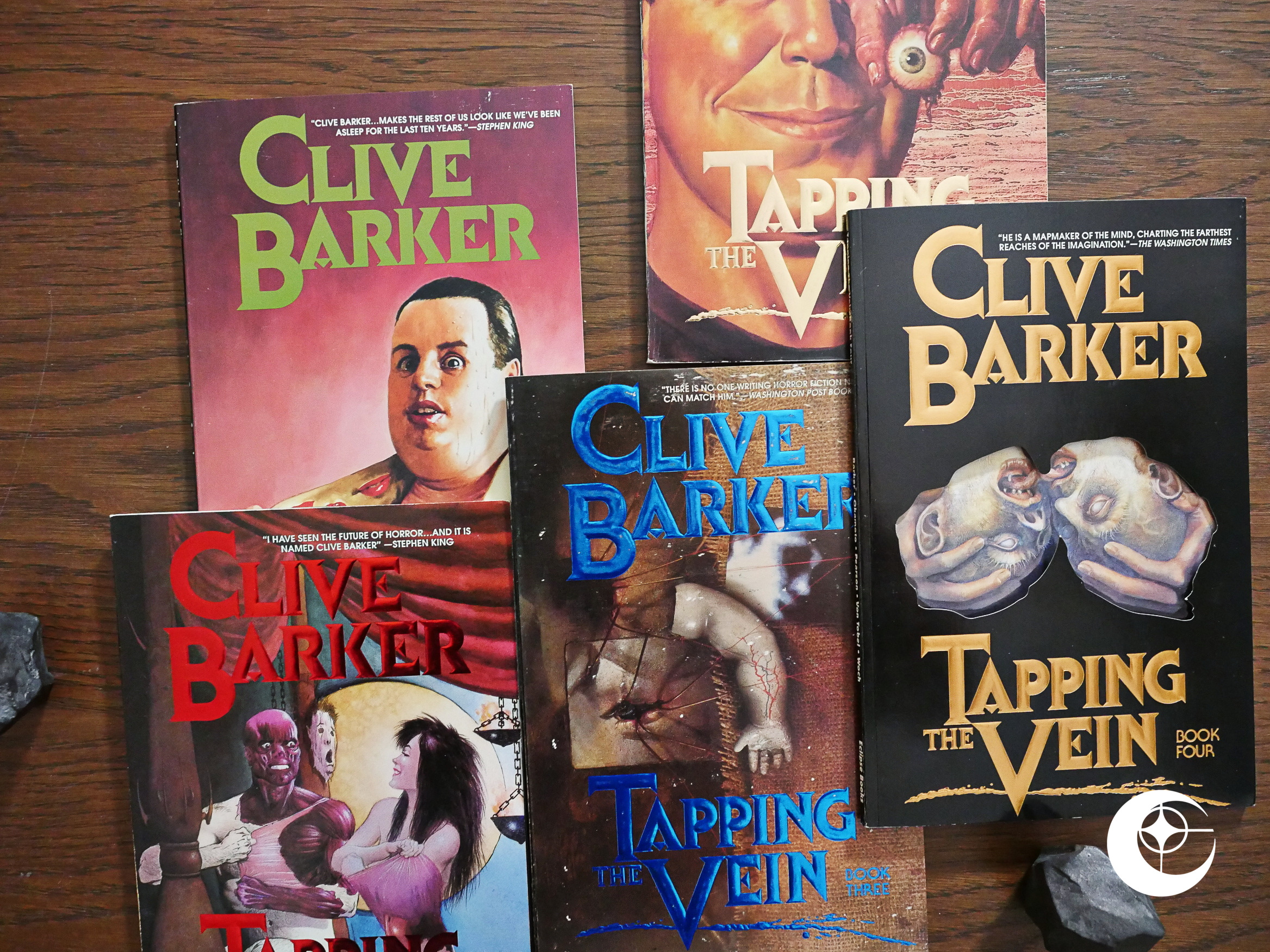
And another chapter in Eclipse’s history begins: Books by and adapted from work by Clive Barker. Over the next few years, Eclipse would publish around 15 books related to Barker; most of them adaptations of his short stories (from The Books of Blood), but also sketchbooks and… other things? I’m not quite sure; I haven’t read them yet.
So how did Eclipse corner the market on Clive Barker? I had assumed this happened through the Steve Niles connection: In Fly In My Eye, Niles has announced several Barker adaptations, so he had presumably secured the rights. Then he stopped publishing himself, took Fly In My Eye to Eclipse, and all these Barker books appeared there.
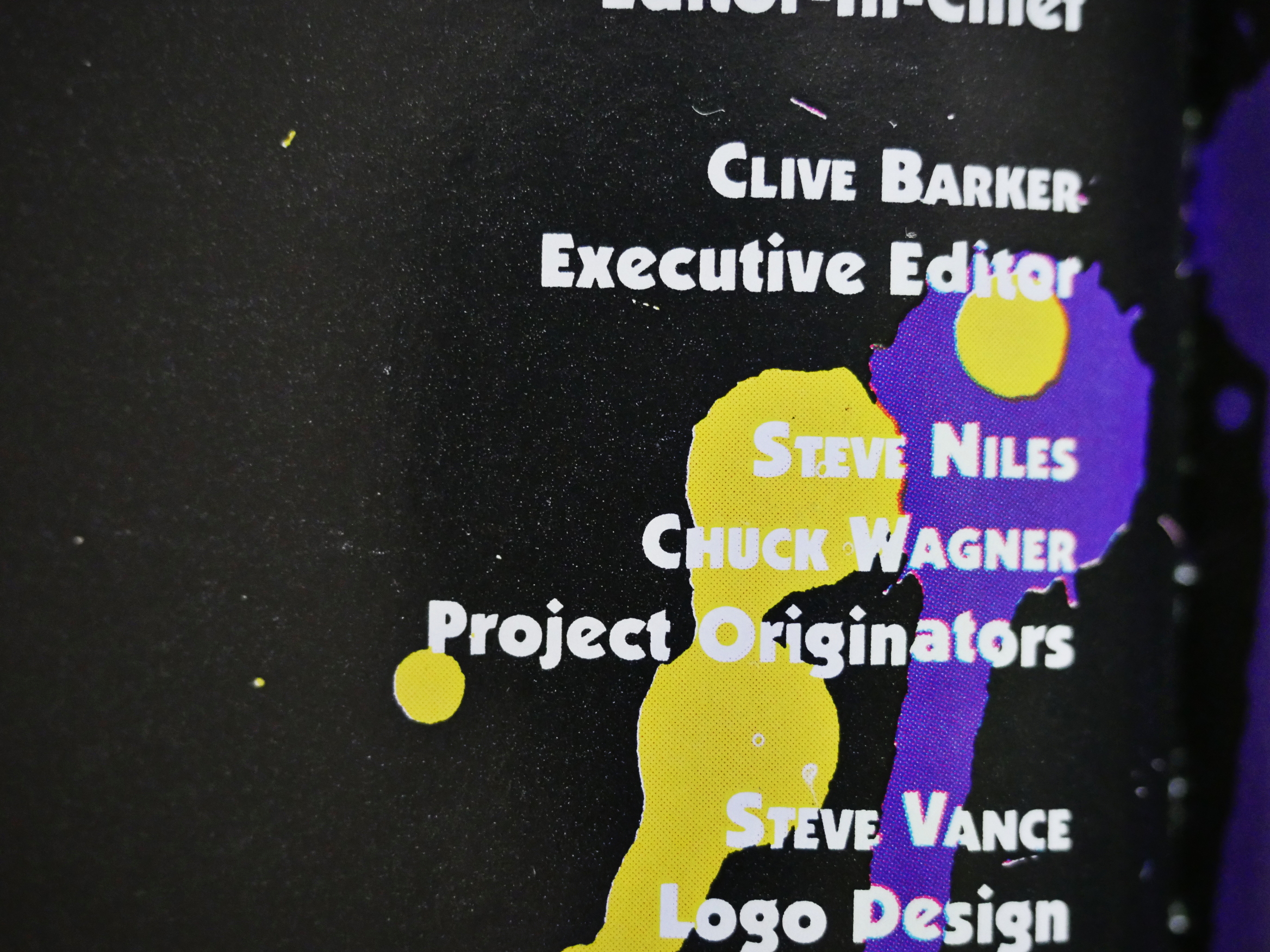
But Niles isn’t mentioned at all in the first issue here. Instead it says that the “project originator” is Chuck Wagner.
Anyway, the idea here is to adapt two of the short stories from Barker’s Books of Blood short story collections per issue. The adaptations vary from 30 pages (as seen above; P. Craig Russell’s adaptation which opens the first issue is the longest one) to 24 pages. So each issue is around 56 pages, and it’s in the squarebound “prestige” format used to signify upscale comics at the time.
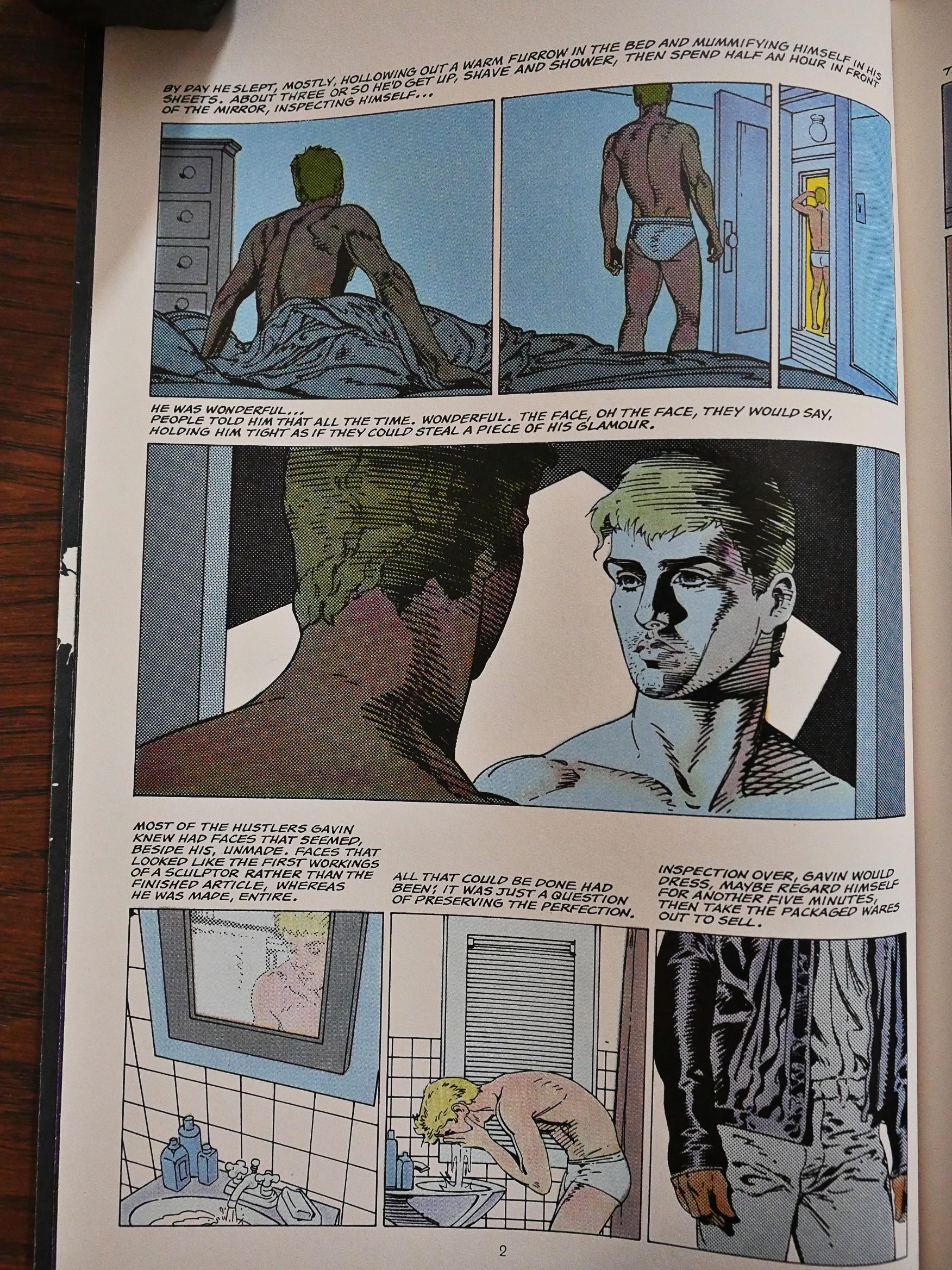
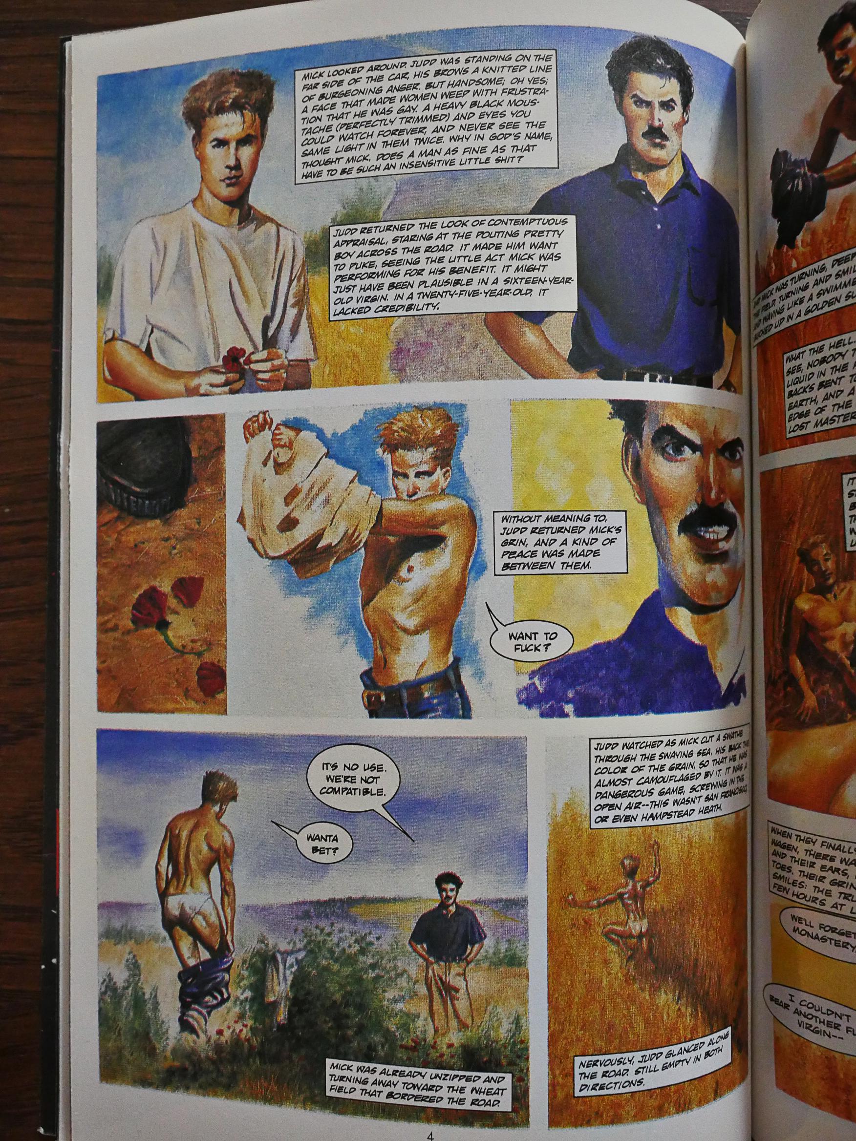
Russell’s work is atypical for the series. All the other works are fully pained, while he uses his normal inked line technique here. He also does the adaptation himself, while most of the other ones are done by editor Fred Burke and/or Chuck Wagner. But it’s a great way to start: Russell’s artwork is well suited for this story, which is way less grisly than the stories that follows.
Clive Barker was a big deal at the time, and was seen to spearhead a disruption within the horror community by bringing in a fresh, more literary and punk attitude, kinda paralleling what had happened the decade before with science fiction and Octavia Butler and Sam Delaney (i.e., the progeny of Harlan Ellison).
So typically enough, the protagonist of the first story is a male sex worker, which is a kind of statement in itself from Eclipse.
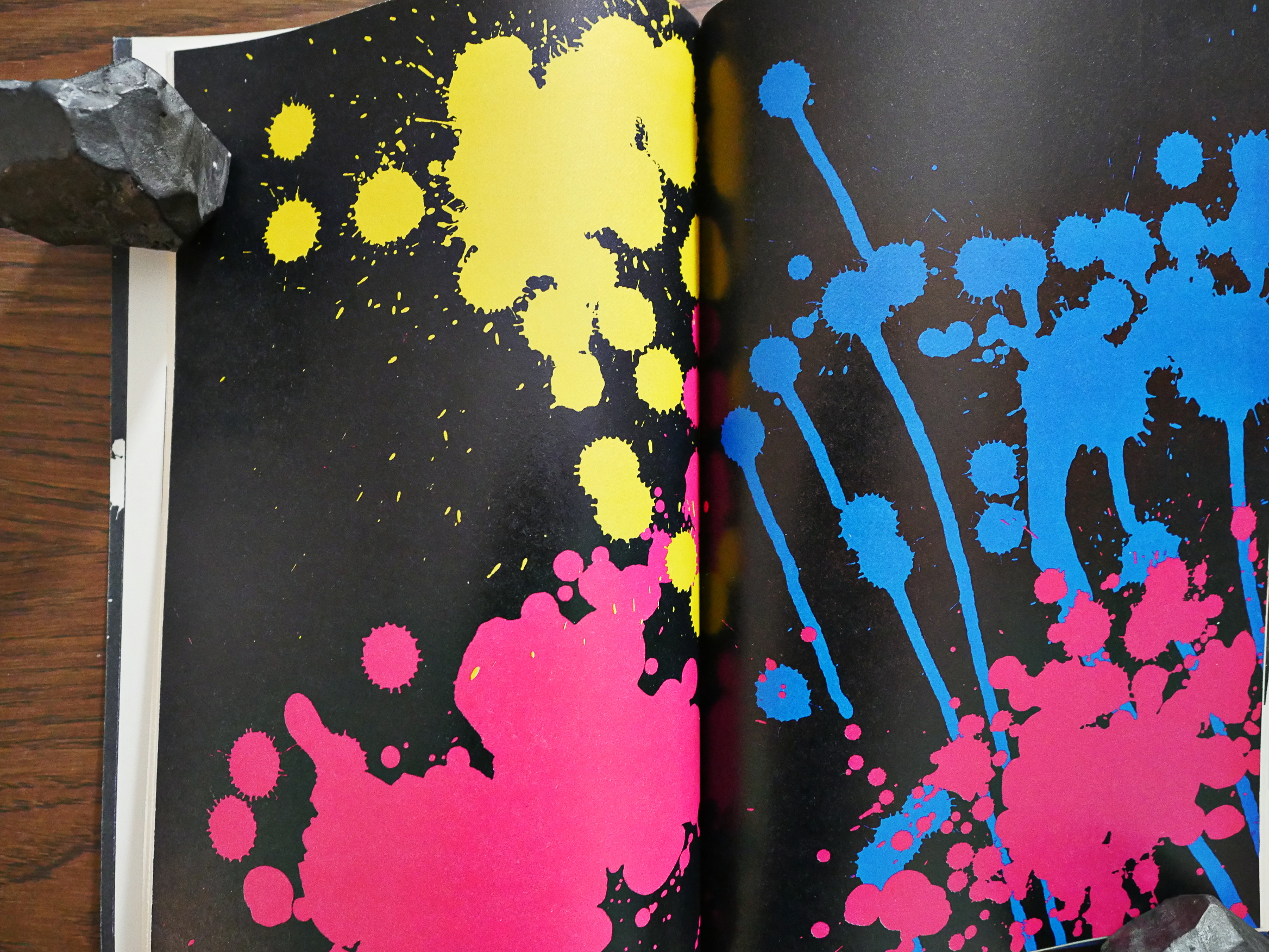
I really like the design of these books. As Barker’s stories are, well, horribly shocking, you need a breather between them, and I like the way the design provides that.
And I also like the way that these books are “silent”. There’s no editorials or chatter about how wonderful Clive Barker is; it’s just the unrelenting stories.
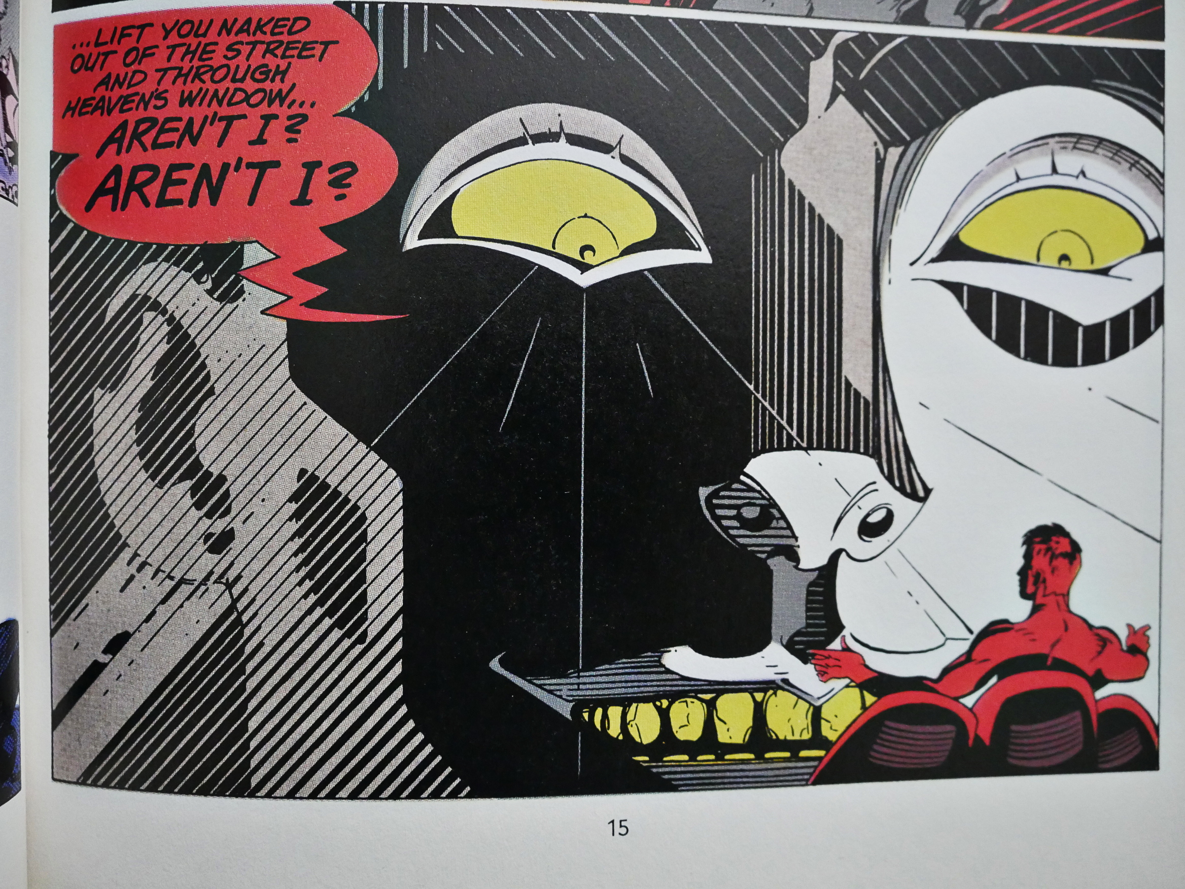
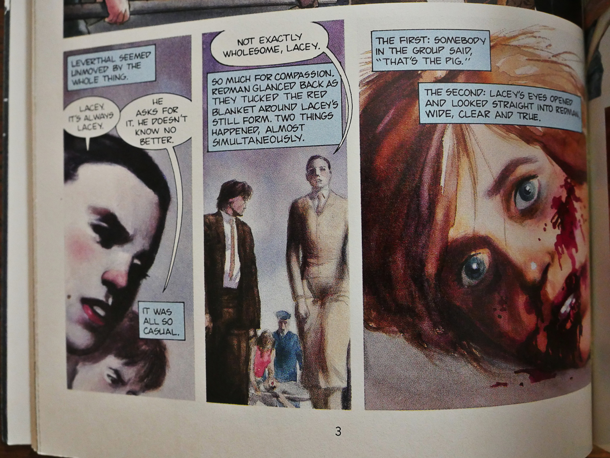
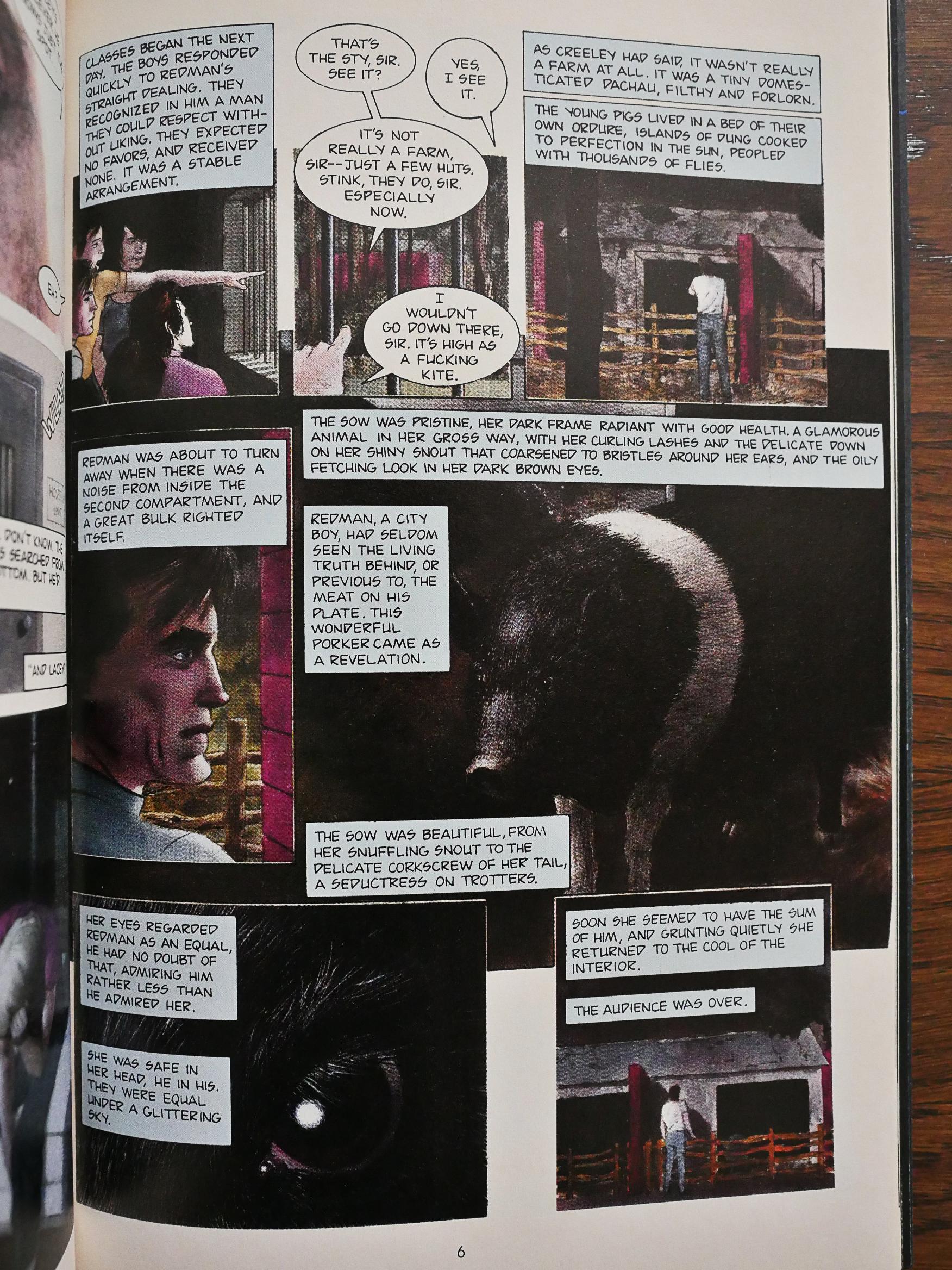
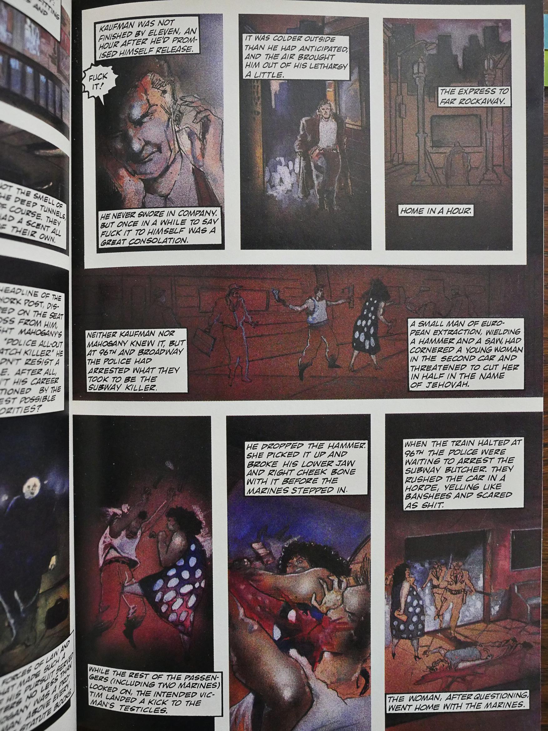
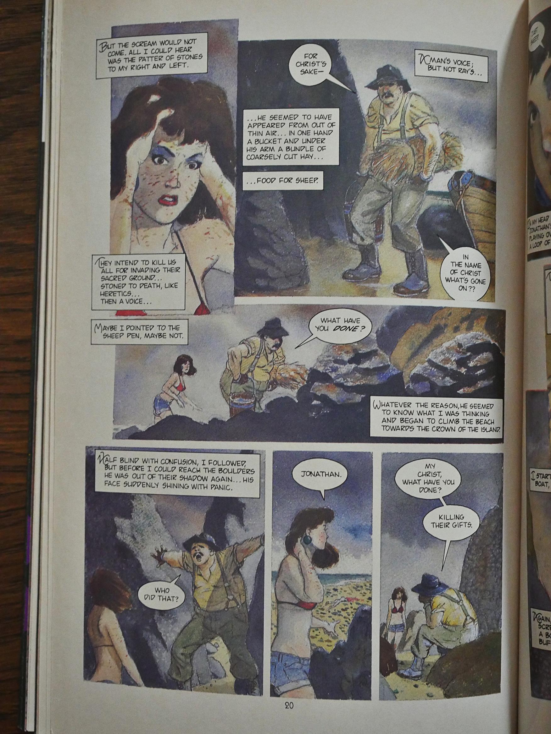
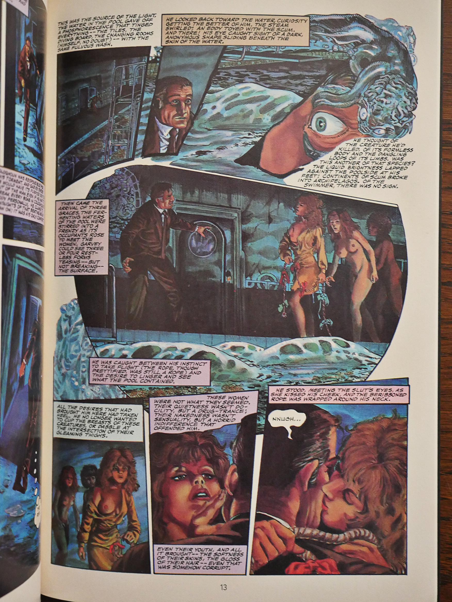
Scott Hampton illustrates the second story, and it’s… grisly.
Both Hampton and Russell had published plenty of stuff with Eclipse before, and I think that goes for most of the artists involved here. But they’re also pretty big names, which makes me think that Eclipse had to have a pretty major budget for this series.
Burke and Wagner does the adaptation of the vast majority of the stories, and their approach is, basically, to fit as many of Barker’s words as possible onto each page. Fortunately, Barker’s words are very readable, so these are still readable, moody, scary comics, but it’s not… good comics. If it hadn’t been for the wonderful artwork on many of these stories, it would have been a less than thrilling reading experience.
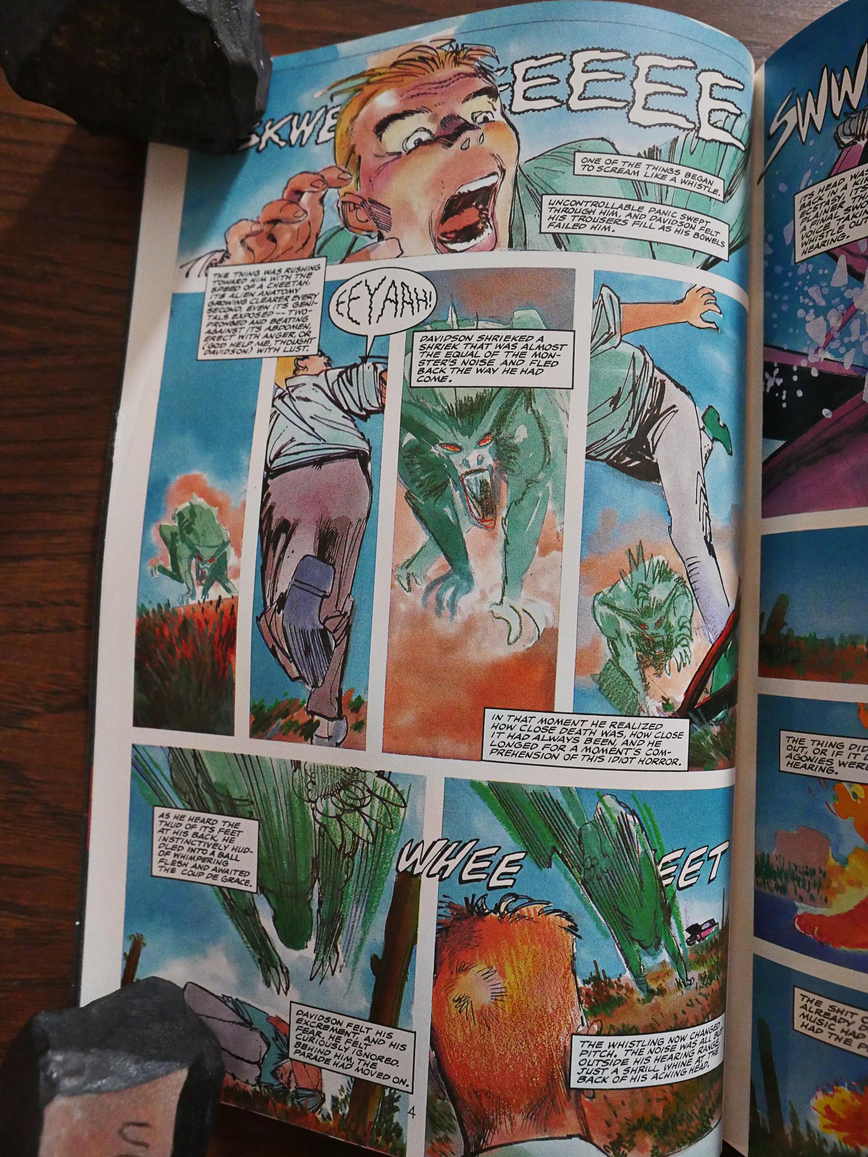
Klaus Janson, most well-known for inking Frank Miller and doing artwork on Batman, is a case in point. Coming from a super-hero background, he does the funny bits well, but doesn’t really help much out with making this caption-heavy style flow well.
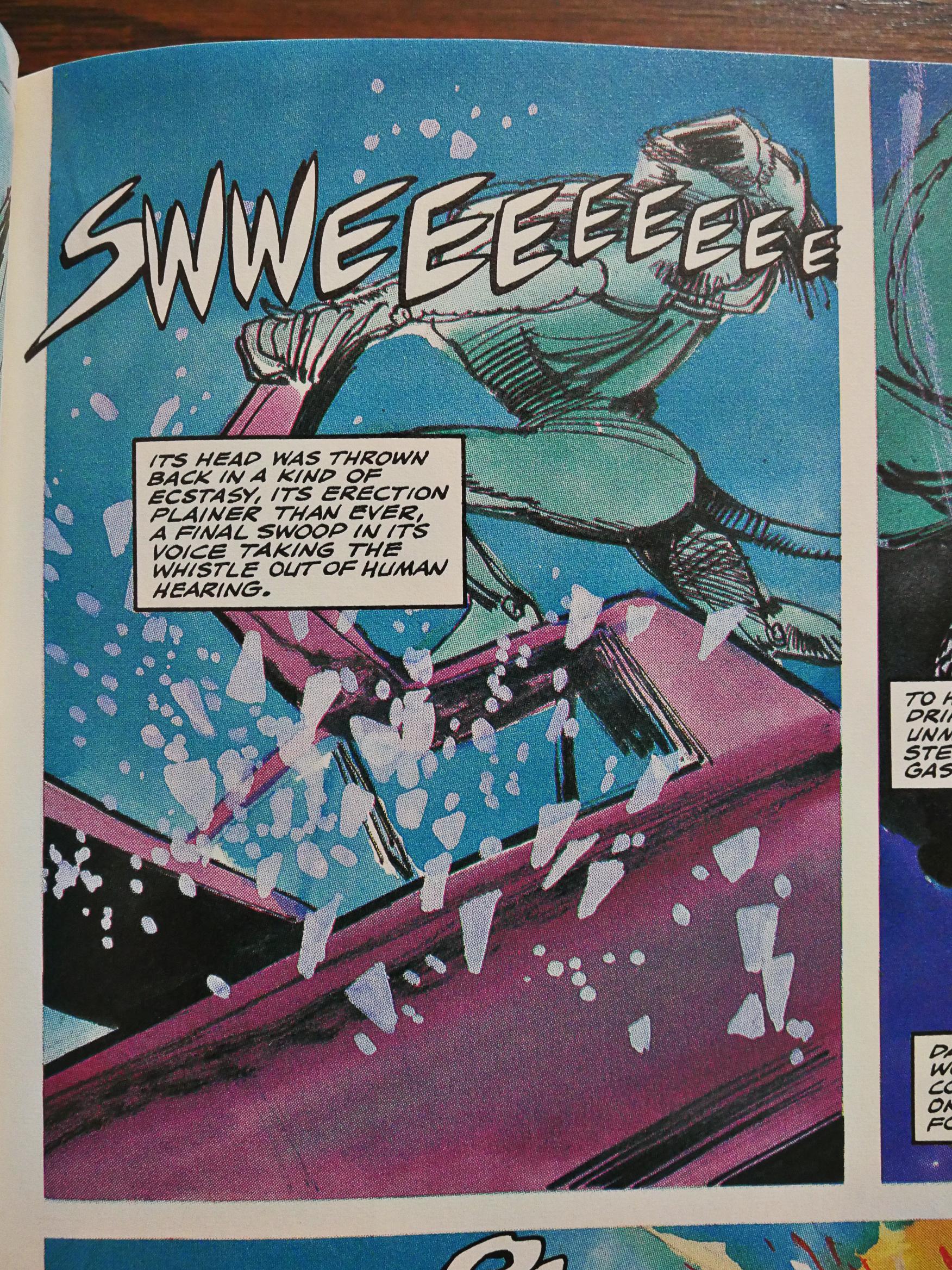
“Plainer than ever.” *stare* Yeah, this may be a book heavy on gore, but Barker’s sex stuff isn’t really depicted.
This is as explicit as it gets, in John Bolton’s lovely rendering.
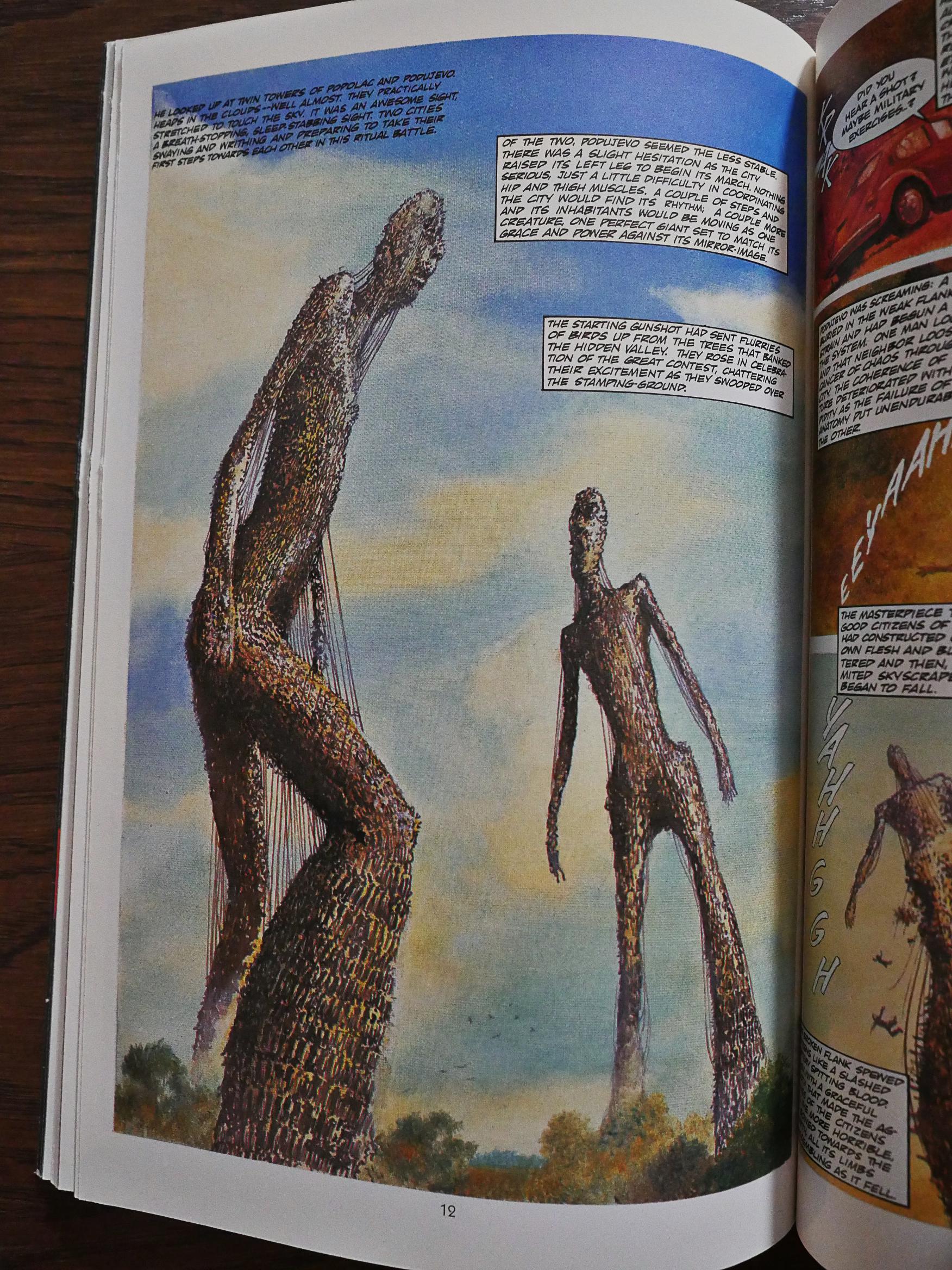
This is from In The Hills, The Cities, which is a story I remember very well from when I read it as a teenager in the 80s. That is, I remember the centrepiece of the story: The vast figures made of people. Which made me really excited to read this, because when reading it, I just couldn’t figure out how Barker meant them to look. It’s such a mind-boggling concept, but Barker made it work in the short story.
So does Bolton do a great job?
Noooo! That’s not what they look like! Gah! Well, at least not in my head, but I’m not sure I had a concrete vision in my head, either.
But… not like that…
Bolton does some closeups later that look way better, though.
Denys Cowan and Michael Davis does what’s probably the most muddled artwork in the series, and as it’s also the grisliest, I found myself skipping over some pages. So tender hearted, don’tchaknow. But it’s also way over-written, and doesn’t really hang together, so…
Bo Hampton does his adaptation all by himself, so I was wondering whether he’d drop the exposition heavy style.
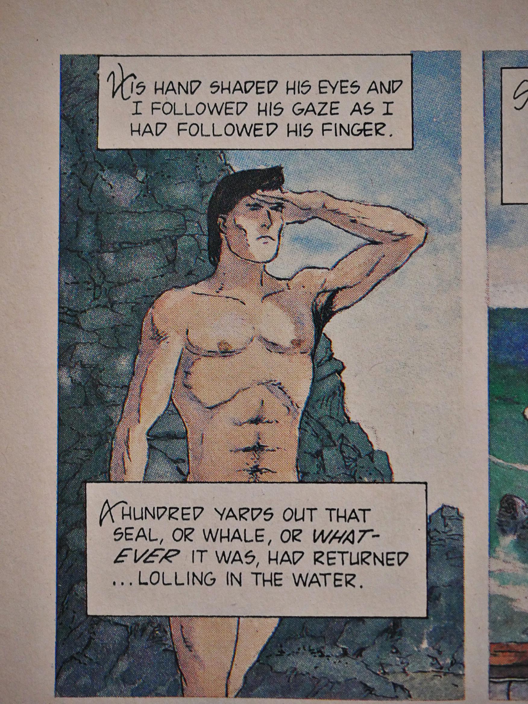
And there’s way less verbiage, but it’s basically still in the same style. It’s also a very odd story (even as Barker stories go), but Hampton tells it with aplomb.
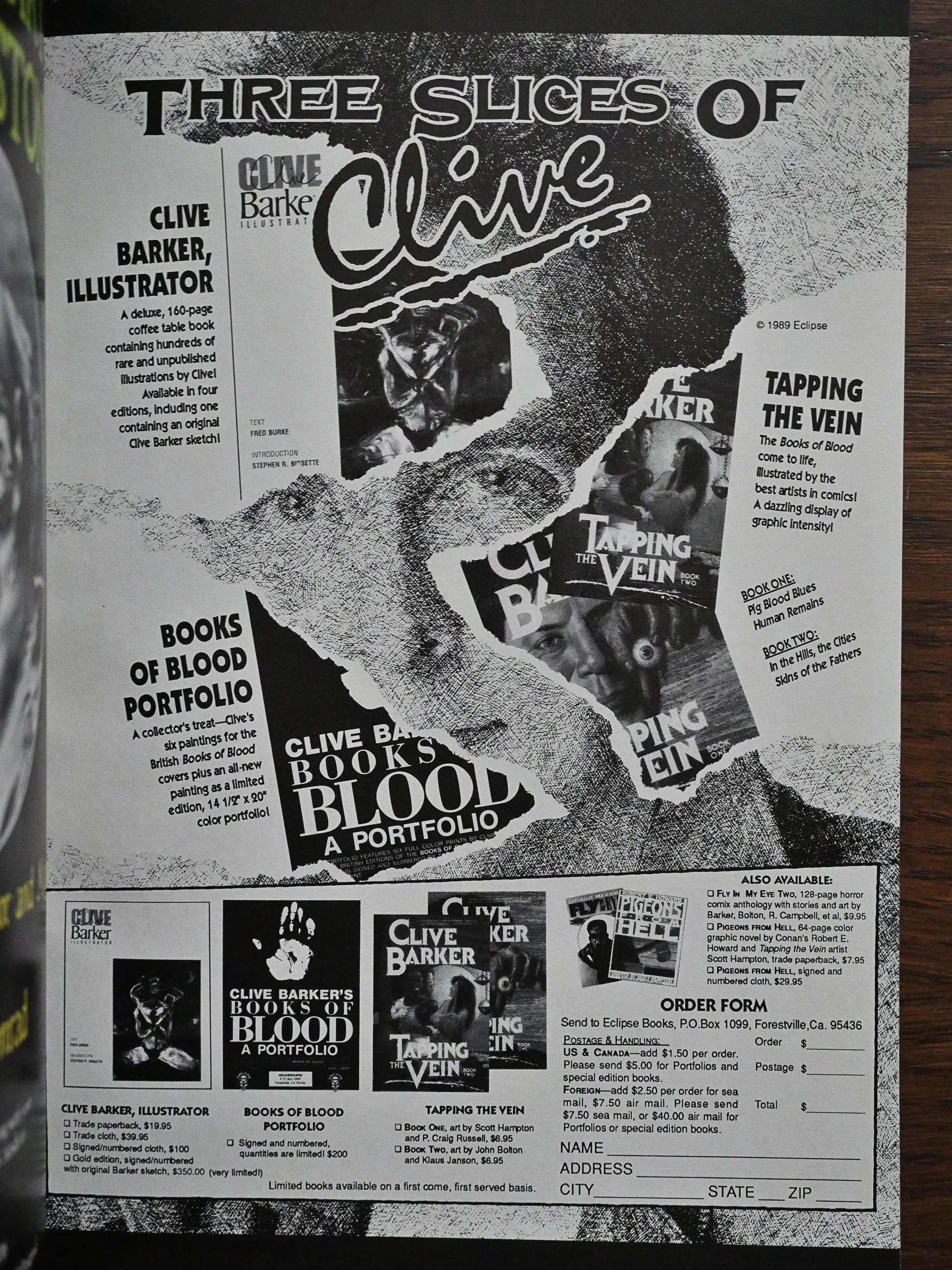
This one also has one of the few ads in the series, and you can see the Barker/Eclipse publishing initiative taking off here. In addition to selling the first two issues of Tapping the Vein, there’s also a Books of Blood portfolio (which I won’t be covering) and Clive Barker, Illustrated, which is a collection of illustration (which I will be covering).
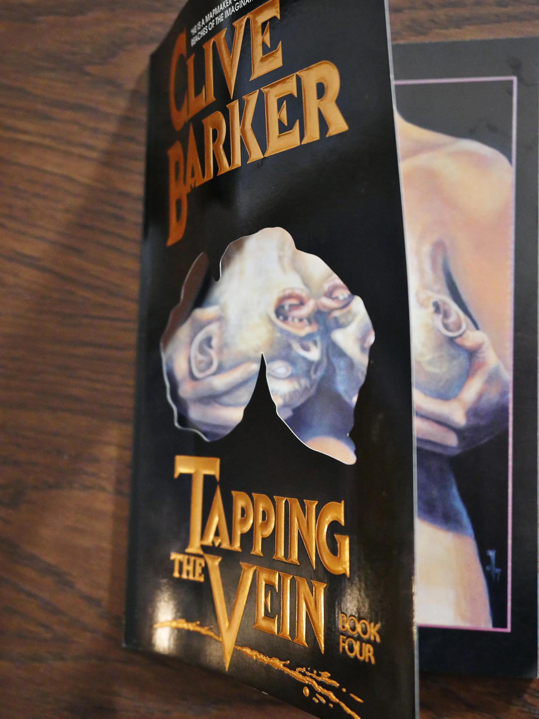
The fourth issue has a die cut cover, revealing what those heads really are.
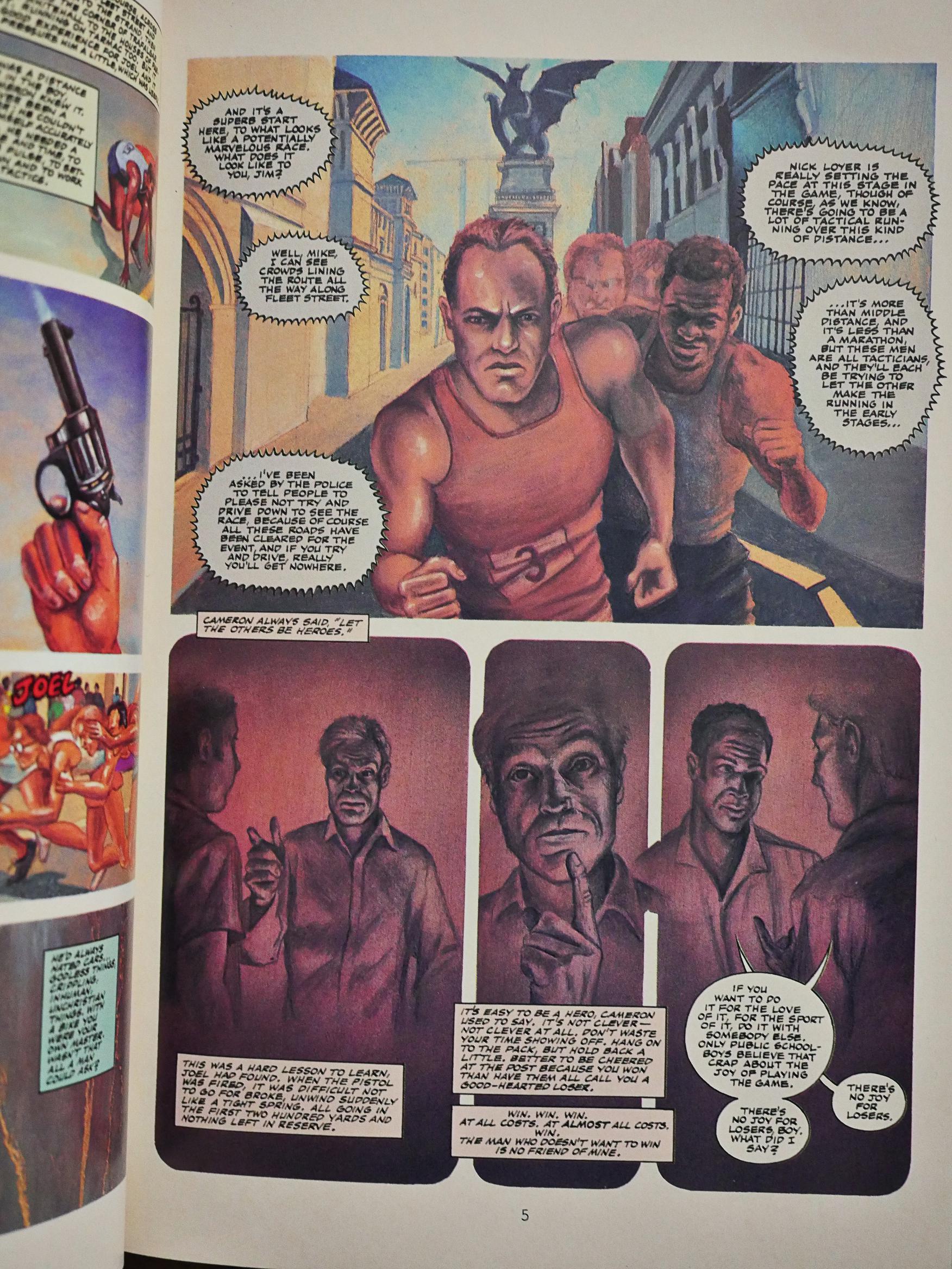
But other than that, it seems to signal that Eclipse wanted to save money, because the “name” artists get a lot less “name”. So here we have Steven E. Johnson, Alan Okamoto and Jim Pearson somehow, all together, trying to draw people running. And failing to do so. It’s a shame, because it’s a pretty good story, but it’s a chore to read.
Stan Woch/Mark Farmer fare better with their, er, fare. I like Woch’s artwork in general, but it’s really his inking I like best, and… that’s not what we’re getting here.
Huh? In issue five, Steve Niles is listed as a “project originator”, so was my original guess on how this series started right after all?
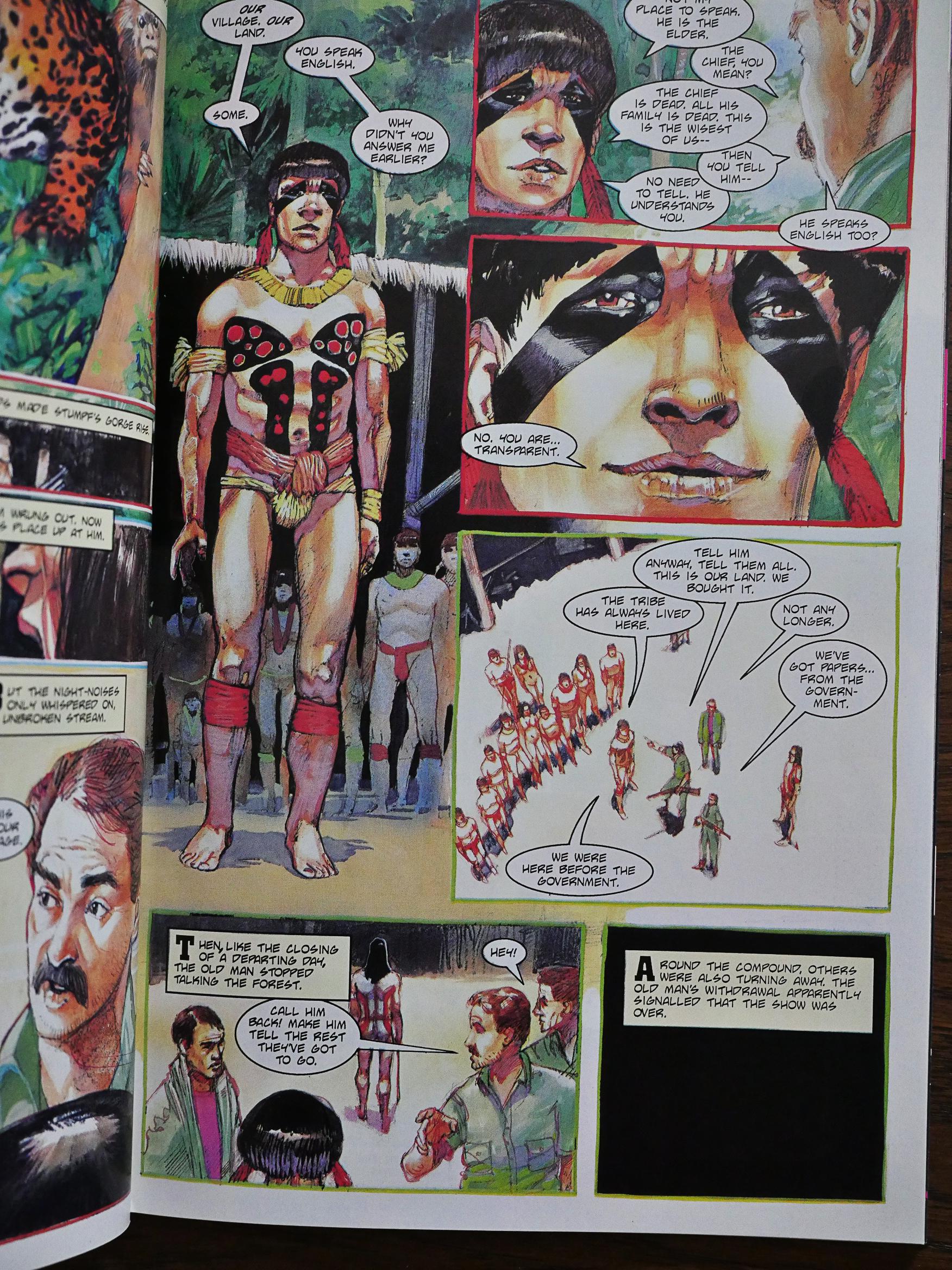
Hector Gomez does lovely artwork for the rather horrific story about dastardly deeds in the jungle.
Reading all these in a row reveal that Barker’s primary tick, and what made these stories seem so fresh and different back then, is that basically he has one story structure: Introduce a horrible situation, let it grow increasingly awful, and then end it with an gruesome atrocity. The end. Having the nice people lose is so much more mature than having them win, you know? Right? Right?
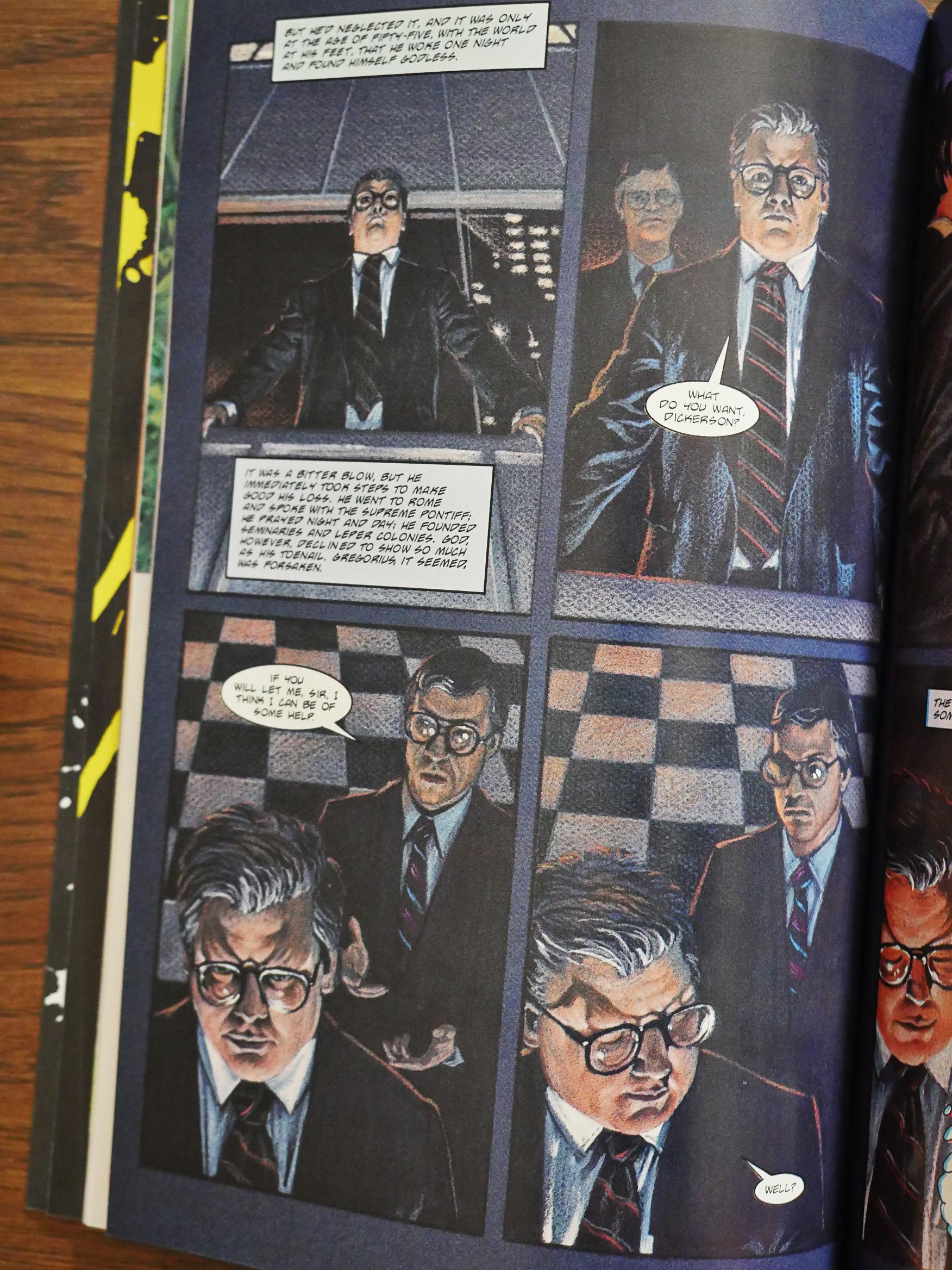
Then we get one last “name” artist, Tim Conrad, and then the series is over. Steve Niles did the adaptation on this one (and co-er-did on the previous one), and they’re much better (as comics) than the Burke/Wagner efforts. Instead of spelling everything out, he lets the artwork breathe and lets it tell us (some of) the story through the characters. It’s a breath of fresh air.
So Tapping the Vein ends here, but the Barker adaptations don’t stop comic. Eclipse would publish six more Books of Blood adaptation, but these are all free-standing volumes that, I hope, will give the adaptations more room to breathe.
And use fewer blocks of text. We’ll see.
I think instead of doing a single post per adaptation, I’ll just gather them all in one post…
The Tapping the Vein stories were collected in one single volume in 2003 by Checker Comics, and single stories have been released in artist-specific anthologies.
Let’s see whether I can find anybody talking about the adaptations…
Oh, here’s P. Craig Russell from The Comics Journal #147:
Fred (Burke of Eclipse) had suggested to me that we’ll probably Olrn with a shot Of him as a hustler in a leather jacket leaning against a brick wall, as he’s described. But I had a different idea, which was that he’s a man basically without a soul. And the first time you see this statue that comes to life, the first time he sees it, it’s wrapped in sort of a fetal X)Sition in the bottom of a tub of water. I wanted to make a visual analogy between the two characters and one of the early lines in the story talks about how he worked at night and slept by day, burrowing into the sheets and mummifying himself. That seemed to tie in with this ancient statue found in the ruins. So I decided the opening shot should be him mummifying himself. Wrapped up in the sheets in this fetal position that W’ould make a visual reference to the first time you see the Statue. So that’s all you see on the first page — this mummified-sheet-wrapped-fetal-positioned man.
And then he goes on to explain how he’d expanded some sections and cut others. Sounds very thoughtful…
Oh! There was going to be another Russell adaptation:
Oh, boy. This was the most distressing episode Of my 20-year career. I guess I can take that as proof that my life has not been hard. It has been an upsetting year. I was doing an adaptation of “Age of Desire” for Eclipse. I was designing the book from page one/inside cover to the back cover. A straight-through story. Everything would have contributed to the story. I was having difficulties from the very beginning convincing them of the way I was laying out the story, but getting a tentative go ahead. I wrote and did my thumb nails for what would be about a 49-page story. And was paid. So I figured, well, this has been accepted.
I took a couple months to finish some other %ork and then started working on it. I had about a third of the book penciled before I heard any news that they had problems with the way I had done my adaptation. They had a whole list of things they wanted to talk to me about. A couple of them were some good ideas editorially, I had talked to Fred Burke about them and they could have been added. Fred was originally afraid that I was not putting in everything that needed to be put into the story. I agreed, but there are some things you have to edit out if you only have so much space. You try to maintain the flavor of the ideas and hit the highlights and save space for the climax. So, I said if I could have more space I’d be glad to add this in. Originally, I’d heard through Fred that Dean (Mullaneyl was encouraging him to make the books as long as he wanted. To do a 64-page book. But suddenly they didn’t want any extra material, which was odd.
[…]
And you turned the page and now there are two full pages Of flames filling it, and just these words slowly coming in: “Give me your heart… give me your heart. give me your heart… I can hear your heart… give me your heart” just swirling through the flames and when you turn the page again they slowly flicker out.
PAETH: What was Eclipse’s reaction ro it?
RUSSELL: Well, Cat Yronwode had a hemorrhage over that. That was the main point to her — that this completely subverted Clive Barker’s meaning of what the story is about.
[…]
At this point I still had such faith, babe in the woods that I am, in what I was doing and the integrity of it all fitting and working together in the final product that I said, “why don’t you just show it to Clive?”. I was sure he would look at it and say it was fine. I was just pushing to show it to Clive.
He found it “sadly inappropriate.” He was not happy with it.
Well, that’s a shame, because Russell’s piece in Tapping the Vein is probably the best one…
Well, what about reviews? Here’s one:
Chuck Wagner and Fred Burke’s comic book adaptation of Barker’s short crams in as much of the original story as possible, quite literally shoe-horning the rampaging action and jumping viewpoints into the less adaptable medium of a graphic novel. Wagner does well with this undoubtable challenge. However the conversion is far from perfect, leaving much of the pictorial version lacking in atmosphere, impact or indeed the all-important imaginative flare. John Bolton’s illustrations are also far from accomplished, missing the mark with the depictions of the demons as well as generally delivering too much of a sketchy and rushed depiction of the storyline. This is a damn shame for such an otherwise exciting and inspiring tale.
Literally shoe-horning. Quite. And he’s talking about the Klaus Janson-illustrated story… But I do agree.
Oh, here’s the Bolton one:
For this second graphic novel adaptation in this second ‘Tapping The Vein’ volume, Chuck Wagner and Fred Burke have once again dissected one of Barker’s monstrously imaginative shorts, taking the bare bones of the short and ingeniously cramming it together into the comic strip format. John Bolton’s illustrations are absolutely superb, somehow visualising the goliath giants in an illustrative format. What seemed almost the impossible to adapt into a graphic novel, has turned out to be an absolute triumph. A truly spectacular short that is done absolute justice by this well envisaged adaptation.
So there you go. I’m excited to read the other, longer adaptations, and I hope that they’re not done in the Burke/Wagner style.

Its a shame you don’t mention which story you are talking about when talking about each book as I am trying to find them all.