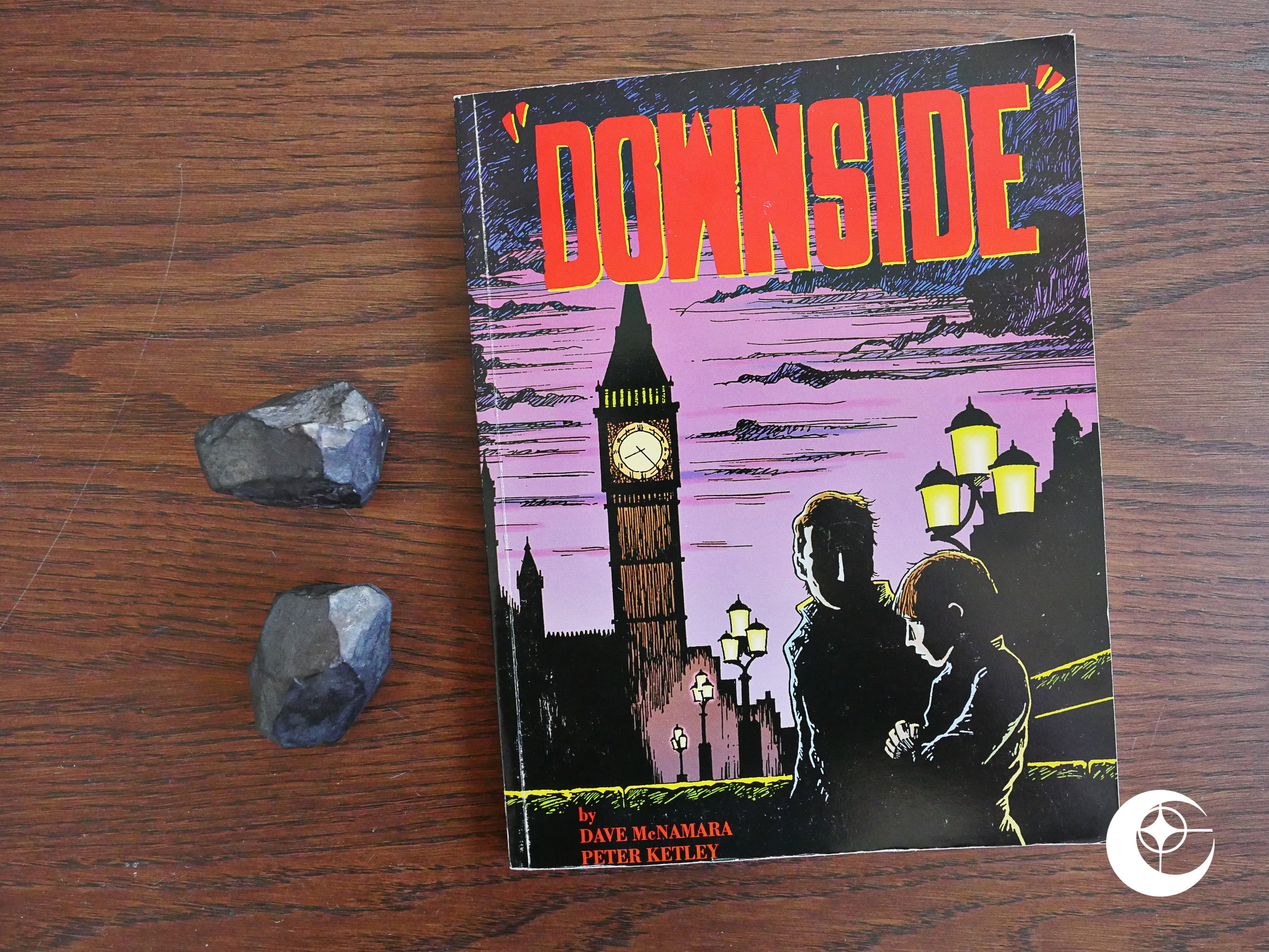
Downside (1993) by Dave McNamara and Peter Ketley.
This is one of the very few comics from Eclipse from the early 90s that I bought at the time (instead of for this blog series). But I can’t remember anything at all about it, so it didn’t make much of an impression.
This squarebound “album” size comic was originally published in the UK as a series of floppies.
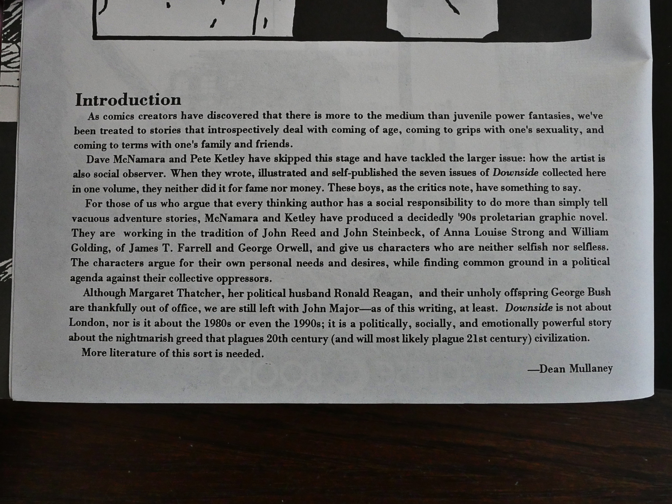
Eclipse publisher Dean Mullaney talks about there being more to comics than “juvenile power fantasies”, which is very true, of course. But it’s a little ironic that Eclipse launched the FX line the same year they publish this, and that’s explicitly a line of juvenile power fantasies. Don’t you think?
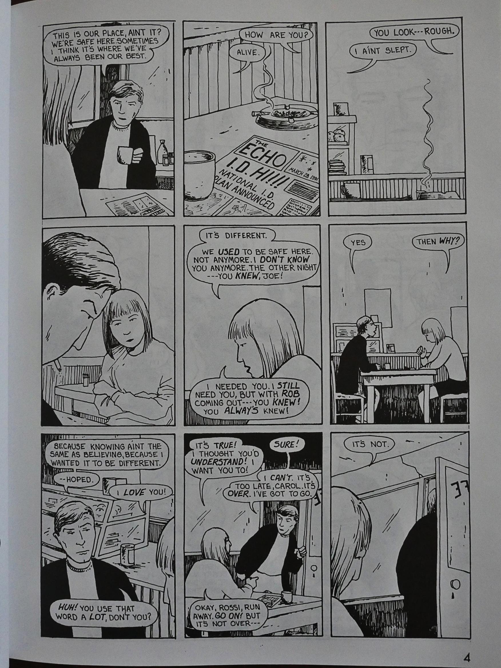
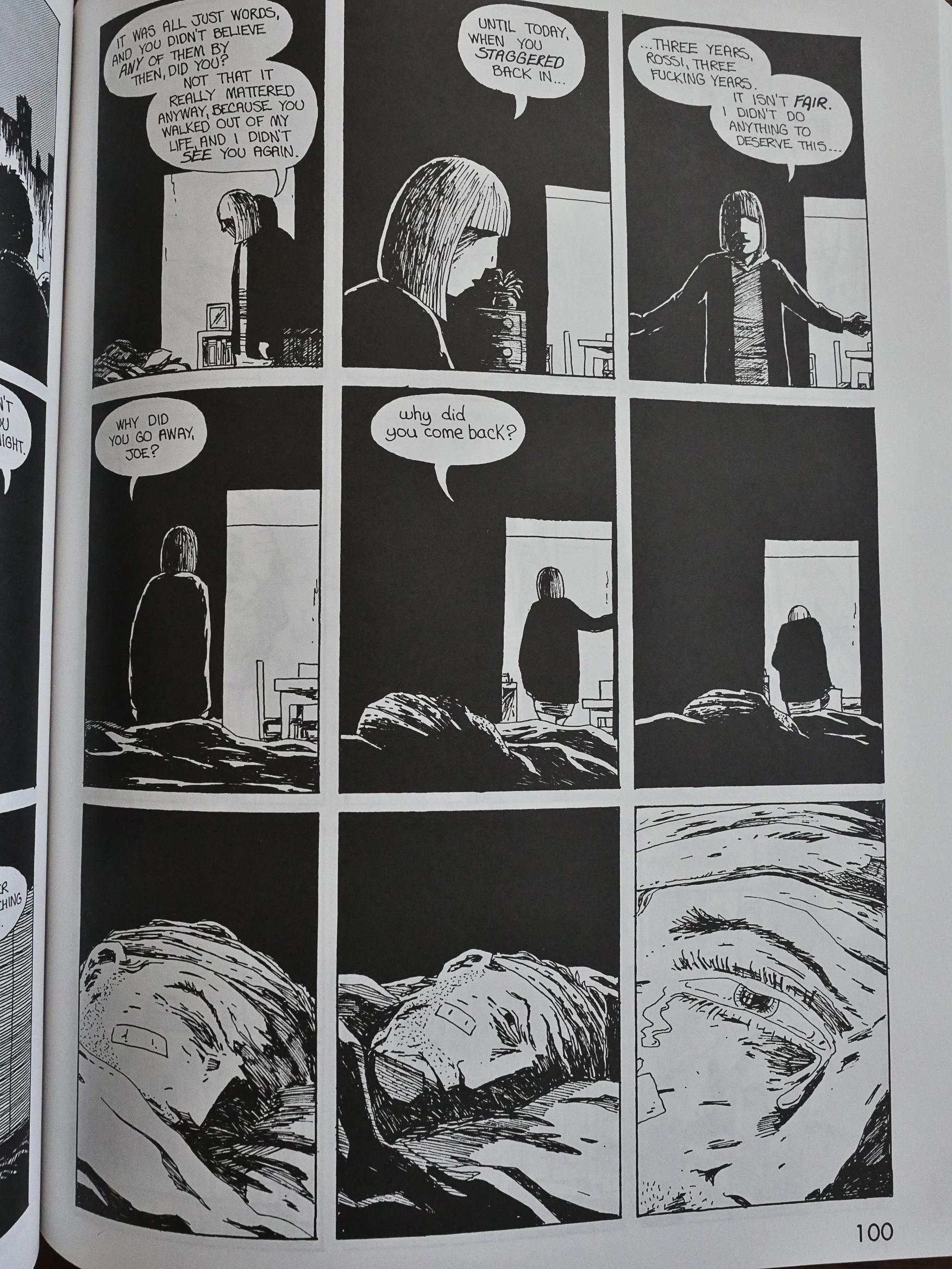
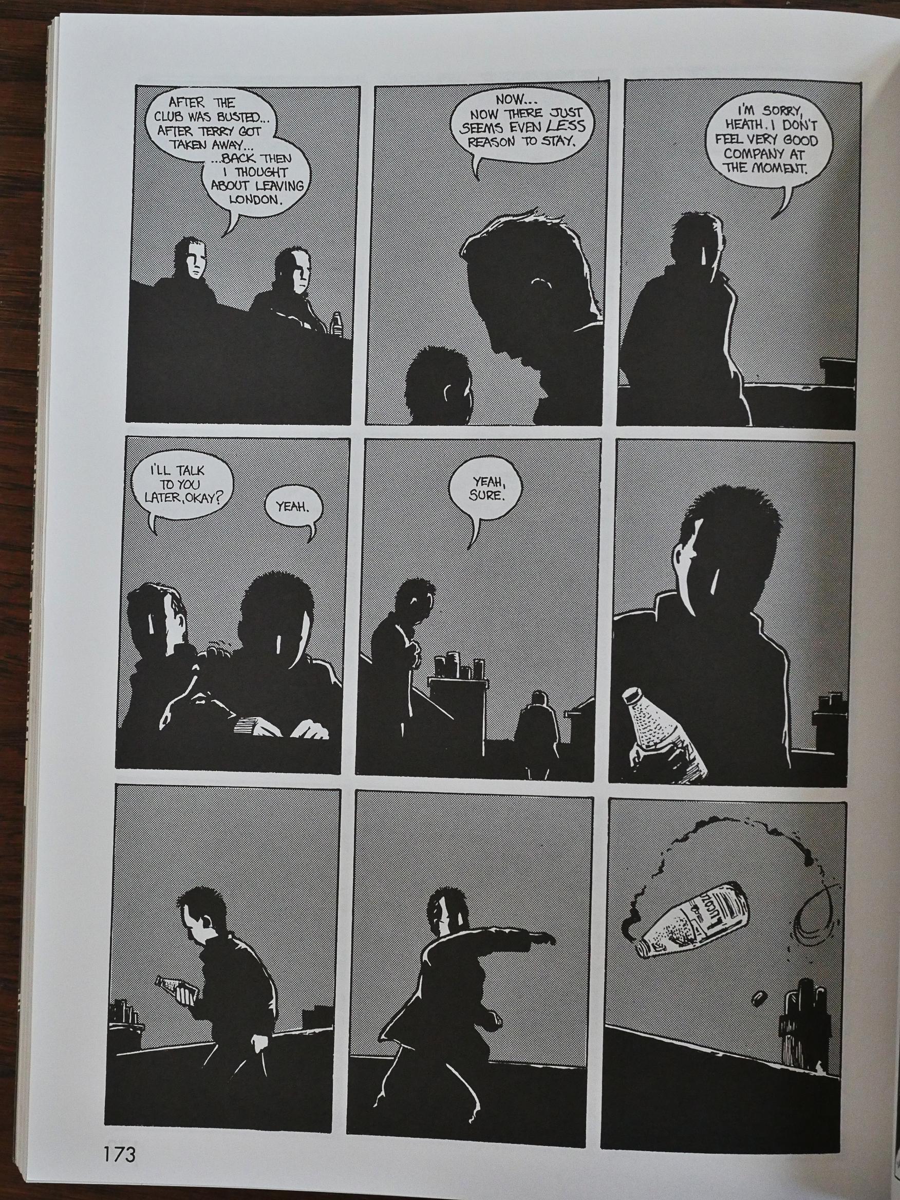
The artwork is a bit on the basic side. They stick to a nine panel grid (which was very popular at the time for crossover semi-literate comics, I mean, er, more high tone comics. But the first thing I thought when I saw this page was “Carol Swain!” And then I started to wonder why, because her artwork is stunning and beautiful, while this… isn’t. Perhaps it’s just that angle in the last panel there… It’s a kinda Swain angle.
But this is rather relentlessly ugly. I think the most disturbing thing about the artwork is that it doesn’t seem to have any sense of space. Somehow the characters often are in vaguely defined environments that doesn’t help with the flow of the story. I mean… just take a detail like the door in the page above. In the first panel the door is open like 50 degress. Then in the fourth panel, the door is almost completely open, so 80 degrees. Then the next panel it’s hard to say what it’s supposed to be, but the panel after that, it’s at 30 degrees.
Yeah I know, it’s an irrelevant detail, but the book is like that: There’s no sense of space; of place.
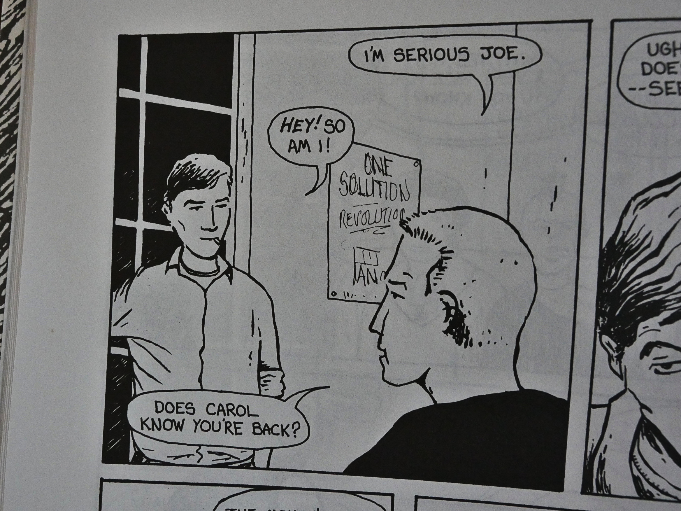
And what are the odds that there are two people called Serious Joe in one comic book!?
But apart from the artwork, the main problem with this book is that every single line in the book is something that you could see somebody utter on a mid-80s Channel 4 “relevant” TV series. That’s not a bad thing… if this were a mid-80s Channel 4 “relevant” TV series, but it’s not. It’s a comic book, and reading scene after scene directly transposed from an imaginary TV series to the page makes for dull reading.
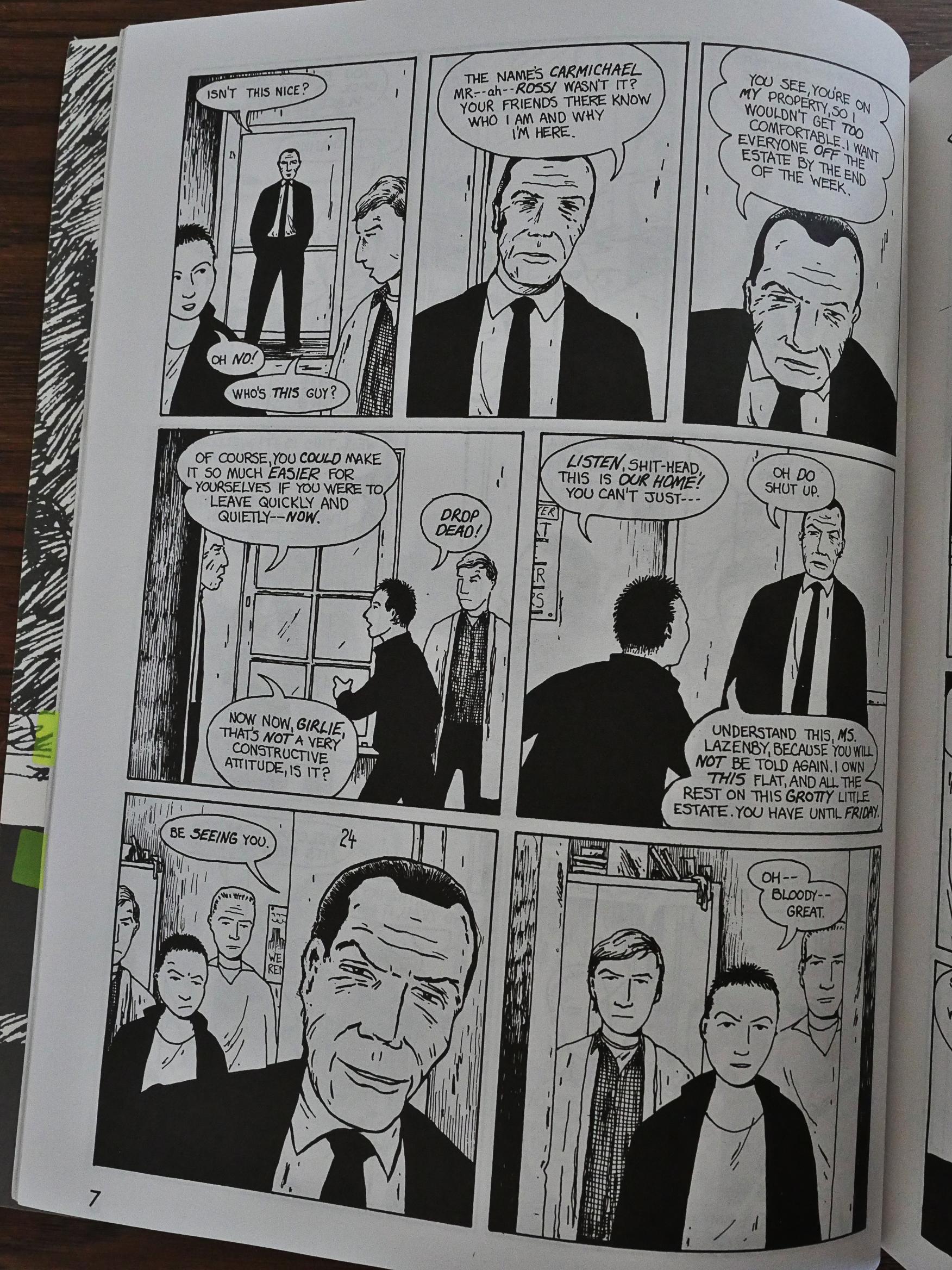
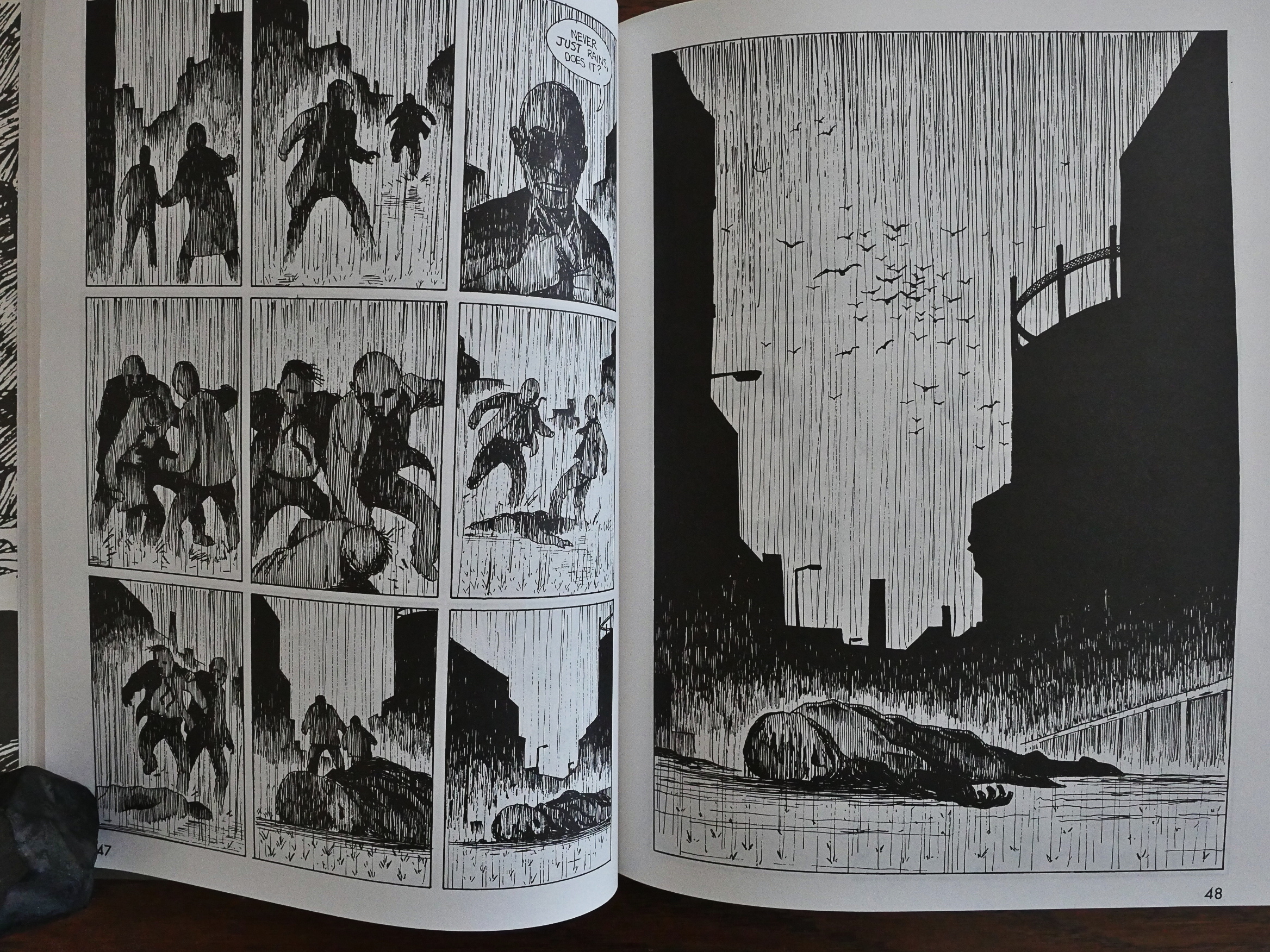
The artist does whip up a couple of pages here and there that has some visual impact. That’s not spread transposed from a TV series, but something almost like a proper comic book.
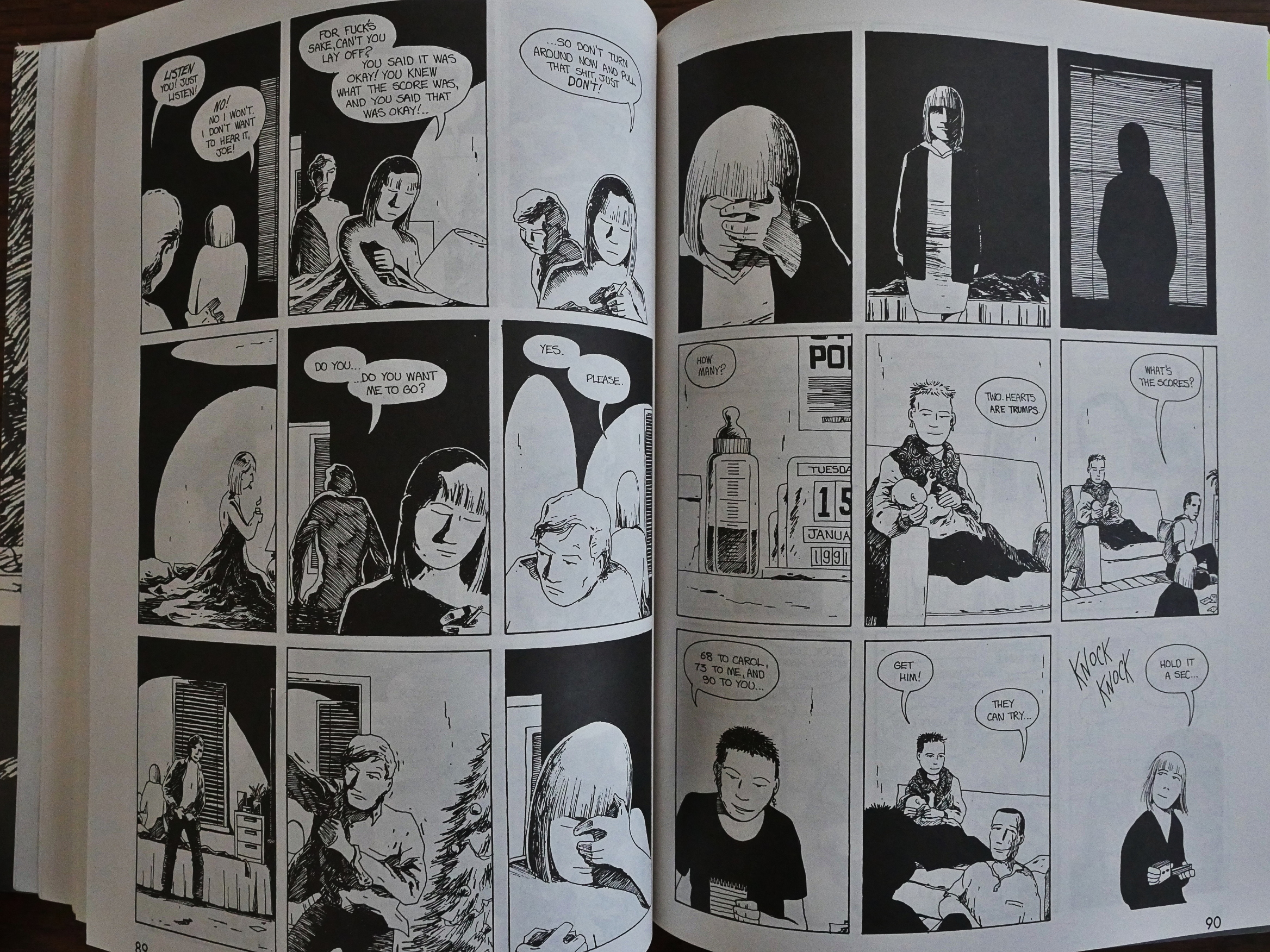
This book is mainly about a slum lord intimidating and evicting tenants, and how the tenants protest and try to fight back. But about half the pages (it seems like) are taken up with a sub-plot about Serious Joe II coming back, and the characters are asking themselves why, and why he left, and we get a lot of flashbacks to things happening in the past (like in the spread above).
We’re never shown why we should care. He doesn’t seem very interesting, and all that relationship stuff is cliché beyond the call of duty.
Why! WHYYY!!!
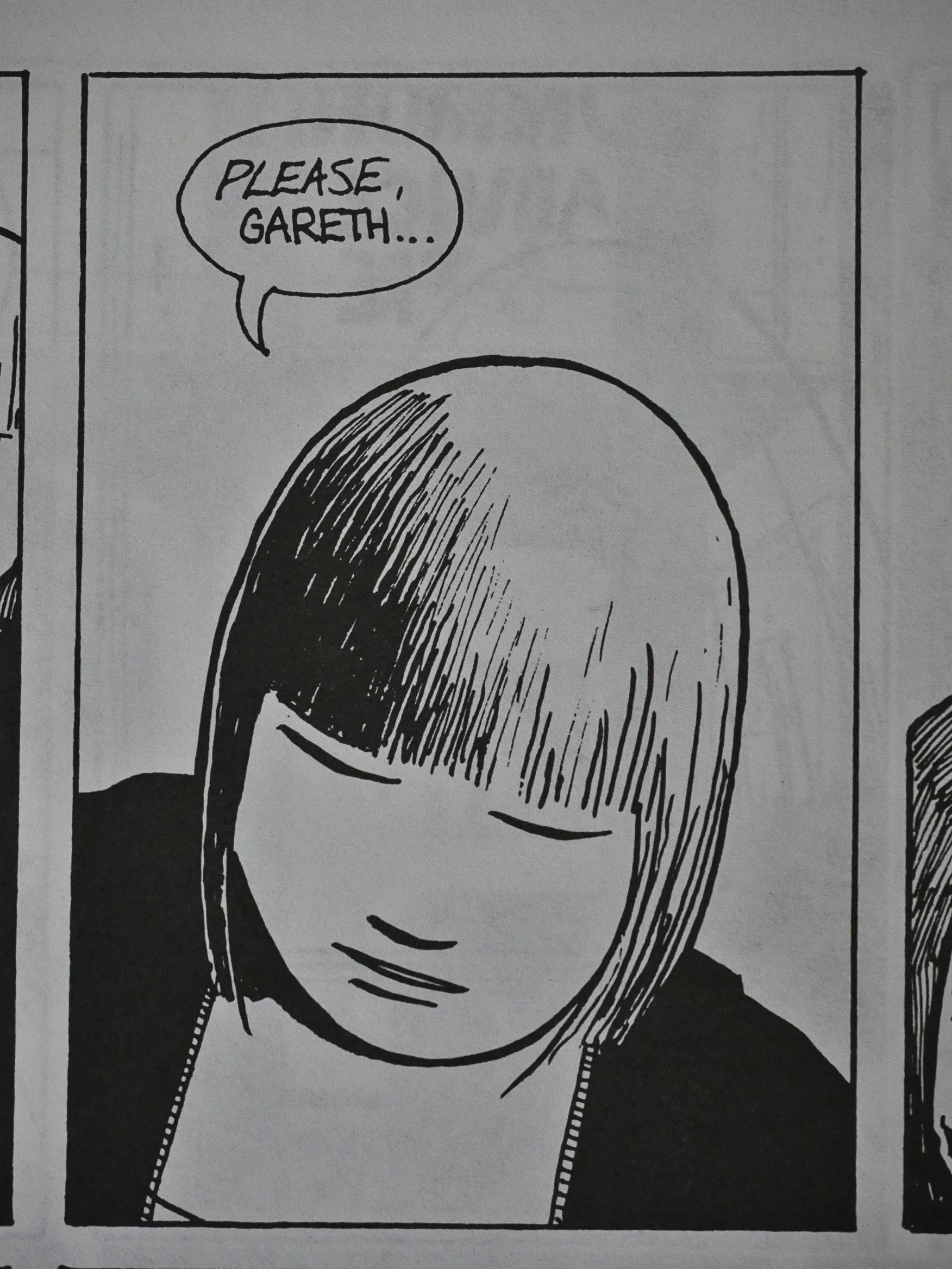
Oh, that’s a kinda Swainish drawing again, but not really.
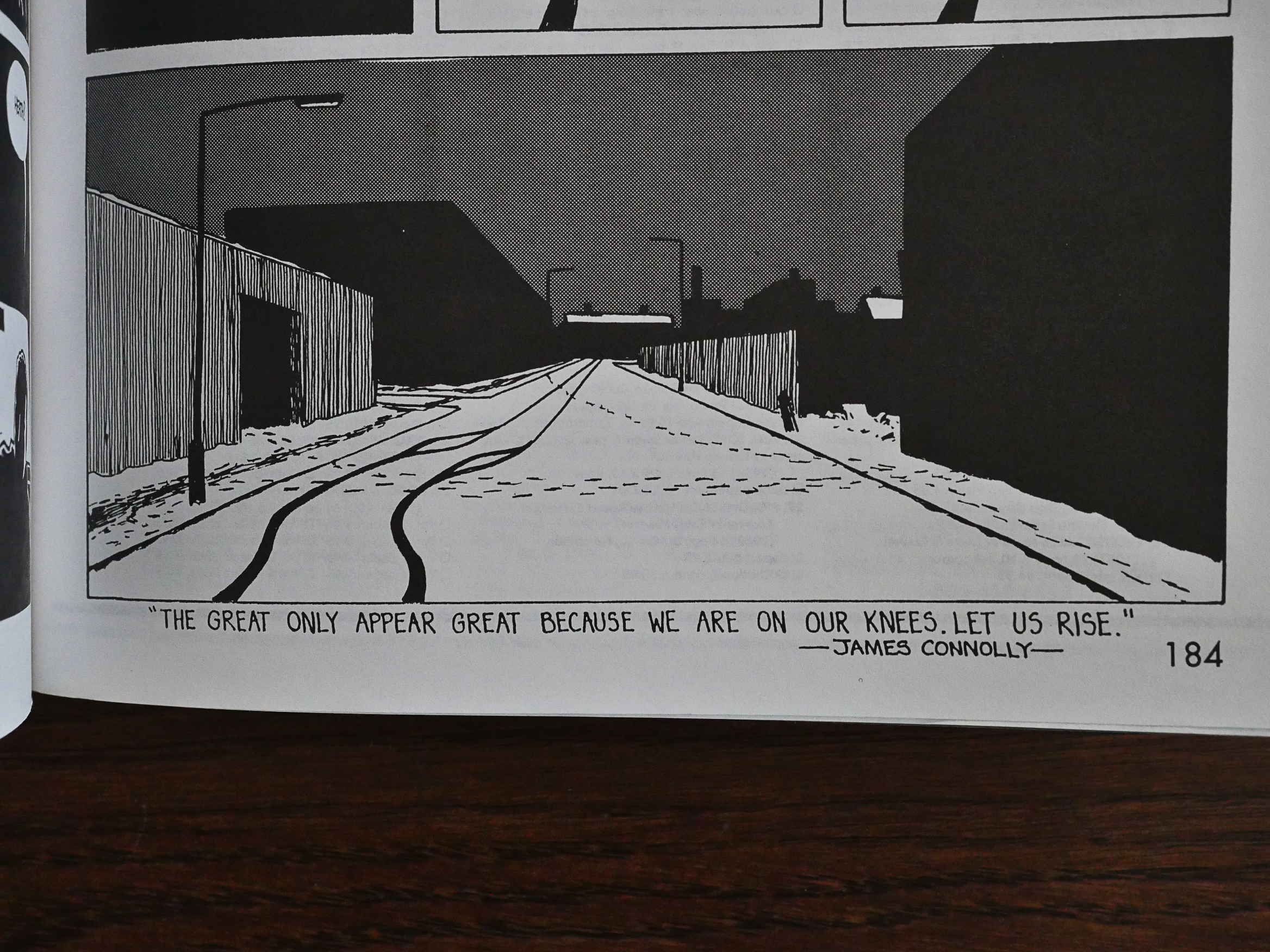
The artwork does improve as the book progresses. It was drawn over a two year period, apparently, and the artist grows to spot his blacks a lot better, and hide his scratchy line effectively. There’s almost a Tardi starkness to it in parts.
Indeed.
It’s surprisingly difficult to find any reaction to this book on the web. Here’s one from Goodreads:
The plot make sit difficult to sympathise with anyone. The squatters are, after all, not legally entitled in any way to the flats they’re staying in; Carmichael is utterly villain material, as are his goons, his trophy secretary, the police, unseen journalists, politicos…in fact anyone outside of the squatters’ immediate circle.
I’m guessing that’s an American.
Here’s a Brit from the Usenet:
Downside is a very `real’ comic strip, much more so than Jamie Hernandez’s supposedly real-life cute punk shennanigans. Dole queues, cigarette butts, demos, riot police, filing cabinets and half-bricks. More PC than Crisis, if such a thing is possible.
[…]
The art has always been a bit of a weakness in Downside, but it’s improving with leaps and bounds. Minimal, sketchy B&W, reminds me of Eddie Campbell (of From Hell in Taboo) a bit. The scene where the riot starts, with hands reaching for bottles and cans and bricks until it finally explodes into a borderless panel is rather wondeful.


Serious Joe!
I remember reading the UK issues of this as they came out. Maybe my mind is playing tricks on me but I think this was c. 1988 or 1989. I think it must have been that early, because the near future setting was imagining Thatcher still in power, and she was gone by the time Eclipse published it. I remember the strip fondly though I don’t remember too much about it. Yeah the art was basic but I was chill with that. Not sure what I would make of it now.