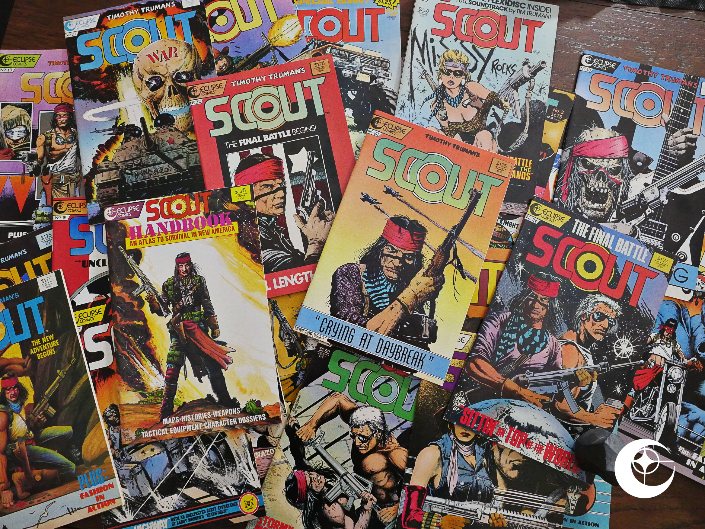
Scout (1985) #1-24, Scout Handbook (1987) #1 by Timothy Truman et al.
I bought a lot of Eclipse comics back in the 80s, but I stayed well clear of the Scoutiverse, so I’ve never read any of these comics before. I don’t even know how all these titles fit together, so I’ve dog out all the ones with “Scout” in the titles and will be doing them in this post, and then the spinoff miniseries in a different post.
Clear? Sure.
(I hope Scout doesn’t have anything to do with the Airboyoverse, which is another thing I know nothing about, because that’d make things even more messy.)
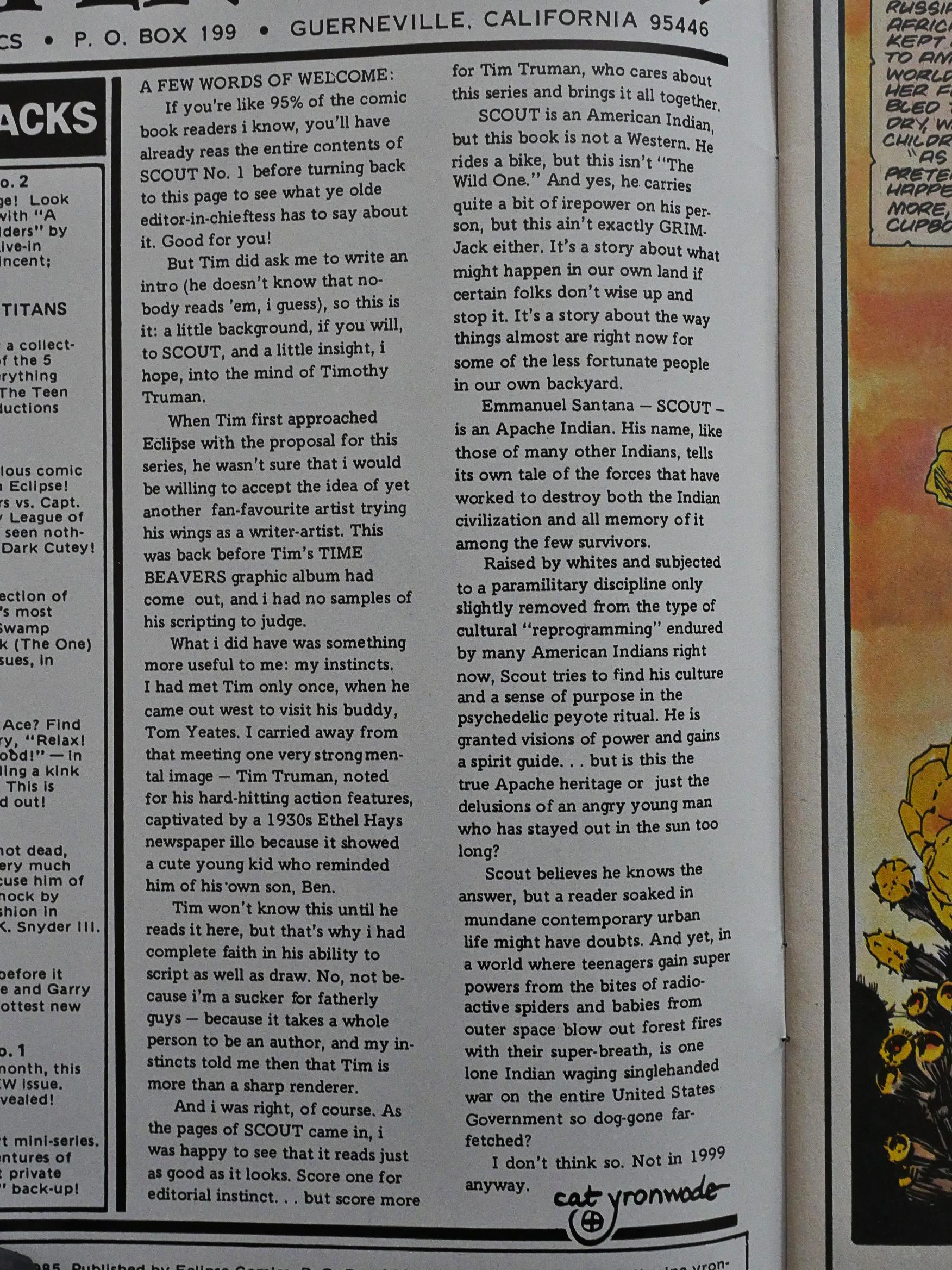
Before starting this, I searched the Comics Journal index to see whether Scout had ever gotten a review there, and it doesn’t look like it. There’s an interview with Truman, but it apparently flew below the radar for them as well as me. But there was a news item about the first issue, that said something like “fan favourite artist Timothy Truman goes from First Comics to Eclipse Comics”, which made me scratch my head. I mean… Fan favourite? But then I see the “fan favourite” thing here in cat ⊕ yronwode’s introduction, too, so they probably got it from her.
Truman had previously done the artwork for Grimjack and Starslayer, but Scout’s his first writer/artist comic. Some artists turn out to not be particularly good writers, but then again, comics by writer/artists are statistically better than when the writer is a separate person, so I’m totes optimistic.
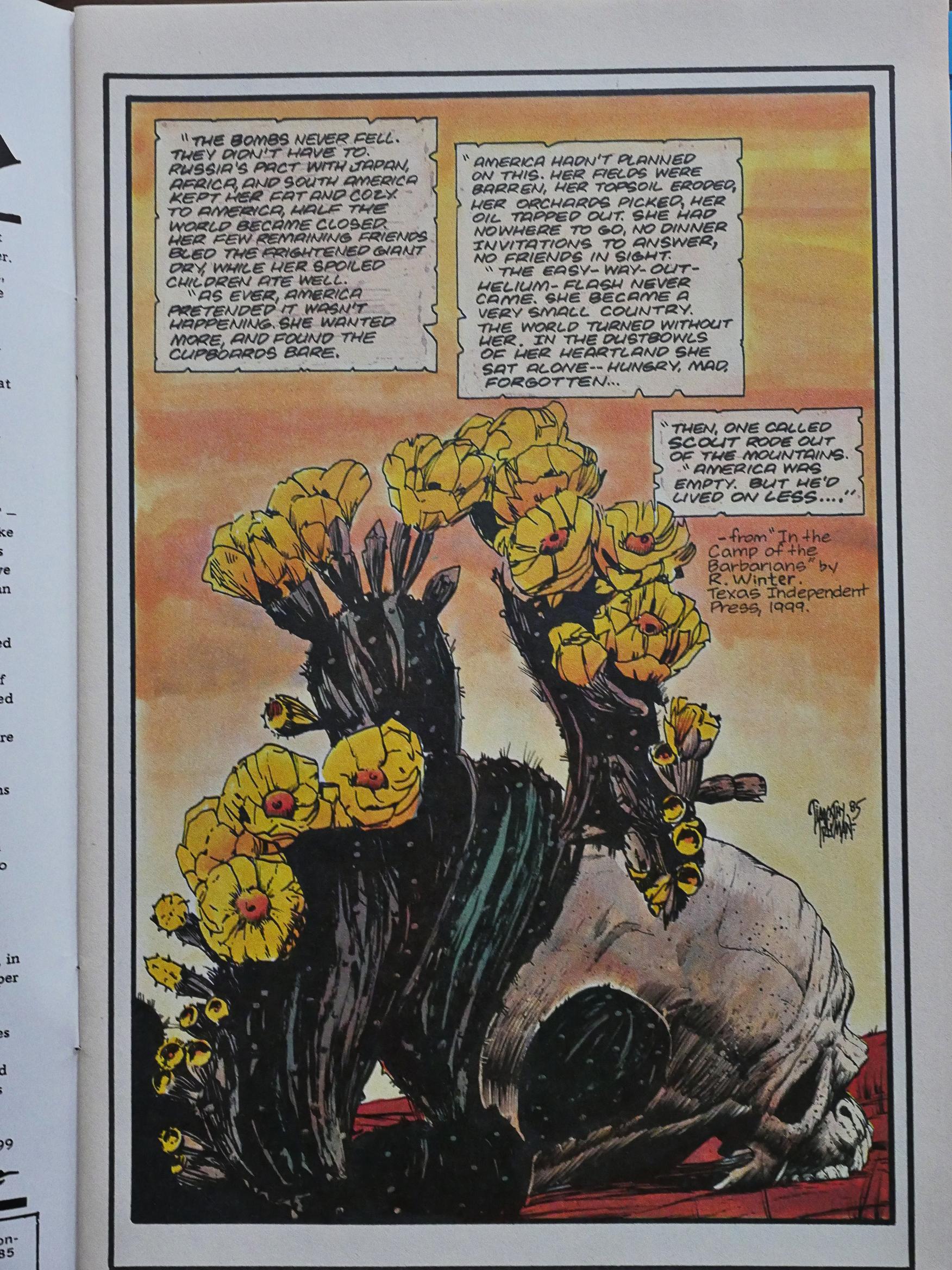
Anyway! Scout’s a sort of post-apocalyptic thing, but without the apocalypse: The US has devolved dramatically due to economic changes in the world. Basically Russia has allied themselves with everybody else, and refuses to trade with the US. In addition, the climate went wonky, and now most people are poor.
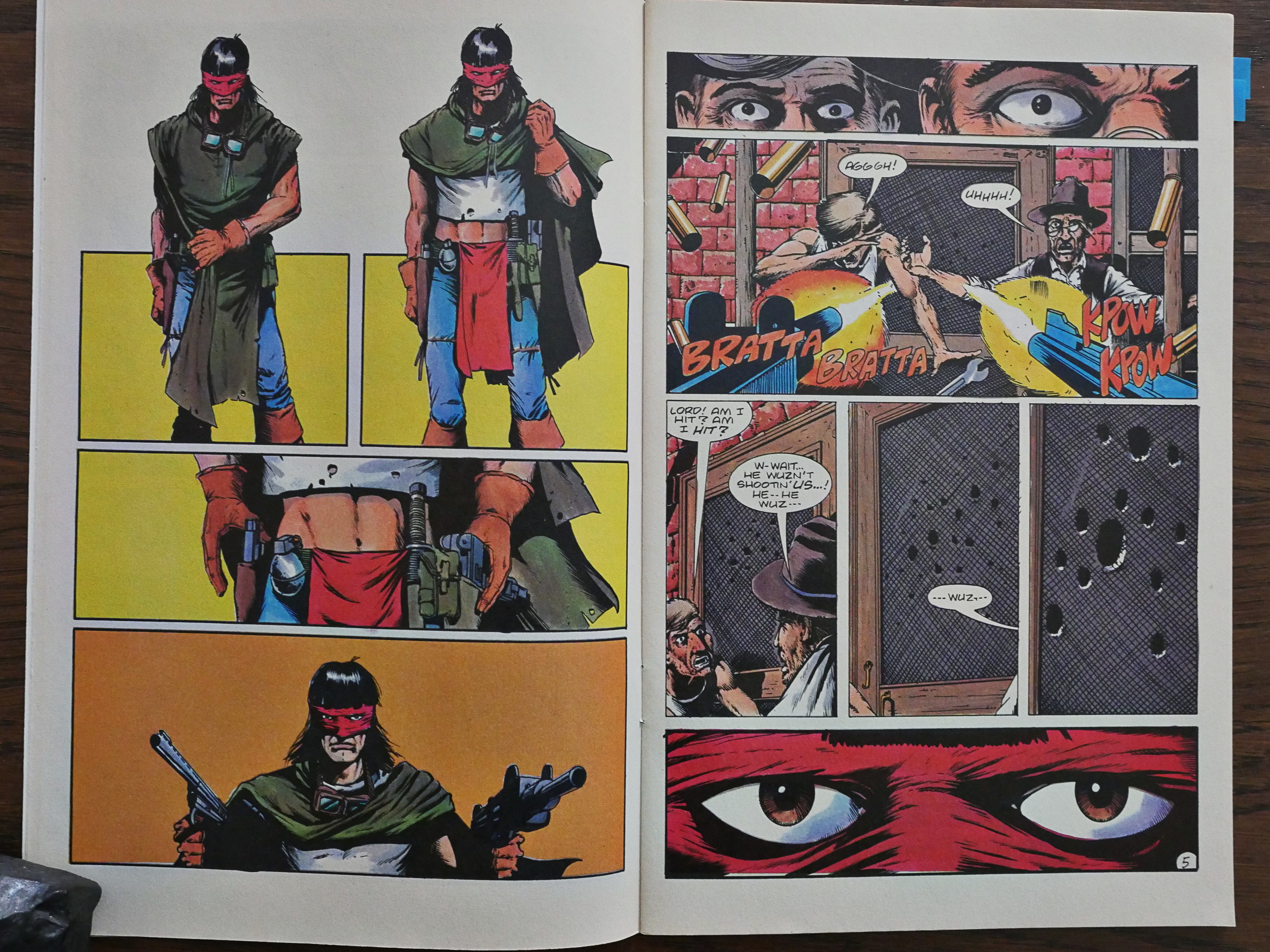
This is the introduction of the Scout character. He rolls in like Clint Bronson, but with a mask and a t-shirt that shows a lot of midriff. How can anybody not love this?
So I totally get the fan favourite thing now.
(The reason he’s shooting at the door is that it turns out that there’s a bear behind it. So he’s a good guy, even if he’s got permanent resting butch face.)
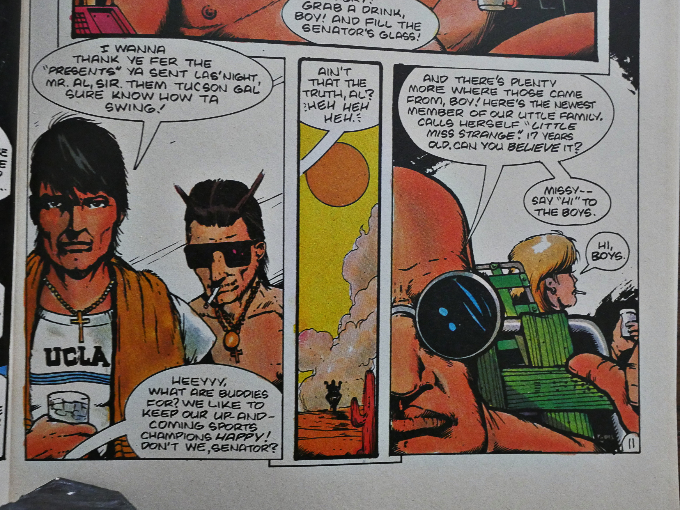
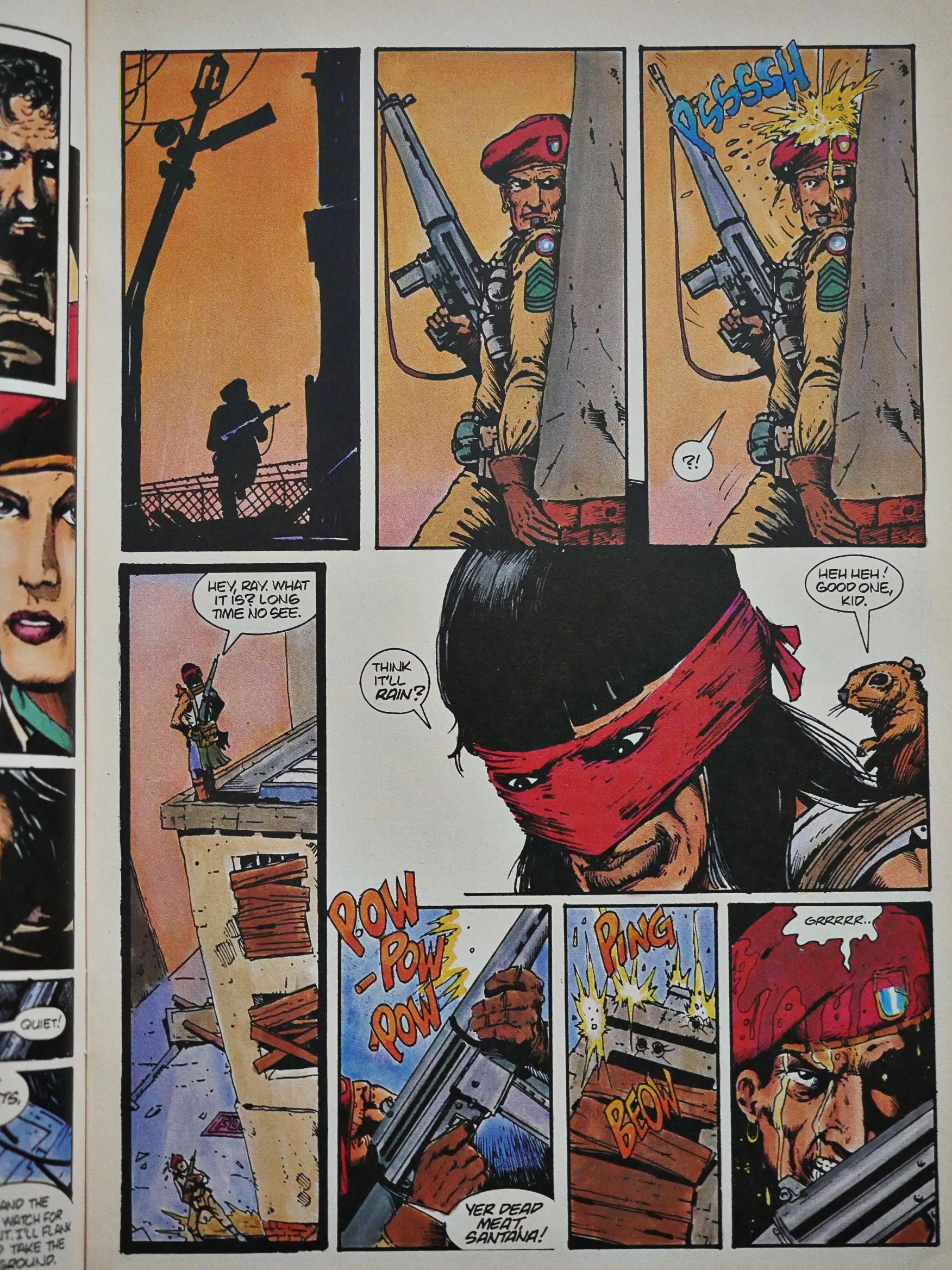
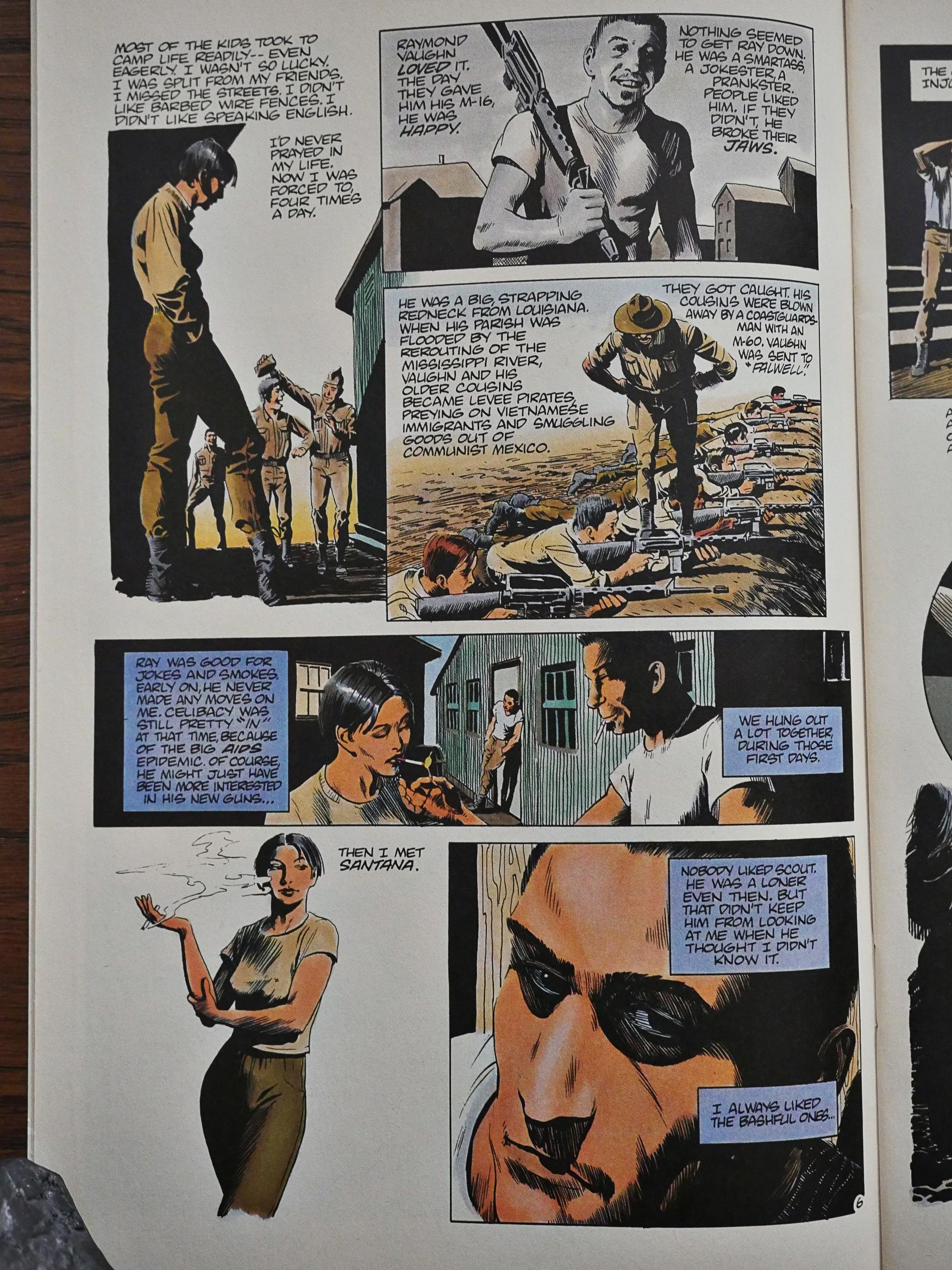
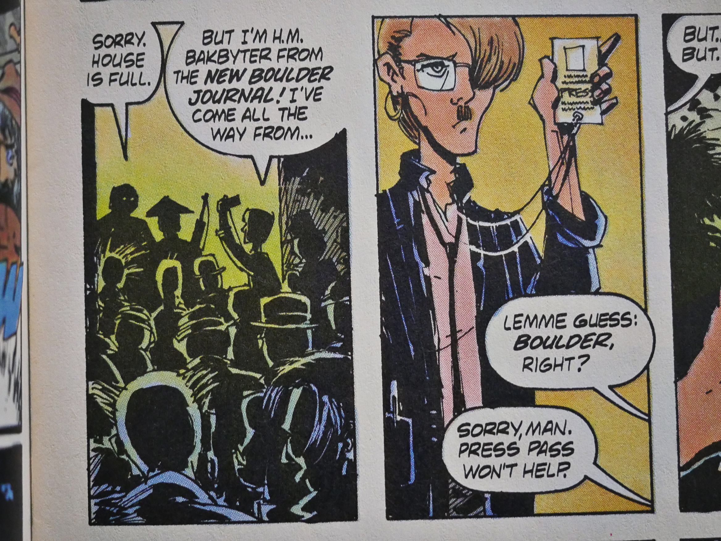
On the other hand, there are many pages like this that are just kinda… blotchy. OK, let’s get the major artistic tic over with first: Everybody has their mouth shut. All the time. And also, Truman has a tendency to show people looking at the reader straight ahead, or in perfect profiles. When he’s got them at other angles, the faces often start looking very odd, with mouths and noses growing weirdly distant or close.
But back to the blotchiness: That guy’s face to the left up there. So many of these panels look like they were either drawn at a smaller size than usual so that the linework just gets blotchy, or was drawn fine but the printer messed up. Or perhaps the pen he was using just had an ink blockage and he didn’t have white-out. I don’t know. It gives everything a dirty, sloppy look… But on the other hand, that might be a conscious artistic choice. It’s a dirty, sloppy world he’s depicting.
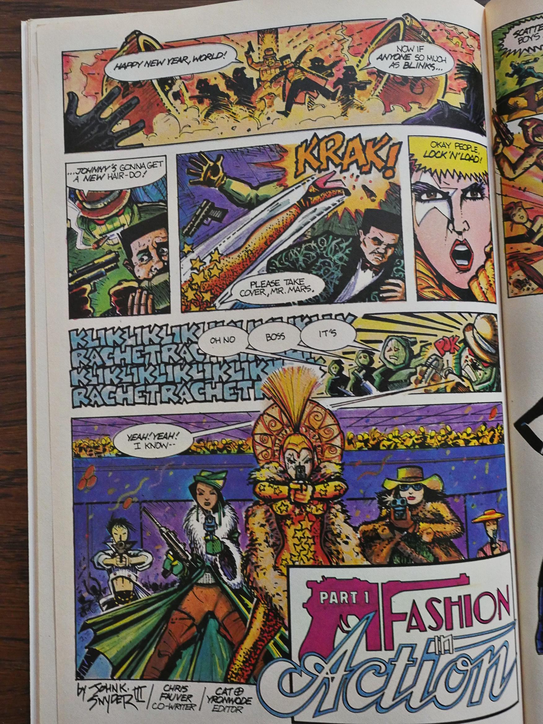
The backup feature is Fashion in Action by John K Snyder III, and it’s quite influenced by American Flagg, I think? You’ve got the stylish, over-the-top action and the attempted information overload and, well, I don’t know, because when you’re doing storytelling like this, you have to convince the reader that there’s something of interest to be teased out from the chaos, and I just couldn’t be bothered.
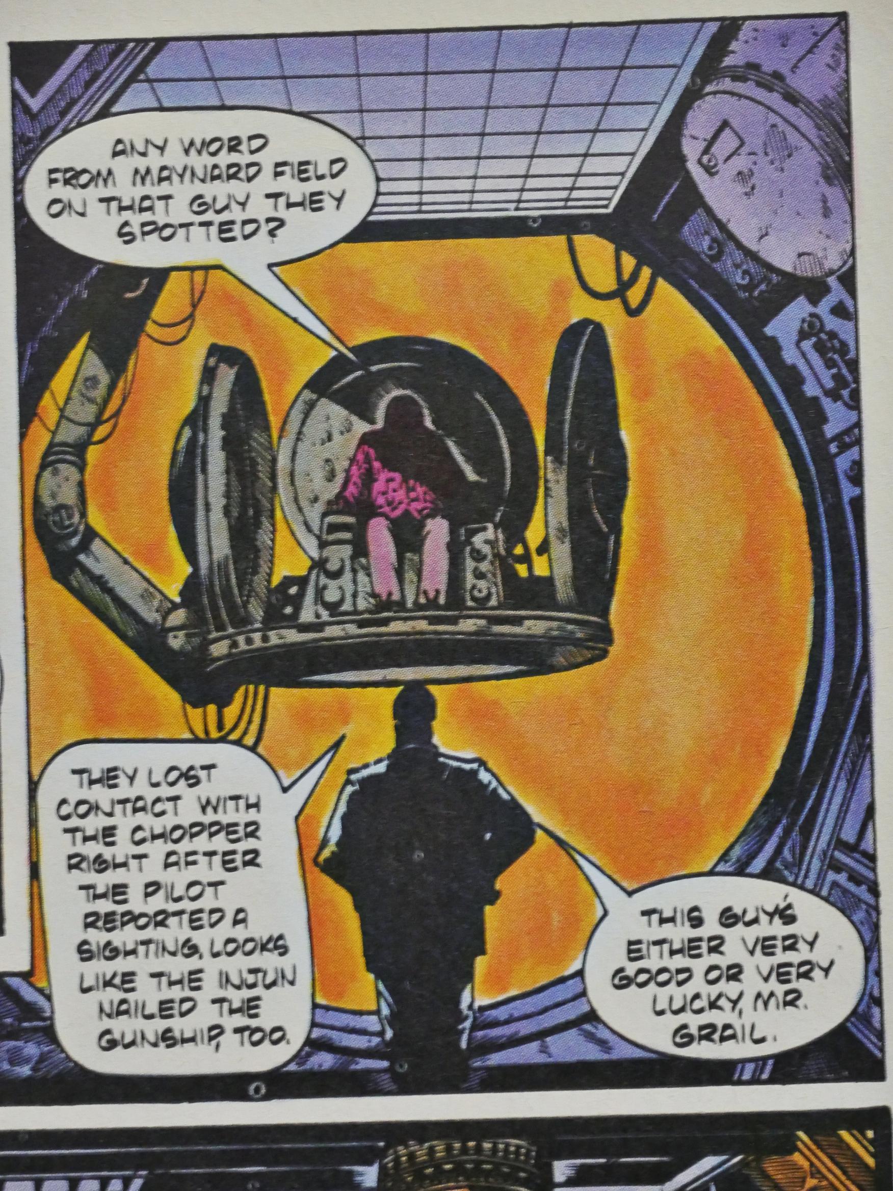
Why do all major villains have impractical chairs? Getting down from that thing to go to the bathroom or fix up a snack must be hell. And where’s the TV and video game system to while away the boring hours when the minions are out minioning? Where’s the coffee table full of Evil Monthly Magazine to peruse?
So impractical.
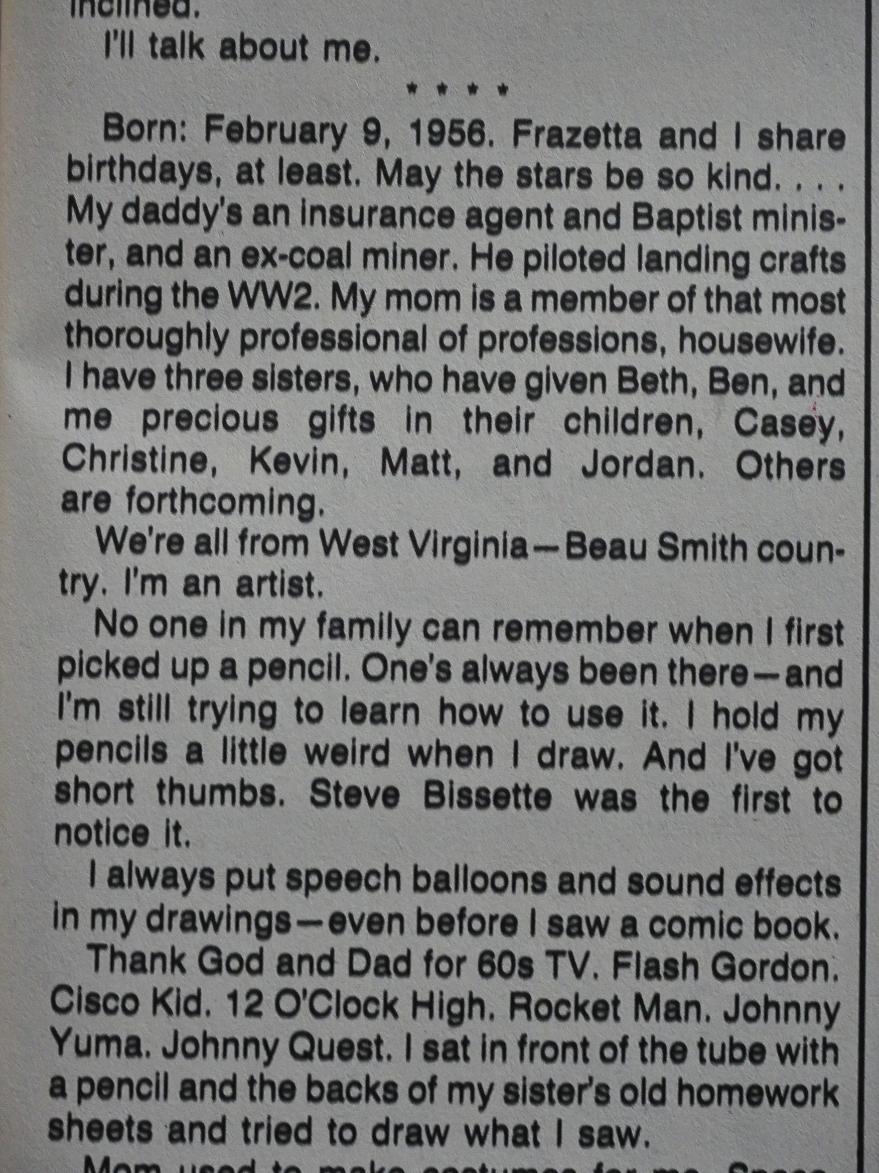
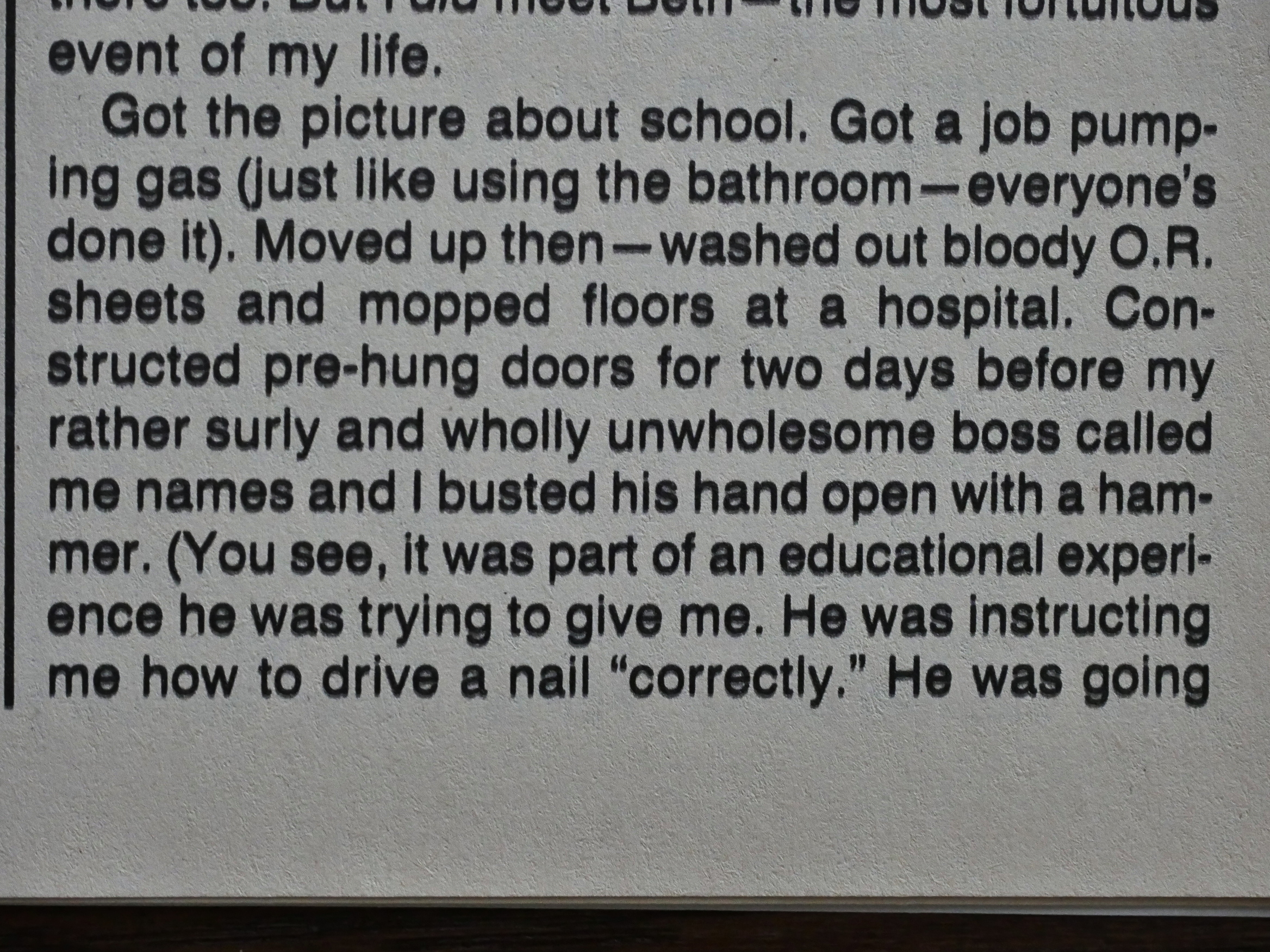
In #2, Truman introduces himself. He’s from West Virginia and his father’s an insurance salesman/minister/coal miner, while his mother’s a housewife.
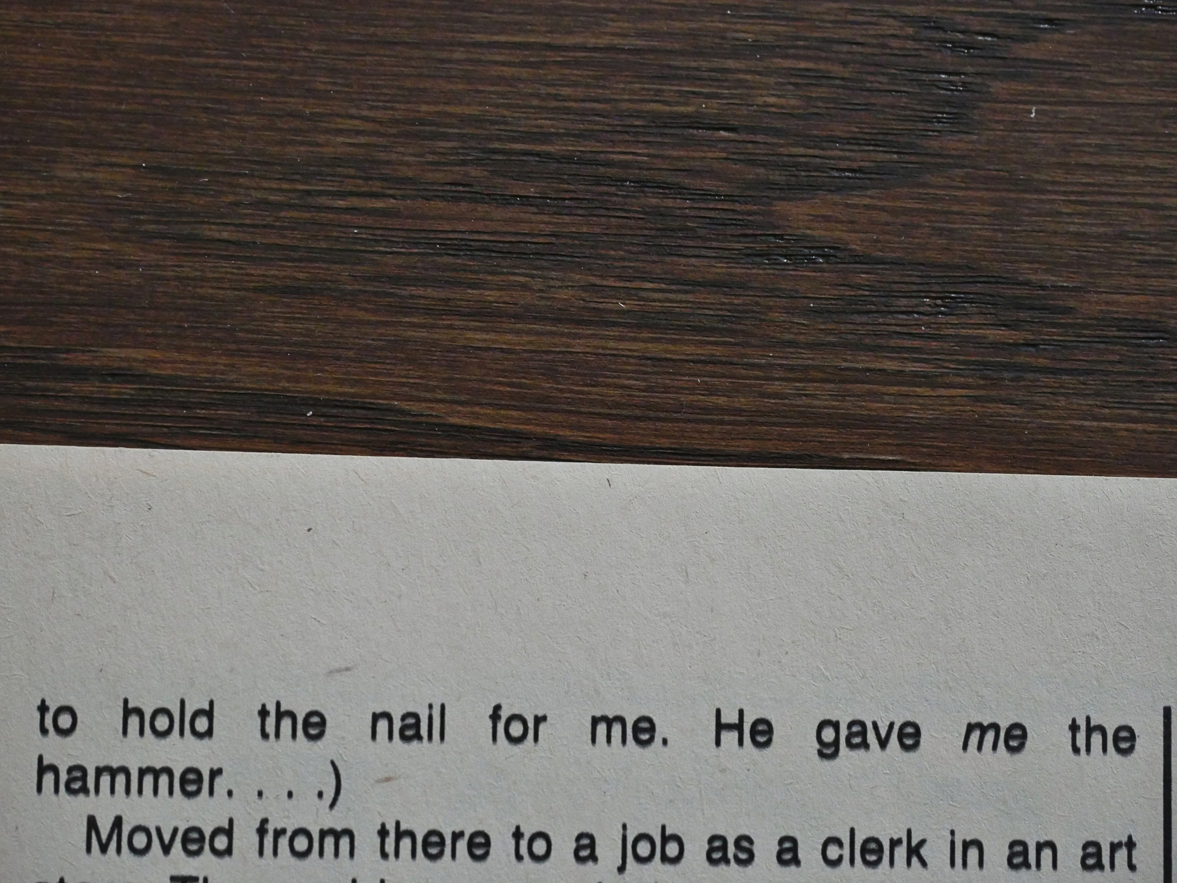
Truman went through many jobs in his youth, and… Either this is him trying to be ironic about his manliness or it’s a display of his manliness? He tells of how he “busted his [boss’] hand open with a hammer”, because…
… his boss was instructing him on how to hammer a nail (!) properly (!!) so his boss was holding the nail (!!!) for him?
And… Truman missed? But that’s OK because his boss was an asshole?
*scratches head*
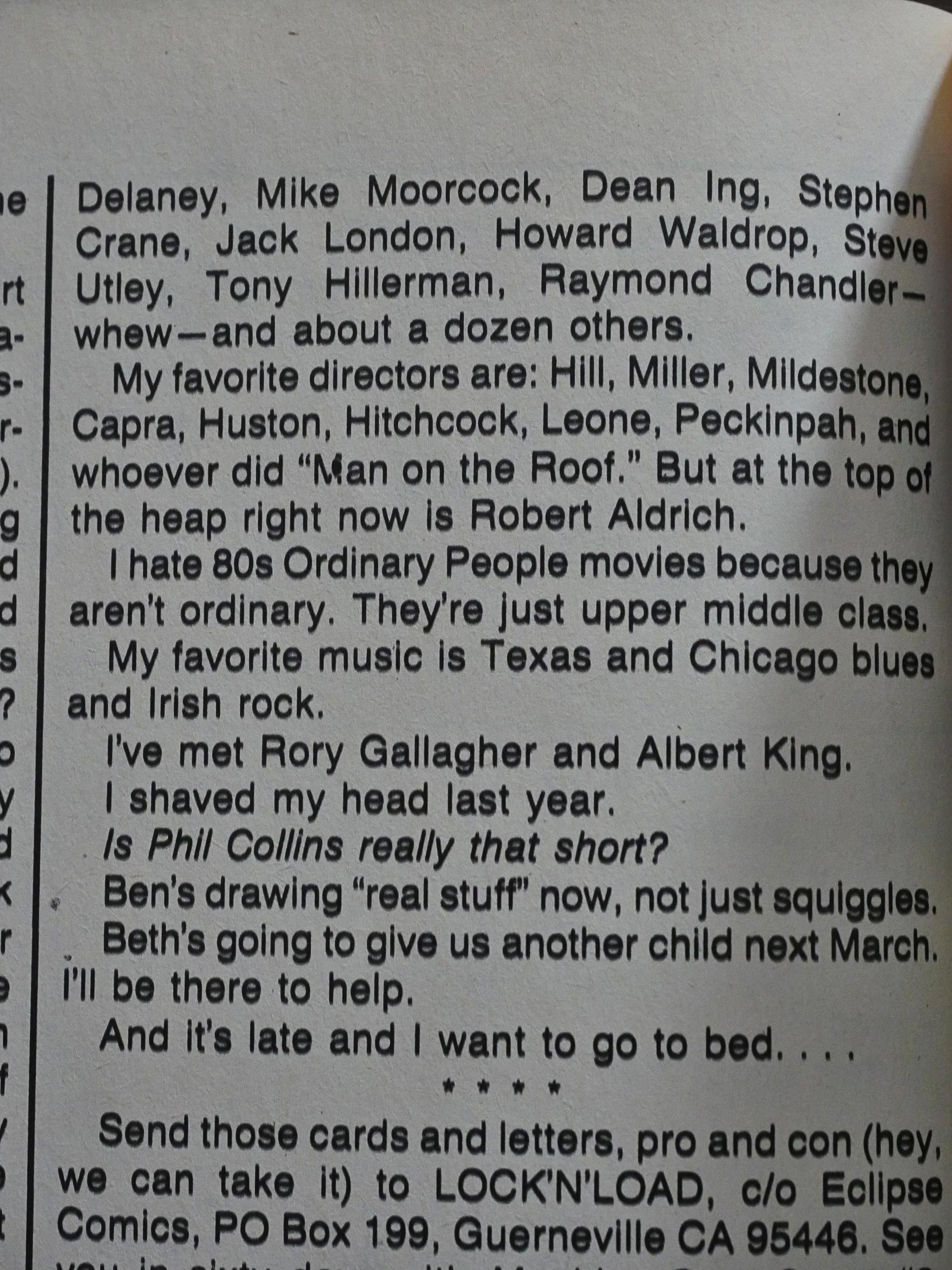
Then we get a list of favourite artists, and after I was halfway through one thing stuck out like a sore thumb (do sore thumbs stick out, though?). See if you can see it, too!
Here’s how it continues, and you’ll get it now:
Yes, he mentions 55 artists, directors, and writers that he loves, and of those (if I counted correctly; you’re welcome to go back and check (click to embiggen)), 54 of them are men.
Perhaps that story about the nail wasn’t meant to be funny after all.
*gasp* One of the characters has an open mouth!!!
Scout marks the territory.
OK, if it seems like I’m making fun of this book, it’s, er, because I am, but I have to be completely honest here. Well, that’s a lie, of course, but anyway: Reading Scout (until now; I’m not that many issues in) has been a total hoot. The story moves briskly, Truman develops characters in a nice way (not by infodumping that much, but by showing), and he develops the world in an excellent way, by dumping us into it and then showing us more and more.
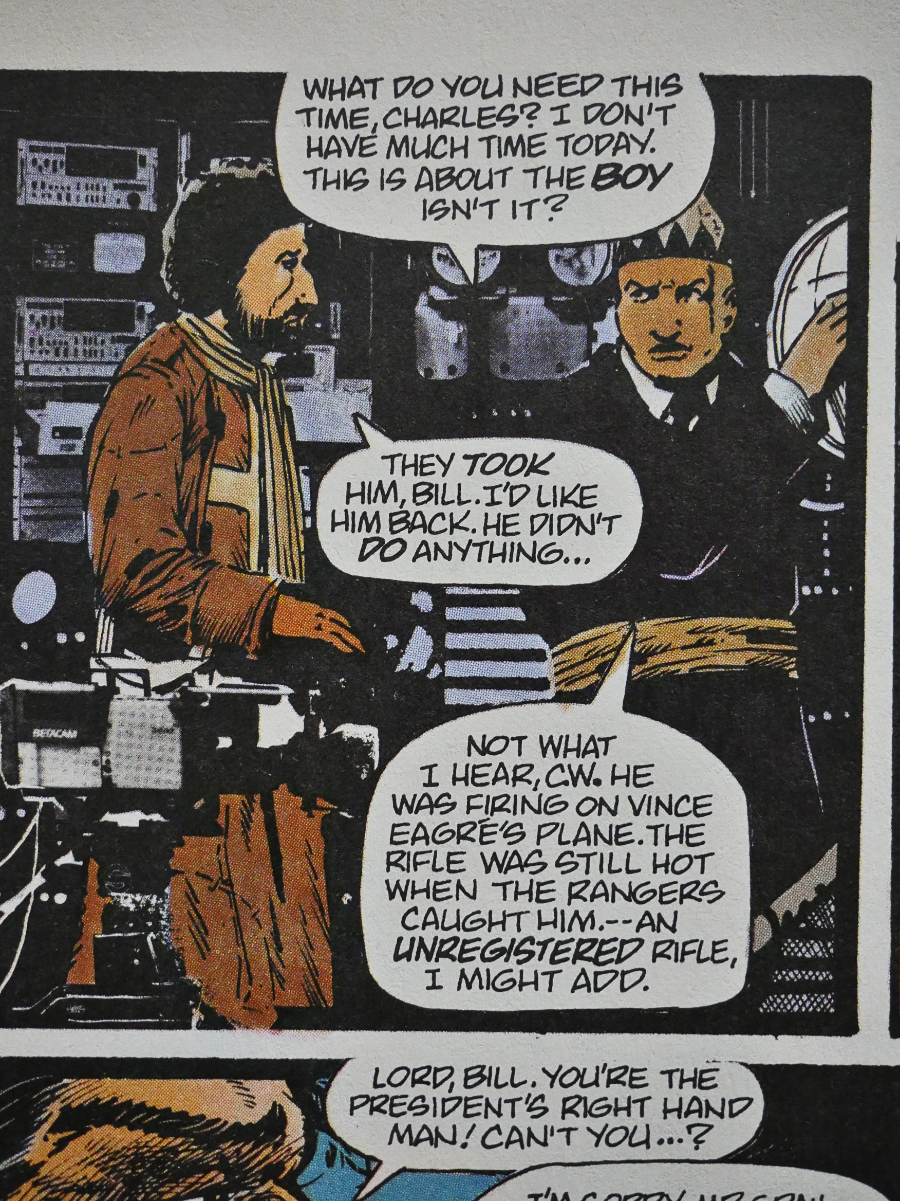
Not everything is perfect, however: Truman sometimes struggles with layout and speech balloon placement. The eye is not infrequently directed one way, while we’re supposed to go another, so I’m often getting the responses before what they’re responding to, which is annoying.
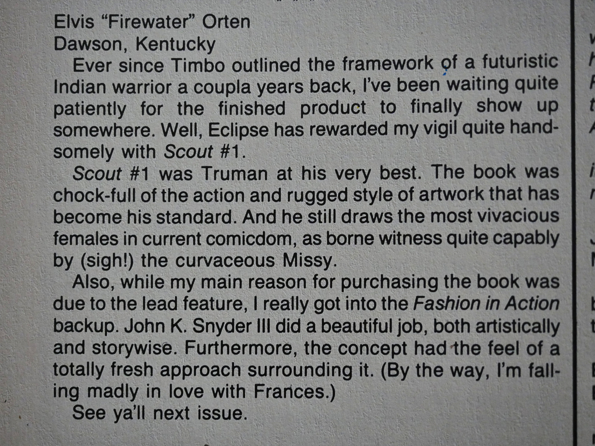
I think that in just about all the Eclipse books around this time, Elvis Orten makes an appearance in the letters pages. Often in issue after issue. So I guess he’s the Eclipse super-fan…
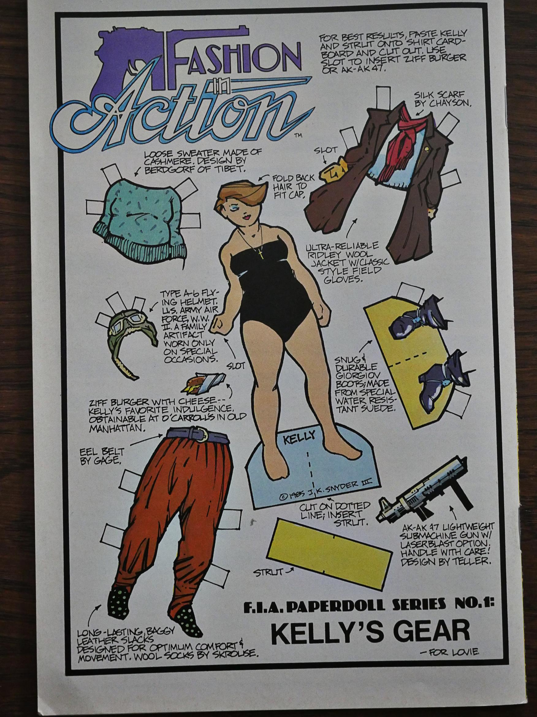
Half a dozen of the issues have these Fashion in Action paper dolls on the back cover, which is an interesting thing for such a super-macho book to do.
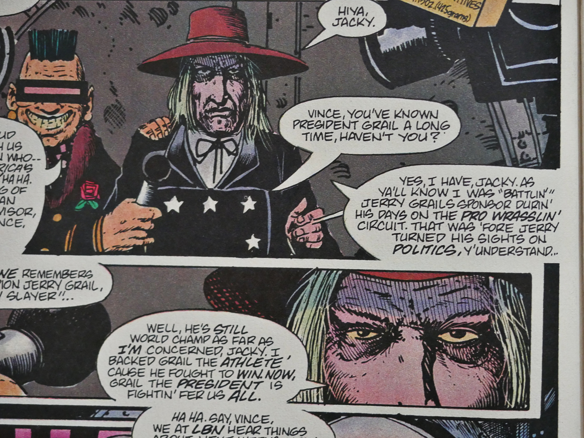
I’m not going to talk a lot about the plot, because talking about plot is boring, but I’ll just note that in this way out crazy sci-fi comic book, the president of the United States is a pro wrestler, which is something Idiocracy picked up on a couple of decades later, and reality a decade after that again.
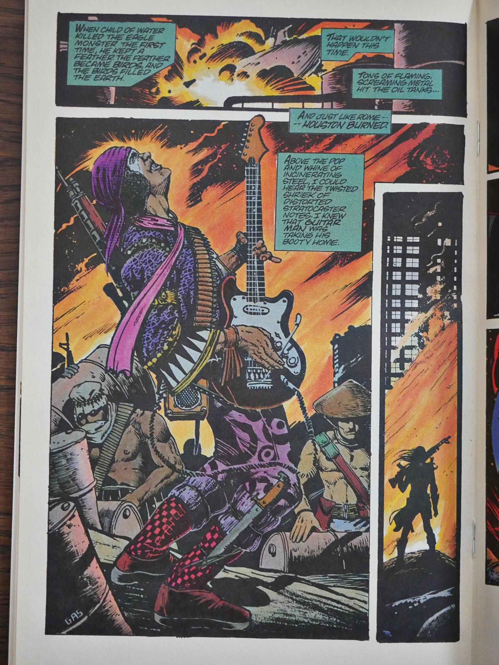
And was Truman the first guy to do a guy playing electric guitar while performing mayhem? Perhaps? Perhaps not? The latest Mad Max did so too, much later of course…
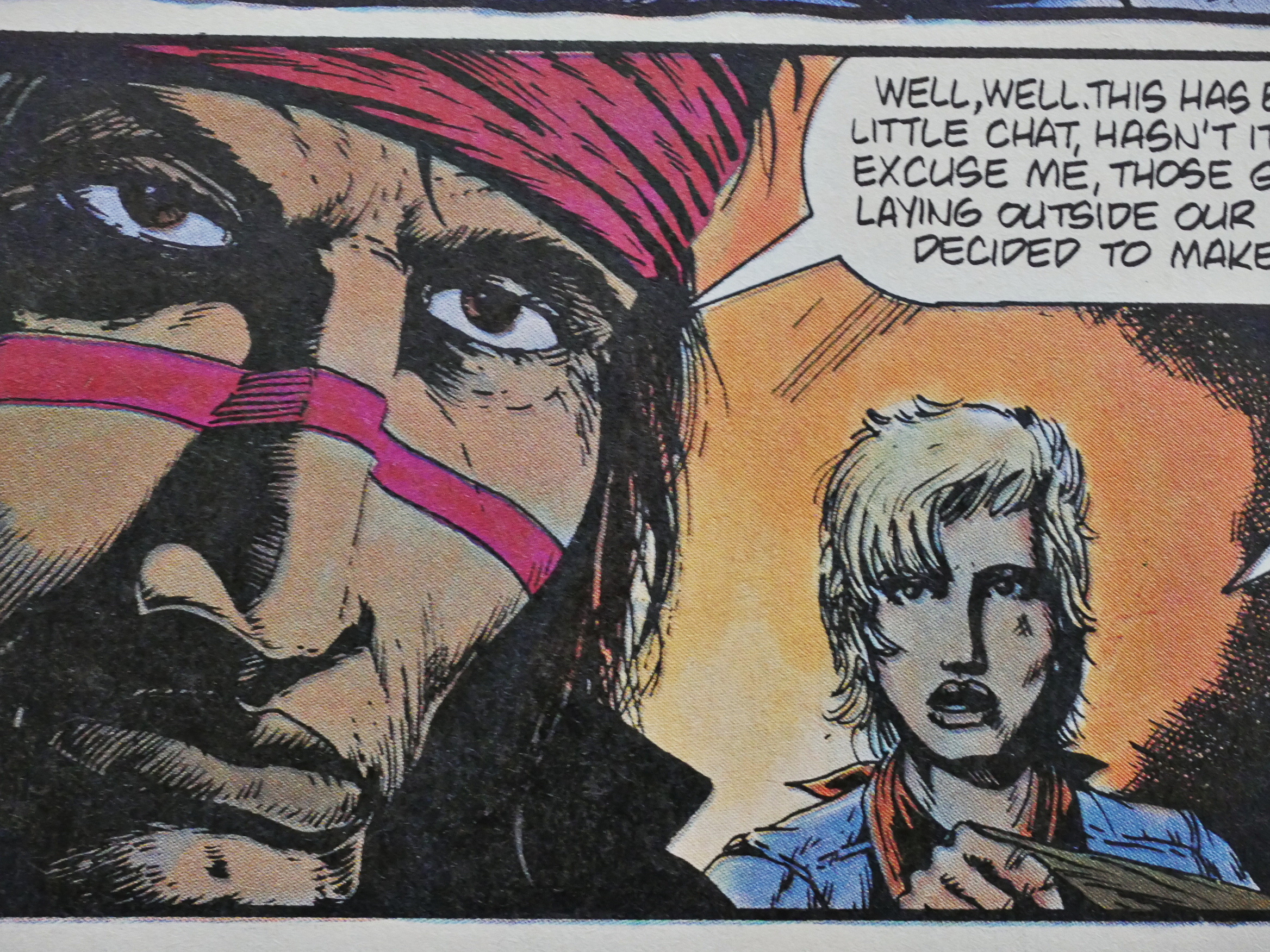
Truman doesn’t experiment that much with his artwork. When you see it, you’ll probably think “there’s a Kubert School graduate”, and, yup, he is, but he does the occasional fun thing like the panel above. But as you also see above, he sometimes skimps on details, and sometimes he pours them on, which makes things kinda uneven…
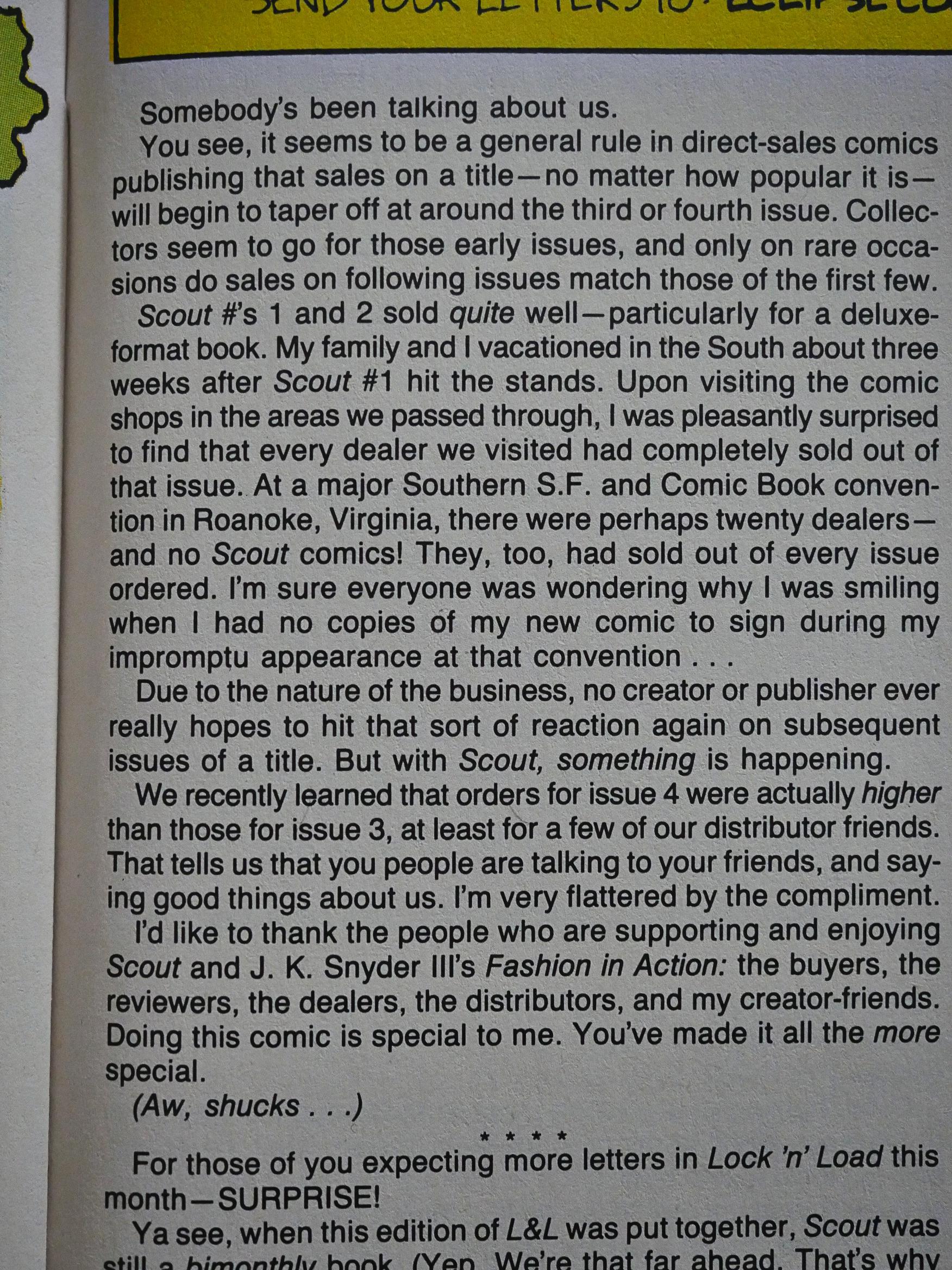
Truman announces that the first issues are a success (commercially), and that circulation is increasing, even. Which is, as he points out, unusual.
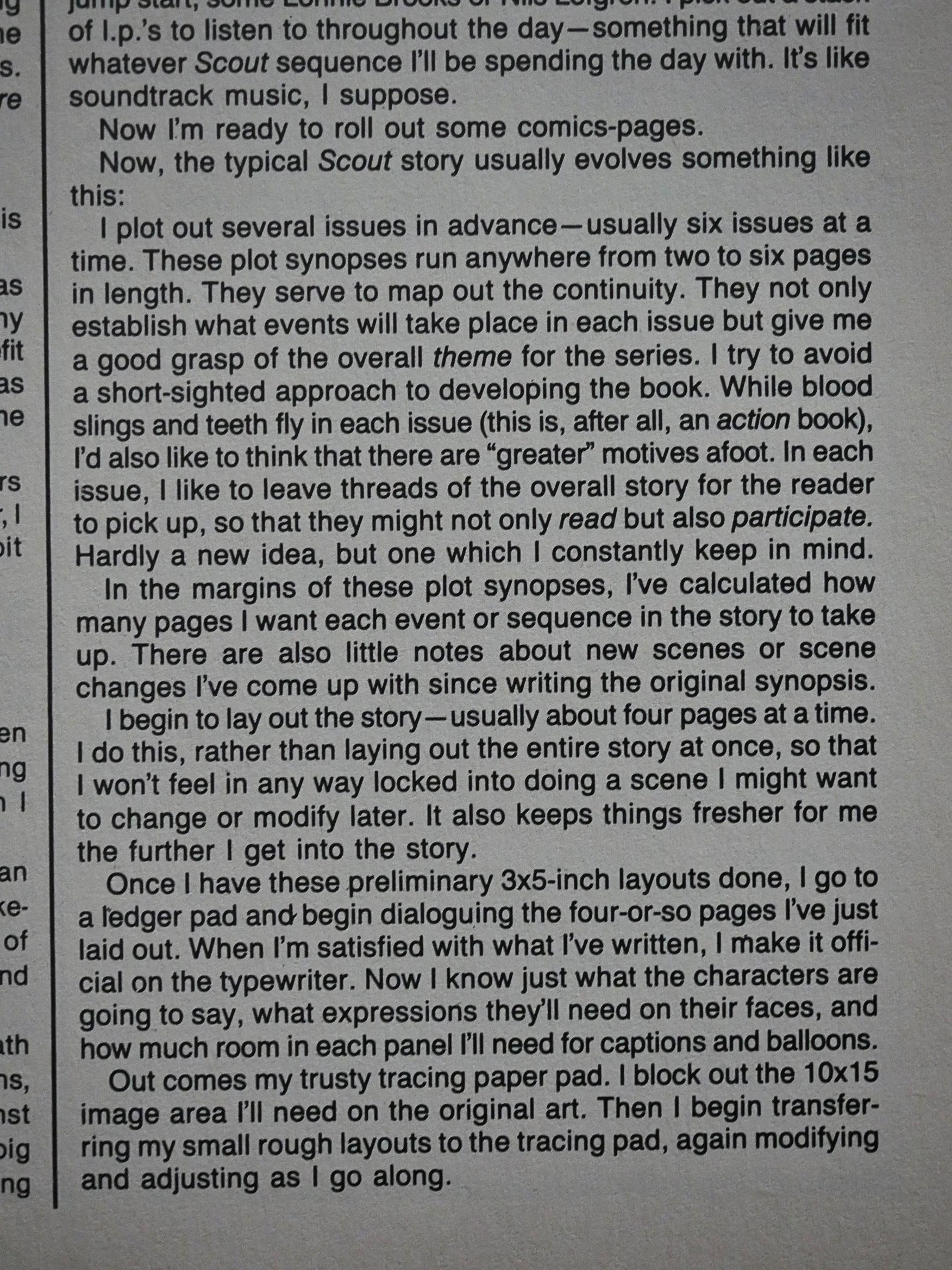
He also writes a page or two about his process, and I always find this sort of stuff fascinating. Some of the things he says are a bit “hm?”, though, as in the “usually six issues at a time”. This is in issue five, so there’s not “usual” yet, you’d have thought.
He also answers my question from earlier in this blog post: What size does he draw at? And it’s 10×15 inches, which means that he draws “half up”, I think the term is. That is, his artwork is just about 1.5x the printed size, which is not an unusual size to work at, but it’s not super big, either.
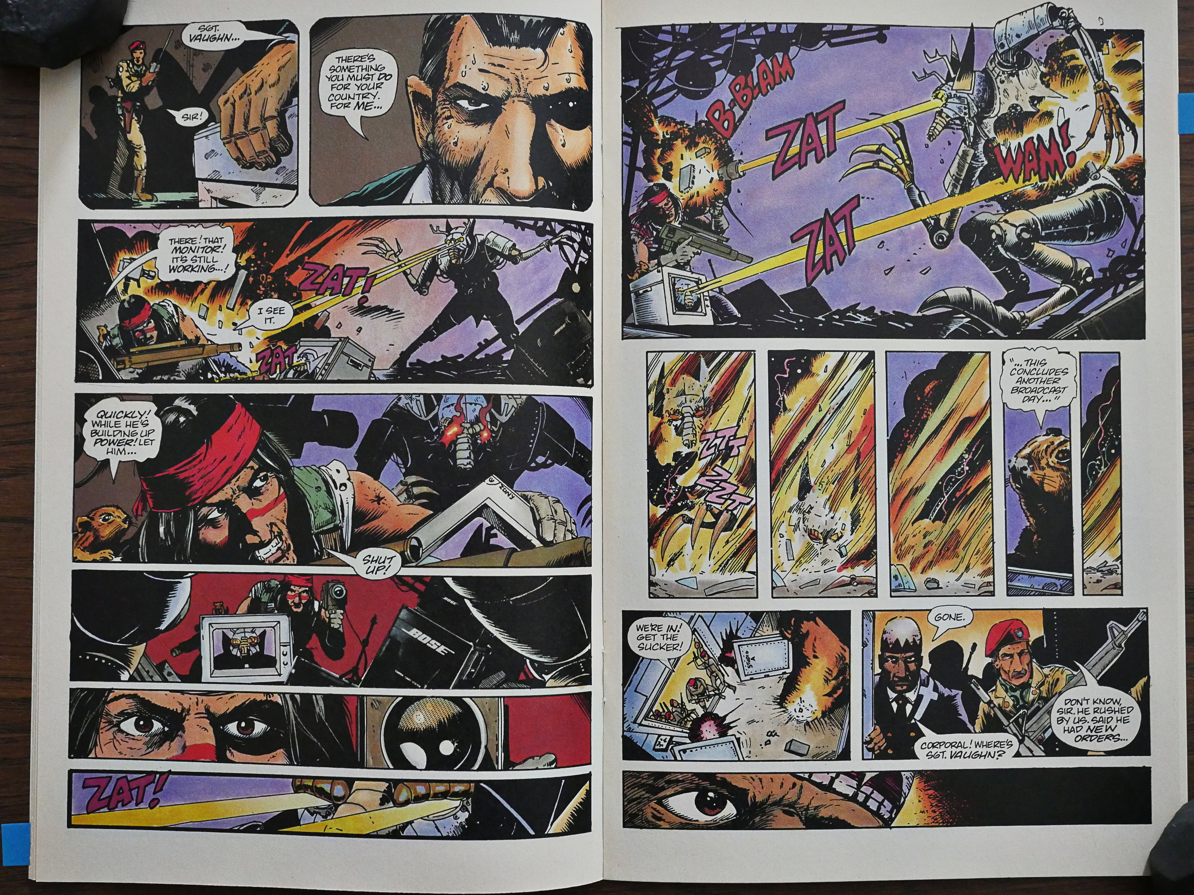
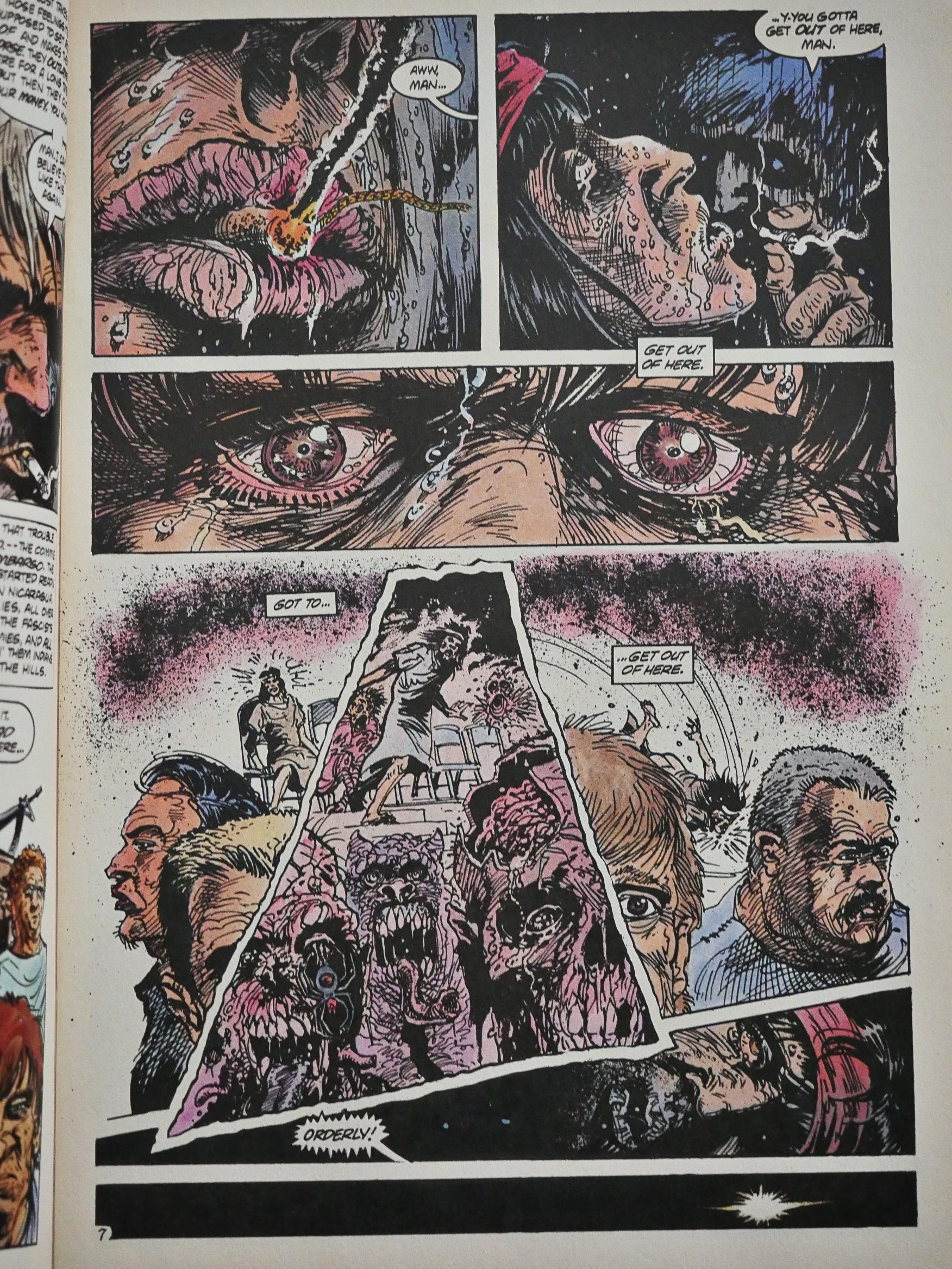
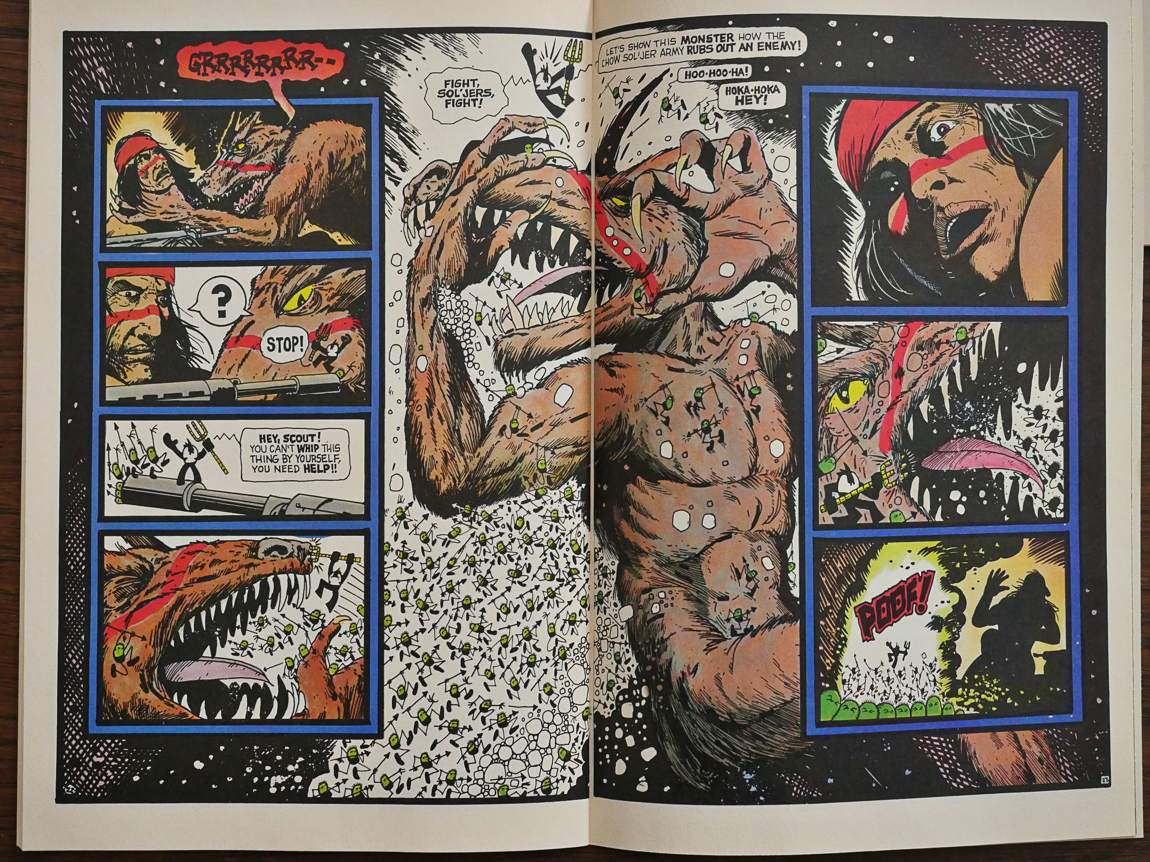
I know I said I wasn’t going to talk about plot, but: Scout hunts down and kills some guys that may or may not be monsters (Scout (and we) see them as monsters, but we don’t know whether those are peyote-induced visions or reality, which is a nice plot element), but each of these “boss fights” are so disappointing. Scout mostly kills them without any real problems…
… and here his method to kill this monster with laser-shooting eyes is… to make the laser beams go into a camera… so the laser beams shoot out of the monitor… and destroys the beast…
*scratches head again*
It’s at this point I’m starting to wonder whether I’ve completely misread the comic and that instead of an intense action comic it’s a hilarious parody of an intense action comic?
Where did I put that razor, Occam!?
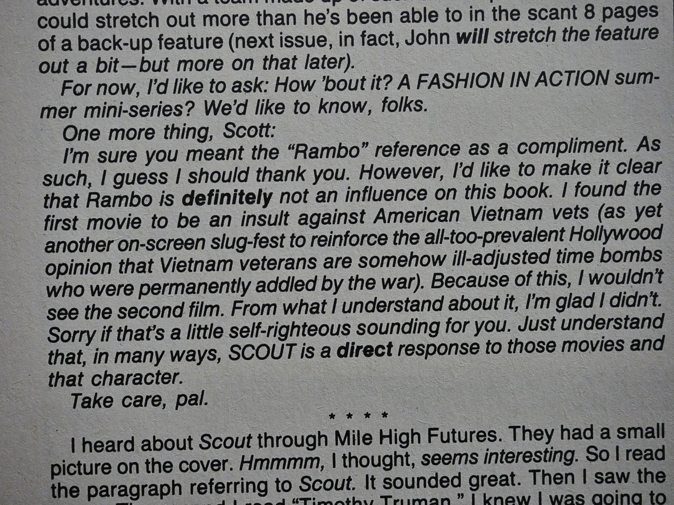
Truman lets us know that Scout is in no way inspired by movies like Rambo, and is instead a response to it.
I guess I can see that.
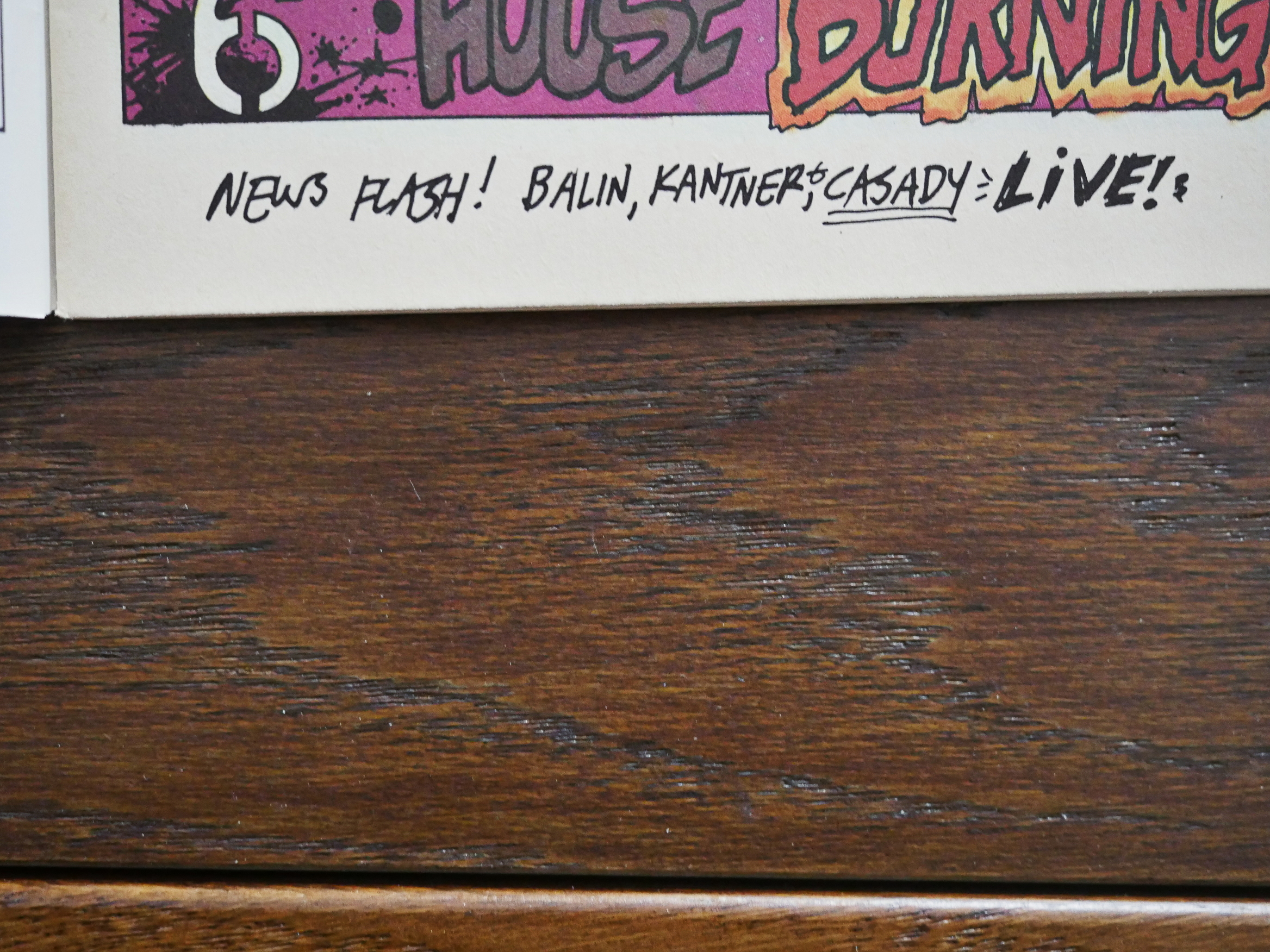
Hm. Why are those musicians mentioned on the bottom of this page? Is that from a previous owner of these comics? (I bought them all used earlier this year.) Hm… Doesn’t look like it…
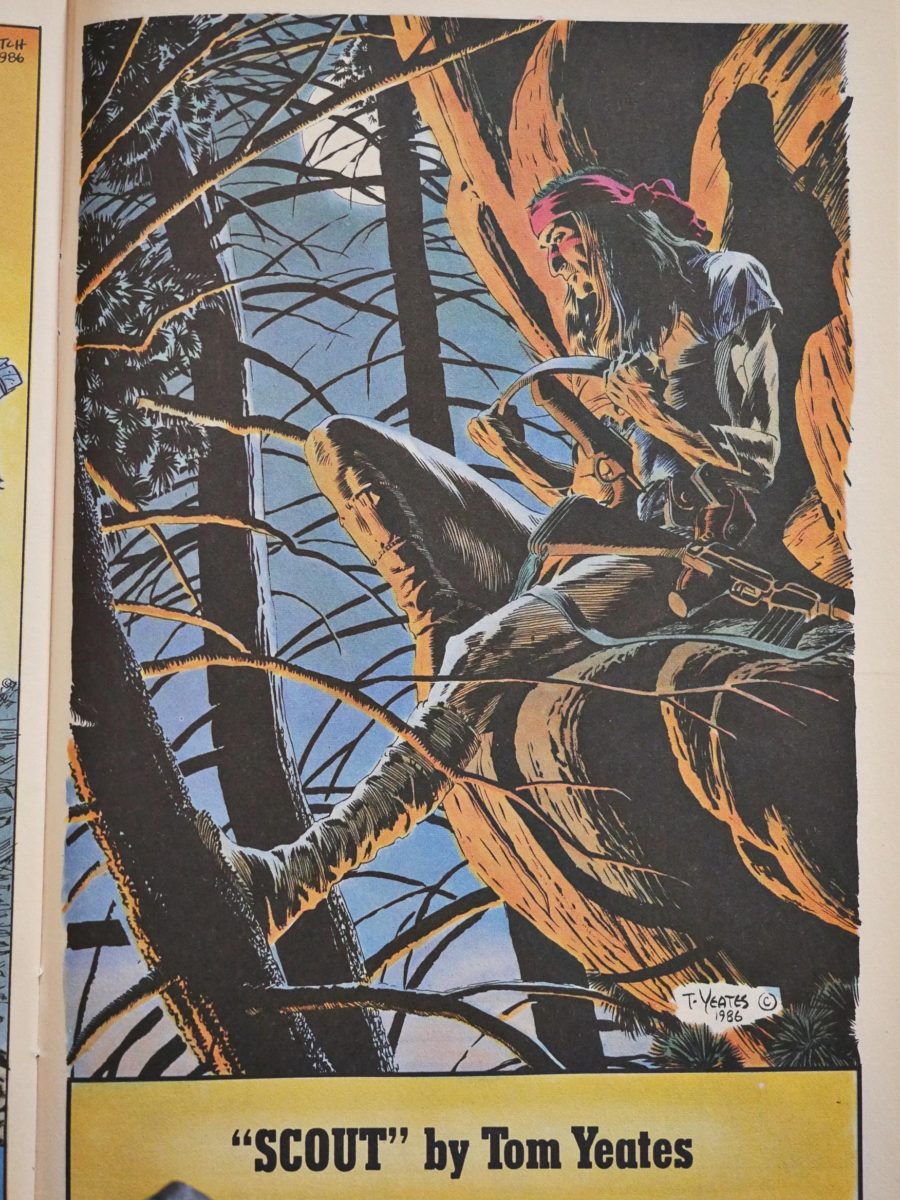
Tom Yeates does the artwork for #7 while Truman is welcoming a new baby into his family. It’s rather nice, eh? Eh?
Meanwhile, Fashion in Action is not getting any less confusing.
Your guess is as good as mine.
Hey, I found a review of Scout in Comics Journal #109 by Heidi McDonald:
Time to review Scout. Time for me to get my Timothy Truman lecture Off my chest. But first a little test. Take the first five issues Of Scout and put all in a row. What do you see on the cover of #1? Scout staring grimly, clutching his gun. What’s on #2? Scout staring grimly, clutching his gun. What’s on #3? Scout staring grimly, clutching his gun. What about 4 and 5? If you guess grim stares and firearms, you win the brass ring.
In fact, you can turn to any page in any issue Of Scout and chances are you’ll see Scout staring grimly holding a gun. Timothy Truman is a competent writer, a good storyteller, and a good draughtsman, but he is the most goddamn inexpressive artist that I’ve ever seen.
His characters have exactly count em, two different expressions: grim relentlessness and relentless grimness. Doesn’t exactly make for much merriment, I’ll tell ya.
[…]
Truman’s art has a sameness to it that can be positively maddening: page after page of people staring straight ahead, looking grim. page after page of people staring at the sides of the page, looking grim. (l have never seen an artist shun the simple 3/4 view as religiously as Truman.) Nobody ever opens his mouth. No one squints. God forbid anyone should smile. Nope, every expression is as blank as paper.
Similarly, hardly anything in the art ever moves. It just sits there. Staring. Grim and relentless. Sorry, too grim for this buckaroo.
So it’s not just me, then. But is that a reference to Truman’s previous book, Grimjack?
But what about the backup feature?
The back up strip is John K. Snyder Ill “Fashion in Action” which is about an all-women celebrity bodyguard firm, which has its headquarters in the Statue of Liberty. The title, combined with the paperdolls on the backs of issue 3-5, lead one to the inescapable conclusion that this strip is Supposed to have something to do with fashion. Unfortunately, there is little to, be found. Nothing you wouldn’t see far surpassed in about ten minutes walking down Melrose Avenue. Sharp lapels, and that’s about it.
Indeed.
Anyway, let’s continue the reading Scout…
Around this time (i.e., #8), the printing quality started deteriorating, and then…
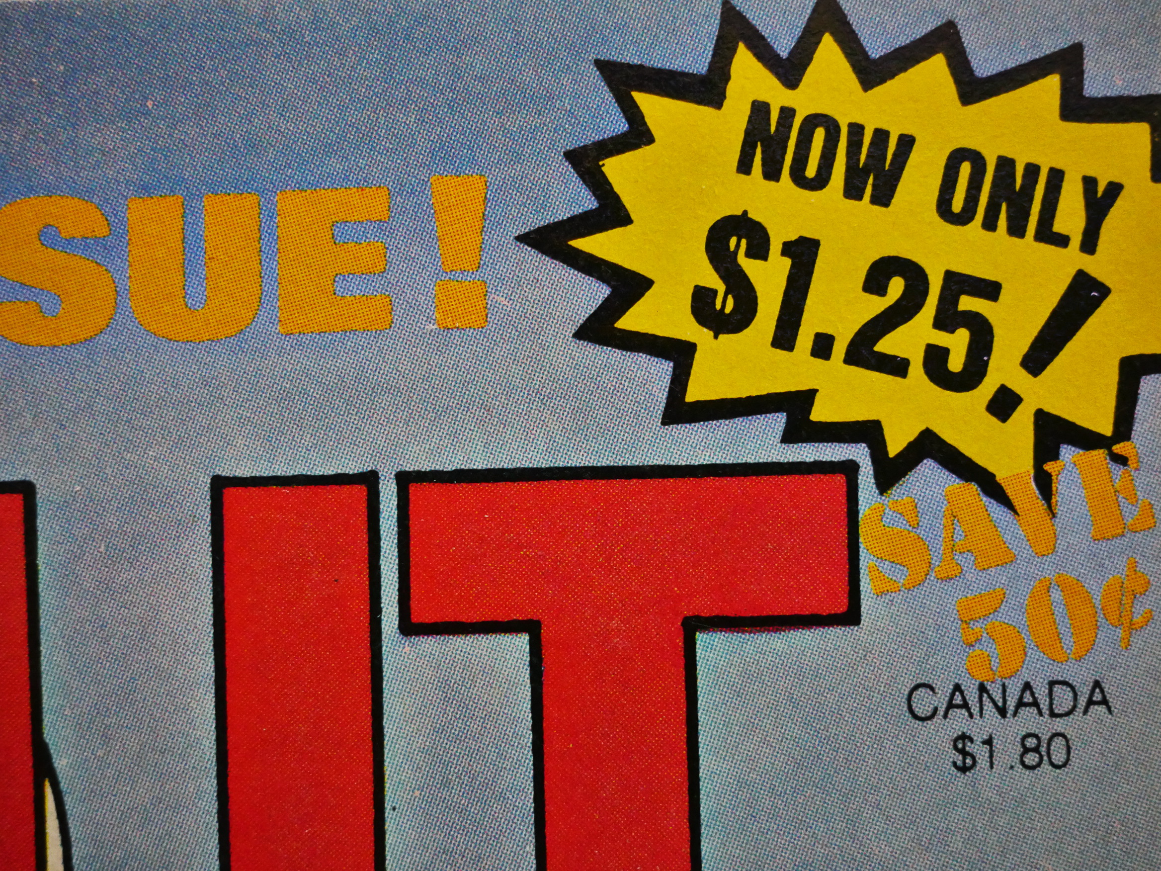
… Scout moved to $1.25 for two issues, and on cheaper paper. But the paper quality seemed to lag a bit when the price was increased again, and the artwork looks even muddier than normal for a month or two.
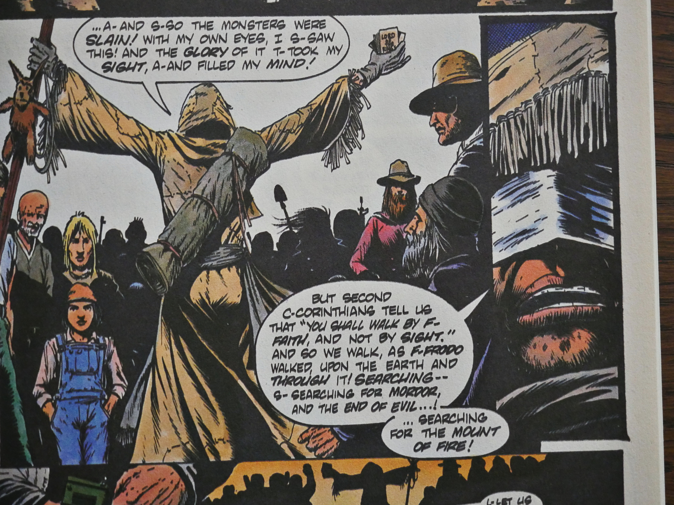
I liked this bit: We have a new person who’s perhaps a lunatic, and perhaps really has supernatural things happen to him, and to drive the parallels home, Truman has him wearing a blindfold that’s quite similar to the mask that Our Hero usually wears. Only in white instead of read. Is Truman saying that Scout’s insane, too? Neither?
Things that make you go “hmmm…” kinda demonstrate that while this comic tries to put up a hard-hitting action front, there’s a lot more going on inside Truman’s head than you’d think by just glancing at the grim covers.
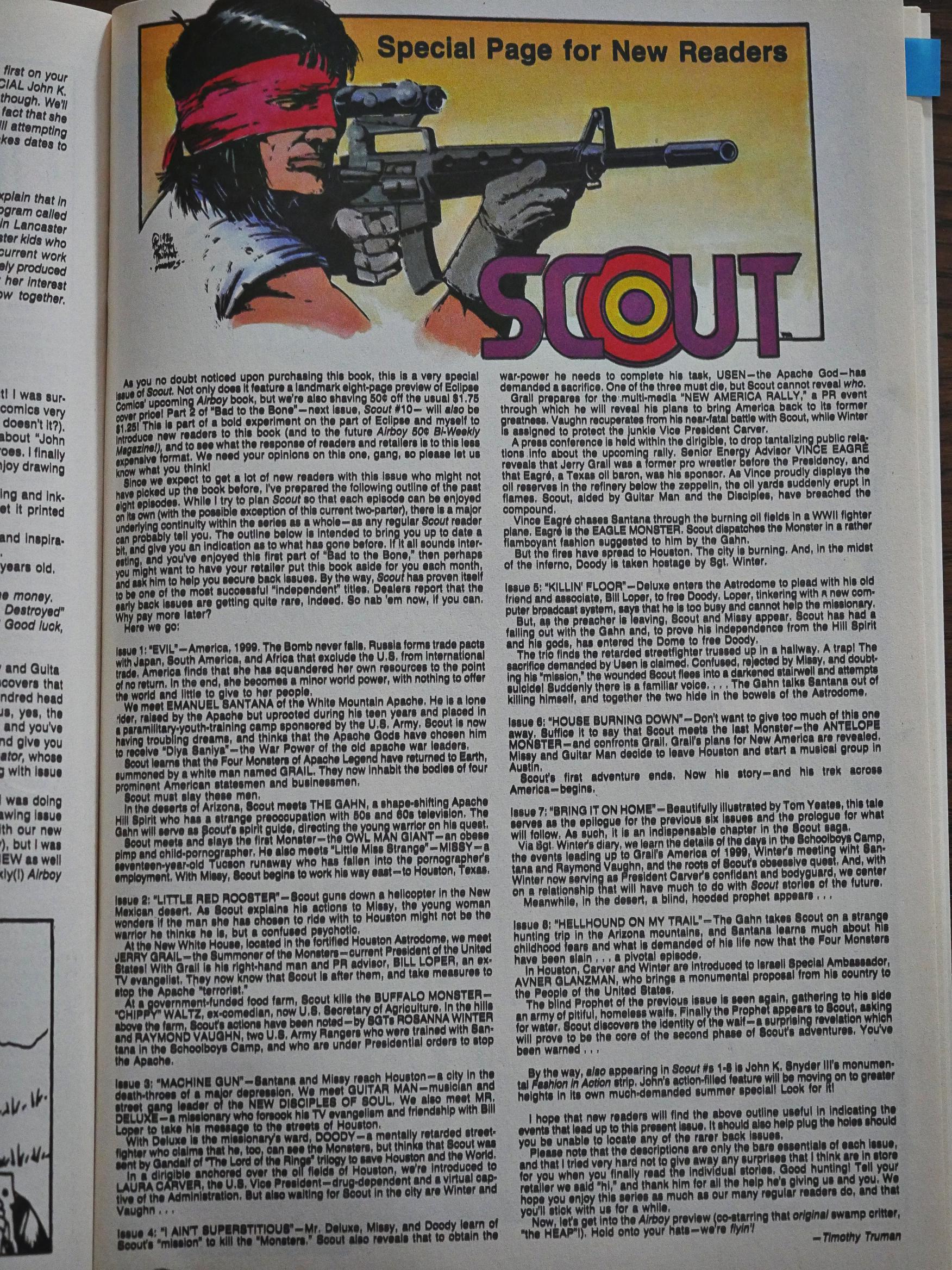
The point of dropping the price is, of course, to get more readers, but Truman chose a pretty odd story to entice people in, I think. I think most new readers would have found themselves slightly puzzled by what they encountered… so Truman helpfully provides a one-page plot recap. Which I don’t really think helps all that much.
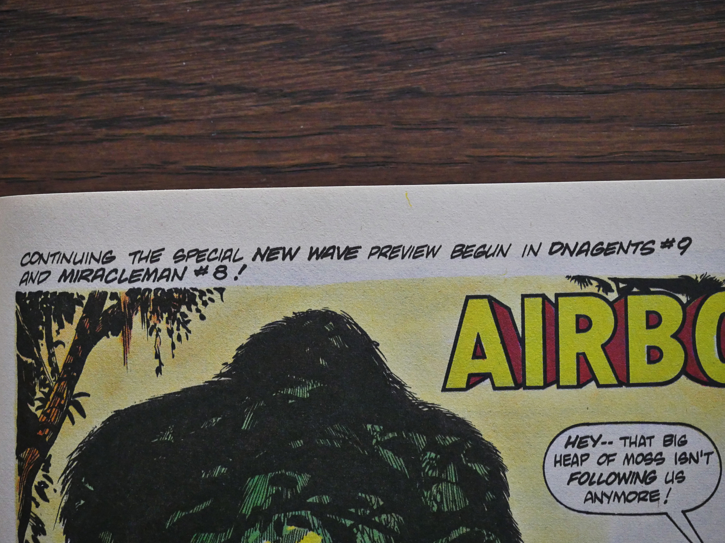
Eclipse really went all in on promoting Airboy and New Wave in the higher-selling comics, so they had a three-part continuous “preview” going on. Collect em all!
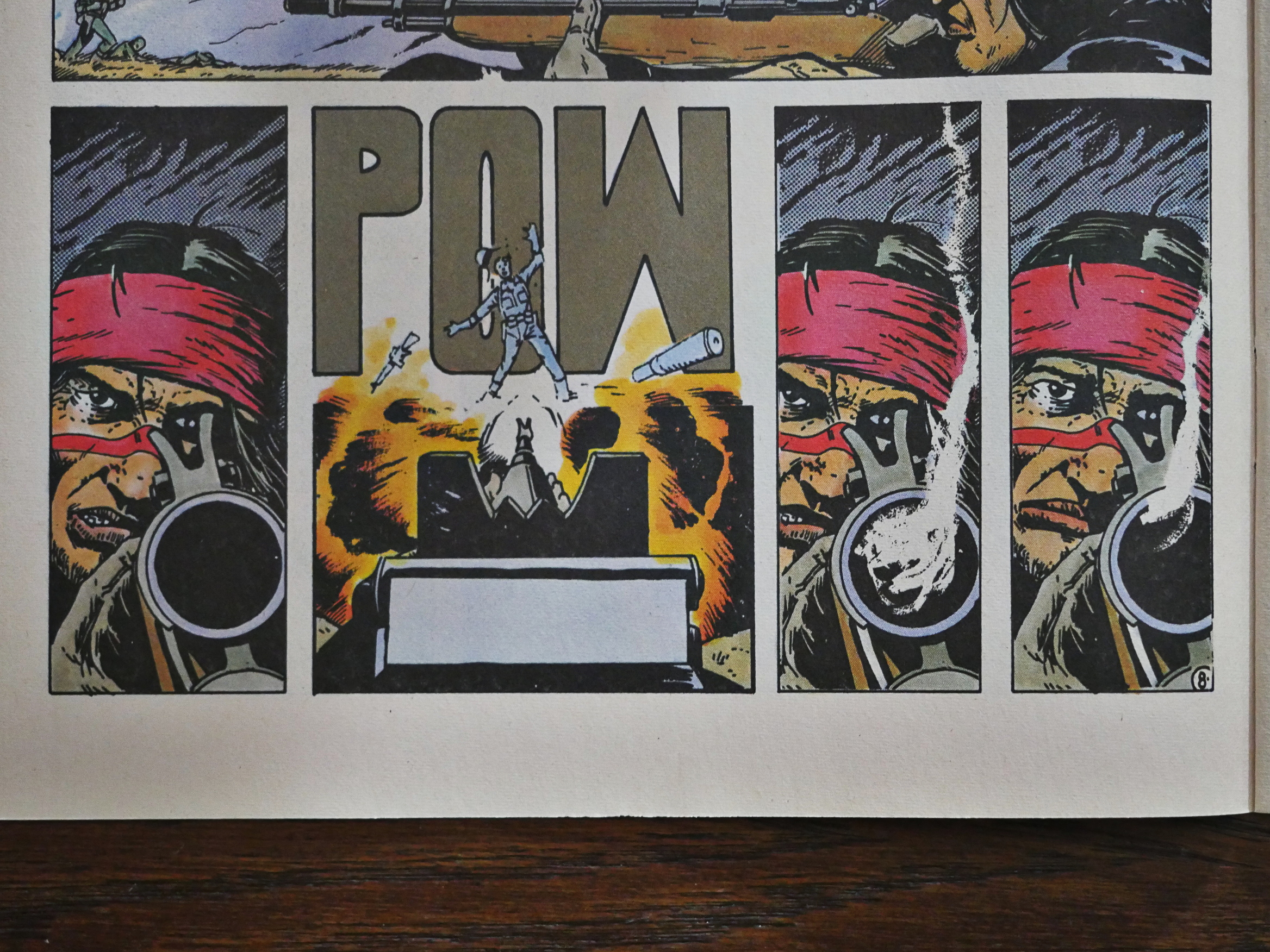
You remember that thing Heidi McDonald said above about Truman only being able to draw one expression? It was pretty true in the beginning, but Truman improved quite a bit over the months. I mean, it’s not difficult reading Scout’s… regrets? sorrow? in that final panel above.
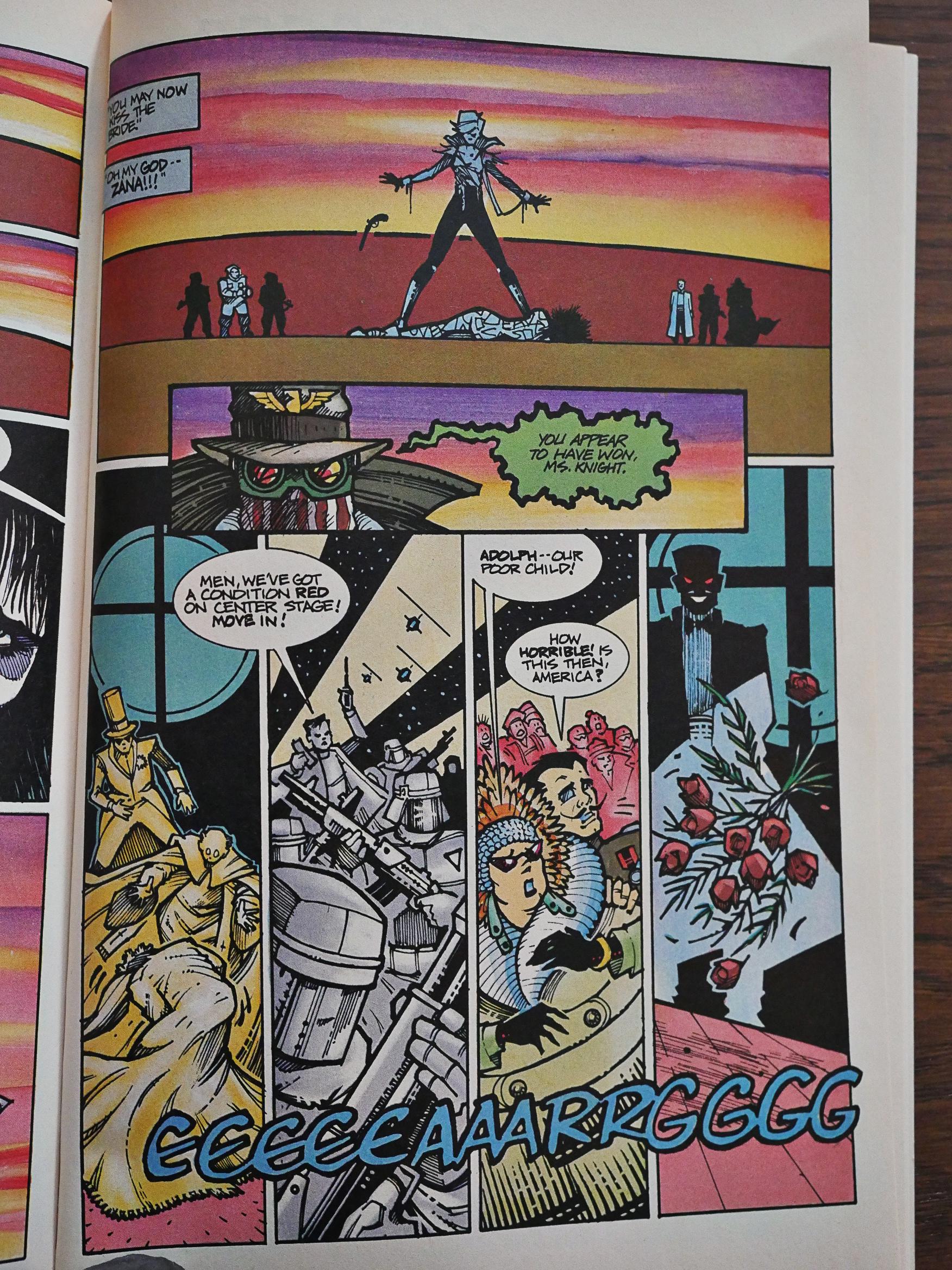
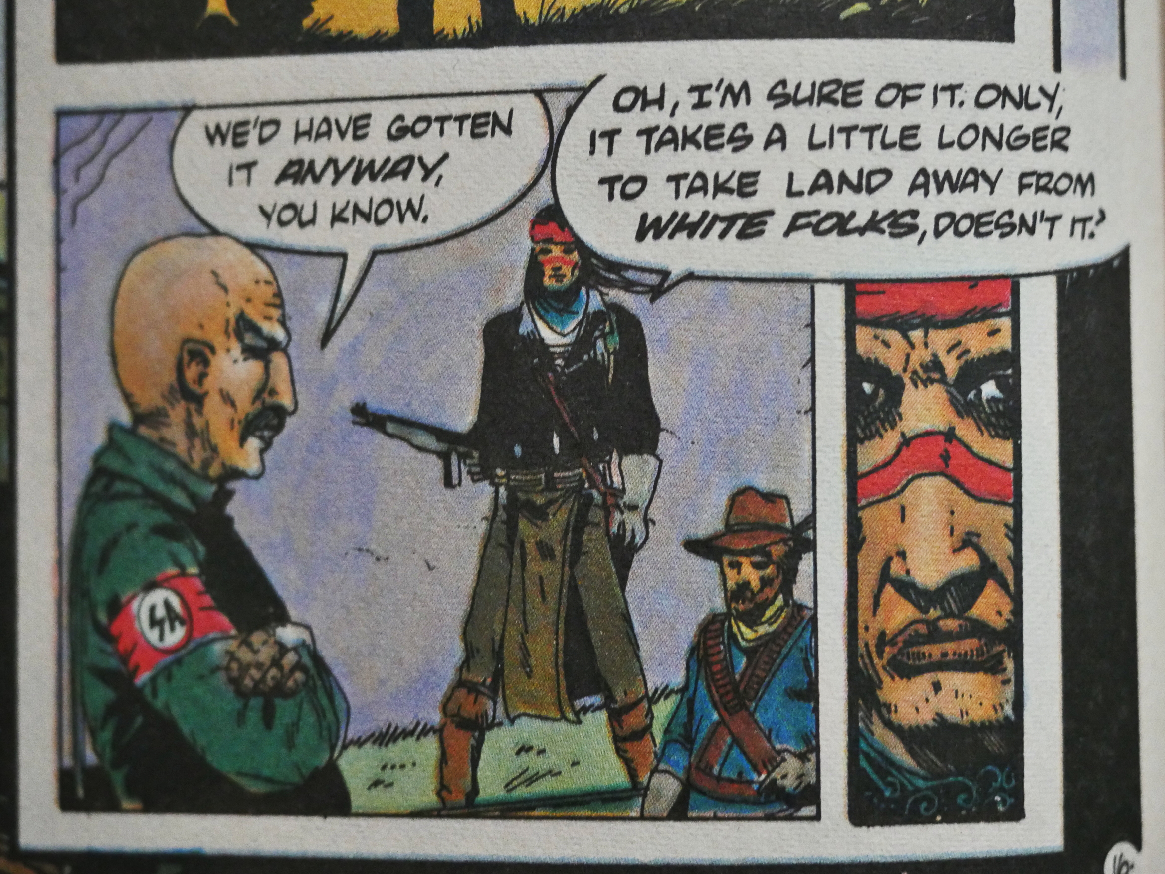
But Truman is maddingly uneven, and many of these pages feel very dashed off. What’s with that SA guy (yes, the Salvation Army are the new real army of the corrupt administration and wears those armbands (which got an audible “tee hee” out of me when I saw this panel)) and his head and short arms? How come Scout’s nose is suddenly twice as long as normal? Is that a dwarf down there?
NO THAT”S A CROSSBOW!
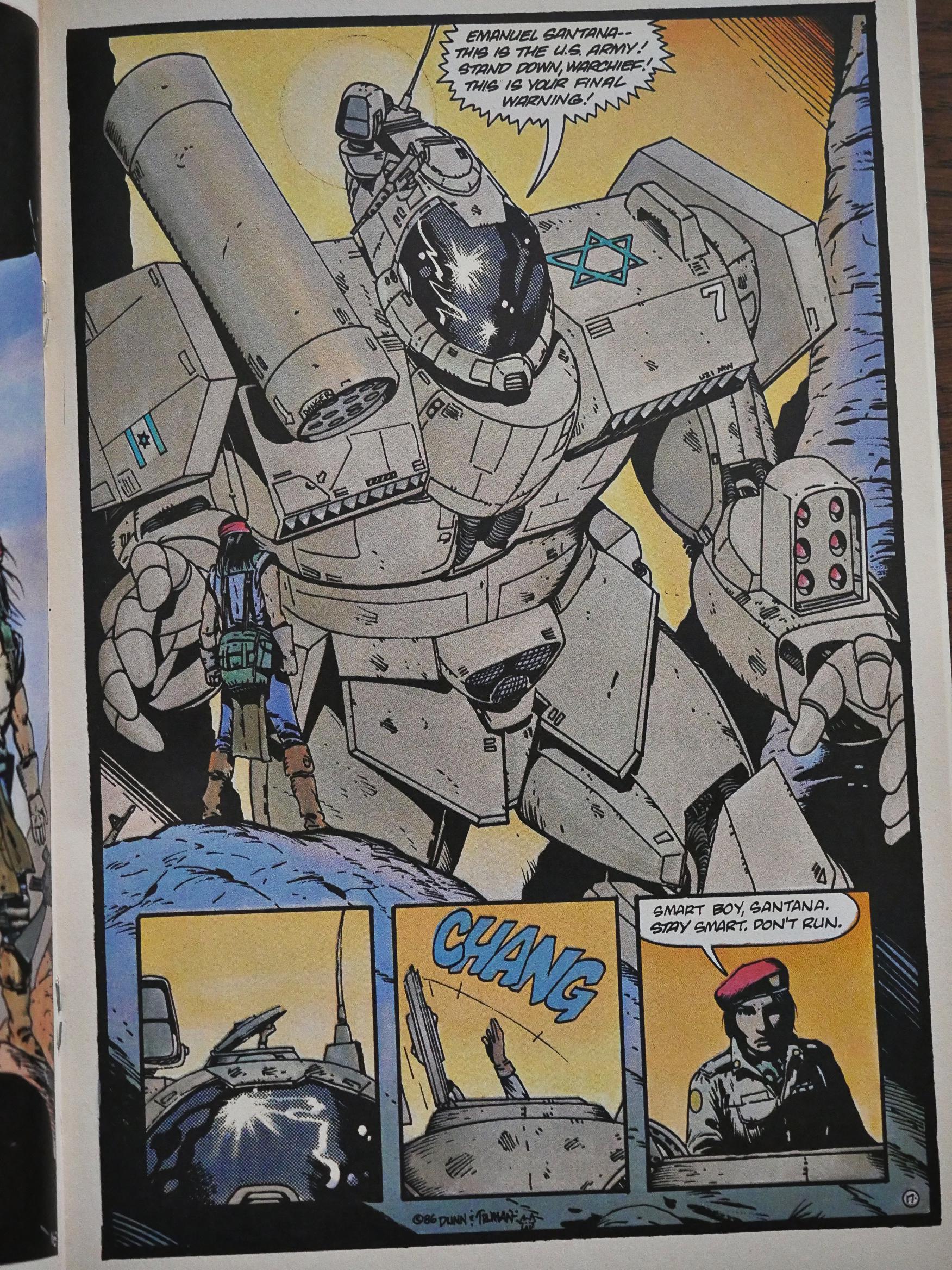
Truman recruits Ben Dunn to draw these giant Israeli mechas. Good choice, and I guess that also means that Truman doesn’t really enjoy drawing those things.
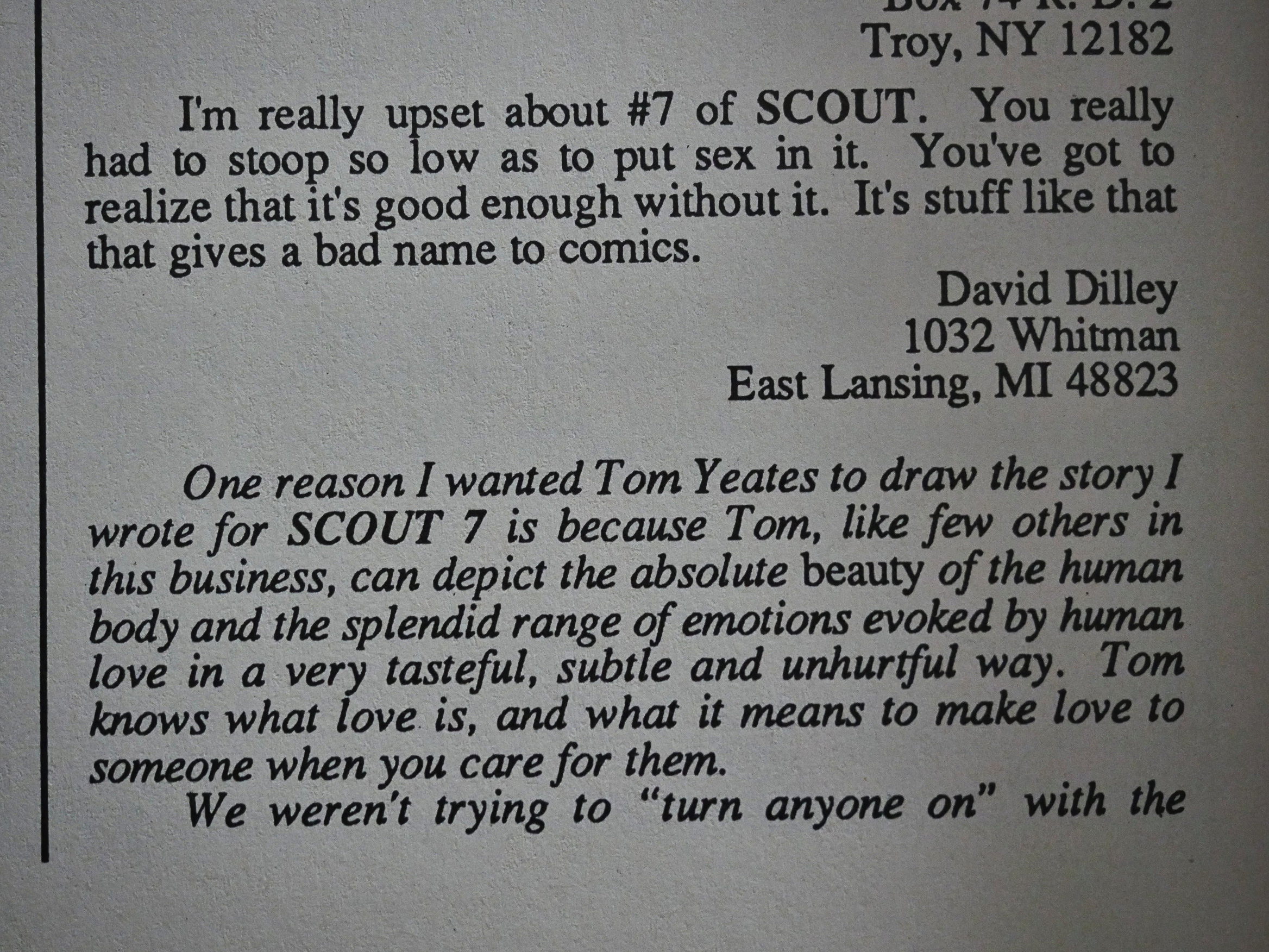
The letters pages are, uh, lively? “Stoop so low.” A wide range of weird opinions. But glass houses, eh?
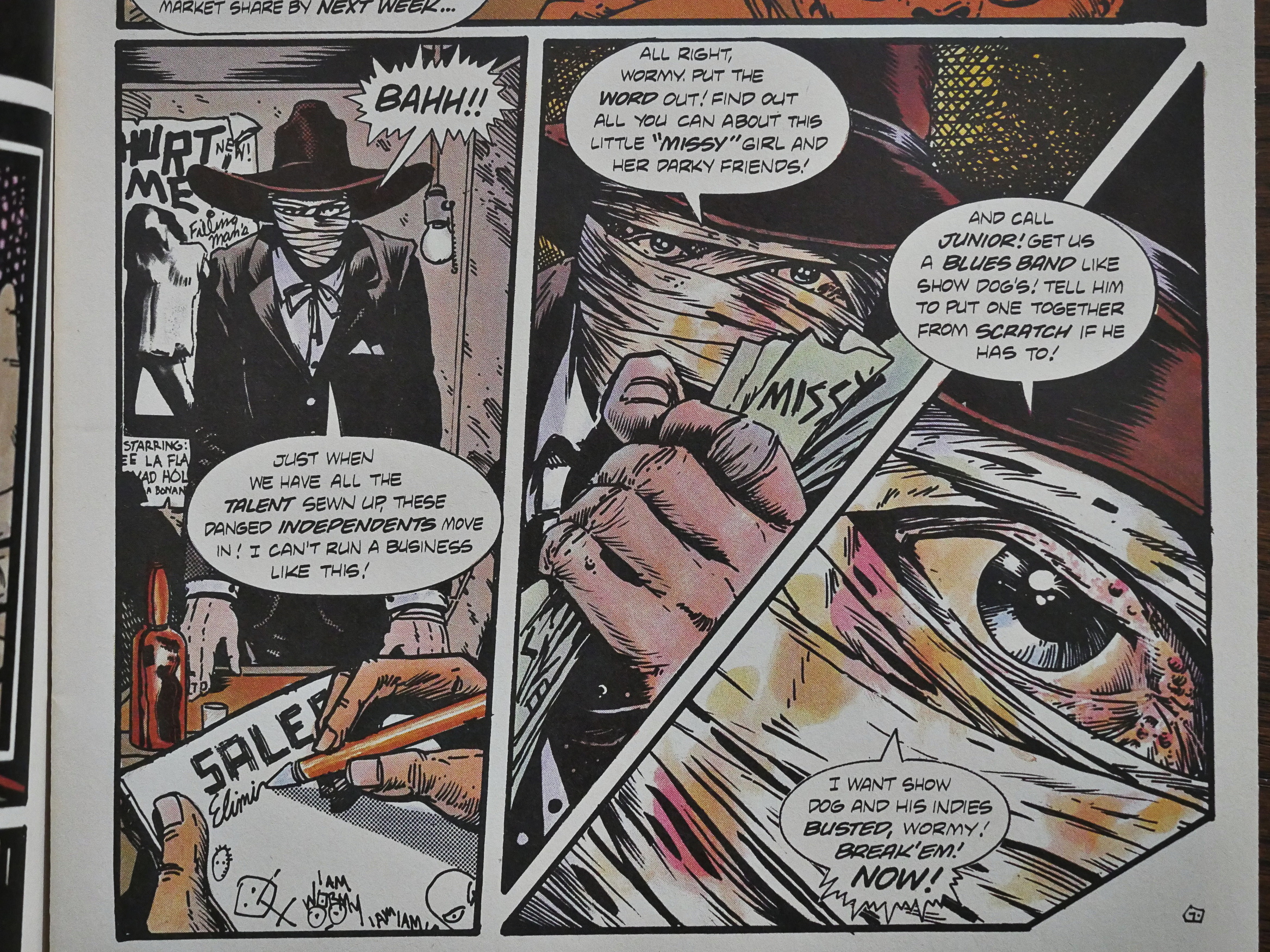
There’s a sub-plot going on for several issues about a singer that Scout had rescued from some bad guys. She ends up in Las Vegas, so you have all these machinations about taking over the Vegas night life (because she brings the real blues back and the people love it). It’s perhaps an odd sub-plot to bring into the proceedings… Well, OK, it is. I think perhaps Truman is interested in music and just wanted to just because.
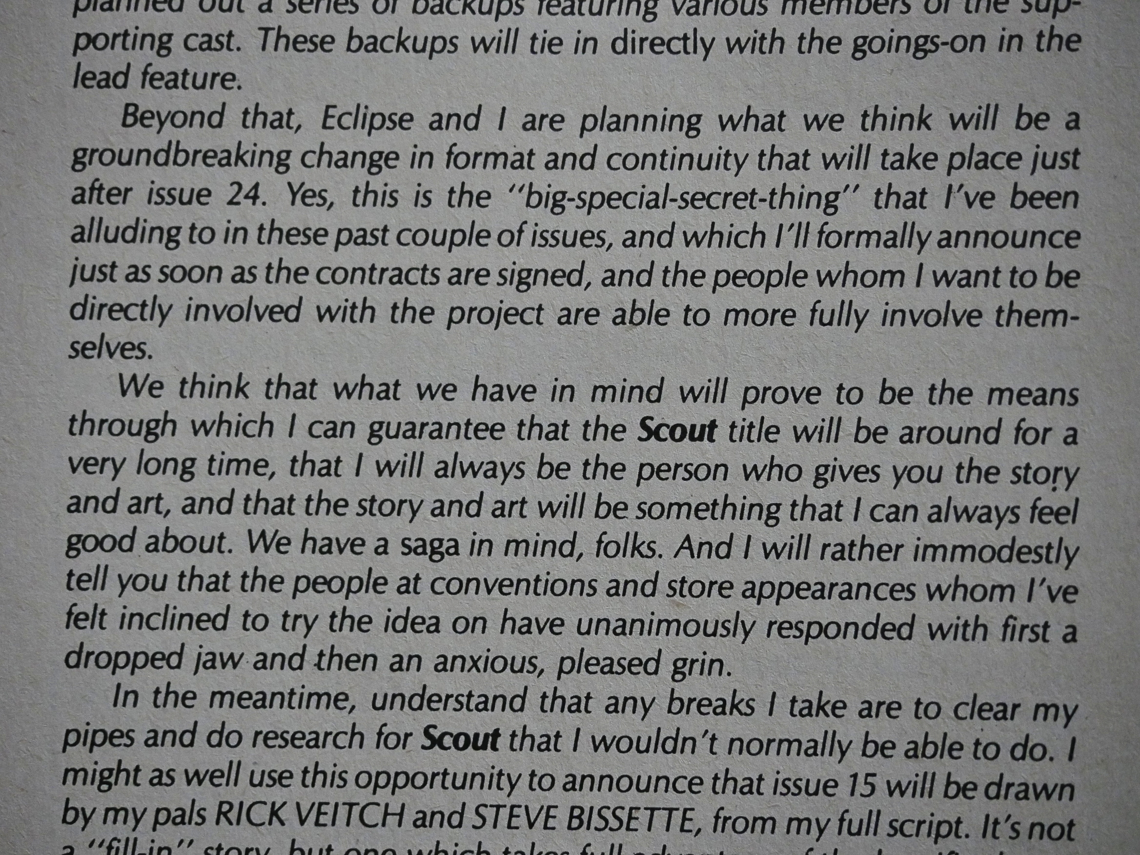
But Truman has an amazing work ethic and has everything planned out. In #12 he announces that #24 is going to be the final issue of Scout in this format, and by gum, so it turned out to be. That like never happens in indie comics.
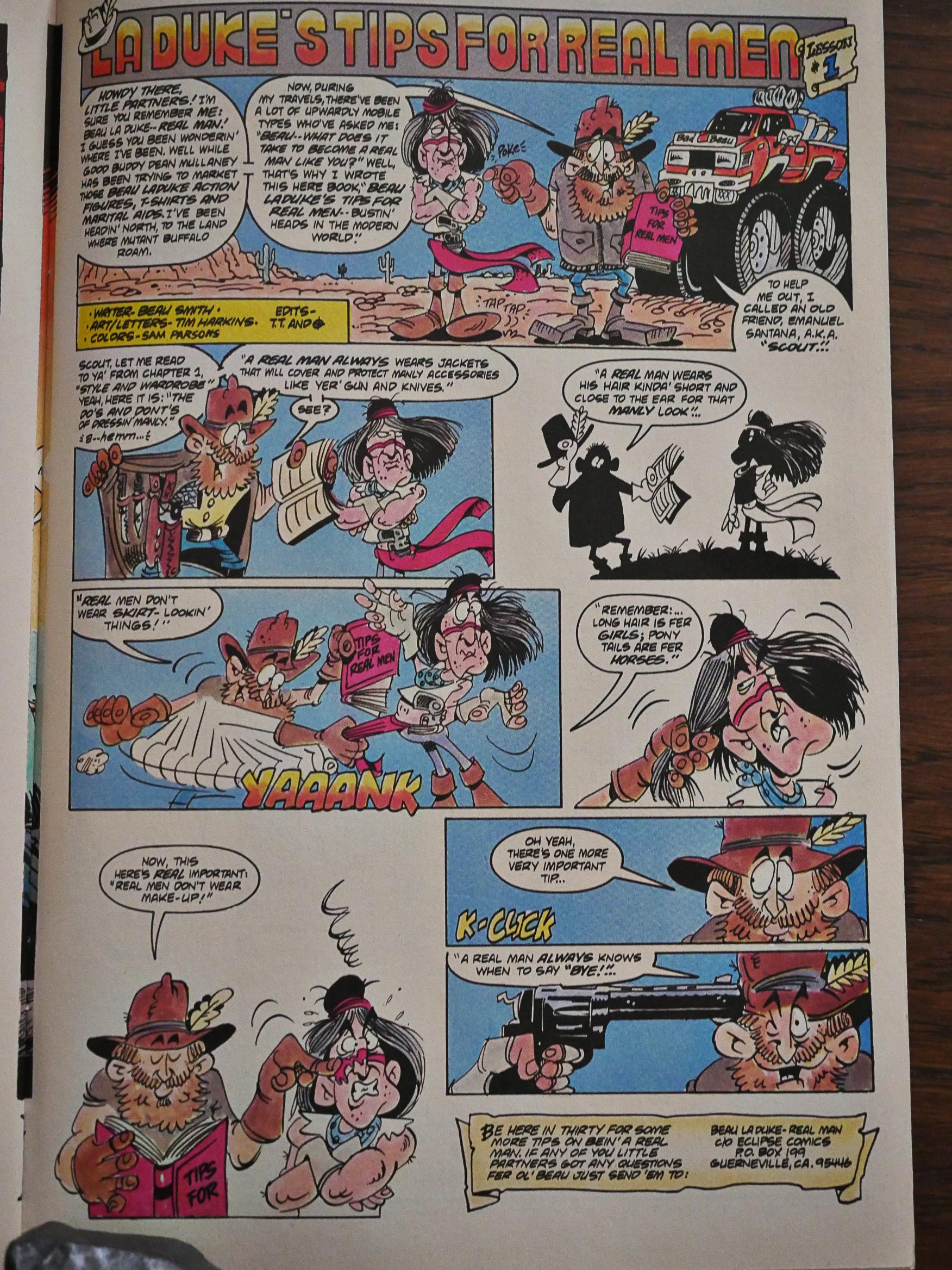
Truman missed having a humorous backup feature, apparently, so he got this recurring one page strip from Beau Smith and Tim Harkins. This is the best of them. Yes, I know.
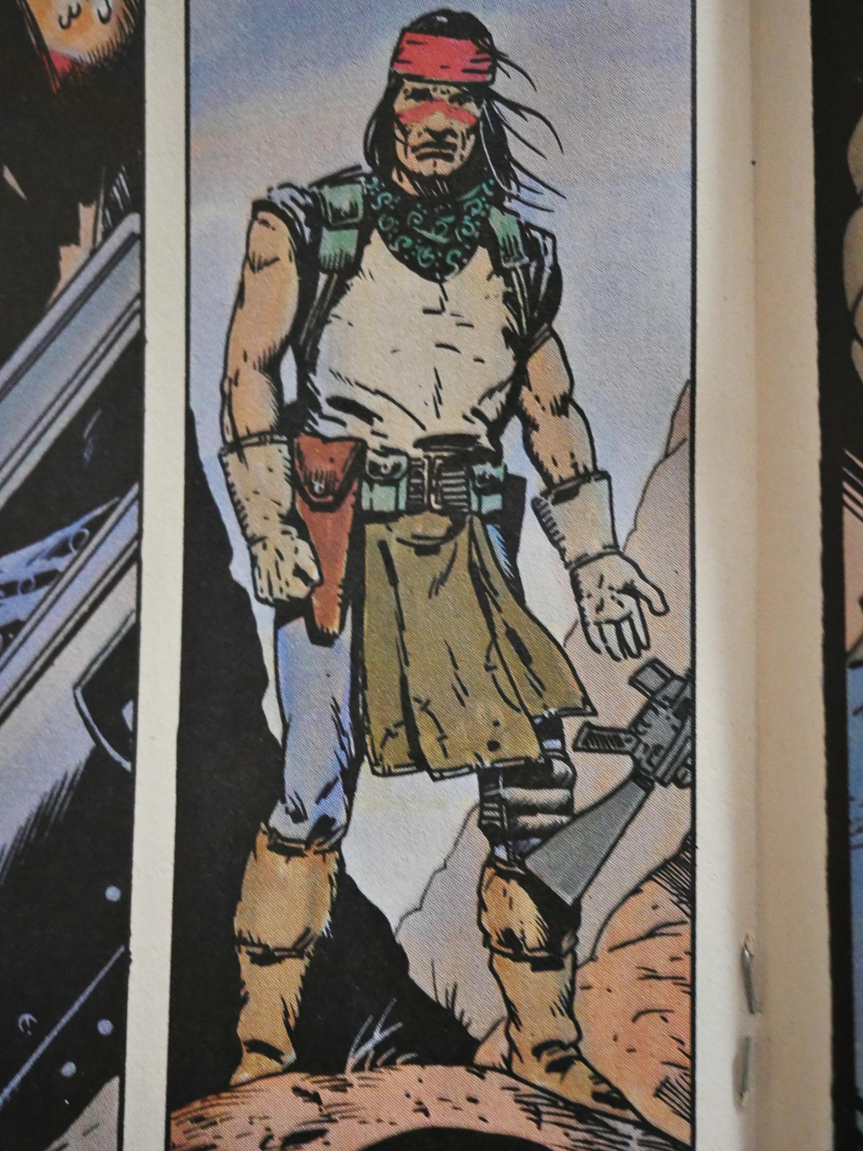
Do you remember Scout’s design from the first issue? The red mask, the red loincloth and the bare midriff? Truman modified them all: Got rid of the mask, changed the colour of the loincloth to a more sensible brown, and gave Scout a t-shirt that fit him.
Truman brought in various artists to do some of the artwork on some issues, but this is the only one of the later ones that are done completely by somebody else: Fellow Kubert School graduates Rick Veitch and Steve Bissette. It looks extremely Veitch & Bissette, which is fun.
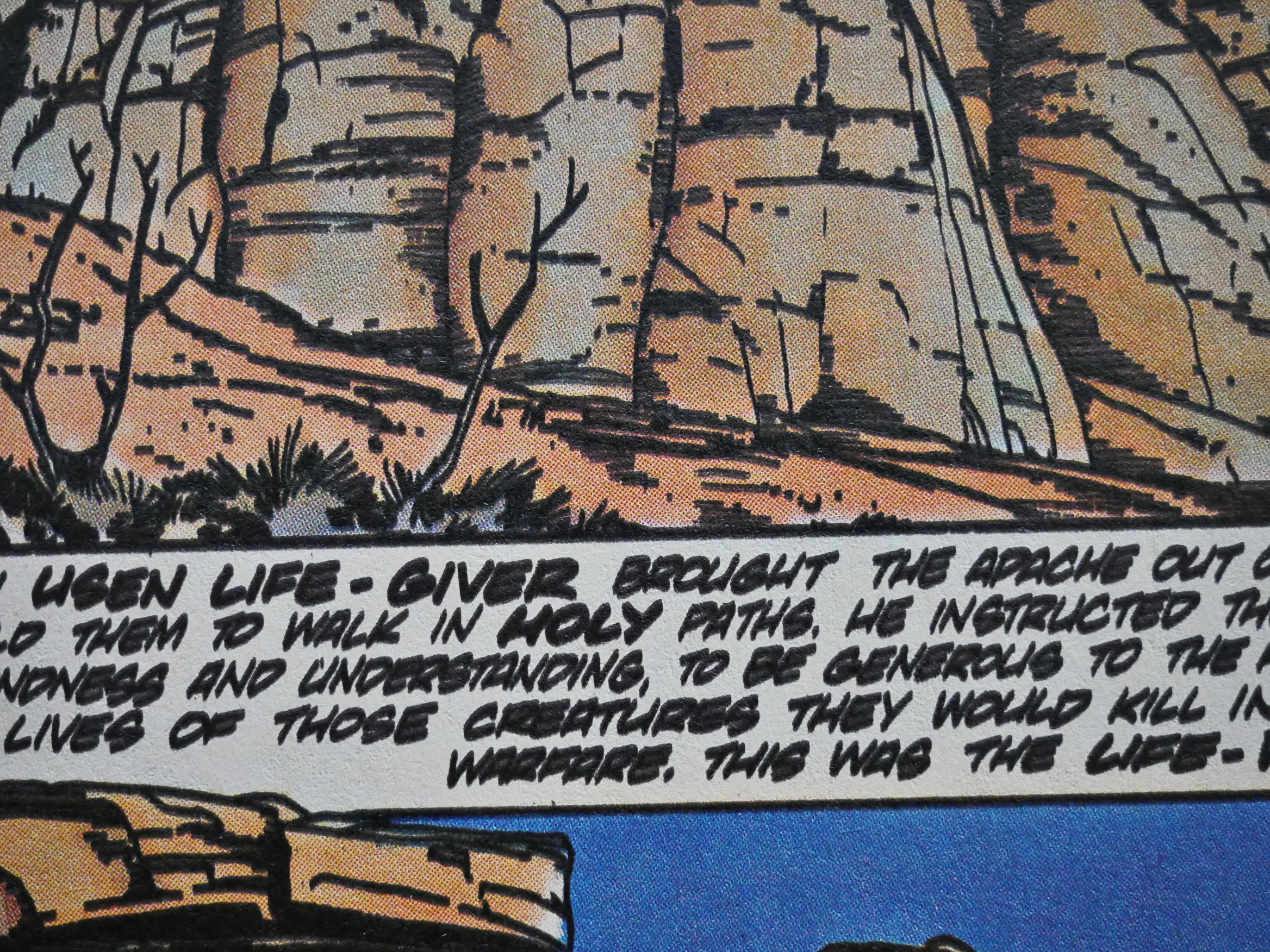
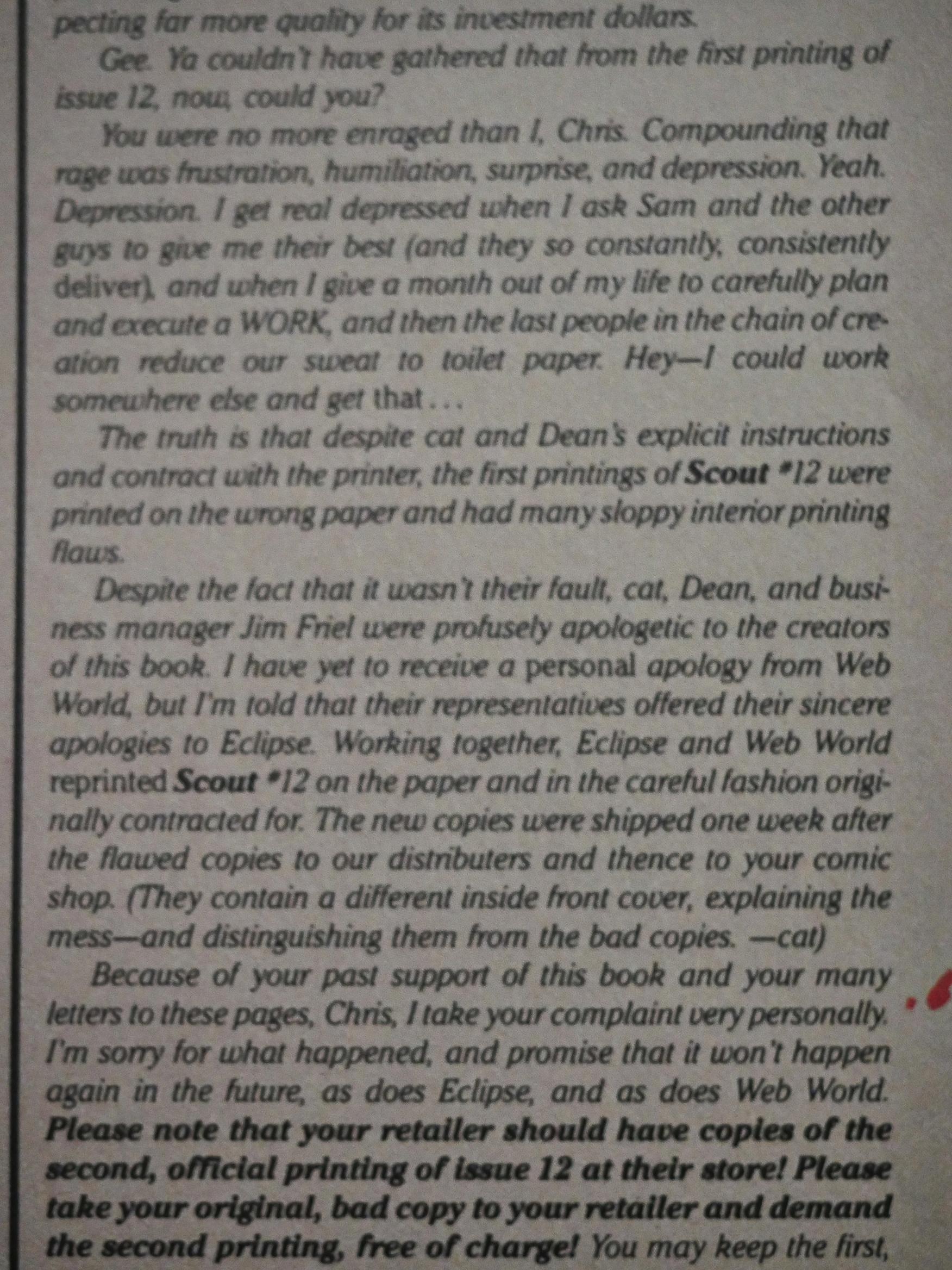
What a blurry picture, but Truman explains why #12 looked so bad (the printer screwed up), apologises profusely, and Eclipse had a second batch printed up that could be exchanged for the first batch free of charge, which is pretty swell of them. My copy was one of the early bad ones.
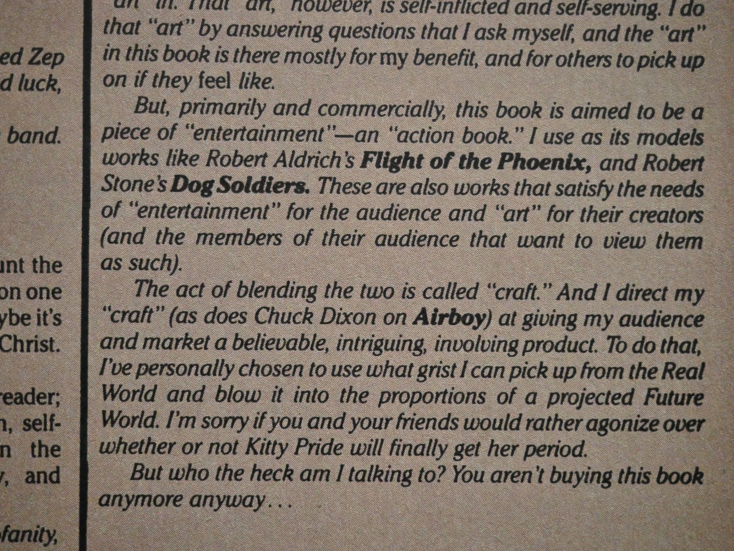
Many of the comments criticise Scout for being “too political”, which I don’t really see that much. Truman clearly, as he writes here, is trying to do an entertaining action book, and the reader is seldom hit over the head with politics. I mean, beyond the obvious bits.
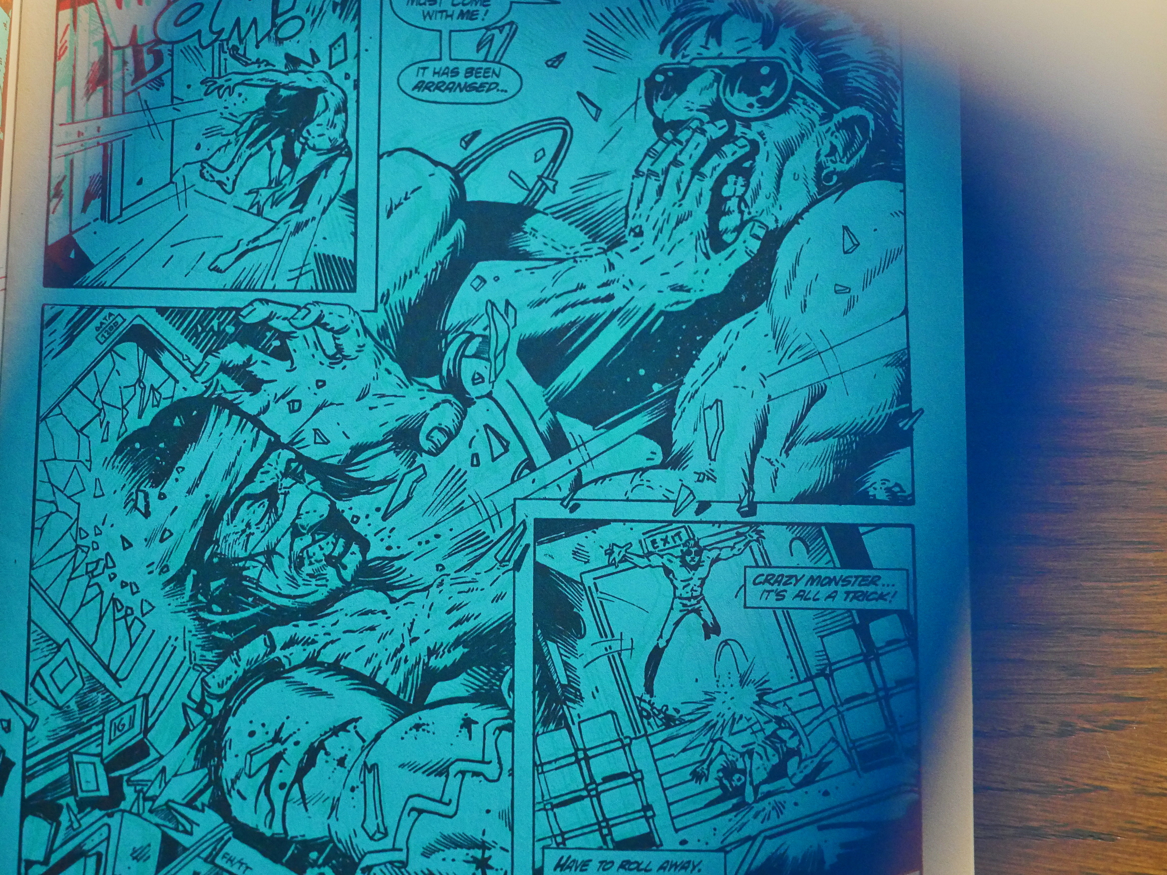
Then all of a sudden, we get a 3D issue. That’s kinda unusual; these things are usually done as a special because many people just can’t read 3D comics. Eclipse offers off 2D replacements, but for $5.
It’s an all-fight issue with little plot, so I guess most people can just skip it, anyway. And the 3D didn’t work for me. Either my eyes are really tired today, or there was something wonky in the process going on, because I just couldn’t focus on what’s going on most of the time.
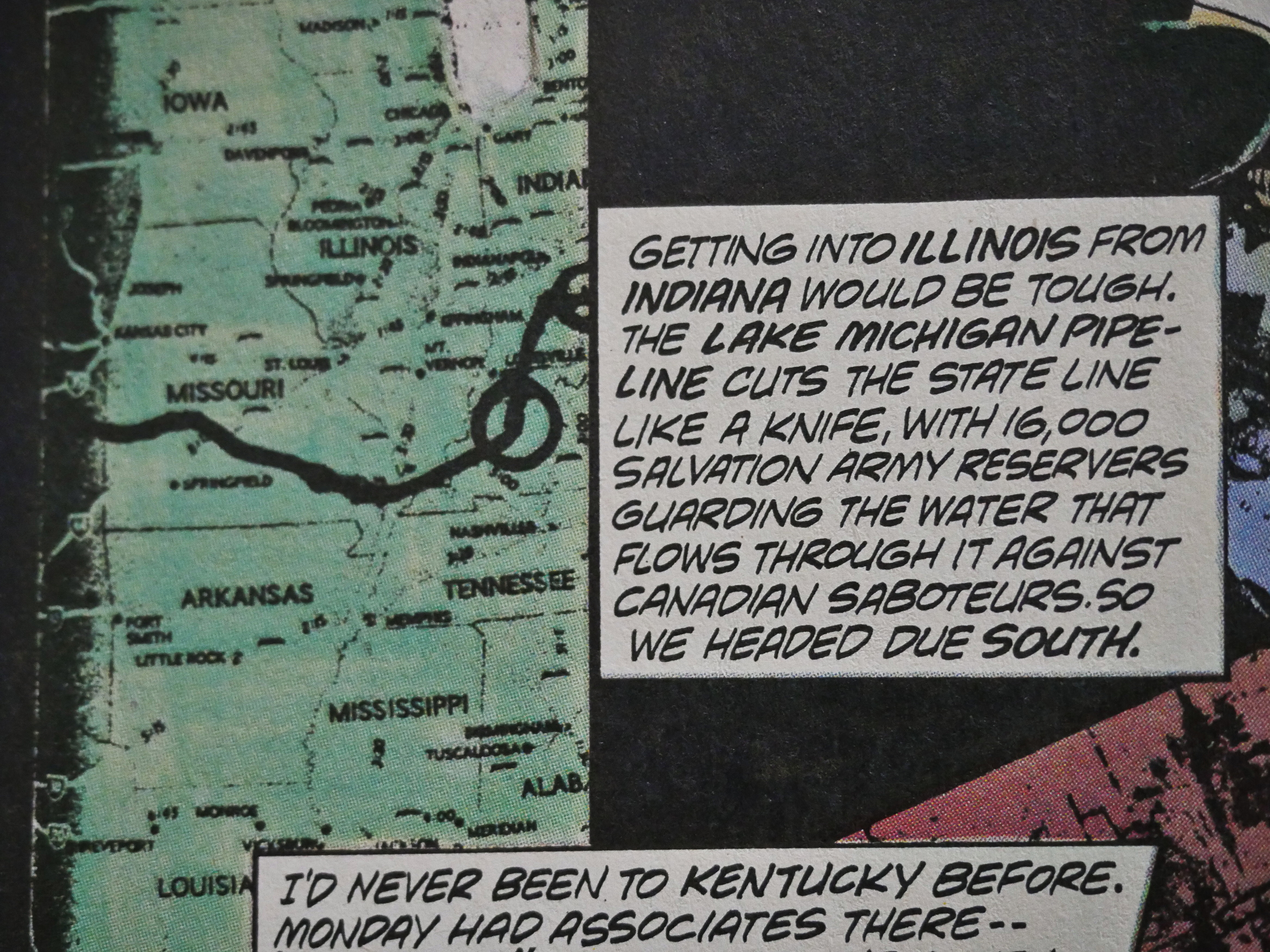
Hey! That plot bit about the US stealing Canada’s water was crabbed by Brian K. Vaughan for that We Stand On Guard (or whatever it was called) series the other year…
There are back-up features throughout the series (because the main feature is mostly 18 pages long), but Truman switches it up by starting to write the back-ups himself and making them relevant to the main storyline. And he places the back-ups in the middle of the main pages, which is structurally unusual, and means that he has to impose a two-chapter structure to most of the issues.
This one’s drawn by John K. Snyder III and didn’t make much sense.
Speaking of sense, here Our Hero visits the sweat lodge once again, and encounters…
Larry Marder’s Beanworld!
I laughed out loud when I got to this page.
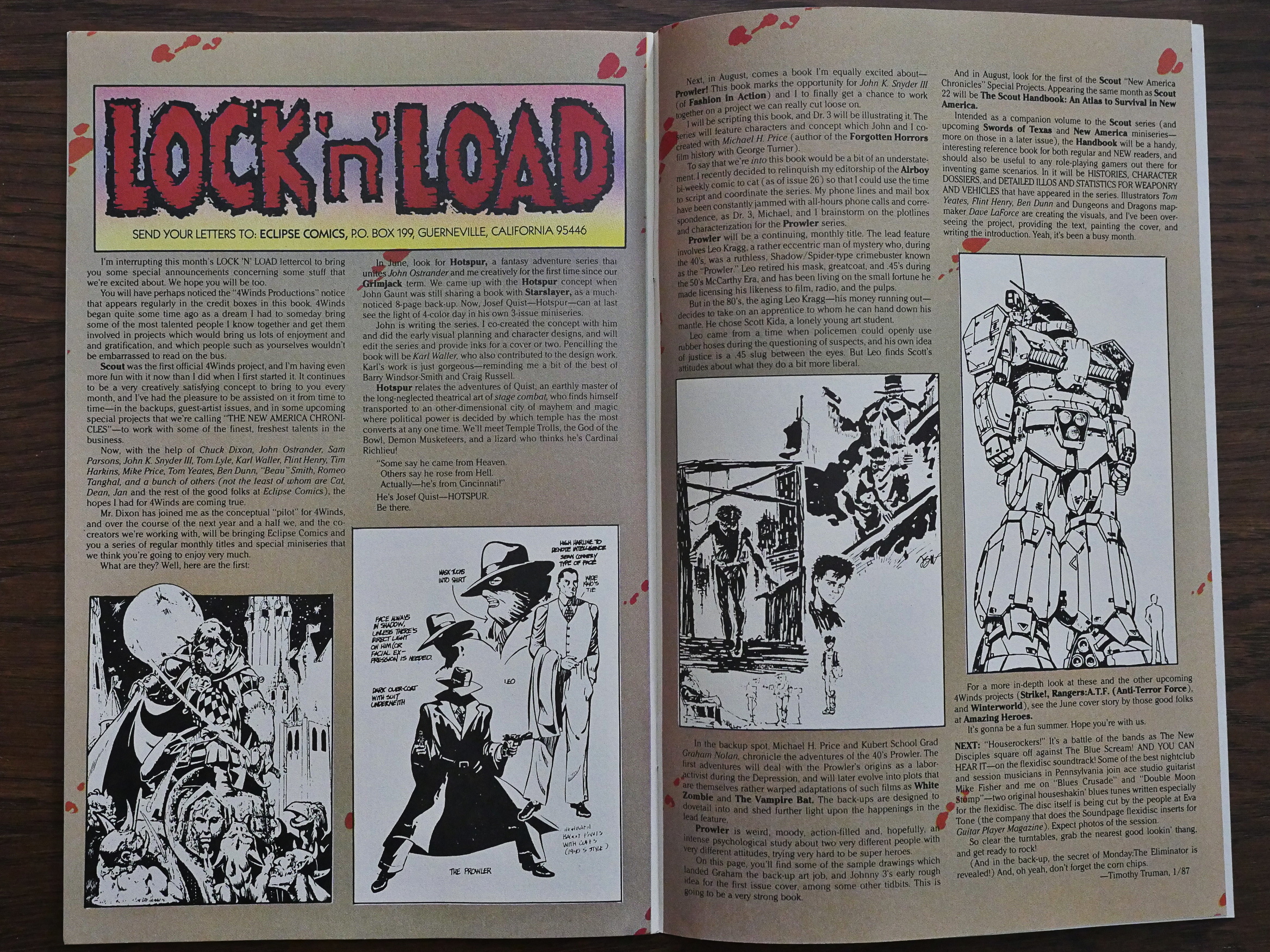
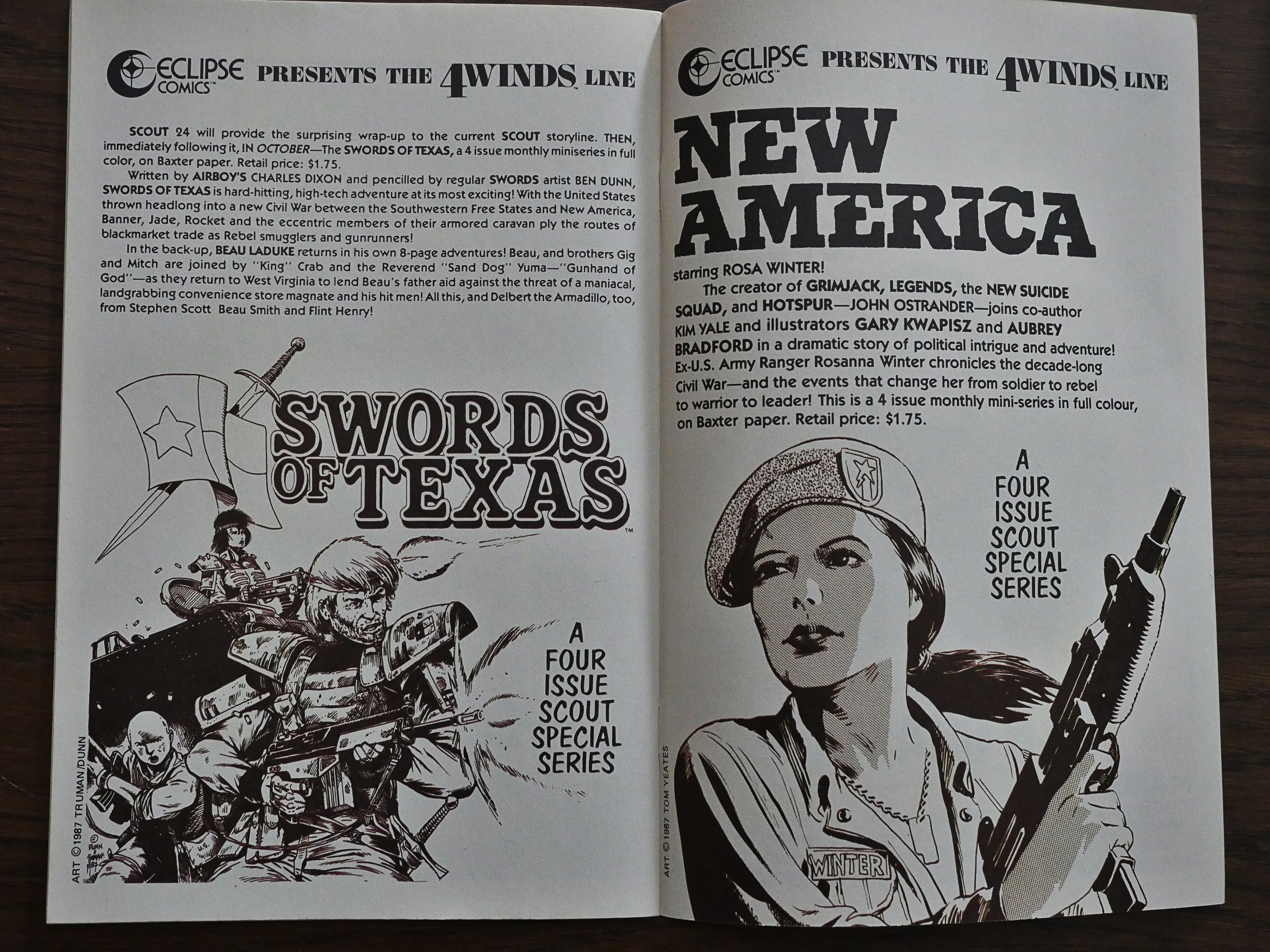
Truman announces that he’s developing an entire line of comics to be published by Eclipse under the 4Winds banner. Most of them written by Chuck Dixon, with artwork by a variety of people. I guess we’ll be hitting them later in this blog series… After reading Scout, I’m kinda excited about reading them, because I’ve never read any of them before. And Scout’s a pretty fun read, so…
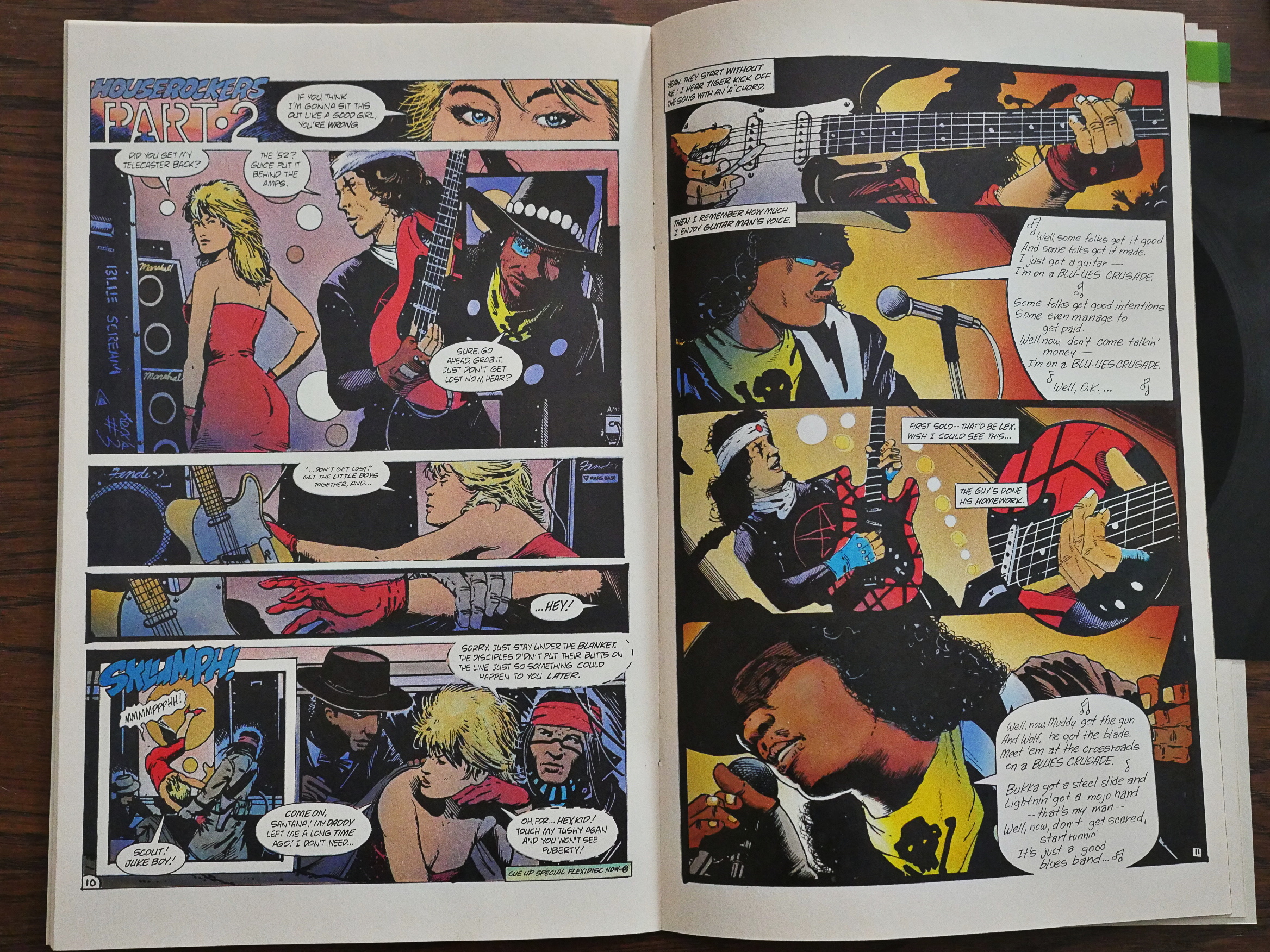
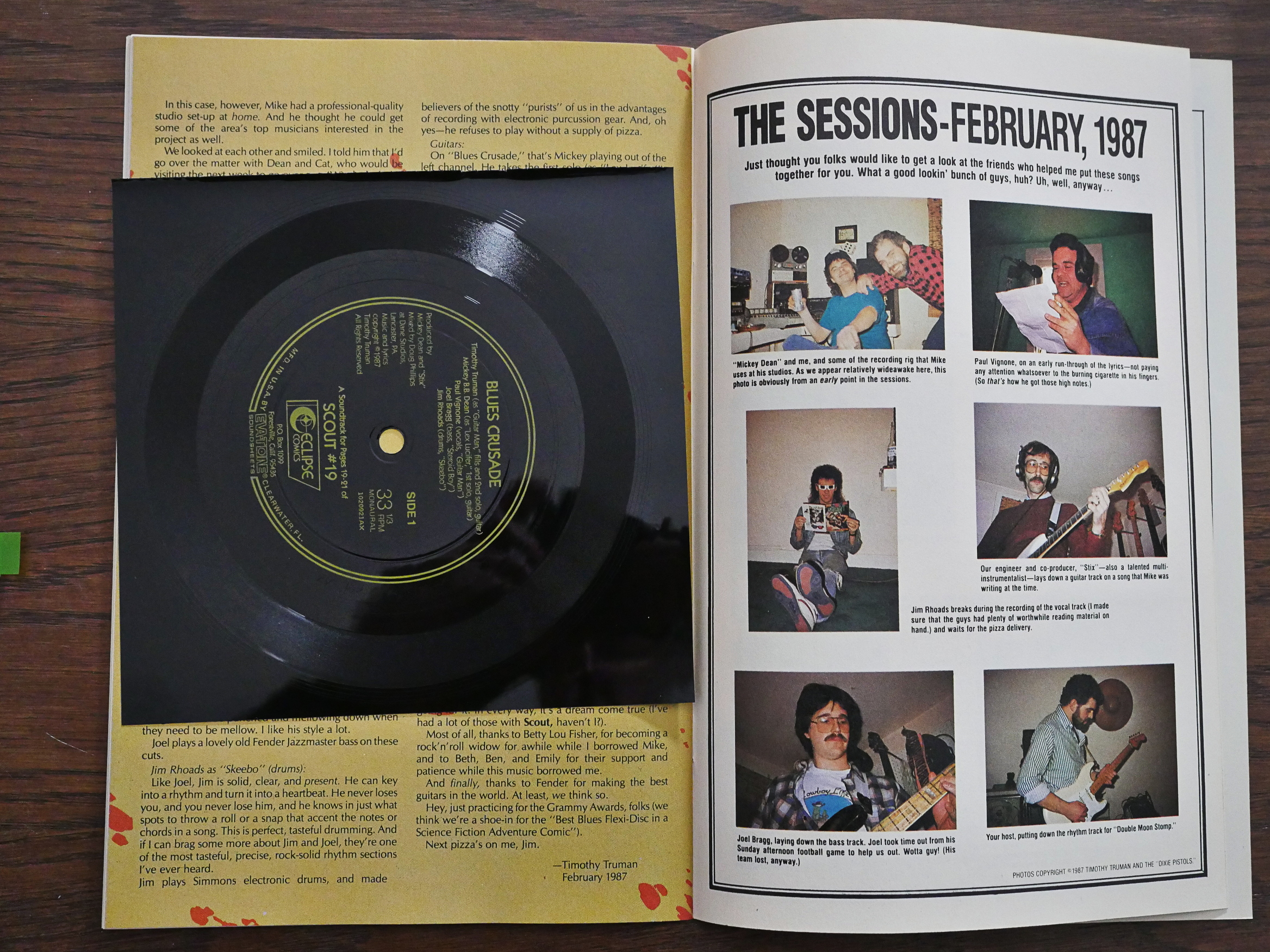
Of all the Scout issues, #19 is the weirdest. It’s a Battle of the Bands issue that includes a flexi (seen below) that you’re supposed to play while reading the sequence seen above where the two guitarists compete to see who can do the real blues.
I listened to it now, and it’s just about what I imagined: The kind of constipated-singing chugging 80s “blues” that was a thing back then. With drums that sound like they’re from a cheap drum machine, but turn out to be from a cheap synth drum set.
Hm… It doesn’t seem to be on Youtube? And since I don’t think it’s any good myself, I’m not uploading it either. (Besides, copyright.) (Unless anybody really really really needs to hear it, and I may be persuaded; leave comments if you ever get to the bottom of this blog post.)
Did I mention that there’s a surprising amount of humour in Scout? It’s mostly of the “sturdy” kind, though.
And did I mention that Truman’s artwork improves? It’s still gritty, but Scout isn’t staring at the reader face-on all the time, but looks to the sides sometimes and even has his mouth slightly open and makes an expression.
In the very last issue, Truman goes to a completely new rendering technique, using… charcoal? Or something? Instead of just inks. Weird artistic choice for a final issue…
And then he announces that Scout’s over, but that two new mini-series will be published next, and then Scout will return in a new series in four months time. Which is what turned out to happen, amazingly enough.
Hm… Perhaps I should read those two miniseries before continuing with Scout: War Shaman? And cut this blog post “short”? Do I hear a sigh of relief?
BUT WAIT!
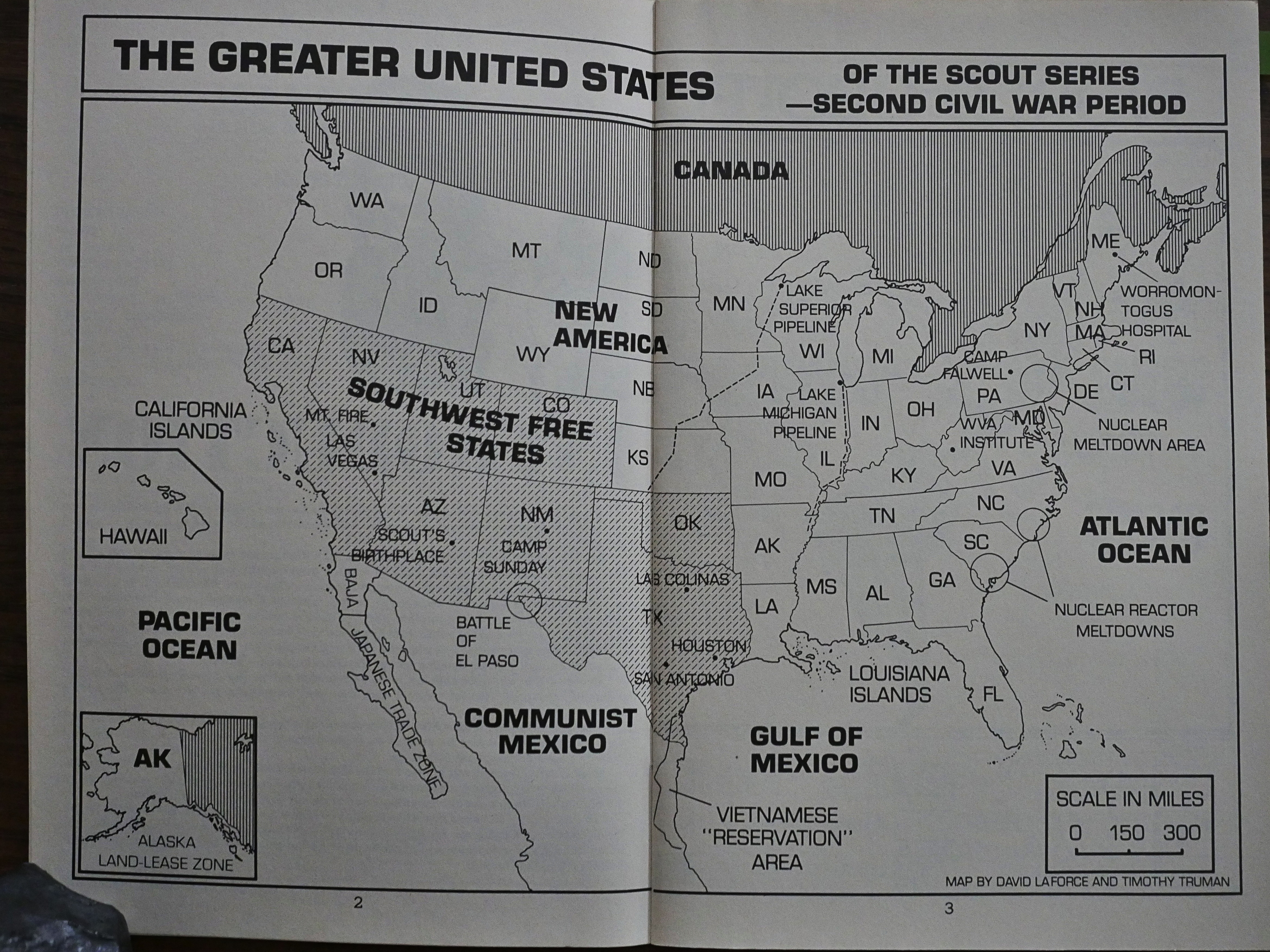
There’s the Scout Handbook first. Hm… Nice map of America…
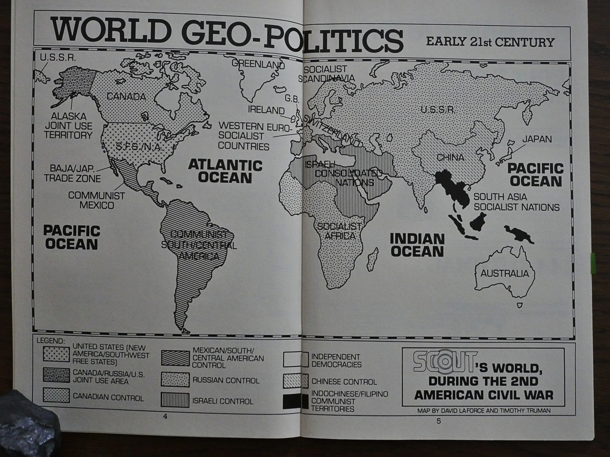
But I found this world map even more amusing. Switzerland is now huge, and Israel has conquered huge chunks of Africa, The Middle East and Europe…
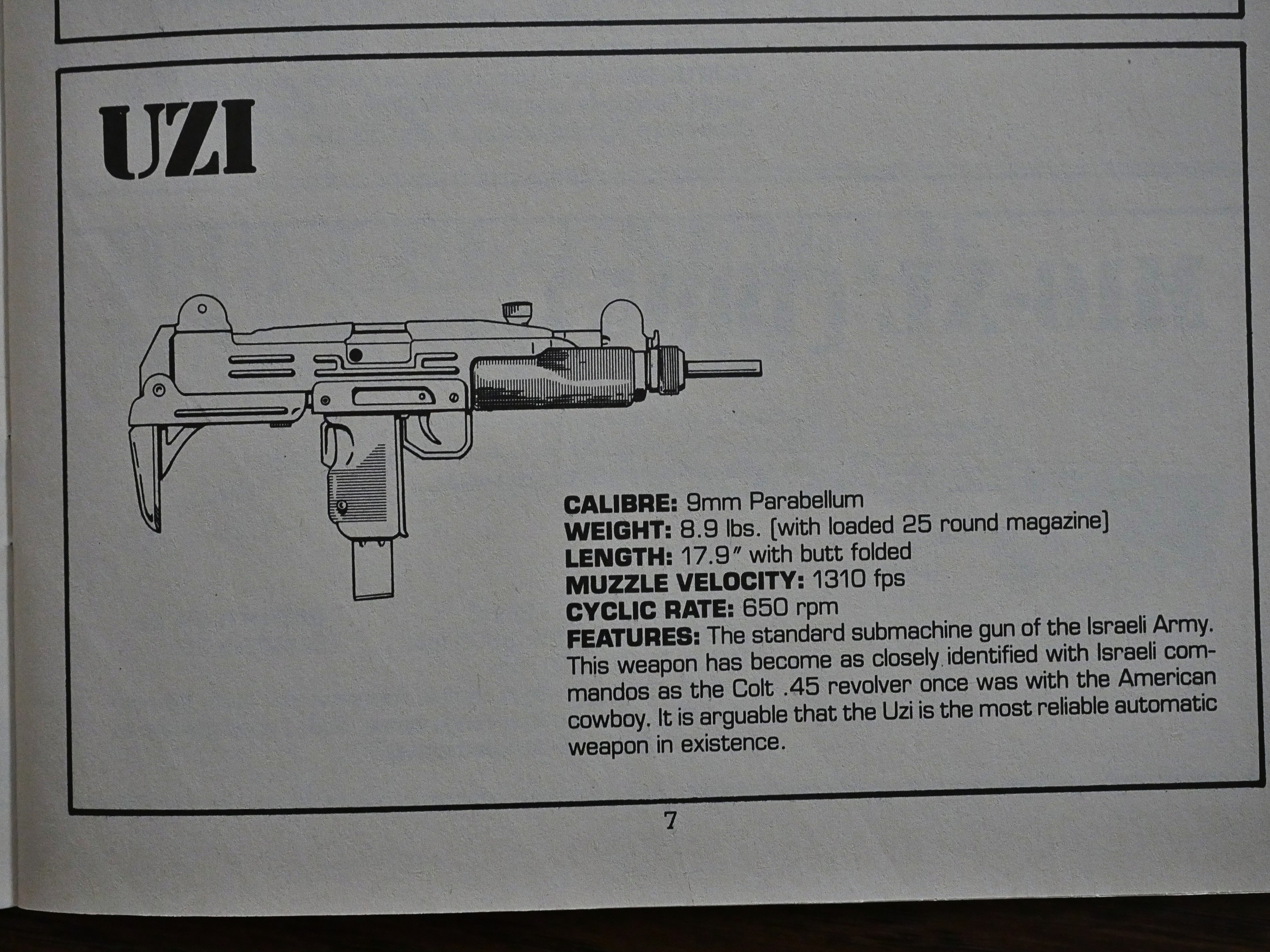
Besides the maps there’s oodles of pages of fascinating gun facts and character bios and stuff. I must admit I kinda skimmed the pages.
So there you have it. Before I end this post and continue with the mini-series, perhaps I should google whether Truman has said anything about the series himself…
Hm. Here’s an interview with Newsarama:
Newsarama: Fist off Tim, this seems like a long time coming, given that many, many properties from the ’80s like Scout have seen collections, reprints, and even revivals. How did the Dynamite reprints come about?
Tim Truman: Dynamite contacted me a year or so back ago about it and we began negotiations. Over the years a lot of publishers have inquired about reprint rights and I always resisted it.
NRAMA: Why?
TT: My reasons were due mainly to my own peculiar and maddening artistic insecurities: Quite simply, I hate to look at the drawings that I did when I was first starting out, particularly Scout and Grimjack. I was sometimes drawing four to six pages a day at that point in my career and looking at the work now drives me crazy. So I was never too anxious to have the work out there again.
Oh, wow. Now I feel like a heel for dissing the artwork…
It was the end of the Reagan era and the beginning of the Bush I regime and there were a lot of things happening that really bothered me. I’m a notorious left-leaner — not a pacifist liberal, really, but a sort of 1920’s pro-labor populist throwback. So I used Scout as an adventure-oriented springboard to address a lot of the social and governmental concerns that I had. It’s been weird watching things unfold during subsequent years. Though the Soviet Union isn’t around any more, several of the things that I wrote about in Scout and Scout: War Shaman have sort of come to pass in one way or another.
Hm! And in all those letter-columns where he strenuously denied being political and stuff! Hmrph!
NRAMA: Looking back at the story now, is there anything the 2006 Tim Truman would do differently?
TT: Yeah. I’d brush up on my figure anatomy, for sure! There’s some storytelling in there that I’m real proud of, though, and I’ll always be proud of the writing and the stories themselves. There’s some pretty groundbreaking stuff in there, and the book turned out being quite influential. Scout will always have a big hold on my heart and soul because it was the first book that was 100% my own vision.
When I think about it, doing that book was such an amazing task. I was writing, penciling, and inking a monthly series, and I did it for almost three years. Quite a lot of work. Towards the end, there, I was getting pretty strange and cranky and lost a friend or two.
Now I’m really curious about how that strangeness is going to play out in Scout: War Shaman.
But to conclude: I found reading Scout to be hugely entertaining, and very different from what I had assumed it was going to be like. Instead of a book of mindless macho violence, it’s a boisterous but thoughtful book.


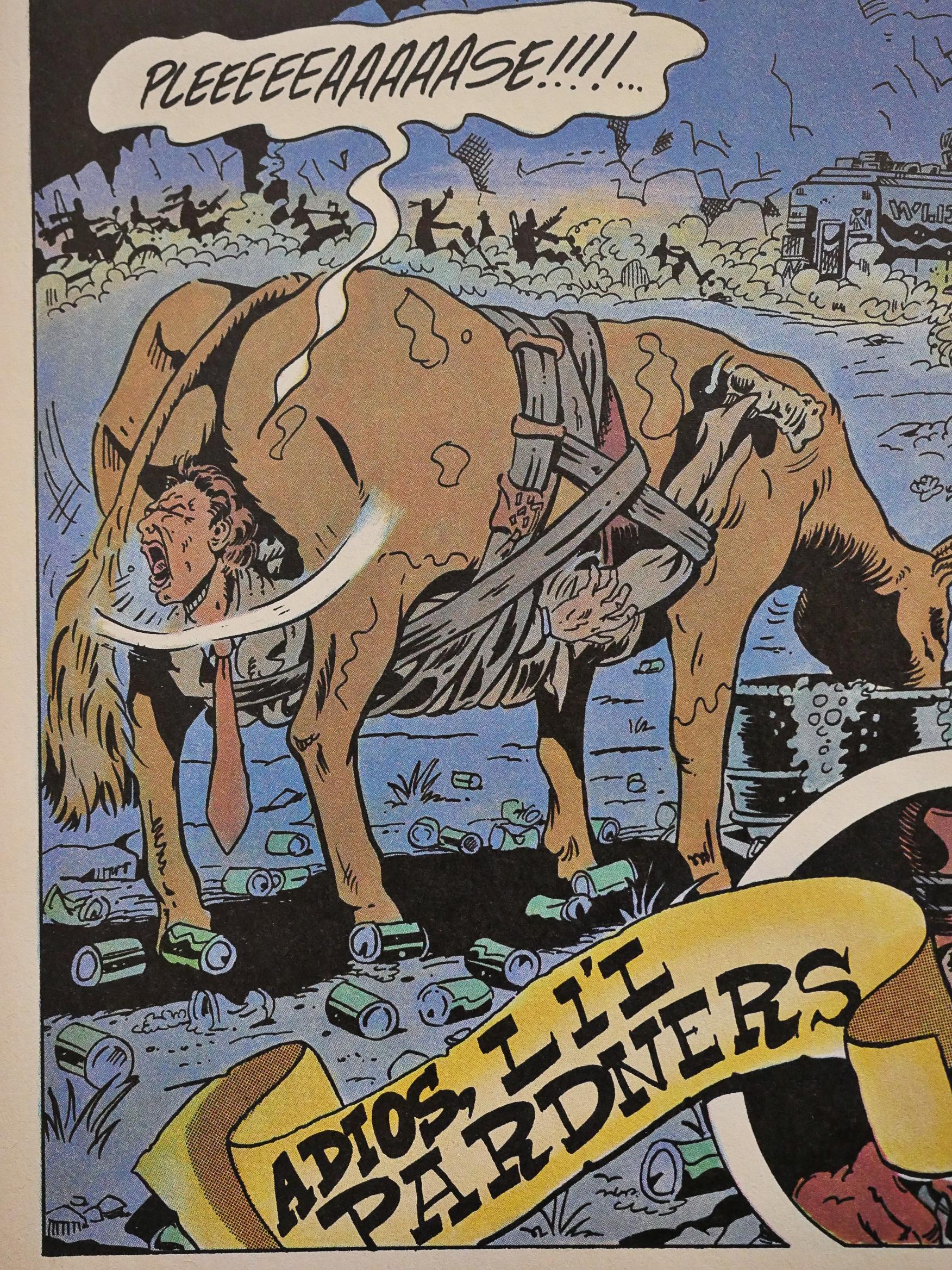
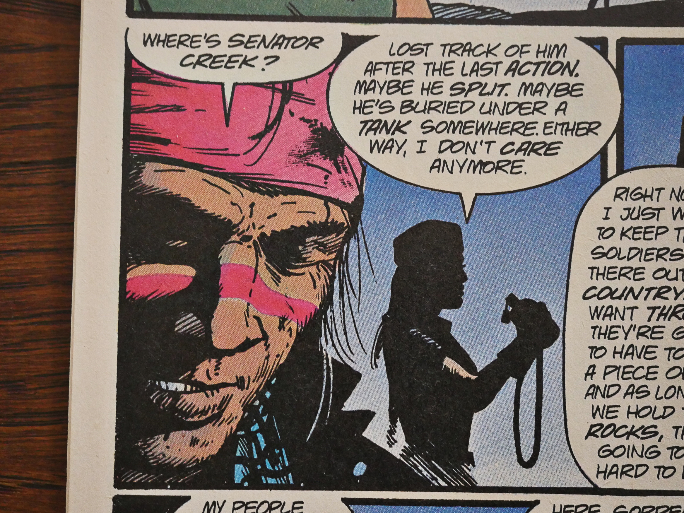
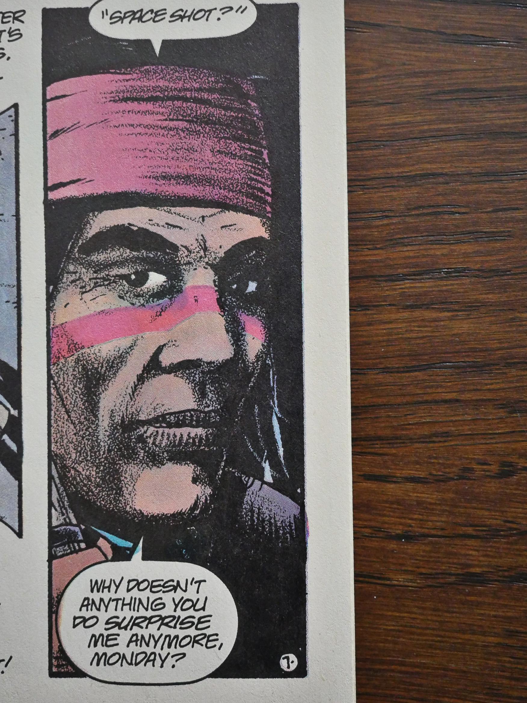
I’d like to see Tim write more “Scout”, with someone like Leo Manco drawing it. Tim’s biggest credit in comics might be his 4-issue “prestige” format “Hawkworld” series, which really elevated Hawkman for that time.
“Scout” was prescient in several ways. Russia (and now China) lining up with several other countries against the US. Economic down turns (other nations leaving the dollar as the standard would wreck us), climate disasters. A 2nd American civil war. “Scout” wasn’t far off.
Where does it say that Eclipse offered 2D replacements for issue #16?
Eclipse reportedly offered 2D versions of all their 3D books (produced in editions of 100), yronwode wrote in an editorial.
Right, I see that yronwode lists the 2D version here: https://www.luckymojo.com/comicswarehouses.html
Cool, thanks!