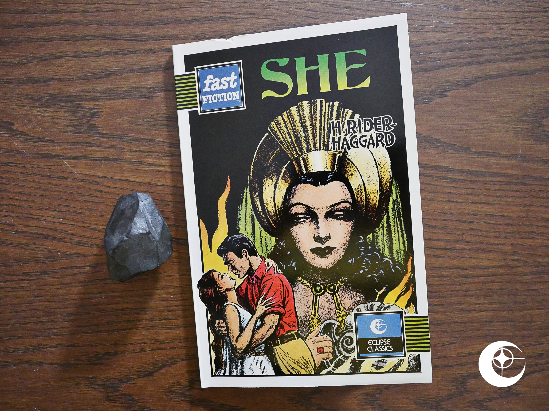
Fast Fiction (She) (1988) #1 by Dick Davis and Vincent Napoli from a novel by H. Rider Haggard.
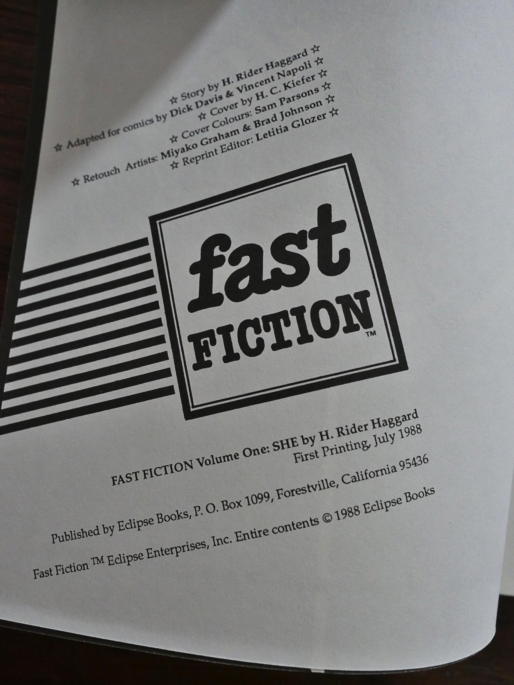
When I saw “Fast Fiction” on the cover, I thought that Eclipse had entered into a co-publishing venture with that British publisher, but that’s not what this is:
It’s apparently a reprint of some kind, since it says “reprint editor”. But as usual with Eclipse, there’s no mention of where the material is sourced from. But it’s copyrighted by Eclipse, so let’s guess at a now-defunct 50s publisher, and that this is in the public domain?
And it’s certainly a weird thing they’ve found. In the house ads for this, it’s presented as “Fast Fiction #1”, but since there were never any other issues published, I guess everybody took one look at this and said “nuh-uh”.
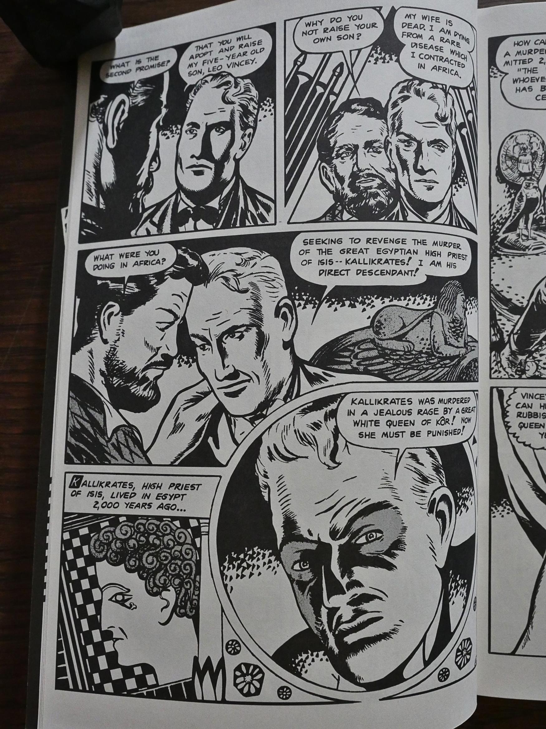
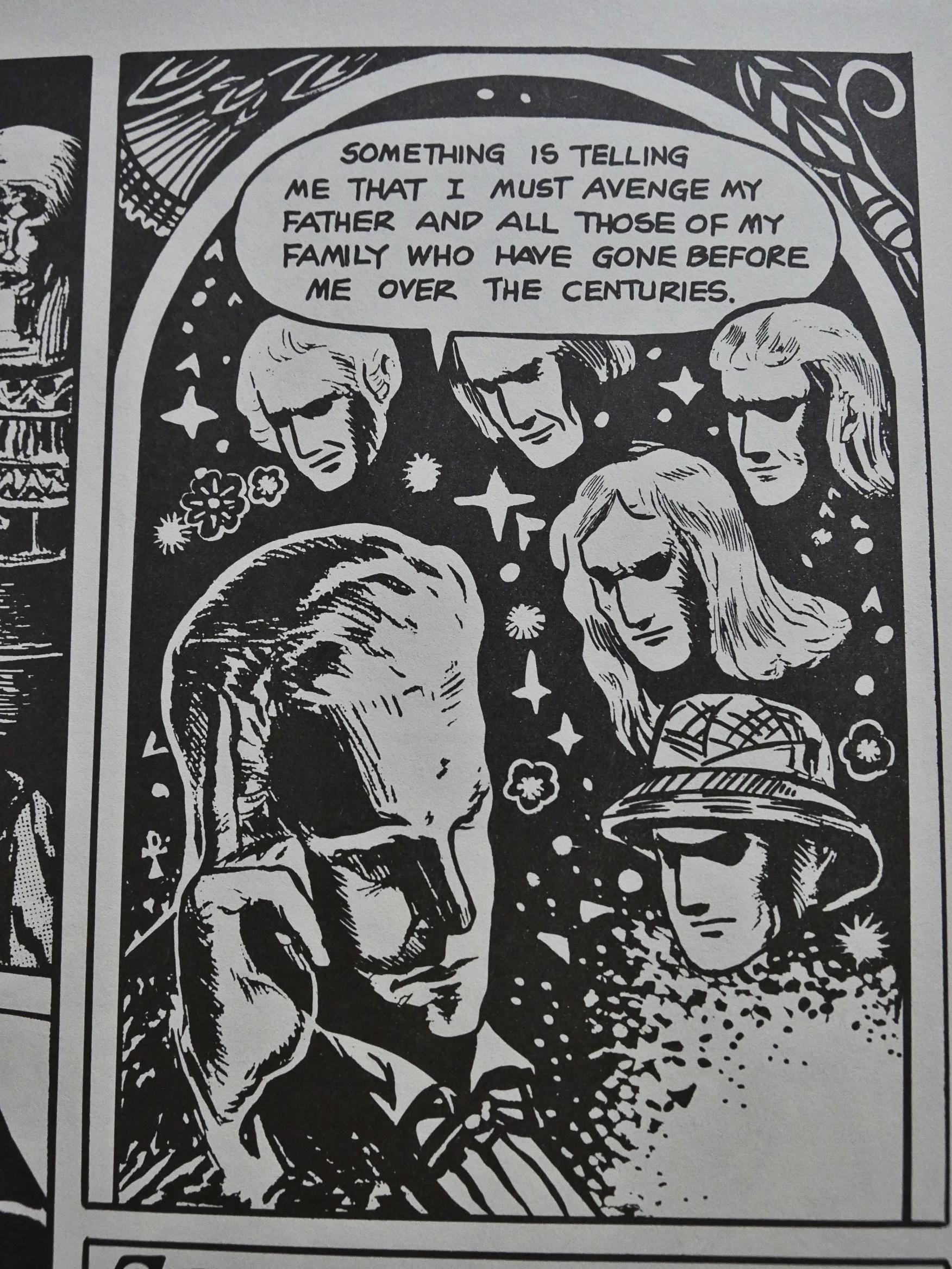
But the thing is, it has that weird deranged outsider-art-but-not-really feel of many of the wildest and er not classically well-trained artists that filled pages in the comics business at the time. I’m reminded of Fletcher Hanks, of course, but since this is a pretty straightforward adaptation of Rider Haggard’s pulp novel, the weirdness is in the artwork only.
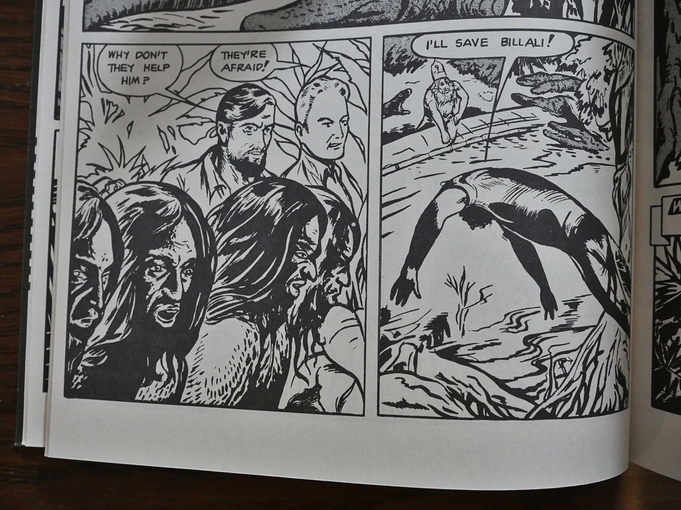
But it so weird that it devolves into these beautiful, almost abstract shapes. The panel to the right above is a man jumping into a river to save a guy from crocodiles. But… but… I’m very taken by the sequence.
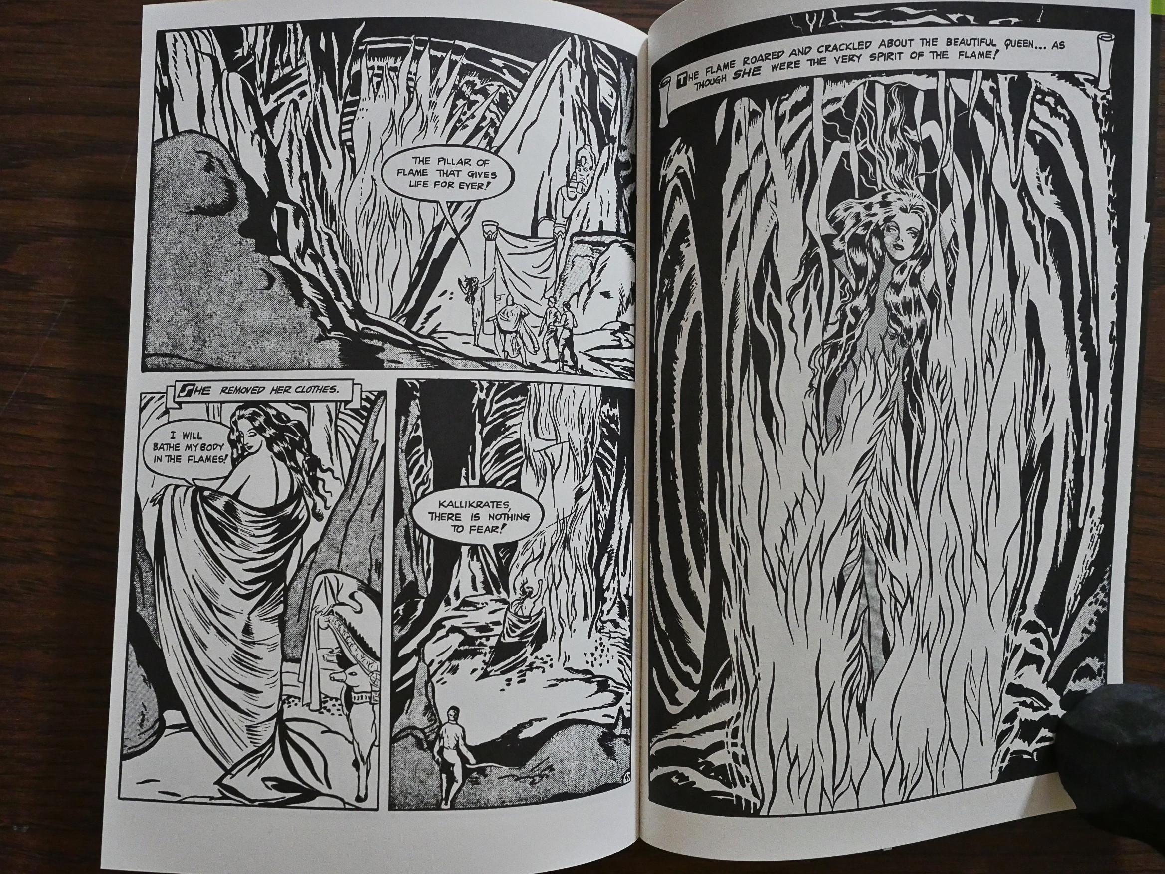
And look at this! Wonderful!
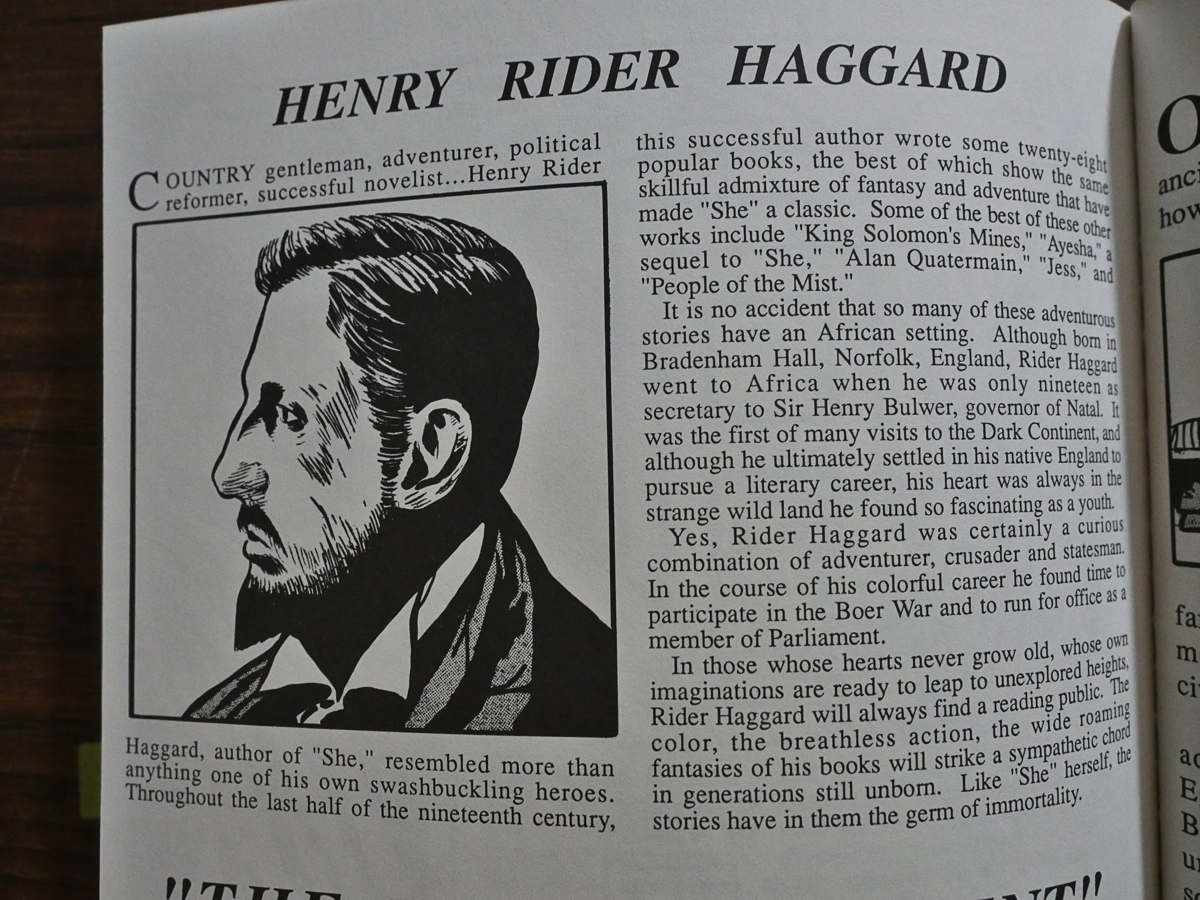
And then we get a couple of pages about Rider Haggard and Africa and Egypt.
So what the fuck is this thing and why did Eclipse reprint it? Were they so hard up for some quick cash after publishing Total Eclipse that they’d shovel just about anything out the door? I mean, I like the weird, weird artwork, but I’m guessing I’m in a strict minority here, and the story isn’t very gripping. We get the bare outline of the plot, really, because they don’t try to shovel all the details in there, and I’m grateful for that.
I think we’ll have to resort to Google.
Let’s see… Oh, this was originally published by Seabord in 1949, and it was as part of their line of comics that competed with the way more famous Classics Illustrated. The line folded (after a name change) in 1951, so it probably wasn’t very successful at the time, either. And it was originally published in colour, of course.
I was unable to find anybody willing to say anything about it online.
Vincent Napoli was a pulp illustrator:
According to American Weekly Magazine, “In all of the artist’s work there is a strong undercurrent of sympathy for the people he draws. He is not a malicious cartoonist, like many of the Surrealist artists. He says he sees beyond the limitations of human character and personality. According to the artist, ‘The pictures just seem to take form when I shut my eyes. I do not know how they do so, other than the fact that they are actually the pictures of impressions which I get from seeing and hearing different things, whether it be the sound of a radio crooner’s voice or the sight of a chicken scratching for a worm.'”
And this is pretty amazing: It’s a comic book about a stamp commemorating the Holocaust.

