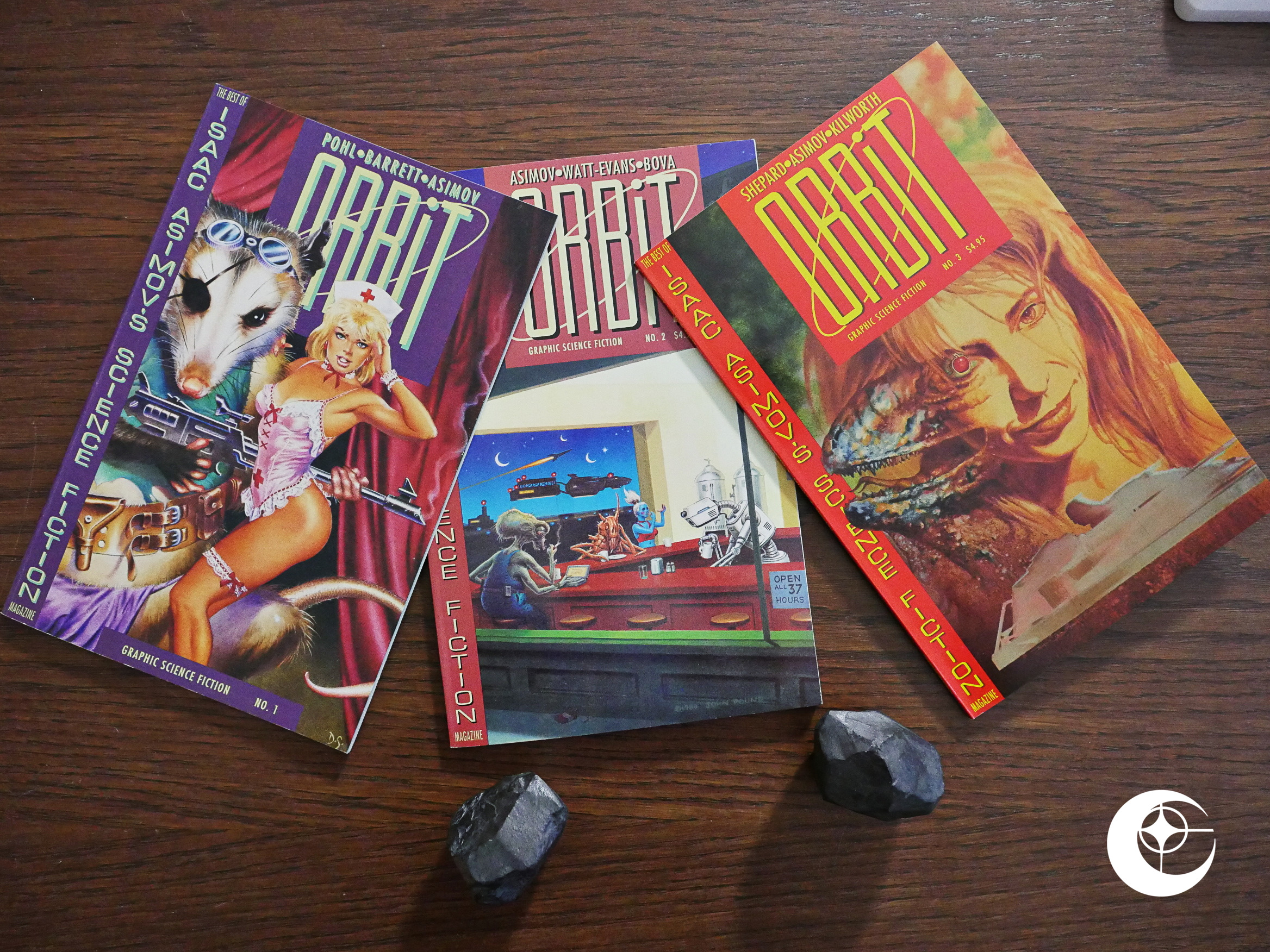
1990: ORBiT

ORBiT (1990) #1-3 edited by Letitia Glozer.

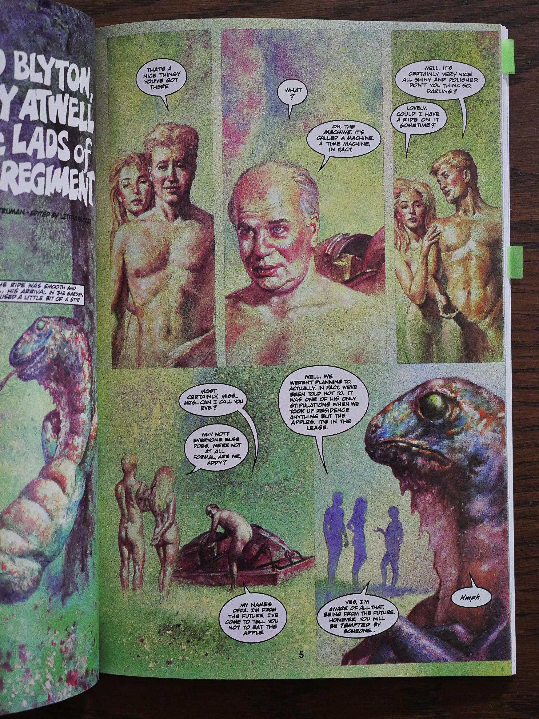
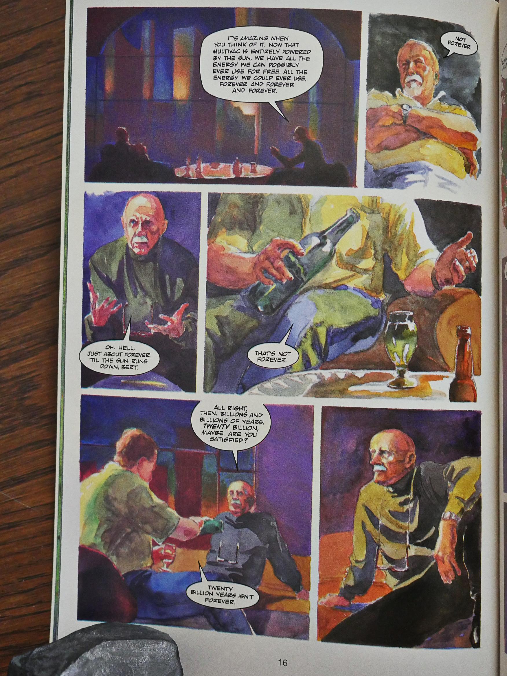
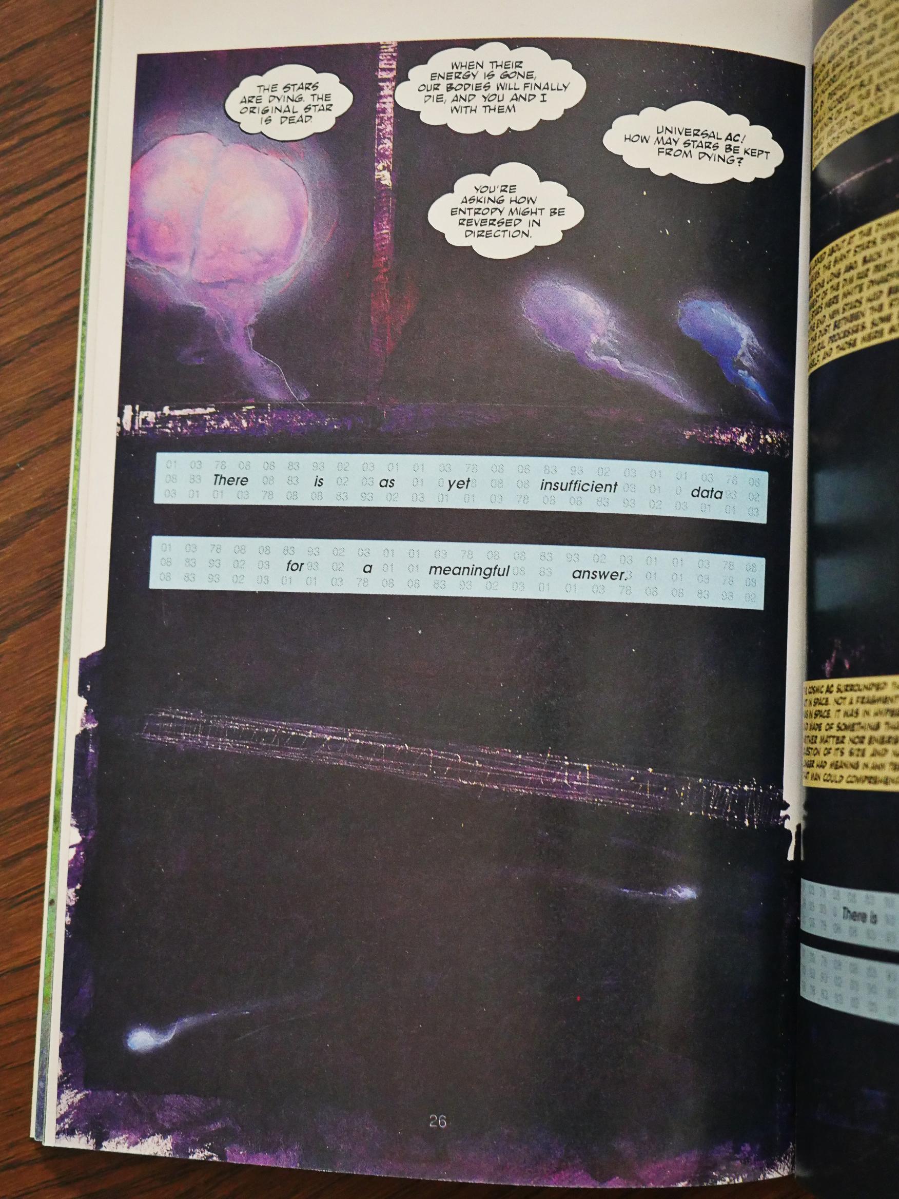
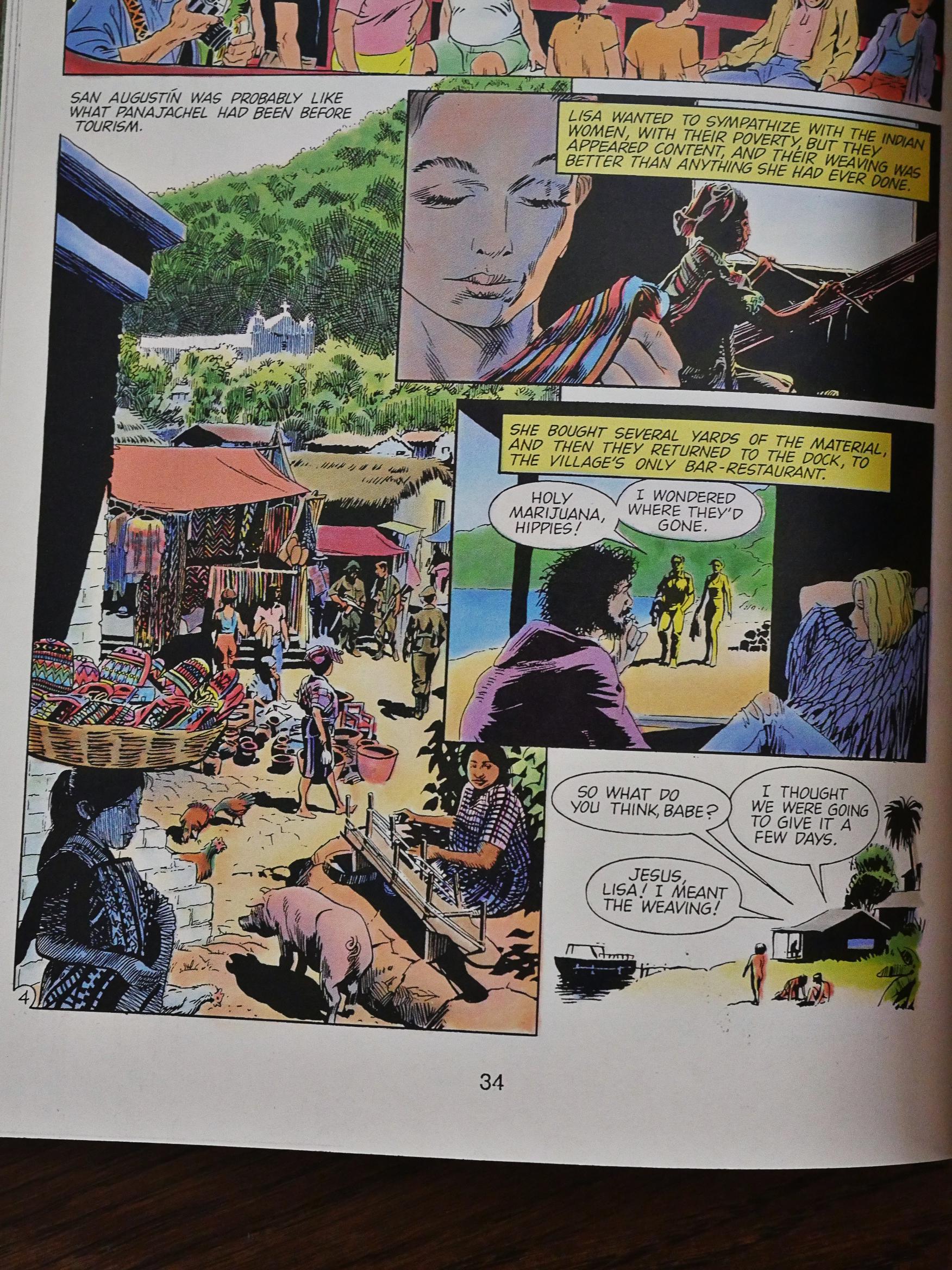
Eclipse had started doing adaptations of Clive Barker’s short stories some months earlier with Tapping the Vein, so perhaps it felt natural to branch out into science fiction short story adaptations, too.

So this is an adaptation of short stories from the Isaac Asimov magazine, which I’ve never seen. I’ve never read any of the science fiction magazines, even if I’m a huge sf geek. I’ve nothing but my own prejudice to go on, really, but I’ve always assumed that those mags were pretty staid and boring. I mean, I liked reading Asimov when I was, like, 12, but I went on to other authors.

Hey! Either Stan Woch or Steve Vance did the design on this extra-special Eclipse/Orbit logo. Heh.

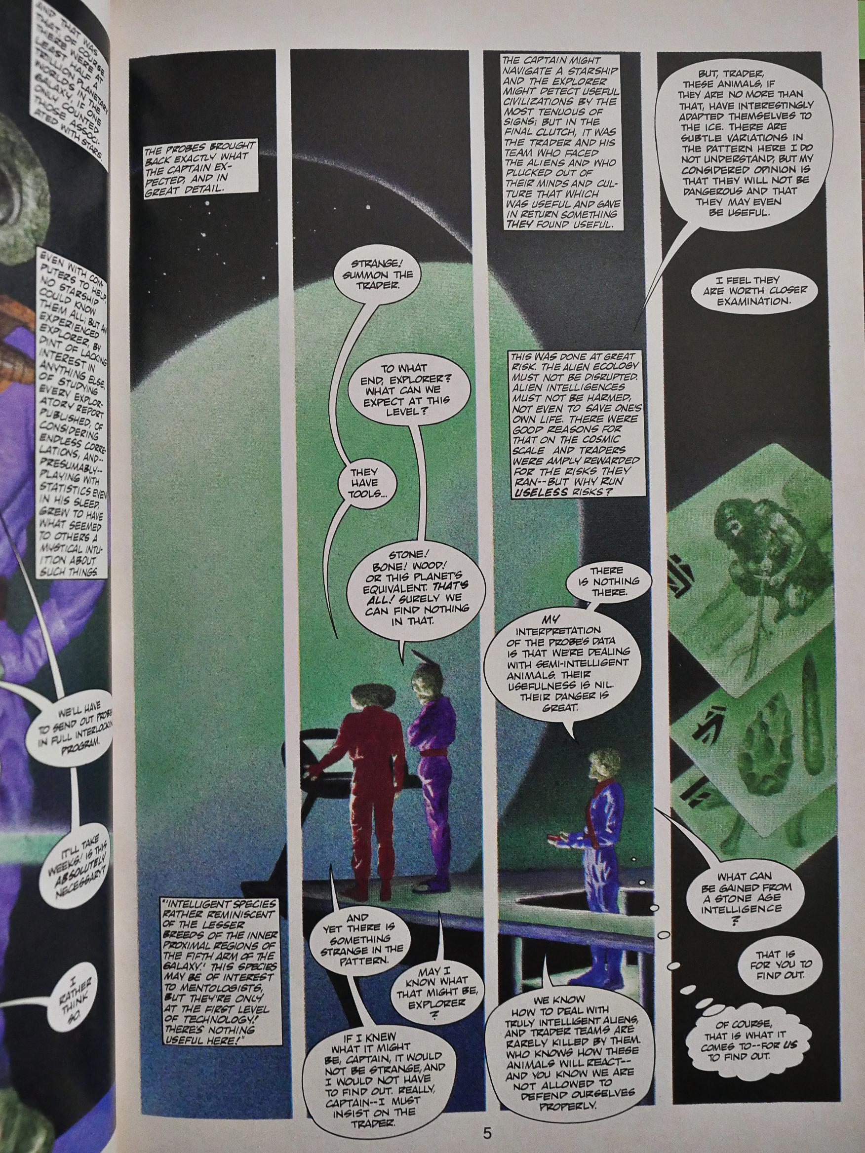
This is very similar to the Clive Barker anthology in many ways. It’s also squarebound, around 50 pages long, features mostly fully-painted artwork, and ex-editor Fred Burke does most of the adaptations. And, as before Burke’s approach to adapting a short story into comic book story is to preserve as many of the original words as possible. His adaptations almost don’t function as comics at all, but more as illustrated stories.

So it illustrators like John Bolton don’t really have much space to work… especially since all these adaptations are around 14 pages long (so there’s three stories per issue).

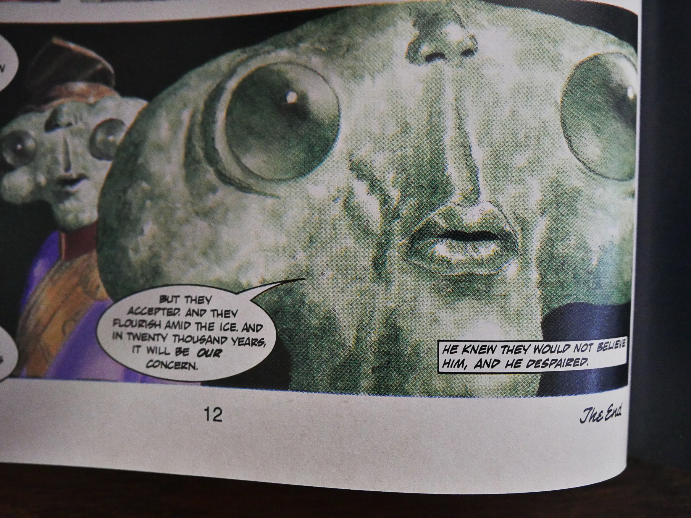
Some of these pieces survive in what I imagine is a pretty unscathed fashion: I can totally see the above piece being faithful to the original Asimov story, for better or worse.

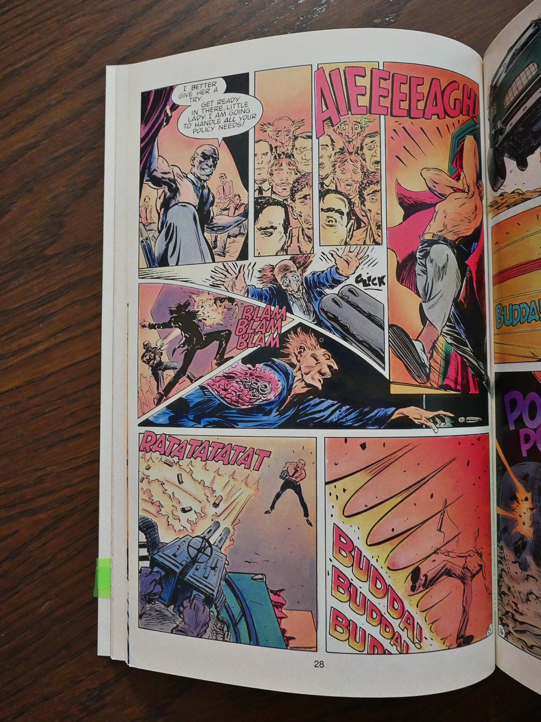
Leslie Clague and Steve Niles pare down the word count considerably for their version of the Neal Barrett, Jr. story, so it kinda works, but the story is a bit of a mess and Mark Pacella’s artwork, while moving a lot better than most of the panels in this series, isn’t very exciting.

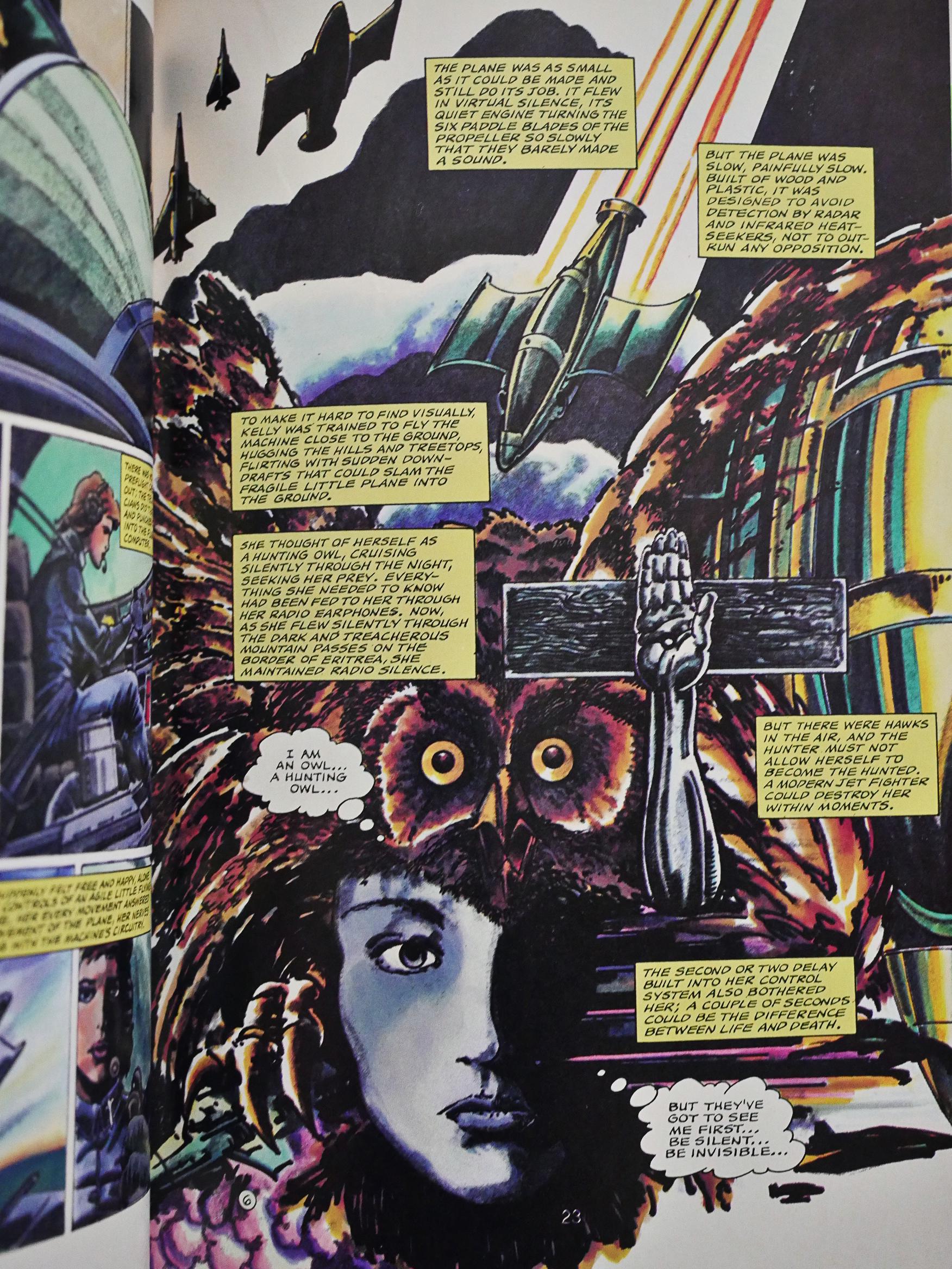
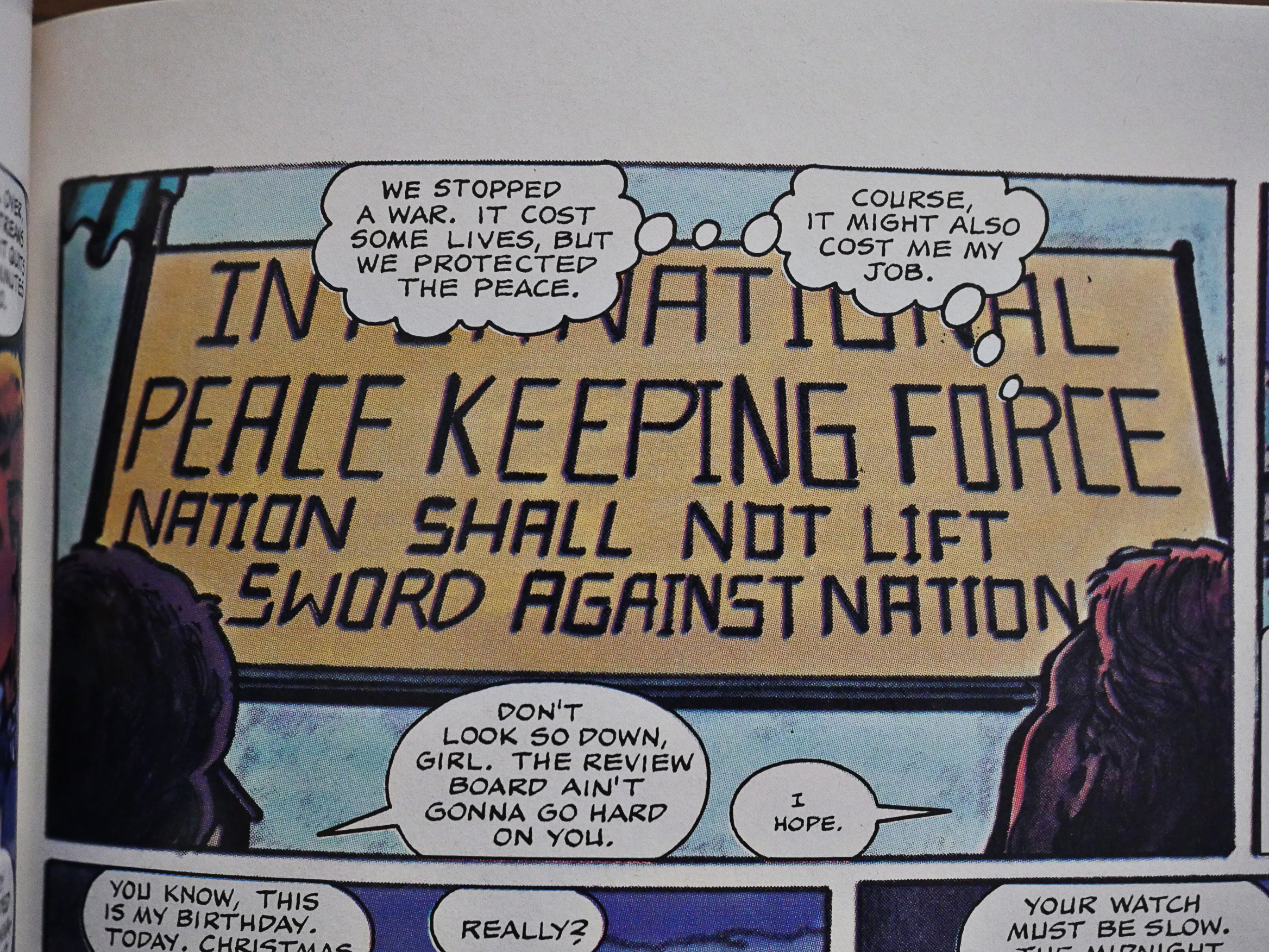
The Burke/Rafael Kayanan version of a Ben Bova story is probably the weirdest thing here, and I’m guessing it’s all down to Kayanan, because Burke is verbose as usual…

… and Bova’s point seems to be that drone pilots are people too. Or something.

Perhaps they give this story as a reading assignment at the military stations in Nevada?

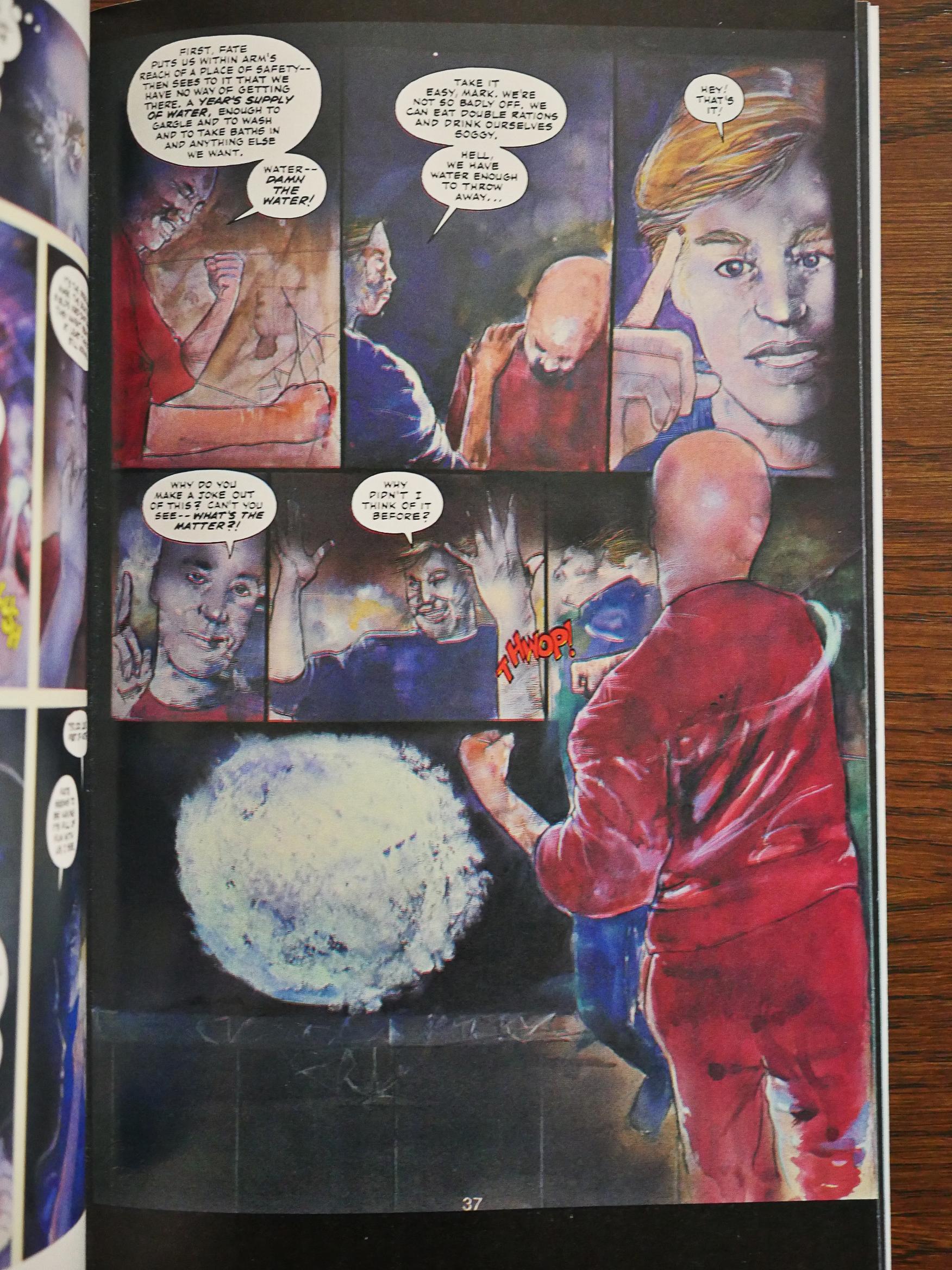
I get the attraction of painted artwork: It looks a lot more luxe and adult and less comic-bookey, which seemed important when going after a bookstore market. (But then it turned out that the bookstore market wanted a black and white pen-and-ink book about a Maus instead.) But some of these artists are almost completely unable to tell a story, like in the JD Scott/Michael Davis piece above.

John Bolton to the rescue! And for once, Burke keeps the exposition down. On the other hand, this story (by Garry Kilworth) is little more than an extended joke, so 14 pages is more than enough to tell it in a leisurely fashion.

John Estes does a great job on this Don Thompson adaptation of an Asimov story, that, again, is little more than an extended joke. Estes goes from this style…

… to this, as the story grows more abstract. It’s not a very interesting story, but the artwork almost makes you believe that it is.

Tom Yeates’ version of a Lucius Shepard story is probably the most successful one in these three issues, in that it has both a pretty interesting story and in that Yeates tells it really well.

All these three issues were released within a year, which is pretty unusual for these kinds of projects. So either they only had three issues in mind when they started it, or perhaps their co-editors at the Asimov magazine helped out keeping things rolling? I’m just guessing.

1990: Black Magic

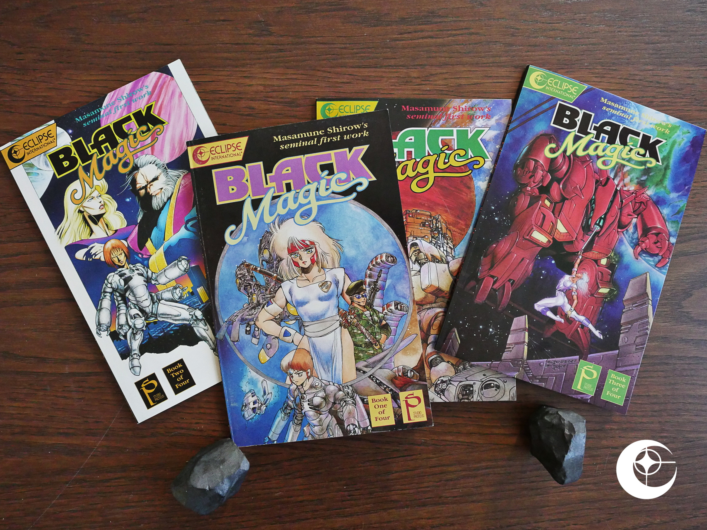
Black Magic (1990) #1-4 by Masamune Shirow et al.

This is the final of the three series Eclipse (aided by Studio Proteus) published created by of Masamune Shirow. The cover say “seminal first work”, but I think you can interpret “semi” in “seminal” as short for “semi-professio”.

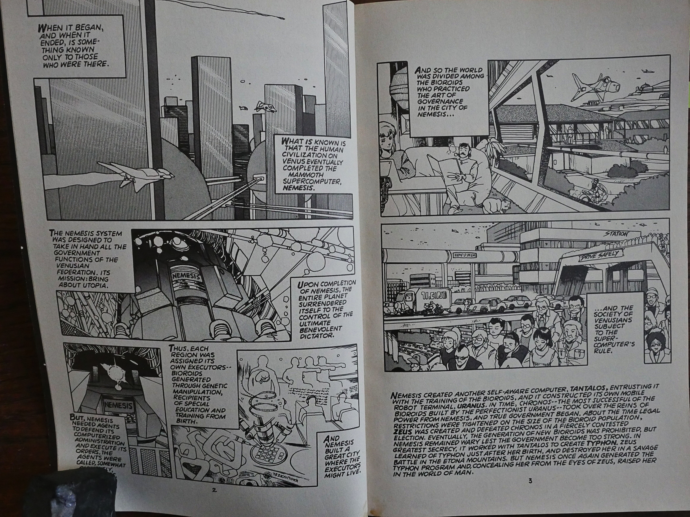
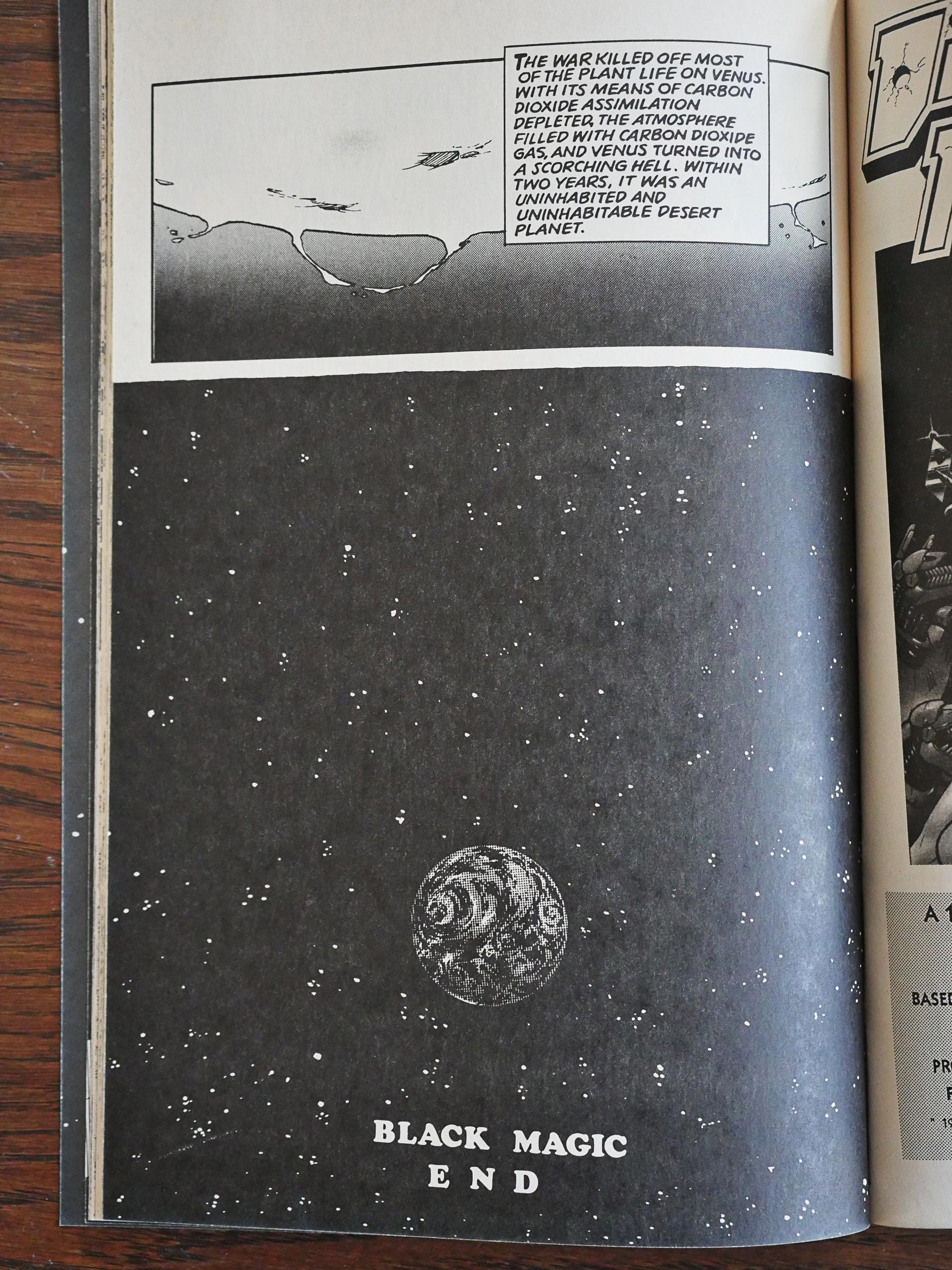
That is, it’s an awkward mess of a book. We start with a two page spread that explains centuries (millennia?) of Venusian life, instead of Shirow’s later “just start with some action” way of starting things off.

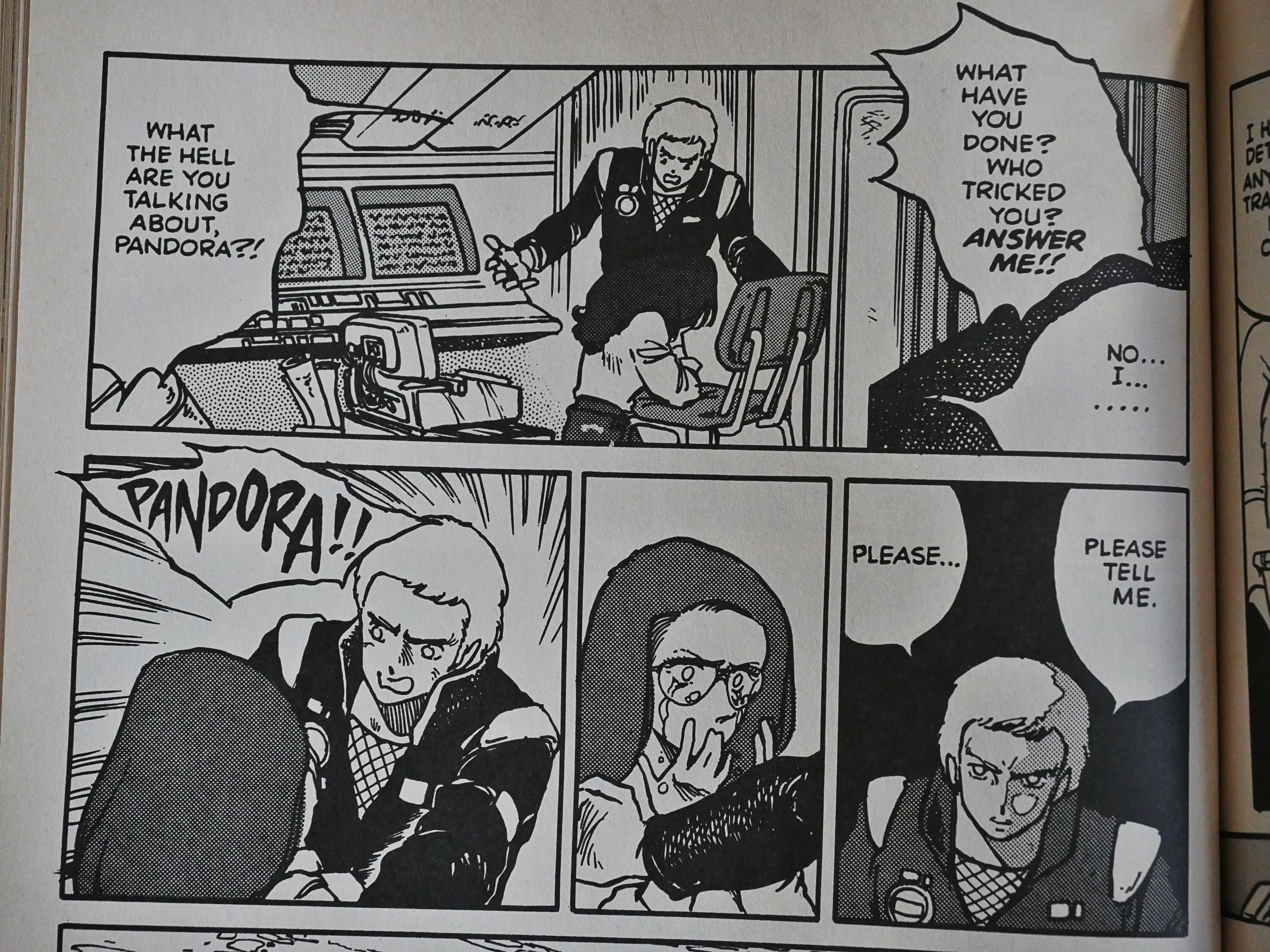
So, after that two-page spread that explains everything, we’re dropped into an action scene (yay!) and the soldiers are talking about… magic? and spells? Which, of course, weren’t mentioned at all on the explainer pages.

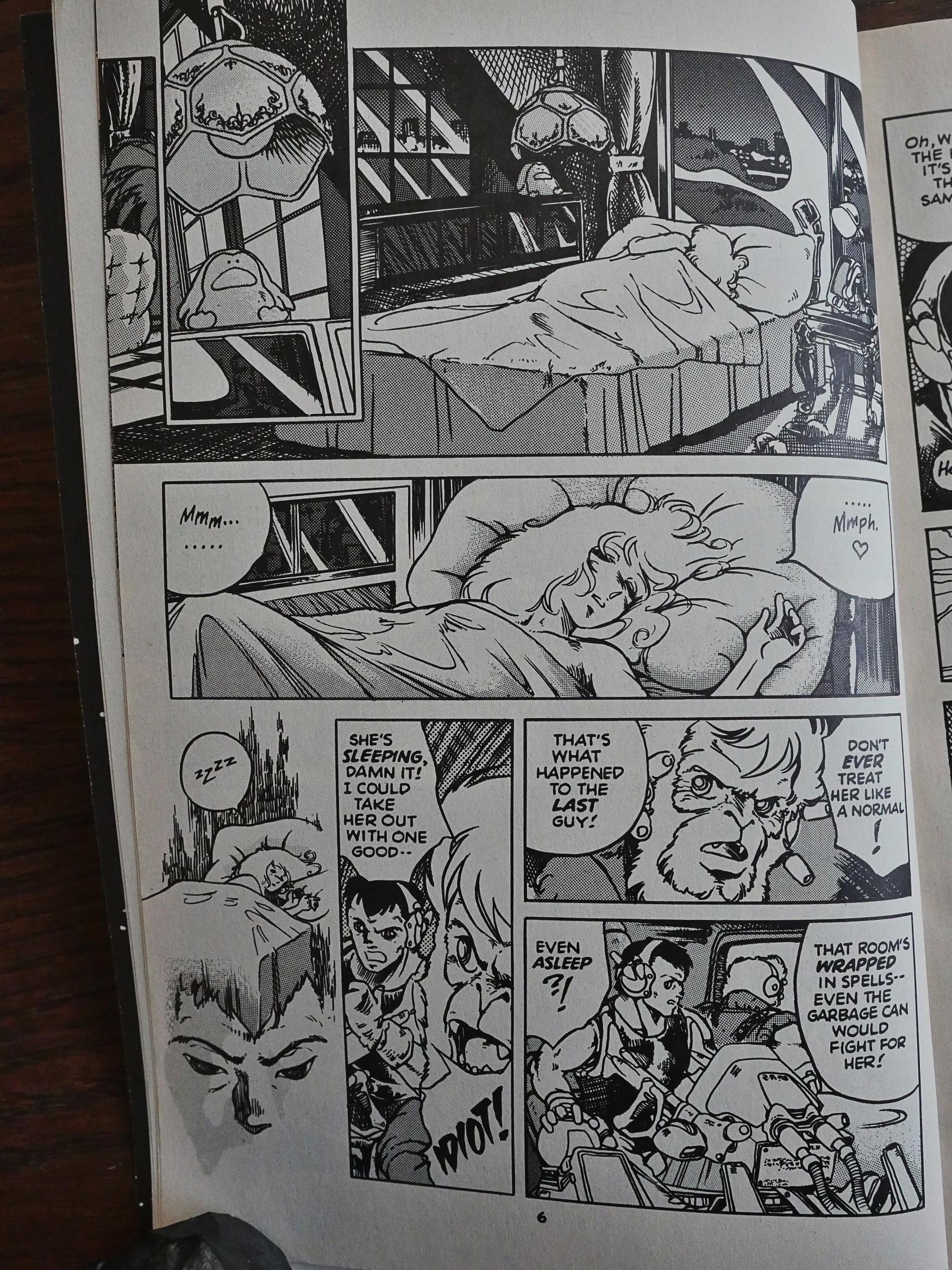
And we rapidly get an expanded cast of characters that have some sort of relation to each other…

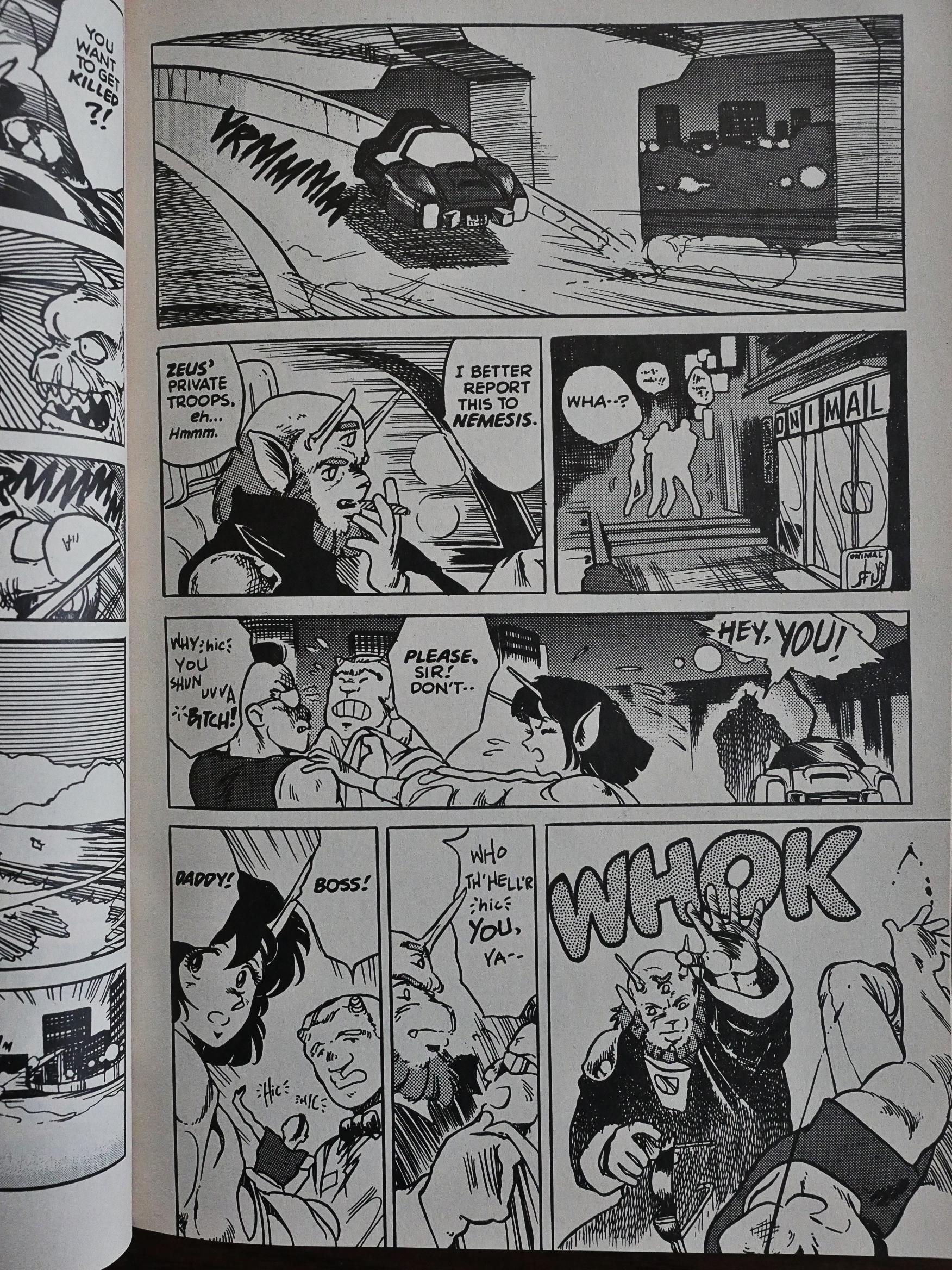
… and we seem to be in for some fun comedy thing in a restaurant (and Shirow gets to do his favourite thing; that feet-in-the-air surprise take). But it’s all abandoned pretty quickly and then…

… we’re on a missile sub and it turns out that this is millions of years in the past and that these Venusians were responsible for terraforming Earth! Yes! Twist ending! And that’s just in the 42 pages it takes to finish the first issue!

So it’s a frustrating read, and the artwork isn’t as exciting as Shirow’s work would later be.

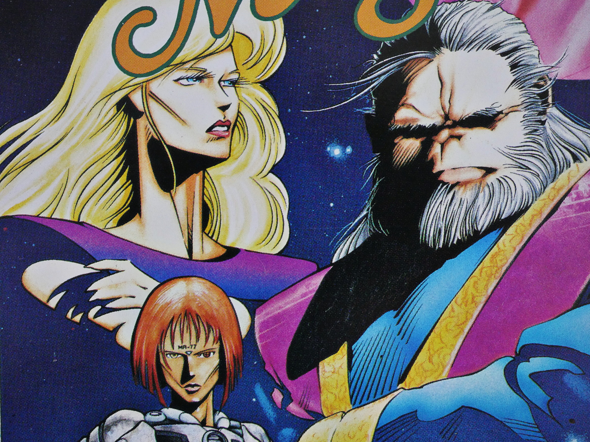
Brian Stelfreeze provides the covers to two of these issues, and… er… it’s kinda like he hasn’t seen a Japanese comic before? The fourth issue claims to have a Stelfreeze cover, too, but it looks so much like Shirow’s artwork that I’m guessing it’s just the normal Eclipse production sloppiness at work.

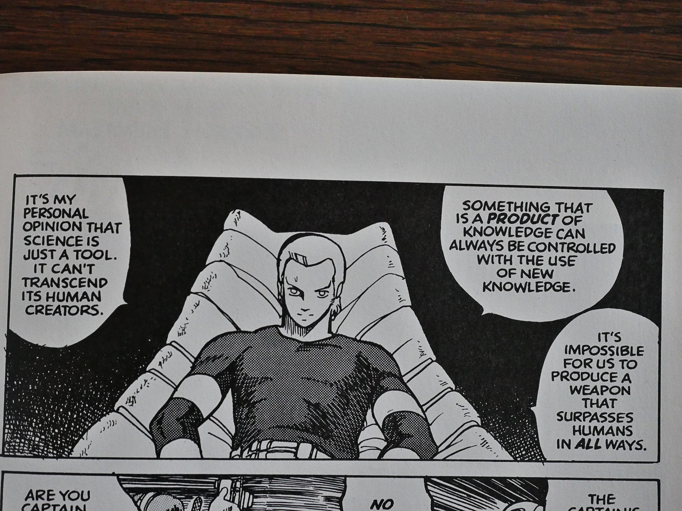
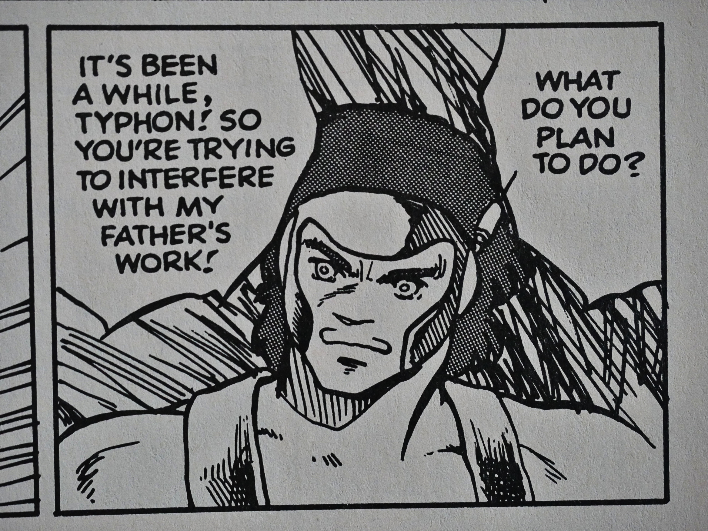
The next two issues have little to do with the first one. They’re all about some soldiers hunting down some killer robots. What the hell?

I don’t have a clue, either.

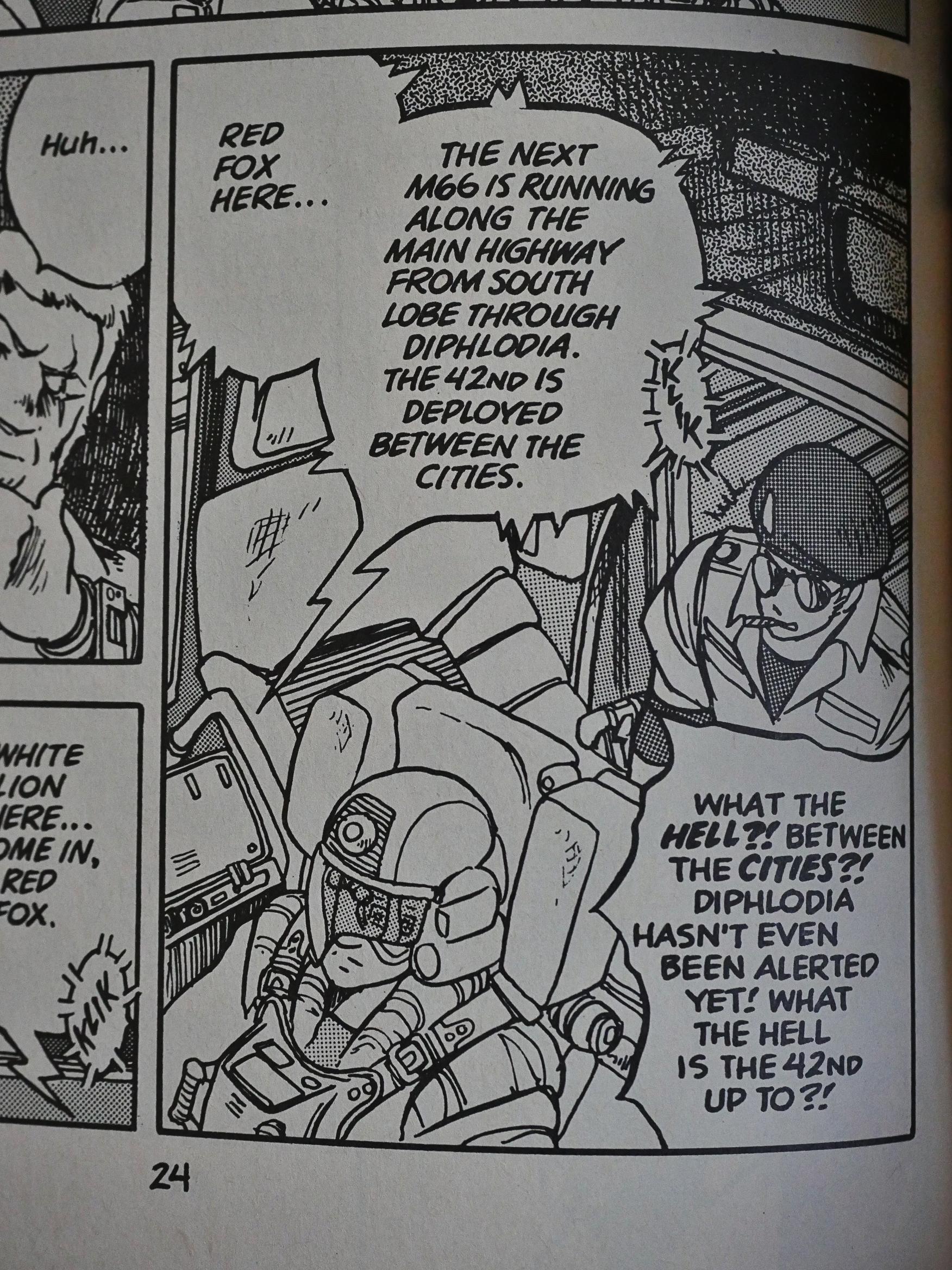
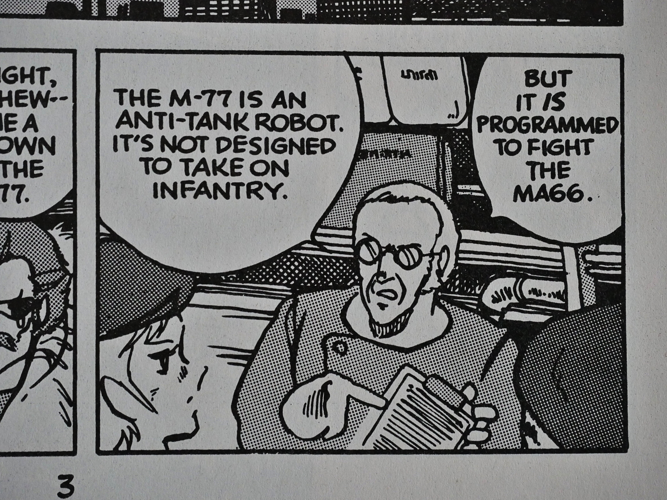
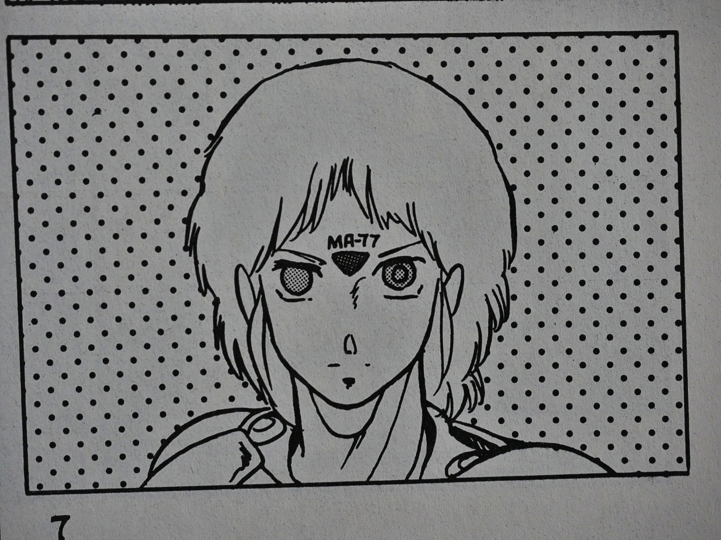
I wonder whether some of the problem isn’t in Shirow’s storytelling, but in sloppy translations. It took me a while to figure out that when they were talking alternatively about an “M-77”..

… and an “MA77”, they were describing the same thing: That robot up there.

The humans (I mean, Venusians) prevail!

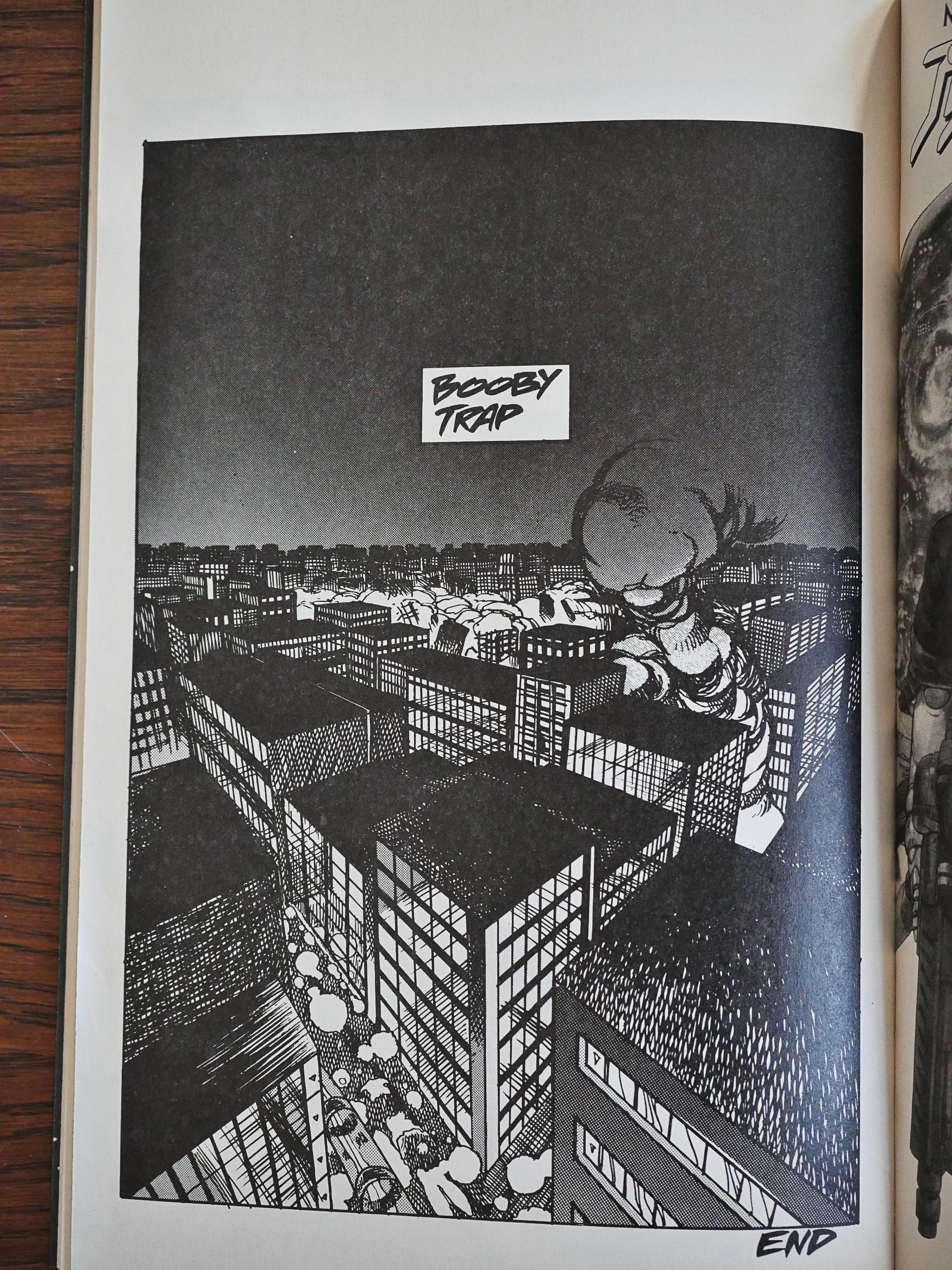
But it turns out that the robot had boobytrapped the building (for some reason or other), so they all died anyway.

Spoilers!

Well, those were two pretty pointless issues about fighting robots, so now what? The fourth issue has slight connection to the first, but it’s mostly about saving a spaceship from not colliding with Saturn.

And then they blow the world up. The end!

Oops. Spoilers.

I guess what I’m saying is that this is typical early work from a developing artist.

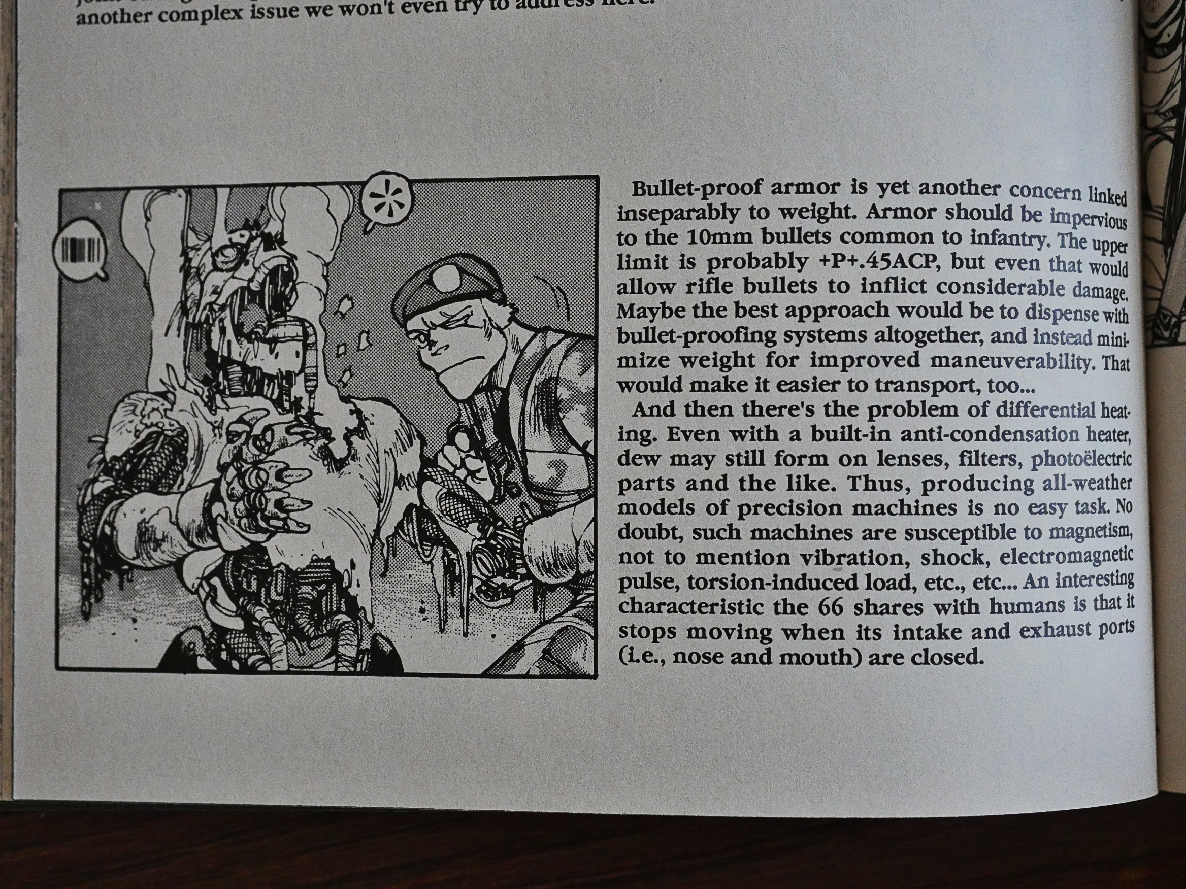
Shirow, as, usual, provides several pages of information about his robots and stuff, which is nice.

Dark Horse has released a collected edition of this stuff.

So what did others think of it?

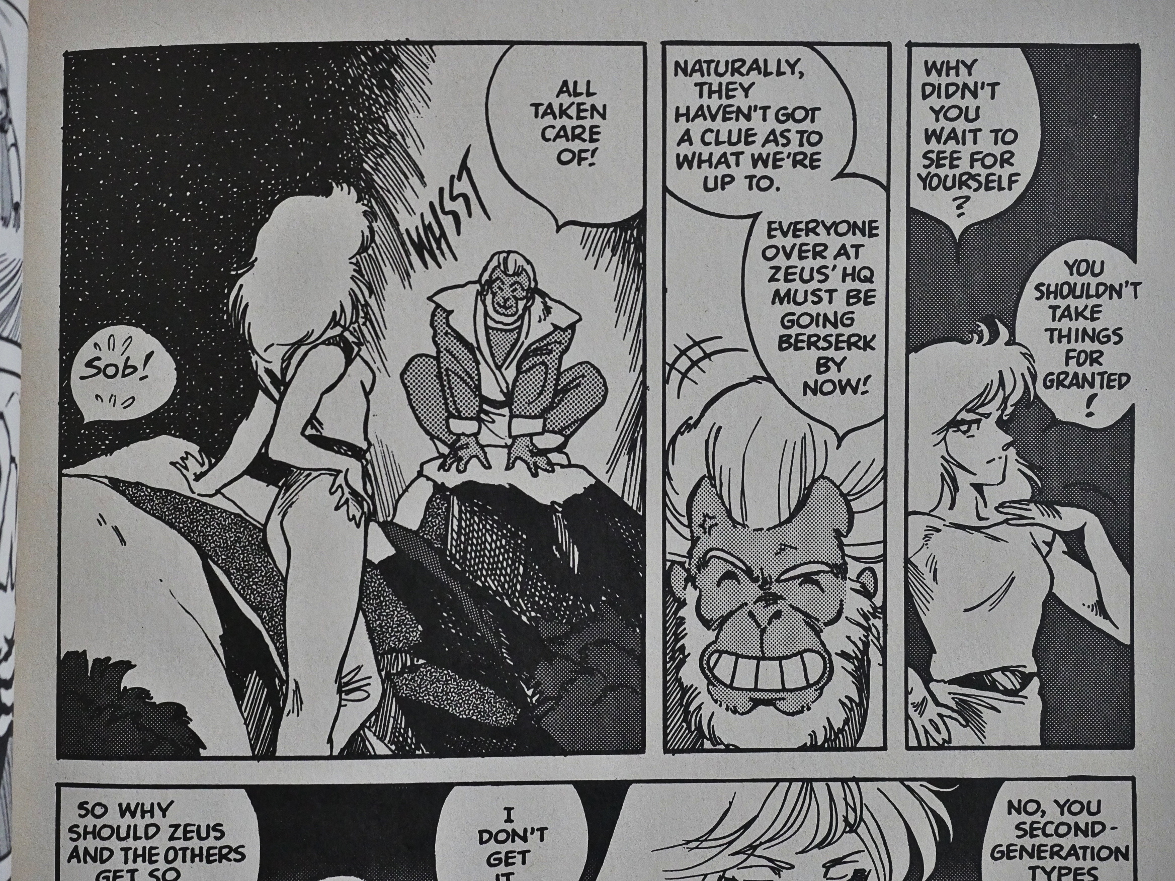
It’s a challenge just to make some basic sense out of Typhon’s basic motivations — one of the longer plot arcs involves Typhon unleashing a wave of killer robots on the populace of Venus, watching over them just to the point that they make it into civilian territory, and then vanishing without explaining what the hell that was supposed to accomplish. I was starting to think that Shirow was just screwing with the readers at that point, suddenly exposing the series’s “heroine” as the actual enemy; but nope, before long she’s keeping Zeus from killing off the rest of the people on Venus.

I know! But either that guy’s confused or I’m confused. He says that the middle two issues take place on Earth, and this story happened millions of years ago, so I don’t think so? It happened on Venus? I think? Not that I’m going back to check. And he also says that the colony is blown up? It was just a single building in the version I read.

But anyway: Confusion!

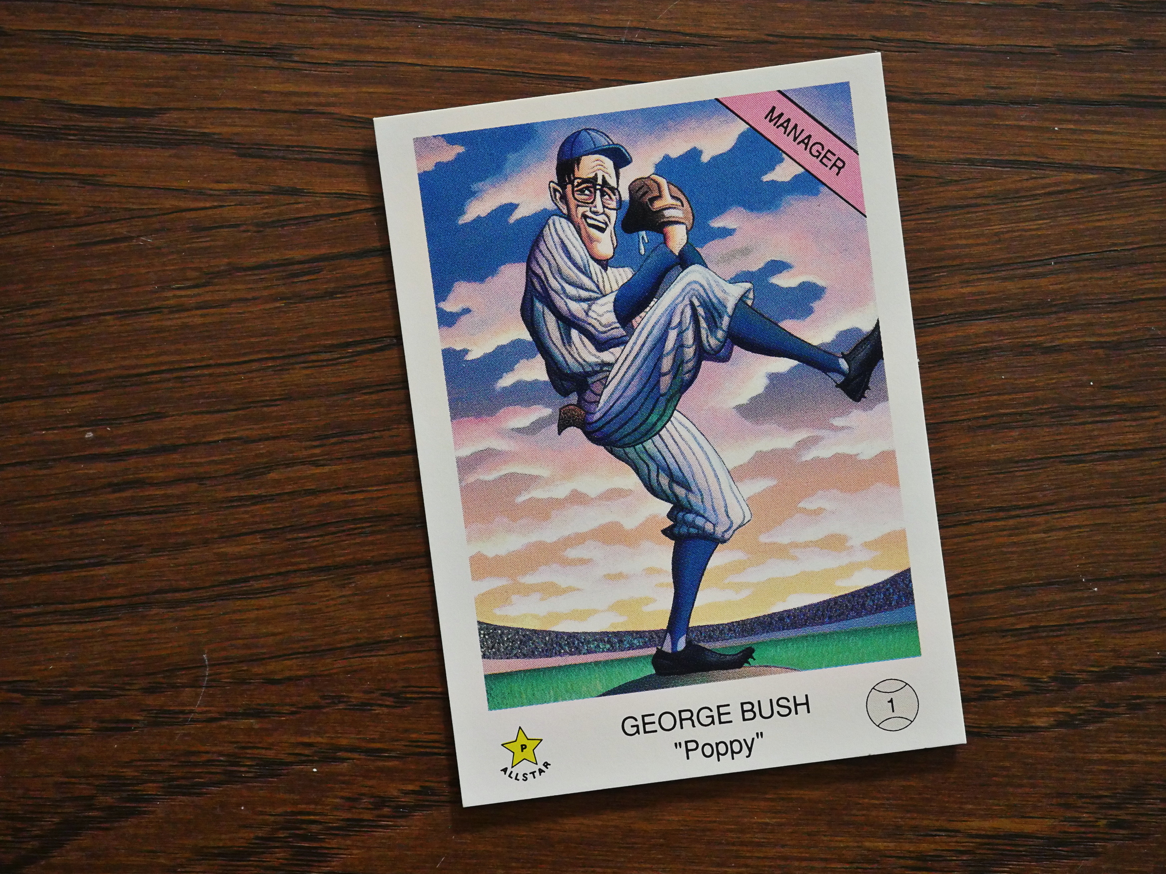
1990: Bush League Trading Cards

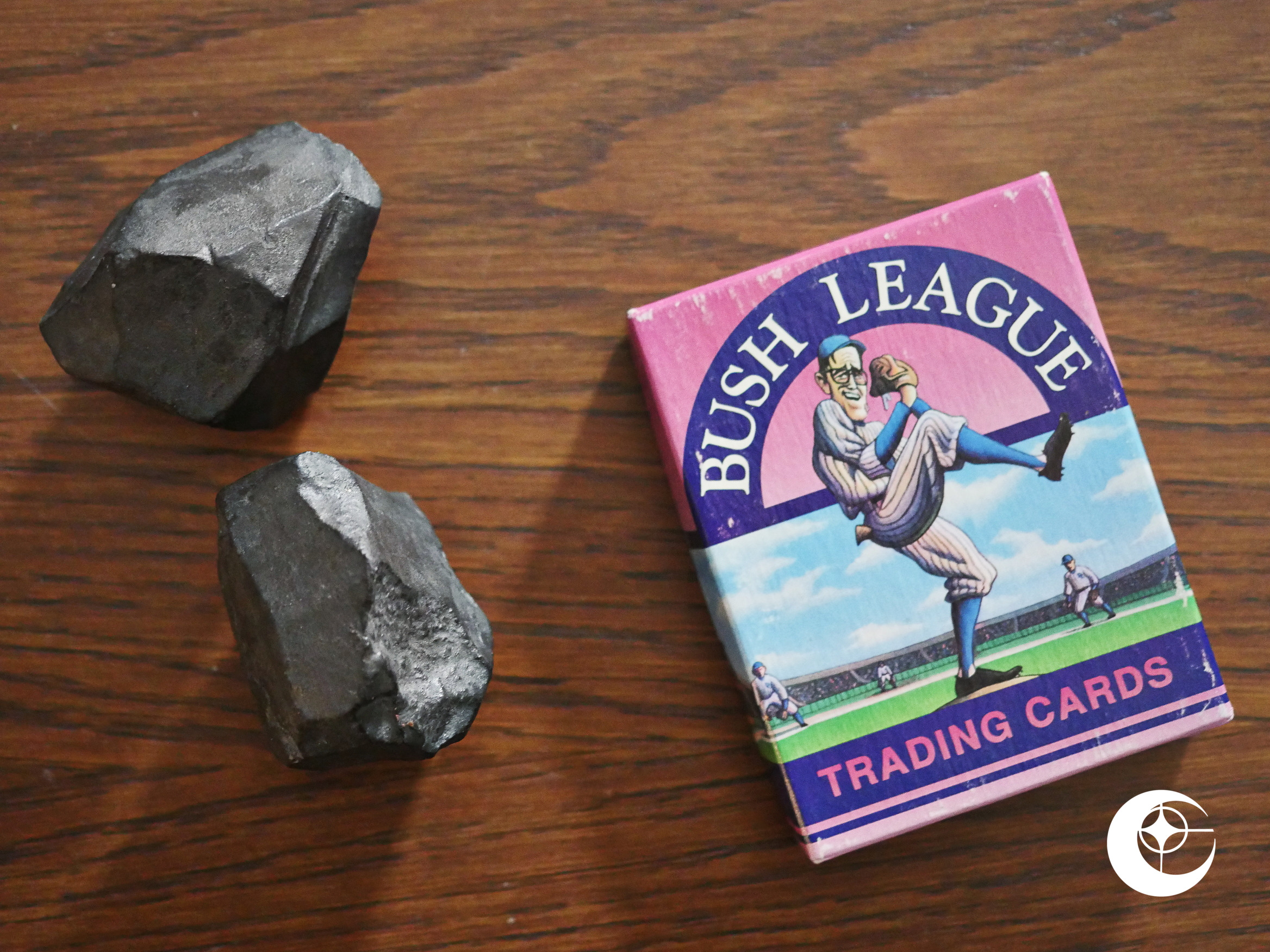
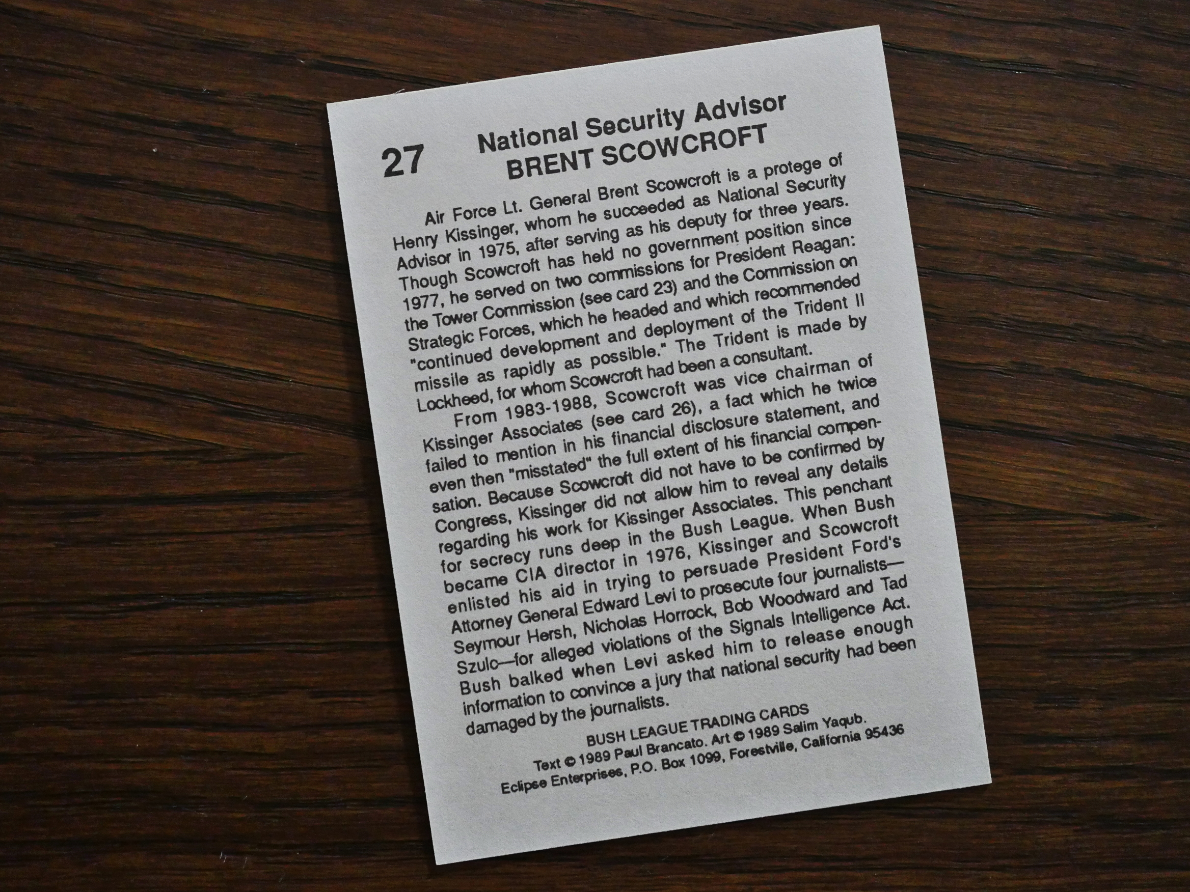
Bush League Trading Cards (1990) by Paul Brancato and Salim Yaqub.

Brancato and Yaqub kicked off the entire “current events” “trading” card genre with Iran/Contra a couple of years earlier. That had a pretty limited scope and made some sense in that format, even if it wasn’t… very… interesting: The writing was dry and the artwork wasn’t exciting.
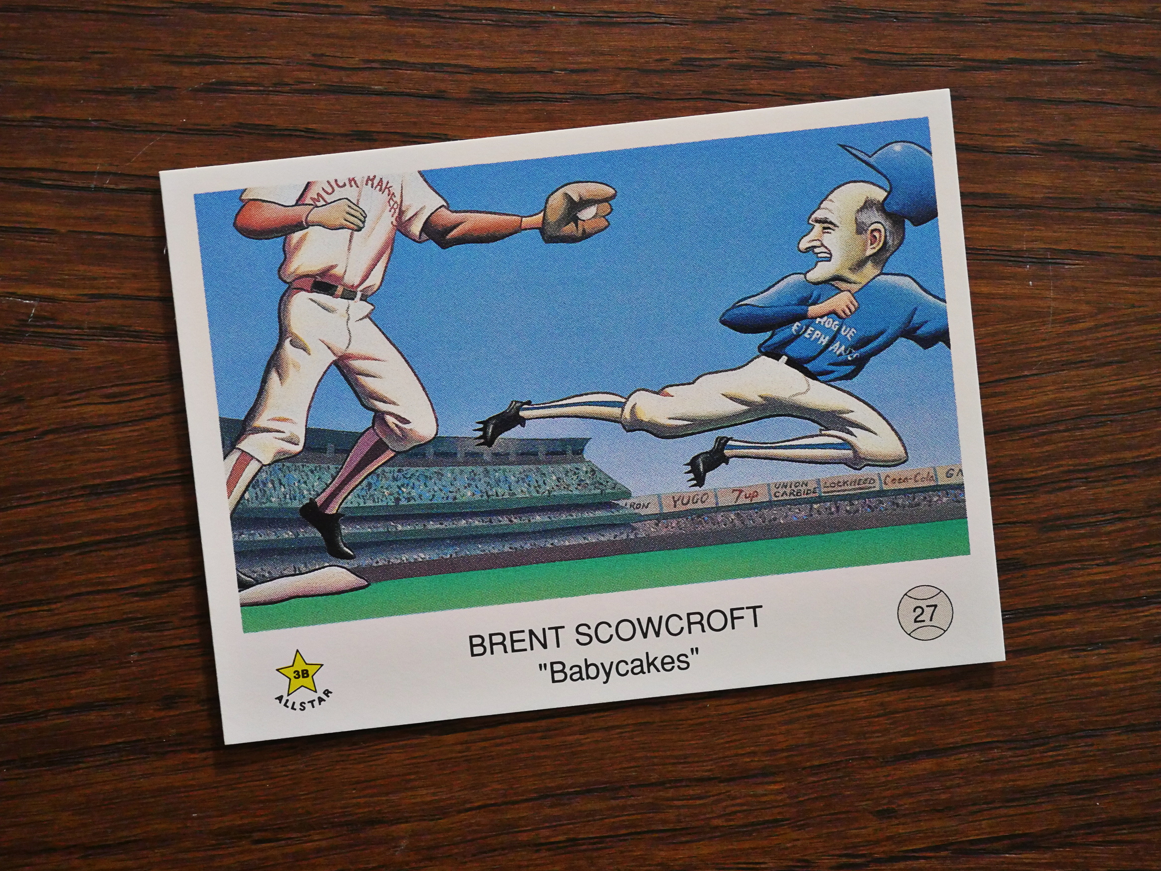
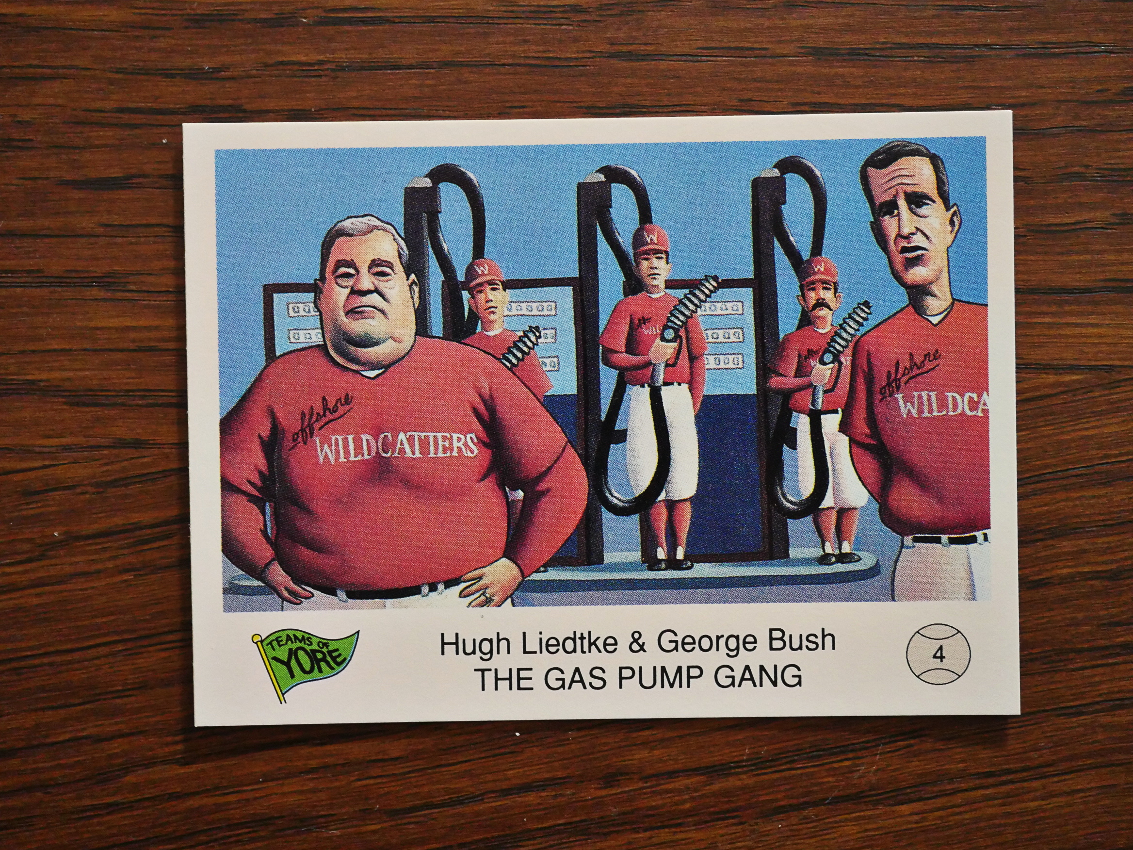
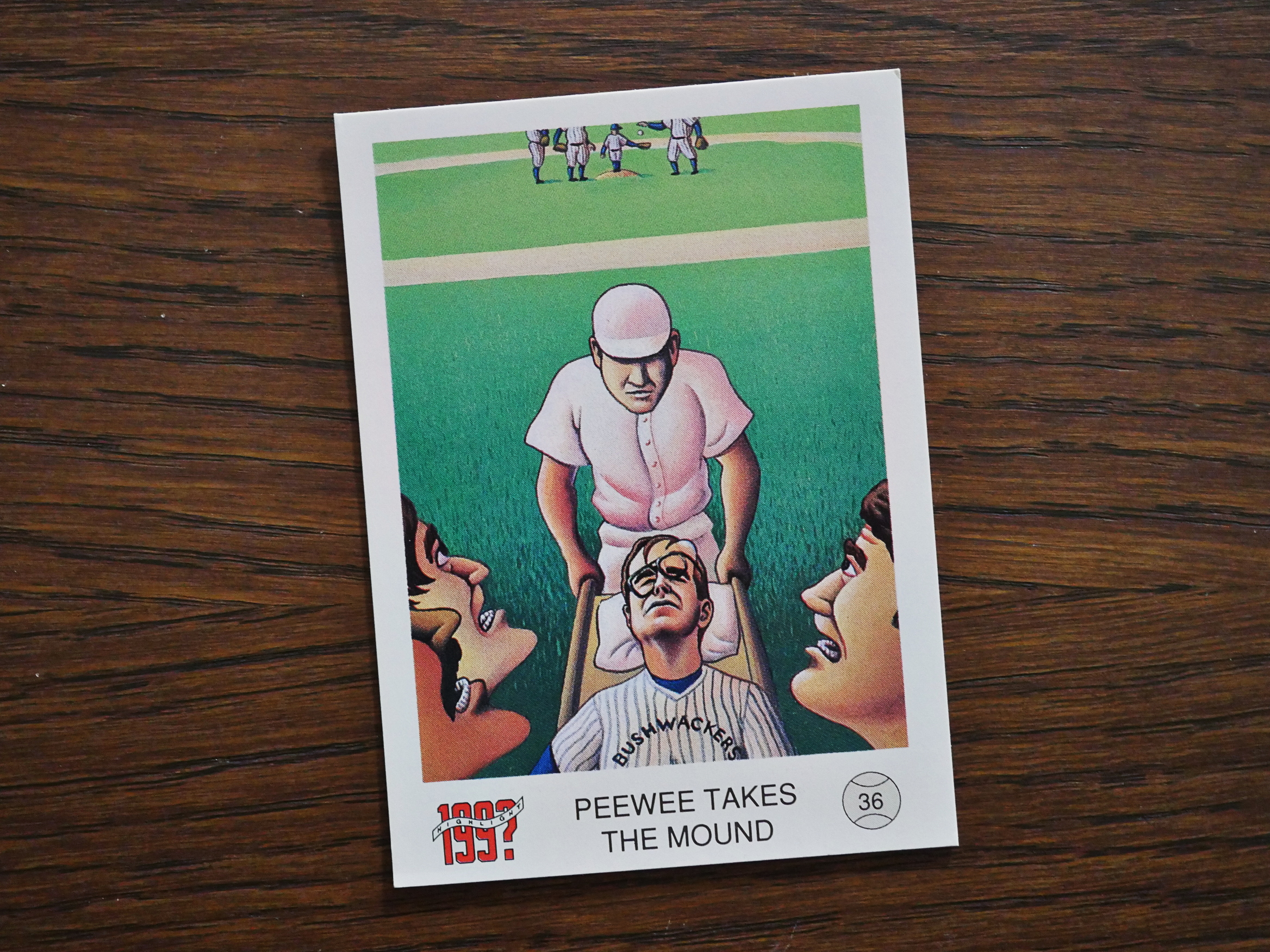
So here they’re at it again, and this time they’re doing the George Bush (the elder) and his administration. This time Yaqub is drawing everybody as if they’re playing some kind of sportsball, so it’s more focused in that way.

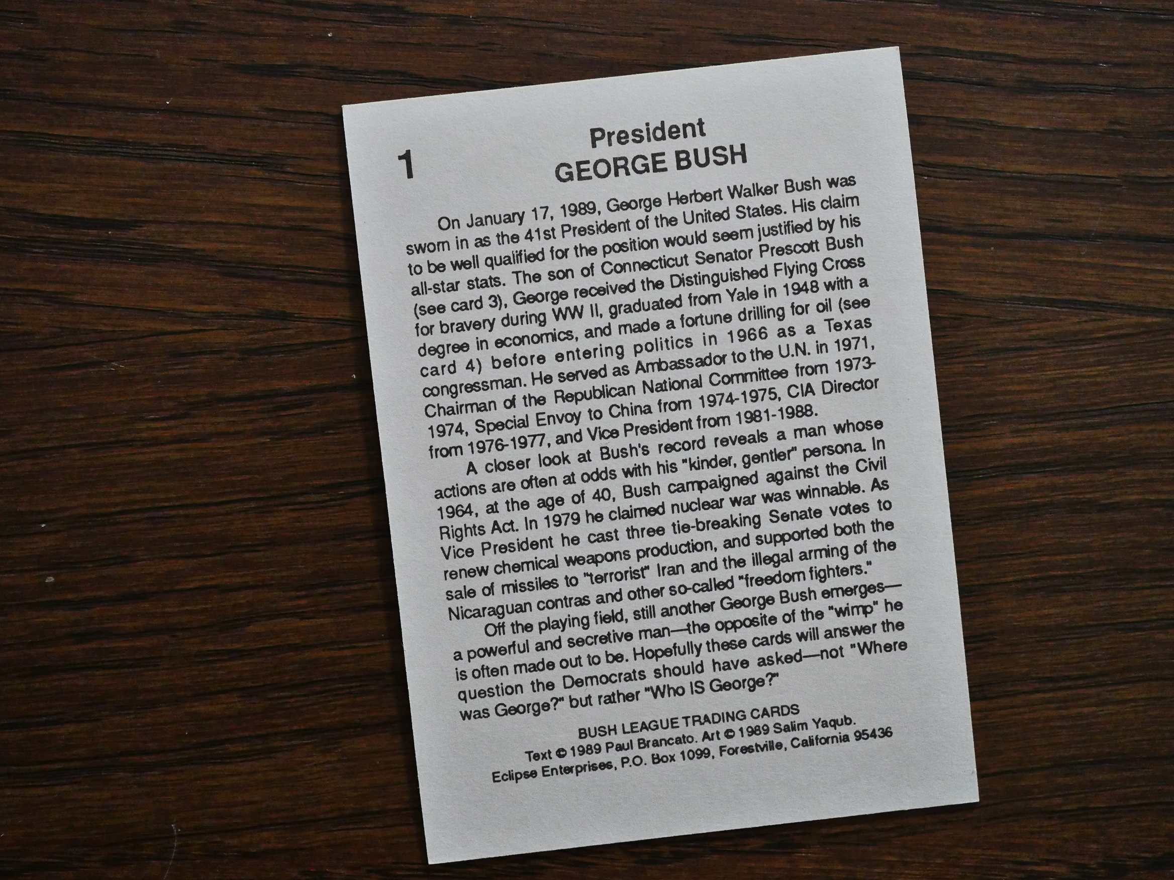
The writing is still dry.

The people they choose to portray don’t really seem very interesting to read about now, at least.

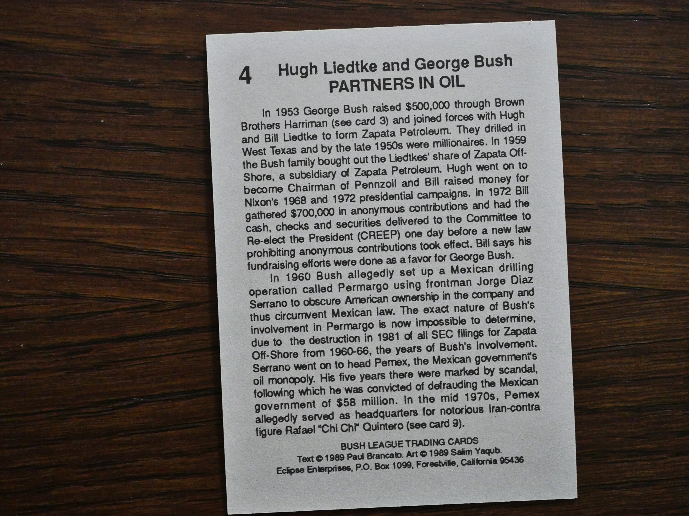
Many of the cards don’t really have any juicy scandals to expose, either, but just point towards something that may perhaps have been shady.

Perhaps if I knew more about this sportsball it’d be funnier?

Bush’s people do seem like douche canoes, but that’s not really surprising…

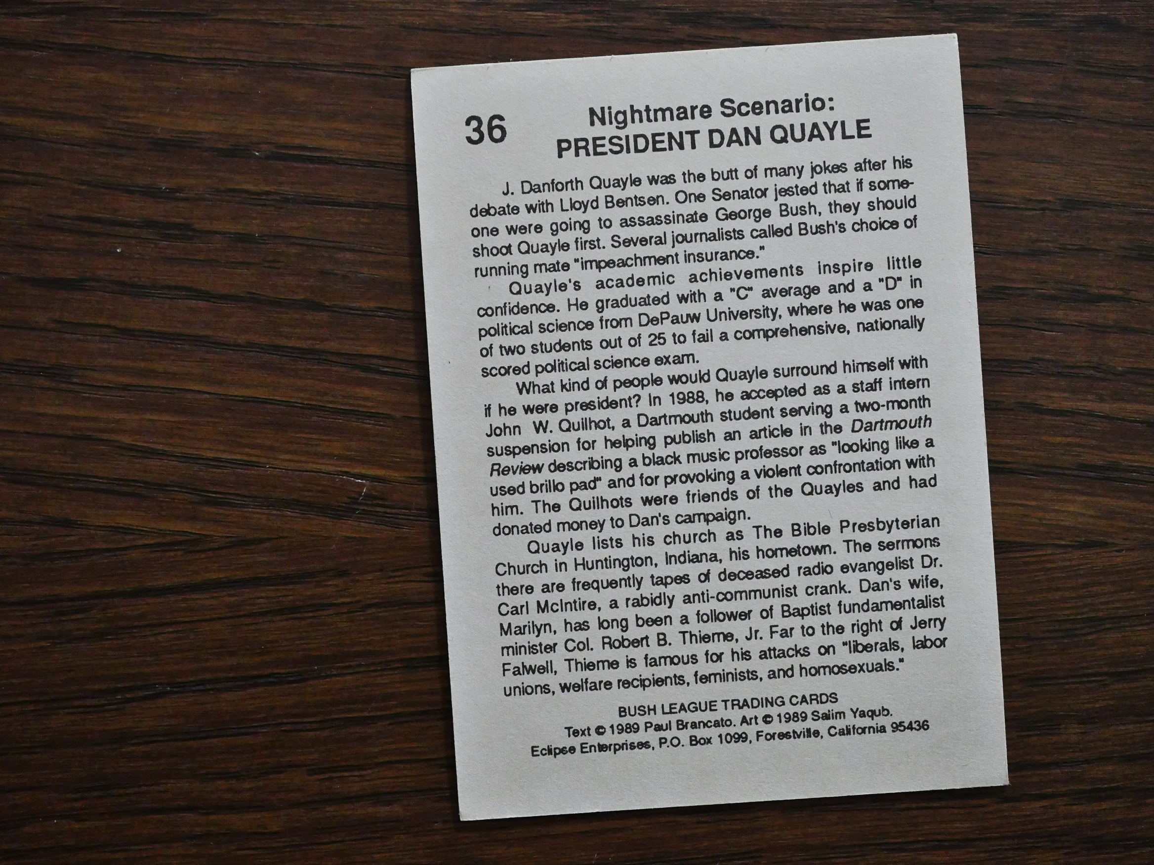
And then the final card:

Ah, nostalgia. Do you remember the days when the nightmare scenario was that Dan Quayle might take over as the president? Do you?

Those were the days.

1990: What’s Michael?

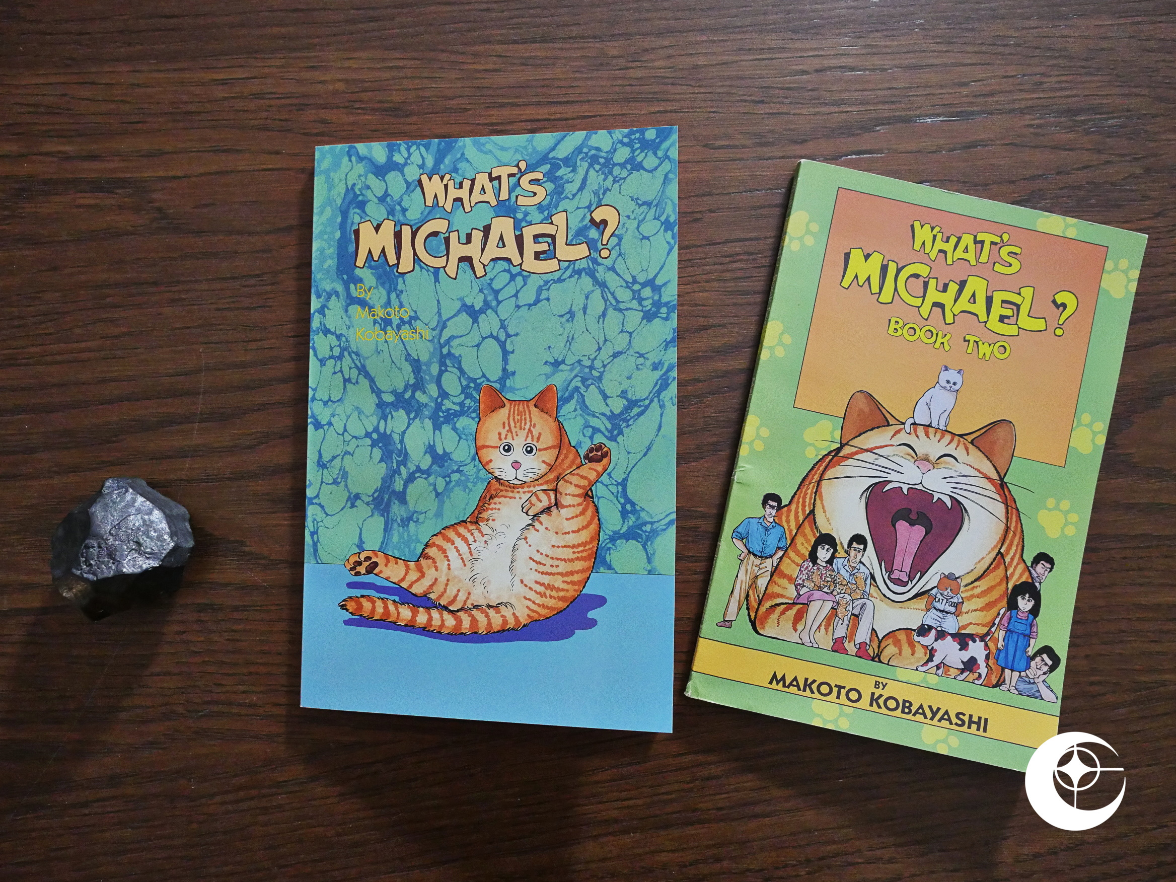
What’s Michael? (1990) #1-2 by Makoto Kobayashi.

Eclipse and Studio Proteus try yet another format for their reprints of Japanese comics: Slim (110 page) trade paperbacks. I assume that each of these reprint about half of one of the original Japanese paperbacks?

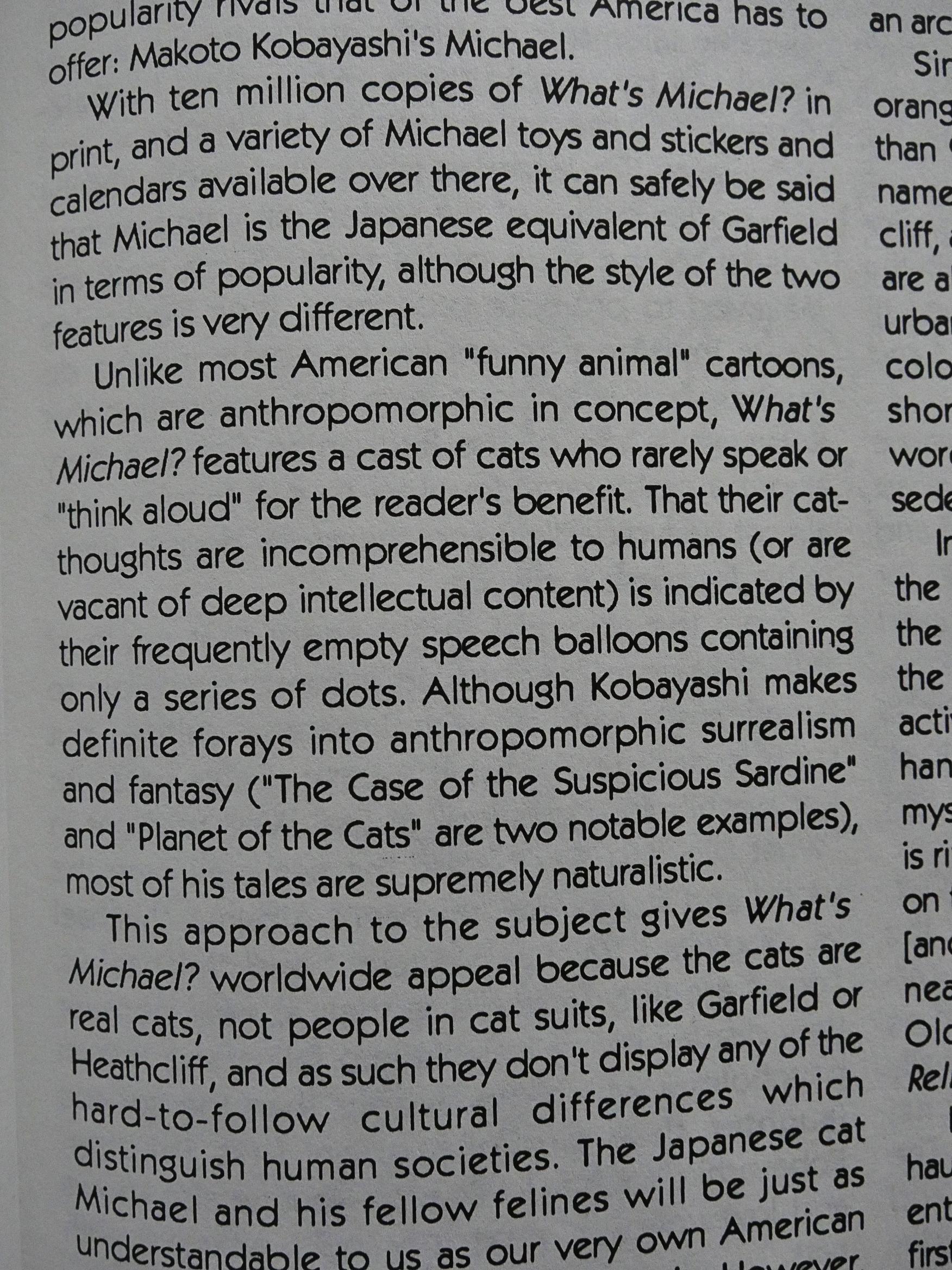
Editor cat ⊕ yronwode, after comparing What’s Michael? to Garfield in the in-house Eclipse ads for the book, explains that What’s Michael? is nothing like Garfield, and what’s more Michael isn’t a single cat, but every Japanese orange tabby? Or something? Sounds kinda unlikely.

Aaand… yes, that’s nothing like Garfield. (The cat dies.)

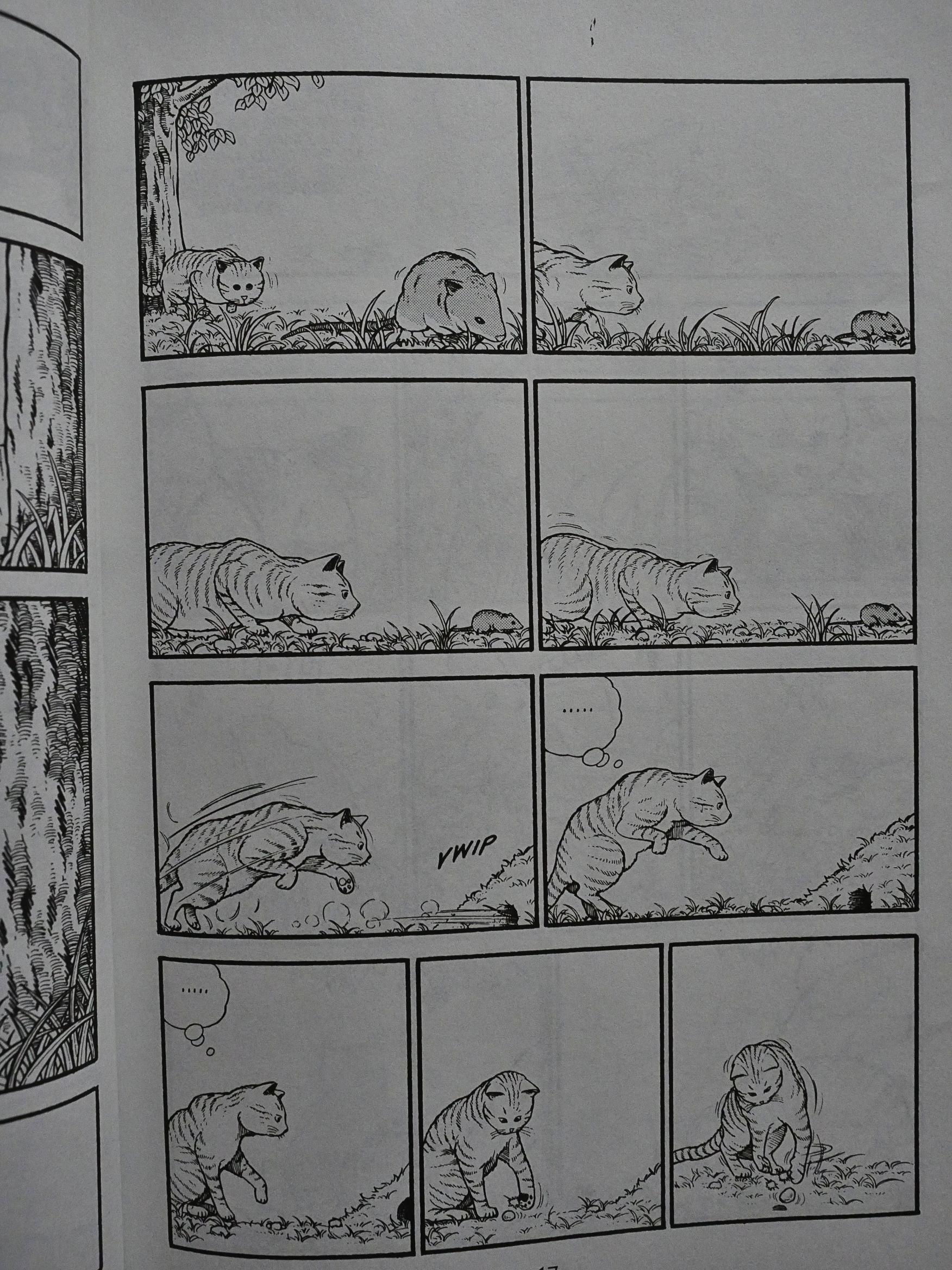
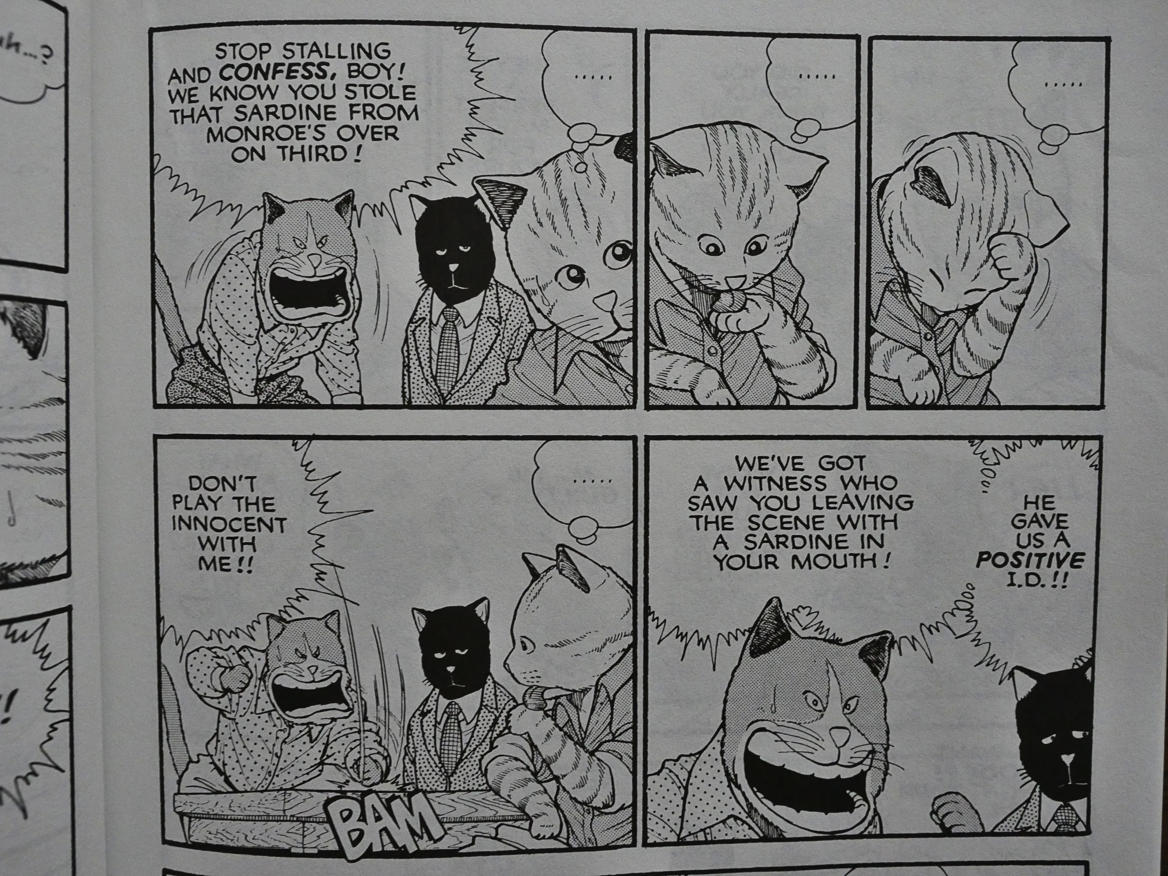
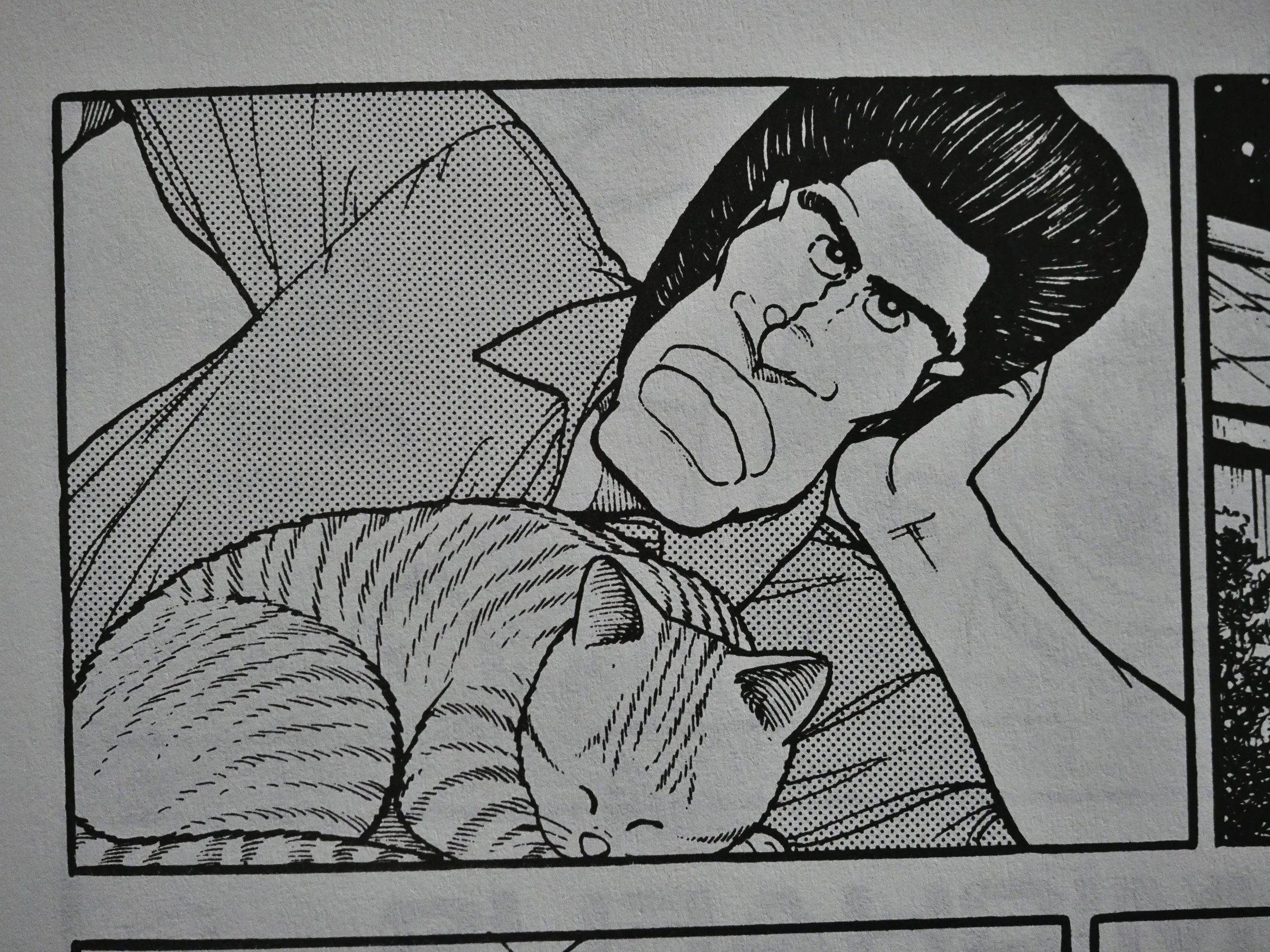
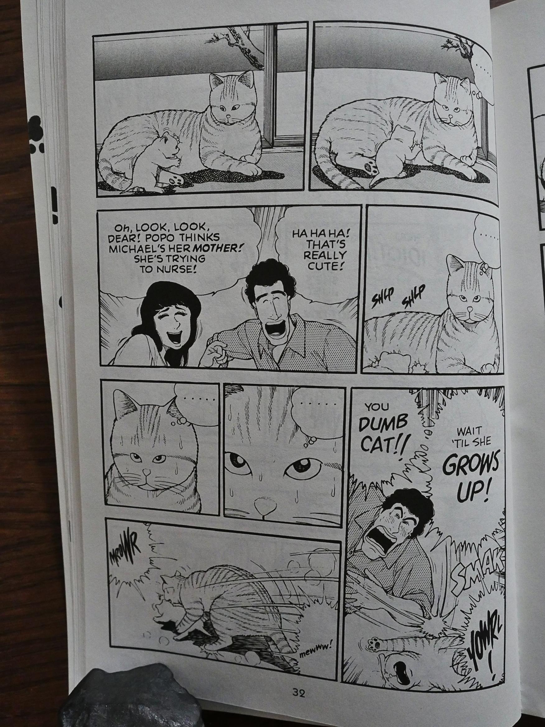
So most of these are vignettes about non-anthropomorphic cats, and they’re extremely well-observed, like above where a cat will always pretend that its plan was successful. And the body language is just perfect. Makoto Kobayashi does this stuff extremely well.

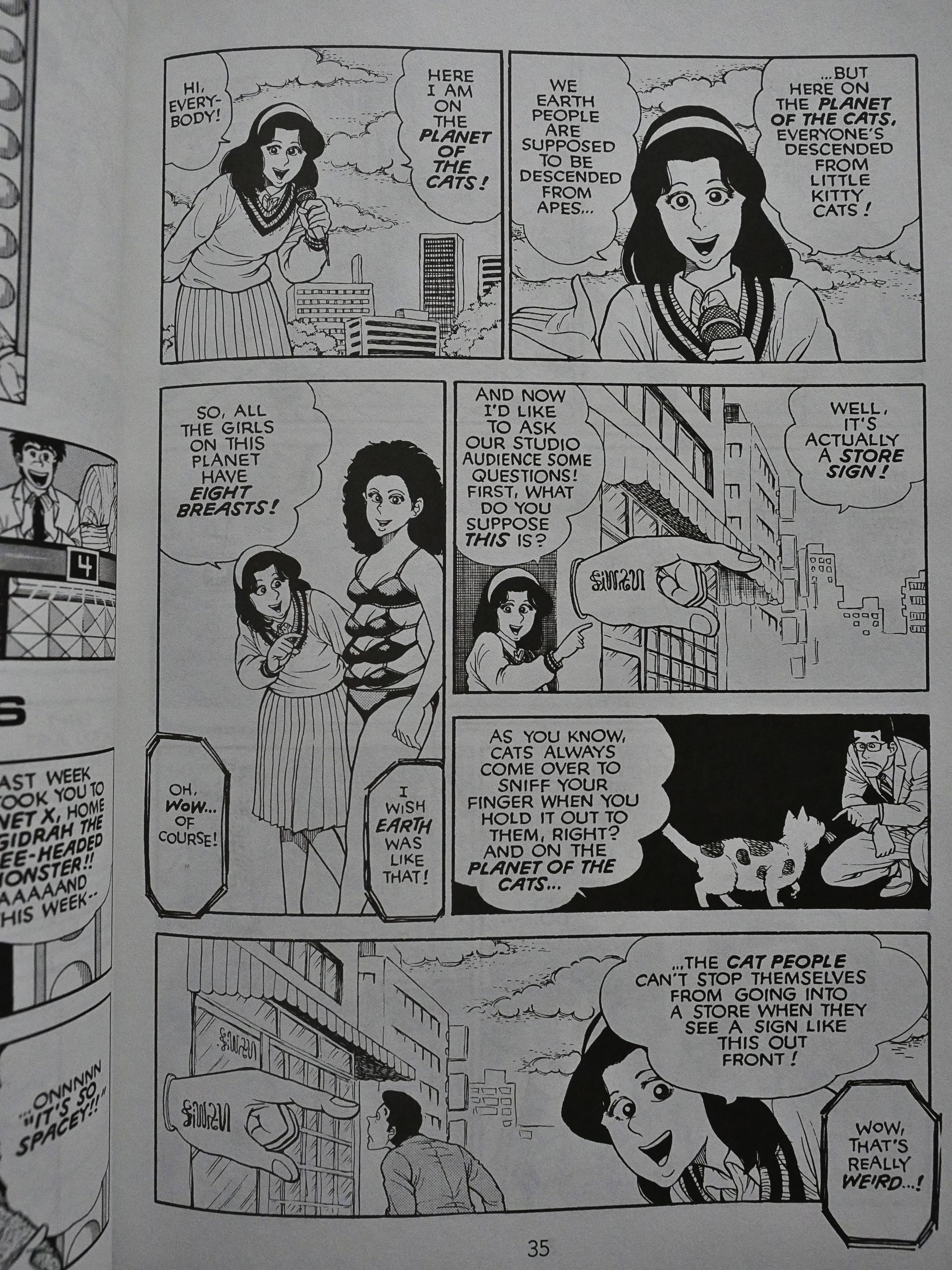
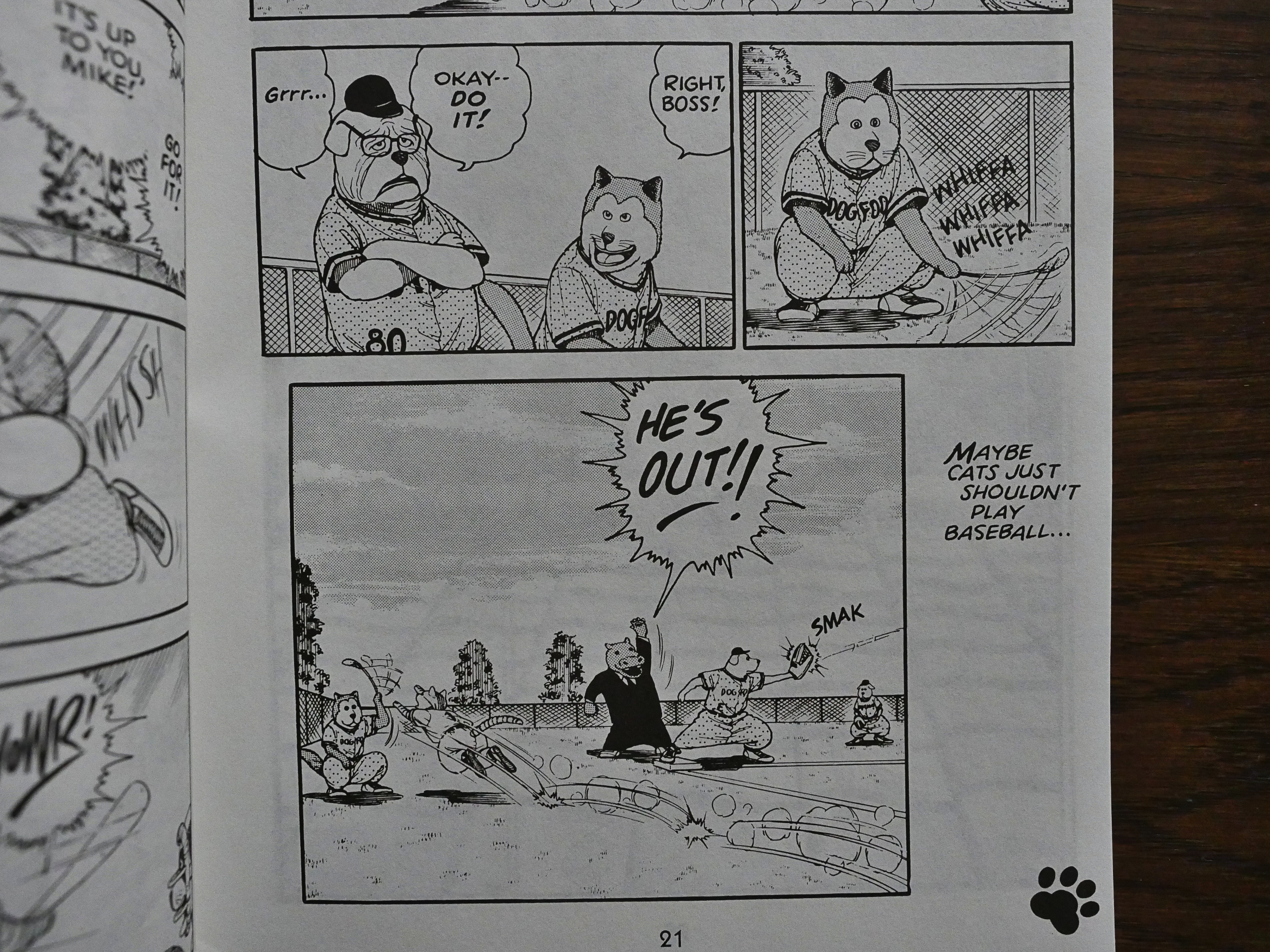
And then there’s these… other random skit things with anthropomorphic cats that are just… insane…

… and these that are even… I can’t even. It’s the most brilliant insanity ever.

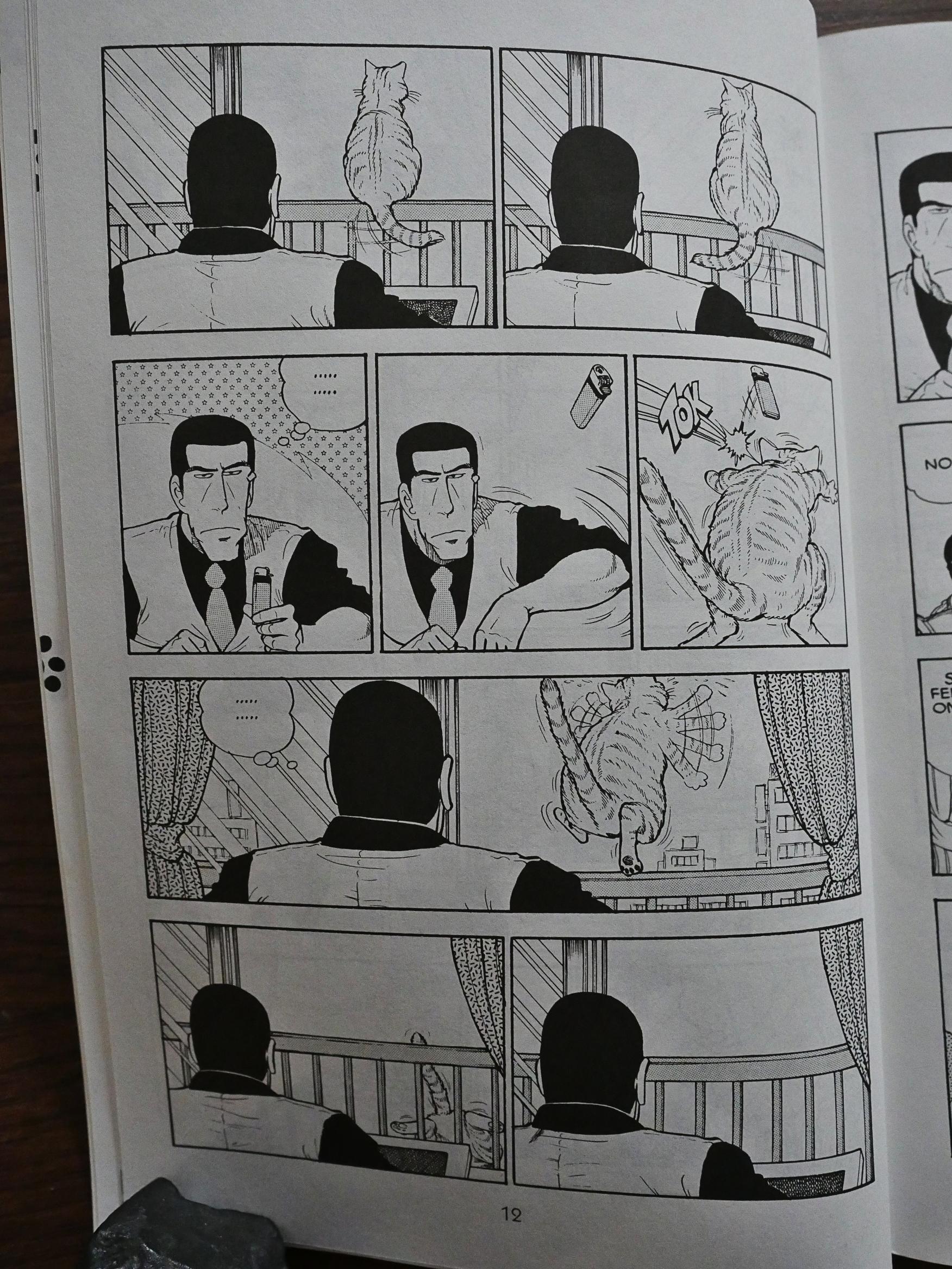
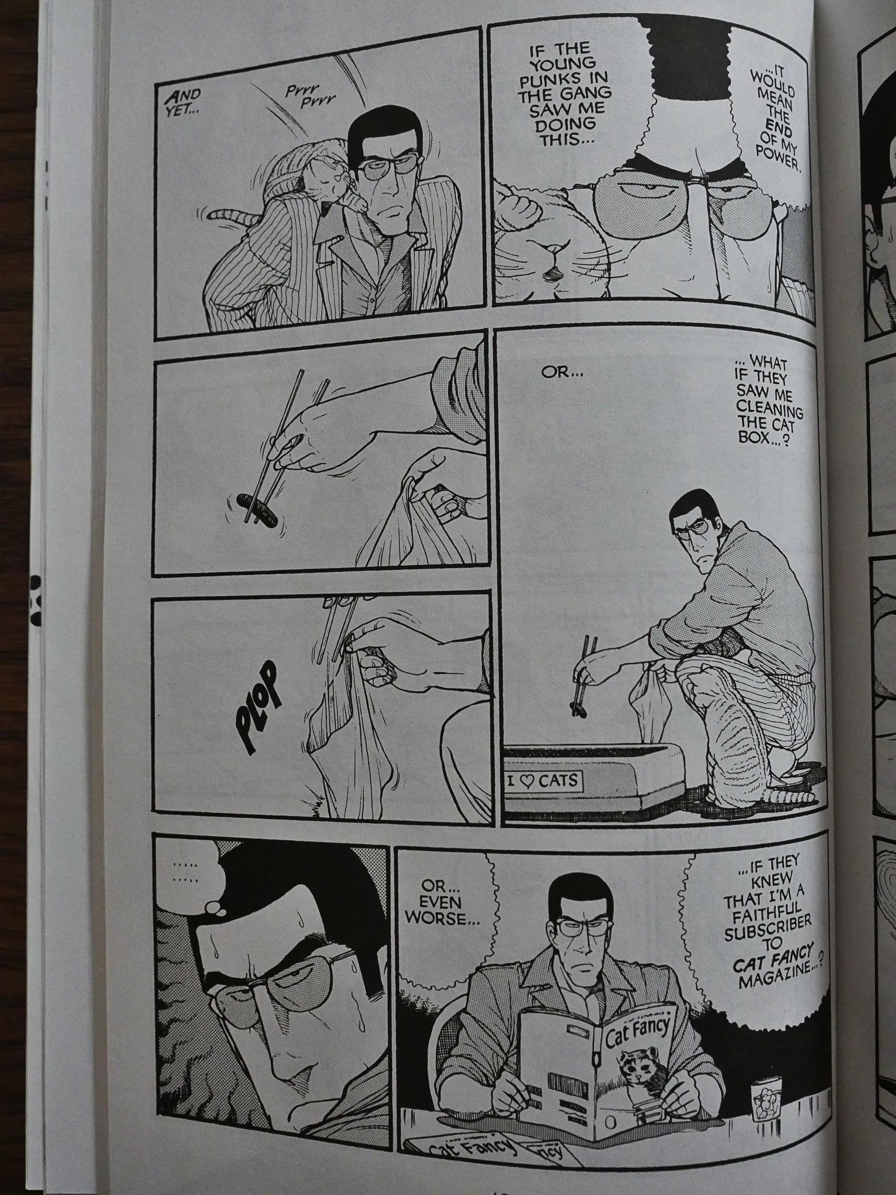
And even in the “realistic” bits, the level of kookiness is just off the scale, like this Japanese mafia guy and the way he worries about what would happen if his co-workers (so to speak) should find out that he likes cats.

And is that how Japanese people clean the litter boxes?

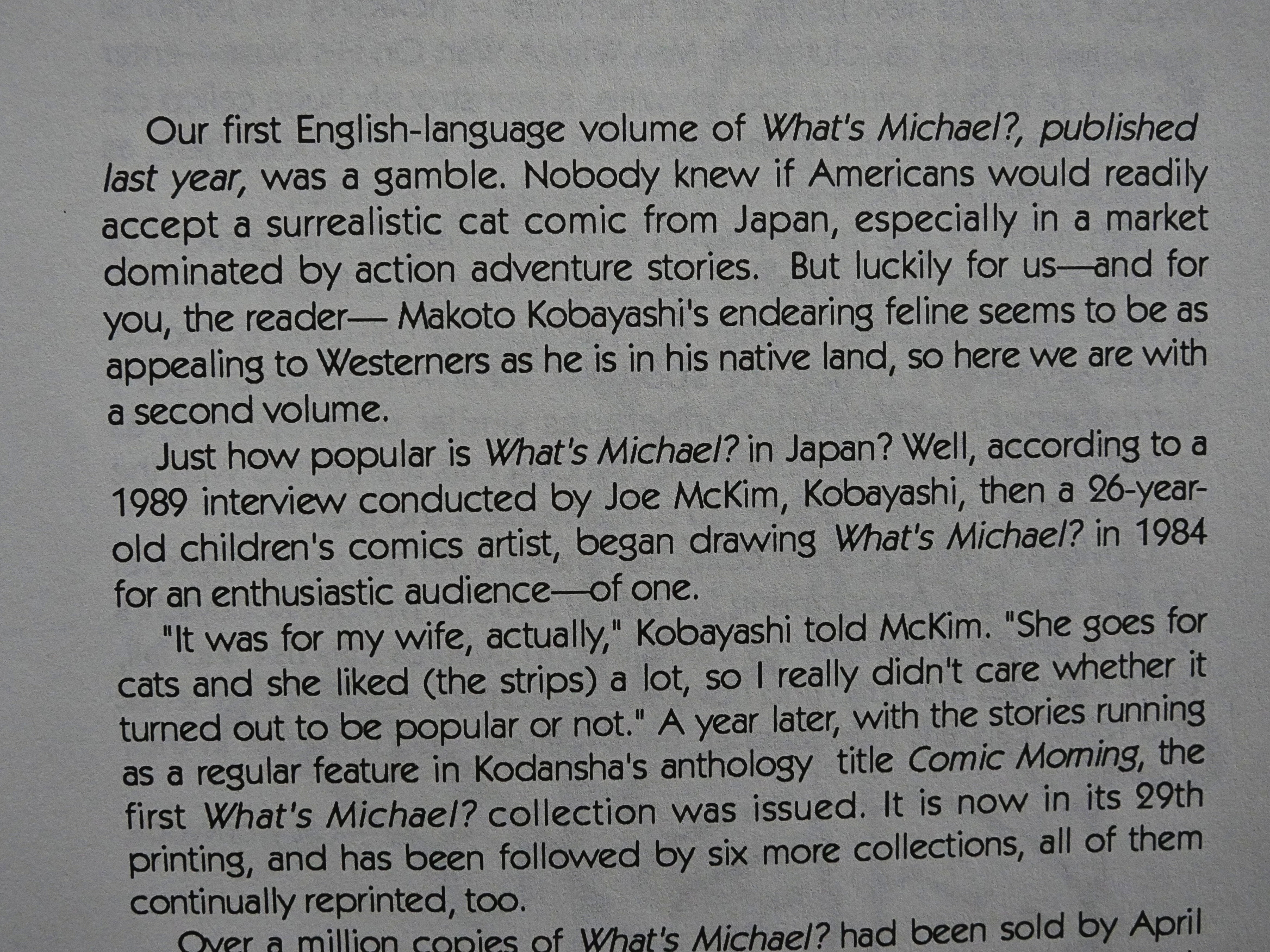
Well, the first volume was really good, and it sold well for Eclipse, so there’s a second one. And in this volume, the humour is sharper, and there’s more clarity to what Makoto Kobayashi is doing. We’re basically following a number of cats and their owners, and all the owners have at least one cat called Michael, and it’s an orange tabby.
And it’s difficult to quote just a single thing that shows how funny these strips are, because every one just builds and builds, and the book had me laughing out loud like an insane person. It’s the mixture of the extremely well-observed and the unpredictable flights into fancy that’s irresistible.

And it deals with situations that you wouldn’t really expect it to.

And in addition there’s these more free-form conceptual bits that break up the more observational strips.

It’s just a completely brilliant reading experience, and now I’m sad I didn’t read these in the 90s.

I see that Studio Proteus took the book with him to Dark Horse after he left Eclipse (and sued Eclipse into bankruptcy for failure to pay him), and Dark Horse published all eleven volumes. Which are long out of print now.

So weird that they haven’t reprinted them “unflopped”, and in thicker volumes, like the Japanese originals.

Anyway, a quick stroll down Ebay later, and I’ve now bought all the volumes I don’t have used, so nyah.

1990: Tales of the Mysterious Traveler

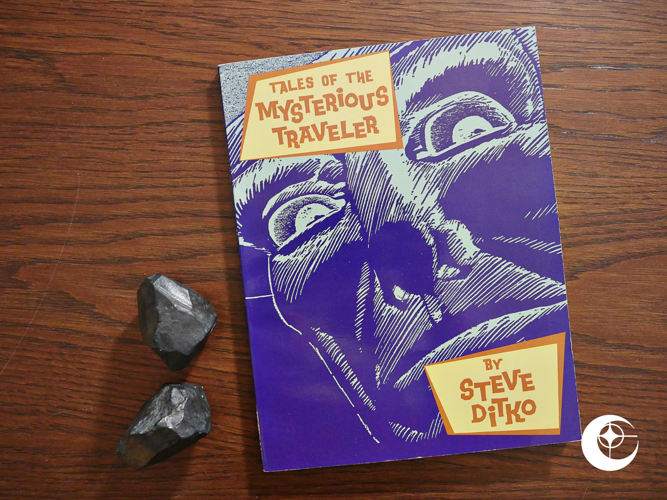
Tales of the Mysterious Traveler (1990) by Steve Ditko et al.

Ditko died earlier this year, and that led to an abundance of articles and tweets about Ditko. Many celebrated his artwork, but many also focused on him being all “weird”. According to these tales, his weirdness consisted of 1) him not wanting to talk to them, and 2) him being totally unreasonable about trivial matters. This article is a pretty good skewering of the 1) people: I completely agree with what she’s writing there. There’s nothing weird about not wanting to be part of comics fandom. I think he went way beyond the call of duty: He actually responded whenever anybody contacted him, and then was ridiculed because he was terse.

As for 2), I wonder how many of the stories about him being difficult to work with are exaggerated. For instance, Dean Mullaney wanted to rewrite one of his pages (!), and when Ditko sensibly refused, he dropped him from the Eclipse anthology. When Fantagraphics included a page of people mocking him, in Ditko’s own comic, he pulled out, just like anybody else would have. But the story from Fantagraphics is that he unreasonably dropped the book because of a colouring mistake. Russ Maheras confirms that Ditko didn’t like having his comic be a “poison sandwich” and ripped it (and the cover) out before sending Maheras a copy. (Groth chimes in with a comment saying that Ditko never mentioned the page in question, so obviously it wasn’t a problem. *sigh*)

So… I have no doubt that Ditko was ornery, but I think the way he separated his personal life from his work was both sane and reasonable.

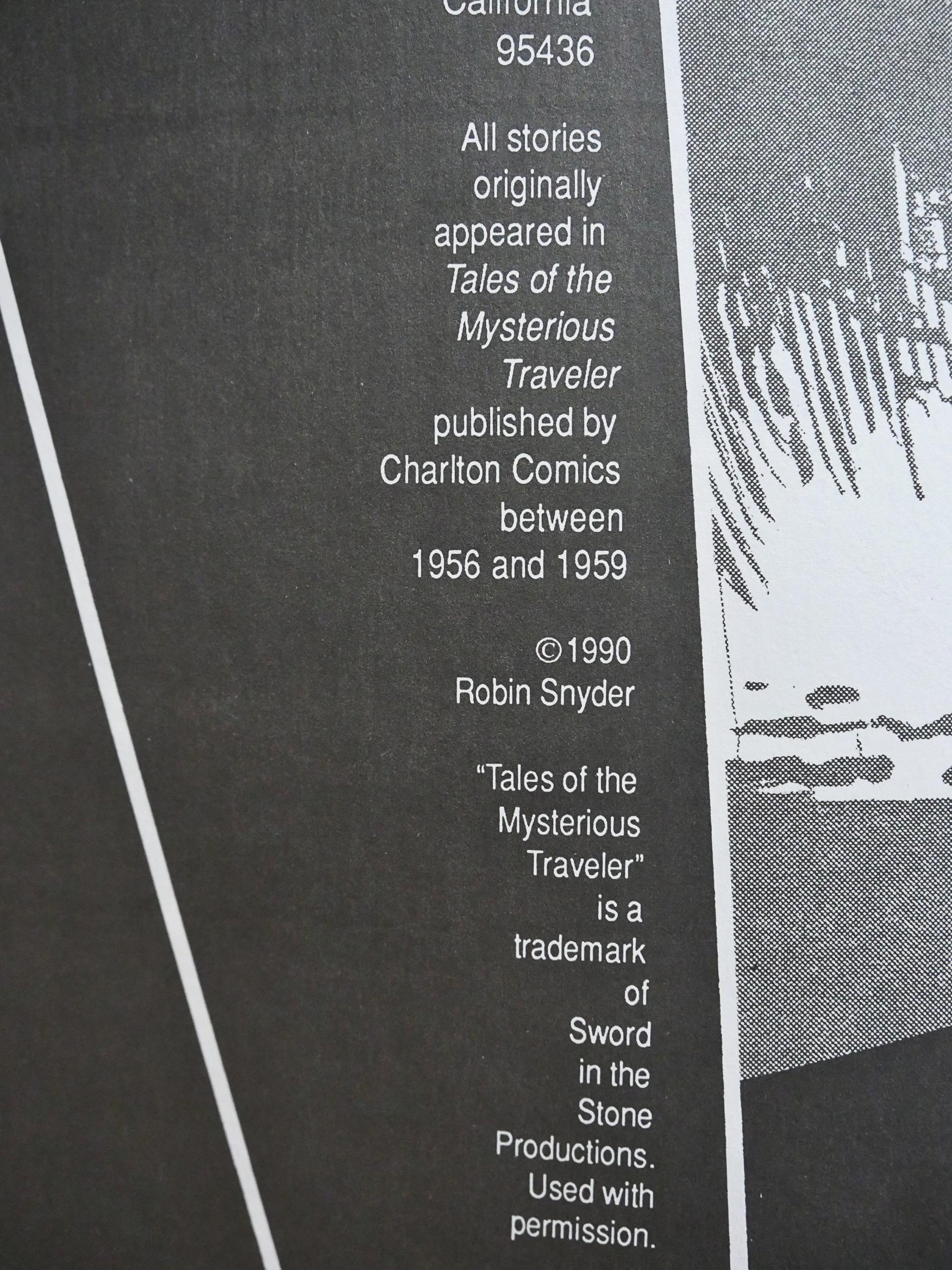
Anyway! This is a reprint of late-50s Ditko work that I assumed would be in the public domain. But it’s copyrighted by Ditko’s future publisher Robin Snyder, so perhaps Ditko got some money out of it, and perhaps even gave Eclipse permission to do the book?

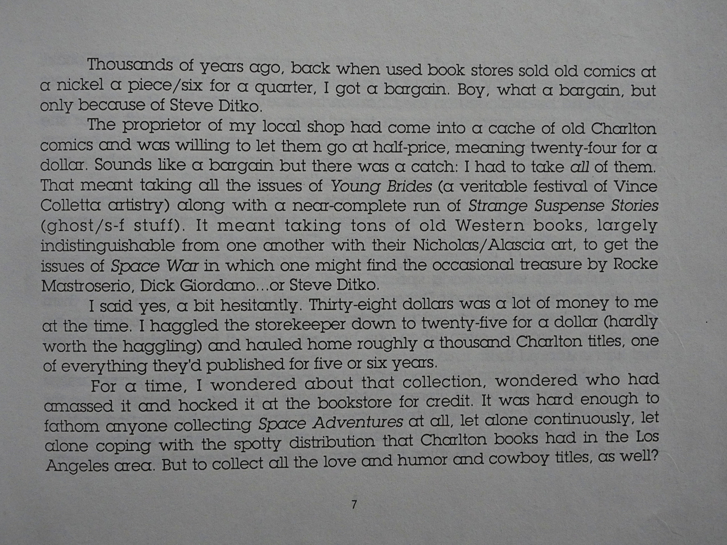
Mark Evanier tells the story of how he bought 1K Charlton comics in his childhood. He had to take some (eww) romance and (ewwww) cowboy comics, too, but it gave him a solid cache of Ditko.

Charlton was infamously the cheapest of all the publishers. The pay was lousy, but as they churned out oodles of comic books, there was next to no editorial control or interference, which suited Ditko very well.

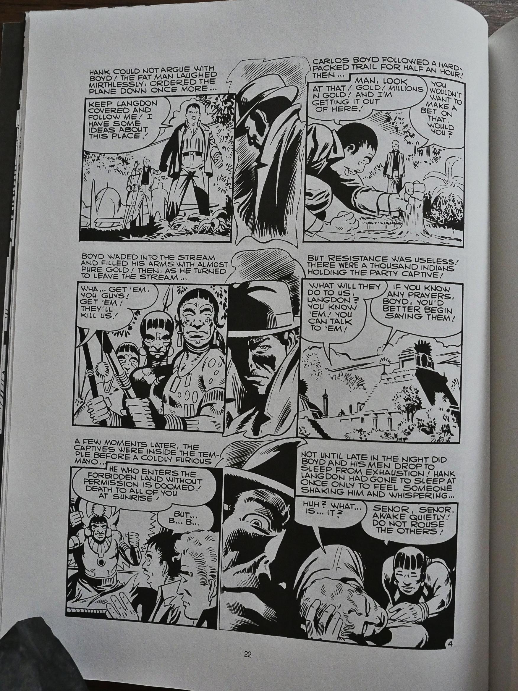
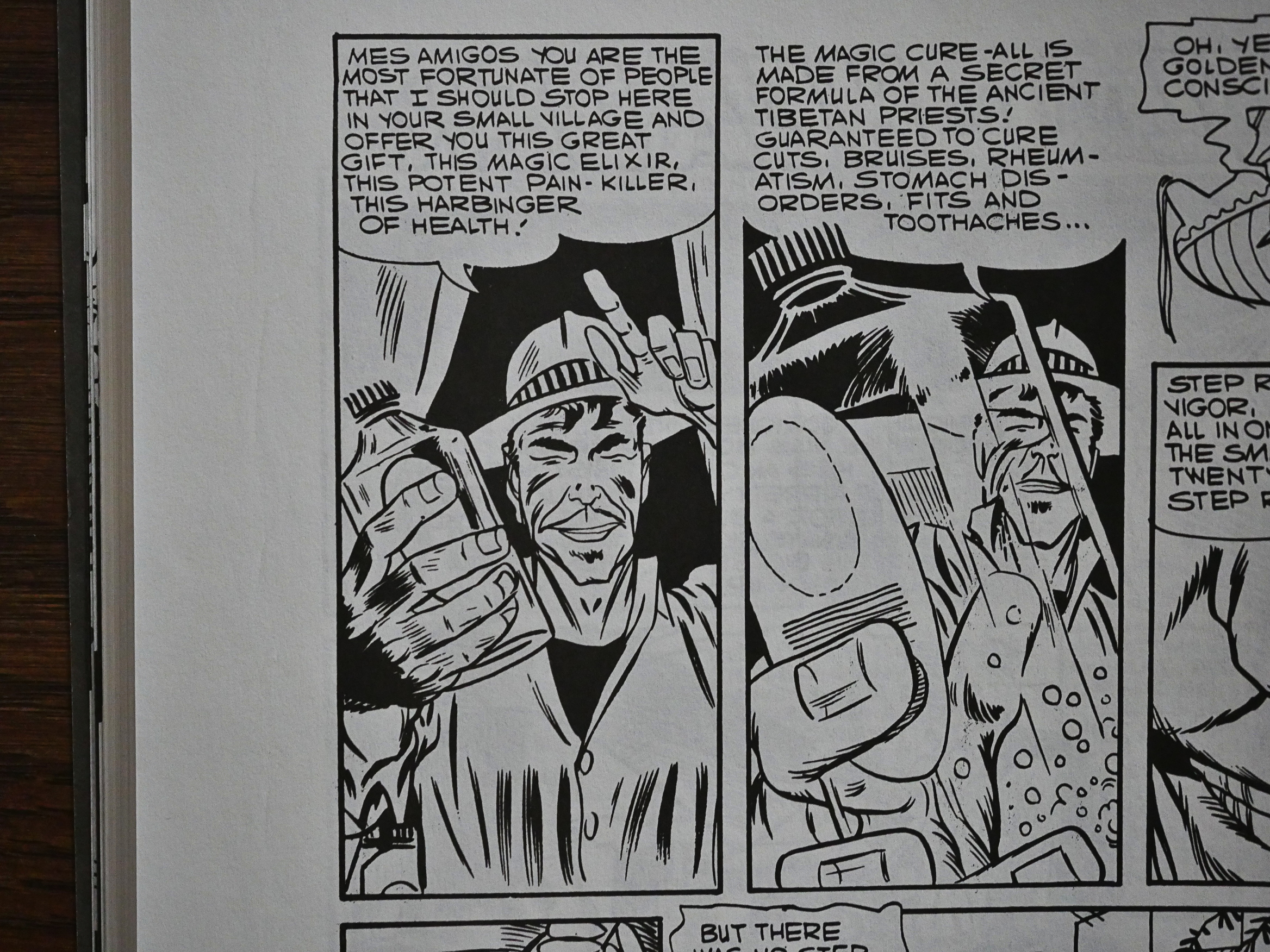
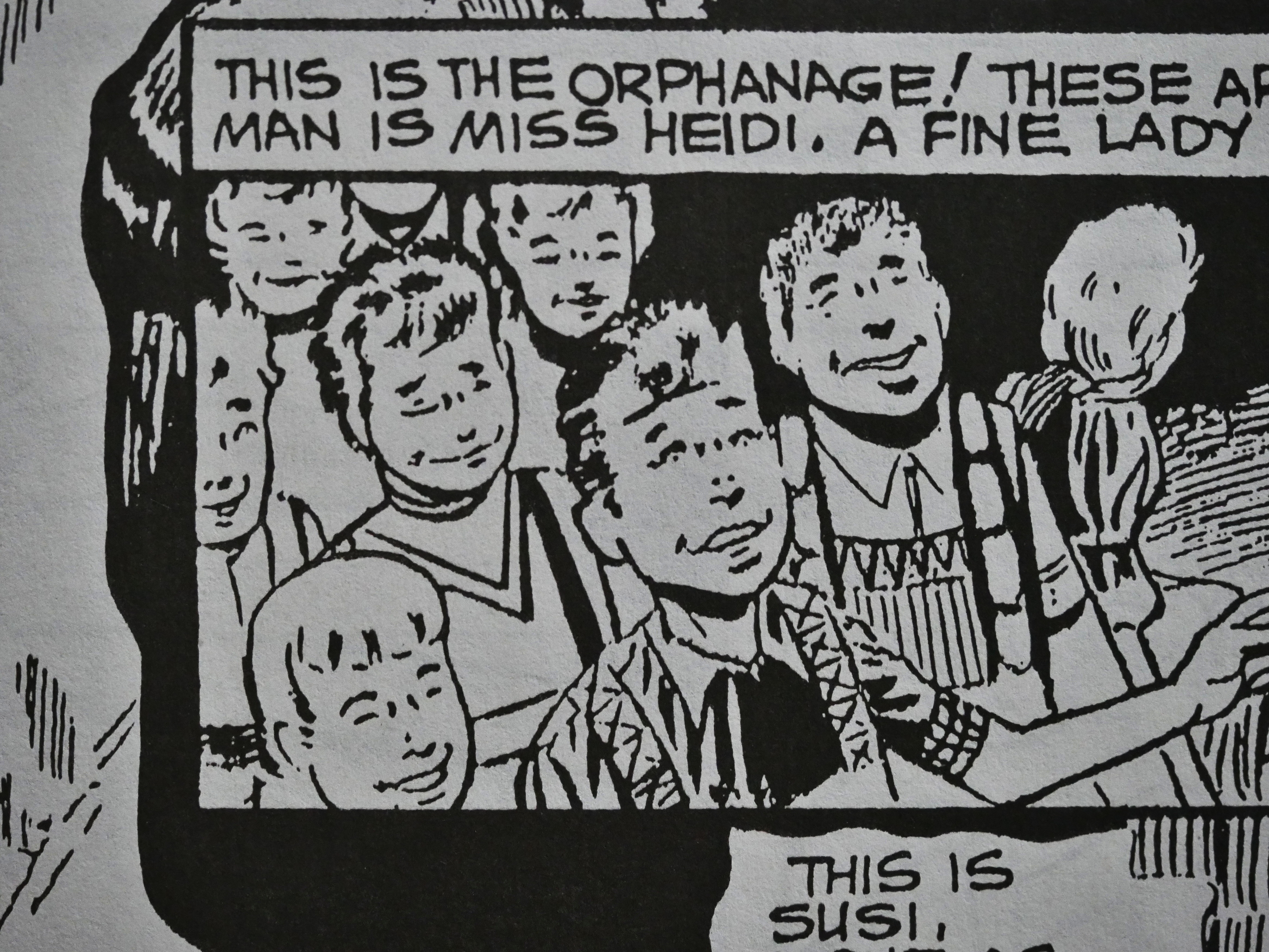
The authors of these stories are not mentioned, but apparently Ditko didn’t write them himself? They’re mostly “twist ending” comics, and they’re all in the four to six page range, so reading these all in a sitting could have been a repetitive chore. But they’re a rather varied bunch within that framework. And the quality varies wildly.

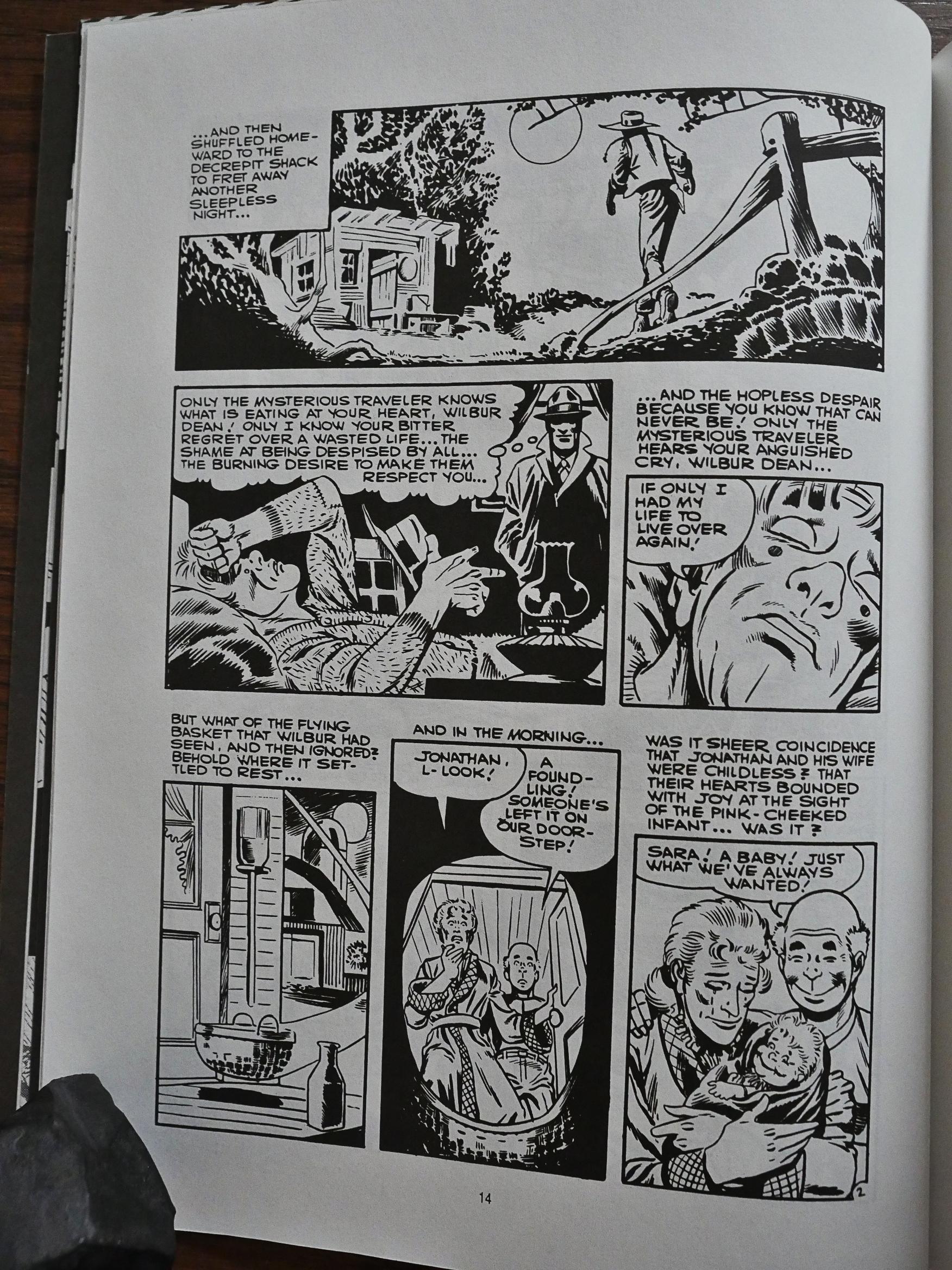
Ditko’s artwork is the main point here, though, and he certainly looks like he’s having fun.

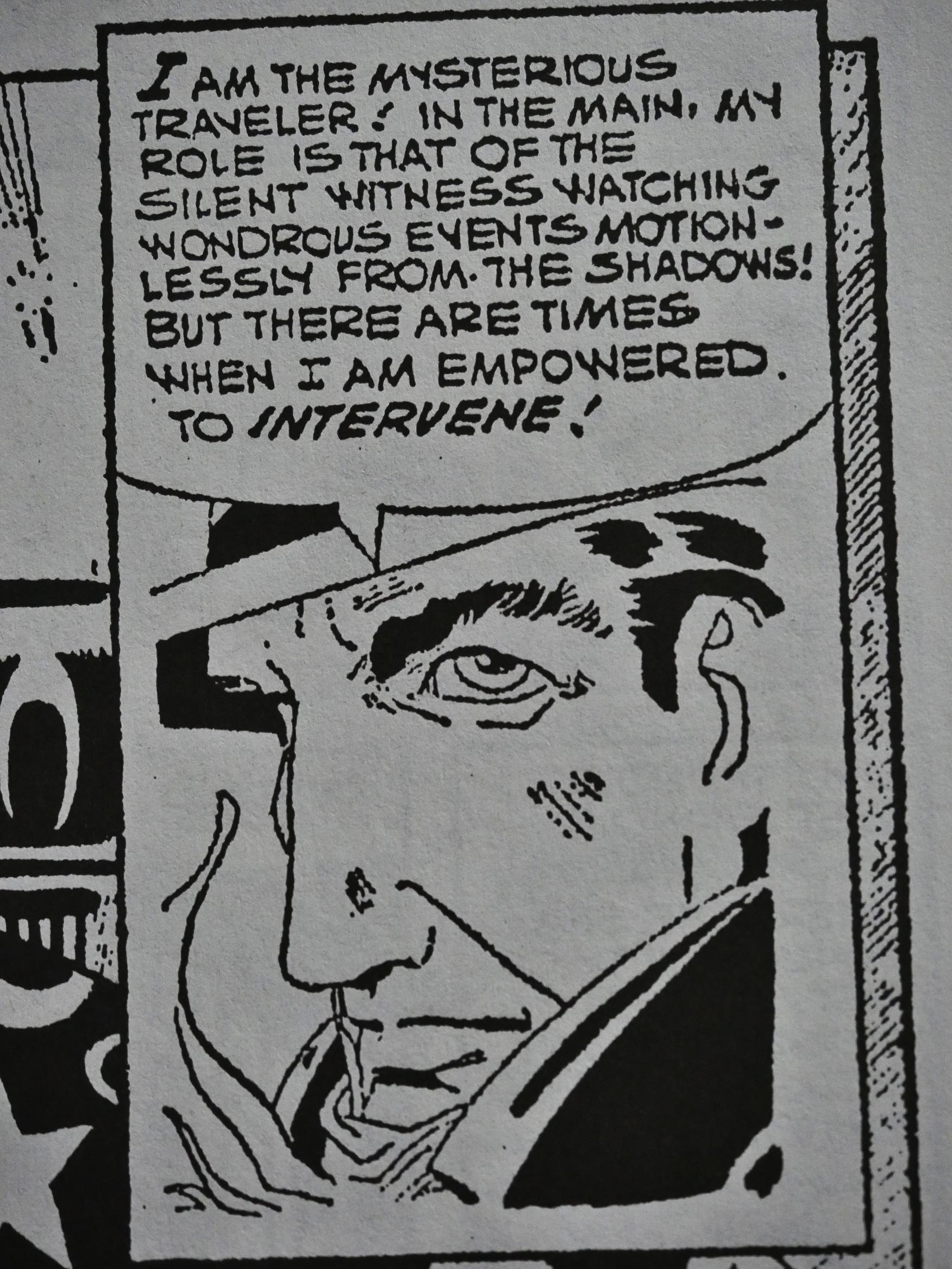
The concept of The Mysterious Traveler is that there’s this all-seeing dude who, er, see’s what’s going on and tells us the story. So Ditko has to work him in on just about every page, and it’s fun to see all the different ways he has of doing that. On the page above we get a very dramatic in-between panel zoom on hist very dramatic face.

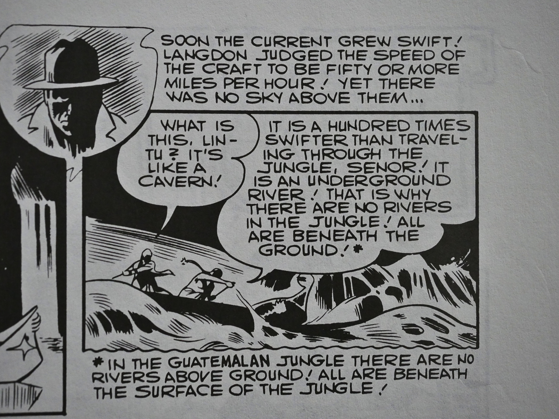
Perhaps a bit of editing on the text would have been appropriate.

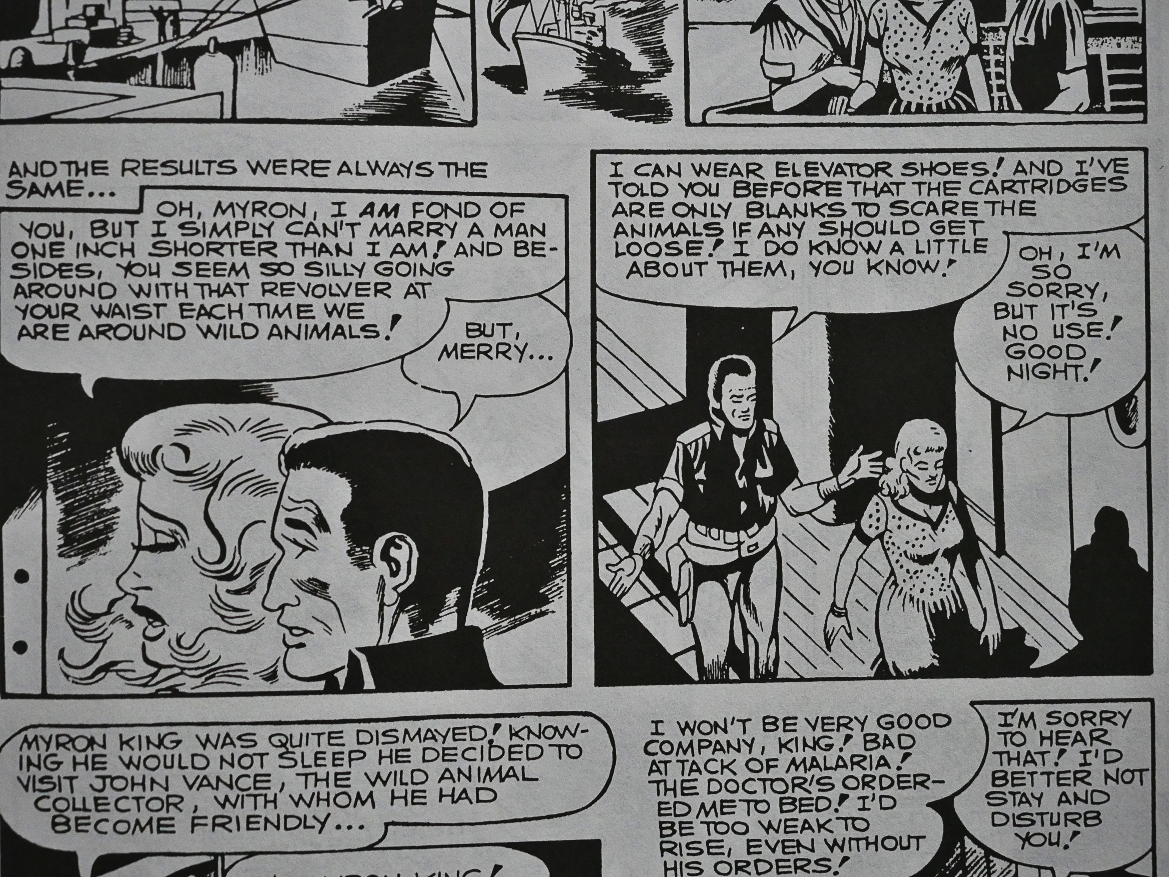
*gasp* One inch shorter! Elevator shoes! How’s that for a concept for a story?

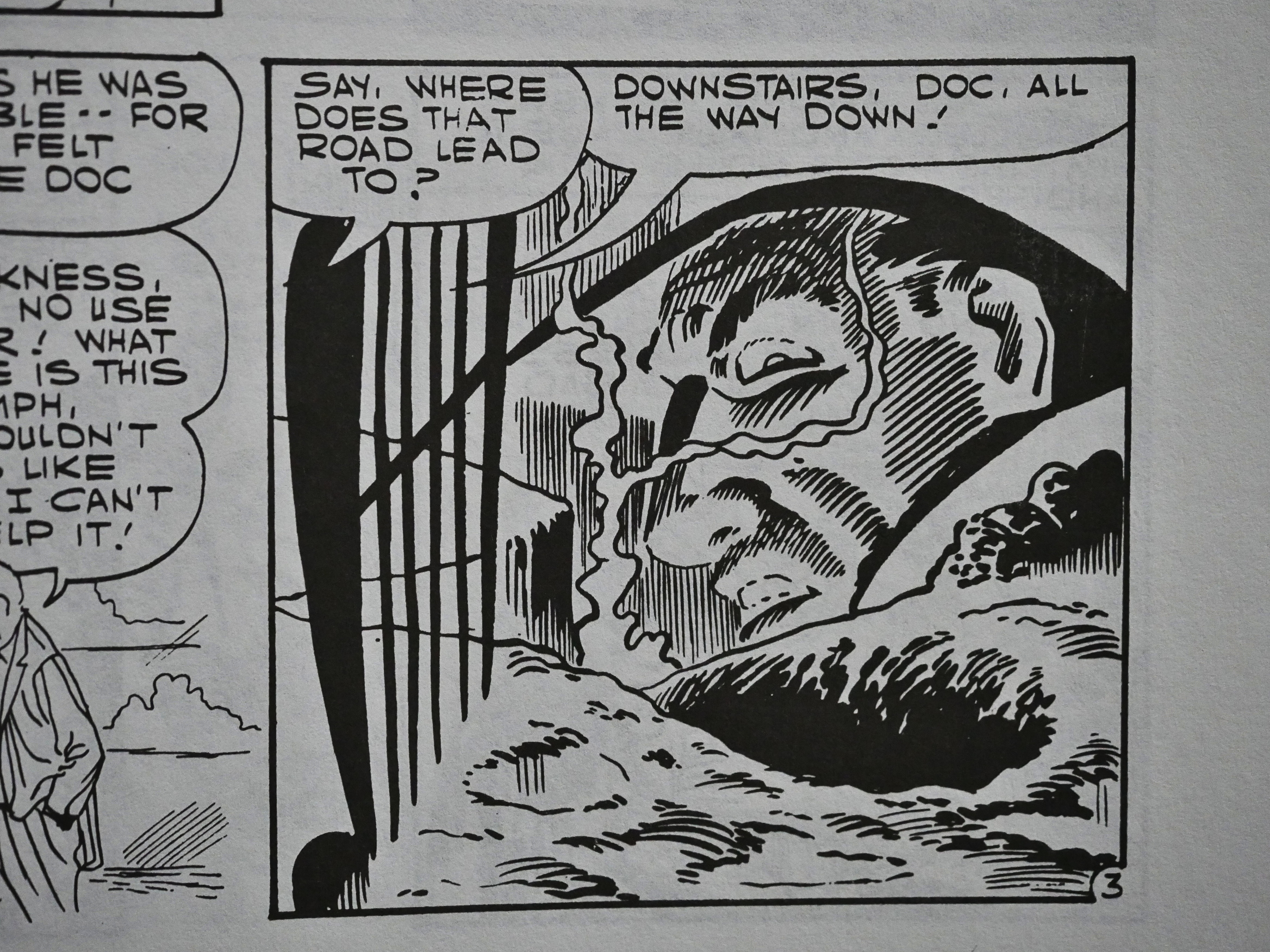
OK, I’m making fun of the format here, but a couple of these stories are affecting and effective in their maudlin mawkishness. I loved the story above, which is about a doctor who dies, gets bored in Heaven and goes to Hell to attend to people there. It’s funny and moving. *sniff*
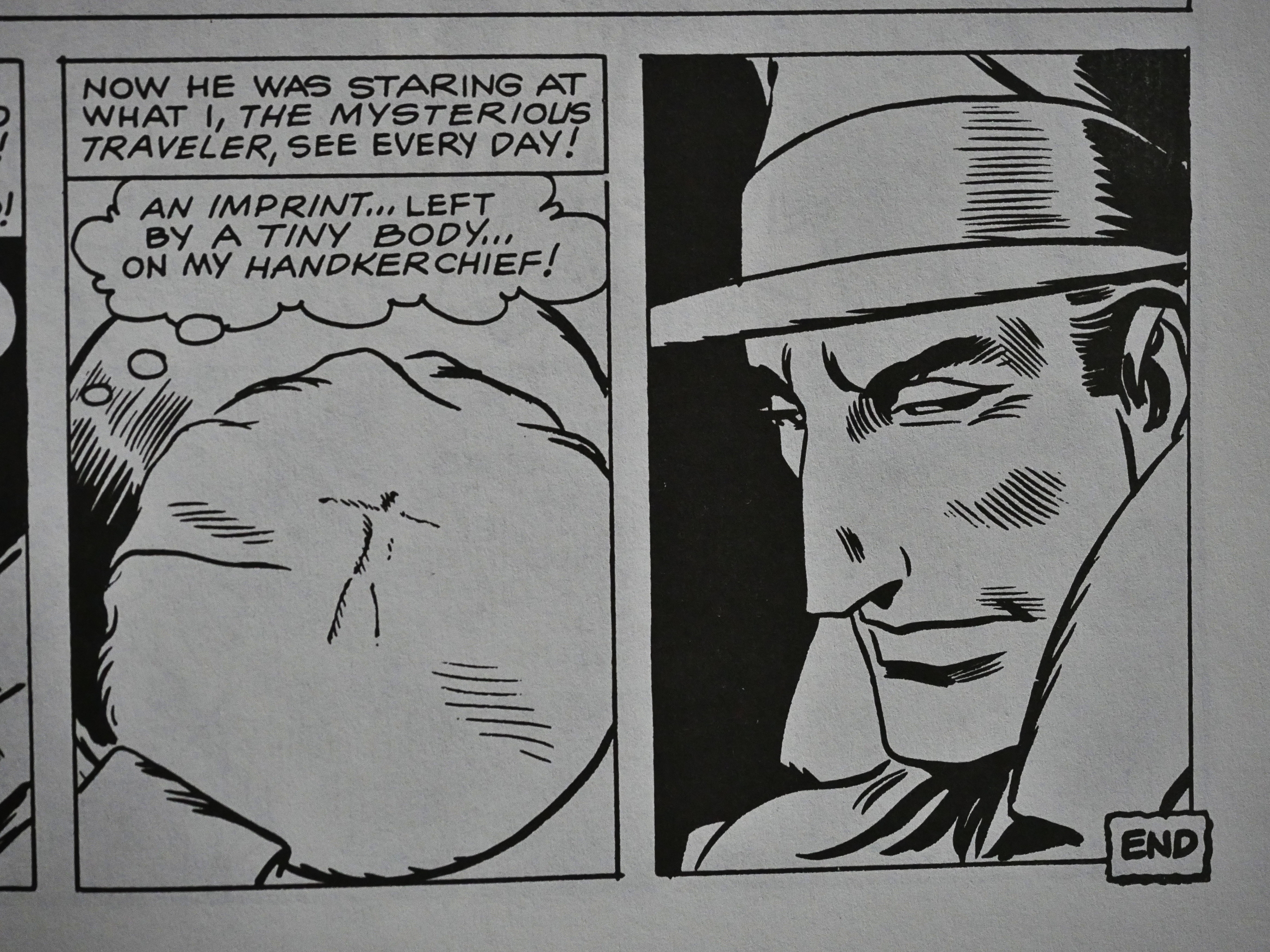
Ditko is a very clear storyteller: There’s never any doubt as to what’s going on. So while that’s his priority, he experiments a lot with how to show us things. Isn’t that a great sequence?
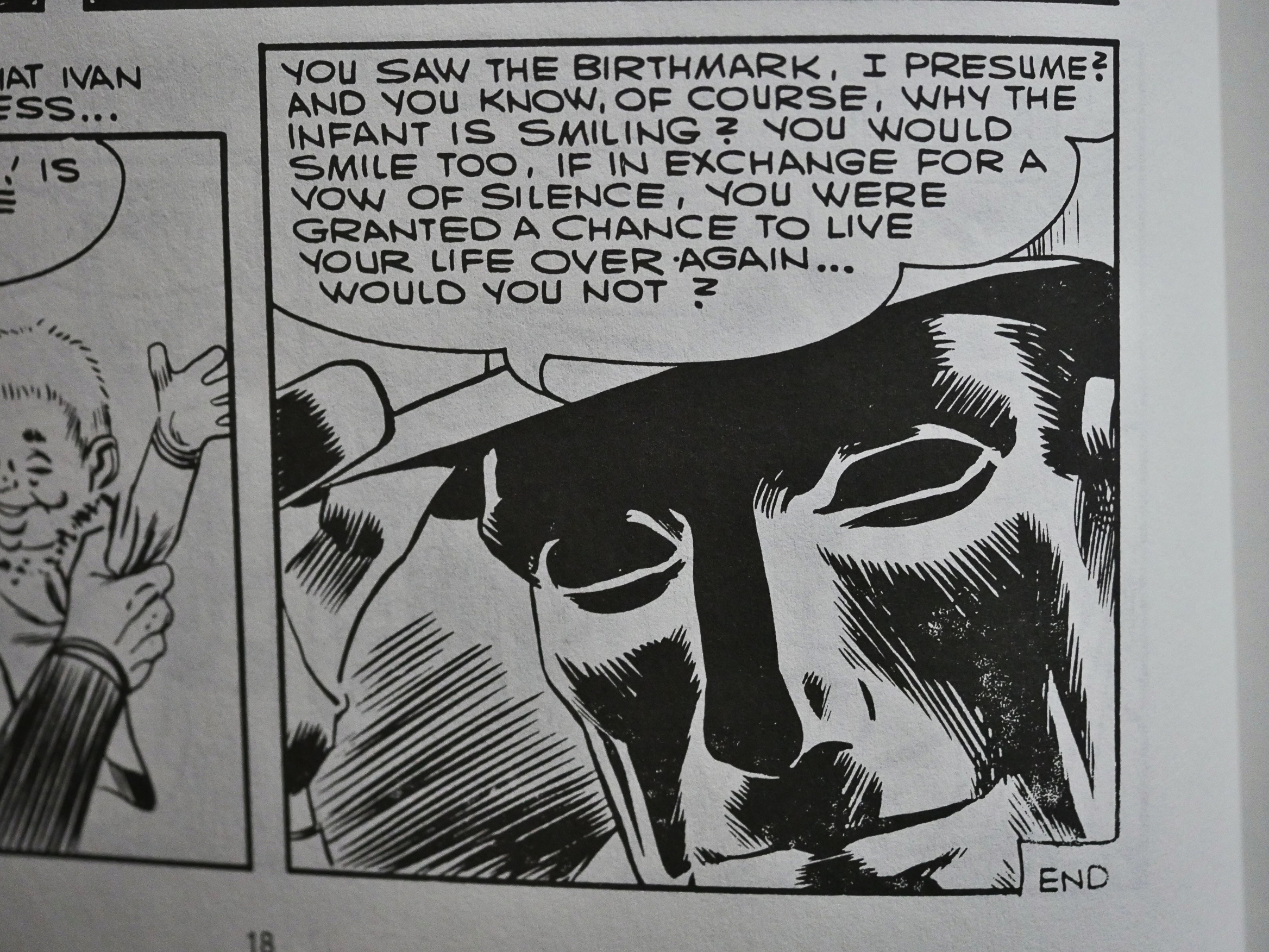
He, The Mysterious Traveler, sees an imprint of a tiny body… on some other guy’s handkerchief! Every day!

I’d smirk, too, if that were the case.

The reproduction in this book is mostly better than you’d expect from comics reproduced from printed copies. So perhaps they were shot from the original artwork? There’s a couple of stories that have that disintegrated look (like above), but it’s mostly very nice.

The final story is completely atypical: It doesn’t really look like Ditko, and it’s signed J. Kodta. There are no search results for ‘”J. Kodta” ditko’ on the Googles, so I have no idea what’s that about.

Now there’s a search result, though.

This volume doesn’t seem to have been reprinted, but Fantagraphics released a bigger collection of Mysterious Traveler stories in 2012 (in colour). There doesn’t seem to be an overlap with the stories in this collection, as far as I can tell.

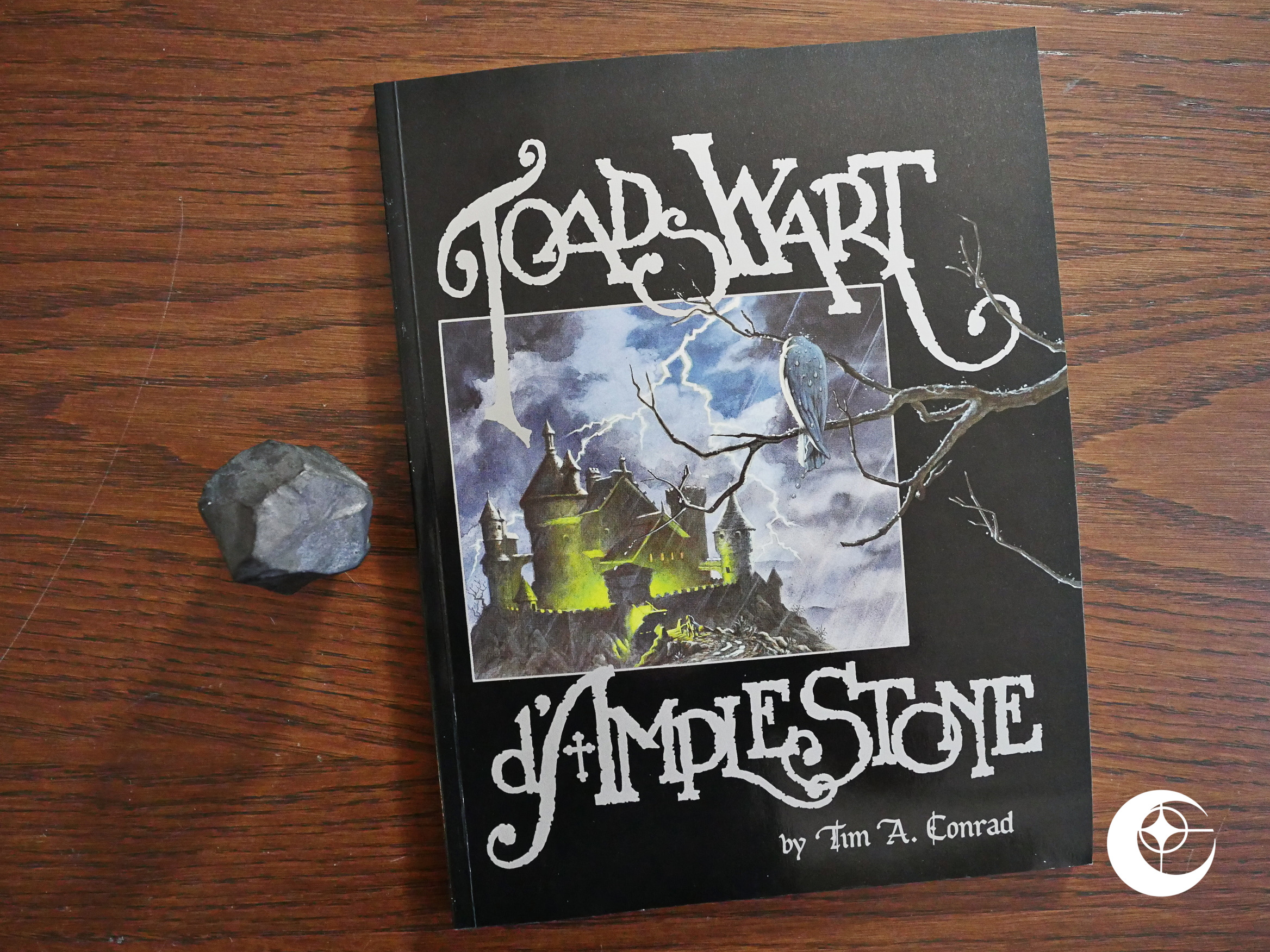
1990: Toadswart D’Amplestone

Toadswart D’Amplestone (1990) by Tim A. Conrad.

As the 90s start, we find Eclipse a transformed company. Just two years earlier, Eclipse were pumping out one new action/adventure series after another, while there’s no new series of that type in 1990. In 1987, for instance, Eclipse launched around 50 new things (mostly new series, but also some oneshots and a smattering of collections), while 1990 sees only 15 new things, and they’re mostly graphic novels and other one-shots.

This very shiny album reprints this Conrad story that had been serialised in Marvel Comics’ Epic Illustrated magazine.

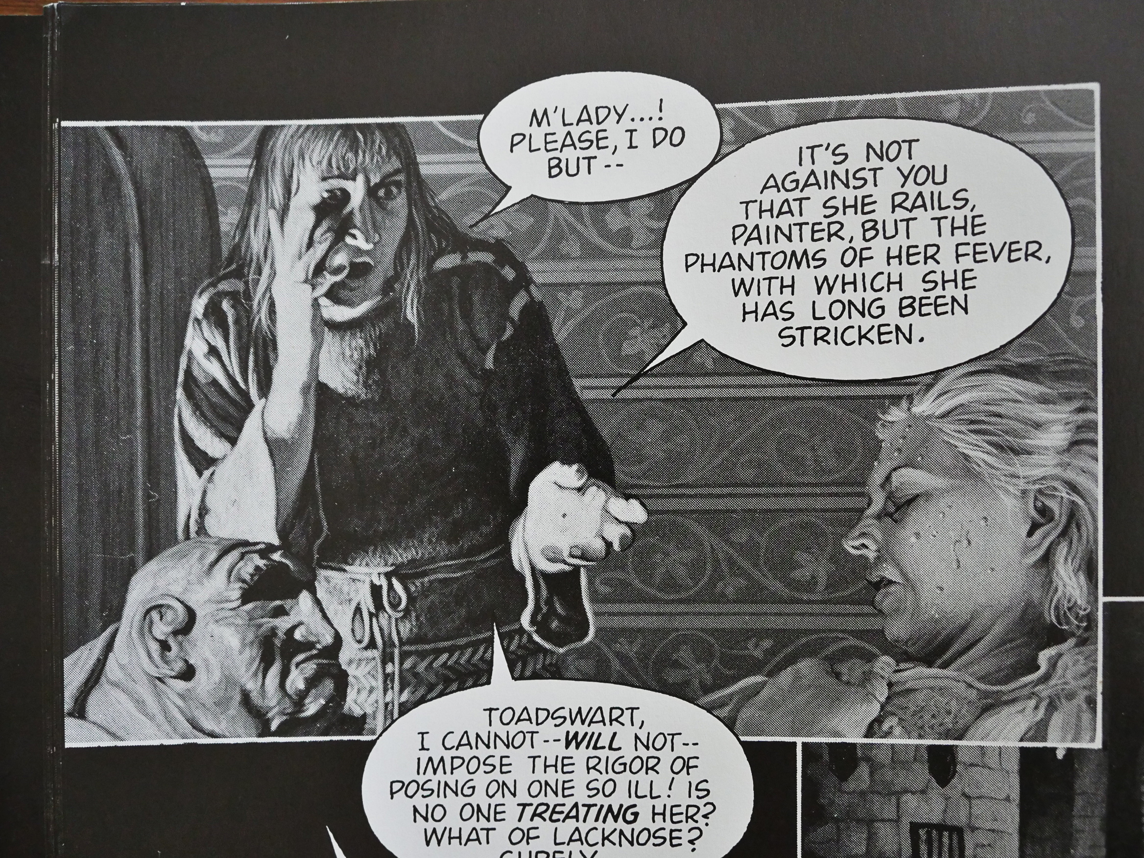
And it’s a very appropriate paper choice. Conrad’s black and white artwork glitters on this black, ink-soaked paper. As for the text… Conrad’s obviously going for a Gothic horror feel, but the text just isn’t very… er… good?

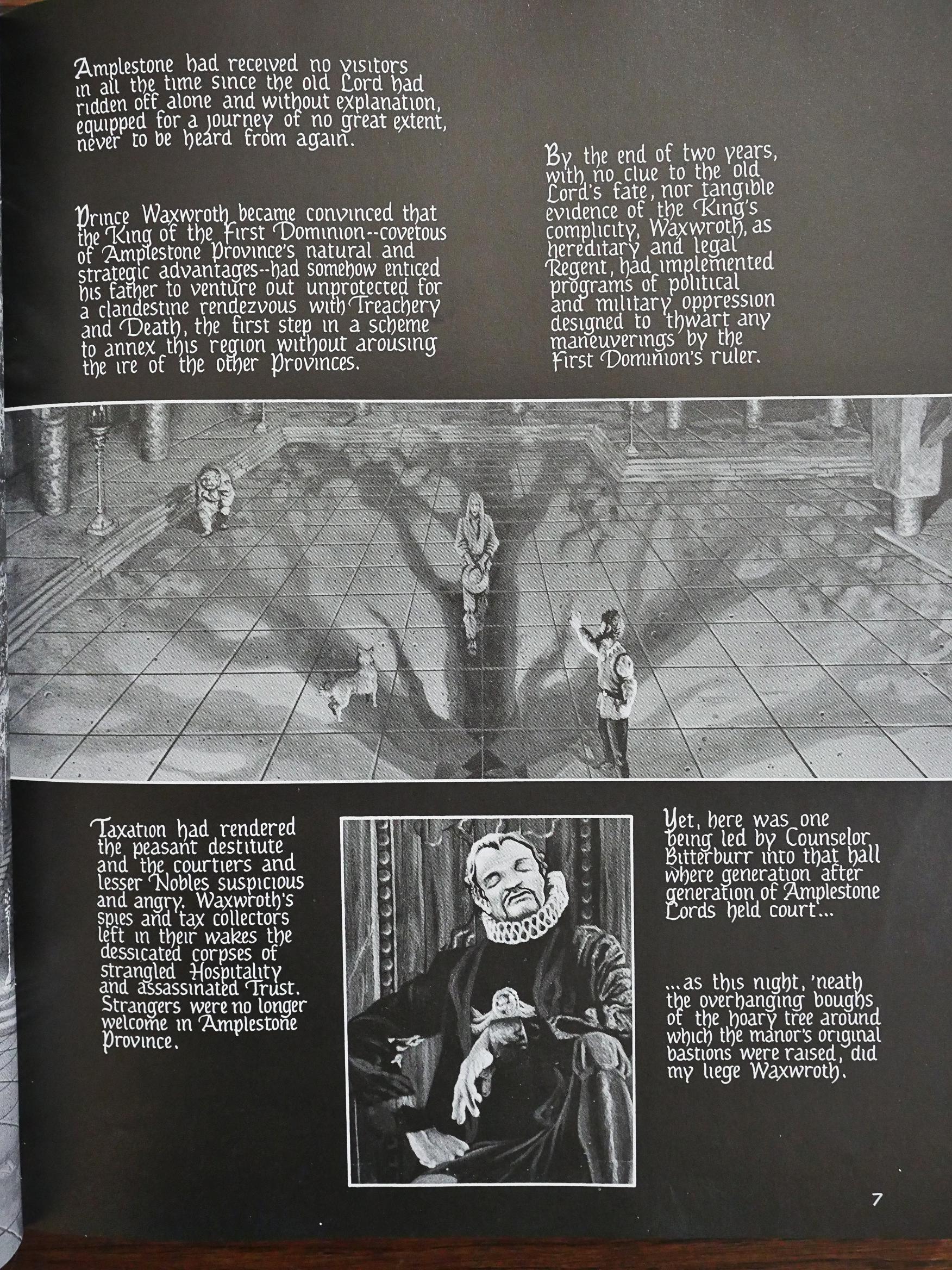
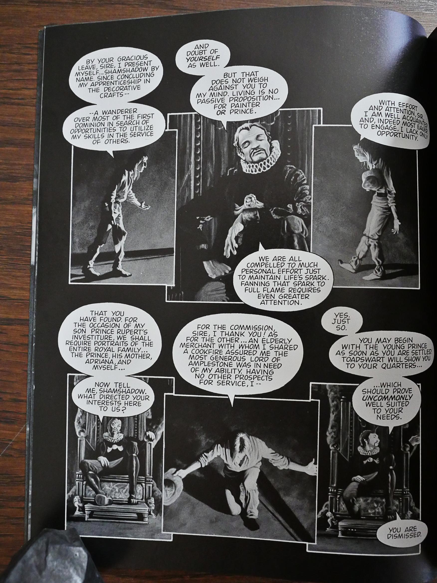
When he’s not doing blocks of exposition, the characters prate and they prate. That’s as it should be in a Gothic horror, but it doesn’t much help with the flow of the comic.

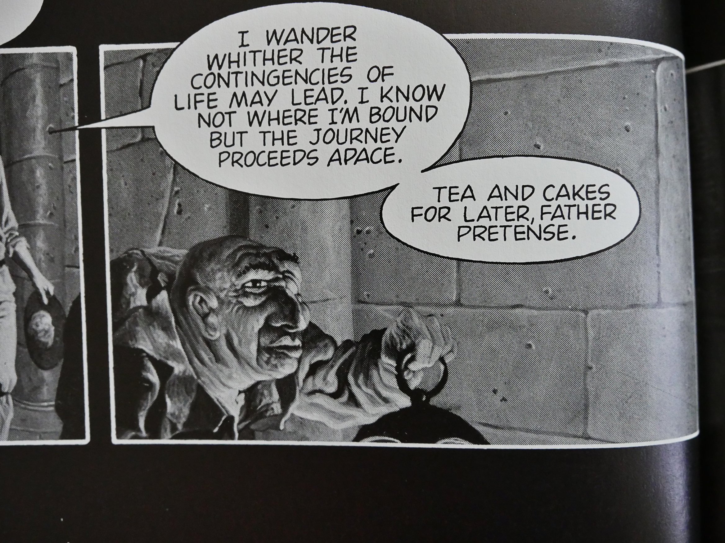
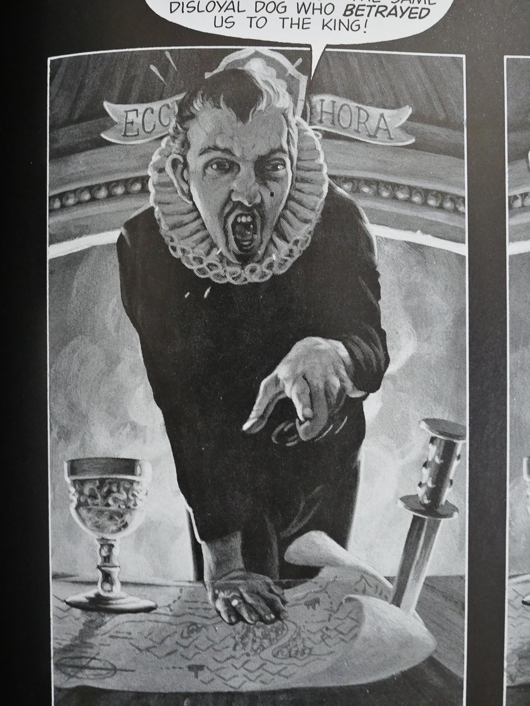
I’m guessing that Conrad relies heavily on photo reference (note, for instance, the identical poses of the guy in the collar up there on this and the previous page).

But pictures of what? Panels like this makes me wonder whether Conrad had sculpted misshapen heads to be able to draw them accurately.

If this had been a new book, I would have guessed that this artwork originated in a 3D computer rendering farm somewhere, but since this is the 80s, it has to be a lot of work…

And it’s effective in its gruesomeness, even if it’s rather stiff.

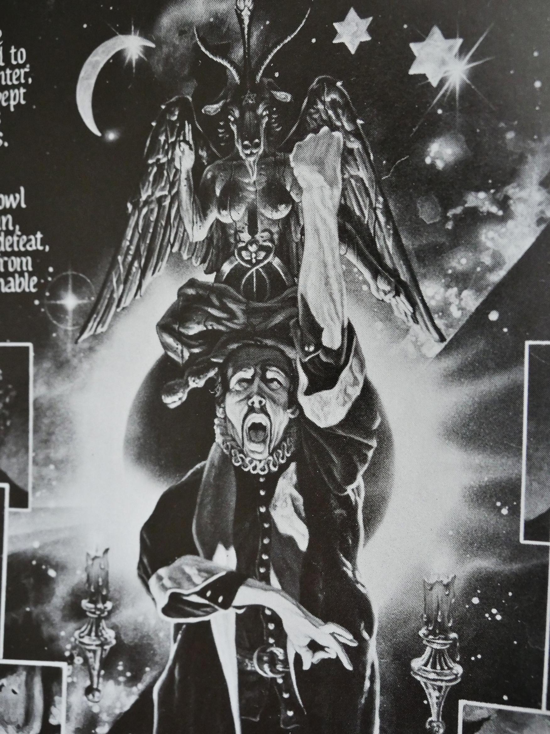
And then there’s pages like this. That’s pretty fab, eh? But what’s the expression on that guy’s face supposed to be, anyway?

Some of these panels makes me wonder whether Conrad had just painted directly onto pictures, because no artist would have come up with that fish eye lens effect on their own. I think?

Anyway, while I was really sceptical at the start, the story did pull me in after a while. It’s a pretty original take on these tropes, and I had no idea where the story was going, which is fun.

But then it ends with basically a Deus Ex Machina. It had been foreshadowed a bit, so it’s not a total cheat, but it still felt like a let-down.

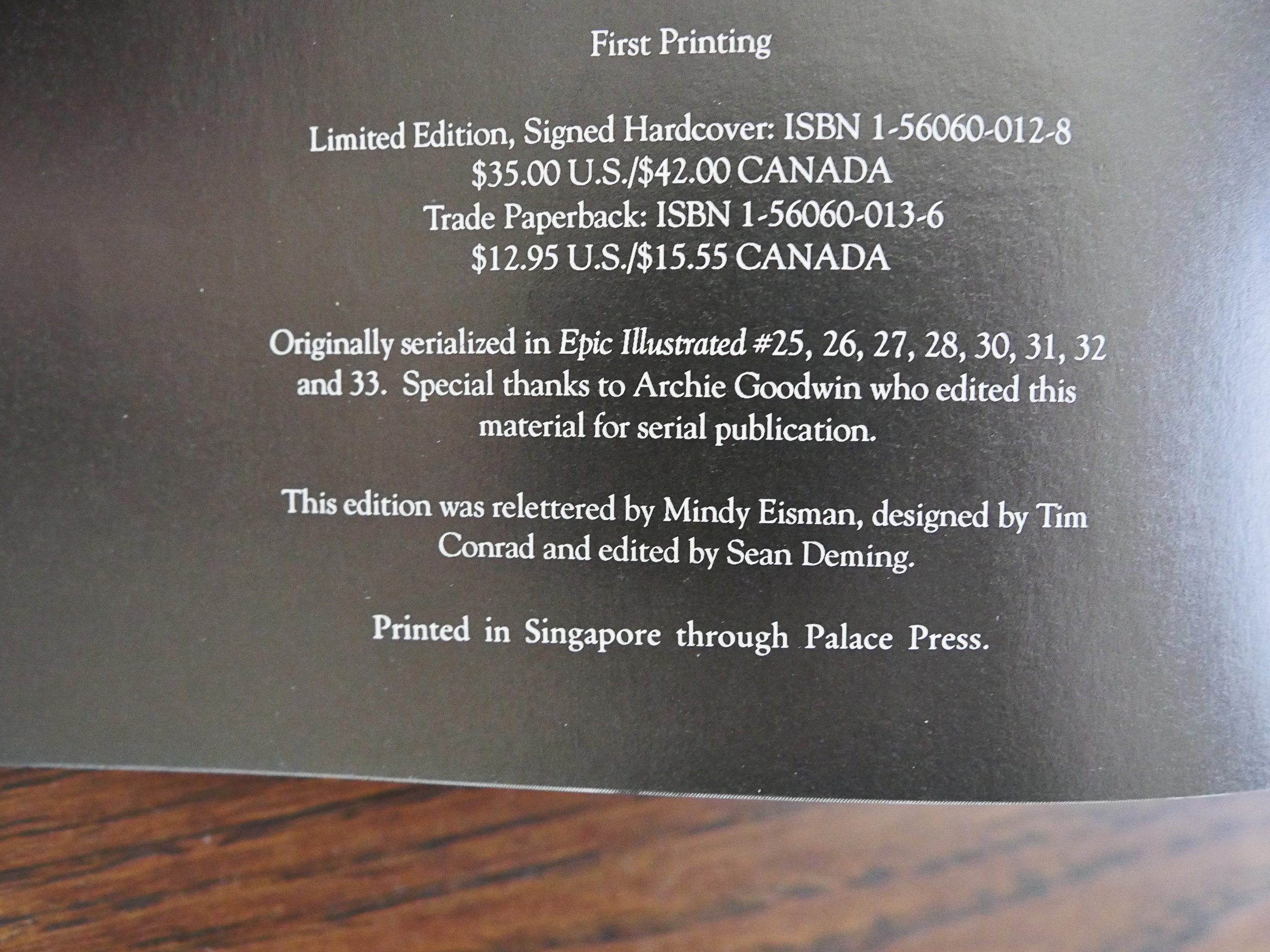
Hm… is this the first Eclipse book with an UPC code? It’s printed in silver, so I’m not sure that it even works…

I was unable to find any proper reviews of this book, but there’s this from Amazon:

This book is like led zepplelin’s ”the song remains the same” transformed into a graphic novel. Completely absorbing. An immersive powerfully touching, affecting experience. Unique.
Mm-hm.

1989: Sam Bronx and the Robots

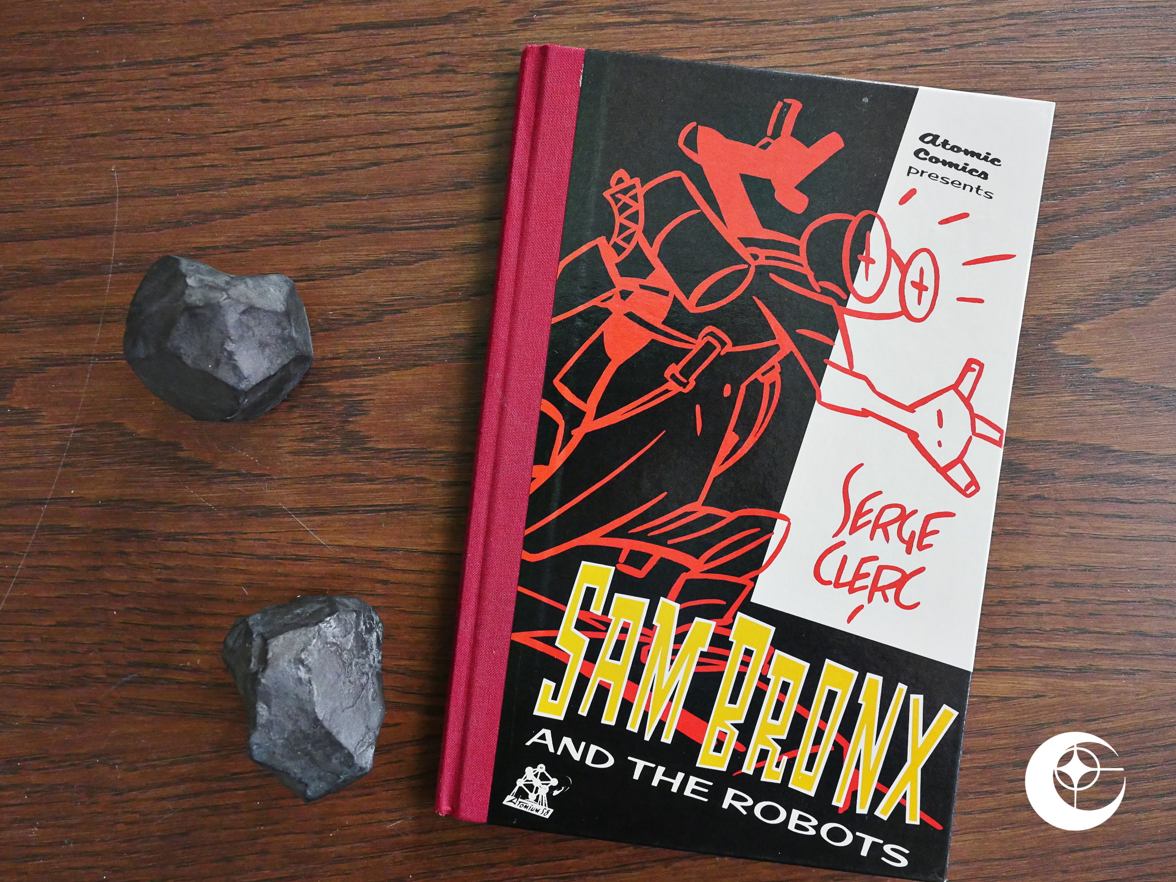
Sam Bronx and the Robots (1989) by Serge Clerc.

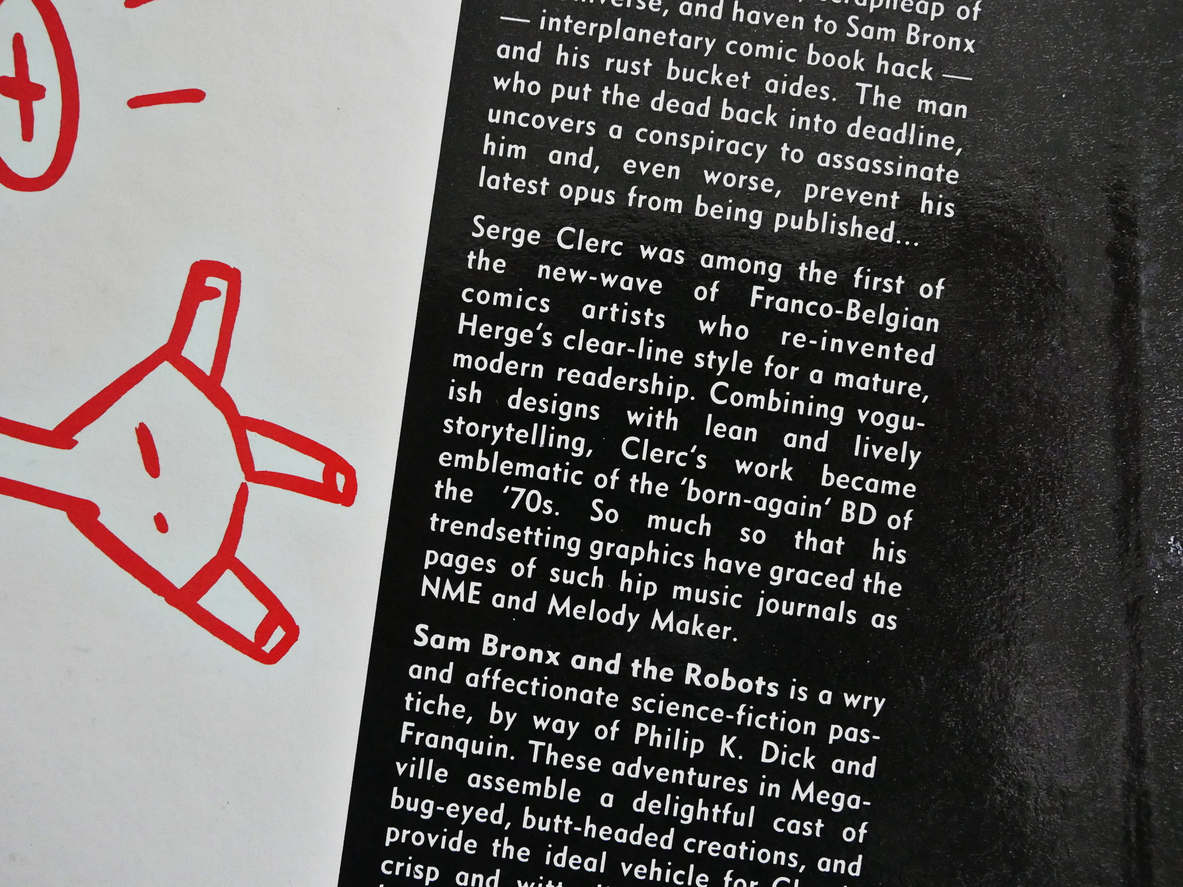
This is the second and final (after The Science Service) of the Acme/Eclipse experiment with a new format: Thin, smallish, duotone, hardback comics. While the first one seemed fit for the format, this one (originally done earlier in Belgium (I think?)) is very… slight:

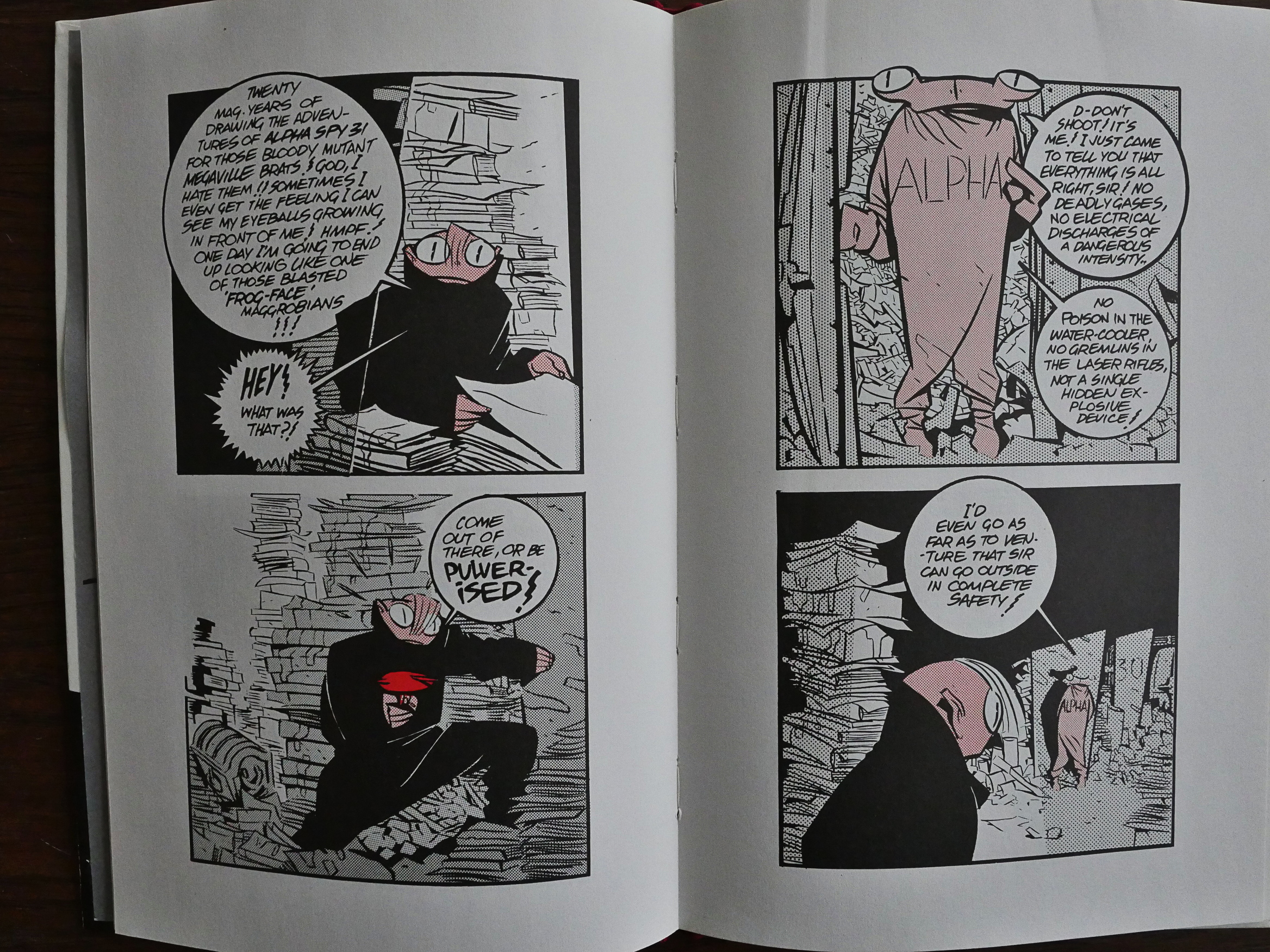
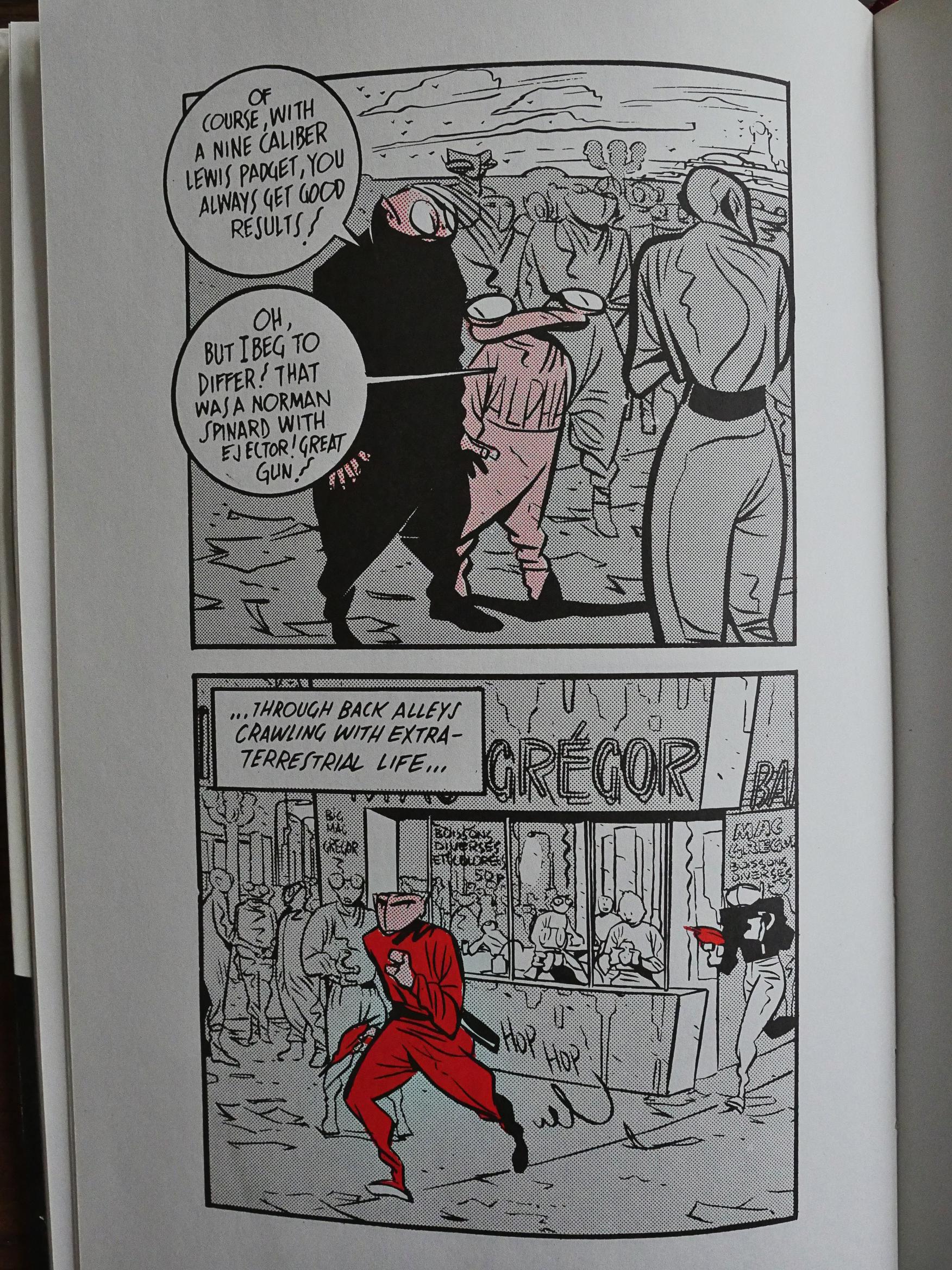
It’s in Clerc’s very stylish but quite pared-down punk version of the clear line school originated by the Hergé and his studio.

There’s two stories in here: One’s sixteen pages and one’s eight pages, and you can basically read the entire book in four minutes. For a very, er, how to put it… “price conscious” (i.e., stingy) American 80s comics audience, I kinda would guess that many didn’t feel that this $7 comic was a “value” proposition.

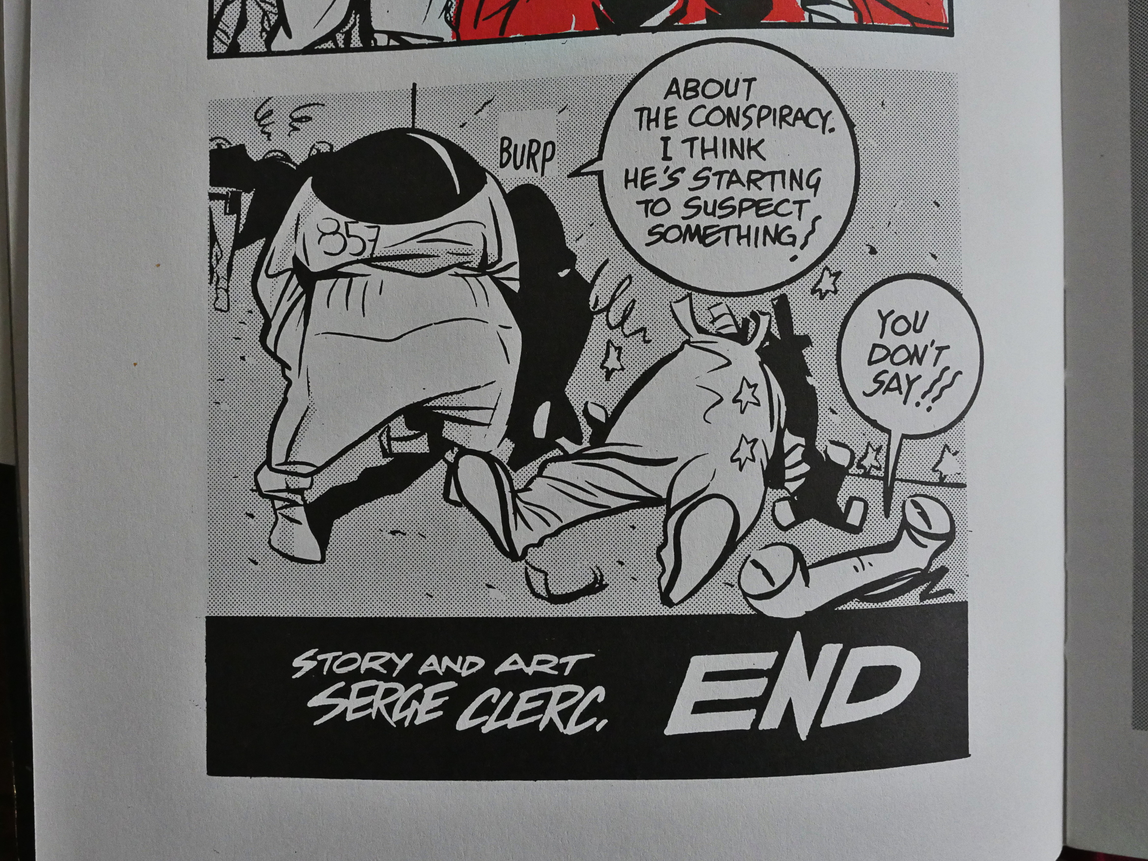
I do enjoy Clerc’s artwork, of course. How can anybody possibly not? But the two stories are very basic: Both are basically jokes. The first story manages to get a paranoid feeling going where you think that things are more complicated than they seem (especially with the almost-repeating numbers and stuff), but in the end, these are basically goofs.

They’re not bad, but I can definitely see why there wasn’t a third volume in this series in the US.

The back cover explains that Clerc is even hip enough to be featured in the NME and Melody Maker.

Right.

I couldn’t find many people on the web talking about it, but there’s this:

These two brief stories appear to have been created a panel at a time, such is their meandering freshness, the discipline provided by restriction to two square panels a page. The wonder, however, is all in the art, as the plotting is slim and lacks engagement. That cartooning is brilliant, though. Clerc has a facility for designing oddities, and creates his strips enabling him to encompass whatever he feels like drawing.
Sounds about right.

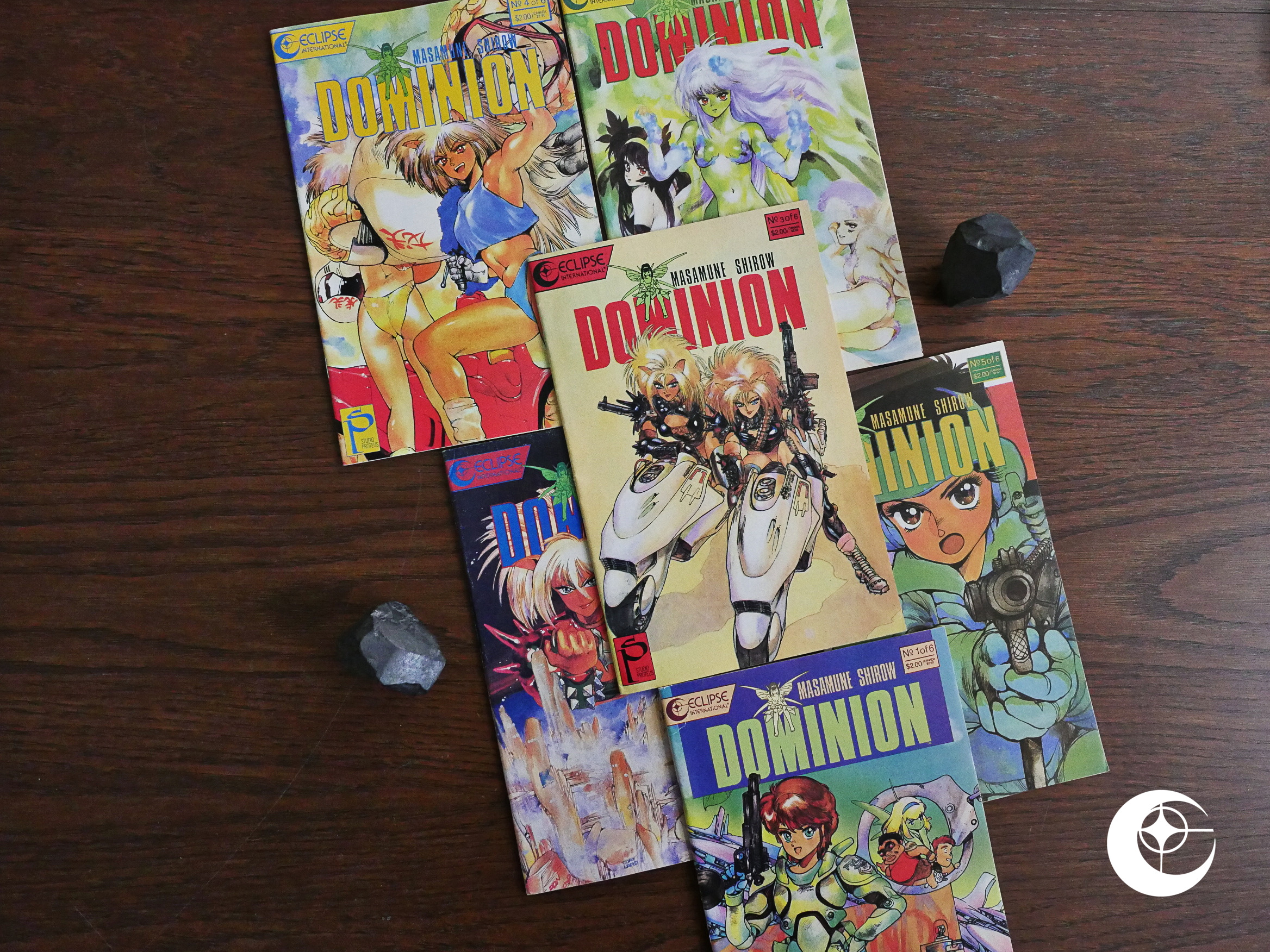
1989: Dominion

Dominion (1989) #1-6 by Masamune Shirow et al.

Eclipse and Studio Proteus continue with their translations of Masamune Shirow’s comics while waiting for him to complete his Appleseed series.

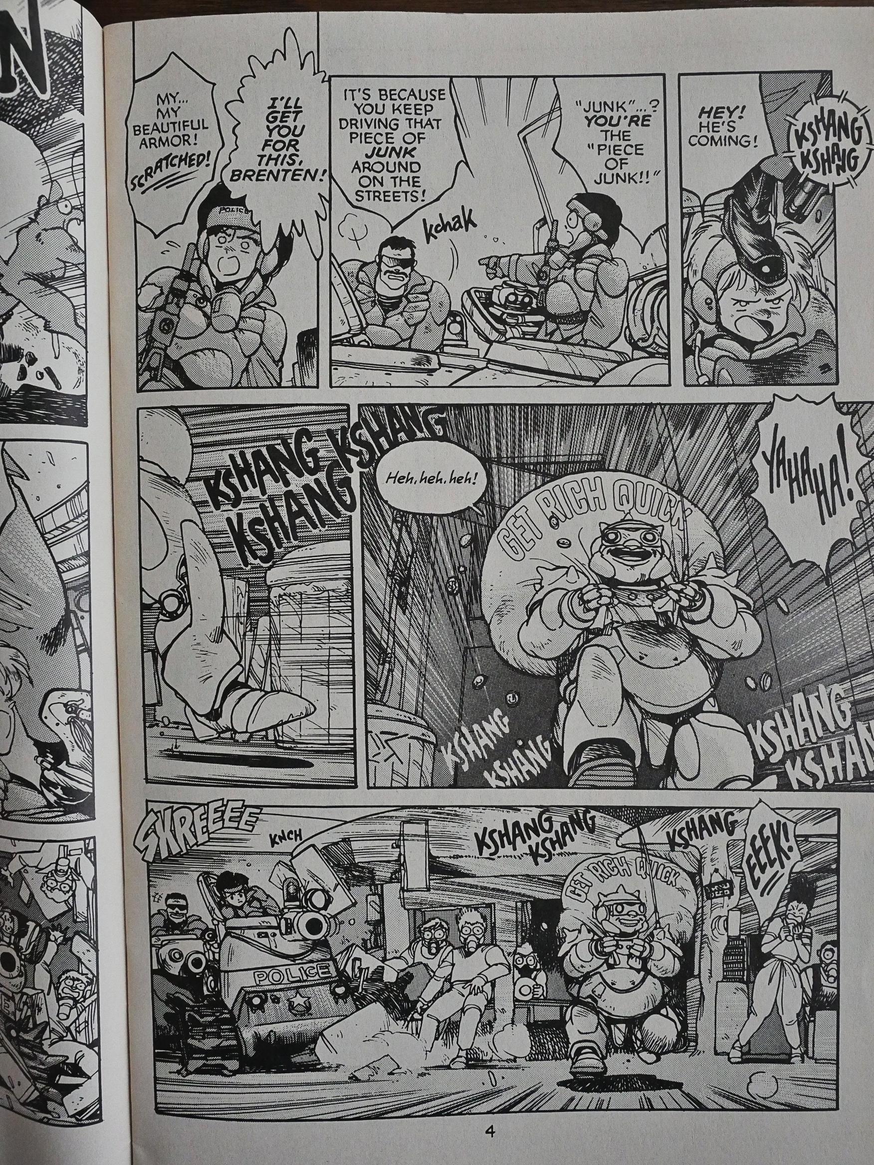
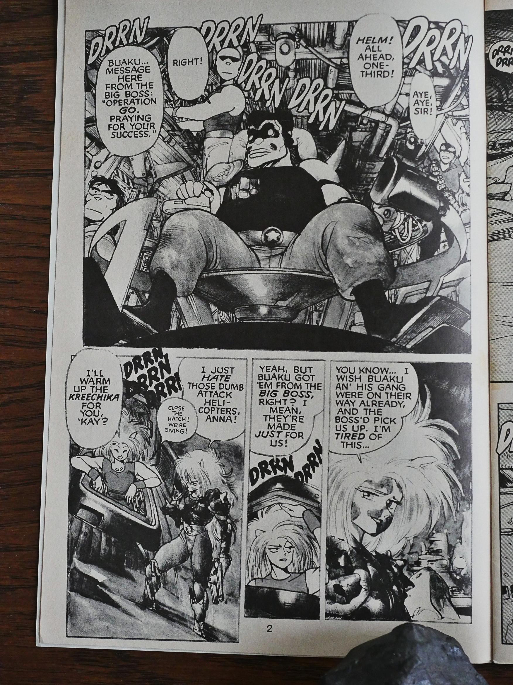
This is Shirow at his funniest, I think? While he always has a sense of humour, I guess, this is very silly, and I like it a lot. The story starts in the middle of the action, and we’re introduced to the (pretty small) cast of characters while they’re shooting at each other. Shirow’s pretty good at this: It doesn’t take many pages before we know these characters pretty well. It doesn’t hurt that Shirow leans pretty heavily on cop show cliches, either: It’s the normal mix of characteristics.

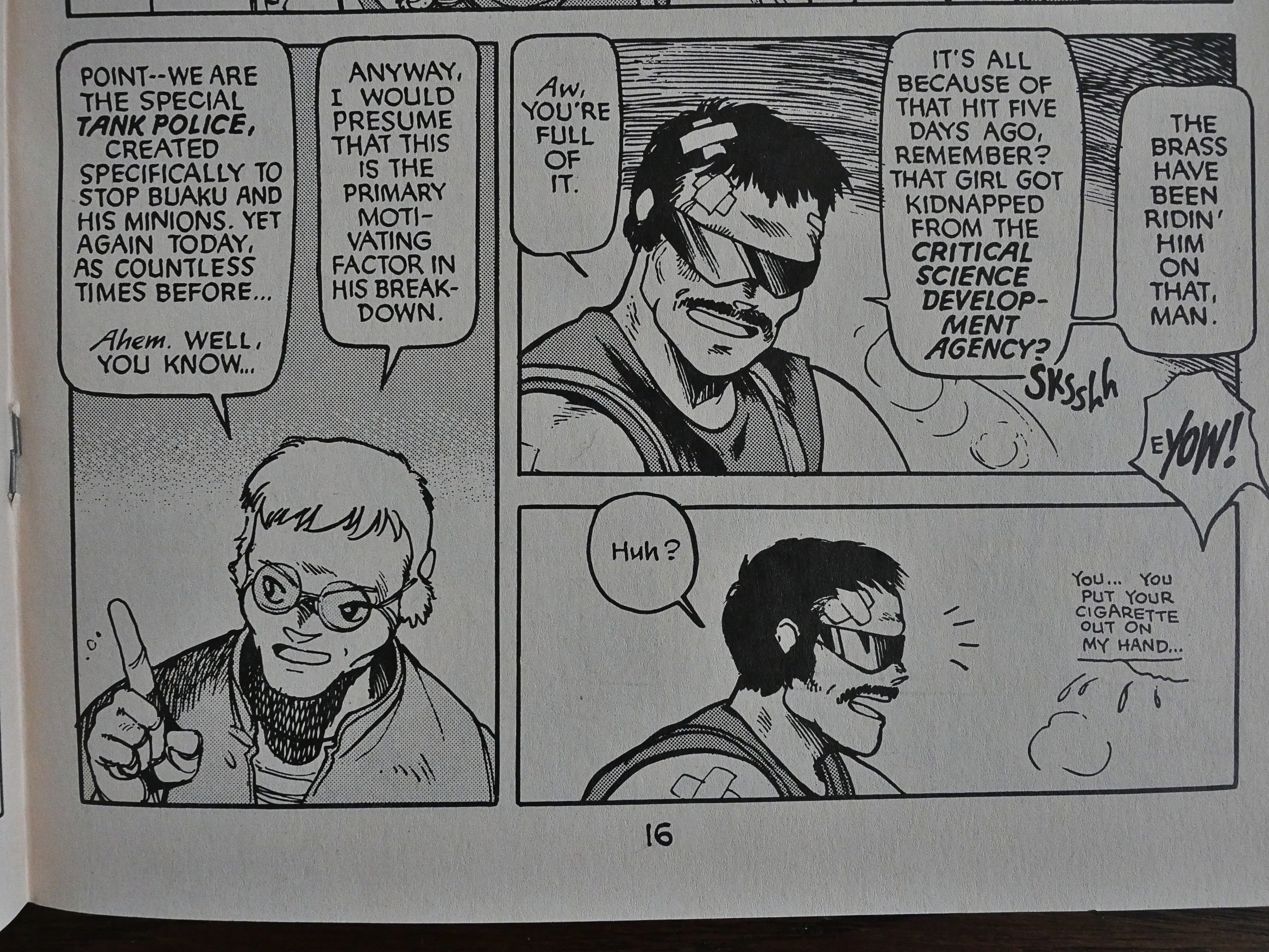
So it isn’t until page sixteen that Shirow explains what this is all about, and then he does it in the most expedient way possibly, by having two of the characters as-you-know-Bob each other.

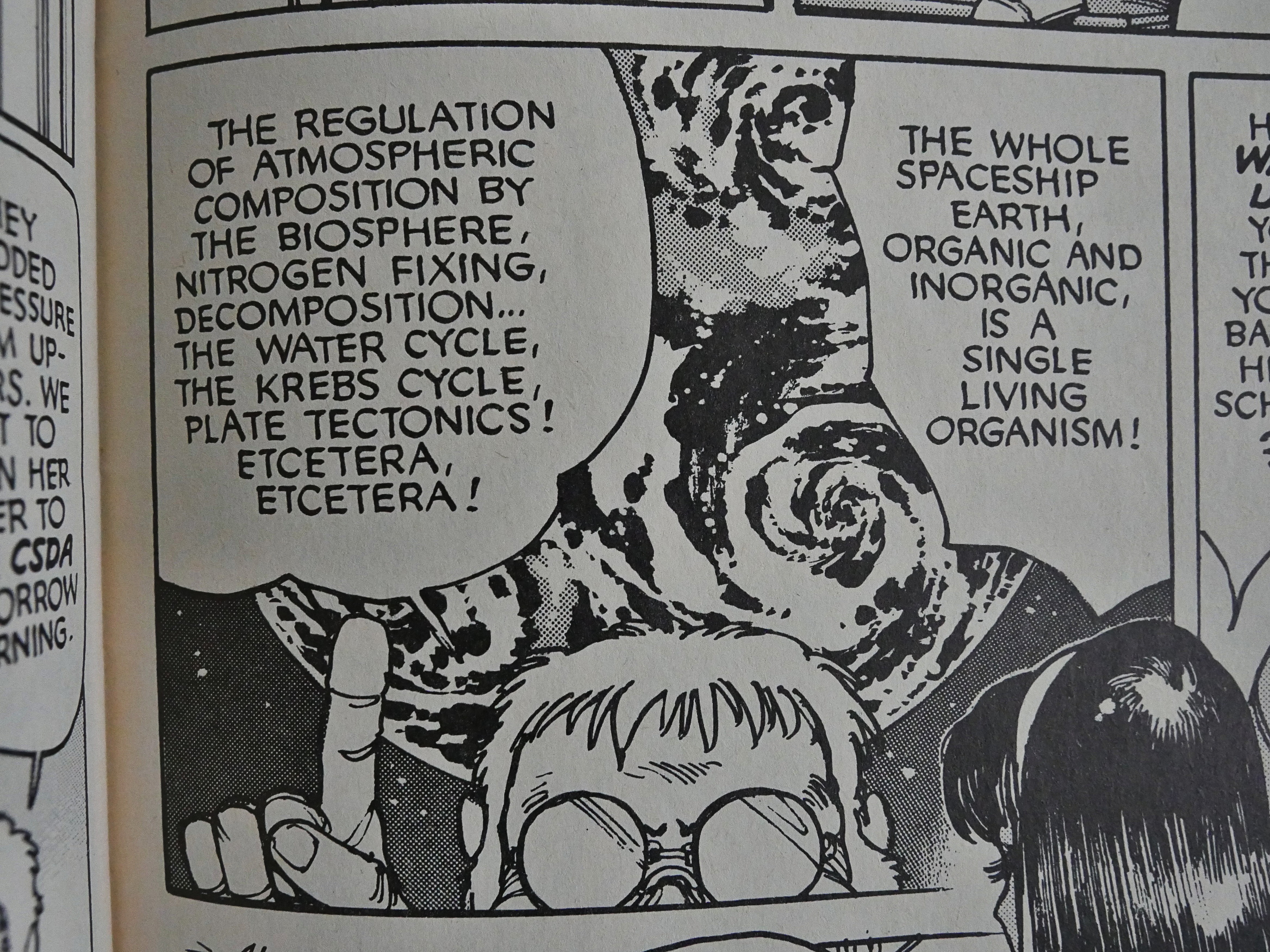
We also get the requisite lesson about the Earth and the fragile ecosystem and stuff. The story takes place in a kinda generic post-apocalypticish world where the air is… bad or something.
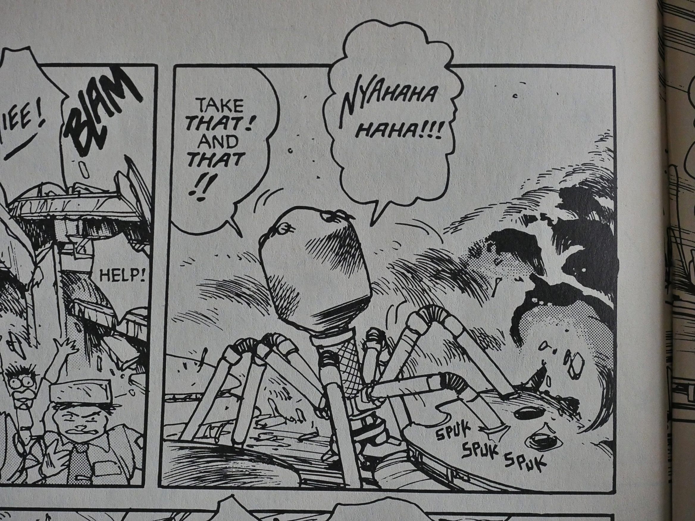
But the main point of this book is the deranged action, complete with a mad villain. “Nyahaha haha!” That’s a good villain laugh, isn’t it?
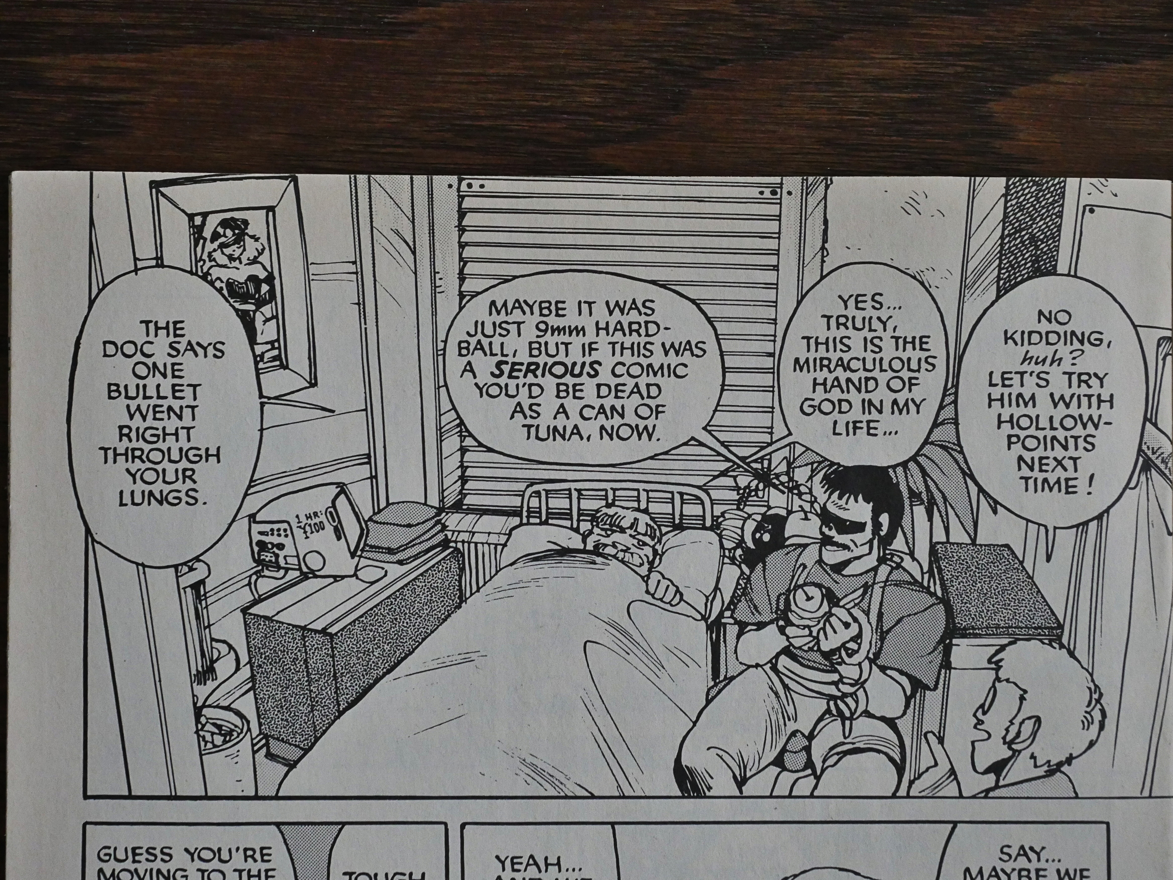
Shirow comments on the over-the-top action (and about how nobody seems to get hurt seriously by it) in the comic itself.

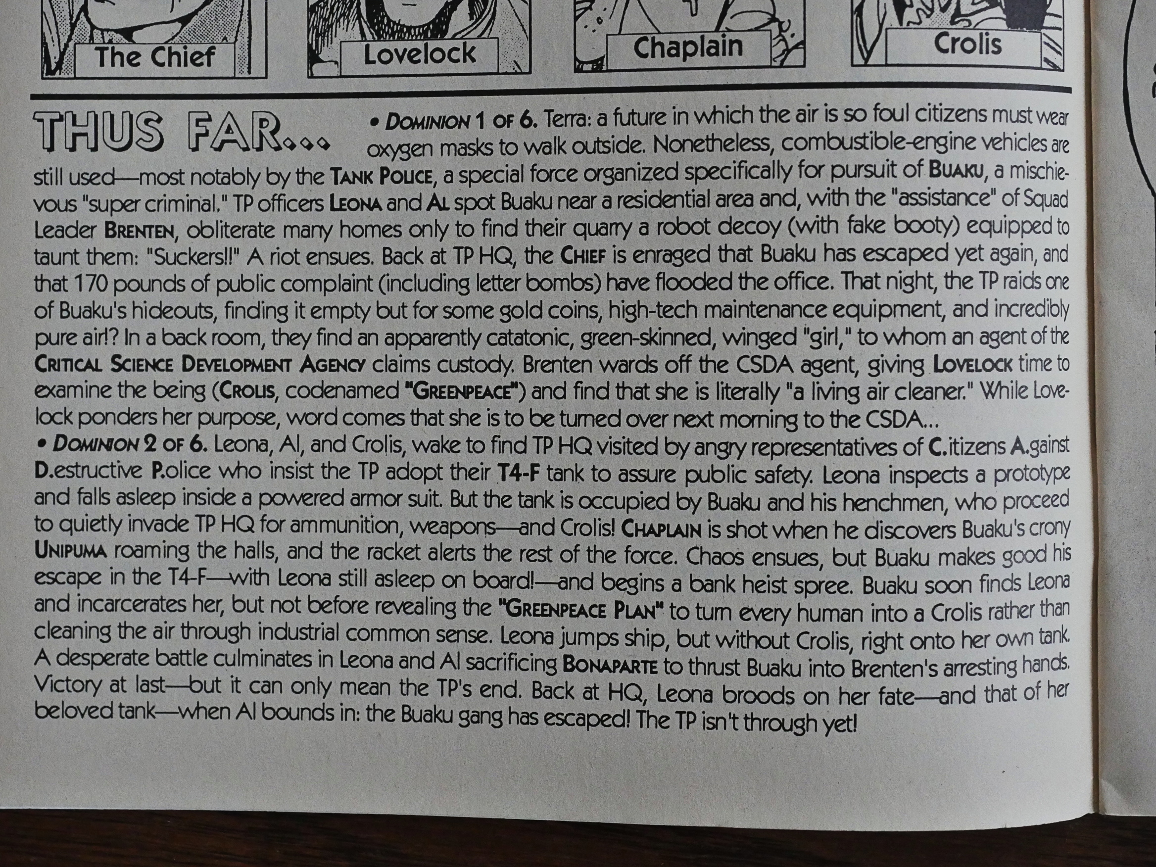
In the third issue, they start putting in a recap, which I guess… makes sense? But reading it would take longer than just reading the original comics (these are pretty breezy reads), so…

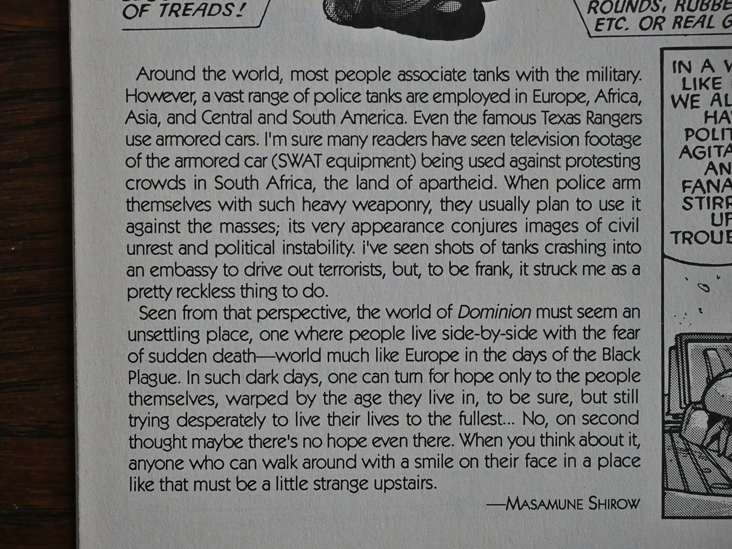
Shirow contributes some pages of context for the book, and doesn’t really want a tank police in the real world.

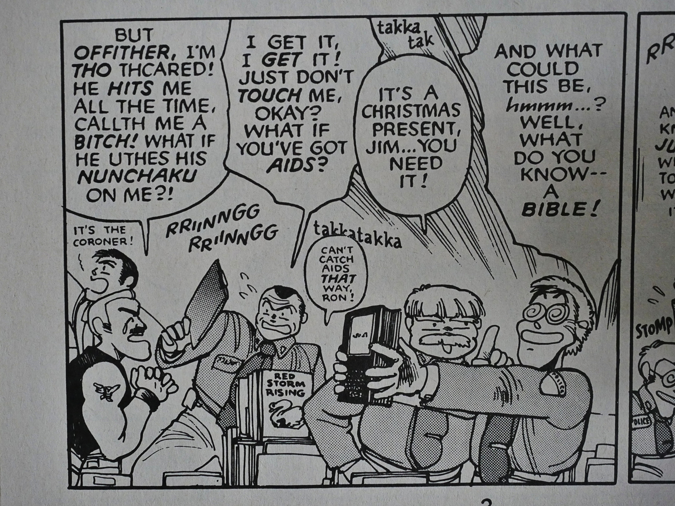
*sigh* This is fortunately the only gay joke in the series.

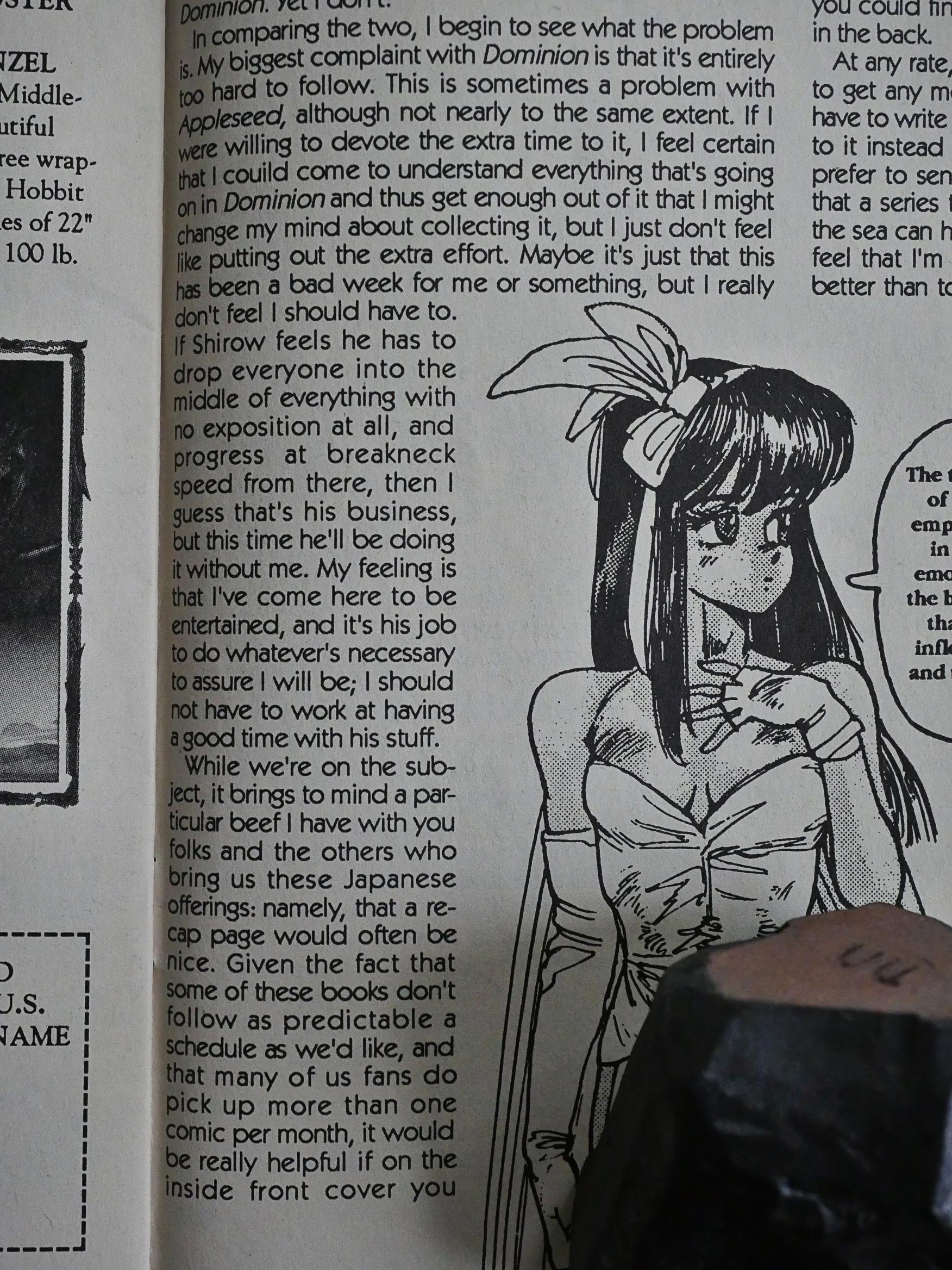
Geez. A writer complains about the book being hard to understand. I don’t get that at all: Shirow’s storytelling is extremely clear, and his character design is wonderful: You can tell all the characters apart immediately (which is often not the case in Japanese comics for kids).

Suddenly! Two pages done with this shading technique? Were these pages originally in colour, perhaps? Japanese comics frequently have a couple of pages in colour at the start of the chapter, and that would explain why this looks so weird…

The book ends rather abruptly. Shirow did a sequel in the 90s, but there’s apparently no direct connection to the story here.

The series has been collected and published by Dark Horse through several editions, according to Amazon.

1989: Batman & Me

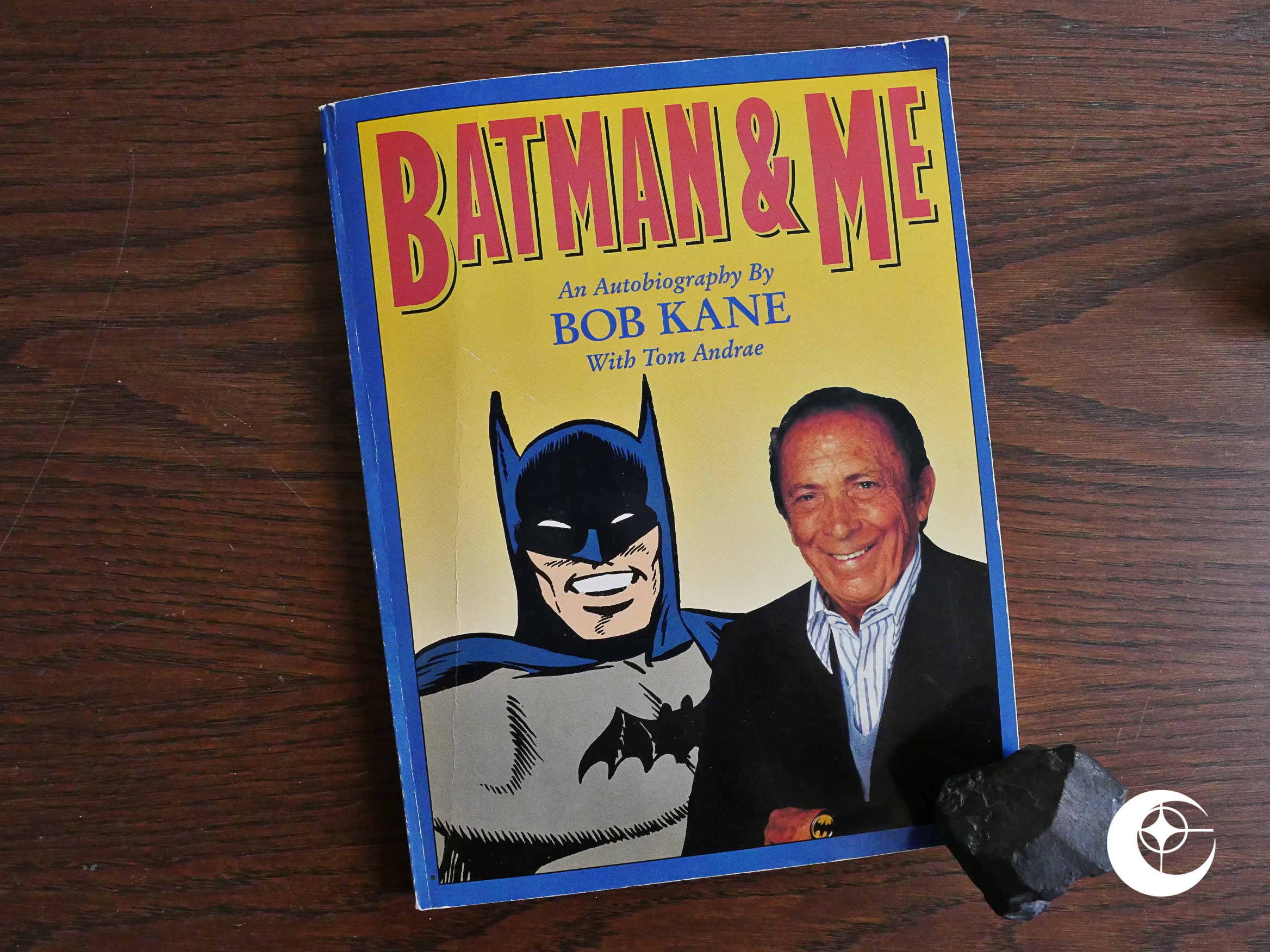
Batman & Me (1989) by Bob Kane and Tom Andrae.

Eclipse had previously published a handful of books (like Comics & Sequential Art by Will Eisner), but I think this is the first autobiography? Like virtually all of the books, this is also in album format, which is a slightly odd choice.

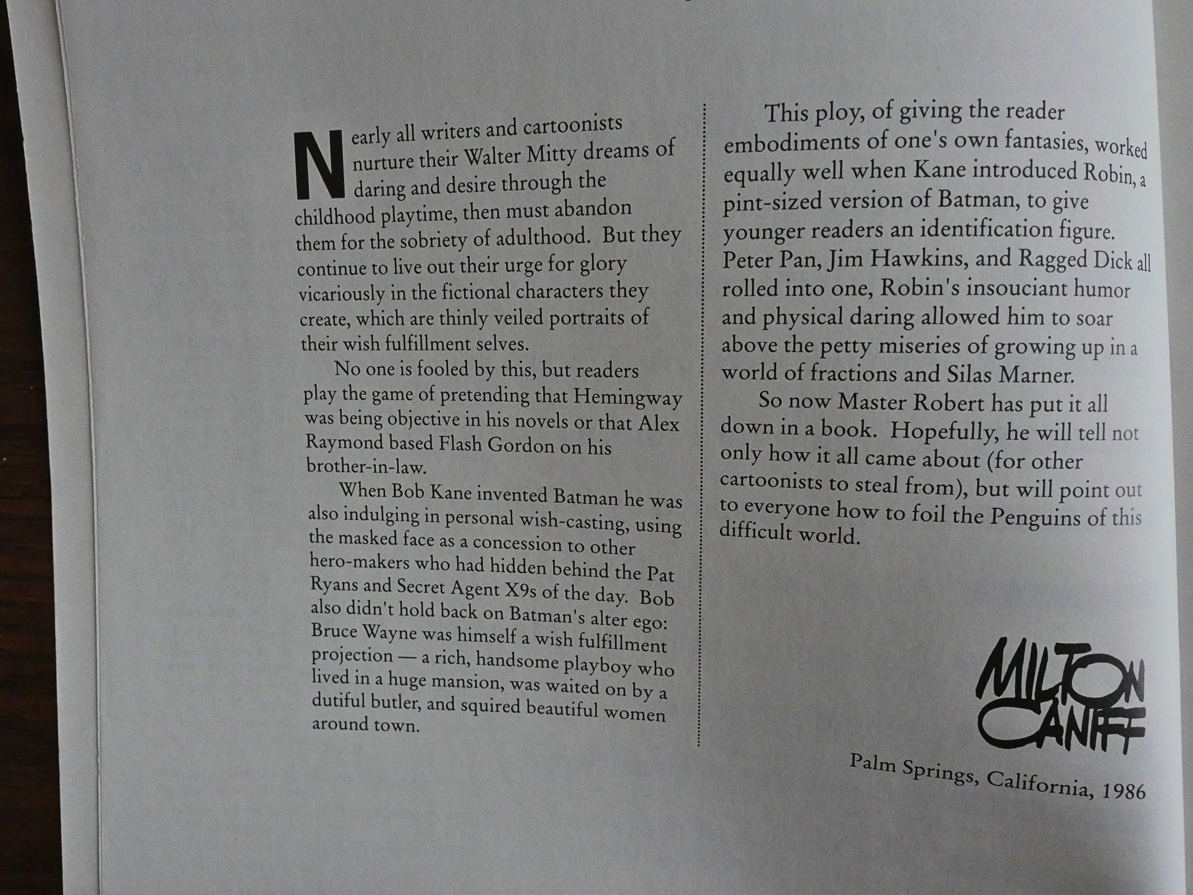
Milton Caniff does the preface…

… but apparently virtually the entire text is by Kane “with” Andrae. I really have no idea, but I’m guessing that Andrae wrote the text based on in-depth interviews with Kane.

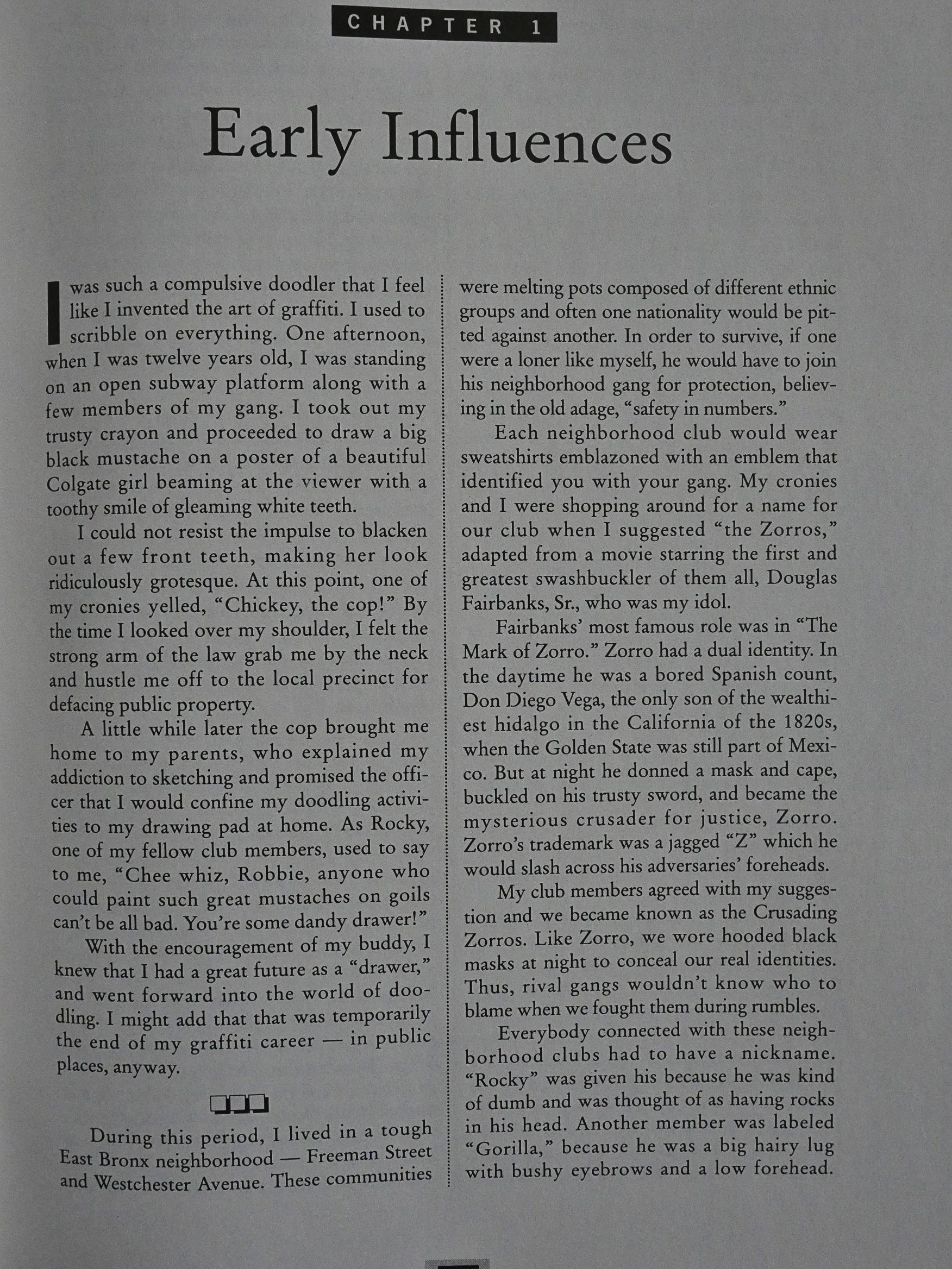
It’s a pretty strictly chronological retelling of Kane’s life, starting as a child in the Bronx, detailing some really hair-raising fights with rivalling gangs and stuff. The prose is clear and pretty entertaining, although it relies heavily on set phrases and cliches.

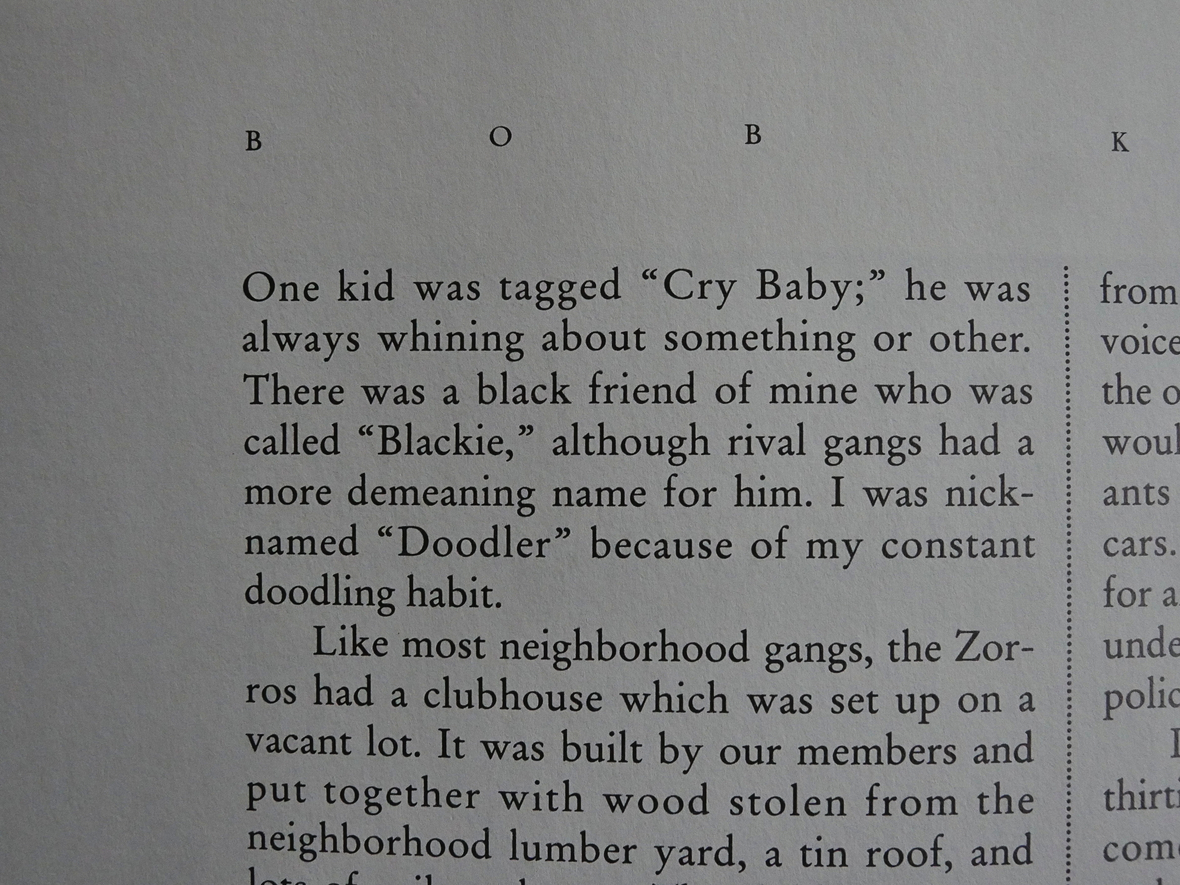
And you can’t really say that his gang were that imaginative with their nicknames, can you?

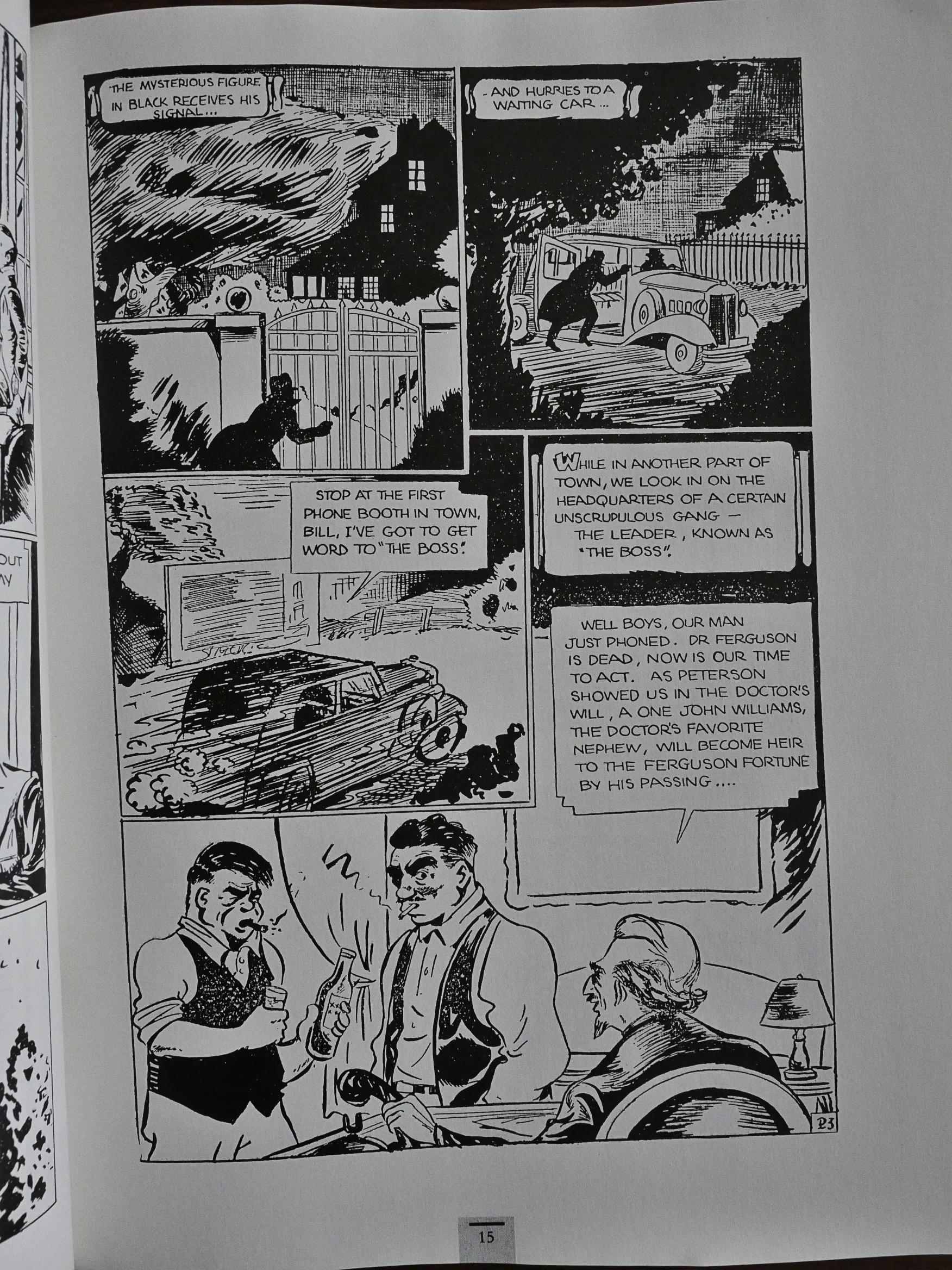
But we leave the childhood years after half a dozen pages and we get to his professional career. And it’s really nicely put together: When he discusses his first published adventure comic, we get the story, and so on. I mean, it’s a small thing, but I’ve read so many comics histories that are so sloppily put together, with the illustrations never showing you what the text is talking about, that even something as simple as that stands out.

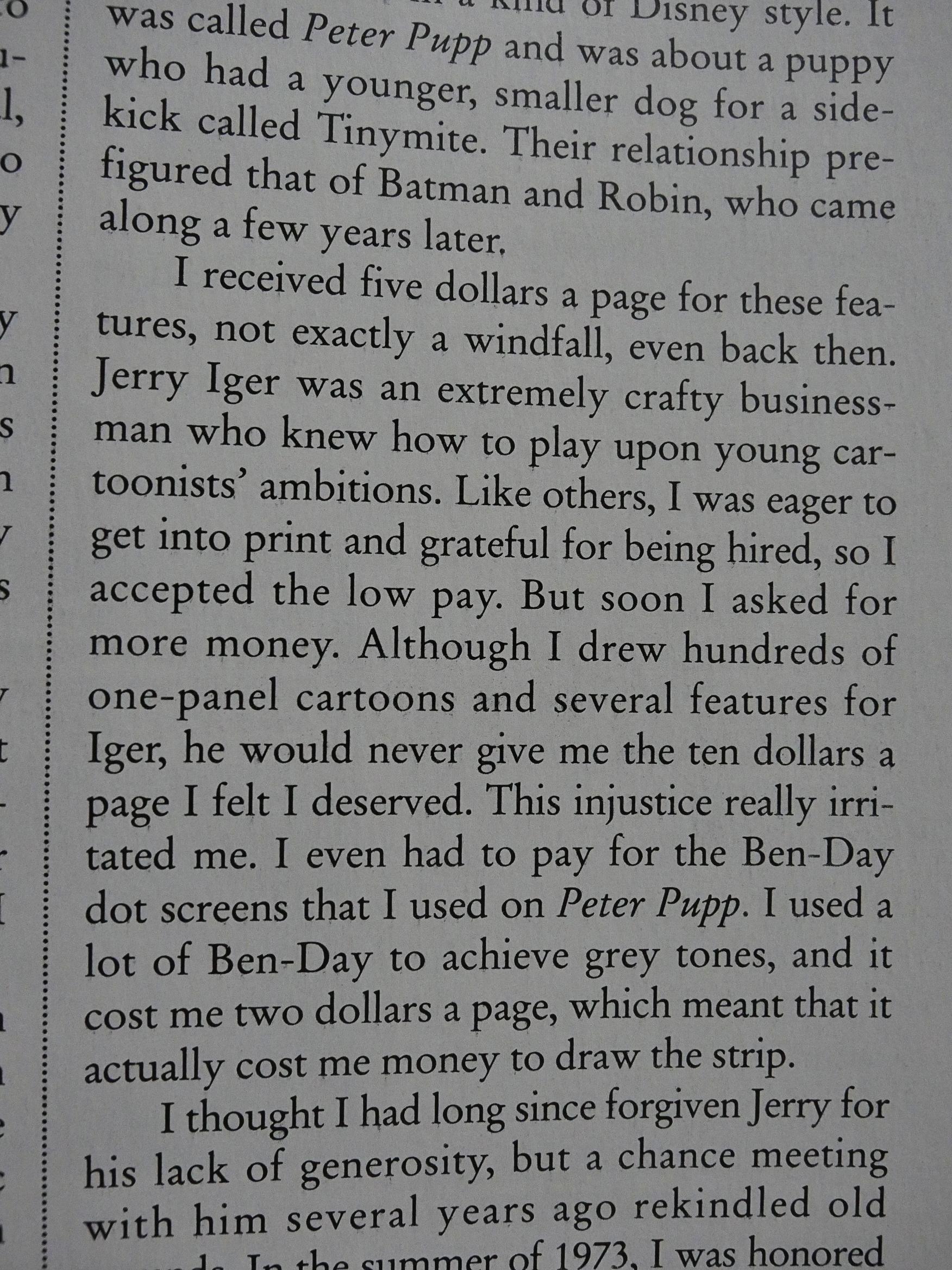
Working for the early comic publishers was no joke, with Kane being paid so little that after paying for the art materials, he lost money for every page.

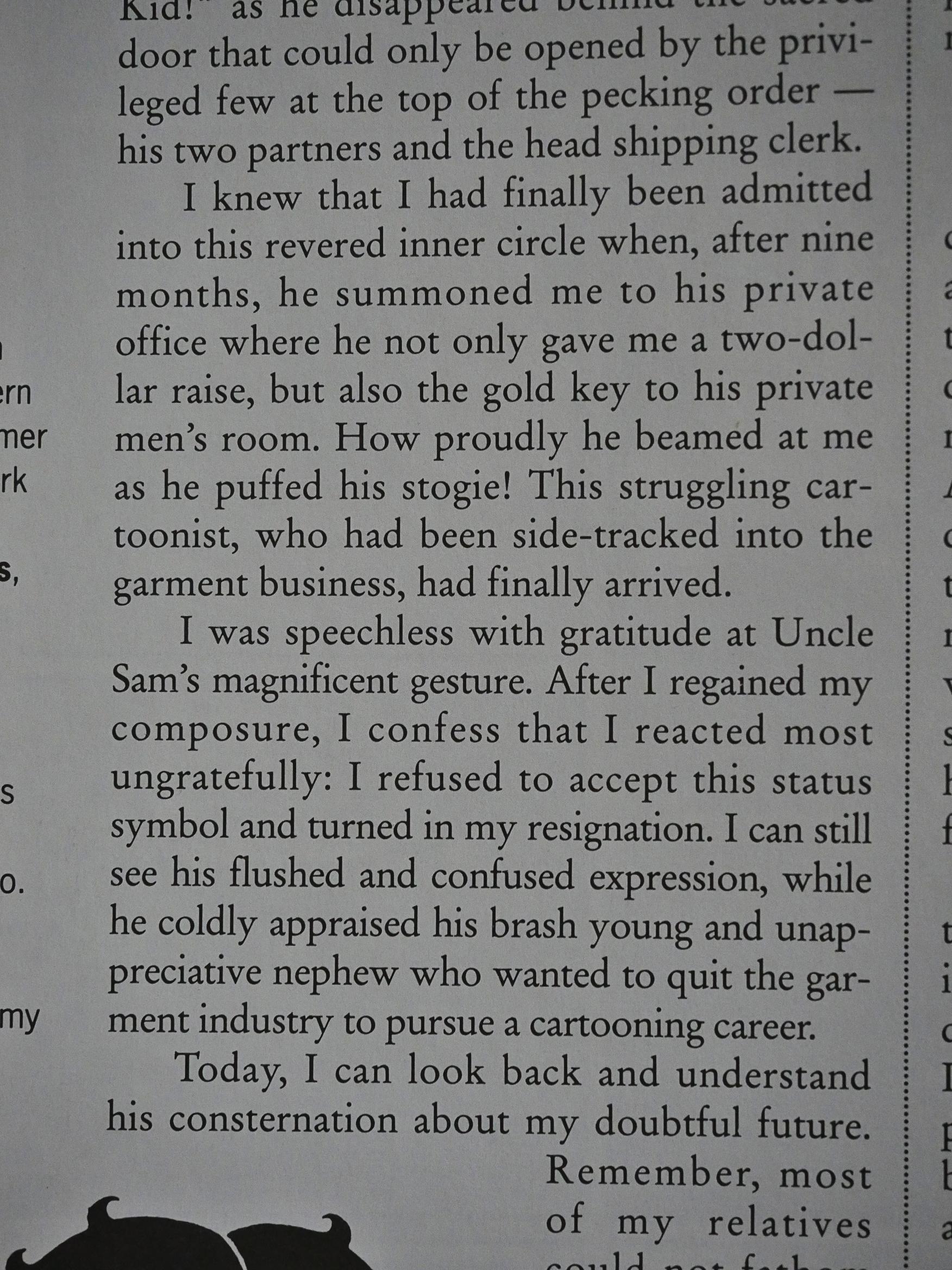
So he gave it up briefly and went to work for his uncle at a shipping company. He left after being promoted and being told that he could finally use the executive bathroom. He just found that division so absurd that he quit on the spot.

I think that’s a wonderful anecdote.

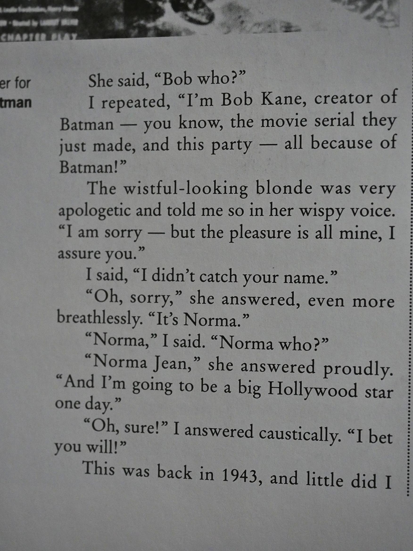
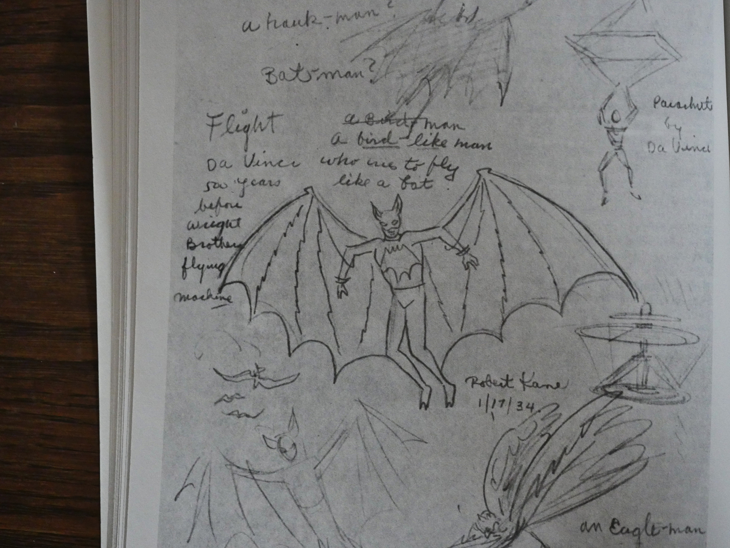
And then there’s Batman! Kane is so far from self-mythologising: He describes in detail where he ripped off the concept, I mean what he was inspired by. The cape was from da Vinci’s helicopter…

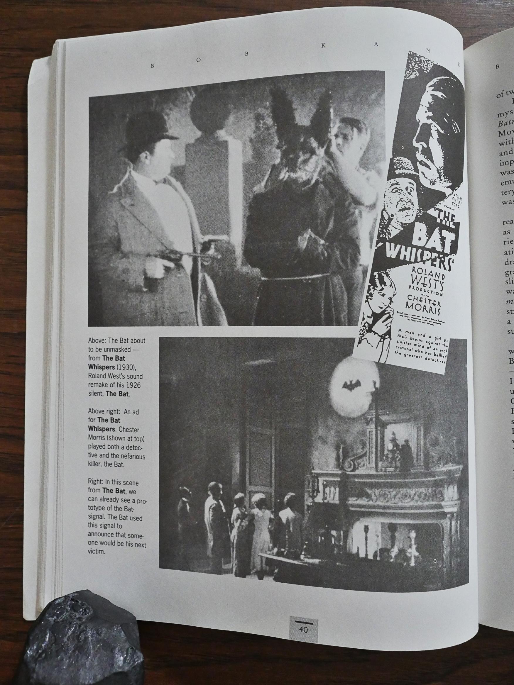
… and the name and general look was from various other bat-themed movie serials.

I don’t really know much about Batman’s history, but I have registered that some people are angry that Bill Finger doesn’t get more credit. It’s clear that Bob Kane considers him to be a co-creator who contributed significantly both to Batman and Robin.

And Robin was introduced to appeal to boys, and Catwoman was introduced to appeal to both women (as somebody to identify with) and to men (to have somebody to ogle). Kane’s way of talking about these things is wonderfully straight-forward.

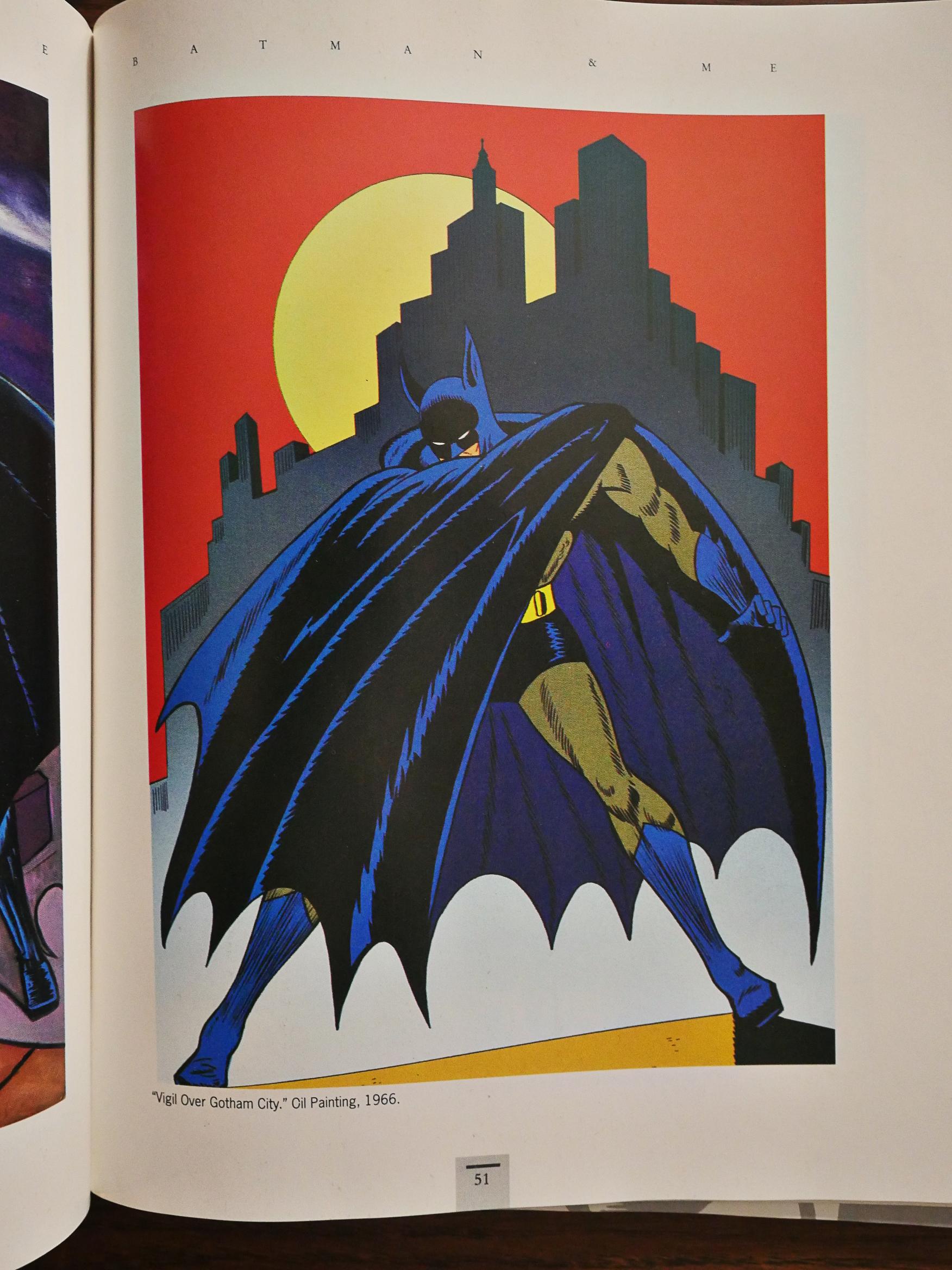
The middle portion of the book is a colour section where we get several illustrations…

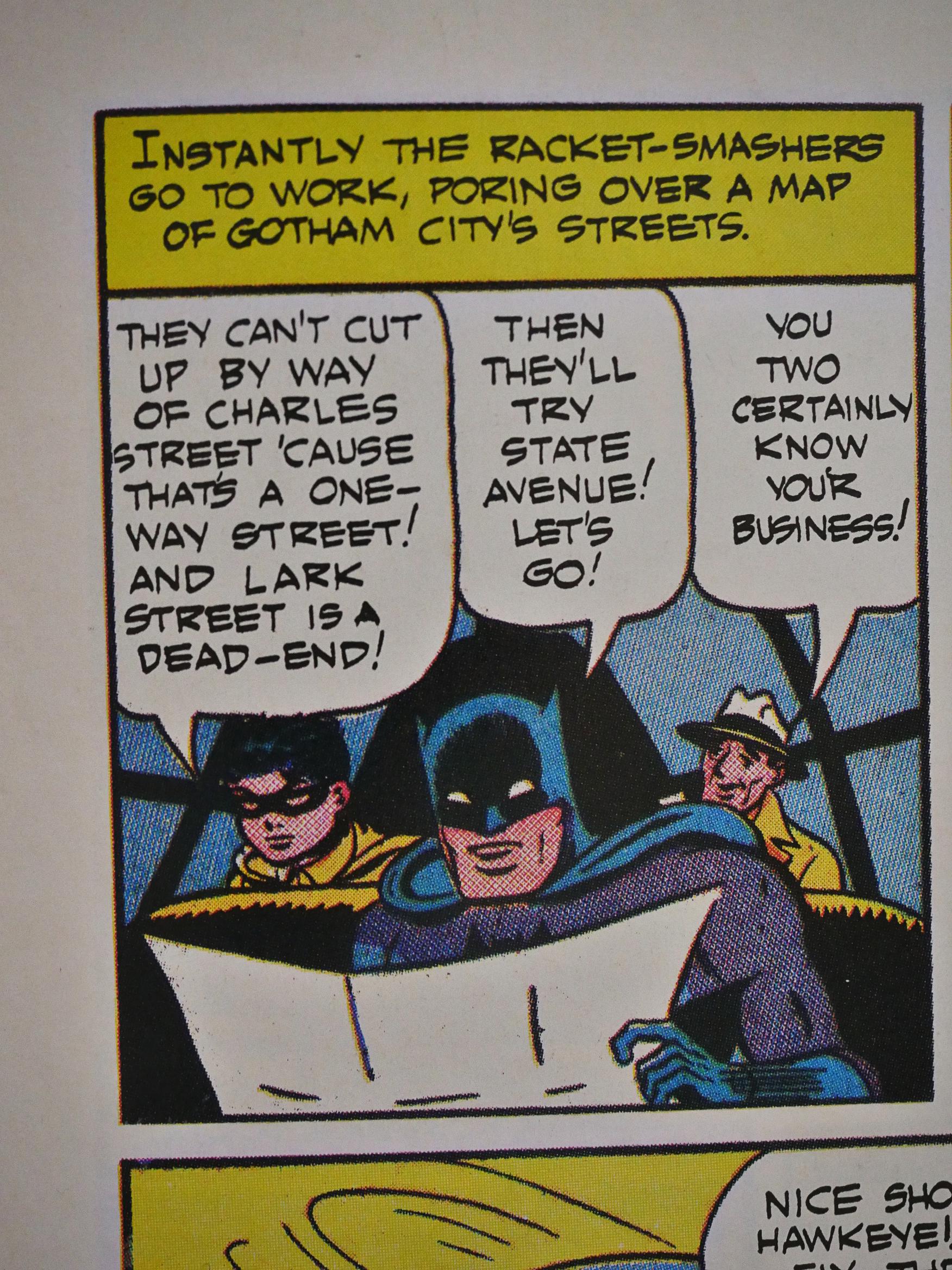
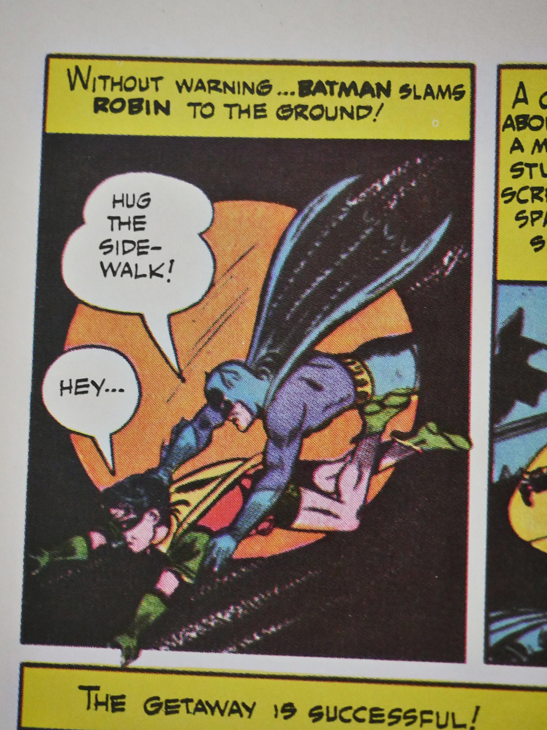
… and two complete early Batman stories. Batman and Robing were apparently really good at reading maps!

Hey…

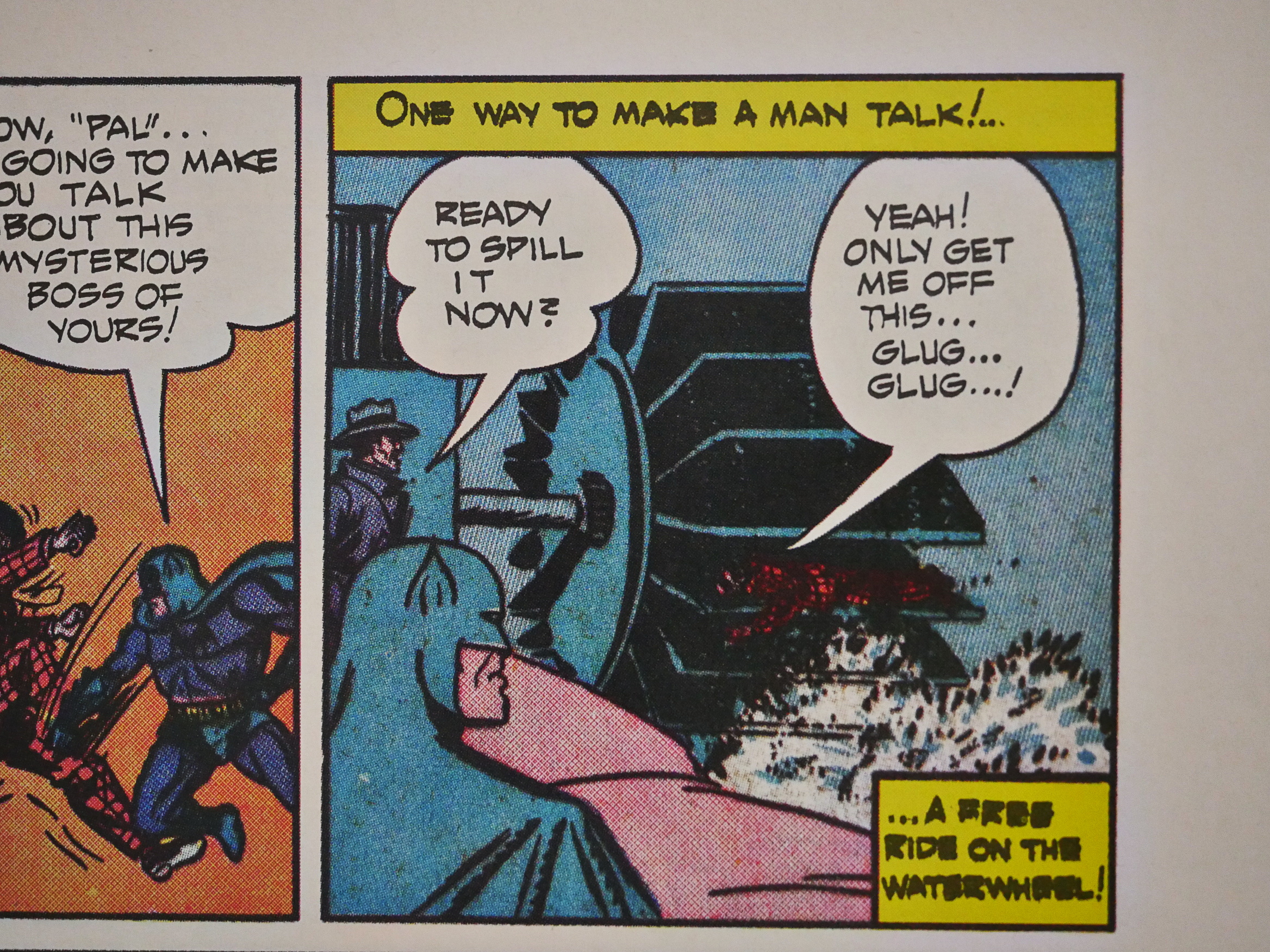
And Batman liked to waterboard villains from the start.

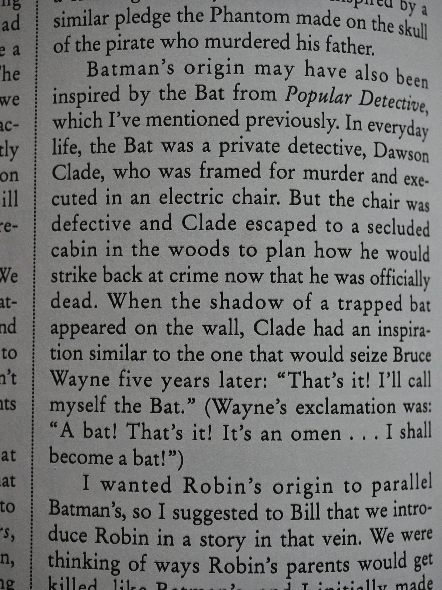
Even Batman’s origin (which they didn’t come up with until a year after they’d created him) was er inspired by other sources.

Kane did less and less of the day-to-day artwork on Batman and started hobnobbing with Hollywood stars.

Anyway, this autobiography is a lot better than I thought it would be. Kane’s got a bunch of entertaining anecdotes and gives a down-to-earth analysis of his own work.

Let’s see what people on the interweb has to say about it…

Yikes!

This is Bob Kane’s thoroughly despicable account of how he came to create Batman all by himself, was one of prime creators of comics from the golden to the silver age, and how he came to sleep with Marilyn Monroe. It is all a pack of lies.

We know that Batman was co-created by Bill Finger, many of the most popular and innovative parts of the Batman mythos were created by others, that aside from his actual part in Batman Kane had very little impact on comics, that he farmed out so much work to ghosts that his impact is diluted even more, and nobody believes the Marilyn Monroe story. She certainly was not around at that point to refute it, so he victimized Monroe. The book is entertaining to read, thus the extra star, but this book is absolutely disgusting.

That’s… a weird reading. Kane wrote nothing of the kind about Marilyn Monroe… and the rest… is… just made up, as far as I can tell? How utterly strange.

I had no idea this was such a controversial book:

Bought this autobiography as a research tool for a play I hope someday to finish. If you want to know about Bob Kane, don’t start here. Or do start here, but be aware that he is the king of embellishment, and his whole book is an attempt to build himself up as both a larger than life figure, and the sole creator of Batman. The writing is serviceable and spritely enough, and he does give some credit to his writer, Bill Finger, but Kane’s hubris gets less entertaining with each chapter. I donated this book to the local library not long after purchasing it. I don’t need Bob Kane’s defense of freezing others out of creative profit in my house.

And here’s somebody on Amazon:

This tome earns three stars on the strength of its audacity. Bob Kane is a man who never met an idea he couldn’t claim as his own, it seems. Kane made himself very rich on the backs of writer Bill Finger and a host of ghost artists. The narrative in this book, with its clumsy boasts and baldly revised history (including sketches that are almost certainly purposefully misdated to support Kane’s claims), provide ample indictment of one man’s hubris. But that’s not to say it isn’t entertaining in its own sad way …

THEY ALL HATE IT.

Oh well.

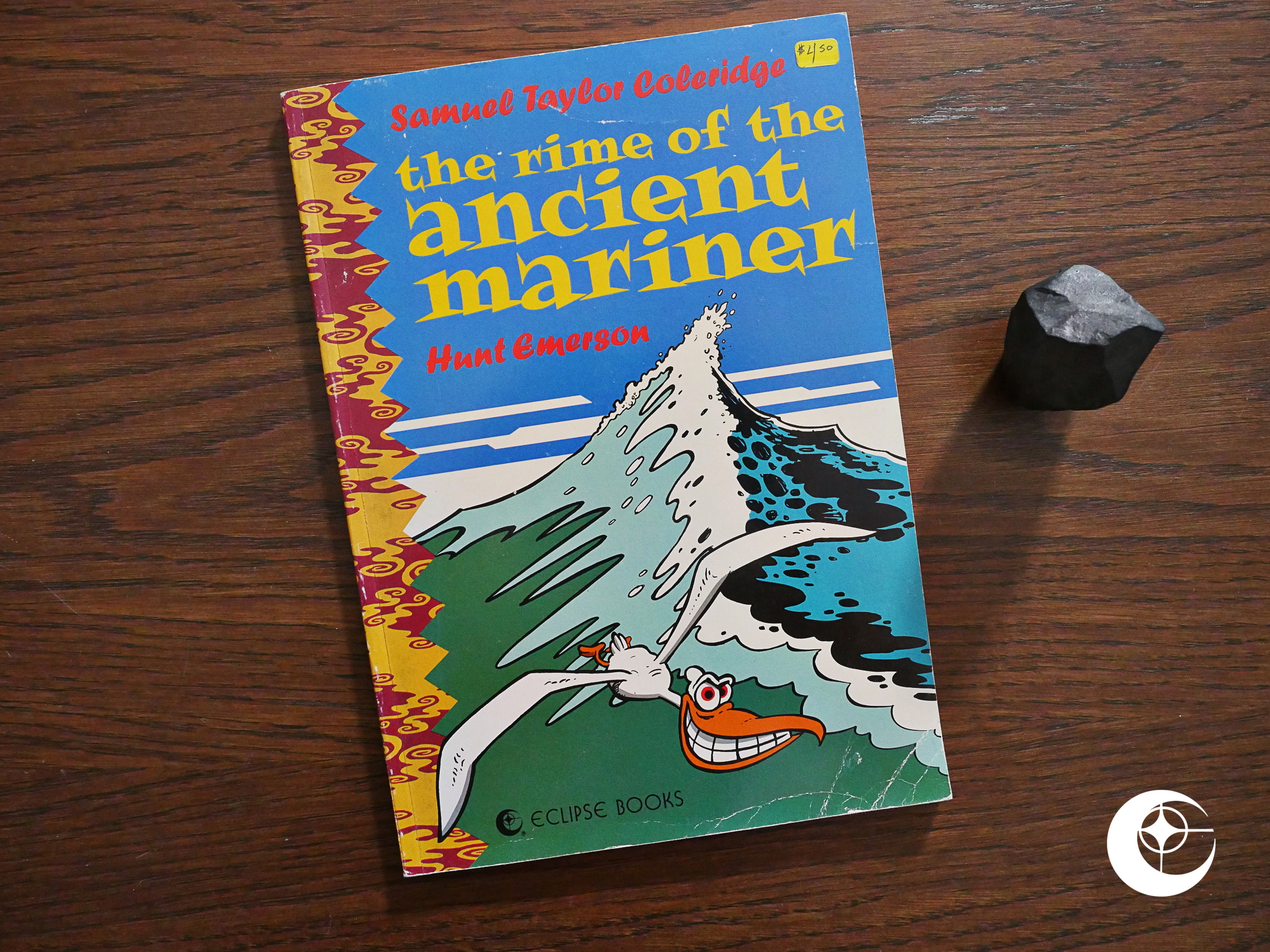
1989: The Rime of the Ancient Mariner

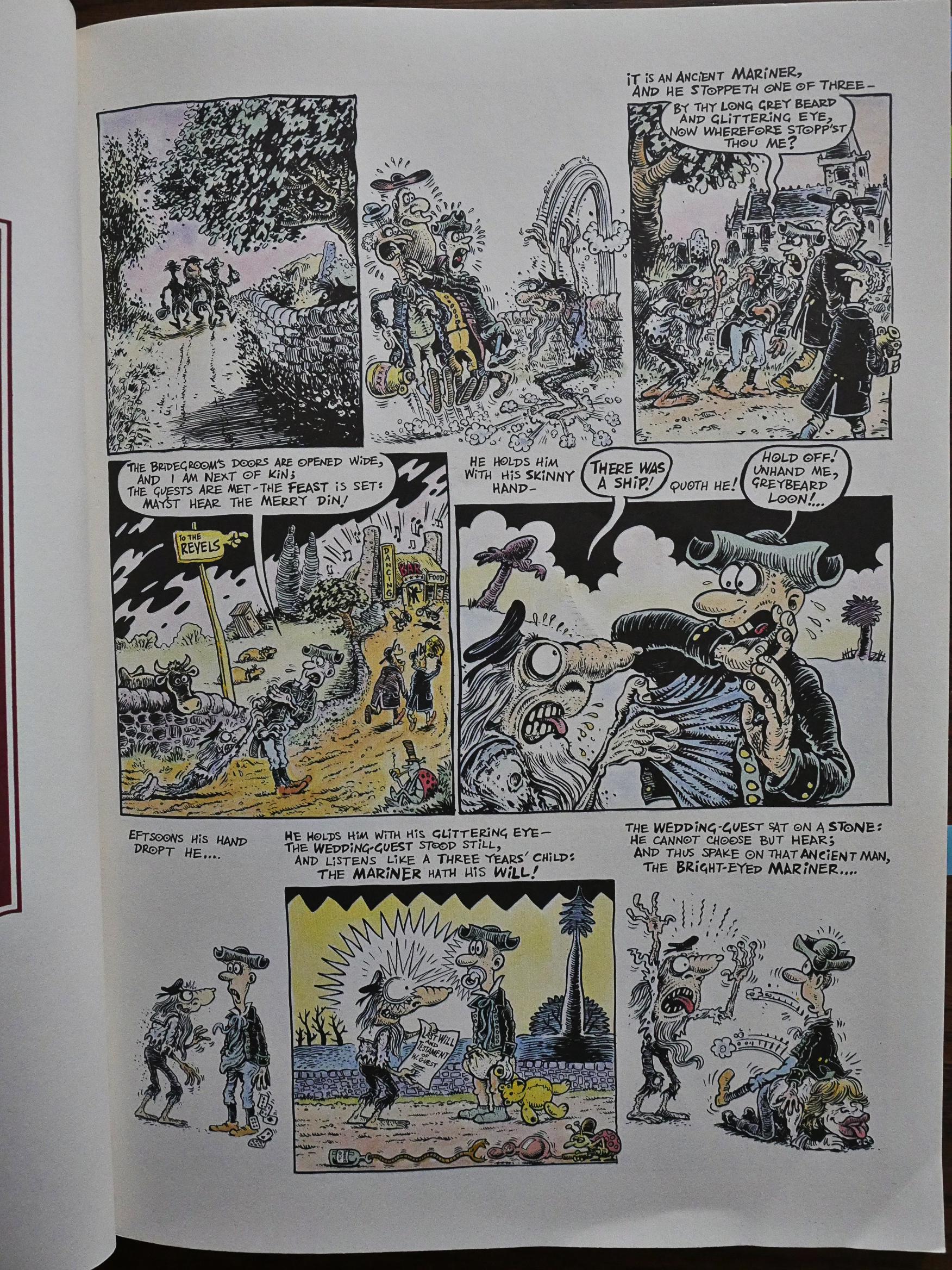
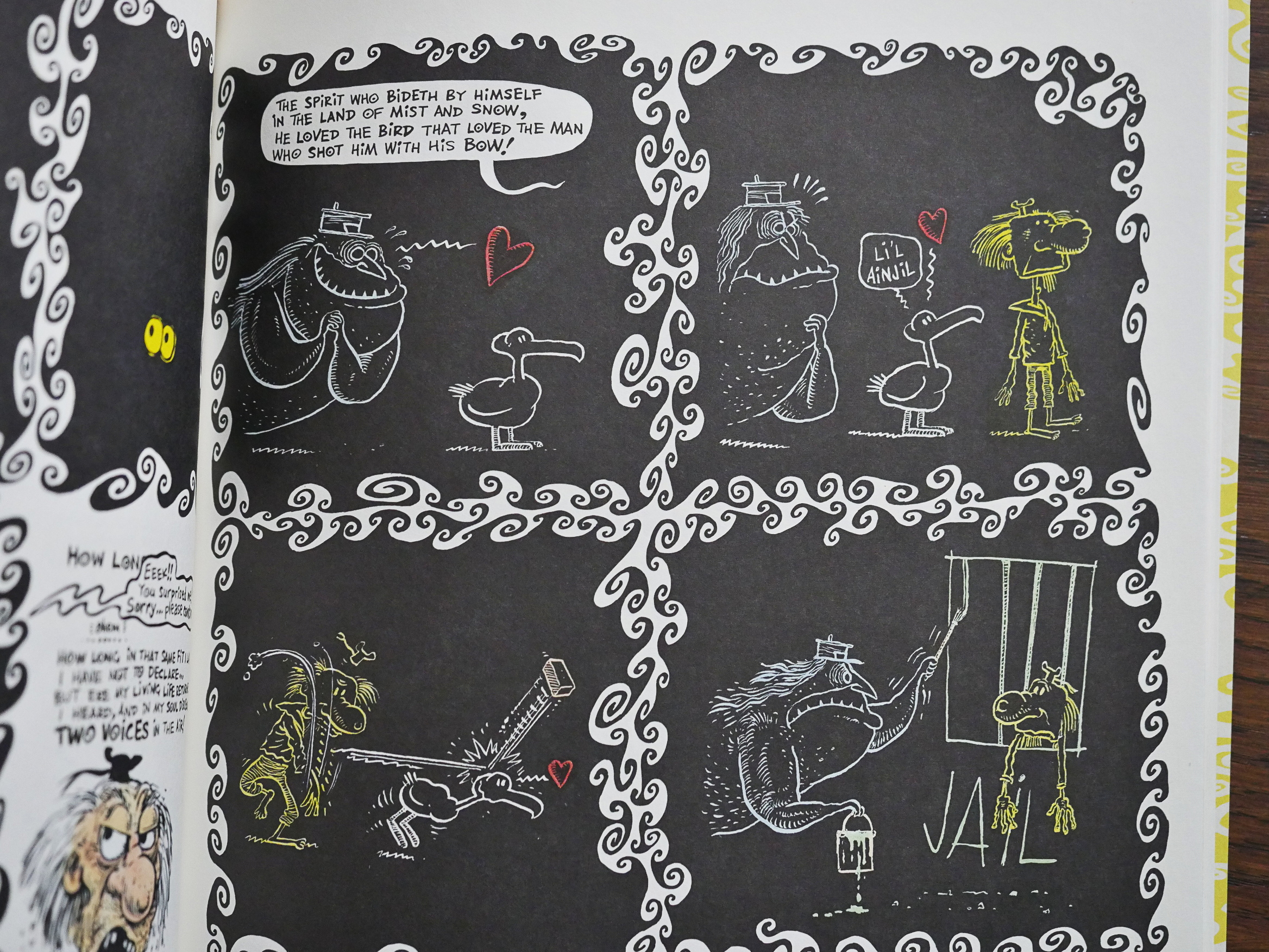
The Rime of the Ancient Mariner (1989) adapted by Hunt Emerson from a poem by Samuel Taylor Coleridge.

Eclipse published a number of books around this time that were imports from the UK.

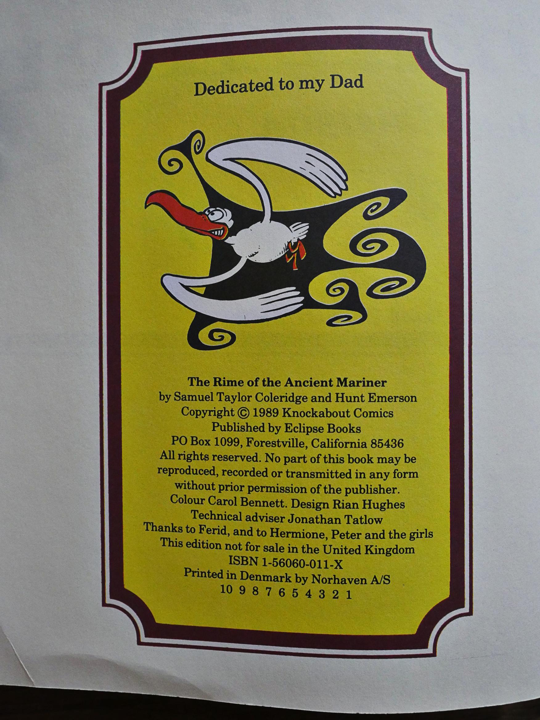
This is apparently one of them: It says “this edition is not for sale in the United Kingdom”, which I take to mean that Knockabout published the same book in the UK, and probably not a lot was changed except some logos and the indicia. It’s even printed in Denmark.

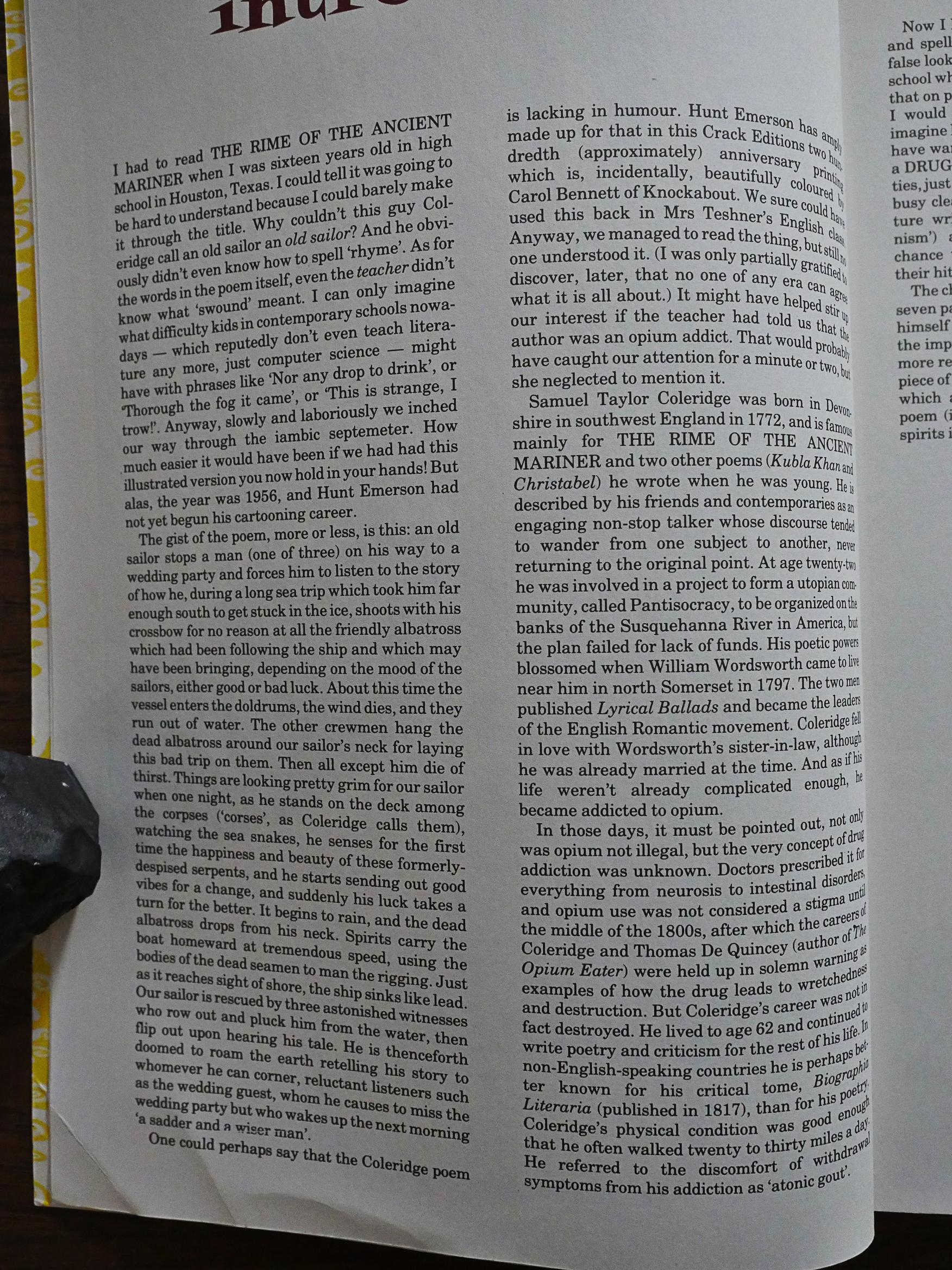
Gilbert Sheldon does the introduction, and gives a plot summary of the poem, which I, of course, skipped. No spoilers!

I mean, either you know the poem (and in which case you don’t need to read a plot summary before you read the adaptation), or you don’t, and you still don’t want that. Weird choice.

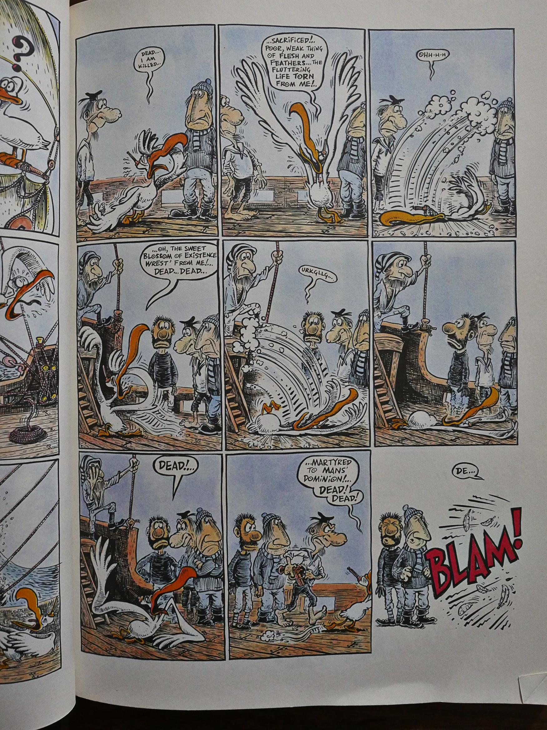
But this is a very funny book. Emerson’s main schtick is to take the words from the poem and illustrate them literally. Emerson’s artwork is just so organically funny anyway that even if this could be totes cornball, I think it’s just totes hilaire.

But he has more tricks up his sleeve than that, though. There’s the slapstick bits with physical comedy…

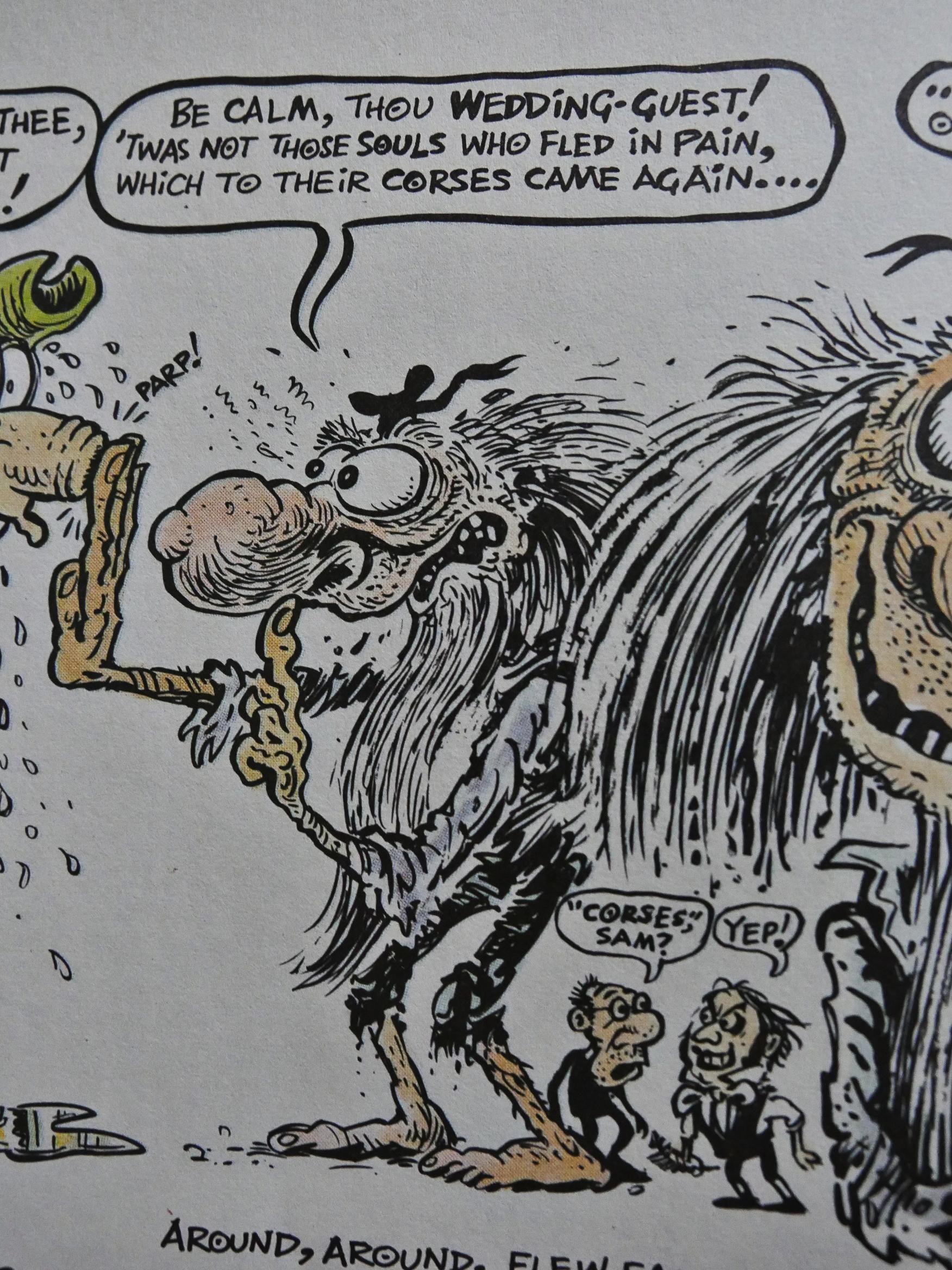
… there’s the asides where he questions the mad author about his word choices…

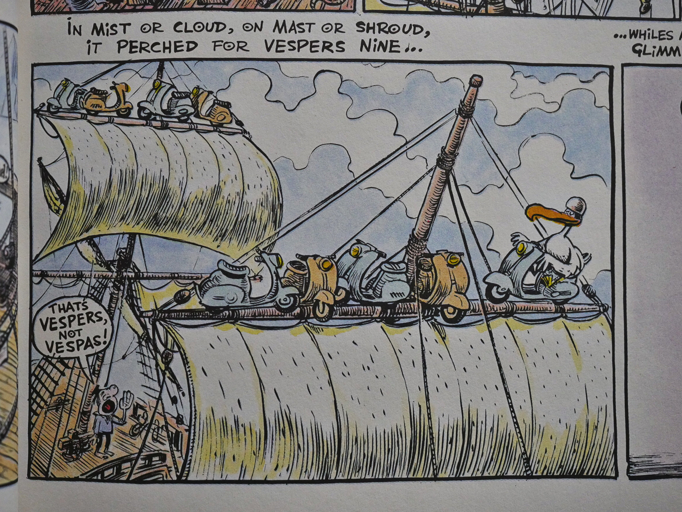
… and there’s the slightly wince-inducing visual/verbal puns.

And he explains the entire concept behind the plot with these four panels: It’s just like Krazy Kat. The albatross is Krazy, the Mariner is Ignatz and the Sea Spirit Guy is Offisa Pup.

Makes total sense.

This is the first Knockabout/Eclipse co-publication, I think, and I think it was a one-off… unless I’ve forgotten any in the books to come up later in this blog series. (I think we’ve just got 10% of the Eclipse output left to get through now. *phew*)

So what did the critics think?

Here’s R. Fiore from the Comics Journal #137:

If you’re really looking for a good literary adaptation, then look for Hunt Emerson’s version of The Rime of the Ancient Mariner, part of Eclipse’s expanding non-garbage line. The thing that made Emerson’s version of lady Chatterly’s Lover so wonderful was that he satirized both Lawrence’s targets and Lawrence himself. As this is a lampoon in the style of the old MAD, when Kurtzman couldn’t come up with a story and just let Jack Davis loose on a poem, you don’t get that kind of double satire, but it is still a delight. Like Robert Crumb’s adaptations, it’s not an attempt to recreate someone else’s work, it’s the cartoonist showing what he feels about the work, and what it means to him. As outrageous as the lampoon is, by the end you will by God have read The Rime of the Ancient Mariner, and you will find just how much of Coleridge’s vision can survive the most violent hammering.

Heh heh. “Eclipse’s expanding non-garbage line”.