1989: El Salvador: A House Divided

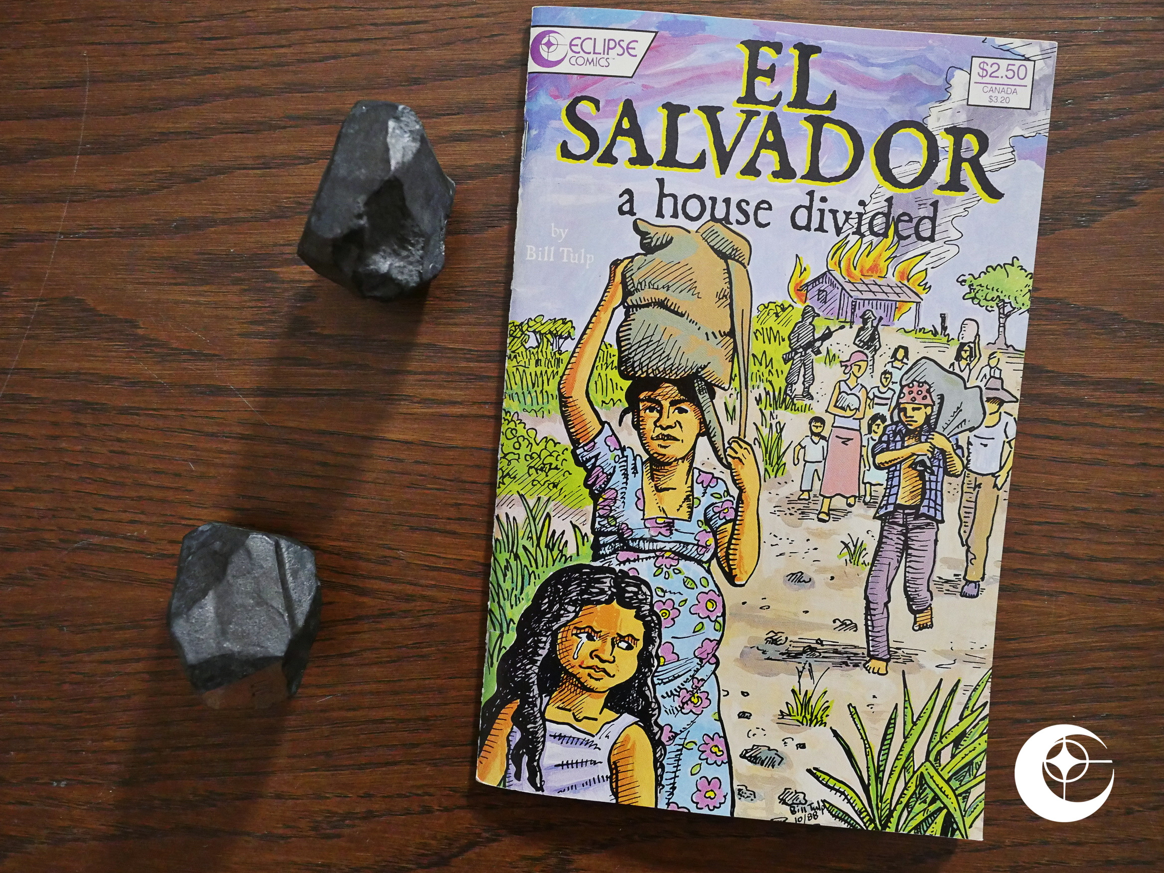
El Salvador: A House Divided (1989) by Bill Tulp.

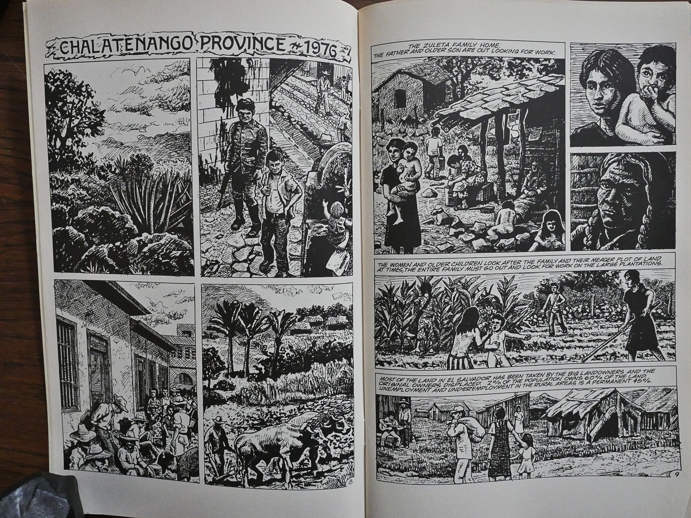
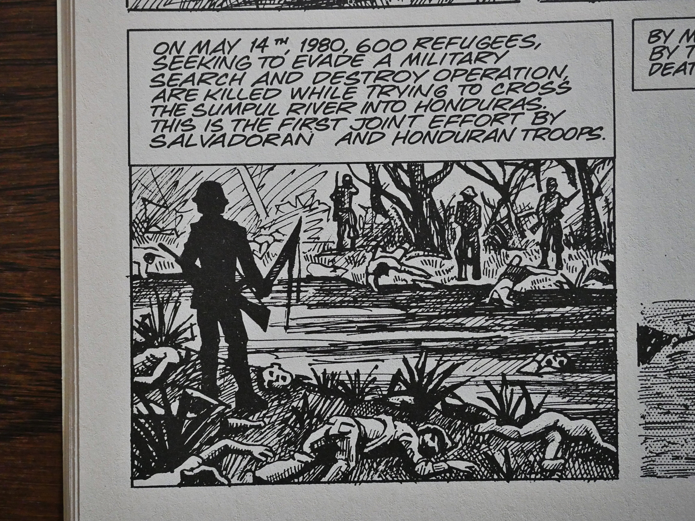
Eclipse’s foray into comics journalism/politics continues with this powerful book about El Salvador. It’ll make you angry and it’ll make you cry, and it’s, perhaps, the best of these books Eclipse published.

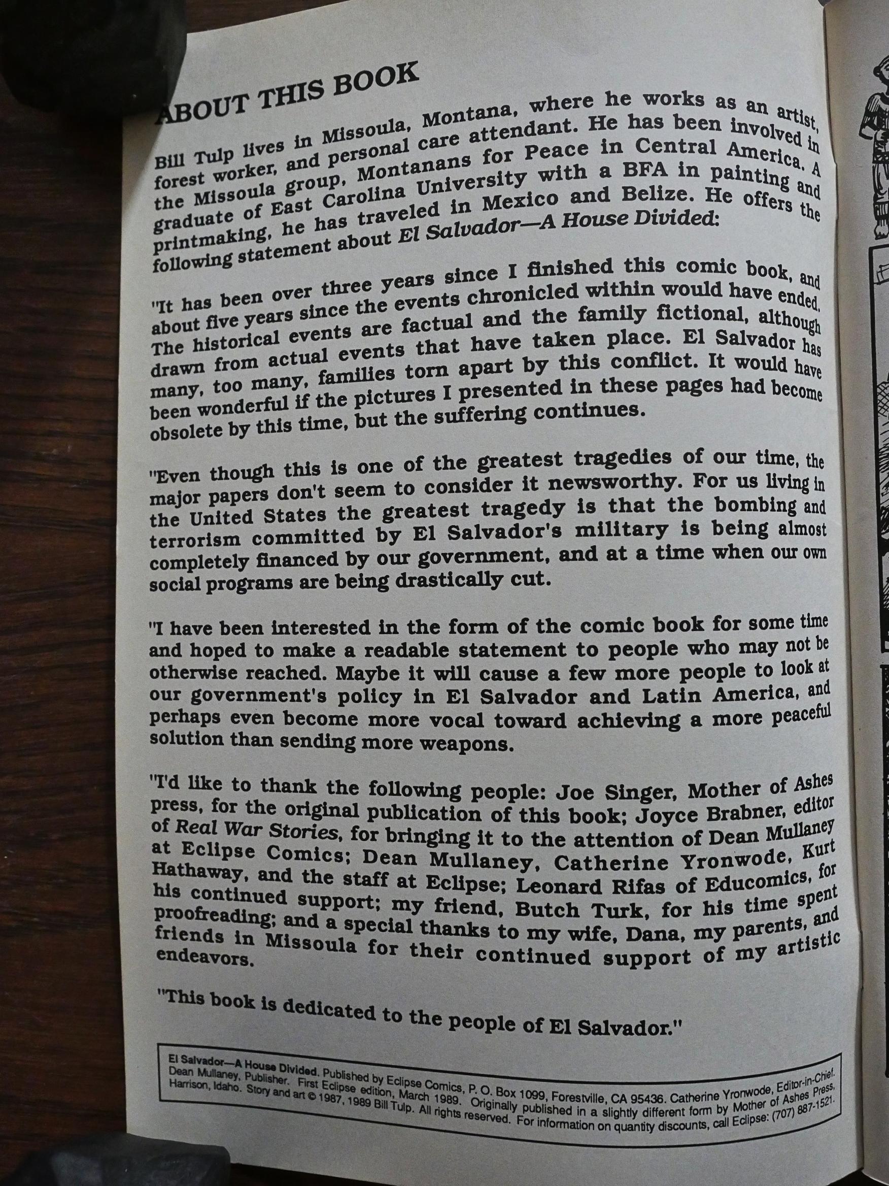
The introduction explains that this 48 page book (on semi-newsprint paper, but cardboardish covers) is a reprint of a book published four years earlier by Mother of Ashes Press. As Tulp explains, even if years have passed, the book is still relevant, because the war was still going on.

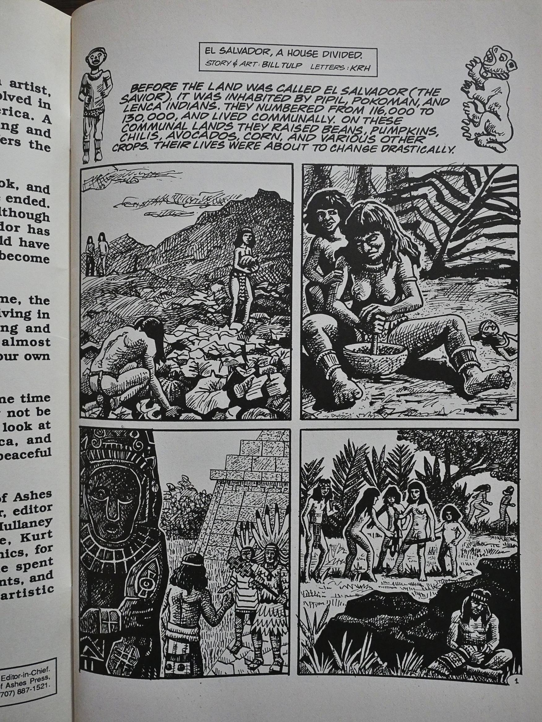
Tulp starts with a brief history of El Salvador, from 1524 onward. Despite being necessarily more of a sketch than an in-depth review, Tulp manages to provide an easy narrative version of the history.

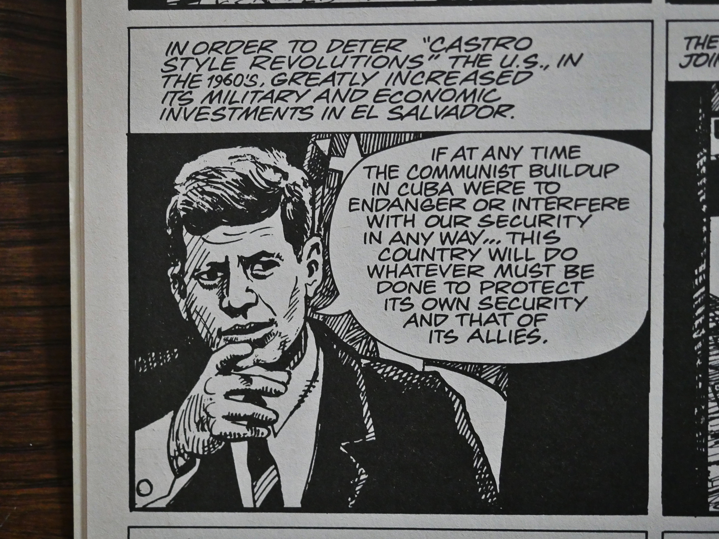
I’m guessing Tulp worked quite a bit from photographic reference, but without making the people seem stiff and awkward, which is the norm. He makes everything fit in seamlessly, whether he’s drawing US presidents or Salvadorian jungles.

When we reach “the present” (i.e., 1976) the book changes mode completely and we start following a specific family in their daily lives and how they try to navigate the waters during this time when death squads, military raids and “disappearances” starts gearing up.

The book doesn’t say anything about whether this family is based on real people or not, but I’m guessing the latter. The family is a didactic tool to show us what’s happening: One son is forcibly drafted into the army (and has to kill civilians), the mother gets involves with women’s groups, the father just tries to keep things going, and a daughter becomes a revolutionary. I mean, these things could happen…

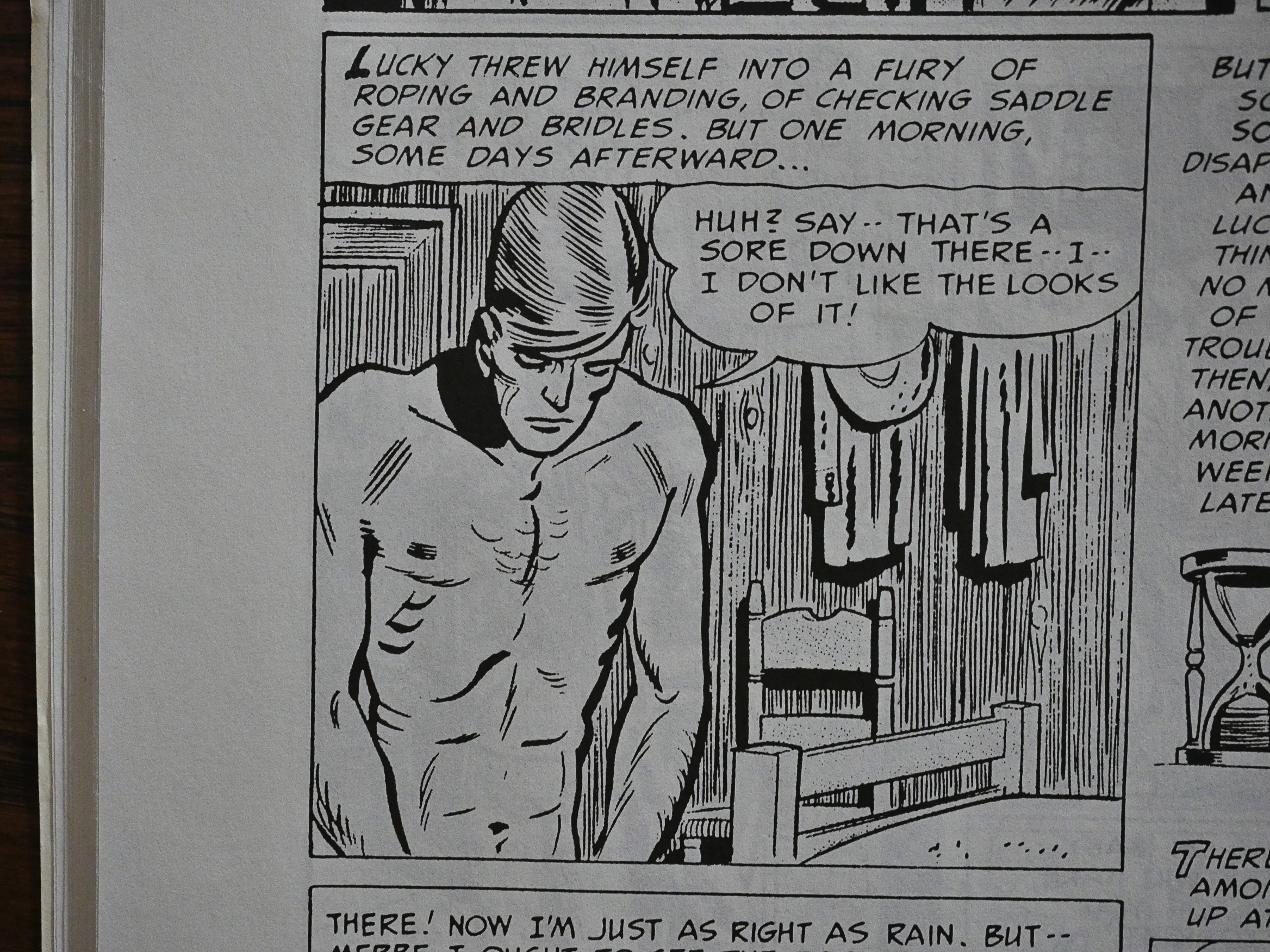
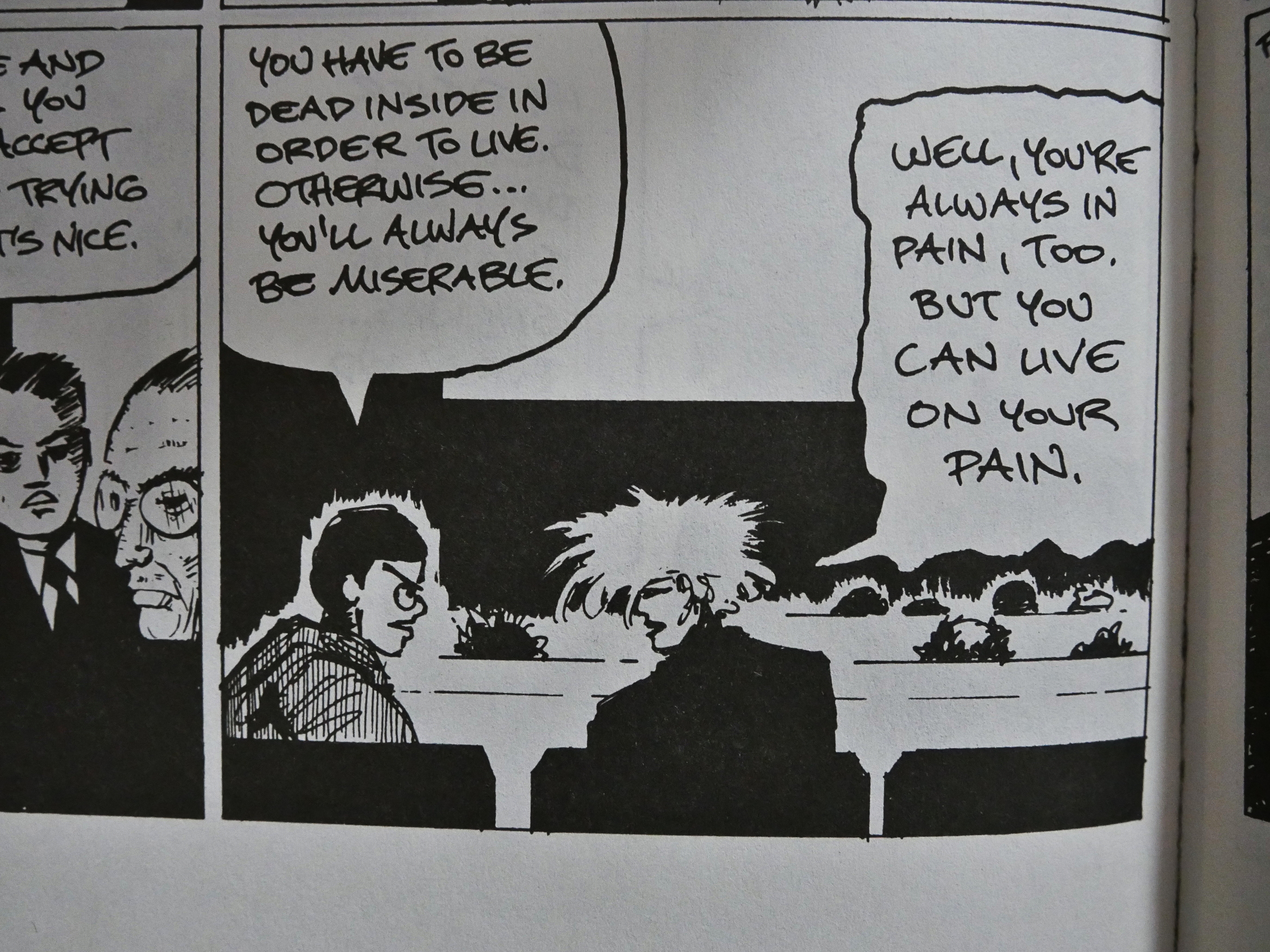
I think Tulp’s artwork is strong. He uses clear, strong layouts that tells the story in as straightforward a manner as possible. I like the hatching, but a few times he seems to go overboard as in the top left panel up there, where the horizontally hatched wall suddenly turns into a different wall.

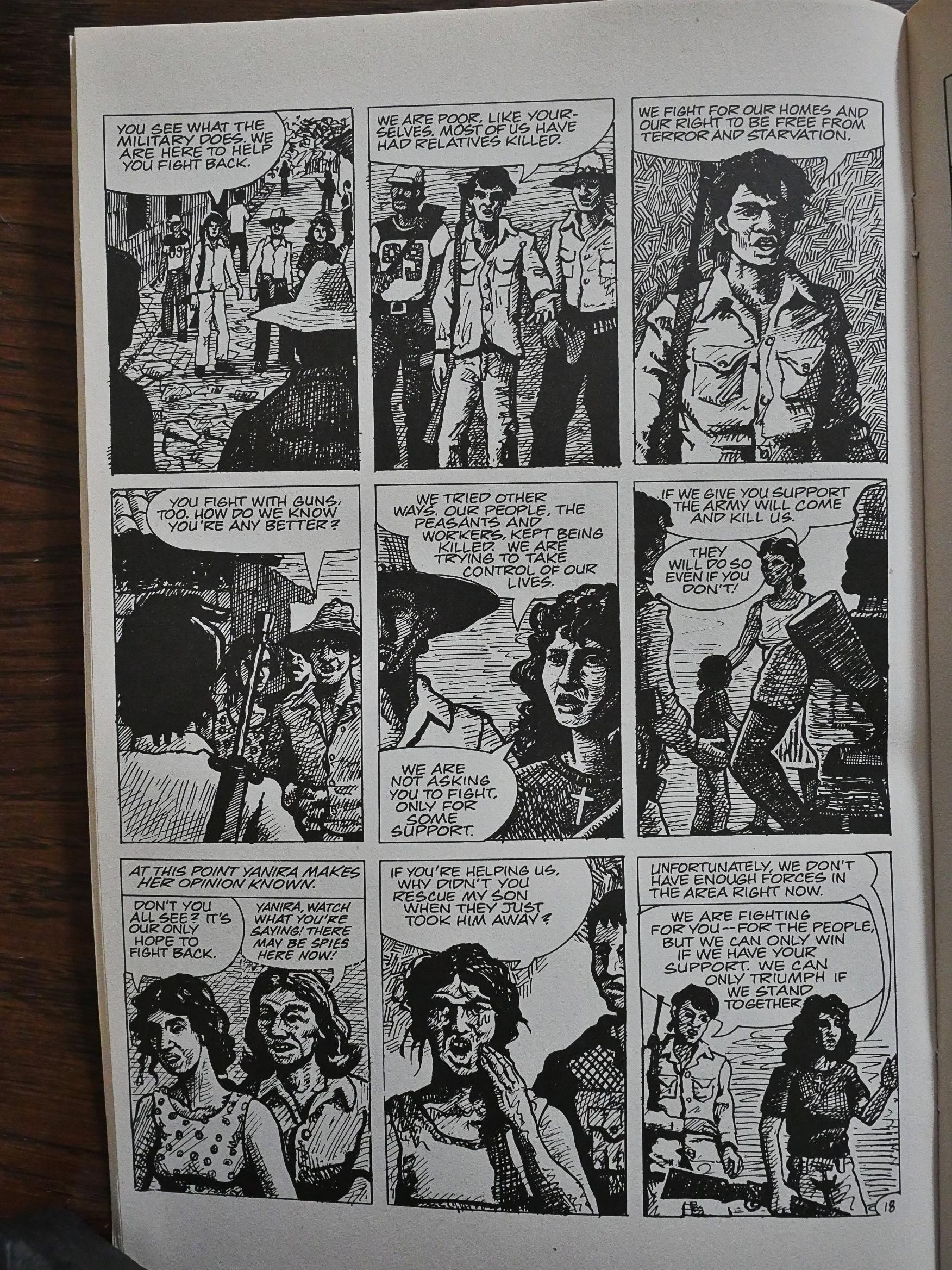
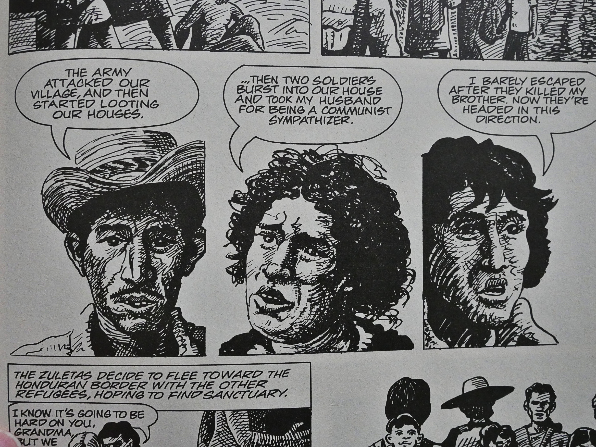
His characters have real individuality.

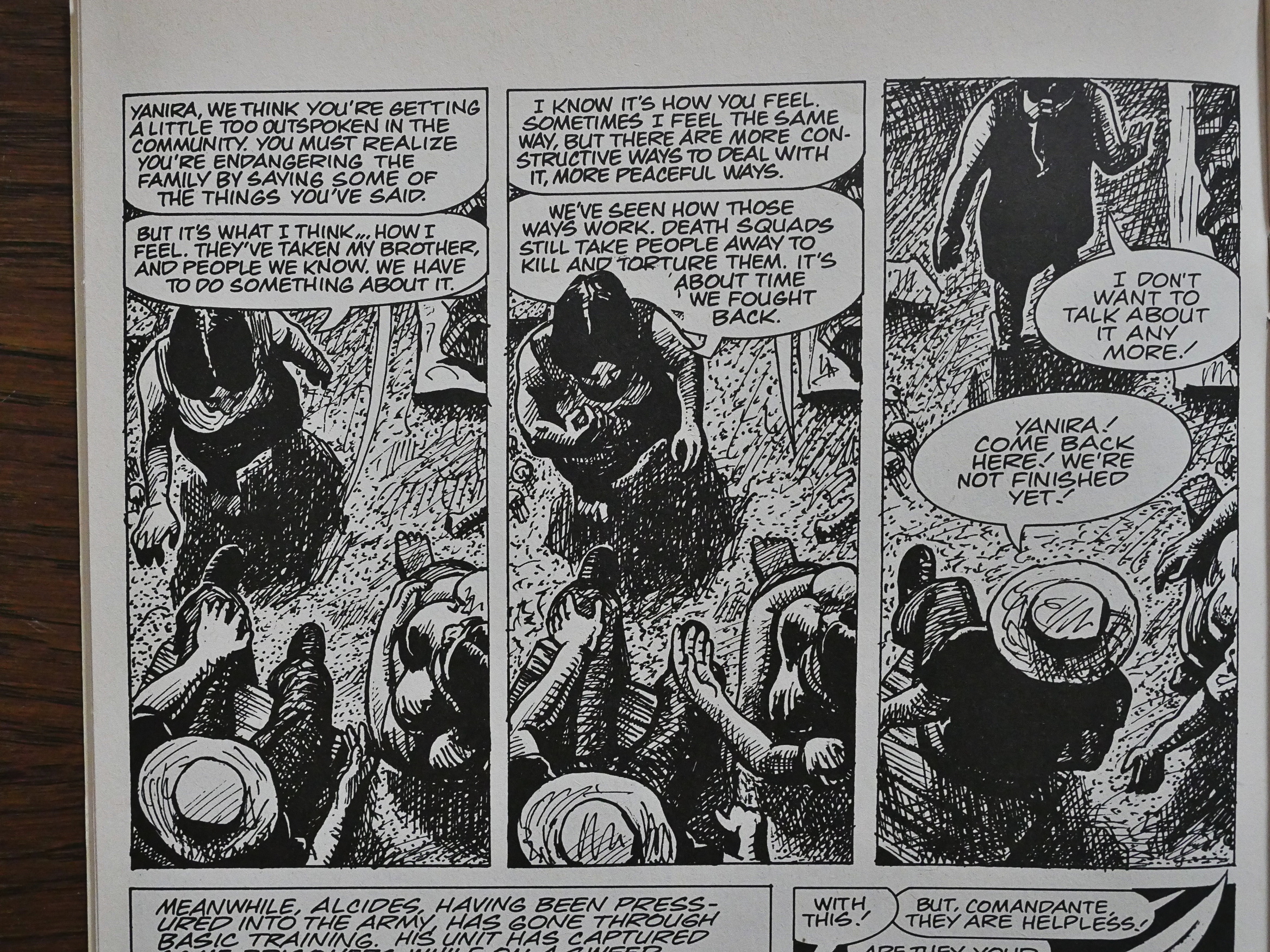
Even if he keeps things simple overall, he sometimes does these bewildering angles. I mean, it’s still clear what’s going on, but it gives you a break from looking at these characters straight ahead. And it also provides you with a sort of paranoid feeling, spying on these people from above.

The dialogue isn’t exactly naturalistic. Tulp has the characters provide us information we need to understand instead of doing it all with omniscient captions, which would have been wearying.

Like I said at the start, this book will make you angry and it will make you cry. I hadn’t expected Tulp to be as proficient as he is in getting emotionally involved with these characters. Even if it’s clear that he’s propagandising to some extent, it’s impossible to not give the characters your sympathy.

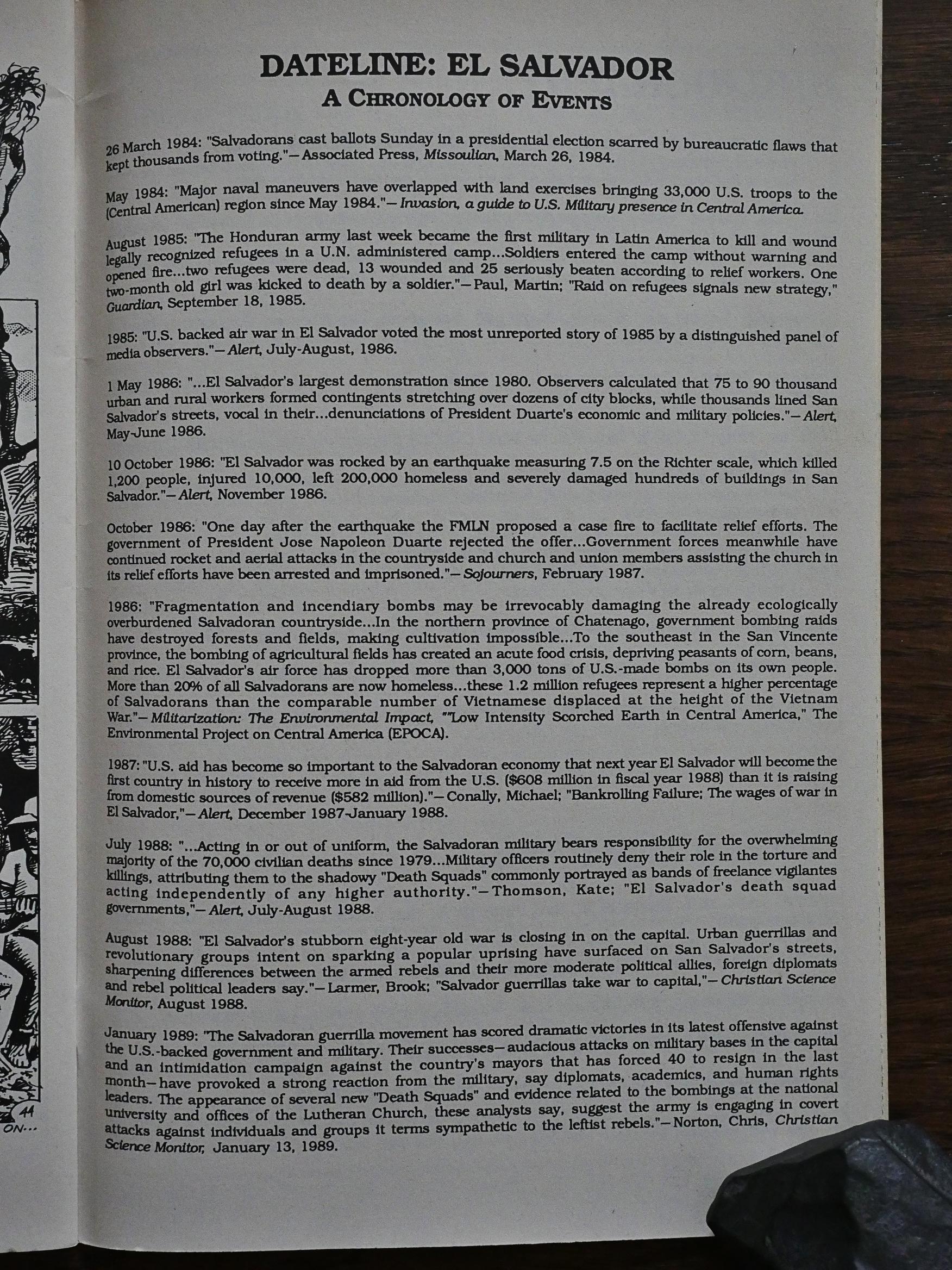
A page at the end sums up what’s happened in El Salvador since the book was published, and it ends with the rebel forces getting ready to take the capital, but the war would last until 1992.

I bought this book in 1989 and I liked it tremendously back then, too. Amazingly enough, this seems to be Tulp’s only comic book.

This book has never been reprinted.

1989: Cyber 7

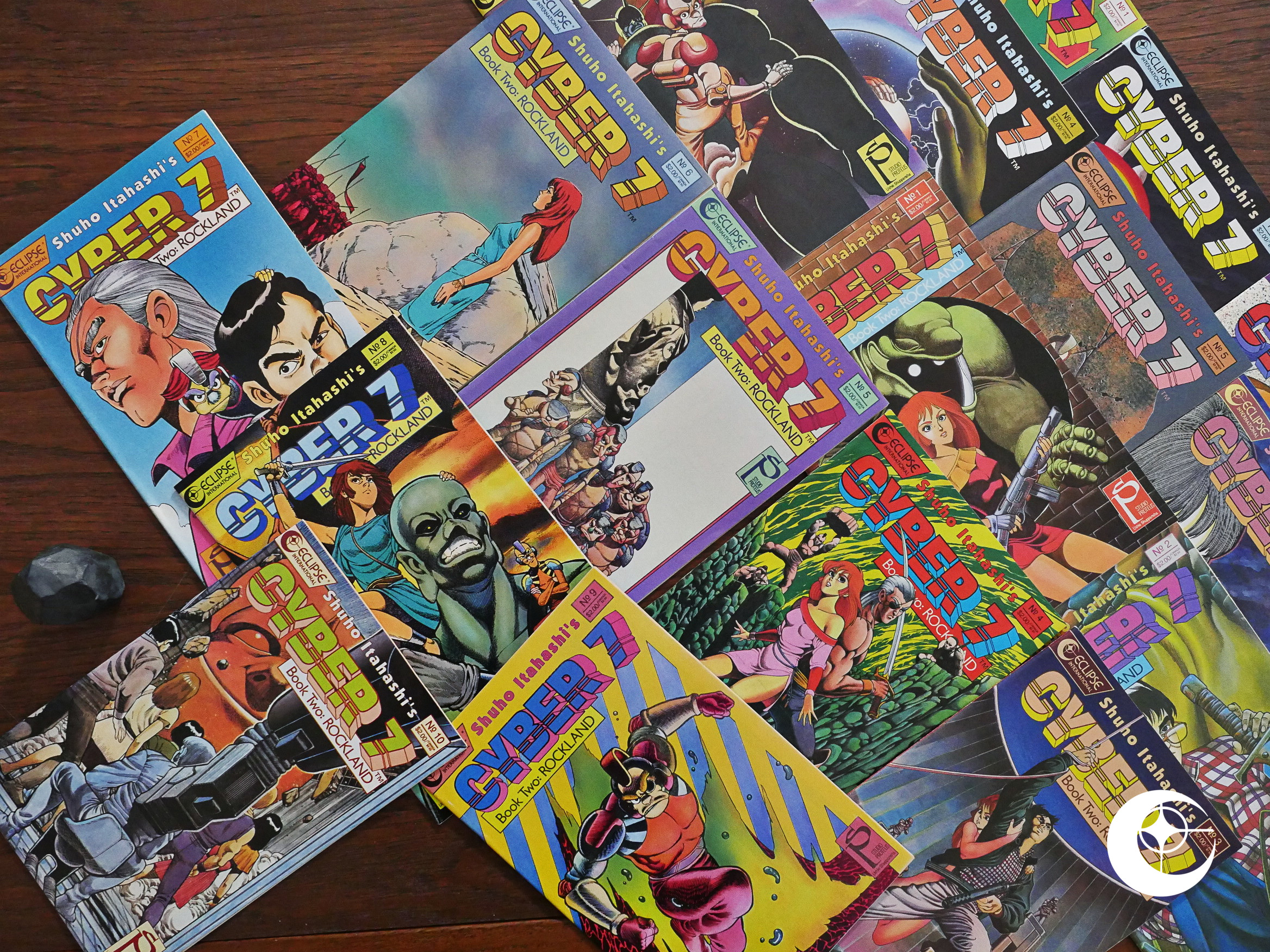
Cyber 7 (1989) #1-7, Cyber 7: Book Two (1989) #1-10 by Shuho Itahashi et al.

This is the second Japanese comics series Studio Proteus packaged for Eclipse, and it probably the weirdest one Eclipse published, in some ways.

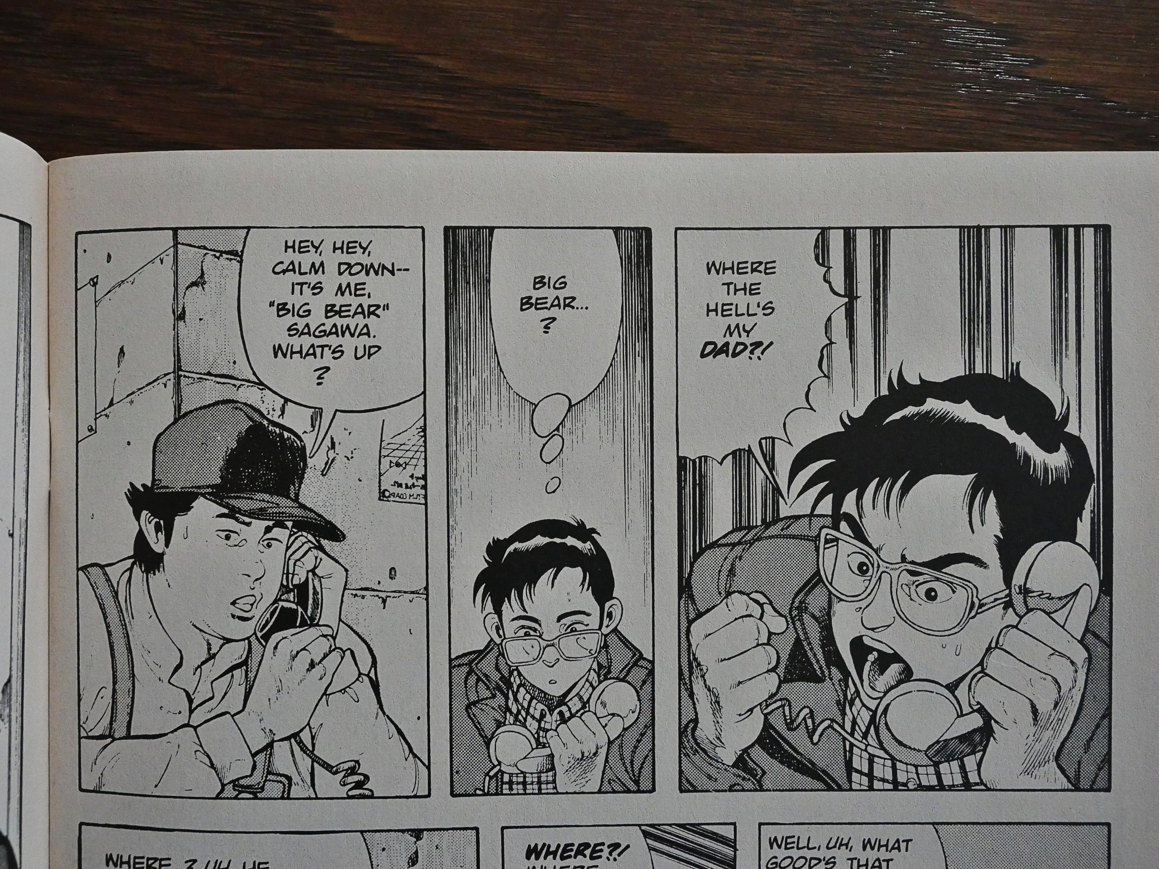
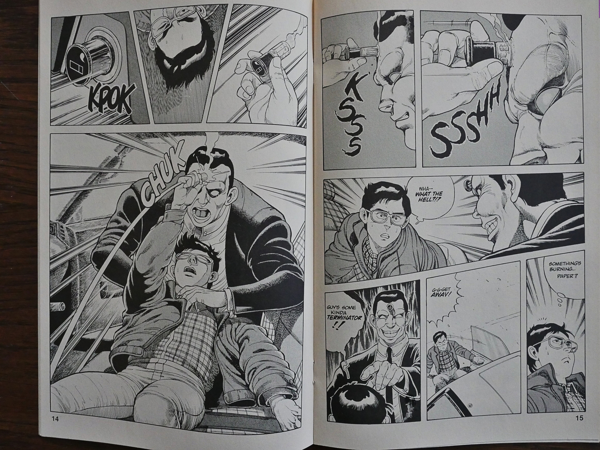
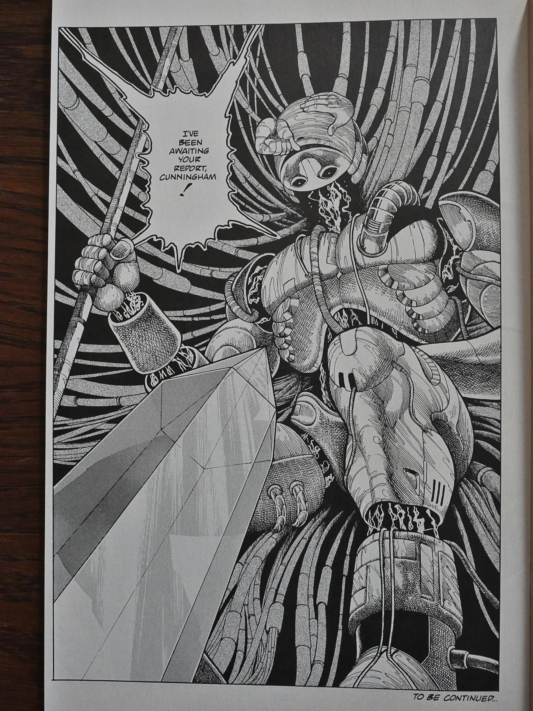
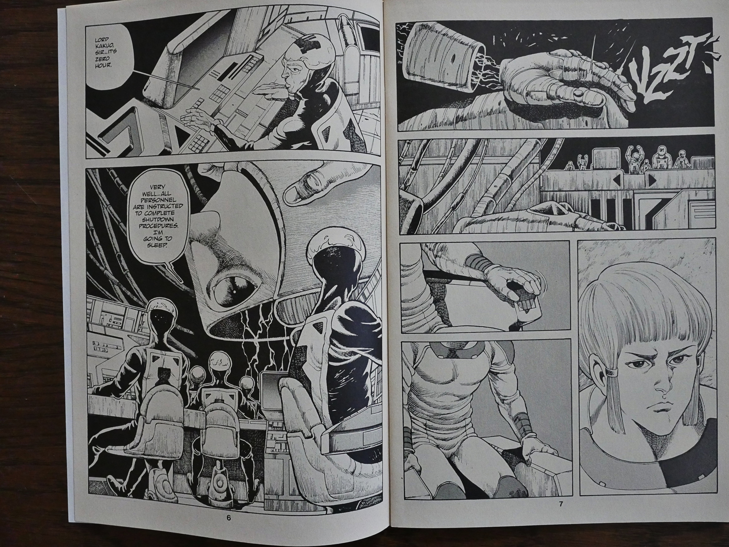
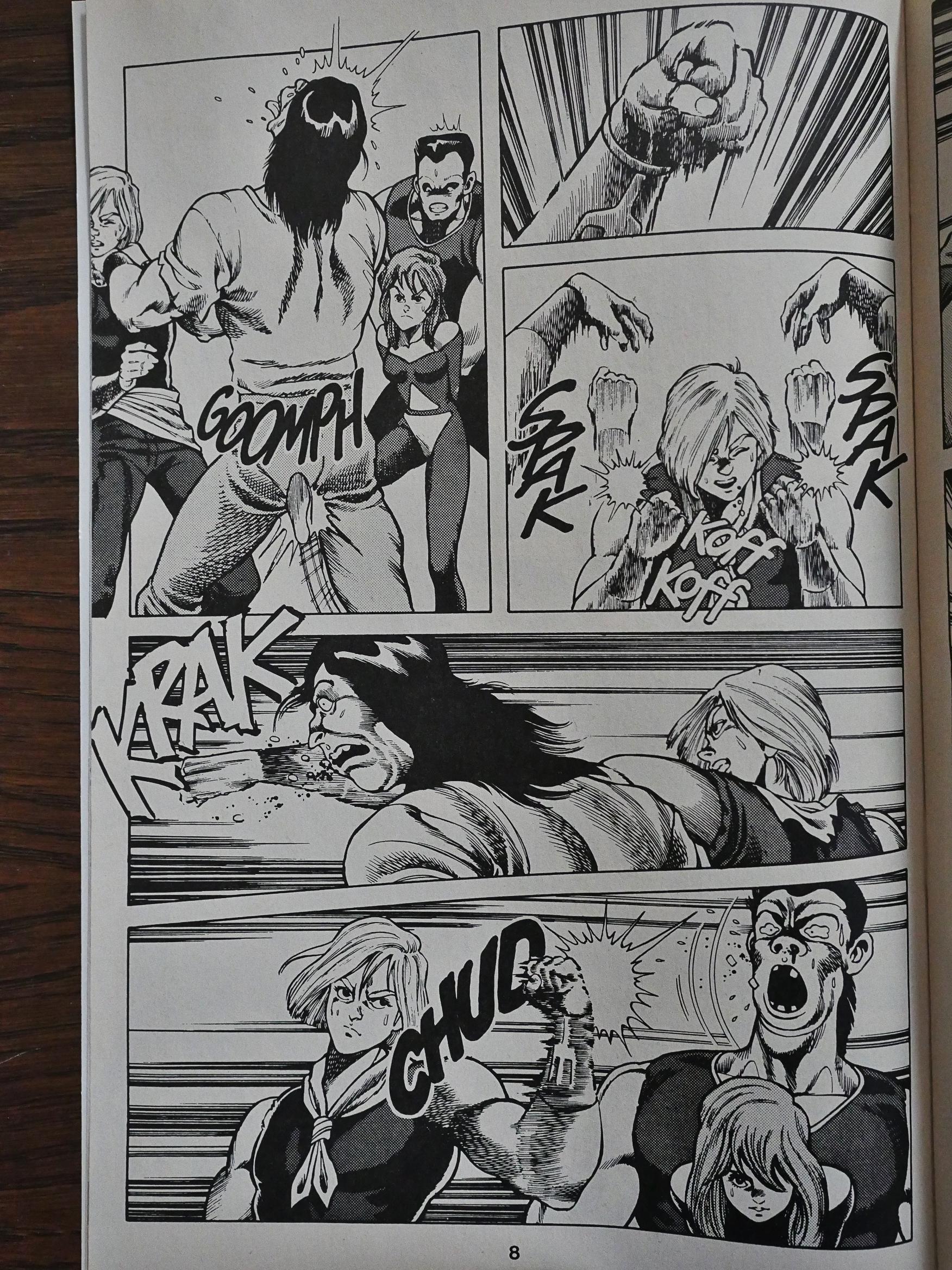
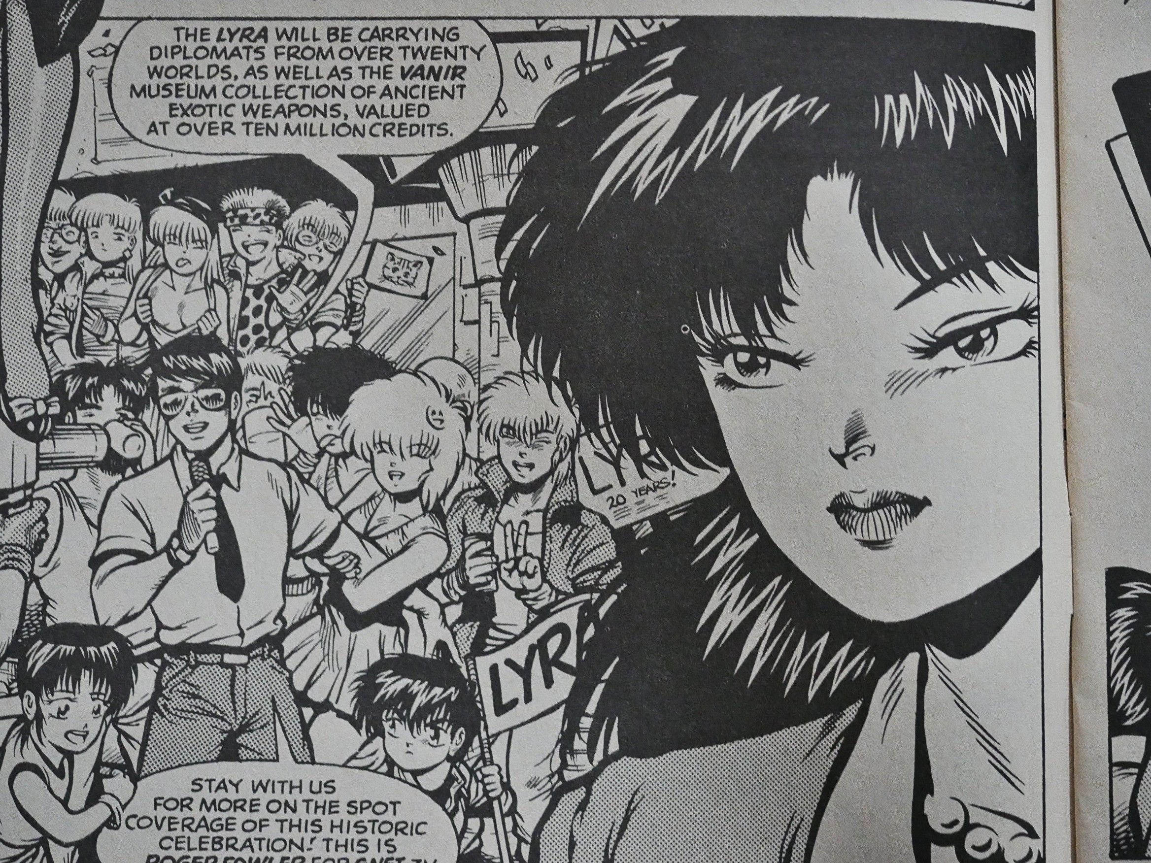
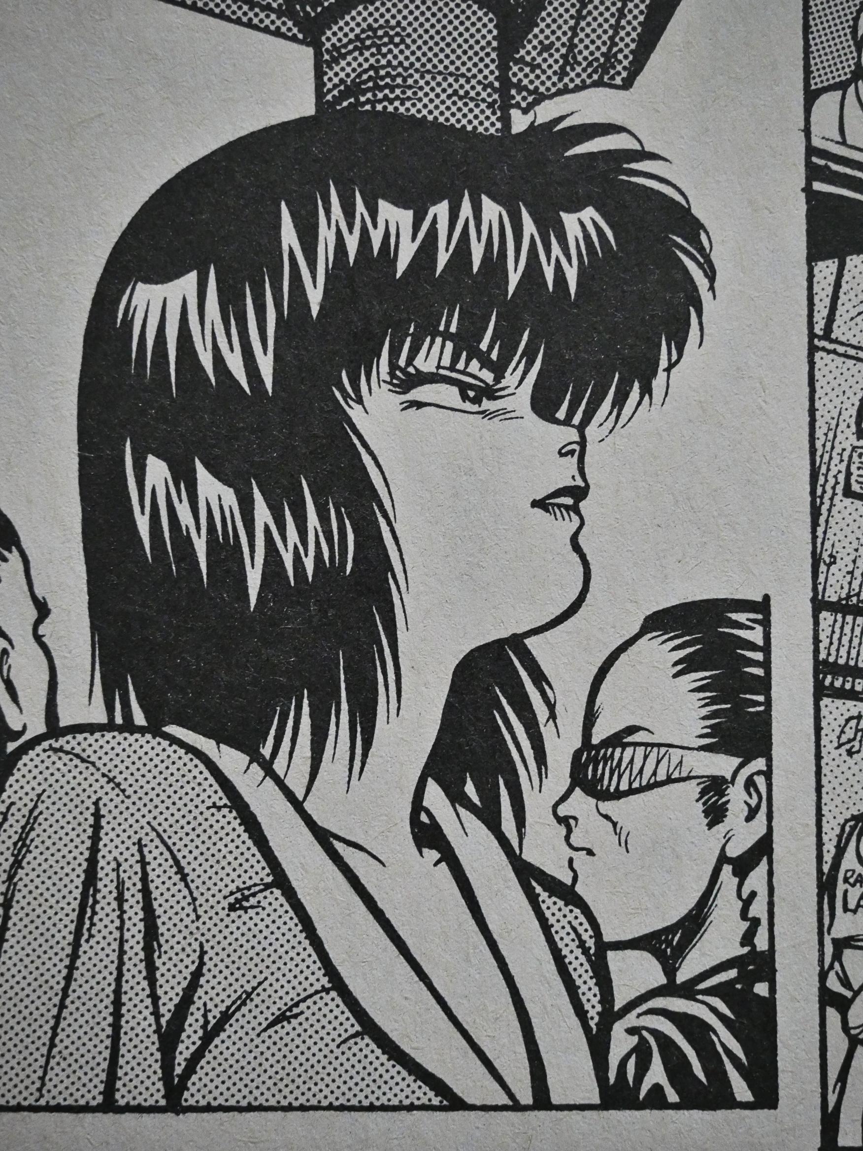
I can see why they picked it, perhaps: It’s very influenced by modern European comics. The face above on the left could come from any number of French adventure serials for teens.

But that’s not a very European action sequence… or American… or Japanese, even. It’s weird, and I find it difficult to articulate what makes it so odd.

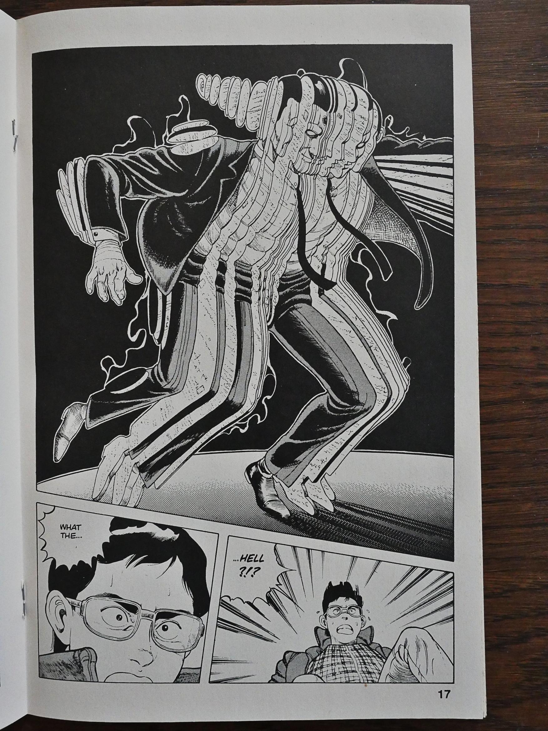
Once we get to the monsters we’re on more familiar turf. Not that they’re anything like Hitoshi Iwaaki’s Parasyte creatures, but these guys made from pages of paper are weird and unnerving in the same way.

Anyway, Itahashi starts off the series with a ferocious opening 40 pages where nothing is explained and everything is mysterious and intriguing. These are propulsive, gripping, original sequences that really feel exciting and fresh.

And then Itahashi starts in with the explicit explanations that pretty much drain the story of its tension and intrigue.

The villains even get in on the act with several scenes of as-you-know-Bob-ing where they explain things to each other that they both know in advance. There are many, many pages of this stuff, and it’s tedious as fuck. I’d have preferred to be left in the dark if this is the alternative.

On the other hand, there are some really kick-ass creatures here, so that helps a lot.

Is it just me, or are these labs kinda Metal Hurlant ca. 1979 or what?

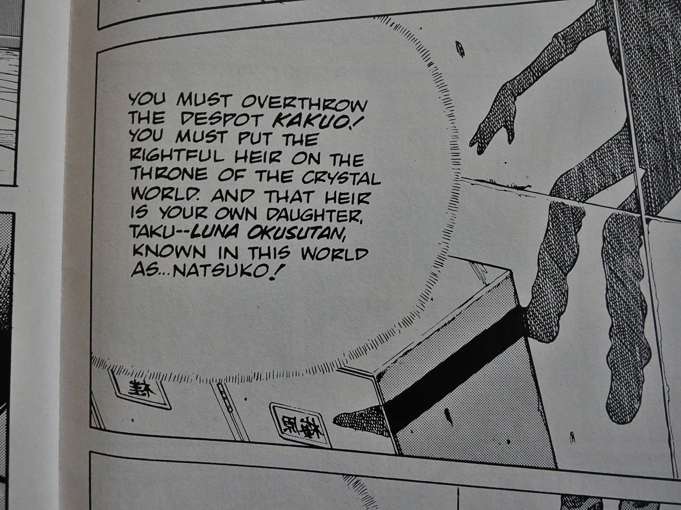
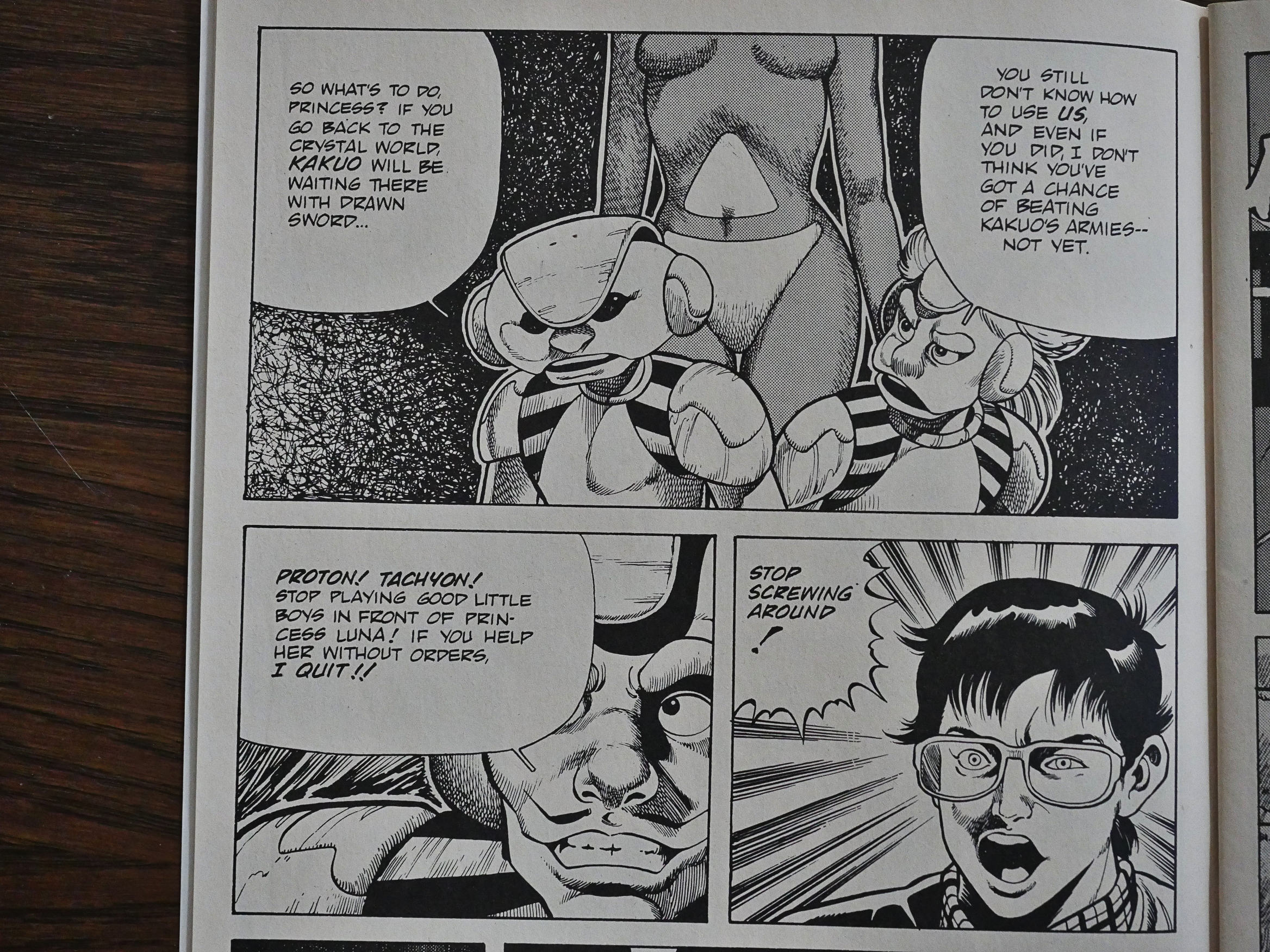
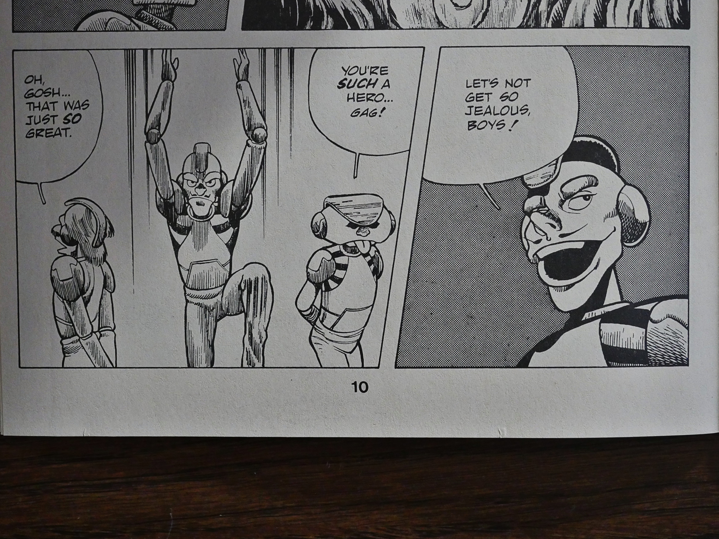
The titular Cyber 7 are a gang of… robots… that are the heroes here, but only reluctantly. They only help if the princess asks them to using a text from a lost book. It’s so weird. Reluctant djinns?

Some of them are nicer and gets ragged on by the more reluctant ones.

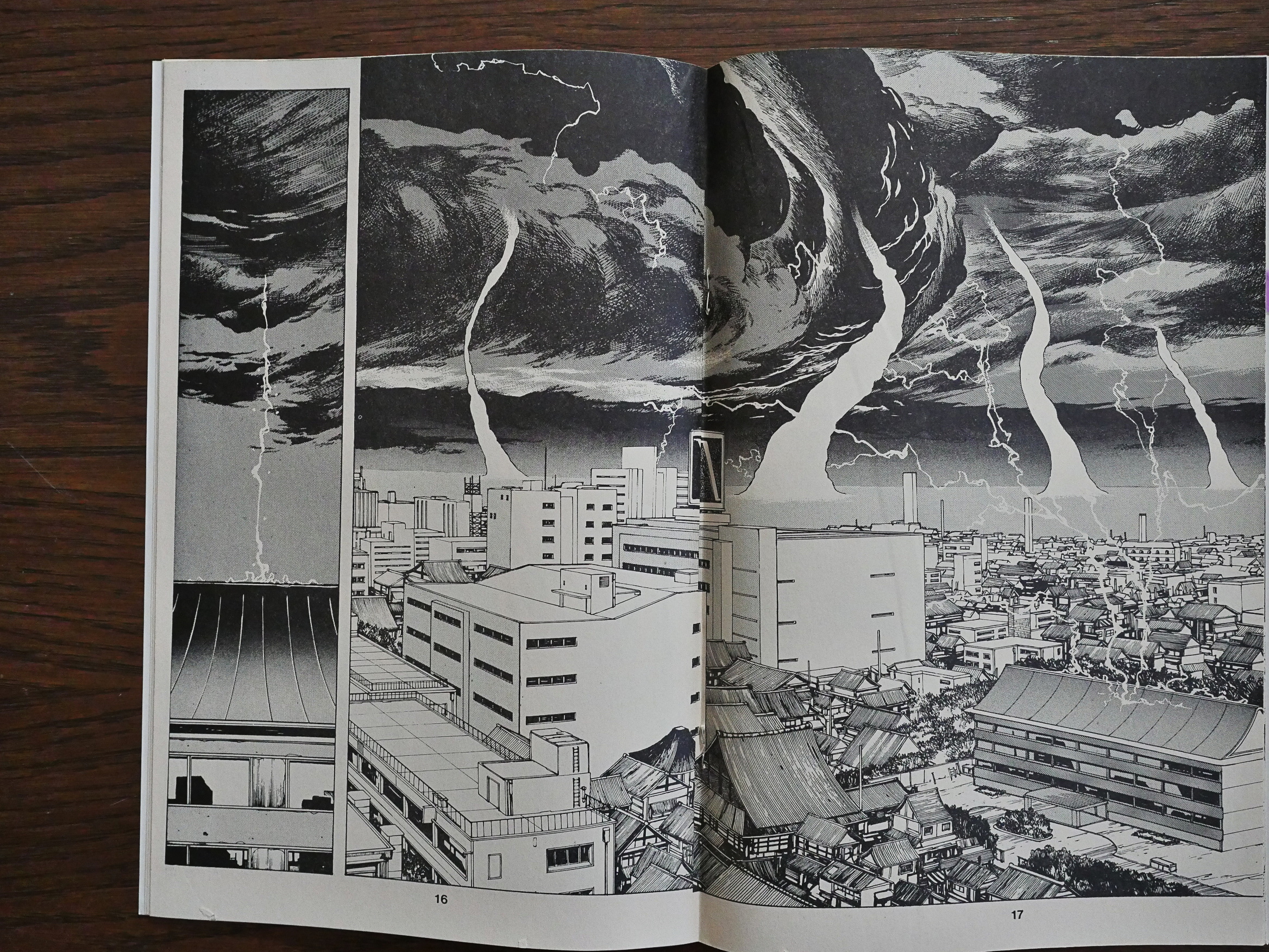
The wonderful cityscapes look more like normal Japanese comics books, so I’m assuming that Itahashi has a gaggle of assistants that do these pages for him. They’re drawn in a very different style than the figures.

Another weird thing about this series is that Toren Smith, the Proteus packaging guy, didn’t write an introduction in the first issue or try to introduce Itahashi to the audience. Virtually all the other Eclipse Japanese translations have done so, and it makes sense to contextualise the work.

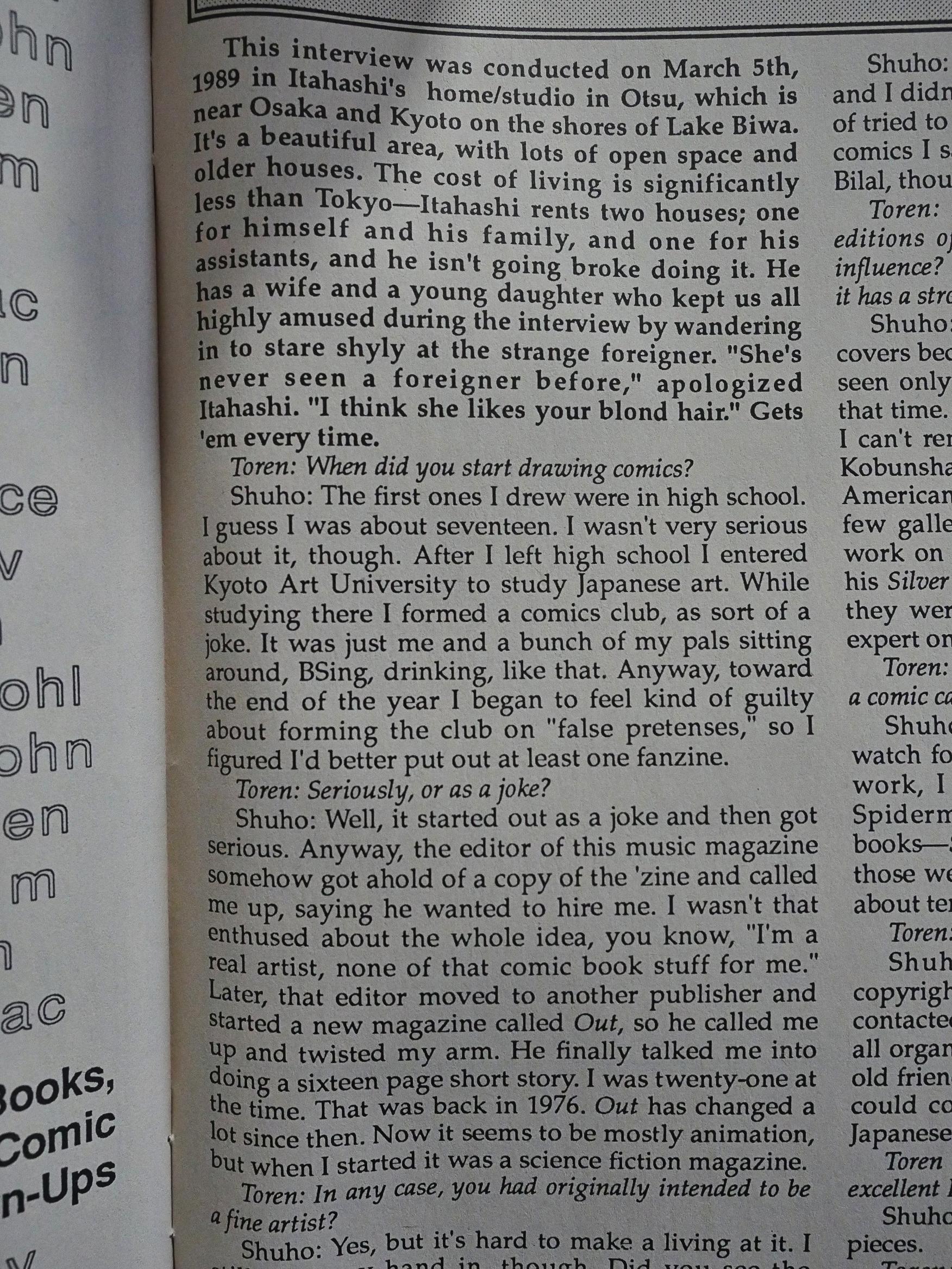
But in the final issue of the first volume, we get a brief interview with the artist and learn that, indeed, he has an entire rented house full of assistants, and that he never really intended to start doing comics, and that he’s a fan of Enki Bilal. All of which explains a lot about what I’ve just read.

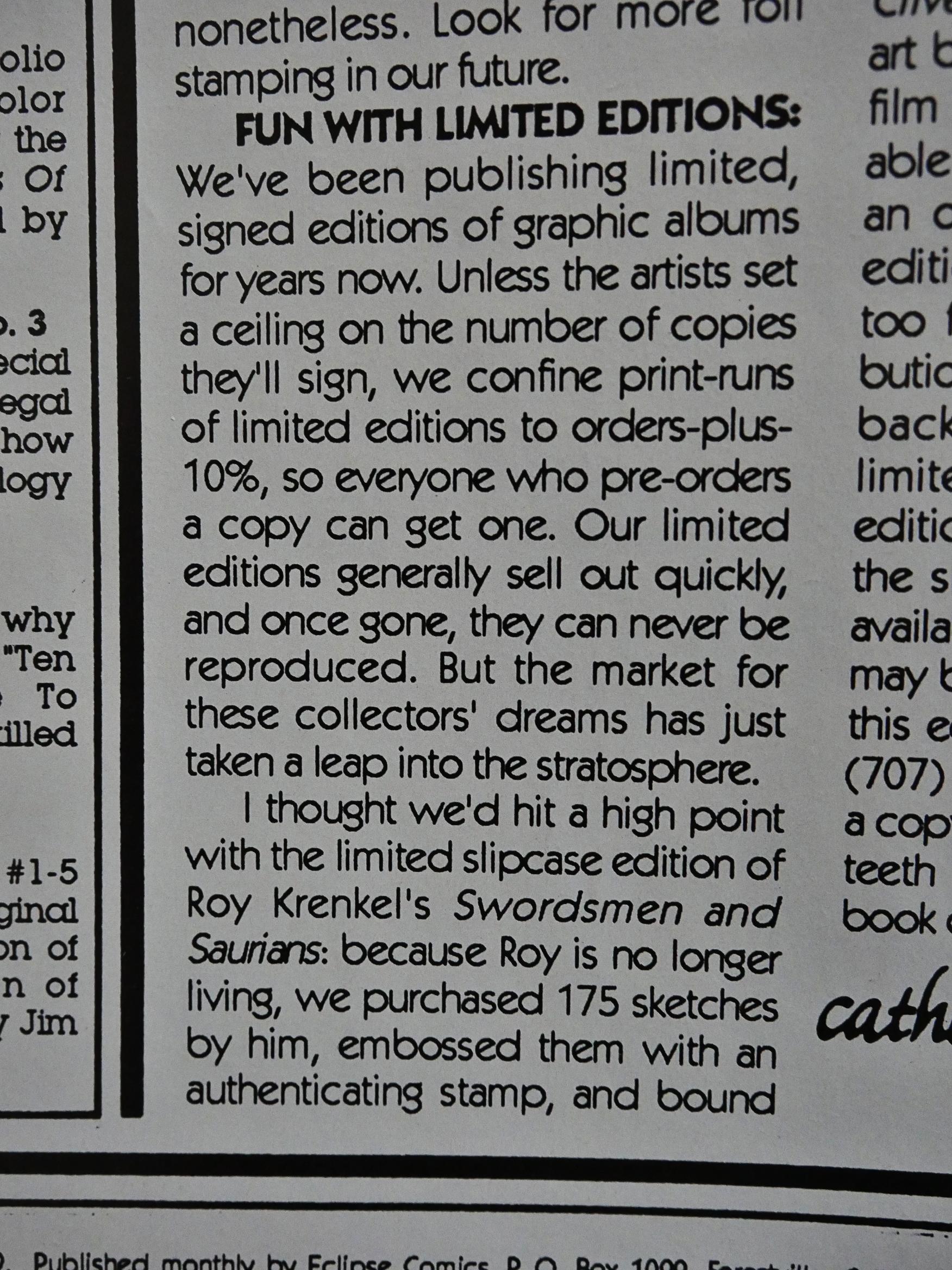
Heh. cat ⊕ yronwode explains what Eclipse means with “limited editions”: It’s whatever the comics shops ordered plus 10%. I guess that’s… limited… even if that’s basically how virtually all comics in the direct market are produced. The “limited edition” thing basically just means that they kinda promise not do reprint the thing, not that it’s scarce…

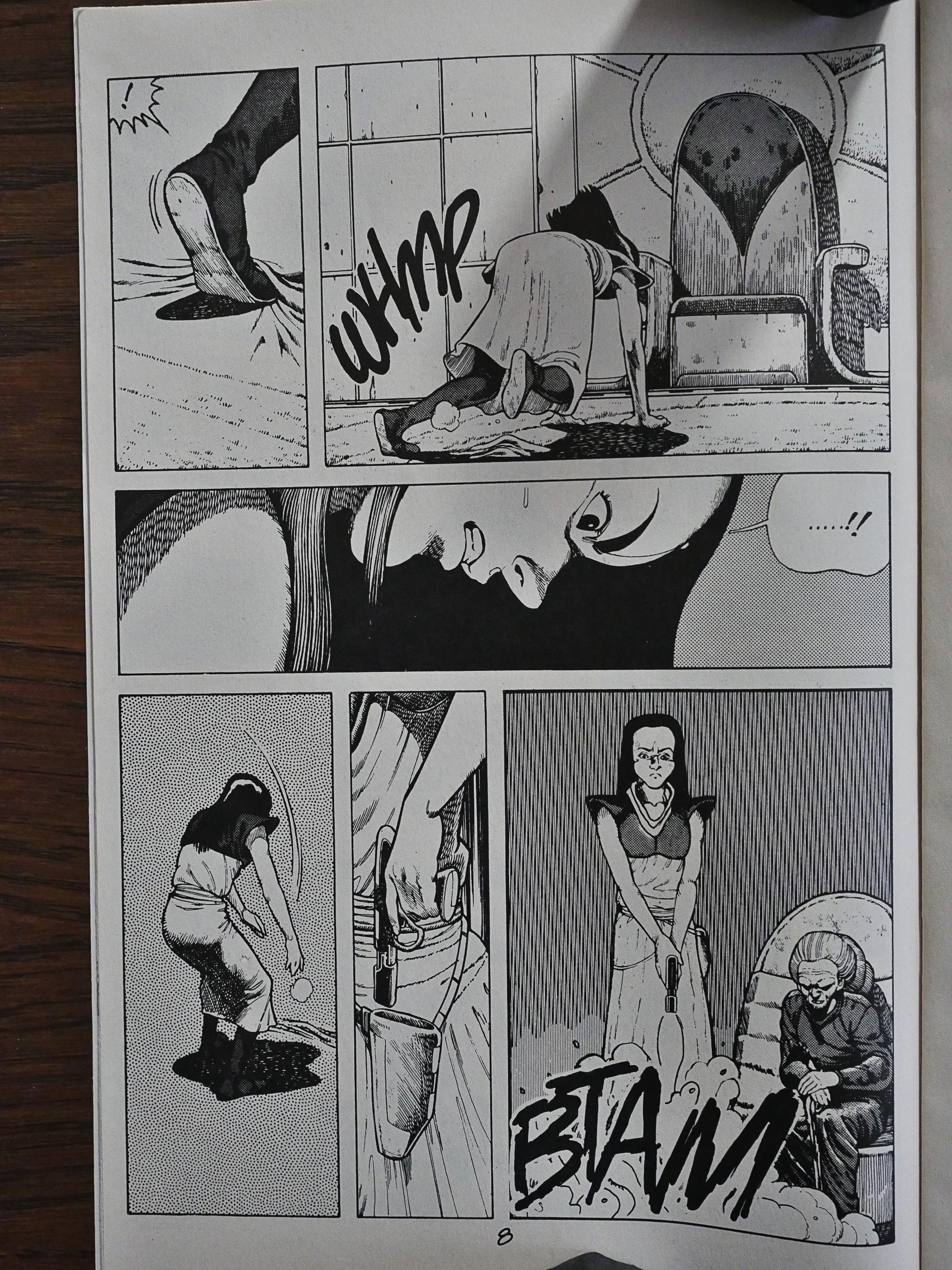
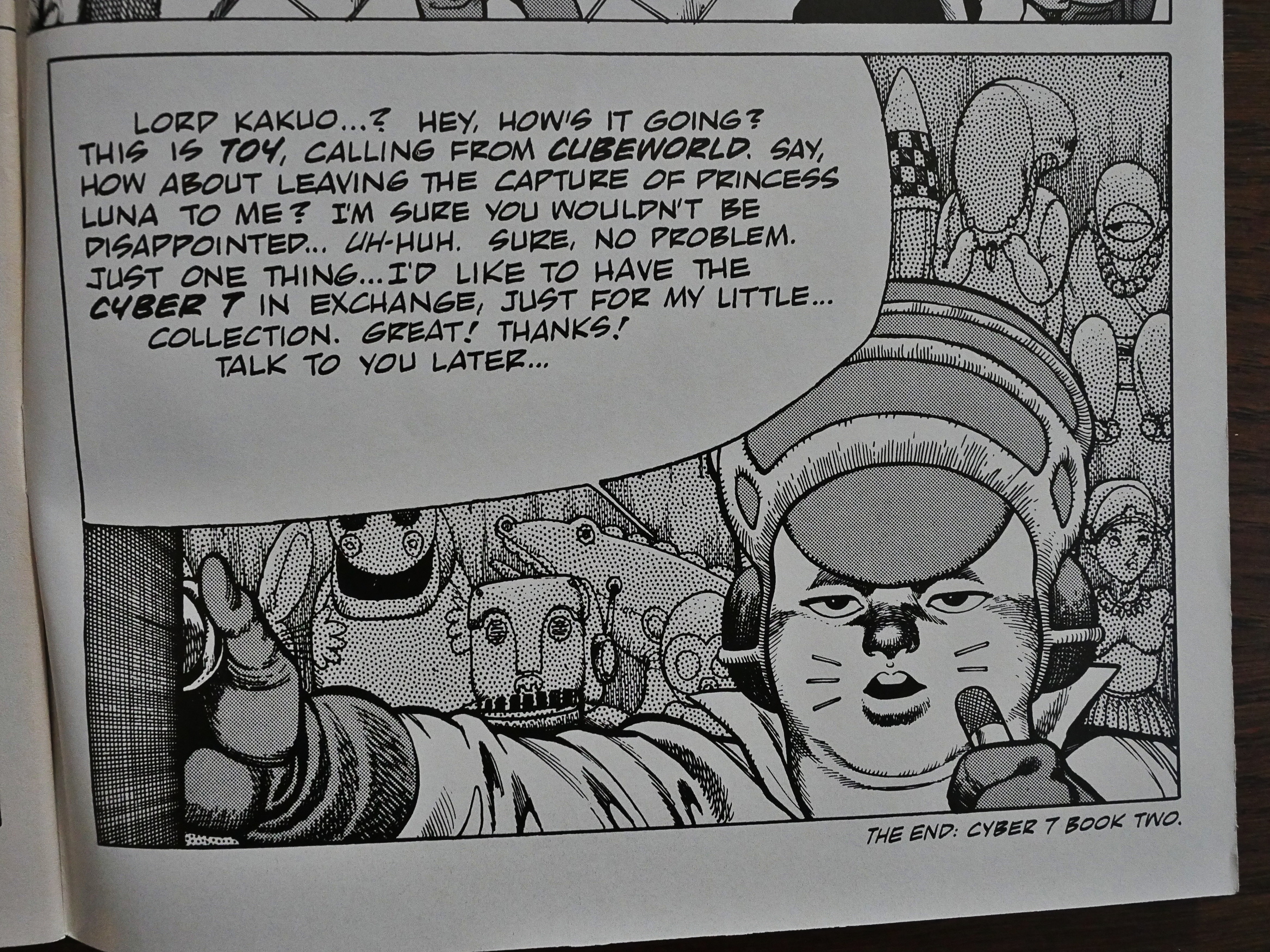
Anyway! The second volume picks up right where the first one ended, and introduces us to a slew of new, fun and interesting characters. Here we have one of the villains who’s walking to her… throne… and then stumbles over a carpet, and then shoots the carpet because she’s so mad!

That’s quality villainousity! Five stars!

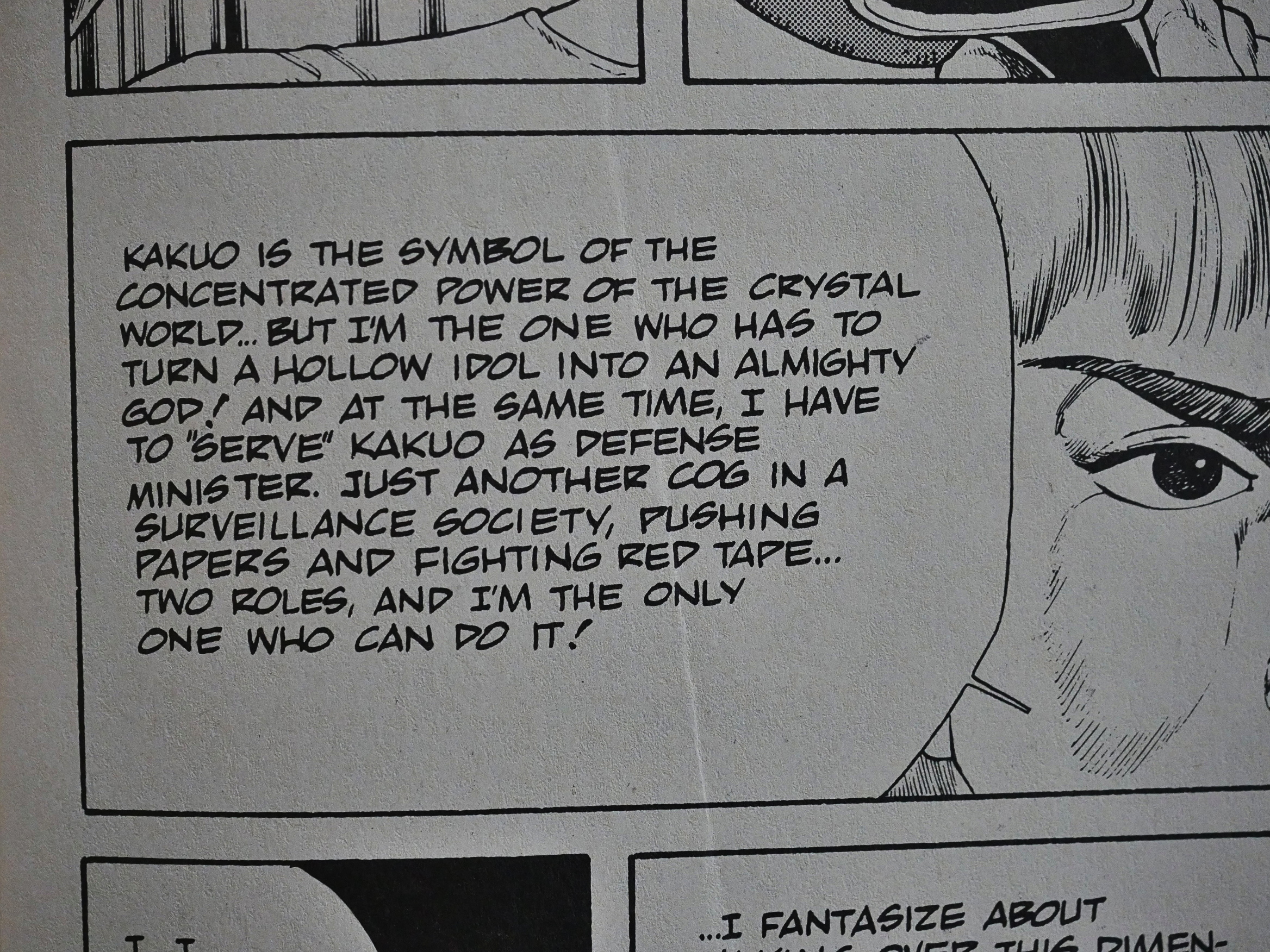
It’s hard to say how serious Itahashi takes his comics. This series has a well worked-out plot and setting: You can feel there’s a lot of thought behind it. But it’s like he can’t resist putting in all these less than serious sequences in the middle of the “real” action.

I really like it, and it’s a fun, breezy read.

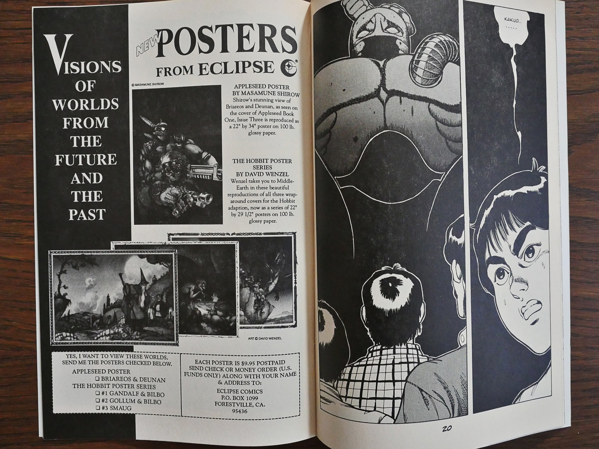
Eclipse puts in these random ads in the here and there in the comic which I take to mean that they messed up the left/right page sequence and had to put something in to make double page spreads work properly again.

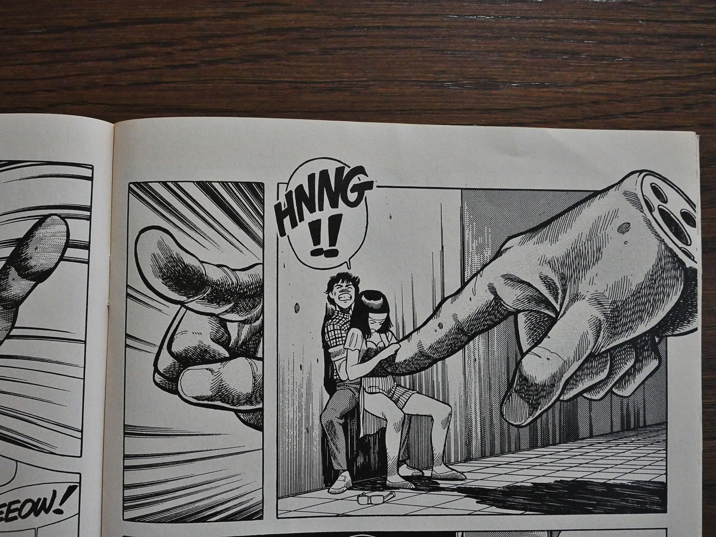
The Giant Finger of Squeeze!

The tenth and final issue of the second volume is a choppy read, and it ends on the inside back cover. I wonder whether they dropped some pages to fit it all in, because they had to cancel the book in a hurry…

Due to low sales? I can only guess, but Itahashi is, basically, the only translated Japanese comics maker to not have his own English-language Wikipedia page, and he doesn’t seem to be on any of the Manga wikis either.

The series was never picked up by anybody else after cancellation, and it’s never been reprinted, and I can’t find anybody writing anything about it except in the book Manga: The Complete Guide:

The detailed, faintly Western artwork has the chiseled 1980s look of Katsumi Otomo or Jiro Taniguchi, while the surreal villains are reminiscent of a Grant Morrison or Peter Milligan comic.

All of this leads me to think that this was never very popular comic in the US (or most anywhere), and it’s not that difficult to guess why: It doesn’t really tick many of the boxes that attract audiences to Japanese comics. It’s both too weird and too familiar at the same time: It’s not Japanese enough to satisfy the genre cravings.

I really enjoyed reading it and think it’s better than most of the Japanese books Eclipse published, but not having any kind of satisfying resolution at the end of the second volume is a bummer.

Itahashi said in the interview that he planned seven volumes, but I don’t know how many were completed.

1989: Bob Powell’s Mystic Tales

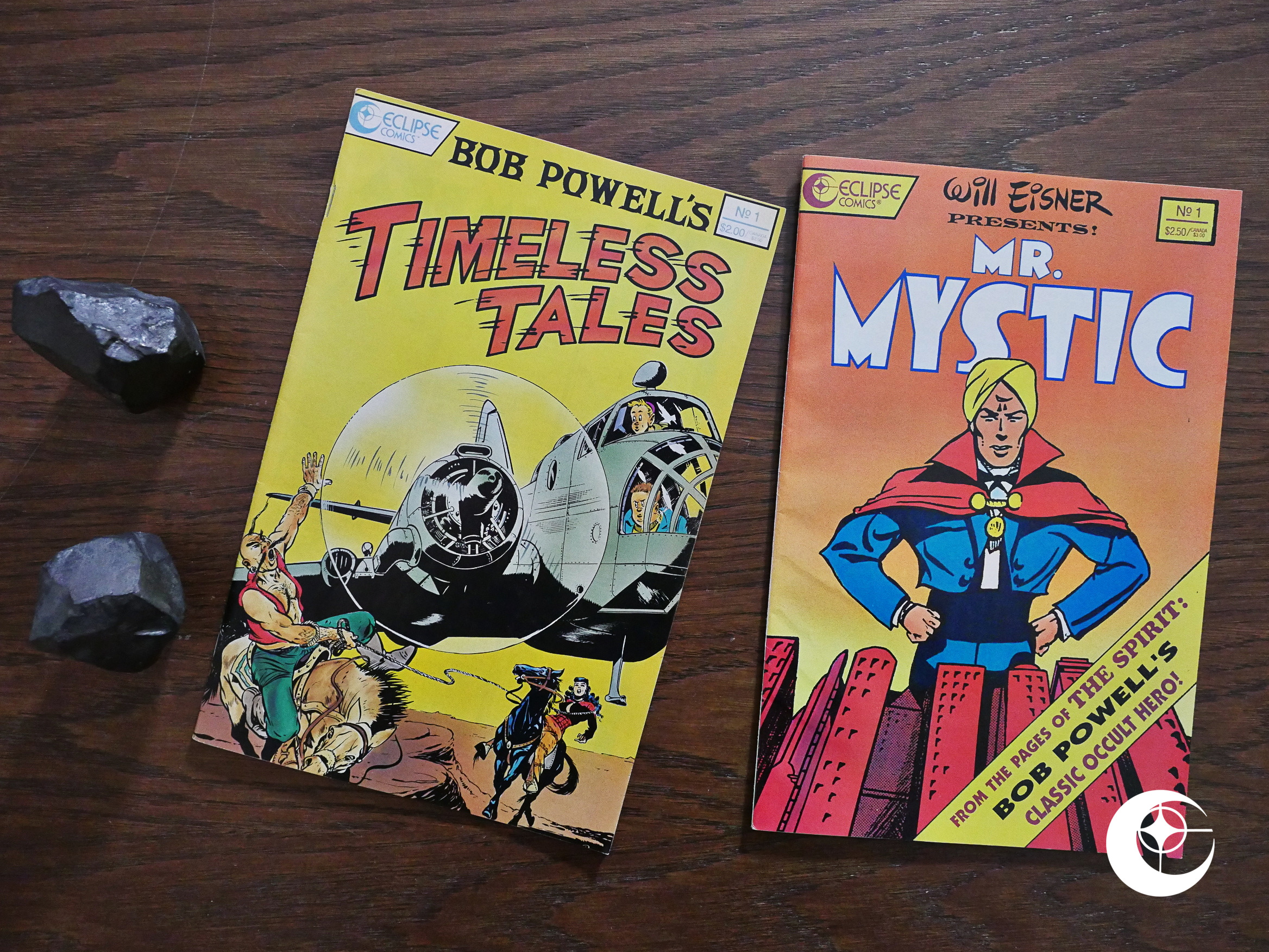
Bob Powell’s Timeless Tales (1989) #1, Will Eisner Presents (1990) #1 by Bob Powell et al.

How odd. Two random reprints of Bob Powell material. Powell worked at the Eisner/Iger shop for a while, and then established his own shop later, and he has never been exactly, er, popular. In any way whatsoever that I know of. He produced filler material for a large number of companies, but that’s basically it.

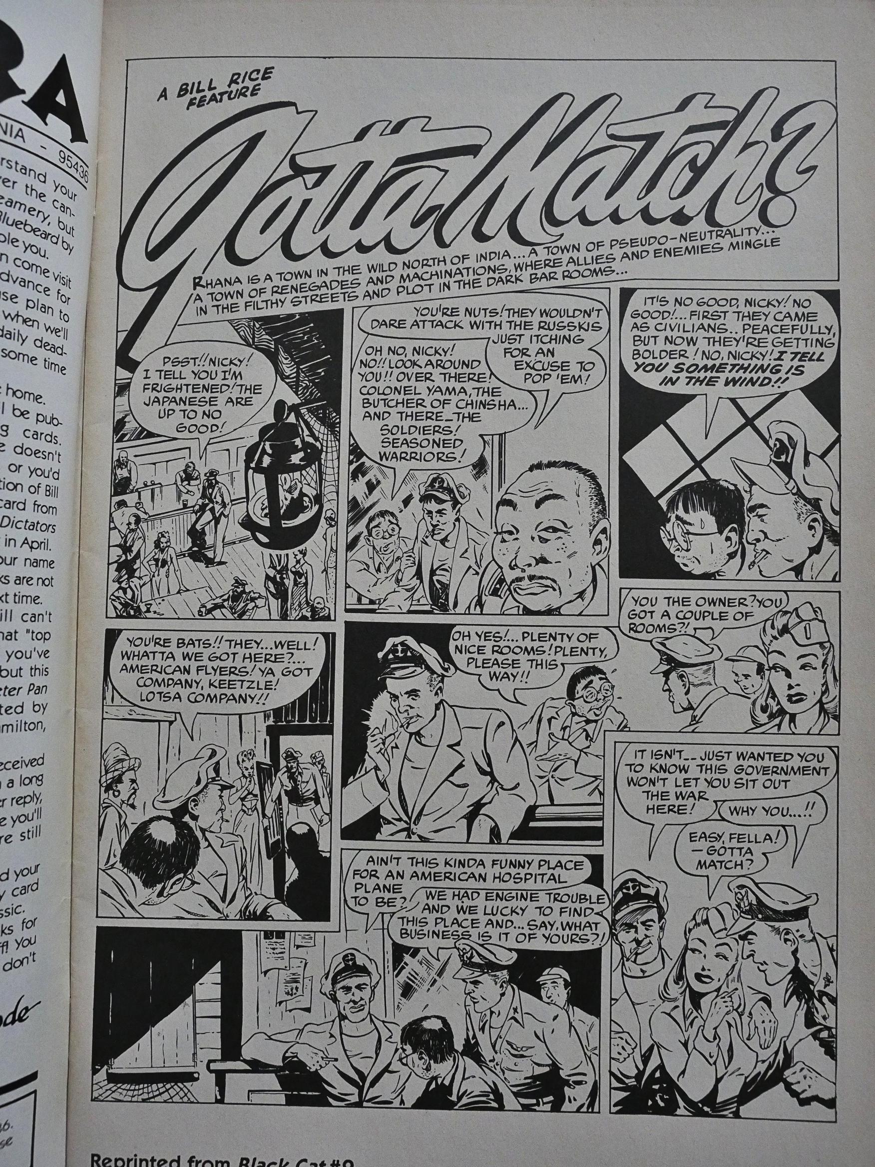
We’re not told when this material reprinted here was produced, but at least we’re told where they originally were reprinted. But comics.org says there are 172 series called Black Cat, so I’m not going to try to find out.

You can see from his artwork that he picked up a thing or two from Will Eisner, but the pages are pretty messy and don’t read very well.

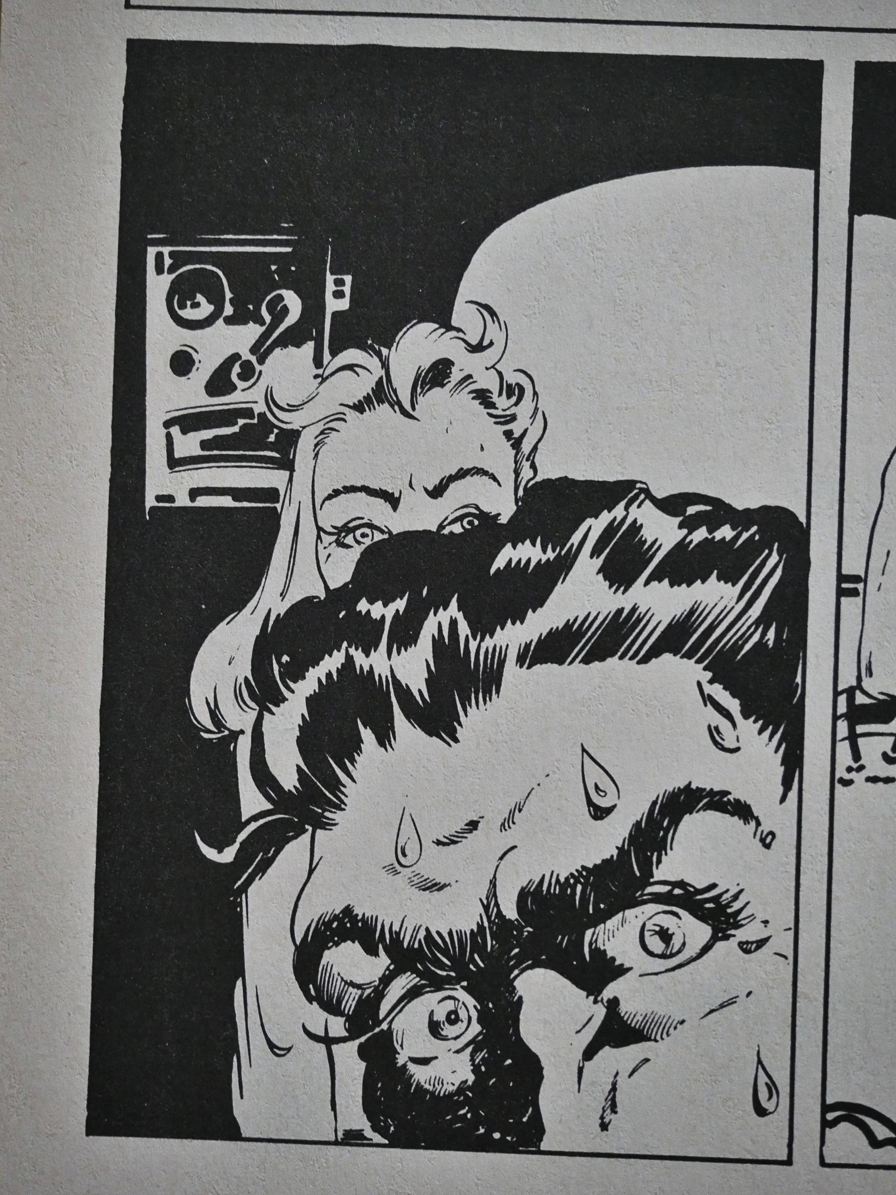
There are single panels that I absolutely love, though, but it’s mostly dull fare.

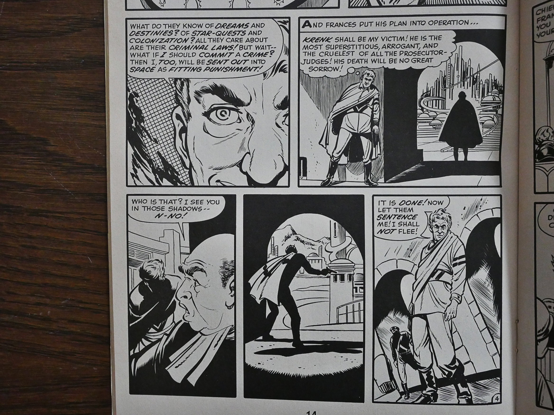
Powell doesn’t really keep the characters consistent and while he tries to jazz up the composition, he just succeeds are being confusing. The fat guy transmogrifies into a silhouette of a thin guy after apparently killing a judge, and then… another person appears?

Whatevs, dude.

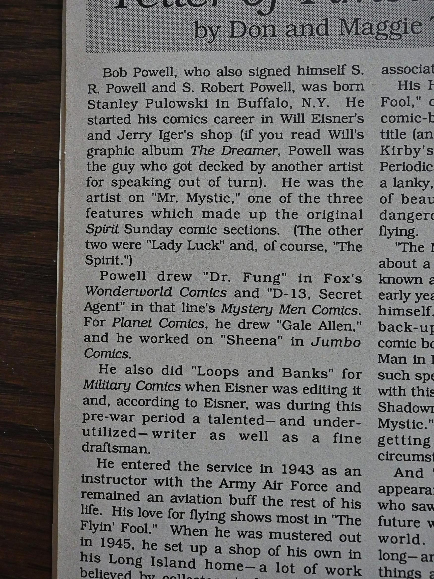
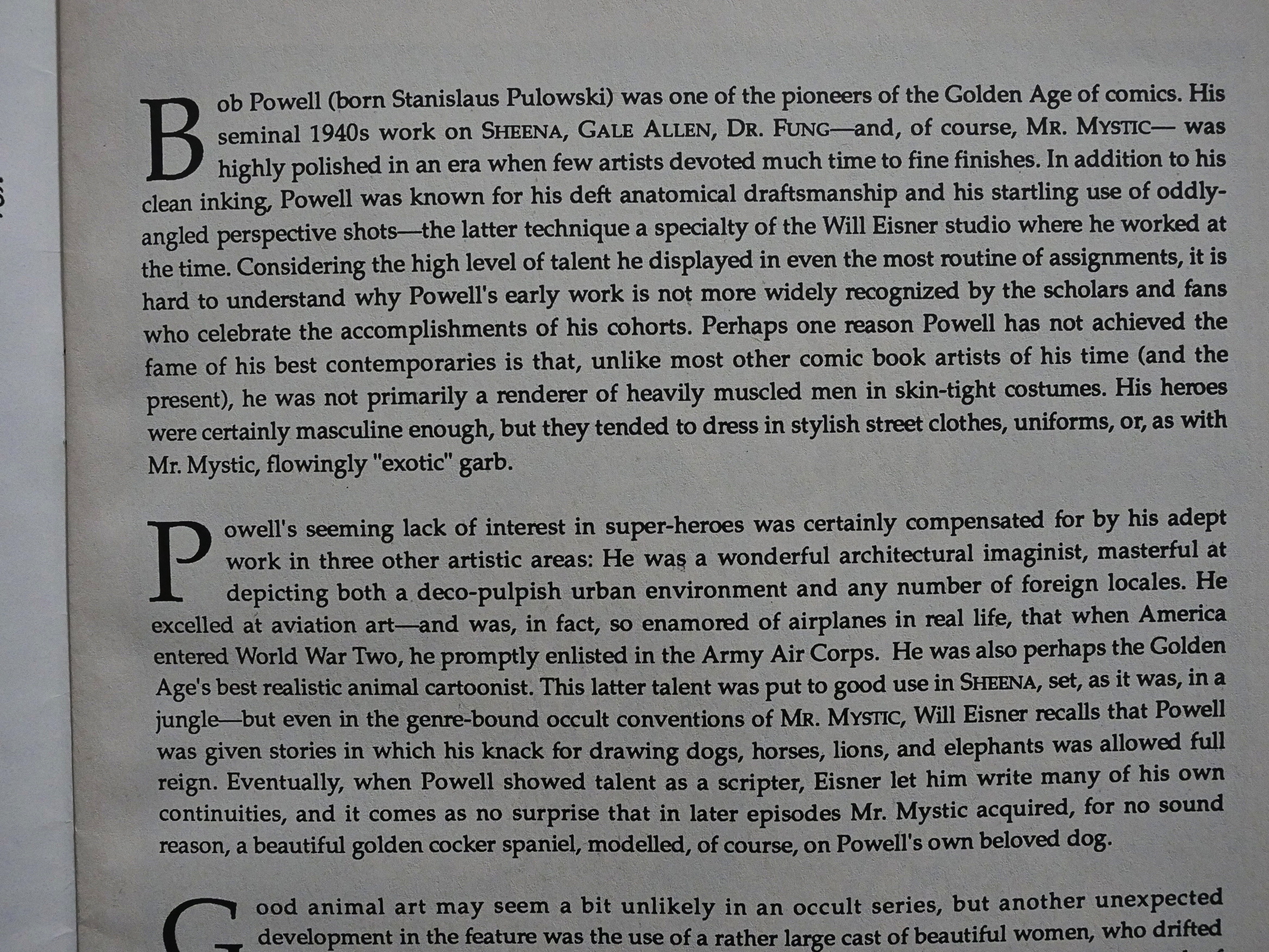
Don and Maggie Thompson were apparently the instigators for this comic, and they provide a career overview that seems to say that Powell didn’t really amount to much, but not exactly in those words.

Powell (real name Stanley Pulowski) was also apparently not a very nice guy. “Everyone who knew him hated him.”

Well OK then.

In addition to the material not being very good, it’s also thin on the ground. Bad, but too little. Isn’t it ironic? No? Anyway, there’s only 20 pages of Powell here, and this issue probably has more in-house ads than any other Eclipse publication, which is also weird, since this stuff is public domain…

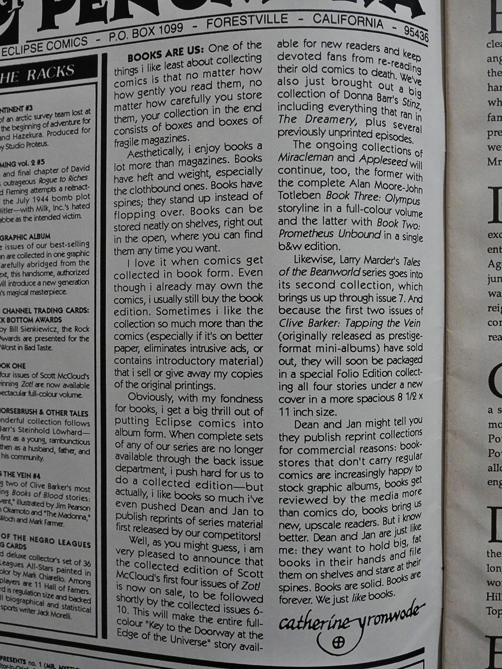
Onto “Will Eisner Presents featuring Mr. Mystic”: Mr. Mystic was filler for the Spirit “comic book” insert. But first: cat ⊕ yronwode tells us that books are better than floppies. In a floppy.

yronwode and Dean Mullaney does a more laudatory Powell introduction here than the Thompsons did in Timeless Tales.

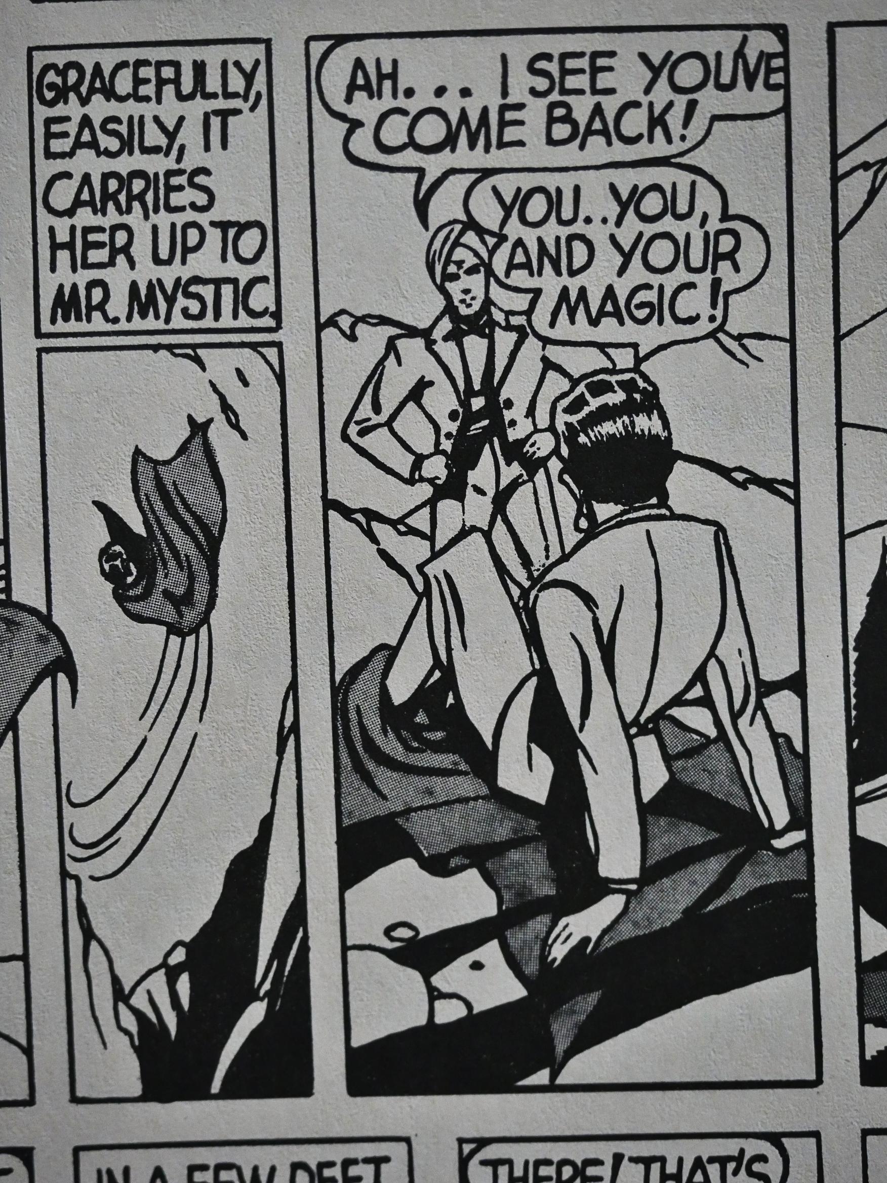
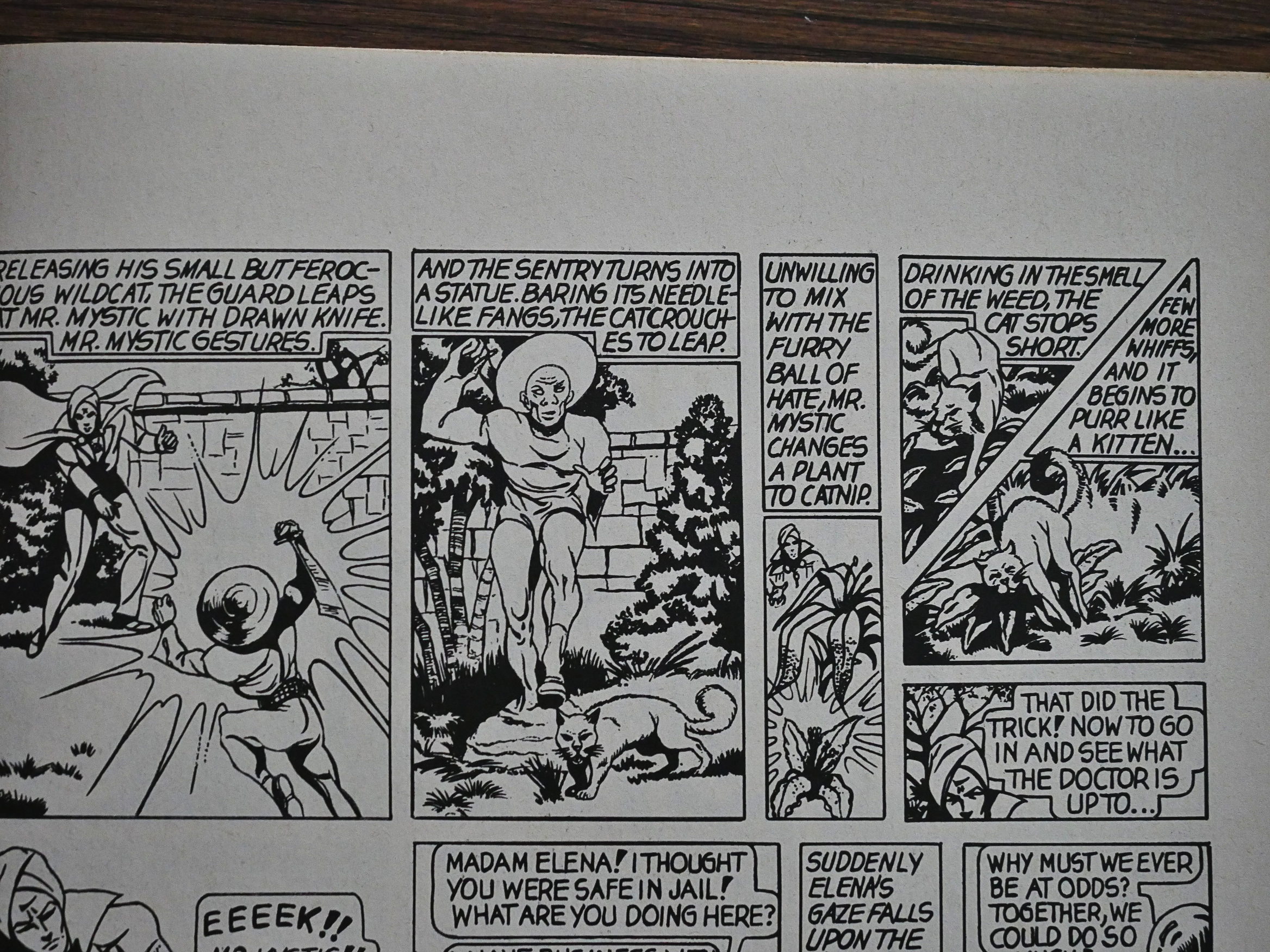
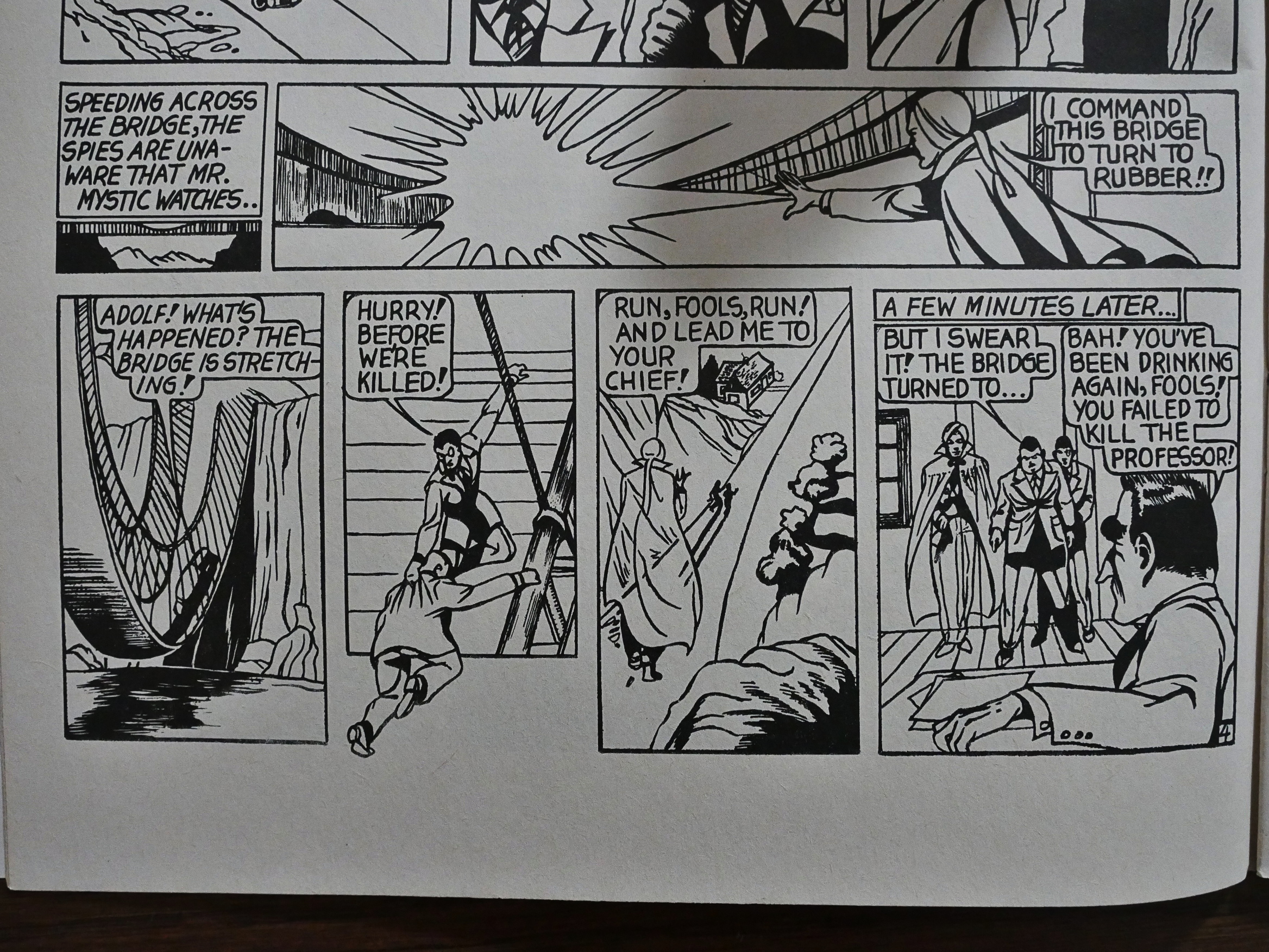
Mr. Mystic is basically a guy with magic powers who can do anything, so he does… anything, like turning a bridge into rubber, so that the villains he’s following have to… walk… back to their lair… instead of driving… which is better because… it’s slower and… er… Uhm.

All these stories are monumentally moronic, and not in a fun, campy way. There’s no limits to Mr. Mystic’s awesome super powers, so there no tension: Villains try to do villain stuff, and he waves his fingers, and things are resolved.

“You… you, and your magic!”

But does this sheer stupidity sometimes become transcendent tomfoolery? Mr. Mystic is attacked by a thug with a knife and… a cat… and turns the thug into a statue and… some weeds… into catnip… which then distracts the… ferocious cat…

I guess that’s up to you do decide.

The artwork (which is from much earlier in Powell’s career than Timeless Tales) is stiff and charmless.

These stories have apparently not been reprinted anywhere after this.

1989: Swordsmen and Saurians

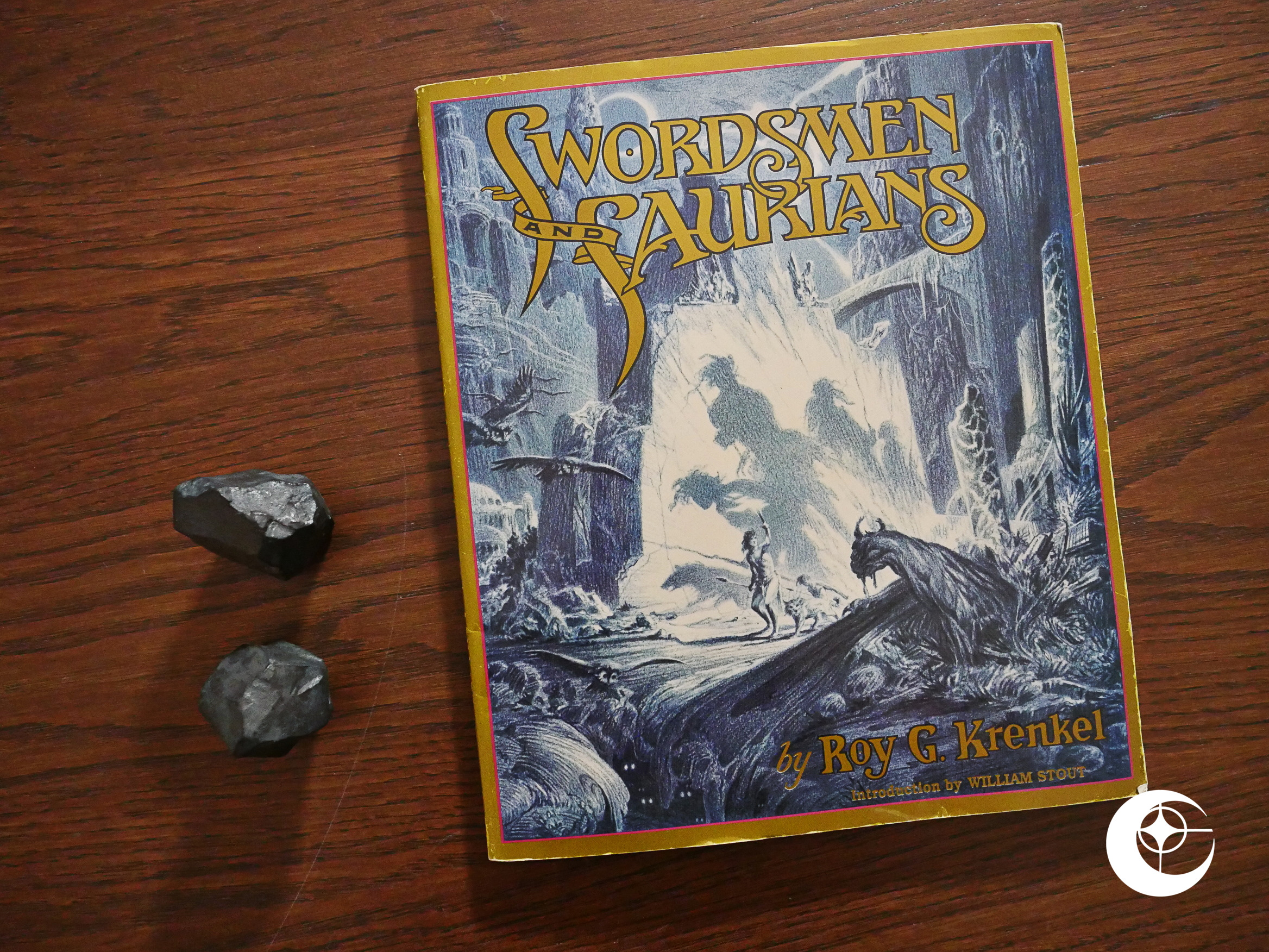
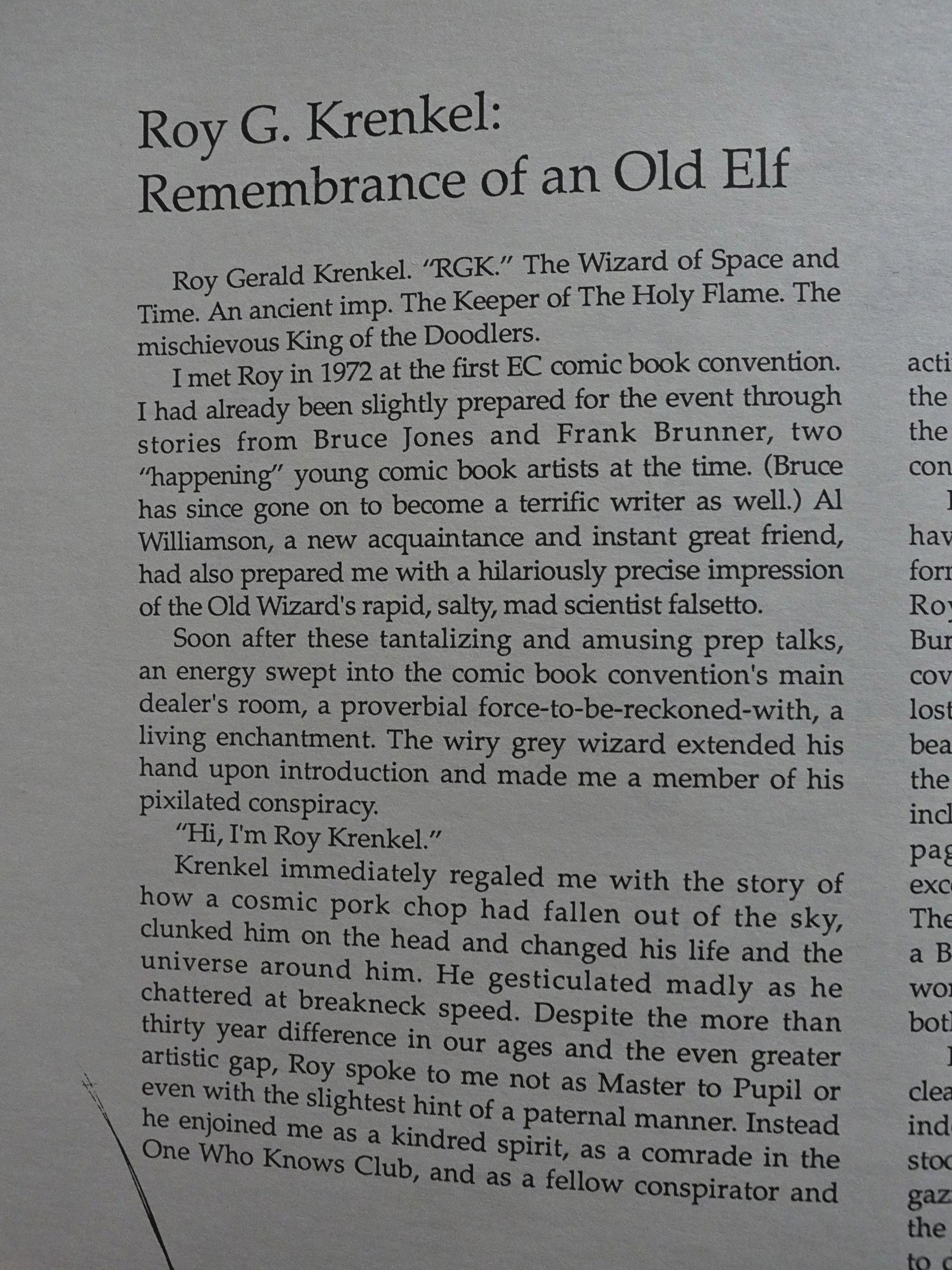
Swordsmen and Saurians (1989) by Roy G. Krenkel.

Up until this point, Eclipse had almost exclusively published comics books, and virtually all of them either in standard US format or in album format. This would change over the next few years, what with Eclipse starting to publish trading cards and other weird stuff, but also a small line of art books.

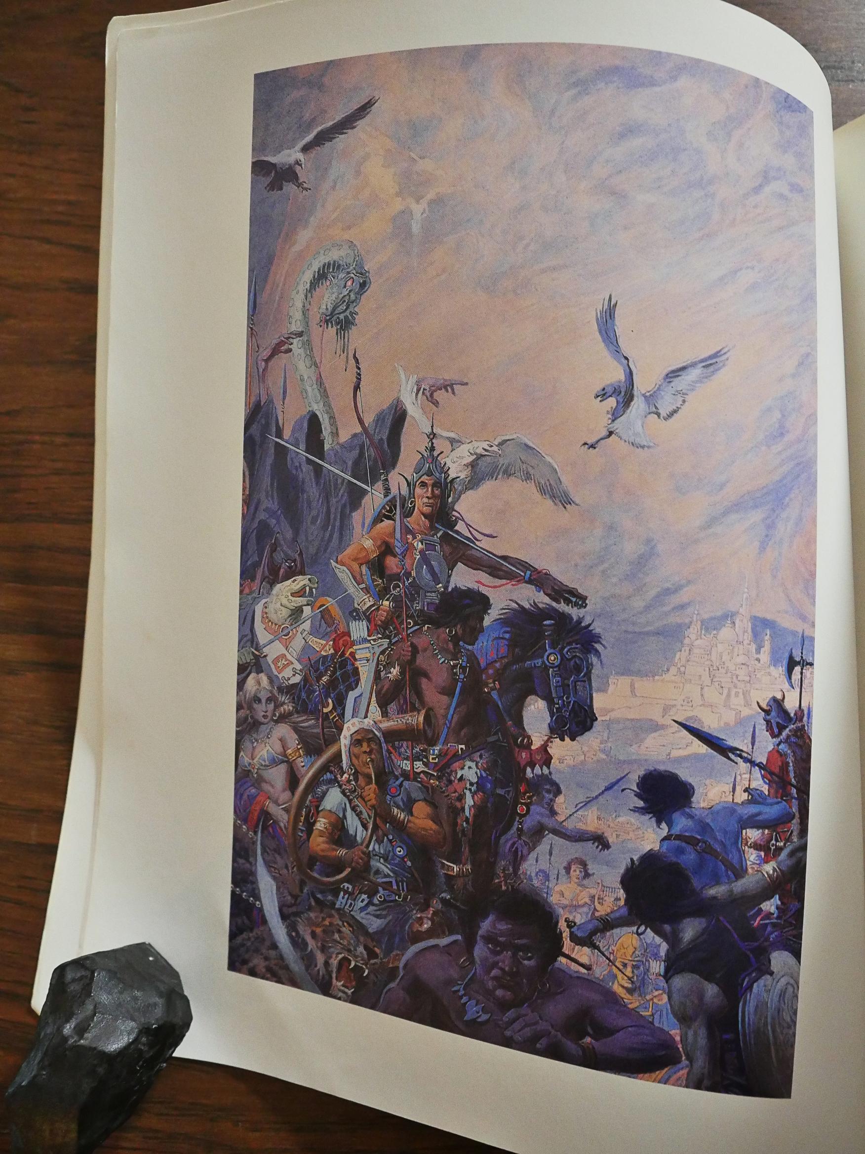
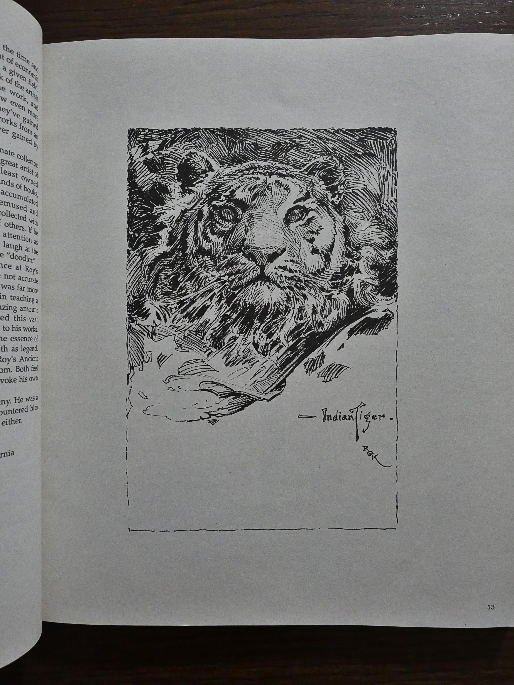
This is an oversized, wide book, printed well on nice paper, and with one single colour piece included.

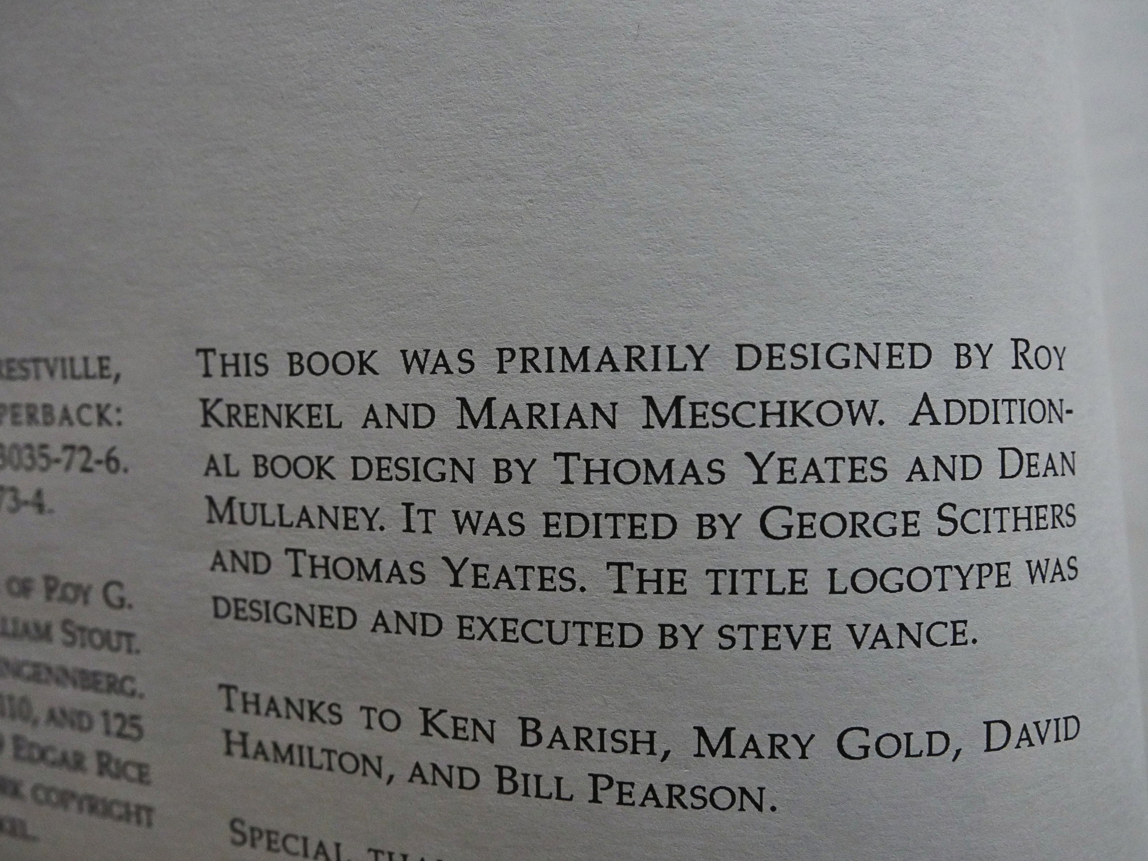
The book was designed by Krenkel and Marian Meschkow, which might explain why Eclipse never published anything that looked quite like it before or after.

William Stout writes a nice but perhaps too short introduction. We’re given a few personal reminisces, but not really much to explain what Krenkel did, or what his place in the world was, or what they work collected here is supposed to be.

But it’s extremely pretty.

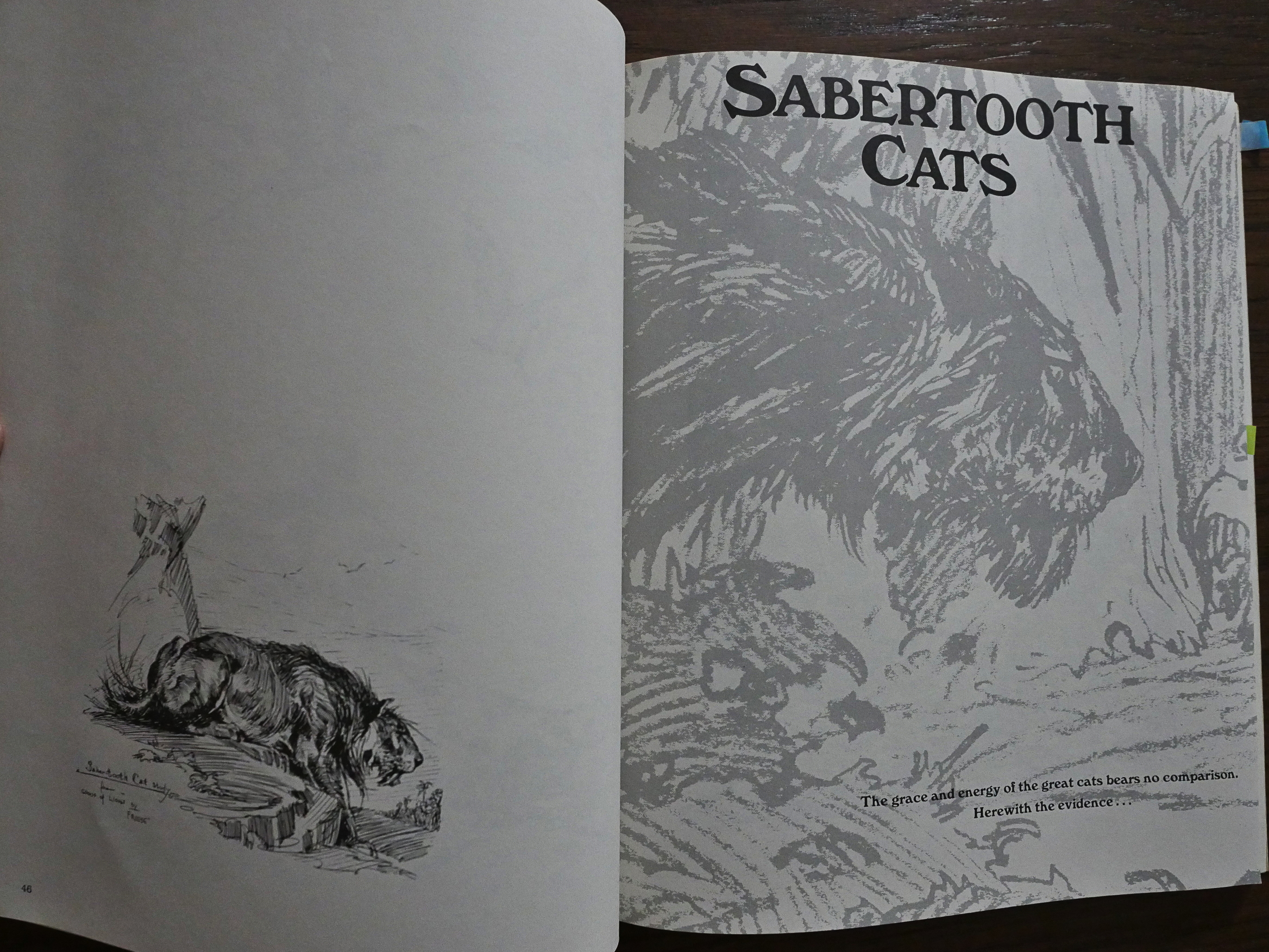
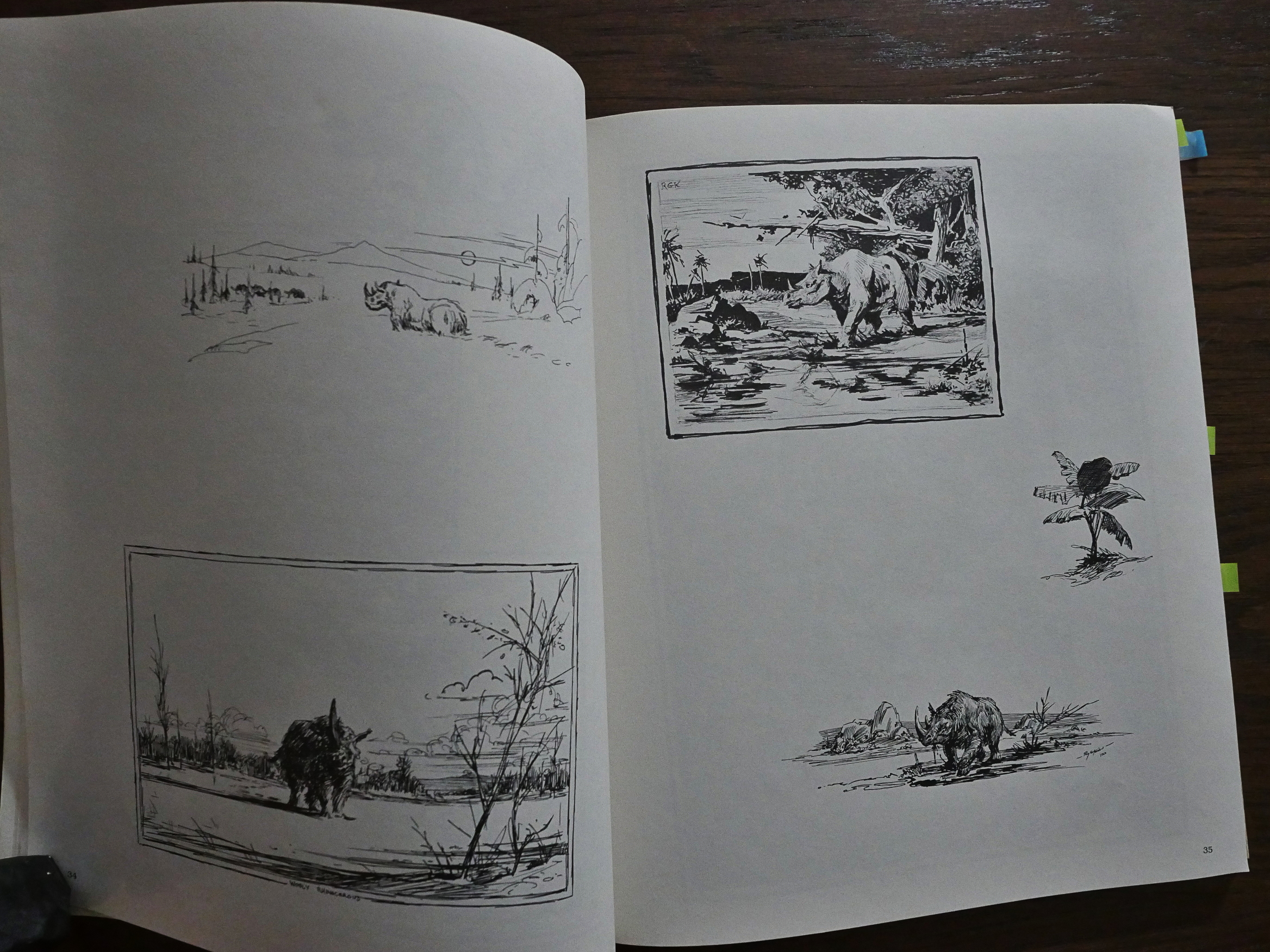
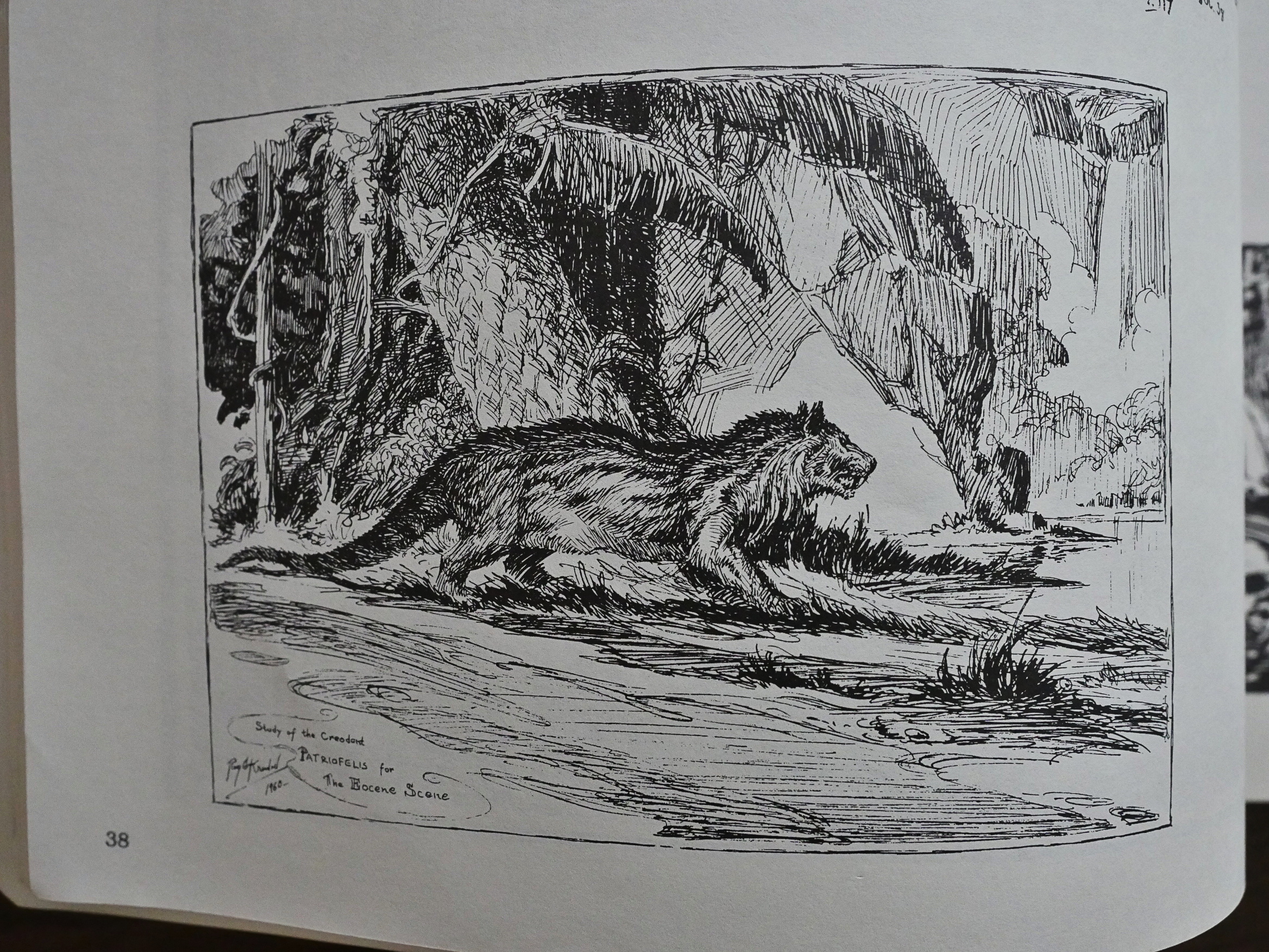
We’re given no context to the work, or any explanation of whether the work is new or old, or what this work is. It’s arranged by subject, so we get a section on dinosaurs, and then a section on sabertooth cats, and so so.

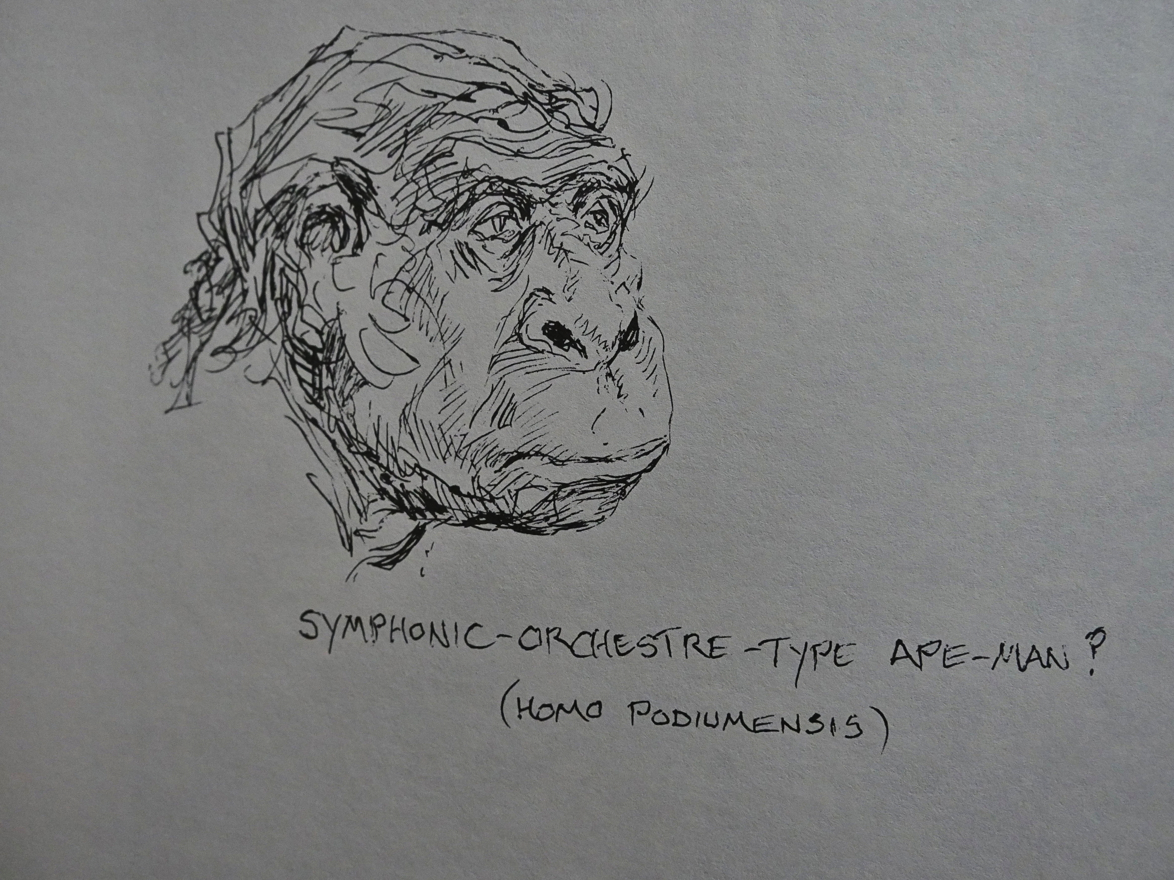
But it soon becomes clear that this book is simply a collection of random sketches and studies that Krenkel must have used in preparation for his published work. If he’s known for anything (and I don’t really think he is) these days, it’s for doing painted covers for science fiction/fantasy books and magazines, and I’m assuming that that’s the end point for these exercises.

Don’t get me wrong: These are lovely drawings. And perhaps saying “A collection of random works in progress” on the cover wouldn’t be a good way to sell this collection.

And there’s some funny bits in here, too.

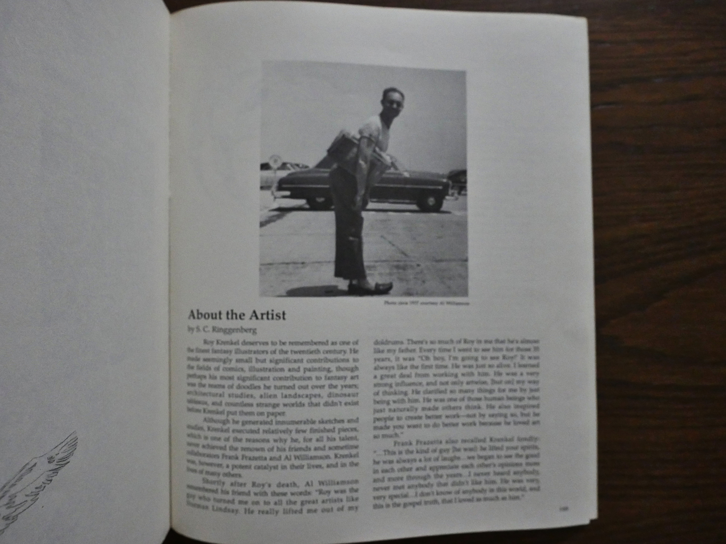
Steve Ringgenberg (or Ringennberg as the indicia would have it) does provide some historical context in the afterword, which is nice, because I’ve forgotten all I ever knew about Krenkel. This turns out to be from the article in The Comics Journal #80 that they published after Krenkel died in 1983.

1989: Teen-Aged Dope Slaves and Reform School Girls

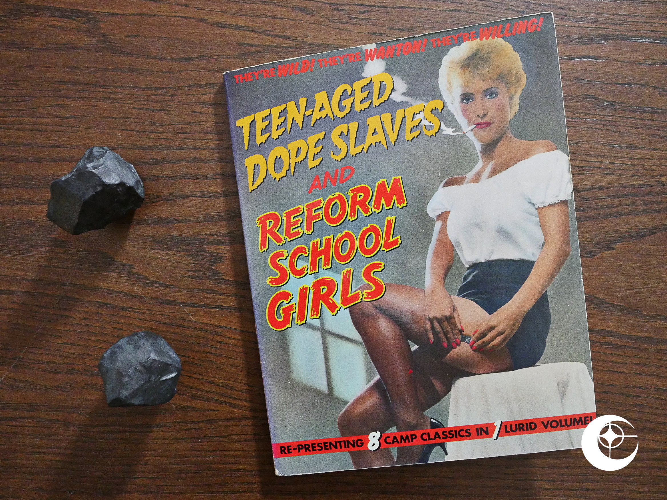
Teen-Aged Dope Slaves and Reform School Girls (1989) edited by Dean Mullaney.

Yet another collection of pre-code comics. I had no idea that Eclipse did so many of these. And they’ve got a pretty decent taste level, so I’m looking forward to reading this.

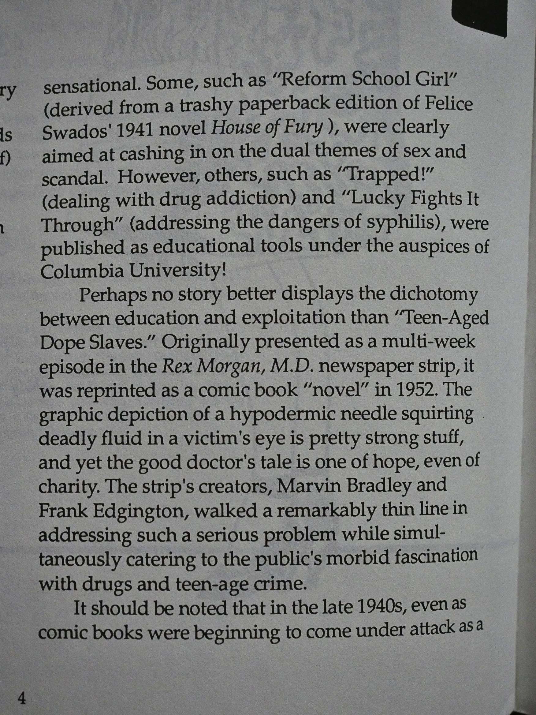
Editor Mullaney gives some context to these stories in the introduction. It’s an odd grab-bag of… things. Most of these lurid pieces are from normal 40s/50s comic books, but a couple are from educational comics released by a University, and one has its origin as a newspaper strip that had been reformatted into a comic book.

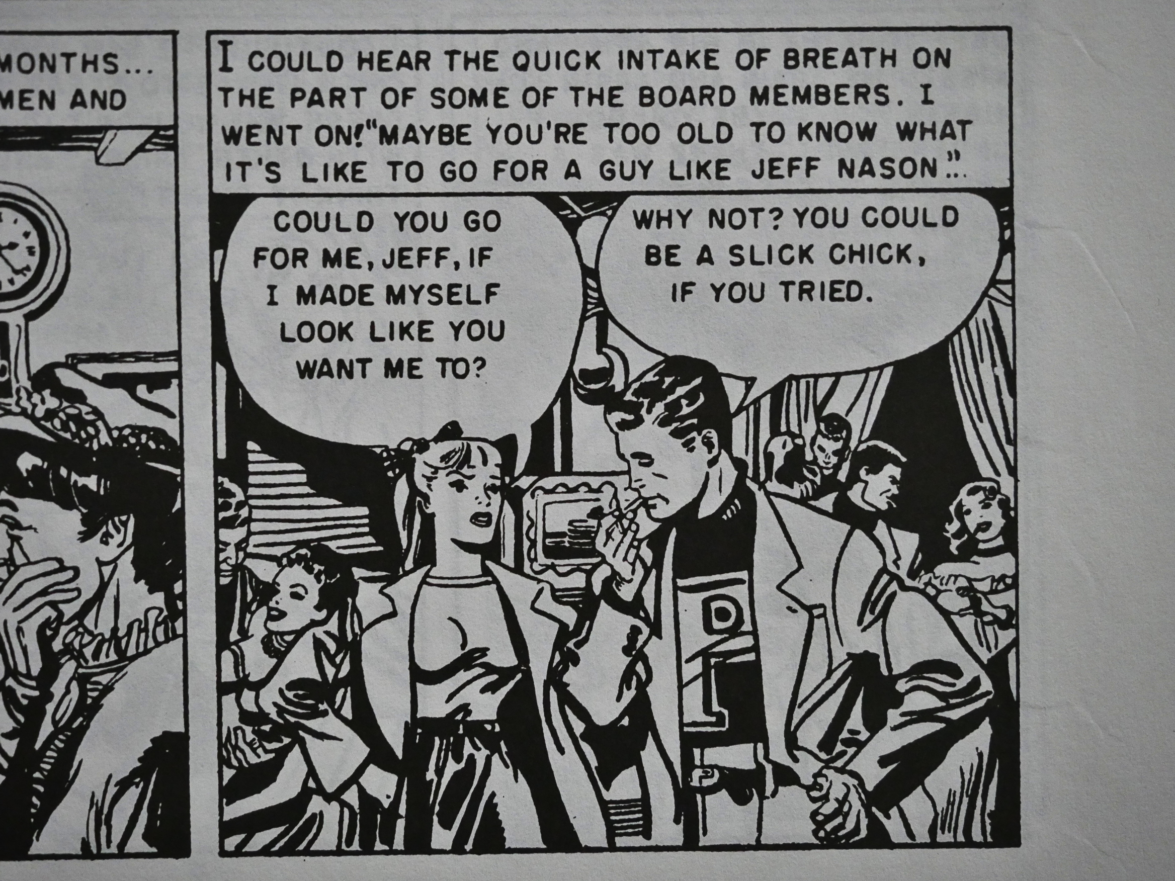
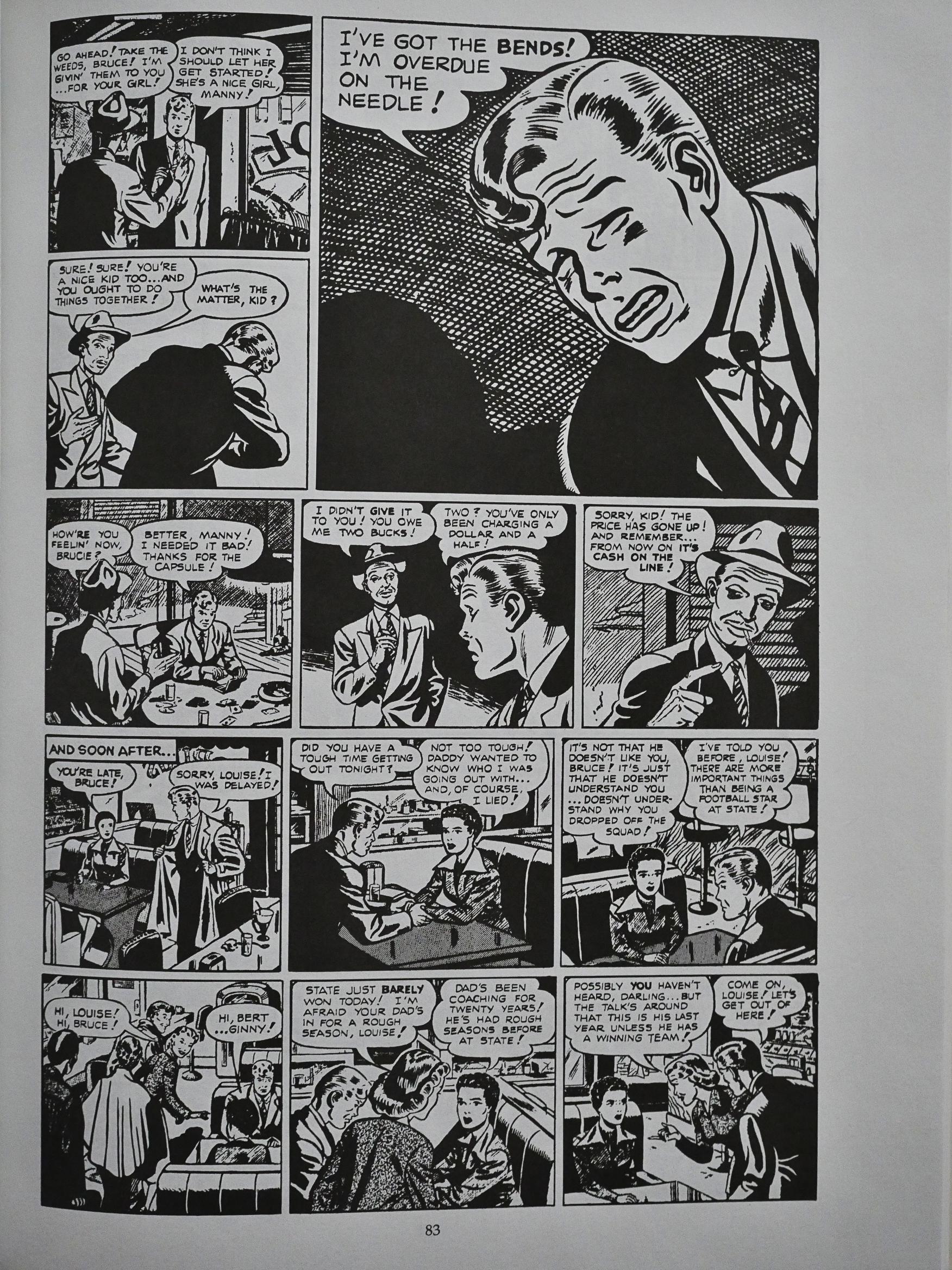
And these stories are, indeed, very entertaining. Here we see a typical dating situation in the 50s.

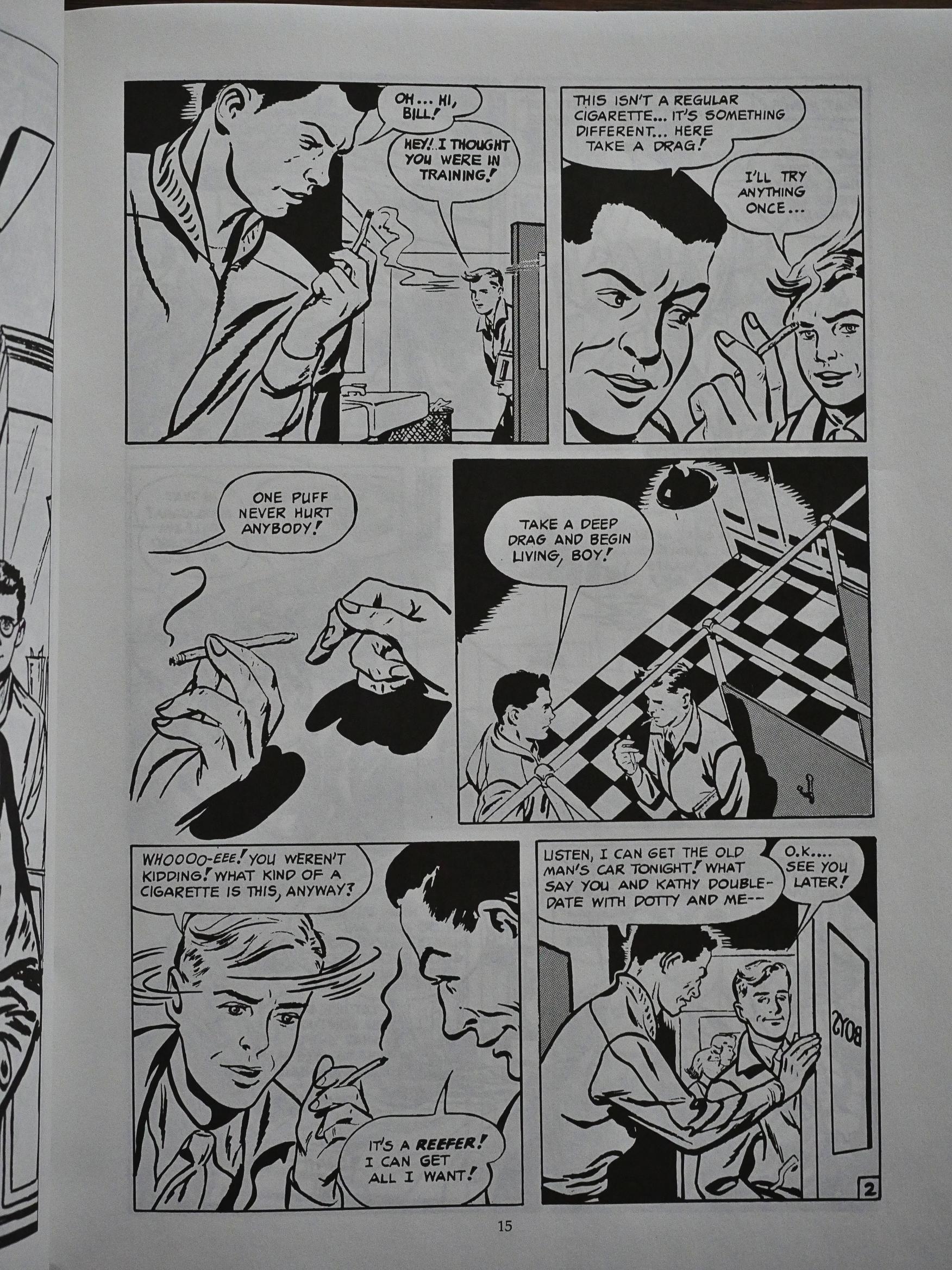
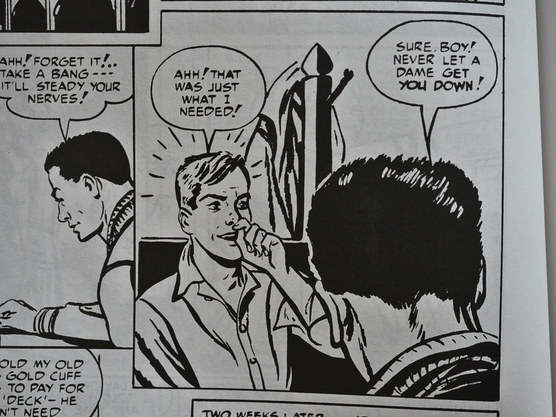
And while all these stories try do tell you that crime and drugs are bad for you, most of them make it seem like such great fun.

Snorting heroin is just what everybody needs! Perks you right up!

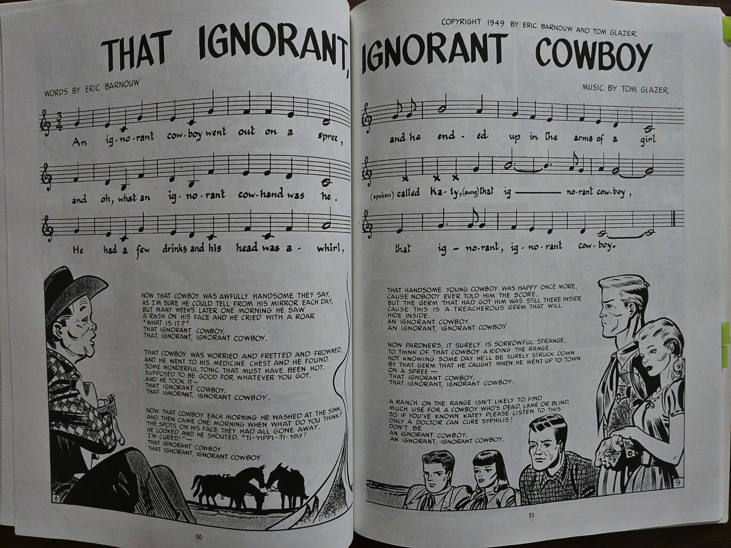
The main attraction here is perhaps this story about a cowboy with syphilis drawn by Harvey Kurtzman! It’s perhaps not his most accomplished story, but it’s got… something. And by something I mean a cowboy with syphilis.

There’s even a sing-a-long tune!

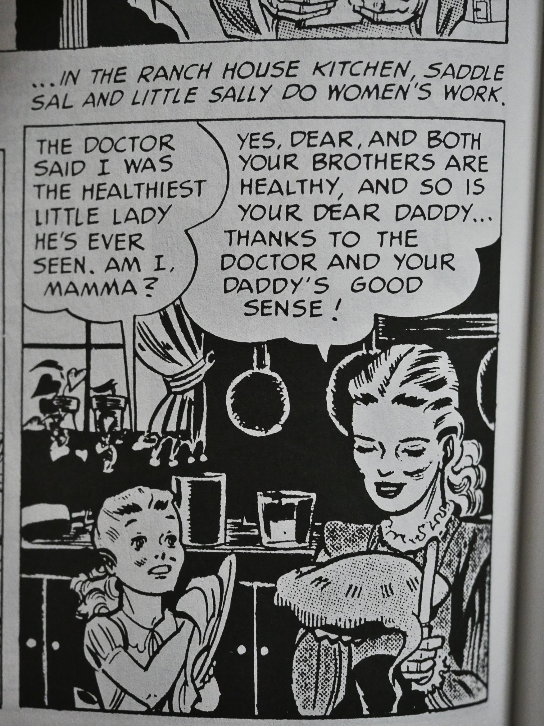
It all ends very happily with Saddle Sal apparently stopping working and raising children that, look!, aren’t syphilitic, either!

Moral: Visit the doctor after a prostitute roofies you and has sex with you while you’re unconscious. I’ve learned my lesson.

There’s two Simon & Kirby stories in here, but they aren’t as good as the material Eclipse had collected in the Real Love collection a couple of months earlier. They’re still entertaining, though.

All these stories are fun, and the weakest one is the Rex Morgan, MD sequence reworked for comic book publication by Archie in the 50s. It goes on way too long and doesn’t really bring anything new to this collection that the other stories hadn’t already covered.

The Comics Journal #137:

This is not the first dispute made over public-domain collections. Last year, Eclipse published Real Inve and Teen-Aged Dope Slaves and Reform School Girls, two volumes Of RD. comics originally published by Harvey and other firms. The collections drew complaints from comics pioneers Jack Kirby and Joe Simon, whose works were included in both books. In an open letter to trade publications, Simon complained about the way Eclipse had de-colored and otherwise changed the artwork. Furthermore, he charged that he held personal copyrights on some of the art and stories.

Eclipse’s Mullaney responded by claiming that he’d found no active copyrights for anything in the collections under Simon’s name, had paid Simon and Kirby courtesy payments of $100 each, and had used an artist personally recommended by Simon to retouch and clean-up the decolored art. Simon and Kirby later claimed to have never cashed those checks.

Oh, wow. I thought Eclipse had a policy of paying the creators of the public domain work they reprinted. But $100? That’s a joke.

1989: James Bond: Permission to Die

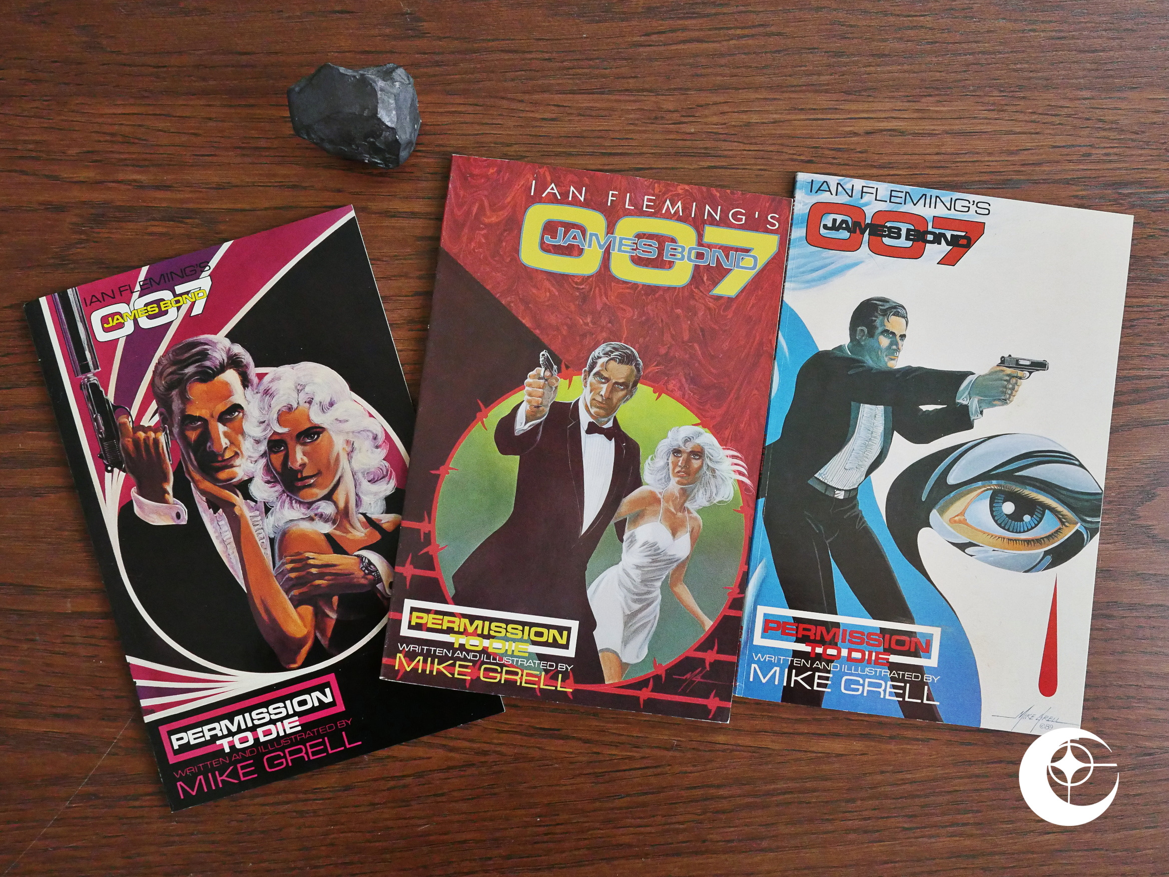
James Bond: Permission to Die (1989) #1-3 by Mike Grell et al.

Eclipse published an adaptation of the current James Bond film later in the year (if I’ve got my chronology right, which I may very well not have), but this is an original work written by Mike Grell and apparently not based on any of the books or movies.

It was published in three 48 page squarebound “prestige format” books, popularised by DC with The Dark Knight and Grell’s own Green Lantern: The Longbow Hunters, which, at the time, I think everybody felt was the epitome of what was wrong with the new wave of post-Watchmen “mature” superhero comics: It was just as stupid as the old ones, but drenched in gristly violence.

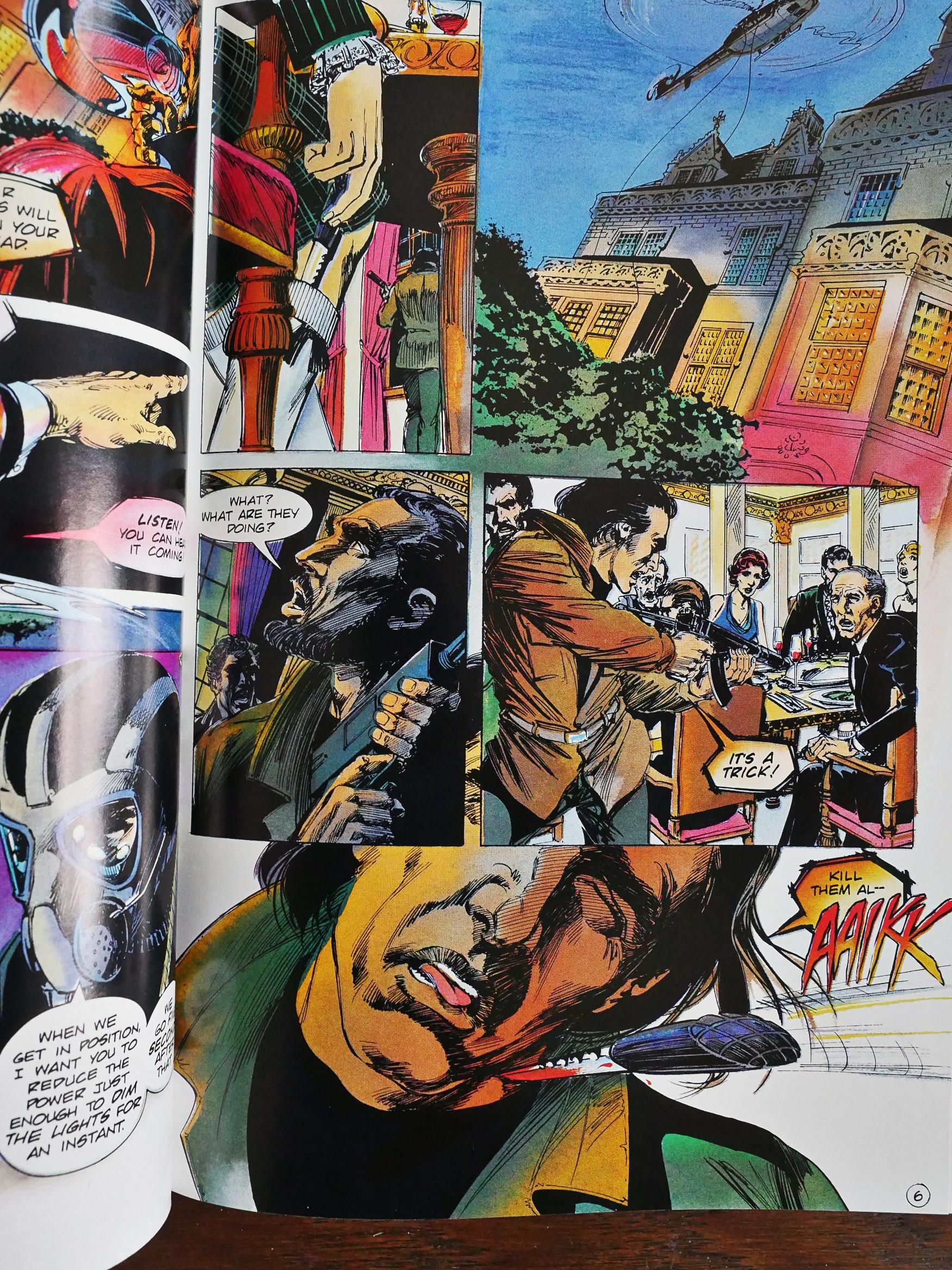
So what’s this going to be like? Bond films are action/adventure movies with a dash of comedy, and the latter is, perhaps, not what Grell is most known for. But it starts of pretty well, with an action sequence where we see somebody pulling up a knife from their socks and killing a terrorist (somehow the blade had become pre-splattered with blood, but never mind).

And then that person pulls a gun from their garter belt, and then that person is revealed to be James Bond in a kilt.

That’s an amusing way to introduce the character, and sets the right tone for a Bond epic.

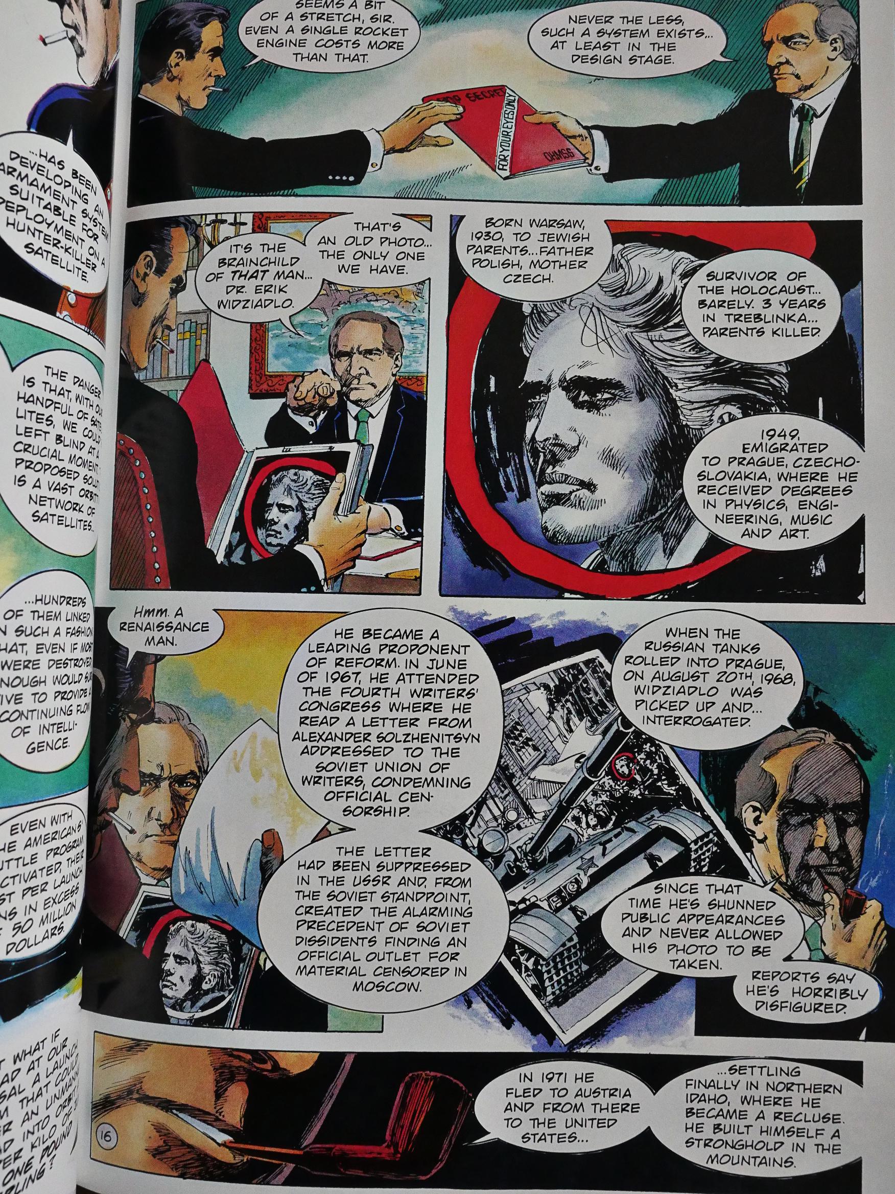
Grell follows the formula strictly, with a long, long introduction to the plot by Bond’s boss…

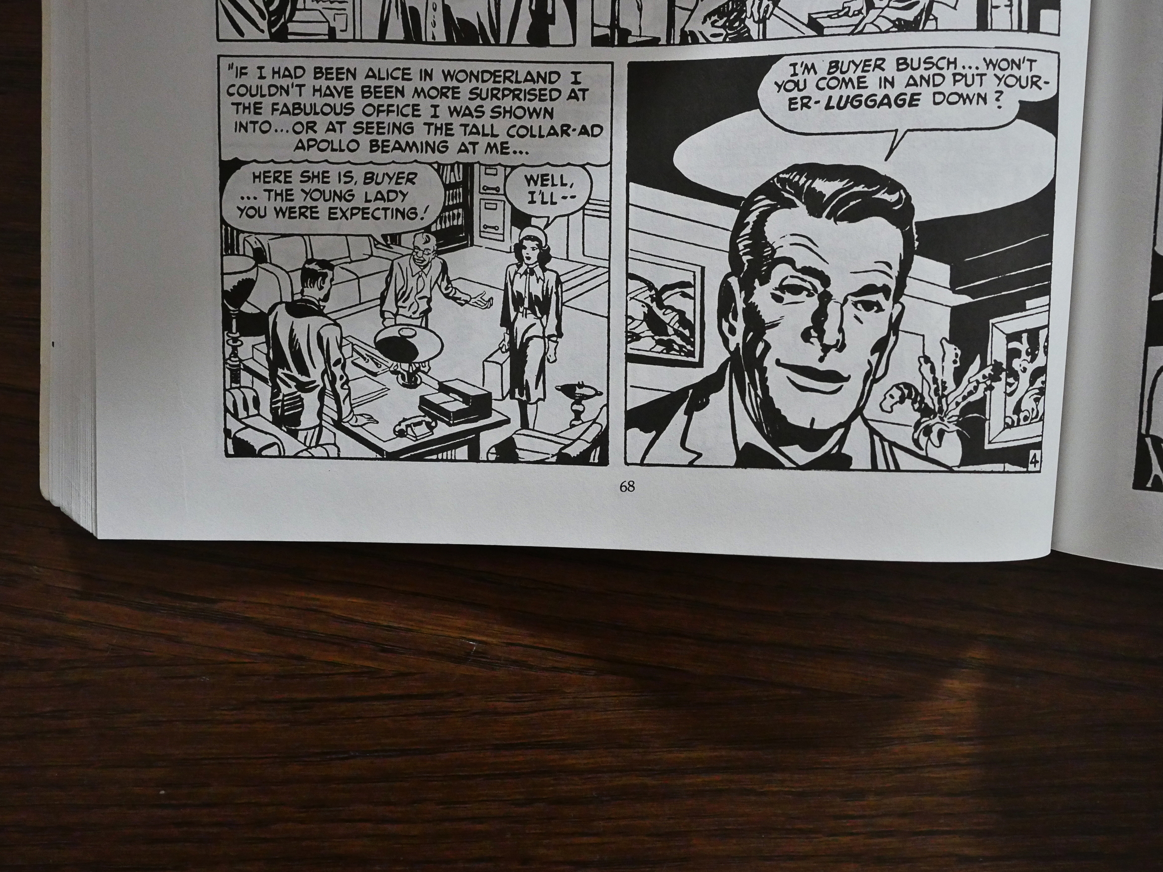
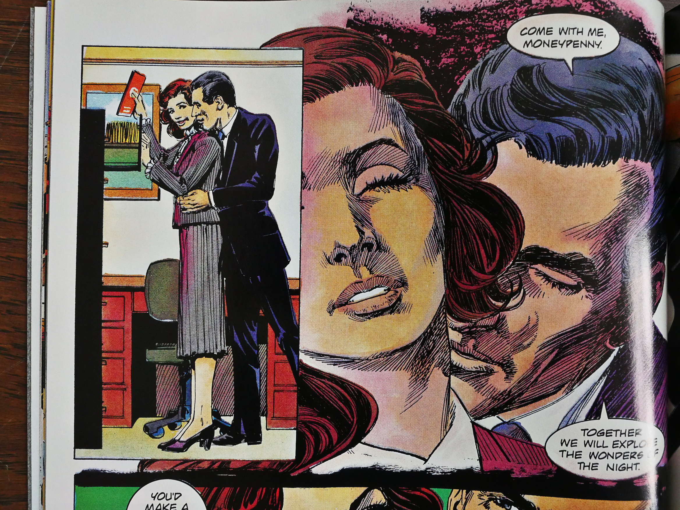
… and then the obligatory Moneypenny and Q scenes.

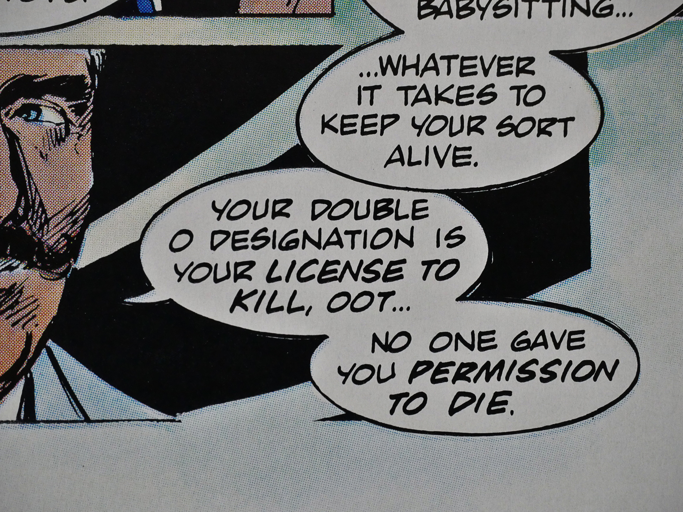
Even name-dropping the current Bond film and the name of the comic itself. It’s all nice and safe.

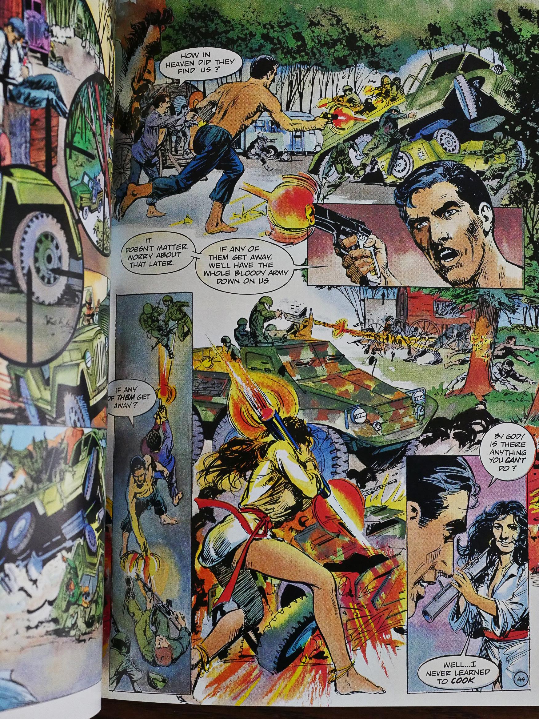
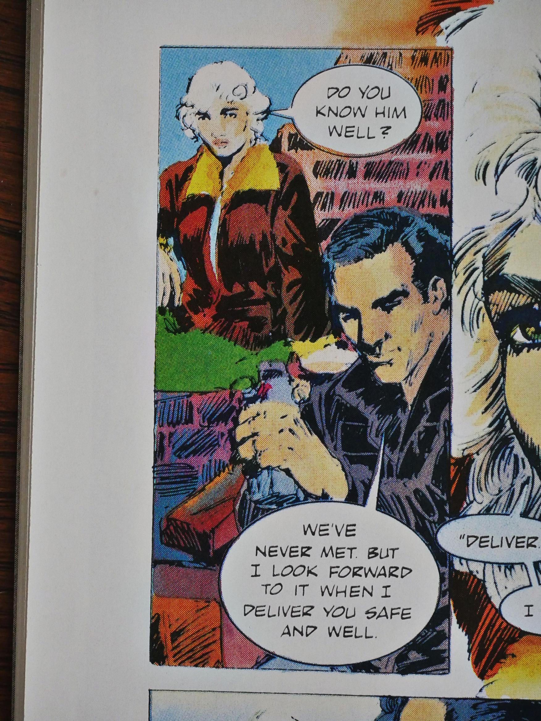
It’s only when the plot starts properly that the problems crop up, because it basically feels like, for the first two issues, that Bond just goes over the same area again and again without getting much of anywhere, and that’s no fun. While there are action sequences, they’re not told very well. I first thought the woman with the bazooka (yes, I know, they’re not called that) was shooting… something that’s almost beneath her legs, but it’s supposed to be a vehicle that’s… far? from her? And is it supposed to be underneath the bigger vehicle above it? Or is that a different panel? Is she shooting at the bigger vehicle? What’s going on?

I wondered how Eclipse landed up with the Bond franchise in comics form, and this is the explanation: It’s through Acme Comics, who, I’m guessing, had the right contacts, for some reason or other. It’s a common thing throughout Eclipse’s history: They end up publishing things brought to them by third parties.

The printing of this book is mostly very nice, but there are panels, at random, that look like this. Either the printer fucked up somehow, or Grell just forgot to finish certain panels.

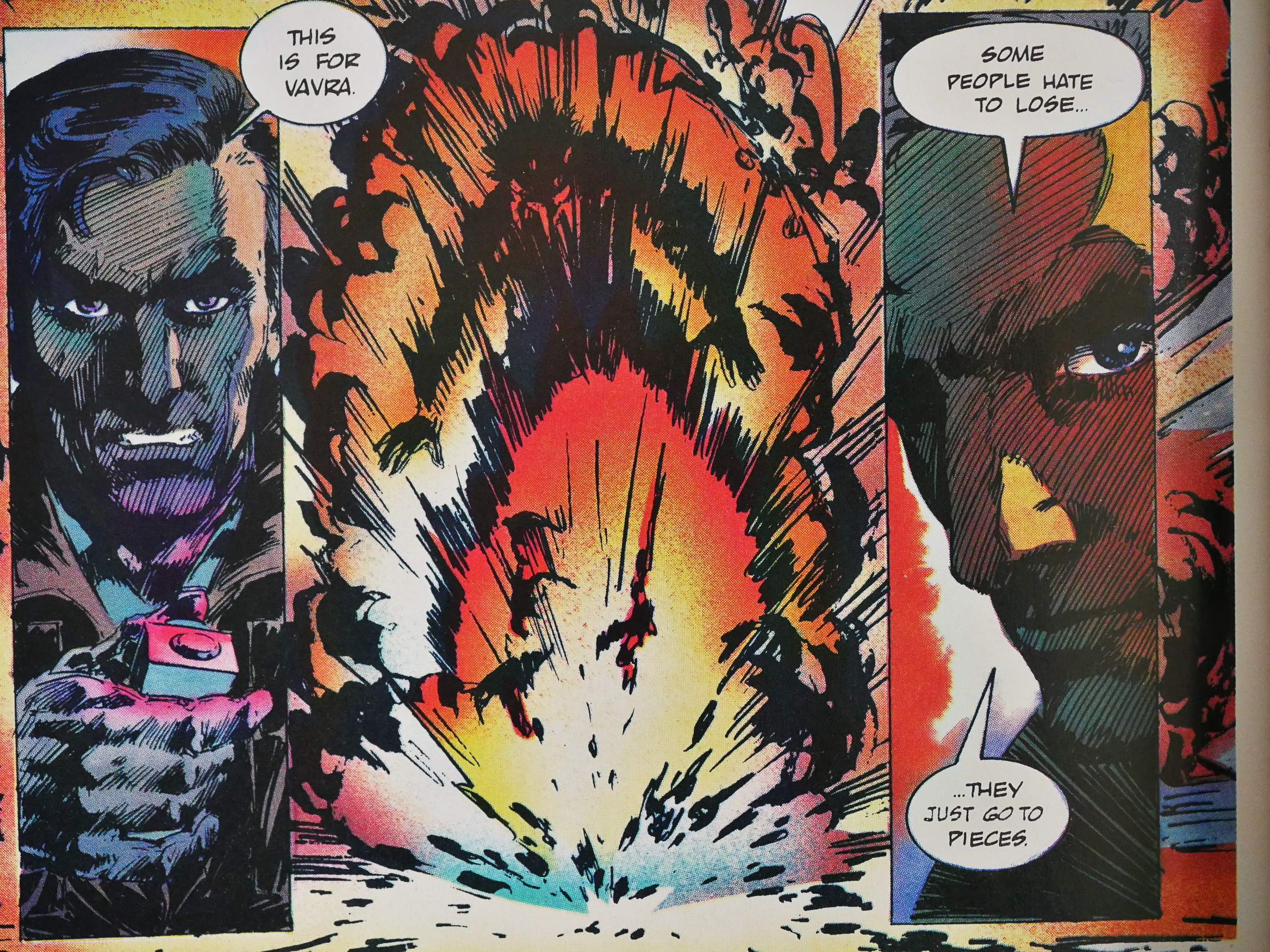
Grell’s Bond bon mots mostly make very little sense. You can see the structure of the joke, but it’s not very… er… funny. He blew somebody up, so they lost, and they went to pieces. I guess.

¯_(ツ)_/¯

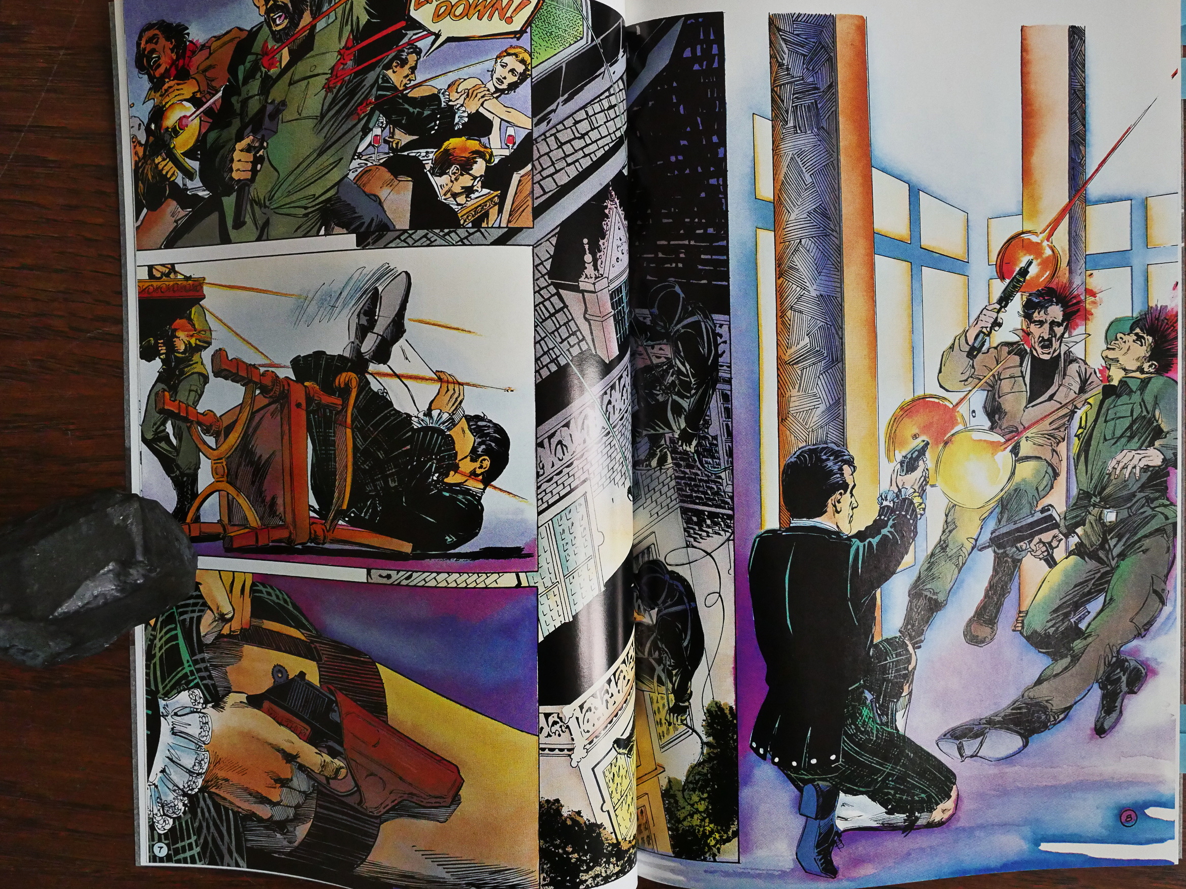
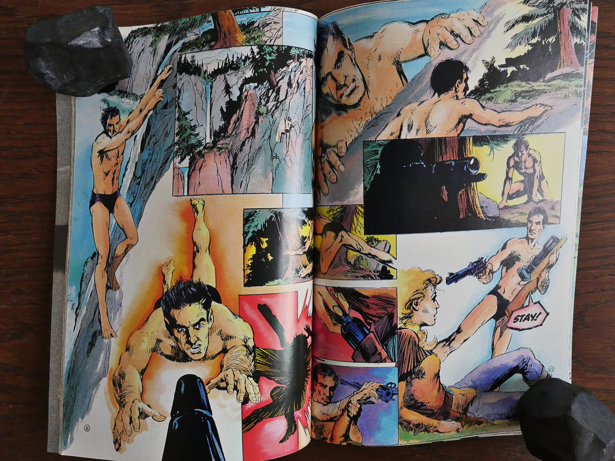
There’s a lot of people standing around talking to each other here, but the action sequences are sometimes harder to get through. Glance at this spread and try to guess the order of the “panels”: The eye is immediately drawn towards Bond jumping at the barrel, but you are suposed to read across the top first, and then make your way back to the left diagonally, and then over to the right again. There’s nothing that leads the eye here.

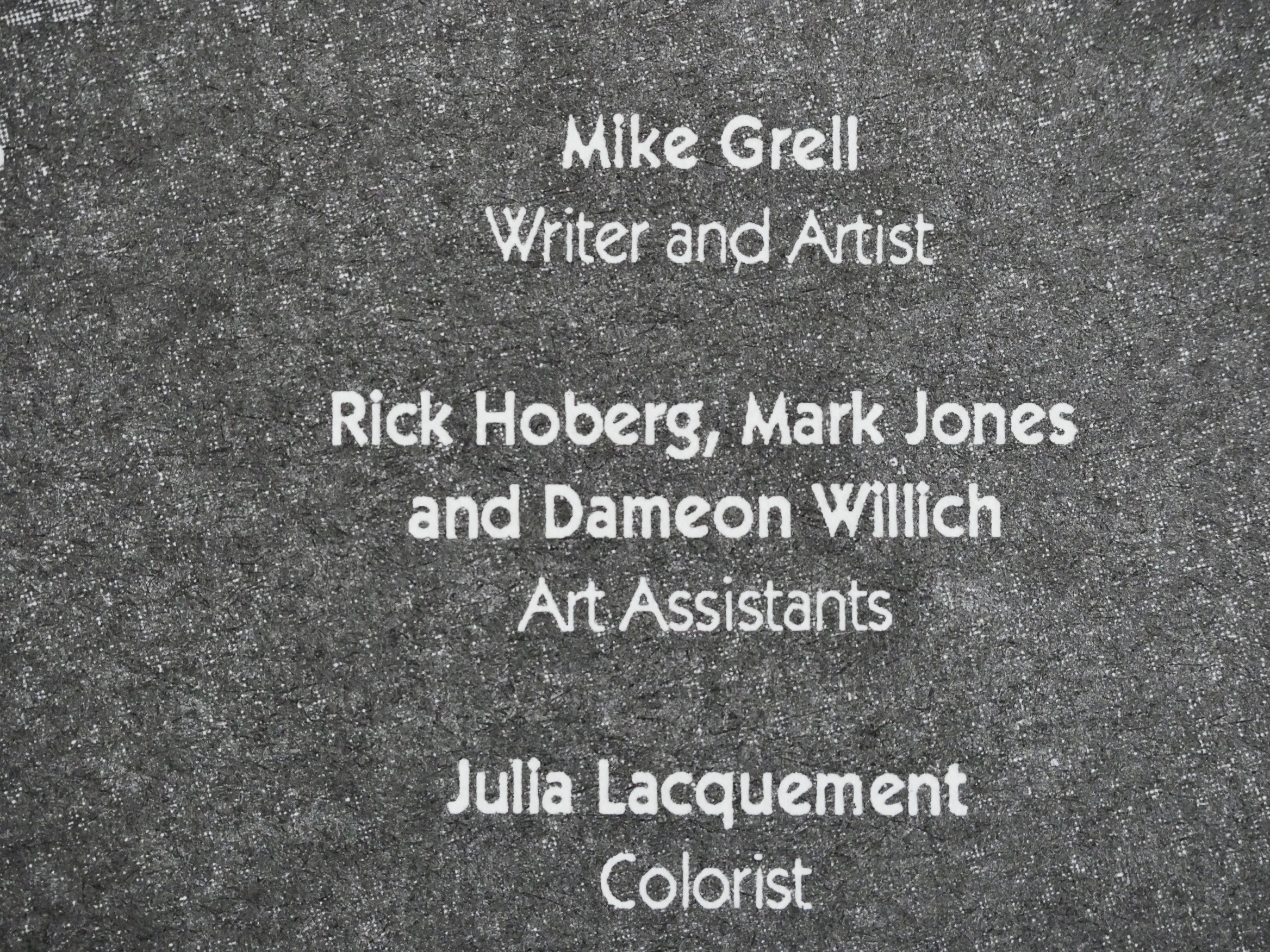
On the first issue, only one art assistant was listed. On the second, two, and on the last one, three. So either Grell decided to put less effort into this as time passed, or they were in a scheduling crunch…

Eclipse collected the series in one volume in 1992. It hasn’t been reprinted since.

Other people liked it:

Mike Grell’s work in Permission to Die is equal to that of his other notable works. His story and visuals are cinematic, using new dialogue delivered just as Connery would, throwing Bond in entirely new situations with new villains, yet all of these could easily be found in the next Bond movie. Grell’s art includes fantastic splash pages evoking classic Bond opening credits scenes as well as movie poster poses and designs.

1989: Fly in My Eye

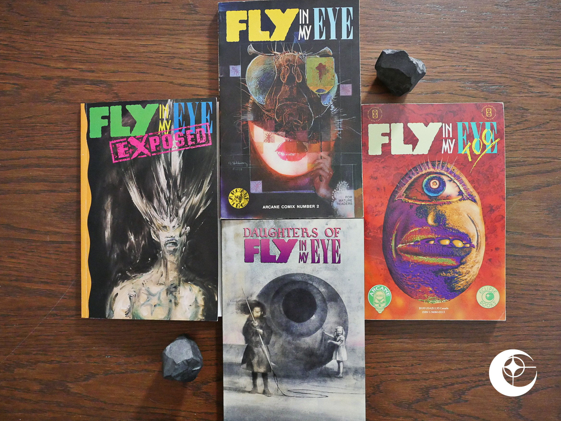
Fly in My Eye (1988), Saturday Mourning: Fly In My Eye (1989), Daughters of Fly in My Eye (1990), Fly in My Eye Exposed (1992) edited by Steve Niles.

Steve Niles is well-known these days as the creator of such horror series as 30 Days of Night, but in 1986 he started Arcane Comix and published a small number of books. Fly In My Eye is the most well-known of these, and Eclipse co-published the last three issues.

But let’s take a look at the first issue, too, even if this is an Eclipse blog.

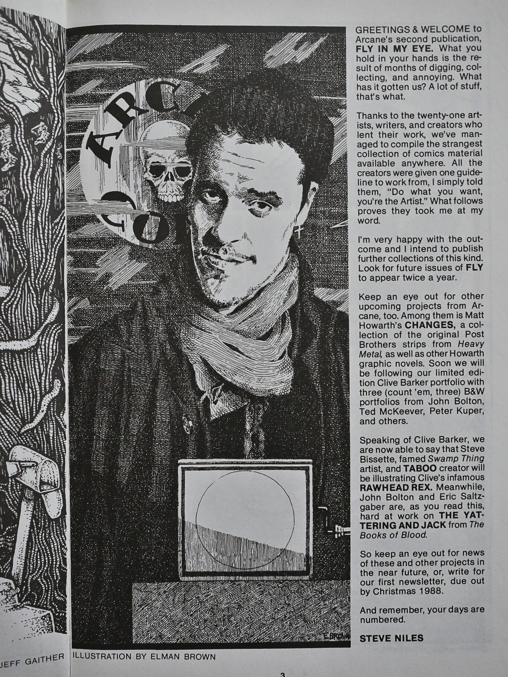
Niles claims that he simply told the contributors “Do what you want”, but I have to pedantically point out that he probably told them more than that, since everybody gave him a horror story. More interesting is that he announces two Clive Barker adaptations, Rawhead Rex (by Steve Bissette) and The Yattering and Jack by John Bolton and Eric Saltzgaber. These were both published several years later by Eclipse comics… but both adapted by Niles himself, and while Bolton did the artwork on Yattering, Bissette didn’t on Rawhead Rex: Les Edwards did instead.

OK, perhaps I exaggerated by using the word “interesting” here, but it might explain something that I’ve wondered about: How did Eclipse get the rights to do a shitload of Clive Barker adaptations? Barker was really hot at the time (what with Hellraiser being a sensation in 1987 and his Books of Blood getting horror readers all excited).

But the connection came via Steve Niles, who apparently had already hooked up with him (license wise) before he blew up?

It’s not the first time these things have been “grandfathered” in at Eclipse, like how Miracleman ended up there by them buying the rights from the bankrupt estate of Pacific Comics.

Aaaaanyway. Let’s look at the book itself. It’s thick (220 pages) and cheap ($10), so you have to wonder whether the contributors got paid much. But there are so many big name artists here? Waaat?

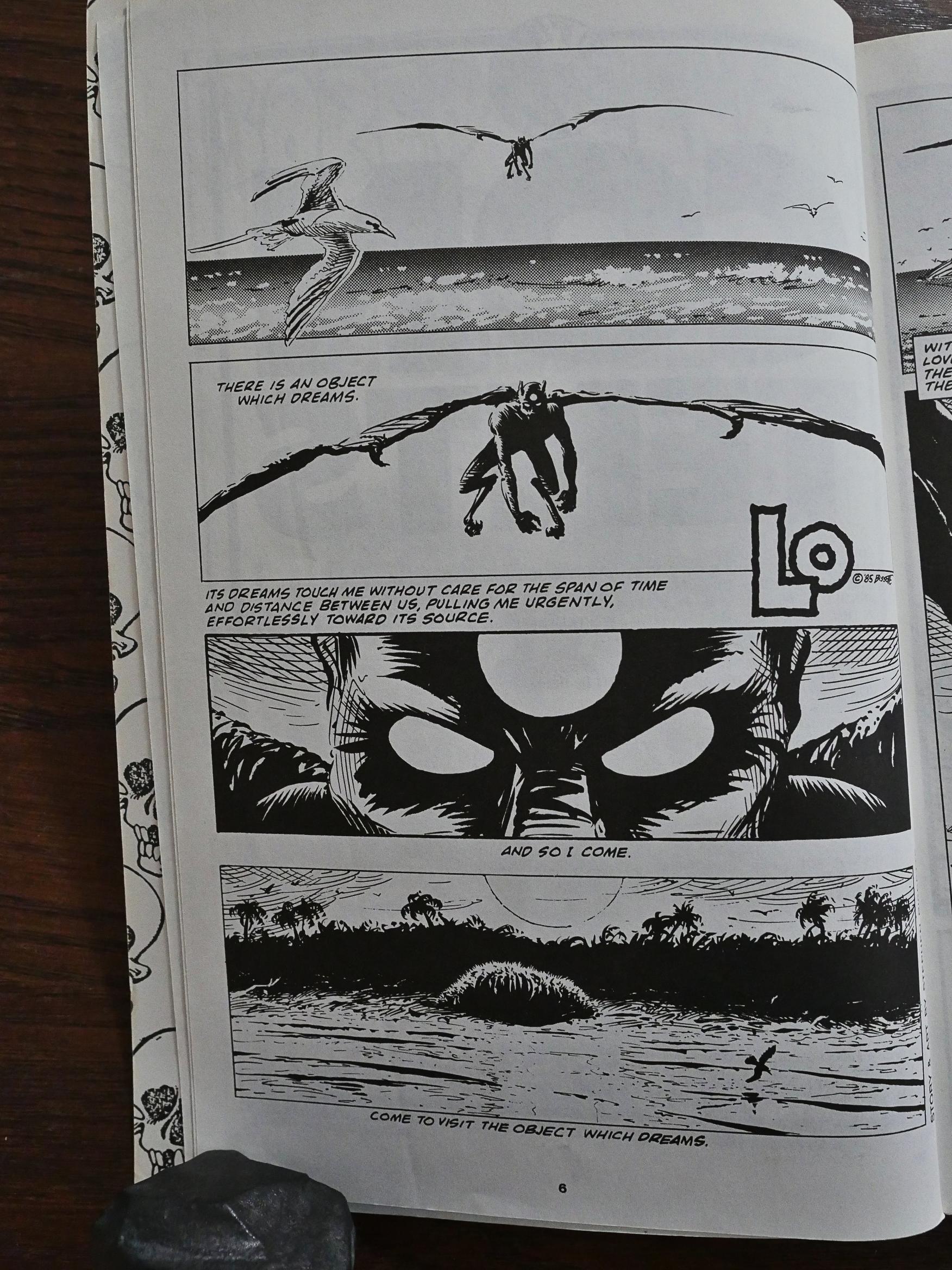
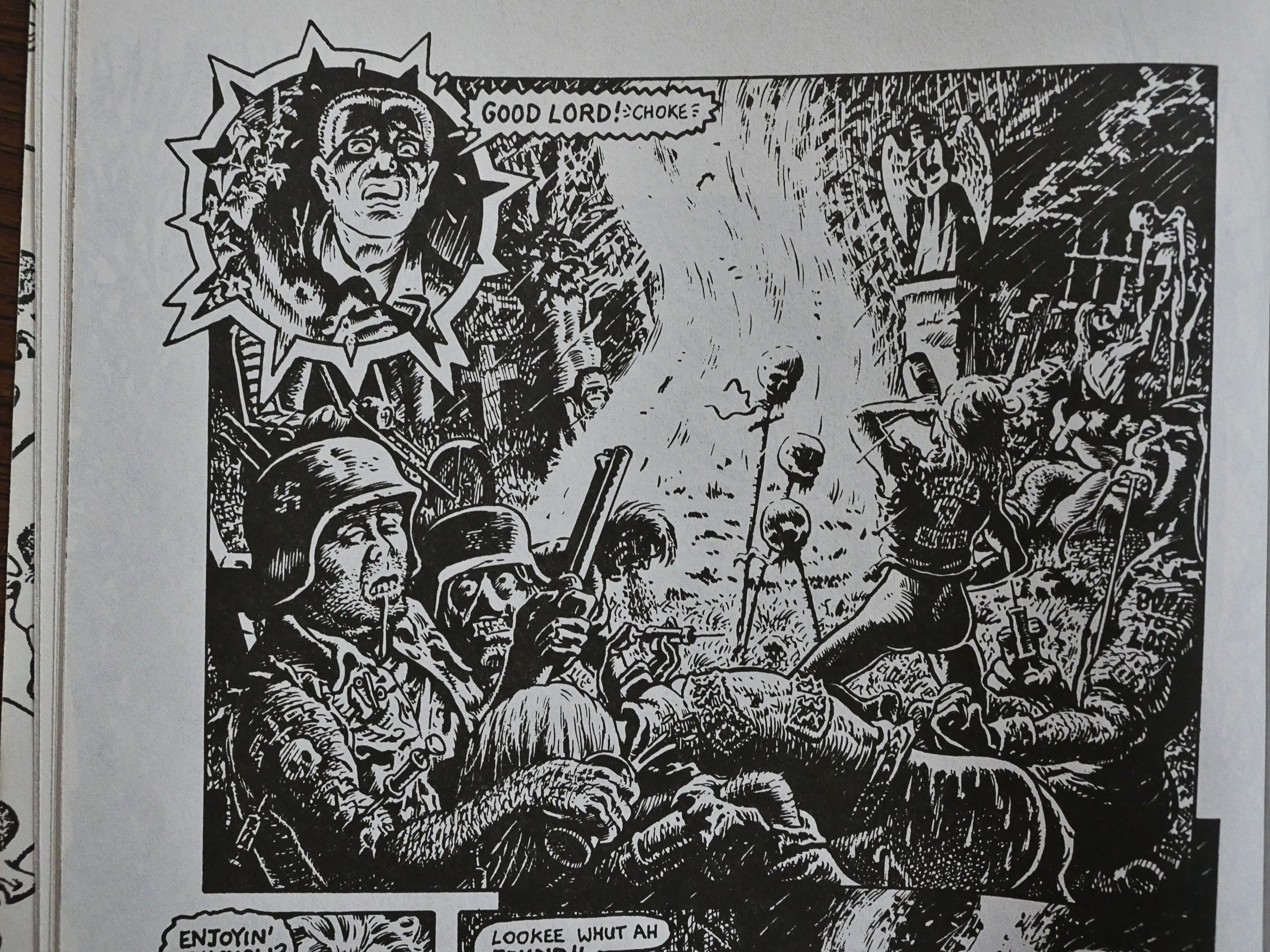
But then you start reading and… Like here, for instance, is a reprint of an old Bissette story (from 1985).

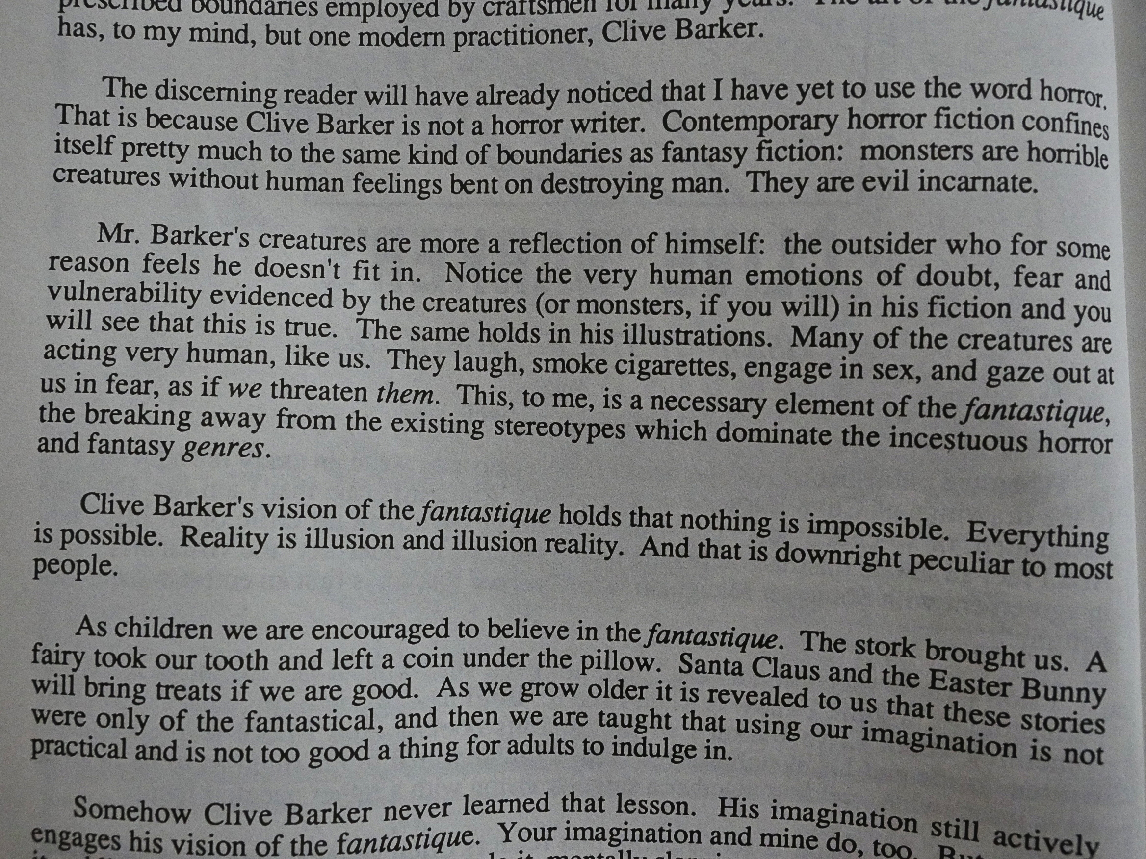
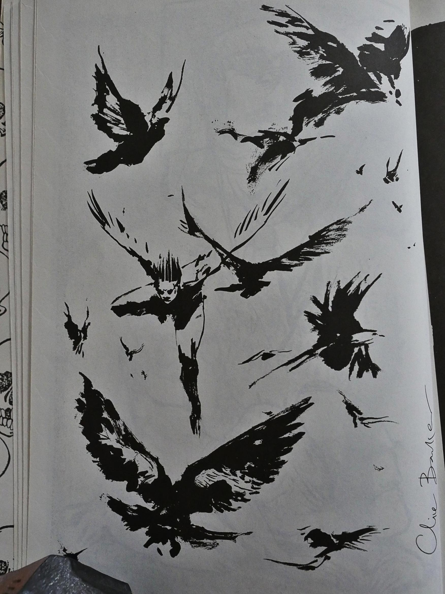
Clive Barker is represented by a selection of pages from his sketchbook. The introduction tells us that Barker isn’t a horror writer, because, er, No True Horror Has Horrible Creatures With Human Feelings.

Classic no true Scotsman argument.

But the sketches are quite lovely.

Bryan Talbot provides a short EC comics parody (from 1981).

Matt Howarth, the only artist who appears in all four issues, is represented with a story that I would guess, based on the art style, is from the late 70s or early 80s. (I couldn’t find any date.)

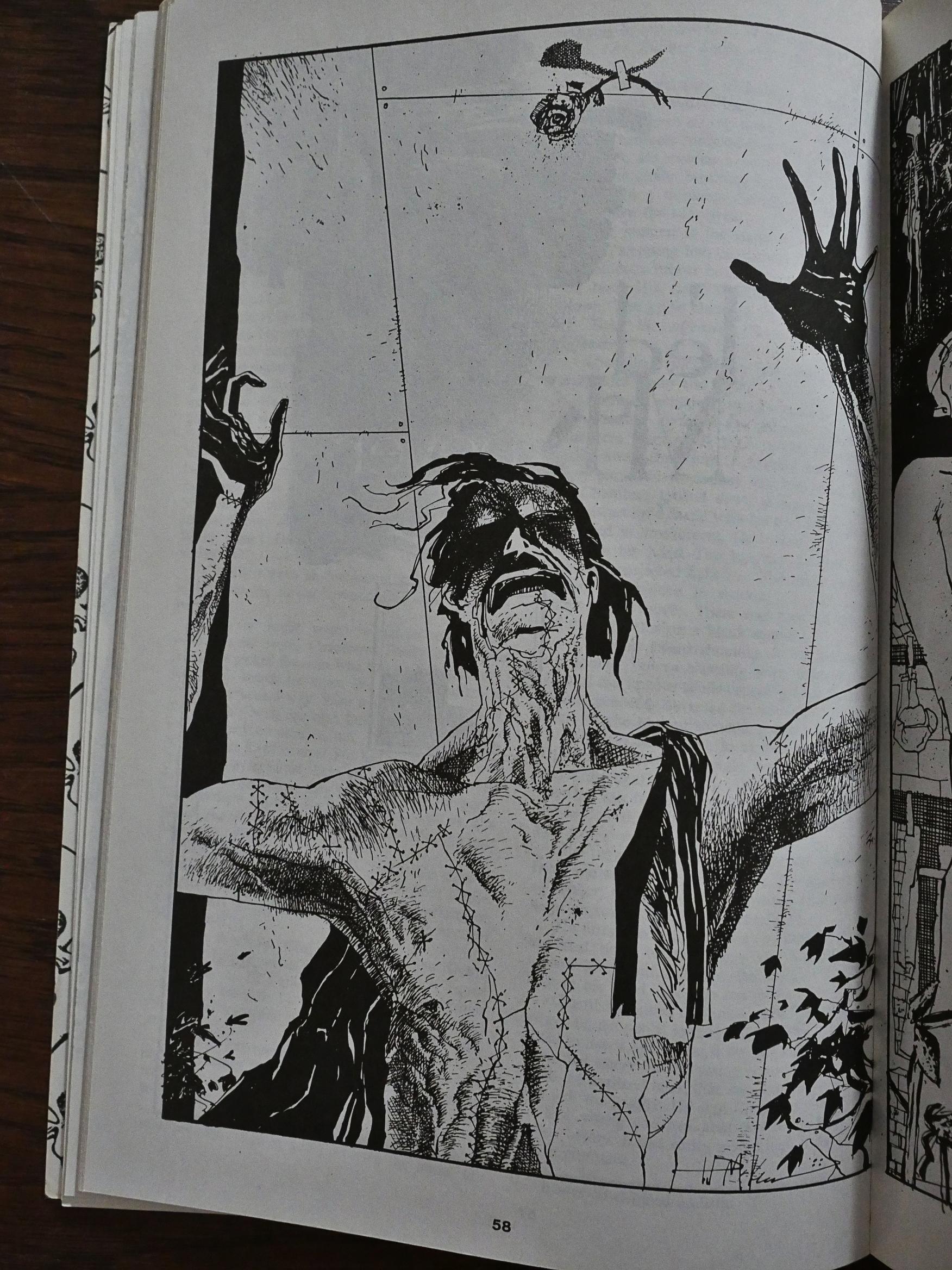
There’s a horror short story by John Shirley that’s quite creepy, but it’s the kind of O’Henry twist ending that you see coming up a few pages before the end.

Ted McKeever supplies a few freestanding drawings that may or may not have been taken from Eddy Current-adjacent work.

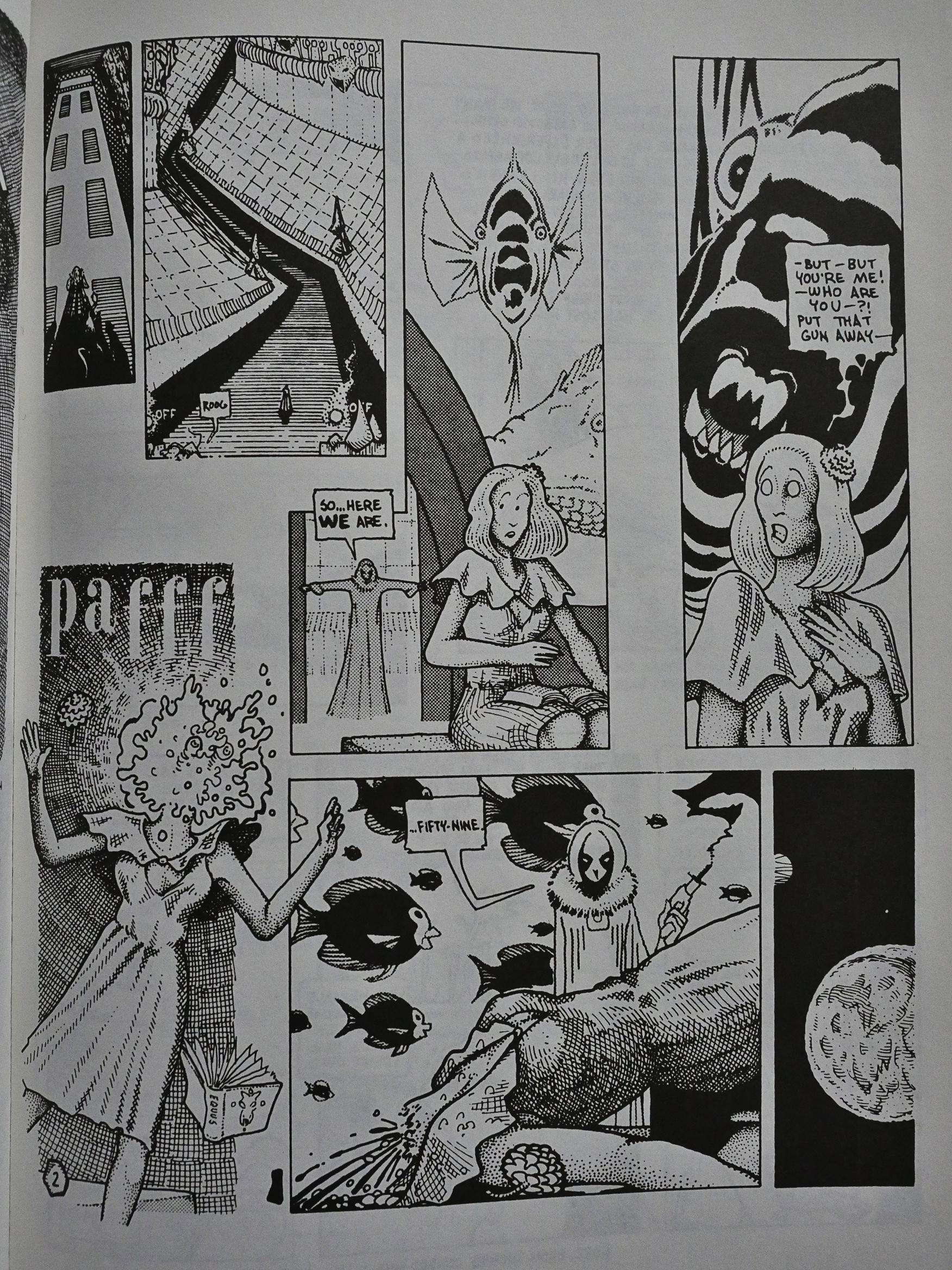
Geez. A Peter Kuper piece from 1980, drawn in a style that I didn’t know that Kuper ever did, so that’s interesting.

But are you starting to see a pattern here? Yes? Yes. There’s a bunch of “name” contributors here, but all their work is stuff that they’ve rooted out from the bottom of their socks drawers. It’s either sketches, portfolio pieces, or it’s old, old work.

The only newer pieces are things like this… thing by Larry Chambers and Edward Griffin. Like many of the contributors here, they seem to be British (or at least the story’s set in London), and it’s a huge 60 pages, which can work in a 220 page anthology. (There are also single page pieces in here.) The only problem is that it’s, er, not very good.

At least this short piece by Kurt Sayenga has good advice.

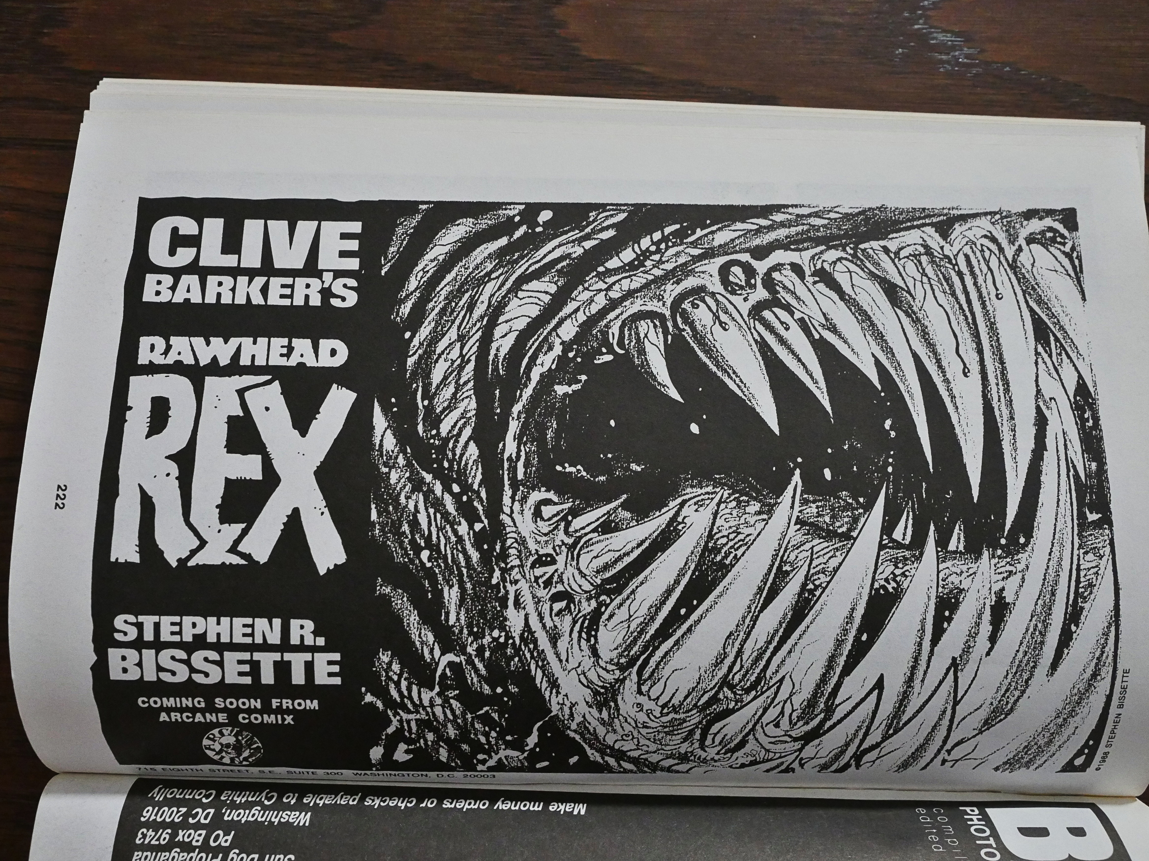
Oh, Bissette even drew a promo drawing for the Rawhead Rex book. “Coming soon.” Tee hee.

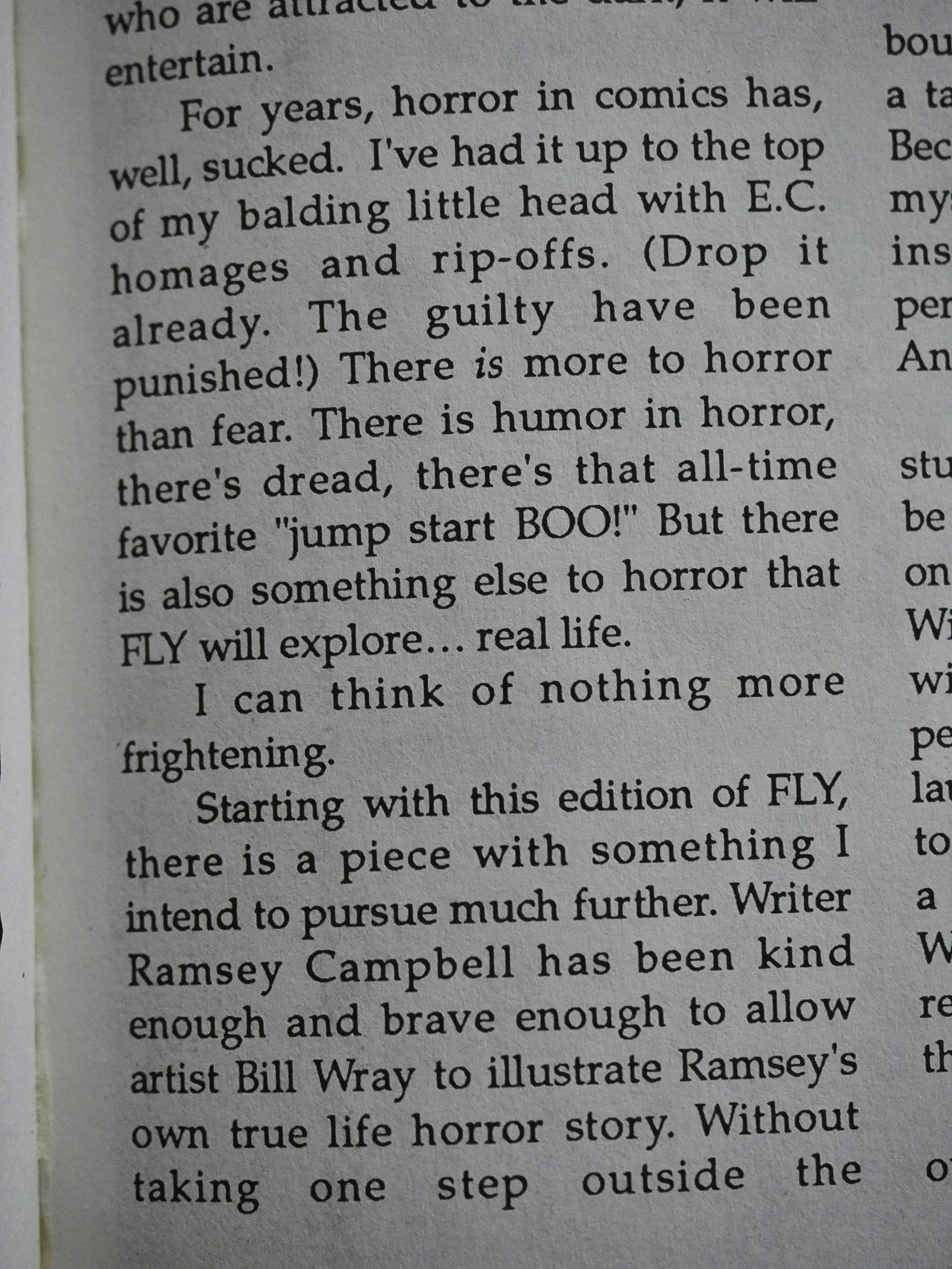
Anyway, the next year, Eclipse took over as co-publishers, and the page count shrank to about half the previous size, and the readability increased a bit. Niles also promises to explore real life more, because that’s where the frights are.

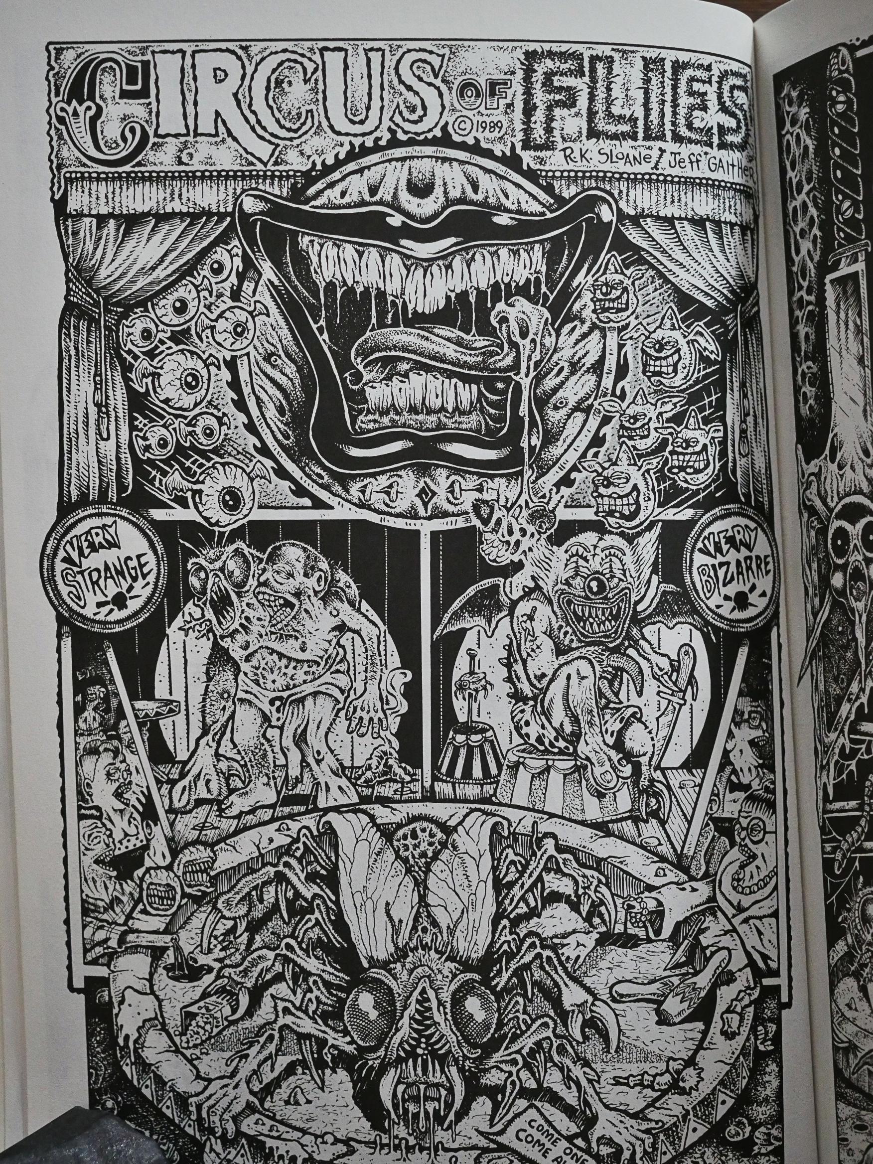
I like these pages by R. K. Sloane and Jeff Gaither. They’ve got a frenetic, moist underground feeling to them.

There’s a newly drawn Matt Howarth piece, based on the art style, so I’m guessing that they’re now paying the contributors more.

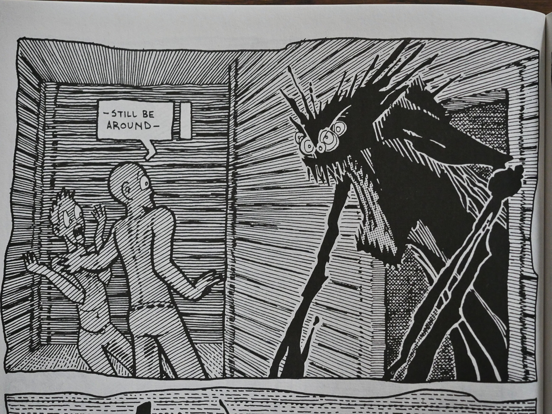
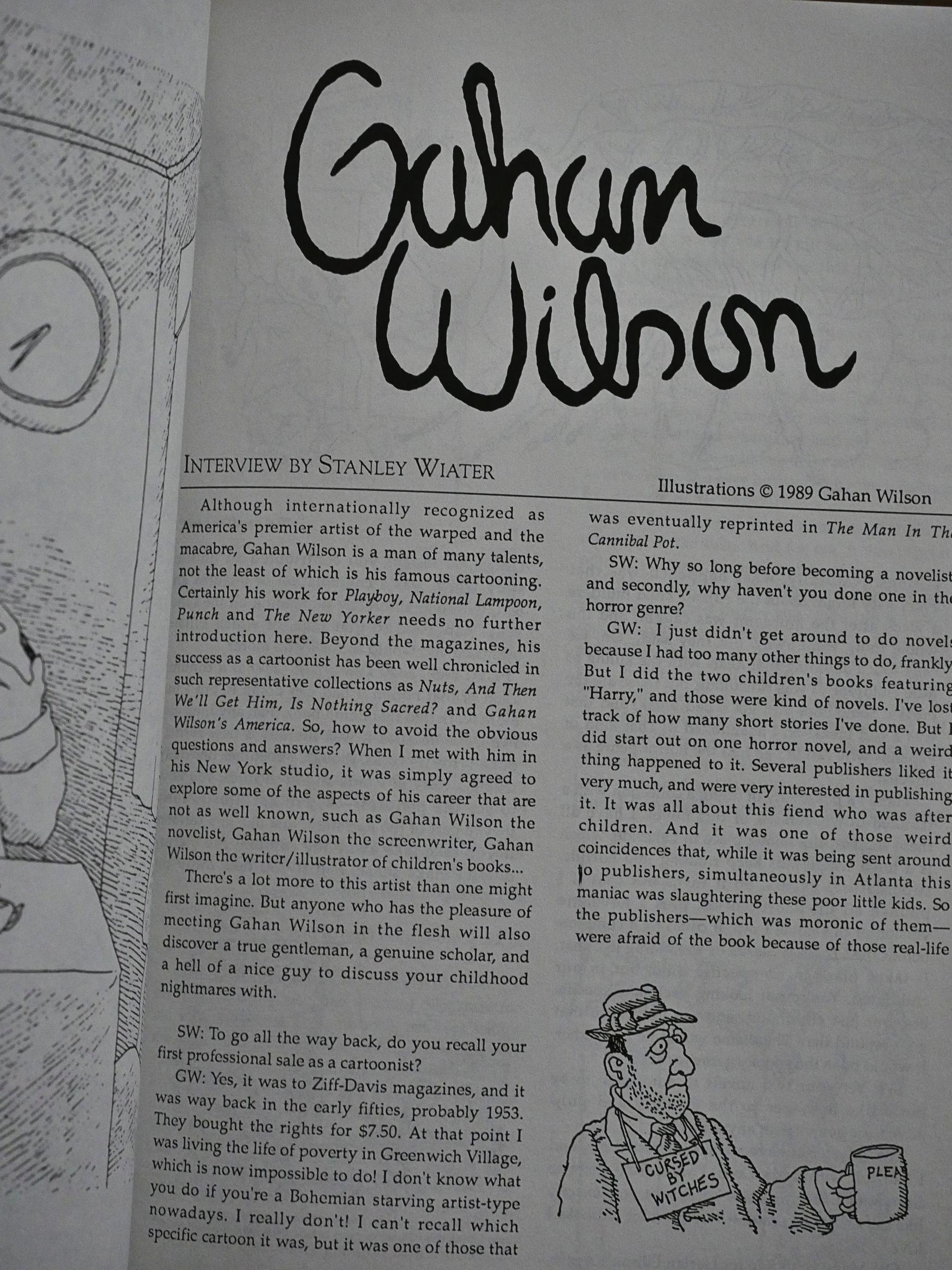
Suddenly a wild Gahan Wilson interview appears!

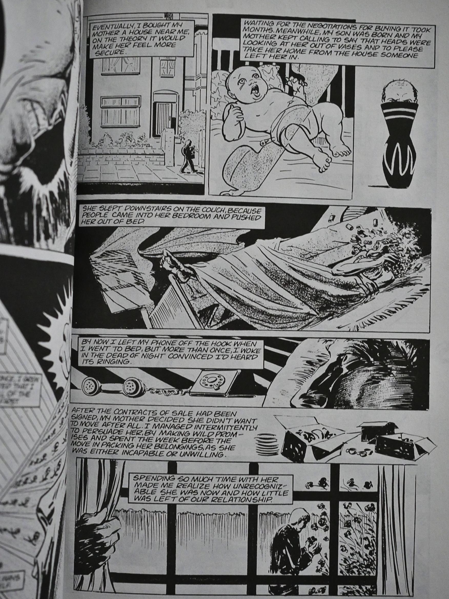
I think this is what Niles was talking about when he was talking about real life horrors. It’s a story written by Ramsey Campbell and adapted by Bill Wray, and while it is, indeed, horrific (it’s about a paranoid and senile mother), Wray’s approach to the artwork here isn’t successful.

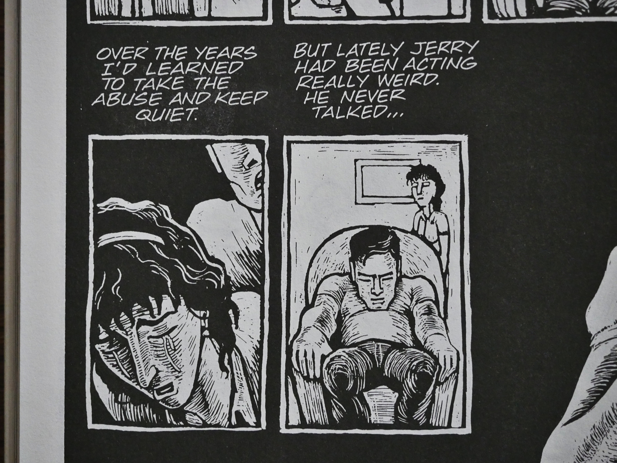
Jeff Dickinson does something that starts off in the domestic horror vein and then the vein explodes and spurts blood all over the place.

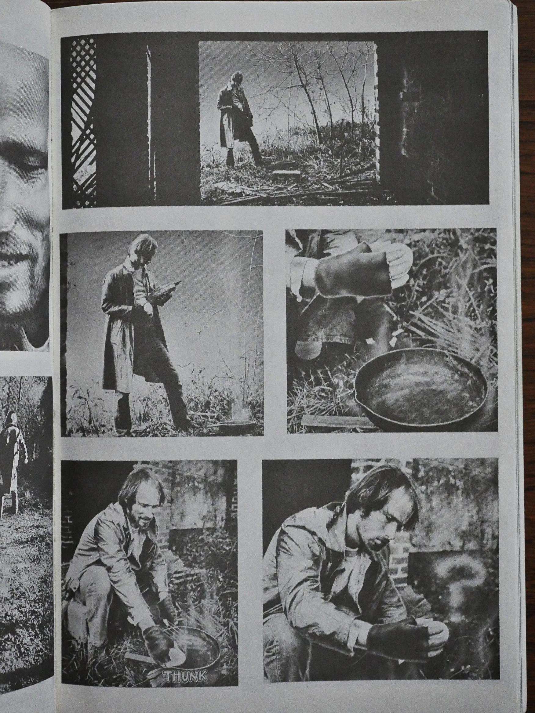
JK Potter and Tim Caldwell do a fumetti-style story. Was Photoshop a thing in 1989? These pictures look manipulated, but in a nice way…

Third issue!

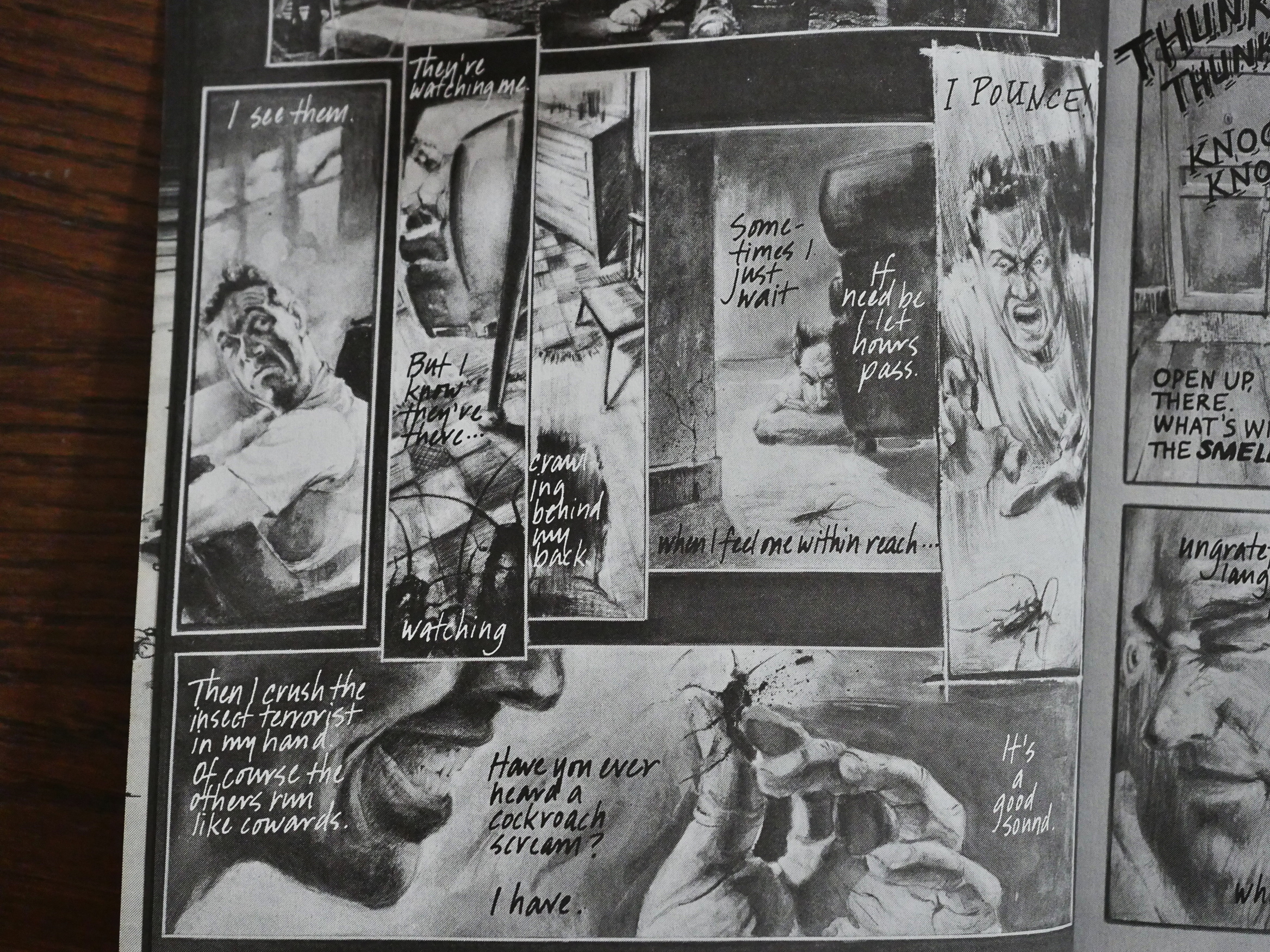
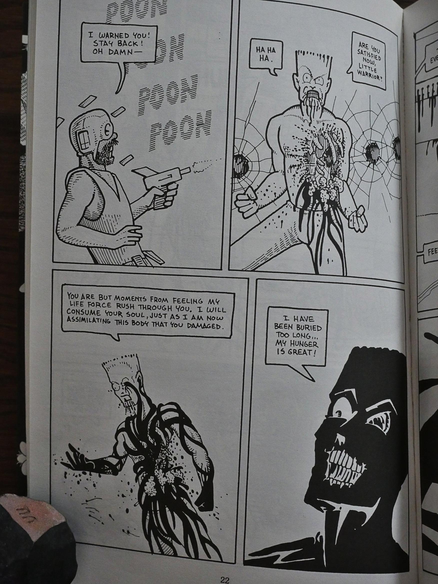
Eek! Cockroaches! But it ends happily: He torches his house and kills them all.

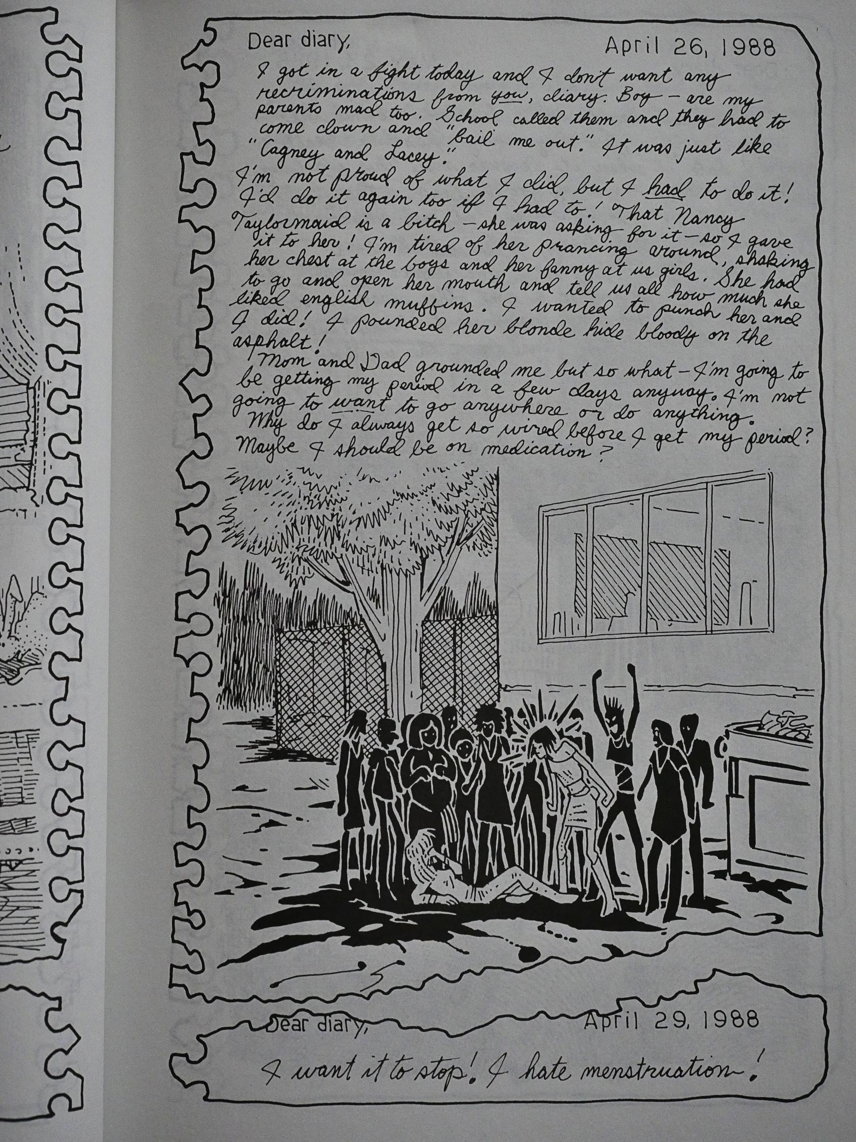
Matt Howarth does a story about menstruation. It’s fun!

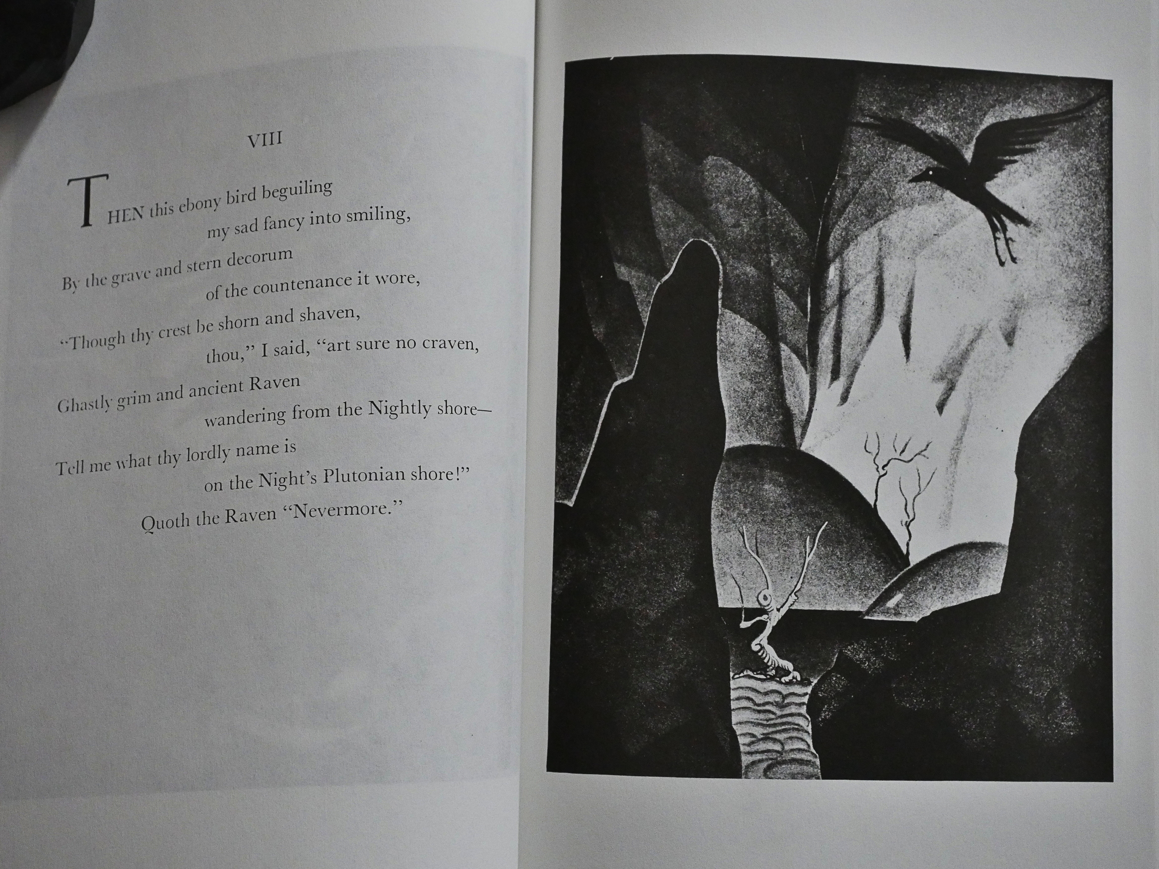
34 pages of Ferdinand H. Horvath illustrating Edgar Allen Poe’s The Raven. It’s nice, but…

This anthology series is an extreme sausage fest. Only one female creator contributes to this series, and it’s Molly Lyre as this short story drawn by D’Israeli, apparently. The credits are a bit hard to make out. But it’s the best thing in the third issue.

The fourth issue is just 48 pages long, and the first 30 pages are a horror/sci-fi thing from, yes, you guessed it, Matt Howarth.

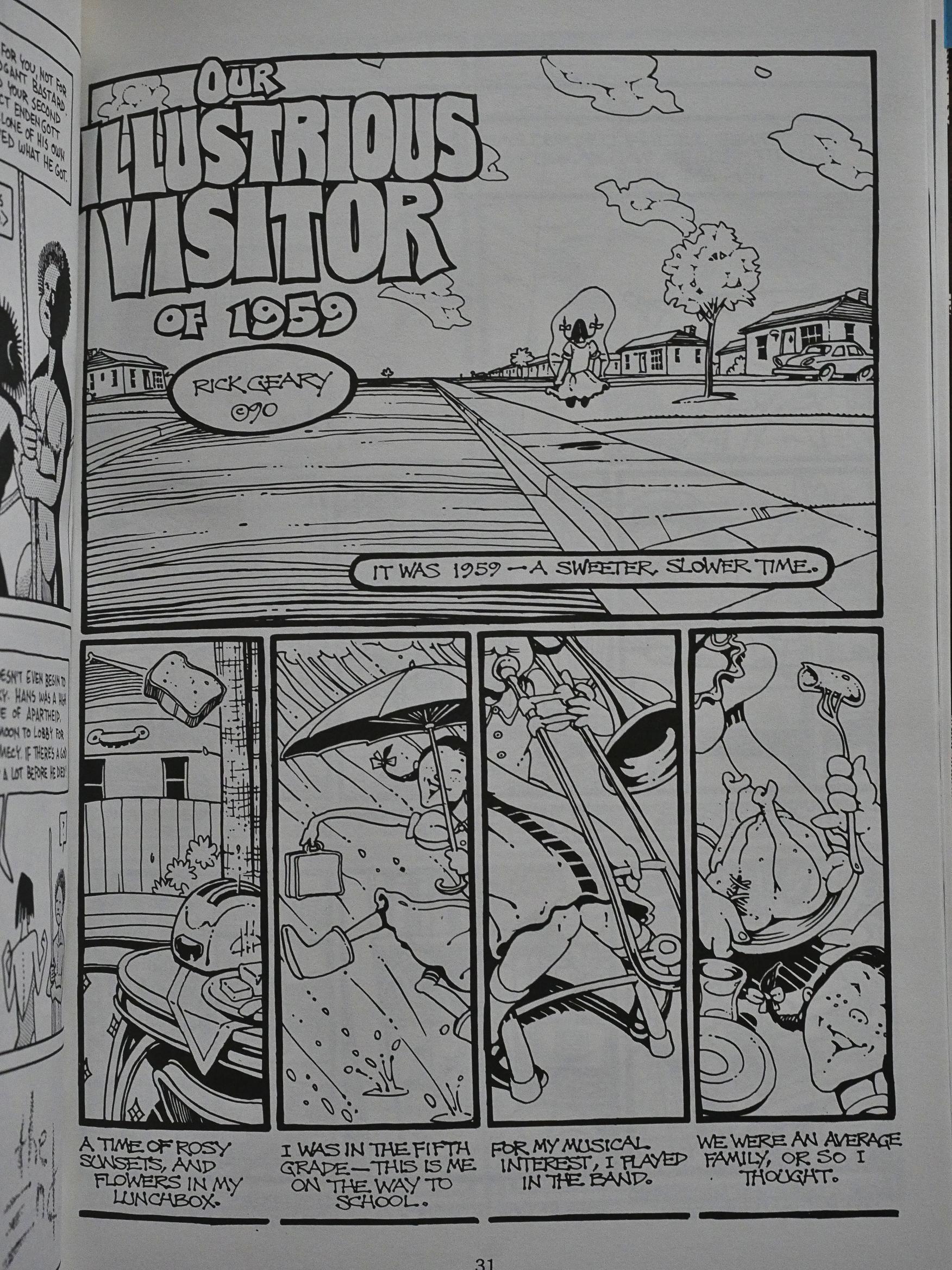
And then there’s a story by everybody’s favourite cartoonist, Rick Geary. I mean, look at that joyful walk in the third panel there. And that toaster! And that toast! I love Rick Geary.

And it’s both a typical and very untypical Geary story, because he manages to be genuinely unnerving in this story. You have no idea where he’s going with it, and then he seems to pull a twist ending… and then he untwists it! It’s great! The best story from the anthology.

But these manipulated pictures by Jeffrey K. Potter that fill out the remaining pages are also nice.

And that’s that.

It’s an odd anthology. Niles originally seemed to go for a vibe similar to Taboo, which was edited by Steven Bissette and John Totleben, but with a more arty sheen. But he didn’t exactly entice his (sometimes) talented contributors to do top-notch work, and there were too many long and not very interesting pieces from newcomers.

Let’s see whether we can find anything in The Comics Journal about the book…

Ooops! Here’s from issue 153, all typos from the Journal or the OCR software:

His story concerns Eclipse’s Fly in My Eye Exposed, which was released in June, 1992.

Dickinson was asked to contribute a story to Fly in My Eye Erposed by the book’s editor, Steve Niles, in late 1989. According to Dickinson, Niles offered him $100 a page for a 46-page story called “The Twisted Men” but said that this amount was negotiable; Niles added that the sum would be paid in installments as the story was delivered. (Niles, who was working as a freelance editor for Eclipse at that time, confirmed that he offered Dickinson S4,600 but could not remember if the sum was to be paid in installments. “I don’t doubt it, though,” he said.)

Dickinson agreed and uorked on the story throughout 1990. After he had delivered 42 pages of the 46page story, Dickinson said, he had still not received any payment from Eclipse. Although the story was completed in January, 1991, he refused to deliver the final installment until he had a contract.

Eclipse President Jan Mullaney called Dickinson at this time and offered him $2,800 for the story. After some negotiating, the two agreed on S3,000; Dickinson was to deliver the rest of the story upon signing the contract. Dickinson said he waited five months without seeing the contract.

“They never sent me a contract and yet they kept wondering where the final installment was,” he said. ‘After several irate phone calls to Eclipse,” he said, he finally received a contract on June 3, 1991. Although S31)00 had been agreed to over the phone, the contract listed S2,700 as his payment for the story.

Furthermore, said Dickinson, the contract contained a clause which demanded delivery of the art on June 7 or else Eclipse would deduct another 15% of the payment. “They had given me 3 days to sign and deliver the art at the lower salary or else.” said Dickinson. “And this after I had waited five months to receive the contract!”

[…]

Dickinson said that for about eight months after he turned in his uork, he didn’t hear any18 thing from Eclipse. He called Steve Niles several times and was reassured every time that his story would be published and that he would be paid for it. Finally, in March of 1992, Dickinson spoke to Eclipse Publisher Dean Mullaney, who also assured him that the book would be published in June and that he would be paid at that time.

In May, however, Dickinson received a call from Niles, who told him that only half the book would be printed, that his story would be cut from the book, and that he would not be paid.

Dickinson demanded a written explanation from Eclipse. Jan Mullaney sent him the following letter, dated 14 May, 1992: “Please consider this an official notification that your story will not be in the publication FLY IN MY EYE EXPOSED.

I apologize for the confusion and delays, but the market has changed considerably over the past year. Steve Niles and other creators took much longer than expected to turn in the book and as a result we could no longer afford to publish the book in the form we originally planned. This was not an easy choice and was made very reluctantly. I apologize again for the delays.”

[…]

Up until recently, said Whiting, Eclipse had always paid him regularly. Niles agreed that Eclipse once treated its artists better. “They just got really irresponsible,” he said.

I’ve been unable to find any reviews of the books, but I found this quote from Niles:

I had my own company called Arcane Comics and I did a couple of things. I did a book called. “Fly In My Eye.” People liked it, but it was a disaster business wise. It was 225 pages and I only charged $9.95 for it. I paid everyone page rates. It was a huge disaster for the business. Then we did Clive Barker lithographs and that was the point where I realized I didn’t want to be a businessman. I wanted to create stuff. So, I started packaging stuff for Eclipse.

1989: Brought to Light

Brought to Light (1989) #1 by Joyce Brabner and Thomas Yeates, Alan Moore and Bill Sienkiewicz, Paul Mavrides et al.
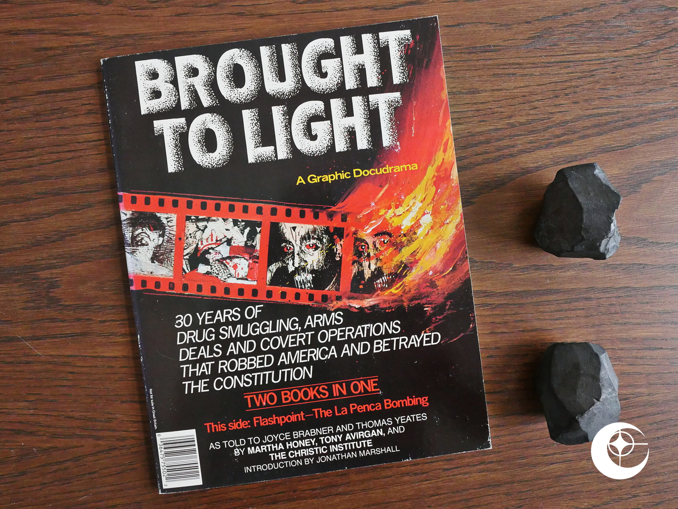
This is part of Eclipse’s “current affair” series of political journalism comics started with Real War Stories. Editor-in-chief cat ⊕ yronwode wrote in an Airboy letters column (and I’m paraphrasing) that it seemed less important to do yet another action/adventure comic about child pornography and drug running when they had an opportunity to do relevant comics that even got taken seriously by real, non-comics journalists, and later wrote this editorial in the December 1988 comics about the experience.

OK, that may sound like I think yronwode was more cynical than she probably was: I think doing these political comics was a heartfelt project. They probably didn’t bring in huge amounts of cash, I have to believe.

This is probably the most famous of these comics, and mostly because half of it’s by Alan Moore and Bill Sienkiewicz, two of the biggest names in comics at the time.
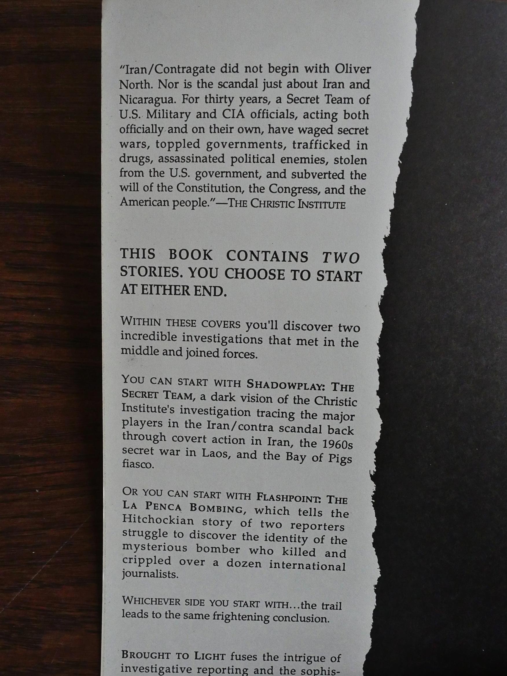
As the introduction explains, this album sized graphic novel has two covers; you just flip the book over to start at the other end. Both are 30 pages long, but they’re very different. The introduction suggests that you can start at either end, so I started at the Brabner/Yeates side.
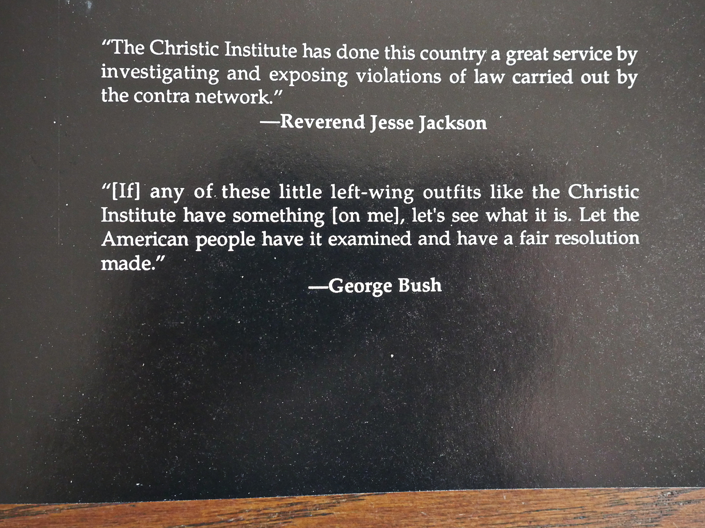
That’s a nice challenge from George Bush.
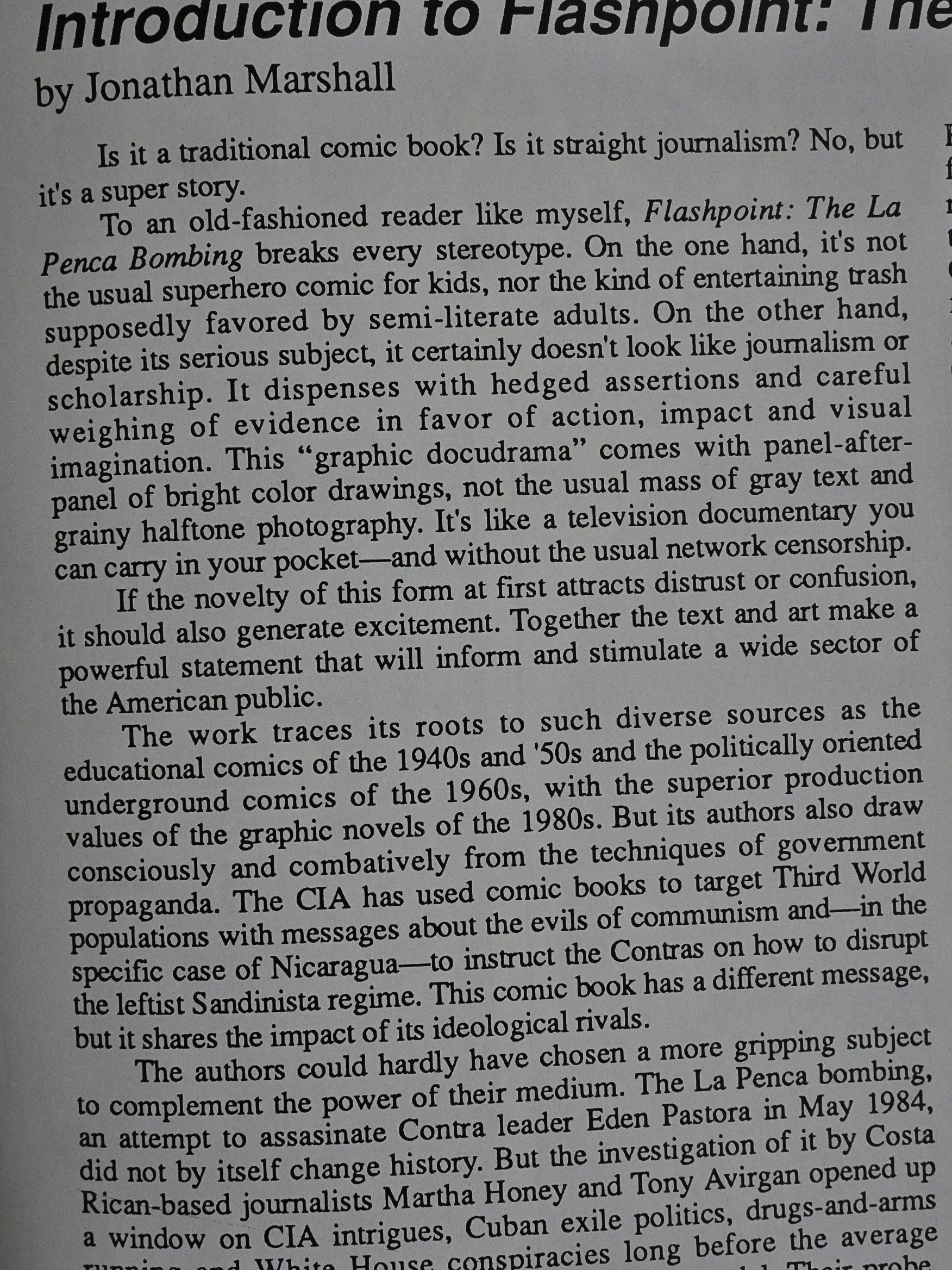
The introduction by Jonathan Marshall goes to great lengths to explain what a novelty it is that a comic book exists that’s not for kids or trash for semi-literate adults. Nice to know.
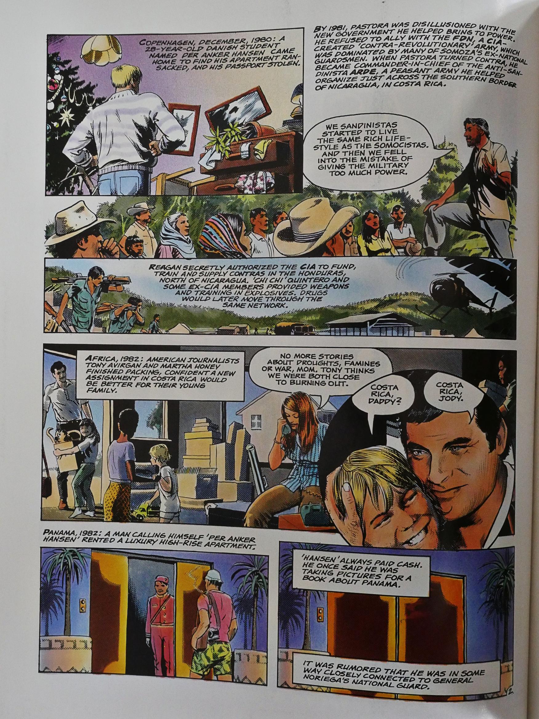
And it’s pretty clear who the Brabner/Joyce piece is for. If you’ve ever seen a two hour American TV documentary, you’ll be able to follow along perfectly, because it’s told without any comic book storytelling techniques, really. You have a narrator (probably a very deep, serious, male one) doing the voice-over, explaining everything to you, and then you have rapid, rapid edits that gives you a sentence or two of sound bites from people, and it’s a mixture of re-enactments and people telling us the story.
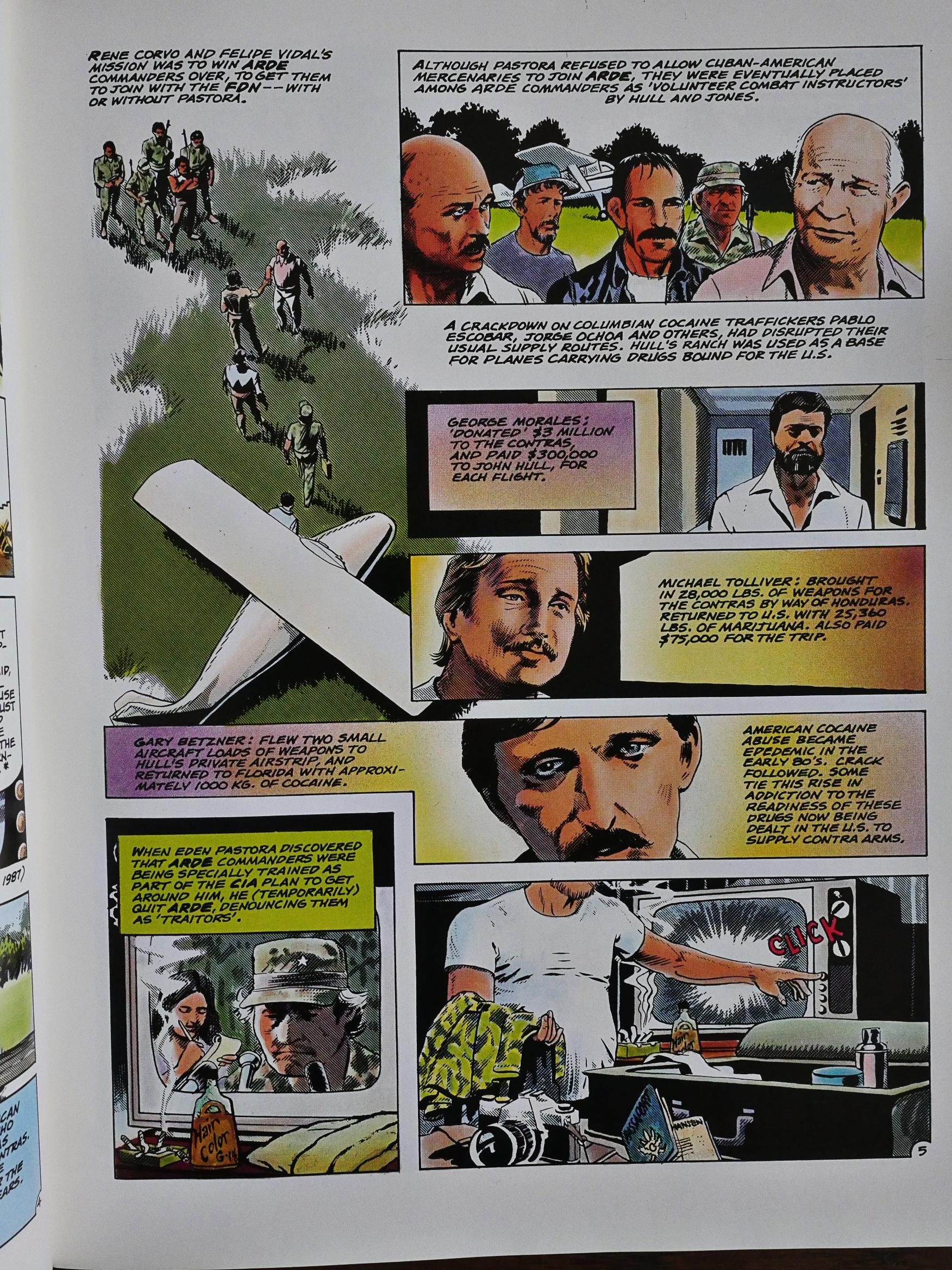
And it’s a story of the CIA planning to kill an independent Contra leader and blaming the Sandinistas for the murder. Instead it goes slightly wrong, as these CIA operations usually do, and they kill five journalists instead. We also get a lot of information about other (mostly botched) operations they attempted, like killing a US ambassador.

Mostly these pages don’t need to be a comic book at all: They’d work just as well with just the “narrators” text as a newspaper article.
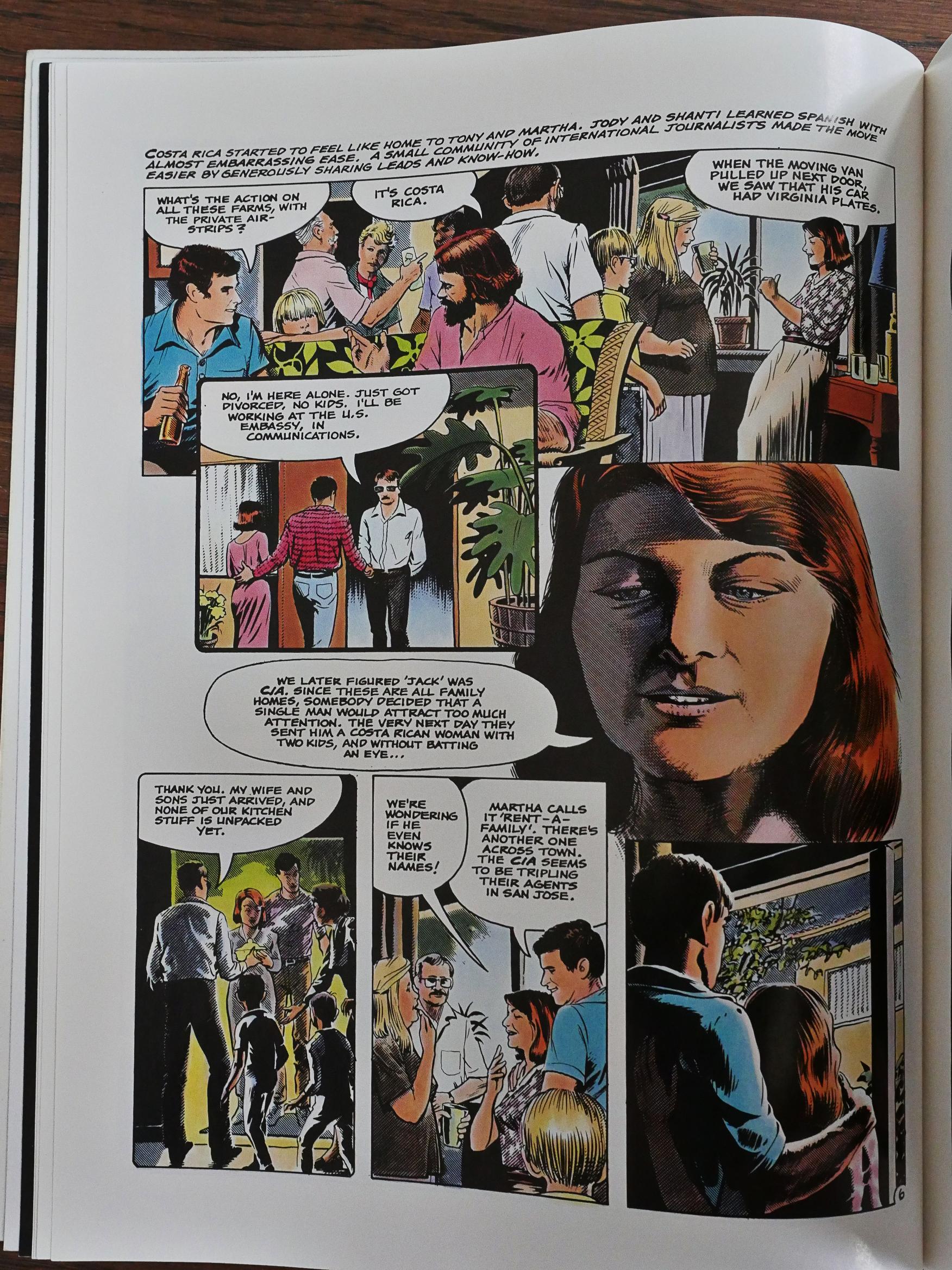
Sometimes, though, they find room to show us the people and have them interact a bit, and it really helps a lot. And it helps in understanding how inept these CIA operations mostly are.
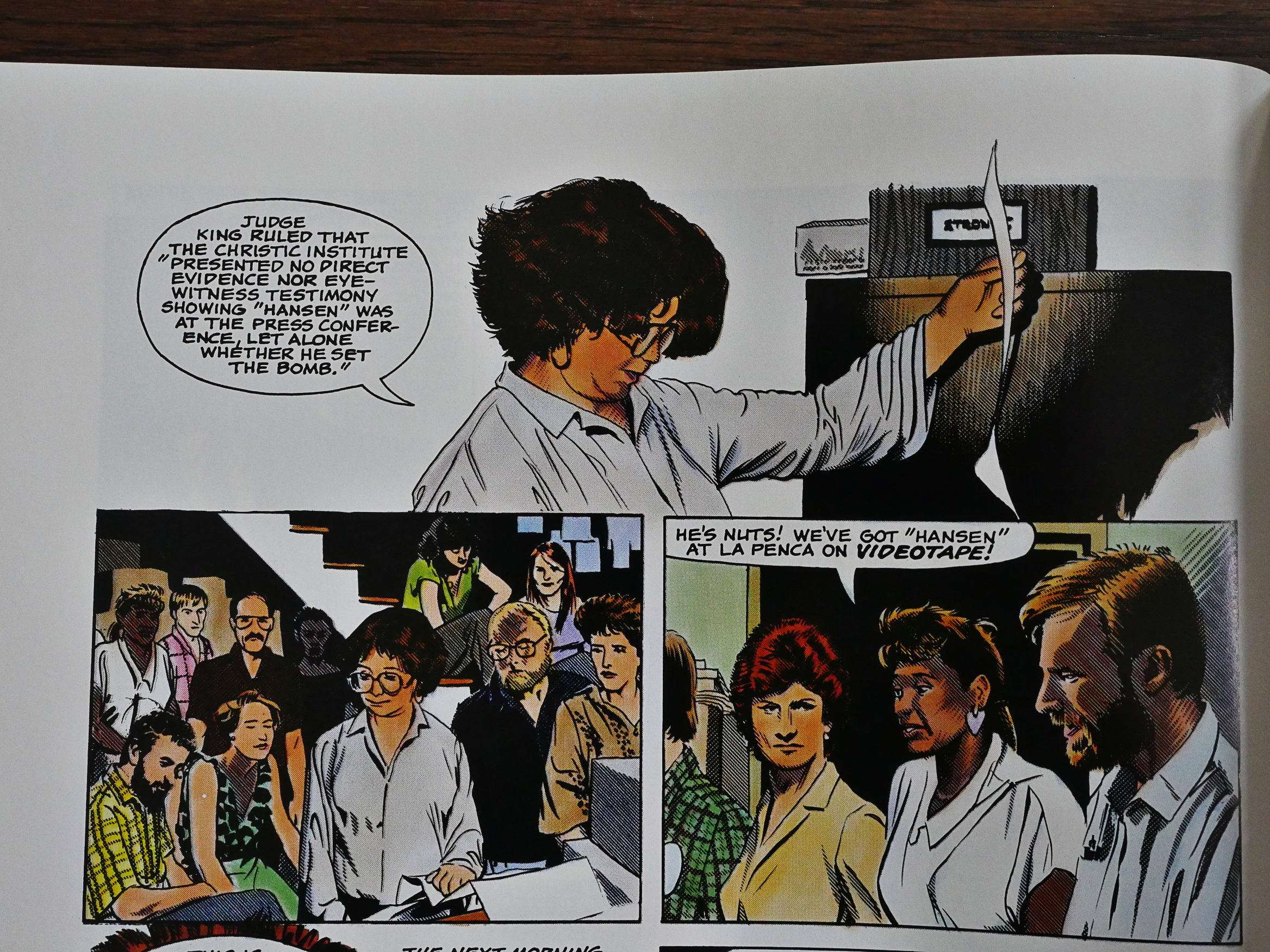
But, on the other hand, since nothing ever happens when they’re found out (even if they have the killers on video), why should they care?

Now, Brabner has most of her information about these proceedings from the Christic Insitute (of Silkwood fame), which I understand has had their reputation somewhat tarnished in later years, so I have no idea how much of this stuff is accurate, but if we’ve learned anything over the last decades, it’s that all the lefty conspiracy theories about the CIA from the 80s have been proved to be true, so…
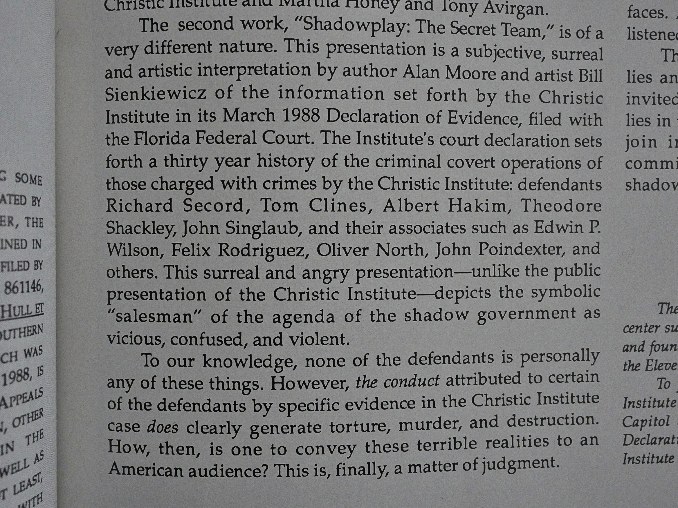
The Moore/Sienkiewicz part of this book is, as the introduction tells us, completely different. It says that it’s a “subjective, surreal and artistic interpretation”, and… I don’t think the middle bit is accurate.
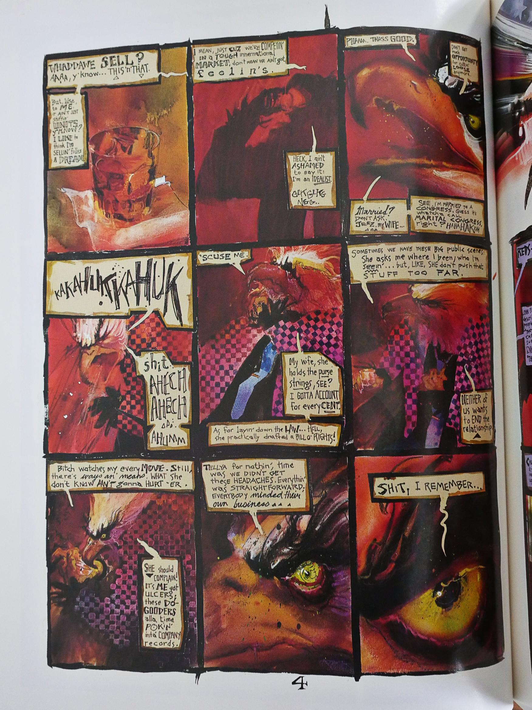
It’s not surreal; it’s just comics. This piece is told from the point of view of the CIA, represented here as a chain-smoking, hard-drinking eagle, which I think makes a lot of sense.
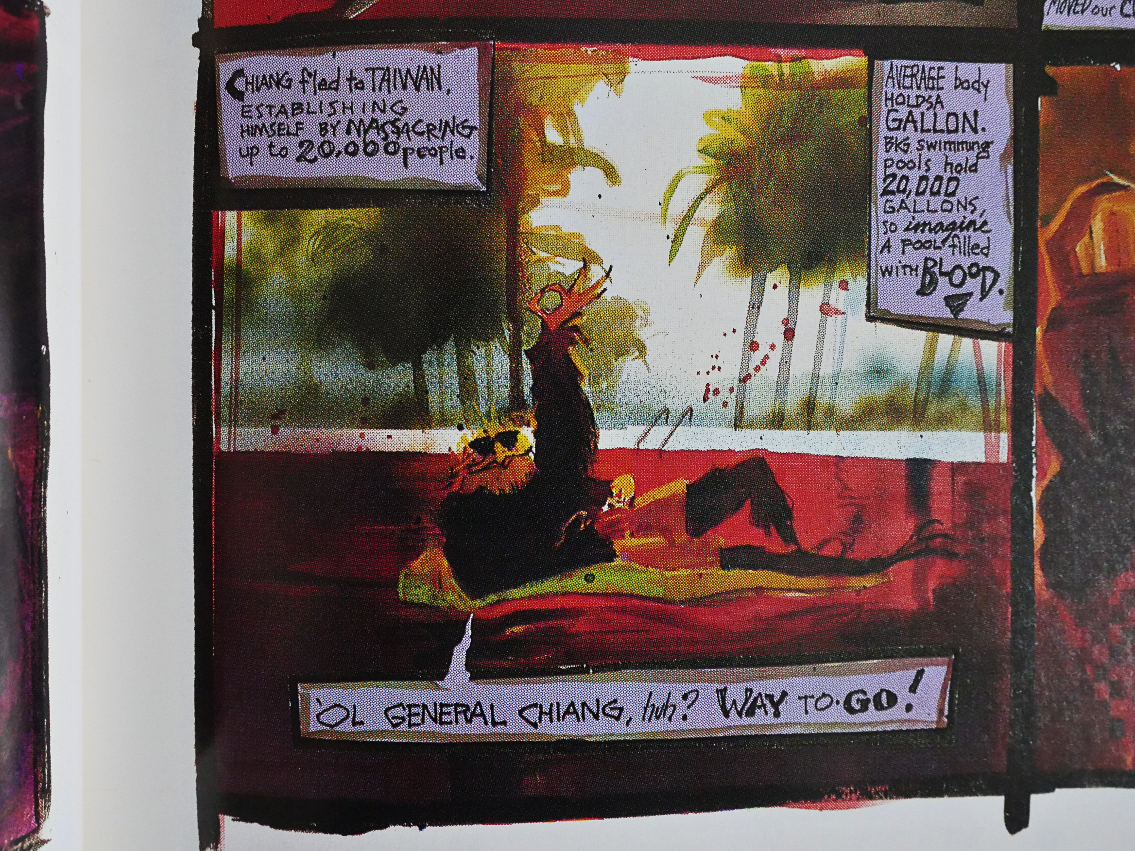
The main storytelling metaphor Moore uses is to represent 20K dead people with a swimming pool filled with blood.
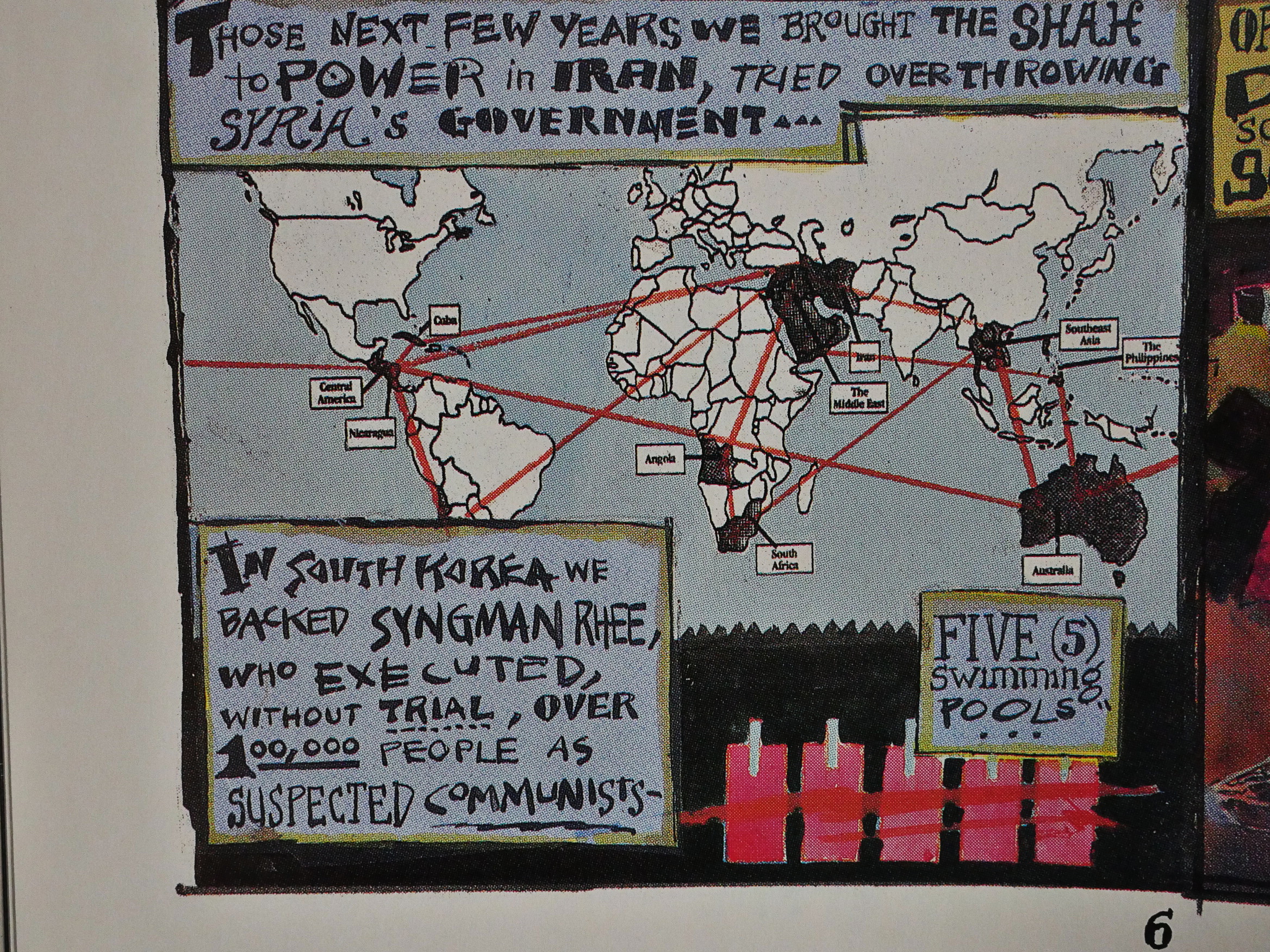
So Syngman Rhee killing 100K people is five (5) swimming pools.

While Brabner told the story of the CIA killing the rebel Contra guy at La Penca, Moore basically tells the story of all major CIA “secret” operations from WWII and to the present date, so there’s a lot of information to get through.
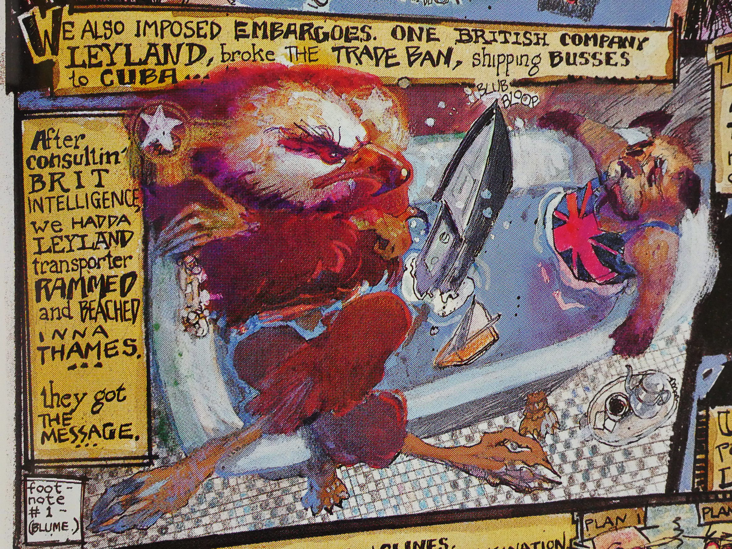
Most of what Moore describes was controversial at the time (*gasp* “CIA involved with toppling Allende in Chile? What slander!”) has now transmogrified into things that are self-evident and trivial (*yawn* “Of course the CIA had to intervene. It’s just common sense.”) without ever stopping by the “Oops; sorry for lying all these years” stage.

But this one had me googling, and… it seems like the jury is still out on this one. Did the CIA arrange to scuttle a ship transporting Leyland buses to Cuba? Perhaps not.
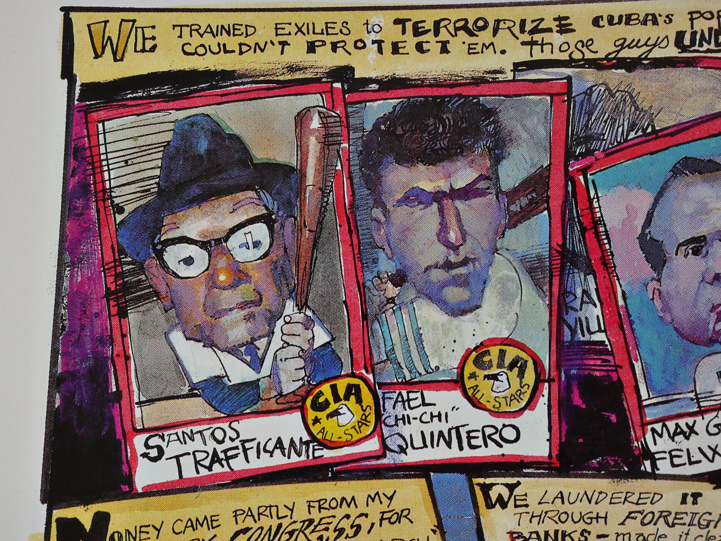
Heh. We’ll later in this blog series cover Eclipse’s non-sports “trading cards”, many of which also cover current events. I think first up are cards on the Iran-Contra scandal, and Sienkiewicz drew (some?) of those. So this is cross-over advertising!
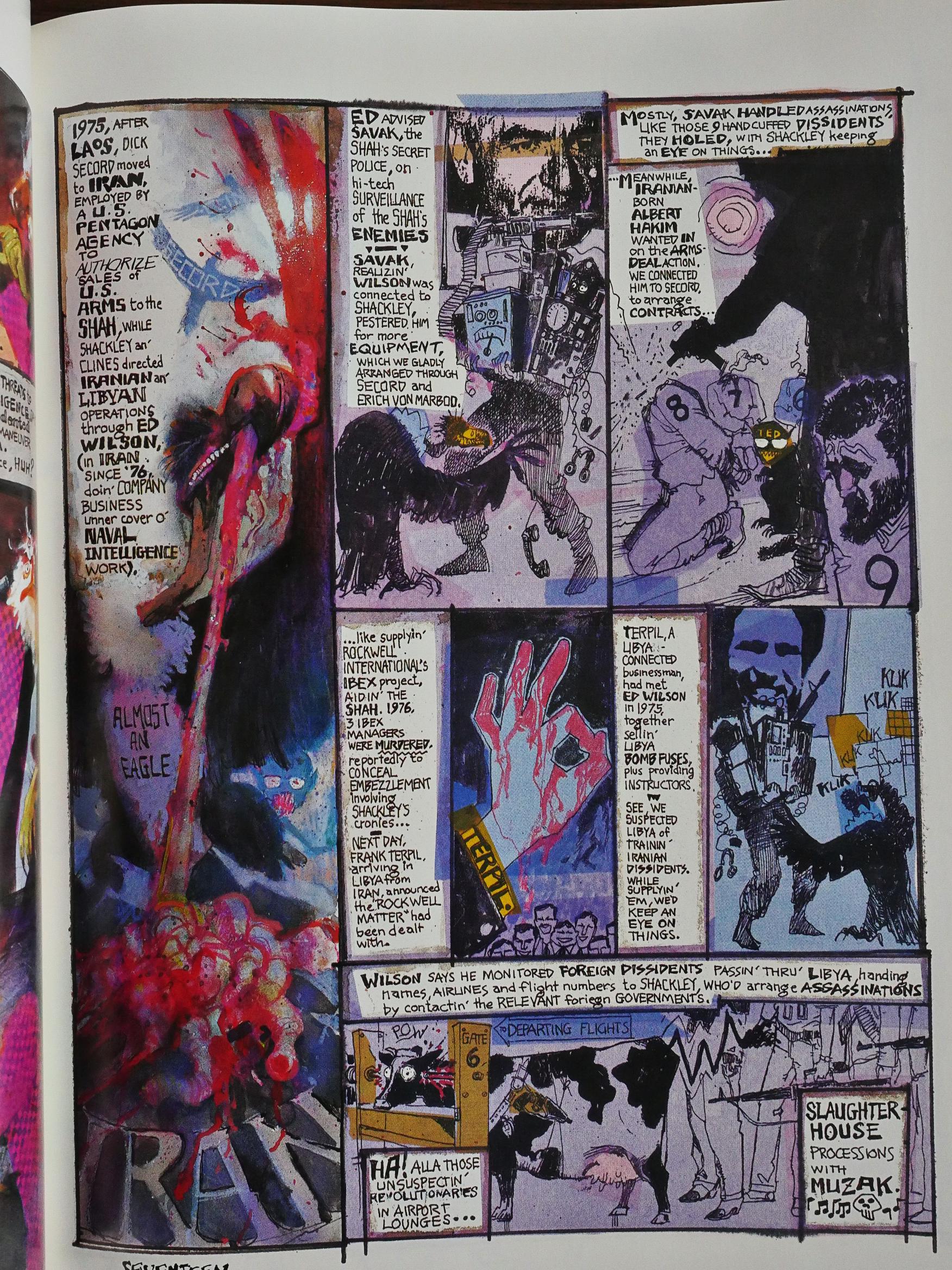
Sienkiewicz artwork (and lettering) for this piece is wonderful. It’s as deranged and blood-soaked as the CIA operations were. I think he does some of the best work of his career here, and he’s done a lot of really good stuff. I mean, look at that cow.

It’s not Moore’s best work, though. He tries to fit so much stuff into these short 30 pages that my eyes had started glazing over by the time I got to this page.
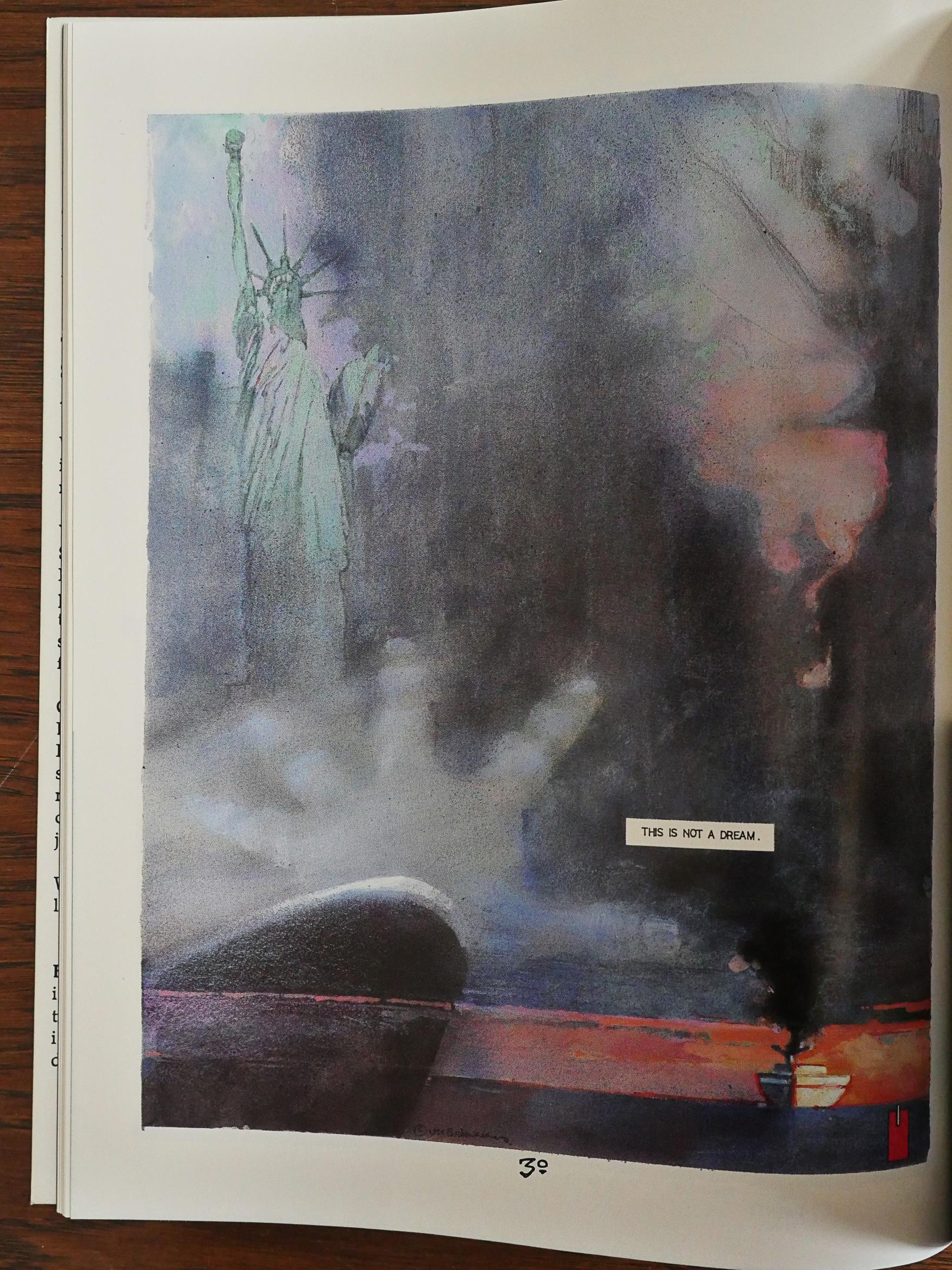
There’s a framing sequence of sorts, though: Just a couple of pages before and after the main action, not told in the CIA guy’s hectoring voice, but instead in Moore’s more portentous one, and the ending gave me chills.
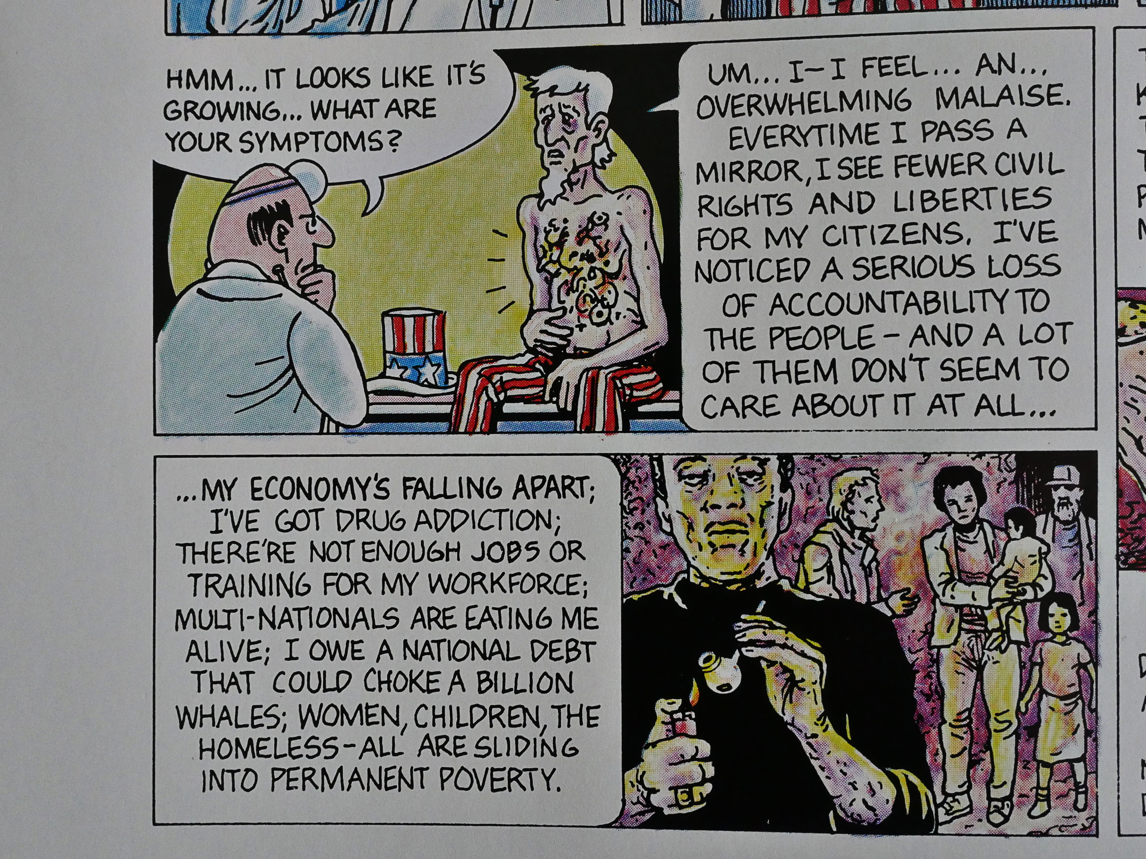
Between these two 30 page pieces, we have a two page strip by Paul Mavrides that uses the metaphor of an diseased Uncle Sam, and a doctor who tells him what he has to do to get better.

What was the reaction to the book? The Comics Journal 121 announces it:

This summer Eclipse Comics and Warner Books will simultaneously publish Brought to light, a comic designed to publicize the lawsuit brought against members of the CIA by the Christic Institute. The 64-page book will include two comic stories, one written by Alan Moore and drawn by Bill Sienkiewicz and the other written by Joyce Brabner and drawn by Rick Veitch. Eclipse will be producing a comic version of the project while the Warner’s version will be in book form.

The Comics Journal 124:

Although a federal district court in Miami recently threw out a lawsuit brought against several high-ranking memtxrs of the Reagan administration by the Christic Institute, Brought to Light, the comic book which tells the story of that suit, will be released as planned this fall, acording to the comic’s editor, Joyce Brabner.

[…]

“I have to keep rewriting the damn thing” as the case develops, Brabner said. Christies suit, brought under the Racketeer Influenced and Corrupt Organizations Act (RICO), charges that 29 individuals have engaged in a criminal conspiracy in South America that includes assassination, drug trafficking, and gun running. Individuals named include General Richard Secord, General John Siglaub, and financier Albert Hakim. Federal Judge James Lawrence King dismissed the case, maintaining that Christic had failed to establish its central premise, that a wide-ranging conspiracy, involving the persons named in the suit, was responsible for an assassination attempt against Contra leader Eden Pastora, during which eight people were killed by a bomb.

[…]

The lawsuit has also come under attack in the liberal press, with critical articles appearing in Mother Jones and The Nation. Brabner acknowledged that the writers made some valid points, but said Brought to Light was still important because “The purpose of this book is not to tell people how things are, the purpose is to raise questions.”

Oh. “To raise questions”, the first defence of any troll… That’s not encouraging.

The Comics Journal 125:

Warner Books has terminated its agreement to co-publish the controversial Brought to Light book with Eclipse Comics. Citing fears of vulnerability to libel litigation, Warner tendered Eclipse a cash settlement to remove itself from the project, Eclipse Publisher Dean Mullaney said. The move pushes publication of the Iran-Contra expose past the November elections and leaves Eclipse searching for a bookstore distributor. “The net effect is that the book will be released right around Thanksgiving rather than November 1.” Mullaney said. “But it is in production, the paper’s been ordered, and we’re currently set to go to press November 1.” Under the agreement, Warner was to distribute the 64-page book to bookstores while Eclipse offered it to the direct sales comics market.

Warner representatives refused several requests for comment.

[…]

“As to the background on why they pulled out,” Mullaney said, “one person at Warners — a lower-echelon person — said to me, ‘What would we do if George Bush wins?’ An executive at Warners told my brother (Eclipse partner Jan Mullaney) that it would be ‘unwise’ to go ahead with the book ‘given the current political climate.’ He didn’t say whether he meant at Warners or in the country — presumably both. Mullaney said he is “not exactly sure who put the kabosh” on Warner’s involvement, but that both companies had solicited advice from several libel specialists, as well as Warner and Christic Institute attorneys, at every stage of development.

[…]

Warner’s stated reason for its withdrawal , according to Mullaney and Brought to Light Editor Joyce Brabner, is that the July dismissal in Miami of Christic Institute’s lawsuit — a major source for the information related in the book — “changed the situation in regards to possible libel liability. ”

[…]

Lucas, who was promoted from Vice President of Marketing to Assistant Publisher after bringing The Dark Knight to bookstores, refused several requests for comment.

[…]

Shadowplay, by Alan Moore and Bill Sienkiewicz, details the 25-year history — as outlined in the Christie lawsuit filed in Miami on May 29, 1986 — of an American “secret team” Of military and intelligence that pursued political destabilization around the world in the name Of American “national security interests.” Of Warner’s libel objections, Alan Moore said: “I don’t know what your libel is, really. I’ve been given the facts and have tried to present them coherently. With a work of this complexity and density, there were some areas I misunderstood and we cleared those things up and I revised me script — and of course more information has come out and I’ve changed me script appropriately. ‘ ‘The script is based on material given me (by Eclipse and Brabnerl from the press and the Christic affidavit,” Moore said. “If those sources are true and accurate, then my script is true and accurate. ”

[…]

Yronwode speculated that Warner officials sought to disassociate themselves from the project because Of documented ties to organized crime, which has also been implicated in the Iran-Contra affair.

OK, it’s because Warner’s has a mob connection. There’s a whole sidebar on the connection.

This is a more fascinating publication history than most comics have!

But what did the critics think of it after it had been released? Here’s Andrew Dagilis from The Comics Journal 129:

Brought to Light is more than a snack. but still less than a meal. The cooks behind the dish have undoubtedly toiled long and hard in the steaming kitchen; their sweat drenches the pages. But for all their exhausting labors the end result falls far short of a feast.

[…]

For the rest of Sienkiewicz• art. arm yourself with patience and be prepared to scan some panels several times before you finally make out what’s drawn there. The same applies to some balloons.

It’s too bad, almost a shame. Considering how important is the story being told here, how hard Alan Moore worked to organize and present it. and how very good Bill Sienkiewicz can be when he decides to serve the materlal more than his own artistic fancies. one wishes the end result cohered better. As it is, Shadowplay tells an ugly tale with a surprising amount of ugly art.

[…]

In trying to fit it all in (what happened. what was said, what was felt, what’s the historical background) Brabner jerks the reader around too much. Bit players appear and disappear, faces come and go after uttering one Or cryptic word balloons, dates change without warning… the story’s component parts never lock together in a solid whole but instead seem to lie there in a barely-connected jumble.

Oh, my, I have to include this bit from an interview with Moore in issue 140:

GROTH; I assume they just let you loose on the CIA and that was it.

MOORE: Joyce did provide all the reference I needed and pointed us in which direction to take the strip in the initial stages, and then they turned us loose. I vas very, very pleased with Brought to light; it’s one of my favorite works so far. I was thrilled with what Bill (Sienkiewiczl had done with it.

There was a review in the Journal #129 which praised me but criticized Bill for going too wild with the illustrations. I feel that I should take this opportunity to put matters straight in that most of Bill’s wildness was called for in the script.

Bill was only doing what I asked him to do a lot of the time. Some of the things that looked like the wild, orgiastic flights Of fancy that Bill might be known for were, in fact, directed by me. That’s not to downplay Bill’s contribution at all because he did bring those ideas to life with such verve, and there were some things in there that were purely Bill’s. However, the majority of the wilder visual directions were down to me, so I should accept my share of the blame for that, if there was anything wrong with them. For me they worked perfectly.

I wish the work had been seen more. I wish that it had gotten more coverage. There were national papers and magazines avoiding reviewing Brought to Light, not because of its quality, but because the time wasn’t right politically. It was just before or after the elections; Bush had just got in or whatever and there was the new “up” mood in this “kinder and gentler” America. Brought to Light seemed a bit downbeat and spoilsport. Was there an injunction against it in America?

GROTH: I don’t believe so, no.

MOORE: Maybe that was just a rumor over here. I know that Smith’s (an English bookstore chain) over here refused to stock it. They pulled it after unidentified complaints from unidentified people, that it showed how to make a Molotov cocktail. This was, in fact, one of the bits where we were reprinting a CIA manual that they handed out to Nicaraguans. I suppose the moral is that it’s OK to tell brown people how to set fire to themselves but not OK to tell white people how to set fire to each Other.

GROTH: That’s a reasonable interpretation, I think.

MOORE: On the other hand, there was some interest in it over here. It got covered on a couple of media programs and there was an excellent stage play performed from it. It was not very widely performed, but the performances that I saw were excellent. It was a guy named Phil Judge from a pop group over here called “Morris Minor and the Majors” who’s also an actor. He did it as a one-person monologue, which is basically what it is. It was chilling.

As for the lawsuit by the Christic institute, which is where this material was adapted from:

It was the liberal magazine Mother Jones that first raised serious questions about Daniel Sheehan’s theory. In a harsh take-out last winter, writer James Traub suggested that the Christic lawsuit was a “gorgeous tapestry . . . woven of rumor and half-truth and wish fulfillment” and that Sheehan was a man “in whom passion has overcome reason.”

And somebody has edited Wikipedia to say:

Writing for the Columbia Journalism Review, Chip Berlet described the Christic Institute as “something of a rarity among advocacy groups: starting out on the left of the political spectrum, over the years it was drawn into the conspiracy theories woven by the radical right.”

I can’t really find anybody doing a dive into the material in the Brought To Light book, though, to point out what’s supported and what’s not.

I’m guessing: Most of it. There.

1989: Bogie

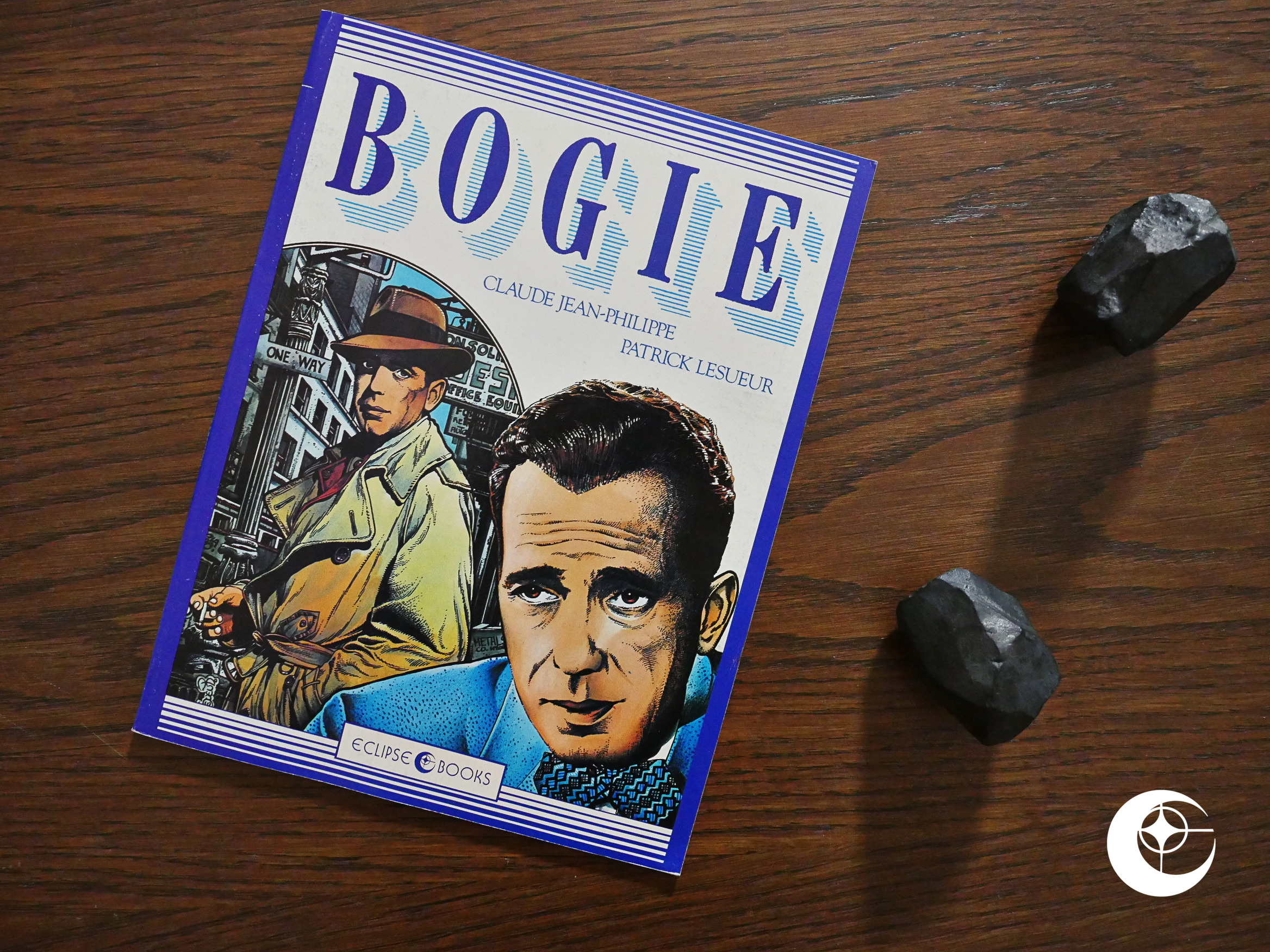
Bogie (1989) by Claude-Jean Philippe and Patrick Lesueur.

Both of the creators are unknown to me, so I wondered what Eclipse had dredged up this time. This was originally published in France by Dargaud and is here printed as a squarebound album. On extremely shiny, white, thin paper, which is an unusual choice.

There’s no text pages to give a context to the work.

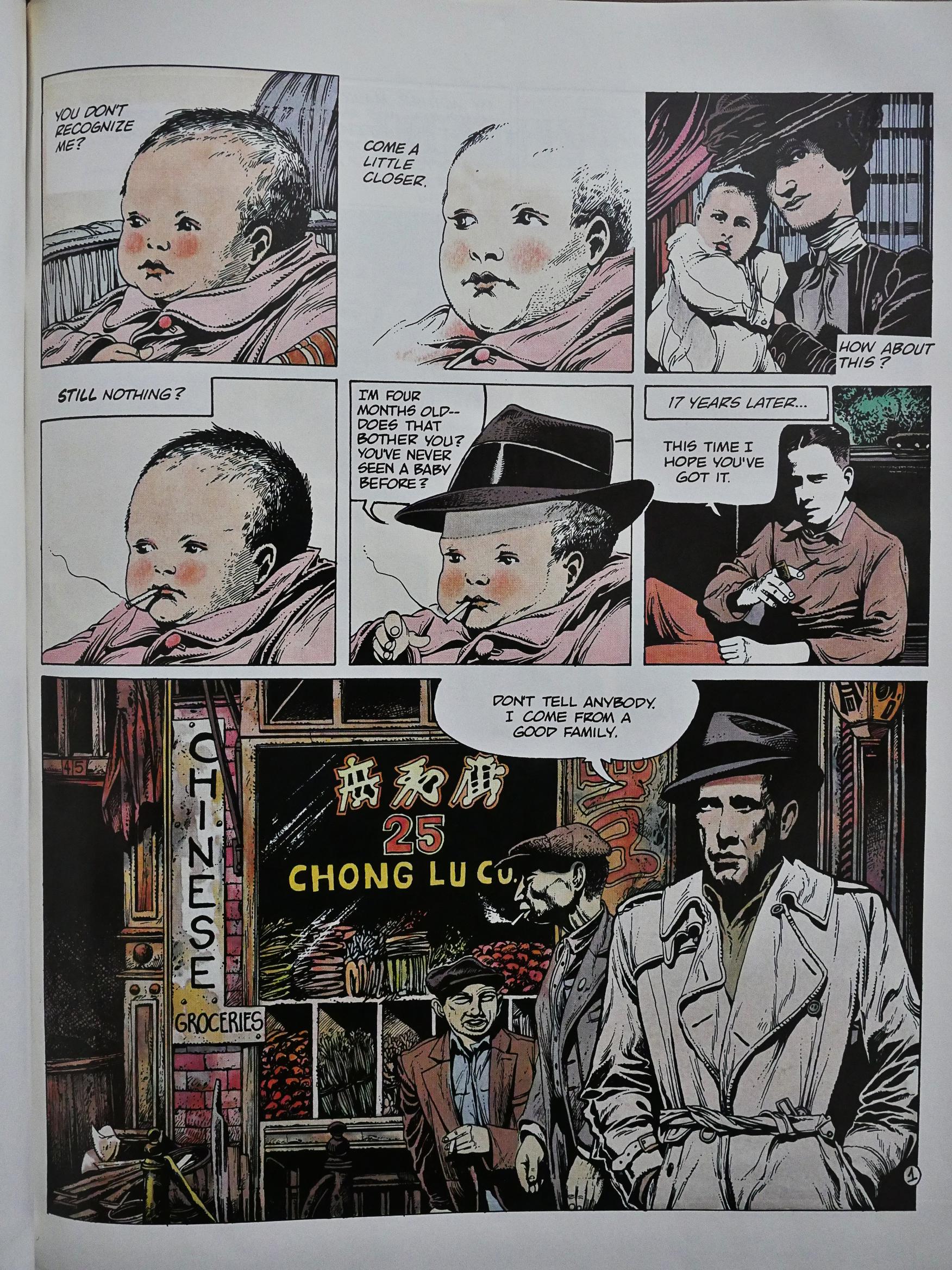
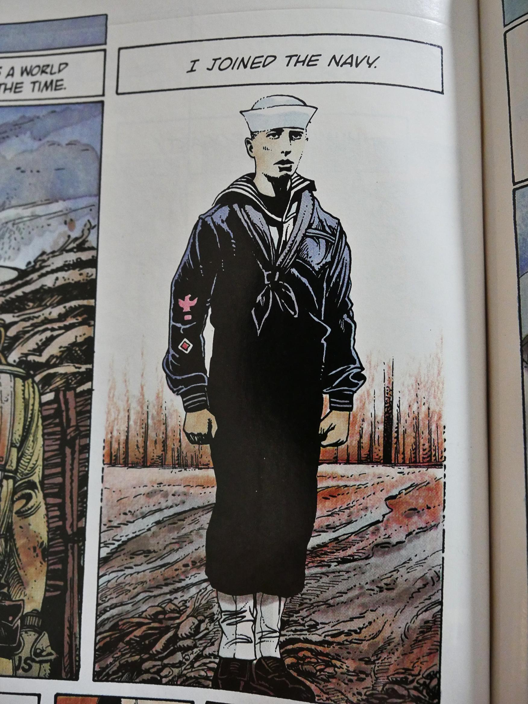
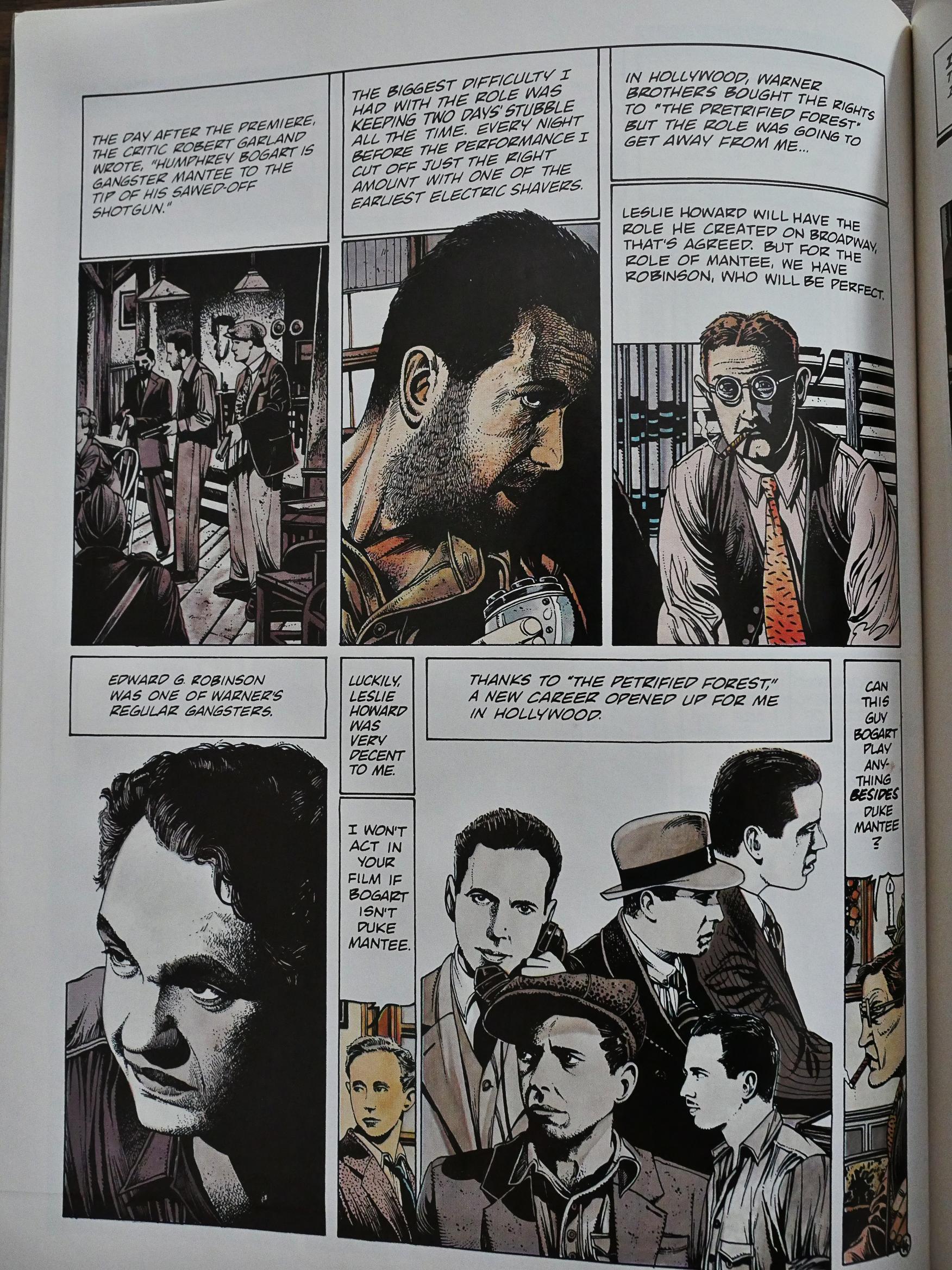
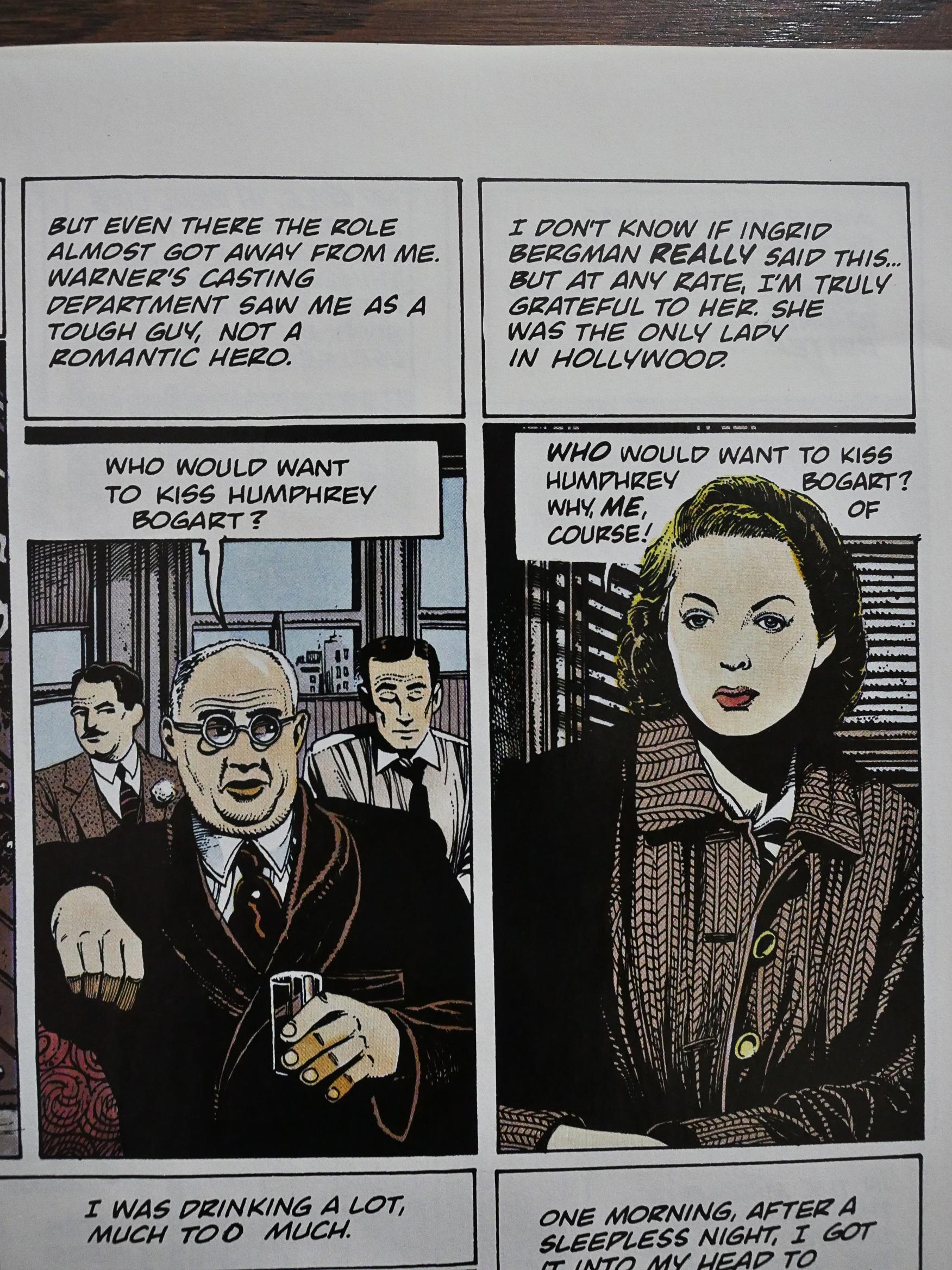
And the art style isn’t my favourite. It looks extremely photography based, so much so that some of the panels just look like blown-out photo copies.

The story of Bogart’s life is told mostly through narration.

The faces that aren’t obviously drawn from photo reference often look rather misshaped, like in the top right panel up there.
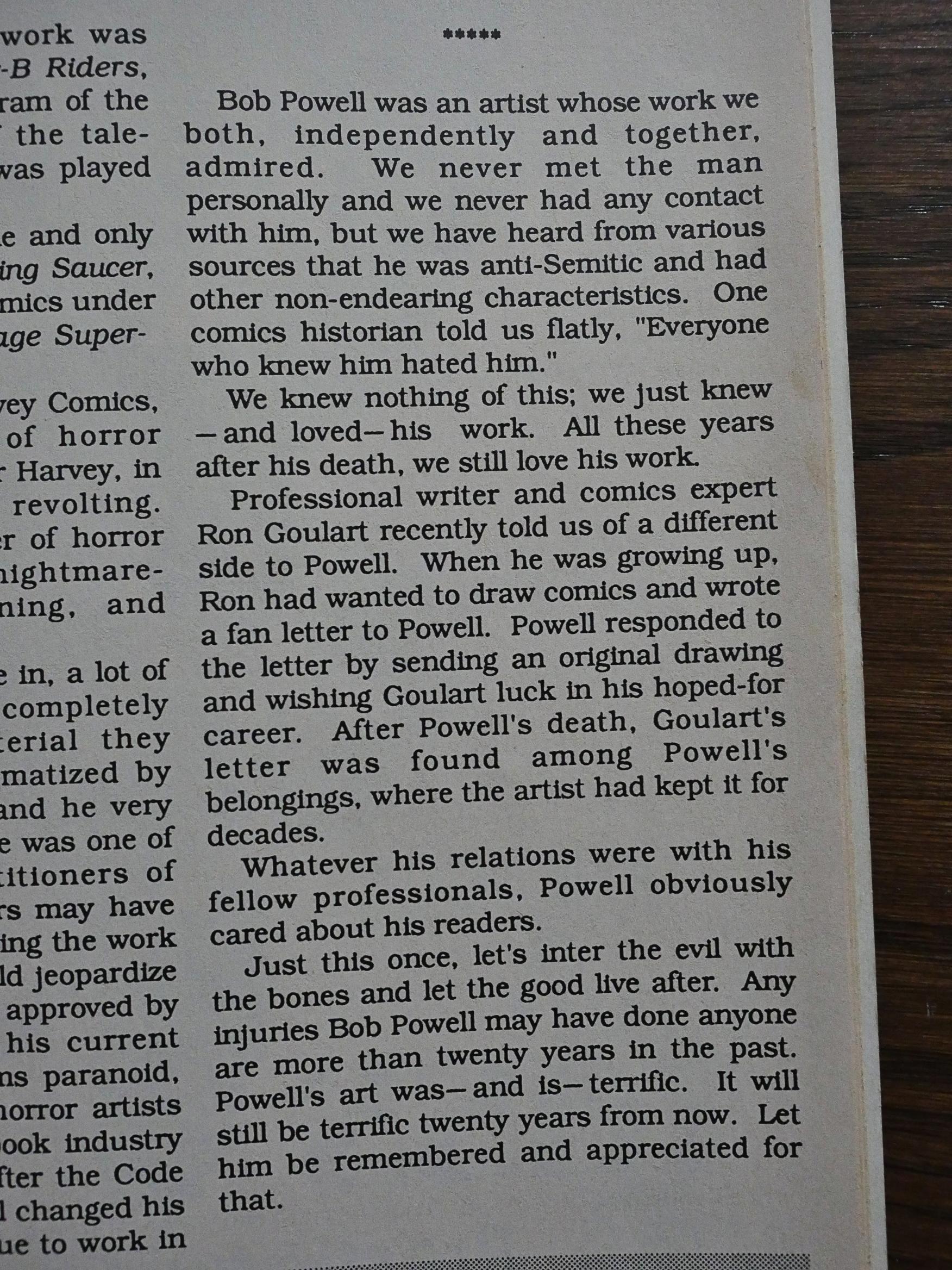
But… somehow, despite all my misgivings, I began to be pulled into the work. It establishes a rhythm early, and sticks with it to the very end. Perhaps it’s because I know nothing of Bogart’s story, but it’s just… interesting. It paints a very sympathetic picture of a fun, but laconic guy.

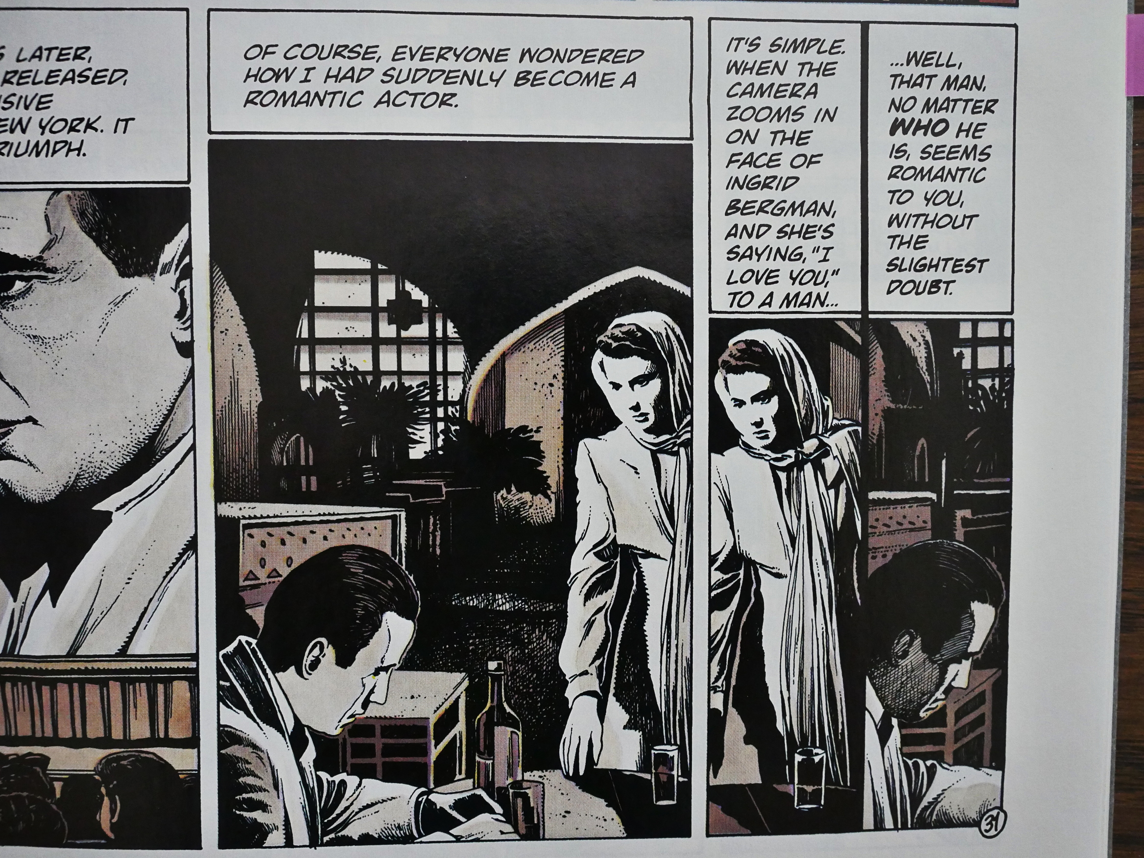
And the artist does do some interesting things beyond doing a lot of tracing, like here when he repeats bits of the preceding panel in two narrow panels. It’s an odd choice, but I feel that it totally works: The narration talks about Bergman, and she’s repeated, and then talks about who she’s talking about, and repeats Bogart.

It’s a calm rhythmic beat.

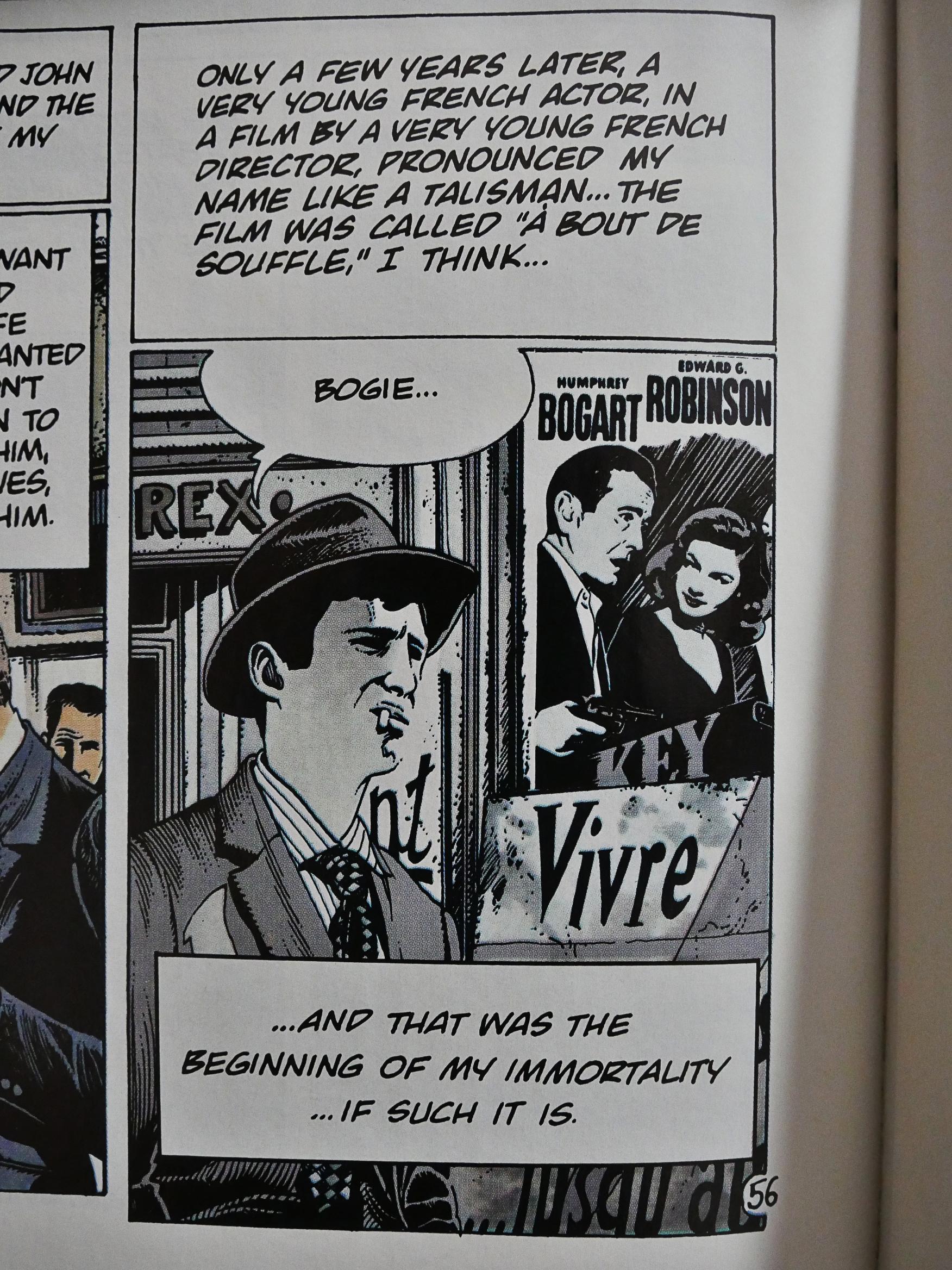
And at the end, we return to France, of course, because Jean-Luc Godard is who’s important. Right? Right.

It’s an odd little graphic novel, as this blog points out.

At only 56 pages it’s a slim number, but as someone with an interest in the cinema of Humphrey Bogart and the medium of comics, Bogie is the point at which those two graph lines meet. It’s a fun little number.

It’s never been reprinted in English again, and you can pick up used copies for $1-2 on the web. It was originally published in 1984 under the name Bogey, and the writer’s name is Claude-Jean Philippe, not “Claude Jean-Philippe” as Eclipse states on the cover.

1988: Dirty Pair

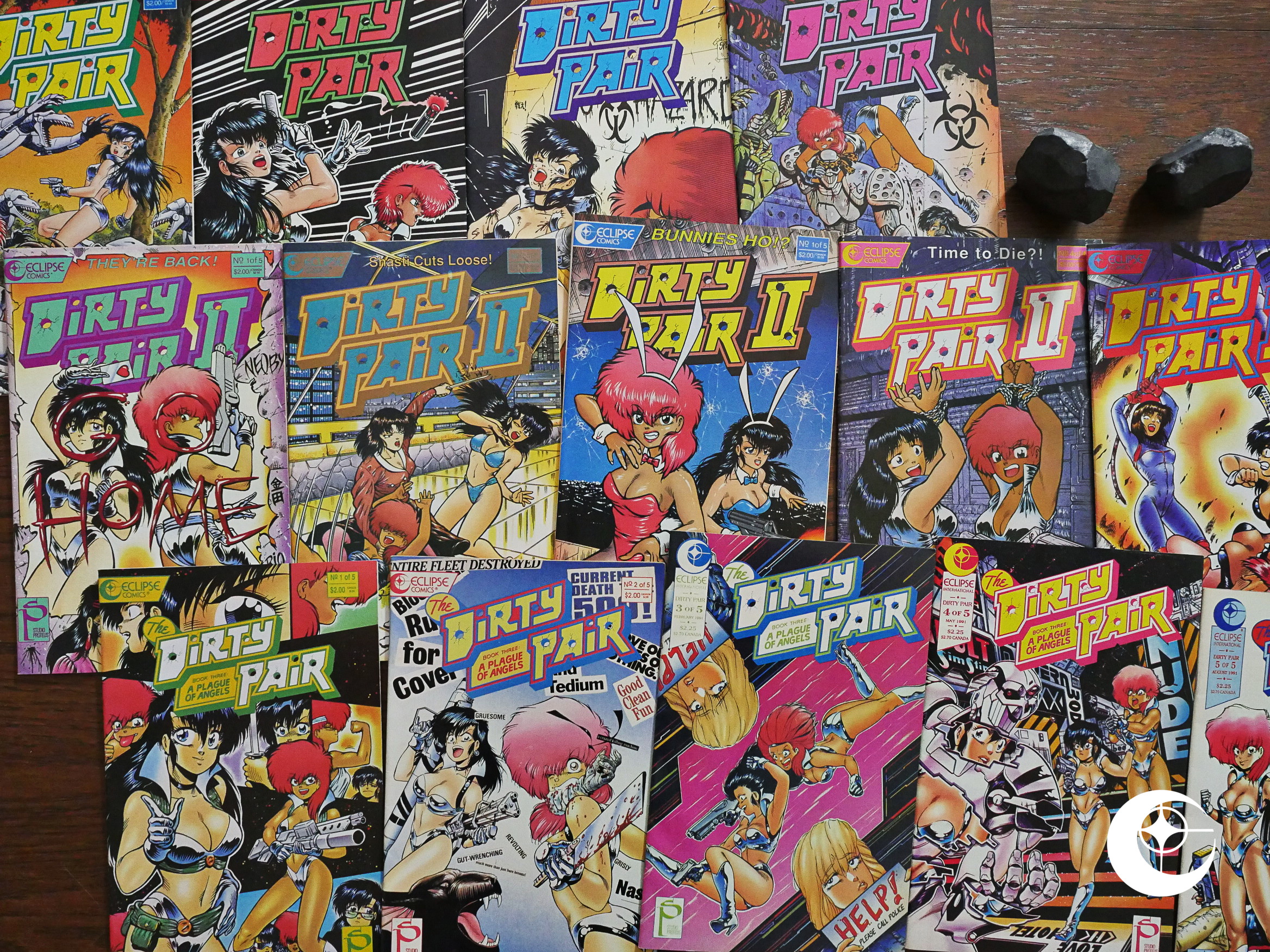
Dirty Pair (1988) #1-4, Dirty Pair II (1989) #1-5, The Dirty Pair Book 3: A Plague of Angels (1990) #1-5 by Toren Smith, Adam Warren et al.

Toren Smith is the owner of Studio Proteus (who were packaging translations of Japanese comics for Eclipse at the time), but this is the first comic he wrote for Eclipse. It’s something as original as the first comic book series based on a Japanese book series. The book series had been adapted previously for animation, but Smith didn’t have the rights to the designs for the animation, so he and Warren did new character designs based on the novels, and approved by the original author.
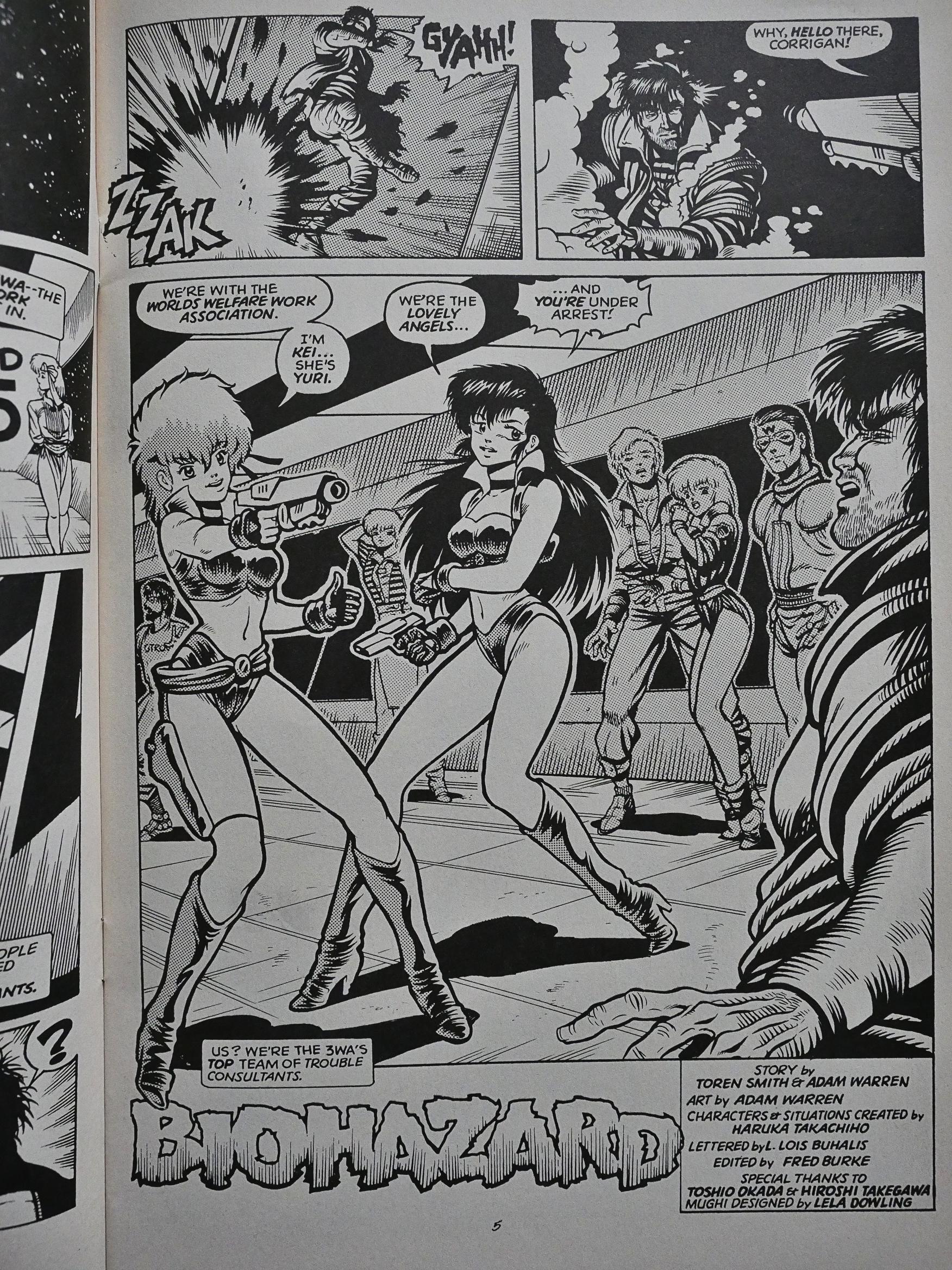
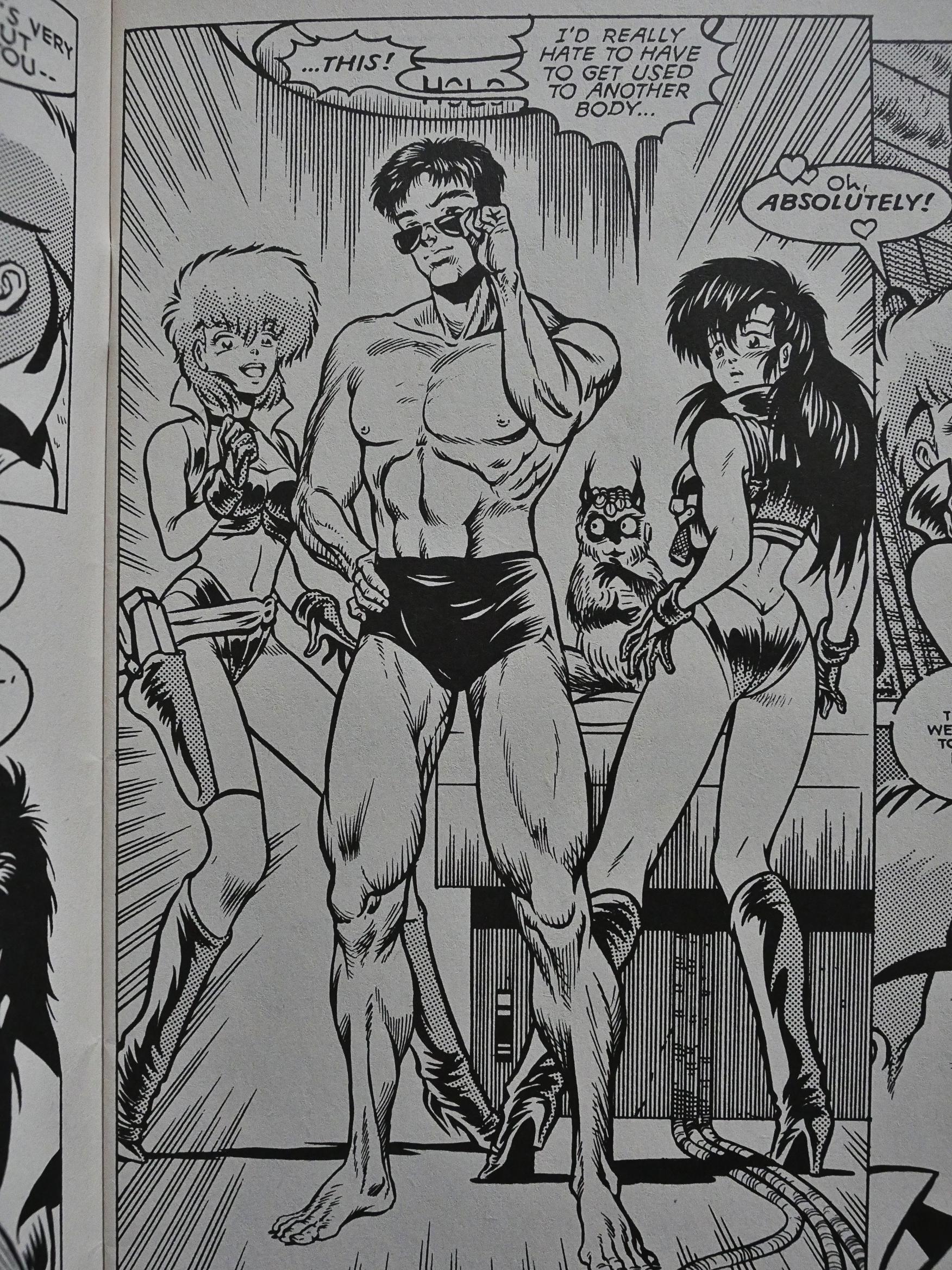
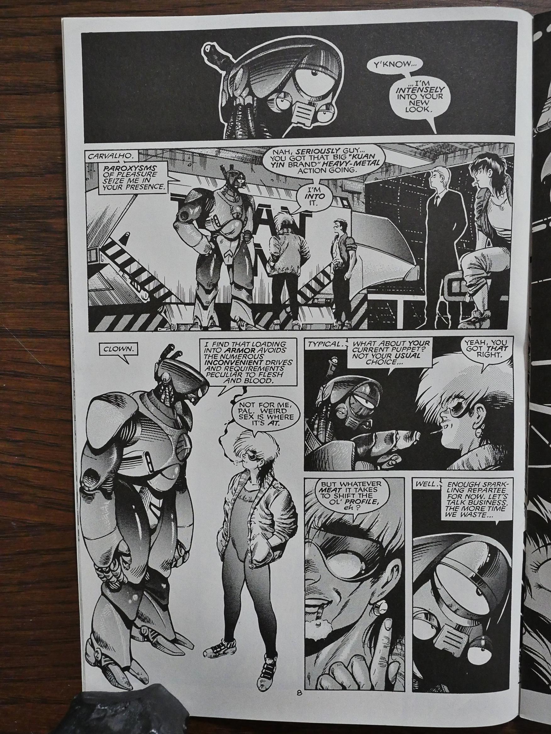
So I was expecting this book to look like a Japanese comic book… but the only thing that vaguely resembles a Japanese comic book is the way the titular protagonists are drawn. The layouts and the rest of the characters are solidly in the American realist tradition. Warren had attended the Kubert School. As opposed to many others comic through that school, his artwork doesn’t really look overtly Kubertian.

But perhaps that’s just because Warren is such a bad artist. These drawing are uncomfortable to look at. Somehow his bad proportions and weird faces make me almost nauseous.

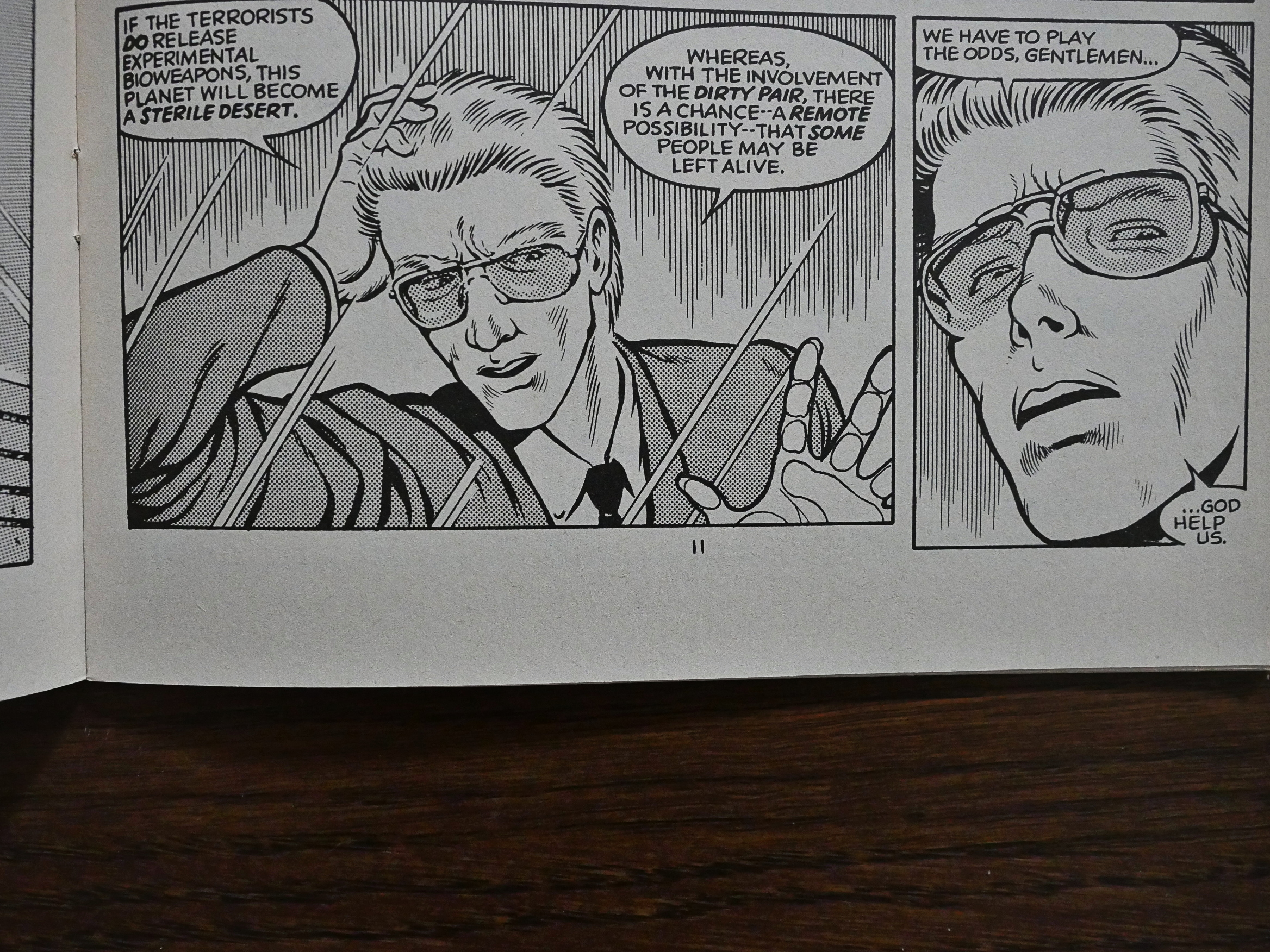
Smith’s writing doesn’t make my stomach churn, but it’s not very good, either. This is supposed to be an action comedy kind of comic, and there’s a lot of (confusingly rendered) action, but the comedy is rather hokey, and the characters have a tendency to just state what their deal is instead of showing us.

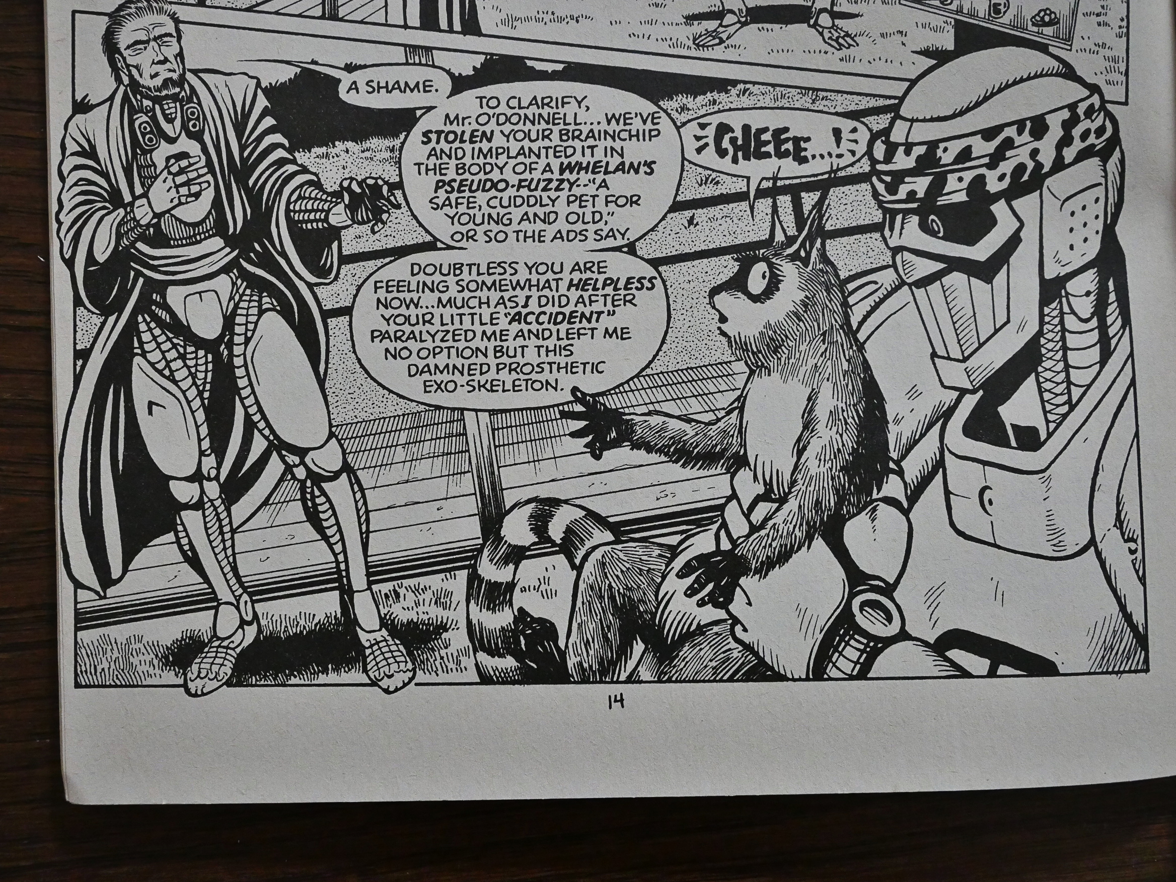
Is a bandanna on a robot a fun idea? Hm… No?

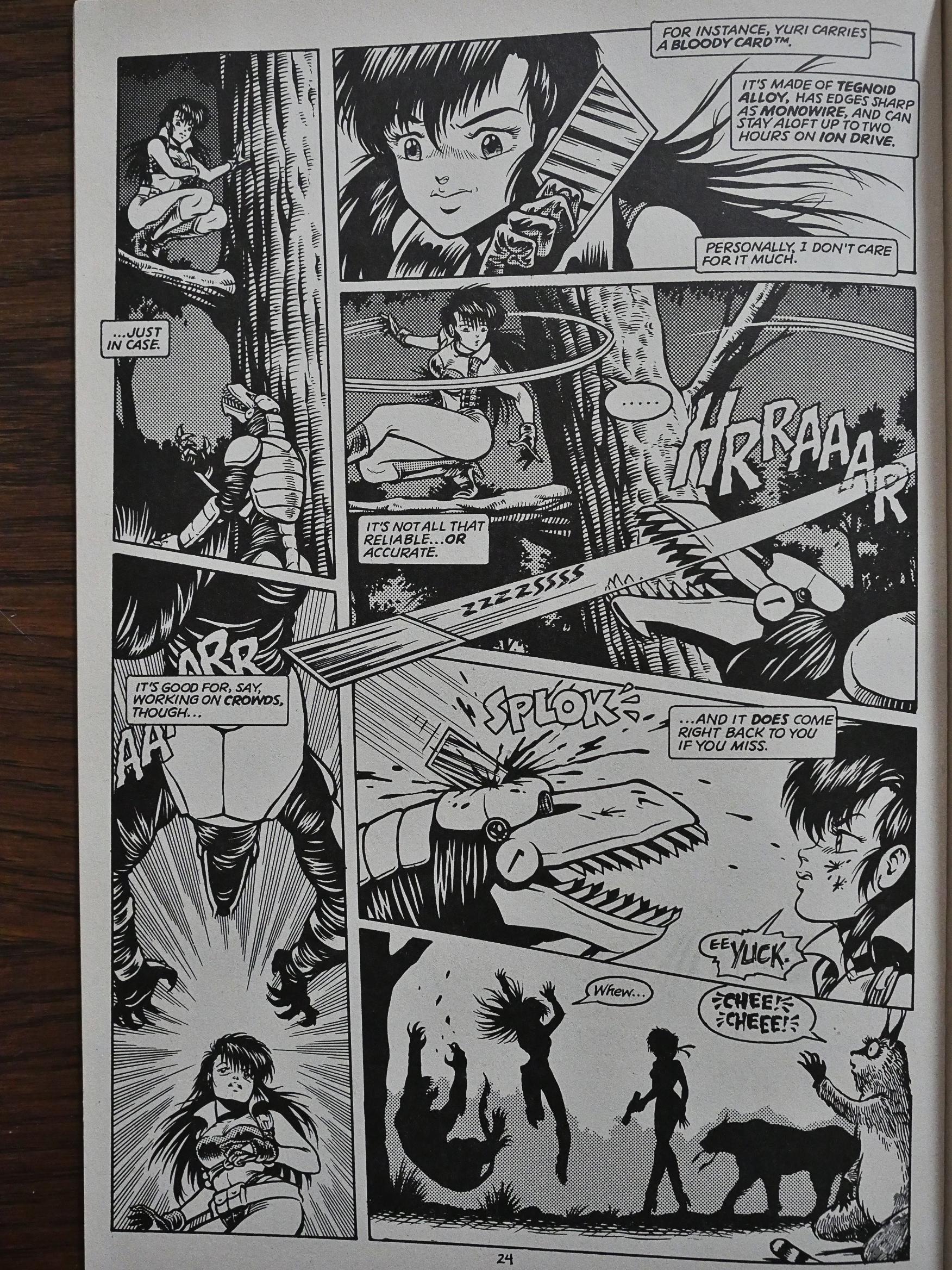
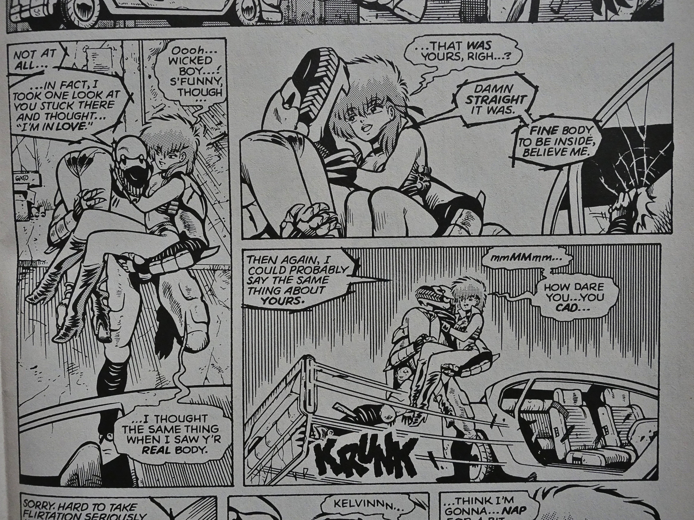
Oh, yeah, I mentioned the confusing action sequences. I mean, I understand what’s going on on that page, but it’s not a model of clarity. Somehow the eye is drawn to the bottom left panel before going to the top right panel, which is the wrong direction. Warren tries to steer us from the third panel to the bottom left on (with that flying card), but by then I’m more annoyed than interested.

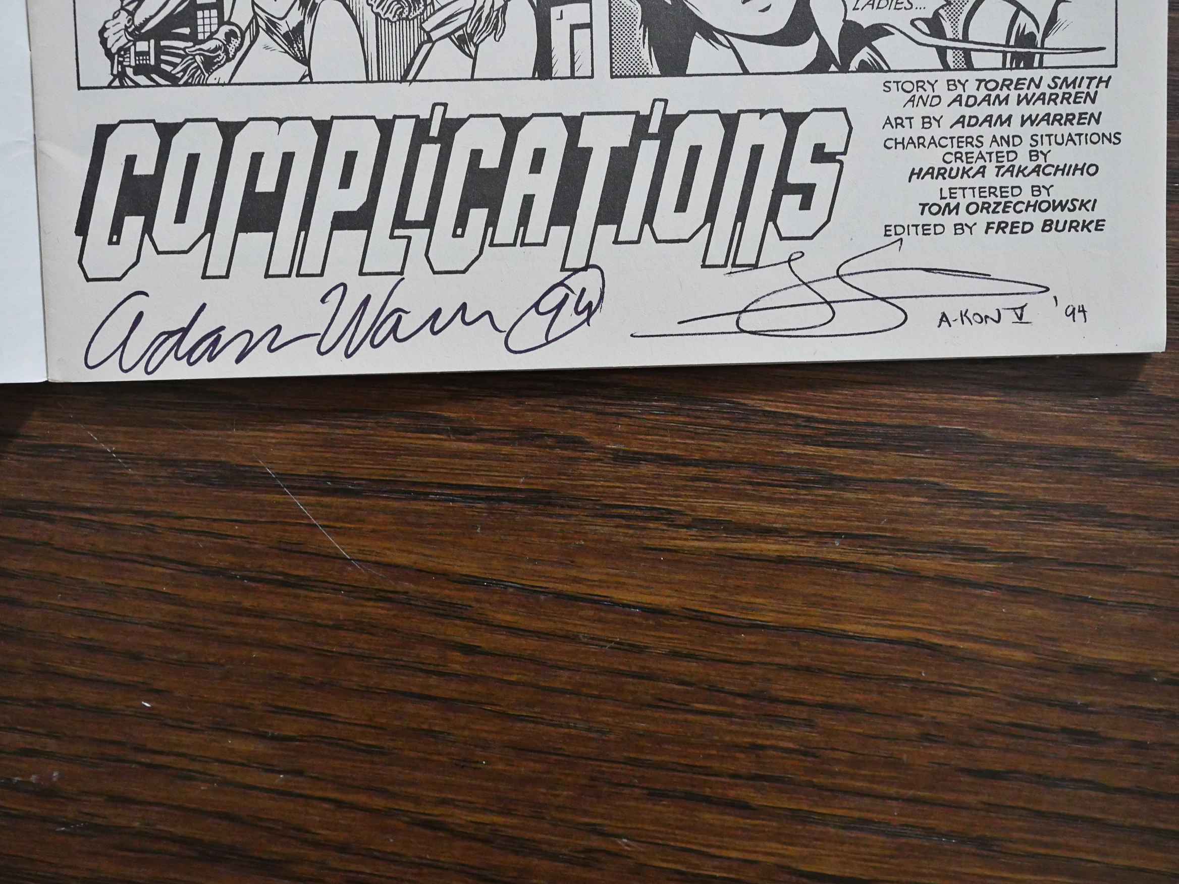
Huh. One of the issues are signed by Warren and… somebody who did a squiggle. In 1994, apparently. I bought these from somebody on Ebay for virtually nothing, so I guess they’re not… er… You know.
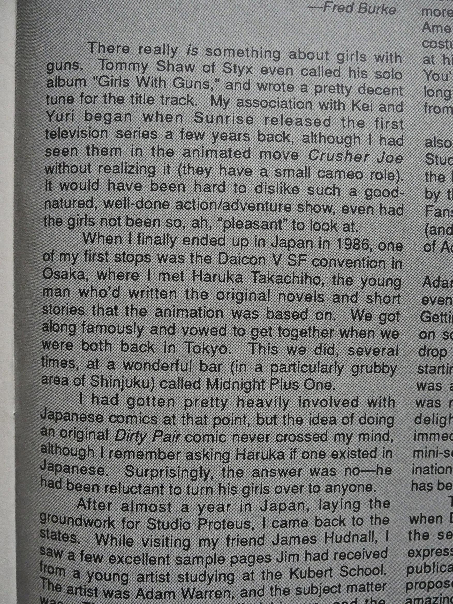
Smith explains how this book came to be. Both he and Warren had been interested in doing Dirty Pair, without knowing about each other. James Hudnall made the match; they wrote to the creator of Dirty Pair, and he gave them the thumbs up.

It’s not all cheesecake in this comic. It’s more like 97%.

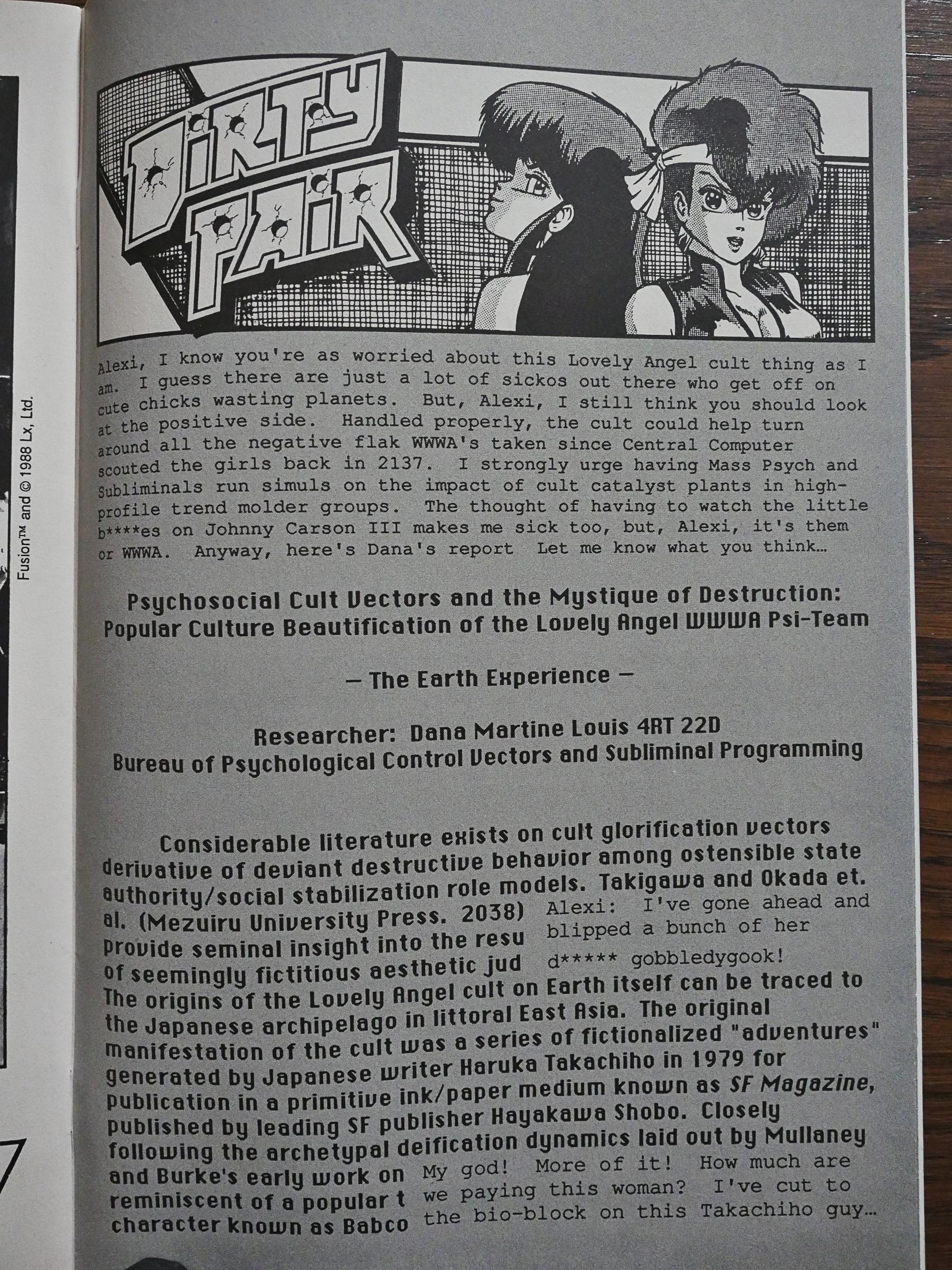
Smith provides background to the Dirty Pair characters through these mock intelligence reports. They’re kinda amusing, but this made me wonder whether the Japanese novels and animated series really existed or whether it was all made up by Smith. It wouldn’t be the first Eclipse book to play these games. But, no, it’s a thing.

Smith does his best to be funny via innuendo.

The editor says that the series was a commercial success, and it had to have been, because a few months later we get Dirty Pair II:

And Warren’s artwork has improved considerably in his months off. His linework is no longer vomit inducing, and his characters start looking more consistently Japanese-ish.

His profiles have become works of sheer horror, though. Instead of looking like cute manga girls, they look like genetic mix-ups. Perhaps somebody had an accident involving cat DNA while doing some splicing. I don’t know, but it’s horrific.

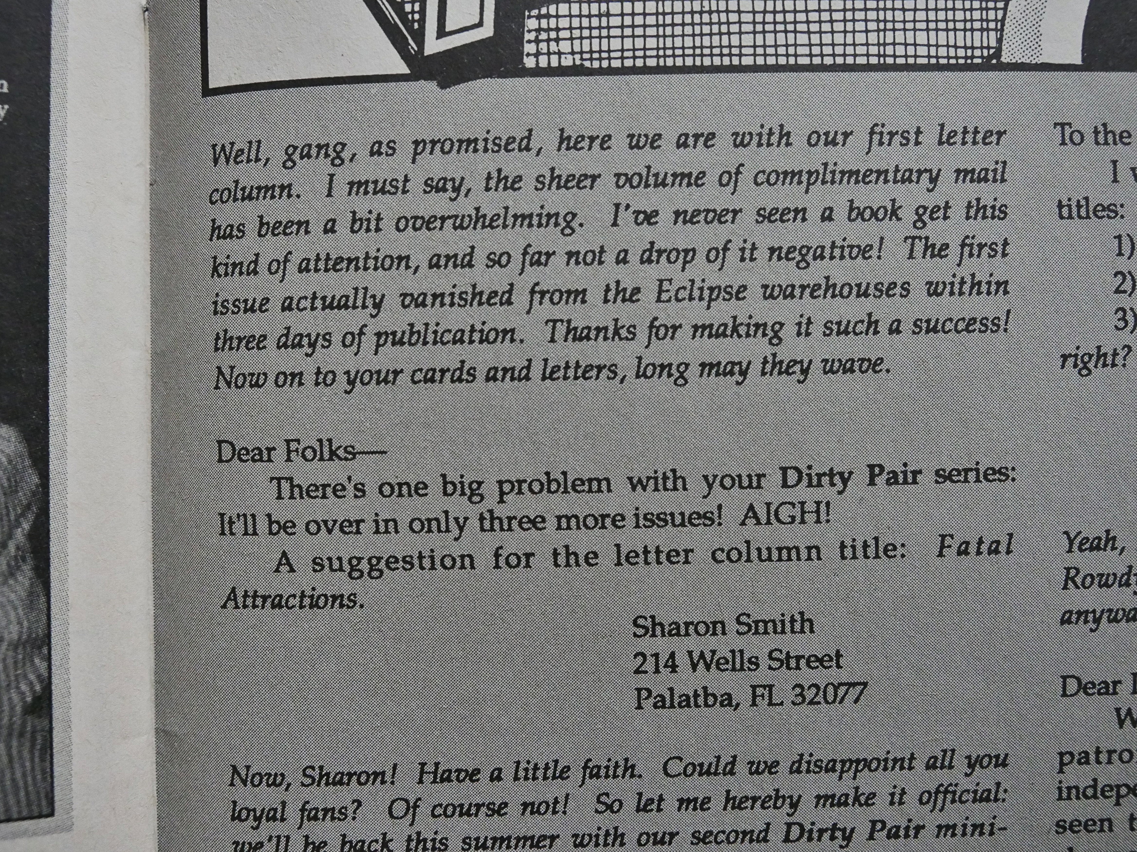
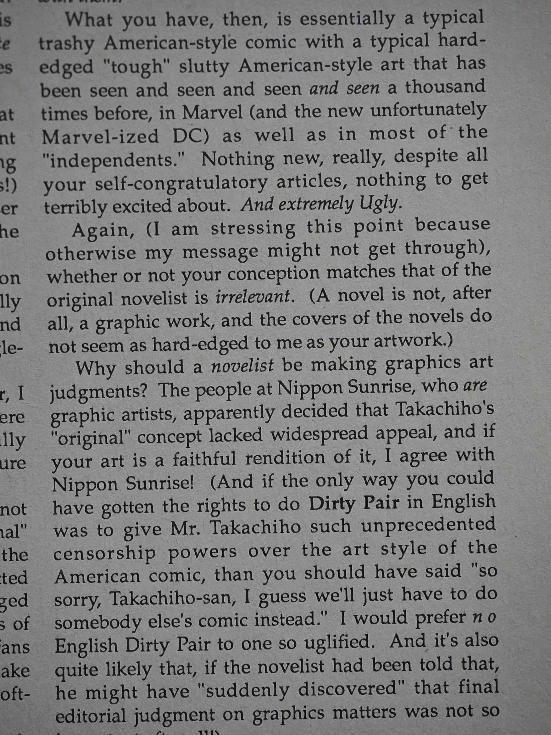
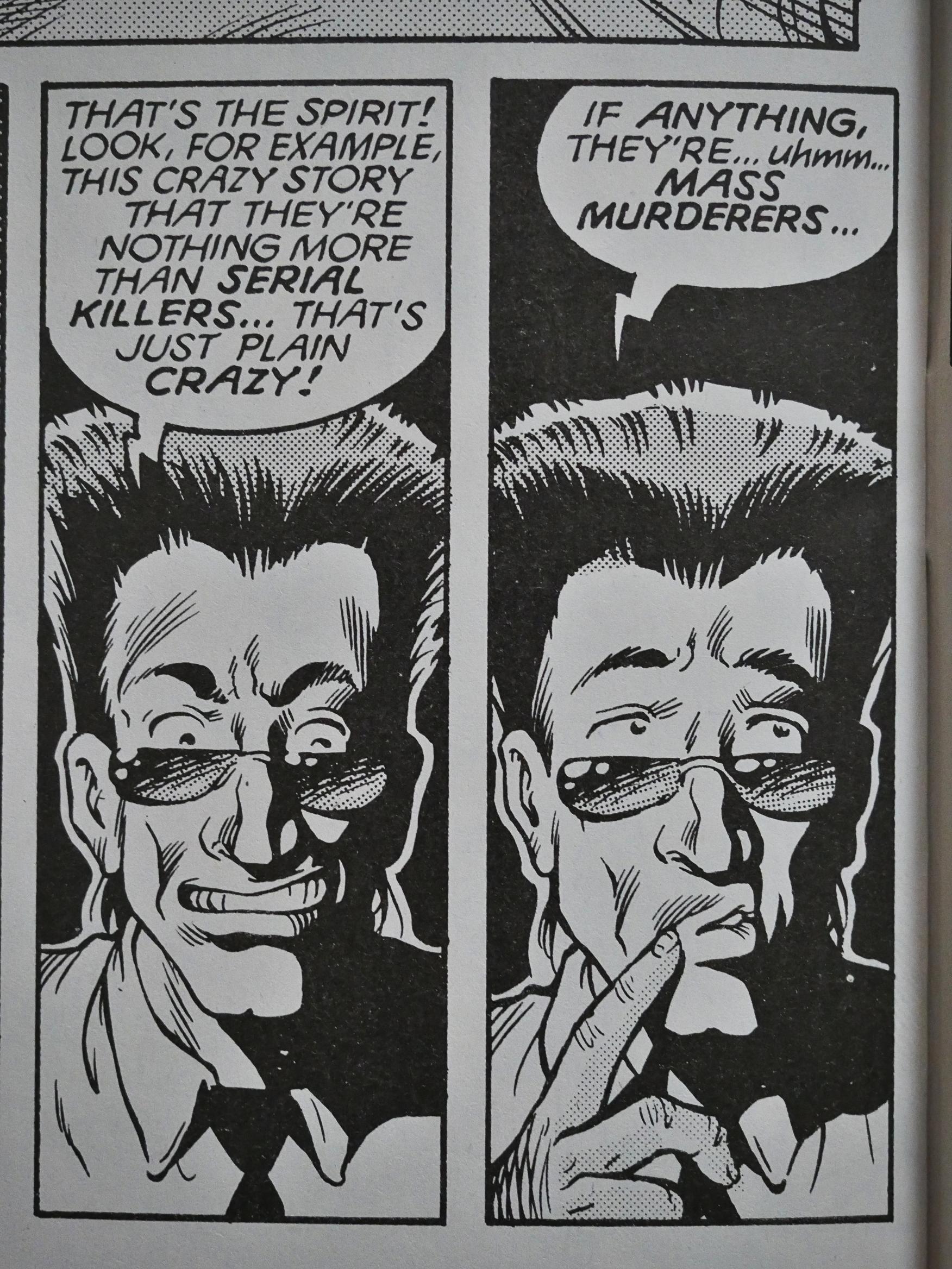
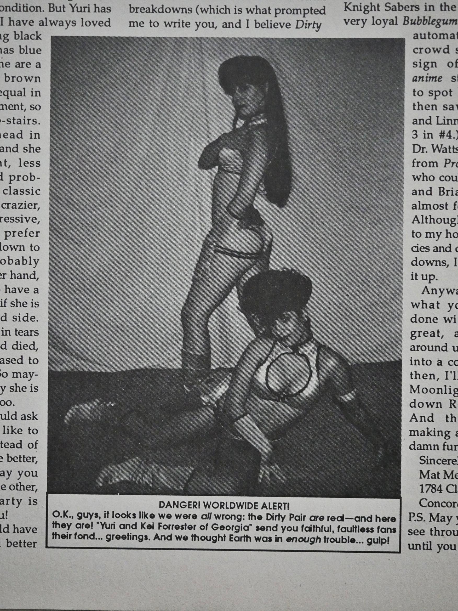
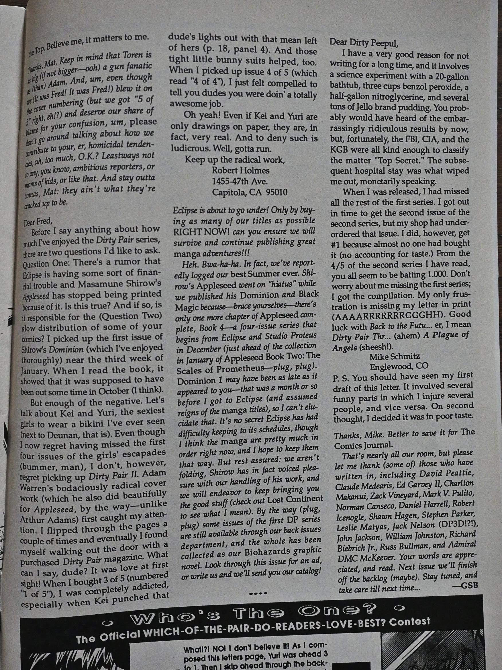
A person writes in to express his disdain for the comic; especially the “hard-edged ‘tough’ slutty American-style art”. He may be having some kind of personal problems he’s working through. I mean, what sane person would be denigrating comic book artwork in so strong terms?!?

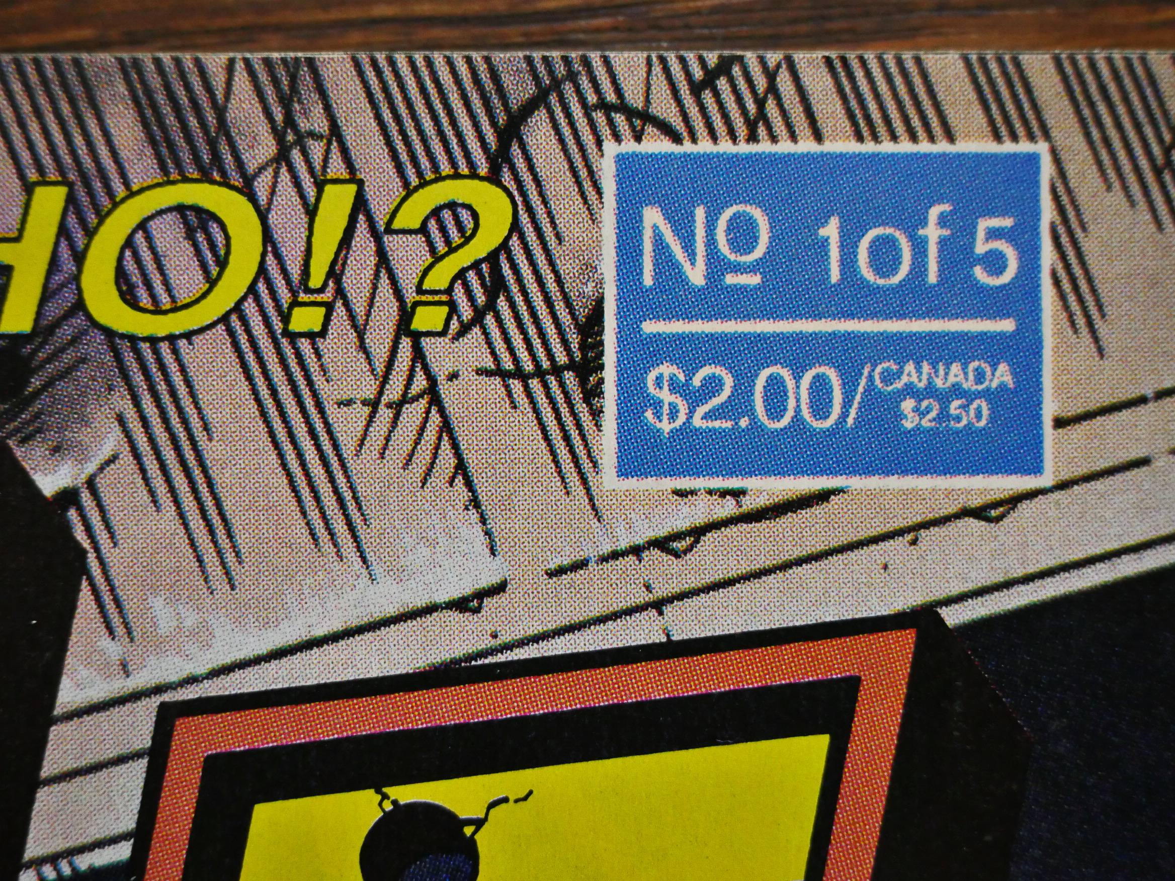
Issue three is confusingly labeled as “1 of 5” on the cover…

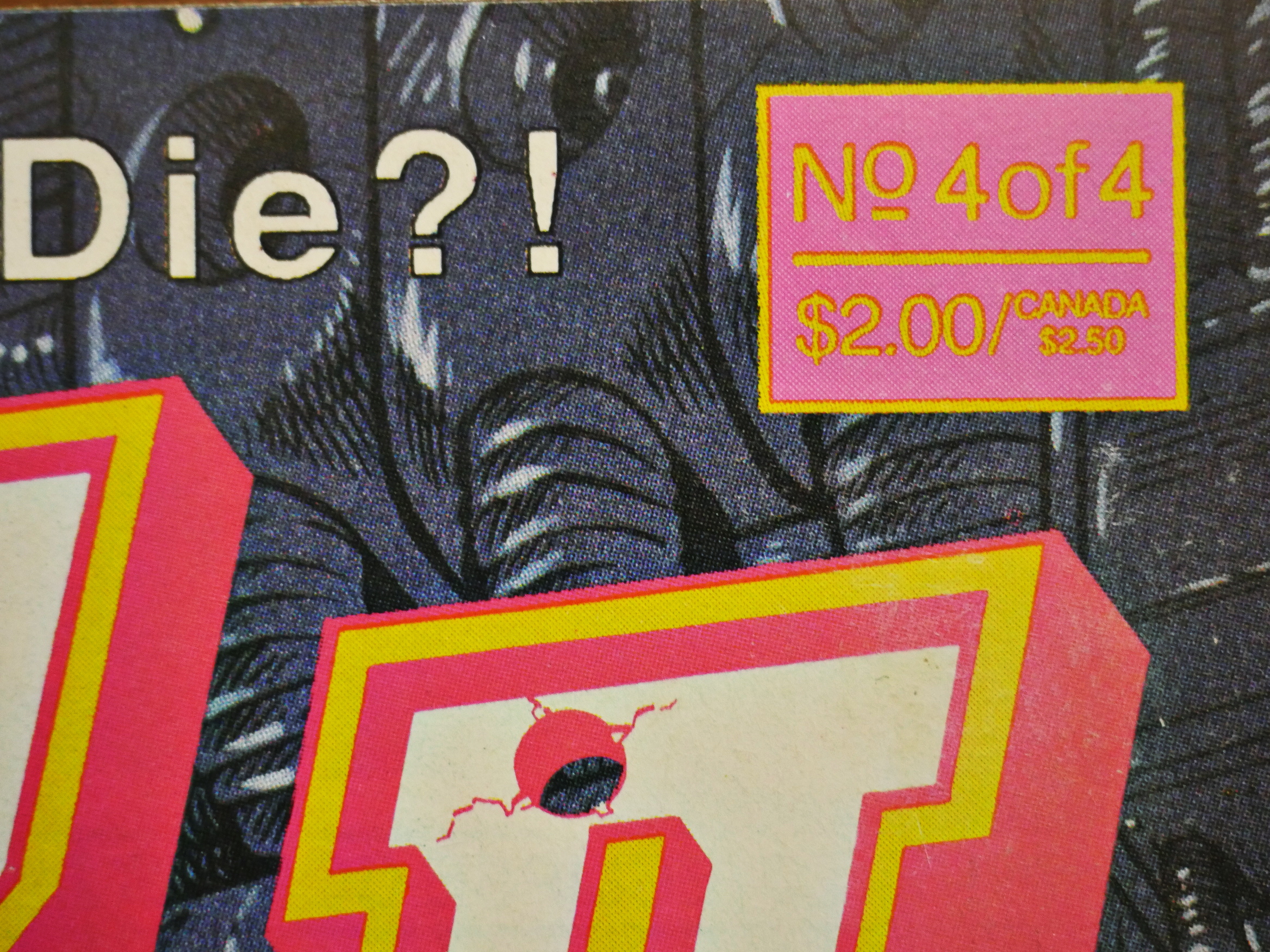
And the fourth issue is labelled “4 of 4”. I think at this point editor Fred Burke didn’t really give a shit, and he left soon afterwards.

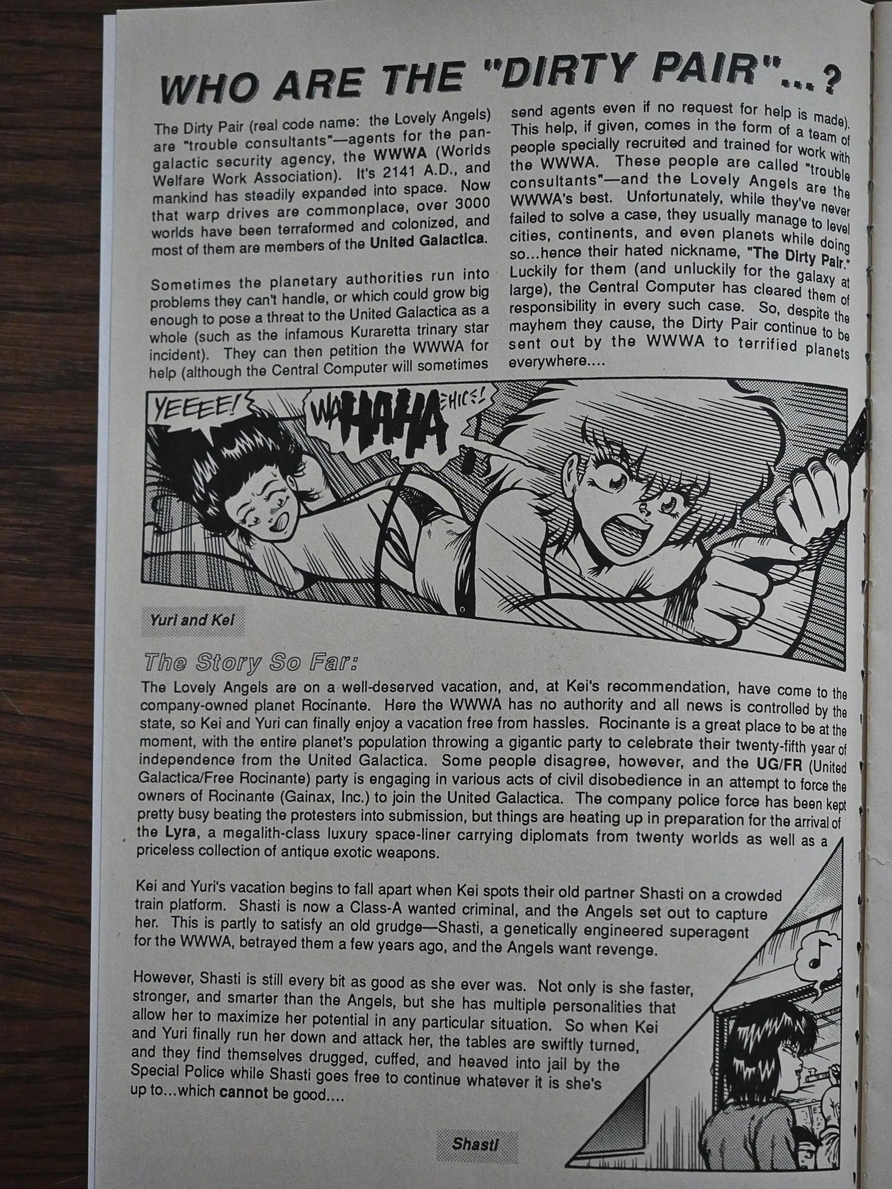
We also start getting recap pages, which is nice… Especially since these comics were printed on a pretty lethargic schedule. Reading the indicia (which may not be accurate either), it took nine months to get the five issues out.

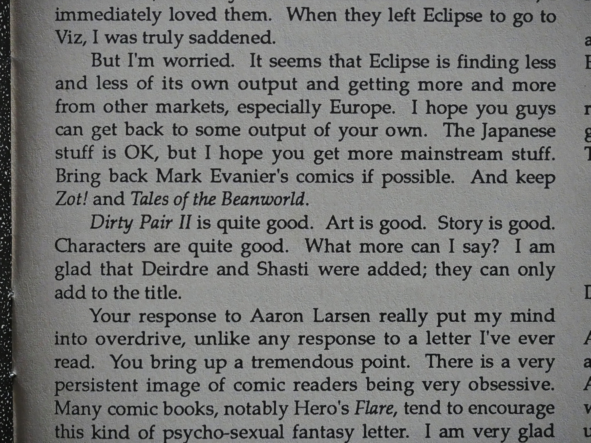
A reader writes in to express concern about the direction Eclipse is taking: Mostly reprints and not much new, original material.

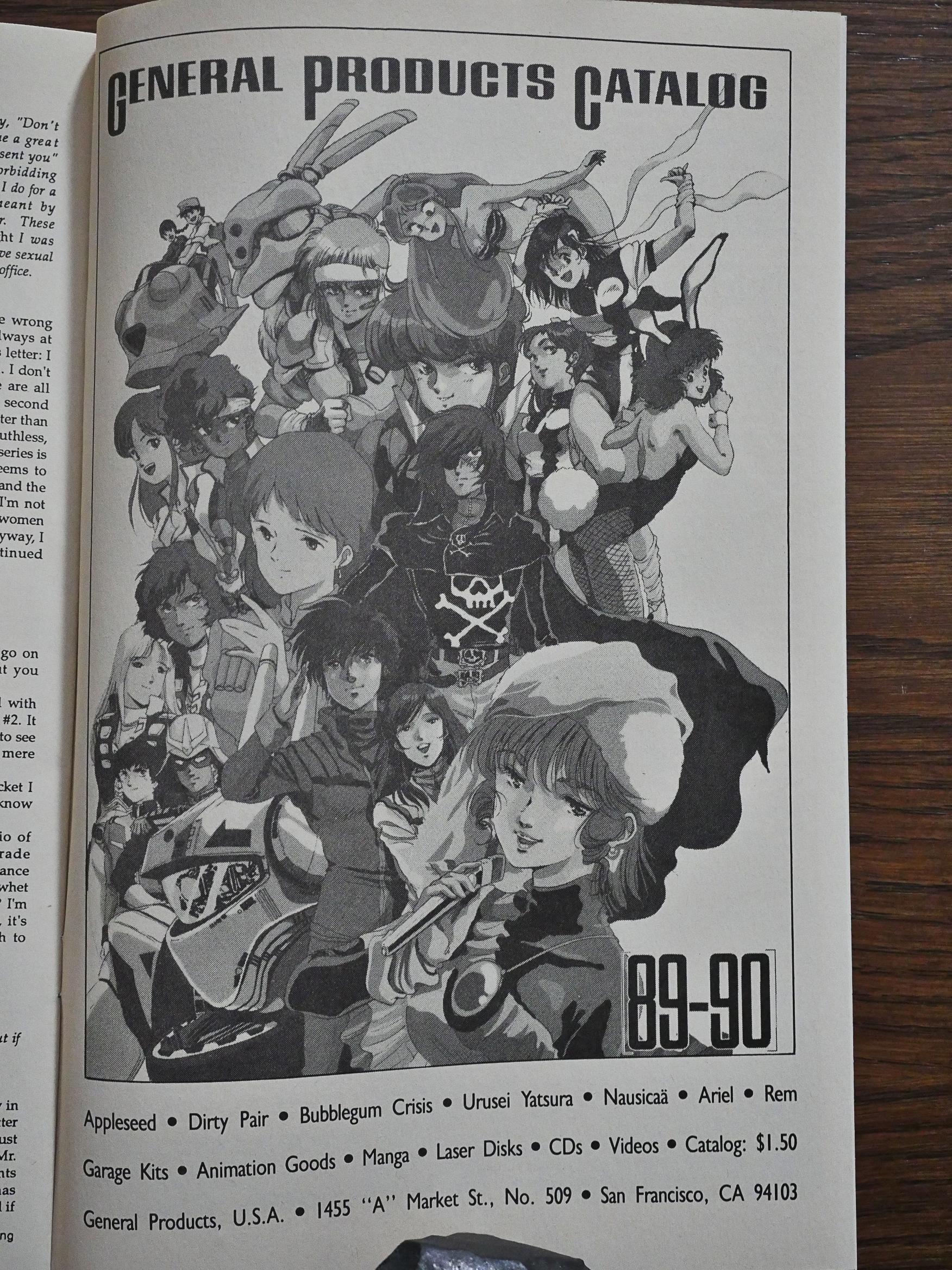
This is an amusing artefact. General Products (how’s that for a name) were apparently a huge Japanese shop that opened up a branch in San Francisco around this time, and took out an ad in Dirty Pair. A few of the letters had been mentioning General Products (before they opened that shop), so that seems like a good idea.

Oh, what was the second Dirty Pair arc like to read? Tedious. It’s not funny and it not exciting, and it’s not fun to look at.

So I had no hopes for the third series.

But… but… Whaaa? It cannot be!

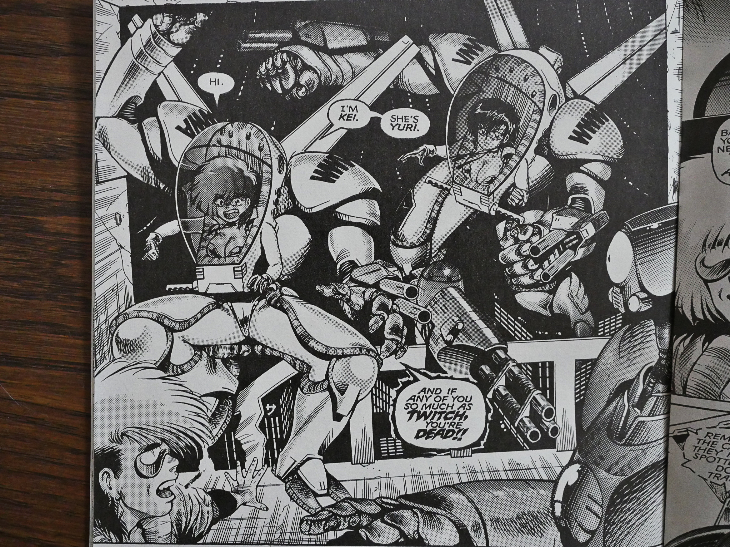
Between the two series, Warren has completely overhauled his art style. It now looks stylish, slick and very Japanese-inspired. It’s not just the sexy girls, but pretty much everything.

And the writing! It’s funny! What happened!

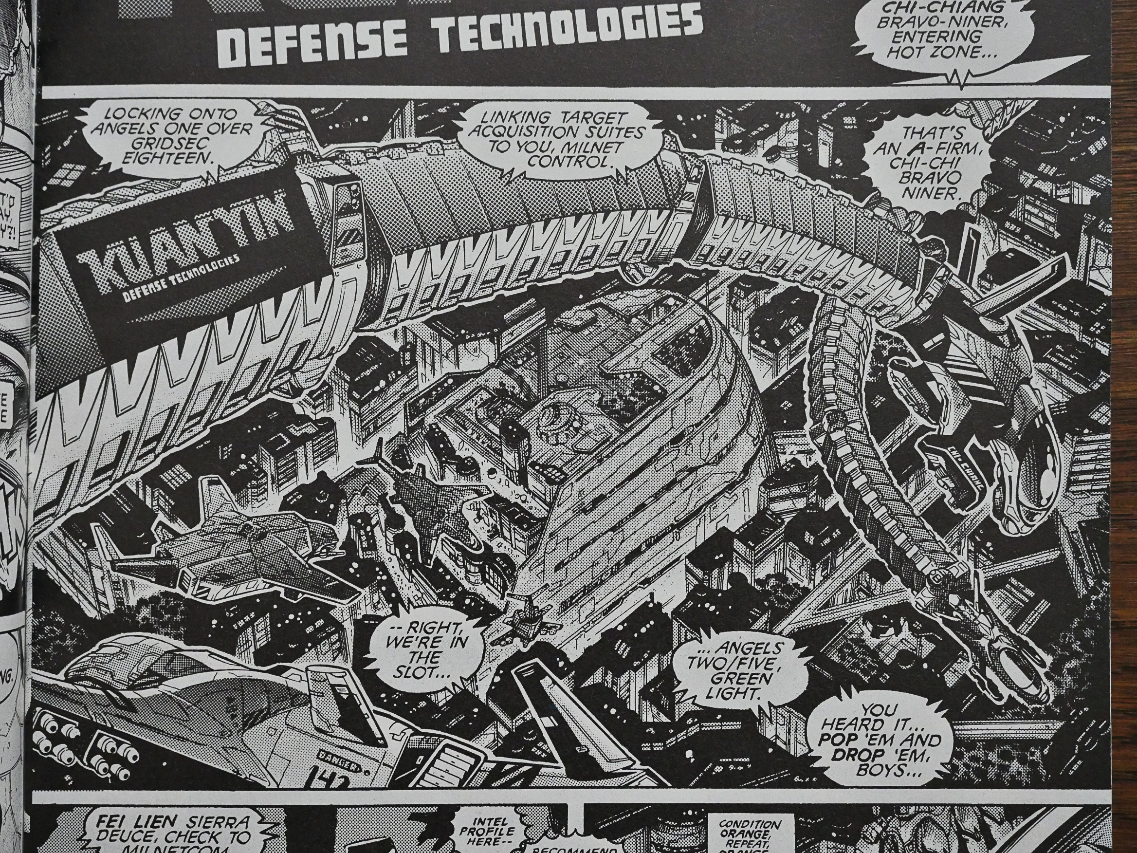
Just look at the crazy design for those battle robot suits! With the huge windows to show off the Pair’s big boobs! It’s funny! It looks weird! It’s great!

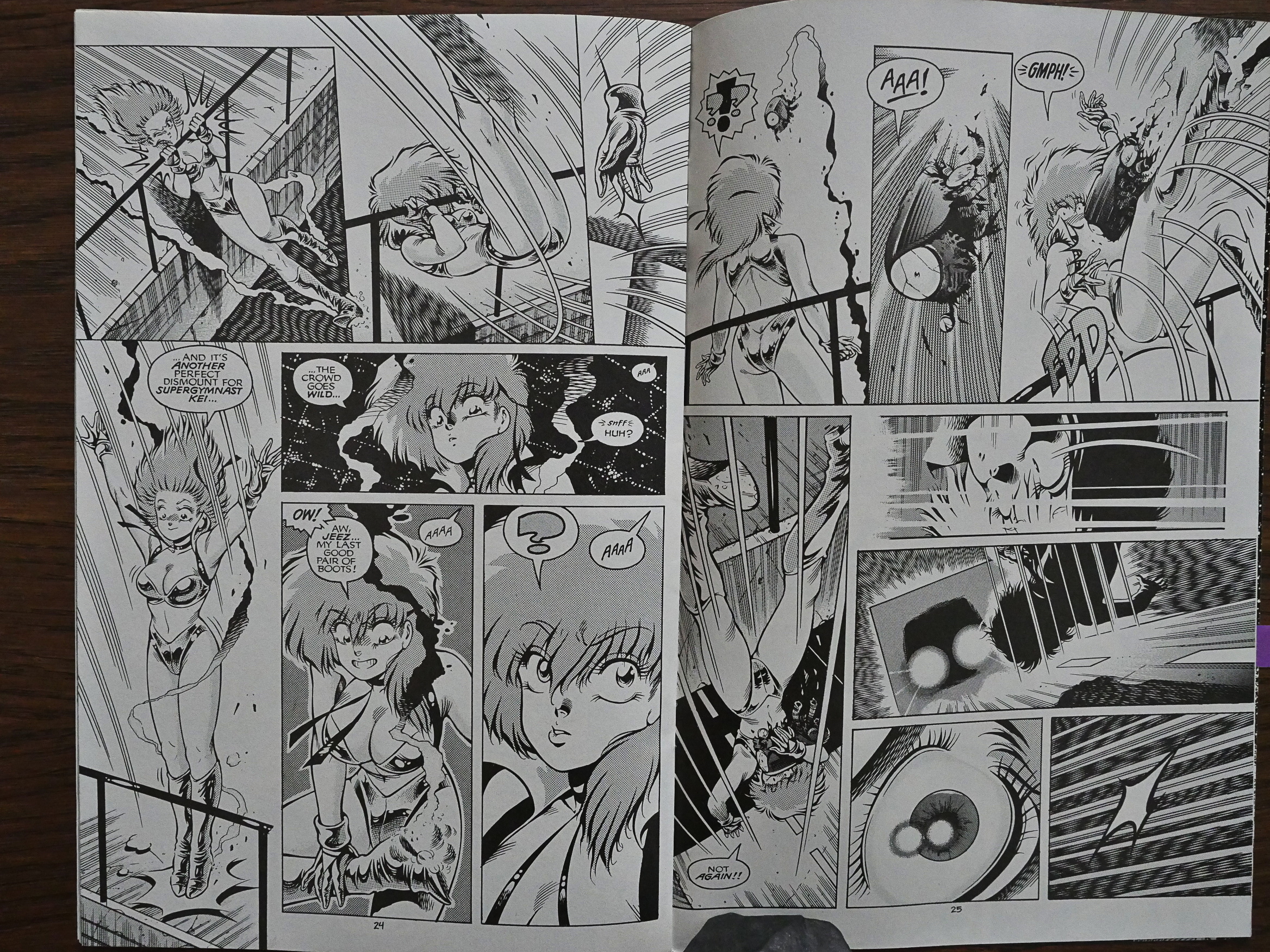
And Warren has totally mastered how to do exciting action scenes. This is from the middle of the sequence, so it probably doesn’t make a lot of sense out of context, but the Kei-jumping-and-falling-and-doing-acrobatics sequence was genuinely thrilling to read.

And did I mention that it’s actually funny now?

So somehow both Smith and Warren levelled up something furiously between the second and third arcs. I can hardly believe it’s the same creators, because the third arc is a hoot. And it even has an interesting plot, and introduces a new viewpoint character that we can relate to more easily than the Pair (who are pretty kah-razy, but in a good way).

I guess cosplay was beginning to become a thing around 1990?

Another reader writes in concerned about the future of Eclipse. He writes that there’s a rumour that Eclipse were in financial difficulties, and the editor says “pshaw”. And this was about three years before Eclipse went bankrupt, but some creators connected to Eclipse had begun publicly to complain about late payments and the like. (Alan Moore, for instance, would go on to state that he hadn’t gotten any royalties for Miracleman after the very first issue.)

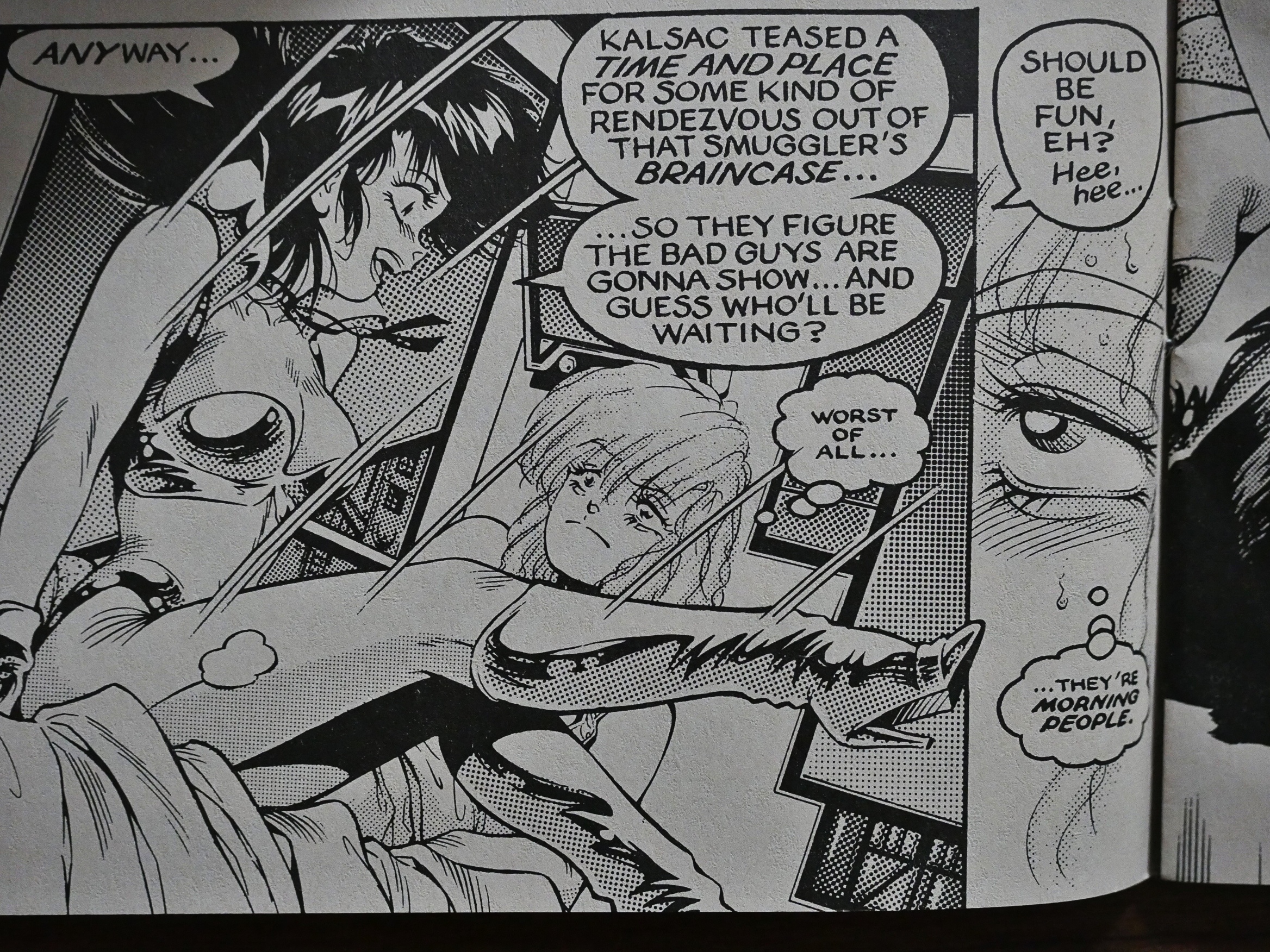
“Worst of all… they’re morning people.” That is, indeed, the worst.

Look at this artwork! Just look at it!

So that was a pleasant surprise. The first two series are a drag, and the third is a hoot.

After leaving Eclipse (and suing them into bankruptcy), Smith and Warren took Dirty Pair to Dark Horse, where they published a number of mini-series during the 90s. There doesn’t seem to have been any new Dirty Pair material since… 2003?