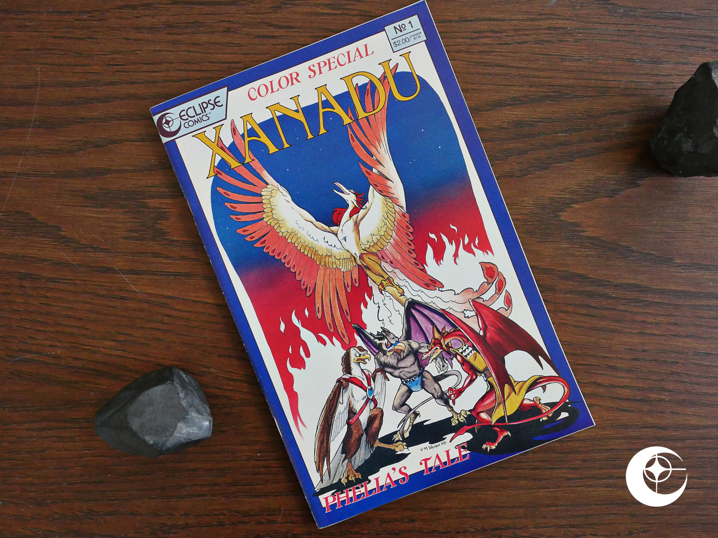
1988: Xanadu Color Special

Xanadu Color Special (1988) #1 by Steve Gallacci, Vicky Wyman et al.

I guess this is published by Eclipse comics because Lex Nakashima is the “conceptual editor” here, and Eclipse had published a few of his other series, like Fusion. And the writer on that book was Gallacci.

But I think the Xanadu series was serialised in some furry anthology somewhere? Was it published by Mu Press? Hm… no, that happened later…

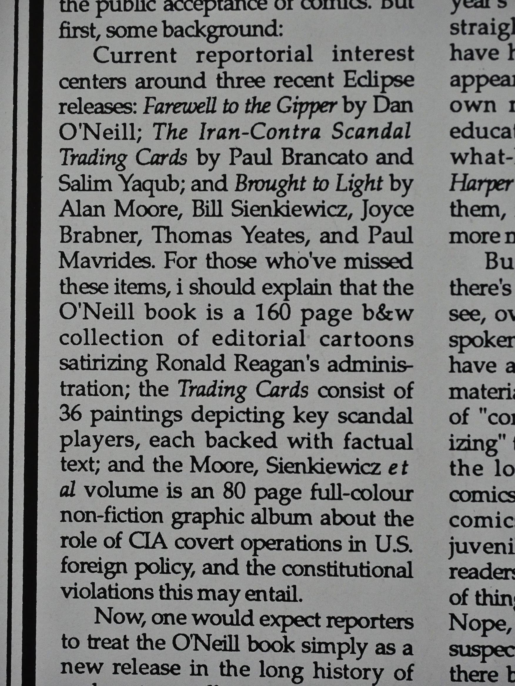
Anyway, before we have a peek at the book, cat ⊕ yronwode’s editorial here reminds me of my methodological problems with this blog series: I’m trying to do the comics in chronological order, but determining what that is has proven to be difficult. I’m using the comics.org data set as a baseline, and only diverging from that when it’s obviously wrong. Like here in this book, which is purported to be published in December of 1988, the editorial talks about journalists interviewing yronwode about Brought to Light, which according to the indicia of that book (and comics.org) was published in 1989.

And a lot of books, especially for the next couple of years, don’t have any information about the month they’re published in, so I’ve been trying to go by the “on the stands” part of the column, but, for instance, it will says that Pogo #1 is “on the stands” in April, and then again in December.

The column will also list many books that were never published at all as being “on the stands”, so it’s all rather confusing.

So to sum it up: I’m trying to do these articles chronologically, but it’s not easy, and there will be huge divergences. I just noticed that Fly In My Eye had to have been published in 1988 (listed on comics.org as 1990), so perhaps I’ll do that next, then…

MY OCD SENSE IS TINGLING!

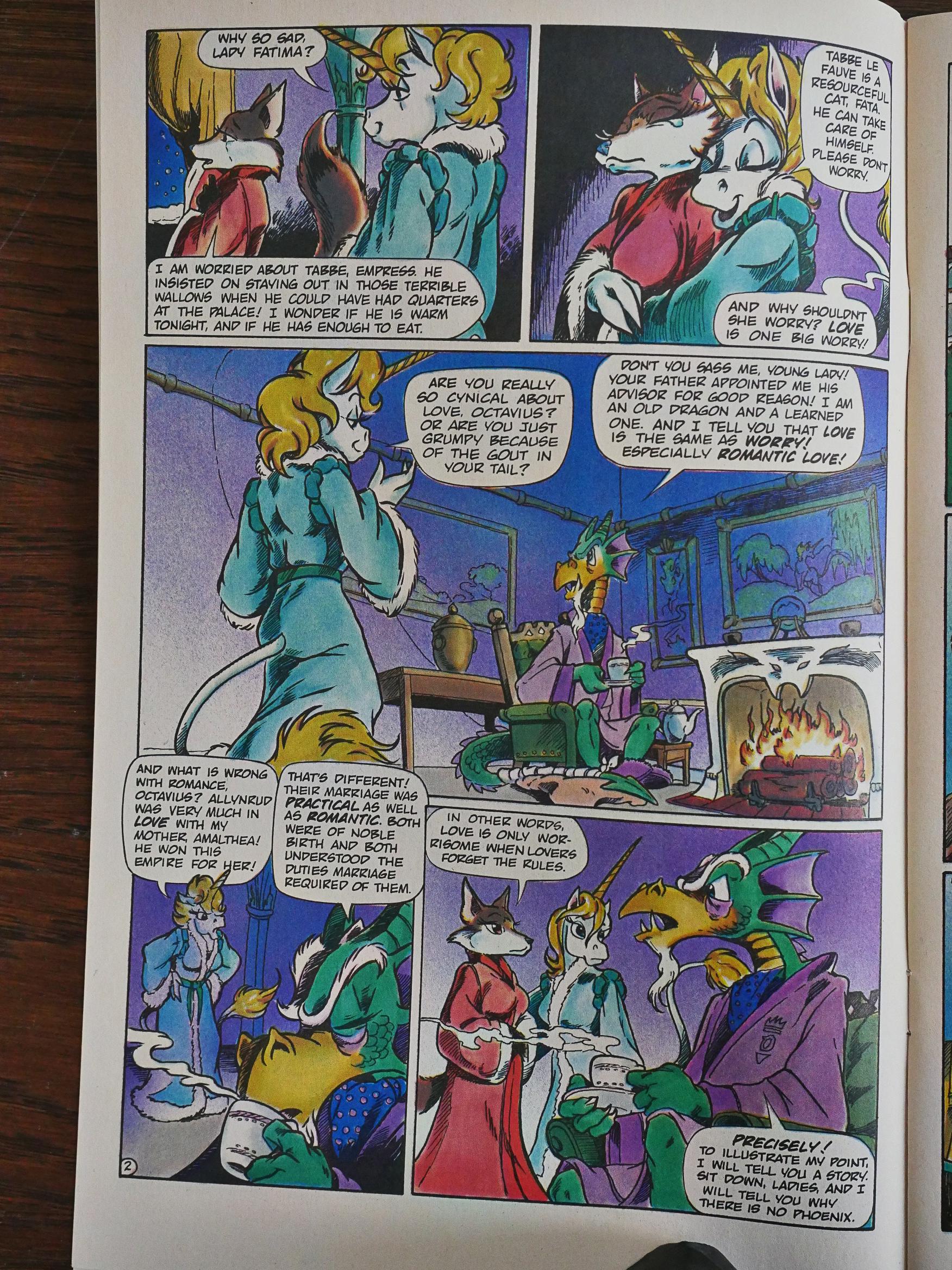
In this colour special, we’re apparently dropped into whatever drama is going on in the non-colour non-special bits of the Xanadu series, but we’re being “as you know, Bob”-ed through the introduction.

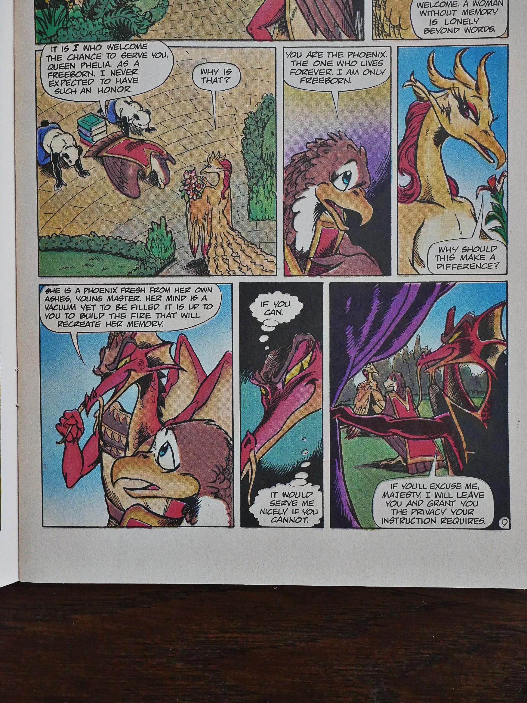
But then that turns out to just be the framing for the main story, which is all about a phoenix and is apparently not part of the storyline? I guess that makes sense?

Anyway, it’s not a very compelling story. You’ve got the wise leader and the evil advisor, and things happen pretty much as you’d expect.

Wyman’s artwork is competent and clear, but not particularly thrilling.

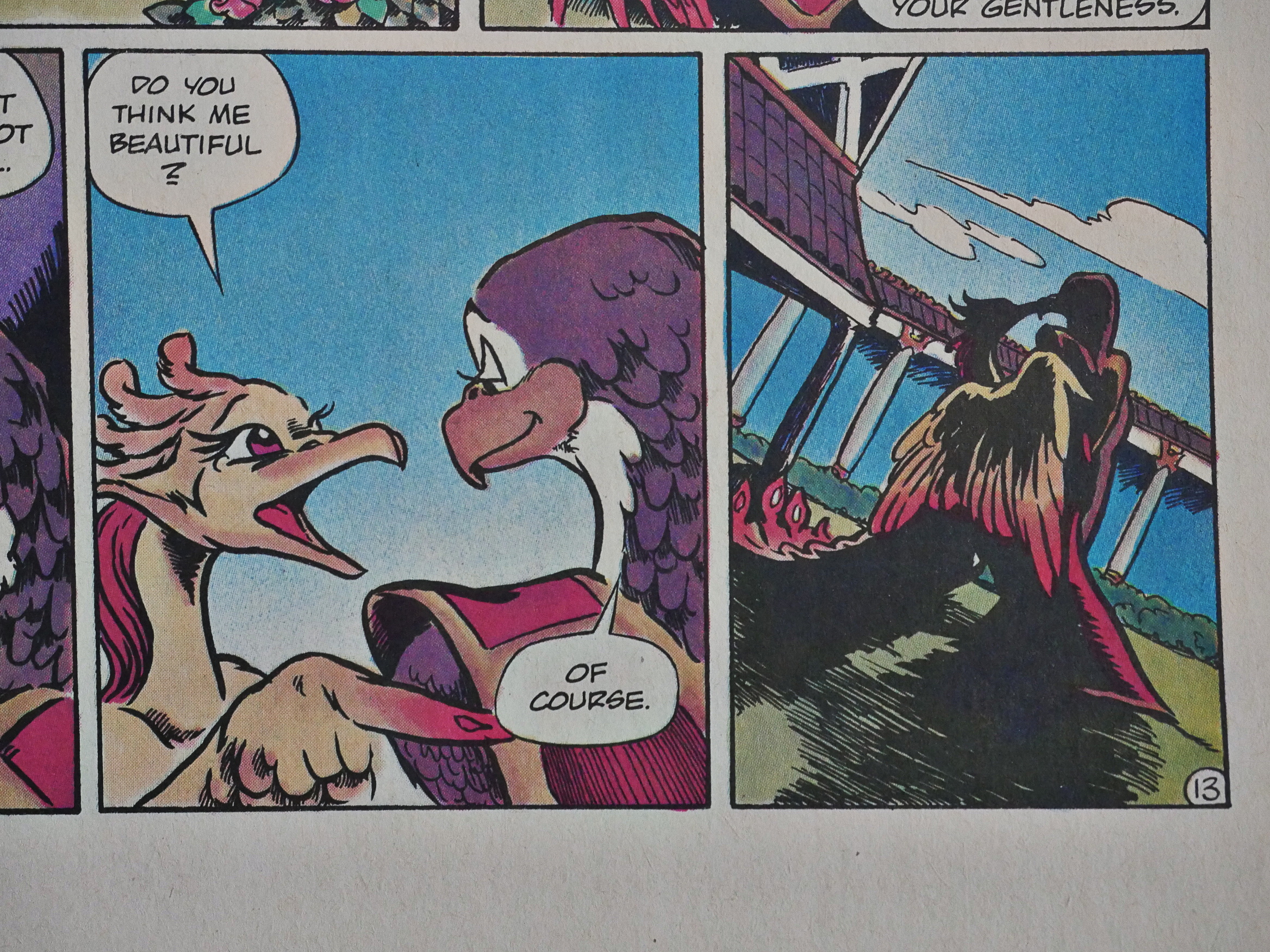
And perhaps it’s just me, but seeing birds kiss is a bit on the weird side.

None of the Xanadu stuff has been reprinted, apparently? But that’s kinda normal for Gallacci’s stuff: He was enormously popular in the 80s, but then he kinda tapered off, and left all his various storylines unfinished. Unfinished stories aren’t very attractive when doing reprints.

1988: Pigeons from Hell

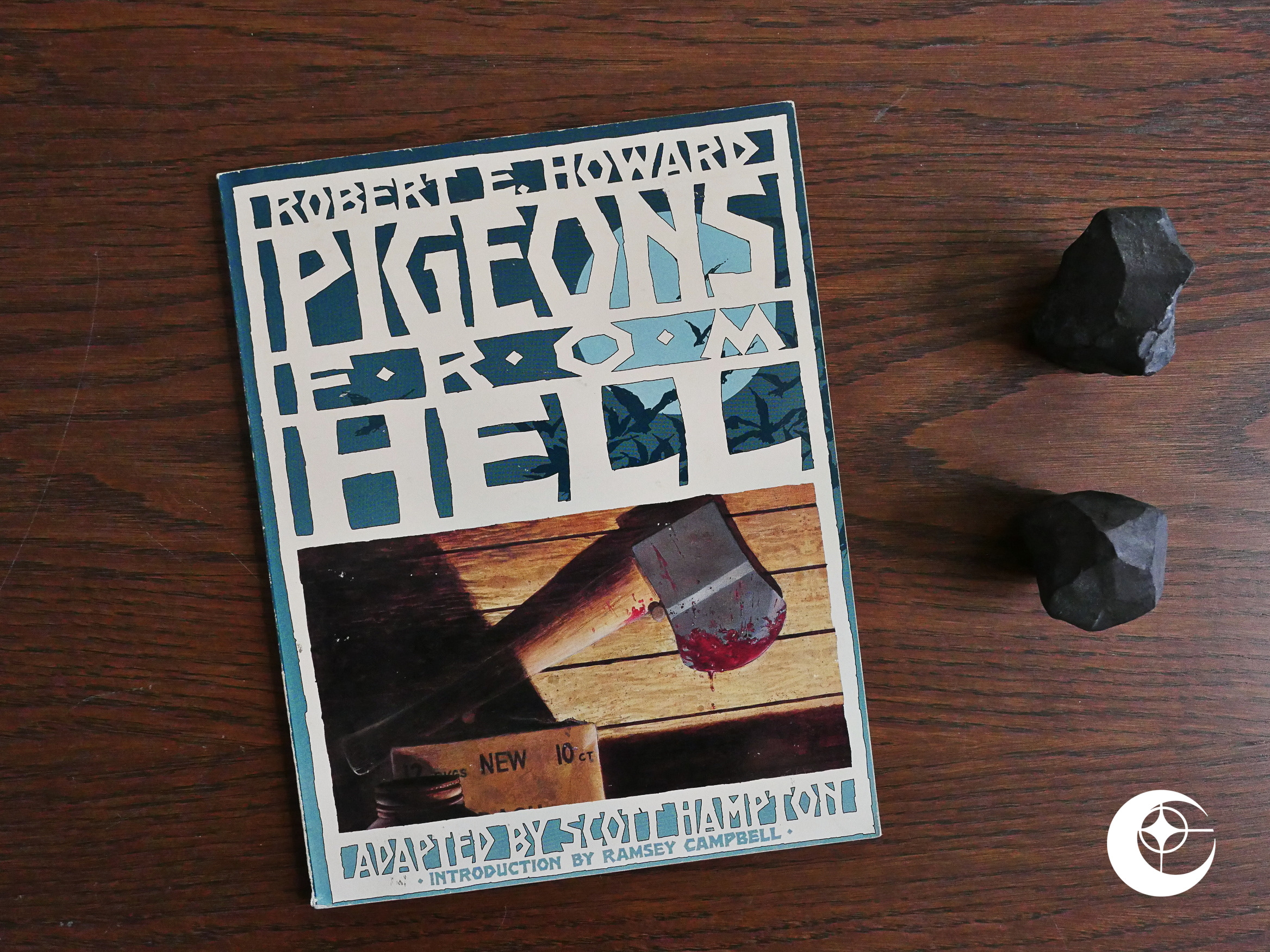
Pigeons from Hell (1988) #1 by Scott Hampton adapted from a story by Robert E. Howard.

Hey! Scott Hampton! The Hampton siblings have published a substantial bit of comics at Eclipse, like Lost World and Silverheels, but this is the first solo Scott Hampton thing. And it’s a 50 page graphic novel adaptation of the Robert E. Howard horror novel from the 30s.

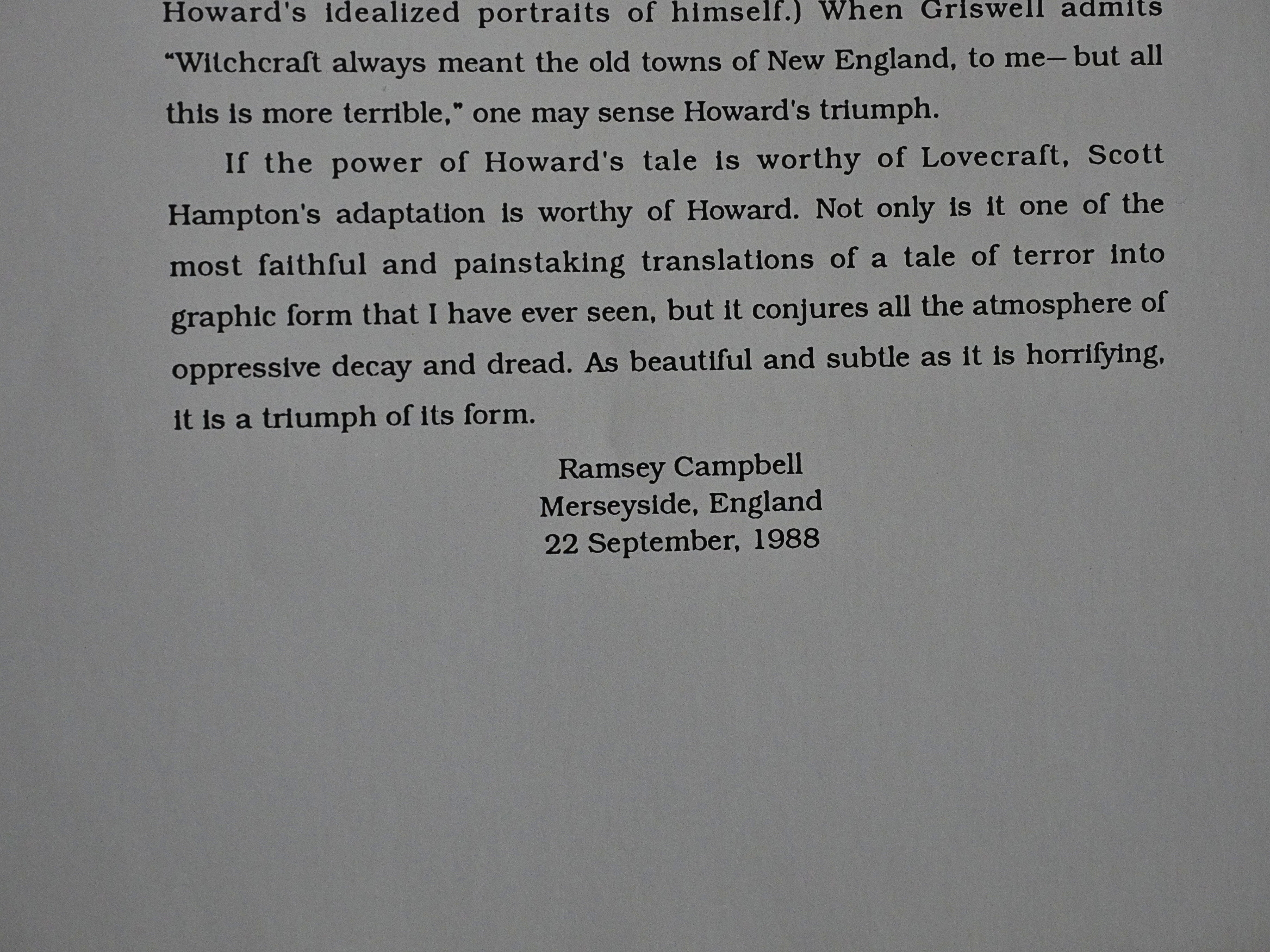
We get an introduction that provides some context, and then ends by calling the adaptation “a triumph”. Hard sell introductions are a weird phenomenon.

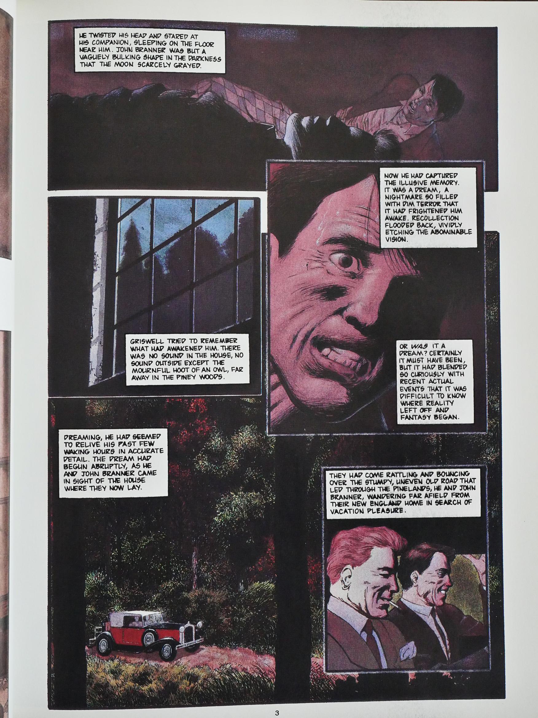
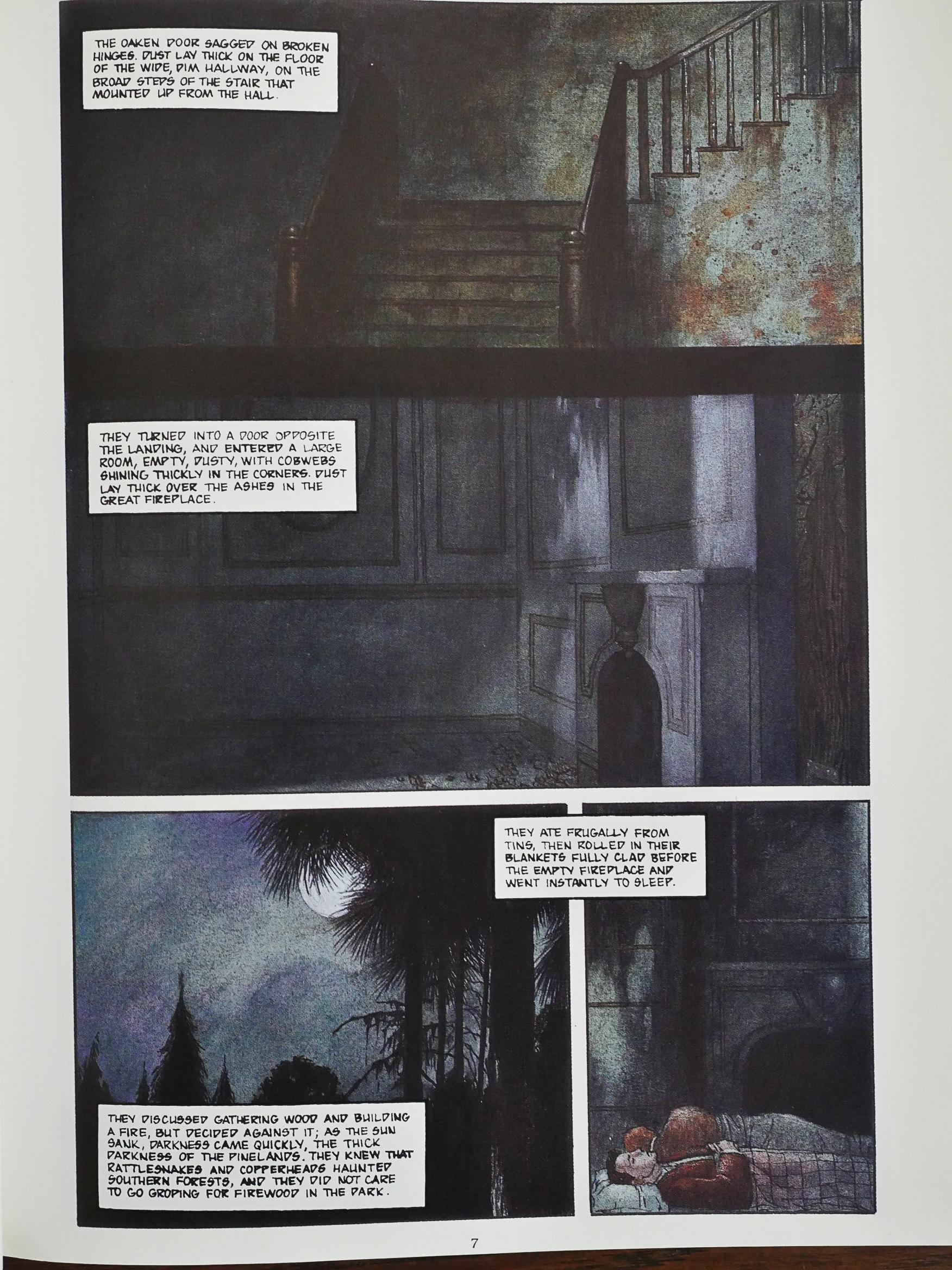
Scott Hampton’s fully-painted artwork is really pleasant to look at, as usual, but the approach taken in the adaptation is pretty dull. Large blocks or narration that tells us what we’re already seeing in the panels.

But I guess it does lend a certain ponderous mood to the proceedings, which is quite apposite. Those are some nice horror interiors, eh?

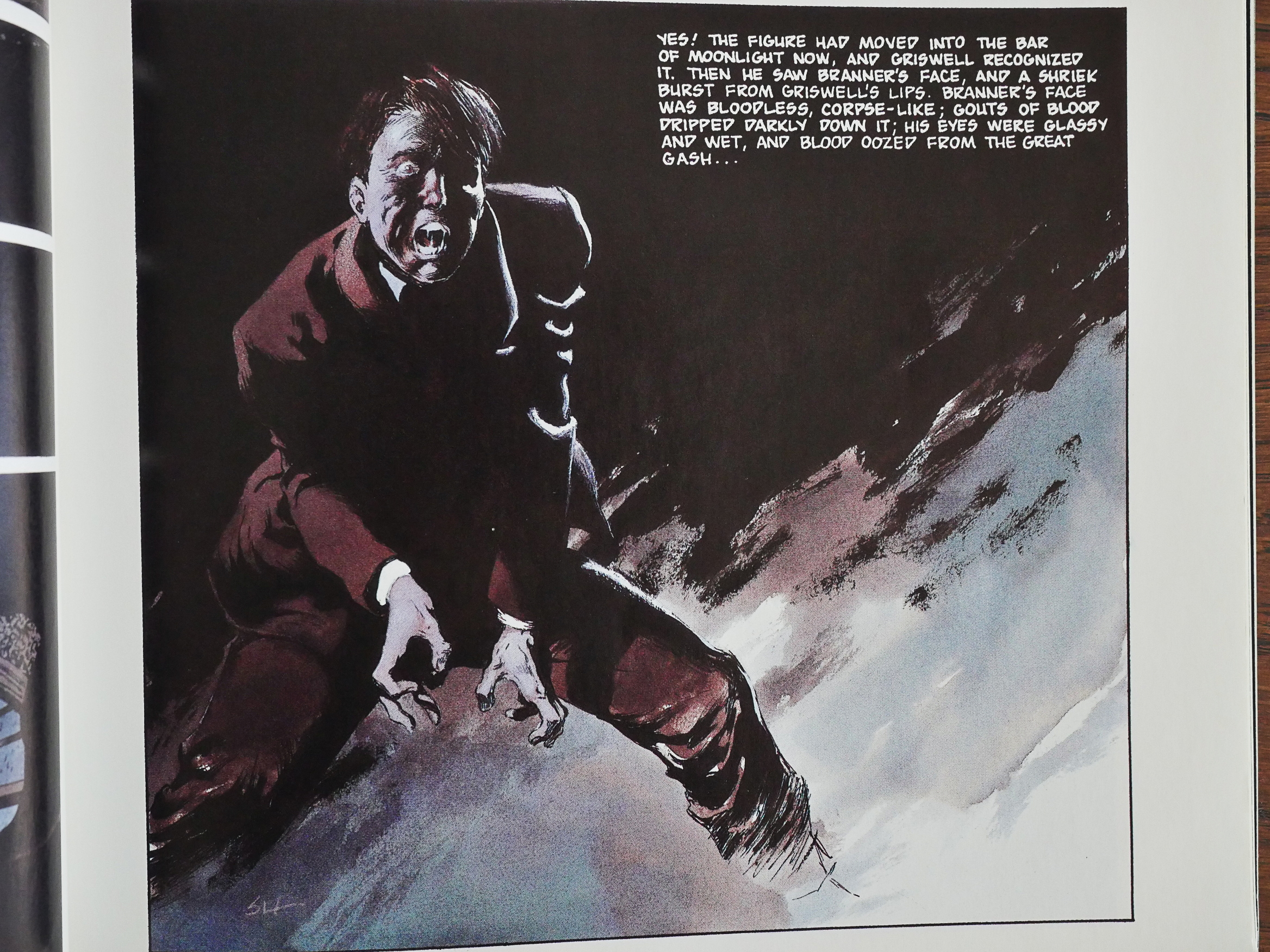
And that’s the most Bernie Wrightson horror stance not drawn by Bernie Wrightson.

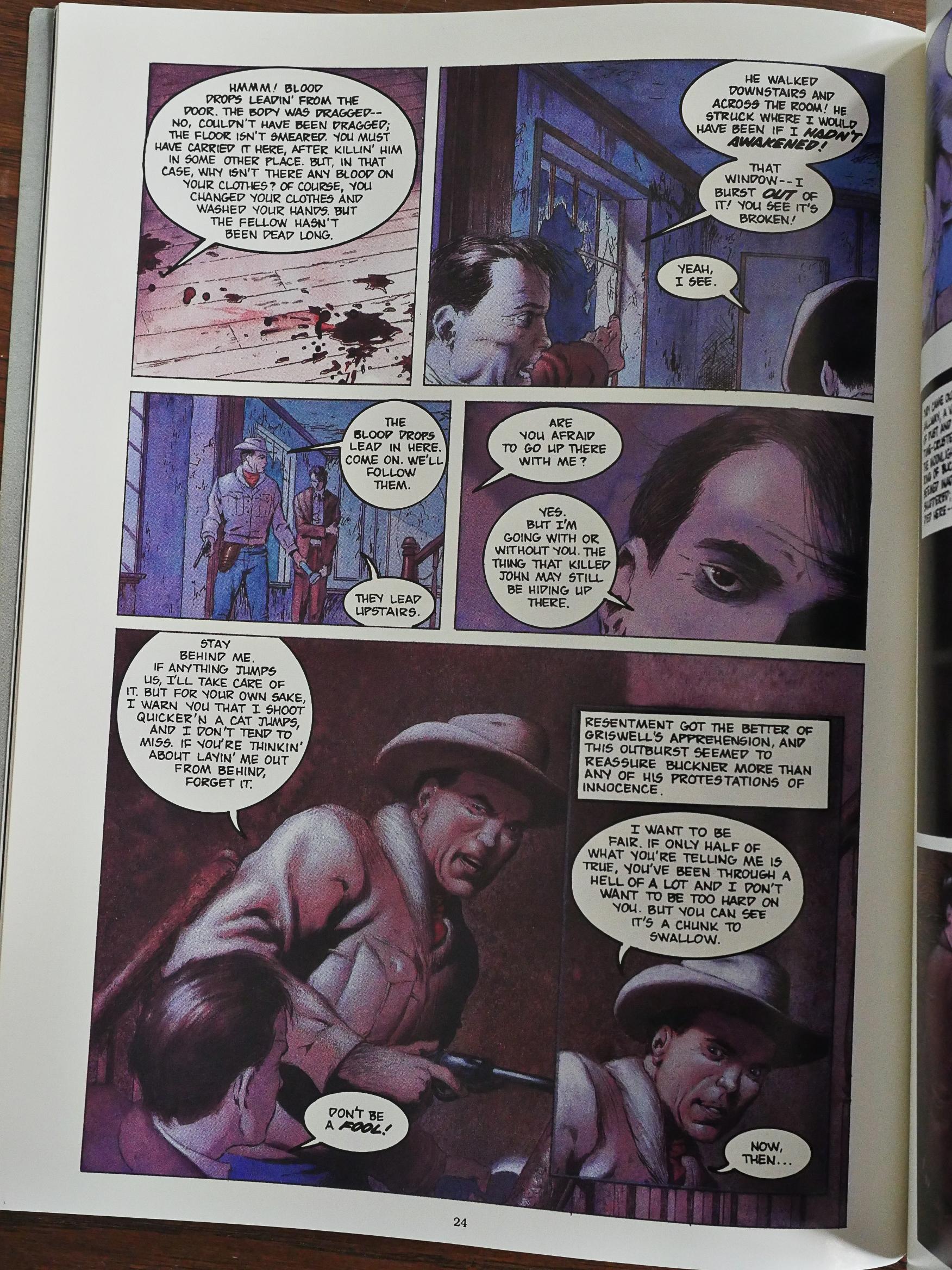
Fortunately Hampton shifts his approach completely once the opening, scariest chapter is over. We’re introduced to a sheriff who’s very smart and capable and soon solves all the mysteries and horrors. The problem is that the comic loses its tension when it switches to this more comic-bookey approach. So while it reads better, it also loses something.

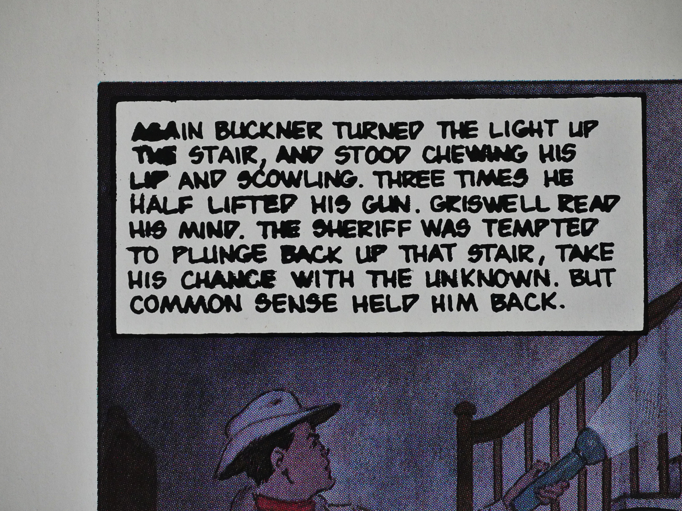
And the printing isn’t very good. The colour often smudges into the white area, and the black plate suffers from serious ink gain.

It seems to be well liked:

There are some truly beautifully painted pictures of the mansion there. Very dark, but extremely atmospheric…and creepy. The pictures of the stairs are also well drawn, blending light and colors in a way where you can, just like the main character, barely see something on top…but just barely.

It has apparently never been reprinted, which is odd.

1988: Into the Shadow of the Sun: Rael

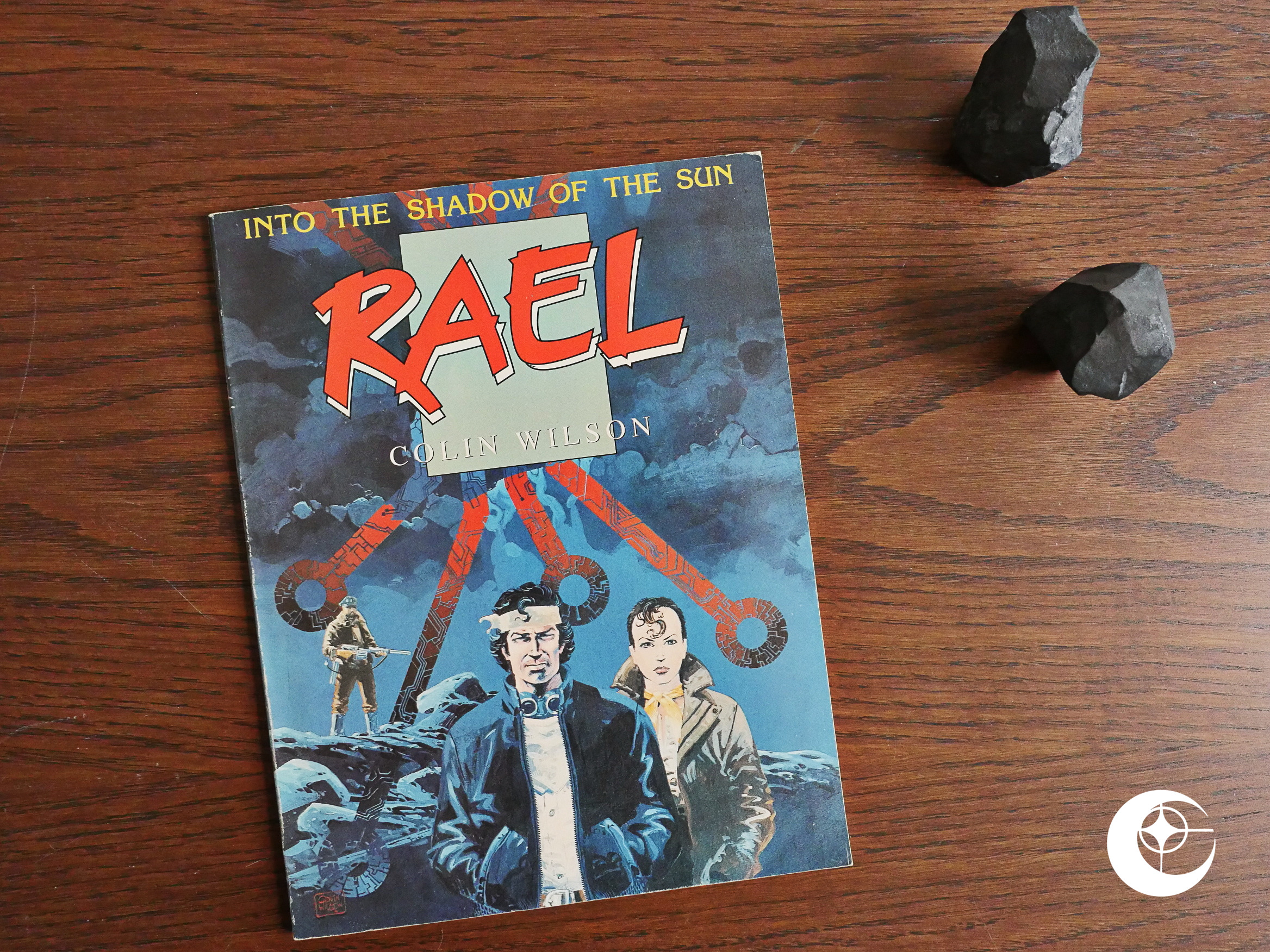
Into the Shadow of the Sun: Rael (1988) by Colin Wilson et al.

I thought this might be one of the promised Argentinian graphic novels translated through the 4Winds connection (like the Merchants of Death magazine), so I was not very enthusiastic about reading this. On the other hand, Colin Wilson doesn’t seem like a very Argentinian name…

But this arrived at Eclipse via the Acme Press connection (like the Aces magazine), which made me more enthusiastic. Editor Cefn Ridout at Acme seems to have pretty good taste. But Editions Glenat? Colin Wilson doesn’t seem like a very French name, either.

And this is the first album in a projected three part series.

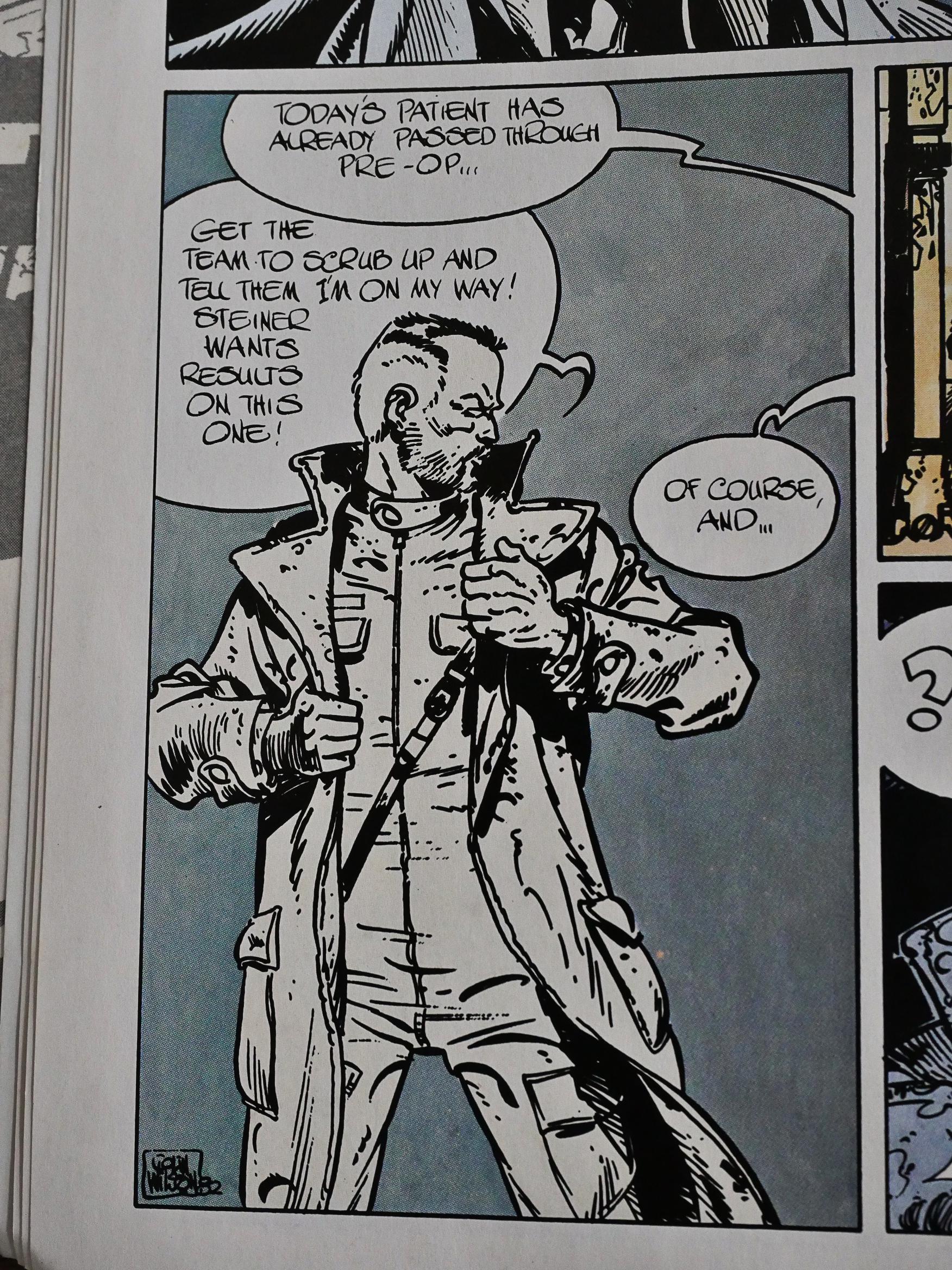
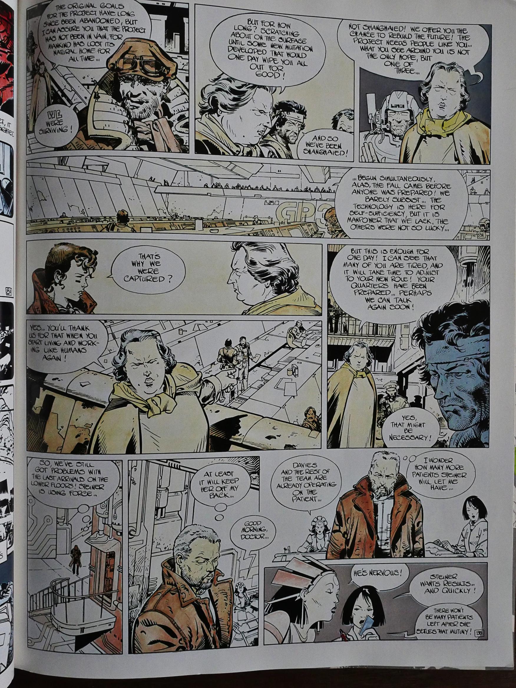
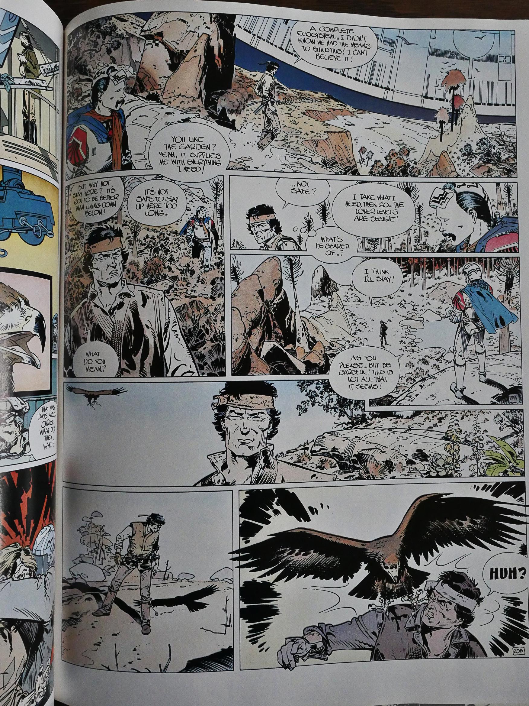
The artwork looks very much like cod-standard post-Jean Giraud science fiction: A bit scruffy and dirty, mixing contemporary and futuristic. But the most striking thing about this is the colouring, which I’m wondering is a… mistake?

Is this supposed to look like this, or did the printer do something wrong during the colour separations? Or is it an aesthetic choice to show how bleak and bleached everything is in this space station?

But when Our Hero gets “outside”, the colour palette doesn’t really change. Really weird.

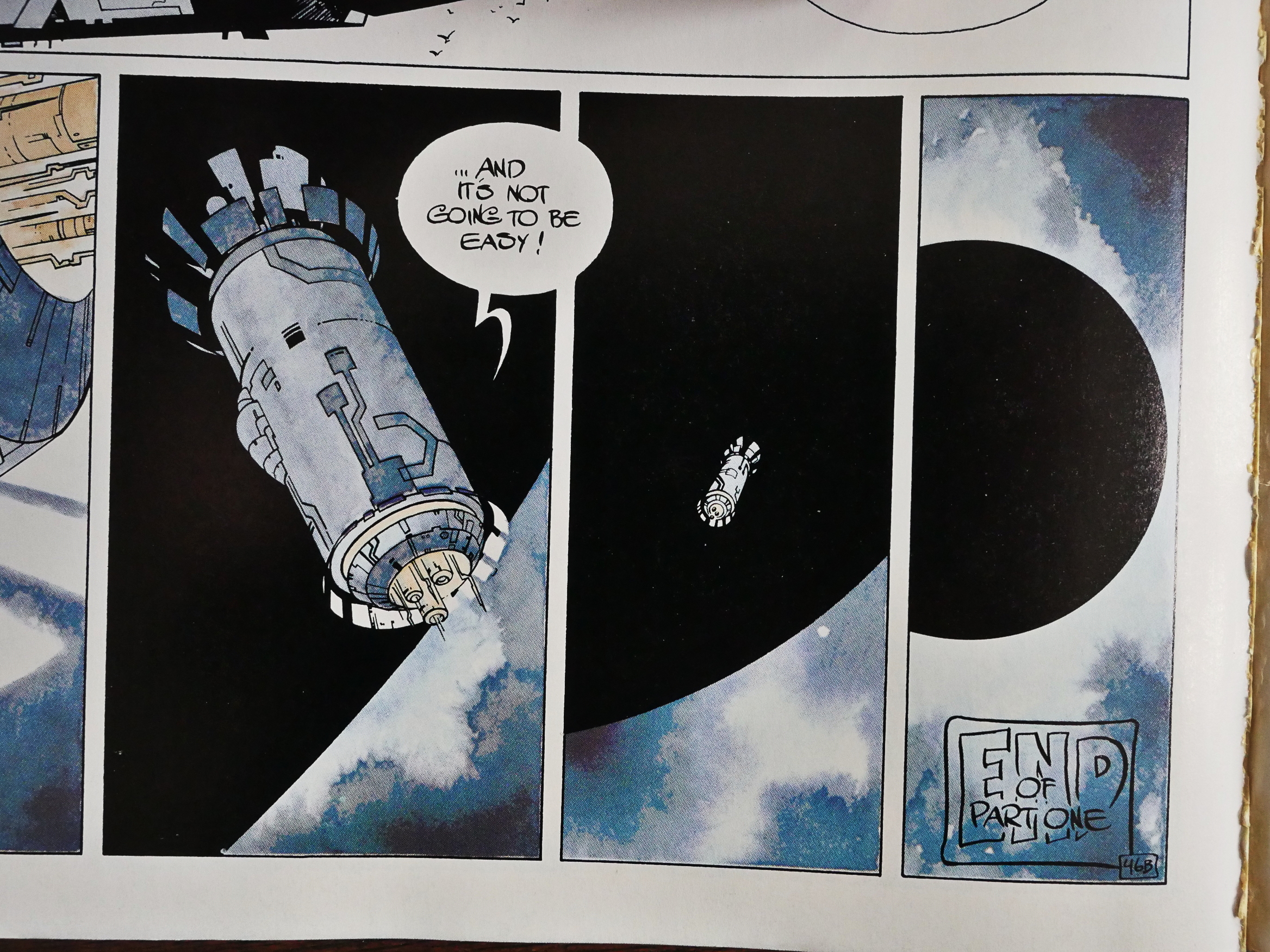
Anyway, it definitely looks like a French dystopian sci-fi thing, and it reads like a retread of all those you’ve ever read, only a bit more confusing. It’s not very exciting, but the artwork’s nice and I liked the robots.

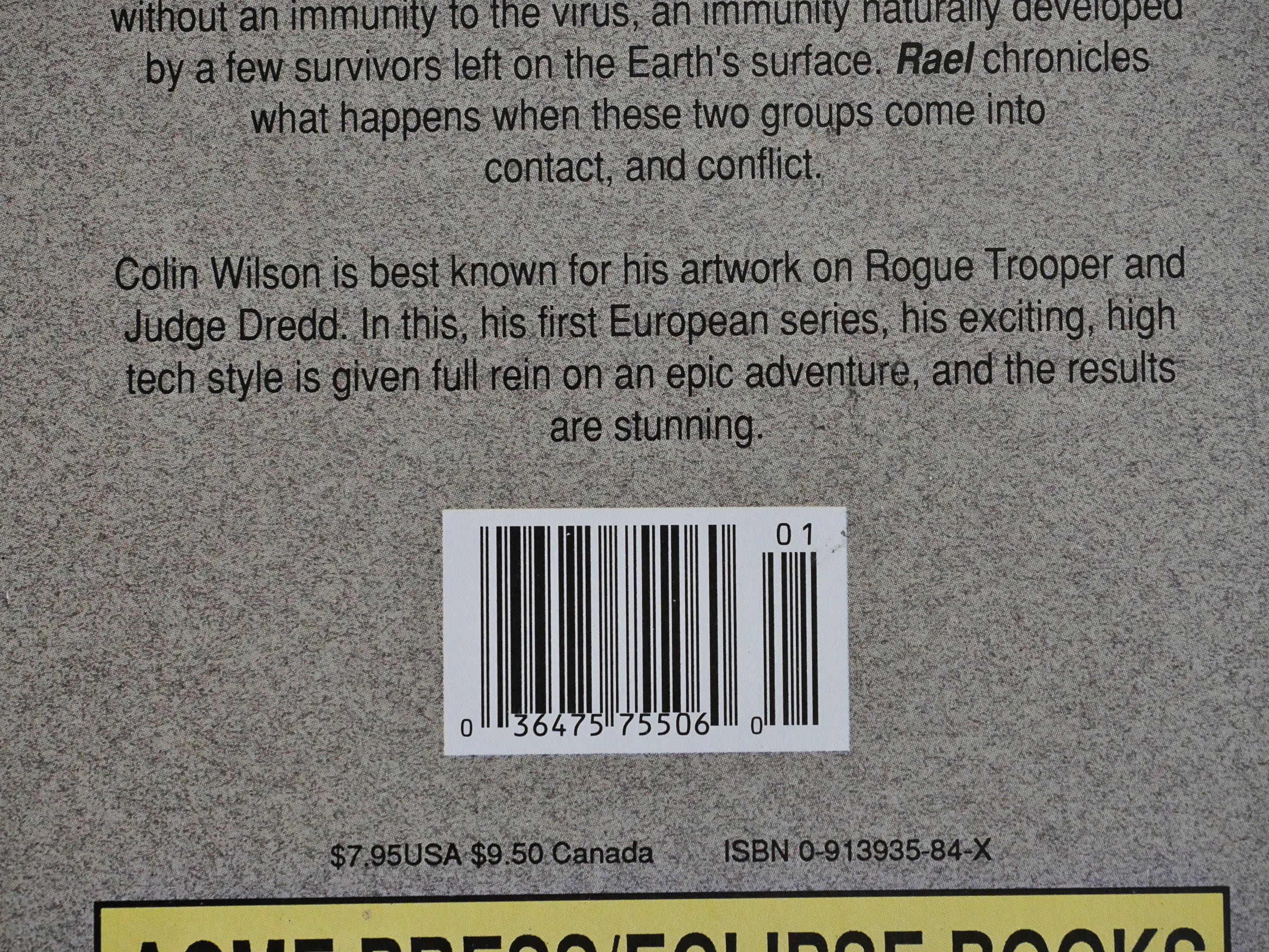
And then it ends, and the subsequent parts were never published in the US. They were in France, though, under the name Dans l’ombre du soleil. And apparently, my Giraud comparison wasn’t completely off the mark, since Wilson had also been doing Young Blueberry, the series that Giraud co-created.

That web site also claims that Wilson did the colours himself on the Glenat edition, while Janet Gale is listed on the US version. I’ve been unable to find the French version of any of the “bleached” pages on the web, so I can’t really compare.

Aha! That explains the Acme Press connection: Colin Wilson is British and used to work on Judge Dredd before going bande dessinée.

1988: Real Love: The Best of Simon and Kirby Romance Comics

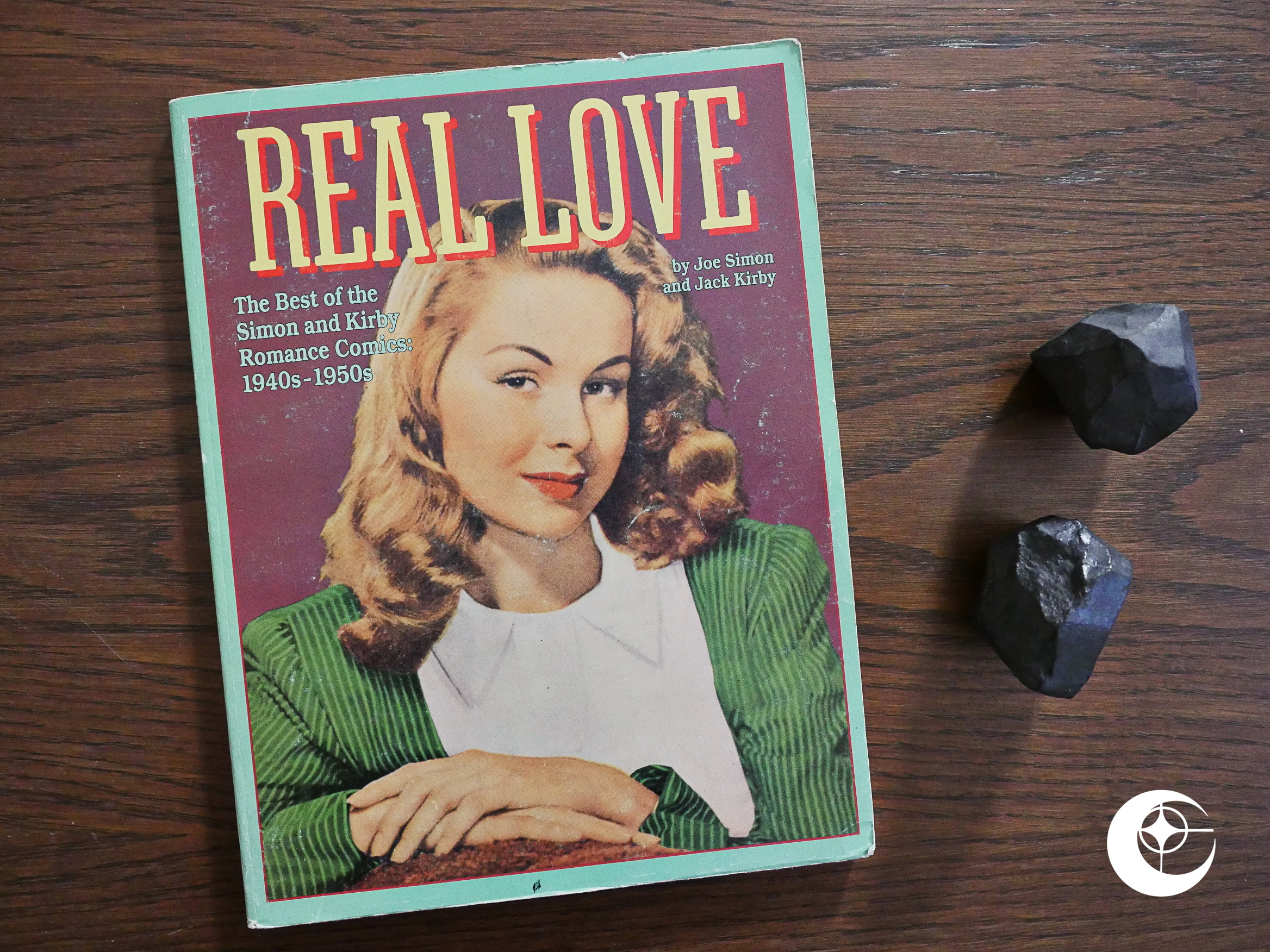
Real Love: The Best of Simon and Kirby Romance Comics (1988) by Joe Simon and Jack Kirby et al.

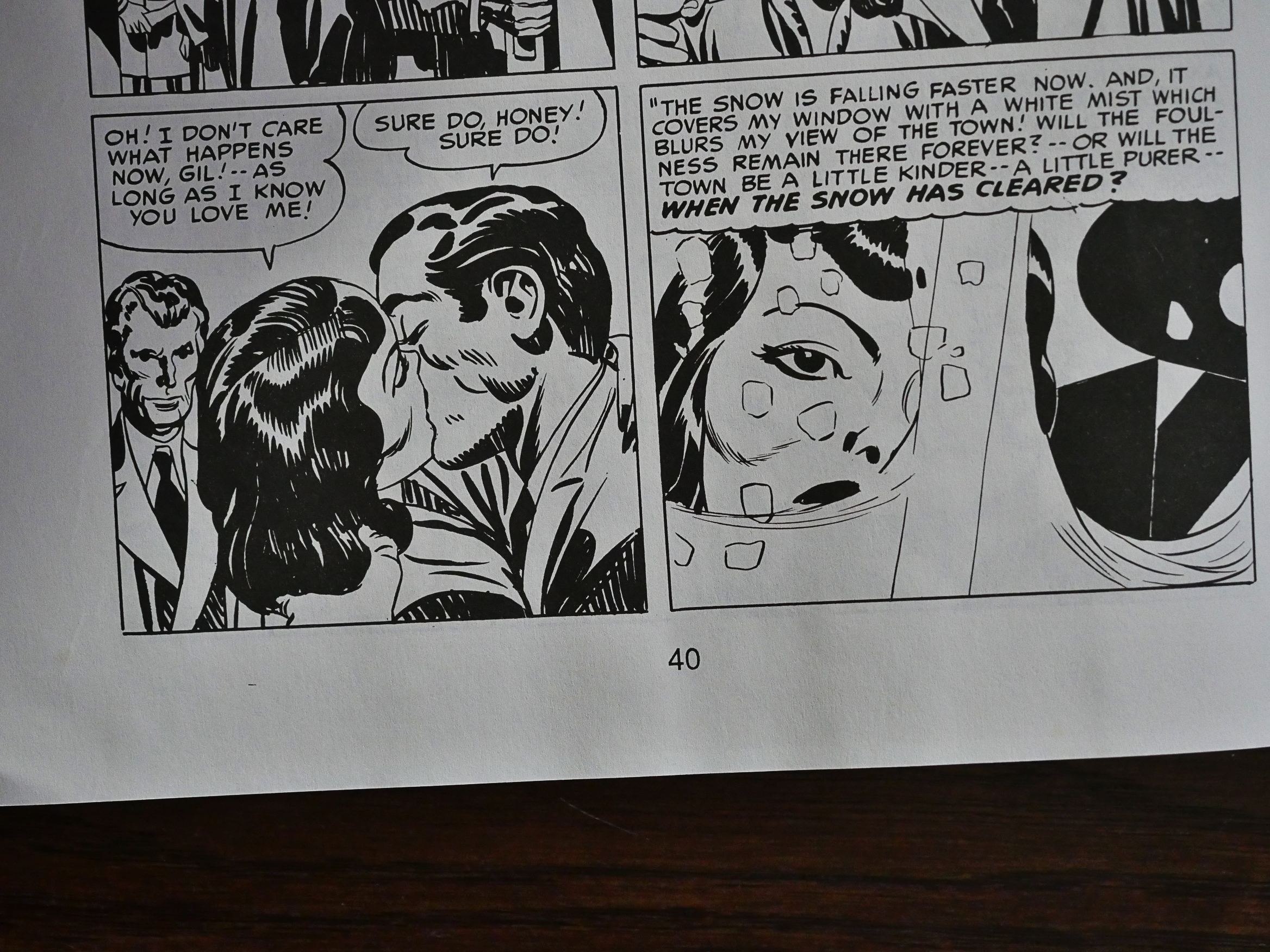
I approached this 160 page collection of comics from 1949/50 with some trepidation. I’m bored silly by most older American comics: I once bought a Craig Yoe collection of pre-code public domain romance comics and I literally died of boredom.

Literally.

Somehow, my zombie corpse is still trundling around the world and reading comics, and so we come to this collection. Would I succumb to the powers of Anubis once again, or would my carcass be spared?

On the other hand, I had been presently surprised by some of the other Eclipse reprints from the 40s and 50s; in particular the Seduction of the Innocent series which shows that there are entertaining gems to be found here and there. It’s just that Craig Yoe doesn’t have much of a talent for seeking them out.

And I’m no Jack Kirby fan. I mean, I’ve read an Imperial Metric ton(ne) of his books, and I enjoy reading some of them, and I enjoy looking at more of them, but I’m no fan. Still, these comics were (as Richard Howell’s introduction explains) really, really commercially successful at the time they were released, so perhaps there’s some light entertainment value to be had? I mean, I’m not asking for a lot… I’m not expecting brilliant melodrama a la Douglas Sirk, but just some fun.

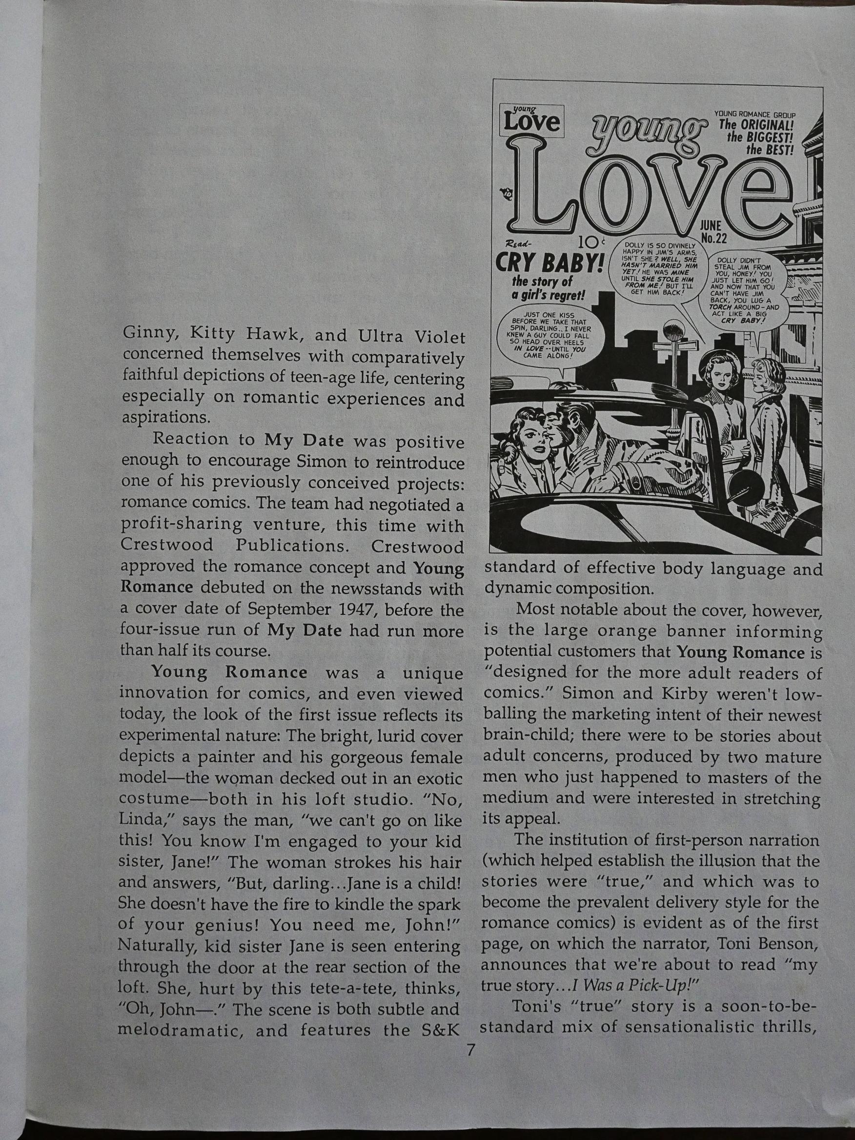
This is a pretty well-done reprint project. Howell provides a lot of historical context to the stories, and provides a paragraph or two about each story; some of which helped me parse some of the more coded issues that I might not have been completely sure how to parse otherwise.

Greg Theakston is listed as the main production person on this book, which I take to mean that these comics went through the controversial “theakstonizing” process. Basically, Theakston would take two copies of a printed comic book, bathe each page in a chemical bath that would dissolve the colours, and then end up with a black-and-white page that the printer could then use for reproducing in black-and-white. A couple of years later, this would be done by scanning the pages and removing the colours on the computer.

If that’s what these pages went through, the results aren’t all that bad… I mean, many of these pages clearly look like if they’ve been reproduced from newsprint, but I’ve seen a lot worse.

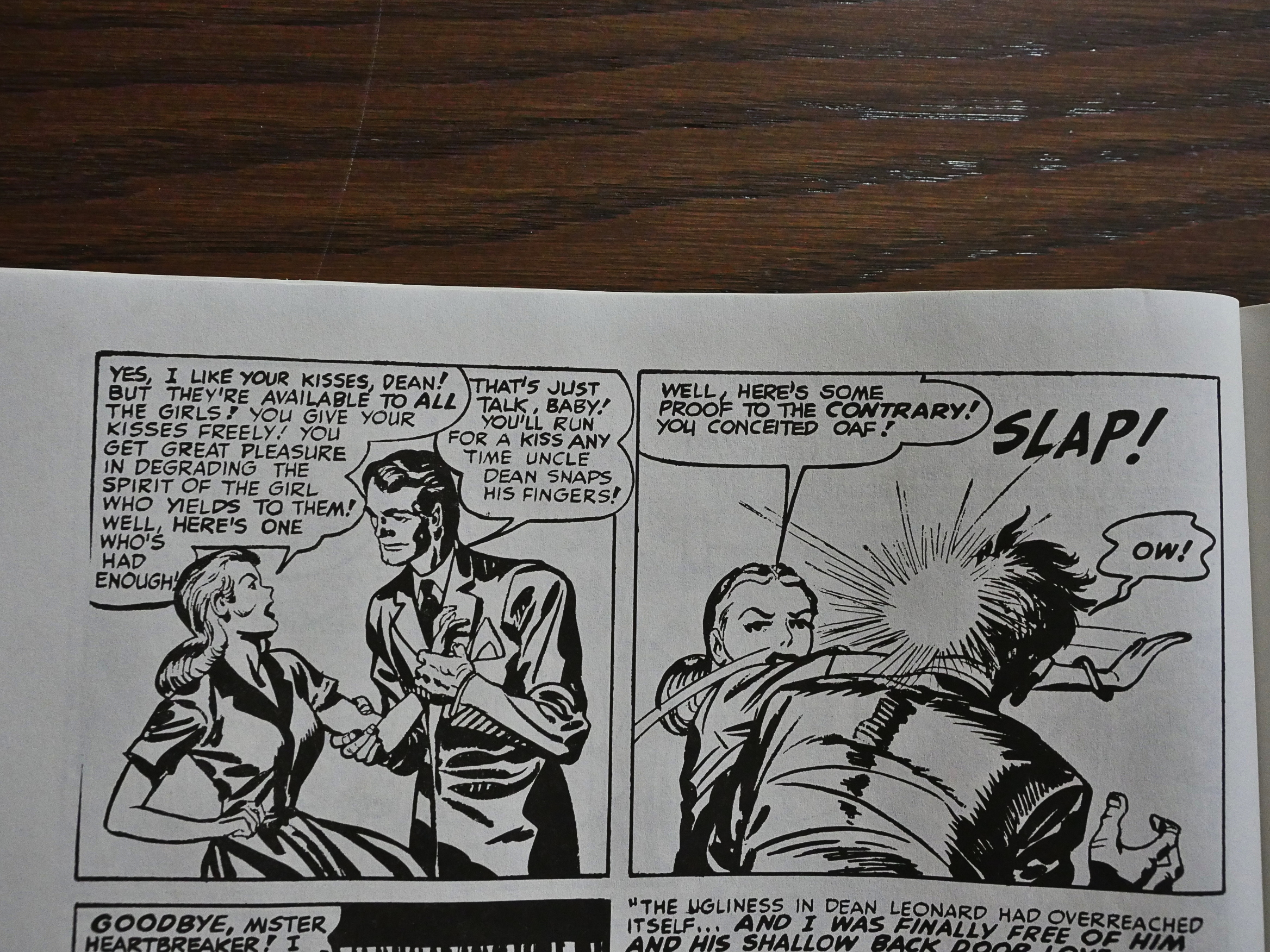
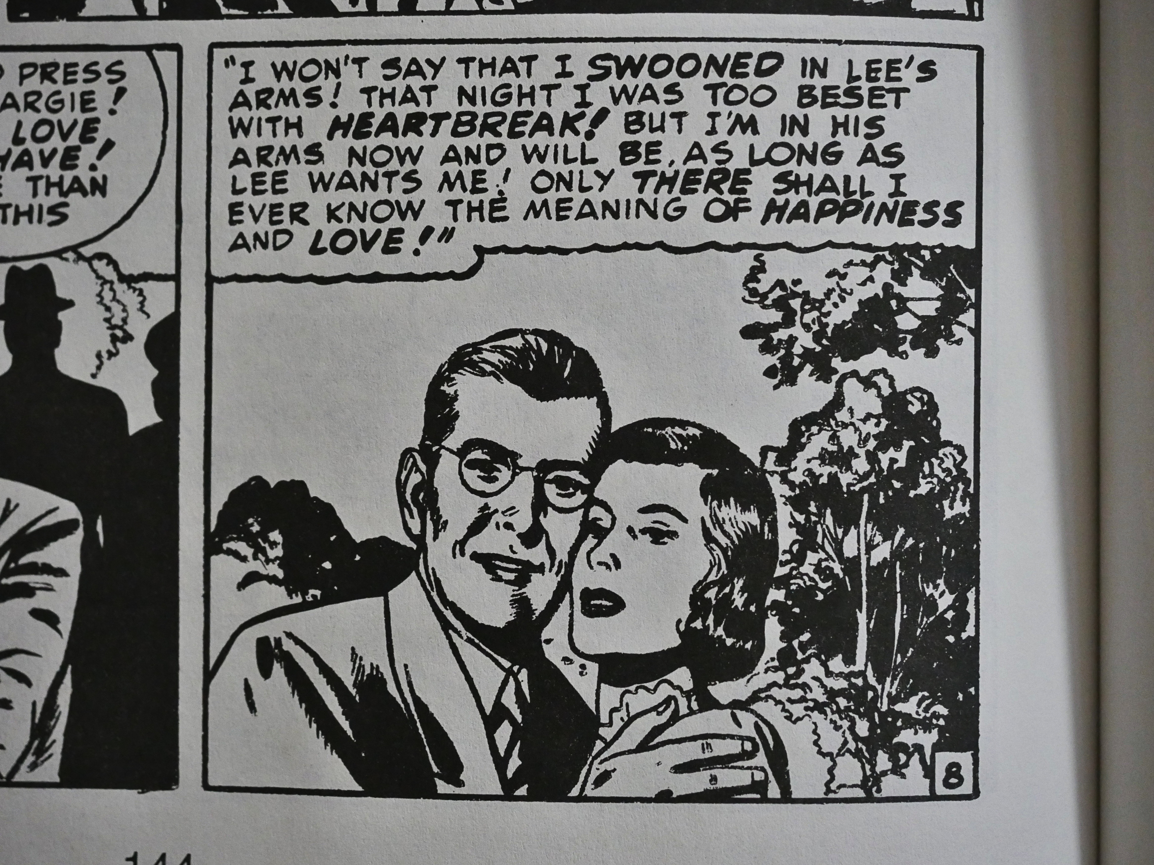
(And also about that page up there: Tee hee.)

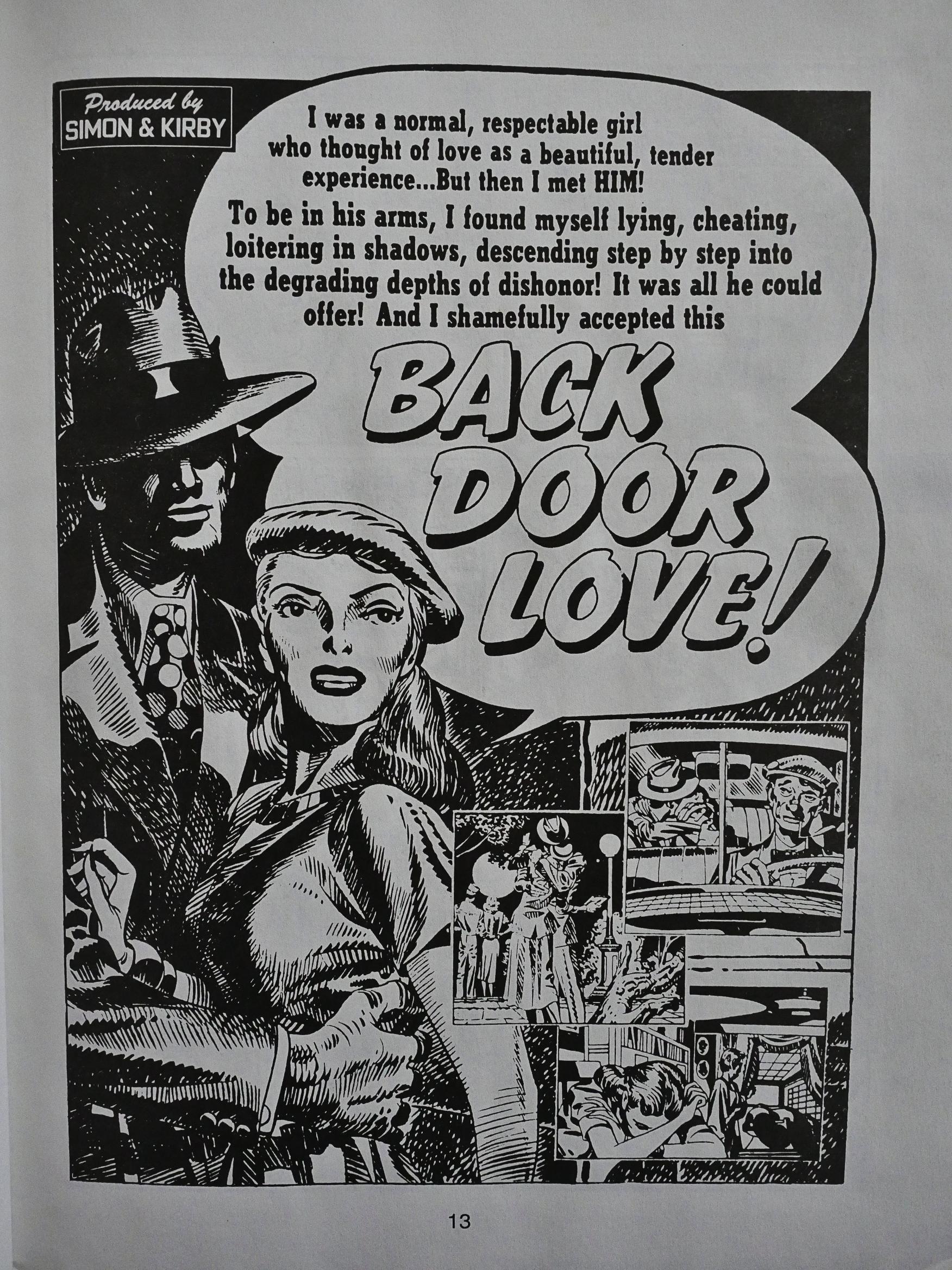
Anyway, these are romantic short (8-15 pages) stories, but they’re pretty dense. In some of the more involved storylines you almost feel like you’ve just seen an entire 50s B movie. They’d need to pad out the time a bit with some dance scenes, but these are incredibly imaginative stories that pack an emotional punch. I’m found myself completely won over after just having read a few pages.

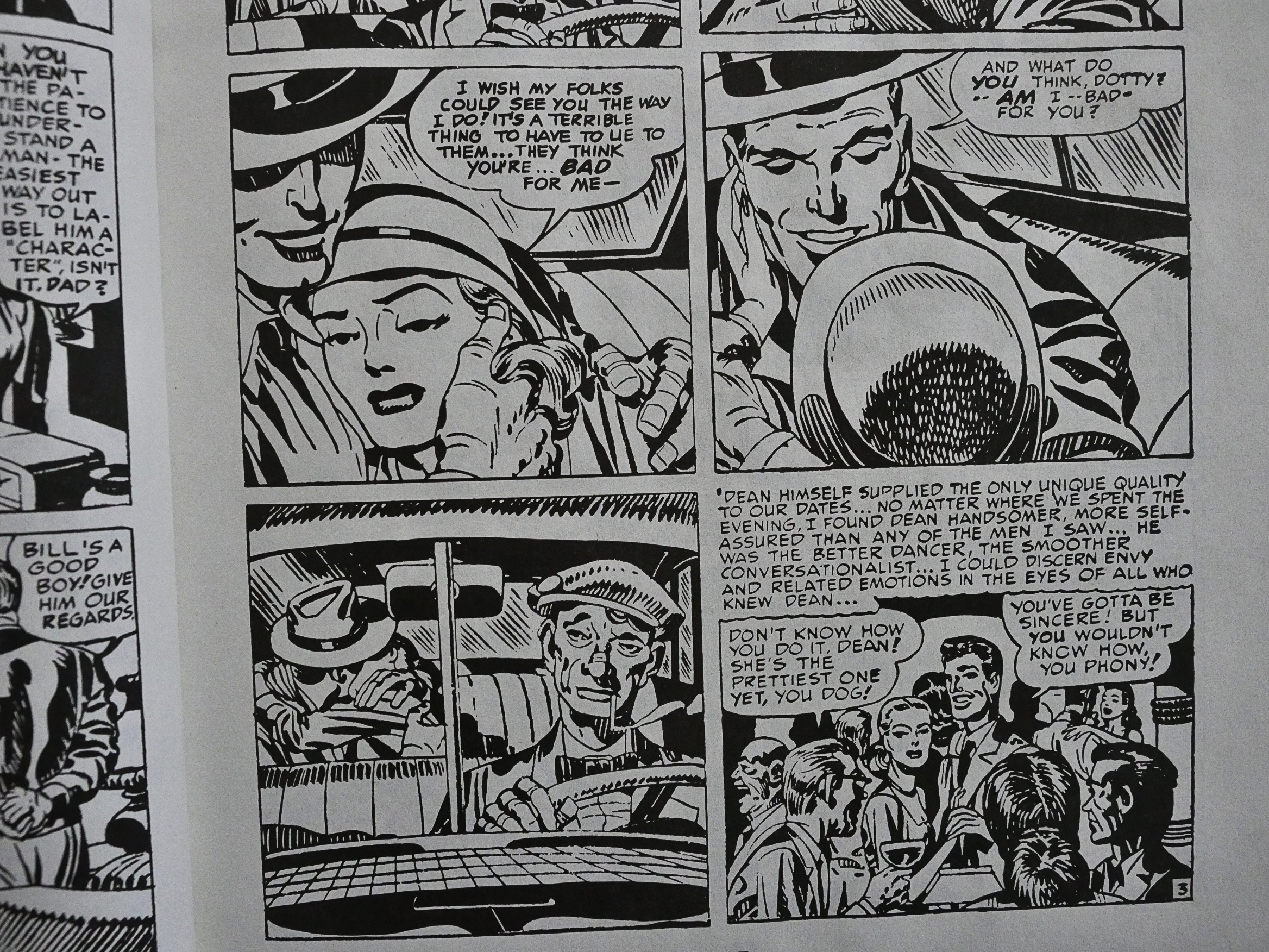
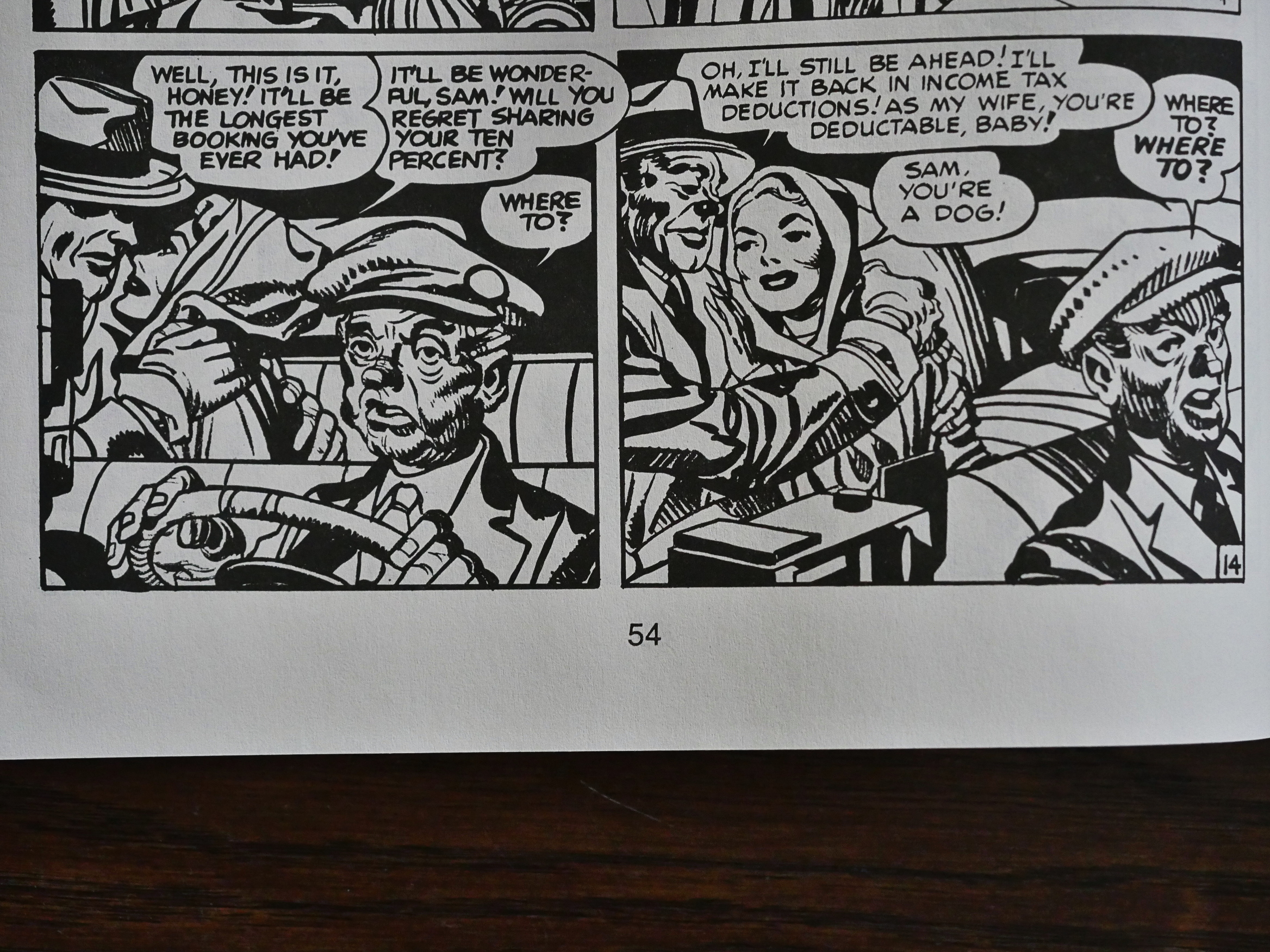
And just look at that laconic expression on that cab driver’s face. Just look at it!

The editor picked out a small selection of stories, and these are presumably “the best”. While you expect a certain amount of repetition, plot wise, when reading an anthology of these stories, there’s virtually none to be found here, so either Simon and Kirby were plotting geniuses that had stories on tap forever, or the editor was very careful and thoughtful in the way he selected the stories.

All of the pieces are told by the protagonist, so there’s a confessional/bragging/whatever “I” voiceover to every stories, but other than that, the protagonists are men, women, nice people, bad people, and weird people.

I’m also impressed by how much agency the female characters are given. In most of the stories, they’re the driving force, even if the protagonist is a man.

These comics were obviously meant for colour printing, and Kirby and/or Simon left lots of white space in many panels to be filled out. So it should perhaps have remained in colour. And some of the panels show more signs of having had serious retouching than others. The woman’s face up there, for instance, looks a bit off, I think, and the lines on the man’s face look rather blunt.

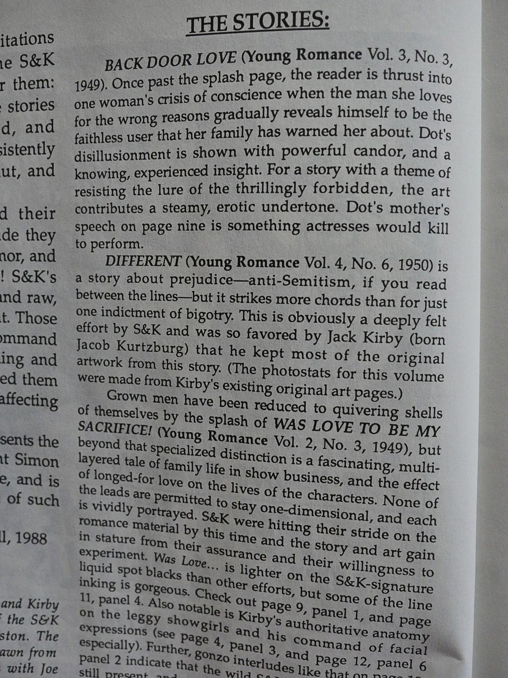
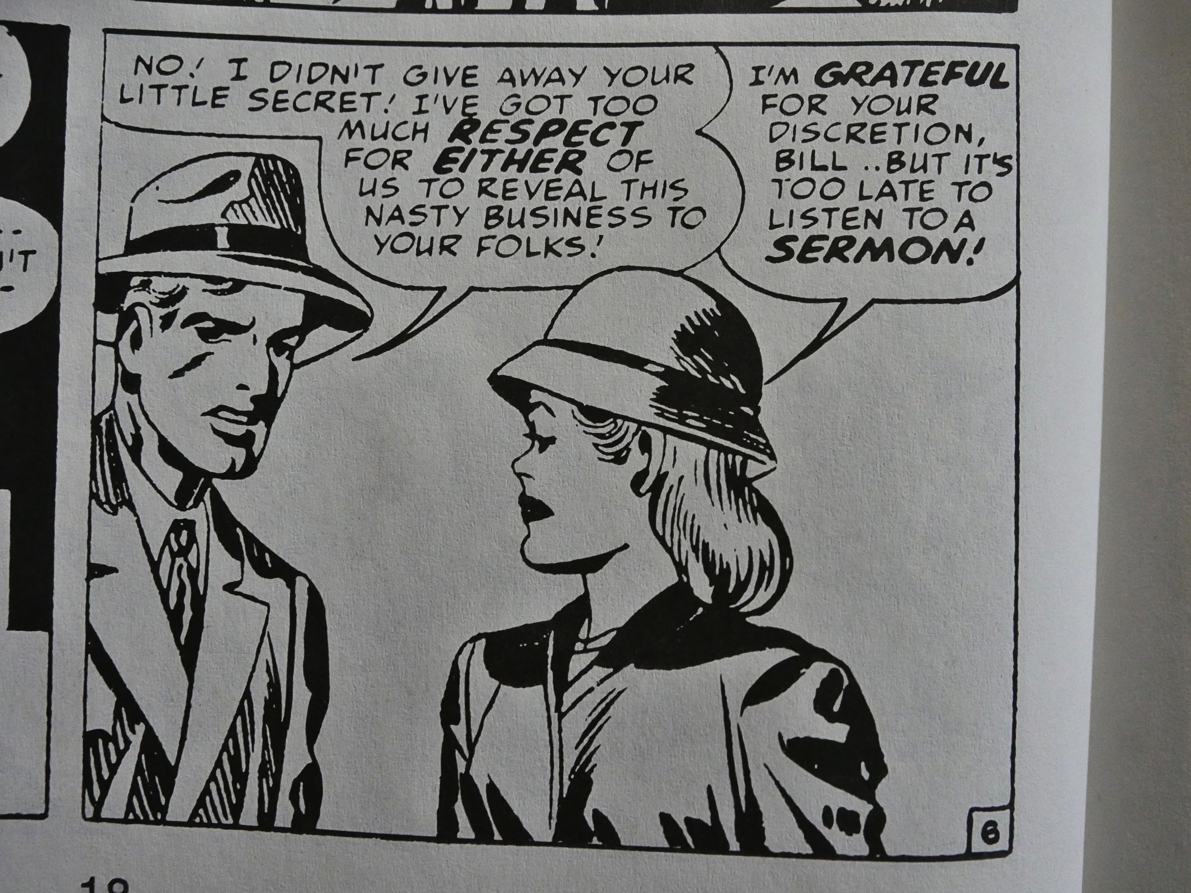
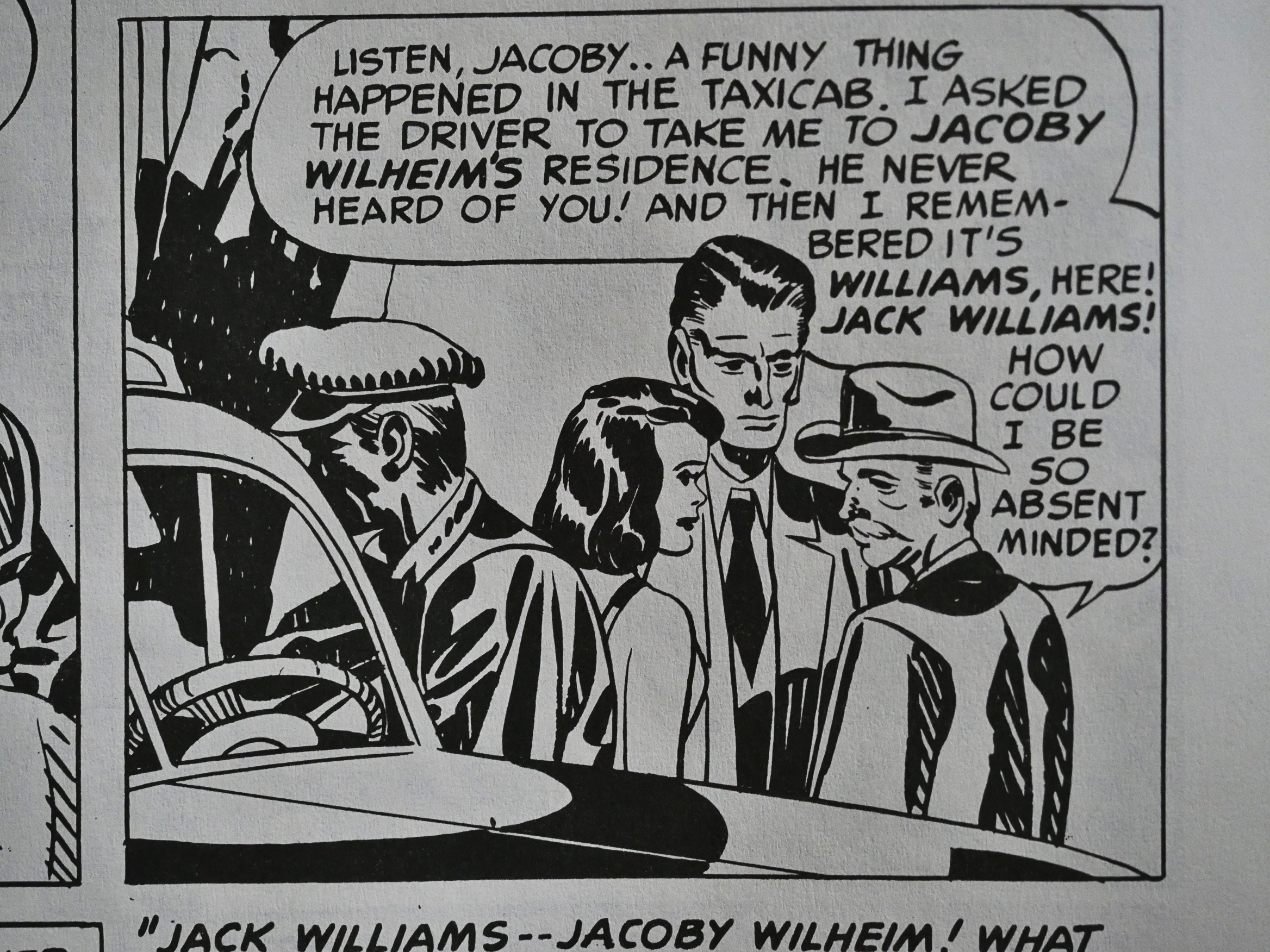
Simon and Kirby were always political. Captain America, their first breakthrough creation, was always off fighting Nazis. In these romantic stories, some of this is somewhat coded. The man above, who’s changed his name from Jacoby Wilheim to Jack Willams to avoid persecution in the US, is only described as “a foreigner”. Did Simon and/or Kirby want to leave it ambiguous whether they were thrown out of the country club for being Jewish or for being Germans? Wilheim isn’t an obviously Jewish name; if Kirby had called him something like “Jacob Kurtzberg” there would have been less doubt…

And the story has a happy ending in the next-to-last panel, where the girl gets the goy, but then there’s the last panel, where things turn depressing again.

The introduction says that Kirby was so proud of this story that he kept the originals for it, which he didn’t with the vast majority of his vast output. And I can totally see why: It’s a great story; very affecting.

But it’s not all gloom and racism. Most of the stories are just straightforward fun. Some of them have twist endings, some of them don’t. Sometimes the girl gets the boy, sometimes she doesn’t. There’s no formula at all, which is a huge departure from the soul-killing gross of romance (and non-romance) comics from this era.

And while probably nobody thinks of Jack Kirby as a great humorist, this book has plenty of comedic touches. Mostly in the form of cab drivers who just don’t give a fuck about the dramas happening on their passenger seats.

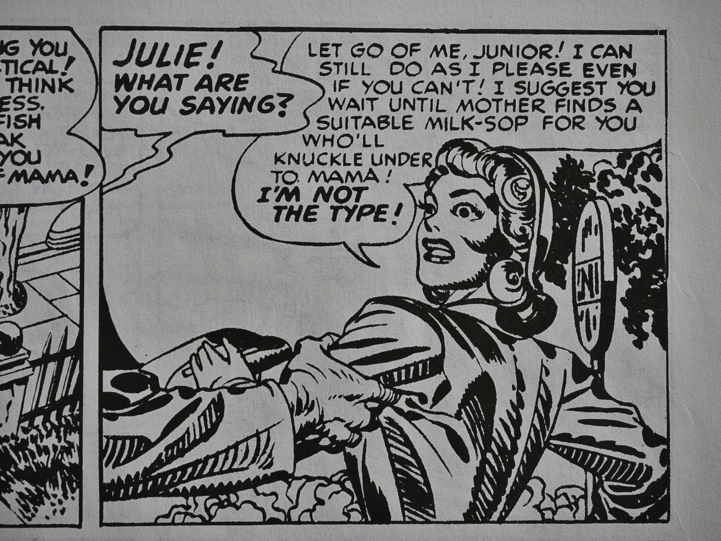
Hm… “Milk-sop”? I just wonder about the etymology… Is that the same as “milk-toast”, which I’ve also seen spelled all fancy-like as “milquetoast”? If only there were a search engine on the web or I could be bothered to put the mouse pointer on the Firefox icon… I guess I’ll never know.

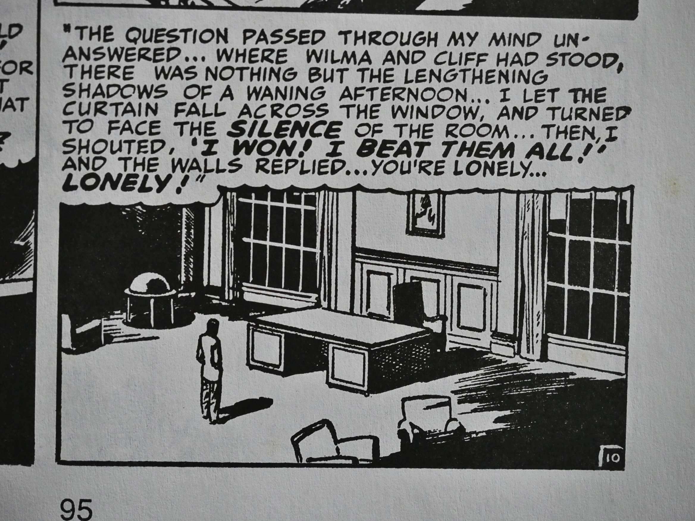
Did I mention that not all the stories have happy endings? Yes? OK, but behold the gloom above!

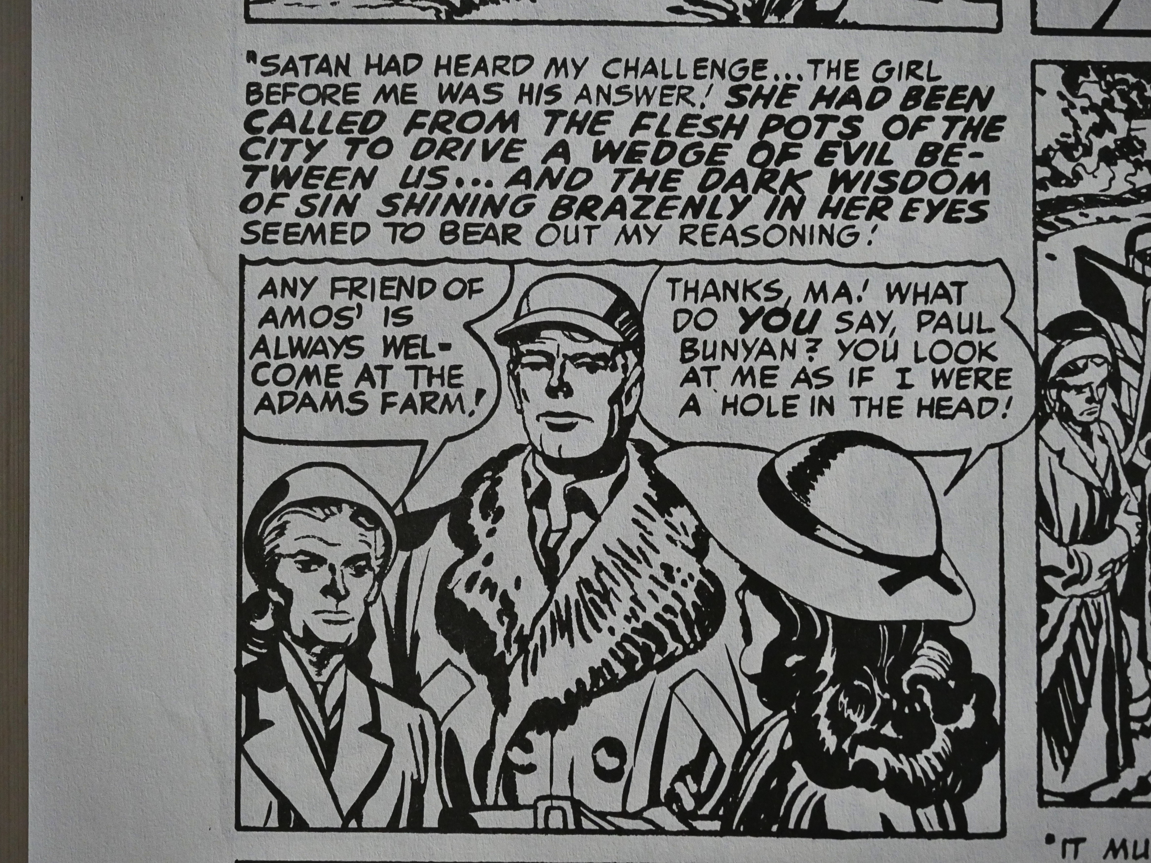
I was really taken by this story of a borderline deranged scold of a lumberjack who grows passionate about a woman SENT BY SATAN!

Well, that’s what he thinks, but he’s, like I said, borderline deranged, and Simon and/or Kirby doesn’t hold back. This one does have a happy ending, but I was wondering for a while whether Kirby and/or Simon were sending the insane lumberjack off to the wood chipper.

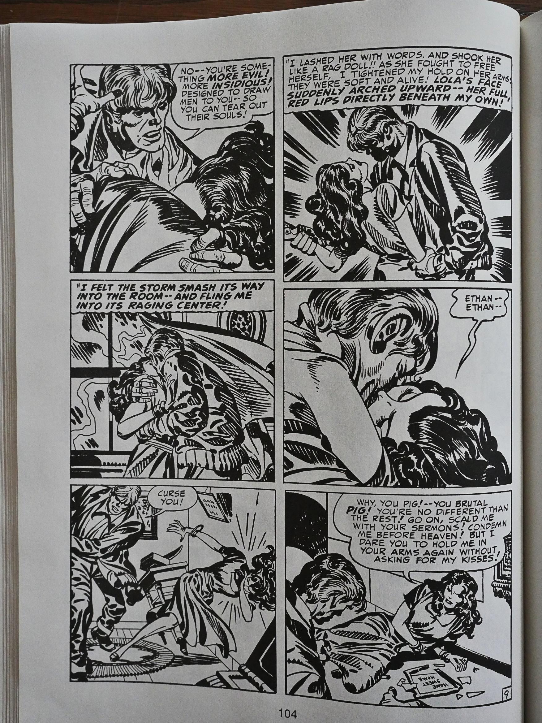
Such violence! Kirby action! There’s a lot of really good art in here. Kirby’s anatomy isn’t exactly realistic, but somehow it all fits together when he adds all that dramatic shading and those razor-sharp lines. He really moves the eye naturally across the page, conveying the story transparently.

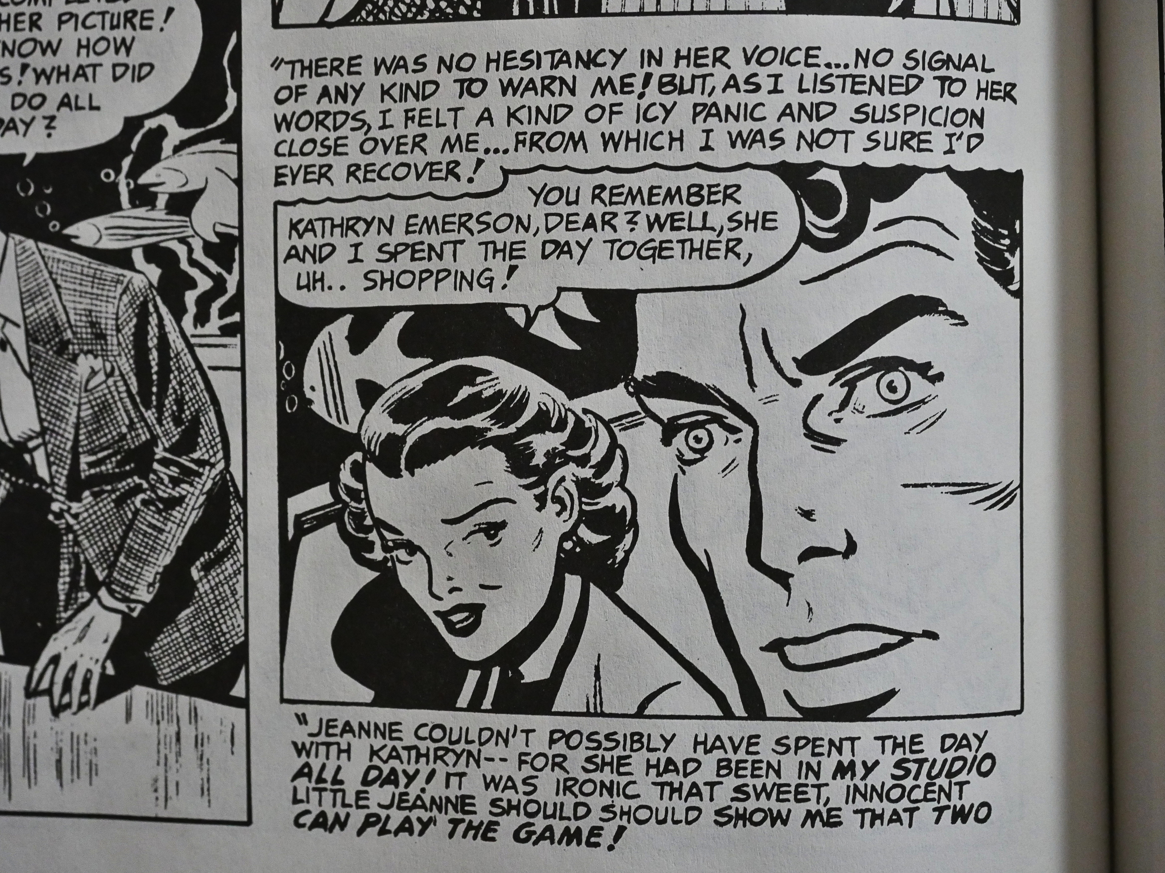
And I totally loved this short piece where I have to briefly recap the plot, which is something I loathe doing: First we get seven pages of that guy up there cheating on his girlfriend, hanging out with a stream of beautiful women. We never really get to see the girlfriend other than off to the margins; she is totally not a protagonist or has any agency, she’s just an appendage to the narrator.

Then, in the very last panel, without any foreshadowing whatsoever, we find out that she’s cheating on him, too.

Story over.

Isn’t that brilliant?

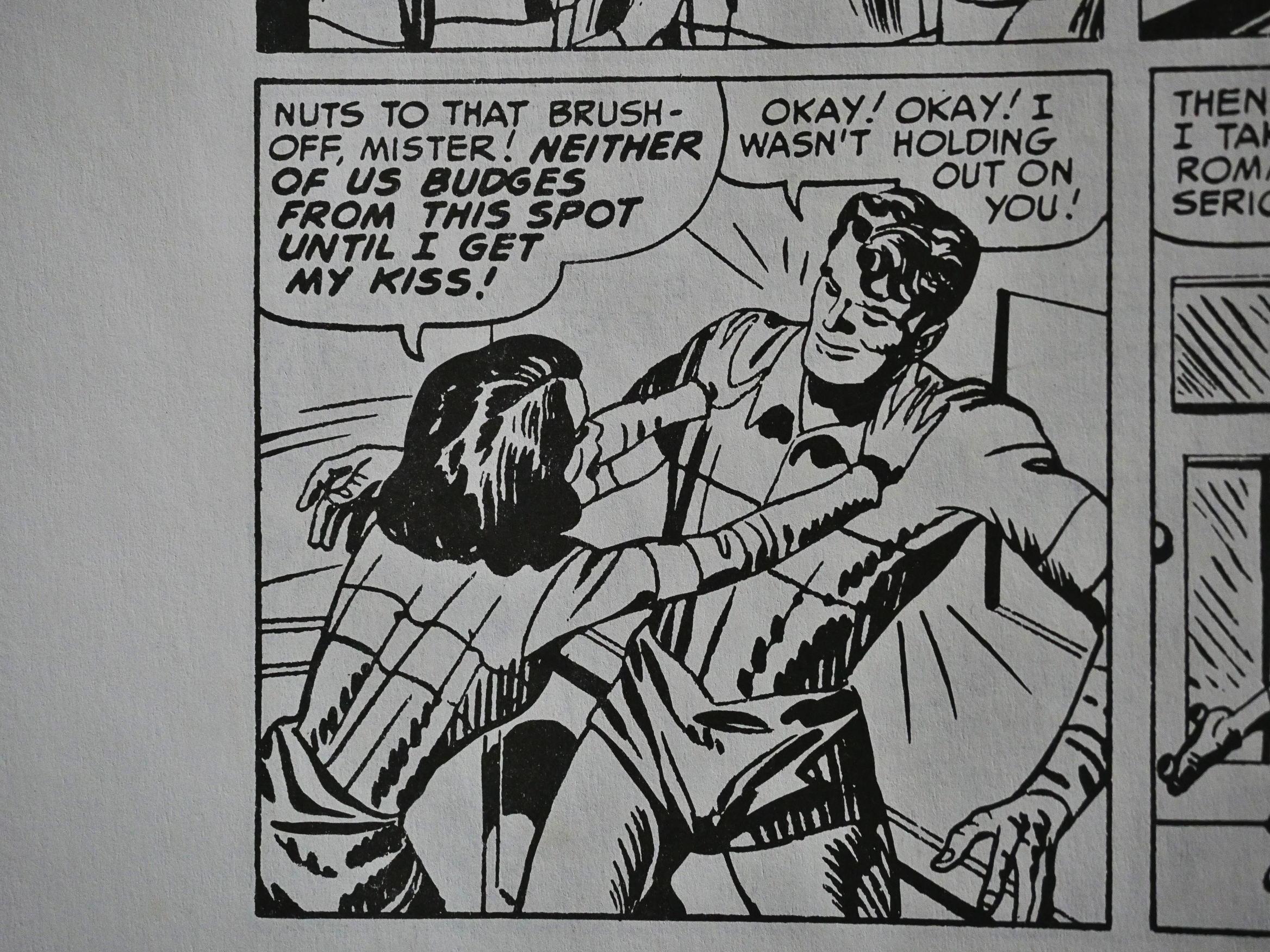
Did I mention that the female characters are very active? The male characters are often left to just react.

The most bitter-sweet ending of them all: Settling for some dude.

As taken as I was with this collection (and I really enjoyed reading it), I somehow don’t want to run out to buy a complete collection of these comics, either. These 160 pages feel sufficient to me. At least right now.

But weirdly enough, it looks like nobody has taken it upon themselves to reprint these comics. Fantagraphics released a collection called Young Romance a few years back, and it covers the entire period from 1949 to 1959, and has zero overlap with this collection, if I read the contents page correctly. (I totally forgot that I had the collection on a shelf here or that I had read it.)

Hm… There was some controversy about that book. In 2012, it was in public domain, while the Eclipse book claims that these stories are copyrighted by Simon and Kirby. Did the copyright expire between 1988 and 2012? There’s some suggestion that Fantagraphics publishing that book spiked Titan’s plan to do a complete reprinting of the romance books. And that seems to be the case, because they didn’t publish any.

It’s a shame. This stuff is way better than most of the 50s stuff that gets reprinted.

1988: Farewell to the Gipper

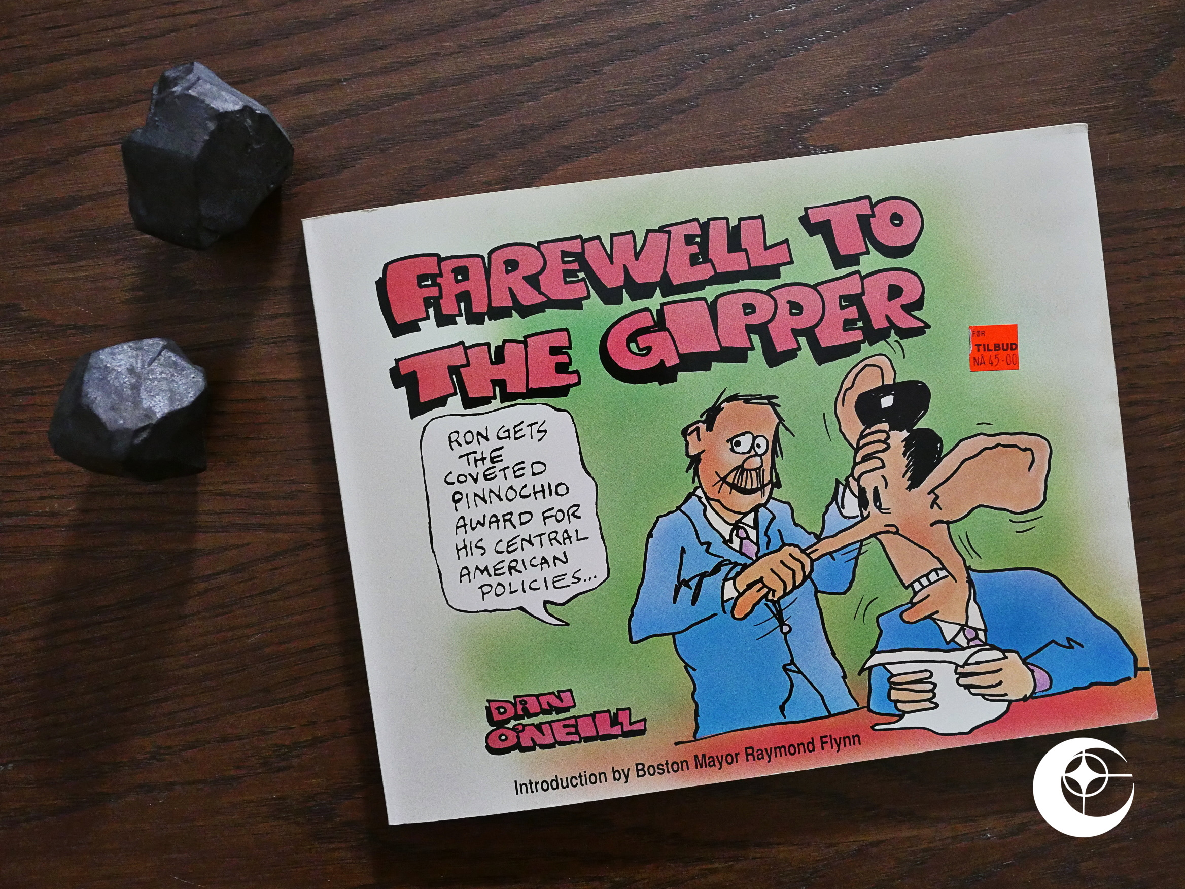
Farewell to the Gipper (1988) #1 by Dan O’Neill.

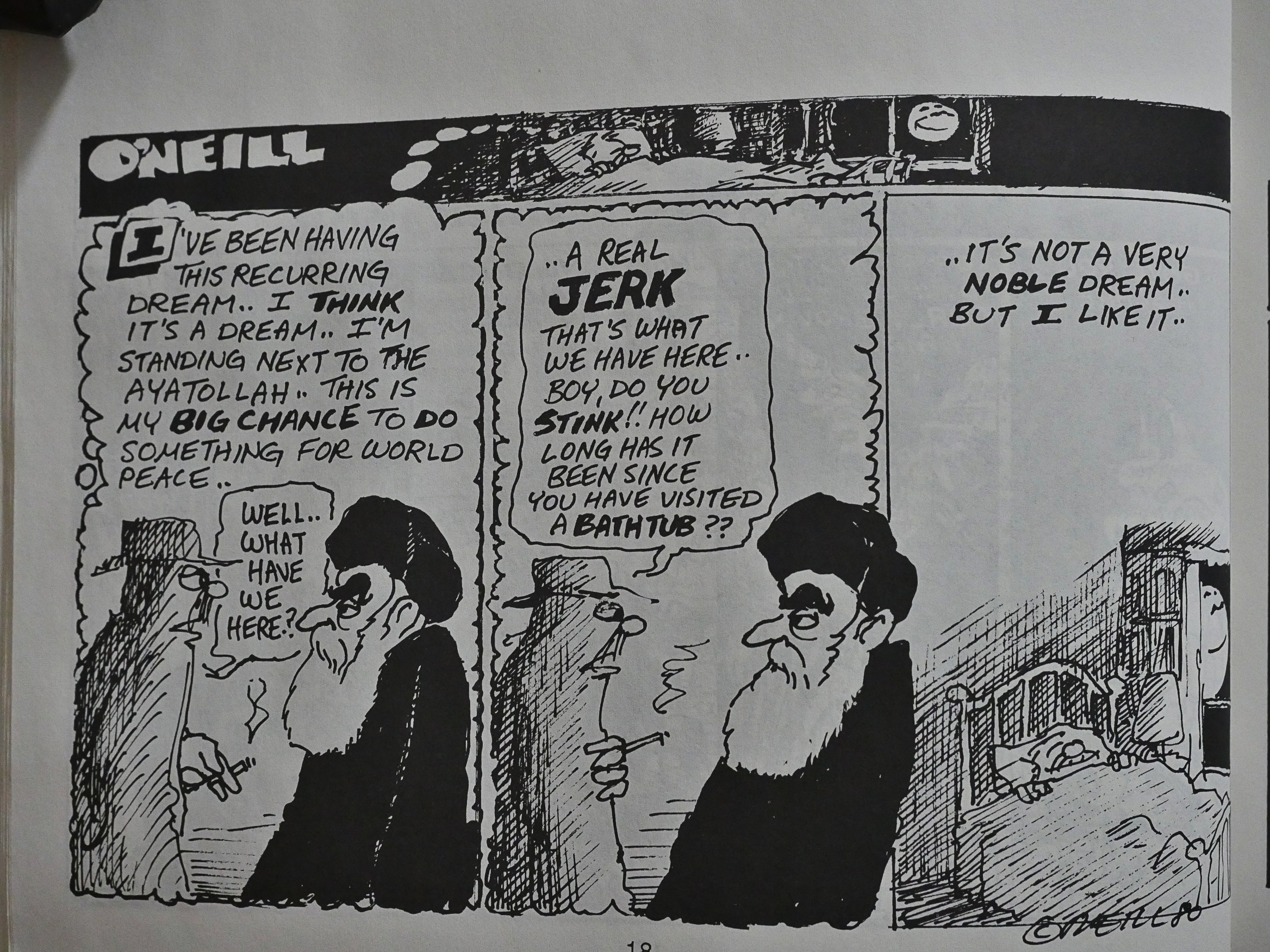
Eclipse rarely published anything outside the normal comic book/magazine formats, and they didn’t publish any political cartoonists, so them doing this horizontal-format trade paperback is doubly weird. On the other hand, it perhaps part of the mini-line of political comics that started with Real War Stories the previous year. (A handful of graphic novels and trading cards on politics would follow.)

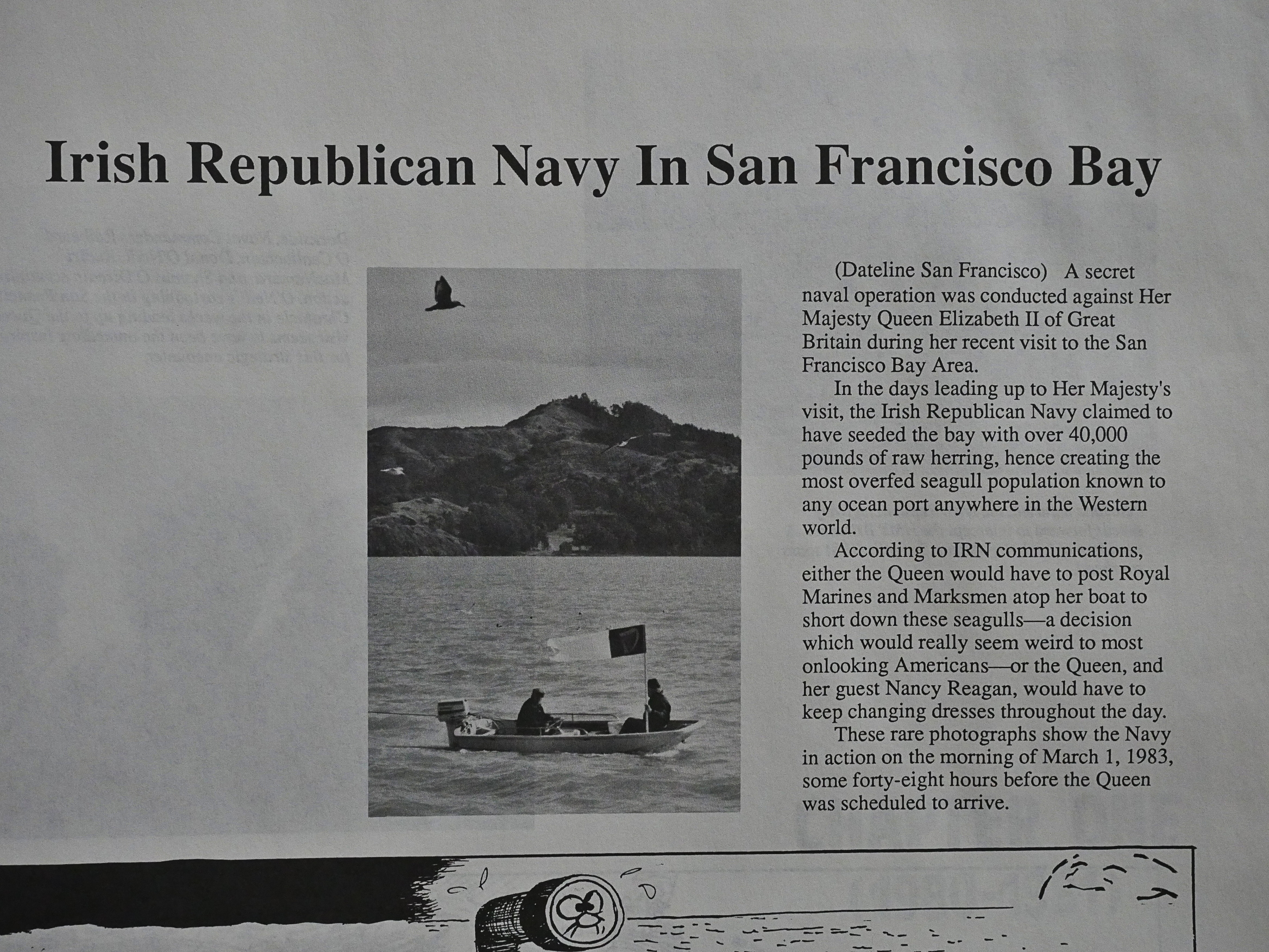
Dan O’Neill is probably most well known for participating in the Air Pirates stunt: They published and underground parody of Mickey Mouse and Donald Duck, and were sued by Disney. (I think Disney won?) As usual when Eclipse prints something, there’s no mention where these strips came from, but I’ll guess an alternative weekly.

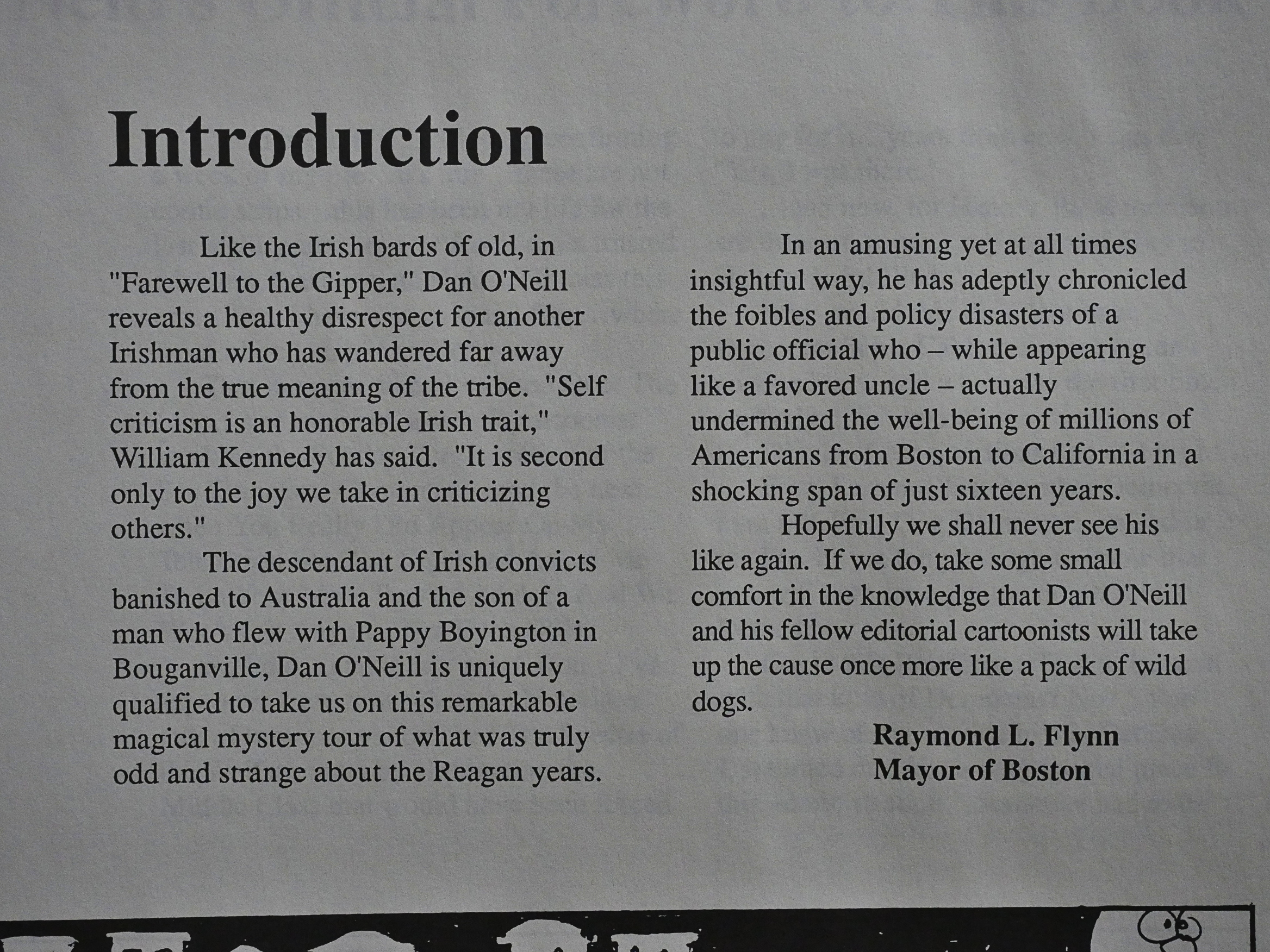
There’s an introduction by the Mayor of Boston, for some reason that’s not explained.

O’Neill seems like a guy who liked to do various weird stunts, so let’s hope the strip is funny.

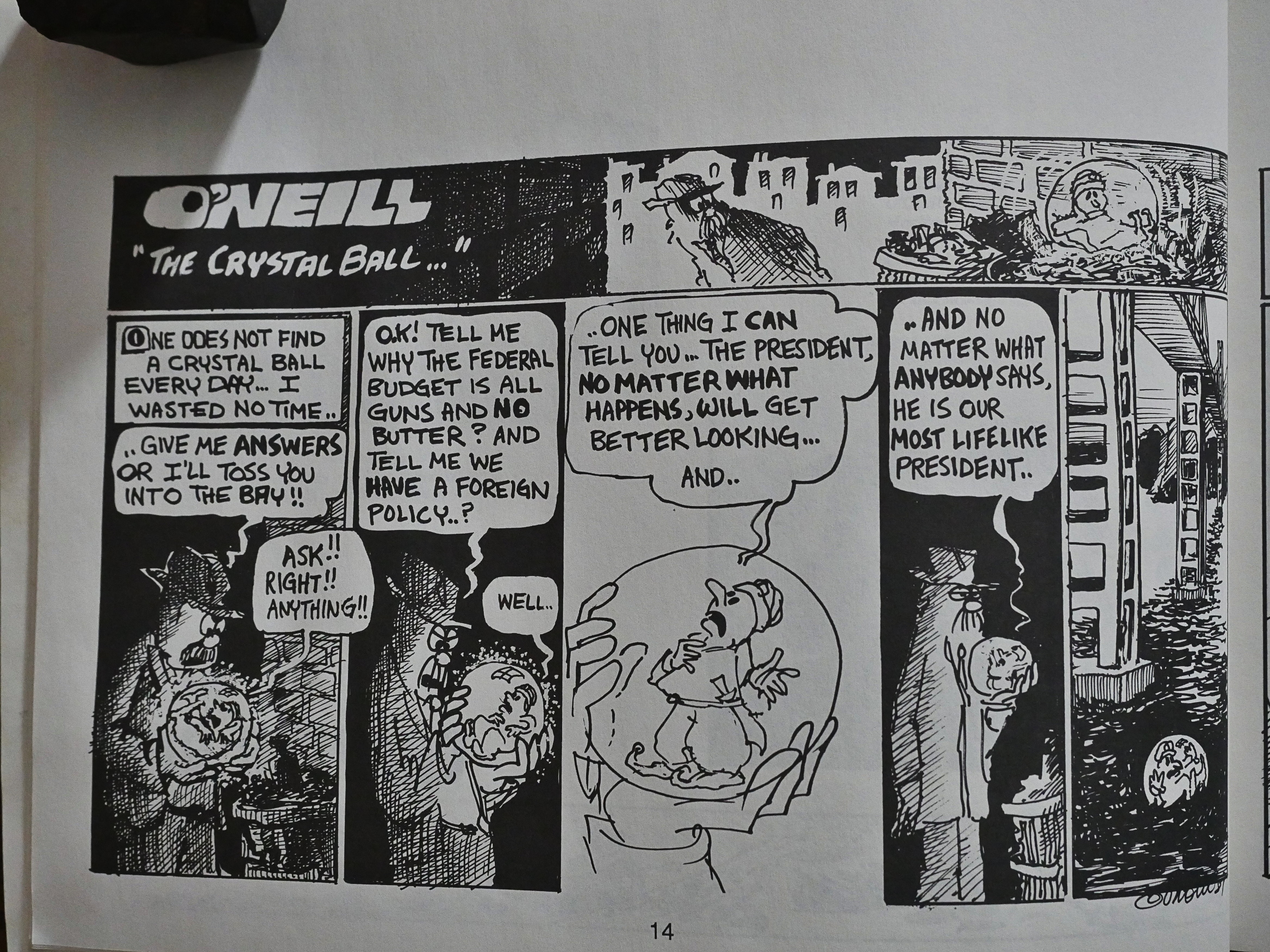
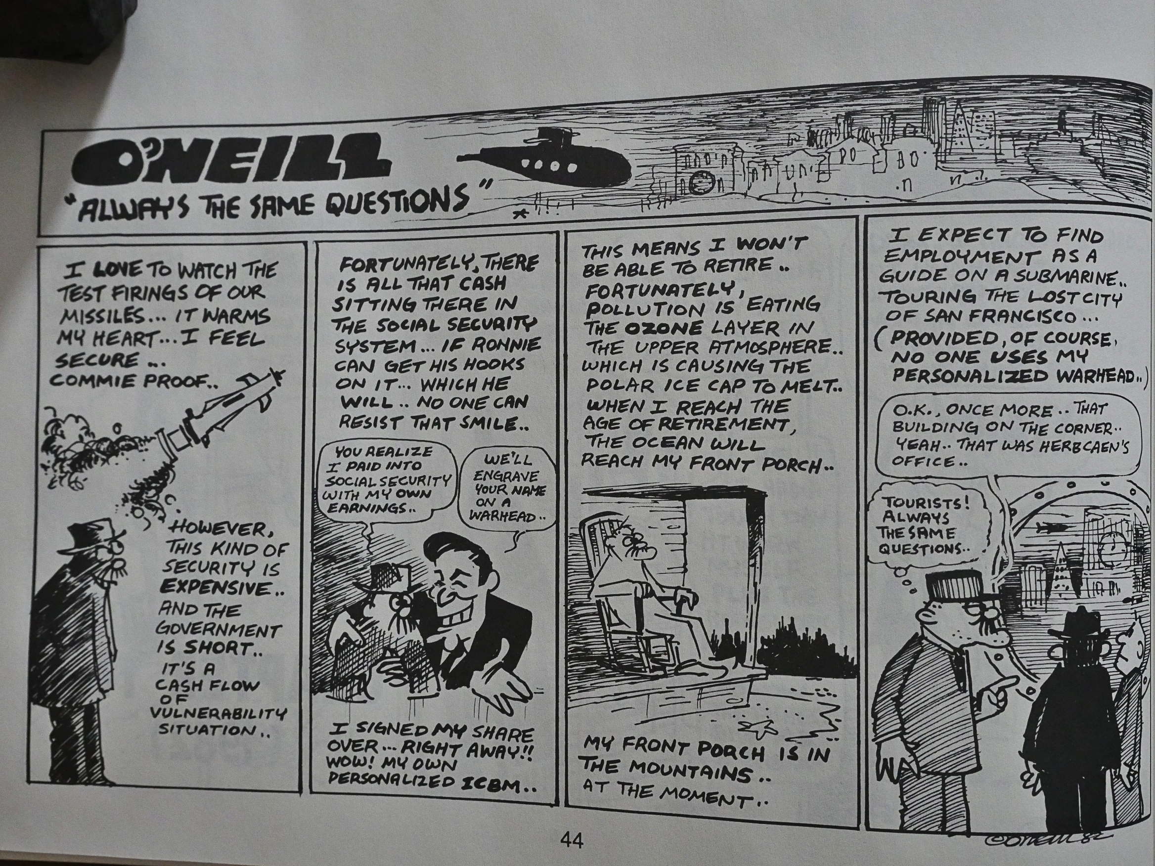
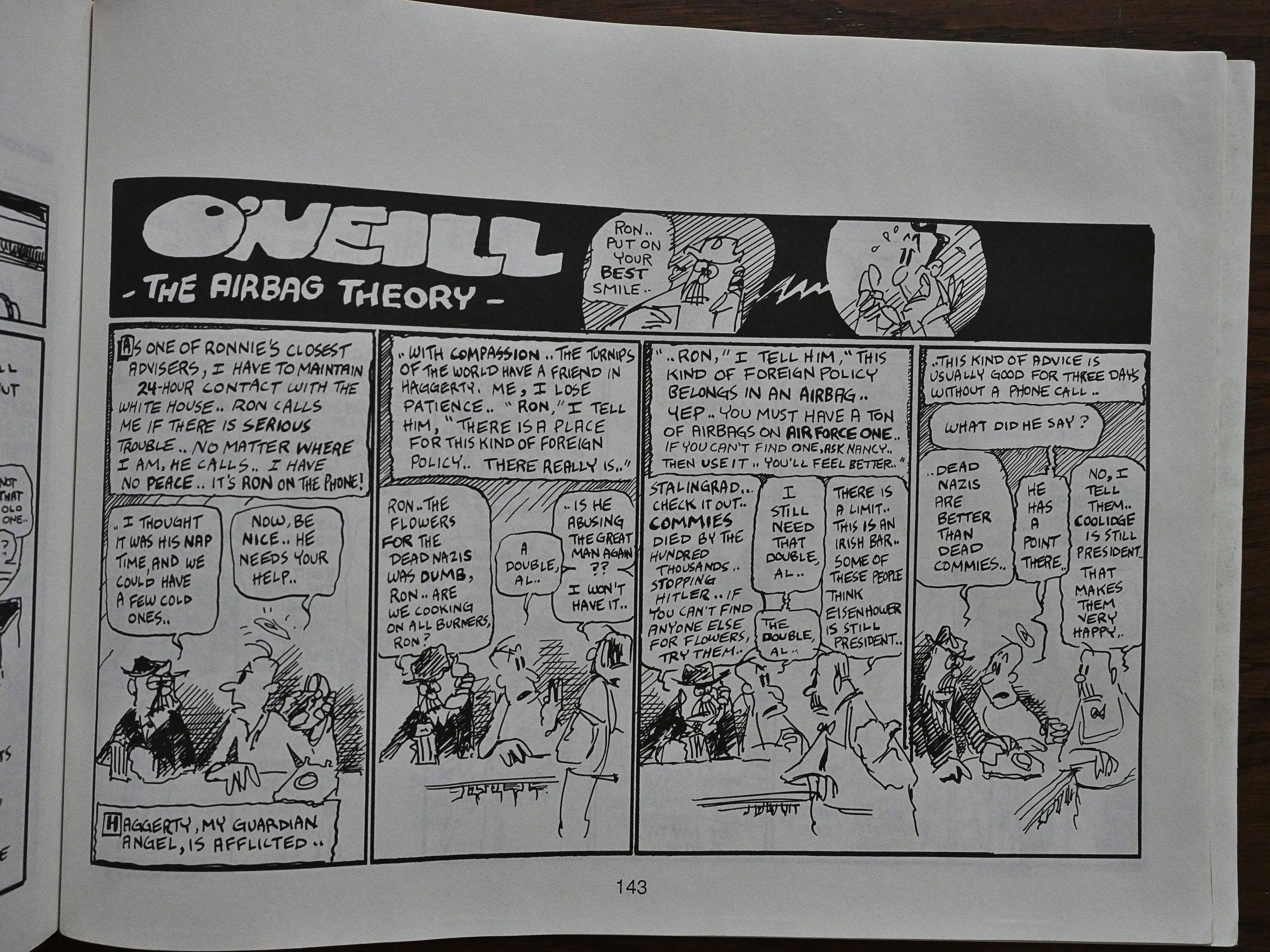
Eh… Not really. But his lettering’s nice. Especially the logo, which has an oldee tymey look to it.

And it’s weird that Eclipse printed these strips with a huge top margin. Why not trim it down to the strip size?

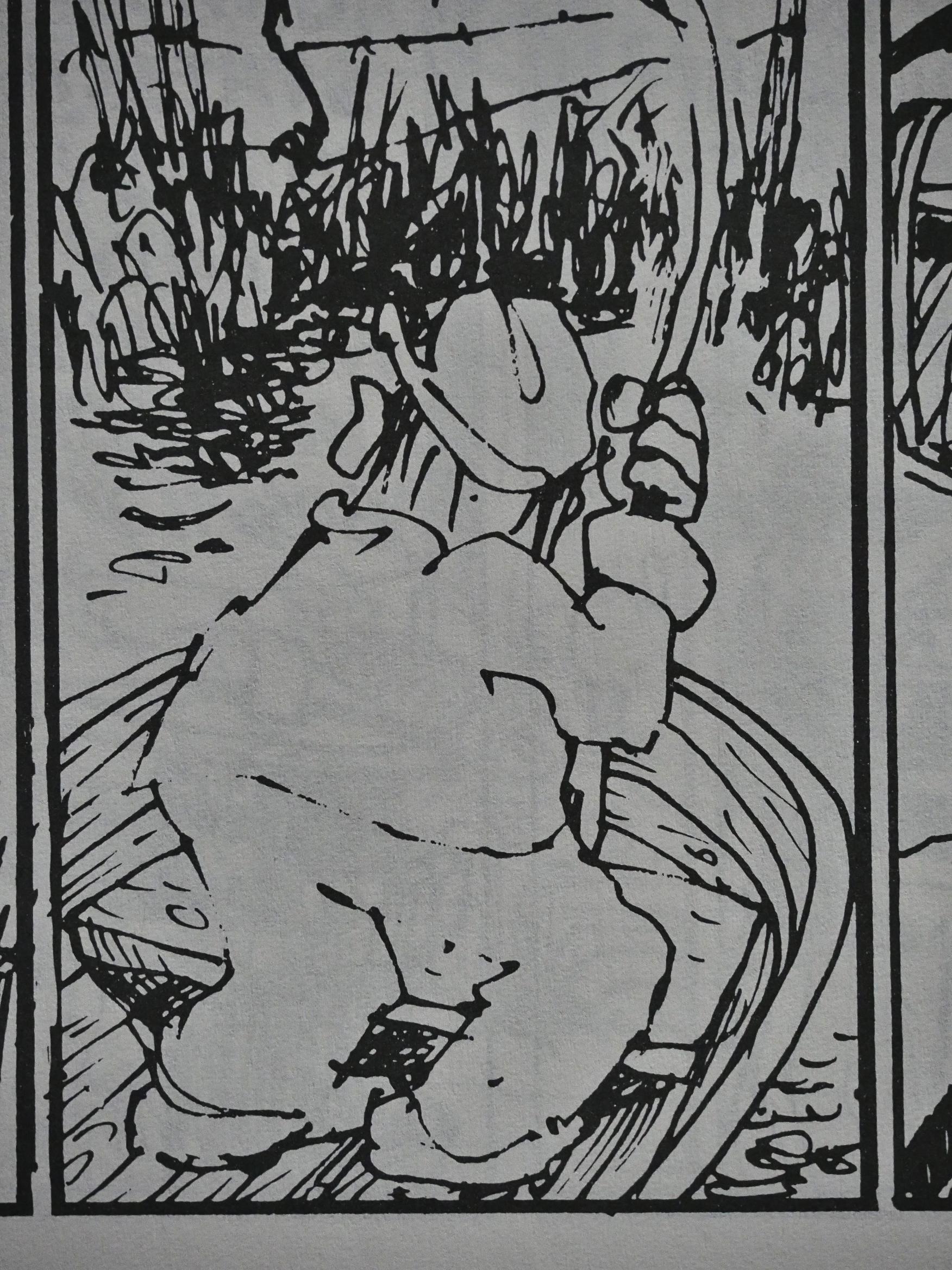
How much effort O’Neill put into the artwork varies wildly, but it’s mostly pretty sketchy.

The bad reproduction doesn’t help, either. Lines fade to nothingness, and black areas fill in. It’s not a pleasure to look at.

I do like the patter of the dialogue. It feels quite natural.

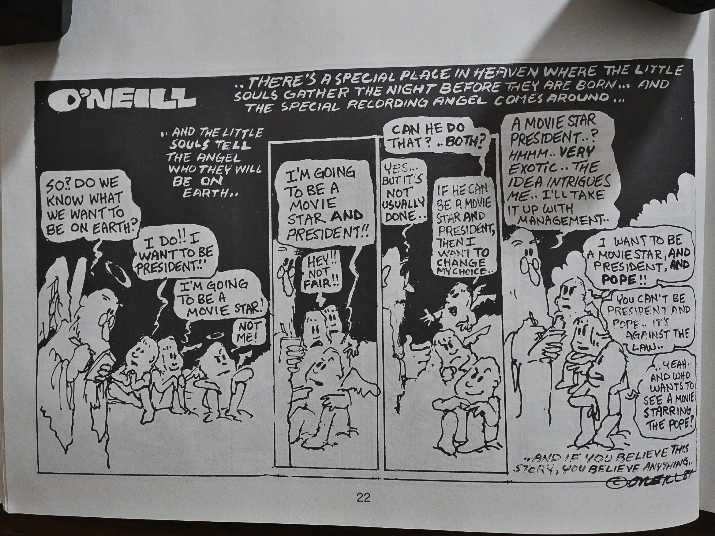
And O’Neill is pretty prescient.

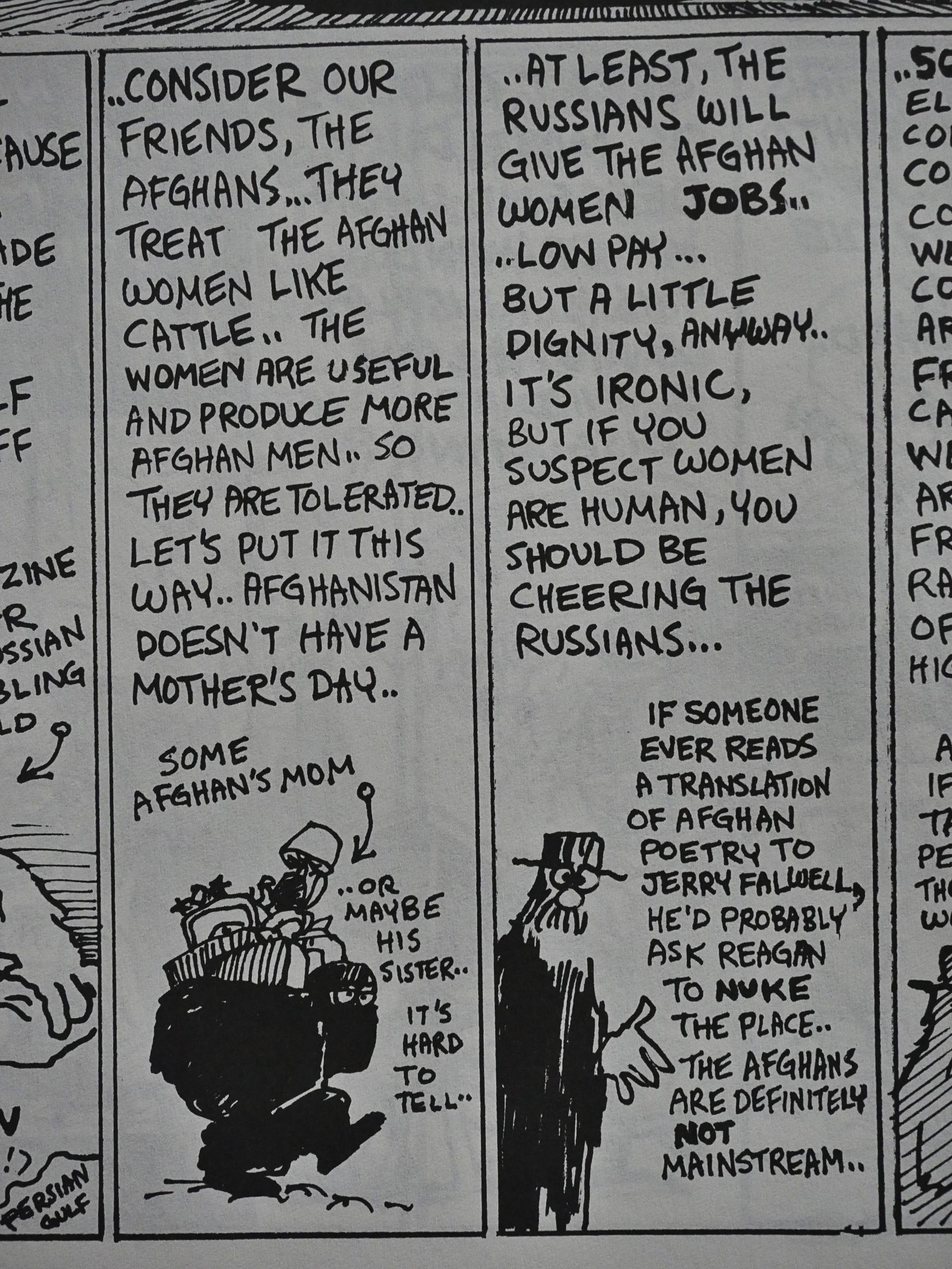
Some of these strips could have been text only, which is a bit tiresome. And it’s not really that funny, is it? It’s wryly amusing at best.

The later strips in this collection are generally the better ones.

The book has never been reprinted, apparently.

1988: California Girls Paper Dolls

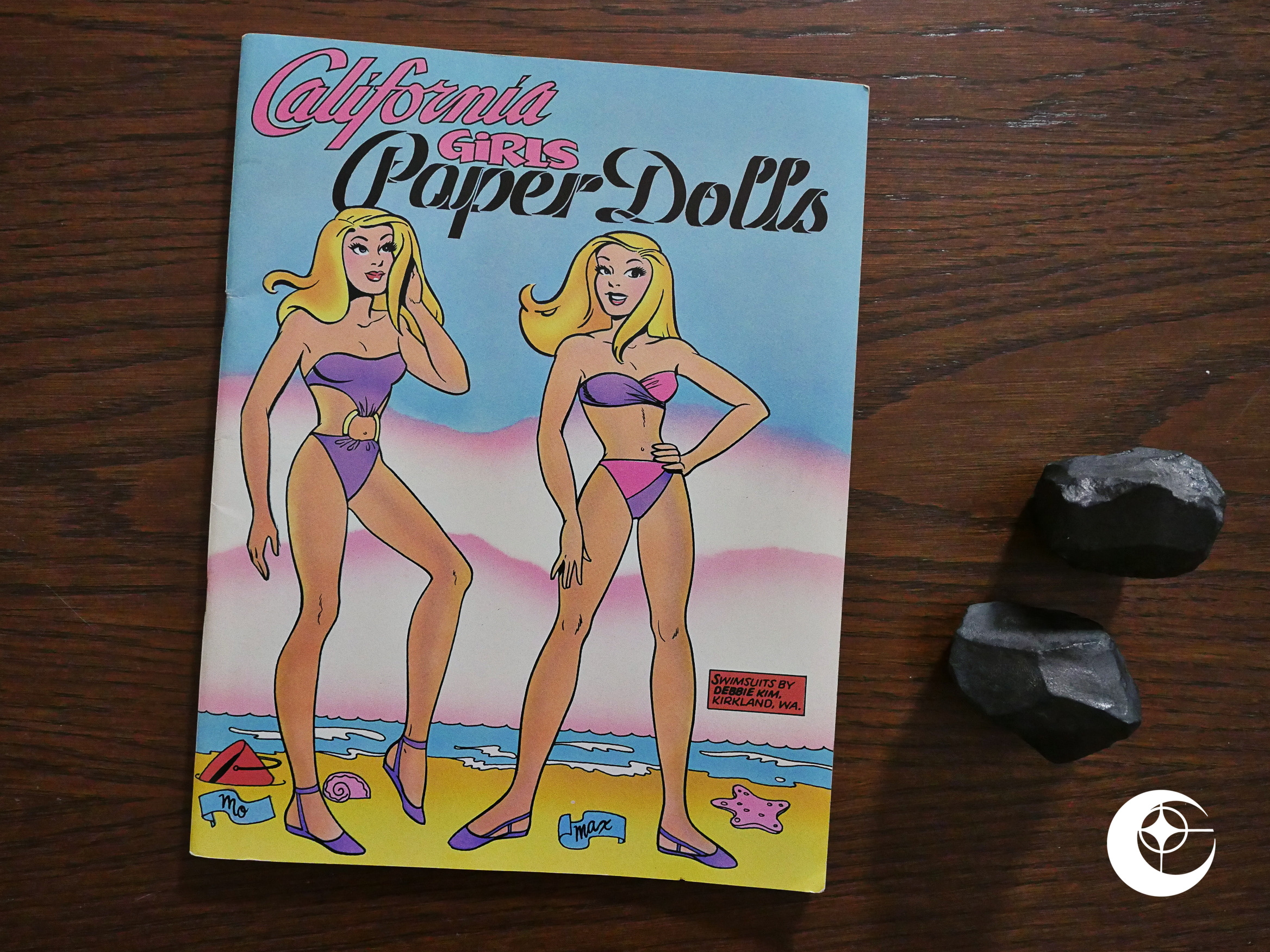
California Girls Paper Dolls (1988) #1 by Trina Robbins.

I should have covered this book in the post about California Girls, but I didn’t know it existed before re-reading those (great) comics.

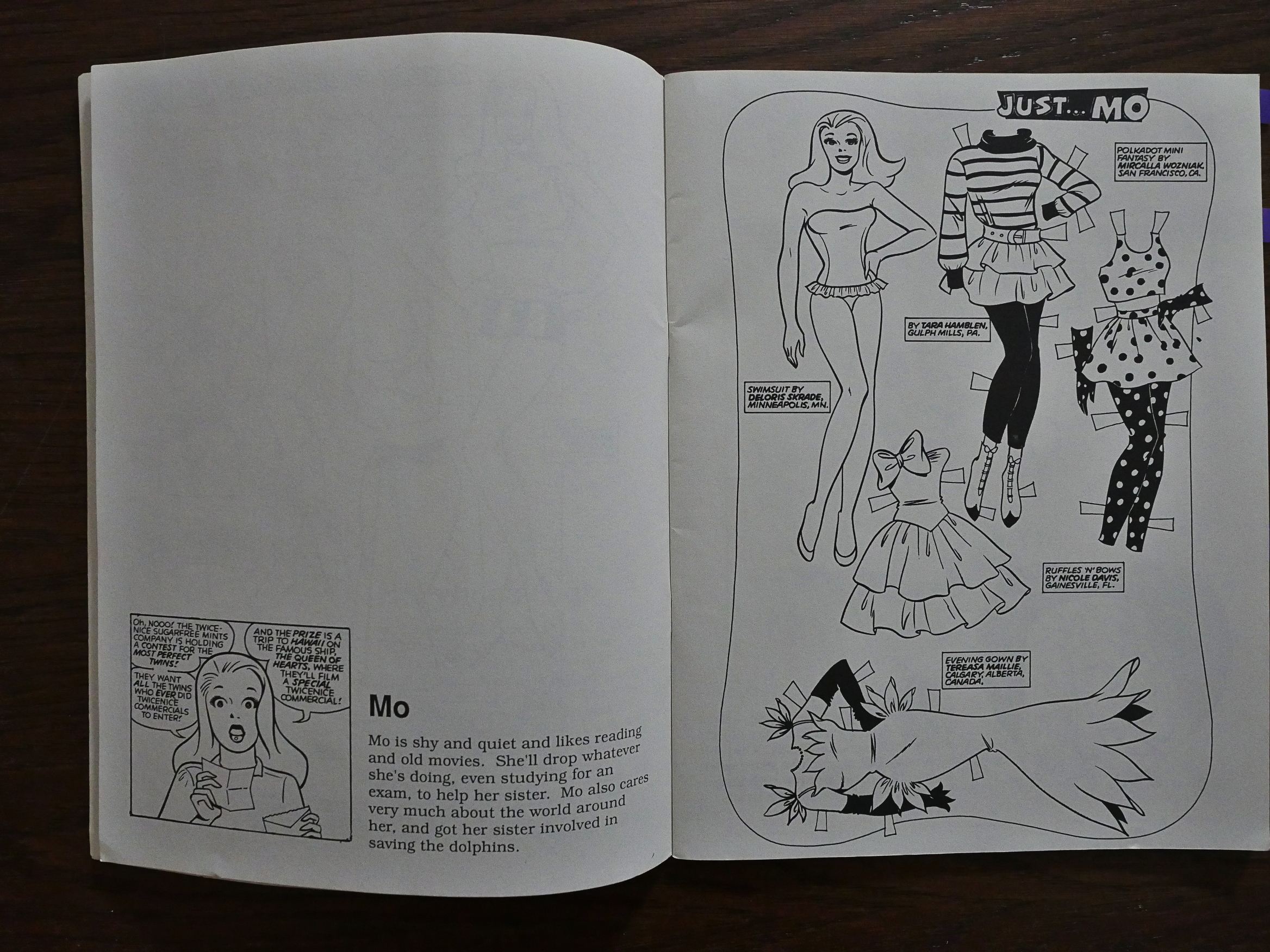
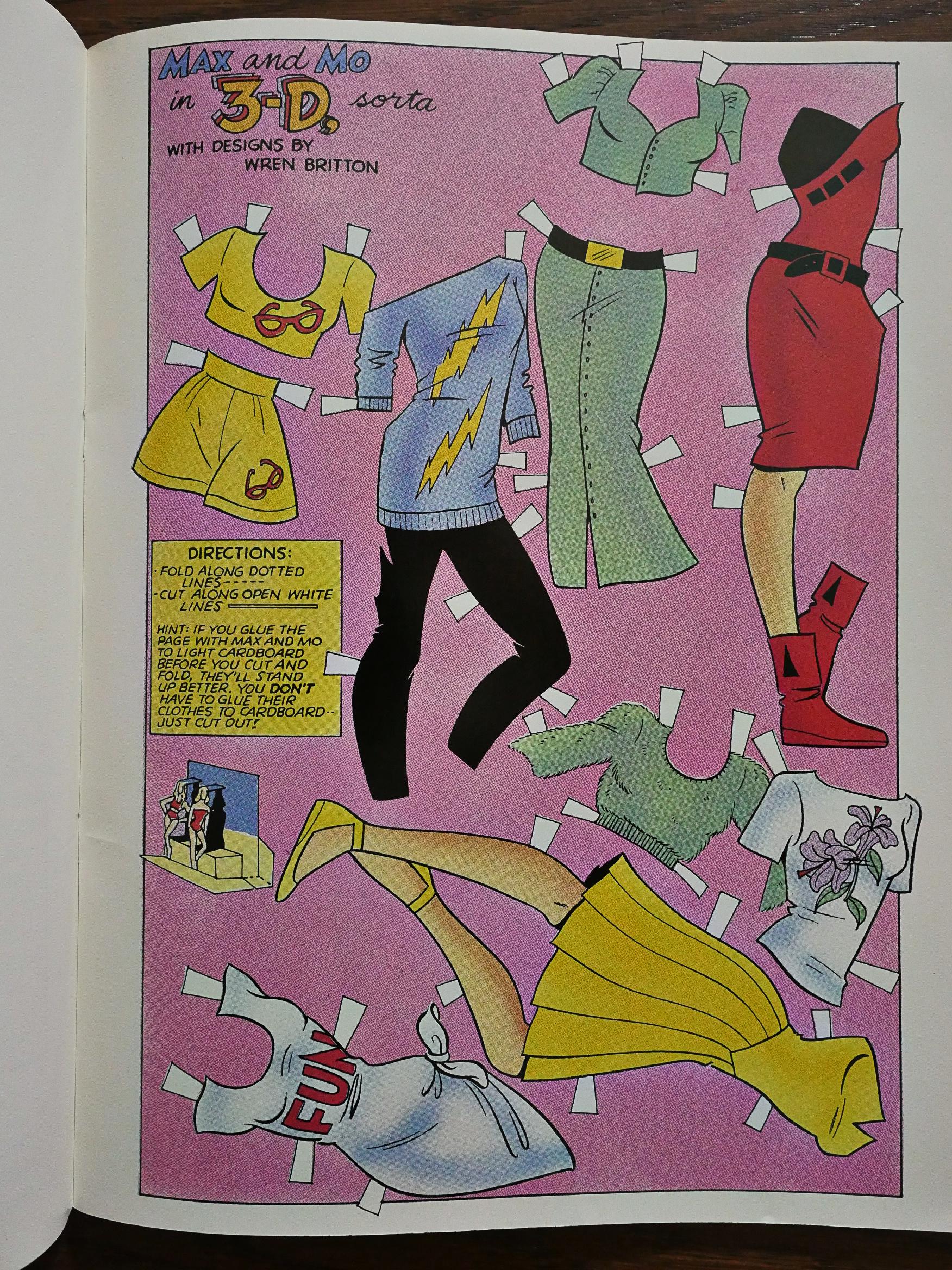
As with Robbins’ previous book of paper dolls, Paper Dolls from the Comics, this is a magazine-sized floppy, printed on nice paper, where every other page has paper dolls, and there’s little of interest on the back (because when you’re cutting out the dolls, the back will be ruined).

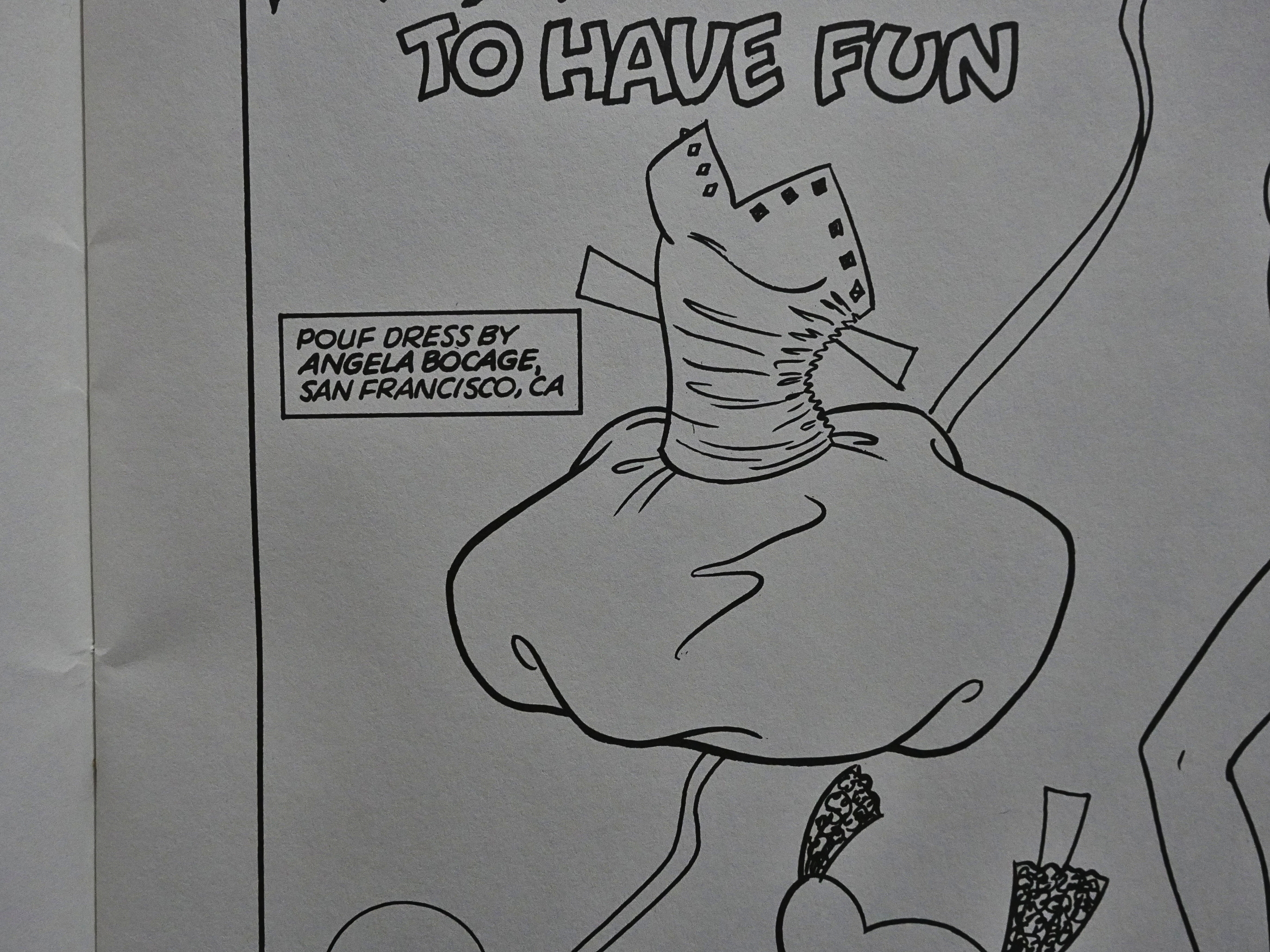
The designs are mostly contributed by readers of the comic, but it’s fun reading what famous names pop up here and there. Here’s a dress by artist Angela Bocage.

Most of the pages are in black and white, but there are four pages of colour paper dolls, too.

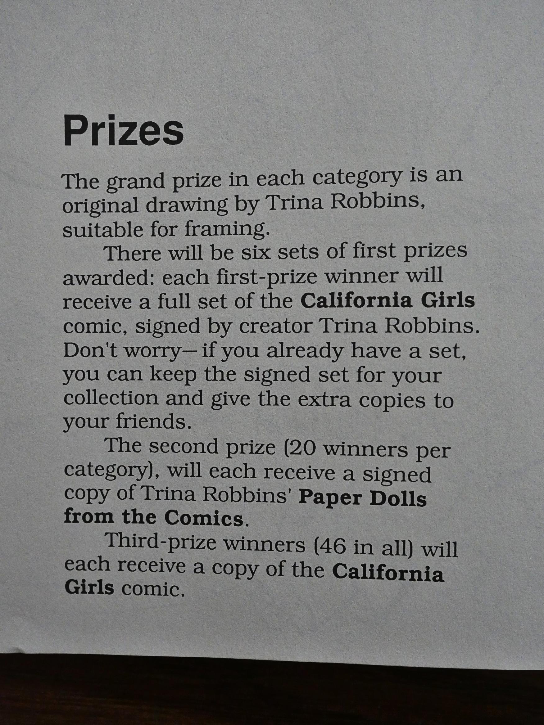
And you could always colour the black and white pages, too. There’s even a competition for best colouring job, with lots and lots of prizes, including a Trina Robbins original drawing.

1988: Appleseed

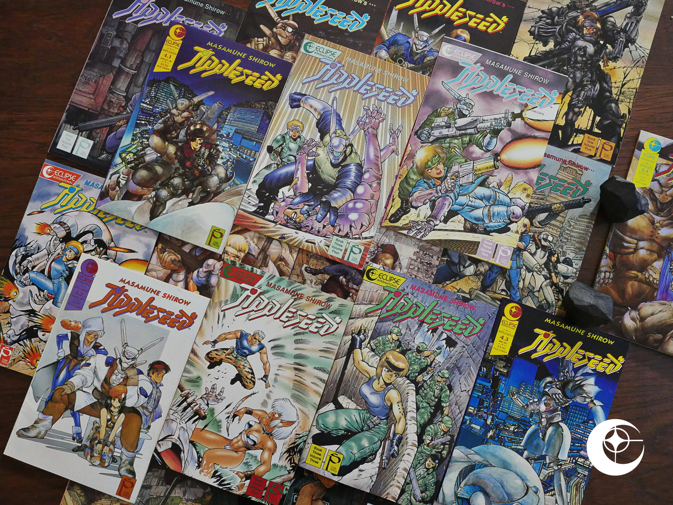
Appleseed (1988) #1-19 by Masamune Shirow.

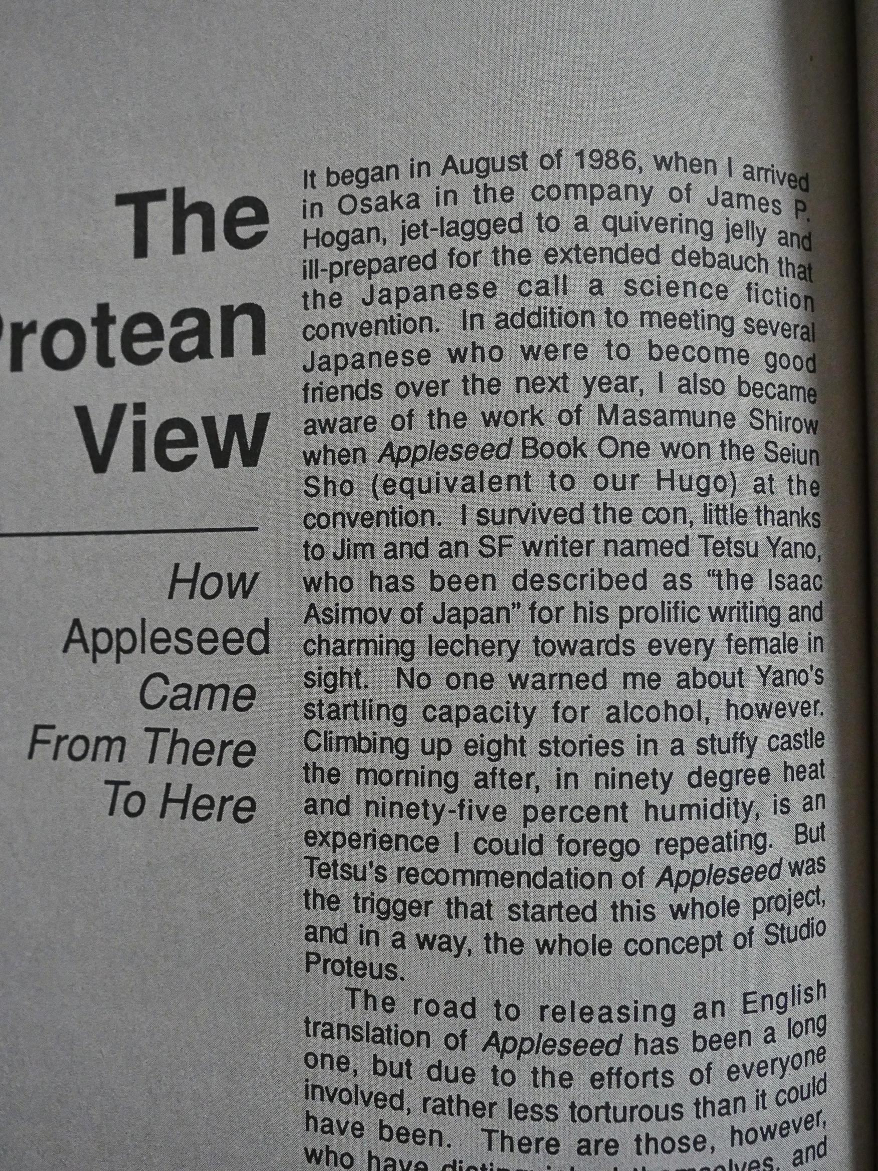
All the previous translations of Japanese comics published by Eclipse had been provided (and picked) by Viz Comics. Viz pulled out of the deal because they didn’t feel that Eclipse were able to sell sufficient quantities of comics, so Eclipse turned to Toren Smith instead. He was running Studio Proteus as a packager of Japanese comics for the US market, and most of these were published through Eclipse.

To start with.

I’m just foreshadowing what’s coming in this blog article near the end.

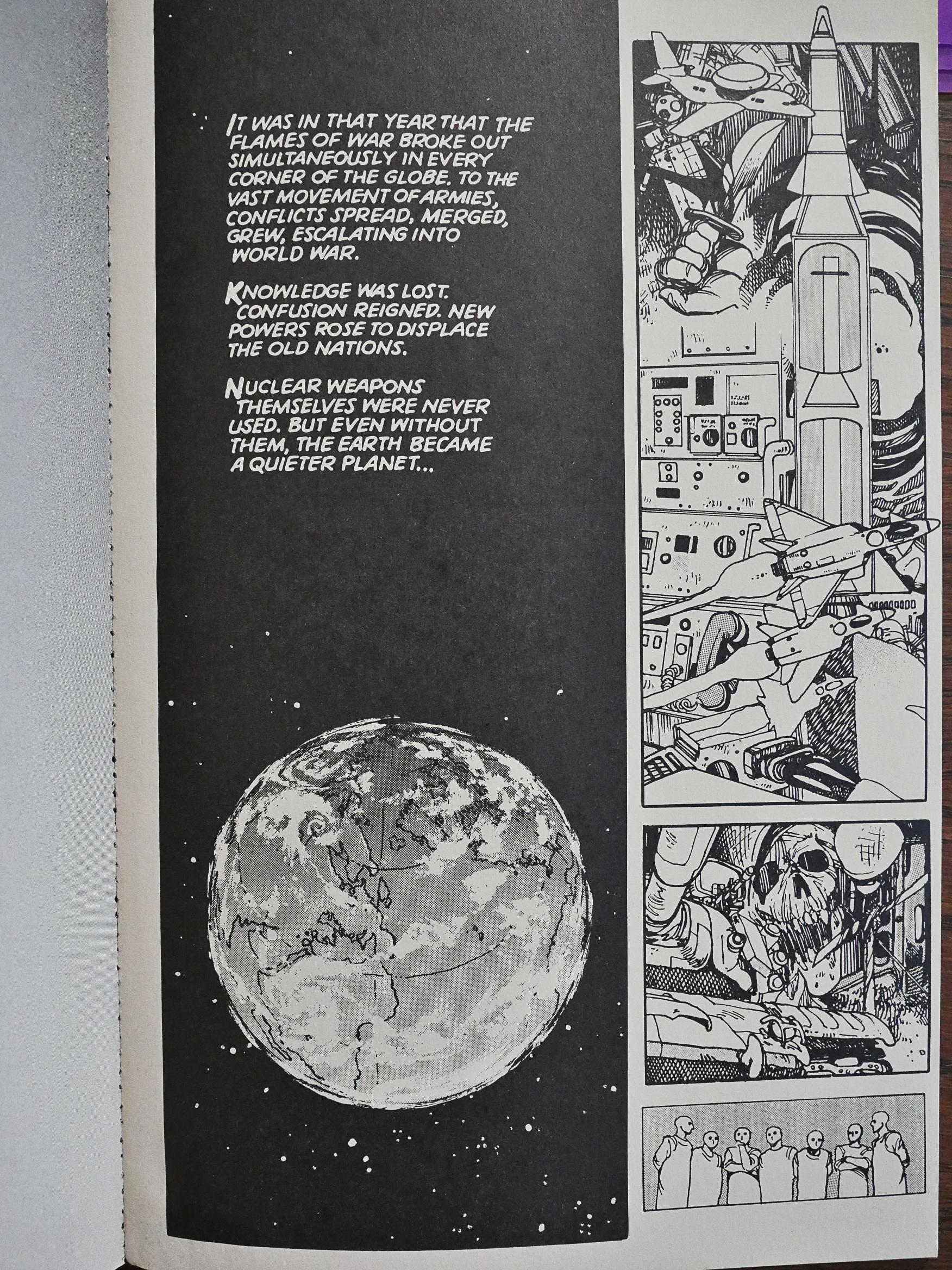
But first we’ll talk about Masamune Shirow’s Appleseed. Shirow, as opposed to most other successful comics artists in Japan, didn’t employ an entire studio of “assistants” (i.e., people who do most of the work), but instead (apparently) did everything himself, while holding down a day job as a teacher. In addition, Masamune Shirow is a pseudonym, so there’s that sense of intrigue which might have helped with his success in Japan (he won the “Best Graphic Novel” prize at a Japanese science fiction festival for the first Appleseed book.

(Note the mirror Earth above because Eclipse forgot to flip the panel after flopping the page.)

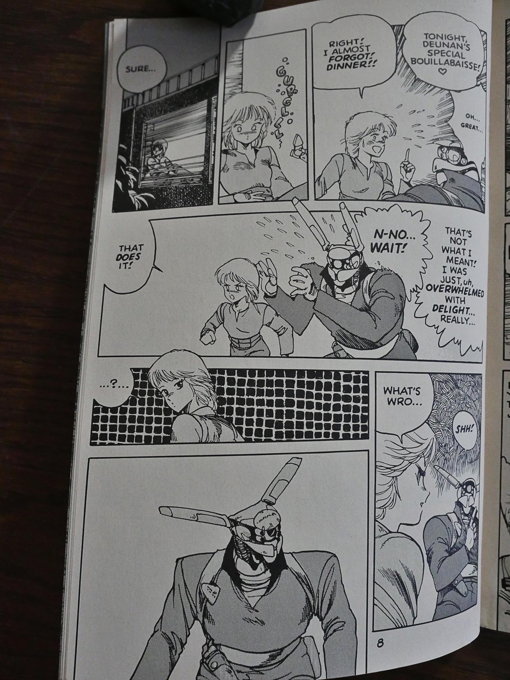
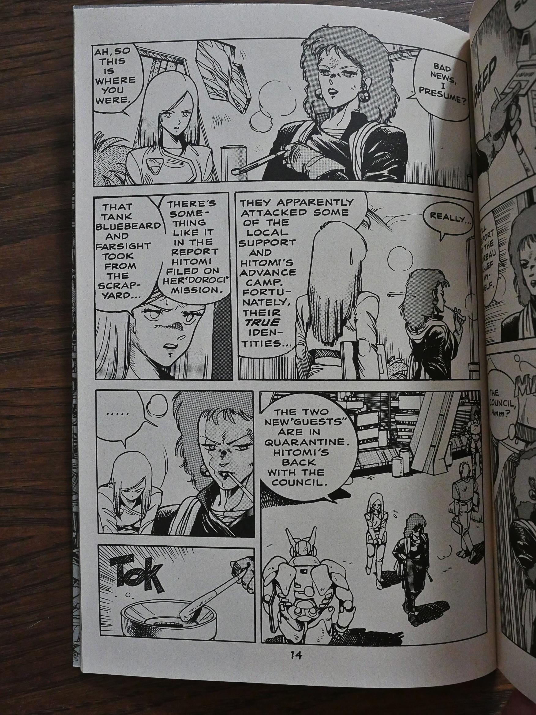
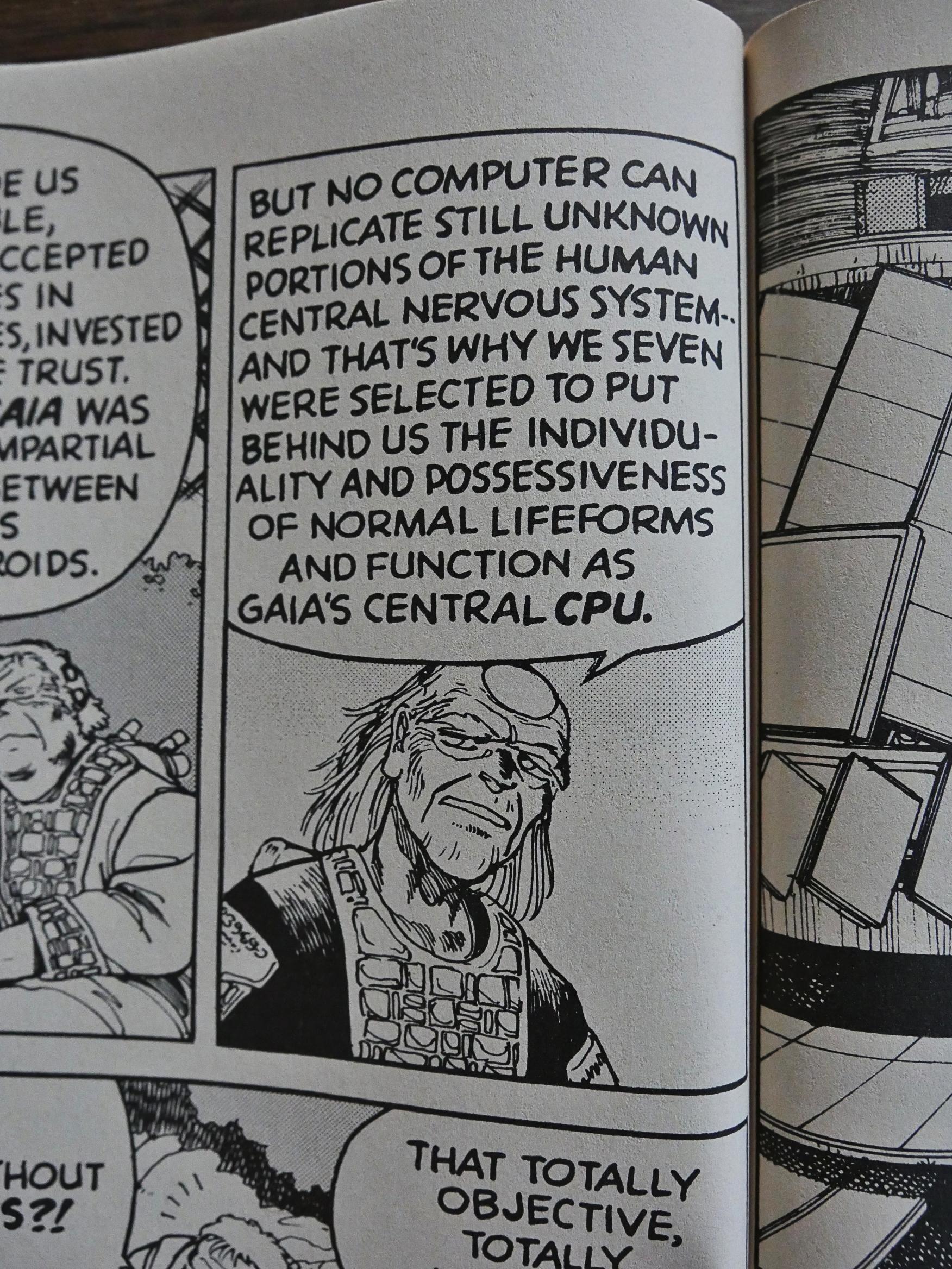
But it’s not an unwarranted prize. The first book is intriguing. There’s so much world-building behind the things that Shirow shows us. The page above is part of the sequence where we’re introduced to the main characters, who initially appear to be a plucky, young, housewife with a helpful robot husband. Or something: Shirow doesn’t tell us what’s going on, but just drops us into the world and allows us to make the connections. Like since if they’re talking about dinner, then that robot guy perhaps isn’t a robot anyway?

It’s not until many many pages later that we find out for sure that he is a cyborg with both organic and metal parts. And I love that way of showing us a new environment: Just letting it happen naturally while the story unfolds, and keeps us (the readers) on our toes.

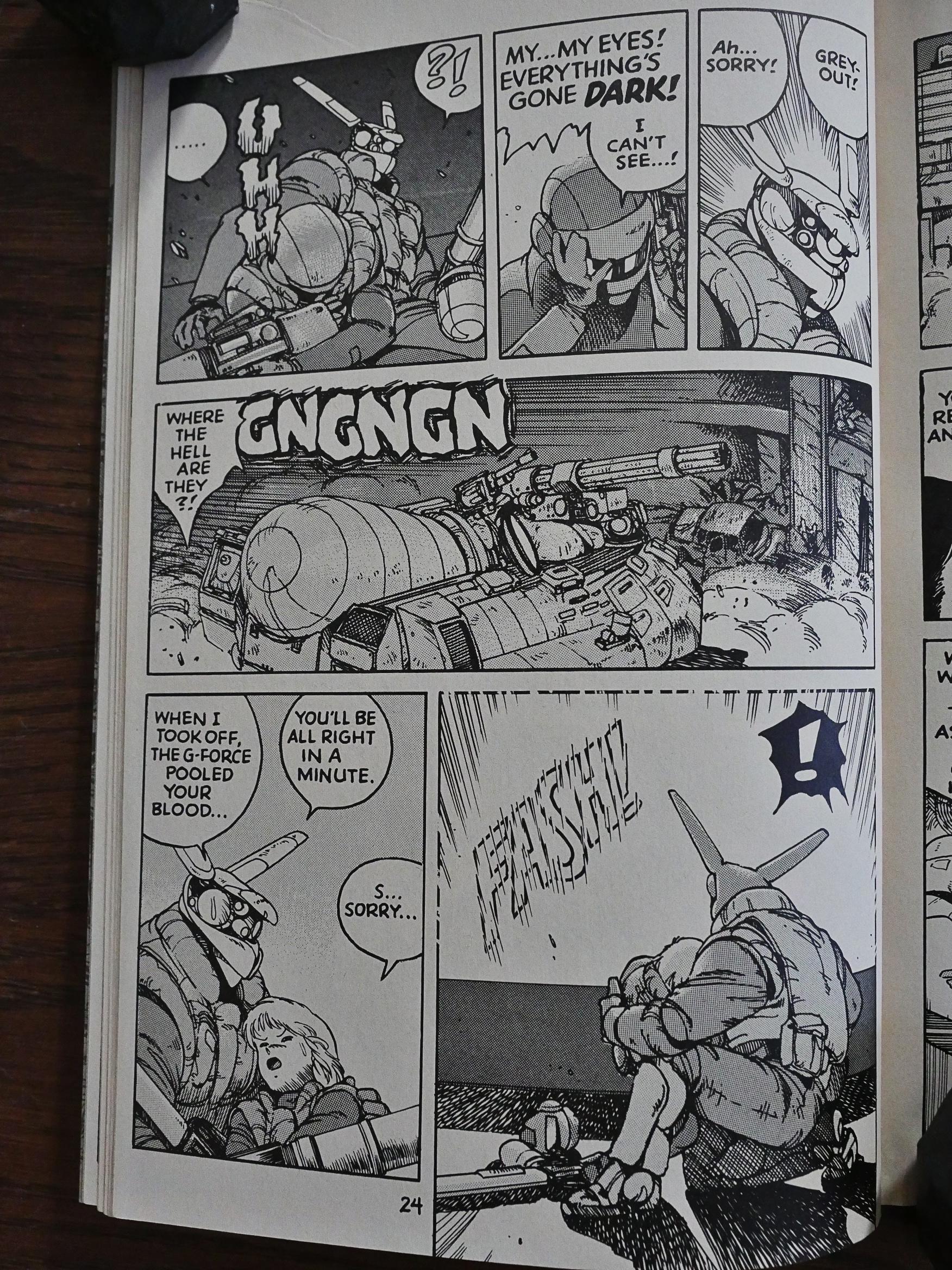
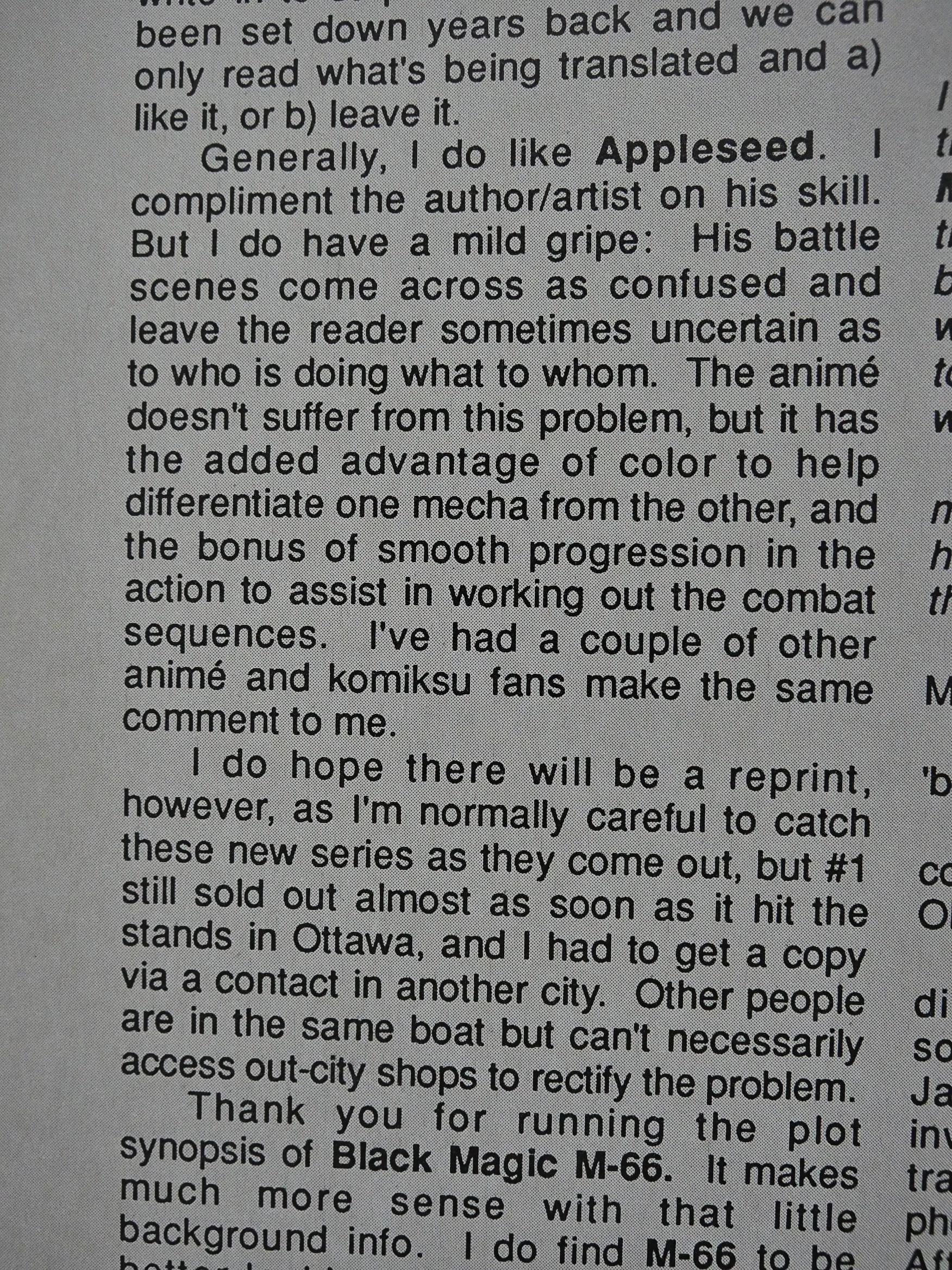
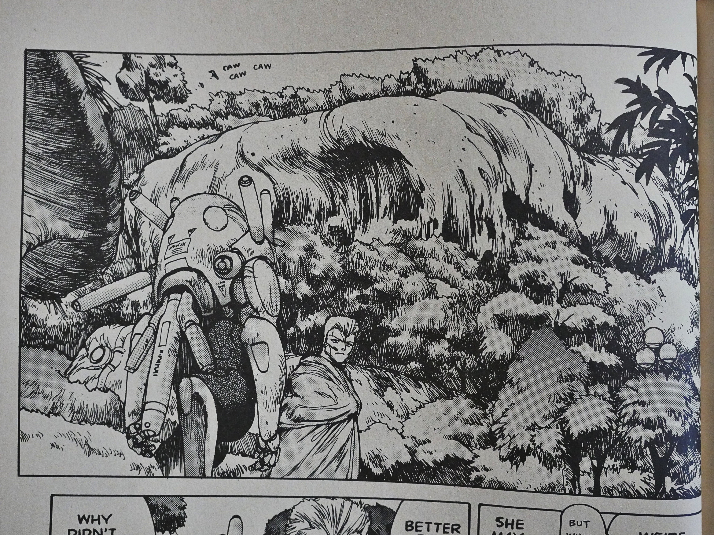
Unfortunately, he also has a tendency to do scenes where it’s just impossible to determine what’s really going on. I’m not sure that’s always an aesthetic choice, or just that he’s kinda bad at having action scenes make sense.

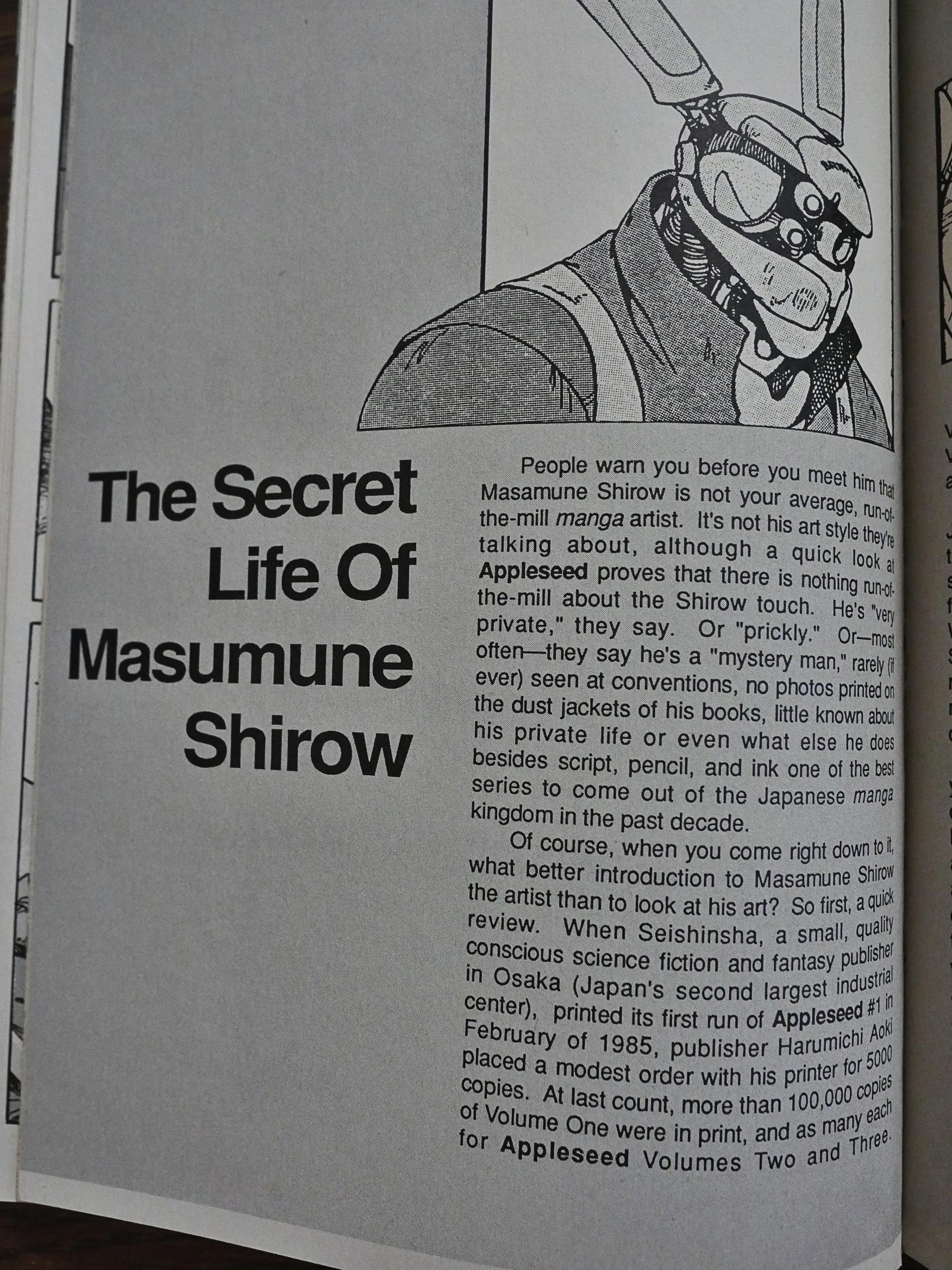
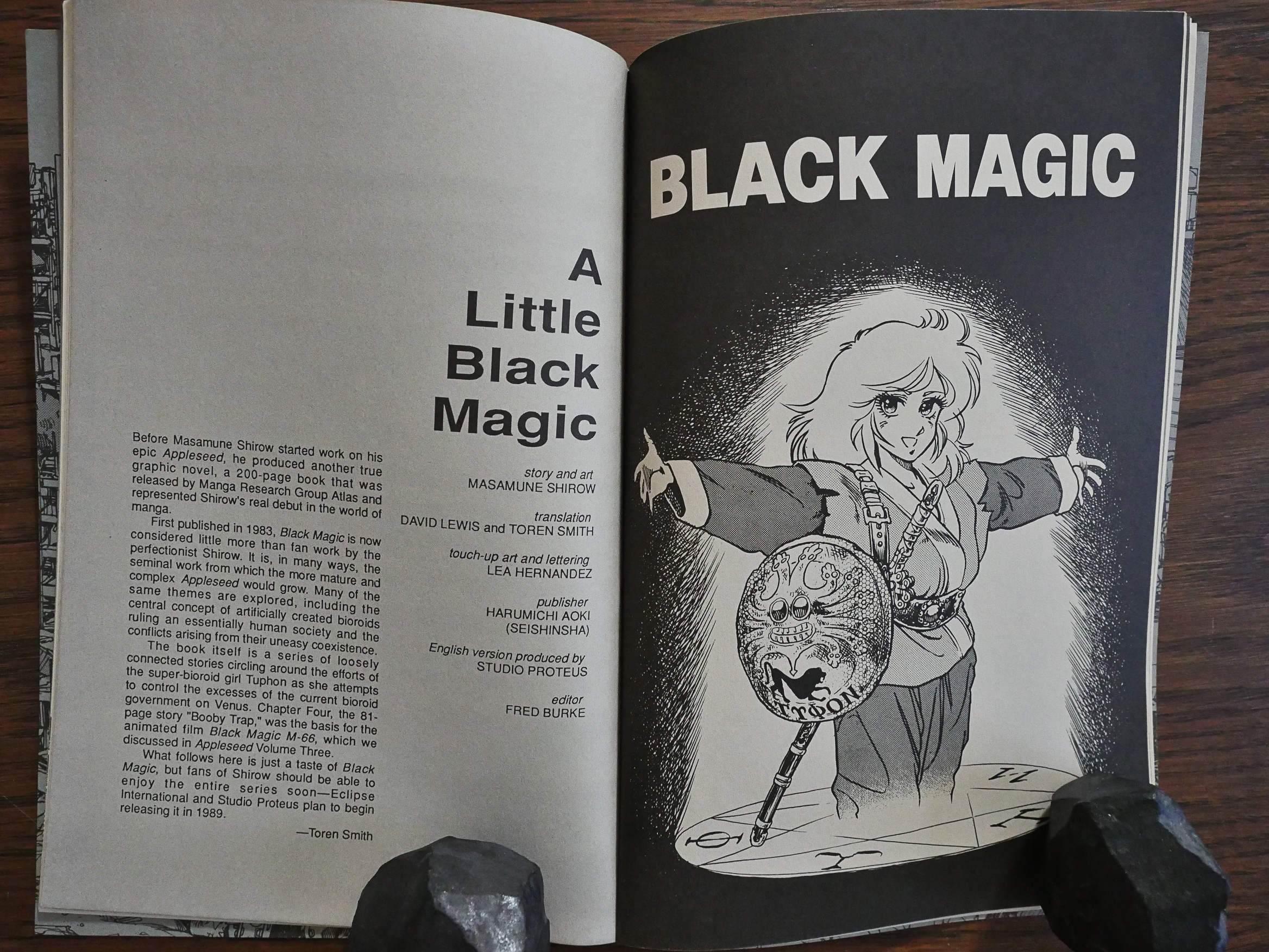
In the first few issues, we get an introduction to Shirow (and a bit about Japanese comics in general) by the translators.

While the Viz books were designed and packaged completely by the Viz people, the Proteus books look somewhat more like normal Eclipse books. The main difference is that these are squarebound 48-62 page comics, but they do have the normal Eclipse house ads and logos and stuff.

The first two books are all about the future of mankind and political intrigue and post-human society. I found it refreshing how many of the players were female characters. Shirow allegedly grew up mostly reading comics for girls, so I guess that rubbed off on him. Or perhaps he just enjoys drawing women more.

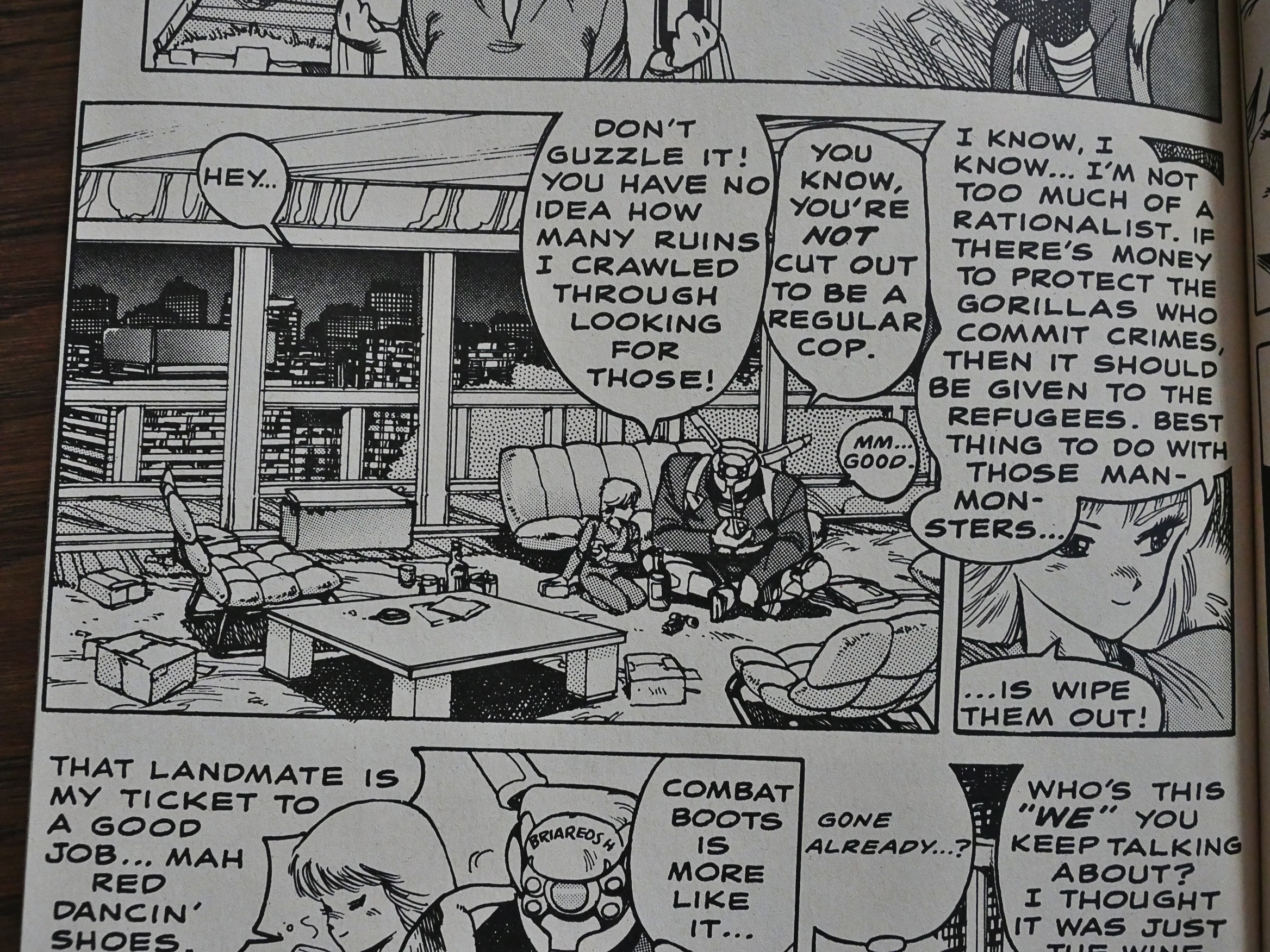
There’s a lot of dialogue I’m not sure I’m interpreting right. She seems to be saying that all criminals should be killed or something, but “if there’s money to protect the gorillas who commit crimes”… Is that where money to police forces go? To protect the criminals?

I don’t know whether there’s something lost in translation, but this comic requires a lot of head-scratching.

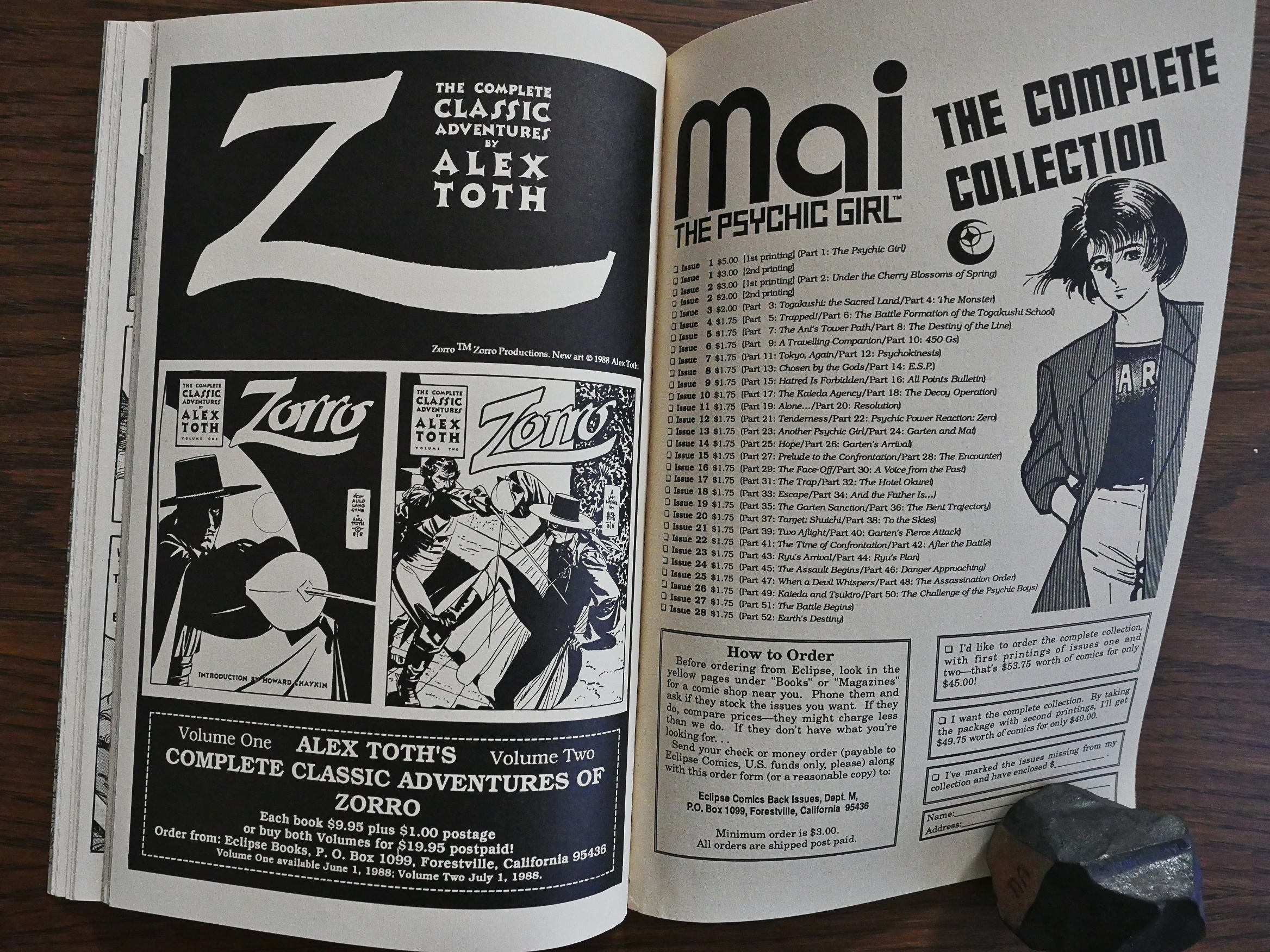
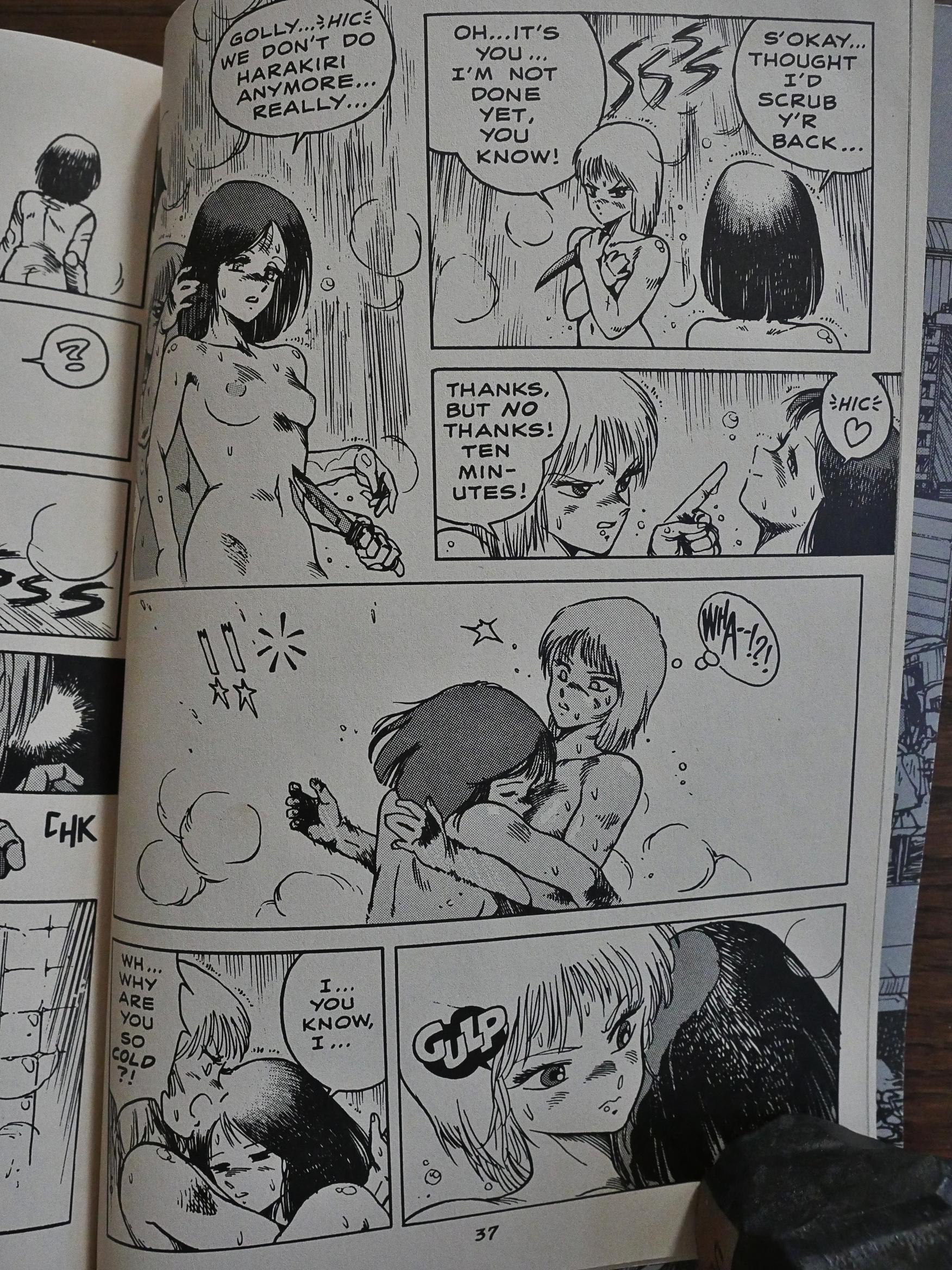
Eclipse controversially dropped a few pages from Mai the Psychic Girl where Mai took a shower. All the letter writers were irate. Eclipse didn’t do that with the shower scenes here, and not in the next volume, either, where there’s about 20 pages of two women taking showers, getting massages and talking about politics.

This is not a fast-paced book. There are sudden busts of inexplicable violence involving robots and explosions, but it’s mostly people talking at each other at interminable length.

The first three books are five 48 page issues. Now, the source material is just 190 pages long, so they could obviously have packed that into four issues. This means that there’s a lot of padding going on. Long, long letter columns and lots and lots of house ads. And one backup featuring an earlier Shirow work, Black Magic, that Eclipse later reprinted in full.

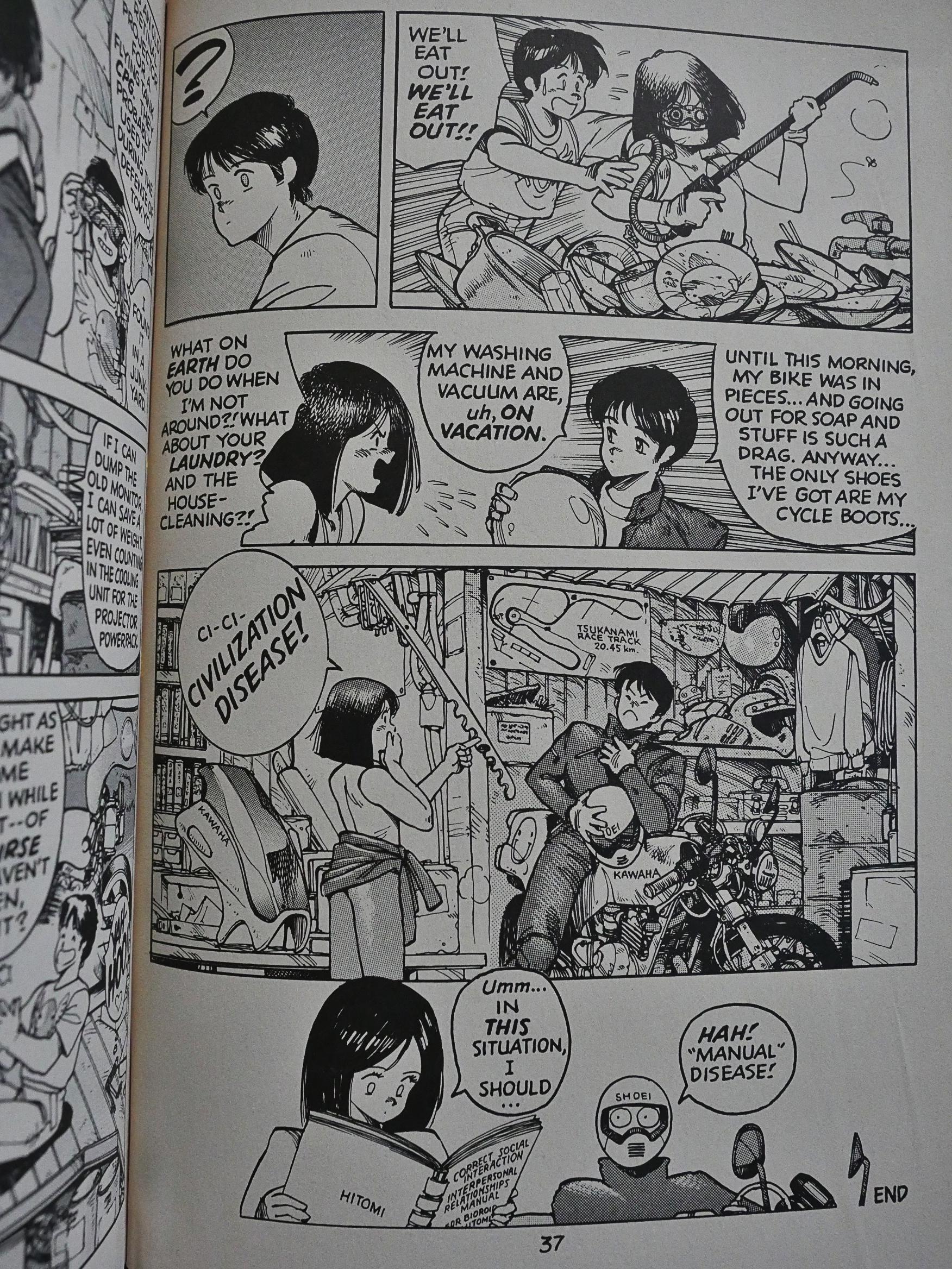
Shirow drops in scenes of comedy every now and then. Some of these are more impenetrable than others. What’s the joke here? I mean, it’s funny that she looks this up in her manual (she’s a semi-artificial life form), but what’s the “civilization disease” and why is then “‘manual’ disease” funny?

The physical humour is easier to parse. Here we have our heroes becoming so surprised that they tip over (so that we only see one foot each in the panel above to the right). Shirow likes that gag so much that he repeats it twice more during the rest of the series. And why not?

Toren Smith explains how he came to do Appleseed (and other Japanese comics) for the US market. Apparently he was the one to pick the various series, and not Eclipse.

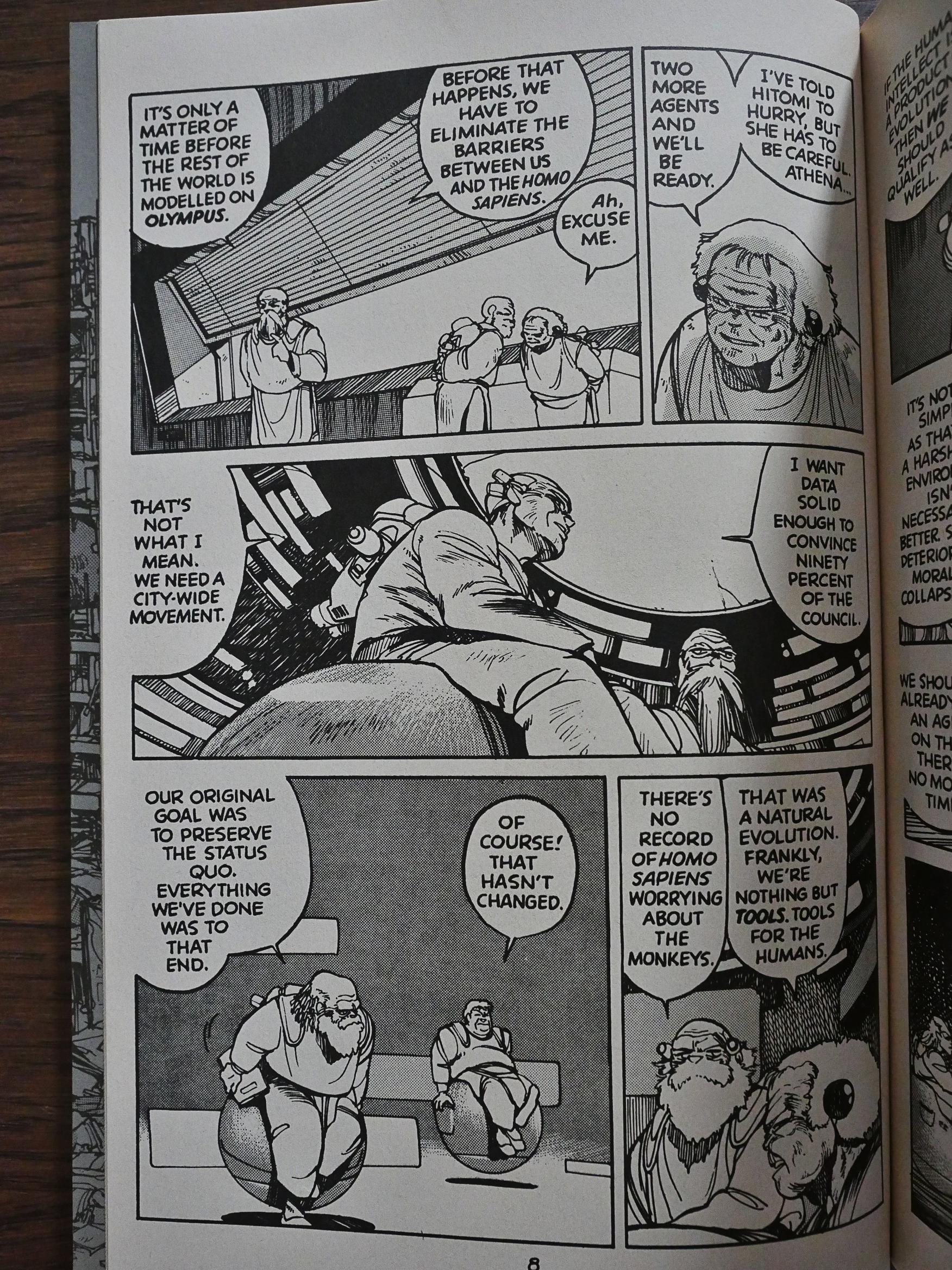
At the end of the first book, Shirow gives up letting the story just unfold and resorts to the simplest cheat there is: “As-you-know-Bob”-ing. The characters stand around telling each other what all the characters involved has to already know, but we don’t. It rather ruins the fun of reading the book.

A reader points out that Shirow’s pages are hard to read, especially the action sequences.

The problem is mainly that Shirow doesn’t vary his drawing between the background and the foreground characters, so you have to play “Where’s Waldo” a lot. It’s compounded by his bizarre robot/exoskeleton designs, where you don’t really know how many appendages each character has, or where one ends and another starts.

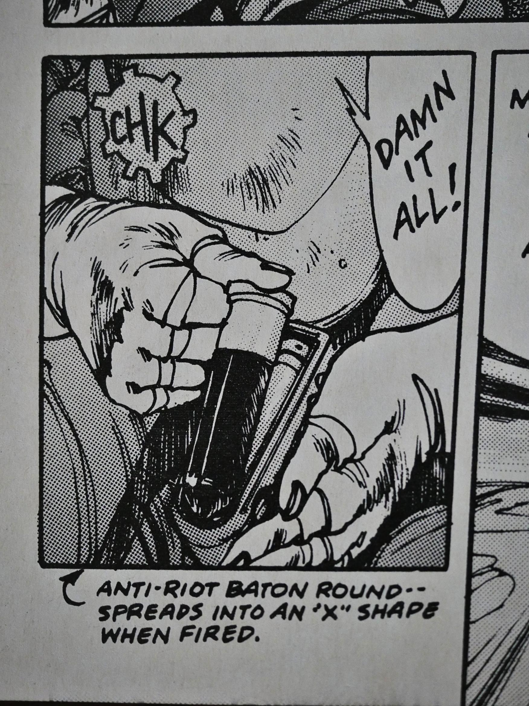
Shirow is really fond of introducing the reader to new weapons tech (that he then explains in footnotes under the panel).

Anyway, I think that perhaps Shirow grew tired of his storyline, because after the first two volumes (which was about all those grand things), the last two volumes are an even more confusing mish-mash of heists, espionage, sabotage and politics. I started losing interest pretty quickly, so perhaps it made more sense than I think it did. But it seemed to me that a lot of the plot lines didn’t really go anywhere, and Shirow instead just had fun drawing a lot of people shooting each other.

And you can’t really blame him for that.

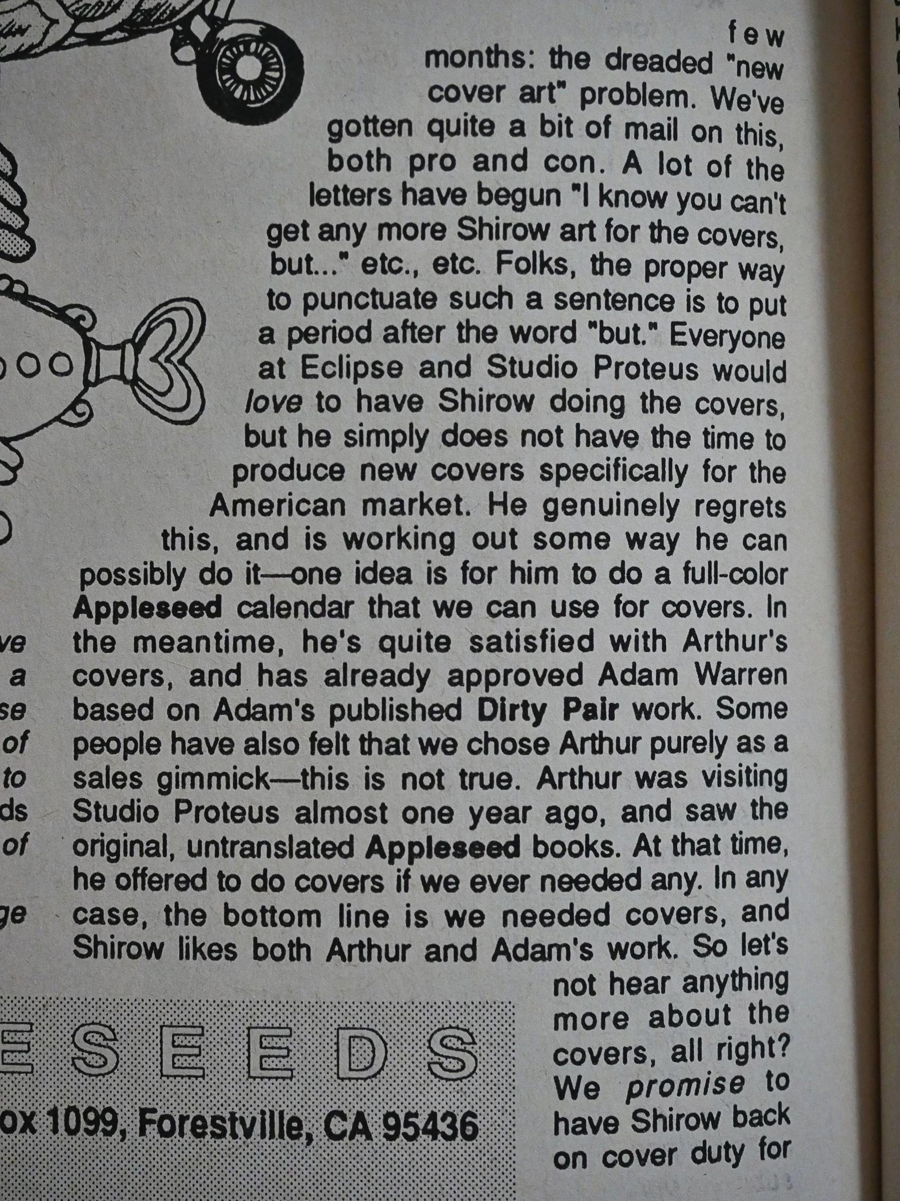
Eclipse had to resort to having other artists drawing the covers, and readers weren’t happy with that.

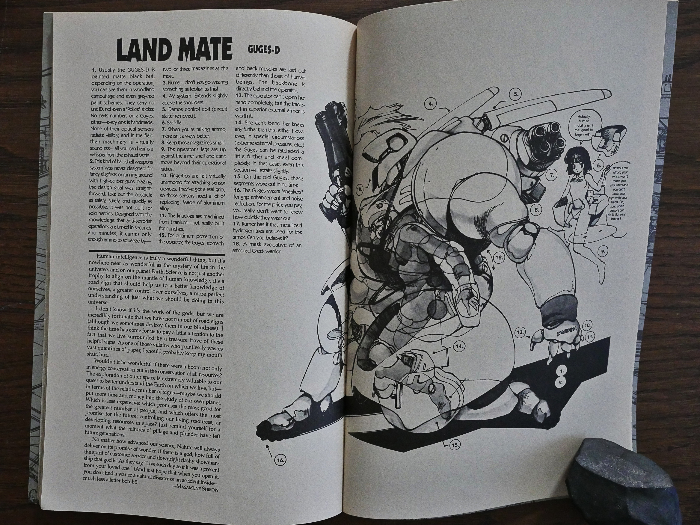
During the third book Shirow provides the filler material himself, writing short essays about the world and stuff.

And also detailed drawings of various technical bits from his universe.

And then it’s over. Shirow said that he’d originally planned on doing ten books, but had then compressed it down to eight. But he didn’t return to the series after the fourth book, and I think the reasons are pretty obvious: The series stopped working sometime during the second book, and the rest was just treading water.

But the first half of the first book is pretty fun.

Shirow went on to greater fame with Ghost in the Shell.

And apparently I’m not the only one to be frustrated with the last two books:

On the whole, I like the story’s ambition and sense of grandeur, though it’s on a lot of the specifics that I take issue. For most of the second half of the manga, it’s almost nothing but ESWAT missions against extremists from the Sacred Republic of Munma and other high-class criminals. While the dialogue and the attacks do reflect a lot of detail and research about real-life special forces, it does make the story a bit repetitive after a while. There were a few times I had to confirm which chapter I was on and who was supposed to be the enemy.

Dark Horse has reprinted Appleseed… because Toren Smith parted ways with Eclipse shortly after this series was published. I’ve tried to Google the specifics of why he left originally, but he apparently never talked to The Comics Journal about that, so I don’t know.

But remember Viz pulling the books from Eclipse because they sold so little?

I remember reading that Toren Smith was surprised that his Japanese translations sold so much more at other publishers and suspected that something was up and asked to see the accounting details from Eclipse.

This was around the time that editor-in-chief cat ⊕ yronwode and publisher (and owner) Dean Mullaney were getting divorced, so things might perhaps have been more chaotic than usual in the offices. In any case, the story as I remember it, but can’t verify now, because I can’t find the quotes, is that allegedly he received back two sets of accounting books: One copy of what he’d already been told the sales were, and the real books, that showed much higher sales numbers.

He then sued Eclipse.

Comics Journal #172:

In December of last year, Toren Smith and his company Studio Proteus filed a lawsuit against Dean and Jan Mullaney of Eclipse for past due advances and royalties. The suit, filed in California Superior Court, was seeking $150,561 for money owed to Smith and four Japanese companies, and also sought $1 million in punitive damages to compensate Smith for “the malicious and oppressive actions and conduct of the defendants.”

Smith translated and packaged several Japanese books for Eclipse from 1988-1992, including Dirty Pair (licensed from Studio Nue), Appleseed and Black Magic (from Seishinsha), Lost Continent (from Akihiro Yamada), and Cyber 7 (from Shuppansha). The four Japanese companies assigned Smith all Of their claims against Eclipse, which is named the “alter ego” of Dean and Jan in the suit. Smith and his lawyer, Stephen Hollman of Pettit & Martin, declined to comment to the Journal, but the public record speaks clearly.

On Sept. 30, a judgment was ruled in the case stating, “IT IS HEREBY ORDERED, ADJUDGED, AND DECREED that judgment is this action be entered in favor of plaintiff, Toren Smith, and against defendant, Eclipse Enterprises, Inc in the amount of $122,328.59.”

Dean Mullaney then let Eclipse go bankrupt, and Smith paid the Japanese rights holders out of his own pocket the money that was owed to them.

We’ll return to the bankruptcy again closer to the end of this blog series.

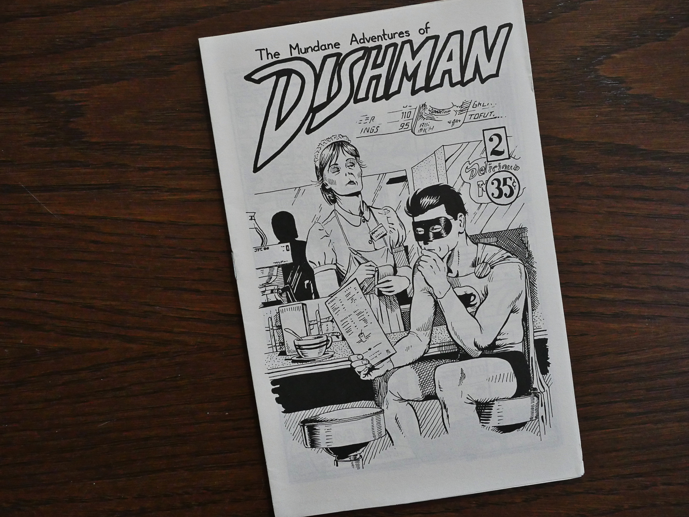
1988: Dishman

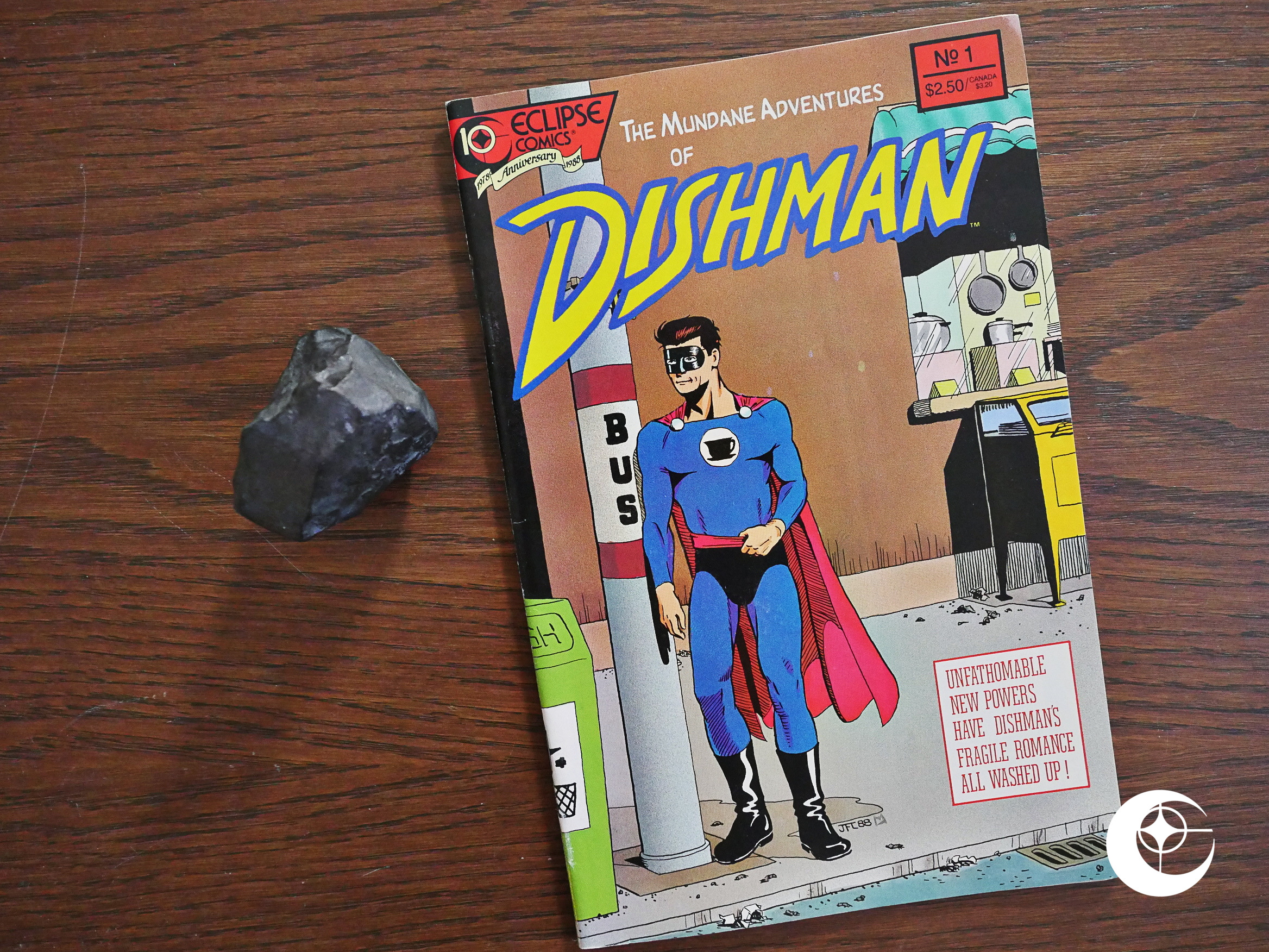
Dishman (1988) #1 by John MacLeod.

This is an unusual item in Eclipse’s late-88 line-up: It’s a reprint of a mini-ish comic from 1986 (so it’d be a thing Eclipse might have published 18 months earlier during the black and white boom) and it’s 48 pages long.

And I remember being really taken with it at the time it was published.

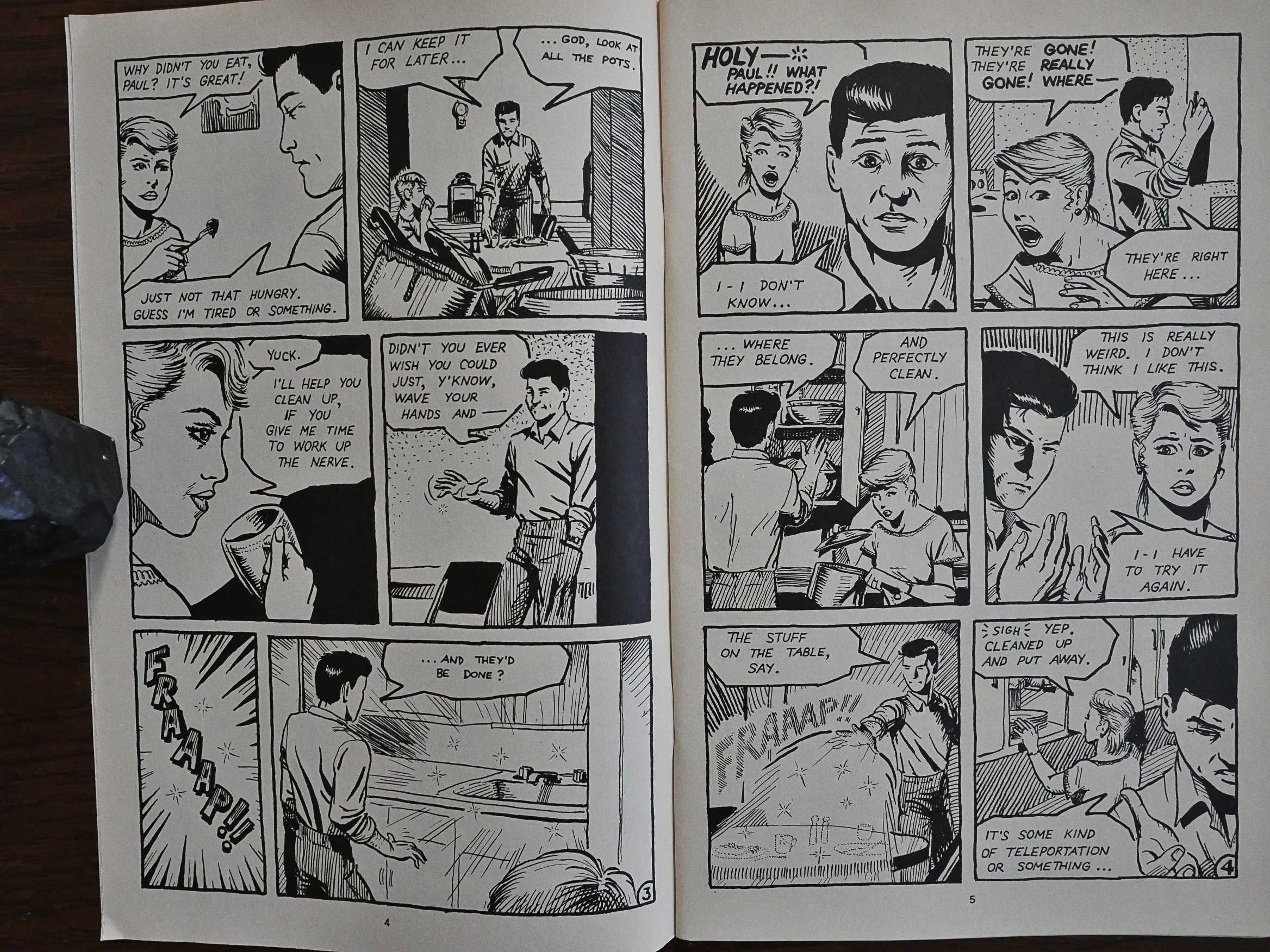
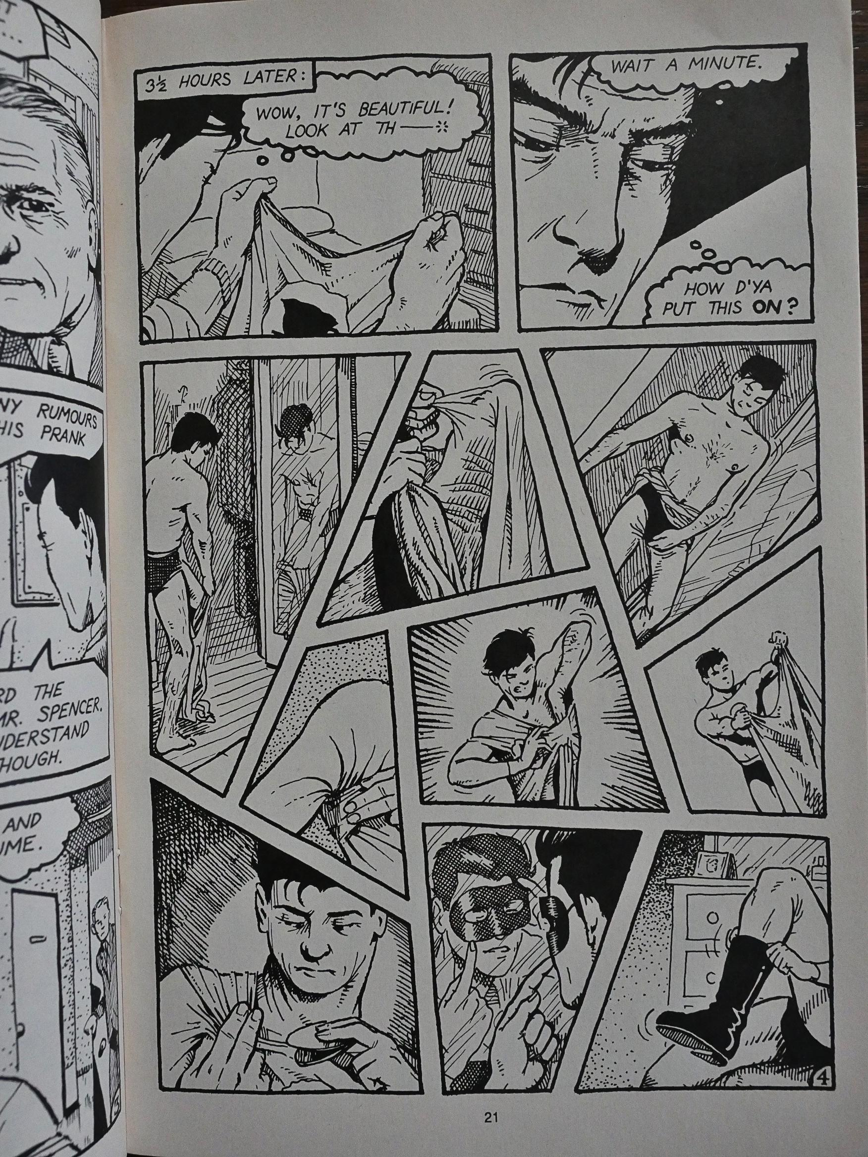
I find MacLeod’s artwork to be really charming. It has an attractive normalcy to it: It’s not overtly Jamie Hernandezish or anything; it’s just a solid, realistic, non-exaggerated rendering of people who look like real people.

The storytelling is also clear and well done, and this spread tells you what the concept of the book is: A guy gains the superpower to clean dishes from being exposed to radioactive Fiestaware for too long.

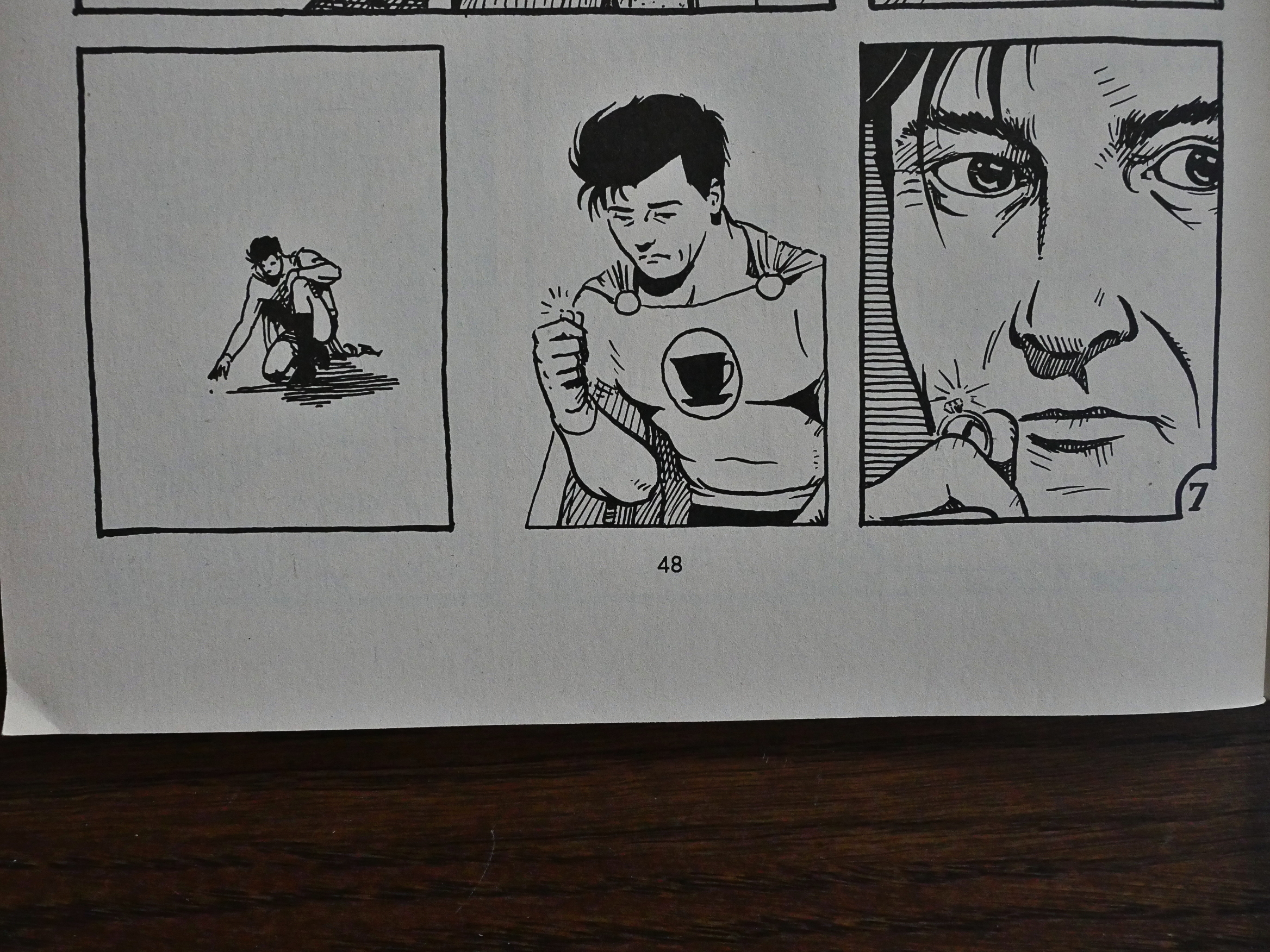
That all sounds like a parody book, but it’s… kinda not. It’s having fun with super-hero concepts, but it’s not exactly making fun of super-heroes. It’s depicting it as an aspirational idea, even if the power imagined is a pretty tiny one.

And then, after 48 pages, it just ends with no real resolution. Were further issues planned after reprinting the initial mini-comics?

I even have the original #2 of the mini-comic series, which I’m guessing I bought at the time in the hopes that it was the continuation. I was probably bummed that it was just one of the issues reprinted, because I really enjoyed this very special book back then, and I enjoyed re-reading it now.

Hm… Oh! John MacLeod has recently (?) started doing more issues! I’ve gotta check those out. He’s just putting them on Dropbox, which is very nice. Now I can read them on my Ipad.

He’s also got this old page. And he’s on twitter.

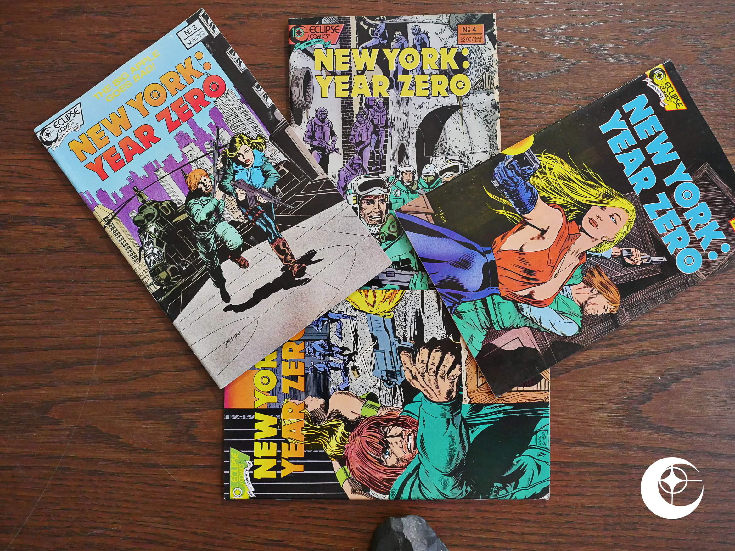
1988: New York: Year Zero

New York: Year Zero (1988) #1-4 by Ricardo Barreiro and Juan Zanotto.

I thought perhaps that this was part of the 4Winds (Truman/Dixon) line of comics, but neither the cover nor the indicia mentions 4Winds.

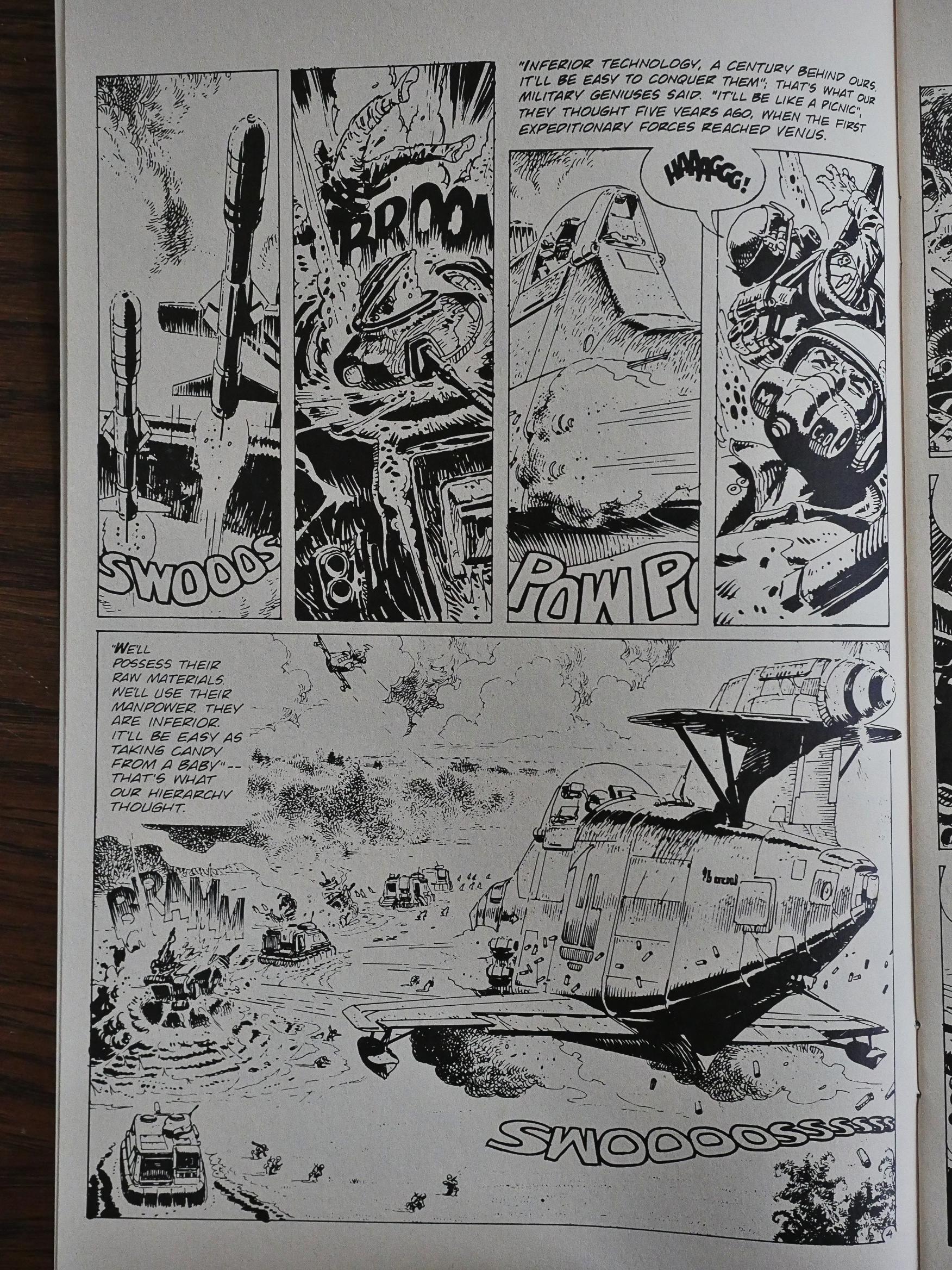
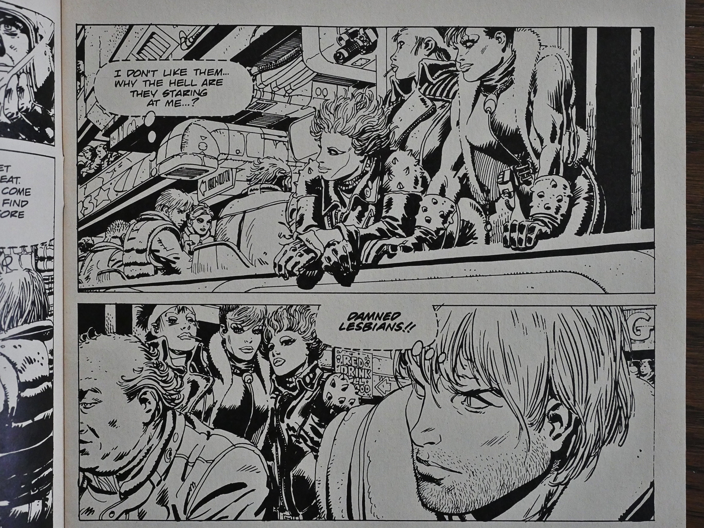
Instead we get something that looks very much like an Argentinian or Spanish sci-fi dystopia, probably not meant to be printed in this size or form factor. It looks a bit magazinish… was it meant to be in colour? I can’t tell. And as usual with Eclipse reprints, I’m guessing we won’t get any info.

I also wondered why it was called New York: Year Zero when it’s set among the teeming jungles of Venus (!), but it soon shifts back to Earth and we get to see what a lovely place it’s become.

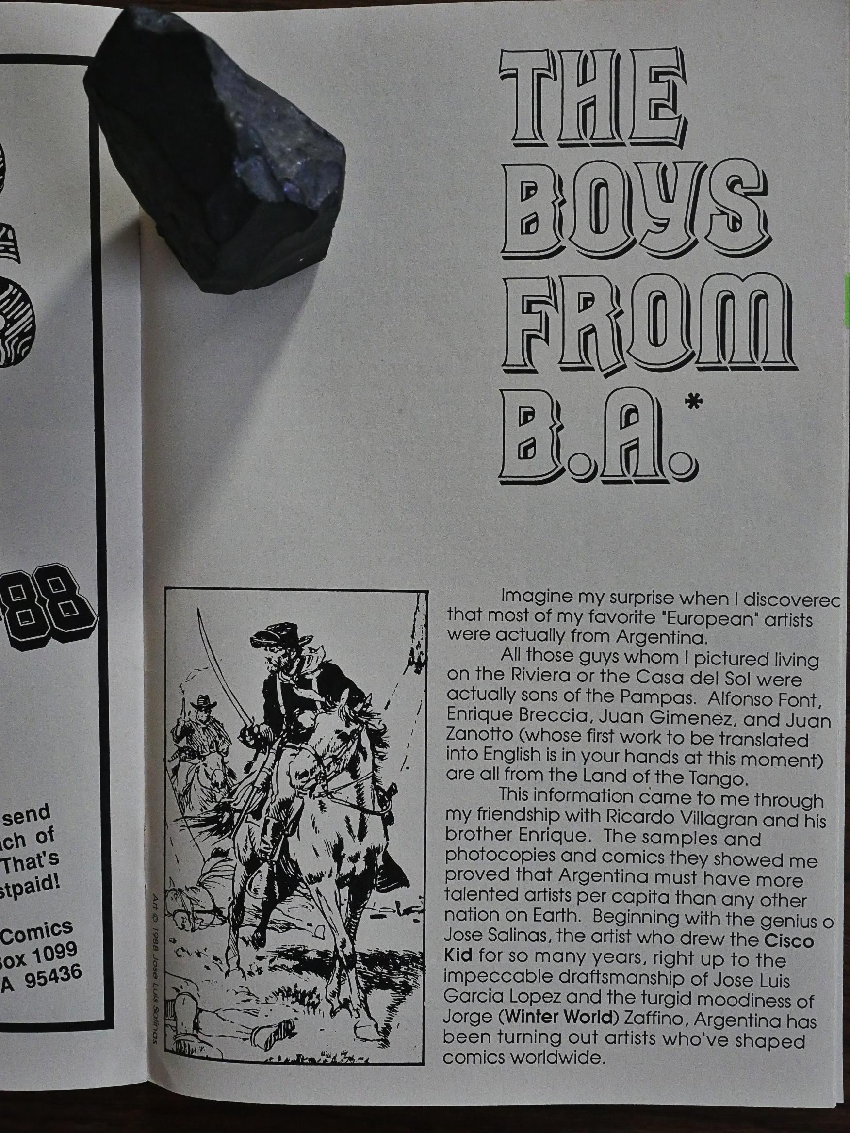
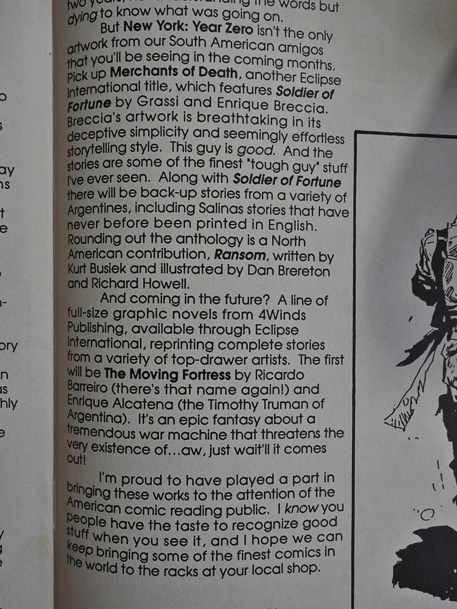
And then we get some info! Chuck Dixon writes an introduction and explains that this is the work of some Argentinians that were introduced to him via Jorge Zaffino, who he’d previously worked with.

And Dixon also semi-explains the existence of the befuddling Merchants of Death magazine: It sounds like it also came into being via Dixon’s contacts… perhaps…

He also announces a new line of graphic novels by various Argentinian creators, and that never happened, I think. Which is a shame, because there’s a lot of good Argentinian stuff out there.

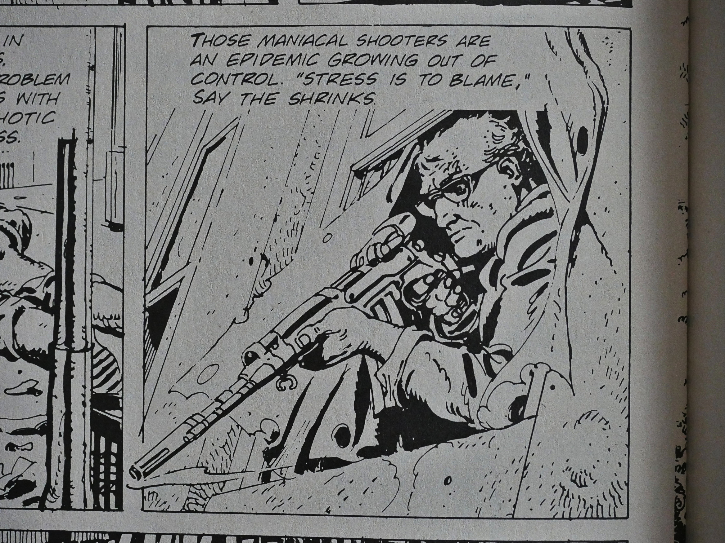
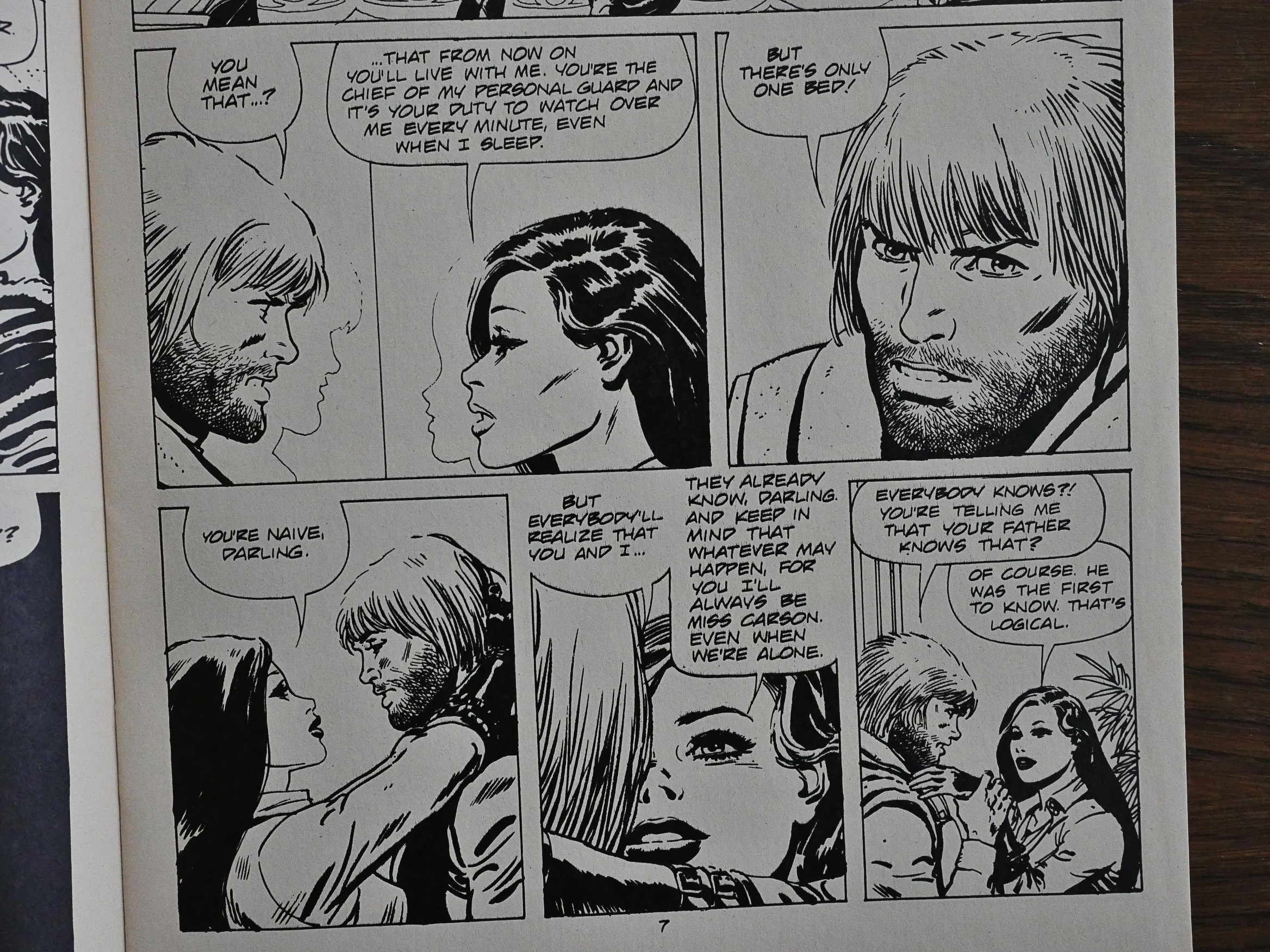
This isn’t one of those things, though. It’s a perfectly nice read: The artwork’s the normal detailed, scratchy style, which I have nothing against. It’s told in a clear, concise way. The problem is that is just so… normal. Perhaps it’s a novelty for American audiences, but if you’ve read European anthologies in the 80s, there’s so. many. of. these. things. in there, and this has nothing in particular to recommend it.

I’m guessing the reason they picked this over the metric ton of stuff they could have published instead is that it’s a fairly short story, and that it’s set in New York.

Since Eclipse didn’t continue publishing Argentinian reprints, I’m guessing the US market wasn’t very receptive, either.

1988: Krazy & Ignatz: The Komplete Kat Comics

Krazy & Ignatz: The Komplete Kat Comics (1988) #1-9 by George Herriman.
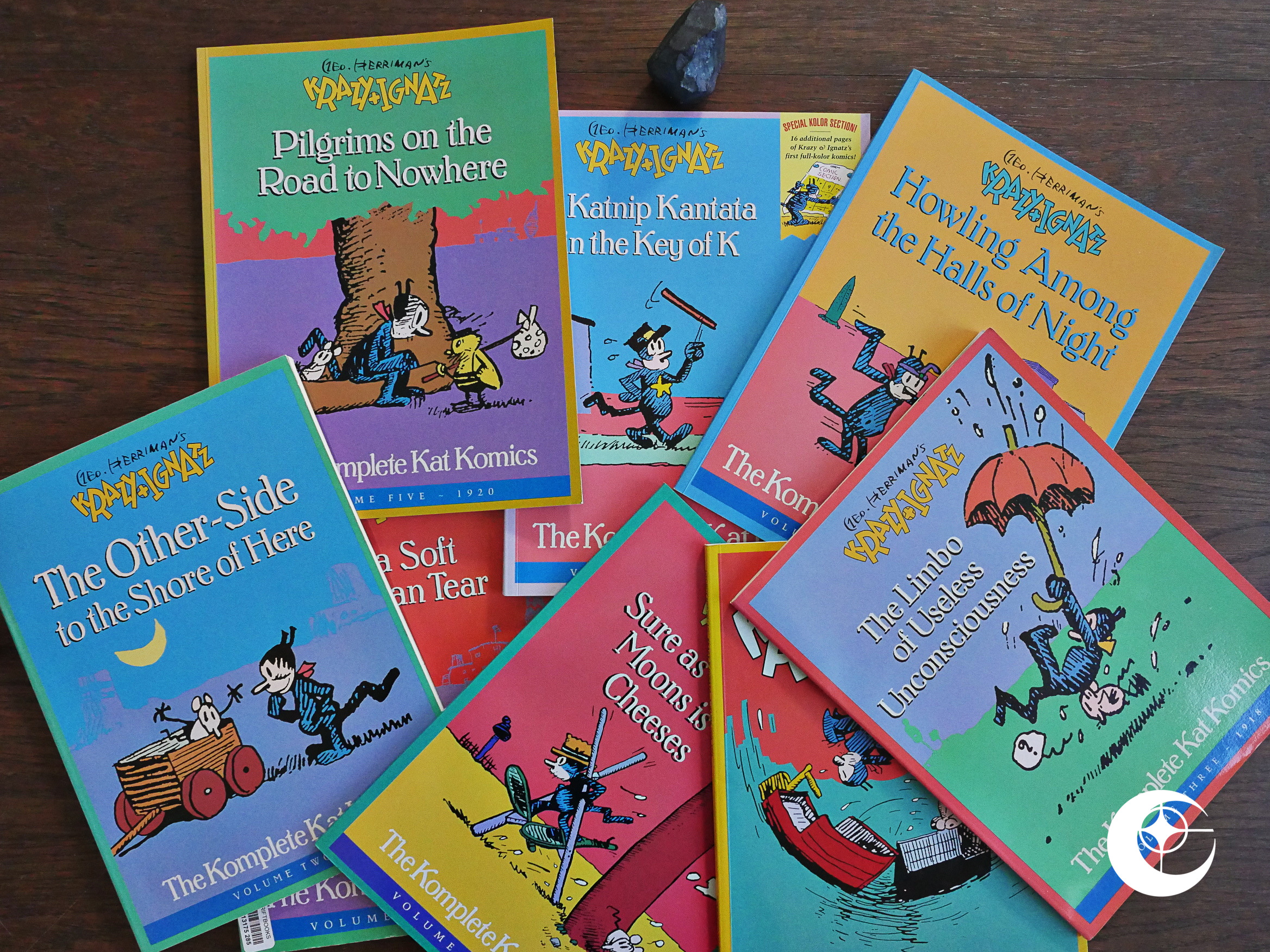
Well, you can’t say that Eclipse didn’t reprint a lot of crap, but then they go and make amends by trying to do a substantial reprinting of the Krazy Kat Sunday strips. We’d seen some lethargic attempts at getting this, the best comic ever, back into print before, but Eclipse managed to do nine whole years worth, which is probably nine times as much as anybody else had managed until now.
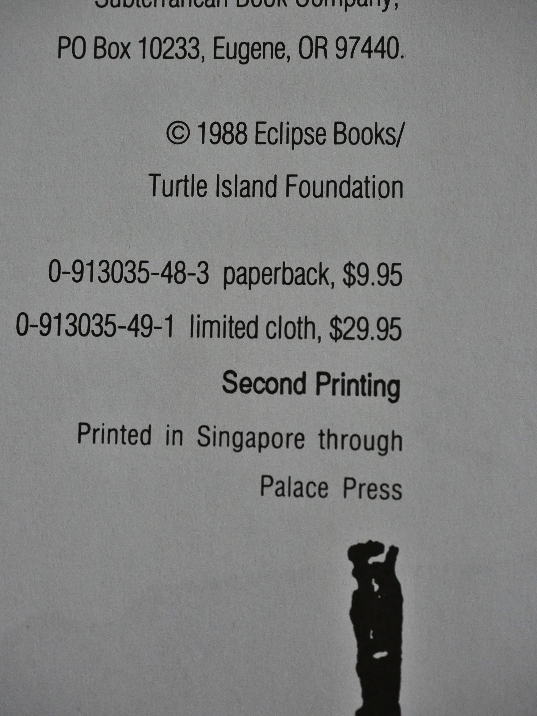
And it was apparently something of a success? The first volume, at least, went into a second printing, and Eclipse kept doing them until they went under, more or less…

Anyway, there are more essays and books about Krazy Kat than just about any other subject in comics, aren’t there? I bought the latest two books recently, but I haven’t read them yet, so my feeling about the field is out of date.

But every time I read an article about Krazy Kat in the 80s and 90s, are that they try too hard to pin the work down. “This is what Herriman meant.” “This is Herriman’s theme (singular).” “This is what it all means.”

Even sensitive and intelligent writers like Austin English falls into that trap, I think, but doesn’t get stuck.

It’s like reading reductive books on your favourite album. “This song is about the singer picking his nose.” It’s wonderful reading books that gives you lots of background information about how the record was created and what the author was going through; that open up the interpretative options, not close them down. I remember Jonathan Lethem’s book about Talking Heads’ Fear of Music fondly in that regard.
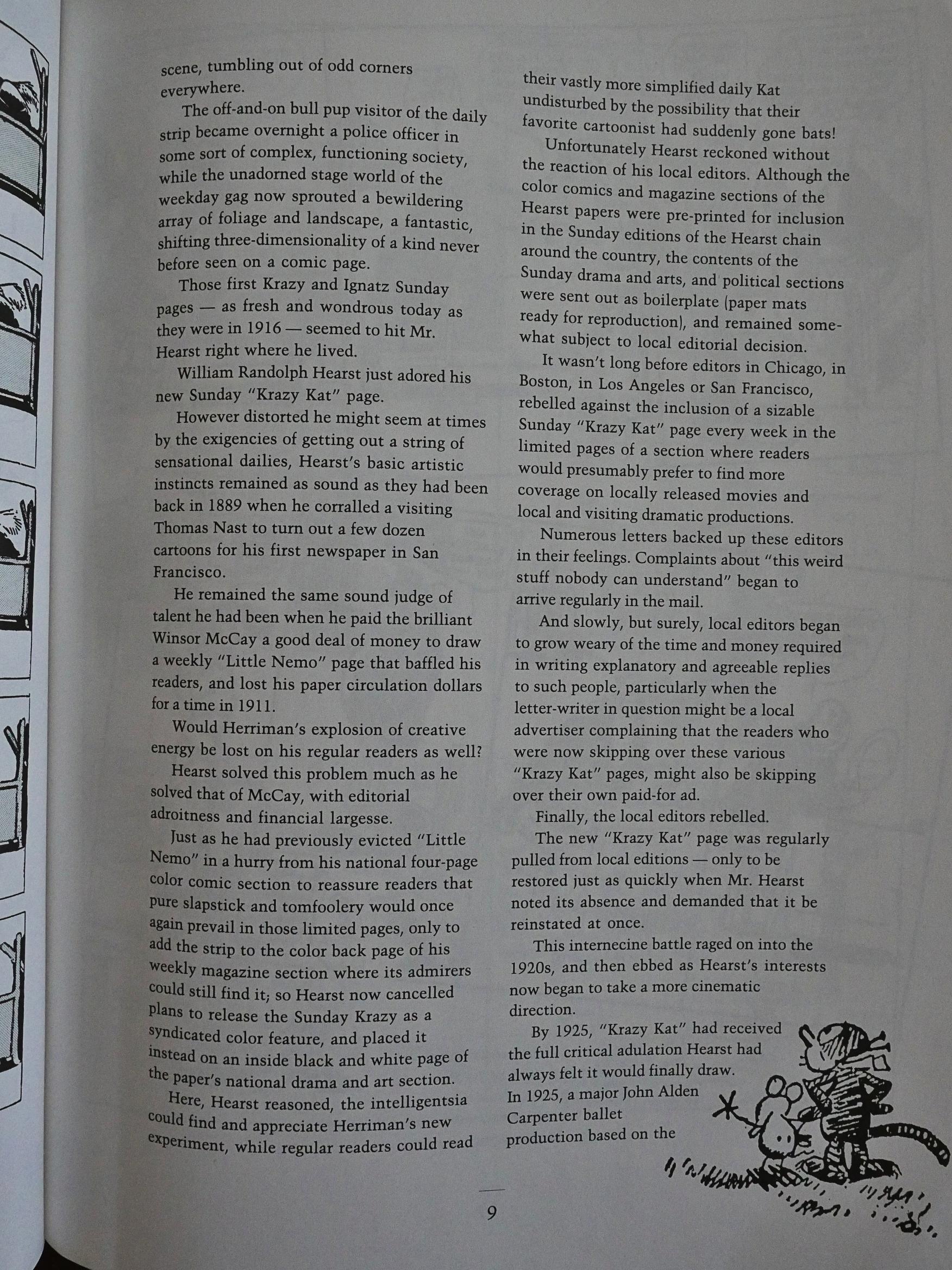
Editor Bill Blackbeard provides the introductions in these volumes, and gives a bit of context, but he mainly says 1) we don’t know anything about Herriman, and 2) William Hearst had to cajole the editors of this newspapers to keep them running it. Blackbeard’s explanation for they didn’t want to run it was that (basically) that it’s baffling. The readers wrote in and were upset with all their general confusion.
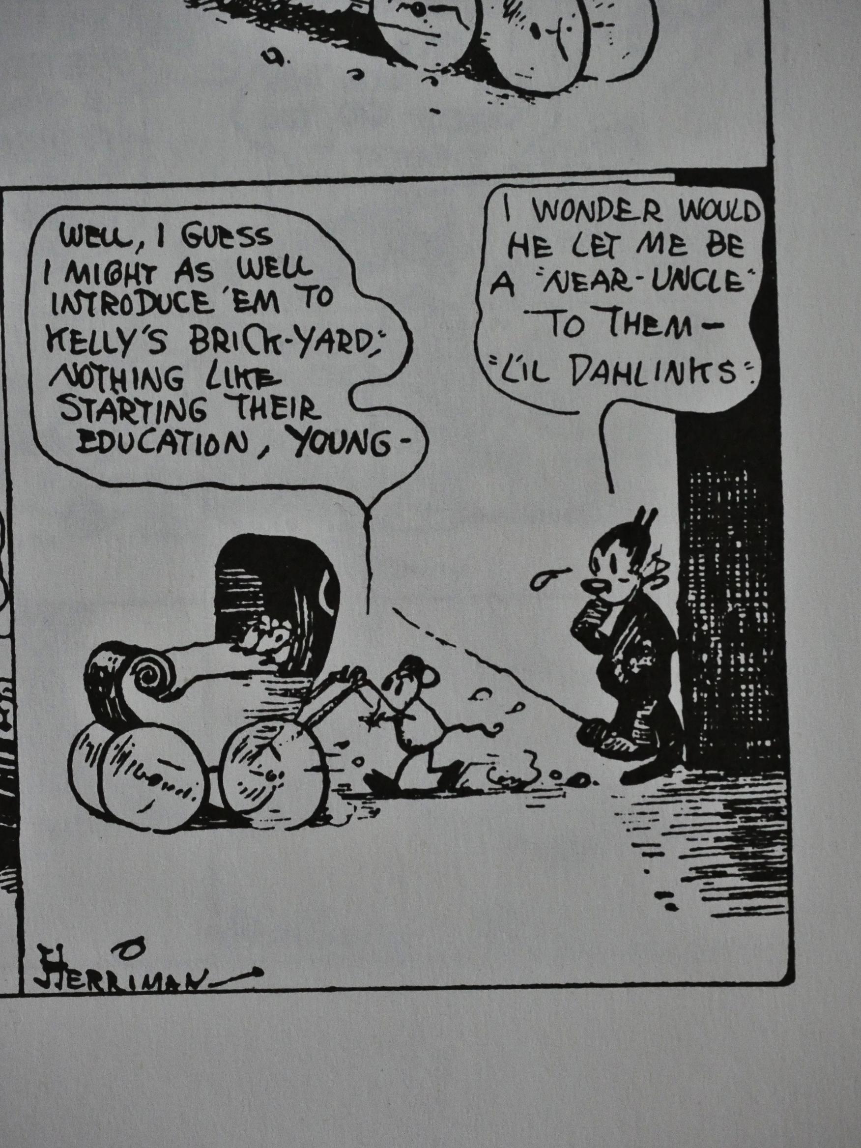
He doesn’t provide any examples of the general bafflement, and reading these early strips, I think there may be a reason why: These strips are clear, easy to read, and very logical. The reason the editors wanted to be rid of the strip may perhaps not have been because they didn’t understand it, but because they understood it all too well.
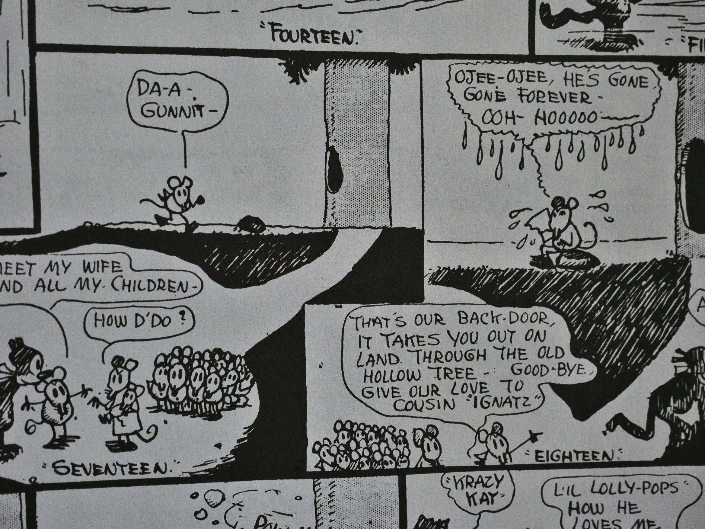
It’s a strip about Krazy Kat (presented always, in these early years as “he”, “nephew” and all the other male words in the lexicon) in love with Ignatz (demonstrably male; with wife and children), who alternates between loathing Krazy and loving him (but only when nobody’s watching).

Could it possibly be that the editors (and readers) reacted negatively because *gasp* IT”S ABOUT TEH GAYES!
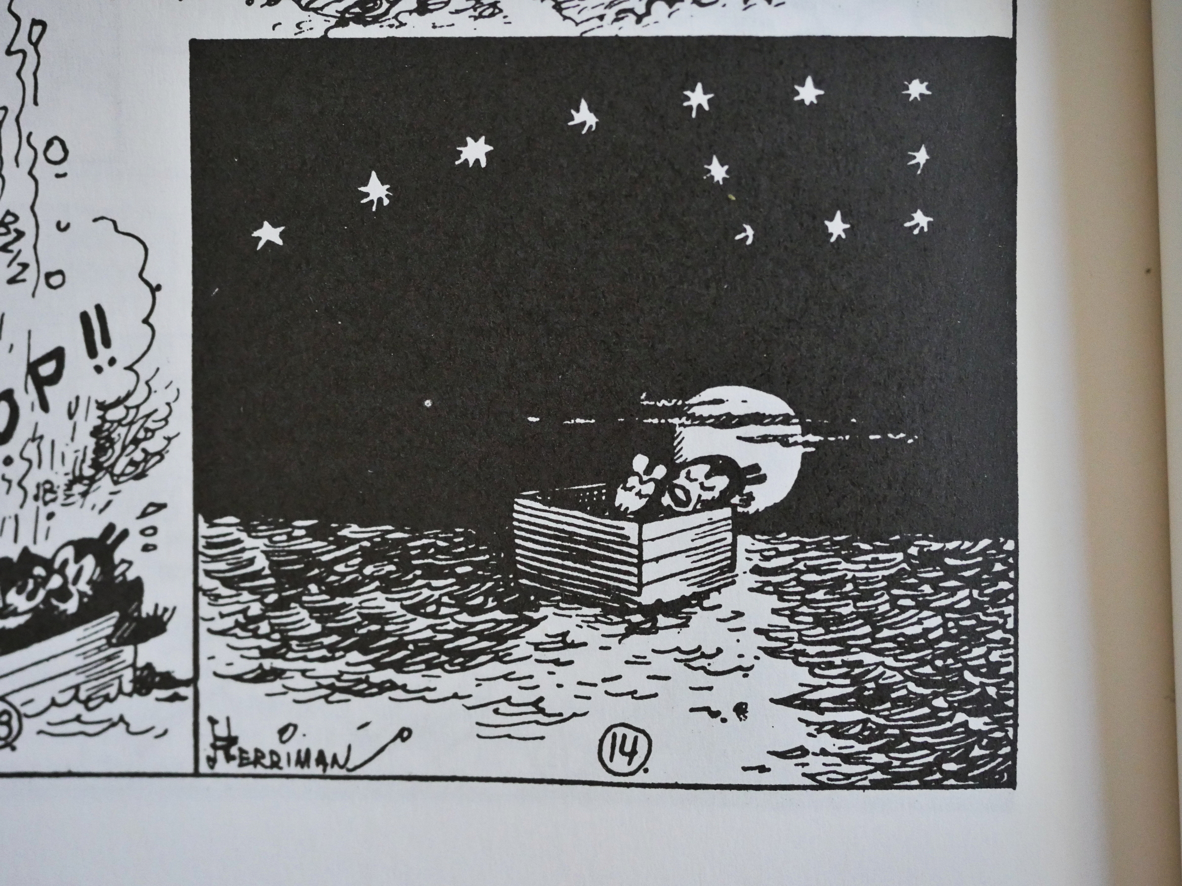
No, of course not. It’s because it’s too “highbrow”, as Blackbeard puts it.

*sigh*

But if that’s the reading the people a hundred years ago gave these strips, it may or may not have been what Herriman intended. After a few years of people asking him what gender Krazy Kat is, he’d go on to say that Krazy is sexless, a “pixie”.

I remember, with horror, articles from the 90s where people had gathered seemingly every panel where Krazy Kat had done something particularly effeminate, or somebody had called Krazy “she” and wrote “here’s definite proof that Krazy is female!!1!ONE”.

Or to put it even more moronically, here’s RC Harvey for
instance
:

(Despite refusal to assign a gender to his title character, I use the feminine pronoun because Ignatz is clearly male, and a female-male love relationship — while perhaps too conventional for the whimsical
unconventionality of the strip — was not so untoward as to disturb Herriman’s first readers, crossspecies implications to the contrary notwithstanding, and so most of them doubtless thought of Krazy as being
female. Why shouldn’t we?)

“Doubtless.”

People are amazing. Sometimes horrifyingly so.
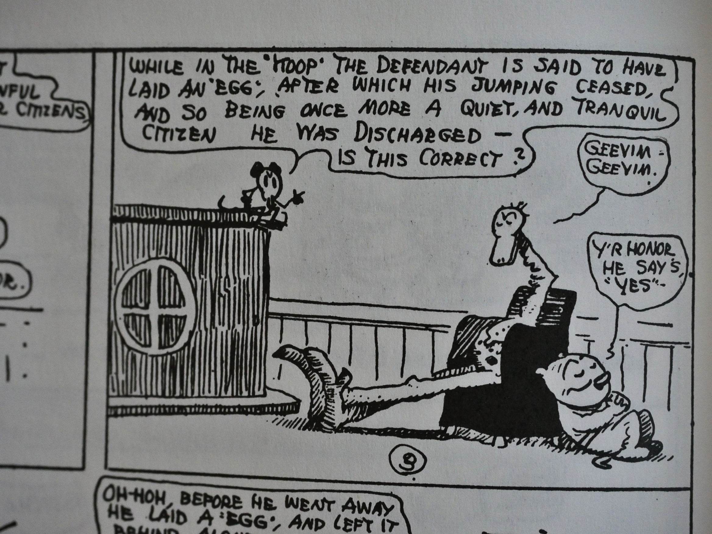
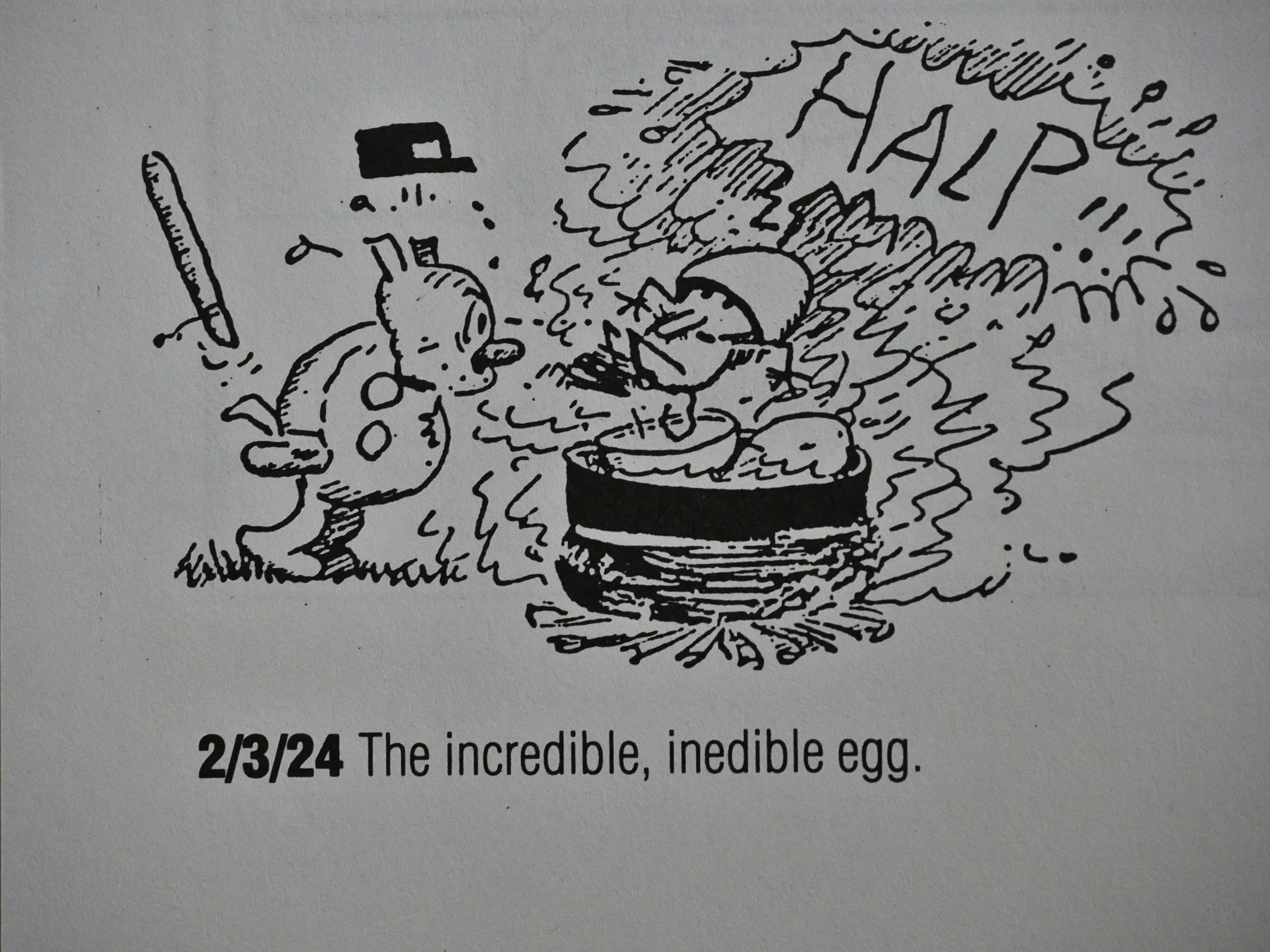
And I’m sorry for that rant, because Herriman is somebody who plays with everything, anything, for a laugh, like this guy who apparently laid an egg after eating Mexican jumping beans. Herriman can’t be reduced or pinned down, ever, but being obtuse to this degree (about other people’s reaction to the work) is really annoying.
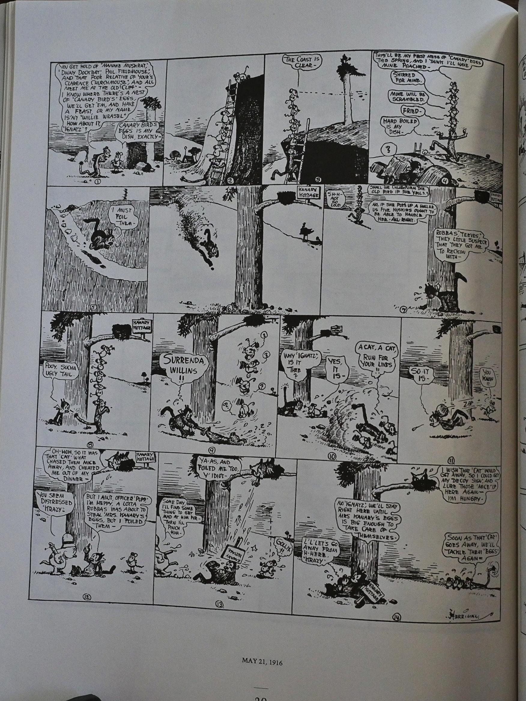
So let’s talk about other things! Like how Ignatz is really creepy in these early strips. I’ve read all the Sundays (as Fantagraphics were publishing them in this century), and they pick it up around 1926. Here, ten years earlier, he’s much nastier than I remember him being in the strips I’ve read more recently. Above he’s conspiring to eat a bird’s eggs while she’s away, having placed Krazy Kat in charge.
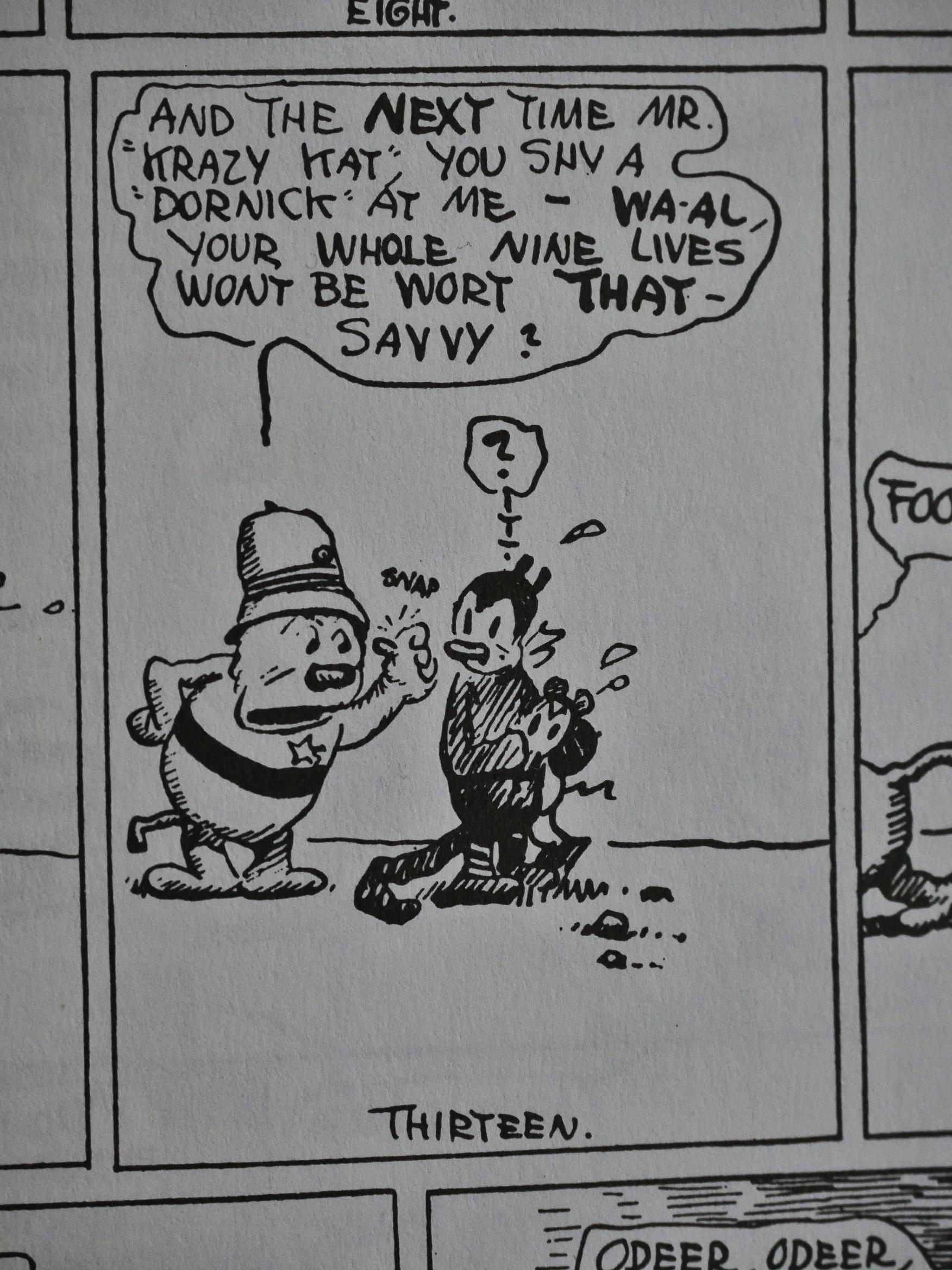
And there’s no sign here of how infatuated Offisa Pup would become with Krazy Kat: He barely tolerates Krazy in these strips.

In my mind, the central cast of the story are constants, but it’s really only Krazy Kat who remains the same throughout the series. And a lot of important, but peripheral characters, like Krazy’s aunt Tabby, go missing.
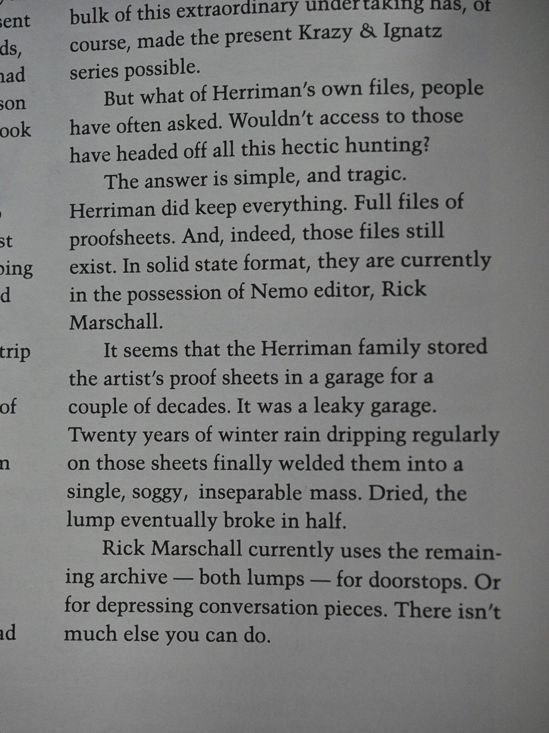
Blackbeard recounts the sad, sad story of what happened to the original proofs (the family put them into a leaky garage and they turned into a block of paper) and why this series is reproduced from newspaper printings. But I vaguely recall something about this now being quite accurate any more? Googling for half a minute doesn’t turn up much, though.
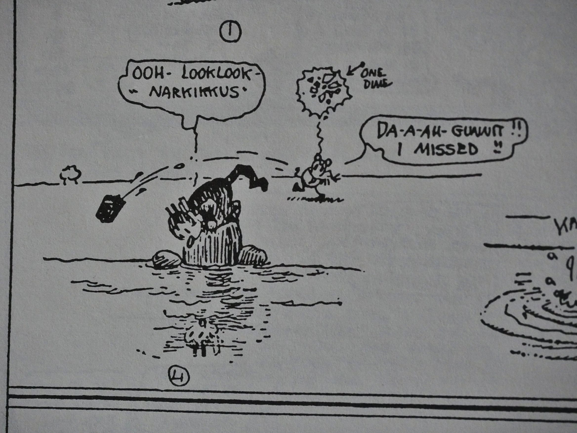
Blackbeard is right in that there are some “highbrow” things in here. Would most Sunday paper readers get the Narcissus reference? I think perhaps more than you’d expect…
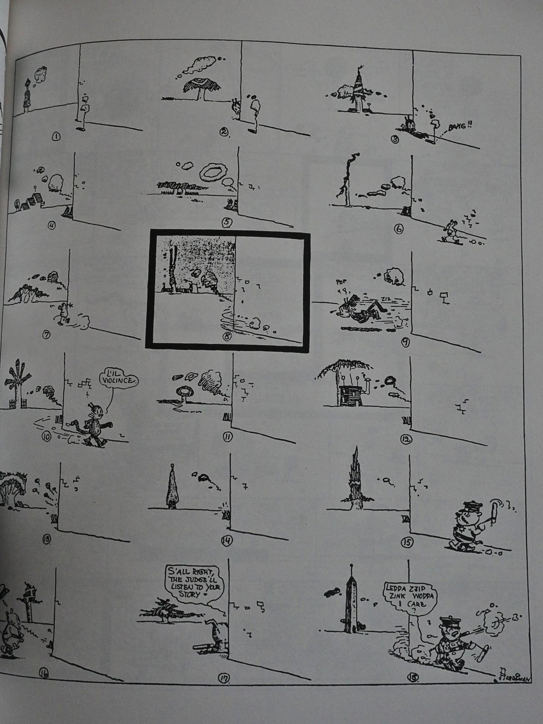
At the that of the series, Herriman didn’t really do the overtly shifting backgrounds much. It’s only in 1917 he really starts in with pages like this, where the object at the horizon changes constantly, but once he started, he used it quite a lot. And never really stopped.
In the second volume we get a debaffler feature, which is nice, because some of the references Herriman comes up with are a bit obscure (beyond the constant dialect word play).
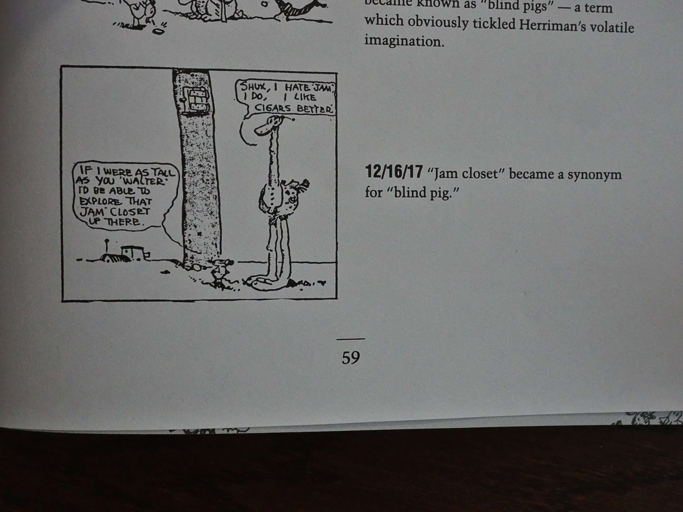
Like “jam closet”, which is a synonym for “blind pig”, which means “a place where you drink alcohol”.
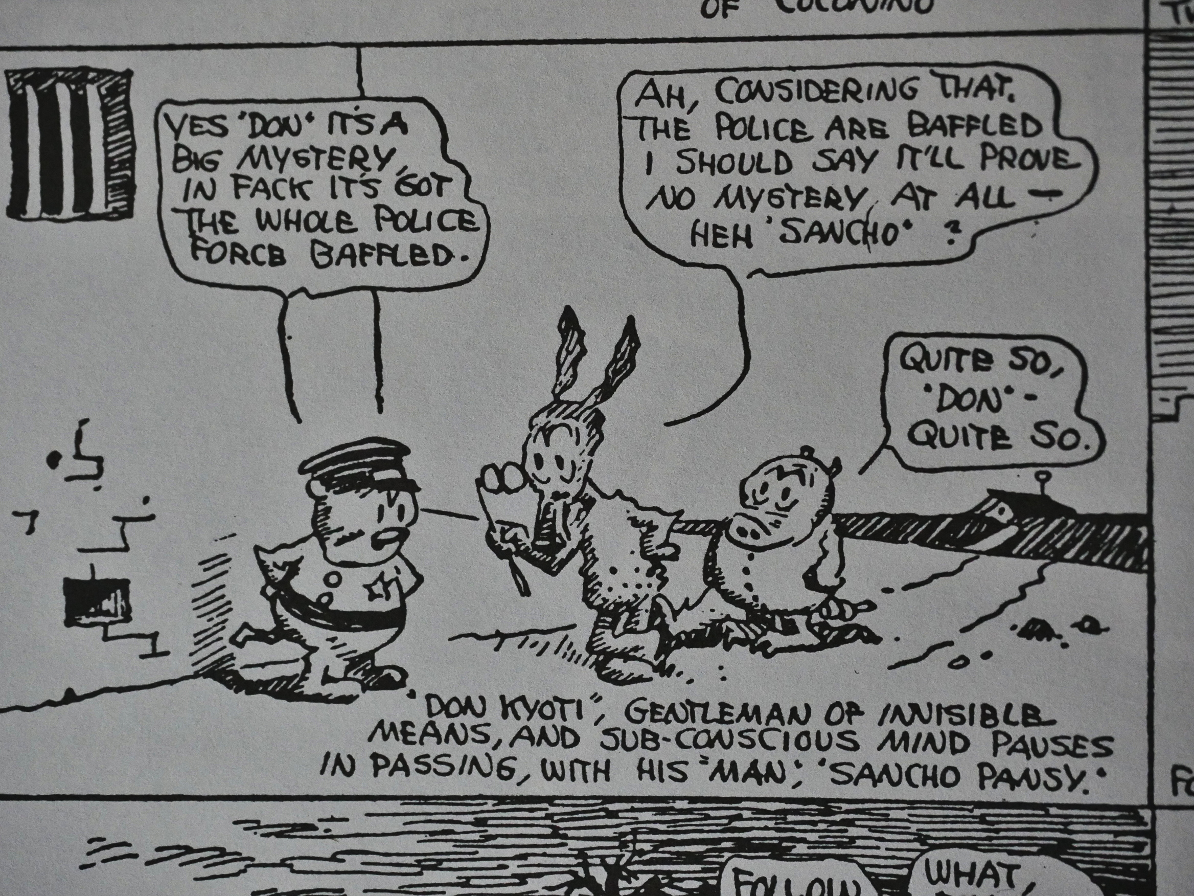
Heh heh. I mean, Herriman does this constantly with names, but I was taken with the Don Kyoti/Sancho Pansy pairing.
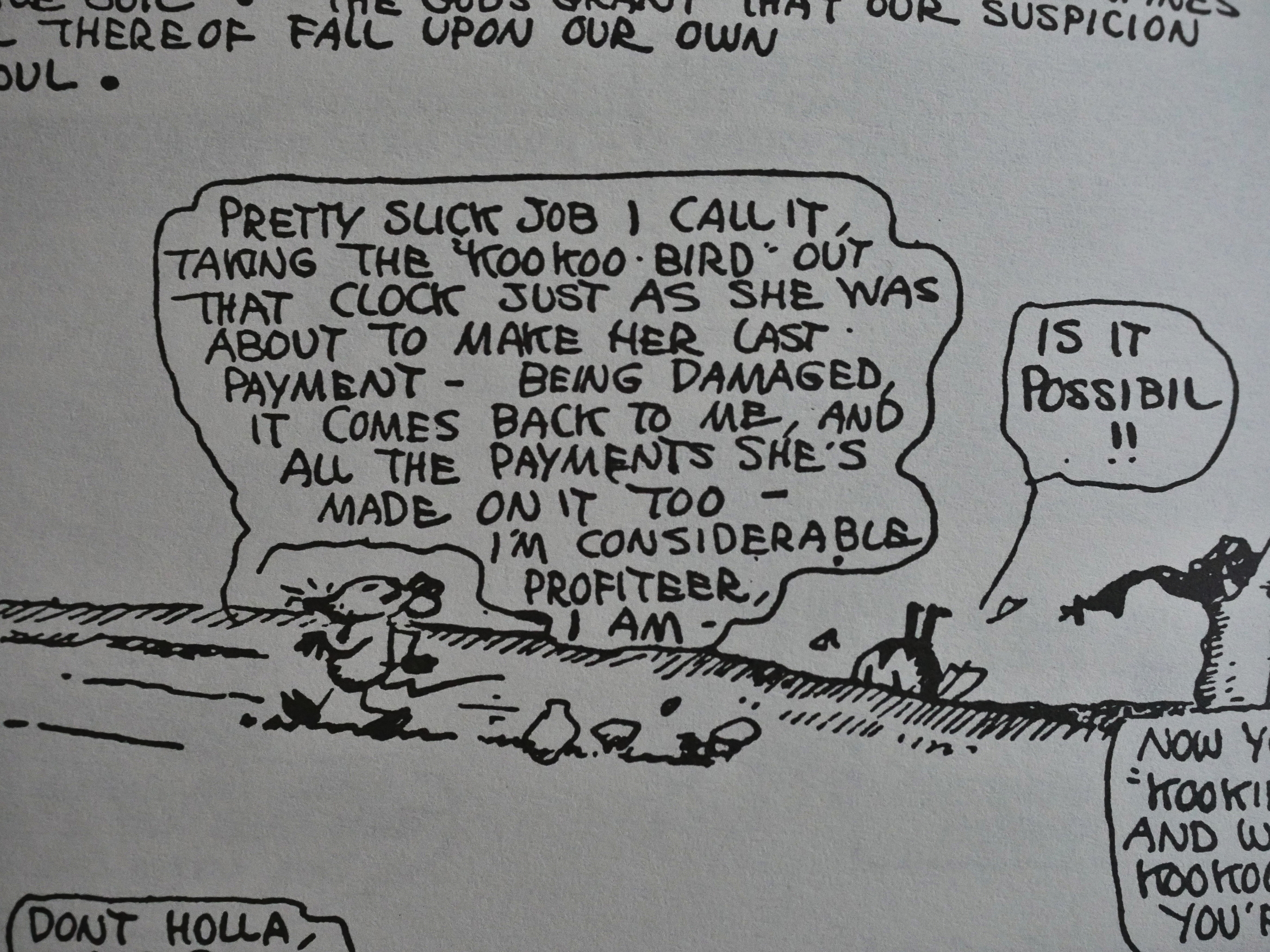
Perhaps the most evil scheme Ignatz cooks up in these early strips is his plot to defraud a widow of her cuckoo clock. He’s sold it to her on a down payment plan, but there’s a clause in the contract that states that if it’s broken, he can repossess it. So the day before the final payment is due, he’s stolen the cuckoo out of it, and is on his way to take it.

I guess Herriman also thought this was a bit too far, too real: Ignatz as a scoundrel is fun, but Ignatz as a profiteer would make him unlovable to Krazy, too. (Who foils his evil plans, as usual.)
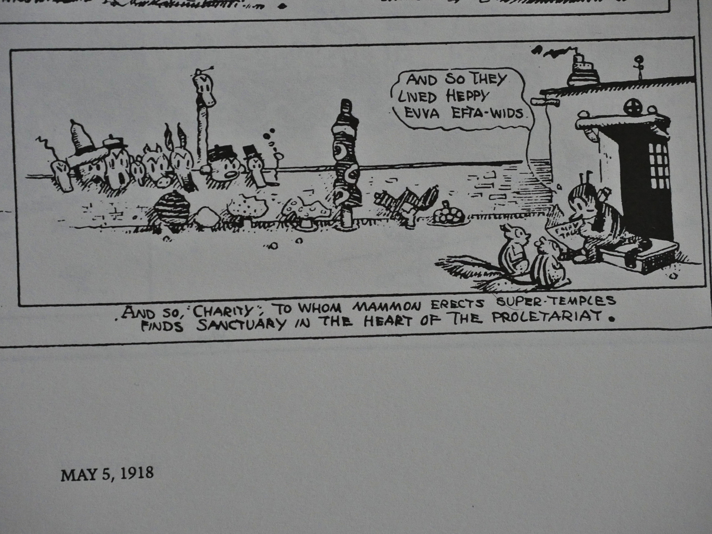
Perhaps the constant references to “the proletariat” didn’t endear him to the editors of Hearst’s newspapers… which were mostly conservative papers, I think?
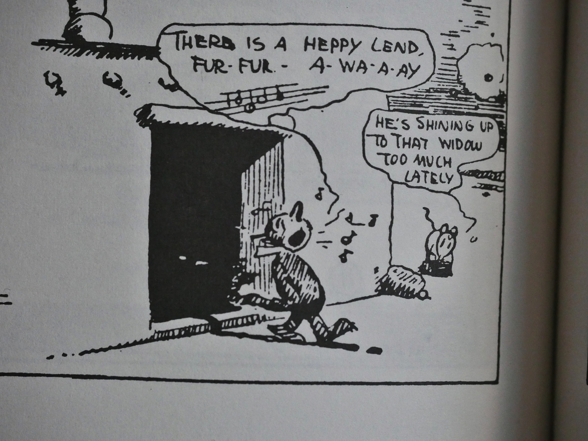
Ignatz doesn’t like it when Krazy Kat shows too much attention to women.
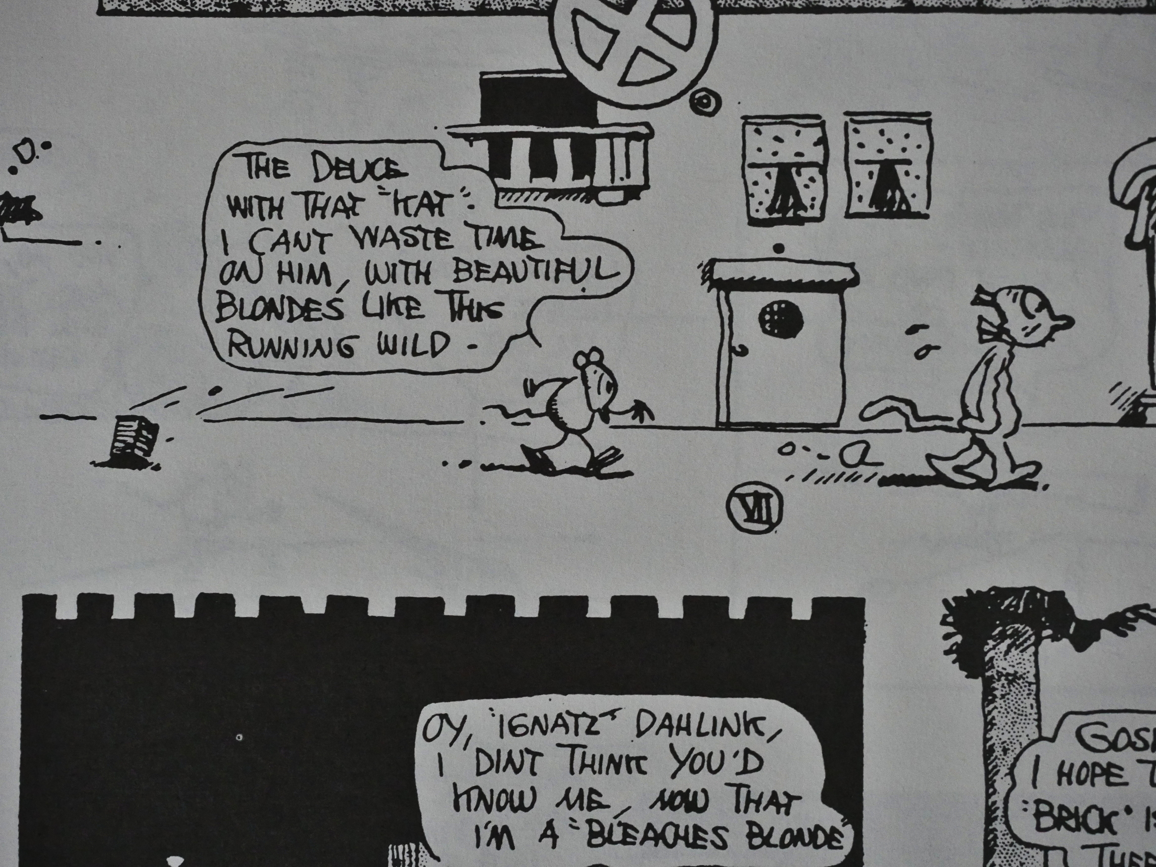
In 1918, we have this page that I think is the first time Herriman plays much with race. Krazy’s hair has been bleached and is now a blonde, so Ignatz suddenly becomes very, very attracted.
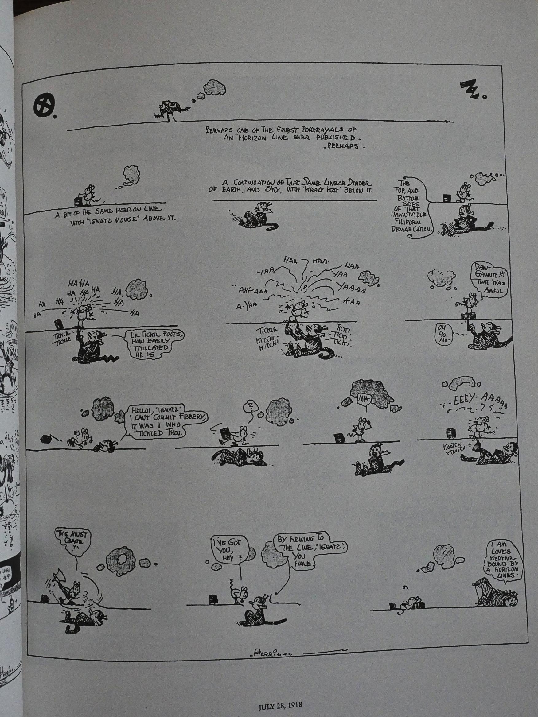
One thing I had forgotten is how relatively little Herriman plays with the strip format himself. For a kooky strip like this, he relatively seldom goes meta and draws attention to the mechanics of the strip. Here he’s playing with a line that both a horizon line and something that Krazy can hide underneath and pop out of to surprise Ignatz.
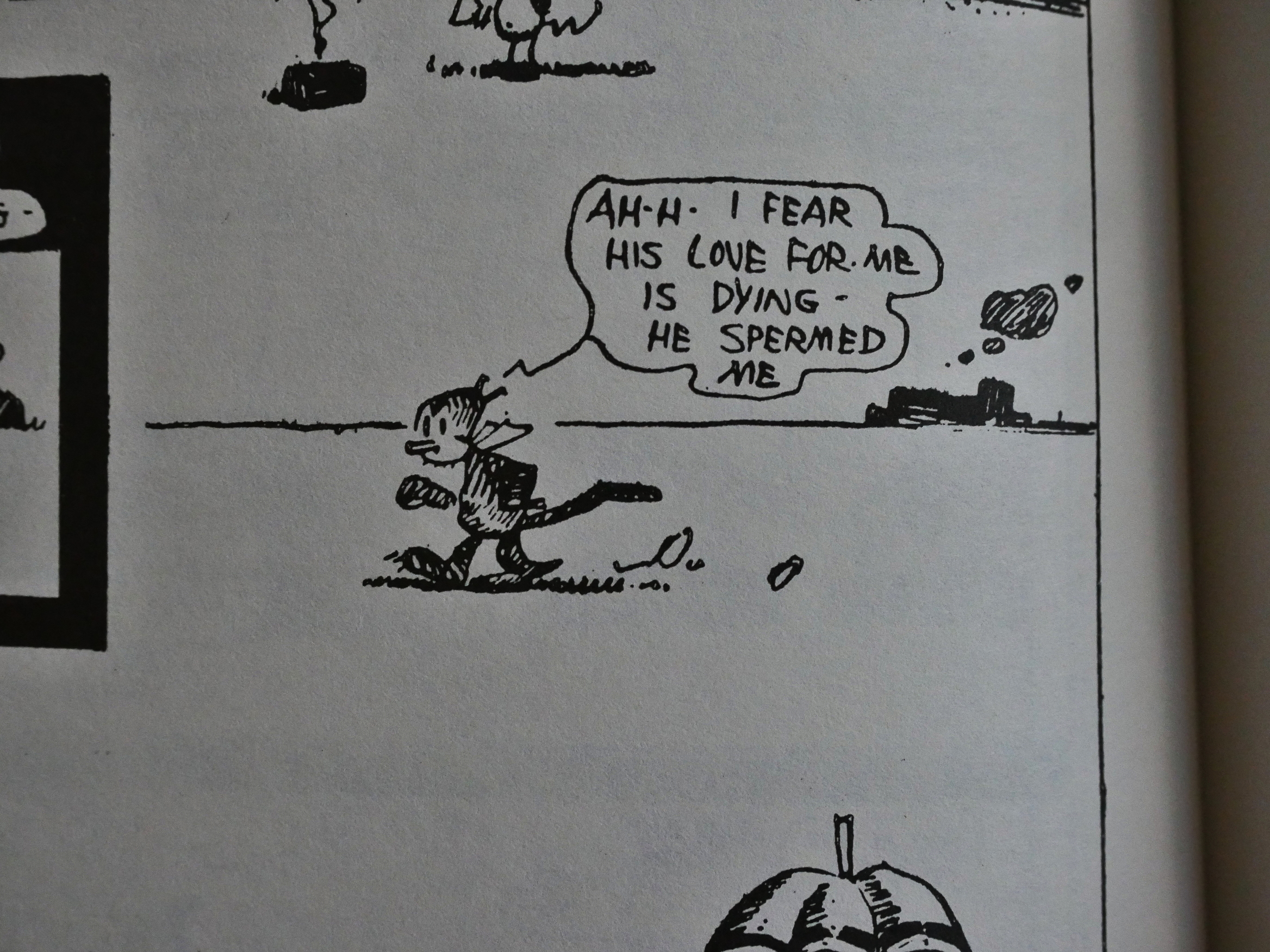
I’m sure that word play meant nothing at the time. Nothing!
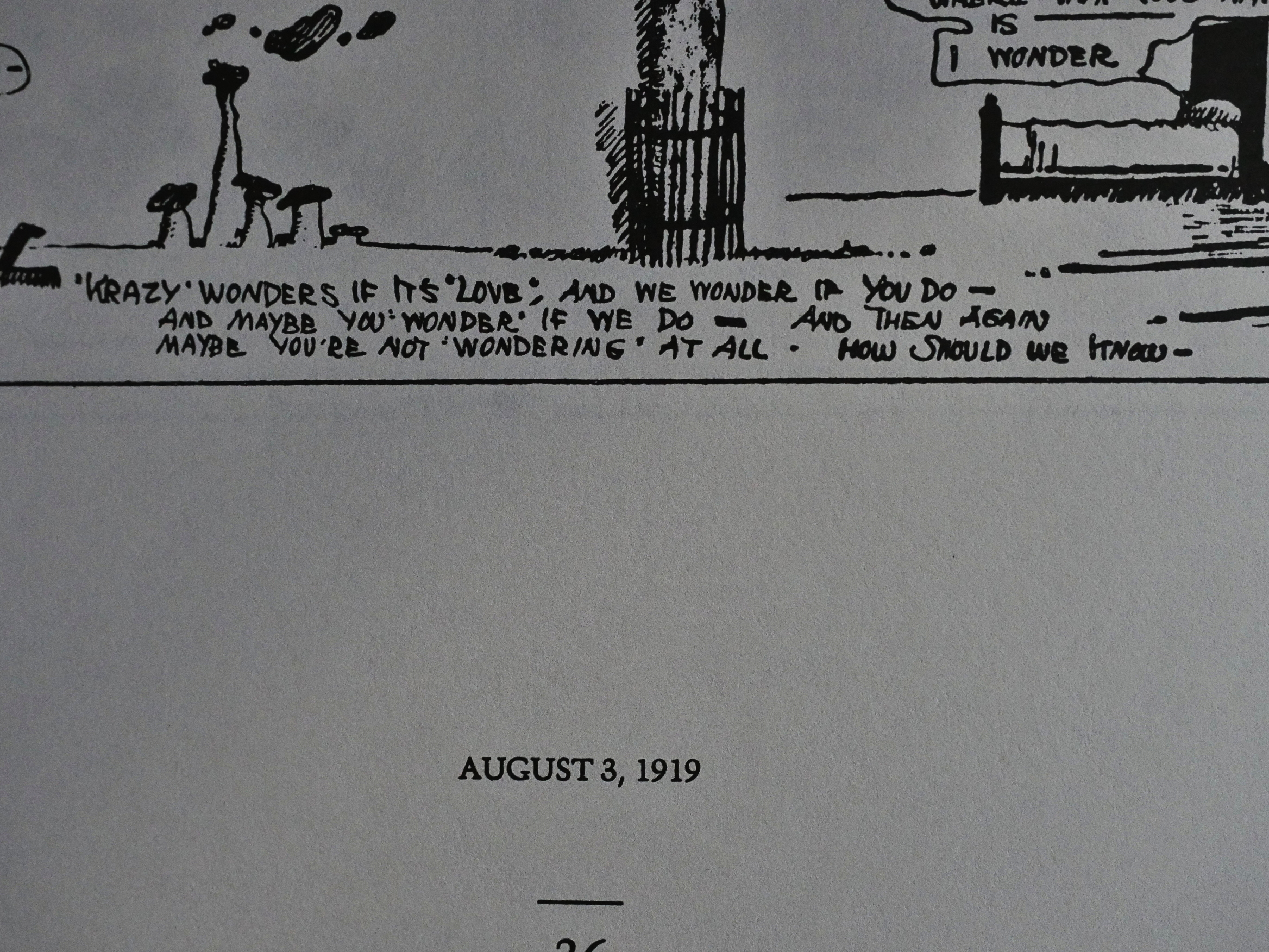
I love the way Herriman ends some of his strips with these diffident, airy comments.
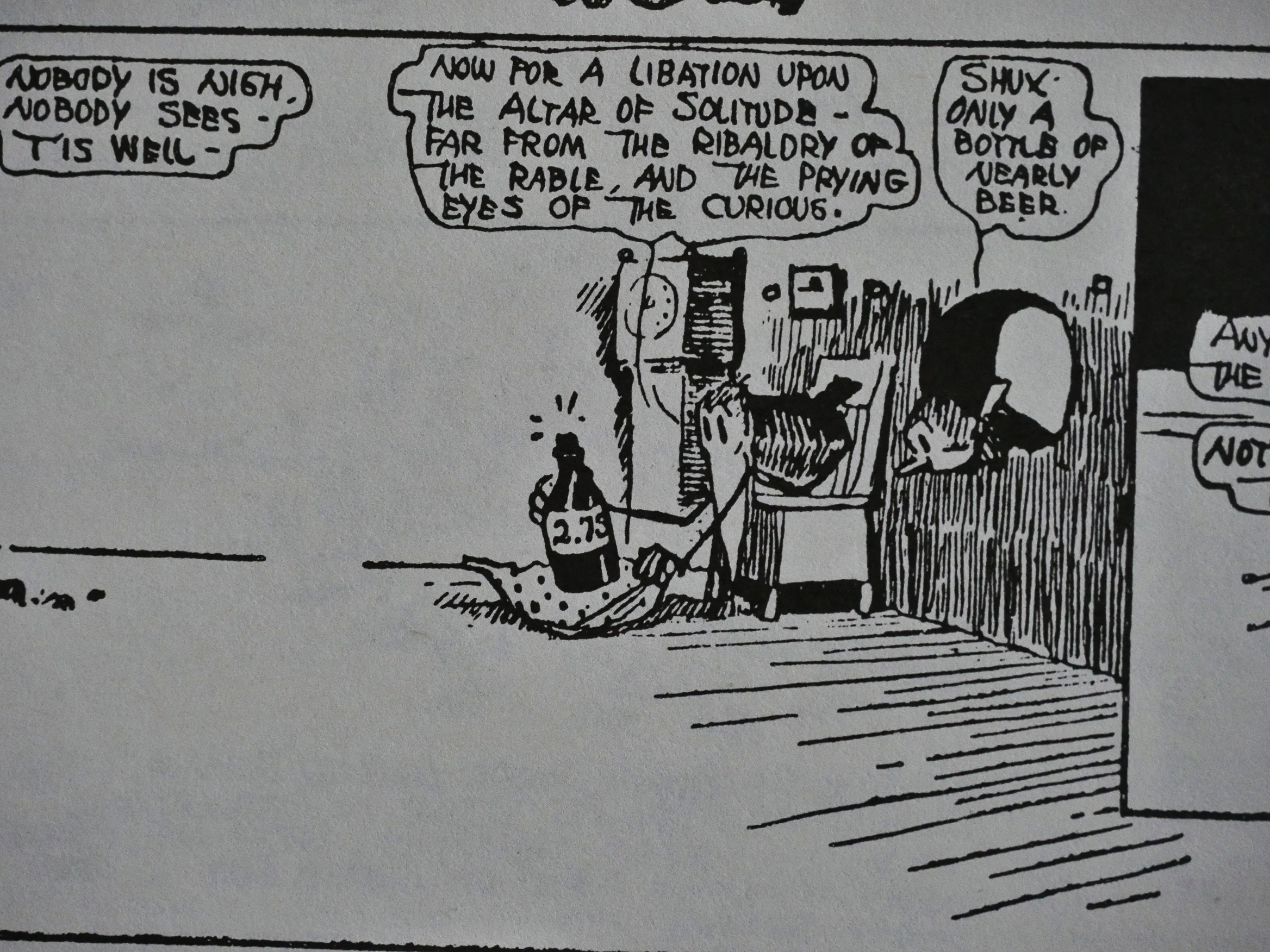
Nearly beer. Was low-alcohol beer also illegal during the prohibition? I’m sure google could tell me, but I’m too lazy to find out.
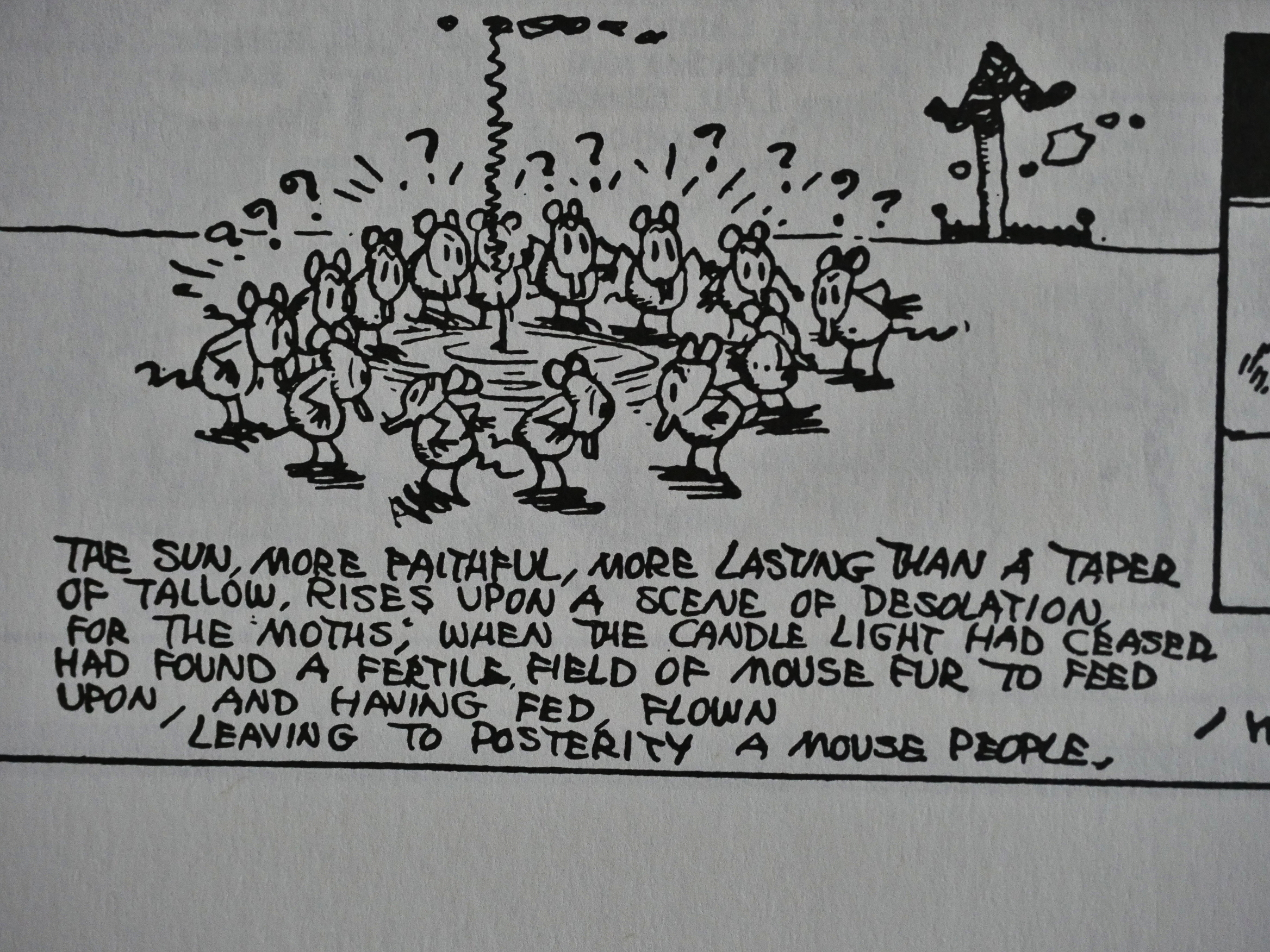
In 1920, we get the first reprinted strip. The story of how mice lost their fur originally appeared in 1919, I think, so I turned to the debaffler page:
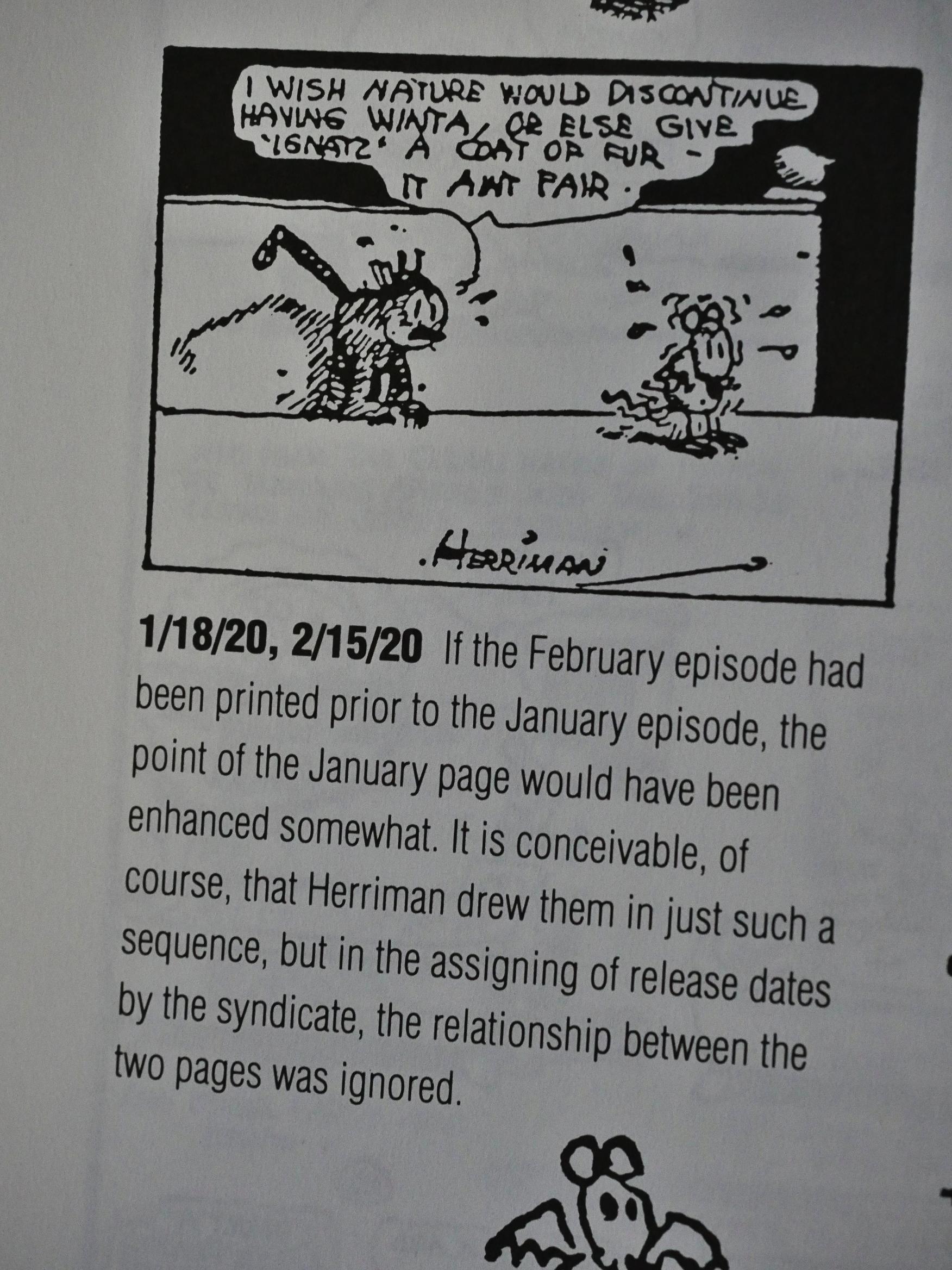
Which doesn’t mention that at all, only that it would have made more sense for that page to appear before the January page where the story continued. So Blackbeard had forgotten the earlier appearance of the February page. Tsk, tsk. I still wonder whether it was really reprinted, or whether this was a production snafu when they collected pages for this collection.
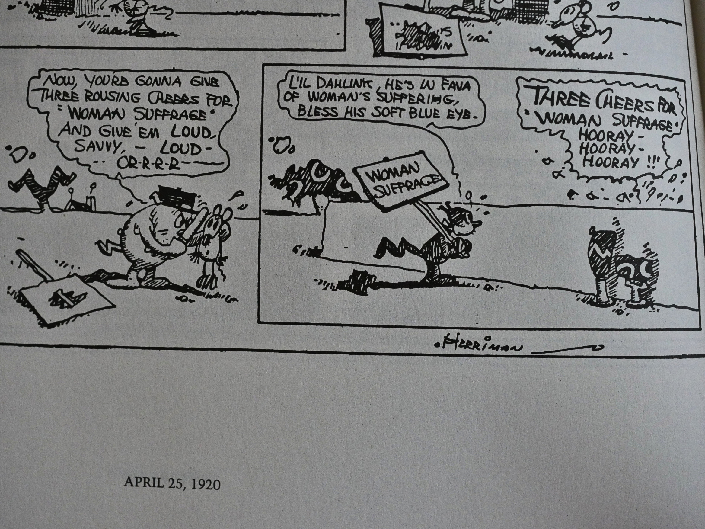
Ignatz is, of course, on the wrong side of every cause.
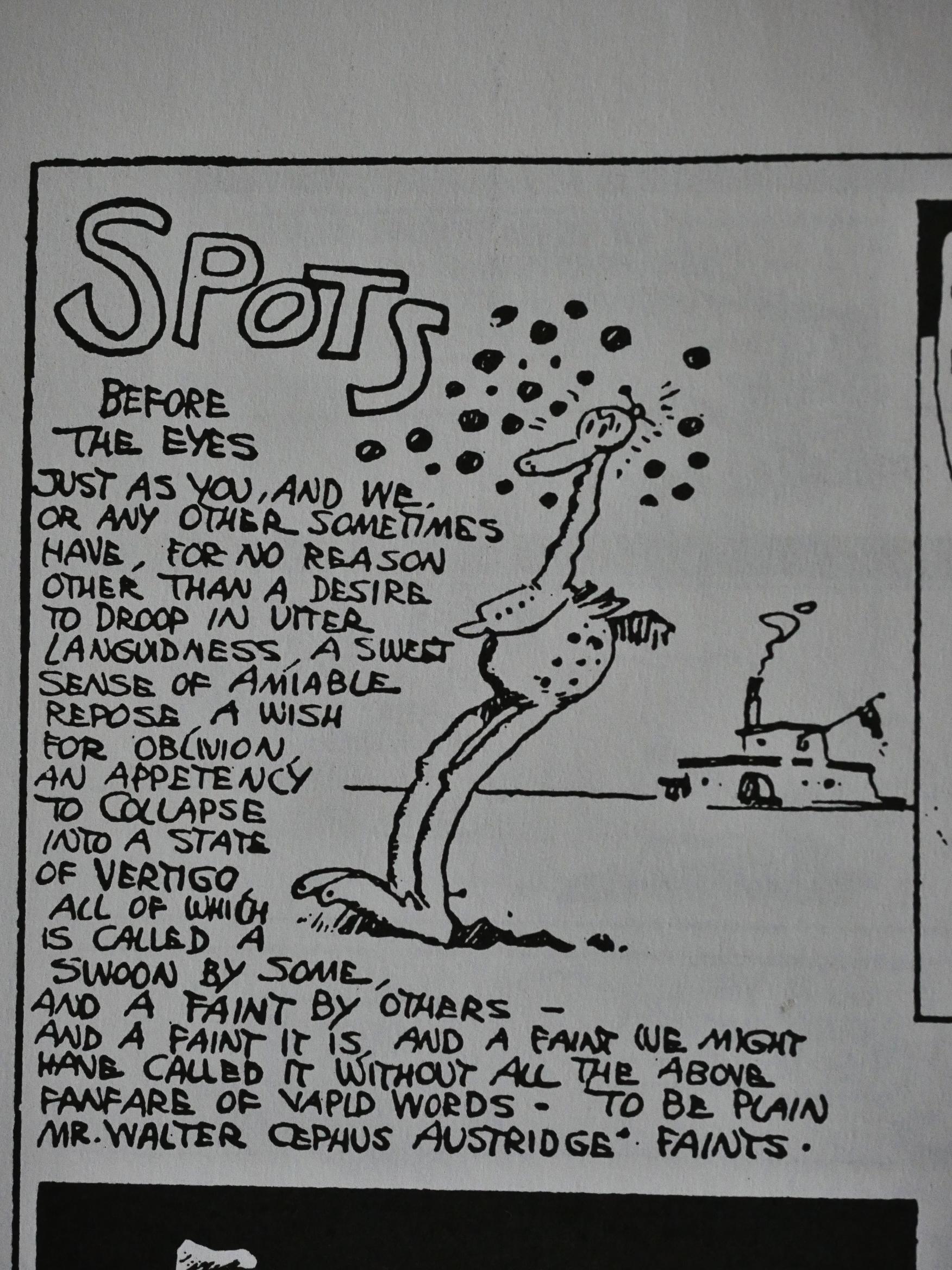
I’m really impressed with Herriman’s meandering way of saying not very much at all. It seem so unforced and natural that I’m just bemused and amused. I can totally see how other people might not have the patience for this nonsense, though.
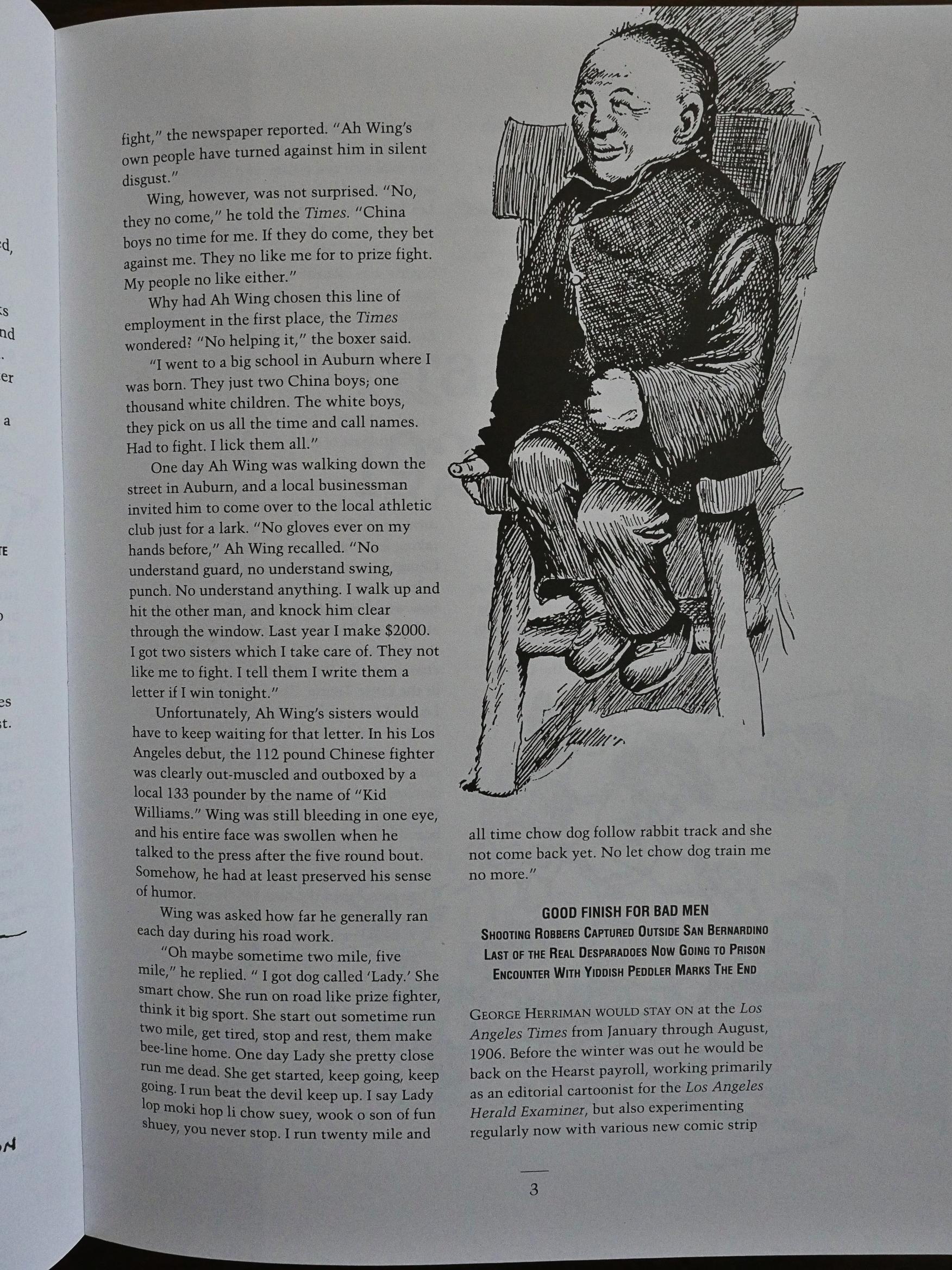
Blackbeard’s introductions get more interesting as the series progresses. Perhaps the series created an impetus for him (and others) to go out there and do more research? Anyway, in the 1921 volume we get examples from Herriman’s career as a journalist… for “lighter” items, like here when he’s interviewing a Chinese boxer that’s visiting the US.

Krazy Kat is usually very gentle, but there’s several strips where Krazy’s a boxer… and it’s a total massacre.
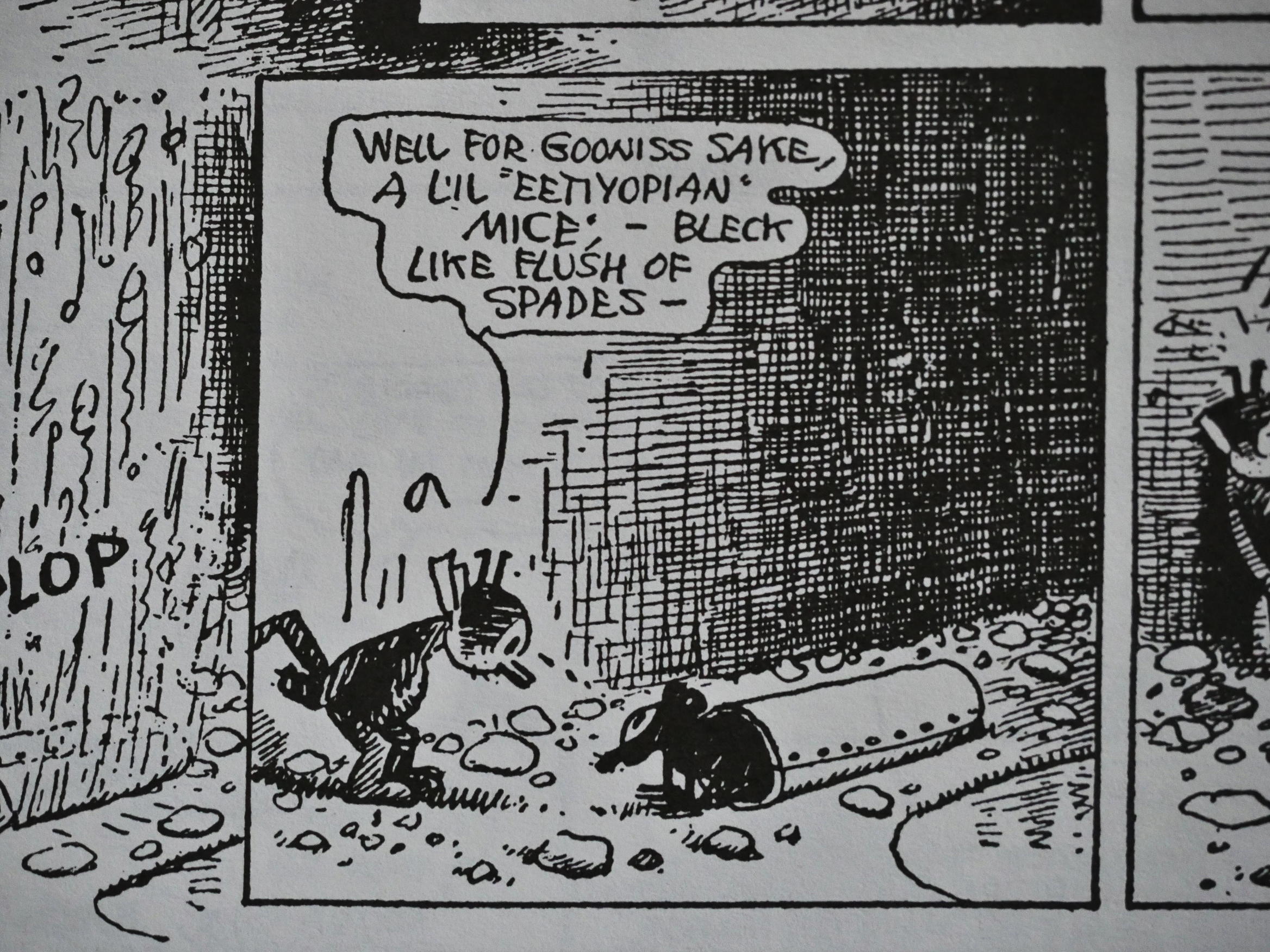
After the first few years, the reproduction get a lot better. I’m guessing they found better-preserved newspapers? It’s still variable (especially the 1924 volume has some annoying glitches), but some of these look absolutely astounding.
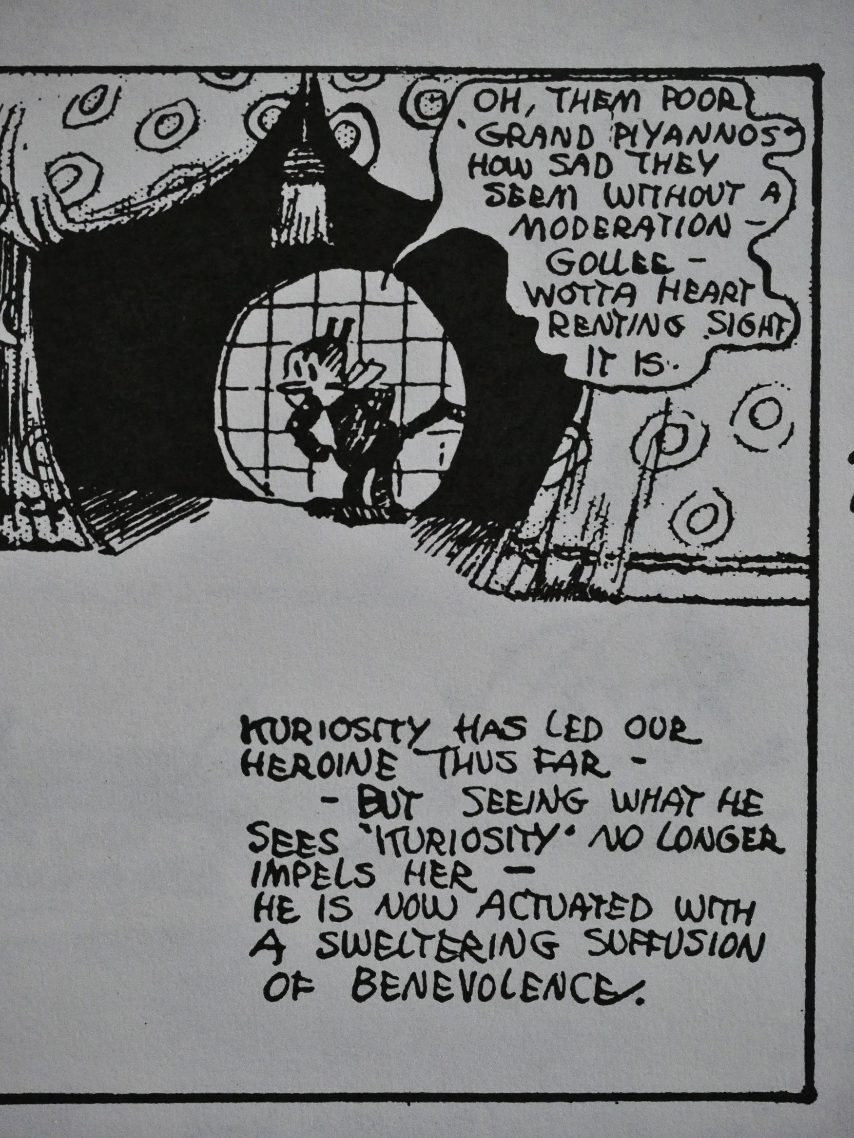
I think if we could peek into Herriman’s head when he was (sort of) baiting the tiresome “well, what gender is Krazy?” people, like here, we’d find that the overriding thought going on was “tee hee”.

Or perhaps not. Are we mind readers?
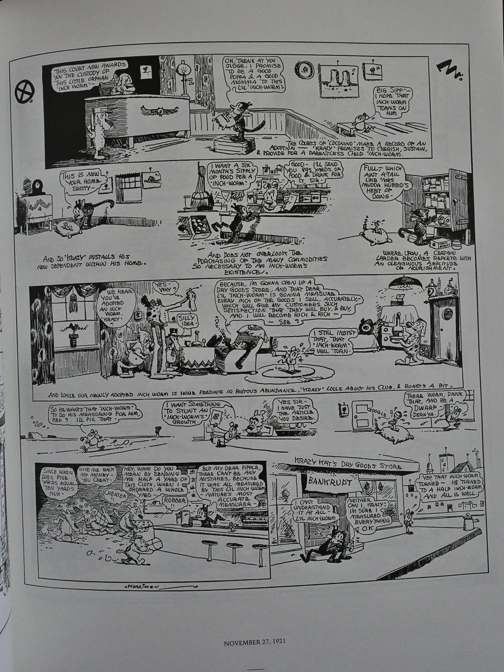
There aren’t many strips like this, which is like a Carl Barks ten-page Donald Duck strip in miniature: Krazy comes up with a brilliant business scheme, it all goes wrong, and the business has to be shut down. I love it. I mean, I like the “normal” stuff, too, but (especially after having read all these in as short as time as this), variation’s nice, too.
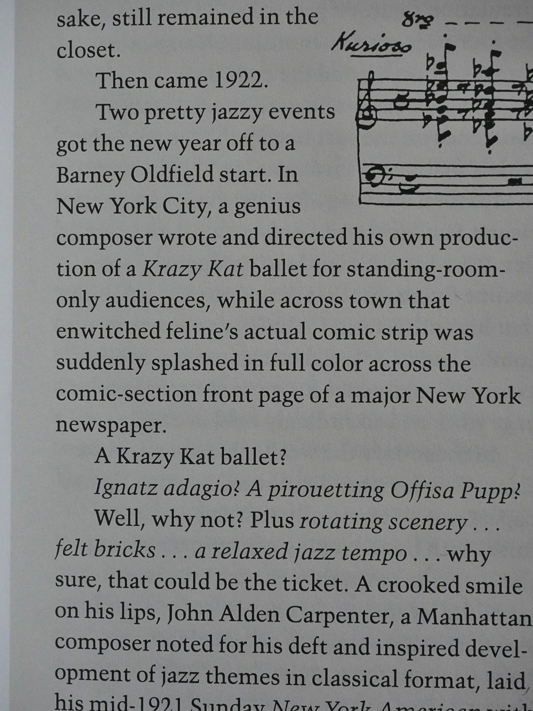
Apparently 1922 was the breakthrough year for Krazy Kat as far as high culture recognition. A ballet was created in New York, and to celebrate, Herriman was given a weekly colour page in the local Hearst paper, all of which gave him a lot of attention. Especially from the cultural elite.
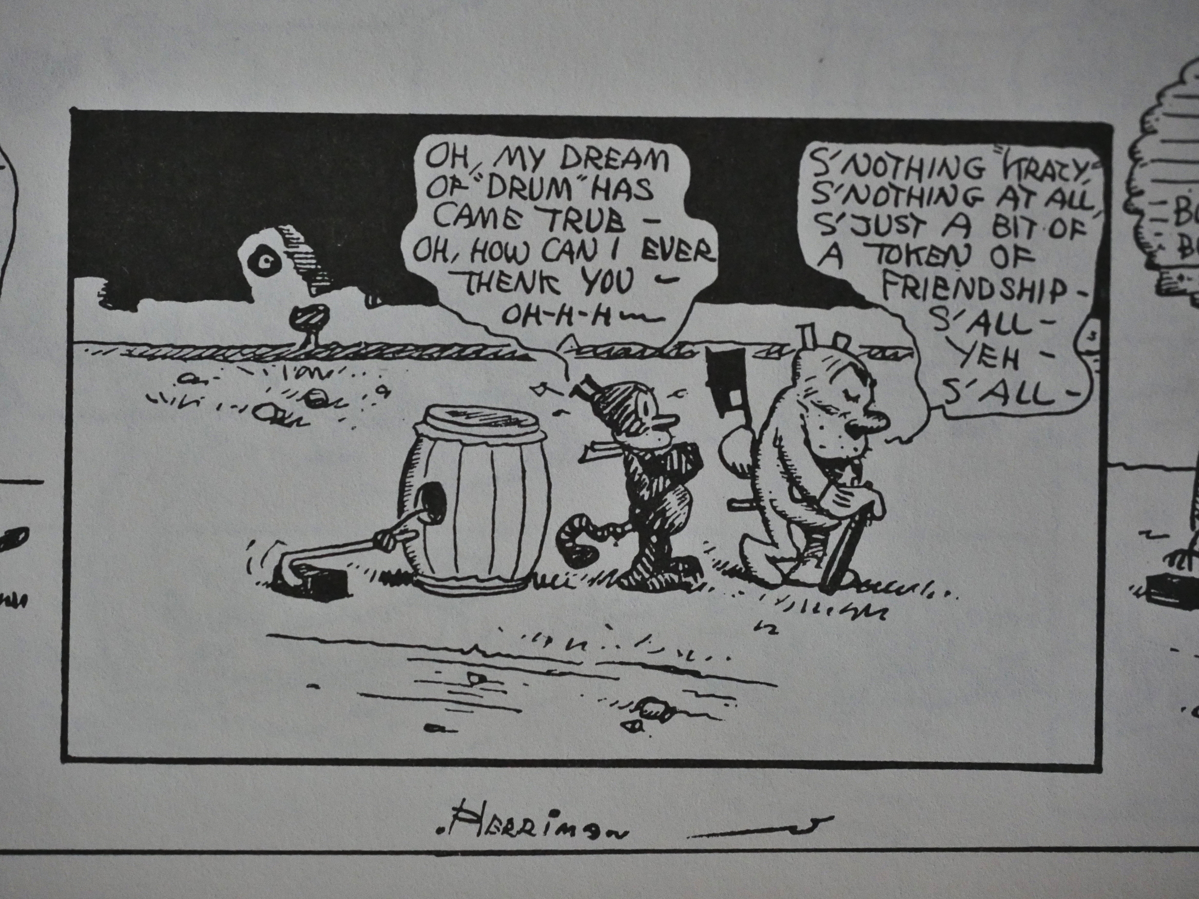
So while this was going on, there was the normal national black and white Sundays (in which Offisa Pup was developing a more explicit crush on Krazy)…
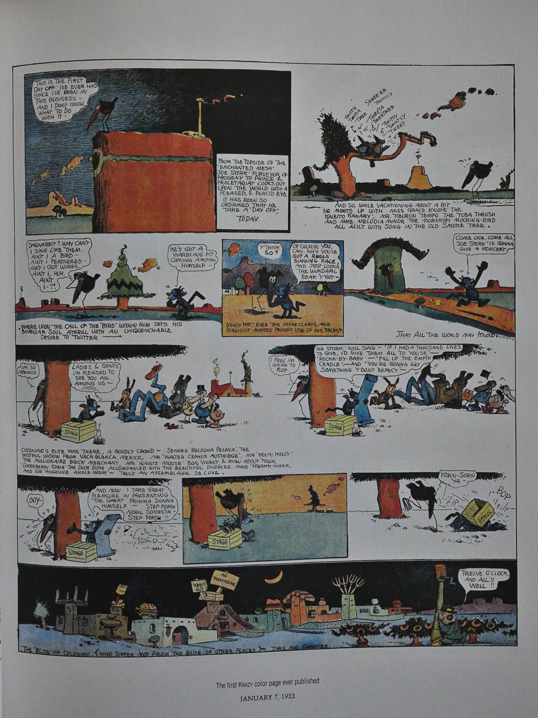
… as well as a colour page in New York. The very first page has Krazy coloured blue, while Krazy shifted to the yellow we’re used to now. A printer’s error or did Herriman change his mind? Blackbeard’s commentary doesn’t, er, comment.
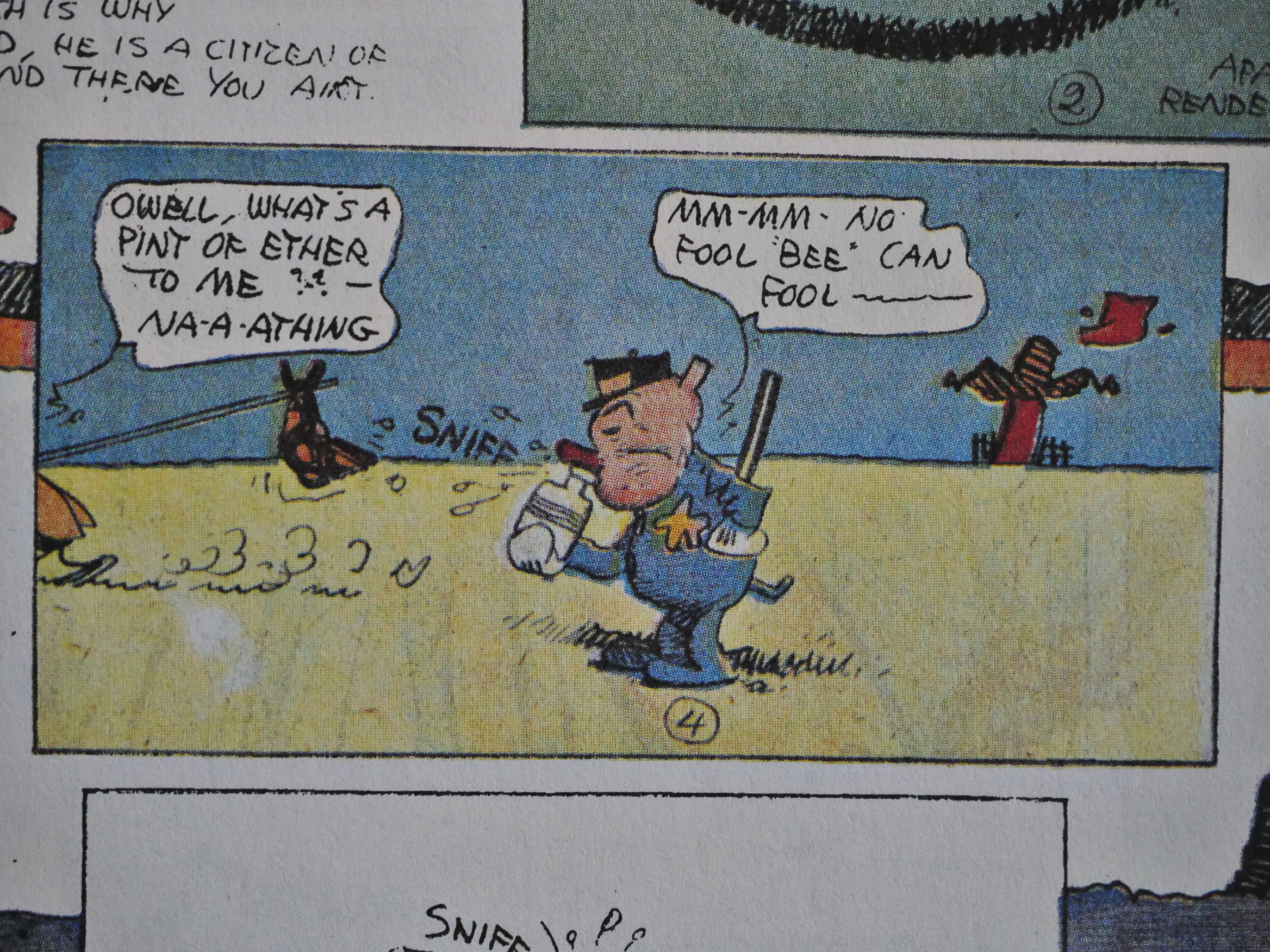
While the colour pages are all brand new, a couple of them recycle gags from older pages, like this one where Offisa Pup (and eventually all of them) sniff a bottle of ether.
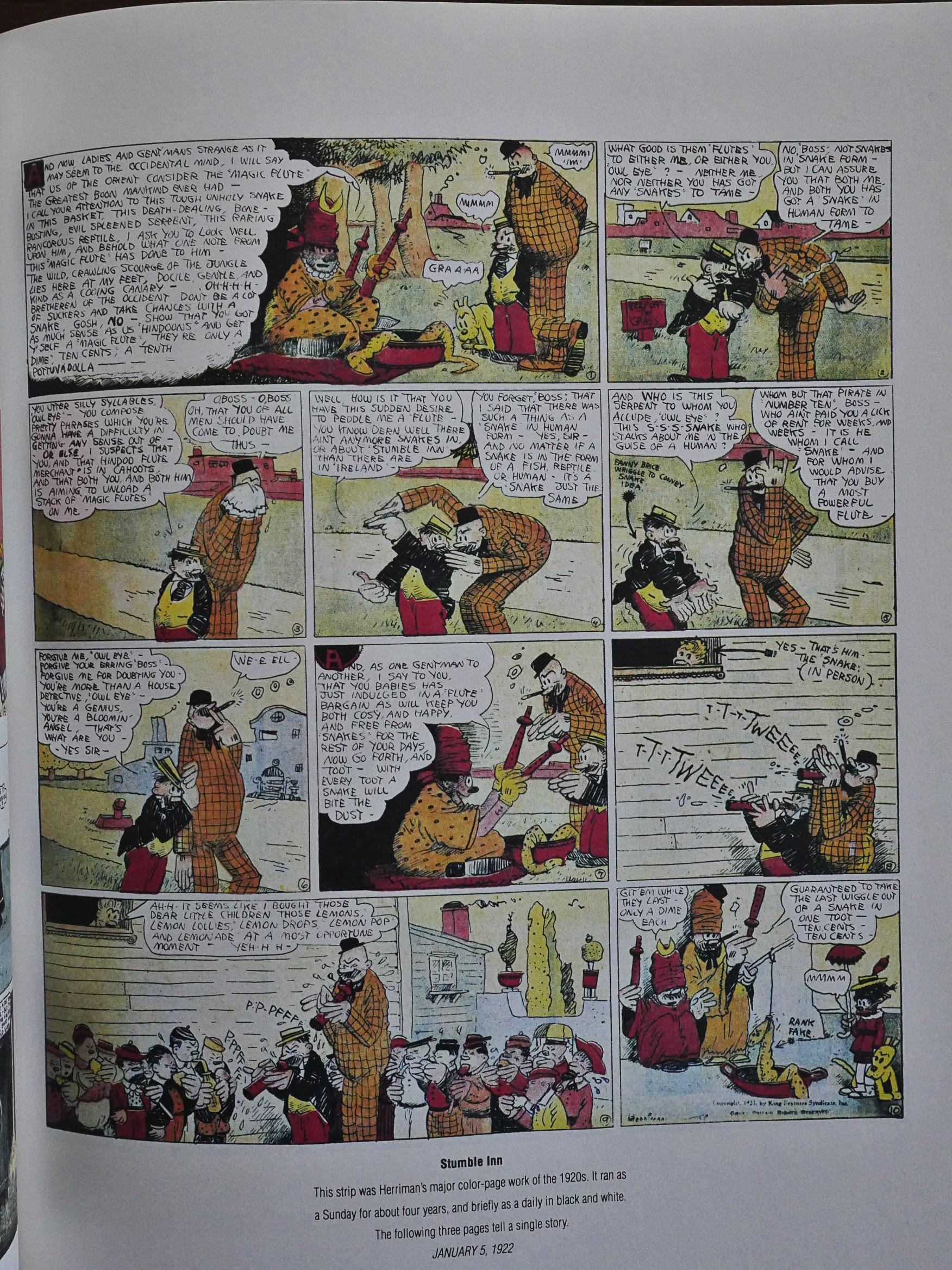
To fill out the rest of the 16 page colour supplement in this volume, we get a sampling from some other strips Herriman had going around this time.
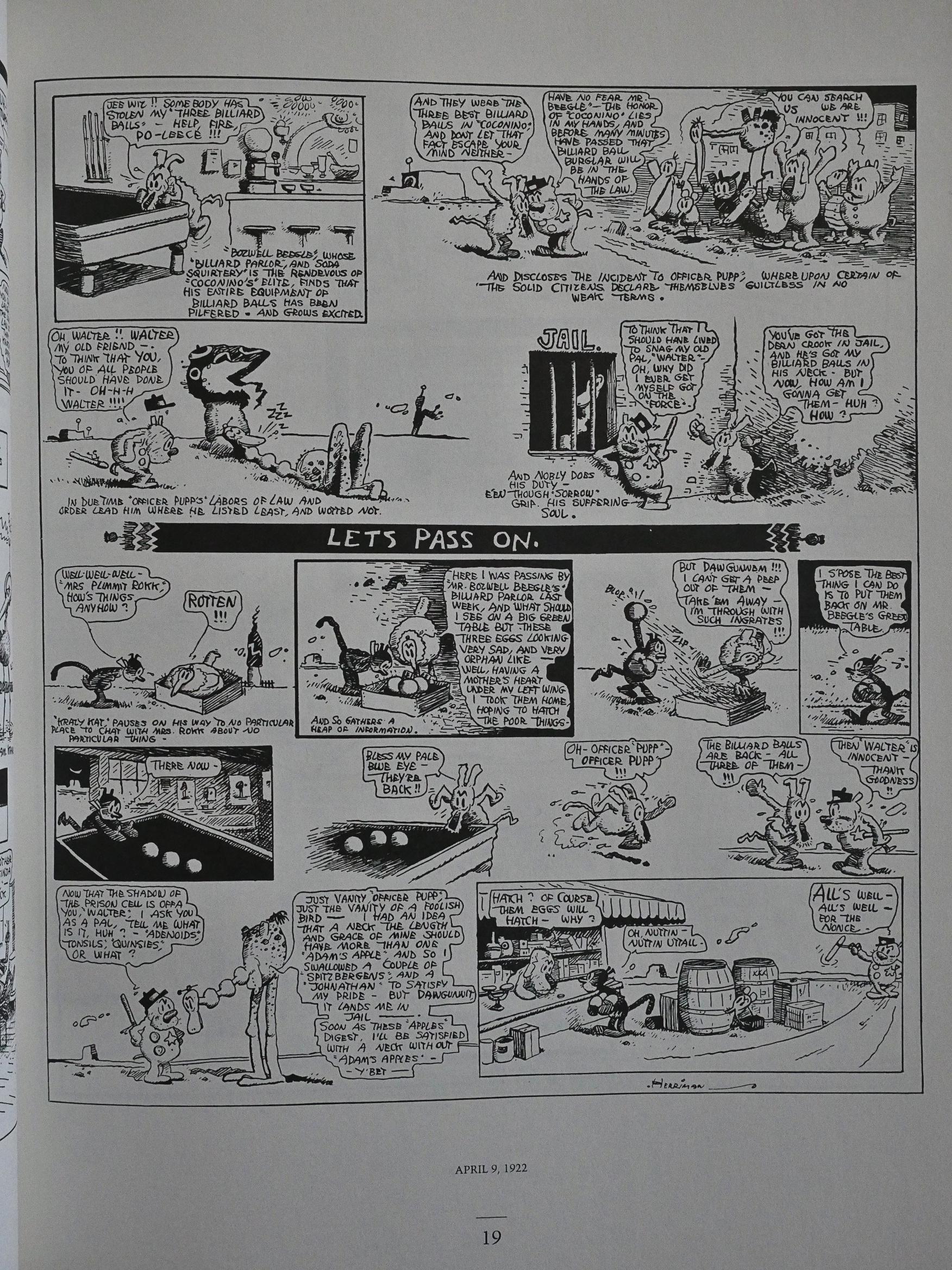
There’s something about this strip… Mrs. Plimmit Rock makes an appearance in the middle of this strip where it’s divulged that she’s the one who stole the billiard balls, and then the strip winds its way to the resolution. But then there’s the very last panel, where Krazy buys eggs, and we have to make the connection back to her predicament. I think it shows how much faith Herriman had in the reader getting involved, and it’s sweeter for not having Krazy’s intentions spelled out: Of course Krazy didn’t forget about her, even if we (as readers) did.
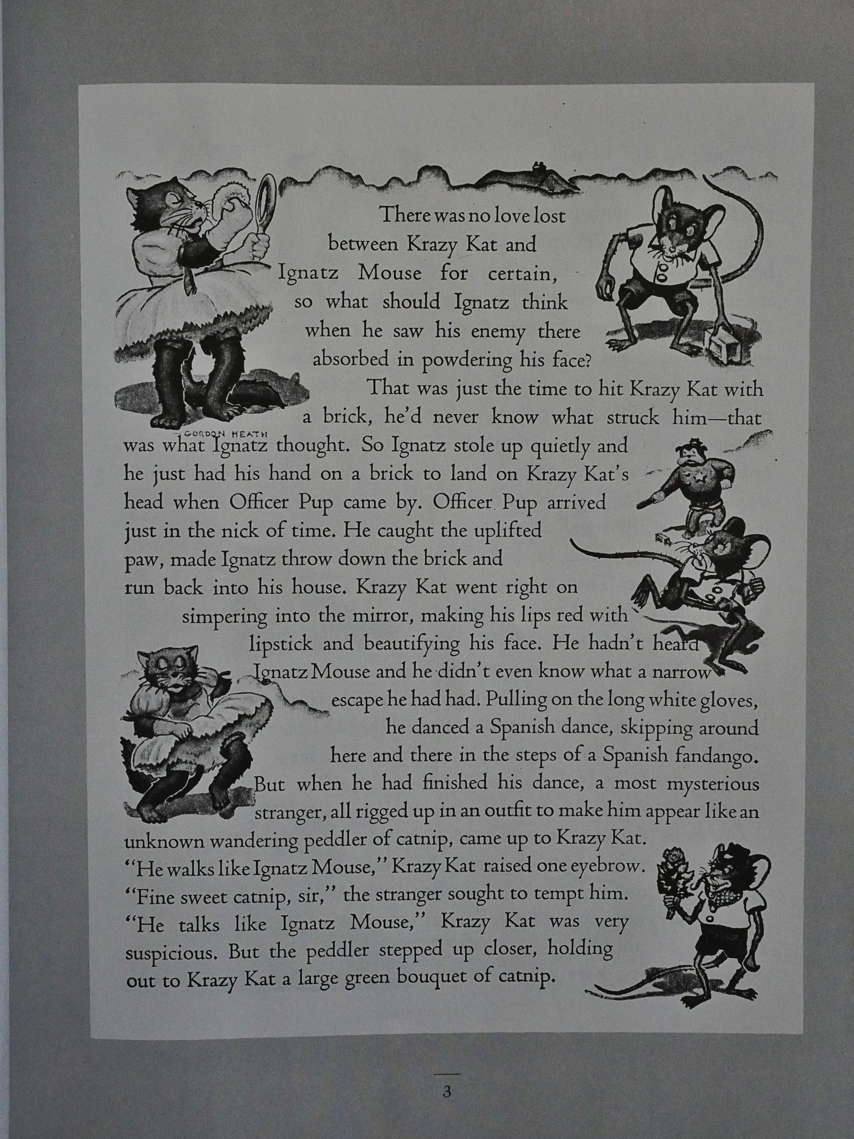
The final volume, from 1924, is apparently written by John Alden Carpenter, the guy who did the ballet? This isn’t stated explicitly, but I find no other way to interpret the introduction. It’s drawn by Gordon Heath, and I think it demonstrates what a horrible, horrible strip Krazy Kat would have been if Herriman wasn’t the one to do it. I mean, the artwork’s horrible, but the text is 10x worse.

*shiver*
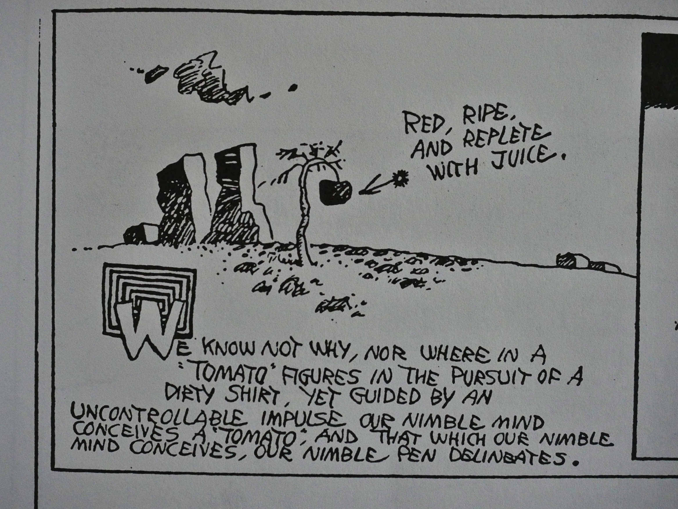
We are talking in the majestic plural.
The “debaffler” pages are pretty informative, but sometimes Blackbeard feels compelled to use the space to make some jokes of his own.
They’re… not as good as Herriman’s own jokes.

This is a recurring problem with reprints of older, funny comics: The people writing the editorial material feel compelled to bubble over with bonhomie and mirth (WE ARE WRITING AN INTRODUCTION FOR A FUNNY COMIC BOOK! CAN YOU BELIEVE IT! IT IS SO FUNNY!) and it’s usually a total drag.

The last volume was published by Eclipse in 1992, and they were in severe economical problems, so I’m guessing it was more that than horrible sales. But I have no idea.

More than ten years would pass until somebody started reprinting Herriman again, and it was Fantagraphics that picked up the thread. They started, sensibly enough, with 1925, and continued until the end before they went back to 1916 and come full circle:

Fantagraphics will be collecting these first nine years of Sundays into three volumes comprising three years apiece, starting with the very first Sundays from 1916 through 1918, and incorporating all the original articles and special features from the first edition, including rare art, series editor Bill Blackbeard’s definitive historical overview The Kat’s Kreation, and updated and expanded DeBaffler endnotes explaining some of the arcana behind the strip’s jokes.

So, three volumes collecting these nine Eclipse volumes. By this time, tear sheets had been found for most of the strip’s run, so better reproductions were possible.

I don’t have the Fantagraphics editions of these years, but I do have the 1925-1944 books, and they are, of course, wonderful, too.