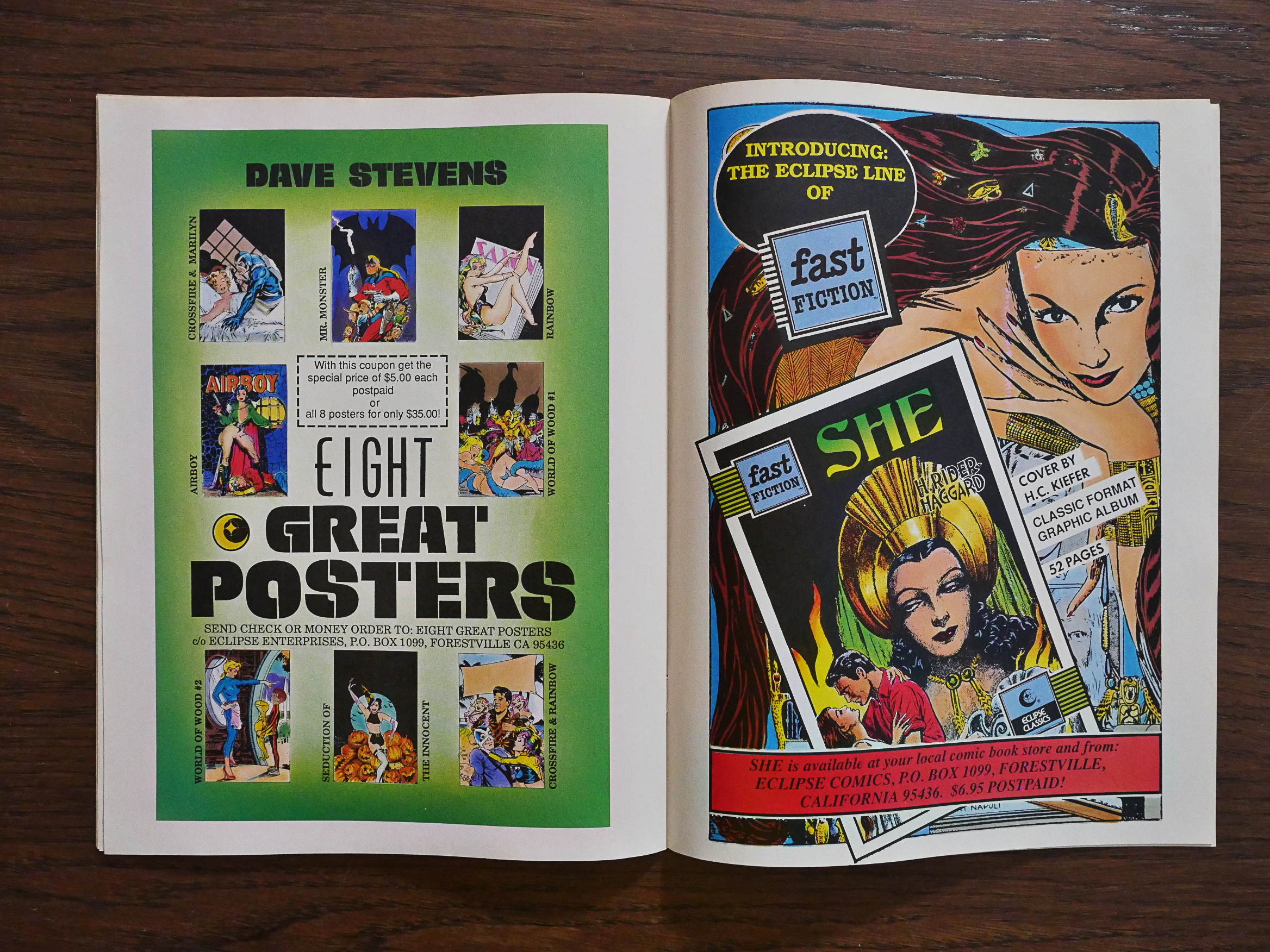
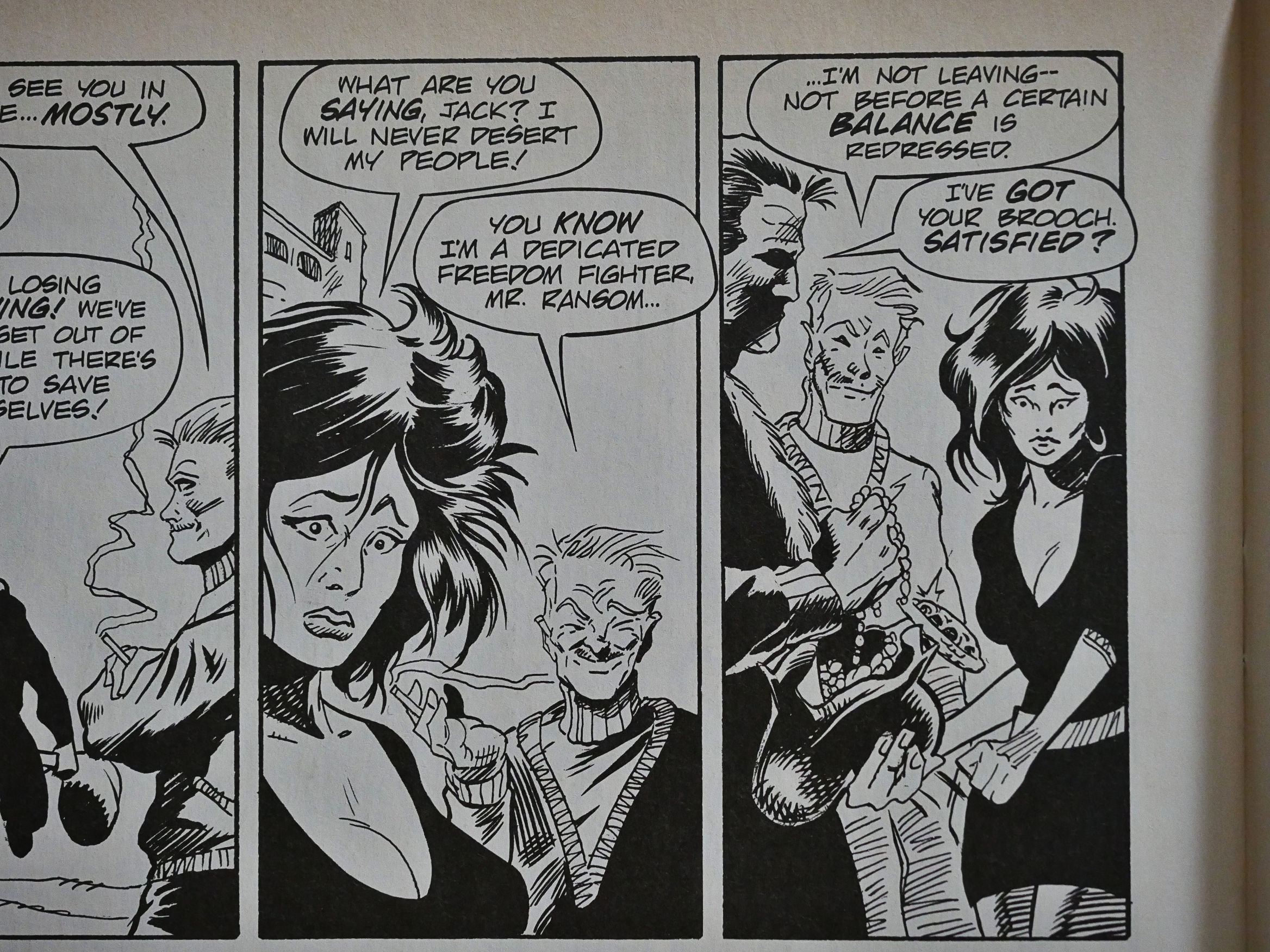
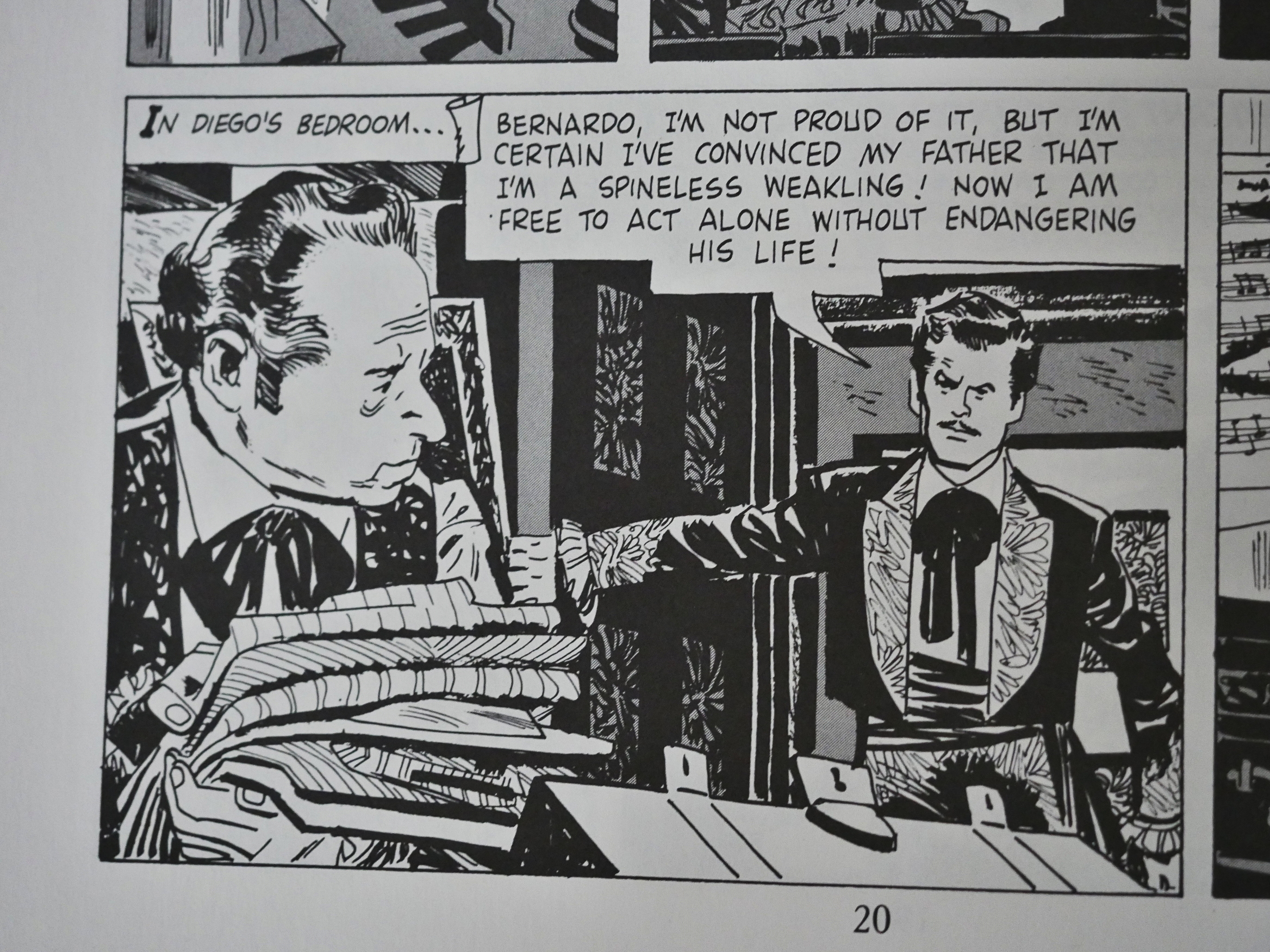
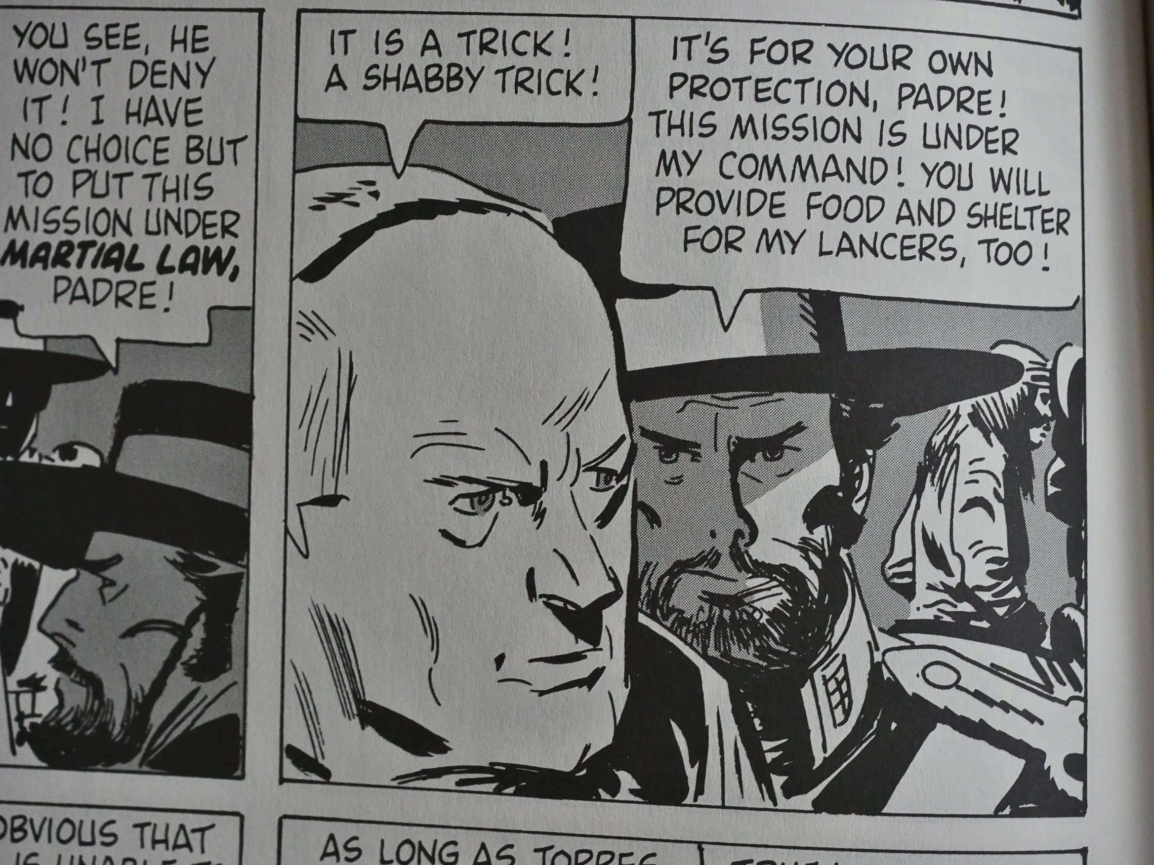
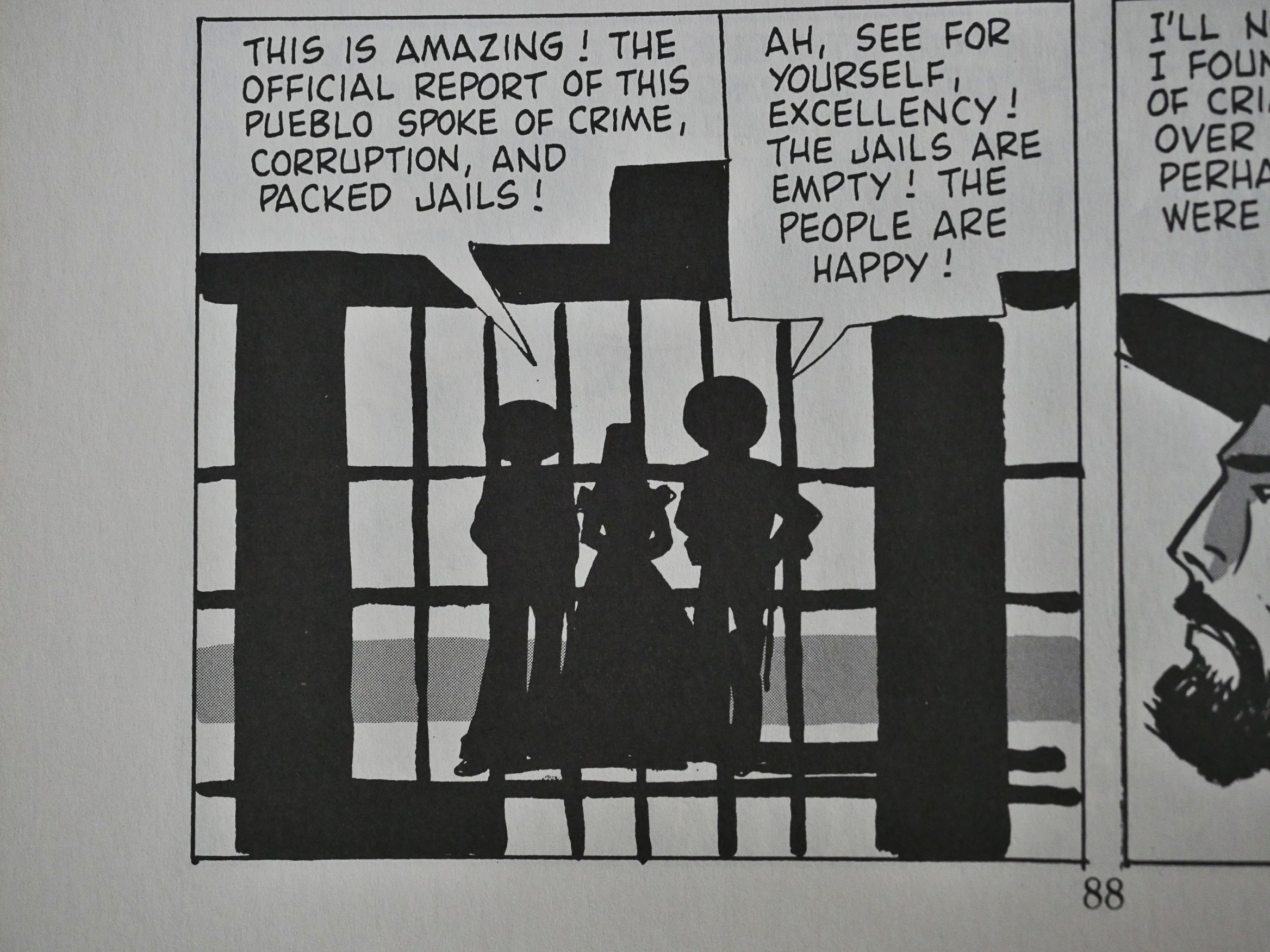
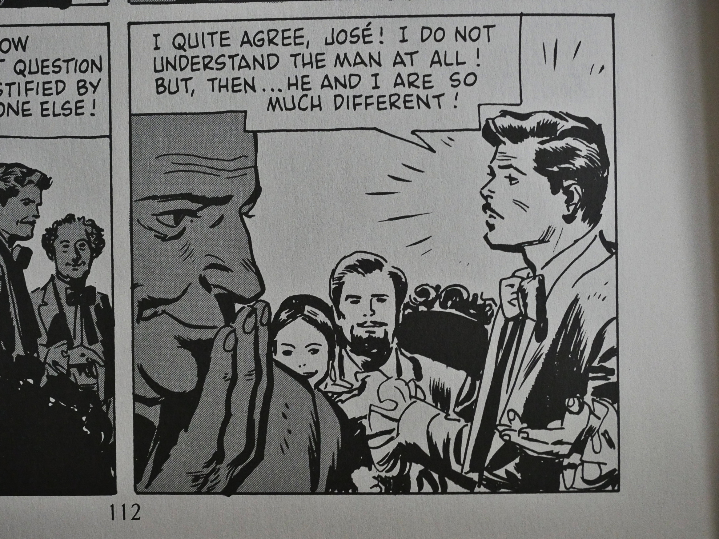
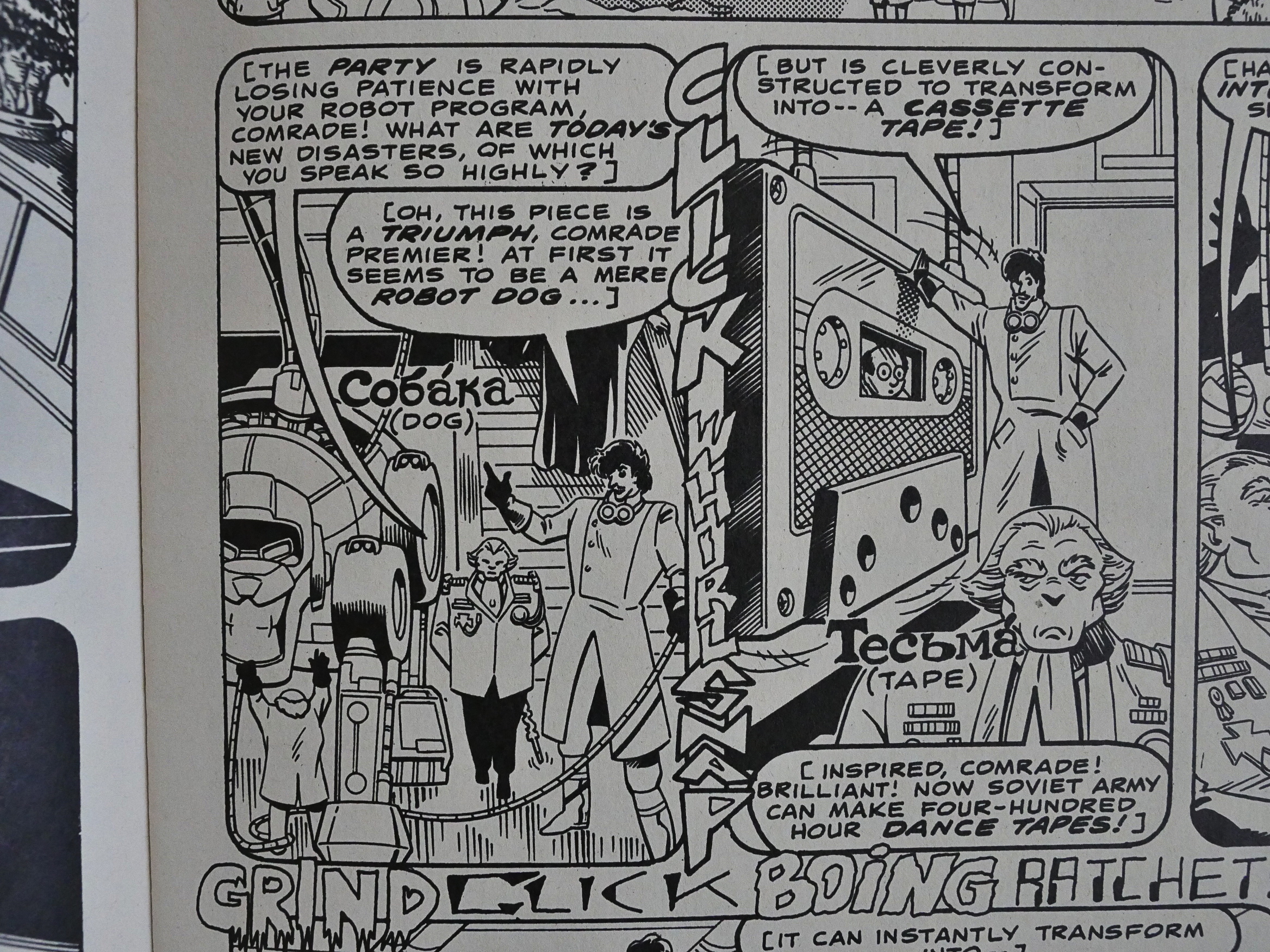
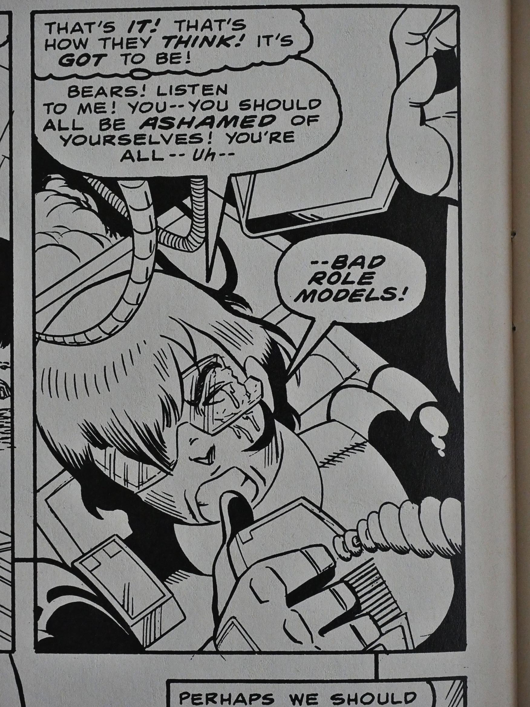
1988: Fast Fiction (She)

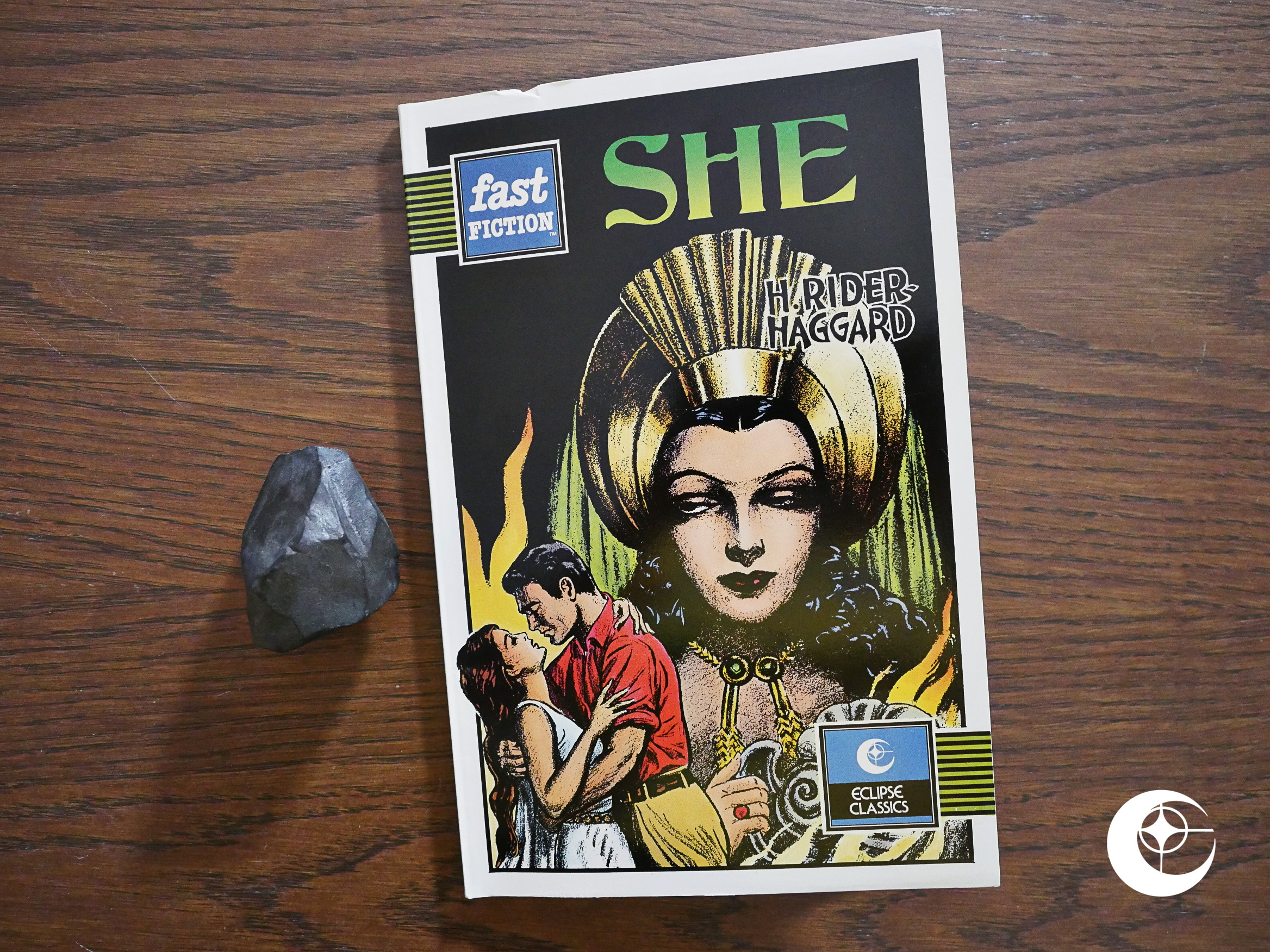
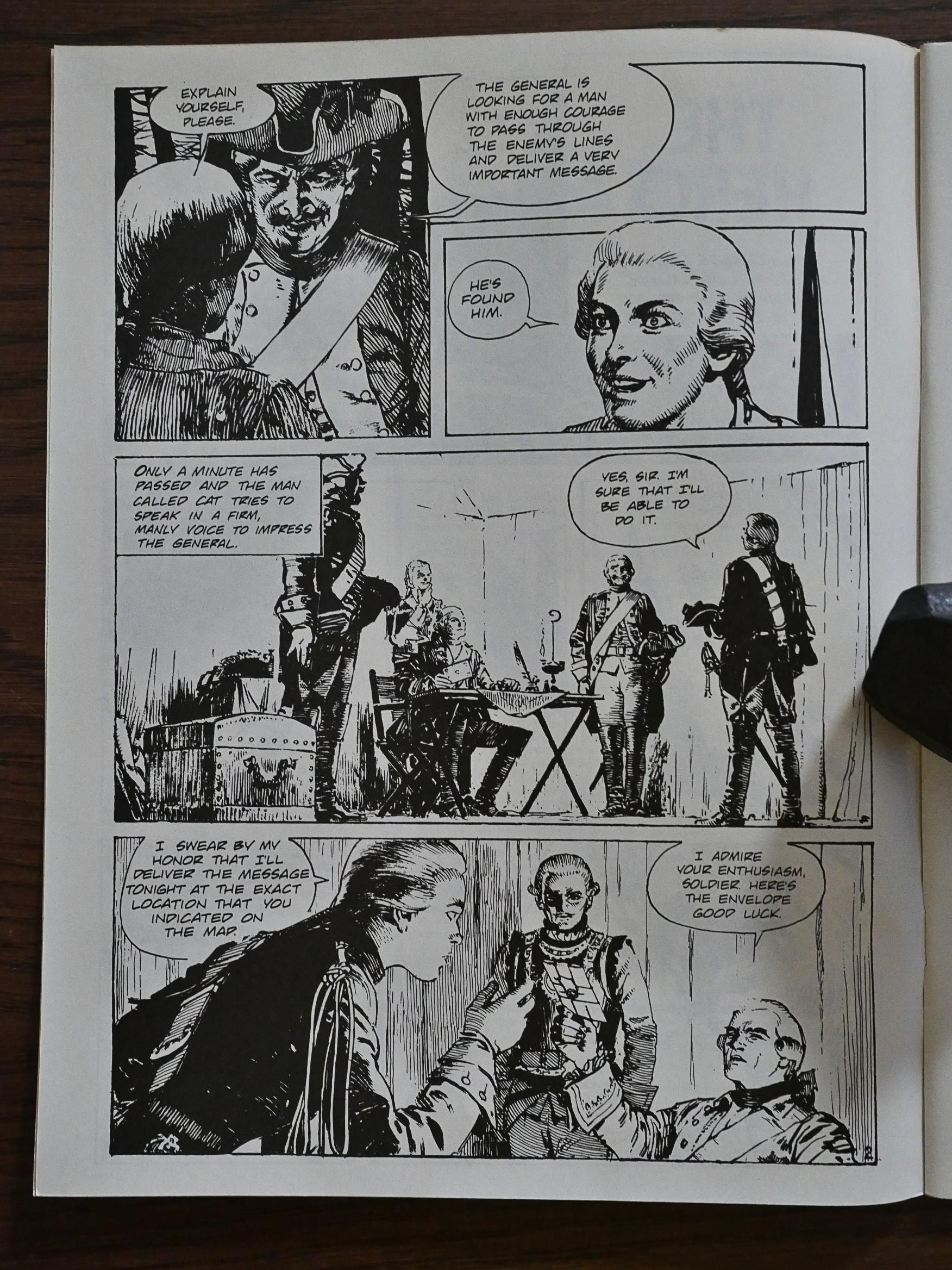
Fast Fiction (She) (1988) #1 by Dick Davis and Vincent Napoli from a novel by H. Rider Haggard.

When I saw “Fast Fiction” on the cover, I thought that Eclipse had entered into a co-publishing venture with that British publisher, but that’s not what this is:

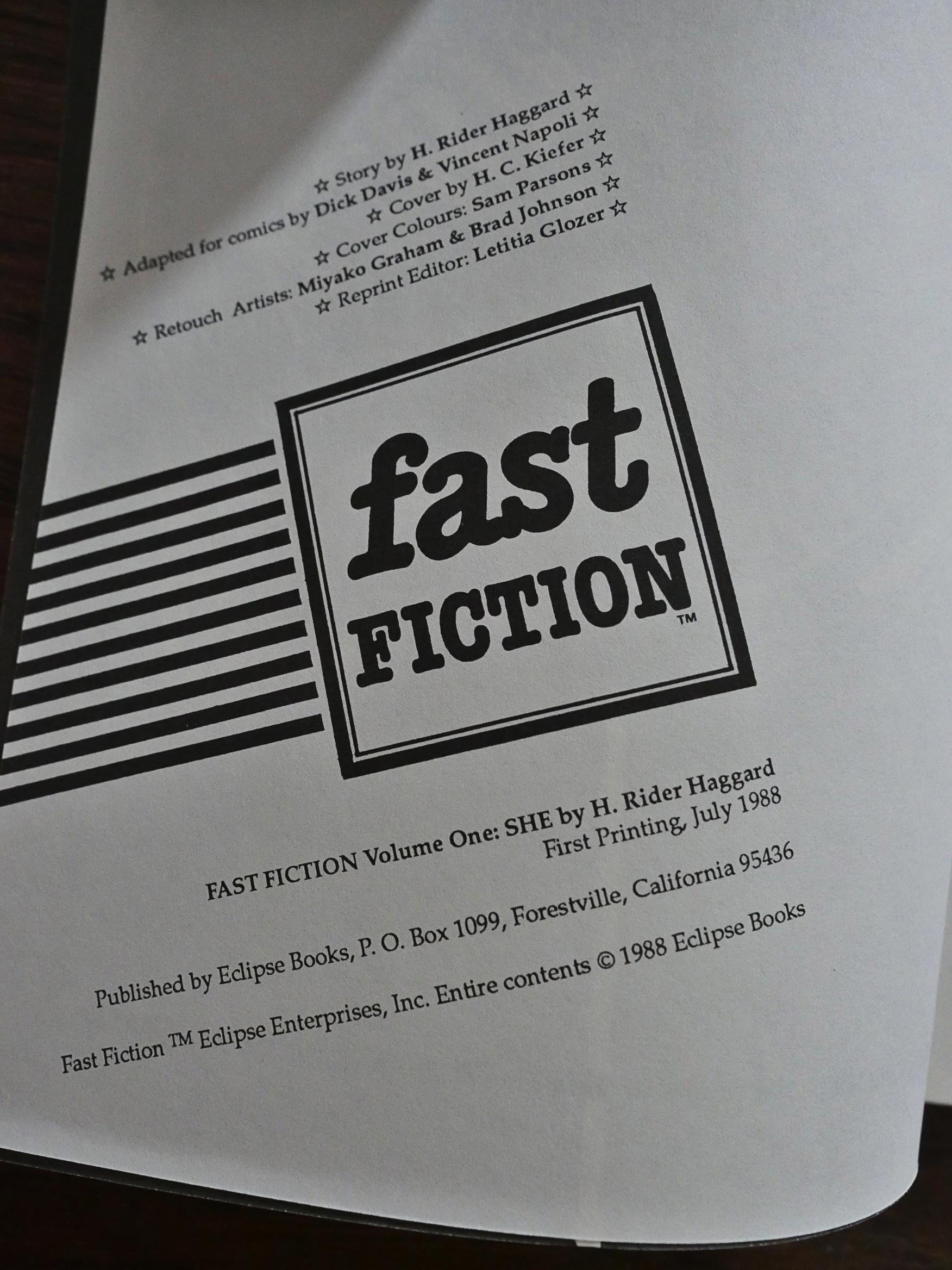
It’s apparently a reprint of some kind, since it says “reprint editor”. But as usual with Eclipse, there’s no mention of where the material is sourced from. But it’s copyrighted by Eclipse, so let’s guess at a now-defunct 50s publisher, and that this is in the public domain?

And it’s certainly a weird thing they’ve found. In the house ads for this, it’s presented as “Fast Fiction #1”, but since there were never any other issues published, I guess everybody took one look at this and said “nuh-uh”.

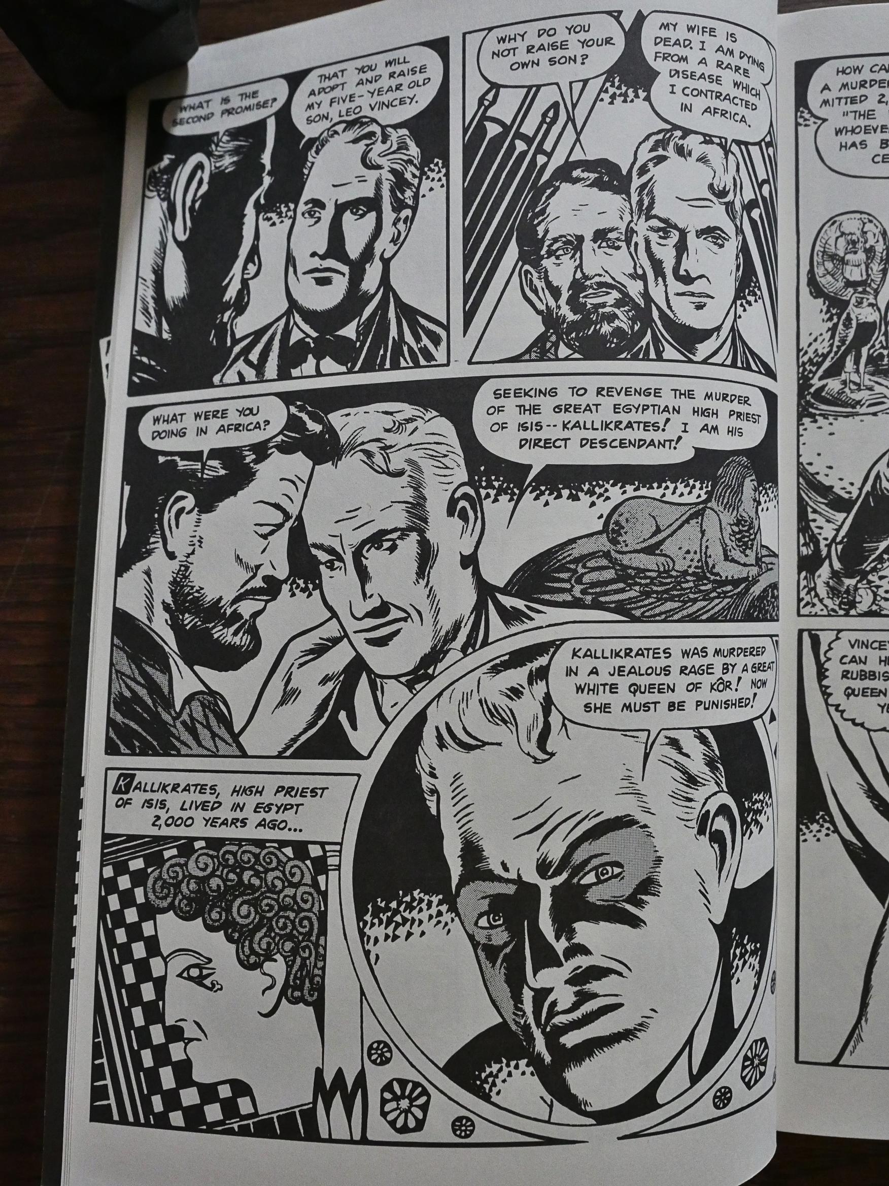
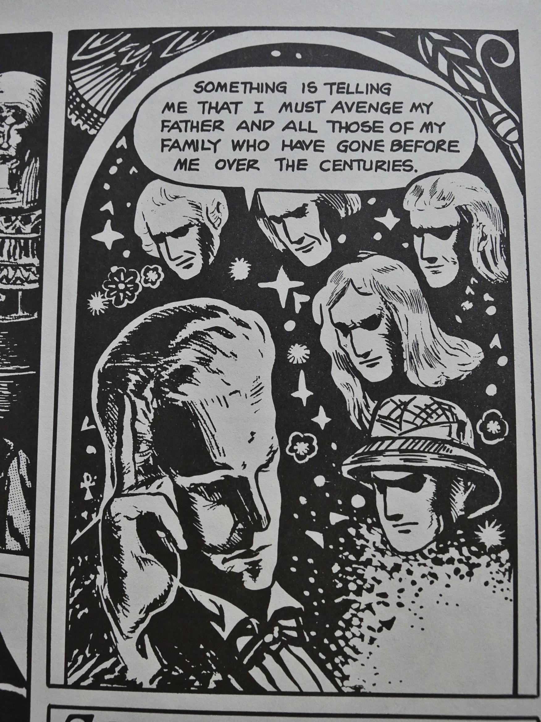
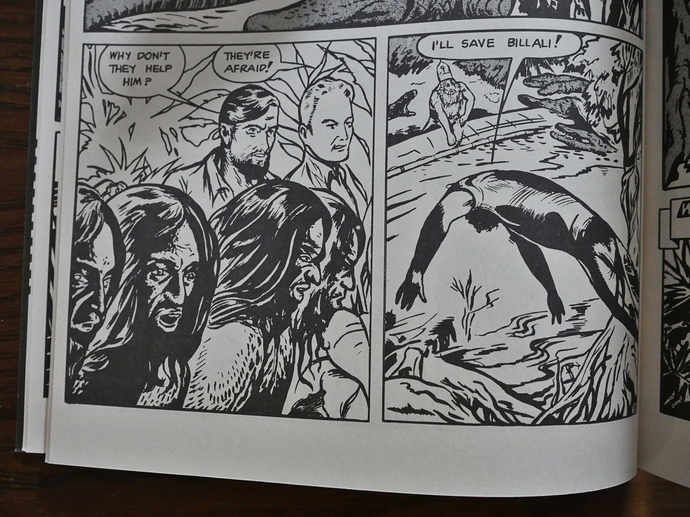
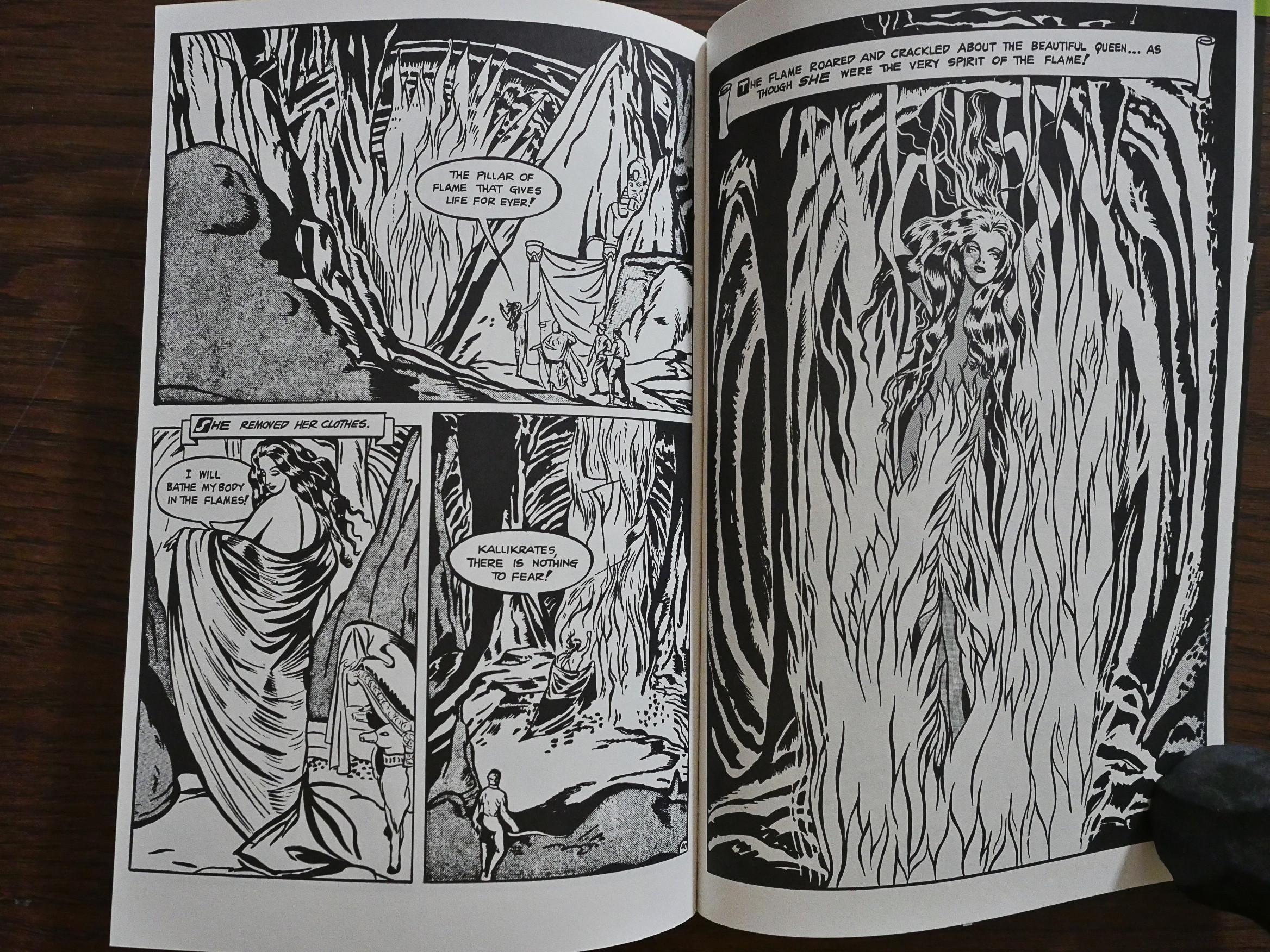
But the thing is, it has that weird deranged outsider-art-but-not-really feel of many of the wildest and er not classically well-trained artists that filled pages in the comics business at the time. I’m reminded of Fletcher Hanks, of course, but since this is a pretty straightforward adaptation of Rider Haggard’s pulp novel, the weirdness is in the artwork only.

But it so weird that it devolves into these beautiful, almost abstract shapes. The panel to the right above is a man jumping into a river to save a guy from crocodiles. But… but… I’m very taken by the sequence.

And look at this! Wonderful!

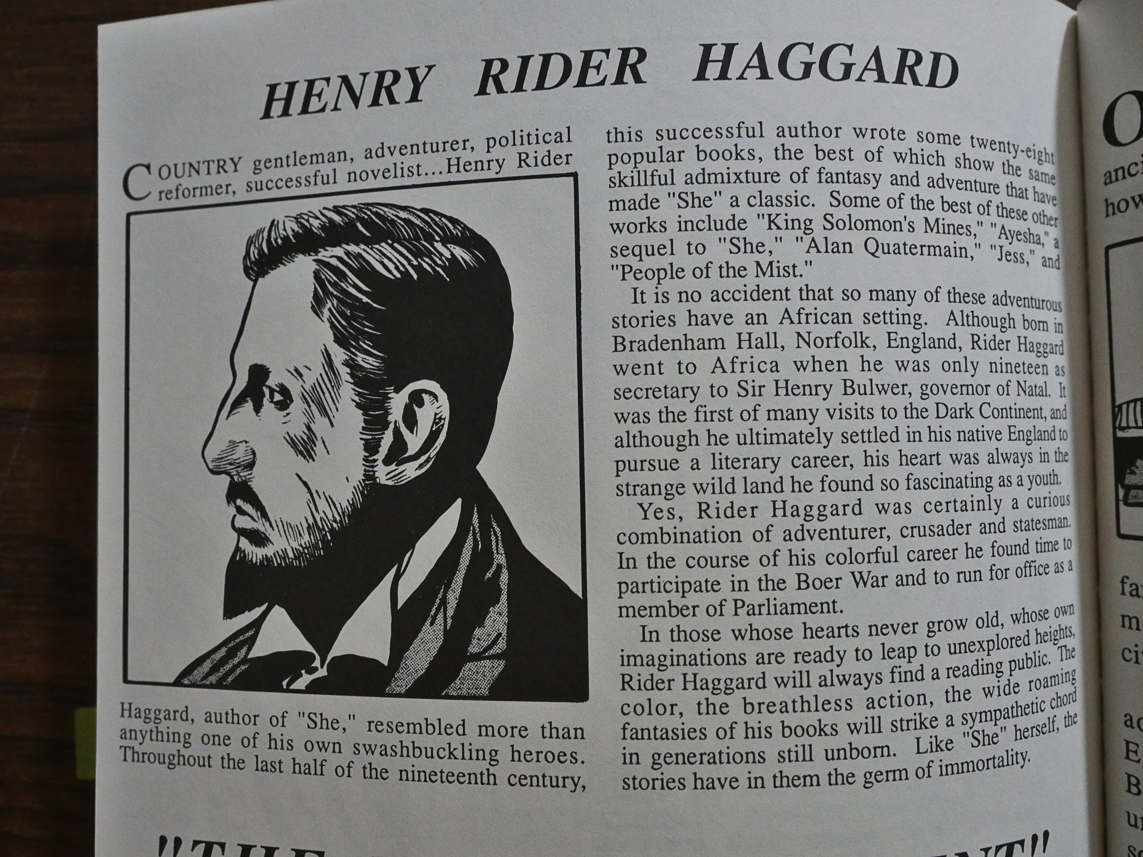
And then we get a couple of pages about Rider Haggard and Africa and Egypt.

So what the fuck is this thing and why did Eclipse reprint it? Were they so hard up for some quick cash after publishing Total Eclipse that they’d shovel just about anything out the door? I mean, I like the weird, weird artwork, but I’m guessing I’m in a strict minority here, and the story isn’t very gripping. We get the bare outline of the plot, really, because they don’t try to shovel all the details in there, and I’m grateful for that.

I think we’ll have to resort to Google.

Let’s see… Oh, this was originally published by Seabord in 1949, and it was as part of their line of comics that competed with the way more famous Classics Illustrated. The line folded (after a name change) in 1951, so it probably wasn’t very successful at the time, either. And it was originally published in colour, of course.

I was unable to find anybody willing to say anything about it online.

Vincent Napoli was a pulp illustrator:

According to American Weekly Magazine, “In all of the artist’s work there is a strong undercurrent of sympathy for the people he draws. He is not a malicious cartoonist, like many of the Surrealist artists. He says he sees beyond the limitations of human character and personality. According to the artist, ‘The pictures just seem to take form when I shut my eyes. I do not know how they do so, other than the fact that they are actually the pictures of impressions which I get from seeing and hearing different things, whether it be the sound of a radio crooner’s voice or the sight of a chicken scratching for a worm.'”

And this is pretty amazing: It’s a comic book about a stamp commemorating the Holocaust.

1988: Merchants of Death

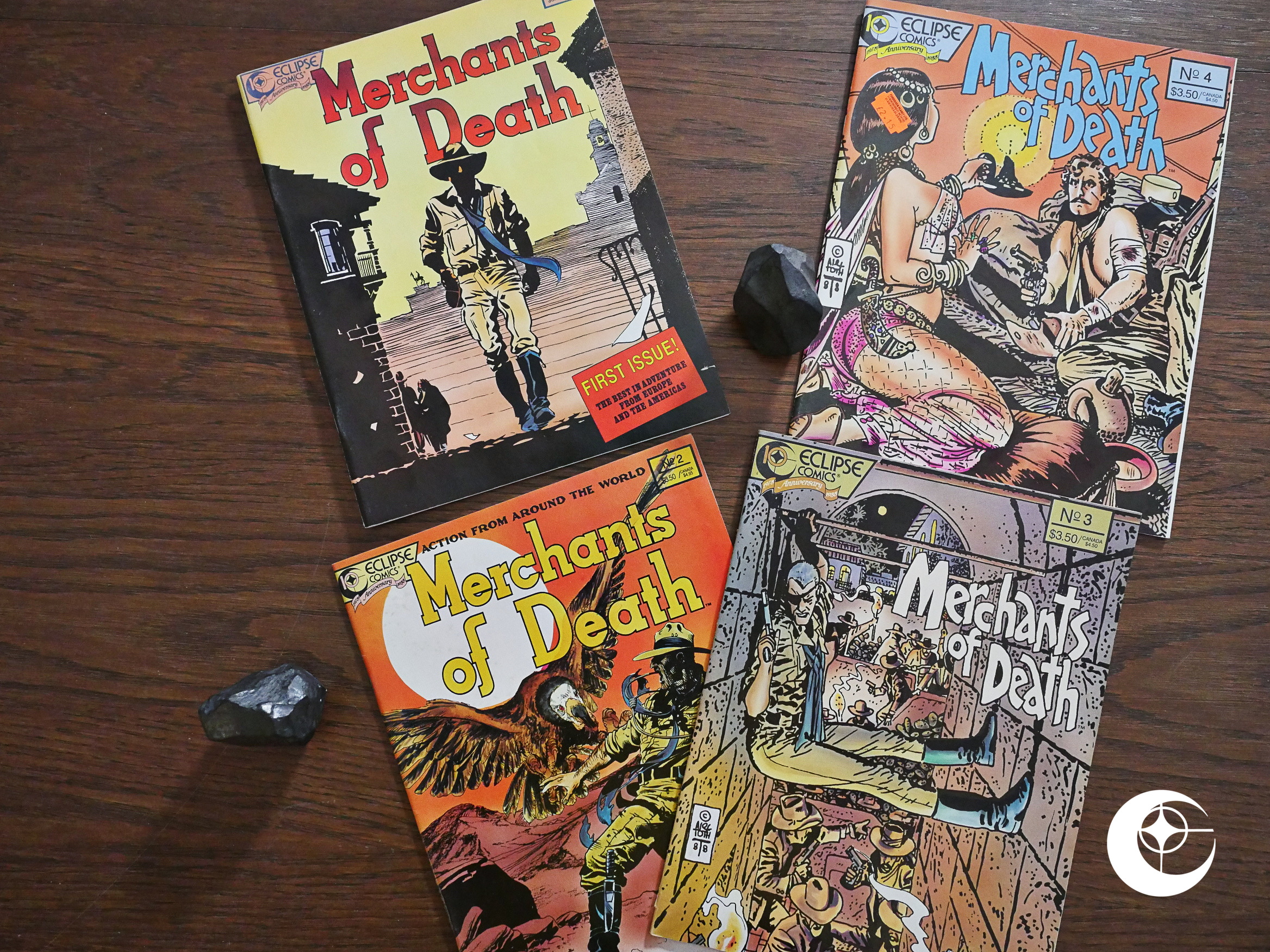
Merchants of Death (1988) #1-4 edited by Letitia Glozer.

How odd. Eclipse had just started co-publishing a European action/adventure magazine anthology a couple of months earlier. That one was called Aces, and was lovingly compiled by the Brits over at Acme Comics. It was impeccably curated, with interesting biographies of the artists involved and news from the Continent. It was obviously passion project for the editor, and then Eclipse goes into direct competition with that with Merchants of Death, dubbed “The Best In Adventure From Europe And The Americas”.

Perhaps the idea was to create more of a presence in the comic store by trying to establish a “new corner for these things”. It was a successful strategy with the Japanese imprints, which Eclipse launched three of at the same time, and became A Thing.

These are 40 page magazines, printed on thick, non-glossy paper, and feel pretty substantial. However, the contents are everything but.

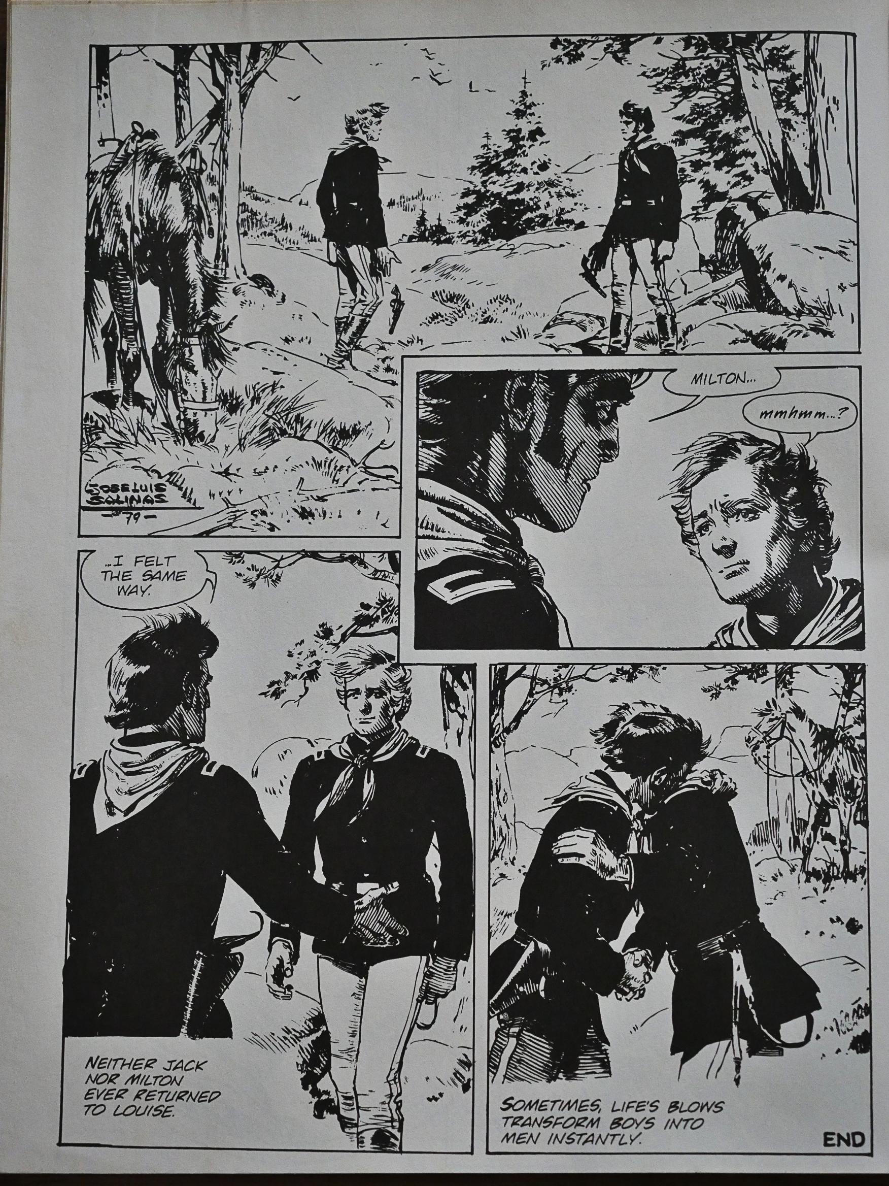
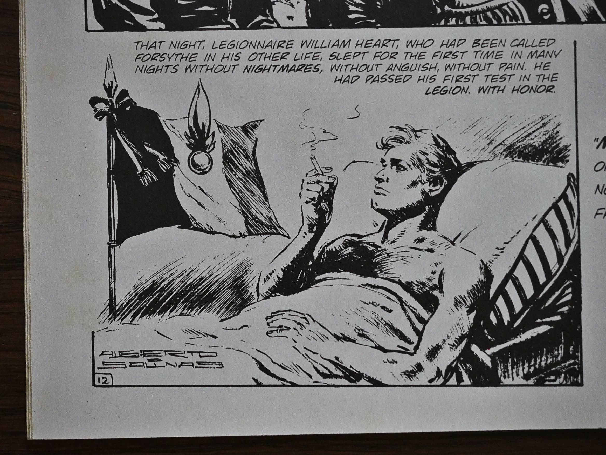
While Aces had some pretty big names doing exciting strips, here we get people that typically end up in cheap, nondescript anthologies aimed at teenage boys in Europe. Carlos Trillo and Jose Luis Salinas doing random 12 page stories about war and stuff. Salinas is a good artist, but these stories don’t have much meat on them. And the reproduction isn’t very good; Salinas’ very Spanish very thin-lined and messy artwork just doesn’t show up much of the time.

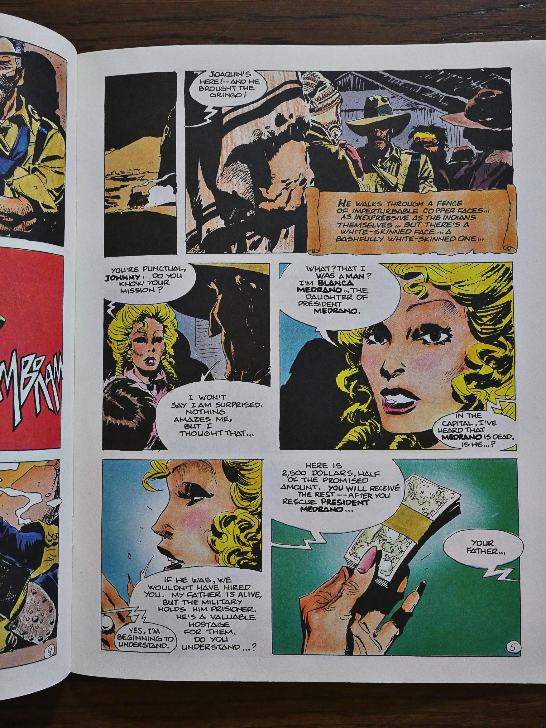
I was excited when I read the indicia which mentioned Alberto Breccia. But it was Alberto Breccia jr. and “A. Grassi”. Jr? And that’s definitely not an Alberto Breccia page, and the credits say Enrique Breccia, so perhaps it’s a relative? A son? It’s not particularly thrilling, and I wonder why Eclipse coloured his pages in this magazine and no others. The price tag ($3.50) was pretty steep for its time, but…

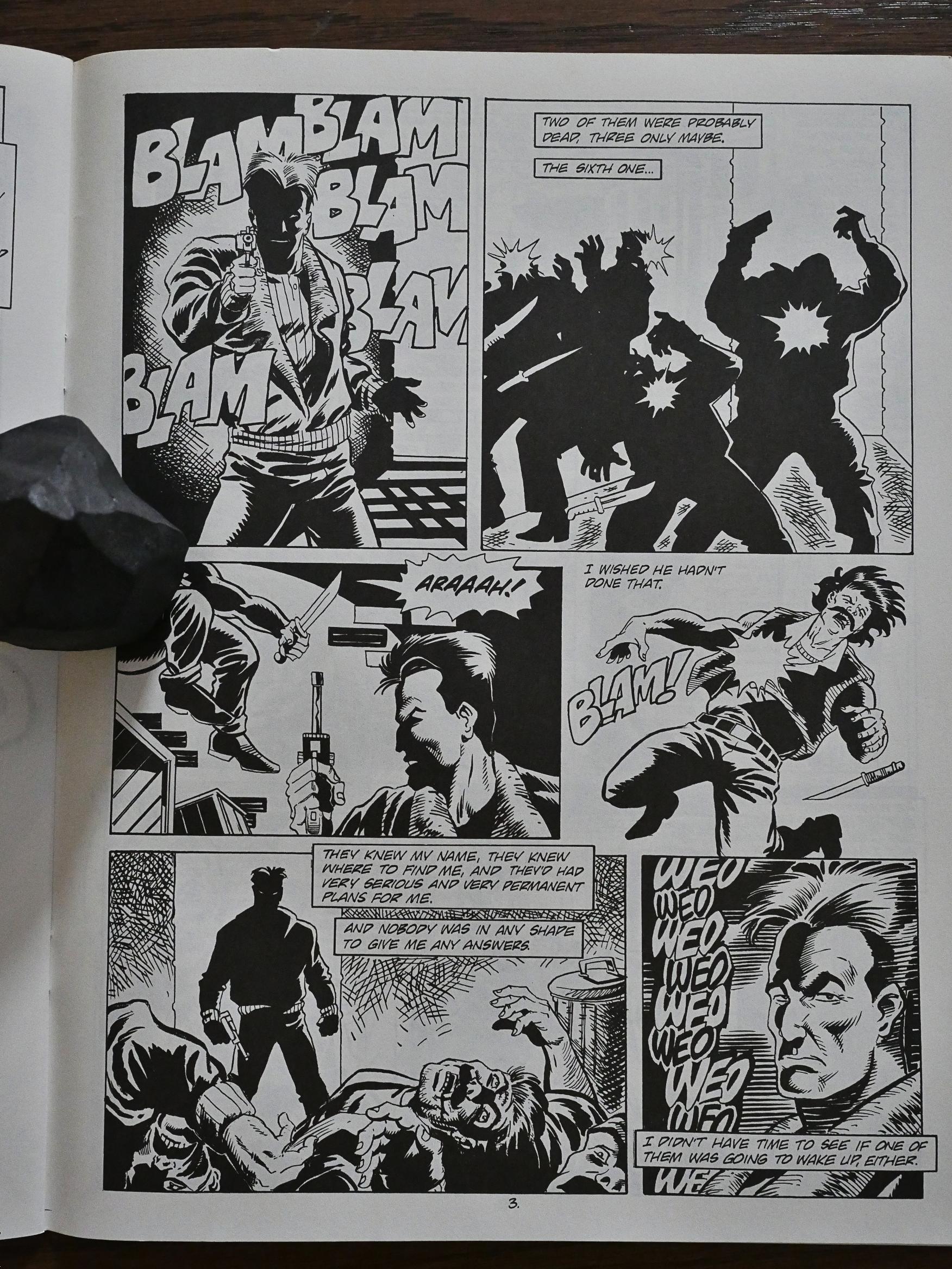
The stories are very hard-boiled: The guy takes assignment after assignment from people who turn out to be villains, and then he has to shoot them. As one does.

But it’s the best stuff in here.

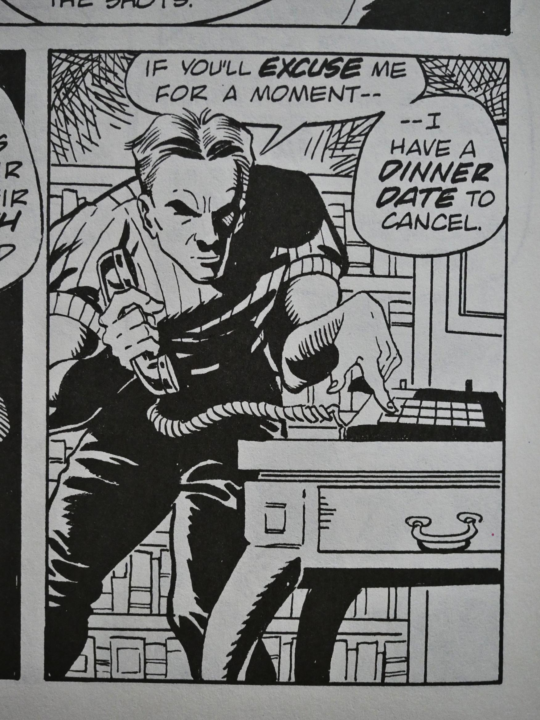
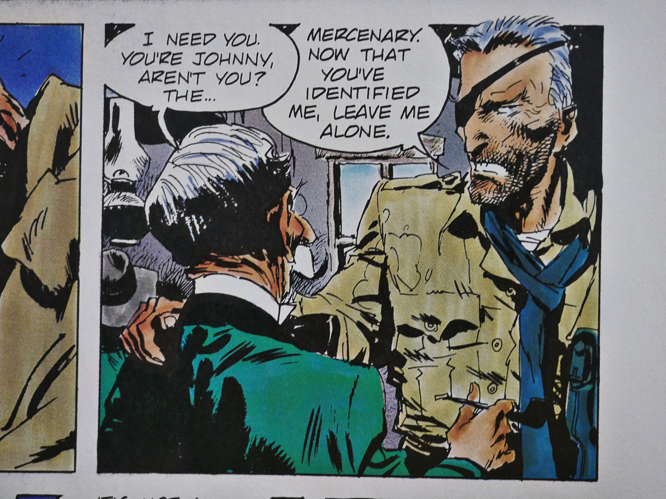
And last and least, we have a continuing serial from Kurt Busiek, Dan Brereton and Richard Howell. It’s about a mercenary who doesn’t take money because of reasons, and it’s pretty ineptly drawn.

Yes, that’s exactly how a normal person bends down to make a phone call, and yes, that’s exactly what a phone looks like.

It’s a not a pleasant thing to read, even if the story isn’t as bad as you’d expect just by looking at the pages. There aren’t too many stories about the King of Roumania.

Perhaps for perfectly good reasons.

The first two Trillo stories revolve around people coming to the realisation that violence is like bad.

The last two are about how awesome it is to be in the Foreign Legion and killing people.

Carlos Trillo. He contains multitudes.

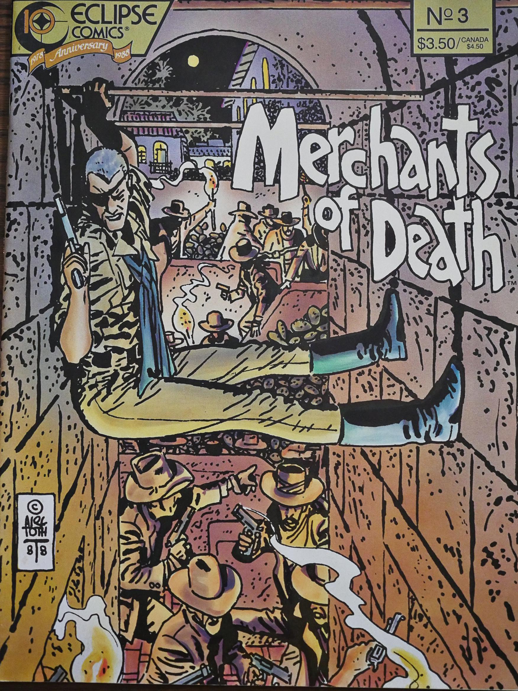
OK, this is the best bit in the series: This cover by Alex Toth. Eclipse had just published his Zorro collection, and they somehow managed to wrangle him into providing some covers to this anthology, too.

Enrique Breccia’s faces are just so absurd. That guy walks around making that face all the time, and the other people have gigantic cartoonish noses. I mean, I like it, but it’s so weird.

So what is this thing? It’s two random reprints of European properties that I would guess could be picked up for nothing. It’s not “the best” as the cover proclaimed; it’s what you get when you write to a Spanish comics agent and say “send over whatever you have lying in the closest cupboard”.

Adding to the feeling of being taken for a ride are the sheer number of in-house ads: Up to ten pages per issue. Why print it as a 40 page package if you’re going to do that, anyway? Why not use some of those pages to give the European reprints some context? There’s absolutely no text in these issues to say where these pieces originally run, either, but that’s a typical Eclipse thing to do.

The final issue concludes the Mark Waid Romanian thing by giving it some extra pages (leaving room for fewer ads), and it’s not a bad way to finish off the story.

The artwork doesn’t improve.

If I were the Acme Press people, I would have been livid with Eclipse for trying to pair off this substandard series with their excellent Aces series as a “sister” anthology. (The co-publishing deal Eclipse had with Viz and Proteus also soured, so it would be typical.)

And as both anthologies were cancelled around the same time, I guess this strategy didn’t pay off for Eclipse, either.

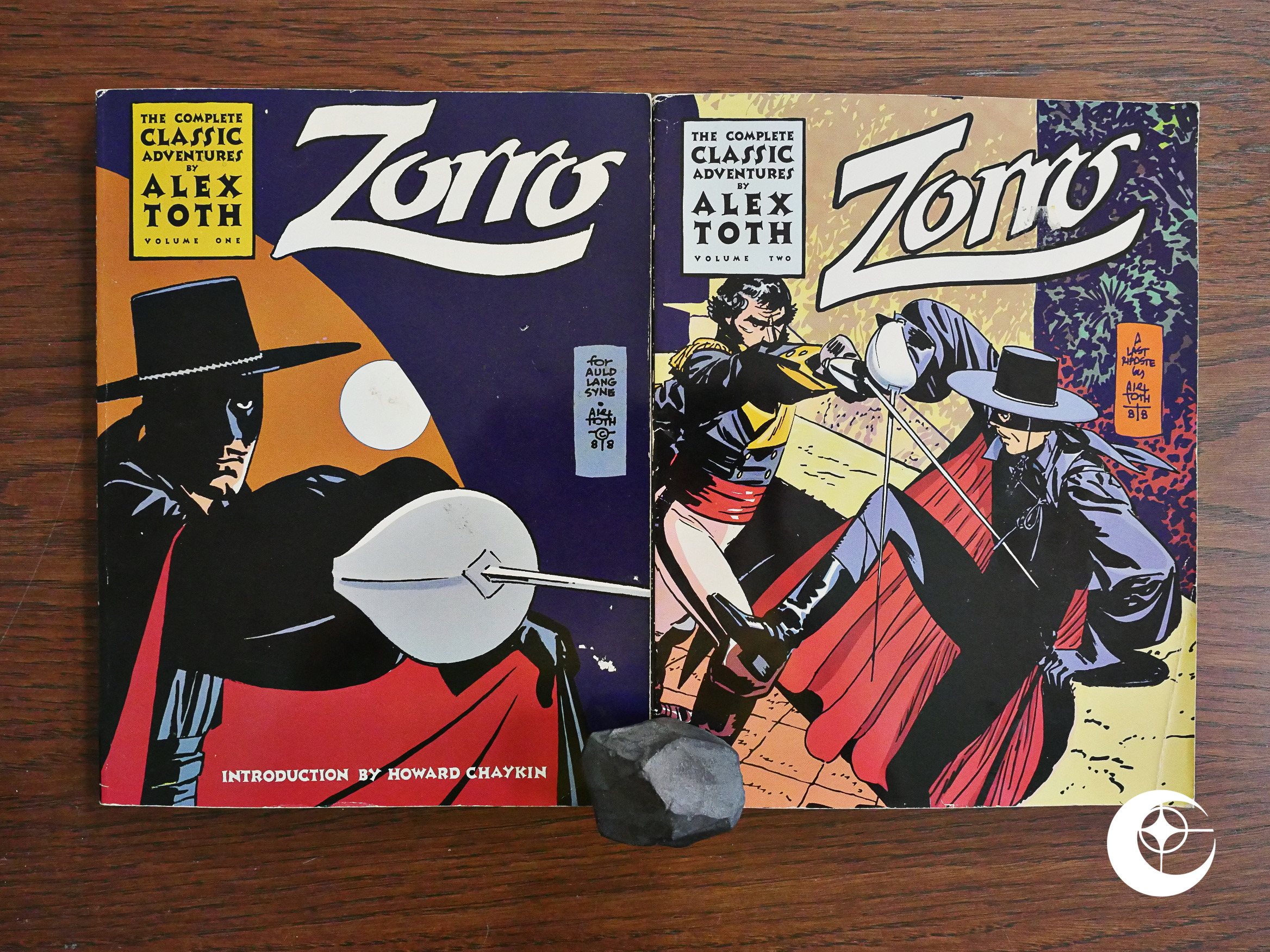
1988: Zorro: The Complete Classic Adventures by Alex Toth

Zorro: The Complete Classic Adventures by Alex Toth (1988) #1-2 by Alex Toth et al.

I remember I had a translated version of some Disney Zorro stories when I was like eight, and I remember thinking that they were super-lame. And I read basically all comics that came across my path, but these were so cheesy that even I couldn’t stomach reading them.

But, of course, I don’t know whether the Zorro comics I reluctantly read back then were the Toth ones or some other anonymous artist from the Disney/Dell coal mines.

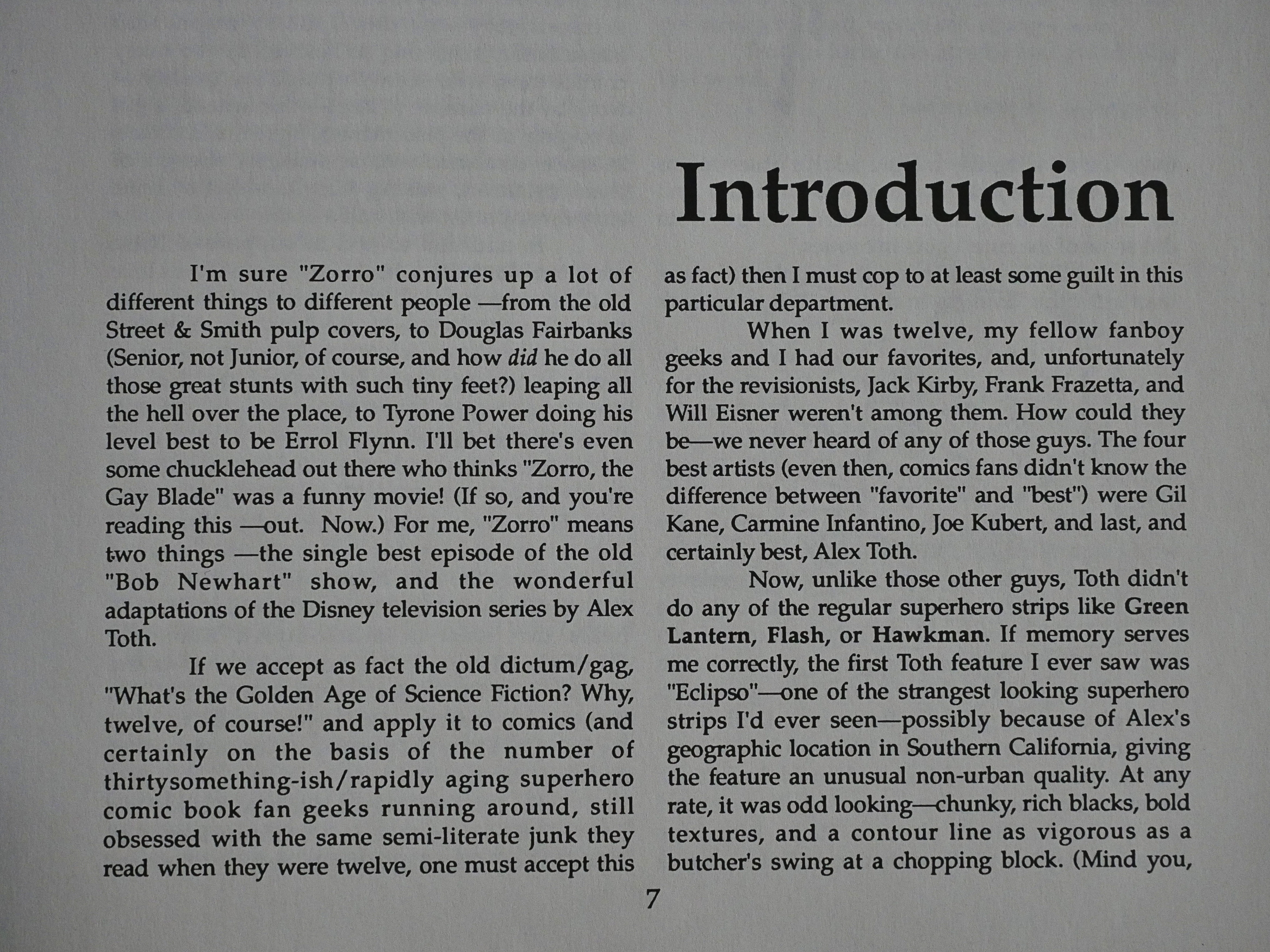
Howard Chaykin writes a lively introduction to the first of these two rather thick volumes (120 pages each) and explains that he’s been a lifelong Toth fan, and reports on some amusing anecdotes about Toth’s argumentativeness.

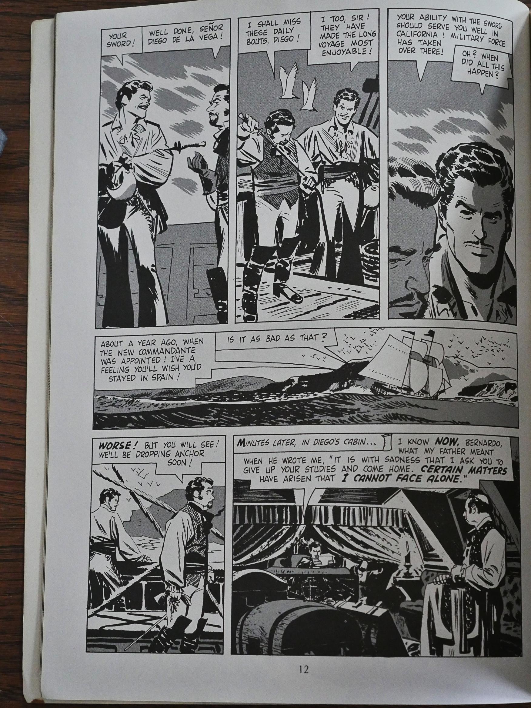
The Zorro comics I read back then were in colour, and in (just about) normal comics size. And this certainly looks like it’s been drawn for a colour comic, but like somebody added zip-a-tone to this version.

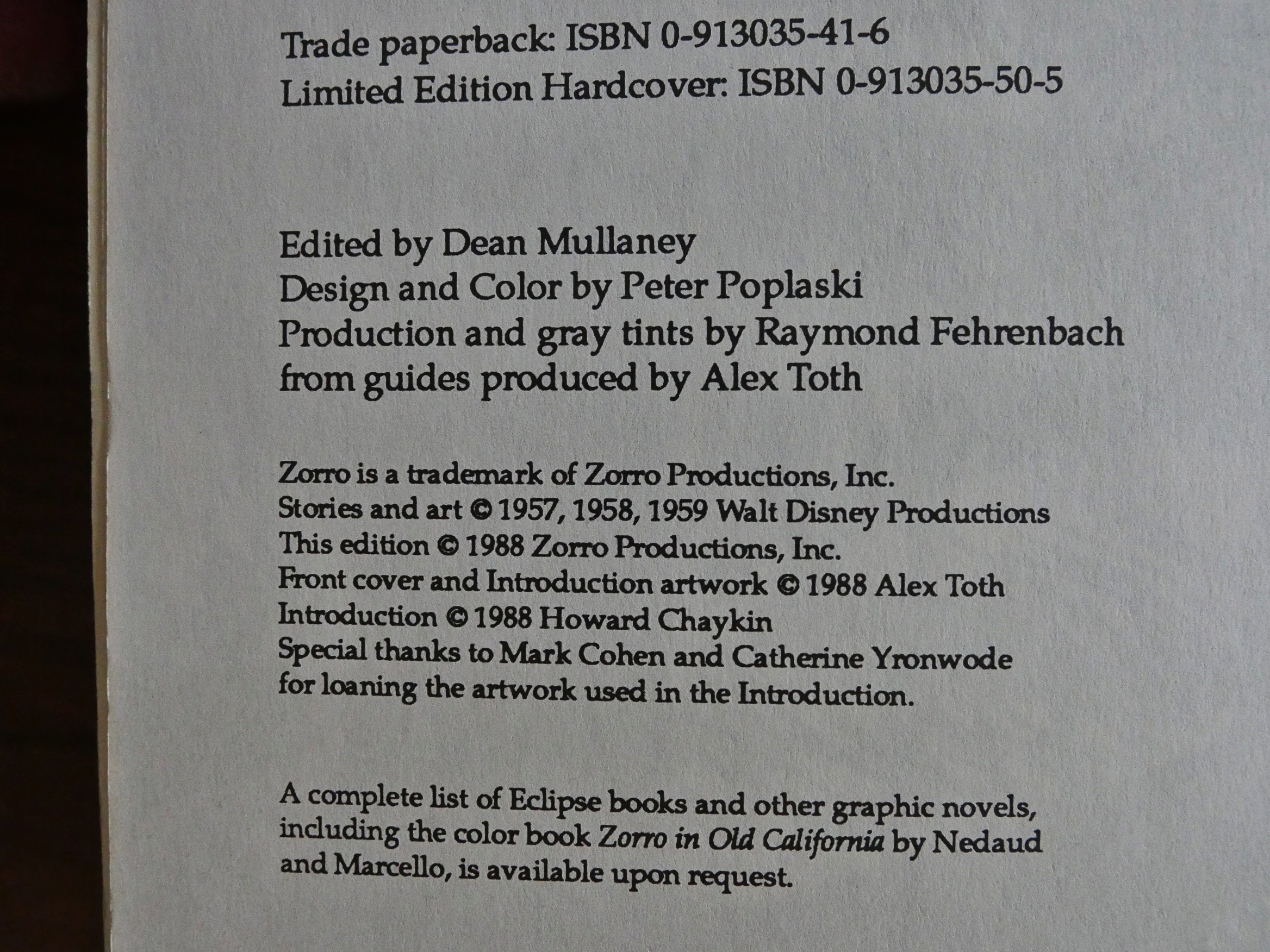
Aha! Toth did the guides and Eclipse added the tones. The tones are kinda weird: Usually when you do this kind of tone, you have several different darkness levels (i.e., how tight the dots are), but it’s 100% completely flat in this book.

The artwork is wildly inconsistent. Some panels look like either Toth didn’t really spend much time on it, or something went wrong during reproduction.

While other panels are super sharp. And since these panels are on the same page, I’m guessing Toth just spent more time on the panels that interested him more…

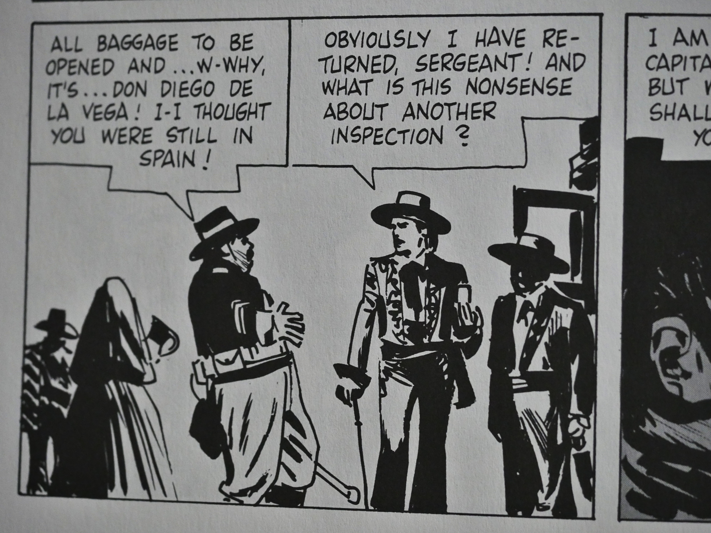
I had expected all these stories to be extremely repetitive, with Zorro outsmarting the stupid sergeant time and time again, and there’s certainly some of that, but there’s also change and development: Zorro gets some of his nemesises (that’s a word) sent off to jail, so it’s not a complete status quo. But the plot is basically what you’d expect otherwise, and it’s boring as fuck.

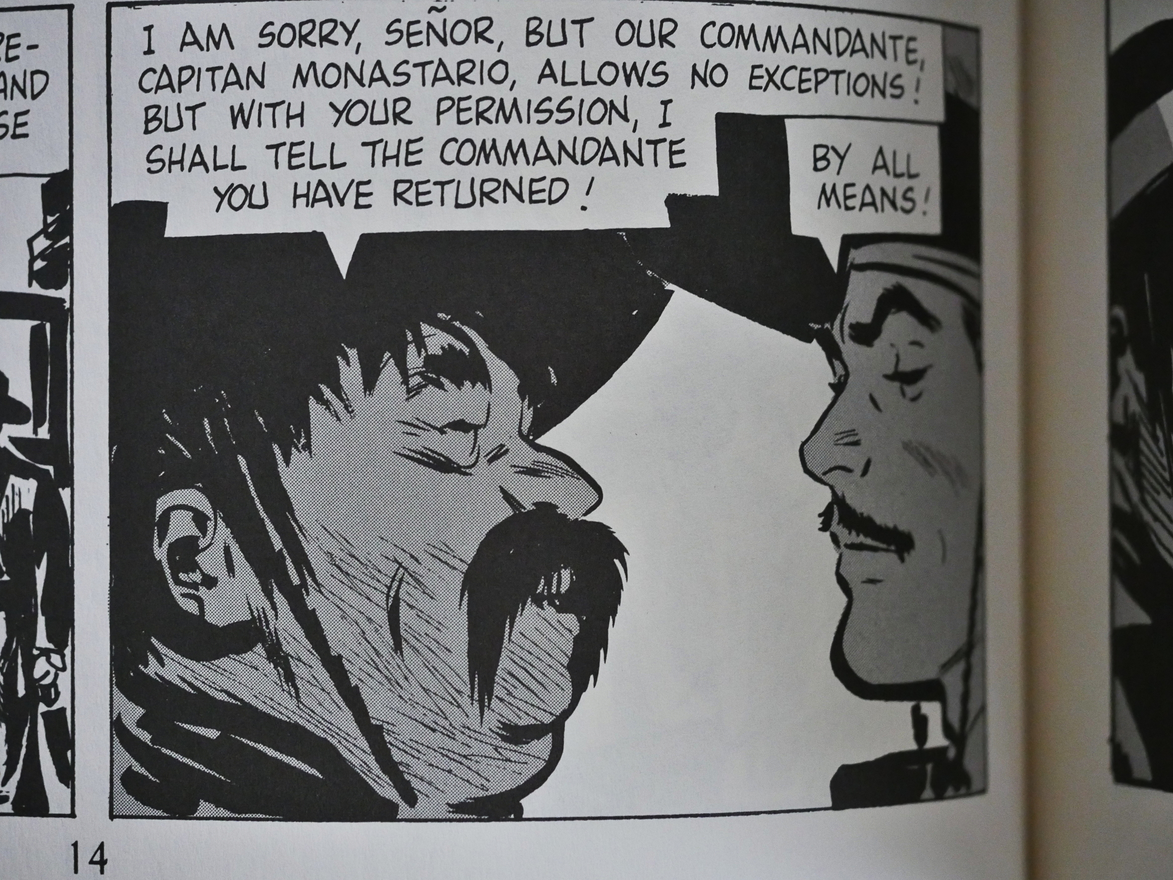
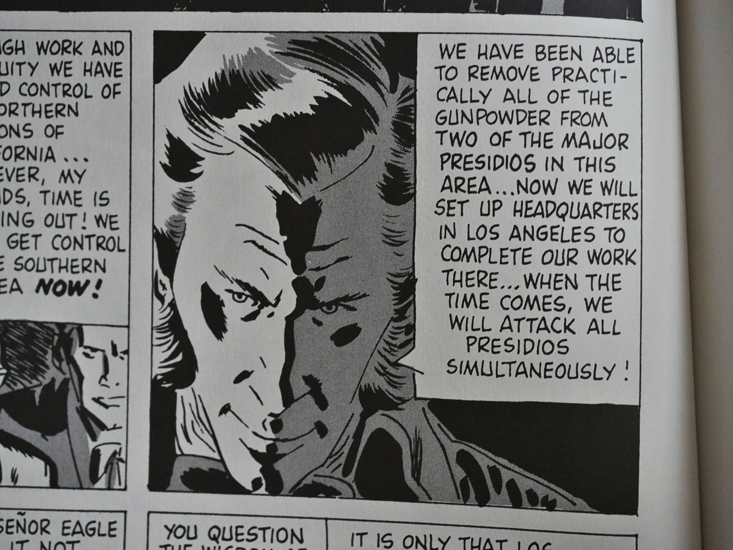
Weird faces. I’m beginning to believe that Toth didn’t really put much effort into this…

But still, there are some very nice panels here and there.

“Tee hee.” I think Zorro was almost unmasked (as the fop above) about forty thousand times during these 240 pages.

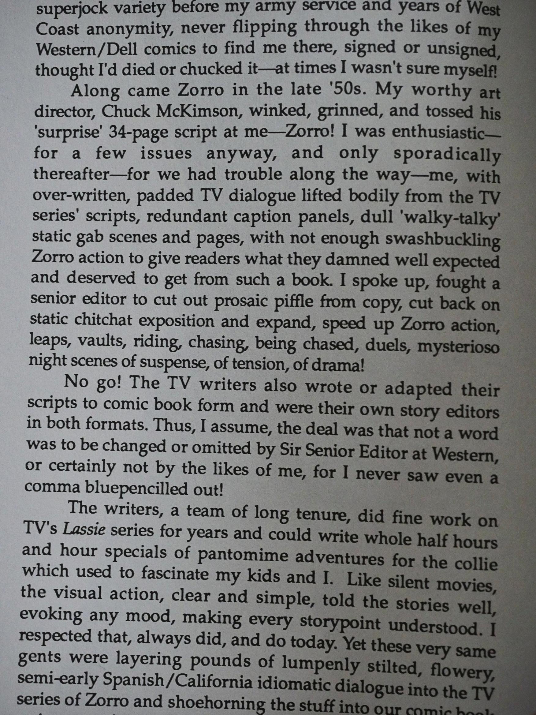
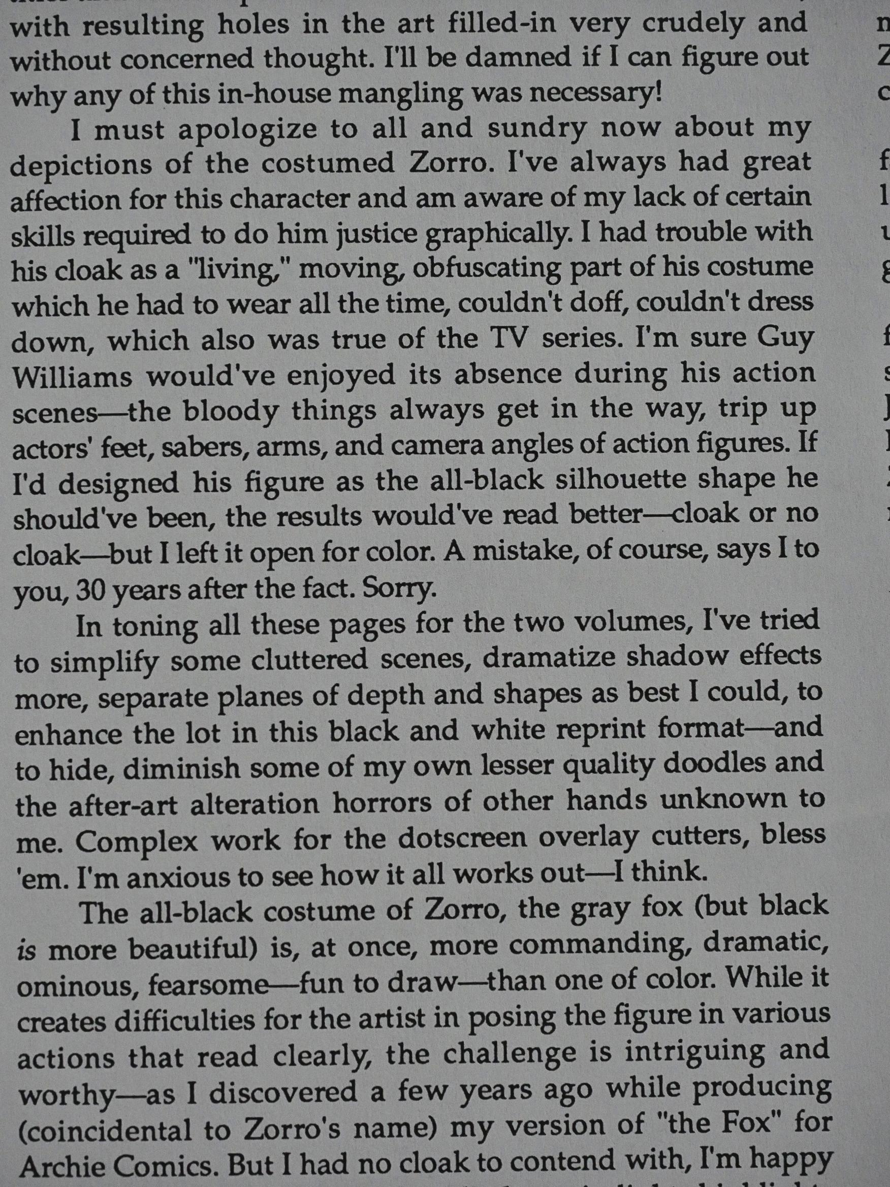
Toth does the introduction to the second volume himself, and he’s very candid. He explains that the stories are mostly adaptations of TV scripts, adapted by the same people who wrote those scripts, and that they contained a lot of piffle. It certainly explains the lack of fun and action: It’s more expensive to do adventurous scenes on TV, so you have people talking to each other for 95% of the time. It’s not so expensive in comics, and Toth wanted to make changes, but wasn’t allowed by the editors at Dell.

He also owns up to some of the artwork not being his best, and wonders whether some of it has been altered by Dell afterwards.

The artwork in the second volume is better than in the first. You get some great un-Tothy faces like this…

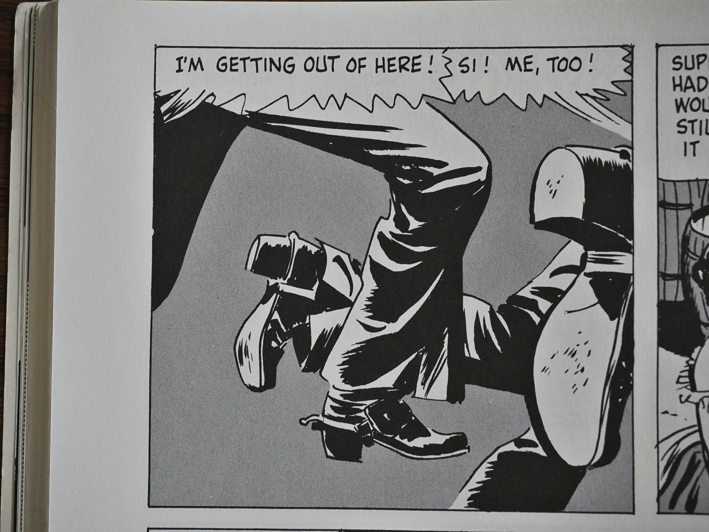
And some very Tothy action sequences.

Still, getting through this was painful, and I totally agree with my eight-year self: These comics are super-lame.

Eclipse had reprinted some European Zorro comics two years earlier, so somebody there obviously had a Zorro fetish.

RC Harvey in Comics Journal #129 is more positive:

Although the book contains hundreds of beautifully-drawn pictures, Toth’s storytelling is but adequate to the task — “adequate” with Toth is usually better than average elsewhere (and it is here. too), but here we also see him falter occasionally, leapfrogging key events in his breakdowns a time or two. missing the most dramatic composition for narrative purposes a few times, inking some panels perhaps too hurriedly. But when the master nods. it serves merely to conVince us he is human: it doesn’t spoil the stories.

Moreover, such momentary lapses are mostly lost amid the success. and everywhere they are evident they are at least as instructive as the virtuoso work.

These comics have been reprinted several times since, most lately by Hermes Press in 2013, so perhaps I’m just channelling my inner child too well.

1988: Total Eclipse

Total Eclipse (1988) #1-5 by Marv Wolfman, Bo Hampton, Rick Bryant, et al.
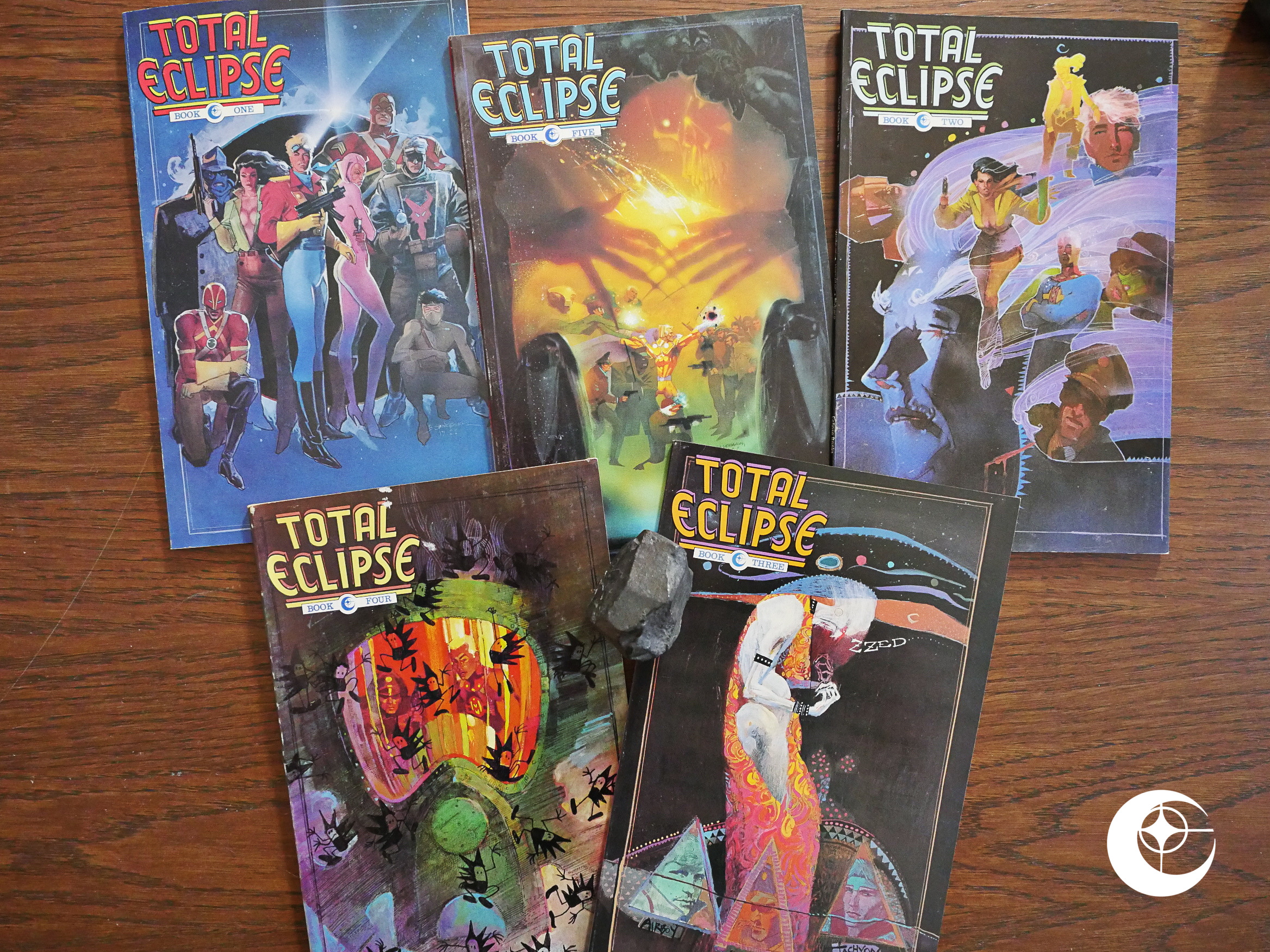
This series was meant as a celebration and a ratcheting up of the Eclipse comic book comics line: Line-wide crossovers were all the rage at the time, and Eclipse even got the writer for DC Comics’ Crisis on Infinite Earths to write this series. It was a great success for DC; this was the end of another chapter of Eclipse’s story.

Eclipse had concentrated for the past few years on publishing action/adventure/super-hero periodical floppies (bi-weekly, monthly, bi-monthly, whatever) to some success. That is, Airboy and Scout were successes; the rest not so much.

After Total Eclipse, no further series like that would be debuted. From now on, Eclipse would concentrate on graphic novels, one-shots and series reprinting things from other places in the world (mostly Japanese, but also a smattering of European and Argentinian comics).

(Not that Eclipse stopped publishing these comics like *snap*: Many of them continued their long runs for quite some time, but no new ones were developed.)

In one way, you could say that Eclipse were returning to their roots: They started off being a graphic novel publisher. But while the original push was all creator-owned, many of the graphic novels over the following years are licensed properties like James Bond, The Hobbit and that Anne McCaffrey Dragon thing that I forget what is called.

We have to wait until the Twilight of the Eclipse (i.e., 1992) for the next attempt at launching domestic periodic floppies (and they’d fail).

This is also a personal watershed of a kind for me: I had read pretty much all Eclipse comics up until (say) 1984, a smattering of their comics until now, and virtually none of their comics after this, so I’m pretty curious what these comics are going to be like.
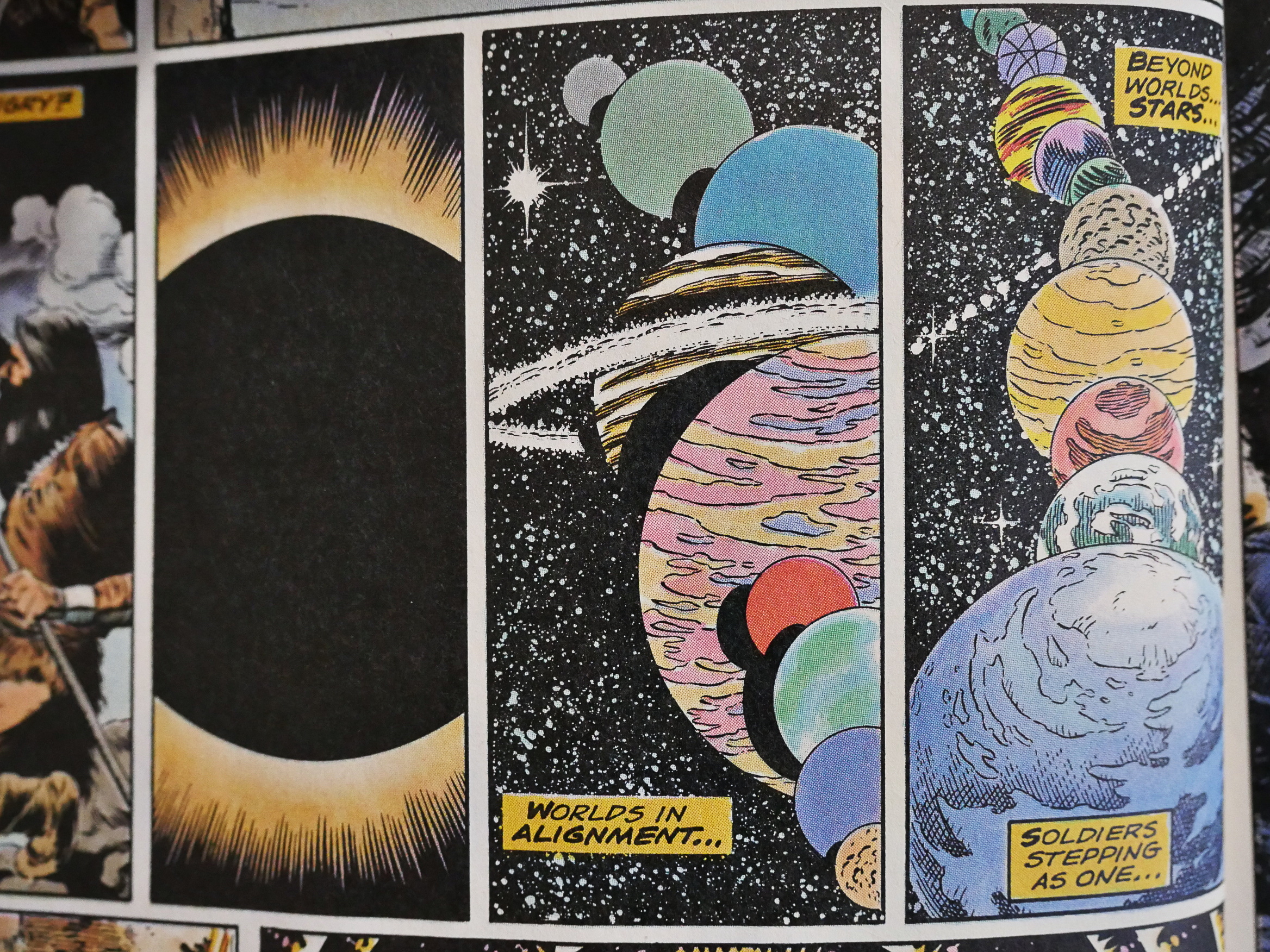
ANYWAY!

Let’s talk about this series. It’s five 48-page squarebound standard-size comics (i.e., the “prestige” format that Frank Miller’s Dark Knight Return popularised). Most of the issues were released with three or four months passing between them, which I would guess might have contributed to the (perceived) failing of this series. I have no idea what the sales numbers were, though, but I vaguely remember there being some muttering about this at the time.

It’s too bad I don’t have a complete run on Amazing Heroes digitised and searchable; there should be some chatter in there about the series.

Hm… sounds like a project.

ANYWAY!

Those … infinite worlds kinda remind you of Crisis on Infinite Earth, doesn’t it?
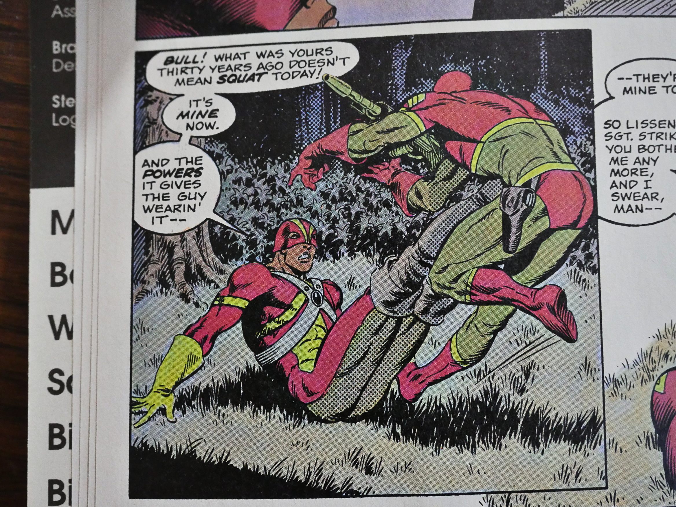
Weirdly enough, the Strike! storyline continues without a glitch from the Sgt. Strike one-shot.
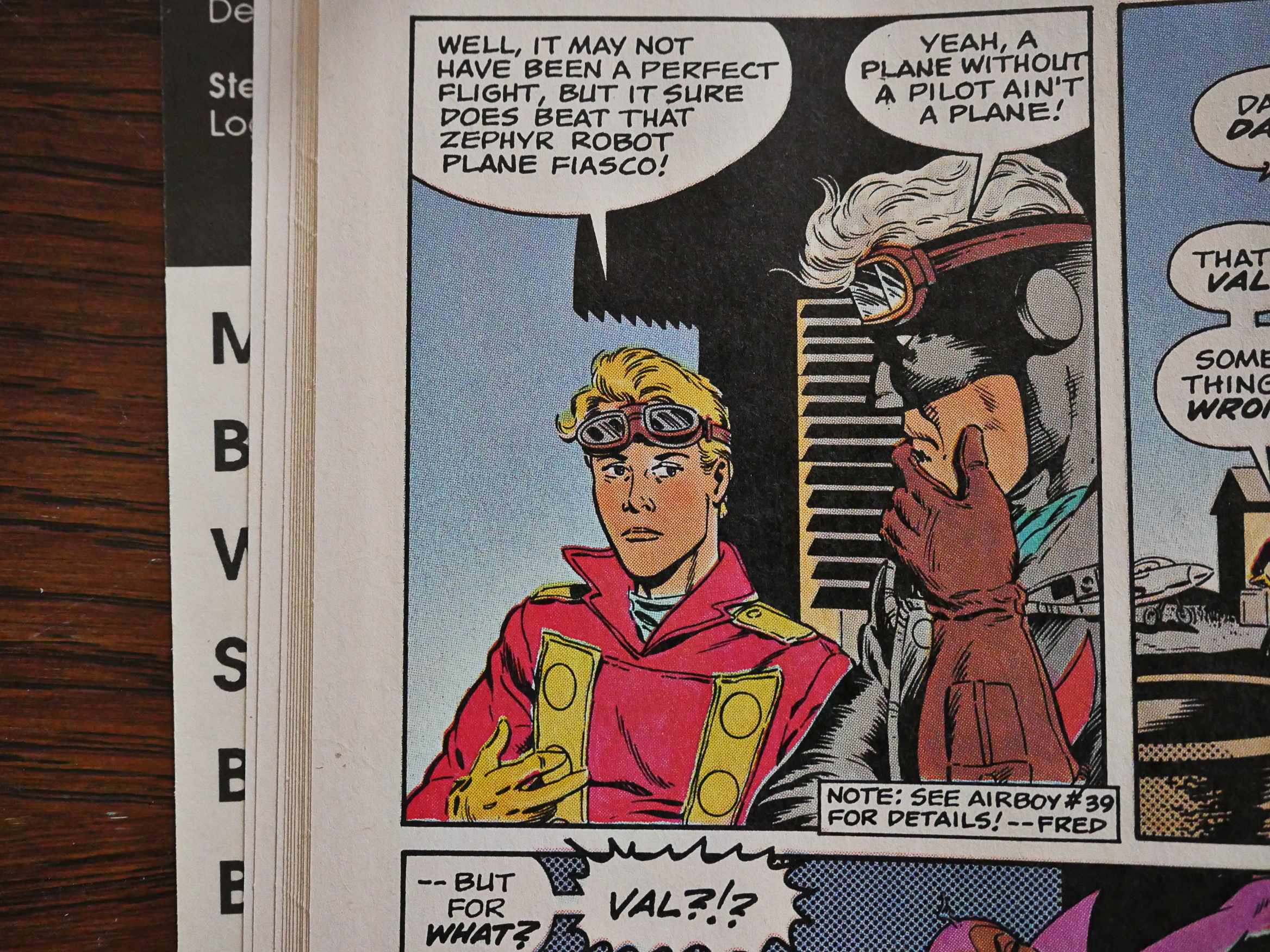
But, really, there aren’t that many connections to the other books. We see a few “see Foo #bar” here and there, but a lot less than I would have imagined in this book.

The selection of characters that appear here is also not quite what I would have expected. Basically, it’s everybody from the Airboyoverse, a few of the second-stringer 4Winds titles (Strike!, The Prowler), The Liberty Project, the New Wave characters and Miracleman. Many of these are owned by Eclipse in one way or another, or are from 4Winds titles that had ended. Characters you’d expect to pop up that would have made sense would have been DNAgents or Zot! or Pelleas and or Melisande.
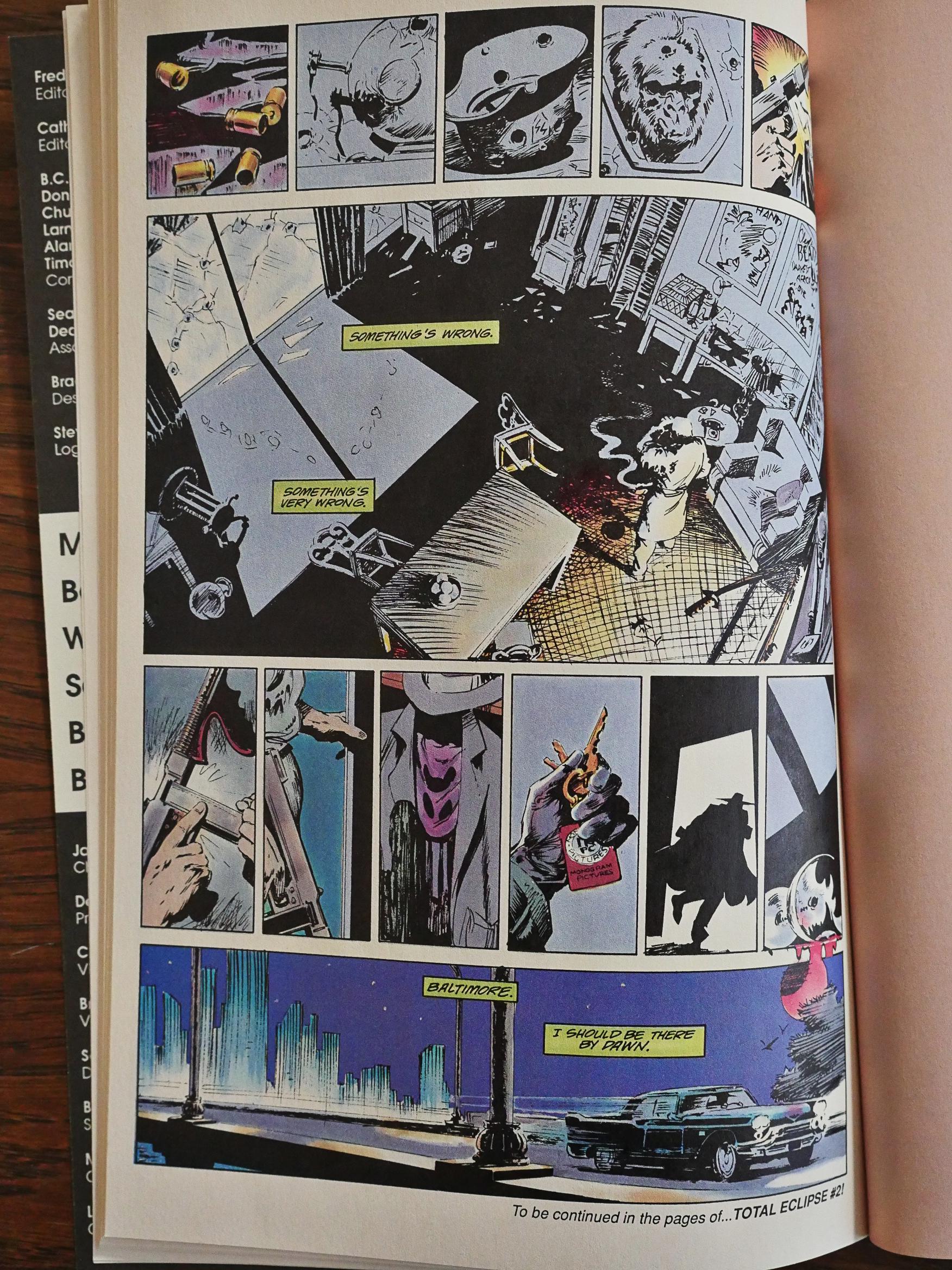
Each issue is about 30 pages of the main story, and then a ten page backup that concentrates on one of the characters within the Total Eclipse framework. It works really well and allows the reader to sample how the “real” creators handle the characters, like in this Prowler bit by Timothy Truman, Brent Anderson and Mike Dringenberg.
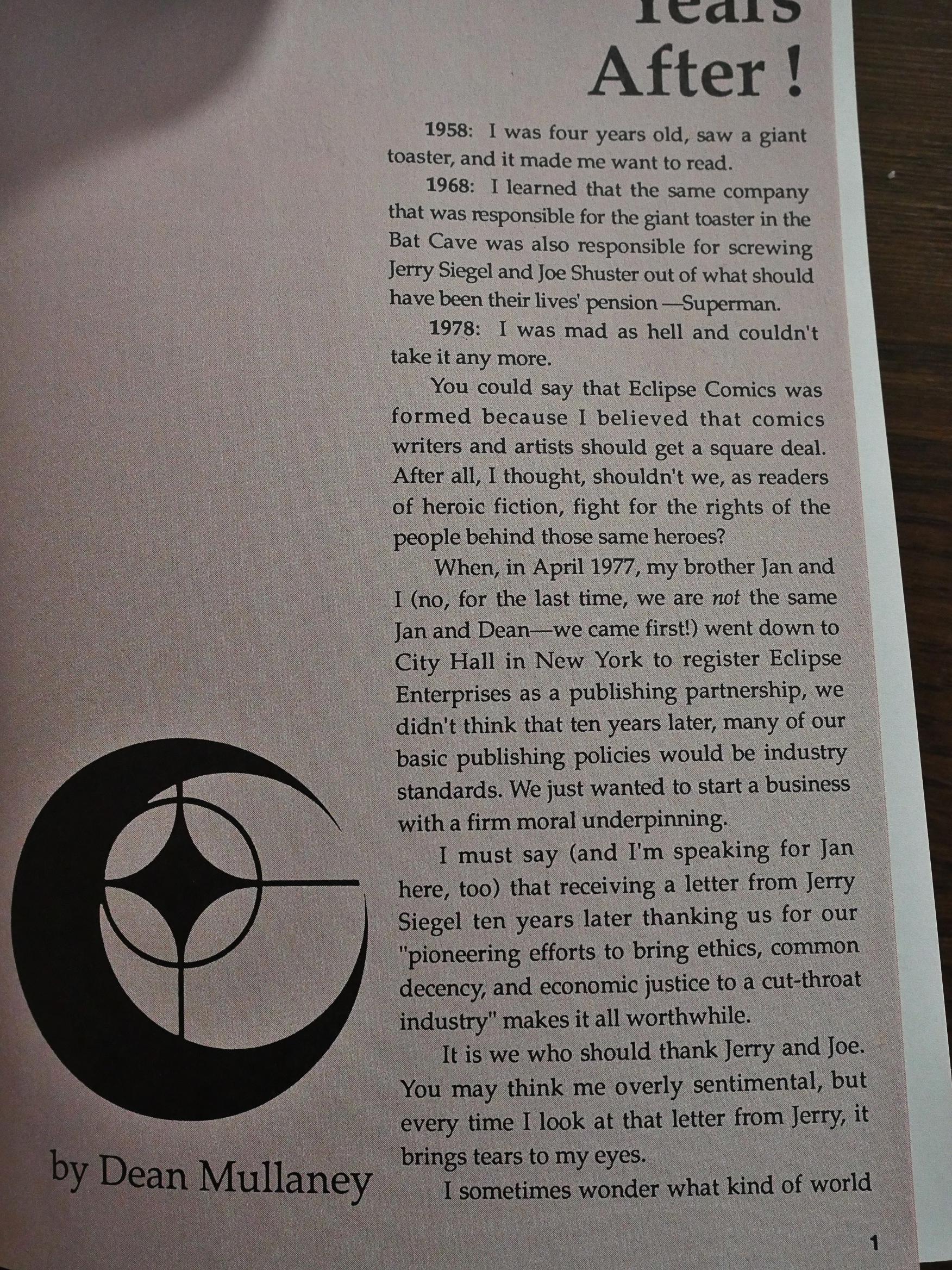
And finally, in every issue we get four pages of text by publisher Dean Mullaney. It’s both a personal history as well as a history of Eclipse Comics, and it’s quite interesting. We’ll return with some specifics later…
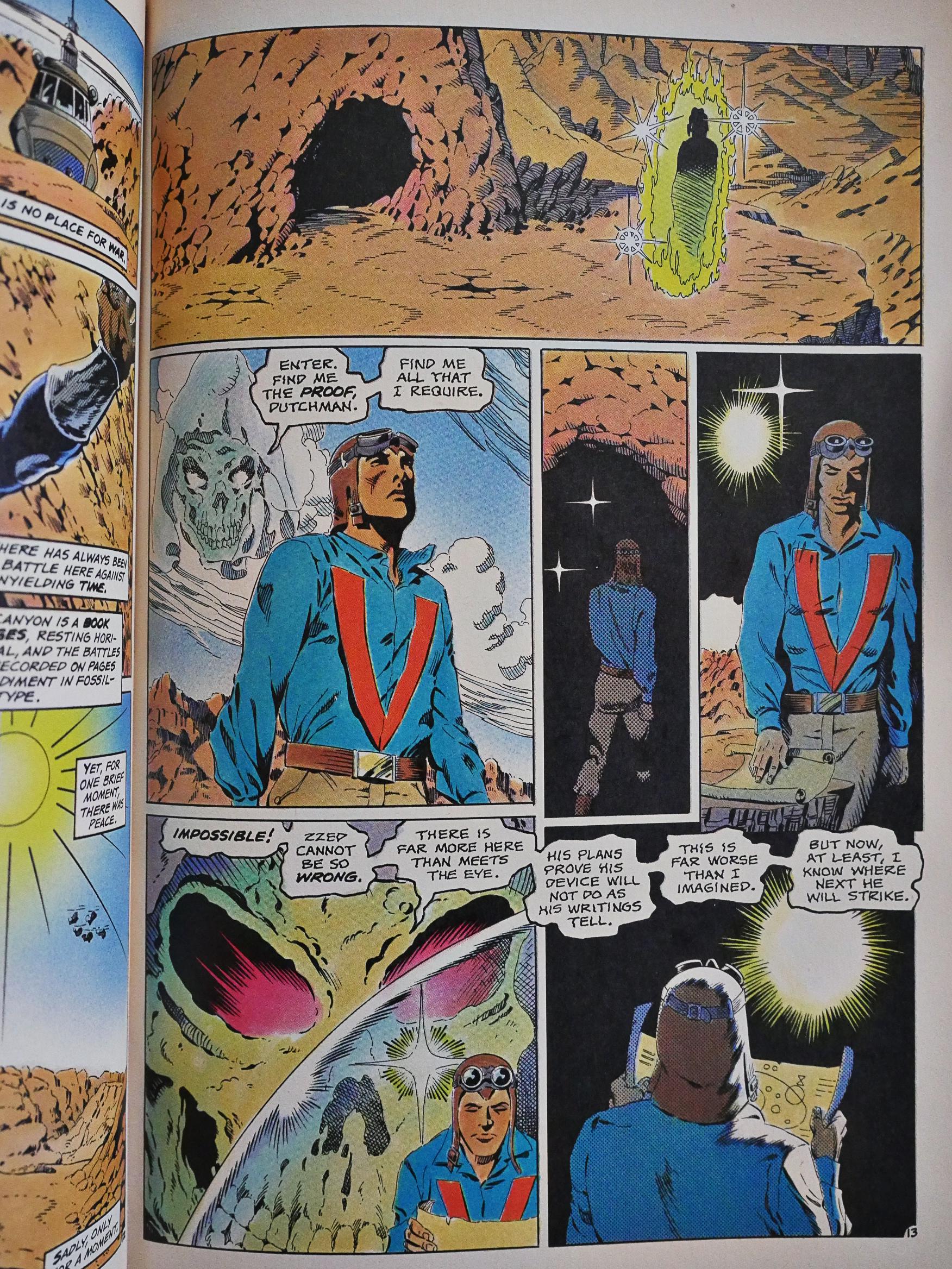
I enjoy Bo Hampton’s artwork in general, but I don’t think this is his best effort. He doesn’t seem to have an obsession with drawing all these characters (which seems very different from George Perez on Crises, for instance), so their faces in particular are often rather indistinct. The Dutchman’s face above… do any of the three renderings resemble each other much? No? Right. But Hampton’s still a pretty good storyteller, and I love that next-to-last panel on that page.
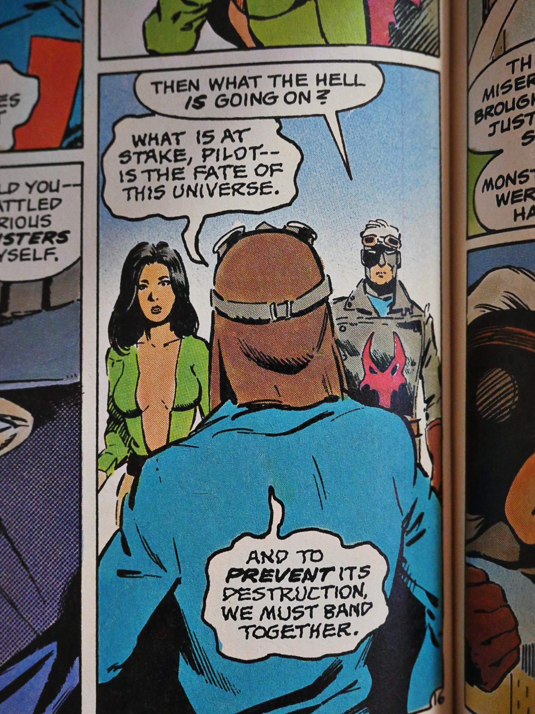
Oh. The story. When you make one of these crossover, you always have to put the entire universe in jeopardy, and Wolfman does just that.
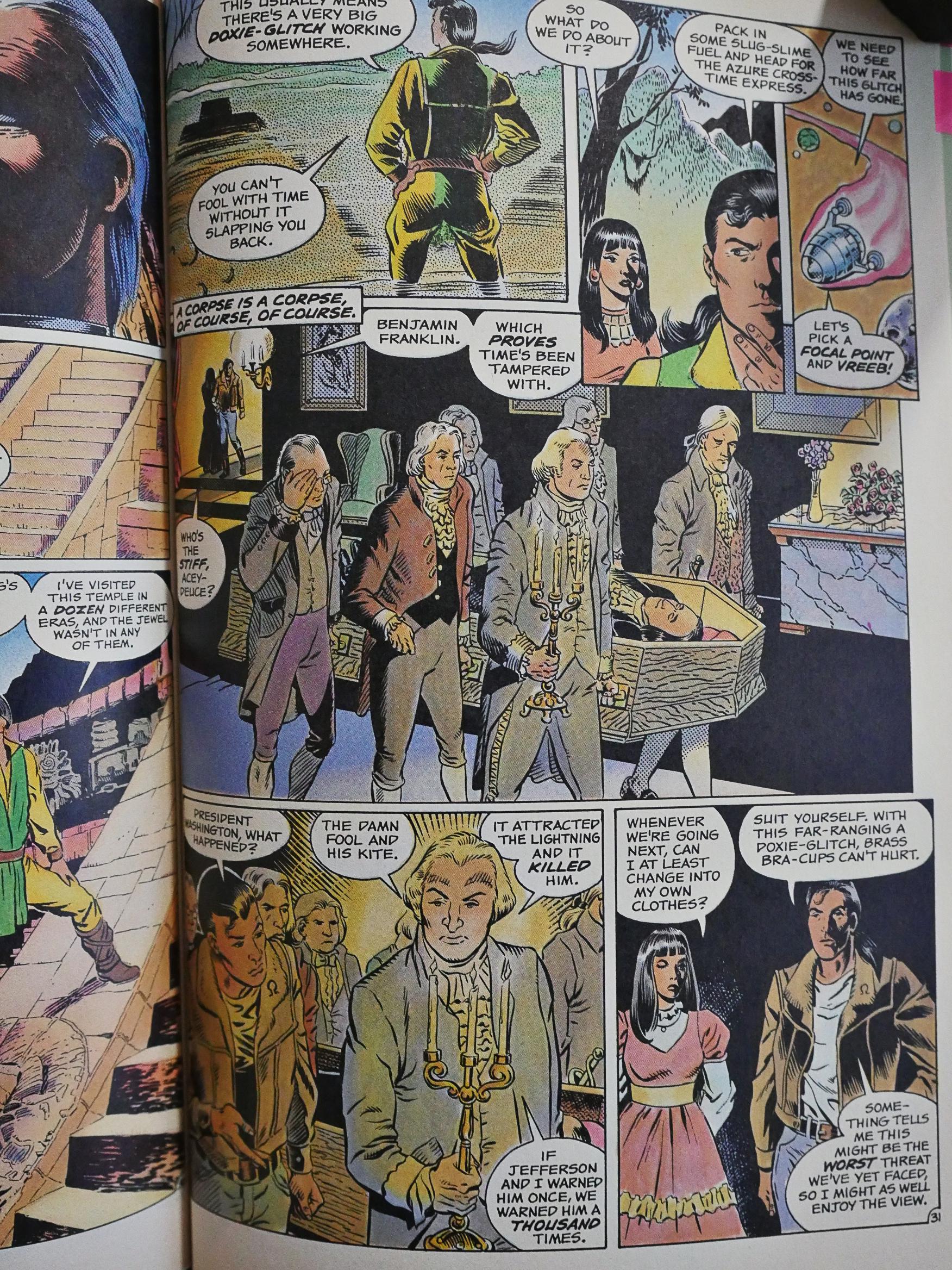
What surprised me, though, was what he concentrated on as the vehicle for it all: This all basically takes place within Doug Moench’s Aztec Ace world. At the start, when Wolfman introduced the Aztec Ace thing, he even emulated Moench’s storytelling tics: The page above wouldn’t be out of place in an Aztec Ace issue.

As things progresses and all the heroes and villains thrash around in the Ace-ness, Wolfman cuts back on that stuff a lot.
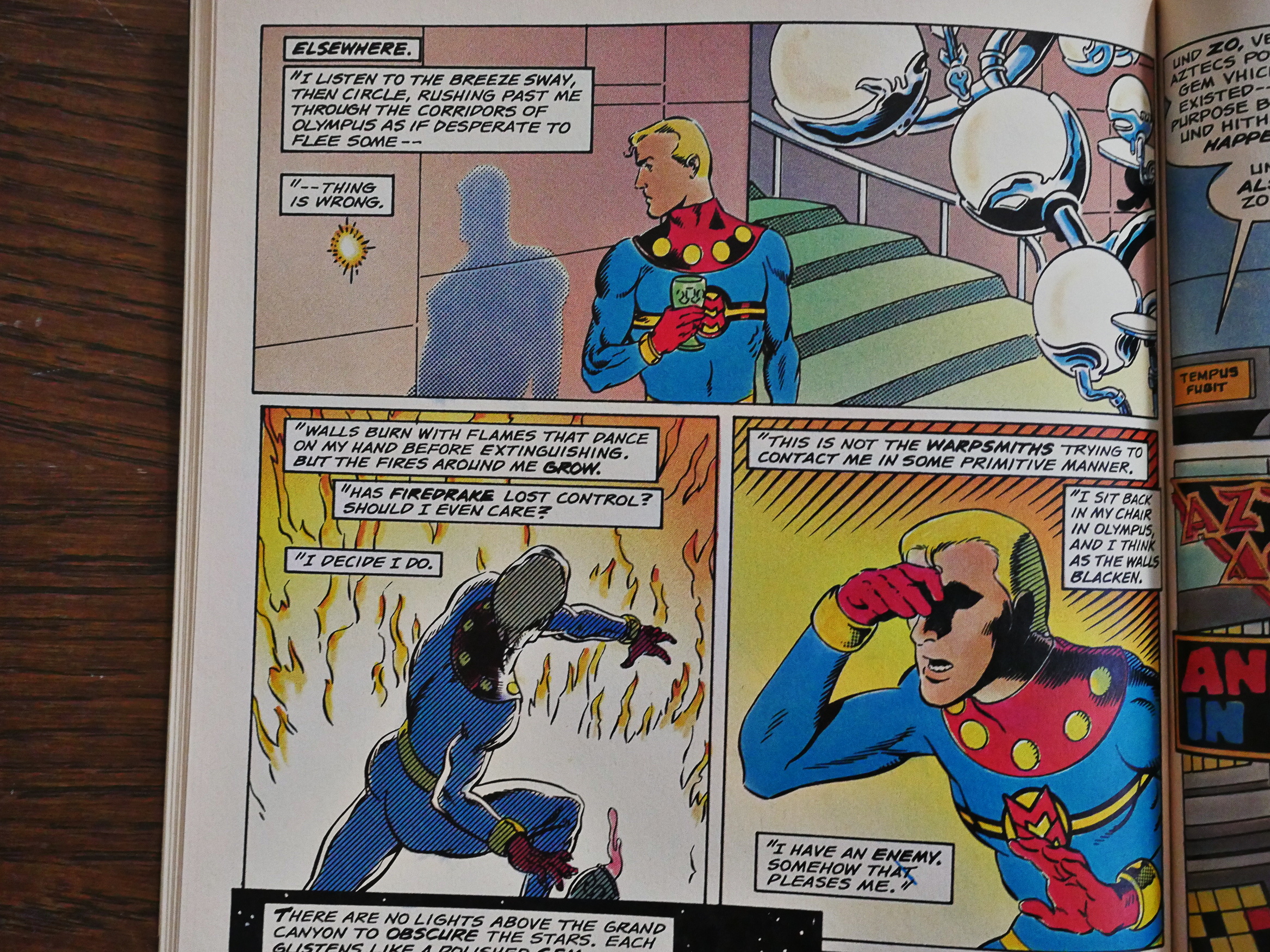
Wolfman also tries his hand at being Alan Moore whenever Miracleman is on the page, with, er, not very convincing results.
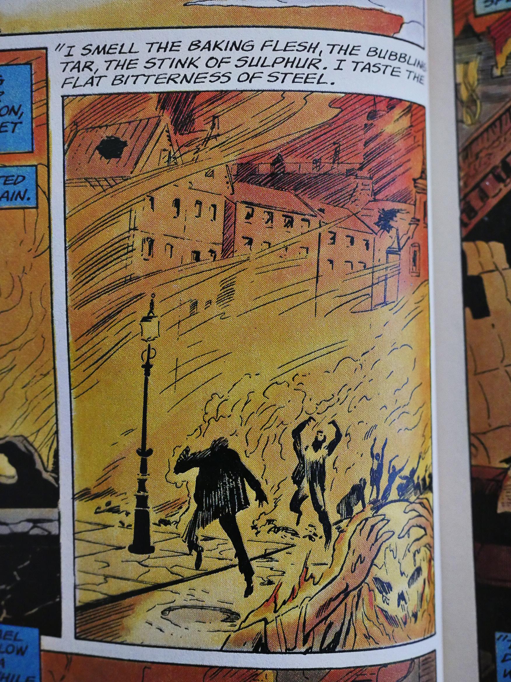
The references he makes to the rather harrowing proceedings at the end of Moore and Totleben’s tenure on Miracleman feel trivialising and in bad taste. DC is doing the same with Moore’s Watchmen these days, so I guess Moore is just doomed to have his creations fucked over by lesser talents.
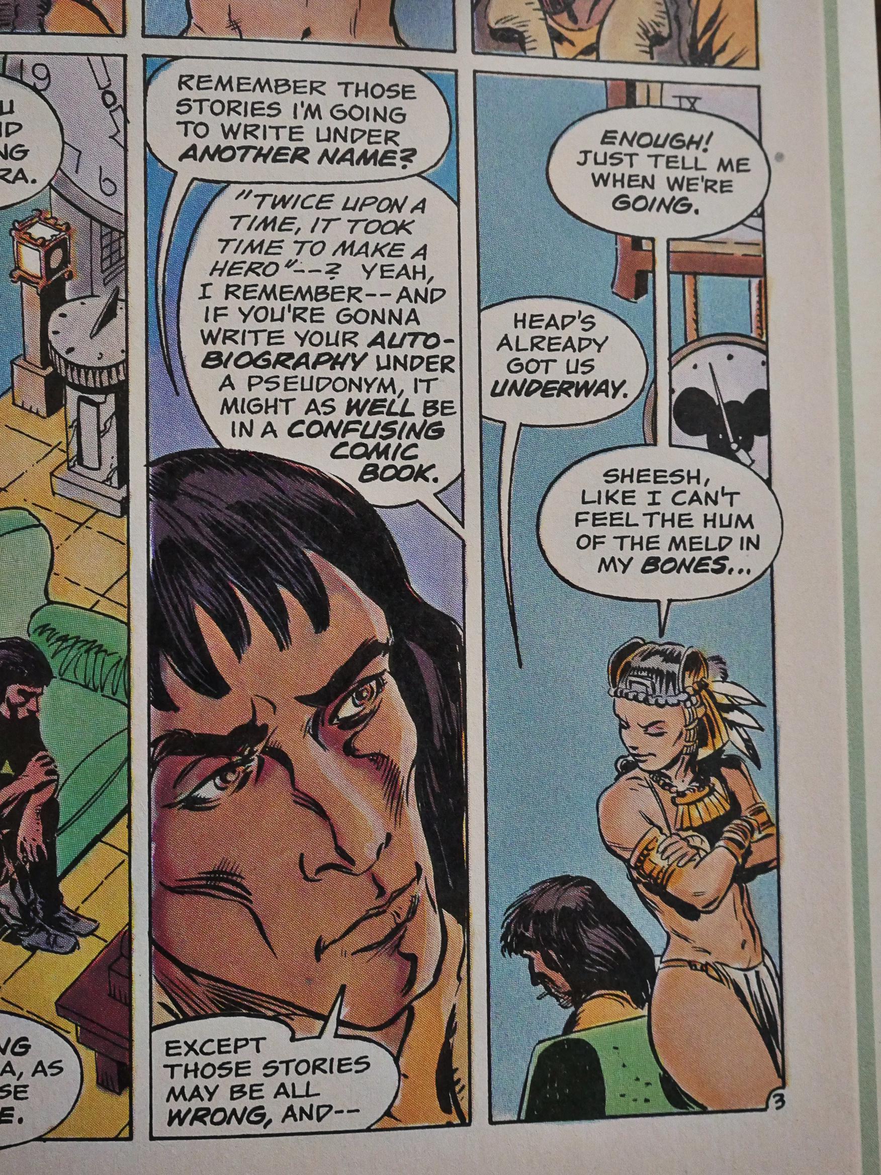
Tee hee. A confusing comic book.
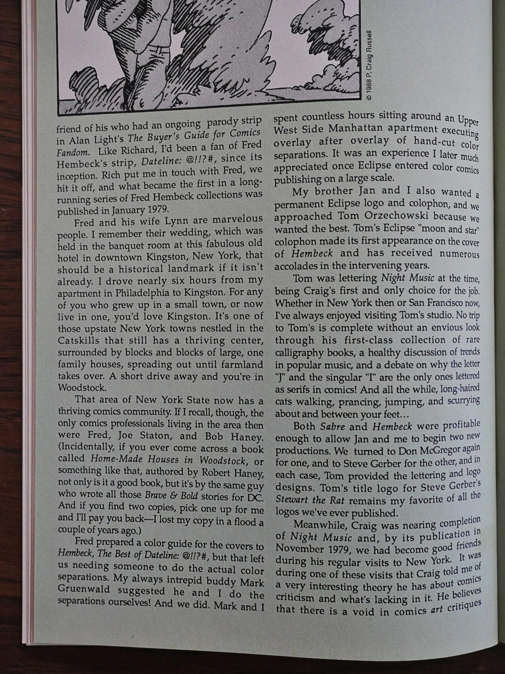
Mullaney’s history lesson about Eclipse is quite detailed at the start, and then grows progressively less so. But that’s understandable. It’s how those first comics got to be published that’s interesting, and then it gets to be routine.
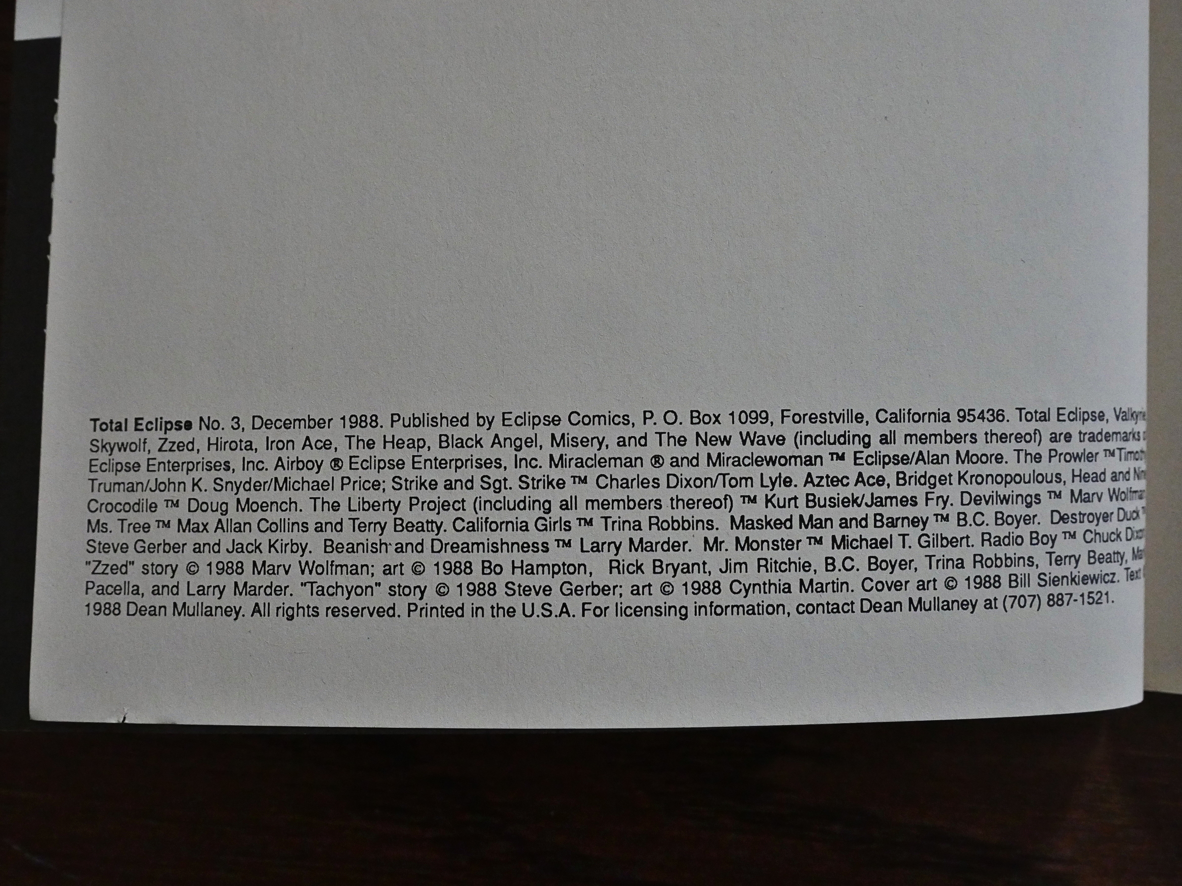
Since this is a crossover between many creator-owned comics and characters, the indicia grows comically long.
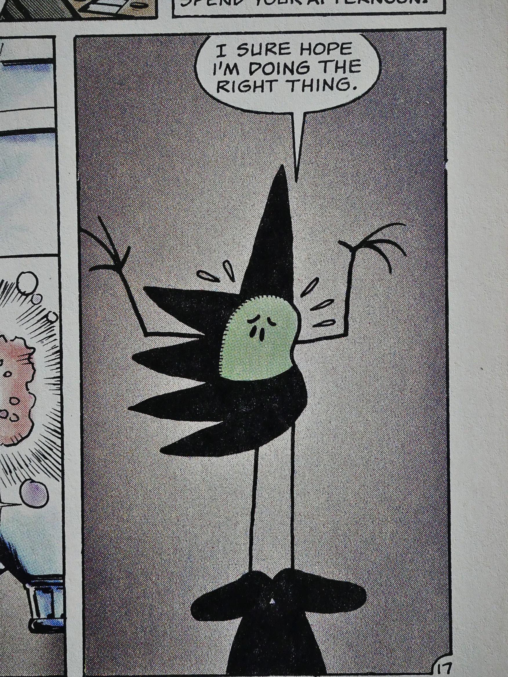
Oh, yeah! Beanish from Tales of the Beanworld drops by and turns out to actually do something plot-wise in the book. Not a very interesting thing, because, let’s face it, nothing interesting happens in this book, but still.
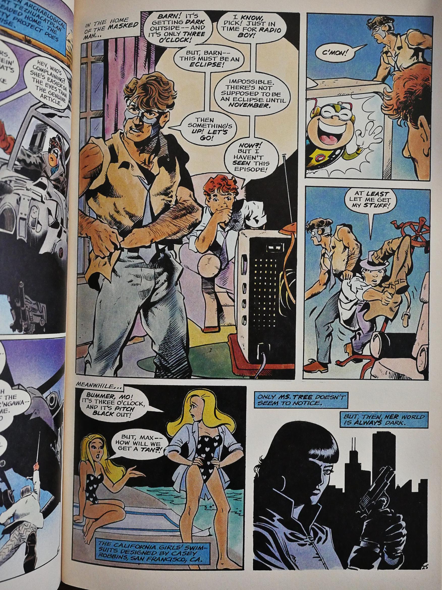
Characters that drop by without any impact whatsoever includes Trina Robbins’ California Girls, but I love that even here, we get to know who designed those outfits. And the page reminds me a bit of certain Crisis crossovers that consisted of nothing but the hero looking up at the sky in a panel in the book thinking “Hm… something’s going on…”

Perhaps this is Wolfman making a sly wink at that debacle. Or perhaps they’re just having fun.
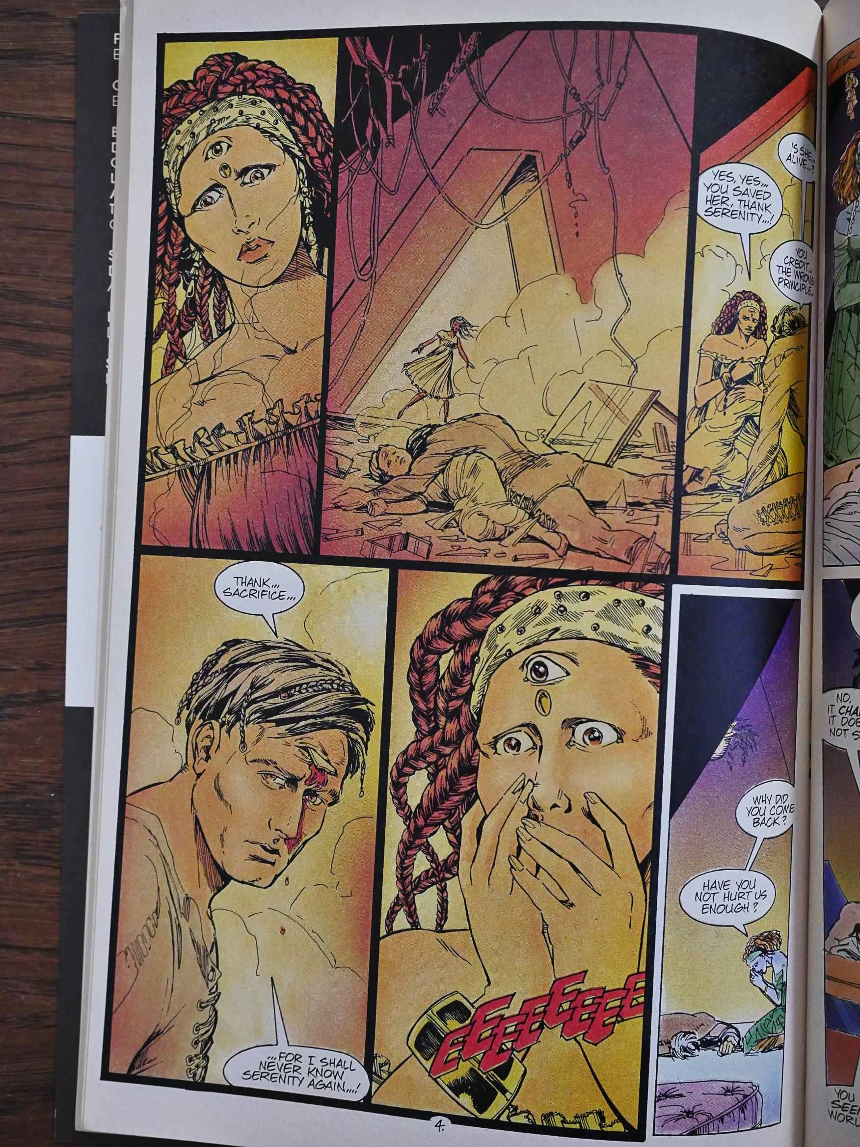
Steve Gerber drops by to write a backup feature about, er… Tachyon? Is that what he’s called? He’s with the New Wave. The artwork by Cynthia Martin is quite stylish with all those thin thin lines.
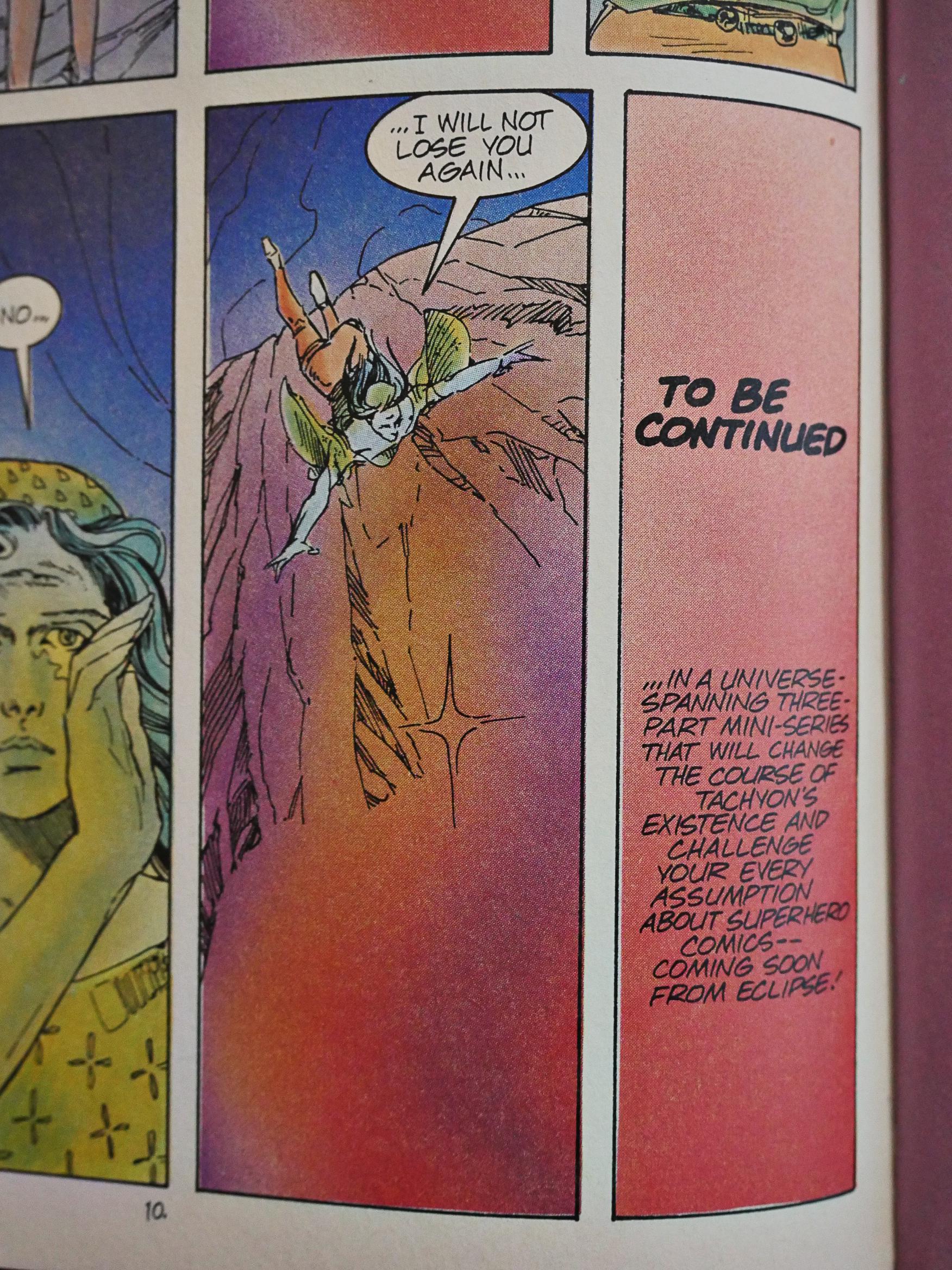
And Eclipse had plans to spin this off into its own series, and that never happened, because Eclipse stopped doing new super-hero series. Which they had to know that they were going to do by this point, but perhaps this had been completed a year earlier when Eclipse were still in that business.
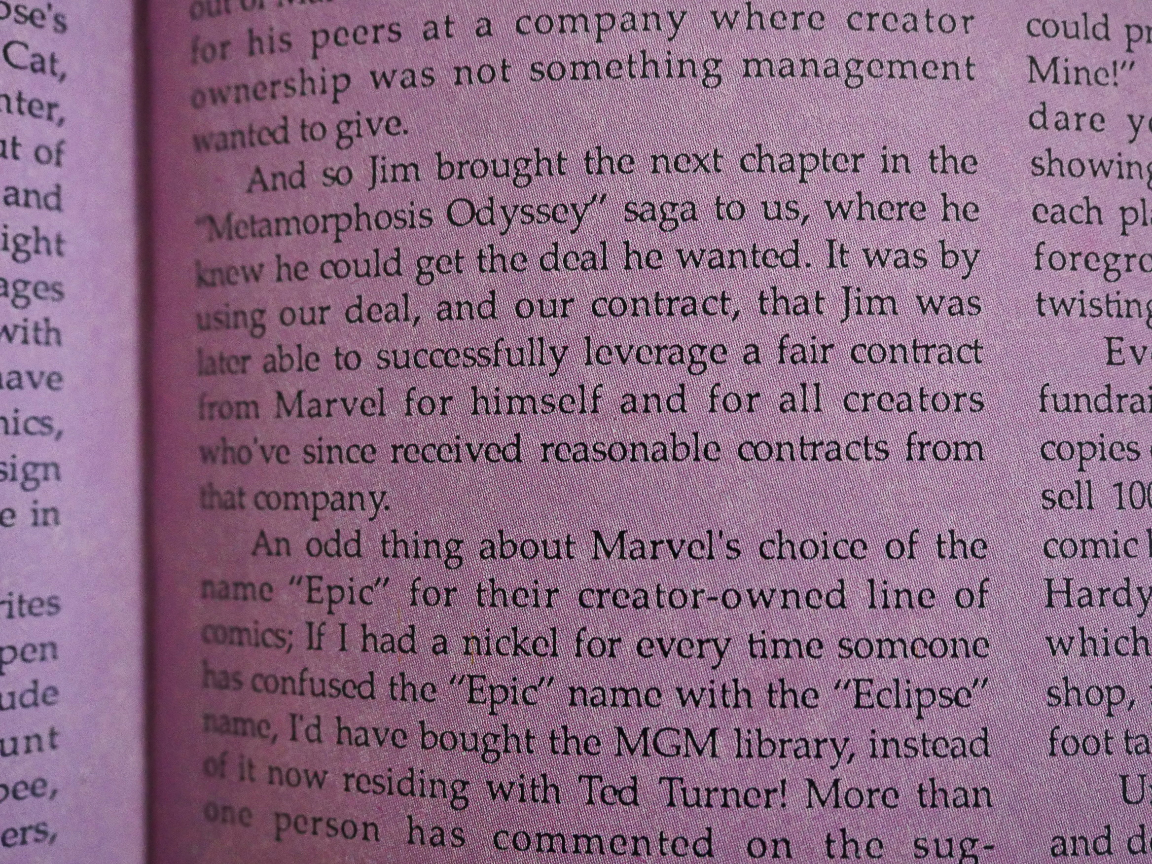
I had surmised that the artists tied to Marvel were using Eclipse as a bargaining chip, and Mullaney confirms it. And they all returned to Marvel after Marvel caved, so it was a success for the creators. Less for Eclipse, who had to find other people and projects to publish.
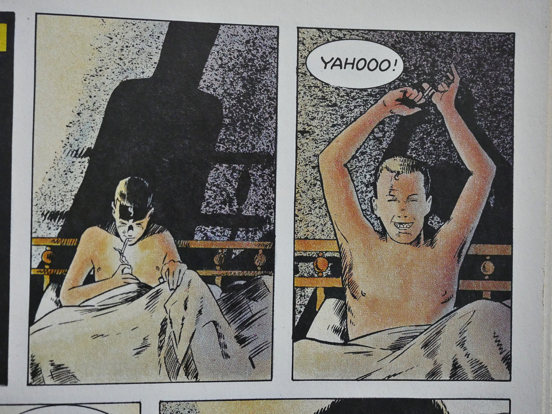
One backup feature stands out like a twelve inch nail protruding from somebody’s eye socket: Neil Gaiman and Mark Buckingham’s Miracleman strip. It’s a prologue of sorts to their run on Miracleman, and it’s brutal. The tone of Total Eclipse is rather lighthearted within all the standard super-hero mayhem, and this is something completely different.

And excellent, although it’s probably gorier than it had to be.
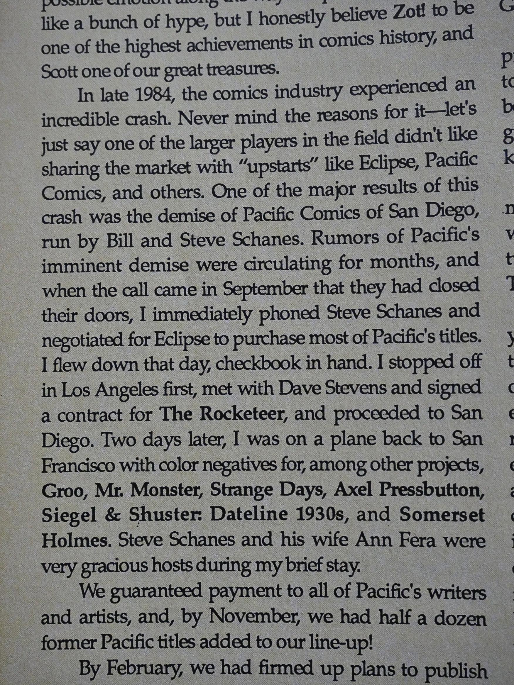
Mullaney tells the tale of when Marvel flooded the direct sales market with titles, forcing many smaller companies into bankruptcy. One of them was Pacific Comics, from whence Eclipse bought the unpublished titles. What I found interesting here was that Mullaney got the colour negatives for all the comics in the pipeline, which I hadn’t seen stated explicitly anywhere before. But that explains how Eclipse were able to publish so many new titles over a few months.
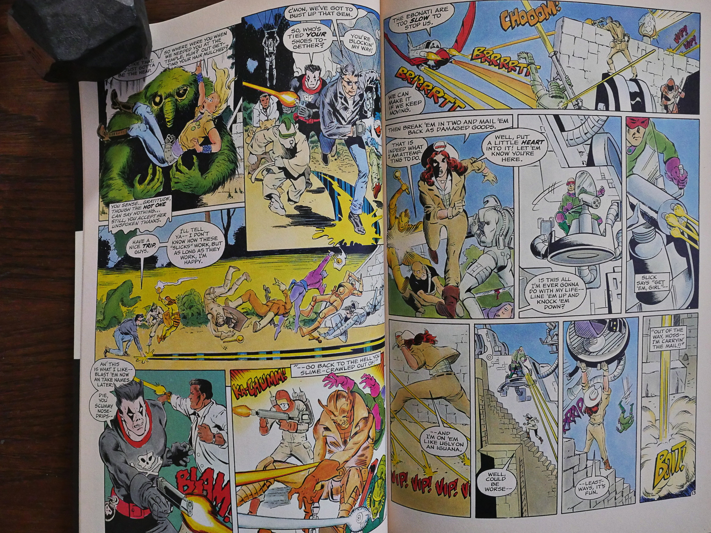
Uhm… Should I write more about the plot? No? Trust me, you don’t want to know. But if you like pages and pages and pages of fighting like this, you can do worse, I guess.

I don’t really, so I found the thing rather dull.
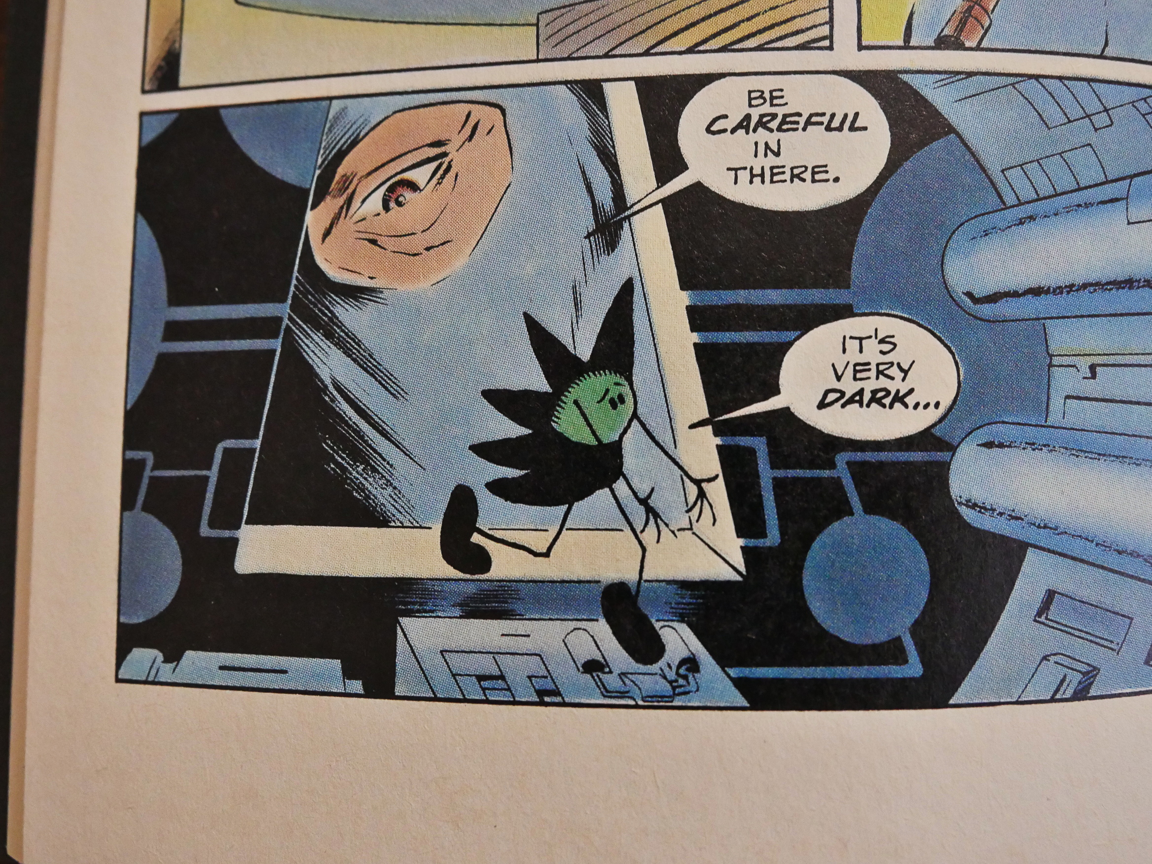
But I liked having Beanish in here.

The ending is quite nice. Basically, everything returns to the status quo, except that they kill off one character. (Who nobody liked in the first place.) But it ends on a pretty up tone, fitting the rest of the book.
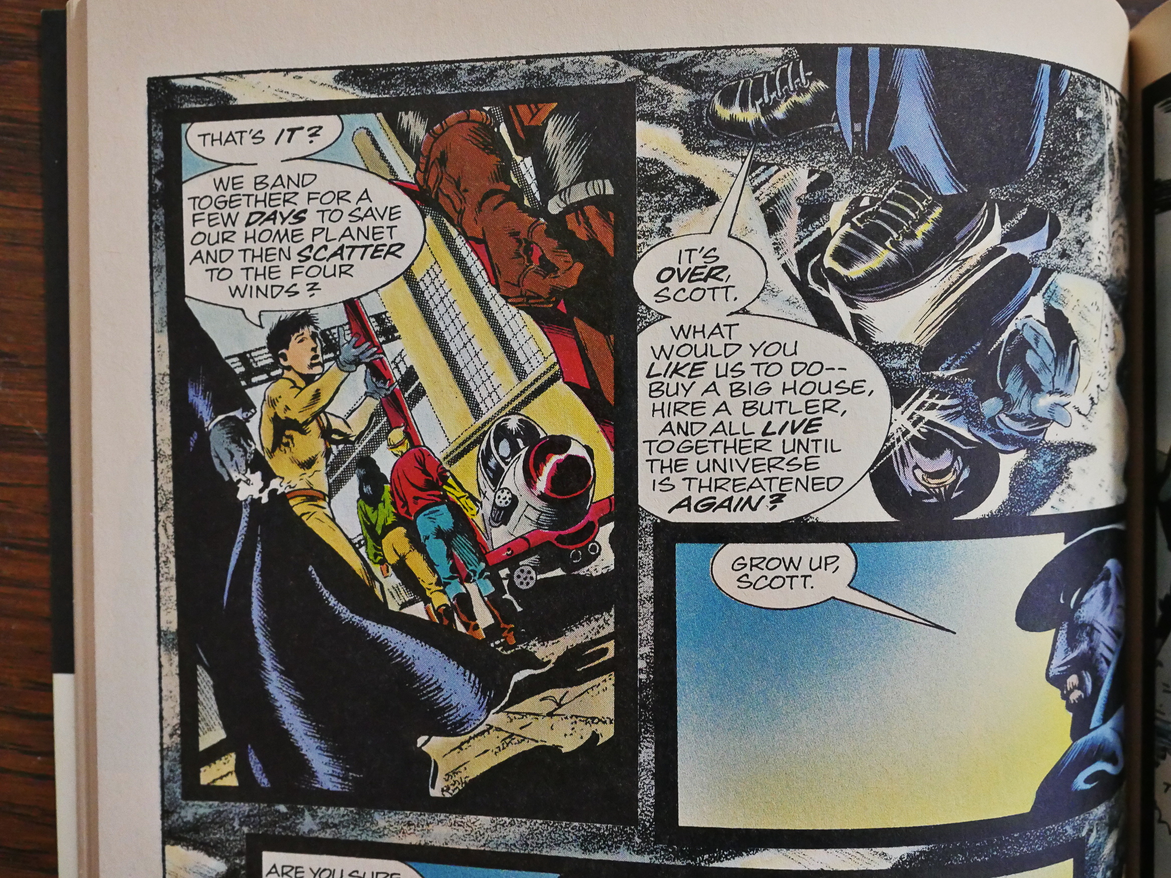
And then we get the final backup story, written by Chuck Dixon and with excellent artwork by Stan Woch, and it’s a bit of a downer. It’s a strange editorial choice.
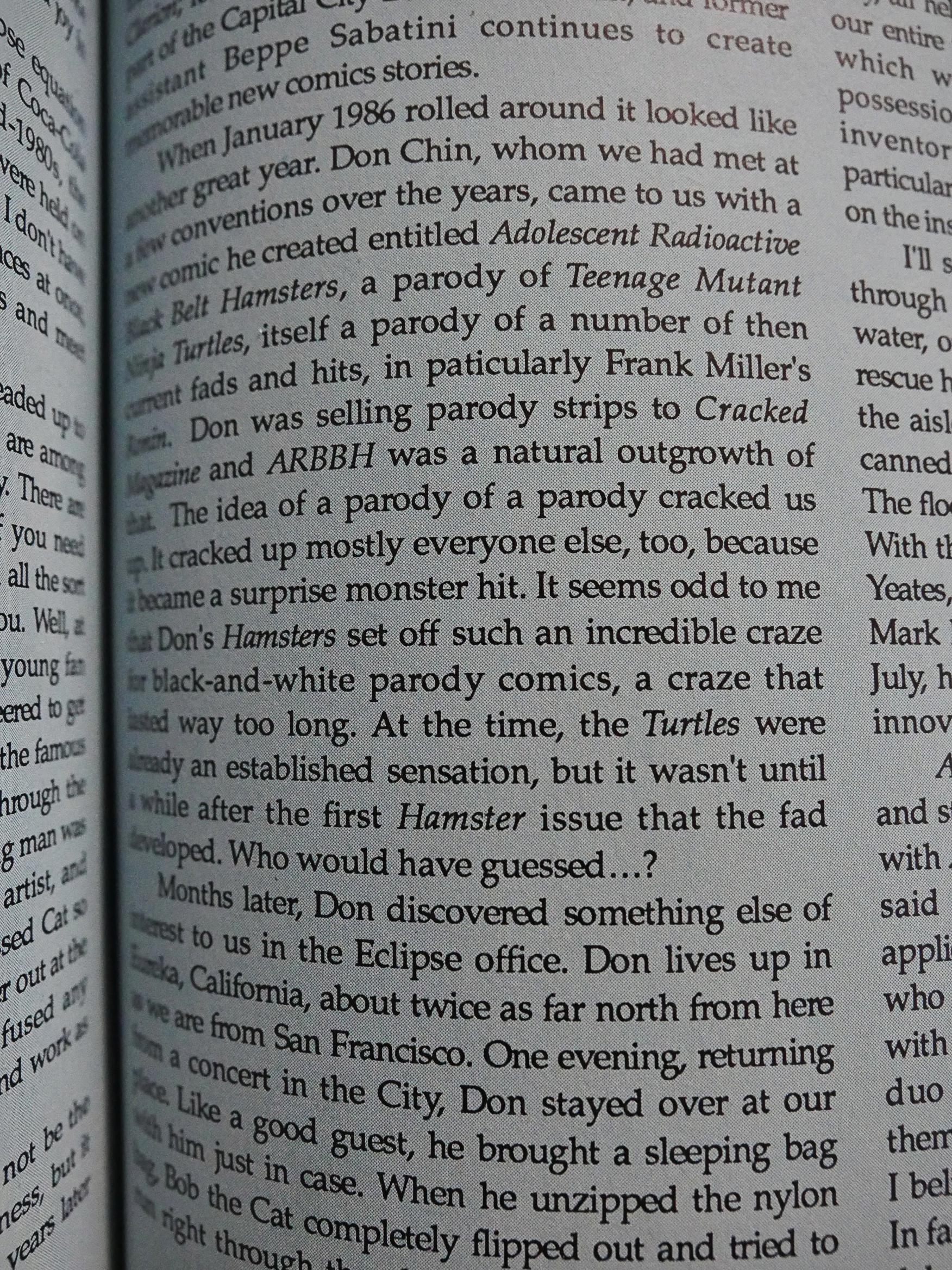
In the final issue’s story of Eclipse Comics, Mullaney pretty much own up to having started the black and white boom, but doesn’t mention that it also almost broke the American indie comics business, although “a craze that lasted way too long” might be read as a semi mea culpa, I guess.

So there you have it: Eclipse bet hard on this series, with nice covers by Bill Sienkiewicz and all (I especially like the one with the Beanworld character all over it), but it was a bet that didn’t pay off, apparently.

I tried googling a bit to see what other people thought of it:

So, the basic thing of it is that the villain became a hero, and neither of the remaining villains was brought to justice or even captured. Add to that the madness of it all (Eclipse’s publishing at this point consisted of a couple dozen different realities, including the revived characters from Hillman Publications.) and the fact that Eclipse’s publications didn’t last much longer after this crossover, and you’ve a recipe for 80’s comic boom madness. I pride myself on having collections of Miracleman, The Liberty Project, Aztec Ace and several others (and I’m working on a run of Destroyer Duck, which are harder to come by than hen’s teeth these days) and even *I* don’t have a clear understanding of what this is all about.

Hm… Oh, here’s Wolfman talking about it:

When I took on Total Eclipse, which was Eclipse’s attempt at shoving their universe together, I did it as a favor. I didn’t know or care about the Eclipse universe (aside from selected books which I really did like) and I didn’t have a specific story to tell as I had with Crisis. But I was asked by people I couldn’t say no to, and I did the job. The book was, as is the cliché, a job of work.

I was asked to take Kurt’s Elcipse series and somehow incorporate it into my larger story. I did my best, but my heart wasn’t in it for any number of reasons. Total Eclipse came out, sold two copies, and vanished. I tried to do as good a job as I could, and for all I know the two people who bought it loved it, but I’m sure I did no justice to Kurt’s or anyone else’s creations.

Well, that explains a lot.

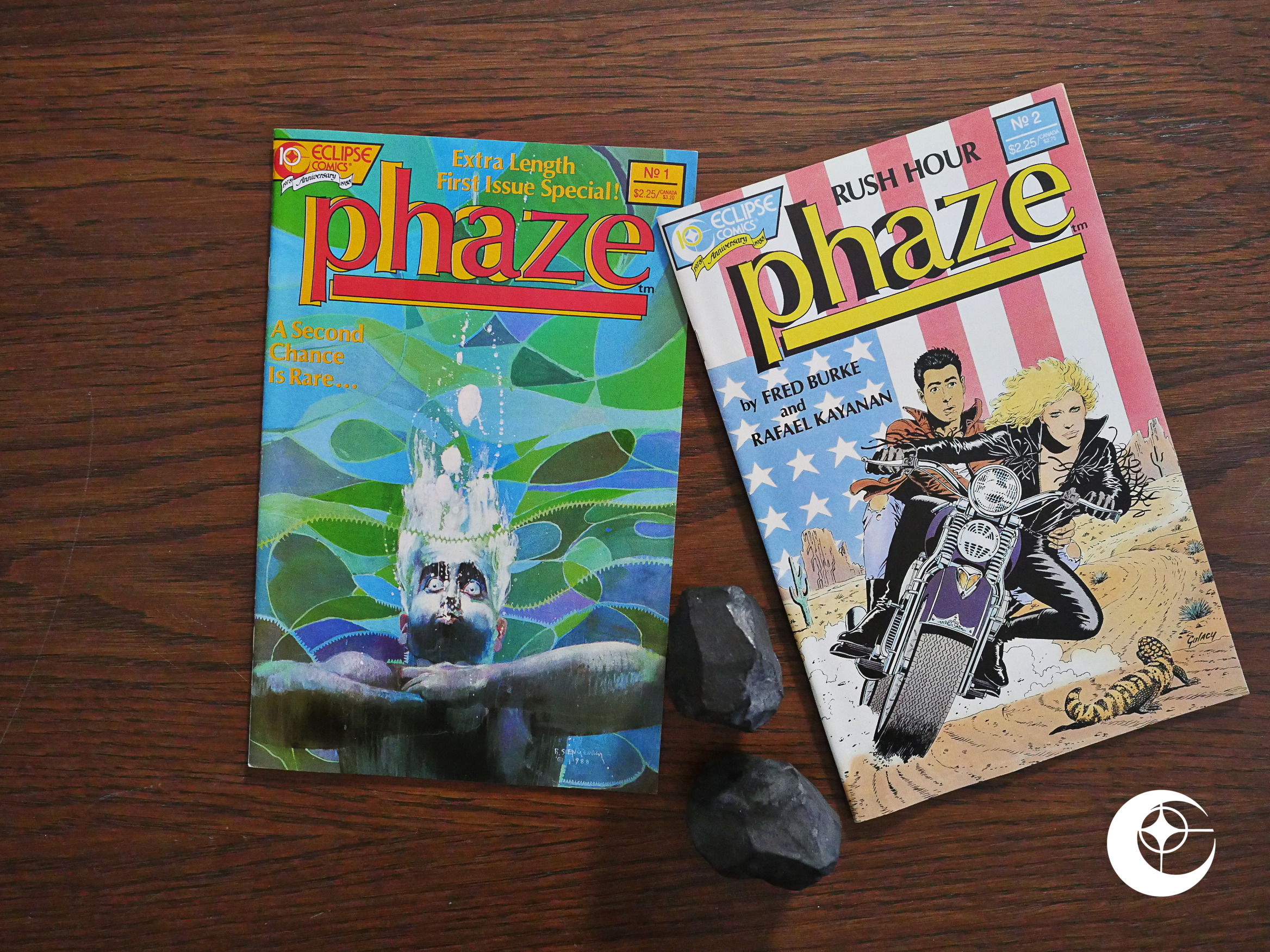
1988: Phaze

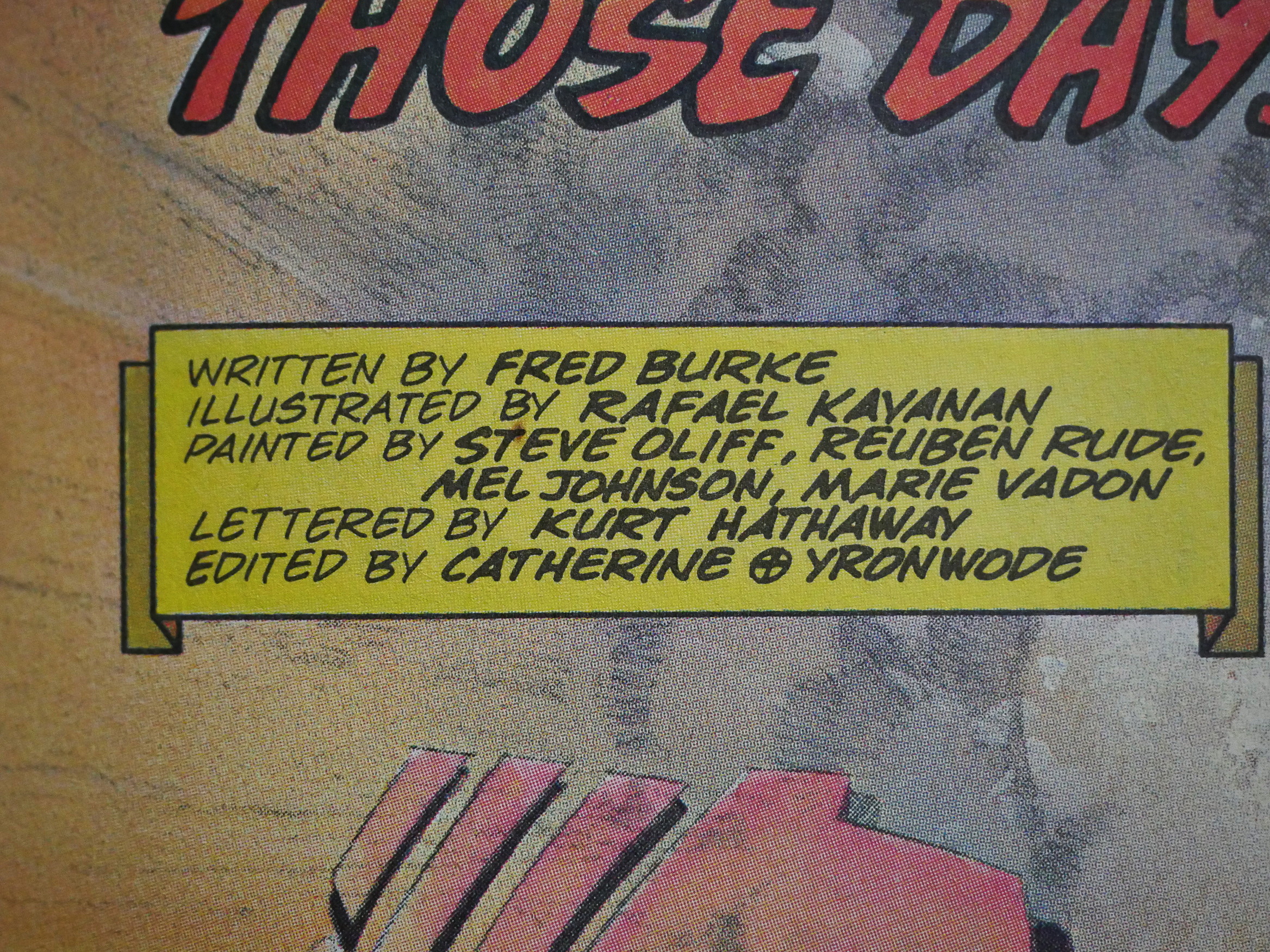
Phaze (1988) #1-2 by Fred Burke, Rafael Kayanan et al.

Eclipse must have had high hopes for this series. There were in-house ads for it for seemingly years before it debuted, and Eclipse got two very high-profile artists to do the covers: Bill Sienkiewicz for the first issue, and Paul Gulacy for the second.

But perhaps that has something to do with the writer, Fred Burke, being an editor at Eclipse.

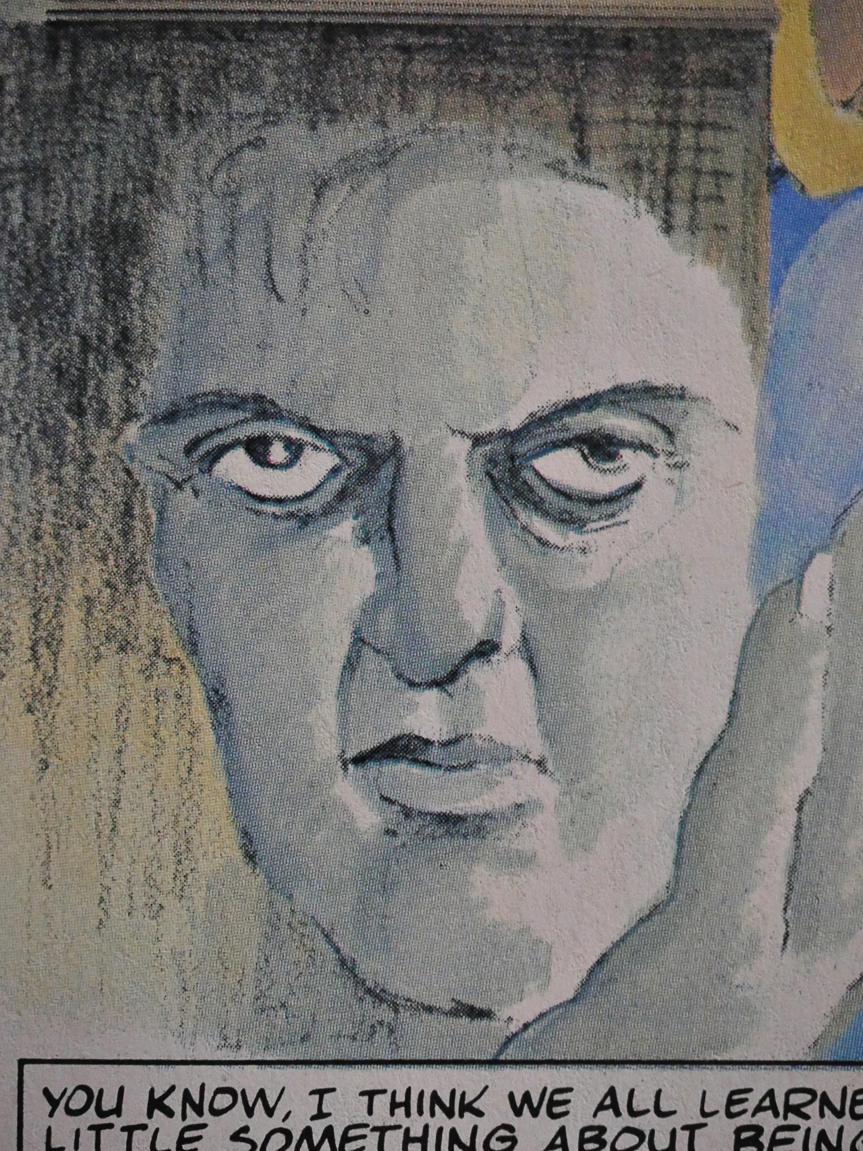
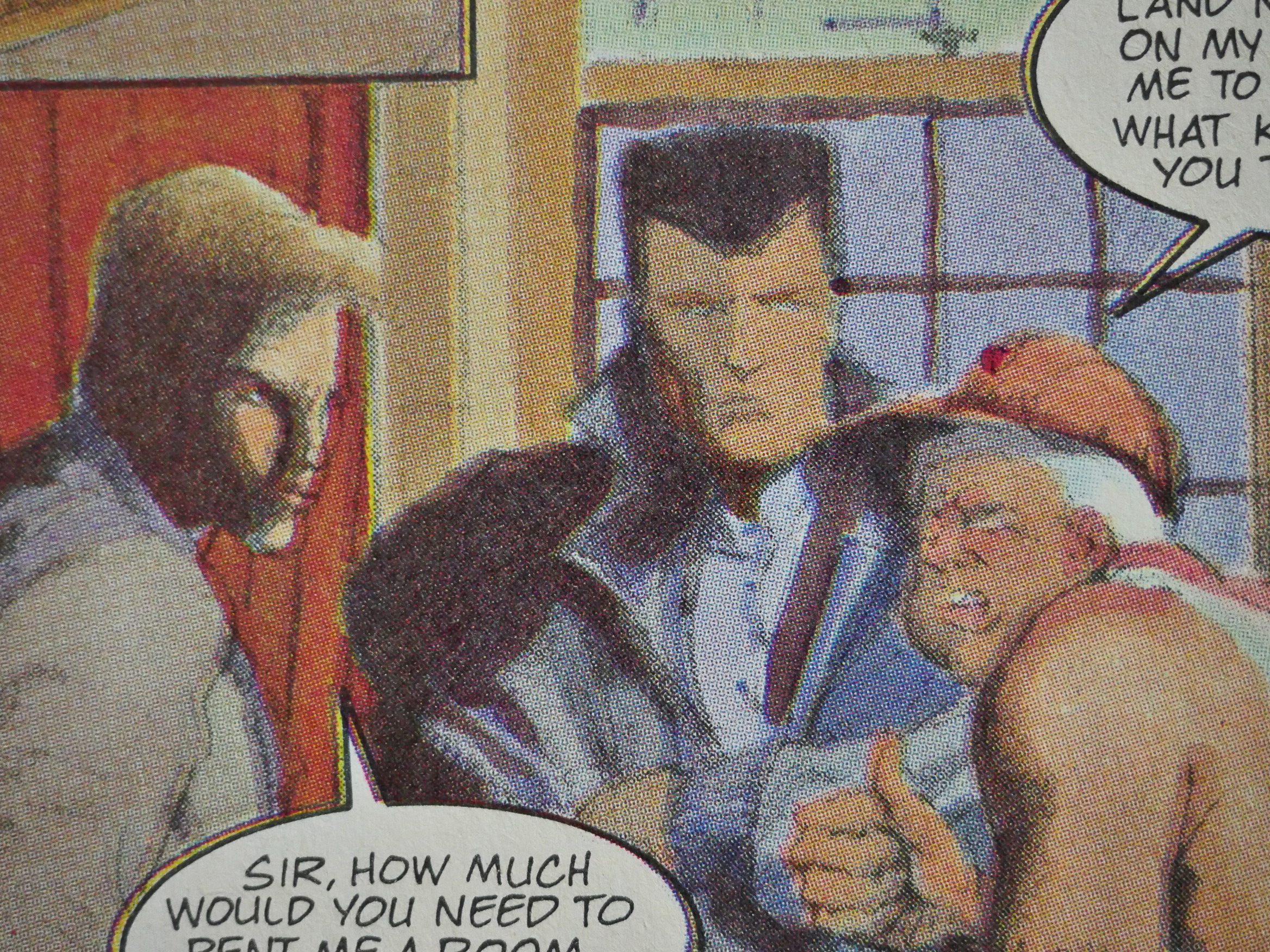
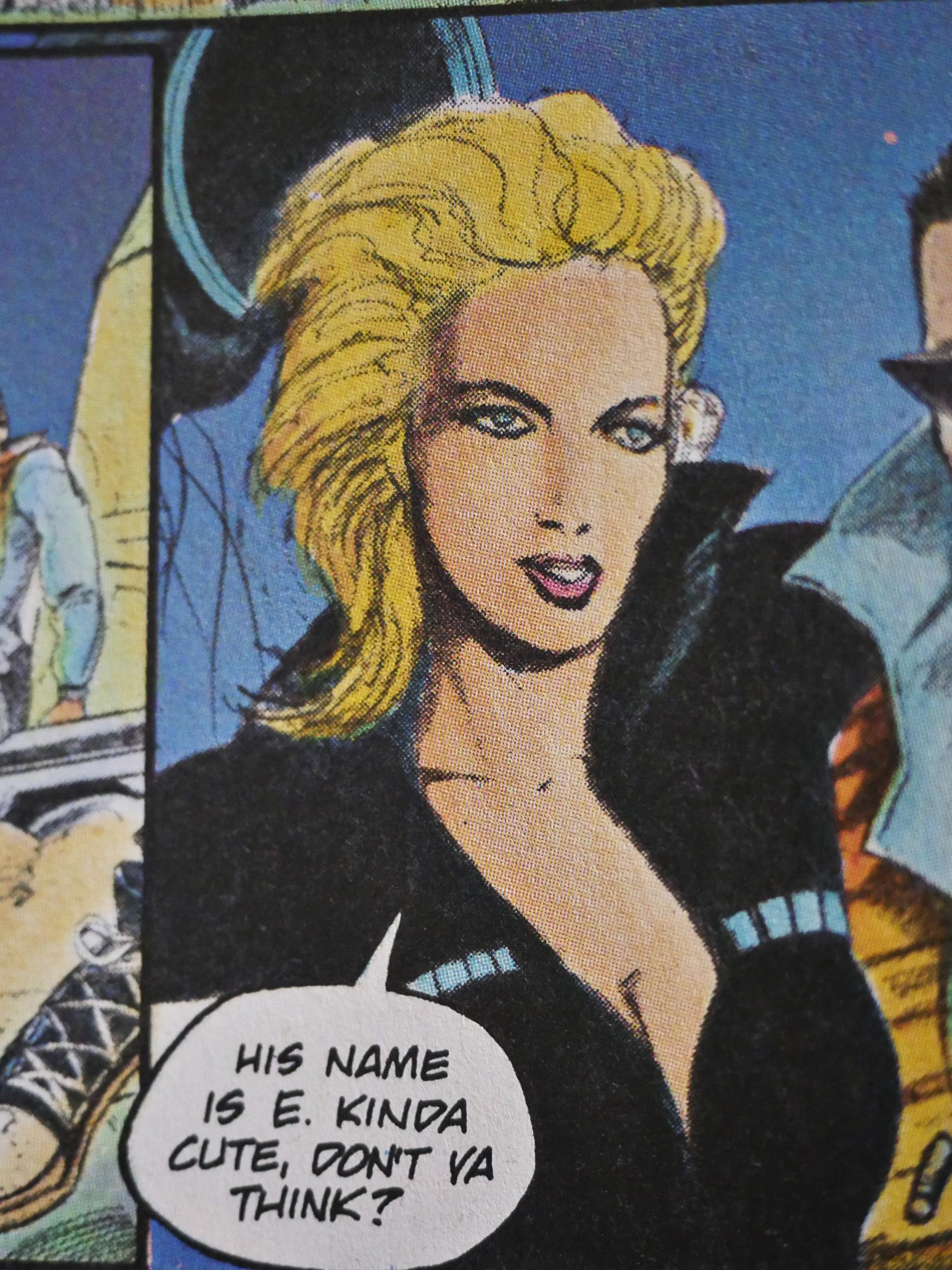
The interior artwork is by Rafael Kayanan, and it’s downright bizarre. Basically no faces look the same twice, and people transmogrify into monsters at the drop of a hat.

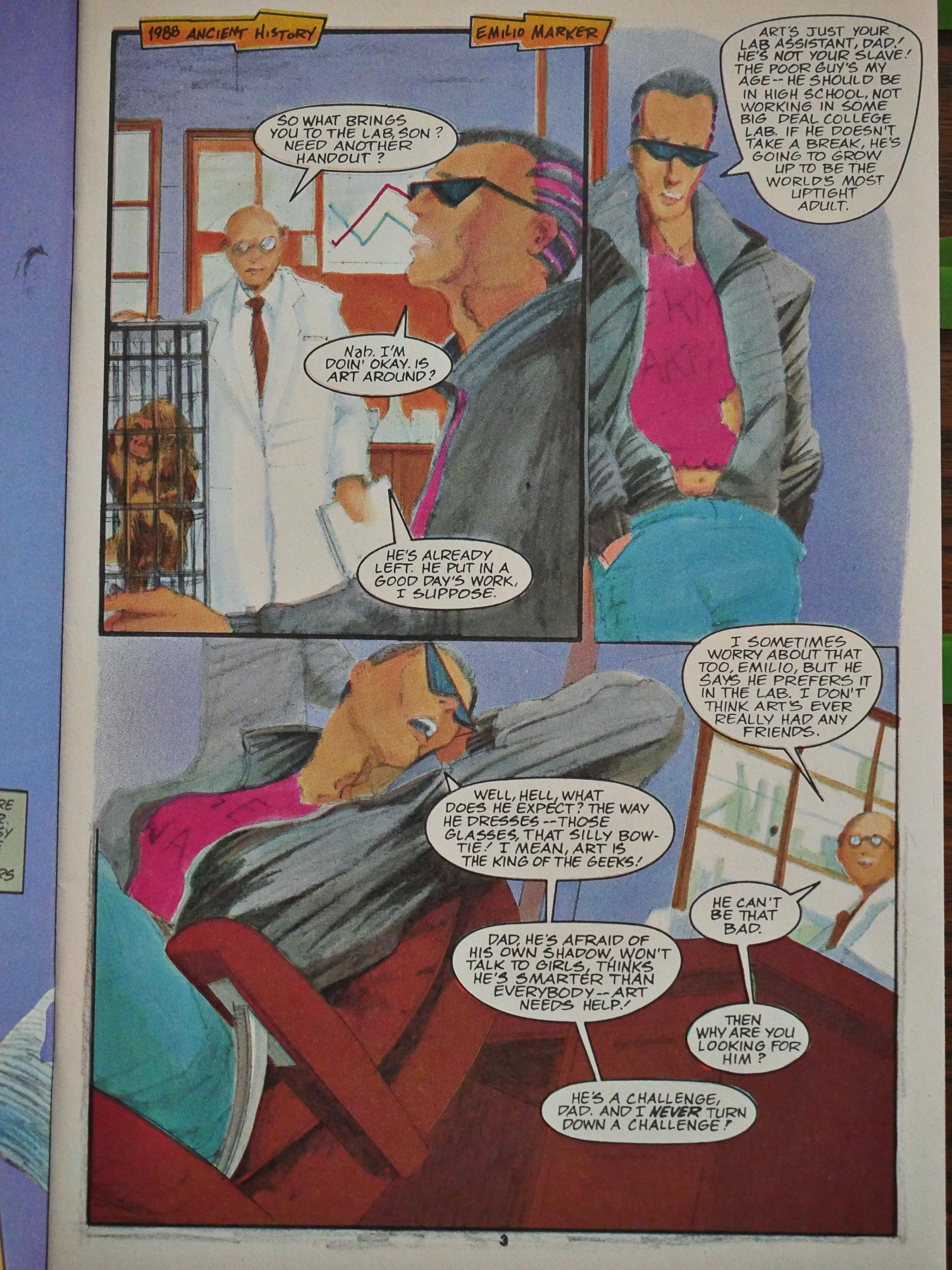
The layouts of the first issue are wild a wacky, without any rhyme or reason. I mean, if that’s as dramatic you’re going to get while entering a room and sitting down, where do you take it from here?

(Cool glasses, dude.)

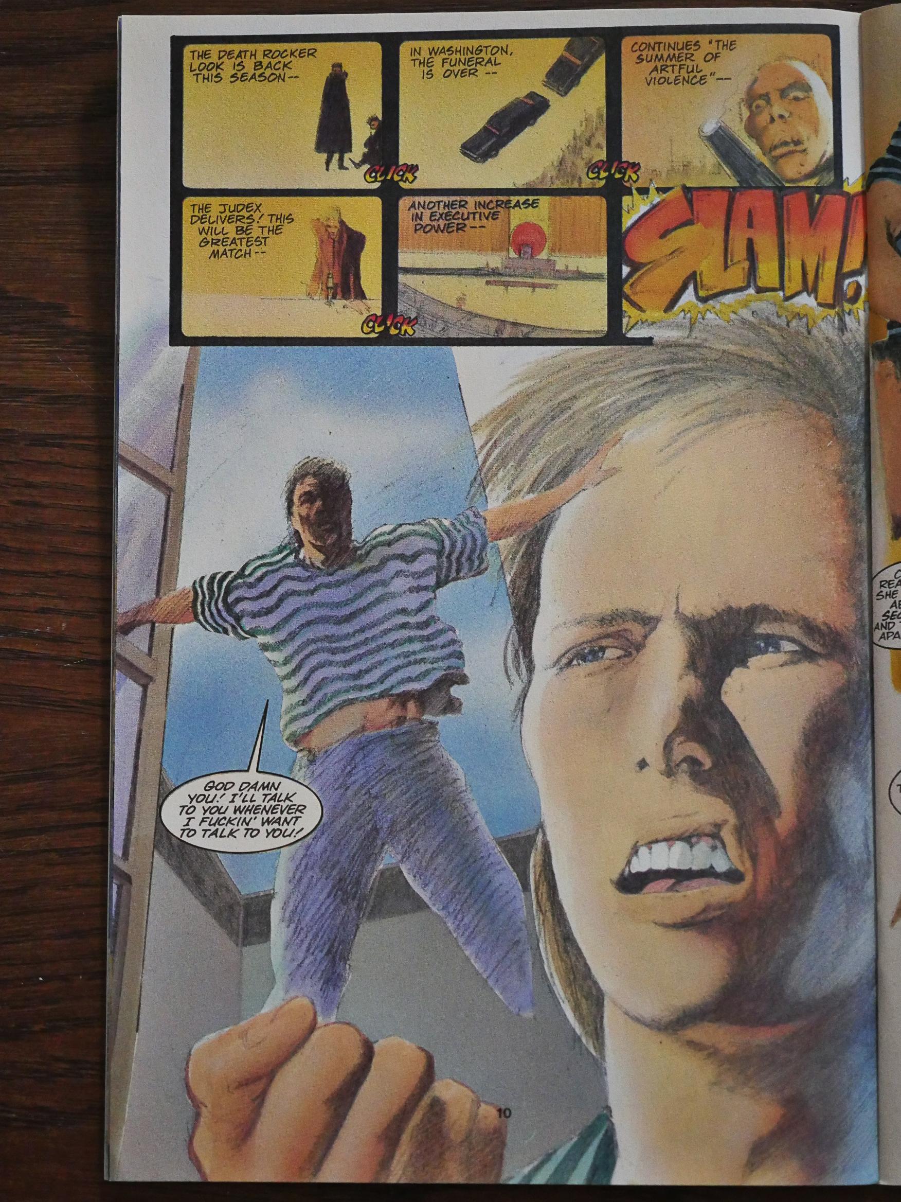
Oh, right, you take it here.

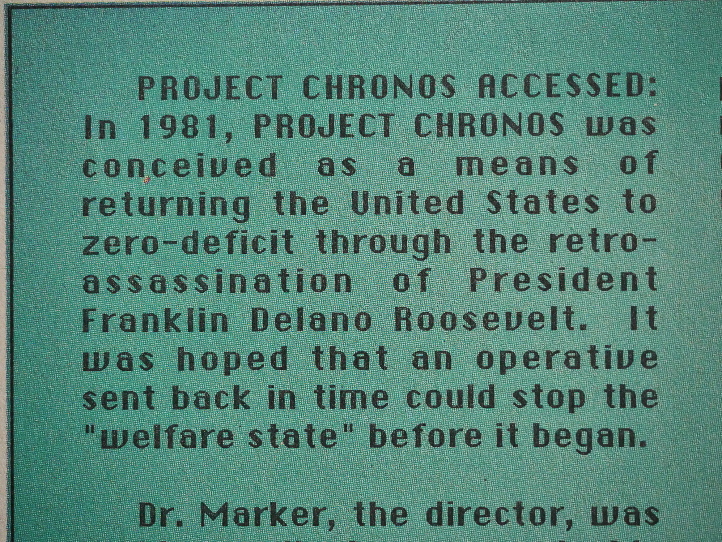
This is a time travel story, and Burke gets the time-travel storytelling bits just right, I think: He uses all the modern oblique strategies for letting us know all that he wants us to know, and making us participate in the story by not spelling everything out. A little effort makes the reader involved. The danger is that if you don’t convince the reader that the effort is worth it (i.e., that this is going somewhere interesting), it’s a total failure.

This isn’t. I really wanted to know how this all would resolve, wonky panels and all.

Wow! So, this is “illustrated” by Rafael Kayanan, but there are four colourists listed as “painters”. With an art style like this, I just assumed that Kayanan had done it as mixed media, because on some pages there’s very little that looks like a pencil line; it’s all colours. But perhaps that explains all the faces that change shape: Kayanan put in some vague pencil lines (uninked), and the colourists just did whatever they wanted.

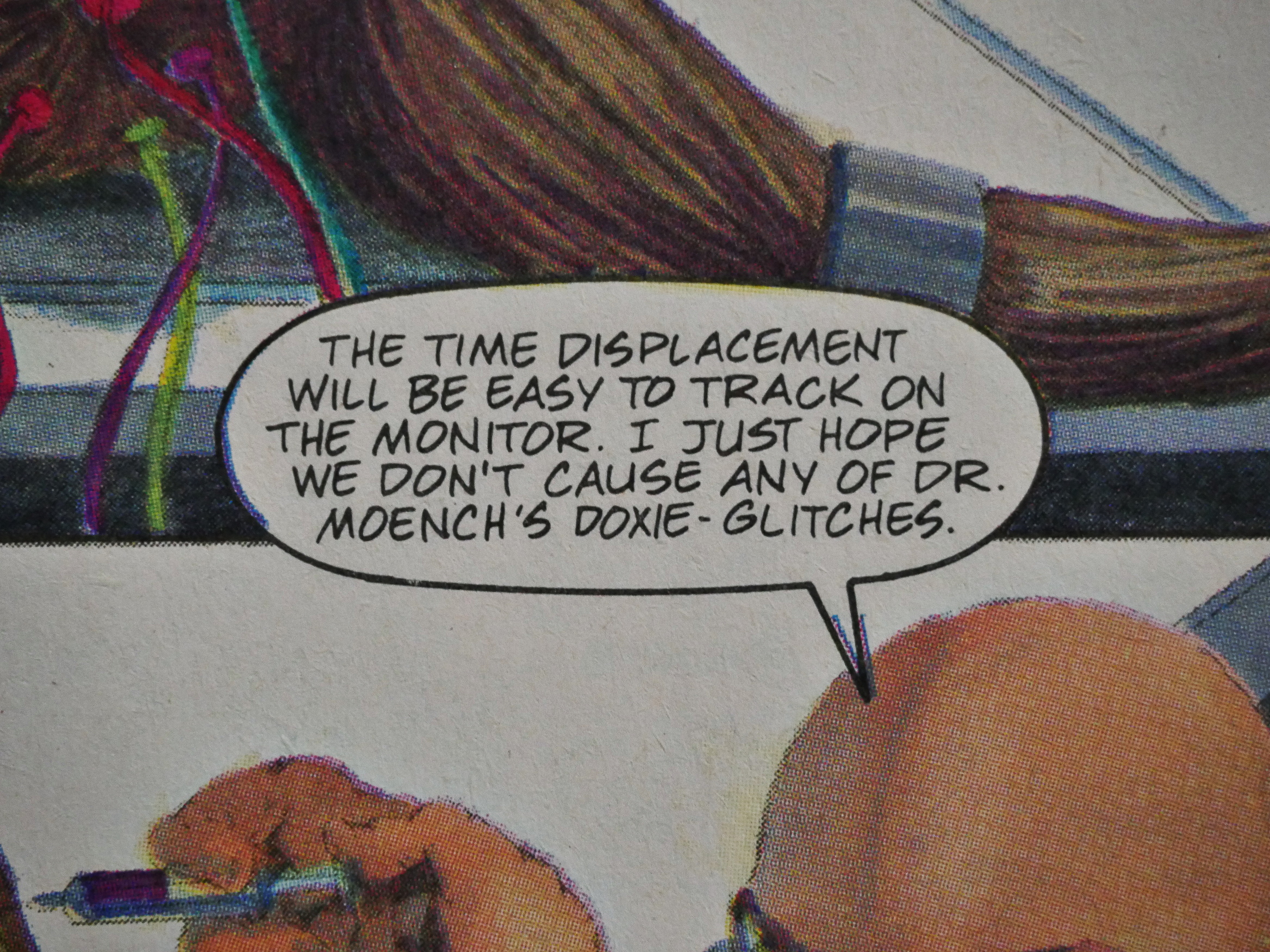
Heh heh. The Doxie-Glitches are from Doug Moench’s Aztec Ace.

I’m wondering how much of the first issue is supposed to look like this, and how much is because the printer fucked up. It doesn’t look out of register, exactly, but that’s… not… right…

Heh heh. Best evil plan ever!

The second issue looks much, much, much better, so perhaps many of the problems with the artwork were printer’s faults. Faces are still very wonky, though.

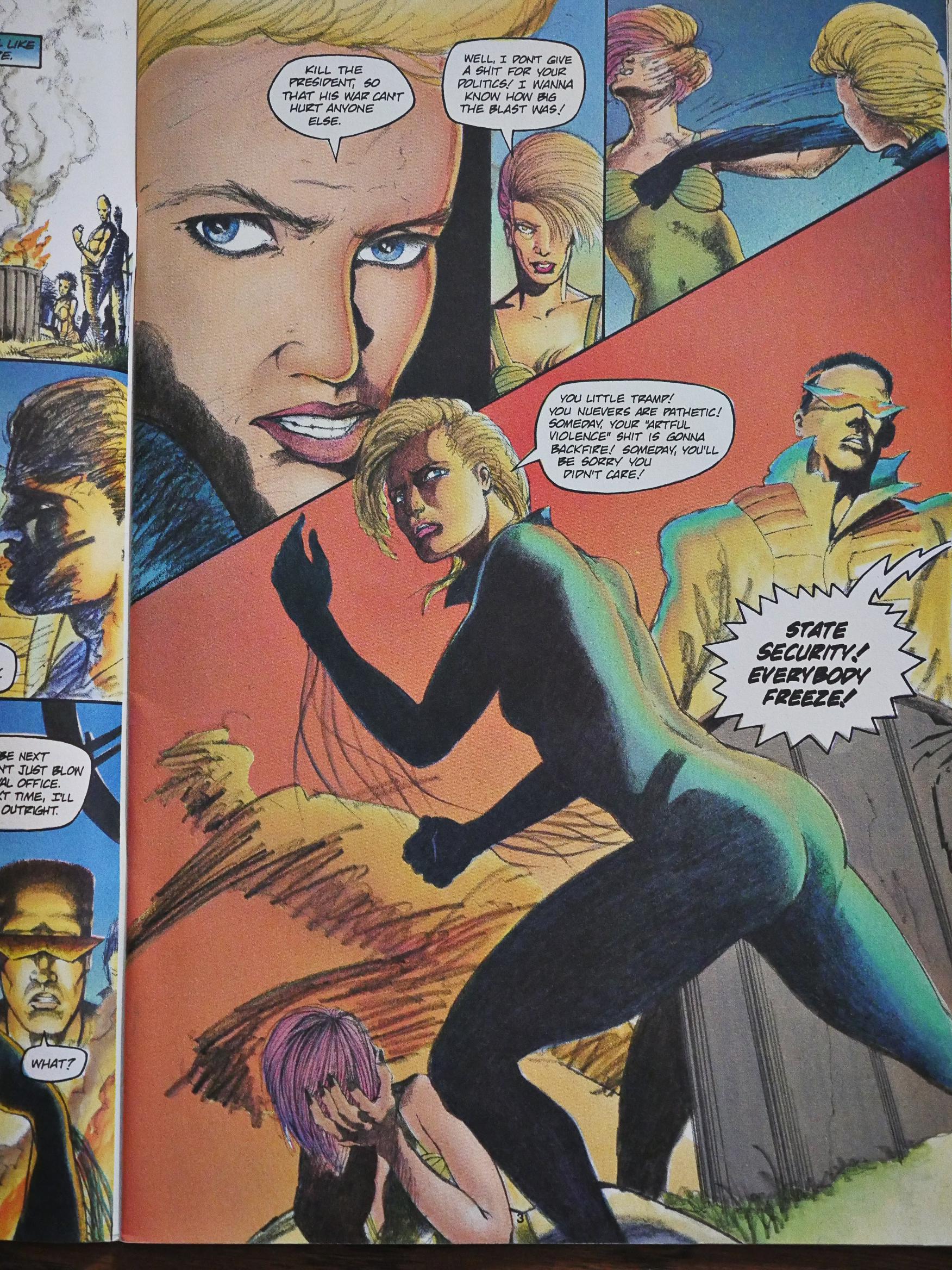
The pencil work is sketchier in this issue, but the figures are stronger, and the layouts make more sense. And that’s not a gratuitous pose at all.

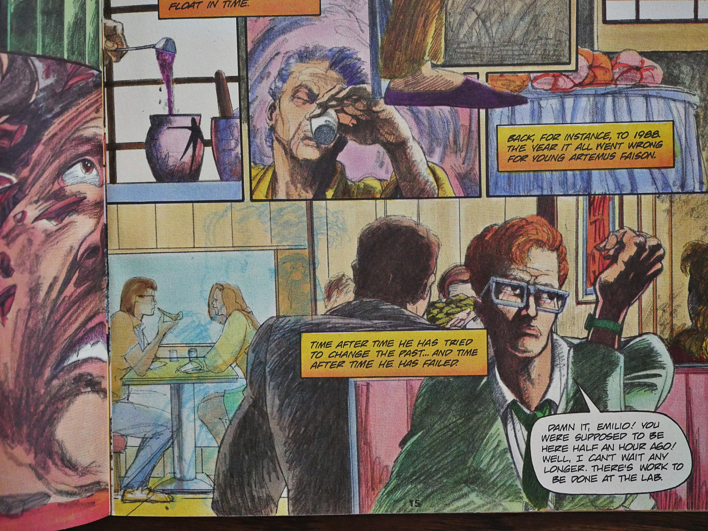
That’s not a printing glitch, I think? The doctor takes his time-travel drug, and then you see a very faint blue version of him descending into the panel below (where he’s young and red-headed). It’s nice.

Of course, it might still be a printing error.

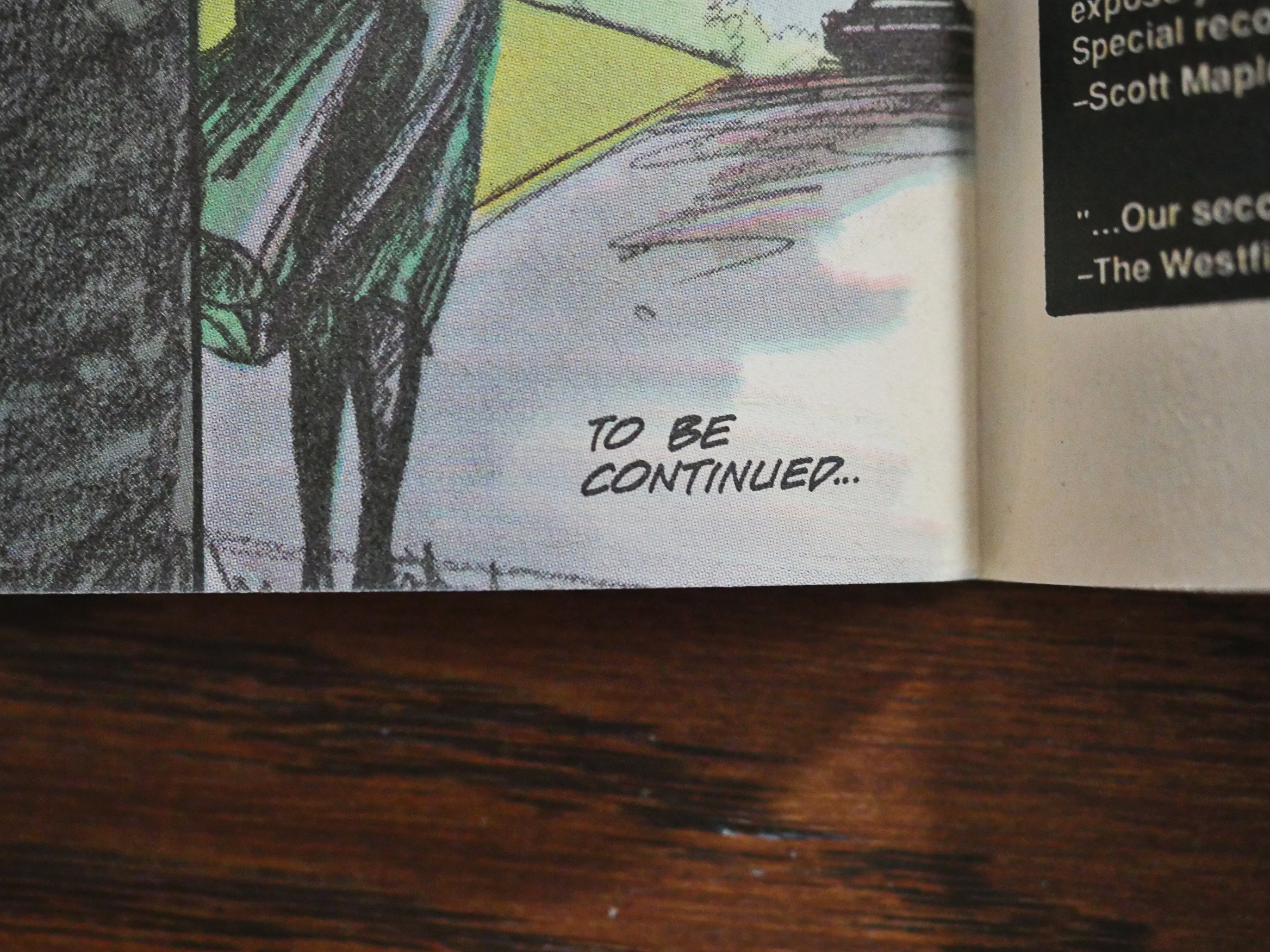
And so it ends with the traditional “to be continued”.

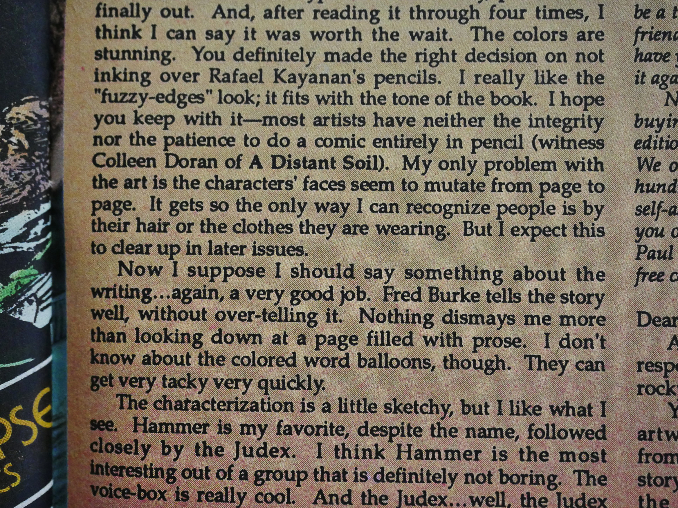
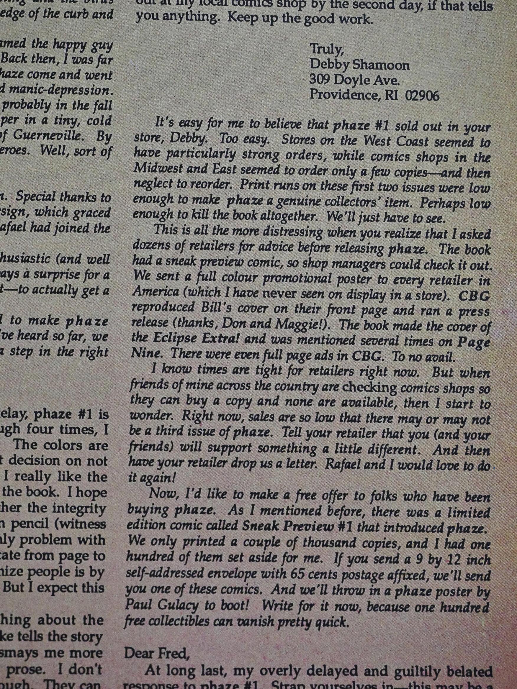
I’m not the only one who found the mutating faces slightly confusing.

Burke explains that, indeed, Eclipse promoted the hell out of this book, but it still had shitty sales, and he didn’t know whether it would continue.

Rafael Kayanan is now a superstar illustrator who draws in a completely different, super-detailed style.

Phaze has never been finished or reprinted.

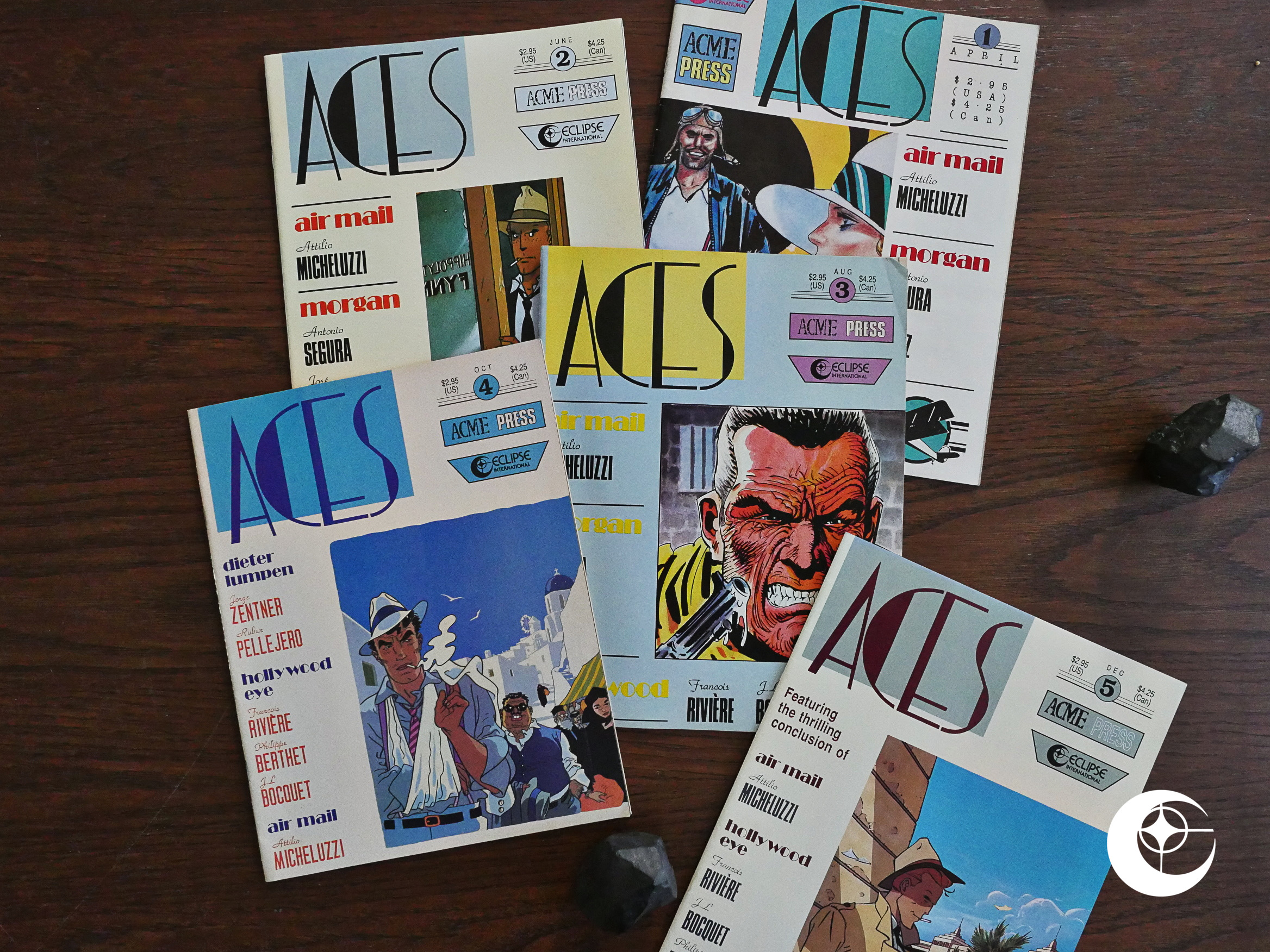
1988: Aces

Aces (1988) #1-5 edited by Cefn Ridout.

This is a slightly weird one: It’s a British anthology (assembled by Acme Press) of European (Italian, French, Spanish) hard-boiled comics for the US market. I’m sure this makes sense one some level or another.

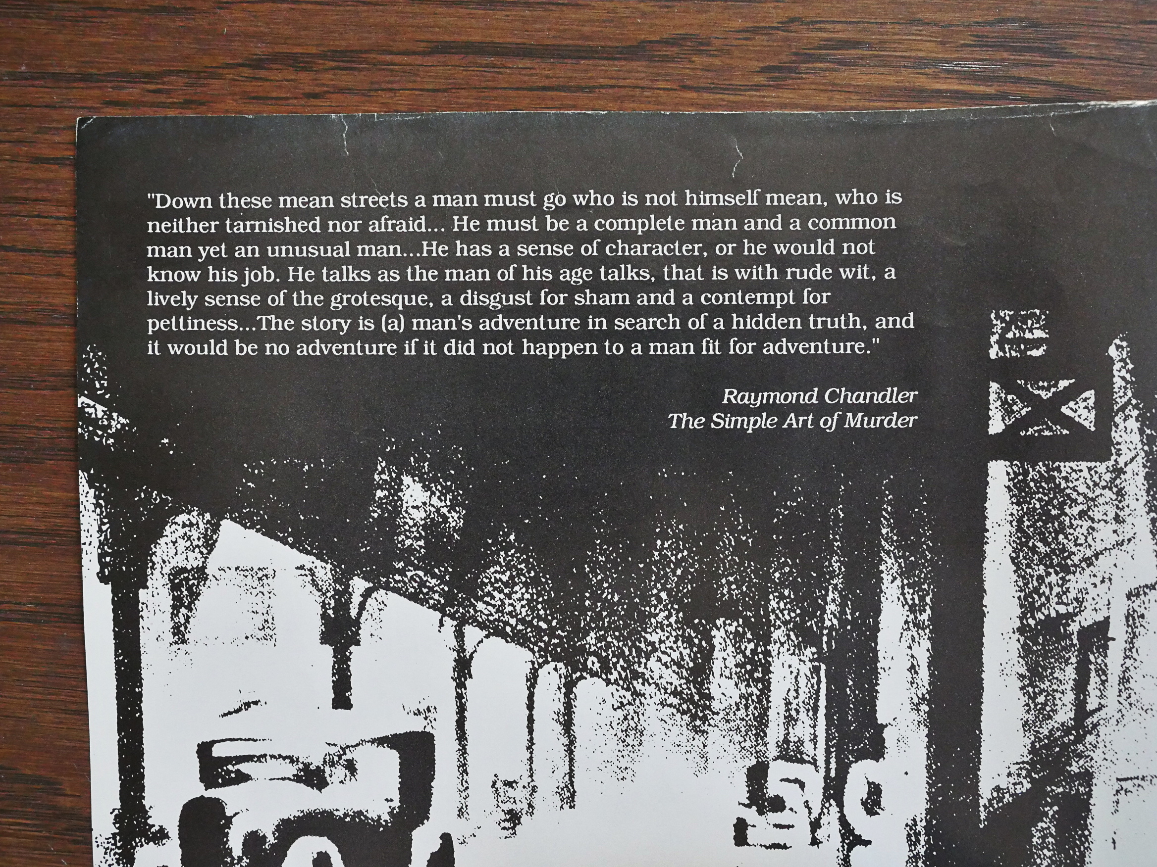
It’s an anthology with an extremely clear identity, and the inside first cover sets the tone: All the strips featured take place around the 40s, give or take a decade, and all feature a somewhat hard-boiled protagonist living in a noirish world. And they’re all newer (i.e., made in the 80s) comics. Most anthologies have problems getting a consistent tone or feeling; if anything this could have had the opposite problem.

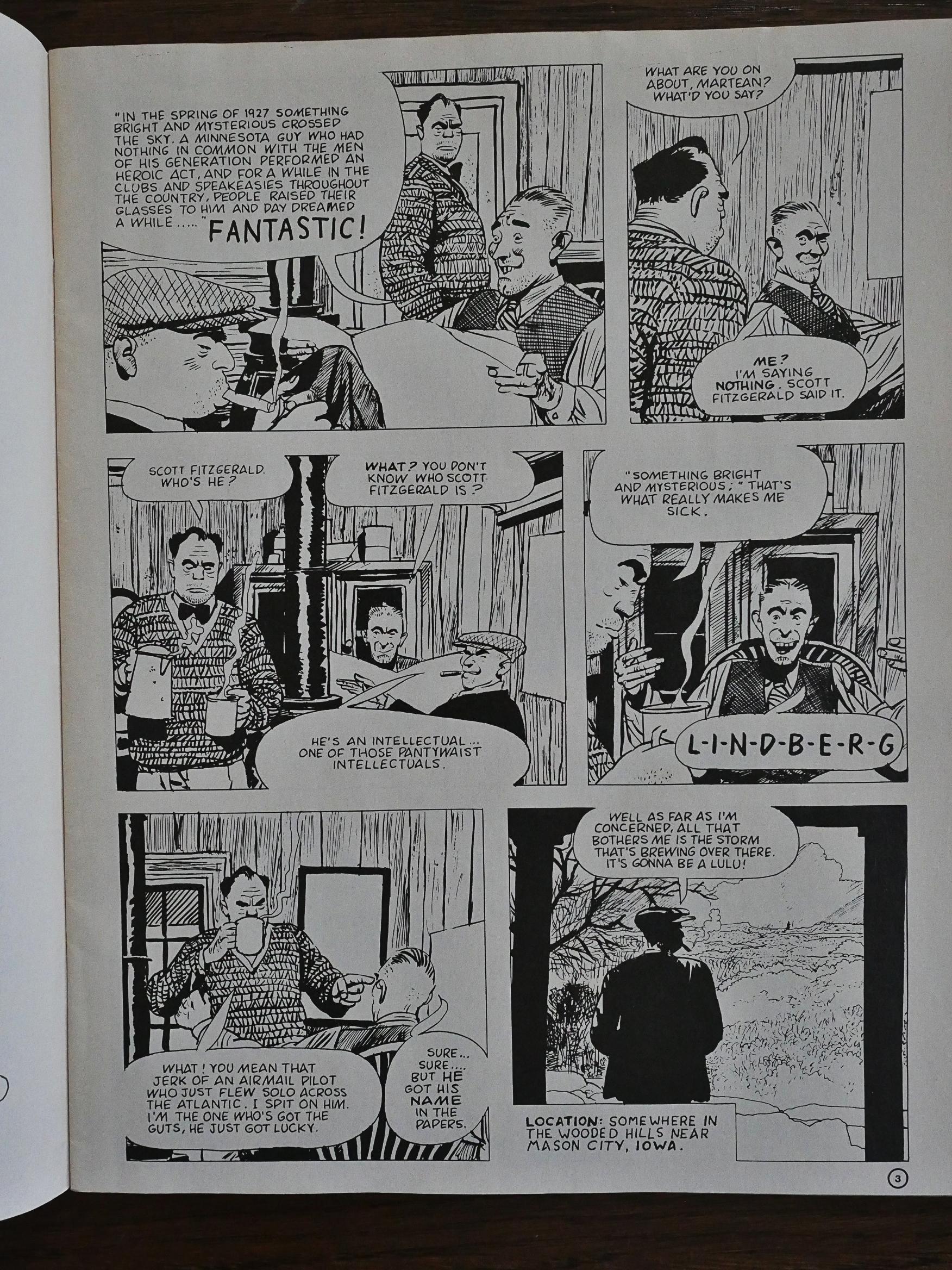
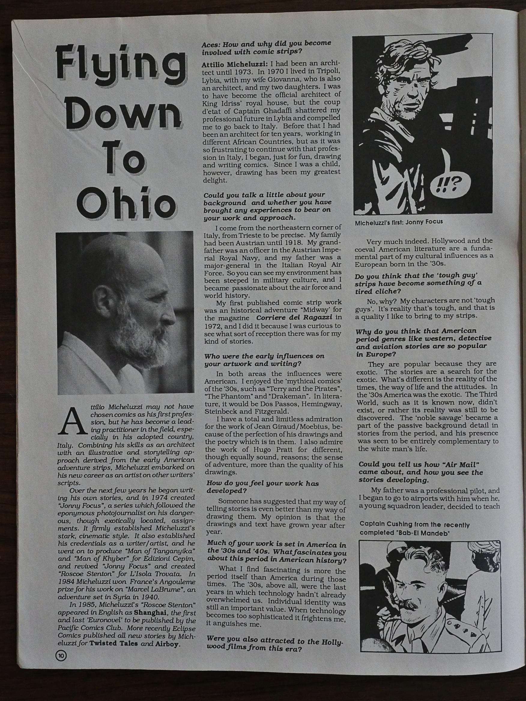
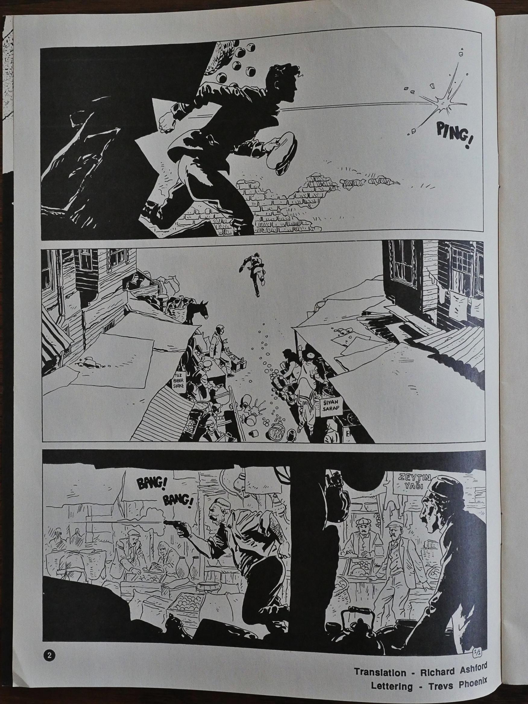
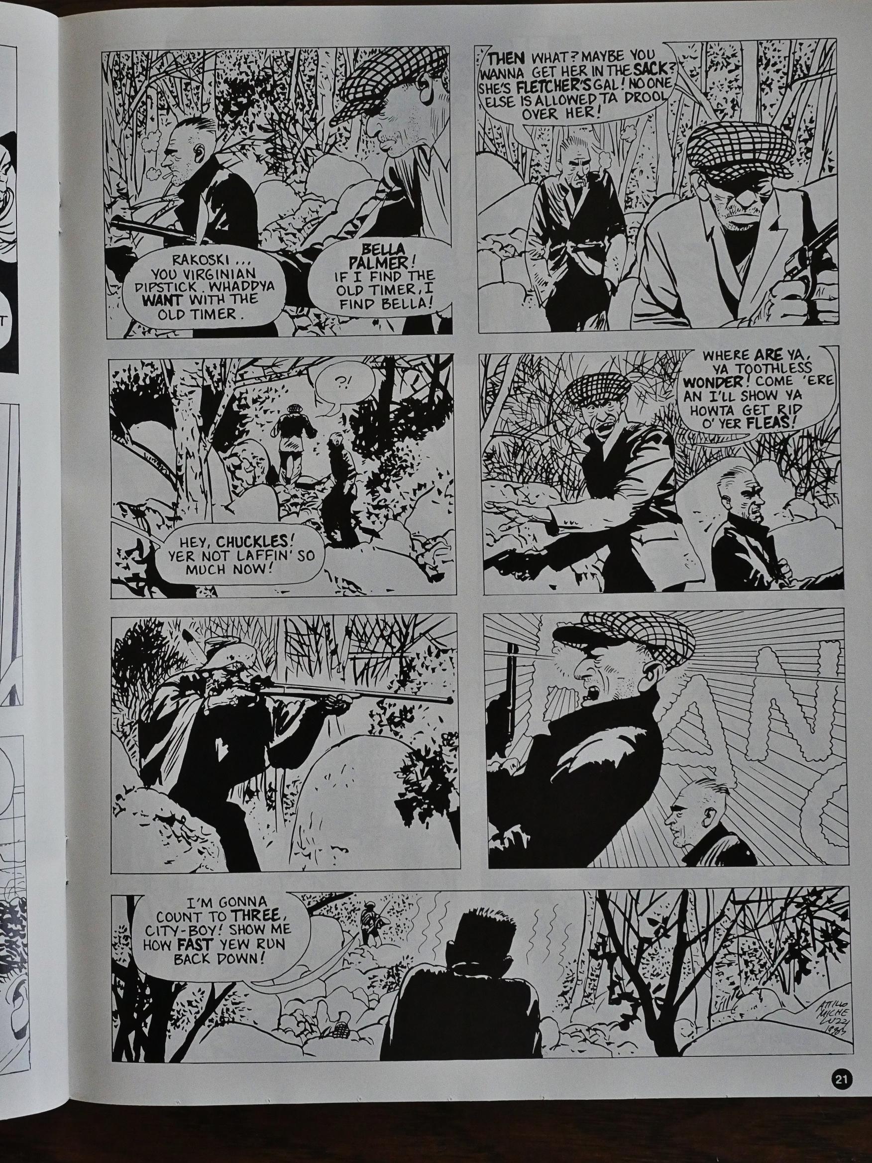
But it doesn’t, because Ridout has chosen well. The thing I was most excited to read was the Air Mail story by Attilio Micheluzzi. He’d been popping up as an artist in Eclipse’s various horror anthologies, and I just absolutely adore his artwork, and I was very interested in seeing how he’s as a writer.

And he’s something else. The plot is simple, but still oblique, as we follow two groups of people whose connection to each other is unclear at the beginning. And that above there is the first page and our introduction to the villains. It’s not straightforward, but still naturalistic. And I still adore the his artwork.

In almost every issue we get an interview with one of the featured artists, and these are new interview done by the Acme Press people.

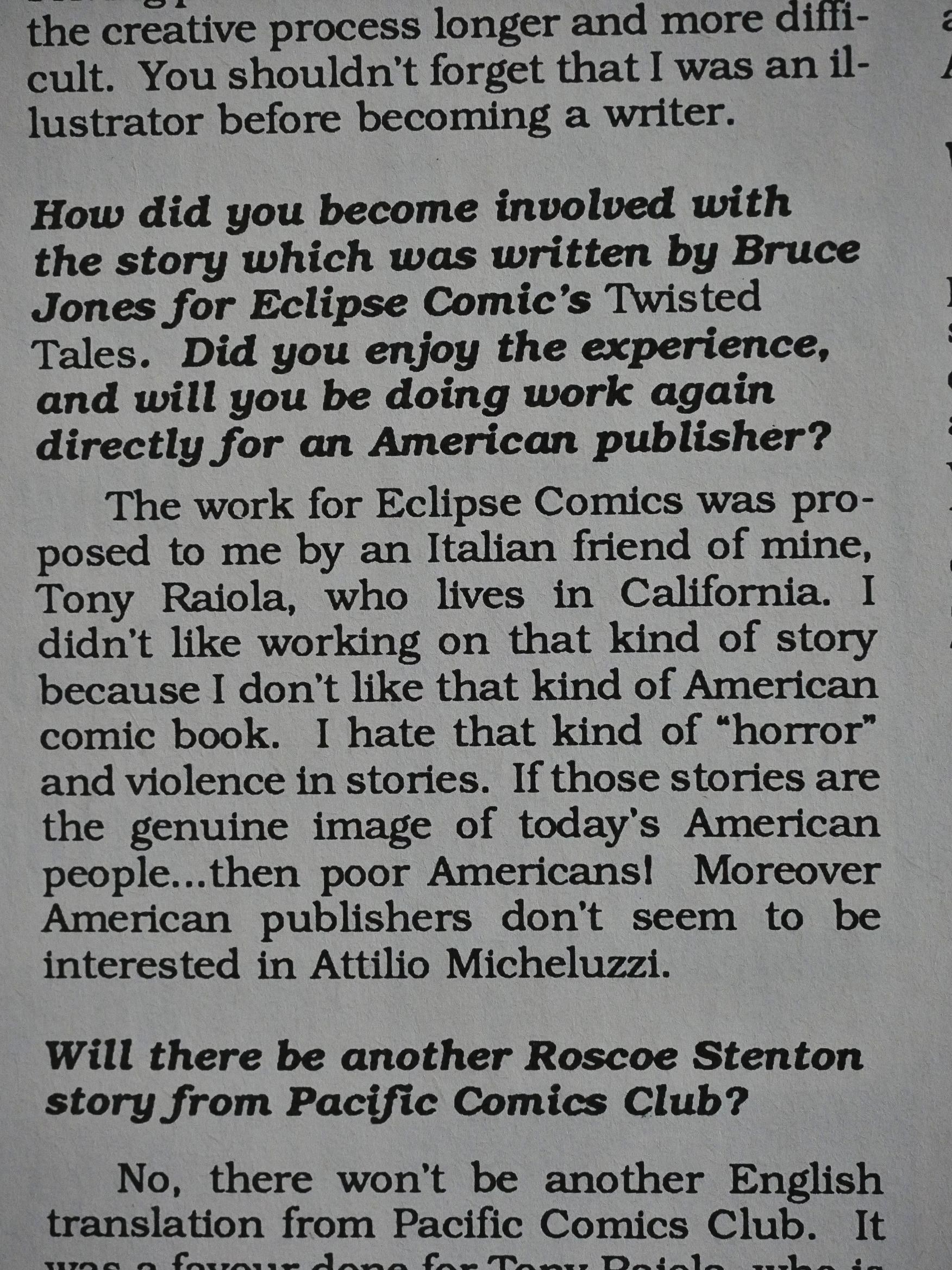
So they’re also able to ask Micheluzzi about things like his work with Bruce Jones, and it turns out that he hated it. The editor also asks them about the current state of European comics, which was in a serious slump around this time.

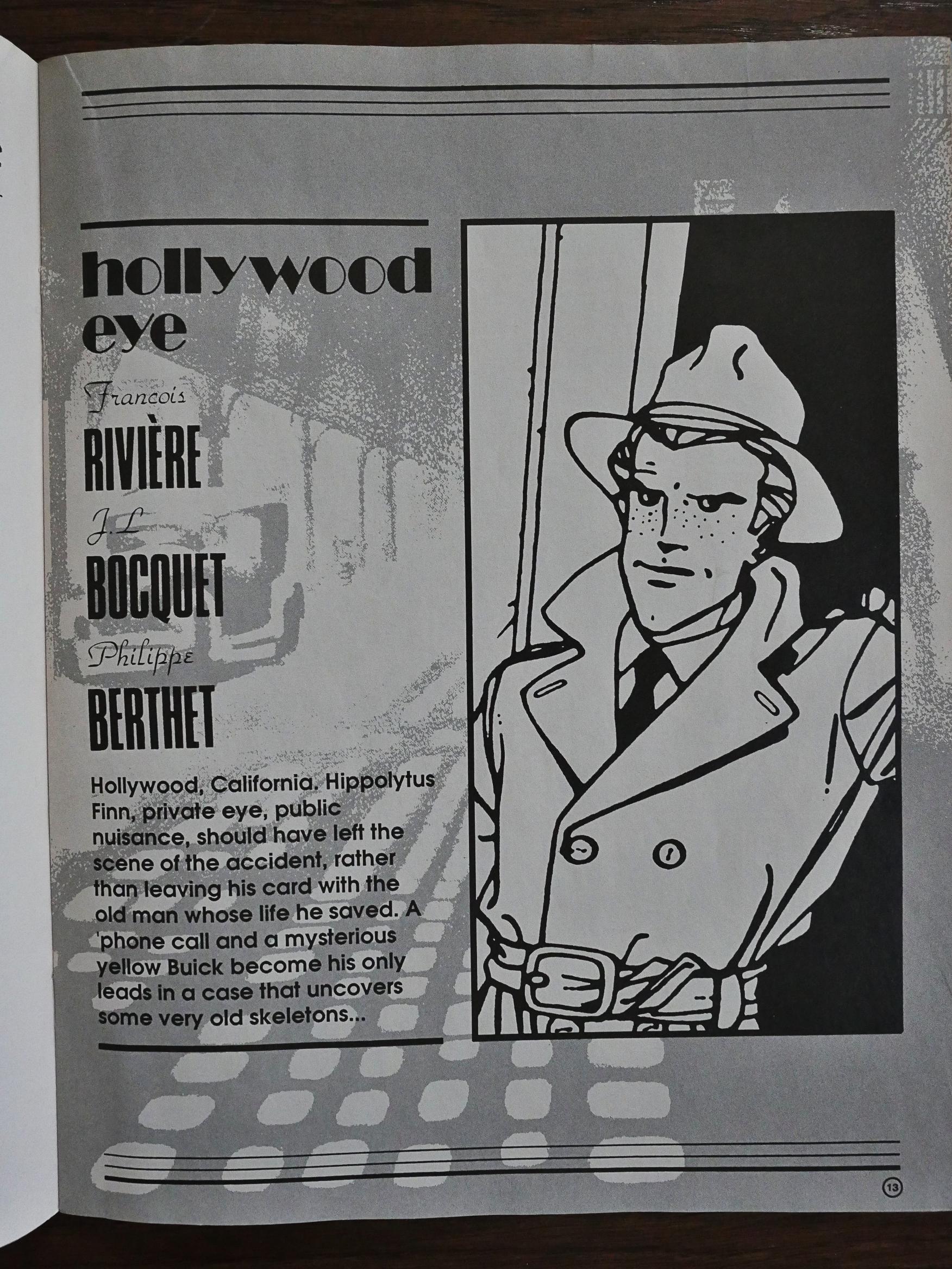
This is a 32 page magazine, but still they’re pretty wasteful with the space. I’m used to reading European anthologies along these lines, and they cram as many story/editorial pages as possible in. But here we have introductions of every feature (in every issue) with an entire page like this…

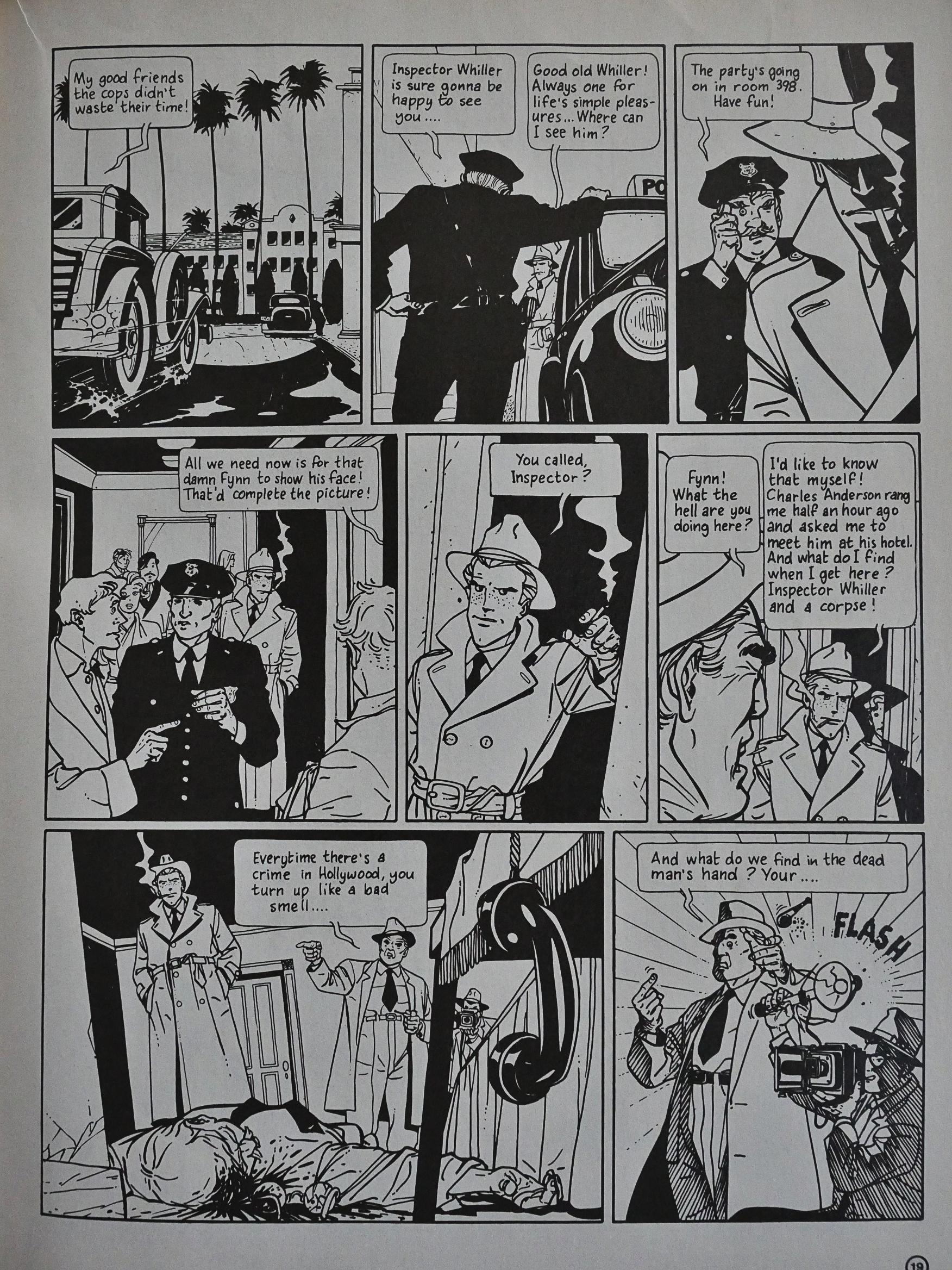
The least successful story here is Hollywood Eye by Francois Riviere, JL Bocquet and Philippe Berthet. I mean, it’s not bad, but it has all the cliches imaginable, so while the artwork’s pretty attractive, it’s a bit mundane.

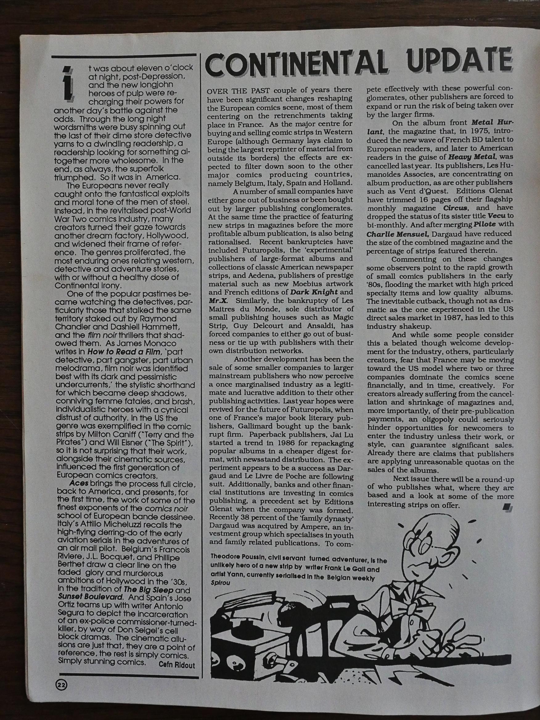
Most issues also has a page or two about the state of European comics, so you get the feeling that this anthology is a real passion project for Ridout. And he writes with insight.

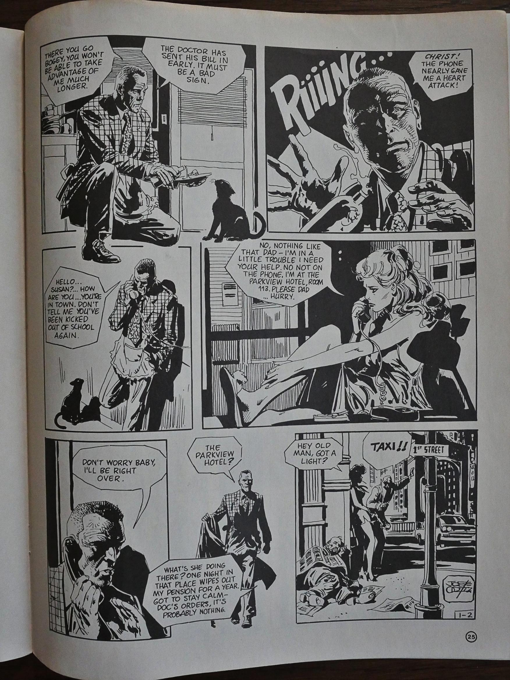
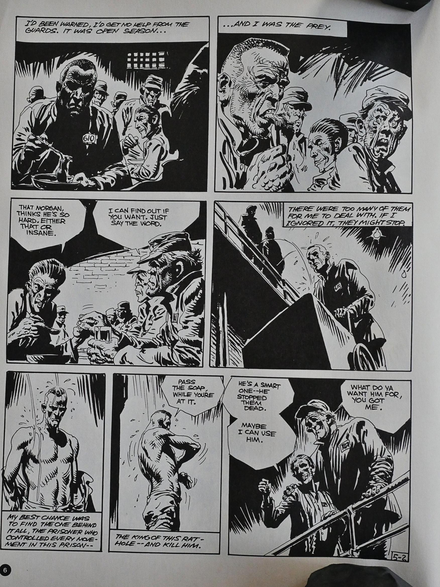
Finally, the last of the significant contributions: Morgan by Antonio Segura and José Ortiz. It’s very, very hard-boiled, even if the protagonist has a cat. Here, too, there are annoying cliches in the plotting (they fridge his daughter and he takes revenge), but it’s so unhinged and over the top that you just have to admire it.

One thing you don’t have to admire is the lettering by Trevs Phoenix on the Hollywood Eye strips. It’s beyond annoying to read.

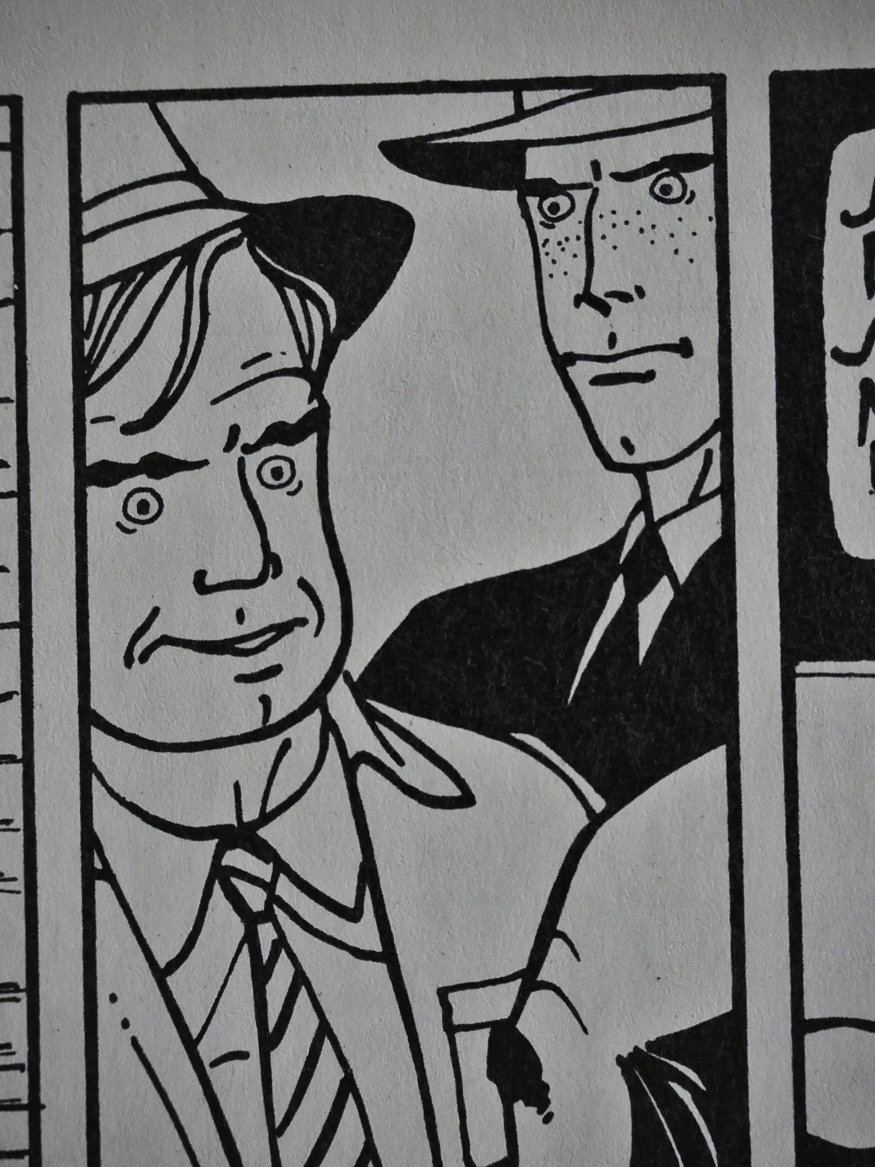
And Berthet’s eyes? WTF IS UP WITH THOSE? He draws them all as round balls with a dot in them, and it looks totally deranged, especially in such an otherwise realistic style.

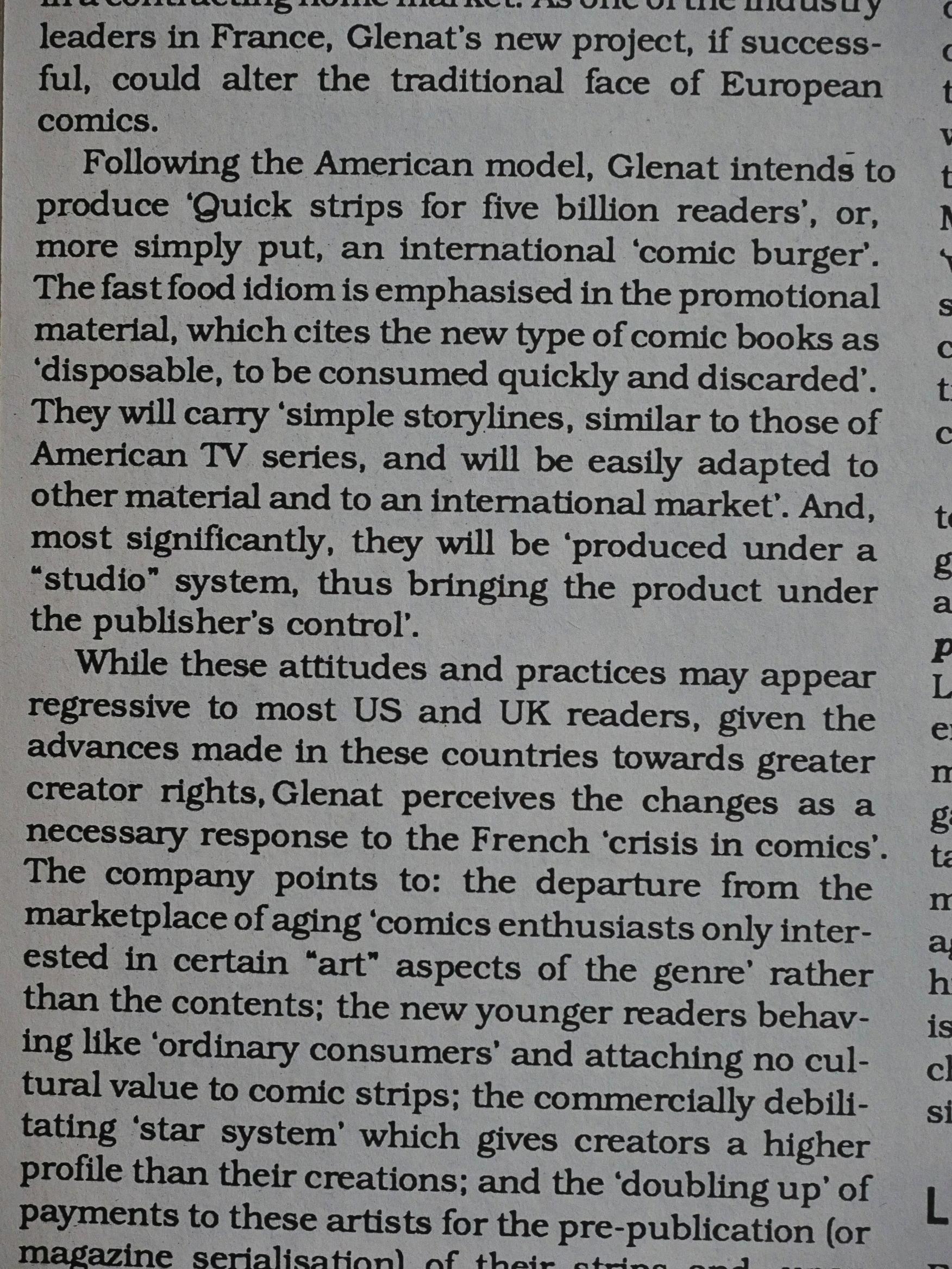
I wonder whether Glenat were successful in making their “comic burger”…

Did I mention that Morgan is hard-boiled? I did? Let me mention it again.

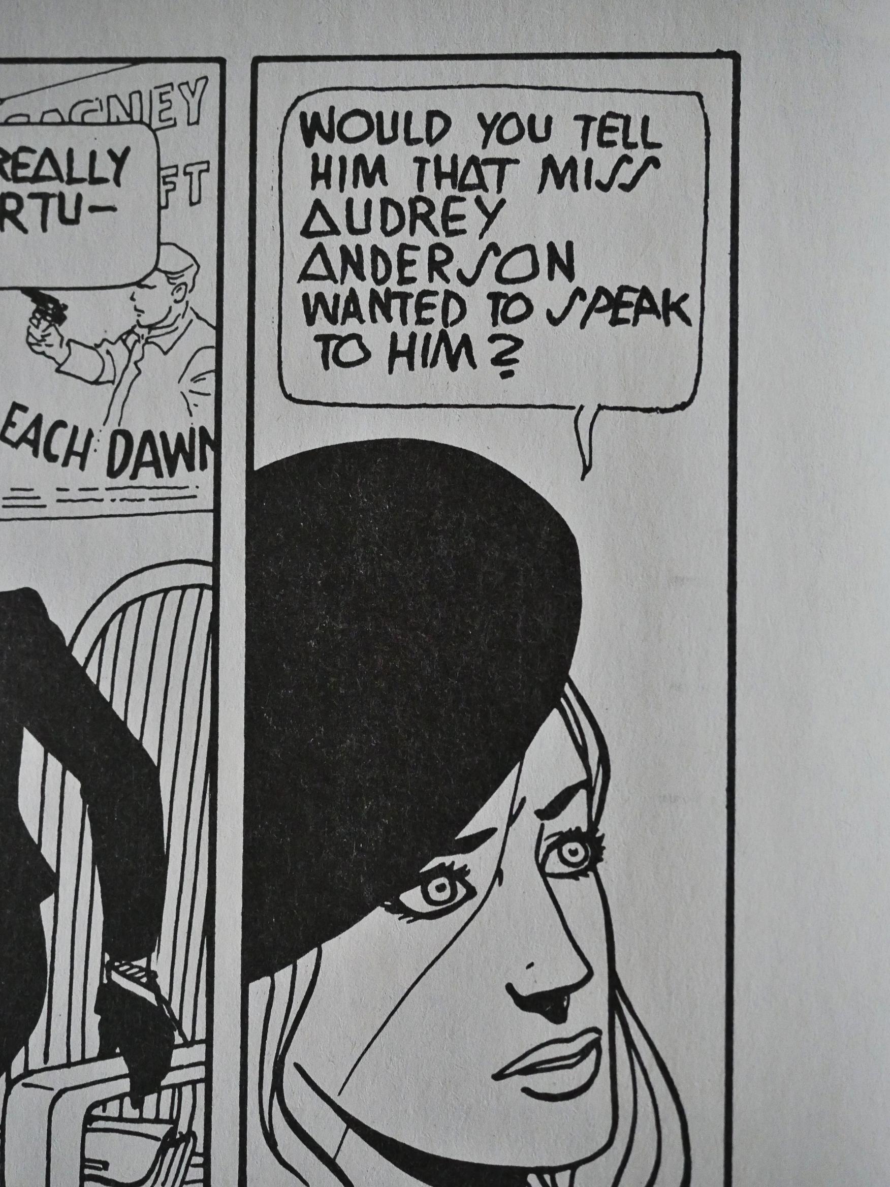
Replacing Morgan in the fourth issue is Dieter Lumpen by Zentner and Pellejero, and it’s the most well-known feature in Aces. The series has been reprinted all over the place, and I think IDW did (or are doing?) a complete collection these days. You can’t fault Pellejero’s artwork, but I don’t think it’s as interesting as Morgan, as weird as that was.

The fifth and final issue concludes the two main serials, leaving no room for anything else, so I’m guessing Aces ended before they had planned (low sales, perhaps?). And it’s printed on shiny white paper, while the previous issues had been on matte paper. Shiny paper can work well with black and white because the blacks get so much richer, but something went wrong during the printing. It’s like the lines were blown out during repro, and then it was printed with too much fill-in. So lines are missing, but the lines that are there are blotchy. It’s weird and makes everything look unpleasant.

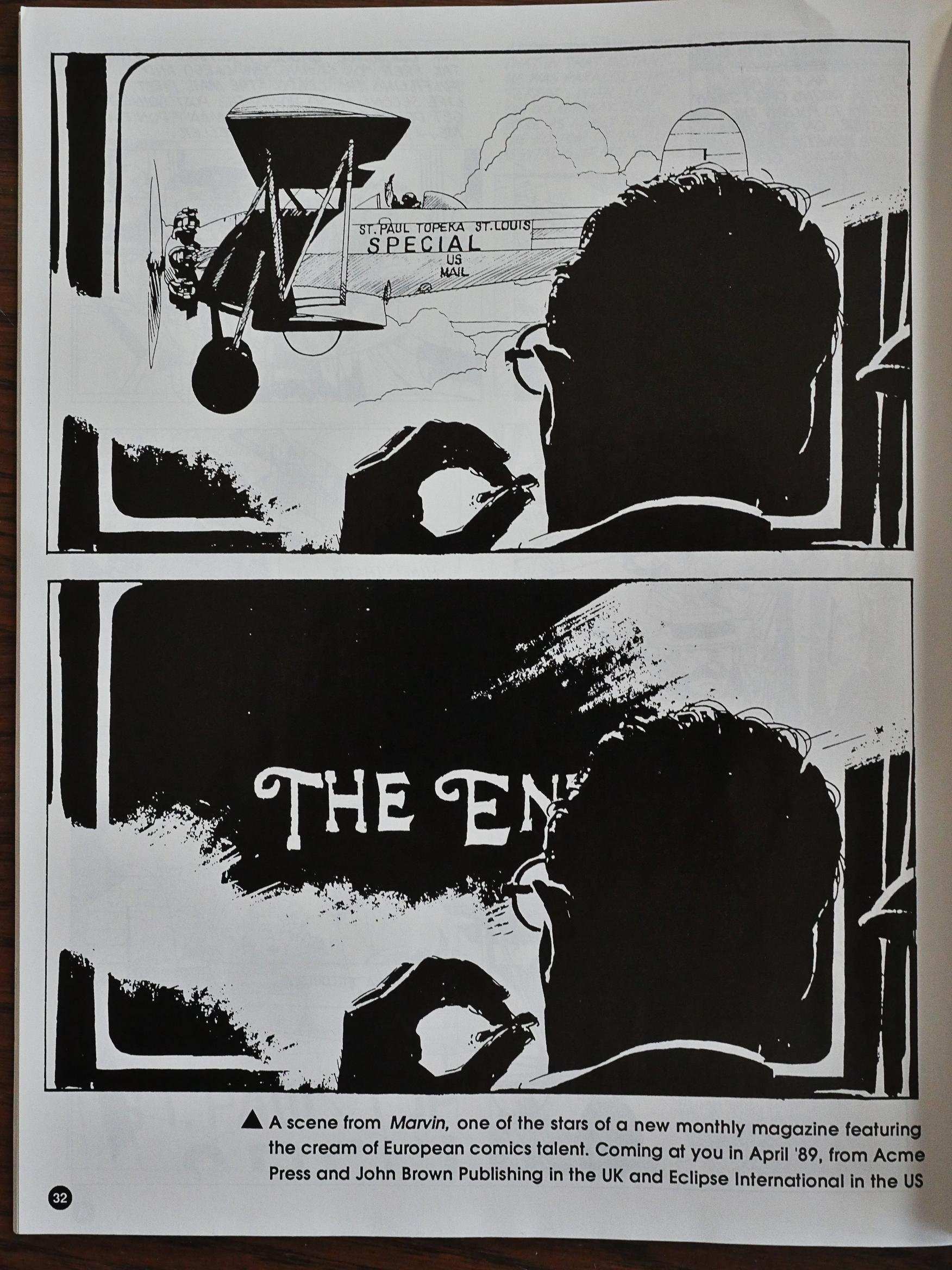
The final page is confusing. The two panels we see there are the concluding panels to Air Mail, but the text says that they’re from “Marvin” which is to be featured in a new magazine of European comics from Acme and Eclipse. It didn’t happen, I think.

I think Aces was just about perfect as an anthology. Too bad it didn’t have a longer life.

1988: XYR

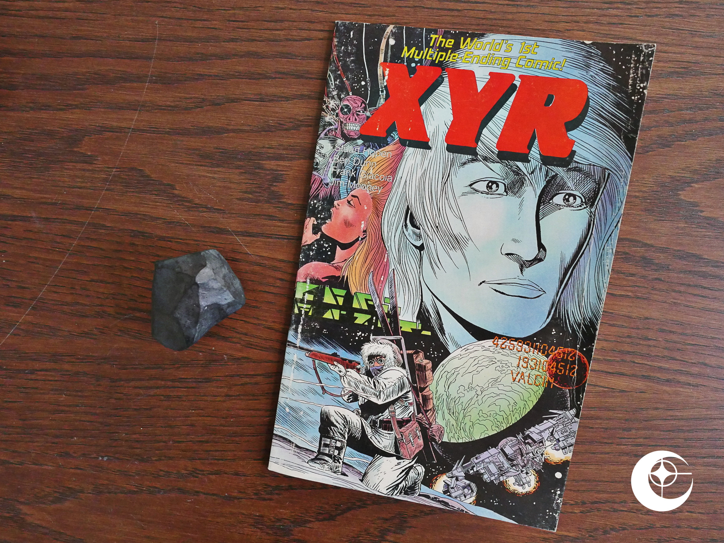
XYR (1988) by Stuart Hopen, Ben Dunn, Frank Giacoia, Jim Mooney et al.

“The World’s 1st Multiple Ending Comic!” That can’t possible be true, can it? I remember choose-your-own-adventure comics from my childhood. Might be fake, artificially-implanted memories!

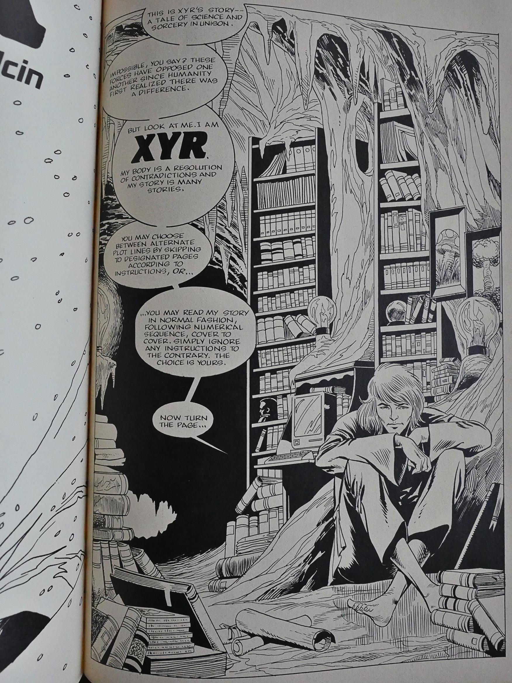
I always found those comics to be a bore, because they usually just had a bunch of endings that cut the story short, and you’d have to go back and find the “real” story. However, this isn’t quite like that: We’re instructed to either follow the instructions (as you would in a normal choose-your-own-adventure comic) or just read the pages in numerical order.

So that means that the pages are constructed so that they can be read in different orders, which made me perk up. Had Hopen come up with something new and fabulous?

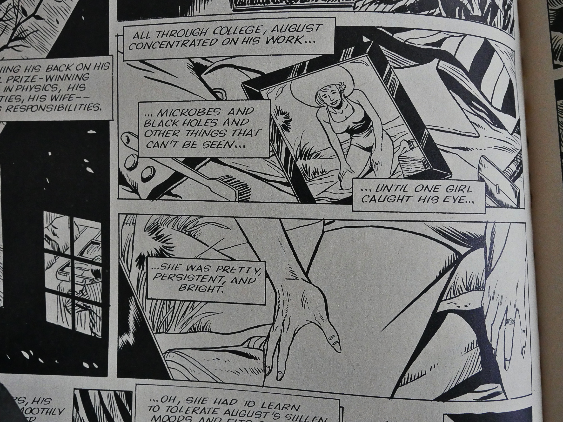
But the first thing that strikes you about the book is just how weird it is. We see a guy looking at a picture of his wife… and then the next panel zooms in on her crotch. I mean hands. Is that a clue about anything? What’s that thing in the background? WHAT?

So I was wondering whether that would mean something if you read the pages in opposite direction or something, but this was a page at the start not included in any other directional readings.

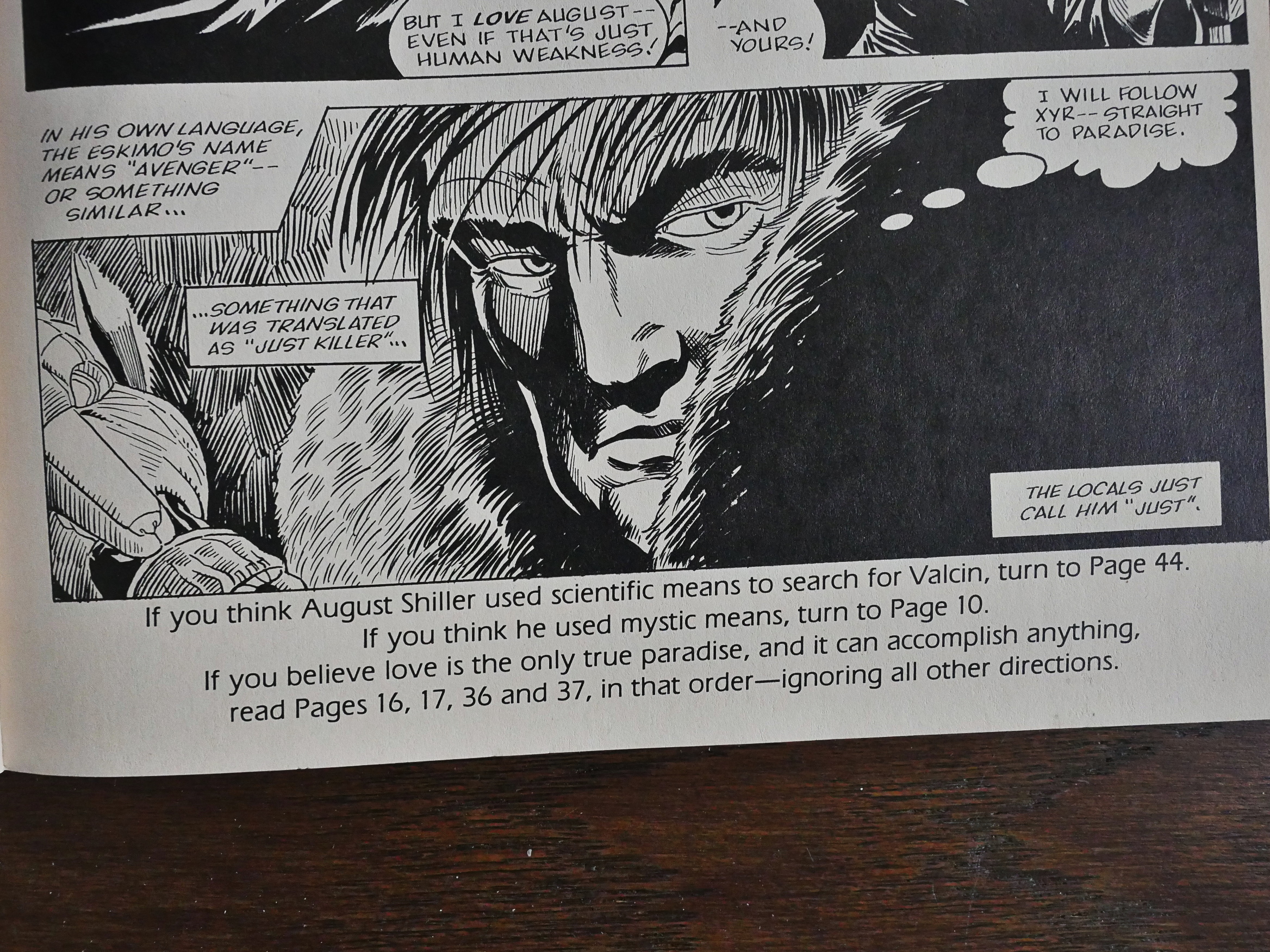
Because, yes, several of the pages are meant to be read in a third way (in addition to following the directions and the straight numerical reading): “Read pages 16, 17, 36 and 37, in that order. Ignoring all other directions.”

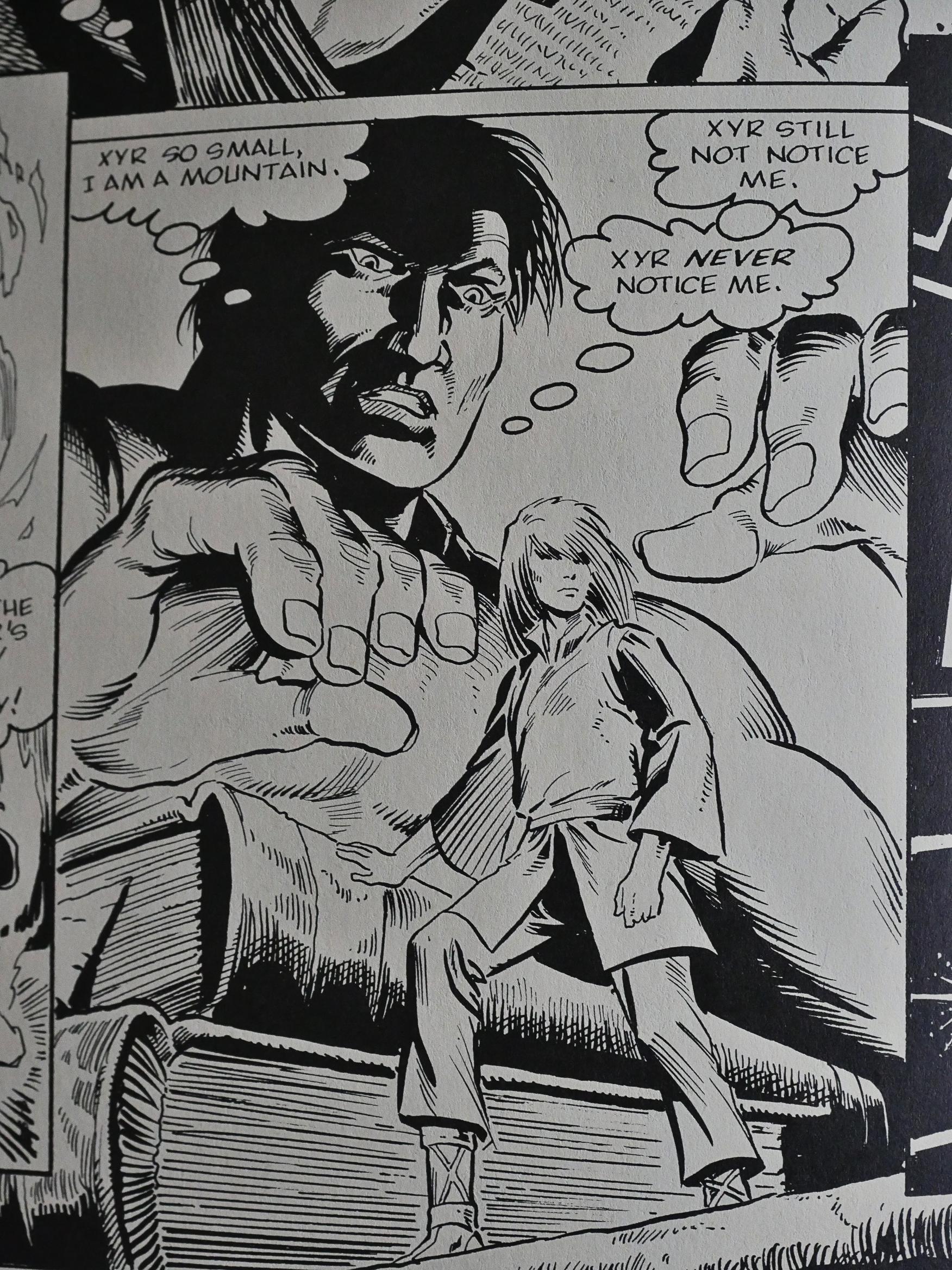
So how does Hopen pull this off? By having many pages be extremely vague with nothing of interest happening; just Our Hero musing about life, death, magic, and navel lint. I think.

So it’s less of a storytelling feat than you might surmise. Still, it’s more fun than the traditional multiple ending comics.

None of the reading orders made me understand what that guy’s beef was.

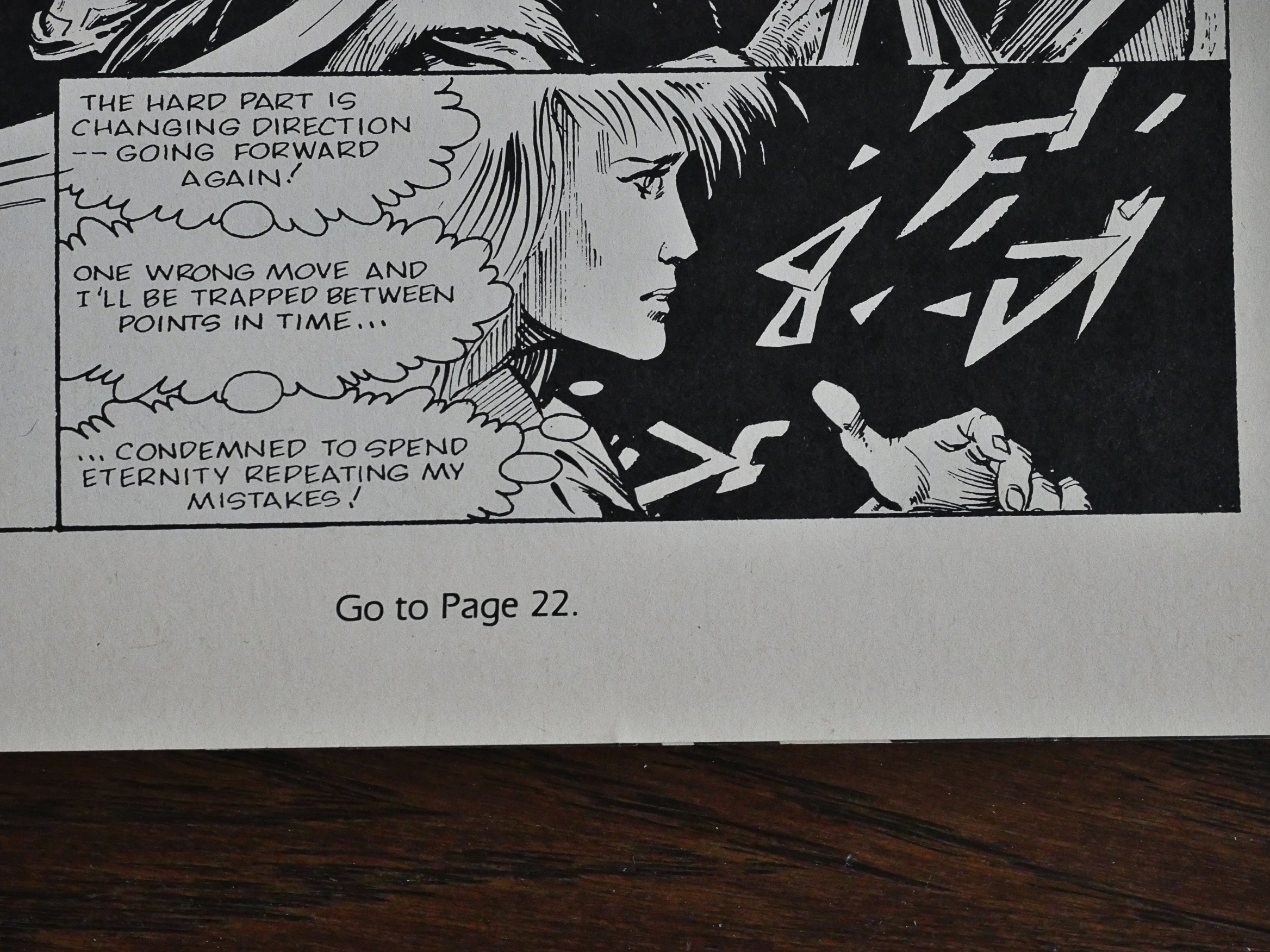
And, yes, there’s one reading that makes you end up in an infinite loop, as there should be.

So, it’s much better read than I guessed it would be, but it’s still not exactly… essential…

Oh! I knew I knew that name! Stuart Hopen is the guy who wrote that rather good The Wandering Stars book that Sam Kieth drew an issue of before scampering off.

1988: Scout: War Shaman

Scout: War Shaman (1988) #1-16 by Timothy Truman et al.

I had originally intended to cover Scout: War Shaman in the original Scout blog post, but since there were two in-continuity miniseries in between, I split it up into two posts. And as usual when I get to issue 25 of something (which this, in effect is), I don’t really have that much to say about it, so this is going to be short. Ish. Shortish. Only like 30 screenfuls. Your thumbs are already thanking me.

The first issue of Scout: War Shaman is an all-painted, all Tim Truman issue, and I assumed that that was the reason for the hiatus and the relaunch. In addition, the covers are printed on a heavier cardboard stock, which gives it all a high class feel.

It’s rather let down by half the pages being printed in a an extremely shoddy and blotchy manner: Reading some of these captions is rather a chore. But they also seemed to signal a departure in how Scout is told. It’s now all told as a flashback from the point-of-view of one of Scout’s sons, who’s in captivity, 15 years (or something) after the events we’re being shown here.

So everything’s different from the first series. Other than Truman still vacillates between being able to render faces to, er, not.

Truman explains that he (and his wife) went on a trip to visit various First Nations and get some reference snaps before doing this series.

But then… in issue two he inexplicably drops the painted style and reverts to his normal inks. The storytelling approach also somewhat goes back to what we’re used to, but without the inventiveness or excitement.

Truman adapts an Apache creation myth, which is kinda fun but rather opaque. I never understood what made the “monsters” so monstrous, which made Our Hero killing them seem rather pointless…

In every letters page Truman insists that Scout: War Shaman is monthly now, but the indicia stubbornly insists that it’s bi-monthly. Until a few issues before the end, when it says “monthly” and then the schedule starts slipping.

It’s a curse!

Truman doesn’t draw children very convincingly, either.

Heh. There was a competition where the readers were invited to send in pictures of manly men/womanly women, and they definitely seem to have given the first prize to the correct contestant.

Suddenly! Disco dancing breaks out!

They also had a poll where people voted for their favourite Scout anything. I’m not sure much was learned.

“Too bad your review was so misinformed” Truman says to a reviewer who apologised for not sending a copy of the review to Truman. This makes me curious what the review said, so let’s see.

Peter Cashwell, The Comics Journal #123:

The most damnably infuriating thing about the production on this song, however, is that shaker part. God, the shaker part. Not only is it twice as loud as anything else in the song—no, three times as loud—it’s not even well-played. Instead of providing a percussive counterpoint to the drums, it completely obscures them with a mushy wall of static. The end effect is something like listening to a band playing next to a working gravel spreader; it’s actually painful to hear.

Well that fun and all, but it was mostly a rather effusive review: He compliments Truman on his guitar playing and on writing good tunes and stuff; he just doesn’t think the production is much up to snuff.

I don’t really see much that “misinformed” may be applied to…

Scout’s ever-shifting face gets torturin’.

But what I wanted to say that I find Scout: War Shaman to be a disappointment after being so pleasantly surprised by the first Scout series. While that series was fun and inventive and showed lots of thought and intelligence and growth, this one starts out intriguing, but then abandons the central conceit (of this series being a flashback), and then Truman basically seems to lose interest.

For this page I thought “wow, Truman’s really pulled himself together now, so I was totally wrong”, but then it turned out to be inked by Tom Yeates. For most of the remaining issues, Truman farmed out parts of the artwork duties to others, and ended up doing only the layouts to the final issue.

But it’s not like he has bad taste in artists. Ricardo Villagran’s artwork is really attractive, but it still points to Truman being fed up or burnt out on Scout. He also basically stops doing the letters pages and backup features.

Oh, and the thick cover stock disappears.

Beau Smith even takes over the writing of one issue.

But the competitions continue. Here’s one for best Scout window displays. Cut on the bias.

And then it’s over, with an ending that refers back to the first issue of the first Scout series, which is nice and stuff, but it feels rather like an emergency fix.

cat ⊕ yronwode promises that there will be further Scout series in the future, but they have not appeared yet, so our patience has yet to be rewarded. Truman still mentions the possibility in newer interviews, so perhaps it’ll happen at some point still.

Most of the original Scout series has been collected and reprinted, but Scout: War Shaman has apparently not, and I’m not really that surprised.

1988: R.O.B.O.T. Battalion 2050

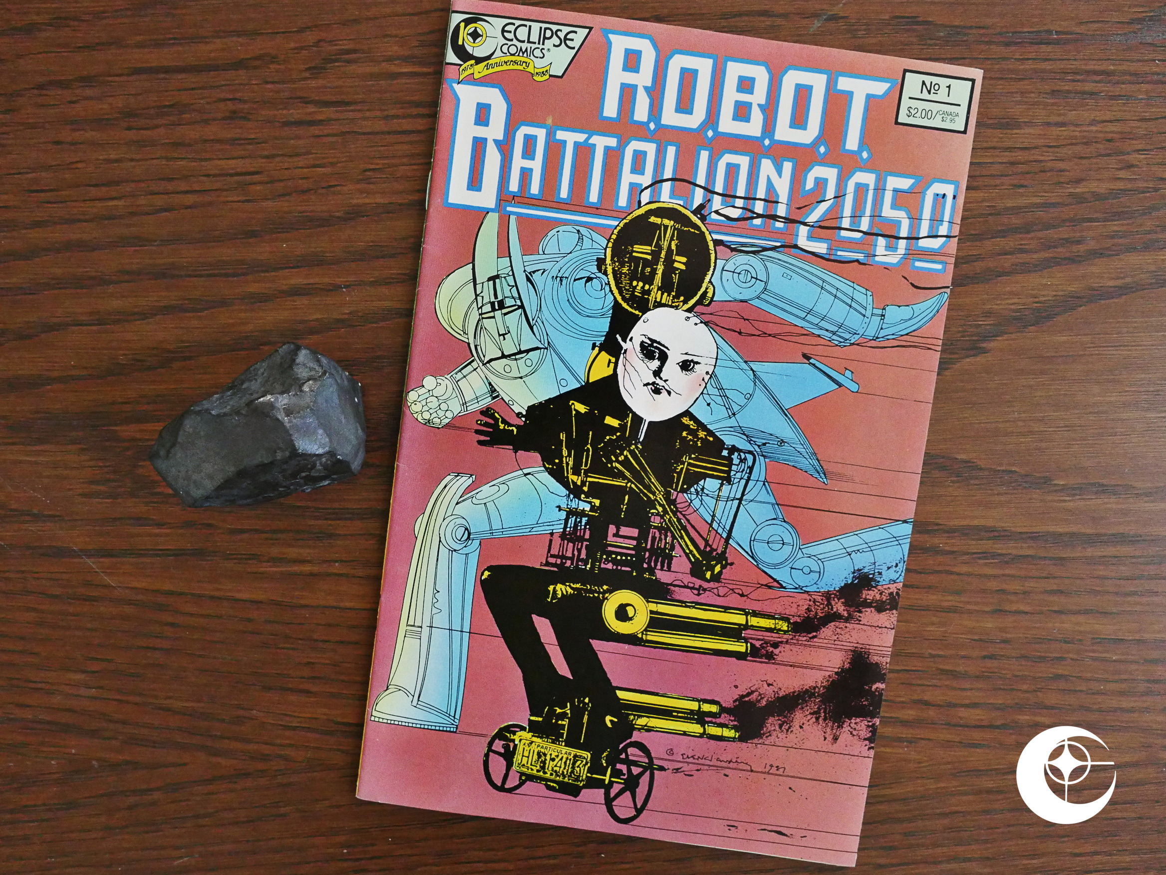
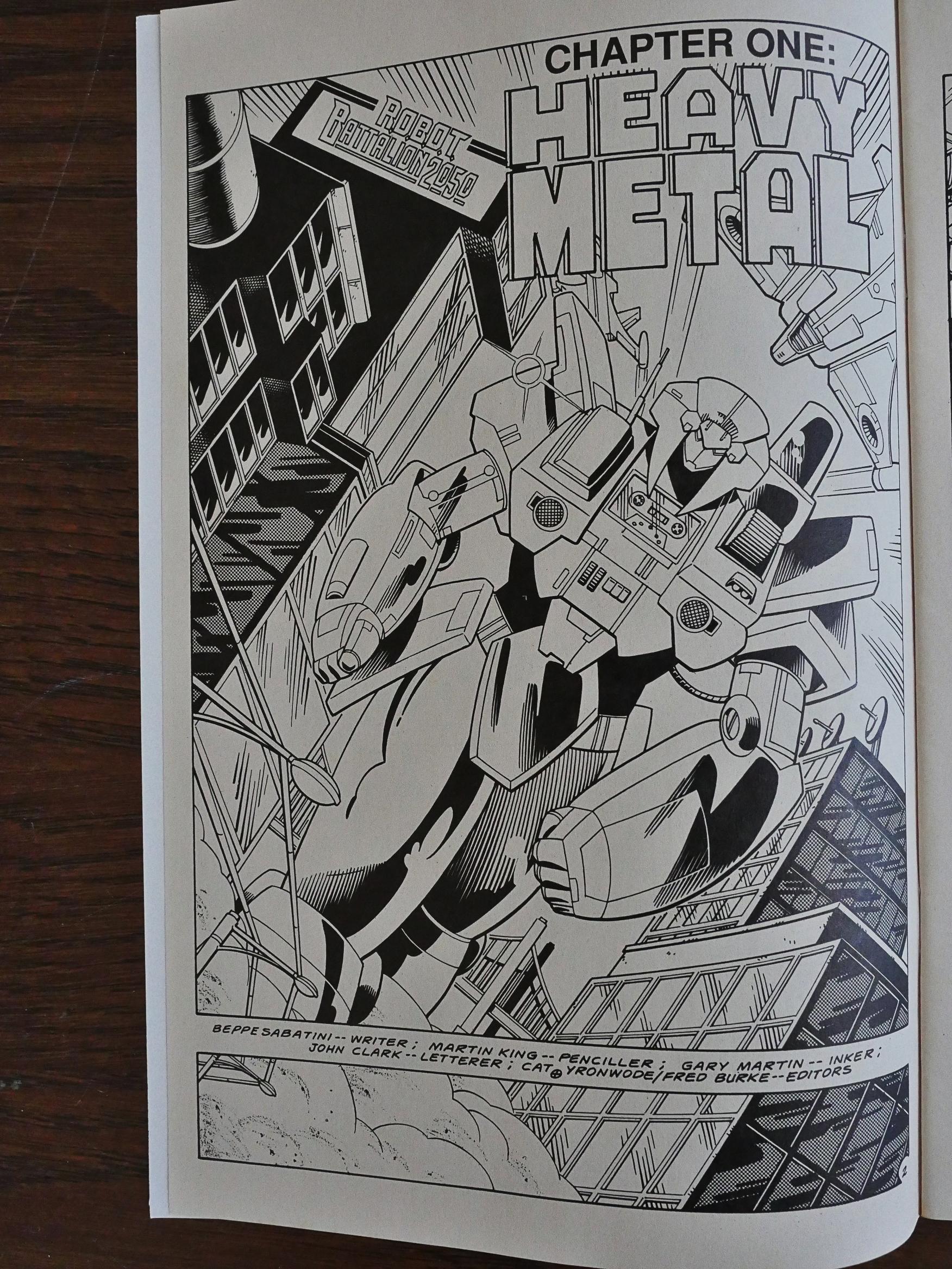
R.O.B.O.T. Battalion 2050 (1988) #1 by Beppe Sabatini, Martin King, Gary Martin et al.

That’s a rather atypical doodle from Bill Sienkiewicz for the cover of this comic book, and lends more confusion to an already confused concept. In the comic story itself, it seems like this was meant to be called Cheap Shoddy Robot Toys, which is a very typical black and white boom title, so perhaps that’s why they went with R.O.B.O.T. Battalion 2050 and an arty Sienkiewicz cover? To make people forget all about that debacle?

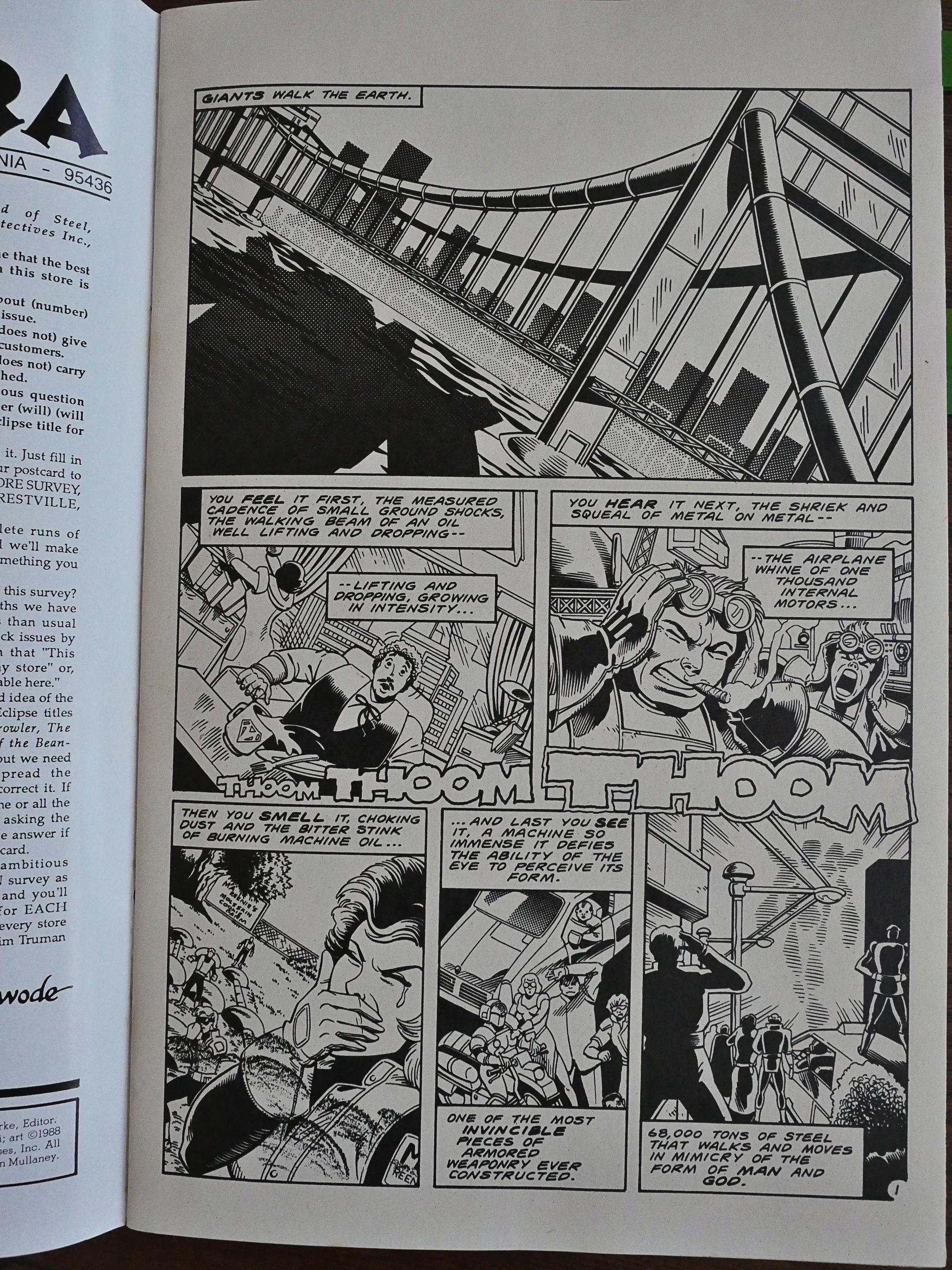
Because the interiors are very typical of that long past and unmourned era (i.e., 18 months earlier). But it’s got one thing going for it: It’s funny.

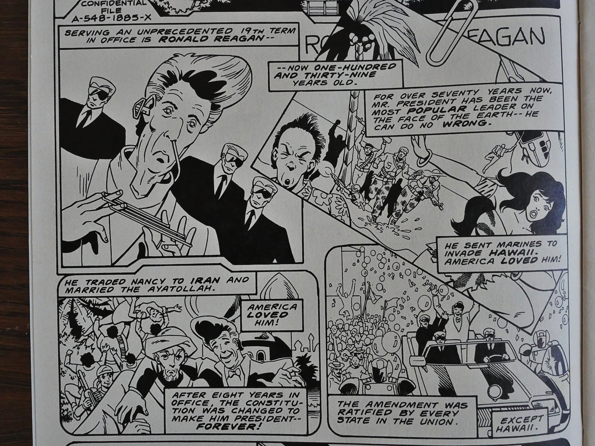
It’s a sort of parody on Japanese robot animated series (and The Care Bears), and political commentary, too.

The US invading Hawaii seems to become more of a possibility every day now, doesn’t it? The US president marrying the Ayatollah hasn’t happened yet, though.

Three’s an unforced quality to the extreme silliness on display here that’s really charming.

There are, perhaps, too many fight scenes and too few jokes in the book for it to be completely successful, though. And I don’t know whether this was meant as a one-shot or not, but I could totally see it continuing. But parody books are hard sells, I guess.

It’s never been reprinted, and I’m unable to find out anything about it on the interwebs.

1988: Power Comics

Power Comics (1988) #1-4 by Dave Gibbons, Brian Bolland et al.

Huh. Are all these Acme Press/Eclipse Comics books going to be reprints? I guess it makes sense to use this as a vehicle to bring more British comics to the US…

… but this is a pretty bizarre reprint project as those go. Brian Bolland and Dave Gibbons were at this point (in 1988) superstar artists, so anything with their names on has a certain guaranteed audience, but these are comics from the mid-70s, produced for the Nigerian market, from well before anybody had heard of them.

According to the frontmatter, the idea was to create a comic that emulated earlier, simpler super-hero comics. I’m guessing they were going for a 40s Batman or Superhero feel for the stories, which involve Powerman (as he was called originally, but renamed here as Powerbolt presumably because of trademark issues) saving kids and women from falling planes, out of burning buildings, and from dinosaurs in hidden valleys.

The emphasis is solidly on simple storytelling, because presumably these comics are aimed at children. One thing I haven’t seen since very early comic strips is the way the panels are numbered to help the readers read the panels in the correct order. George Herriman, for instance, used to do that a lot, but he has layouts that sometimes are challenging. That’s not the case here. Is numbering panels just a thing they used to do in Nigeria around this time?

Dave Gibbon’s artwork is awkward and not very accomplished. His Powerman, for instance, has a bizarrely small head, and nobody looks very pretty or glamorous.

Oh, and all the stories end with an attempt at a sex joke, which is not how I remember Batman from the 40s.

Brian Bolland’s artwork is a lot more exciting. He even sometimes lets characters slightly poke out of panels for emphasis.

The warning to the children not to play with electricity is probably a good one.

Hey, that’s a very Neal Adamsish face, isn’t it?

“Doctor Crime” and “Snake Island”. The writers keep things simple.

Oh! The Nigerian publishers did make them add the panel numbering, and they did it with little round stickers.

More warnings about the dangers of electricity, but here it’s warranted: That woman saves a sick Powerman by sticking him in the shower and throwing an electric lamp at him! I think that’s worse than Superman jumping off of tall buildings…

The sexual innuendo at the end of each episode escalates…

Bolland’s draws some really attractive faces, but then he veers off into awkward caricature now and then. Mostly when he does profiles. I think this panel demonstrates the dichotomy.

And, of course, some really villainous villains.

Bolland was concerned about how he was drawing black people, and apparently that concern was warranted.

Ouch!

Hey, where’s the fourth and final issue? Didn’t I have it here somewhere? Hm… can’t find it… so I’ll just have to live without learning whether the final panel of the final strip ends with Powerman just raping a gaggle of women, because that’s where it seemed to be heading.

These comics have never been reprinted again, and these four issues are apparently only a small sampling of all the issues that were created. Wikipedia claims that Bolland drew 300 pages for the series, and Gibbons presumably an equal number.