1987: Paper Dolls from the Comics

Paper Dolls from the Comics (1987) #1 edited by Trina Robbins.

From the title, I thought this was going to be a collection of paper dolls from various comic books, but the “comics” here refer to comic strips.

I bought my copy used, and it’s apparently a review copy. But I can’t make out the text on top. “PDN Sejd/och”?

Anyway, in the introduction Robbins explains the concept: Newspapers used to run paper dolls in the comics section.

“Wholesale rates available for paperdoll collector clubs.” Well, that’s odd. Don’t people just copy these onto thicker paper before cutting?

Oh, I see! Every other page has paper dolls, and the other half has a very brief article about the comic strip in question. So you can cut paper dolls out of this comic to your heart’s delight; you won’t miss any of them.

Of course we have strips like Brenda Starr making an appearance.

But also Dick Tracy, who has cut-out disguises that you can… glue to Dick’s face? Because he’s forgotten to draw in those tabs.

But what Robbins said in the introduction about “an earlier and simpler” time… May, perhaps, the reason the newspapers were so keen on printing these paper doll pages be that they wanted to print some easy cheesecake and beefcake? And the outfits might perhaps be secondary?

Perhaps that’s just me coming from a later and more complicated time.

1987: Overload Magazine

Overload Magazine (1987) #1 edited by Evan Mills.

I wasn’t sure whether this anthology was part of the bust part of the black and white boom (BAWBAB, for short) or whether it was from Eclipse’s next phase.

This very nice opening piece by Dennis Wolf doesn’t have any mutant rodents, but seems more like a humorous Heavy Metal page, so perhaps not?

Mike Dringenberg is a veteran artist, so that’s not very BAWBAB. But on the other hand, the writer is Donald Chin, who wrote patient zero in that debacle…

And then we get to The Original Turtles Patrol. Ding ding ding! We have BAWBAB!

And it’s the only piece in this book that hints at a continuation: All the other strips are shorter sf things, usually with a bad joke at the end.

Like this one with very nice artwork by Dennis Wolf and a groan-worthy joke by Donald Chin.

And Parsonavich drops by with a Hamster story, written by himself. It’s more chaotic and dense than these stories usually are, but, of course, it also has a lame twist ending. I’m kinda taken with his Moebius-in-a-woodchipper artwork.

And finally, two short pieces by Sam Wray, drawn in an incongruous European style.

It’s not a bad little anthology. Some of the artwork is great, and even if there are some parts where the humour makes your eyeball roll, it’s so unpretentious that is has a kind of endearing charm.

So of course it didn’t last more than a single issue.

1987: Lars of Mars 3-D

Lars of Mars 3-D (1987) #1 by Jerry Speigel, Murphy Anderson, Jim Mooney, et al.

Eclipse published a number of 3D comics during a two year period…

… and I think it stopped here, with the nineteenth issue. Some of the earliest ones Eclipse did seemed to be done by artists who were enthusiastic about doing it, but as the issues trundled by, I guess everybody grew tired of the novelty.

And as the issues went by, Ray Zone (who did most of these 3D separations) tried to push the effects, er, deeper, to less than impressive results to these eyes. See that little guy up there between the running soldier’s feet?

He’s only in the red channel, because the soldier’s knee covers him. That’s not 3D; it’s just annoying shimmering in the eyes.

And also, this issue seems to have the incorrect tone for the red shapes, so they shine through more than they should.

In short: It was no fun to read this book.

The first story is a new one, done by the original creators of Lars of Mars, and it’s … Well, it’s like those panels up there.

We get a text page explaining that Siegel and Anderson created the character in 1951, but it only got a two-issue run before being cancelled.

So, naturally, we get some reprints, too. Probably shot from a comic book? They’re none too crisp, but at least they have background, which the new strip doesn’t.

Jerry Siegel is the creator of Superman, and he gives Lars of Mars a Lois Lane-like figure that Lars of Mars hypnotises into believing in whatever. Which is rather sadistic, since everybody assumes she’s gone round the bend, but that’s rather Lois Lane-like, too, isn’t it?

Now I can pack the 3D glasses away. I hope.

1987: Radio Boy

Radio Boy (1987) #1 by Chuck Dixon, Jim Engel, Flint Henry, et al.

We’re getting to the end of an era: The black and white boom has gone bust, and Eclipse would withdraw from this market soon, and approach a new, lucrative idea soon: Japanese comics. Just two months after this book, Eclipse would start its assault on the US comics market with three bimonthly translations (Area 88, Kamui and Mai, the Psychic Girl), so I assumed that this was a way of testing the waters.

It’s nothing of the kind. Bizarrely enough, it’s ostensibly a parody of Japanese comics (and Osamu Tezuka’s Astro Boy in particular) published months before the vast majority of the US comics-reading audience had even seen a Japanese comic book.

And reading it, it becomes clear that the creators of Radio Boy haven’t seen a Japanese comic book, either. I’m guessing from the stilted English that they have seen badly dubbed versions of Godzilla, though.

Or perhaps they’ve just read about somebody having seen badly dubbed versions of Godzilla, because it’s just painful to read.

The two shorter backup features are funnier and look slightly more Japanese. But that’s just because nothing looked less Japanese than the main story.

The last one is inked by Timothy Truman and has a couple of jokes that work, but, not to harp on the same point over and over… That looks more like a European montage sequence.

They do namecheck Tezuka in the Jim Engel-penned biography of the purported creator of these comics Hawiya Nistamicha (get it? huh? huh?), and it does show that they aren’t as unfamiliar with Tezuka as I had assumed after reading the comics. The bit about the various “The Japanese”, going through Paul Terry and Izzy Sparber before settling on “The Japanese Walt Disney” is funny, and citing “the woman who draws Love Is” as a person who’s influenced by him is, too.

It’s such a bizarre comic book. I wonder whether fans of Japanese comics would find it offensive now, or just be as nonplussed as I am.

I was unable to find anybody that had anything to say about it on the web, but this came close.

In the Comics Journal, Dale Luciano reviewed it in issue 117:

Another unheralded sleeper.

Radio Boy from Eclipse Comics is a silly piece Of tomfoolery, a send-up Of Japanese adventure/superhero comics and the animated cartoon series based on them. A talented crew of funnymen, including Chuck Dixon (who wrote the scripts for the three featured stories in Radio Boy), Jim Engel, Flint Henry, and Timothy Truman, wring a goodly share of throwaway laughs from this goofy, fast-paced lampoon. (In a funny swipe at the mode of editorial writing that accompanies so many descriptions of Japanese comics, Radio Boy is credited to “Hawiya Nistamicha,” identified as the “Feudal lord of the Funnies” who, before he became a comics legend in Japan, gave up a career as a sumo wrestler when “a paralyzed buttock in an early match soon put an end to his dreams.”)

It’s really a one-joke comic—like Scott McCloud’s Destroy!, I assume Radio Boy is a one-shot—but the joke is irresistible. Particularly inspired is the lead feature, in which Radio Boy does battle with “Mitsu, the Plant Demon.” The Osamu Tezuka parody is hilarious, and Dixon makes nonsense poetry out of a clever approximation Of stilted translation. A typical caption reads, “Radio Boy lies most unconscious. His mind is being stupid of the danger that he is being surrounded on all sides with.”

Radio Boy is good silliness.

“Clever approximation.”

1987: Elf-Thing

Elf-Thing (1987) #1 by Frank P. Marino and James J. Friel.

Knowing nothing about this book except that its cover looked really amateurish and that it was published at the rump end of the black-and-white bust, I though this was going to be really awful.

And the artwork looks like something Solson would have published, but this is a surprisingly funny parody. It parodies a lot of things simultaneously (Elfquest, Swamp Thing, Marvel comics in general), so it’s not exactly laser focused.

The premise here is that this is a world where normal people are monsters, but one of them has transformed themselves into a puny, cute elf body. Well, as cute as the artists talents’ allow.

The main problem is that about half the time, it’s more like reading a normal dopey super-hero book than reading a parody. We get the entire origin story, and if they’d left out (some rather funny) sight gags, nobody would have raised an eyebrow.

See? You’ve read worse jokes than that.

And most original of all, they keep the elf naked throughout most of the book.

I don’t mean to imply that this is some kind of long-lost treasure. The artwork is hard to look at, and the storytelling sags. But it could have been so much worse.

1987: Bullet Crow, Fowl of Fortune

Bullet Crow, Fowl of Fortune (1987) #1-2 by Chuck Fiala.

We’re now in March 1987, so the black and white boom had properly gone bust by this time. But with a three month lead time, these were solicited in December 1986, so I guess a lot of these shipped to stores that were then stuck with them.

Just a little peek at the “On The Racks” section of the editorial inside-cover page. I like the one about Zot!. “This issue answers the question, “Are Zot and Jenny ever going to get together, or what?””.

It doesn’t.

Anyway, from the format of these pages, I’m guessing that this is a strip that was running in a magazine or other, and that this is a reprint. As usual with Eclipse, there’s nothing in either the indicia or anywhere that lets you know that it’s a reprint, and from when or where.

It starts off as a gag-per day strip, and I guess there’s a lot worse than these jokes out there.

After some days, we get into Fred Hembeck territory, with Marvel’s Iron Man showing up for a handful of strips. He’s even name-checked in one of the strips, so I’m guessing this ran in a comics-related fanzine? Comics Buyers Guide, perhaps?

But after a dozen strips, we drop the gag-a-day format, and the rest of these two issues are, very vaguely, a continuing story.

That’s supposed to be a polar bear.

If I were to take a stab at the reason Eclipse thought this was even remotely publishable as a stand-alone comic book, I’d guess, first of all, “black and white boom”, and second of all, “well, that bunny has big tits”.

Aha! It’s a reprint from something called “The Comic Reader”! Perhaps I should do some research. The Comic Reader (TCR) was a comics news-fanzine published from 1961 to 1984. So these are old strips, too.

As the series progresses, those tits get ever more prominent.

The last handful of pages look like they’re new, so perhaps this strip was cancelled over at The Comics Reader and Fiala finished up the strip here?

That would make sense.

And I don’t have any more to say about this comic (did I have anything to say?), so perhaps this is the place to drop some choice Gary Groth quotes I happened upon about Eclipse in this period generally.

This is from an essay that was published in 1987 in The Comics Journal, and you can read it all here, but let me just excerpt, at length, the stuff that’s relevant for Bullet Crow.

Eclipse probably wins the prize for strip-mining a fragile market, though. We know Dean Mullaney will say anything under oath, but will he and Cat Yronwode publish anything under the sun? Apparently so.

The real tragedy here — what separates Eclipse from the other schlockmeisters — is that the company was founded upon certain artistic principles. They weren’t principles I thought much of, but at least the company was obviously guided by discernible principles. Eclipse originally published graphic novels (or what passes for them) by upper-echelon Marvel hacks. Somewhere along the line — and I think the exact moment occurred when Eclipse adopted all of Pacific’s schlocky titles when that company went bankrupt — Eclipse sold out, adopted Marvel as their spiritual mentor and instituted the assembly-line system of creative manufacturing for their four-color comics. Since then, they have become shrewd hustlers with a line of soulless, mass-produced color comics — the kind Cat Yronwode would attack viciously in her old Comics Buyer’s Guide column — and black-and-white and 3-D comics, about which more later.

It would be funny if it weren’t so tragic. I mean, it looks like Eclipse will publish anything that looks like it has even the slightest chance of turning a buck. It doesn’t matter whether it’s work plagiarized from Jaime Hernandez or Vaughn Bodé; it could be superhero schlock like Champions or Airboy or New Wave (a kind of New Universe, Eclipse-style); anything in 3-D (the current favorite being the 3-D Stooges); the loathsome Adolescent Radioactive Black Belt Hamsters and other rodent-style books (like Guerrilla Groundhog); media tie-ins from role-playing games (Villains and Vigilantes) or money-making crap like Captain Eo, which conflates two mass-market icons of equally repulsive natures: Disneyland and Michael Jackson.

Heh heh. I covered the Hamsters here and Guerilla Groundhog a couple of days ago.

I don’t think there’s much to disagree about there, but then he goes on to say:

I went on to say something like this:

“Although the free marketeers will tell you that this boom in publishing activity proves the health and prosperity of the marketplace, what it actually proves are two propositions: the direct-sales market’s insatiable appetite for junk, and secondly, the entrepreneurial opportunism of anyone in the U.S. over the age of 12.” This appealed to English skepticism at unbridled economic exploitation, but Claremont immediately took umbrage and asked me if I was saying that these comics shouldn’t be published, to which I replied that of course they shouldn’t be published, that they were crap and that the less crap in the world the better.

It seems so ripe for whataboutism. Fantagraphics had already published less-than-amazing cash grabs like Doomsday Squad by now, and would go on to start an entire imprint to shovel out crap way worse than Bullet Crow (i.e., Eros, still going till this day).

The reason companies publish crap is that they want to make money, so no matter whether publishing crap is a good thing or not, the question is whether they use that money for worthy goals.

Now, Fantagraphics were (and are) the publishers of the Hernandez’ brothers Love and Rockets, and I think that anything a publisher does to stay afloat while publishing Love and Rockets is fine. If it takes selling crack to kindergarteners, that’s not crime in my book.

The problem is that Eclipse never published anything of that calibre. They published a bunch of books that I think are very good (Zot!, Beanworld, David Chelsea in Love), but those aren’t ends that defend all means. I mean, I could totally forgive Eclipse for selling molly to highschoolers, but that’s where I draw the line!

So I don’t really blame them for publishing books like this. On the other hand, the next book is Elf-Thing. We’ll see whether I survive that…

1987: Marauders

Marauders (1987) by The Dixie Pistols.

Timothy Truman had earlier included a flexi disc with his Scout comic book featuring his band The Dixie Pistols, but this is the first (and only) LP Eclipse released.

And as you’d expect, catherine ⊕ yronwode provides the liner notes, as she wrote the column on the inside cover of just about every comic book Eclipse published.

In addition to griping about how bad the liner notes Colombia does are, she also explains what the songs are about. “Whenever I play it, someone comes up to me and says, ‘Wait minute! I used to own that dog!”

I’m sure I could make fun of these liner notes all day long, but I’m not going to, because I’m a gentleman. Besides, Timothy Truman seems somebody who could beat me up, and I don’t want that.

As for the music… It’s completely not my thing. It’s the kind of constipated-singing manly man “country” rock that starts playing automatically in your head when you look at those pictures.

And it’s pretty ineptly recorded, with the tambourine so highly mixed on some songs that it’s like sticking your head into a concrete mixer. But not in a fun way, like with Einstürzende Neubauten.

The inner sleeves are kinda fun. “Military bands” was apparently one of the genres they came up with while drunkenly designing this one night.

But what does the critics think? Peter Cashwell, Comics Journal 123:

This LP raises several questions, the first of which, to my mind, is “Why is a self-proclaimed •Chicagostyle blues’ band from Pennsylvania Called ‘The Dixie Pistols’?” The rest of you may be more interested in the second question, especially since I don’t have a good answer for the first, and it is: “Can Timothy Truman atually play guitar?” The answer is yes, and often. Indeed, one of the Pistols’ main strengths is Truman’s axework, and his forays into slide guitar, mandolin and singing are also pretty enjoyable, if a good deal less accomplished.

It’s a positive review.

I have no idea what happened to the Pistols, but if you google on youtube now, you’ll find several clips with titles like “Blues Crusade by Tim Truman And The Dixie Pistols Karaoke @ Bucky’s GoPro”. So… they’re doing karaoke to the album?

[youtube https://www.youtube.com/watch?v=zJuCsKFD_y0]

It’s a big world.

1987: Stig’s Inferno

Stig’s Inferno (1984 Vortex) #1-5, Stig’s Inferno (1987) #6-7 by Ty Templeton.
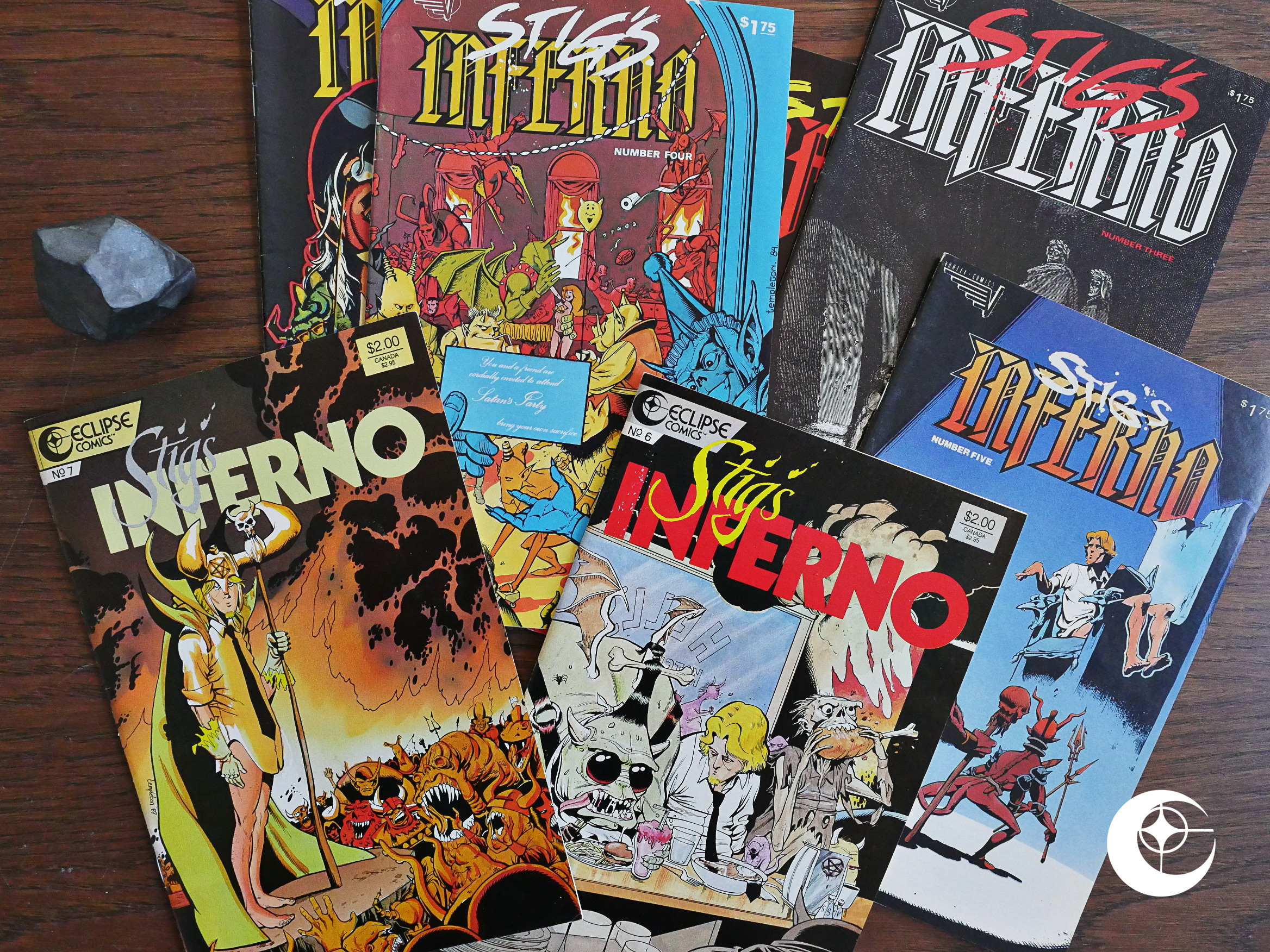
As a teenager, this was one of my favourite comics, and I still perk up at the mention of Ty Templeton’s name despite not really following his career much after starting to work at super-hero comics. I seem to dimly remember an … origin story … of … Doctor Light? Can that be right? Early 90s?
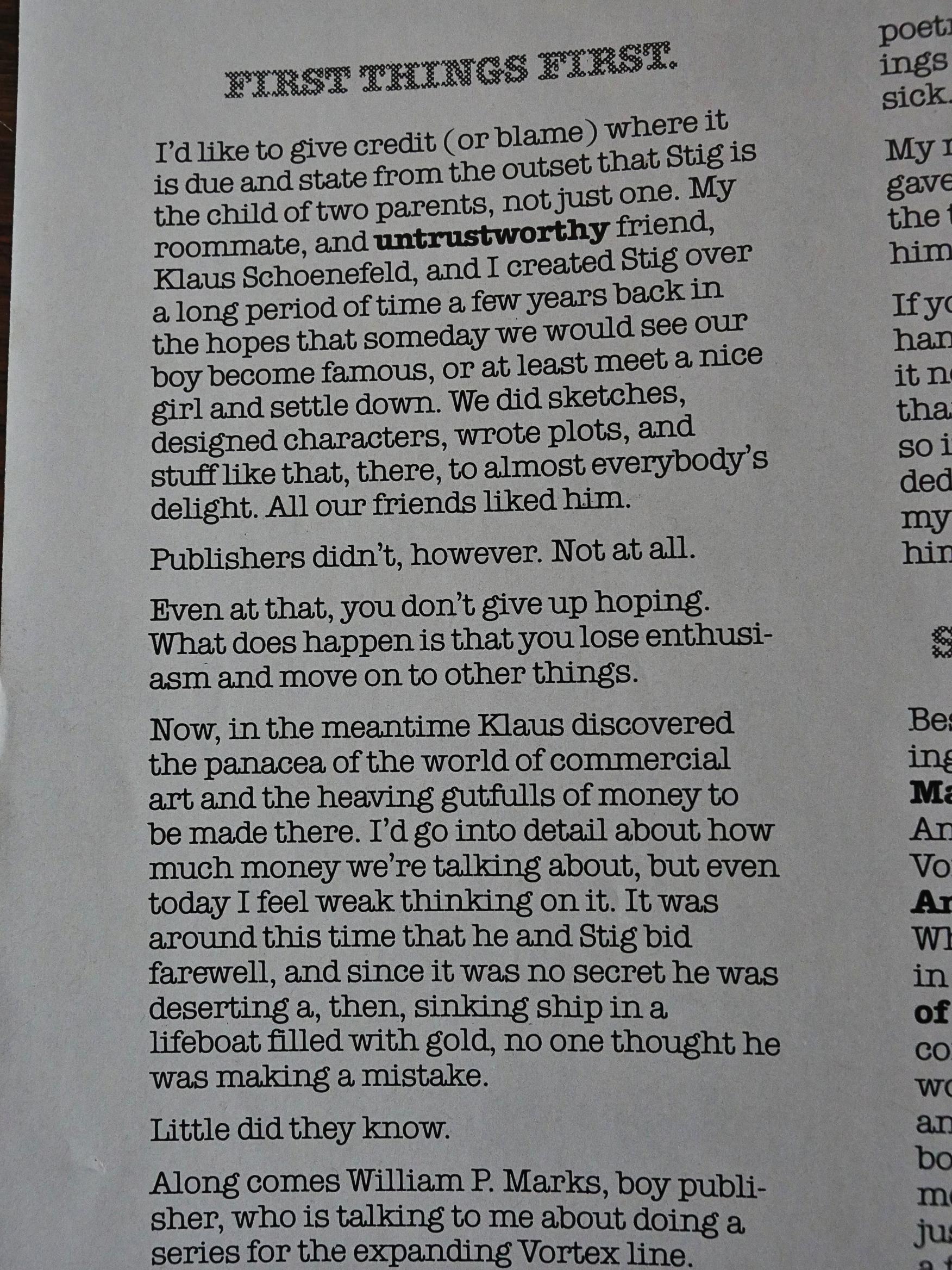
Anyway, this was originally published (lethargically) by Vortex Comics for the five first issues. Templeton explains that Stig’s Inferno was co-created by Klaus Schoenefeld, but was picked up by (later notorious) publisher Bill Marks after Schoenefeld had stopped doing comics, so Templeton did the book solo.
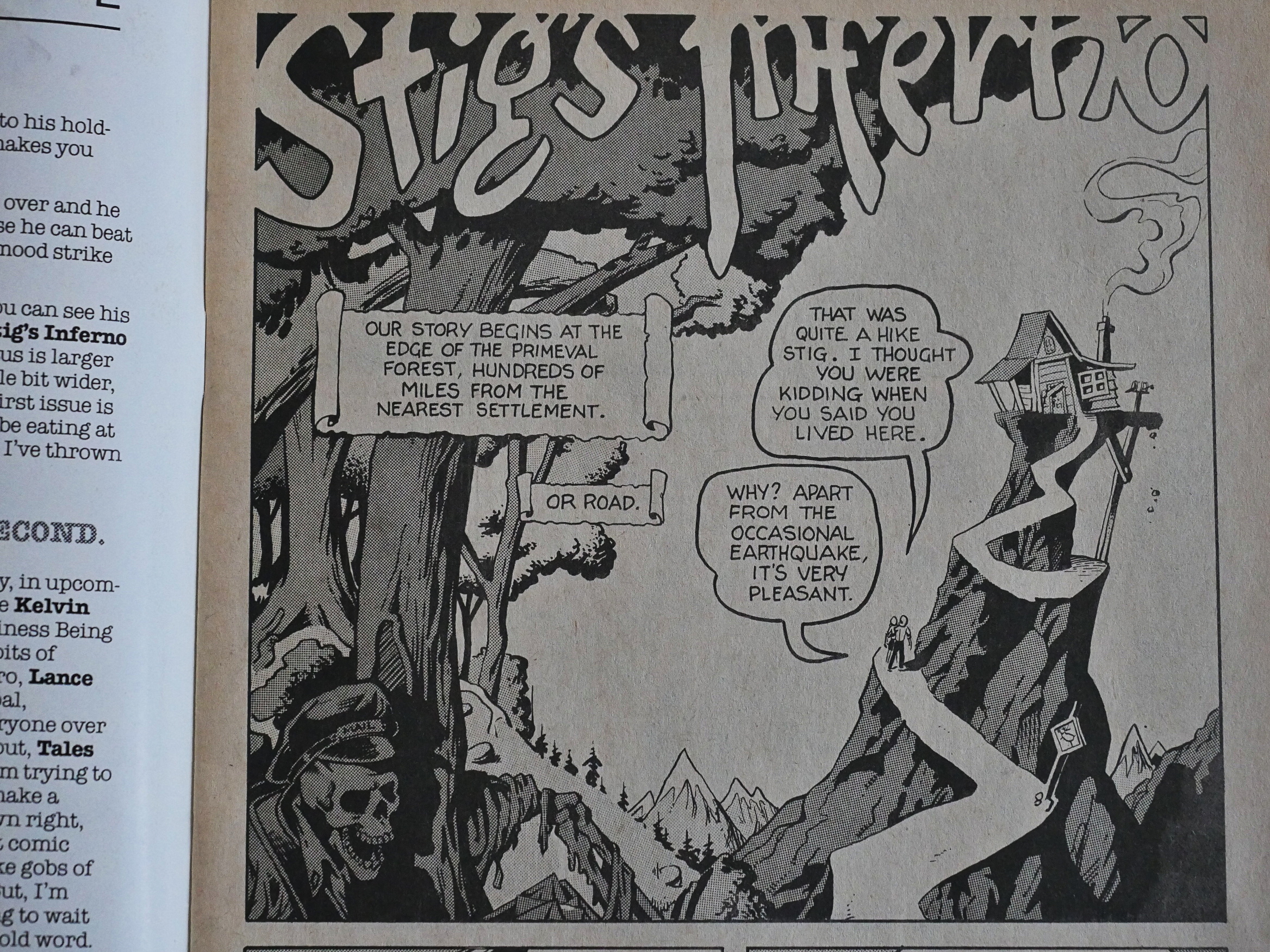
The immediate attraction here is, of course, Templeton’s almost impossibly sharp artwork. It’s got a Wally Wood feel to spotting of blacks, but otherwise Templeton isn’t a Wood disciple, I think.
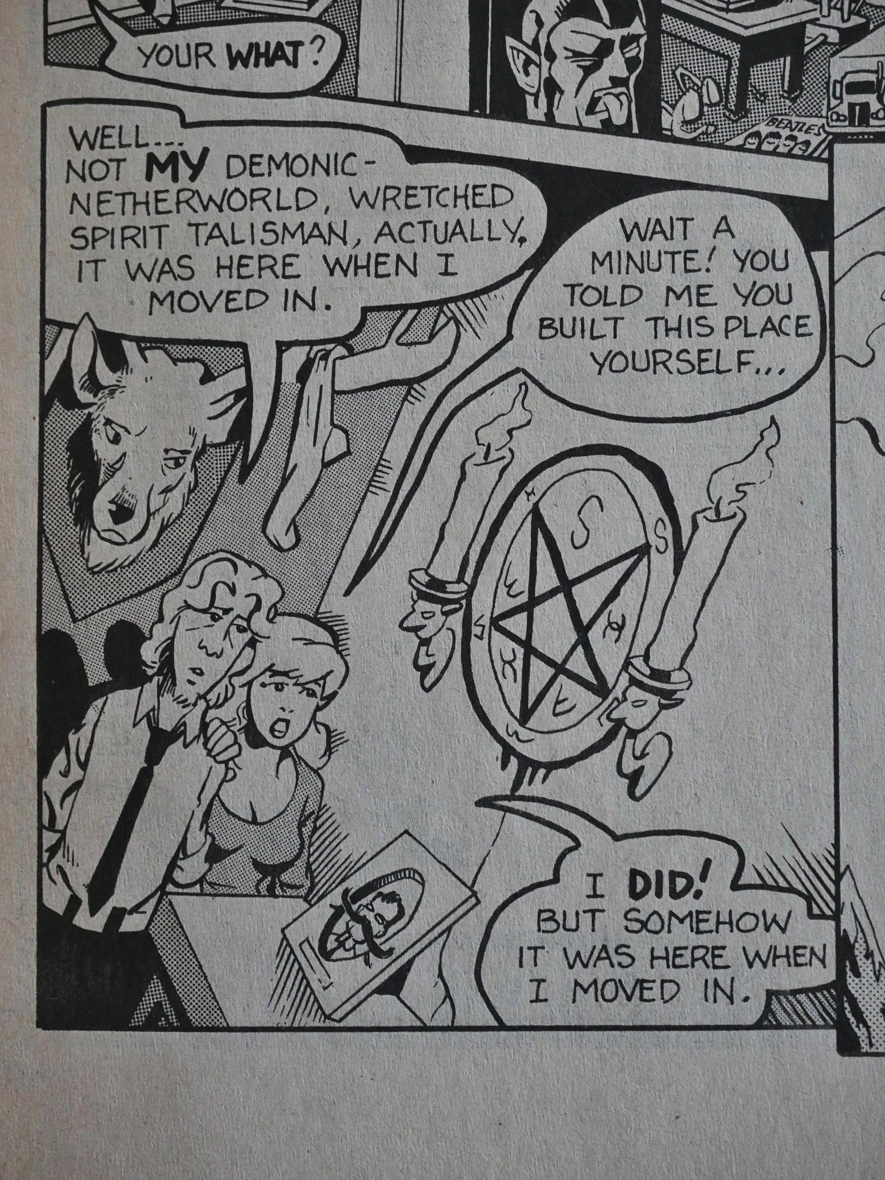
His faces and figures are… Uhm… A bit Bill Elder? I don’t know, but the mix is really attractive and fun to look at and to read.

And the jokes were just perfect for a *counts on fingers* 15 year old me. I thought it was the silliest and funniest thing ever. Re-reading it now, I, er, don’t, but I still find it very amusing. There’s so many of these jokes that even if half of them don’t quite land, the cumulative effect is appreciable.
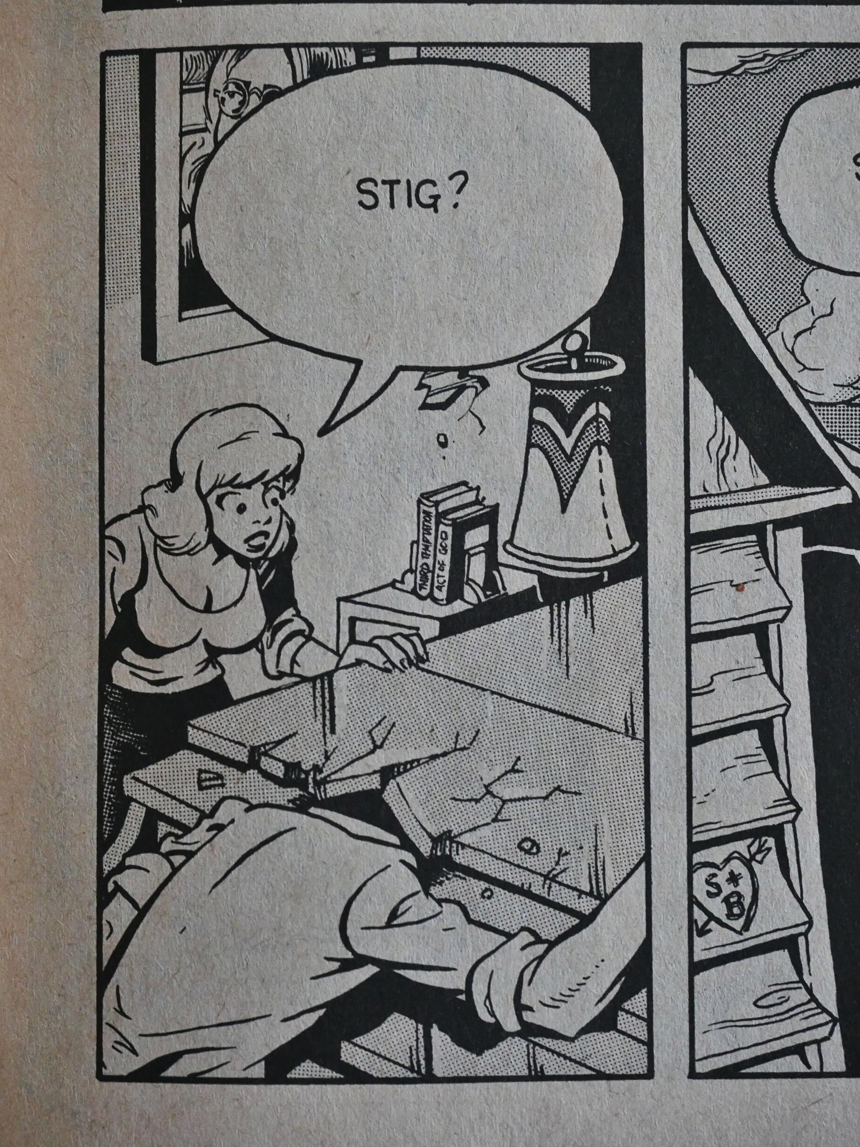
The plot is that Stig dies…
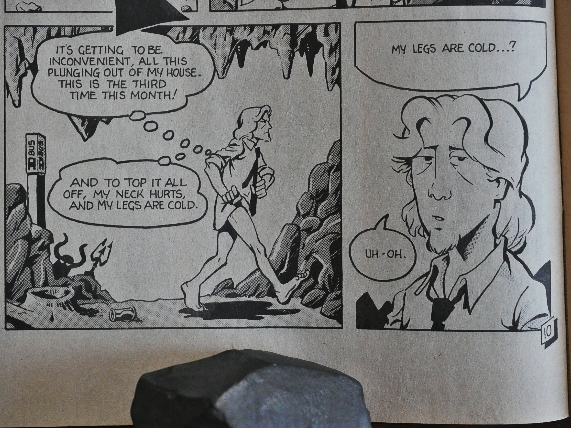
… and then lands up in hell without knowing that he’s dead or that he’s in hell. He thinks he’s in a fantasy film shoot most of the time.

Oh, and he’s pantsless. If there’s one thing people know about this book if they know anything, it’s that it’s about that pantsless guy in hell.
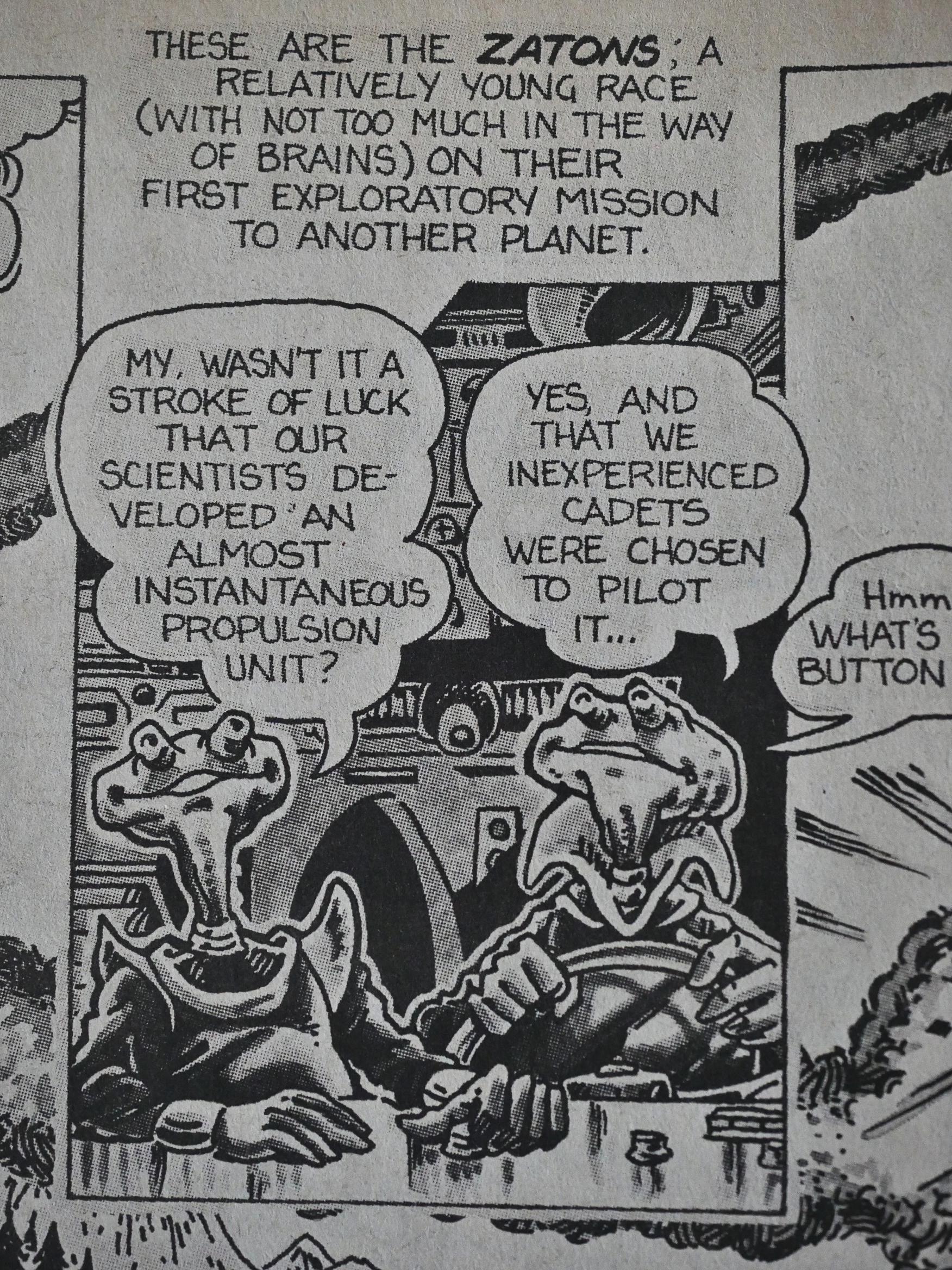
(Art by Templeton and Anthony van Bruggen.)

The Vortex issues are brief: They’re only 24 pages long, which is an unusual length. The vast majority of American comic books are (or were) 32 pages long, and if they wanted to go shorter, they have to go to 16 pages (which Eclipse did with books like Airboy). Vortex is a Canadian publisher, though, and perhaps they have printers there that fold paper in a different way.

And the main feature only occupies twelve to fifteen pages of each issue, so there’s only a short jolt of Stigness before it’s onto something else that’s almost equally silly, like this Not Stig competition…
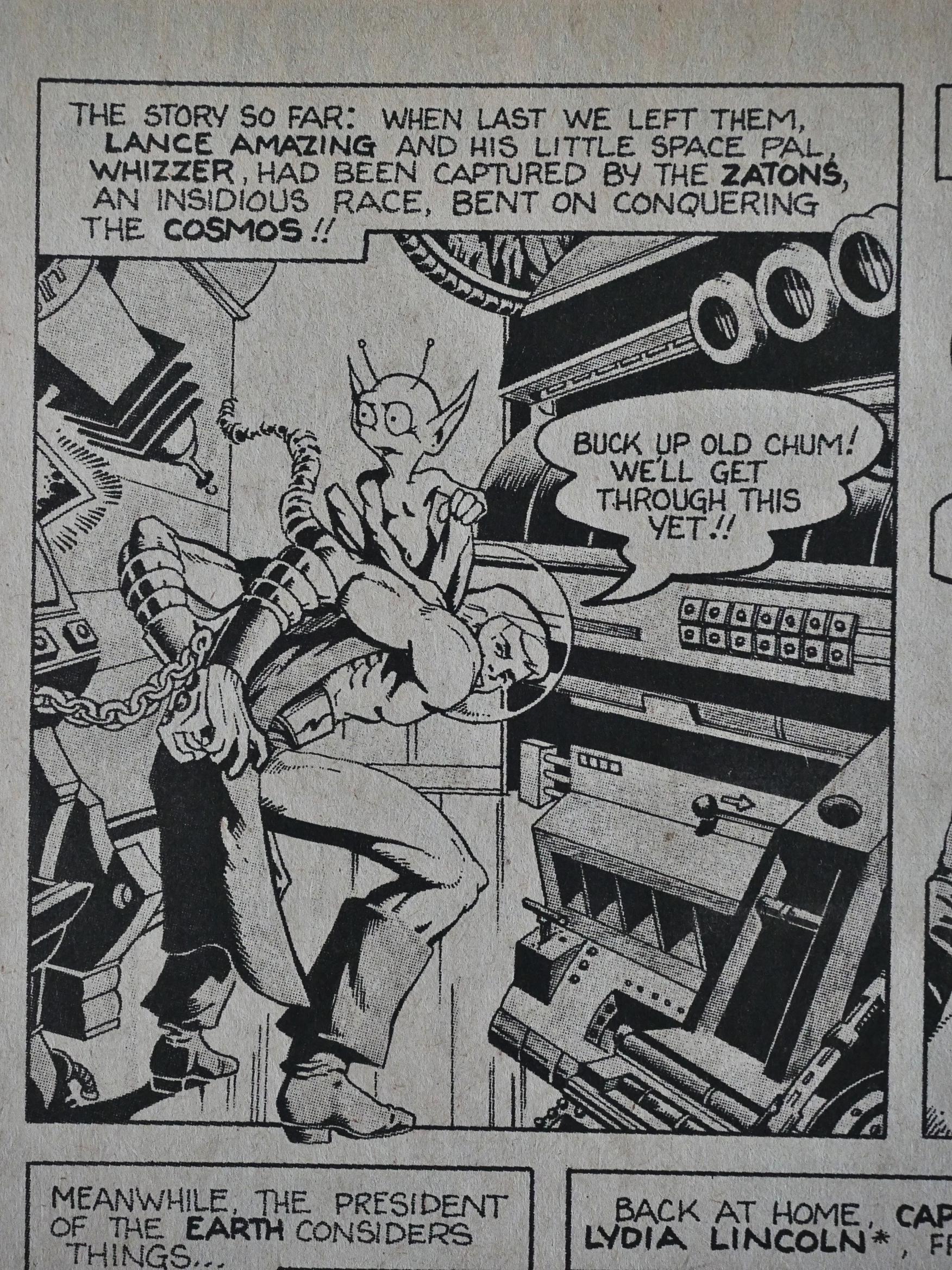
… or even sillier things, like the very brief Lance Amazing backup.
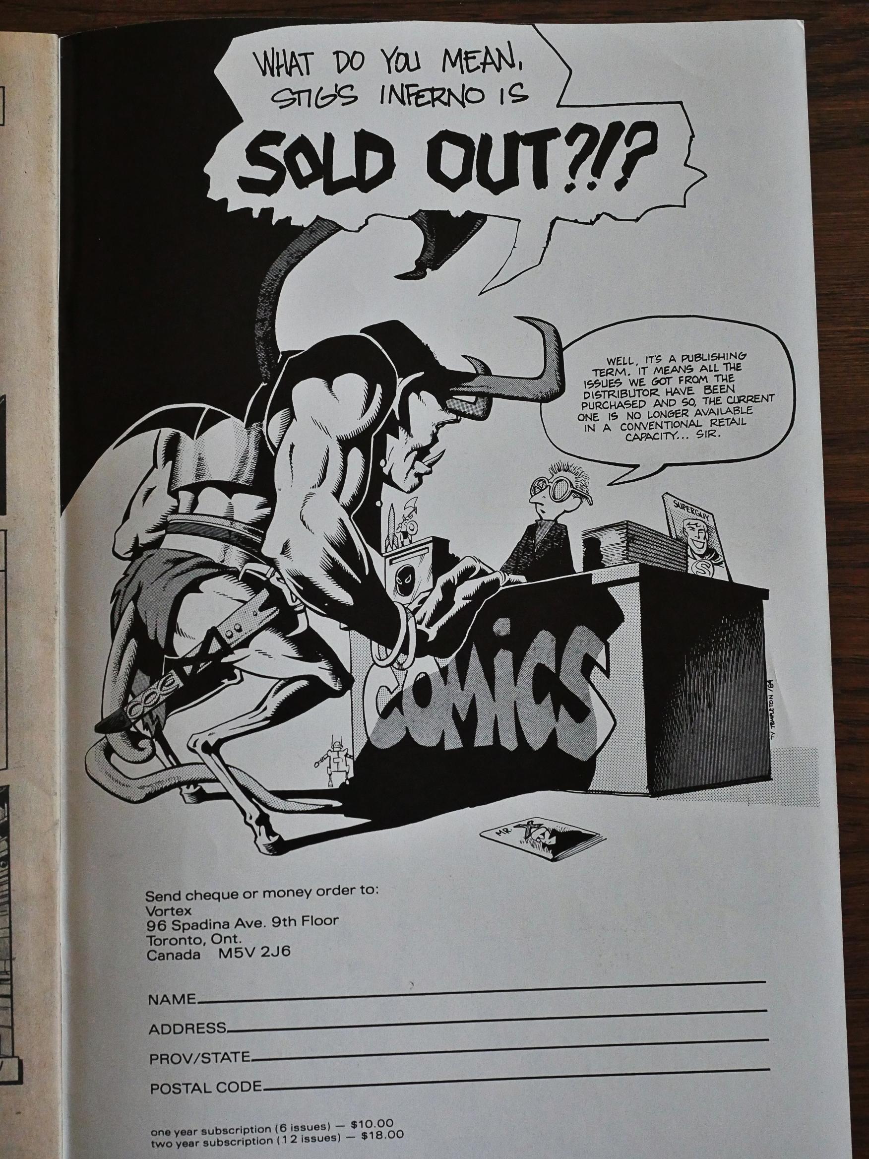
Wow, that’s a super-sharp ad.
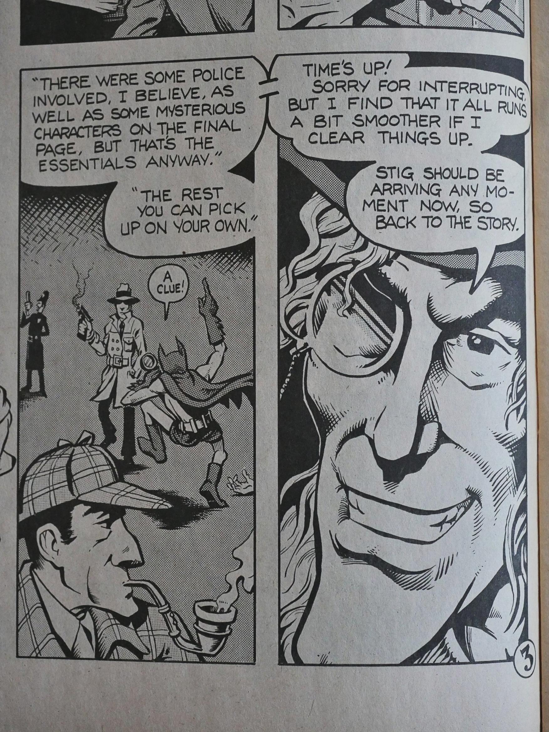
In the second issue, Templeton introduces a Crypt-Keeper like figure to provide the recaps and framing sequences between the stories. And recaps are probably necessary, because the five issues were published over a two-year period.
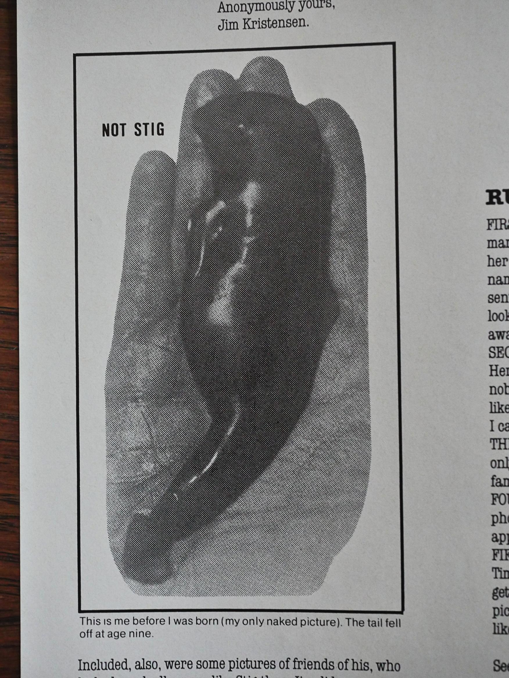
The winner of the Not Stig competition.
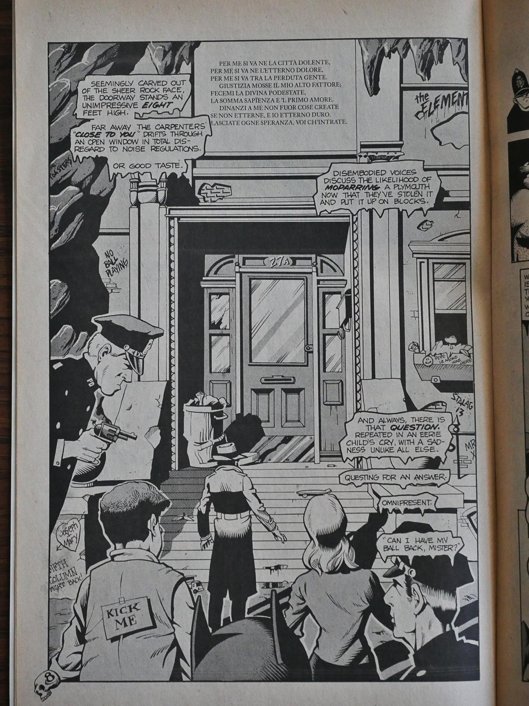
Reading this now, I’m finding it hard to guess whether Templeton had any plan with this book beyond the central premise. He’s got a pretty large cast that contribute to several plot threads, and since there are so few pages to develop them in (and not to mention the gags and the jokes), some of them don’t get very far.
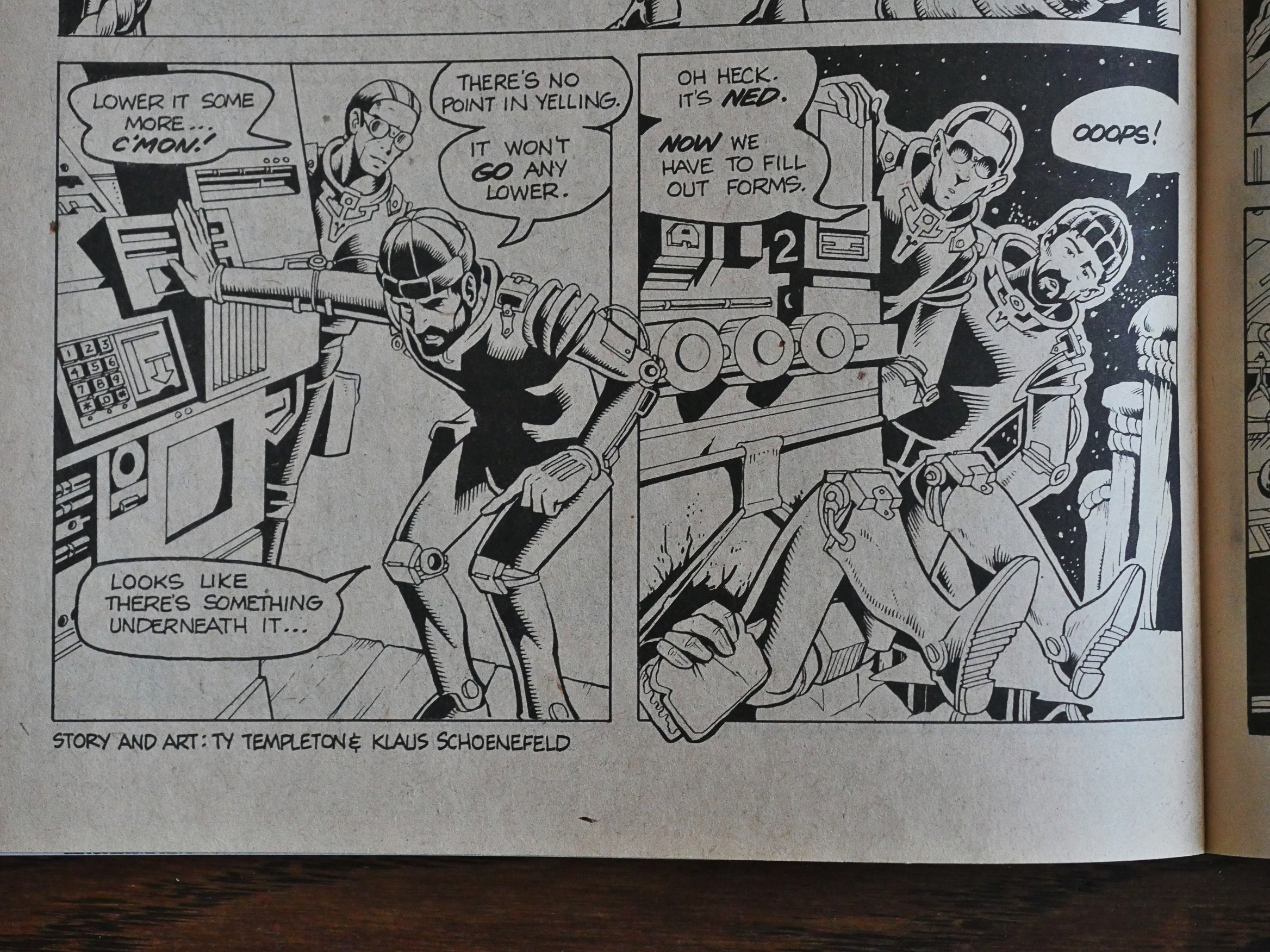
Templeton’s entry into comics apparently made Schoenefeld reconsider his retirement from the field, and he collaborated on the art on a couple of backup features. (As well as starting his own series, Kelvin Mace.)
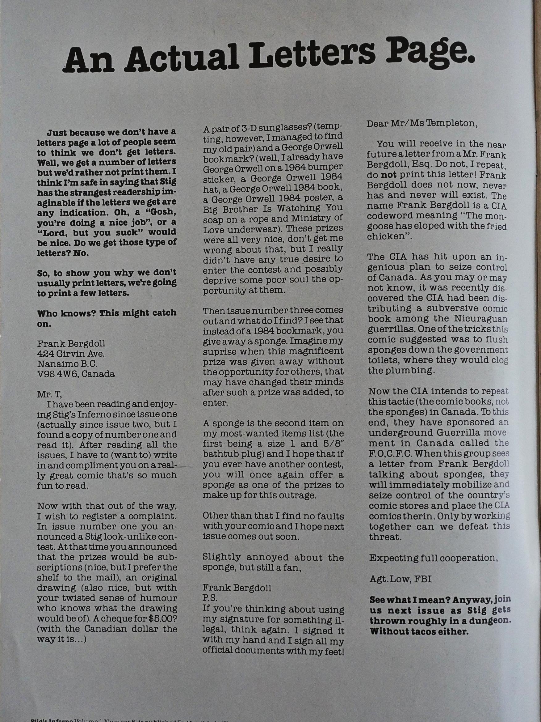
Templeton complained (perhaps facetiously) about the weirdness of the letters he’s getting, but that’s a pretty good one.
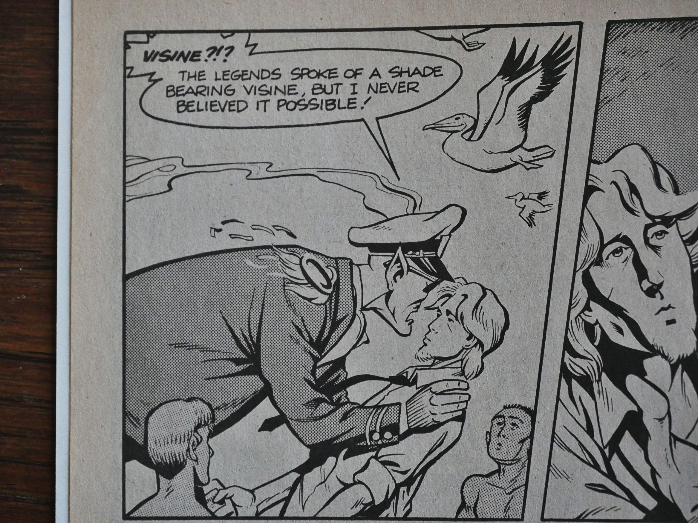
Stuff like this… is this going anywhere, or is it just a random joke? I’m leaning towards random joke, and Templeton not really knowing where he’s doing with it all.
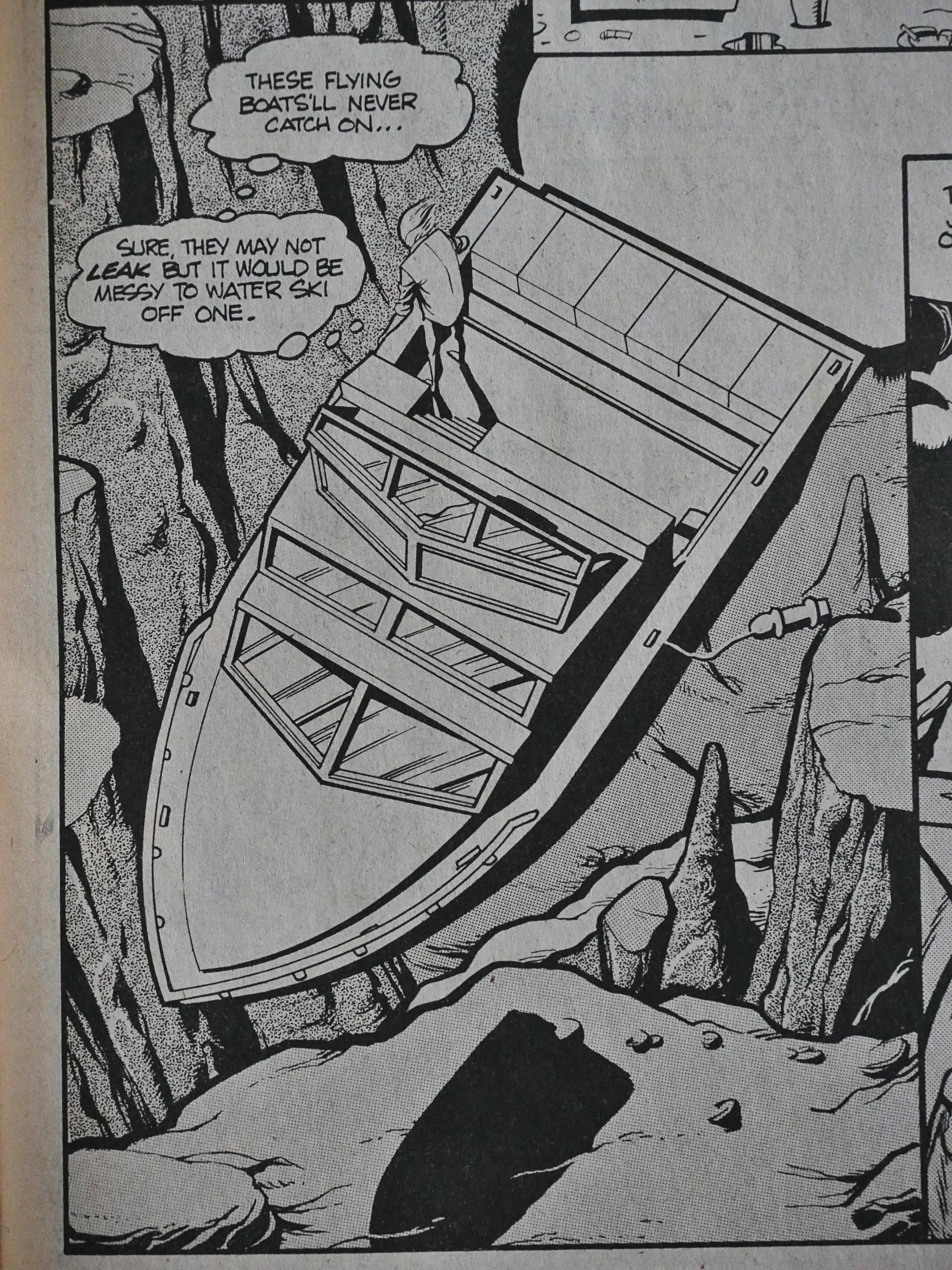
That joke made me laugh out loud. It’s just so stupid.
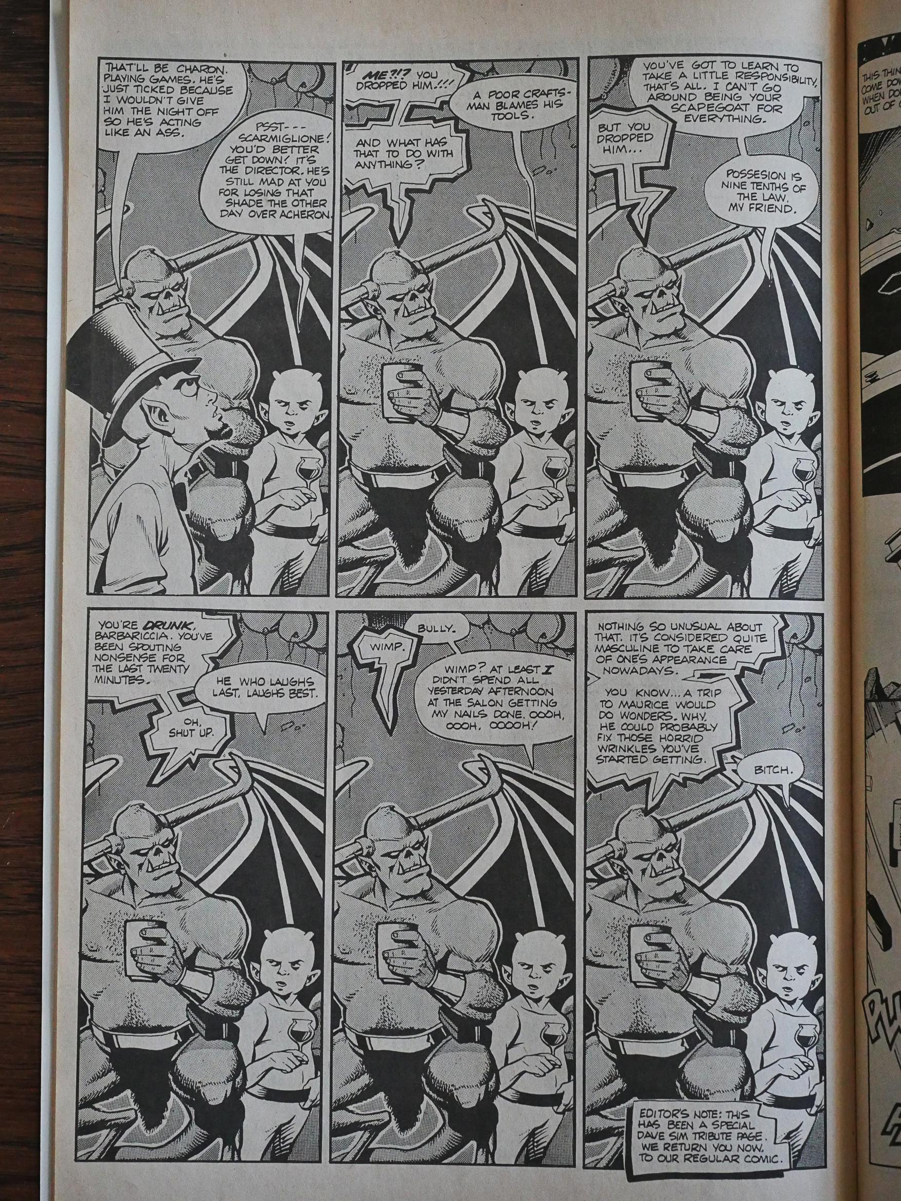
Templeton doesn’t indulge in much “fourth wall” humour (i.e., mentioning that we’re in a comic book), but that’s a nice commentary on Dave Sim’s Cerebus, which was using photocopying a lot as an effect around this time.
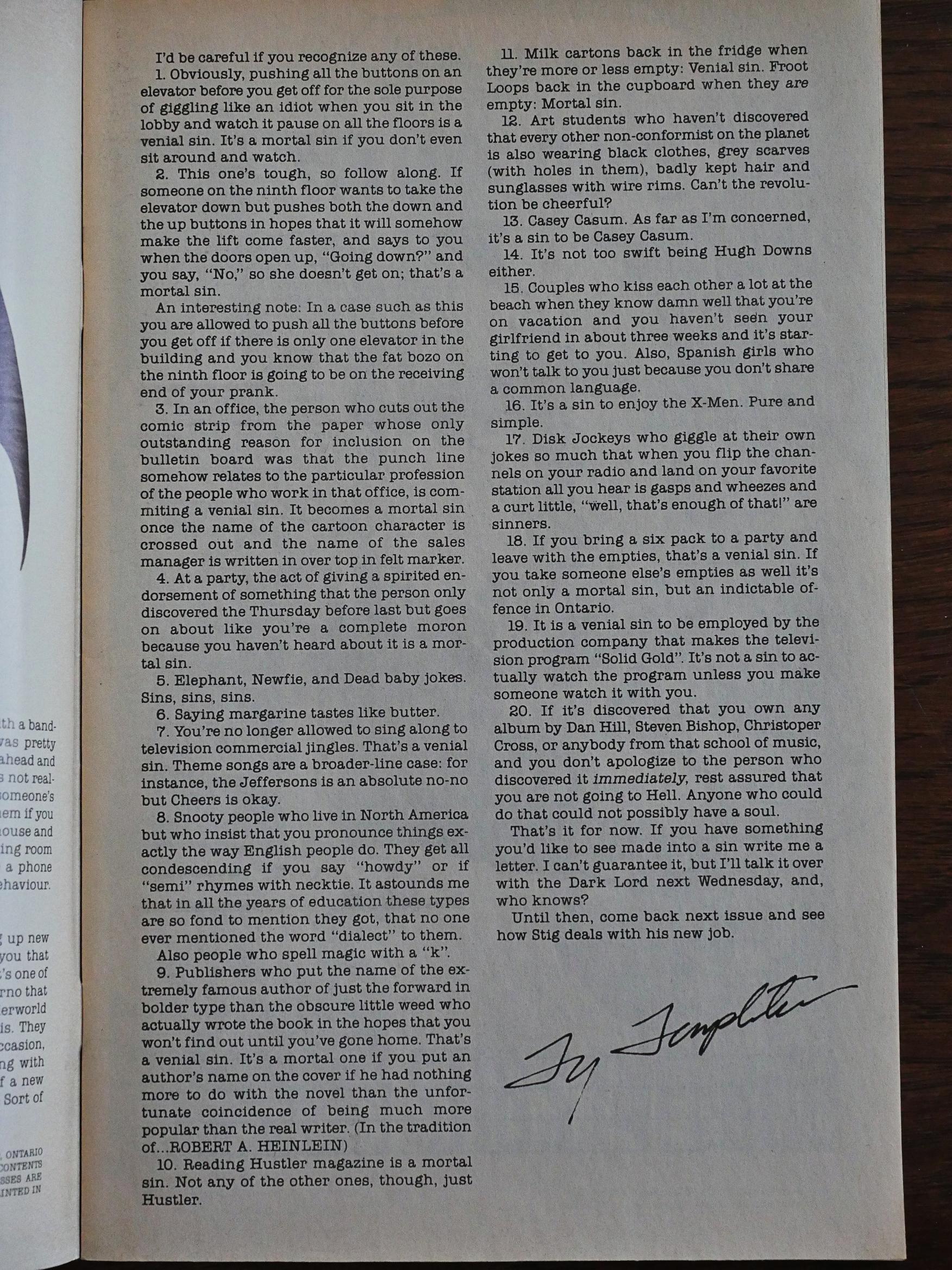
I think I agree with most of Templeton’s list of deadly and venal sins here, especially the one about hitting both the up and down buttons on elevators.
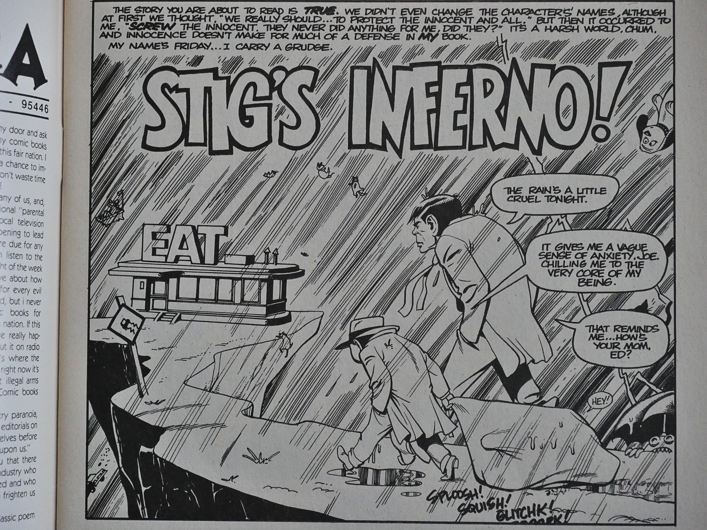
And then! Eclipse! Templeton had by this time (early 1987) worked for Eclipse on a number of projects, like Adolescent etc and The New Wave. So perhaps it seemed natural for him to restart it there, especially since 1) it’s in black and white and 2) there’s a boom going on.

The artwork hasn’t changed a lot in the intervening year(s), but that looks very Mad Magazine.
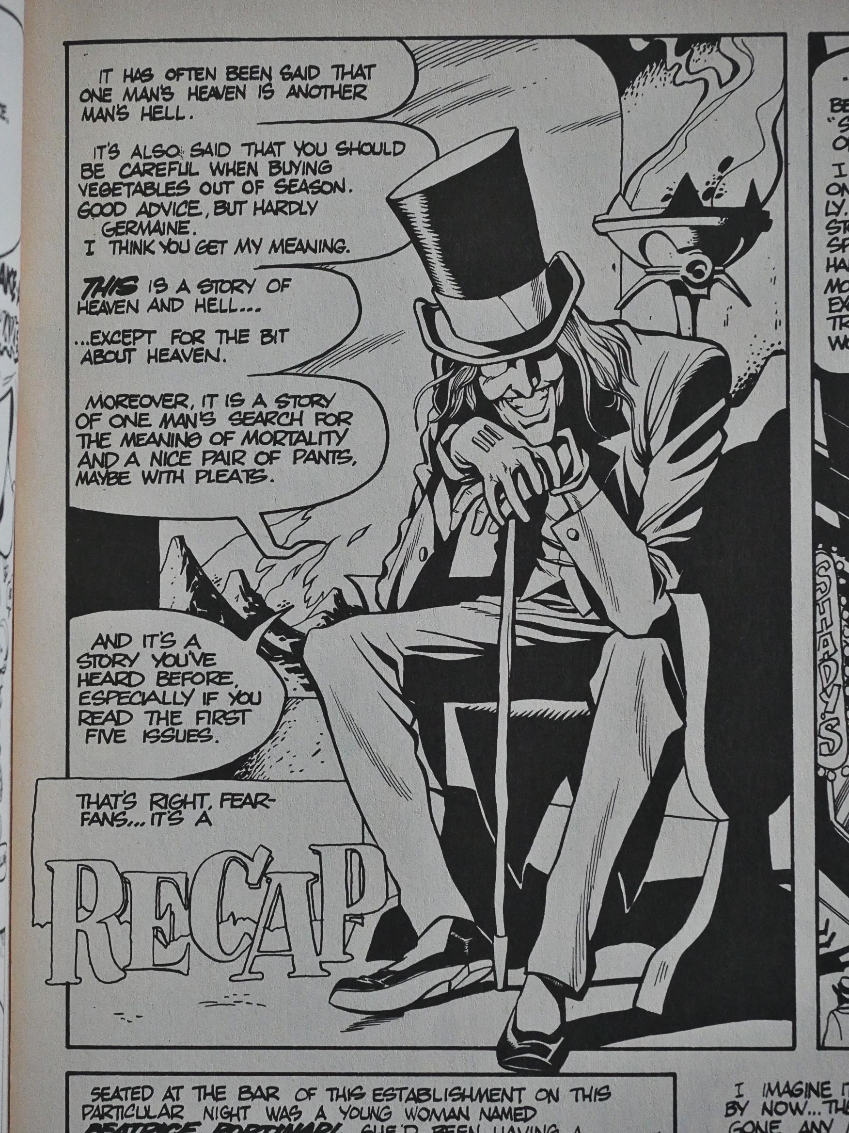
The first issue’s portion of Stig doesn’t advance the story at all. Instead it’s all recap.
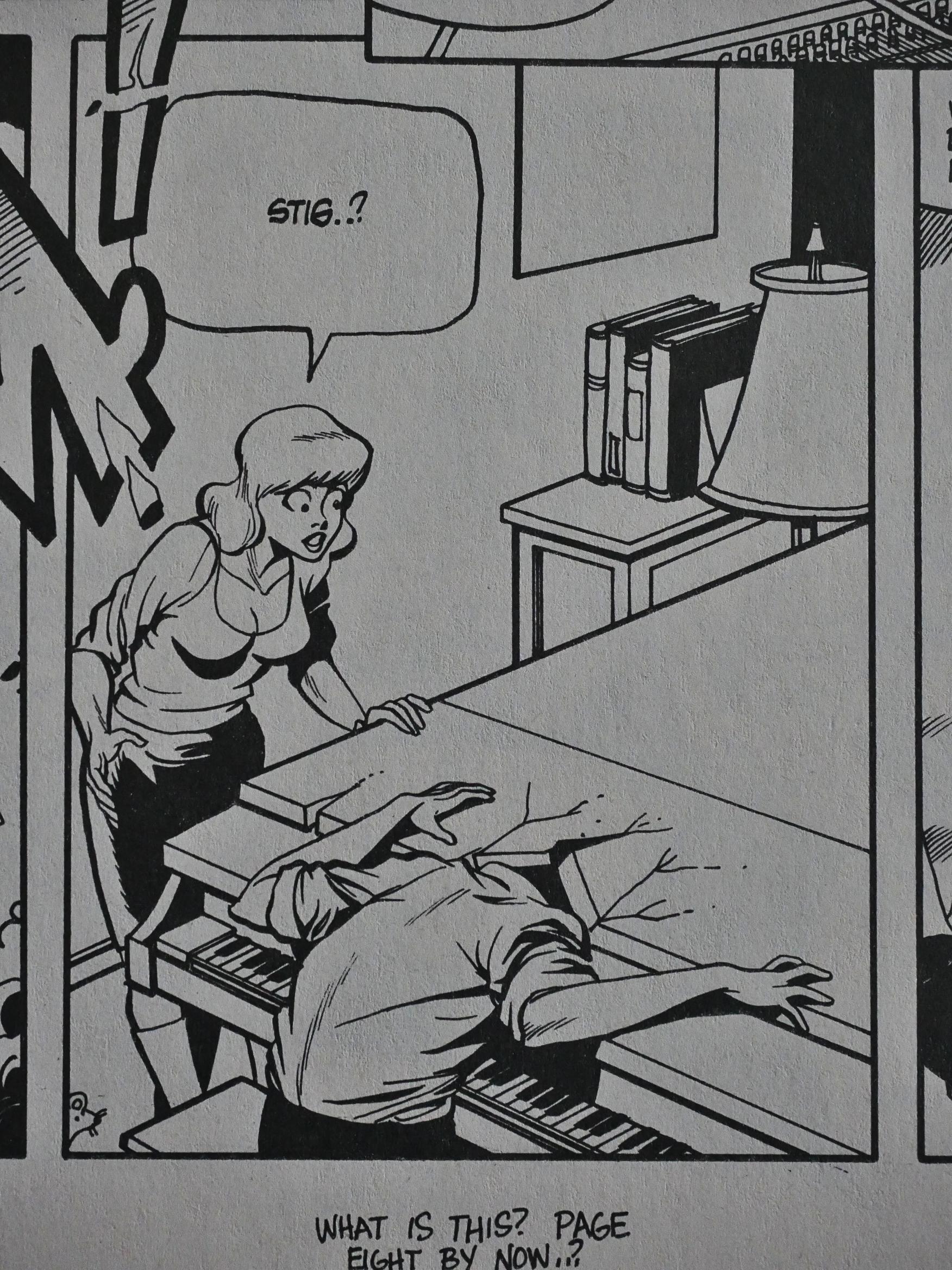
Not only that, but Templeton reprints several pages from the first five issues, lightly modified.
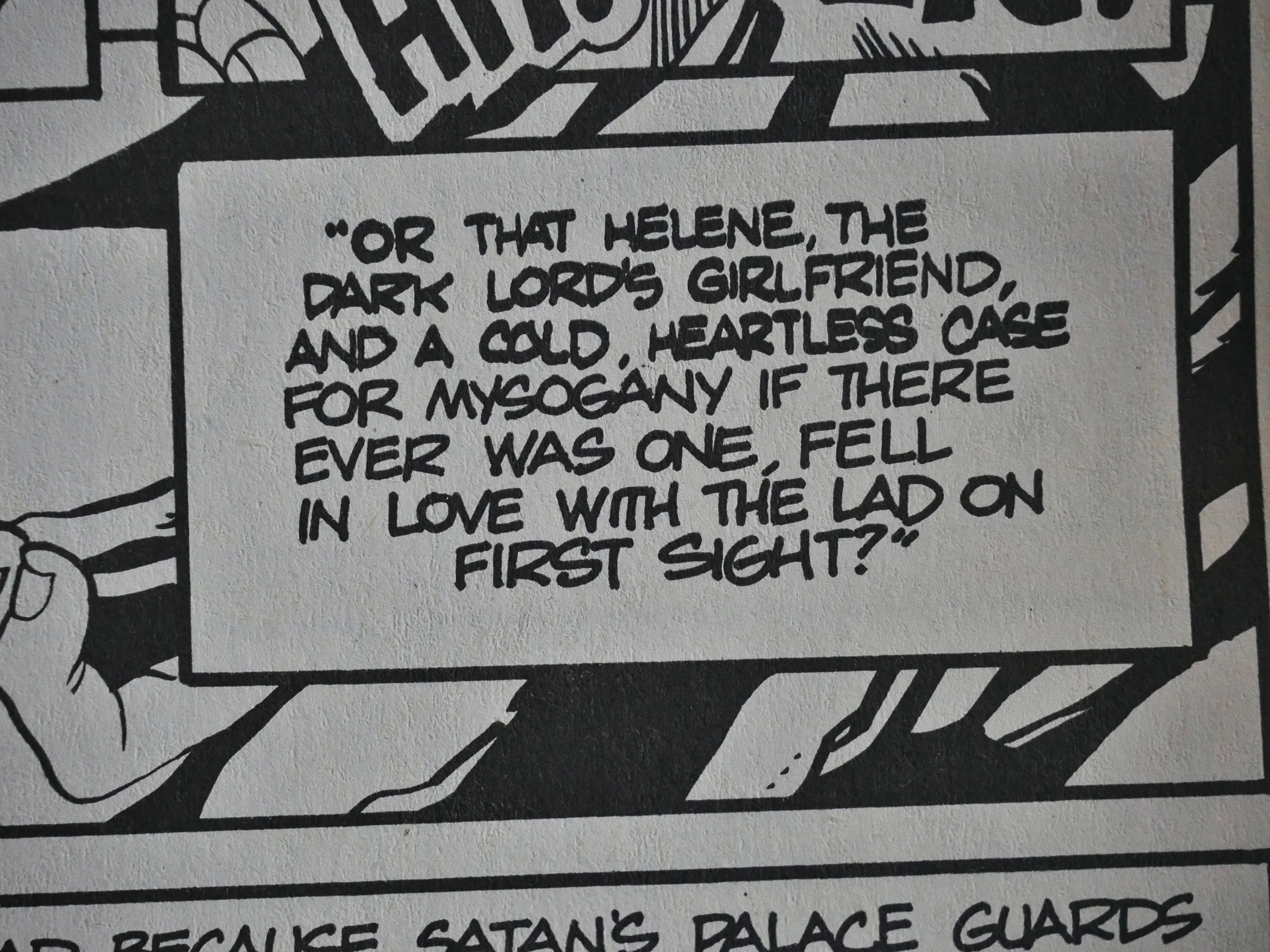
And there’s nobody doing proffreading.

So the first new issue is rather a disappointment.
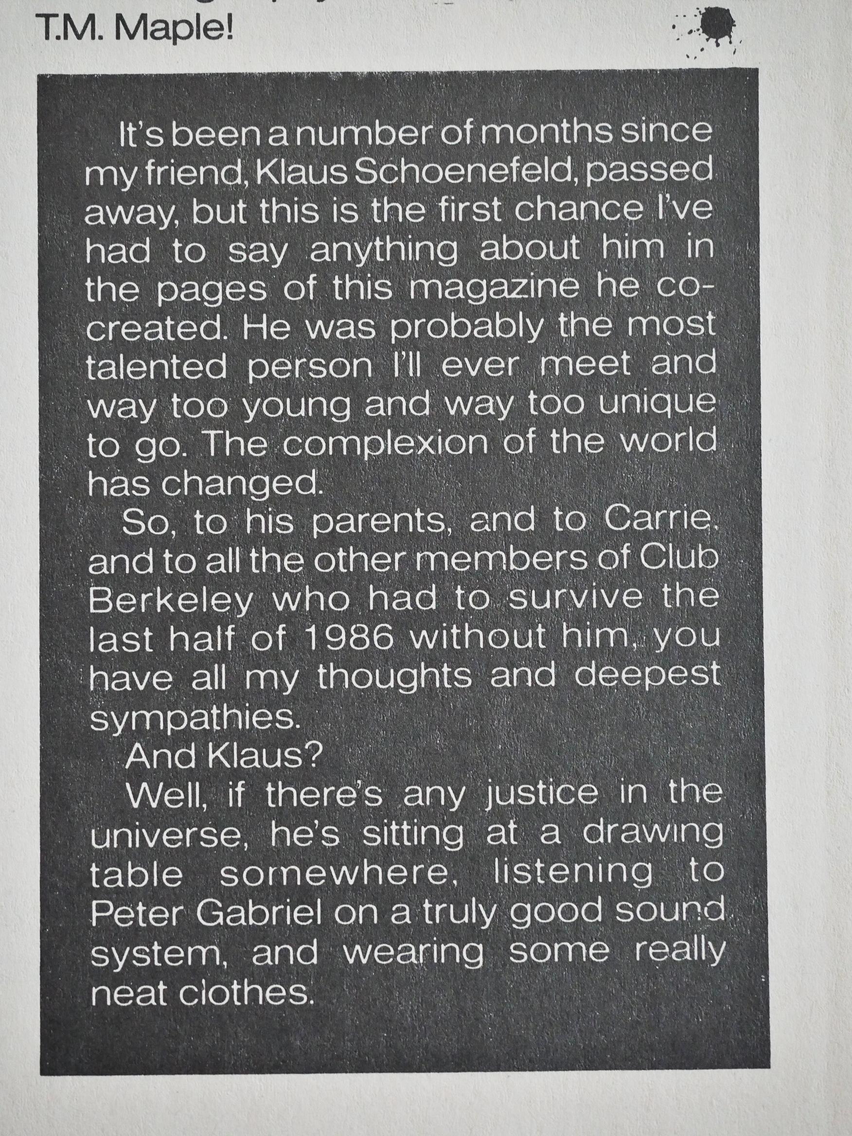
Meanwhile, Stig’s co-creator Klaus Schoenefeld died of a heart attack at only age 25.
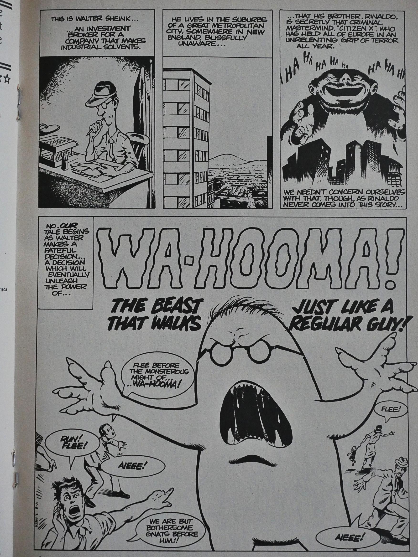
To fill out the first Eclipse issue, we have a Sam Kieth-drawn monster/romance parody.
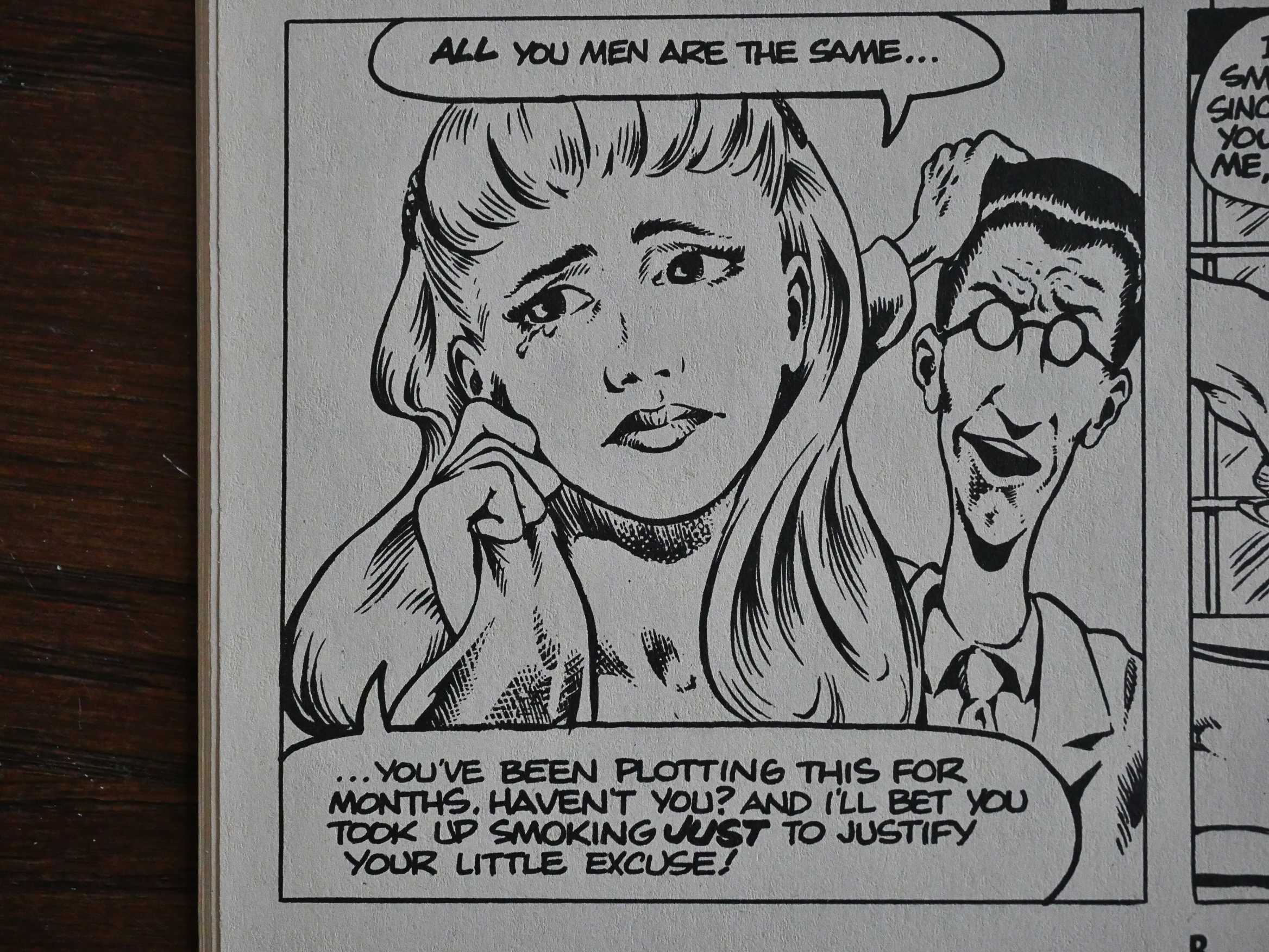
Kieth is probably aping Dave Stevens here in his rather handsome rendering of women.
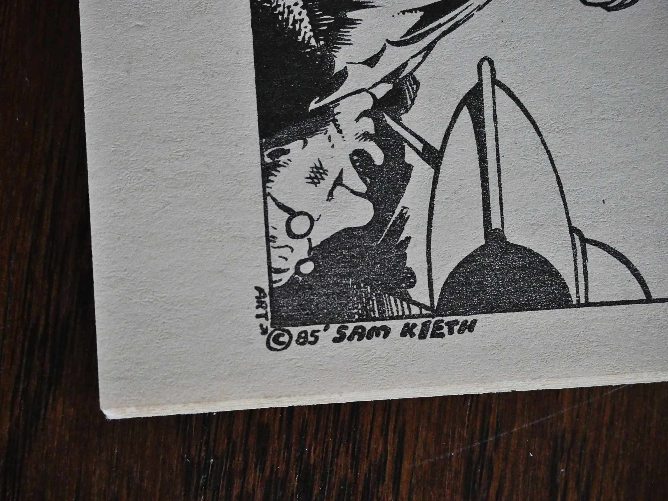
Oh, so this is from 1985? It’s a piece they had floating around they jammed into this book? It’s funny, anyway.
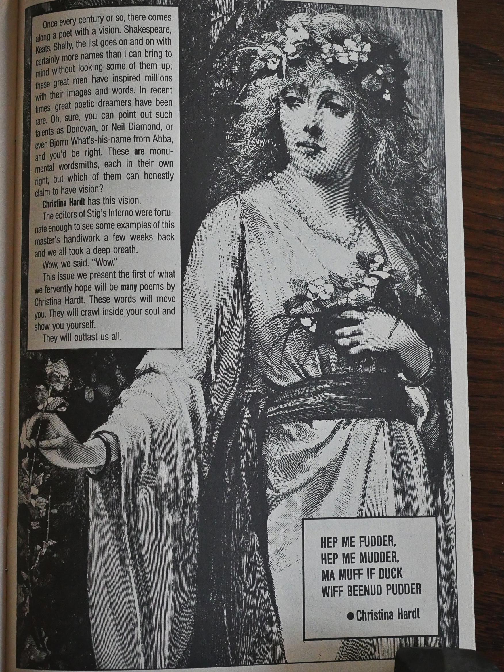
I don’t mind these filler pages: They give the book a grab bag feel; some surprises are good and some aren’t, but it’s certainly better than filling up pages with house ads.
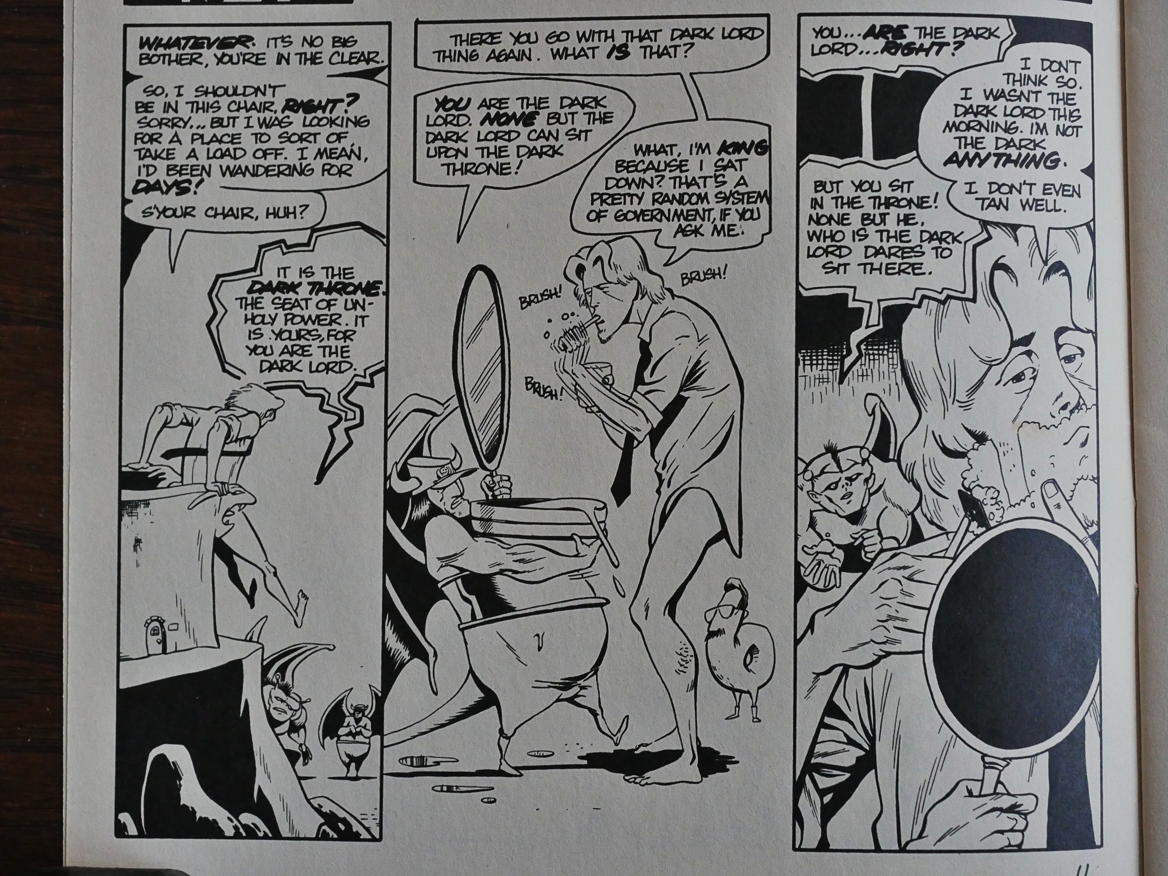
Finally! In the second Eclipse issue Templeton advances the er plot.
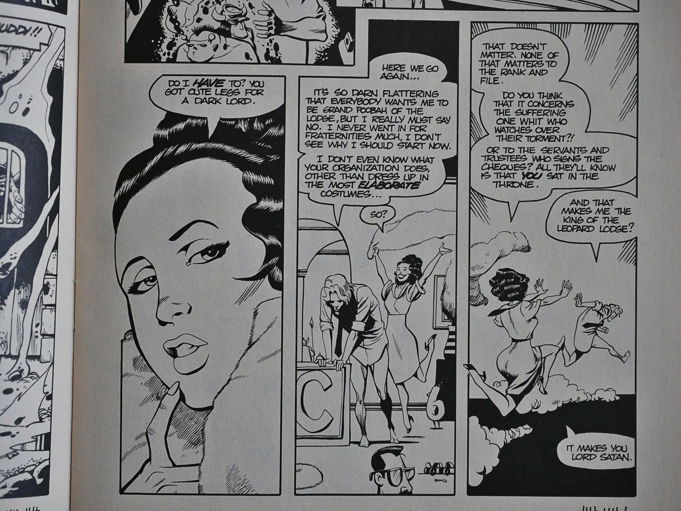
There’s a surprising amount of it, too: It probably the most text-heavy issue in the series.
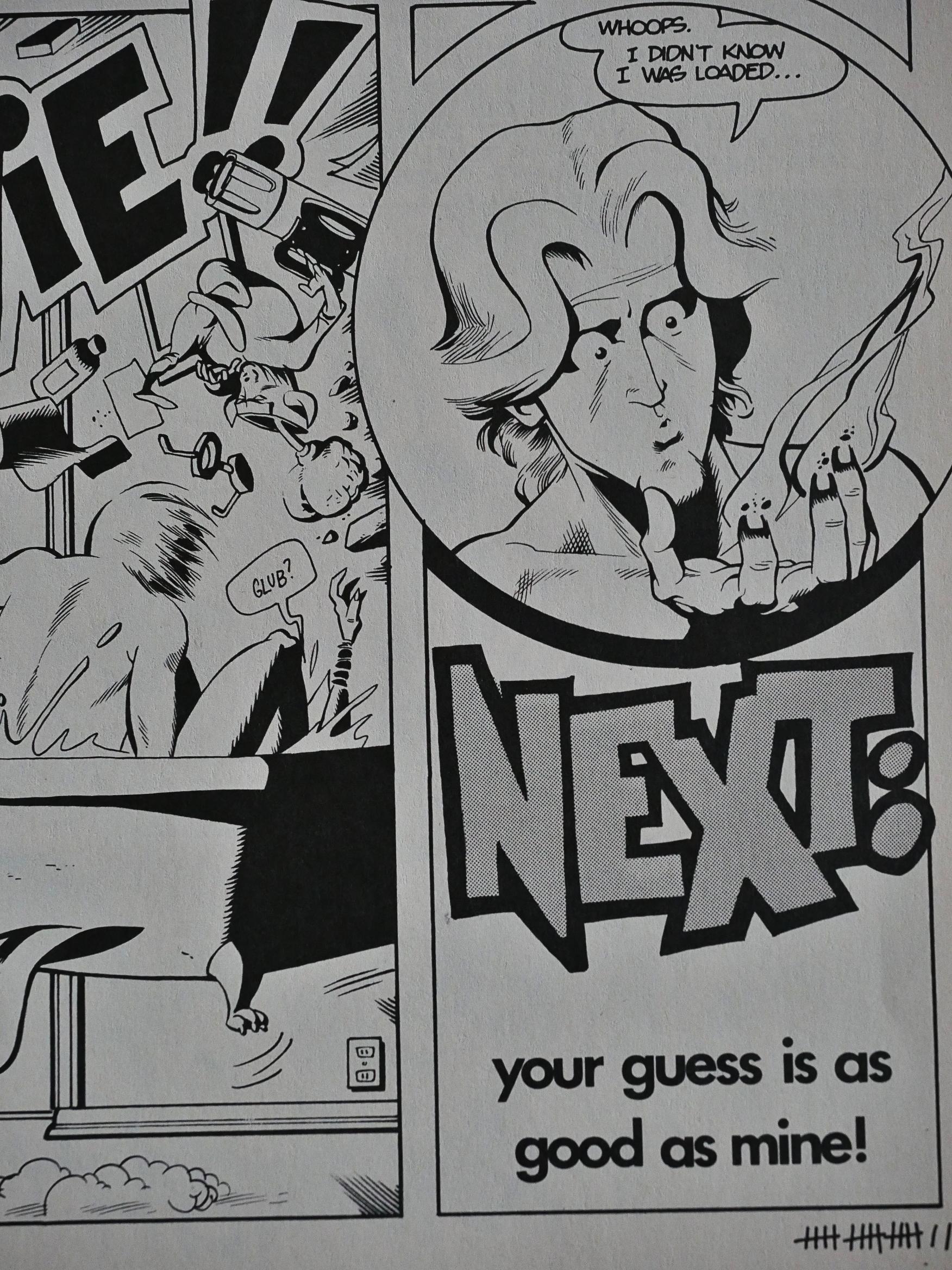
And then it’s over. Perhaps Templeton didn’t really have a plan?
c! c!

Vortex reprinted the Vortex issues of Stig’s Inferno in one volume, but the series has never been reprinted as a whole, and hasn’t been continued anywhere that I’m aware of. And you kinda see why: Even if it’s beautifully rendered and quite funny, it just doesn’t go anywhere. It’s weird that Templeton didn’t just slap a (say) 20 page ending onto it and lightly edit the middle bits. Then he’d have something that I think some people would really like to read.

Templeton has put the entire thing here, so you can read it for free. If, for some reason, you wish to read a recap of the plot, it’s here.

But what did the critics think? I don’t know! I thought it had a bigger presence than it did, because I can’t find a single review of it in The Comics Journal.

But there’s this. Gary Groth talks about his arch nemesis, Eclipse, in his story of the black and white boom (and bust):

Anyway, Eclipse wouldn’t touch black-and-white comics until — you guessed it — the black-and-white explosion. In July 1986, Eclipse published one black-and-white comic (Adolescent Radioactive Black Belt Hamsters); by October Eclipse had announced four titles; in November, six; in February and March, eight each; and by April, they had announced nine. Ty Templeton, whose own black-and-white Stig’s Inferno was published by Eclipse (and was probably the best B&W from Eclipse up to that time), confirms my view that this flurry of publishing activity was so much unprincipled strip-mining. In an Amazing Heroes interview, Templeton said:

I don’t think for a minute that Dean [Mullaney] wanted to publish [Stig’s Inferno] until black-and-whites became really big. Because at no time did we talk about it and then, one day, out of the blue, he just called me and said, “We’ve cleared our schedule, we can do Stig.” I think that’s only because the black-and-white market suddenly looked hot. So I hope that he wants to continue doing it even though black-and-whites are dying out, because if the sales drop down to the point that nobody’s making money, like they did with the Hamsters and the Koalas, he might suddenly go, “We-e-ell, this isn’t the gold mine we thought it was.”

From one of their own creators, Eclipse stands condemned.

I guess that explains the general feeling of not really committing in the two Eclipse issues. They’re filled with all sorts of filler instead of really expanding on the storyline.

Still worth reading.

1987: Guerrilla Groundhog

Guerrilla Groundhog (1987) #1-2 by Chuck Wagner and Andy Ice.

I assume that this is more extruded product to stoke the black-and-white boom, released just in time for the bust? It’s got that tell-tale sign: It’s about a mutant woodland creature who fights a lot.

But the premise here isn’t all that bad. The villains are Marxists from Jupiter’s red spot. It’s not Commies from Mars, but it’s not bad.

The artwork is generally professional. Is Andy Ice a pseudonym? But it’s got some problems with proportions and faces looking very goofy in every other panel.

Yeah, yeah, mutant animals… Prime black-and-white bust product.

I tried to find something that was funny to use as an example of the humour, but it mostly just isn’t. Here’s an attempt, at least.

And ended.

The most interesting thing in this book is this ad for Floyd Farland by Chris Ware. This is a page I think doesn’t appear in that book? Hm… and it seems to recap half of that book?

I haven’t seen this ad in any other Eclipse books, weirdly enough. In the other ads they use a less text-heavy approach.

But back to the groundhog: I was unable to find any contemporary critique of it, but I found this on the web:

There’s something about a giant angry groundhog as big as a man, riding around in a super gopher digging machine… something that reeks of “we’re not really sure what the hell we’re doing, but whatever it is, let’s get it done as fast as we can before the comic shop owners wise up.”

Indeed.

1987: The Sacred and the Profane

The Sacred and the Profane (1987) #1 by Dean Motter and Ken Steacy.

That’s a very minimal cover. I don’t actually appear on it; it’s just the reflections.

Eric McLuhan does the first introduction where he says that Christian tragedy isn’t possible.

Archie Goodwin does the second introduction, where he more sensibly explains the publication history of this work.

It was published in black and white in the 70s by Star*Reach. It was then rewritten, partially redrawn and fully repainted in the 80s for publication in Epic Magazine, where I think I read it at the time.

This graphic novel reprints that version on very white, non-glossy paper, and it looks very nice. Steacy designs the pages thoughtfully, using the placement of the panels to create nice effects, like when he goes from pages like this to pages that are “full bleed” (i.e., no white borders whatsoever) that opens things up panoramically.

I love Steacy’s use of purple on the pages.

And the colours are beautiful. But there’s a certain vagueness to his characters and faces that I’m not sure are really intended or are production artefacts.

Oh, the story? It’s about Catholics in space that encounter some alien tentacle monster and then have a total emotional breakdown. And this is shown by everybody shouting at each other all the time.

The text is all set in… uhm… Bodoni small caps? I guess? It’s a nice typeface, but it has very narrow stem widths, so it’s awful when set in black on white, because the ink will fill in the too-narrow stems, rendering the text hard to read.

The text is also glued down on the page in a sloppy way. It’s so weird: It’s obvious that there’s so much work that’s gone into this book, but then they haven’t cared enough to fix the placement of the text blocks.

Oh, yeah, since all that happens in the book is people fighting the tentacle monsters and standing around shouting at each other, providing all the data we need is left to these text pieces that Sister Marianna has helpfully written.

In the penultimate chapter, we even get the entire backstory of the spaceship (and the history of Earth) told in this manner.

And the weird thing is, it kinda works. Instead of being a crutch, it increases the tension.

So is it any good? It’s got plenty of troubles: Wall-to-wall clichés in the plot and dialogue, a self-conscious pretentiousness and a gravitas that the Church in Spaaaace thing doesn’t really warrant.

But it’s better than a run-of-the-mill Heavy Metal/Epic Magazine sci fi serial, I think.

And, of course, Motter writes an afterword where he explains everything we should have gotten out of reading the book.

The pages showing Ken Steacy’s process are kinda fun, though.

But what did the critics think?

Here’s Rob Robi in The Comics Journal #118:

And the premise, which I remembered from so long ago, is a winner: take a group of Catholic missionaries, project them into a spacefaring situa tion, and have them encounter a sentient life form. How does their faith withstand, and their theology explain, the staggering reality of non-human intelligence?

Academically, it’s about as urgent an issue as how many angels can dance on the head Of a pin; still, there might be, there should be, a story in it.

But as I reread The Sacred & The Profane in 1987, I realized with astonishment that Motter and Steacy don’t come within a country mile Of finding it. It’s amazing just how much of their story is stuff you’ve seen a scadzillion times before: starship maneuvers, scary-but-misunderstood aliens, Grade-Z melodrama. It’s a startlingly shoddy piece of work. (I’ve seen a few “Doctor Who” adventures with nearly the same plot, and much wittier handling). In his selfcongratulatory afterword to the volume, Dean Motter, bristling with pedantry, explains to us poor slobs that the story is structured according to guidelines set dmvn by Cicero in De Orator. He does not, however, go on to explain the errors in spelling, punctuation, and elementary grammar that smear the work from start to finish. (And there ought to be a Hall of Shame for comics scripters who insist on writing science-fiction without possessing even a basic knowledge of astronomy in The Sacred & The Profane, the starship St. Catherine goes on an “intergalactic” mission, but when things get tough, they consider high-tailing it “back to the solar system.” By way of NeverNever land, I suppose.)

[…]

As aliens infiltrate the ship, the stressed relationships of the crew members provide Much Drama—we get to read dialogue like, “Listen, you slut! I saw you with that technician this afternoon..” I wonder if Motter realizes how funny— almost camp—all of this is?

I think he liked it!