1986: Reid Fleming & Heartbreak Comics

Reid Fleming, World’s Toughest Milkman (1986) #1, Reid Fleming, World’s Toughest Milkman (1986) #1-5, Heart Break Comics (1988) #1 by David Boswell.

I remember Reid Fleming being a kind of small sensation in some circles back in the 80s. It was a cult that rather reminded me of the hubbub surrounding Bob Burden’s Flaming Carrot comics, and left me almost as cold as a teenager.

I had the self-published first version of the Reid Fleming book, as well as the first version of Heart Break Comics, and that’s where I stopped: I never continued reading it went it went “mainstream” at Eclipse.

Both Heart Break and Reid Fleming have their origins as a full-page weekly strip in the underground Georgia Straight newspaper. Reid Fleming was meant as a one-off, but got a rabid fan reaction. (According to Boswell, the reaction was from a group of friends who made a lot of noise; a very small cult.)

The first issue is magazine size, and reprints the 1980 self-published first issue. It’s a mixture of new (i.e., from 1980) longer stories and one-page reprints.

The page up there pretty much sums up the initial approach: Reid Fleming is an agent of chaos, violence and absurdity, and you’re either on board with that or you’re not. As a teenager I wasn’t: I found the Three Stoogieness of its humour to be tedious. But not as tedious as I found Flaming Carrot, which basically utilises the same idea.

I’m not so sure now? I appreciate the attractive stiffness of the artwork and the obsessive hatching and the weird hairdos more now, and even if there are a lot of jokes like this that I think don’t quite land, it’s an amusing read.

This is the first of the “old” strips (i.e., reprints from the newspaper), and the artwork is scratchier. The humour is basically the same.

“Bores? Why —” (I oughtta.) There’s a lot of early-30s screwball comedy in Reid Fleming, but I just wanted to mention the hatching (cross and non) again. It’s a really organic look despite all those straightish lines. I’m a sucker for texture.

The running joke throughout the series is that Fleming is a fanatic fan of a daytime soap that features a guy in a coma. And he’s been that way for five years.

The edition of the first issue that I have is the fifth printing, which must mean that Reid Fleming was a commercial success in addition to being a critical darling. And this also means merchandising: There are buttons, t-shirts and posters.

The next first issue from Eclipse is in normal American comics size, and promises a five-part story. I hadn’t read these before, and was curious as to how Boswell would develop the story.

We basically continue in the same vein as before to begin with…

… but the jokes are more Zippy-like now: More non-sequitur than insult, even though this is a bit of both.

But it has a real kind of plot, and it feels like Boswell was thinking about the thing more as a movie than a comic book. And I don’t mean that as a compliment: Movie scripts instantiated as comics are usually not great comics.

I found myself thinking “so that’s the end of the first act” some pages later.

Apparently Reid Fleming was a hit with the college crowd.

To no great surprise, Boswell lets us know that he’s really fond of pre-Code Hollywood cinema.

Hm… what’s this?

It’s issue 4… but it has the same contents as issue 3? Aaargh! I’ve bought a 90s reprint of the fourth issue! Which has the magazine number 1 as number 1 and the normal size number 1 as number 2!

Now my plan to read all Eclipse comics is a complete failure! And I won’t know what happened in the fourth chapter!

But, anyway, as the series progresses, it gets even more movie-like. Here’s a dream montage sequence.

The series started in 1986 and the final issue was published in 1990. That averages around one issue per year.

Boswell explains why: He’d been writing a screenplay for a major Hollywood studio, but the movie never happened.

I didn’t think that Boswell was going to be able to wrap up the storyline in any sensible way, but he tied everything up very neatly in the end. In a very Hollywood way.

While Reid Fleming was in constant delays, Eclipse decided to reprint Heart Break Comics in a very shiny comics album:

It seems like it’s basically a facsimile edition, and includes the introduction from the previous edition:

Boswell’s artwork developed quite a bit from the mid-70s style above to:

This, which is from the early 80s (so before the new Reid Fleming series).

It’s drawn in a very thin-line glamorous way: Constance up there looks very much like a 20s movie starlet. It’s really pretty.

Storywise, it’s a bit one note. The protagonist of this story is Lazlo, Slavic Lover, but he seems a lot like Reid Fleming. He’s not as random and deranged, but he’s also a hard fighting and drinking man.

Boswell explains how he was able to complete Heart Break Comics by getting financed by his friends. The early-80s version of Kickstarter, I guess.

The album is rounded out by some sketches… I don’t recall these being in the first edition of the book? On the other hand, would I?

I don’t mean to sound as down on these comics as I undoubtedly sound, because I did like reading them. The artwork’s fun; the action is absurd; the story is satisfying. I just don’t quite connect to it.

But what did the critics think?

Harvey Pekar in The Comics Journal 117:

On the basis Of his first two books, Reid Fleming, Wbdd’s Toughest Mikman and Heartbreak Comics, David Boswell has established himself as one of the leading comic book creators to have emerged in the past decade. He’s not only a very good writer, but an illustrator who transcends certain technical limitations with his originality and intelligence.

Steve Monaco, The Comics Journal 87:

with Reid Fleming, World’s Toughest Milkman, the Canadian cartoonist David E. Boswell may have created the comics hero of the ’80s. Published in 1980 (and having its origins in a weekly Canadian newspaper strip from the late ’70s), Reid Fleming is the story of a pugnacious working-class hero who, through the use of both his wits and his fists, does daily battle with the various obstacles of the workaday world. It is also a true rarity among contemporary comics—a laugh-out-loud funny book With jokes and characterizations that improve with every reading.

Monaco, again, in The Comics Journal 103:

Beginning With the best, in Heartbreak Comics cartoonist David Boswell has done the impossible: he took the sky-high expecrations built up by his earlier Reid Fleming, the World’s Toughest Milkman and surpassed them. In his first book in almost four years (and in only his second book, period) Boswell has created a full-length work that easily compares against the all-time best of the undergrounds, and makes a jaded old comics snob like me feel so elated that he has to suppress the urge to make rash statements such as “the Thimble Theater of the ’80s.”

Dale Luciano, The Comics Journal 113:

Boswell is a preposterously funny cartoonist. His intuition for grotesquery is highly refined, and his grasp of the primordial baseness of his central character is complete. (The assumption that there is a Reid Fleming in each Of us is implicit.) Boswell has created an unforgettable comic archetype, an inarticulate, violent, rampaging brute whose capacity for emotional involvement begins and ends with the tube. Reid feels trapped by life (“HOW many Mondays can there be in a man’s life?”) and he fears the inevitable abproach of death. He vents his existential panic in a succession of gratuitous acts of violence and expresses his outrage in the abrasive poetry of abuse and derision (“Get outta that stream, asshole! You’re killin’ the fish!”). Yet despite his anguish and ennui, he clings—absurdly yet touchingly—to his milk truck.

Heidi MacDonald, The Comics Journal 116:

A similar treat is David Boswell’s incredible Reid Fleming. Don Thompson plumbed the depths Of illogic when he gave this book an “F” because the hero is a rude, ill-mannered bully. That is correct. One might as well say that the heroine of Elektra was a vicious, mind-bogglingly amoral assassin. So what, in both cases. Is that supposed to be an esthetic value judgment or something? Gimme a break.

[…]

If there’s a problem here, it’s that maybe it’s a little too strange and unworldly. Fleming is fascinating, but not really involving.

That is the most negative thing I can find anybody said about Reid Fleming. I mean, having Don Thompson giving you an “F” is perhaps the highest honour a comic could get in the 80s, but MacDonald’s “not really involving” is something I agree with.

Reid Fleming has been released in a collected edition from IDW in 2011.

1986: Giant-Size Mini Comics

Giant-Size Mini Comics (1986) #1-4 edited by Larry Marder, Matt Feazell, Jay Kennedy and Paul Curtis.

I remember being very taken by this series as a teenager. It was a glimpse into a world that was otherwise difficult to access: The American self-published micro press.

From the title, one might surmise that this is basically a reprint of mini-comics, and the first piece (by Stengl Dooley) certainly looks that way: It’s eight panels long, and looks like it might have its origin in a twice-folded piece of paper.

But it’s a rarity: Most of these pieces look way too cluttered to have been blown up from smaller sizes, so I guess the “mini” in “mini comics” mostly refers to the size of the print run, not the size of the pages.

Each issue is edited by a different person, and Larry Marder went for an all-humour issue, and featured a few people I’ve never heard of before, like Allen Varney above.

He also contributes a couple of pages himself, like this anti-Beanworld page.

And speaking of beans, I can never resist a Mike Bannon page. It’s the nail clippers that lands the absurdity.

So the material here is both old and new, specially made for this series.

Matt Feazell edits the second issue, and while there’s funny stuff in here, he also mixes it up with some tense pieces, like this gripping one from David Steinlicht.

It also has, perhaps, with this Mike Erniest piece, the most basic strip in the series.

People who would later become prolific indie comics makers, like Jeff Nicholson also drop by.

This is perhaps my favourite strip in the entire series, and it’s by Matt Levin and is part of his Walking Man series. I don’t actually remember reading any of these comics, but turning to this spread gave me a strong sense of deja vu, so I think it’s likely something that I’ve looked at a lot at the time.

Early Sam Henderson. Nice to see that he hasn’t changed over the years…

Tornado Alley by somebody called Dissmeyer is also really good.

The indicia to the third issue says that Matt Feazell is the editor of that issue to? Did they change their minds?

But the feel of the third issue is wildly at odds with the other issues. This could have been an issue of a punk/underground anthology instead, like mid-period Weirdo. Bill McKearn’s contribution is genuinely unnerving, and I love that 70s underground art style.

Ron Hauge’s single panel cartoons seem like something out of an alternative weekly.

And so does Kenny Be’s pages.

The only woman to appear in any of these issues is Teresa Henry, which is yet another break from the other issues. And, indeed, it turns out that the indicia is wrong, and Jay Kennedy is really the editor here. It is the strongest issue, perhaps, but also slightly disappointing in how, uhm, professional it is.

The final issue makes up for that in spades. Paul Curtis edits, and he’s most of the contributors are solidly from the mini-comics milieu.

Not only mini, but micro, as he’s gotten most of the contributors to do these nine-pages-on-a-single-page pieces. It’s a jam-packed issue, but… not with the most interesting contributors.

It’s not all micro comics, though. Eric Larsen does a very early Savage Dragon thing… but… eh.

So there you go; two really good issues (the Feazell and Kennedy ones), one pretty good (Marder) and one that’s interesting if not aesthetically a triumph (Curtis).

There ought to have been more issues, I think, but the black and white boom had gone bust by this time, and Eclipse could no longer publish anything as long as it’s in black and white and make money.

But what did the critics think?

My favourite comics critic from when I was a teeneager, R. Fiore, writes in Comics Journal 113:

This is something that was needed, but an attempt this gutless only keeps a more serious effort from happening. The humor is on the level of that fictional gag strip Chester Gould used to sneak into Dick Tracy, and so is the artwork. Iconoclasm, experimentation, and rage are notable for their absence. Jay Kennedy is editing the third issue, so it ought to improve. And then relapse.

And gives it a “one old lady” rating, which is the next to lowest one. For those not familiar with the scale, this rating means “Toilet paper”. In the same Funnybook Roulette he gave the 1986 Sears Christmas Catalog two and a half old ladies, which means “A little more than mediocre but a little less than good.”

1986: Fashion in Action

Fashion in Action Summer Special (1986) #1, Fashion in Action Winter Special (1987) #1 by John K. Snyder III et al.

Fashion in Action ran as a backup feature in Scout for a while, and I discussed it some in that article. So the question is: Has it changed much after being spun off into its own title?

Not really. The first issue consists of three eight page segments, so it was probably meant to be run in Scout, anyway? But for the first time, the Fashion in Action crew deals with a fashion crime.

And speaking of crimes against fashion…

Not much has changed in that area, either.

And there’s paper dolls.

The second special is one long story, and it’s better than the first special.

The plan was apparently to continue doing these specials a couple of times per year if sales warranted, but perhaps sales didn’t?

A reprint of all the Fashion in Action stories was kickstartered in 2016.

1986: Tor 3-D

Tor 3-D (1986) #1-2 by Joe Kubert and presumably et al.

When I read the title of this book I imagined it was going to be about Tor Johnson, the infamous 50s actor. Instead it’s Kubert Tarzan rip-off. I mean, totally original series about a character living 10K years ago. And in three dimensions.

There’s no information whatsoever in this book about where this came from, but it’s obvious that it was created for a comic using a different size ratio, and that it was drawn with 3D in mind. The stories (if you want to call them that) are basically just excuses for drawing Tor fighting dinosaurs with things flying at the reader in 3D. It’s kinda fun.

However, it’s rather… scratchy? Especially the red channel is splotchy and grainy. Has this possibly somehow been scanned/shot from a printed old comic book and then been sloppily restored and printed? Or did the original negatives survive throughout the years?

Probably optically dropped out the channels, like what I’m doing here…

There are no credits inside the book except Kubert’s signature here and there, but this doesn’t look much like Kubert.

This is a fun thing I haven’t seen anybody do in a 3D book before: Completely different images in the two channels.

My camera doesn’t like taking pictures of the red channel. Probably messes up the white balance.

And here’s the combined page. Fun for the whole family.

Aha! It was indeed a reprint of an old book. The cover there boasts that it’s the world’s first 3D comic book, and it was originally published in 1953.

1986: The Spiral Path

The Spiral Path (1986) #1-2 by Steve Parkhouse, Geoff Senior, et. al

So what’s all this then? A book written by Steve Parkhouse? I thought he was mainly an artist and not a writer…

This is obviously a reprint from somewhere: The aspect ratio points towards this being created for a magazine or a European comics album. Also the very fine linework in the art.

As usual, Eclipse is completely silent on the issue of where they source their reprints.

It’s an, er, story that’s very reminiscent of things like Thorgal, which is a very commercially successful French album series: It’s got wizards and warriors and it apparently takes place in Olden Dayes.

The artwork, as you can see, is very nice. It looks like Senior (is that the artist?) was staring at Prince Valiant the entire time while drawing it.

Another clue! It’s told in four to six page episodes, so it’s definitely from a magazine of some kind.

Hold on! This isn’t another one of the dregs from Warrior Magazine, part of the deal that Eclipse had inherited from the Pacific Comics bankruptcy estate? That would make sense, and it’s logical that Eclipse waited with this until after they’d printed all the other stuff, because this is an incoherent non-story drenched in turgid prose, and it was a struggle to get through it, even if it’s just about sixty pages in total.

It’s bollocks.

But it’s nicely drawn.

And it doesn’t really have much of an ending. Of the approximately nine hundred characters that were introduced, most of which had similar names, I think about half died, but then some came back to life, and I have no idea what it was all about.

Except one of the evil wizards died. Probably. Perhaps to be resurrected in the sequel, The Silver Circle, that I sincerely hope never happened.

Research time!

Comics.org confirms my guess that this was reprinted from Warrior. The Comics Journal confirms that it was part of the Pacific deal; The Spiral Path was announced three years before it was published.

This wiki says that the sequel was never published and:

Set in the wartorn land of Tairngir, it’s a rambling epic which frequently seems to change direction without ever really deciding where it’s going.

But it says that the artist is John Bolton? It doesn’t look like Bolton. Is Geoff Senior a pseudonym? Nope. You just can’t trust the Internet.

1986: Espers

Espers (1986) #1-5 by James D. Hudnall, David Lloyd, John Burns, et al.

I have no idea why, but I thought that this book was really going to suck. Which is weird, because I can’t really remember reading anything about the series.

And does it? No, it’s great! It’s a tightly plotted heist story told in four issues, with convincing action movie dialogue and great art by David Lloyd. However, I was wondering while reading the first issue whether this was a reprint from a black and white magazine or something, because it’s incredibly muddled. Like it usually is when you’re colouring something not meant for colour printing.

But not, it was created for this format.

If you’ve seen the much later Sense8 TV series, you know the plot here: It’s about a group of plucky telepathic and otherwise gifted people going against a villain who has enormous resources.

Each of the first four issues has a two-page little story about one of the characters in the book. Espers was Hudnall’s first comic book, and you feel that he’s really enthusiastic and giving it all.

The second issue has less muddled printing, I think, so you can see Lloyd’s artwork pretty well.

Hudnall was ahead of the curve in using leery, evil, sadistic Muslims as the villains. Fortunately they all have moustaches they can twiddle while doing their dastardly deeds.

I think that perhaps Hudnall sent out copies of the first issue to all the famous authors he knew, because the letters page has missives from Harlan Ellison, Roger Zelazny and Ray Bradbury.

Hudnall announces that Lloyd is leaving after four issues due to commitments on Alan Moore’s V for Vendetta.

I wasn’t the only one who didn’t like the colours on the first issue. Hudnall says that Eclipse is moving to another printer, Web World in Florida, to see whether that helps. The paper is slightly whiter, at least.

Ah, Dave Gibbons gives the game away: Hudnall had been sending out copies of Espers to everybody he likes. Probably.

John Burns, the new artist, did character sheets for each of the Espers, and they’re really nice. Which makes me excited for the next issue, when he takes over.

And it’s certainly something. I mean, it’s beautiful and stuff, but somehow it doesn’t quite flow. It sacrifices readability somewhat. Perhaps it should have been printed in a bigger format? It’s a bit cramped.

The issue feels like it’s treading water plot-wise, too, and is something of a disappointment despite the nice artwork.

We get a presentation of the artist, and then… Nothing.

Very curious. What happened? I think I’ll have to do some research. I mean, Google.

Hm, hm… Heh. In Comics Journal 128, Lloyd says:

I’m constantly dogged by these bad coloring experiences. When the first issue of ESPers went to the printers. the guy running the presses was promoted. At that exact point, the apprentice took over the presses — at the exact Blint at which my book went there! I’ve got issues of ESPers #1 which are so offregister they’re in double vision.

Heidi MacDonald in The Comics Journal 116:

What a Difference an Artist Makes Department: ESPers had a pretty rough start, but writer James Hudnall tries real hard. The first four-part Story was predictable, but there were some nice characterizations. David Lloyd’s art, however, was sort of gray and dismal, and that wretched printing process that I’ve ranted on about every time I talk about Eclipse didn’t help matters any. With the fifth issue, however, the book switches artists and takes a quantum leap forward. John M. Burns has a strange addiction to signing his name on every page (maybe he’s been drawing newspaper strips too long) but his art absolutely top-notch. It’s sort of advertising/paperback cover slick and pretty, but it also reminds me of the kind of illustrations one was always running across in high school lit textbooks, if that analogy makes any sense. One-dimensional, yes, but perfect for a book that’s about international espionage and intrigue. If Hudnall can restrain his impulses towards comic book cliches, this could work out really well.

Er… But I wanted to find out what happened. Let’s see…

Hm. Epic picked up the series and continued publication under the name Interface, but Burns is gone and Paul Johnson does the artwork. They also reprinted the original series; all five issues even if including the fifth issue makes no sense. Also reprinted by Caliber and Halloween Comics.

Wikipedia:

But the remaining issues in that story arc were never published by Eclipse, a decision that Hudnall himself attributed in print (in vol. 2, #1 from 1996) to disappointing sales and to an unspecified dispute between Eclipse and himself.

Aha!

The first six issues of that series, featuring painted art by Paul Johnson, re-introduced the main characters and re-told the story from the original “Espers” 4-issue story arc in flashback form, before picking up the “Liquidators” story line that had begun in issue #5 from Eclipse.

So Johnson redrew the Burns issue, I guess.

Anyway, the first Espers arc was pretty good; I guess I’ll be picking up the 90s version, too.

1986: The New Wave

The New Wave (1986) #1-13, The New Wave vs. the Volunteers (1987) #1-2 by Mindy Newell, Sean Deming, Lee Weeks, Ty Templeton, Ron Courtney, cat ⊕ yronwode, Mark Gruenwald, Don Thompson, Maggie Thompson, et al.

Here’s the thing: When writing about not-particularly good thirty year old comics, the entire project can get to seem a bit deranged. Who cares whether somebody once published some comics that weren’t very good? Raking the comics over the coal just seems petty, right?

Be nice, you know?

But on the other hand, bad comics can be interesting to talk about, too.

It’s clear that The New Wave is no labour of love for anybody involved. It seems like a book generated by somebody who thought that having a super-hero team would bring in the moolah, so you have this rather long list of creators of no great notability, and the editor is credited as the co-writer. But, hey, Ty Templeton? So at least the inking will be super sharp.

There’s an incredible amount of drama in the first few issues. There’s torrents of speech bubbles, all filled with pointless and unfunny quarreling.

This is the basic mode of the book: People stand around shouting at each other while not much of possible interest to anybody is achieved.

But Templeton’s inks are, indeed, pretty sharp. Even if the facial features morph and change from panel to panel.

Deming reminds us that a preview of the series had already been printed in Miracleman and The New DNAgents. It was even worse than the book proper is.

And Deming is pushing the idea that there’ll be an “Eclipse Universe” with crossovers and fun, but I think that perhaps The New Wave was mostly left out.

That’s… a weird face.

But what I wanted to mention here is how the speech balloons are placed. It’s really consistent; you always read from the top to the bottom. In this panel that works quite well, because the first balloon is to the right, so you can ping-pong back and forth and get the dialogue. But in too many panels, the leading utterance is the balloon to the left, so you have to use a ruler to determine which balloon is slightly higher than the other to get the right sequence, and it’s totally annoying.

In addition, it’s often just unclear what they’re doing. Did you get that what she did was opening the door at the first reading?

The ping-pong balloons are also problematic in wide panels. Here the reading order is the guy’s first utterance, and then you’re supposed to move your eyes to the very right-hand-side and read hers, and then return to the middle. It’s not well done.

Oh, those facial features again…

WHAT ARE THEY ON ABOUT

Newell used a few swear words in the first issue, which upset a reader.

Newell promised never to use certain words, and then lists them.

O… K?

Sam Parsons takes over as the colourist after a few issues, and he does a pretty good job. Sometimes he goes completely wild and fills in the backgrounds the artists didn’t bother with.

Deming announces that The New Wave will stop its bi-weekly 50c incarnation and instead become a regular 32 page monthly comic.

But apparently this happened rather abruptly, because the next couple of issues have two 13 page chapters instead of a continuous story.

Story-wise, this panel sums up my reaction: I have no idea why anything in the book happened. Newell was perhaps trying to set up plot points for years to come, because there was so much weird unexplained stuff happening. Or perhaps it’s just bad storytelling.

Chuck Dixon stops by and contributes a story about The Heap that doesn’t have anything to do with anything, drawn by Karl Waller/Sam Trapani, so perhaps there were scheduling problems, too?

And then Ty Templeton leaves, which means the only remotely interesting thing about the series is gone.

And plot twist: The girls at the school his fifteen year old daughter is going to are smocking crack in the bathrooms. Sure!

And then we’re promised something fantastic next issue! I think!

*gasp* It cannot be so!

Weeks inks himself in this issue, and it’s a rather nice, scratchy look that suits his artwork well. It doesn’t help with the head to body ratio problems, though…

Amazingly enough, Eric Shanower does the pencils to the final issue. Stylish togs!

Because, yes, the book is cancelled because of low sales. But there’s a two issue micro-series to follow that’ll tie up all loose ends. But it also stands as a complete story for new readers! Sure!

I rather doubt that this was originally planned as anything but a regular issue of The New Wave, because it continues straight from the preceding issues, and is probably pretty incomprehensible for any new readers.

And it doesn’t look like it was drawn for 3D originally. The artist (another new one, Gerald Forton) has a tendency to place all his figures out at the border of his panels. Like this guy’s reflection up there…

… is completely out of the frame in the red version, which means that there is no 3D there: It’s just a shimmering in the blue eye.

It’s a difficult issue to read for that reason: I found myself constantly trying to focus on things that just existed in one eye, and therefore I couldn’t focus on.

The second issue, though, I can well believe was planned as a 3D thing. It has lots of fun object placement that allows for easy 3D-izing.

As promised, the two issues did wrap up the biggest of the “eh, what’s going on?” things from the series, and gave pretty good closure. So let’s give them that.

But what did the critics think?

The ever-dependable Heidi MacDonald muses in The Comics Journal #112:

All of the problems with Airboy are tripled in The New Wave, four issues of which I’ve ‘read,’ if that is the correct word, for I find them unreadable.

The New Wave superduper team is shown together on the cover of the first issue, but that’s a close a they’ve come to actually ‘teaming up,’ as thus far all we’ve had is endless, tedious bickering and squabbling aboard a space station among these utterly uninteresting characters. The Green Slime did it much better. Perhaps as a reviewer when I say that I can’t make heads or tales of this, but that’s the truth—and lord knows I’ve tried.

In four issues, The New Wave has yet to include anything resembling an interesting story or character. The art is equally cluttered and unenjoyable.

[…]

Wow. We agree.

The New Wave has never been collected or reprinted.

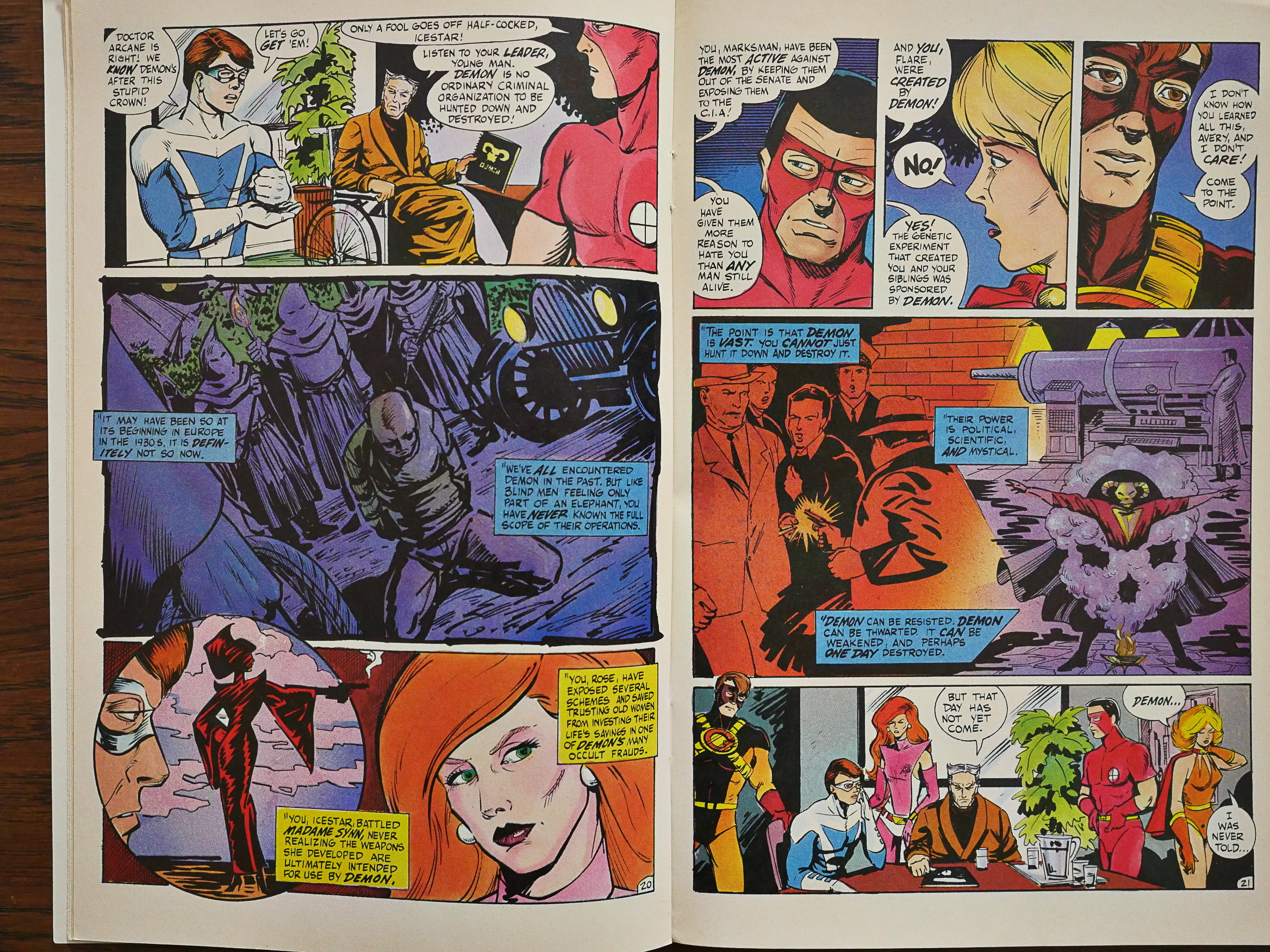
1986: Champions

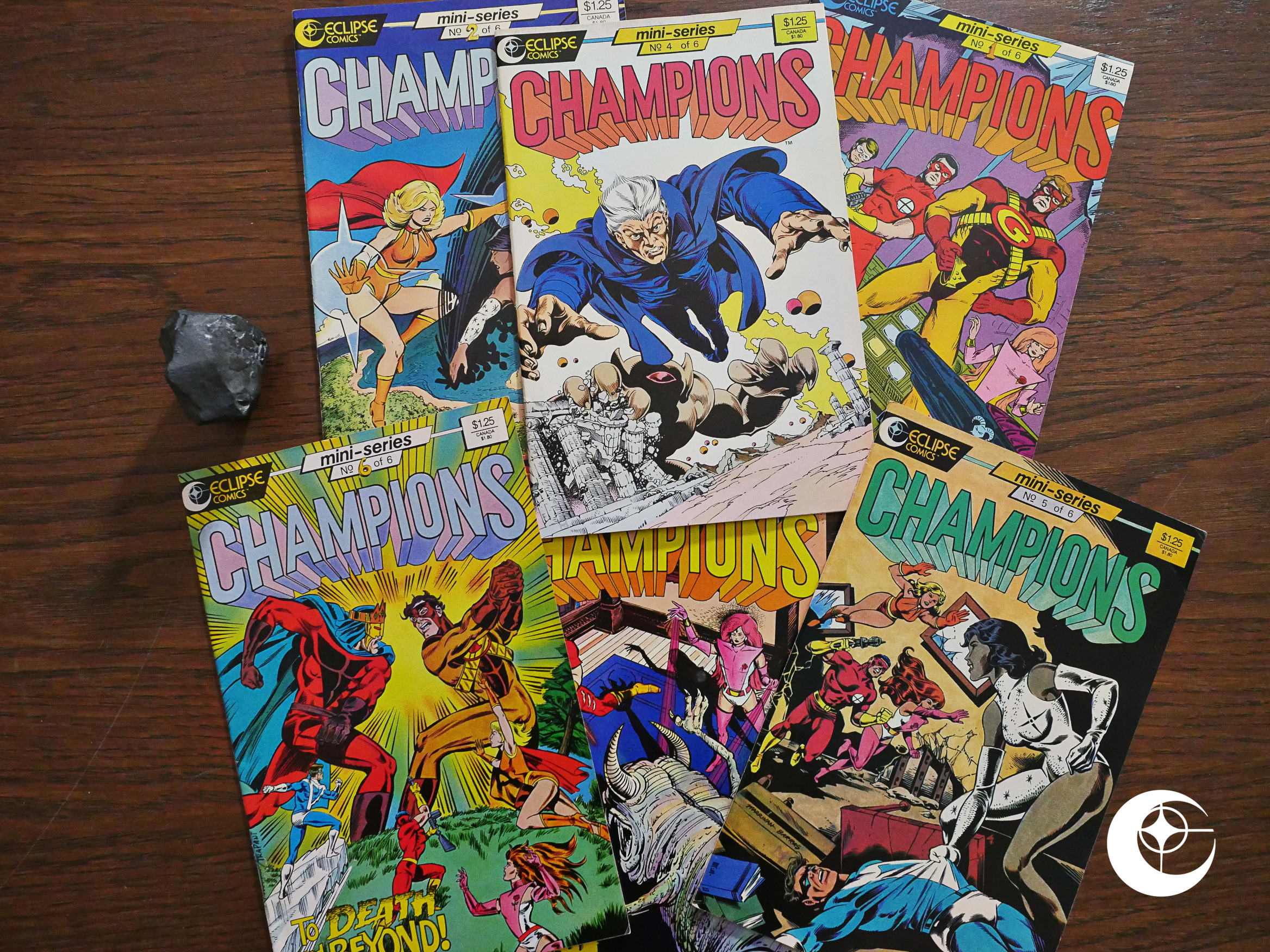
Champions (1986) #1-6 by Dennis Mallonee, Chris Marrinan et al.

Oh, what fresh hell is this.

It’s a comic book based on a super-hero role playing game? I couldn’t be less the intended audience for a comic book if they’d tried.

But, hey, I can consider this an anthropological excursion.

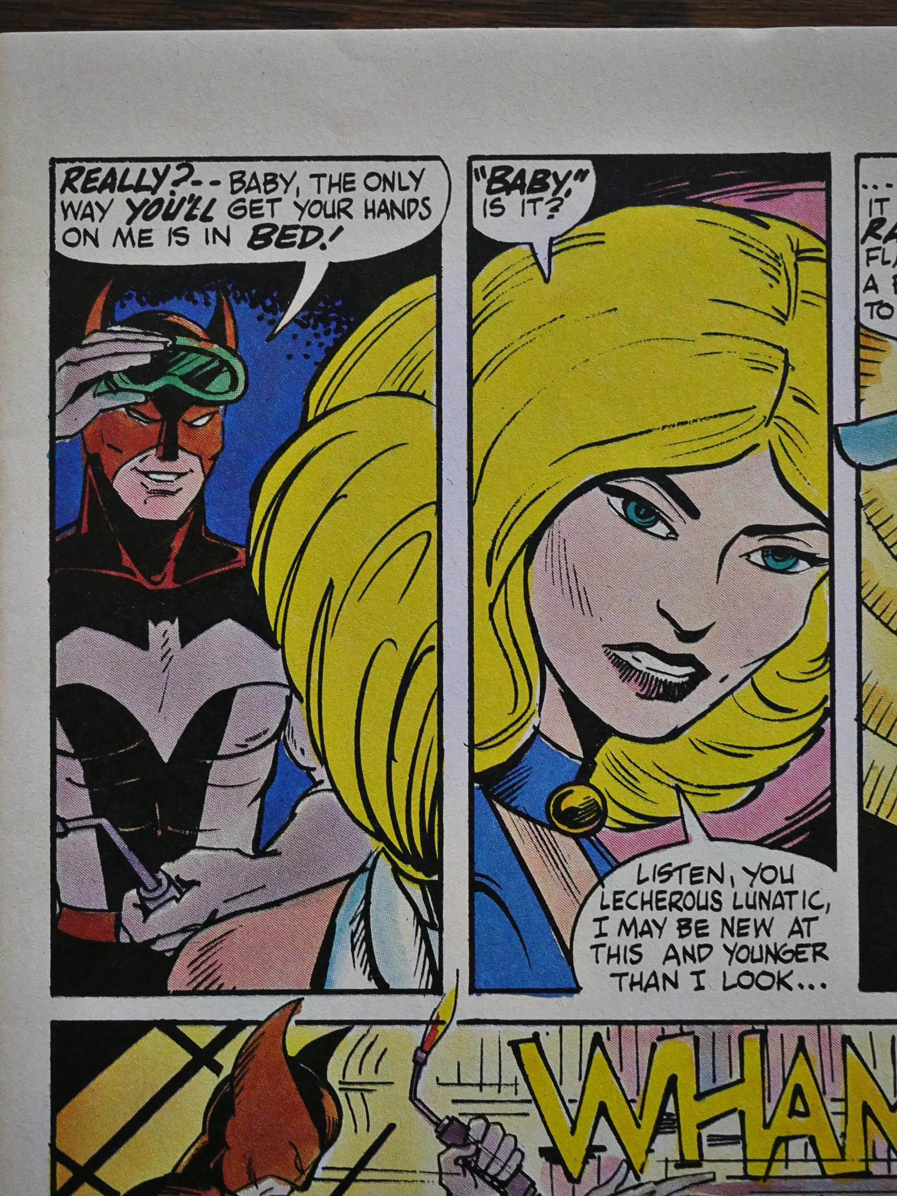
Whaaa? The first issue is drawn by Carol Lay!? I love Carol Lay.

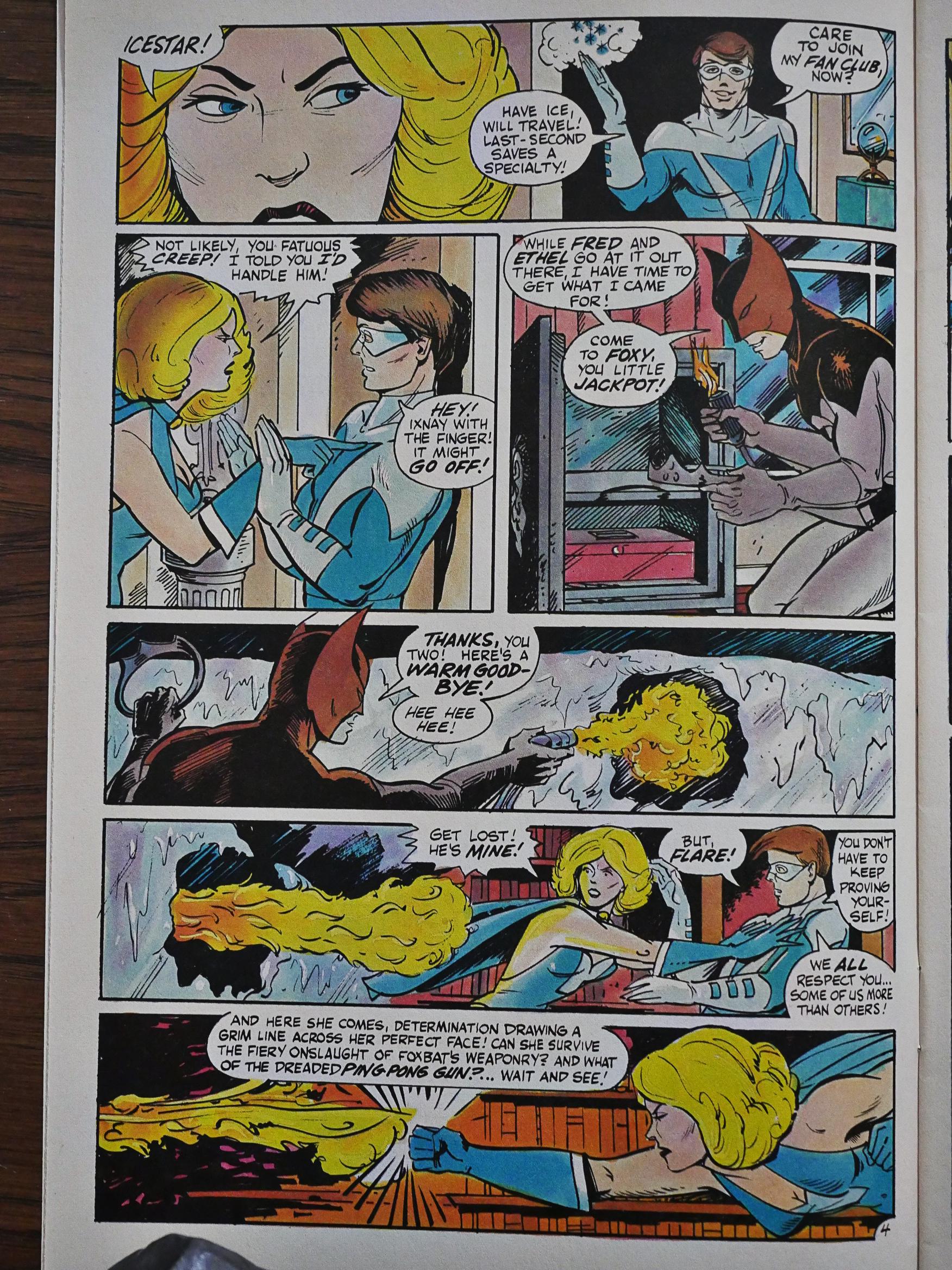
But it doesn’t help. As super-hero comics go, this is super lame. The fight scenes (and there are mostly just fight scenes) are static and unexciting.

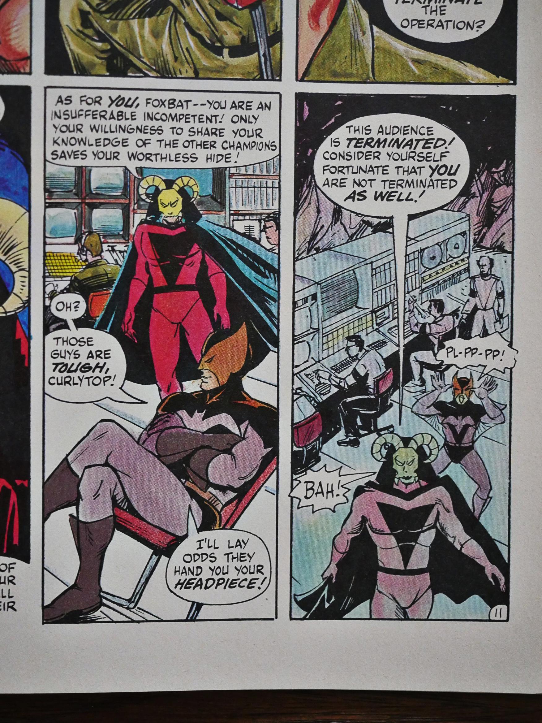
But you have to love that “pl-pl-pp!”

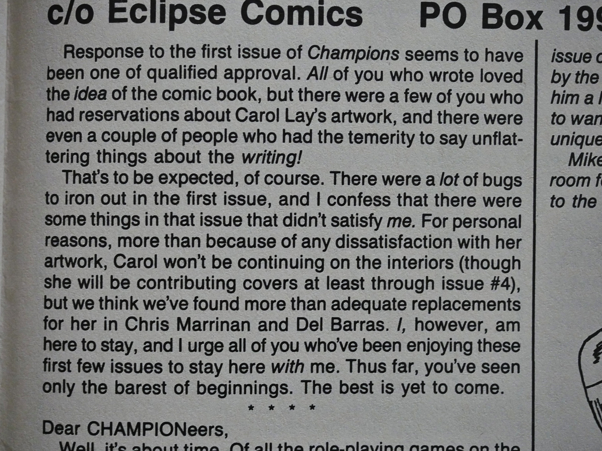
By second issue Lay is gone, of course: The mystery is that she had gotten involved with this project in the first place. Chris Marrinan takes over pencilling, and a variety of inkers don’t do that much to help.

Apparently role-playing games have a lot of back-story, so reading this is like reading issue #452 of a book that you’ve never heard of before.

That was never any interesting in the first place.

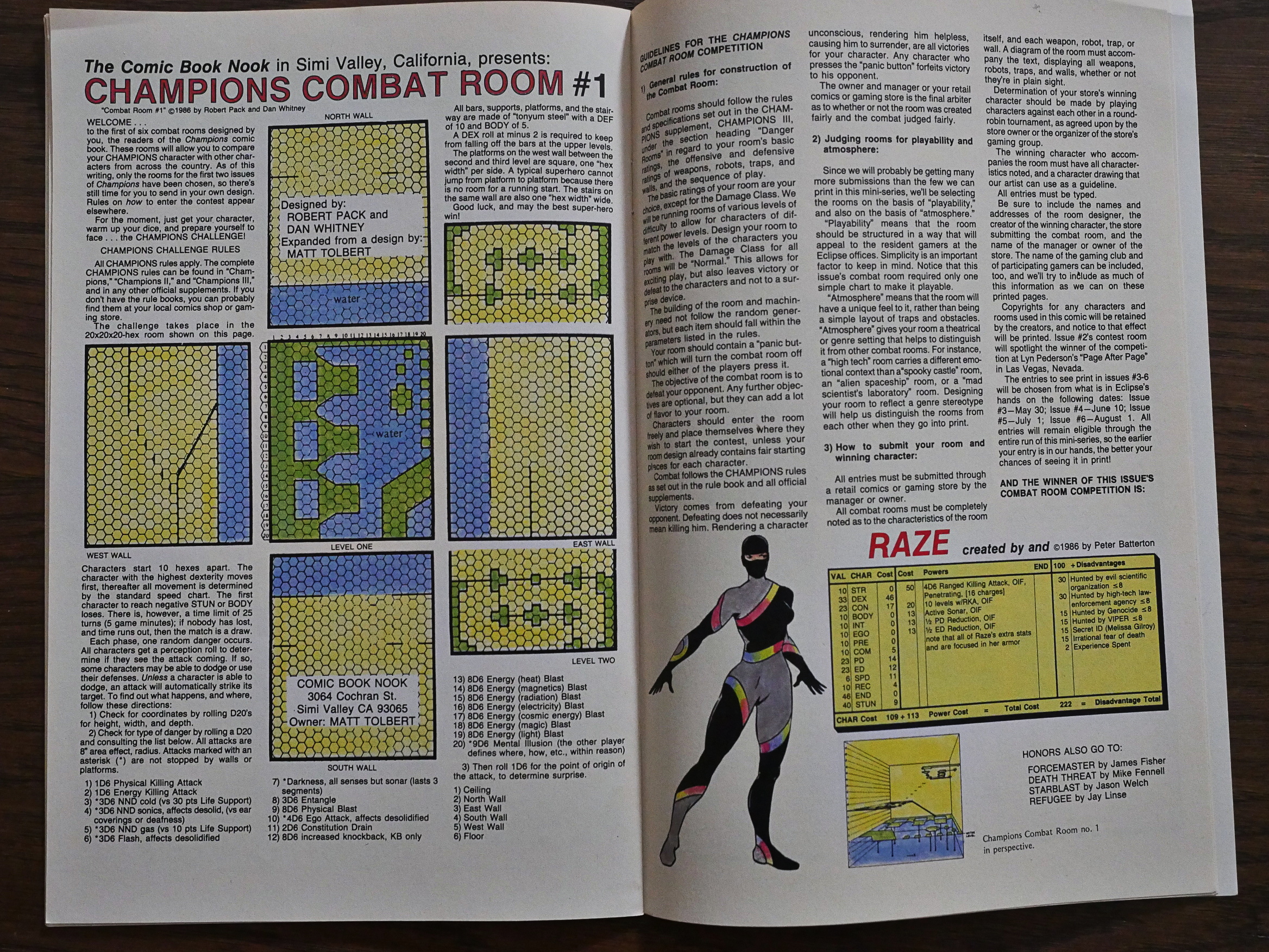
OK, so here we have the meat of the, er, issue: Combat rooms and character descriptions. The readers are encouraged to send in their own designs, but as there were no new combat rooms in the last two issues, I guess nobody cared that much?

“Qualified approval.”

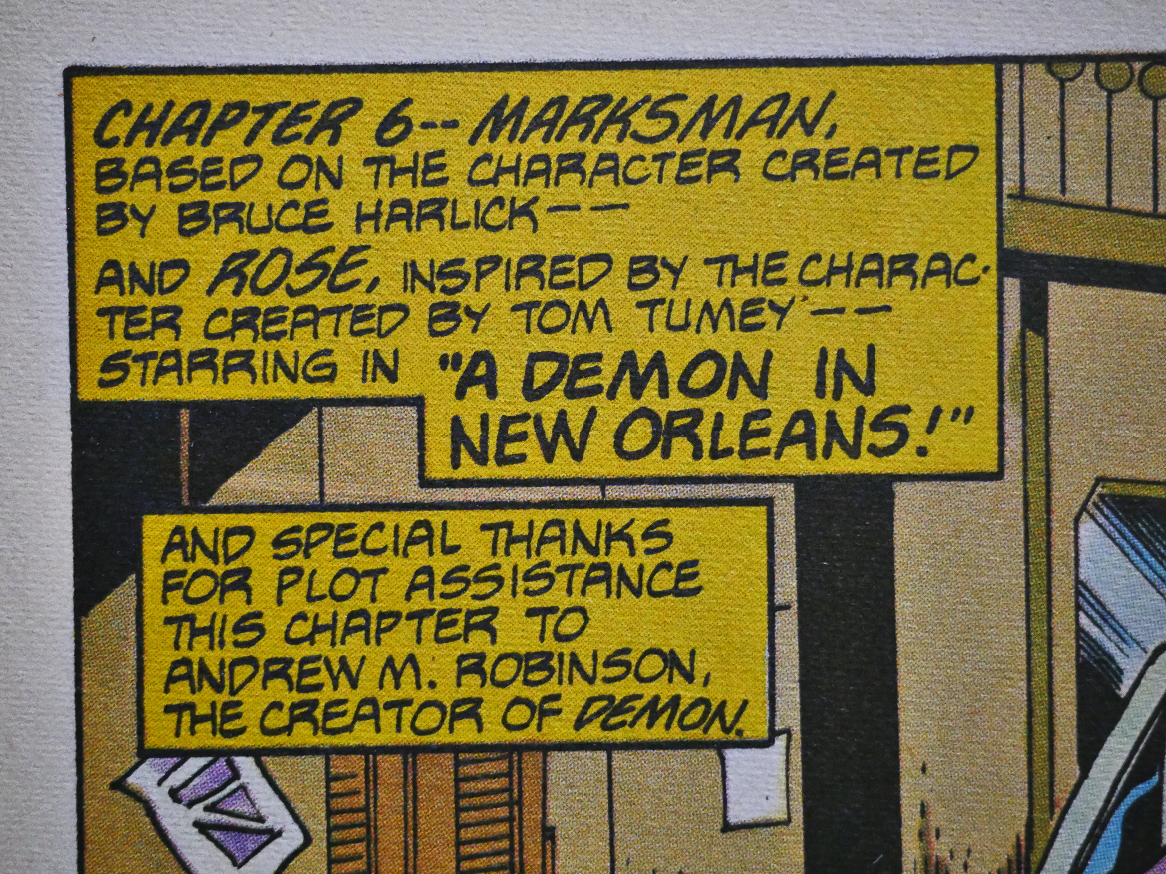
It’s kinda fascinating in a boring way how they credit the creators of each character when they introduce them.

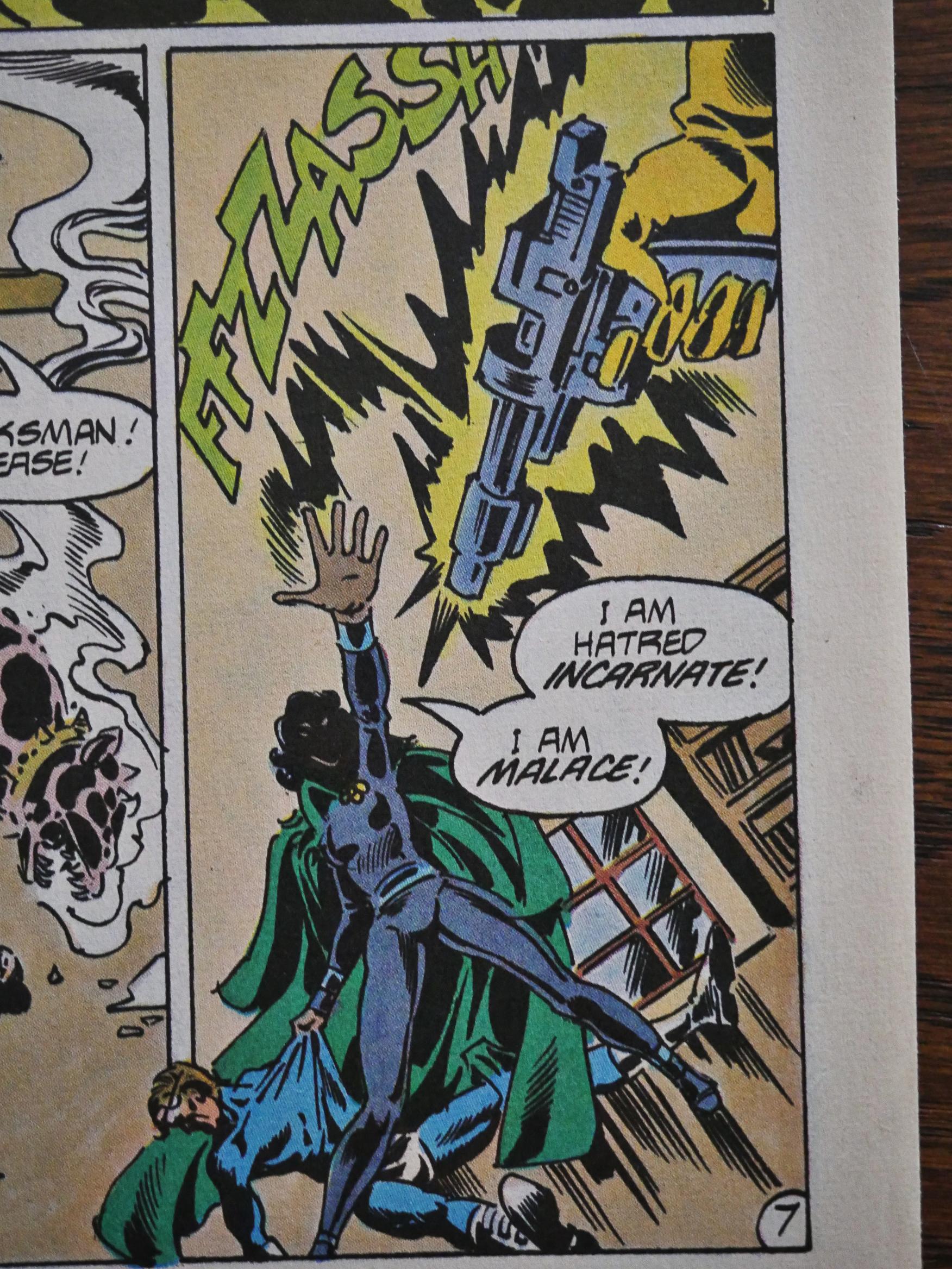
You are, Malace! You are!

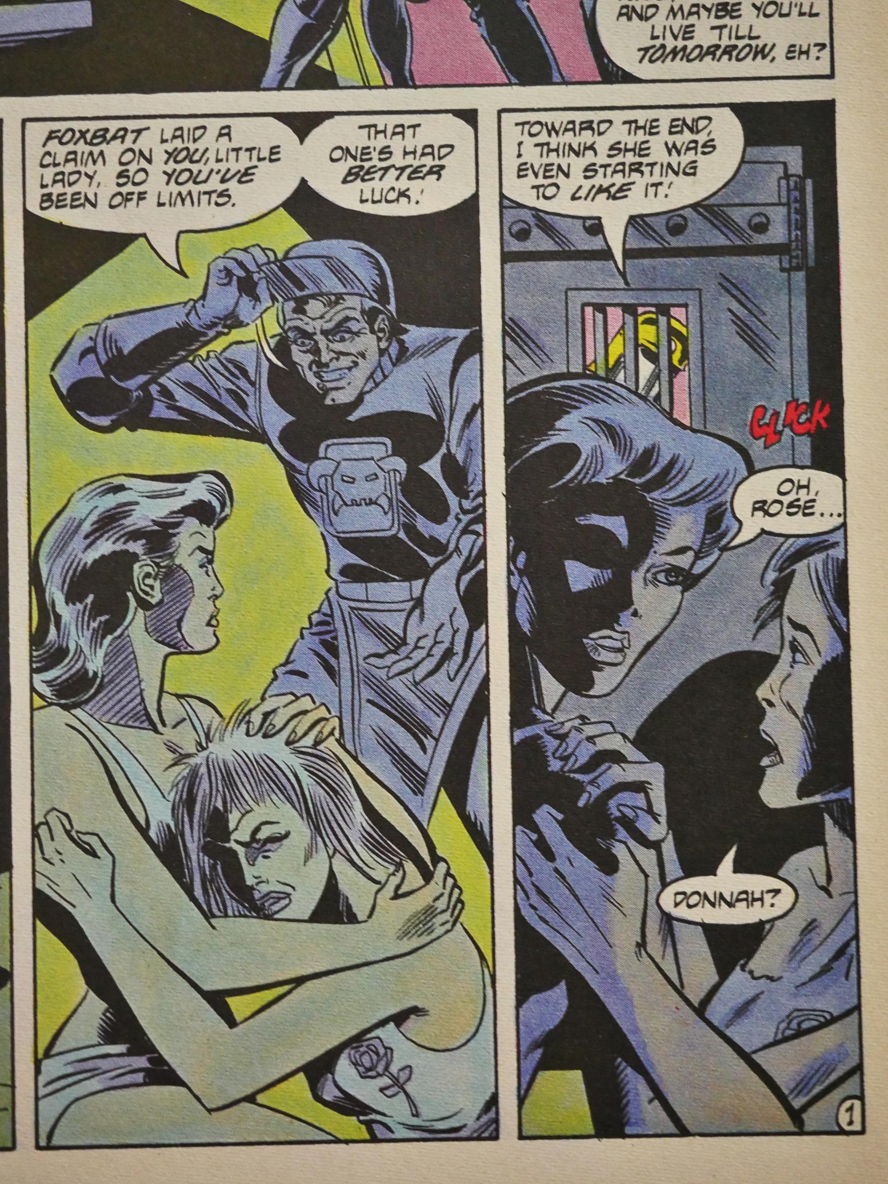
Oh, didn’t I say anything about the storyline? A bunch of characters swapped faces and genders and there was fighting and rapes and murder.

I must admit I found it hard to pay attention.

*insert funny joke here*

1986: World of Wood

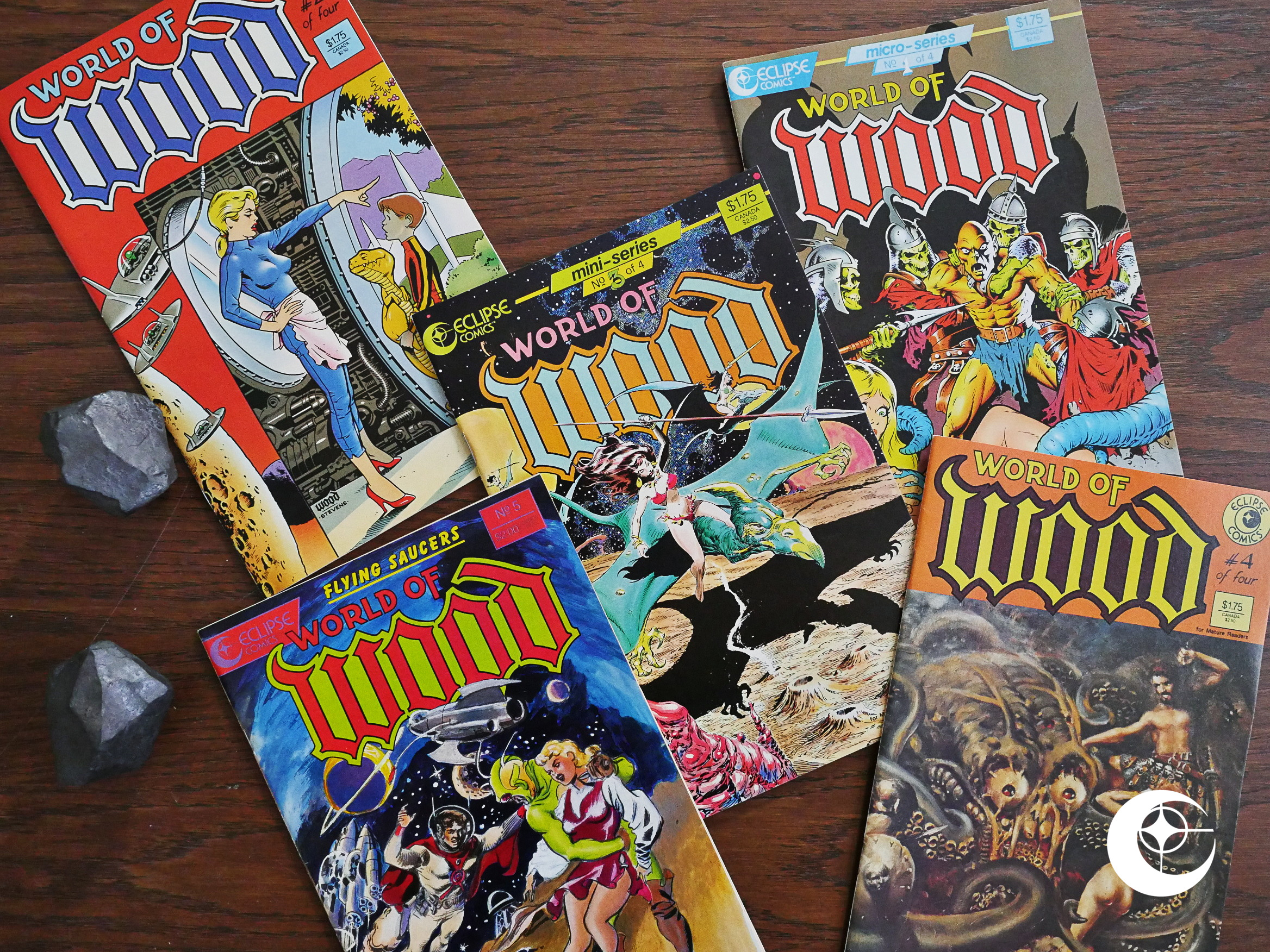
World of Wood (1986) #1-5 by Wally Wood et al.

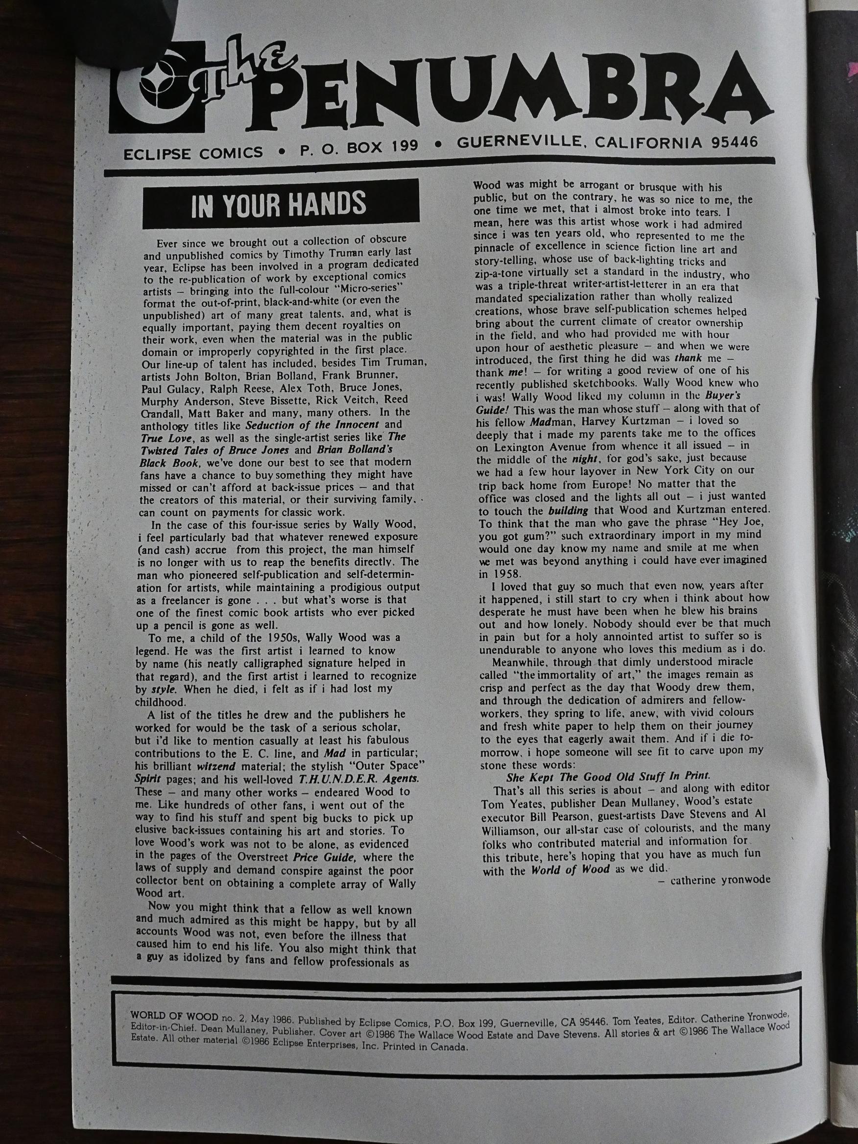
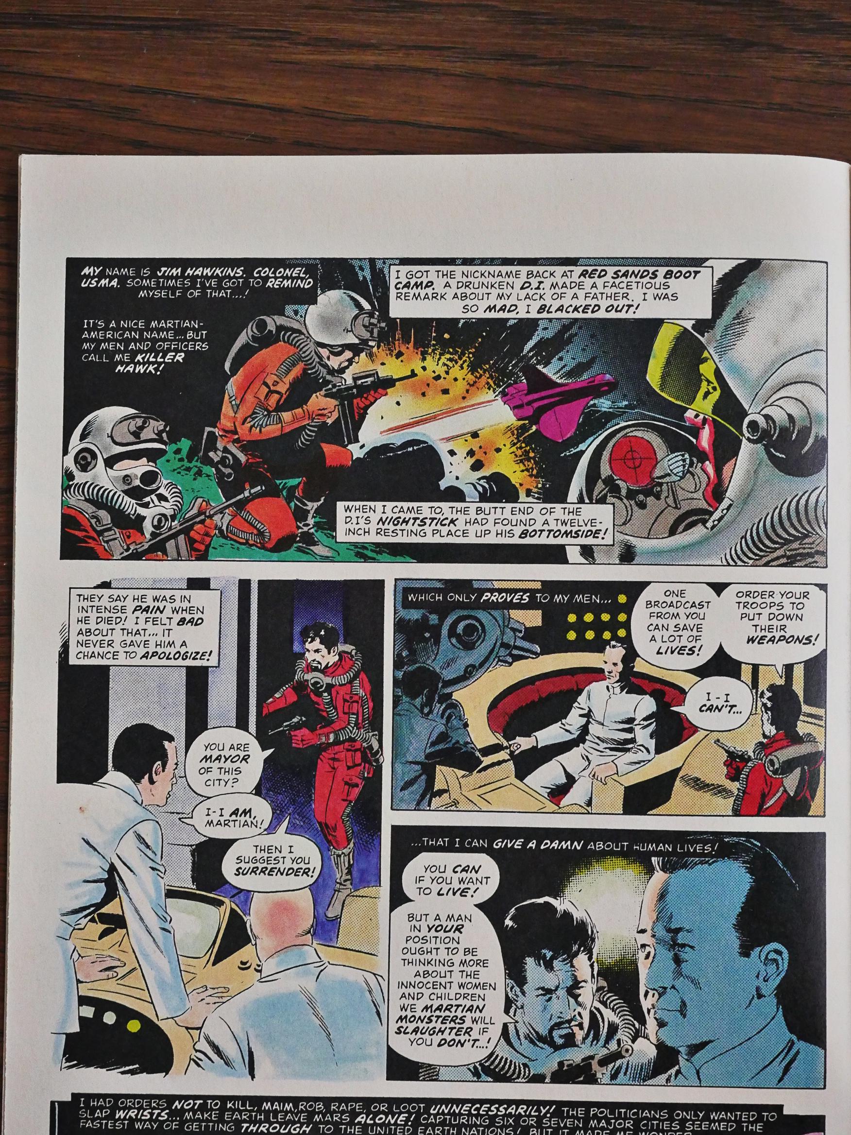
Eclipse’s horror/sf reprint series continues with Wally Wood, and cat ⊕ yronwode for the first time tries to give a reason for these books to exist:

It’s a nice editorial, but it has two problems: yronwode makes it sound like she’s scoured the most obscure publications to find Wood gems for our delectation. As usual for the Eclipse reprints, she is completely schtumm about the actual origins of the comics.

The truth is a bit more boring: The four planned issues of the World of Wood series reprint stuff published in various Warren magazines in the 70s. These aren’t hard to find, and have been reprinted all over the world in any number of formats.

The other thing she neglects to mention is that this isn’t her project at all. As far as I can tell, this project was put together by Tom Yeates for publication by Pacific Comics, announced a couple of years earlier, but not published until now. Eclipse bought the rights from the Pacific estate.

So now that we know what we have, what does it look like? Pretty nice! These were originally published in black-and-white in magazine format, so they’re shrunken here and coloured mostly sensitively by a number of good colourists. There are so many of them, for some reason or other. They all wanted to work on it? They were in a hurry? I don’t know.

But it mostly works pretty well.

(Hm… I think Jaime Hernandez has swiped that panel more than once…)

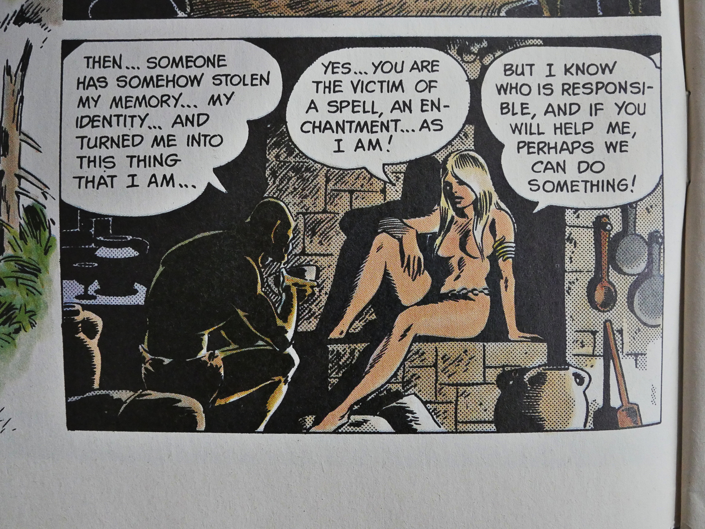
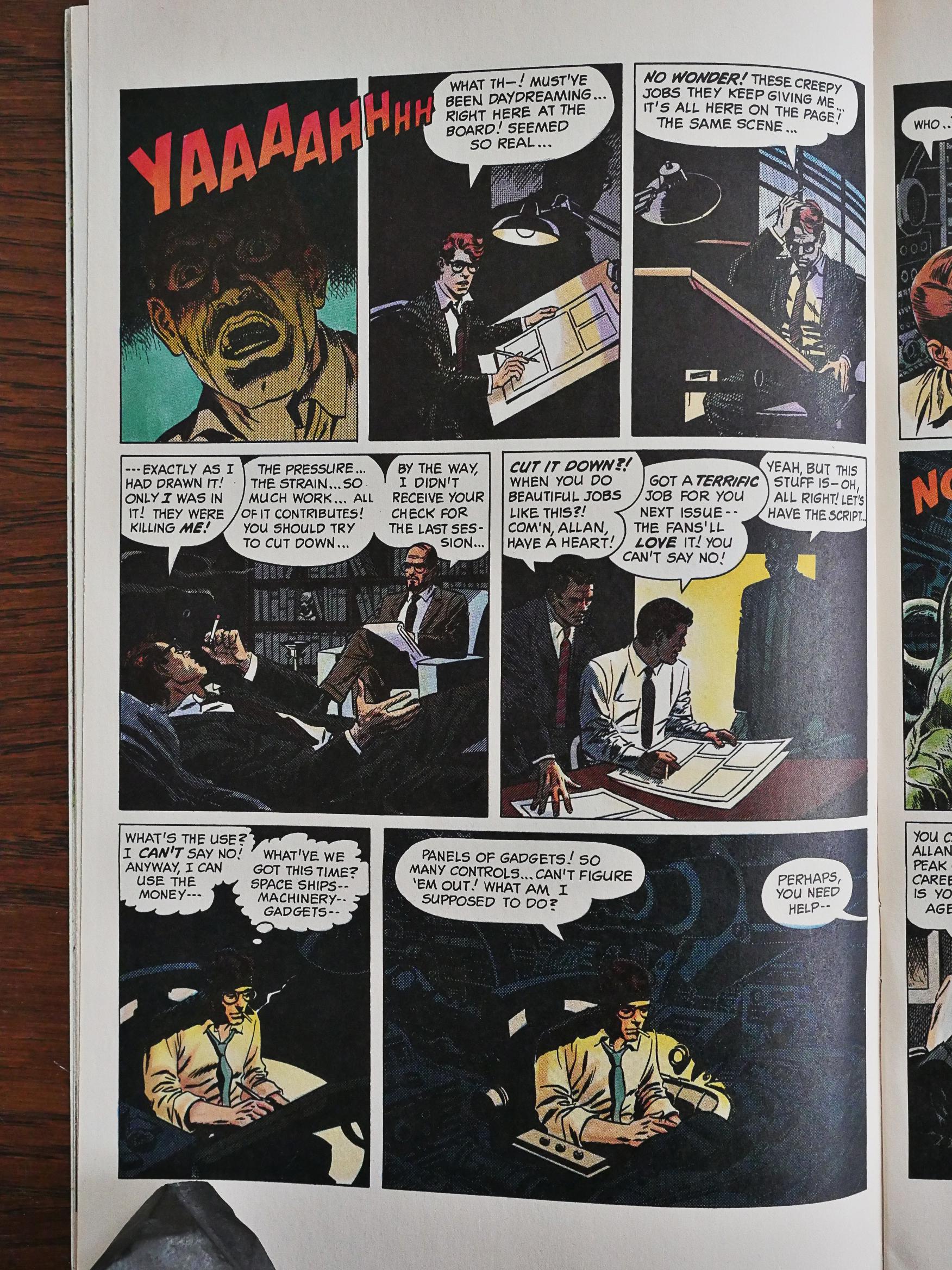
But these are from Warren magazines (Eerie, Creepy, 1984, Blazing Combat), so they’re pretty basic stories. You have to have the twist ending. There’s a formula. So the fun is in the artwork and how the twist is done. This artist-trapped-in-his-artwork thing has been done more than a few times before, no?

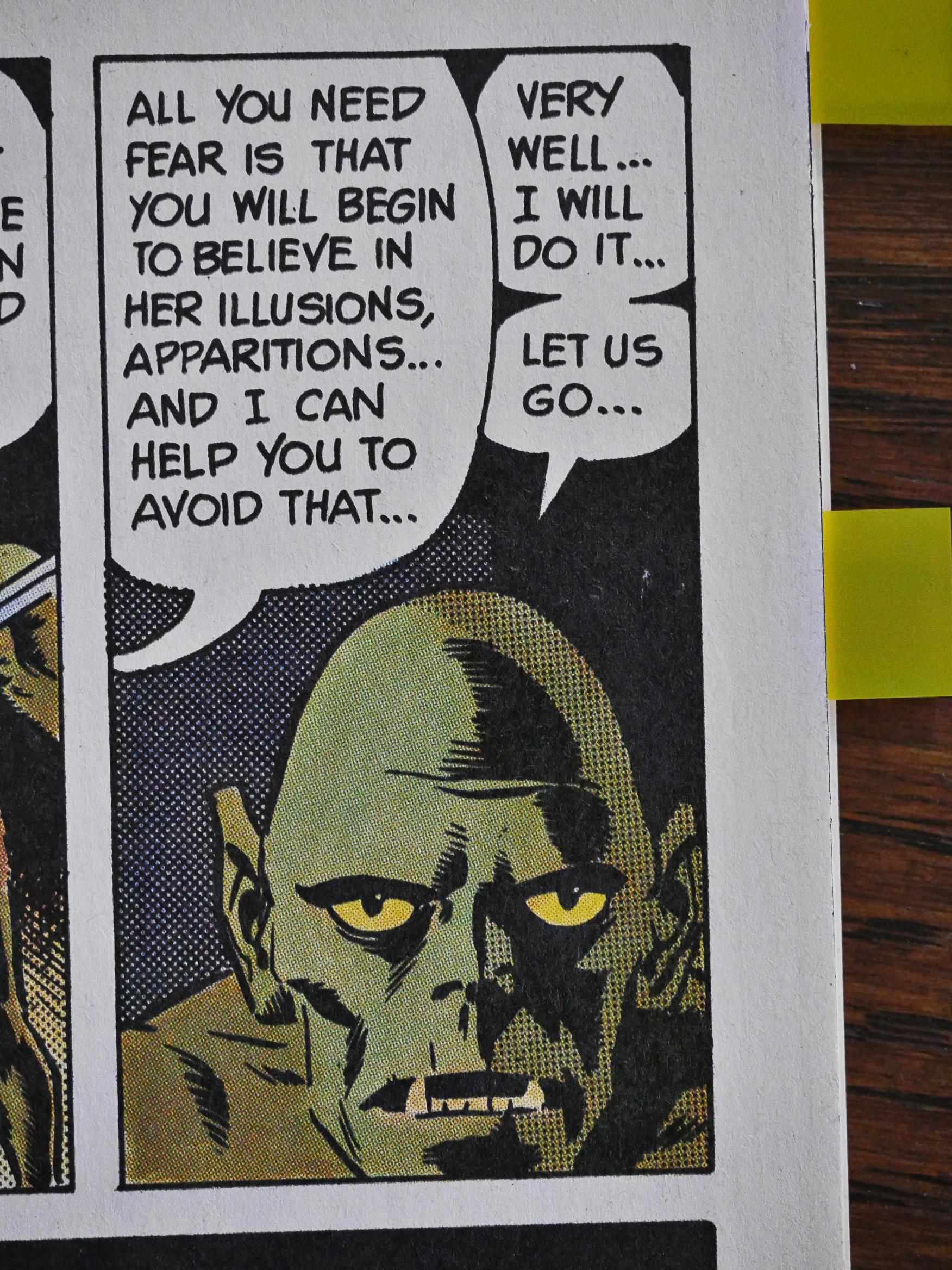
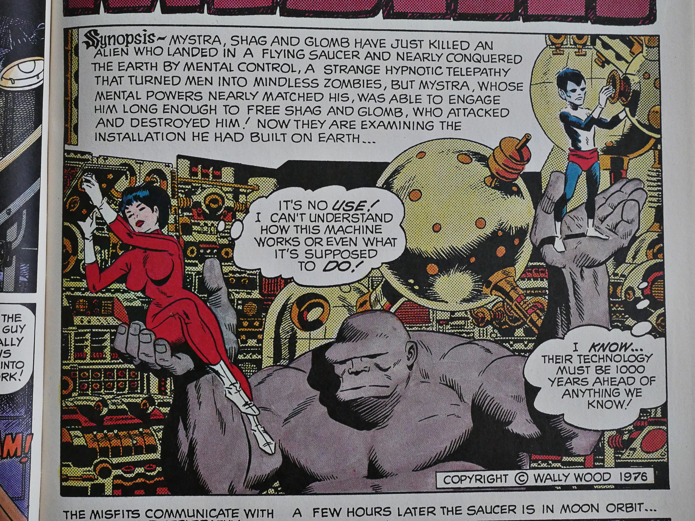
The only non-Warren piece to appear is this one, which is from Heroes Inc. Is that one of Wood’s self-published ventures? In any case, it starts off with a synopsis… so it’s a continuation of a previous story? It’s a truly bizarre tale that makes little sense, but it’s fascinating. Its vagueness makes it seem like there’s so much subtext to the proceedings. But there’s probably just drunkenness.

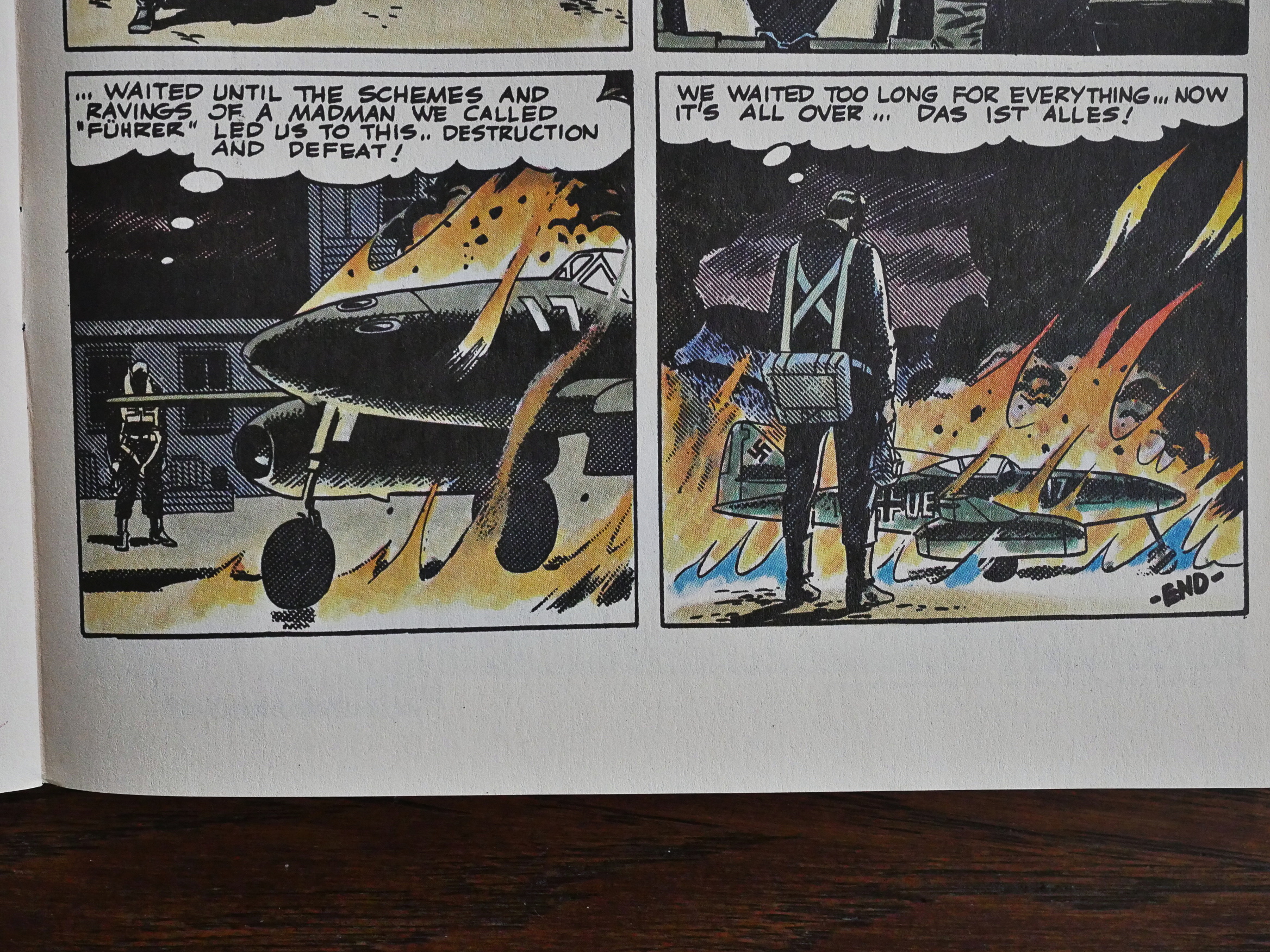
The most coherent stories are the ones written by Archie Goodwin, like this story about conscientious Nazi pilots.

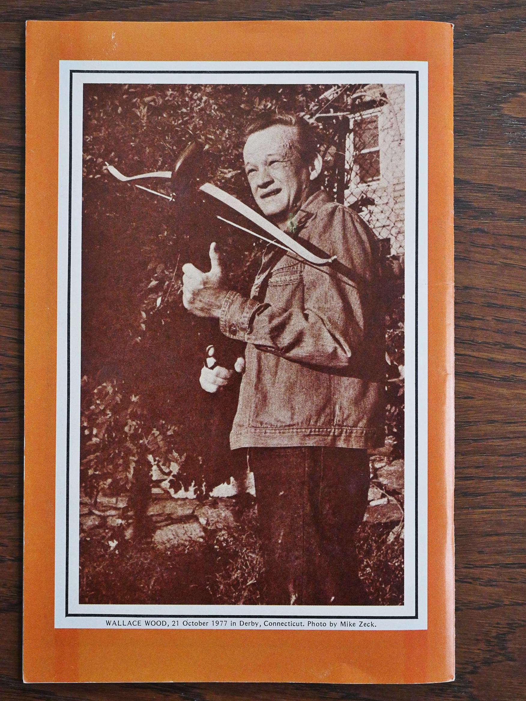
Oh, so that’s what he looked like? Hm…

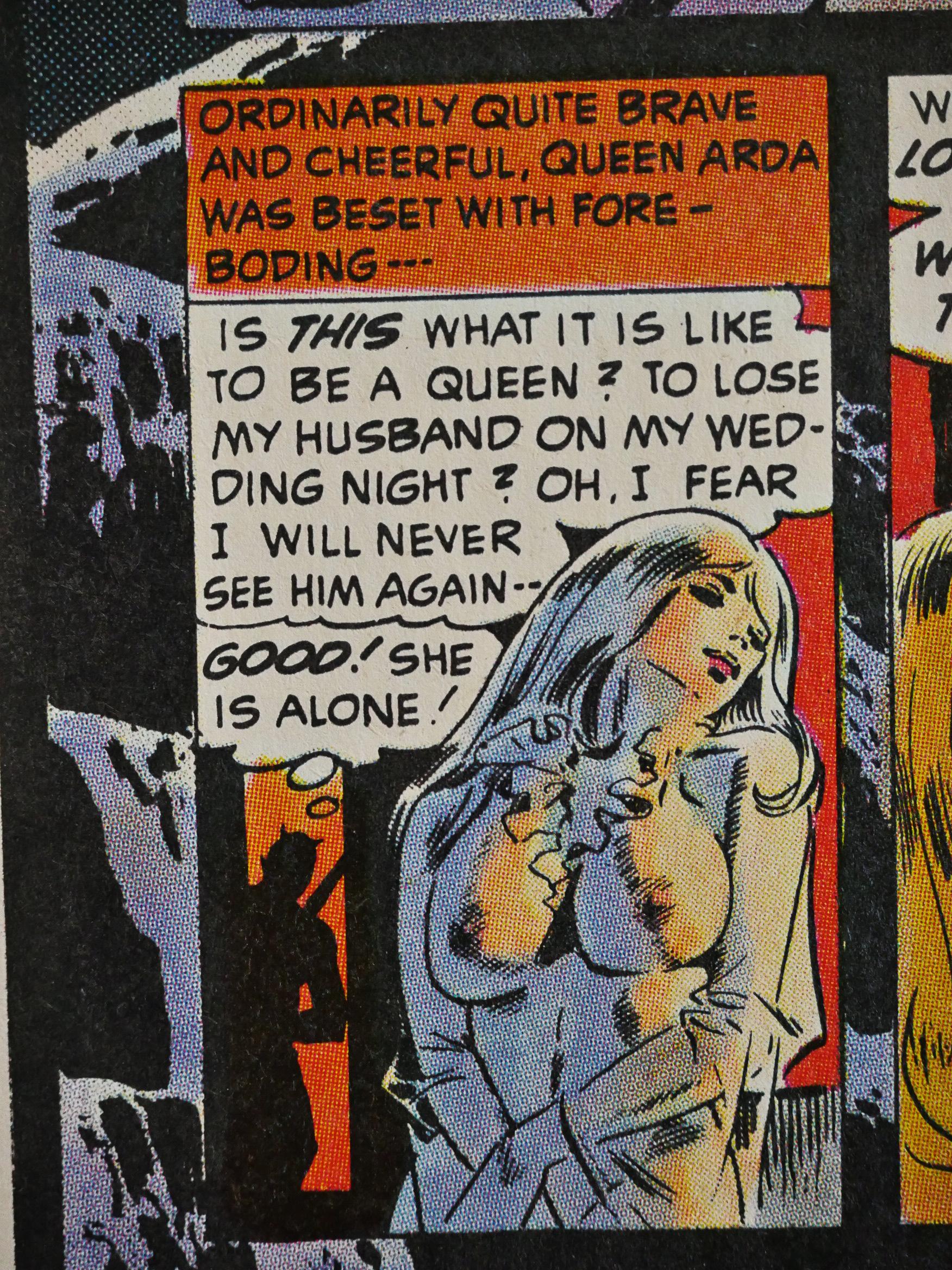
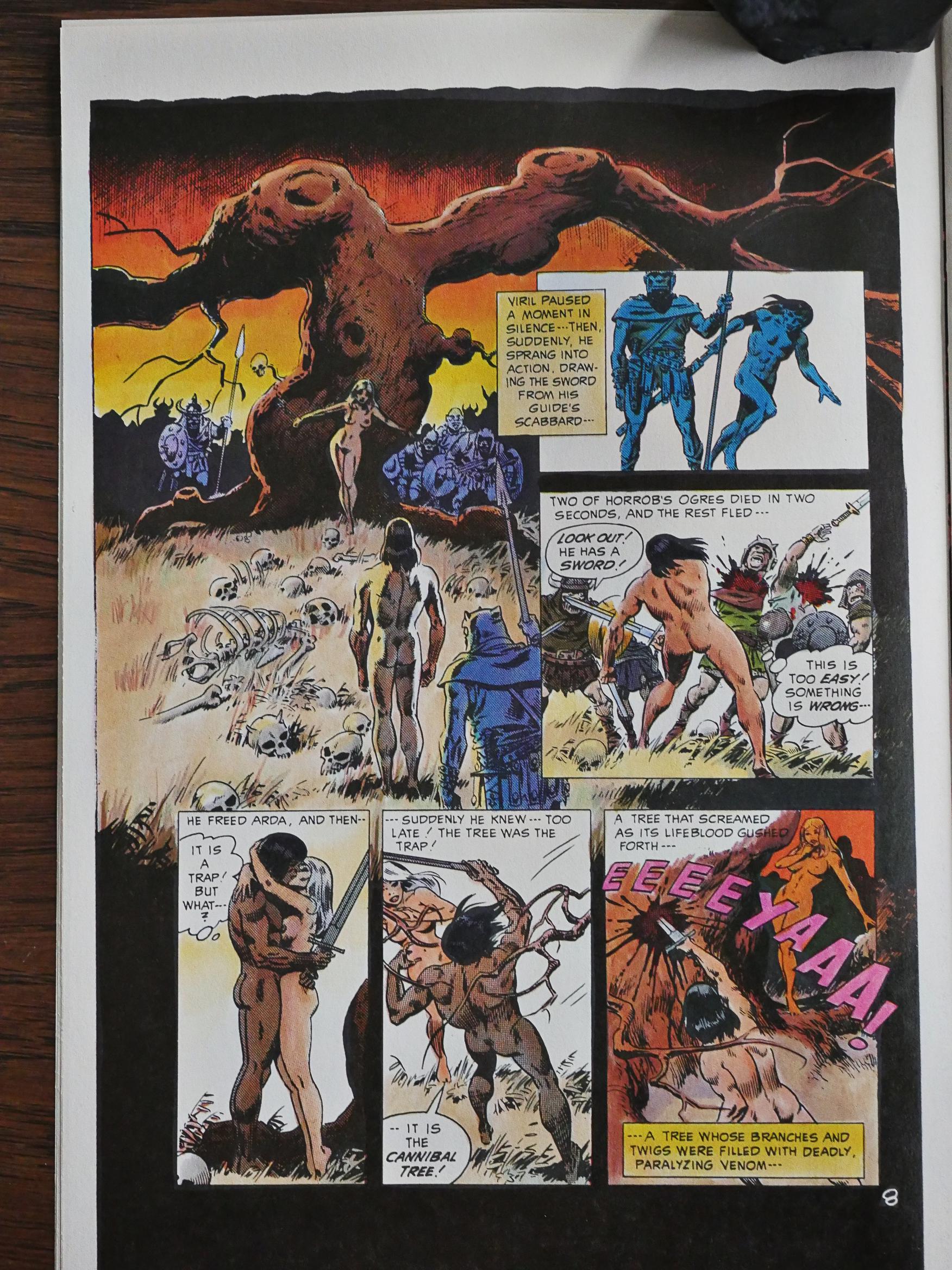
The stories Wood wrote himself are mostly scenes of bewildering nonsense nicely drawn. Here we see Queen Arda beset with foreboding. That’s what it looks like when you’re beset with foreboding.

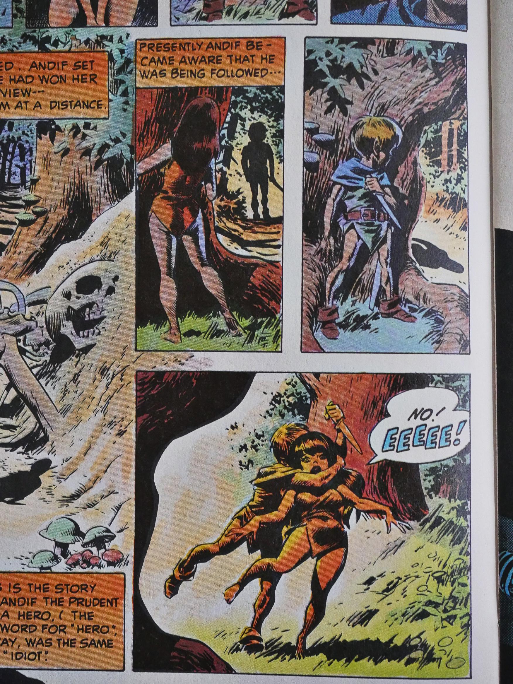
But it goes beyond casual cheesecake to bizarre unexplainable lunacy. That woman following that little man is his friend and lover, who is following him as he goes off on an extremely dangerous adventure, so he attacks her with a knife…

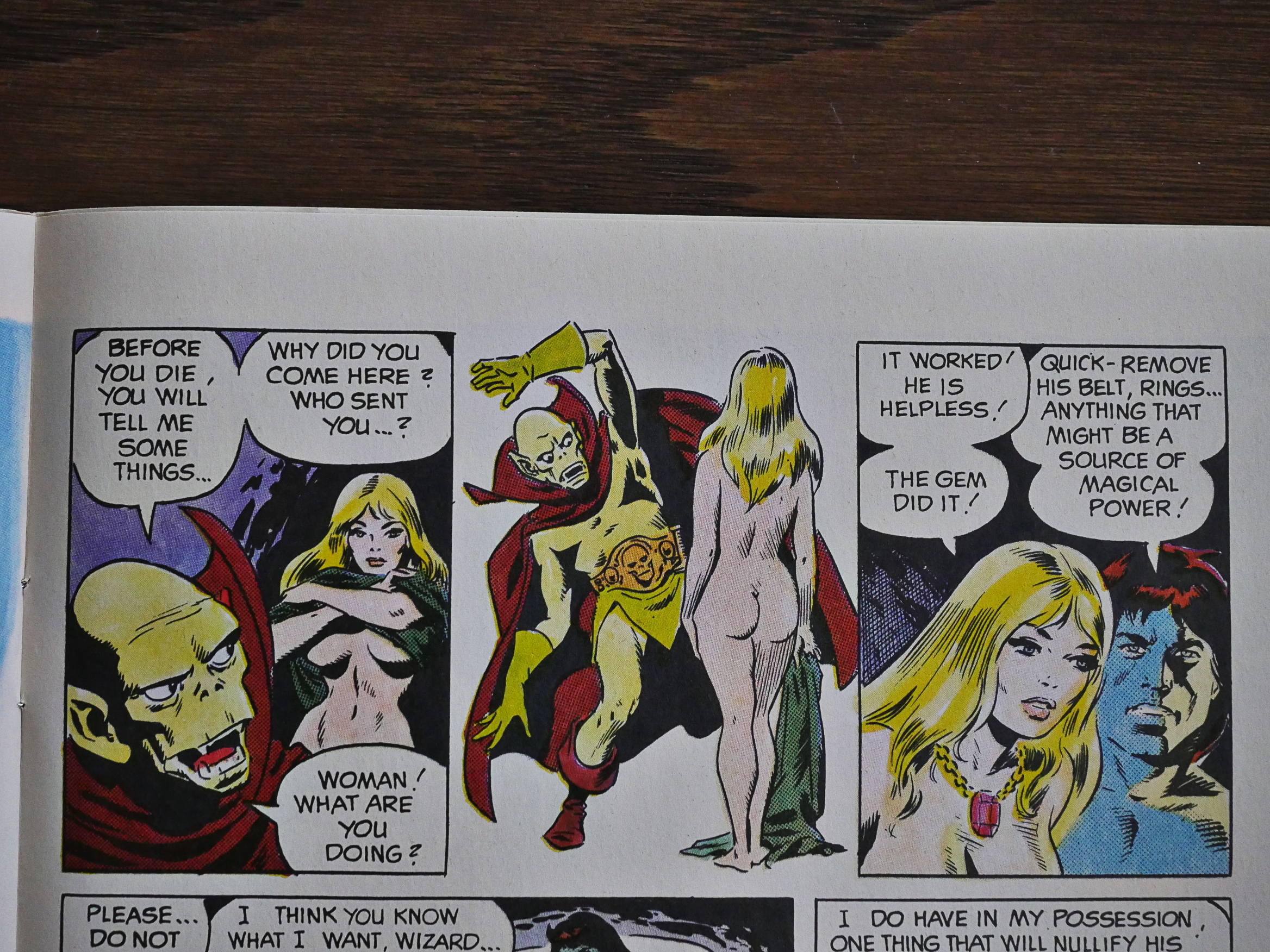
… and then pulls her clothes off? OK? She stops screaming, so they run away… without her clothes? And without most of his own clothes? Were they supposed to start fucking in the ditches with trolls walking past? What? The entire story is such a non-sequitur that I had to do some research. The person running that blog writes about editor Bill DuBay and his 1984 Warren magazine:

Continuing to focus on rewritten stories, the first 2 issues of 1984 feature a butchered Wally Wood story titled “The End” which was split up into 2 heavily rewritten stories titled “Quick Cut” and “One Night, Down on the Funny Farm!” Both rewritten stories are idiotic. Dubay’s obsession with oversized genitalia is a major plot point of the first story which is pretty brutal in its treatment of women. While the second story is not as offensive, it’s just as stupid, featuring a nonsensical story about a network TV writer that appears in a fantasy world. None of which makes sense when you look at the artwork of course. Wally Wood was so upset at what Dubay did that he’d never do any work for Warren again.

So the editor looked at this story, and was apparently as puzzled as I was by the sheer idiocy of it, and split it into two stories and wrote new dialogue and captions to it.

It probably didn’t improve on things, but it might have been hard to make things worse…

Sometimes Wood almost makes his vagueness work. “Something is wrong”. There’s more of a dream logic to his stories than any plot.

On the other hand, he might just be fucking with us. “The gem did it!” Sure!

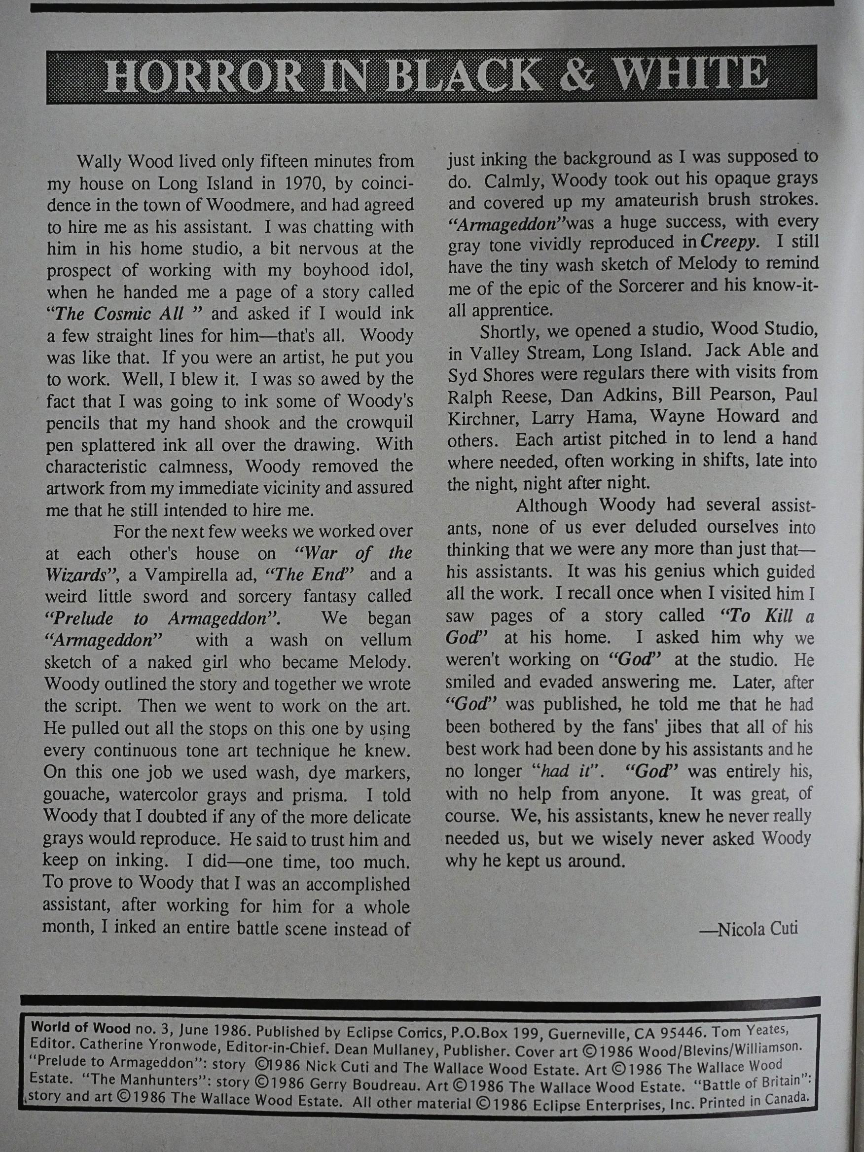
Nicola Cuti, who worked as Wood’s assistant, writes a nice little remembrance. Which Eclipse runs in both issue 3 and 4.

As he mentions, some of the pieces for Warren were done in gray washes, and adding colour upon wash sometimes makes things muddled indeed.

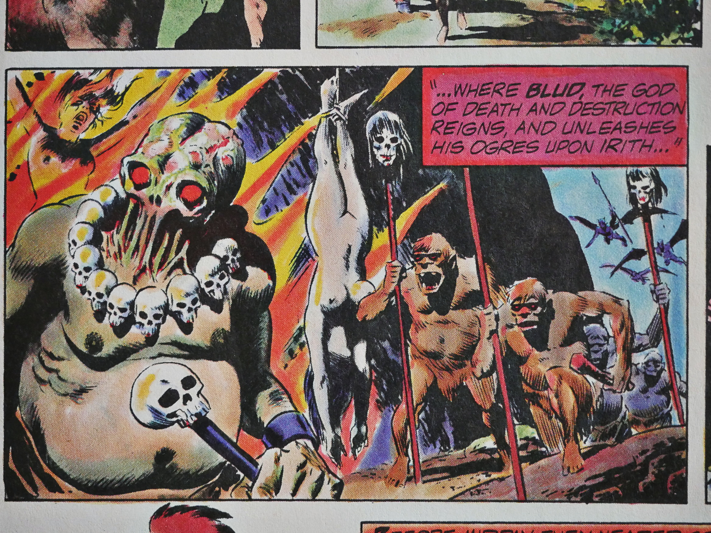
The aforementioned Bill DuBay wrote one of the stories here, and it’s kinda fascinating. The protagonist is that guy up there, who is apparently a murderous fascist sadist, but thinks of himself as the hero. He’s from Mars (he thinks), which is a pure American planet that takes no immigrants of any kind. It’s kinda timely?

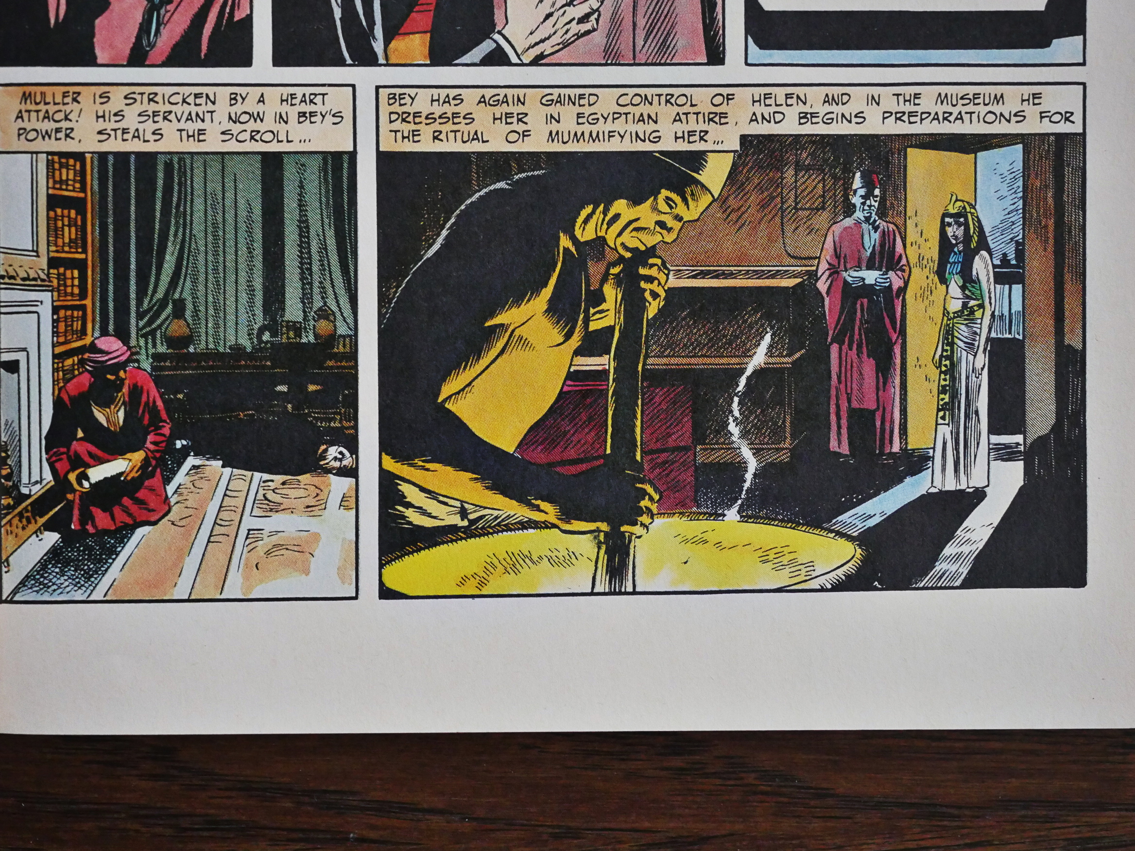
Perhaps the worst piece in the series is Wood’s retelling, I mean recapping, of The Mummy. It’s exactly as exciting as sitting next to somebody telling you the plot of the latest film they’ve seen.

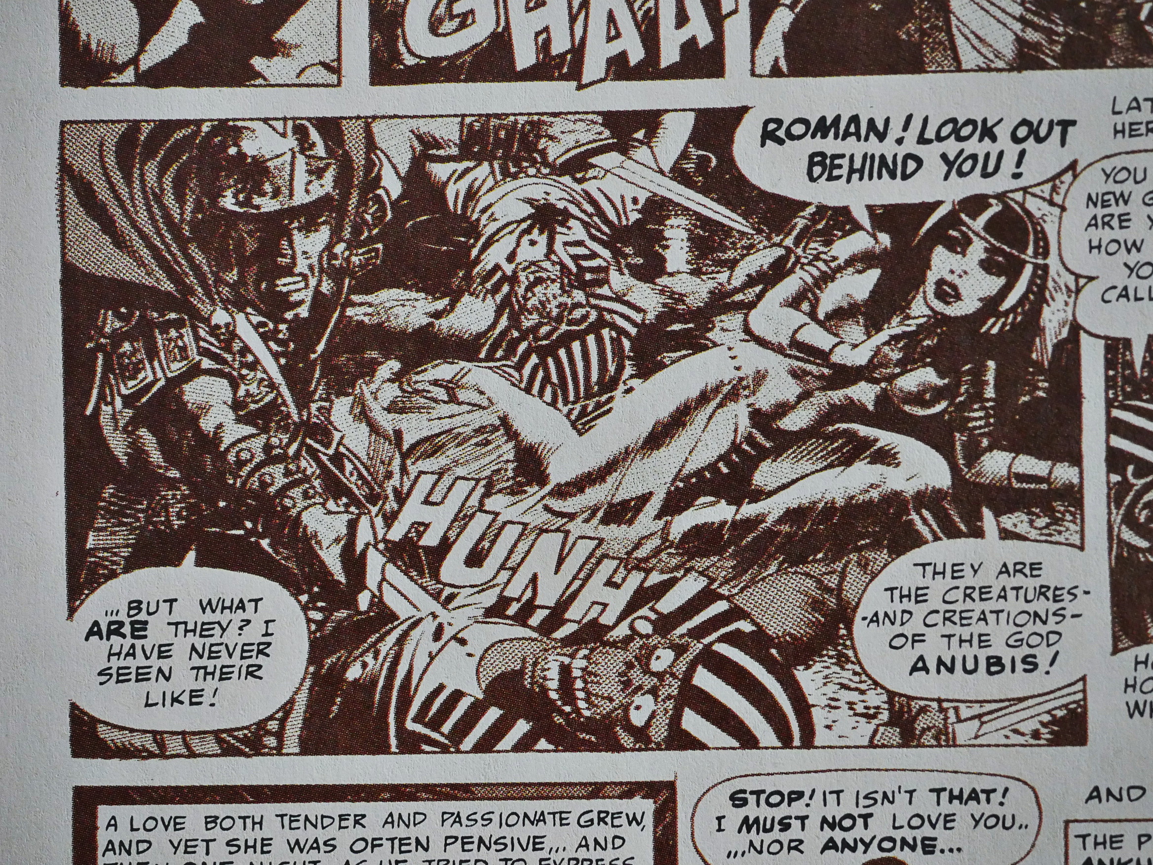
Wood used a lot of assistants, but he drew this story, To Kill a God!, all by himself, and Eclipse elected to print it in sepia tone for some reason, and the results are pretty horrendous.

So that’s the four issue mini series… but then there’s another issue almost three years later.

This one isn’t Warren reprints, but instead reprints early-50s public domain material (this one from Avon). It’s tedious, almost unreadable dreck, and the artwork is rather primitive, too.

The backup feature, drawn by Al Williamson with Wally Wood, is a bit better, but no big shakes.

Of all the Eclipse books I bought for this blog series, these five issues were by far the most expensive pieces. Mile High lists the first four issues at $90 and the final issue at $130. Which means that they sell them at $45, which is pretty steep. You can find them cheaper on Ebay, but some people sell slabbed copies for similar prices there. So collectors really like these books.

And why not? The artwork is gorgeous, so who cares that the stories don’t make much sense?

1986: True Love

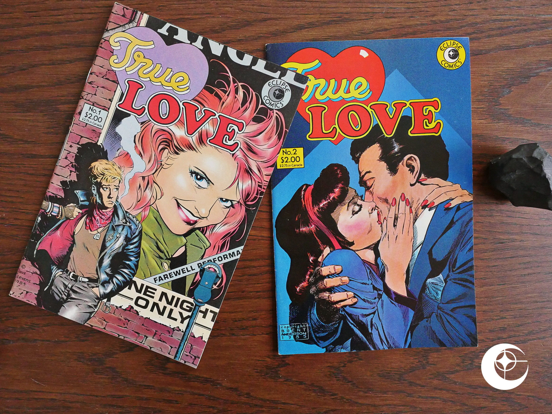
True Love (1986) #1-2 edited by Jim Vadeboncoeur, jr.

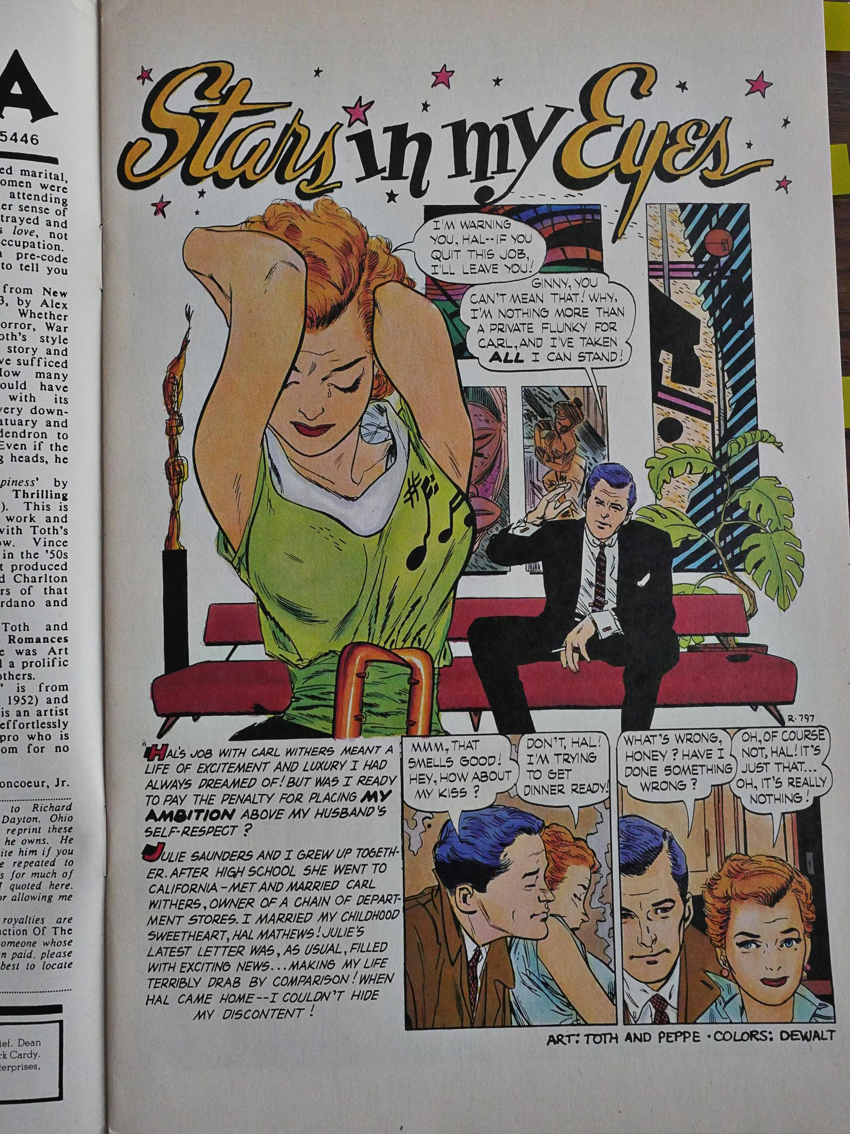
This short series reprints romance comics published by Standard in the 50s (i.e., public domain). These things are usually more miss than hit, but…

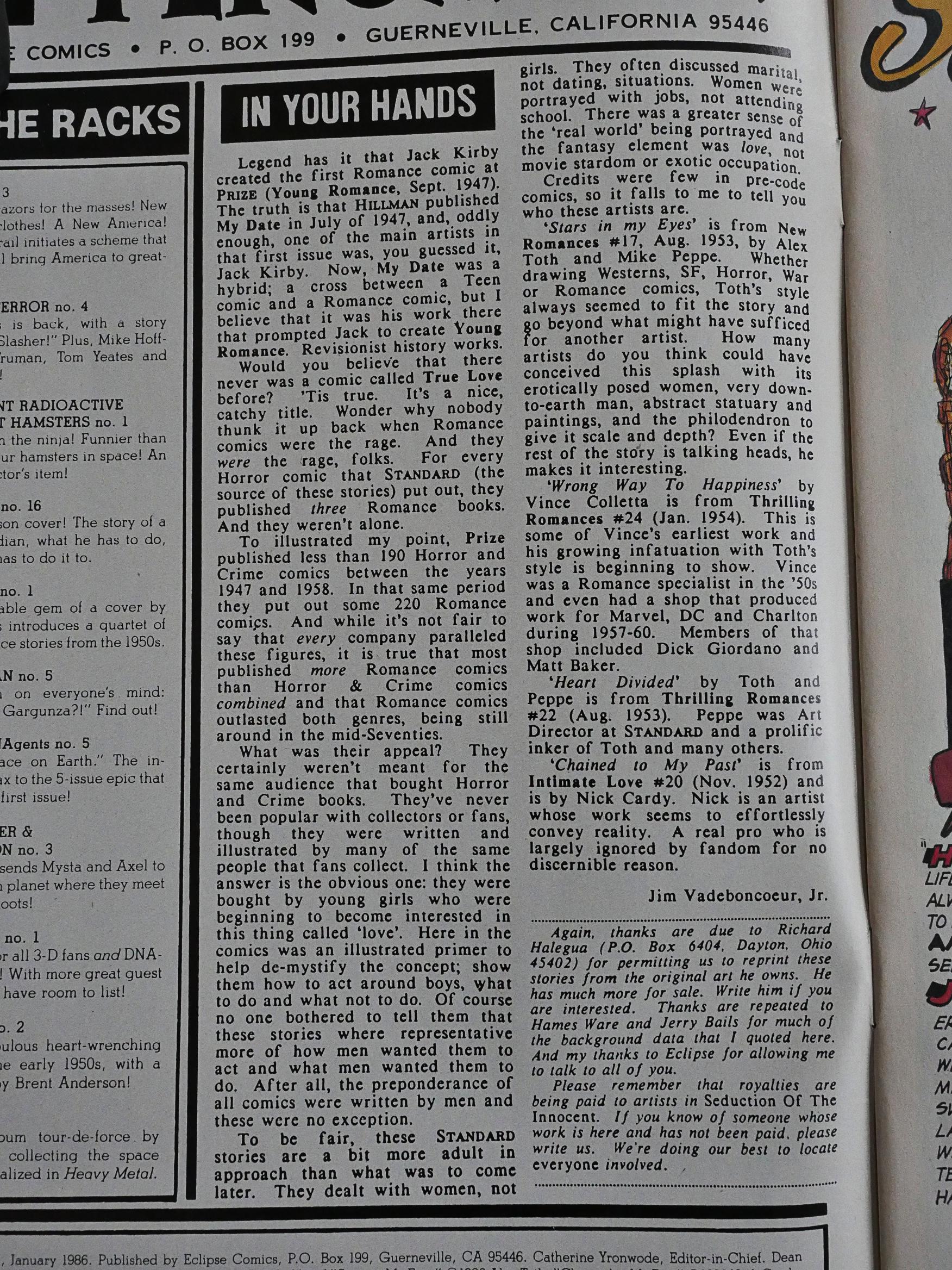
… when I read that the editor was Jim Vadeboncoeur, jr, I perked up, because he was the driving force behind the Seduction of the Innocent reprint series, and that was definitely a cut above most of these reprint books.

True Love is apparently so much part of that first series that Eclipse forgot to edit out the references to it in that box at the bottom.

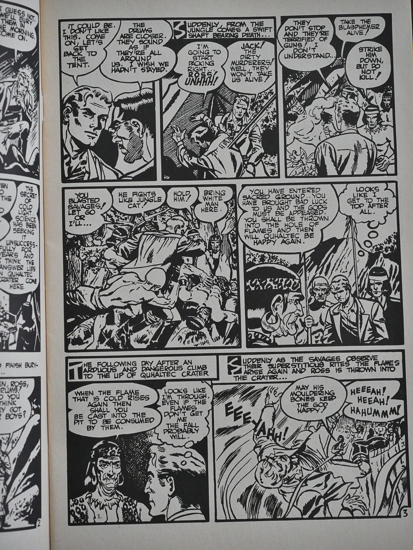
About half the pages in these issues have Alex Toth/Mike Peppe artwork, and it’s so sharp it bleeds. It’s shot from the original artwork, too, so the linework is really allowed to shine.

But is Toth and or Peppe more than a bit influenced by Bernie Kriegstein here? Some of those lines are positively Kriegsteinian…

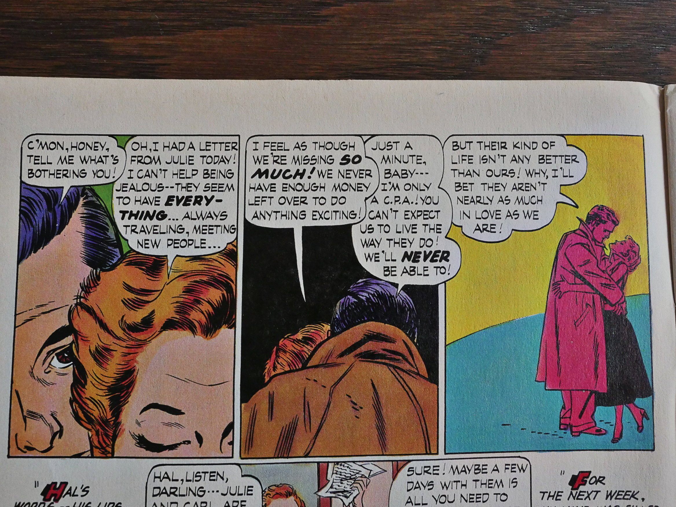
The layouts aren’t, though, but they’re delightfully screwy in their own way. I love Toth’s weird framing choices here: Too-close close-up from the front; 180 degree reverse shot of the back of their heads from a further distance; and then full figures oddly shoved off to the right corner. It’s dizzying and it’s great.

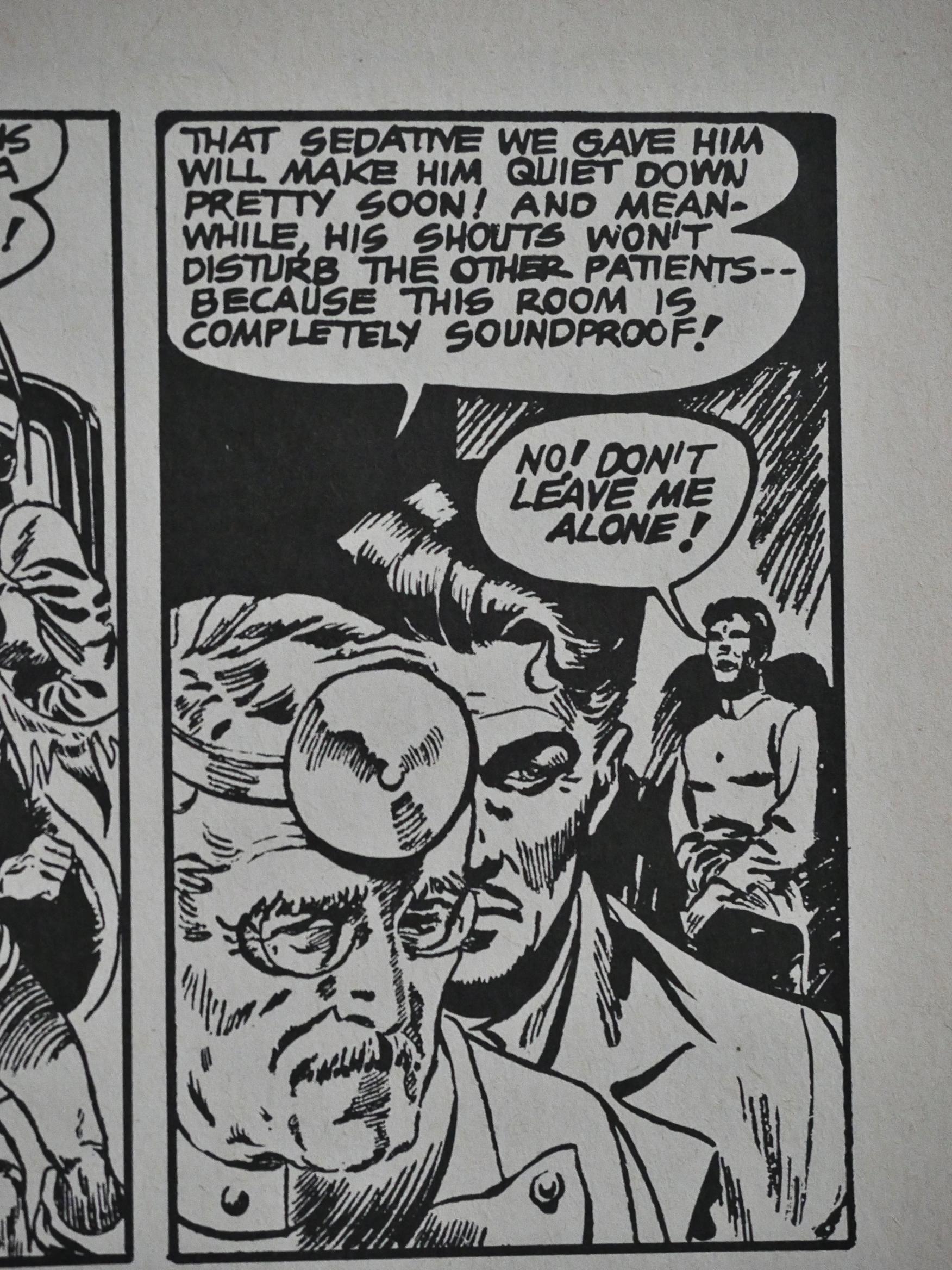
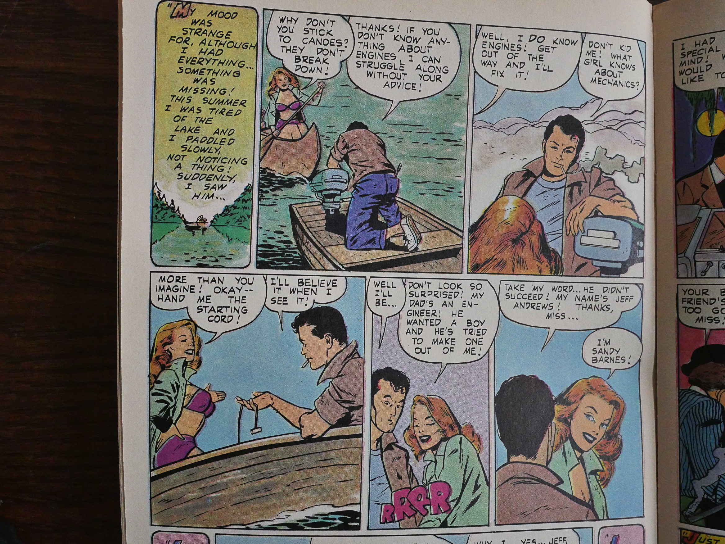
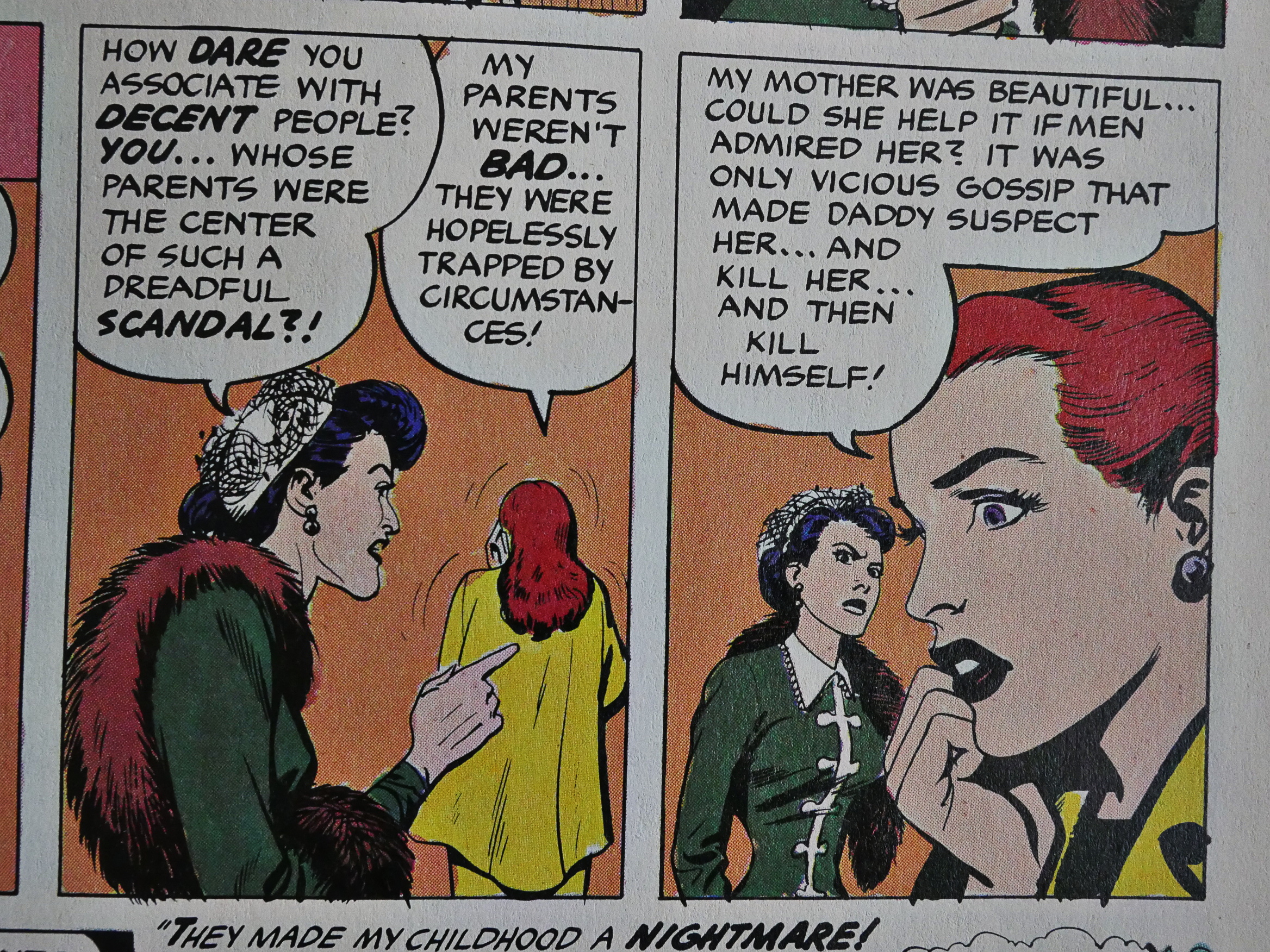
These are love stories, of course, so we get lots of meet cutes and so many plot twists. But they’re fun and they’re fresh. This one, drawn by Vince Coletta (in a style prettier than he would use later as a Marvel super-hero artist), doesn’t go anywhere you might guess by the panels above.

However, there’s also the ones (like the above drawn by Nick Cardy) that goes exactly where you’d expect. But that’s OK, too.

More Toth/Peppe action. I mean… Nobody else does framing like that.

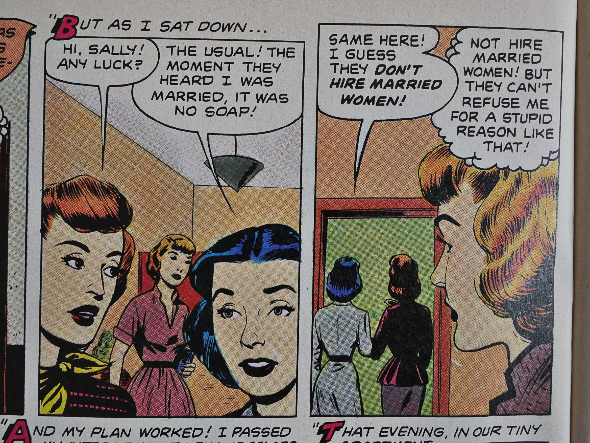
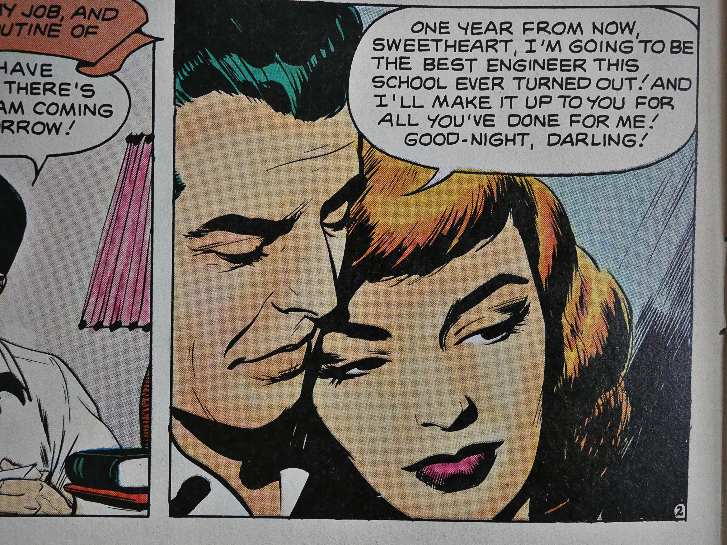
The stories are more modern than I would have guessed: Here a woman has to lie her way into the workplace to support her husband while he finishes off college.

The artwork by Nick Cardy is super lush.

Two issues of this stuff isn’t enough, but I guess it didn’t sell?

Jim Vadeboncoeur, jr sure had good taste when picking out pieces to reprint.

Heidi MacDonald reviewed it briefly in The Comics Journal #109:

And then there’s True Love, reprints of Standard romance comics from the ’50s. Issue has a supremely charming cover by Dave Stevens, and inside it’s pretty women by Toth, Cardy, and Colletta (Who proves that when aping Toth, even Vince Colletta can do tolerable work).

These comics are for those who prefer kissing to punching. (I should think that would be the majority of readers, but I’m not placing any bets.)

[…] Toth’s in particular is a tour de force that gives these tired little melodramas a highly Romantic lushness. Every expression is hyperbolically pensive and full Of meaning. As sappy as these stories may be, they are still comics that worked in completely naturalistic terms, something all too rare.

Indeed.