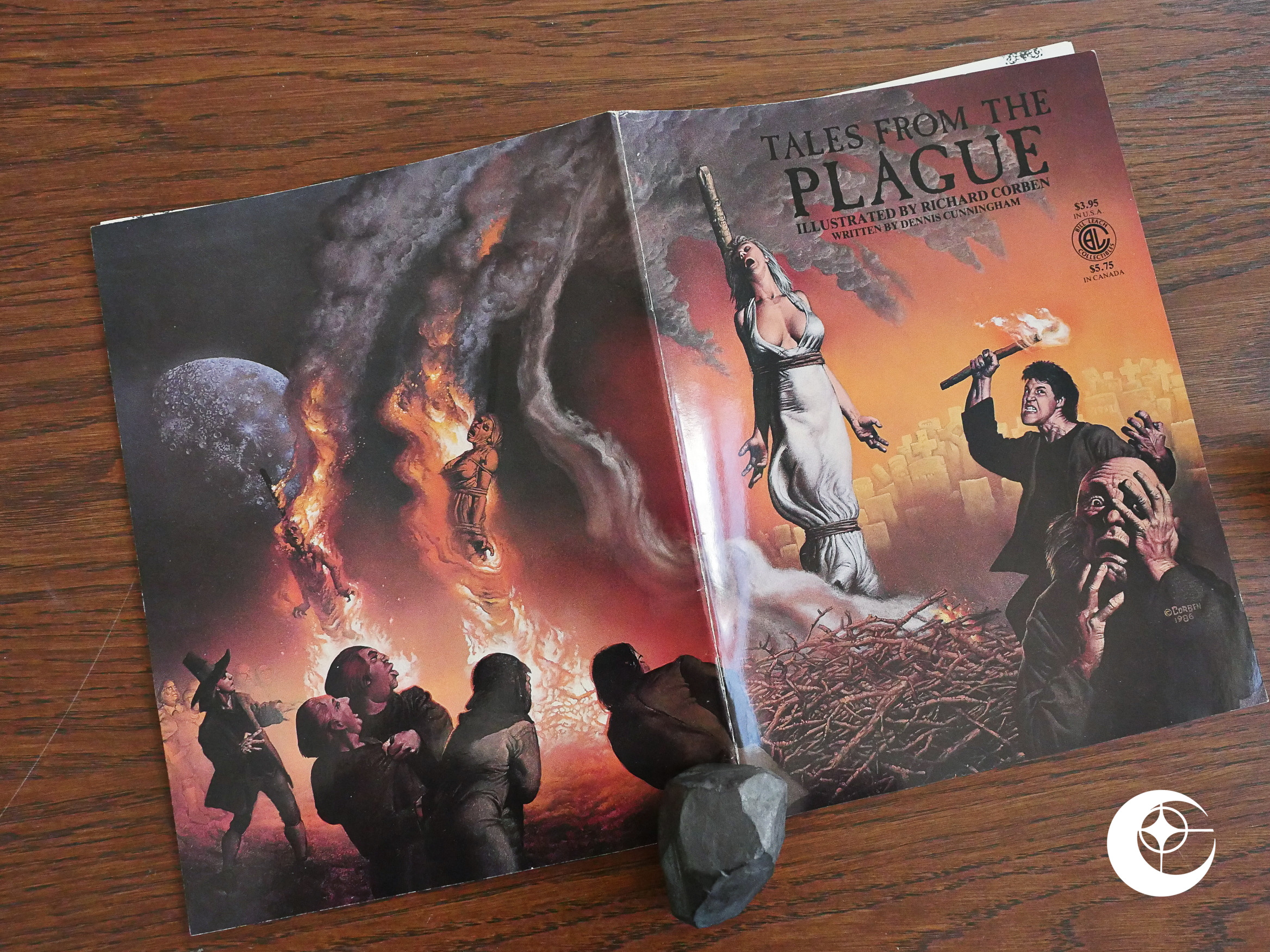
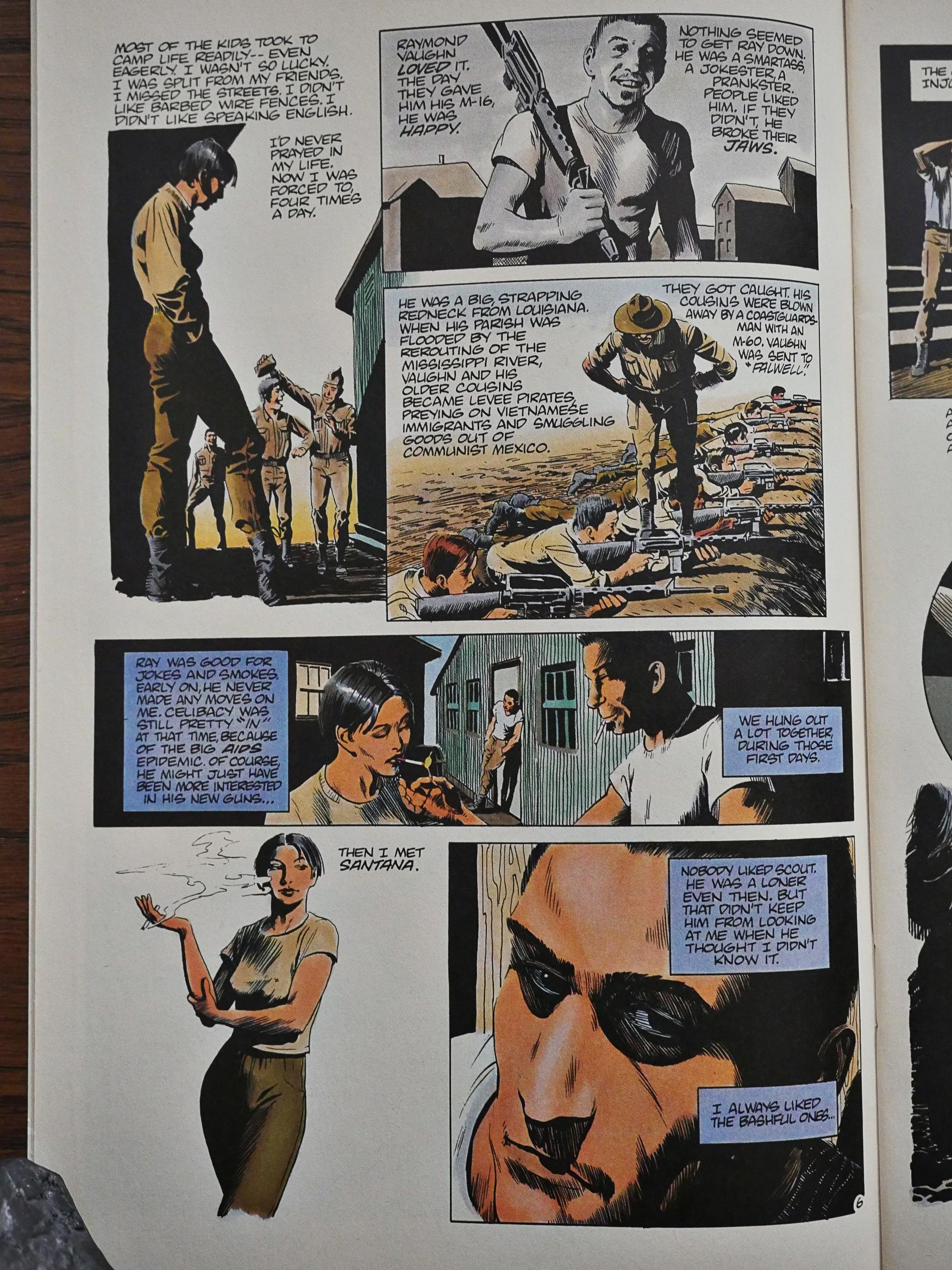
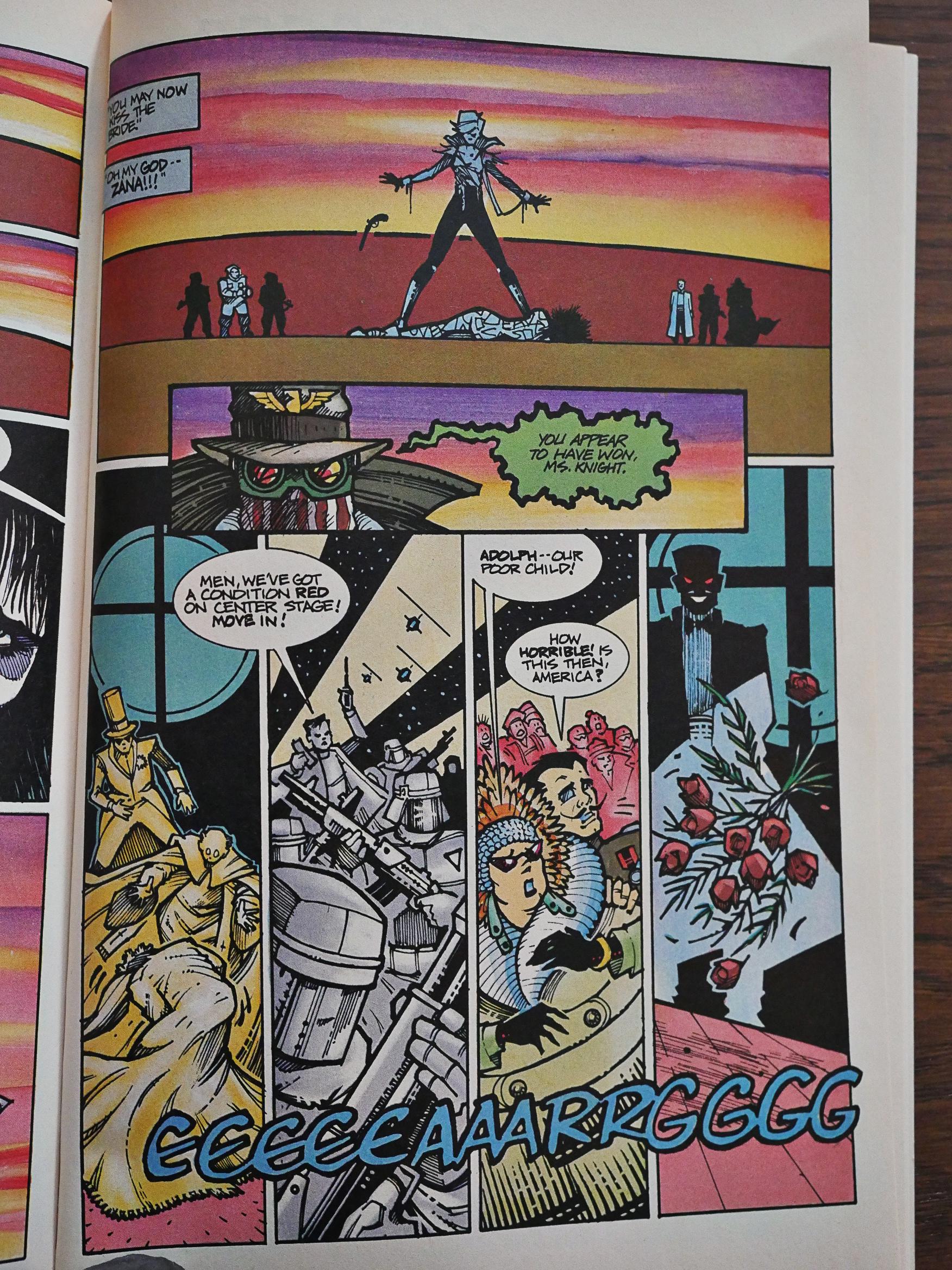
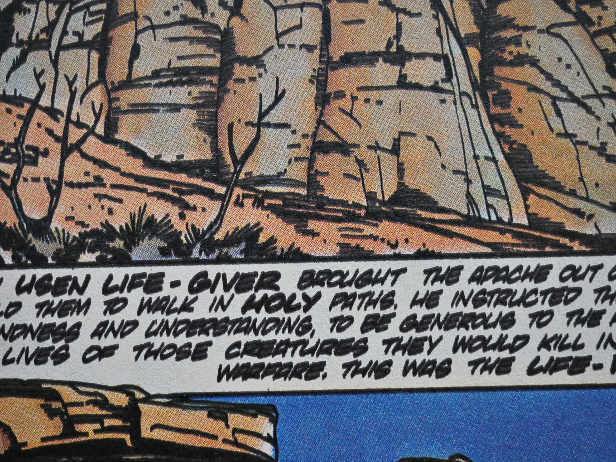
1986: Tales from the Plague

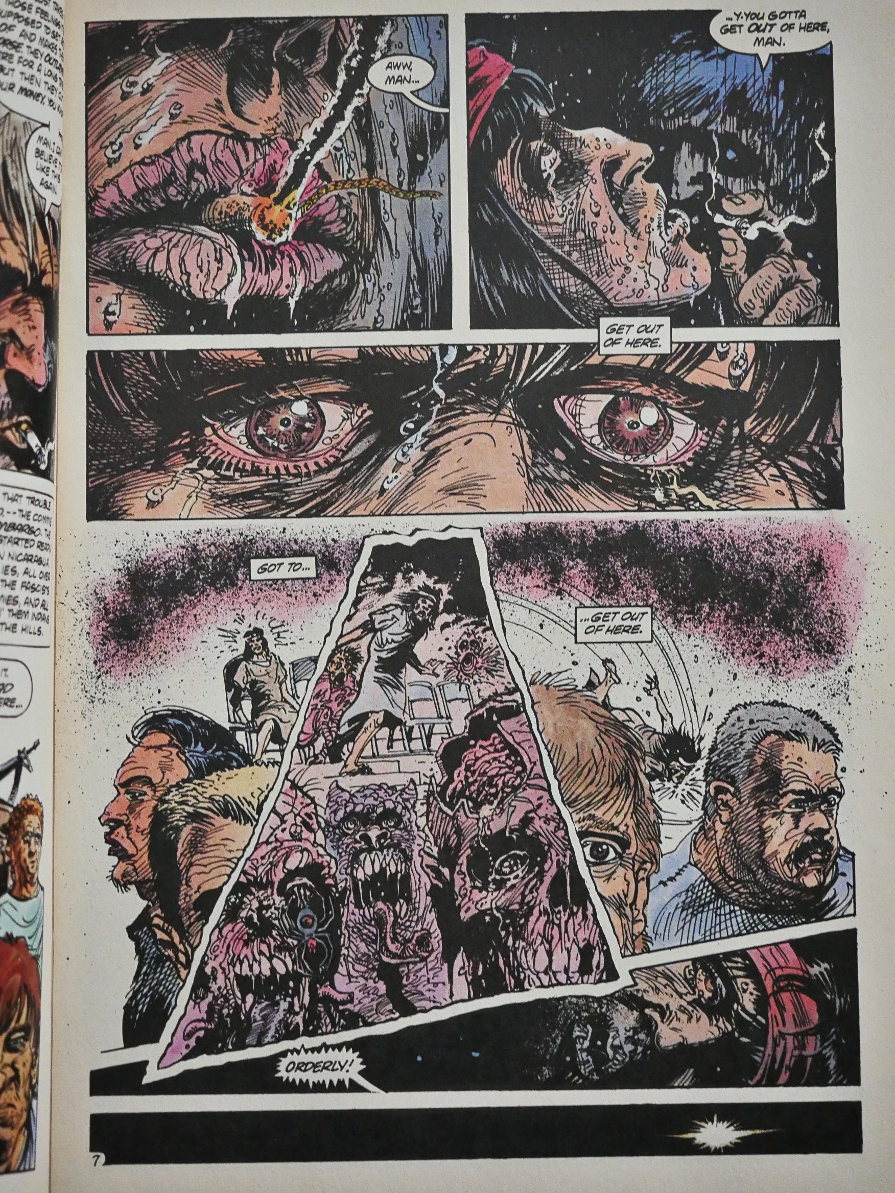
Tales from the Plague (1986) #1 by Dennis Cunningham and Richard Corben.

Hm… No Eclipse logo on the cover?

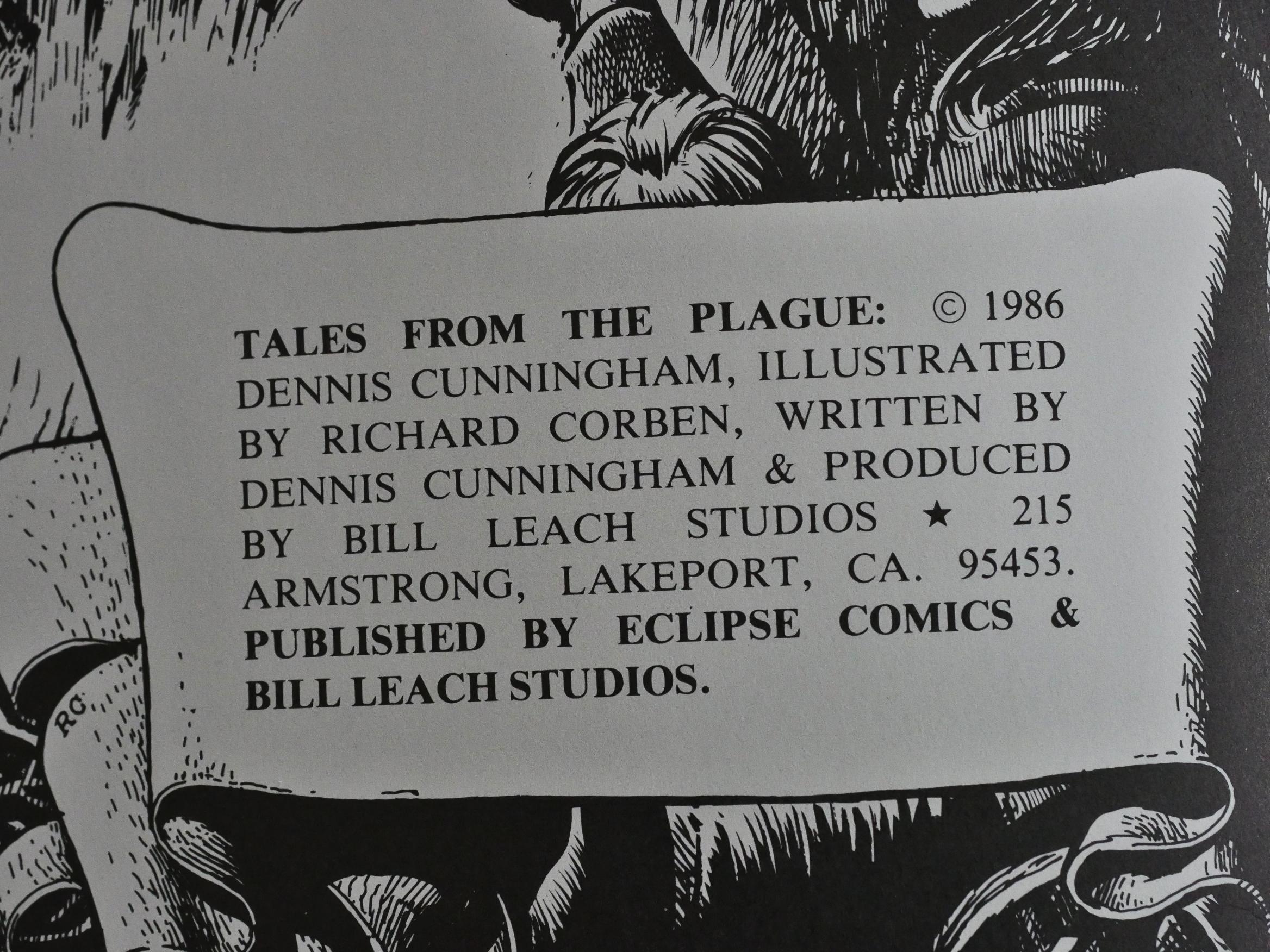
Ah, co-published by Bill Leach Studios. Which reminds me: I should probably mention at some point what my criteria for “Is this an Eclipse book?” is.

Eclipse distributed a couple of dozens of books that they didn’t publish themselves, most noticeably the Ken Pierce collections of old newspaper strips (Modesty Blaise, Axa, etc). These are often listed in the back issue ads in the Eclipse books, but since they’re not Eclipse “proper”, I’m skipping them in this blog series.

I’m also skipping series like Spaced, that do have the Eclipse trade dress, but where the indicia says that it’s not published by Eclipse, anyway.

But this book is Eclipse-ish, so let’s get on with the reading.

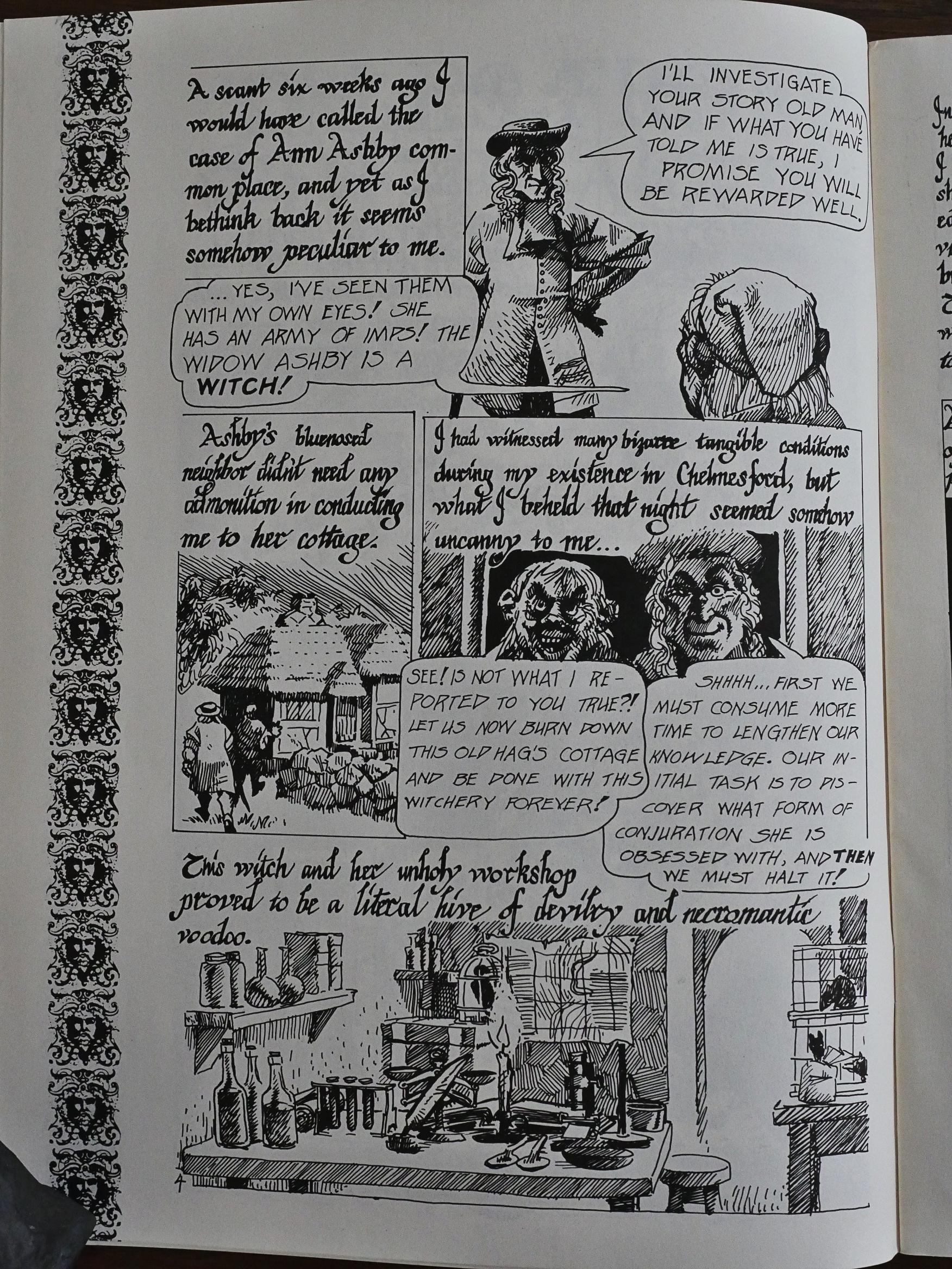
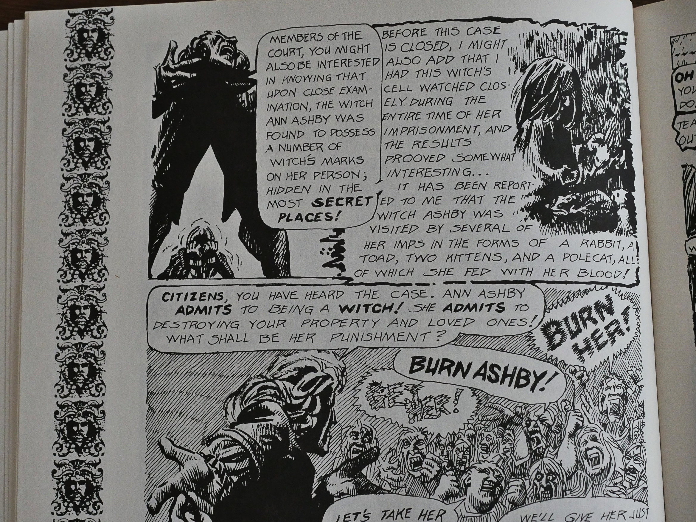
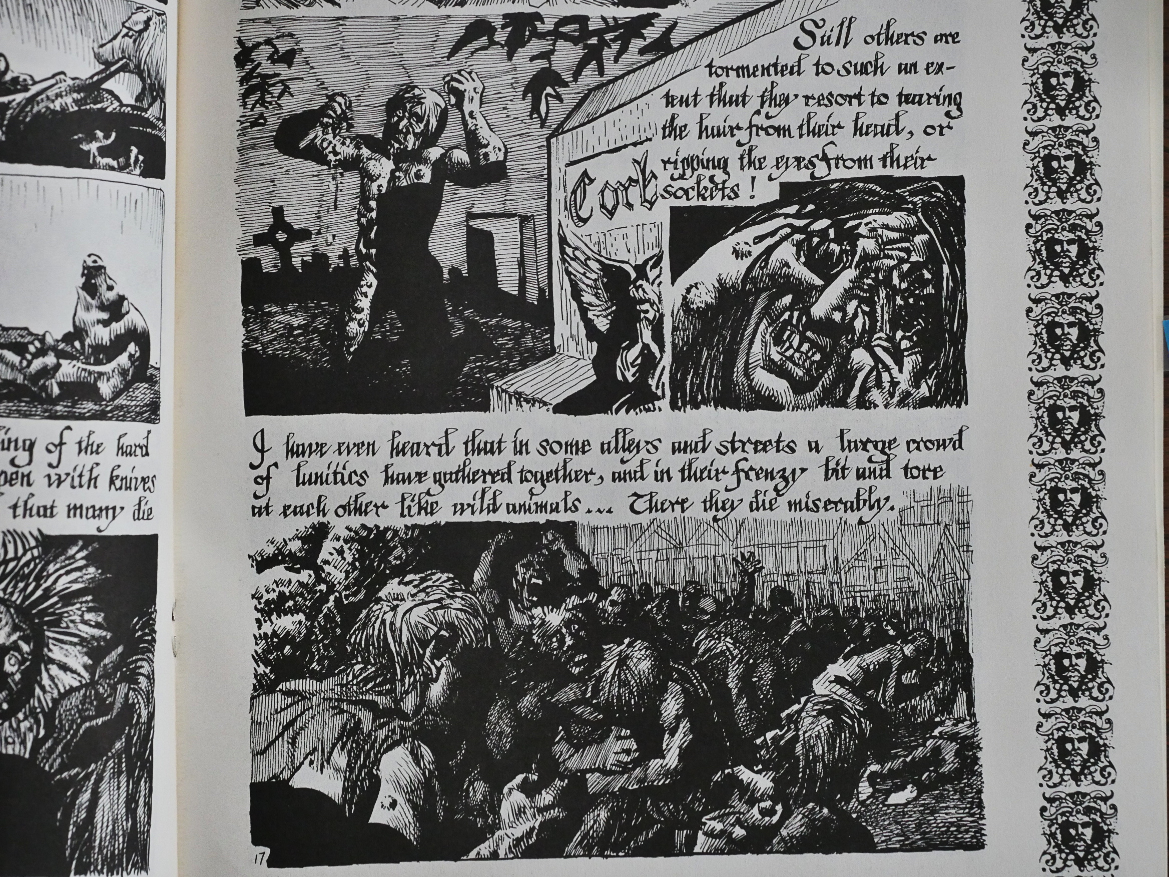
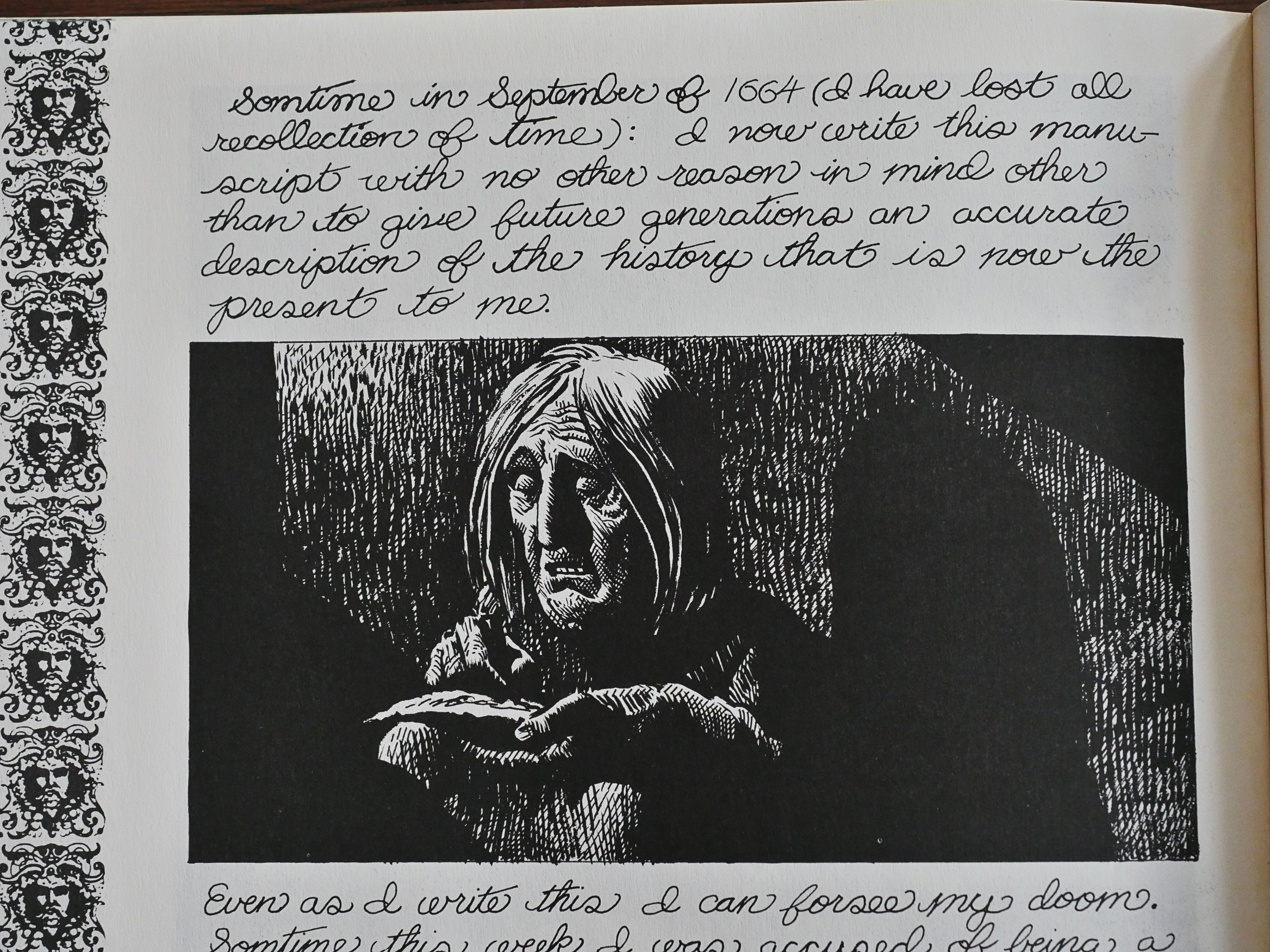
The first thing you notice about this book is how text-heavy it is, and what annoying scripts they’ve used to letter it. The “normal” speech bubble lettering is uneven and ugly, and the oldee tymey script is irritating.

The second is that this seems to have been drawn for a much smaller size: The lines of the artwork are crude and coarse.

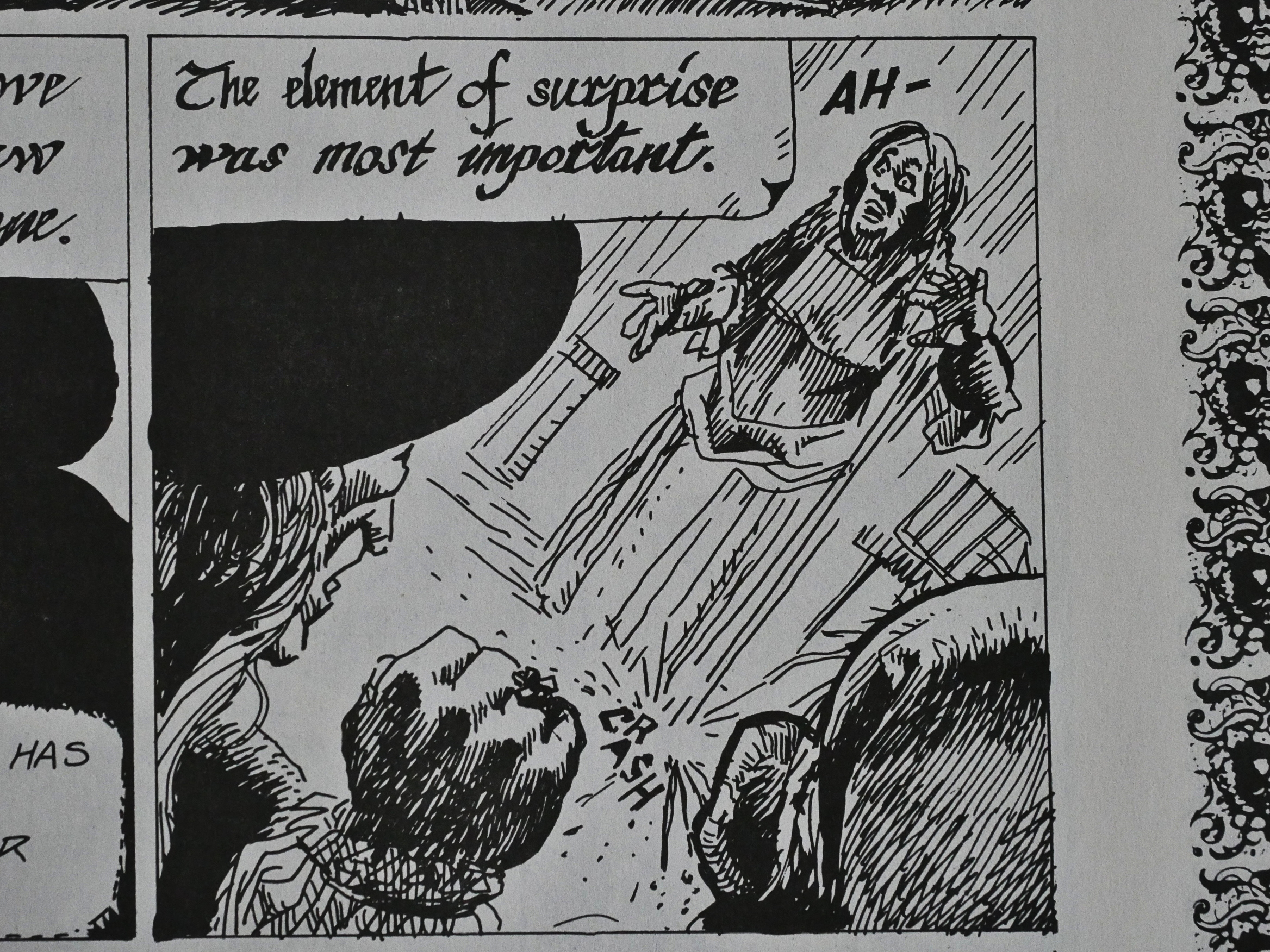
It’s also often hard to parse: I thought that was just a torso floating around, but I guess those lines going down from the torso are meant to indicate a skirt?

Storywise, it’s a “found manuscript” framing, where we first get the story from the point-of-view of a man who’s responsible for burning a real witch (as he sees it).

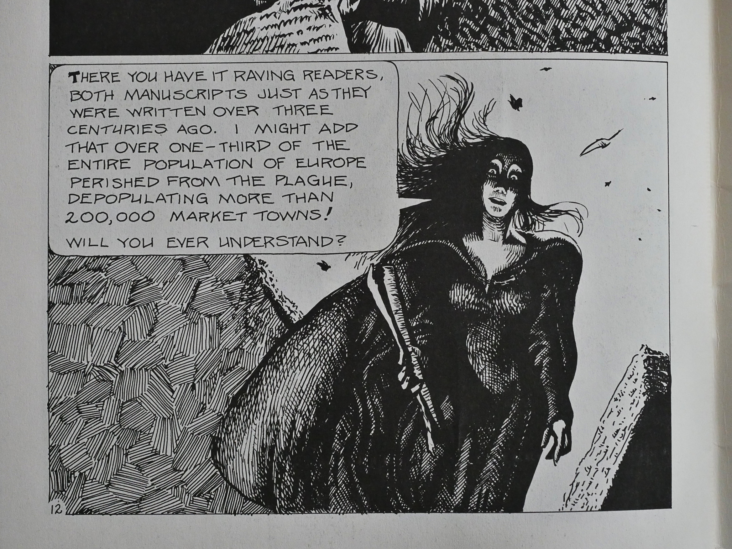
Corben’s artwork improves by leaps and bounds over the pages. Where in the start it was scratchy and amateurish, once we get to the gruesome Black Plague pages, he really makes and effort and goes to town.

In the second part of the book, we switch to yet another annoying script, but this time it’s from the point of view of the accused witch who (spoilers!) turns out to be a pre-renaissance scientist trying to combat the Black Plague and not a witch at all. That’s irony, huh?

While this book really isn’t worth reading (at all), the ending is somewhat affecting.

And based on true, found manuscripts! Huh! They wouldn’t lie to us, would they?

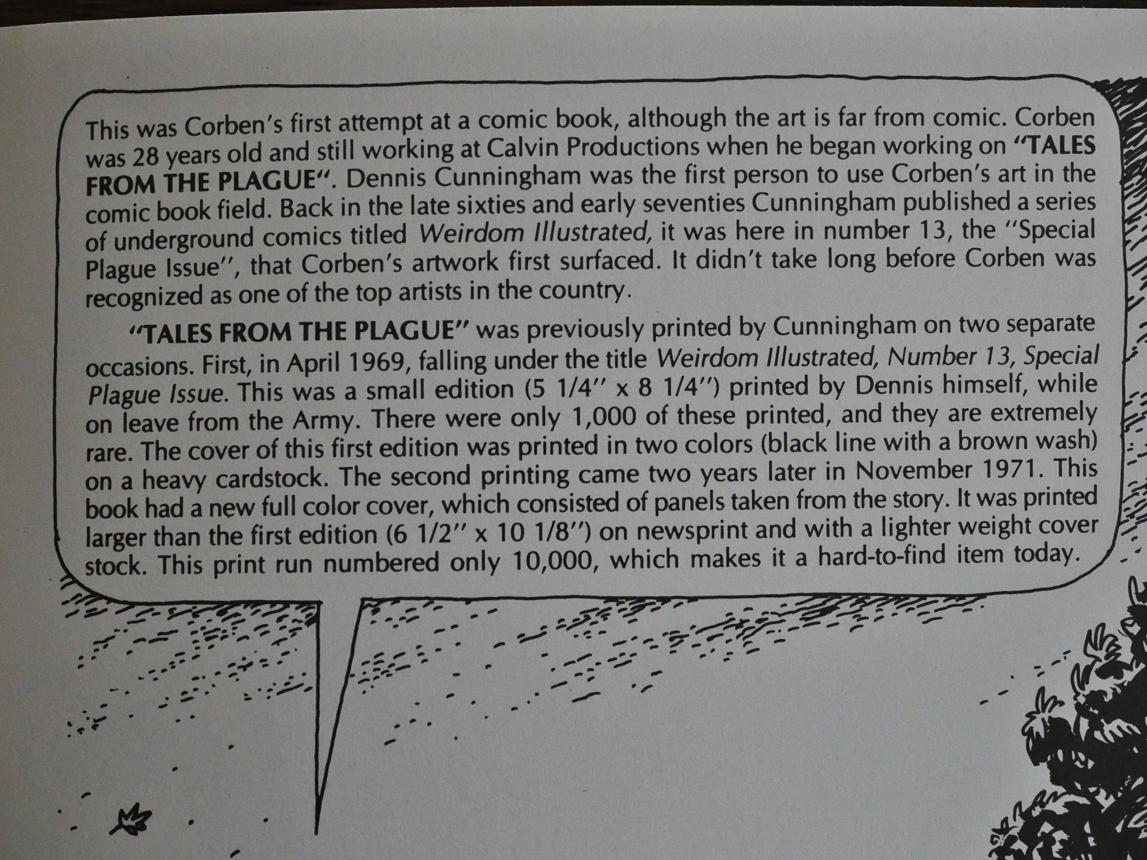
I thought this was a rather weird book to be publishing, but here we get the explanation: It’s Corben’s very first published work from way back in 1969. Which explains neatly why the artwork really sucked at the start but then grew better as the pages kept rolling past.

1986: Zorro in Old California

Zorro in Old California (1986) #1 by Nedaud and Marcello.

This is a rather puzzling thing for Eclipse to be publishing:

It’s a collection of six ten-page Zorro stories originally published in French, created for the Disney empire and published in Le Journal de Mickey. It’s by a pair of creators that have absolutely no pull, commercially or critically.

So perhaps the people at Eclipse discovered some incredible gem that they just felt they had to publish?

Nope. This is bog-standard professional, competent European boys’ adventure comics, which used to be produced by the metric tonne.

If you try to imagine “European version of Zorro produced for Disney”, the vision you’re seeing is just what’s on these pages. It’s moderately entertaining, but… why? Whyyyy?

The translation is mostly pretty competant.

Since this is Disney, this is how racy it gets in the sex dept.

And while there is some shooting and stuff, the violence is also very kids-friendly. (You get the feeling that there’s a joke in the dialogue here that didn’t quite translate…)

So what gives? I tried Googling, but found nothing much. But with the Comics Journal search engine I struck pay dirt:

Eclipse Comics (Box 199, Guerneville, CA 95446) brings back the classic character Zorro, created by novelist Justin McCarthy in The Curse of Capistrano. The Eclipse Zorro, in a $6.95 graphic novel format, features a Tom Yeates cover and six ten-page adventure stories written by Nadaud and illustrated by Carlo Marcello for Le Journal de Mickey. “We like Zorro” said Eclipse publisher Dean Mullaney. “We wanted to do an original, and this is a way of testing the market to see if Americans are interested in Zorro, not just for comic shops, but if we can move a good number through the regular bookstore channels. If so, there’s enough material for a second volume, and we’re looking at the possibility of doing an all-new story that we would create with an American artist and an American writer.

So Eclipse thought they could move some units in bookstores if they had a well-known name on the cover. I guess that makes sense. He doesn’t mention the fact that the exact same album was released in Europe; here in the Swedish translation. So presumably Eclipse could roll this out very cheaply, too. Or perhaps they sold the entire package back to Europe.

1986: Kitz ‘n’ Katz Komiks

Kitz ‘n’ Katz Komiks (1986) #1-4 by Bob Laughlin.

The black-and-white boom was getting underway and would come to set its mark on Eclipse over the next year or so. Eclipse’s first “boom” book, Adolescent Radiactive etc. was a commercial success, but I would guess that this wasn’t.

Kitz ‘n’ Katz had been running in The Comics Buyers Guide for some years as a traditional “four panels with a punch line” strip, but in 1985 Phantasy Press published a comic book version, which Eclipse then took over with issue two. (Well, the second issue says that it’s “distributed” by Eclipse, and then the last three says that they’re the publishers, so who knows what happened.)

Anyway, each issue has a bundle of unconnected one-to-fourish page stories about these characters.

Kitz ‘n’ Katz is, of course, somewhat a riff on Krazy Kat. But while Herriman made something really special and interesting, this… isn’t. Herriman would do great riffs on race and gender, and the “is Krazy or not?” thing is reflected in nobody (including Kitz and Katz) knowing which one is which. So you’d think that in a strip like this where this is made explicit with “Whitey” and “Blackie” (!), you’d see something beyond this gag, but… no.

And speaking of implicit made explicit: Here Laughlin takes a trip to Coconino county. It’s a rather nice homage, and probably the best thing from Laughlin in these issues.

Because he’s got plenty of guests showing up for a few pages each. Only one of them does some things within the Kitz ‘n’ Katz universe: Patrick McDonnell, who wrote a book on Krazy Kat, but is most well-known for his long-running Mutts daily strip. This is very early McDonnell, though, and looks kinda punk.

Err… That Kozy/Kitz/Katz heart thing is probably… Ok, let’s skip it.

But I wanted to mention that while Laughlin’s inspiration Herriman used dialect for fun and characterisation, Laughlin basically just does a “phonetic” spelling of non-distinctive American English. Is it supposed to be New Jersey or something? All the characters speak the same way (and none of the supporting characters have any distinctive personalities), so it’s all rather a waste.

George Erling is the other artist to have some pages in each issue, and they’re kinda fun.

Only about half of the pages Laughlin contributes are Kitz ‘n’ Katz stuff, and unfortunately, these are even less fun than the main feature. They range from the wince-inducing lameness of things like the above…

… to something that resembles a stab at an actual joke, like the above.

Laughlin wonders whether he should reprint some of the older strips, and if so, how. He tries out this arrangement:

Which I’ve never seen before, and probably for good reasons. One strip across the top, and then two strips arranged as a square in the bottom.

There’s music, too. Somebody should release a MIDI version of the score.

There’s no letters page as such, but Arn Saba (of Neil the Horse fame) drops by to say that he quite likes the book.

The Patrick McDonnell strips grow increasingly weird. They’re written by “Mr. Paciello” and rather reminds me of the lunacy of Mark Marek.

Eclipse switches the book to newsprint at this point, which makes it look even more new wave.

Unfortunately Gary Fields provides a couple of pieces.

The book has more well-known fans, like Howard Cruse, apparently…

The final issue is even more scattered than the previous ones, and there’s a general feeling of scraping the barrel here. The pages of these one-panel gags aren’t even the worst thing in here.

And then we get the first “next issue” thing, and it is, of course, in the final issue.

Laughlin self-published one issue after Eclipse cancelled it.

Now, I knew nothing about Laughlin before reading this series, but it turns out that he’s a veteran artist having had his own short-lived comic strip in the 60s (Cuffy), and worked as the inker on the Heathcliff comic strip for ages.

He died in 2006 at age 81. This is from the note in The Comics Journal #277:

CARTOONIST BOB LAUGHLIN DIES MAY 14: Cartoonist Bob Laughlin, who created the comic series Cub’ and Kitz ‘n’ Katz in addition to assisting on Heathcliff, died on May 14 following an earlier stroke. He was 81 years old. Laughlin inked the Sunday Heathcliff comics in the 1980s, and also worked on the Monty Hale comic book. His comic feature Kitz ‘n’ Katz ran in the Comics Buyer’s Guide and was published in the mid-80s as a comic-book series by Eclipse; another Laughlin creation, Cuff, ran from 1963 to 1964. In his May 16 blog entry, Craig Yoe paid tribute Laughlin’s work, describing his strip as “brilliantly genius”: Bob was one Of those cartoonists who was as good as it gets — but labored in pretty much obscurity,” wrote sublime strips about a black and a white ‘kat’ who didn’t know themselves which was who lwerel probably too artsy, too gentle, too charming, too creative, too surreal, too cute, too poetic, too sophisticated, too silly, too sweet all together to find a broad audience Patrick McDonnell tells me how sweet and self-effacing Bob himself was. Bob resisted Patrick’s urgings to join the National Cartoonist Society because he didn’t feel he was worthy. The truth was that With Kitz ‘n’ Katz Bob’s work transcended of his fellow cartoonists’ work.”

But what did the critics think? Steve Monaco in The Comics Journal #96, who starts off his very confused article with several paragraphs about how expensive comic books are these days, and then:

Laughlin seems to have attempted a genuine funny-animal book with no apologies or equivocations made for the fact, and while he would undoubtedly describe his intended audience as the cliched kids-of-all-ages, the unadorned art style and primer-level humor featured in the book indicates that would work best for the most-ignored minority in comics today, namely, little kids. But that is precisely where the book runs into trouble, because Laughlin, through his Krazy Kat fixation, presents stories that would leave most kids cold as well as dialogue, written in a quasi-Krazy phonetical manner, that would probably only confuse them. Anyone older would find both tedious.

Er… What? Is he saying that older readers find Krazy Kat tedious?

While the corny slapstick of ‘The Doolers” segments that run through the book might appeal to them on a purely Visual level, and the art style is nicely appropriate, the verbal transmogrifications throughout the book are often so far out that even adult readers may find them troublesome. (l don’t think anyone should be expected to automatically be able to transform Laughlin’s description of a bathtub from “porzlin yott” to “porcelain yacht.”)

*slow eye blink*

Yeah, that’s really hard.

Sheesh.

Anyway.

1986: Airboy and On and On

Airboy (1986) #1-50, Target: Airboy (1988) #1, Airboy versus the Airmaidens (1988) #1, Valkyrie! (1987) #1-3, Valkyrie! (1988) #1-3, , The Airfighters Meet Sgt. Strike Special (1988) #1 by Chuck Dixon, Stan Woch, et al.
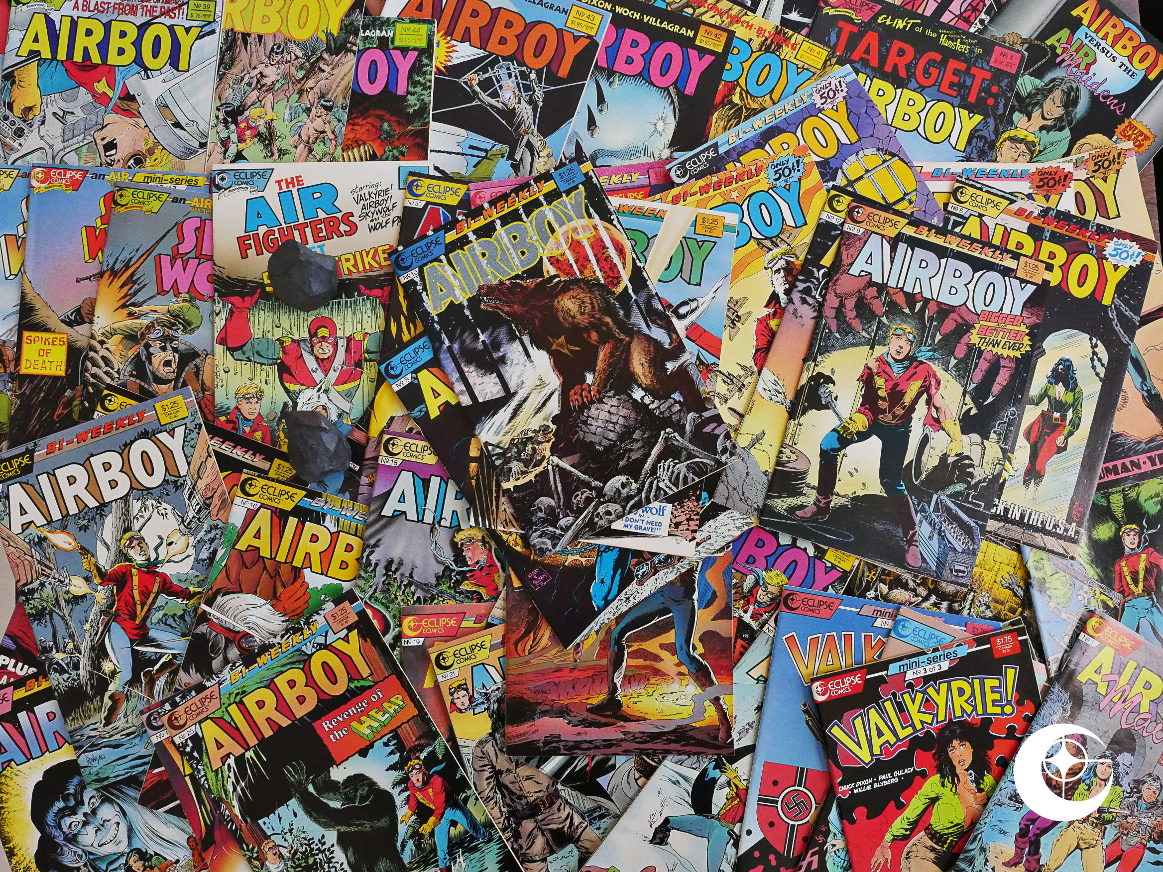
Strap in; this is going to be a long blog article.
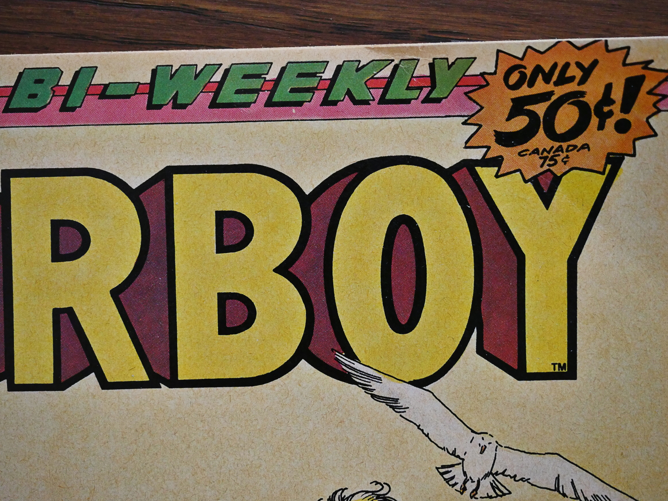
Around this time, Eclipse experimented with a variety of formats and price ranges. They launched two bi-weekly 50 cent series: This one and The New Wave. The catch is that these are 16 page comics, and Airboy has only 13 story pages per issue. So you basically get a bit more than half a normal comic, but twice a week.

Would the experiment be successful?
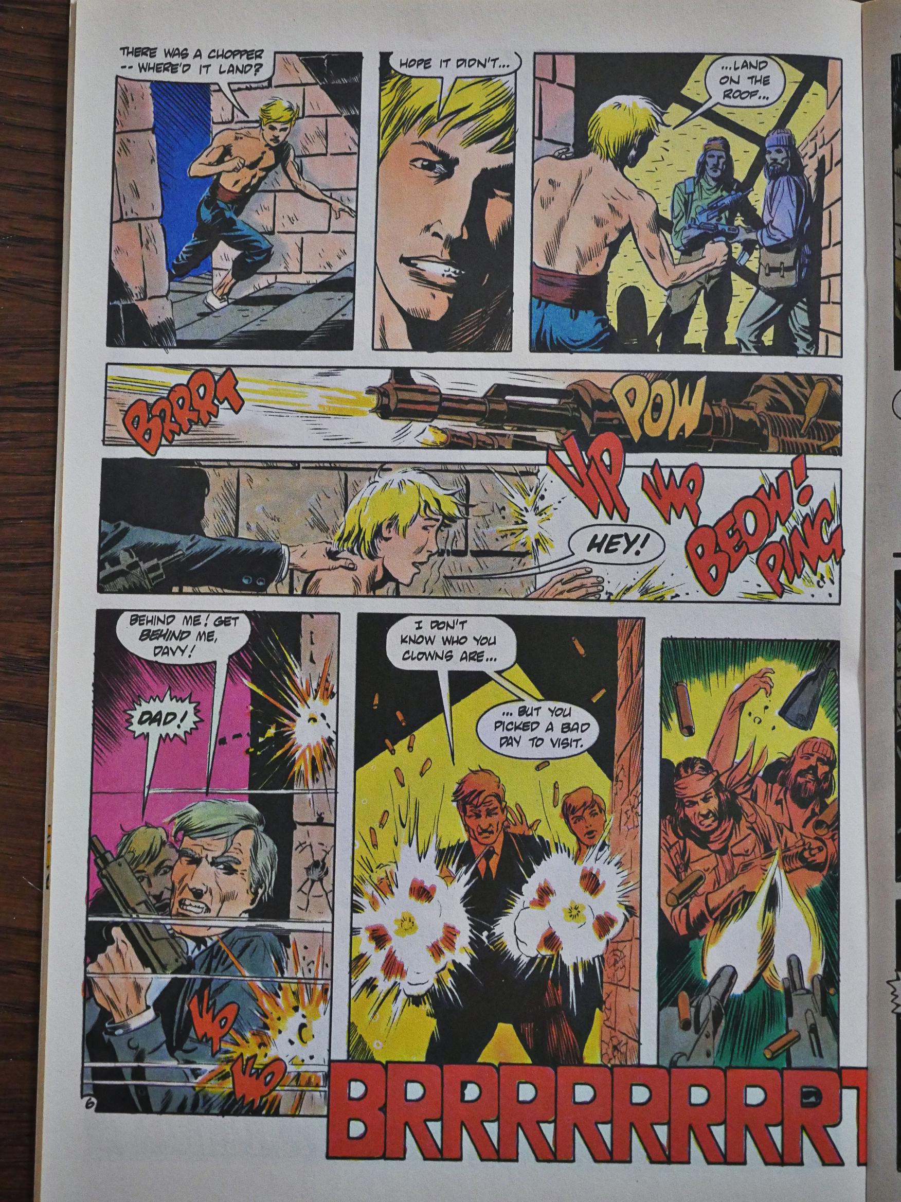
Writing thirteen page chapters and having the results come off as meaningful to the reader is a challenge. You can’t spend pages on expositions or recaps, but have to deliver a satisfying chunk of story, action and humour per issue.

And I think that Airboy does this surprisingly well.
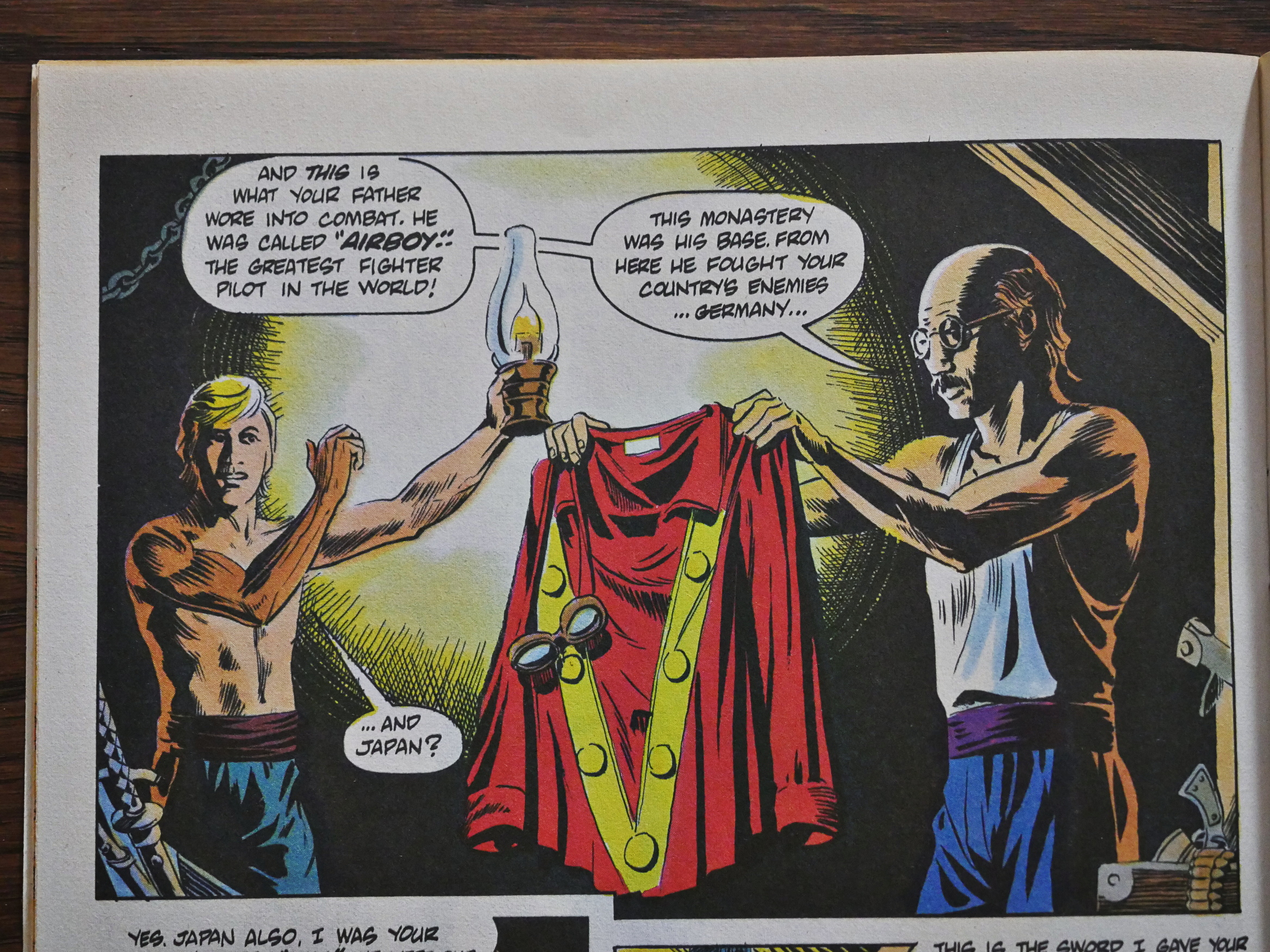
I haven’t read Airboy before, because I assumed that it would suck. It’s a revival of a defunct 40s/50s comic book series originally published by Hillmann and mostly created by Charles Biro (of Crime Does Not Pay fame). Those kinds of revivals seldom work well, because they’re usually made for mercenary reasons.

But you really feel that the creators here (Chuck Dixon is the writer and Timothy Truman was involved with the updating, drew the first two issues with Tom Yeates, and is the editor) are really into this, for some reason or other. They’re too young to have grown up with the characters, so it’s not a nostalgic project, I think?
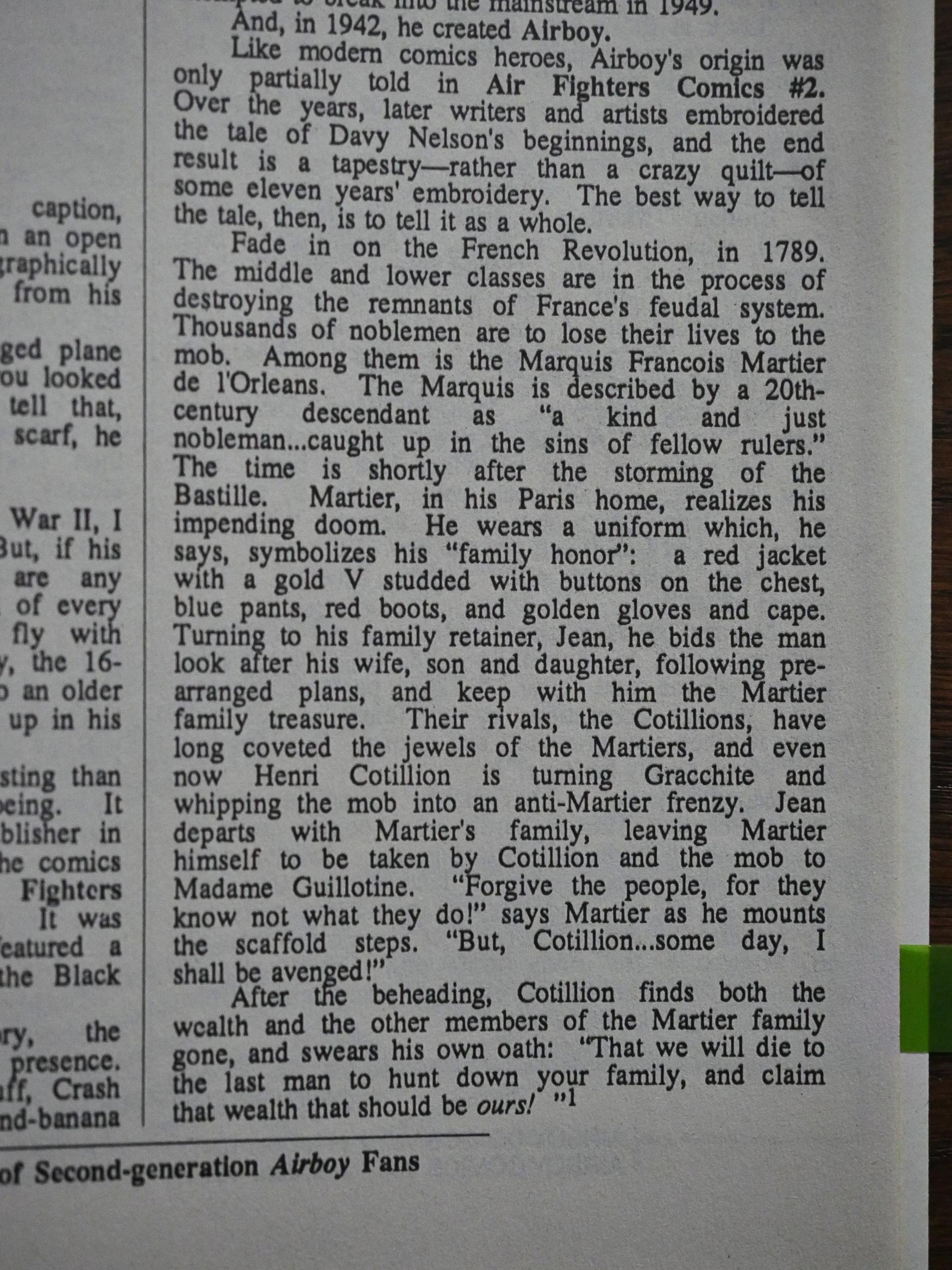
The first few issues have an essay that explains the long and complicated plot line of the original Airboy comics…
… and it just goes on and on, and it makes you wonder who might possibly be interested in a dry recap like that. Reading about the history of the comics is fun, but reading plot recaps is deadly. I think.
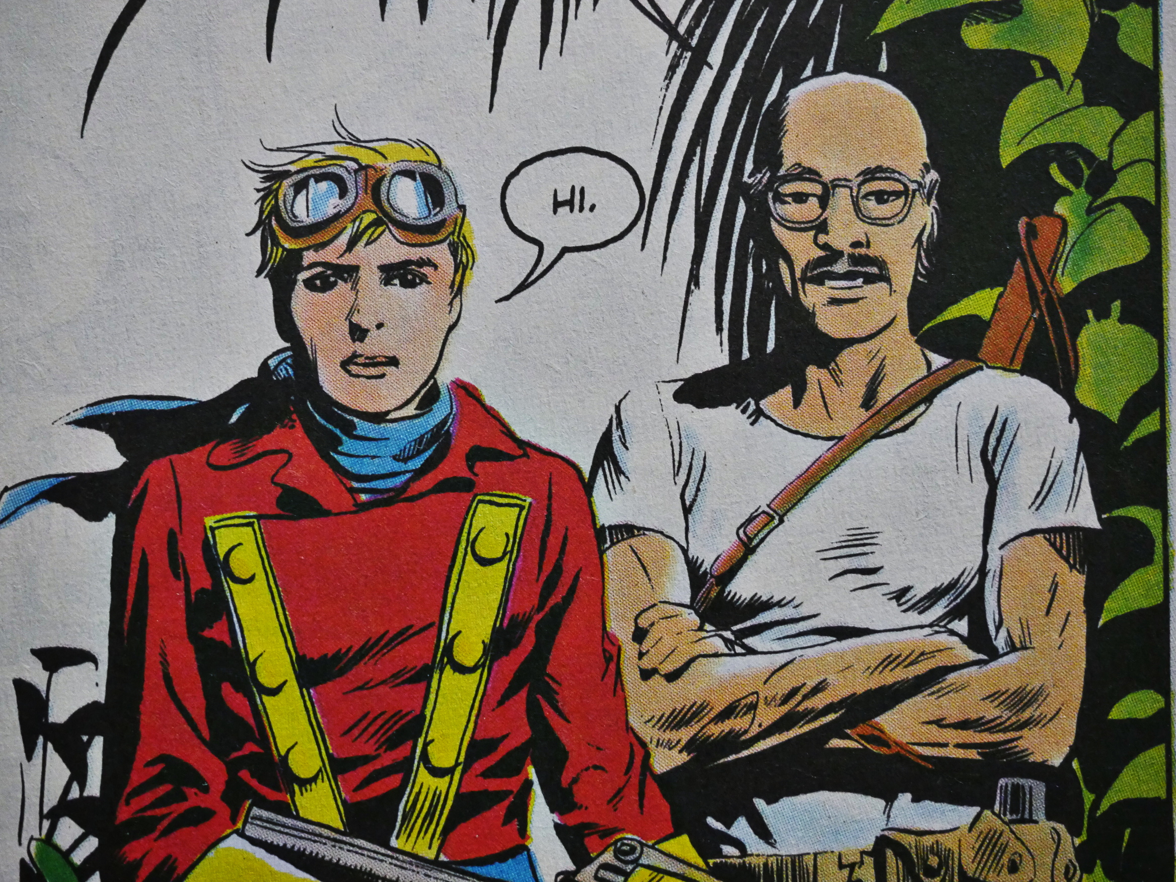
In Truman/Yeates’s depiction of the new Airboy (the son of the original), I was a bit confused whether he had a sister or not. (He doesn’t.)
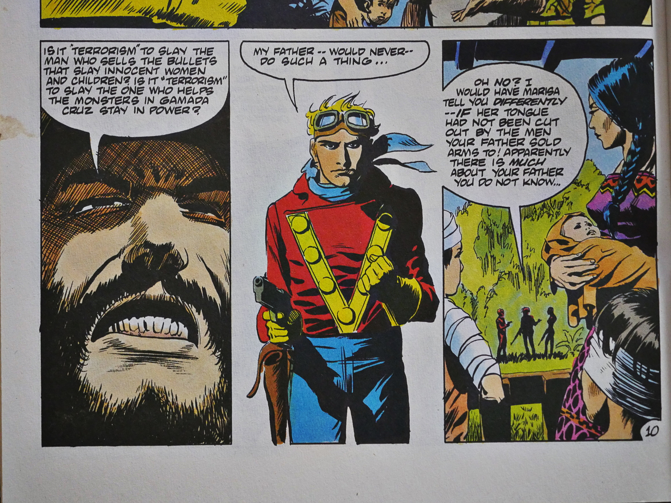
The second issue is where we get the politics of the book straight: Airboy is no longer blindly fighting for whatever the US interests are, but fights for justice. Here he gets a lesson in South America about what’s going on.
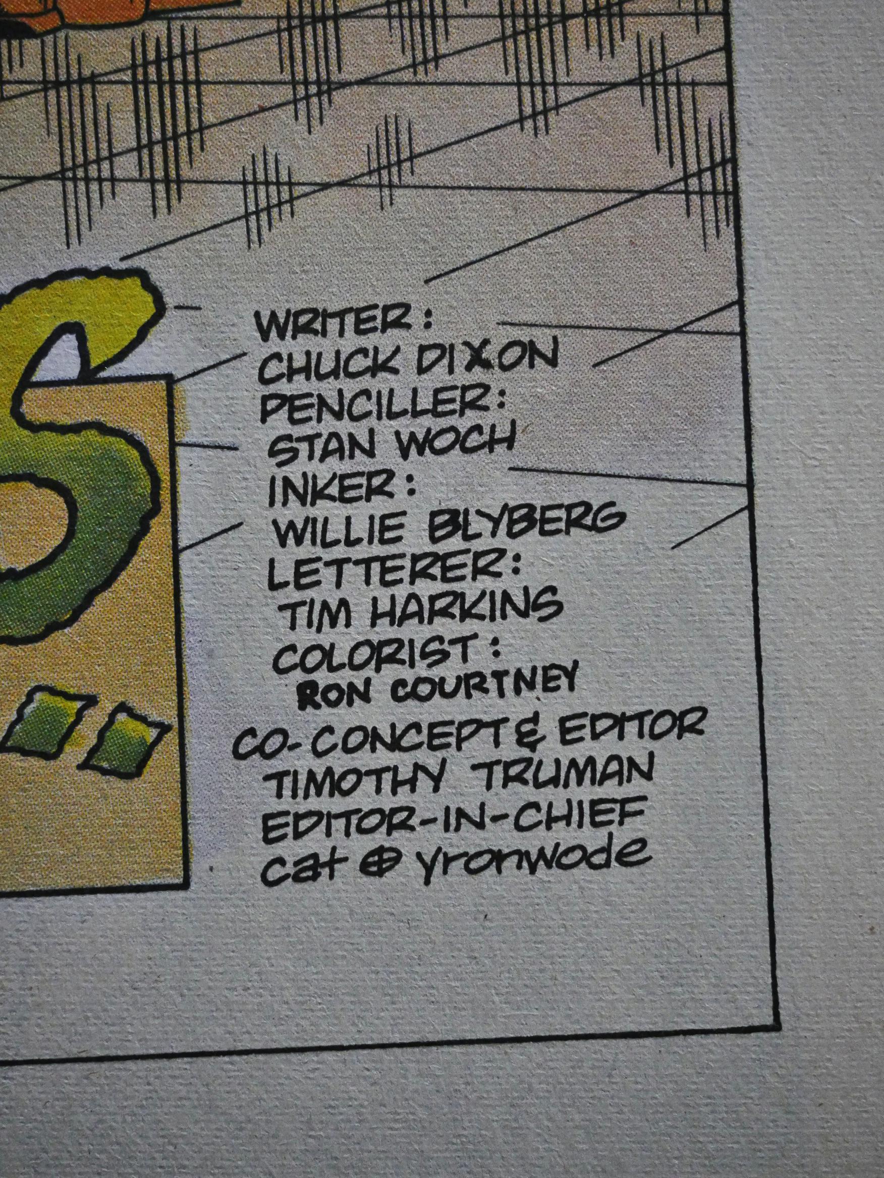
And then with the third issue, Truman and Yeates are gone, and Stan Woch/Willie Blyberg takes over. “Strange move”, I thought, but Dixon explains later that this was always the plan, but Woch couldn’t do the first couple of issues due to a scheduling conflict. Hm…
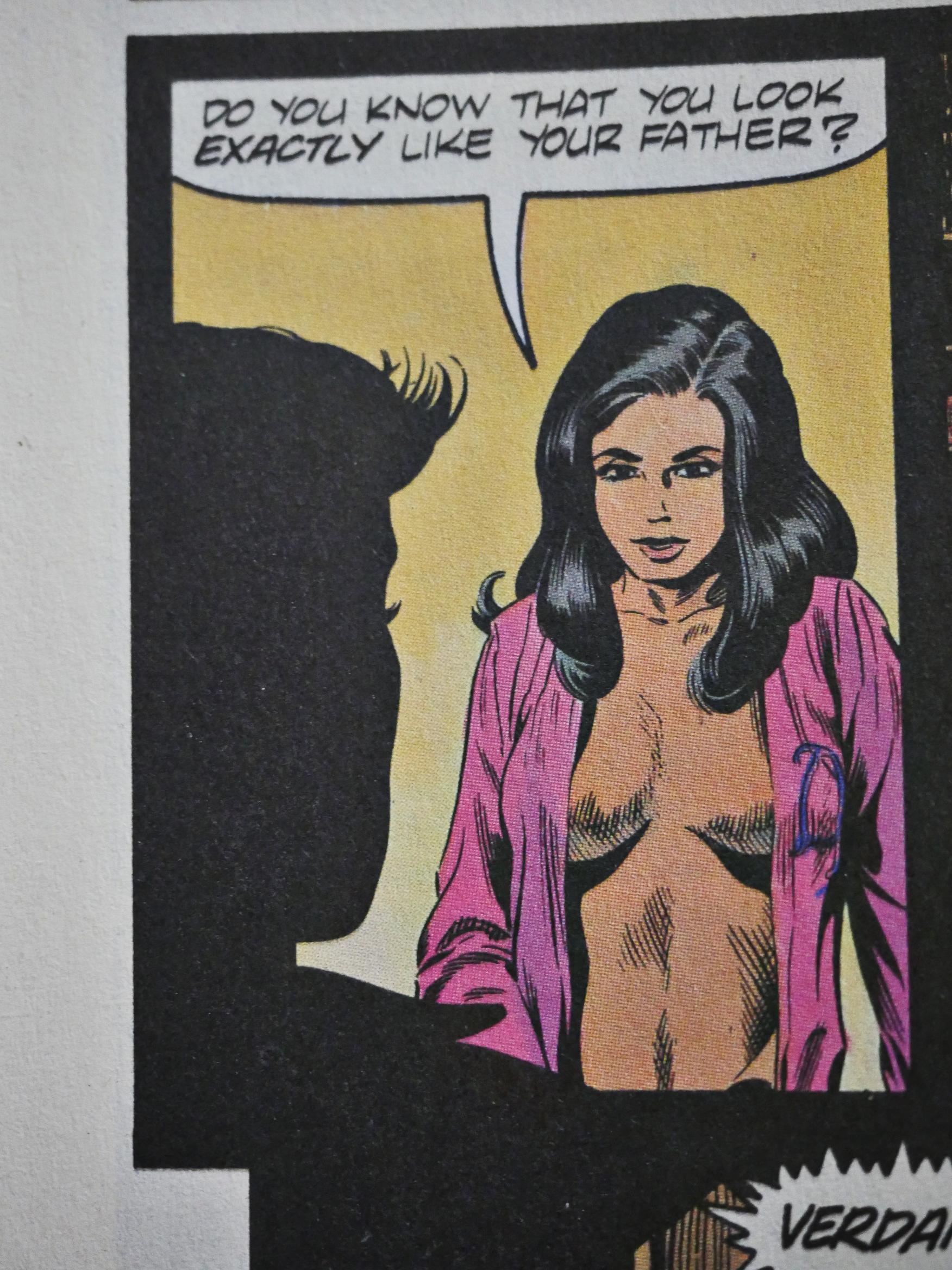
Woch continues where Truman left off, but ups the sex quotient a bit. And this plot development is rather creepy: Valkyrie (seen here modestly dressed), who’s been in stasis for 30 years, wants to get it on with her former lover’s son. Because he looks like his father. That’s healthy!
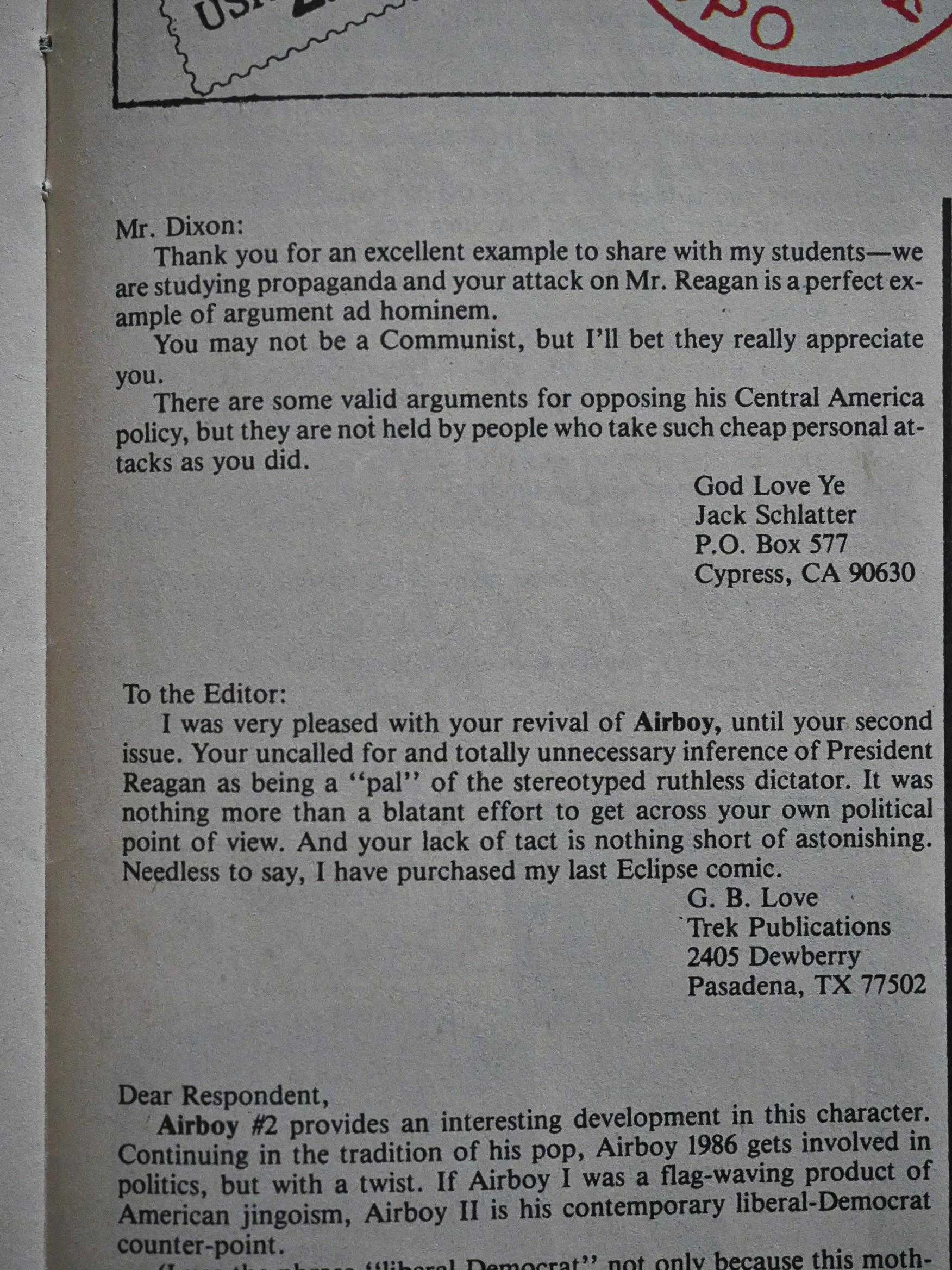
Then we get the inevitable fallout from the South American storyline in the second issue. A bunch of letter writers say they’re shocked, shocked I tell you, that such Communist propaganda as Airboy could sneak into a comics store.

In a way it’s comforting to read these reactions, because it reminds us that these fascists have always been a part of the comics-reading public: Reading comments on comics sites these days could make you despair that the alt-right seems to have taken everything over (mention Marvel anywhere on the Internet and you’ll get two dozen comments from these people), but they’ve always been with us. They’re not a new phenomenon.
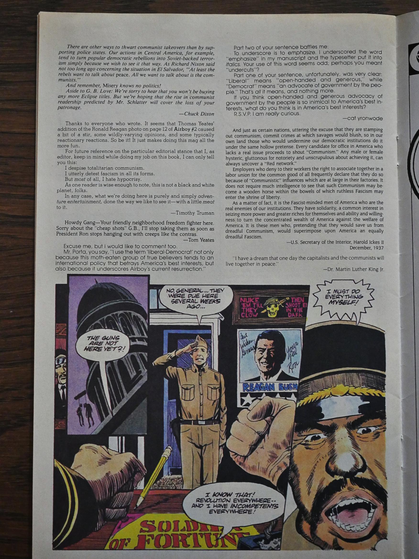
Everybody involved in Airboy, from the writer to the penciller to the inker to the editor to Harold Ickes III weigh in with responses to these people who swear they’ll never buy a single Eclipse comic again because of the panel above. (Yeates was the one who cheekily added the Ronald Reagan poster in the dictator’s office.)

Fun times.
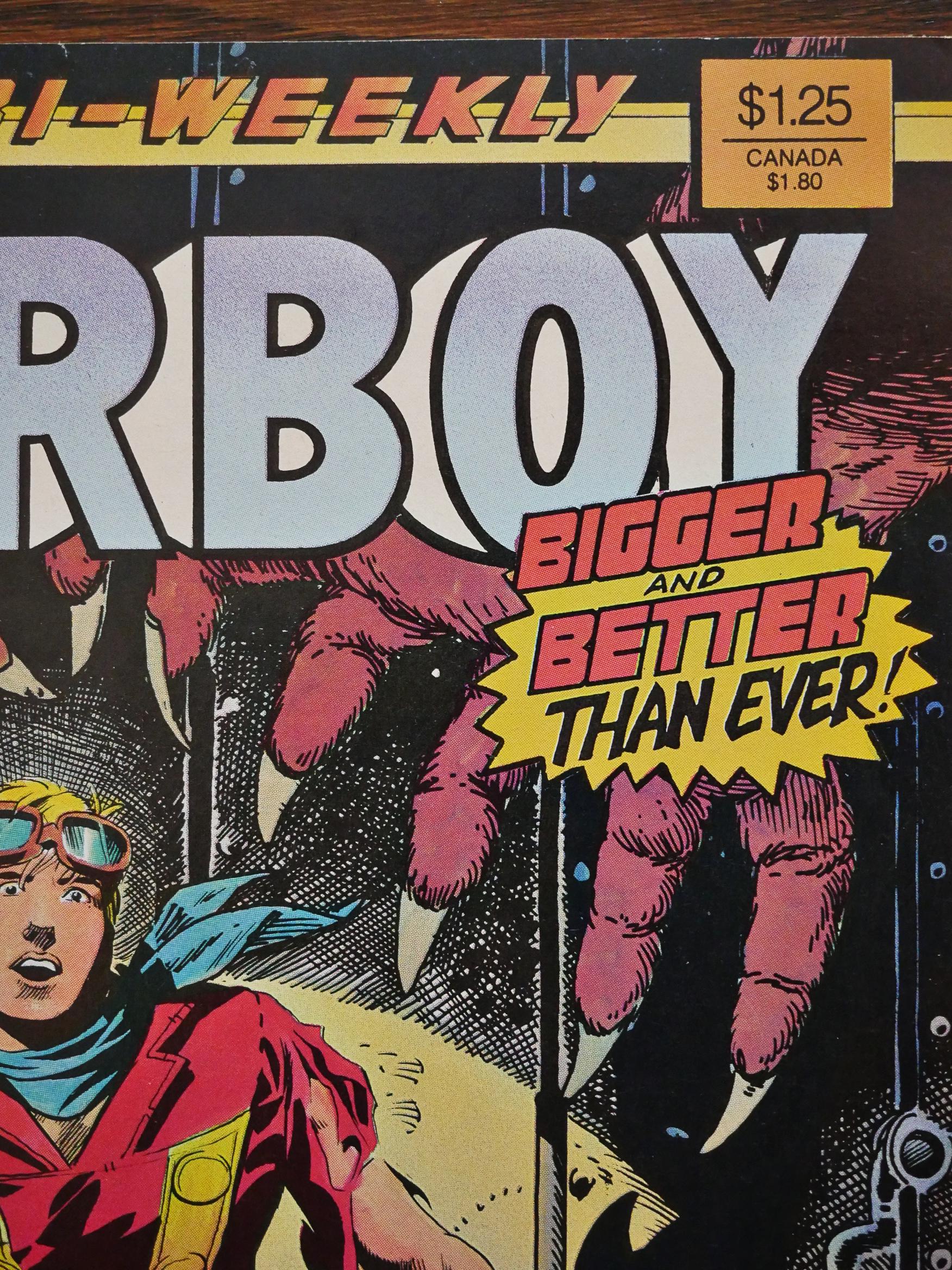
Then they change the format: Double the pages to the normal 32, and increase the price from 50c to $1.25. The reasoning behind this isn’t explained at all in the book. Perhaps the 50c thing just wasn’t working out for them financially? It’s still bi-weekly…
… and they manage this by keeping the main feature at 13 pages, so that Stan Woch doesn’t have to cripple himself drawing two full-sized issues per month, and add an equally long backup feature to fill out the issue.

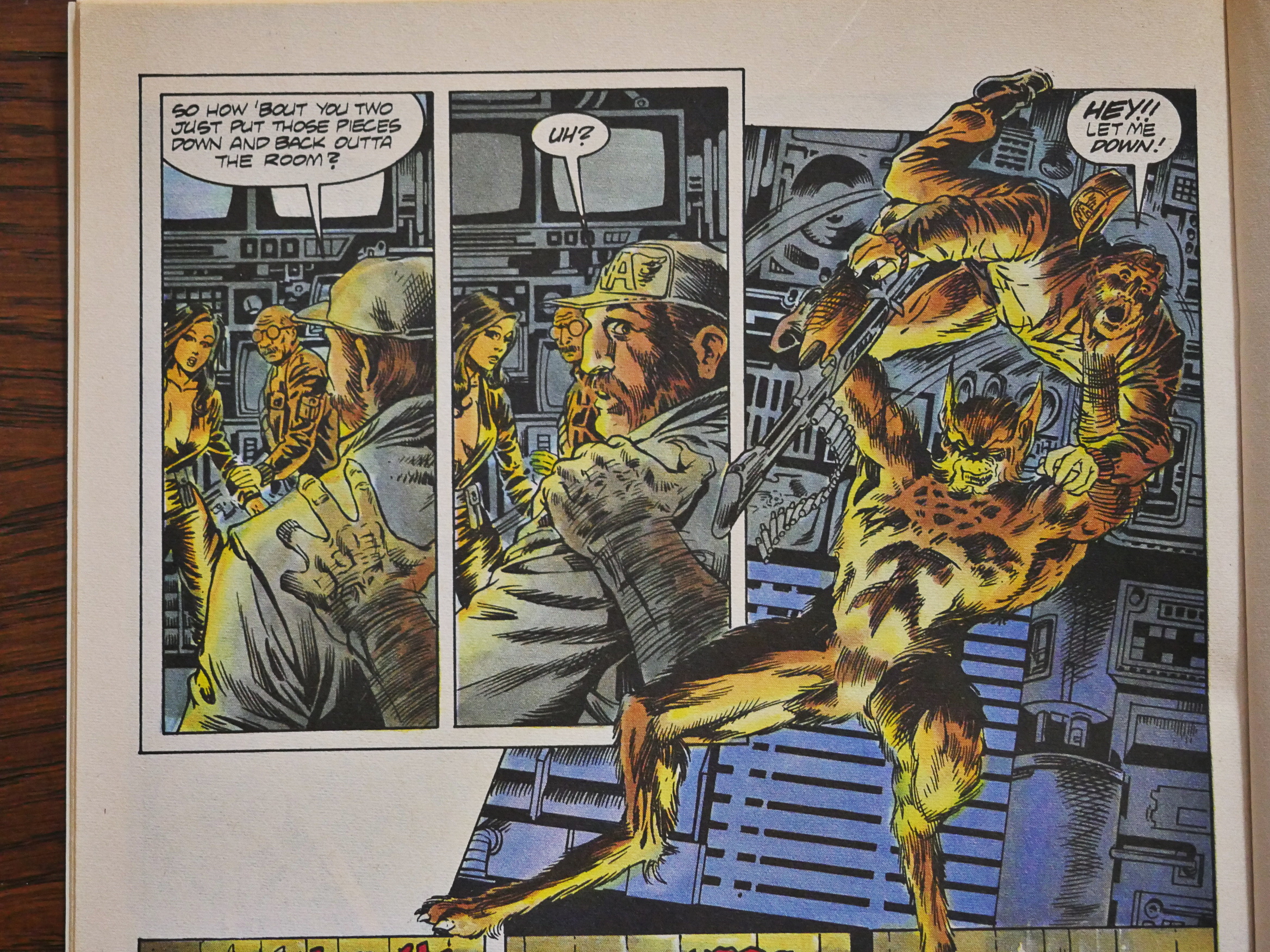
I haven’t talked much about Woch’s artwork, but it’s just kinda absolutely perfect for the book. He’s great at doing action scenes, and he draws real people perfectly, nice anatomy and all, but he’s also able to depict the fantastic elements, like this werewolf, in a manner that fits the otherwise realistic surroundings without a hitch.

It’s nice to look at, and his pages are extremely readable. No problems with the layout.
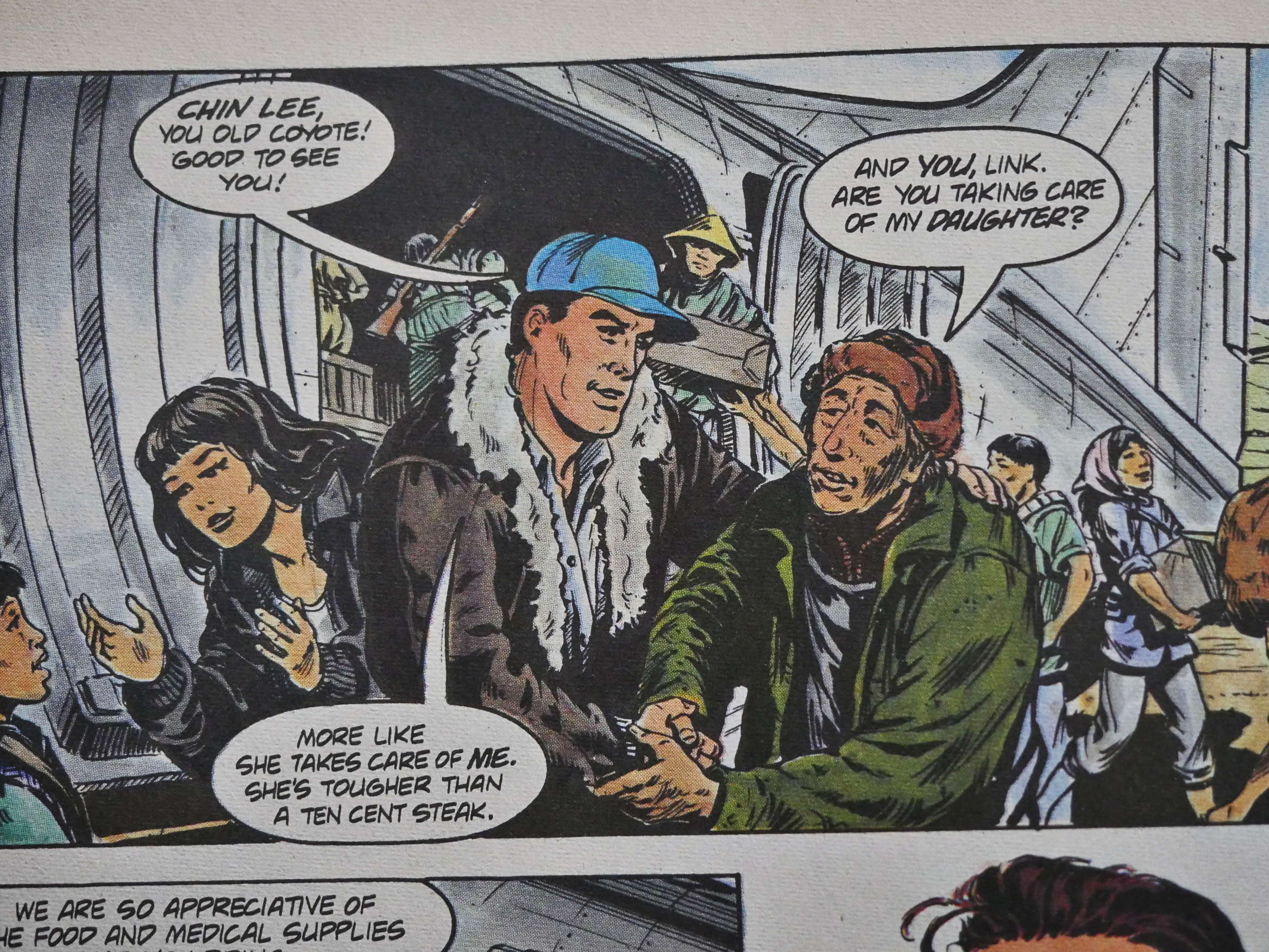
The backup features focus on what various characters from this universe have been doing between the end of the original Airboy comics and now. Here we have Skywolf’s group helping pro-Maoist people in China in the late 40s. Tee hee.

The artwork is wildly variable, though. Above we have Larry Elmore.
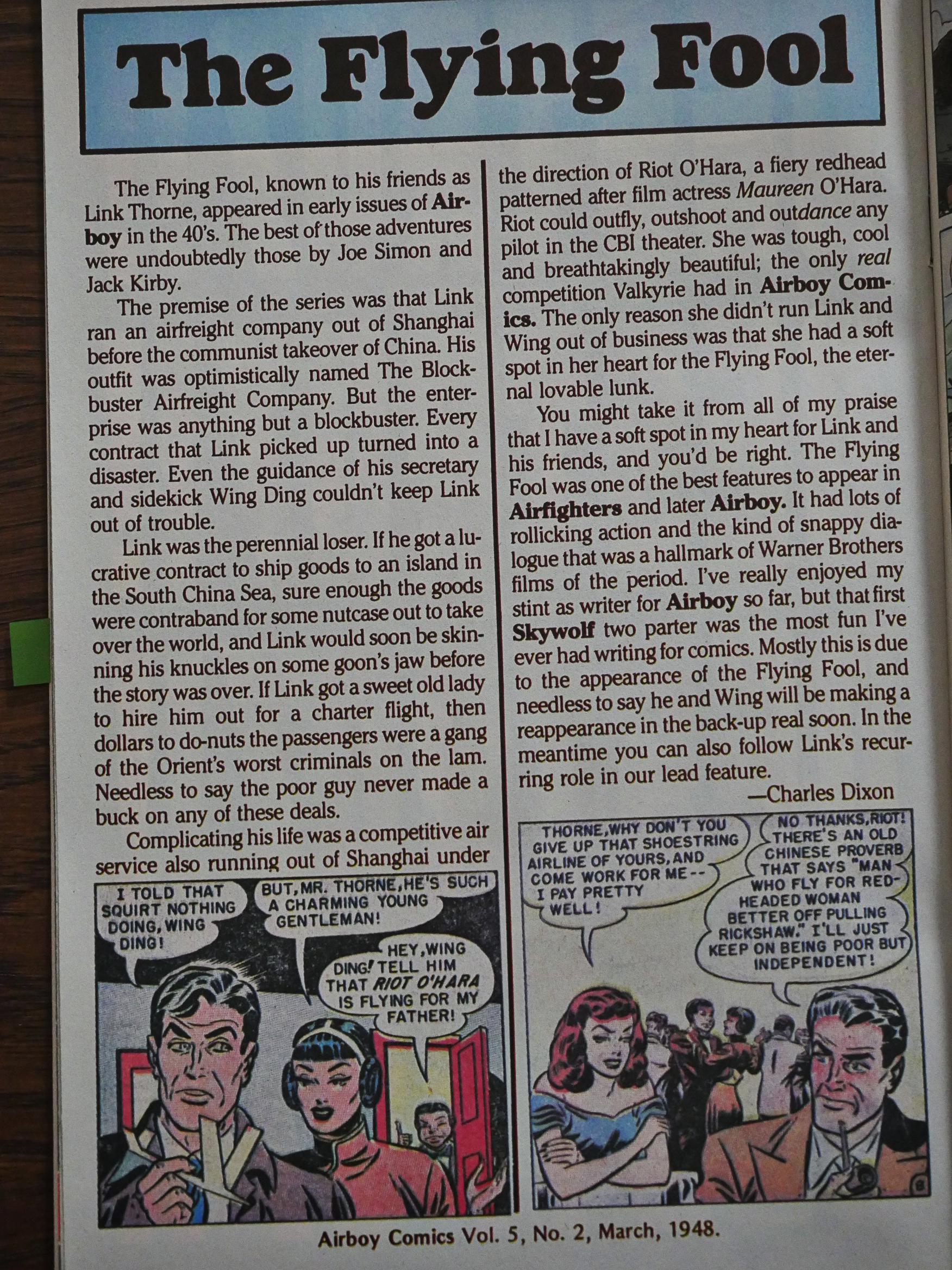
Dixon also starts adding these pages where he talks about these old characters, and they display his enthusiasm.
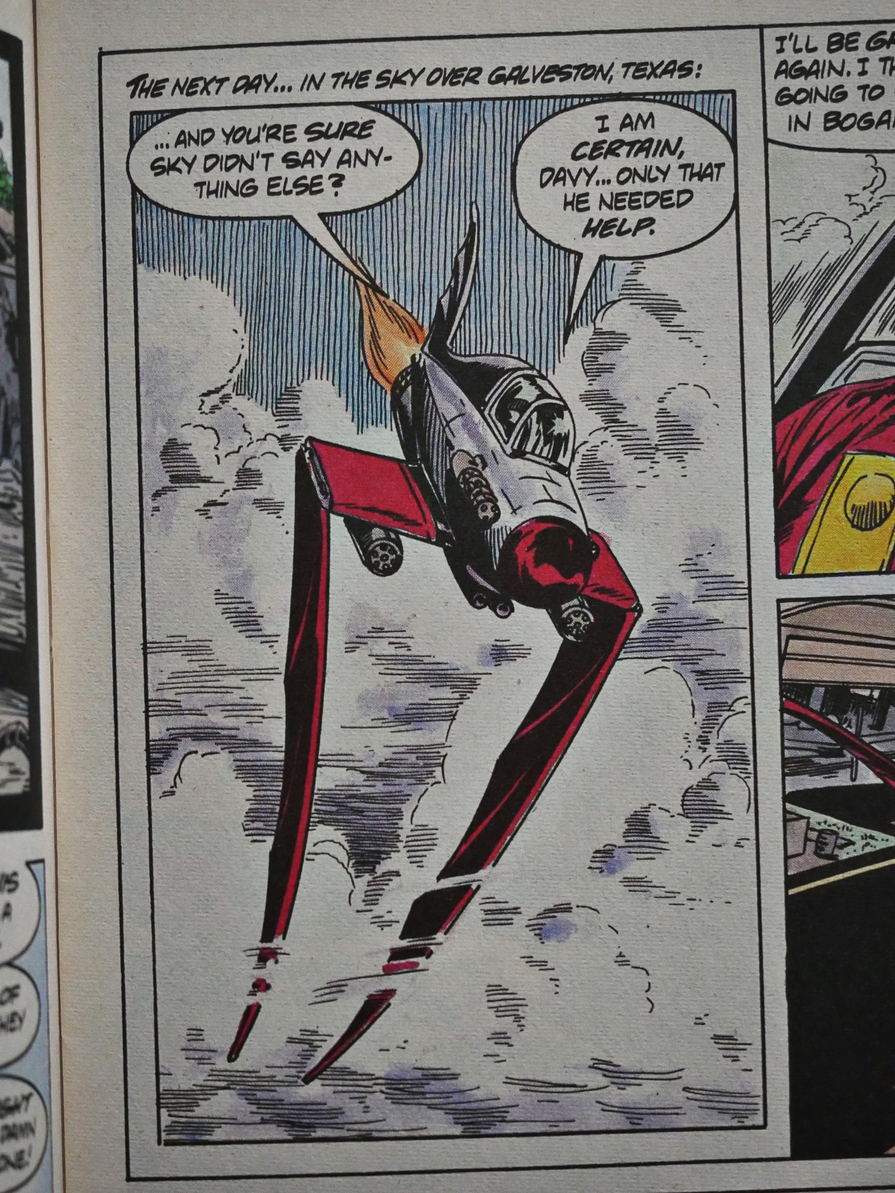
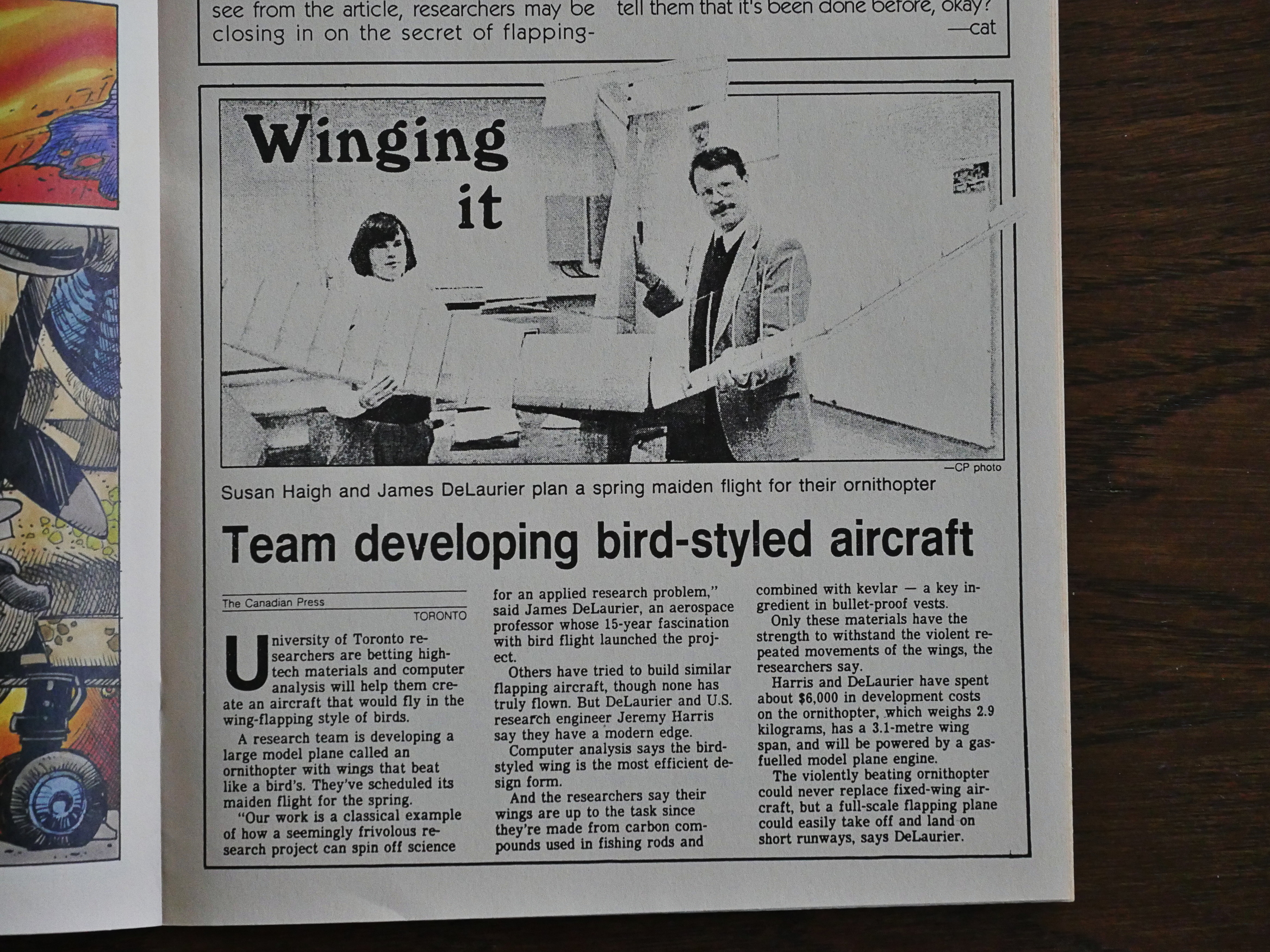
There’s a lot of hardware in this book: Guns, cars and planes. Did I mention that Airboy has a flappy-wing plane? No? Airboy has a flappy-wing plane.

Woch makes it look like it almost makes sense.
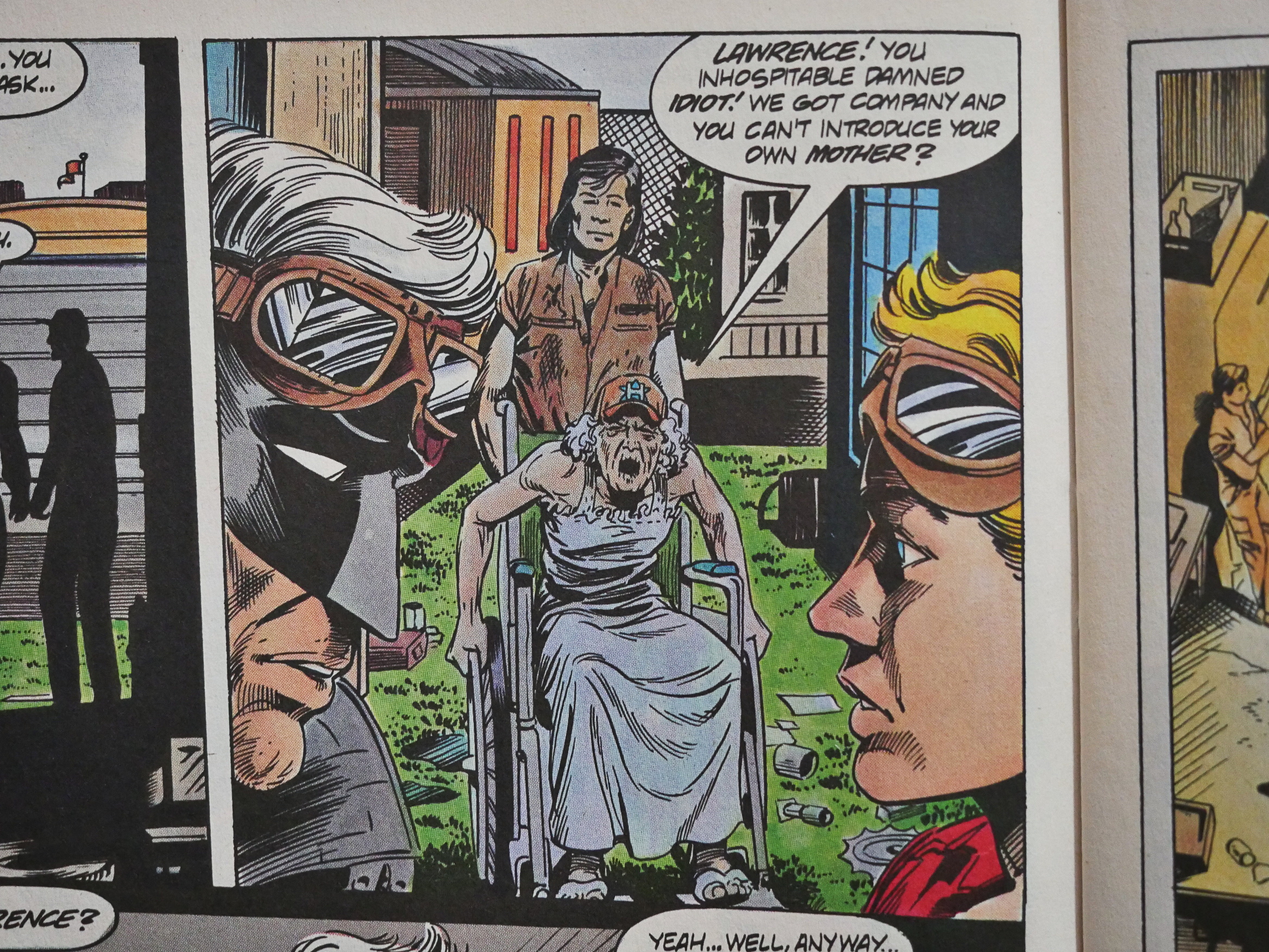
It’s not all action and killing and helping refugees: It’s not that often you get to meet characters’s mothers, is it?

Here’s Skywolf’s mother.
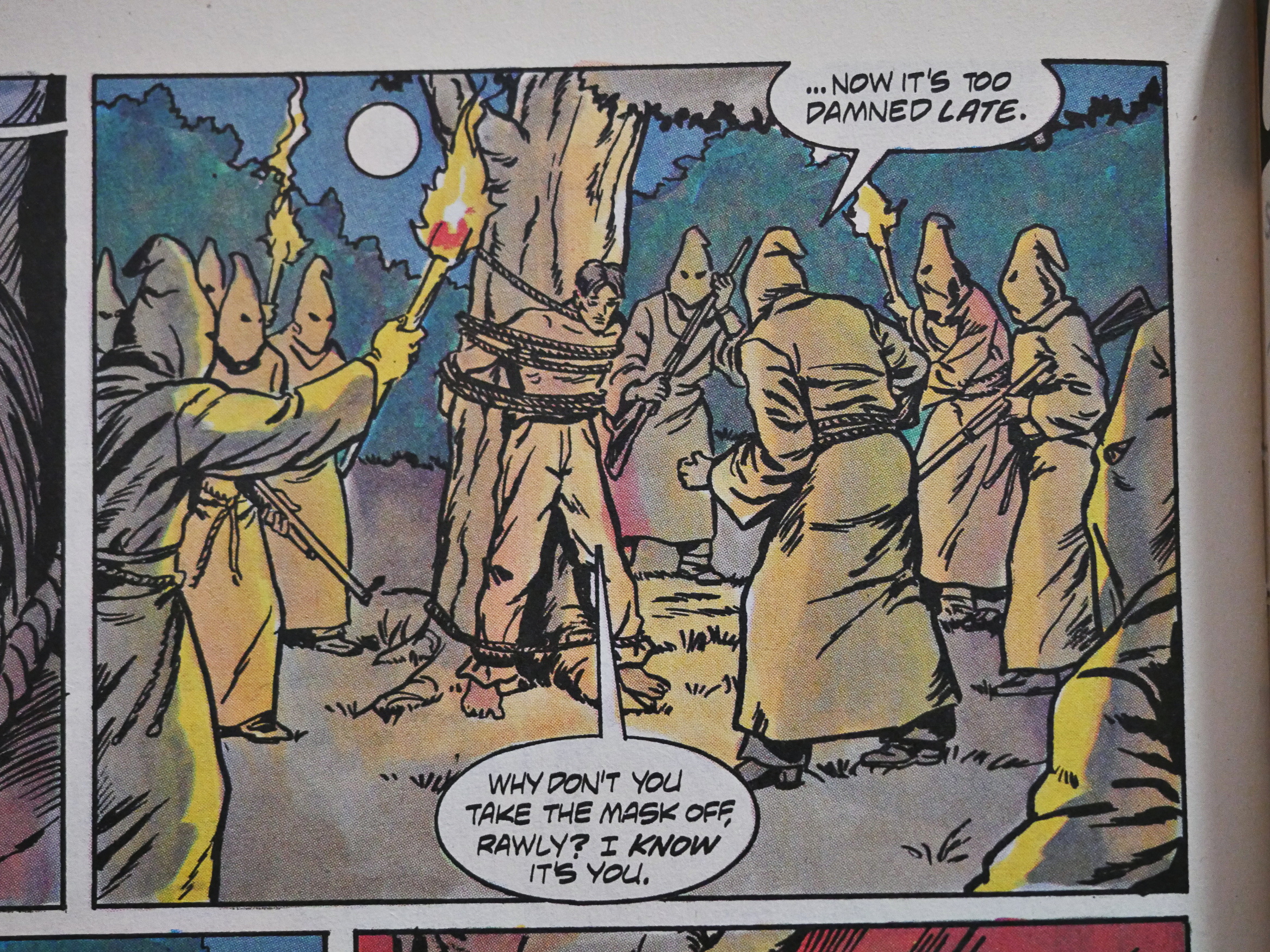
It felt, after a while, like Dixon was baiting the letter-writers with his targets. Which is fun! Skywolf went up against the Ku Klux Klan, as if to say “let them protest this! Hah!”

Nobody seemed to do, though. I guess that’s something’s that’s changed…
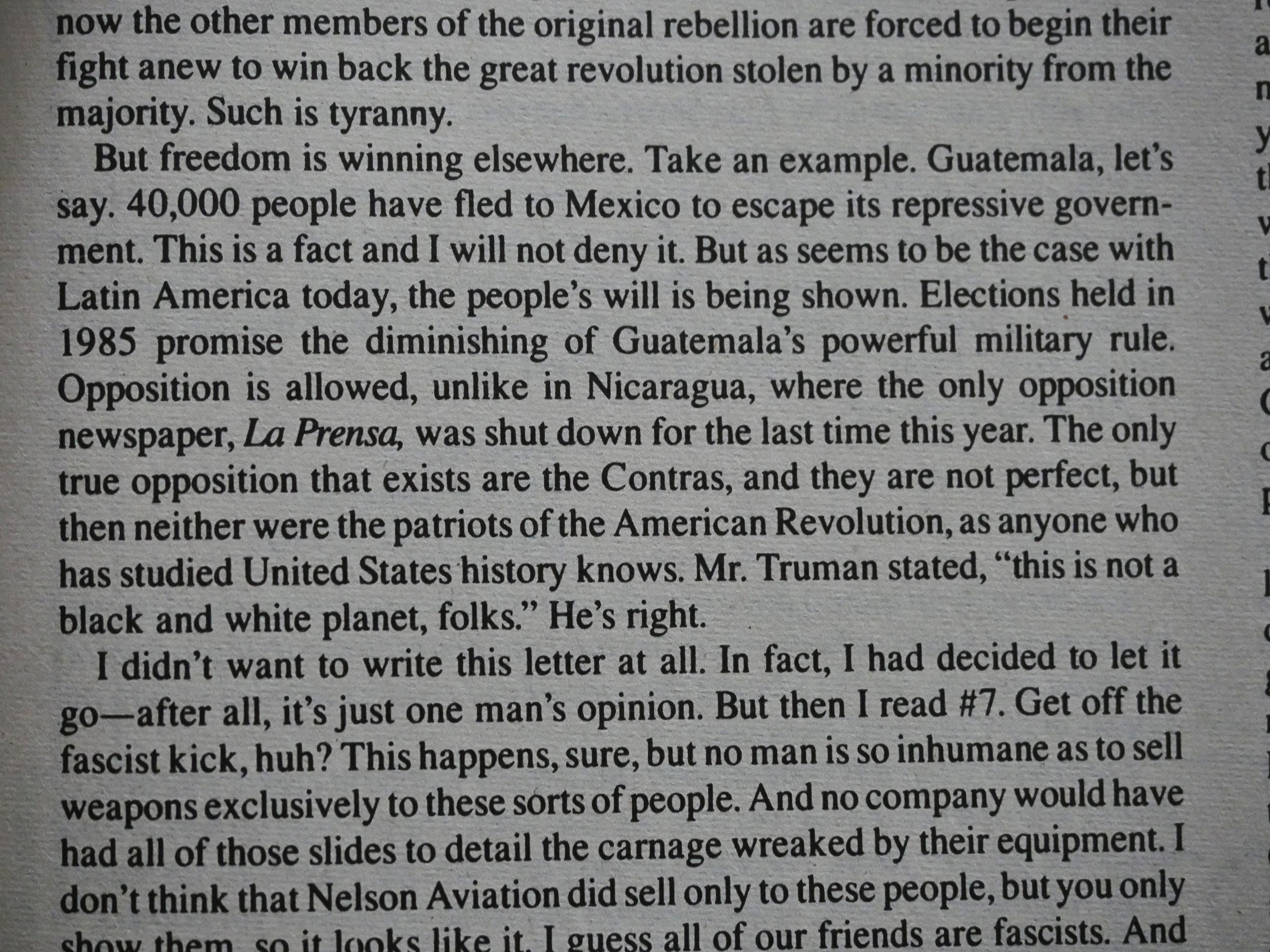
The politics continue on the letters pages, of course. Here’s a guy who compares the Contras with the “patriots of the American Revolution”. This might perhaps be a very shrewd observation, but perhaps not in the way the letter writer thought.

Tee hee.
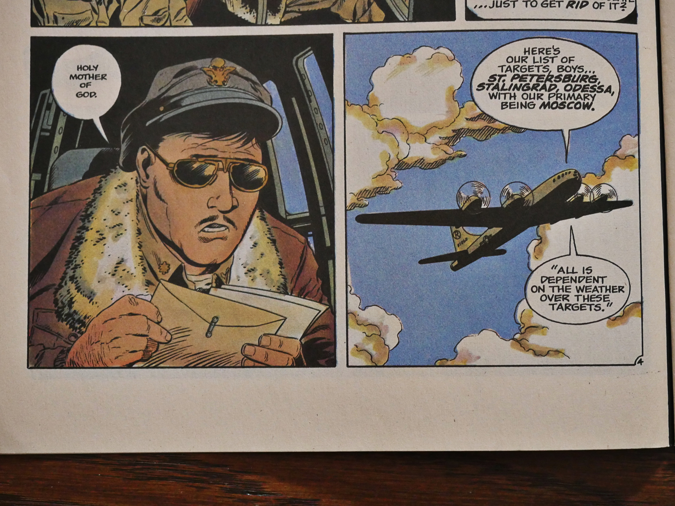
Anyway, Dixon gets his mojo back again by having Harry Truman send a bomber towards Moscow with a nuclear bomb. (Mid-40s.) That’s something they probably don’t teach you in school! (Very nice art by Bo Hampton and Will Blyberg.)

I can’t wait for the letters to pour in!
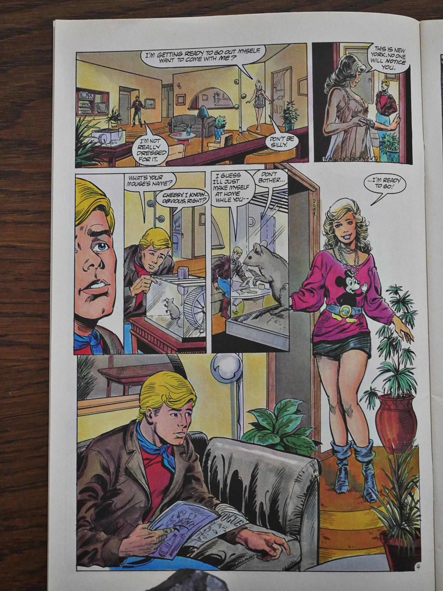
Unfortunately, Stan Woch left the book permanently by issue nineteen, and his replacements are less than exciting. This is Ron Randall with Kim De Mulder, and there’s nothing particularly wrong with is: It’s standard mid-80s mainstream artwork…

So it’s boring as fuck.
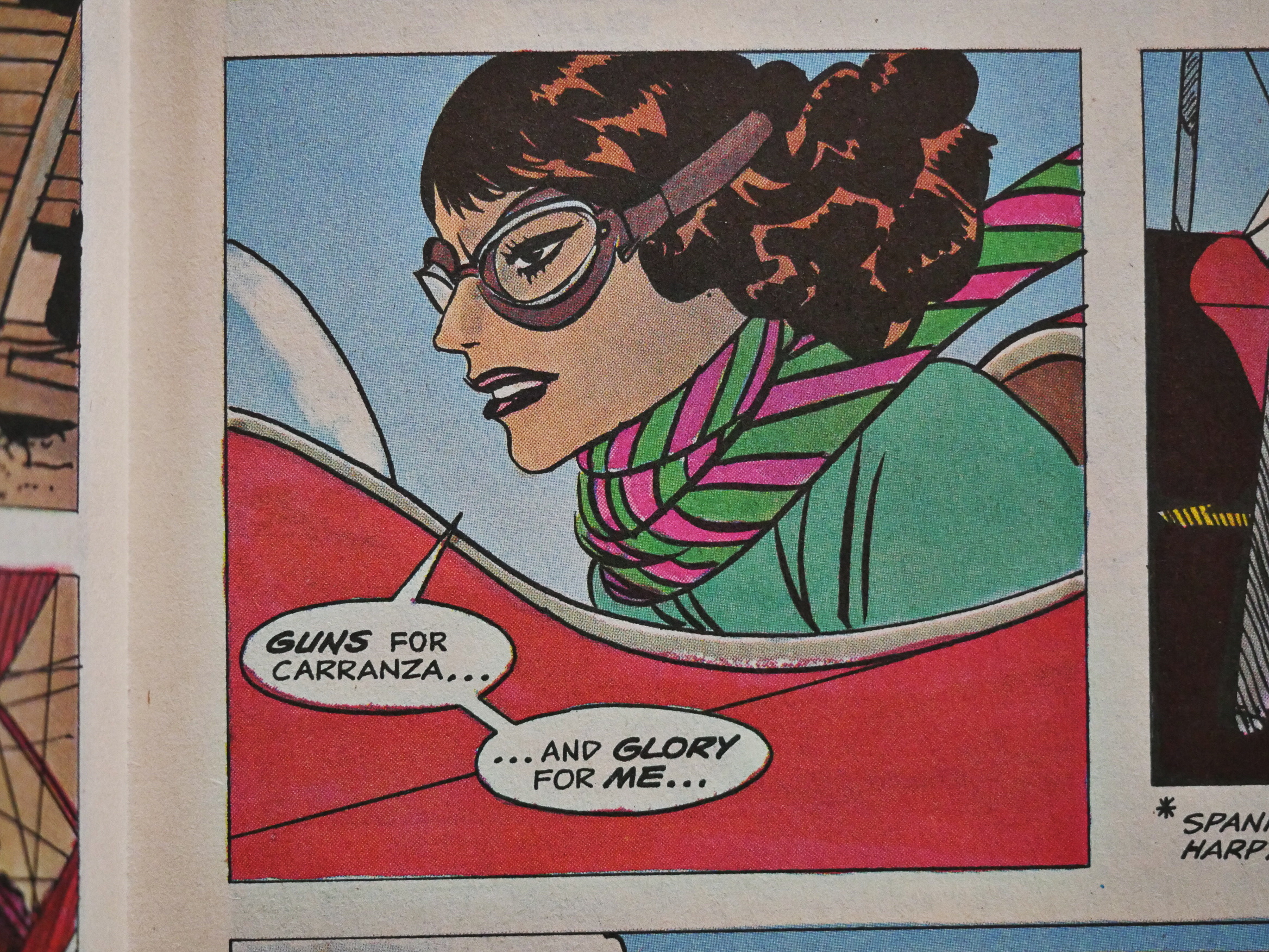
Fortunately we have some backup features to shake things up a bit after the snooze-fest main feature artwork. Here’s Attillio Micheluzzi (who’d contributed a handful of features to the various Eclipse anthologies), but he only sticks around for a single issue. Boo!
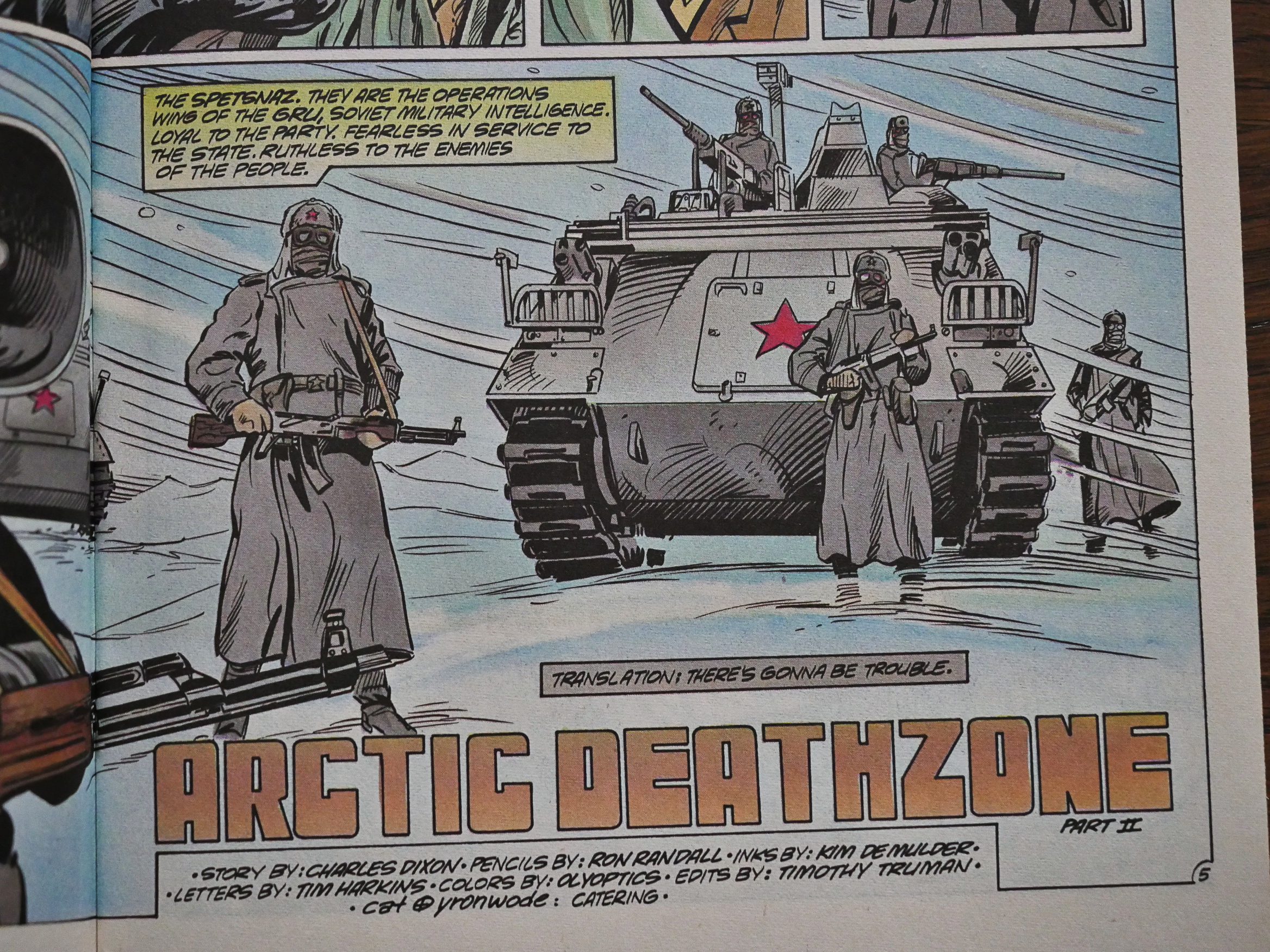
To prove that he can have some less controversial villains, Dixon makes the Russians the antagonists in the next segment.

The structure of Airboy is mainly two-or-three-issue stories, but with 13 pages per issue, that means that a typical story is quite short and snappy. There’s a lot happening, but these aren’t cramped or leaden or anything: They’re all snappy, breezy reading; quite accomplished entertainment.
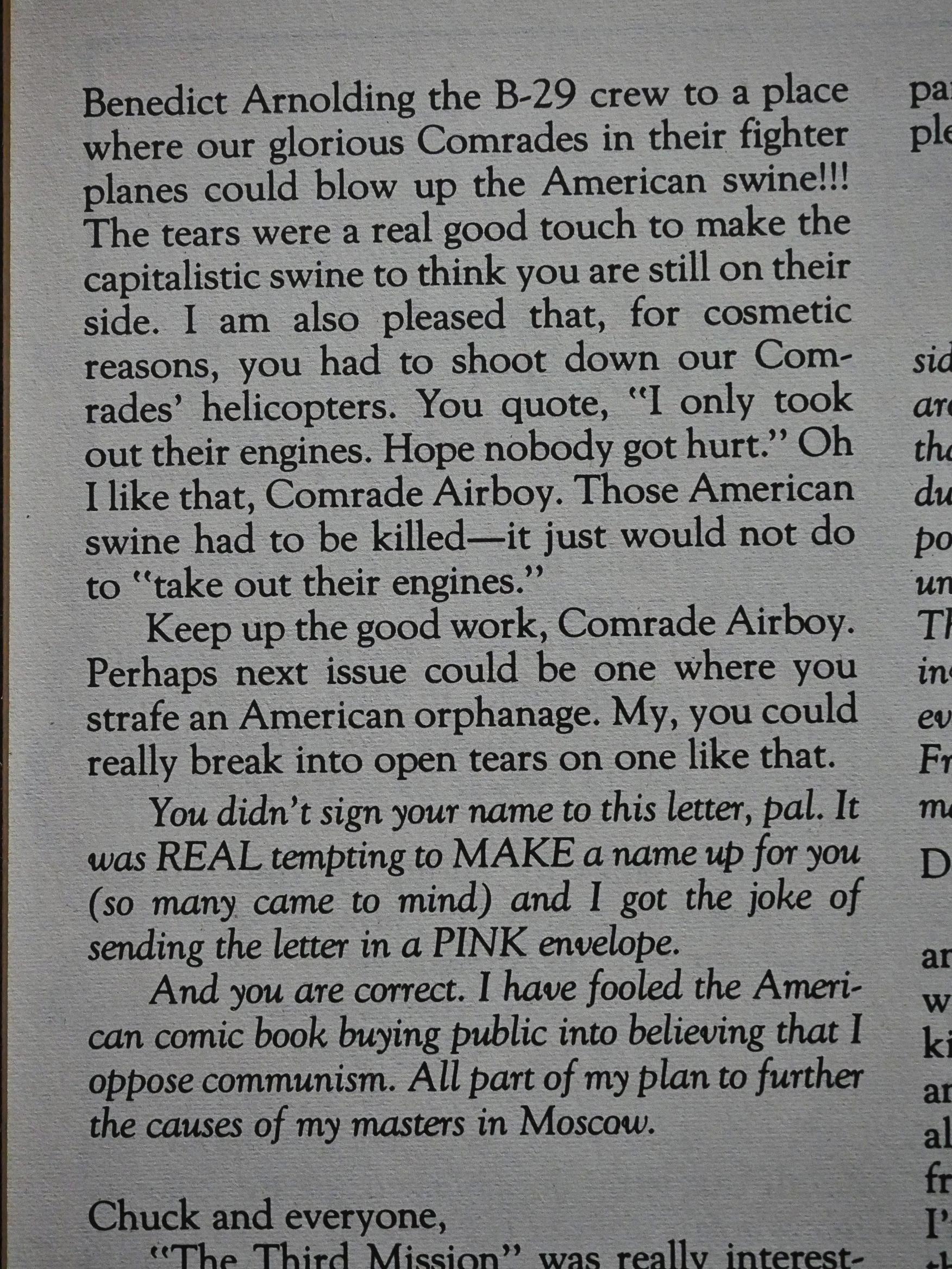
A letter writer applauds Dixon for being a good Communist.
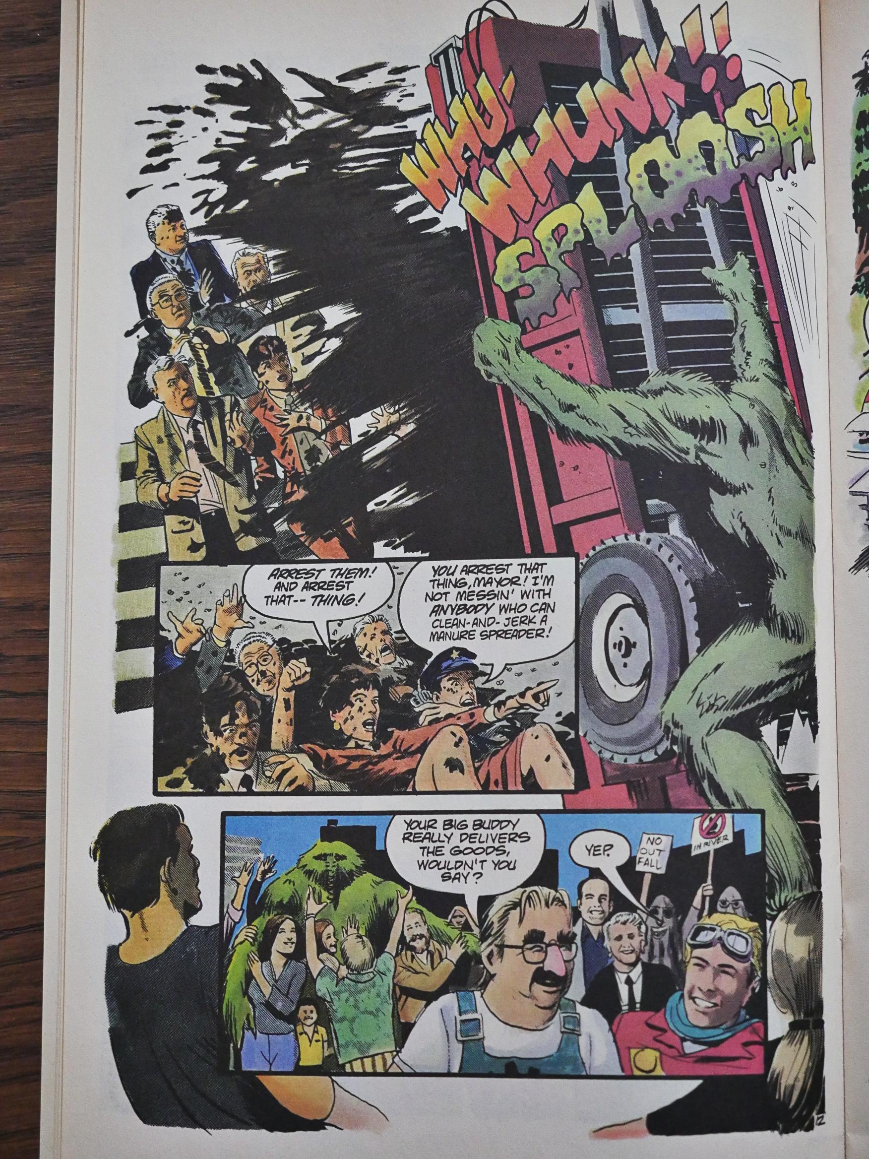
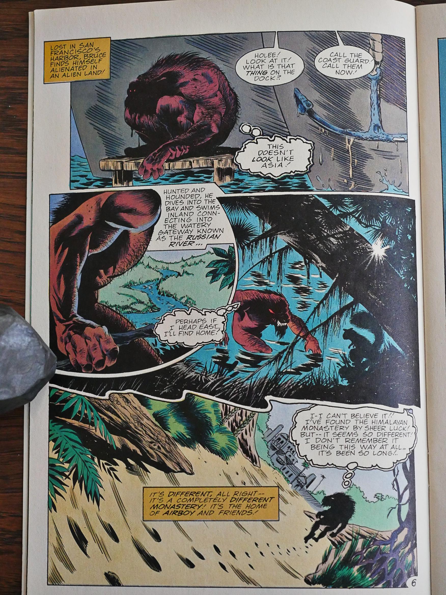
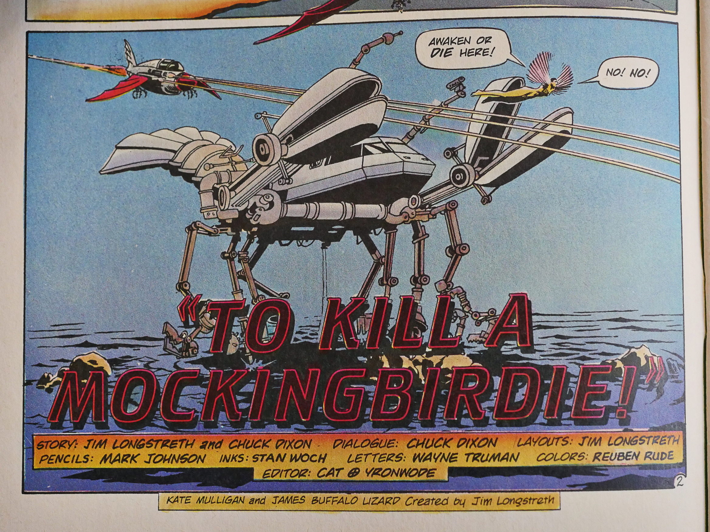
Issue 25 is special: It’s got artwork by Tom Yeates and Mark Johnson, and it’s all about pollution around the Russian River area. It doesn’t really… fit… in any way with the surrounding series, but it’s fun and it certainly looks great.
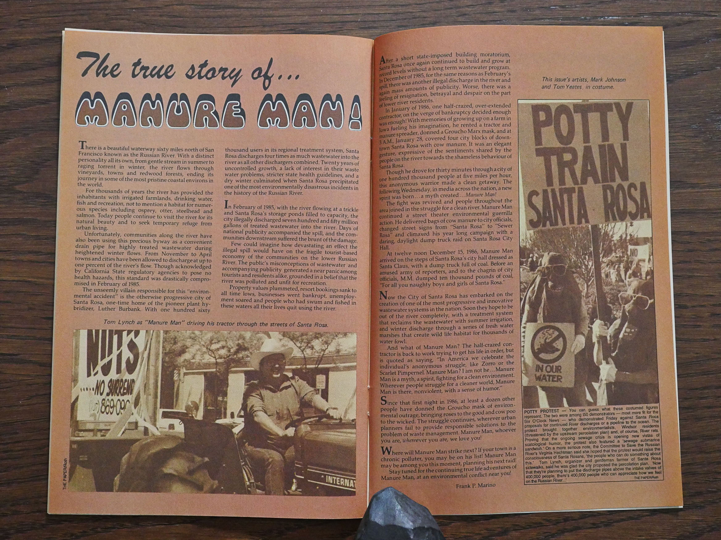
And it turns out to be based on a true story! So I guess they just… wanted to, so they dropped it in.
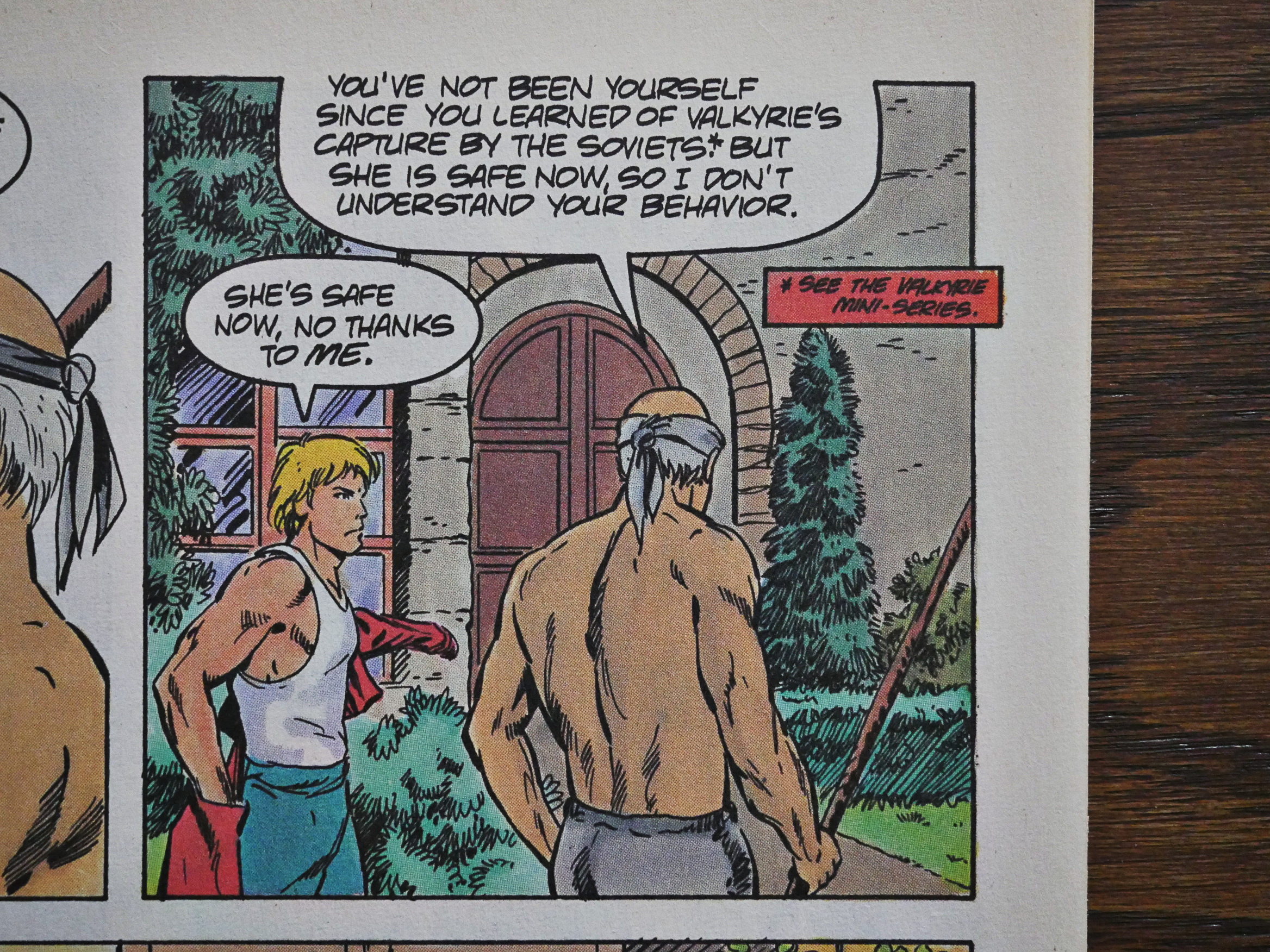
At this point, the spin-offs start arriving. In previous blog entries, I’ve done the main series first, and then all the spin-offs at the end, or in a separate article, but for this one I’m going to just inject the mini-series and specials into the article whenever the main Airboy series mentions them. Makes sense?

Yes, this is going to be a very long blog article.
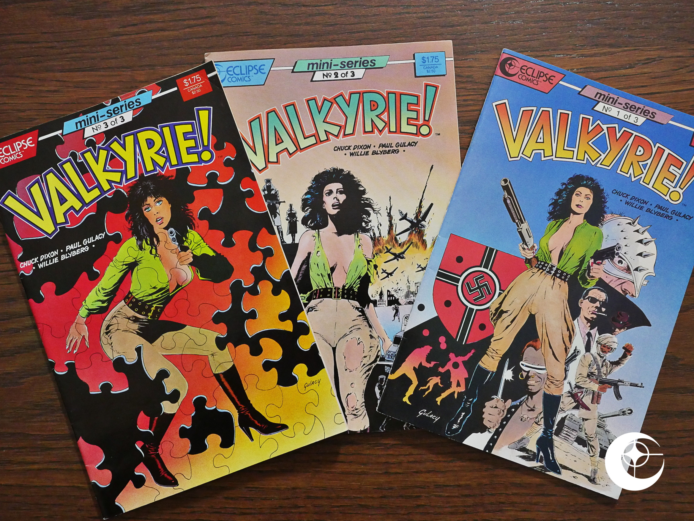
First out we have the first Valkyrie! mini-series, featuring artwork by Paul Gulacy and Willie Blyberg.
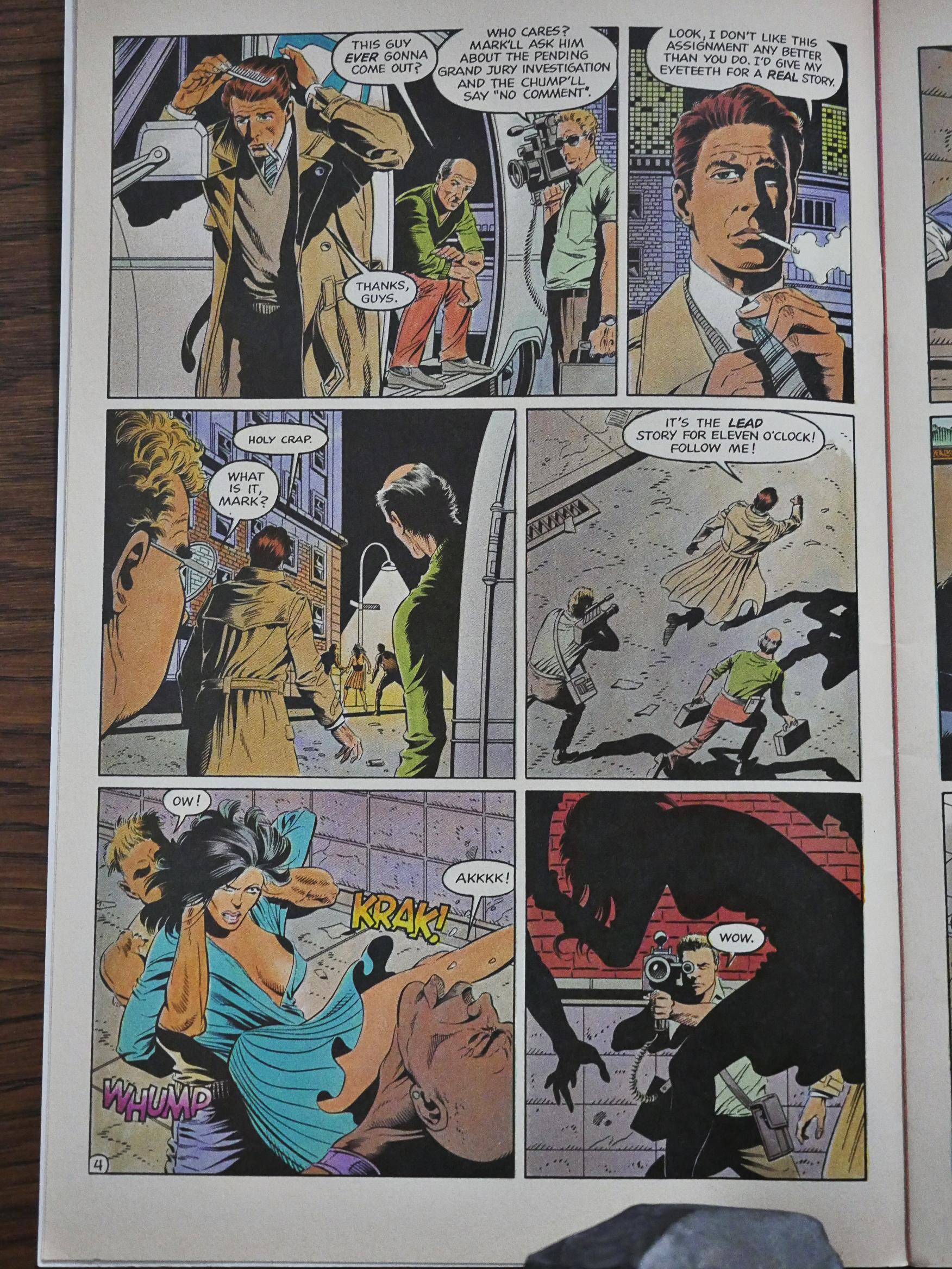
Gulacy’s artwork is sharp and heavy on the inky areas, and has solid storytelling. However, it feels like some of his faces are a bit on the wonky side here… like that guy in the second panel up there. Does that look… right?
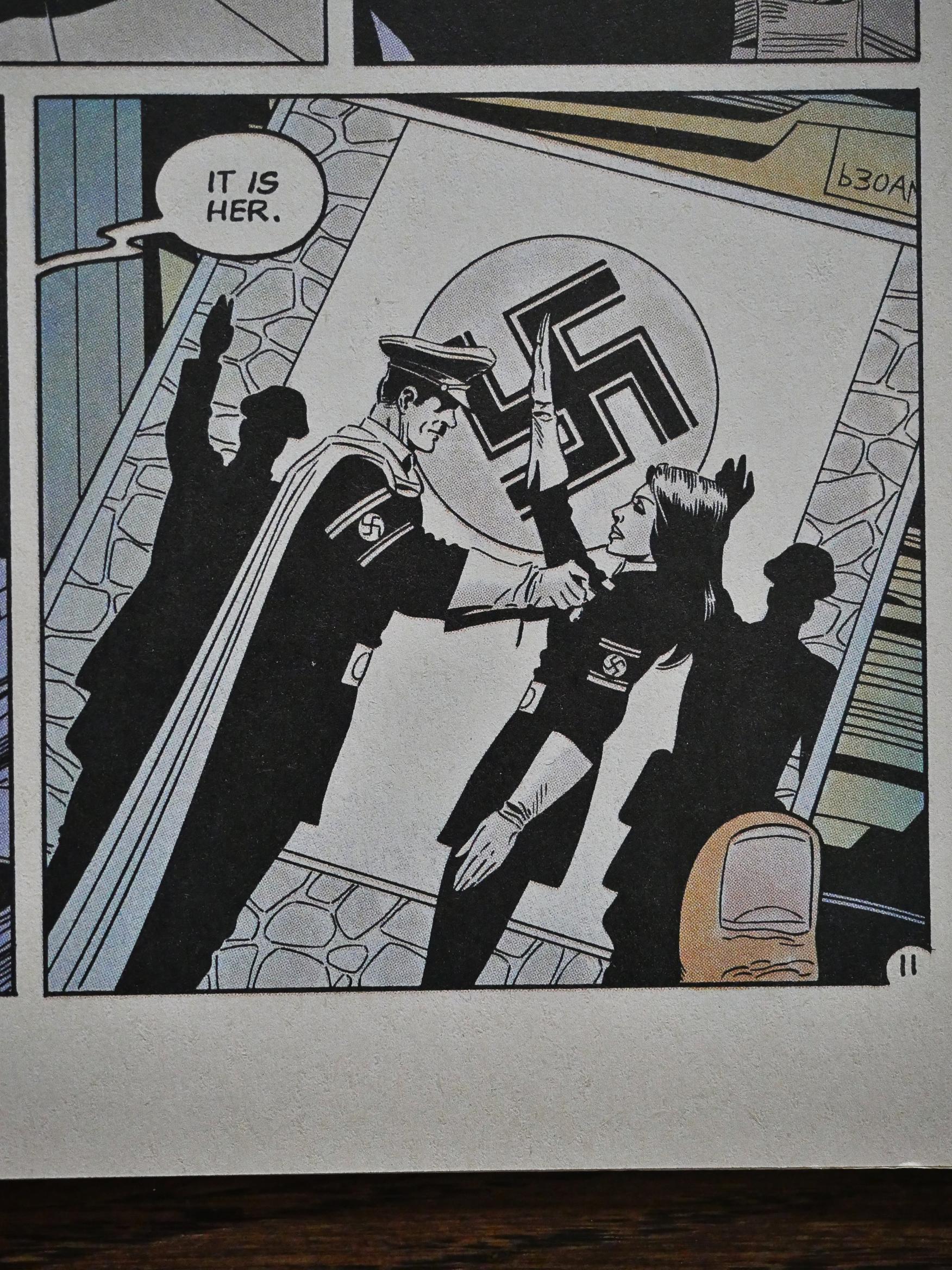
Anyway, the story is about Valkyrie being kidnapped by the Soviets to stand trial for Nazi war atrocities.
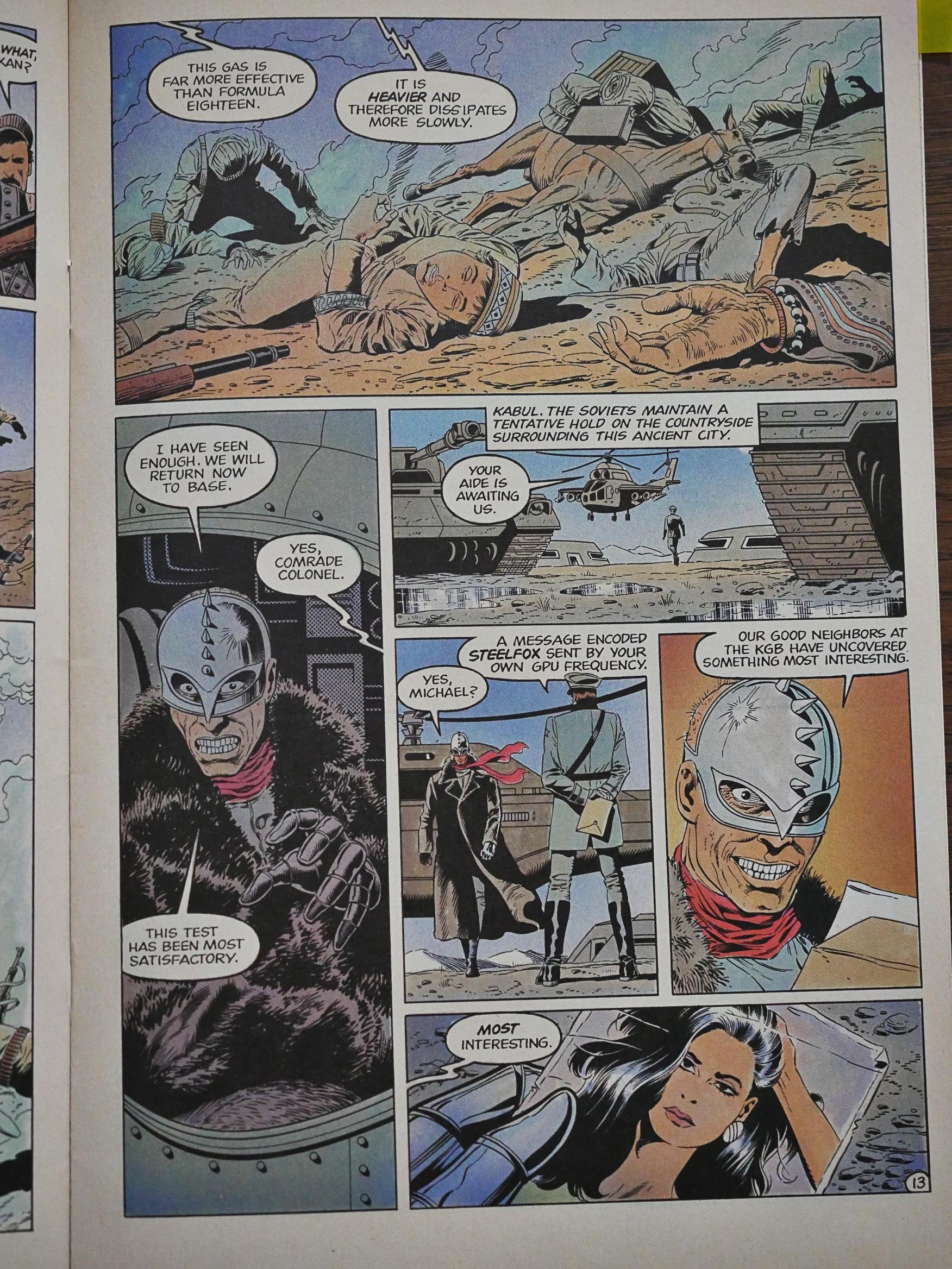
We get a brief allusion to the Soviets perpetrating some atrocities themselves in Afghanistan, and that guy in the mask there doesn’t look, er, nice, so I thought we were in for a rollicking Soviet ass-kicking book.

Instead what happens is that she stands trial, the Americans present evidence that Valkyrie didn’t participate in the Nazi atrocities, and the Soviets let her go.

That’s basically the entire plot of this three-issue series, and it feels like it’s something that Dixon would normally do in 13 pages, but instead he spends 70 pages here on this, so it’s all rather odd.
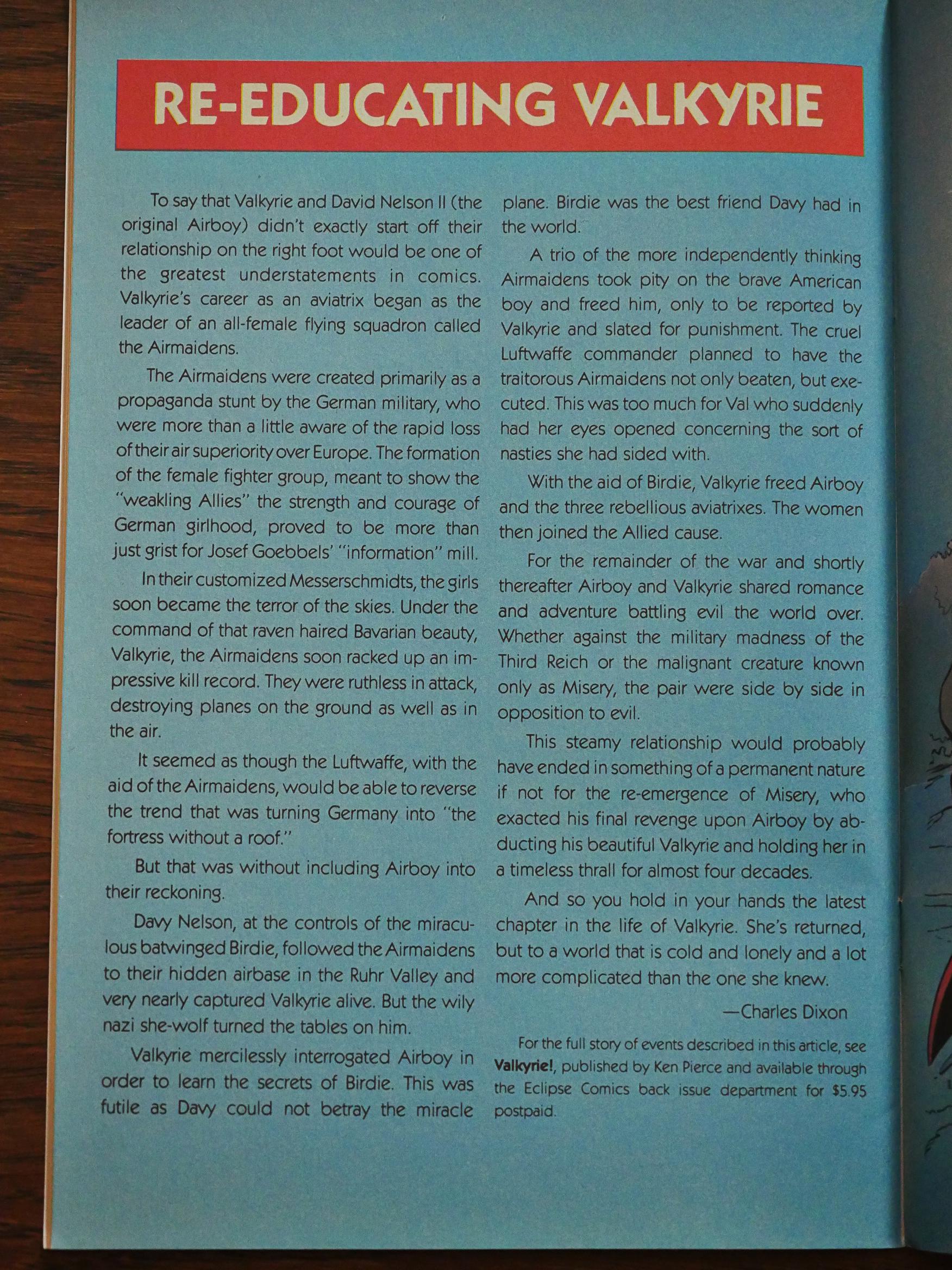
Of course we get a recap of Valkyrie’s long history.
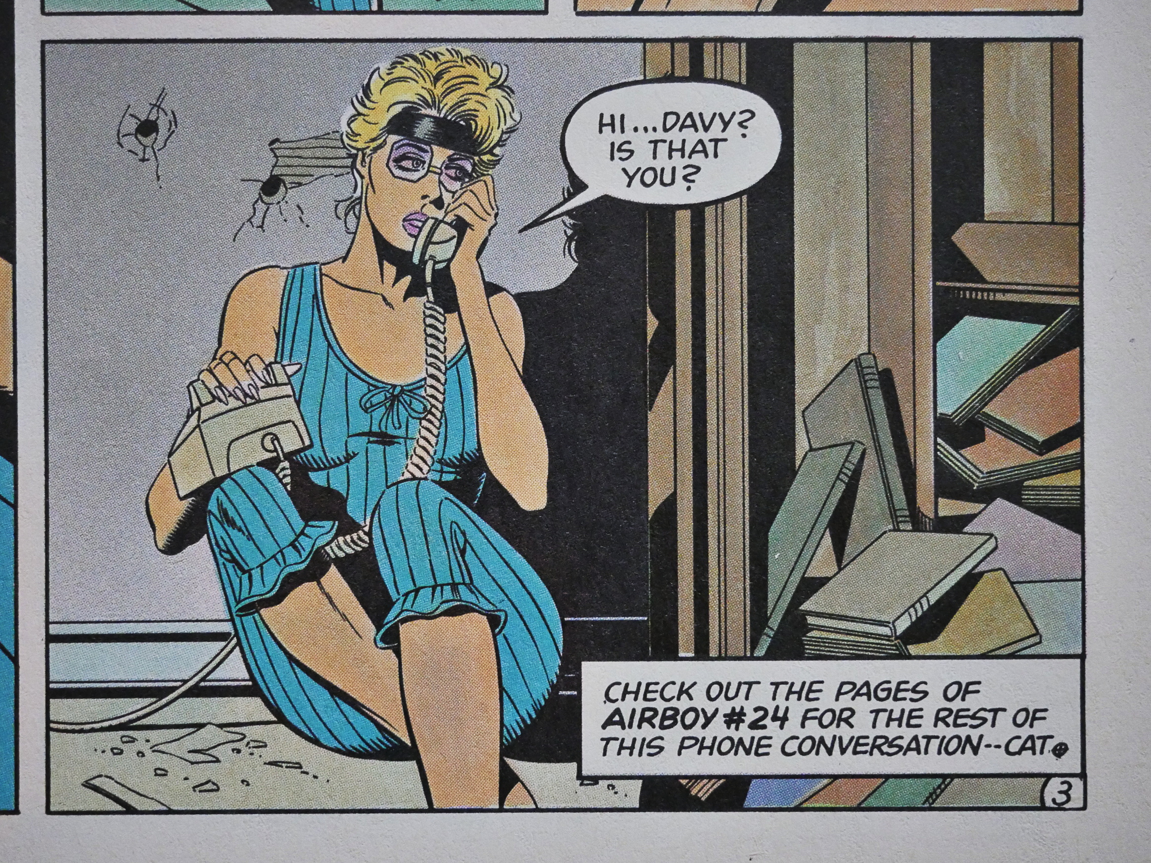
And things are tied tightly in to the mothership. I know DC and Marvel use(d) to do this sort of stuff, but I can’t recall seeing it anywhere else. It’s either fun or annoying, depending on whether you want to read all these books together or separately. I’m doing them all, so I don’t mind, but I wonder whether all these spin-offs lead to reader fatigue…
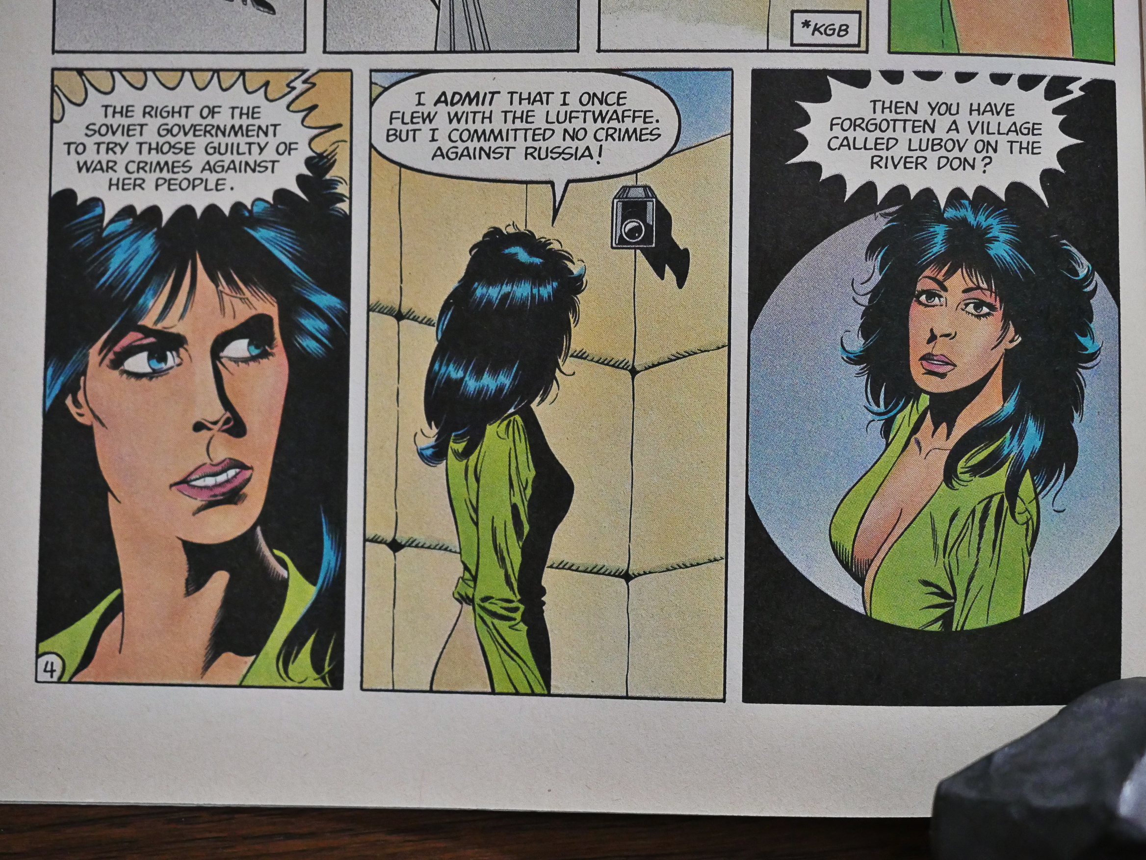
Remember what I said about the slightly wonky faces? Sometimes it’s more than slightly. Those features just seem to swim around in her face.
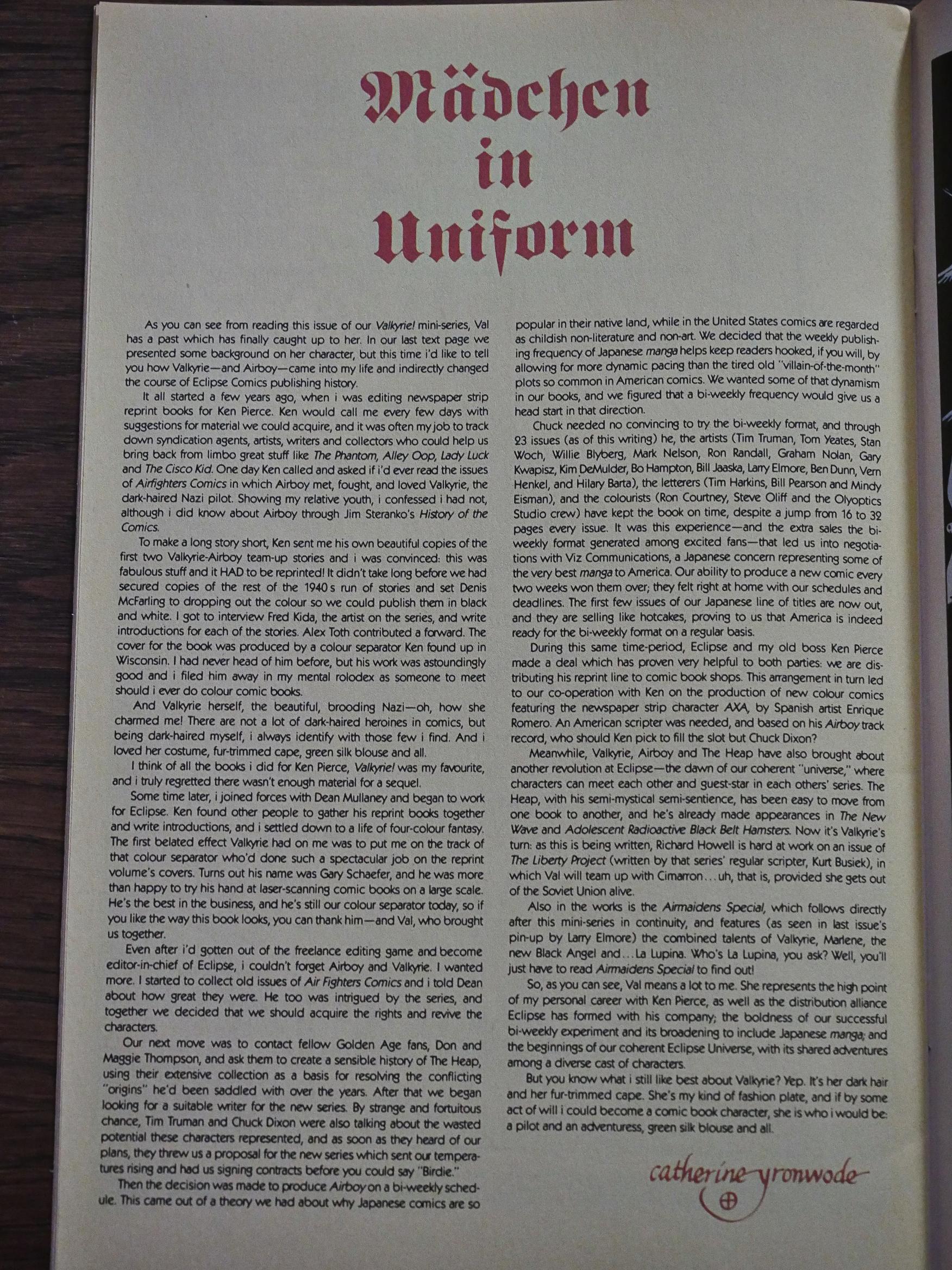
cat ⊕ yronwode explains the whole backstory of how Eclipse came to publish Airboy in the first place. It started with yronwode working on putting together a Valkyrie reprint project with Ken Pierce, and then led to her being a fan of the original comics. And serendipitously enough, Dixon and Truman were also thinking about doing new Airboy comics, so it all came together.
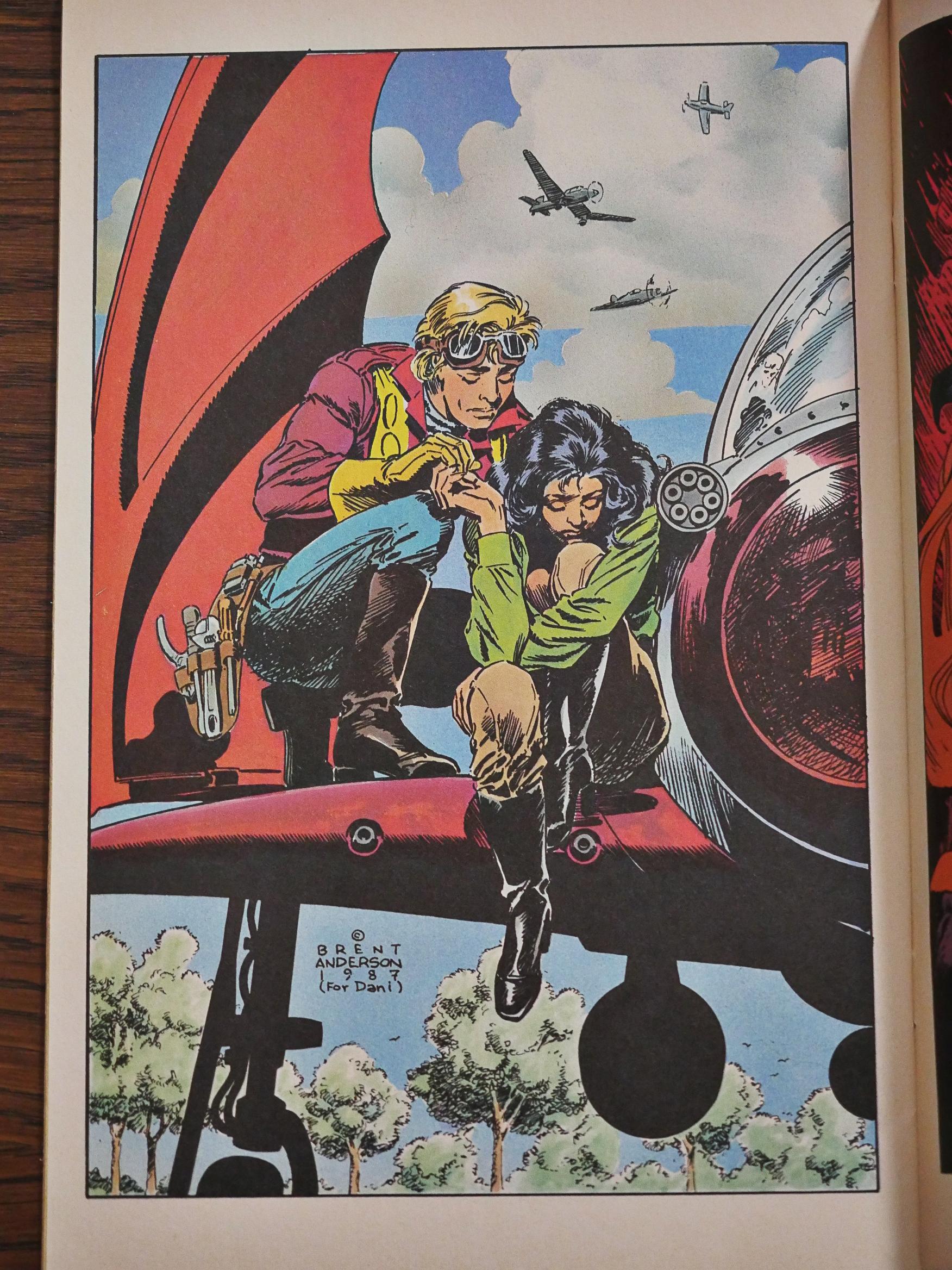
There’s a couple of pin-ups in each of these issues, and this one by Brent Anderson is nice, eh?
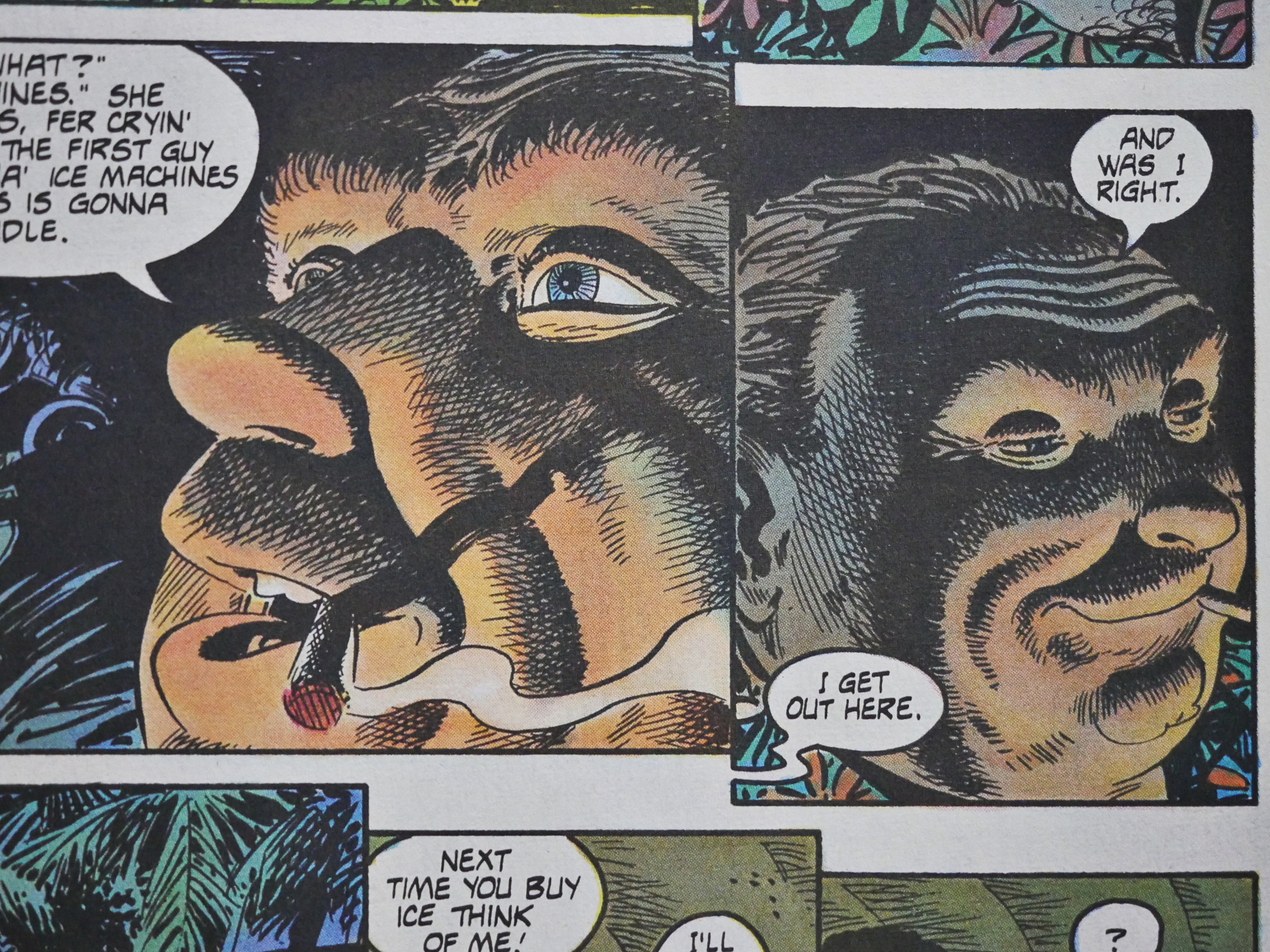
Back at the mothership, things are as normal. Boring artwork on the main feature, and then people like Dan Spiegle drop in to do the back-up feature. Love that shading.
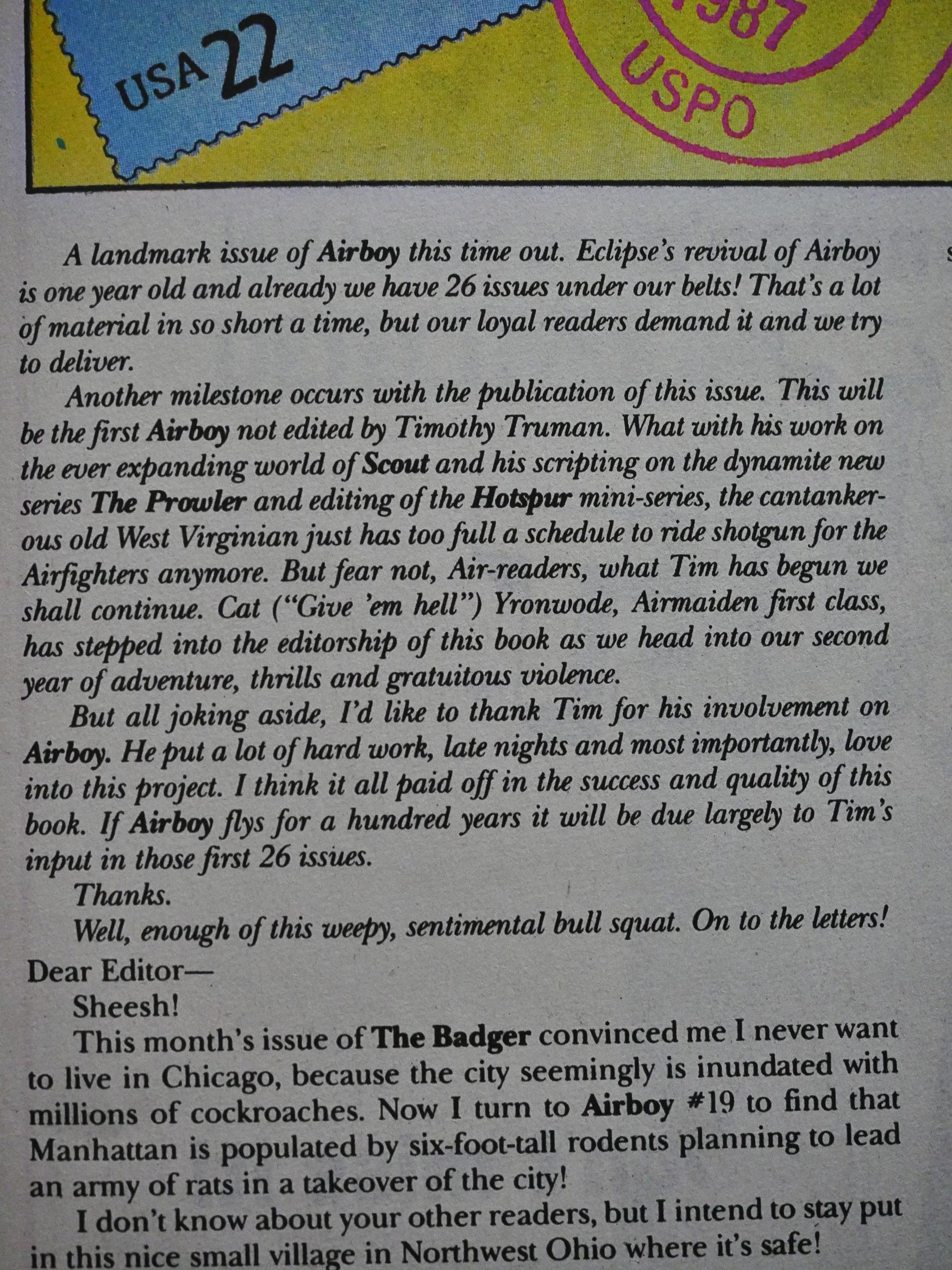
Dixon announces that Timothy Truman is leaving his role as the editor of the book. *gulp* I hope that doesn’t affect the quality of the book, because it’s been a surprisingly entertaining read so far.
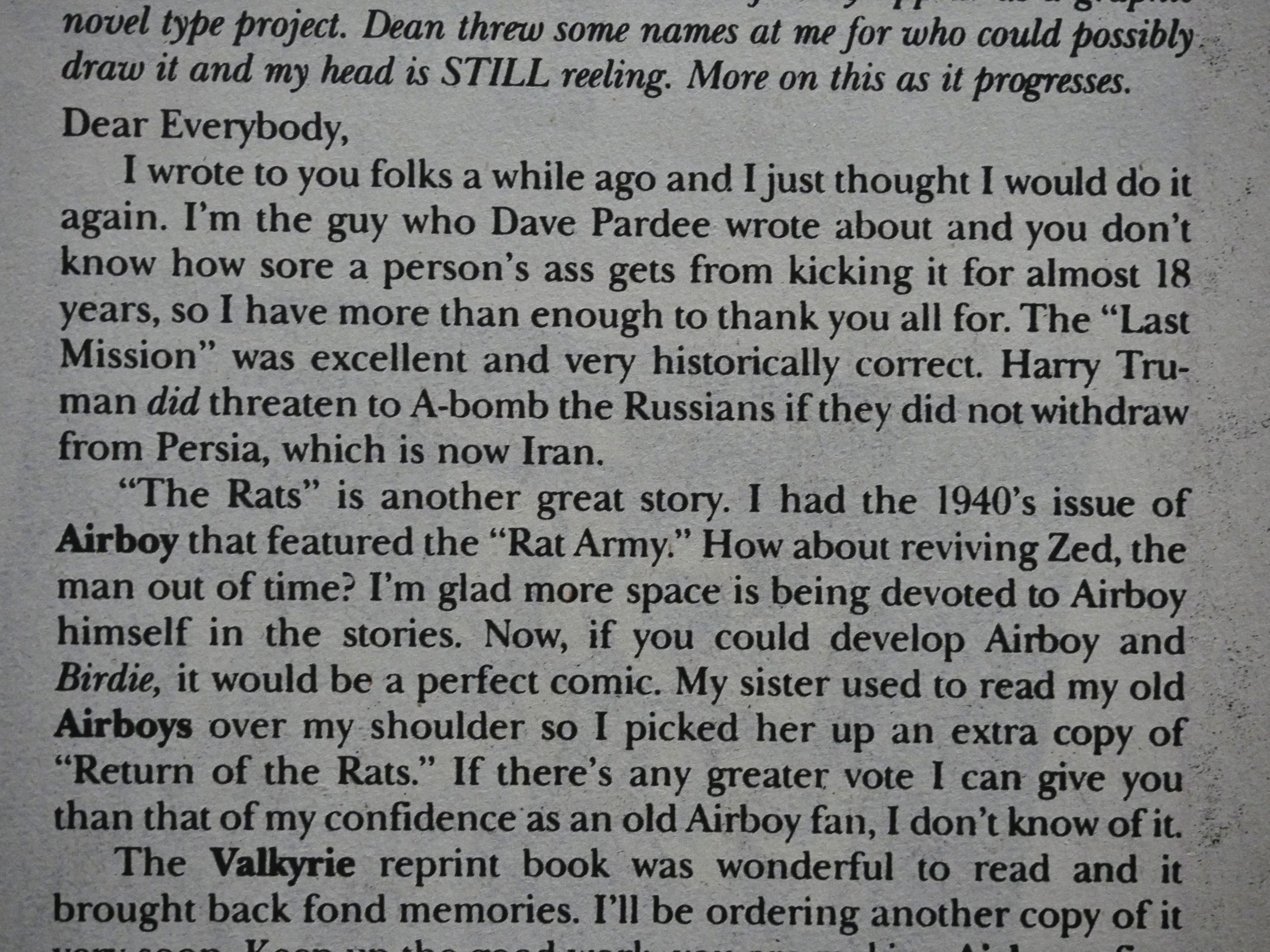
Naturally the “send an A-bomb to Moscow” plot line got a great deal of blow-back in the letters column, but several readers also write in to say that Truman did threaten the Russians with A-bombs, so it’s not so far-fatched to have a plot-line that involves him actually doing it.
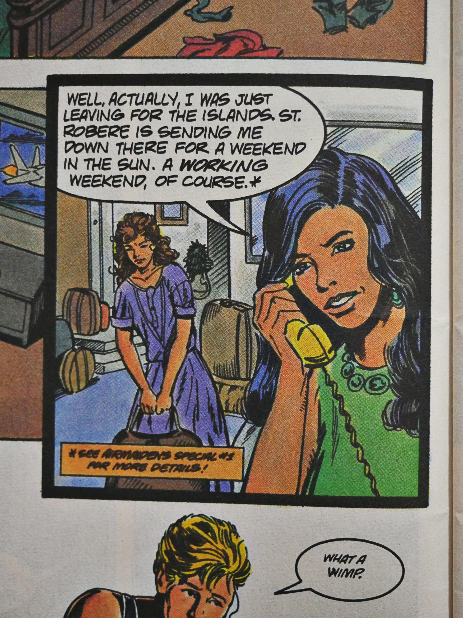
The spin-offs continue, now with Airmaidens Special:
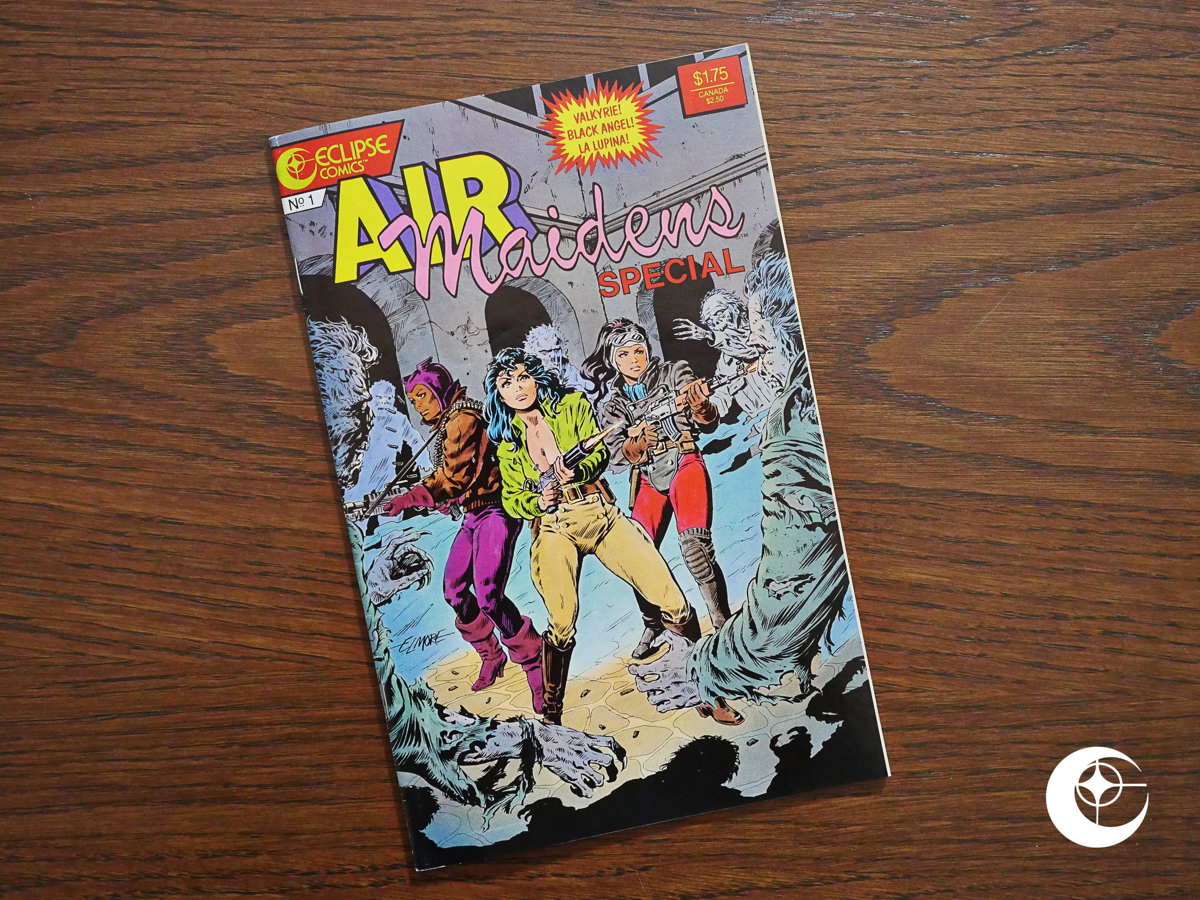
Artwork by Larry Elmore.
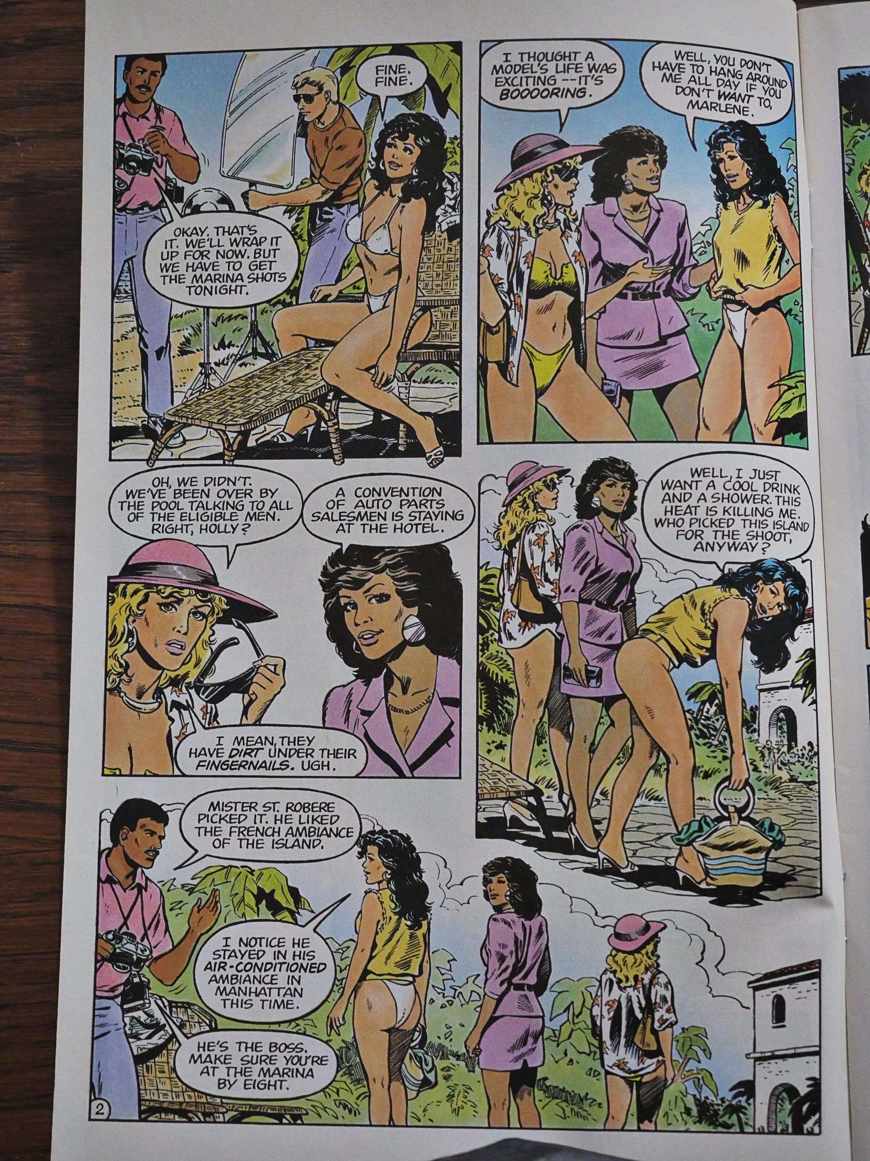
Since it’s about four women, there’s a lot of opportunity for cheesecake. There’s blowback on the cheesecake in the letters pages, too, but cat ⊕ yronwode always pops in to defend sex-positivity.
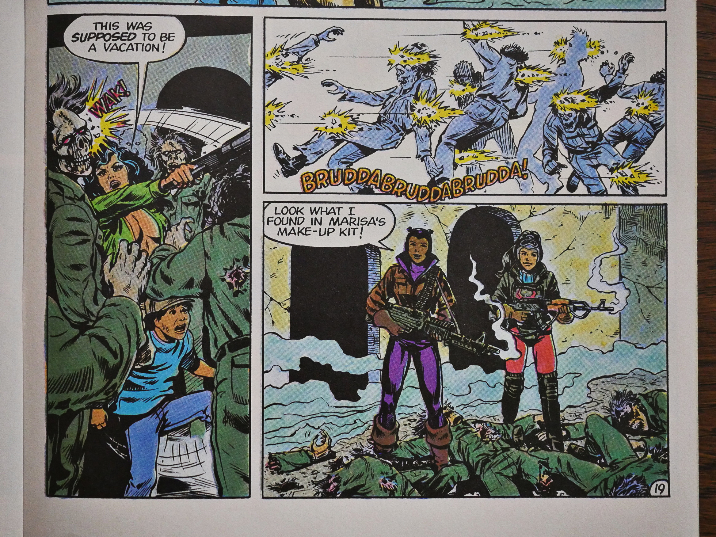
Of course, nobody writes in to complain about stuff like this.

It’s a rather odd book. It was about half an hour since I read it, and I can’t really recall what it was about. Somebody… got kidnapped? By zombies? I don’t know. It was kinda fun anyway.
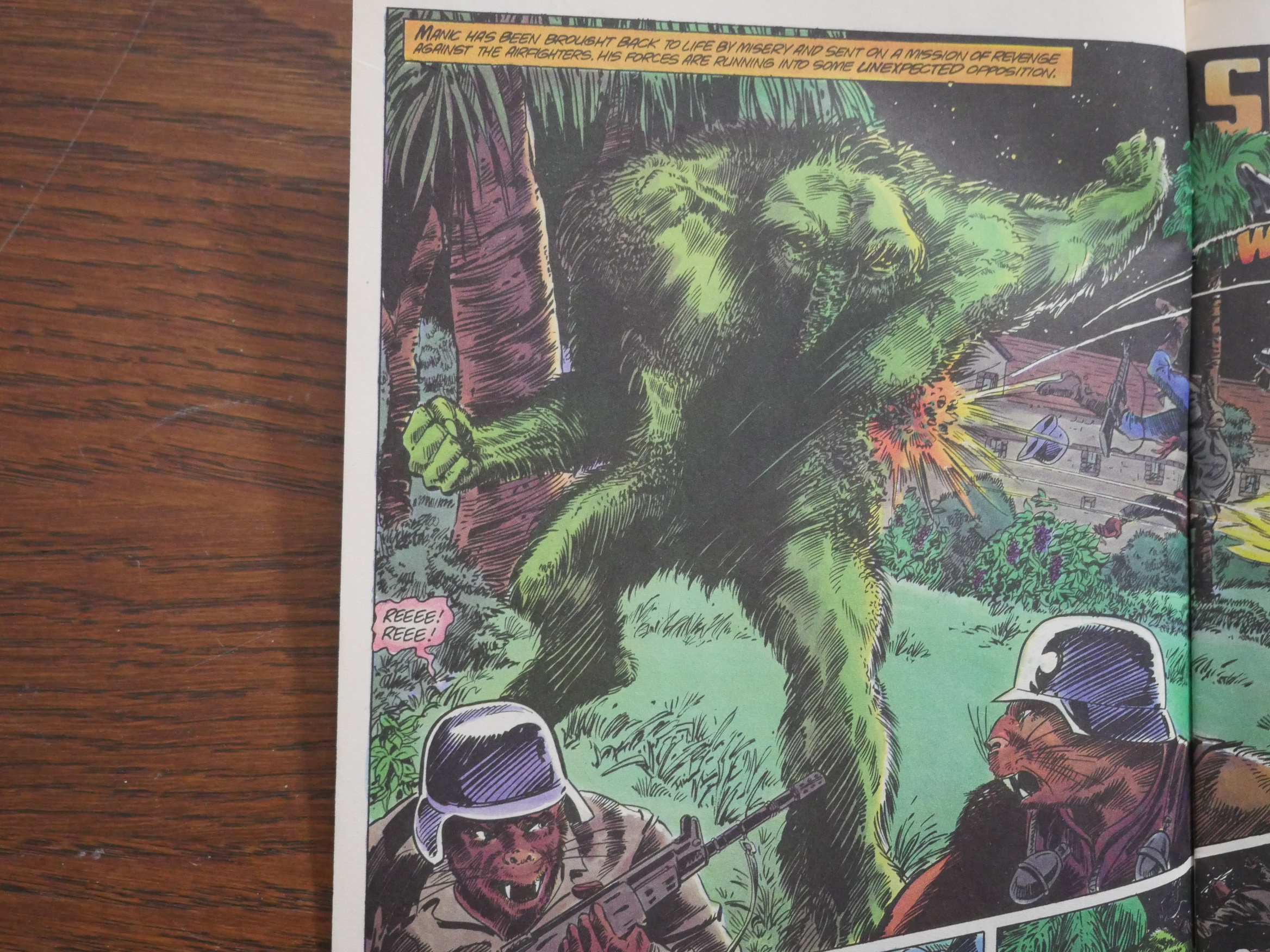
The Heap was the original swampy creature, but the incarnation here looks kinda like Swamp Thing with Man-Thing’s nose. Which is probably the gag. Art by Ron Randall and Kim De Mulder, who were doing most of the main features for these issues. It looks nice here, but it’s pretty pedestrian normally.
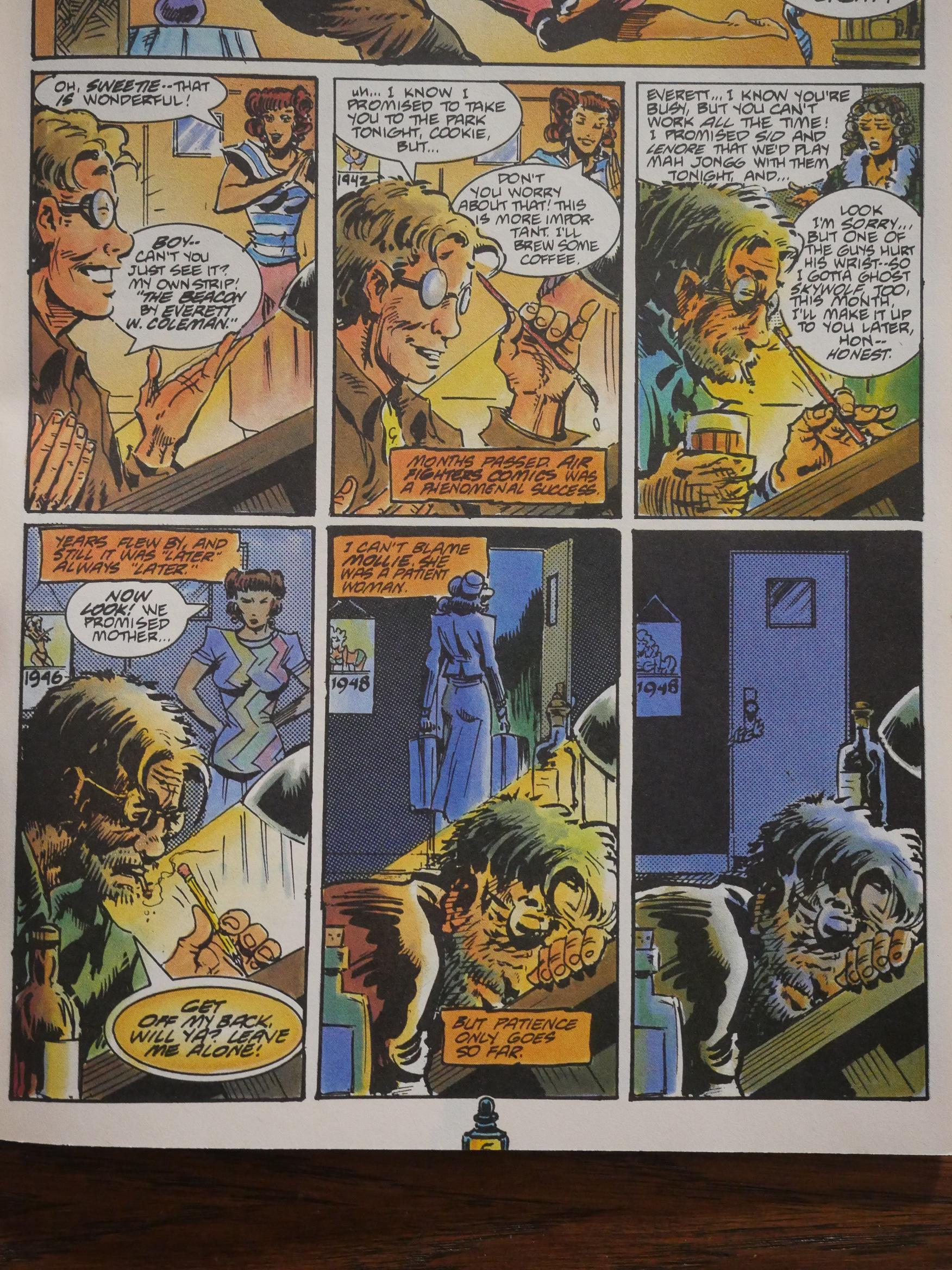
Remeber Mr. Monster and that Airboy crossover? This is where it started, and it was pretty incomprehensible without these ten pages created by Michael T. Gilbert.
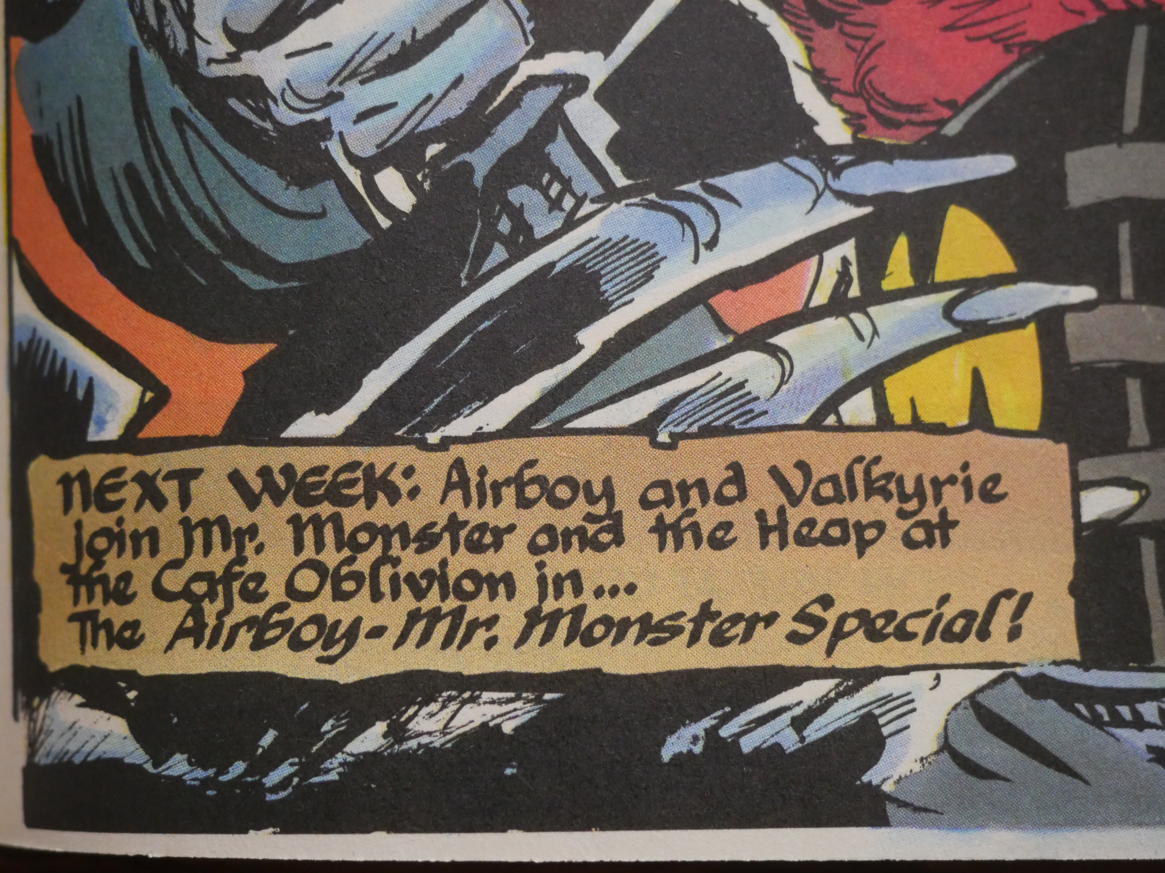
They’re really selling these spin-offs hard…
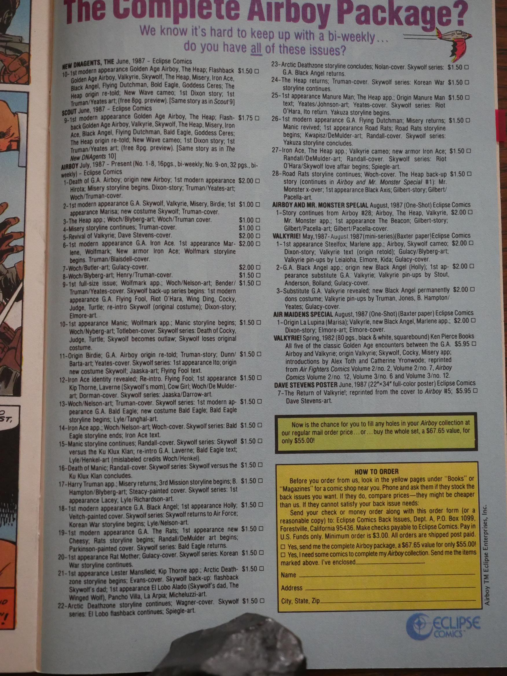
Oh, yeah, they’re also pushing the back issues for the Airboyoverse. It’s rather odd that it was still possible to buy a complete set from Eclipse. They must have overprinted significantly on all the issues. Or perhaps they just don’t do much mail-order business.
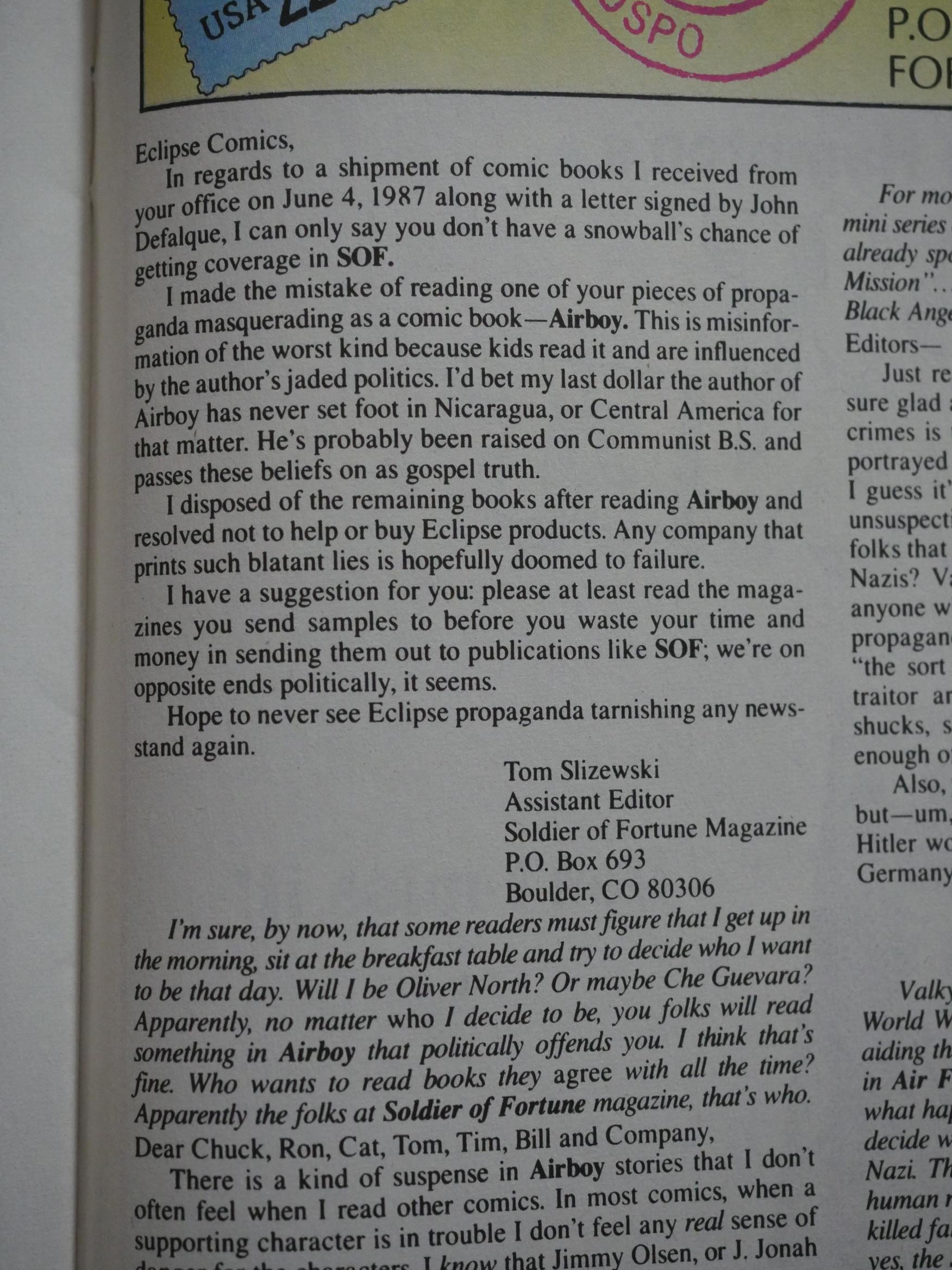
Tee hee. The assistant editor of Soldier of Fortune Magazine writes with “Hope to never see Eclipse propaganda tarnishing any newsstand again.” I’m sure Dixon felt honoured.
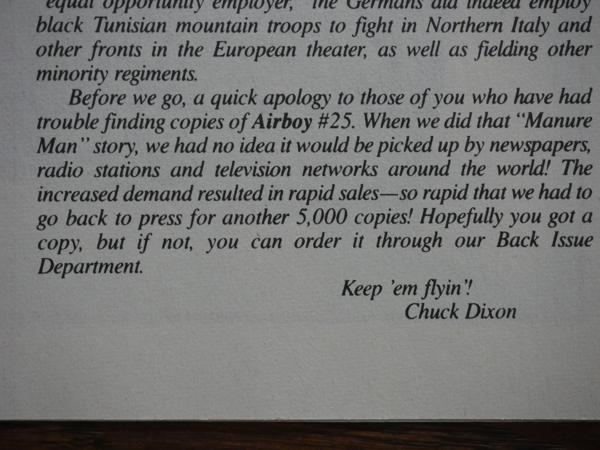
And remember that issue of Airboy several meters earlier in this marathon blog post? About the pollution of Russian River? It apparently got a lot of media attention, and Eclipse went back to press for another 5K copies. Nice!
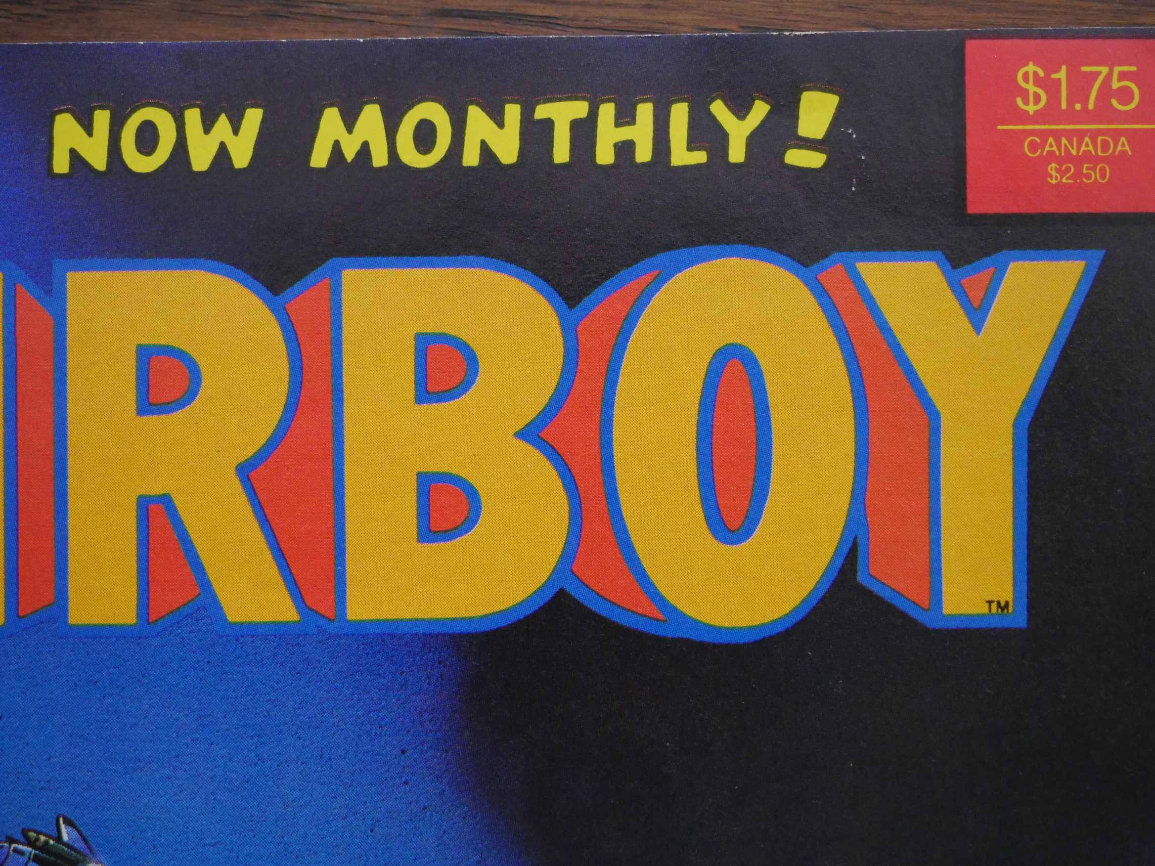
And then we get a format change again. Stan Woch/Willie Blyberg are back, but Airboy goes to a monthly schedule, a higher price, and better paper. I thought this would mean that the book would also ditch the Skywolf backup features, but that didn’t happen: Instead the main feature increased from 13 to 18 pages, the backup feature dropped a couple of pages, and the rest are dropped in-house ads.
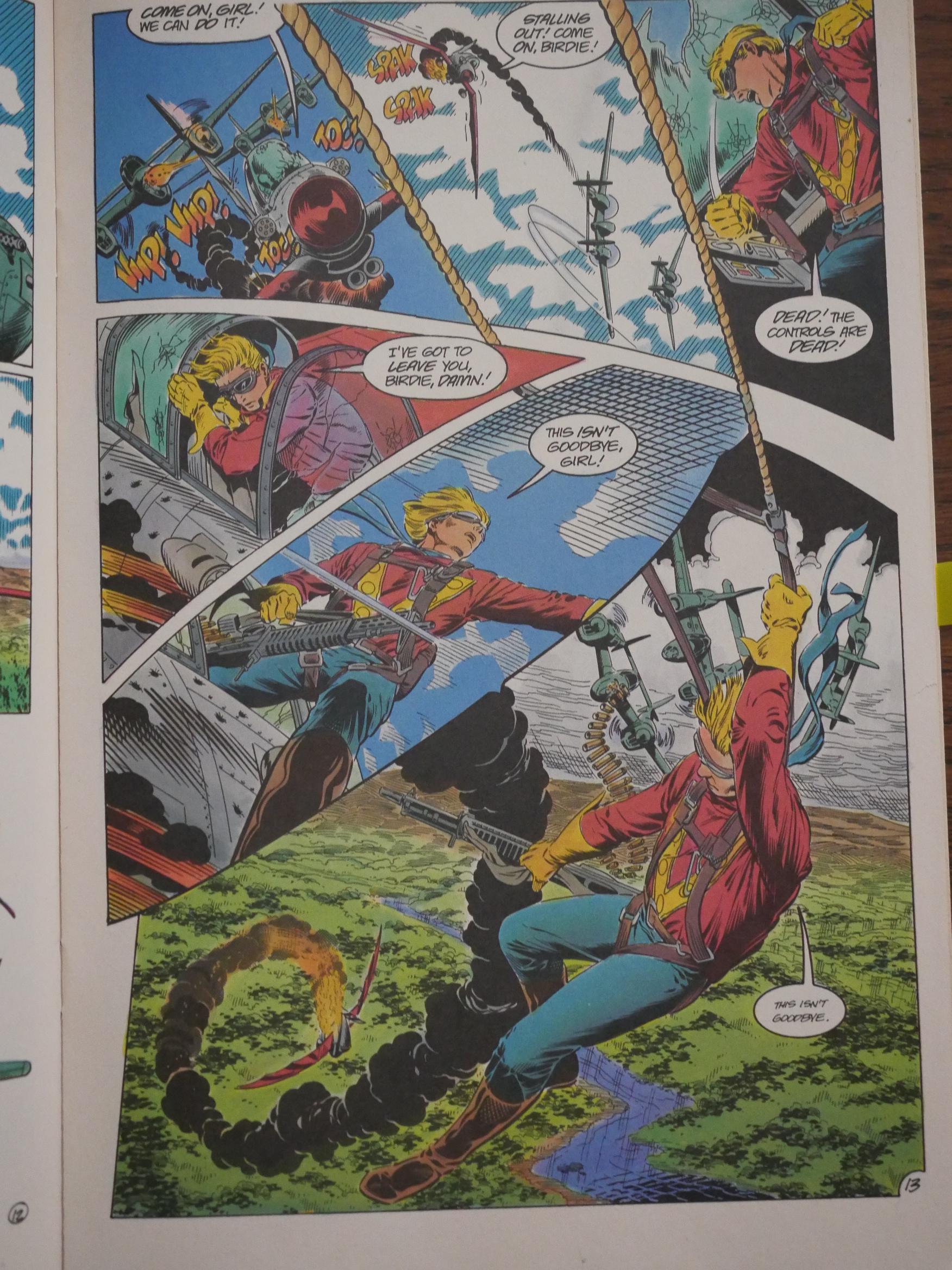
It’s nice to have the Woch/Blyberg team back again, man. Not that the artists doing the intervening issues were bad or anything, but it wasn’t exciting.
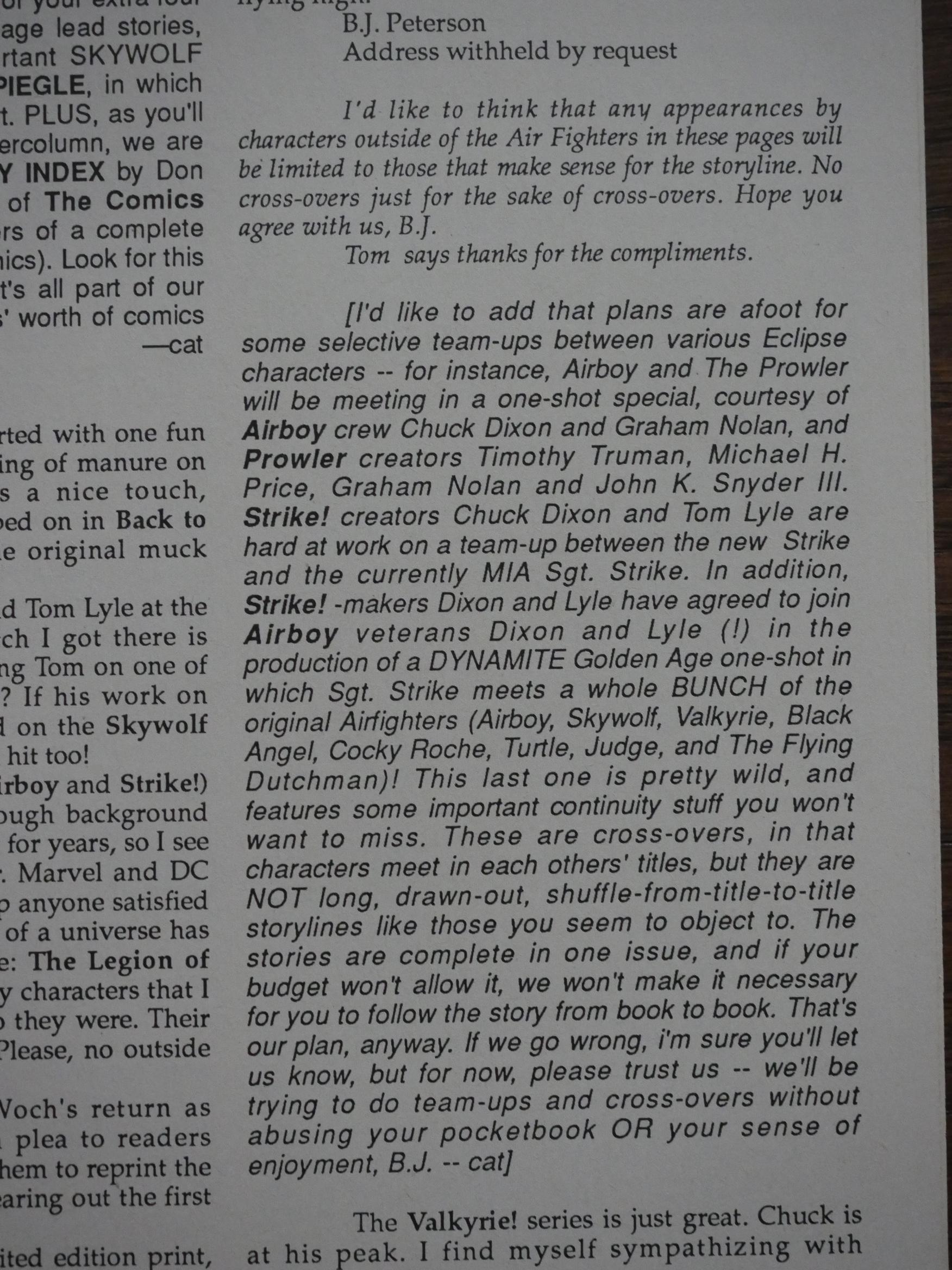
A writer asks what’s up with all these crossovers, and Dixon reassures the reader that there won’t be that many. Just the ones that makes sense. And the cat ⊕ yronwode drops by with a mega-list of crossovers that are coming. *titter*
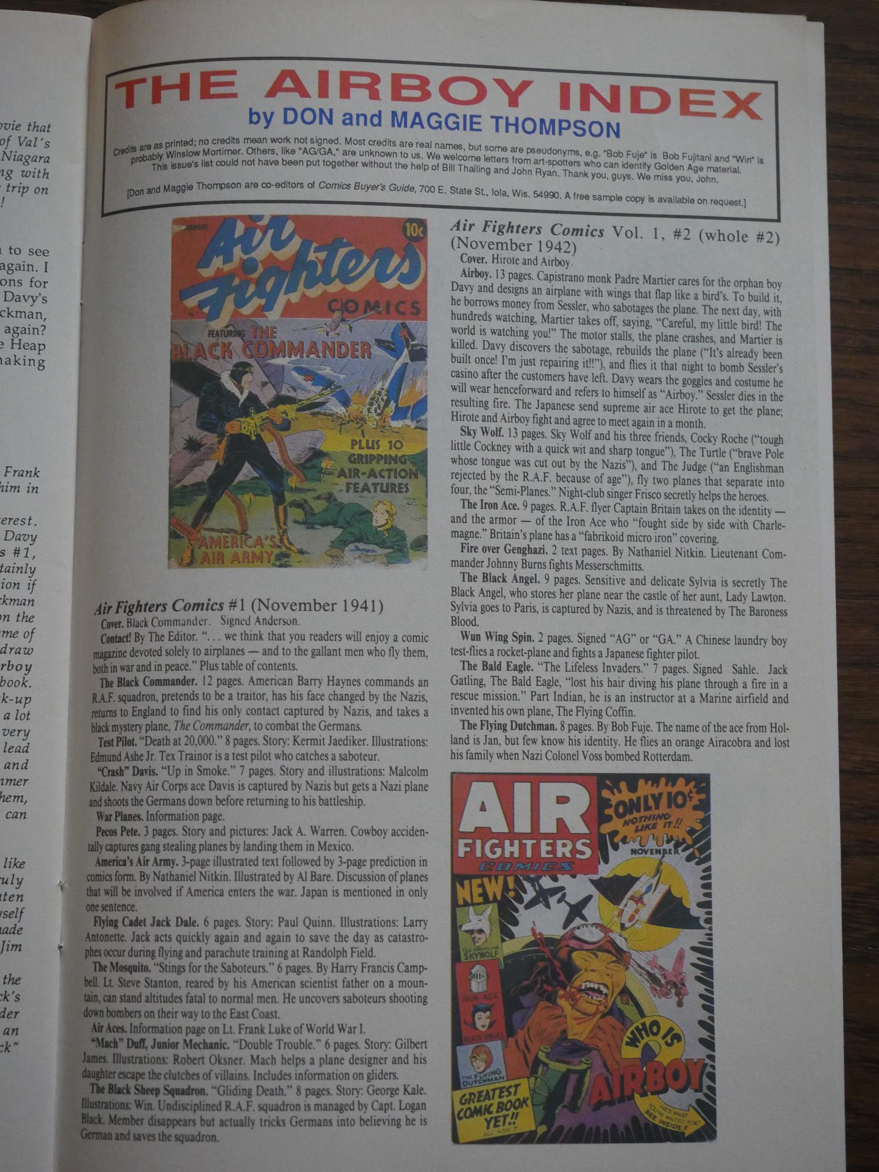
Another new feature in the new, monthly Airboy is an Airboy Index written by Don and Maggie Thompson. It’s one single plage like this per issue where they basically recap all the stories from a couple of Air Fighters books from the 40s.

So obsessive! I can’t even!
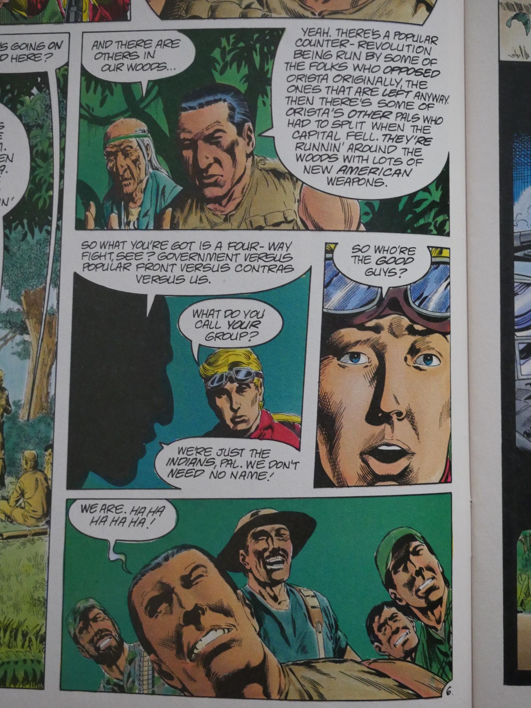
I wondered whether Dixon would approach these longer main features in a different way than the 13 page things he’d be doing up till now. After all 18 pages is (where’s my calculator) 40% longer than 13 pages.

And, yes, they have a quite different feel. Conversations are allowed to be longer, and the storylines grow surprisingly complex.

The first time Airboy went down to this Latin American country, he just helped overthrow an eeevil dictator and went back home. This time the new government is falling apart, and there’s four different factions working against it, and it’s complicated.
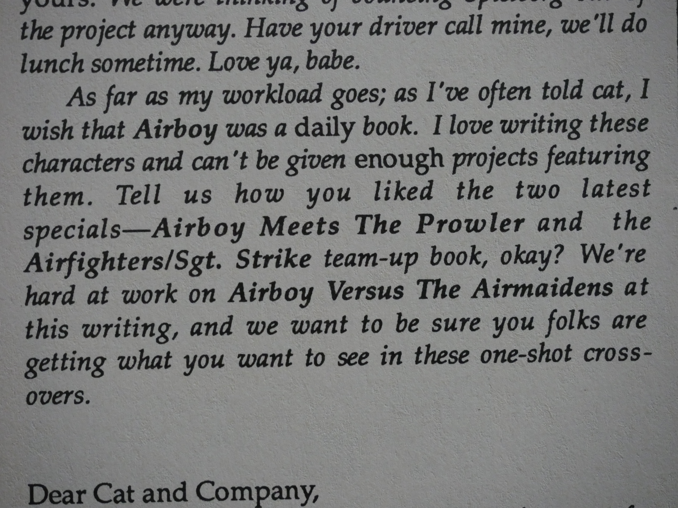
OK, another couple of spin-offs coming. Let’s look at the Airfighters/Sgt. Strike one first:
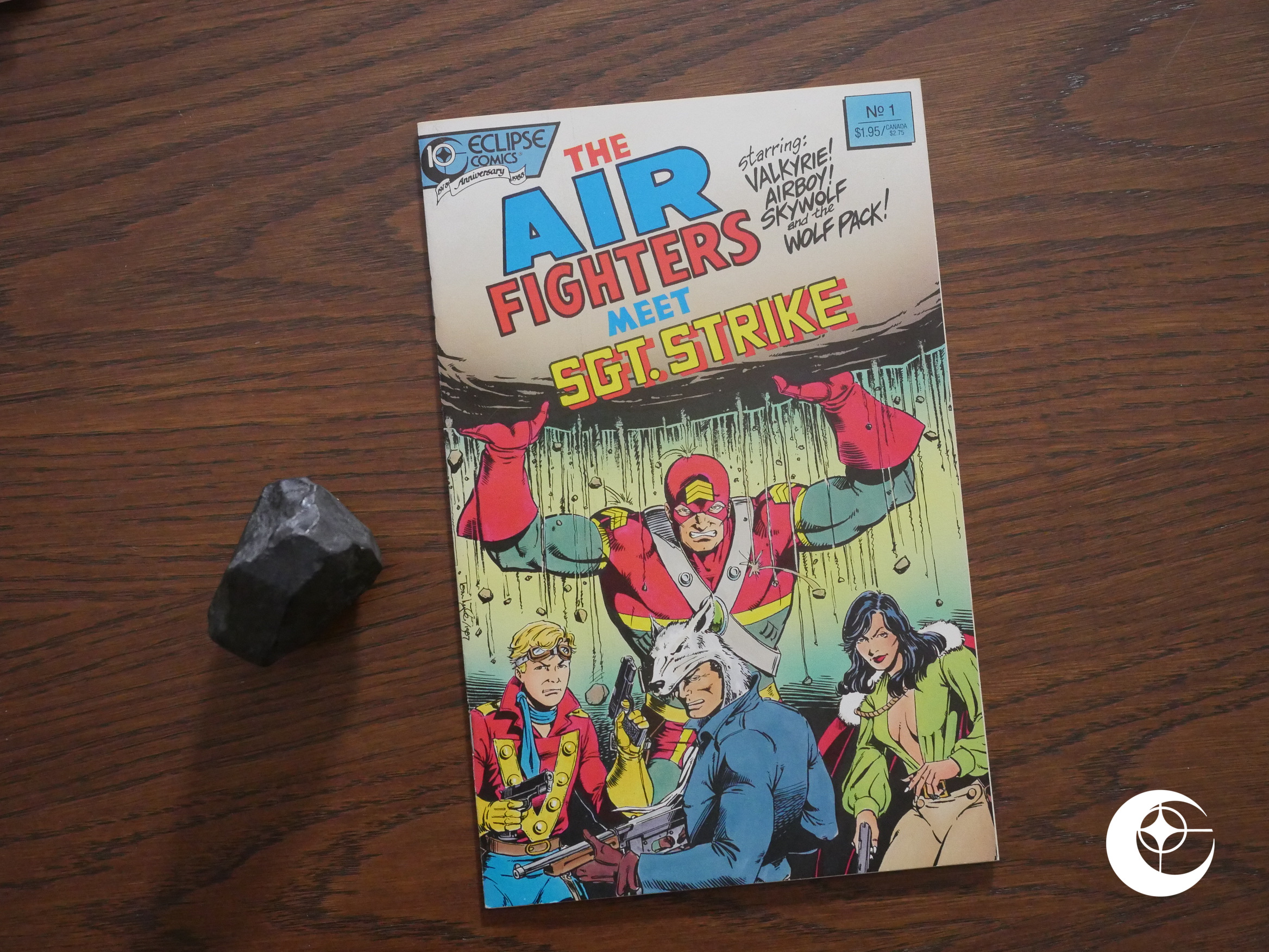
This is a cross-over with … a book called Strike? But it has the older version of Strike, who’s called Sgt. Strike? I didn’t get that part, but I guess I will when I read Strike later in this blog series.
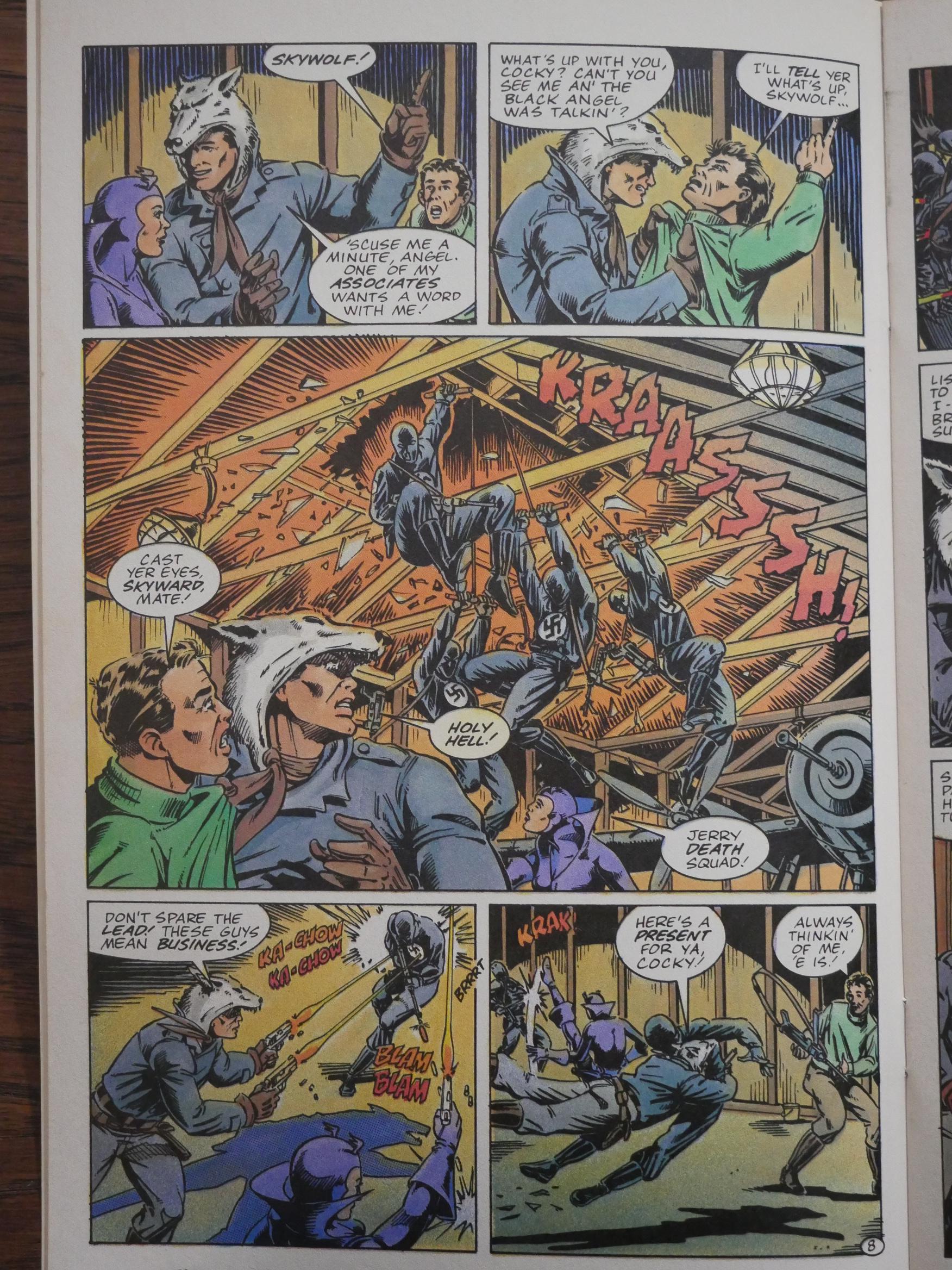
The artwork by Tom Lyle is hard to get exited by, but as usual with these Airboy things, it serviceable.
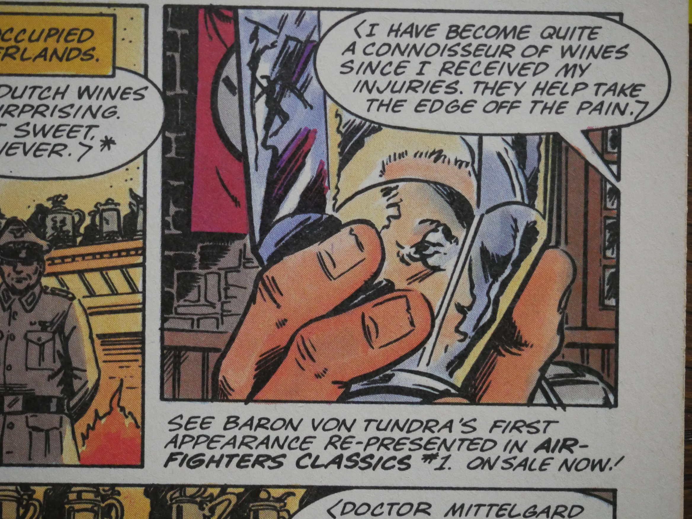
Gotta push the other tie-in series, too. I’ll be doing Air Fighters Classics in a separate blog article, you’re no doubt happy to hear.
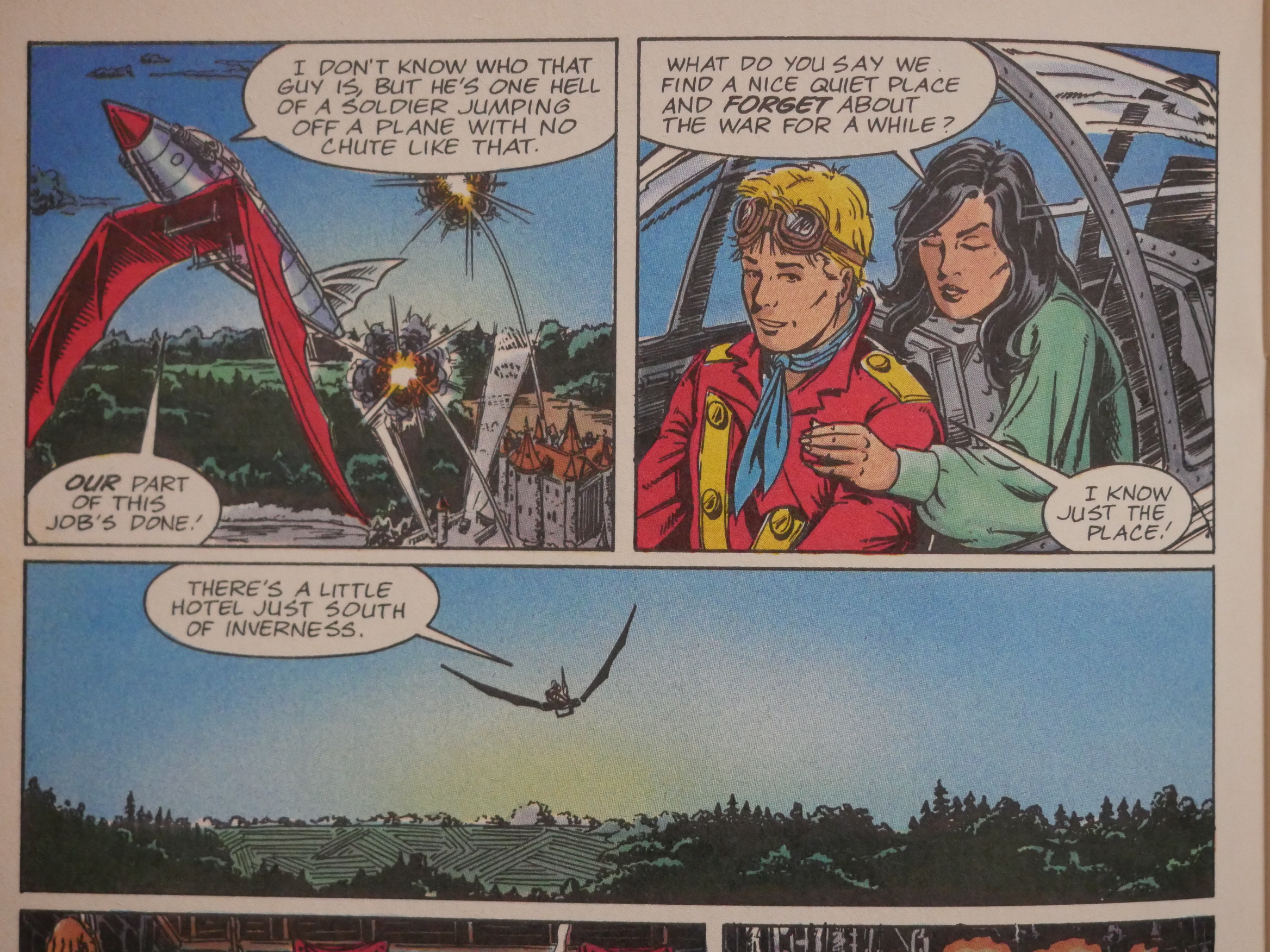
The team-up is super-lame. It basically consists of Airboy flying Sgt. Strike in and then going off on a hot weekend with Valkyrie, or something. There’s no up to this team. Up.

I guess instead of reading these spin-offs in the context of Airboy, I should instead wait until I’m reading the other part of the team-up, because they seem to be more concerned with the non-Airboy part of the up which teams are done.
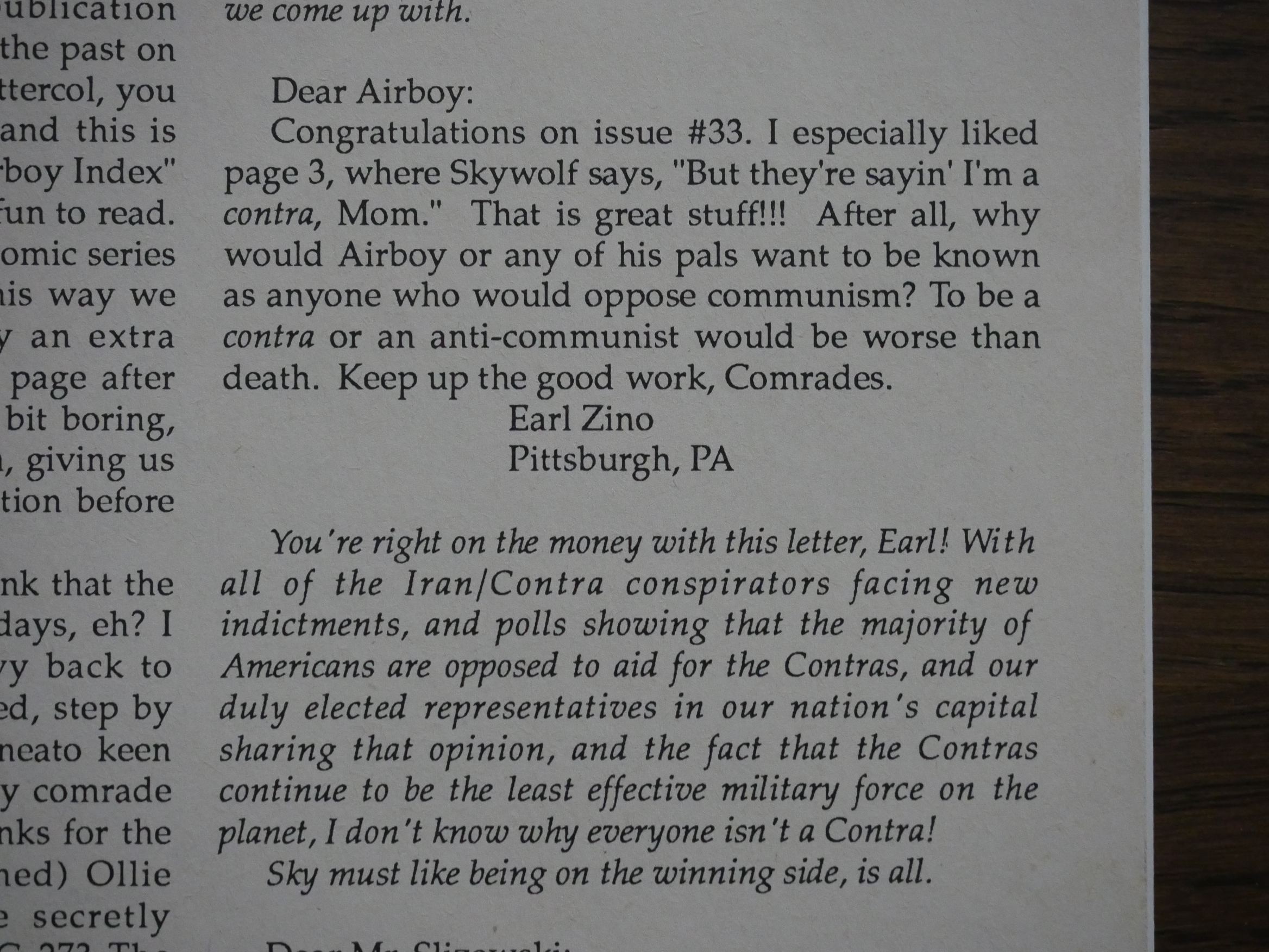
Dixon is further applauded for his hard-line Communism which is exemplified by Skywolf not liking the Contras that much. There’s basically a letter like this every two issues. Very persistent.
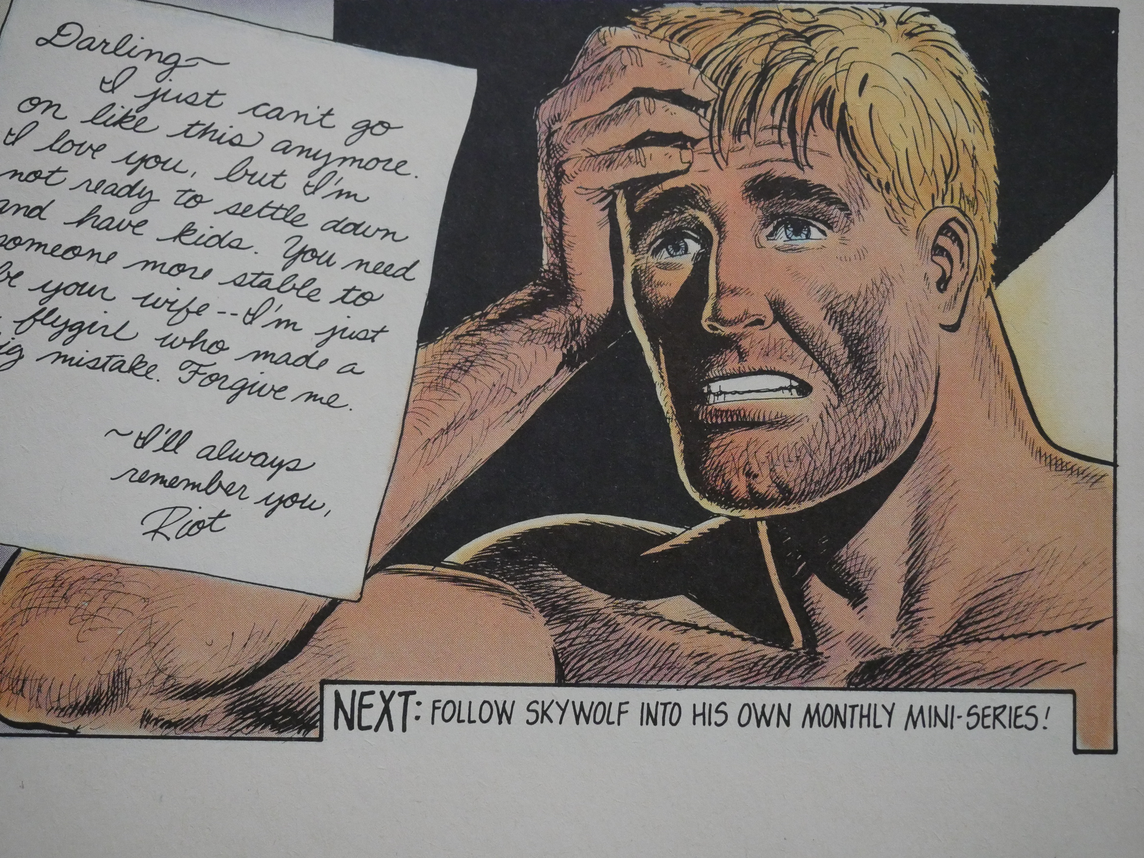
And then we get a Skywolf mini-series! Let’s do it!
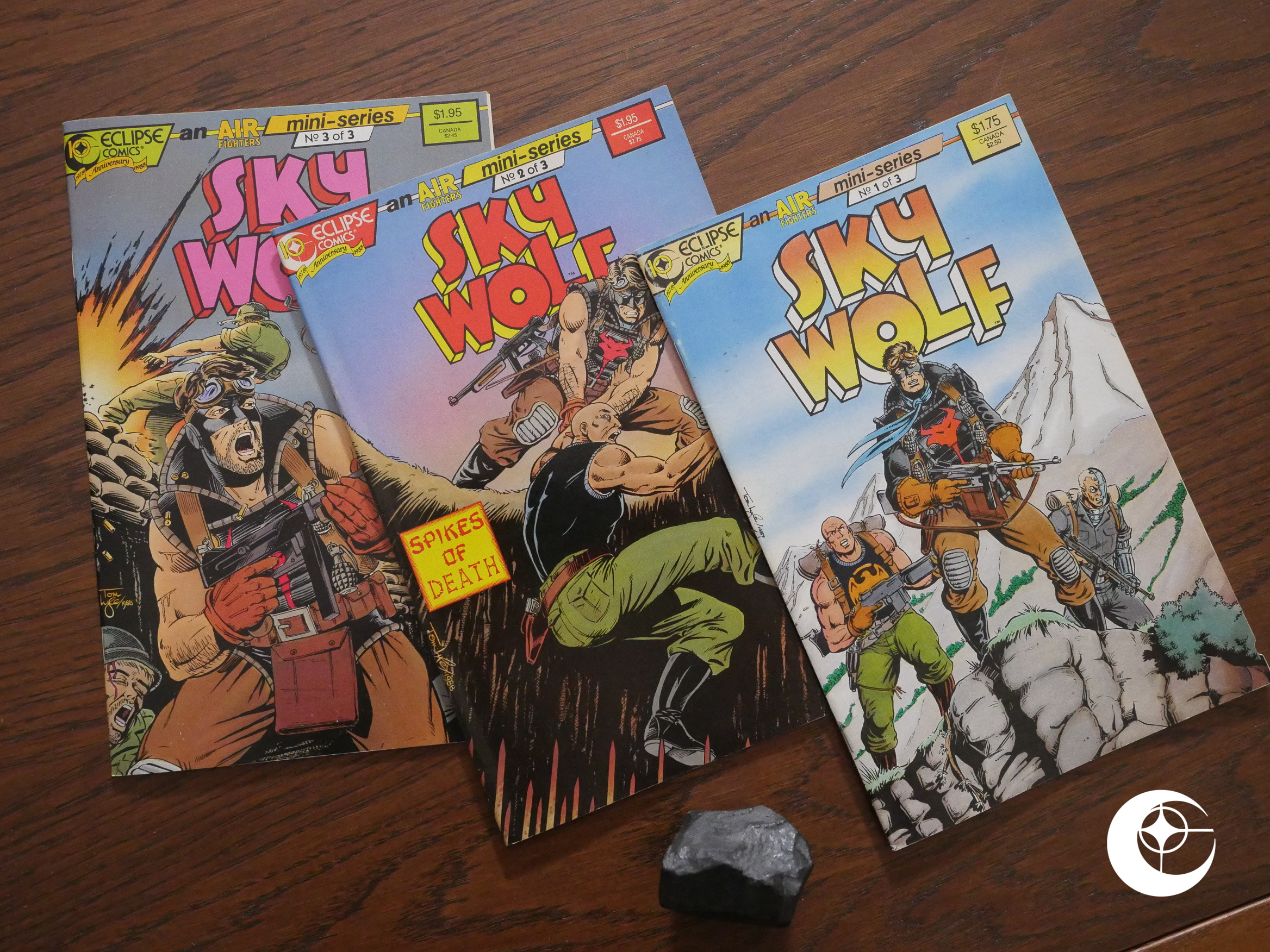
Artwork by Tom Lyle, but this time with inks by Ricardo Villagran.
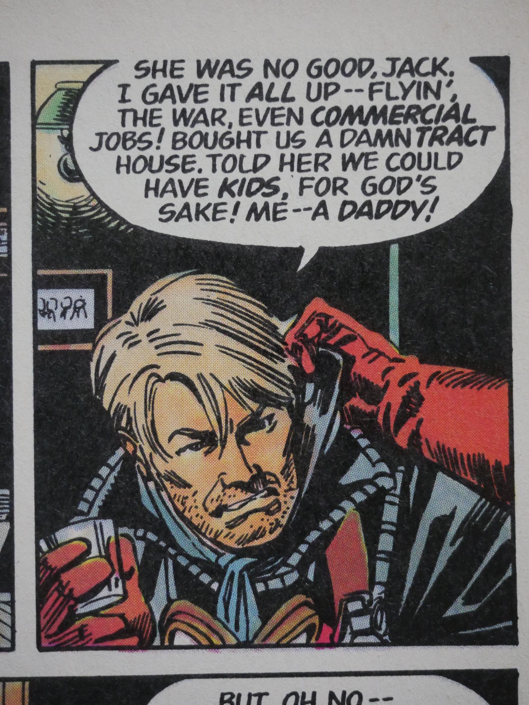
It takes off straight from the backup feature in Airboy, and then sends Skywolf off on a tour of Vietnam. But this is the early 50s, so it’s when the French were fighting there, and he gets to experience the Vietnamese routing the French.

So unpatriotic!
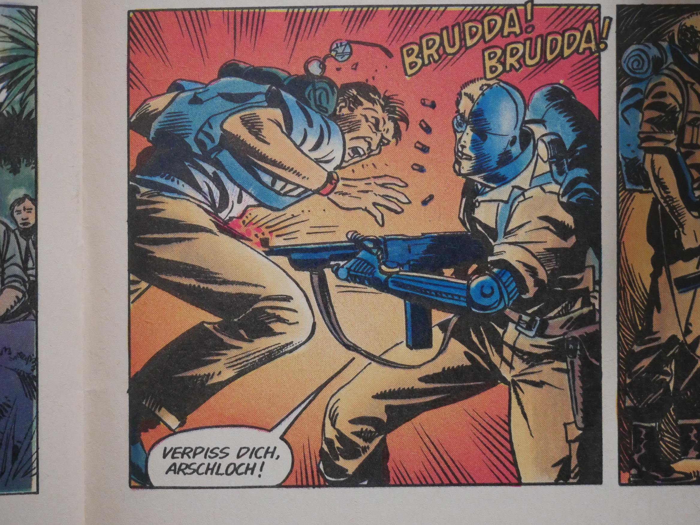
Heh. In an early issue Dixon got a lot of blowback from readers because his German characters were lousy at speaking German. Dixon promised to use cat ⊕ yronwode’s mother (who’s German) as a language consultant, and I guess that’s where that, er, rather colourful expression comes from.
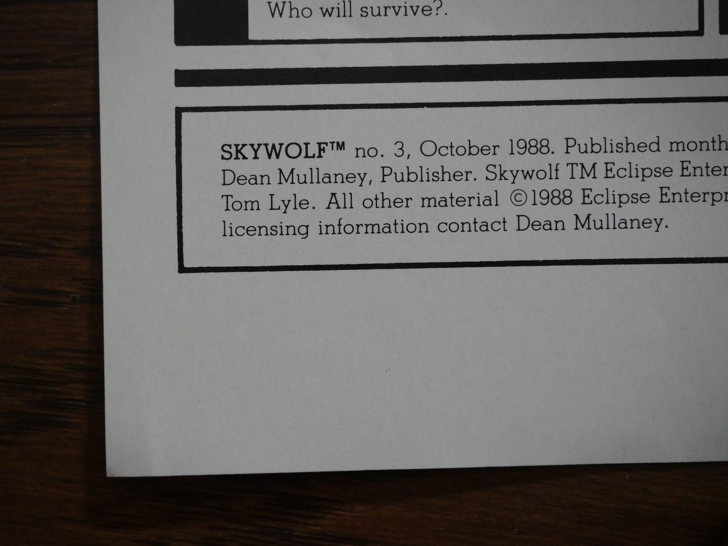
Airboy and the surrounding series seemed to come out at a steady clip with no delays or anything. But this three issue series took about nine months to come out, so I guess they ran into problems of a kind or another…
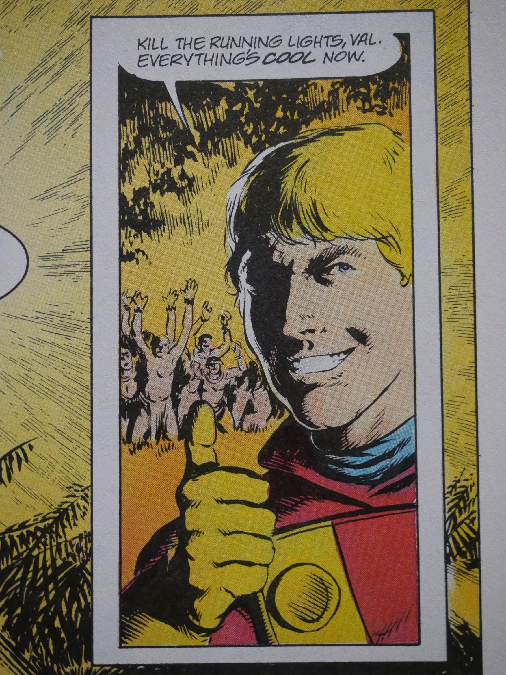
Back at the Airboy farm, Woch is AWOL again, and Gary Kwapisz steps in for an issue of very off-model sheet Airboying.
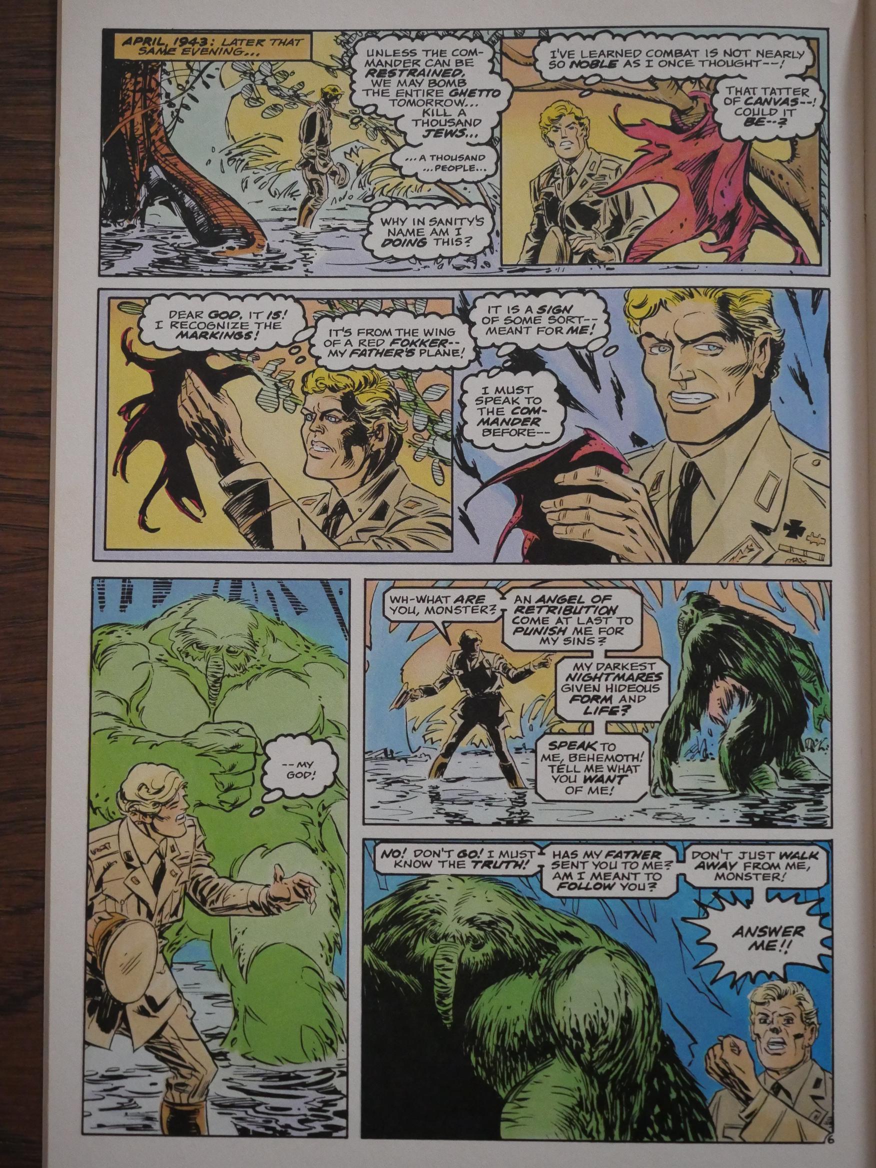
And in a very strange choice, Len Wein writes the back-up feature for three issues, featuring The Heap. Wein was the creator of Swamp Thing, so I guess… that… makes… sense. Carmine Infantino on art. It’s the only thing in Airboy that’s not written by Dixon himself, and… it’s OK, I guess.
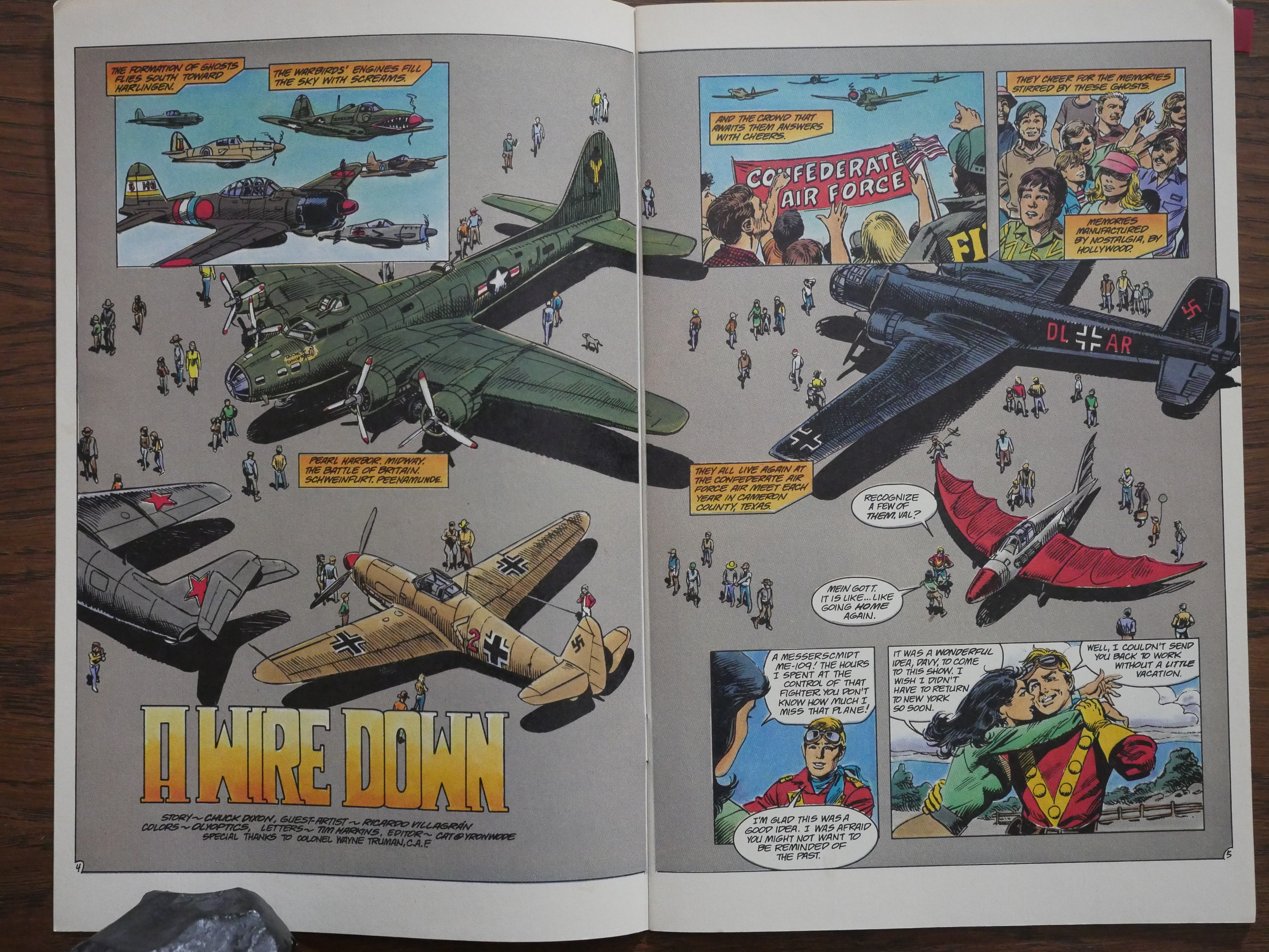
Woch is still not back, so Ricardo Villagran does the artwork to the main feature all by himself. He’s very good at drawing planes, right?
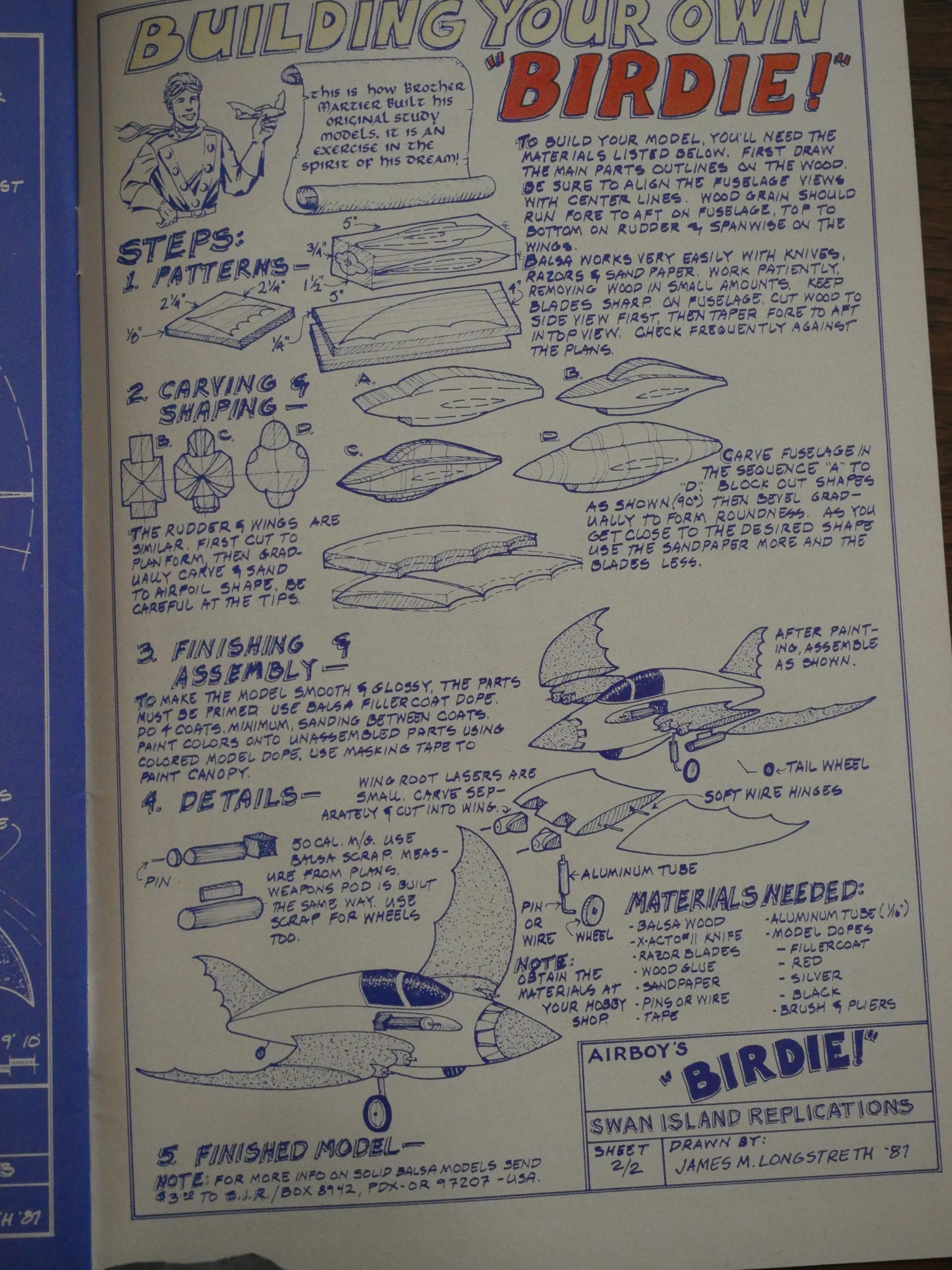
He didn’t do this model sheet that explains how to build your own copy of Airboy’s weird plane, though.
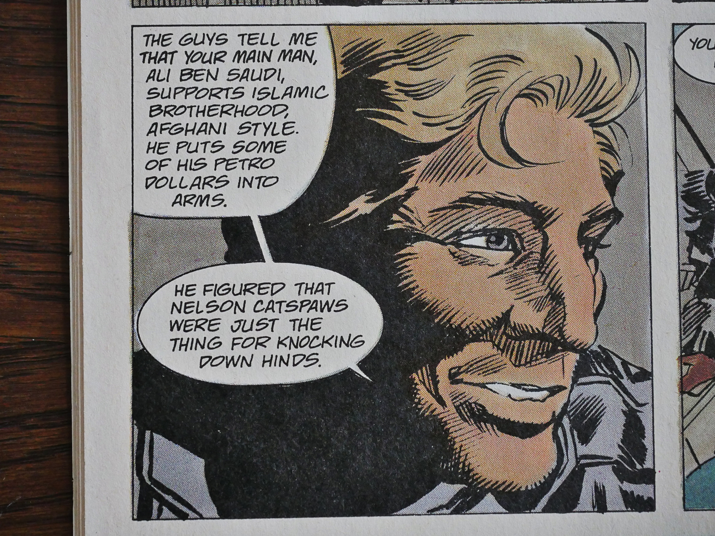
In search of further relevancy, we divert from the American backyard and takes a trip to the USSR’s backyard, Afghanistan. Even if the Russians had withdrawn from Afghanistan by this time, I think?

And Airboy’s arms went to… The Islamic Brotherhood.

Oh, well.
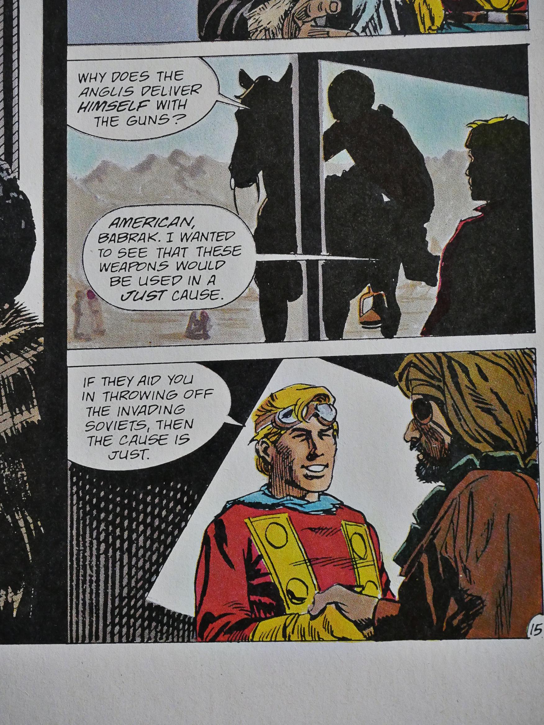
It’s just ’cause it’s Soviets, which I guess is fair.
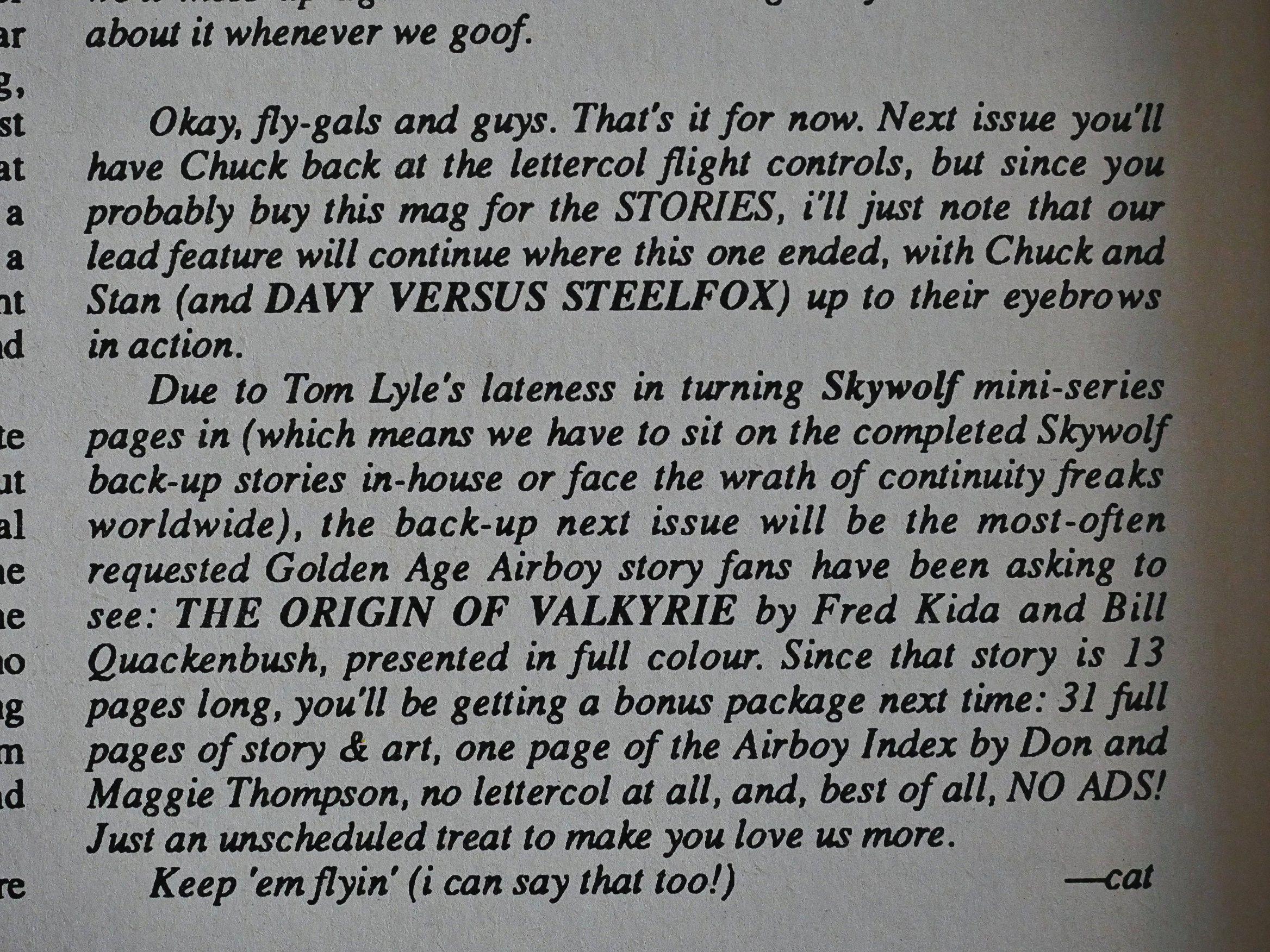
We get the explanation for why the Valkyrie mini-series was so late: cat ⊕ yronwode throws penciller Tome Lyle under the bus.

We’re now up to the early 40s (issue-wise), and you can feel a general disinterest from Chuck Dixon. The Skywolf backup features are gone, and he seems to have stopped doing the letters himself.
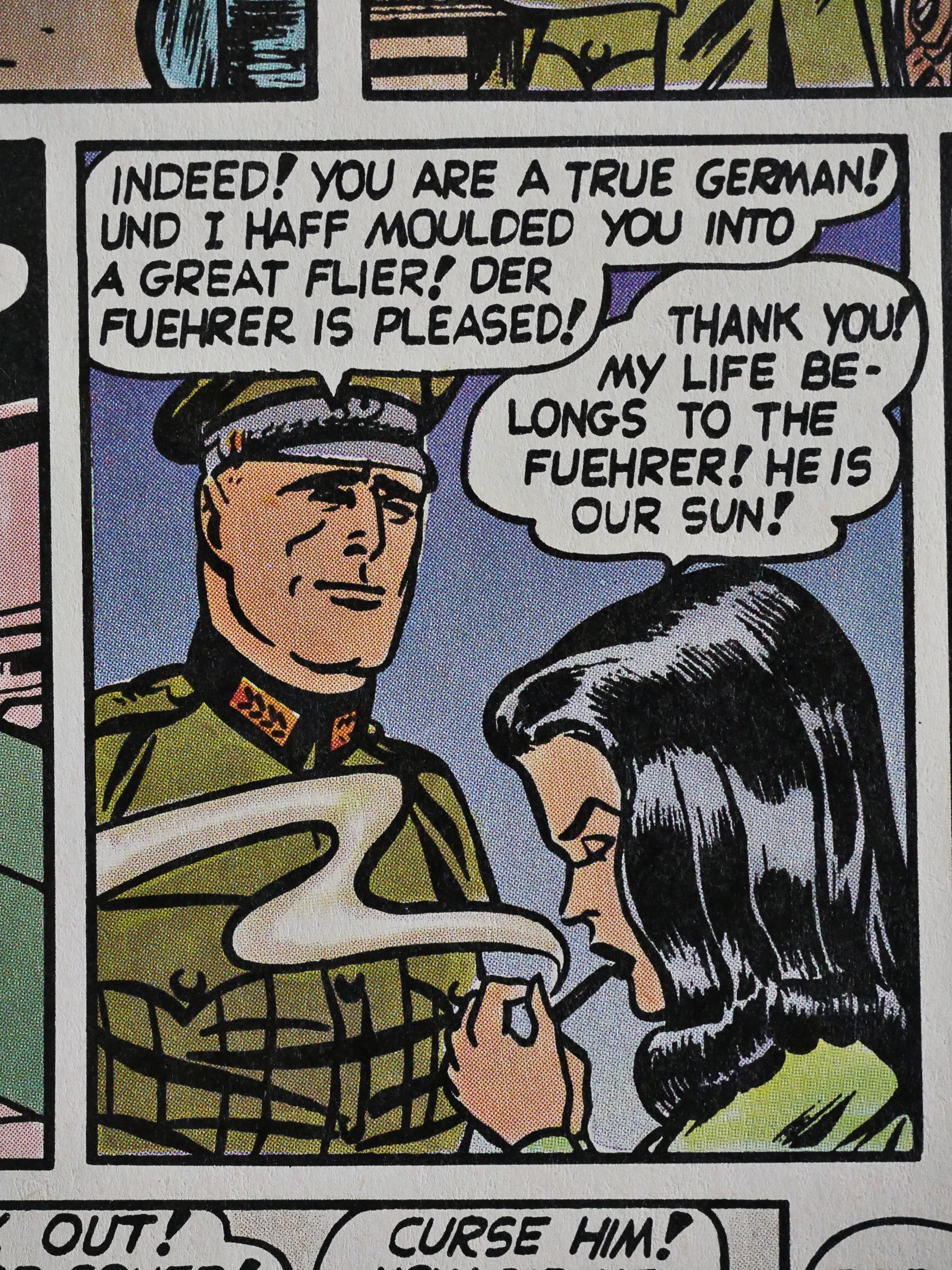
Instead we get re-coloured reprints of the original Airboy comics. They’re not bad, I have to say. As 40s propagandist adventure comics go.
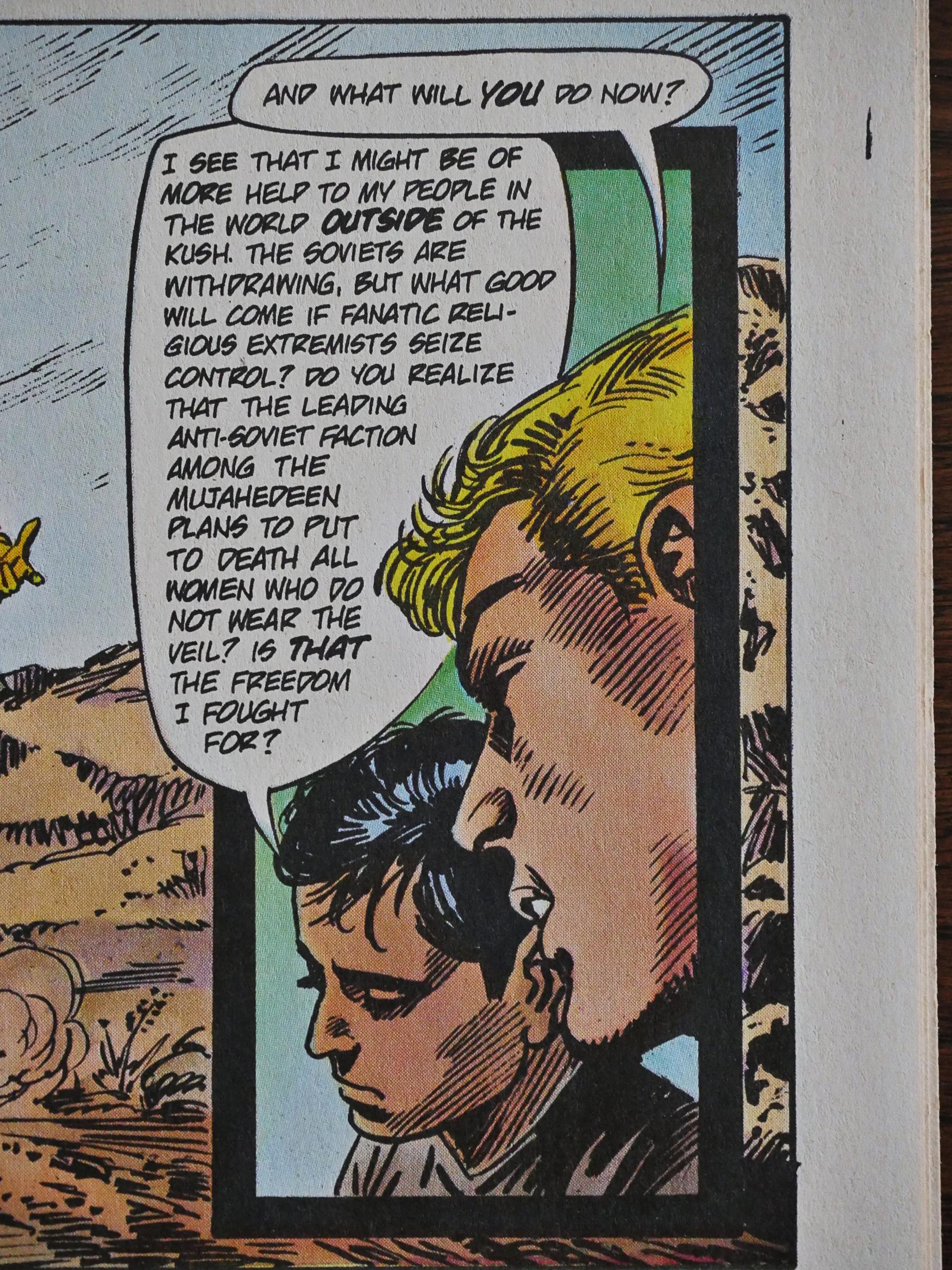
Airboy helped the Afghans defeat the Soviets (spoilers!), but it’s a bitter-sweet victory, as the Afghan boy Airboy’s been helping lays a helping of downer on the proceedings by pointing out that perhaps these Afghans aren’t all good.

Things are getting too complicated, so another spin-off:
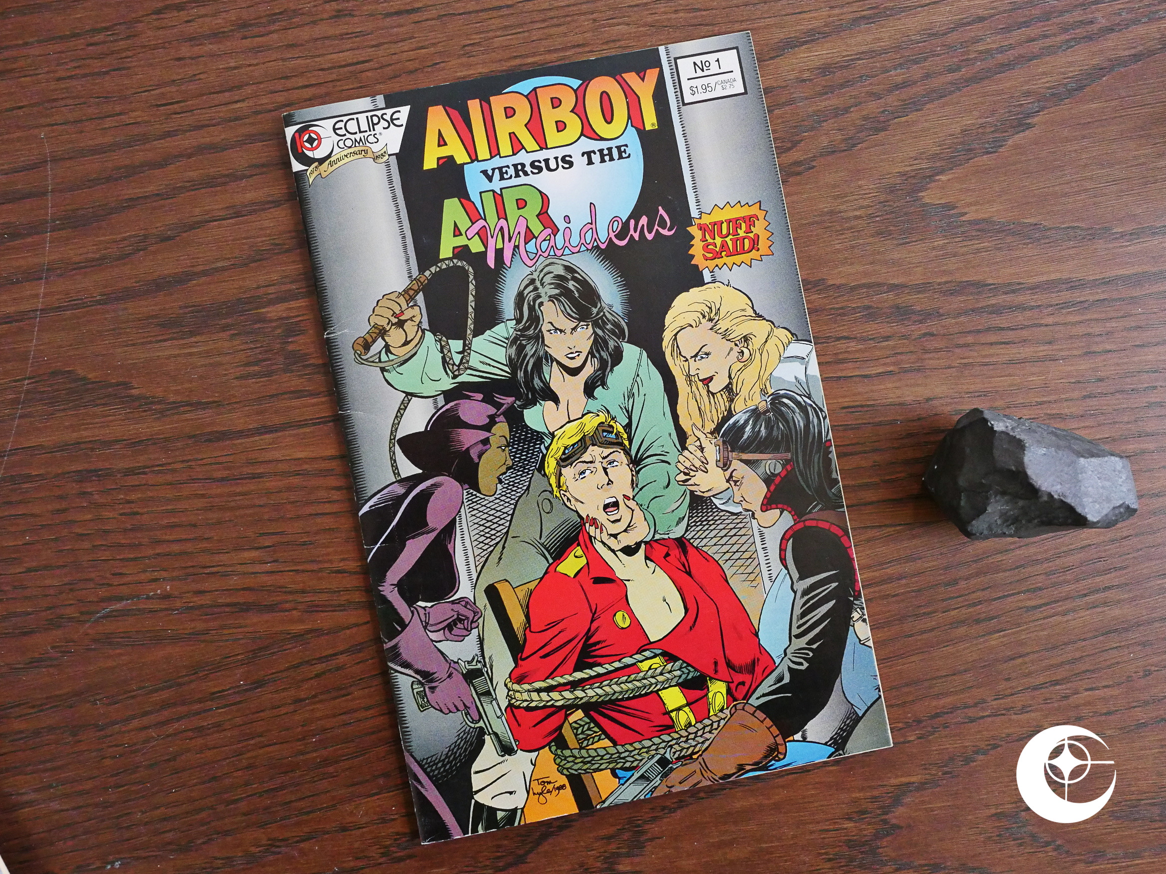
And instead of the politics, we get this villain:
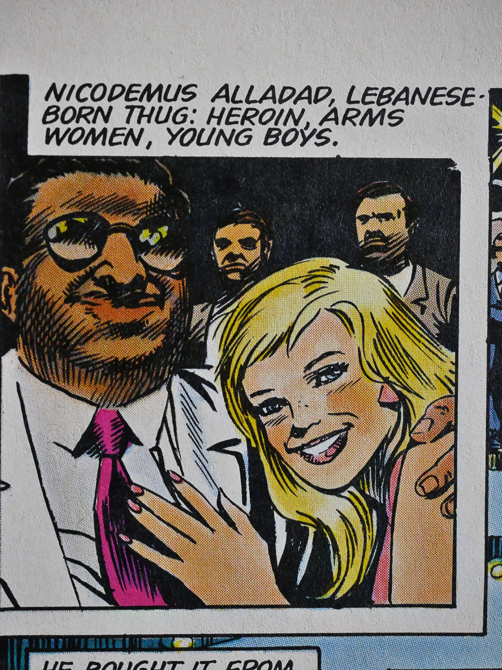
Who seems rather nice, I have to say: He arms women and young boys? An upstanding citizen.
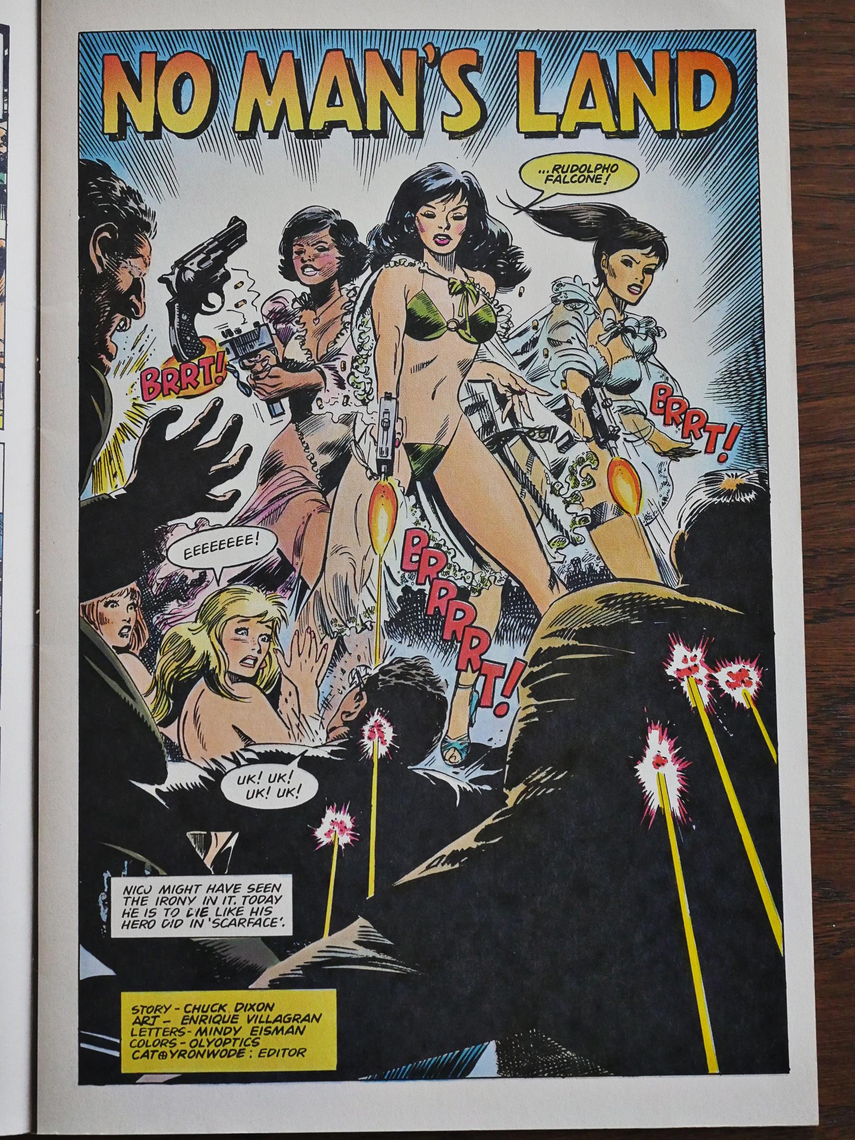
Enrique Villagran does the artwork, and we get ample cleavage.

The action scenes aren’t bad, but it’s rather unclear why this is a separate special instead of just a normal Airboy issue.
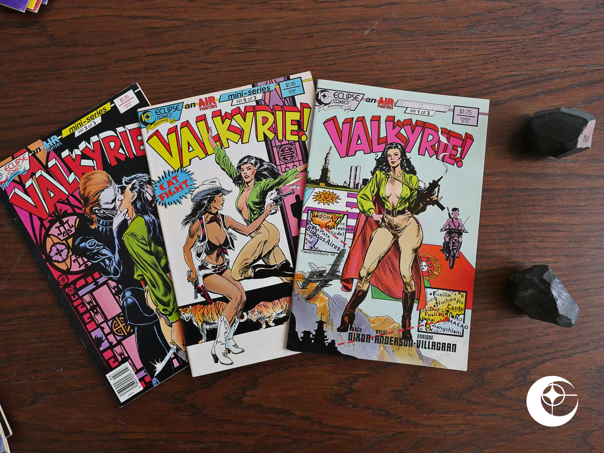
So of course we get another Valkyrie! mini-series; this one drawn by Brent Anderson with inks by Enrique Villagran.
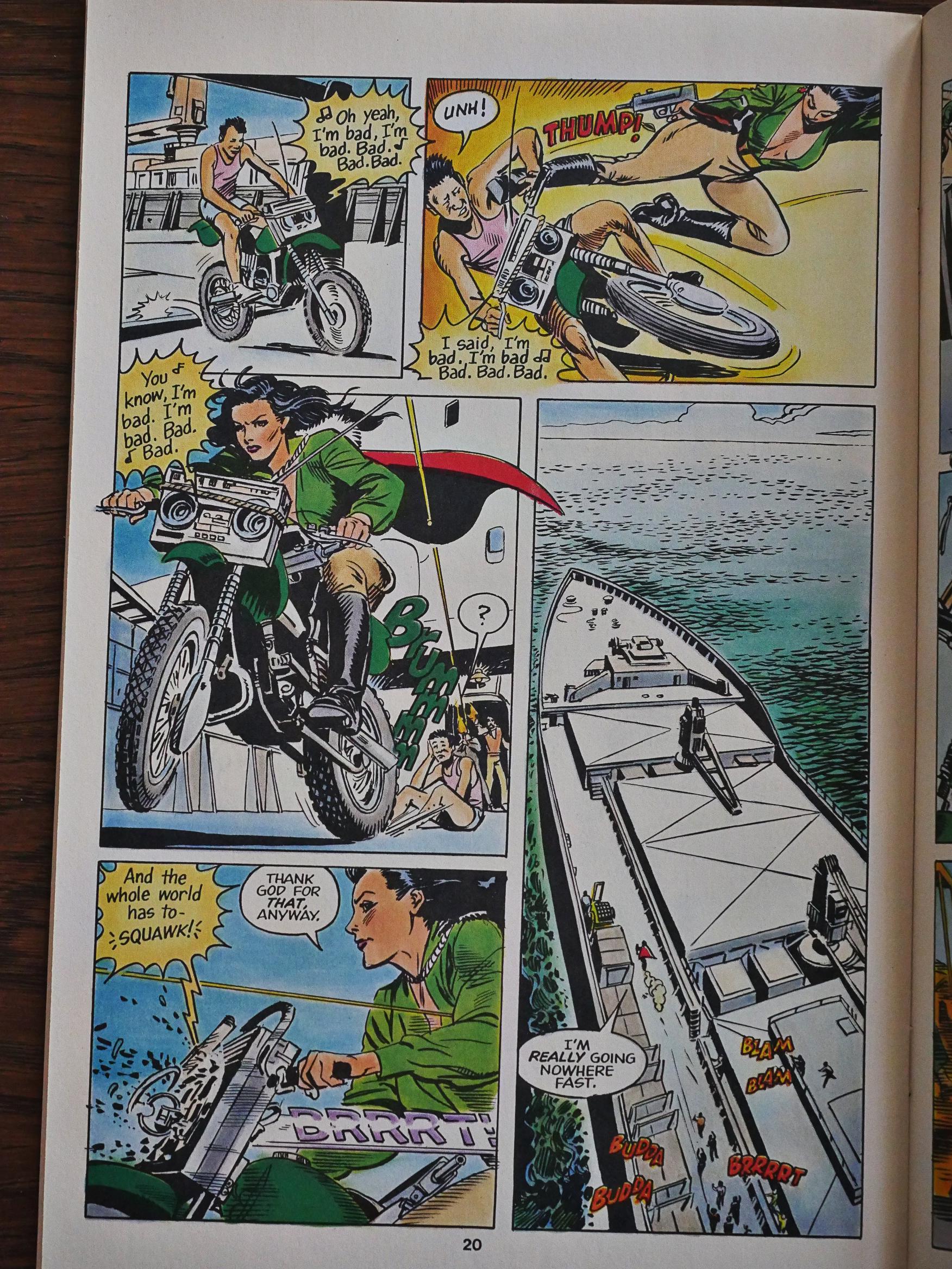
I think Brent Anderson usually does better artwork than this. I mean, it’s fine, but it seems a bit phoned in. Storywise, the mini-series treads water for quite some time, but I guess it’s about as entertaining as any of these issues.
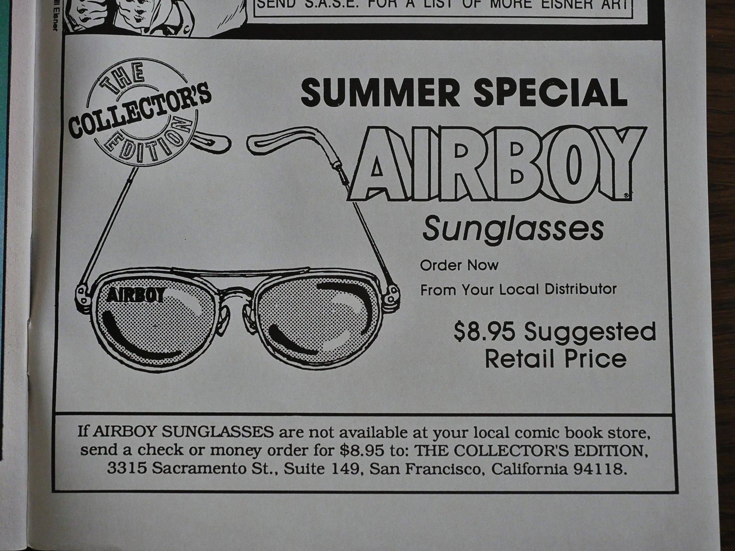
Hey! Merchandising! I guess it makes sense to make aviator sunglasses for Airboy fans… But why not his jacket as well?

So what’s next?
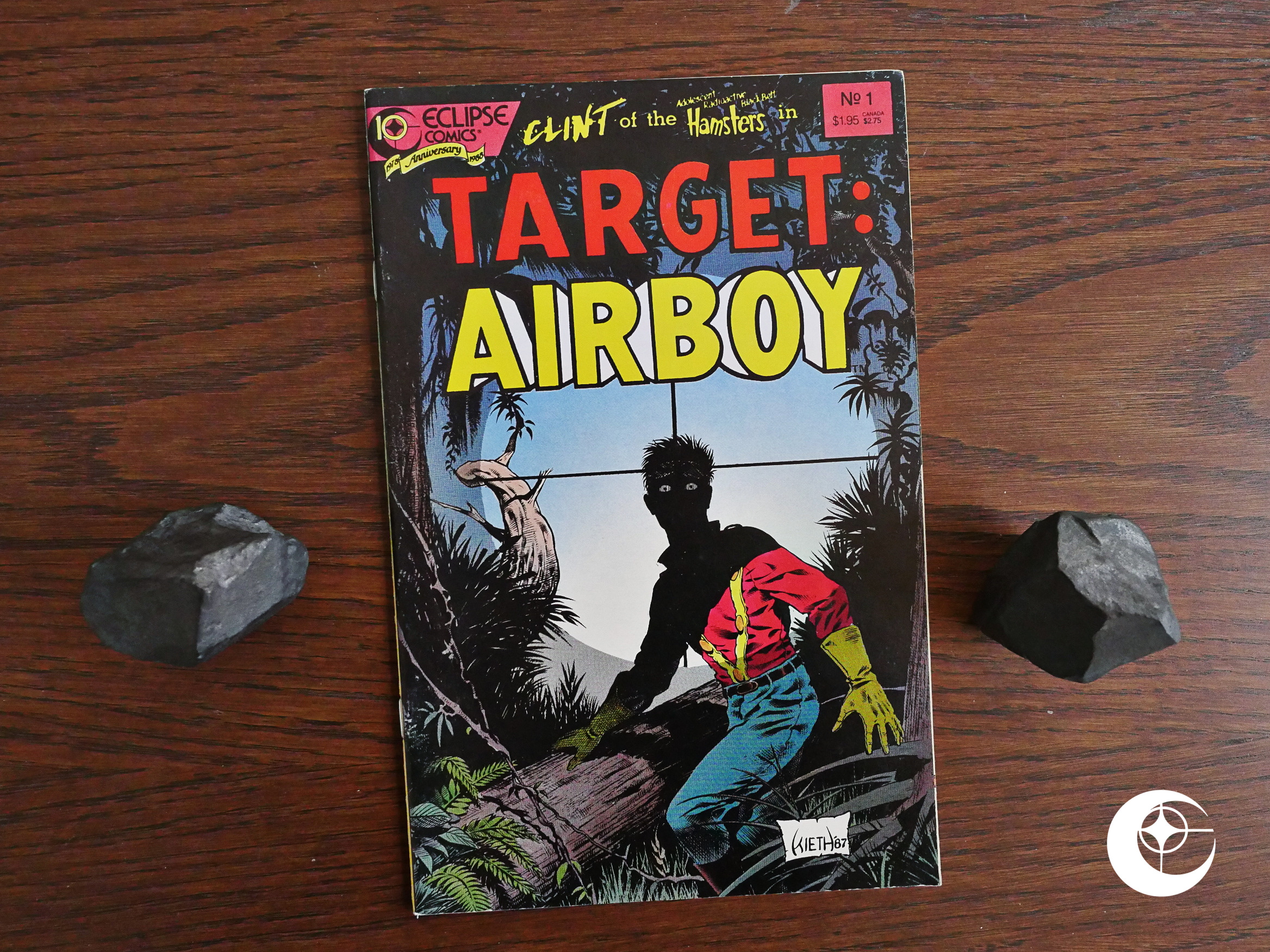
Yes! Another crossover, and as yronwode promised, there would only be crossovers if the absolutely made sense. So here we get a crossover with Adolescent Radioactive Black Belt Hamsters.

Yes.
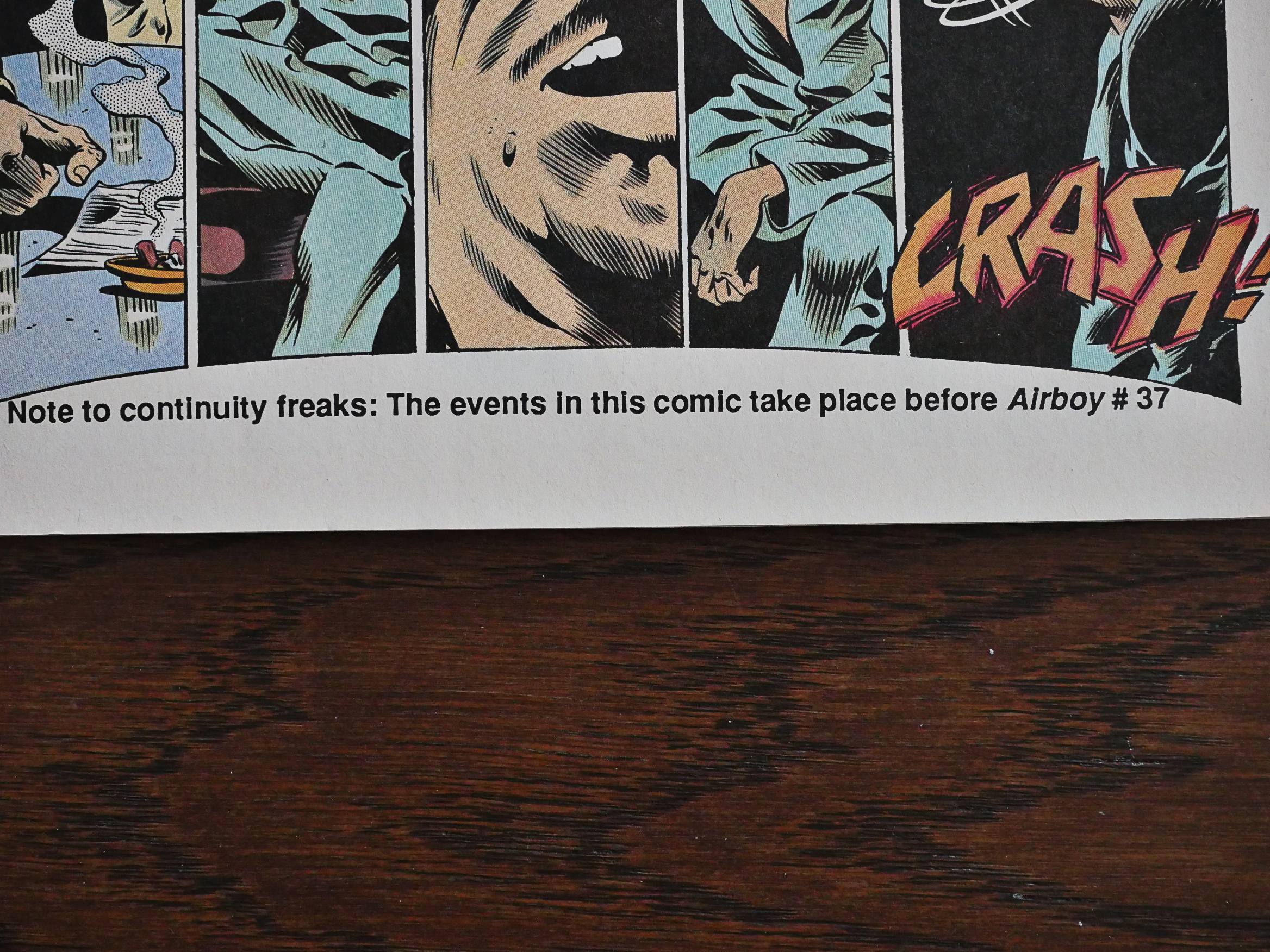
Or to put it another way: This story has nothing to do with anything.
The artwork is by Sam Kieth, which is always fun. He’s very Kieth here. But:
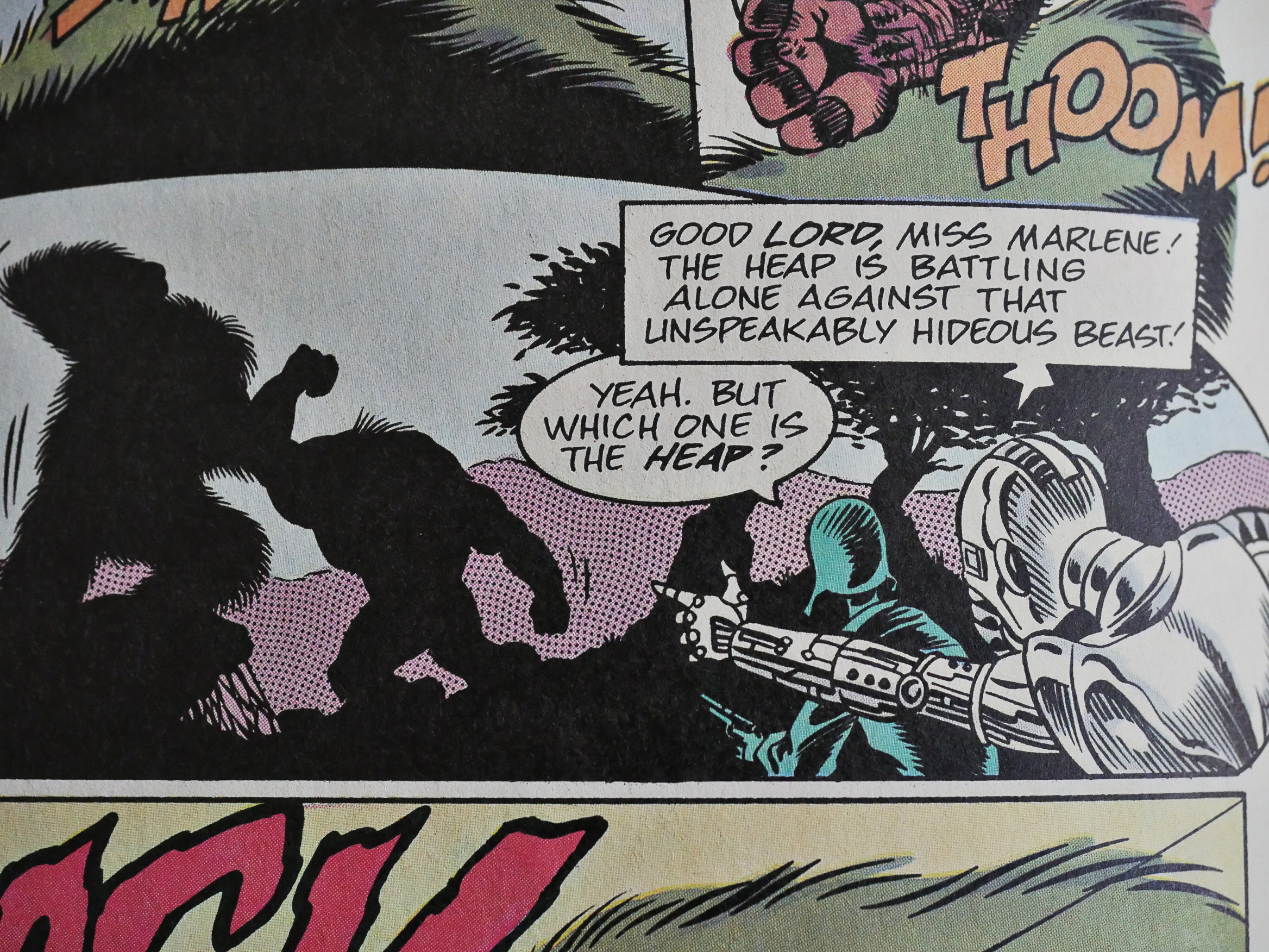
The story, co-written by the Hamster writer, is super lame and the humour is … it’s like that panel above.

So let’s return to the mothership and see what’s up with Airboy.
And things are not going well. Dixon brings in a co-writer to produce the most boring issue yet.
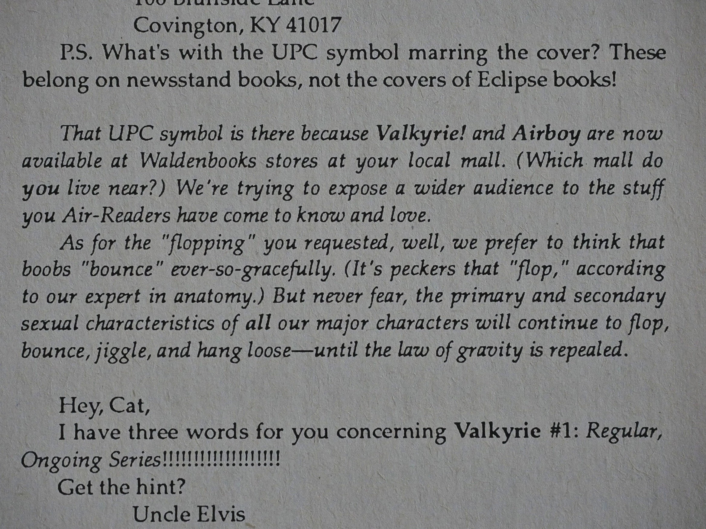
But apparently at this time, Eclipse had managed to place Airboy at Waldenbooks, which was probably something of an achievement.
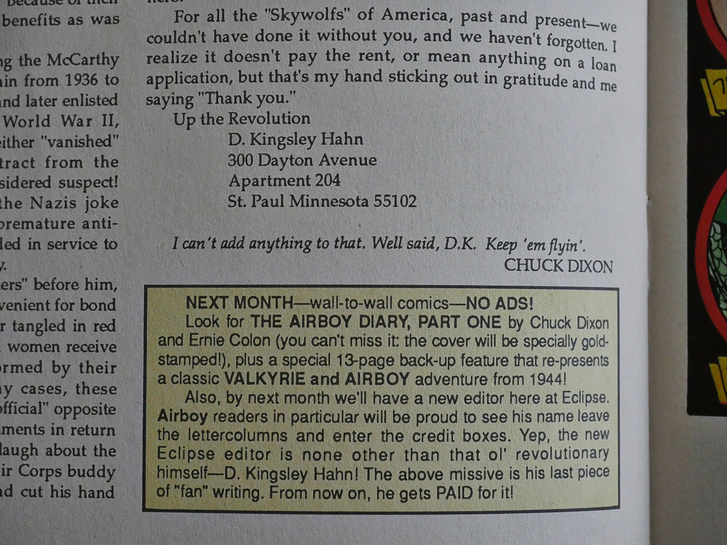
Dixon returns to do another letters column, and announces that one of the letter hacks is now the editor of Airboy. I have no idea whether this is a joke or not, and D. Kingsley Hahn is never mentioned in any of the remaining issues.
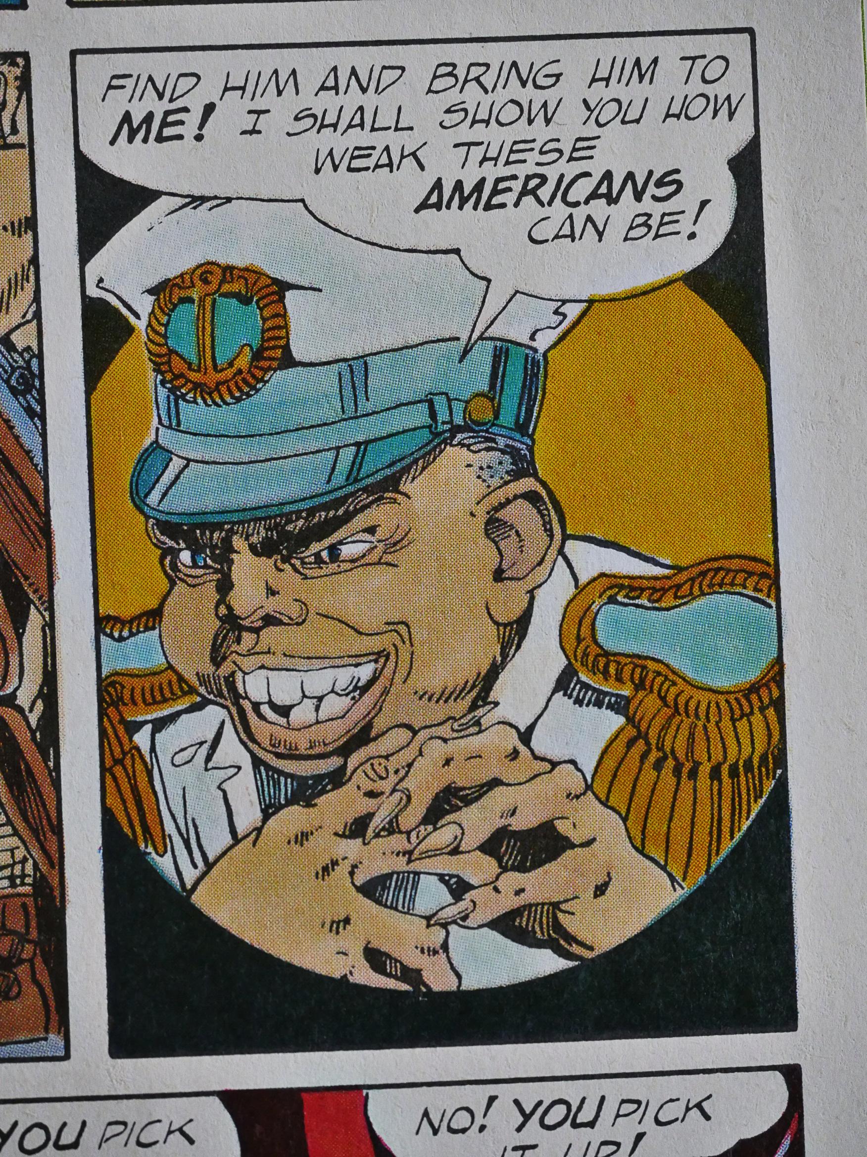
The Airboy reprints continue as the backup feature, and it’s bracing how jingoistic these comics are. But more readable than most comics of this era.
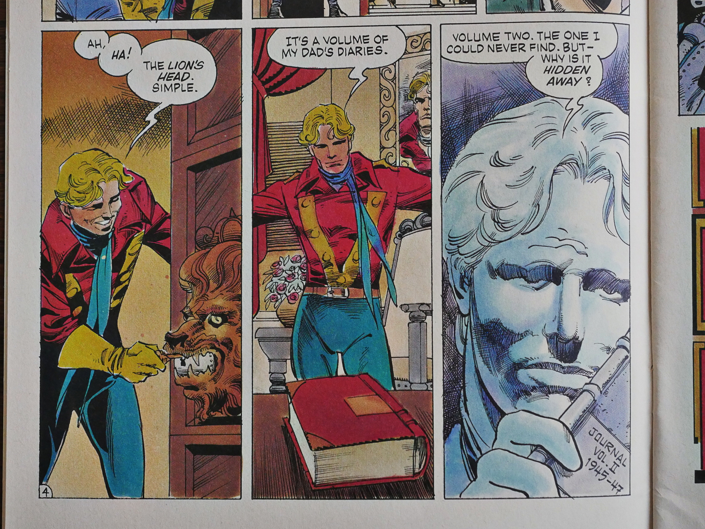
Ernie Colón takes over as the artist for a four-issue story arc that’s presented as a graphic-novel-within-the-series. But as these are four 18 page sections, it’s not a whole lot more epic than normal Airboy storylines.
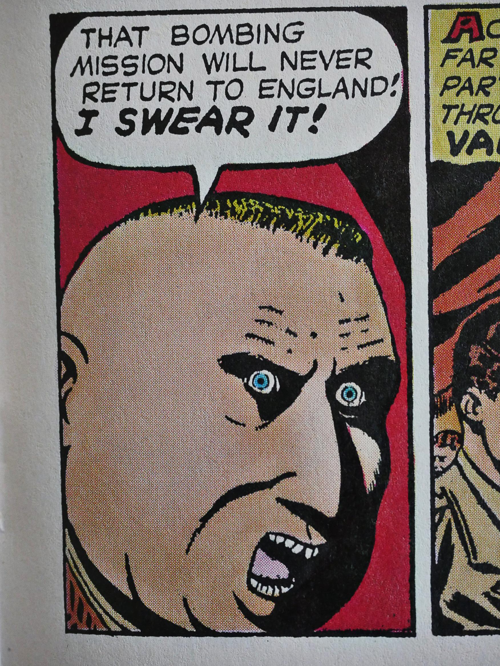
That’s a Nazi!
Instead of letters we have yronwode printing news relevant to Airboy fans. I guess.
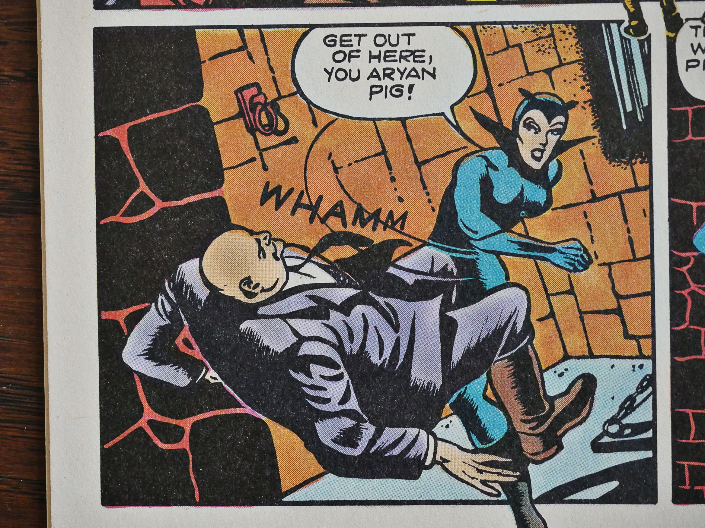
“You Aryan pig!” is an epithet we should start using again.
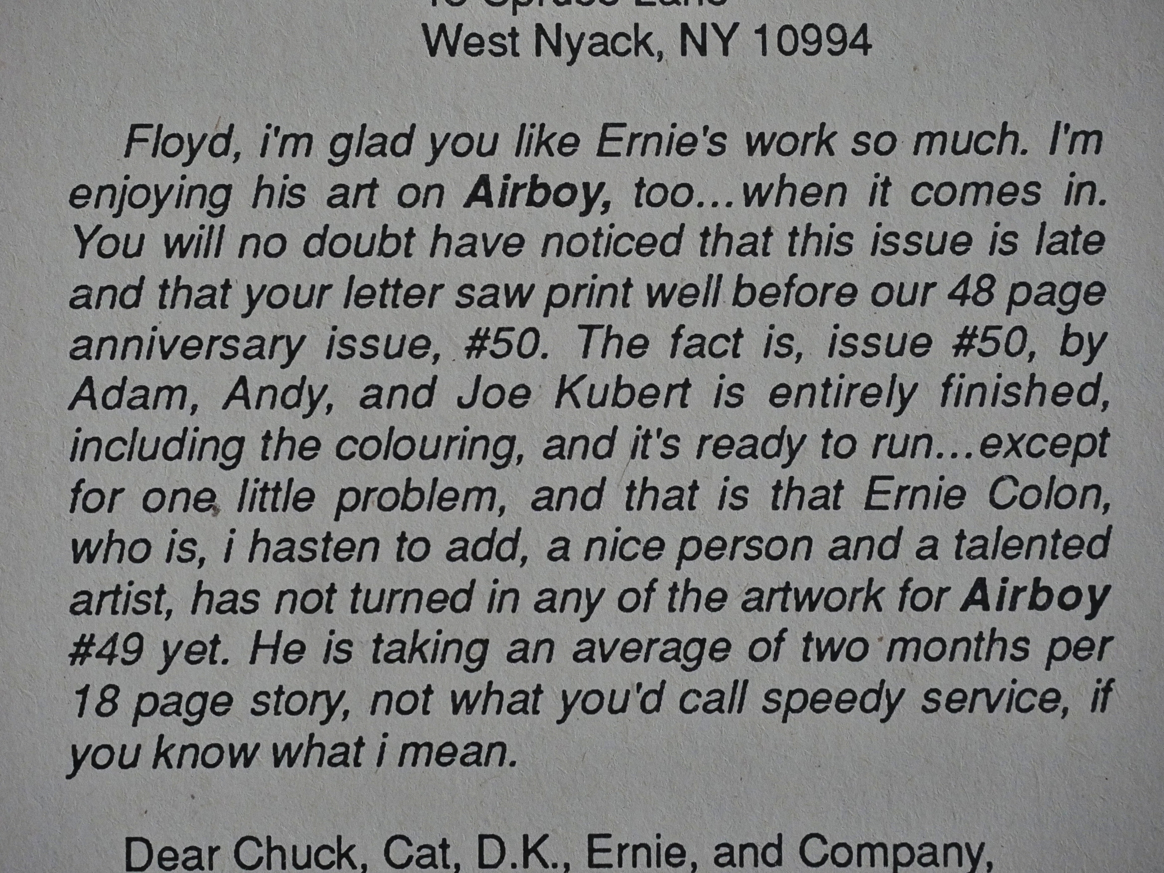
yronwode continues with the under-the-bus throwing by pointing out that Colón is incredibly slow.
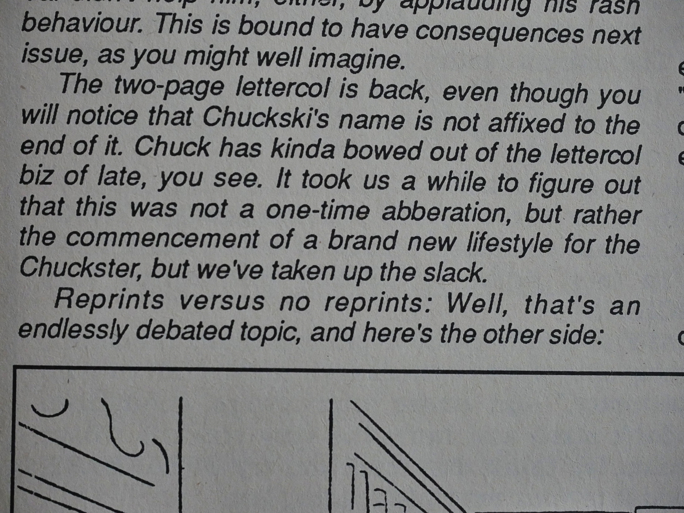
And then Dixon lands under the bus, too. yronwode writes that he simply stopped doing the letters column without informing her. You get the feeling that there’s drama going on behind the scenes. Around this time other Eclipse creators were complaining about not being paid or getting paid late, so perhaps that has something to do with it.
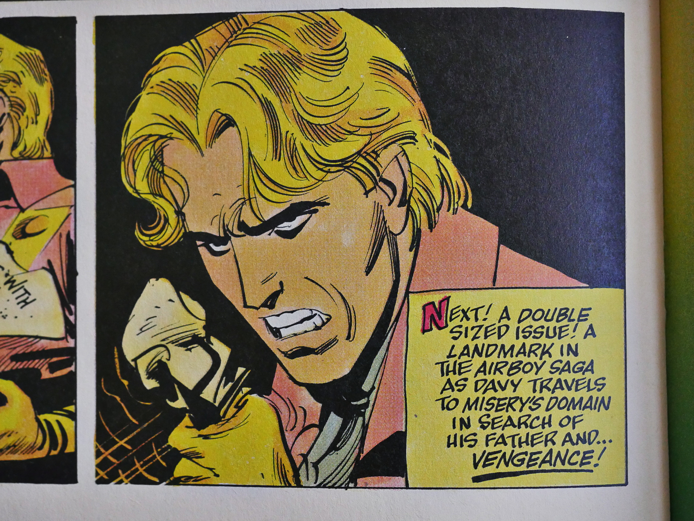
And then the Colón 72 page epic ends… with a non-ending.
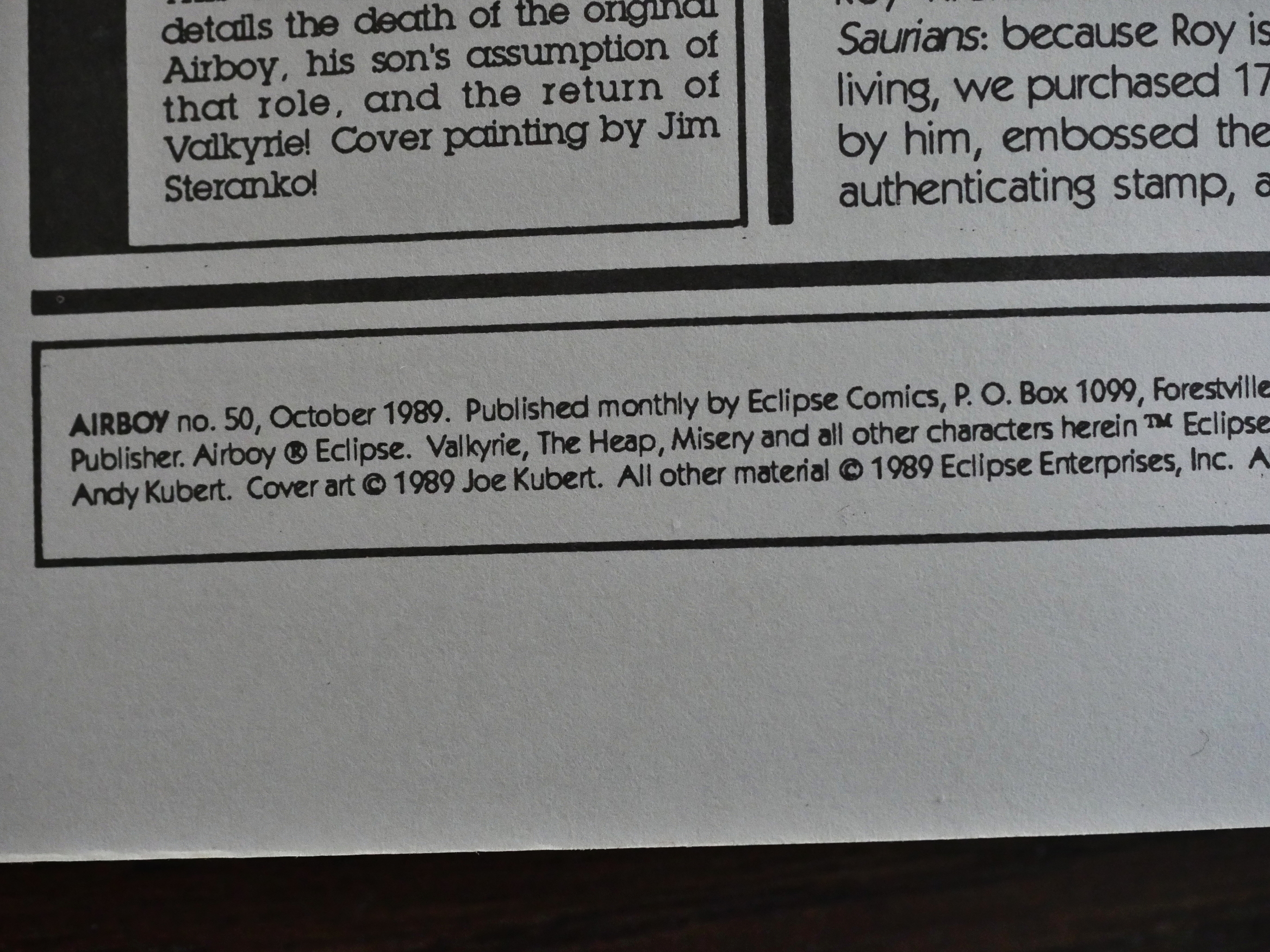
Despite yronwode claiming that all the delays were Colón’s fault, there’s a four month gap between the last Colón issue and the final issue, drawn by Andy and Adam Kubert.
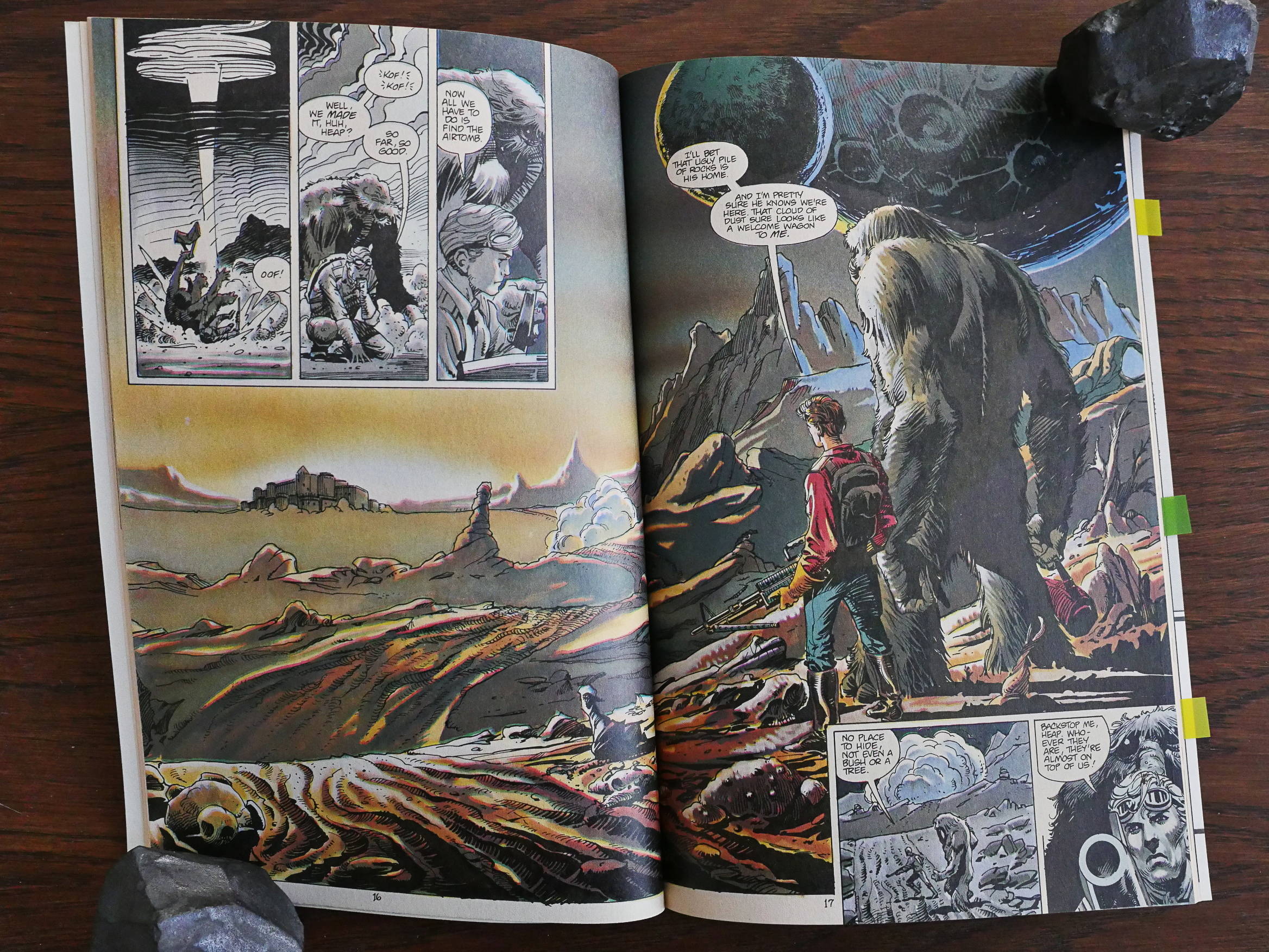
And it looks rather nice. Adam Kubert is the finisher (both ink and colours), and it’s the best-drawn issue after Stan Woch left.
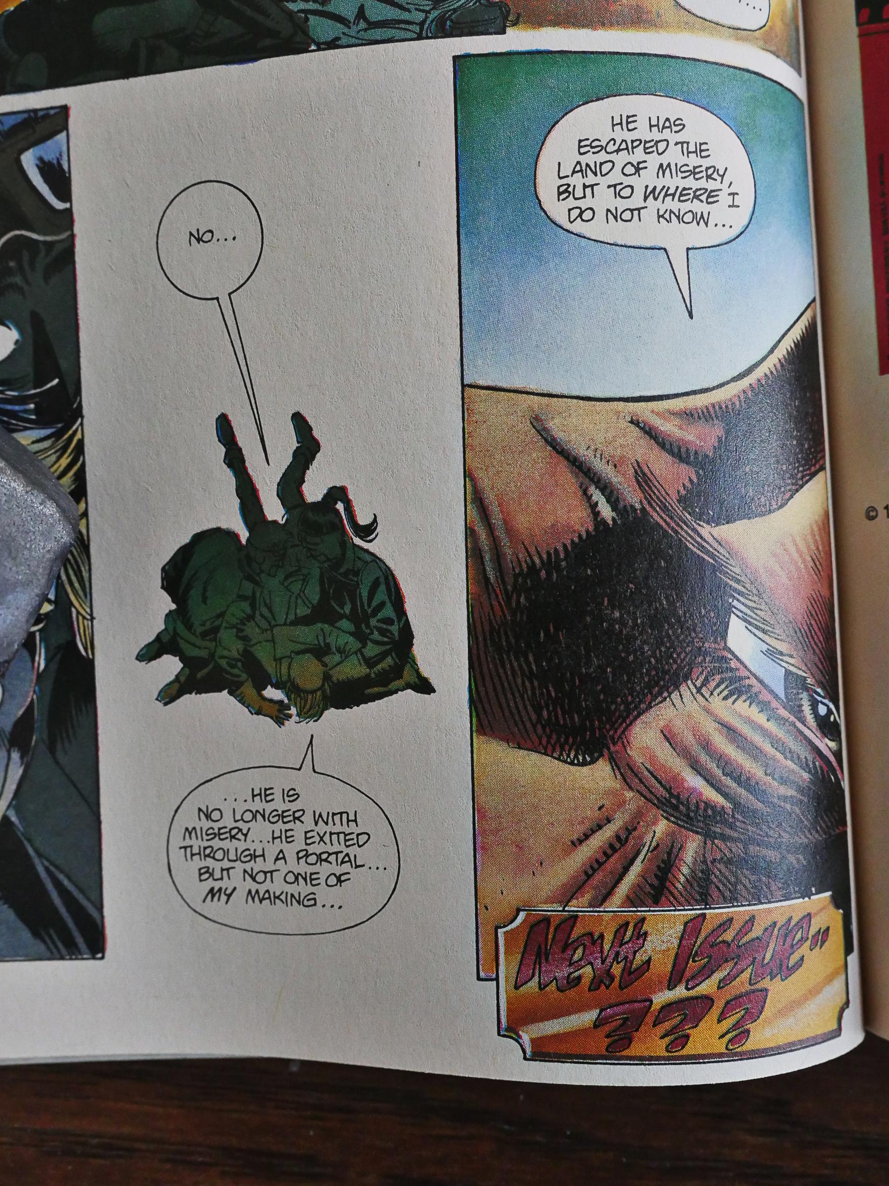
And of course, the final issue ends on a cliffhanger.

*sigh*

You’ve got some splaining to do, yronwode!
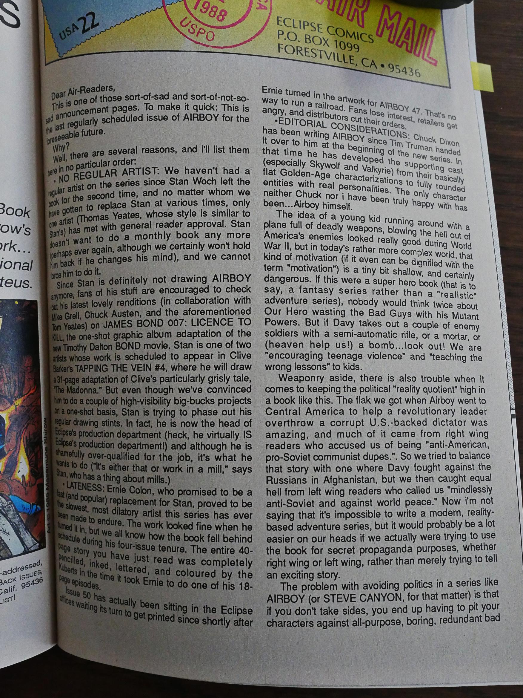
Which she does, over two pages. She laments there not being a regular artist on the book; Stan Woch elected to start working in Eclipse’s production department instead!

She then throws Colón under the bus some more.

She says that she never liked the Airboy character. (But the supporting characters are nice.)

She says that the politics of the book were complicated, and she points out that she was the one who added the downer ending to the Afghan story.
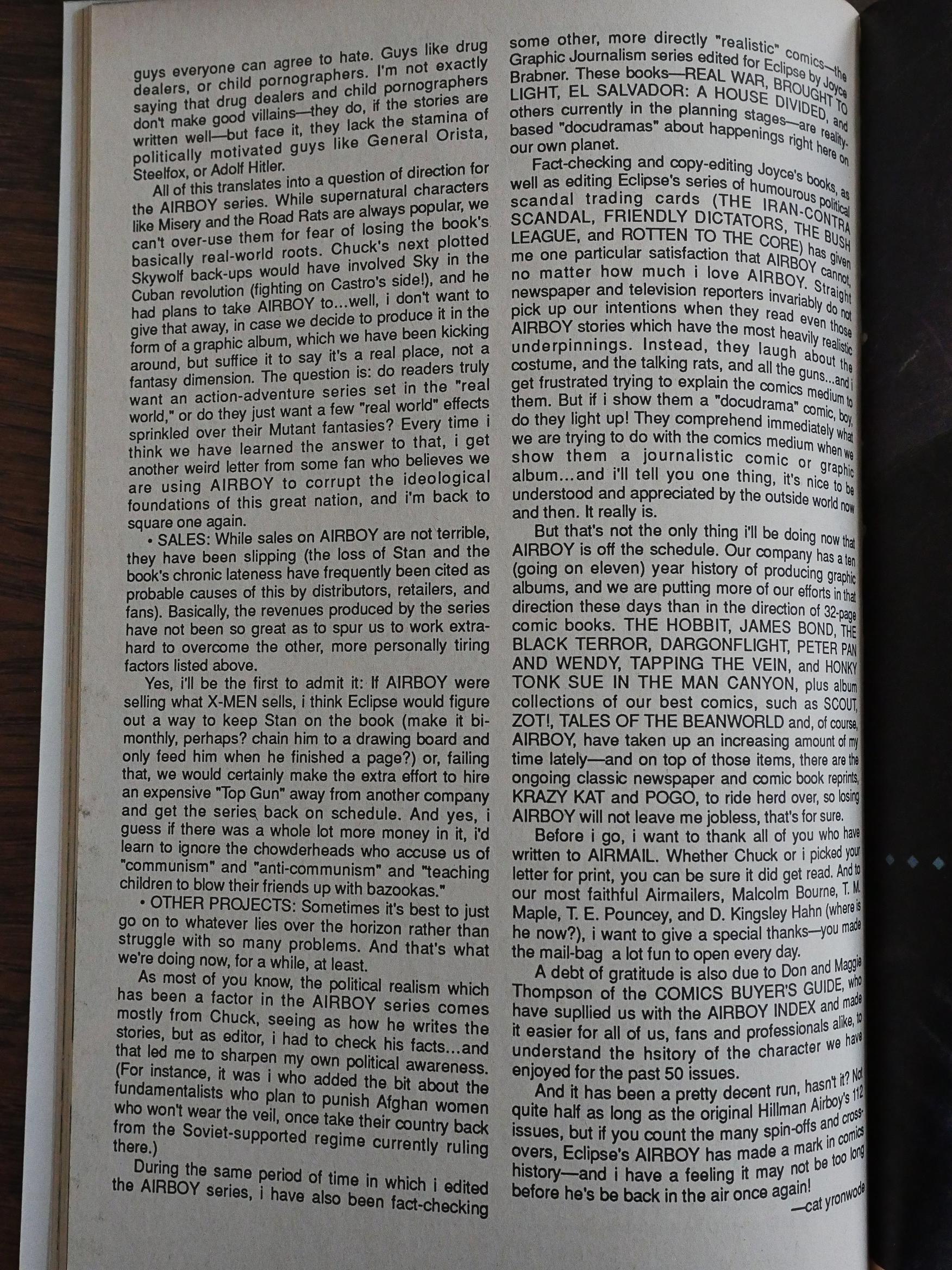
She says that it’s boring to use “drug dealers and child pornographers” as villains (as Dixon had just done in one of the preceding storylines) when you can have dictators instead.

She says sales we OK, but not good enough to outweigh these issues, especially when she gets so much more acclaim from doing “docudrama” books like Brought To Light than a stupid adventure comic book.

I’ve been paraphrasing slightly. Slightly!

I’ve got my crystal ball out, and this is what I guess happened: Dixon was chafing under editorial constraints and stopped giving a shit. Sales tanked and Eclipse cancelled the book.

So there you have it: I was pleasantly surprised by this series. It’s a nice, fun, diverting read, and sometimes the artwork is good. It’s not going to win any prizes for anything, and it’s difficult to find any reviews from this era, because probably nobody reviewed it.

I found this mention in The Comics Journal 112, from an article by (who else?) Heidi MacDonald:

Of the two, Airboy, written by Chuck Dixon, inked by Tom Yeates and pencilled and edited by Timothy Truman is the more bearable. ‘Course that’s partly ‘cuz Dixon and Truman have inherited a pretty good mythos, complete with a gimmick vehicle (Birdie, the plane with wings that flap), a really rotten villain, and a femme fatale. There’s a ton of “Karate Kid” (Macchio and Morita version, not DC’s) in the scenes of Airboy and his mentor, Hirota, but Airboy remains a dashing enough lad. Soon to come is the Heap, who was actually the predecessor of all those other muck monsters in the comics medium, shambling through the swamps while Swamp Thing and Man-Thing were mere saplings, or tadpoles, or whatever. Yeates is a good inker for Truman, relieving some of the latter’s grimmer tendencies while preserving his strong layouts. The problem with the book is the frantic pace, doubtless featured because the story is a mere 14 pages, which just isn’t long enough for today’s weak comics scripters. After 14 pages, they’re just getting started, and, unfortunately, even with the bi-weekly frequency, confusing, seemingly thrown together fight scenes comprise the majority of the plot line. Characterization has to step aside for action and exposition is shoved in the most graceless fashion.

Not a very positive reaction, but it’s apparently just based on the first two issues.

The entire Airboy series (spin-offs and all) was reprinted by IDW over the last few years as a series of omnibuses. Dixon and Truman gave some interviews:

Do you have a favorite memory of the series or a favorite character or scene?

Dixon: It was all fun. Even behind the scenes, with a Barry Goldwater conservative writer working with an editor who was a self-avowed communist.

Truman: Well, if you mean me, an unrepentant lefty, anyway. But I’m hardly that far left. Cat? Well, maybe. Whatever the case, the different viewpoints made a good mix.

I had no idea that Dixon considered himself to be a conservative. He hid it pretty well.

Over the years, Dixon has returned to Airboy a handful of times, and I’ve read a couple of the efforts, and they’re still OK. But the most famous appearance of Airboy recently was the James Robinson-written miniseries that was very controversial. I read it yesterday, and it reminded me why I’ve never enjoyed Robinson’s work: It’s maudlin and thinks that it’s way more interesting than it is. It’s got a couple of fun scenes. If he’d cut the dialogue down to about a quarter, it might have been an OK series.

So there you go: The longest blog article in the history of the Internets.

1986: Adolescent Radioactive Black Belt Hamsters &c

Adolescent Radioactive Black Belt Hamsters (1986) #1-9, Adolescent Radioactive Black Belt Hamsters 3-D (1986) #1-4, Clint (1986) #1-2, The Adolescent Radioactive Black Belt Hamsters Massacre the Japanese Invasion (1989) #1 by Don Chin, Parsonavich, et al.

Hey, that Eclipse-less holiday didn’t last as long as I thought. When did I sign off? April 1st? Makes sense. But now I’m back!

… with the book that really got black-and-white boom and bust underway. It all started with Teenage Ninja Mutant Turtles, of course, but it hadn’t really yet become obvious that you could shovel any kind of garbage out to the direct sales market, and the stores would buy it all frenetically in the hopes that one of these books would be the next Teenage Ninja Mutant Turtles, selling for megabucks to deranged collectors.

So this book is the first (I think) of the parodies of Teenage Ninja Mutant Turtles, and it was quite successful, getting a second printing (which is what I have here), even though there’s not much to recommend the book.

Parsonavich seems to be inspired by… Moebius? Via Frank Miller’s Ronin? With a heavy dollop of old-school underground sloppiness. Hm… Is there also a Matt Howarth thing going on with the way he uses all those semi-dotted lines?

But while he’s got good influences, he’s not what you might call actually, er, good.

But what charms the book has, it’s all Parsonavich’s. It has a weird personality, and it’s fun looking at some of these pages. But then you start reading it and oy vey. There’s one hopeless pun after another, and nothing makes much sense, and there’s a feeling that surely the writer must be a sixteen-year-old. It’s not a bad book for a sixteen-year-old, but it’s a bad book. And Chin was twenty-three when he wrote this.

The panel above is from a sequence where the gag almost landed: It’s a Kung Fu training montage, and one of the things they learn is how to tie their shoes. That’s kinda funny, right? But… that’s a fun as it gets.

I tried my best to pretend that I was twelve years old again, and just stop being so critical, and try to enjoy the silliness, but it’s not silly enough.

The fake pull quotes on the rather nicely designed covers are… there. The design is cribbed from Ronin, of course, but it’s still a nice design.

Parsonavich is very uneven, but sometimes he does these panels that are like a swirly storm of little non-crotchy lines, and it’s rather nice. It’s like if a mid-70s Moebius had gotten stoned and really obsessive.

These issues are jam-packed. There’s usually thirty story pages, with almost no house ads, which is very unusual for Eclipse. This does mean that we get backup stories that aren’t even up to the standards of the main feature, like this one by Kevin Harville and Herb Wood.

Right from the start, it’s obvious that Chin is very enterprising. In issue two he announces a spin-off miniseries, a 3D miniseries, and over the next issues he’ll announce a colour graphic novel, a possible video game, a role-playing game (none of these happened), and a Commodore 64 game that he designed himself and was selling. So he’s very… er… entrepreneurial, and perhaps that’s where his attention was focused. It was not on writing good jokes.

None of the other artists involved (here’s Herb Wood and Mike Dringenberg on a fill-in issue) seemed to pay any attention to Parsonavich’s character design. You can tell who each of the hamsters are by the eye spots and the mohawk.

Chin writes that it’s been rumoured that the first issue was selling for $85 somewhere in the country. Yes, this book was a winner.

They even toured comic book stores in California.

That’s almost like a joke! (They meet Eclipse’s new acquisition The Heap, and he’s looking at his reflection in the water. Just in case you’re having any difficulty parsing that panel.)

Chin helpfully explains the chronology over the various series. NICK here is Naive Interdimensional Commando Koalas, or whatever they were called. That book is published by Independent Comics Group, which is a subsidiary of Eclipse I wasn’t aware of, and won’t be covering in this blog article series. That book is the only comic book they published: All the rest are character indices, like The Official Legion of Super-Heroes Index. I wonder why Eclipse set up that entity. To protect themselves from being sued by DC?

And then Parsonavich leaves without any replacement artist having been decided upon…

… and when he leaves, the trade dress of the book changes completely, and it starts looking like a normal Eclipse book. It’s not just on the outside, either: We now get a shorter main story and house ads and all that stuff, so I wonder whether Parsonavich was the designer of the book, too, when he was around.

The new artist is Sam Kieth! He’s a wonderful artist, so how did he end up here?

Things change a lot when he comes in: Things get genuinely weird instead of just being random. That monster is The Toe-Jam Monster from Atlantis. Yes. Then things straighten out a lot and we get actual plot, and one of the hamsters apparently dies, and there’s a lot of staring into the sunset and thinking about life and stuff and it’s all wha?

Wha?

It’s still not good, though.

And they’re stepping up the publishing schedule, too!

And getting Mark Martin to do backups! What’s going on?

Well, they’re cancelled one issue later.

The final issue is all shorter pieces by a variety of people. Parsonavich also returns for some pages, and his artwork seems to have regressed. Or perhaps he doesn’t give a shit.

Chin explains that the book is cancelled by “personal choice”. And also because of “an unhealthy trend in the comic book market”. I assume that the sales had tanked because the black and white boom had become the black and white bust as retailers realised that this stuff is unsaleable.

18 months later Chin makes another go at it with a single issue about the “Japanese Invasion”: Japanese comics were becoming popular in the US.

I’m guessing this didn’t really work out, either, because there’s only one issue.

So let’s go back to 1986 again and the other spin-offs. First we have the incredibly sharp-looking 3D issue drawn by Ty Templeton.

The 3D works great, and I’m assuming that the funnier jokes are Templeton’s.

Is this Templeton? Hm… It’s variations on the old weakling ad trope…

That joke is probably all Chin, though.

All these 3D issues were published at a speedy clip, with a different artist on each issue. Gotta cash in before the 3D fad fades. Tom Sutton does an issue, and while he’s a funny artist, his artwork is so busy that it doesn’t 3D very well.

There’s so many details that partially overlap that it all just turns into mud. At least for my eyes. Nothing to focus at.

Finally, and least, we have the Clint two-part series. The cover looks like we’ll get a parody of Frank Miller’s Dark Knight Returns, but instead it’s a parody of Frank Miller’s Elektra: Assassin.

This is probably the funniest bit: It’s where the letterer discovers that he can beat up the penciller and inker just by writing sound effects in the parts of the (black) panels they’re standing in. I haven’t seen that done before…

Chin stated in a letters column that this book had sold half a million copies, and I assume that’s over all the issues.  That’s an insane amount of hamster copies to be floating about.  You can still pick up “near mint” copies of #1 for cover price.  If you want to.

Chin went on to start Entity Comics, a small publisher in the 90s of whom I know nothing.

But what did the critics think?

From The Comics Journal 110, from an unsigned piece that I assume is Heidi MacDonald:

You may recall that I was less than enchanted with the first issue of Adolescent AOOLESCENT RADIOACTIVE BLACK BELT HAMSTERS Radioactive Black Belt Hamsters The second issue is now out, and I really don’t want to sound like a broken record, but this is very lame stuff indeed. Sample: Man to Hamsters: “Youse guys ready to paint the town?” Hamster. “Where we gonna get that much paint?” Enough already. On the tive side, there is a slightly amusing Frank Miller joke on page 12, and this second outing is a bit better than the first. Perhaps the intended effect is • ‘Hey this is so awful it’s fun,” but even that is negated by an unfunny-bordering-on-offensive view Of Harlem (a charge which writer Don Chin tries to deflect by having characters in the story complain about it, but that still doesn’t make it funny). I might also point out that art is a textbook case Of how not to swipe from Moebius. The effects which Moebius uses for variations in shading, Parsonavich slathers over everything in sight, making each and every panel literally undecipherable. His draftsmanship is nonexistent. (Look at the last three panels of page 13, for example, where the proportions of Chin and Parsonavich vary in every single panel.) Seriously, this is such bad work that it’s all too easy a target. I’ll refrain from any further punishment. I only wish that Chin and Parsonavich would do the same.

Ouch.

Issue 112:

Although I vowed to stop talking about the Hamsters, circumstances have forced otherwise. Adolescent Rad. etc., #3 features art by Herb Wood and Mike Dringenberg, which manages to make Parsonavich’s—bad as it was—look definitive.

True.

1985: Comics & Sequential Art

Comics & Sequential Art (1985) #1 by Will Eisner.

After advertising this book for years in other Eclipse publication (along with other books that weren’t published), Eclipse finally published the first version of this book in 1985. It’s album sized, black and white, squarebound, and…

… apparently extremely popular. Or Eclipse only had money to print tiny runs every year. The version I have of this book is unfortunately not the original one; this one is published by Poorhouse Press.

I’m cheating on the premise of this blog series! Oops!

Eisner explains the origins of the book: These texts were originally published in The Spirit magazine (published by… Kitchen Sink? I forget. Or was that Will Eisner Quarterly? I’m confused).

But most of all, these were probably written to be used as lecture notes, and the book itself as curriculum at The School of Visual Arts in New York, where Eisner was lecturing for quite a while. I’m not quite sure what the age range of the students there are, but this is a very… how shall I put this politely… dumbed-down book.

I FAILED!

Eisner explains in a common-sense way how to use various elements to build a story and to convey emotion. If the character you’re depicting is angry, do this or this. If you want faster action, use smaller panels. And so on and so on. It’s not that the things that Eisner says sounds like bad advice, but it’s like reading a manual for an auto mechanic: Eisner doesn’t open up possibilities, but seems intent on saying that “This Is So”.

The prose style gets on my tits, too. There’s always an attempt at classing things up. Sure, it’s a book on comics, but it’s “sequential art”. And to explain how time is measured in panels, he naturally brings in the special theory of relativity by Einstein, because, sure! That’s a relevant thing! It’s high class!

About half the pages are like this: They reprint Eisner’s Spirit strips or his newer work, and he explains how much thought has gone into his smart storytelling choices. (There’s absolutely no non-Eisner artwork in this book, which I guess makes a lot of economical sense.)

But his explanations alongside these pages are often more than a little head-scratchy: Here he says that the woman is stabbed in “centered on the page”. I had to get out my slide rule and do some really heavy calculations here, but the stabbing turns out to be not centred at all: It’s below the centre vertically and two thirds to the left horizontally.

How can any student read “is testimony to the discipline and restraint that is required” (written by an artist about his own work) and not want to rebel and leave the SVA class in disgust?

Eisner is so good at finding appropriate things to bring into these notes: Here we have a sentence from Hans Prinzhorn, “Artistry of the Mentally Ill” that’s so… relevant.

I could go on, but I won’t. Lucky you.

I googled around a bit to see what he was like as a teacher. Here’s Ray Bilingsley:

Will was gruff. He wasn’t a teacher that played around. We’d be sitting in the classroom talking and when he came in, everybody got quiet. He wouldn’t say a word. He would walk to the front of the class to his desk and sit down. He would start his lesson and he didn’t care if you paid attention or not. As he would say, he already got paid. He said, you can play around, you can not be serious, I don’t care. I’m here to teach the people who want to learn.

So, just like the book, then.

A Short Break

In the Eclipse chronology, we’ve now reached 1986, and I think this is a place that makes sense to take a few months break from reading and typing stuff about Eclipse. Primarily to preserve what’s left of my sanity, but also because we’re at a break in Eclipse’s history, sort of.

Eclipse started in 1978 and wound up its regular schedule in 1992, so 1986 is about halfway there. For the first few years, Eclipse seemed to function as a refuge for high-profile ex-Marvel writers and artists, but when Marvel fixed some of their business practices (instituting royalty schemes and starting the creator-friendly Epic imprint), they mostly all went back to the mothership.

That left Eclipse floundering, but they got a second creative direction in 1984 when Pacific Comics went bankrupt, and for a year or so, the new direction was “whatever Pacific Comics had contracts for”.

The first comic I’ll be covering after the hiatus of this blog is Adolescent Radioactive Black Belt Hamsters, which is the quintessential comic from Eclipse’s third direction: Shovelling whatever black-and-white crap into the direct market that the market would sustain.

Eclipse had gone from being a business created for publishing comics to being a place where comics were being published to sustain the business.

But it’s not all bad. I seem to recall that there’s several good series that managed to sneak in between the Teenage Ninja Mutant Turtle rip-offs, trading cards and attempts at setting up a shared super-hero universe; most remarkably perhaps the introduction of Japanese children’s comics to the US.

I’ve read about two and a half short boxes (seen above) and I’ve got four and a half short boxes (seen further above) to go through, so join me again this autumn. Or something.

1985: Seduction of the Innocent

Seduction of the Innocent 3-D (1985) #1-2, Seduction of the Innocent (1985) #1-6 edited by cat yronwode

This series of books reprints crime and horror stories from various Standard comics from the early 50s. As Standard didn’t really publish that many of these comics (as co-editorisher Jim Vadeboncoeur, Jr. points out), these eight comics perhaps reprint a sizeable fraction of them?

Vadeboncoeur provides a page or two of introductory text in each book, which is very welcome. Eclipse has a tendency to skimp on contextualising the things they’re reprinting.

The first two books are in 3D, but are apparently fix-up jobs that weren’t originally in 3D. The conversion’s pretty good.

The source material is super-risque.

But the best thing about this reprint series is the number of Alex Toth pieces that are reprinted. Super stylish.

Then there’s the regular 2D series, which was originally projected to be a three part miniseries, but was expanded to six issues after the initial three issues were published. Did they sell better than expected, or did Eclipse just find more material worthy of reprinting then they’d expected to?

Oh, cat ⊕ yronwode. Here’s an entire column dedicated to peeving; first about the way airline stewardesses stress certain words, then bounced checks (with a threat to publish the miscreants’ names), and then about people who cut up the comics to send in the ordering coupons.

While the artwork in some of these pieces are great fun to look at, most of the stories aren’t very memorable. The action is choppy as hell and all the stories end with the requisite twist ending.

But these are better stories than you usually see in reprints like this. I’m usually bored silly by the third page when I attempt reading pre-code reprints, but these are pretty inventive strips.

Vadeboncoeur provides a general overview of the comics scene at the time, too.

Hey, Jack Katz (of The First Kingdom er fame).

But the editors obviously preferred Toth (usually inked by Mike Peppe), and it’s not difficult to see why. Toth cycles through a number of styles, like this kinda Johnny Craig thing…

And this very cute style…

But mostly he does a kinda Bernie Kriegstein thing that I was not aware that Toth was doing.

As you can see, these pages are shot from the original artwork which they amazingly enough managed to squirrel out. The result is super sharp pages, probably better printed than they ever had been before. Along with the sympathetic new colouring job, these reprints are head and shoulders in front of the current craze of shooting from printed 50s comics. Fetishising off-register printing is all well and good, but … this is better! There. Let the healing start.

But back to the stories. Here’s a guy in jail who figures out the way to escape is to fatten up a rat because… of what he says above. Were all the writers hopped up on diet pills or something? Because that’s brilliant.

It’s the 50s, so you have a cursed bongo drum because of course you would.

Ooh! Technical details!

And that’s the weirdest thing in this book: A one-page strip from Frank Frazetta about how the hottest place to take your date is a church (or synagogue).

So that’s it. Eight issues of reprints from Standard comics (with a couple of non-standard stories in issue #4), and they’re much better than you’d expect them to be.

1985: Scout

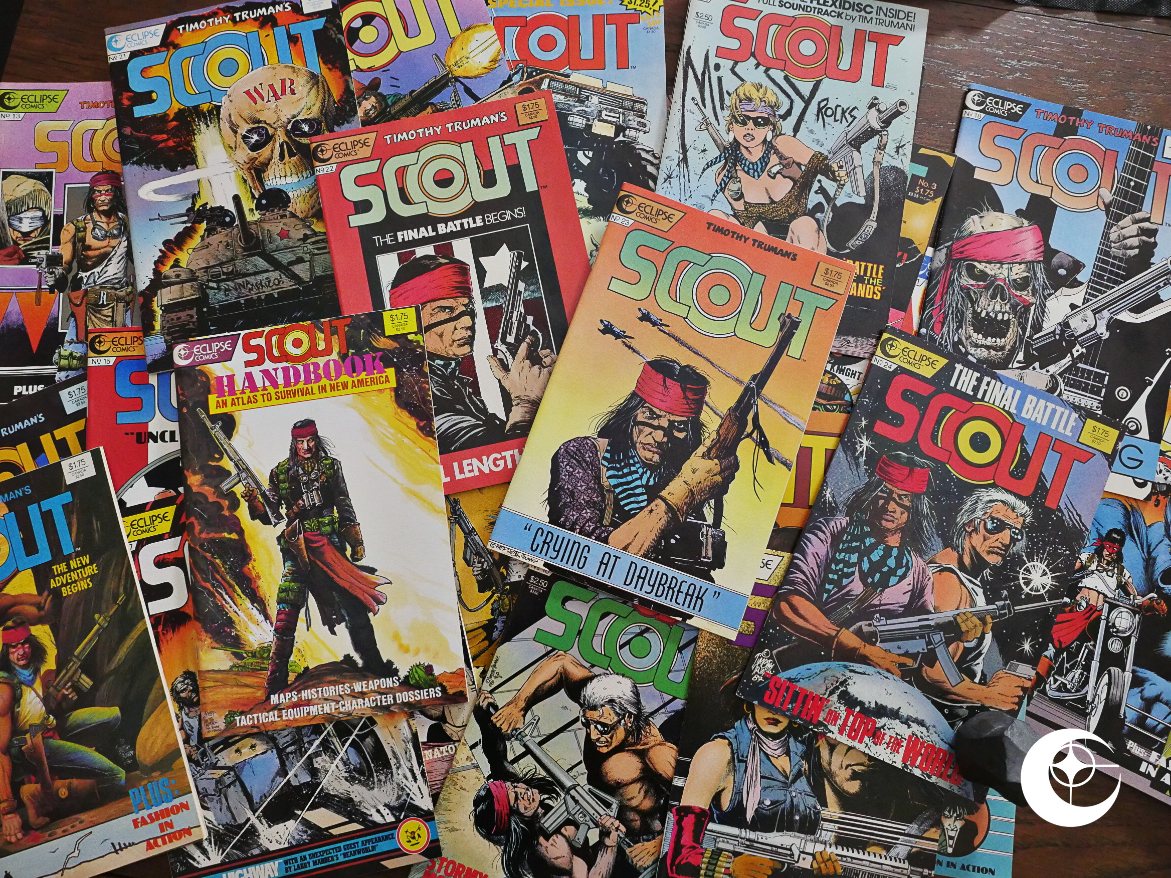
Scout (1985) #1-24, Scout Handbook (1987) #1 by Timothy Truman et al.

I bought a lot of Eclipse comics back in the 80s, but I stayed well clear of the Scoutiverse, so I’ve never read any of these comics before. I don’t even know how all these titles fit together, so I’ve dog out all the ones with “Scout” in the titles and will be doing them in this post, and then the spinoff miniseries in a different post.

Clear? Sure.

(I hope Scout doesn’t have anything to do with the Airboyoverse, which is another thing I know nothing about, because that’d make things even more messy.)

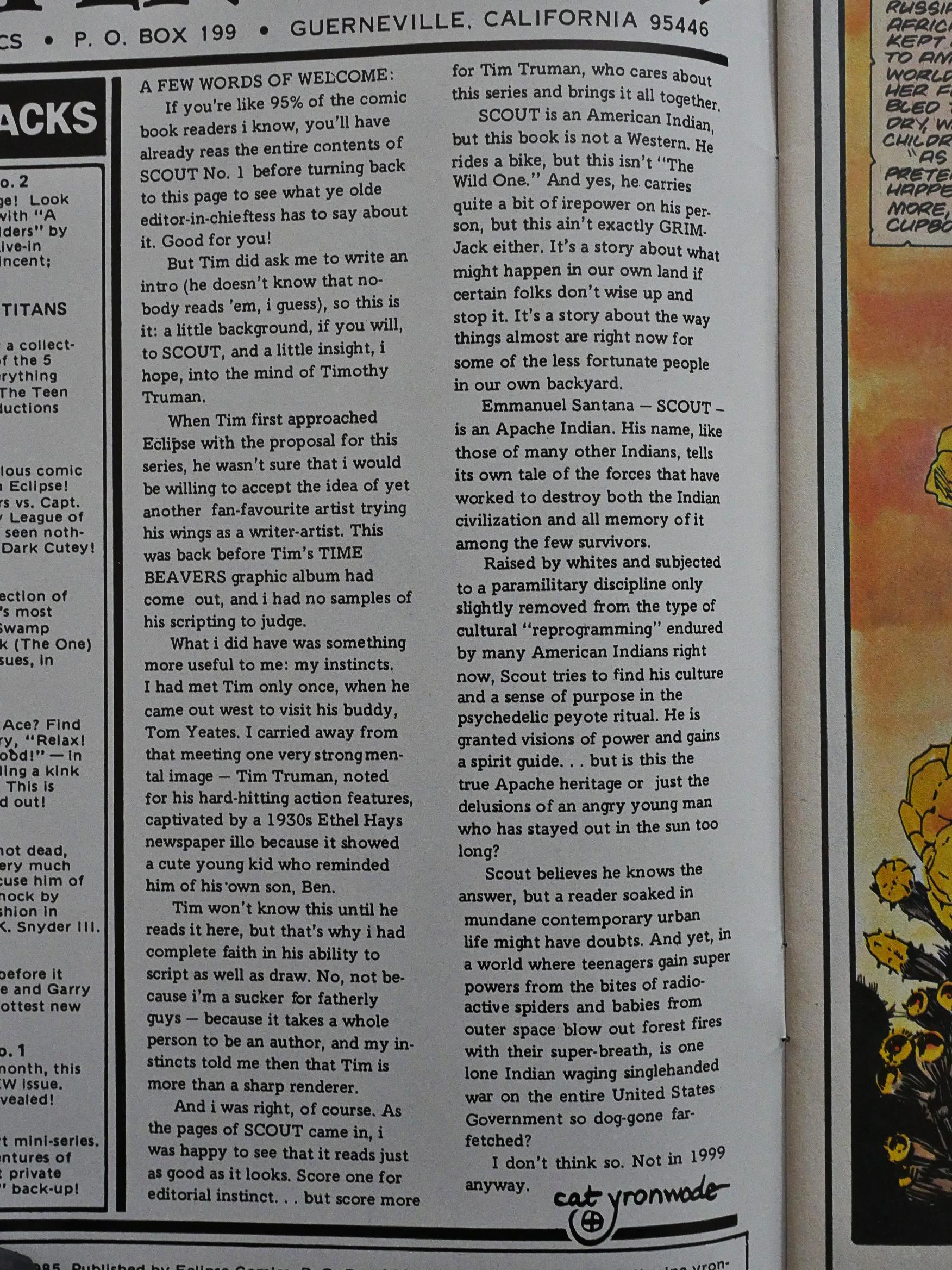
Before starting this, I searched the Comics Journal index to see whether Scout had ever gotten a review there, and it doesn’t look like it. There’s an interview with Truman, but it apparently flew below the radar for them as well as me. But there was a news item about the first issue, that said something like “fan favourite artist Timothy Truman goes from First Comics to Eclipse Comics”, which made me scratch my head. I mean… Fan favourite? But then I see the “fan favourite” thing here in cat ⊕ yronwode’s introduction, too, so they probably got it from her.

Truman had previously done the artwork for Grimjack and Starslayer, but Scout’s his first writer/artist comic. Some artists turn out to not be particularly good writers, but then again, comics by writer/artists are statistically better than when the writer is a separate person, so I’m totes optimistic.

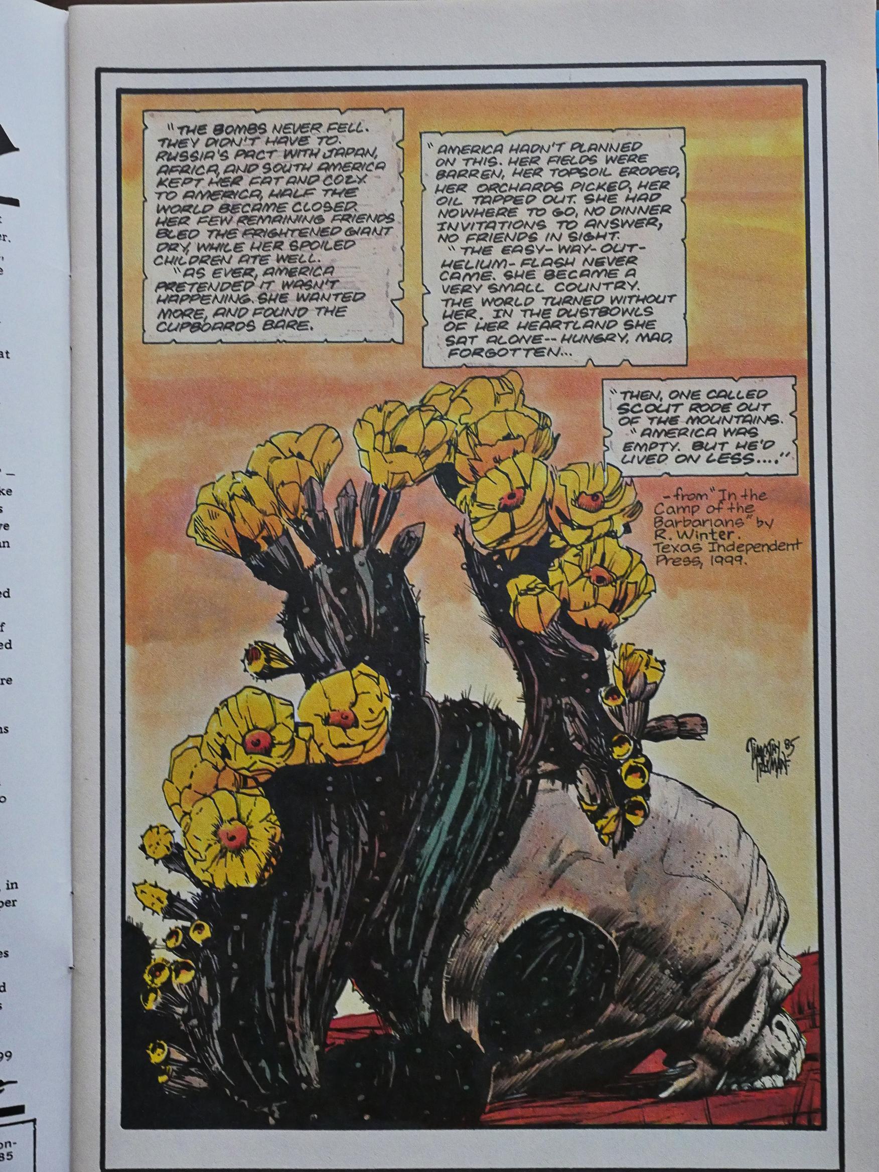
Anyway! Scout’s a sort of post-apocalyptic thing, but without the apocalypse: The US has devolved dramatically due to economic changes in the world. Basically Russia has allied themselves with everybody else, and refuses to trade with the US. In addition, the climate went wonky, and now most people are poor.

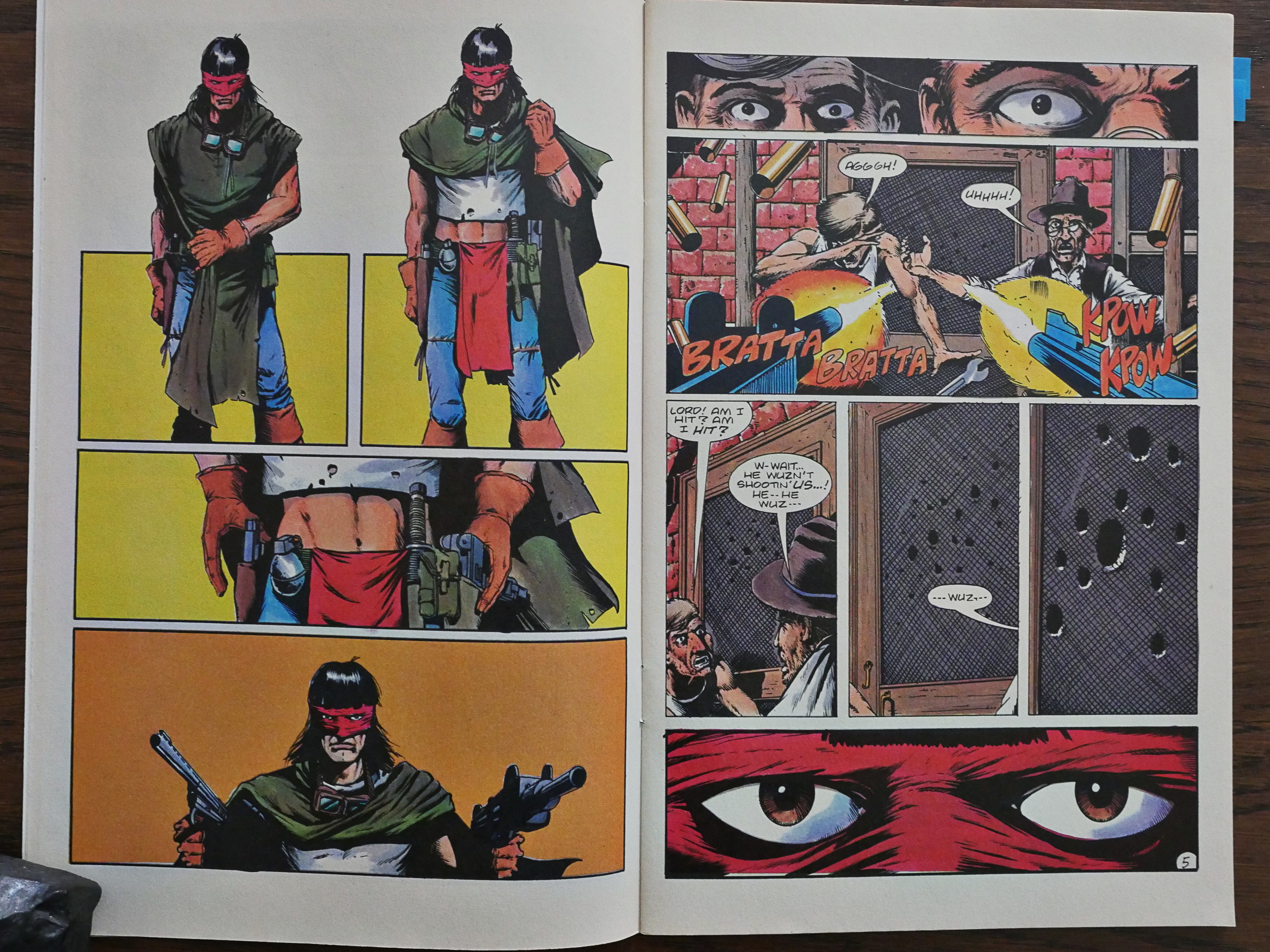
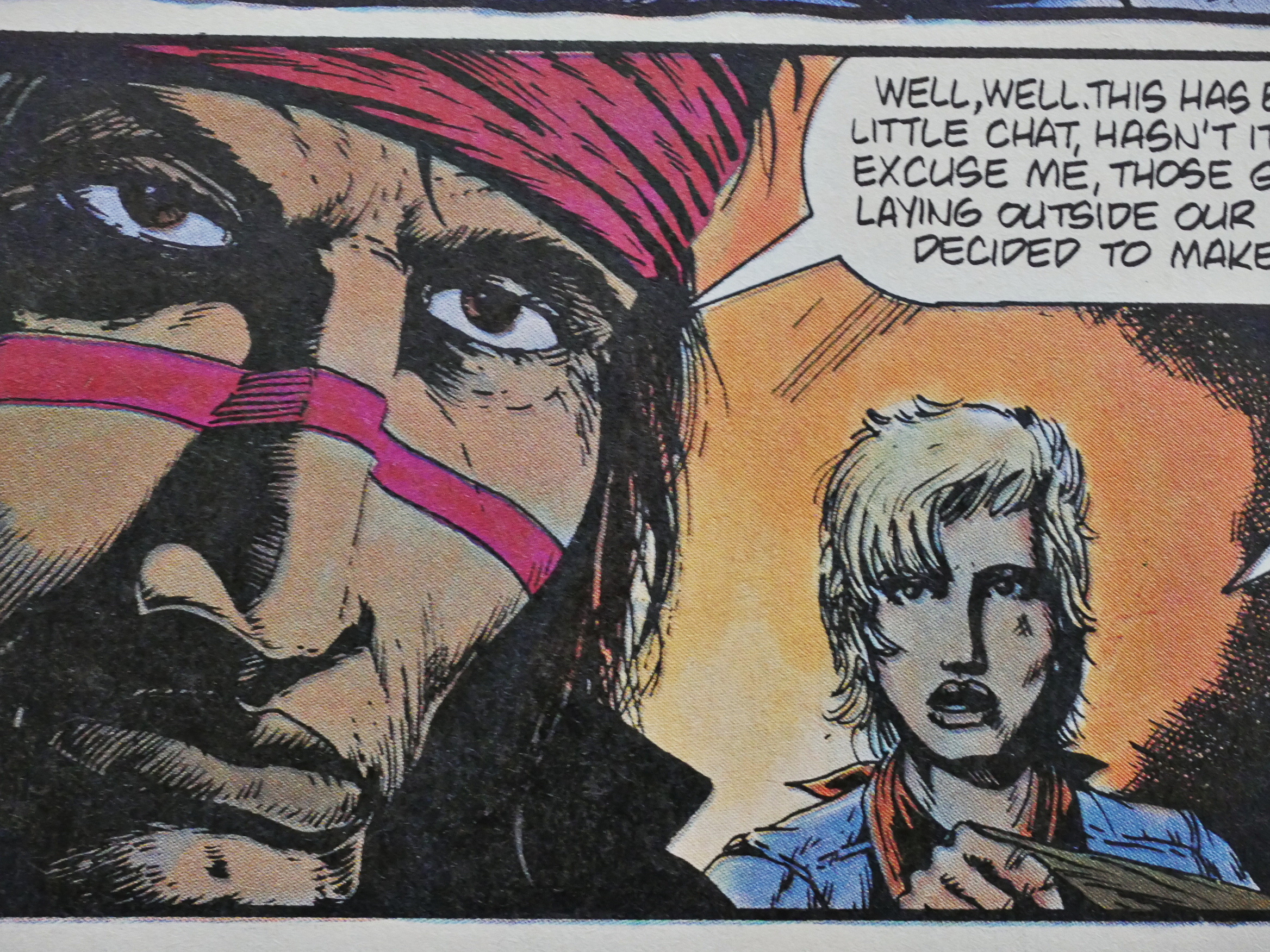
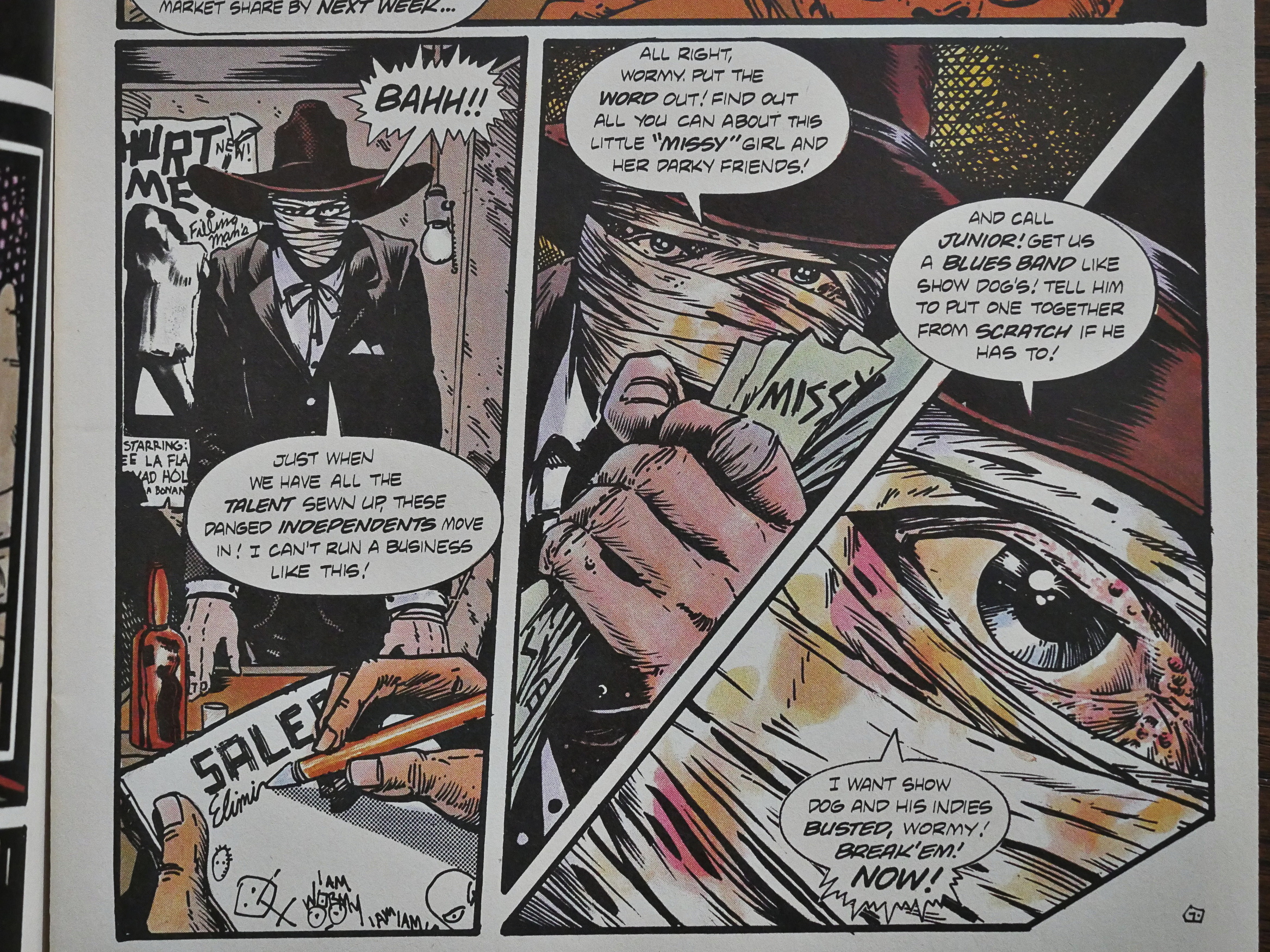
This is the introduction of the Scout character. He rolls in like Clint Bronson, but with a mask and a t-shirt that shows a lot of midriff. How can anybody not love this?

So I totally get the fan favourite thing now.

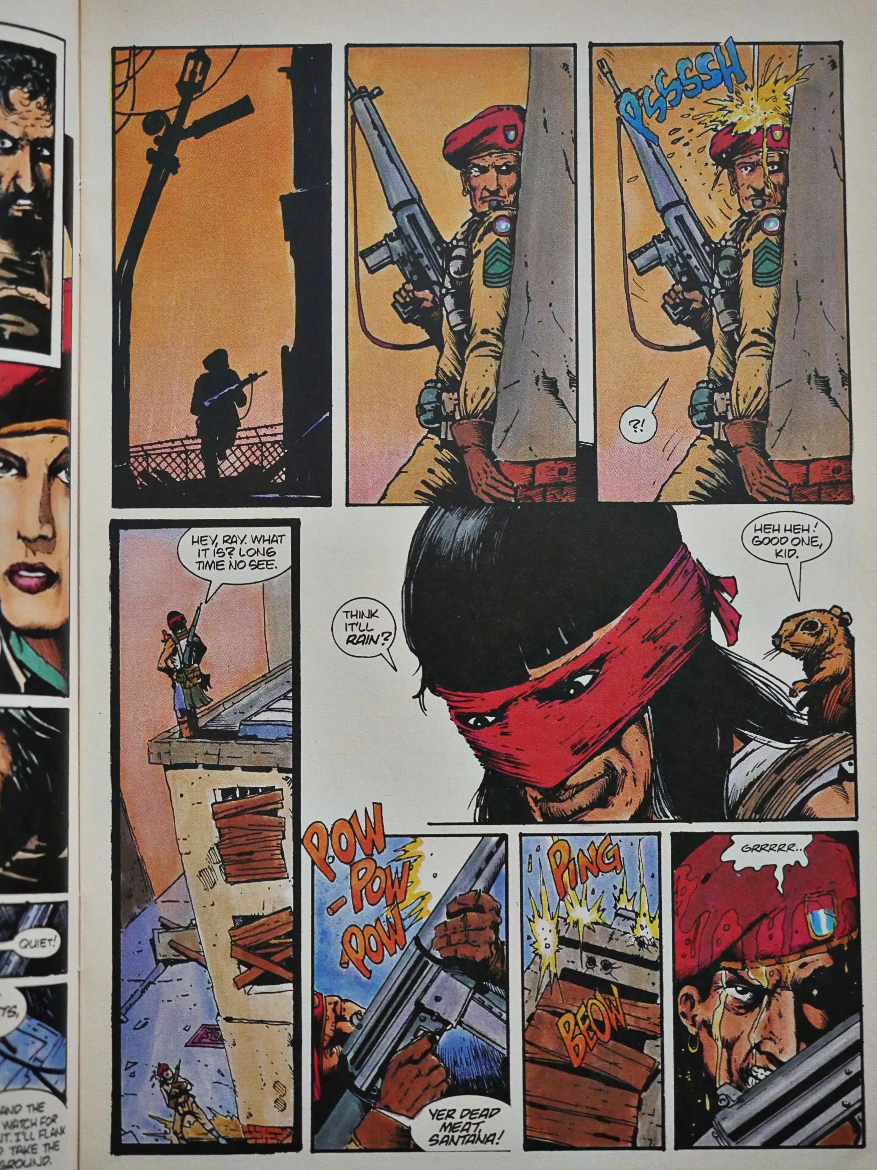
(The reason he’s shooting at the door is that it turns out that there’s a bear behind it. So he’s a good guy, even if he’s got permanent resting butch face.)

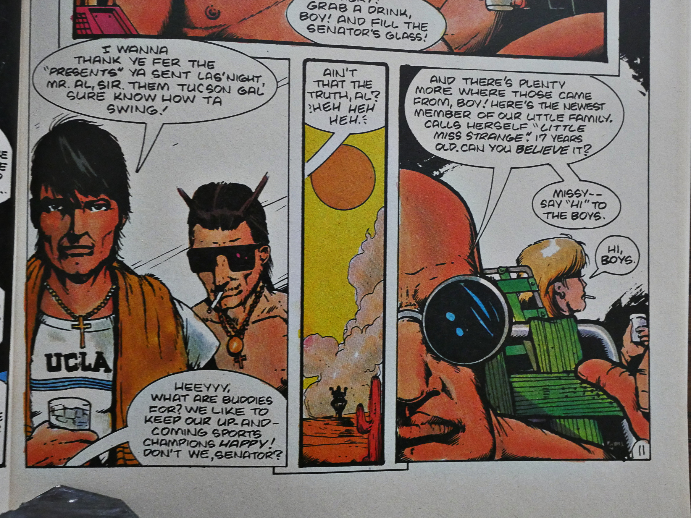
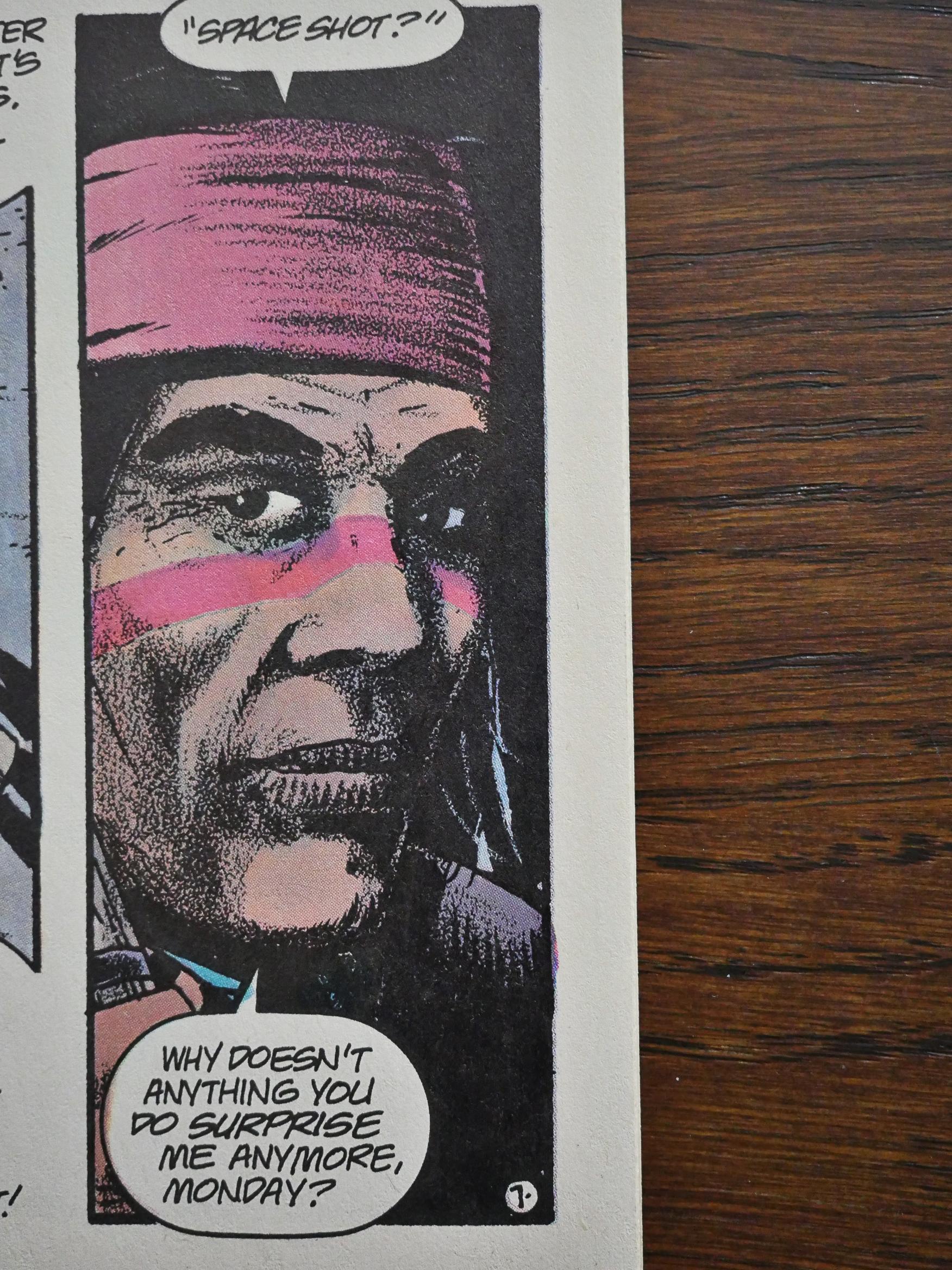
On the other hand, there are many pages like this that are just kinda… blotchy. OK, let’s get the major artistic tic over with first: Everybody has their mouth shut. All the time. And also, Truman has a tendency to show people looking at the reader straight ahead, or in perfect profiles. When he’s got them at other angles, the faces often start looking very odd, with mouths and noses growing weirdly distant or close.

But back to the blotchiness: That guy’s face to the left up there. So many of these panels look like they were either drawn at a smaller size than usual so that the linework just gets blotchy, or was drawn fine but the printer messed up. Or perhaps the pen he was using just had an ink blockage and he didn’t have white-out. I don’t know. It gives everything a dirty, sloppy look… But on the other hand, that might be a conscious artistic choice. It’s a dirty, sloppy world he’s depicting.

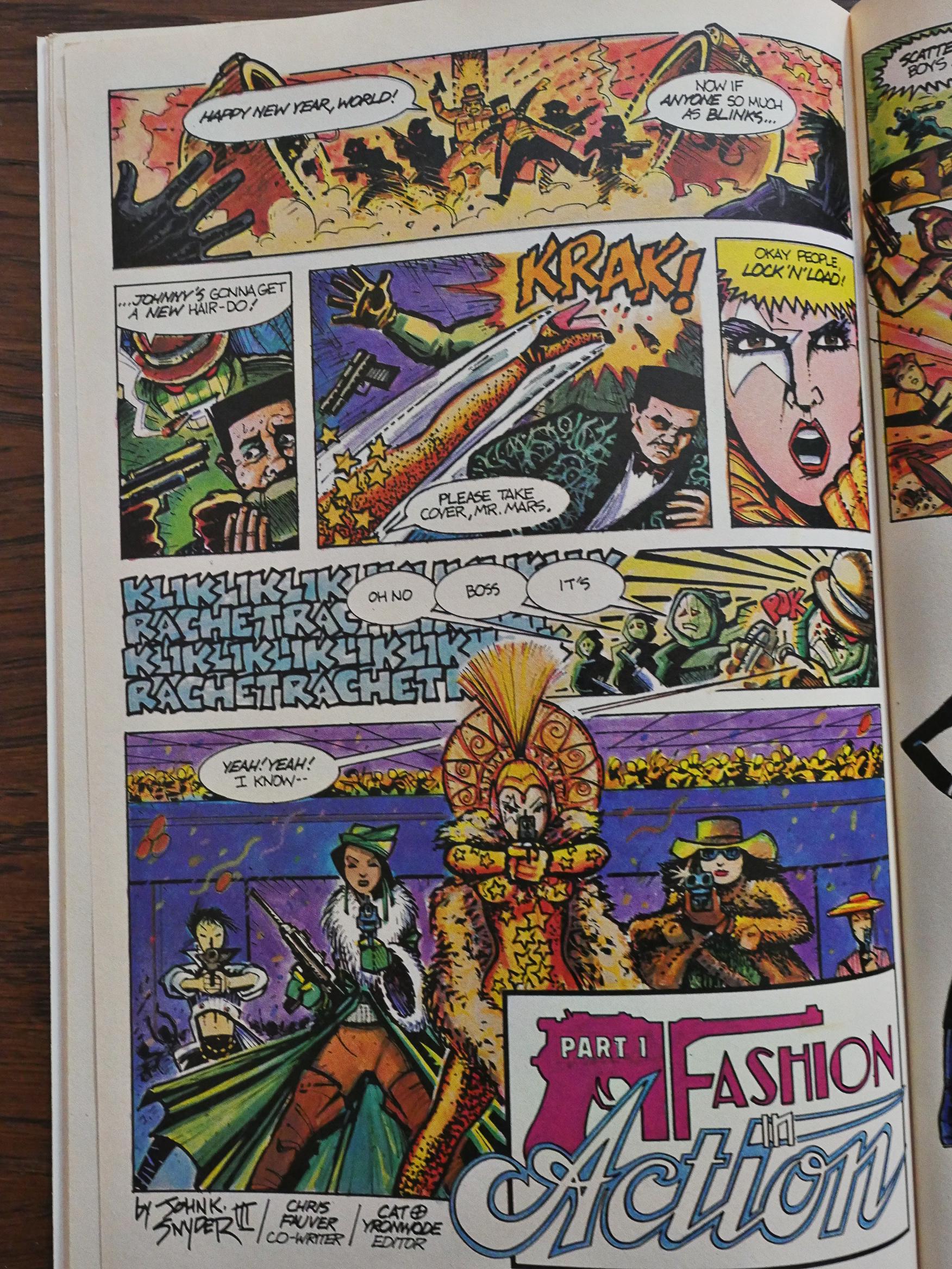
The backup feature is Fashion in Action by John K Snyder III, and it’s quite influenced by American Flagg, I think? You’ve got the stylish, over-the-top action and the attempted information overload and, well, I don’t know, because when you’re doing storytelling like this, you have to convince the reader that there’s something of interest to be teased out from the chaos, and I just couldn’t be bothered.

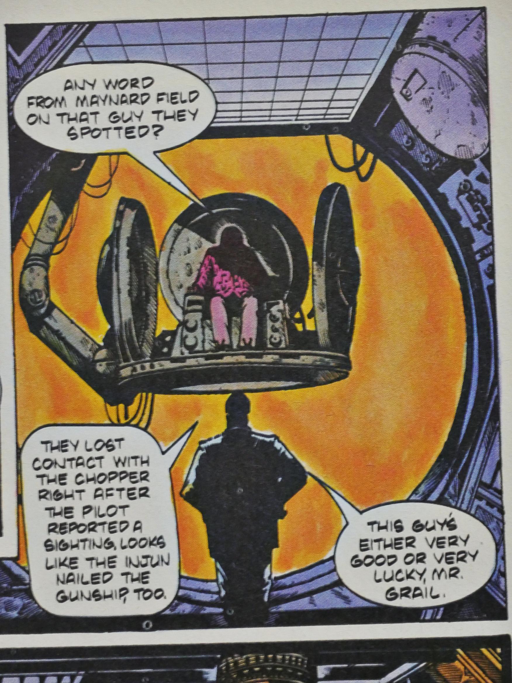
Why do all major villains have impractical chairs? Getting down from that thing to go to the bathroom or fix up a snack must be hell. And where’s the TV and video game system to while away the boring hours when the minions are out minioning? Where’s the coffee table full of Evil Monthly Magazine to peruse?

So impractical.

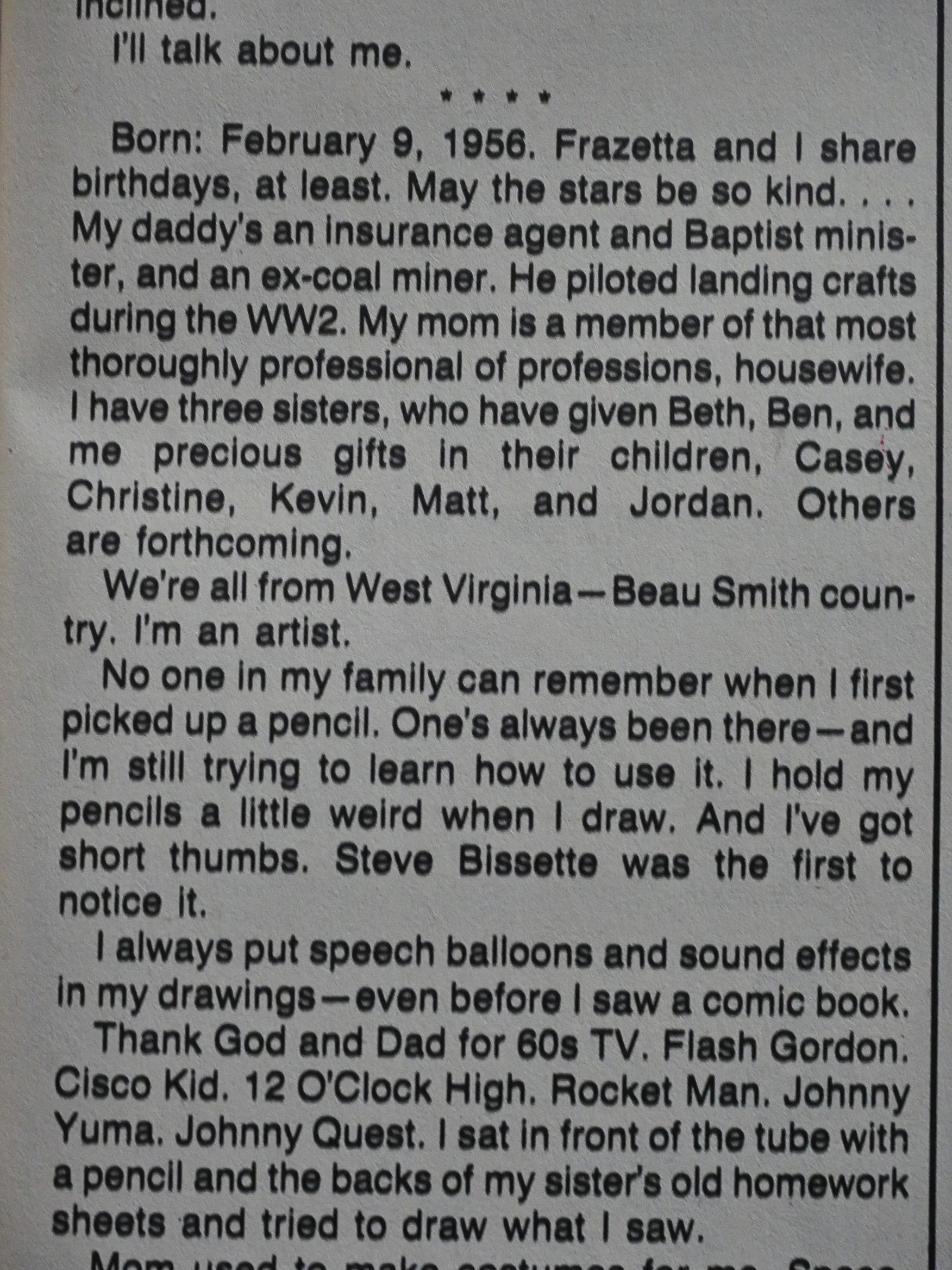
In #2, Truman introduces himself. He’s from West Virginia and his father’s an insurance salesman/minister/coal miner, while his mother’s a housewife.

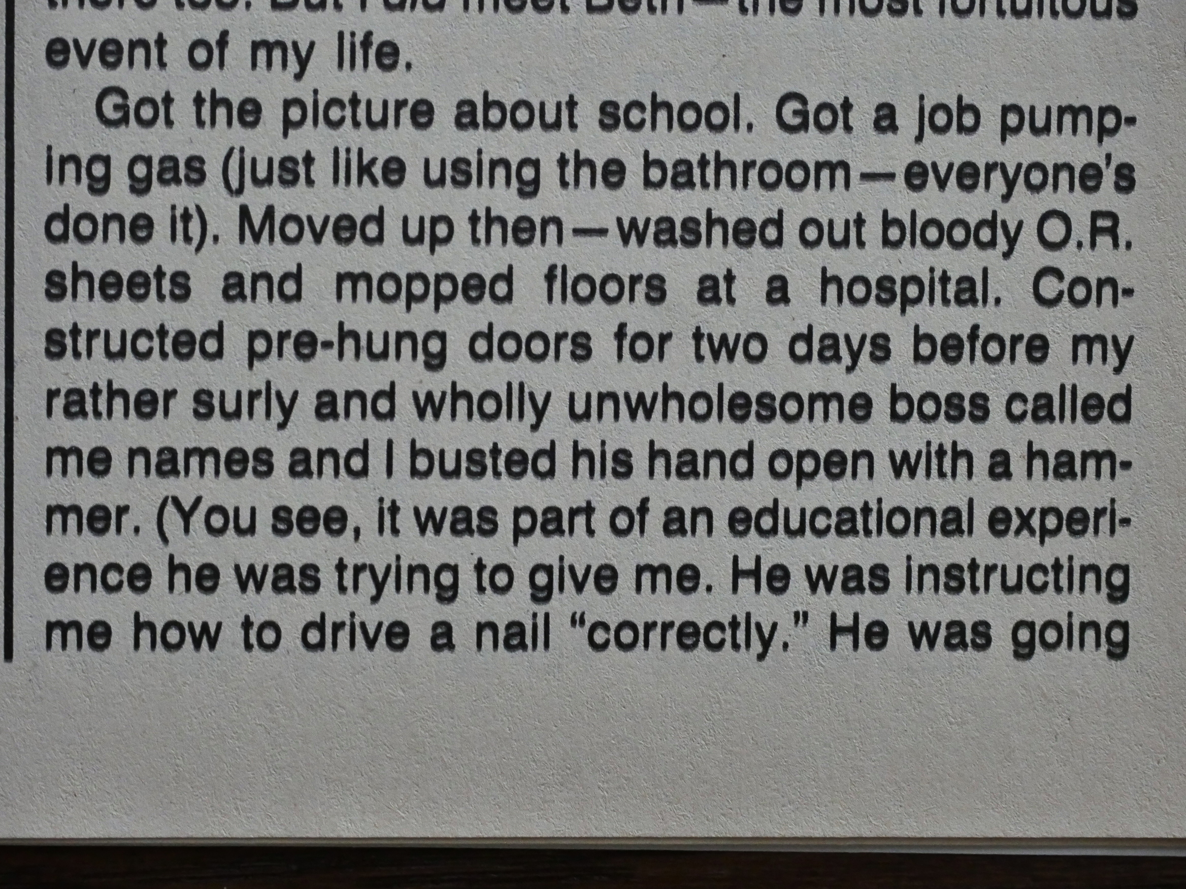
Truman went through many jobs in his youth, and… Either this is him trying to be ironic about his manliness or it’s a display of his manliness? He tells of how he “busted his [boss’] hand open with a hammer”, because…

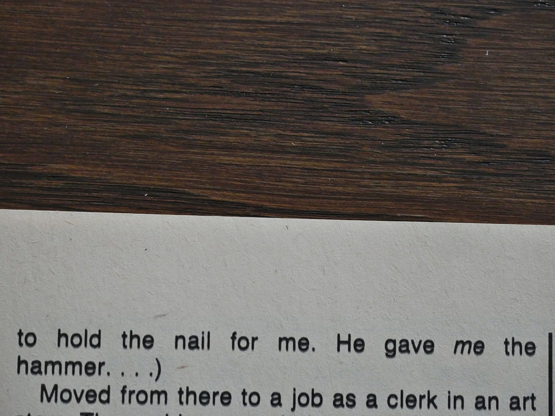
… his boss was instructing him on how to hammer a nail (!) properly (!!) so his boss was holding the nail (!!!) for him?

And… Truman missed? But that’s OK because his boss was an asshole?

*scratches head*

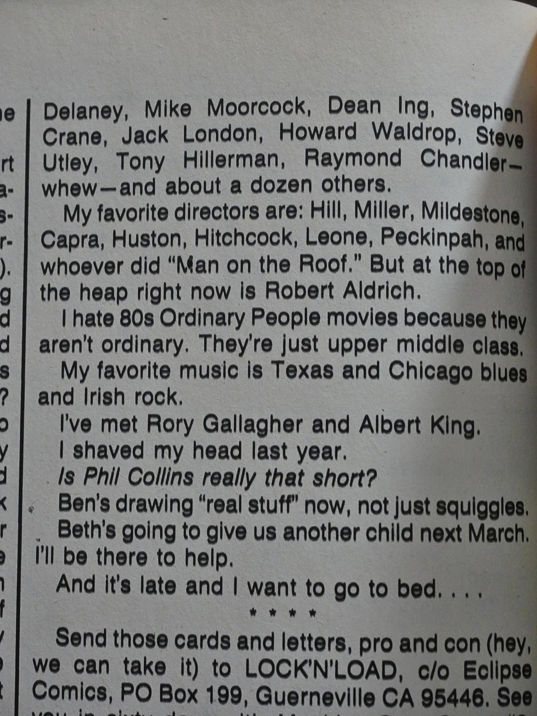
Then we get a list of favourite artists, and after I was halfway through one thing stuck out like a sore thumb (do sore thumbs stick out, though?). See if you can see it, too!

Here’s how it continues, and you’ll get it now:

Yes, he mentions 55 artists, directors, and writers that he loves, and of those (if I counted correctly; you’re welcome to go back and check (click to embiggen)), 54 of them are men.

Perhaps that story about the nail wasn’t meant to be funny after all.

*gasp* One of the characters has an open mouth!!!

Scout marks the territory.

OK, if it seems like I’m making fun of this book, it’s, er, because I am, but I have to be completely honest here. Well, that’s a lie, of course, but anyway: Reading Scout (until now; I’m not that many issues in) has been a total hoot. The story moves briskly, Truman develops characters in a nice way (not by infodumping that much, but by showing), and he develops the world in an excellent way, by dumping us into it and then showing us more and more.

Not everything is perfect, however: Truman sometimes struggles with layout and speech balloon placement. The eye is not infrequently directed one way, while we’re supposed to go another, so I’m often getting the responses before what they’re responding to, which is annoying.

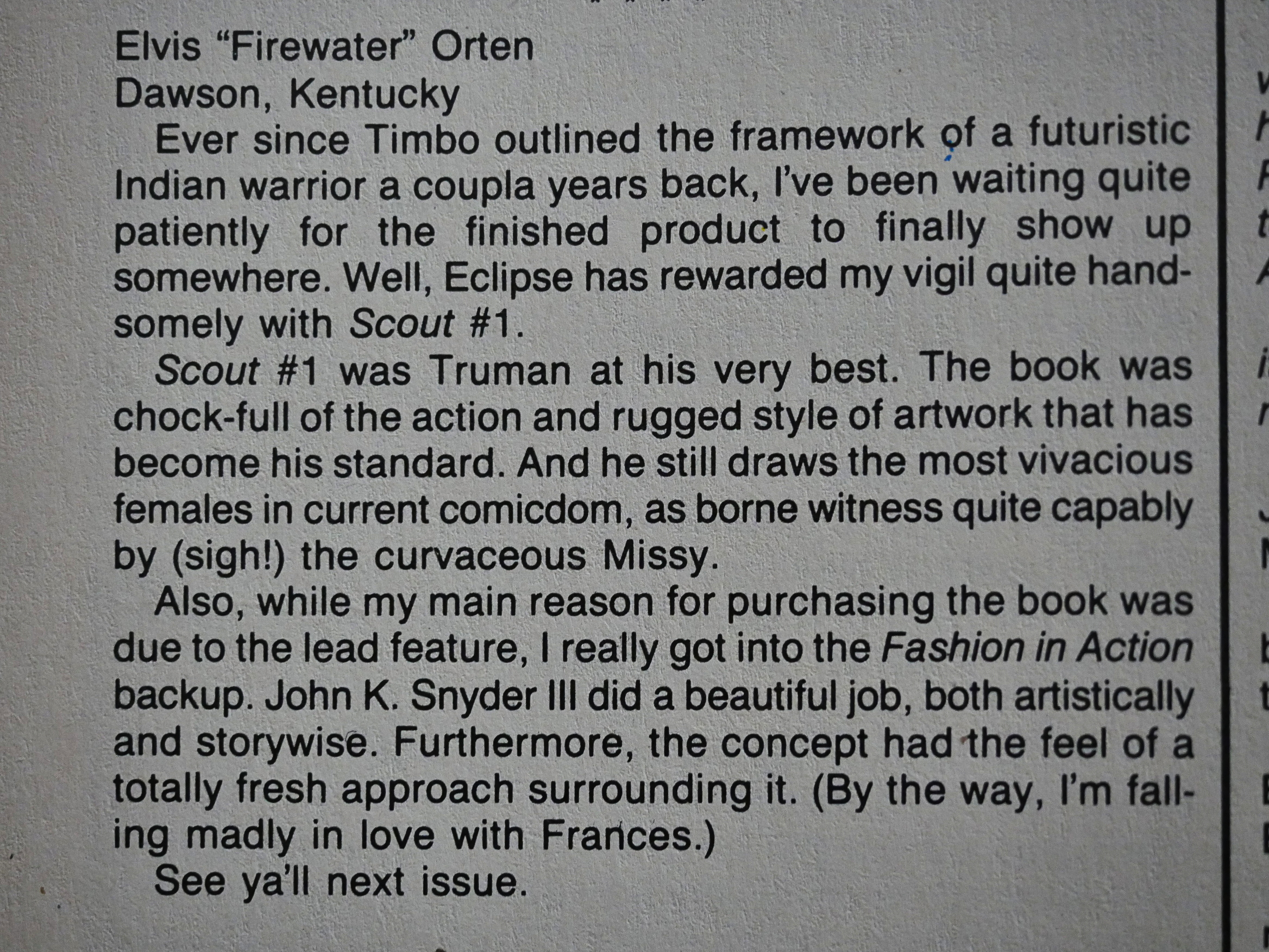
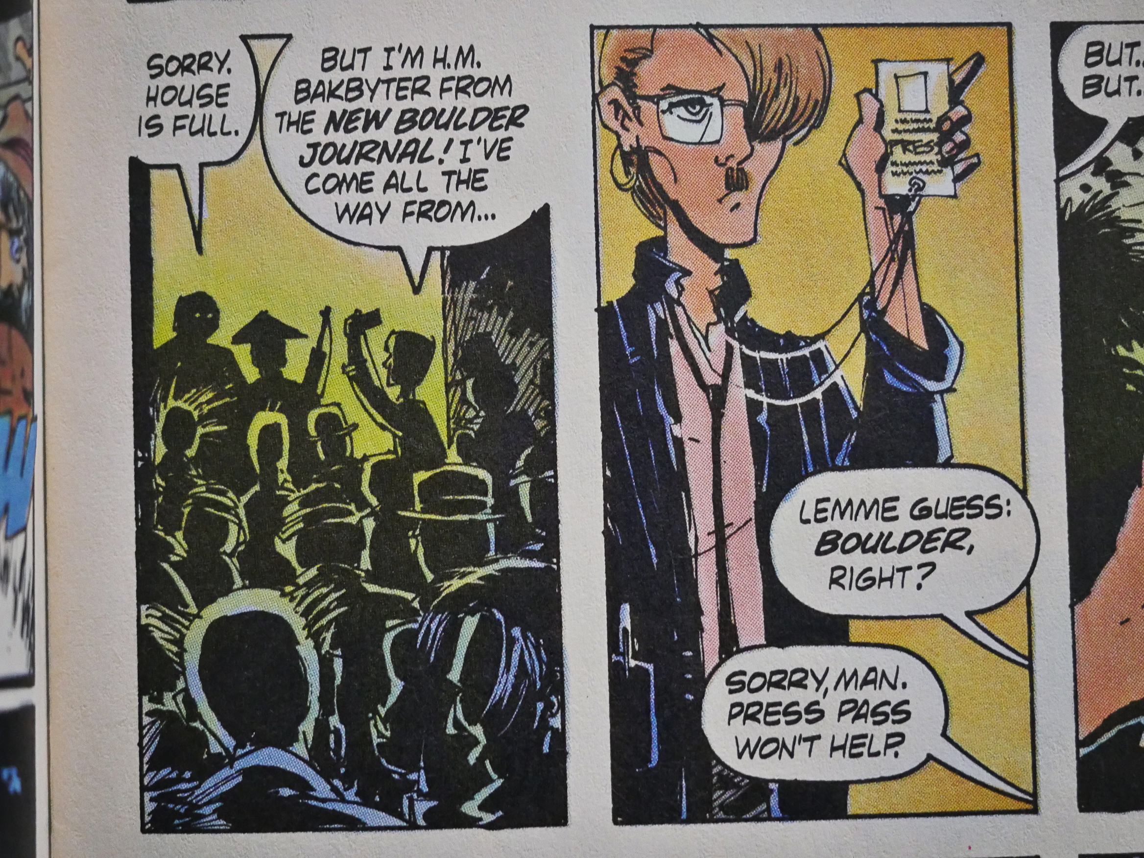
I think that in just about all the Eclipse books around this time, Elvis Orten makes an appearance in the letters pages. Often in issue after issue. So I guess he’s the Eclipse super-fan…

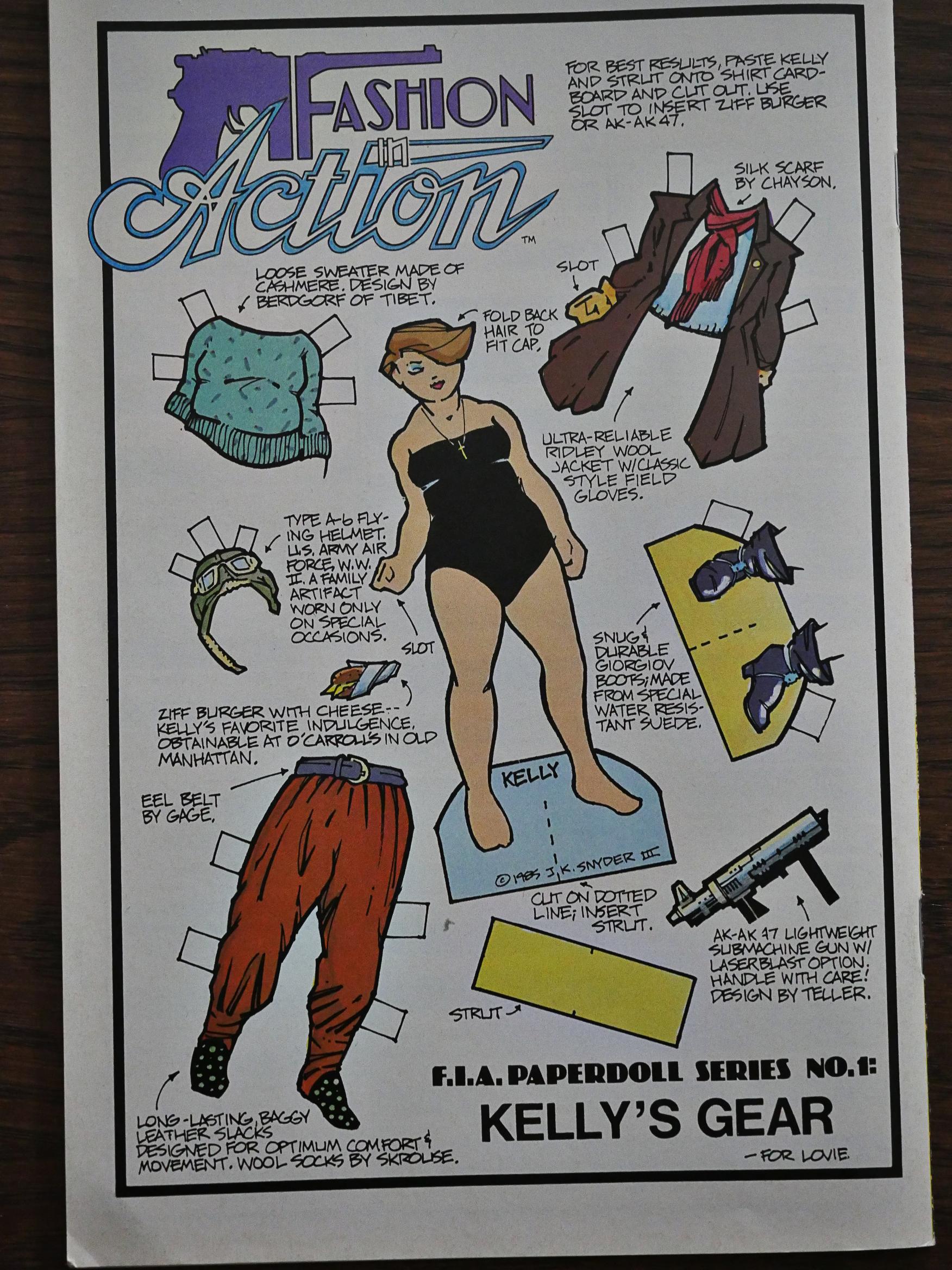
Half a dozen of the issues have these Fashion in Action paper dolls on the back cover, which is an interesting thing for such a super-macho book to do.

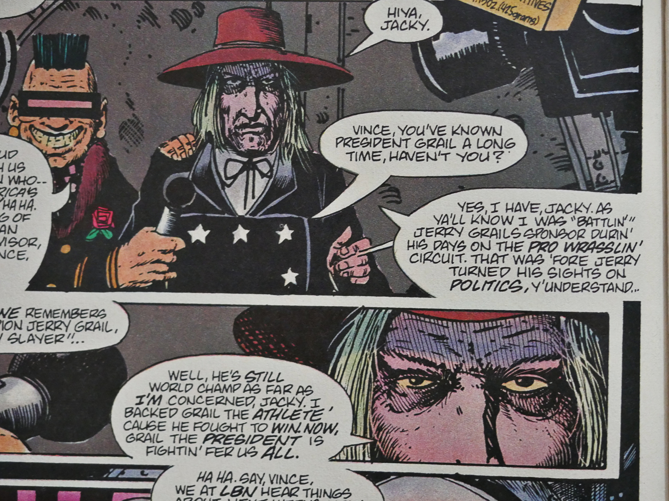
I’m not going to talk a lot about the plot, because talking about plot is boring, but I’ll just note that in this way out crazy sci-fi comic book, the president of the United States is a pro wrestler, which is something Idiocracy picked up on a couple of decades later, and reality a decade after that again.

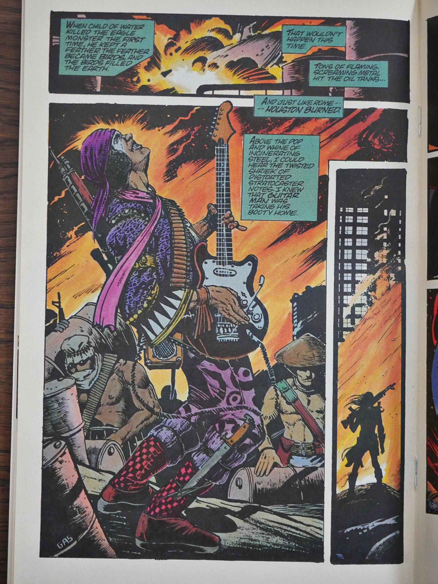
And was Truman the first guy to do a guy playing electric guitar while performing mayhem? Perhaps? Perhaps not? The latest Mad Max did so too, much later of course…

Truman doesn’t experiment that much with his artwork. When you see it, you’ll probably think “there’s a Kubert School graduate”, and, yup, he is, but he does the occasional fun thing like the panel above. But as you also see above, he sometimes skimps on details, and sometimes he pours them on, which makes things kinda uneven…

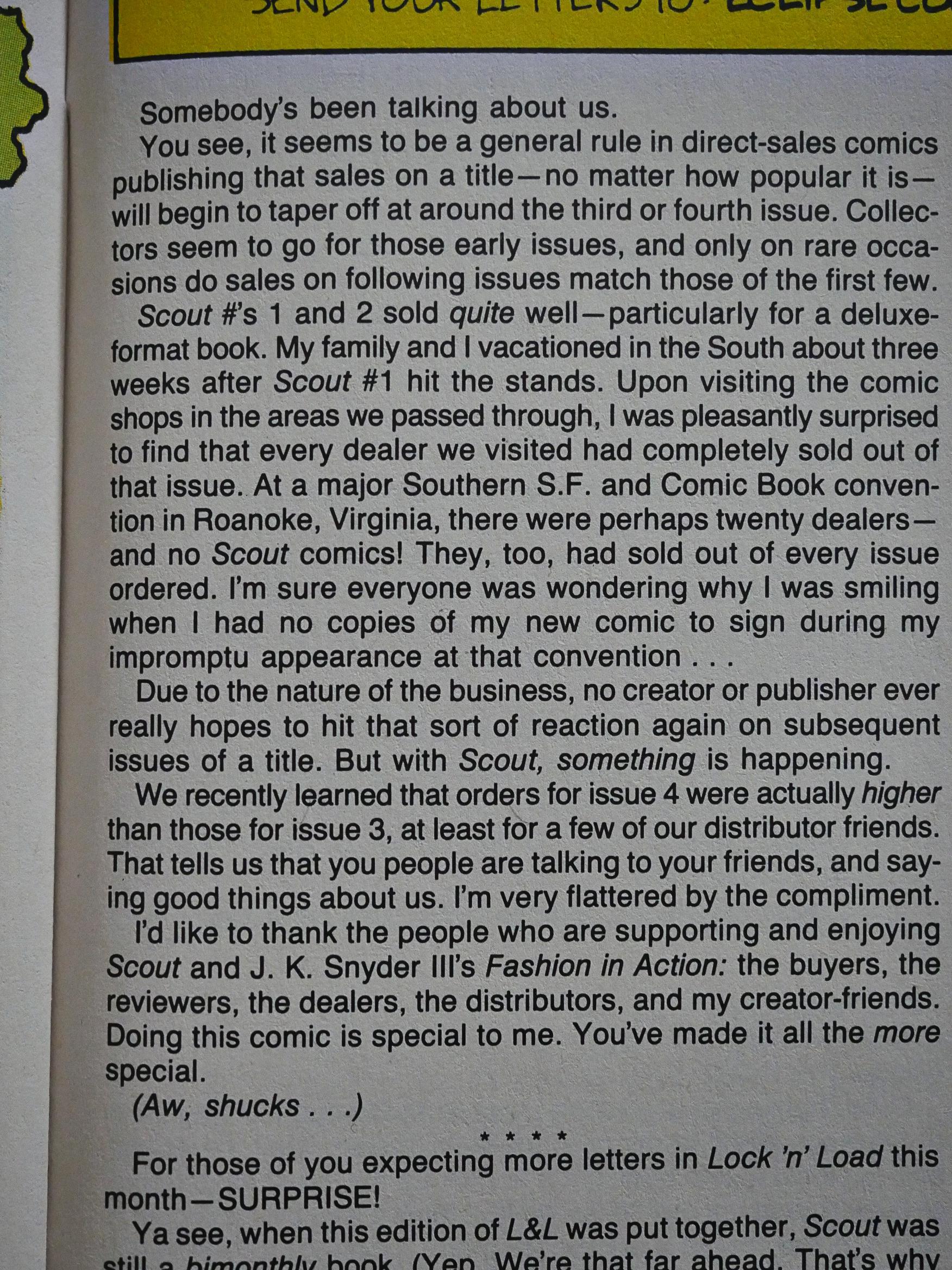
Truman announces that the first issues are a success (commercially), and that circulation is increasing, even. Which is, as he points out, unusual.

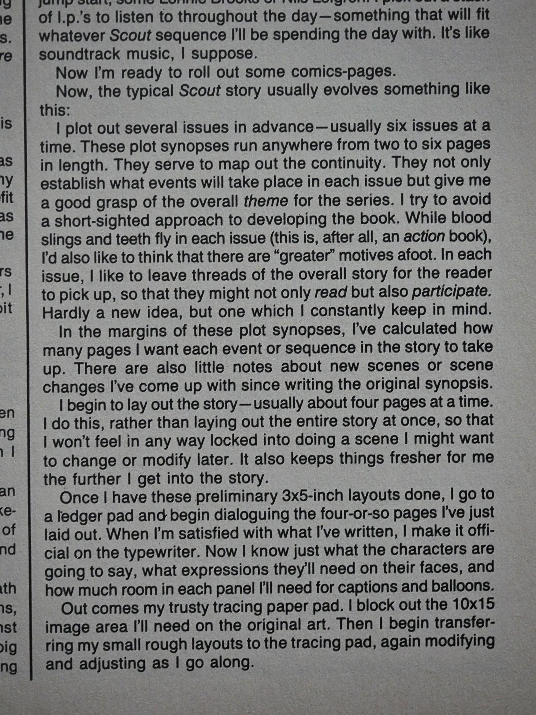
He also writes a page or two about his process, and I always find this sort of stuff fascinating. Some of the things he says are a bit “hm?”, though, as in the “usually six issues at a time”. This is in issue five, so there’s not “usual” yet, you’d have thought.

He also answers my question from earlier in this blog post: What size does he draw at? And it’s 10×15 inches, which means that he draws “half up”, I think the term is. That is, his artwork is just about 1.5x the printed size, which is not an unusual size to work at, but it’s not super big, either.

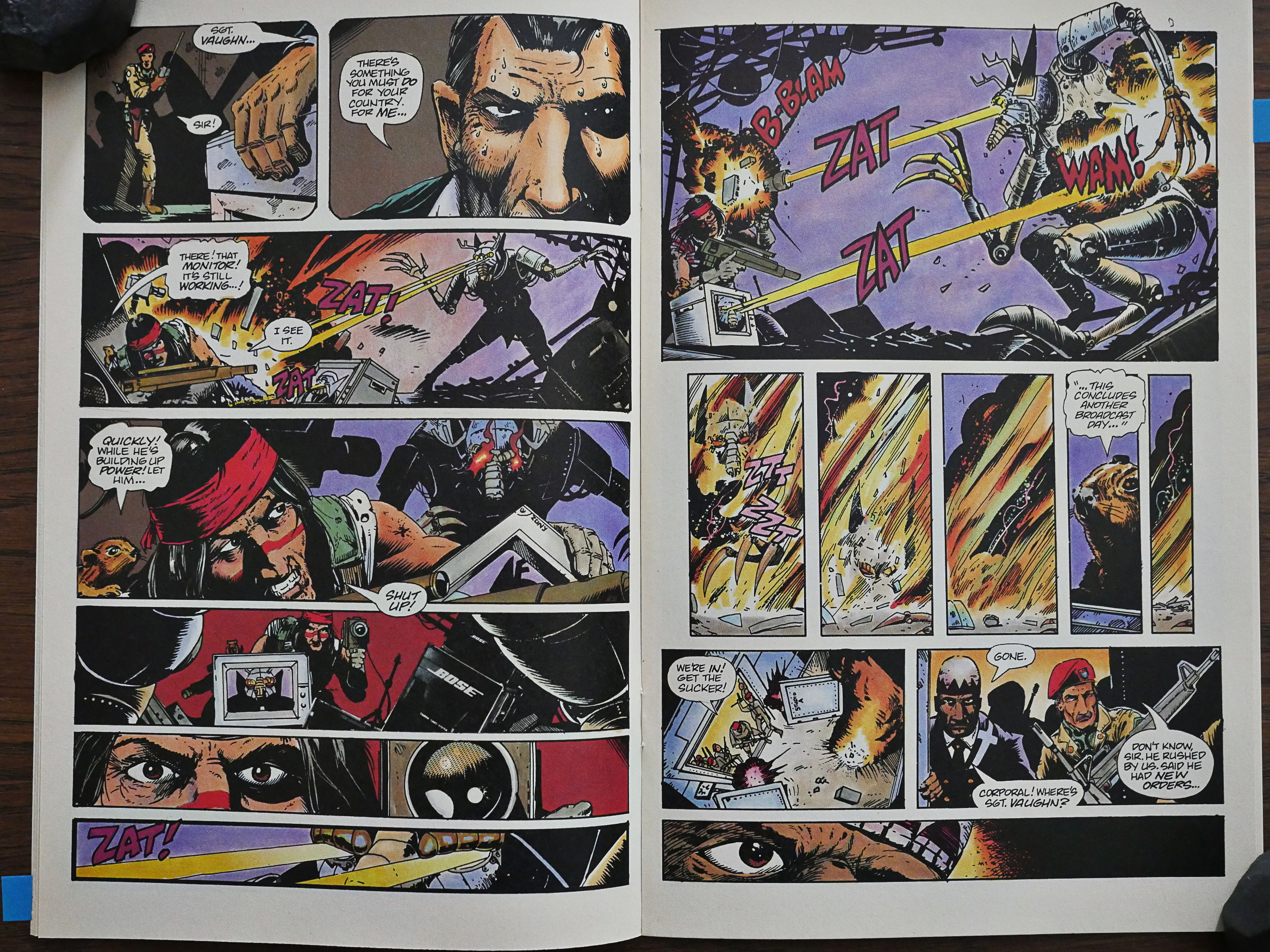
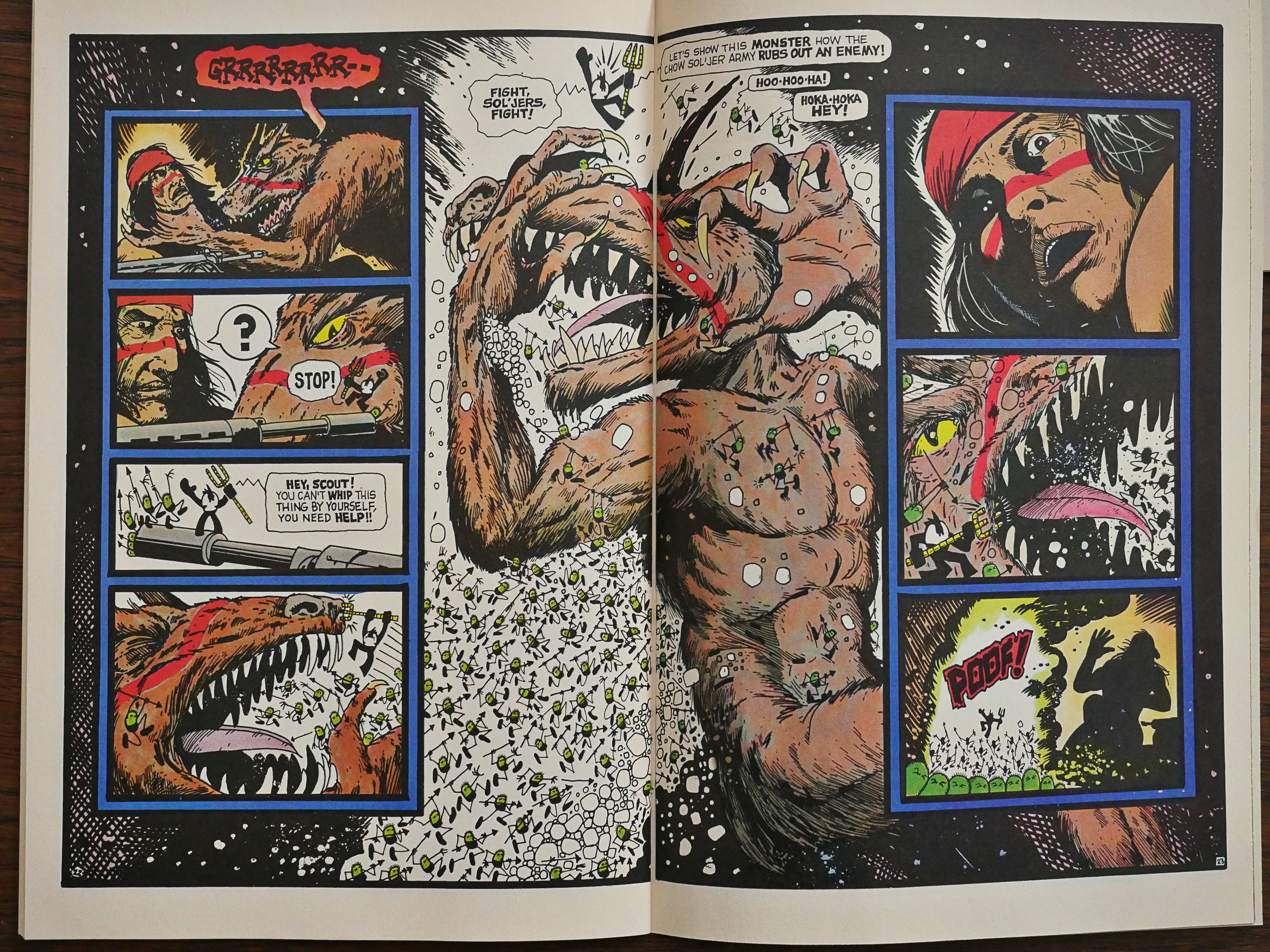
I know I said I wasn’t going to talk about plot, but: Scout hunts down and kills some guys that may or may not be monsters (Scout (and we) see them as monsters, but we don’t know whether those are peyote-induced visions or reality, which is a nice plot element), but each of these “boss fights” are so disappointing. Scout mostly kills them without any real problems…

… and here his method to kill this monster with laser-shooting eyes is… to make the laser beams go into a camera… so the laser beams shoot out of the monitor… and destroys the beast…

*scratches head again*

It’s at this point I’m starting to wonder whether I’ve completely misread the comic and that instead of an intense action comic it’s a hilarious parody of an intense action comic?

Where did I put that razor, Occam!?

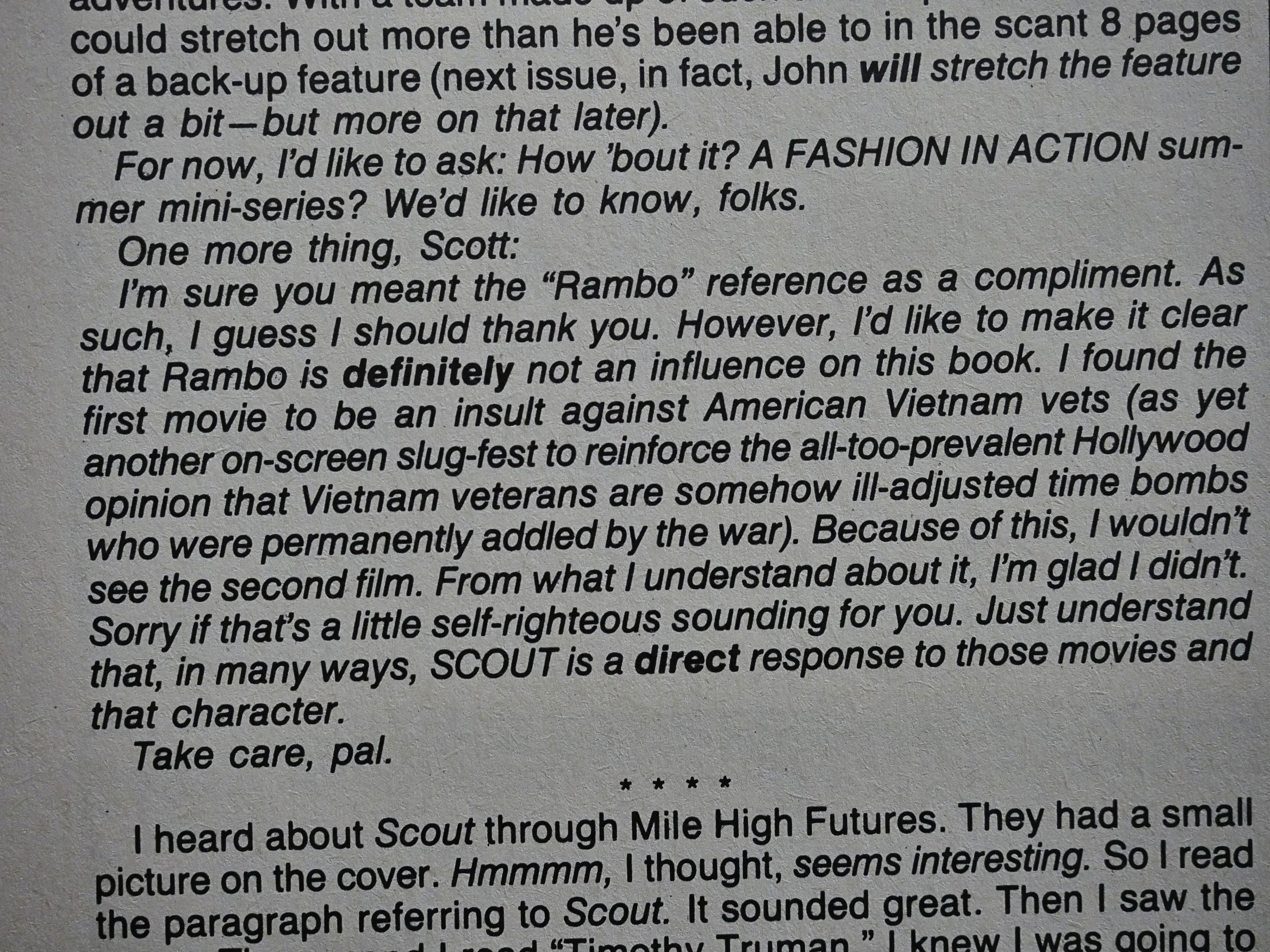
Truman lets us know that Scout is in no way inspired by movies like Rambo, and is instead a response to it.

I guess I can see that.

Hm. Why are those musicians mentioned on the bottom of this page? Is that from a previous owner of these comics? (I bought them all used earlier this year.) Hm… Doesn’t look like it…

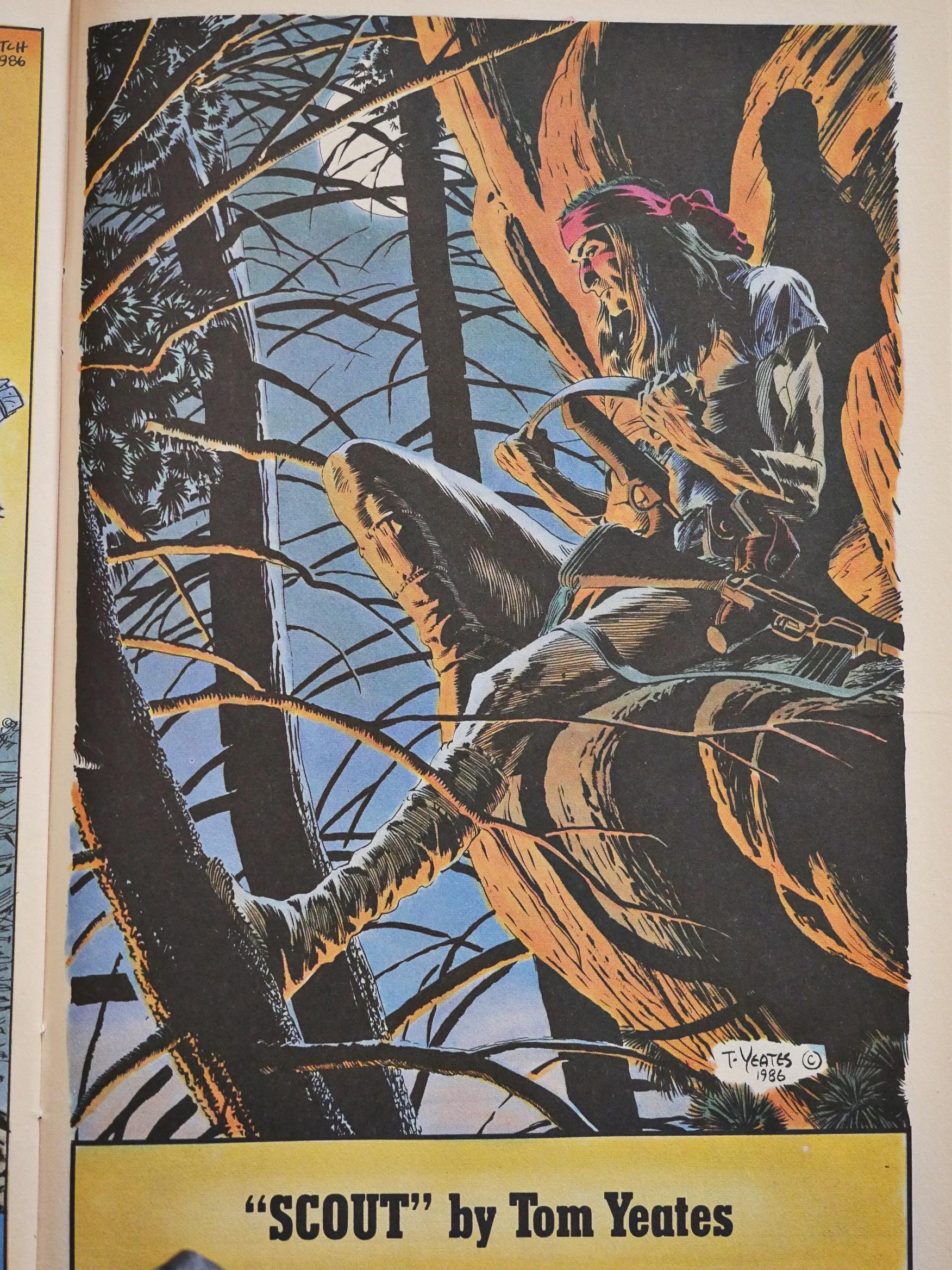
Tom Yeates does the artwork for #7 while Truman is welcoming a new baby into his family. It’s rather nice, eh? Eh?

Meanwhile, Fashion in Action is not getting any less confusing.

Your guess is as good as mine.

Hey, I found a review of Scout in Comics Journal #109 by Heidi McDonald:

Time to review Scout. Time for me to get my Timothy Truman lecture Off my chest. But first a little test. Take the first five issues Of Scout and put all in a row. What do you see on the cover of #1? Scout staring grimly, clutching his gun. What’s on #2? Scout staring grimly, clutching his gun. What’s on #3? Scout staring grimly, clutching his gun. What about 4 and 5? If you guess grim stares and firearms, you win the brass ring.

In fact, you can turn to any page in any issue Of Scout and chances are you’ll see Scout staring grimly holding a gun. Timothy Truman is a competent writer, a good storyteller, and a good draughtsman, but he is the most goddamn inexpressive artist that I’ve ever seen.

His characters have exactly count em, two different expressions: grim relentlessness and relentless grimness. Doesn’t exactly make for much merriment, I’ll tell ya.

[…]

Truman’s art has a sameness to it that can be positively maddening: page after page of people staring straight ahead, looking grim. page after page of people staring at the sides of the page, looking grim. (l have never seen an artist shun the simple 3/4 view as religiously as Truman.) Nobody ever opens his mouth. No one squints. God forbid anyone should smile. Nope, every expression is as blank as paper.

Similarly, hardly anything in the art ever moves. It just sits there. Staring. Grim and relentless. Sorry, too grim for this buckaroo.

So it’s not just me, then. But is that a reference to Truman’s previous book, Grimjack?

But what about the backup feature?

The back up strip is John K. Snyder Ill “Fashion in Action” which is about an all-women celebrity bodyguard firm, which has its headquarters in the Statue of Liberty. The title, combined with the paperdolls on the backs of issue 3-5, lead one to the inescapable conclusion that this strip is Supposed to have something to do with fashion. Unfortunately, there is little to, be found. Nothing you wouldn’t see far surpassed in about ten minutes walking down Melrose Avenue. Sharp lapels, and that’s about it.

Indeed.

Anyway, let’s continue the reading Scout…

Around this time (i.e., #8), the printing quality started deteriorating, and then…

… Scout moved to $1.25 for two issues, and on cheaper paper. But the paper quality seemed to lag a bit when the price was increased again, and the artwork looks even muddier than normal for a month or two.

I liked this bit: We have a new person who’s perhaps a lunatic, and perhaps really has supernatural things happen to him, and to drive the parallels home, Truman has him wearing a blindfold that’s quite similar to the mask that Our Hero usually wears. Only in white instead of read. Is Truman saying that Scout’s insane, too? Neither?

Things that make you go “hmmm…” kinda demonstrate that while this comic tries to put up a hard-hitting action front, there’s a lot more going on inside Truman’s head than you’d think by just glancing at the grim covers.

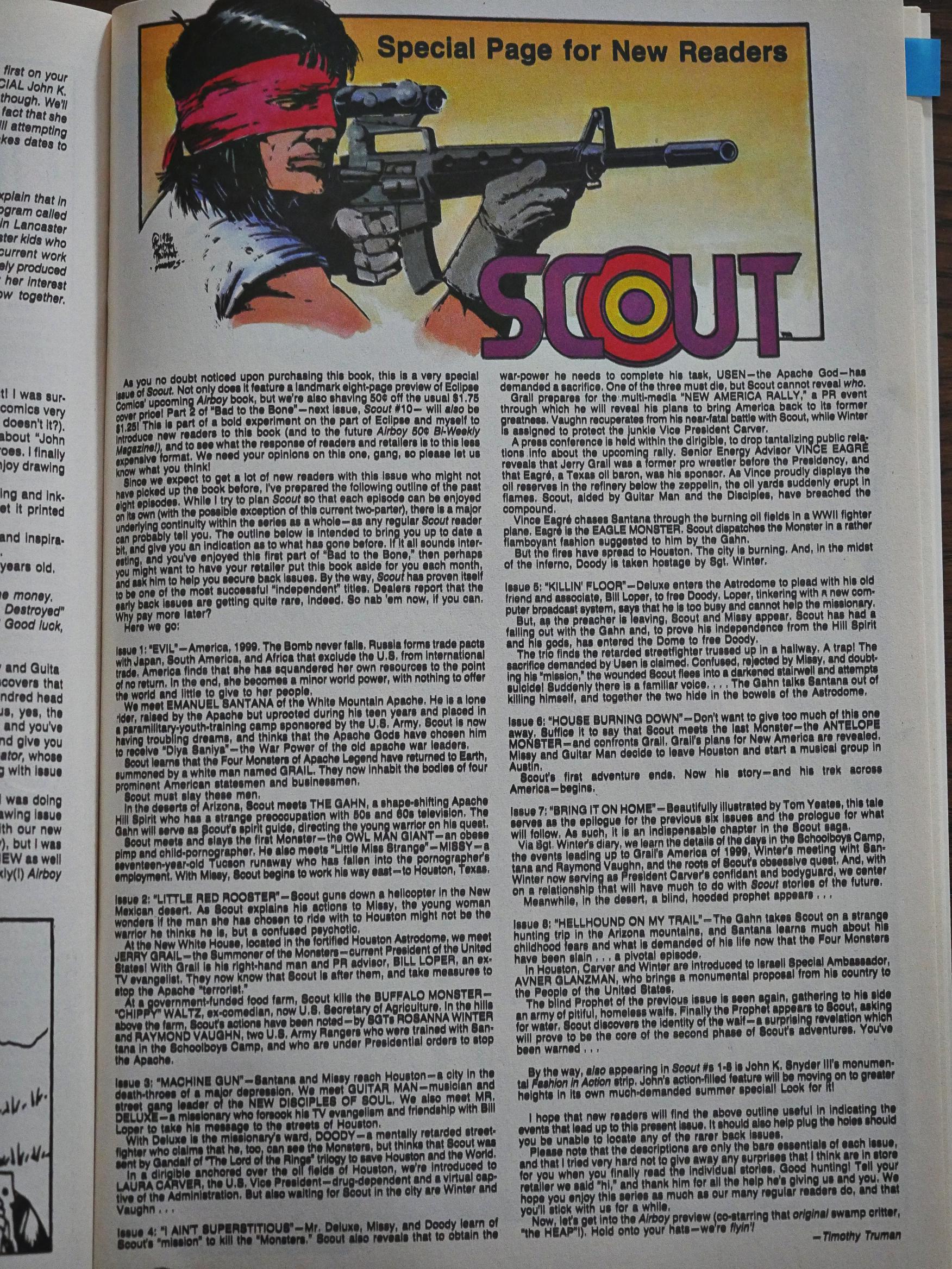
The point of dropping the price is, of course, to get more readers, but Truman chose a pretty odd story to entice people in, I think. I think most new readers would have found themselves slightly puzzled by what they encountered… so Truman helpfully provides a one-page plot recap. Which I don’t really think helps all that much.

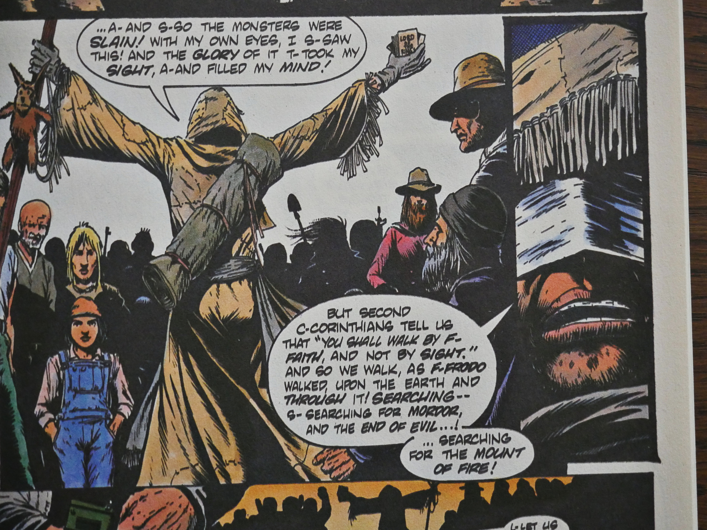
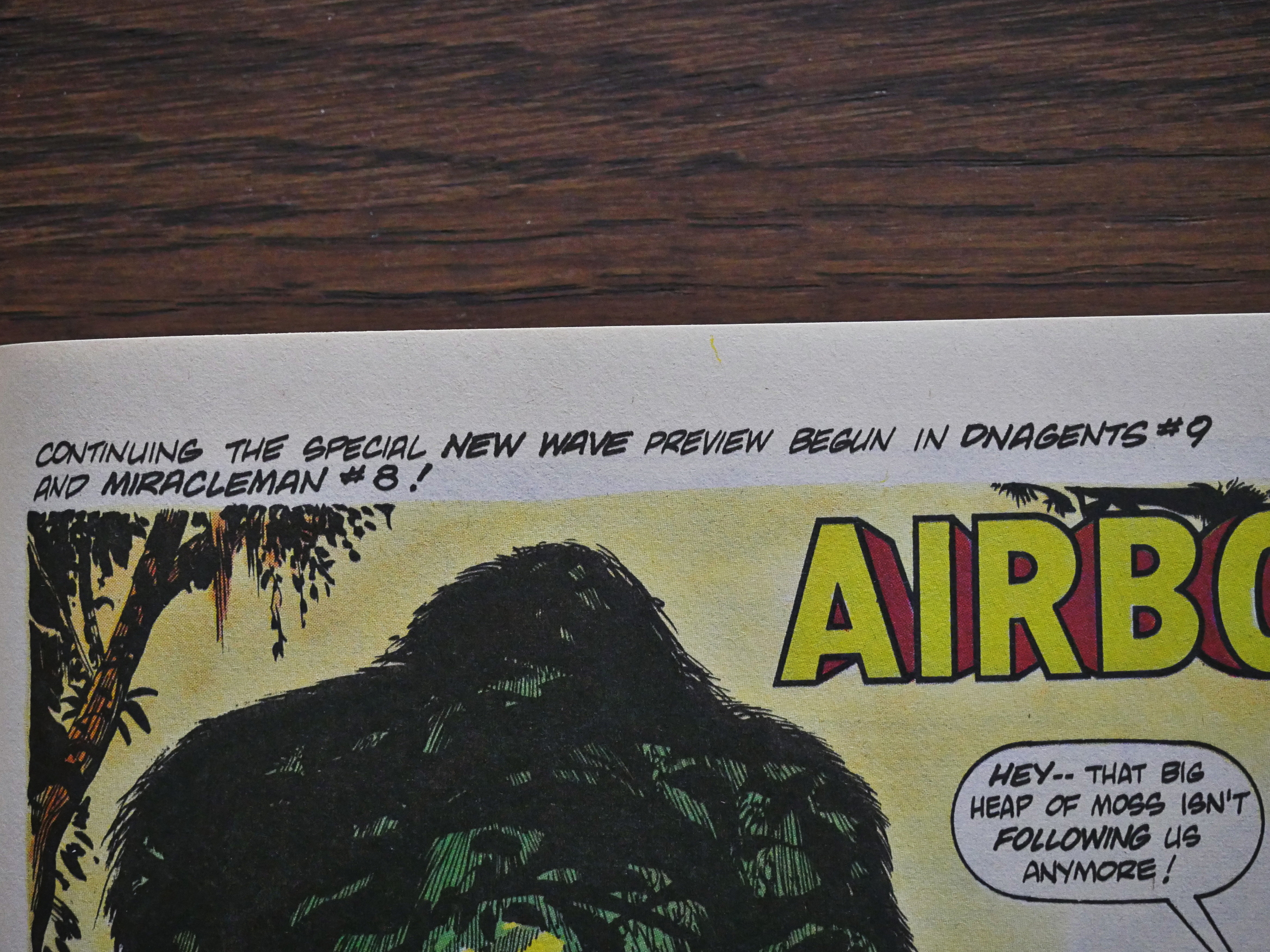
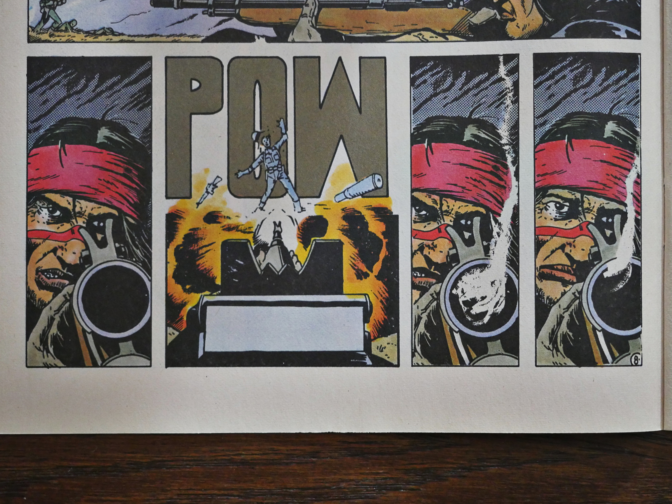
Eclipse really went all in on promoting Airboy and New Wave in the higher-selling comics, so they had a three-part continuous “preview” going on. Collect em all!

You remember that thing Heidi McDonald said above about Truman only being able to draw one expression? It was pretty true in the beginning, but Truman improved quite a bit over the months. I mean, it’s not difficult reading Scout’s… regrets? sorrow? in that final panel above.

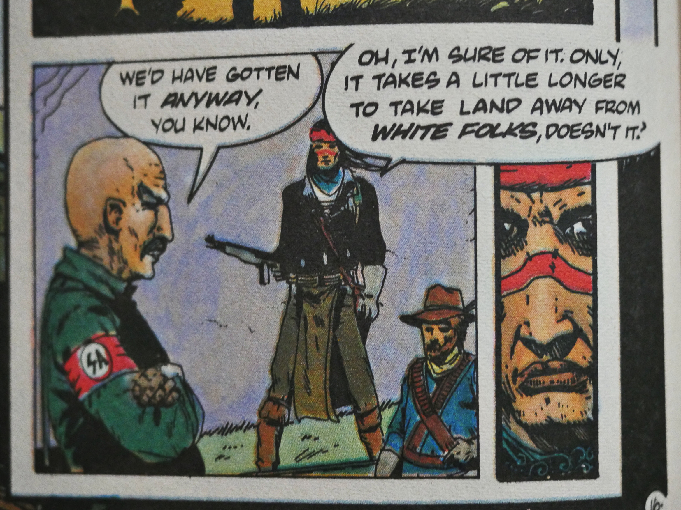
But Truman is maddingly uneven, and many of these pages feel very dashed off. What’s with that SA guy (yes, the Salvation Army are the new real army of the corrupt administration and wears those armbands (which got an audible “tee hee” out of me when I saw this panel)) and his head and short arms? How come Scout’s nose is suddenly twice as long as normal? Is that a dwarf down there?

NO THAT”S A CROSSBOW!

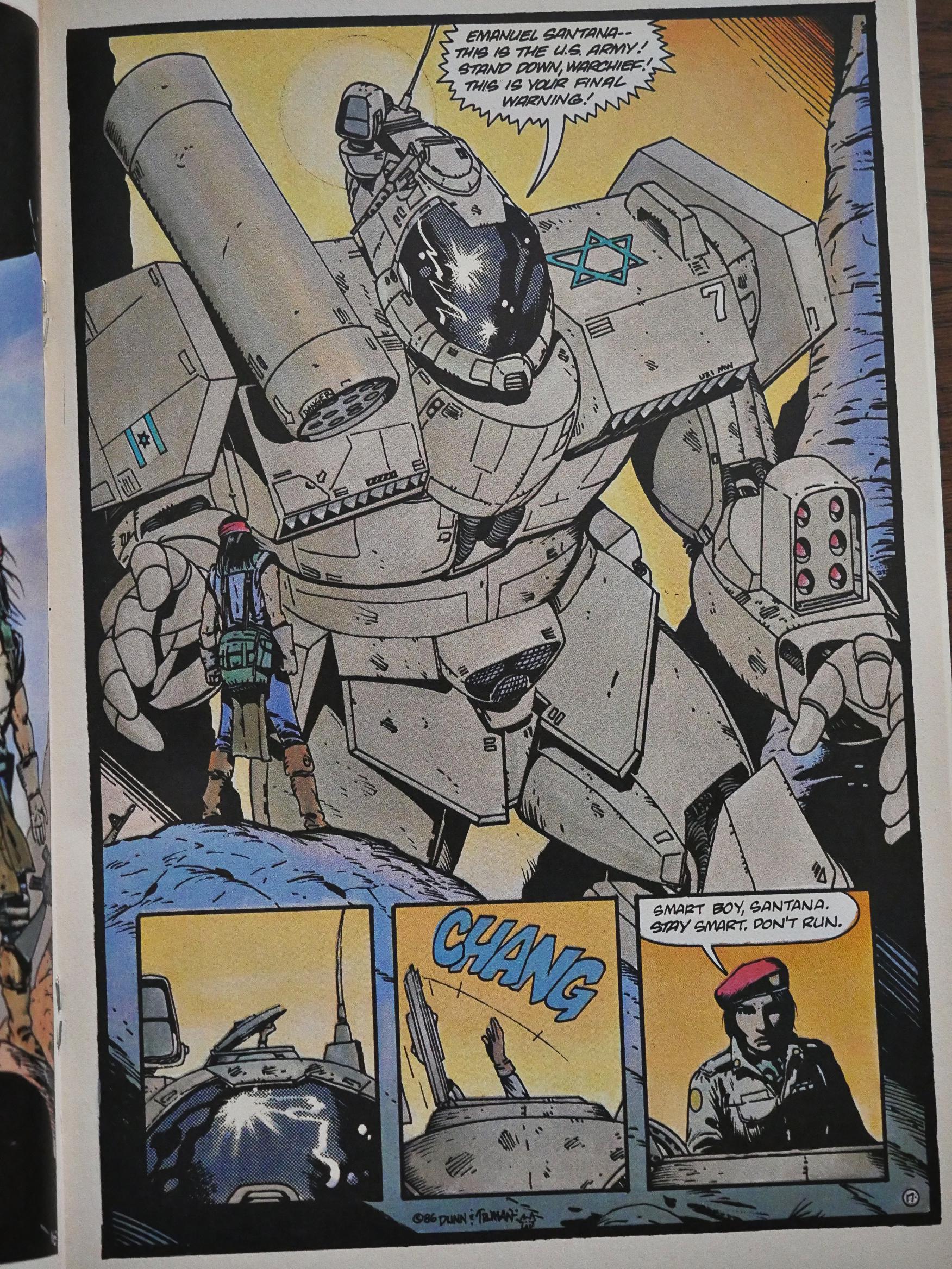
Truman recruits Ben Dunn to draw these giant Israeli mechas. Good choice, and I guess that also means that Truman doesn’t really enjoy drawing those things.

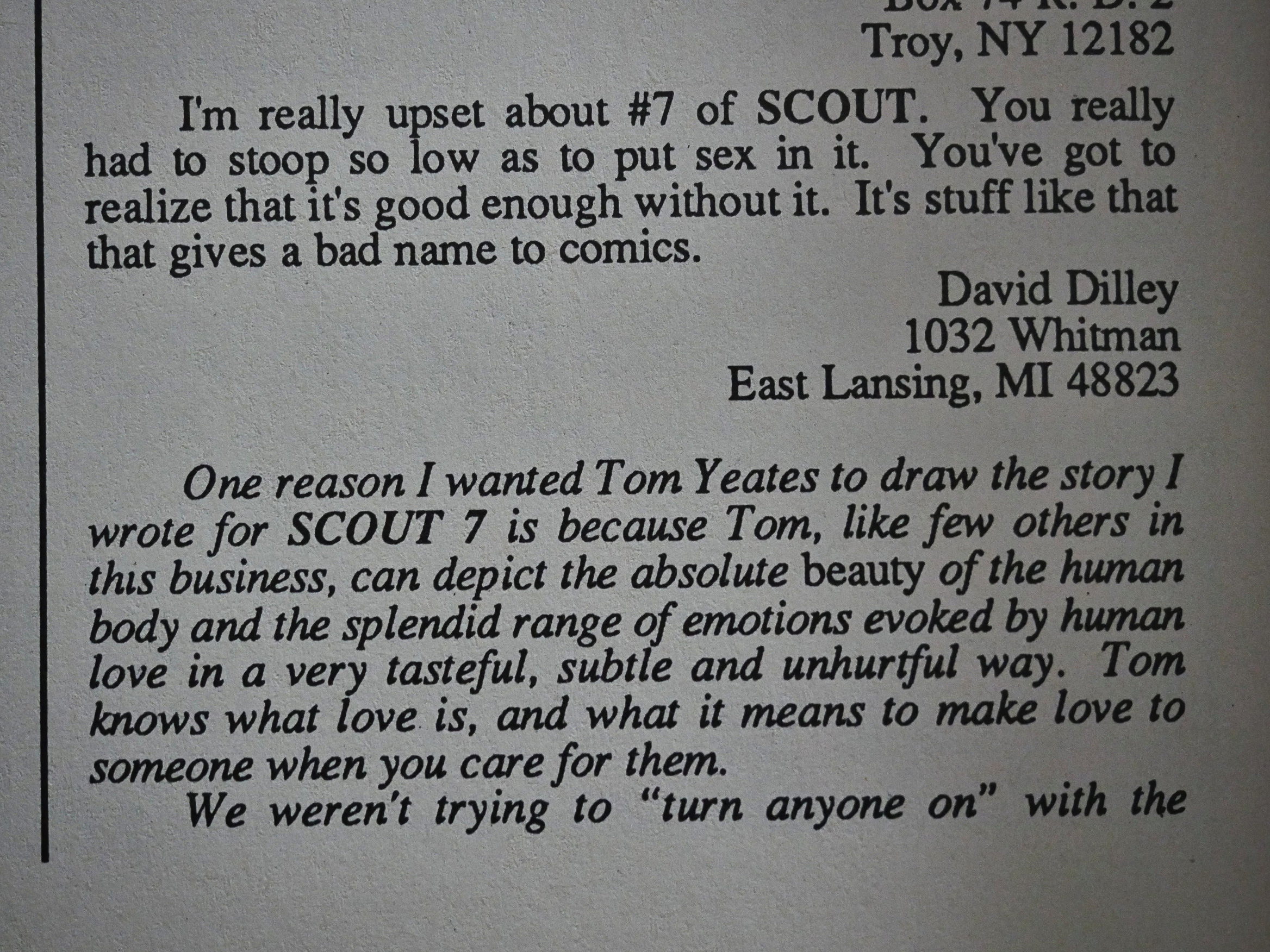
The letters pages are, uh, lively? “Stoop so low.” A wide range of weird opinions. But glass houses, eh?

There’s a sub-plot going on for several issues about a singer that Scout had rescued from some bad guys. She ends up in Las Vegas, so you have all these machinations about taking over the Vegas night life (because she brings the real blues back and the people love it). It’s perhaps an odd sub-plot to bring into the proceedings… Well, OK, it is. I think perhaps Truman is interested in music and just wanted to just because.

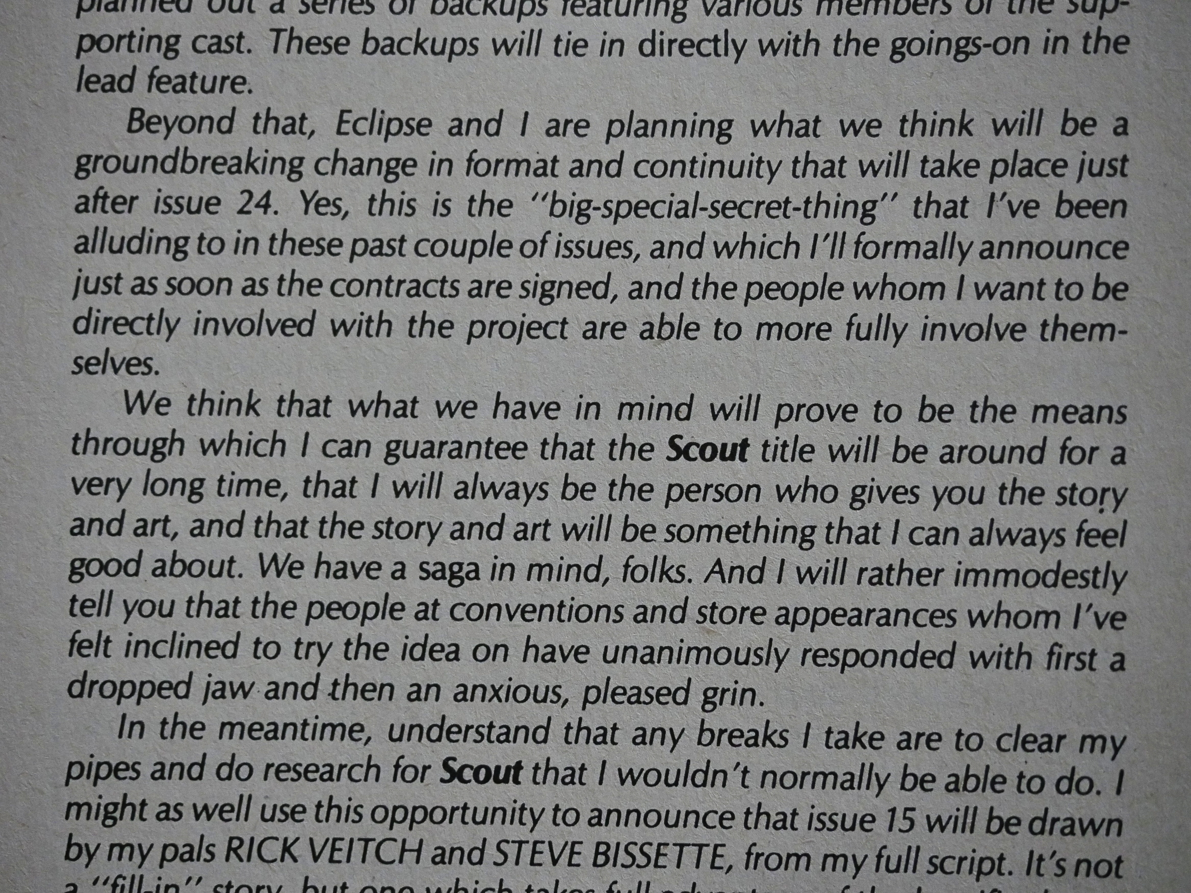
But Truman has an amazing work ethic and has everything planned out. In #12 he announces that #24 is going to be the final issue of Scout in this format, and by gum, so it turned out to be. That like never happens in indie comics.

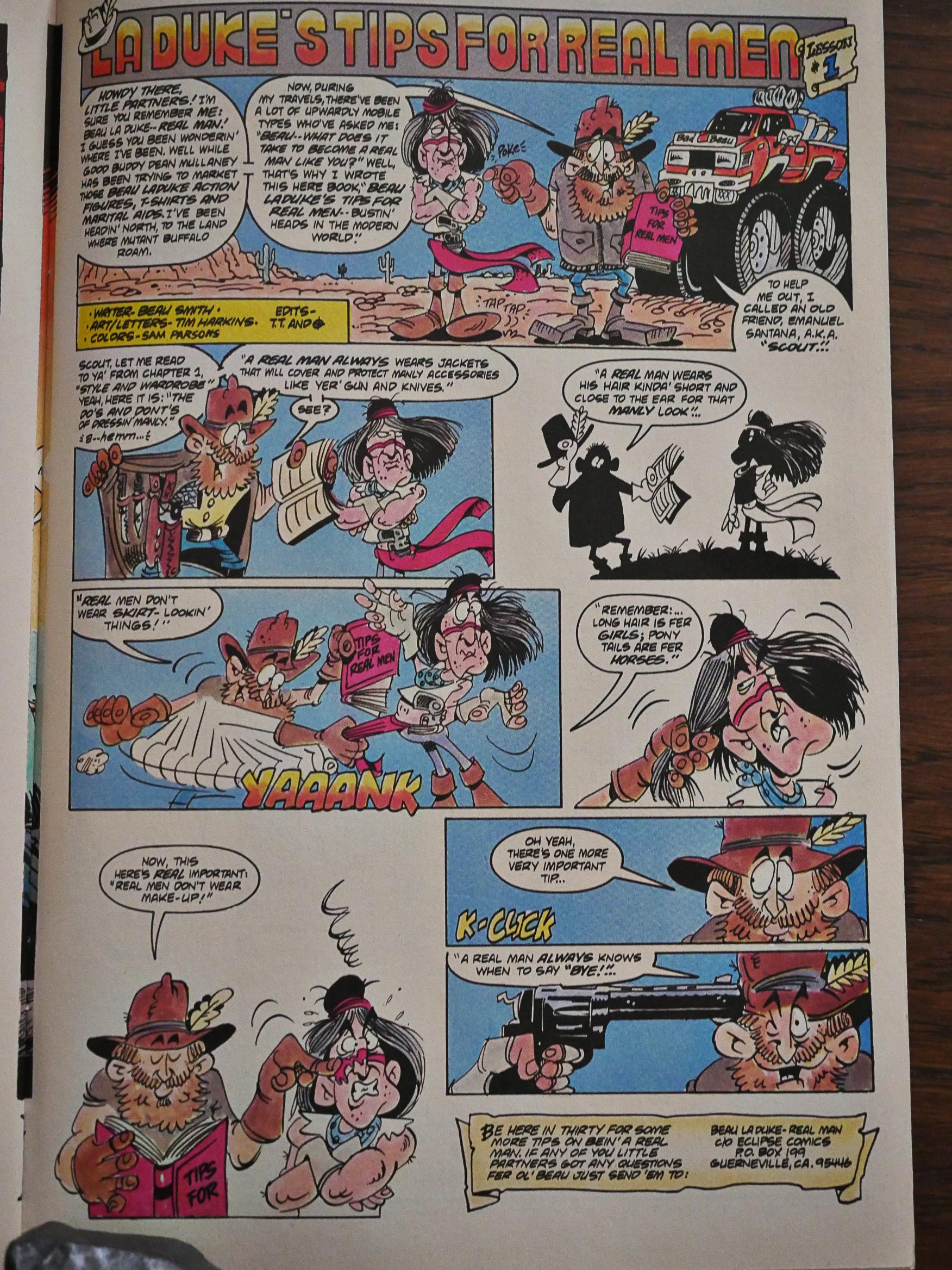
Truman missed having a humorous backup feature, apparently, so he got this recurring one page strip from Beau Smith and Tim Harkins. This is the best of them. Yes, I know.

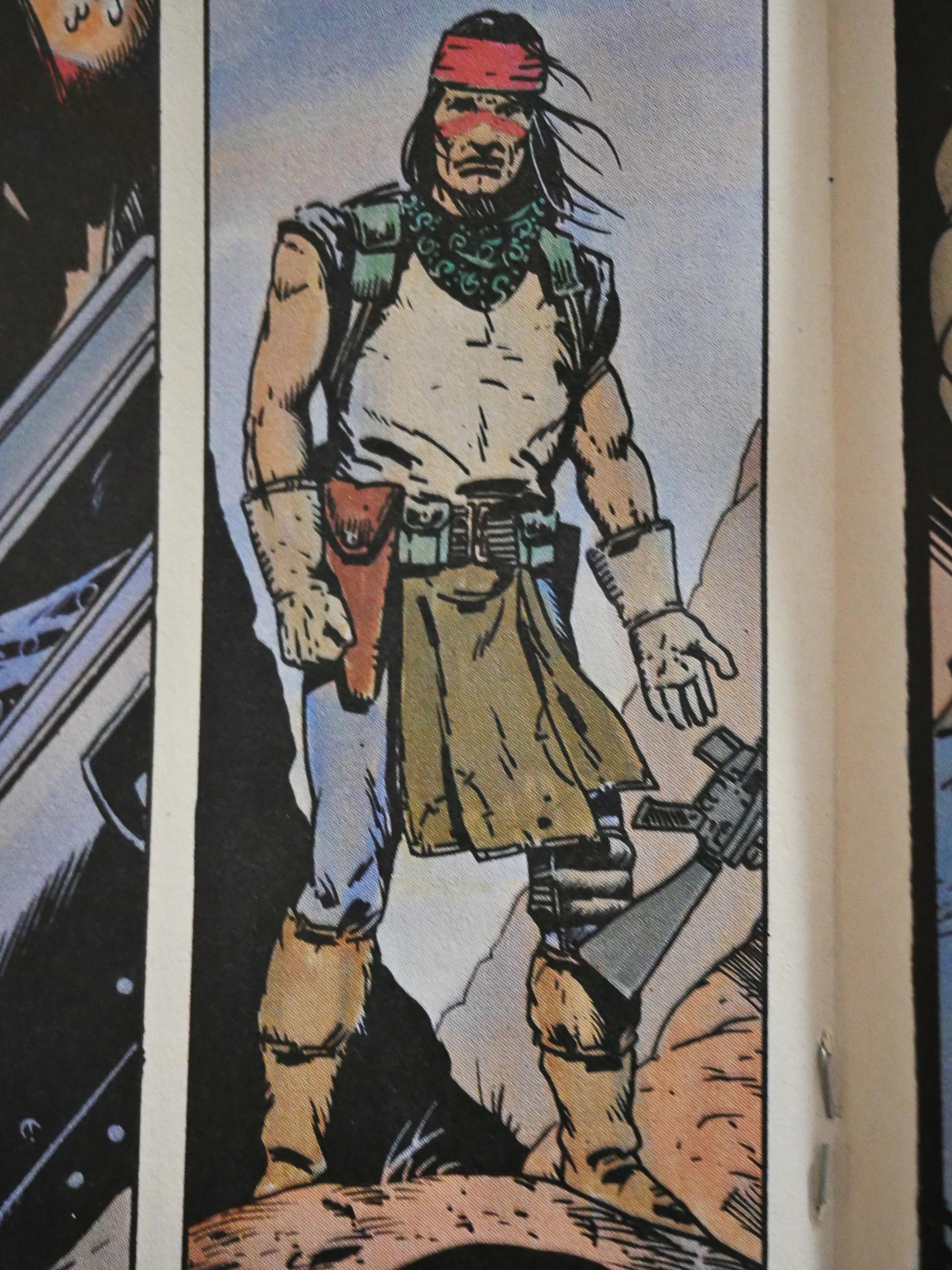
Do you remember Scout’s design from the first issue? The red mask, the red loincloth and the bare midriff? Truman modified them all: Got rid of the mask, changed the colour of the loincloth to a more sensible brown, and gave Scout a t-shirt that fit him.

Truman brought in various artists to do some of the artwork on some issues, but this is the only one of the later ones that are done completely by somebody else: Fellow Kubert School graduates Rick Veitch and Steve Bissette. It looks extremely Veitch & Bissette, which is fun.

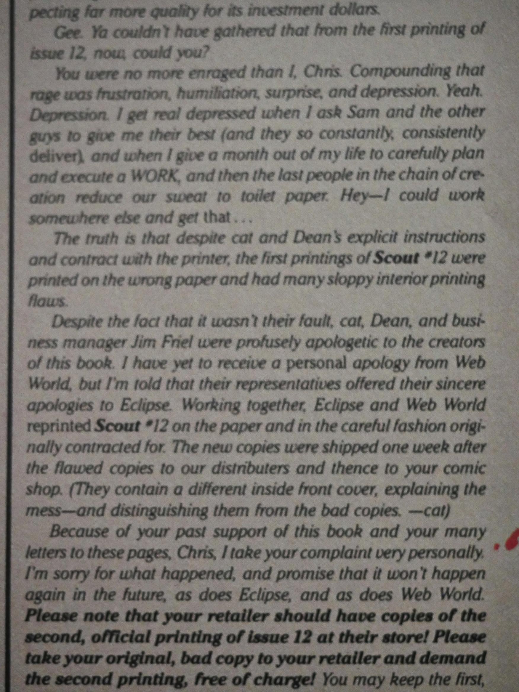
What a blurry picture, but Truman explains why #12 looked so bad (the printer screwed up), apologises profusely, and Eclipse had a second batch printed up that could be exchanged for the first batch free of charge, which is pretty swell of them. My copy was one of the early bad ones.

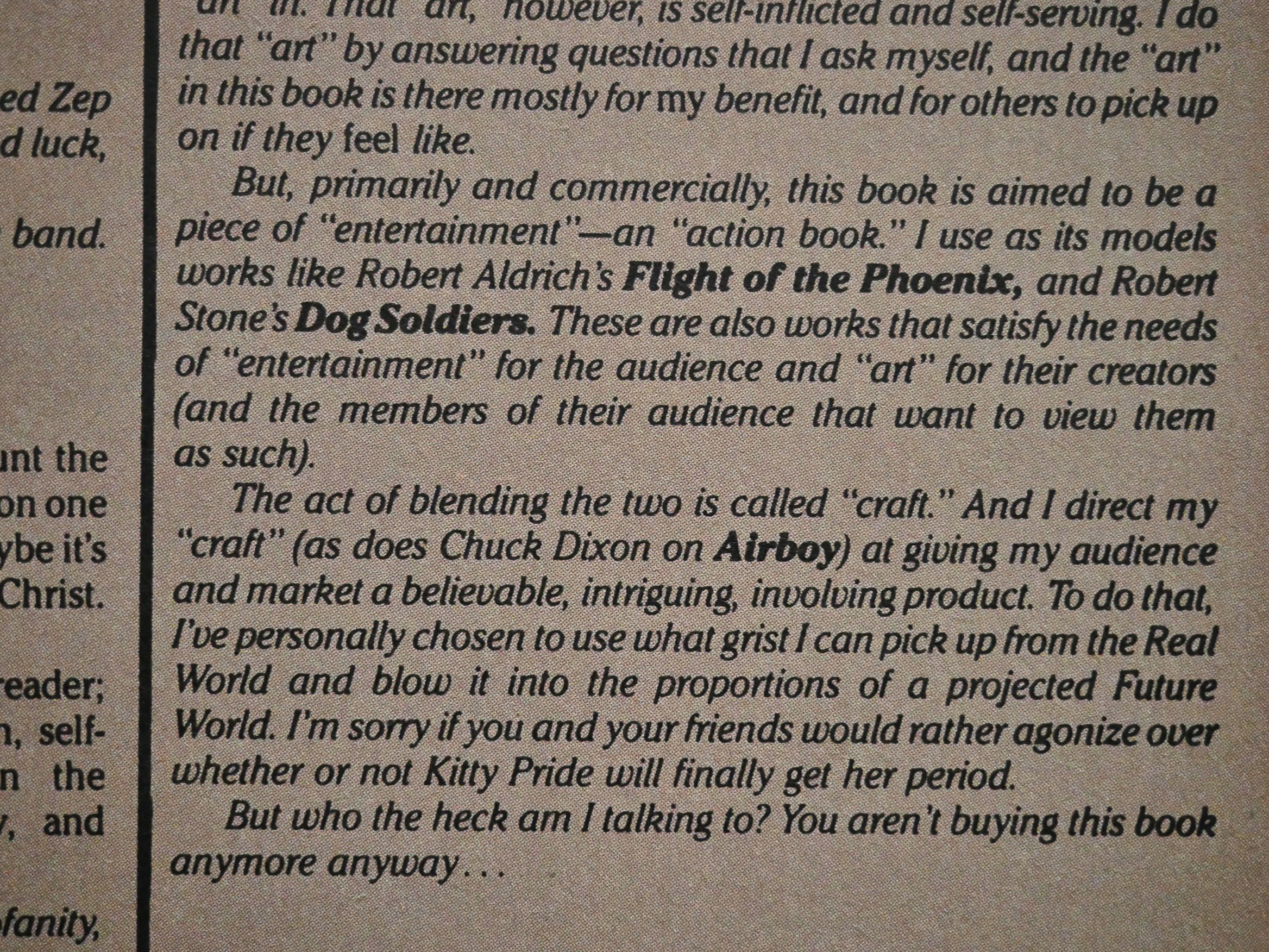
Many of the comments criticise Scout for being “too political”, which I don’t really see that much. Truman clearly, as he writes here, is trying to do an entertaining action book, and the reader is seldom hit over the head with politics. I mean, beyond the obvious bits.

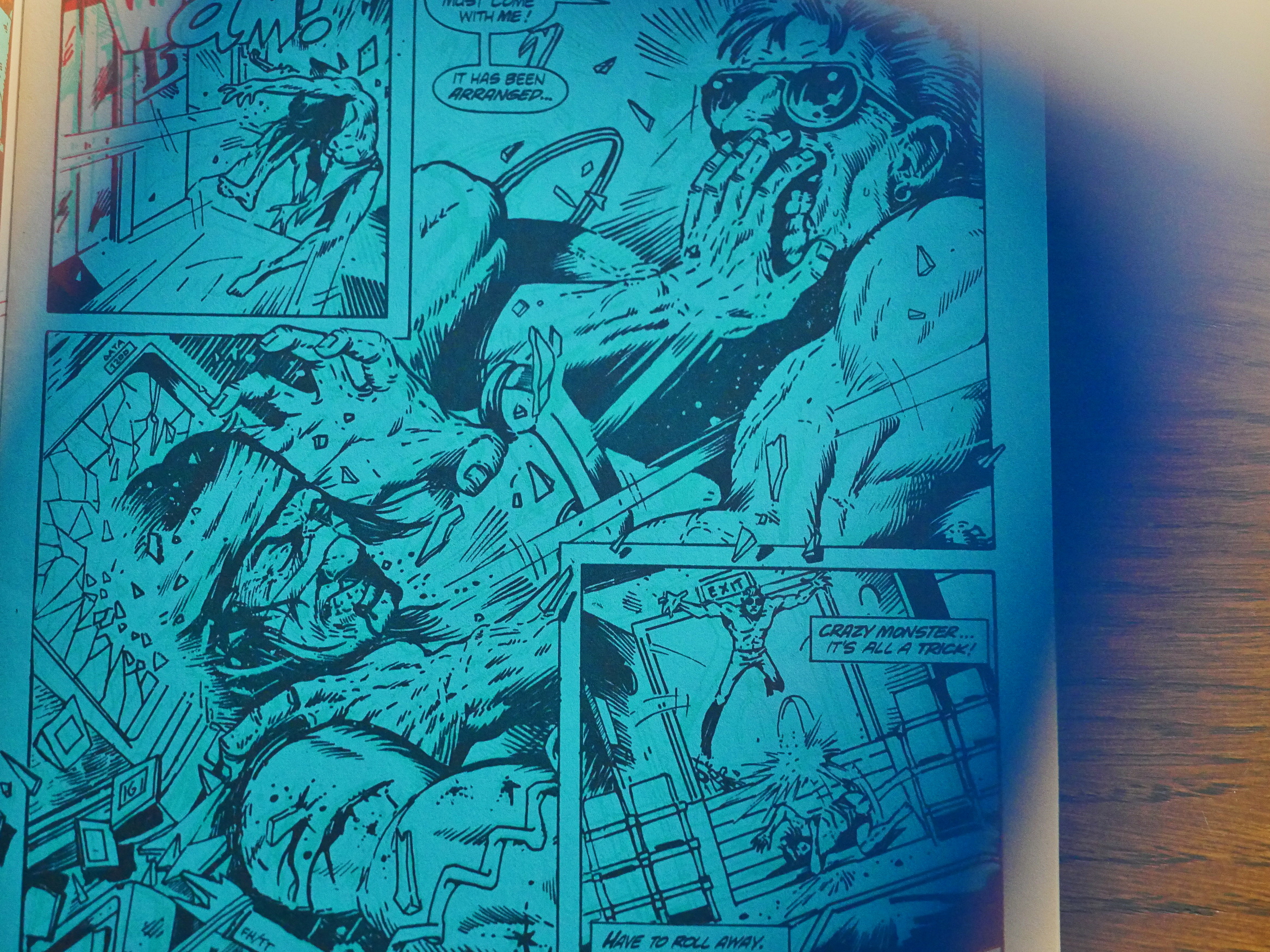
Then all of a sudden, we get a 3D issue. That’s kinda unusual; these things are usually done as a special because many people just can’t read 3D comics. Eclipse offers off 2D replacements, but for $5.

It’s an all-fight issue with little plot, so I guess most people can just skip it, anyway. And the 3D didn’t work for me. Either my eyes are really tired today, or there was something wonky in the process going on, because I just couldn’t focus on what’s going on most of the time.

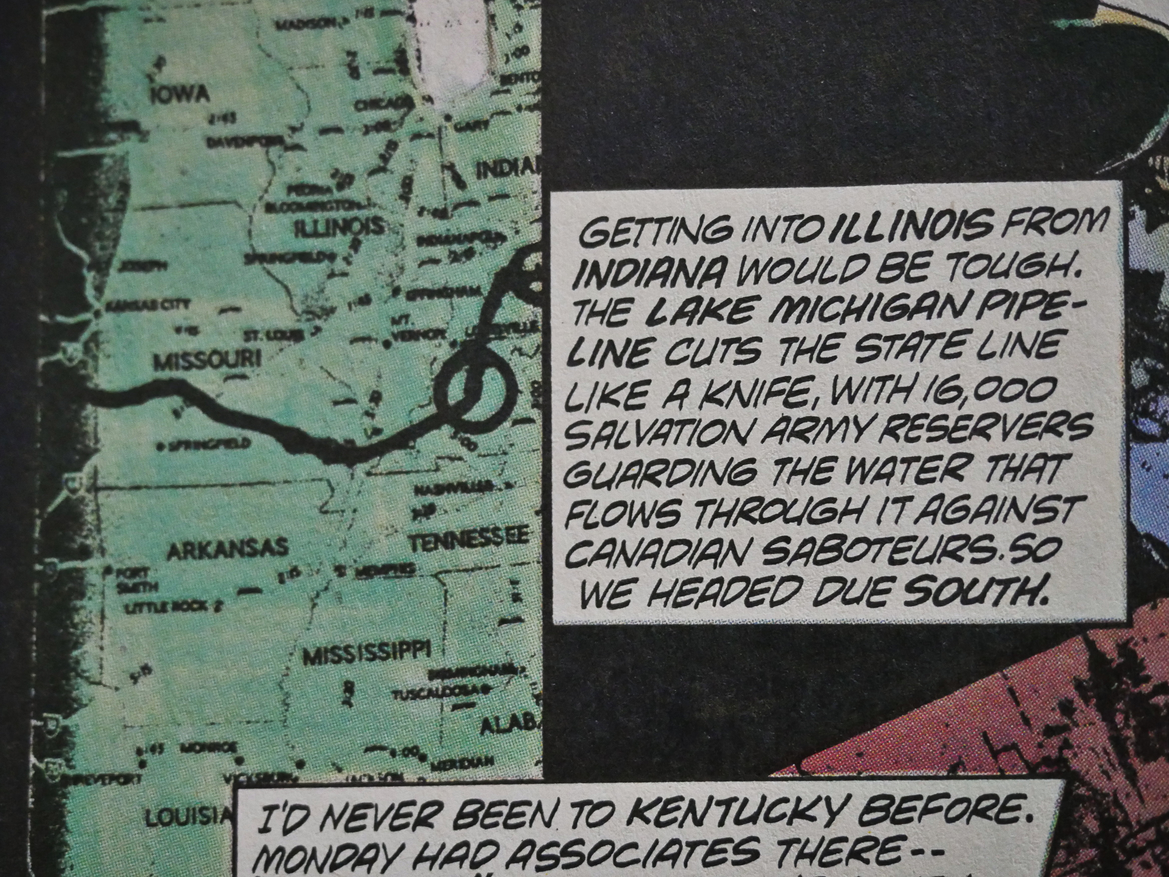
Hey! That plot bit about the US stealing Canada’s water was crabbed by Brian K. Vaughan for that We Stand On Guard (or whatever it was called) series the other year…

There are back-up features throughout the series (because the main feature is mostly 18 pages long), but Truman switches it up by starting to write the back-ups himself and making them relevant to the main storyline. And he places the back-ups in the middle of the main pages, which is structurally unusual, and means that he has to impose a two-chapter structure to most of the issues.

This one’s drawn by John K. Snyder III and didn’t make much sense.

Speaking of sense, here Our Hero visits the sweat lodge once again, and encounters…

Larry Marder’s Beanworld!

I laughed out loud when I got to this page.

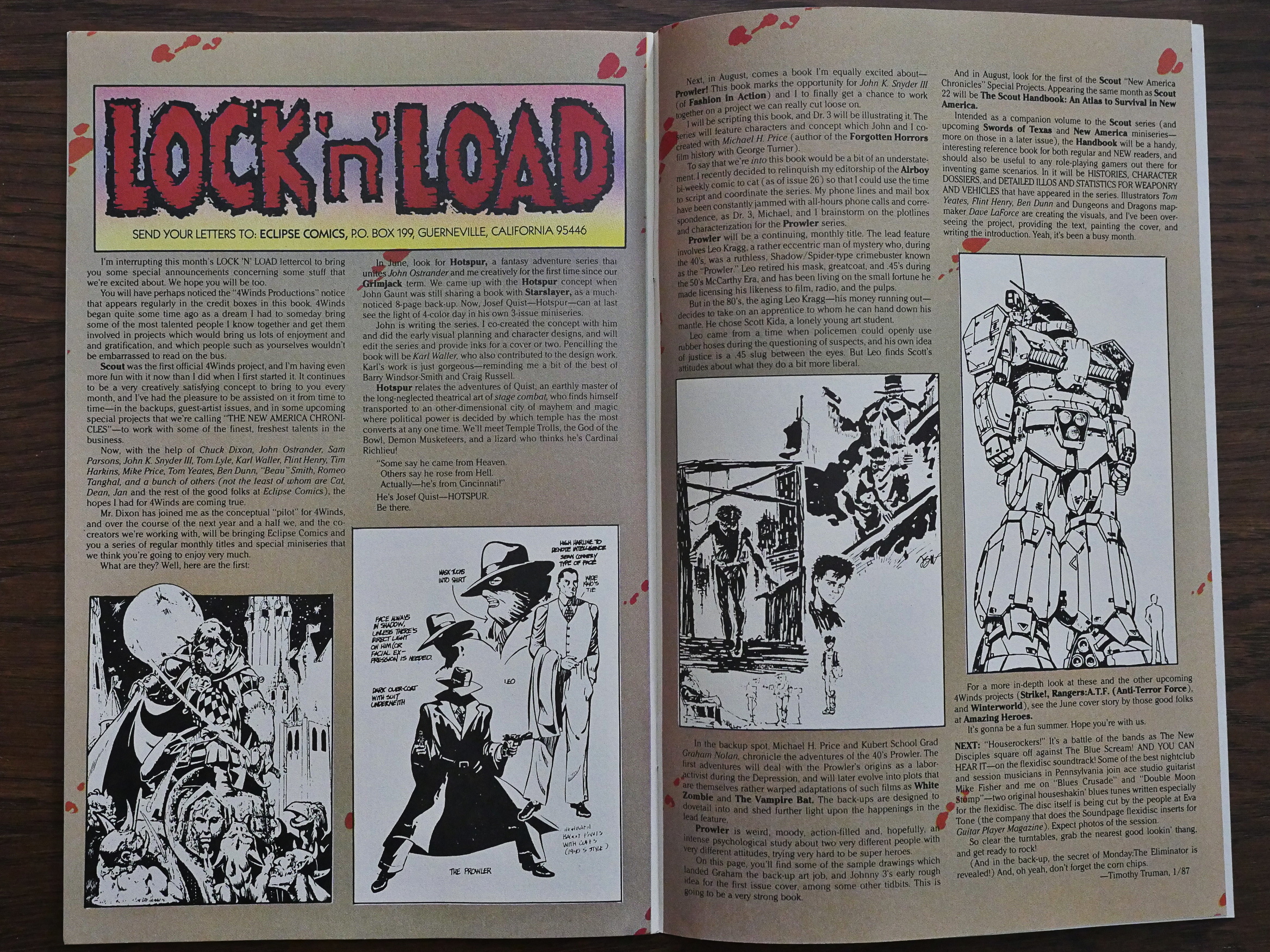
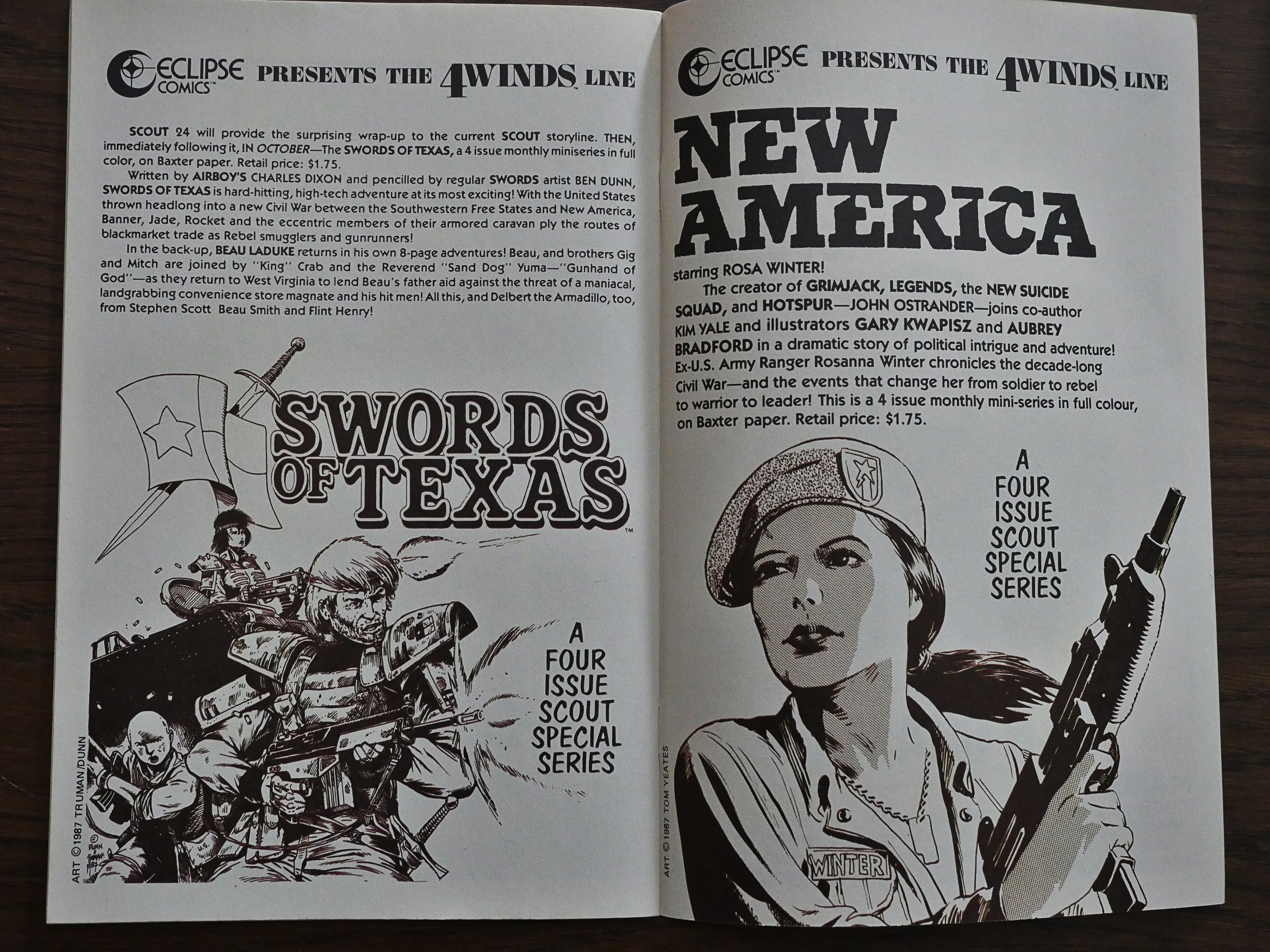
Truman announces that he’s developing an entire line of comics to be published by Eclipse under the 4Winds banner. Most of them written by Chuck Dixon, with artwork by a variety of people. I guess we’ll be hitting them later in this blog series… After reading Scout, I’m kinda excited about reading them, because I’ve never read any of them before. And Scout’s a pretty fun read, so…

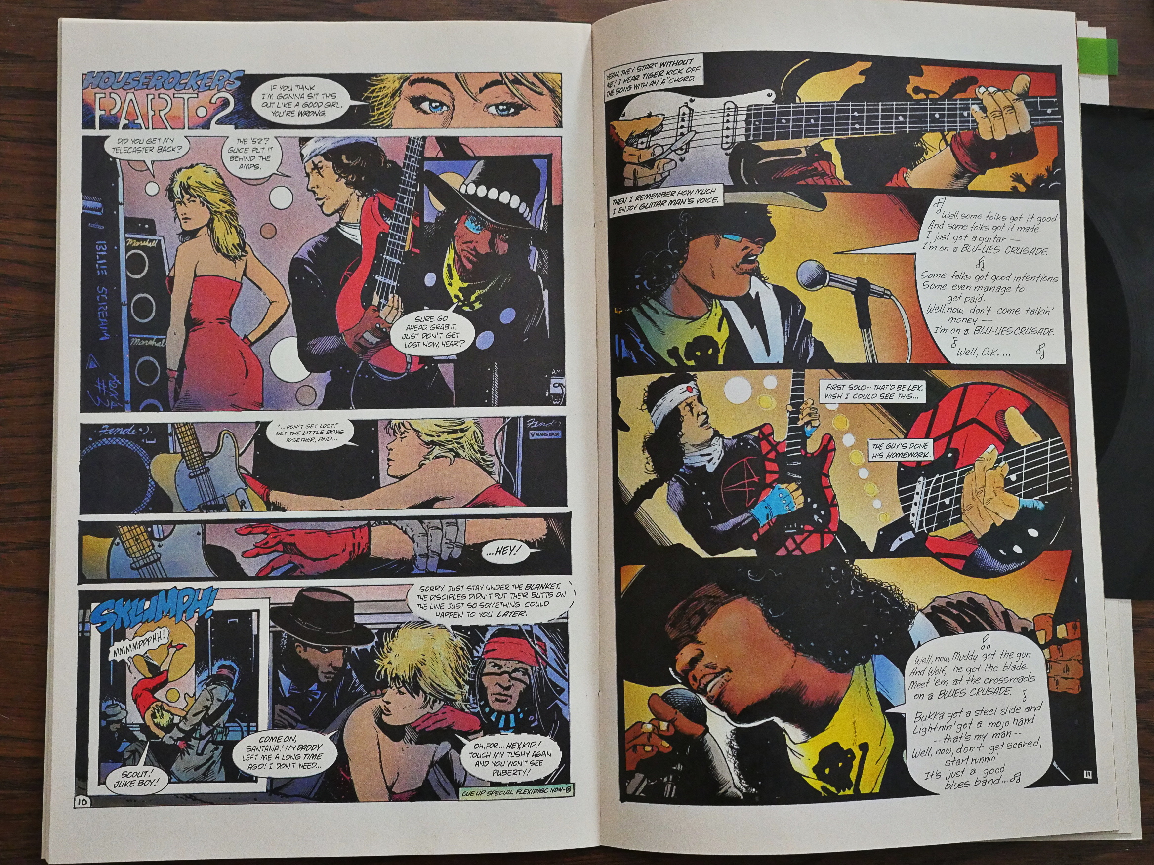
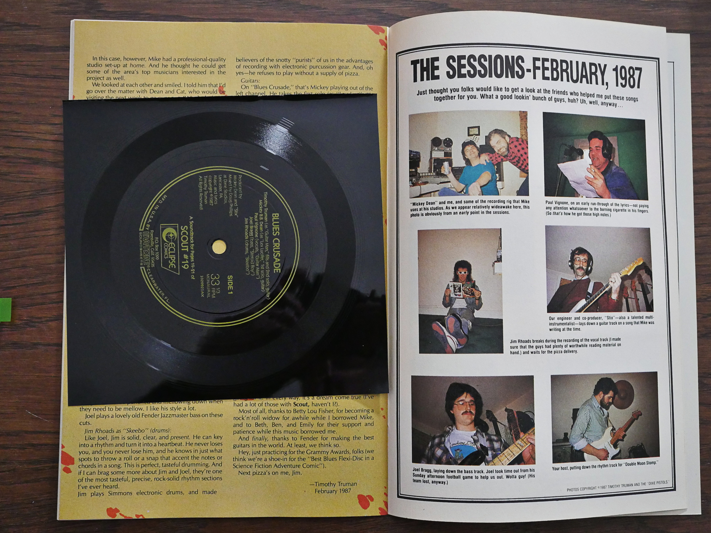
Of all the Scout issues, #19 is the weirdest. It’s a Battle of the Bands issue that includes a flexi (seen below) that you’re supposed to play while reading the sequence seen above where the two guitarists compete to see who can do the real blues.

I listened to it now, and it’s just about what I imagined: The kind of constipated-singing chugging 80s “blues” that was a thing back then. With drums that sound like they’re from a cheap drum machine, but turn out to be from a cheap synth drum set.

Hm… It doesn’t seem to be on Youtube? And since I don’t think it’s any good myself, I’m not uploading it either. (Besides, copyright.) (Unless anybody really really really needs to hear it, and I may be persuaded; leave comments if you ever get to the bottom of this blog post.)

Did I mention that there’s a surprising amount of humour in Scout? It’s mostly of the “sturdy” kind, though.

And did I mention that Truman’s artwork improves? It’s still gritty, but Scout isn’t staring at the reader face-on all the time, but looks to the sides sometimes and even has his mouth slightly open and makes an expression.

In the very last issue, Truman goes to a completely new rendering technique, using… charcoal? Or something? Instead of just inks. Weird artistic choice for a final issue…

And then he announces that Scout’s over, but that two new mini-series will be published next, and then Scout will return in a new series in four months time. Which is what turned out to happen, amazingly enough.

Hm… Perhaps I should read those two miniseries before continuing with Scout: War Shaman? And cut this blog post “short”? Do I hear a sigh of relief?

BUT WAIT!

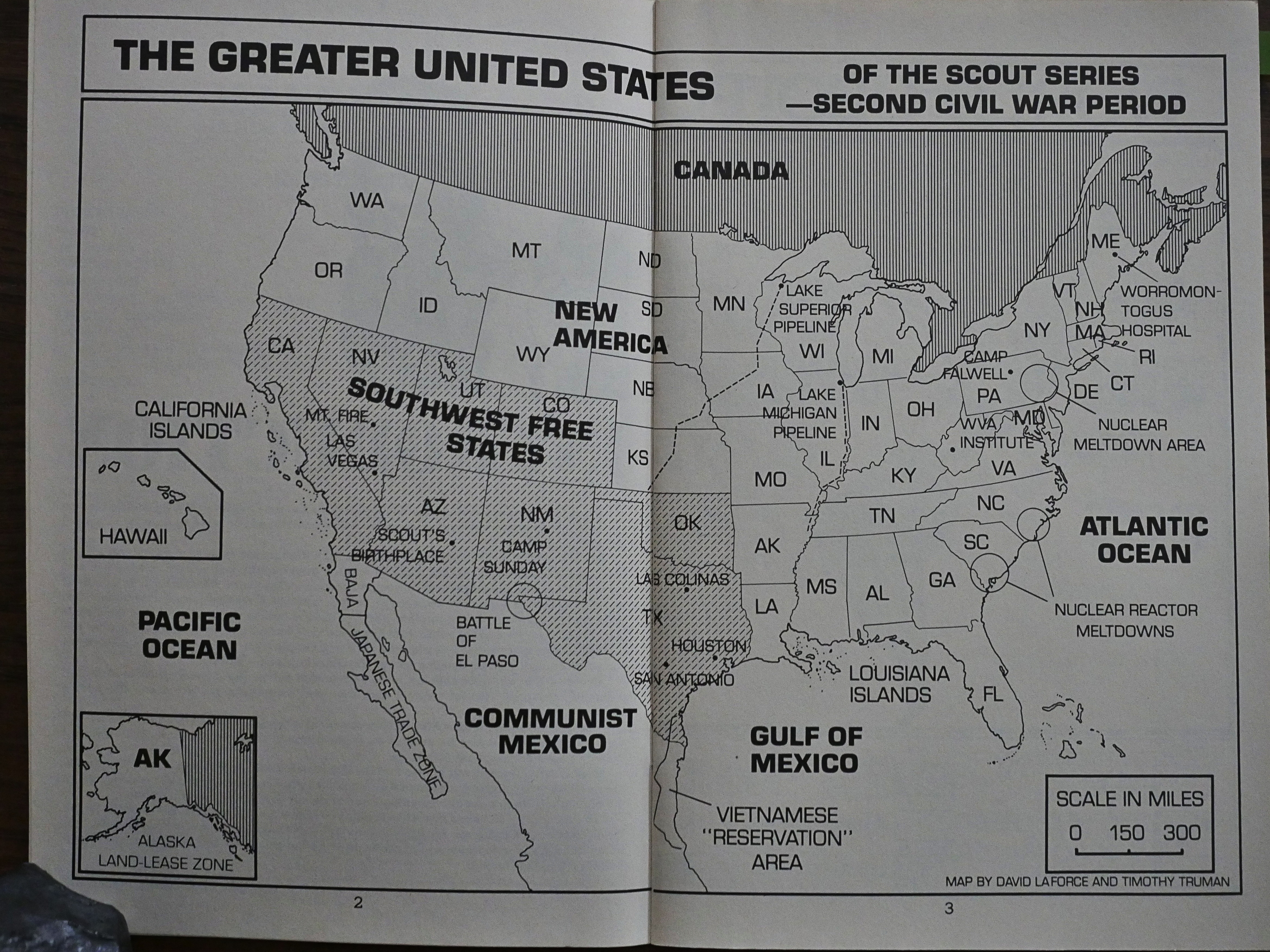
There’s the Scout Handbook first. Hm… Nice map of America…

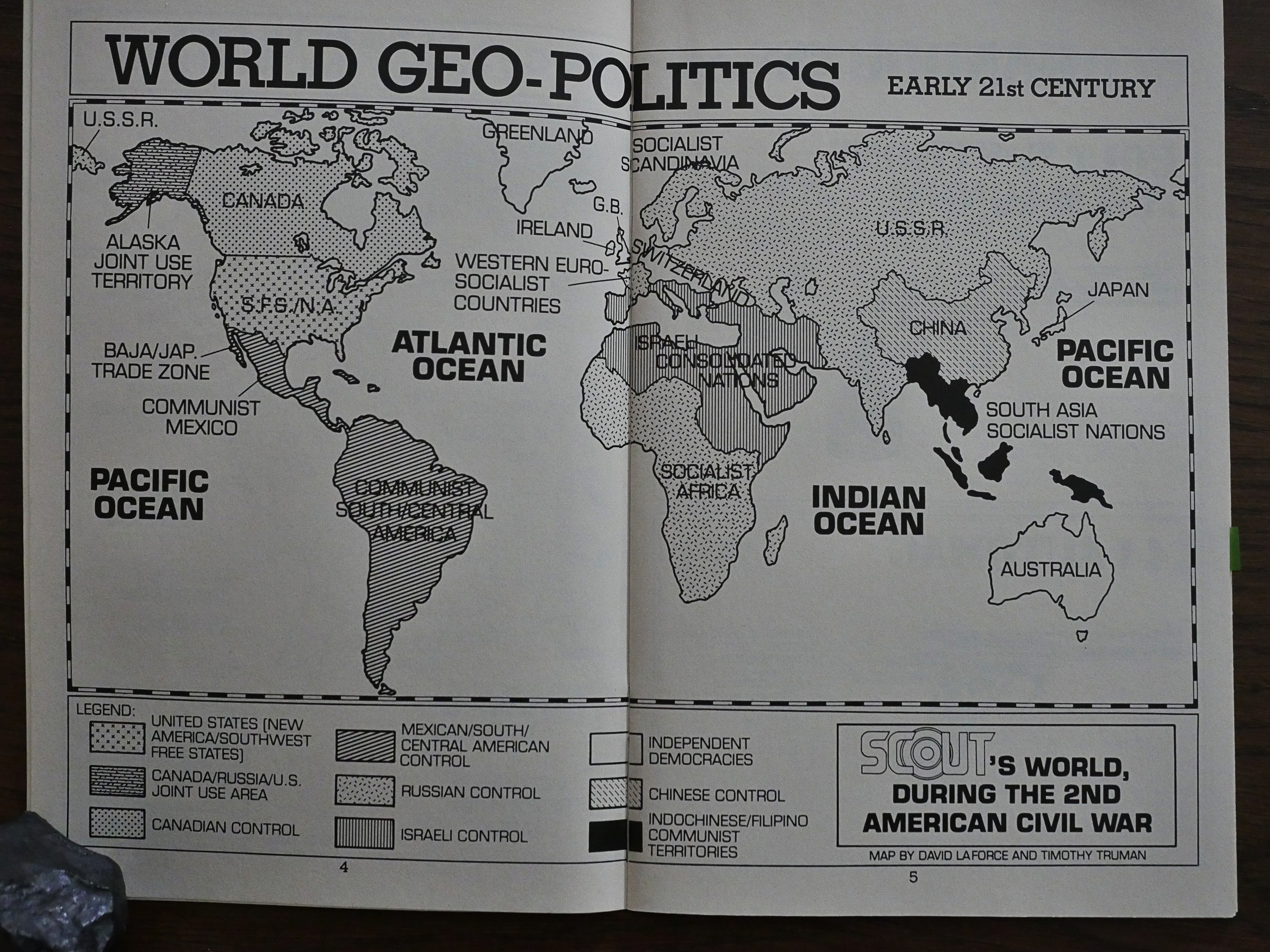
But I found this world map even more amusing. Switzerland is now huge, and Israel has conquered huge chunks of Africa, The Middle East and Europe…

Besides the maps there’s oodles of pages of fascinating gun facts and character bios and stuff. I must admit I kinda skimmed the pages.

So there you have it. Before I end this post and continue with the mini-series, perhaps I should google whether Truman has said anything about the series himself…

Hm. Here’s an interview with Newsarama:

Newsarama: Fist off Tim, this seems like a long time coming, given that many, many properties from the ’80s like Scout have seen collections, reprints, and even revivals. How did the Dynamite reprints come about?

Tim Truman: Dynamite contacted me a year or so back ago about it and we began negotiations. Over the years a lot of publishers have inquired about reprint rights and I always resisted it.

NRAMA: Why?

TT: My reasons were due mainly to my own peculiar and maddening artistic insecurities: Quite simply, I hate to look at the drawings that I did when I was first starting out, particularly Scout and Grimjack. I was sometimes drawing four to six pages a day at that point in my career and looking at the work now drives me crazy. So I was never too anxious to have the work out there again.

Oh, wow. Now I feel like a heel for dissing the artwork…

It was the end of the Reagan era and the beginning of the Bush I regime and there were a lot of things happening that really bothered me. I’m a notorious left-leaner — not a pacifist liberal, really, but a sort of 1920’s pro-labor populist throwback. So I used Scout as an adventure-oriented springboard to address a lot of the social and governmental concerns that I had. It’s been weird watching things unfold during subsequent years. Though the Soviet Union isn’t around any more, several of the things that I wrote about in Scout and Scout: War Shaman have sort of come to pass in one way or another.

Hm! And in all those letter-columns where he strenuously denied being political and stuff! Hmrph!

NRAMA: Looking back at the story now, is there anything the 2006 Tim Truman would do differently?

TT: Yeah. I’d brush up on my figure anatomy, for sure! There’s some storytelling in there that I’m real proud of, though, and I’ll always be proud of the writing and the stories themselves. There’s some pretty groundbreaking stuff in there, and the book turned out being quite influential. Scout will always have a big hold on my heart and soul because it was the first book that was 100% my own vision.

When I think about it, doing that book was such an amazing task. I was writing, penciling, and inking a monthly series, and I did it for almost three years. Quite a lot of work. Towards the end, there, I was getting pretty strange and cranky and lost a friend or two.

Now I’m really curious about how that strangeness is going to play out in Scout: War Shaman.

But to conclude: I found reading Scout to be hugely entertaining, and very different from what I had assumed it was going to be like. Instead of a book of mindless macho violence, it’s a boisterous but thoughtful book.

1985: Reese’s Pieces

Reese’s Pieces (1985) #1-2 by Ralph Reese et al.

Of all the artist-focused microseries Eclipse published in 1985, Ralph Reese is the artist I’m least familiar with. All the other ones Eclipse did (John Bolton, Brian Bolland, etc) were people who’d recently become big names doing commercial comics, so it would make sense to try to cash in on that by digging out old material and reprinting it.

This is the last of these reprints, so either Eclipse saved the least for last, or this sold so badly that they aborted the project.

As usual, there’s no information about where these comics originally appeared. But the mascot up there looks like the spider from Web of Horror, right? So it must be from 1969.

As you can see above, Reese worked as Wally Wood’s assistant for some years, and later joined Neal Adams at his studio.

In these comics he experiments a bit with different styles… Here’s a very photo-realistic one (perhaps they really are drawn-over photos?), but it printed weirdly…

That’s the second and final page of the story, and it rather seems like this was supposed to be published as a two-page spread, since it’s supposed to be read across first, and not down. And the page number at the bottom there says “39”, so it was originally printed on the right-hand side, not on the left.

Oh, Eclipse.

Reese seems to emulate French comics artist Caza here? The experiments are fun, but the stories (by various writers) are pure eh.

Those darn curses.

Reese would go on to do the Flash Gordon newspaper strip in the 90s.