1985: Ragamuffins

Ragamuffins (1985) #1 by Don McGregor, Gene Colan, et al.

This comic reprints the first three Ragamuffins stories from the Eclipse magazine.

McGregor explains how hard it is to sell anything about genre comics in the US comics marketplace. Or at least it was back in the 70s and 80s. I think any editor would jump at the chance to publish a comic book about two kids walking down the sidewalk today, don’t you?

I don’t really have much to say about Ragamuffins that I didn’t when I wrote about the Eclipse magazine, but it’s still sweet and melancholy. It doesn’t really have any major insights to offer, though, even if it takes itself very seriously.

But the reproduction of Colan’s shot-straight-from-the-pencils artwork looks a lot better here than in their original appearance, and the colouring by Steve Oliff is sensitive and perfectly right for the work.

Above you see the original printing, which was way way too washed out, to the point you couldn’t see what was going on here and there. So that’s an improvement.

This, story, on the other hand, doesn’t really look that good. Almost as if it were shot from the printed page:

Which also looked awkward, as if they’d tried to up the contrast too much when shooting the pencils.

Anyway, there were a couple of further Ragamuffins stories published in Eclipse Monthly, but those were never reprinted. There has never been a complete collection of this work, and to the best of my knowledge, McGregor didn’t continue the series, as he said he wanted to do in the introduction.

1985: Mr. Monster

Doc Stearn…Mr. Monster (1985) #1-10, Mr. Monster’s Super Duper Special (1986) #1-8, Airboy-Mr. Monster Special (1987) #1 by Michael T. Gilbert et al.

I remember being vaguely taken with Gilbert’s collection of Wraith stories (published by Aardvark Vanaheim), but for some reason or other I skipped buying Mr. Monster back in the days.

If I had known that William Messner-Loebs was responsible for the inks (and some of the pencils), I probably would have bought it, because I was a rabid Journey fan. The Wraith was a homage to Will Eisner’s The Spirit, and Messner-Loebs was also very influenced by Eisner, so Gilbert and Messner-Loebs is an obvious (and quite attractive) pairing.

Throughout Mr. Monster’s run, the book is dominated by short stories, often between eight and sixteen pages. I guess this suits the material (it’s a zany kinda-parody of super-heroes fighting monsters), but it does give you a very choppy reading experience.

It’s quite dense, so you do get the feeling the Gilbert does want to give the reader “value for money”… Cramming as many weird things into as few pages as possible.

Gilbert explains that he er borrowed the Doc Stern{e,}/Mr. Monster concept from an old comic book that had now fallen into the public domain.

Gilbert’s version of Mr. Monster was originally meant for the Pacific Comics anthology Vanguard, but Pacific Comics went bankrupt and Eclipse took over the first three eight-page episodes that had already been done, without writing a contract for any further issues. But it apparently sold well, so the book continued on at Eclipse.

Gilbert writes and does the layouts, while Messner-Loebs is supposed to do the pencils and inking, but its obvious from early on that basically Gilbert does whatever he wants to, and leaves the boring parts to Messner-Loebs. This gives the artwork a rather schizophrenic look, where one panel is clearly rendered fully by Messner-Loebs, and some look more like finished Gilbert panels, like the above.

As for the writing… Reading this, I found myself going “oh, yeah, he’s going for over-the-top posturing? and it’s… amusing?” I don’t really think Gilbert takes it far enough: It’s almost not a joke. Tweak it slightly and it’s just any super-hero comic.

I did not laugh out loud at any point while reading this, which is probably more a reflection of my mood than the work in question, but there you go.

I find this rather amazing: Mr. Monster #1 sold 26K copies! And in subsequent issues both Gilbert and editor cat ⊕ yronwode will mention that the circulation has increased by a further 5K copies, and then “with every issue”. So we can guess that at its height, it sold in the mid-30Ks, which are numbers any of the major comic book companies today would consider extremely respectable.

The letters pages have a fun club-like vibe going on. Every issue somebody’s submitted fan artwork or something. And the people writing in doesn’t seem to be children, so it’s rather puzzling why Mr. Monster would attract this crowd… Perhaps they just found it to be totes hilaire?

Speaking of fan art: The main feature in the third issue is written by superstar writer Alan Moore. Not all the pages are as experimental as this one, but it’s quite interesting nevertheless. And I guess I should mention letterer Ken Bruzenak who does almost all the lettering throughout Mr. Monster, and he does it flawlessly and imaginatively.

Also with #3 Gilbert starts running oldie reprints as backup features. Here’s Basil Wolverton…

… and here’s Jeffrey Bonivert, who’s not an oldie at all. But, man, is that the most 70s drawing ever? I mean ever?

Gilbert explains that he has to run reprints because Mr. Monster is very expensive to produce: Not just because he pays the other people well, but because he also pays himself well. Which is refreshingly honest.

I wonder what name was blanked out there: “including Alan More, Dave Stevens, and Steve Bissette”…

Who’s doing what on the main feature is rather chaotic: Here’s Jeffrey Bonivert doing some pages.

Reprints continue with Jeffrey Grandenetti, who was an assistant at Eisner’s studio, and drew very much like him, so I see the attraction.

In #4, Gilbert does a solo eight-page story, which also seems to illustrate what I think are his weaknesses as an artist: His pages are rather unreadable. I know that he wants the over-the-top chaotic atmosphere, but my eyes just slid around page like without latching on to anything.

Messner-Loebs also does a solo story here, and it’s extremely readable. But not as entertaining as Gilbert can be.

One thing I did like about Mr. Monster was its feeling of constant experimentation and “anything goes”. Just throw any old thing in here and see whether it works or not. So here we have TERROR-CHROMA! which turns out to be computer colouring. The first ever, apparently:

Colours by Steve Oliff on a computer and artwork by Bonivert.

When I read this I went “uh oh, that’s the last we’ll see of Messner-Loebs here”: Gilbert says that he repencilled some of the faces on Messner-Loebs’ solo story.

Somebody on the letters page suggests that Don Simpson should be roped in…

… and the next issue he does the cover and the inks because, yup, Messner-Loebs left. I have no idea whether that had anything to do with the repencilling thing, but, you know.

Steve Ditko! The introduction says that some people claim it’s Ditko’s very first story, which is fun.

Mr. Monster was nominated for Best New Series at the Kirby Awards, so I guess people liked it, they really liked it?

A Swamp Thing/Mr. Monster team-up was contracted for, but never happened, I think?

Gilbert and Moore had even plotted the story (which Gilbert later described as “a romp through the horror worlds of various old comic book companies”), but right before Gilbert began to actually produce the story, Alan Moore had his split with DC Comics over Watchmen and without Moore, obviously there was no project left.

Oh well.

Of the weirdest random drive-by contributions, we have two pages by the wonderful Mark Martin.

Finally in #10, we get another full-issue story, and it has some of the funnier bits Gilbert came up with. I think on pages like this (and the two subsequent ones) Gilbert finally goes over the top enough to be like you know funny. It’s a bit Mad in the Kurtzman years.

And this is the much-heralded 6-D issue: It’s twice as good as 3-D because it’s both in colour and has 3-D elements. Unfortunately, the 3-D elements didn’t work at all for me: They were just uncomfortable blurs.

Gilbert explains where he came up with the idea: He saw it in an old comic book.

And then Mr. Monster is cancelled. Gilbert doesn’t outright state here why it’s cancelled, but alludes to sales and that perhaps it’ll continue later and I immediately though DRAMA!

Using the Comics Journal Search Engine, I soon found this news item written by “TP”, but I’m too lazy to look up the indicia, so I guess that might be Thom Powers?

MICHAEL T. GILBERT TAKES MR. MONSTER TO DARK HORSE

Creator Michael T. Gilbert is taking his Mr. Monster from Eclipse Comics to Dark Horse. According to Gilbert, he made the decision early in the summer based on a recent decline in sales, editorial differences, and the conclusion of contractual obligations with Eclipse.

“Eclipse is perceived in the industry as a company that can’t sell super-heroes,” Gilbert said. He pointed out in the past two years Eclipse’s sales on super-hero titles such as Miracleman, The Champions, New Wåve, DNAgents, and Crossfire have shown a distinct decline.

[…]

Eclipse was contracted to publish 12 issues ofMr. Monster. But after a steady decline in sales, Gilbert said publisher Dean Mullaney asked Gilbert to wrap up the series with issue and do an Airboy/Mr. Monster team-up in place of the last two issues.

“There was no talk of continuation,” Gilbert added. Gilbert blames poor sales partly on a lack of continued advertising. Due to Eclipse’s great output, Gilbert says, most of their comics get advertised only during the first couple of months after their debut, “unless it’s a property they own outright,” such as Airboy.

“Editorial differences”: “The last straw” that sent Gilbert seeking a new publisher rather than renegotiating a new contract with Eclipse was the changing of “certain wordings” made without Gilbert’s consent to his part of the script in the Airboy/Mr. Monster team-up. He had previously had “editorial differences” with Eclipse co-publisher Cat Yronwode that he didn’t wish to comment on.

“I think Eclipse didn’t quite know what they had with Mr. Monster:’ Gilbert said. On the other hand, “The people at Dark Horse have been fans of the book for some time and made it known to me that they would like to publish it.”

[…]

The comic will be changed to a black-and-white, monthly format with at least 16 pages of new material each issue, plus a back-up feature reprinting a “golden age” story.

Yup. So much drama.

But what’s that about an Airboy/Mr. Monster special?

It’s a weird one. I have yet to read Airboy, so I have no idea whether metafictionality is its stock in trade, but the crossover book is all about one of the old golden-age illustrators of Airboy being threatened by an Airboy villain and is then saved by some heroes.

It manages to be pat and bizarre at the same time, which is quite an achievement.

Gerard Jones adds a text where he compares Airboy to Thomas Jefferson.

I think.

And that’s the end of Mr. Monster at Eclipse. Gilbert would continue publishing it at a bewildering array of publishers over the next few decades, and is still working in comics.

But there’s more! Concurrently with Mr. Monster, an eight issue series of reprints was published. It’s called Mr. Monster’s Super Duper Special with various sub-titles (or super-titles, because sometimes the title doesn’t appear on the cover, only in the indicia, which is a thing Eclipse did sometimes).

The first issue is a 3D thing, and has some of the most extreme 3D effects I’ve seen. It’s exhausting to make your eyes focus that far back and then have to focus to the front again to read the text.

Even the text pages are whack: One of them’s printed so the blue channel has black text…

… and the red channel has white text. Oops. That didn’t come out well in the camera…

Like Mr. Monster itself, the effects are a bit on the exhausting side.

The series is mostly public domain potboilers from the 40s and 50s. Gilbert says that Eclipse try to look up the artists responsible and give them a $75 per page reprint fee (even though they don’t have to), which is nice of them (if accurate).

The prettiest piece reprinted is this one drawn by George Evans.

It’s not all horror and sci-fi: We also get two pages of “true crime” by Jack Cole of Plastic Man fame. These images were among the ones Fredrick Wertham used in his book Seduction of the Innocent to illustrate how extreme comics books had gotten, and that they should be censored.

The thing about these old comics… I understand that many people love them (certainly at the time; some of them had circulations in the millions), but I just find them tedious. I know, they’re bad comics, and when it comes to bad comics, you just irrationally love them or not. I kinda like reading Ric Hochet comics, even if they’re tedious and formulaic, and I can’t quite explain why.

I just don’t have a taste for this particular kind of nonsense, so getting through some of these reprints was a chore.

Max Allan Collins apparently feels the same way. Only he kinda likes the particular ones reprinted here.

Things pick up a bit with this Bob Powell sci-fi yarn. I love how the user interface on space ship is so horribly bad that stumbling around sends you to Mercury.

The best issues here are the Hi-Schlock Shock! issues.

Gilbert has collected some of the most bizarre stuff he could find, like this guy who’s run over by a steamroller and then… becomes evil… but thin, very thin, produced by the Iger studios.

And there’s a Dick Briefer Frankenstein story here, which is the only one that made me want to read more. It’s so weird. But readable.

Fred Hembeck drops by to explain what makes schlock schlock, and that’s a pretty good explanation.

The Miss Gay and Butch Dykeman is a parody comic from the 50s (allegedly), so it’s not really schlock, is it?

The final issue is dedicated to Basil Wolverton strips from Weird Tales from the Future.

And that’s it, folks.

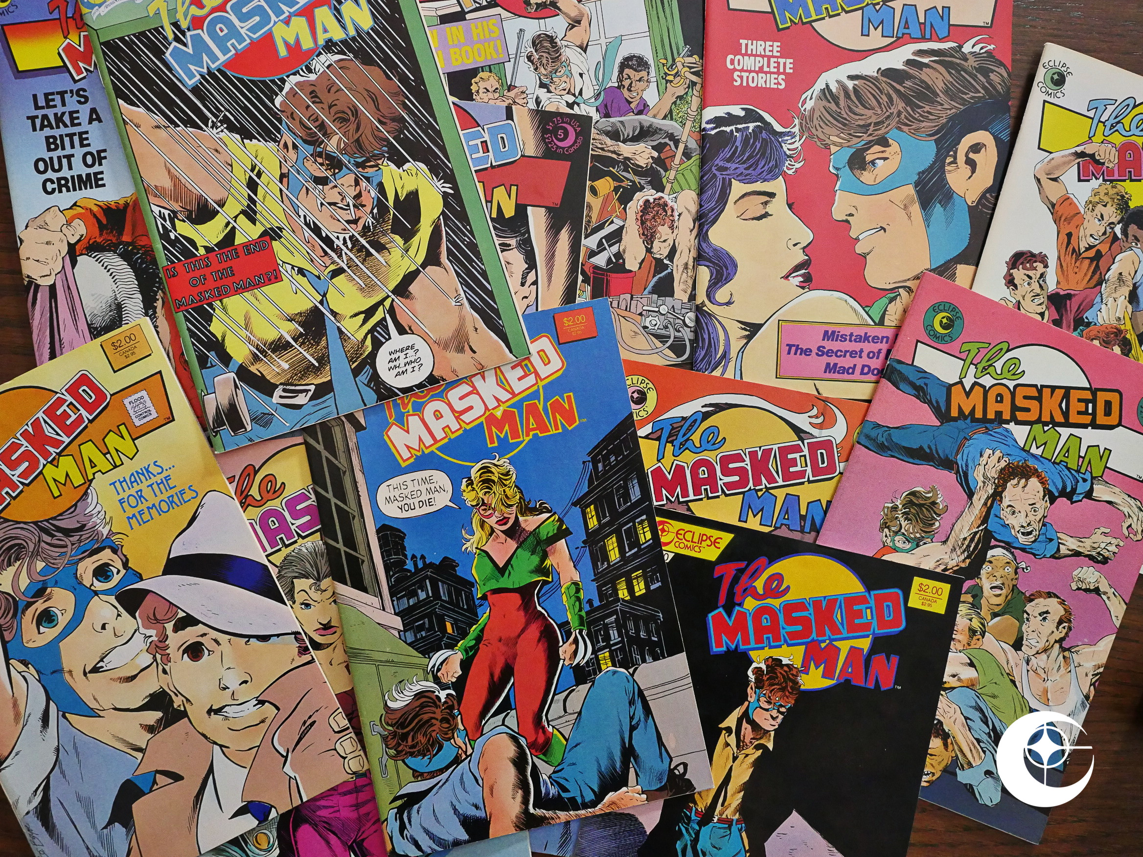
1984: The Masked Man

The Masked Man (1984) #1-12 by B. C. Boyer

Wow! Coming to The Masked Man is so jarring. After plowing through all the comics that arrived via the Pacific Comics bankruptcy, it’s so strange being back with a comic that’s firmly in Eclipse’s aesthetic.

The Masked Man had run in the Eclipse anthologies, and going by the letters pages there, it was the most popular feature.

Which the inherited Pacific comics are dominated by horror and science fiction, and with some of the most famous artists in comics (Al Williamson, Berni Wrightson, etc) or British nihilistic hyper-violence (Axel Pressbutton), that’s definitely not The Masked Man.

The first issue is a reintroduction to the character, but not a strict retelling, so it’s not boring for somebody who’s recently read the anthologies.

Boyer is a pretty straightforward artist. His figures are a bit stiff, and it’s solidly on the more cartooney side of mainstream realist comics. He very occasionally plays a bit with the comics format (like with the exploding border up there), but it’s not his main interest.

No, these are stories about an upstanding guy who’s put a mask on to fight crime, and the stories are often a bit on the maudlin side. Or should I say emotional? (Above we have our hero not letting himself be taken advantage of by a sleazy politician.)

There’s a backup feature in most of the early issues, all written by somebody called E. Yarber, but with a variety of artists. These are mostly small vignettes with a humorous twist ending, and after every one of them I felt myself going, “well, that was a bit clumsy, but that was a cute ending, huh?”

Here we have Val Mayerik doing the artwork, so I was expecting heads to inappropriately start exploding, because that what he usually does, but no. The Masked Man is family oriented.

In the first issue, Boyer writes about how he sold The Masked Man (originally called The White Collar Man; the name was changed by editor Dean Mullaney). tl;dr: He sent it to Eclipse and they said yes.

Boyer does something on the letters page I can’t recall anybody else doing: Each issue he’ll send a page of original artwork to a randomly chosen letter writer. Perhaps I can do the same! I’ll send an original jpg to a randomly chosen commenter! That’s the ticket.

Oh, yeah, there’s a lot of villains shooting at our hero and his friends, but they’re the ineptest people ever, and here Boyer has a bit of fun with that.

While every issue is a complete story, and there’s various subplots developed throughout the series, I think the best bits really are these absurd action sequences. As the issues progress, we get less and less of them, though.

The second issue has three stories that were intended for Eclipse Monthly, but were stranded when that anthology was cancelled. Shuffling them around an doing that new first issue was a smart move.

The Masked Man isn’t just a comedy/action comic book: There’s a lot of these dramatic scenes where children (here’s Aphidman) reuniting and coming to an understanding with their parents (here’s J. Judah Johnson). It’s definitely the most prominent theme: Everybody’s losing or finding their parents.

Kelley Jones shows up doing the inks to one of the backup stories.

Have I mentioned the weird thing the printer that Eclipse uses did on most of the comics? Put glue in the centre margins of pages 10-11 and 22-23. Sometimes there’s so much glue in there that you can’t open the pages properly without ripping the paper, like here.

The single weirdest feature of The Masked Man is the jealousy between the hero’s sidekick and the hero’s girlfriend. And the sidekick isn’t gay; that’s mentioned explicitly (in the anthology stories), he’s just doesn’t want his friend to have a sex life of something.

It’s a bit of a head-scratcher.

Boyer’s politics, on the other hand, aren’t very difficult to suss out. Here we have some strident activists making their case as clearly as I guess Boyer sees their issues.

And you also see some angles that Boyer perhaps shouldn’t have attempted to draw humans at.

Oh, yeah, Eclipse had that flood around this time, and lost their entire backstock.

cat yronwode writes on Wikipedia:

Hi, this is cat. The loss of many hundreds of cartons of back stock comic books — about 90% of our published back stock — in the flood meant that no further back issue subscription sales could be undertaken, and those sales were a distinct portion of the company’s income. In addition, all of the four-colour film negatives for past printed comics were lost in the flood, and because this was in the pre-digital era, the result was that no graphic album collections could be produced from the issues thus affected, limiting another source of income which had previously been profitable. There have been those who, over the years have claimed that these losses were not great, but in fact they were significant and the company never regained its strong financial position after the flood. cat yronwode

And with #9, Boyer steps into the comic to announce that it’s been cancelled (due to low sales). The storyline can’t be said to have come to any sort of conclusion: There were a lot of stuff that didn’t go anywhere much. But it’s a nice final issue.

And cat ⊕ yronwode ends it all by writing a bit about Boyer, who turns out to be the kind of guy who goes to church (no!), but perhaps slightly more surprising, has a janitorial service as a day job. That he’s now going back to full time.

But then! Issue ten! It’s just one year after #9, but in the meantime the black and white boom had started, which was a period you could publish the phone book in 32 page slices and sell tens of thousands of them. As long as those 32 pages were in black and white.

Collectors, eh?

Boyer uses the opportunity to stage a comeback, and retools the artwork and makes it more broody and serious.

And at this point I thought he was going to go full on boobs-and-guts slaughtering (with those knives attached to Elektra’s, I mean, Blade’s hands). But, nope. The book basically remains as before, only with a bit fewer jokes.

Boyer promises three specials per year instead of a continuous release schedule.

Hey, that’s a kinda fun internal ad. Larry Marder, Matt Feazell and Chris Ware. Never to be seen on the same page again.

The second of the b&w issues go to a cheaper, off-white paper, which is a good sign that it’s not selling very well.

(And again with the parent/child thing.)

And… Yes. Boyer says that sales have been halved, but I don’t know whether that’s from the colour issues or from the previous one. The black and white bust was harsh, but relying on collectors to feed you isn’t a good idea.

And the, with issue 12, it’s cancelled again.

This comic has never been collected or reprinted, which is both surprising and not: There’s a reason that The Masked Man was the most popular feature in the Eclipse anthologies. It’s funny, has pathos, lots of action, characters that aren’t completely stock characters, and artwork that’s… OK.

But that’s really on a story by story basis. The longer subplots are either annoying, involve complete MacGuffins, or go nowhere. If these stories were published in a complete edition, you’d feel cheated, because there’s no story arc here.

B. C. Boyer returned briefly to comics in the 90s with Hilly Rose, and cat ⊕ yronwode returned with him as the editor.

But what did the critics think? Joe McCulloch blockquoteth in 2011:

The Masked Man, by comparison, was a warm bath for genre fans, blending odd, stiff comedy and maudlin drama with the occasionally inspired visual bit of time distortion or long panning, then pouring the works into a whole tub full of fuzzy nostalgia for an indistinct Better Times, impliedly before the mess of darkening, complicated corporate superhero characters, when real heroes relied on their guts, represented the best, and always did the right thing.

It’s an interesting take; go read it all.

Leon Hunt wrote this at the time (from The Comics Journal #92):

I had written the first half of this review shortly after the first appearance of Boyer’s work at Eclipse and reflected my dismay at Boyer’s back-up strip for Don McGregor’s Sabre, “The Incredible Seven,” a noxious blend Of amateurism and cynicism that first drew my attention to this artist.

[…]

I’m also using this review as a way of trying to understand how someone can produce—and have pub. lished—something as awful as “The Incredible Seven.”

[…[

With all this success and popularity, one might conclude that Boyer has improved enormously since previous efforts. I would argue that it is more likely that he will now probably never improve.

Hm! I think he doesn’t like Boyer’s work!

1984: Twisted Tales

Twisted Tales (1982) #1-8, Twisted Tales (1984) #9-10, The Twisted Tales of Bruce Jones (1986) #1-4, Twisted Tales (1987) #1 by Bruce Jones et al.
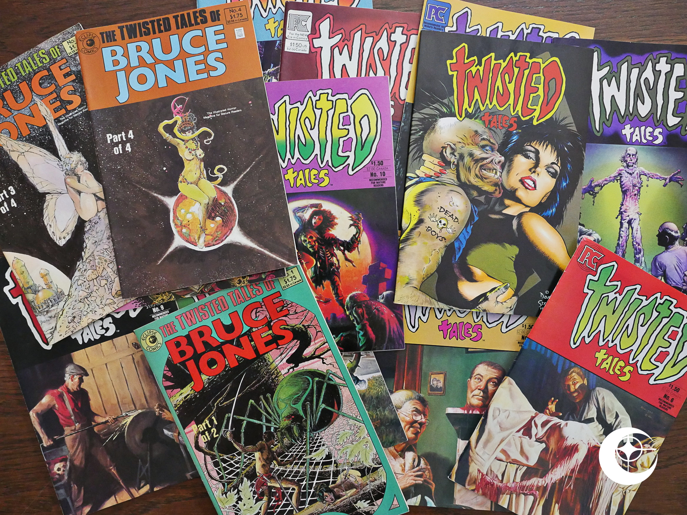
Of all these Eclipsish comics, Twisted Tales my be the ones I remember best from my early teens. Of course, the eight first issues were published by Pacific Comics before they went bankrupt, so it’s fair to say that Pacific was a more memorable publisher than Eclipse, and I should have done a blog series about them instead.

D’oh!
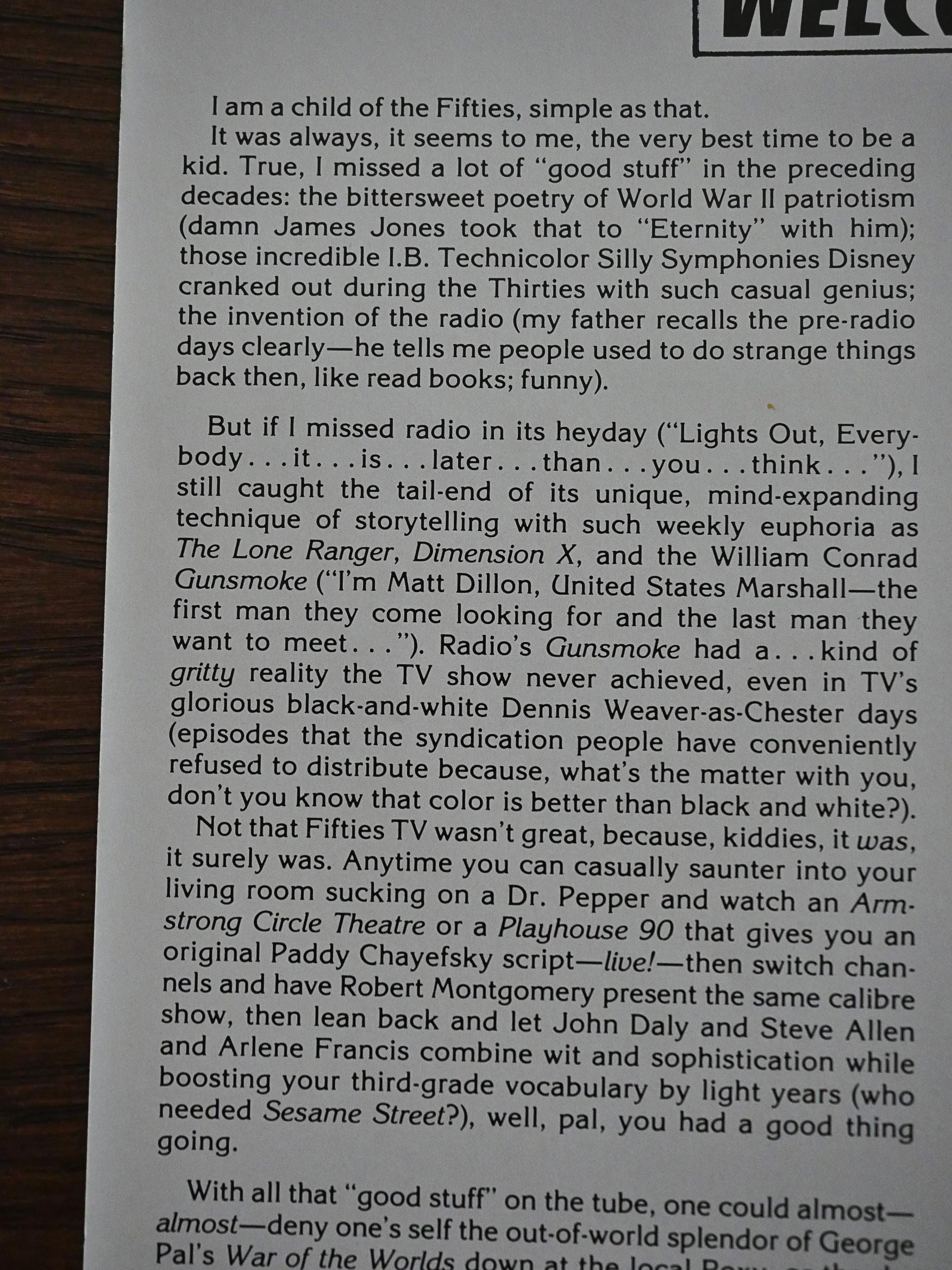
In the first issue, writer and co-editor Bruce Jones provides a background to what he’s attempting to do here. Basically: Do horror in a way that reminds him of what it was like to experience horror stuff when he was growing up in the 50s.
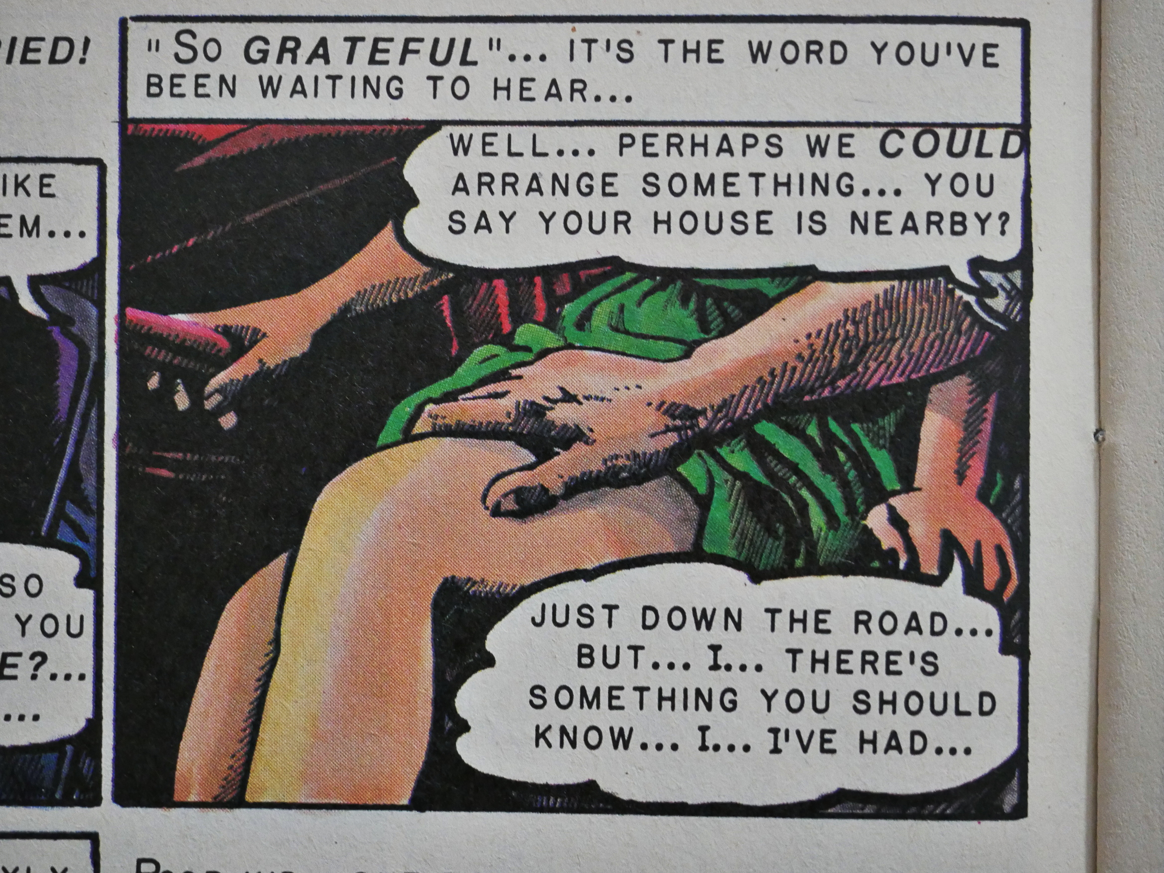
While EC comics are an obvious touch-stone here (down to the lettering Richard Corben uses in the first story of the first issue (but didn’t he use that style anyway around this time?)), we’re in the 80s, and things have a more psychosexual tint to them than when Al Feldstein wrote horror comics in the 50s.
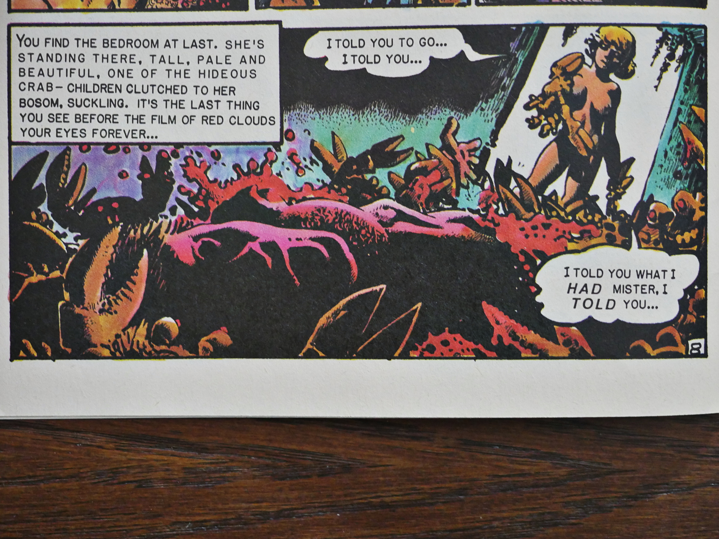
And that the punchline to the story, so don’t display it if you haven’t read the story, which turned out to be pretty much everybody’s favourite, according to the letter columns. It’s called infected, and you see, she’s saying that she had… and then we see that she has…

Yes, it’s a very silly joke, but mixing that joke in with Corben’s awesomely gruesome artwork, it’s exhilarating. You really feel that Jones has honed his horror craft and is extremely enthusiastically throwing everything horrible he knows at the reader.
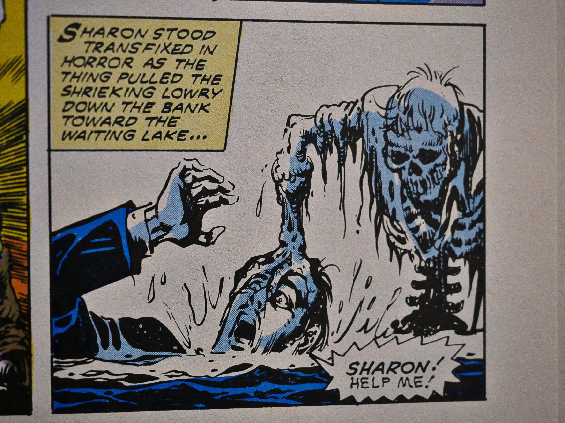
I had expected a bunch of Warren artists to show up here, but only a small handful, like Alfredo Alcala drops by. It’s the most traditionally EC story of them all, perhaps.
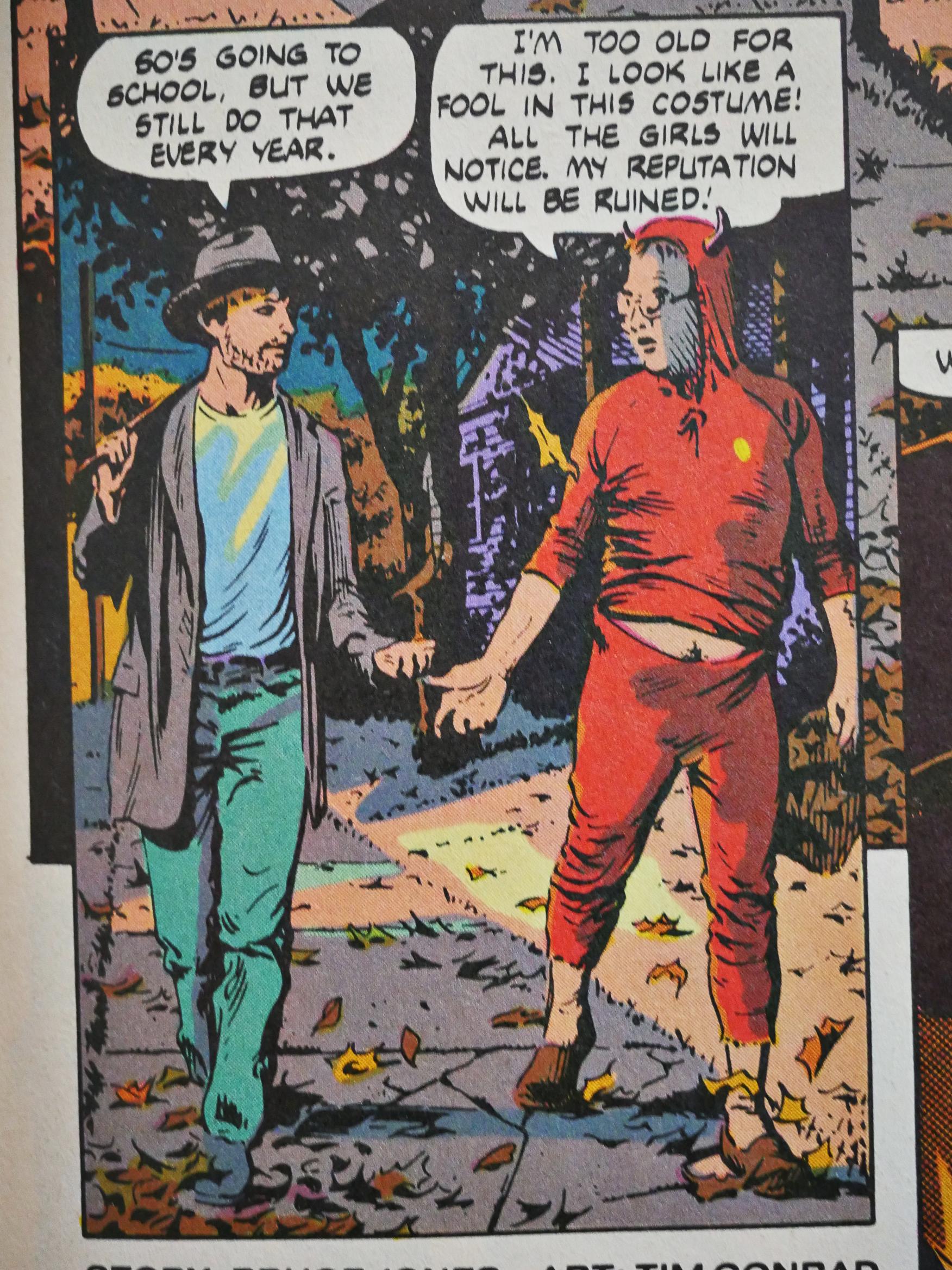
Tim Conrad provides the artwork to this slow burner: Everything’s wrong throughout, and resolves itself perfectly within its horror universe.
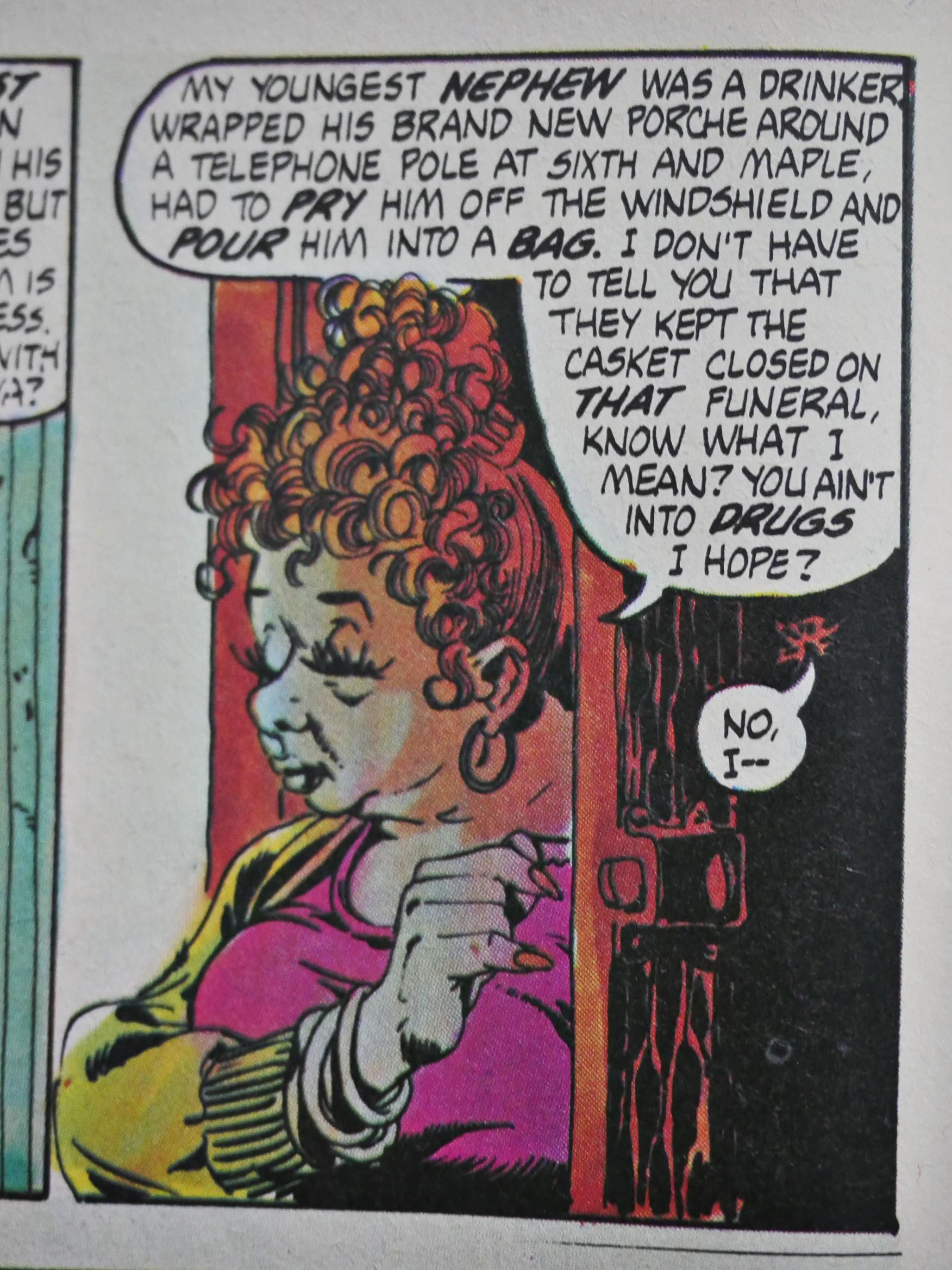
If there’s one problem Jones has, is that he’s a bit prolix at times. But he does have a good ear. It’s seldom grating.
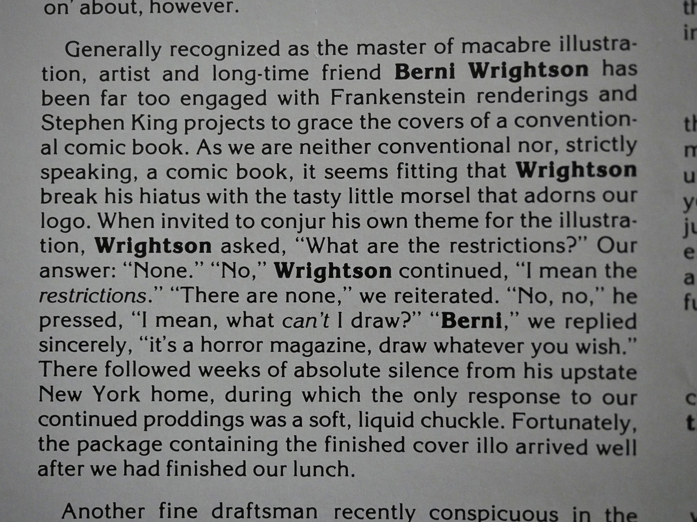
In the second issue, Jones explains that there are no restrictions here on what the artists can draw, because this is a horror magazine for mature readers. Wrightson takes him up on it and does perhaps the most grisly cover of its run. But Jones overstates the case: Of course there are limitations to what he could have drawn. If he’d turned in something with severed erect penises, then that would have been a no-go. Decapitated heads is just good clean fun, you know.
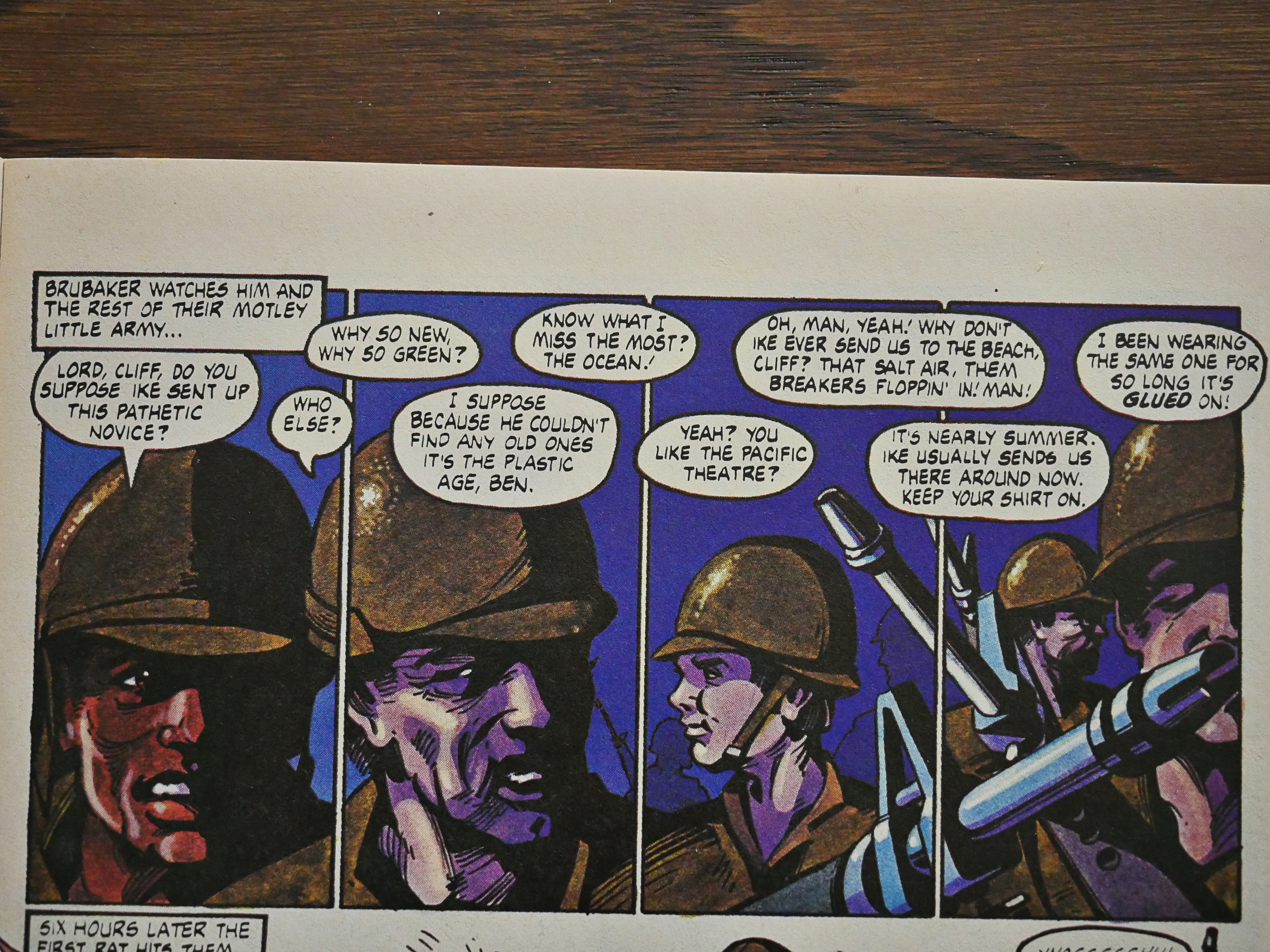
The first issue had used traditional flat-ish colour separations, while the rest use laser scanning for the colours, which allows artists like Ken Steacy here to turn in fully painted stories.
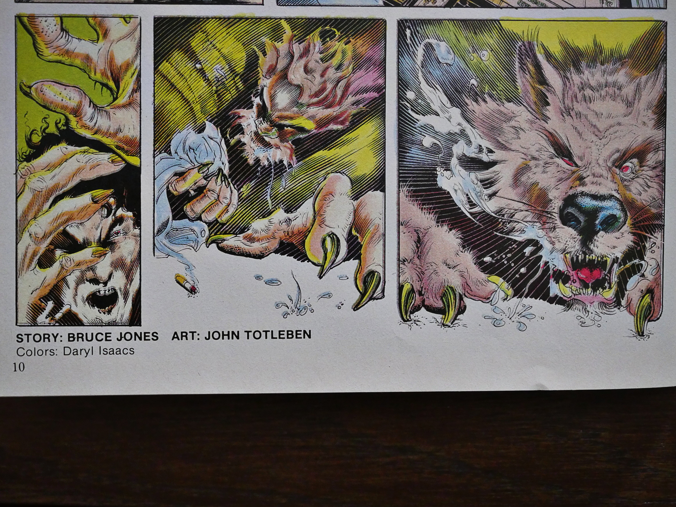
Hey! John Totleben! Was this after Swamp Thing? Hm… It’s a fun little ditty.
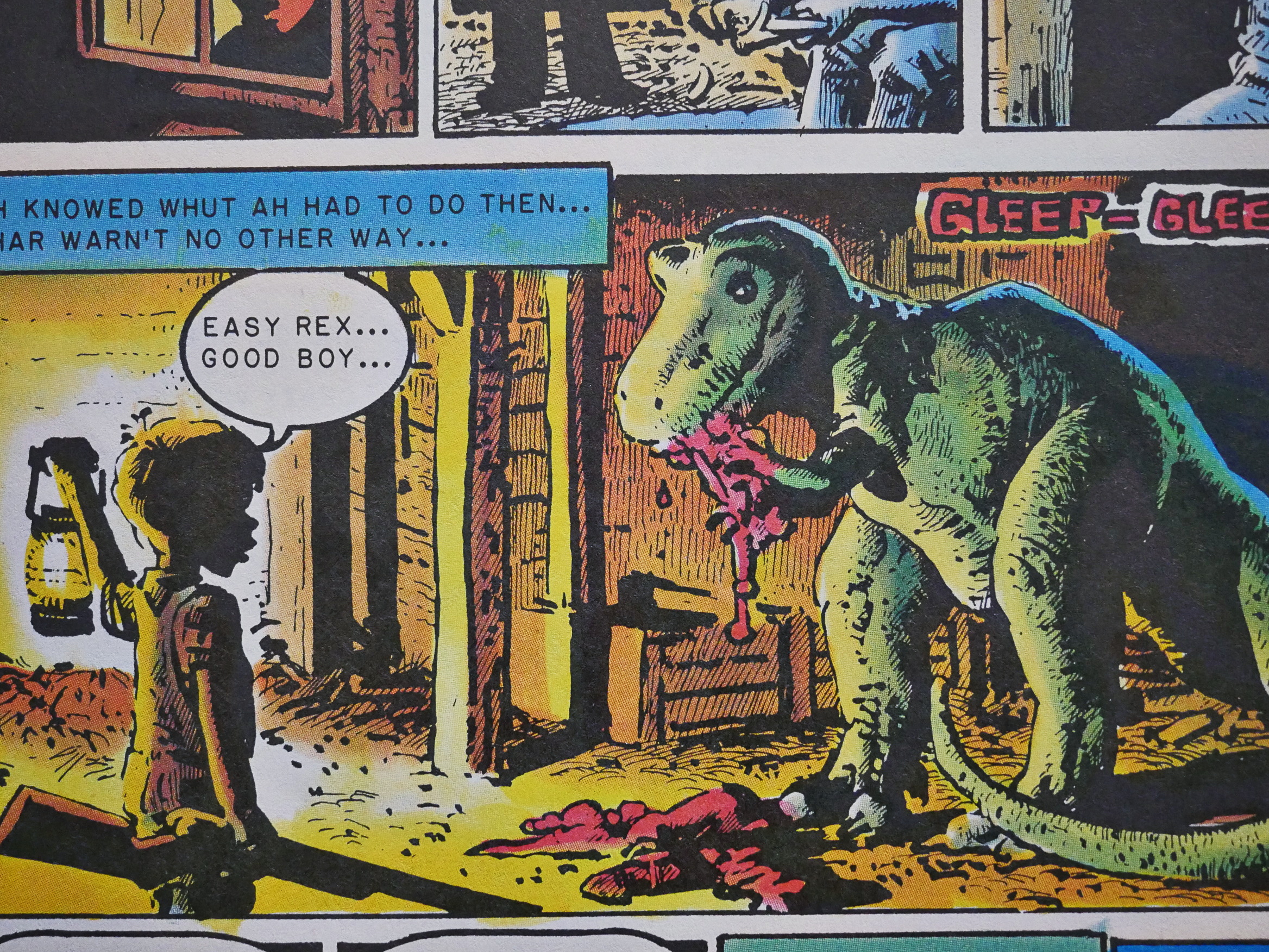
Did I mention how much I remember of these stories from when I was a kid? I must have read them a gazillion times. Here’s the second and final story with Richard Corben artwork. Still a pretty harrowing story now.
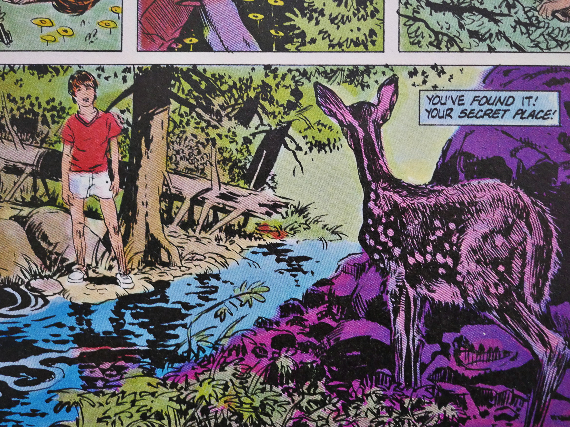
Bruce Jones does the artwork to a single one of the stories, and very nice it is indeed.
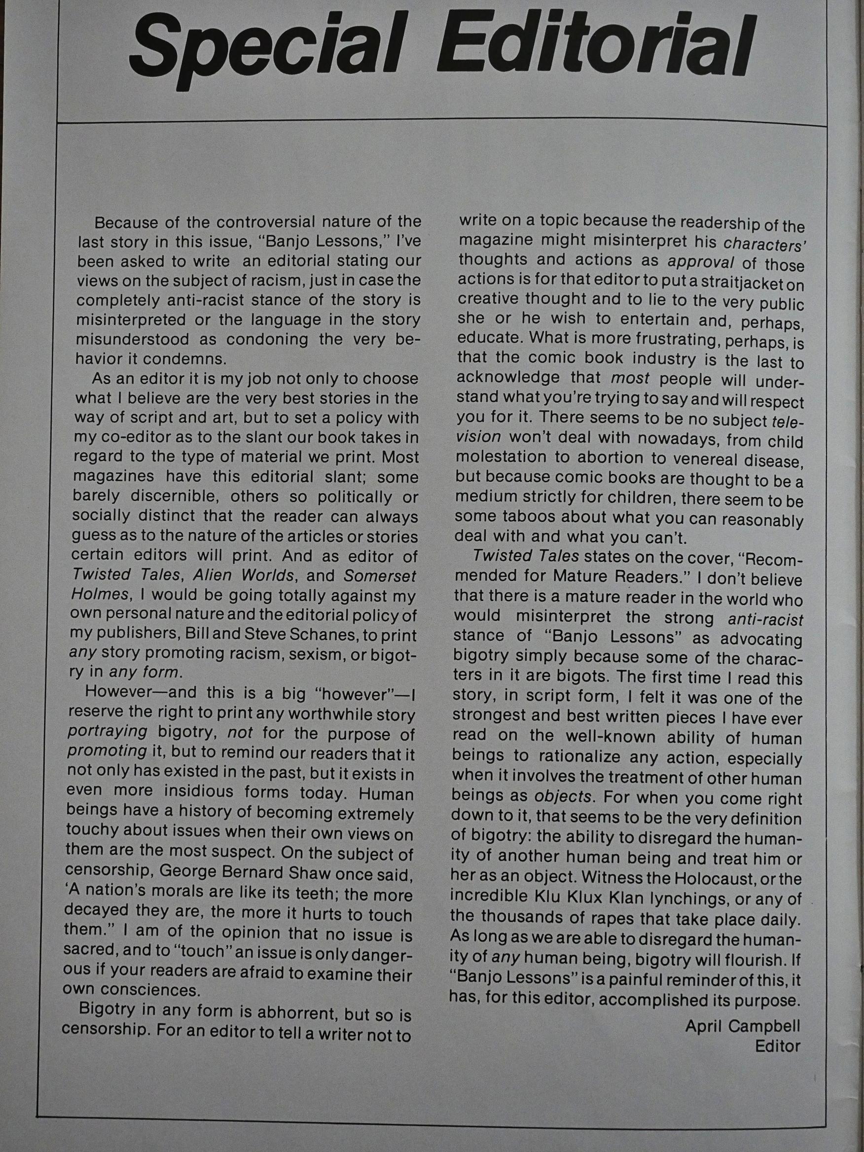
And then we come to the biggie: Banjo Lessons. The issue opens with co-editor April Campbell basically saying that, no matter how this is going to look, Banjo Lessons is not racist. It’s a pretty defensive way to open, but…
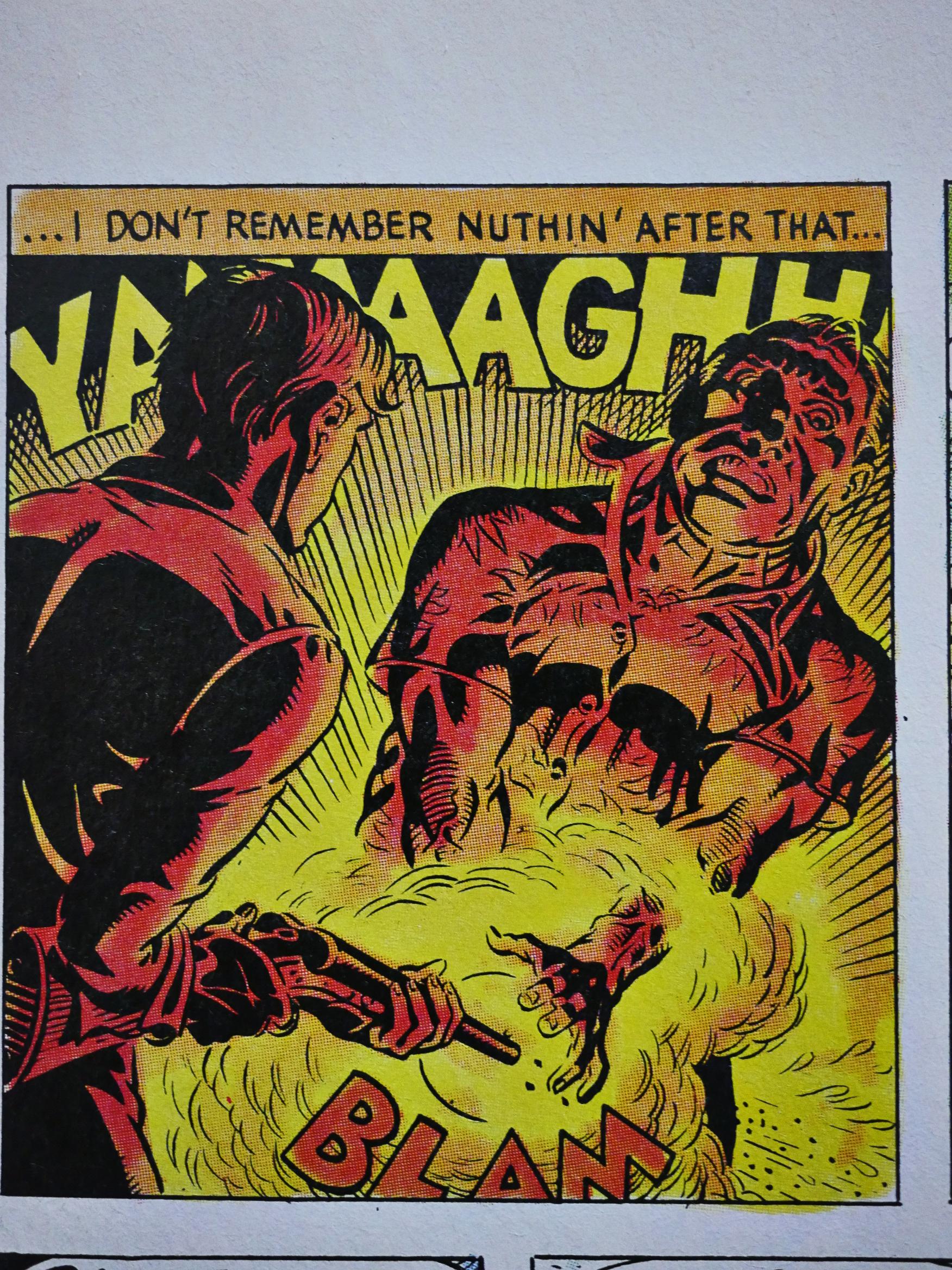
OK, here’s the story, which I’m not going to show the most offending imagery from. The artwork’s by Rand Holmes, and he lovingly and gruesomely renders it in his best Al Williamson/Wally Wood mode. No, that panel up there isn’t what Campbell was referring to.
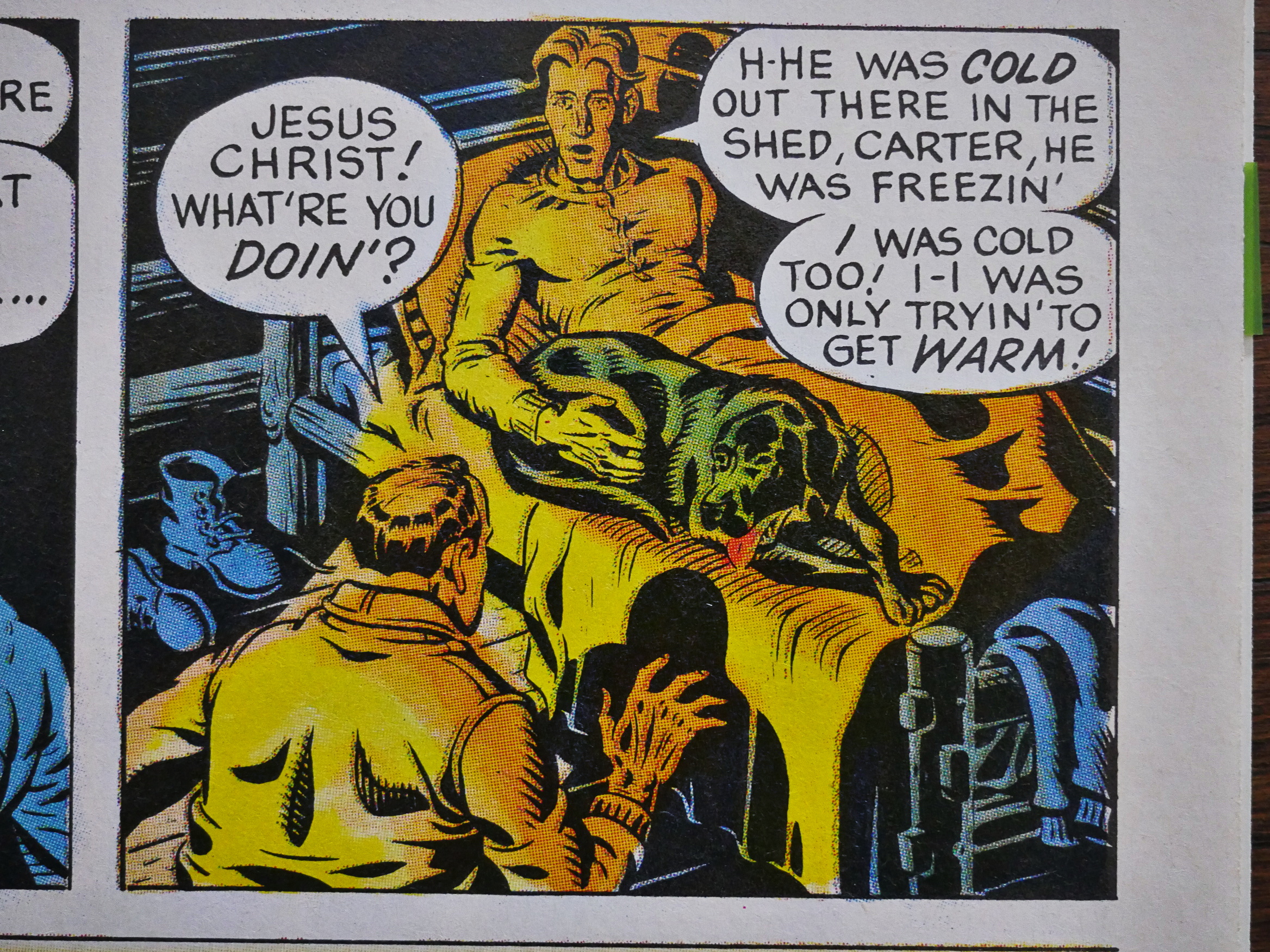
I felt reading it this time, that Campbell was giving away some of the shock value of the story by inducing a certain interpretation to panels like the above, that might otherwise not be understood until a second read-through. But, of course, I remembered it all from when I read it last 30 years ago, so…
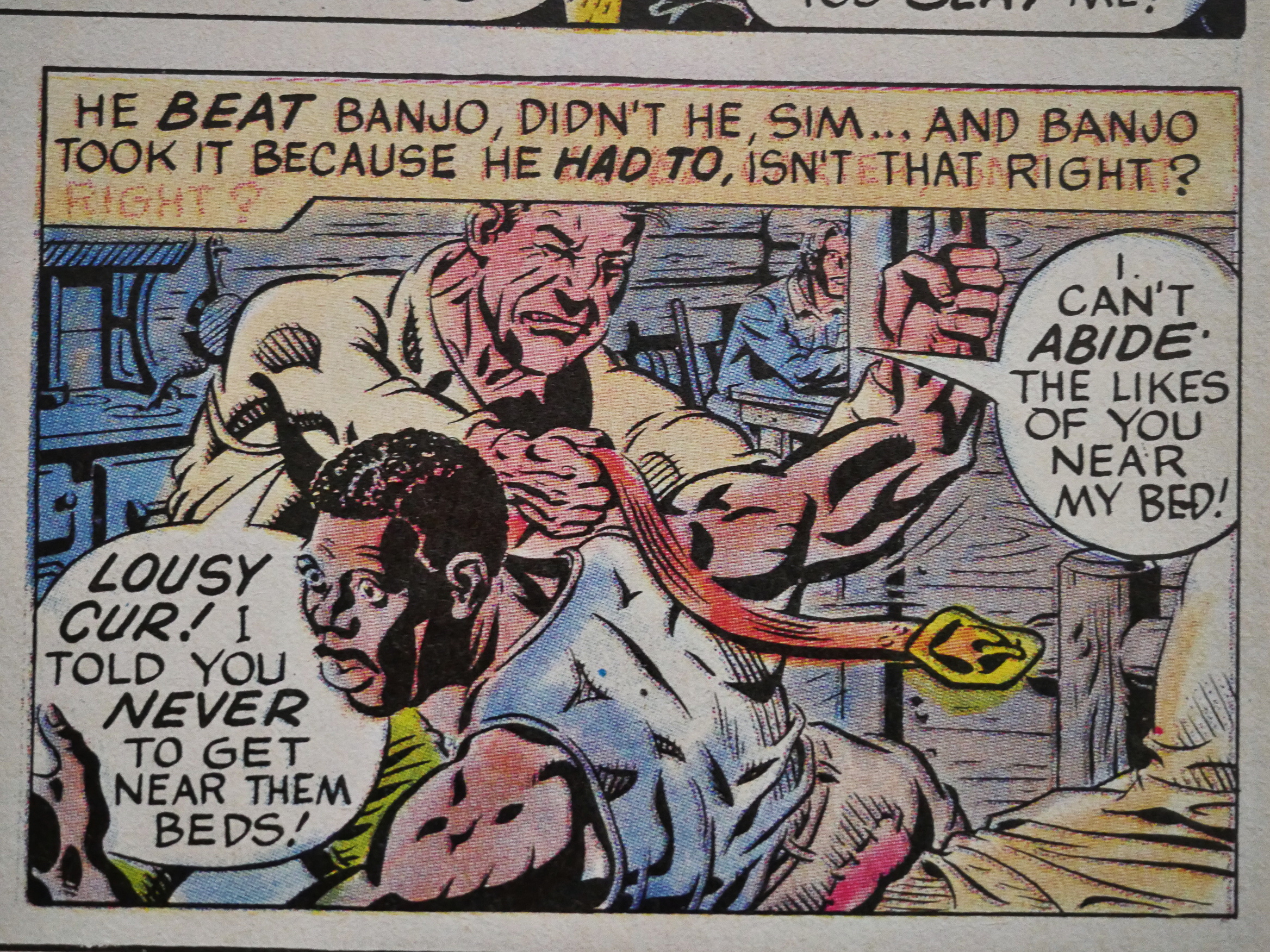
But the denouement (a few panels after this one) was still as shocking and revolting as ever. Perhaps even more so now.

Of all the pieces in Twisted Tales, it’s the only one that made me nauseous now.

(Hm… has something been erased in that caption and overwritten with something else?)
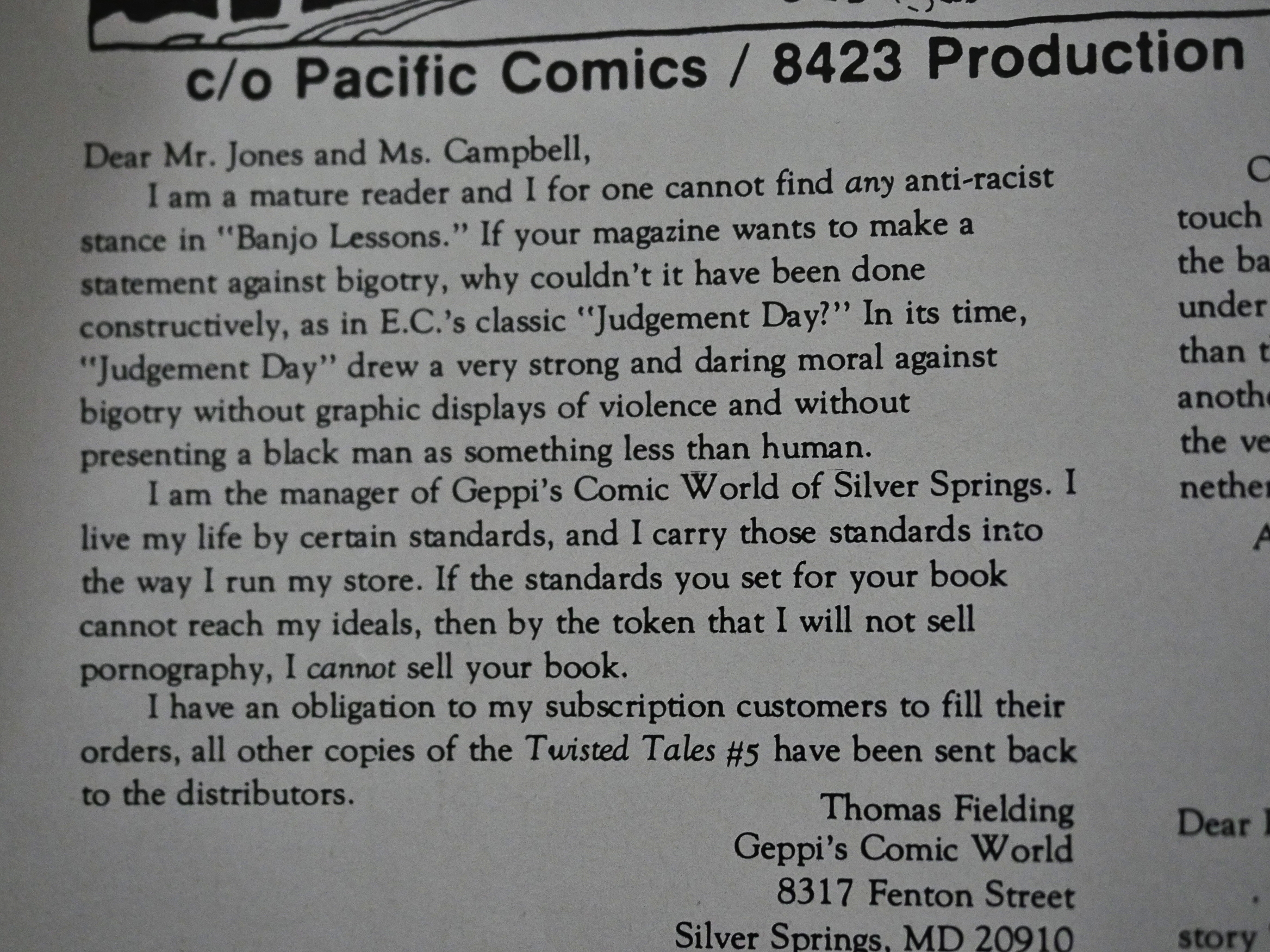
The reactions were, er… Mixed? Here we have one retailer that refused to sell the issue and returned it to the distributor.
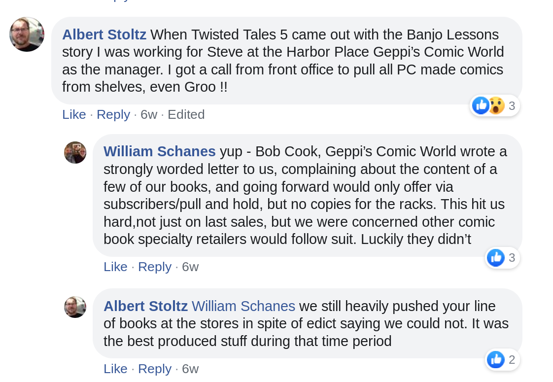
Steve Geppi was so angry with the story that he apparently ordered all Pacific Comics pulled from the shelves of his store(s).
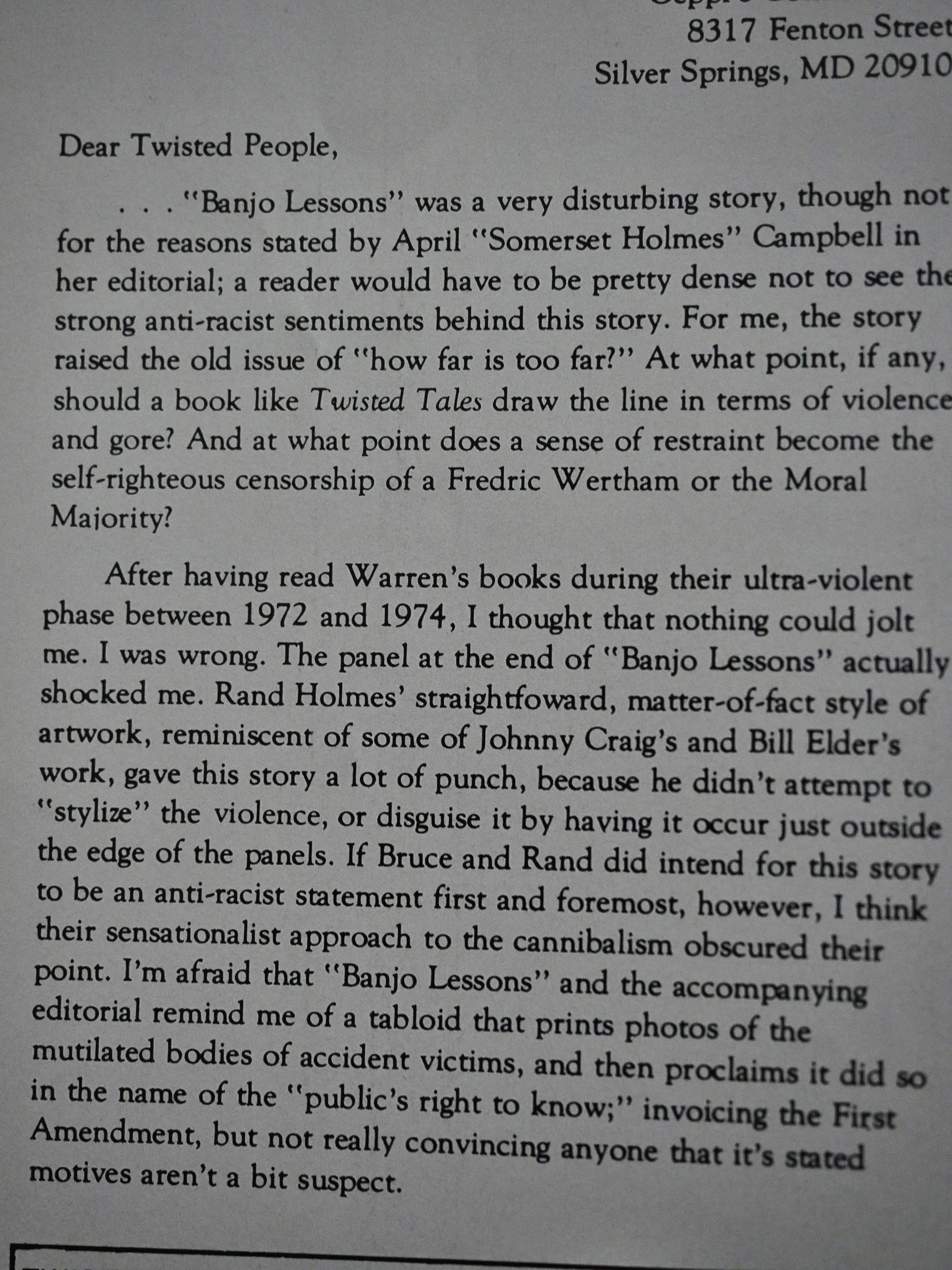
Another reader asks “how far is too far?”
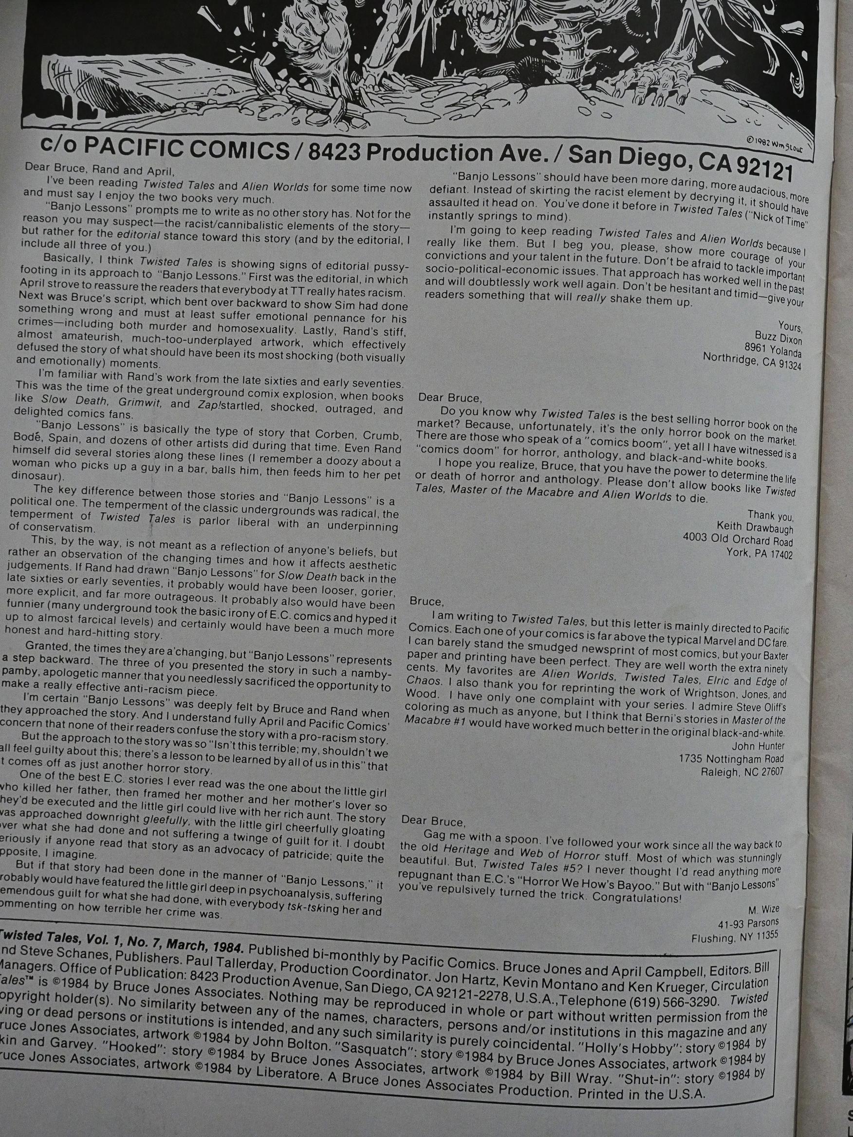
Chuck Dixon, on the other part, felt that there was something wrong, perhaps, er, it should have been grislier! Or funnier! Or less preachy! Or something! It’s almost like you feel it touched a button. Or something!

Banjo Lessons have never been reprinted in any collections as far as I can tell by googling for three seconds, not even in the Rand Holmes retrospective.
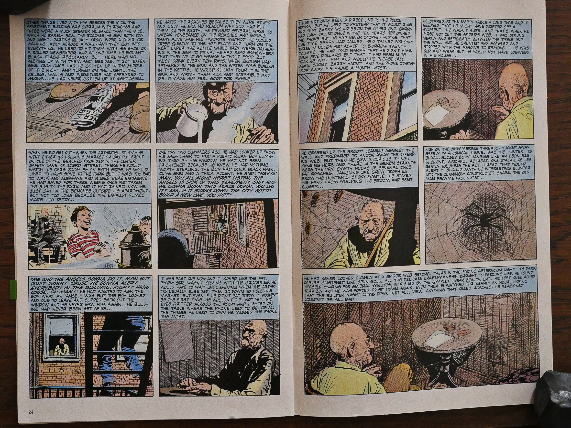
Roomers is probably my favourite story in Twisted Tales, strangely enough. When I turned the page to this Attillio Micheluzzi-illustrated piece now, I groaned inwardly “eeep! super-overwritten!” But it’s really not. It’s more of an illustrated short story than an overwritten comic, if that makes any sense. Jones writes an original and touching story with many small, sensitive and well-observed touches. Really quite wonderful and a major change of pace.
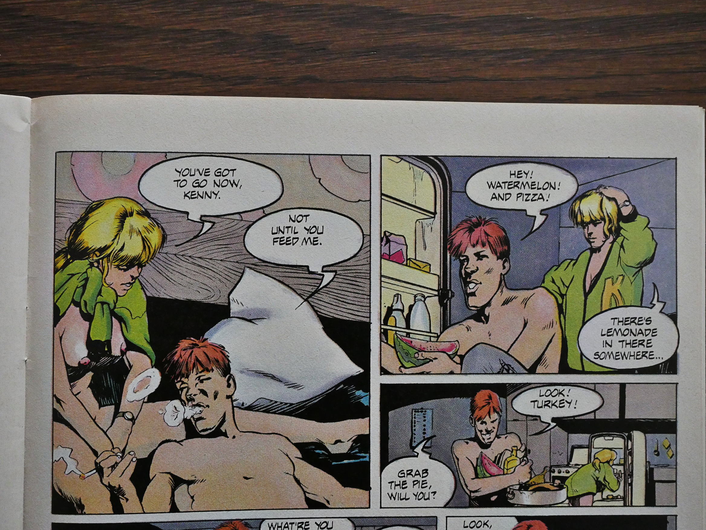
Micheluzzi’s not the only Italian illustrator who pops up: Here’s Tanino Liberatore of RanXerox fame, in another story that’s way twistier than you expect.
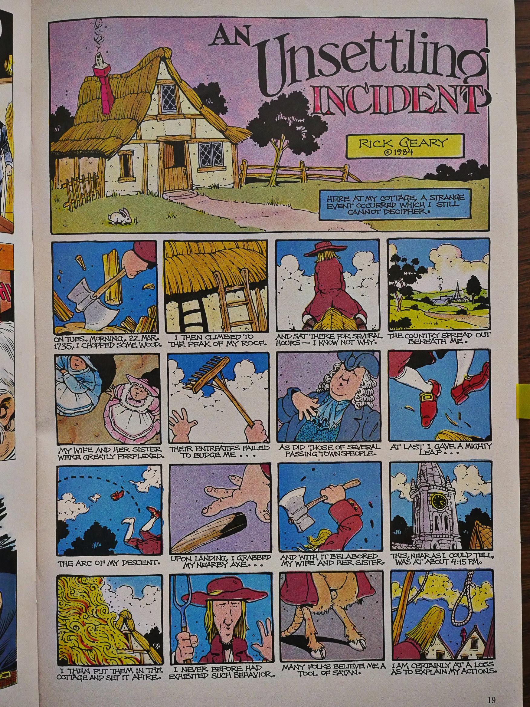
Hey! Rick Geary! You can never have enough Rick Geary, but he only does two of these one-pagers.
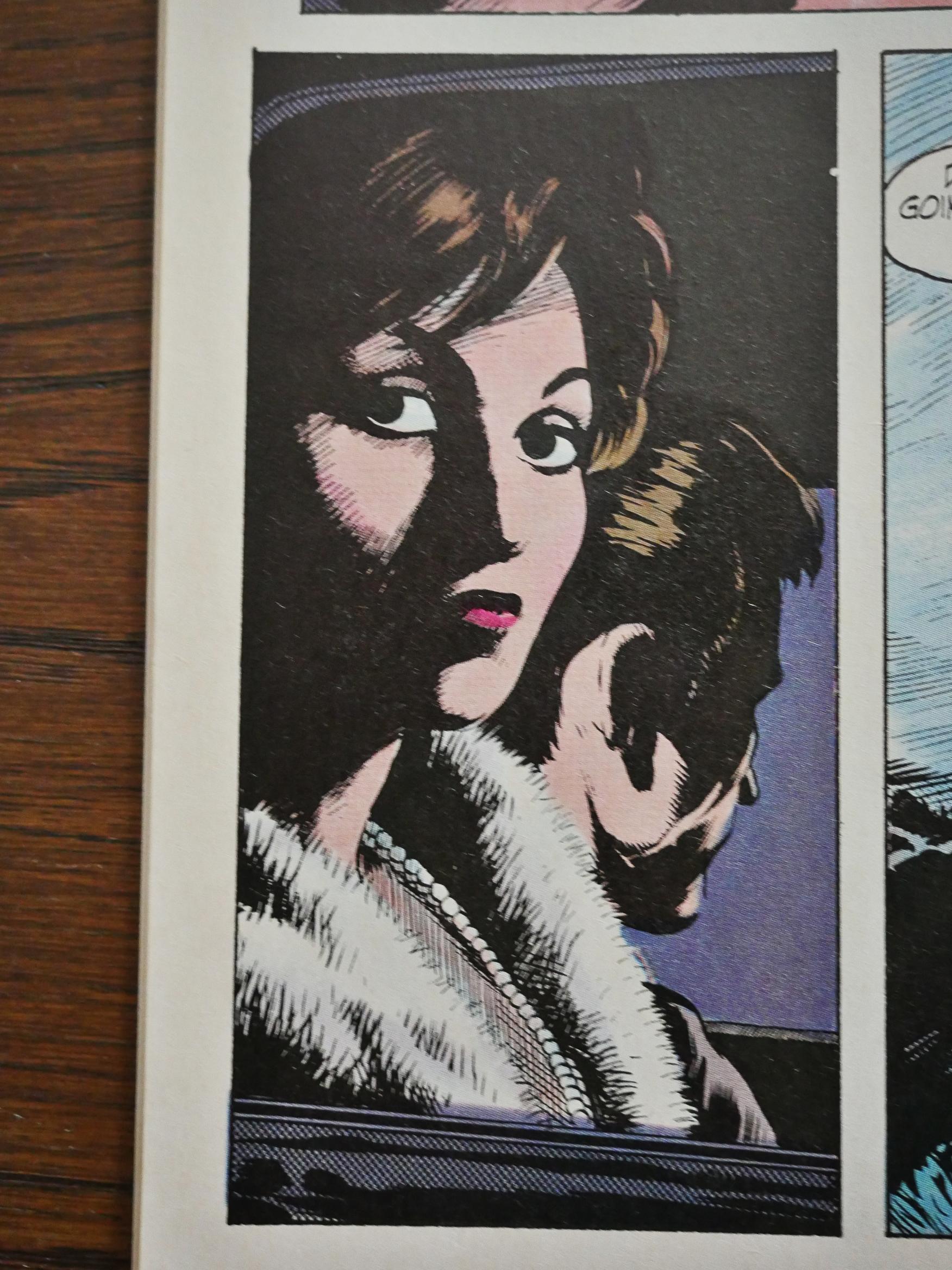
Most of the artists in Twisted Tales are pretty famous, but I’m not familiar with Mike Hoffman. He’s got a super-attractive inking style.
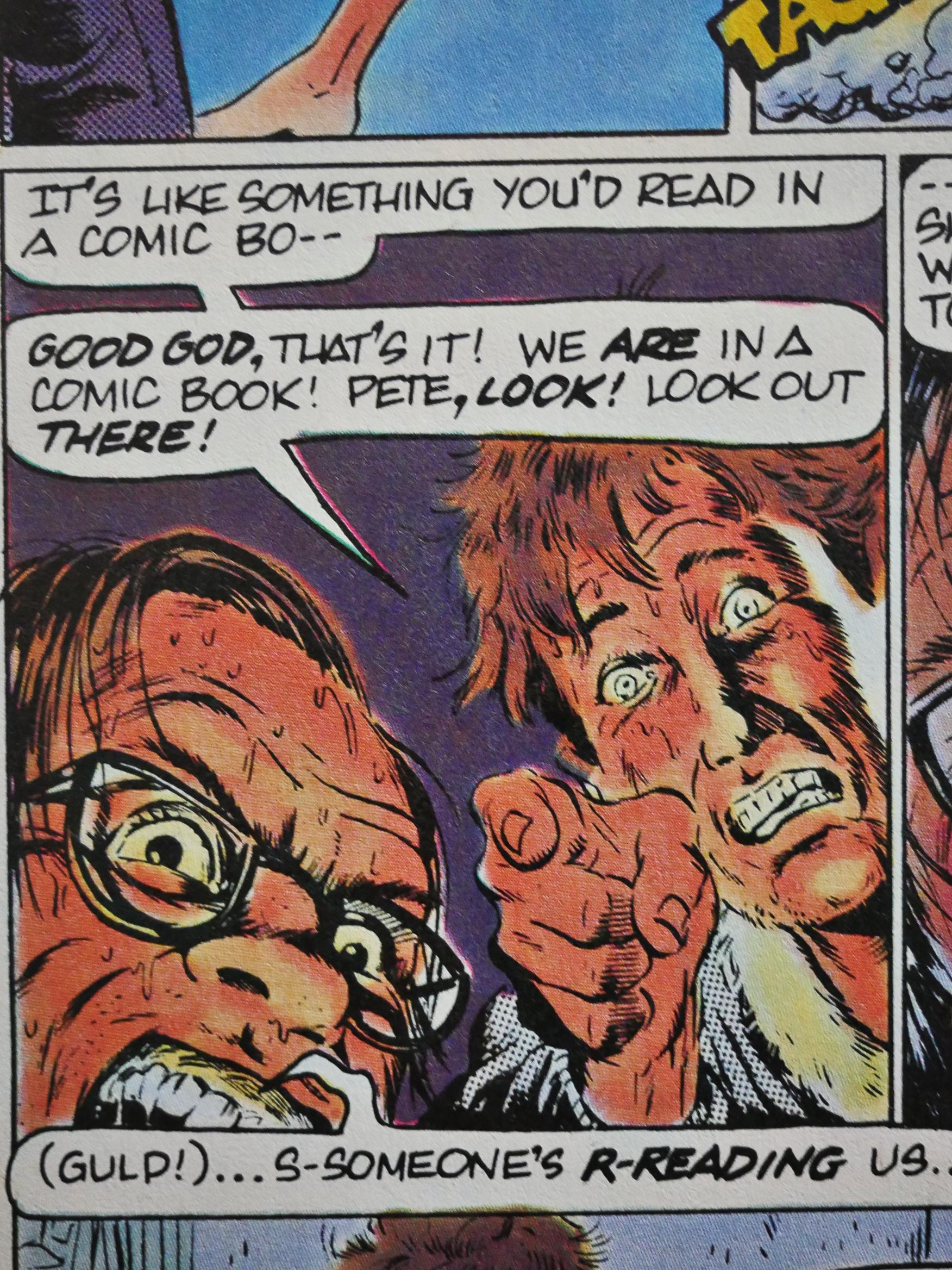
And then Pacific went under and Twisted Tales was picked up by Eclipse Comics.

As with its sister publication Alien Worlds, it only lasted two issues under the new regime, but I wonder whether the reason it was cancelled (and quickly replaced with Tales of Terror (which was not edited by Bruce Jones)) was not that Eclipse wanted to own the trademark (both Twisted Tales and Alien Words are owned by Bruce Jones Associates), but that Jones was burned out.

#9 of Twisted Tales has, for the first time (I think), somebody else writing the stories except Jones himself. The opening shot, illustrated by Thom Enriquez, is a story about a writer with a writing block (sort of), which is usually a sure sign that the writer is out of ideas.
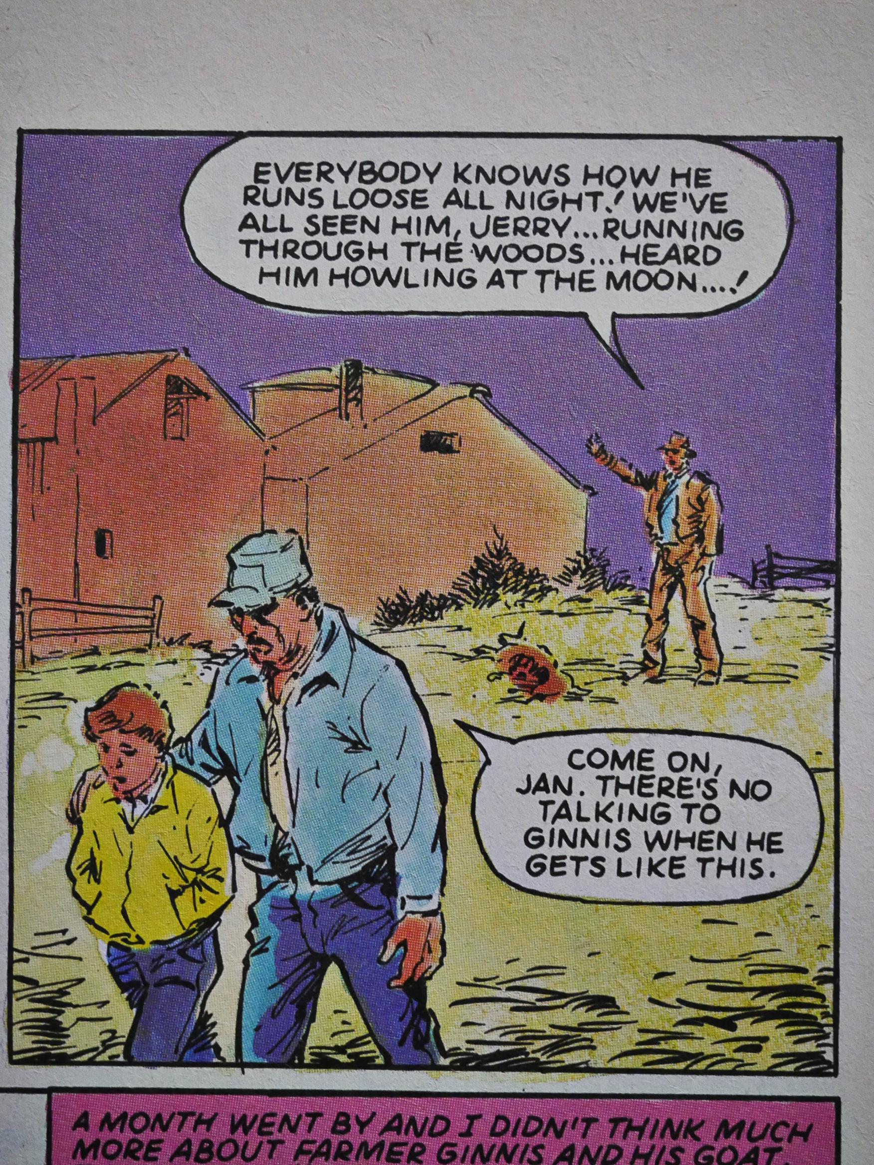
Jan Strnad writes this (allegedly true) story illustrated by Val Mayerik, for instance.
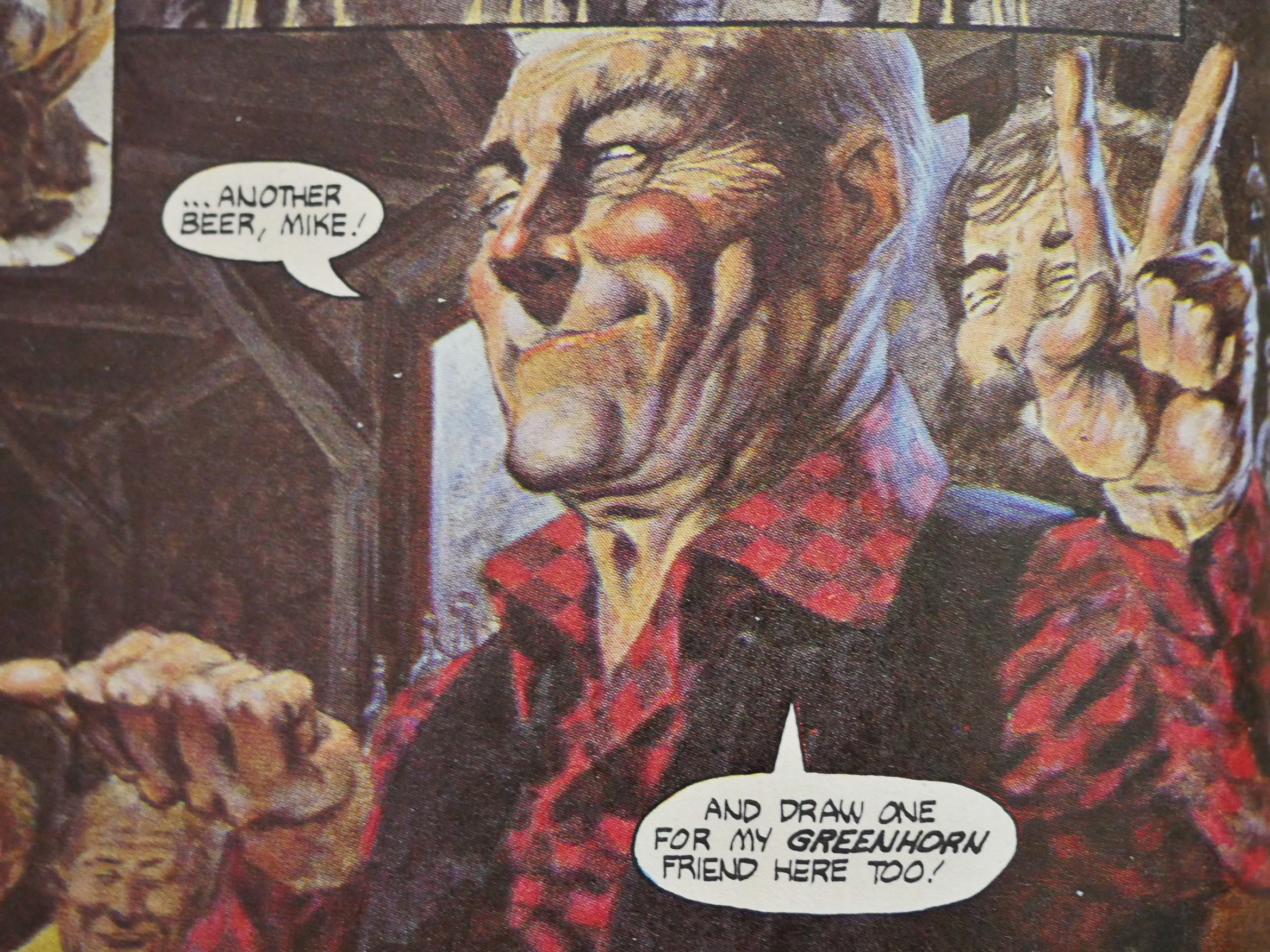
But then, in the final issue, almost all the stories are written by Jones again. And he’s even enticed Berni Wrightson to come back and illustrate a short yarn.
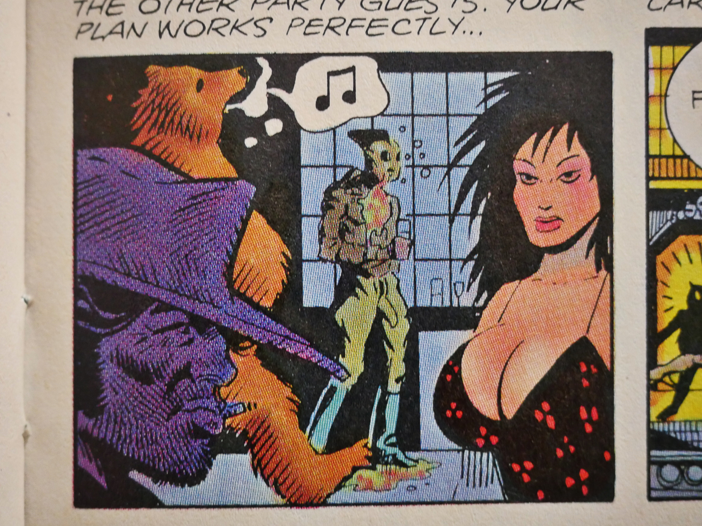
Bill Wray draws a scene from a party featuring some very recognisable characters. See how many you recognise!
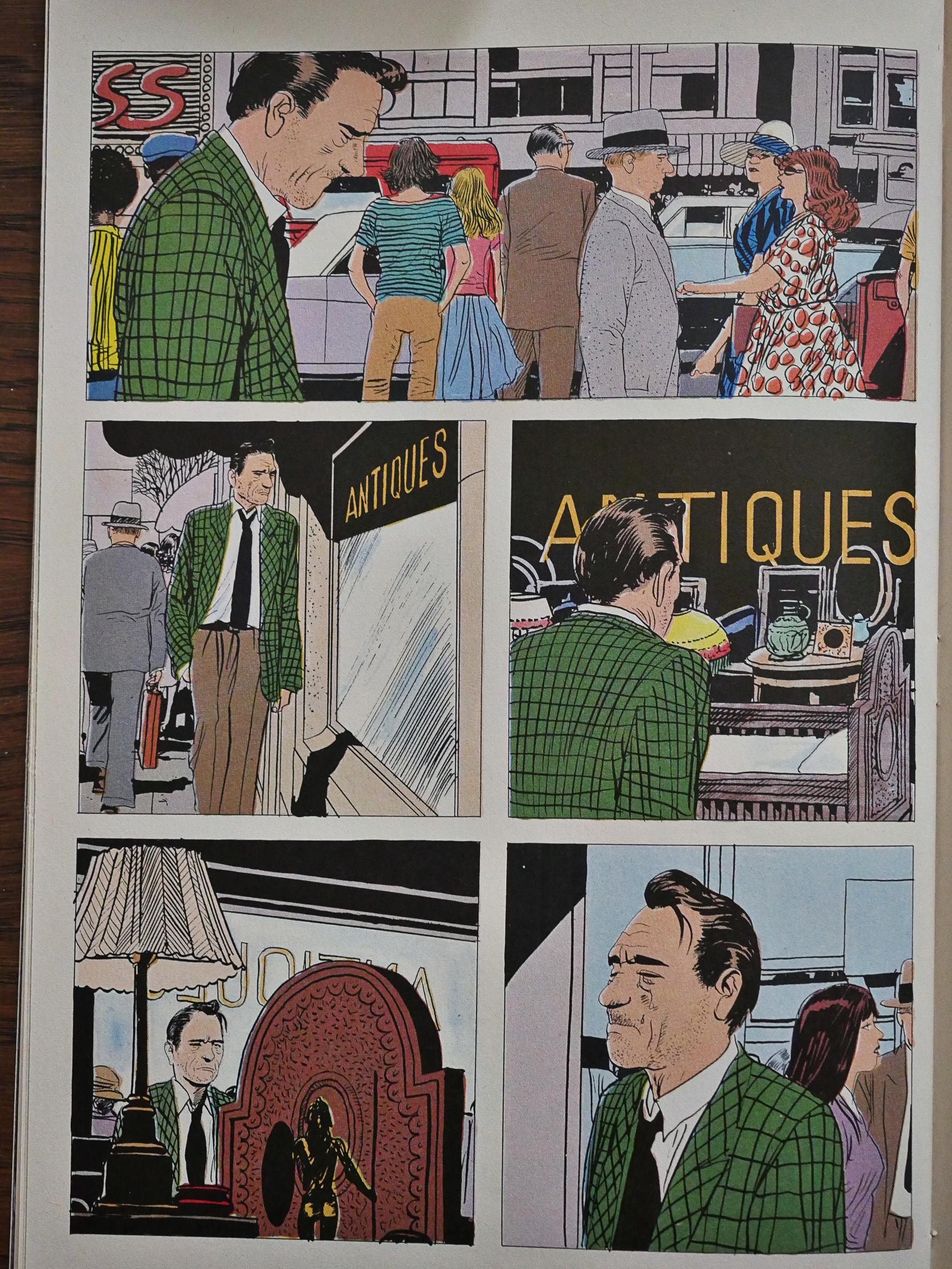
Perhaps as an apology for the previous text-laden story that Attillio Micheluzzi drew, David Carren writes a story for him with very little text to obscure his very Italian and sharp artwork.

And then it’s over. As far as I can tell, few of the stories here were reprinted beyond appearing in French and German anthologies concurrently to appearing in the US comics. Of all the missing reprinting projects, that’s perhaps the weirdest: I think there’s only a couple of duds among all these stories. They’re extremely entertaining and genuinely surprising, many of them, not formulaic hackwork like you’re used to reading in EC-influenced horror anthologies.

But perhaps it’s a rights issue? All the artists own the copyrights themselves. But on the other hand, why would the object en masse? Makes no sense. And there’s always a market for horror anthologies. Just imagine a slightly larger-sized collection of this stuff with excellent printing…
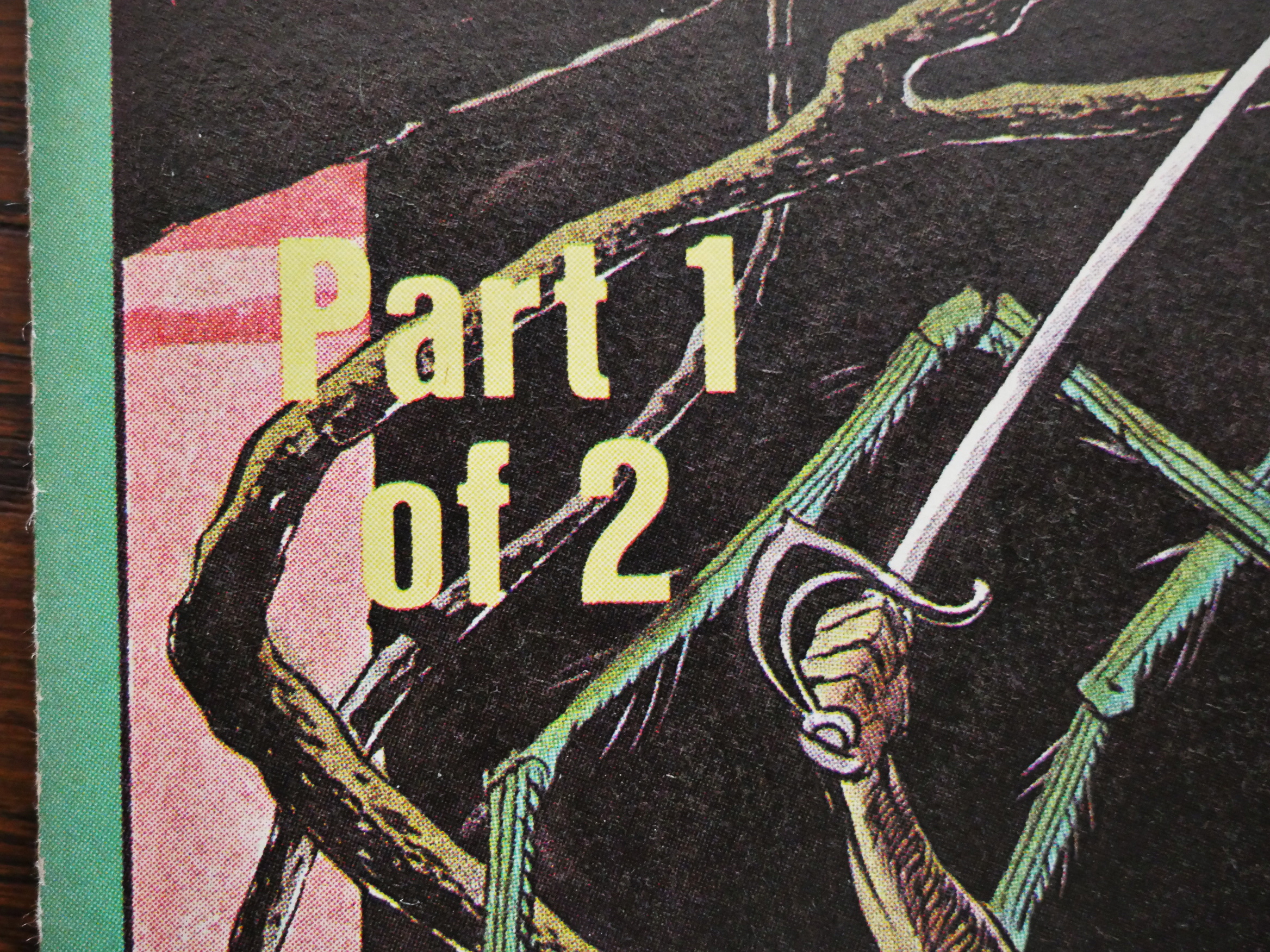
But speaking of reprints, here we’ve come to The Twisted Tales of Bruce Jones, where the first issue’s cover proclaims that it’s a two issue micro-series, and then goes on for four issues.
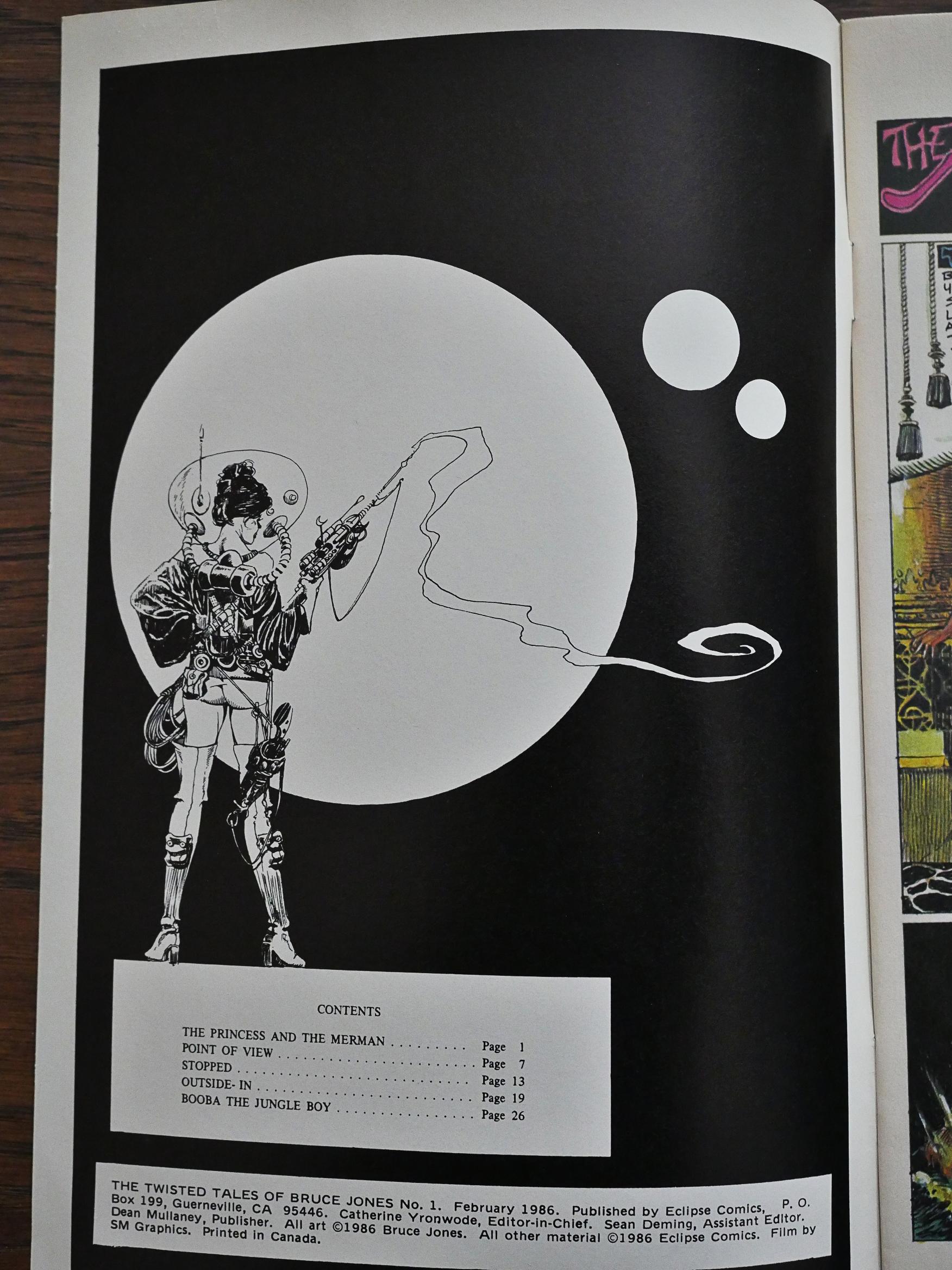
Jones usually has no problem putting words to paper, but there’s no explanation what-so-ever about what we’re about to read here.
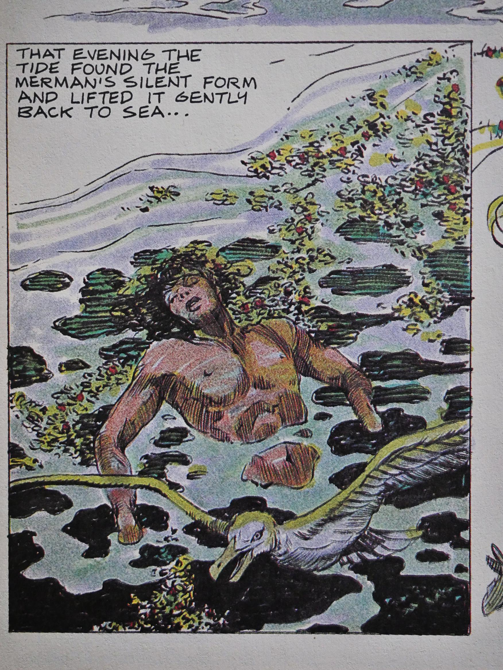
And it turns out to be three (perhaps) new stories written and drawn by Bruce Jones, and the rest are reprints from the late 60s/early 70s.
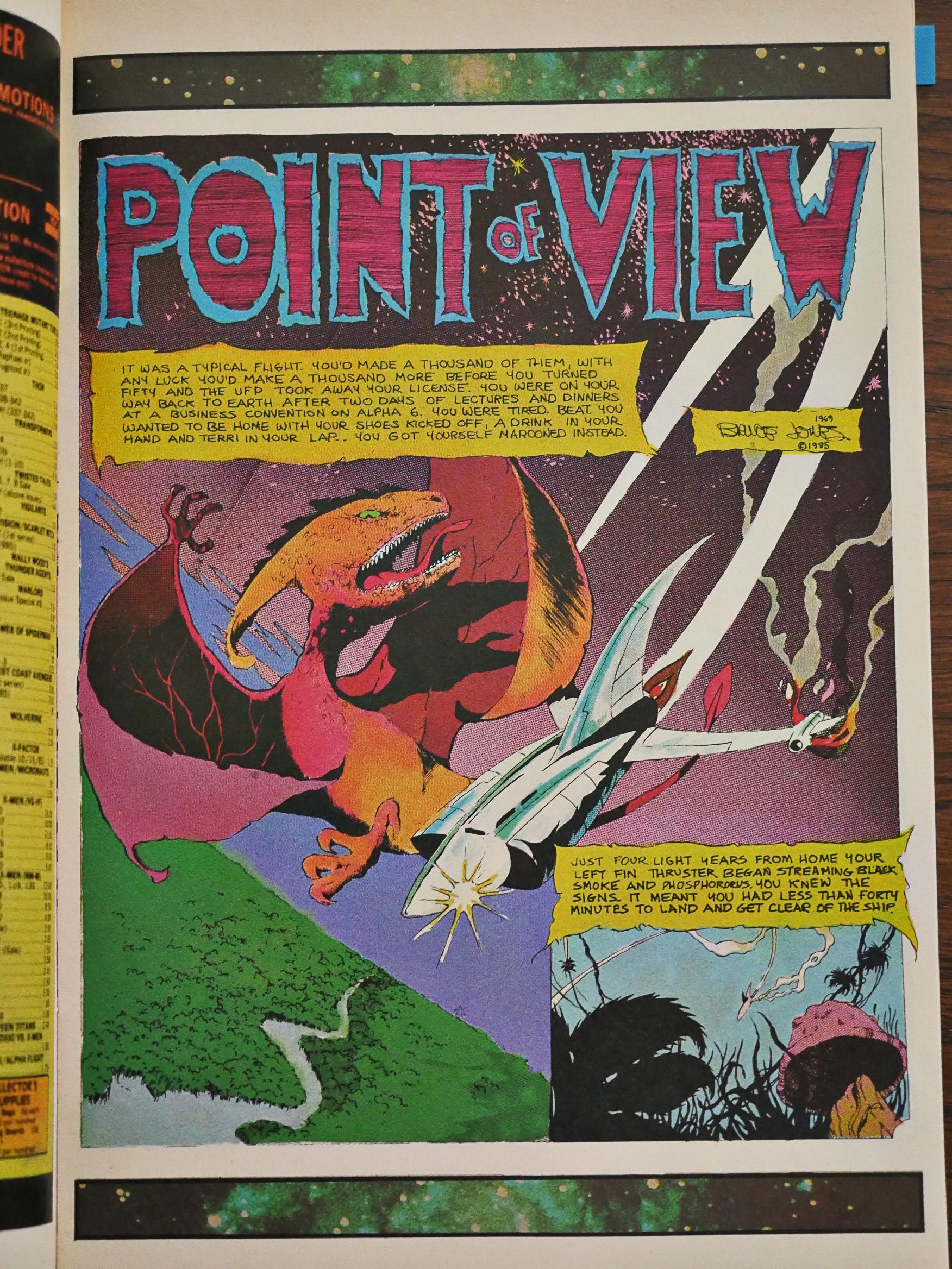
This one mentions both 69 and 85, so perhaps some of these were reworked a bit before publication?
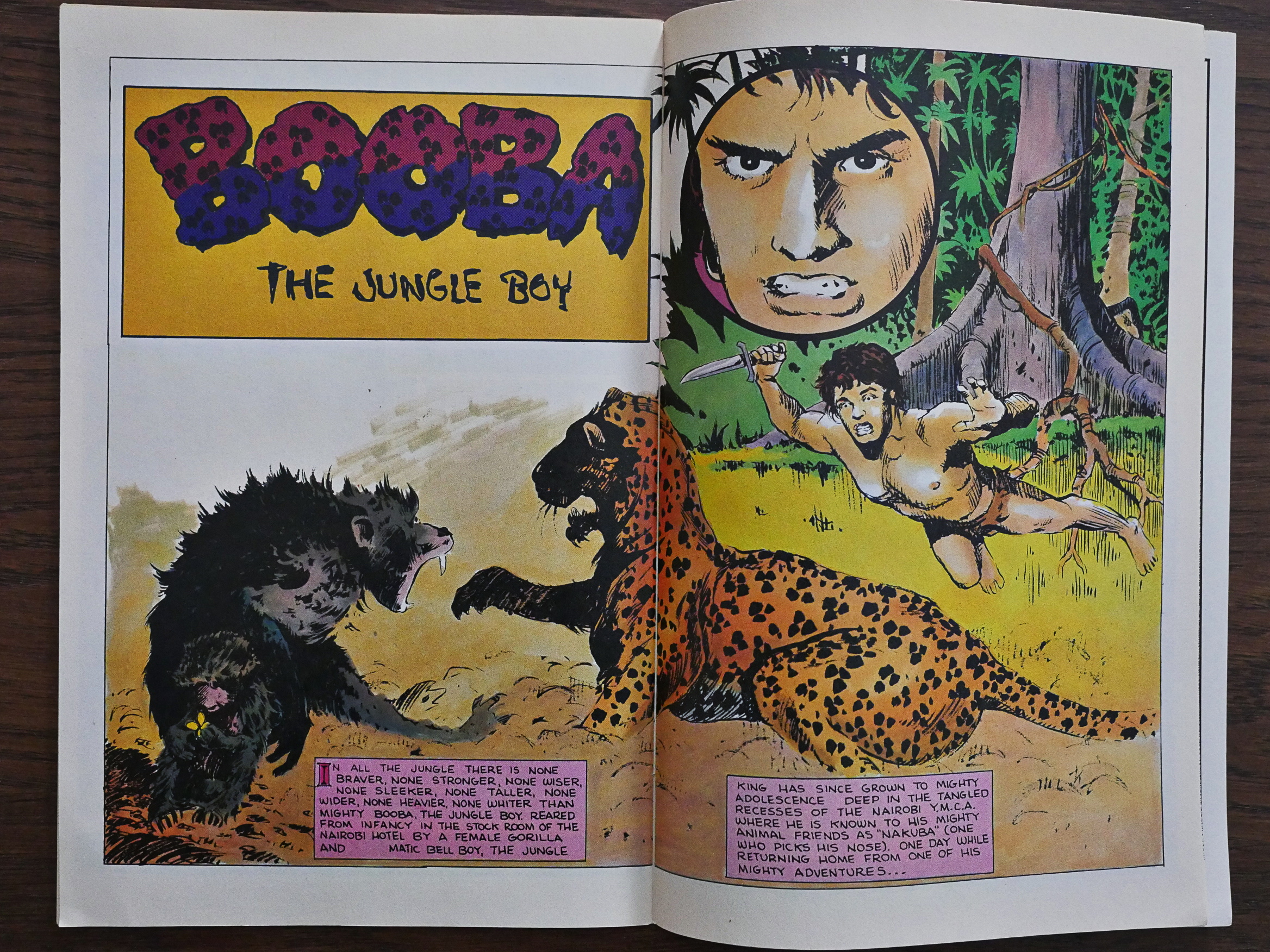
In any case, these are basically early pieces that have probably never been published professionally. At least comics.org doesn’t have any record of them being published… perhaps they appeared in fanzines?
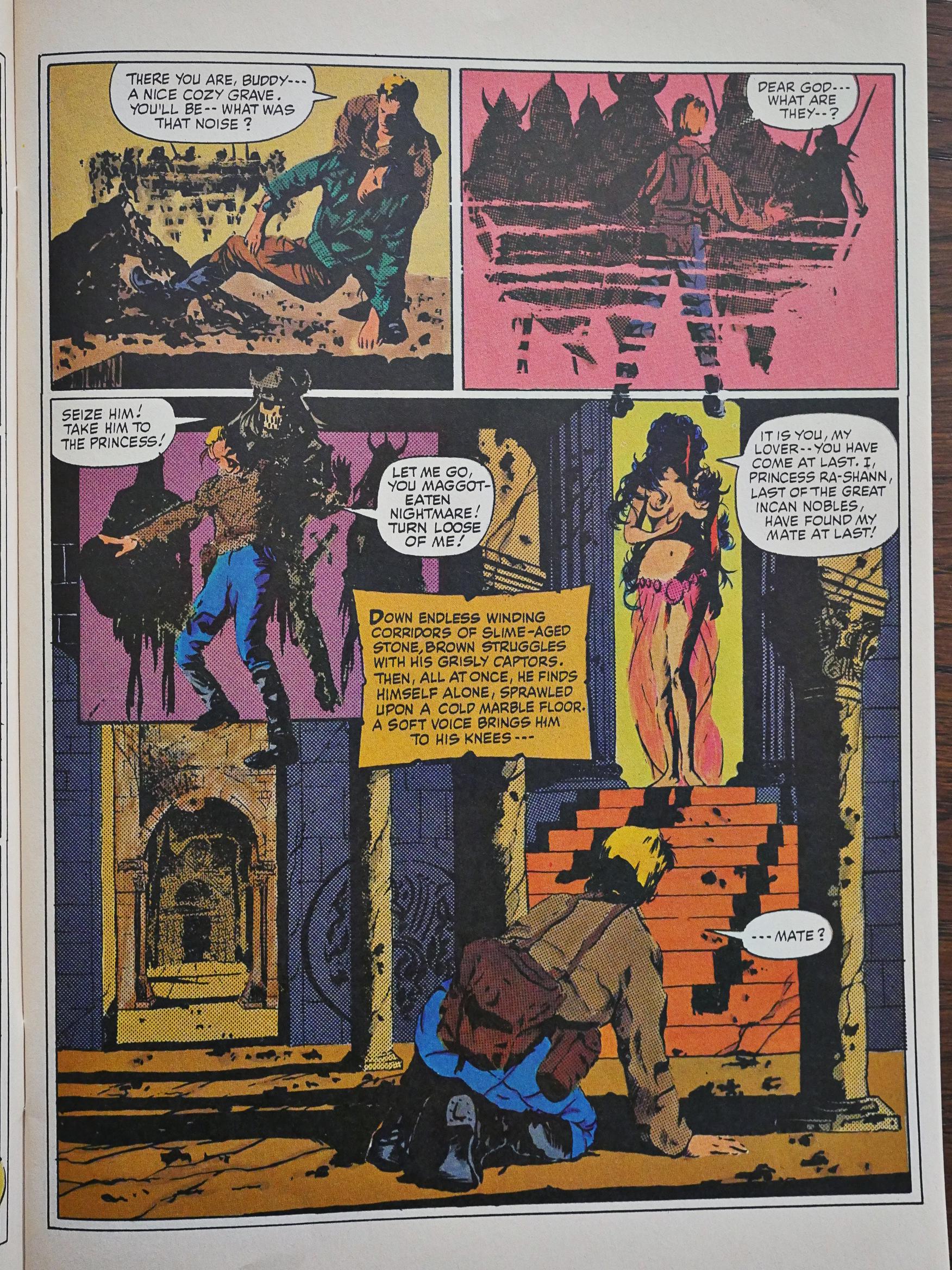
While Jones would later become a very accomplished writer, he isn’t here. All the stories are basically twaddle.
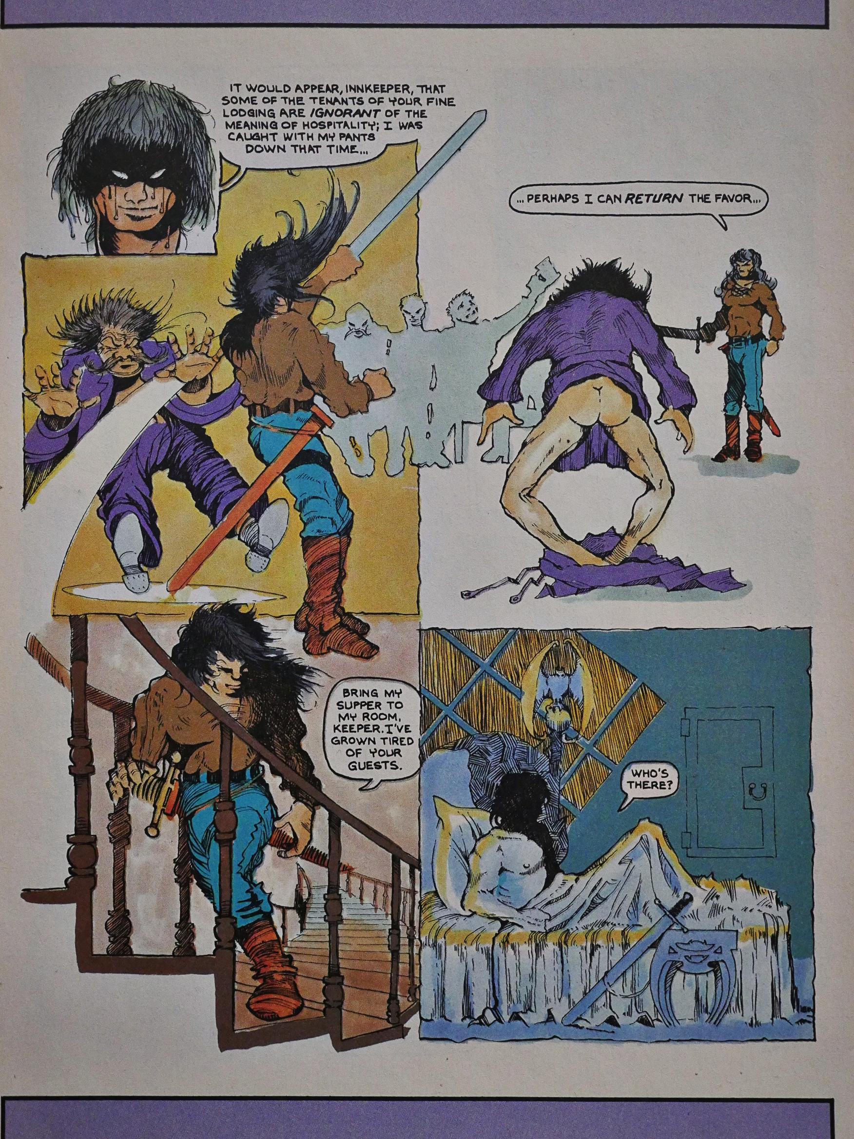
The artwork veers between trying to be Frank Frazetta and trying to be Vaugh Bodé, which are both fine aspirations.
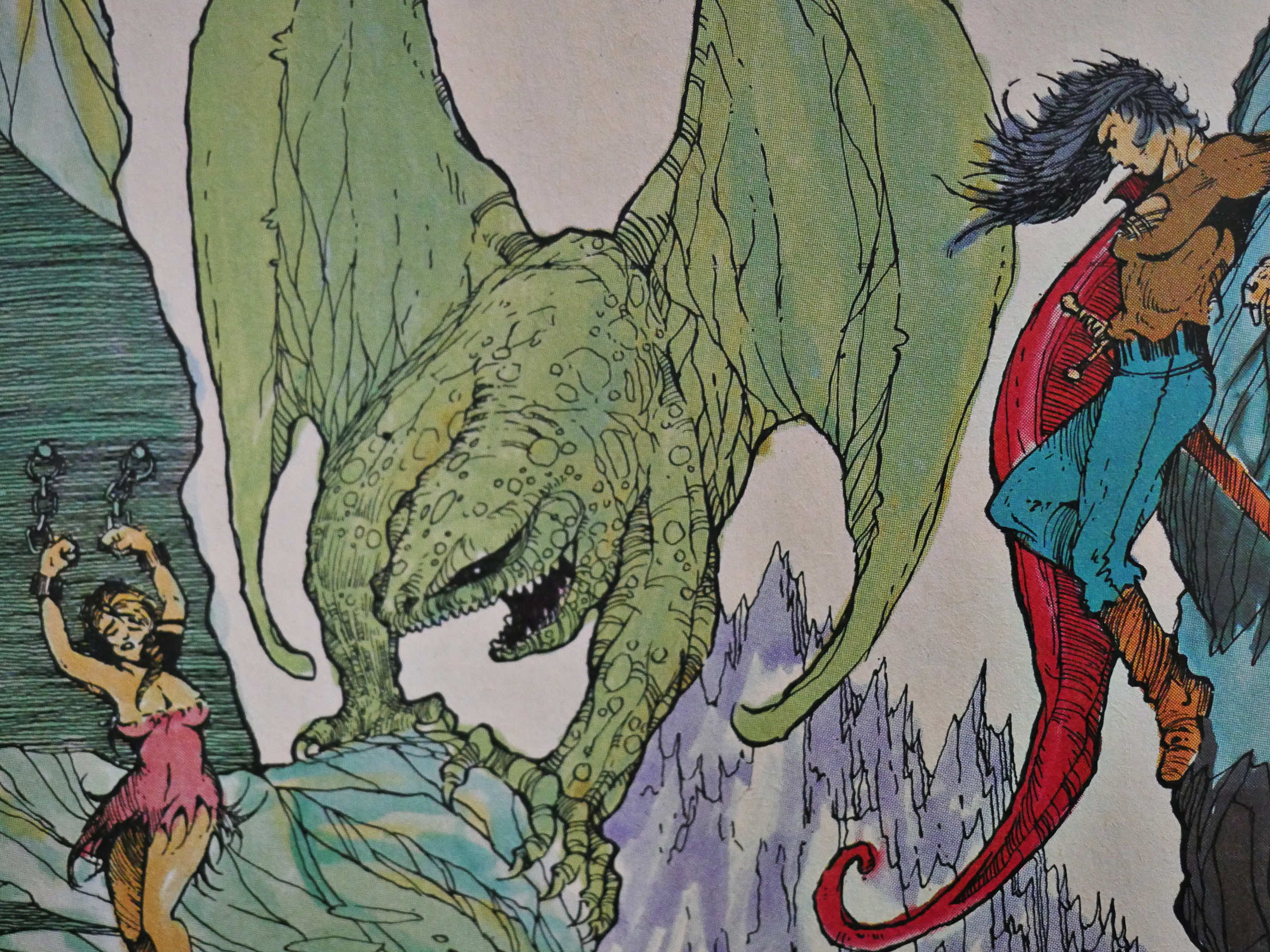
Sometimes the artwork’s so wrong that it’s right.

This series was apparently published on a weekly basis during February 1986, presumably so that (due to the long lead time for ordering comics on a non-returnable basis to comics store) orders would have to be locked in for all four issues before any retailer saw the first issue.

If so: Well played. Too bad for the retailers that presumably had to eat their stock of #2-4 for breakfast the next few years.
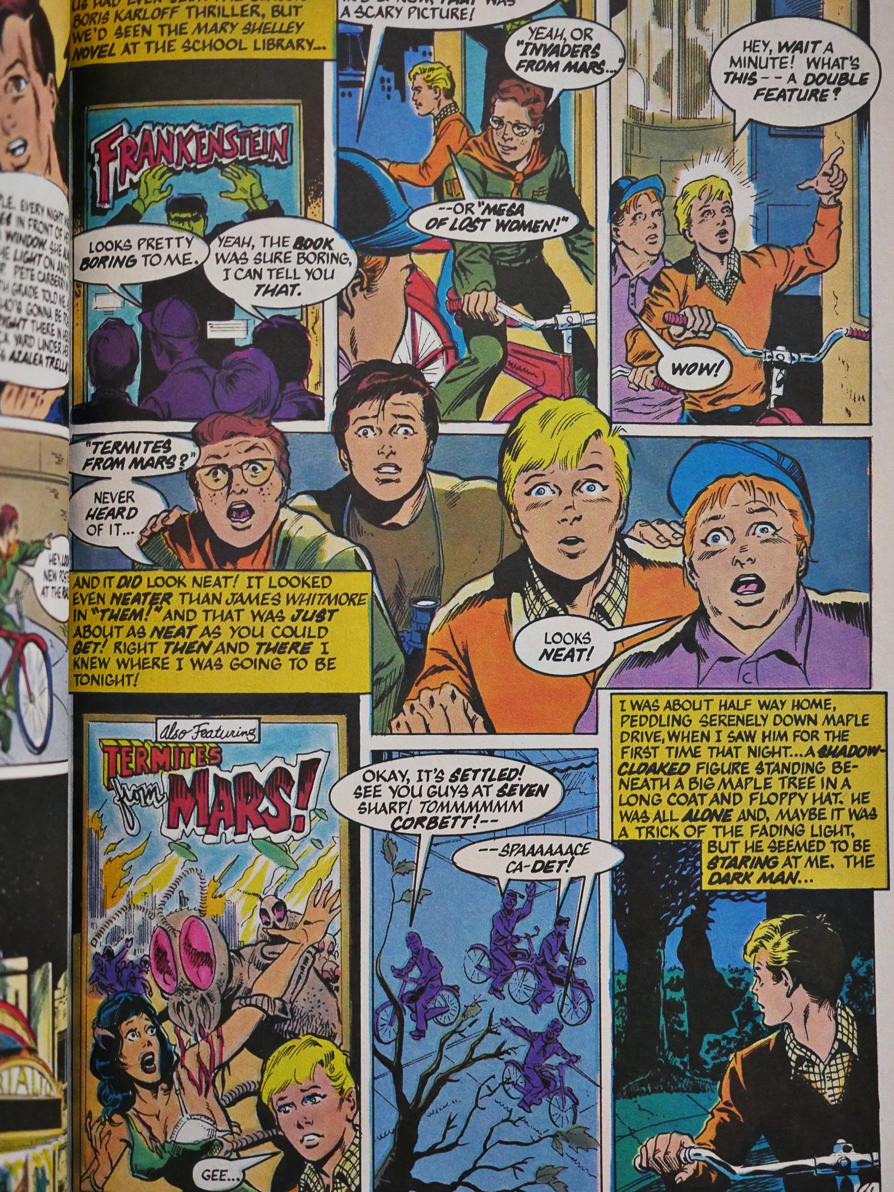
And finally, a year and a half later, Jones returned with the all-new Twisted Tales anthology, which was supposed to continue on a regular basis in a squarebound “prestige” format.

It’s very different from the original run. Despite being longer, there’s only three stories here, and the first one (seen above, ineptly drawn by Rick Stasi and Jim Mooney) takes up most of the space. It’s about growing up in the 50s and friendship and that kind of stuff, and isn’t very horrible. Perhaps the style of artwork here is appropriate for this sort of tale, it’s still fucking boring to look at.
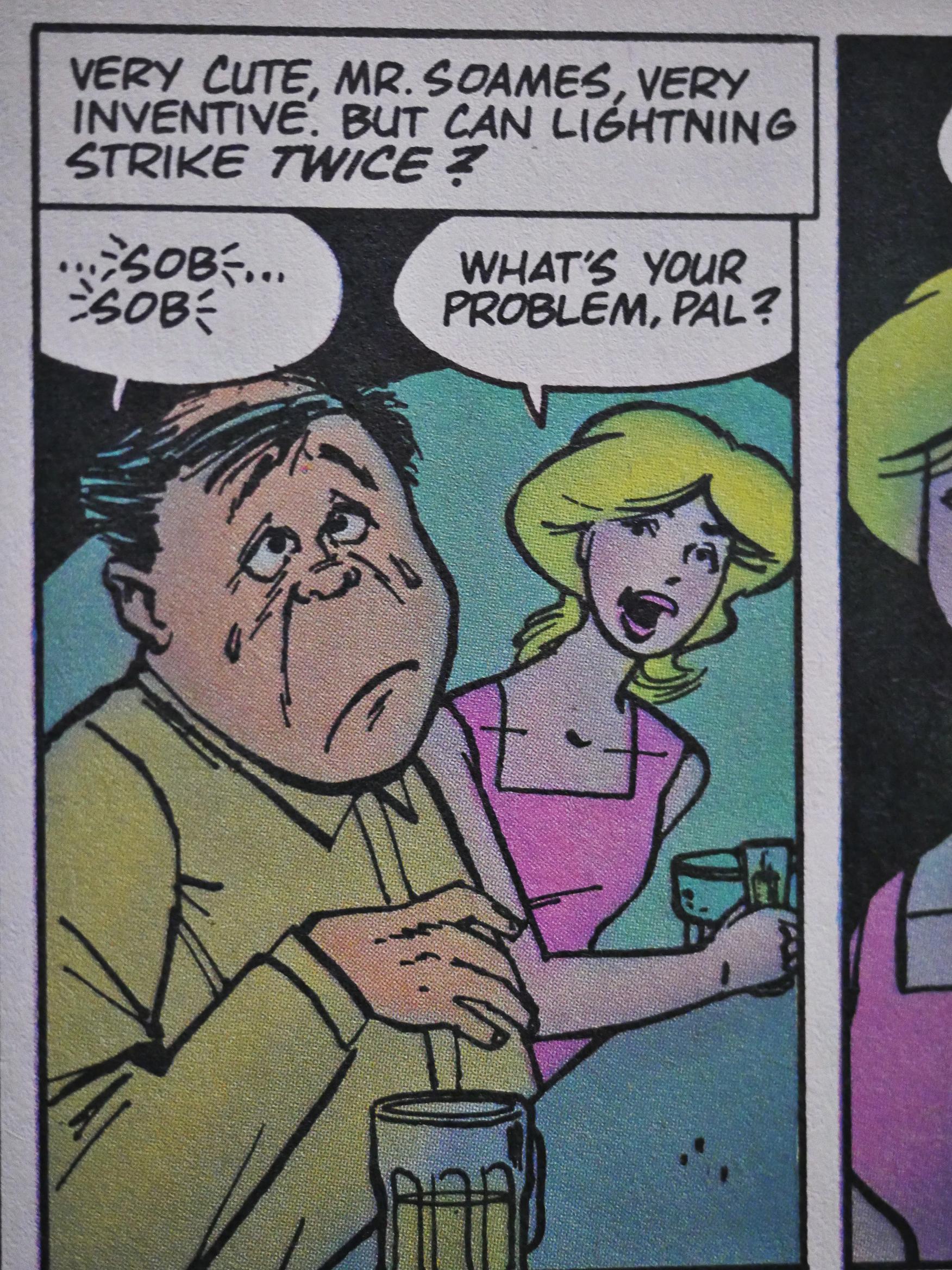
Scott Saveedra does the artwork on one of the backup stories. And he’s also a strange choice, but at least his artwork’s kinda amusing.

And… that’s it. I loved reading the ten issues of the original run.

But what did the critics think? Hm… Heh, just stumbled onto this by Paul Wardle i The Comics Journal #97:

A case in point is DNAgents. I have never paid much attention to this title until a friend of mine who works in a comic shop pointed out to me why the book is known sarcastically as T&Agents. Not only are the characters shown in a variety of suggestive positions in almost every panel, including an exorbitant number Of crotch shots, but the characters in question are supposed to be teenagers between the ages of 13 and 16! This book borders on being comicbook kiddie-porn.

No, it’s not about Twisted Tales, but instead about T&Agents. I mean DNAgents. He’s got a point.

Hm.. Let’s see… Here’s Michael Now from #90, from an article called “Comics In The EC Mold Or Just Moldy Comics”.

Sorry, but I have to quote a bit more than usual:

With the appearance of TT#1, my hopes weren’t altogether dashed, but let us say they were dented a bit. The ending of the first story, “Infected,” drawn by Richard Corben, where the woman’s “crabs” turned out to be some absurd form of mutated man-eating land crabs, should have been the tip-off, but remained, optimistic, hoping that the next Story would be better, and the one after that, better still. What a chump I felt like by the end of the comic.

[…]

Aside from the needless nudity, I saw another unfortunate pattern in Jones’s stories: few of them made any solid sense.

[…]

Even “Banjo Lessons” by Jones and Rand Holmes, also in #5, which appears to a Sincere attempt at an anti-racism story, is too obviously derivative Of Al Feldstein’s and Wally Wood’s similar stories in Shock Suspenstories to say anything new. Still, I must admit that this is probably Jones’s best Twisted Tales story to date, with only the Rand Holmes story in “Speed Demons, coml ng anywhere close.

[…]

The following story, rather badly drawn by Don Lomax (who has, appropriately enough, drawn comics for Hustler, and whose work I disliked when I saw it a few years ago in a magazine called Gasm, an illfated Heavy Metal rip-off) is even worse. The story is built around two women clad only in underwear with knives held to their throats, and having fingers and ear lobes carved off. The twist ending reveals that the women are actually lesbian lovers getting rid of their husbands.

I guess these girls never heard of divorce.

I found this story to be particularly vile. It angered me to see Jones not only use the female form, but homosexuality as well, as nothing more than lame, unimaginative, reader as well as disrespectful and insensitive to women and homosexuals as equal members Of the human race. One must wonder, what does Bruce Jones have against women? Perhaps only a skilled therapist can answer that question.

[…]

What form of diseased “adult” are these comics supposed to appeal to?

Well! I never!

1984: Berni Wrightson, Master of the Macabre

Berni Wrightson, Master of the Macabre (1983) #1-4, Berni Wrightson, Master of the Macabre (1984) #5 by Berni Wrightson et al.

The first four issues of this series was published by Pacific Comics. Eclipse took over when Pacific sank.

Bruce Jones (who has written a lot of horror comics, including some in this series) provides a page on introduction to each issue (except the final one).

The first two and a half issues are reprints from various Warren comics and are mostly written by Wrightson himself. Wrightson uses a number of art techniques, but the ones that survive the shrinkage and colouring best are perhaps the ones like this, with pen and brush and ink and simpler, lines.

But, man, nobody does a shouting man better than Wrightson. All that passion. All those lines. All that nice colouring by Steve Oliff for this edition.

And creeping horror, of course. Nice kitty!

Bruce Jones says that “Jenifer” (also from a Warren magazine) is his (and perhaps Wrightson’s) best-known work. And it’s true, it very memorable: It’s at least 30 years since I’ve read it, and even as forgetful as I am, I remembered that name.

And that face! So beautifully horrendous. In this colour version, it looks a bit like Richard Corben, I think?

It’s still a pretty horrifying tale, only let down by the O. Henry ending.

I think this was originally done in black-and-white washes, but Oliff manages to add colour tastefully.

Anyway, they ran out of Warren stories in the middle of #3, so the rest are from stuff Wrightson did in the late 60s and early 70s and published in places like Witzend and Badtime Stories.

Yes, Wrightson can do humour, too. Gruesome humour, but still.

Uhm… Uhm… Actually, I remember that page from when I was a teenager, too, and I wondered the same thing as now: Just what is the joke here exactly? Hm…  Oh!  Those are eyes instead of nipples on the breasts?  Perhaps it was clearer in the original black and white.

Some of the early stuff is horribly over-written.

And one single story has collaborative artwork: This one is with Jeff Jones and Alan Weiss. And Pacific decided to print this final issue on coated, shiny paper, which makes that blacks pop even more. Perhaps the entire series should have been like that…

And then we get to the concluding issue published by Eclipse, and it’s back to dull paper. And this issue has the earliest work, I think. It’s not as accomplished as the stuff in the earlier issues.

I mean, it’s not bad or anything, but it’s also let down by less crisp printing than the Pacific issues.

From an interview in Comics Journal #100:

ANDREW CHRISTIE: Let’s begin by talking about what you ‘ve been doing since last you spoke for publication in these page in 1982. The reprint series Berni Wrightson, Master of the Macabre came out from Pacific, and then from Eclipse. Was that your doing or Jim Warren’s? Did you get any money from Pacific on the deal? What did think of it?

BERNI WRIGHTSON: 1 wasn’t real impressed; that stuff was never intended to be in color.. I don’t know. I just didn’t think it looked so good. I did get paid.

CHRISTIE: Oh! That makes you unique.

WRIGHTSON: (laughter) I guess so, yeah.

Berni Wrightson continued to create comics for just about all comics publishers until he died in 2017. Many of the comics here seem to have never been reprinted anywhere else, which is very weird. Time seems over due to do a proper retrospective on Wrightson’s work.

1984: Strange Johnny Nemo Days

Strange Days (1984) #1-3, The Johnny Nemo Magazine (1985) #1-3 by Peter Milligan, Brett Ewins, Brendan McCarthy, et al.

These books are another part of the British Invasion (which included books like Miracleman and Axel Pressbutton), brought to you by Pacific Comics, but then ended up with Eclipse Comics when Pacific Comics went belly up.

Milligan, Ewins and McCarthy had all done work for 2000AD in the UK before they did this book for an American publisher. I have no idea whether these were originally intended for a UK publisher, but I doubt it since the aspect ratio of the pages is the normal American standard sized one.

There’s three continuing stories in the Strange Days series: First off (in every issue) there’s Freakwave, which has artwork by Brendan McCarthy, and it’s the way weirdest one.

I’m not going to attempt to describe what it’s about. Mainly because I have no idea. And because that’s boring, anyway, but it’s great fun. And the creators had fun doing this, obviously, with that lavish artwork and the “similar ilkness” and “get this head in the clouds” (they’re referring to a city formed as a head that floats in the air).

It’s that kind of thing.

The three main serials are all eight pages each, but there’s some stand-alone pages sprinkled here and there.

The most straightforward bit is Johnny Nemo, who’s a private dick (or something) in the future. Yes, he solves mysteries and goes around shooting a whole lot of people (it’s British so there has to be hyperviolence) and all the normal stuff.

And has a manual ad block.

But it’s a traditionally told and drawn story: Inked lines and kinda solid colours.

The artwork gets very wild at times in the interstitial bits.

It is!

Oh, yeah, the third story is about a super-hero (of sorts) called Paradax. It’s not quite as straightforward as Johnny Nemo, but it’s nowhere near as weird as Freakwave.

But it has the occasional page like that.

And then Strange Days ended. I don’t know whether it was planned as a three issue series, but all the three serials finished up quite properly. That is, I have no idea whether Freakwave had an ending that made any kind of sense, but again, that’s the point.

Paradax went off to have his own two-issue comic at Vortex a couple years later. I don’t think Freakwave continued.

Picking Johnny Nemo as the star of the next comic is a no-brainer: It’s funny, sharp and easy to follow, and apparently this was supposed to be a six-issue mini-series?

Johnny Nemo is streamlined even further for this series: More jokes, more violence, more plot. In this one he basically goes after a drug dealer, but he runs into people like those upper-class twits (who are hunting plebes). Oh, the social commentary!

The backup feature is a new thing called Sindy Shade, and is slightly more weird than the main feature, but it’s drawn in the same style. Keeping things simpler the second time around. Oh, and McCarthy’s gone: It’s just Milligan and Ewins for this series.

Milligan explains the reason he’s no philosopher.

The third issue, the artwork is done by Steve Dillon and Ewins, and it’s fine, I guess. Not as sharp as Ewins on his own.

The editors announce that the book has been cancelled due to low sales. So I guess they had to wrap up both Johnny Nemo and Sindy Shade quickly:

And… eh… That’s an ending, I guess…

Sindi Shade has even less of a conclusion.

All the parties involved went on to have extensive careers in comics. Milligan continued Johnny Nemo with a variety of artists at other publishers, and the stories have been collected extensively.

1984: Sun-Runners

Sun-Runners (1984) #1-3, Sun-Runners (1984) #4-7 by Roger McKenzie, Pat Broderick, et al.

Sun-Runners started at Pacific Comics early 1984. Writer Roger McKenzie explains the impetus for the series:

He’d been thinking of leaving the comics business, but came up with the idea for this book and sold it to an editor, who sold it to Pat Broderick, who was at this time a pretty big name after his stint on Marvel’s Micronauts series.

As sci-fi series go, it’s perhaps not the, er, most hard science ones, what with those stars in that conglomeration. What the Sun-Runners do, exactly, isn’t really specified (you kinda imagine that the writer doesn’t, either), but it has something do to with extracting energy (!) from stars by, er, wrangling them somehow. Perhaps they need some Sun-Sheepdogs to keep them penned up. I don’t know.

I don’t know why some of the characters were DNA-modified half-animals, either, but I think that might have been covered later in the story, if it hadn’t been cut short. It seemed to be pointing towards getting into that stuff, at least.

Oh, and there’s a comedy relief robot.

Apparently Broderick had chosen to work on Sun-Runners because he was burnt out on super-heroes. Which is why it’s kinda odd that the protagonist is a super-hero, with the requisite super-villain arch-nemesis. They’re deadly opposites, you see. The villain has the best motivation ever: He’s everything the hero isn’t. Except, like, size… physique… hairdo… language…

So we have the standard action/sci-fi plot with a hero who’s much too heroic for the company he’s working for, so he’s suspended all the time and has to work outside the normal system. Everything about this book is standard…

… except the weird sexual things that they smuggle in most issues.

Shapeshifter sex! Hawt!

But not appreciated by all the readers. Here’s one who’s first “appalled” by some spelling mistakes, but that’s not what brought the pearl-clutching on: No, it’s that scene above that caters “to an undersexed, mindless audience”. We don’t need that kind of filth!

McKenzie didn’t follow that reader’s recommendations, because a couple of issues later he introduced a merry band of pirates, yes, in a space-going, yes, pirate ship, complete with billowing sails, yes, that lands on this planet to steal steel (yes).

So you’re thinking: This is all a gag, right? They’re playing it for yucks?

No, they tie up that elephant guy and apparently the entire crew rapes him (after he’s unable to perform with the captain).

On a WTF level, it’s, er, uhm. Is it on a WTF level? I think perhaps it went beyond that scale.

*scratches head*

You can’t say that it’s not an original plot development, though.

Anyway, I think Frank Miller’s Ronin was published the previous year? Pat Broderick apparently saw it just before drawing this page. It’s nice.

The backup feature for #2-4 is a private dick thing with artwork by Paul Smith.

And I think that’s all I’m going to say about it.

Mike Baron, writer of Nexus, writes in to say that he must be hitting the same zeitgeist as McKenzie. Or… perhaps… it’s just a very nice way of saying “stop plagiarising us”, since Nexus came out a few years before Sun-Runners.

Nah. Must be the first option.

And then Pacific Comics went bankrupt and Eclipse took over the publication. #4 was sent to the printers as is, almost, and then they’re ominously saying that there’s a contract to be negotiated.

Broderick does one more issue, and then the team of Glen Johnson/Jim Sinclair took over, and now the plot went completely off the rails, and we’re subjected to almost two issues of psychodrama and a few pages of things actually happening and well eh that art?

That’s the most erudite I feel like being here.

I mean, one of the elephant characters has the name “Admiral E’leph”…

… and another is called “Lord Phant”.

One last yuk with the comedy relief robot (who’s apparently now picking up women in bars (or trying to) in addition to female-looking robots, which he’s usually doing).

The inside cover of the final issue has a very strange way of saying that the title had been canceled. “[T]he last Sun-Runners issue to be published by Eclipse.” Did it continue somewhere else? Did they have a falling out?

Let’s see what the Internet says.

In issue 106 of The Comics Journal, Roger McKenzie tells us the entire story. It’s a long but not very complicated story: McKenzie claims that catherine yronwode and Dean Mullaney as a pair of non-communicating editors scheduled the book without telling him, and when he then was late with the book, they deducted a fee from the checks they sent him.

The piece ends with:

But never again. I’ll ride with Ricky Nelson drivin’ that truck before I ever, ever work for Eclipse again. Me and Rod don’t need the aggravation. And we sure do hate being swindled.

Despite Eclipse’s best eforts to sabotage Sun-Runners, the book has moved on to Sirius Comics. We have retitled it Tales of The Sun-Runners, and re-numbered it volume 2, The first issue will be released in March, 1986. It will be a 2S-page full-color Baxter book with a cover price of $1.50. Glen Johnson and Jim Sinclair remain as the artists.

So there you have it. Sun-Runners was cancelled by Eclipse before issue #6 even hit the stands. Before the art team even had a chance. But with the issue priced at $2.00 a pop and without any promotion or support from Eclipse, I doubt we ewer had much of a chance to begin with.

It’s on page 47 to 52 and includes copies of the letters and schedules from Eclipse that seem to support McKenzie’s story.

If you have a subscription to the online Comics Journal, the epic tale starts here.

And, yes, Sun-Runners continued at Sirius…. for two issues. And then Amazing published another two issues.

McKenzie doesn’t seem to have written many comics after that.

1984: Somerset Holmes

Somerset Holmes (1983) #1-4, Somerset Holmes (1984) #5-6 by Bruce Jones and Brent Anderson

The first four issues of this series were published by Pacific Comics, and when they went bankrupt, Eclipse comics took it over, as they did with so many of Pacific’s books.

The first issue details how the book came to be: Jones and Anderson had worked together, and editor April Campbell thought it would be a good idea that they did a longer series together, and they came up with a Polanski/Hitchcock affair.

And Campbell did the modelling for the title character.

So there’s a little featurette, including pictures of the Pacific Comics headquarters.

And Campbell/Jones acting out some of the scenes. Brent Anderson relies heavily on photographic reference, I guess.

And after that introduction, the comic is pretty much exactly what you’d expect: A very cinematic paranoid thriller of a comic book.

It’s printed on coated shiny stock which really lets pages like this shine. I mean, literally. But it also lets the black get really juicy and heavy, which is perfect for this book and Anderson’s artwork.

It’s not all fumbling around in the dark emulating camera moves. Anderson is also well versed in native comic book storytelling, which is a relief. (That’s a very nice two-page spread of a woman waiting for a doctor and getting bored.)

The backup feature in all six issues is Cliff Hanger (*groan*) with artwork by Al Williamson, and it’s a pastiche of 30s adventure serials. Apart from the wonderful artwork, it has the required ridiculous plot, and works great, I think. All the tropes are covered.

For the second issue they did a recap page that takes longer to read than just re-reading the first issue would have taken. They didn’t repeat this in any of the subsequent issues.

Hang on… I remember that page! Or rather, I remember a review written about it at the time. Must have been in The Comics Journal? Perhaps by Heidi MacDonald? What I remember is that she said that no rich woman like that would ever not rinse her face thoroughly, so the page was ridiculous.

How strange what things we remember. Or do I? Perhaps I should look it up…

Yes! It’s in The Comics Journal #93, and it is indeed by MacDonald:

And I’m shocked at the huge gaffe that editor Campbell let by in #2, where a rich bitch is about to, God help us, dry her face with soap on it. The very horror of the thought..

That’s something I’ve gone around remembering 32 years now. Geez.

What else did she think of the comic?

What really interests me is the approach that’s been taken by writer Bruce Jones, artist Brent Anderson, and editor April Campbell. “Cinematic” is a popular buzz-word among fans and critics, but here it’s been takén to a fascinating extreme.

There is scarcely any element in the first three issues that does not tell the story in exactly the way a ‘film would, and not a comic. The first issue opens with a series of twenty-one identically” shaped panels, and the credits flash as Somerset is run down by a car. Right on through, every panel fulfills some cinematic function.

But then:

In fact, what we’ve been calling “cinematic” is actually, to coin a clunky term, “comicsmatic.” XVhat Jones and Anderson use is an attractive but slavish imitation of a movie, while the “comicsmatic” is the idiom of comics and nothing else.

[…] In #3, Our Gal Somerset and good-bad guy Brian battle a thug atop a speeding tram, another deliberate evocation of Hitchcock. Here, Anderson is forced to use comics grammar—speed lines to the vanishing point and exaggerated perspective – although still very conservatively. Then, in a moment of pure comicsmatics, the thug drops the presious key, and Somerset makes a desperate grab for it, her hands in a panel on one side of the page, the key on the other side, and the panels gradually Come together.

A trick? Yes, but also a moment that film could never duplicate.

Geez. That’s basically what I said above, but I chose a different page to illustrate it…

I guess I’m right!

Oh, yeah, I didn’t mention what the story is about, because I think explaining plot is boring, but it’s basically “woman with amnesia is hunted by villains (OR ARE THEY)”. You know. But it’s well done. The many twists are quite twisty, and not all of them happen as you expect them to.

With #5, the book moves to Eclipse, and the paper moves from a coated stock to a matte paper, and the results are best described by the technical term “eww dude”.

Anderson seems to lose interest in the artwork about one third through, and there are many pages where he seems to have just sketched the characters in.

He also cuts way back drawing backgrounds.

What happened? When Pacific went under, did the funding disappear, too, so that Anderson drew the fifth issue over a drunken weekend? The last issue is better, though, and they tie up all the loose ends very tightly. Perhaps a bit too tightly, but it’s a satisfying end.

And apparently some people thought that Jones had ripped off Hitchcock a bit too overtly, but, eh, it works.

Eclipse released a collected edition the next year, which I have not read, but it apparently reprints the series without any alterations. It has never been re-released. Cliff Hanger has apparently never been reprinted.

1984: Siegel and Shuster: Dateline 1930s

Siegel and Shuster: Dateline 1930s (1984) #1-2 by Jerry Siegel and Joe Shuster

These two comics reprint a tabloid comic book Siegel & Shuster (the creators of The Superman) put together in the mid-30s, but which were never published.

It a cornucopia of single page beginnings to adventure stories that, naturally, were never continued, so it’s … perhaps … not very interesting to the general audience.

The tabloid wasn’t to be just adventure serials, but all kinds of things, like this feature about the future. They were both science fiction buffs.

There’s even some humour pages. I mean. Allegedly humour.

The art styles vary wildly, and they were done over a four-year period. This is one of the earliest ones, from 1931 when they were 16 years old.

Shuster explains (in an interview with Shel Dorf) that his mother was supportive of his ambitions.

I don’t think it’s all that odd that this tabloid was never published. It’s basically two teenagers goofing off, but they don’t really produce any knee-slappers. This one, where they comment on the format of comics, is one of the better ones.

And this parody of Tarzan isn’t bad. I mean, the idea is basically there.

The second issue is printed on newsprint, and in black and white, and with an increased cover price, so I’m assuming that the first issue didn’t sell gangbusters.

But it’s better! It reprints the Snoopy and Smiley series (of which they did 18 episodes before giving up). I wouldn’t have recognised that artwork as Joe Shuster at all: It’s so different from his usual style. And the gags are… Well… Fine.

The issue is rounded out by reprints of pencils for various things that they had cooked up, and now we’re beyond the “of interest for people with special interests” area.

This is a pretty odd project for Pacific Comic: They were more into sci-fi and horror, so I wonder what prompted them to do this project.

Of course, they went bankrupt before they had a chance to print it, which is how it ended up at Eclipse Comics.

1984: The Rocketeer

The Rocketeer Special Edition (1984) #1, The Rocketeer (1985) #1 by Dave Stevens

Pacific Comics had been serialising The Rocketeer, first as a backup feature in Starslayer, and then in the Pacific Presents anthology during 1982-84.

As Mark Evanier explains, Dave Stevens is very s-l-o-w, which explains why it had taken two years to get these five chapters together, and before that happened, Pacific Comics had gone bankrupt, and Eclipse took over the publication of the final chapter of the Rocketeer serial.

So we start off with a recap of what’s happened so far…

And we’re off! Stevens’ artwork is super-sharp and attractive, of course, but you all know that.

In addition to the final chapter of the story, we also get some very attractive pin-ups, like this one by William Stout…

And the always fabulous Michael Wm. Kaluta.

And apparently Pacific had been running a Betty (the Rocketeer’s girlfriend) look-alike competition? So the winner is announced here.

And then a year later Eclipse reprinted the entire saga in album format, so we get to revisit Stevens’ older work.

Let’s!

The Rocketeer may be an overt tribute to old (like 20s) adventure serials, but there’s perhaps more slapstick than there used to be in those.

But there’s the usual stuff: Our Hero finds a gadget, and there’s nazis and feds and criminals after him.

Stevens’ anatomy was slightly wonky in the start (that head is a bit too big), but there’s a lot of very attractive cheesecake here. And, yes, Betty is modelled after Bette Page.

As stories go, The Rocketeer is neither better nor worse than an old action film. You have all the cliches, like the boss firing Our Hero…

… and the damsel being distressed…

… sometimes more distressed than you’d expect in these things, but it’s all pretty lighthearted and inoffensive.

Some of the stuff is just “eh?” even at this extremely low bar for realism. But air-planes buzzing cars and breaking the windows? Eh?

The printing on the album is super-crisp and displays Stevens’ linework perfectly. Except for the last chapter, which had been printed in the Rocketeer special. It looks like it’s been blown up from a smaller source, while the other chapters don’t. So I started wondering whether the first chapters had been drawn for a larger form factor, but that doesn’t seem to be the case.

Perhaps Eclipse re-shot the artwork for the first four chapters, but then reused the film for the comic on the last chapter, but just blew it up? In any case, whatever they did is a shame, but… It’s not like the pages are ugly or anything. Just not as pretty as they should be.

I looked to the indicia page to see whether there was any explanation, but nothing beyond a thank-you to Jaime Hernandez for “last minute art assist”. Eh? So I googled a bit, and that doesn’t explain the reproduction difference, either, because he apparently just did the breakdowns to this page:

As well as a couple of panels on the preceding page, which were added to the album version.

But I guess that scuppers my “they reused the film” guess.

Dave Stevens continued The Rocketeer very intermittently, and it’s been collected and reprinted many times.

Stevens died in 2008.

But what did people think of The Rocketeer at the time? I found this amusing snippet from an interview with Howard Chaykin in The Comics Journal 109.

GROTH: Dave Stevens?

CHAYKIN: (pause) It’s pretty, it’s gorgeous, it’s really lovely… I envy the seductiveness of it..

GROTH: There’s a but coming.

CHAYKIN: 1 sort of wish the Rocketeer had been a better, denser story. Sorry. There really isn’t a but.

GROTH: You seem really hesitant.

CHAYKIN: I thought there was, but no. I could see it coming myself, but… Dave draws like a motherfucker. I wish it didn’t take him so long to do this stuff. Or I wish he could figure out a way to trim some of the excess fat and’ do simpler stuff.

GROTH: He and Kevin could start Unproductive Studios.

And:

Dave Stevens is arguably the first (and biggest) star created by the direct sales phenomenon. His Rocketeer series and the covers he did for Eclipse have spawned a veritable cottage industry of t-shirts, posters, and prints, the profits from which have unfortunately been swallowed by a withering legal battle with Marvel.

I guess people liked his artwork.

Like duh.