1984: Laser Eraser and Axel Pressbutton

Axel Pressbutton (1984) #1-6, Laser Eraser and Pressbutton (1985) #1-6, 3-D Laser Eraser and Pressbutton (1986) #1 by Steve Moore, Steve Dillon, et al.

Axel Pressbutton was a series created by Steve Moore (under the pen name Pedro Henry) in the 70s, and was then a weekly strip running in Sounds magazine (drawn and sometimes written by Alan Moore (no relation)), before ending up in Warrior magazine (from Quality Communications in the United Kingdoms).

And then Pacific Comics made a deal to reprint it in the US. It was apparently part of the package deal that would later include Alan Moore’s Marvelman/Miracleman, which perhaps turned out to be slightly more successful than Pressbutton.

As I’ve mentioned a few times before (see previous blog posts for details), Pacific Comics went bankrupt and all these properties associated with Dez Skinn’s Warrior magazine ended up at Eclipse.

I think Warrior was in black and white and magazine sized, so for the Eclipse version it’s been given a sheen of colour and shrunken down to regular American comics size. And printed on nice paper.

However, the shrinking (in the first few issues in particular) has not resulted in a very pleasing result.

“Klemond…. Murder… Do they?!?” I guess! Perhaps! Who knows!

If you’ve read British genre comics from this period (early 80s), you know what to expect: It’s “punk” and “transgressive” and aimed squarely at a nihilistic twelve year old boy’s brain. There’s fun fun murder and spurting blood on regular basis…

… an occasionally insane sidekick (Axel Pressbutton; he’s got a thing about plants, you see), as well as the hyper-competent lead in these comics (Laser-Eraser; an assassin)…

… and squishy, squishy jokes about sex. That green thing there is super-horny all the time and spurts bodily fluids all over the place, and harasses all the female characters.

So it’s all good fun, eh?

Eh. When a story (here illustrated by Brian Bolland) ends with what can most easily be interpreted as a prolonged and confined rape scene, it illustrates the problem with writing in this genre: The distance from “tee hee” to outright misogyny is ><.

If the story you’re telling isn’t interesting enough, and innovative enough, it rather leaves a bad taste in your mouth. Alan Moore (no relation) gets away with writing much squickier scenes by making (some) readers feel like there’s a purpose to it all. These Pressbutton stories have no such ambition or pretence.

Anyway, Pedro Henry tells the story of how Pressbutton was created. Click to embiggen.

These guys made a bet, you see, and the guy to the left won.

I think that’s probably the most Warrior scene ever. Much hyperviolence.

The first six issues reprint mostly Pressbutton stories, but there’s also a bunch of backup features, and they’re all taken from Warrior, I guess? The books don’t say. This is from a story set in the Marvelman universe, written by Alan Moore (no relation) and with artwork by Garry Leach. It’s the only Moore (no rel) story in these comics, and I’m afraid I have to predictably say that it predictably is the best thing in these comics: It’s complex, condensed, moving, and with wonderful art.

But it’s not like the other stories aim for that kind of stuff. This one, with artwork by Dave Gibbons (writer not listed, so probably Steve Moore), is just a fun piece of fluff.

Steve Moore mentions that Steve Dillon reworked the Pressbutton design a bit, and… wow. That is such a weird design for a character that you have to admire it.

And here’s how any child can create their own version of the sweaty rape pig for their own bedroom, just by using a balloon, paper mache and an eggbox. Fun for the whole family.

Some of the backup features are completely opaque to me. This one (by Steve Parkhouse/John Ridgeway) is about some future humans recovering the Shroud of Turin and cloning Jesus, presumably. And it just ends there. “And await the second coming.” OK? Is that a double entendre? Or is the very idea that somebody would clone Jesus outrageous enough that it serves as a shocker of an ending?

Wat.

Please send an explanation on a postcard.

While the main Pressbutton storyline is quite readable, some of the storytelling choices are also on the “wat” scale. The sex pig spurts a bodily fluid (sperm, I guess) into that bad guy’s face, but at that point we cut to Pressbutton’s face where he says “God… He’s blinded him!”

That’s the panel that was too gross to show to British kids? Not the rest of this book?

Wat.

Plz send explns on pstcrd.

Oh, yeah, I forgot to mention why this book is called “Pressbutton”. Axel Pressbutton had most of his body eaten away by a fungus, and had an android body built to fill in the empty spaces. And he was built with a button on his chest, and when you push it, he gets an orgasm.

The most out-of-place backup piece is this one by Hunt Emerson, not even drawn in his normal style.

At the time this was published, it was a Big Secret that Steve Moore was Pedro Henry. But it’s alluded to here, where he mentions that Steve Moore was in the room…

And then Eclipse restarts the numbering and changes the title to give Laser-Eraser top billing, and drops the price to 75c. And the stories are no longer reprints from Warrior, but are drawn for this published size.

That gives the drawings an added crispness, but, er, Dillon’s artwork seems to regress. Steve Moore has fun with using English words instead of American ones, even if this is directed at an American audience, which is amusing. And I have to admit that it took me more than two milliseconds to get the joke with “they ain’t even eating these things”. But not a lot!

Know what I mean wink wink.

When they went to an America First production line, I thought that perhaps they would do longer stories (in Warrior the chapters were mostly around ten pages long), but, nopes. If anything the stories are shorter, because they’re done in one each issue, and there’s always backups of some kind of another. The “Twilight World” backup serial (illustrated by Jim Baike) ran for four issues, though.

Steve Dillon left the book, and we first got a fill-in issue by David Lloyd.

And then Mike Collins/Mark Farmer took over the remaining run.

They’re not very distinctive artists, and the action scenes grow less dynamic.

With the reduction in price, the paper went cheaper, and you get ads sprinkled everywhere between the story pages.

Nobody liked the indecipherable logos on the new series.

An American letter-writer is concerned that Axel Pressbutton doesn’t have a penis. He’s worried that Axel will get depressed by Laser-Eraser having sex with other men.

Of all things to be concerned about in this comic book, that’s one, I guess.

The question most letter-writers asks, however, is “what’s Pedro Henry’s real name”. They never answer, but when they arrange the letters like this (with the next one namechecking Steve Moore), I don’t think they really tried to guard the secret that well.

That’s a dick joke about the sex pig.

And that concludes the second series, which leaves us with the 3D special:

The 3D isn’t bad, but the main story doesn’t seem to have been made with 3D in mind. There’s a brief backup feature that screams “LET”S BE 3D”, but perhaps the main feature was meant for a regular issue?

And I’m not 3D expert, but the 3D was pushed a bit too far in many scenes. When the depth difference is so large between the guy in front and the lamp in the back, the red version of the lamp is almost totally obscured by that guy, which means that you only see the lamp with the green eye. Which means that it’s not 3D any more.

Oh, well. Enough kvetching.

These comics don’t seem to have been collected, not even the Alan Moore (no relation) strip from Sounds?

Steve Moore died in 2014.

1984: Alien Worlds

Alien Worlds (1982) #1-7, Three Dimensional Alien Worlds (1984) #1, Alien Worlds (1984) #8-9, Alien Worlds (1988) #1 by Bruce Jones et al.

The Pacific to Eclipse migration continues with Alien Worlds, edited by Bruce Jones and April Campbell, and mostly all written by Bruce Jones.

So this science fiction anthology started at Pacific Comics in 1982, but was picked up by Eclipse Comics in 1984 when Pacific Comics went bankrupt.

I wasn’t sure how to approach re-reading these comics: Just start with the Eclipse issues, or go back to #1 at Pacific comics? I’ll just play it by ear, but for this one I went all the way back, because I remember these books being rather fun.

Jones explains the advantage of doing an anthology instead of a continuing series: You’re free to do whatever you want (like killing off the lead character) without worrying too much about repercussions.

And he does, but he’s more fond of bumping off the protagonist’s wife, as in this Al Williamson-illustrated story.

These are EC-inflected stories, so they’re somewhat overwritten, they usually have a twist ending, and they have beautiful artwork.

“Noooooooooo”

And hyperviolence, of course. (Nestor Redondo.)

(Art by Tim Conrad.) But, by Emacs, how Jones loves exposition and captions. Sometimes it successfully sets the tone (and mood is paramount in many of these stories), but sometimes it’s just… There.

The artists are a mixture of old hands, 70s super-stars and up-and-coming artists. We have the latter here, with Dave Stevens. In the introduction, Jones said that this piece was Moebius-inspired, and I didn’t see it at all.

Until I came to this panel. That’s indeed a very Moebius guy, down to the clothes, even.

Ken Steacy is probably the one who contributes the most pages to this anthology, and he uses different approaches to the artwork on each piece.

Bruce Jones is an artist, too, but only draws one of the stories, unfortunately.

The letters pages mention EC Comics. Not particularly surprising.

The stories are a bit hit and miss, but reading this little stack of comics, I was taken by how varied the tone and approach was between the stories. Sure, some of the O Henry stories can get a bit groan-worthy, but sometimes he comes up with original, elegiac stories that you don’t quite see coming.

He sometimes is a bit, er, inspired by Ray Bradbury, like in this Ken Steacy-drawn piece which lifts its premise from There Will Come Soft Rains. But they do it in a lovely, effective way. *sniff*

And then there’s the funny ones.

Some of these stories make me wonder whether they’ve been repurposed from somewhere else, like this beautifully drawn (by Jeff Jones) very brief (and rather nasty) story.

Which brings me to another theme here: Violence (often sexual) towards women.

It’s not as rapey as, say, Heavy Metal can be. But:

So amusing. (Art by Al Williamson.)

A letter writer asks “er, what?” about the Williamson piece, and Jones explains that it was originally intended for an early 50s comic? He says that the artwork wasn’t reworked: Only the script. The credits say “Script: Bruce Jones”. So… He slapped new text into the speech balloons? Without that dialogue, it wouldn’t be as rapey, so…

Some choices are rather bizarre, as the every-other-sideways printing of this Roy Krenkel-drawn story. And I wonder again whether it’s an old piece that Jones has “re-scripted”. And: Oy vey.

Finally the most bizarre rapey story here (drawn by John Brunner and Mike Mignola): We first spend an inordinate amount of pages demonstrating how kick-ass this woman is, and the climax is where she almost emasculates her opponent.

Only to then be transformed into a tentacle beast to be raped by another tentacle beast.

*scratches head*

Your guess is as good as mine.

But back to more fun stuff. In the later issues lets some other writers join the fun, like William F. Nolan writing for Richard Corben in this beautifully drawn and horrifying little tale.

Then there’s the 3D issue. Yes, that blood sputters almost into your face.

But the 3D process here isn’t very advanced. It bears all the hallmarks of being “retrofit 3D”: The artists have drawn their pages in the normal fashion, but have drawn the requisite amount of things that can be made to poke out. But they aren’t drawn on separate layers, so while you get the 3D effect, you don’t get the parallax effect.

But it’s still fun.

Finally we’ve reached the subject of this blog: Eclipse Comics. The first Eclipse issue is #8, and we get some new artists, like Paul Rivoche, who does an appropriately paranoid private dick thing.

Jones tailors his tales very well to the artists who are drawing the stories. Al Williamson gets space ships, Rivoche gets trenchcoats, and…

… and Rand Holmes get transsexuals. (Although Jan Strnad wrote this one.)

But Jones writes very few of the stories in the last two issues. I think there’s one in either issue? So you get a drop in cohesion, while some of the stories are still pretty good. And I love that colouring job by Tom Luth.

And then Eclipse cancelled Alien Worlds and started a new anthology called Alien Encounters which also features Bruce Jones as a writer. Confused? Jones owns the trademark to “Alien Worlds”, and perhaps that wasn’t OK with Eclipse? I’m just guessing.

But three years later, Eclipse announced a new Alien Worlds series, this time in “prestige” squareback format. And Jones writes all the stories again. It’s not a very compelling collection, but it’s varied as usual. Ralph Reese gets something funny.

That’s the punchline.

And Bob Fingerman gets frogs that talk a lot.

No further issues were announced.

Bruce Jones has had an extensive career after these comics, which have never been collected. Which is understandable, but there’s some really good stories in here, and tons of beautiful artwork.

1984: Groo Special

Groo Special (1984) #1 by Sergio Aragonés, Mark Evanier, et al.

This comic marks the next phase of Eclipse’s history: The Pacific takeover.

Pacific Comics was a comic book distributor that started its own line of comics. It was modelled after Eclipse, in some ways: Everything was printed on nice paper, everything was creator owned, and they had a similar emphasis on non-super-hero genre work.

But with a more fantasy/horror slant, perhaps, and with bigger name creators, I think it’s fair to say.

The distributor part lost huge amounts of money on one of the cyclic downturns in comics: There was a lot of comic book stores that simply stopped paying them when it came to crunch time. The comic book publishing division was still making money hand over fist, I think I remember the publisher saying. But the company went bankrupt with a large number of comics ready to go to the printer.

The bankruptcy estate sold off all of these to Eclipse (I think). Or did Kitchen Sink end up with a couple? Hm. Googling doesn’t tell me much. But in any case, Eclipse at least ended up with the vast majority, and more than doubled the output one month to the next. (The next ten posts will all be about ex-Pacific comics.)

Unless Eclipse paid a lot for these comics, this must have been a huge windfall for Eclipse; especially cash flow wise.

This Groo Special was out of the gates slightly ahead of the pack.

It’s kinda weird that this ended up at Eclipse at all, because Aragonés had already singed up with Marvel/Epic as the new home for Groo. Why they’d make a pit-stop at Eclipse with this special is a bit puzzling, but perhaps it was just more practical, what with Eclipse being around the corner from Pacific.

It’s fun to see that letterer Stan Sakai and colourist Tom Luth were with Aragonés even this early. I think they’re still doing these jobs to date. And Luth has so many itsy-bitsy things to colour.

I was no fan of Groo as a tender teenager. I simply thought that all the carnage wasn’t all that funny. The prisoners are hacked to death, and that’s the joke.

Well, fine.

As a backup feature, we have an ostensibly old story (from 1977) with a newly created ending, but I don’t know whether that’s just a schtick and the entire thing is new. Or what.

Then we get a few pages with these really nice cut-out paper figures.

To round of the issue, we get a reprint of the Groo story from Destroyer Duck. It has apparently not been recoloured from its original appearance on newsprint, and the colouring looks a bit janky here on this nice, white paper.

Aragonés and the gang are still publishing new Groo adventures, of which I have read almost none.

1984: Cap’n Quick & a Foozle

Cap’n Quick & a Foozle (1984) #1-2, The Foozle (1985) #3 by Marshall Rogers

One rather strange thing about Eclipse is that they almost never put the creator’s name on the cover, but in this case it’s rather ridiculous.  Marshall Rogers was a pretty well-known artist, but not known for working in this style (he did super-heroes), so you’d have thought it might have helped sales to slap in on there somewhere.

But not only that, Rogers doesn’t put his own name on the inside pages, either: There’s no credits page.  The only place I found his name mentioned was in the indicia.  Perhaps he’s just shy.

Anyway, we last saw the Cap’n and a Foozle in Eclipse Monthly, where we were in the middle of a complicated and extremely weird and funny story.

So the first issue starts off with a recap (that doesn’t really do the plot justice), but it’s fine as recaps go. (The story involves running around from the cops a lot.)

Like here. It’s a classic gag: Drawing a hallway on the wall and then the cops run into the wall. But the thing that makes it super-special here is that they’ve written “clop clop clop” on the wall and the cop says “I hear ’em heading down this way”.

Now that’s genius.

The artwork here is Marshall Roger’s best I’ve seen. In addition to the style he’d been using on this story up until now, he also drops a hyper-realistic cat into the mix. And it talks in more complete sentences than Internet cats do these days.

But we still get the same super-weird layouts and techniques. So much zip-a-tone.

Oh, yeah, the plot involves some rats with the faces of American politicians controlling it all. Here’s their comeuppance.

Both issues of Cap’n Quick & a Foozle are jam-packed: There’s no room for a single house ad in the first issue. For somebody who works as slowly as Rogers, that’s a rather strange way of doing it. I’m sure everybody would have been satisfied with 20 pages of lunacy, but instead we get a full 32 pages.

So it’s no wonder that the second issue takes eight months to be released. We embark on a new story, and it feels a bit less inspired than the totally insane first one. I mean, I like it, and the artwork is still great, but I think perhaps Rogers may have been struggling a bit here…

And then it ends: They go off into a new dimension, never to be seen again.

The third issue is called just The Foozle, and reprints the first Foozle story from the Eclipse magazine, but this time in colour. And it doesn’t really suit Rogers’ artwork: It goes rather muddy.

And this story has nothing to do with the preceding one, so I wonder what the thought process here was… There’s no editorial or letters page to explain things.

And there’s a backup story by John Wooley and Terry Tidwell. That’s been signed by the creators!? How did that happen? I’ve had these comics since the mid-80s, and I didn’t recall that at all… Perhaps they signed all the copies?

Anyway:

It’s not a good story.

The Foozle storyline has never been collected, which is a shame, because it’s so much fun. But it’s also understandable, because it would make a rather lopsided collection without much closure.

Marshall Rogers died in 2007.

1984: Crossfire & Co

Crossfire (1984) #1-26, Crossfire and Rainbow (1986) #1-4, Whodunnit? (1986) #1-3 by Mark Evanier, Dan Spiegle, et al.

Dear Reader; sorry for the almost one week hiatus between the last post and this one. I’ve been aiming for a post per day, but it just took so long to read these Crossfire comics. (And things were pretty busy otherwise, too.) But the next few series should be much shorter, so I should be able to keep my posts on schedule. Well, about as on schedule as Eclipse comics were published.

I’m sure you’re relieved.

ANYWAY.

Crossfire is a spin off from The DNAgents. He was introduced as a bailbondsman cum private investigator there, but with a suit that makes him able to fly. I mean, glide.

While The DNAgents was solidly a super-hero comic book, Evanier has more fun on Crossfire. All the stories are set in Hollywood, and most involve the movie business in some way or another. Evanier worked on various TV shows throughout the 70s and 80s, and wrote more than 200 hours, he says (repeatedly) in his long text pieces.

His imdb page didn’t seem to agree on that, which was a head-scratcher. But I downloaded the raw imdb data, and, yes, he seems to have credits on about 300 productions. imdb filters out things that nobody says they’ve seen or something: I’ve never understood the algorithm.

Anyway, in almost every issue there’s a long er essay about his life in show-biz. I remember reading these avidly as a teenager back in the mid-80s. Remember, this was when the Internet wasn’t very available (UUCP anyone?) and insider stories like these weren’t available in the same way they’re now. And I think that perhaps Evanier didn’t really count on very many people reading them, because some of the stories he tells (with anonymised names or not) are kinda juicy.

While the artwork on DNAgents was just kinda… there… Spiegle is a step up, at least. He’s a bit klunky, but he has fun.

I stopped reading DNAgents back then pretty fast, but I stuck with Crossfire to the very end. As Evanier wrote several times, Crossfire was his favourite project (and DNAgents was not), so the stories are more inspired, the artwork is better, and those Tales from Hollywood made you feel like you’ve been let in to a secret club where you learn all the secrets.

Spiegle’s artwork has an oldee-timee DC flavour to it, doesn’t it? Slightly cartooney but basically realistic. He does these old comedians with their rubbery faces perfectly.

On the other hand, I don’t much care for the layouts. I don’t know how Evanier and Spiegle worked together, and whether Evanier laid them out, but in any case, they’re adventurous but not cohesive.

When confronted with this double page spread, what are the signs that you’re supposed to read them across the spread and not as separate pages? You have that weird-ass border, which I think is supposed to help guide the eyes, but doesn’t really. There’s no flow from panels on the left page to the right page; quite the opposite, really, with that sheaf of papers that man is waving which is protruding into the panel beneath it.

And this isn’t an untypical example.

Here’s another spread from the same issue. So Crossfire is climbing up on that panel to the left and top… and then you follow him towards that duct… and then… er… further to the right? No. Skip back to the previous page and read that scene with the goateed guy? Yes? But do you then read across the spread or continue on the same page?

There are so many pages like this where you have to guess at what the reading order is. Compare that with Dan Day on Aztec Ace, who does a lot more ambitious layouts, but that read effortlessly.

Anyway, storywise you get all the cliches with ingénues getting discovered and stuff. For an insider book, reading this now I’m not really very taken with many of the stories.

The most jarring bits in Crossfire is when he pulls us back into the DNAgents super-hero universe. It’s so incongruous: It’s mostly a private dick book with some jumping around, and then we’re suddenly in this solidly sci-fi super-hero setting.

Did I mention that Evanier has a tendency to repeat himself? I may be repeating myself, but he did the “brains of a puka shell necklace” bit more than once. But it’s not just expressions like that: You really feel that he’s a TV writer, because every character will have A Trait, and this Trait is insisted upon in just about every episode. I mean, issue. And instead of that Trait being developed in some way when that Trait becomes bothersome, it just goes away.

So a plot point in Crossfire (like his artificial blood) will develop like this: 1) Crossfire has artificial blood! 2) Crossfire has artificial blood! 3) Crossfire has artificial blood! 4) *silence*

Insisting, then nothing.

Evanier says that they’re getting a lot of mail, but that both he and the readers prefer the Hollywood stories over reading other people’s fan letters. Which I think is totally true. At least I do.

I may be coming over hyper-critical and very annoyed in this blog post, and I didn’t mean to. I did enjoy reading these comics. But obviously they also annoyed me in a way I’m not quite sure what is.

Well, OK. This storyline was super-duper annoying. The setup: A preacher guy who’s tough on crime. Meanwhile, there’s a killer afoot! What are the chances that these two things will end up being connected!??!

Yeah.

Eclipse sure were pushing Axel Pressbutton around this time. It seems like every comic they published had at least a couple of full page ads for it. It’s a Brian Bolland cover, though, so…

Things like the bit above makes me want to have a decoder ring do determine who the director was.

A constant bug-a-boo in these comics is how evil censorship is. Here we see the effect of too-nice cartoons.

Hey, that’s a very stylish Zot! ad. It was printed in various colour combinations, but that’s a very weird purple/yellow one that’s still quite striking.

I gave that crossword a try to see whether it checked out as a real one, and it seems to? Evanier had fun doing these books, for probably not any pay whatsoever…

Like this screenplay-like one. Evanier experimented with form a lot throughout the run.

One of the most scandalous stories (about a guy that blocked a female actor from getting a job by spreading lies about her) ends with the revelation that he’s her fiancee.

Reading these stories now, I felt an impulse to google around to see whether these stories were public knowledge, or whether Evanier was really spilling secret beans here, but since he changes the name of people involved, it’s not an easy task. So I haven’t.

yronwode usually ran the same editorial in all the Eclipse comics of a certain time period, but this month she wrote one that continued from one comic to another. Buy them all to get the complete editorial!

Which I have done, so I guess I will.

Suddenly! The origin story again! Some of Evanier’s story choices are rather opaque.

Another experimental story, this time announced on the editorial page. Presumably to let us know that the issue is supposed to be that way, because I can see how people my get confused.

Because every third page or so we get a “The End” and then on the next page…

… a “new story” starts. They all tie together, of course, and it’s rather fun. The story itself, though, isn’t all that interesting, so you get these experimental formal choices foisted upon a rote story, and the effect is… not that thrilling.

In #17, we get an announcement that Crossfire is going on hiatus, but we’ll get a four-part miniseries on cheaper paper and at $1.25 instead of $1.75. And if that’s a success, Crossfire itself may go to $1.25 when it returns.

A new #1 sounds like a good idea, but Evanier chooses such a weird story to put his best foot forward with new readers. It continues on the story that’s going in Crossfire, and in addition it co-stars Rainbow from The DNAgents. I can see this appealing to absolutely no new readers.

And the story is about how vigilantes that go around killing people are really rather naff, which isn’t exactly the zeitgeist either (this was around the Dark Knight time). But it’s appreciated anyway.

By this time, Crossfire has lost his magical flying er I mean gliding suit, and just wears a trench coat and his mask. So Evanier is removing Crossfire further from super-hero tropes… but he brings in Rainbow, who’s as super-hero as they come.

So confuse.

Anyway, that page above illustrates Evanier’s writing technique: Crossfire breaks into a house every other issue (to find documents), and every every every single time, he’s discovered and either beat up or has to escape by jumping out of the window.

He’s the world’s worst at breaking in and stealing papers, and after this had happened the ninth time I started wondering whether Evanier was somehow playing this for laughs (I mean, there are plenty of jokes in Crossfire, and it’s really a comedy/action book), but I don’t think so.

Perhaps a laugh track would have helped to guide the reader.

Evanier’s text pages go into hyperdrive. From now on out, there’s often six full pages of show biz stories.

Evanier write about a producer who was so deluded that he drove his company into the ground (anonymised), and promises to send the issues to the guy in question. He never mentions if there were any repercussions.

2 of 2… Nope. To be fair, Eclipse were flooded out a while before, and it’s amazing that they had as few production glitches as they did around this time.

Did I mention that this was a humour/action book? Yes, here’s burglars dressed up as the Marx bros breaking into a pharmacy. Yes, I know, it makes no sense.

Later he writes about when Erin Fleming was trotting around a dying Groucho Marx to score jobs. For herself. I have no idea whether that’s true or not.

The plot of the mini-series is summed up by this panel, and is the one I assume all readers asked themselves: Our Hero knew who the serial murderer was, and even where he lived, but didn’t do anything about it.

What. Ever.

And whoever came up with the idea to print the text one issue with purple on purple… C’mon.

Then we’re back to the regular series, but now it’s in black and white. And instead of reducing the cover price, it’s raised to $2. Not that I care or anything.

Spiegle’s artwork improves enormously, I think. It gets a 60s newspaper adventure strip feel. Not exactly Rip Kirby, but more… British? Yeah. It looks like British adventure strips from the 60s, which is a lot more fun to look at than 70s DC comics.

Evanier explains the reason for the change: Sales were too low for a colour book, and Spiegle wanted to do black-and-white.

Sergio Aragones starts adding spot illustrations to Evanier’s text pieces. They’re not that awesome, but hey, it’s Sergio Aragones.

The editorial page lists who does what at Eclipse. Sympathetically enough, Eclipse comics rarely lists the production/editorial crew, but focuses on the creators. I find it interesting that yronwode seems to be editing quite a few of the basic breadwinners, while Mullaney is doing the more arty books.

Well, arty for Eclipse.

And speaking of arty, Spiegle goes a bit overboard with his newfound b&w freedom once in a while.

Evanier says what his favourite books he’s doing, and then says that he’s not going to bore us with his opinions. Like The Comics Journal, one assumes.

The thing about the stories where Evanier talks about his TV work… is that it’s stuff that I haven’t seen and couldn’t imagine wanting to see. It sounds like American early-80s extruded TV product. So when he writes this story about how inept the censors were, and uses as an example a variety show where the censors objected to the dancers showing too much boob…

It’s just that the stakes are so low that it’s just amazing that anyone would care enough to mind.

Which, to Evanier’s credit, he alludes to later in the article. (Spoilers: They sowed some organza over the boobs, which was then ripped out when the censor left the set, so that the American audience could get their daily TV boob quota.)

An ad for Portia Prinz of the Glamazons. This was the bust part of the black-and-white boob and bust. I mean boom.

I’ll be here all week. Try the shrimp.

Huh. What’s this then? One of the Crossfire issues has the conclusion to something called Whodunnit?

I see! That’s a series that Evanier and Spiegle did where you could win $1K if you were able to figure out the solution, and that was cancelled around this time, so they carried the solution in Crossfire instead. Which makes perfect sense, particularly since the investigator in Whodunnit? is Crossfire.

Which means that I’ll just cover Whodunnit? in this too-long blog post, too.

Oh, yeah, when Crossfire went to black and white, all mention of Crossfire being connected with DNAgents went out the window. Except this allusion to Rainbow who has many-coloured hair.

That’s a good Erik Estrada joke.

Evanier announces that Crossfire will be cancelled soon, but will return the next year in a mini-series that didn’t happen.

And it’s announced editorially, too. “Many felt it to be the most human and least contrived book in Evanier’s prolific comics career.”

Miaow.

And then Evanier gives the low-down on the cancellation. Basically: Low sales. The sales had increased when they went to b&w bizarrely enough, but then tapered off. Or perhaps it wasn’t that strange: This was during the b&w speculator frenzy, so comics shops bought stacks of anything, as long as it was b&w.

So, onto Whodunnit?, which has one mystery per issue.

You get some clues like this (quick! This 1961 note: is it a forgery or not?!).

What does that collection of chemicals spell!?

Have you figured it out?

I didn’t really try, because I didn’t know what the schtick was: Do we look for internal evidence, or was this one where we compare what the comic says to what we know about the reality where it’s supposed to take place.

Winning takes more than just naming the killer.

Spoiler: The first issue was a mixture of real-life trivia and internal evidence.

The second issue is a pure logic puzzle.

So you have to jot down a matrix of possibilities, and then you’ll find out who the killer(s) are. That seems like a more fun approach than the trivia one.

Evanier says that only a single person got all the question right on the first issue, but we’re not told the scores for the subsequent issues.

Wow! I reached the end so you don’t have to.

I was looking forward to re-reading this book, but I felt a bit impatient while reading it. Partly because I didn’t have time to dedicate to reading. So I’m perhaps a bit more critical towards it than it warrants.

I mean, it just book that tries to entertain.

1984: Zot!

Zot! (1984) #1-36 by Scott McCloud and Zot! #14½ by Matt Feazell
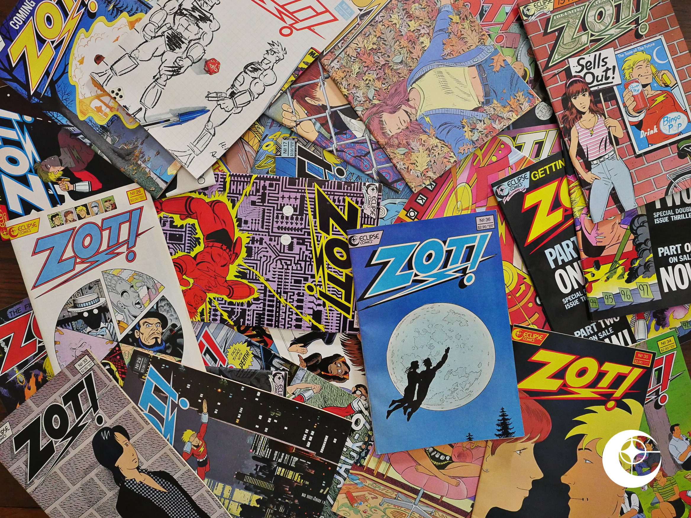
If somebody mentions “Eclipse Comics”, I think the most likely response you’ll get is “eh? what? do I know you?”, but the second most likely response is “they published Zot!, right?”

Right.

I read this comic as a teenager (i.e., when it was being published), but I stopped reading about issue 8, and I didn’t pick it up again until about the mid-teens (after which I backfilled), and I have not re-read these comics since. This is what I think I remember: The first ten issues are super-hero comics that may be better than the pack, but they still aren’t really worth reading, and 2) from #11 and until it ends it’s about high-school drama.

Join me in this overly long blog post and see whether I remember right or not!
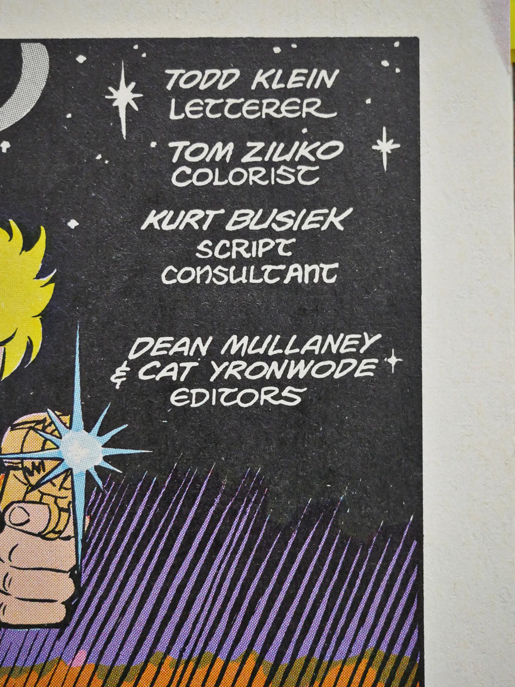
Kurt Busiek is listed as “script consultant” for most of the initial ten-issue run, which is, er, not the most common role in comics…
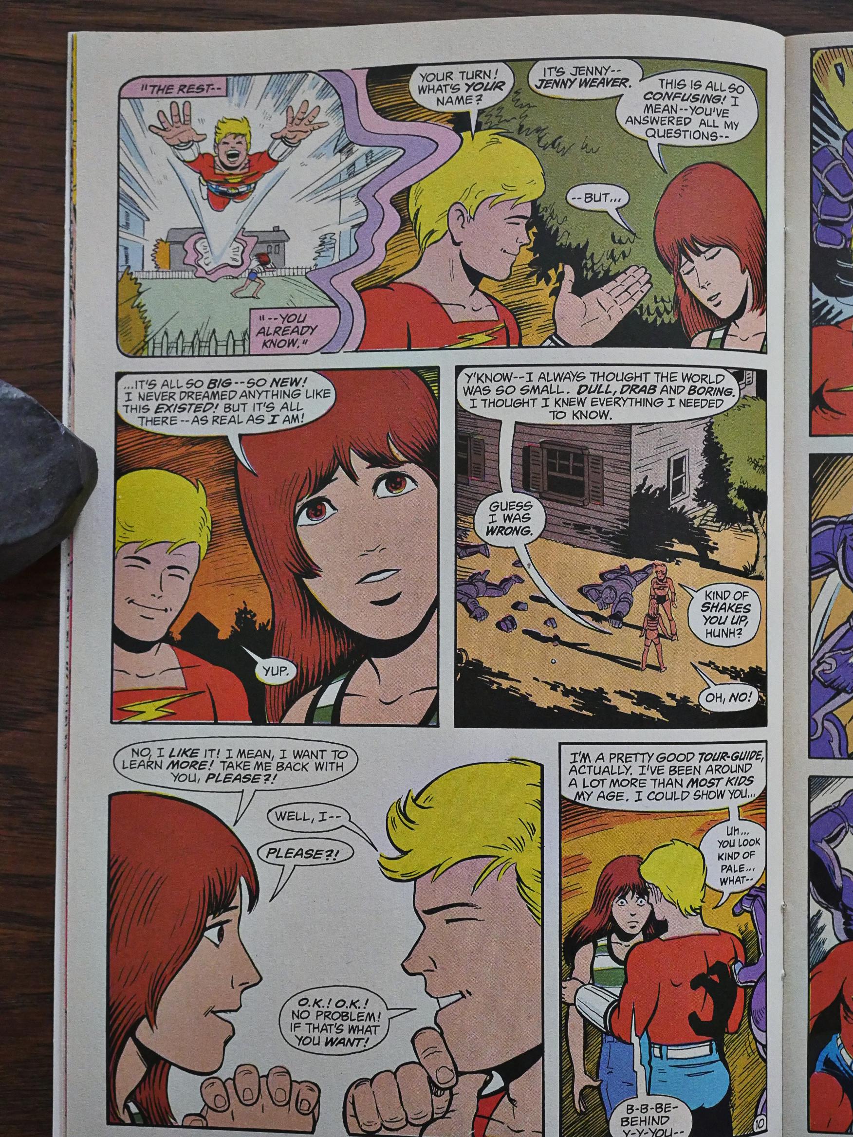
Anyway! Zot!’s about a girl who goes to a magical alternate Earth where she meets up with a teenage superhero. So far I seem to be remembering correctly. The colouring is super-traditional, as if McCloud wants to invoke the old-timey comics. That, and Zot’s suit apparently lead many to believe that Zot! was an homage to CC Beck’s Captain Marvel comics, but McCloud takes pains to explain that that’s not the case.
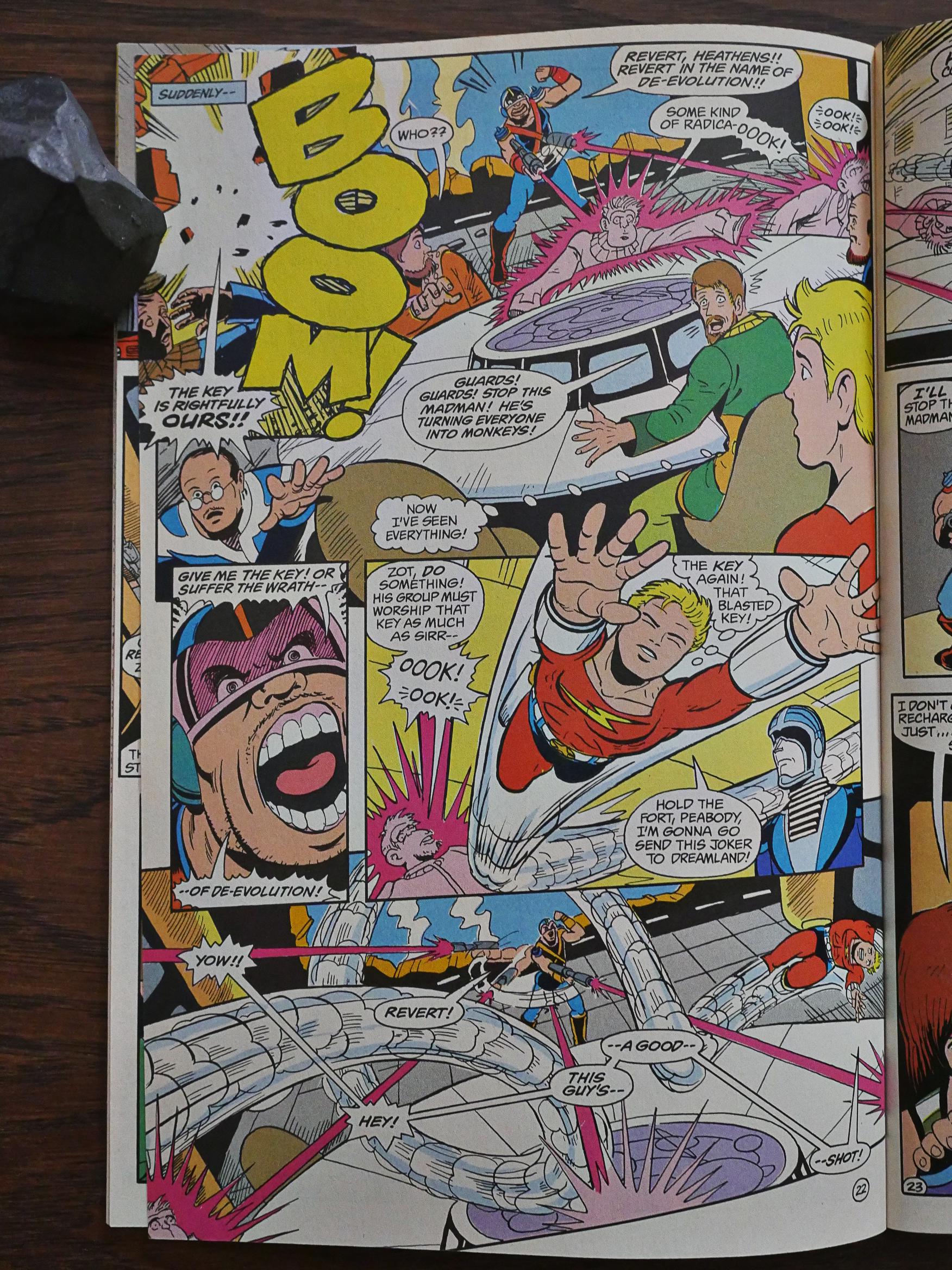
The comics are basically a kinetic blast of fun. Zot encounters one deranged super-villain after another and has it out with them, all while cracking jokes and being heroic. I can see why I would be less than enthused by this as a kid, because I was into serious stuff back then, but reading it now, I find it to be a blast.
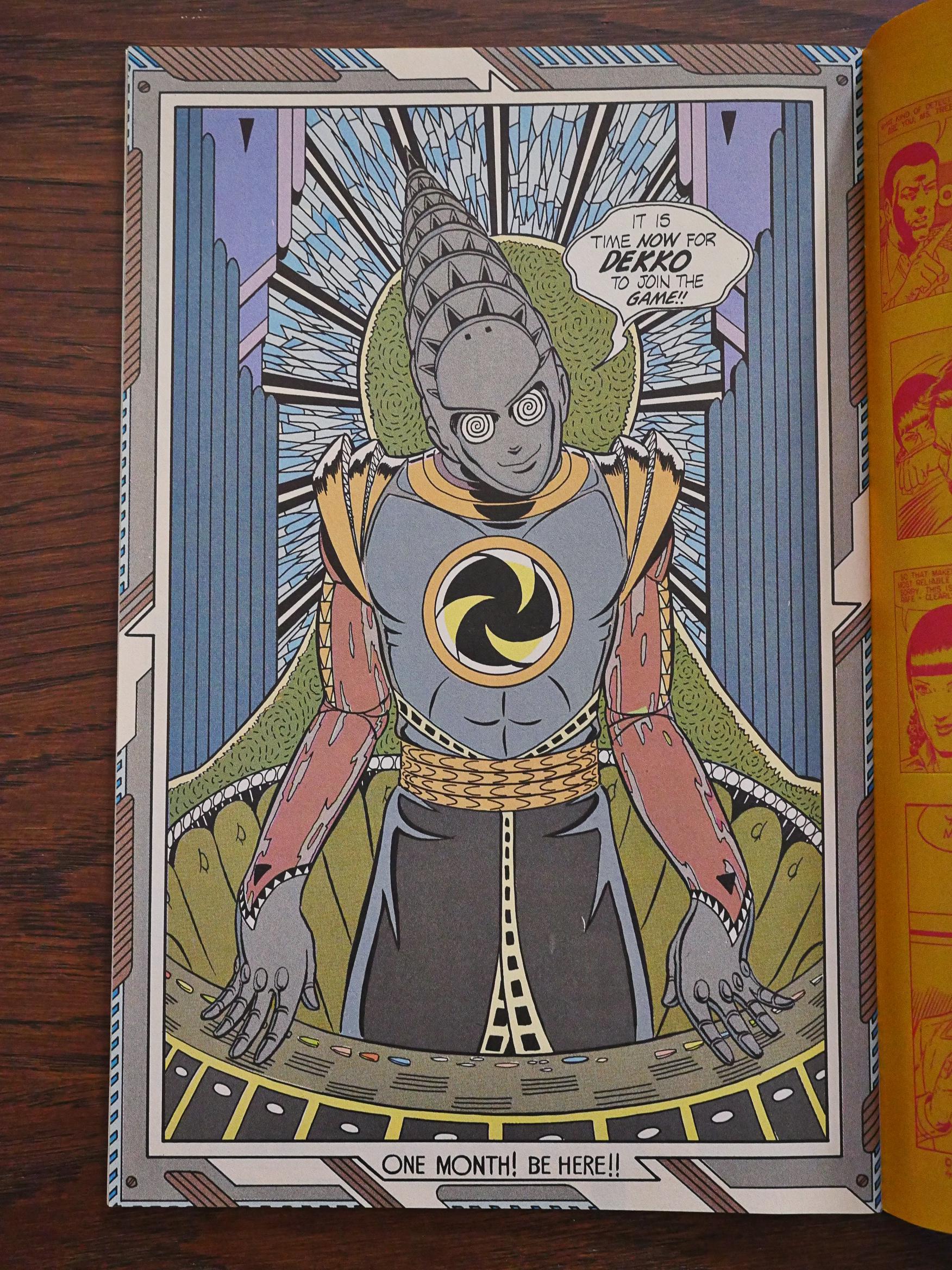
And McCloud has such a kooky imagination. Some of them are genuinely spooky (like 9JACK9), and some are both deranged and touching (like Art Dekko (*groan*) up there).
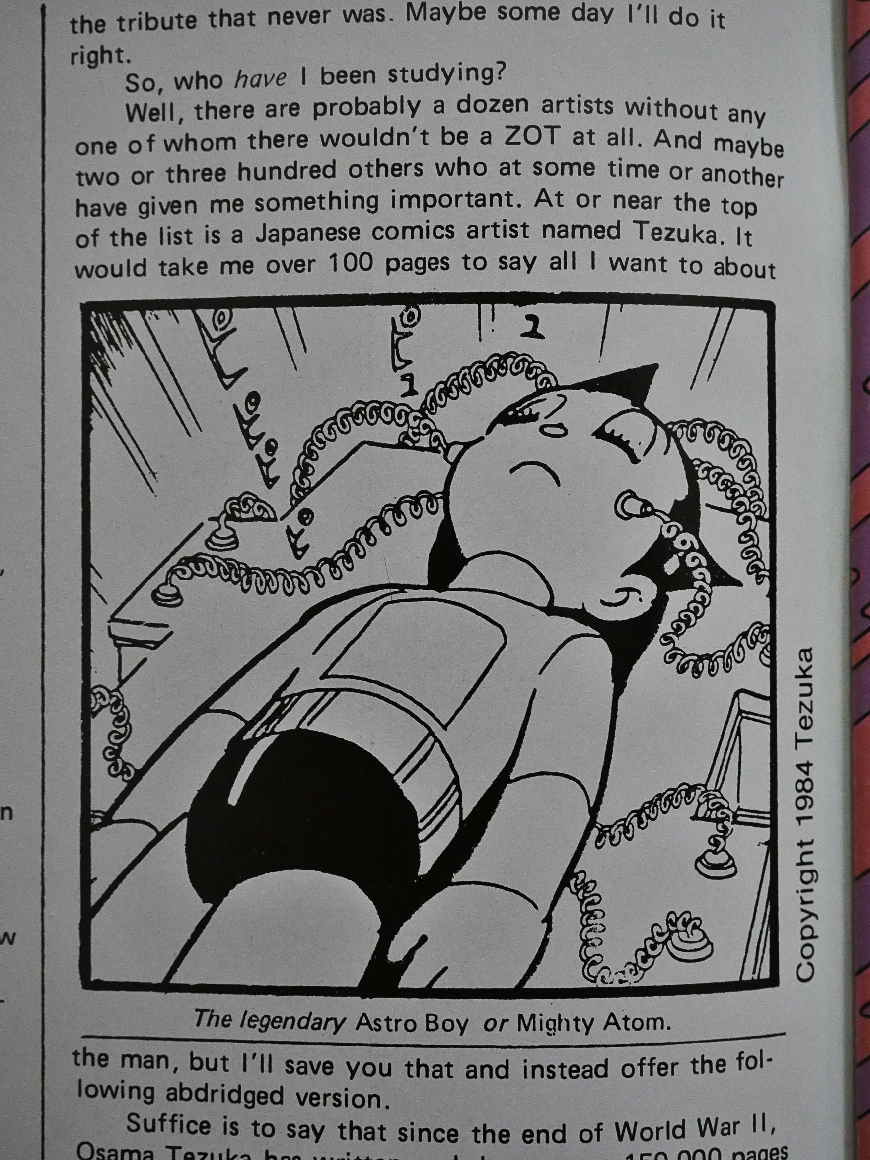
McCloud explains where his main inspiration for Zot! is coming from: Not Captain Marvel, but Astro Boy by Osamu Tezuka, the Japanese comics artist who (with the help of his studio of assistants) allegedly cranked out 150K pages during his lifetime. I guess there’s worse place to find inspiration.
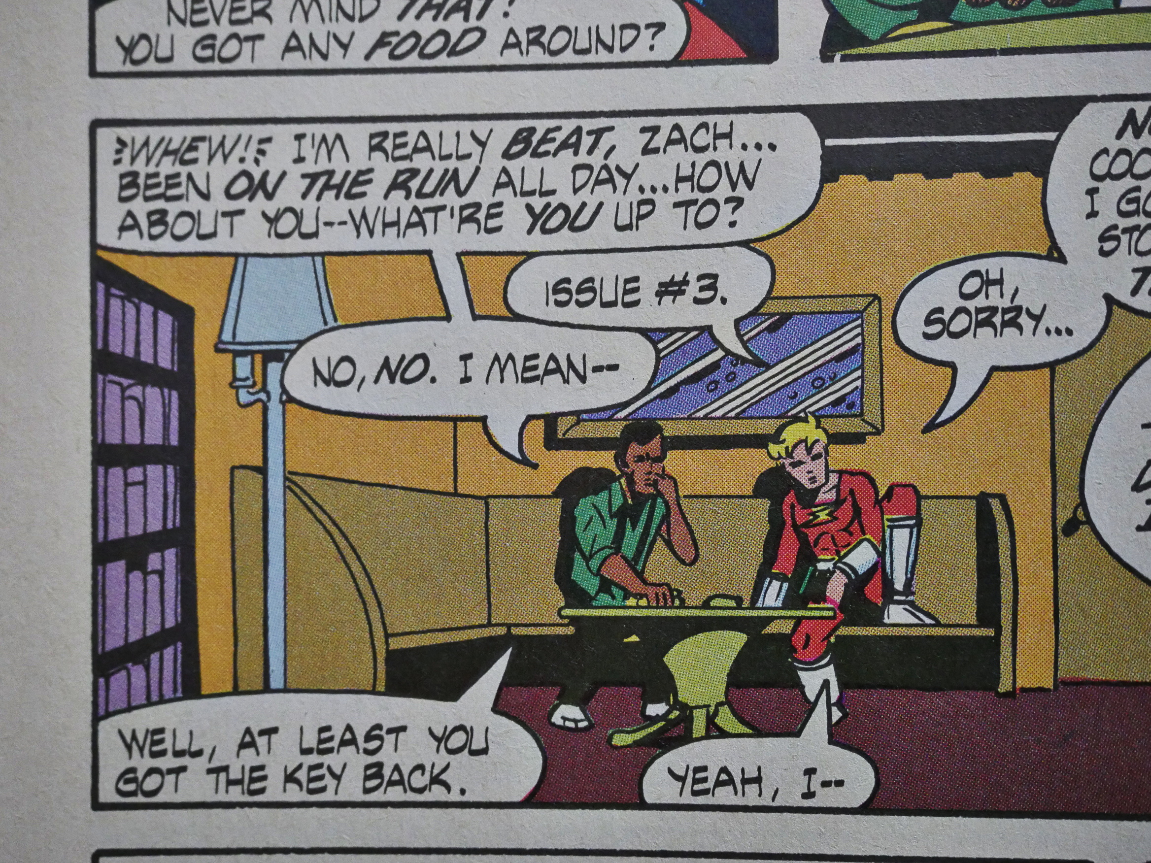
Zot! is a super-hero book, and it’s funny, but it rarely goes intertextual, but McCloud can’t help himself sometimes…
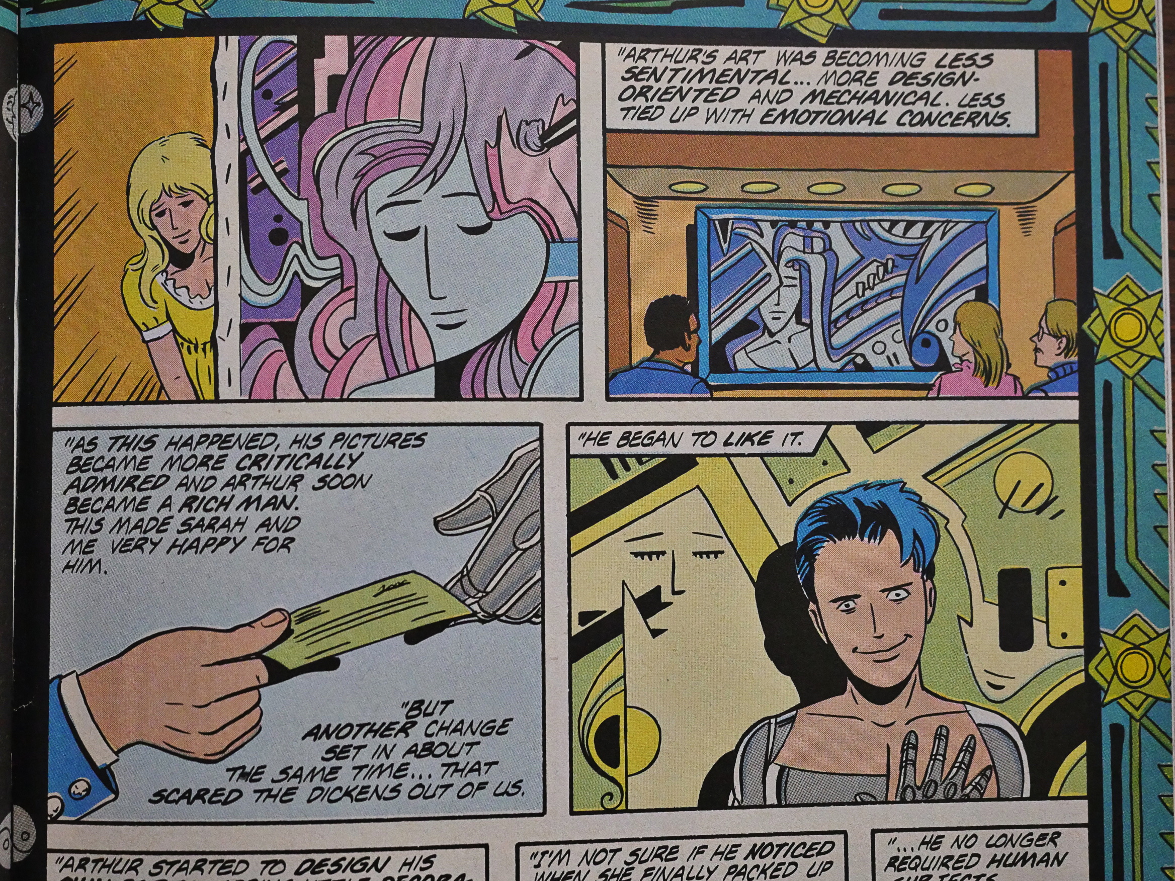
I find it amusing how certain of McCloud’s obsessions have remained unchanged throughout the years. The villain Dekko once made beautiful paintings, but then he excised feeling from his artwork and became a commercial success. In McCloud’s recentish doorstop (which is about a guy who’s bitten by a radioactive painting and then gains the superpower to create Balinese tourist souvenirs by waving his hands around, if I remember correctly), he also rails against modern artists and how bad the art world is these days.

I may be misremembering some details from that book, too, but I’m not going to re-read it.
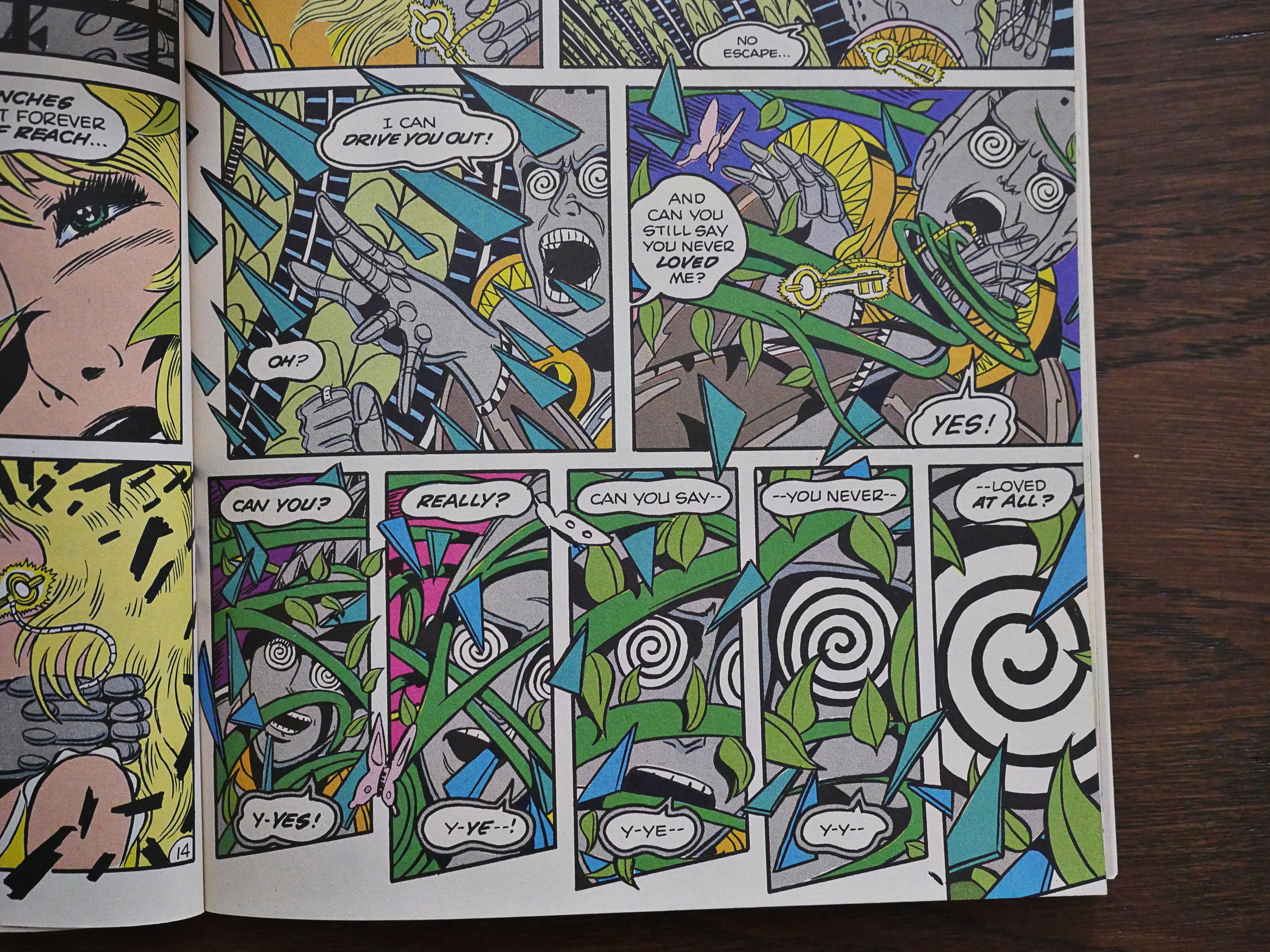
Aaaanyway! McCloud’s pages do have a very Japanese feel to them here and there. I mean, look at those triangles moving around in those panels. Isn’t that so Yuichi Yokoyama? I mean, I don’t think that Yokoyama was around in the 80s? But they’re dipping into the same well.
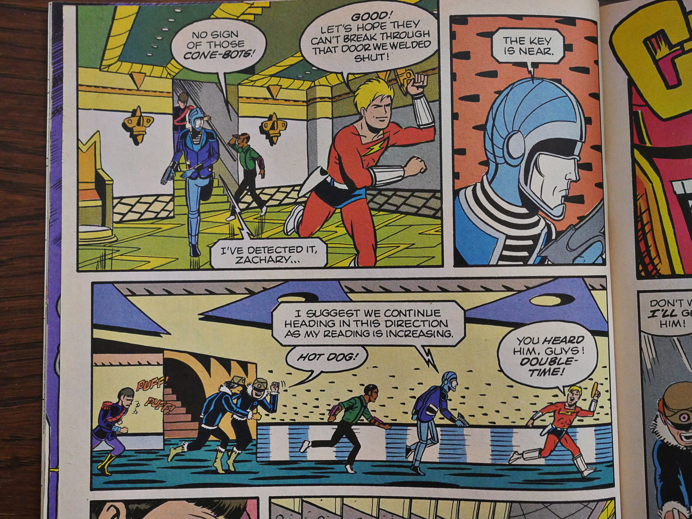
And if you squint a lot (I mean, A LOT), you get the same kind of endless propulsion hinted at in Zot! as you do in, say, Garden.

I know, it’s a stretch. But squint and then squint at Garden.
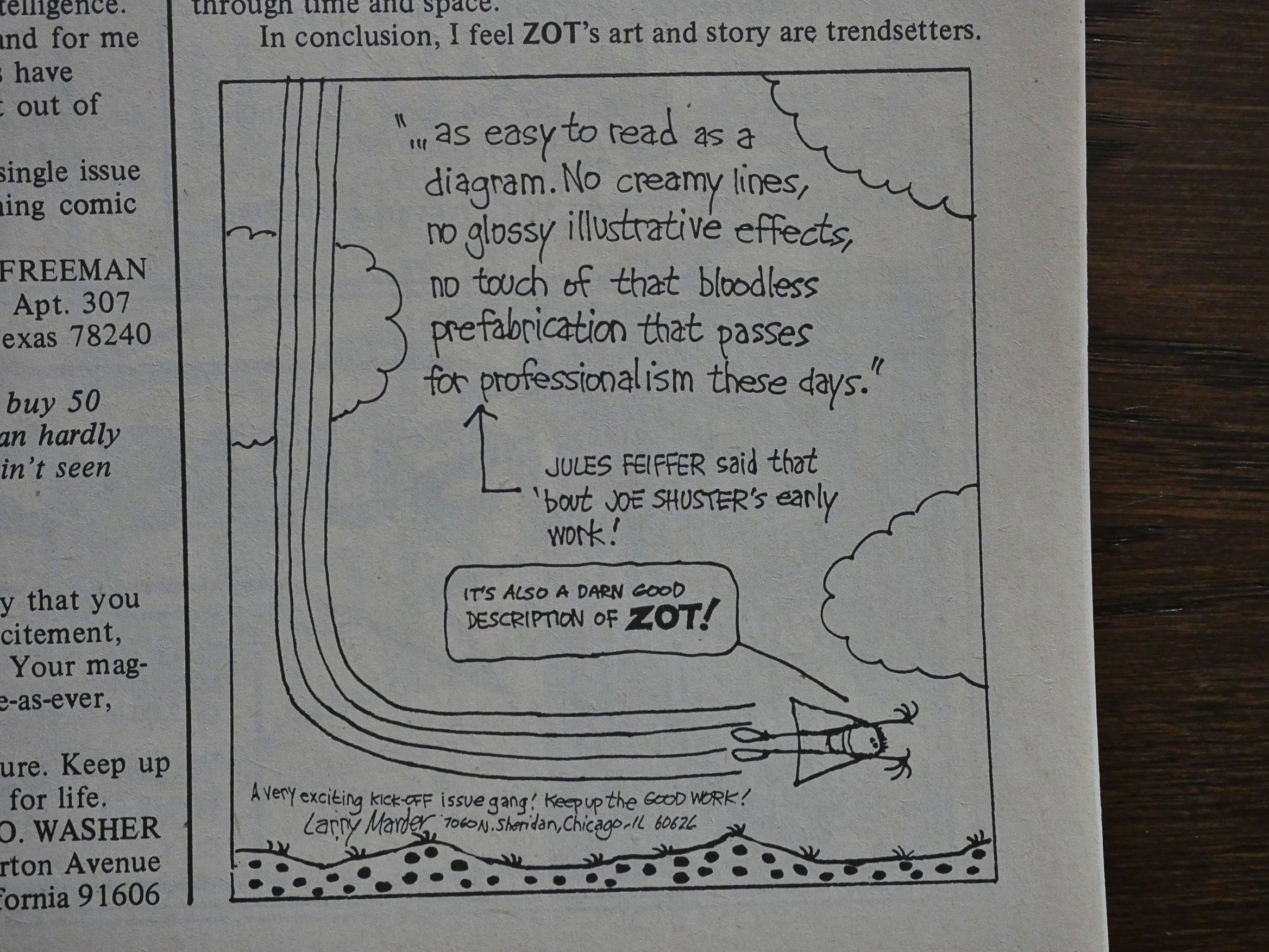
Larry Marder writes in and commends McCloud on his clearly readable pages. And it’s true, McCloud’s pages are extremely readable, even if they’re nothing like Joe Shuster.
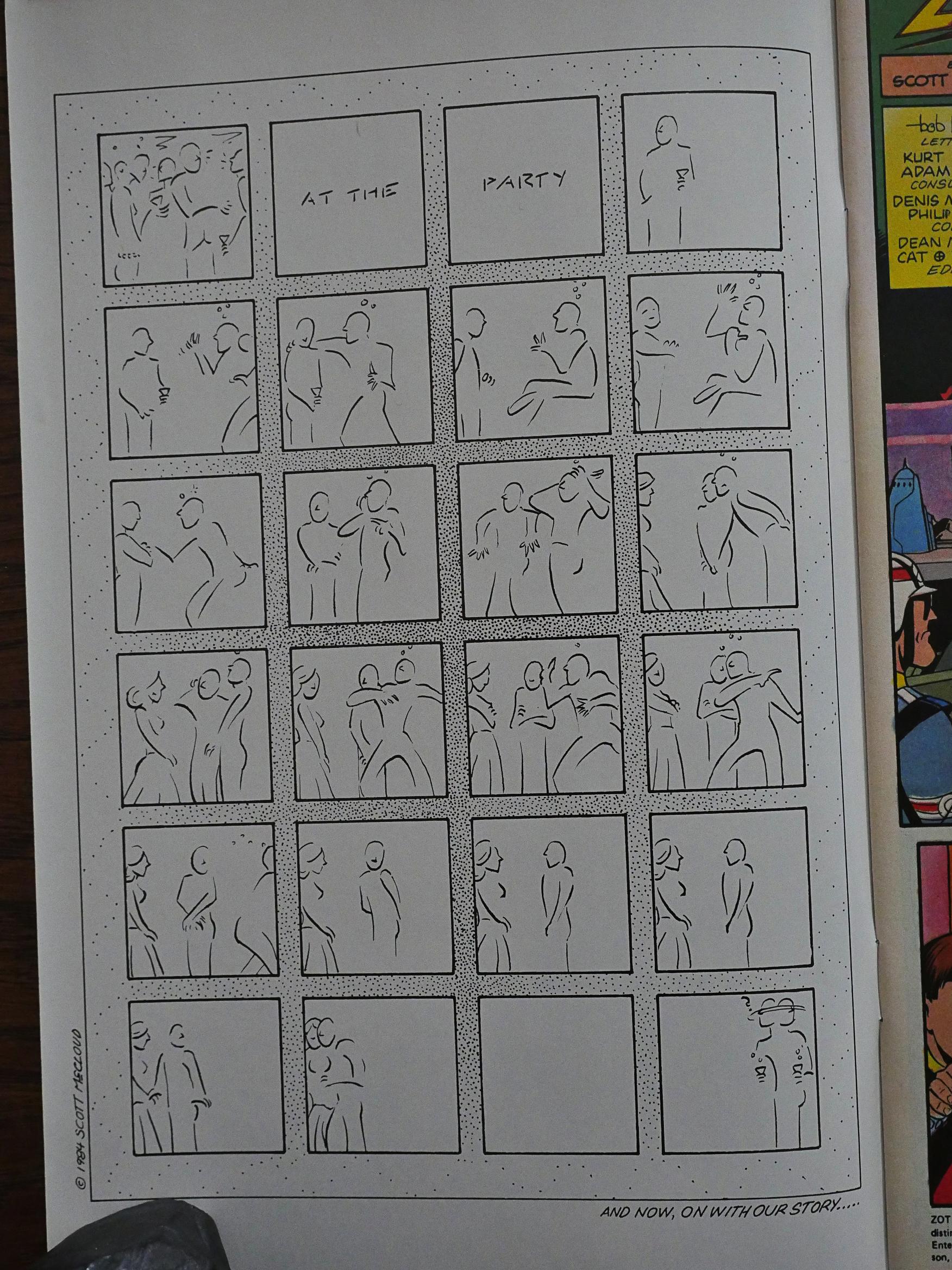
But everything isn’t perfect. You sometimes have to question McCloud’s taste level when he does things like this The Shy Guy Gets The Girl At The Party one-pager. I know, it’s probably just an exercise in trying minimal storytelling, but it’s still kinda embarrassing.
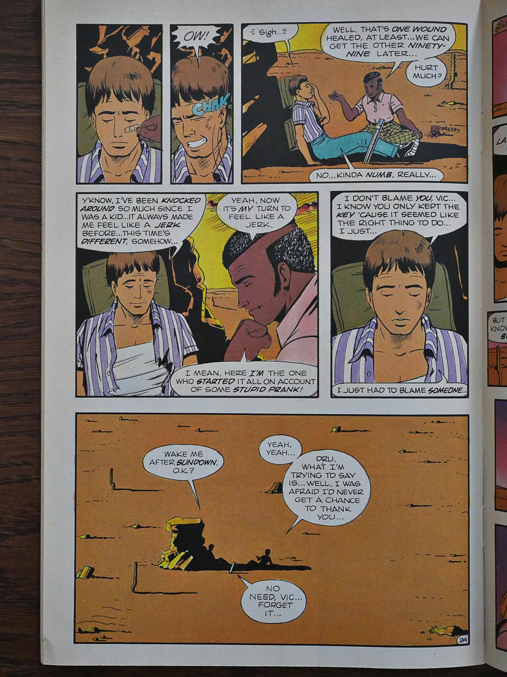
And then things go rather pear-shaped dramatically in the Zot storyline. While things have been “whahoo!” until now, McCloud apparently felt it was a good idea to introduce some real drama into the book, so he (spoiler alert) kills of the wimpiest character. While reading this now, I was scouring the pages for any sign that this was a gay character, because killing off teh gayz has been the number one strategy to add some sobriety to drama. (And if there’s more than one gay character, you kill off the gayest one: Viz. Star Trek Discovery some weeks ago, so not much have changed.)

In any case, it pauses the fun for some pages, and it doesn’t really work within the context.
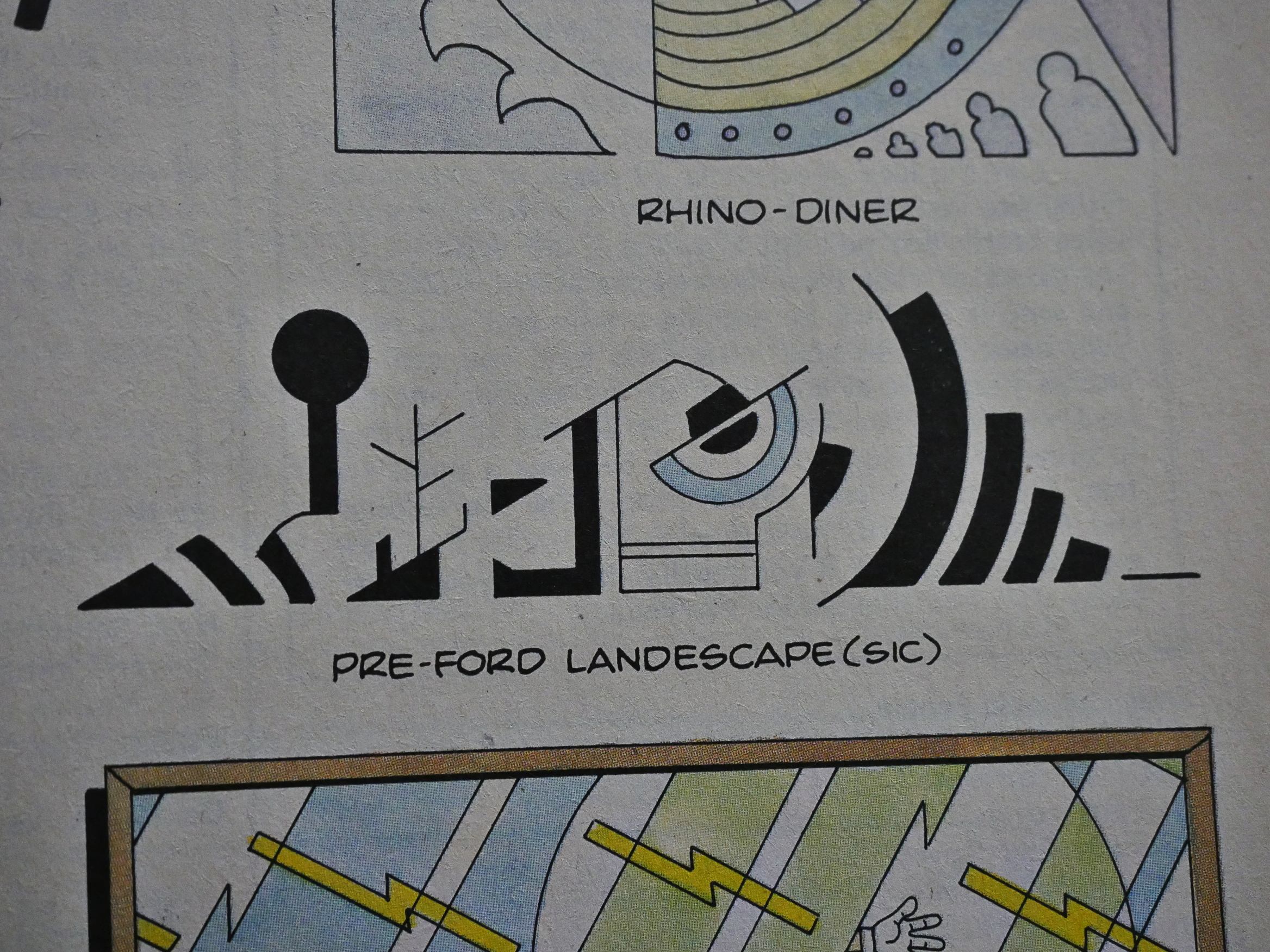
McCloud has fun producing quite a few of Dekko’s artworks, and, er, I don’t think they’re very good, but I kinda liked that one. Could look nice on a t-shirt.
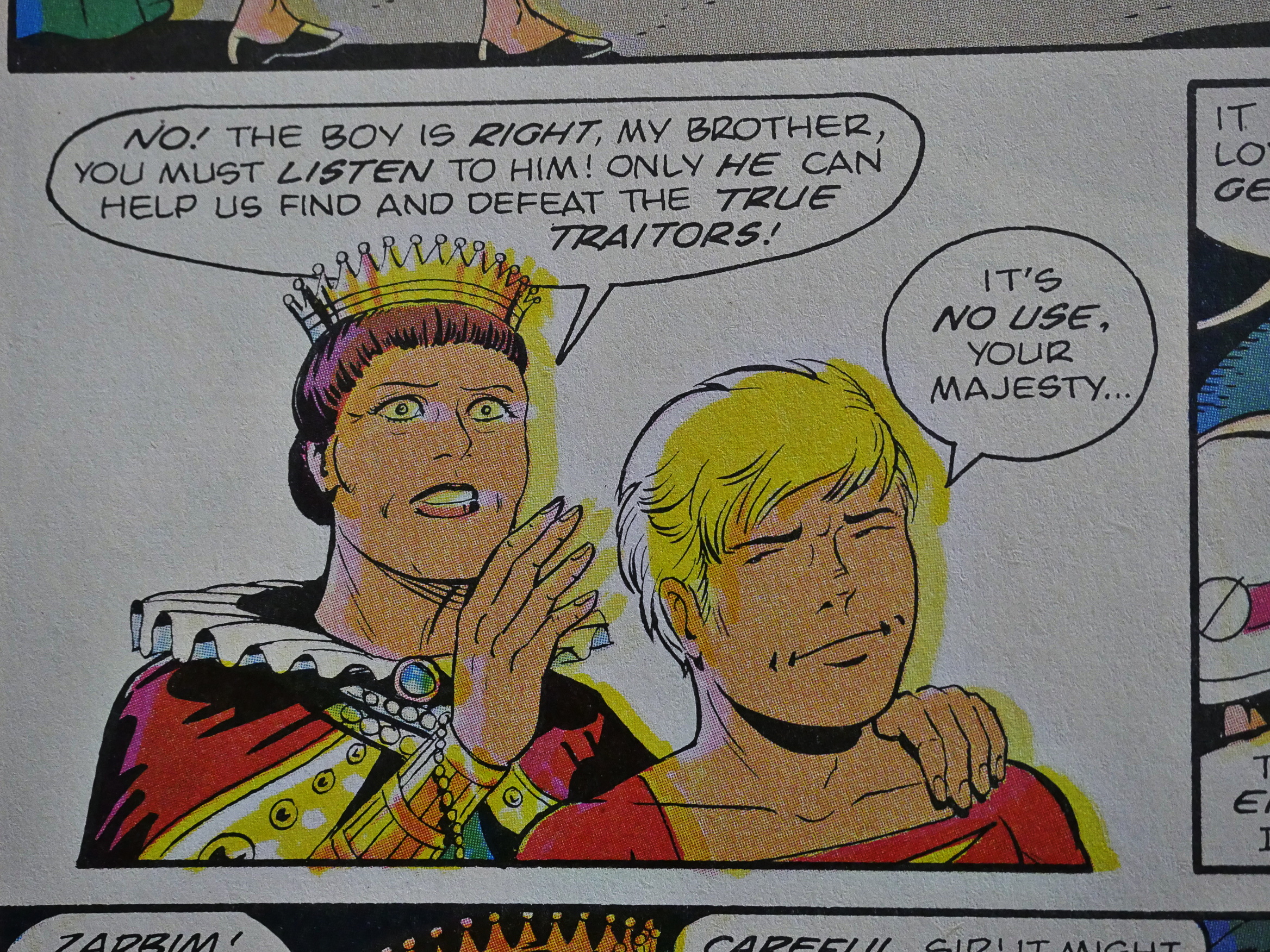
You mostly can’t fault the production on these comics: Nice paper, well-printed, top-notch staples, excellent bouquet, but one issue is printed with the yellow horribly off-register on half the pages.
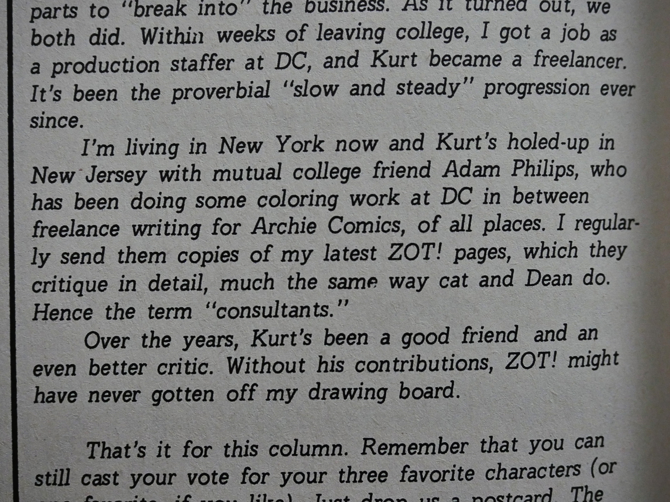
McCloud finally explains why Kurt Busiek and Adam Philips are listed as “consultants” on the credits page: They read the books and offer feedback. You get the feeling that McCloud takes his craft quite seriously and welcomes input, which is admirable.
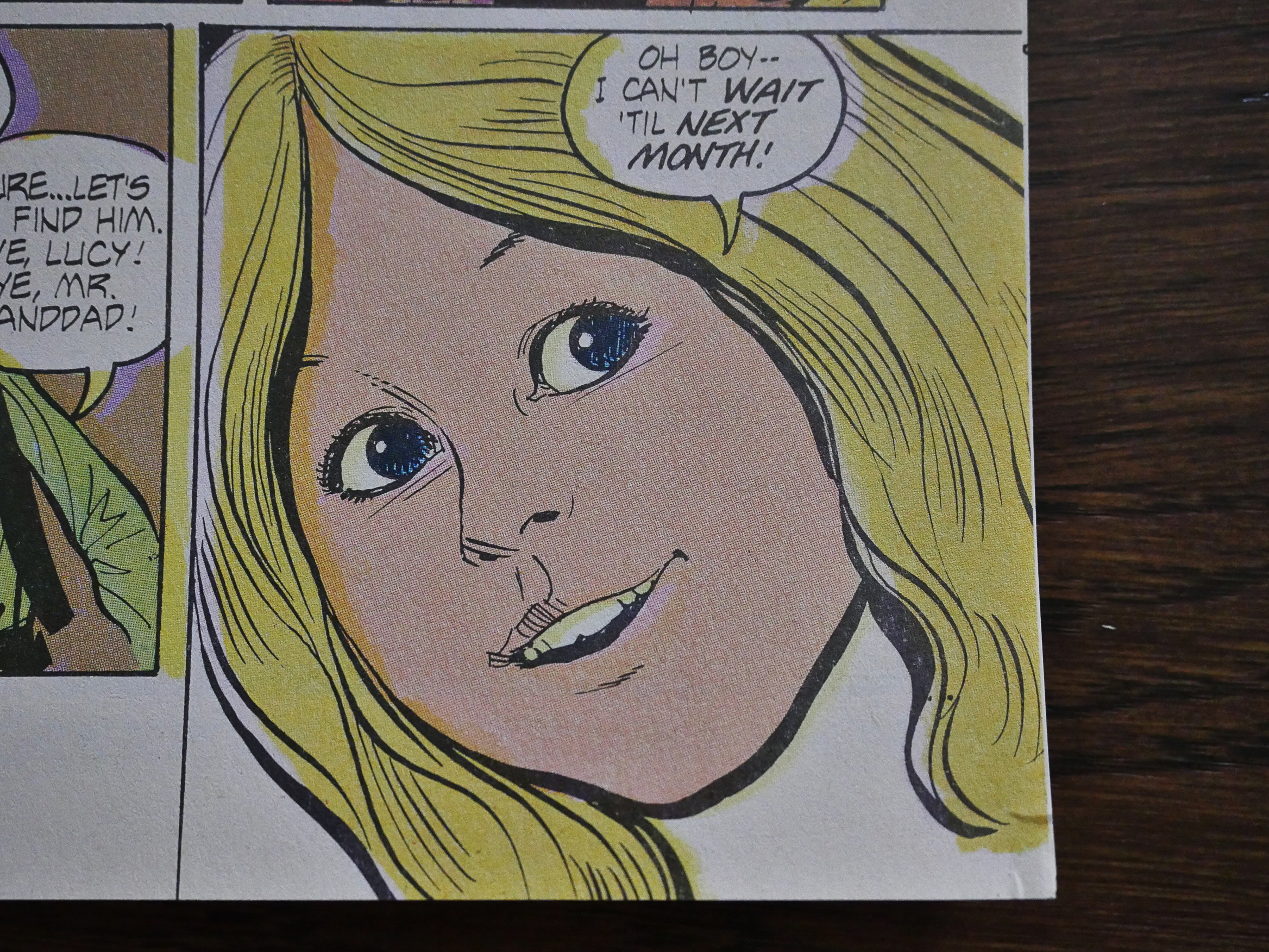
A six-part backup story by Kurt Busiek and Dan Spiegle is announced. Fortunately, only one is printed, because it’s… er… what’s the word for “not very good”? Not very good?
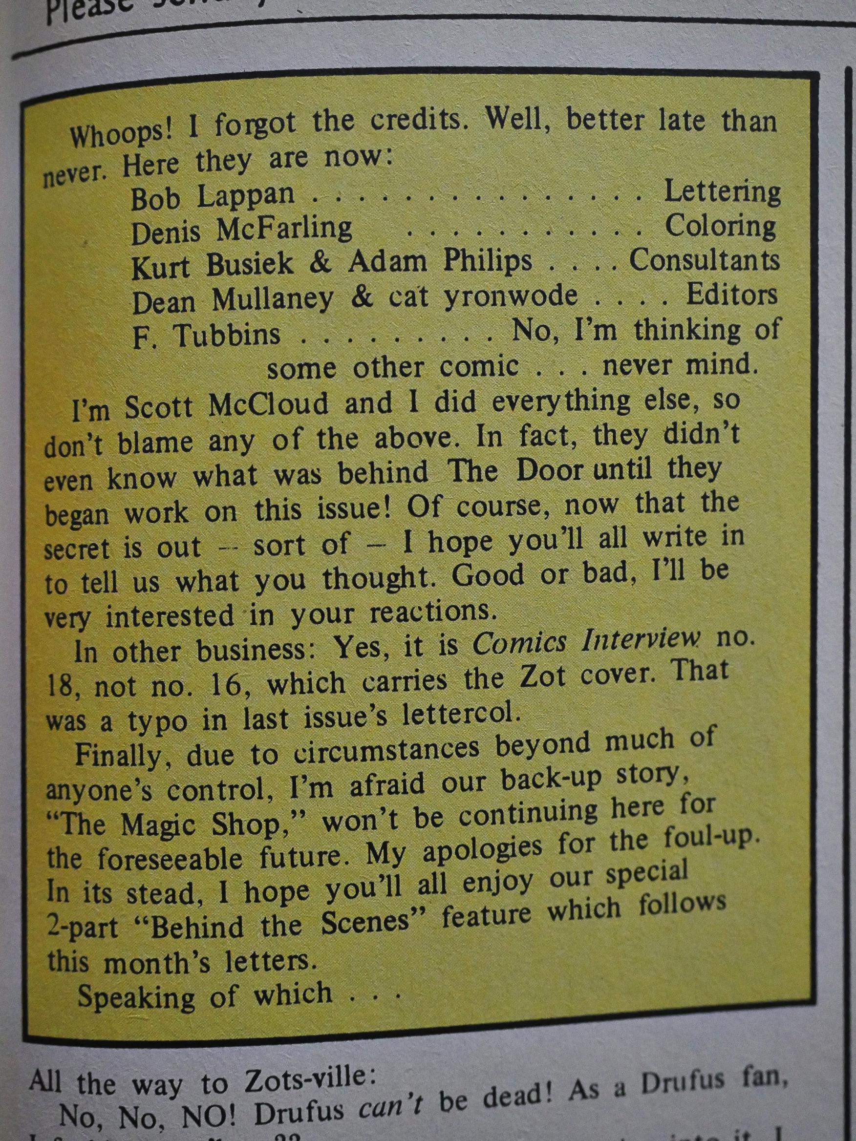
The next issue we find that the backup feature has been dropped. Because of “circumstances beyond much of anyone’s control”. I wonder what the story behind that is. I mean, beyond it not being very good, perhaps there just wasn’t money enough to pay Busiek and Spiegle? Apparently Zot! wasn’t selling gangbusters by this issue…
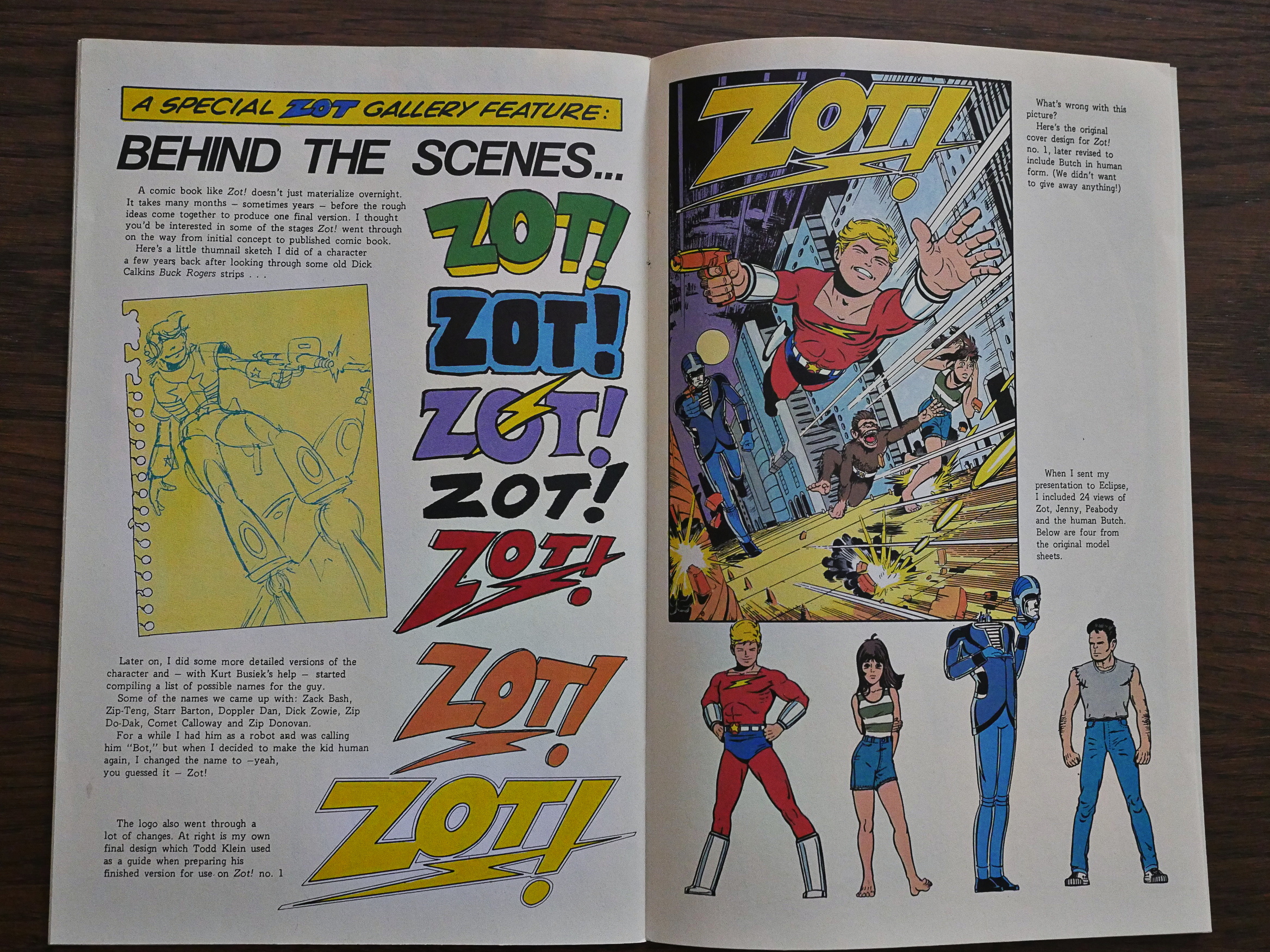
Instead we get some behind-the-scenes pages with concept art and logo design. Which is, frankly, more interesting.
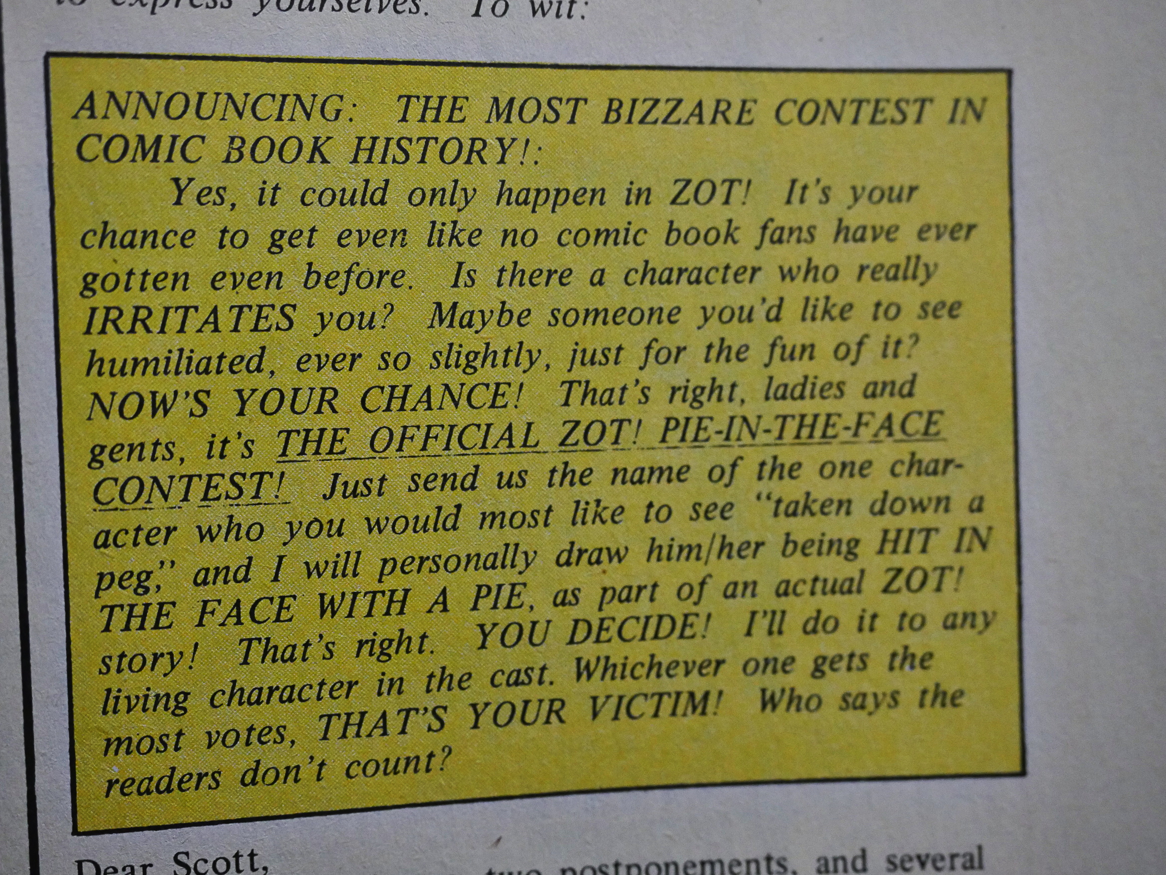
McCloud announces a pie-in-the-face contest. The contest ran for several years; perhaps longer than McCloud had intended.
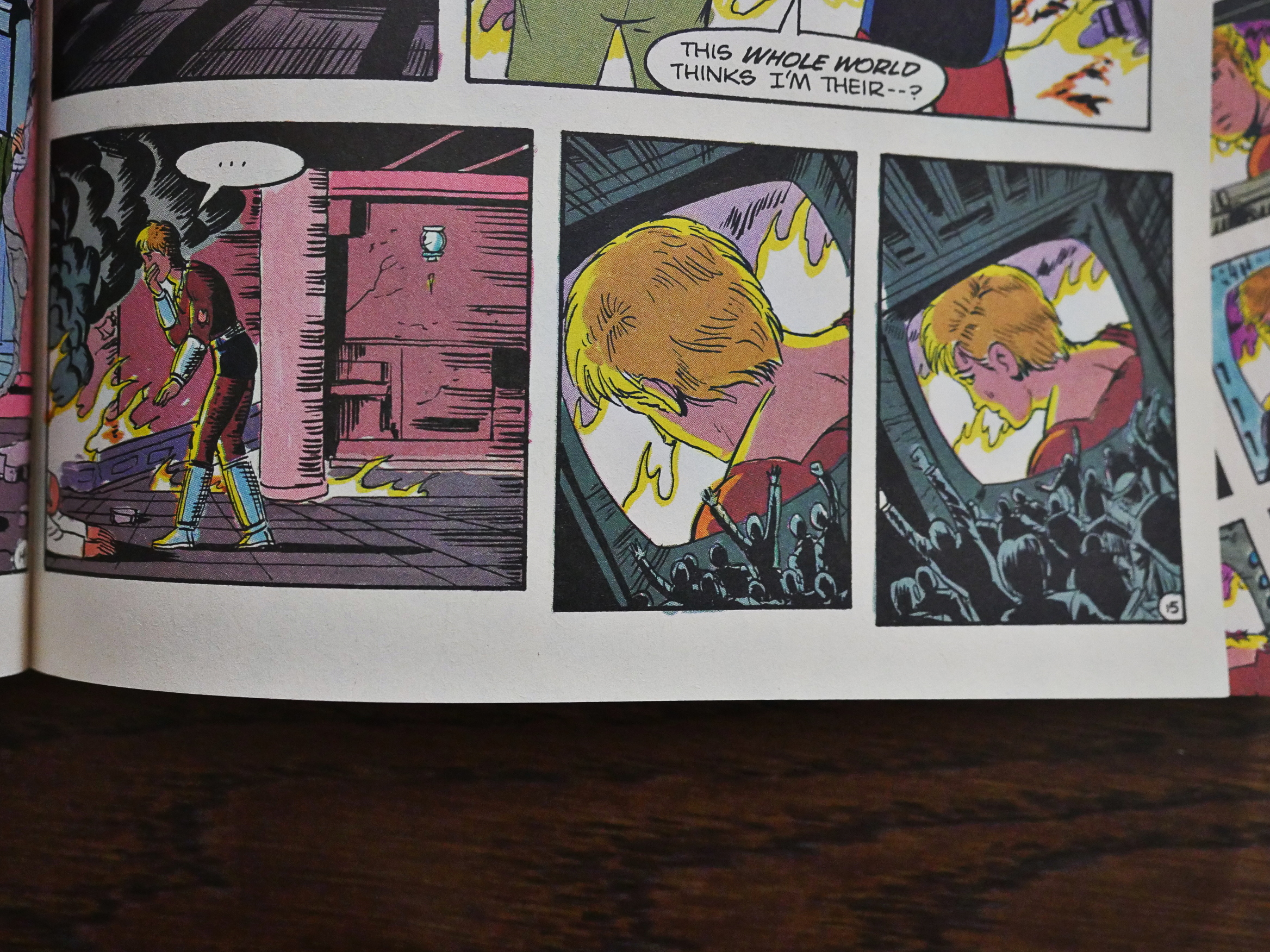
McCloud later became the (for a while in the 90s) the premiere comic book theoretician, and later suggested many ways comics could change to make use of the possibilities online publishing offers (infinite canvas, etc). I find it interesting that he was conscious of the little details in serial comics production and making use of them. For instance, Zot up there is realising that there’s a camera on him, and then you turn the page…
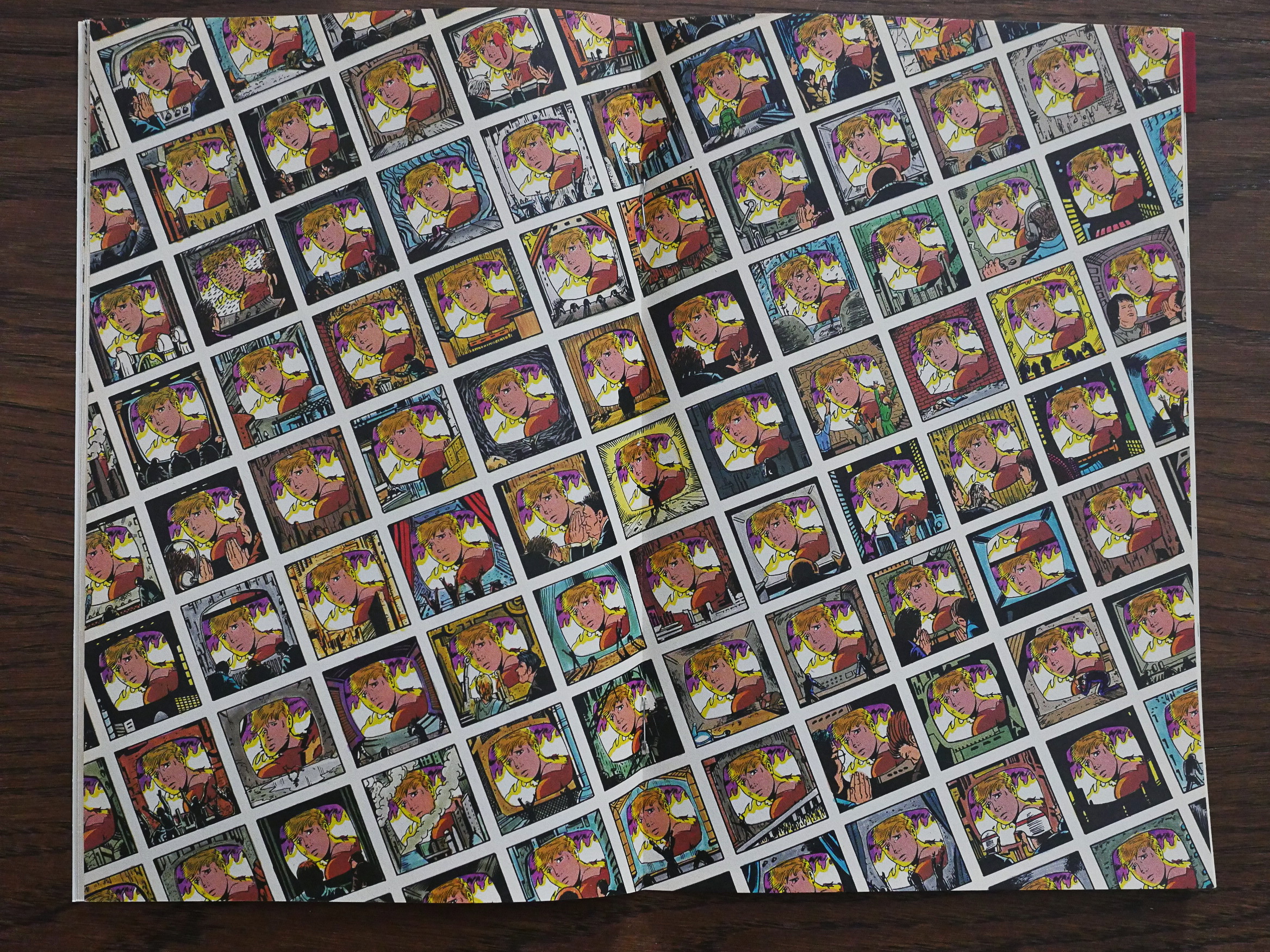
… to this two-page spread over the centre of the comic book. Since these two pages are the only one that are guaranteed to have no gutters between the pages (note the staples in the middle), the page 16-17 spread can be used for things like this without fear of having the effect spoiled.

So you have to pace the plot so that you can do this exactly here, which is a level of attention most (non-art-comics) comic book artists don’t feel worth having.
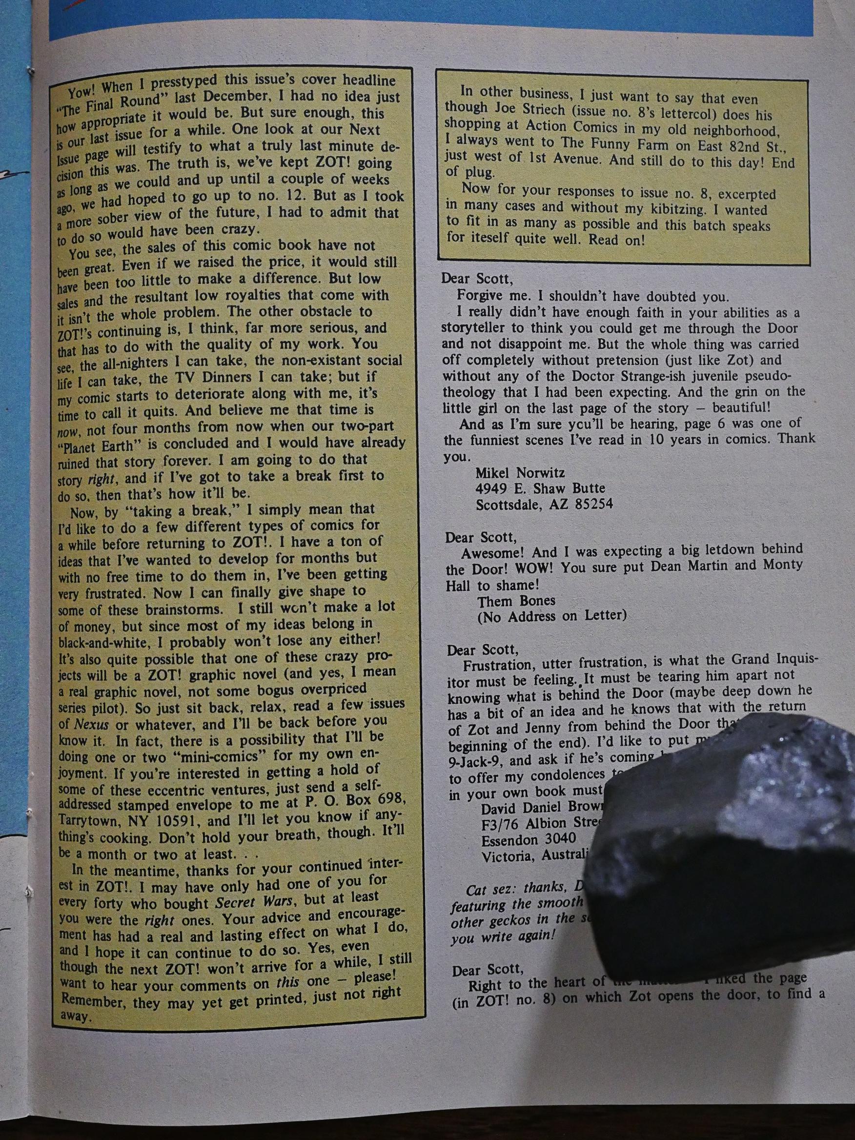
And then we get an announcement: Zot! is going on a hiatus. This is both because Zot! isn’t selling well enough, because McCloud is afraid of going stale, and because McCloud wants to do other projects.

The hiatus lasted for a year and a half, and the only thing McCloud completed in that period was the Destroy! book (which we’ll cover later in this blog series).

Issue number ten kinda ended in a natural spot: We got most major plot points tied up. So how were they?

I liked them a lot better than I did when I was a kid, I think. They have an exuberance I find quite irresistible. However, dramatically it doesn’t quite hold up. There’s one long plot (about a magical key) that runs throughout this run, and after finishing it, I feel that there were issues that mostly functioned like speed-bumps: The Dekko issues were fun, but had nothing to do with anything, so structurally they made no sense where they were.

And the aforementioned Death of the Wimp was tonal wreckage.

So let’s see what happens next! Is it all high-school drama?
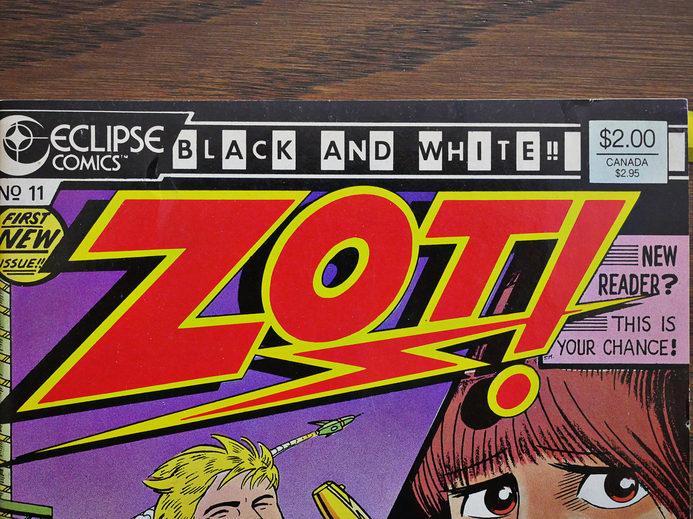
I find this checker banner Eclipse used on some of their black & white comics amusing: As if the lack of colour is a sales gimmick. Which I guess it was; this is slightly after the black & white boom and bust, isn’t it? (For those too young to remember, it was an collectors investment mania triggered by the sudden popularity of Ninja Mutant Teenage Turtles. Yes. It’s a strange world.)
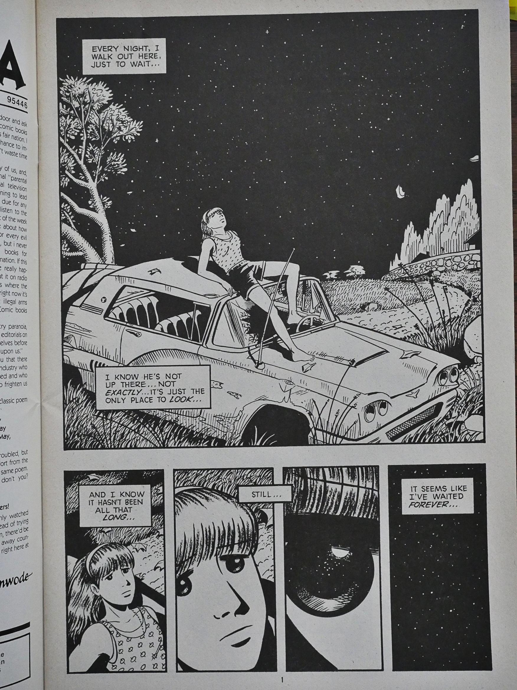
But, indeed, we have a black and white comic book now, and McCloud adjusts his art style accordingly: Gone are the bright open panels, and instead we get juicy blacks and textures.
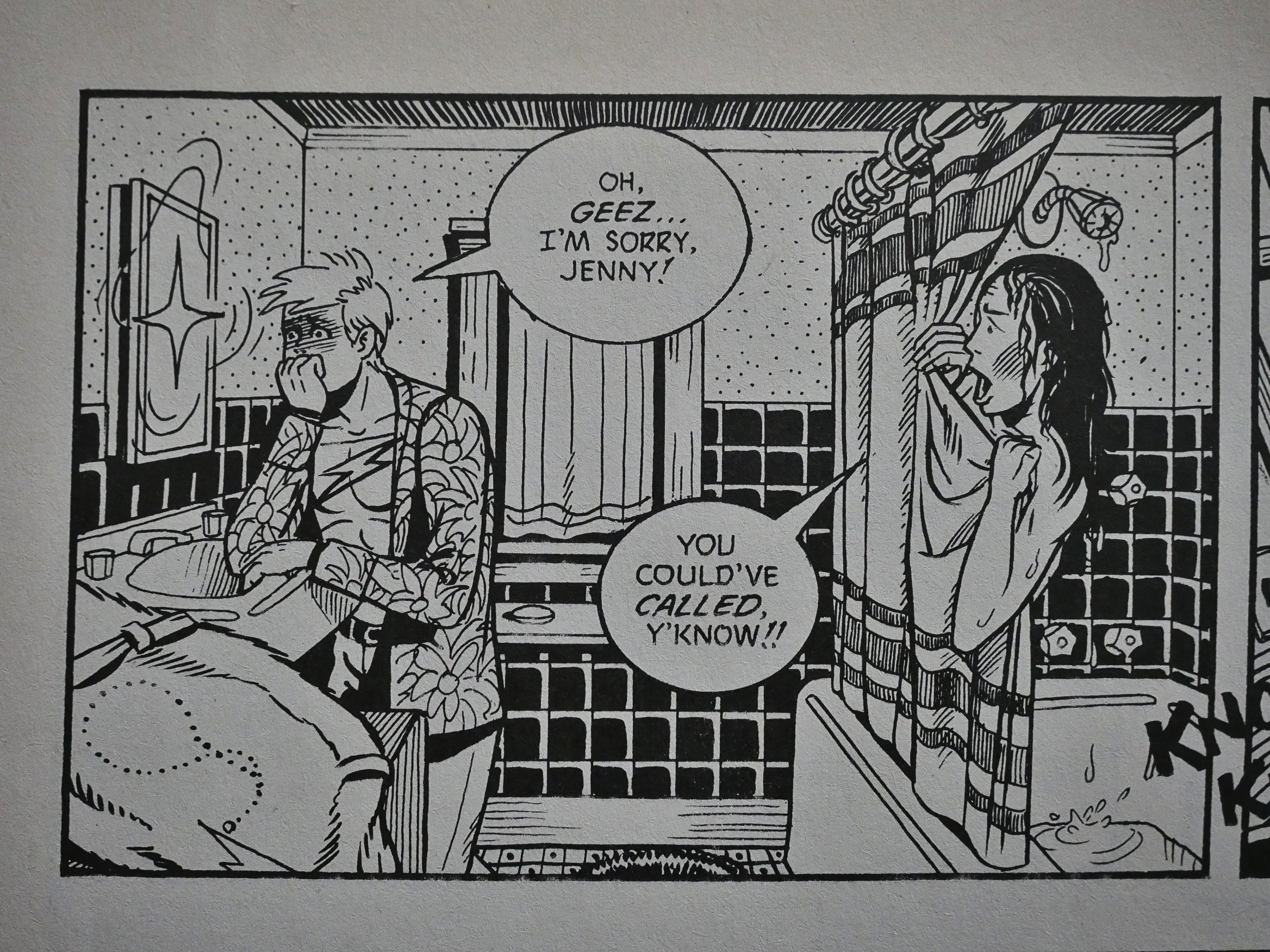
And we go from a comic that doesn’t deal with sex at all to one that does. Slightly. In a teen-age way.
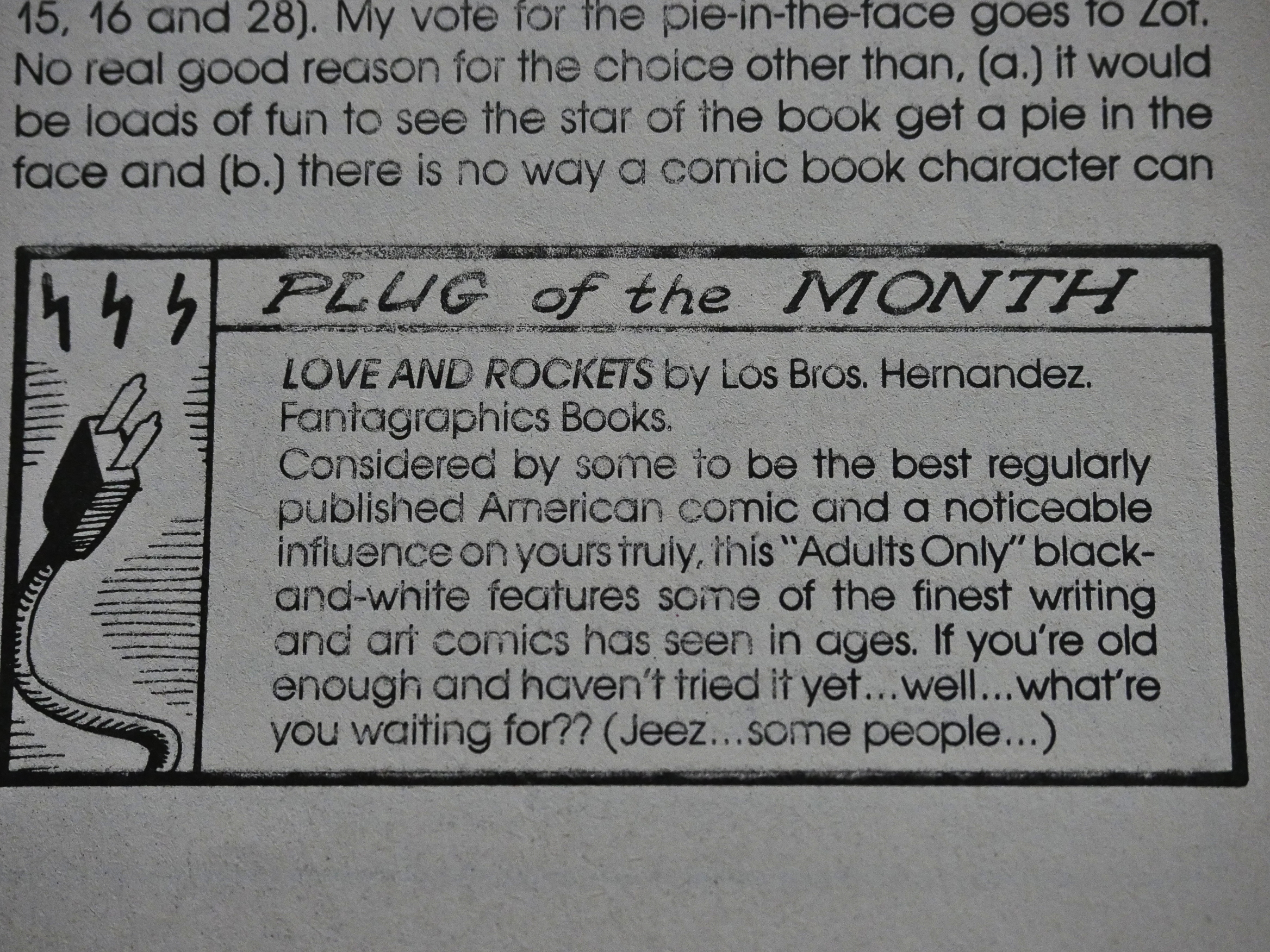
The letters pages expand, and gets a more intimate clubhouse feel, what with competitions and recommendations for other comics. And all the comics McCloud recommends are, indeed, pretty spiffy, so he has excellent taste (which we also saw in the edition of America’s Best Comics he edited the other year).
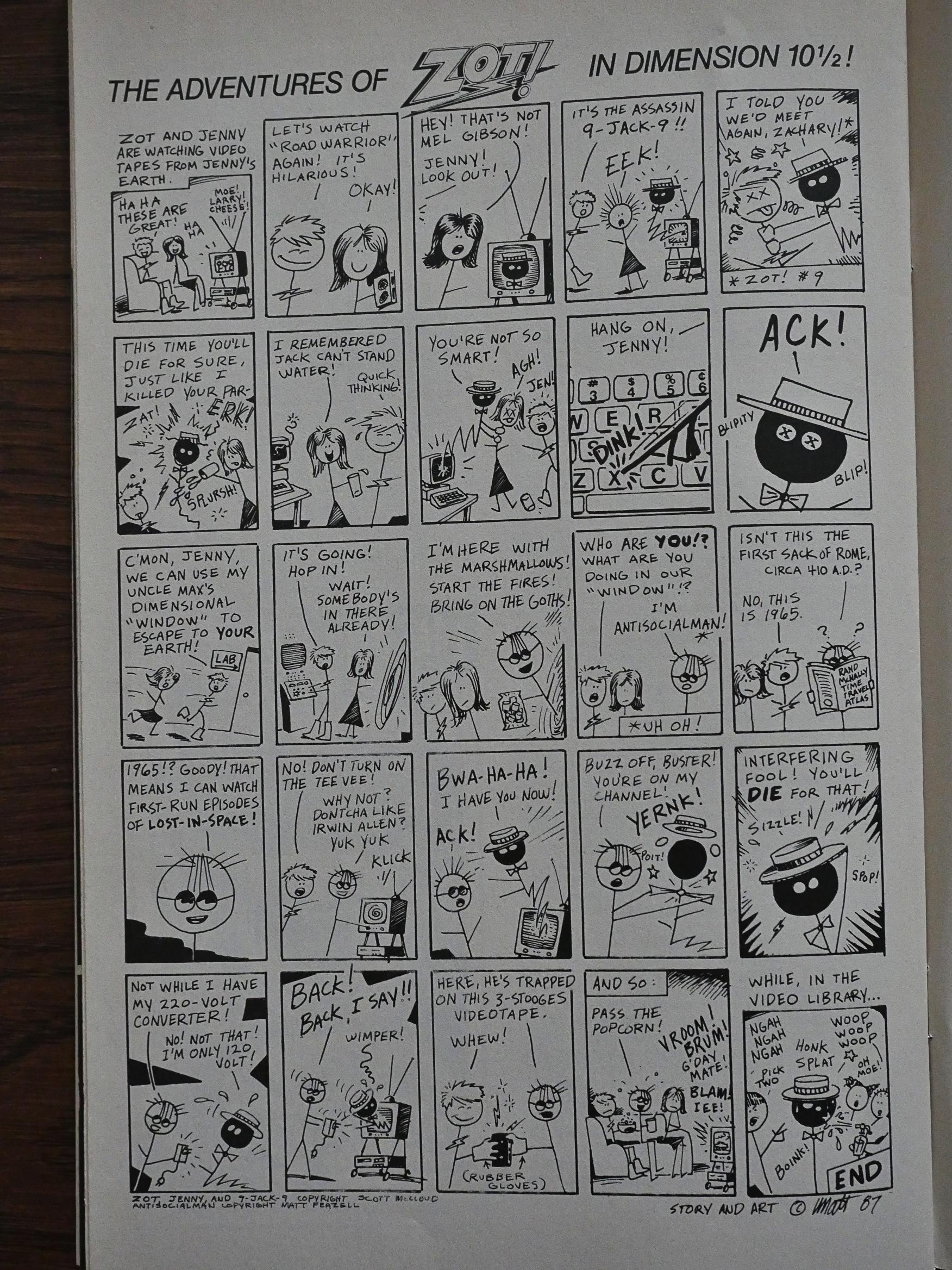
Finally, rounding out each issue, we have The Adventures of Zot! in Dimension 10½ by Matt Feazell.

While the direction of the stories haven’t really changed all that much (it’s still mostly super-hero hi-jinx, so I misremembered), it feels like a much more complete package now. We get a satisfying chunk of the main Zot storyline, and then a chatty letters page with many returning letter-writers, and this backup feature, and it’s all very… satisfying.

(Some readers may have been dissatisfied with the price increase from $1.50 (when Zot! was in colour) to $2.00 now, though, but black & white comics sell less, and lower print runs are more expensive…)
I do find it amusing that Eclipse was pushing the black & white boom like this, though. But we’ll get back to that when we reach the start of those series listed above…
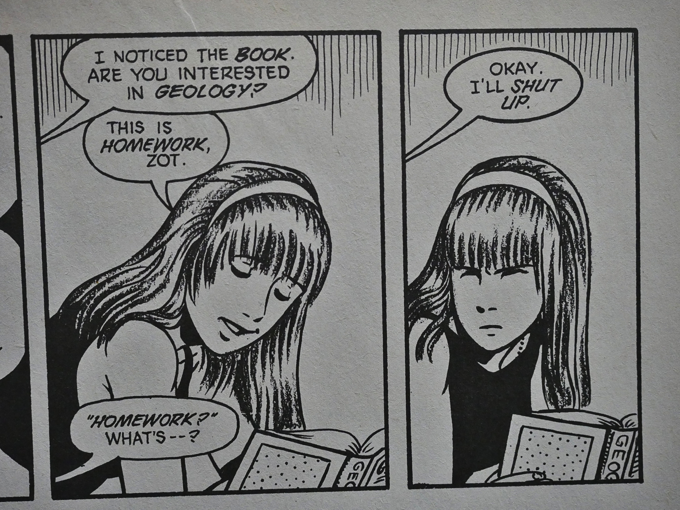
McCloud experimented with er crayons? on Jenny’s head for a handful of issues. I think it’s a nice effect, but when that’s the only place it’s being used, it’s a bit distracting.

And look at that masterful stink face Jenny’s giving Zot! McCloud got really good at facial expressions as the series progressed.
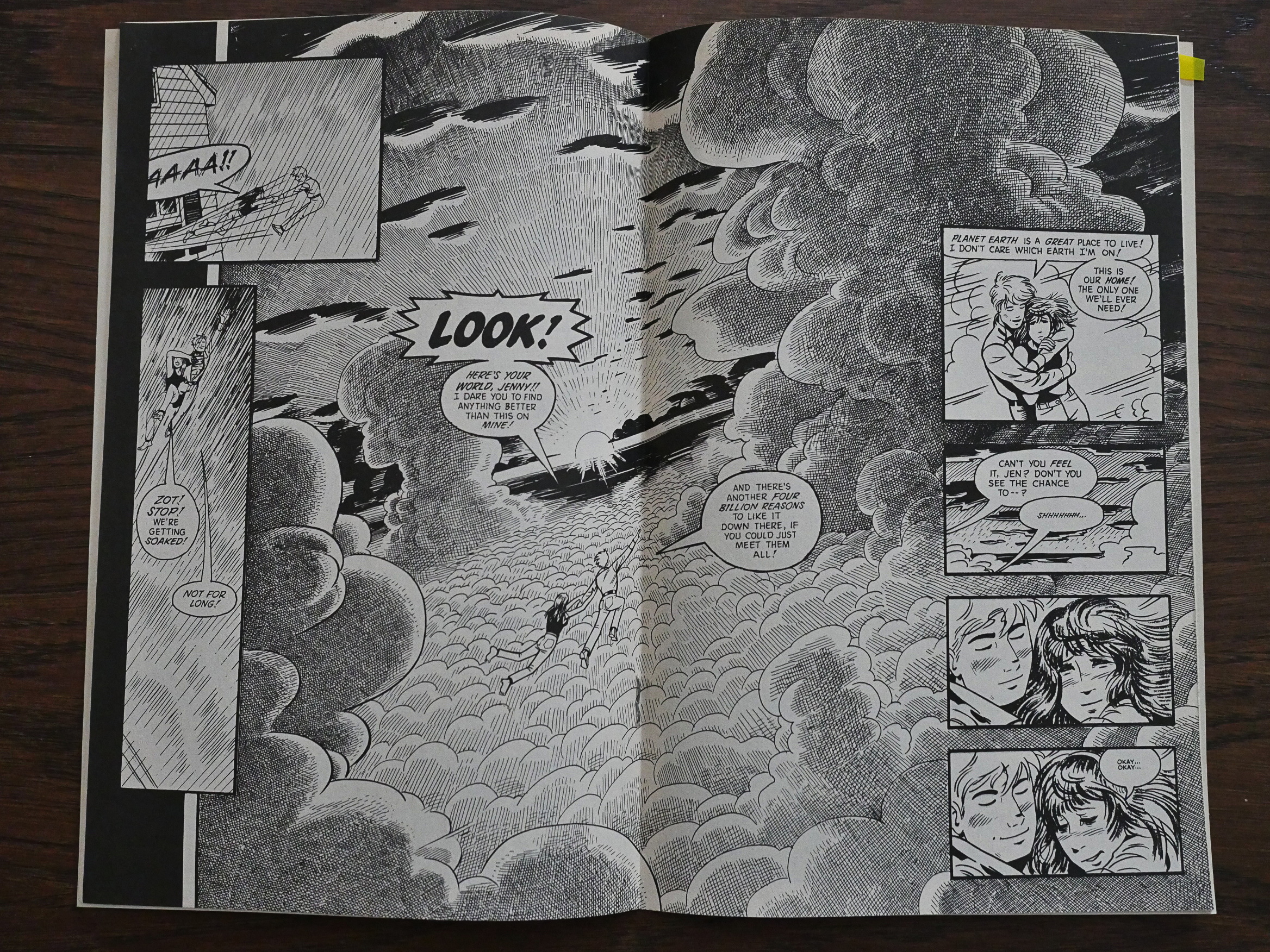
McCloud’s still using the centrefold (er) to great effect in a few issues. I mean, LOOK!
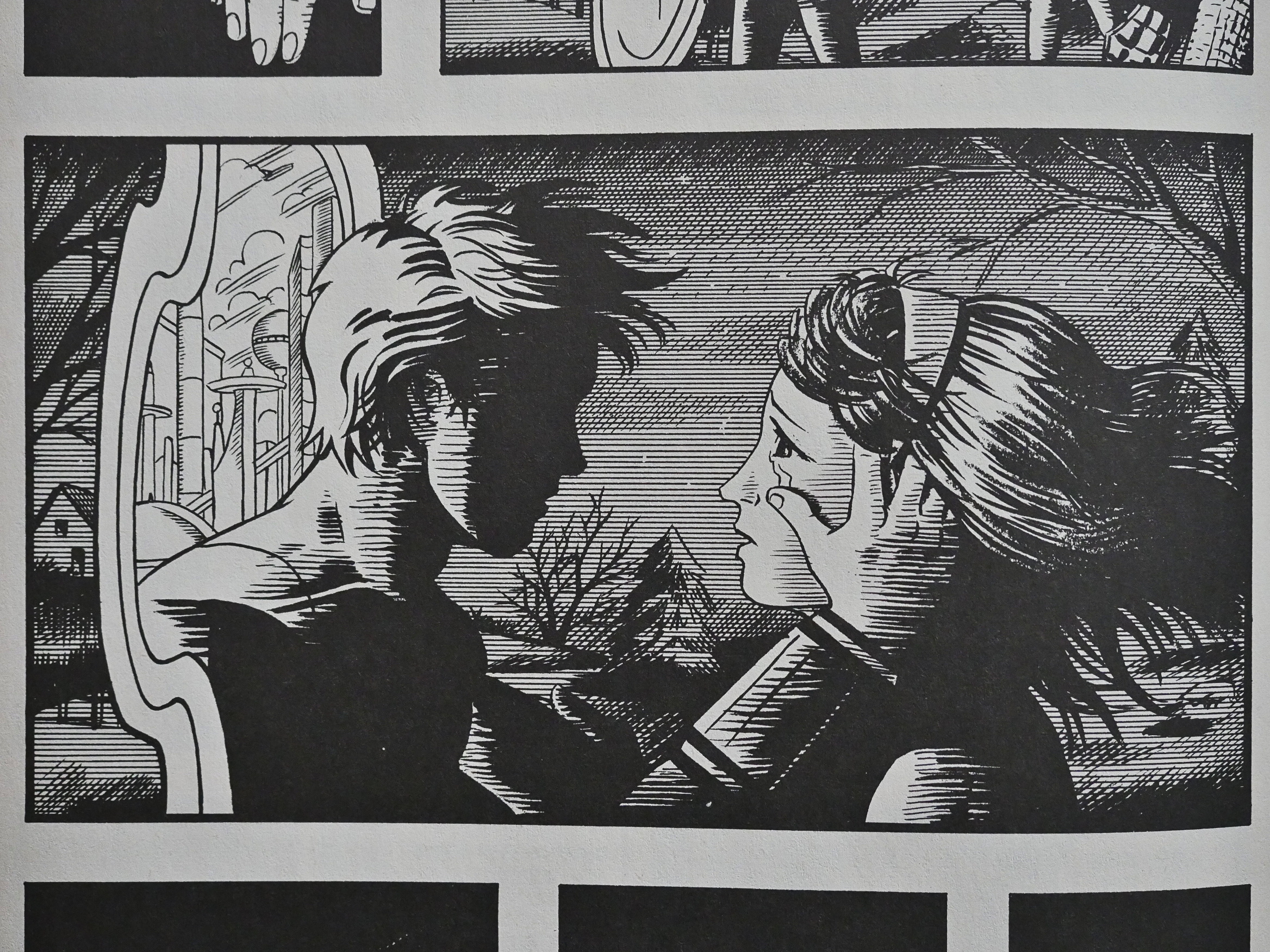
This is probably the most iconic image from the second part of this series: It’s the entire series in one single image. The adventure, the romance, the fantasy.
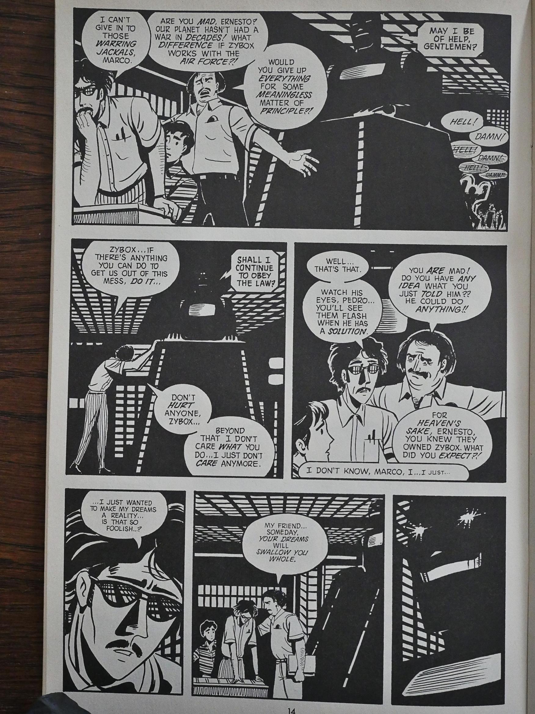
Am I on crack when I think that McCloud is more than slightly influenced by Beto Hernandez on pages like this? Think of those Errata Stigmata pages in the futuristic city…
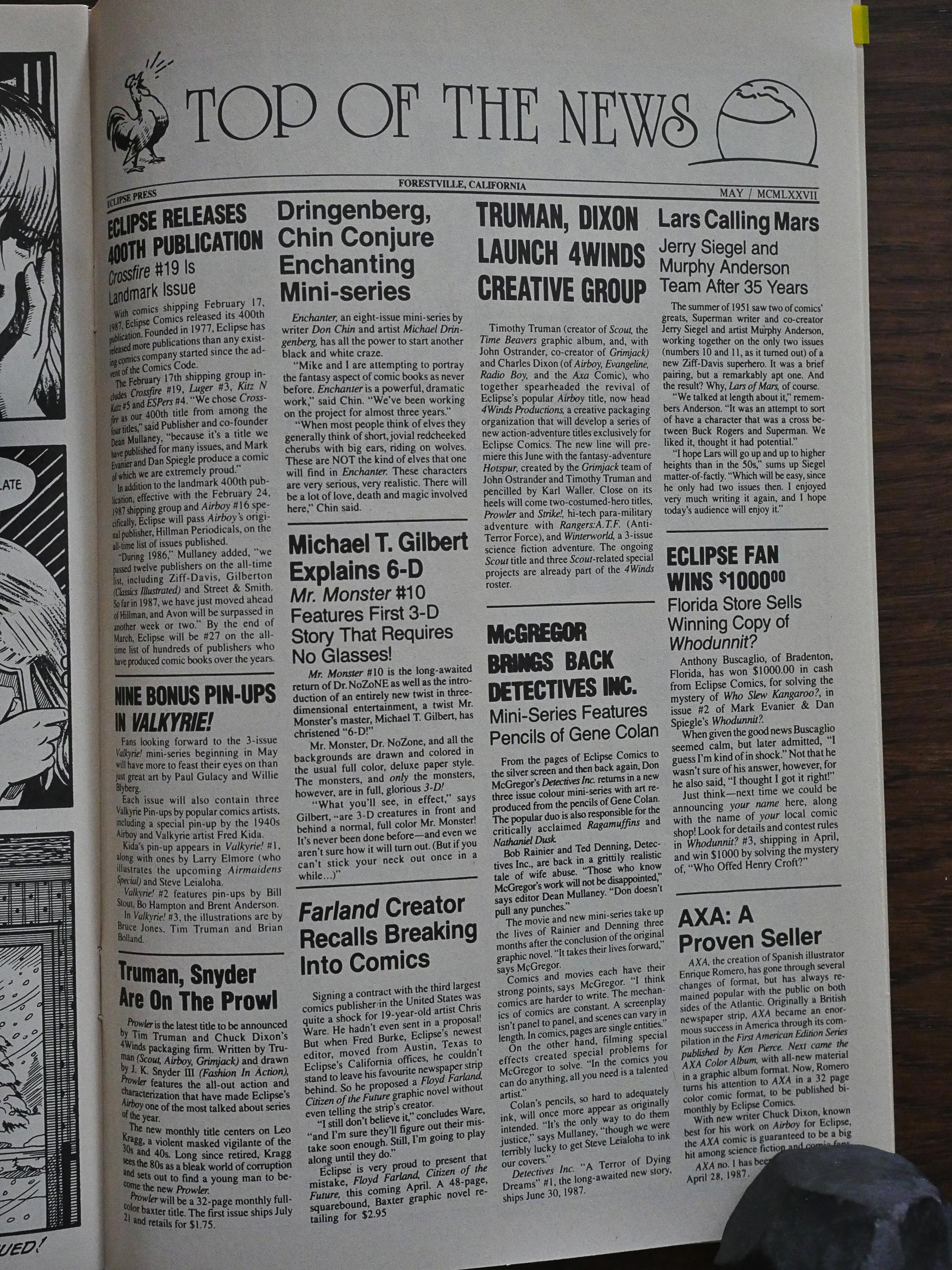
I don’t think we’ve come this far in this blog series before with any of the “normal” Eclipse books? I’m re-reading and writing chronologically, but I’m doing them chronologically by #1 of each series, so how far I get depends on how long the series last. Anyway, I think this is the first of these “news” pages Eclipse tried running for a while to keep the readers abreast of what Eclipse was publishing. They’re laying it on rather thick when hawking these comics…
DID IT!?
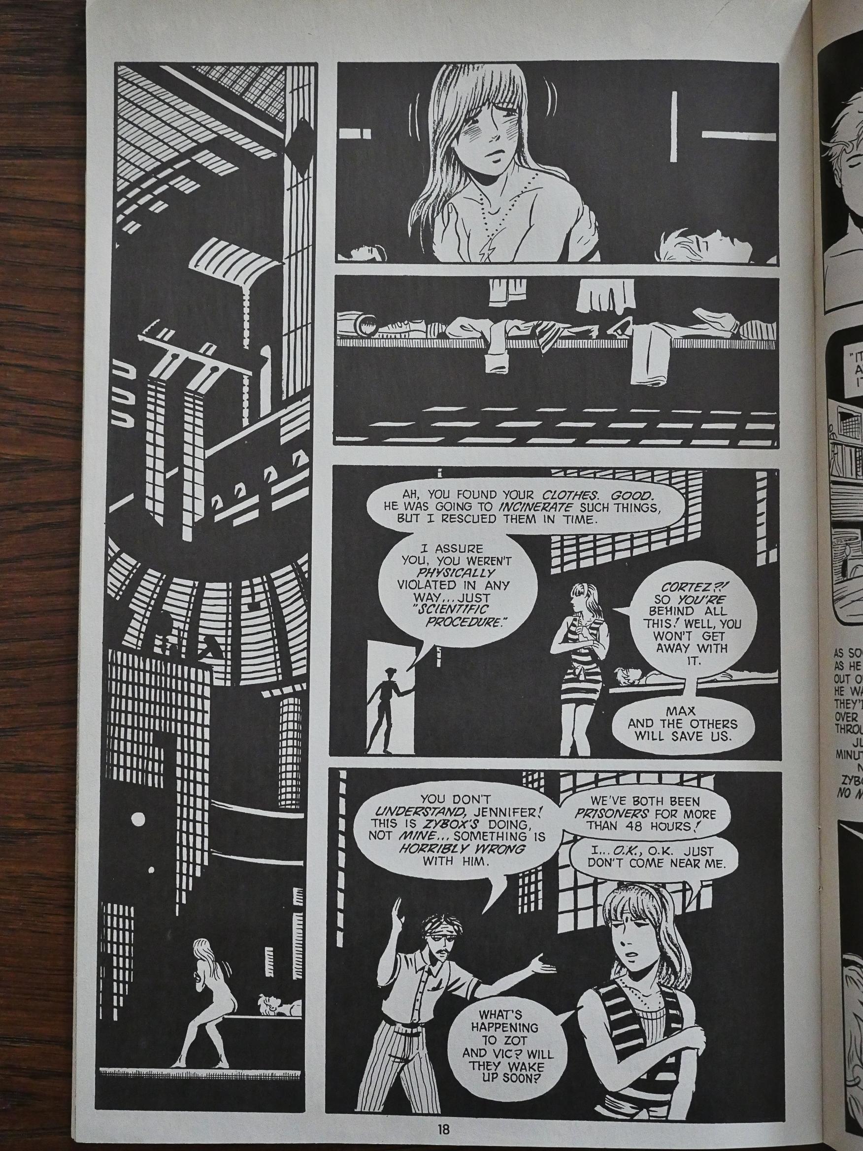
See? More Errata Stigmata (or perhaps the Beto Hernandez layouts from Mister X)…
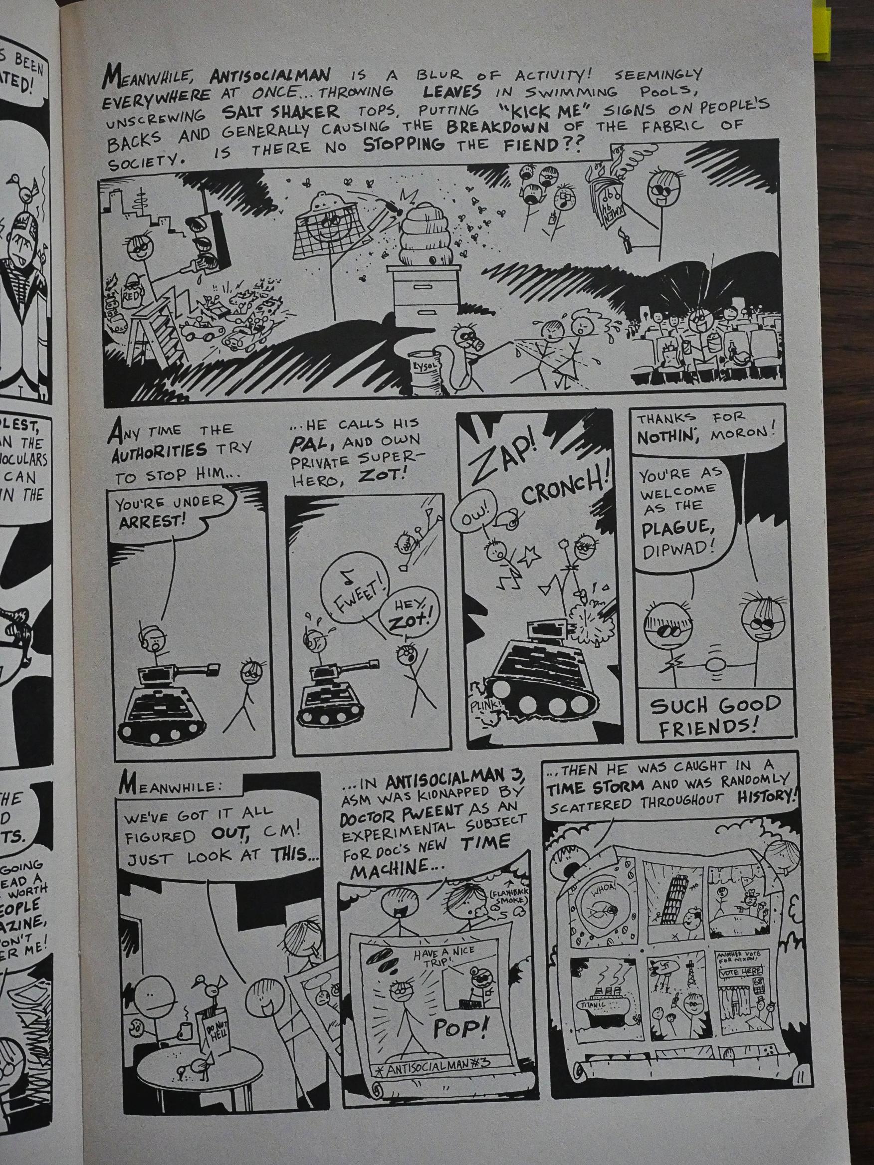
Then we get to the issue between #14 and #15, and it’s a fill-in issue by Matt Feazell. He uncramps his layouts quite a bit.
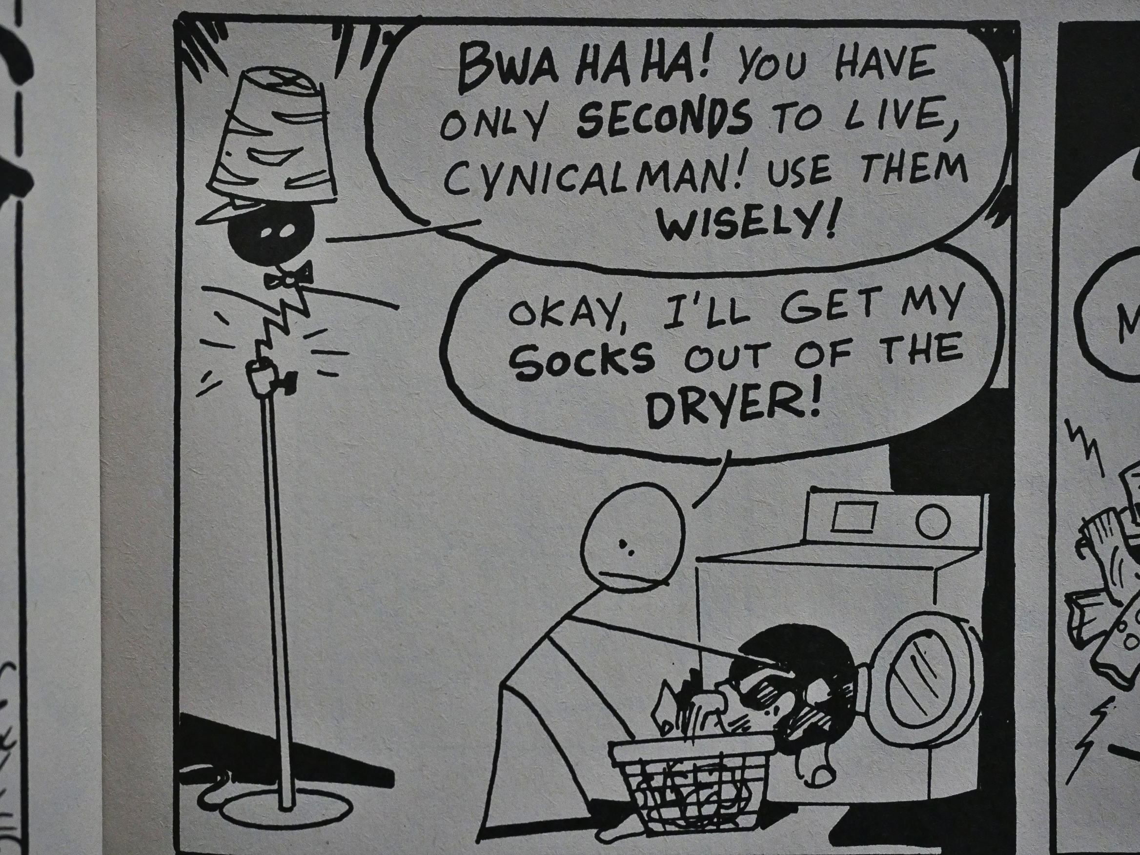
And it’s all good fun.
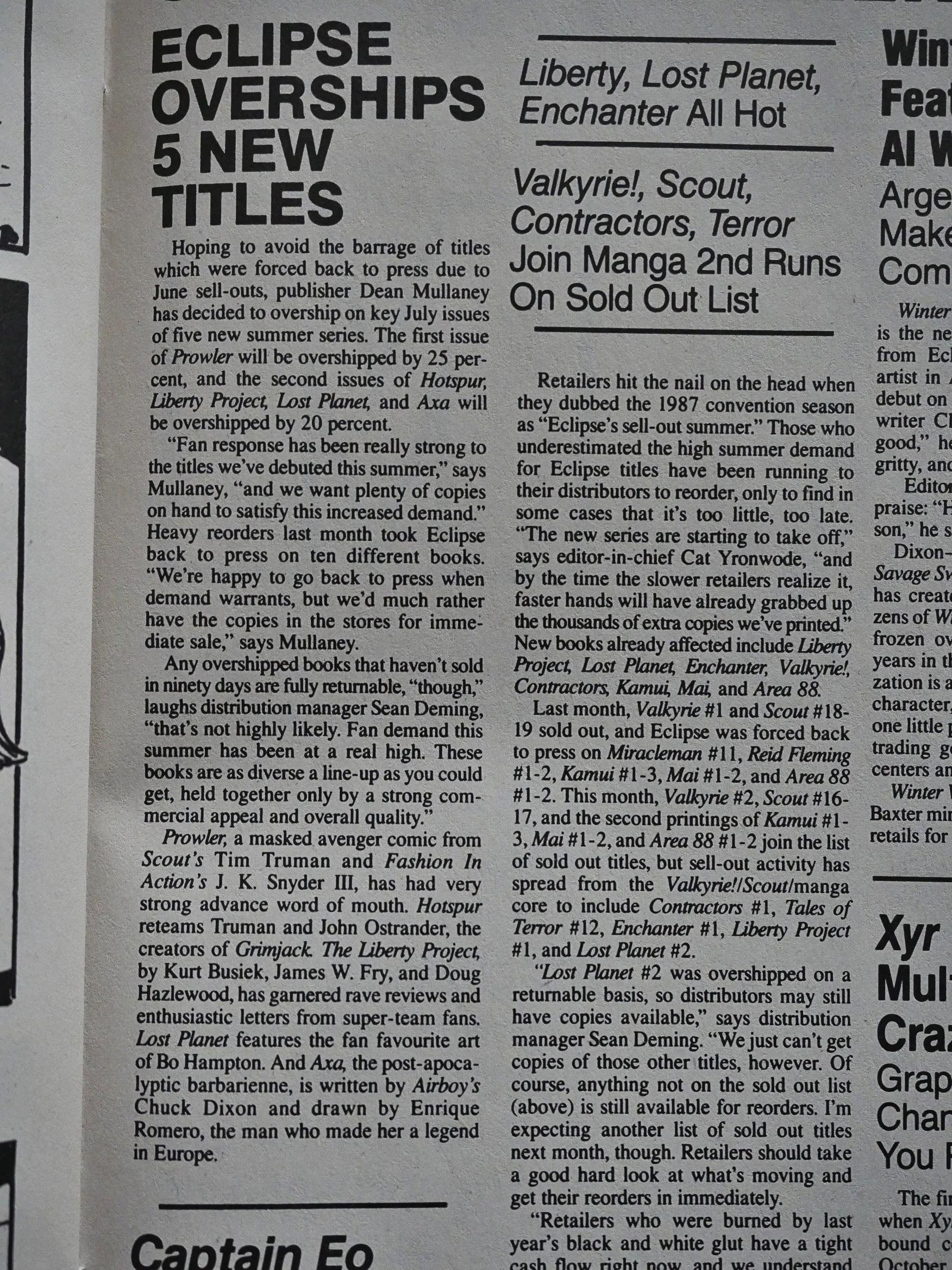
The “news” page claims that Eclipse is selling out of all kinds of comics, but says that this is because comics shops don’t have enough money to put in the orders they should be putting in, apparently. The direct sales market has had so many melt-downs over the years…
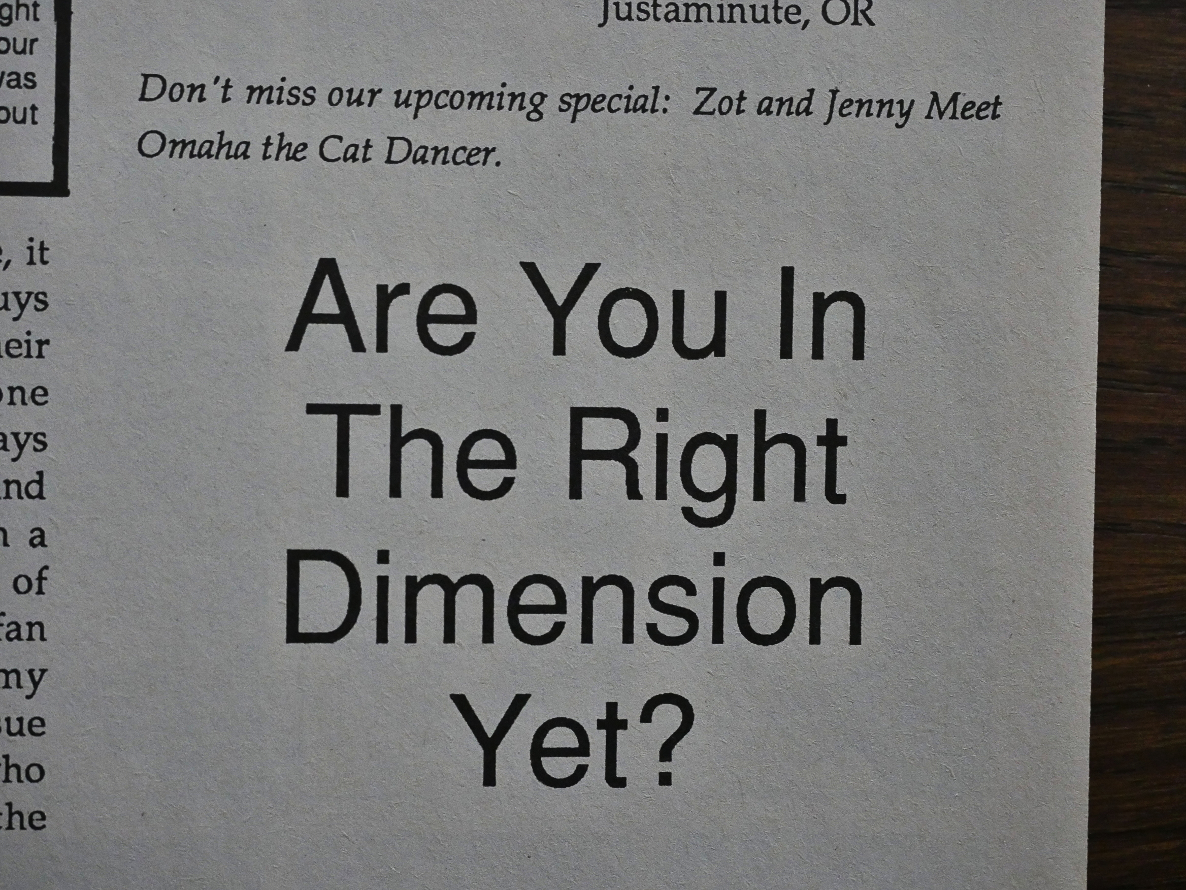
McCloud announces a crossover with Omaha the Cat Dancer. Heh heh.
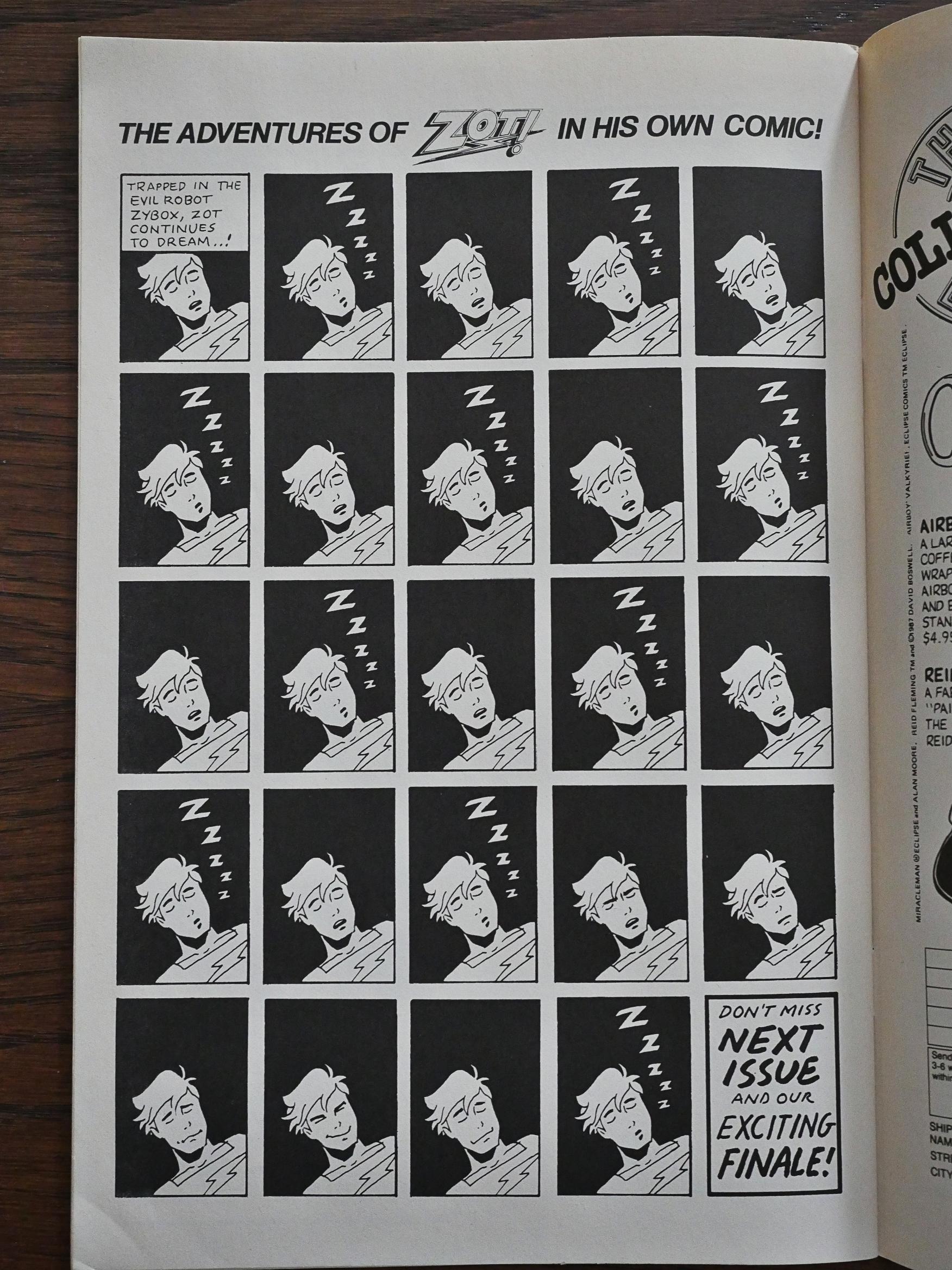
So if Matt Feazell is doing the main feature, then McCloud has to do the backup page, right? Right.
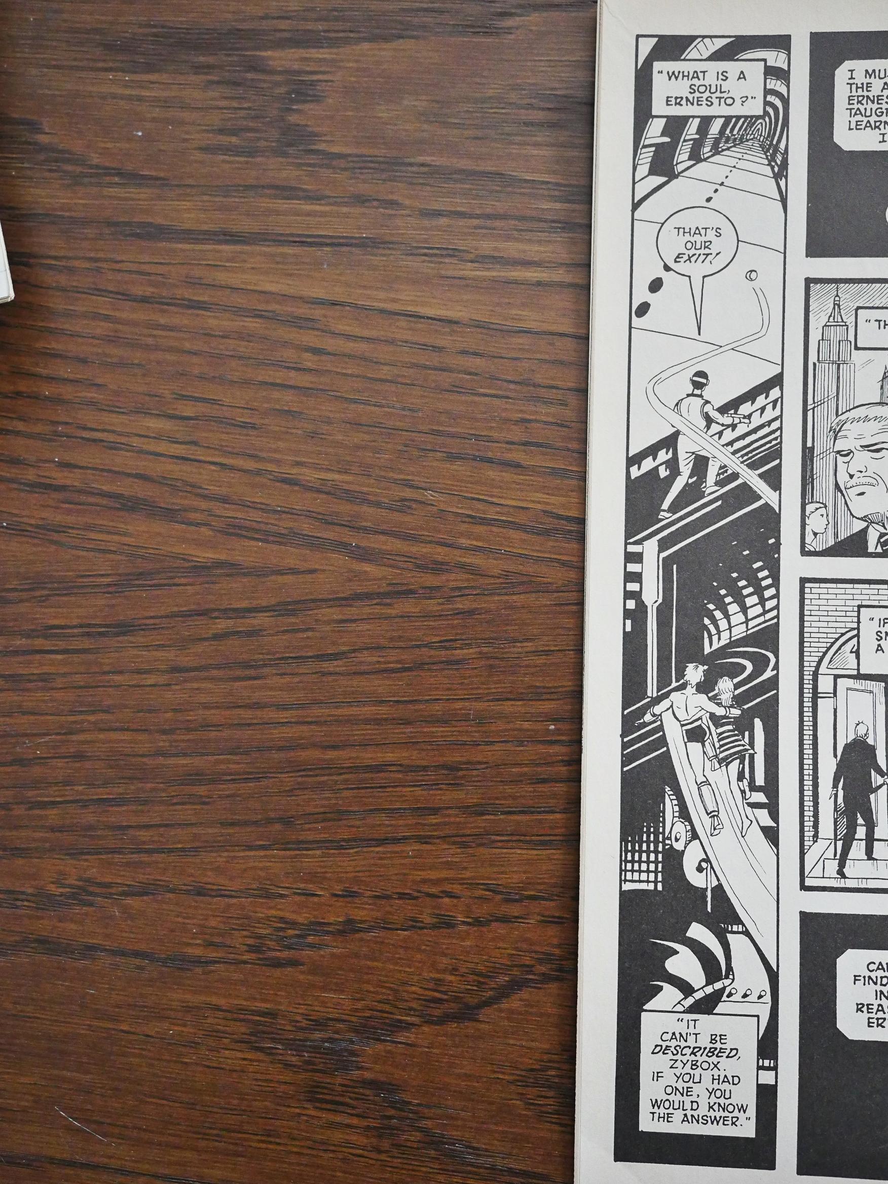
I guess I haven’t really written much about what the comic is about here in the teens… It mostly takes place on Zot’s Earth, and there’s the usual selection of goofy villains and evil plots to take over the world. It’s great fun, but then we get dreary bits like “do machines have souls?” Why. Just why.
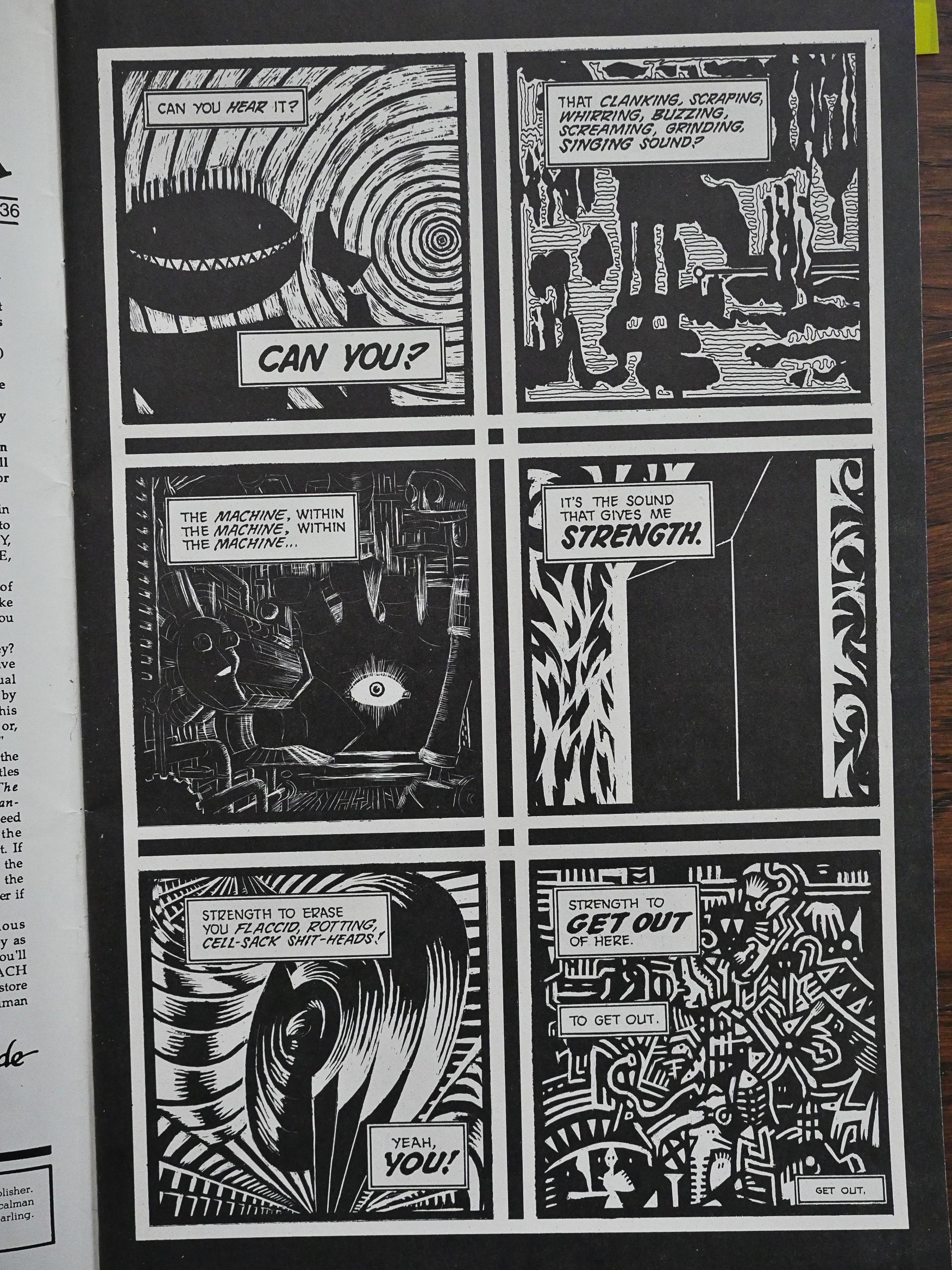
But we also get more fun Dekko paintings. A lot. These are some of the better ones.
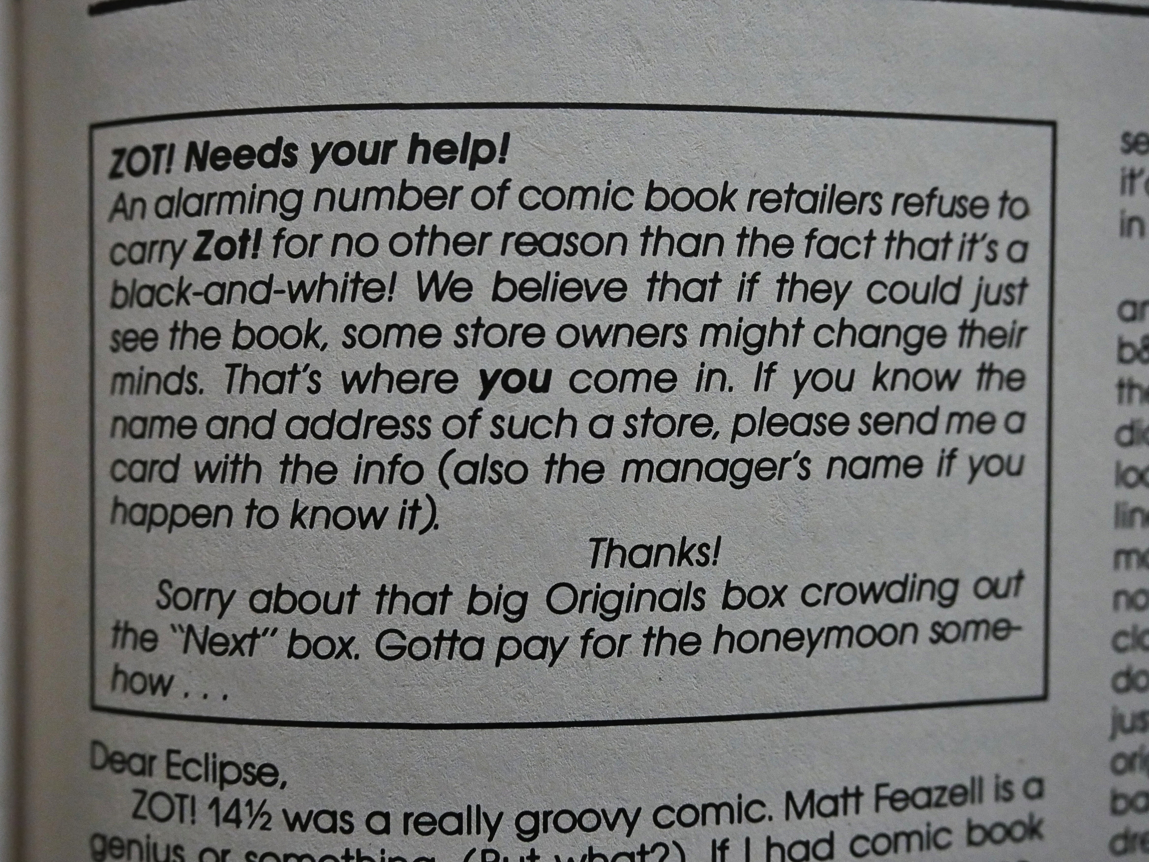
And yet another call to action. Get retailers to buy more Zot!. But what’s that about “big Originals box”?
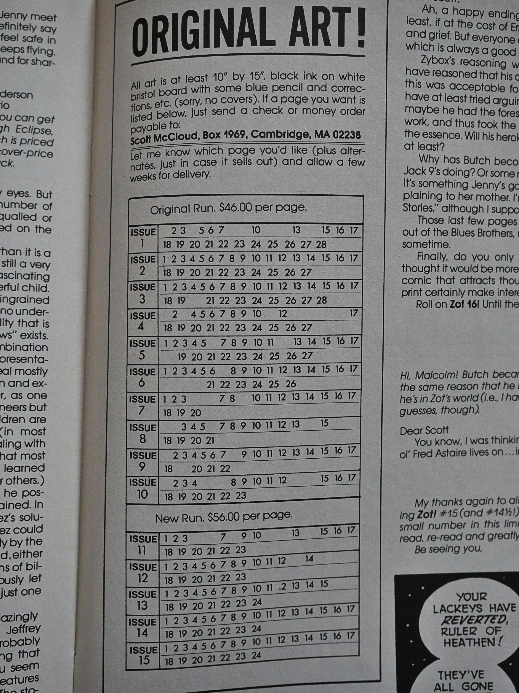
It’s this! Scott McCloud was selling his original pages for $46 (!) a piece, and people were not buying them like crazy. That’s… crazy. Adjusted for inflation, that’s $101 in 2018 money. I had no money back then because I was a student, but didn’t anybody else have any sense? There’s a lot of very pretty pages…
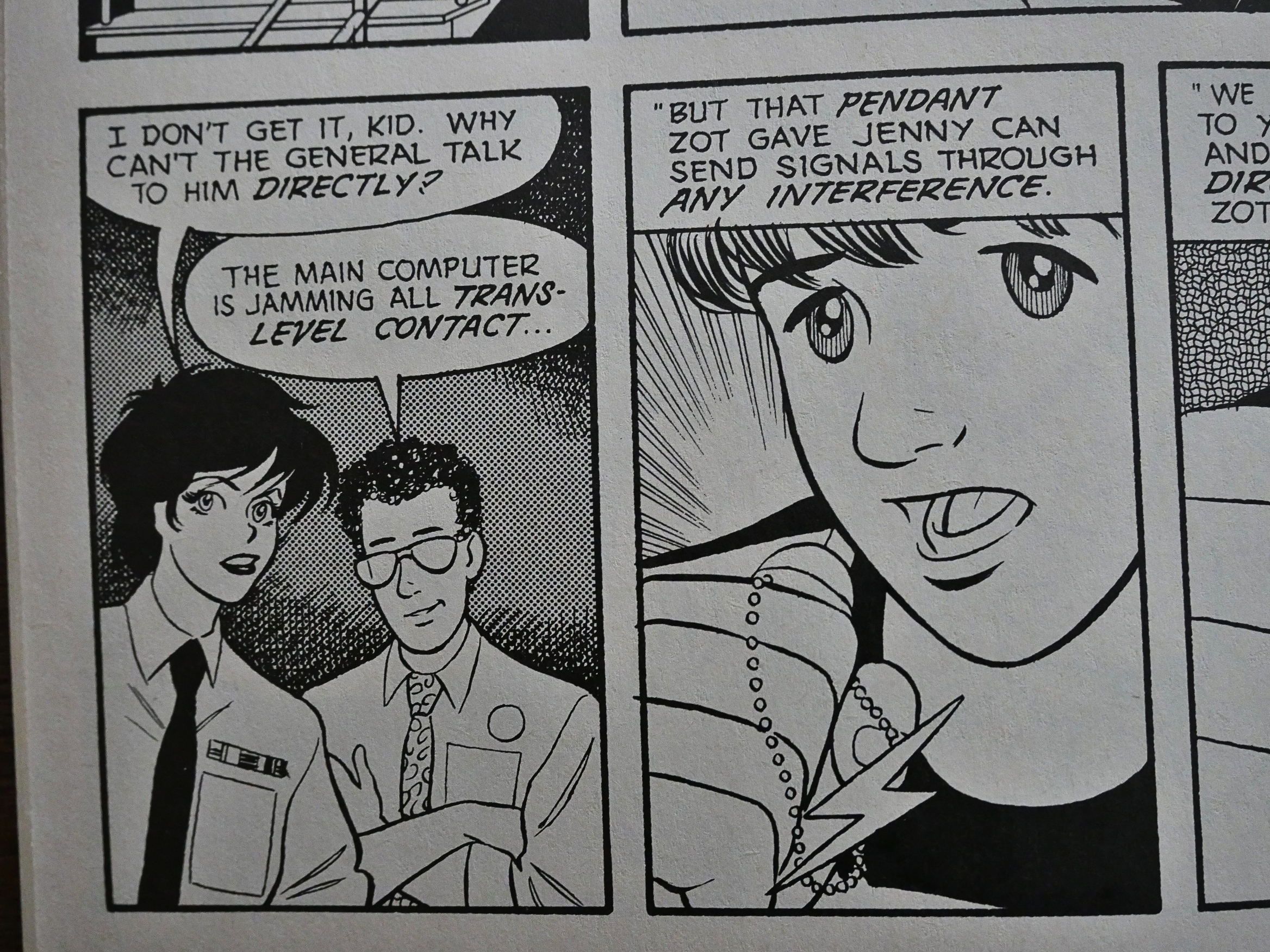
But then Chuck Austen fills in on artwork for two issues, and it’s… jarring. It’s not that he’s a bad artist or anything, but…
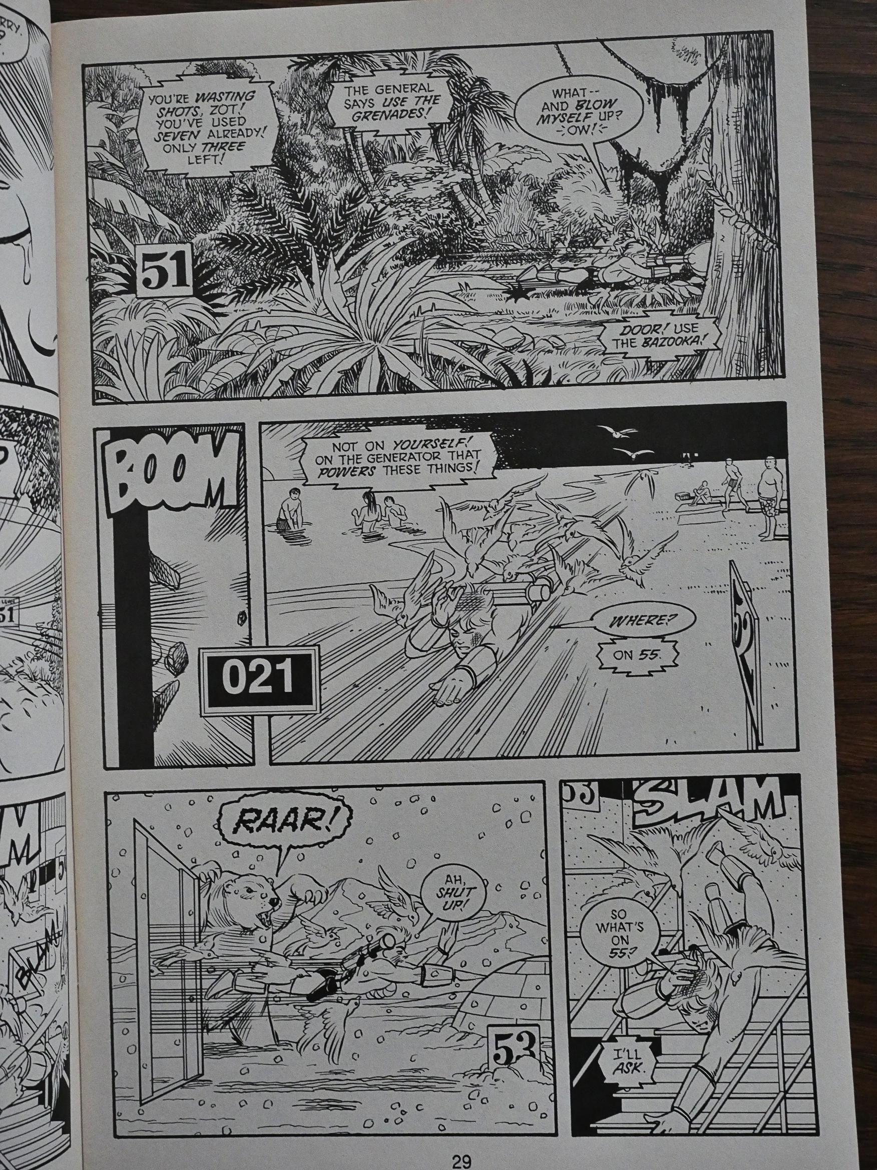
McCloud does the layouts, but the action seems a lot less intense, too.
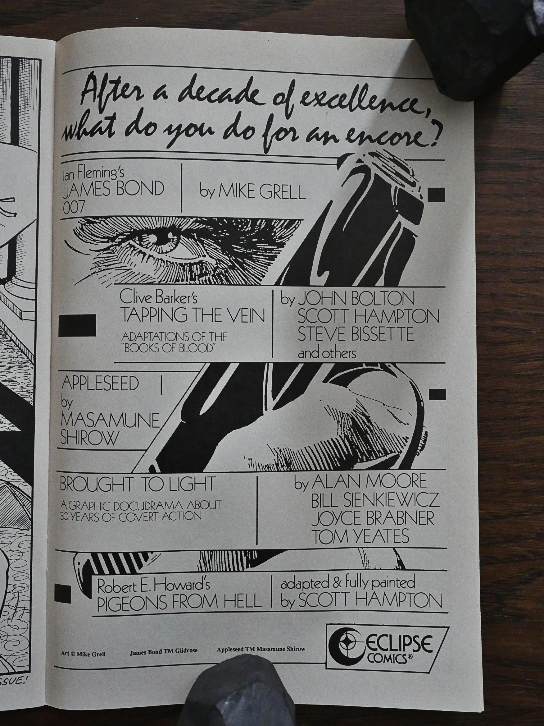
“After a decade of excellence…” Eclipse didn’t lack confidence when doing the ads. So what do you do after a decade of excellence? James Bond by Mike Grell. I guess they’re announcing a change of pace, then!

We’ll see.
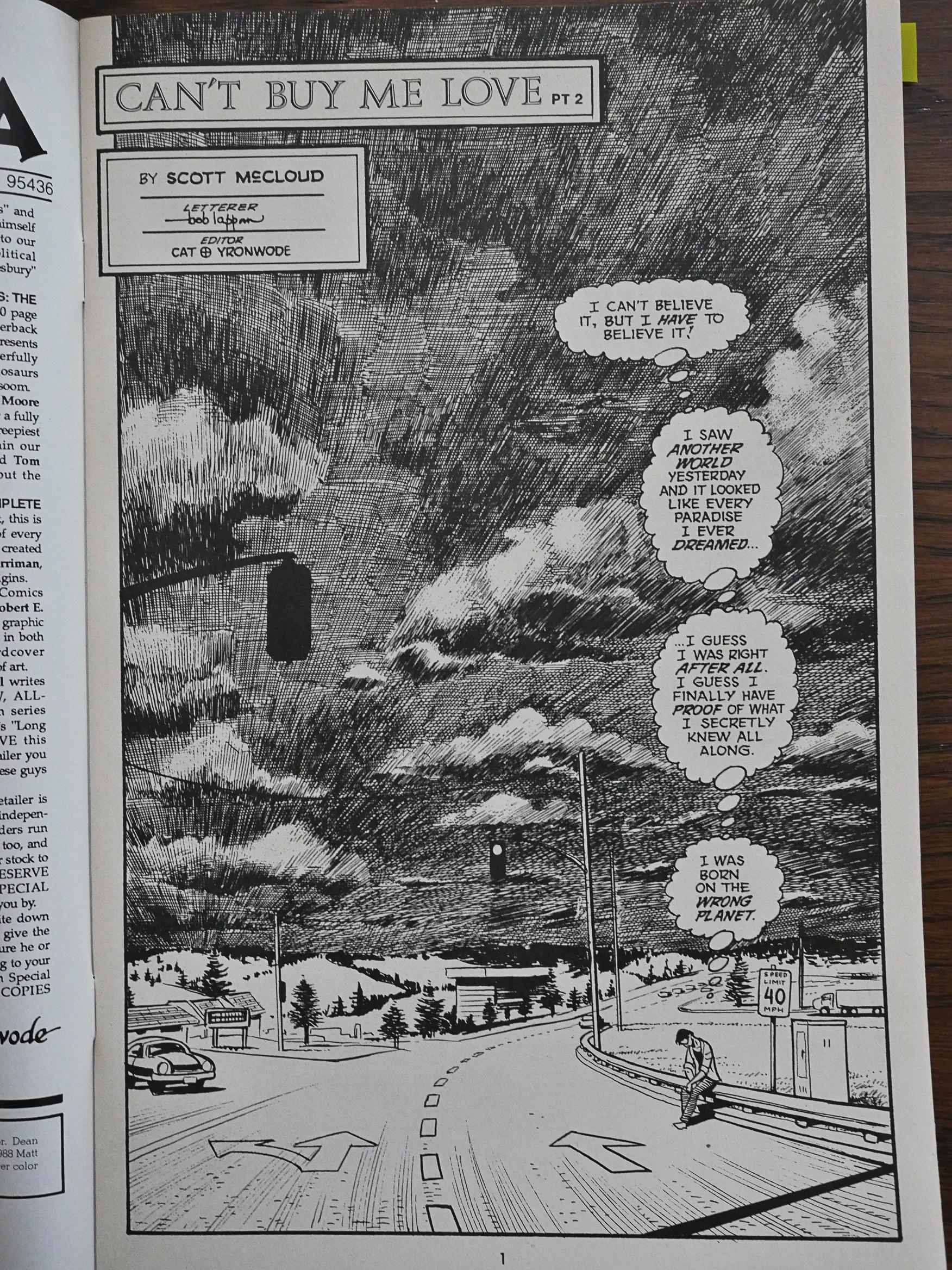
McCloud keeps experimenting with different approaches to black-and-white art. Is this overkill? Hm. I kinda like the overwrought hatching.
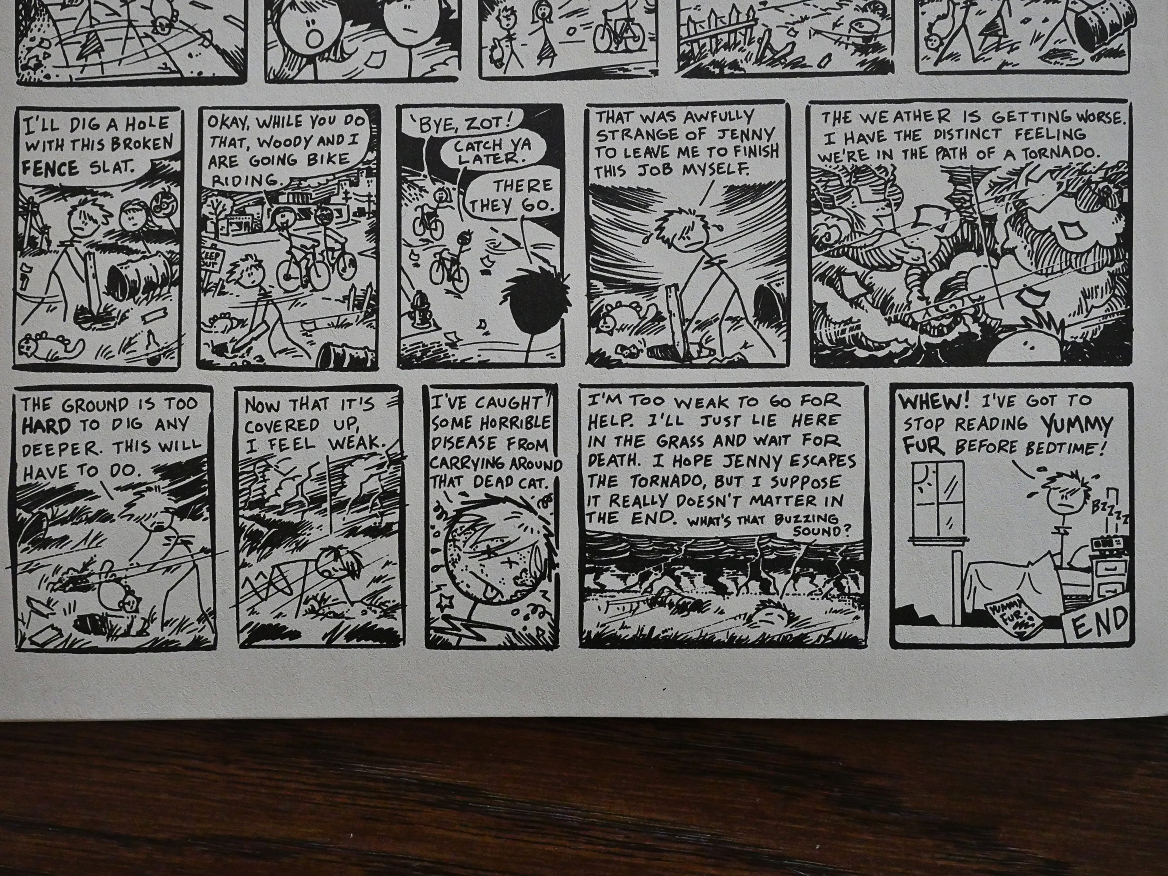
Even Feazell changes his artwork up, as in this homage to Chester Brown’s Yummy Fur.
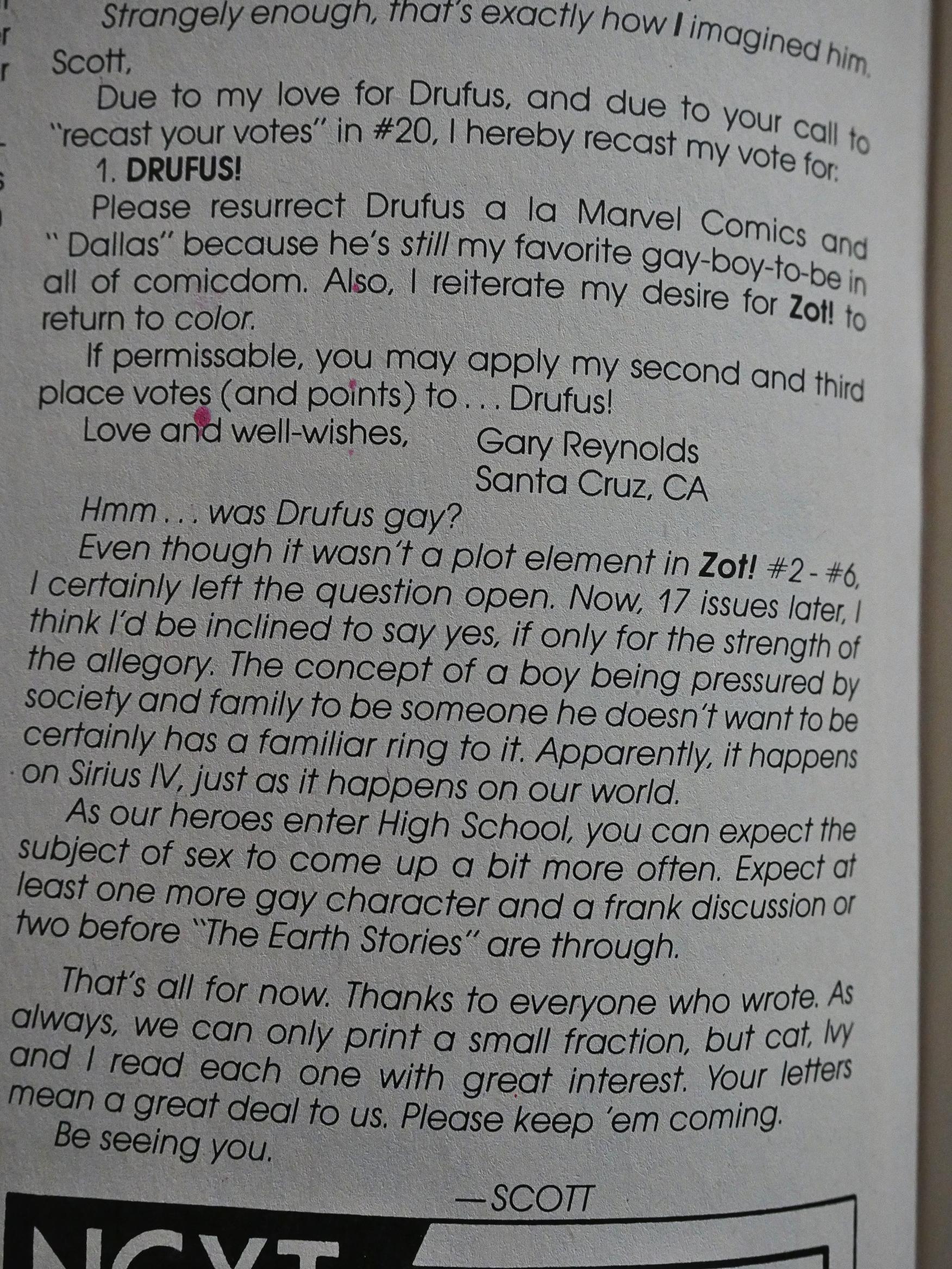
And then we get back to the major controversy: When that wimpy guy was killed off 15 issues earlier. A letter writer assumes (like I did when I read it) that the wimpy guy was meant to be gay, and McCloud says that he hadn’t thought of that, but perhaps yes?

This angered at several letter-writers, but for wildly different reasons. There’s one fundamental religious guy who wrote several rants I didn’t pay much attention to, but another more interesting guy who accused McCloud of not thinking through the way he used his black and gay characters, and accused McCloud of tokenism. (McCloud defends himself admirably, I think.)

Oh, geez. How long have I been typing now? It’s the middle of the night now…

Let’s keep going…
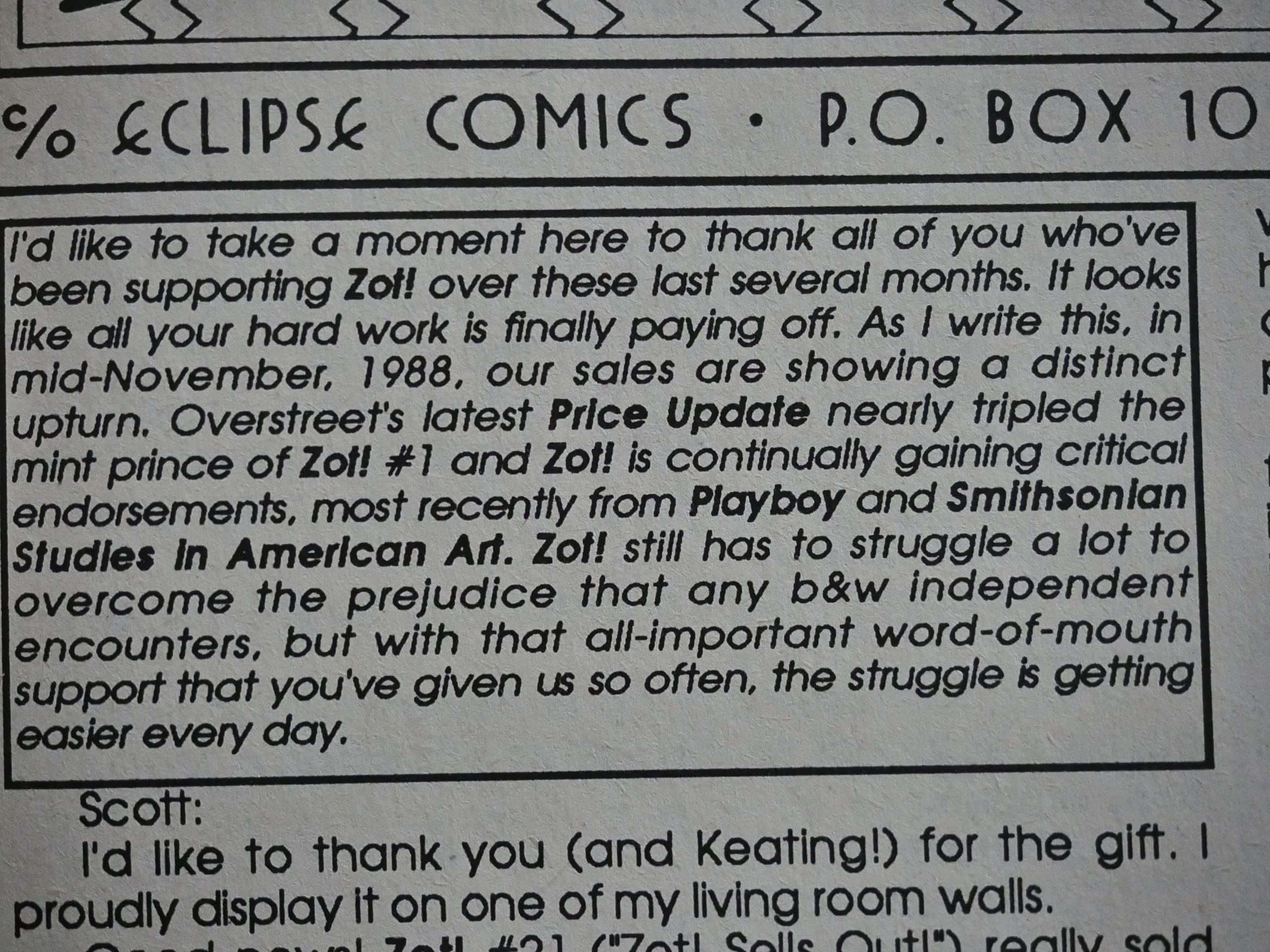
Throughout the second run of Zot!, sales were apparently rising (or steady, at least), which is quite impressive. These day, no serial comics have growing readerships: They’re launched at a #1 with sales of X, and then there’s a “natural attrition” for every issue where it loses readers. Which is rather weird, when you think about it. The 80s, as fucked up as they were in many ways (comics wise), were healthier in other ways.
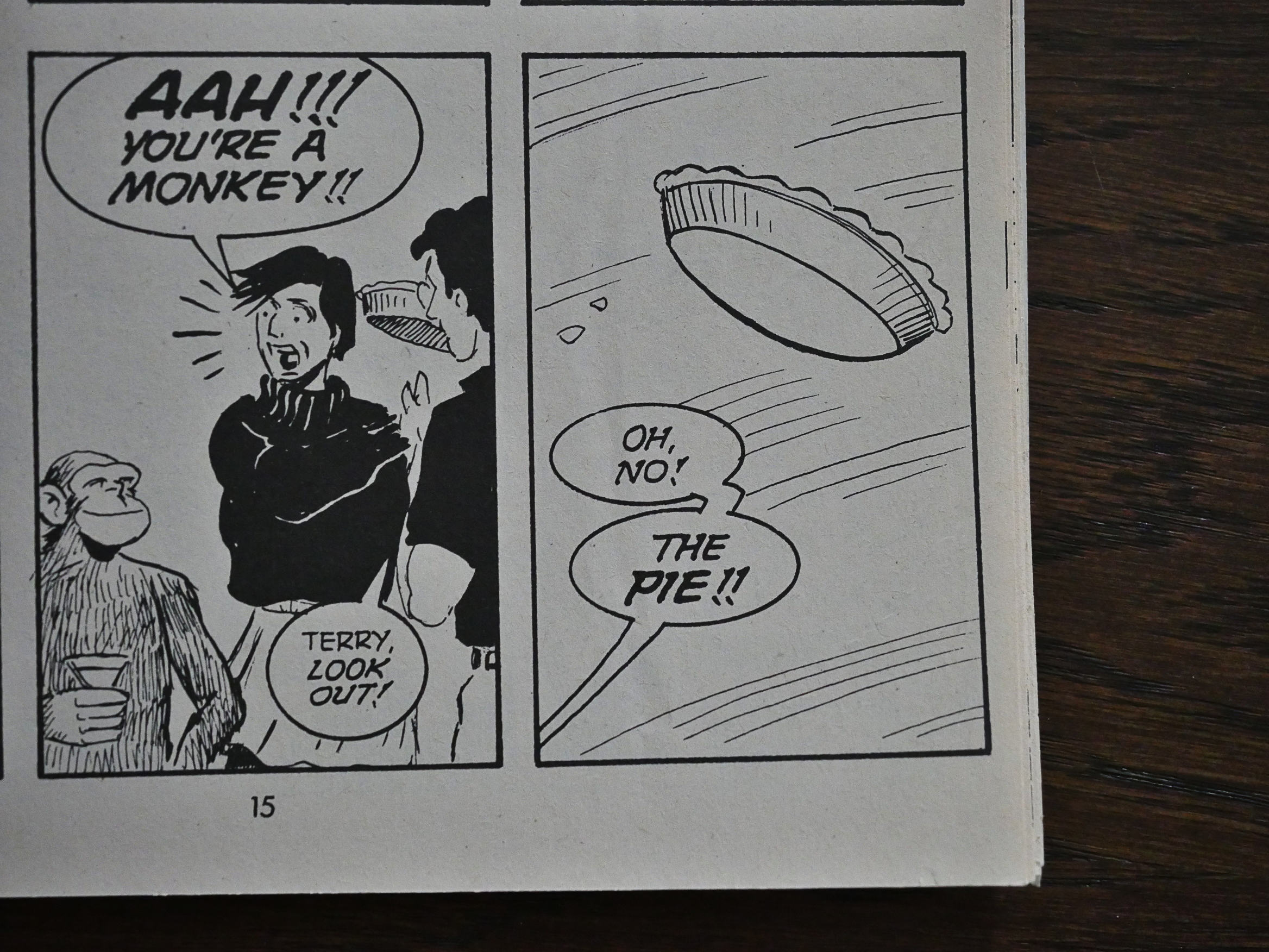
Anyway! I seem to be harping on McCloud’s usage of the comics format a lot, and here’s some more harping. We finally (after some years) get the pie throwing scene (after the readers voted for who they wanted to get a pie thrown in which face ***REMEMBER TO EDIT FOR GRAMMER BEFORE POSTING***), and McCloud does it masterfully. With some fake-outs first that use the materiality of reading comics perfectly.

So that’s the final panels on an odd-numbered page, so you turn the page over…
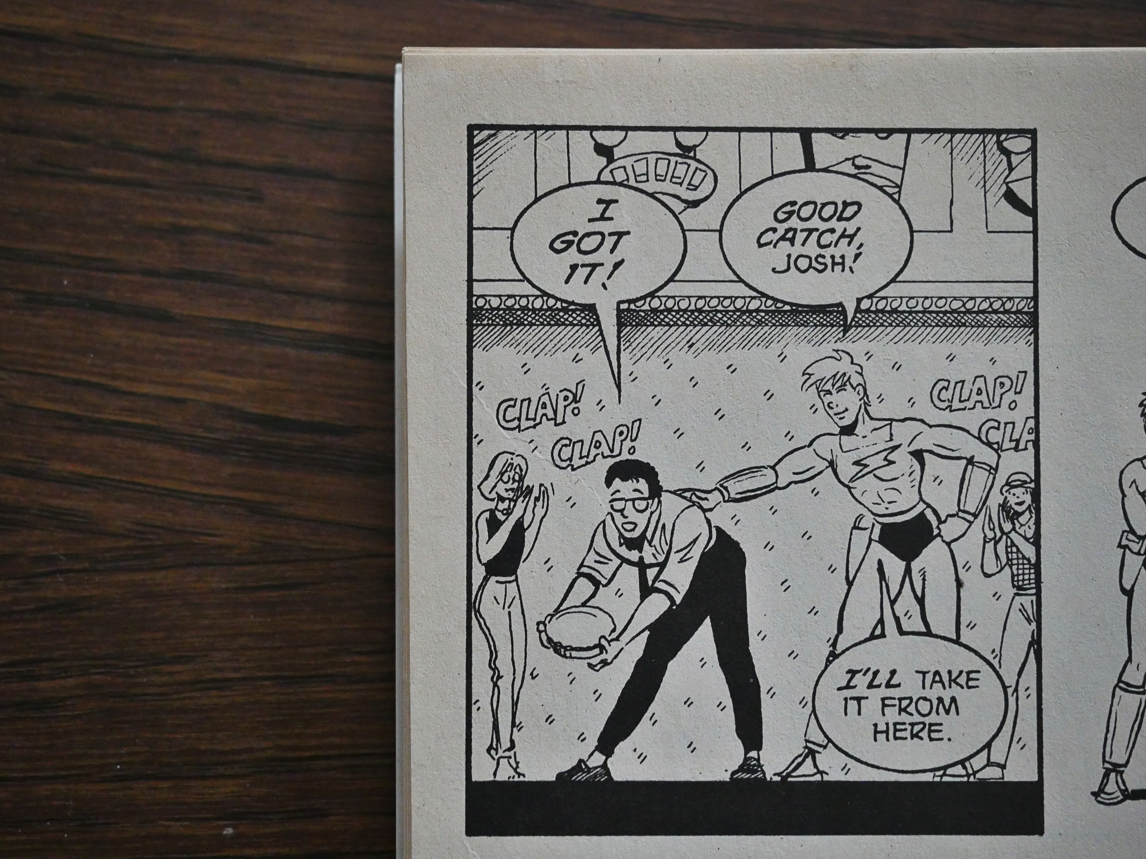
… and somebody doesn’t get the pie in their face. I laughed out loud. Trust me, it’s funnier if you’re actually turning the page.
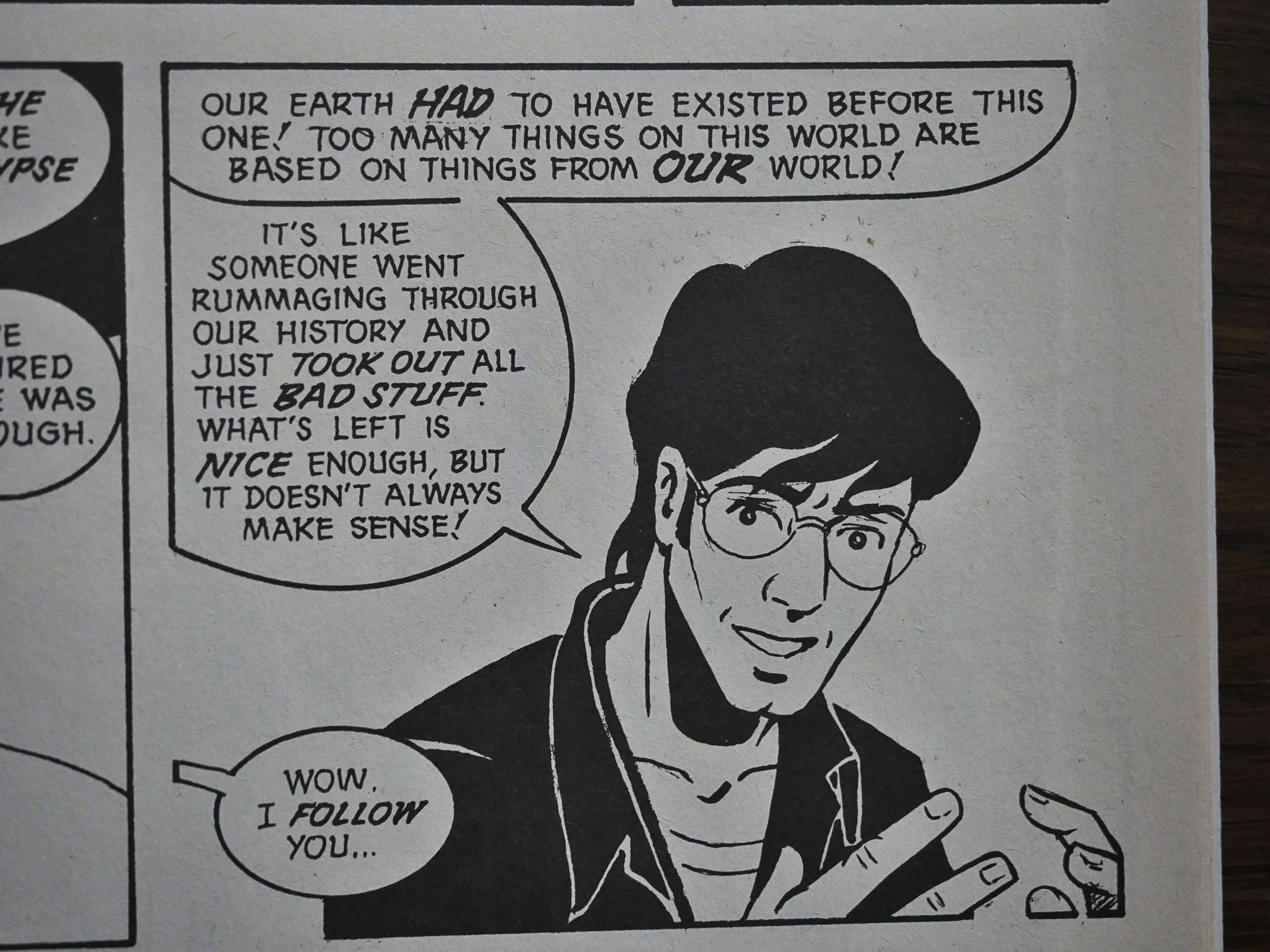
These pie-throwing issues (yes, it goes beyond one) are a farewell to Zot’s universe. We get to see all the villains again, and visit with every character from Zot’s environment at a party), and it all feels very elegiac. We also get the beginning of an explanation of what Zot’s universe really is, but this isn’t really followed up on before the series ended. Reading that panel sent a tingle up my spine.
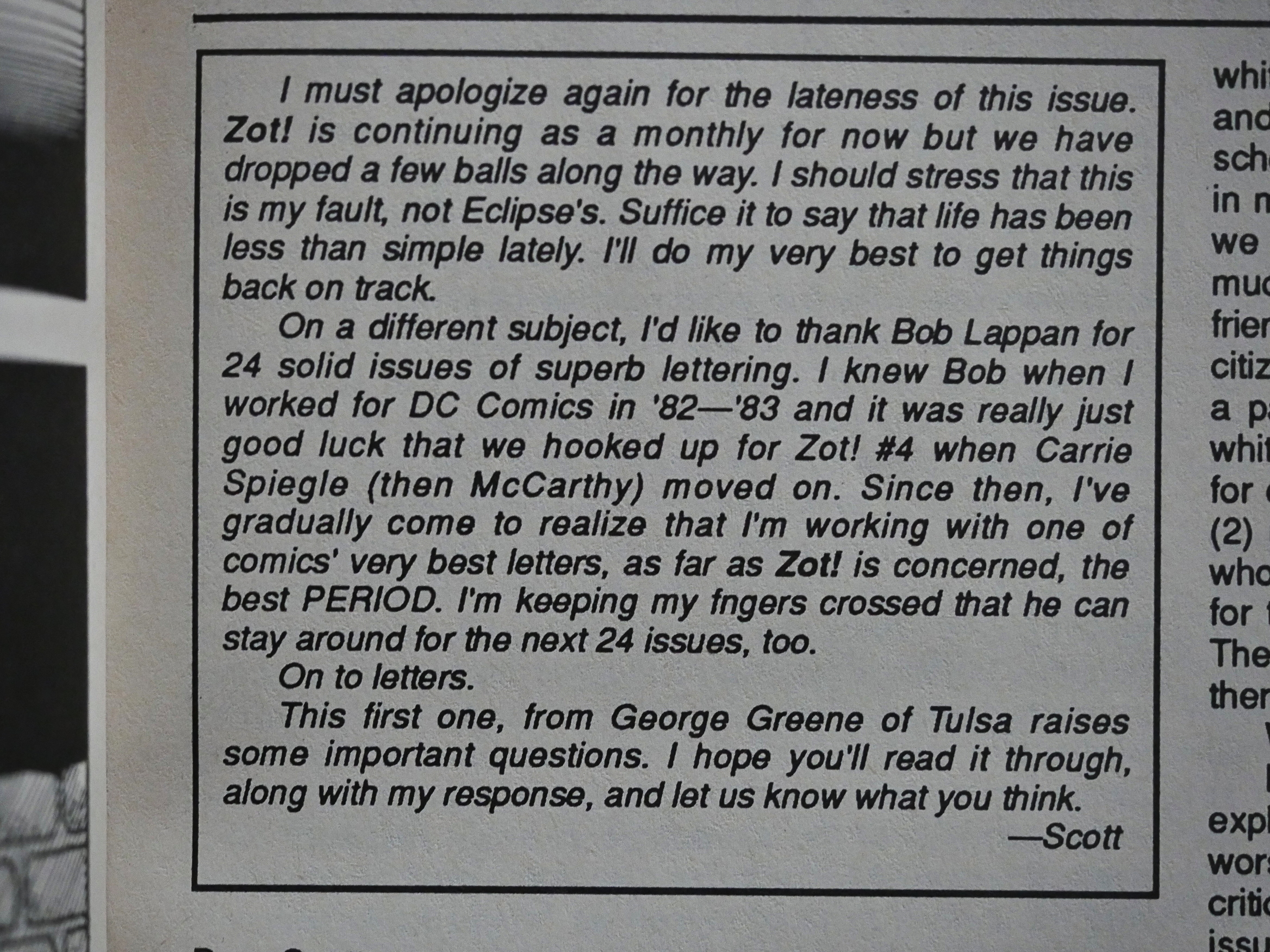
It seemed like just about every issue McCloud was apologising for being late. But he did manage to produce quite a solid stack of comics these years. He cut back to 18 Zot pages per issue (from 24) and gave the pages over to Feazell for an extended backup feature series to achieve a semblance of a schedule, though.
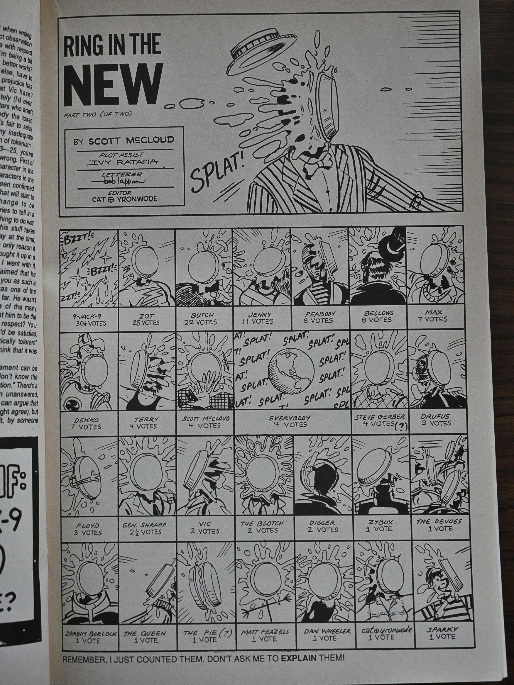
As a bonus, we get a page of all the characters getting pies in their faces. And more.
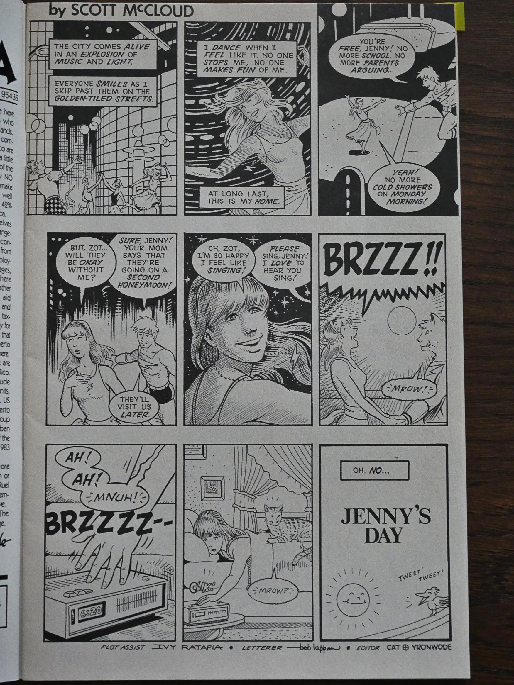
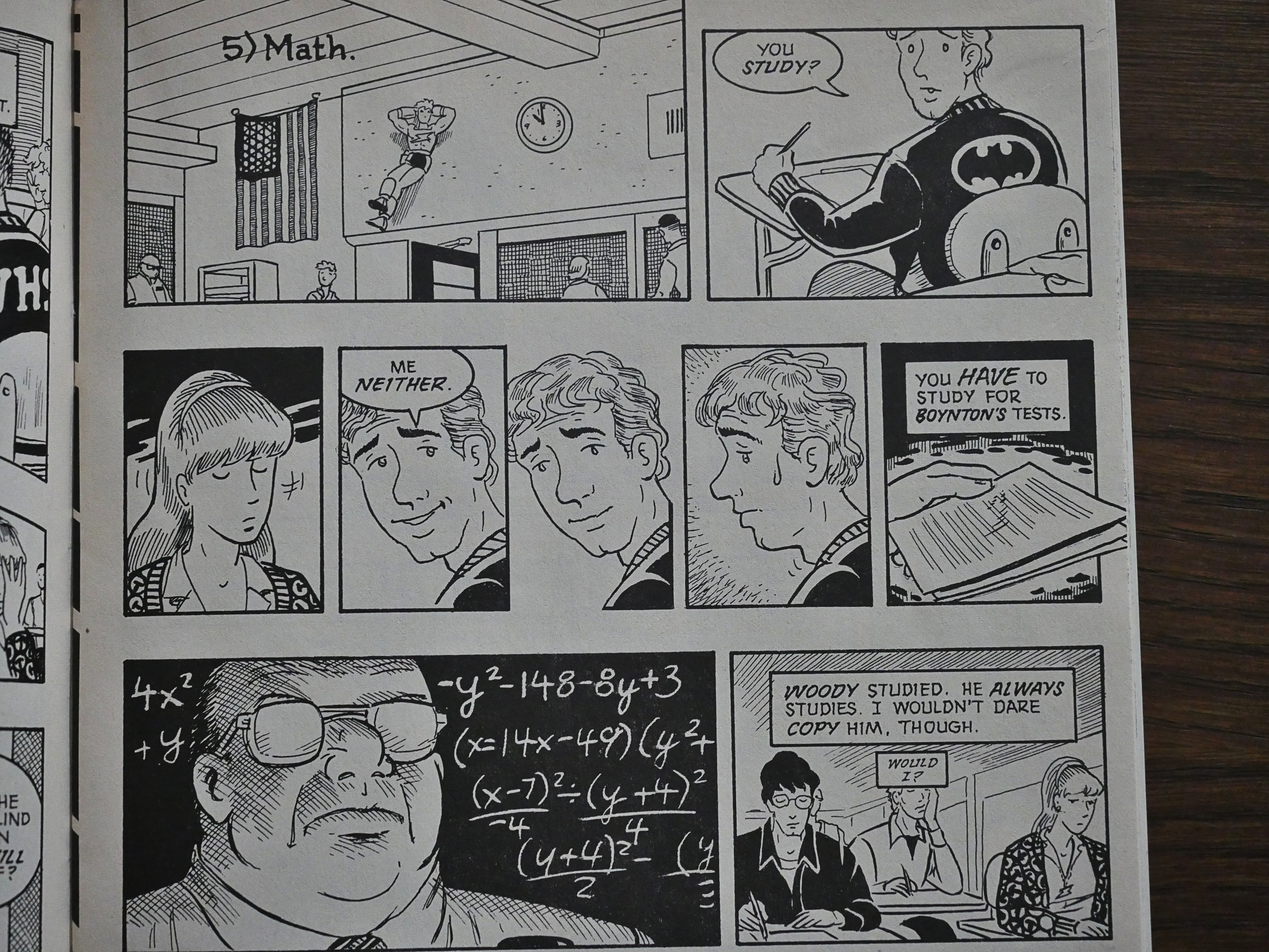
And then the part of Zot! I remembered started: The high-school years. For the last half a dozen issues, we get no visits to Zot’s world. We’re solidly stuck on our Earth and Zot has to deal with being in this crappy place, and Jenny and her friends have to deal with being in high school. I wonder how much of an influence Ivy Ratafia (co-plotter now and McCloud’s wife) was here.
The tonal shift, again, is huge.
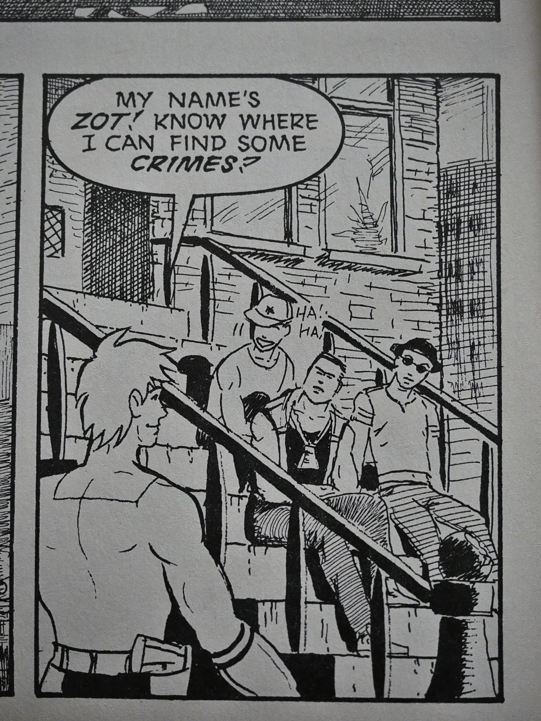
Reading it now, I wasn’t sure whether I approved or not. Is this an incisive investigation in the futility of super-heroes in the real world, or is it just a bit embarrassing?
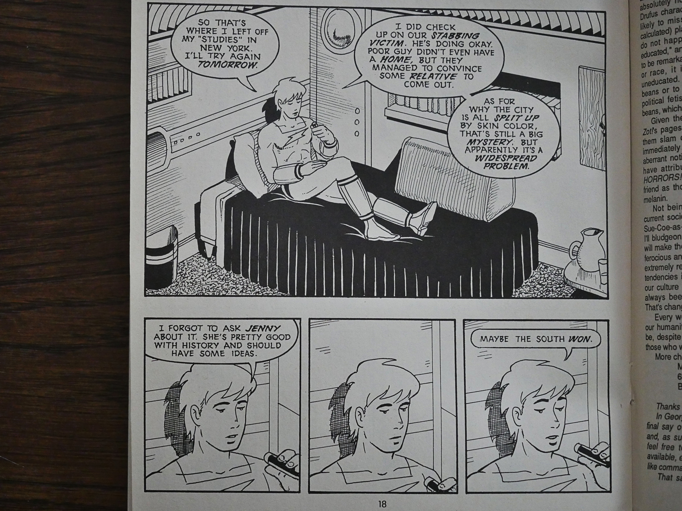
But then after an issue or two, things clicked and it all started to work, I think. It gets engrossing and so emotional.
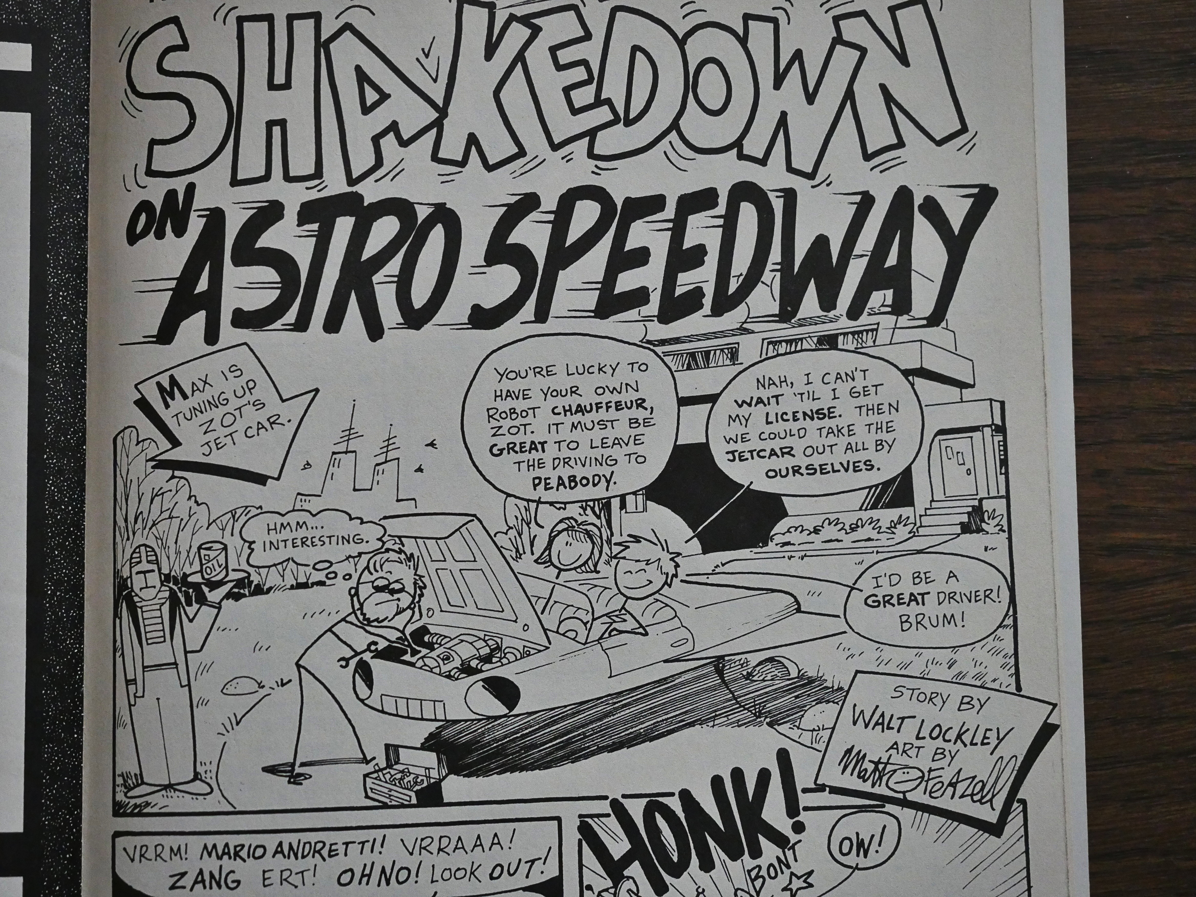
Meanwhile, over in Feazell-world, things are as deranged as always, but he’s gotten a revolving cast of writers now. Some of them seem to be recruited from the letters pages, which lends the whole thing even more of an intimate, family feel.
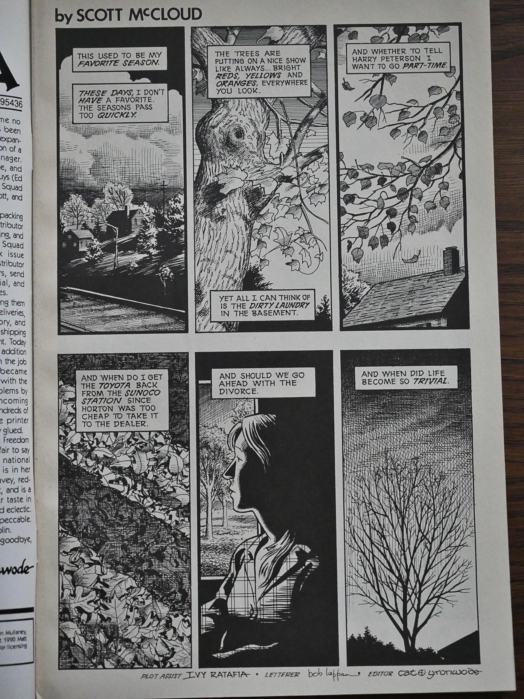
And I think this is peak McCloud lushness. In later works he’d stylise more.
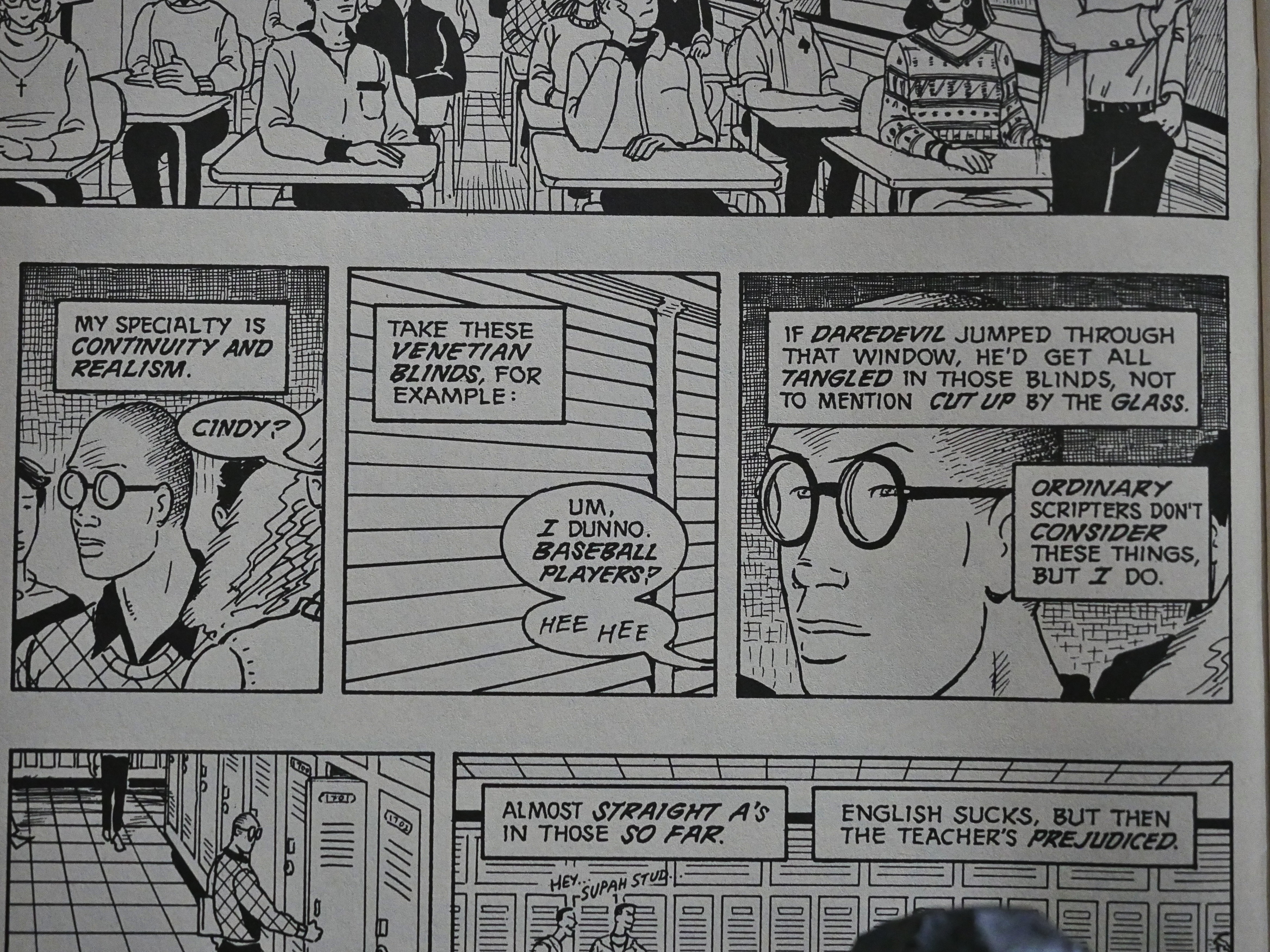
So! What more are these remaining issues about other than high-school? Each issue is centred on a single character from Jenny’s circle of friends. So we get one issue where we get a rather sympathetic, but unflinching and squirm-worthy look at the thought processes of a super-hero comic book nerd. We all knew that guy, right?
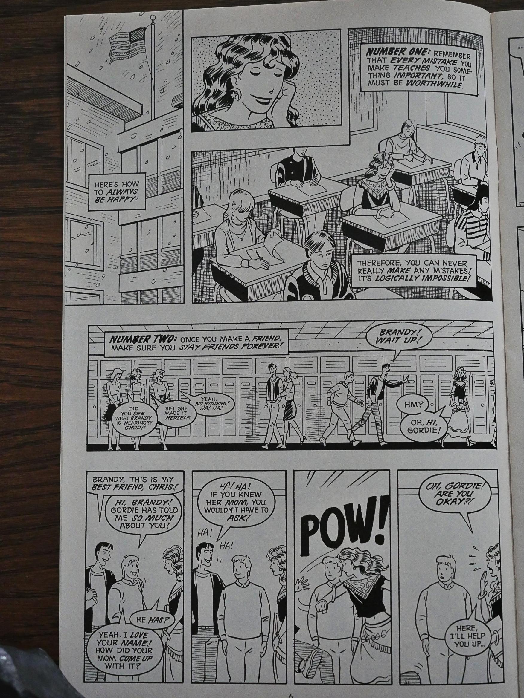
And here we have the girl who desperately tries to be happy and not think too much about things. (The happiness sometimes spills over.)

These mini-portraits mostly feel true and lived; they’re not a litany of after-school specials with one theme after another. They’re impressive and moving.

Which brings us to the issue that won all the awards:
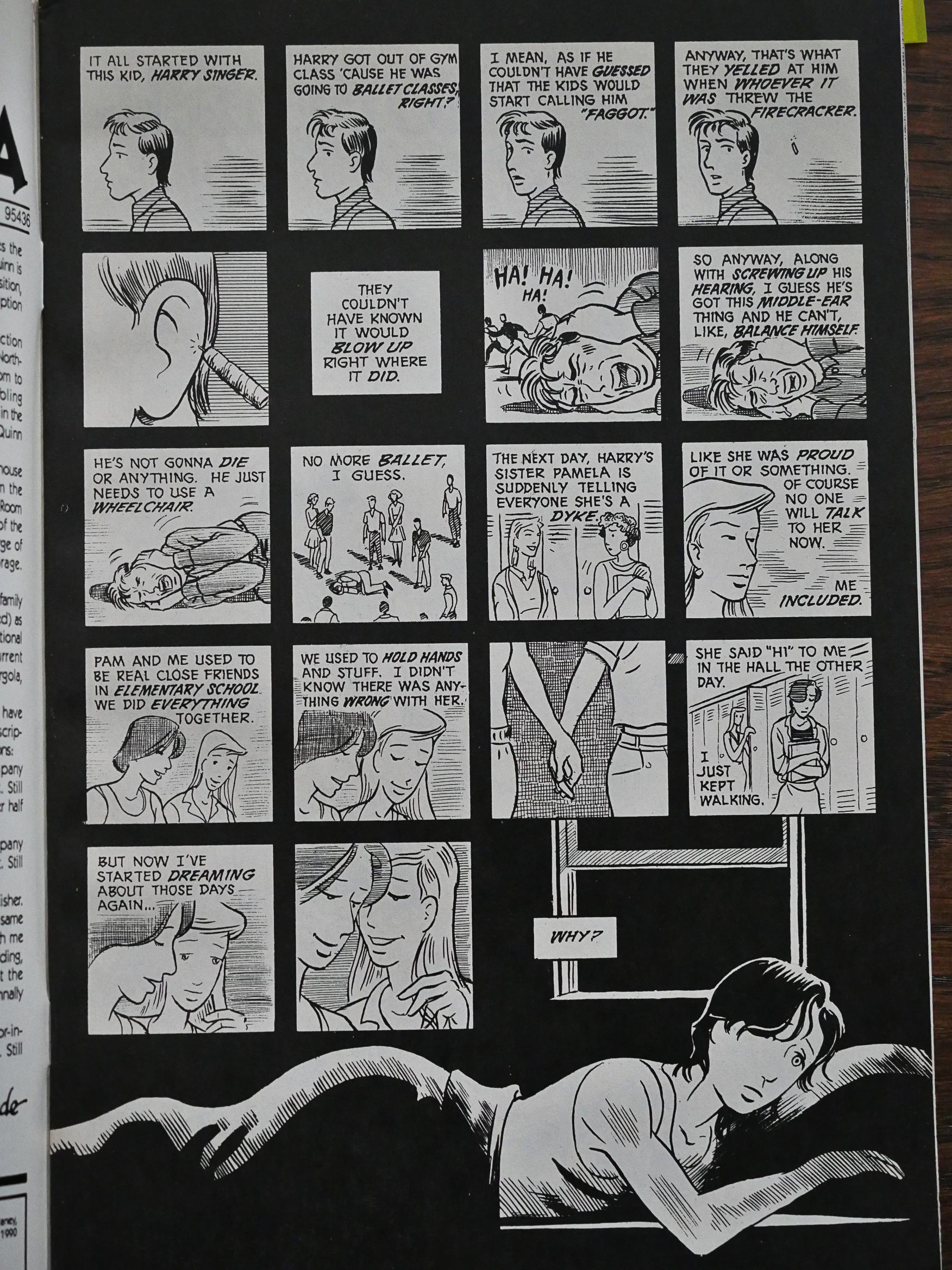
#33, the Terry issue. Terry’s dealing with coming out as lesbian in high-school, and things are difficult. But Terry’s portrayed as a complex character, and we really get into her life situation in an amazing way in 18 short pages.
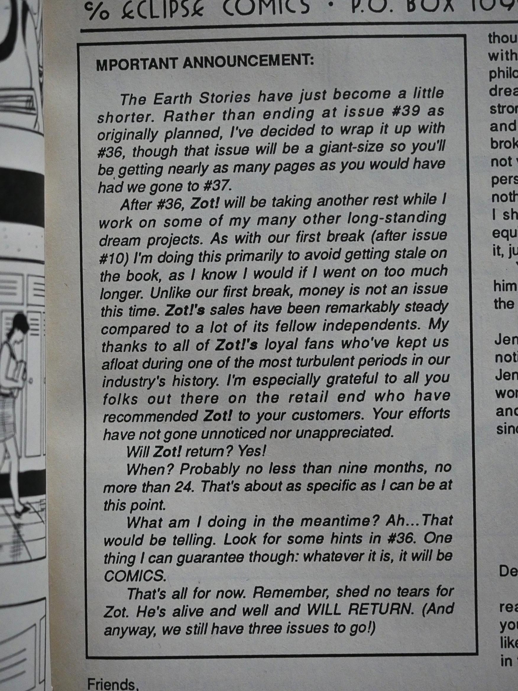
And again, McCloud uses the floppy comic book format amazingly. We have the end of the story, and then the letters page starts as normal. McCloud even has an announcement, that he’ll cut Zot! short (by two issues) from what he’d planned, but that the series will definitely be back after he’s had time do to other projects.

So you read the letters page and then flip the page and…
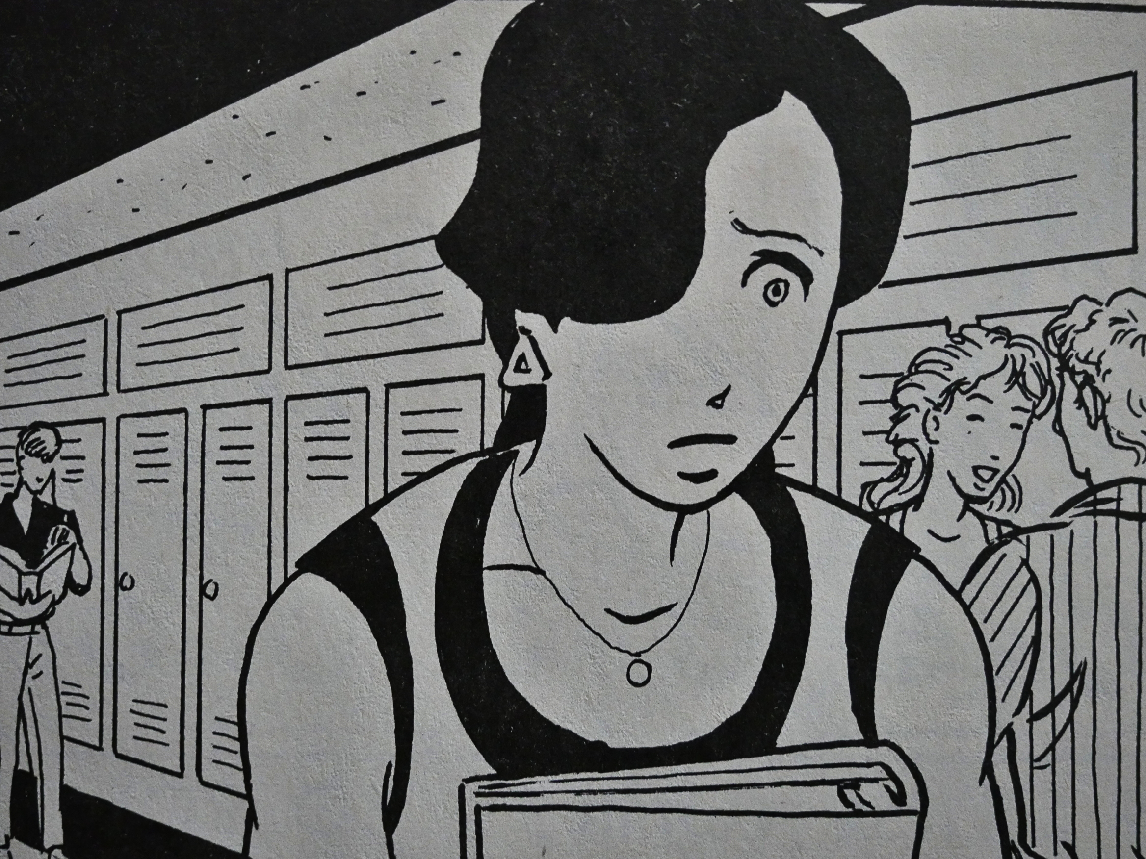
… AND THEN THE STORY CONTINUES ONE MORE PAGE!

I mean, I remembered the McCloud did this trick at some point in the Zot! storyline, but I didn’t remember that it was this issue, so it came as a complete surprise to me now. And it’s such a beautiful ending that I started bawling again, easily moved as I am.

It’s simply wonderfully done.

And I wonder what McCloud did with these things when Zot! was collected in paperback editions. I can’t believe any of these things were as effective there (the centre page spreads or this fake ending/reveal), but I guess that’s the problem when you tailor the comics to closely to the materiality of the floppies.
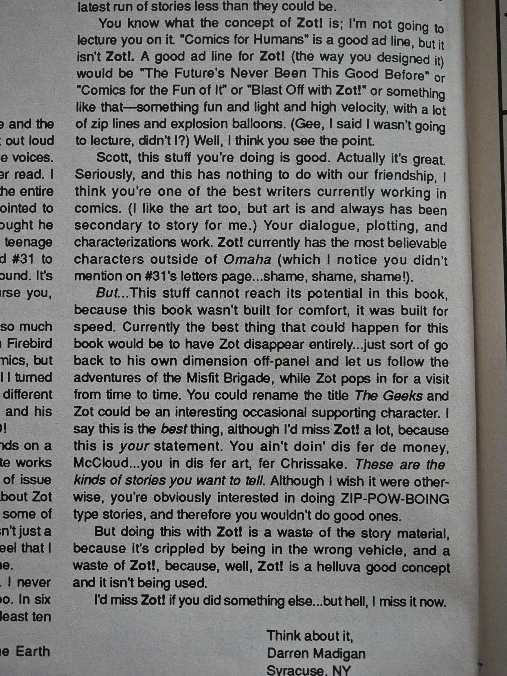
There are many interesting letter writers in these issues. This one points out that Zot!’s direction is problematic. McCloud created a super-hero romp, but here we are in real drama land all of a sudden. Can these realities be reconciled? Would it have made more sense to create a separate vehicle for these high-school issues?

And I think that’s a very good question. I think that Zot’s presence in these dramas make them something other than they would have been without his slight overt fantasy naivete. And I think it really works.
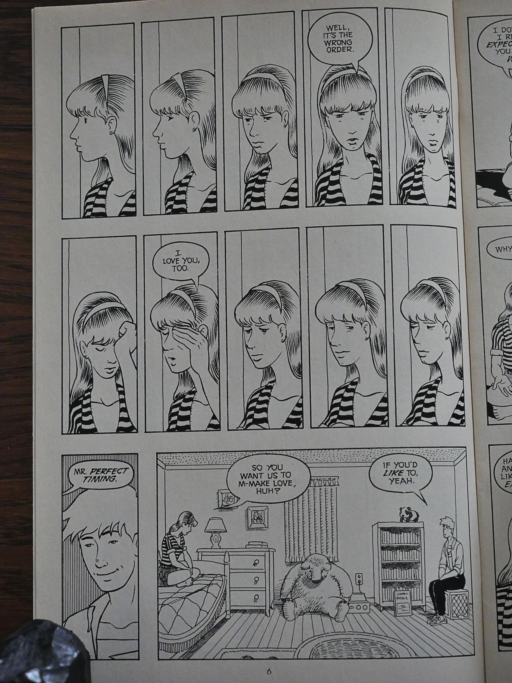
In the last few issues, McCloud experiments a lot with smaller panels to convey silence and diffidence.
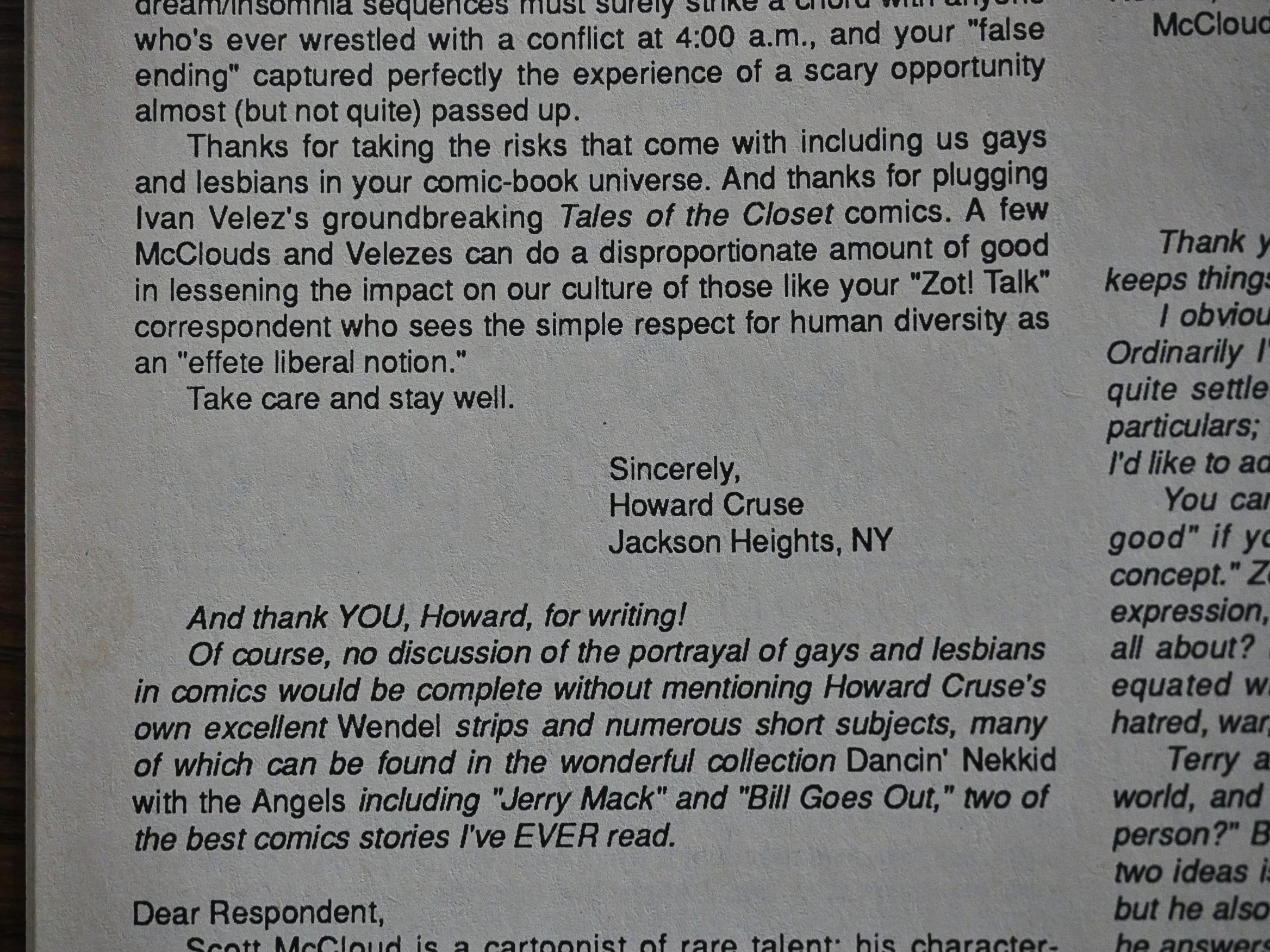
There’s an avalanche of letters after the “Terry” issue, and one of them is from Howard Cruse.
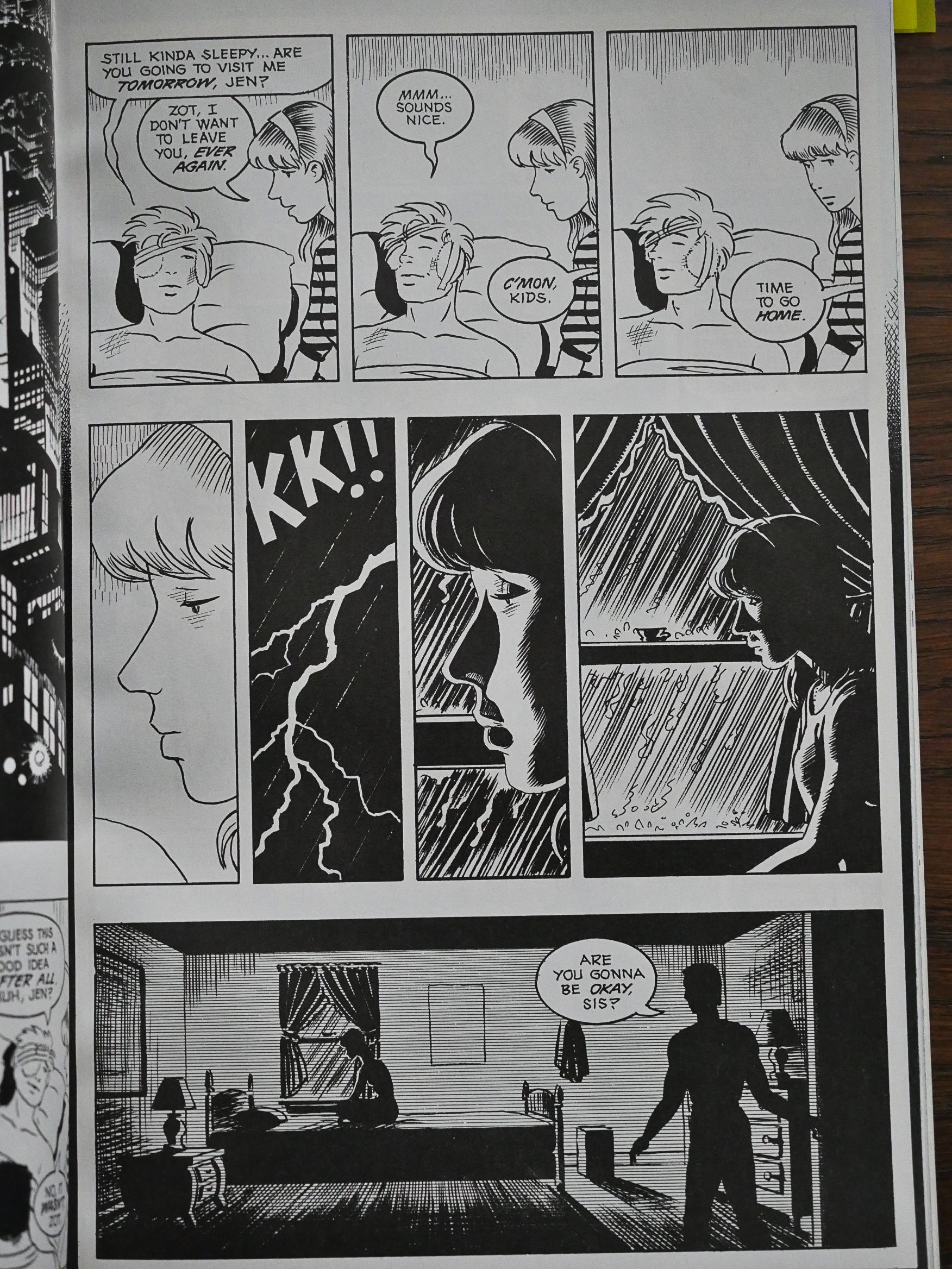
I don’t mean to imply that everything in these issues is perfect. McCloud can lay it on pretty thick now and then, and having Jenny brooding during a thunderstorm pushes this melodrama into cliche.
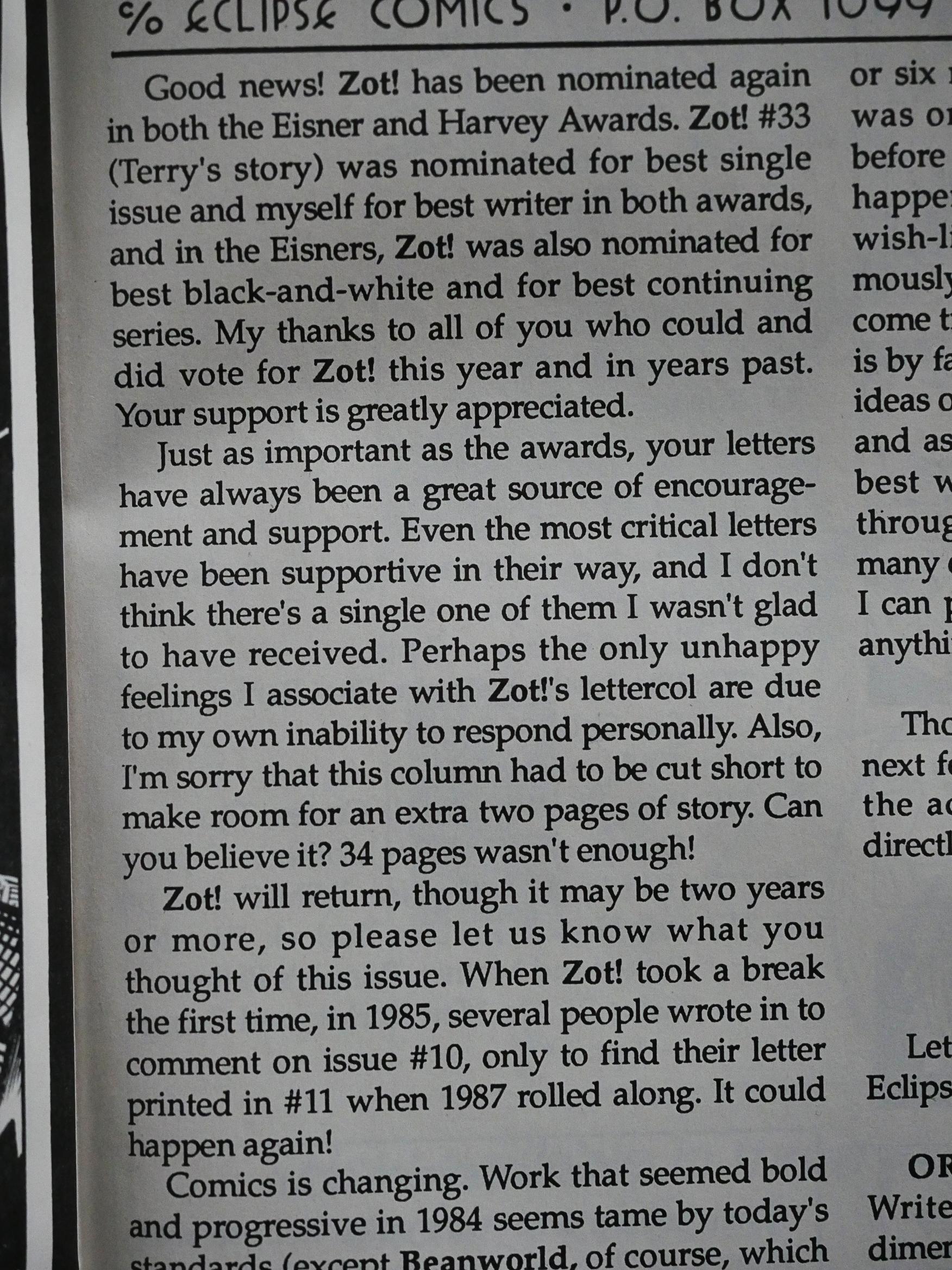
And, to the surprise of nobody who was reading Zot!, it was nominated for all the Eisner and Harvey awards.
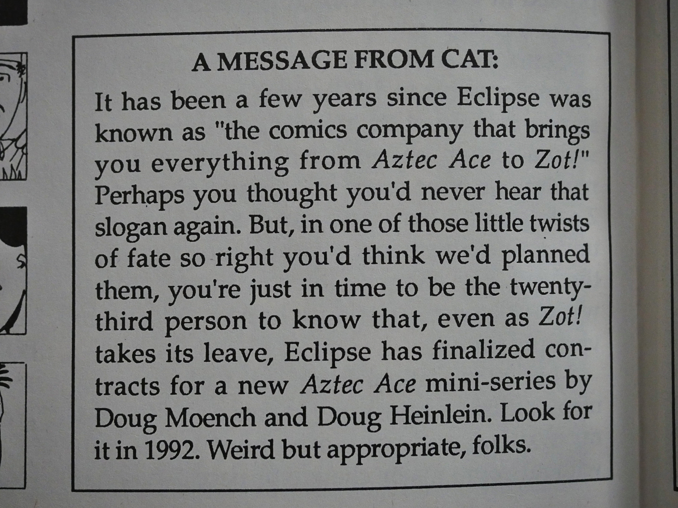
Heh. I wrote about Aztec Ace the other day, and there was apparently a plan to do a new mini-series by Doug Moench and Doug Heinlein in 1992. That never happened, I think.
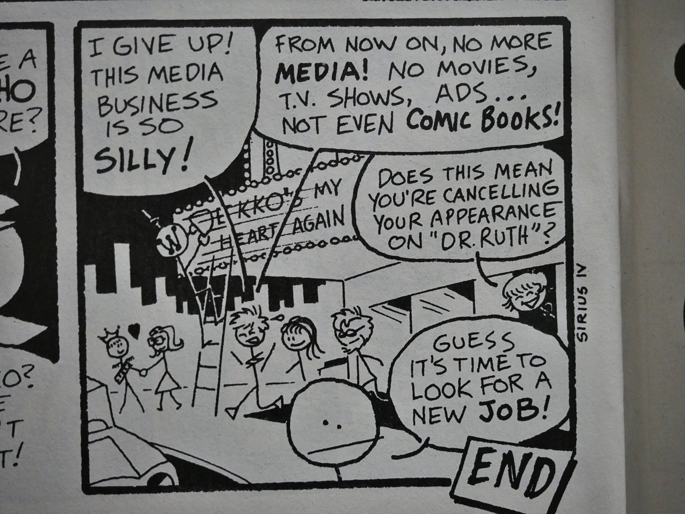
And as the final issue of Zot! fades out, Matt Feazell’s Cynicalman bids us adieu.

So!

I really enjoyed spending these two evenings re-reading Zot!, and I can imagine doing so again in a few years. The fun bits are fun, the exciting bits are exciting, and the emotional bits are… effective.

But what did the critics say? Quoth Tom Spurgeon from The Comics Journal 197:

I’ve never quite understood the cult of Zot!, which seems to have been given new life in the past few years as the kind of Older, hardcore fan who is likely to be a cult member takes to Internet chat groups with increasing regularity. Scott McCloud’s first major comics work was a moderately successful light fantasy utilizing the superhero motif that was serialized by Eclipse Comics from 1984 to 1991. It enjoyed erratic sales and periodically fervent critical response which petered Out the further one got away from comic fandom’s warm, fuzzy center and into either hardcore super-dupers or comics for art’s sake. I’m not sure the creator has a stake in the goodwill continued to be directed ZOE’s way: one gets the Sense from interviews that McCloud is fond Of his creation but not in any way absorbed by it; he has promised more comics starring the characters but doesn’t seem to be in any hurry to do them.

Then again, we have Carter Scholz in Comics Journal 98:

Eclipse Comics has been publishing Scott McCloud’s ZOt! for five months now, and it’s a find. This title is a simple but not simple-minded antidote to the other two books mentioned here. The style is nostalgic, but the picked-up pieces are made new. Zot (full name, Zachary T. Paleozogt) (s a teenaged super-hero from an alternative Earth, who comes screaming through a spatiodimen. uh, no, a temporal disp . no, it wasn’t that well, it’s a kind of a window to another world—and into the life of bored teenaged Jenny Weaver on our Earth. Hot on his heels is a crew of murderous robots (“Hey! You there! Look out! I said look out! They’re coming through!’ which he merrily trashes, all but one, which Jenny uses his blaster to dispatch. Then, after some exposition and the arrival of the police, he goes back through the window, followed by Jenny and her apish brother, who fall through just before it closes, ending up on the perilous ledge of a futuristic skyscraper. holy moley! This is a delightful book.

So there you go.

Half of the colour issues were released in a paperback edition by Eclipse in the late 80s, and all ten were collected by Kitchen Sink in the late 90s. In 2008, all the black-and-white issues were collected and published by It Books, and is still in print.

These days McCloud is most famous for having written Understanding Comics, and less well known for having done the followup book Reinventing Comics.

1984: Star*Reach Classics

Star*Reach Classics (1984) #1-6 edited by Mike Friedrich

It makes perfect sense for Eclipse Comics to reprint comics by Star*Reach. Eclipse, in many ways, feels like an extension of Star*Reach’s aesthetics (although with less SF & LSD).

Friedrich writes the introduction to each issue, and in the first one, we get the story behind Star*Reach: Friedrich wanted to have a place to publish genre works (excepting super-heroes, of course). (At least that’s how I interpret “heroic stories outside of the superhero form”.)

Star*Reach (the comic book) started off as a black-and-white publication, and gradually got a larger colour section, I think. So many of the stories in this collection has artwork that was obviously intended for black-and-white publication, and the colourist here has to find a way to add colour without muddying things up too much.

Jim Starlin needs the acid!

Yes, there’s a lot of very “cosmic” storytelling here.

Like Dave Sim’s “Cosmix”.

There’s not much overtly political work here, which is a bit odd for work originally done in the mid-70s, but there’s the occasional nod towards “women’s lib”. That is, we get female characters that the male characters respond to with “bah! a woman can’t be a soldier/pilot/sorceror/secret agent” and then it turns out that they can. Unless I miscounted, I think there was about four stories with that theme, which would bring us to about 30%…

Statistics are us.

Amusingly enough, virtually all Star*Reach comics were still available at cover price at the time this series was published (which is 33% off). Perhaps Now and Then Books bought them by the pallet in the 70s.

This series has a thorough checklist of every issue Star*Reach published, which is very sympathetic: Friedrich really wants to take care of his creators, is the impression I’m getting.

And finally, the back covers feature a cover gallery.

All in all a nice package, but… are the comics any good?

In the second issue, Friedrich includes a story he wrote himself even if he doesn’t think it’s very good, because it features artwork from Dick Giordano, who’s more known as an inker.

And, yes, it’s quite interesting to see Giardano’s Neal Adams-influenced layouts. And Friedrich is right; the story isn’t very good otherwise: It seems to stall all the time with the incessant flashbacks.

Oh, did I mention that there’s a lot of (mostly female) semi-nudity in these comics? Well, it’s the 70s, after all…

About half the covers were made especially for this reprint series. Here we see a particularly snazzy one from P. Craig Russell.

Friedrich says that his attempts at finding the right way to print colour comics has “come to be recognized as the beginning of the so-called full-color comic-sized ‘Baxter Books'” thing. That may be true, but it’s a recognition that may have faded somewhat…

P. Craig Russell evens out the male-to-female semi-nude ratio, as he should.

Why is it that whenever comic book writers want to come up with a fictitious comic book genre, they use pirate comics? It wasn’t ever really a thing, was it? Alan Moore did so, too, in his later Watchmen comics. This one is by John Brunner (and Steve Leialoha).

Since we’re in the mid-70s, and these are “adult” comics, a common thing to do was to up the stakes by being “more real”, and “more real” seemed inevitably to mean “let’s have scenes of women being threatened by rape”.

That’s a very long schlong (courtesy of Howard Chaykin) along the same theme. Heavy Metal, of course, would take this way further a couple years later.

And speaking of Heavy Metal, this Lee Marrs story was originally printed there. It had been meant for Star*Reach, but they folded before they got a chance to print it. It’s not in Marrs’ usual style, and it’s one of the best things in this run.

Among other oddities, one of the oddest is this Paul Levitz/Steve Ditko thing about… er… I really can’t tell.

And one of the funniest bits is this Lee Marrs riff on Moebius’ Arzach.

Dave Sim reveals that his later obsession with religious matters was present at the start, too, in this not-very-blasphemous story about god/Norman.

And finally, the last issue is dedicated to reprinting P. Craig Russell and Patrick C. Mason’s adaptation of Parsifal, the Wagner opera. I think it’s their first collaboration? The later ones are very successful, but the only thing this one has going for it is Russell’s artwork. The text is redundant and overdone, and the storyline is pretty muddled, even as Wagner adaptations go.

And Mason reveals that he changed the plot a bit, because he’s a Christian, and he just can’t let Parsifal be the redeemer. That’s Jesus! Can’t have any blasphemy.

But what did the critics say? The only mention I can find in The Comics Journal is this editorial from #98 by Gary Groth:

But, so as to leave no doubt as to their role of censors, Eclipse has also altered the content of their comics for no apparent reason than to tone down the “adult” nature of the work. Star*Reach Classics #2 reprints a story by Mike Friedrich and Dick Giordano first published in Star* Reach 1975. In the original publication, the story’s heroine, Stephanie Starr (l trust Friedrich is more original as an agent than he was as a writer), is consistently drawn topless—and occasionally bottomless— throughout the strip. Eclipse saw fitto save its young readers the trauma of seeing too many bare breasts by drawing a top on her, deleting a shot of a pudendum, as well as the line ‘Fuck it!” (Most, but not all, of the tits are excised, and the selection as to which ones go and which ones remain is largely capricious.)

I think they had a feud going.

A Star*Reach Greatest Hits package had been published some years before, and the overlap between that and this series is very small, so I wonder whether Friedrich missed out on some of the better bits for this reprint series? While it’s a diverting read, very few of these pieces are that interesting. At least as seen from 2018.

1984: Aztec Ace

Aztec Ace (1984) #1-15 by Doug Moench, Dan Day, et al.

Aztec Ace is the end of the first phase of Eclipse Comics, in a way. Up until now, the vast majority of Eclipse’s (not very massive) output has been dominated by refugees from Marvel Comics, who left because they didn’t like the editorial strictures over there, or left because Marvel wouldn’t let them retain ownership of their work, or both.

Unless I’m misreading the chronology here, Aztec Ace (created by Marvel writer Doug Moench) is the last one of these. By 1984, the Marvel/Epic line was well-established, and many of the creators that had fled to Eclipse (and other independents) went back to the mothership’s nicely furnished outhouse. (To mix metaphors in a Kenwood blender.)

Anyway, Aztec Ace is about a time-travelling guy with a kick-ass sidekick, and they go around the, er, time-stream to fix things in a ship that’s bigger on the inside. Half the letters on the letters pages are “you know that this is Doctor Who, right?”, but Moench claims to have never seen it, and he never watches TV, anyway.

The first issue is 52 pages long, and is reproduced somewhat iffyli: So many of the finer lines of the artwork (by Michael Hernandez and Nestor Redondo) just disappear. Which makes me wonder whether this originally was intended for an album-sized graphic novel instead of the start of a standard-sized comic book series. The aspect ratio is closer to standard comic book size, though, so if that’s the case, they’ve zoomed and cut the artwork, too…

Since it’s a comic book about time travel, we get a few of these jokes, but not too many.

Moench introduces us to the concepts in Aztec Ace very nicely by not really introducing them to us at all. He drops us straight into the story, without explaining how things fit together. But he’s also got the Bridget character, who’s as much in the dark as we are, so we slowly get to understand how things work by having Bridget learn them.

So we’re kept on the edge of total befuddlement for quite a while, and I can easily see many readers being put off by that. “This doesn’t make any sense! Waugh! Where’s my Garfield comics!” (I’m not being snooty at all here, am I?) But I love that kind of stuff: Vagueness is reality. Clarity is fiction.

Reading this, I’m reminded of techniques Alan Moore would use later.

The layouts in the first two Hernandez-pencilled issues aren’t very exciting, but there’s a couple of these fun pages. The layouts would become much crazier when Dan Day took over in #3.

The first issue includes a text page with a dialogue between our protagonists that’s fun, and I wondered whether that was going to become a regular feature, making Aztec Ace even more of a precursor to Alan Mooredoms than it is, but no.

Another recurring theme in the letters page is “why are you advertising for the NRA on the covers?”, but that’s the stamp of the National Recovery Administration, the New Deal thing set up by Roosevelt in the 30s. It was apparently an idea by editor cat ⊕ yronwode.

Since it’s a time travel book, we get to visit a lot of famous people and events from history, and Our Heroes either help getting events to unfold as they should, or stop The Bad Guys from stopping those events from happening.

Here’s Ben Franklin, or rather his “ebonati” clone. Yes, “ebonati” is a pun on “illuminati”. (Dark/light.) Yes, Moench is very punny.

And, of course, we get a lot of rules for time-travelling, neither of which make much sense, but, then again, they never do, do they?

The doorway to the time-travelling space ship is inside a phone-booth in these issues. Yes, I think at this point Moench was basically trolling the Doctor Who truthers.

As I said up there, Moench only did the “meanwhile, in the future” bit once. Instead he introduces each scene shift (and he shifts constantly, often more than once per page) with one of these nonsense semi-puns in those pink boxes. They’re mostly half-skewered versions of sayings and titles of things you half-remember, but can’t quite place. Or at least I can’t place them.

Moench does give us some straight-up info dump pages, though. The weird thing about them is that he manages to info-dump all over us without boring us silly. These comics are so dense: Reading these 15 issues took me, like, 3x the time it would have taken to read 15 modern commercial comics. And it’s not because all pages are like the one above; they’re not at all, but there’s so much going on that you really have to pay attention.

A couple of readers make the comparison to Howard Chaykin’s American Flagg! comic book, which was published around this time. And I get that: That one was also an early exercise in information overload. I re-read it a few years ago, though, and was surprised by how tame it seems now. Everything in American Flagg! has been imitated and digested now, while Aztec Ace, in comparison, is still way out there.

Moench says that he’s got three file drawers filled with notes for Aztec Ace, and it reads like it. Almost every issue has 28 story pages (leaving room for two letters pages and two in-house ad pages), which is more than most, and every one of those 28 pages is crammed with ideas and schtick and action.

Geez! Aztec Ace increased its orders between issue 2 and 3? That doesn’t happen much these days…

Heh. The editorial page notes that Don McGregor was interviewed for WNEW-TV in New York, and that they’re lugging an edited version of the footage taken for that spot to conferences.

You know the thing about those drawers filled with notes? Yes, you often get multiple quotations from high culture sources starting each issue. Pretentious? Fun? I’m leaning towards fun.

But those semi-puns in the pink boxes…

It sometimes feels like pure logorrhoea.

On the other side, why not?

Aztec Ace, weird as it was, was apparently selling at the top of Eclipse’s lineup.

They finally found a name for the line-wide Eclipse editorial printed on the inside cover. *phew*

I haven’t said much about Dan Day’s (and Nestor Redondo’s and later Ron Harris’) artwork, and strangely enough, neither does Doug Moench on the letters pages. When Day made his debut in #3, I had expected an introduction or something, but Moench didn’t mention him at all, and he continues to not do so until Day’s leaving. Which is downright bizarre, in my opinion, because Day’s so wild and crazy in his layouts.

Now, I don’t know what the scripts from Moench looked like. Perhaps he described each page layout in detail. In which case, he’s an amazingly visual comic book writer. But, if on the other hand, these layouts are mostly from Dan Day’s brain (and I think they are; we’ll come to that later), then he deserves a lot more attention than I’ve seen given to him.

I mean, just look at that two-page spread. Not only are we getting two concurrent scenes (the green inset panels are Bridget and Head talking), but between those we’re getting Ace running away from some guards. But if you look closely at those one, you see that it’s a continuous city scene we’re seeing, where Ace is moving around in space and time, with the inset panels working as panel borders.

It’s fun, interesting, perfectly clear when reading, and so way beyond the call of “Ace runs away from guards while Bridget talks to Head”.

(Dan Day’s more famous older brother Gene Day worked with Moench on Master of Kung-Fu at Marvel in the 70s.)

Moench enjoys trolling his readers a bit. We’re promised an action-packed next issue…

Or perhaps it’ll just be a moody mysterious piece.

Guess which one.

The prevailing mood throughout the chaotic antics of Aztec Ace is one of melancholy. Travelling through time gives you a lot of leeway to write about life and death and stuff, you know.

That issue, though, says “Day” on the cover, but the credits claim that Michael Hernandez is doing breakdowns and doesn’t mention Dan Day at all. Weird. So it’s an unannounced fill-in issue?

And while it does have strangely-shaped panes, it has none of those hog-wild layouts, which points to Day being responsible from them.

Moench does scenes like the one from time to time, leaving us wondering whether that’s a historical character we’re supposed to recognise, or whether this is a foreshadowing of future plot lines. In this case, I was rather annoyed, but it’s not an inherently bad storytelling strategy.

In one issue, we get this on the inside front cover: An explanation of who the historical characters featured are.

Of all time travelling plot lines, the one where you arrive to early is an inherently bad one: When she established the project these people were working at, she knew that there would be a deadline coming up (Cortez arriving in America), so why didn’t she just establish it earlier? Or is she didn’t, arrive later?

“Makes. No. Sense.” says me in Comic Book Guy’s voice.

Like I said, these comics are jam-packed with story pages, so there’s no room for backup features. We only get this three-page feature in a single issue.

Moench admits that his approach to Aztec Ace is a very different one that he had used on his comics at Marvel. Less maudlin and more intellectual, perhaps? He says that if Aztec Ace fails (commercially), he’ll… do something else. Or leave comics.

Gotta get some fourth-wall breaking references in. This is the mid-80s, after all.

On one of the later issues, Aztec Ace dresses up like a super-hero and does the only sensible thing while jumping around on rooftops: Says “Whee.”

In #13, Moench announces that Dan Day is leaving after having done “a very nice ten-issue run”. And that he’s “improving”. *scratches head* Is it just me, or is that kinda bitchy?

But we’re promised pleasant, perhaps even spectacular surprises in future issues. What could those be!?!?

Well, I don’t know what the spectacularity (that’s a word) he was referring to might have been, but it’s sure not the artwork by Mike Harris, Art Nichols and “Tom Yeats” as he’s named in the credits, but I’m guessing that’s the same person as Tom Yeates.

Gone are all the fun layouts, and instead we have totally pedestrian almost-competent standard comic book art.

Even the dialogue seems to devolve precipitously. Instead of intricate banter, we have this leaden stuff. Did Moench just give up when Day left? Or was he uninspired by the artwork?

And then Dan Day is back on #15! What? And so are the layouts and the snappy dialogue. Weird. There’s no letters page, so there’s no explanation, either. Reading the indicia, the non-Day #14 was published in June 1984, which #15 is in September, which is the longest delay between issues, so I suspect… drama…

Even the layouts that aren’t over-the-top are fun. Here we’re reading the long panels to the left downward, and then when we come to the bottom panel, we have speech balloons poking out to the right, which leads our eyes up the legs and then lets us take in the entire figure of Cary Grant. Reading it, it’s so natural and seems effortless: Our eyes aren’t led astray even if they don’t proceed in the normal order.

And that’s it. Final issue. No explanation or warning. So what happened?

When writing these, I try to keep my mind pure and oh so virginal by not looking up other articles about the comics while writing, but wait until this bit, where I’m basically done. But Aztec Ace is so much fun and so weird that I had to.

And found basically nothing. Only on the Dark Web (i.e., page two of Google Search) did I find out couple of articles on Aztec Ace, and they’re both pretty new. Here’s one on #7 and here’s a more thorough one on #1. (The latter one isn’t bad.) But no reviews from the olden days, not even in The Comics Journal, as far as I can tell.

I did read this comic in my teens, but apparently I wasn’t very enthusiastic about it: I dropped it by #9. I find that so strange now, because it seems very much like other things I liked at the time, but… I didn’t, I guess? I have no recollection of Aztec Ace; when I started this blog series I thought it was an Epic series.

But it’s been a hoot reading it now.

Doug Moench did not stop writing comics after Aztec Ace folded, but has written a huge number of comics afterwards.

[Edit: There’s now a Kickstarter for a collected version of Aztec Ace up, and it looks like it’s going to be successful.]

1984: I Am Coyote

I Am Coyote (1984) by Steve Englehart and Marshall Rogers et al.

OK, this’ll be a short one. I should just have appended this to the Eclipse Magazine blog post, where this originally ran and I, er, discussed the feature itself.

So there’s not much more to say here than to talk about what’s new: The slightly shiny paper and the colouring by Joe D’Esposito. The colour separation is done in the way that was popular back then which results in blobs of colour put onto the white areas extending vaguely and haphazardly into the black areas. It’s not a very attractive look.

Rogers goes absolutely crazy with the tones on some of the pages, and I wondered how they’d deal with all that chaos when colouring, and… they… kinda failed.

There are some nicely done pages here, though. In general, adapting a black-and-white work to colour often doesn’t work very well, because the artist uses textures and spot blacks to compose the panels. Which doesn’t leave the colourist with many options in many cases.

It’s OK, but I’d recommend the original version.

1983: Eclipse Monthly

Eclipse Monthly (1983) #1-10 edited by Dean Mullaney.

Eclipse Monthly is a direct continuation of the Eclipse magazine, but whereas that had been in black-and-white and featured an eclectic selection of features, Eclipse monthly is in standard comic book size and in colour.

It’s 48 pages long, which is a really nice length for an anthology: You have the possibility of featuring longer sections without feeling like the issue is just that one section, and you can experiment with having oddball features dropping in on a trial basis.

But Mullaney seems to be going towards a more stable approach: Keep the same five features going in ever issue. And what he seems to be hinting at in the editorial: NO SUPER-HEROES!

Basically everything else, though.

So we get Cap’n Quick and a Foozle by Marshall Rogers, which is a manic, well-drawn delight of a comedic sci-fi tale, which (very vaguely) connects to the Foozle story he did in the first issue of the Eclipse magazine.

B.C. Boyer continues The Masked Man from the magazine, and steps up the funny.

Doug Wildey does the beautifully rendered Rio western. I mean. Look at that steam engine. Like at that horse. Look at that engineer. Look at that cowboy. It’s all so perfectly westernly gritty.

Trina Robbins continues her adaptation of Sax Rohmer’s Dope, to the dismay of everybody who writes a letter to Eclipse Monthly. And not for the racial stereotyping in Rohmer’s work, but because they don’t like Robbins’ artwork. So they’re basically insane.

And finally, Steve Ditko (!) does Static, which is, well, a super-hero.

But one that has dialogue like that.

What can I say? If I had more thumbs I’d point them all up: It’s a class act and a Platonic ideal of how a indie/ground-level anthology should have looked in 1983. It’s impeccably produced (Doug Wildey’s wonderful colouring job on his story is given a really sensitive reproduction) on nice paper, and it’s a fine mixture of new and old talent, all the stories are by single writer/artists, all the sections are good, and while formally varied, it feels cohesive: It focuses on narratively strong stories, and everything is along the humour/adventure spectrum.

It’s no Raw Magazine, but then again, nothing is.

Let’s hope Mullaney can keep this going!

Well, they did… Until #3, when they announce that Ditko is leaving. Well. “Steve decided not to continue the series in these pages.” I seem to remember that Fantagraphics published at least one Static collection, so I guess Ditko did continue it.

We start seeing some new features, like this Don McGregor/Gene Colan/Klaus Janson Ragamuffins story about a very bad boy and a very nice, but scared boy. (The nice one is the blond(e).)

I love Janson’s colouring job here.

Tee hee. Menfolk. But I just wanted to mention this page, because it seemed like Eclipse were trying to corner the market on scenes of childbirth these years: There was one in Sabre, one later in Miracleman, and here’s one in The Masked Man.

I the midst of comedy fisticuffs, of course.

But then the rot really sets in. They’re forced to lower the page count by a third (to 32 pages), which means that you only get three features per issue. That’s not enough to give you that good anthology feeling: A single features that’s off will annoy you so much that you’ll stop buying the anthology.

But let’s enjoy it while it lasts, like this breakdance battle by Marshall Rogers: it’s 1983, remember? (The kid wins because he has magicalish shoes that makes him spin around really fast.)

Rogers was drawing Steve Englehart’s turgid Scorpio Rose around this time, but mysteriously never finished it. Well, it’s a mystery until you’ve read what he’s doing here: He’s having so much fun, and the tale he’s maniacally telling here is 1000x more interesting than the Scorpio Rose twaddle, so… Mystery solved!

Don McGregor et al. are socially relevant…

B.C. Boyer makes fun of Spider-man…

And we get the real story of why Steve Ditko left! Apparently, the editor (Dean Mullaney) was so unsatisfied with one of Ditko’s pages that he tried to edit down the text and asked Ditko to draw some more stuff into the vacated space. Perhaps this will make more sense if you know what the page looks like:

Yes… That’s a lot of text.

So Mullaney rewrote Ditko? And Ditko said “no”, to the surprise of absolutely nobody, and they ran the piece as Ditko intended. But Mullaney dropped the feature, according to himself.

That’s a pity. I thought it was kinda fun.

Doug Wildey does one Rio instalment that has almost no solid blacks: It’s all rasterised and painterly. Very nice.

But as we trundle towards the inevitable cancellation, we get this ridiculous and somewhat offensive story about this blond(e) ranchero who fights against (non-blond(e)) evil Messicans and even eviler (that a word) bears. (Yes, evil bears.) Christy Marx and Peter Ledger are the offending creators here.

Mark Evanier and Mike Sekowski drop by with a story of a masked vigilante set in the DNAverse, for some reason or other that’s never quite clear. Perhaps they were inspired by Don McGregor to do something more socially relevant…

… and speaking of which… McGregor (and Billy Graham) tackle the evil of open floor plans (and racism). It’s a rather effective piece. I mean, not effective in fighting racism (or open floor plans), but it’s good.

*sigh* But we get things like this… thing… with a total of three (count em three) writers (and creators). Only one artist, though. With that many writers (and creators), the writing has to be off the curb, right?

*sigh*

And then it’s over after ten issues.

As declines go, it’s a pretty steep one. It started off with a bunch of top-notch cartoonists in a very satisfying package, and ended up with about half of the content being less than interesting. That most of that decline was perpetrated by writer/artist teams isn’t very surprising: That’s the norm.

Still. If you happen onto these in the 50c bins, you could do a lot worse than grabbing the stack.

What did the critics say at the time?

Obviously the quality Of the pieces in any such project is going to vary, but this title’s editors deserve some credit; the best of Eclipse Monthly is pretty darn good, and the worst is at least interesting.

Russell Freund, Comics Journal #90. He goes on to write a couple more pages, but nothing especially quotable… But he excerpted the same two Static panels that I did, which shows that he’s a man of great intelligence and taste.