1980: Detectives, Inc.

Detectives, Inc. (1980), Detectives Inc. (1985) #1-2, Detectives, Inc.: A Terror of Dying Dreams (1987) #1-3 by Don McGregor, Marshall Rogers, Gene Colan et al.

The initial volume of Detectives Inc. was Eclipse Comics’ first squarebound publication. It’s basically in the European “album” format, which was the direction American comics publishers tried to push for more upscale projects for a few years before deciding that smaller pages sold better. Or something.

Don McGregor had already published the Sabre “comics novel” at Eclipse, but this is Marshall Rogers’ debut. Both are refugees from the 70s Marvel work camps.

McGregor seems like a likeable guy, but his sentences have a way of getting away from him. If he had stopped that one about half-way there, it still wouldn’t be good, but it wouldn’t have qualified for Worst Run-On Simile In A Hard-Boiled Detective Comic of 1980 prize (it was a very contested field).

Oh, how they prate. I realise that McGregor isn’t going for naturalistic dialogue (or rather, I sincerely hope), but here we have two private eyes, I mean investigators, who are approaching a meeting with some shady characters… and this is what they say walking upstairs? OK.

But what about the artwork? Rogers is a quite distinctive artist. His panels are often filled to the brim with various patterns and litter and textures… Often making his attractively lanky characters hard to spot in his panels.

He’s frequently obsessed with trying to make McGregor’s talky-talky pages look less boring by varying the shots and layouts. On this page we have the two characters talking in a diner, while the middle panels are a flashback. The present-day panels are more textured, while the flashbacks have little shading. That bit’s kinda neat. But what’s with all the angles on the two in the diner? Straight on, from below, from above. It’s just… distracting.

On the other hand, the more distraction you get from those lines, the better, I guess.

McGregor does have some self-awareness, though. Sophomorically compelling. Except the compelling part.

Hey, that’s a nice t-shirt!

OH NOES!

Well, I didn’t think that was a very good book, but what did the critics at the time think? What does the trusty Comics Journal search engine say?

Kim Thompson, Comics Journal 59:

Detectives, Inc. is a disastrously mawkish and disjointed attempt to lash together pulp fiction (in this case, a detective story) with a Serious theme. Betrayed by Over— whelming shortcomings in their styles and approaches, Don McGregor and Marshall Rogers have, with all the best intentions in the world, given birth to a monstrosity of a book that fails on all the levels it aspires to.

Ouch.

R. Fiore rebuts in Comics Journal 62:

I found Detectives, Inc. particularly impressive because it succeeds in a genre that is so hard to do well. The hard-boiled detective story can smoke Out a fake in a minute, but McGregor captures the necessary mixture of cynicism and sentimentality, and follows the most important rule: don’t try to be too tough. Furthermore, Detectives, Inc. is that rarest of things in comics, real story. That is, a story that comes from character rather than plot mechanisms.

I think Thompson won the discussion.

Four years later, Eclipse republished the comics novel as a two-part standard-size colour comic book series. I was curious as to whether the colourist would be able to make Rogers’ artwork more legible, but it has rather the opposite effect.

Included in the backmatter is a “making of” retelling of sorts, excerpted from McGregor’s The Variable Syndrome book (which I bought at the time; I was a huge Don McGregor fan as a child). While the text does touch quite a bit on the history of Detectives Inc., it’s mostly about how shabbily he’d been treated by Marvel.

But reading passages like the above, I’m getting a sneaking suspicion that perhaps some of the problems here is that McGregor has an inability to suss out when he’s being ribbed.

He also mentions how structurally daring he was during the writing of the first Detectives Inc. story: He didn’t introduce the plot until page 20, which he never would have been allowed to do at Marvel! That’ll show them!

My response to that is: There was a plot!? Really!?

Look at the difference between the original sketch and the finished product! Er… Uhm… OK, perhaps Eclipse doesn’t have the absolutely best repro people. Here’s what it really looked like in the book:

Anyway.

catherine ⊕ yronwode chimes in with a page of “i told you so” when it comes to comics censorship. I’m not quite sure what she’s referring to, but it might either be the birth scene in Sabre, or the birth scene in Miracleman. (Eclipse is very birtherish.)

Anyway, the second Detectives Inc. mini-series is a new story illustrated by Gene Colan. It’s shot directly from Colan’s pencils and printed in sepia. I’ve always enjoyed Colan’s artwork: He can draw people talking and talking and manages to vary the panels in ways that seem natural, but still dynamic. And the first issue is really well reproduced and printed: You really get to enjoy the moody pencils.

The backmatter is about McGregor making a movie from the same storyline that the mini-series cover. I’ve done my best to search for it on imdb, but I can find no trace of it, so perhaps it was never released?

It’s a much better storyline than the first one. It’s a genuine mystery and while the characters are mostly stock characters, it’s not bad. It’s still way overwritten.

The second issue isn’t as well printed as the first one. Instead of the pencils being lush and moody, they seem just … blotchy. While reading, I was wondering whether they’d switched to normal four colour CMYK printing instead of two-tone (sepia and black) as in the first issue. But the registration seems too tight…

But then the backmatter switches to full-colour (FSVO), too…

And in the third issue the production turns to shit. It really is a four-colour printing, and here half the pages are off register, which means that all the lines are doubled in brown and yellow. It’s like reading through very blurry glasses.

I wonder whether this was done just so they could have colour snaps from that risible-looking movie in the backmatter, so they prioritised that over Colan’s artwork? In which case:

Shame! Shame!

The reasoning may be less horrible than that, though. Perhaps normal four-colour printing is just way cheaper than two-tone sepia.

Anyway.

IDW has reprinted all the Detectives Inc. material in a single volume. Perhaps they fixed the repro issues.

1979: Night Music

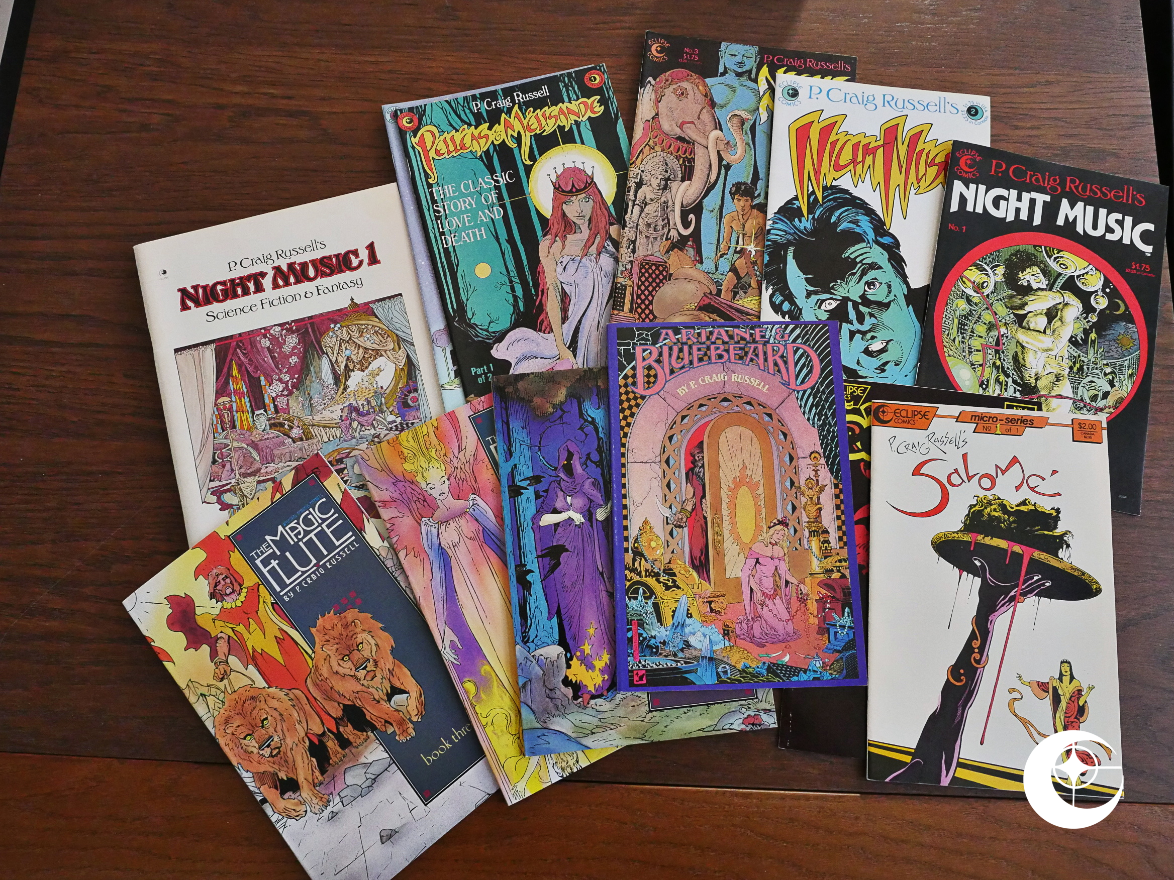
Night Music (1979), Night Music (1984) #1-11 by P. Craig Russell et al.

For the first few years, Eclipse mainly provided refuge for ex-Marvel creators. P. Craig Russell had been doing the artwork for Killraven (written by Don McGregor) in the mid-70s.

I never would have guessed that Steve Ditko and Joe Kubert (!) were his major influences…

Hm… Really? Anyway, the problem with the first Night Music magazine (retroactively designated Eclipse Graphic Novel #2) is that while Russell is a wonderful artist, his prose leaves a bit to be desired. Perhaps he’s just too influenced by writers like Don McGregor who have a tendency to go on and on…

Fortunately, Russell’s flights of fancy get out of whatever text we were bogged down in… (Hm… Perhaps that’s the Ditko influence showing up? Or just some really good acid?)

Apart from Russell’s art nouveau influences, the most striking thing about his artwork is the unusual angles we see his characters in, and how posed they are. I assume that this is because Russell draws figures from photo reference. Those two panels look a lot like if Russell had snapped two pics of his friend while lying on the floor, right?

Also: Russell has a lot of good-looking friends who visits his studio.

Also: Dramatic lighting and luscious lips.

Oh, I forgot to even mention what this story’s about: It’s about a reluctant astronaut who lands his ship on an uninhabited planet. The only reason I even mention the plot is that it, amusingly enough, has two endings, and we can pick the one we like. It’s very thoughtful of Russell.

Also: Drugs.

I don’t think Therimbula and the Sea was ever published?

The volume ends with a short wordless story that’s even more lusciously rendered than the main story. I won’t attempt a plot recap here.

Russell thoughtfully provides us an author photograph that shows himself both in profile and straight on (so to speak).

It’s the ‘stachy 70s, remember.

In 1984, Russell restarted the series with a new number 1, and this time in standard comic book format, and in colour. The first couple of issues mostly reprint the material from the graphic novel.

Usually when you’re colouring material originally prepared for black-and-white publication, the results leave a lot to be desired, but it’s done quite thoughtfully here.

The other stuff in the first two issues are bits and pieces of older Russell stuff that had appeared in various anthologies, or had not been published at all before.

This is the only Russell work I’ve seen that’s done in this non-inked style; reproduced straight from the pencilled page, I would guess.

Most of Russell’s work have these “op. X” designations somewhere. What’s that about?

Russell lets us in on the secret: He numbers all of his notable work, which I think is pretty charming.

Some of the oldest work veers into stylistic territories that Russell would never revisit. That’s very early 70s French, isn’t it?

In the third issue we’re told that we’ve been reading a three issue mini series, and the show’s over.

The third issue is an adaptation of a Kipling Jungle Book story, and is, I think, Russell’s best work to date. From now on, I think basically Russell didn’t write another story himself: It’s all adaptations of stories, plays or operas, and illustrating scripts written by others. Perhaps he realised after the first Night Music that he wasn’t really cut out for writing…

For the rest of this series, the covers of the books don’t mention “Night Music” at all. Instead each story (which may span several issues) have a distinct name, and that name is on the cover. It’s an approach Eclipse used for several creators, I think? One title on the cover, and another in the indicia. It makes sense, I guess: New readers get a new number 1, and fans of the artist keeps buying the series.

I don’t mean that in a commercially mercenary way, either. It’s a kinda cute approach.

Russell’s artwork doesn’t really change radically as the years pass by, but it does get even prettier.

However, since Russell relies so heavily on photo reference for his characters, when he chooses a dorky-looking one as Our Hero, the results can be unintentionally funny.

Herp derp I eat paste.

And I have to mention the colouring. Oh, the colouring. It’s like nothing else anywhere. Fortunately. It’s a mottled mess of muddled muddy spittled flecks of colour. How on Earth did they come up with this colour separation method? Reading the indicia it says that the “film preparation” is by “SM Graphics”: The same people behind the Dalgoda coloring mess.

I think I saw the published mentioning “laser scanning” for the colours, which I always imagined (in my childhood) as something scary involving deadly robots. It’s no longer the 80s, so I can just google the term:

COLOR SEPARATED LASERS The process of printing a black and white laser for each color found in a document. I.E. a four-color process document will result in four lasers when color separated: cyan, magenta, yellow, black.

Well, OK, that didn’t really explain how we ended up with this blotchy mess… Perhaps somebody out there knows?

Eclipse’s trade dress for some of these things are a bit “wha?” Russell’s adaptation of Salome is apparently a “micro-series” of one issue. Well, OK.

It’s a really lovely micro-series, though. Full of pathos and drama and is emotionally gripping, in addition to being gorgeously told. But, as usual, the fly in Salome’s no doubt fragrant ointment is the colouring. Splotch, splotch.

I guess at some point in the blog series i have to mention catherine ⊕ yronwode, who’s the editor at Eclipse and writes one page like this per week throughout most of the 80s. She writes with lower-case “i”s. Most of the columns are dedicated to selling comics (as they should be), but there’s a not-infrequent tendency to just write about, well, anything. It’s like a blog. Being published in front of other people’s artwork. I wonder what the people involved felt about that…

Like in this second Kipling adaptation, which is even better than the first one. But note a) the blotchyness, and 2) the out-of-register printing of the colours. Oh, well.

I love that Russell doesn’t feel like he has to straighten out or modernise Kipling’s language at all. It’s wonderfully obscure at times. Googling this now, I see that not everybody is as appreciative:

Not being a Kipling reader myself, I was surprised to find the dialog and narration of these tales to be surprisingly stiff, formal, and difficult to follow, like reading in a foreign idiom.

said random Amazon reviewer. And it’s not wrong, but I love it anyway.

Remember I mentioned the problems with using photo reference? The drawings are only as dramatic as the talent of the actors, and while most of Russell’s models are really good at looking pensive and racked with ennui, when they have to do something dramatic (that’s Bluebeard assaulting Ariane), it’s often… er… how do I put this charitably?

Awful.

Maeterlinck is wise.

The final four issues of Night Music were published in the “prestige format” (as it was called back then). It’s the format popularised by Frank Miller’s Dark Knight series: Around 48 pages in standard comic book format, but squarebound instead of stapled.

The final three issues are an adaptation of Mozart’s Magic Flute silly opera. Russell is now working with Patrick Mason on the script side, which is something that would continue in all of Russell’s future opera adaptations after Eclipse had folded.

Mason’s approach is distinctly different from Russell’s. While Russell on his own had a tendency of cramming a lot of information into few pages, which can feel claustrophobic, The Magic Flute is quite open and airy. It’s not that the former is worse than the latter, but it’s very different.

And they’ve finally fixed the problems with the colouring which had plagued Night Music until now. Gone are the weird splatters and splotches, and instead we get colours that look painterly and painted.

Mozart’s The Magic Flute is a silly, awkward mess that makes no sense. (In addition the music is horrible.) Mason & Russell’s The Magic Flute is logical, moving and very funny.

And has a bit of Moebius crept into Russell’s artwork?

And Disney?

Of all the stuff that Eclipse published, P. Craig Russell’s Night Music series stands out like a very non-sore thumb. You have to admire Eclipse’s persistence in supporting this work: The first issue appeared in Eclipse’s second year, and the last issue appeared two years before Eclipse went belly up, I think.

I can’t imagine these books were huge sellers. They’re such anomalies in comics: Full of pretension (the good kind) and willowy artwork. But perhaps I’m wrong? Perhaps these sold hundreds of thousands of copies?

All of these books have been extensively reprinted after Eclipse’s demise, mostly by NBM. Russell is still publishing new work to this day, and while researching while writing this, I see that I’ve missed a couple of books the past few years.

Situation now rectified.

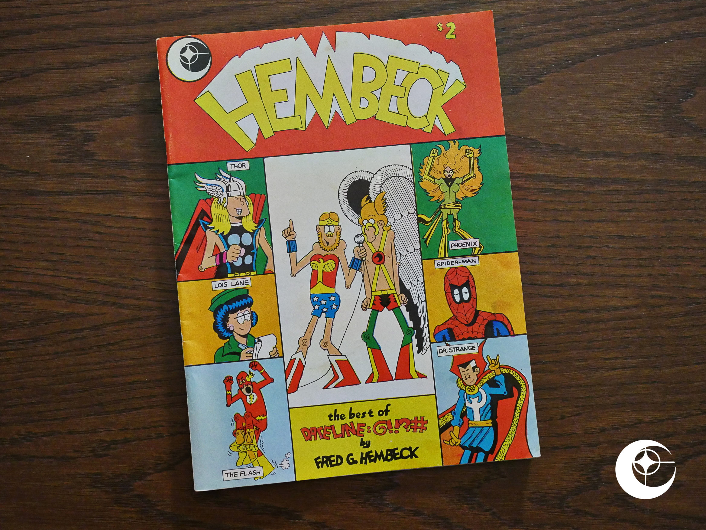
1979: Hembeck: The Best of Dateline: @!!?#

Hembeck: The Best of Dateline: @!!?# (1979) #1 by Fred Hembeck

I think this is Eclipse’s second publication, and it’s a strange choice for Eclipse: The first half dozen things they publish point to trying to distance themselves from super-hero fanboyisms, and here they are reprinting a column from The Comics Buyers Guide, the bastion of super-hero fandom at the time.

A number of strips deal with looking back to older, discontinued publishing lines. What a weirdo!

There’s a lot of pages that aren’t as imaginatively rendered as this one, though.

There’s a bit too much of this kind of thing, which is basically a preview of what it would be like to read blogs twenty years later. Only without as many panels.

I do remember reading this page as a child, though. I thought it was a fascinating glimpse into a different reality: I grew up with a single TV channel, and reading about somebody growing up with cable… with a programming policy as kooky as that… it was just mind-boggling.

Not all the pages were equally fascinating, though.

But you have to admire that charming swirly-knee drawing style.

Eclipse published one issue of this, and then Hembeck moved to Fantaco, who reprinted this issue and published a bunch more.

1978: Sabre

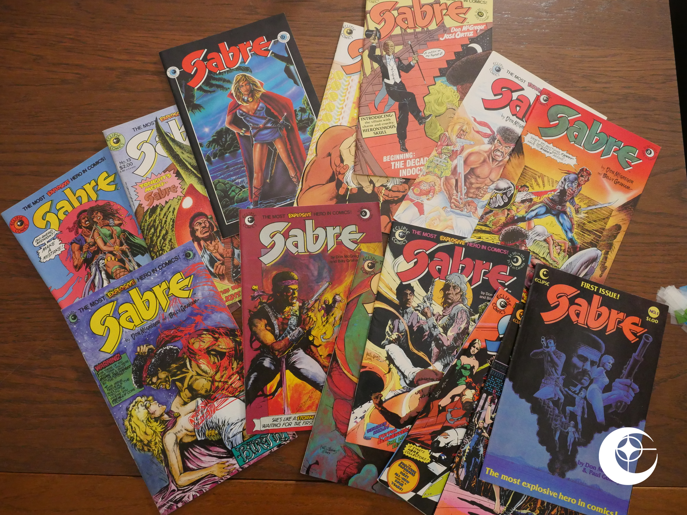
Sabre (1978), Sabre (1982) #1-14 by Don McGregor, Paul Gulacy, Billy Graham et al

There are many comics that vie for the title of “First (American) Graphic Novel”. A Contract With God usually wins, but sometimes somebody chimes up with “How about Sabre? That Will Eisner book was a collection of short stories, after all.”

There are many reasons why Sabre won’t ever win that competition, and the first hurdle is just the format: While the editorial is very proud of the top quality production, it’s just a magazine. It’s a saddle-stitched, normal-sized magazine, and the story is around 40 pages long. That’s not much of a novel.

Even if the title page says it is.

Other reasons why people wants to skip it in a pantheon of respectable graphic novels is that it’s a sci-fi genre piece created by (former) Marvel staffers.

And, as we’ll see, it’s not very good.

Hm… David Anthony Kraft? Is that the guy who ran Comics Interview like forever?

Anyway! This “comic novel” is a mish-mash of various tropes from various sources, including Westworld (for the robots), Sergio Leone (for the hats) and Death Wish (for Charles Bronson’s face pasted onto Jimi Hendrix’s head).

Tee hee! New Yorkers are such lushes!

Paul Gulacy’s figure work is uneven, but the artwork’s quite attractive and super-sharp. McGregor’s writing is consistently horrible. “His eyes are battered” er, right “like the cracked amusement ride” yes, those cups look battered, I guess “with the reminders of what they have viewed during the daylight” hang on, were those saucers battered by reminders?

*scratches head*

It’s not just that McGregor’s writing is bad on a word-for-word basis, but that there’s so much of that bad writing. Why does he find it necessary to describe the character above there when it’s so sharply delineated by Gulacy?

“Do you (explicitly) understand?” the blog writer said.

But it’s not all horrible. The storyline is completely nonsensical, but here where I thought he was going to fridge the heroine to provide revenge motivation for our hero (a la Death Wish), instead…

… she fixes everything herself. Which is refreshing. I’m not sure that really makes up for the pages of “titillating” rape build-up that preceded it, though.

“Life and death reflection seen in reverse”… What a strange thing to write. But then I notice that Sabre’s reflection in that guy’s eye hasn’t been mirror-flipped, so it really is in reverse. I mean, by not being in reverse it’s in reverse.

*scratches head*

The book ends with three pages where McGregor explains that Marvel (without naming them) have editors that are, like, really mean. And he thinks they should stop being so mean (to him). But meanwhile, he published Sabre at Eclipse.

So there you go: The publication Eclipse was founded to publish, and it’s not really a very auspicious publication. Well, not content wise, at least. But it’s nicely printed, and it’s strong on creator’s rights: Eclipse did not claim copyright on any part of the work, which was unusual at the time.

And then, four years later, Sabre continued.

The first two issues reprint the original comic novel, but in colour. And on toilet paper. Combined with the reduction in size, everything is very muddled and strained and ugly.

The backup feature by Elaine Lee and Charles Vess fares a bit better. I assume that’s the same Elaine Lee that wrote the wonderful Starstruck series? I wouldn’t quite have guessed by reading this, but I guess that the sense of humour is… there…

Anyway, by issue three we get new stuff and a new artist, Billy Graham. I wonder whether his first issue was targeted at a bigger print size, because everything is itsy-bitsy on the printed page, and almost unreadable when printed on toilet paper.

McGregor thanks Glynis Wein for being one of the best colourists ever, and Ed Hannigan for the… good colours… Thanks, Don!

I think the best way to sum up that box of exposition is: Nope.

Just nope.

Finally, by 1983 Eclipse gets rid of the toilet paper and starts printing on nicer paper. And it’s very nice paper indeed: Slightly cream-coloured, non-shiny, with very little bleed-through. As you can see here, it holds colour very nicely.

Reading between the lines in the letters column, Billy Graham’s artwork wasn’t much appreciated… for obvious reasons…

Huh. Did Eclipse release a “The Art of Steve Ditko” book? I just had to google that, and apparently: No. Even if they’re taking orders for it here, the project was never completed, because Cat Yronwode had a conflict with Ditko: Ditko lied about never having done bondage comics in the 60s, and Yronwode became disenchanted. At least that’s what’s being claimed now…

But this all leads me to wonder: Yronwode was obviously becoming a presence at Eclipse by now, even if she doesn’t show up in the masthead yet. But is that character a dig at her? It looks physically quite a lot like pictures taken of her at the time, and she’s the Strident Feminist in Sabre, played for yucks…

Wow. There were comics stores that sold 200 copies of Sabre at the time. I have no idea what the total circulation was, but it must have been pretty substantial in the beginning.

Ah, yes. Then we come to the controversial Birth Issue. If I remember correctly, what’s being alluded to here is that one of the distributors (i.e., Diamond, owned by a Christian) refused to carry the issue of Sabre that depicted a child birth. (I know; the 80s were so long ago.)

I don’t remember what the fallout was. Perhaps this warning on the cover placated that lunatic.

A gay couple had been introduced a few issues back, and I had been wondering ever since when the blond(e) one would be killed off. There’s a dictum in all fiction: All Fags Must Die, but ameliorated when there’s more than one to The Faggiest One Must Die, and the blond(e) one is definitely the faggiest one.

And when the birth was coming up, I though, oh, right, here we go. Birth and death. Perfect. Now blondie’s finally dead.

Here’s the very, very, very controversial birthing scene.

But… what’s this!? Blondie doesn’t die!? Instead he kills the bad guy (who’s an animatronic lizard guy (yes I know))!? And then gives his boyfriend a kiss!?

THIS IS NOT COMICS!

*slow clap for Don McGregor*

Well played. I hereby award McGregor not only the You Didn’t Kill Off The Gay Guy Award of 1983, but also the first-ever You Didn’t Have A Notable Character Killed During A Climactic Birthing Scene; which is the first time this award has been given to any fiction writer, ever.

And this is allegedly the first man-on-man kiss in American colour comics. According to a web site that keeps track of these things.

The backup has artwork by Kent Williams, and it’s very nice artwork indeed.

But… but… what’s this? Instead of killing blondie we kill the heterosexual reader stand-in nerd character?

Oh, well. You lose the You Didn’t Have A Notable Character Killed During A Climactic Birthing Scene award, McGregor!

Birth, death. The cycle of life. So meaningful.

But what’s the meaning of this? Once again we see a character reflected in an eyeball, and once again, the image is not mirror-flipped! What’s the symbolism here! What! Is! It!

And speaking of symbolism, Sabre got a Spanish artist for the next story arc.

And he’s very, very Spanish. Which I like. It’s a style that suits the material very well: It’s stylish but slightly disheveled. The story in these issues moves quite glacially, but it’s an intriguing story being told with a large cast of characters. Things move slowly and non-obviously and it’s not even clear what the story’s really about when…

… after about 125 pages it ends.

It’s never a good sign when the writer says that the book definitely isn’t cancelled or anything! He also explains that he has a 4-500 page story in mind for this arc.

And then on the final page we get a notice from the publisher that the book is cancelled. It must have been a decision taken quite late in the production cycle, since the letters column was written before the cancellation.

It’s not really explained why the book was cancelled, but sales seem to be the cause? Perhaps?

It’s too bad, really. The first “comic novel” was a mess; the second arc had bad art and was overwritten, but had its charms; and the third arc was actually pretty intriguing. Finally when the book is read-worthy, it’s cancelled.

Oh well. It’s not like it was a masterpiece or anything, but…

Total Eclipse

After finishing the Fantagraphics Floppies series of blog articles, I promised myself that I’d never do anything like that again, and I’d probably never read a comic book again. EVER!

But then time passes and I started thinking about doing another one… but perhaps with a smaller publisher… one that had published some great comics, like Red Ink, Vortex or Tragedy Strikes Press. Nothing as extensive as Fantagraphics.

Eclipse Comics popped into my head.

Now, Fantagraphics has published some wonderful comics that have gone on to live forever. Eclipse Comics has… not. Fantagraphics has Love & Rockets, Eightball, Way Out Strips, Acme Novelty Library. You know. The Best Cartoonists In The World.

Eclipse had ESPers.

OK, I’m exaggerating slightly. Fantagraphics has published their share of dross, but also a lot of interesting stuff. Virtually none of what Eclipse published has been reprinted. Miracleman, Zot!, … Er… That might be it.

So why Eclipse? Why would a grown person be interested in re-reading a publisher who produced comics mostly for 14-year-olds? I don’t know, and I think I’m talking myself out of doing this now.

Meanwhile, I’m starting to buy the Eclipse comics I didn’t buy in the 80s.

Man, shopping for comics is hard. I mean, if you don’t want to spend the absolute max amount.


(This long and even more boring Shopping Comics For Dummies can safely be left unread.)

OK, here’s my methodology, if I were to buy, say, the four issues of The Blanderizer series, in lowish grades.

I have several tabs open.

First I go to Ebay and search for “The Blanderizer complete”. I find one that wants to all four issues for $1… but with $13 postage. I sigh.

So I go to Mile High Comics, because I like them and they have a lot. They also have the absolute highest prices for a lot of stuff, but there’s usually a “codeword sale” going on that drops the posted price by about 50% (so get on the mailing list where they tell you what the codeword is). But even with that rebate, their prices are sometimes “whaa?”. So let’s say The Blanderizer #1 is posted as $2, #2 is $45, #3 is $1 and #4 is $5. I quickly click “buy” on #3 and #1 (so those are 50c and $1). (Postage is free if you buy a lot.)

Then I go to CyberspaceComics on ebay, because they are the cheapest (if you buy a lot. Their normal postage is $4, but it drops to 25c per issue if you buy a lot). So I see #2 posted as $1 (so it’s $1.25) and click “buy”. But there’s a lot that they don’t have…

So I go to the My Comic Shop tab and find #4 for $1.95. (Postage is a flat $5 no matter how much you buy.) They have almost as much as Mile High, and their prices are more “even”. But they basically have a price floor at $1.70, so Mile High are cheaper on the cheap stuff.

If all else fails, I go to Amazon, but since you’re bound to get a $4 postage surcharge, buying single issues there isn’t the most economical thing to do. But if you’re buying graphic novels, Amazon is usually cheaper than all the options I’ve mentioned above.

So it’s so complicated: You’ve got to get the volume up at all of these; if not, the postage is going to dominate. If you’re buying hundreds of comics in one go (which I did for this project), shopping around this way decimated the cost compared to buying from just one of the major ones (i.e., Mile High or My Comics).

The median acquisition cost for the comics I bought I guesstimate is around $1.80, which is quite cheap by modern comics standards, and is about the median cover price. Which means that “investing” in Eclipse Comics was not a good idea, if anybody had ever imagined that.

I hope you were as bored reading that as I was writing it.


The allure of Eclipse Comics is perhaps that they were a sort of midpoint between “mainstream” superhero fare and “alternative” comics. They published a lot of slightly quirky genre stuff. Nothing too outrageous, but basically decent.

Perhaps that’s it. Reading basically decent comics somehow seems attractive these days. I can’t figure out why.

I’ll be covering the entirety of Eclipse Comics’s output excepting books that reprints other books Eclipse has published. And I’ll do it chronologically by title.

I briefly considered doing it on a month-by-month basis; one blog article per month of the 80s, but that seemed a bit too OCD even for me. Instead I’ll do it chronologically by the date the first issue of the series in question was published. And I’ll be lumping related series into the same blog post to avoid having to do 260 blog posts. Instead there’ll be… er… over a hundred? Something like that?

Let’s get started.