1991: Straight Up to See the Sky

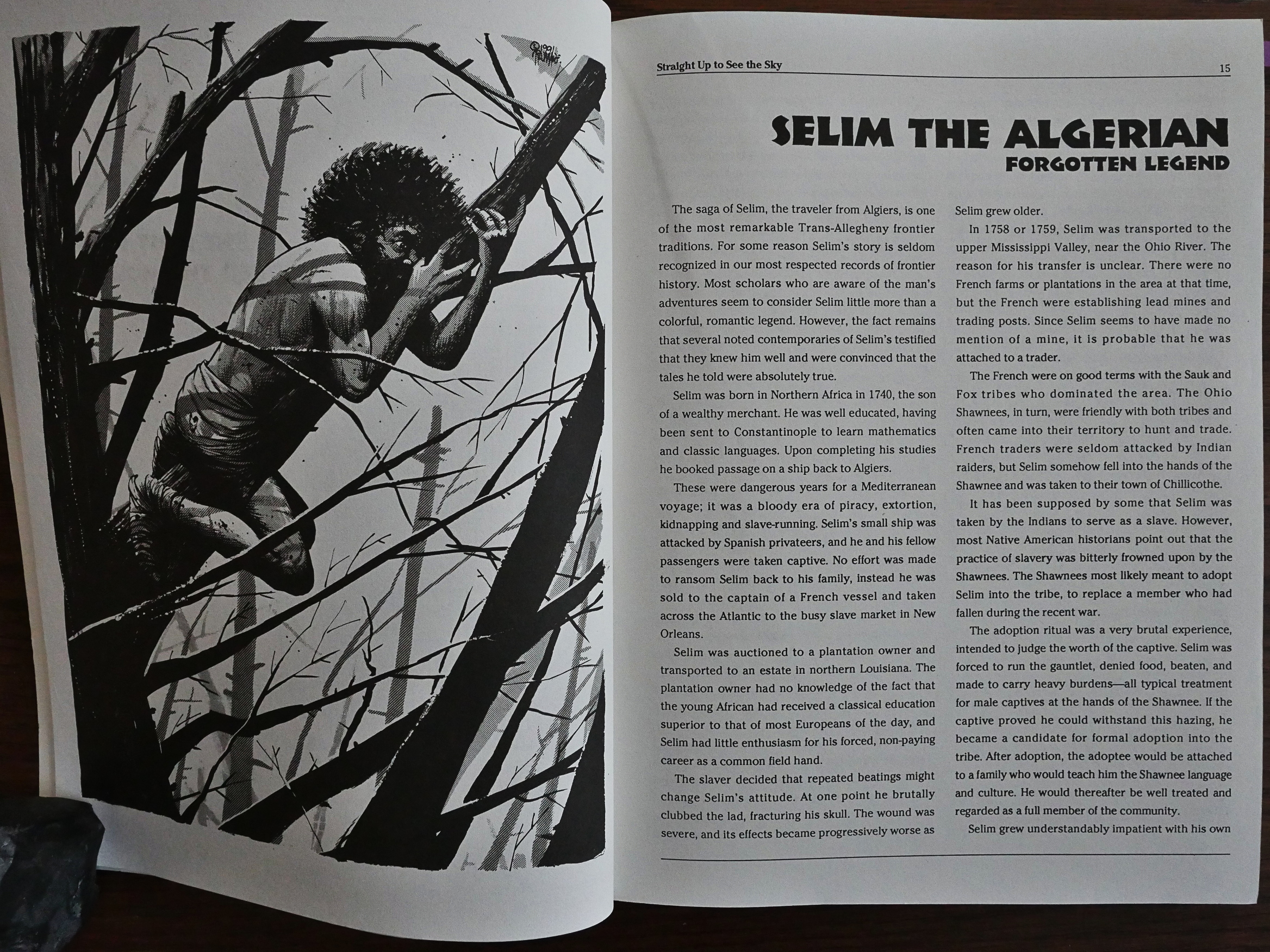
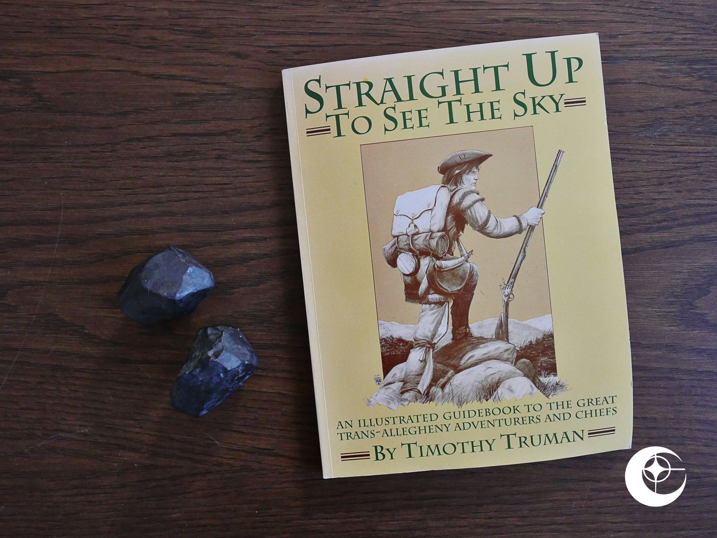
Straight Up to See the Sky (1991) by Timothy Truman.

There’s a lot of Timothy Truman in these twilight Eclipse years…

And I think he said in The Spider that he was reserving the “Four Winds” designation to his most personal works.

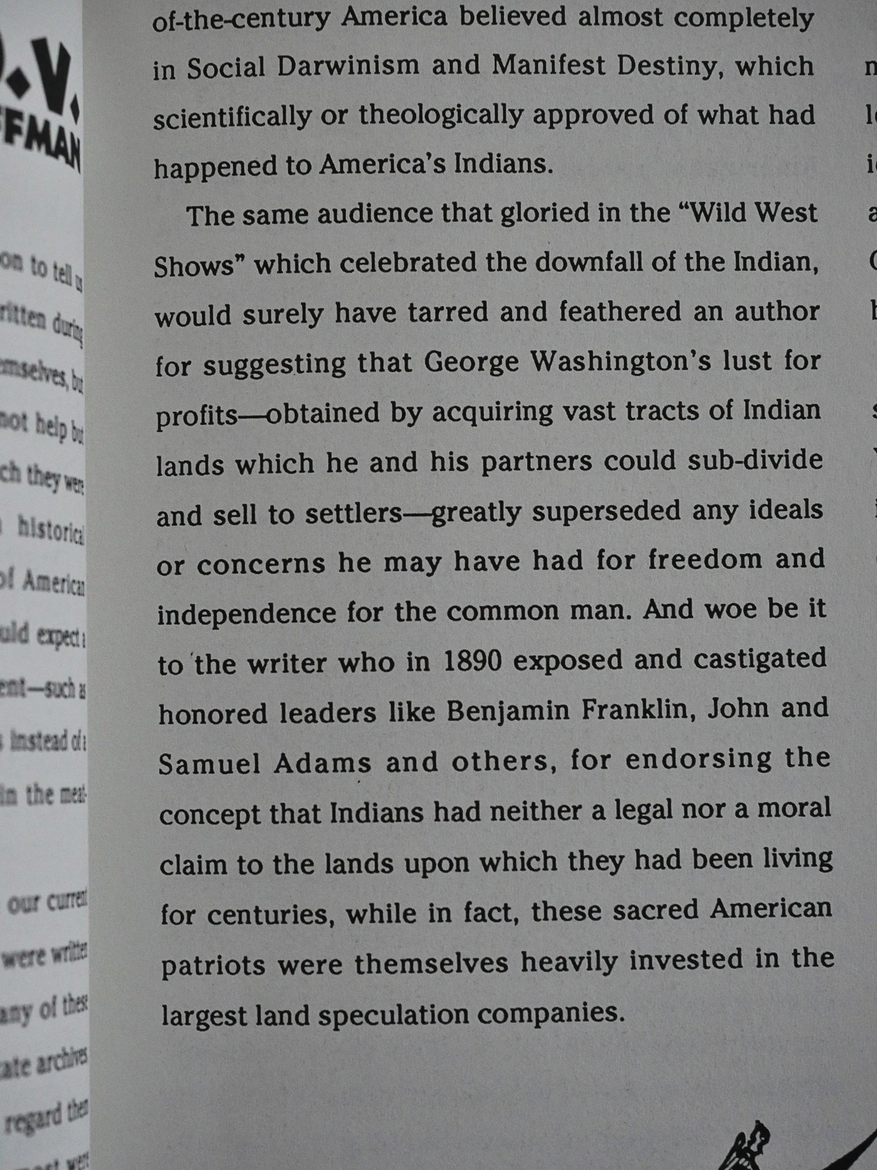
We start off with an introduction by Phillip W. Hoffman called “POV”, where he tells us that, perhaps, people like George Washington might have had other motives for what he did other than the pure goodness of his heart.

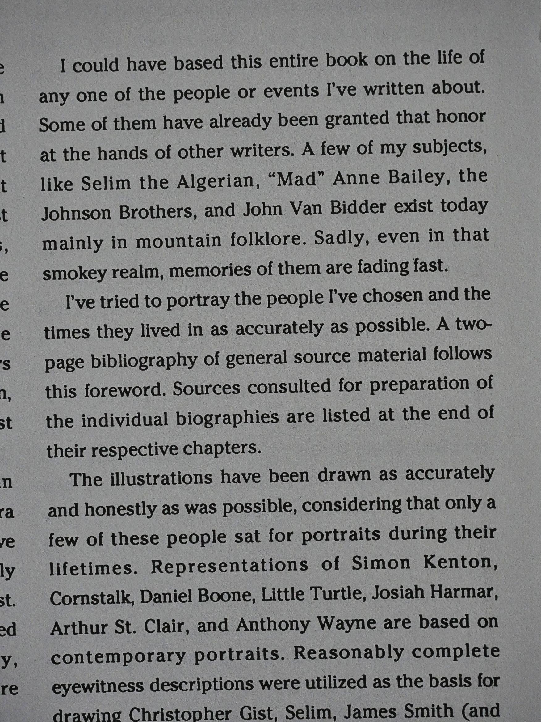
Truman explains what this book is: A series of portraits of a bunch people on the frontiers in the Allegheny area.

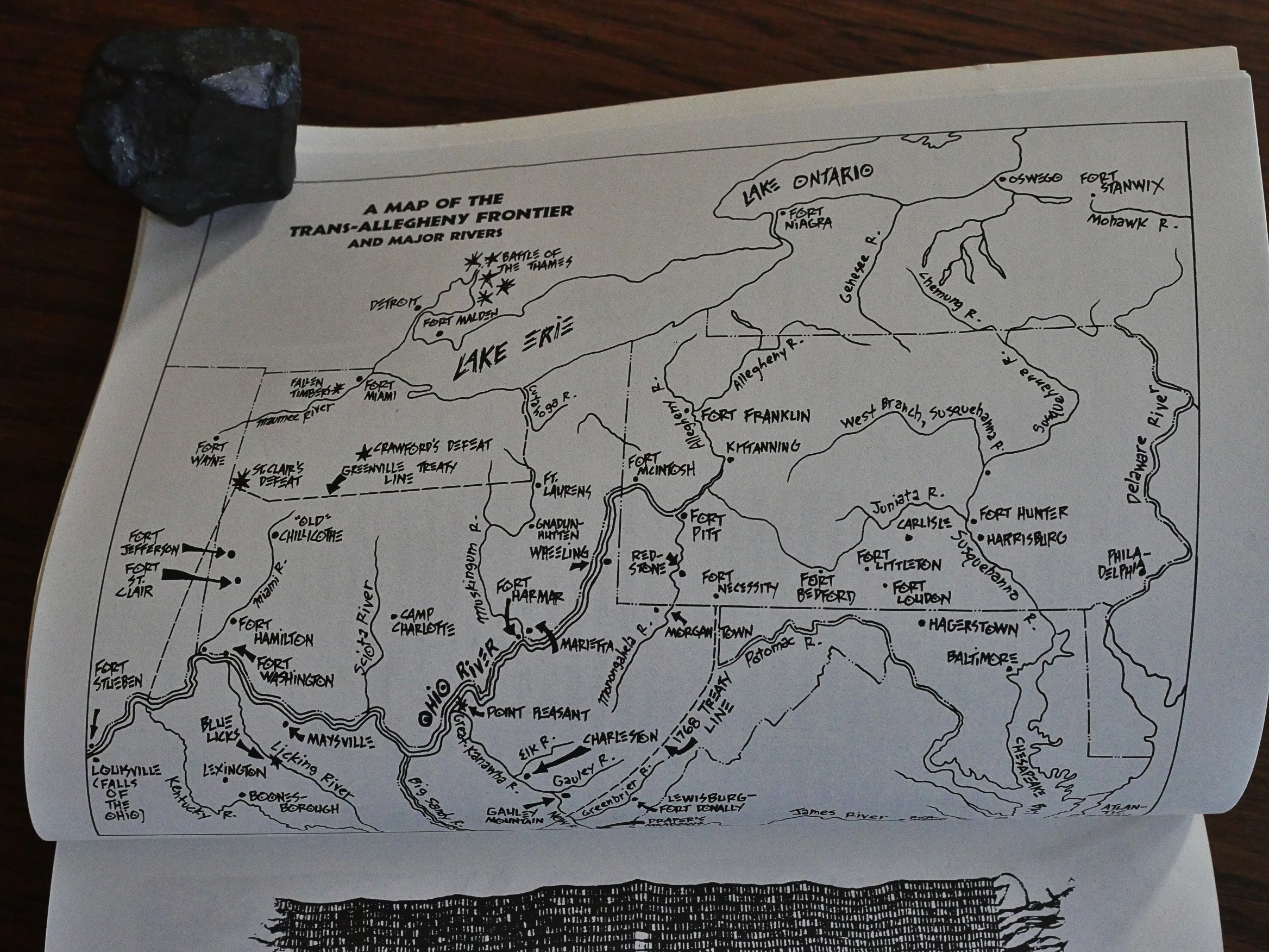
There’s even a map.

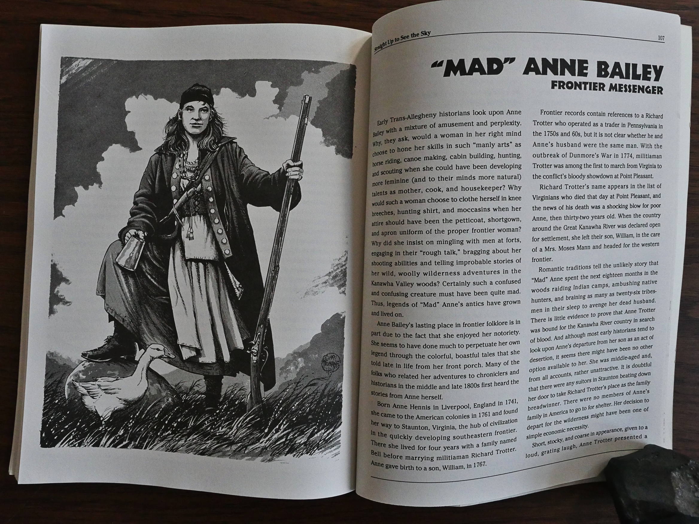
So we get about four to eight pages per person. One full-page drawing and then a text that tells you what they did.

Truman is obviously passionate about this project, and taken one by one, there’s absolutely nothing wrong with these… collections of extended anecdotes.

But being as uninterested as I am about this stuff, I didn’t find it much of a compelling read. At least not reading about one person after another after another. I mean, they’re all interesting characters, I guess, but…

The most befuddling thing is how little the textual description of the people doesn’t match up with the drawings. Anne Bailey here is supposed to be short, stocky, coarse in appearance, and usually wore breeches. That’s… not what that drawing seems to depict, is it?

A reviewer on Amazon really liked it:

I was thrown by how fantastic this book was. The illustrations, done by the author himself, were incredible. The stories themselves, were brought to life in a way that made you want to go back in time to learn more about the characters. Both the “good guys” and the “bad guys” were treated with the same degree of research to make those black and white lines become a lot greyer, and a lot clearer at the same time. It was truly inspiring. Having read The Leatherstocking Tales, which by the way, were a real Snore-fest, Mr. Truman treats the reality of those times with so MUCH more vigor than his predecessor in the art – a boring Mr. James Fennimore Cooper.

1991: Pandemonium

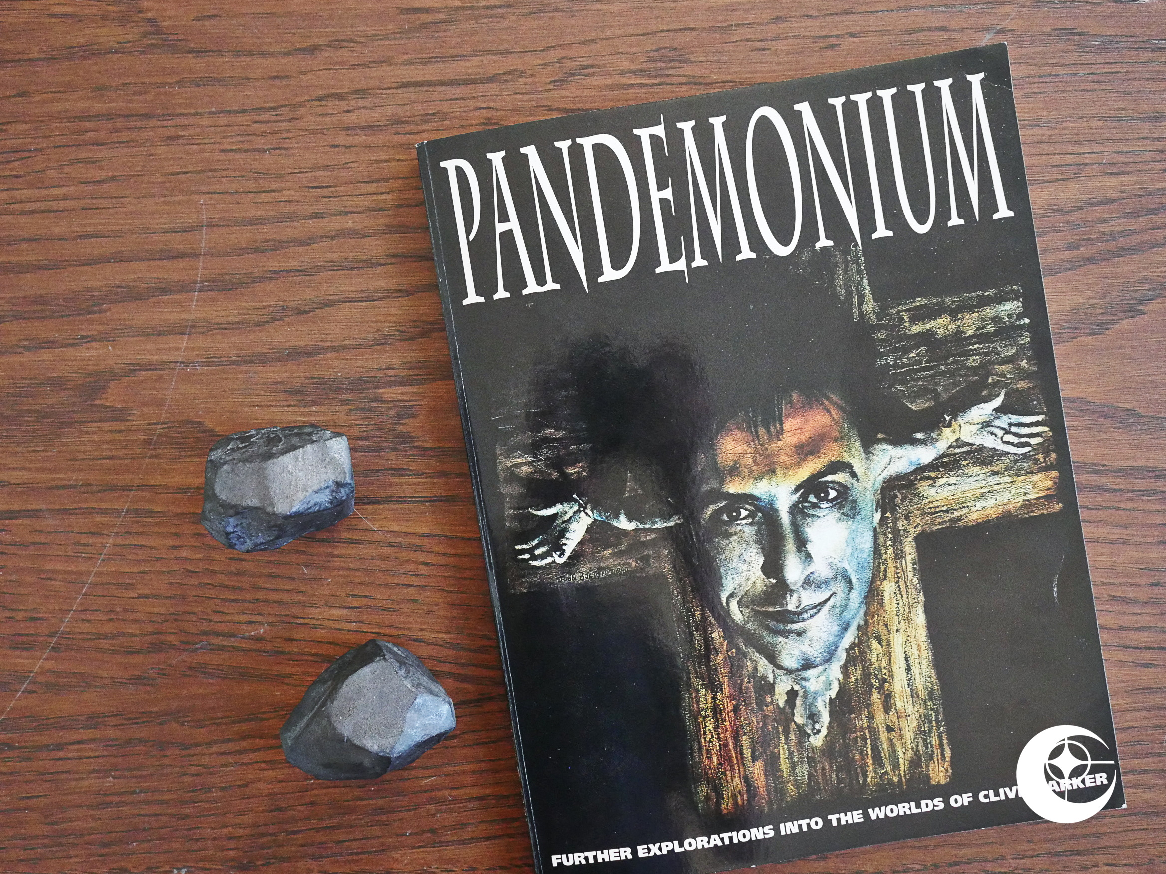
Pandemonium (1991) edited by Michael Brown.

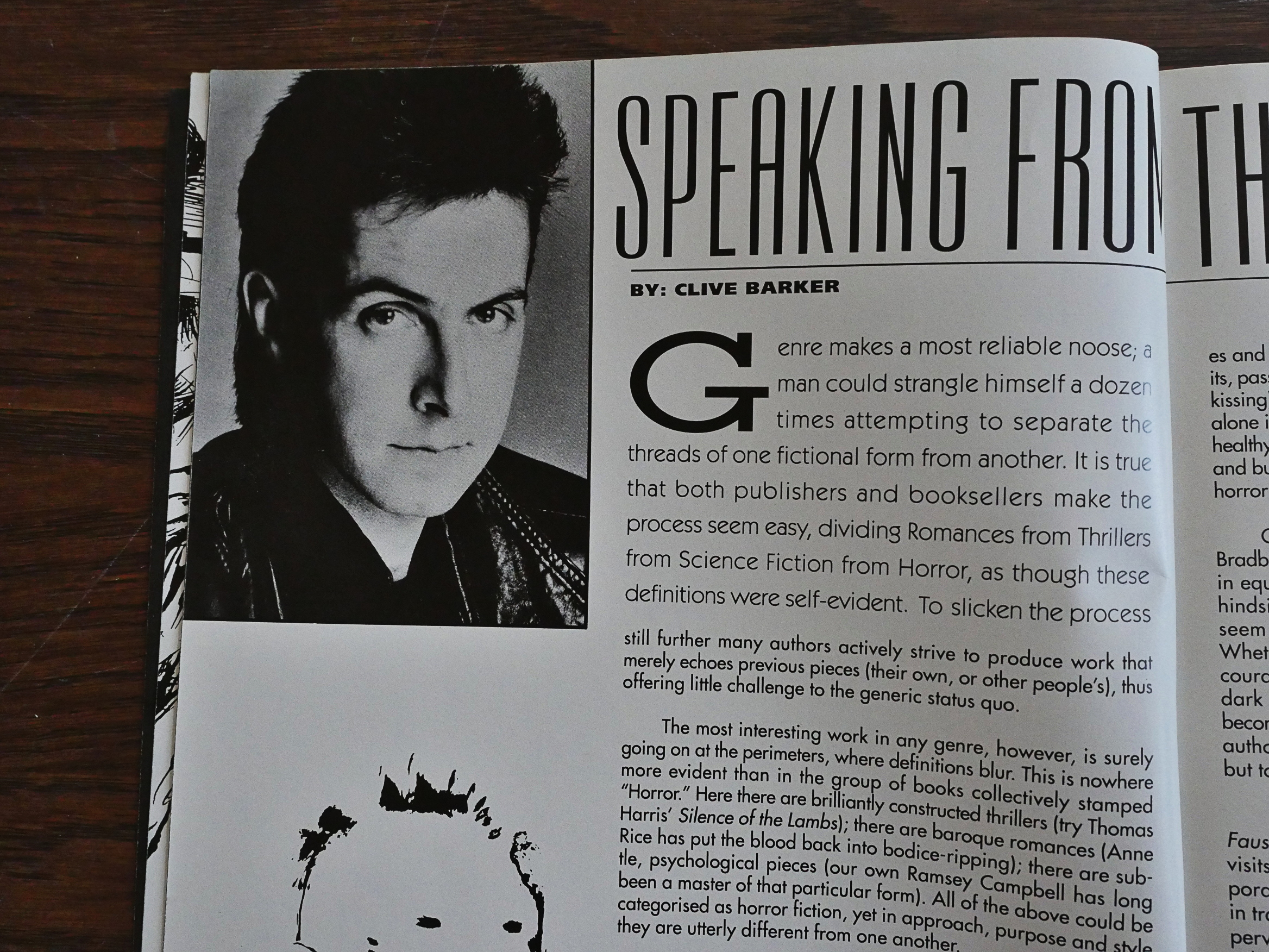
I enjoyed Clive Barker’s earlier, funnier work, but like most people, I lost track of him in the 90s after he went on to do… other… things.

This is from 1991, though, and most of the things he’d made so far had been successes. He was reeling from the failure of the Nightbreed movie, which is alluded to several times, but whatever happened (did the studio take away control from him or something?), it’s not made explicit.

But other than that, he’s still in his golden period here, before the Hellraiser series went into freefall with ever-more cheaply made films. How many are there now? Ten? With the last five going straight to DVD? Something like that.

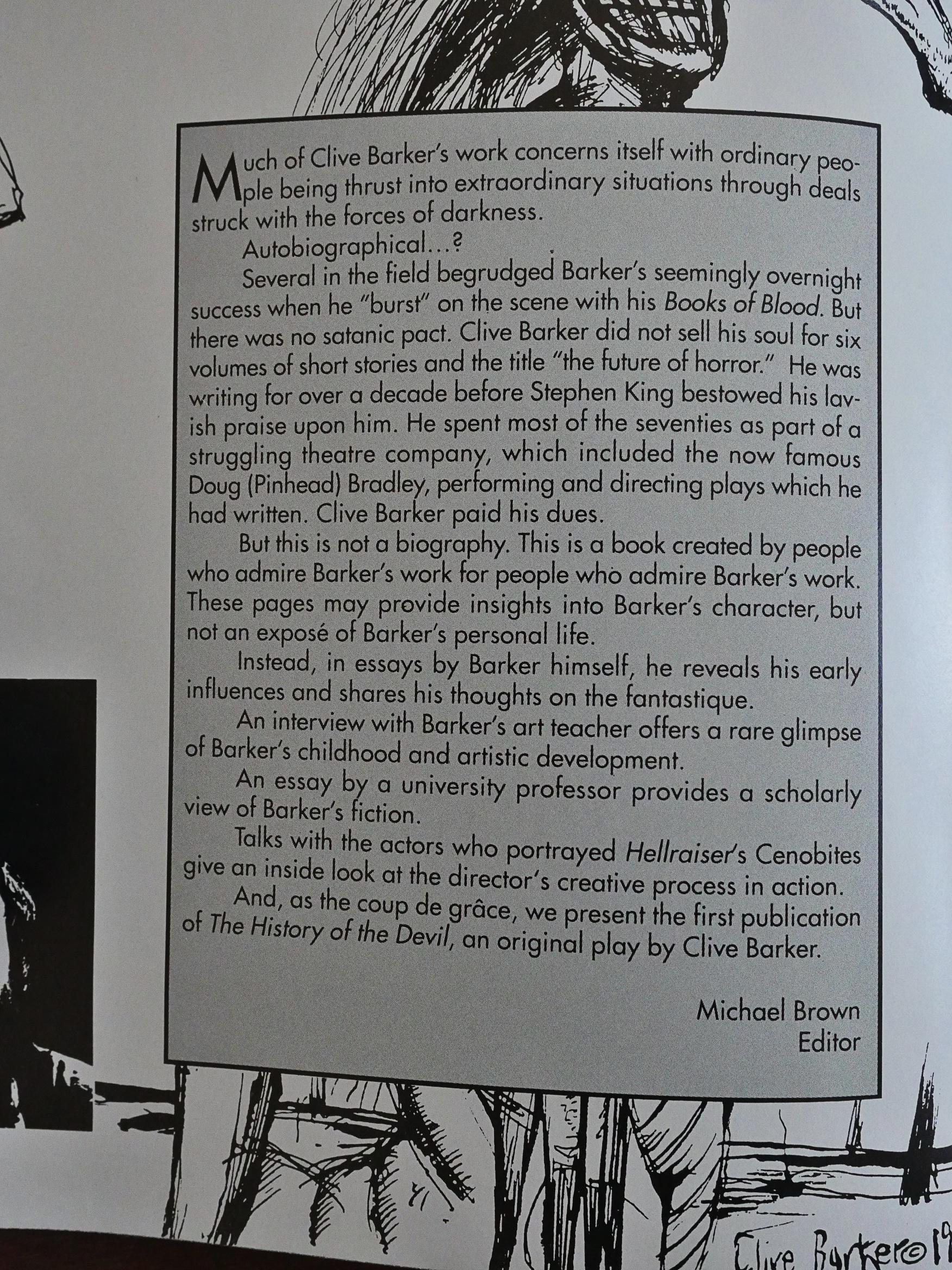
This is not a very focused book. It’s basically a grab bag of everything Barker, so we get an essay or two from Barker himself, where he, as usual, bitches about being pegged as a genre writer.

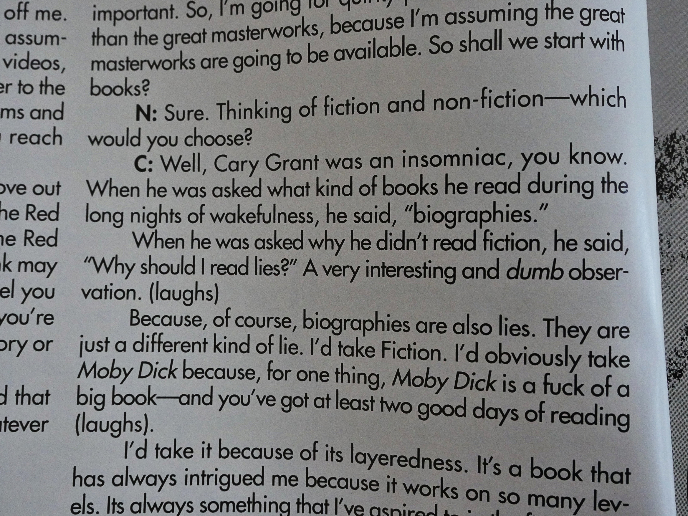
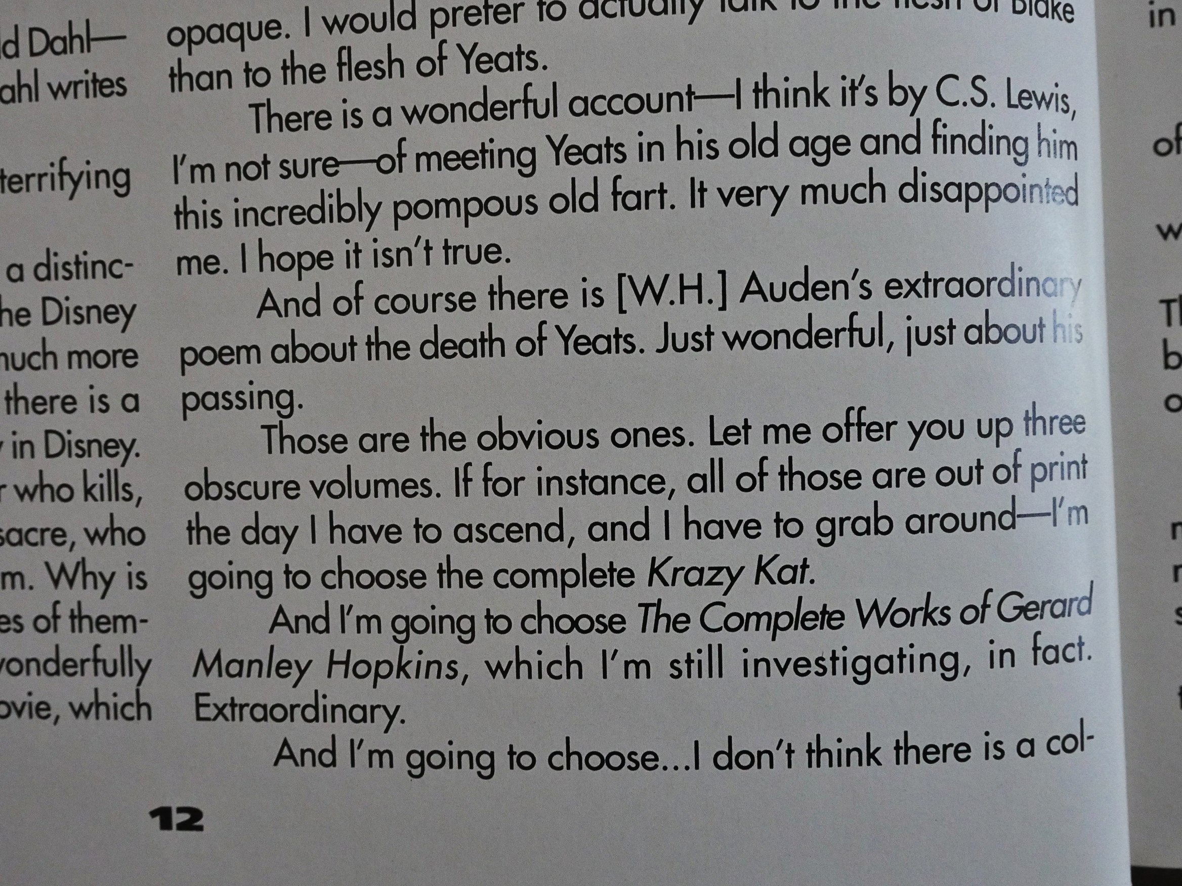
Then an interview with Barker, where he makes deep and insightful comments about Cary Grant in the middle of an extended “what would you bring to a desert island I mean heaven” thing.

Which it’s a kind of boring list of books and stuff, he does list Krazy Kat, so he’s got that going for him.

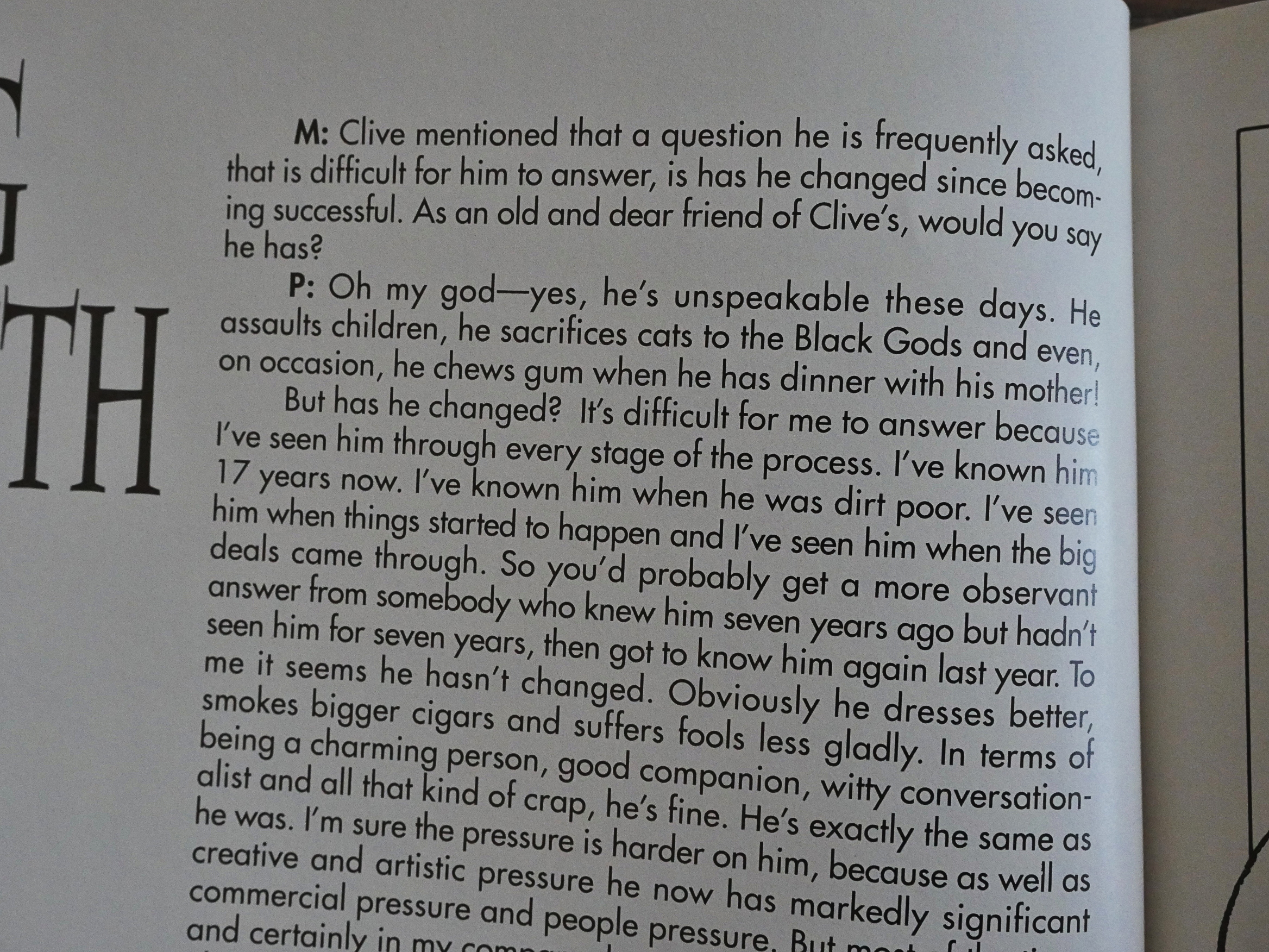
Then we get interviews with several people he’s worked with…

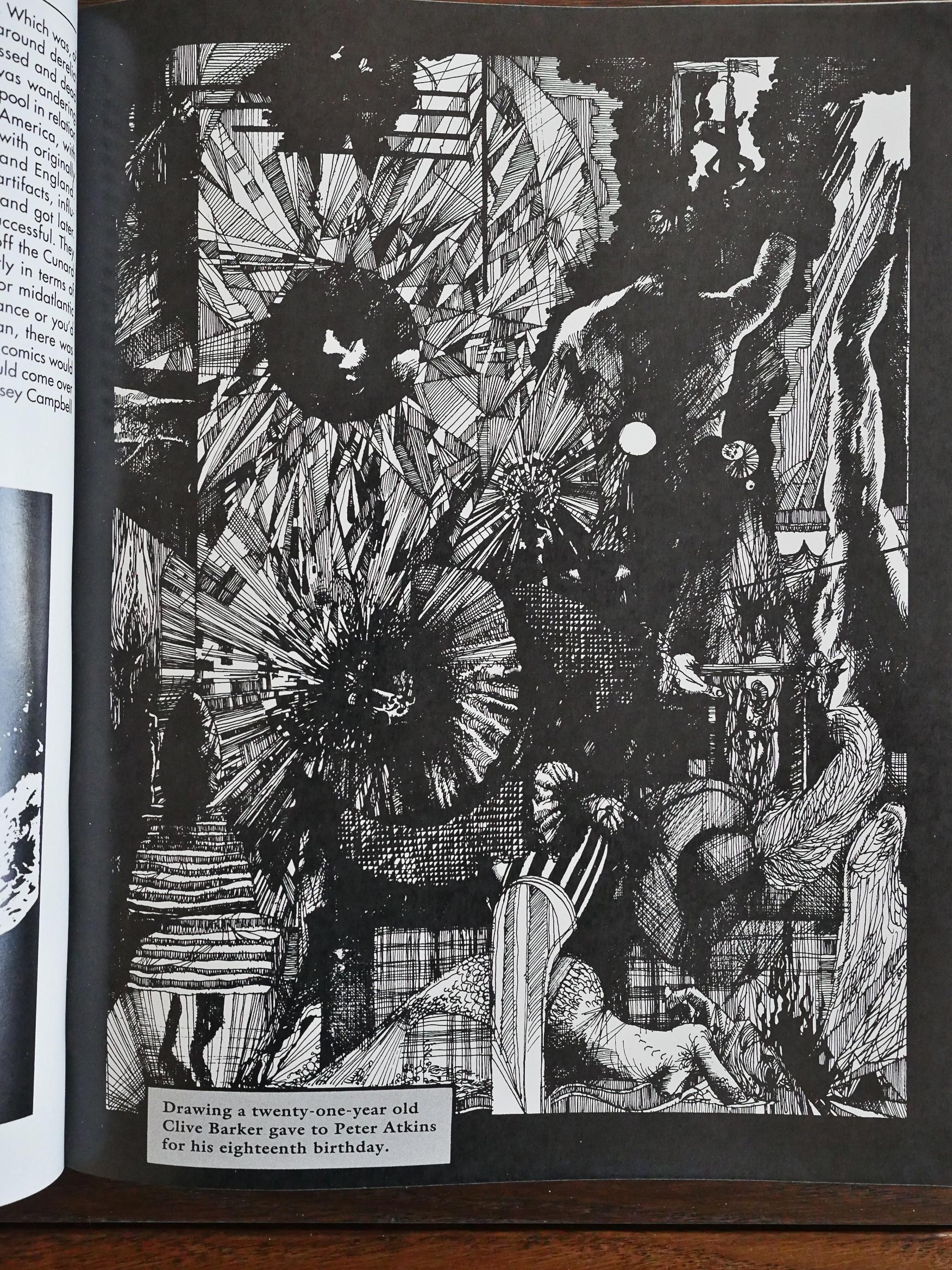
… old and new artwork…

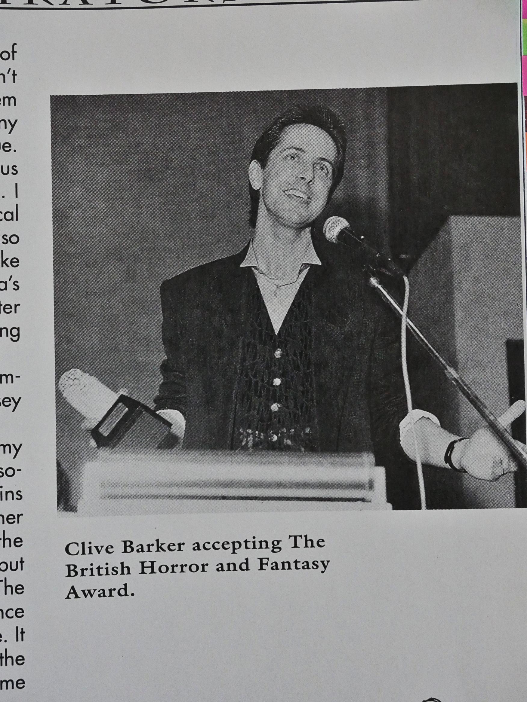
… really flattering photos…

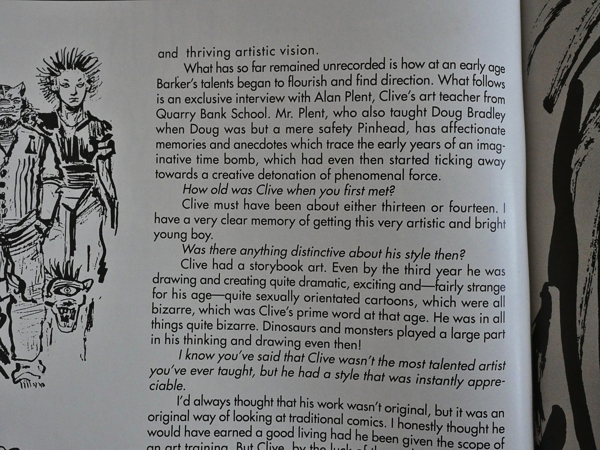
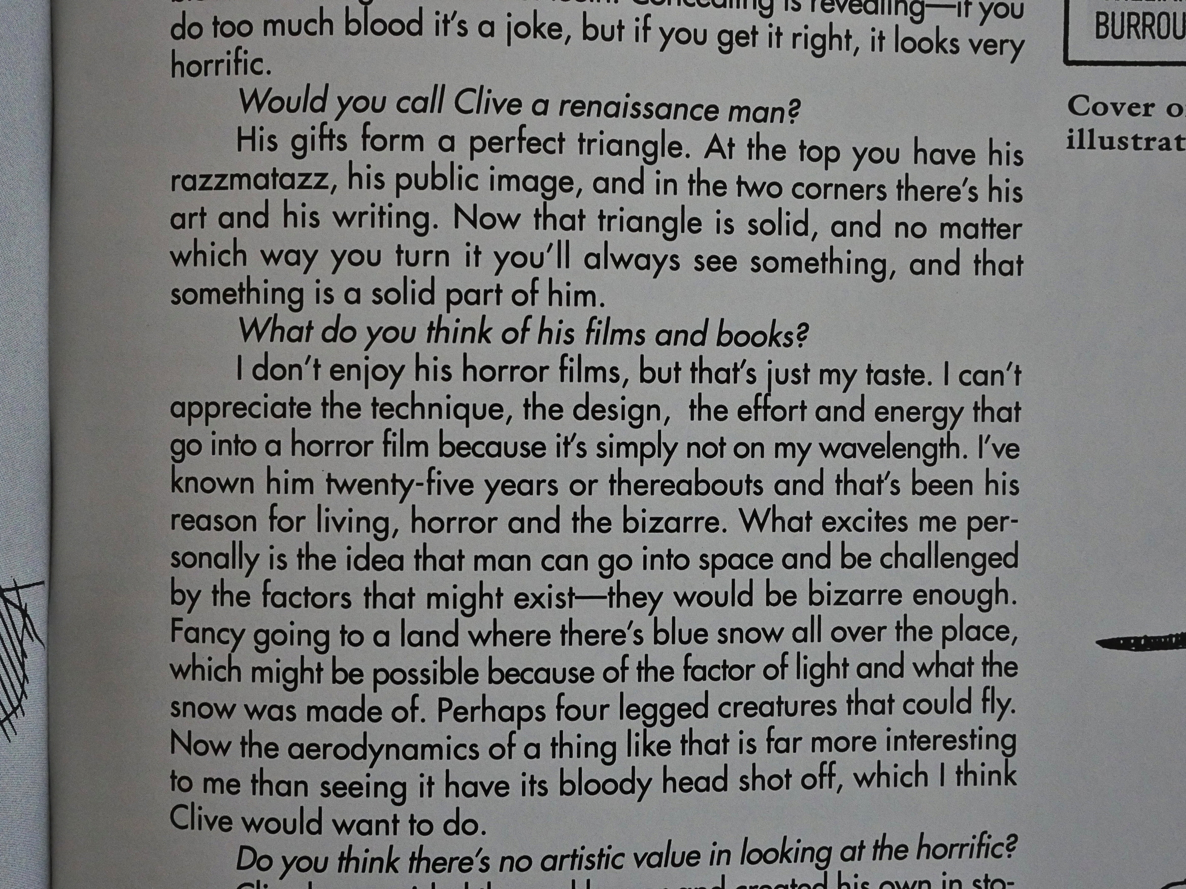
… and an interview with his teacher, who is amazingly forthright about Barker for a book like this.

He seems to think that Barker has a very one track mind.

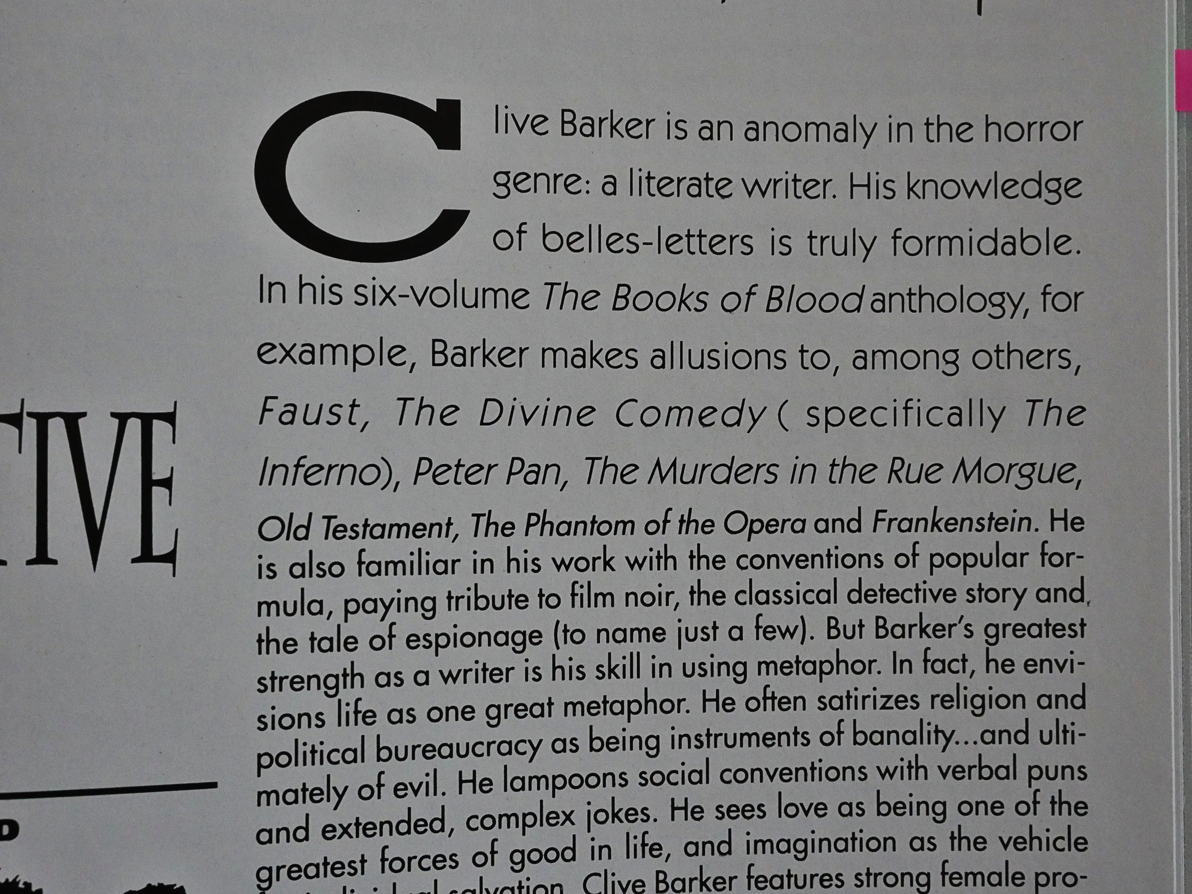
Then we get an analysis of Barker, and it turns out that he’s so great because he’s “a literate writer” making allusions to Faust, The Inferno, Peter Pan, The Murders in the Rue Morgue, Old Testament (!), The Phantom of the Opera and Frankenstein.

So literate! How can it be!

The thing about this book is… before reading it, I knew nothing about Barker. I assumed that he had to be a pretty cool guy, because he wrote some books that I liked when I was a teenager. The impression I have after reading it that Barker is totes jejune. At every point, the book points him as being kinda dull and not very well-read.

Ok, back to the contents… Eclipse! That’s the subject of this blog series, remember?

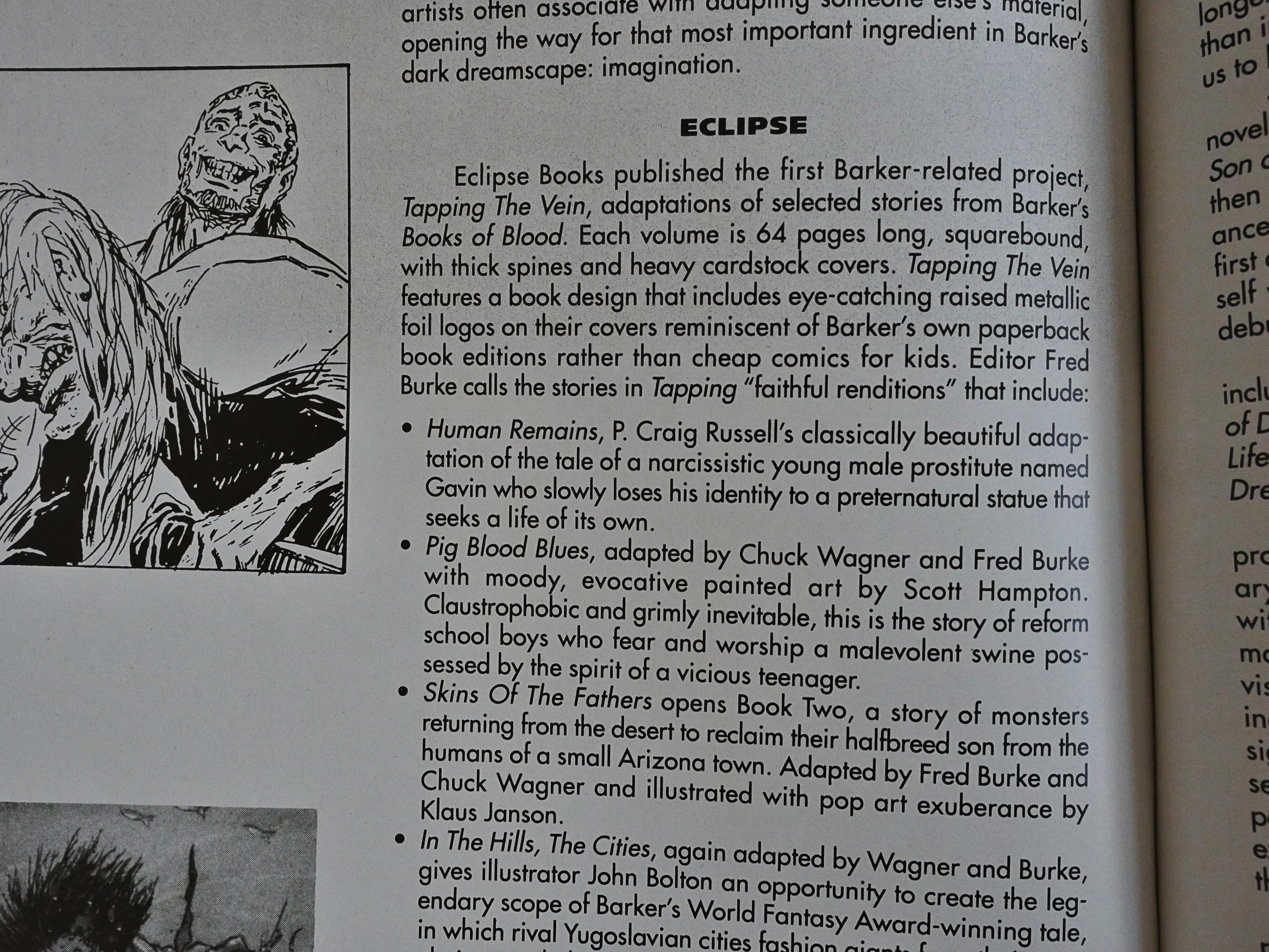
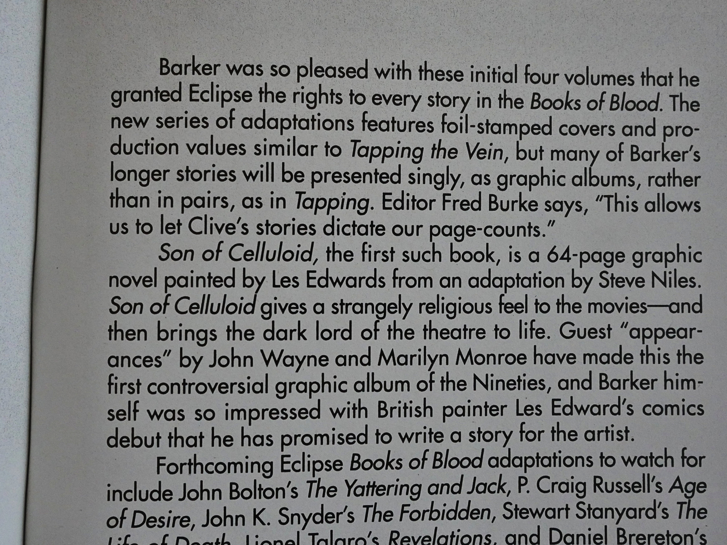
We’re informed that Barker was pleased with the Tapping the Vein series, so he gave Eclipse the rights to all the short stories in his Books of Blood, which is nice of him. Eclipse published six of these, which I’ll cover later in this blog series, because… I bought the first one, Son of Celluloid, from somebody on ebay, and it apparently got lost in the mail or something.

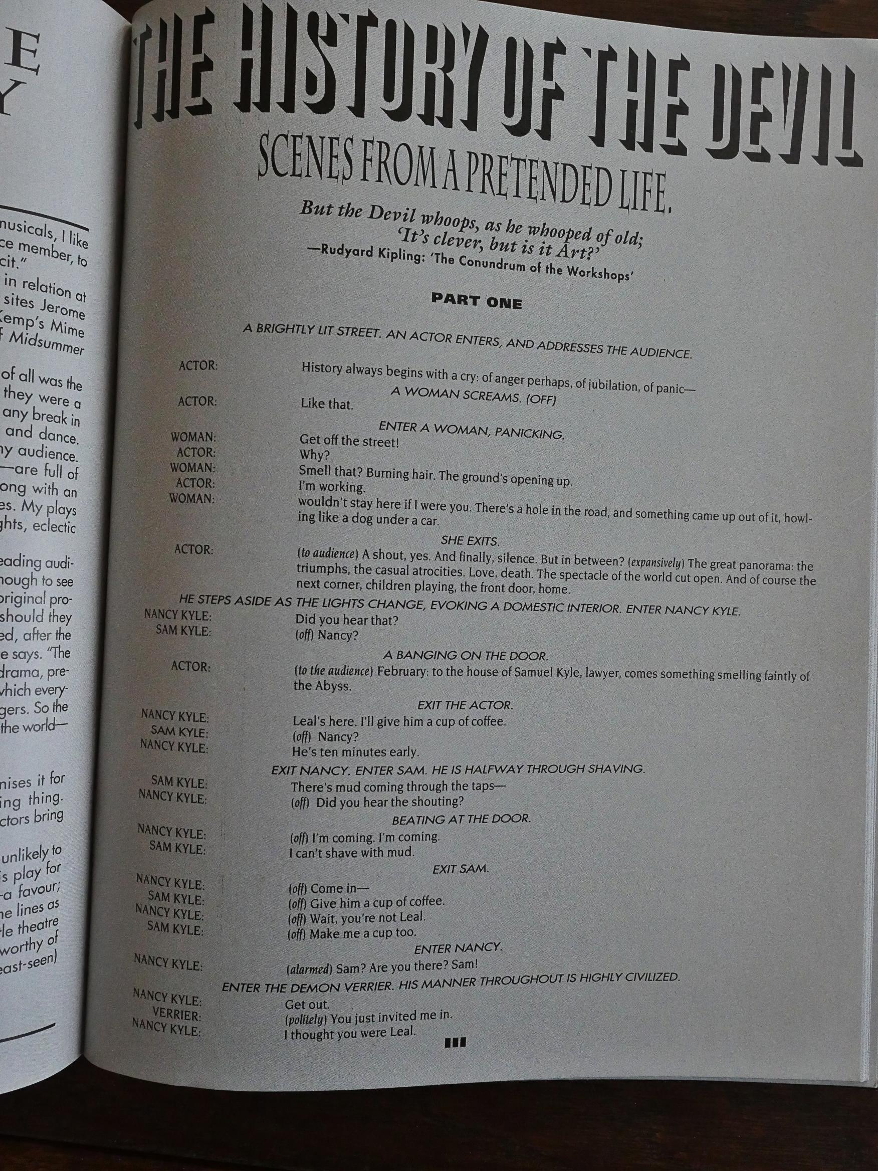
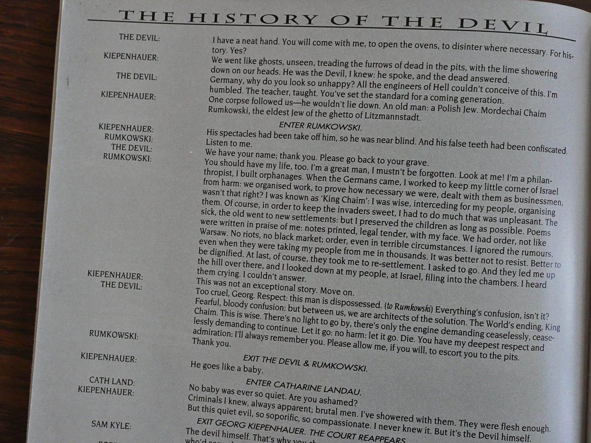
Finally, the last section of the book: The History of the Devil: Scenes From a Pretended Life, the manuscript for a theatre production.

So many fonts! The editor must enjoy playing around in InDesign or whatever was popular in 1991…

The play is one of those terribly witty British things where there are approx nine thousand characters that run around and pop on stage to deliver a devastating bon mot or two before exeunting again. “I beg your pardon?” “By all means beg it.” You see, he’s a demon.

It’s tedious as fuck.

Unless I miss something, we’re not actually told whether this play was ever staged, or when, or how long it ran. I think it probably ran… for three seemingly interminable hours.

It’s about the Devil being put to trial and it has an oh-so clever twist ending because of course it has.

I was snidely going to say “yeah right”, but it’s apparently been staged more than onceand the sci-fi channel made an audiobook out of it.

Here’s somebody who knows something about this book:

This glossy assembly of articles and interviews grew out of Michael Brown’s Dread newsletters and, after initial plans to produce the book with HarperCollins foundered, Eclipse became home for what was planned as the first in a series of ‘further explorations into the worlds of Clive Barker’ (a tagline that seemed oddly reminiscent of Coenobium’s ‘explorations in the further regions of Hellraiser…’).

There you go.

1991: One Mile Up

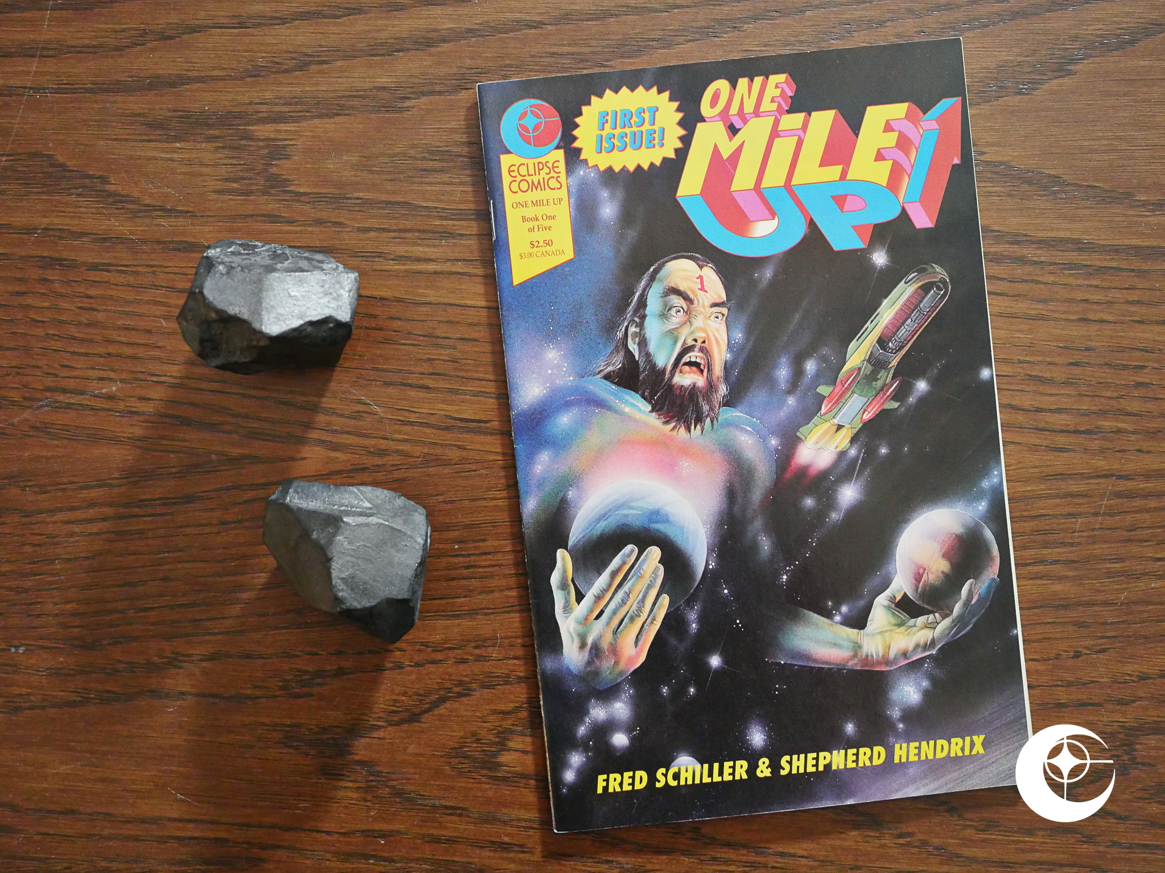
One Mile Up (1991) #1 by Fred Schiller and Shepherd Hendrix.

The in-house Eclipse ads touted this as being something for fans of Japanese comics.

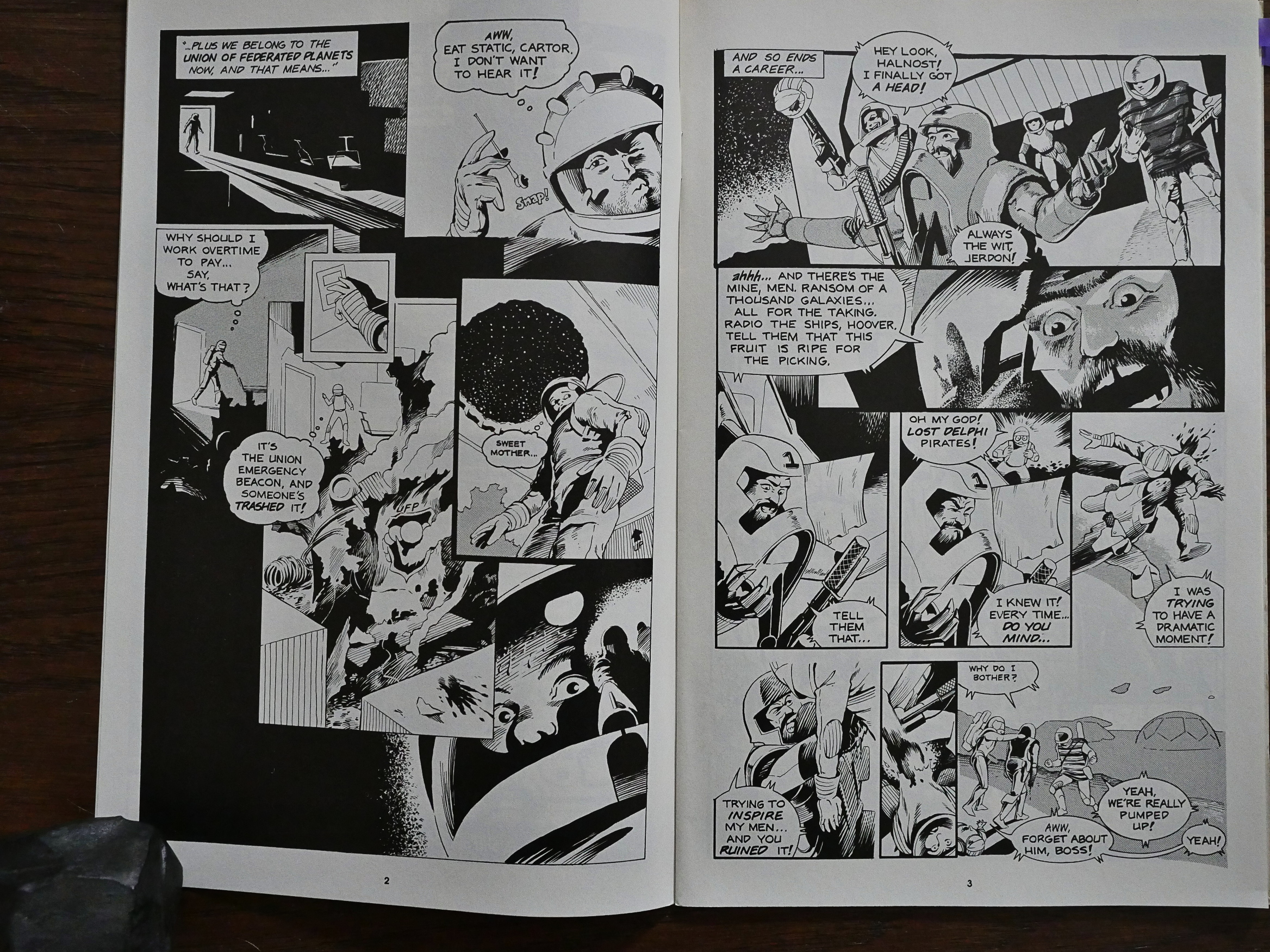
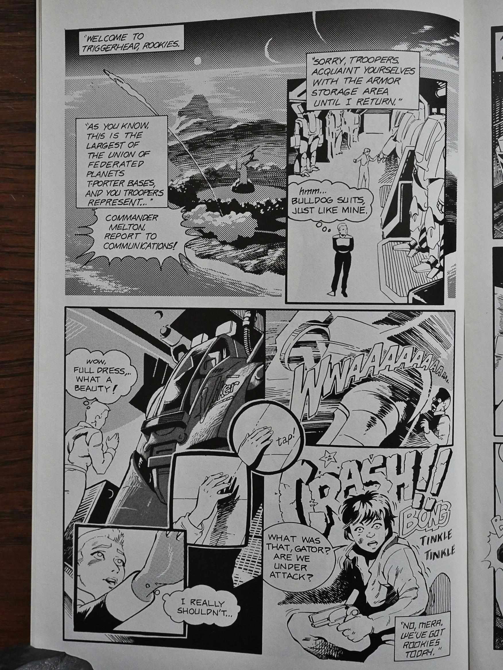
And while the figures and artwork doesn’t really look very Japanese, there’s something about the layouts and the way the action happens (i.e., everything at the same time for maximum confusion and excitement) that suggests that the writer has been reading lots of Japanese children’s comics.

However, if you’re going to pull that shit off, you have to know the tricks, and these people don’t. Most of the pages verge on the unreadable and you have to backtrack to get what you missed to be able to interpret just the hell what’s going on. And for a reader to have that patience, there has to be something worth it in the story, and…

There almost is. It’s a pretty standard sci fi soldier setup, but it’s got charm. I feel that if they’d given the story a bit more room to breathe, this could have been a pretty fun read. I particularly liked the bar scene. It was almost coherent.

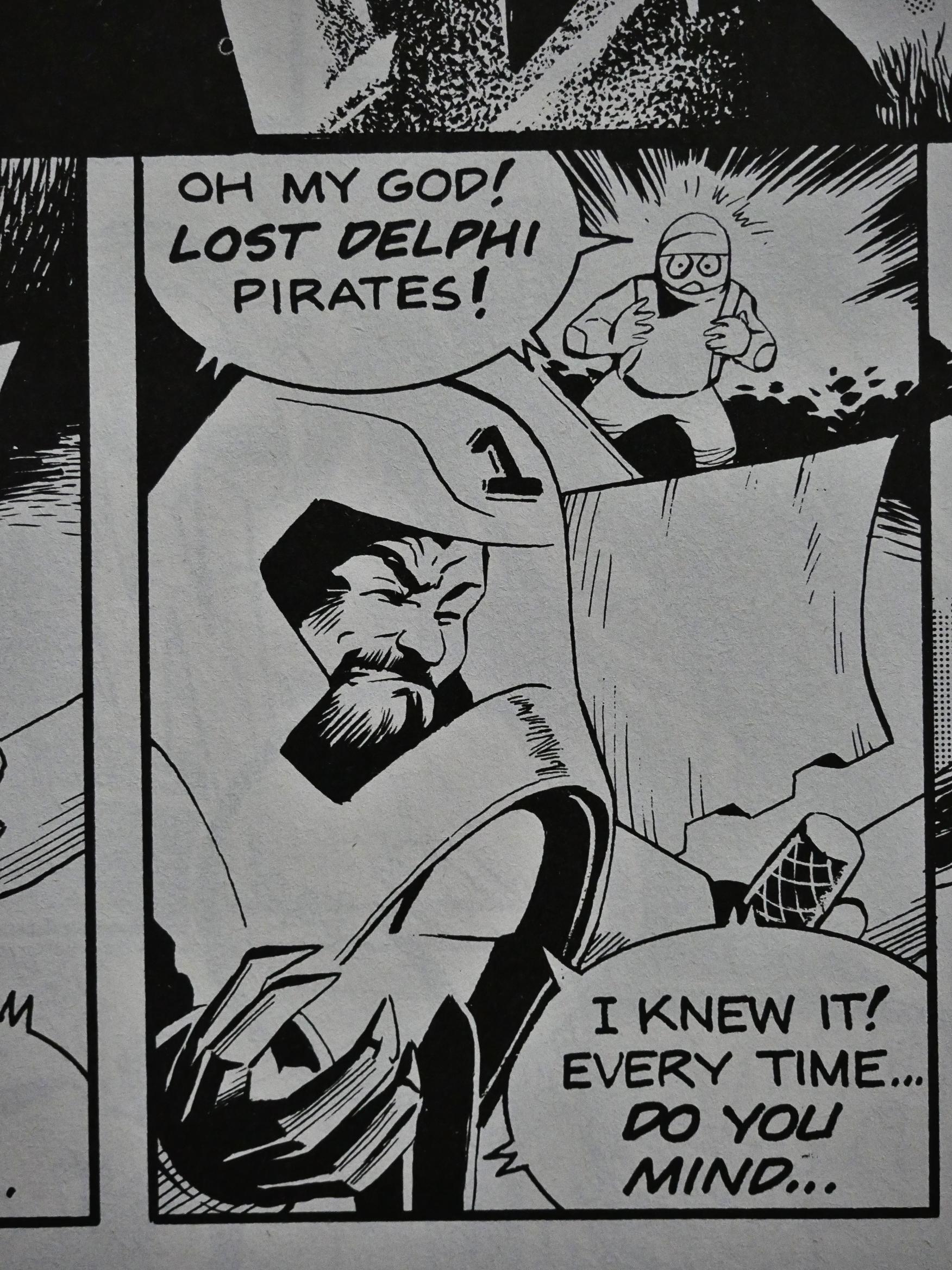
Ah, there’s the Japanese. Going into slightly super deformed mode when surprising things happen.

I know it’s meant to be funny, but having gundam suits that fall over when you tap them isn’t good engineering. I mean, it’s a badly engineered joke.

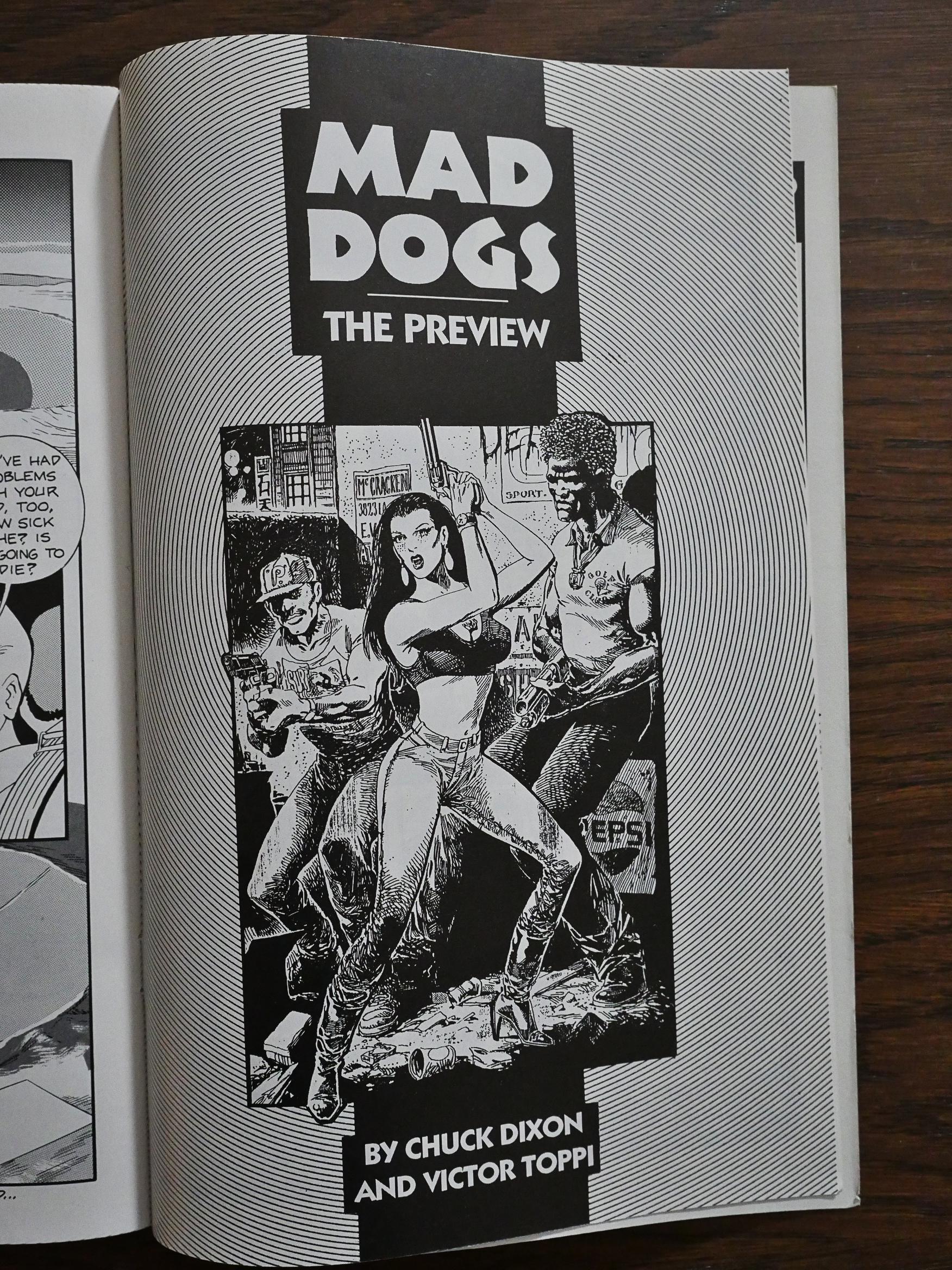
And then we get a preview for Mad Dogs, which we’ll cover later.

This was a projected five part series, but only one issue was published.

I haven’t read any of the comics Eclipse published over the next couple of years, but looking at the list, it’s like we’re back to 1986 with parody comics and cheap black and white comics from not very famous creators dominating. Eclipse had huge money problems at the time, which explains why they’re trying to get some cheap stuff out there, and I guess this is the first comic in that wave.

The story was never picked up by any other publisher, and nobody was much impressed:

You’ve got neophyte mecha-jockeys waging brutal war versus cartoony Bad Guys against a backdrop of intergalactic political conspiracies and the requisite lashings of personal melodrama and an adequate facimile of the boilerplate manga art style.

One Mile Up gives the impression of being a labor of love crafted by a pair of dedicate fans, and therein lies its fatal flaw. While it’s clear that the creators really, really cared about paying homage to the source material, they tragically forgot to give the audience its own reason to give a shit.

1989: Point Blank

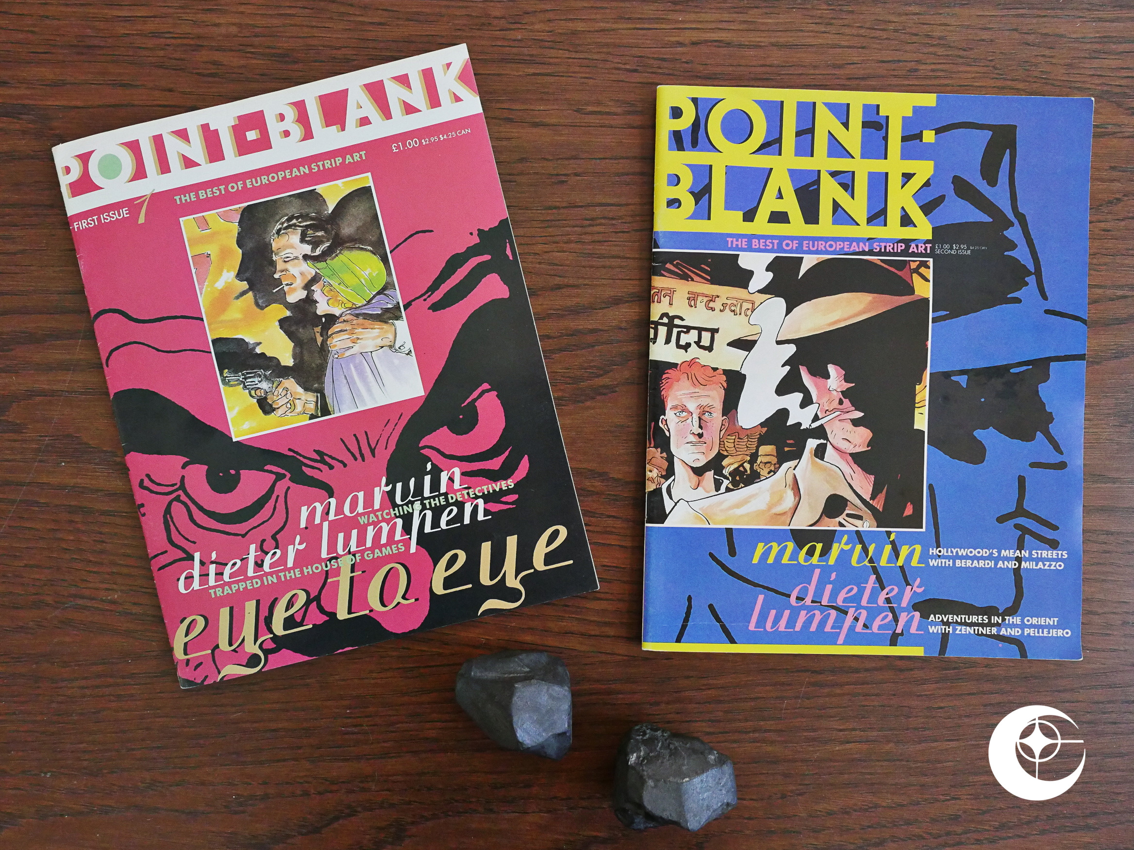
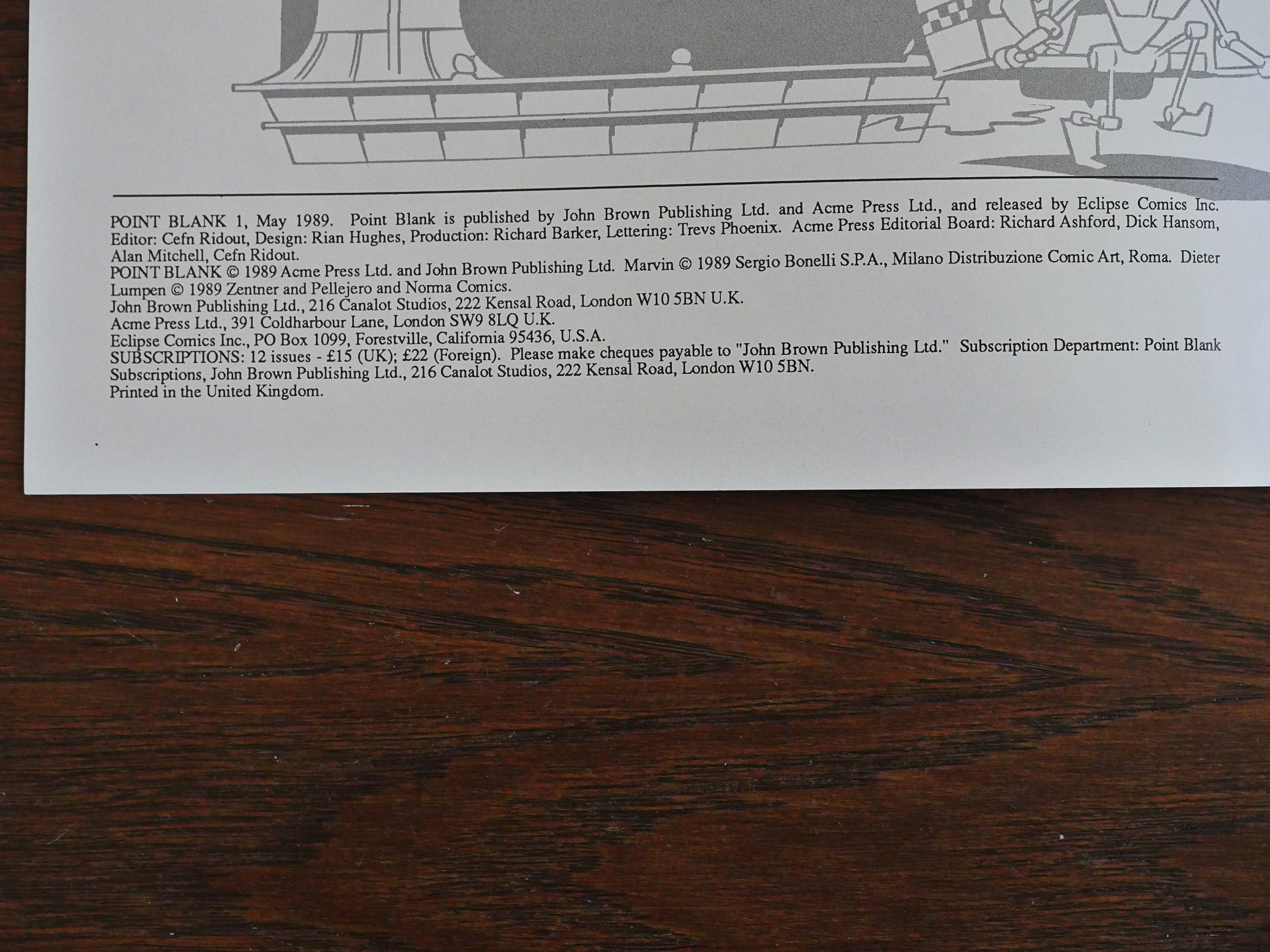
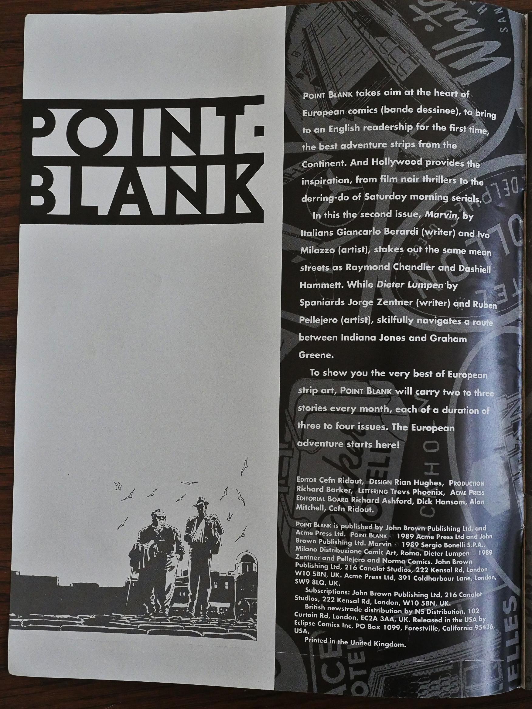
Point Blank (1989) #1-2 edited by Cefn Ridout.

This anthology looks extremely similar to the Aces anthology Eclipse and Acme were co-publishing the year before.

And as usual with these Acme books, it says that it’s “released” by Eclipse Comics… But now there’s also John Brown Publishing in the mix. Is that why they relaunched under another name? “Point-Blank” doesn’t really seem like a more compelling name than “Aces”, really…

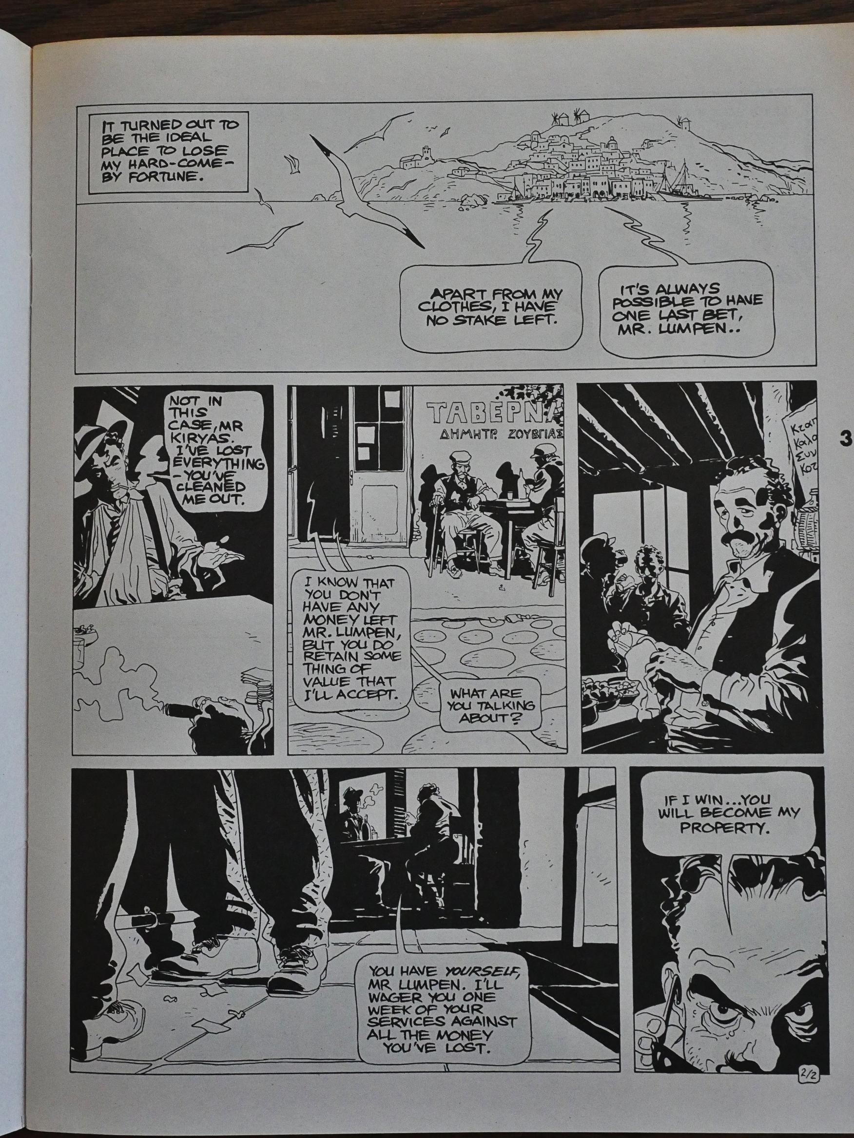
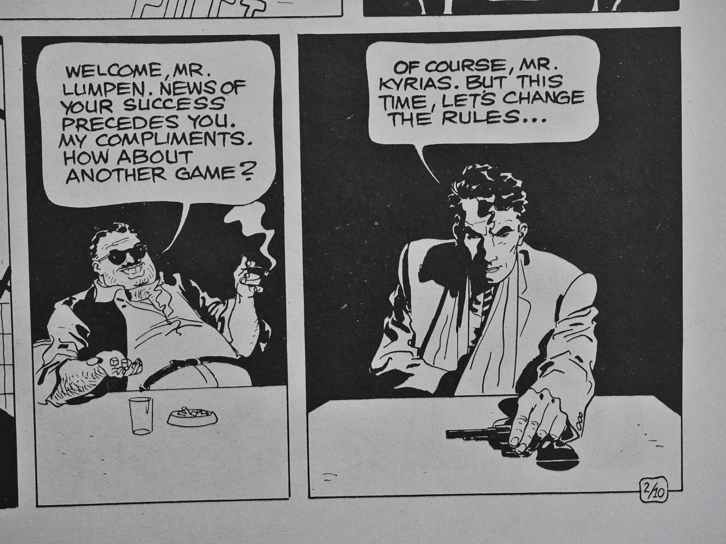
Point-Blank even carries one of the serials over from Aces: Dieter Lumpen by Jorge Zentner and Ruben Pellejero. Dieter Lumpen is the action/adventure strip that everybody tried to make happen, but it’s never going to. You’d see it pop up in basically all European anthologies at one point or another, and then disappear again.

It’s easy to see why the editors give it a try, because Pellejero’s artwork is 100% Hugo Pratt. But while Corto Maltese has wit and charm (so much charm), the Dieter Lumpen stories are tedious and contrived.

When they decided to continue Corto Maltese after Pratt’s death, Pellejero was chosen as the artist. Like, duh. And his artwork is impeccable in those Corto Maltese stories on a panel-by-panel, but they’re even more boring than Dieter Lumpen. I don’t think I managed to make it all the way through the first album, even after trying for weeks…

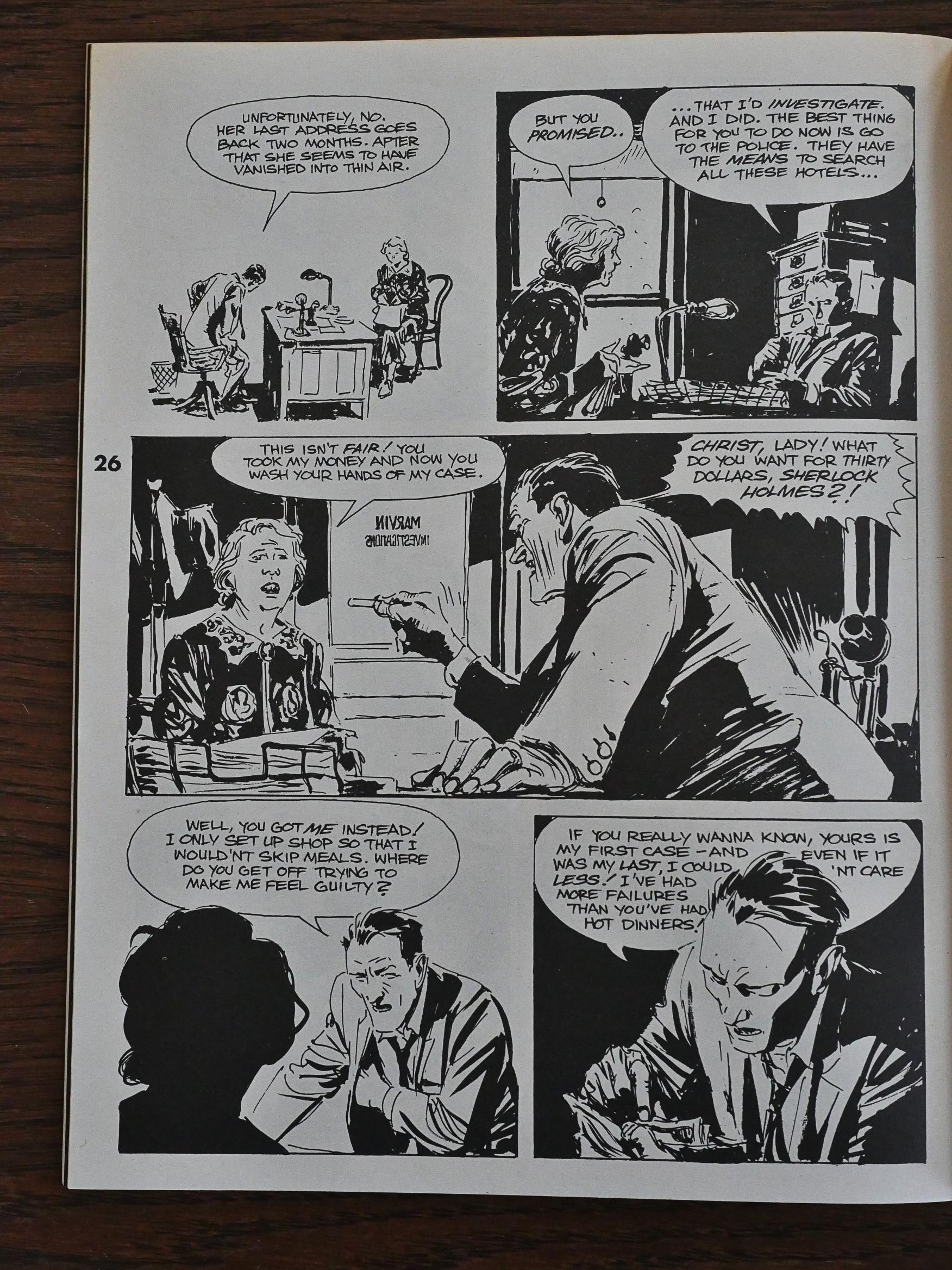
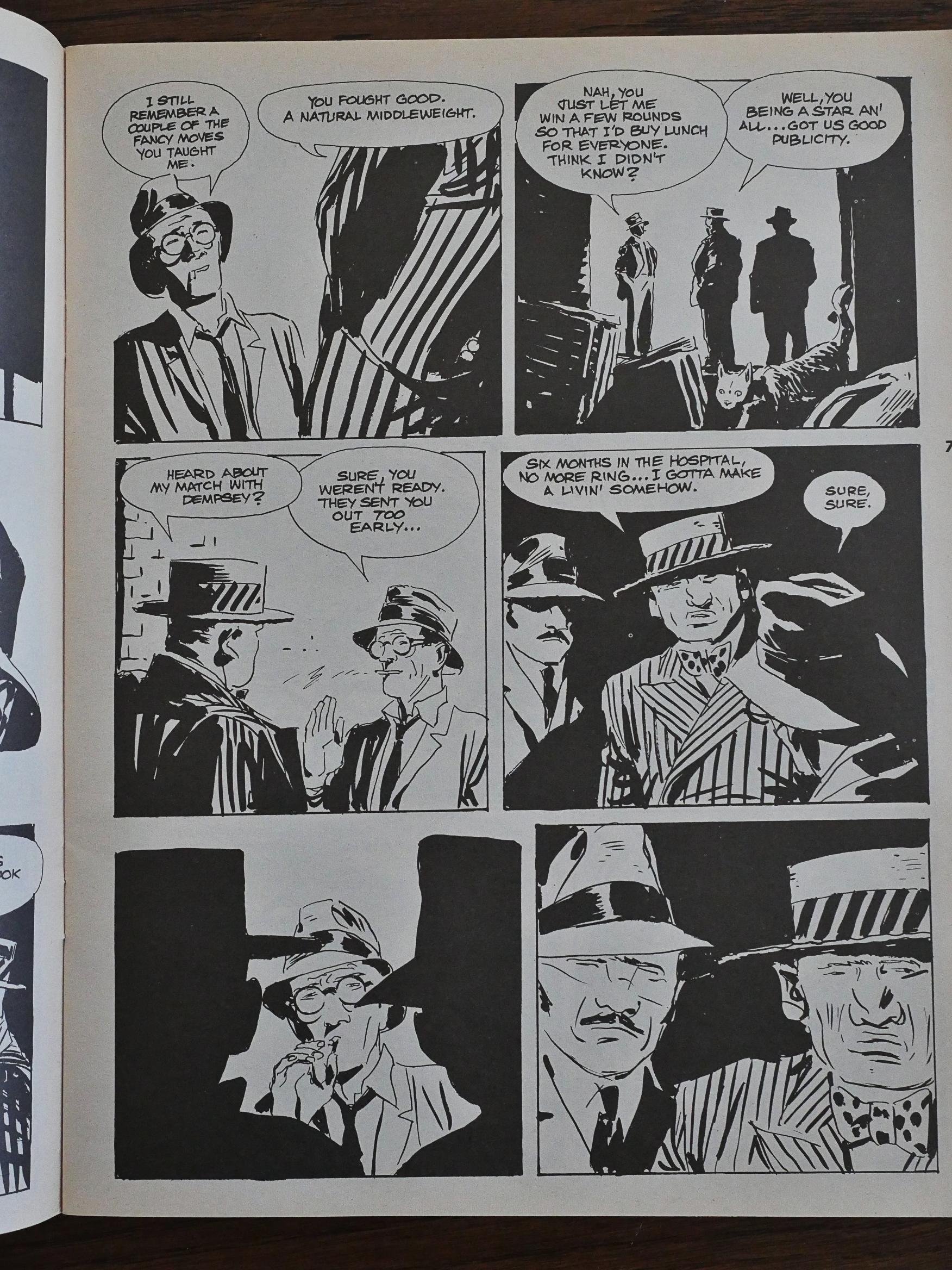
The other serial here is Marvin (!) by Giancarlo Berardi and Ivo Milazzo. The artwork is much sketchier than Pellejero’s, and isn’t er totally devoid on influence either, but it’s a pretty entertaining noir mystery they’re setting up.

Impressive storytelling, too. I love how Marvin slowly realises what his old friend is there to do (i.e., beat him up), and how they then don’t show that violence but cuts to a flashback to Marvin in the Great War.

It’s a shame that they only managed to publish two issues of Point-Blank before cancelling it, because I was getting kinda interested in the Marvin serial (which was left unfinished).

Hm… I see that in the second issue, Eclipse isn’t mentioned at all, so they’d already pulled out?

And after googling for this magazine for a few minutes, I can find out nothing about John Brown’s relationship with it, or why it was cancelled. But it was probably just low sales? European action anthologies are a difficult thing to sell in the UK.

1991: Five Clive Barker Adaptations

Son of Celluloid (1991), Revelations (1991), Dread (1992), The Yattering and Jack (1991), The Life of Death (1993) by Steve Niles and Fred Burke et al. adapted from short stories by Clive Barker.
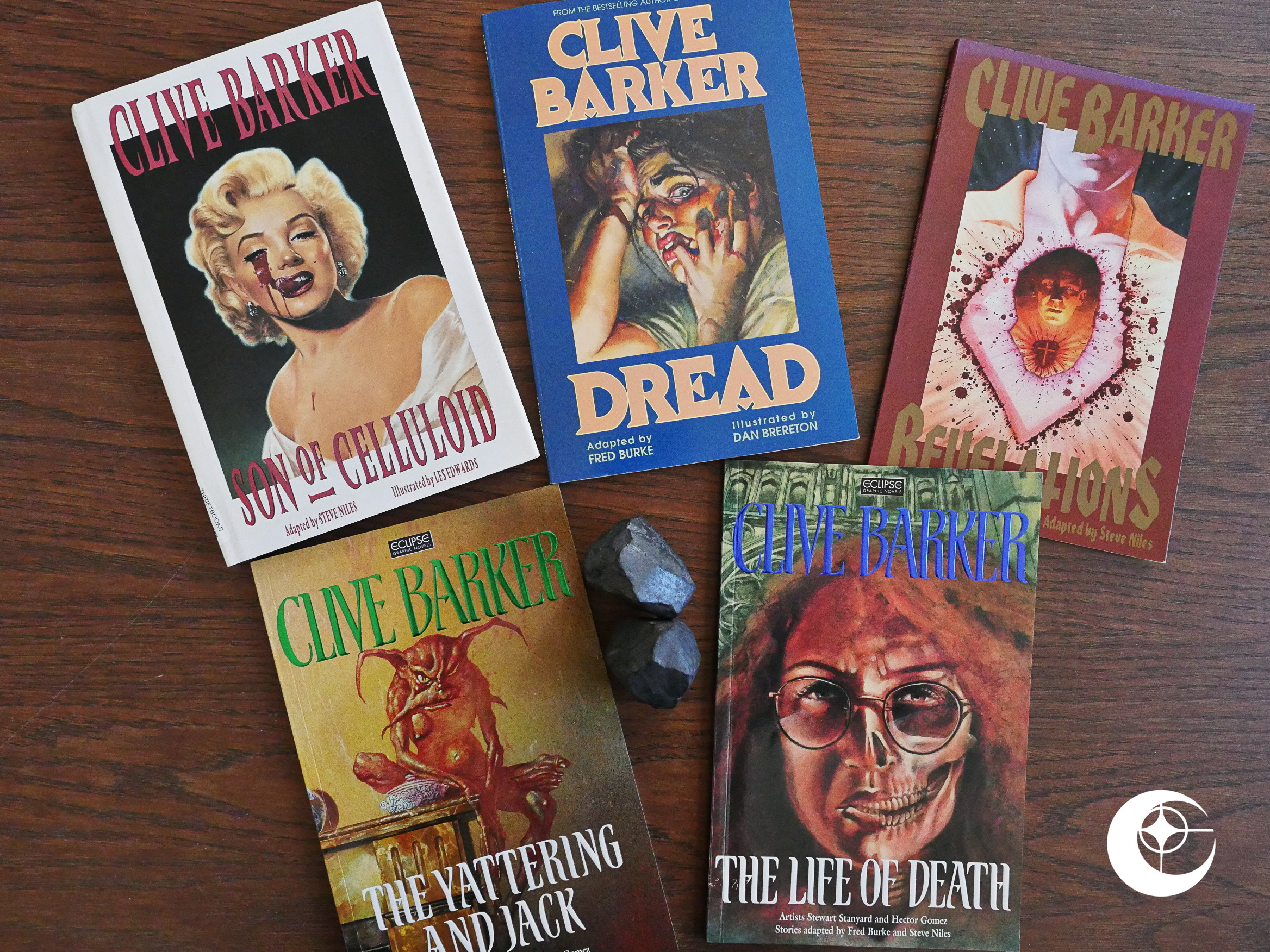
For a few years, it seemed like Eclipse Comics was subsisting on publishing Barker-related books. There were sketchbook collections (called things like “Illustrator”), a thick fanzine (called “Pandemonium”), a portfolio, but most importantly, Tapping the Vein, which over five issues adapted ten of Barker’s best short stories from Books of Blood.

The adaptations were mostly pretty good reads, but they suffered from adhering to a 24 page format, and since The Eclipse Way of adapting literary works is to cram as much of the original text into comics form, it meant that many of the adaptations were very leaden and laden with captions.

So Eclipse did the logical thing and created a series of books that would do the adaptations in however many pages it took. We got six books with adaptations 48 to 60 pages long. But did it help? Let’s have a look.
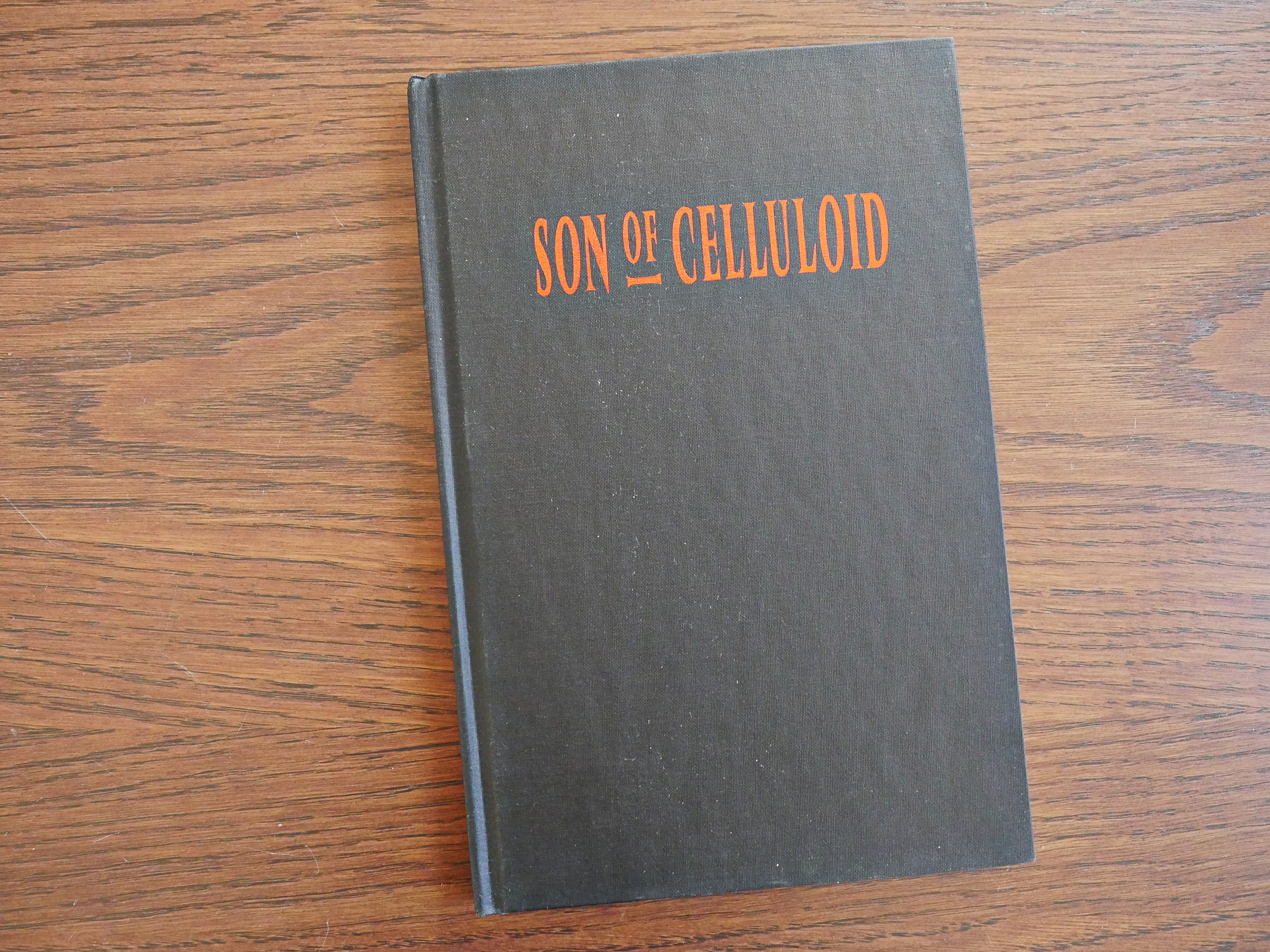
This is the only hardback edition of these books that I have, so let’s just take an even nerdier peek at how it looks. It’s got a kinda stylish front cover, with metallic embossed lettering…

… and a mood-setting … er… I’m sure these paper pages (that binds the innards to the cover) has a printerey name, but it escapes me at the moment.
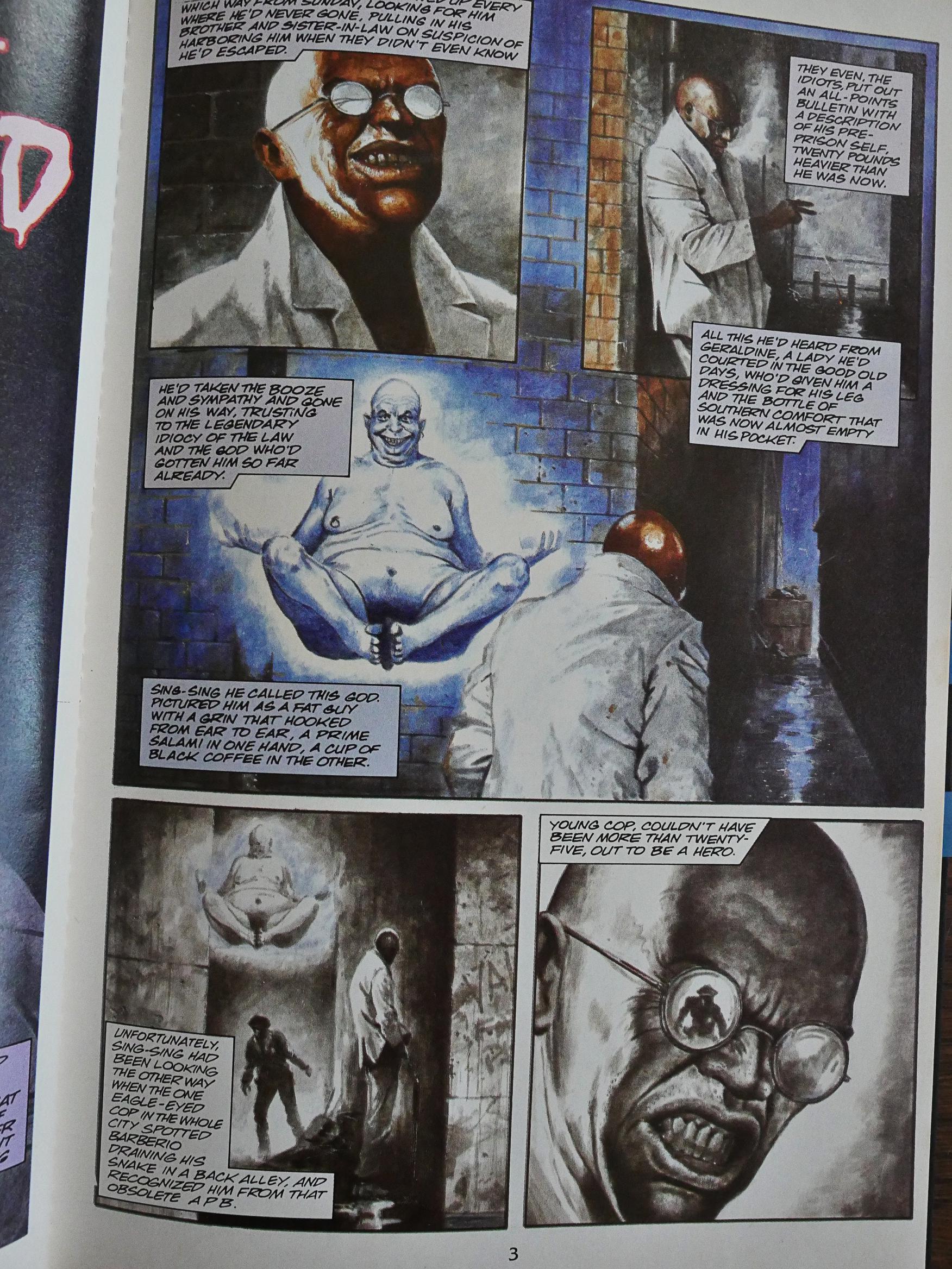
Anyway, Steve Niles does the adaptation, once again, and Les Edwards, who’d primarily been a cover illustrator before, does the artwork. As usual in these Barker adaptations, we’re neck deep in purple prose. Eclipse’s approach is apparently to try to cram as many of the original words in as possible. I guess that keeps Barker happy? Few writers like having their words cut.

And, as usual, that means that the artwork shows pretty much what the words describe… except for the odd glitch or two, where the captions describe that god as having a salami in one hand and a cup of coffee in the other. And the artwork clearly shows that that’s not the case.
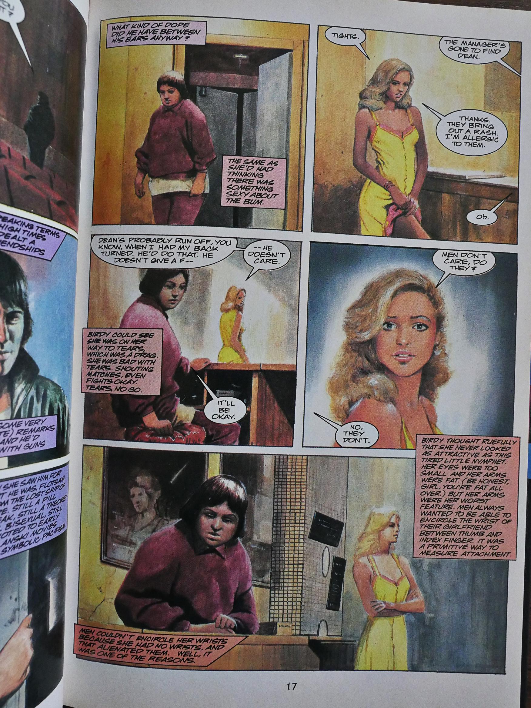
For a newcomer to comics, Edwards does a pretty good job. The book’s very readable.
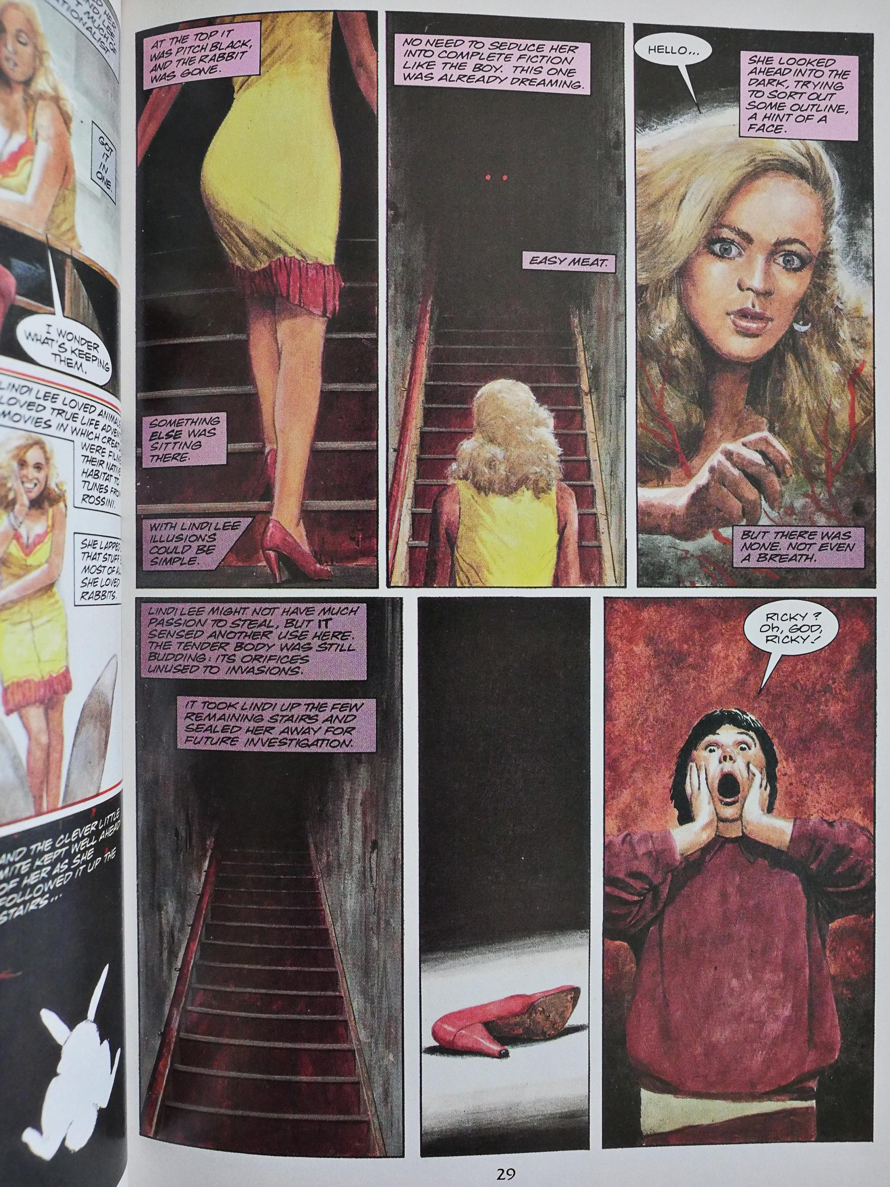
But these aren’t exactly good comics.
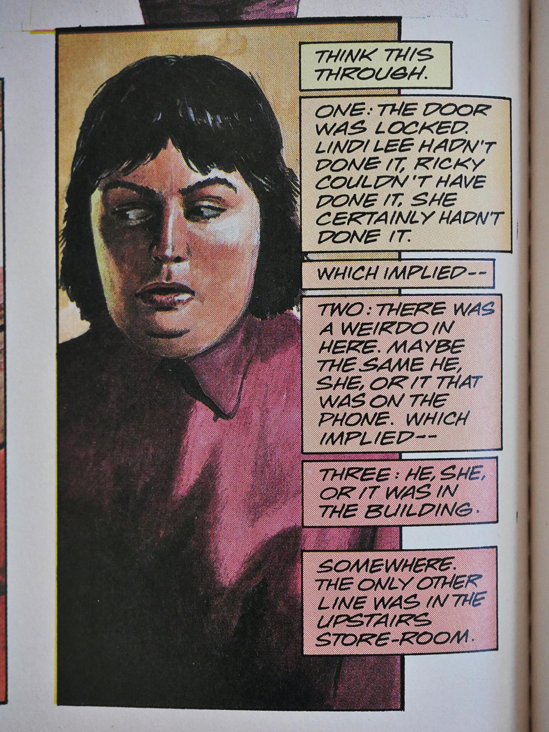
It’s still an entertaining read, because Barker is (once again) ahead of the horror writing pack by putting in a protagonist who’s aware of horror tropes, and thinks things through logically. This is something that horror movies would exploit (to great success) starting a decade later or so.
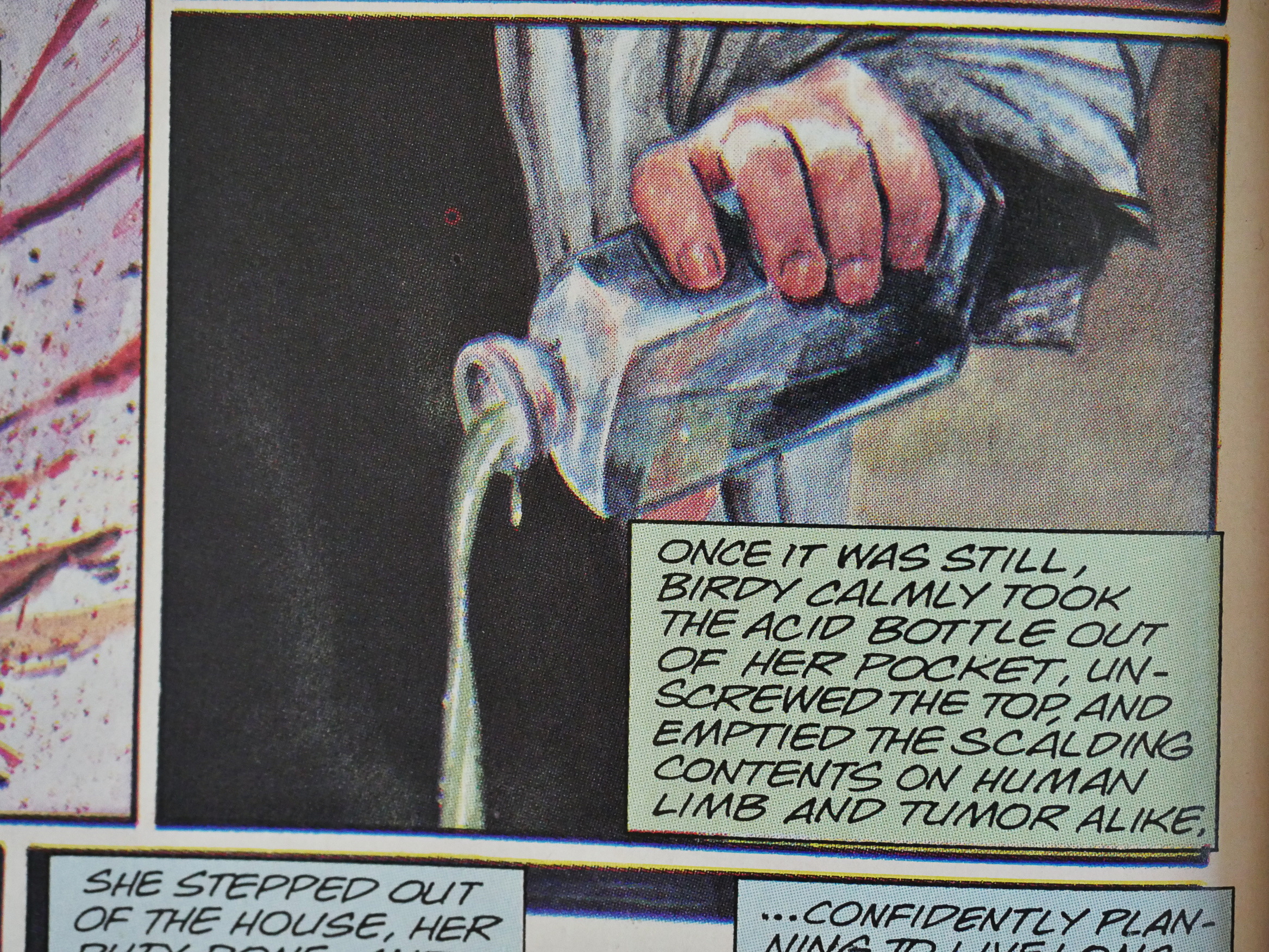
And unusually enough for a Barker story, the story has a happy ending (sort of). I mean, at least the protagonist doesn’t suffer a horrible death or anything, which is Barker’s go-to move.

She even goes on a diet, so that’s nice for her.

Oops! Spoilers!
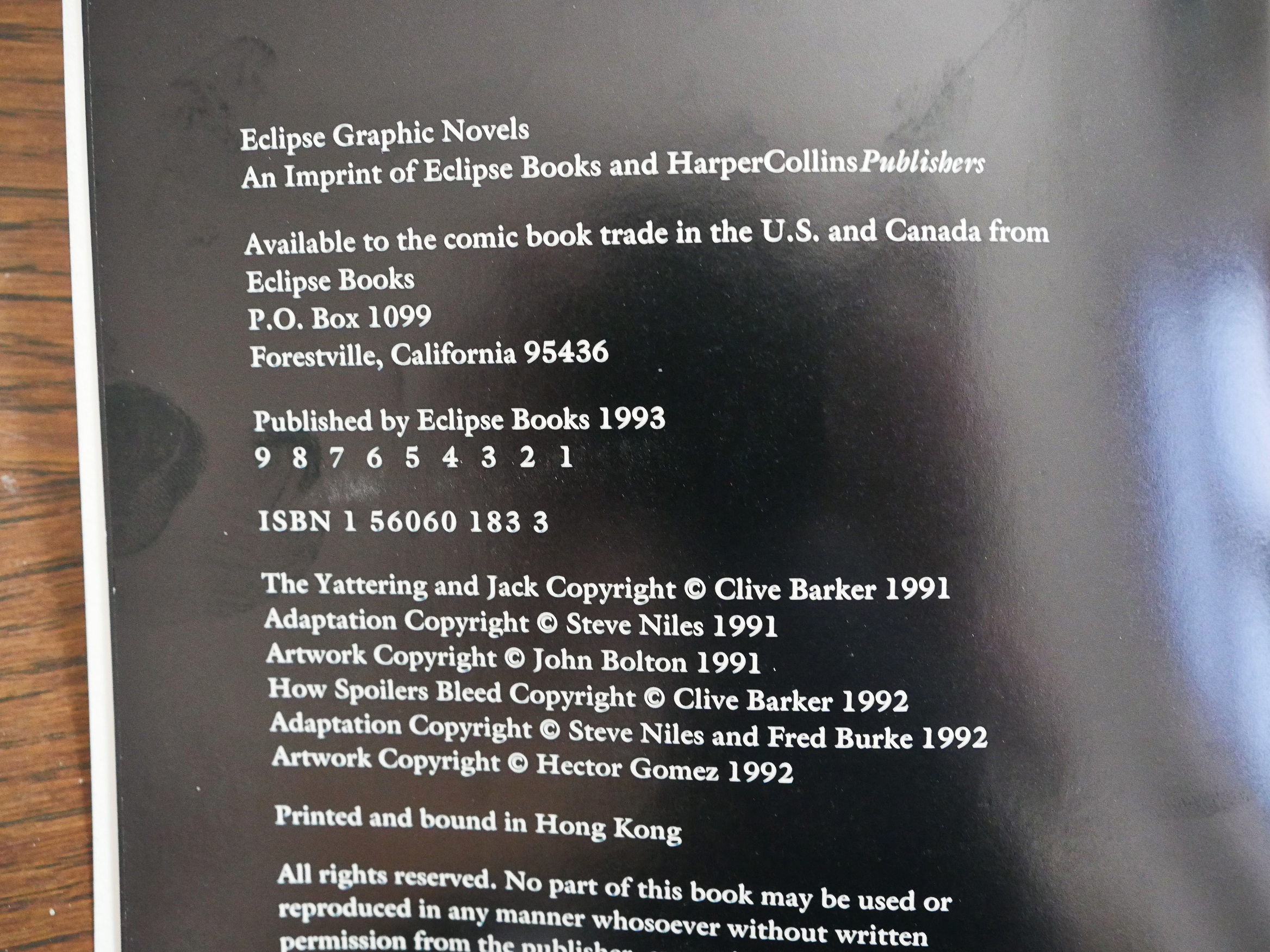
The edition of The Yattering and Jack I have is the reprint from 1993. If I understand things correctly, this was originally published in a 64 page package in 1991. Eclipse then got a distribution/co-publishing deal with Harper Collins, and repackaged several (all?) of the Barker adaptations (and stuck a short Barker from Tapping the Vein into each as a backup). So you ended up with something that’s around 90 pages long: Anything shorter might perhaps fare less well in bookstores?
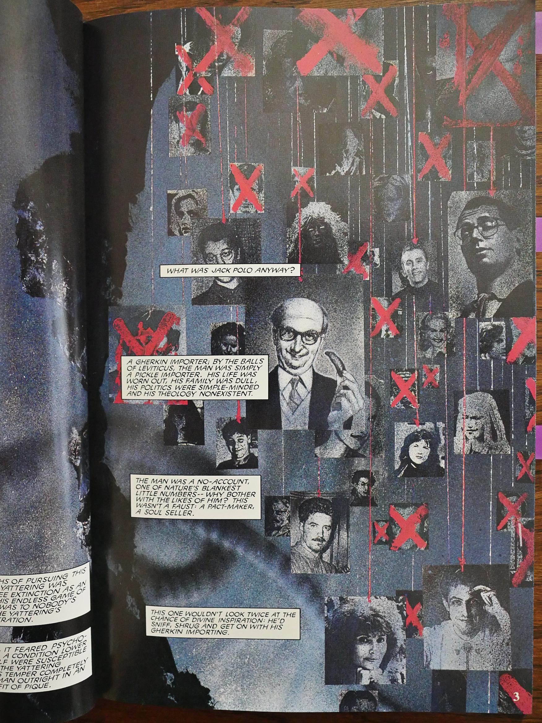
The artist on Yattering is John Bolton, and he’s clearly having a lot of fun with this material.
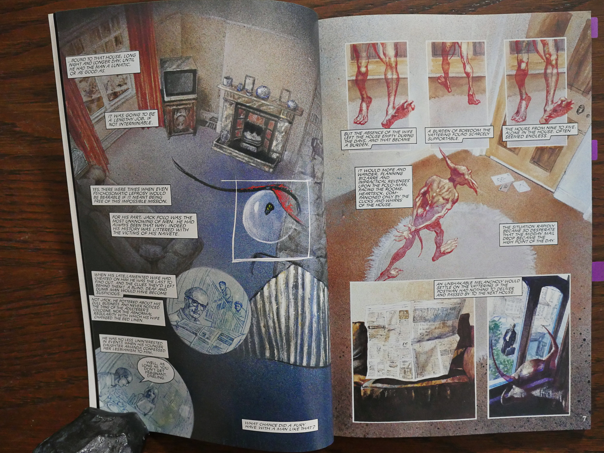
And it’s Barker’s funniest story from Books of Blood, if I remember correctly. That doesn’t really say much, because it’s pretty much the only one that tries to be funny, and it’s more of a “oh, that’s very mirthful indeed” thing than a “ha ha” story. It’s about a guy tricking the devil (I mean, a demon).
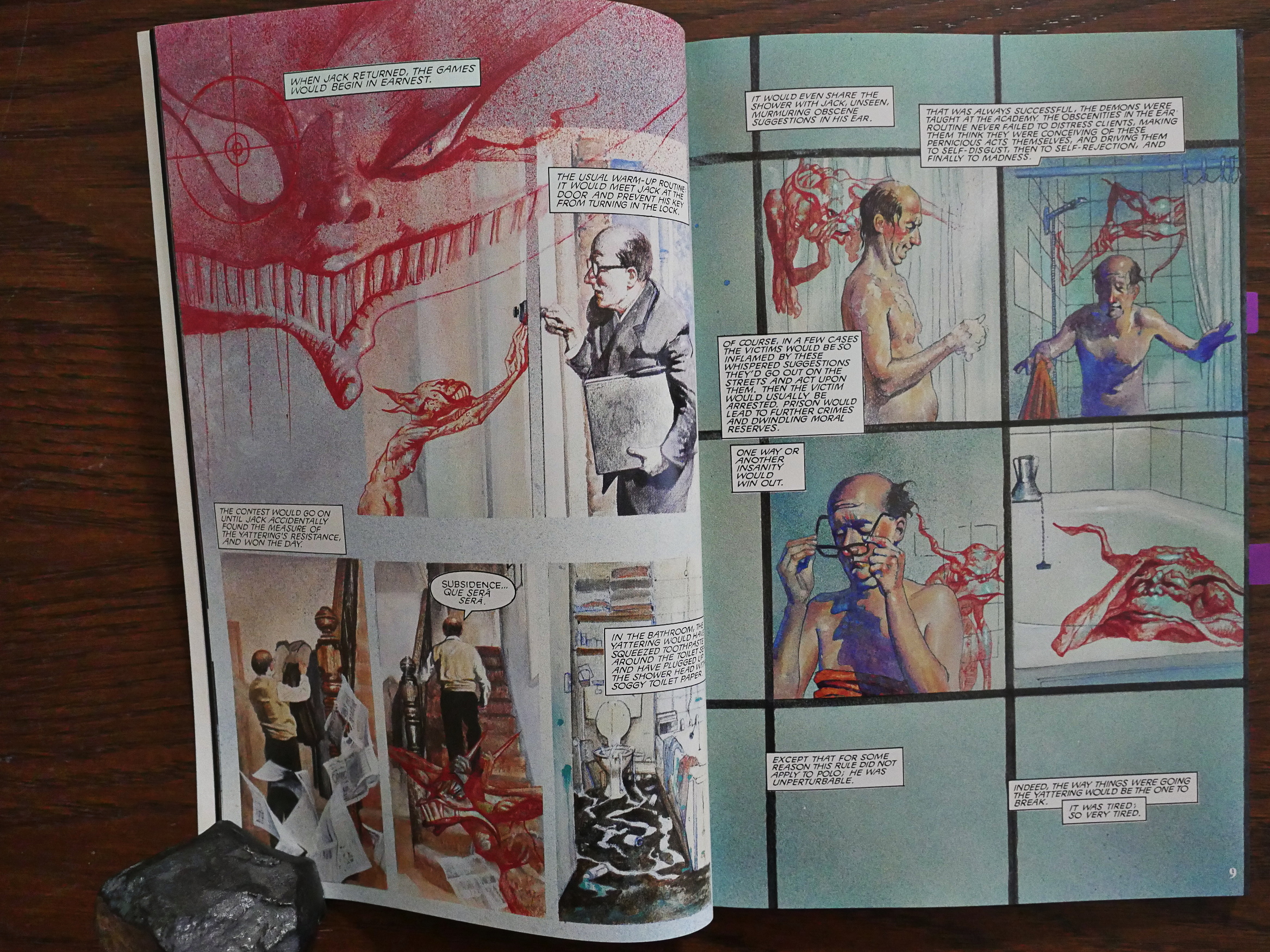
And the longer format helps. Steve Niles insists on preserving a lot of Barker’s words, even when they’re perhaps somewhat superfluous, but we’re not in “illustrated text” territory, which a lot of the other Eclipse adaptations suffered from.
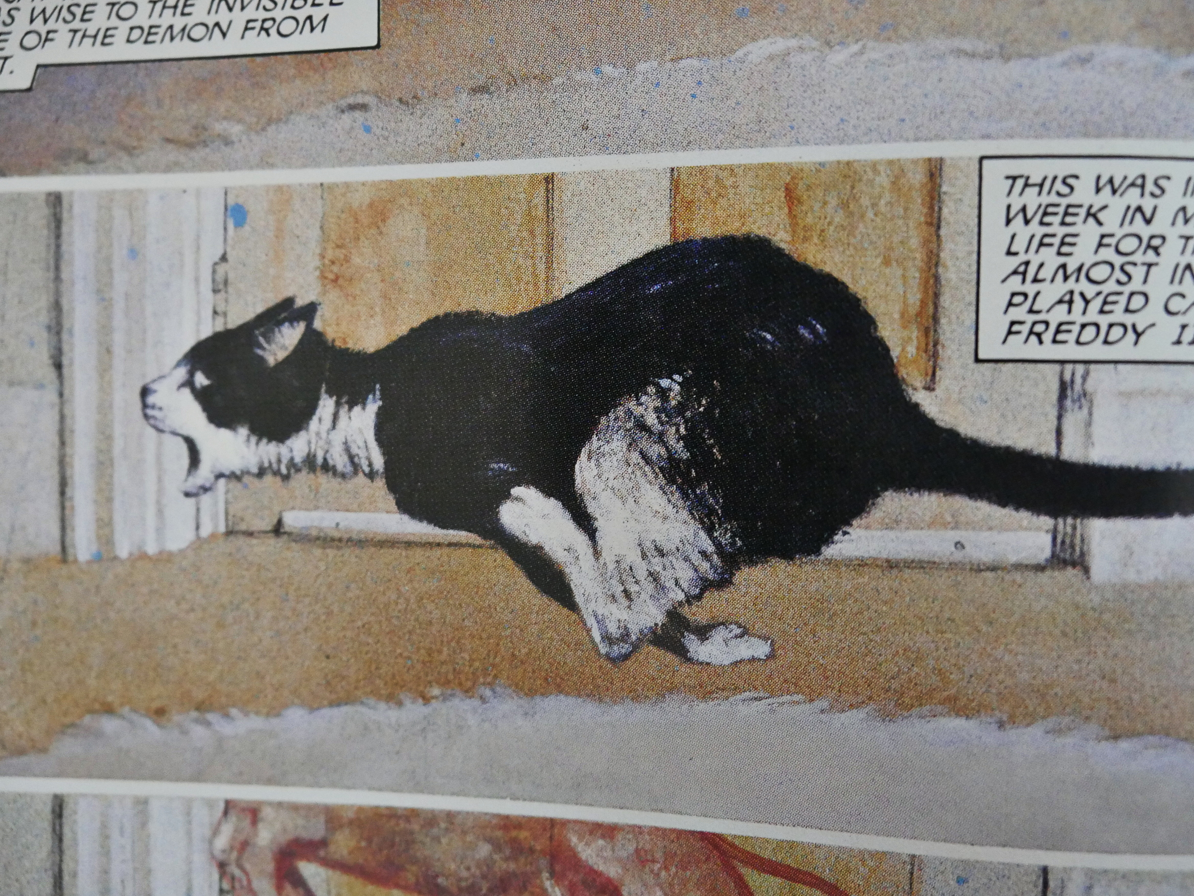
John Bolton certainly knows how to draw cartooney cats and bursts of action, as well as static tableaux.
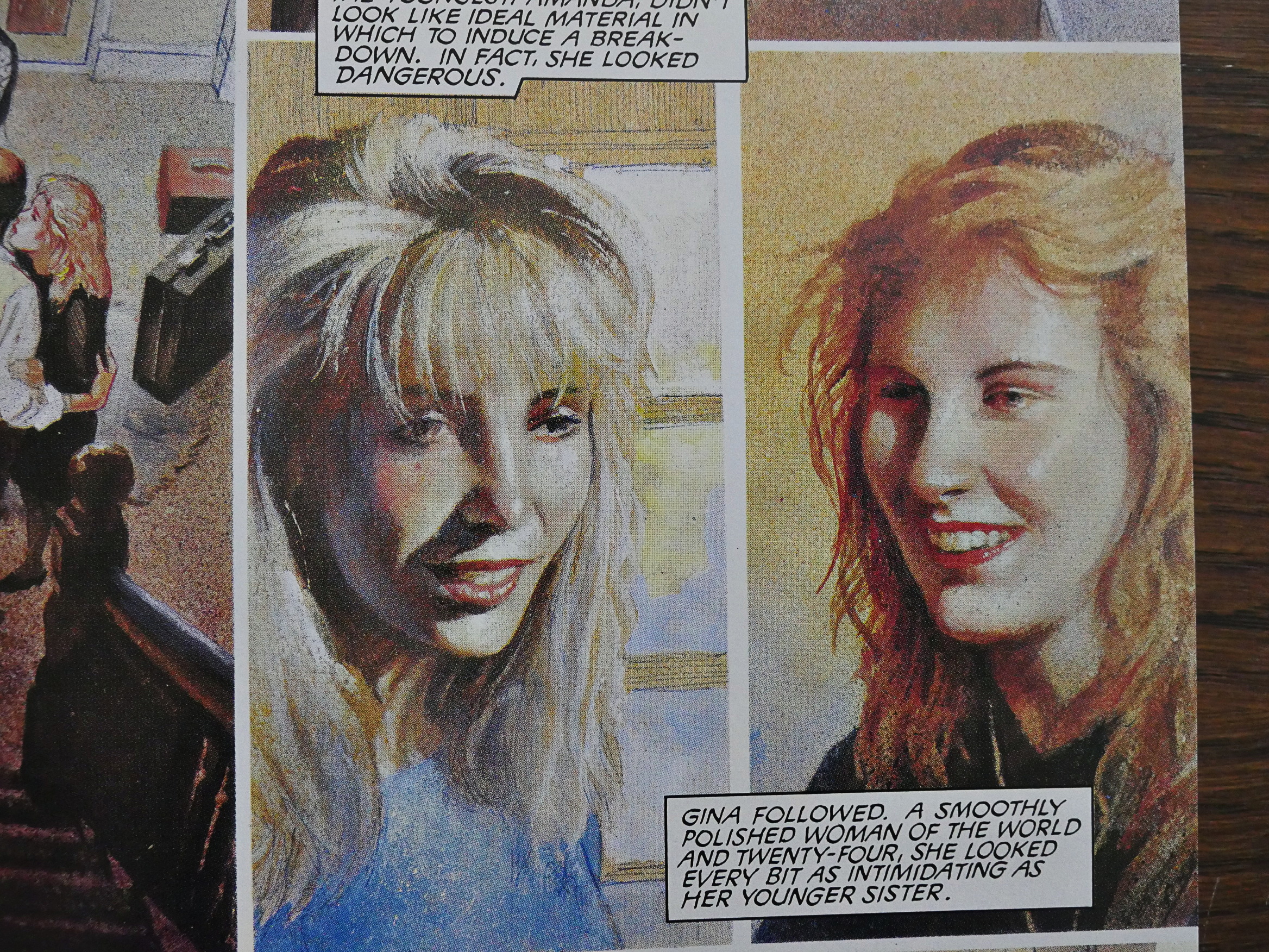
There’s something very humanist about his approach. It’s somewhat photo-reference based, but it’s not crippled by it, as some of the other painterly artists Eclipse favoured around this time.

It was nominated for “Best Graphic Album” in the 1992 Eisner awards, but didn’t win.
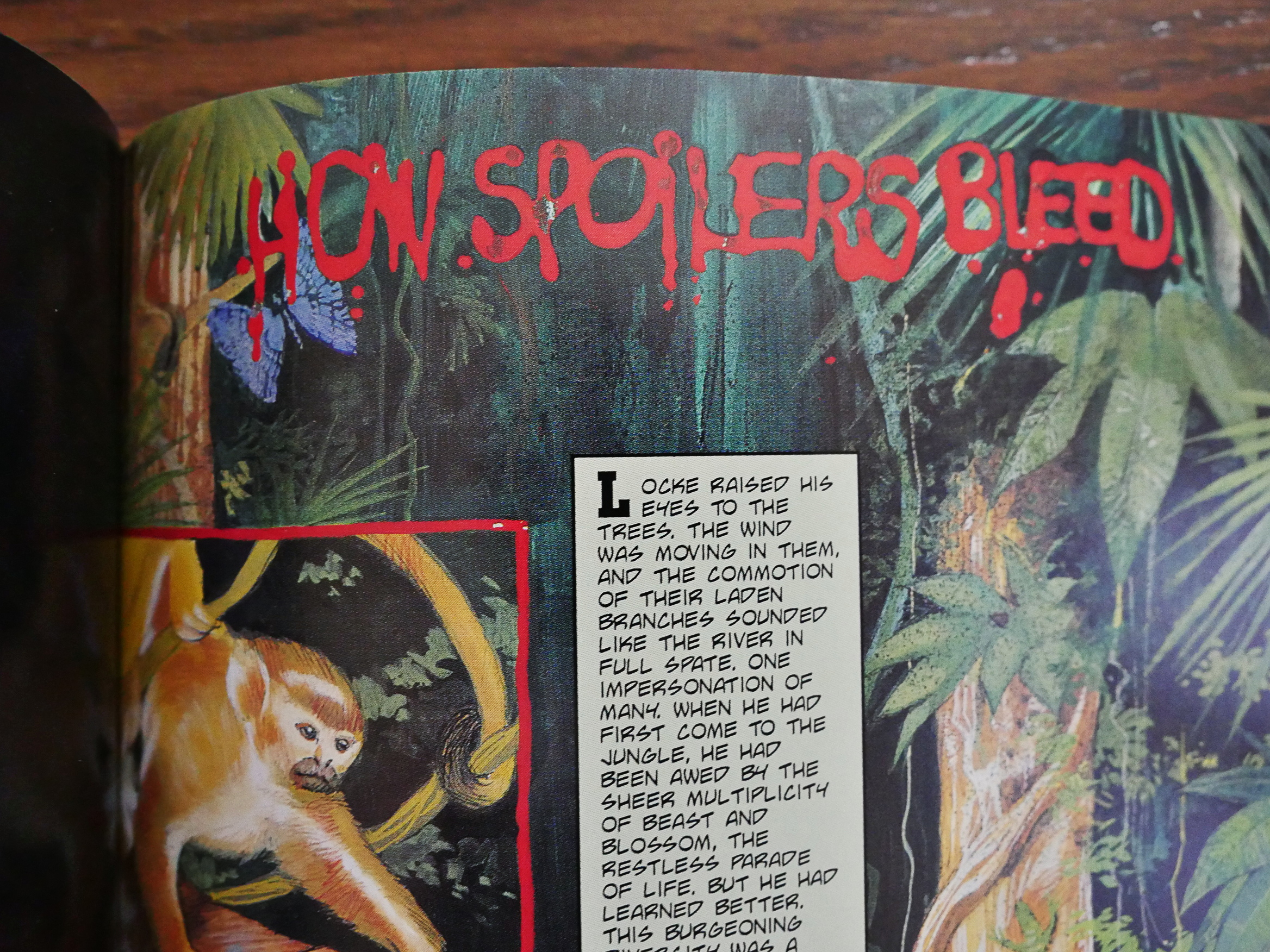
And we get a reprint from a Tapping the Vein in this edition of Yattering.
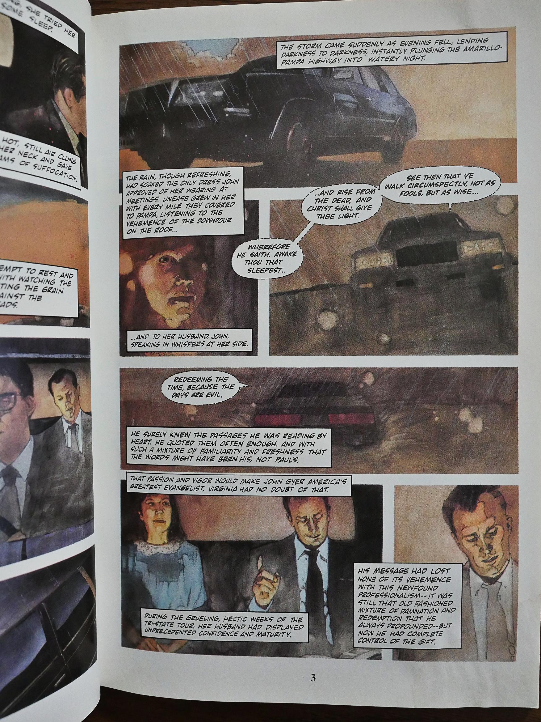
I was curious about Revelations. cat ⊕ yronwode promised, I meant, warned in one of her page two columns that people would find this book very controversial indeed… if they were able to find it at all. It not only has “fully frontal” nudity, but it deals with religion, I mean Christianity, and that’s so controversial that retailers all over the US were refusing to carry it. Or something.
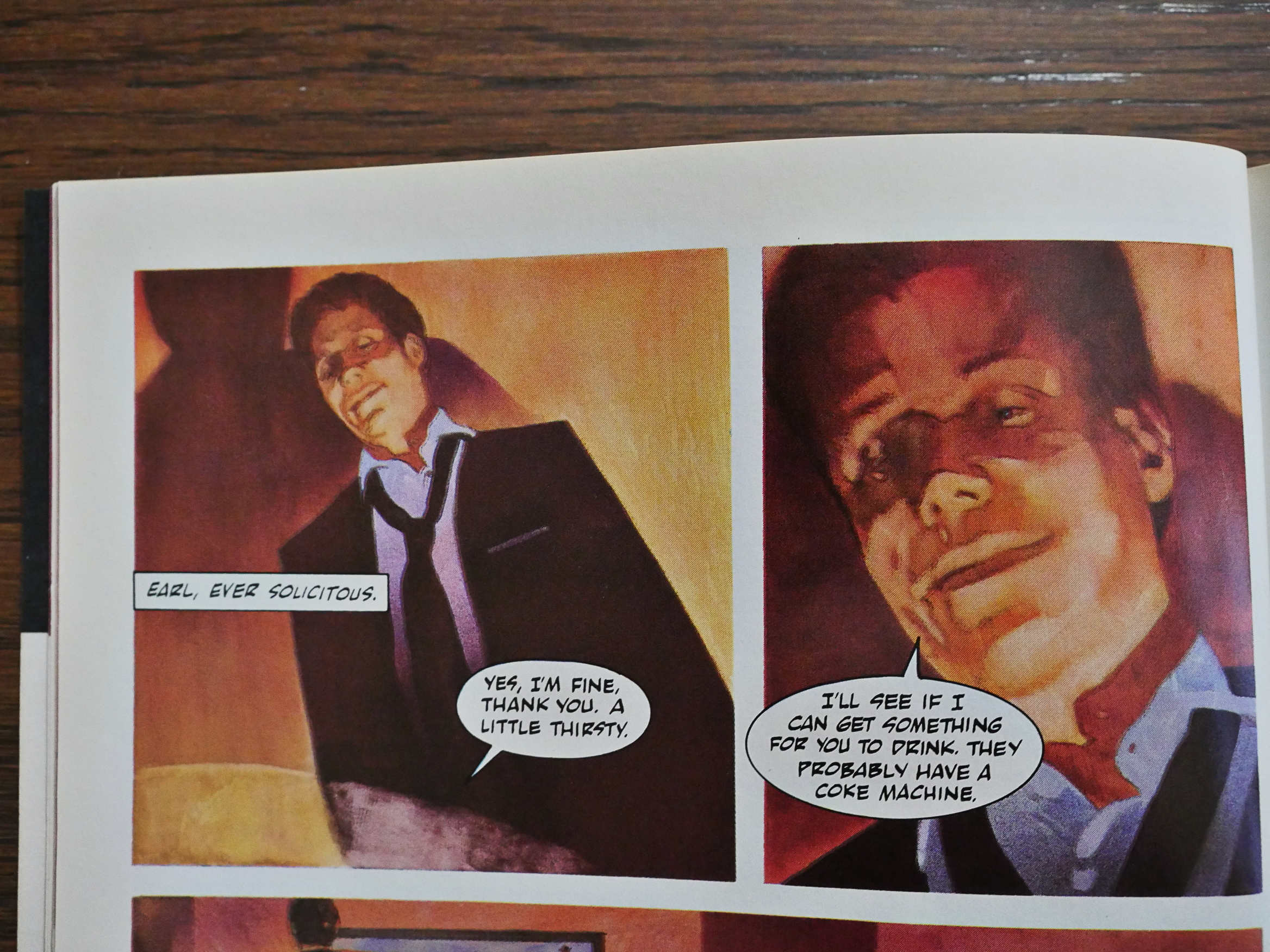
Lionel Talaro’s artwork is very photo-based, but he’s got a wonderful sense of colour and drama. Steve Niles, again, did the adaptation, and I think perhaps it’s the best one of the bunch. Niles keeps a lot of Barker’s exposition, but it’s a pretty brief, uncomplicated story, so it reads well. The pages aren’t totally overpowered by captions.
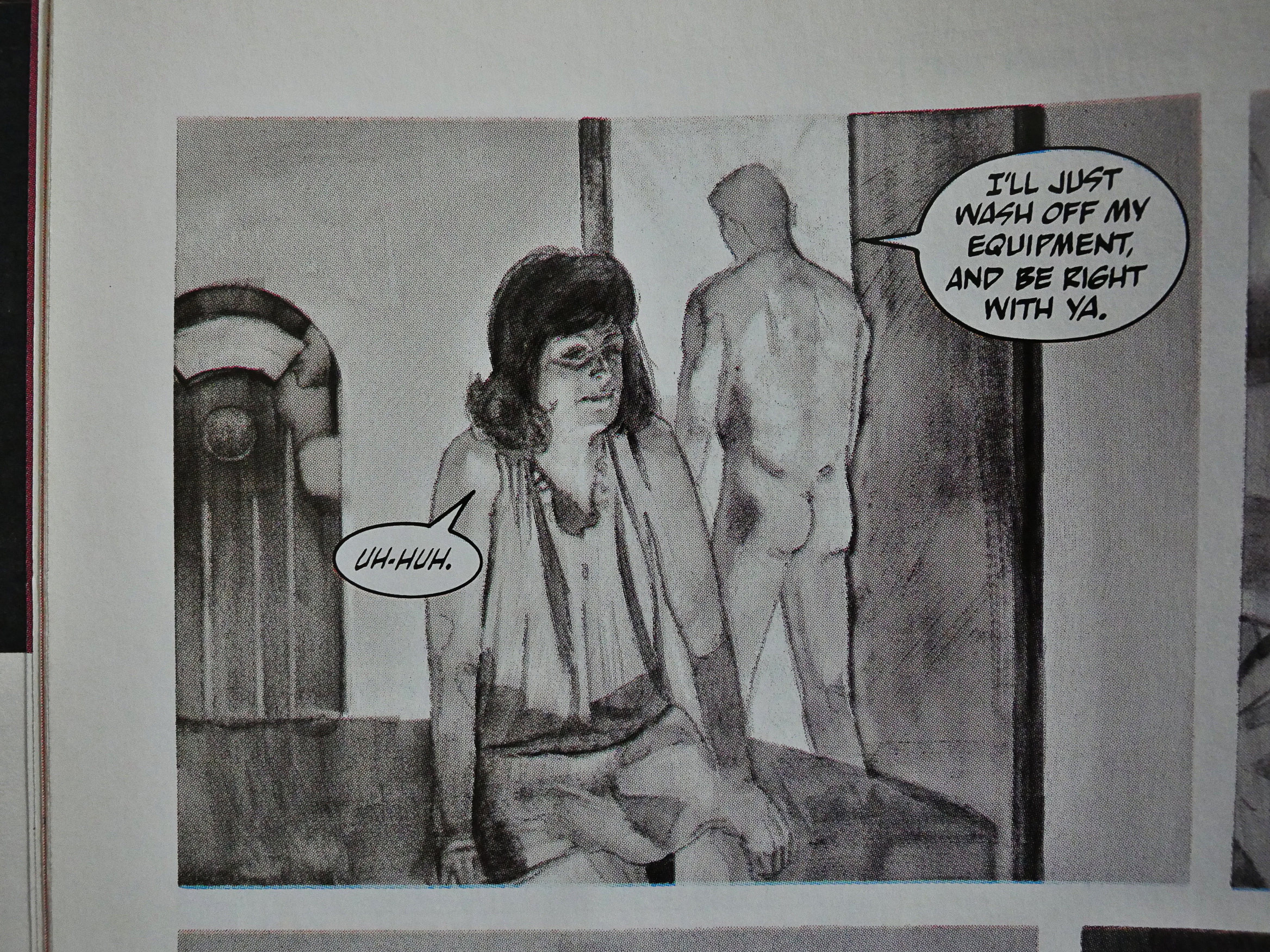
The promised nudity does appear, but isn’t, I think, anything anybody would be shocked by.
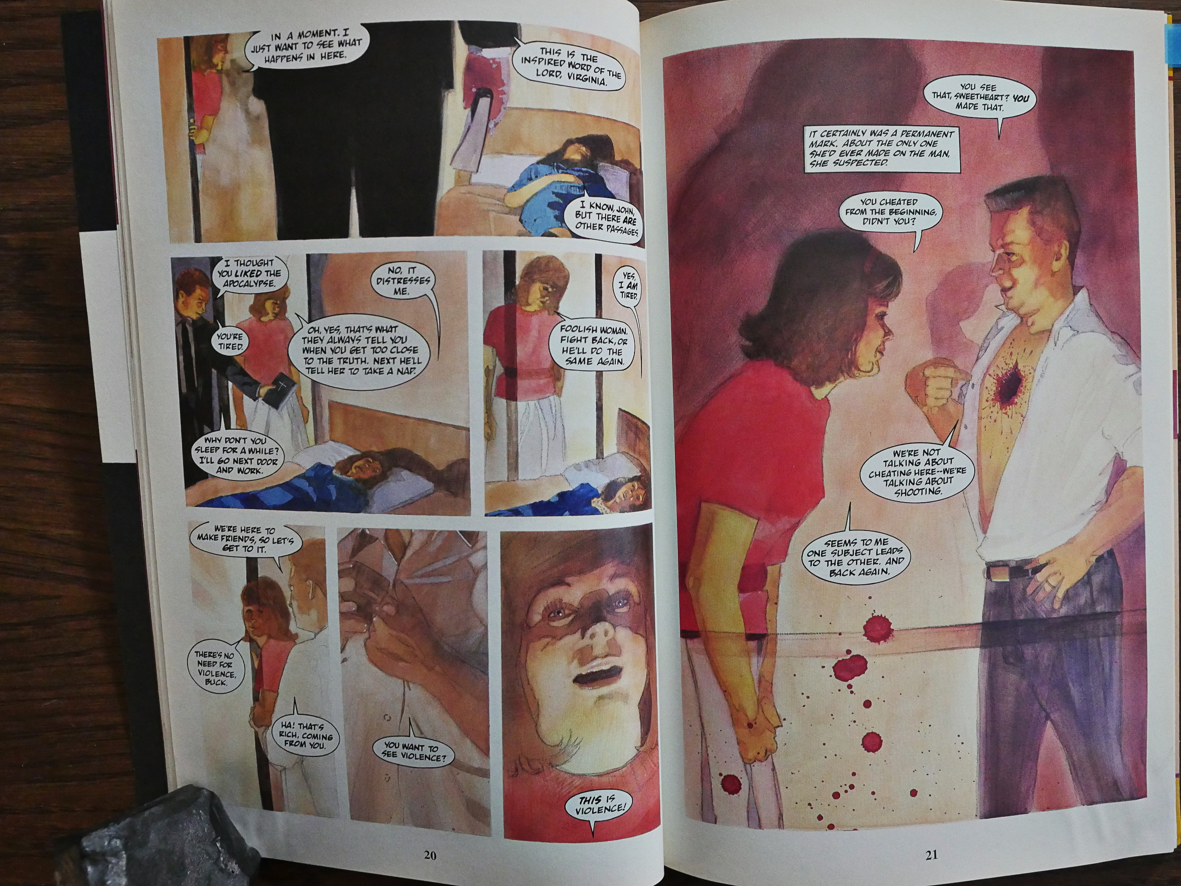
Neither is it particularly blasphemous, so either those retailers were on bad acid, or yronwode was trying to pique the reader’s interest by promising controversy.
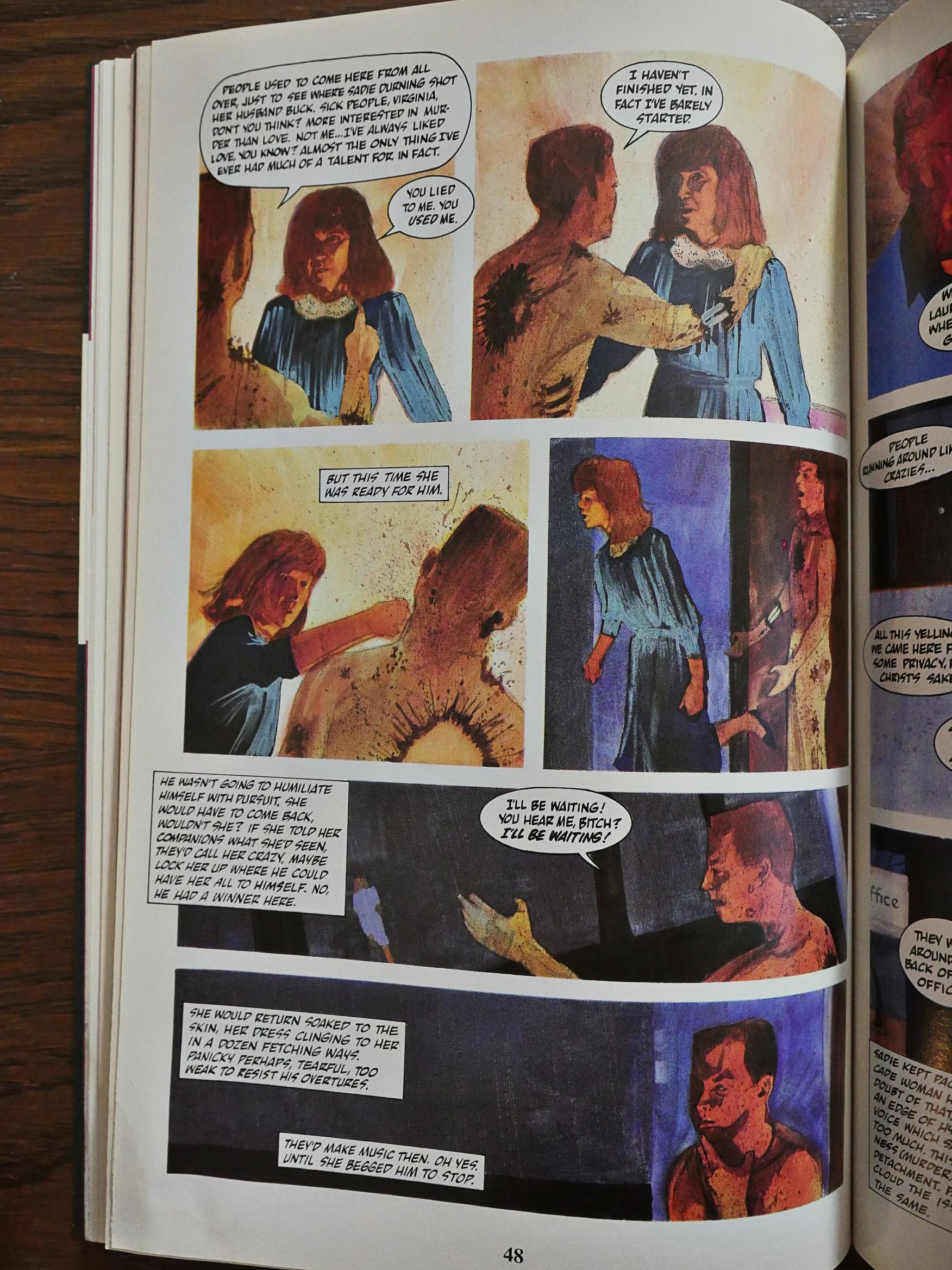
While Talaro’s artwork mostly looks great, he doesn’t do action. I mean, he tries to, but it’s pretty bad. I guess that’s what happens when you tell people “stand that way!”, take a snapshot, and then draw exactly what’s on the picture.
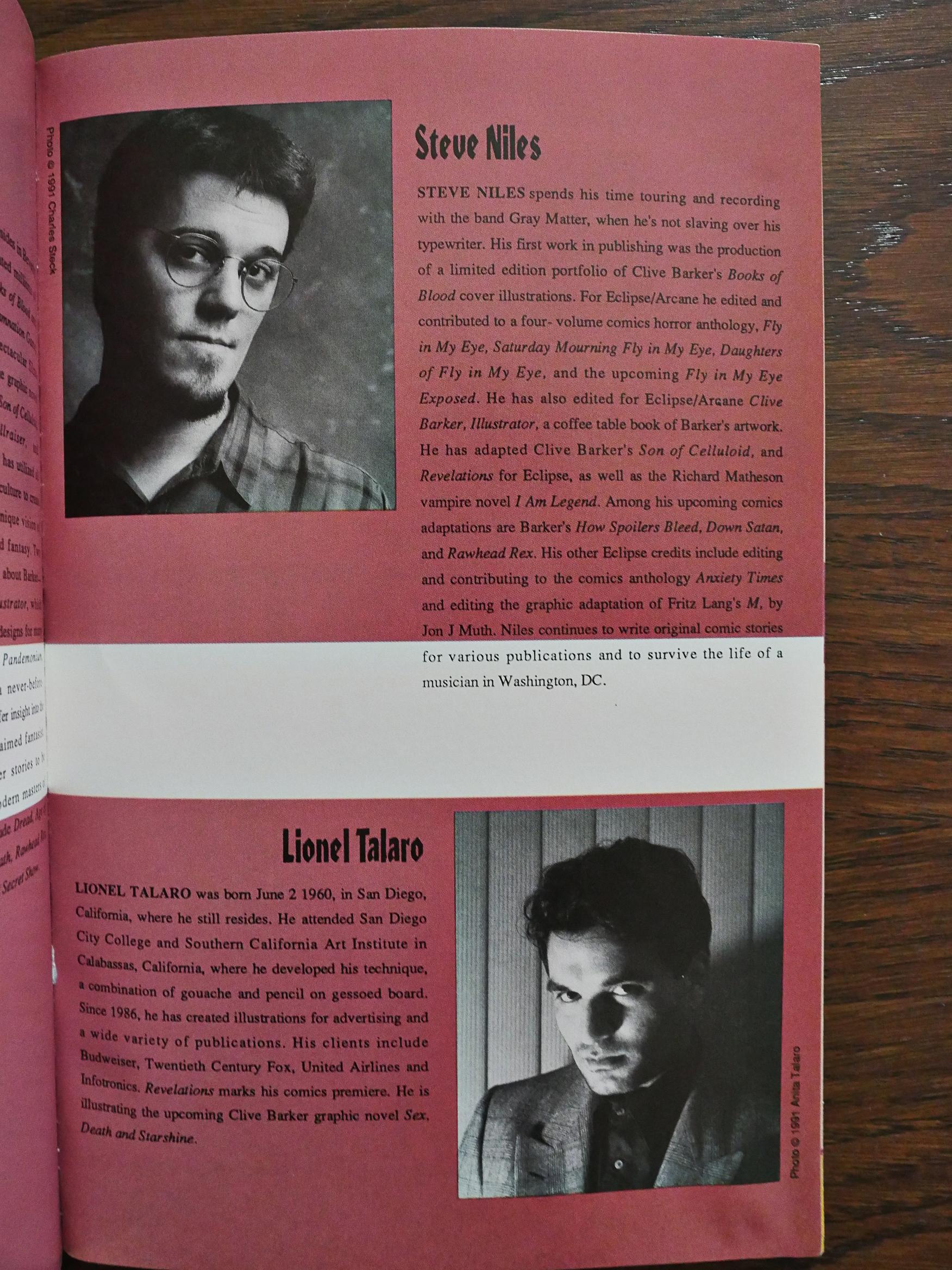
Ah; it’s his first comic book. Makes sense.
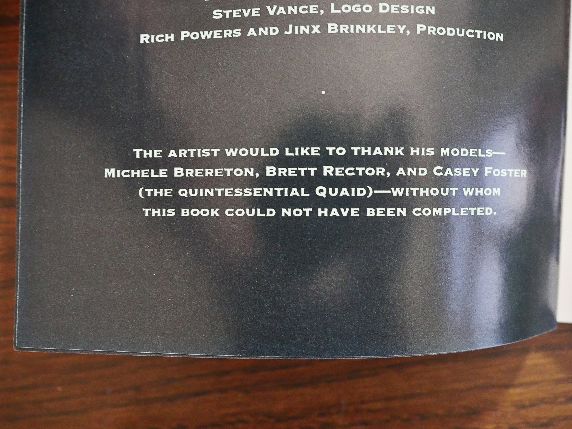
Then there’s Dread… and artist Dan Brereton at least calls out his photo reference.
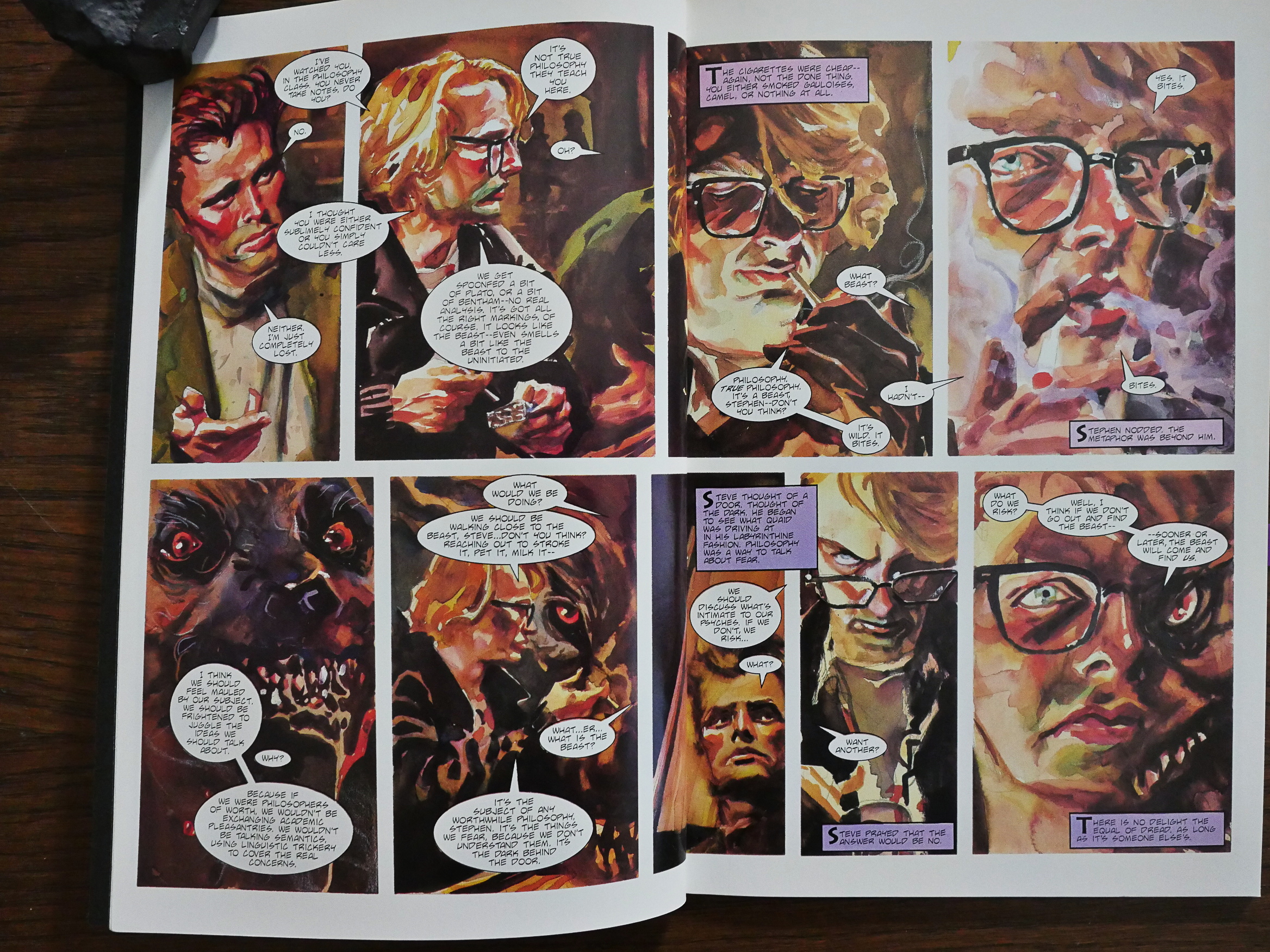
And, indeed, these are very much based on photo reference, Brereton goes hog wild with angles and colours and strange transformations. It’s a really fun book just to look at: Every new page spread has something new and interesting.
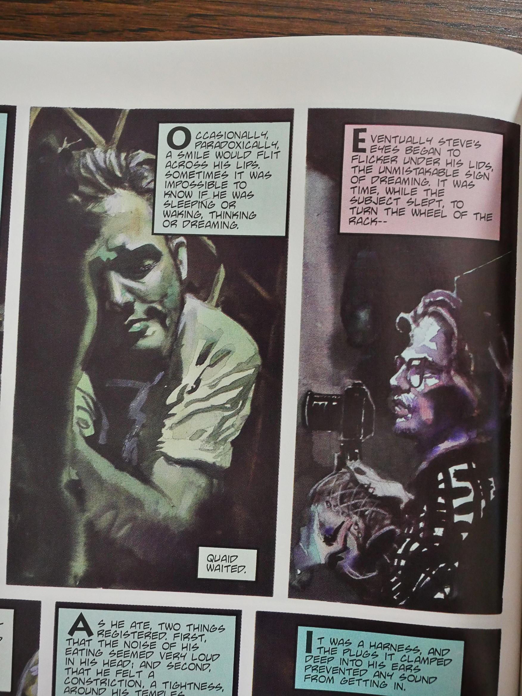
If only I could say the same about Barker’s story or Fred Burke’s adaptation. It’s ridiculously exposition heavy. I understand that they want to retain Barker’s mood, and the easiest way to do that is to just put as many of his words in as possible, but it gets a bit tedious having the captions and the images telling us the same thing.

And the story is basically just a tortured O’Henry thing that takes way too long to get to the point, and the point isn’t really very sharp.

And what’s it about these people sleeping so heavily?
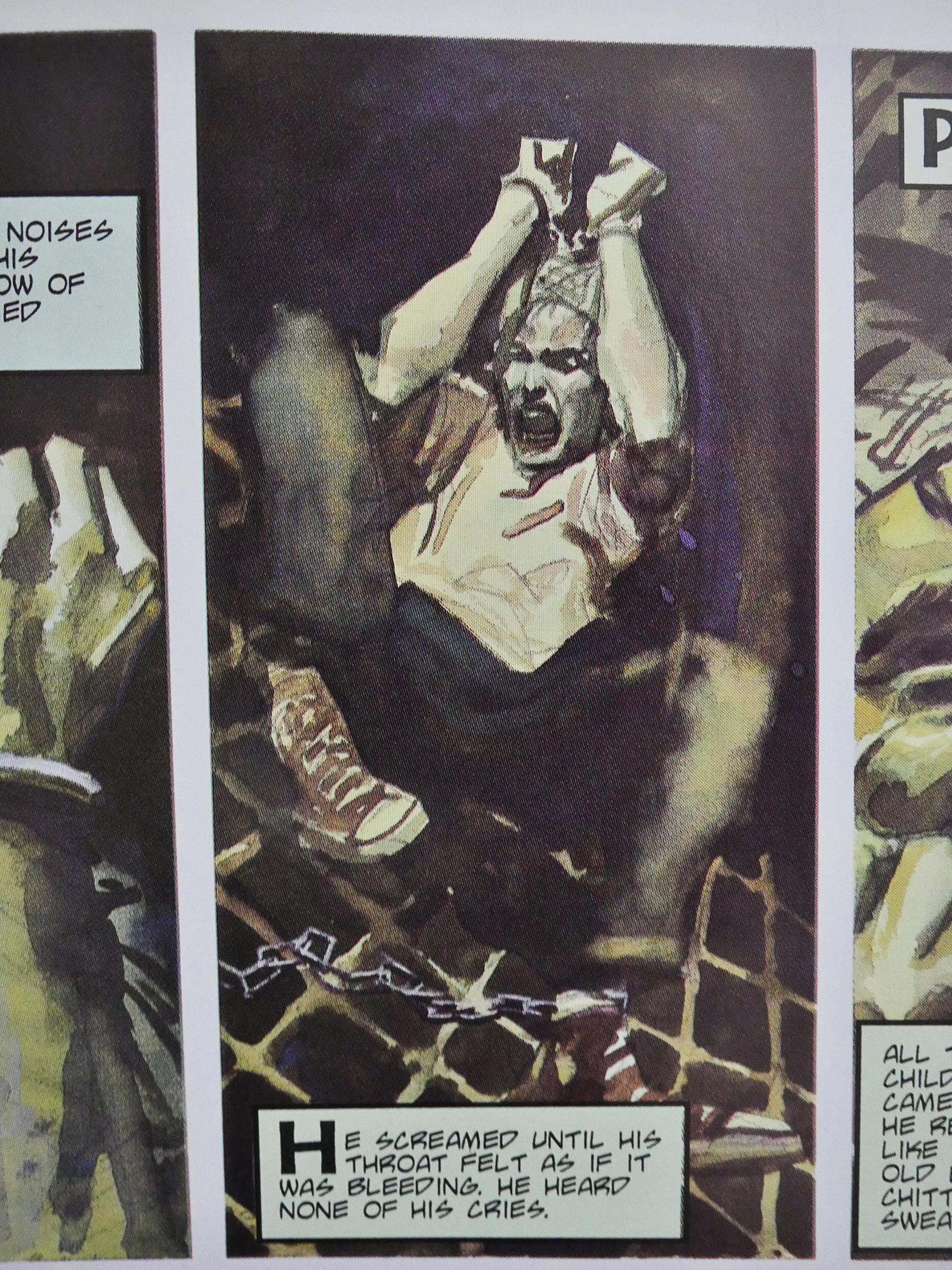
And has Barker never worn hearing protection? You can still hear your voice, dude.
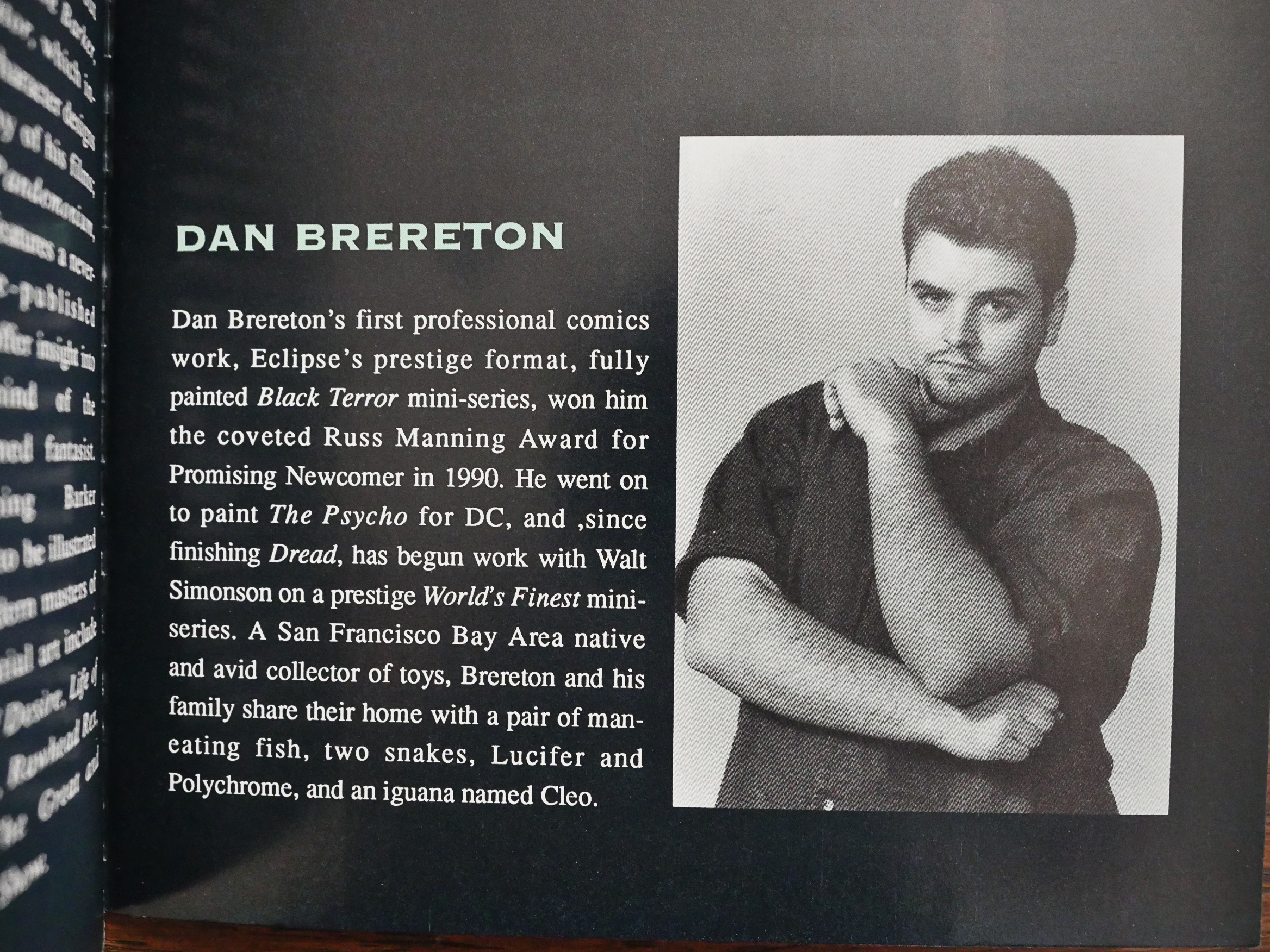
Oh, Brereton won a Russ Manning Award (whatever that was) for The Black Terror? That’s totally understandable.
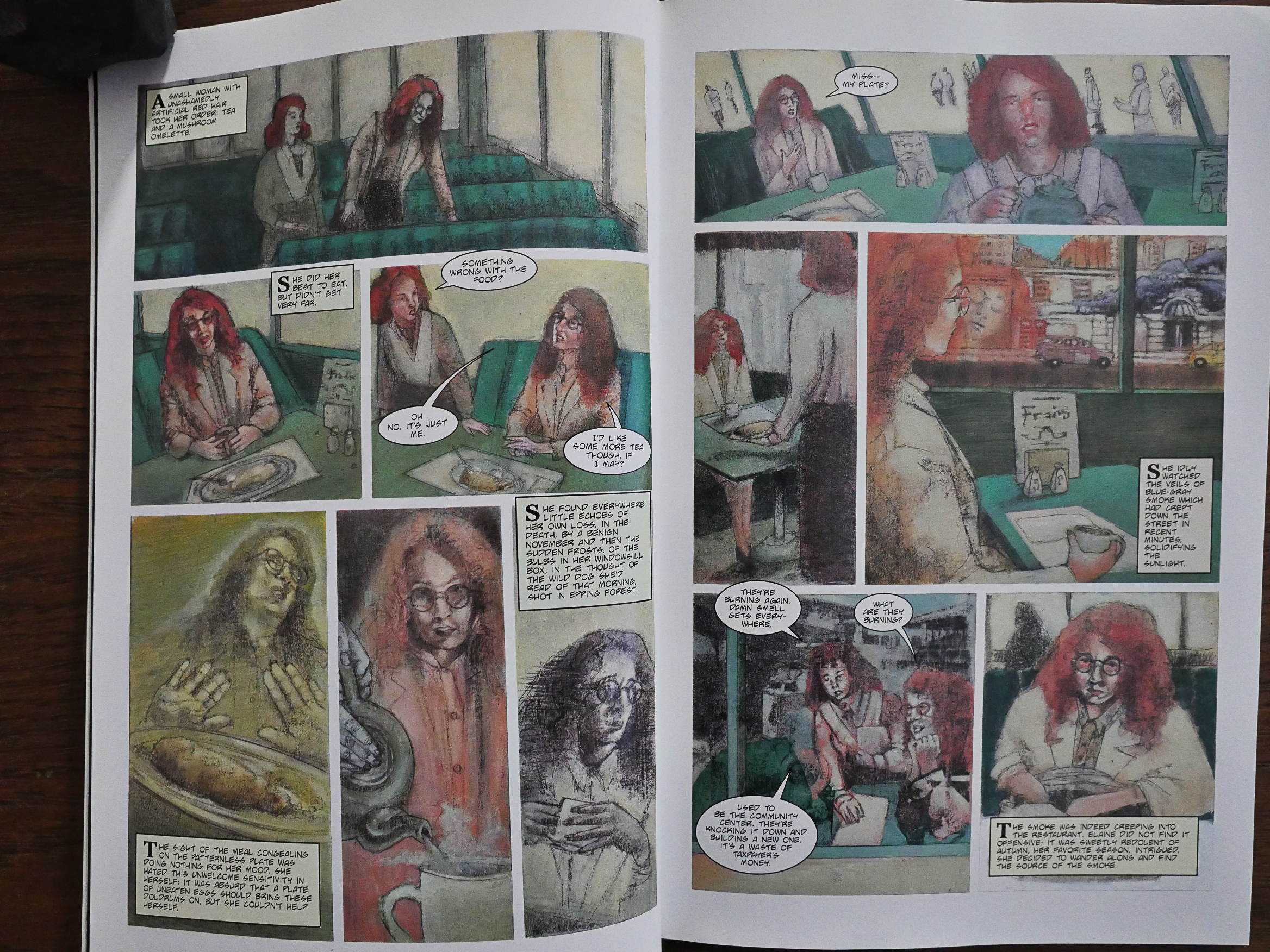
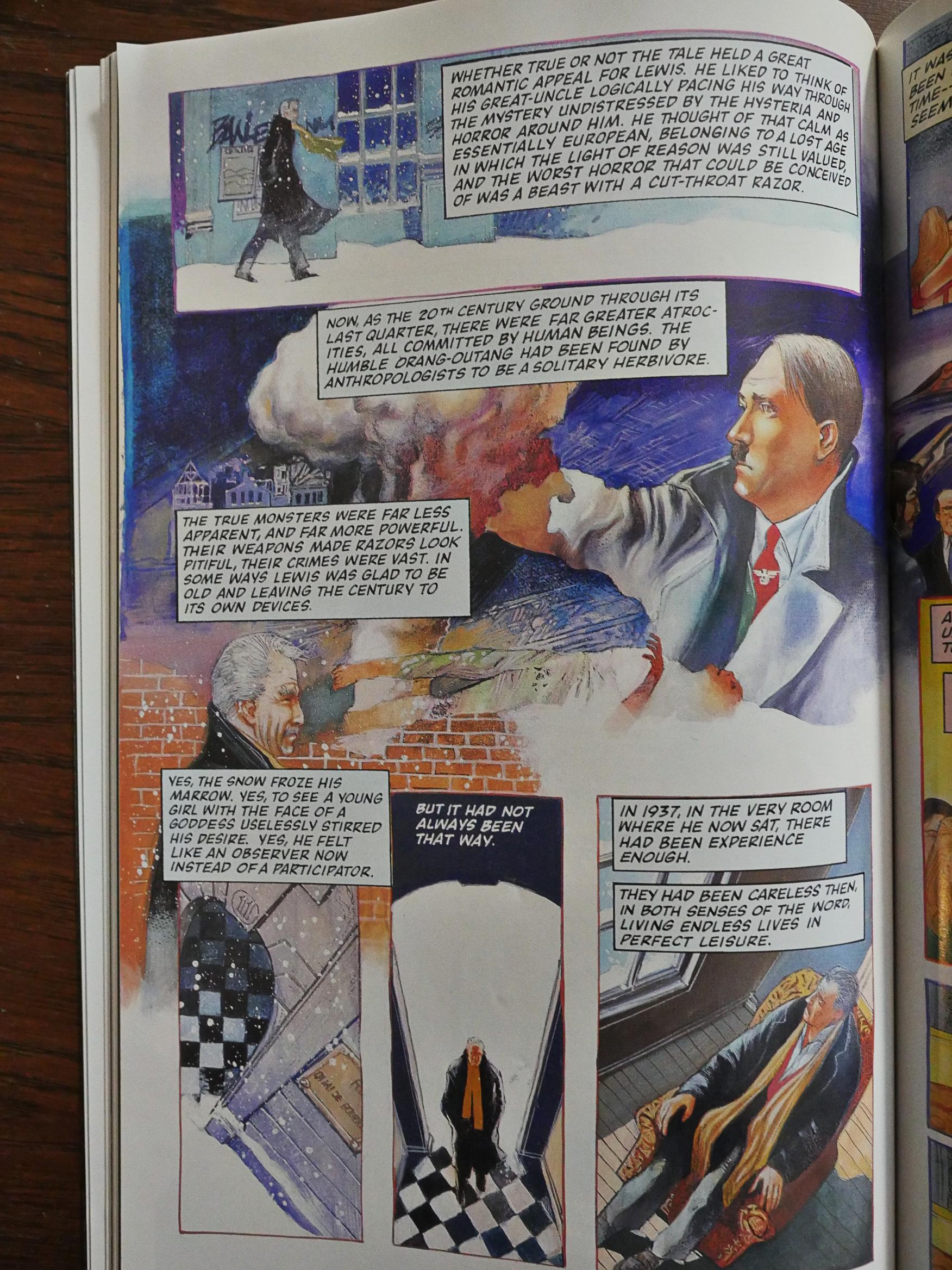
And finally (well, except for Rawhead Rex, which I’ll cover in a separate blog post because it’s the very last thing Eclipse published, and it also has an interesting controversy behind it) and least, we have The Life of Death. It’s got some good character portraits (both literally and figuratively), but it’s not that interesting of a story. I don’t know how many stories they had left to choose from, but it’s understandable that they didn’t go for this one first…
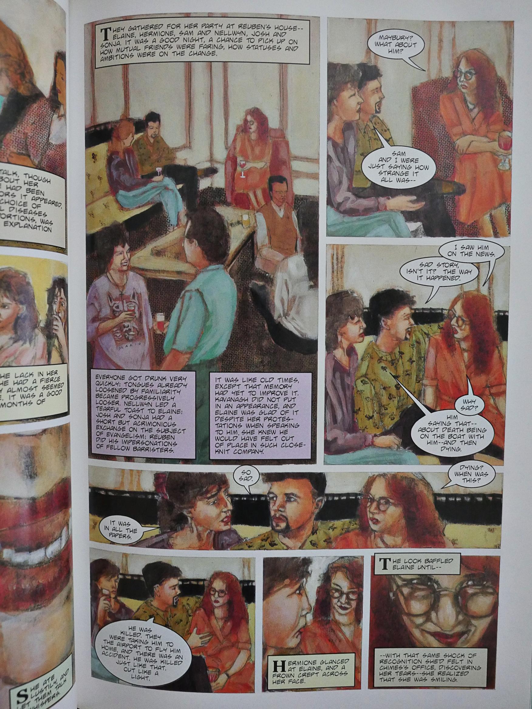
Stewart Stanyard’s artwork does suit this static story very well. He manages to scare up some interest in all these scenes where little happens.
The backup story here, New Murders on the Rue Morgue, with artwork by Hector Gomez, is not a reprint from Tapping the Vein, I think? It’s also not very good.

My google-fu may just be very bad, but these comics don’t seem to have been reprinted after Eclipse went under? Can that be true? Some rights issue, perhaps? Because I can’t believe that these wouldn’t still sell, even if they’re not exactly perfect. Spending this evening reading these comics was rather nice.

Since these comics have been out of circulation for a couple of decades, finding people talking about them on the web isn’t easy. Here’s somebody on Goodreads:

I read Dread in Books of Blood Volume 2 a few years back and found it a bit difficult to get into. This graphic novel still makes the skin crawl but cuts out a lot of the tedious talk that bogged down the novella. The artwork is dread-worthy, washed with a dark-hued palette that certainly fits the tone of the story. This isn’t my favorite Barker short but it’s worth seeking out of if you’re a fan.

I’m not the only one who questioned Eclipse’s choice of stories to adapt:

Although “the life of death” short story is both unsettling and involving, the addition of the illustrations in this graphic novel do nothing to embellish the experience of Barker’s writing. The ” Murders in the Rue Morgue” is short enough to be painless, but still not interesting. It is a shame that they did not choose better stories for this compilation, although I sometimes think that certain authors works should not be “visualized” by anyone save the actual reader in their own mind’s eye. Pass on this one

1988: Tips from Top Cartoonists

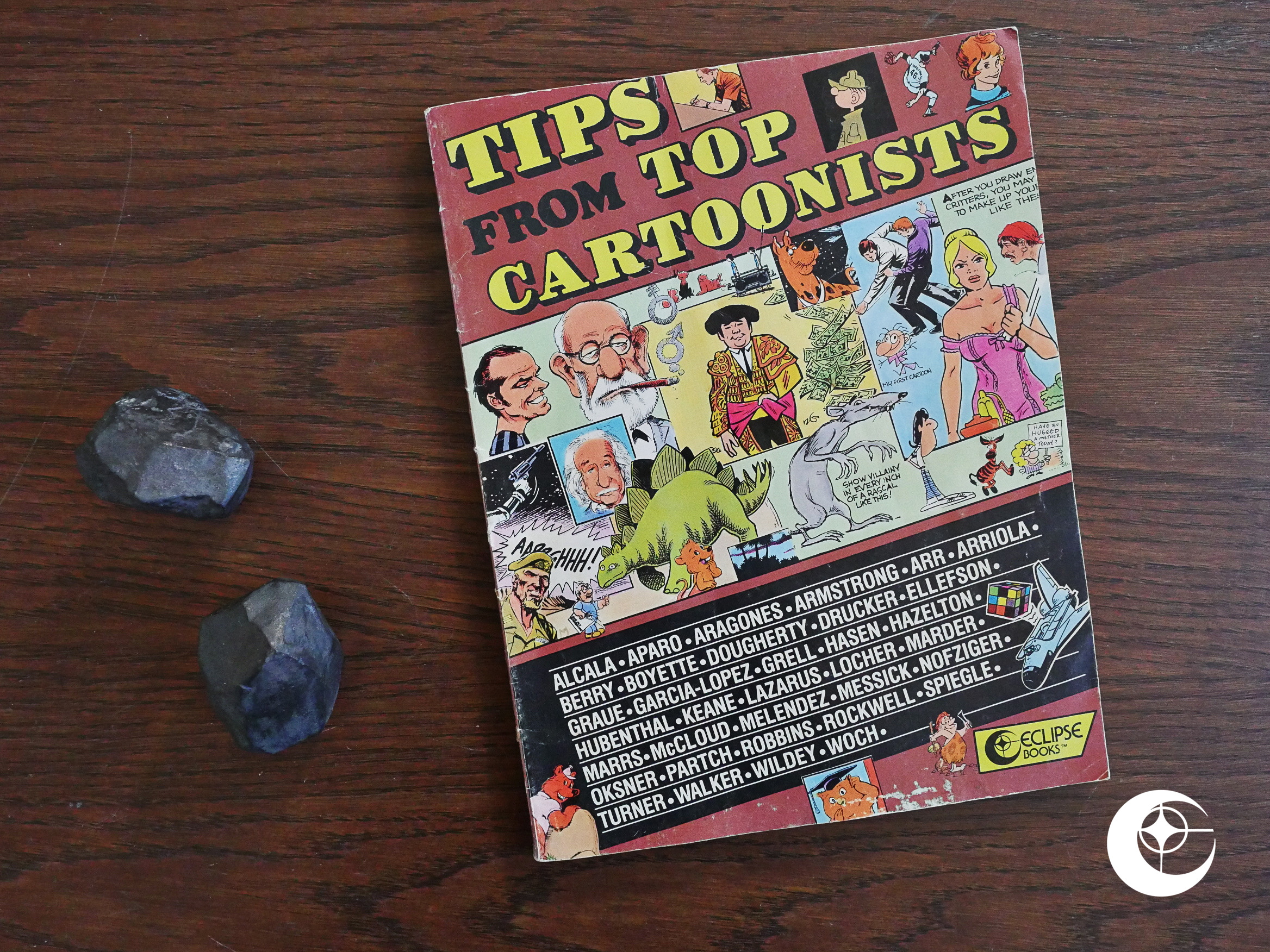
Tips from Top Cartoonists (1988) edited by Don “Arr” Christensen.

Hey, we’re a bit out of sequence here… I’m playing catch up with a few books that didn’t arrive in time for me to blog about them when my CDO said that I should.

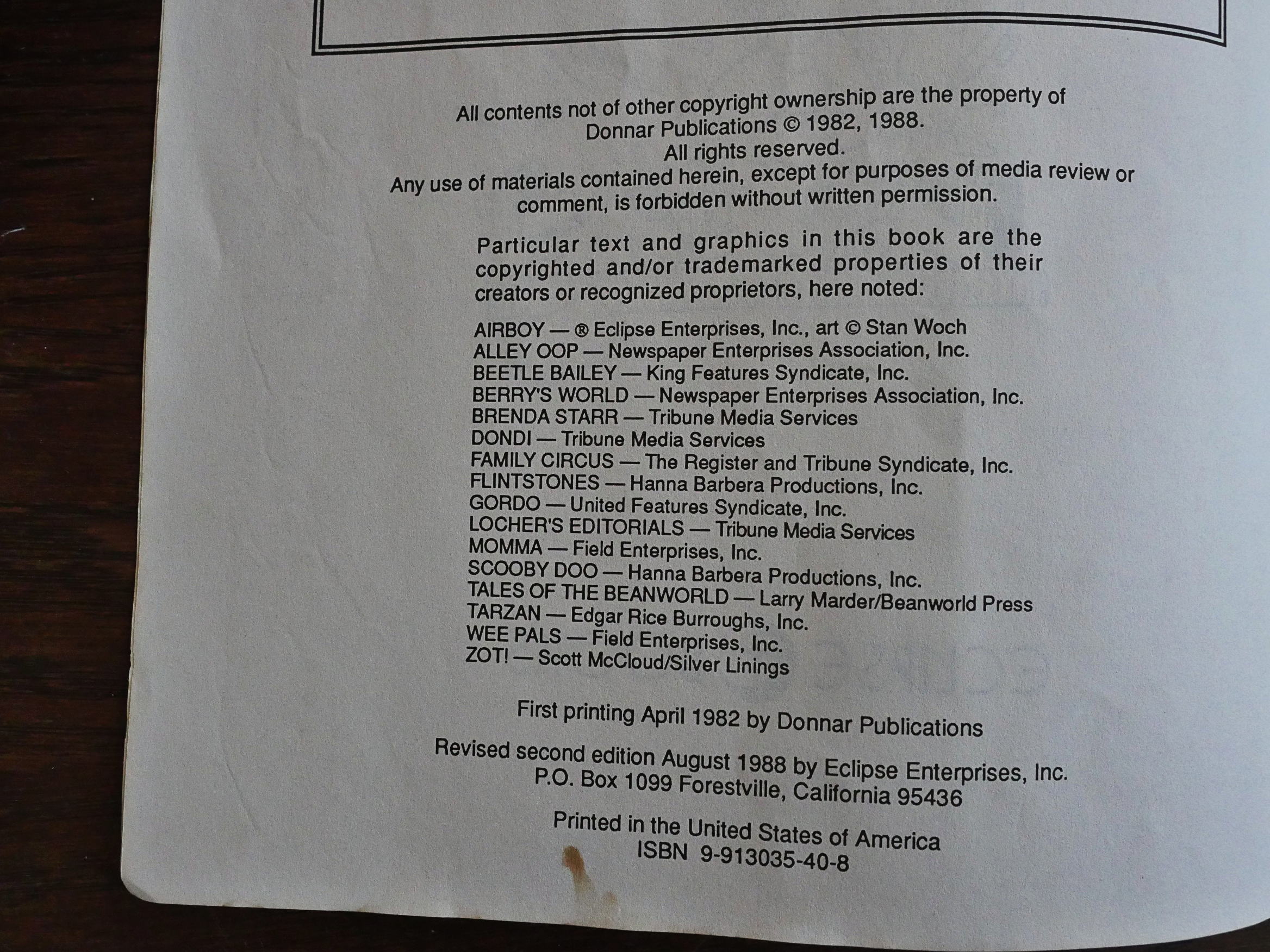
So here we have a book originally published (by Donnar Publications) in 1982, but this new, expanded version was published by Eclipse in 1988.

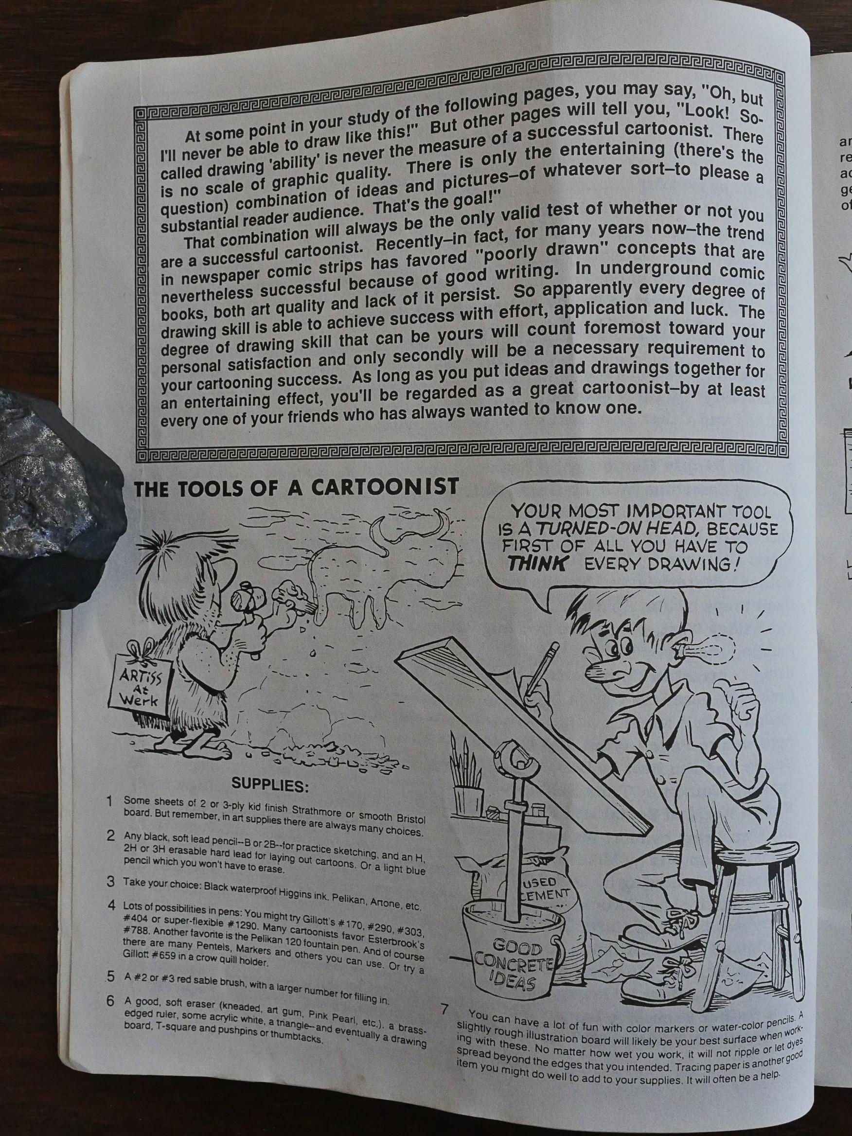
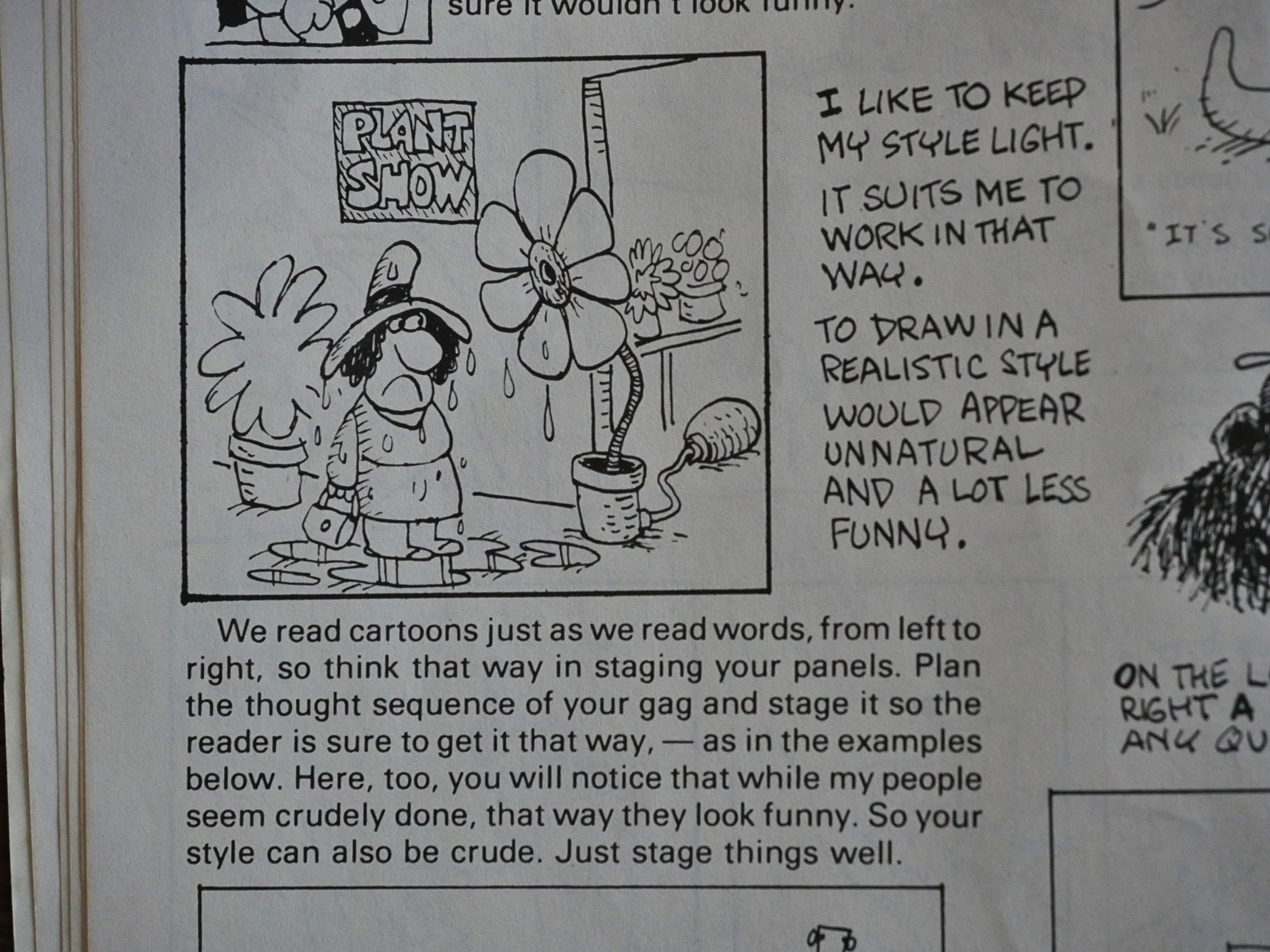
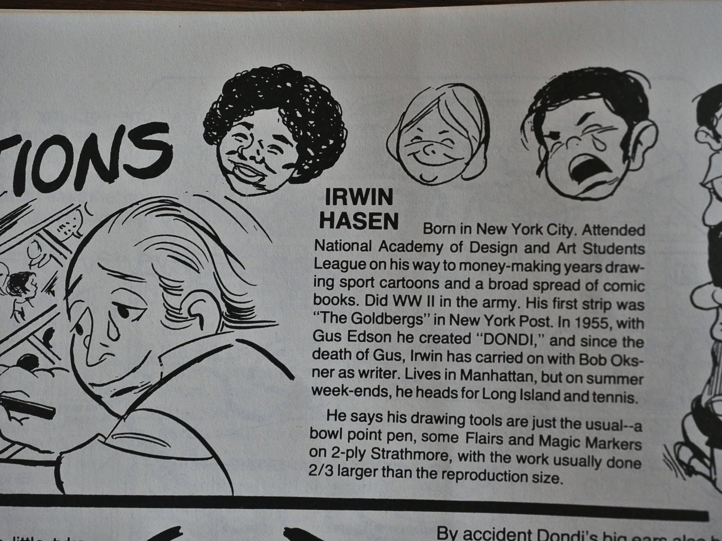
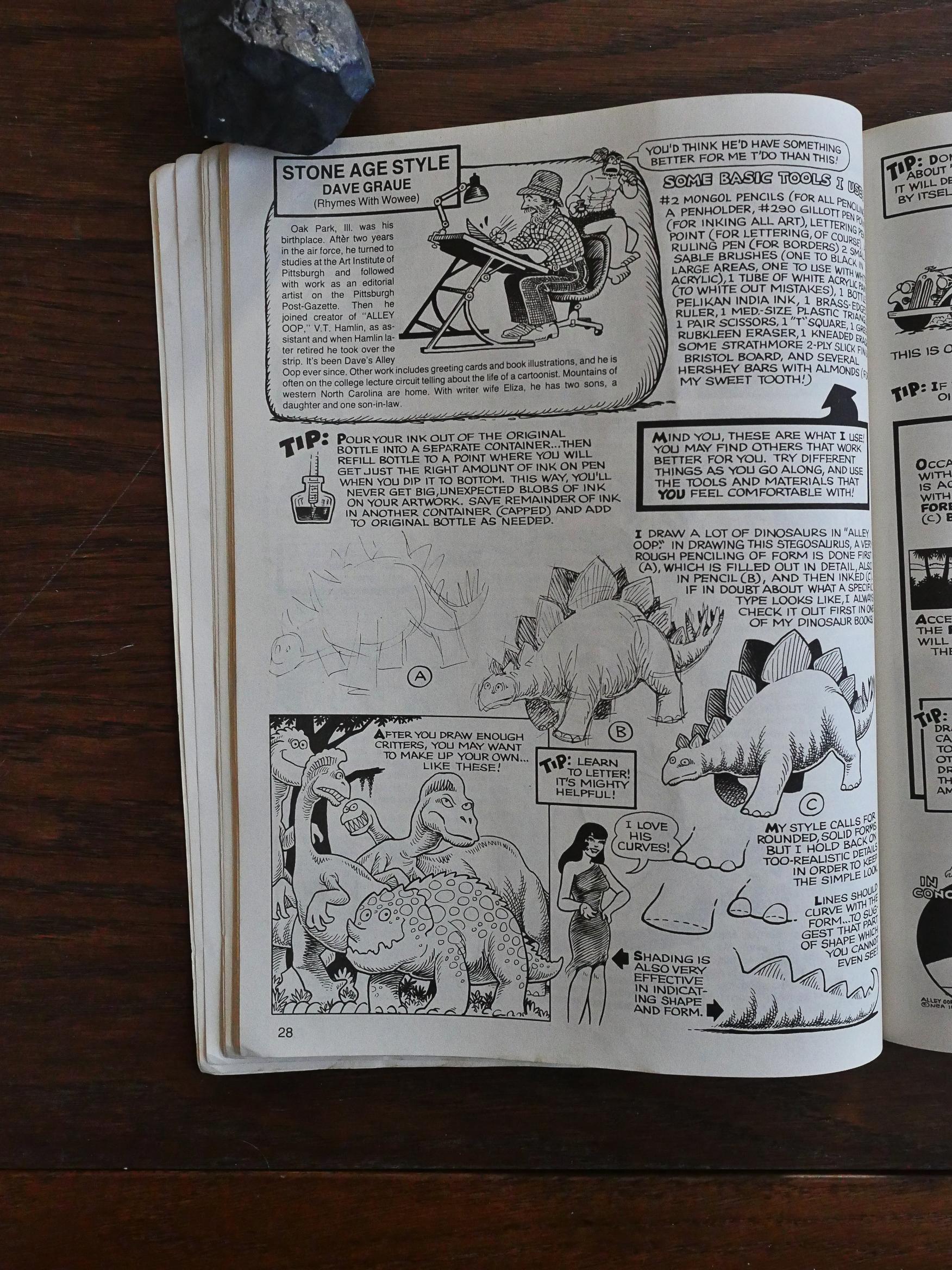
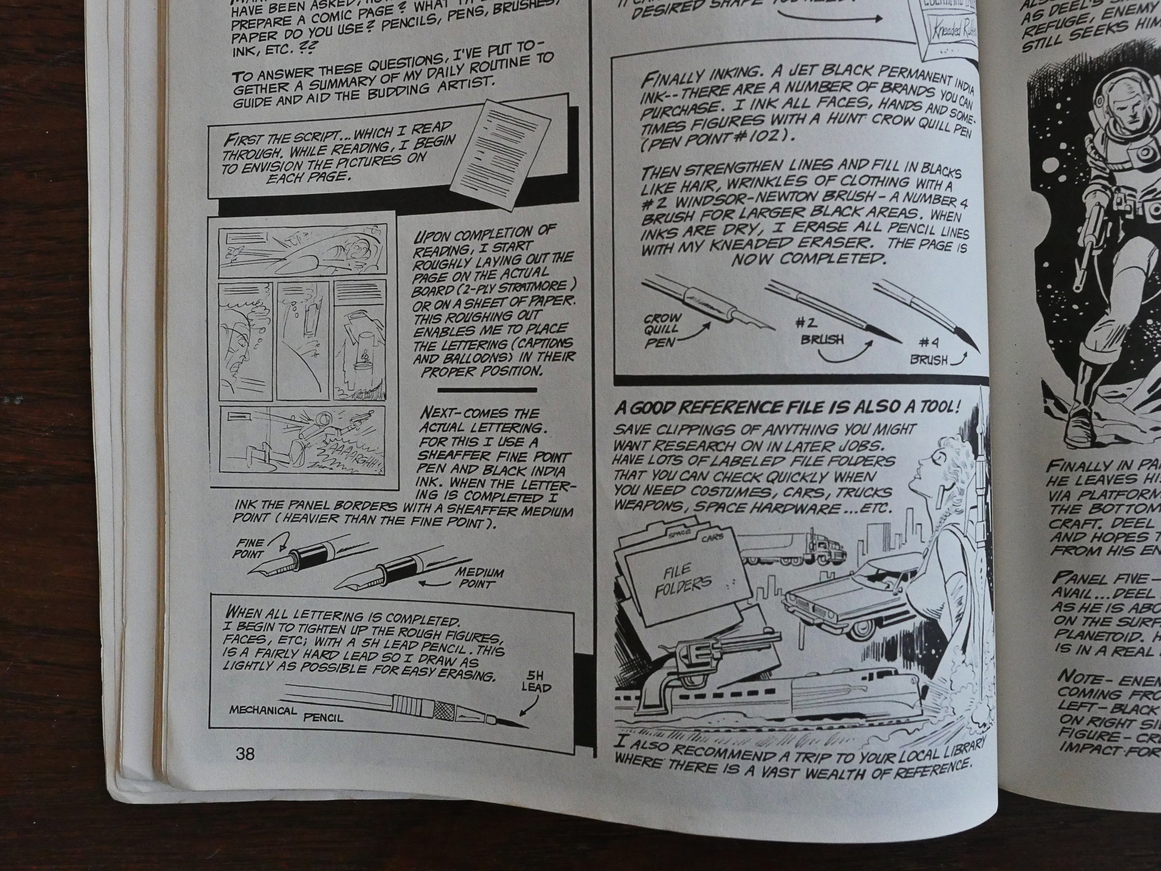
The format of this book is basically that every cartoonist gets two pages do talk, apparently, about anything they want as it relates to making comics. (A couple get four pages.) Some are more high-level than others, but I mostly appreciate (as a non-artist) the most basic stuff, like what paper to use (“two ply Strathmore”) and what pens and inks to use, because it’s just so nerdy and that appeals to me.

So here’s the editor, Don Arr, himself, giving some pointers on how to draw cartoony cartoons.

Sergio Aragones stresses how details and the lack of them makes things more or less funny.

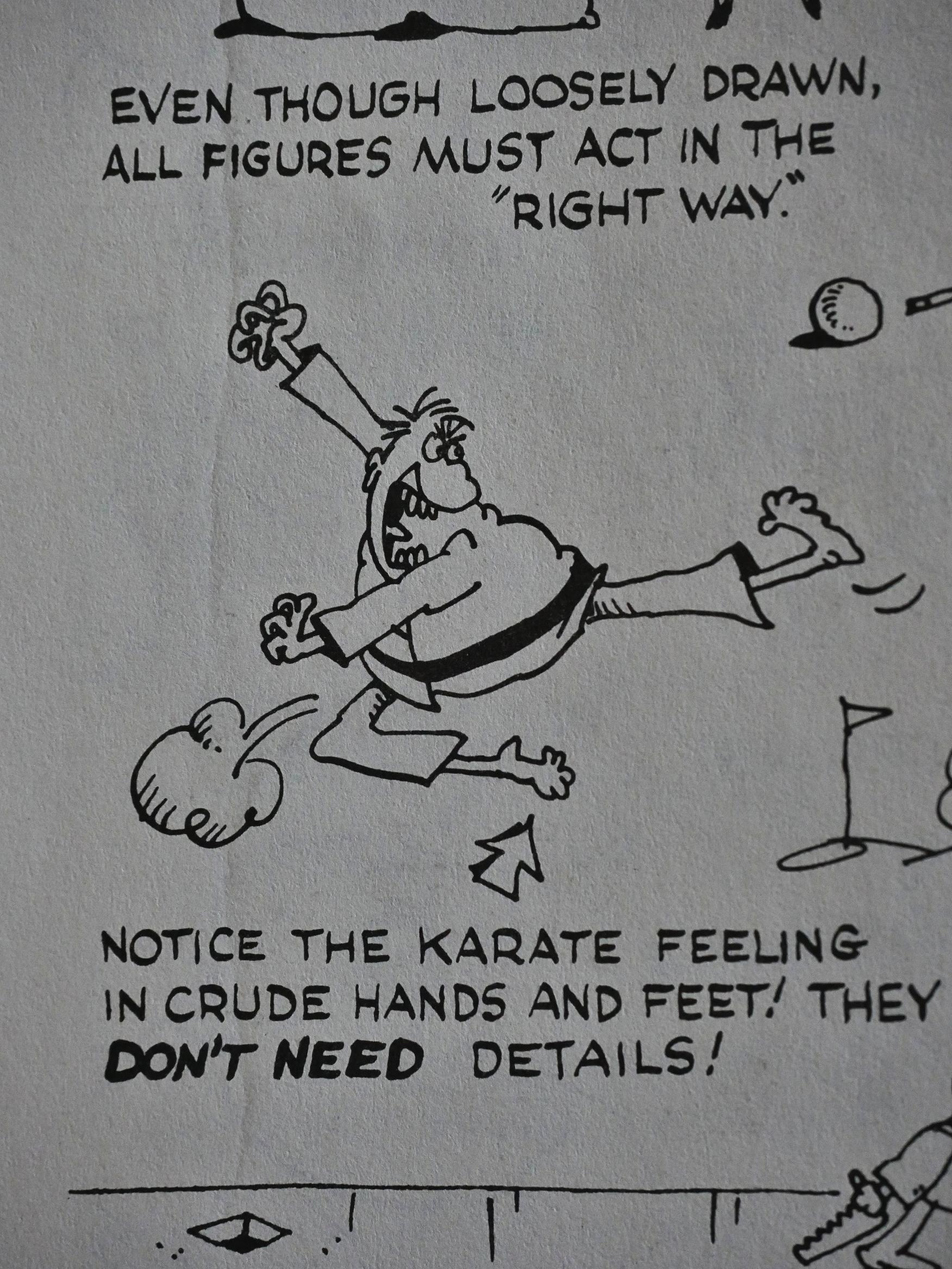
Mell Lazarus owns up to drawing crude characters, but thinks that makes them funnier.

Each cartoonist gets a very short bio to explain who they are.

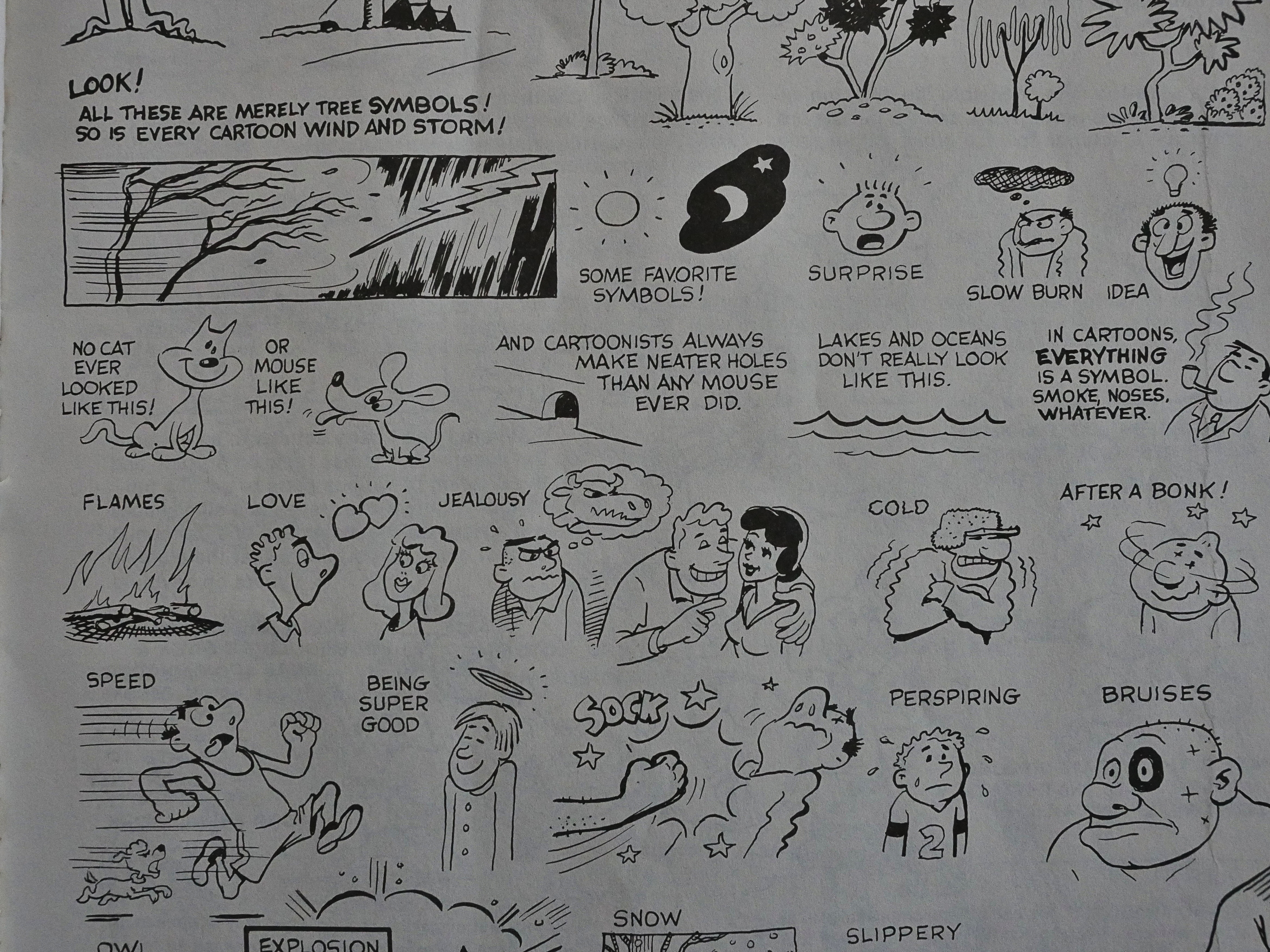
Most of these pages have been created entirely for this book, I think, with instructional how-to drawings of how to create various effects.

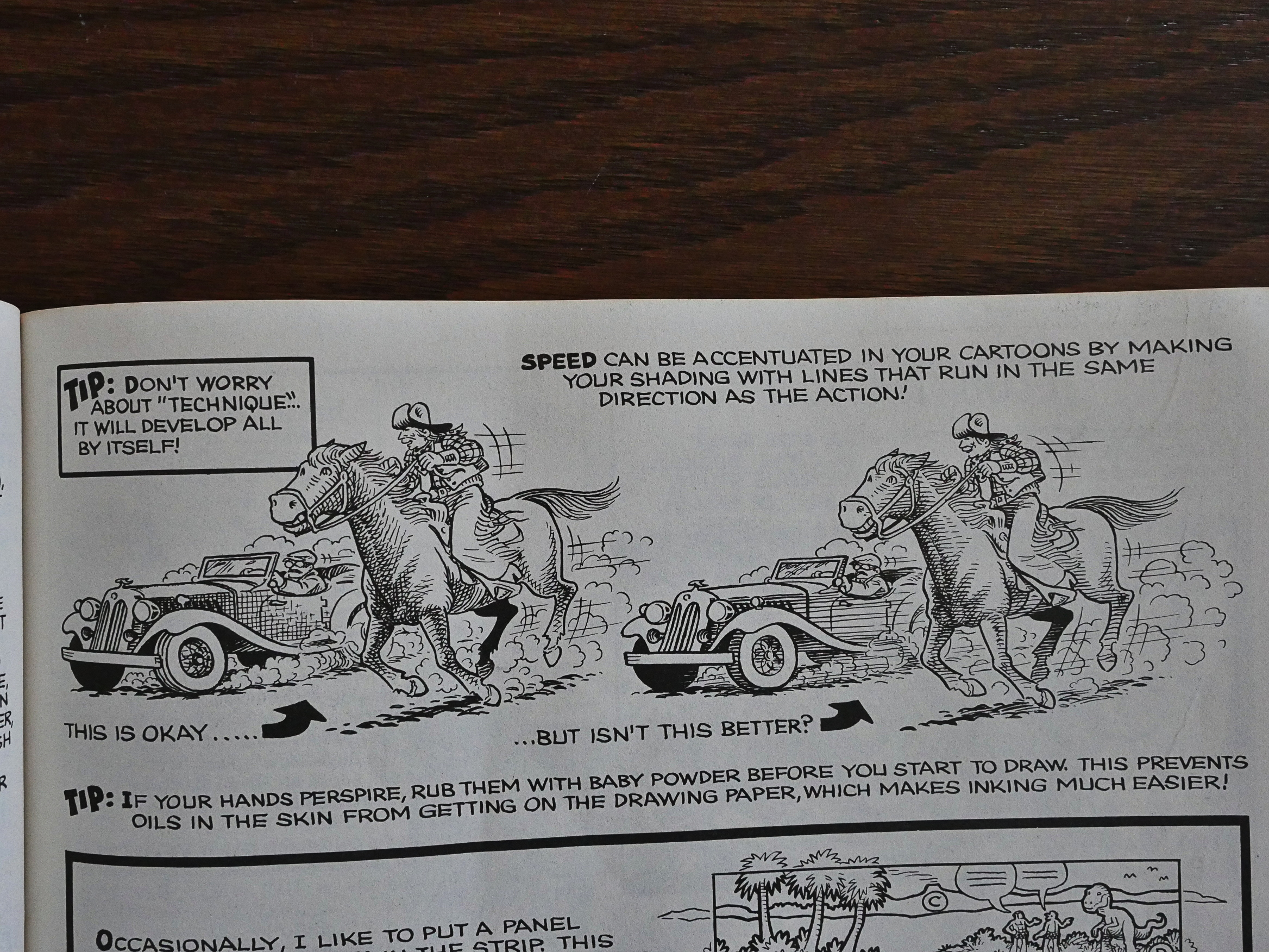
Like here when Dave Graue demonstrates the difference directionality in hatching makes. Nice.

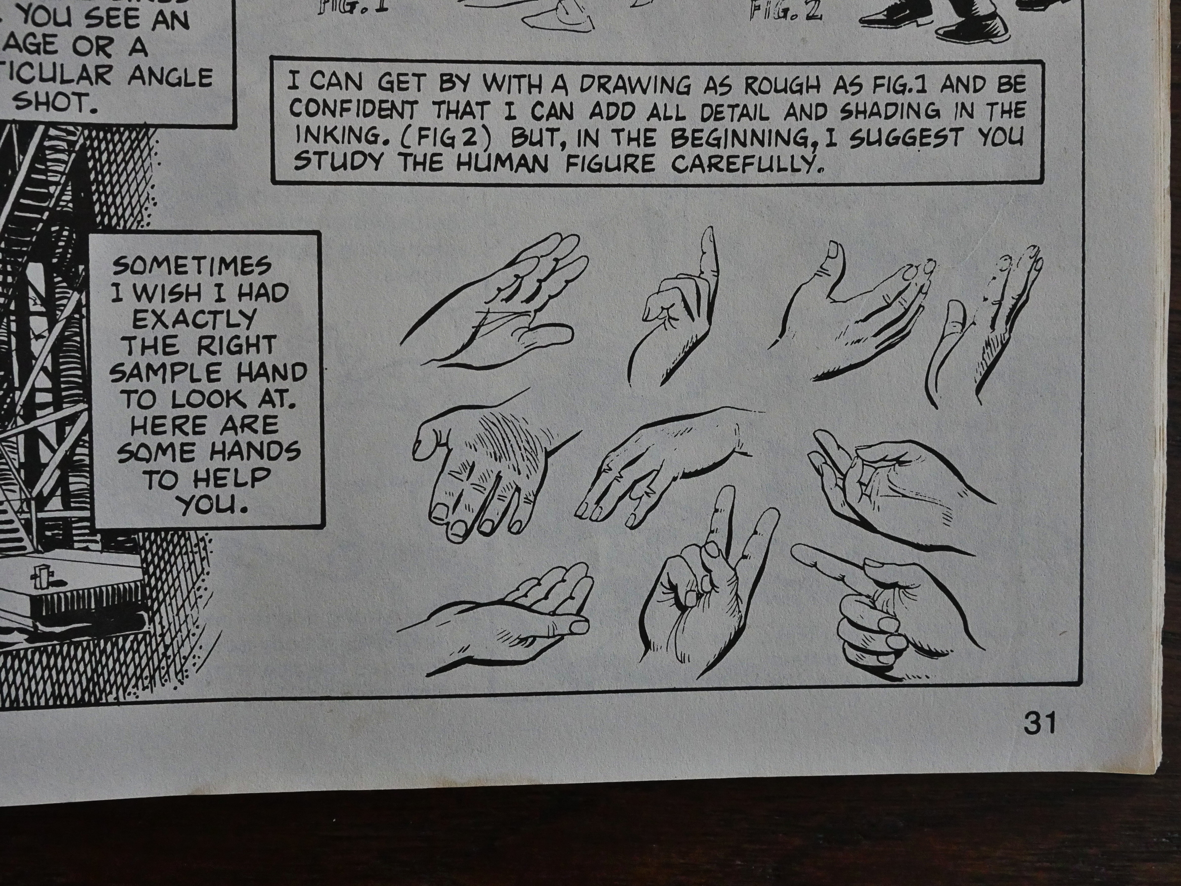
Dan Spiegle very helpfully provides several hands that people can crab.

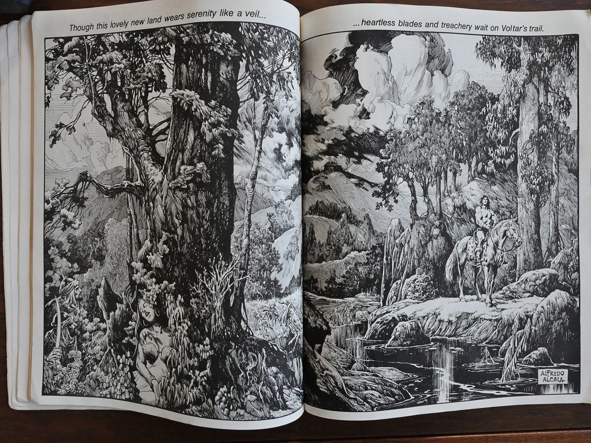
Alfredo Alcala, after doing his allotted two pages of tips suddenly springs this double page spread on us. Yowza.

Oh, is that what a crow quill pen looks like? I’ve never quite known…

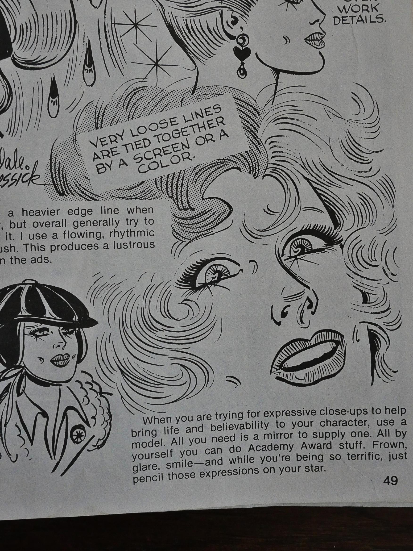
Dale Messick is one of only three women who appear here, but I guess that’s a better percentage than most of these things at the time.
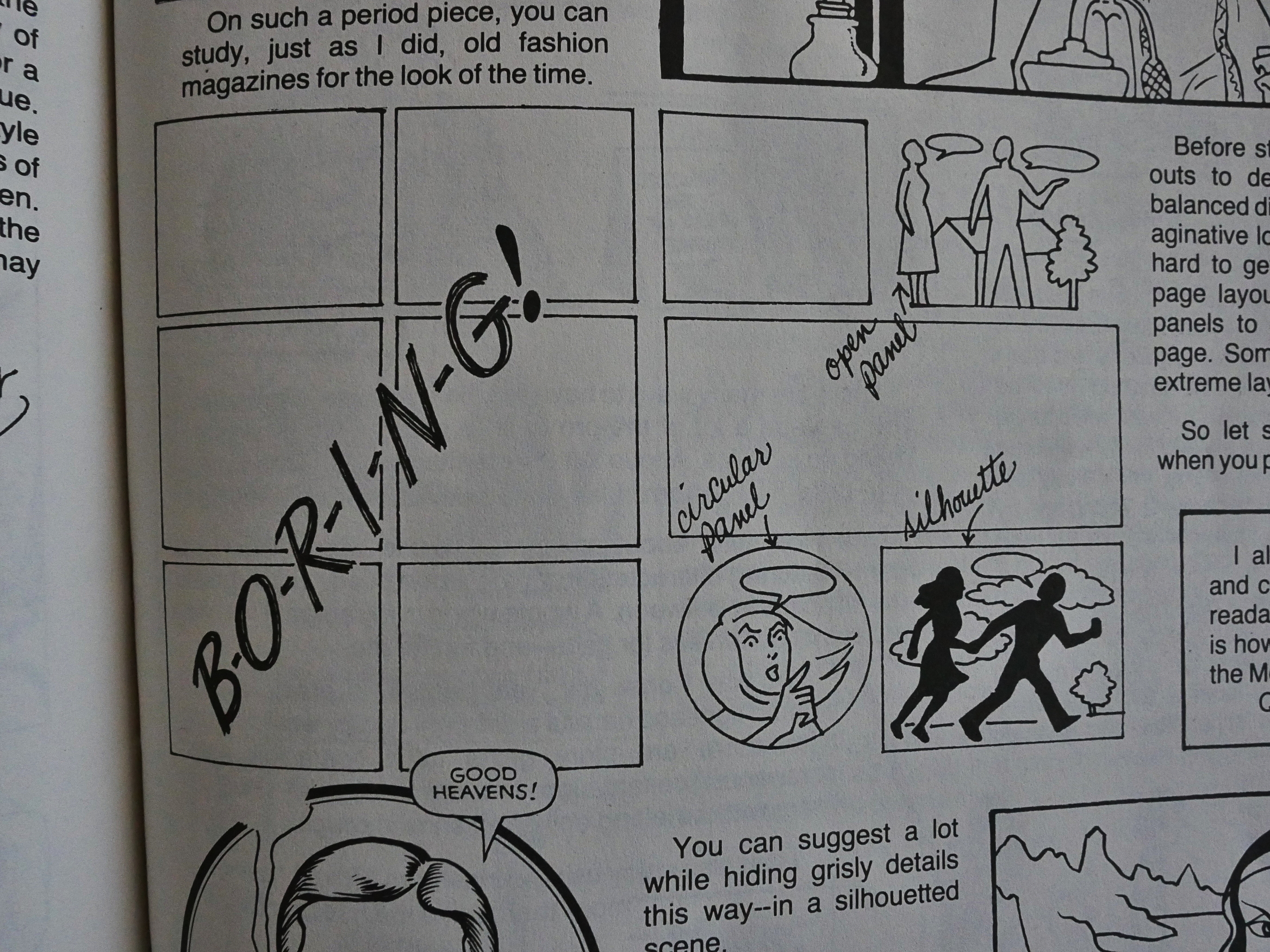
Trina Robbins lays down the law on b-o-r-i-n-g! layouts.

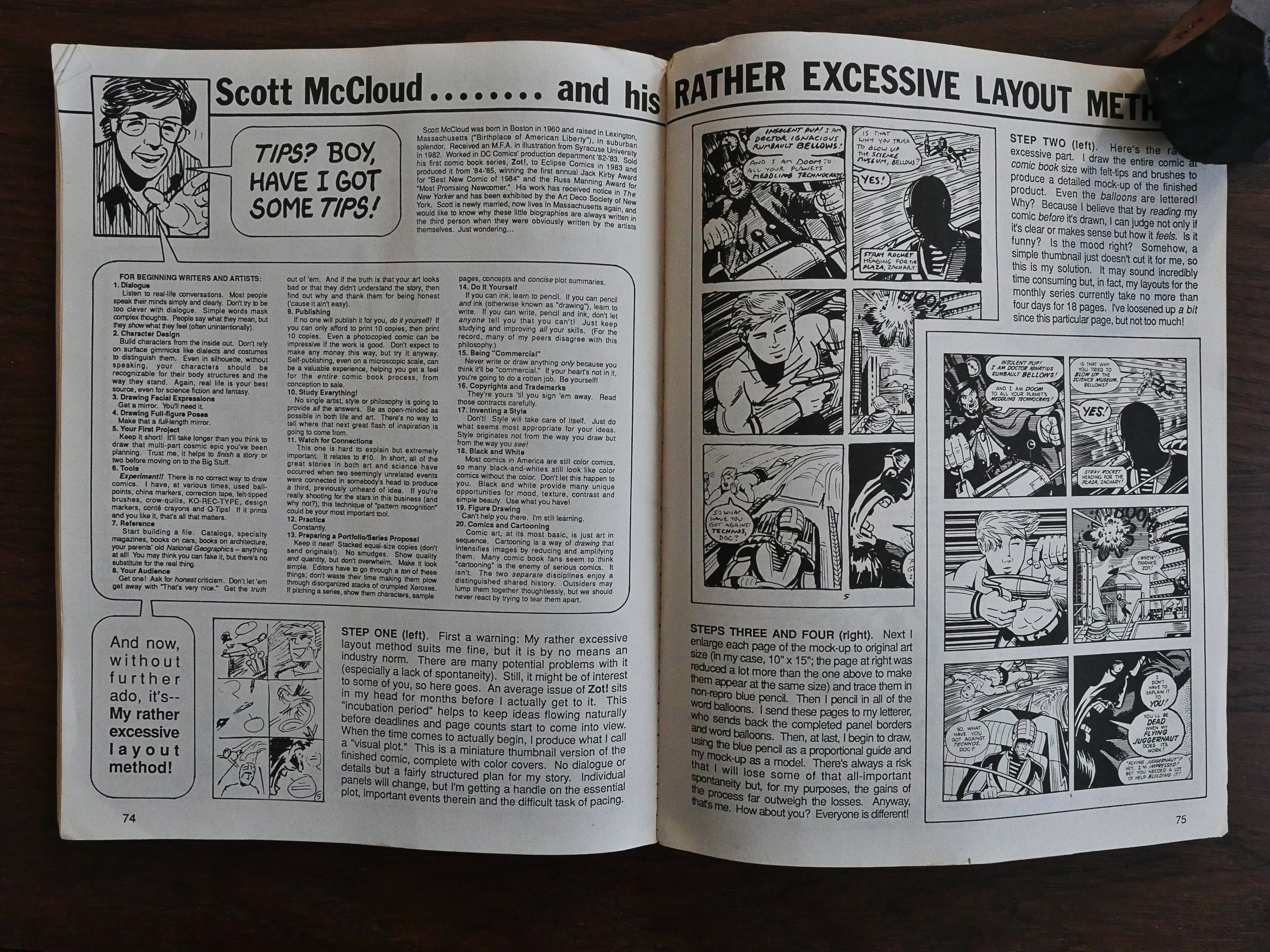
And Scott McCloud, of course, manages to squeeze in about twice as much text as anybody else. No wonder he went on to write a couple of books about comics.

This book has never been reprinted since, and I’m unable to find anybody on the web who has anything to say about it. I do wonder who’s the target audience for this book… It’s a bit on the basic side, which meant that I could understand most of what they’re talking about. Which is nice. But would anybody who’s actually interested in drawing find it helpful? I don’t know.

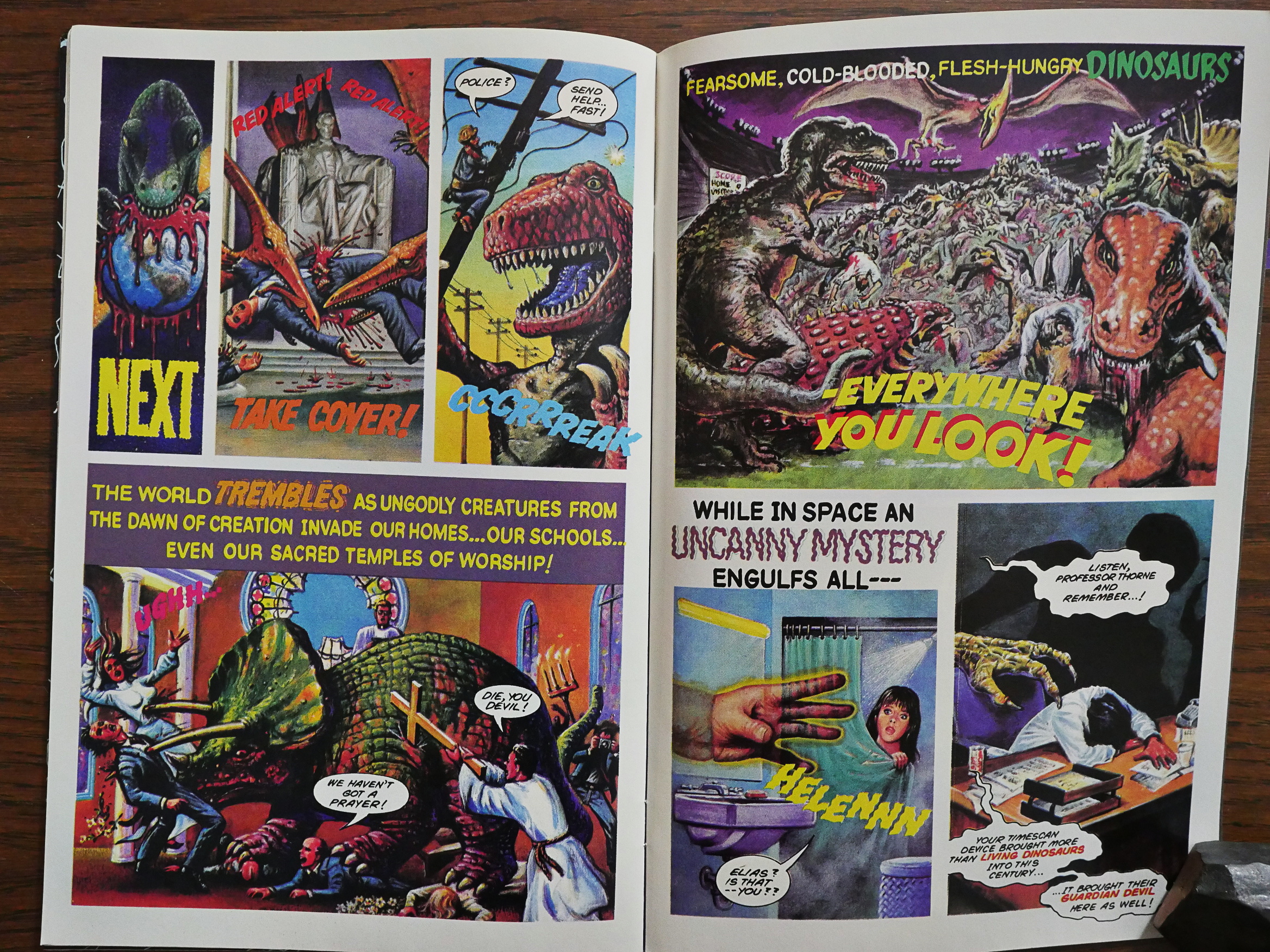
1991: Dinosaurs Attack! The Graphic Novel

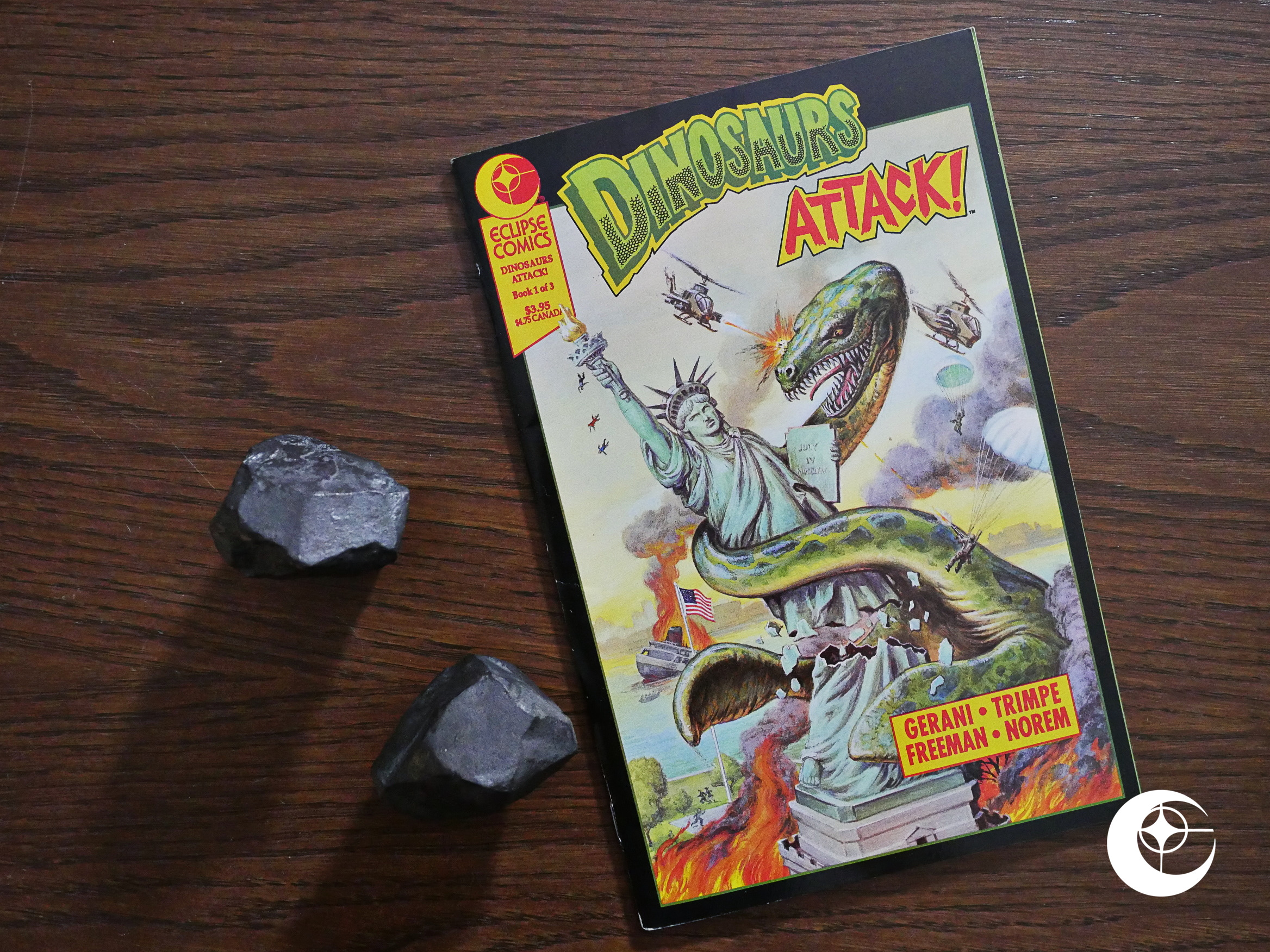
Dinosaurs Attack! The Graphic Novel (1991) #1 by Gary Gerani, Herb Trimpe, George Freeman, Earl Norem, et al.

Eclipse had been serialising graphic novels by publishing them in three squarebound, 48 page issues first for a couple of years. With Robin Hood half a year earlier, they had moved to floppies, and this continues that trend. It’s a 48 page floppy for $4, which was more expensive than the norm at that time.

And unlike many of the other graphic novels Eclipse published, it’s not fully-painted. Instead it’s… Herb Trimpe.

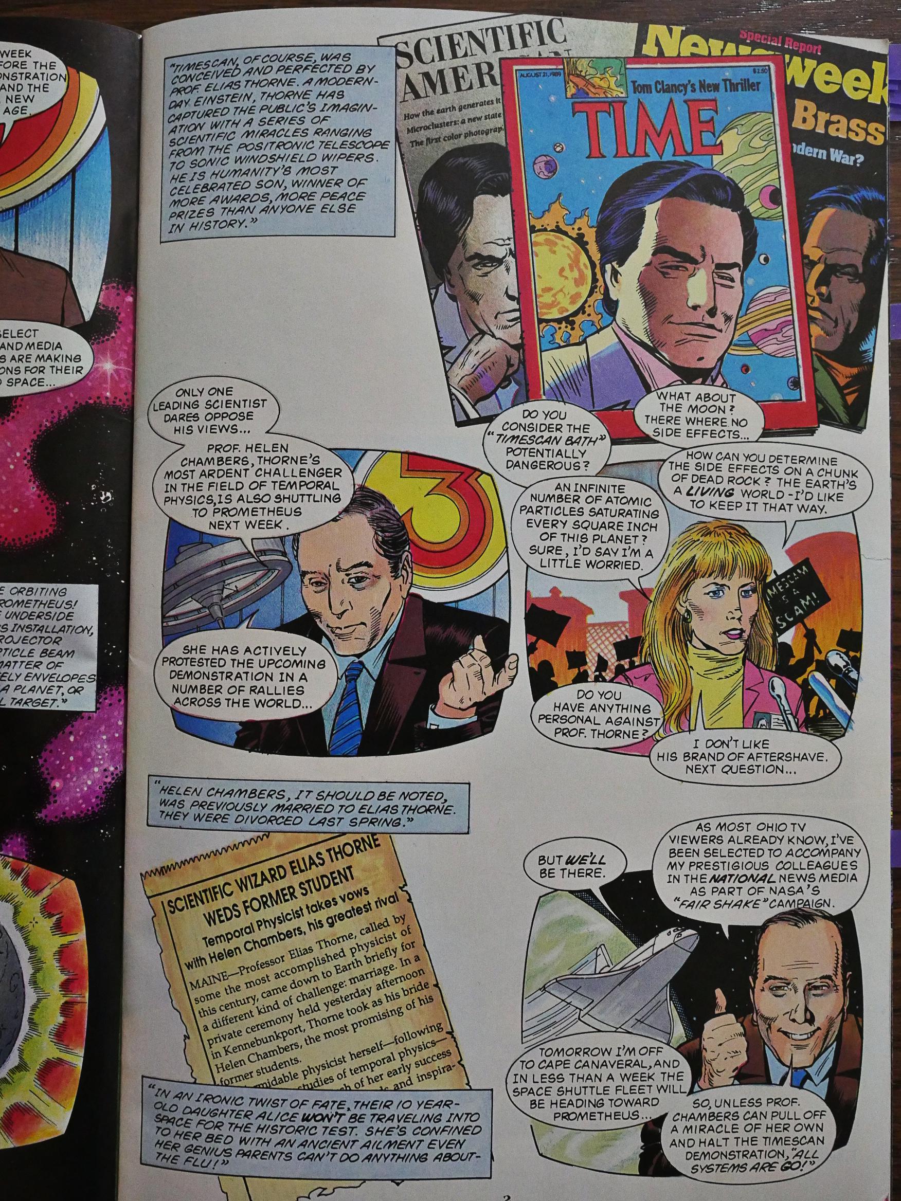
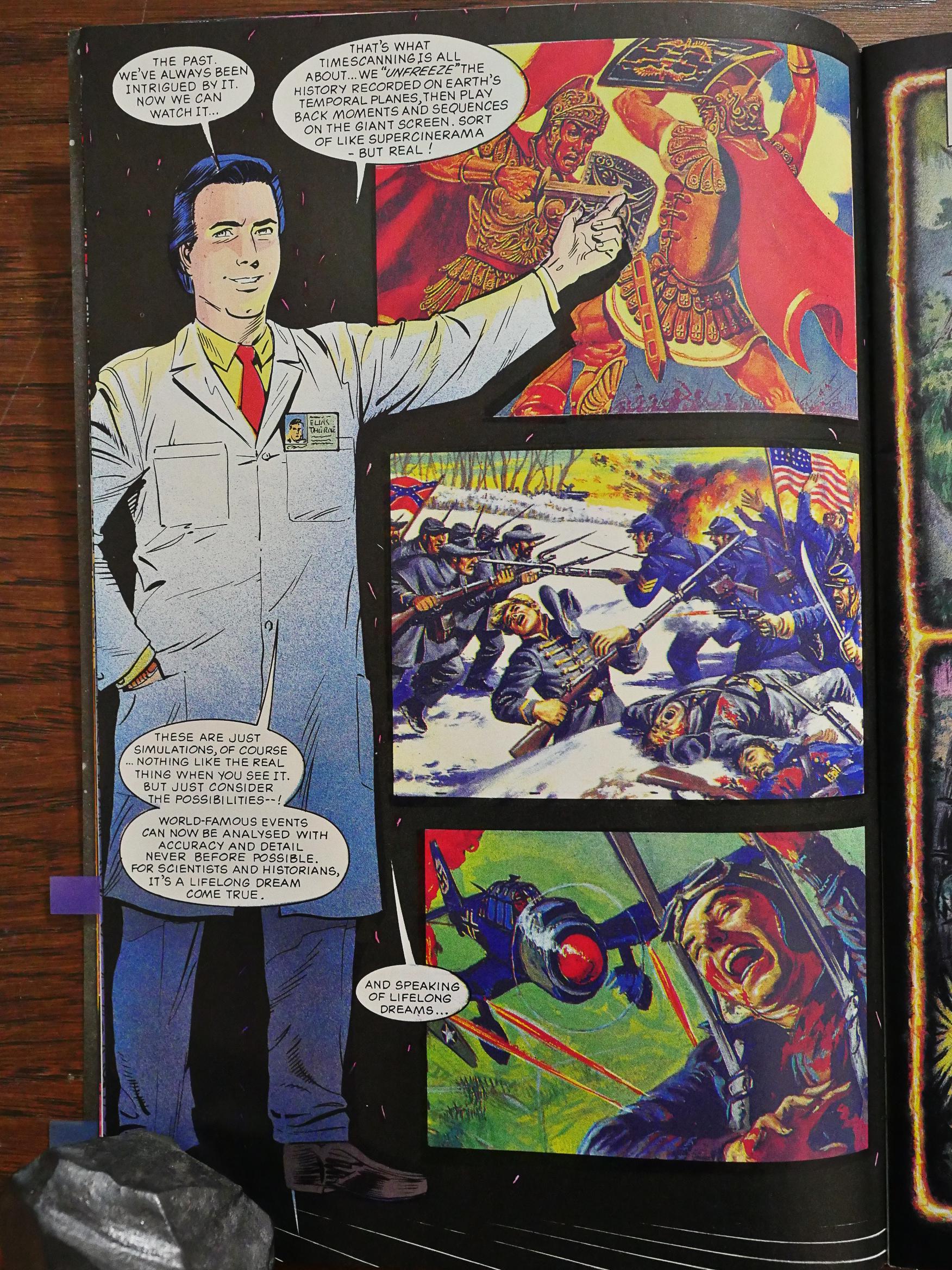
The comic is based on the Topps trading cards, but I’m assuming that the author added a whole lot more plot here. I mean, it’s a very simple concept in essence (Dinosaurs! Attacking us now!), and the scientist guy above lays out how this is going to happen.

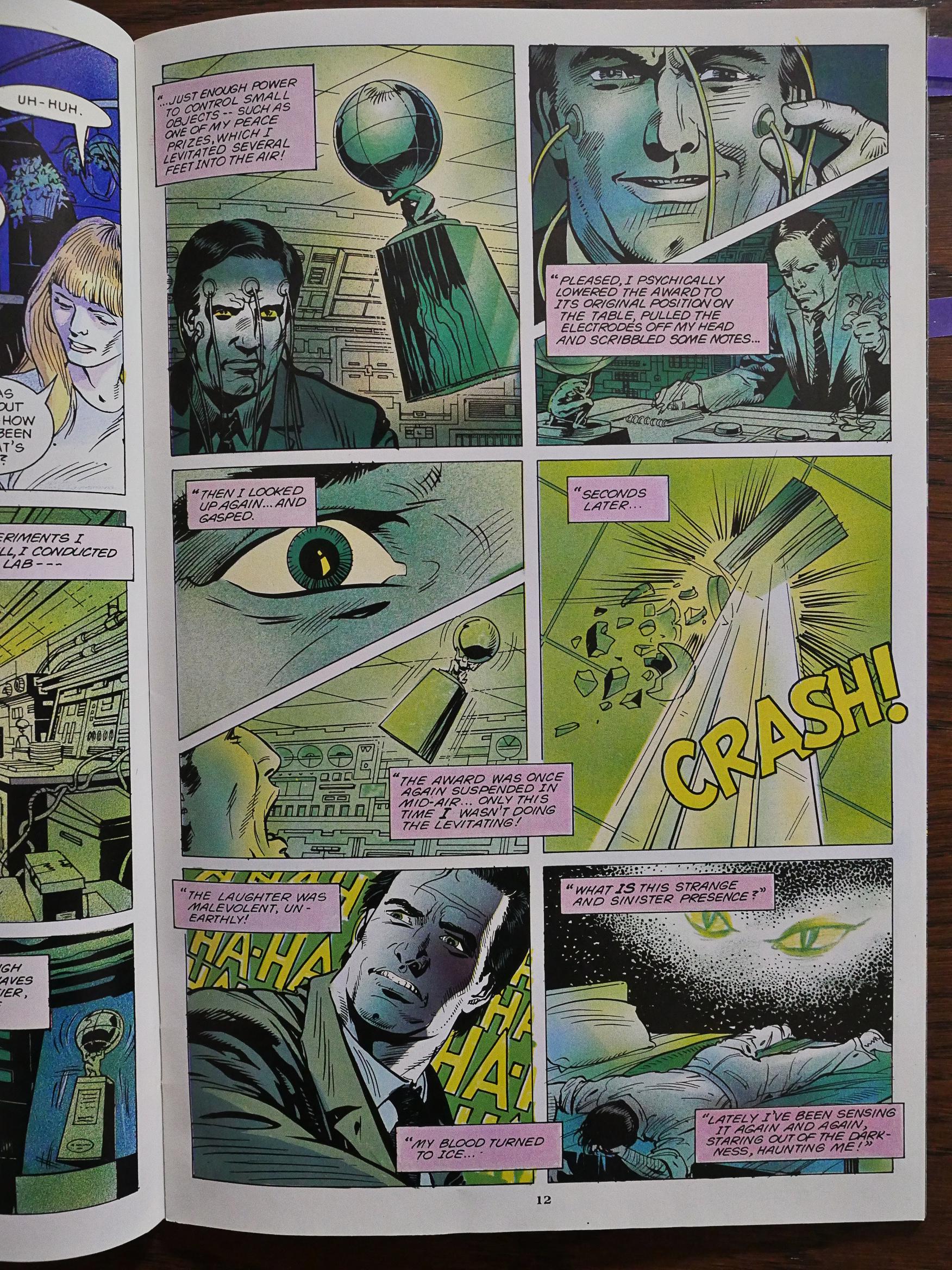
But complicates things a lot, adding ESP and domestic problems and … For something that must have been intended as a goof, it takes itself very seriously.

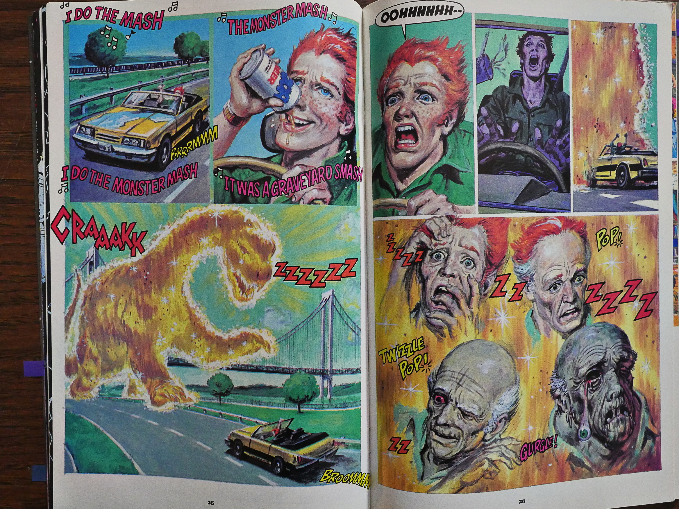
Fortunately, after 25 pages, the dinosaurs finally attack, and we shift to fully painted artwork and get to see some faces melt, like we deserve.

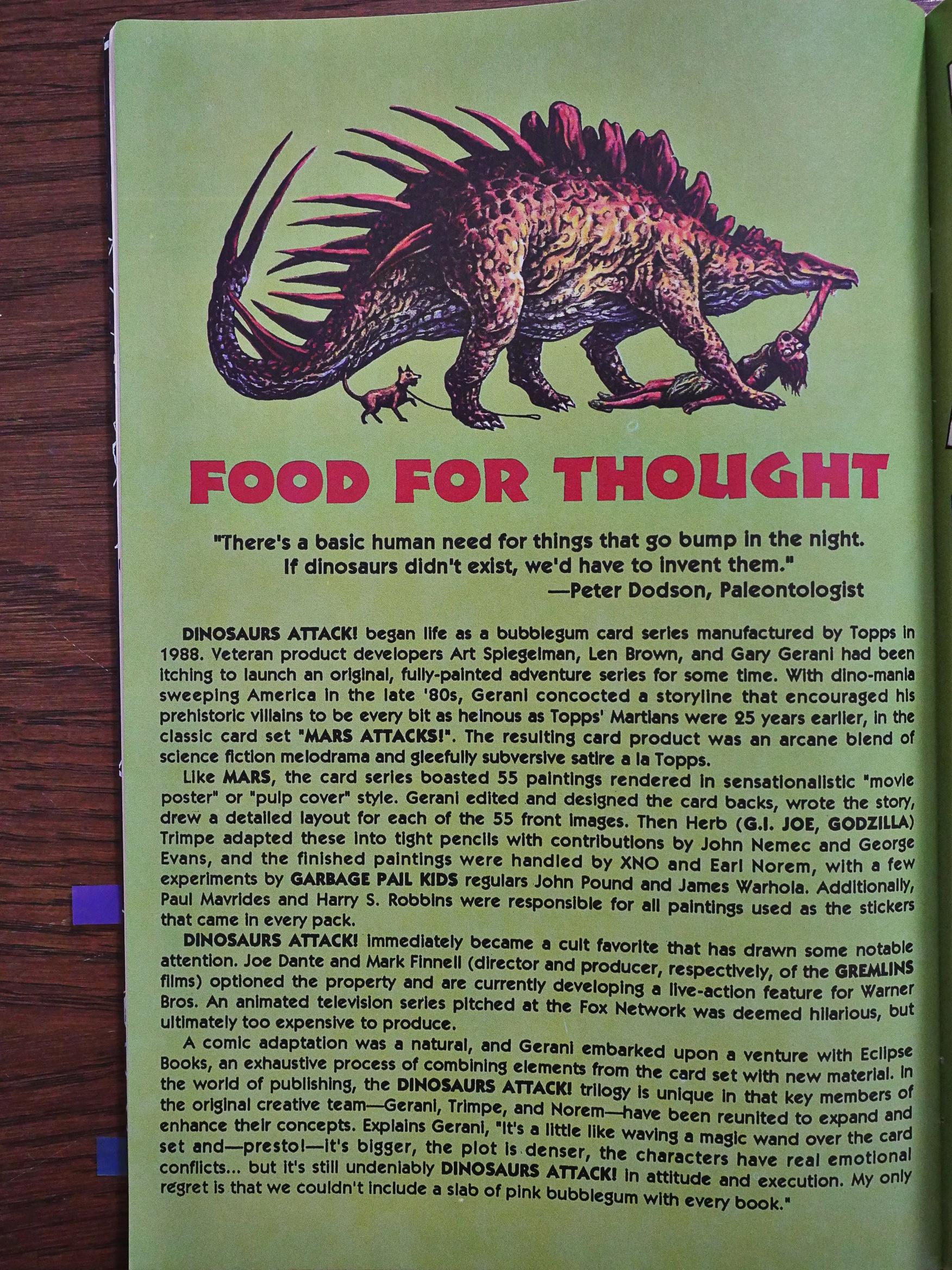
We’re given an explanation as to what it all means.

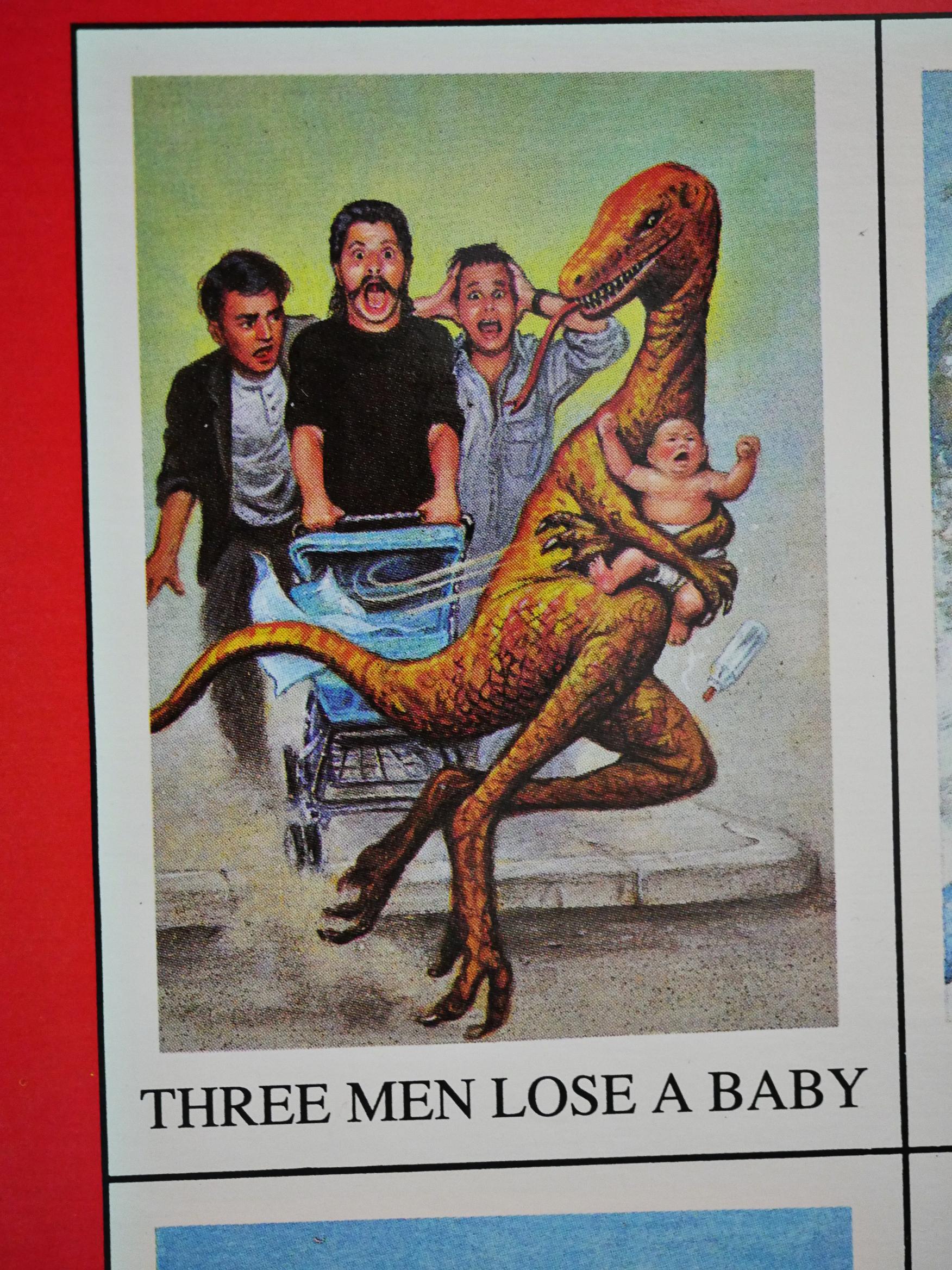
These are presumably images from the trading cards? The trading cards are a lot funnier than this issue.

I mean, just look at that happy dinosaur.

As with the other series Eclipse launched in December 1991, only one issue was published. I’m going to do ahead and guess that this is because Eclipse were in financial difficulties at this time, and I’m going to guess that the professional artists involved here aren’t going to draw a single page before they get paid.
And a lot of artists in these twilight years didn’t get paid.

IDW published a complete edition of this graphic novel 25 years later:

Ultimately this issue spends a lot of time setting up the protagonists and their complicated divorce. It’s evident from the getgo this is a comic from before our time. The structure and heavy exposition style of it harkens back to a day and age when folks actually wanted to read when they opened a comic. It still holds up though and as long as you have the patience for it there’s an interesting story unfolding here.

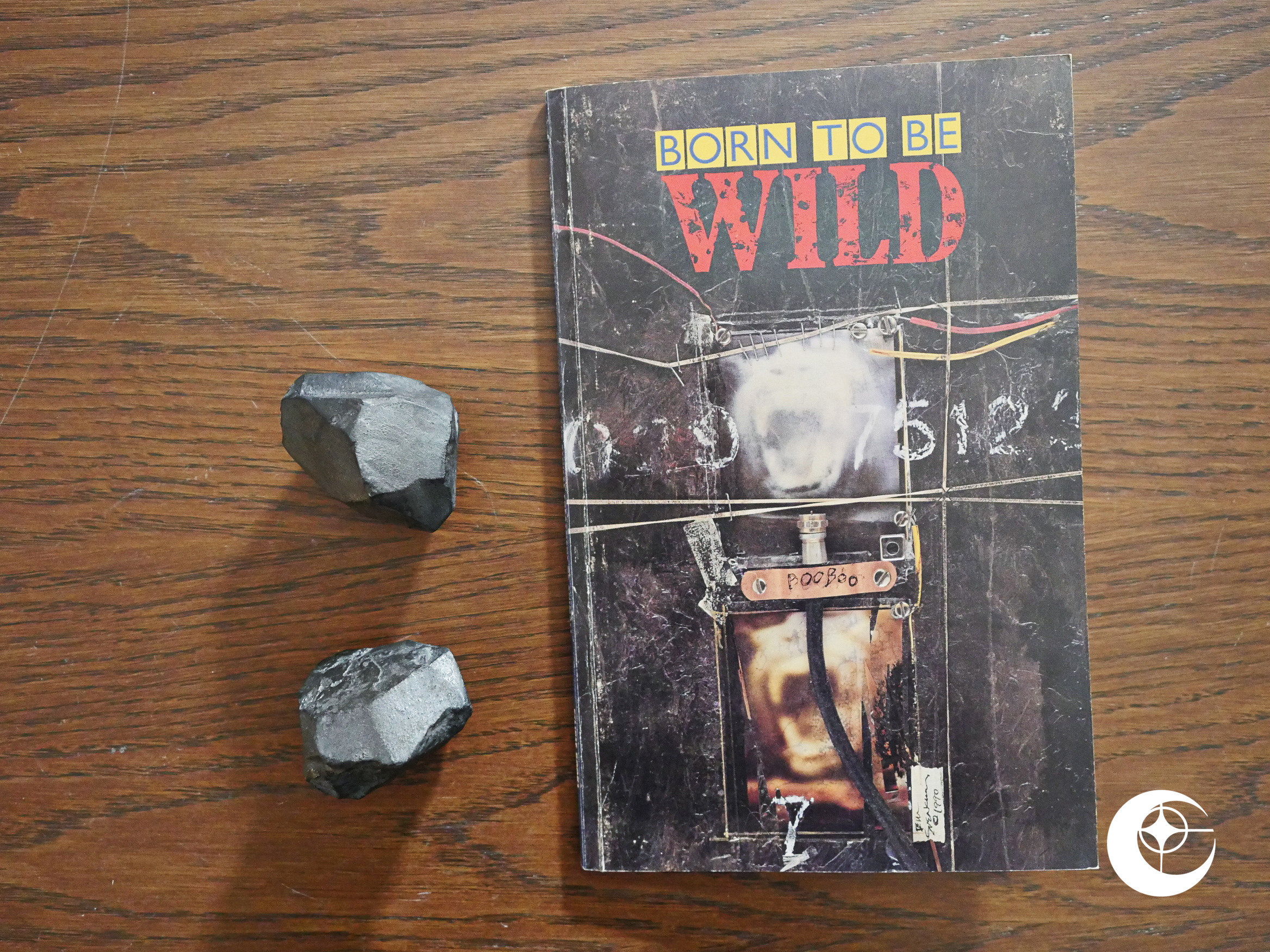
1991: Born to Be Wild

Born to Be Wild (1991) edited by Valarie Jones, Fred Schiller and Steve Donnelly.

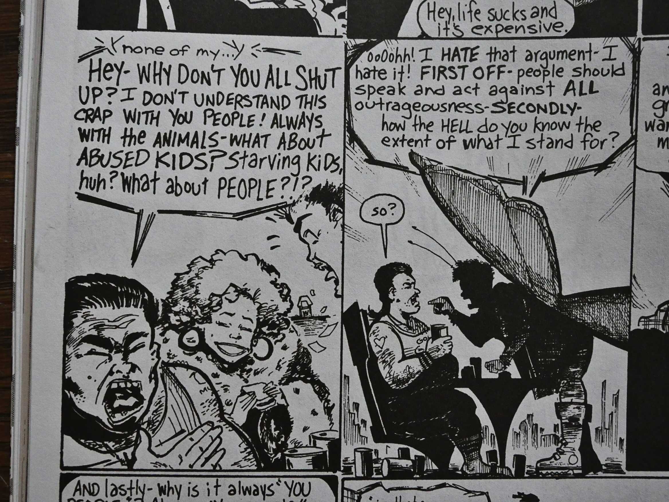
This is the final current events/politics book Eclipse released before going extinct. It’s a benefit book for PETA (People for the Ethical Treatment of Animals) by “CETA”, which is the same only with “Creators”. I’m not sure that’s really a real organisation; the only mention I can find of it is in conjunction with this anthology. Editor Valarie Jones is allegedly the director of CETA.

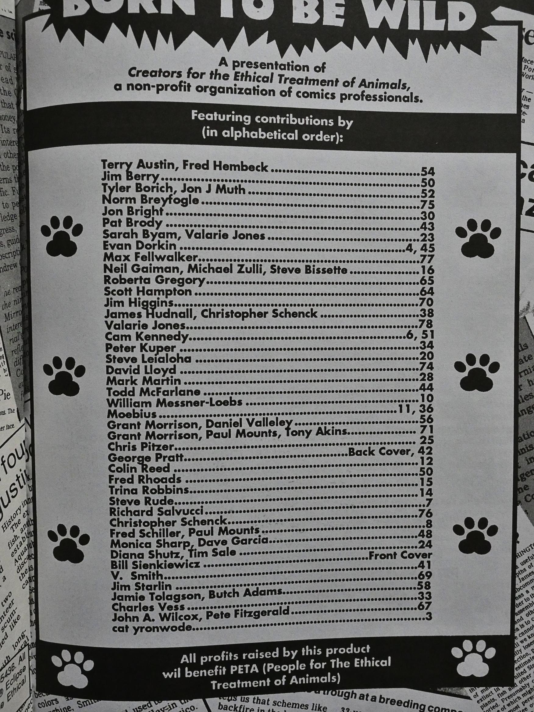
Anyway, it’s an 80 page squarebound anthology with a huge number of contributors: Most of them only do a single page. They’ve helpfully listed the contributors in somewhat alphabetical fashion, and most of the pieces themselves don’t say who the creators are, so to determine who did a thing, you have to scan the page numbers here and them find the creators that way.

Whyyyy?! I think the editors just hate people.

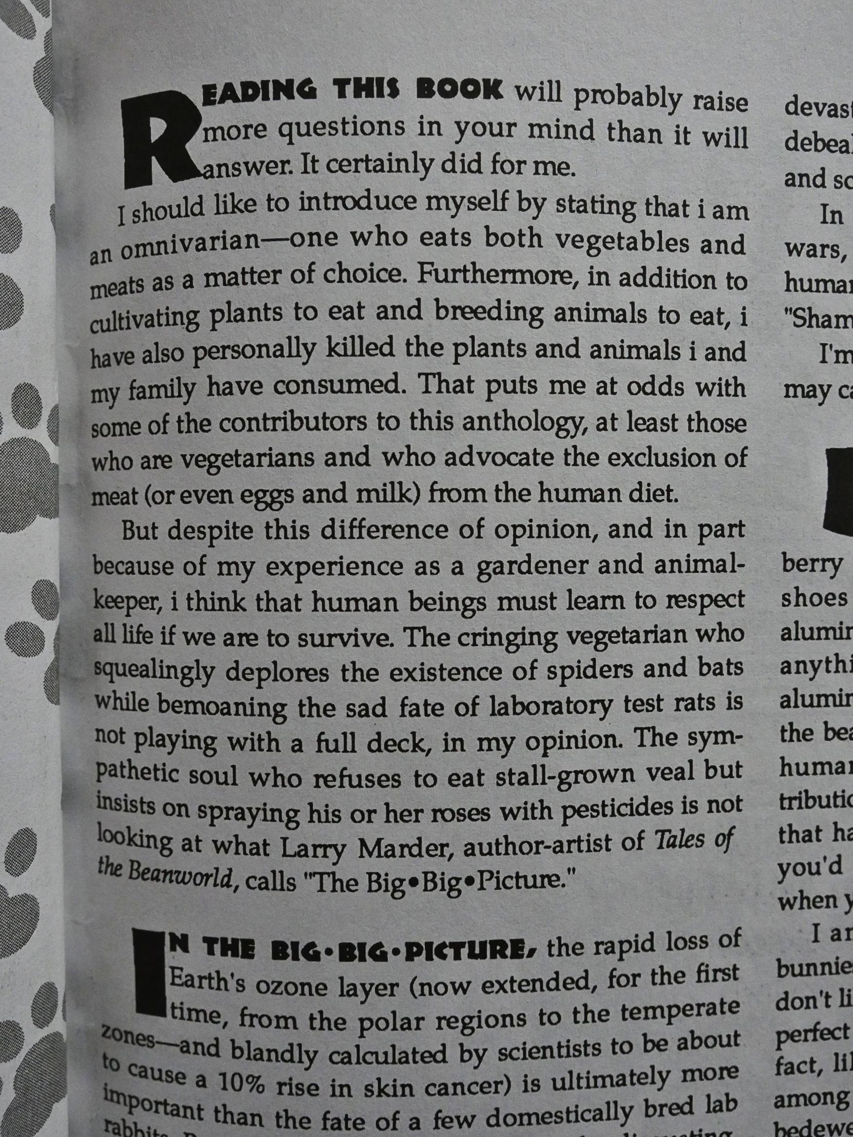
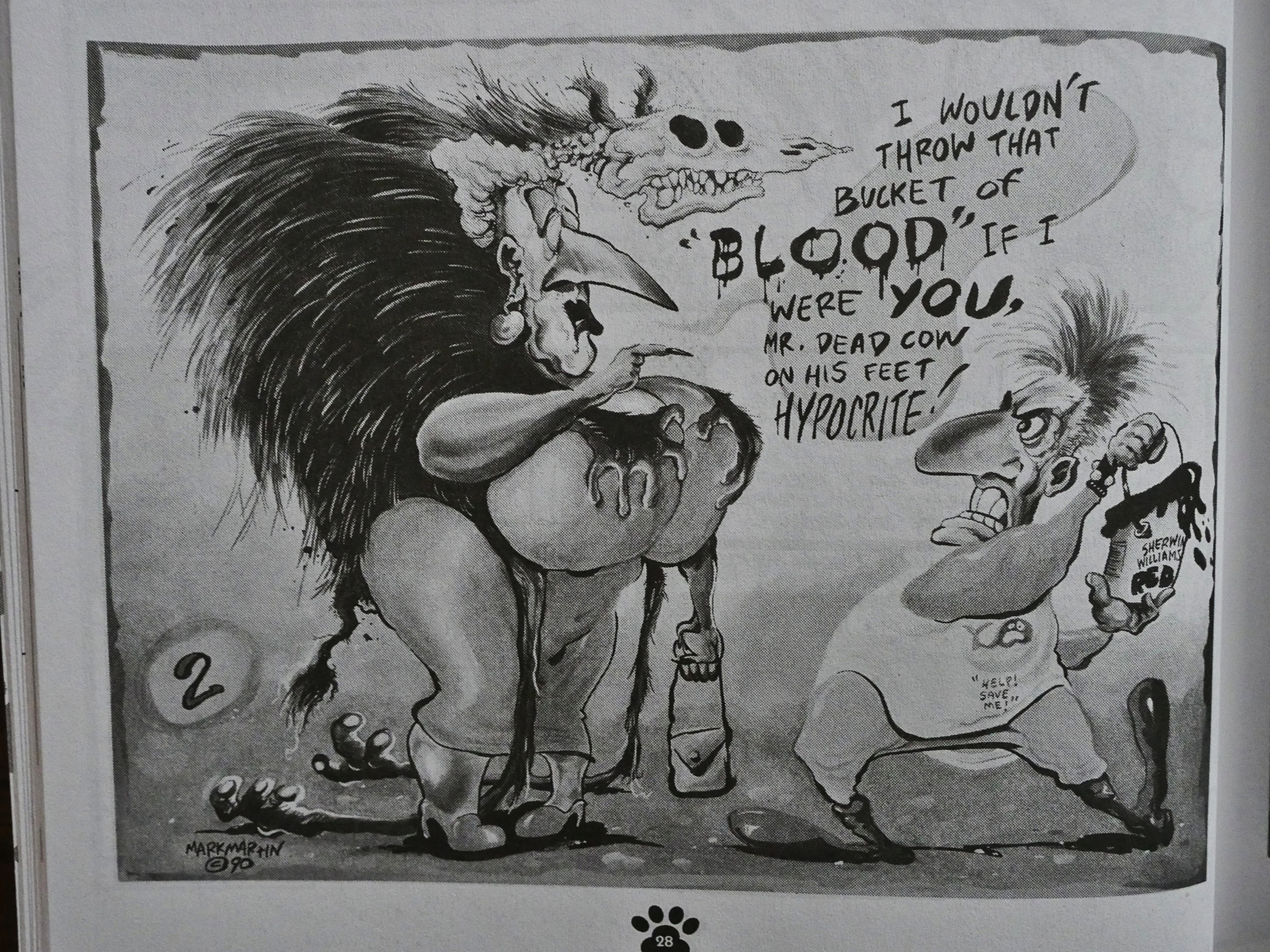
And speaking of editors: The editor in chief at Eclipse, catherine yronwode, inserts herself into the anthology and writes an introduction. It’s an exercise in whataboutism, where yronwode chastises people for caring about silly things like torturing animals in labs when there are more serious things out there. And, of course, labelling people as hypocrites when they care about the welfare of cats but still use pesticides to kill insects.

I’ve always had quite a bit of respect for yronwode, but this page is tone-deaf and insulting, and is a big “fuck you” to the contributors, basically, even if the concedes at the end that perhaps if this is “all you can do” then you should by all means do it.

Thanks!

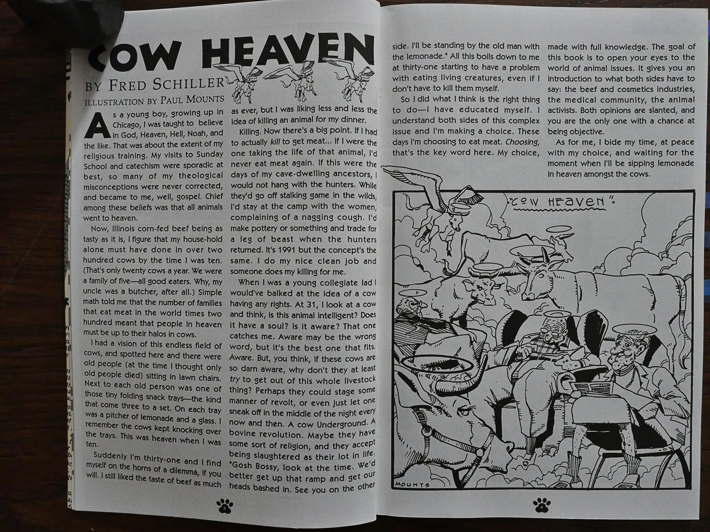
Editor Fred Schiller, on the other hand, writes another introduction that explains the dilemmas clearly (and funnier).

Ooo! That’s a very contented Moebius cat…

I wonder how the contributions were collected. Most of them seem made specially for this book, but perhaps a third seems like they may just have been stuff the artist had in a cupboard somewhere.

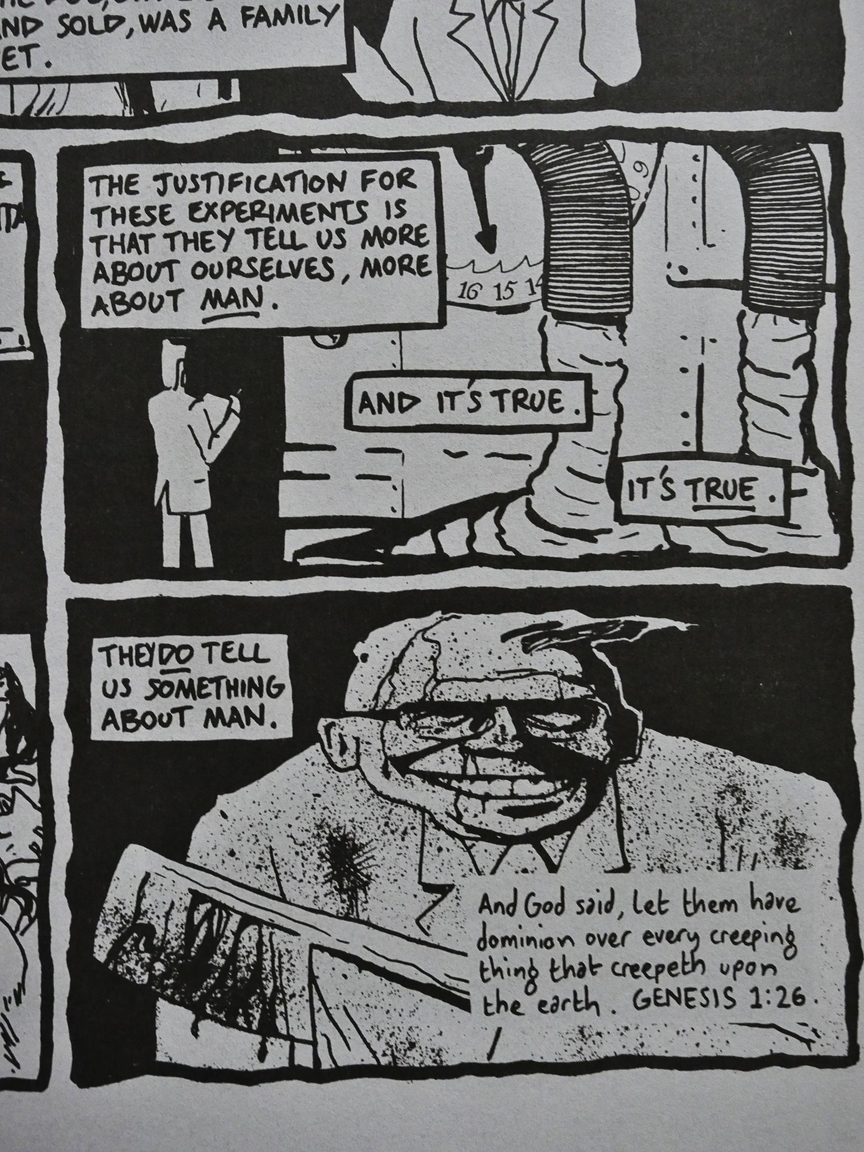
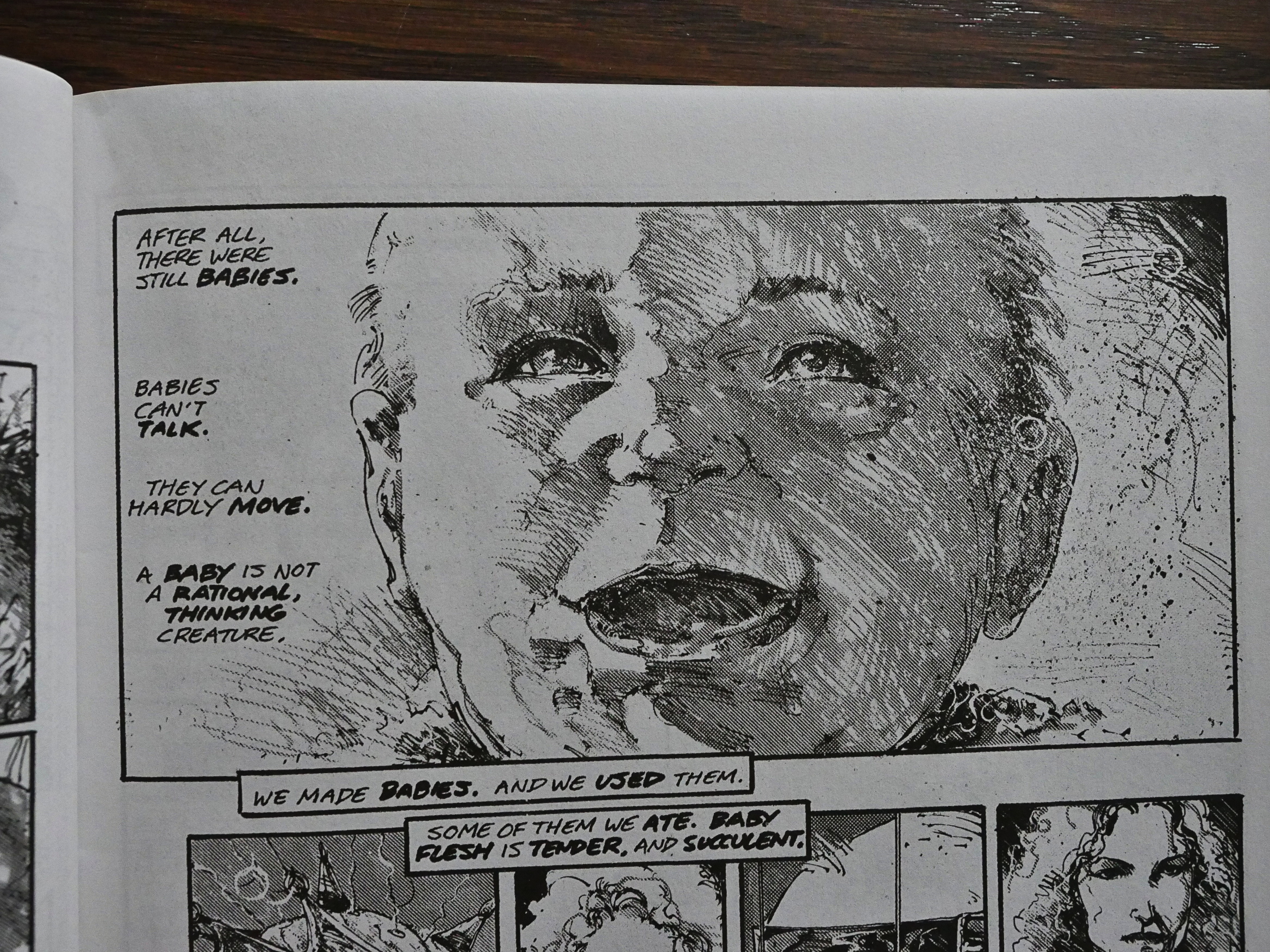
And this Neil Gaiman/Michael Zulli/Steve Bissette horror story (one of the many that posits using humans instead of animals as lab subjects) I’m pretty sure was originally published in an issue of Taboo. It’s pretty stomach-churning.

As if in response to yronwode’s introduction, some of the artists ridicule her stance. Here’s Mark Martin…

… and here’s Evan Dorkin.

Exactly!

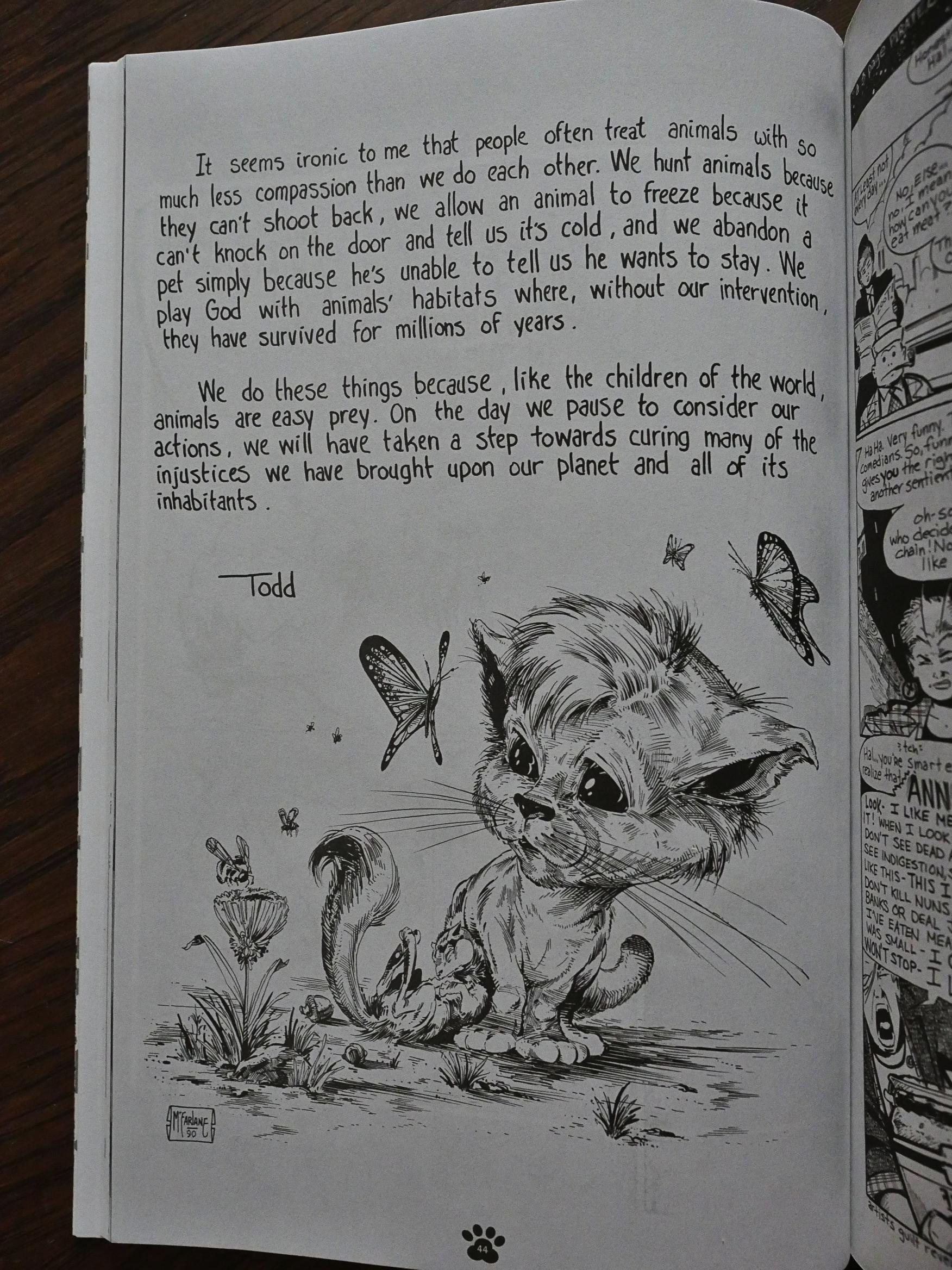
Heh. Todd McFarlane!? I didn’t expect him to pop up here, and certainly not with a drawing like that. As you can see from the credits page, a lot of the people you expect to show up here does, like Peter Kuper and Bill Sienkiewicz, but there’s some surprising ones, too.

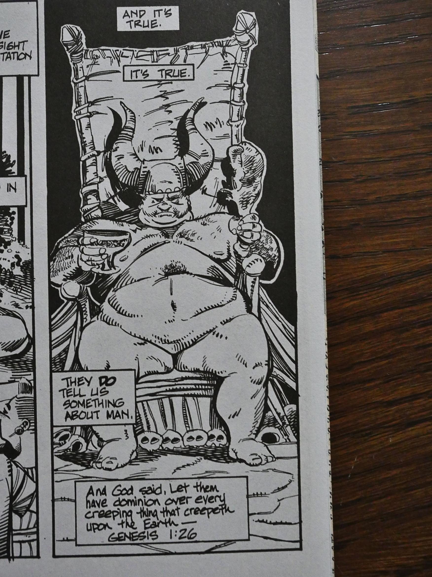
And the weirdest thing (I mean, not content wise; several others basically do the same thing) is this piece by Grant Morrison and Daniel Vallely. Because a few pages later…

… the same story shows up again, but now drawn by Tony Akins and Paul Mounts. A production snafu, perhaps? The editors sent out the same script to two different illustrators by mistake and then printed both versions anyway?

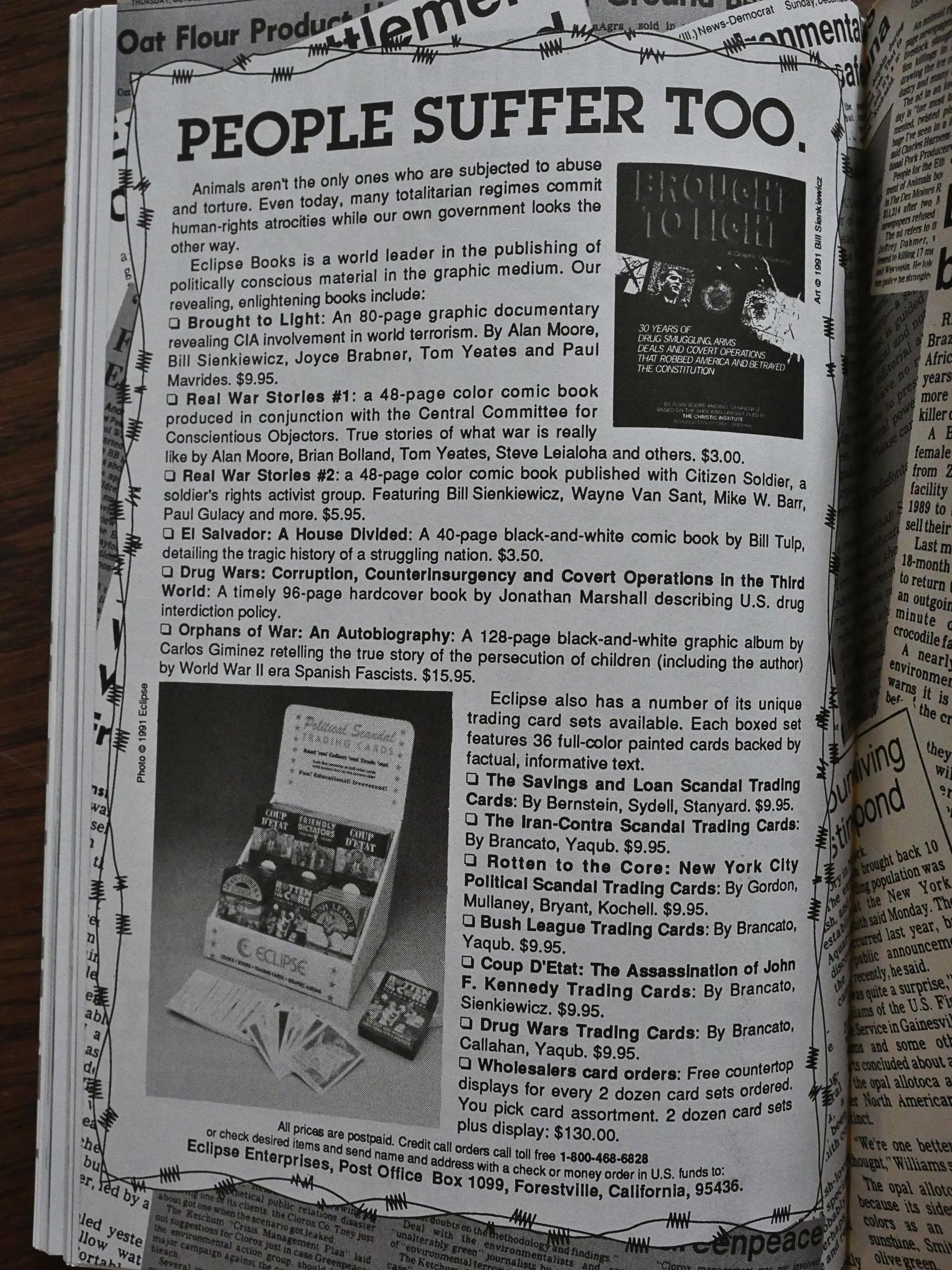
And as a final send-off from Eclipse, you get “PEOPLE SUFFER TOO”. *sigh* yronwode really hated this book, didn’t she? I mean, it makes sense to push the other Eclipse political books here, but perhaps not under that headline.

I’d say that it’s a pretty successful anthology. They’ve got some good creators in there agitating pretty effectively. Perhaps the editors should have ensured more diversity in approaches and subject matters, but I guess it’s pretty limited what you can do as an editor for a project where everybody contributes their work free of charge.

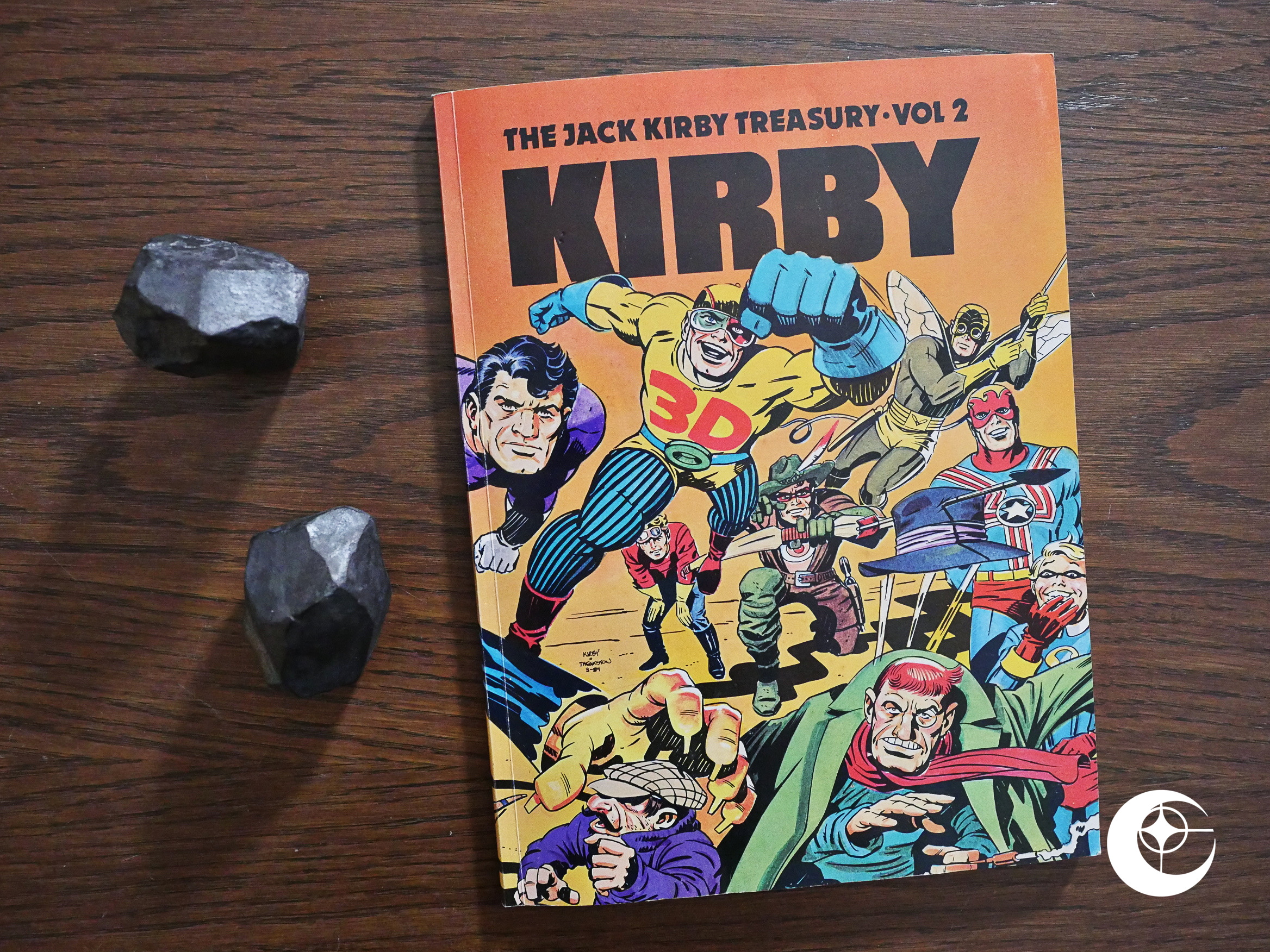
1991: The Jack Kirby Treasury

The Jack Kirby Treasury (1991) by Greg Theakston.

Volume one of this series of books had been published by Theakston’s publishing company, Pure Imagination, almost ten years earlier, and somehow it was now time for the second volume.
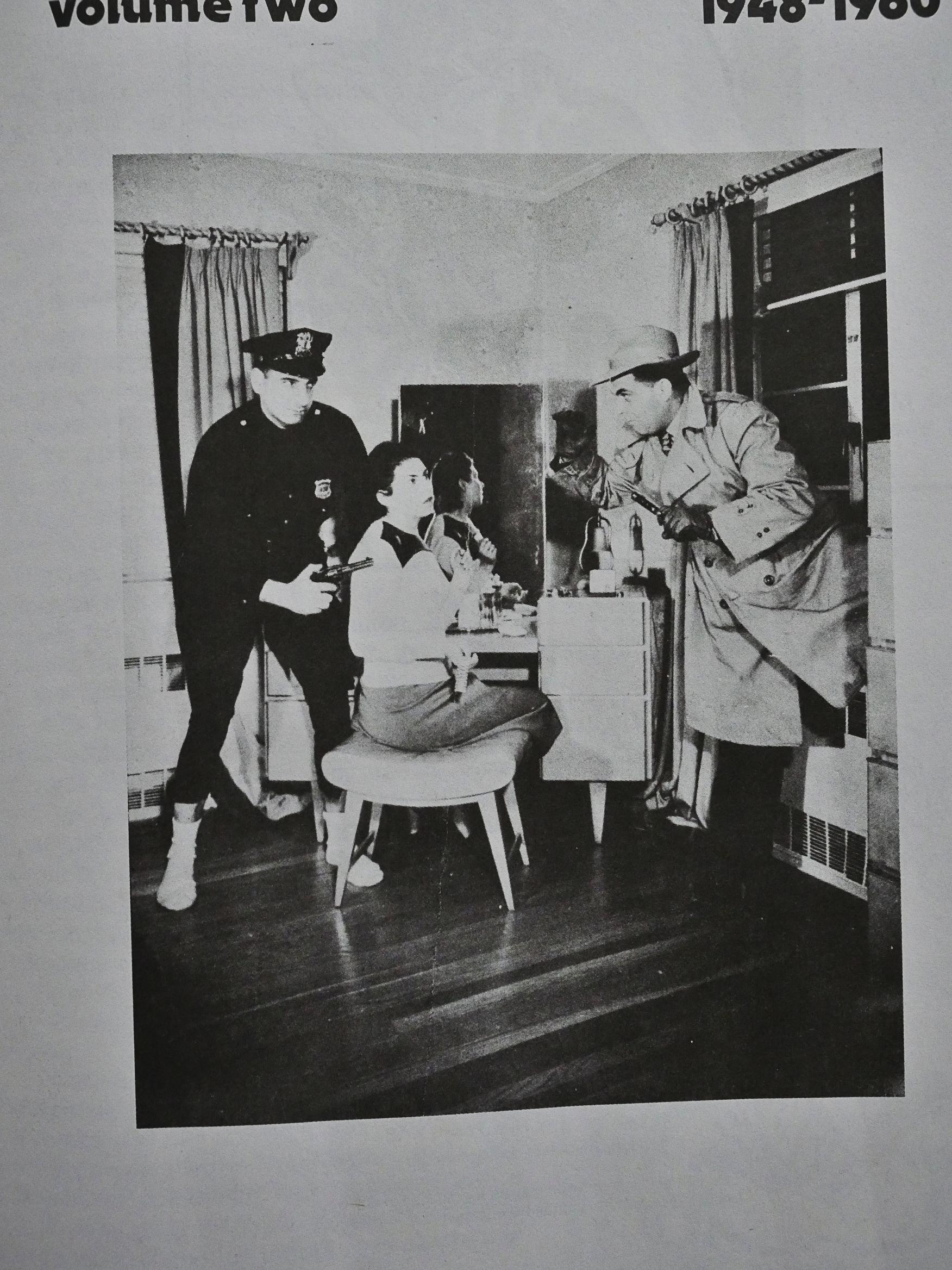
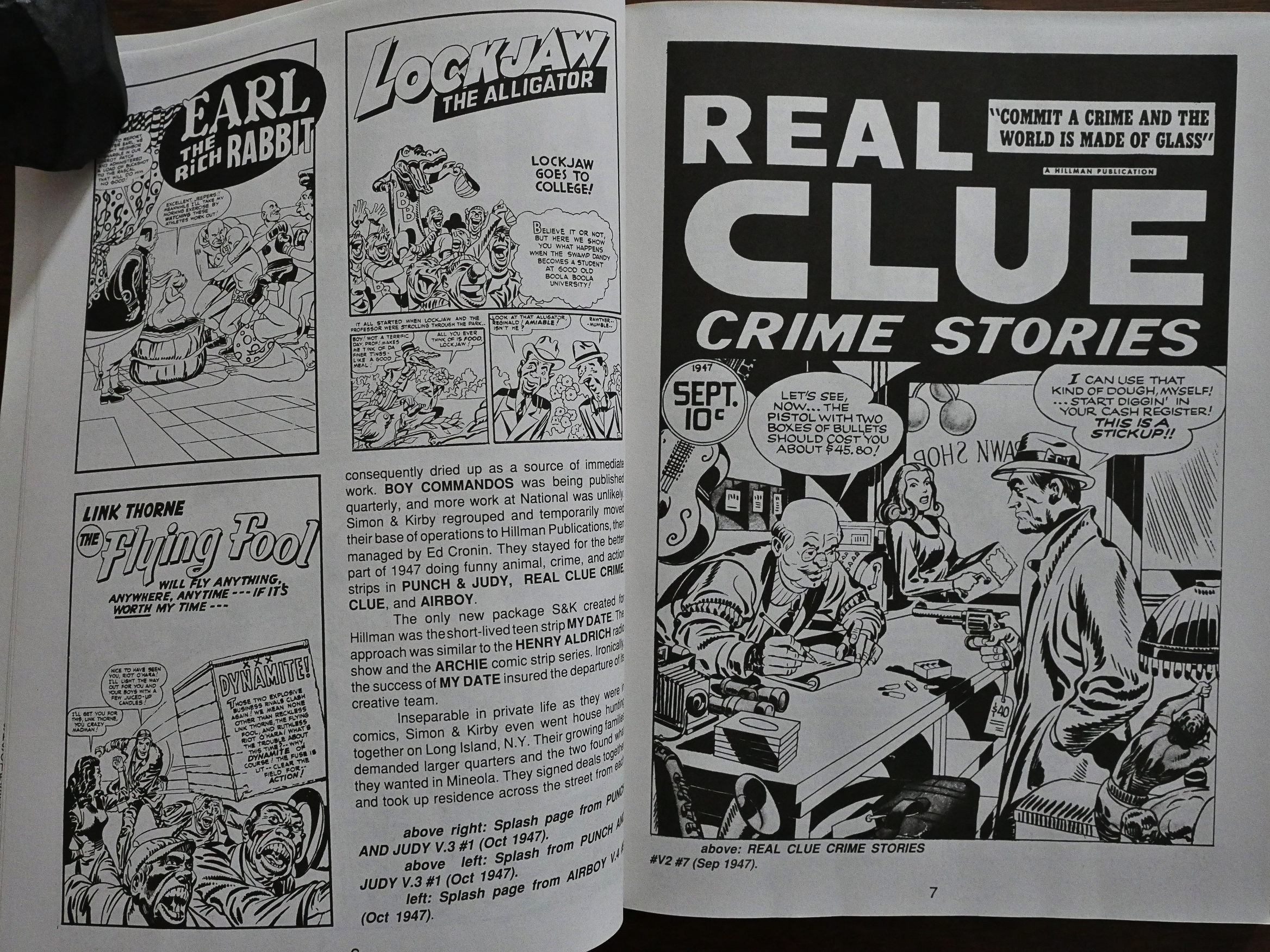
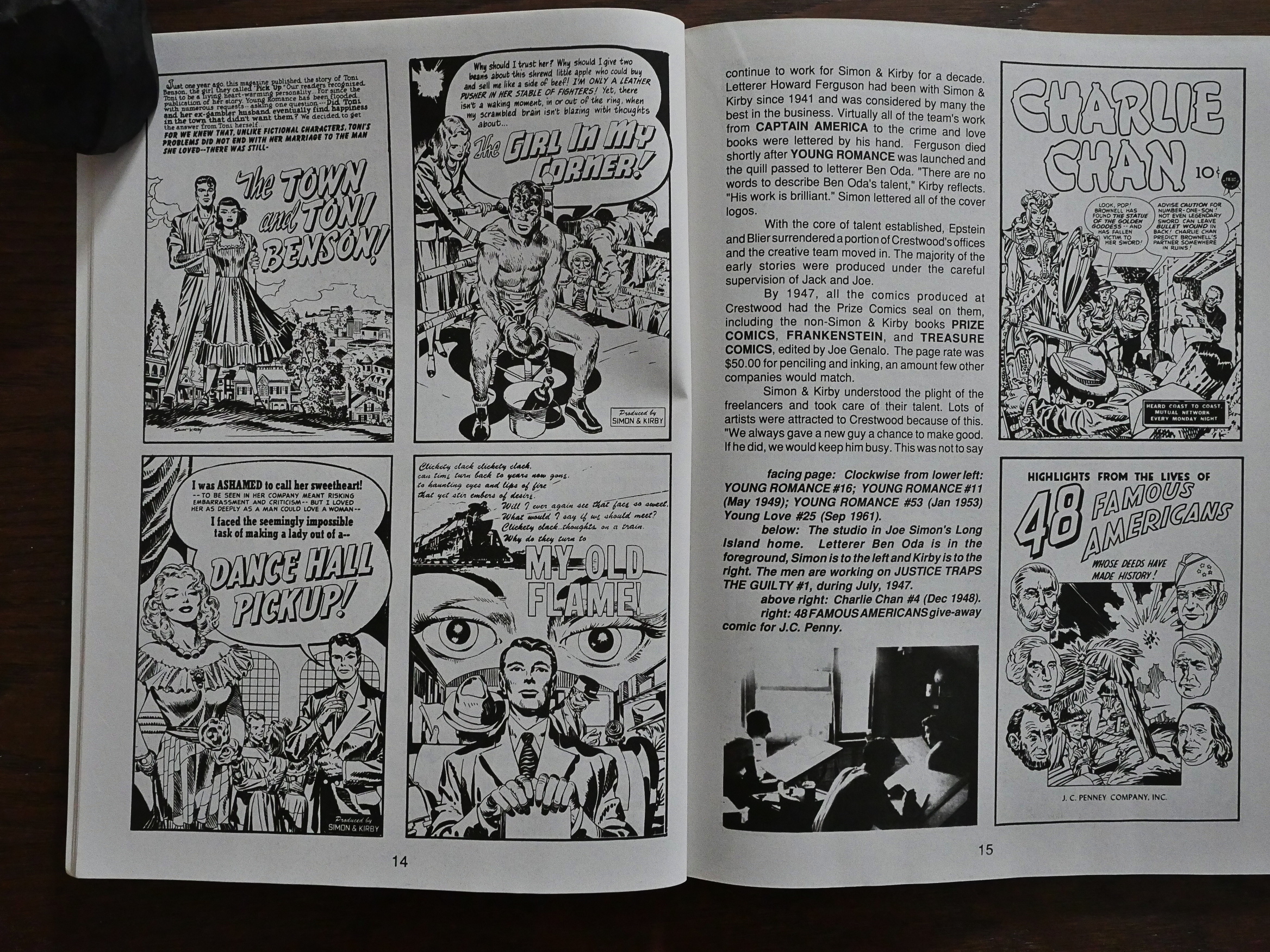
That’s Joe Simon, Roz Kirby and Jack Kirby, left to right. While this book is about Kirby, Simon and Kirby’s stories are very intertwined: They were partners for a couple of decades, and much of the time this volume covers.

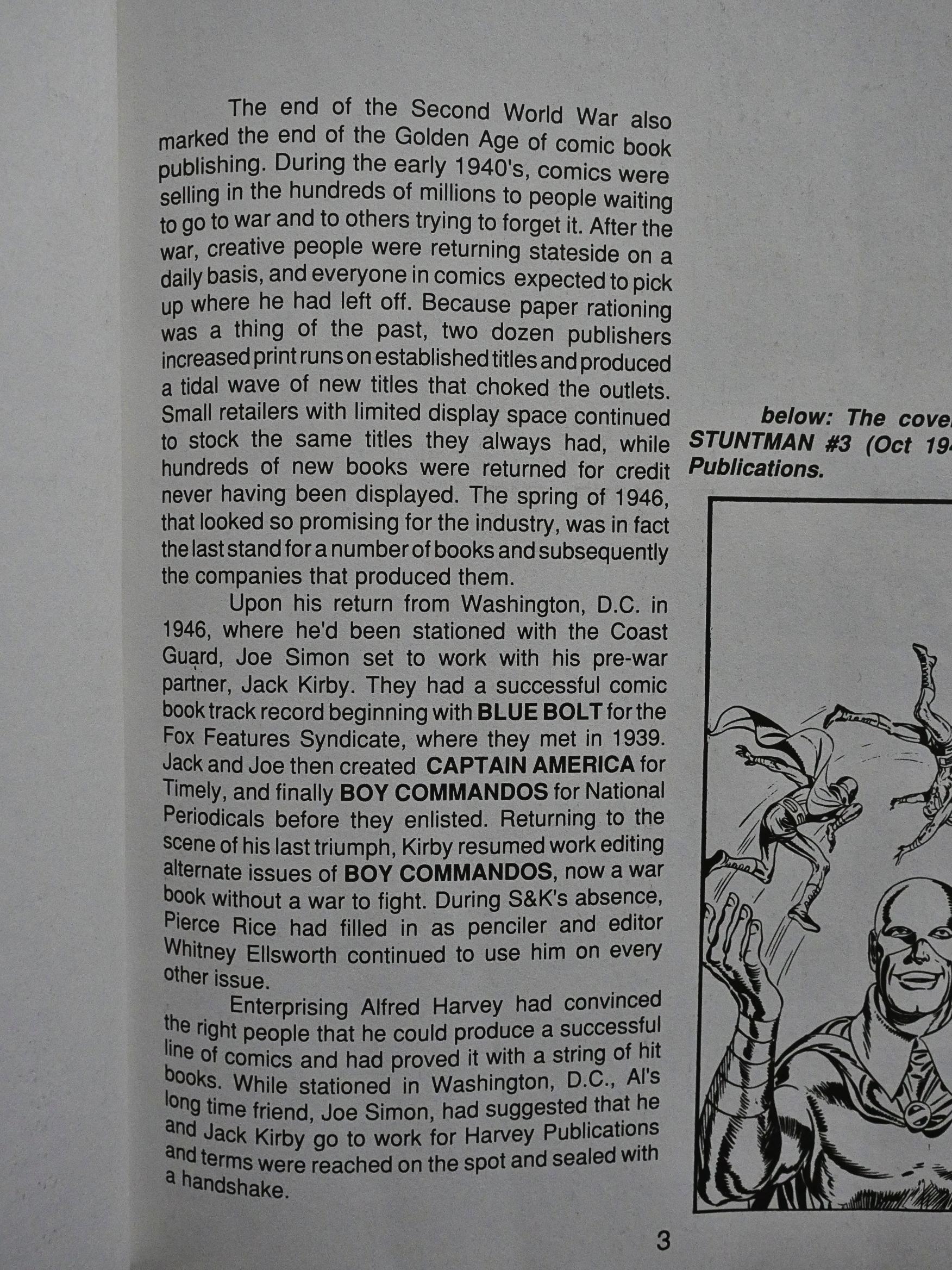
Theakston provides a Kirby biography, but it’s heavily centred on the comics, and not Kirby’s personal life. We get some mentions of children being born and stuff, but Theakston admirably keeps the focus on what matters: Comics.

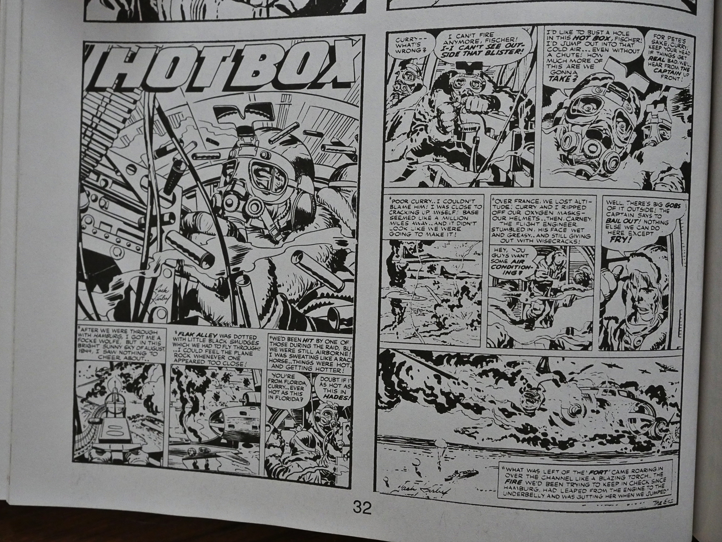
So we get page after page of example splash pages from the period the text talks about.

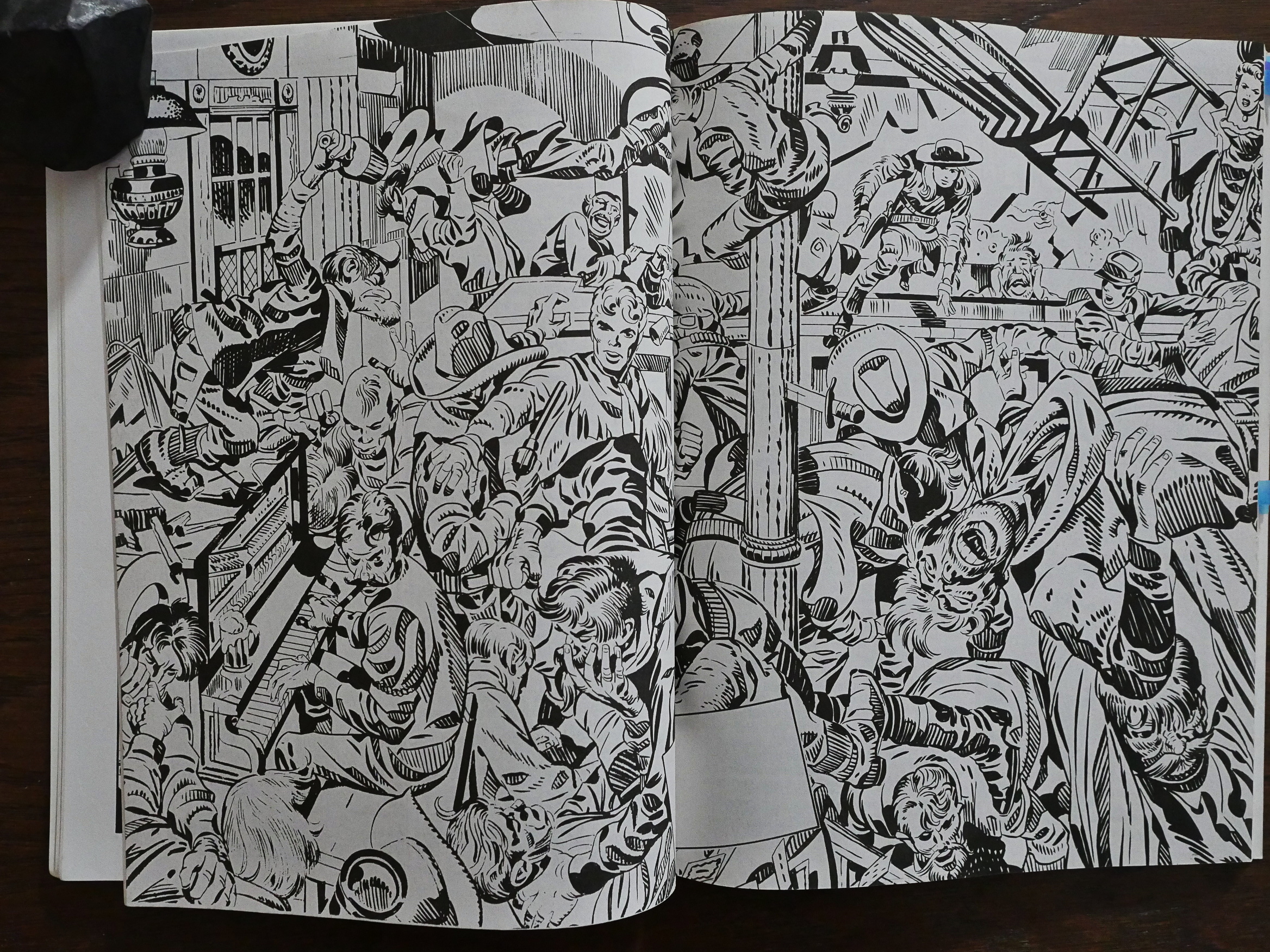
Which is an understandable choice: These splash pages look awesome, even when reduced in size like this. However, it’s a shame that we get very little normal comics pages. These splash pages and covers tell us nothing about Kirby’s storytelling chops and how that develops.

Wowza. That’s some spread.

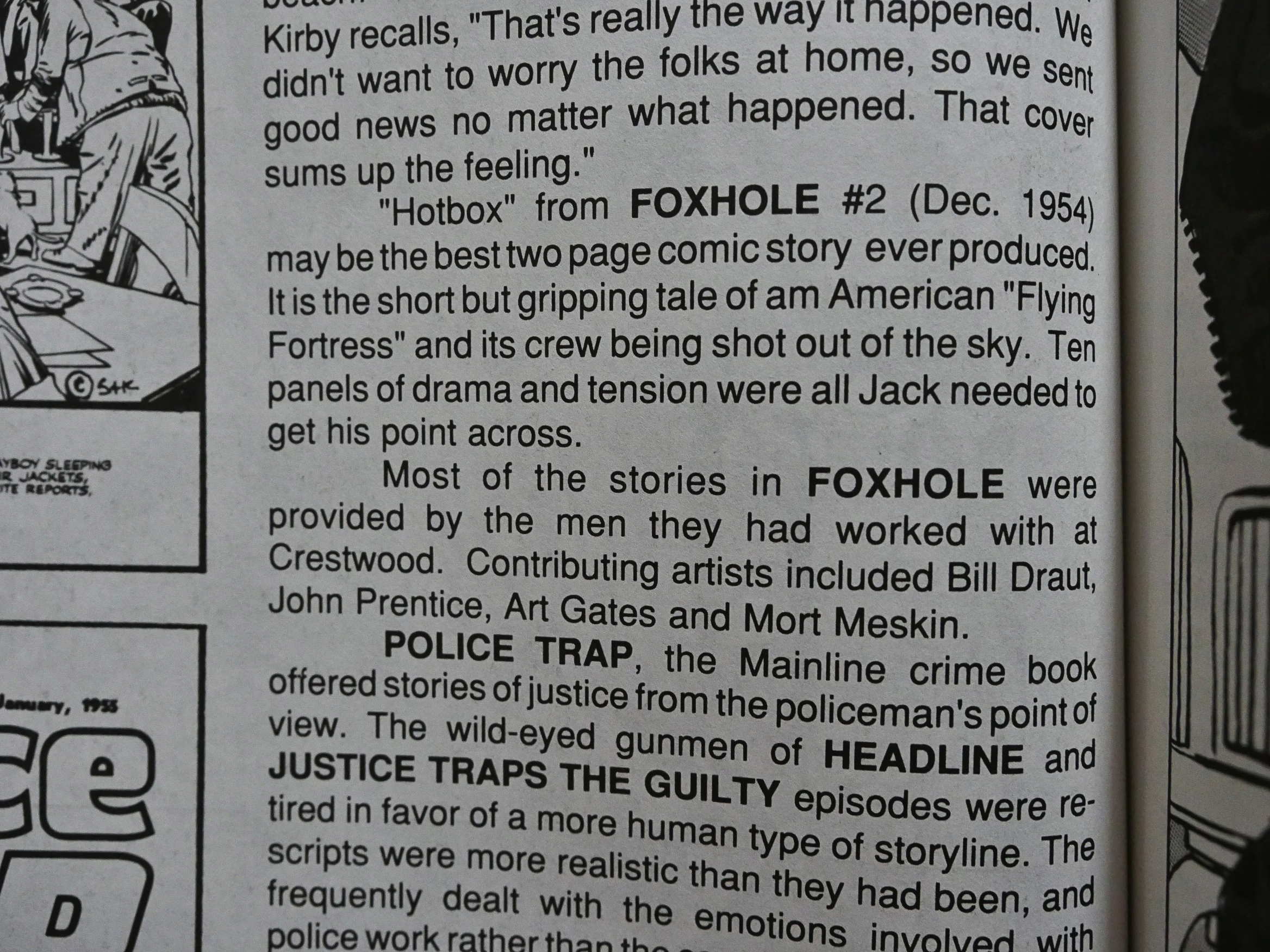
Only one comics story is reproduced, and Theakston says that it “may be the best two page comic story ever produced”.
Here it is.

Well… I think Theakston may have overstated it a bit.

A BIT.

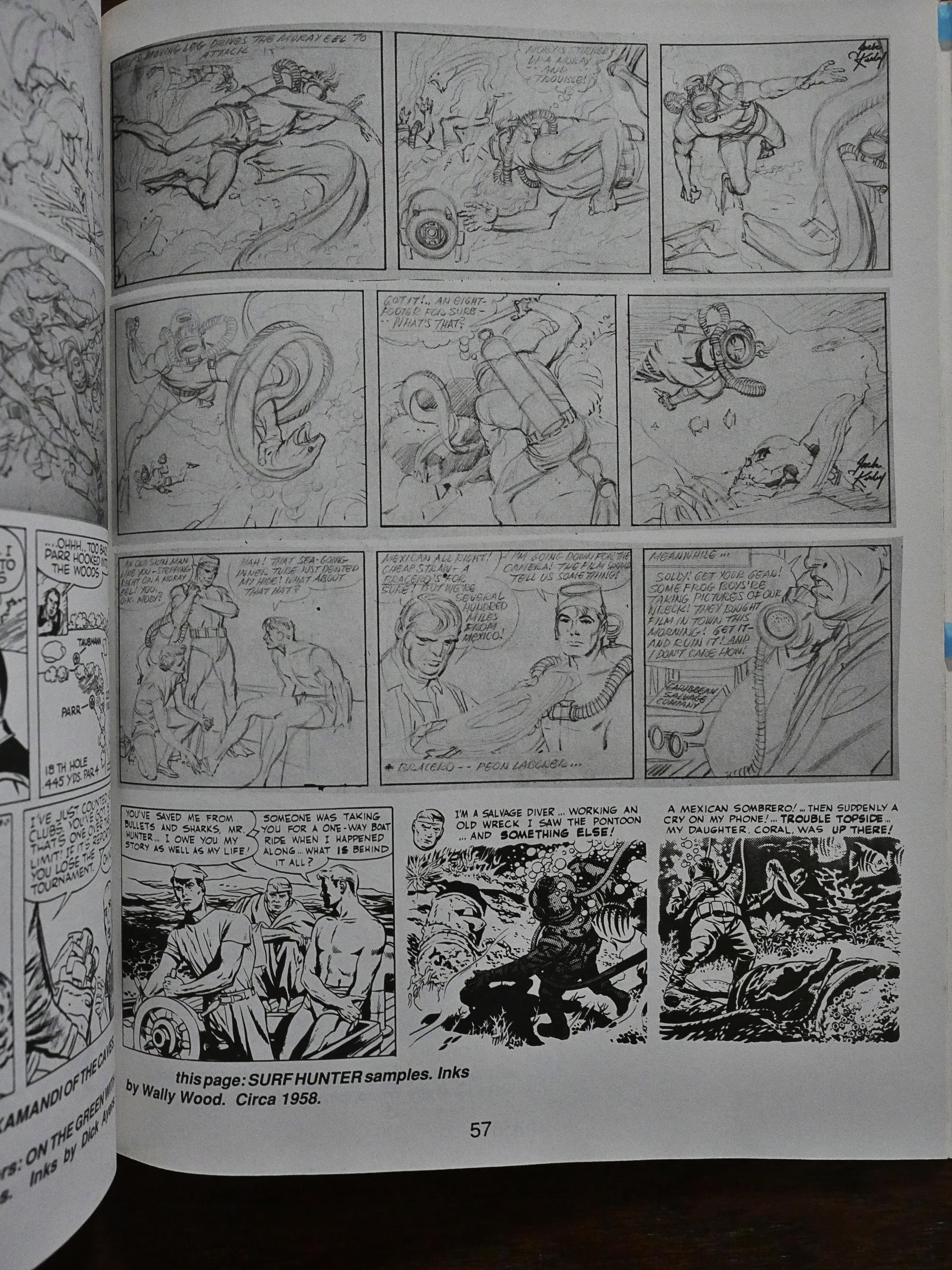
We also get some sketches and quite a lot of half-finished, abandoned or never-published stuff, which is nice.

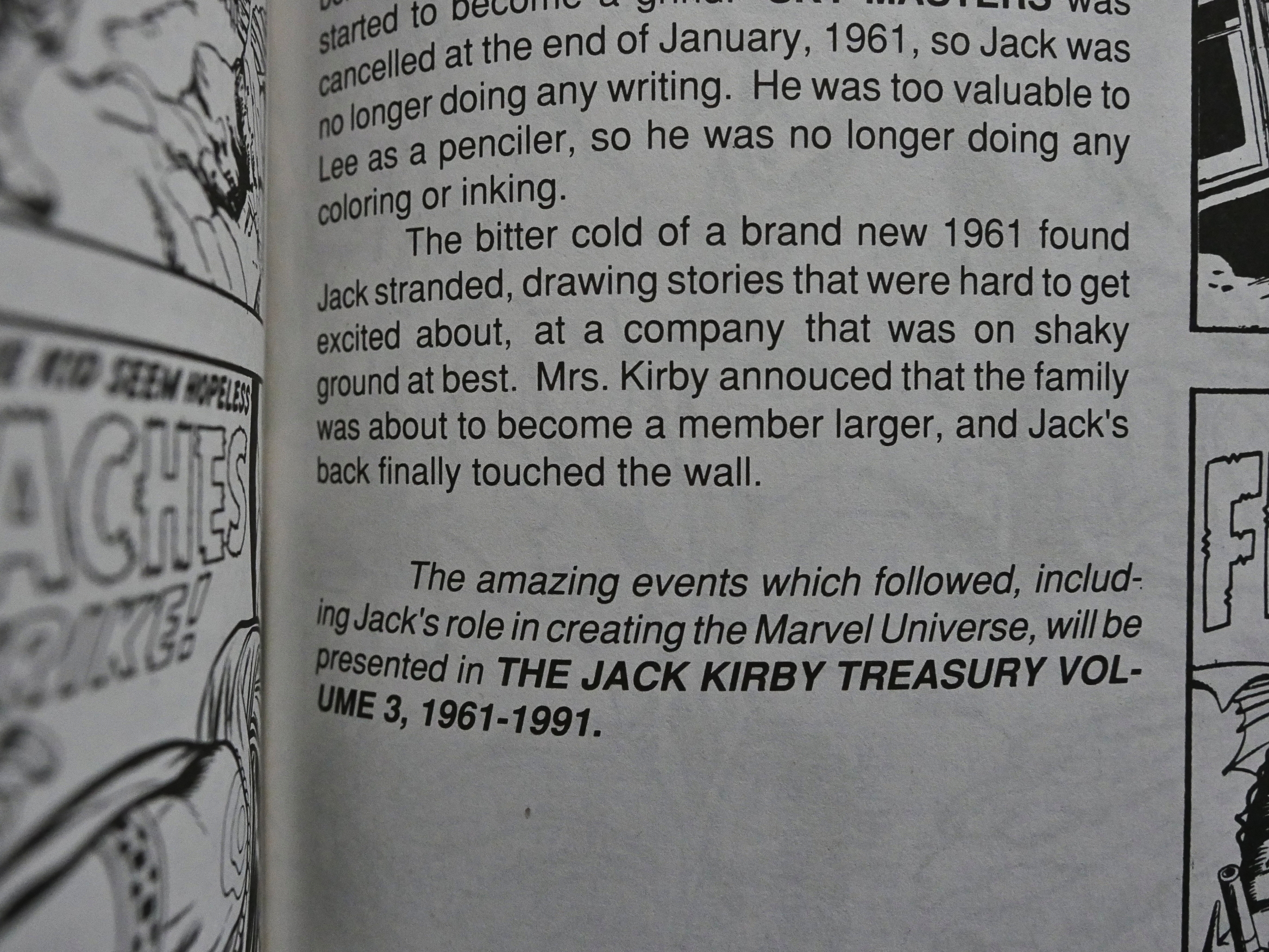
The book ends on a cliffhanger. What’s going to happen in 1961!!!

As far as I’m able to tell, that volume was never published.

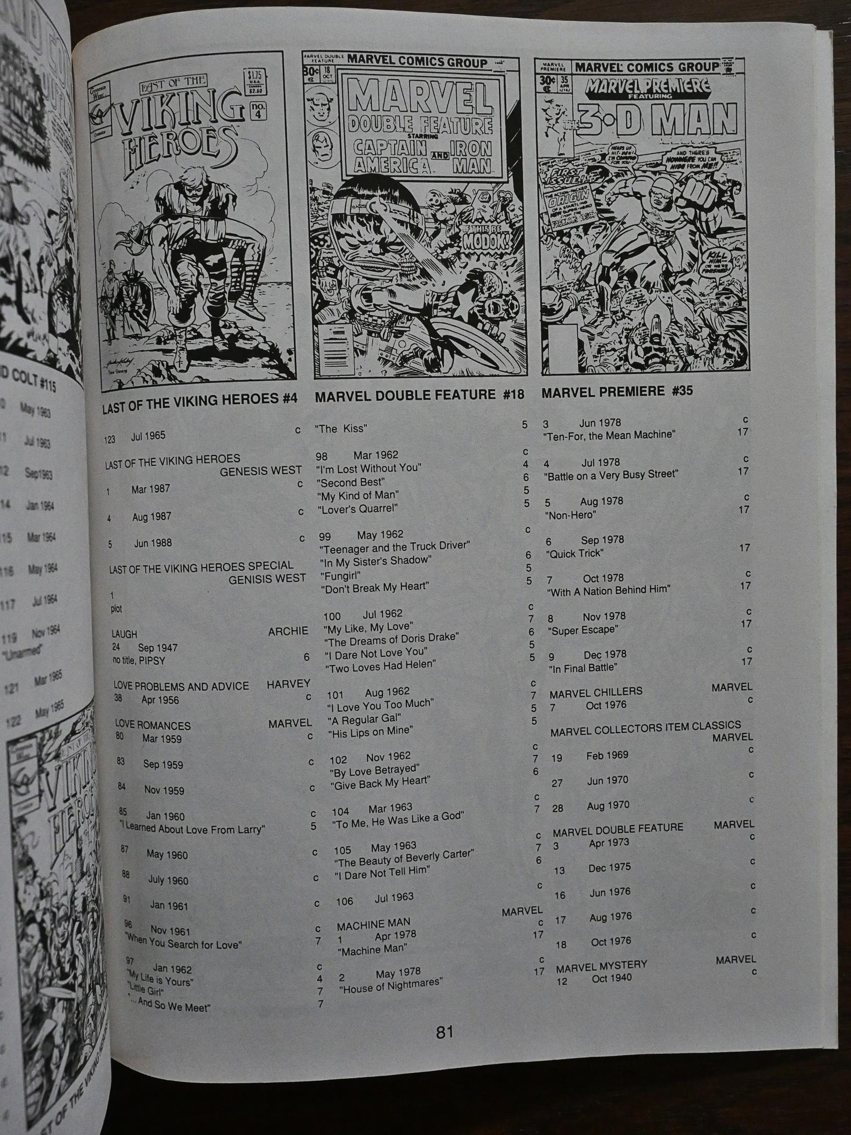
And then we get a checklist.

Hmm… Huh. Theakston was apparently in a dispute with the Kirby Museum… Perhaps that explains why volume three never happened? Hm… no, that’s a couple of decades later.

1991: Dragon Chiang

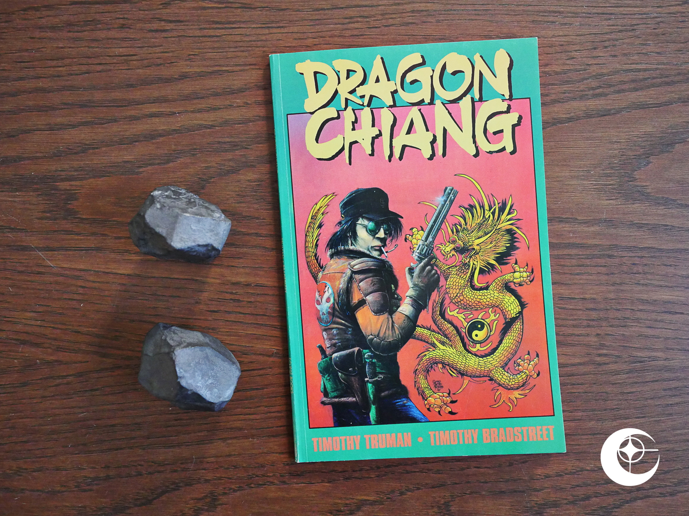
Dragon Chiang (1991) #1 by Timothy Truman and Timothy Bradstreet.

More Timothy Truman. Sure are a lot of books from him in the last Eclipse years…

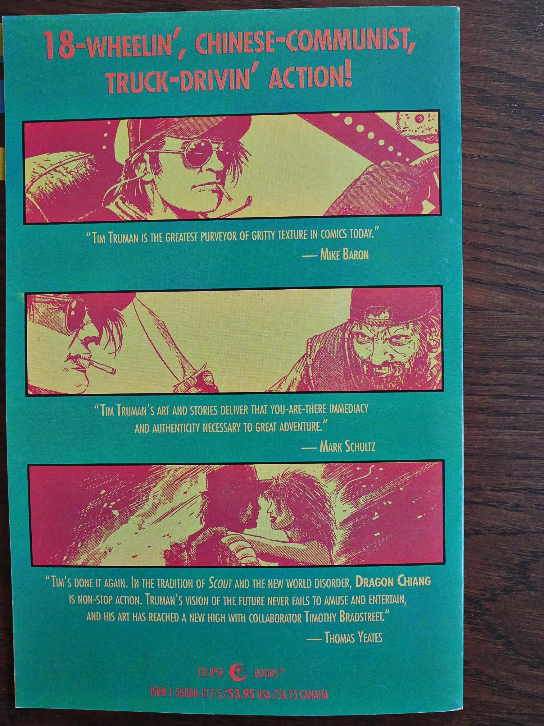
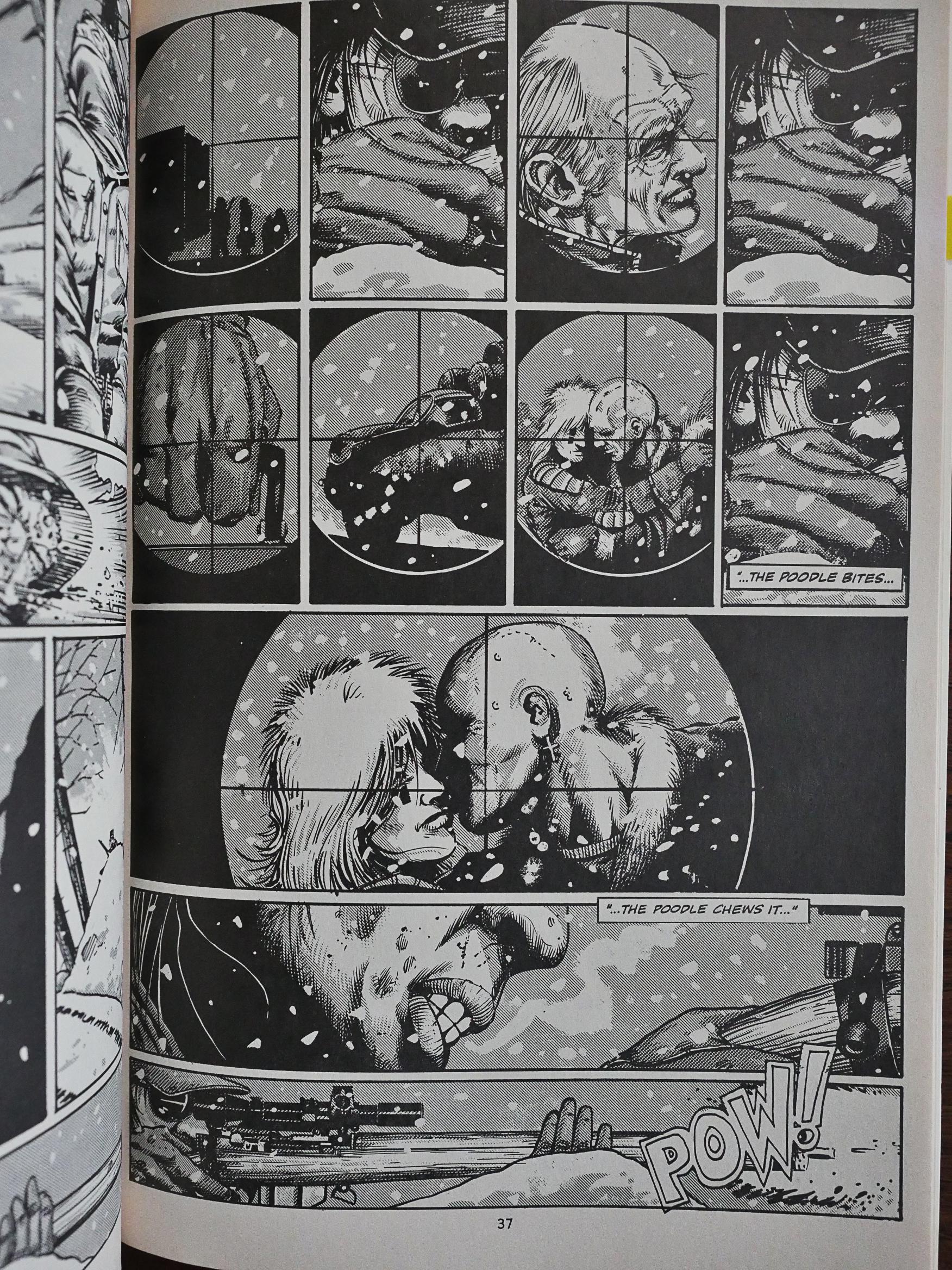
This is a squarebound “prestige format” comic, 48 pages long. The back cover promises you “18-wheelin’, Chinese-communist, truck-drivin’ action”. Hey, I’d buy it.

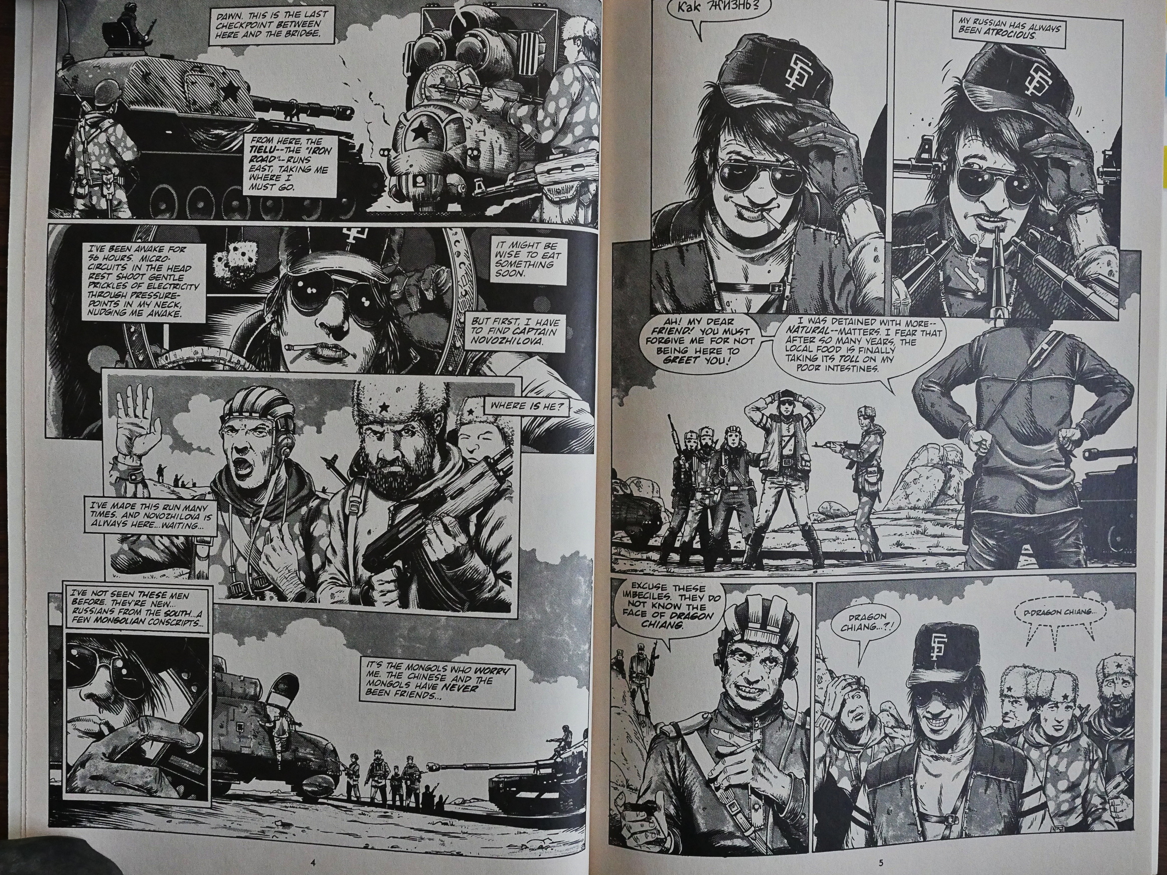
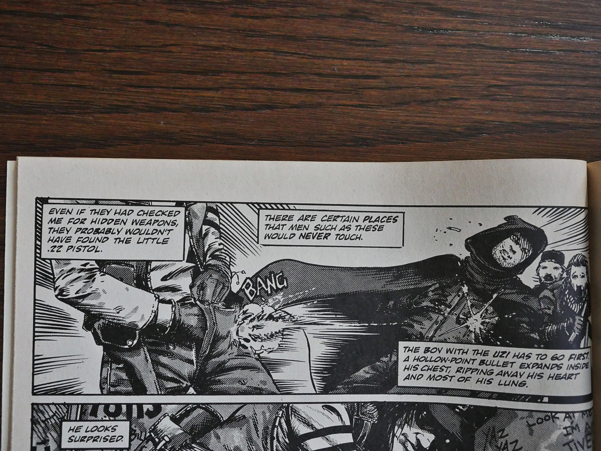
Truman wrote it and did the pencils, while Bradstreet is the inker here. I wouldn’t have been able to tell that these weren’t Truman’s inks. The artwork looks very Trumanish in its gritty details and dirty lines.

The story is well told, entertaining, and with more than the requisite number of action scenes. But it all feels so slight. As a stand-alone reading experience, I’m left with more questions than I am a satisfying story.
As the first issue of a new series, this would have been excellent. As it stands now, I’m mainly just puzzled why this book exists, because it introduces some intriguing concepts, but doesn’t do much with them other than drive a truck through them. Even on the final pages, we’re introduced to a preacher type character that may best be summarised as “er, what?”

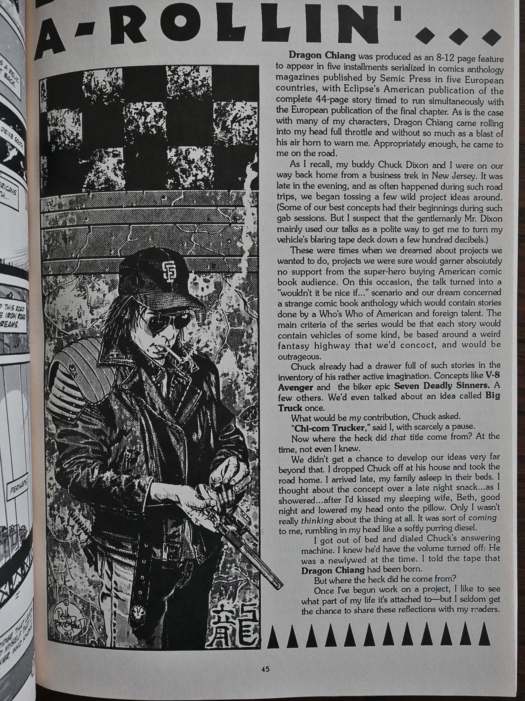
Truman explains why the book is the way it is: It was designed to be serialised in a Scandinavian magazine. Which must have been an even stranger reading experience, because there’d be so little in each “episode” that there’d be nothing to latch onto. But perhaps this would help, in a way? It’d seem like a burst of “wha” and then you have to wait a month until the next piece.

If I read the credits to the left above right, that drawing was done by Bradstreet solo, and it looks super cool. Perhaps even better than the artwork in the main portion of the book. The worst artwork in the book is unfortunately the cover, where Truman has the titular character looking uncomfortably simian and unhealthy. They should just have used that Bradstreet drawing instead.
Here’s Robert Boyd reviewing the book in Amazing Heroes #194:

In the back of the comic, Truman lets you know what his influences were. He needn’t have bothered; unless you’ve lived under a rock for the past 25 years, you won’t be very surprised. Maybe there are people who go in for this type of one- dimensional rehashing of long-stale ideas, but I found Dragon Chiang to be bad science fiction, bad prophecy, bad storytelling, bad characterimtion, and bad comics. GRADE: ONE STAR

I think perhaps he didn’t like it?

Hm… Oh, Truman discusses Dragon Chiang in an interview conducted by Gary Groth in The Comics Journal 144:

GROTH: Dragon Chiang, aside from the geopolitical extrapolation and the fun you had with That, is a real hardon adventure.

TRUMAN: Plotwise the material in Dragon Chiang is thin, but I think that there’s a lot of meat in there, impressions that I have of ongoing political situations. There’s also a lot of meat there in the way of characterization. I feel that it succeeds on that level.

GROTH: Dragon Chiang seemed to me to be one of your more minimalist efforts in terms ofcharacter and dialogue and so forth.

TRUMAN: I don’t see it that way. I was exploring a lot of storytelling techniques when I was doing that book, challenging myself. And, at least personally, I was satisfied with it.

Chiang’s a book that takes two readings. I wanted it that way. On the the first reading it’s a hard-hitting adventure story, but with something definitely Sergio Leoneish about it. You don’t know quite enough about this character. I don’t like characters that are immediately explained for you. I think with a second reading that you’ll find yourself presented with questions about the guy that aren’t readily answered. That’s sort of the ‘.vay I like to pattern all my adventure stuff.

[…]

One of the troubles that I have with Dragon Chiang is that I didn’t put that point across more vividly. I started Dragon Chiang with less planning than Scout. I wanted to do it that way; I wanted to travel with this character, and have him slowly reveal himself to me, as I reveal him to the reader. Then, suddenly, I found myself at the last chapter with a lot of questions that I’d originally wanted to solve, and a lot of plot and theme elements that I wanted to bring out, which I hadn’t. so the book, thematically, was as much of a success for me as it was a failure.

Hey, that Truman guy is perceptive.

Dragon Chiang has never been reprinted.