1991: David Chelsea in Love

David Chelsea in Love (1991) #1-4 by David Chelsea.

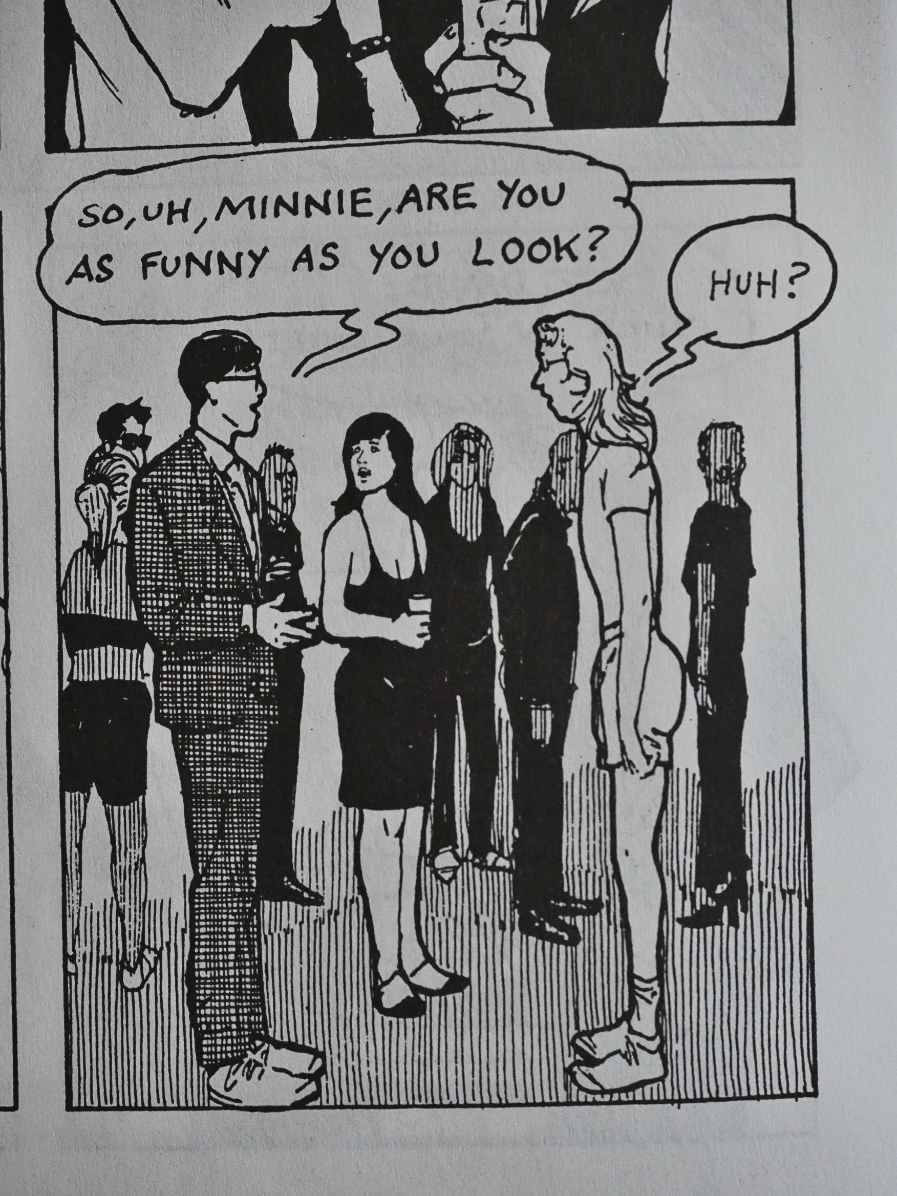
This was one of the few late-stage Eclipse books I bought at the time, and I was hugely taken by it. Just as with Alec, it seemed like a new, fresh twist on autobiographical comics. Even if that new twist was basically making the storyline feel like an independent romantic comedy.

With meet cutes and all.

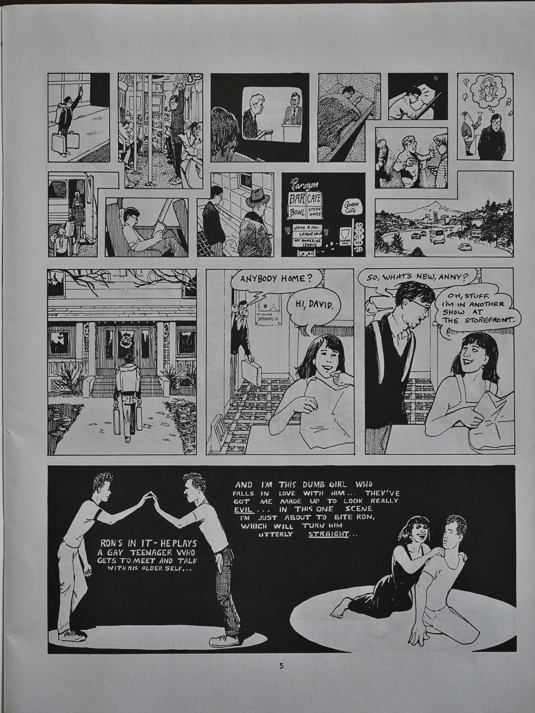
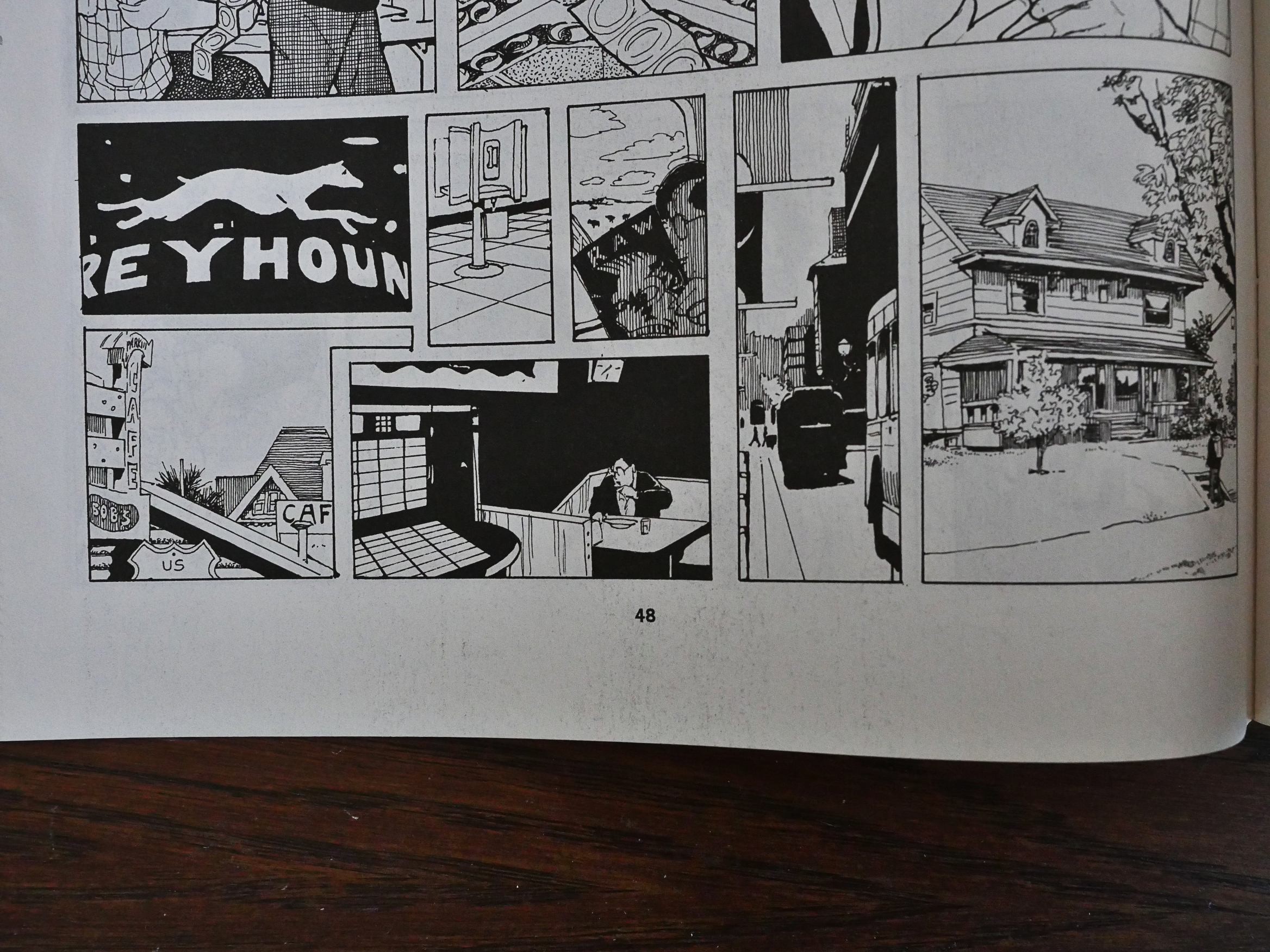
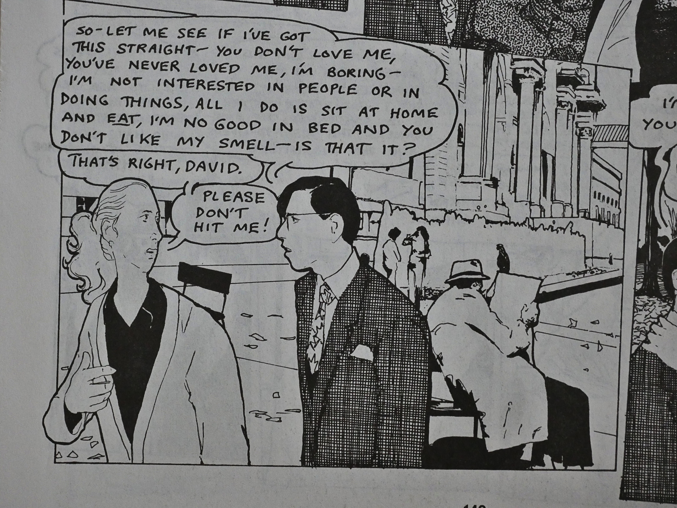
But it’s much messier and feels a lot more true to life than those films usually are. There’s a lot of back and forth in this book: Both literally (everybody moves between New York and Portland a lot, and those moves are depicted in the manner above, with a lots of tiny panels in a travel montage) and plot wise: Both David and Minnie (the central pair here) go through a bewildering number of breakups and reconciliations, and have a huge number of lovers.

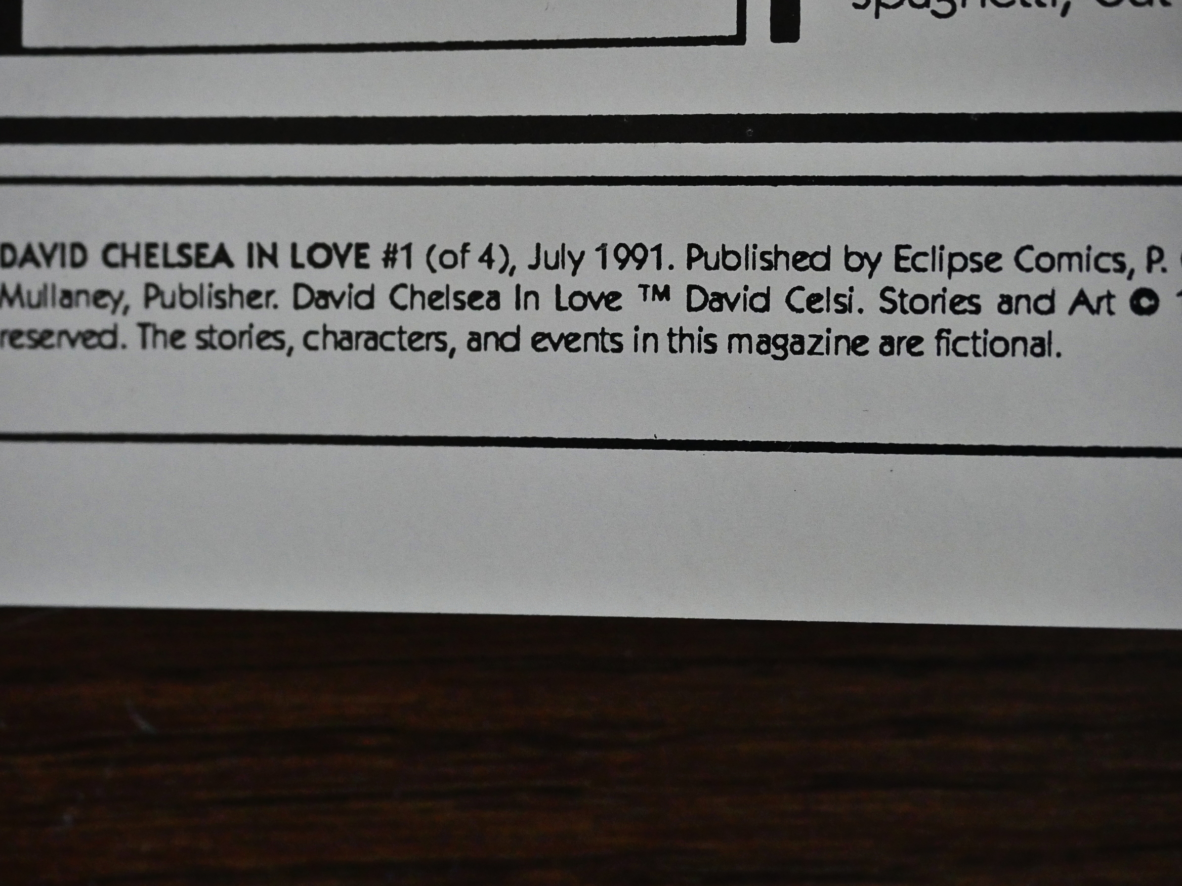
Anyway, while the title of the book, and, well, the contents of the book would have you believe that this is autobiography, the indicia claims that it’s fiction, and that David Chelsea’s real name is David Celsi. So… perhaps that’s true?

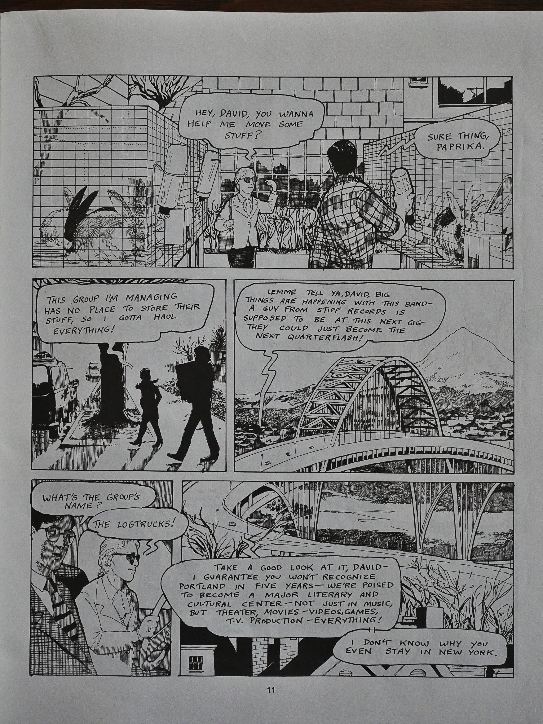
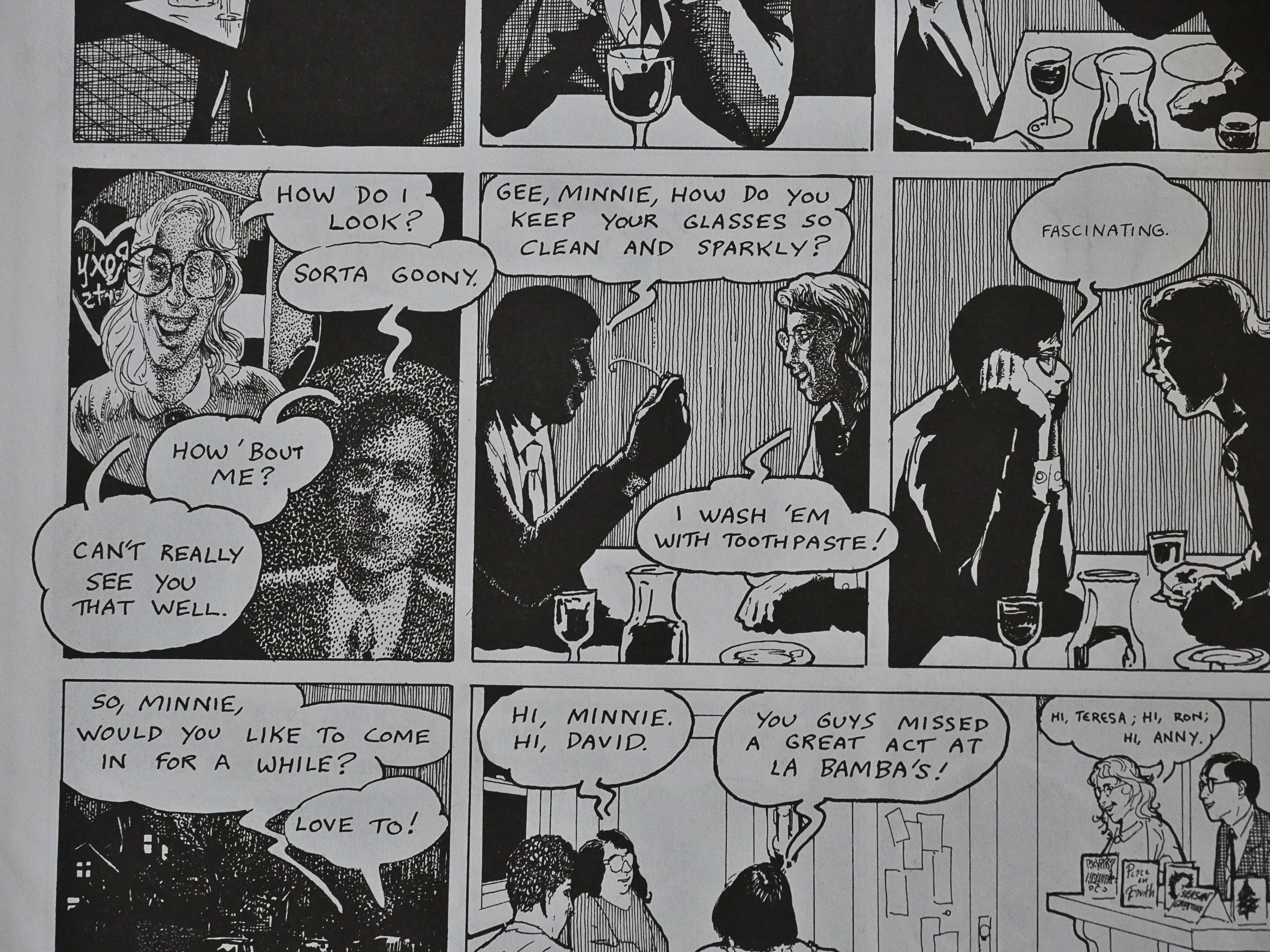
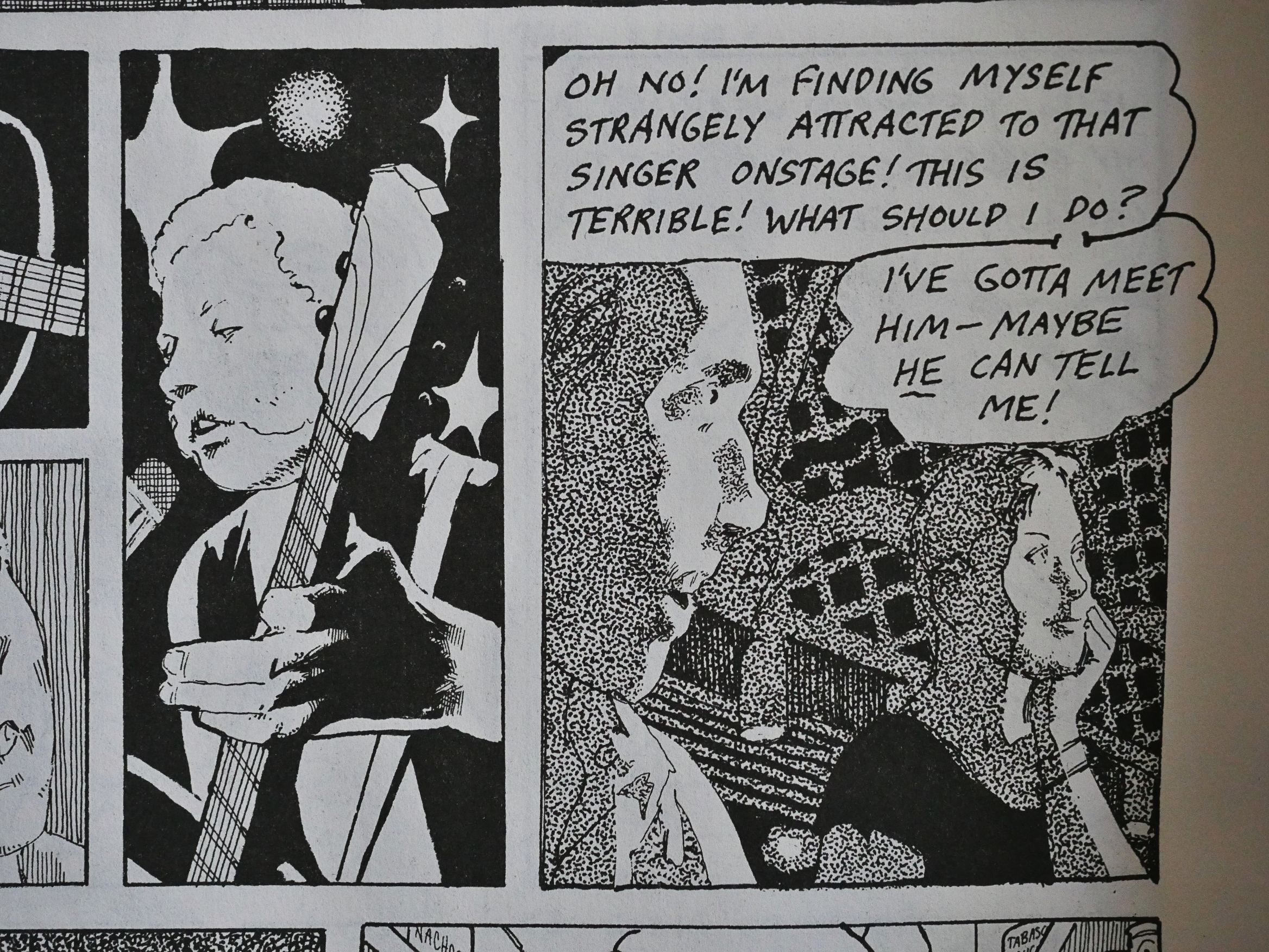
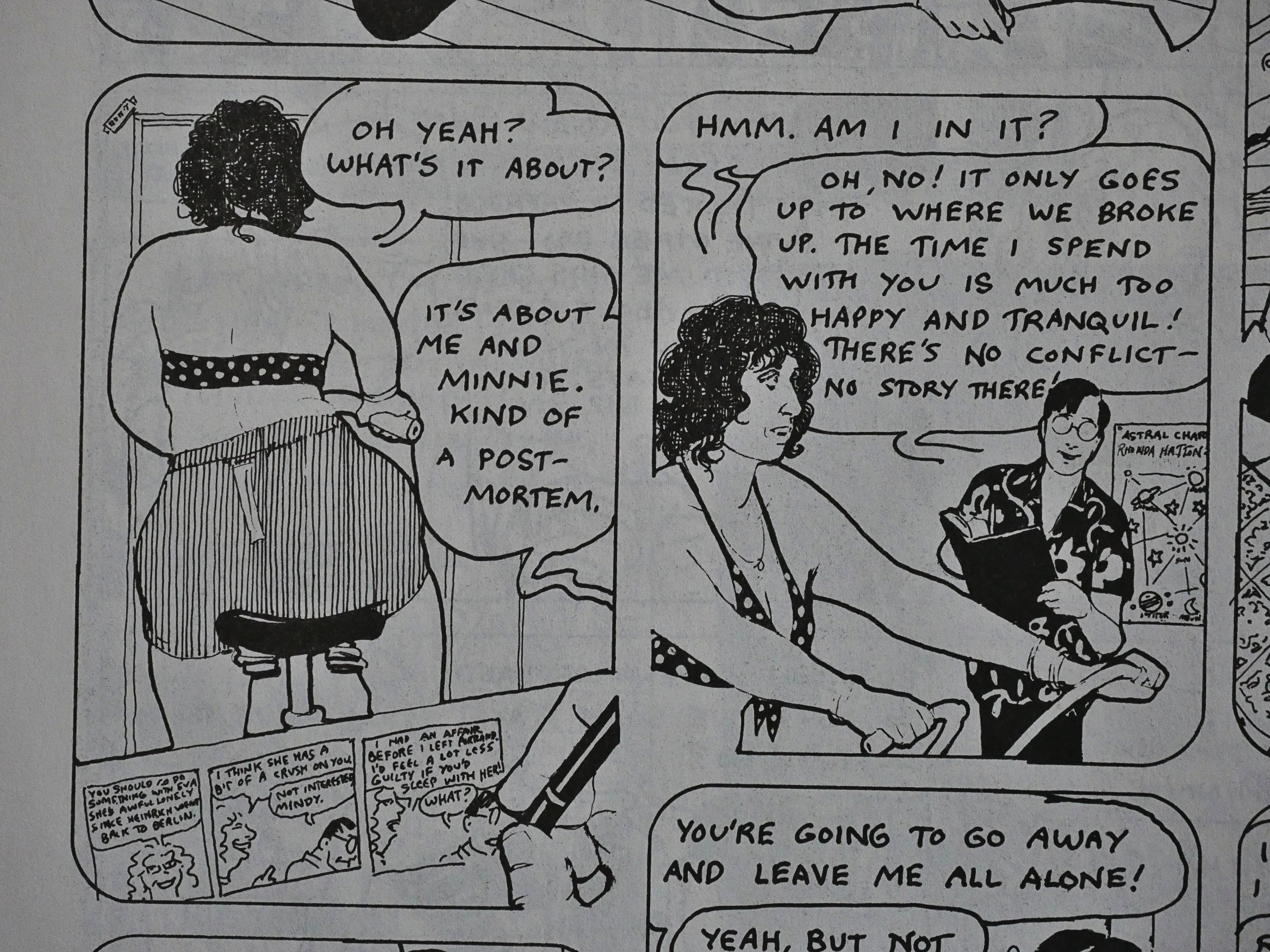
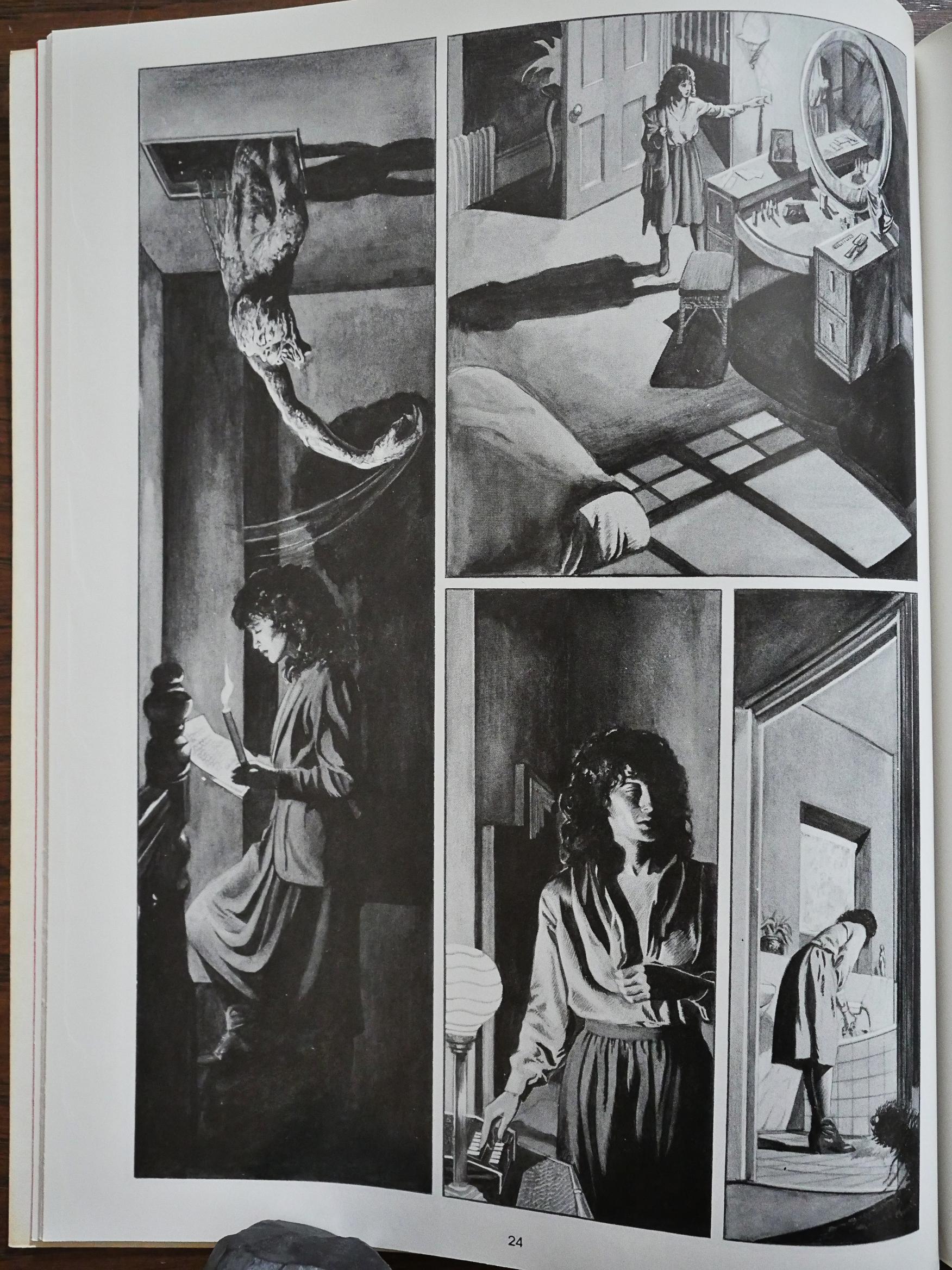
Chelsea does a number of fun layouts, some of which work better than others. The one above, for instance, with two of the panels being contiguous in space but not continuous in time is more distracting than anything else. I think it’s the panel to the bottom left that makes of read kinda wonkily.

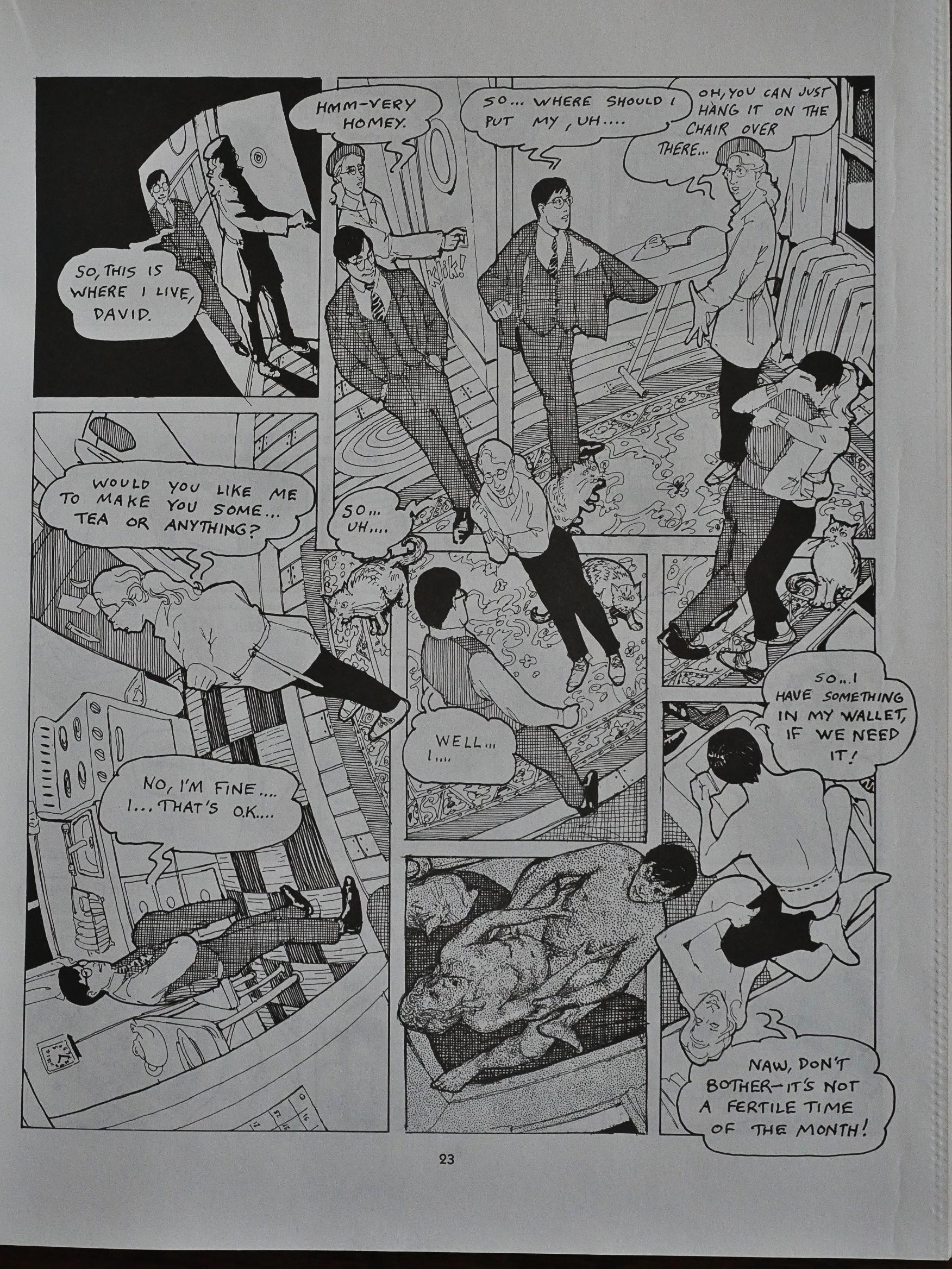
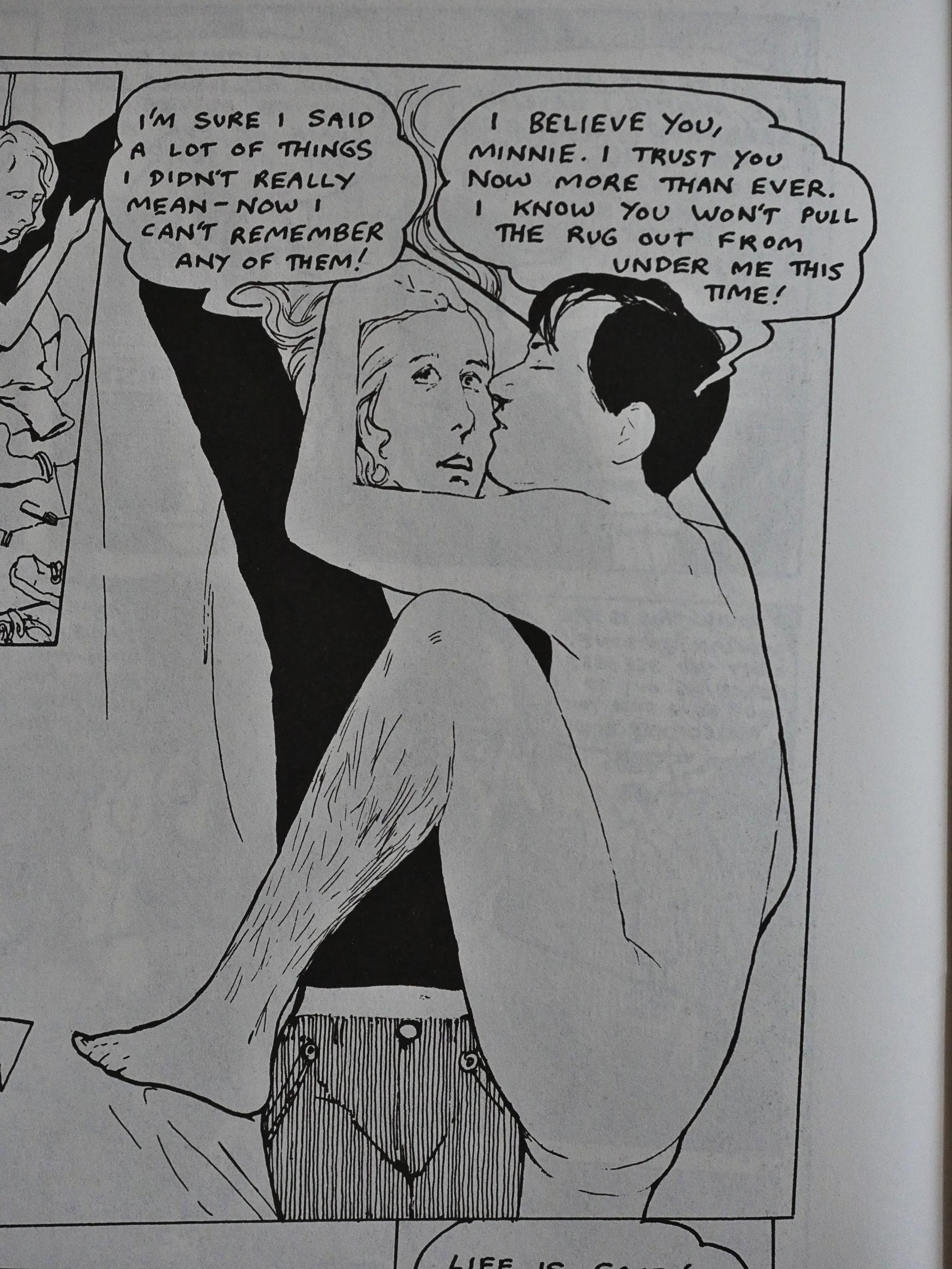
Other layouts work a lot better, like above, where David and Minnie get together in Minnie’s apartment for the first time. The dizzying layout reflects and enhances the characters’ giddiness. It’s kinda perfect in its confusion.

This four part series, 48 pages each, magazine size, is all about love and stuff. And the sweet stuff is really, really sweet.

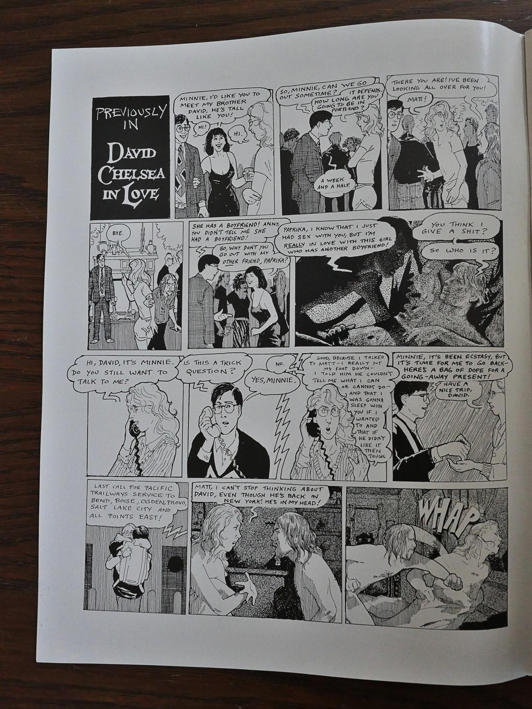
Chelsea helpfully provides a recap page in the second issue, which is basically exactly the way a daytime soap would have recapped the plot. Which is also very appropriate, because Chelsea spends an unhealthy amount of time watching soaps.

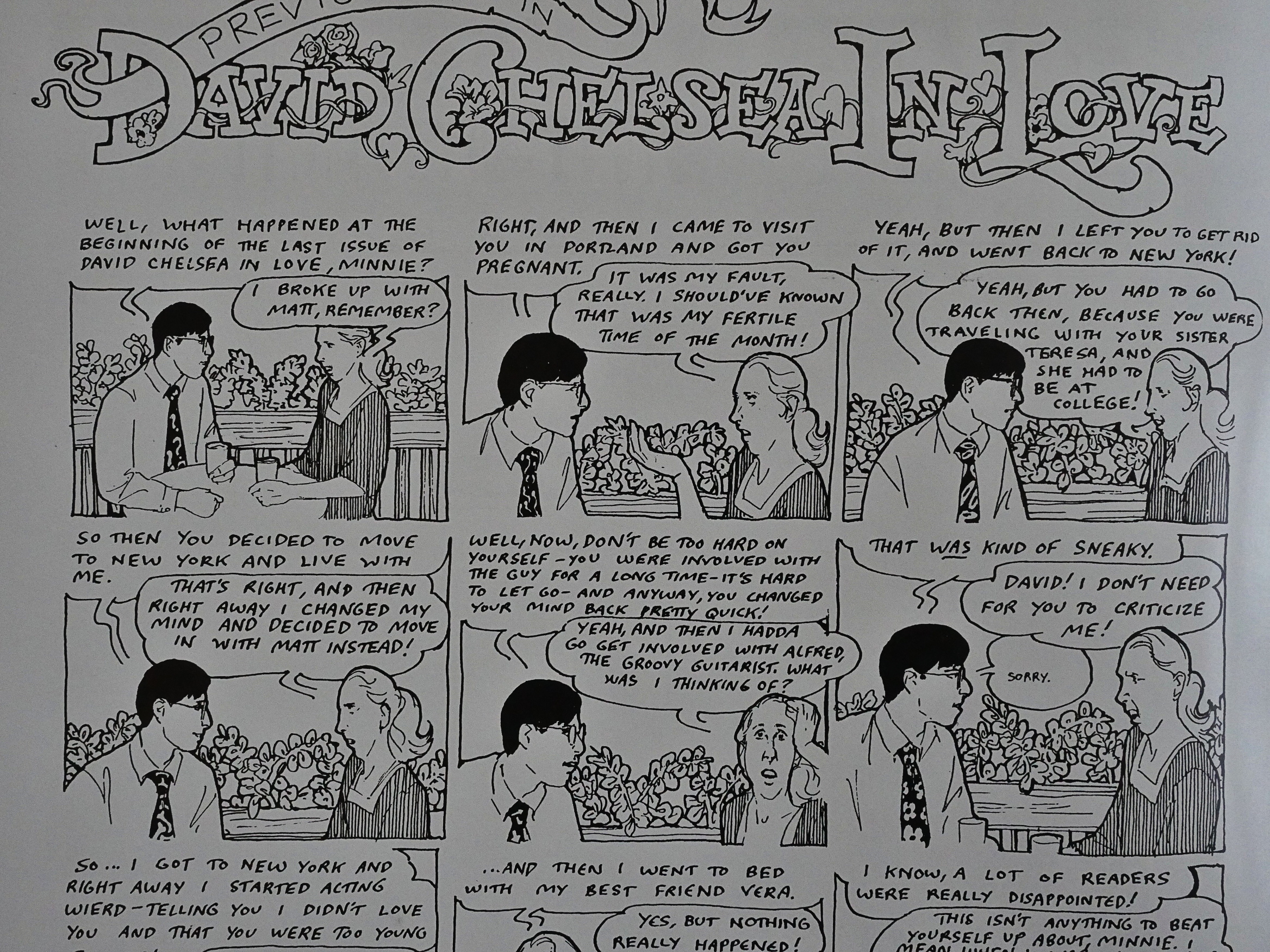
For the third issue recap, Chelsea goes for a totally different approach, with the characters selfconsciously tell the readers what’s up.

I really like these travel montages. They also tell us how the time is passing. The preceding montage had the inauguration of Ronald Reagan, while this one has an even more important event: Raw magazine #3, which tells us that we’re in 1981. Good to be clear!

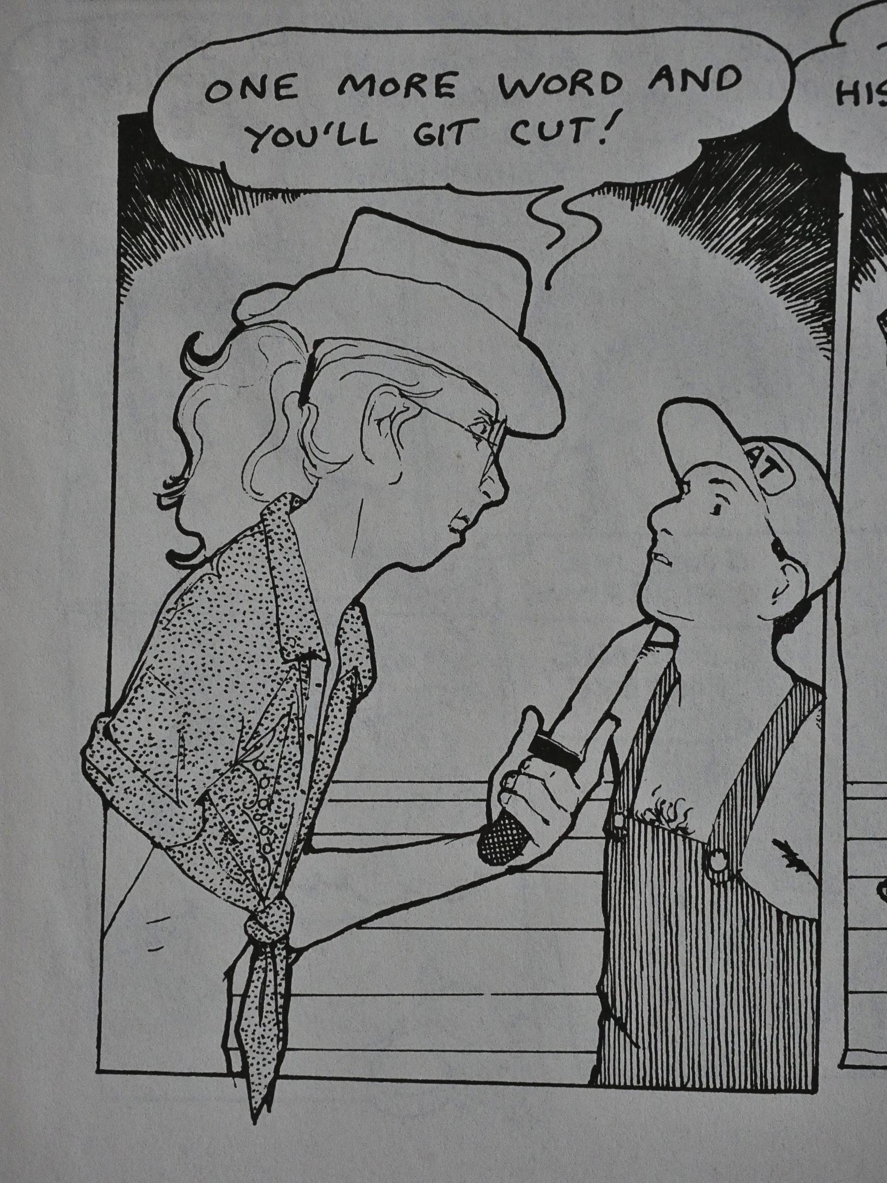
Did I mention that this is also a funny book? It’s a funny book.

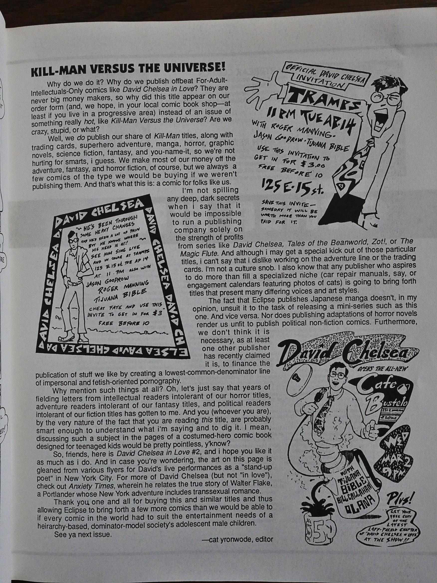
Editor cat yronwode writes one page about Eclipse’s publishing strategy: Publishing Kill-Man Comics pays the bills which enables them to publish comics like this, and she also gets a dig in at Fantagraphics, who had just started the Eros line of comics of “lowest-common-denominator line of impersonal and fetish-oriented pornography”. Which is pretty accurate. (She slyly doesn’t actually name Fantagraphics.) All part of the long-running simmering feud between these companies, I guess…

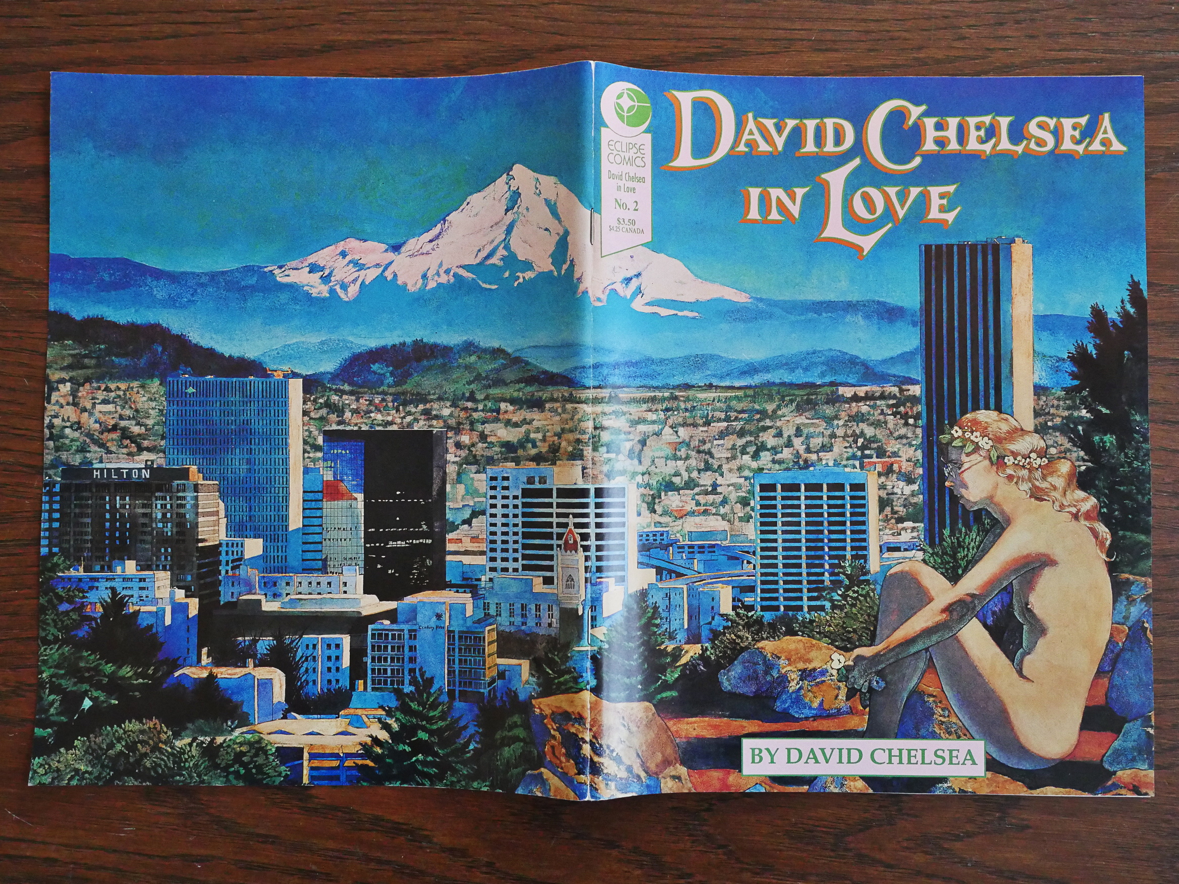
Chelsea does one double page cover, and very nice it is, too.

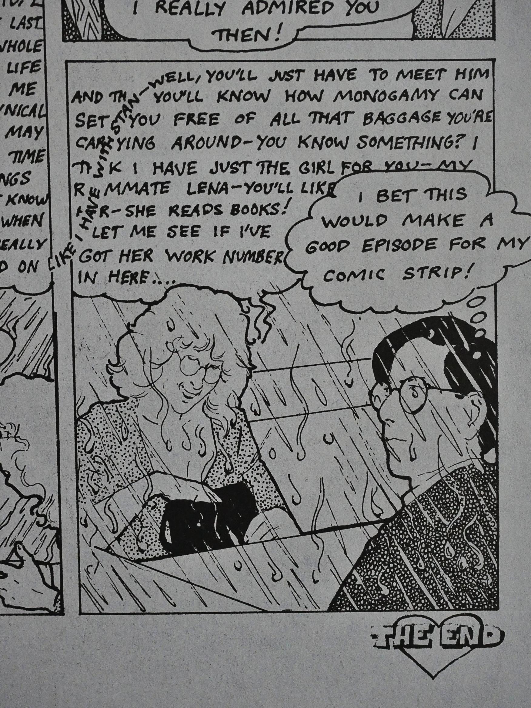
As we get closer to the end, the book becomes somewhat self-reflective. Chelsea’s started drawing this comic (or its predecessor), so naturally everybody around him starts getting antsy about being in the story or not.

Heh. A reference to the Yoko Ono/John Lennon picture by Annie Leibowitz. Could this be foreshadowing?!

Indeed.

I love the subtle way Chelsea changes his art style when he’s depicting his dreams. The outlines become heavier and the other lines become wispier, but clearer.

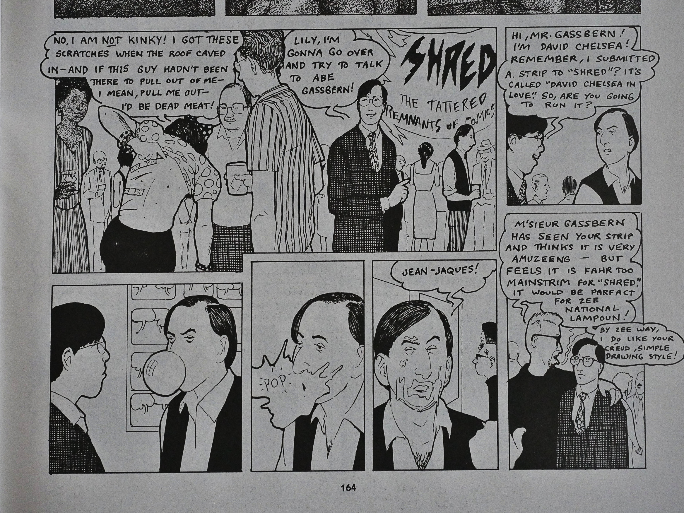
Chelsea attempts submitting the story to Raw Magazine, I mean Shred: The Tattered Remnants of Comics and is rebuffed by a bubblegum blowing Art Spiegelman. Which seems kinda out of character, which makes it even funnier.

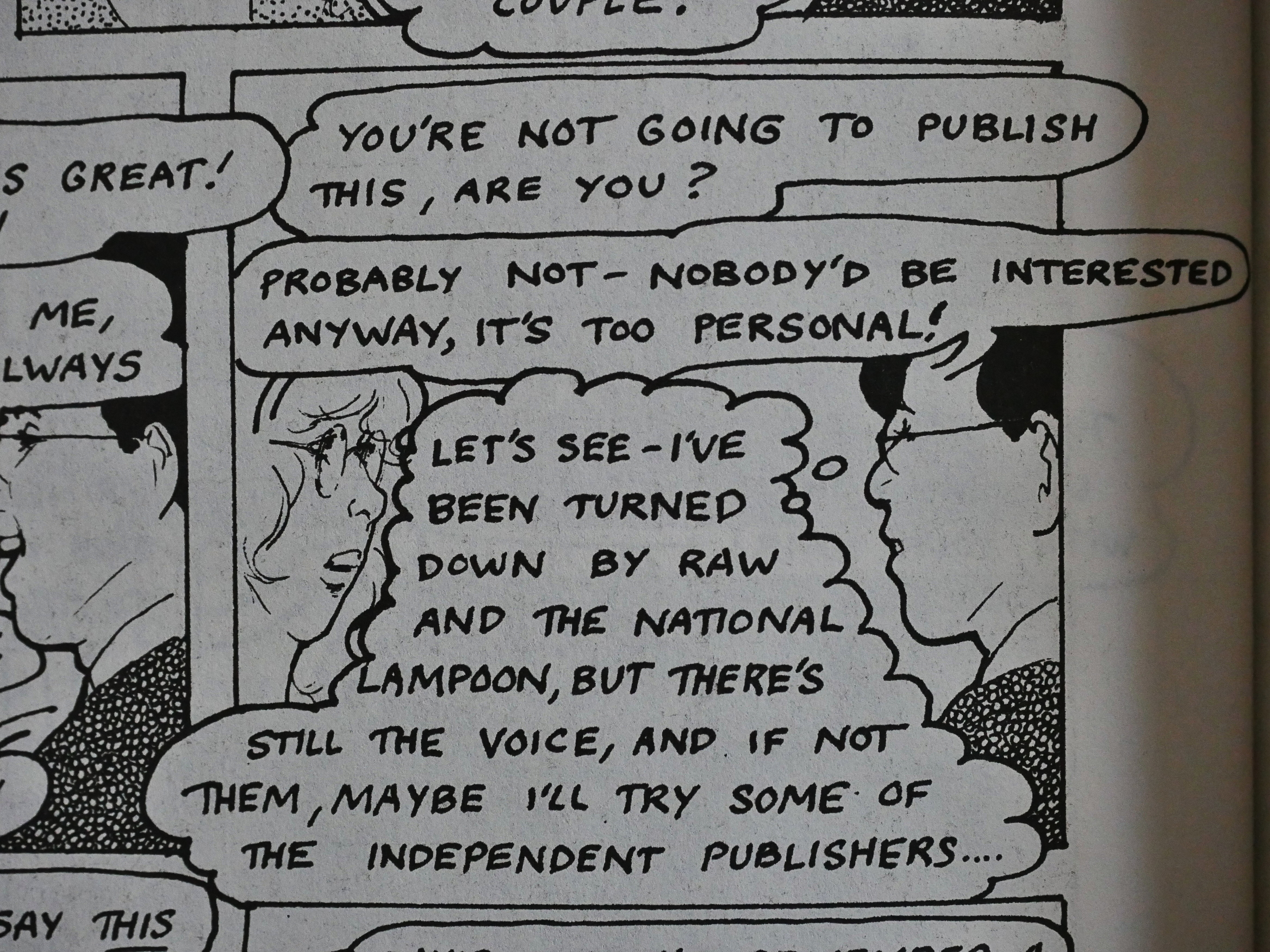
A couple pages later, Chelsea drops the Shred pretence and just namechecks Raw.

It did!

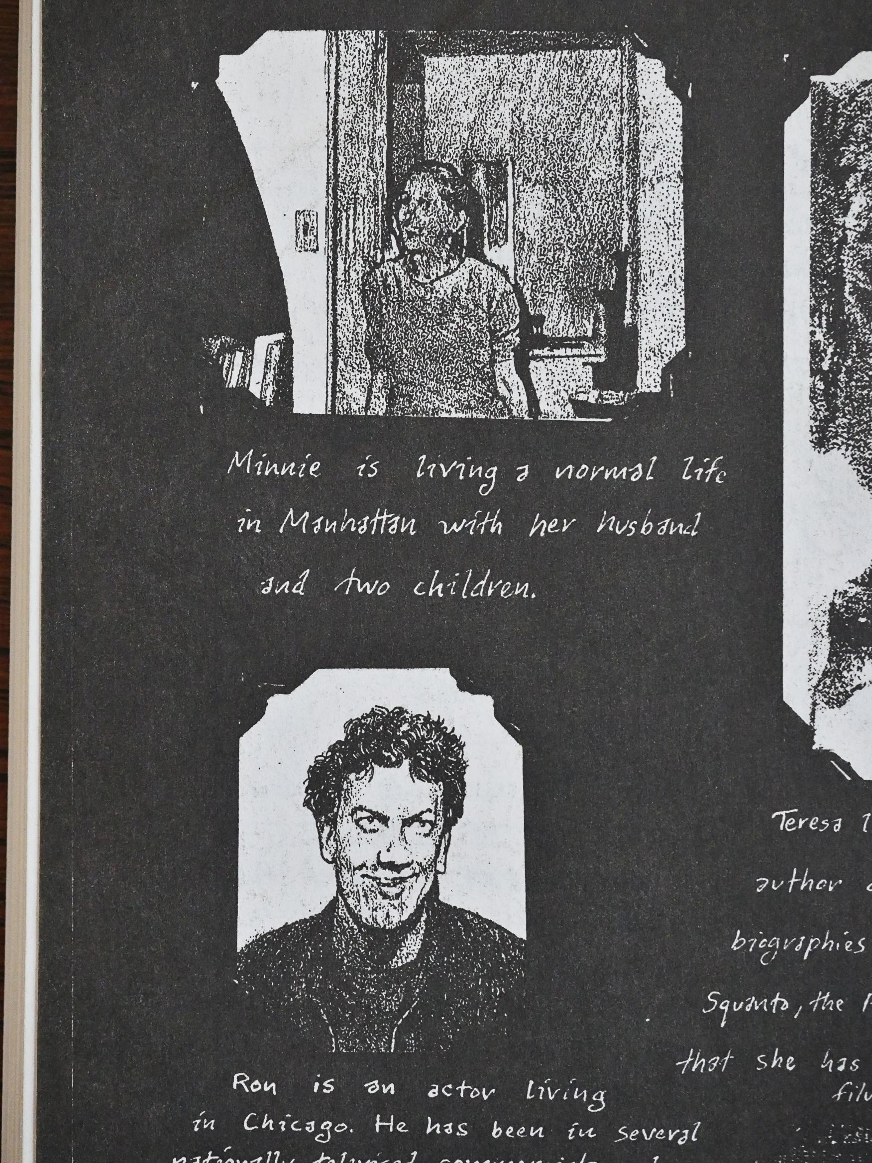
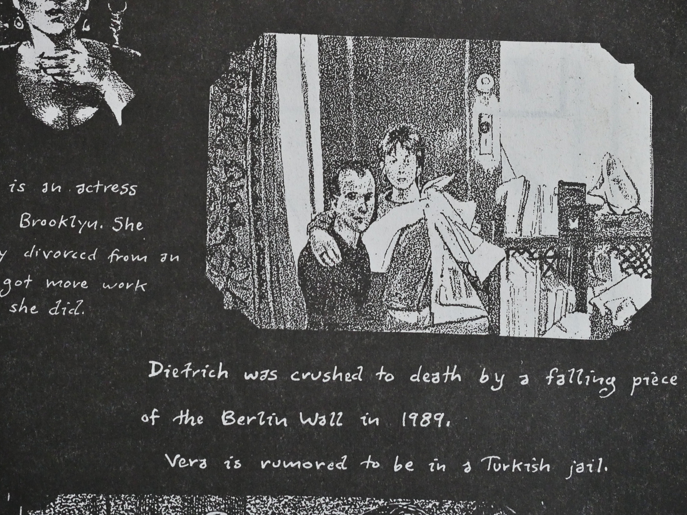
On the final two pages, we get a “where are they now” summary of all the characters, which would seem to point to this being “real”?

On the other hand, some of their fates don’t seem very likely.

Eclipse published a collected edition of this as well, and it’s also been published by Reed in 2003. He’s also published a book called Perspective! for Comic Book Artists: How to Achieve a Professional Look in your Artwork, which er, is something, I guess, but he’s not been a very prolific comics artist after this book.

I think I’ve read them all, also the 24 hour comics, and they’re pretty good. This probably remains his major comics work.

Here’s Rich Kreiner from Comics Journal #147:

he first of four installments of David Chelsea’s autobiographical romance shows him to a struggling commercial anist in New York who is trying to maintain a long-distance relationship with… Actually, David Chelsea appears as just a guy trying to get laid.

[…]

I find myself continually making a disconcerting distinction between Chelsea the creator and Chelsea the character. The level Of passion, the Objectivity Of eye and hand, and the coolness of execution permit the schism. Such a distinction is less felt with the best comic book autobiographers because of not only their skilled intensity. Compare Harvey Pekar’s powerful presence in his most trifling stories. Or compare the empathy so easily invoked in Chester Brown’s Playboy tales. There’s the absolutely vital funkiness infused by Julie Doucet, the raucous breast-beating of Joe Matt, the morally uncluttered yarns of Dennis Eichhorn, and let’s not even get started with Crumb, okay?

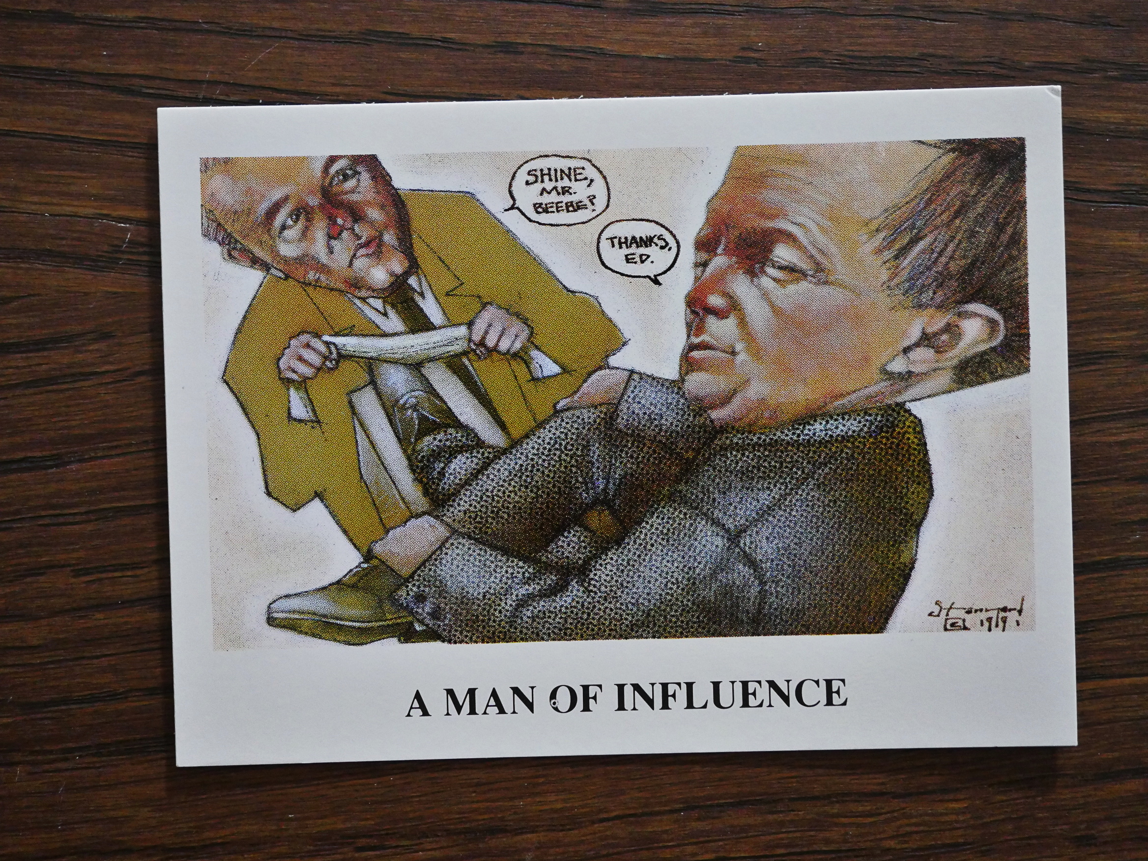
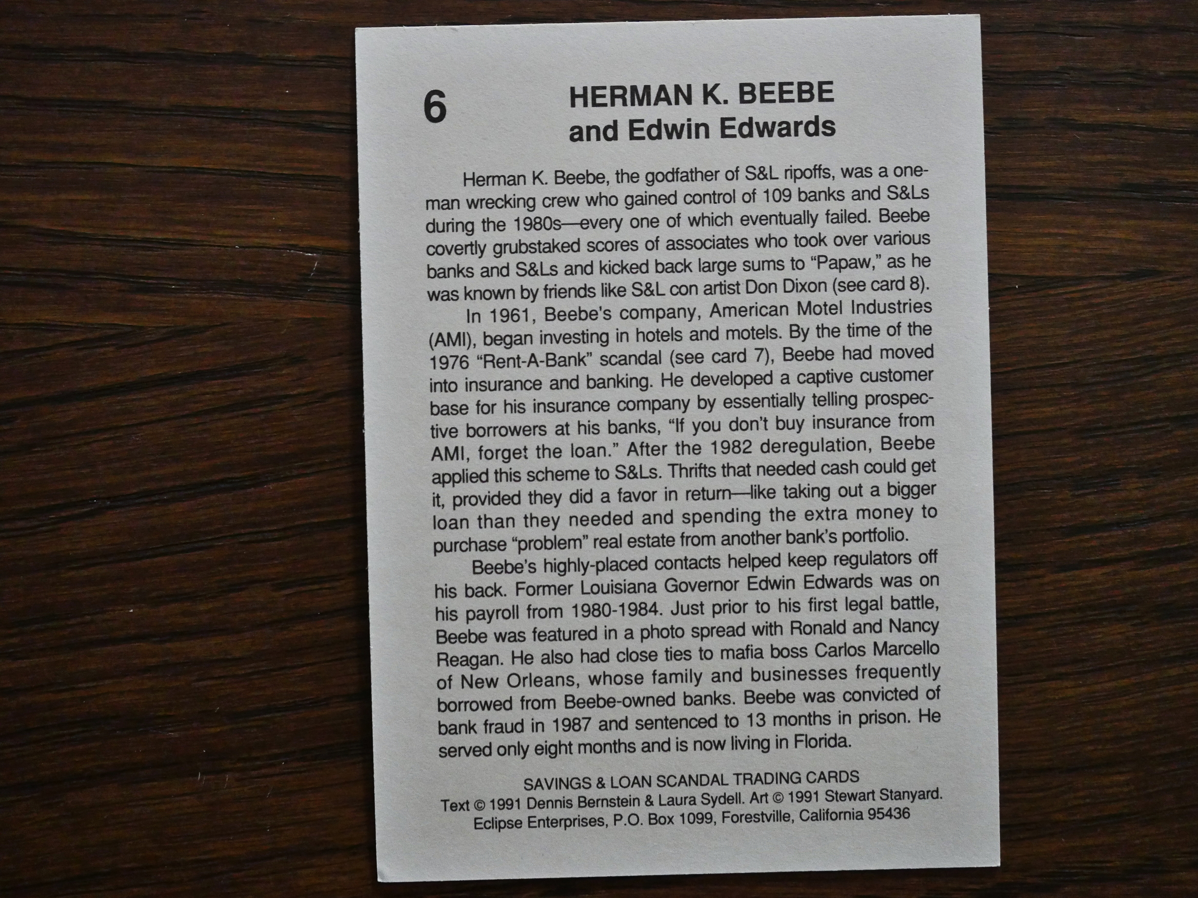
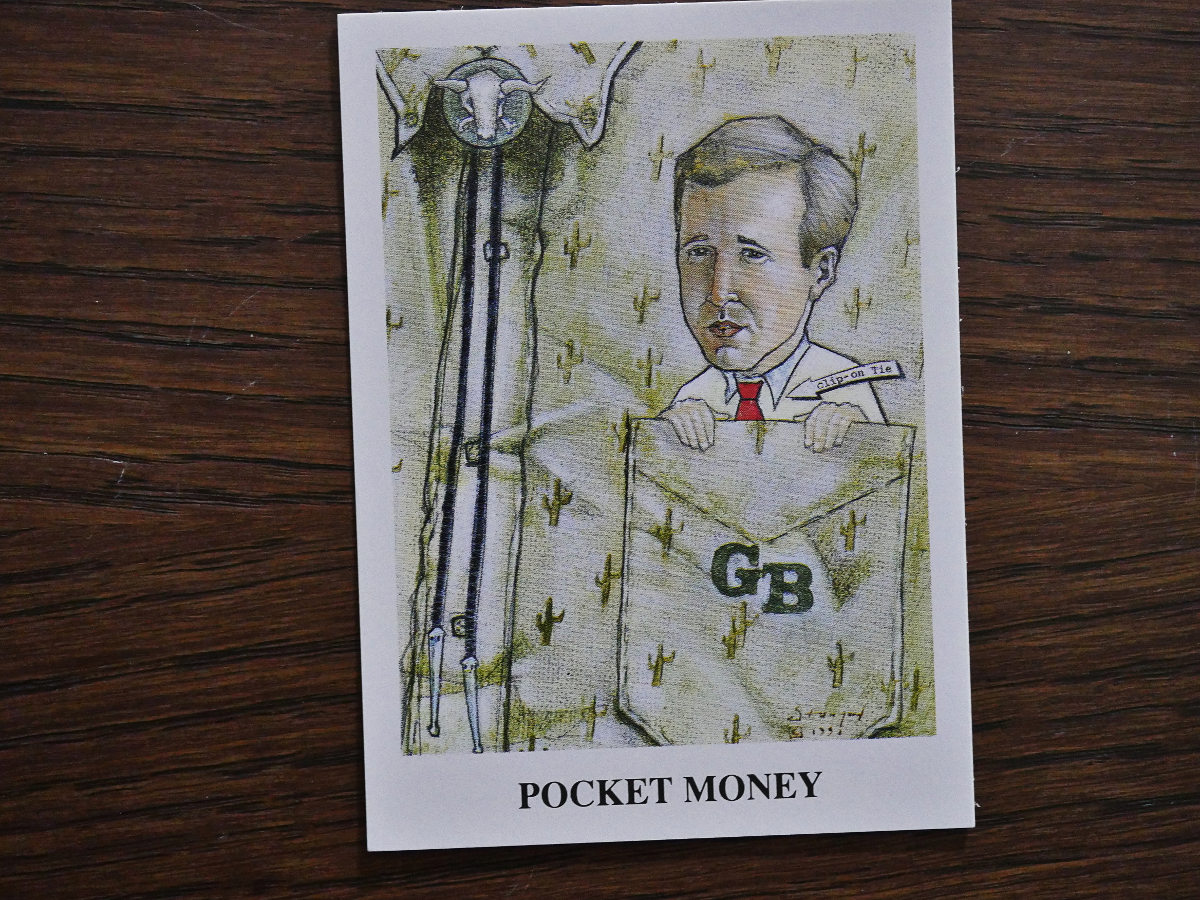
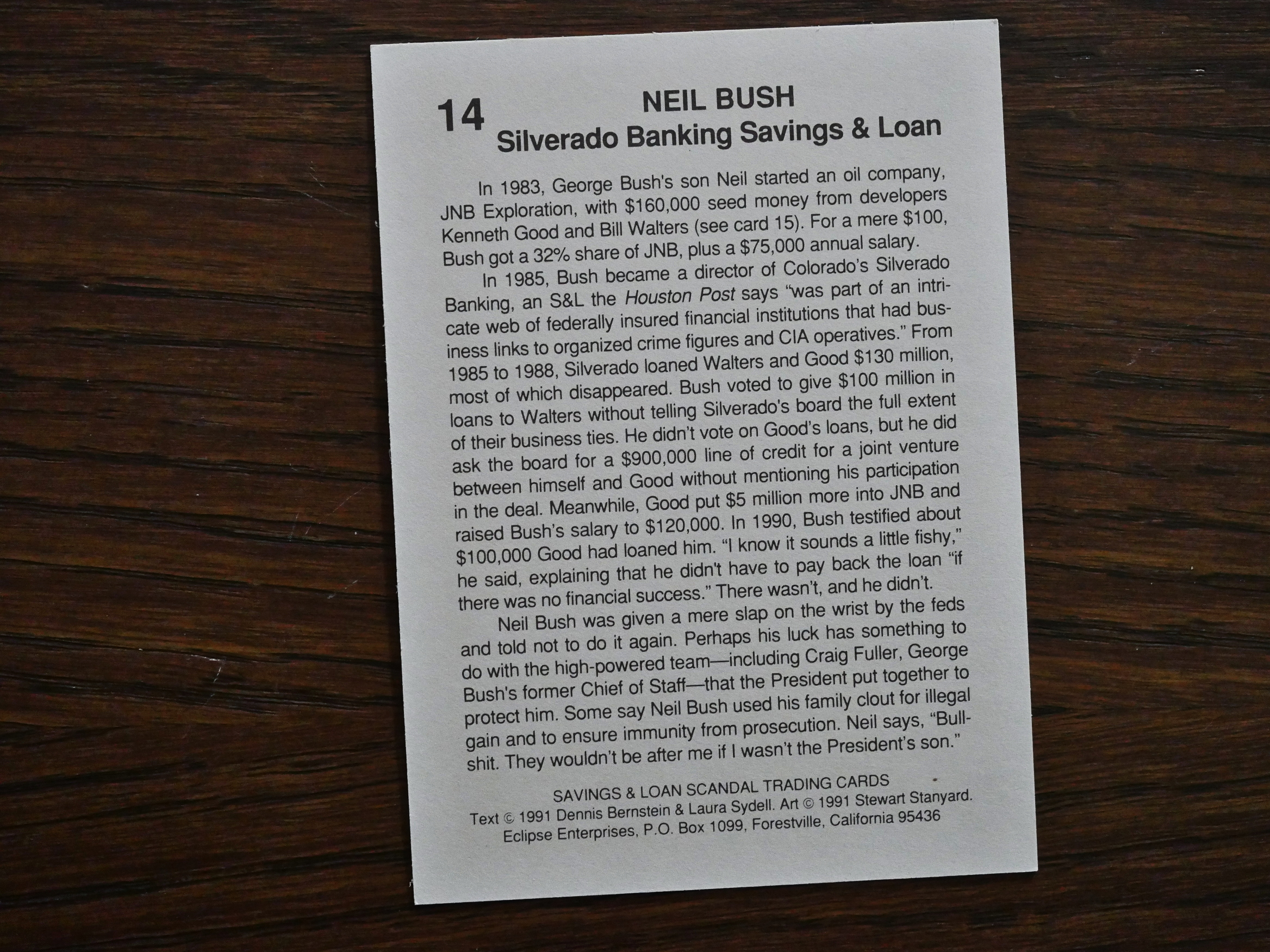
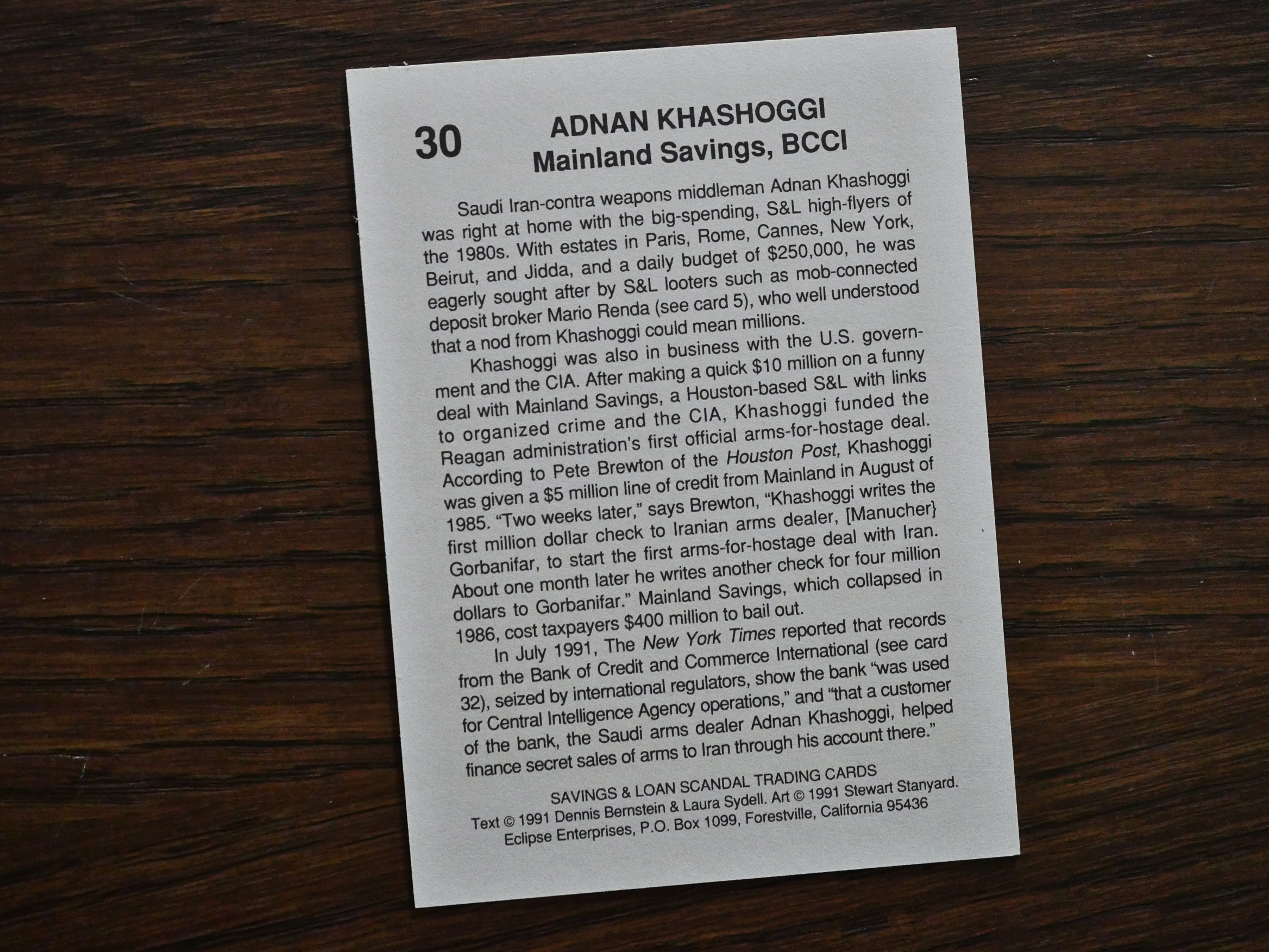
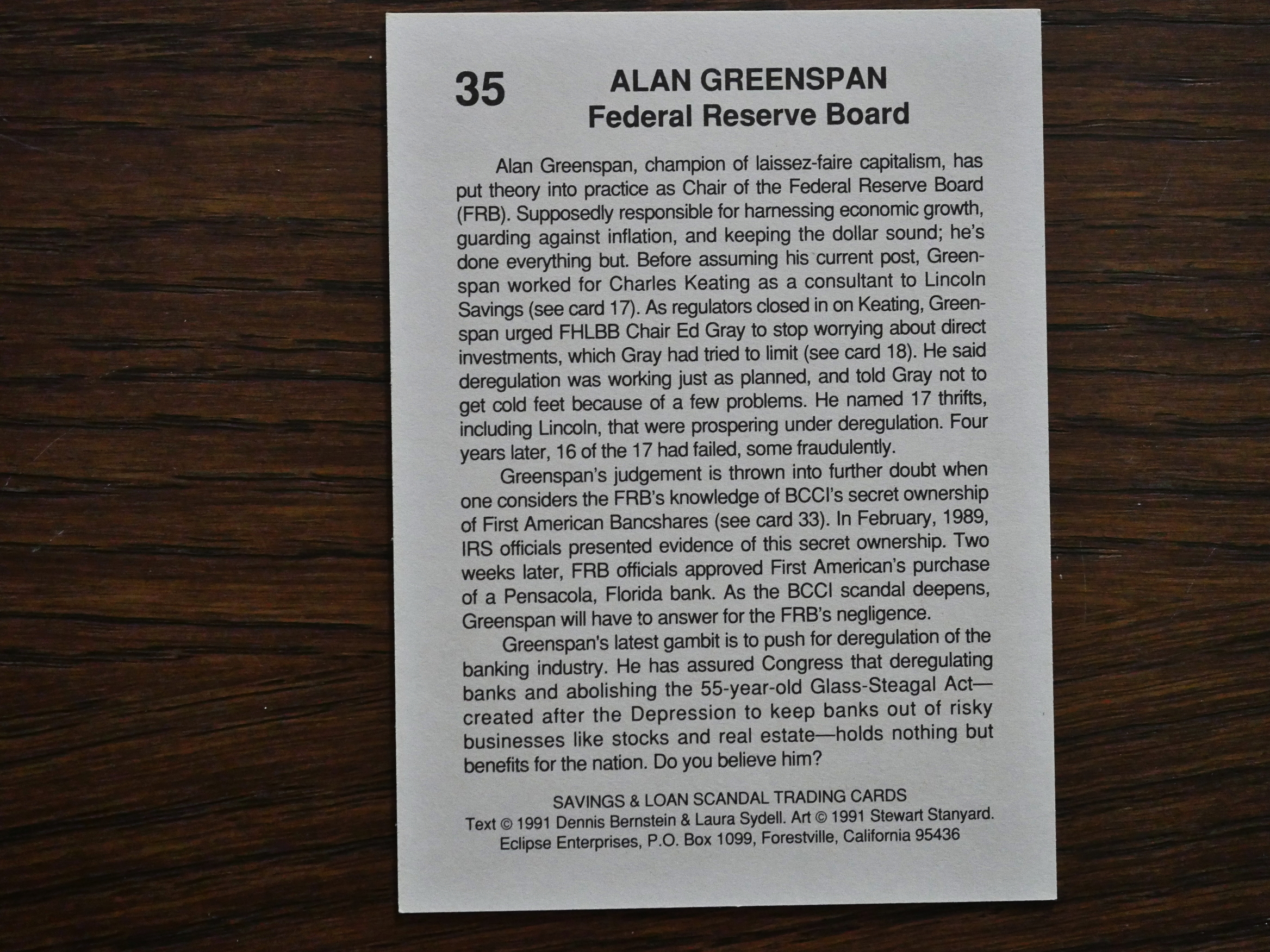
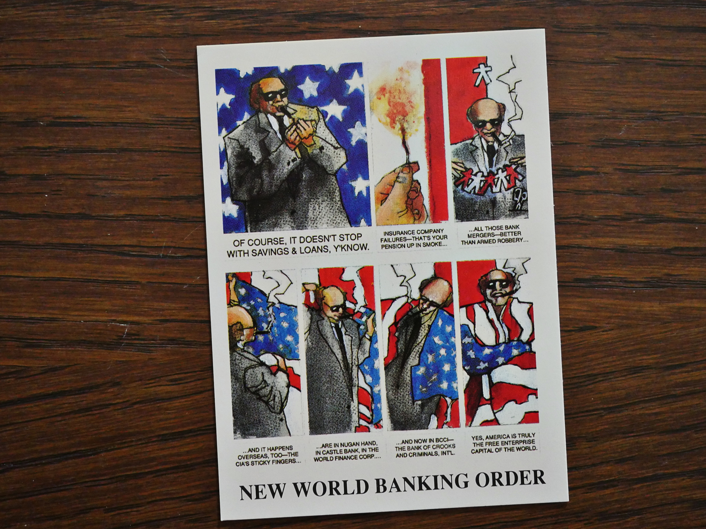
1991: The Savings and Loans Scandal Trading Cards

The Savings and Loans Scandal Trading Cards (1991) by Dennis Bernstein, Laura Sydell and Stewart Stanyard.

I’ve covered a few of the Eclipse “trading” card sets before, like the Iran/Contra set. Beyond the novelty, I’ve been underwhelmed by the writing on these sets, even if the Bill Sienkiewicz-illustrated ones are real purdy to look at.

This set is the best-written one of the ones I’ve seen. Perhaps it’s because it’s about banking and I’m a banker (NO!!!), but I just find the entire thing intriguing (NO!!1!).

I’ve known, in abstract, about the Savings and Loans scandal, but the writers here lay it out in a very understandable manner (well, at least to me).

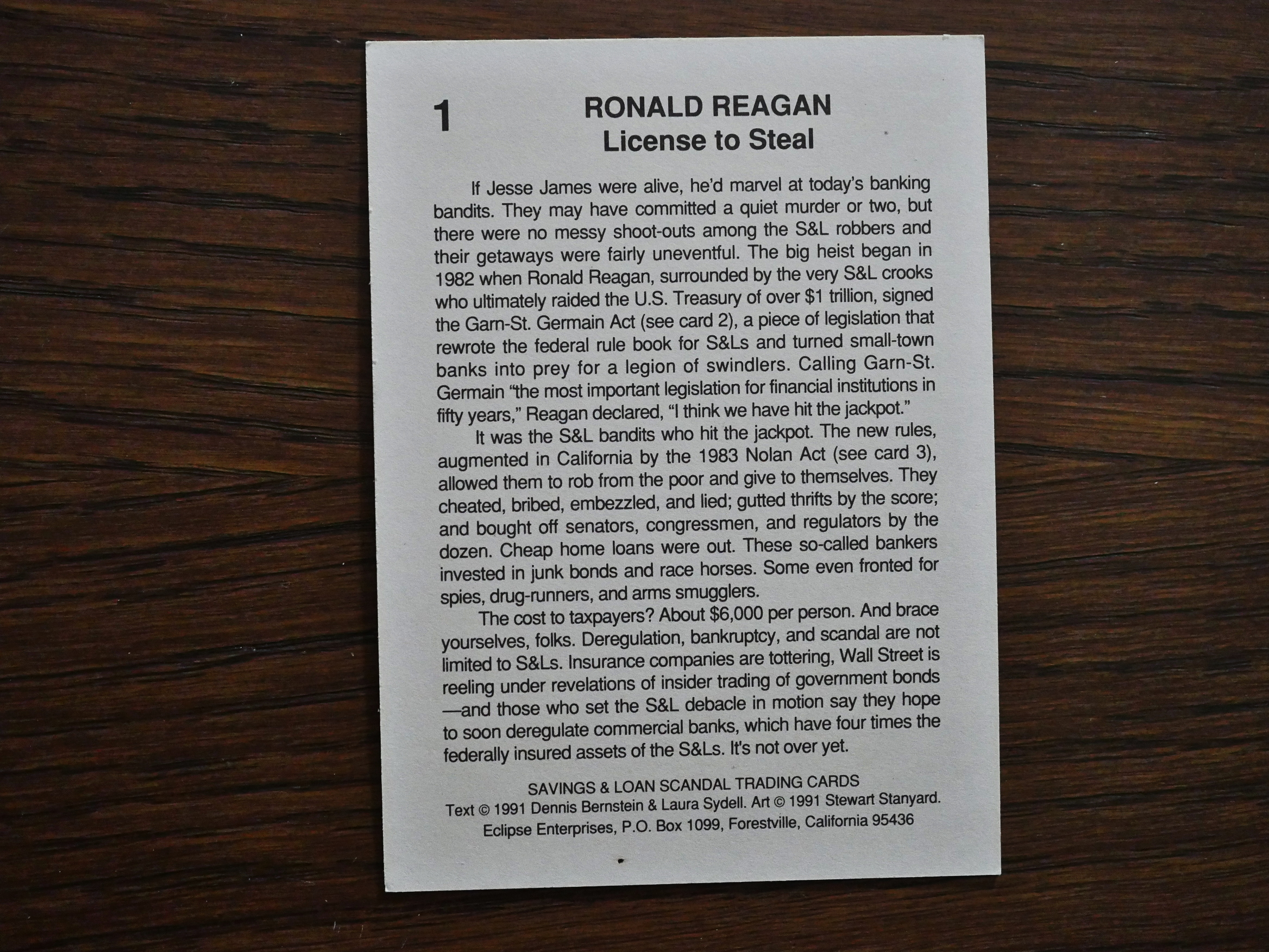
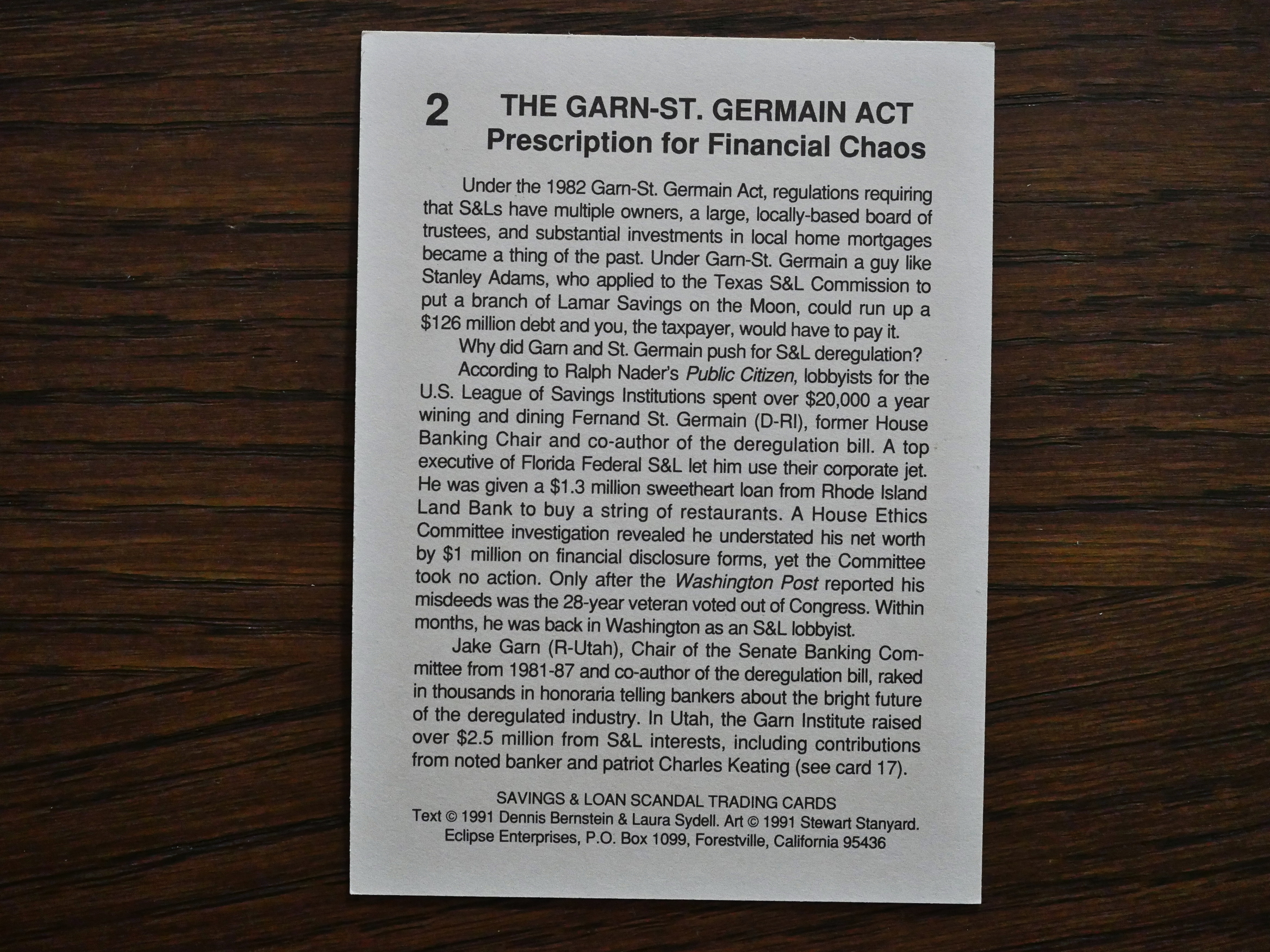
The cards are very much meant to be read sequentially, I think. They have an arc and a logic to them. We start off with some cards that explain what this was all about, and how it started.

Then we’re introduced to a whole bunch of individual banksters, and we’re told what they did and how they ended up. The surprising thing to me was that so many of them ended up in jail. That’s one way things have changed since then: In the previous bankster meltdown, nobody of significance went to jail, and certainly not people who owned banks.

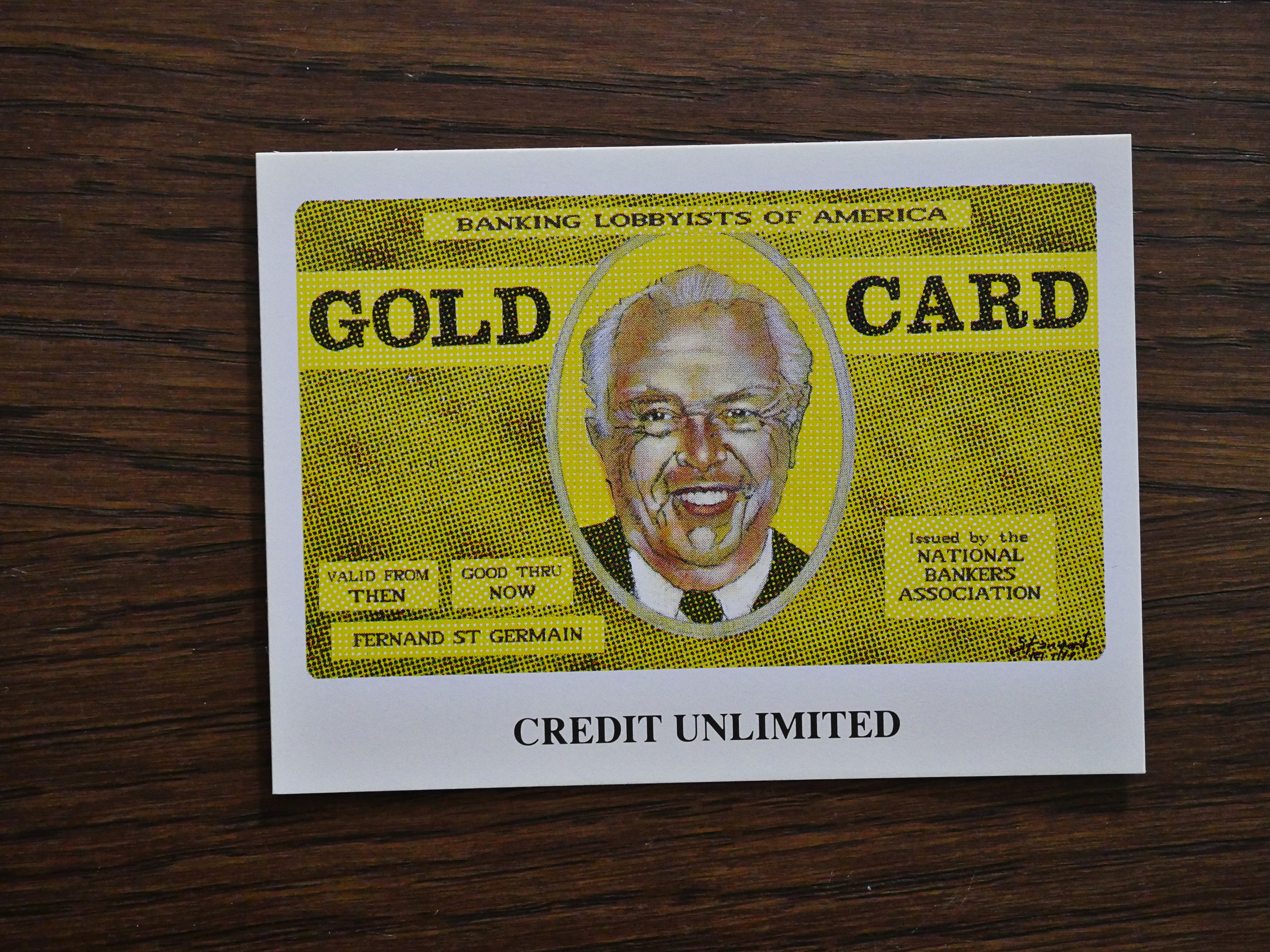
The artwork by Stanyard is pretty apposite. He’s inventive and draws good likenesses of people. They’re not exactly caricatures. But they’re not wildly interesting, either.

Most of the individual cards in the person-by-person rundown of who ruined what thrift, savings & loans, and bank aren’t that interesting, though. After reading about ten of these creeps, it’s hard to care that much, so it’s nice when the writers throw in somebody who’s more connected, like Neil Bush.

As we get closer to the end, the authors tie everything together, and of course it turns out that there’s a bunch of connections between the banksters, the CIA, and the Iran/Contra crimes.

And we get a heads up where things are going. Alan Greenspan is pointed to as a major danger, which turned out to be accurate. He’s the person who bears the greatest responsibility for the 2008 crash.

And I think basically that everything they note here has come to pass. Very prescient.

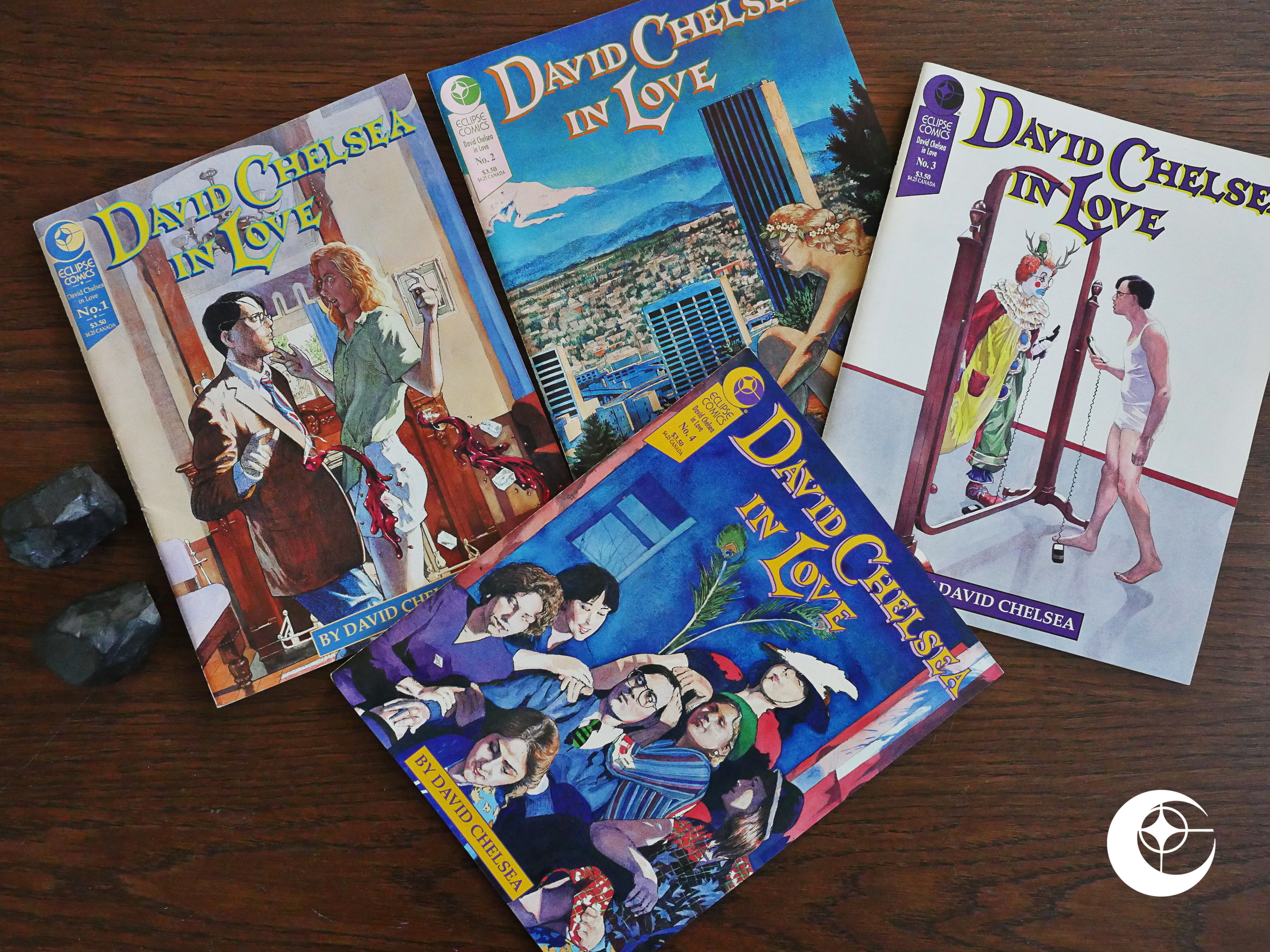
And finally, we get a little dictionary of fun banking terms. Always useful.

Well, if you’re a banker.

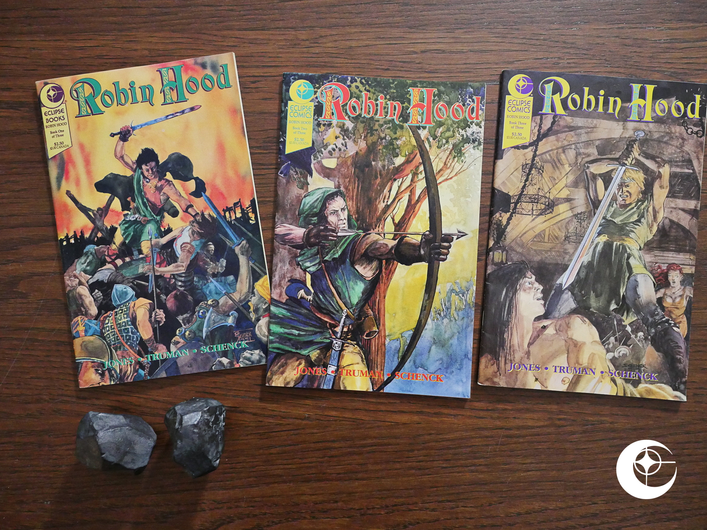
1991: Robin Hood

Robin Hood (1991) #1-3 by Valerie Jones, Christopher Schenck, Timothy Truman et al.

This is a weird hybrid between Eclipse’s current strategy and their next. For a few years, Eclipse had almost abandoned their bread and butter: Monthly(ish) 32 page floppies, costing something around $2 a pop, and gone all in on albums and 48 page squarebound items, typically costing $6 and up. And they focused on adaptations of books and films.

In 1992, they would reverse this approach: Virtually all new series are 32 page floppies, and the adaptations are mostly gone.

Half a year before this new launch, Eclipse apparently tests the water with this Robin Hood series. It’s got the new logo they’d be using variations of, it’s $2.50, it’s a 32 page floppy, and…

It’s called Robin Hood, and it’s fully painted, so it’s almost part of their current strategy, too.

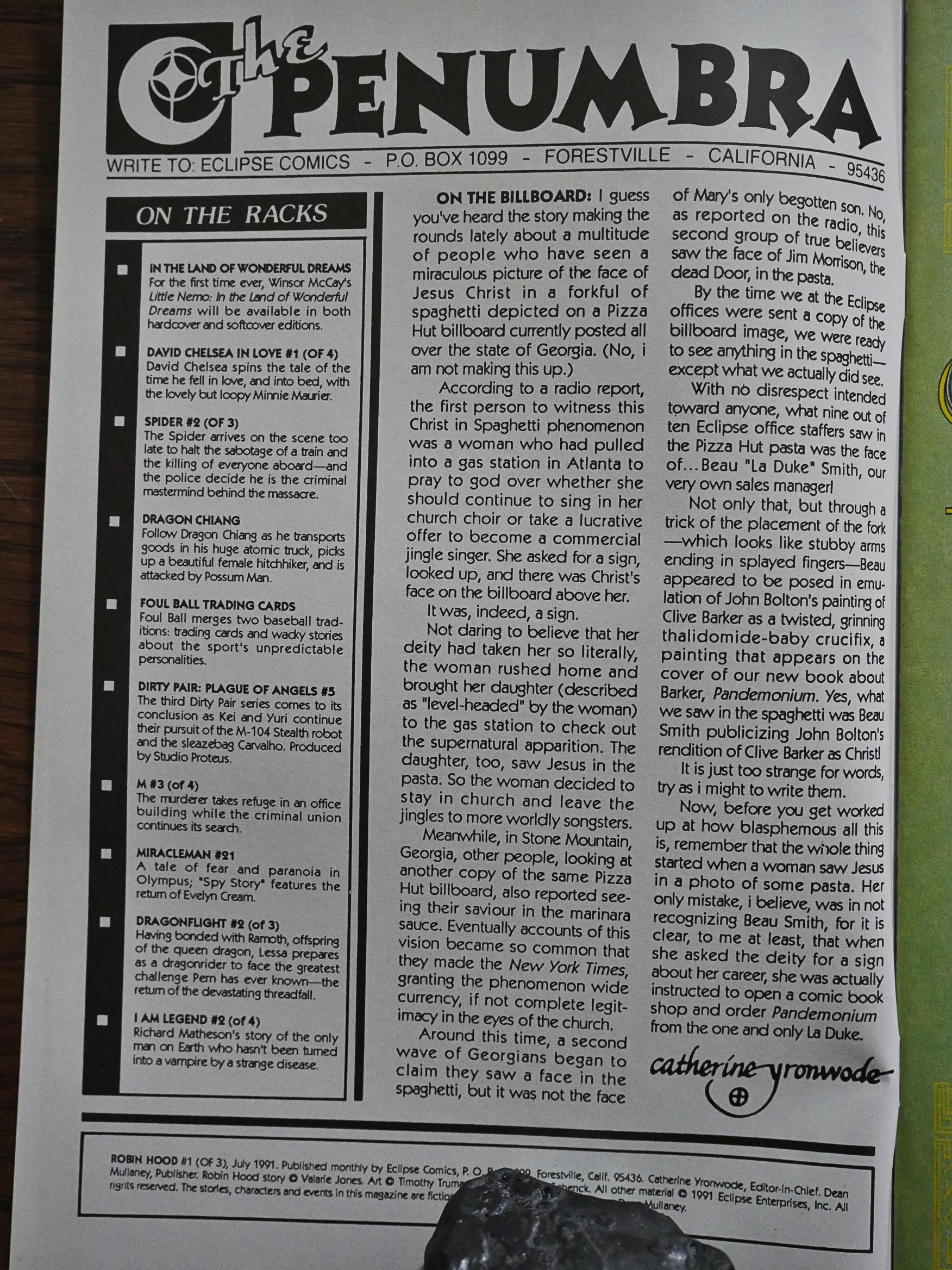
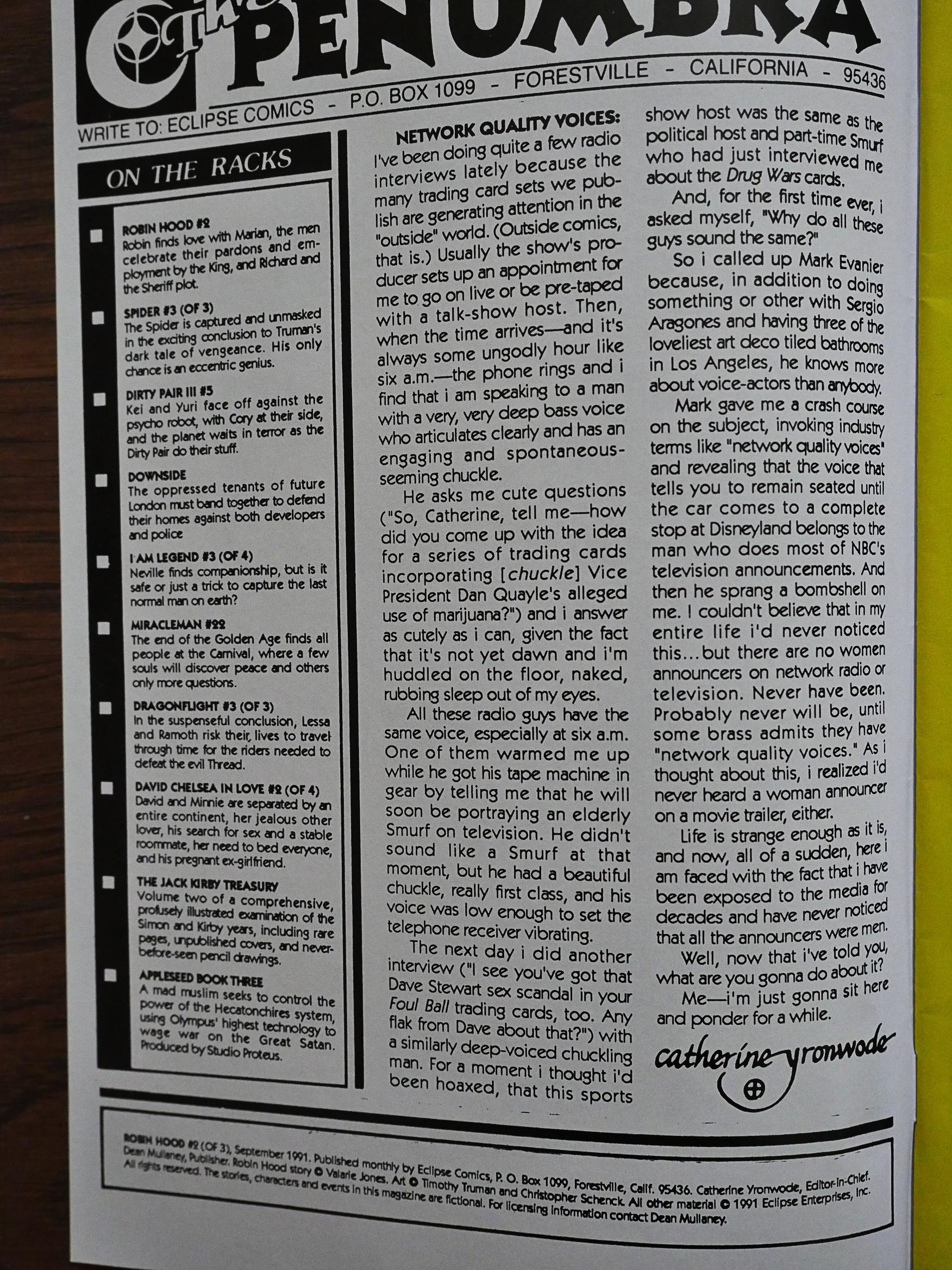
Ah! A penumbra! Since they’d cut down on floppies so much, it’s been weeks since I’ve read one of these. The only floppy they list “on the racks” is Miracleman #21. And catherine ⊕ yronwode recounts a funny story, that’s more amusing than they usually are.

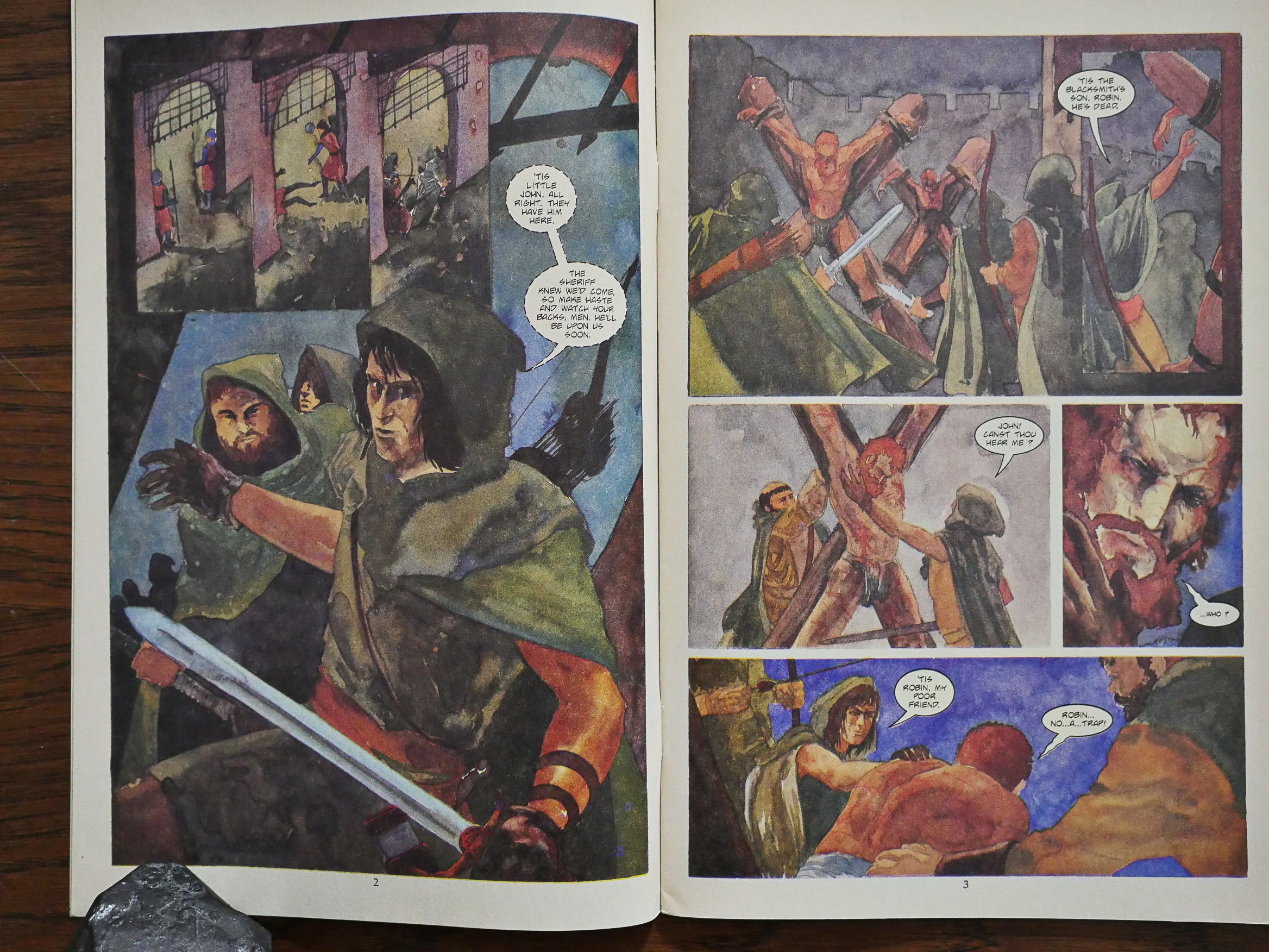
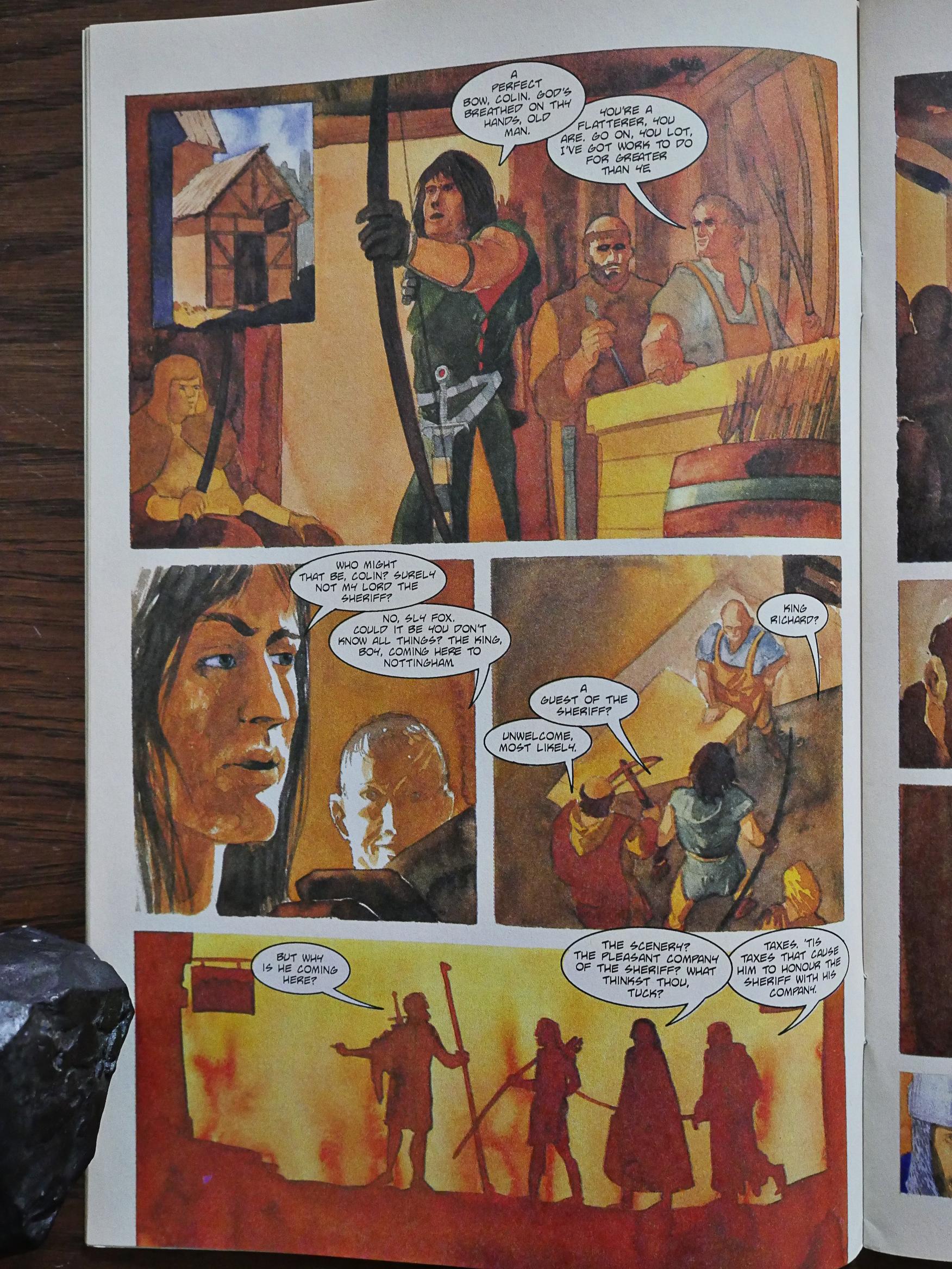
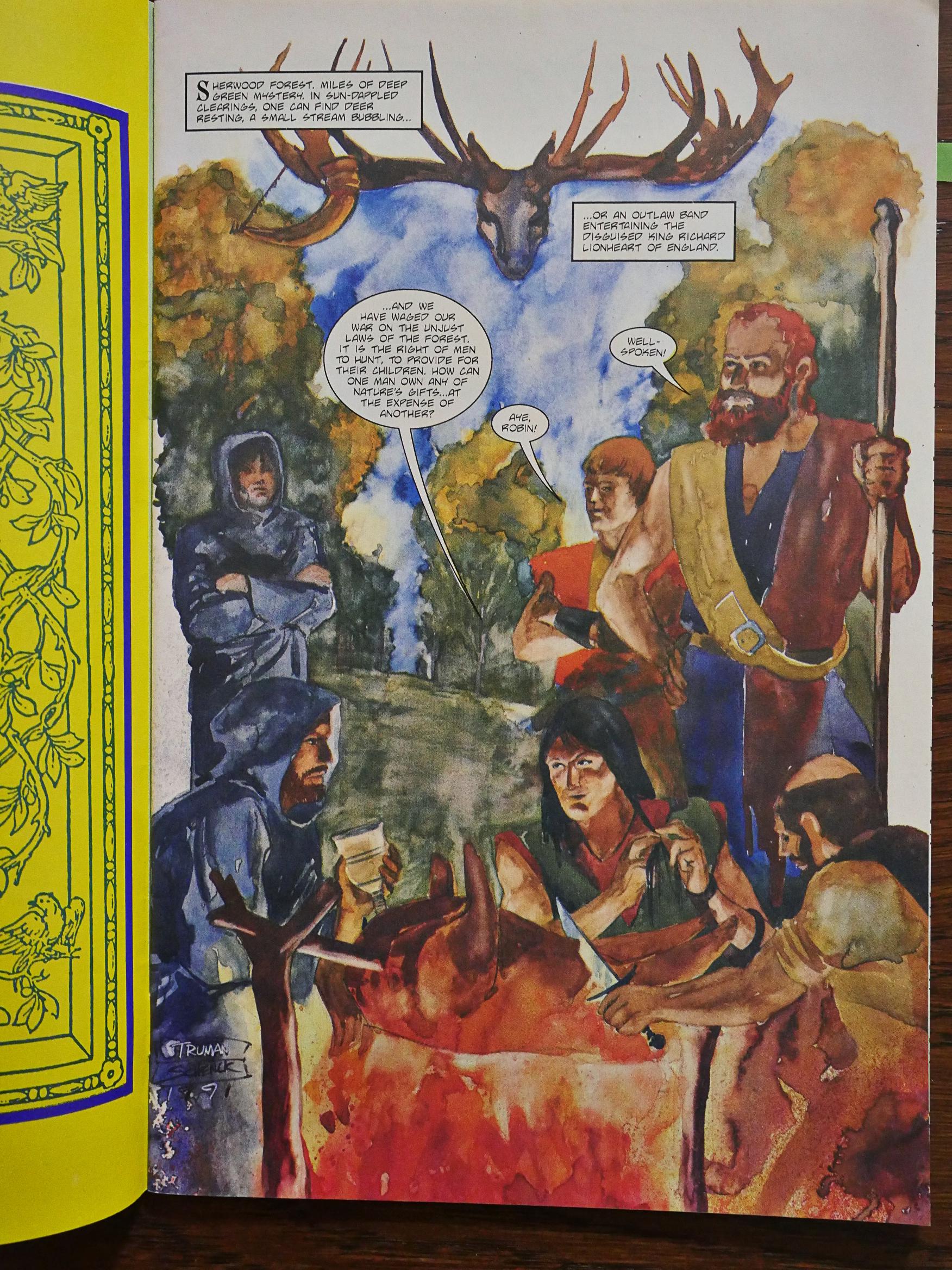
ANYWAY! Robin Hood. The layouts are by Timothy Truman, but the artwork is by Christopher Schenck, which is an unfamiliar name to me. He’s painting in watercolour, I guess? Which makes printing it on absorbent matte paper a strange choice, because that’s no way to make these colours sing. I mean shine.

Was this originally fated for a single expensive 84 page volume on shiny paper, and then they changed their minds when they got the artwork?

Because, while the colours are on fleek, the figurework and the faces are, er, “traditional”. As in positively medieval from time to time.

But oh, the colours. I was immediately put off by all the wonky faces and figures, but there’s a bunch of really lovely pages in here.

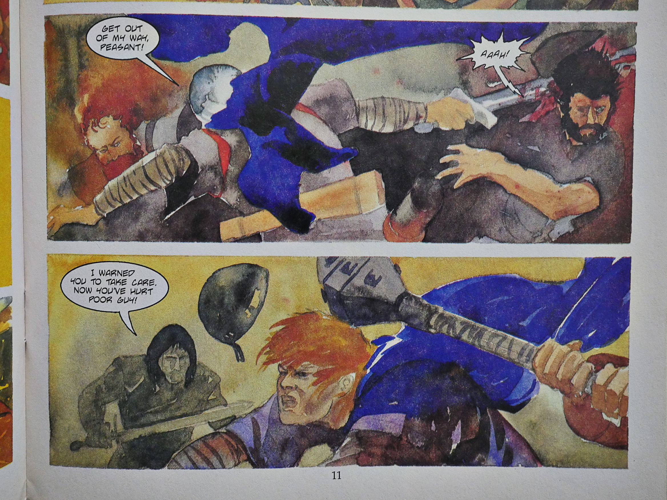
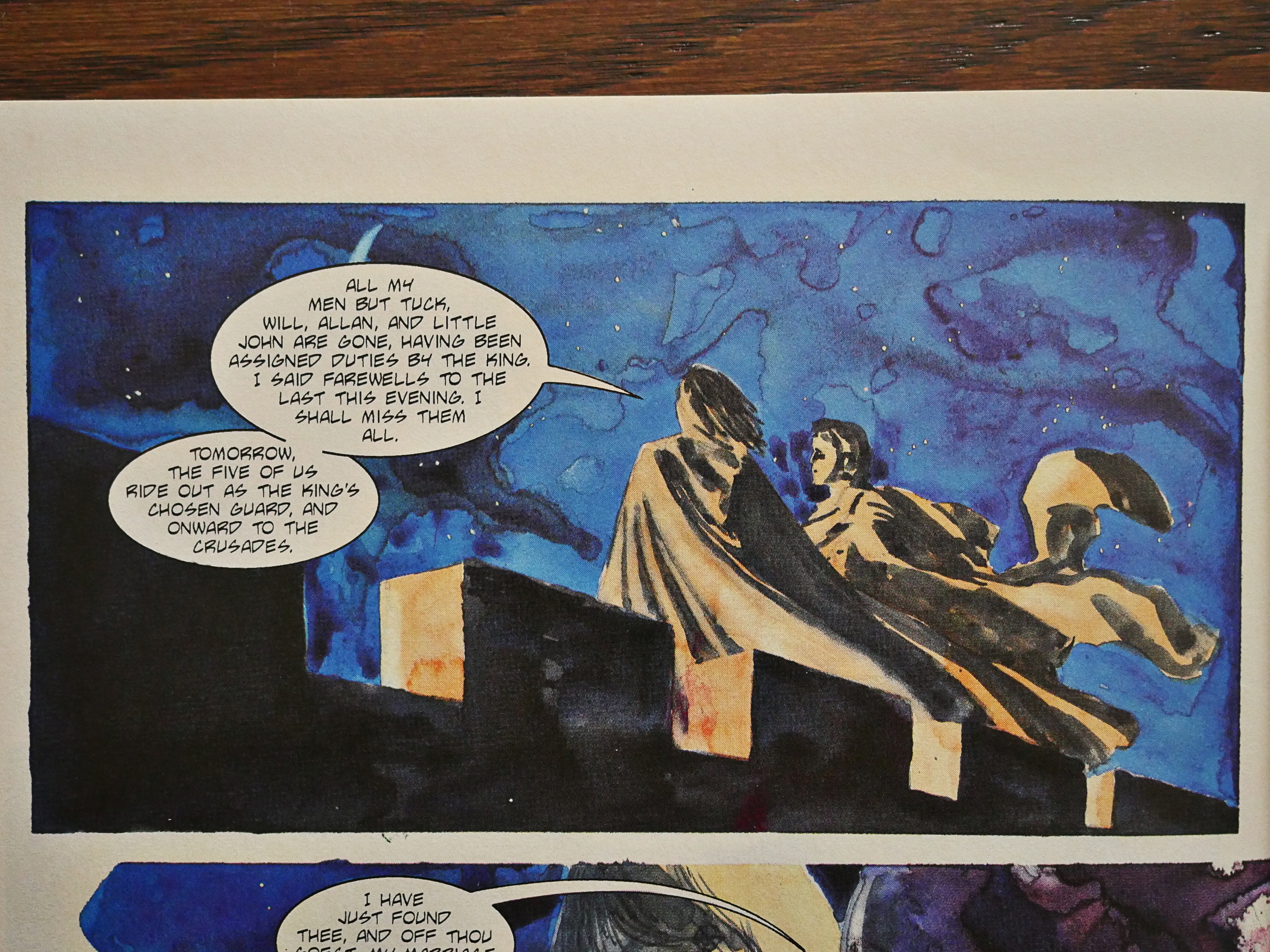
Look at that blue cape! It’s the best blue cape ever!

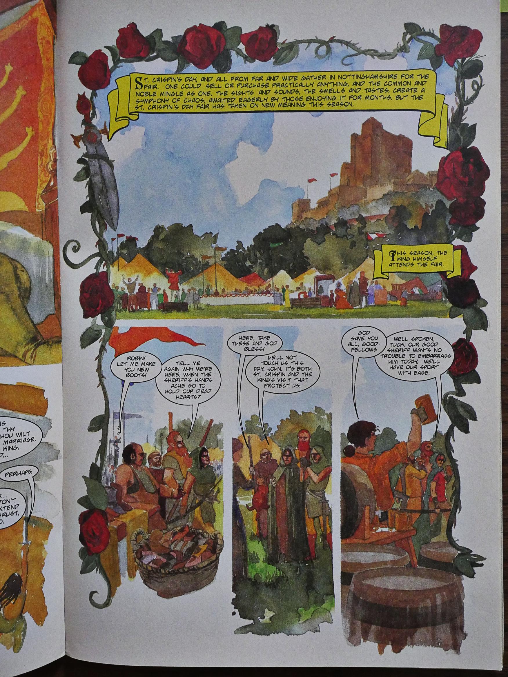
The artwork really sings when he’s given an opportunity to do tableaux like this. Very appropriate for the story.

Oh, the story. I’ve only seen a couple of Robin Hood movies, and, er, the plot in this one is nothing like the plot of those. Well, OK, there are some scenes that are close to what I remember, but not the overall plot. So unless I totally misremember things (which is possible), this is a very revisionist take on the Robin Hood story, and I heartily approve.

Even if it was really confusing reading this, thinking I knew who the characters were and what their motivations were, it’s a solid story, well told. Over 84 pages you get a much meatier story than you’d expect, and Valerie Jones doesn’t achieve this by verbiage, but by good storytelling.

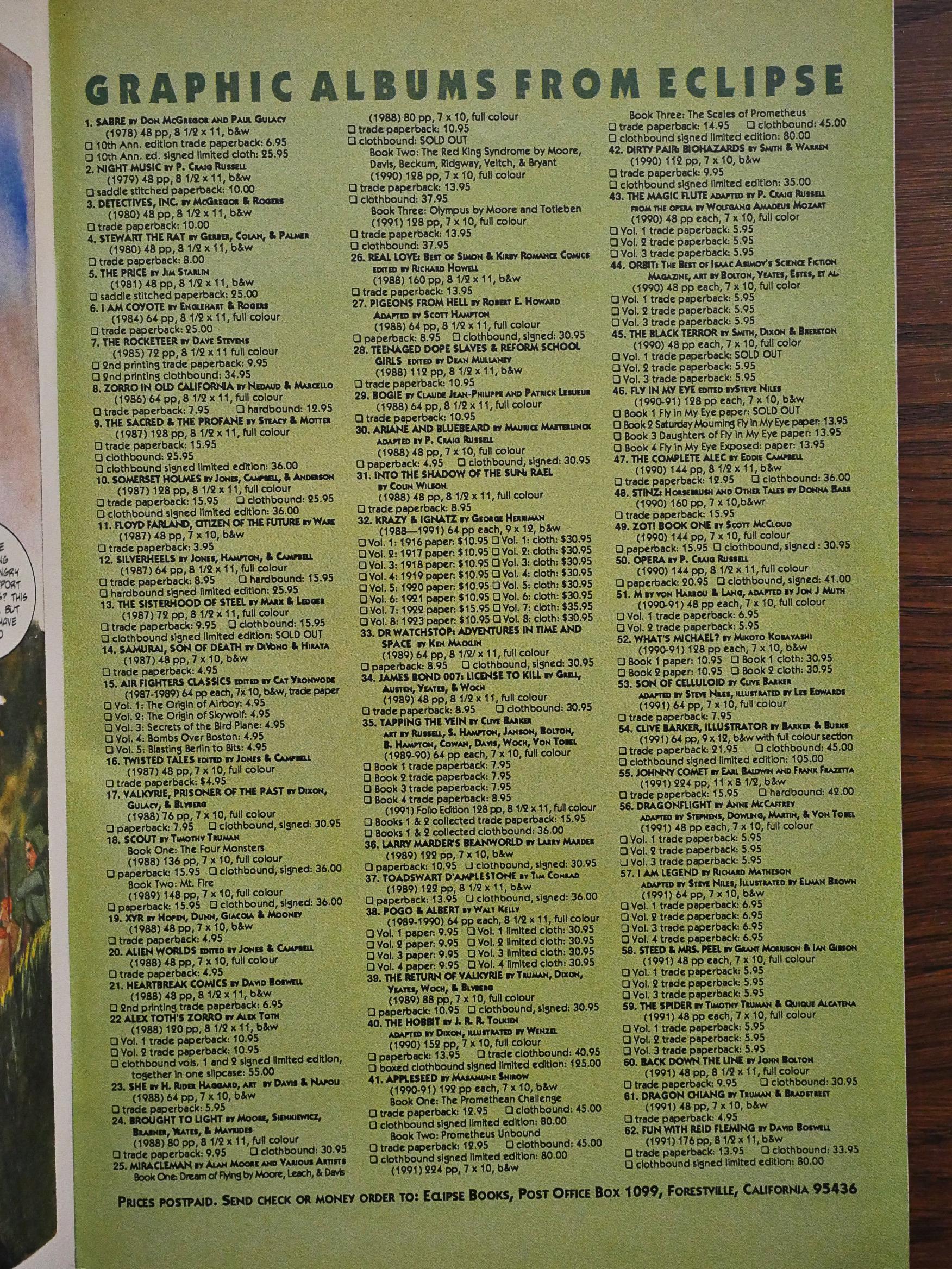
Eclipse used to have a couple of pages of back issue listings where you could order individual issues from all their series. They’ve apparently ditched that completely now, and just lists the graphic novels.

I just had to include that Penumbra too, because it’s something I’ve always noticed about US TV. It’s not that way in any other country I’m familiar with. I mean, having all TV announcers and voiceovers be men. Men with deep voices. It’s deranged.

Anyway! Back to Robin Hood.

The last two issues are printed on slightly shinier paper, which makes Schenck’s colours pop even more.

Look at that nighttime sky! Just look at it!

Lovely.

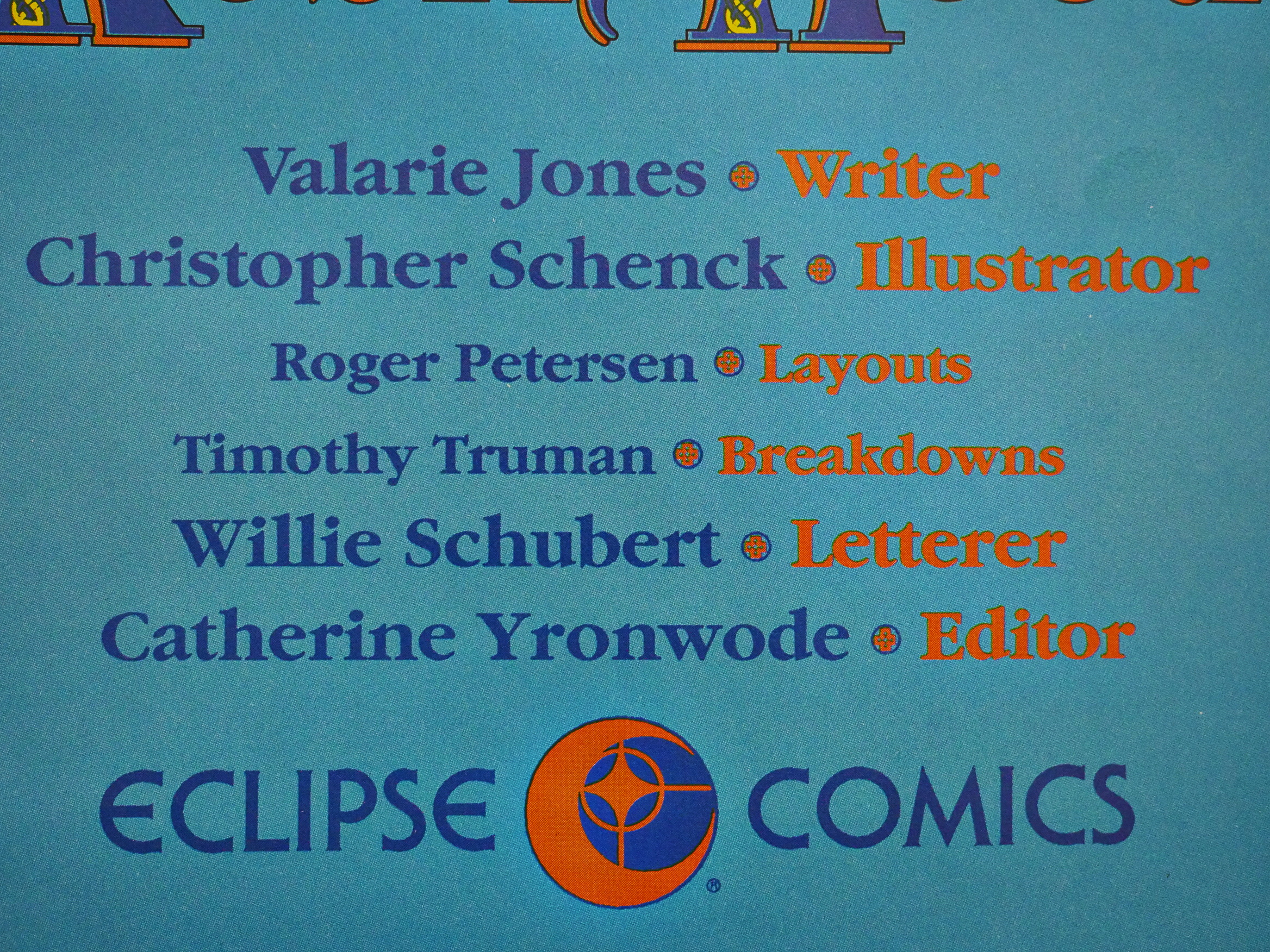
For the final issue, we have Truman doing breakdowns, Roger Petersen doing layouts, and Schenck doing the painting. I guess Schenck really, really hates everything other than putting colours down on the page?

I think Petersen’s work makes a noticeable difference: The layouts get more architectural and the figures start having better anatomies. And the faces, even, are downright non-wonky.

This has never been reprinted, so I’m going to go ahead and guess that most people didn’t enjoy the artwork or the story as much as I did.

And I was unable to find anybody on the internet that they would even admit to having read it, so perhaps that’s the reason it’s never gotten a collected edition.

1991: Back Down the Line

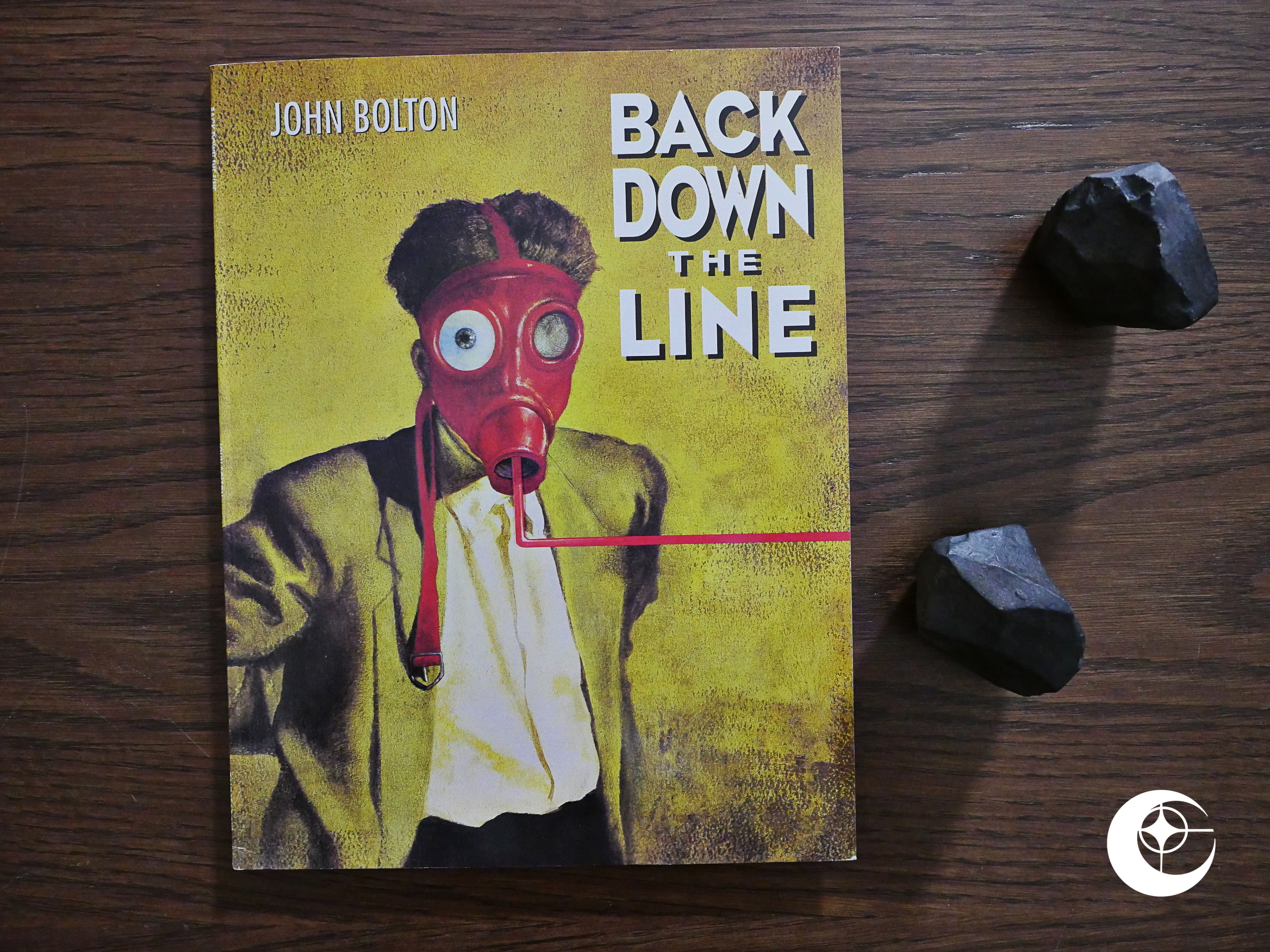
Back Down the Line (1991) by John Bolton et al.

Eclipse had published a lot of John Bolton stories before, but mostly in anthologies. There’s just one previous collection: The Halls of Horror floppy some years earlier.

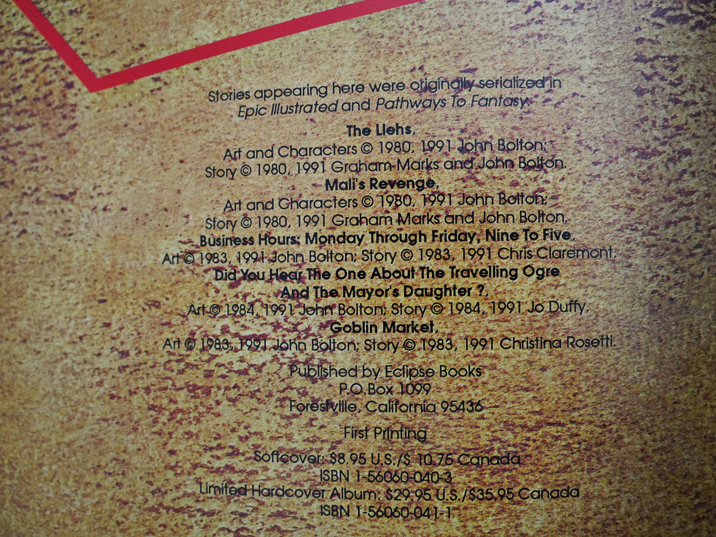
This is a 48 page album and reprints stories from Epic Magazine and Pathways to Fantasy, so we’re talking early 80s. The indicia page is all there is of credits in this thing, so who the authors to these pieces are isn’t exactly stressed.

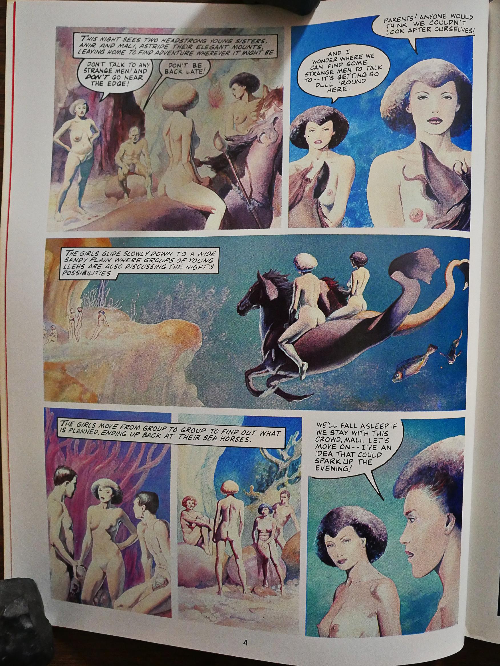
Graham Marks writes this little mermaid thing that starts off funny enough, has some interesting twists along the way, but then ends on a very sour note. I remember this from when I was a teenager, actually…

This story written by Chris Claremont I remember, too, and it’s an amusing little joke; very Chris Claremont. Gorgeous artwork by Bolton.

Jo Duffy wrote the best bit in the book, I think, about ogres and rebellion and stuff.

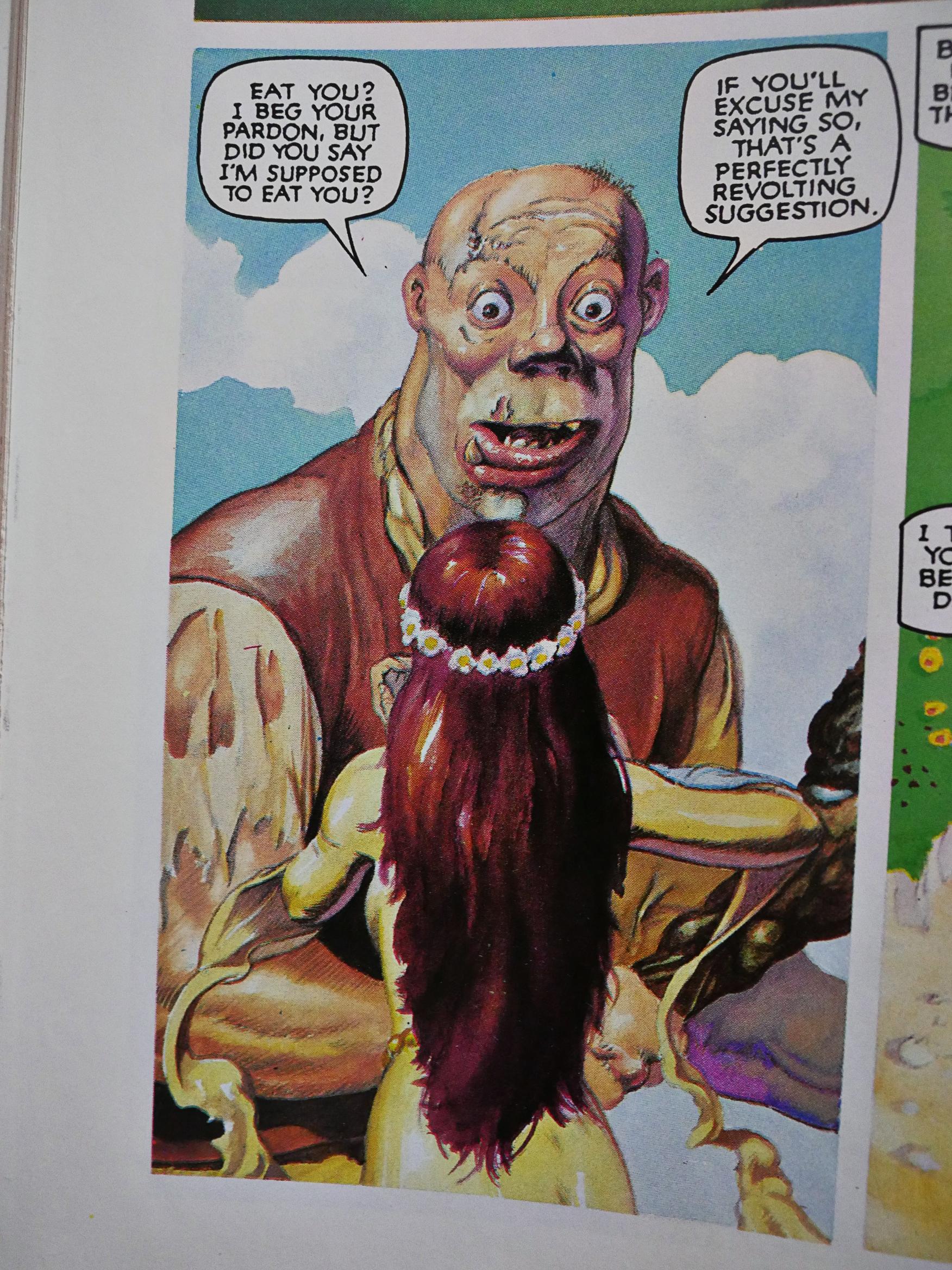
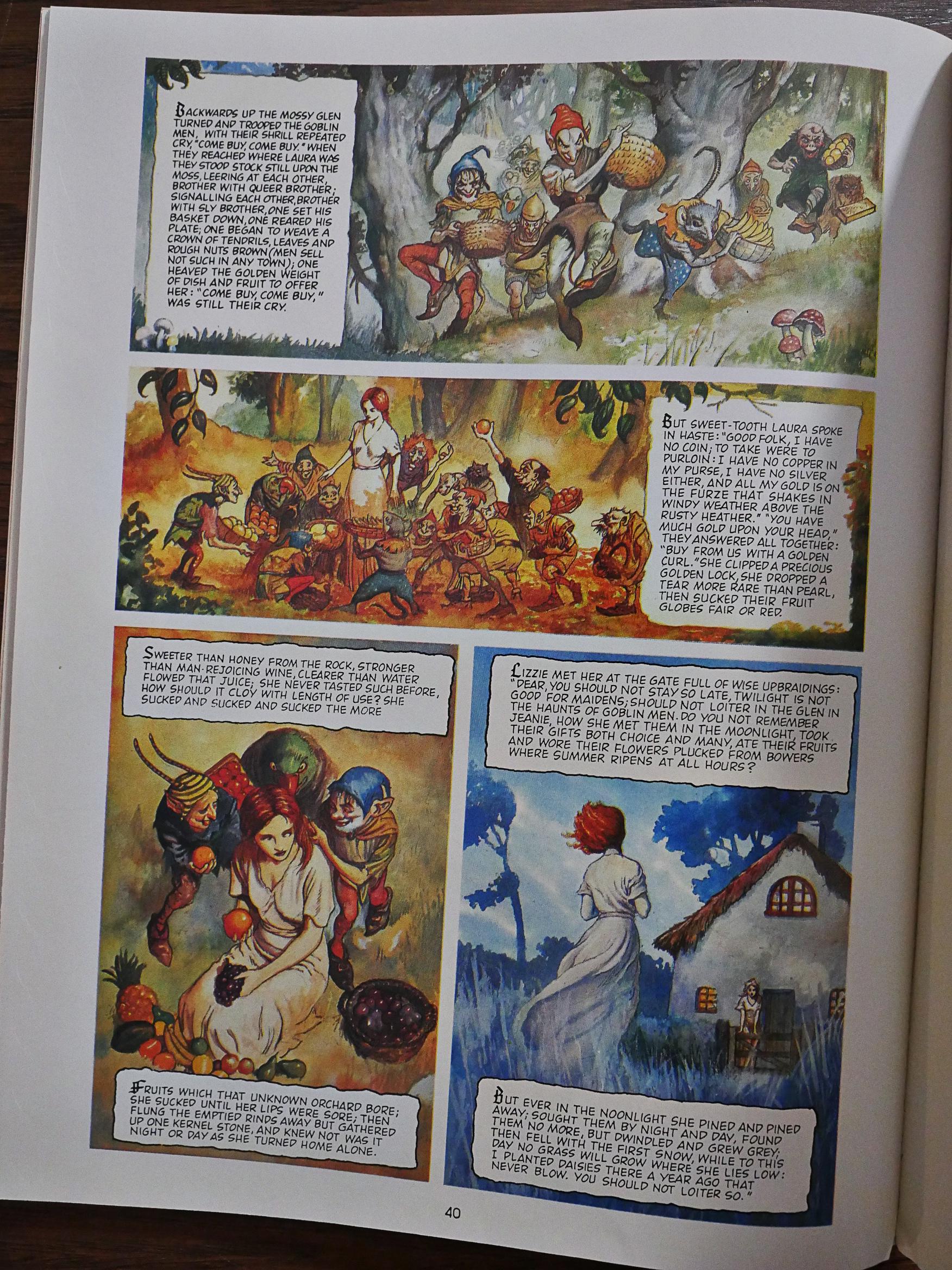
The first three stories were very… slight, I guess you could say. The main attraction is the art, no doubt. Christina Rosetti writes the fourth and last story, and it’s the one that feels most worked out, and not just because there’s like more words. It’s a proper fairy tale with ups and downs and drama and a heroic ending. I wonder whether it’s adapted from a short story?

And that’s it. The cover made it seem like this was going to be a heftier, more serious book, but it’s not bad for what it is. You get 46 pages of great, lush John Bolton artwork, and some fun stories to boot.

I’m unable to find any signs of anybody ever reading this collection, but I’m going to go ahead and guess that all the stories contained here have been included in other, later Bolton anthologies.

1991: The Spider

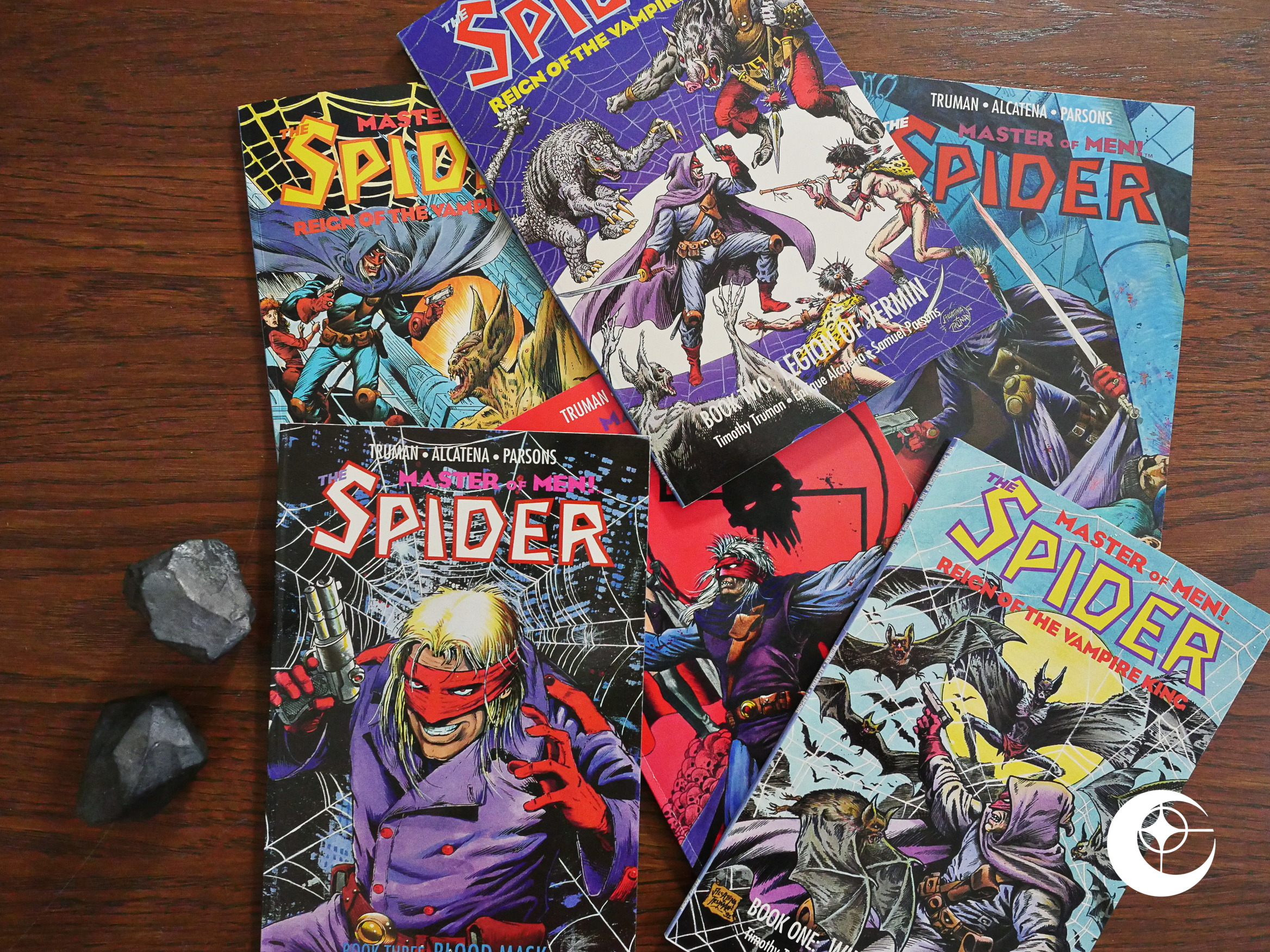
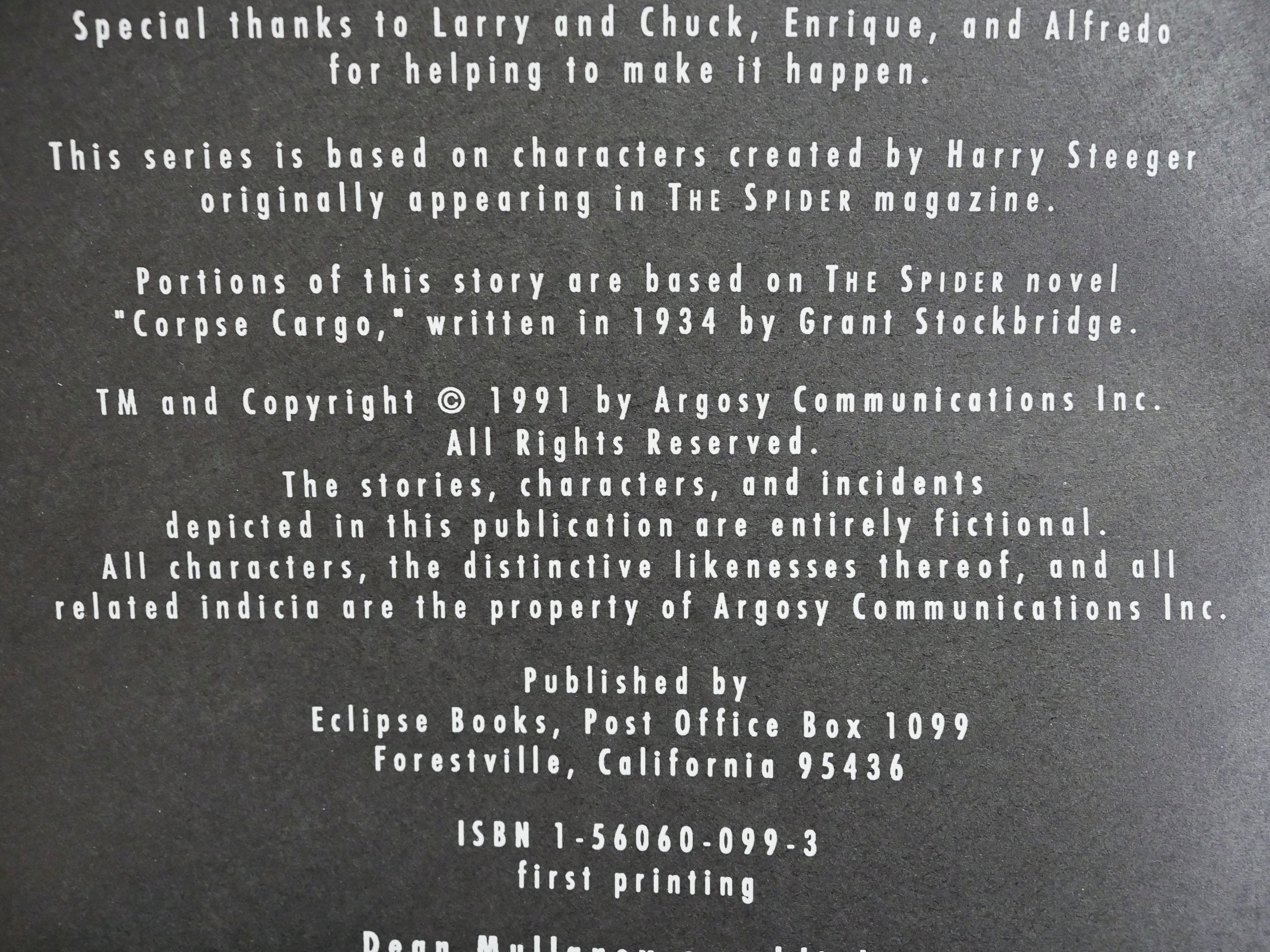
The Spider (1991) #1-3, The Spider: Reign of the Vampire King (1992) #1-3 by Timothy Truman, Quique Alcatena et al.

Hey! This is the first Timothy Truman comic I’ve read in a while. He was responsible for most of the best-selling Eclipse comics in their previous action/adventure monthly incarnation (i.e., 85-87-ish), starting with Scout and branching into a number of comics either written by him (or his partner in 4Winds, Chuck Dixon) or edited by him.

But Eclipse went in a different direction (focusing on graphic novels and painted adaptations of various things), so having him pop up again here is a bit of a surprise. But, of course, these aren’t published in normal “floppy” format, but instead as 48 page squarebound “prestige format” and selling for $6 a pop.

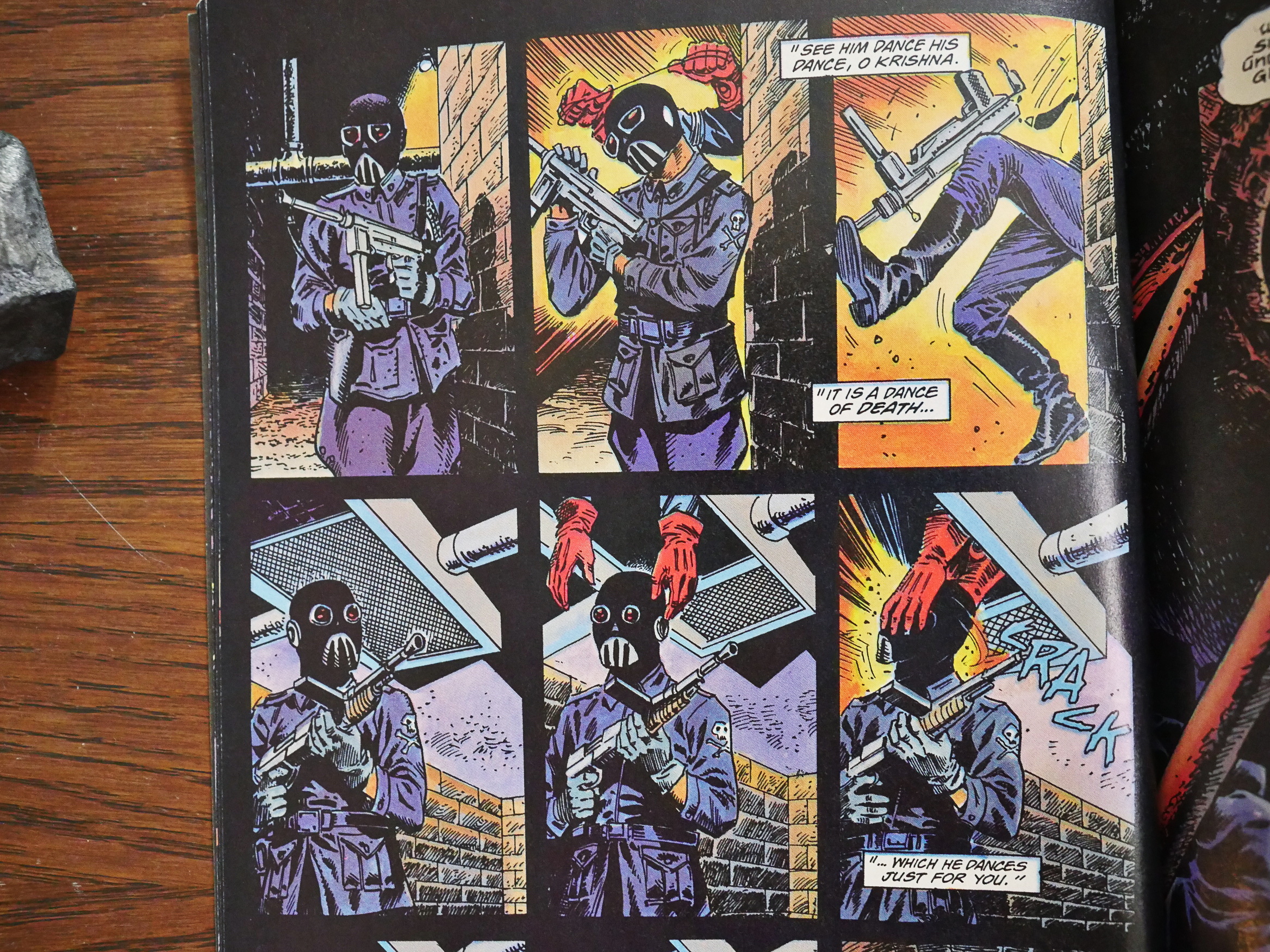
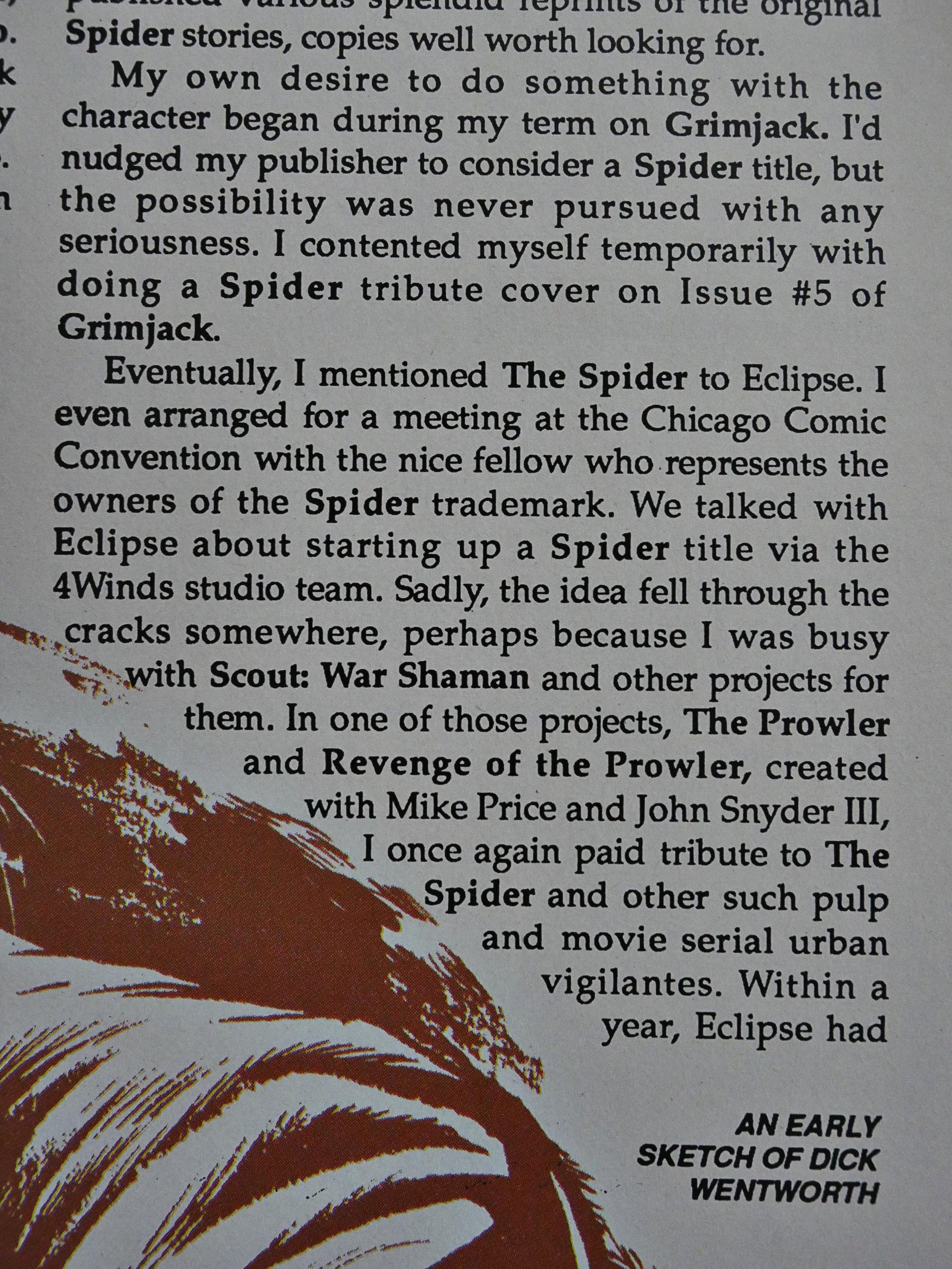
And the subject matter is certainly familiar for any Truman fan: He’s reviving an old vigilante character, which is something he’d been involved with several times before. This time it’s The Spider, a pulp character from the 30s, and for once, it’s not in the public domain.

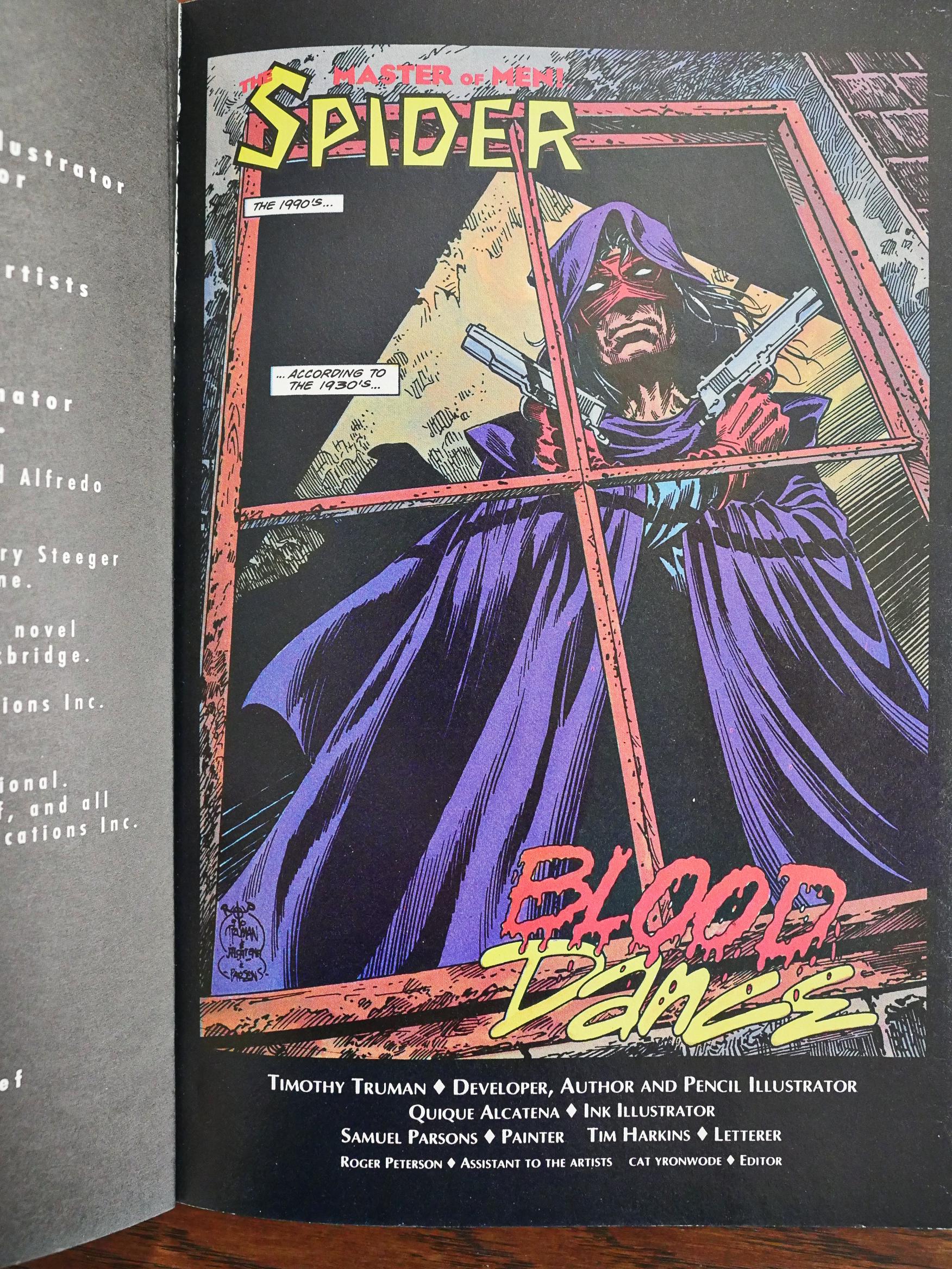
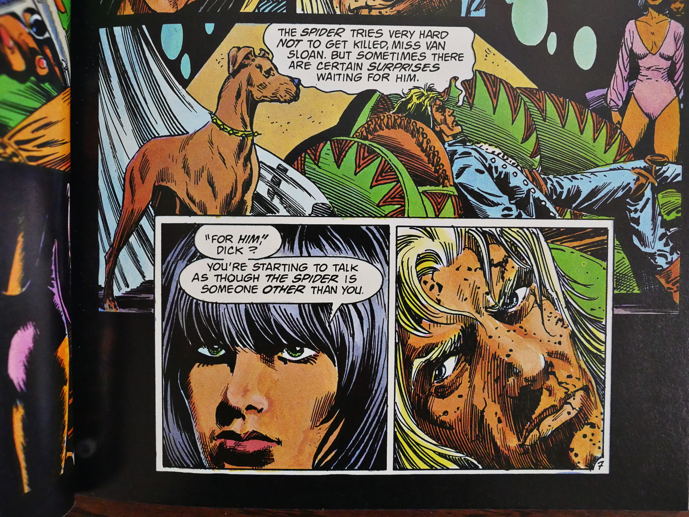
“Developer, author and pencil illustrator.” I think that means that he wrote it and pencilled it.

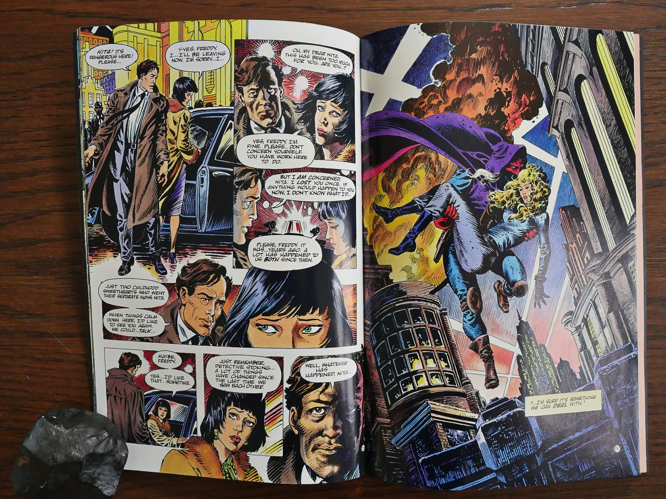
Truman’s take on how to update it is fun, and he makes the concept explicit on every title page: “The 1990s… according to the 1930s.” So he’s imagining how somebody in the 30s would have written a pulp story set in the 90s.

Doing retro-futuristic comics is certainly nothing new, but these usually use the 50s as their starting point, so you get glistening rockets and really, really big cars.

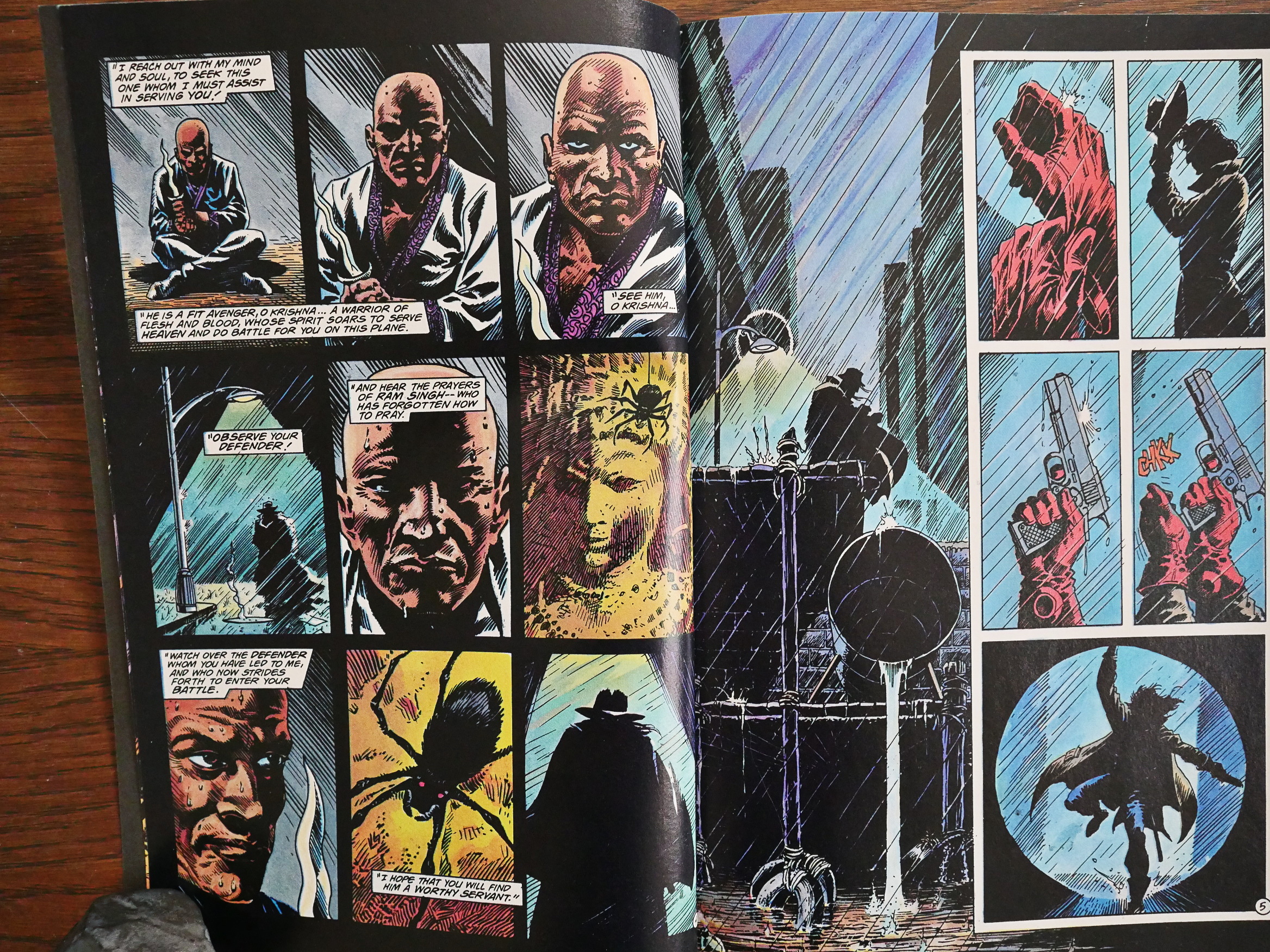
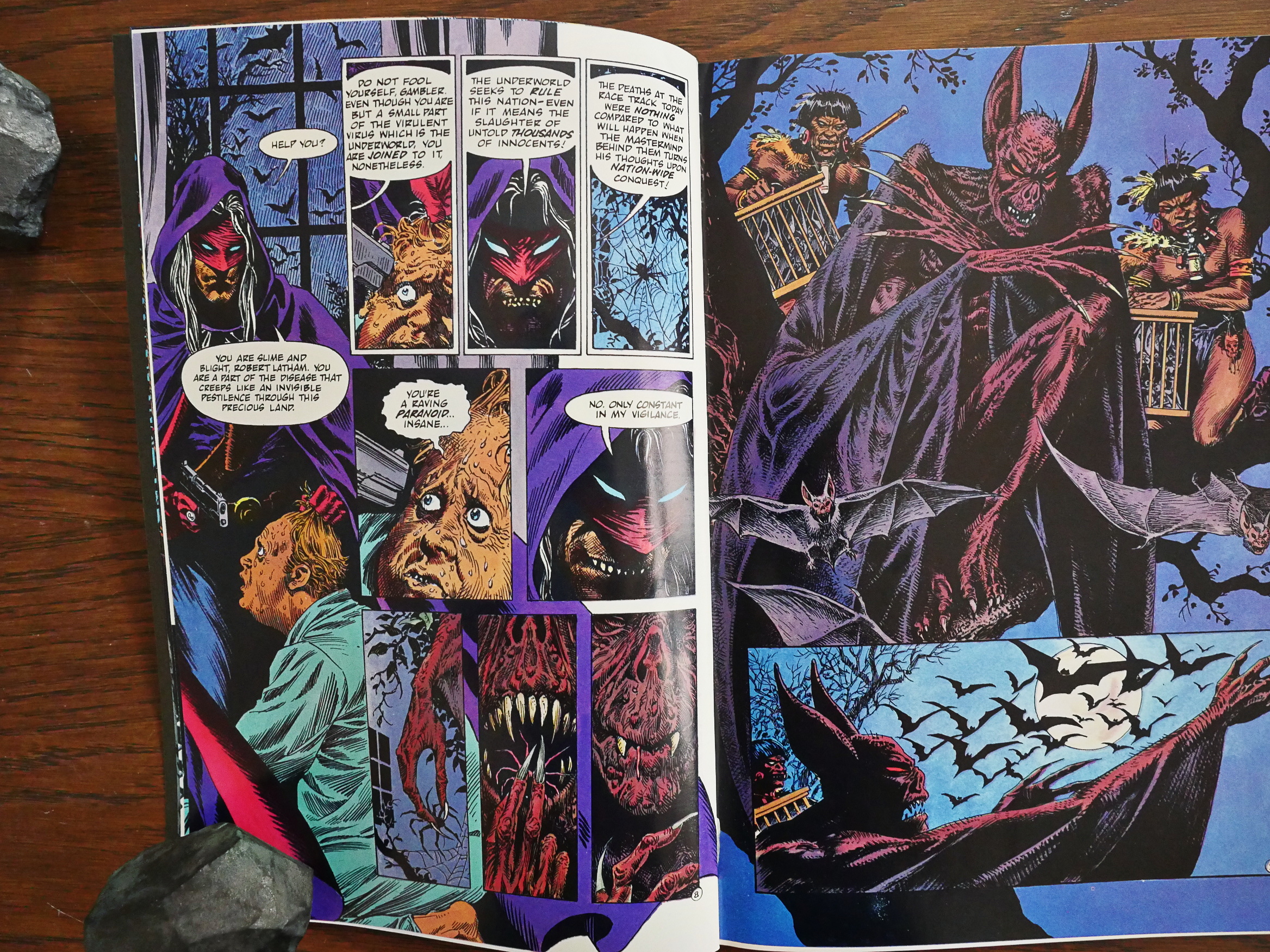
The 90s seen from the 30s is a much danker affair. The Spider was apparently a very violent character originally, too, so updating him to a post-Dark Knight semi-insane vigilante isn’t as much of a stretch.

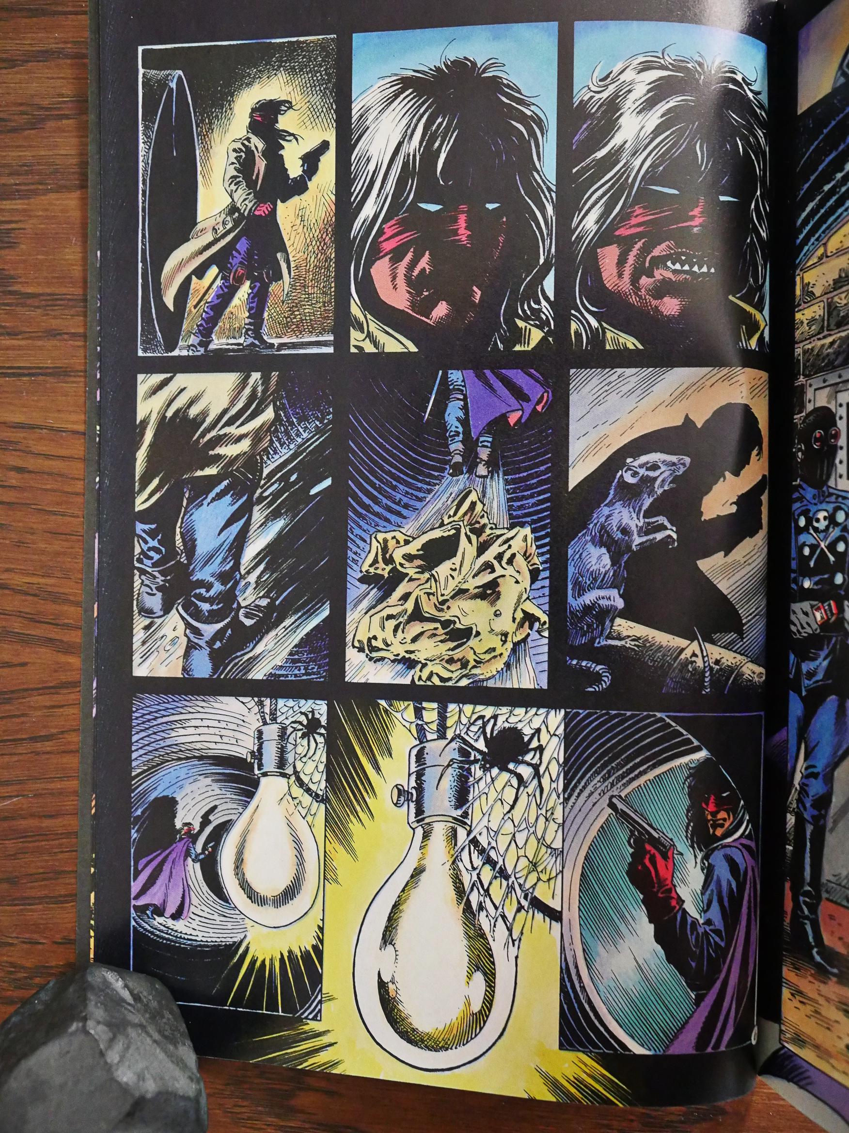
The teeth thing threw me at the start. I wondered whether he was deranged enough to file down his teeth for the look, but those are false teeth, it turns out. He pops them out to assume his secret identity.

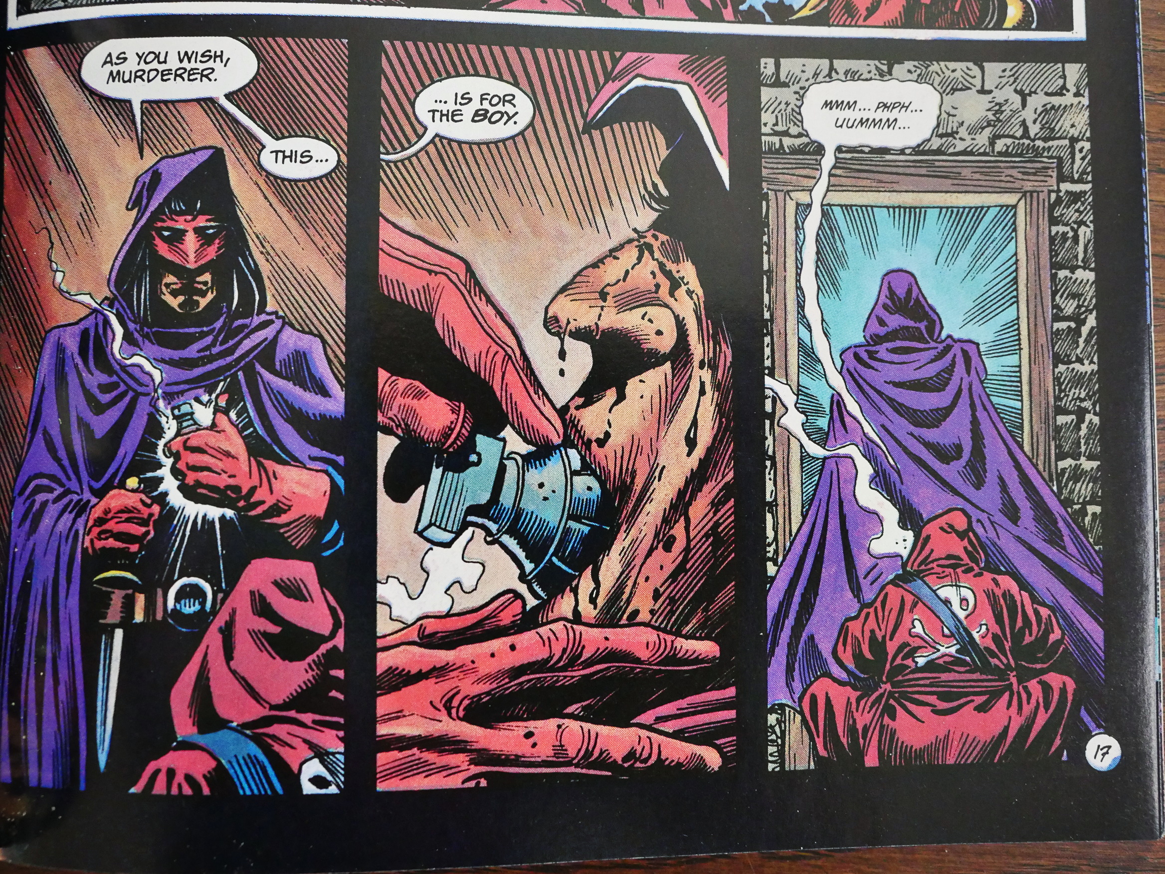
Violent!

Grisly!

Even if you may snicker at the excesses here (well, at least I do, paired with some eye rolling for the extra exercise), this is, as usual with Timothy Truman, a really well-told and somewhat exciting comic. There’s a ton of clichĂ©s, but Truman’s storytelling is so easy and confident that you (well, I) just roll with it.

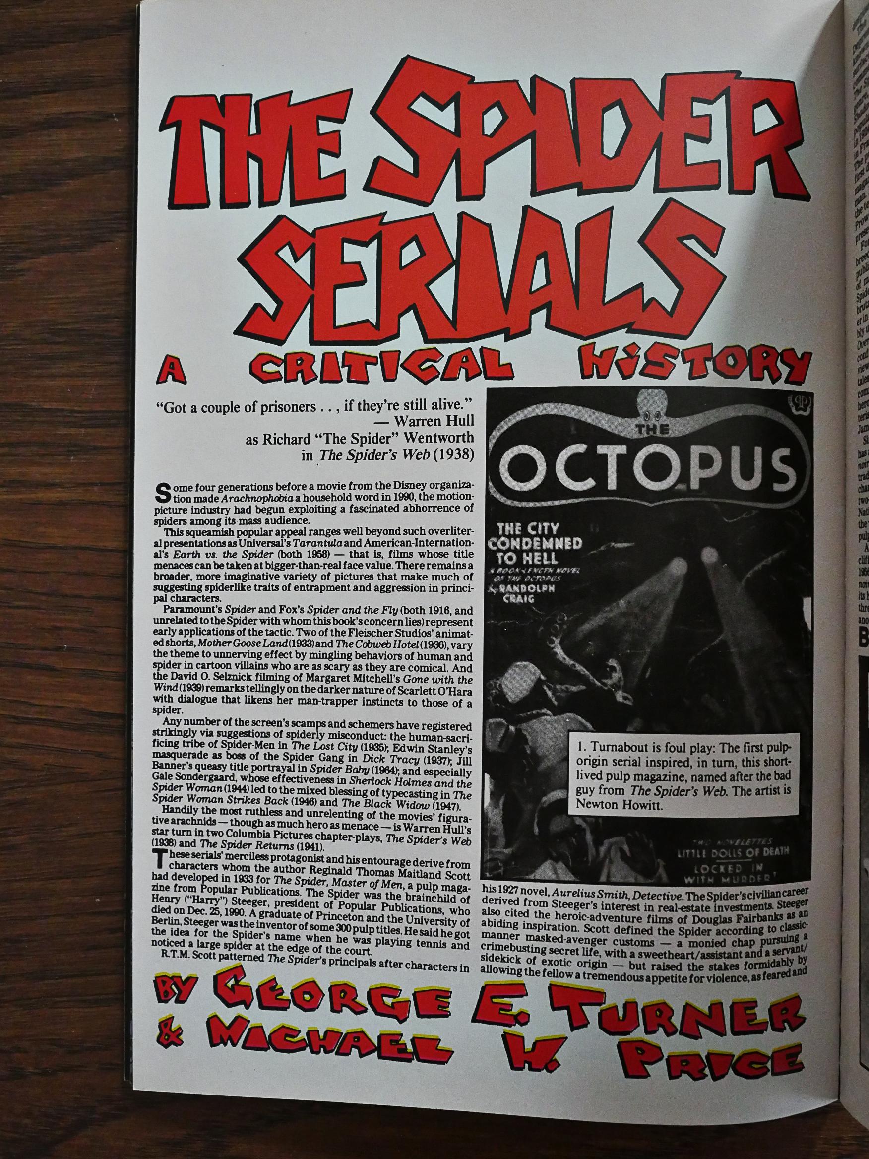
The authors of Forgotton Horrors drop by to explain about The Spider (in very small type over their allotted pages).

Still, even Truman can’t win all of them. Or is that perhaps a government-mandated line? All vigilante comics and movies has to have it in them to get in the right tax bracket?
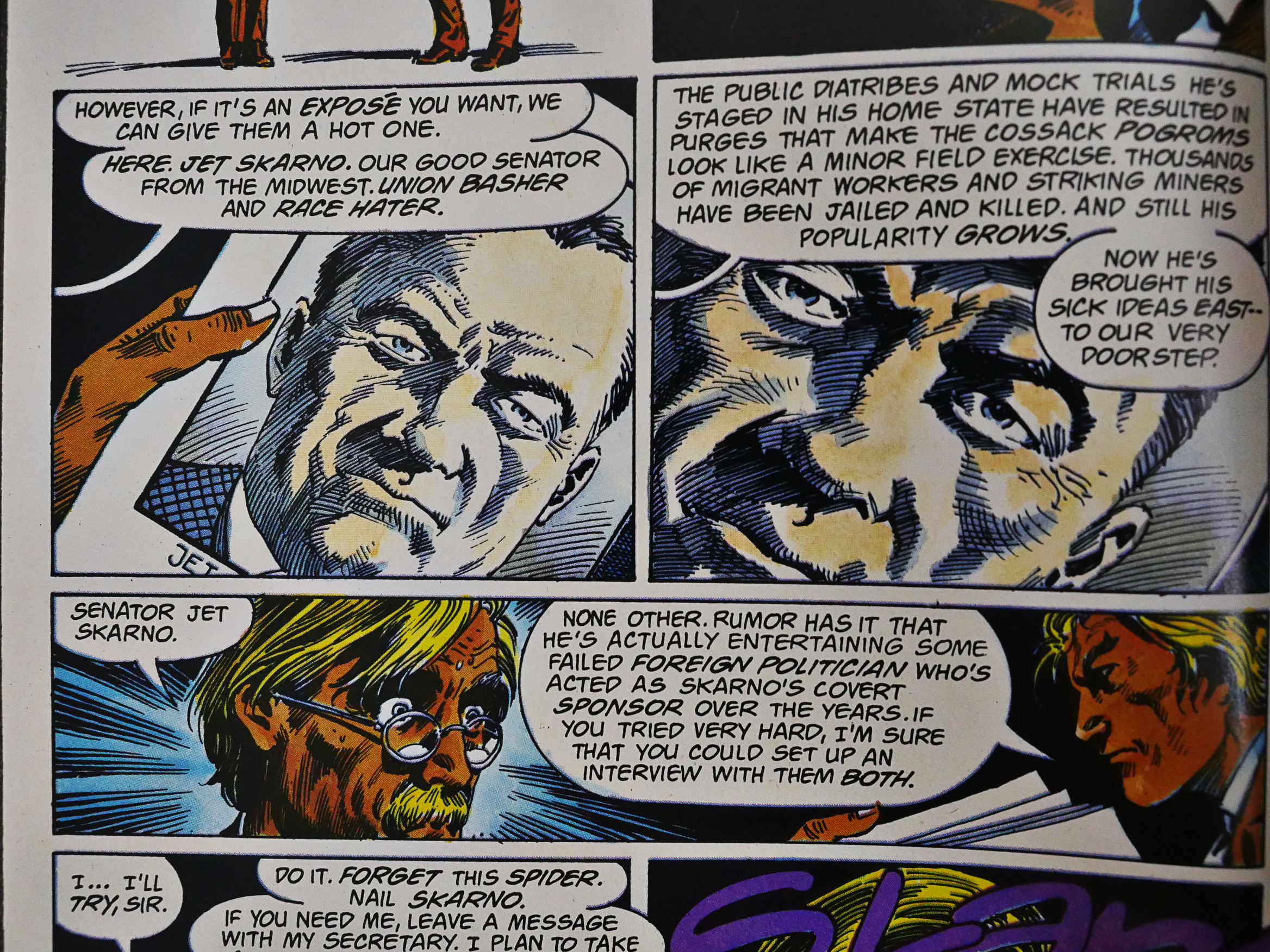
But Truman comes through on the villain front, first with a (presumably) Republican senator, and then *SPOILER WARNING FOR THE REST OF THE POST DON”T READ IF YOU”RE GOING TO READ THESE COMICS*

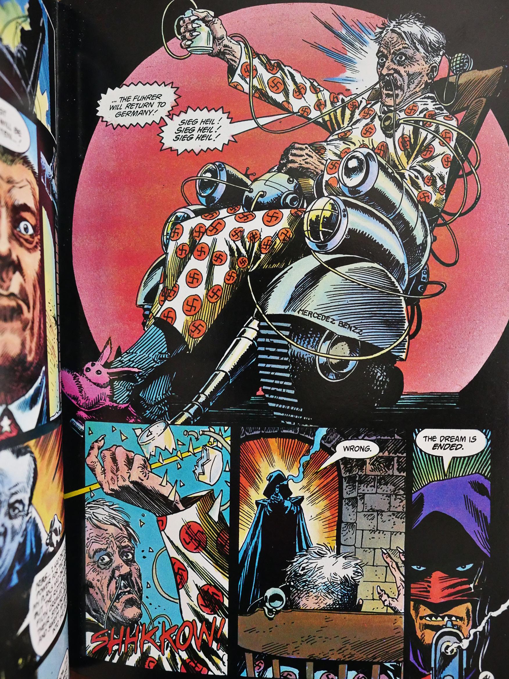
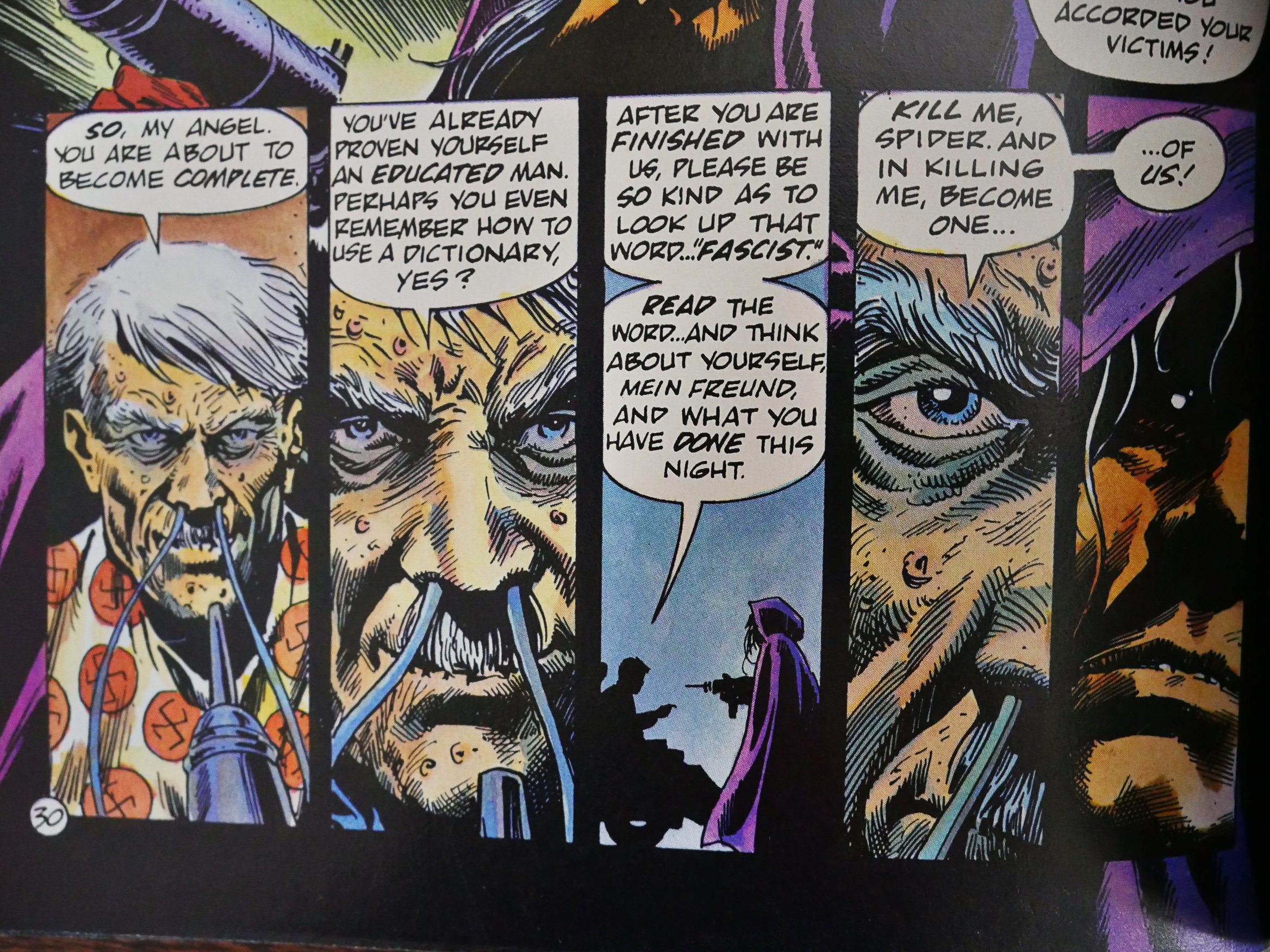
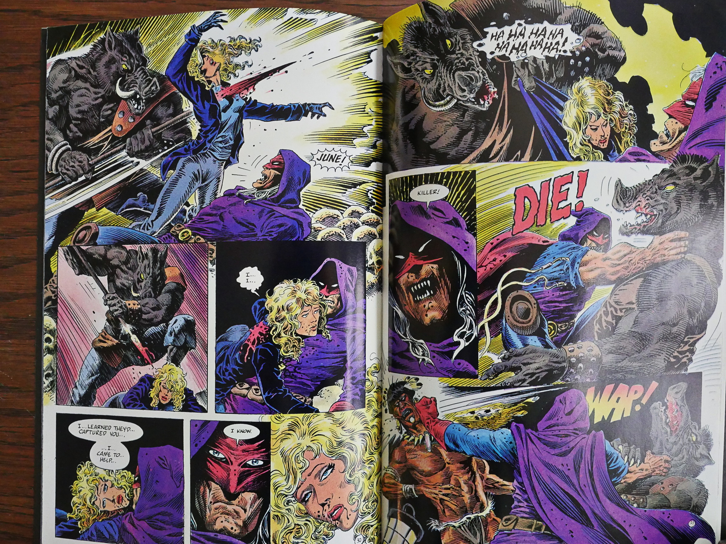
Yeah, that guy. In a pyjamas with swastikas. It’s dementedly fun.

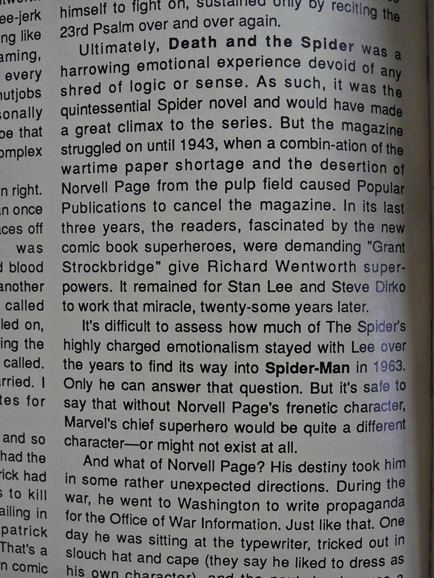
A further article describes one of the Spider serials as “devoid of any shred of logic or sense”. Sounds fun.

Oh, there’s another one of those gummint-mandated lines…

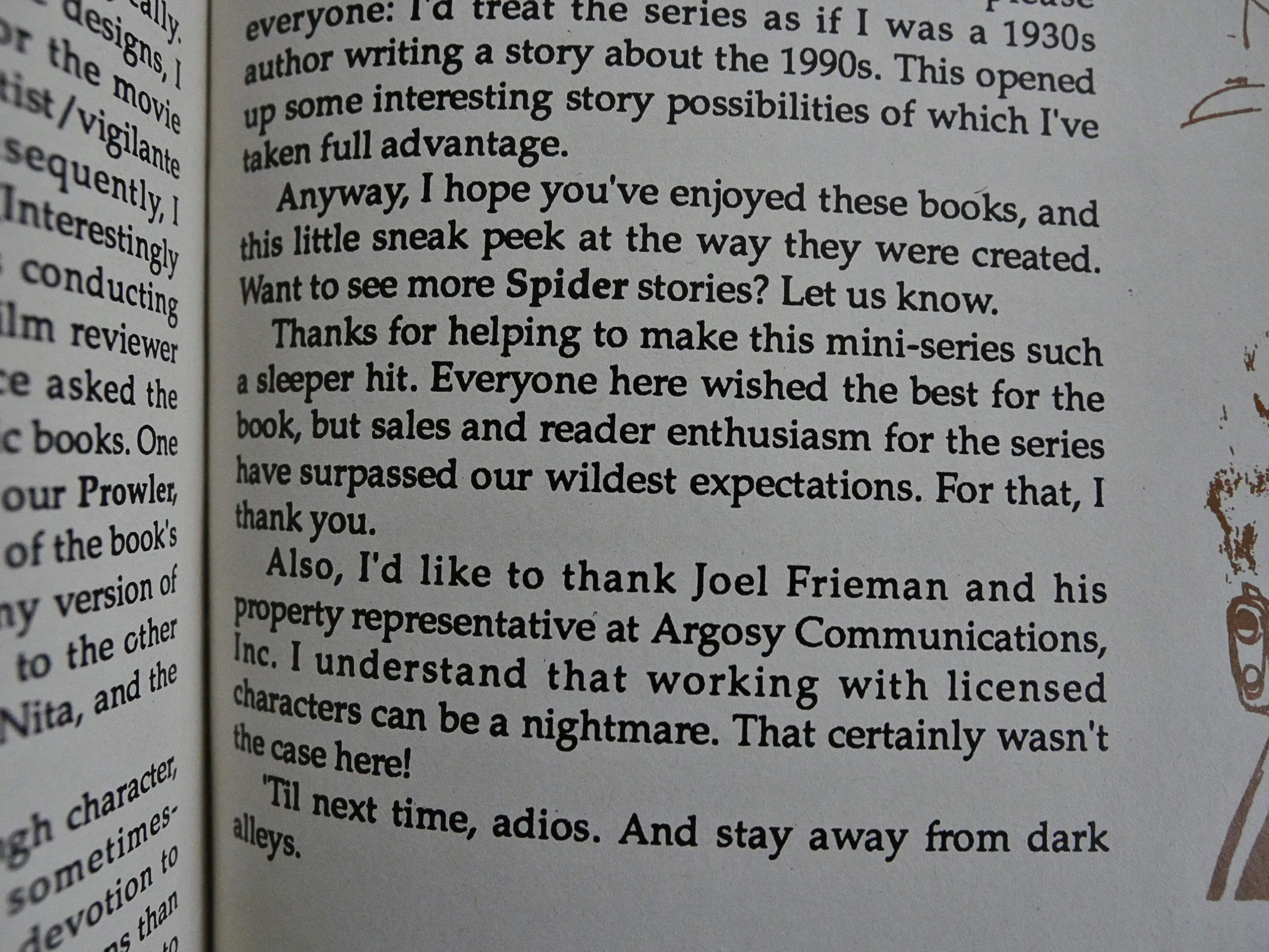
The final issue of the first series has Truman himself describing how this thing came to be. He’d wanted to do it for a long time, even from the start of his career, but it never happened, for one reason or another, until now. And you can certainly see that Truman’s put a lot of work into the series: It’s a project he wanted to do, not an assignment.

And he says that’s it’s a “sleeper hit”.

So there’s a new series, but this time he’s not doing the “pencil illustration” any more, but leaves all the artwork to Alcatena. I’ve never seen any of Alcatena’s work before (that I know of), so I don’t know whether this is the way he does his artwork otherwise, too, but it’s not a huge departure from the first series.

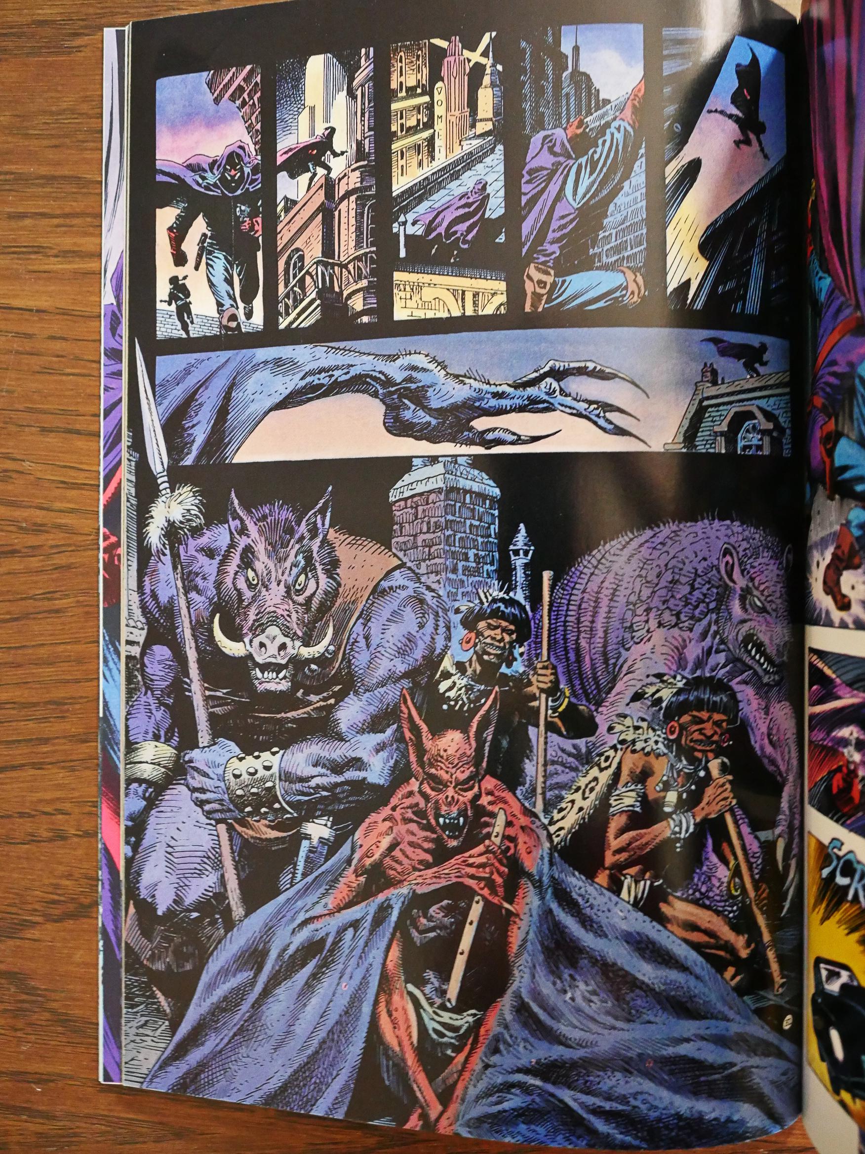
Perhaps it has a more… Warrenish feel to it? Or perhaps that’s just the monsters.

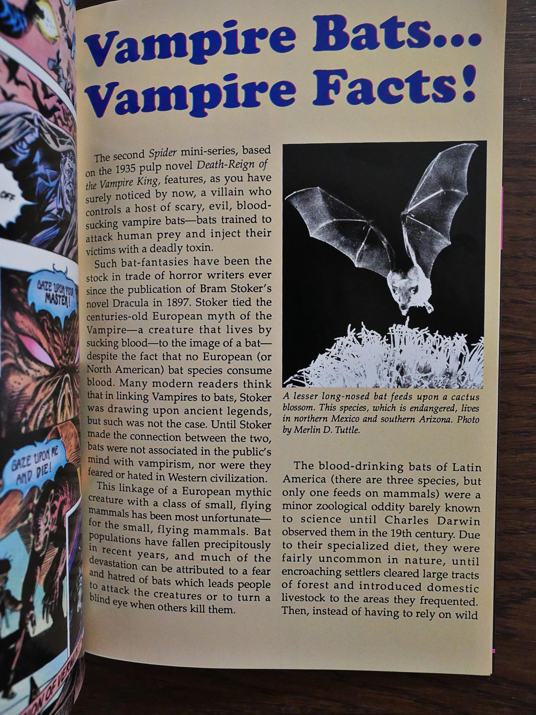
The main villain is a big vampire bat human, so we helpfully get three pages with facts about bats.

The second series is a bit… calmer? than the first one. We get more love interest intrigue (between several of the characters), but it’s still a good action film I mean comic book. I like the twist with several groups of bad guys fighting against each other, and The Spider fighting both of them.

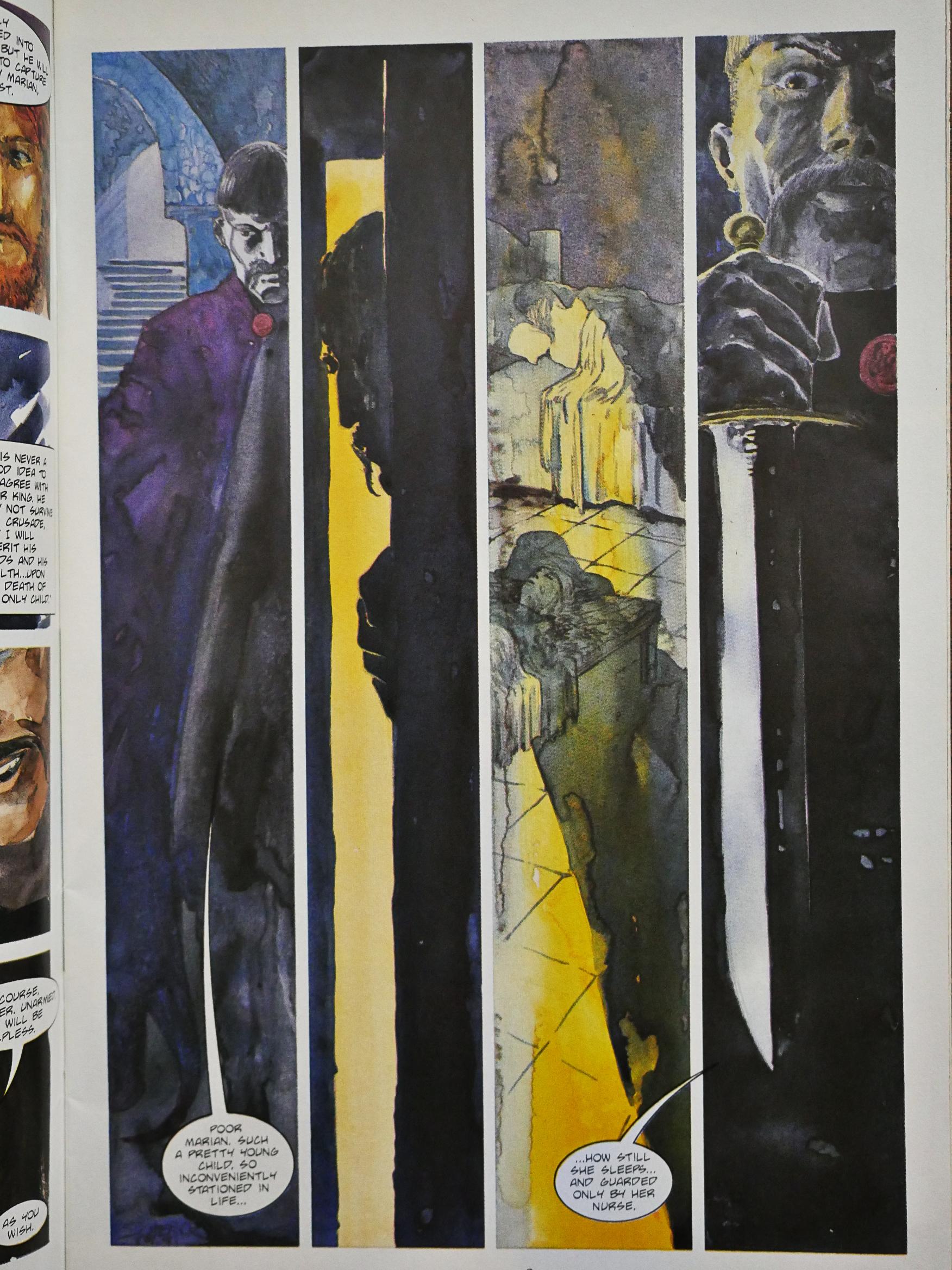
Truman can’t help himself with the clichĂ©s: Here he fridges that woman in front of The Spider’s eyes. So much motivation! To break those ropes!

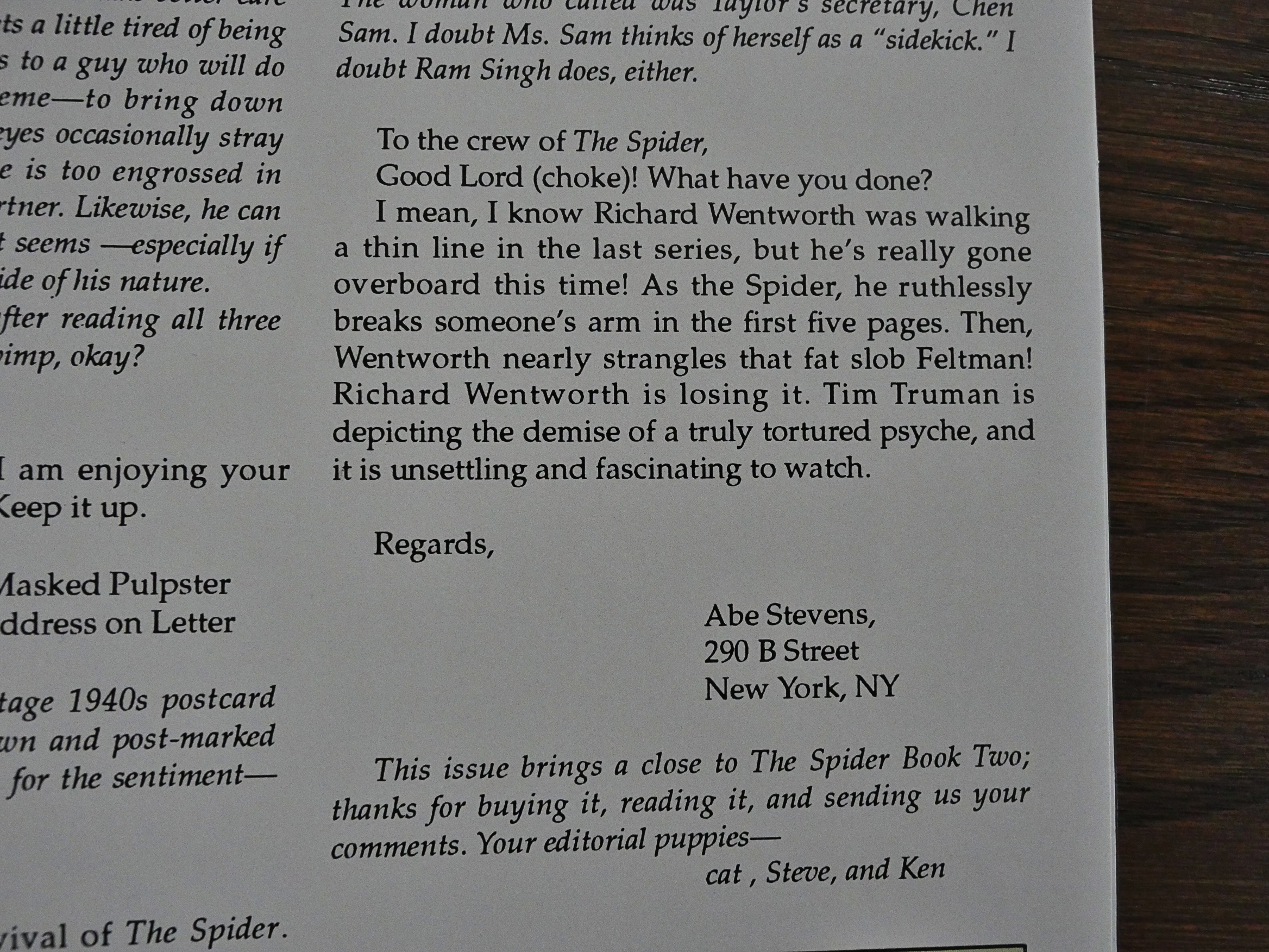
Wow! A letters page! It’s been a while since I’ve seen one of those, too, after Eclipse veered away from periodicals.

Huh. Apparently these have never been reprinted, and that’s surprising. For a pulp vigilante revival, these are eminently readable and entertaining. Virtually everything else ends up being reprinted, so why not these? Could it be a rights issue with Argosy who owns the er rights?

Let’s see what we can find… Oh, here’s a review:

Until that David Liss interpretation premieres, Tim Truman’s version of “The Spider,” from 20 years ago, remains the only prominent take on the character in the past two or three generations.

And it’s an insane, radically redesigned version that distills all of Tim Truman’s signature motifs into a three-issue package. I love it, of course.

It’s not a perfect package. The copyright belongs to Argosy Communications, and Truman apparently helped to bring the project to Eclipse, but whatever printing process the long-defunct California publisher used makes for a frequently blurry or off-register series of pages in “The Spider.” Sam Parsons provides garish colors, but they fit the content of the comic, except when the black holding lines smear into the colored edges and entire pages look printed through Vaseline. And though Quique Alcatena is a fine ink artist, he smoothes over many of Truman’s rougher, distinctive edges, and Tim Truman never looks as good as he does when he’s inking himself, whether it’s 1991 or today.

True, Truman’s artwork has a nice scratchy quality to it.

Hm… Nope, can’t find out anything about it. Somebody should consider collecting it.

1991: Johnny Comet

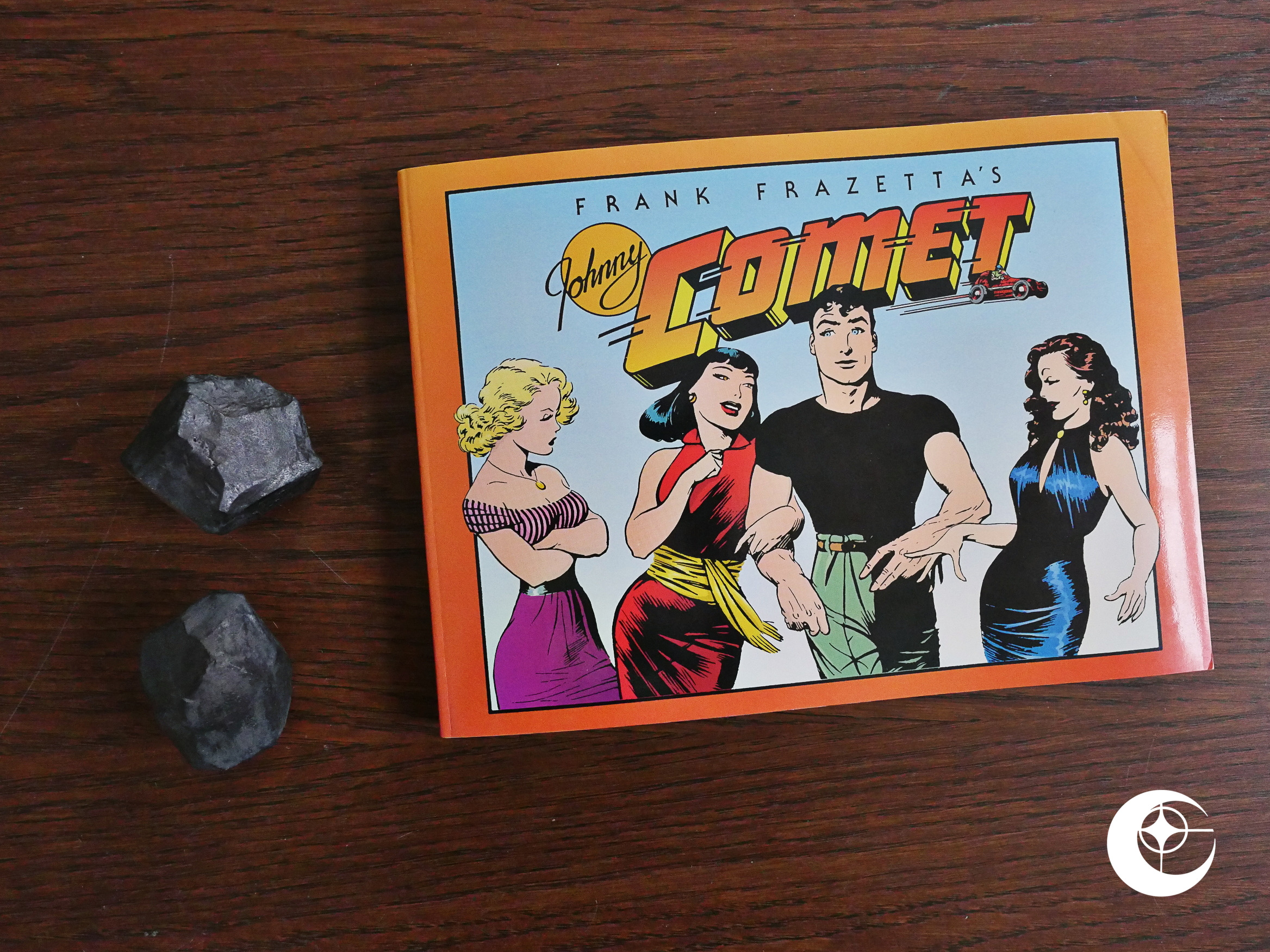
Johnny Comet (1991) #1 by Frank Frazetta, Earl Baldwin, Peter de Paolo et al.

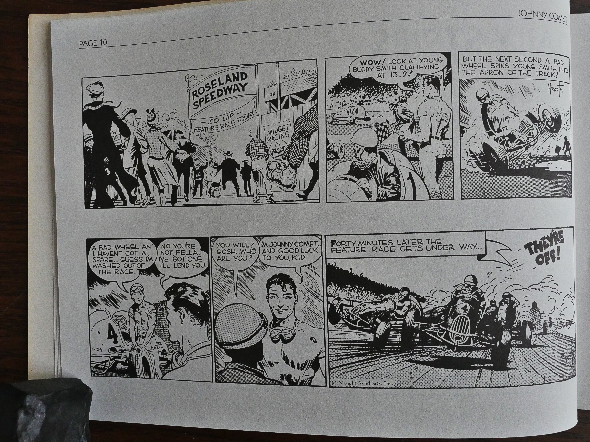
Frazetta is more famous for his fantasy illustrations than his comics, but he did make a go at it for a while. Johnny Comet is his attempt at a syndicated newspaper strip, and it lasted four about a year.

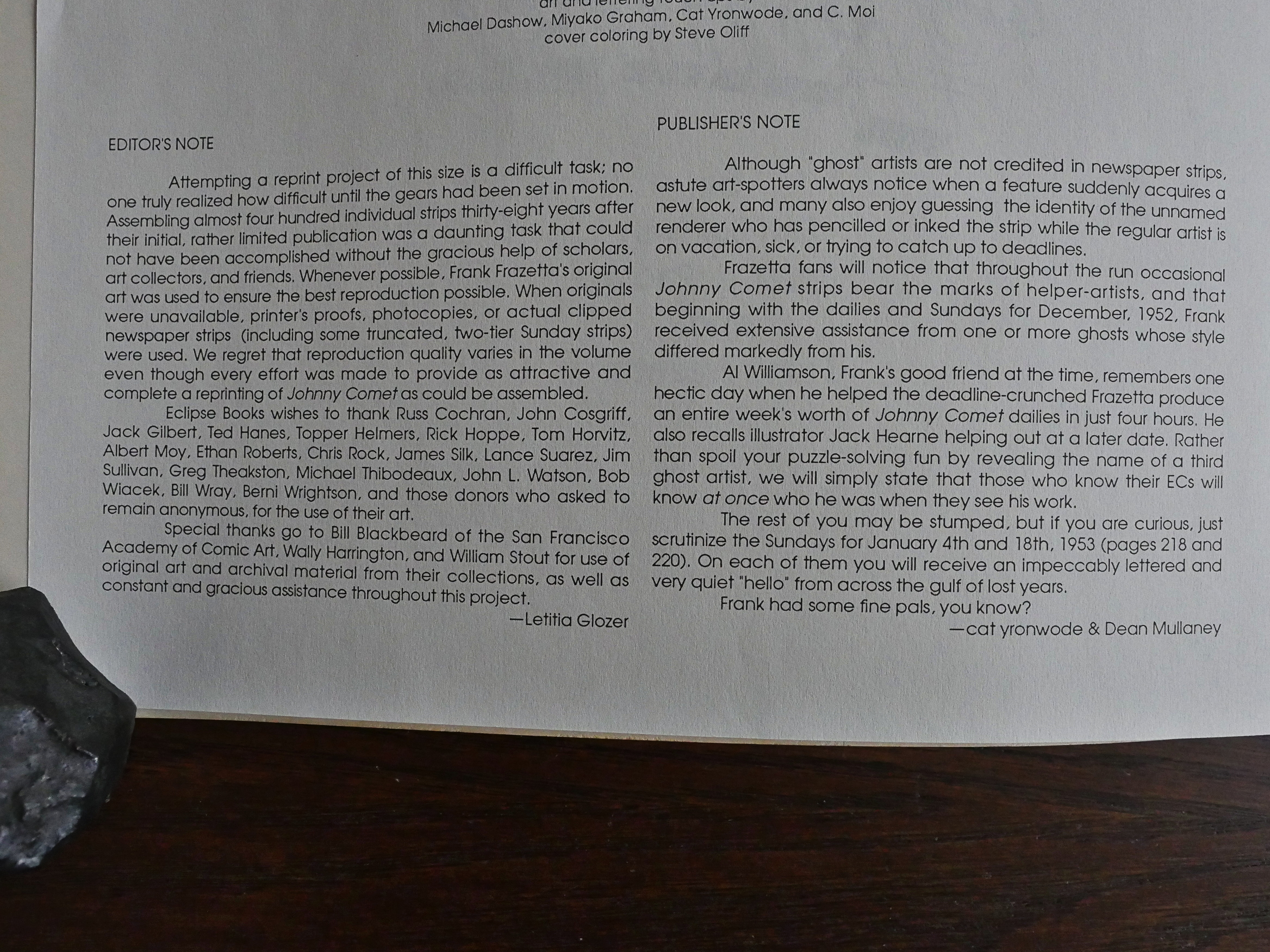
The editors explain that some of this is reproduced from the originals, some from proofs, some from the newspapers themselves, and some aren’t reproduced at all, because they couldn’t find the strips is question anywhere.

They also explain that Frazetta had a lot of uncredited helping hands and mention a few, but leaves it up to us to spot the one doing a couple of the final Sunday strips. Let’s see if we’re able to guess who it is!

Nick Meglin writes a pretty entertaining introduction, talking about about Frazetta’s working methods, and how he was often misunderstood by his audience after he’d gotten famous.

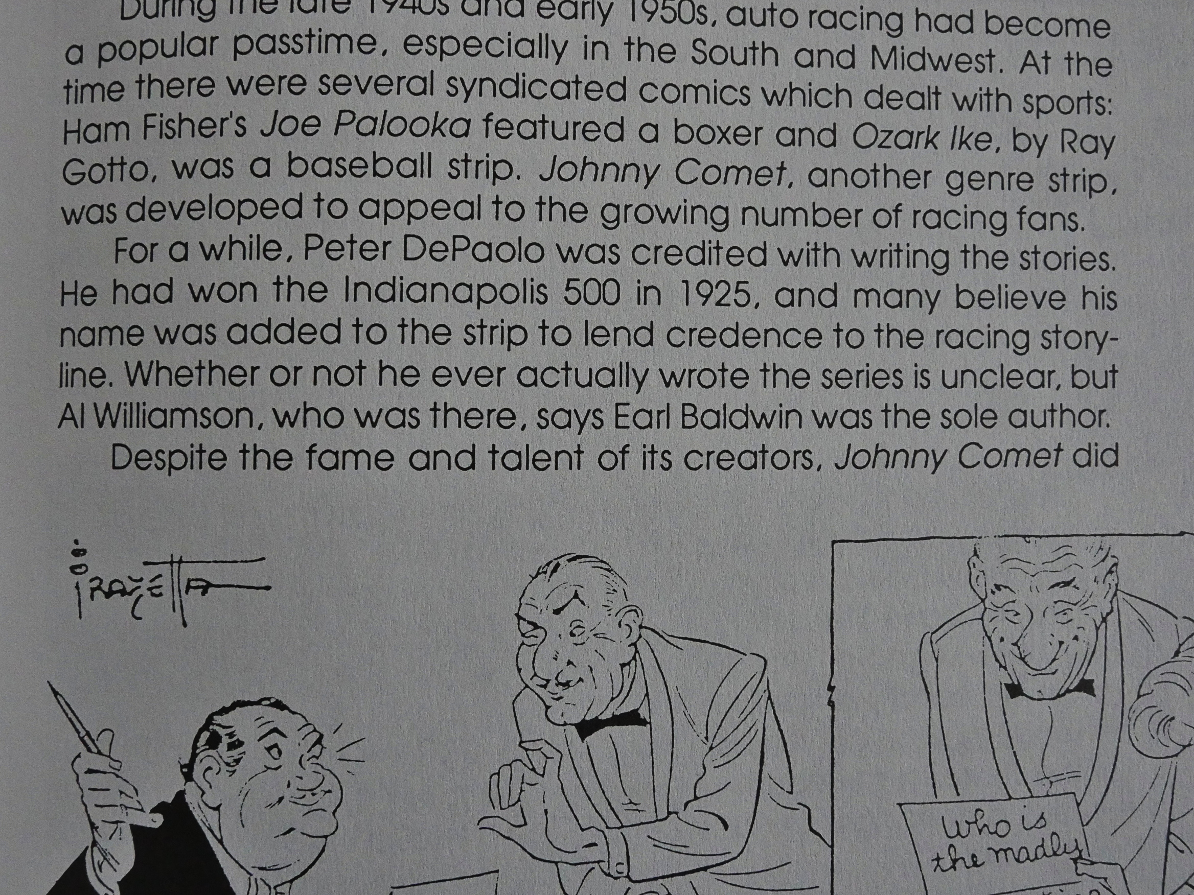
He also explains that Peter de Paolo, a famous (?) race car driver who supposedly was the writer of the strip, probably didn’t write the strip.

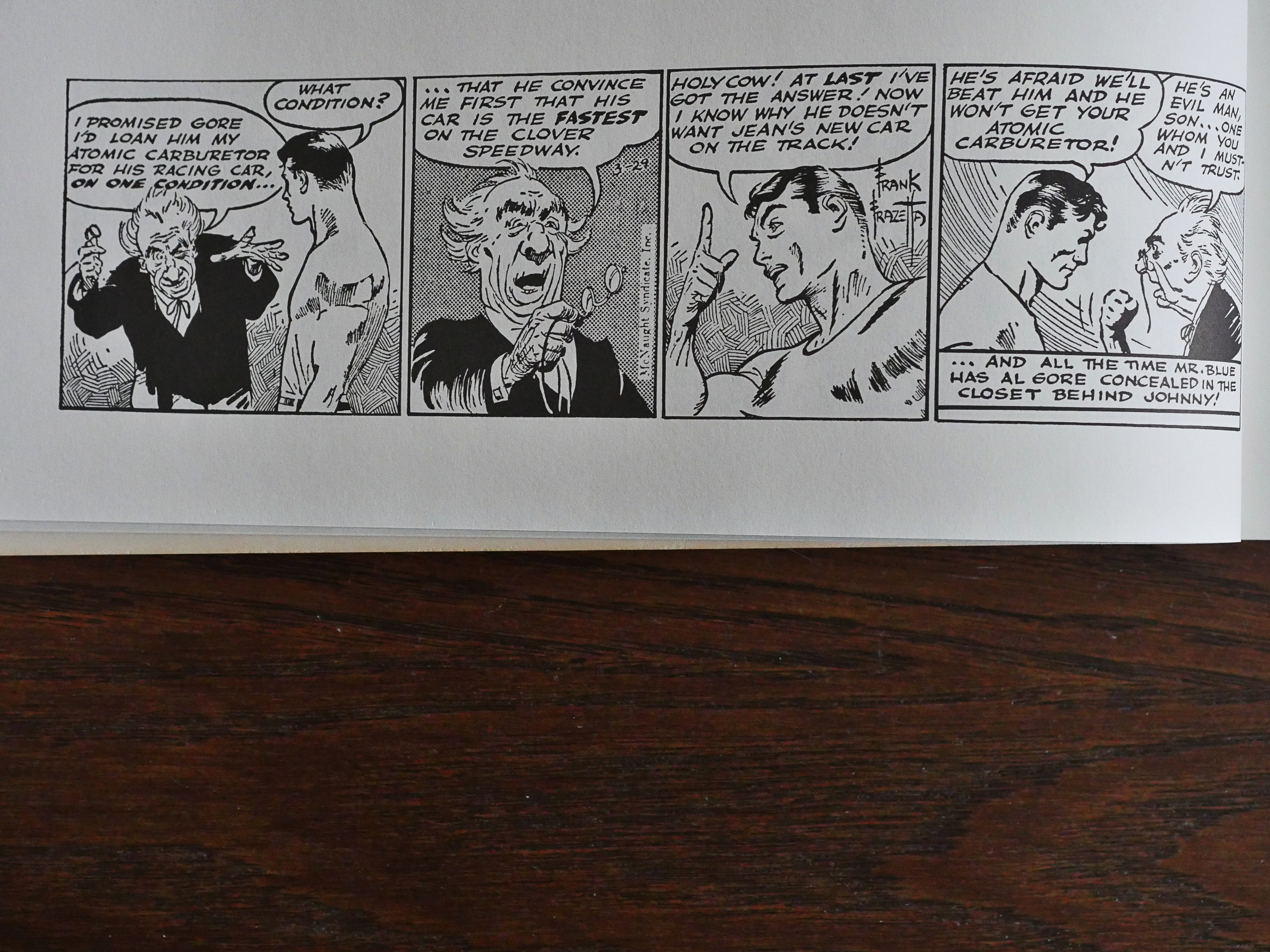
So what’s it all about then? Well, it’s a strip about a race car driver, naturally. I think that makes a lot of sense: There’s lots of action and possibility for intrigue; race car drivers move around a lot, so you get new locations and meet new people; and you can have people sabotage each others cars. Endless possibilities.

It’s such a good idea that in 1959, Jean Graton created Michel Vaillant, which is about a family of race car manufacturers/drivers, which is still running to this day over more than 70 albums. Was he inspired by Johnny Comet? Unlikely; it’s such an obvious idea and obviously has legs.

At least in the European market.

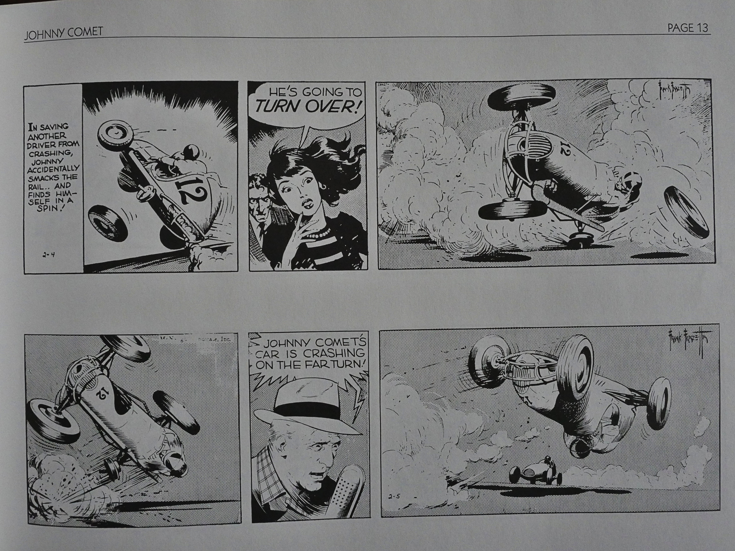
Doing it as a daily strip is tough, though. Frazetta admirably keeps the verbiage down and gives us lots of race track action, but as a daily strip, it must have been a frustrating read. For almost a week, you have Johnny’s car tumbling, and every strip, while looking totes gorg, takes half a second to read and doesn’t progress the plot any.

Michel Vaillant had the advantage of being serialised in French weeklies, and usually at about four pages at a time. You can do a couple of pages of driving around the track and still have plot development in each chunk: Easy.

So perhaps it’s not strange that this failed to find an audience? In any case, it reads like a dream in this collection.

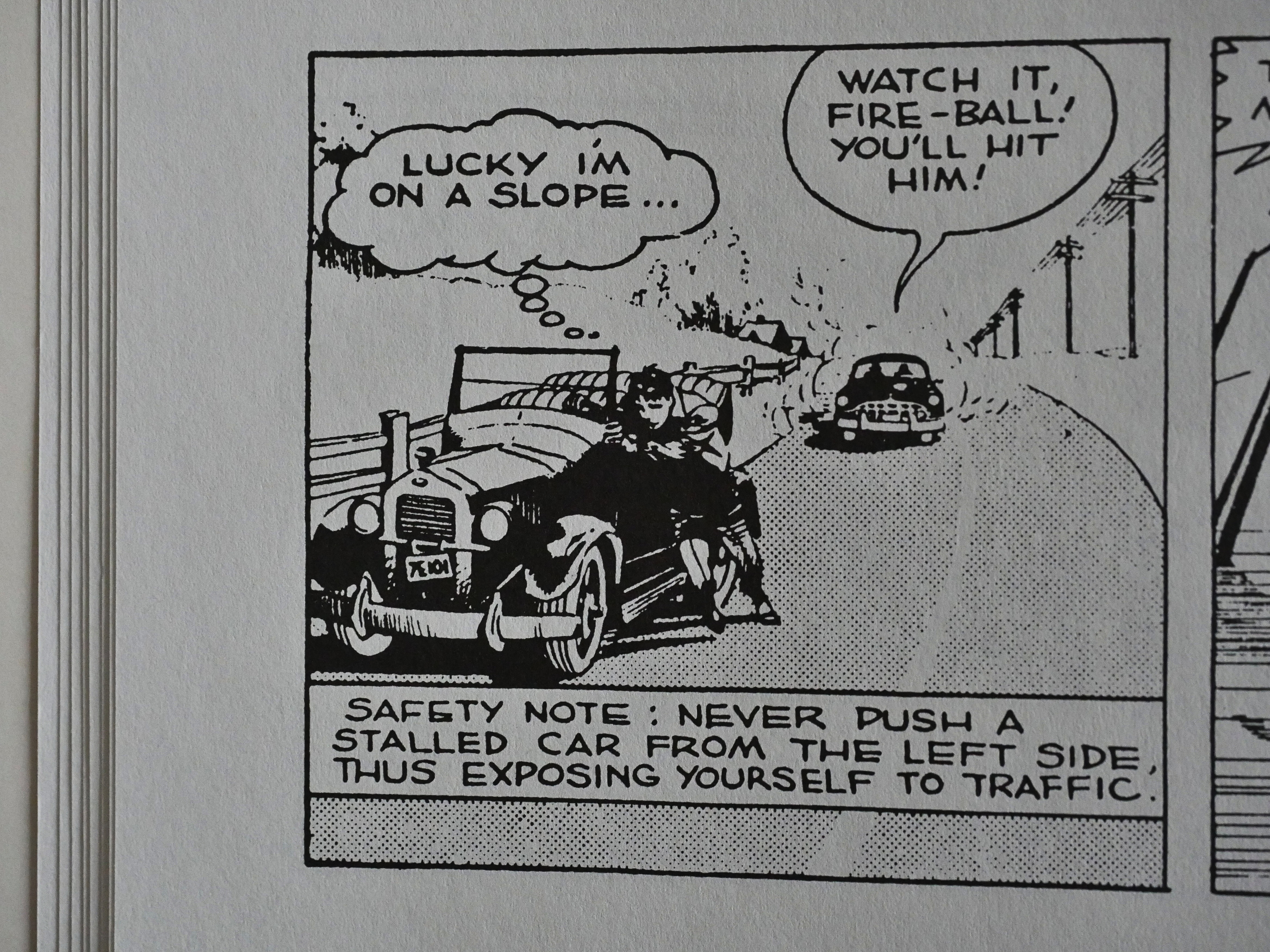
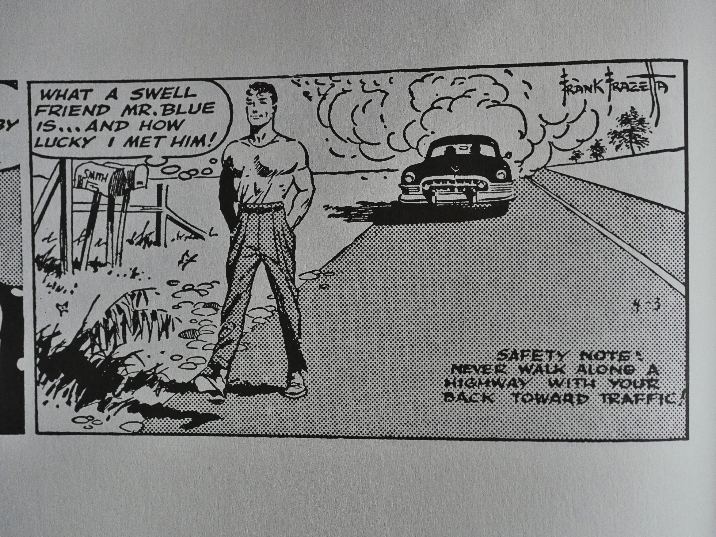
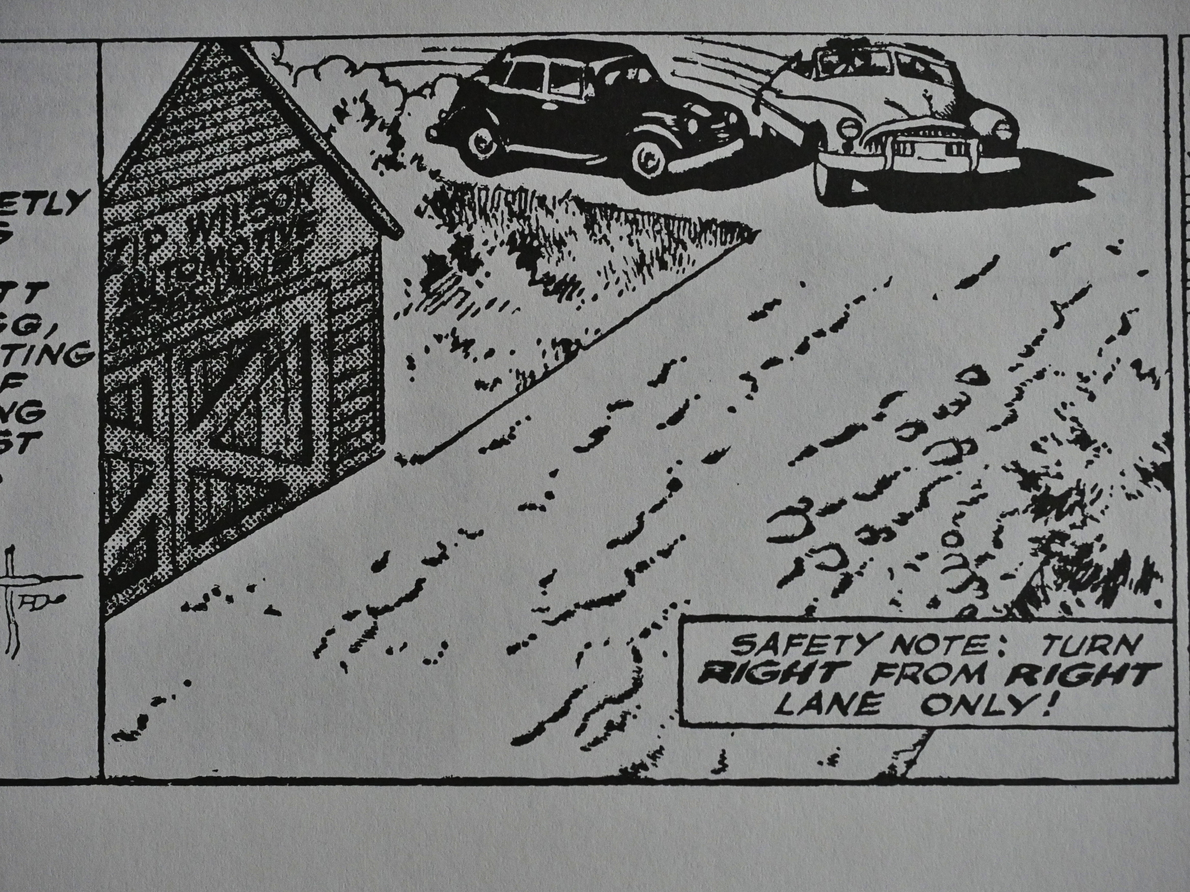
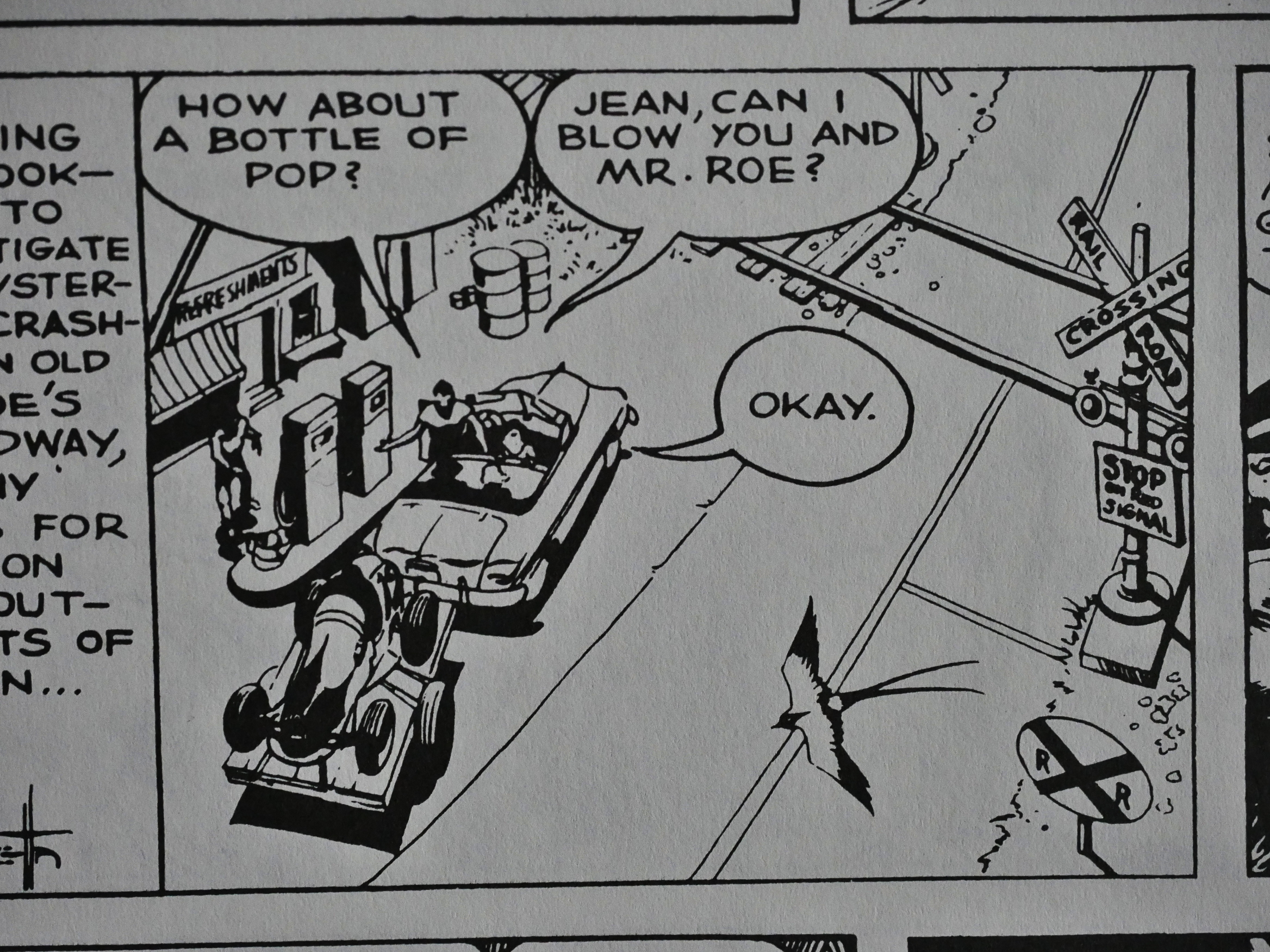
But there’s weirdness going on. Throughout the series, you have these “safety notes” saying what you’re not supposed to do, and that’s usually what Johnny is doing.

So is this geared toward children? Newspaper adventure strips usually go for a more mature audience…

C’mon. No children are driving cars anyway, so you’re giving driving advice to adults? Who thought that that would endear the strip to anybody?
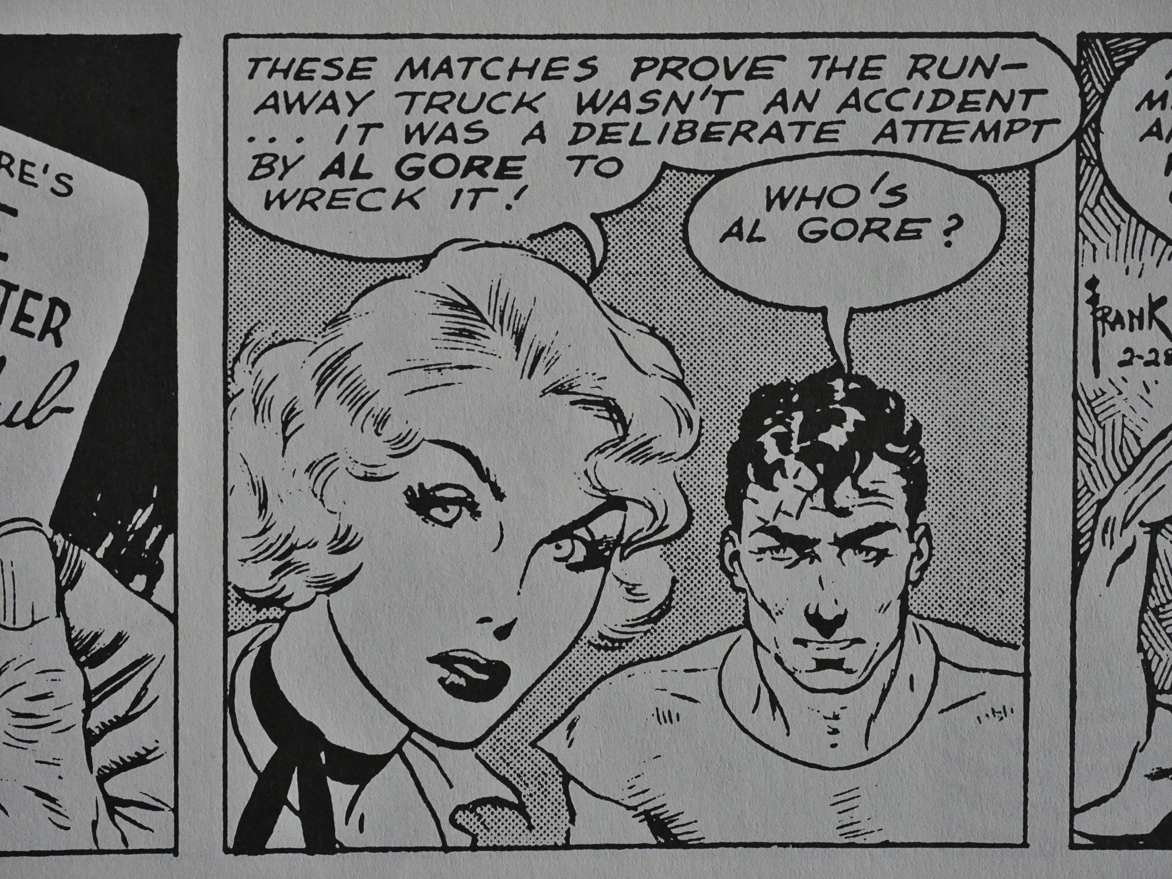
Who’s Al Gore!

Aaanyway. As the strip progresses, I think it loses a lot of its initial bounce. It’s really a really entertaining, breezy read at the start, but we soon get boggled down in standard plots (well, standard for race car driver slash crime solving strips). It starts reminding me more of Rip Kirby than anything else, really.

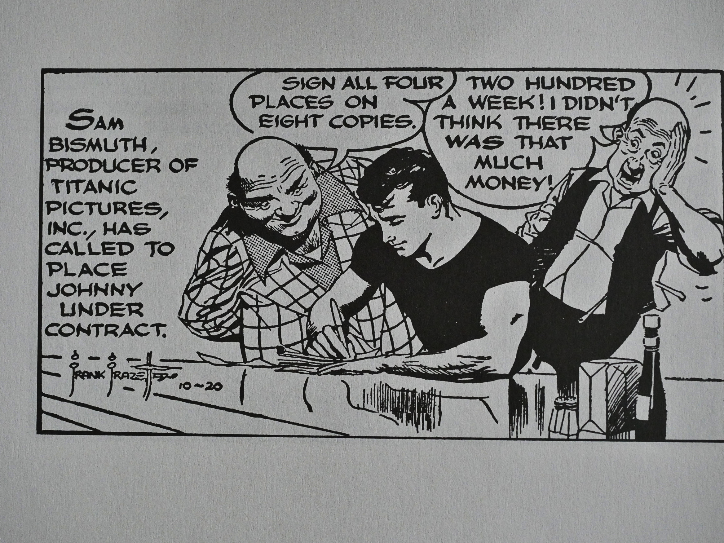
And these things make me wonder whether Frazetta farmed out the strip on a panel-to-panel basis depending on who stopped by at night for a drink. He draws Johnny (and girlfriends) in his lush manner, but the villains are often very cartoony.

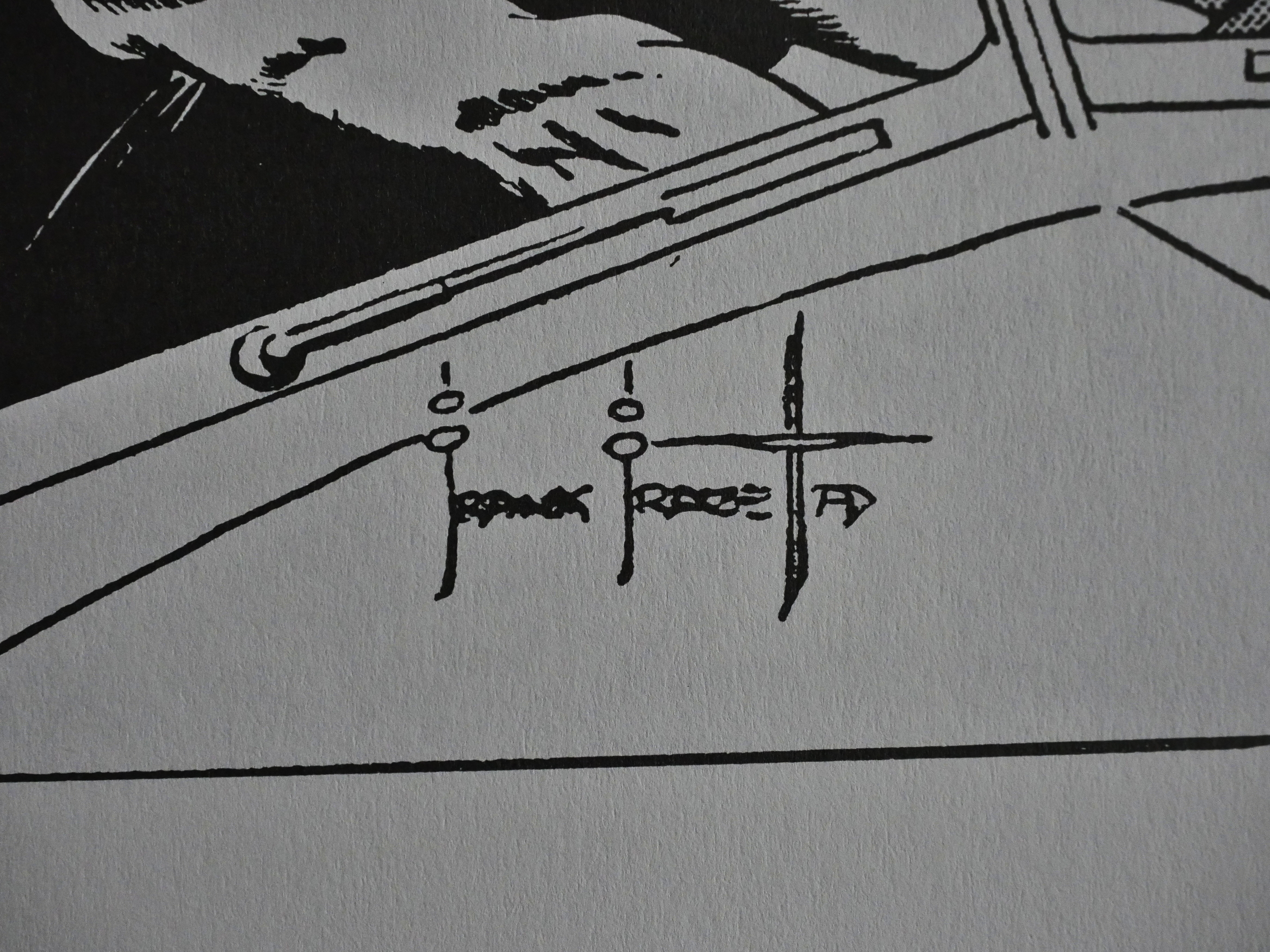
And his signature gets progressively more complicated.

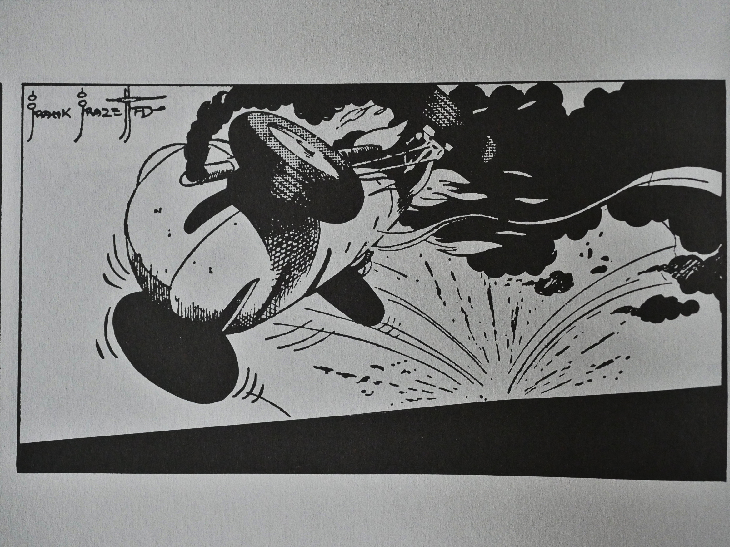
Frazetta (or whoever wrote this) taps into what an audience wants from watching a race: Accidents! Lots of them! I don’t think Johnny gets to complete a single race without somebody crashing (and occasionally burning). (Michel Vaillant avoids doing it that regularly.)

Heh heh. Those are some villainous villains.

And then they start cutting back on race car thing and takes him to Hollywood…

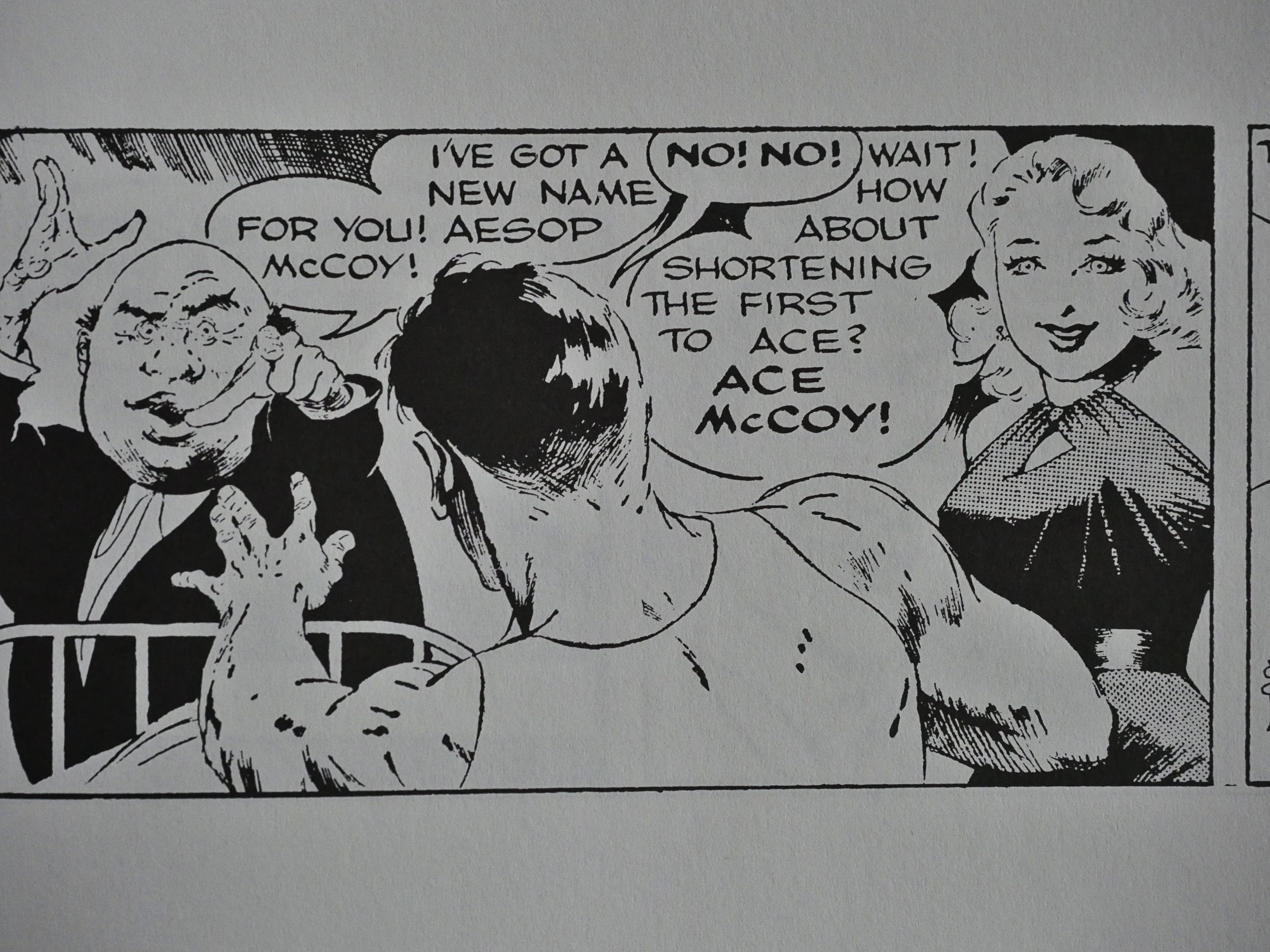
… and then change his name to Ace McCoy in a pretty amusing sequence, and then… he leaves Hollowood and doesn’t do the race track any more, either. I think at this point the creators were pretty much flailing around trying to do anything to make the strip appeal to somebody… anybody…

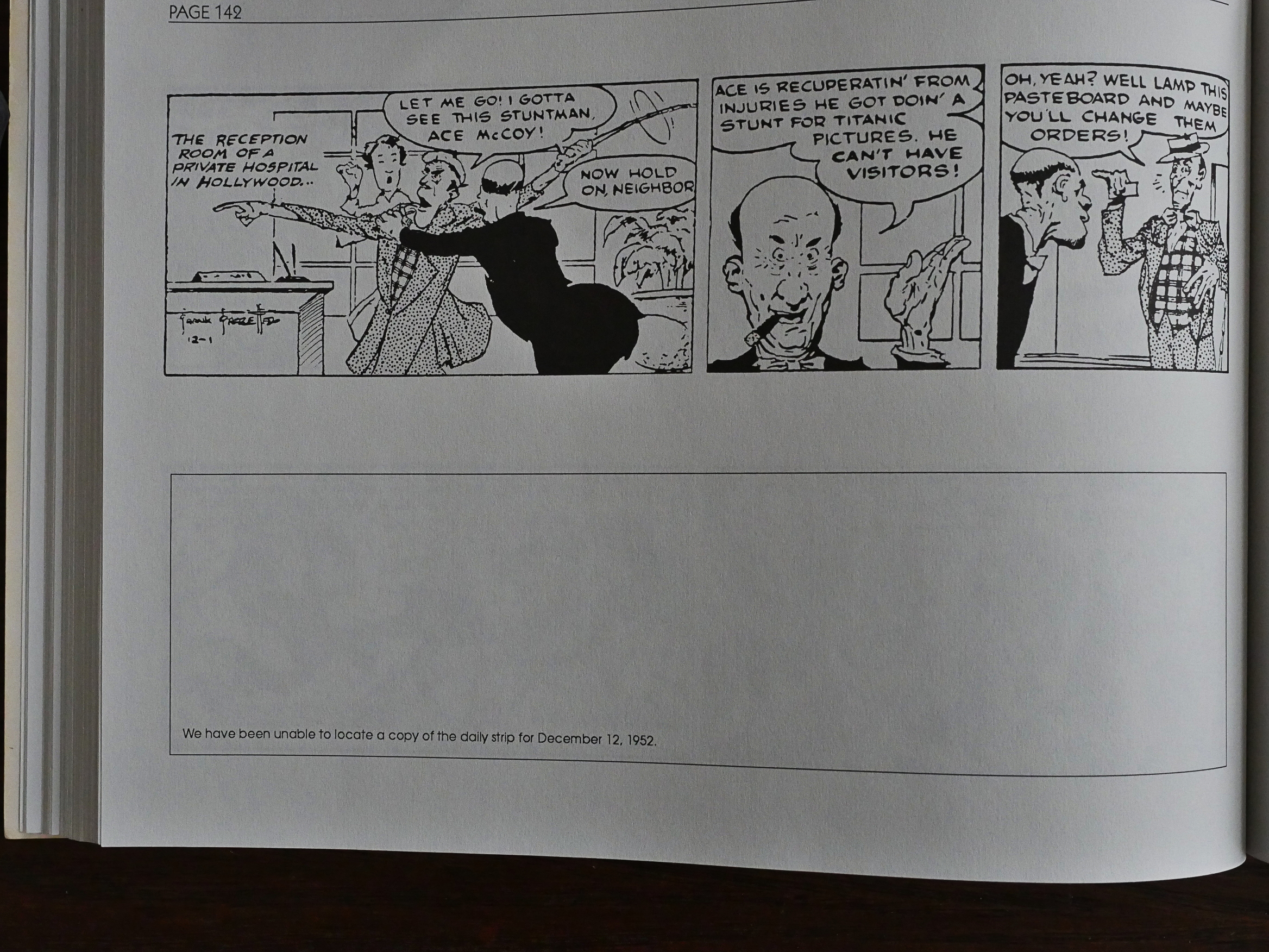
This is also where the blank strips start showing up, meaning that Eclipse were unable to find any newspaper that carried the strip on that day, so I’m assuming sales were way down, too.

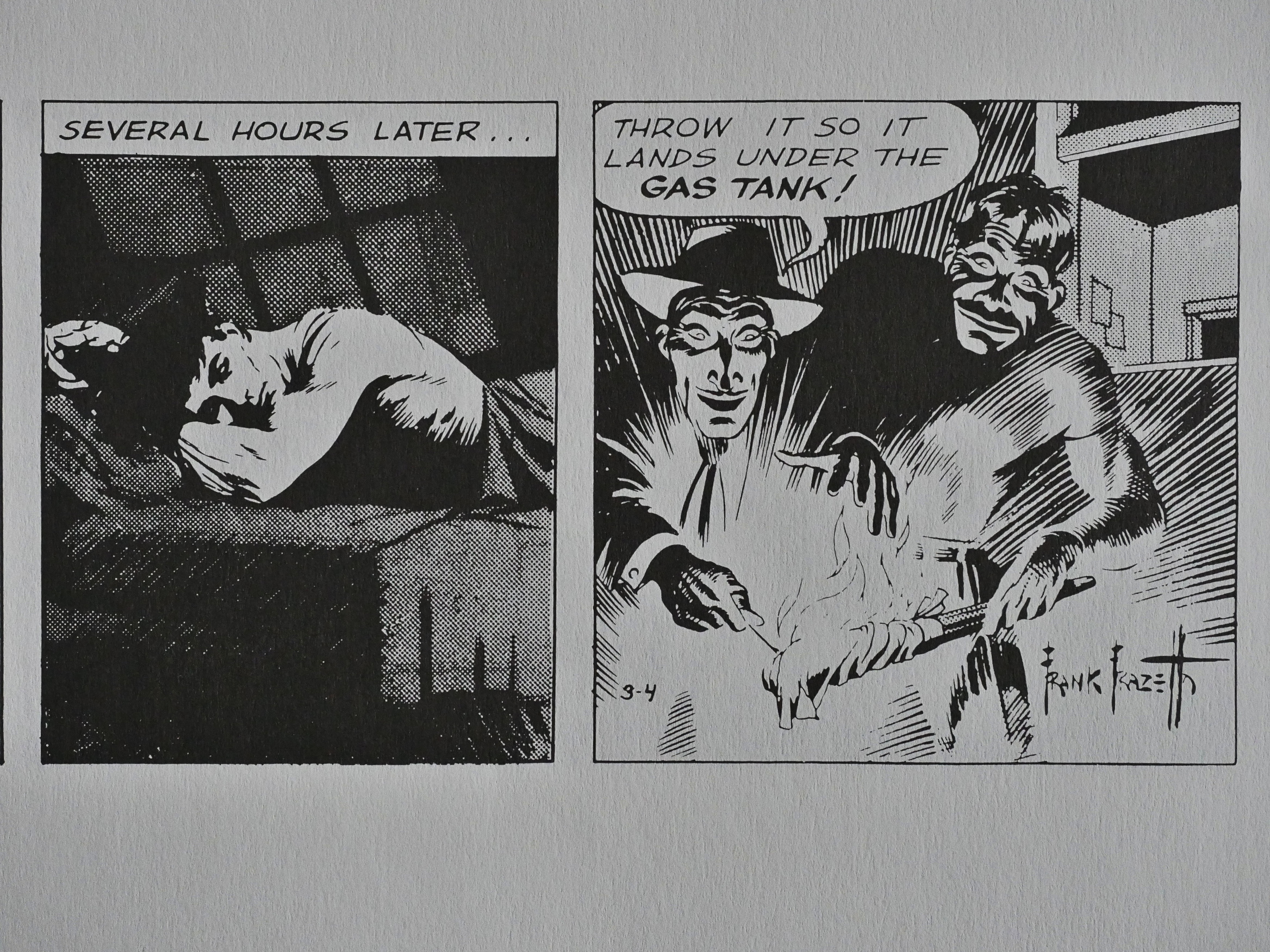
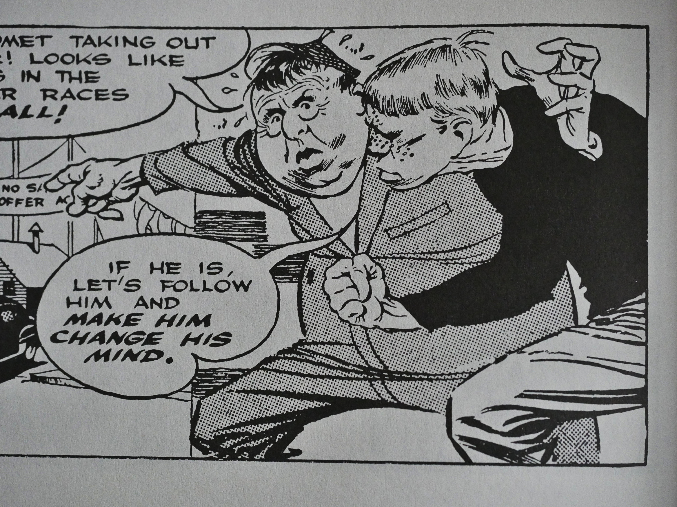
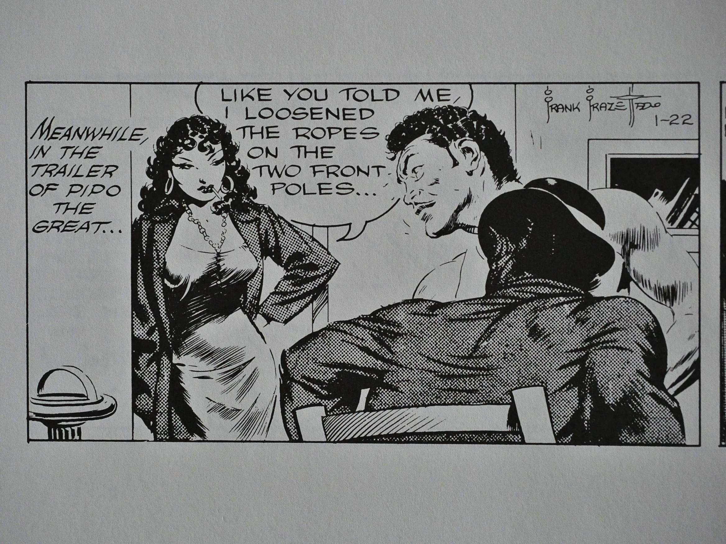
Which brings us to the stupidest plot in the collection: Johnny joins the carnival and that guy up there with the hat is afraid of losing his job, so he convinces his girlfriend to seduce Johnny.

And… after seducing Johnny, she… cut some ropes to a net that supposed to catch Johnny’s car (!), because he… needs to be seduced for the… rope to… be cut… and he couldn’t cut it himself?
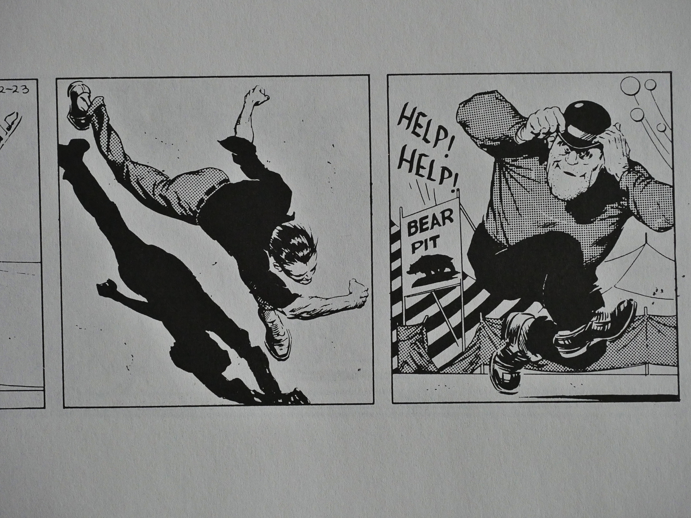
Right?

RIGHT!??!

I take the plot as a sign that they’d just stopped caring at all and Frazetta was just drawing the strip without a script. It still looks nice, though.

That’s an expression I’m going to start using in every day life.

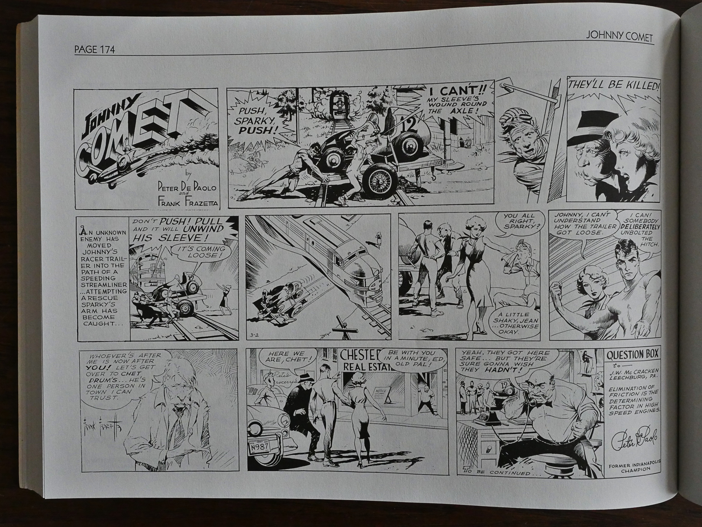
The strip ended in the middle of some nonsense, but we still have the Sundays to read. They start off being in the same mould as the dailies, and have this box at the end where Peter de Paolo answers (?) a question from a reader.

So another gimmick to try to stand out?

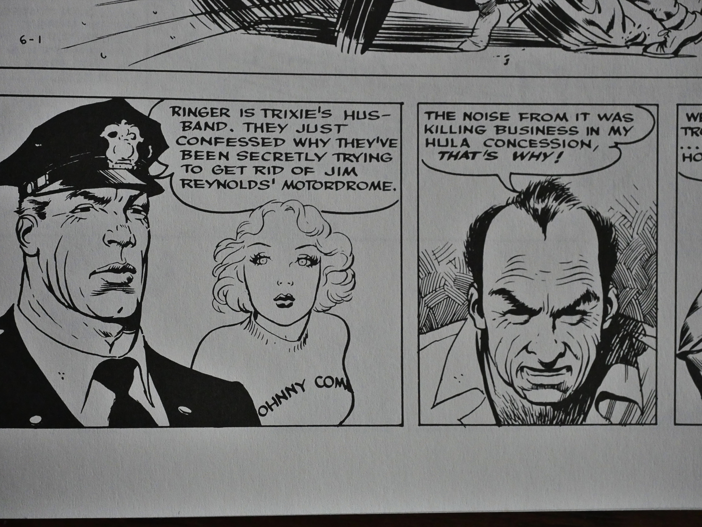
The plot here isn’t among the better ones. Above you get the explanation for why that guy tried to kill Johnny: Noise from his concession.

*sigh*

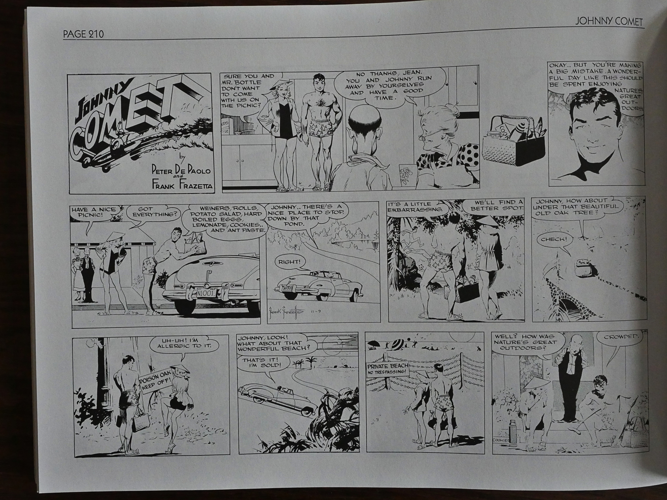
But the Sunday strips change to a gag format, which works better. I mean, not everything’s really… funny… but at least you don’t have to endure those plots.

And sometimes it’s funny!

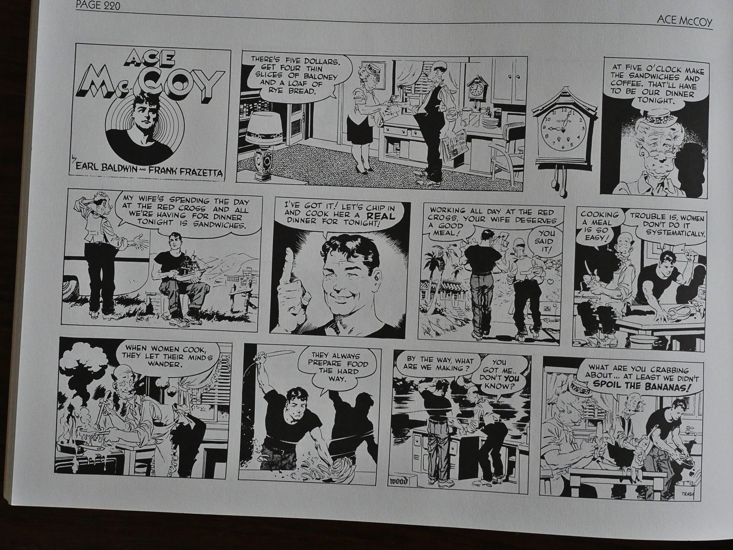
That’s the page we were asked to identify who ghosted on, and I think it’s Wally Wood. The pose of that bottom left panel is just like what he’d do a couple years later for Mad Magazine. Or could it possibly be Al Capp? Capp could be very slick when he wanted to…

Oh! It says “Wood” in the final panel. Gah. Never mind.

It’s been re-released later (perhaps more than once), and I’m not surprised. It’s better than most newspaper strips from that time period. One person had this to say:

The writing is kind of mediocre, with the basic plot device of a job opportunity for Johnny or his friends meaning ruin for someone else, who will then resort to violence rather than think of a less criminal way of doing things used repeatedly. Mr. Baldwin was also overfond of resolving plotlines with the karmic death of the villains or an offstage arrest.

The art, on the other hand, was excellent, with Frazetta’s trademark handsome lead, attractive women , vile looking villains–and some very nice-looking cars. There’s some fine craftsmanship on display in these strips. A nice touch early on was the safety tips tucked into panels that let you know not to do the crazy stunts the characters get up to.

Sure…

1991: I Am Legend

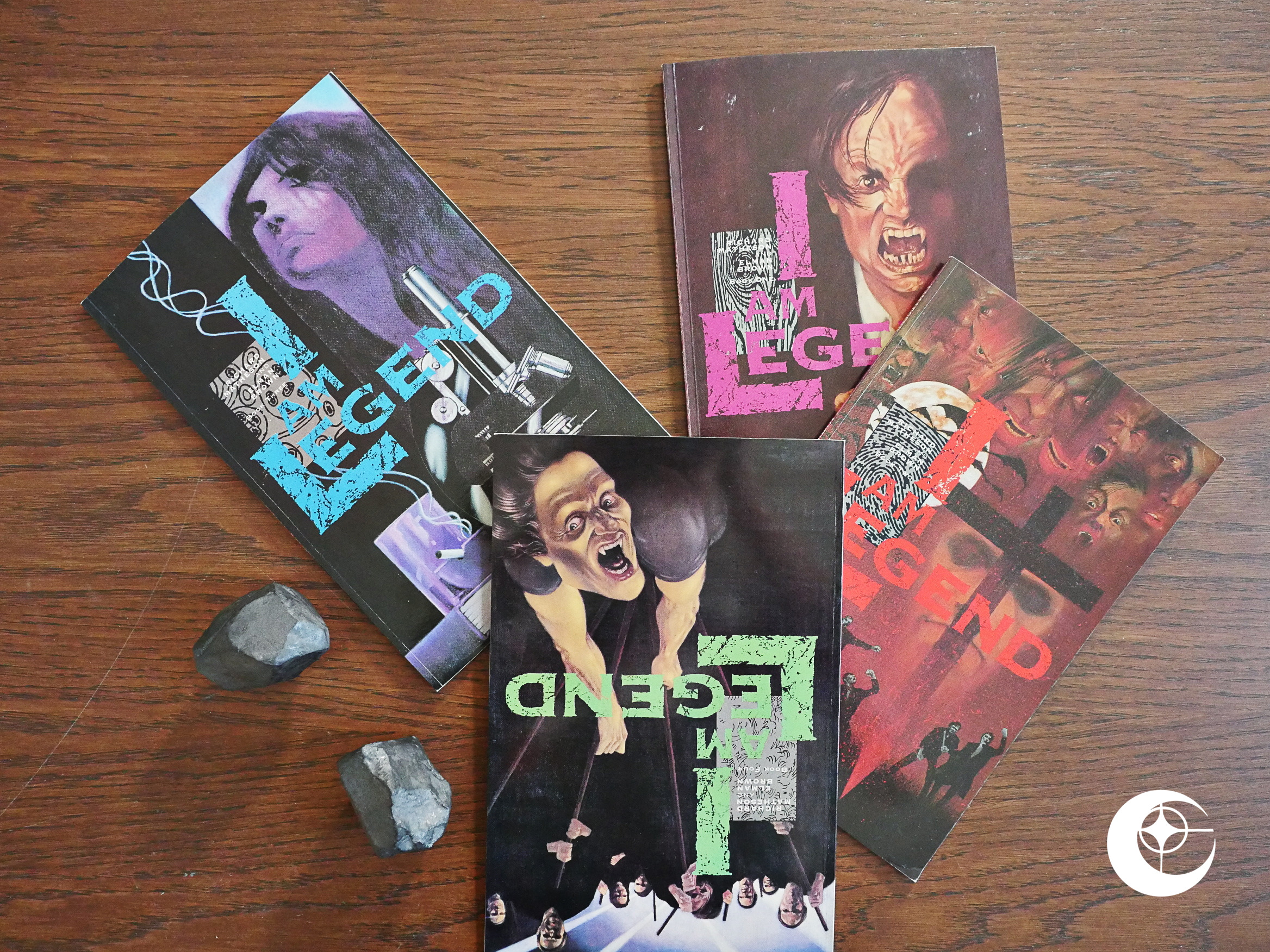
I Am Legend (1991) #1-4 adapted by Steven Niles and Elman Brown from Richard Matheson’s novel.

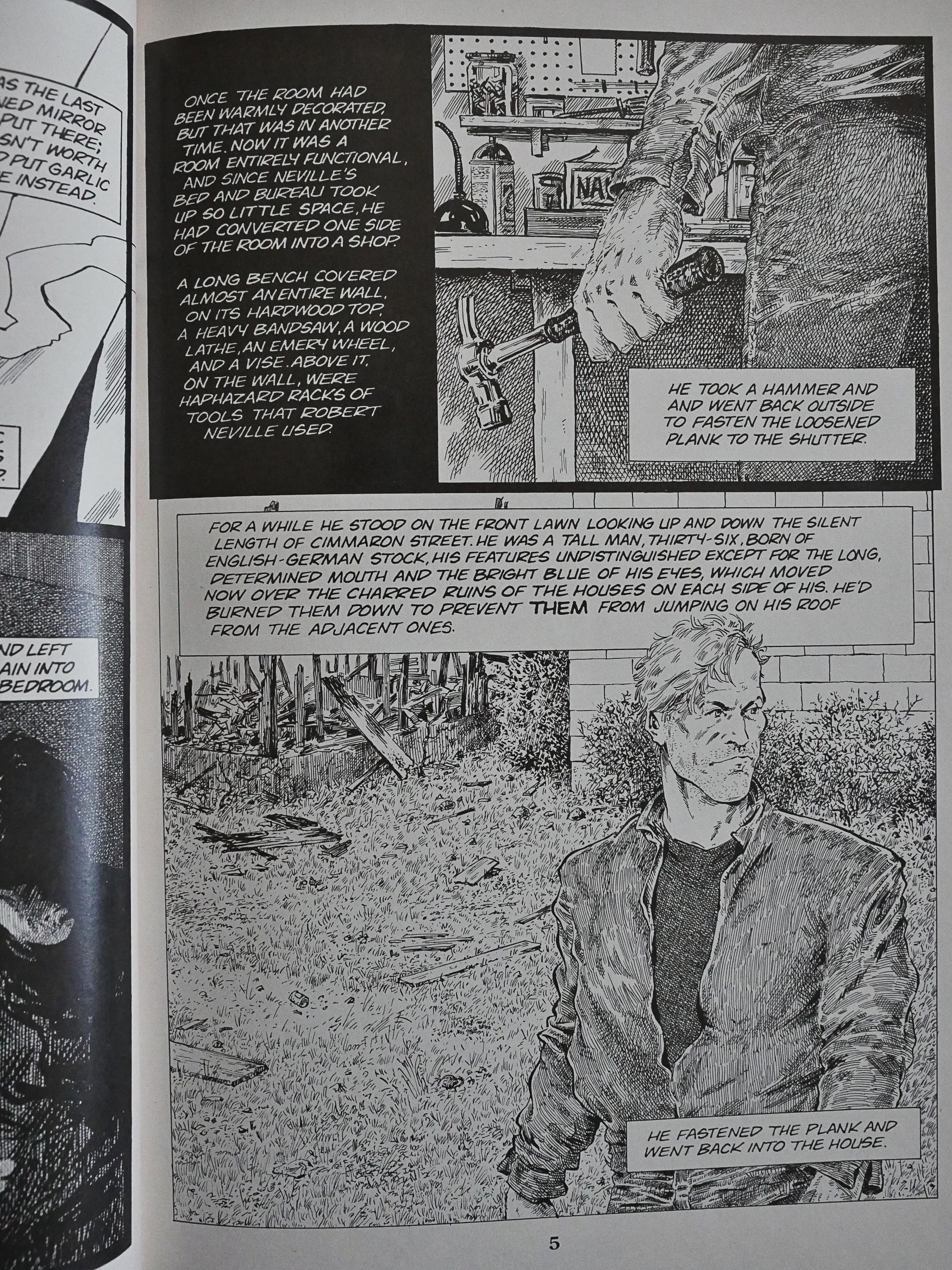
Oh, I thought I’d done all the squarebound “prestige format” adaptation series, but I had forgotten about this one. It’s an adaptation of Richard Matheson’s 50s sci-fi novel which I’ve heard of, but never read. And it’s adapted by Steven Niles, who’d done a couple of Clive Barker short stories, and they didn’t suck, so I was hopeful. And these are 4 60 page volumes, which should give ample space to do the adaptation without overwriting.

Oops.

Double oops.

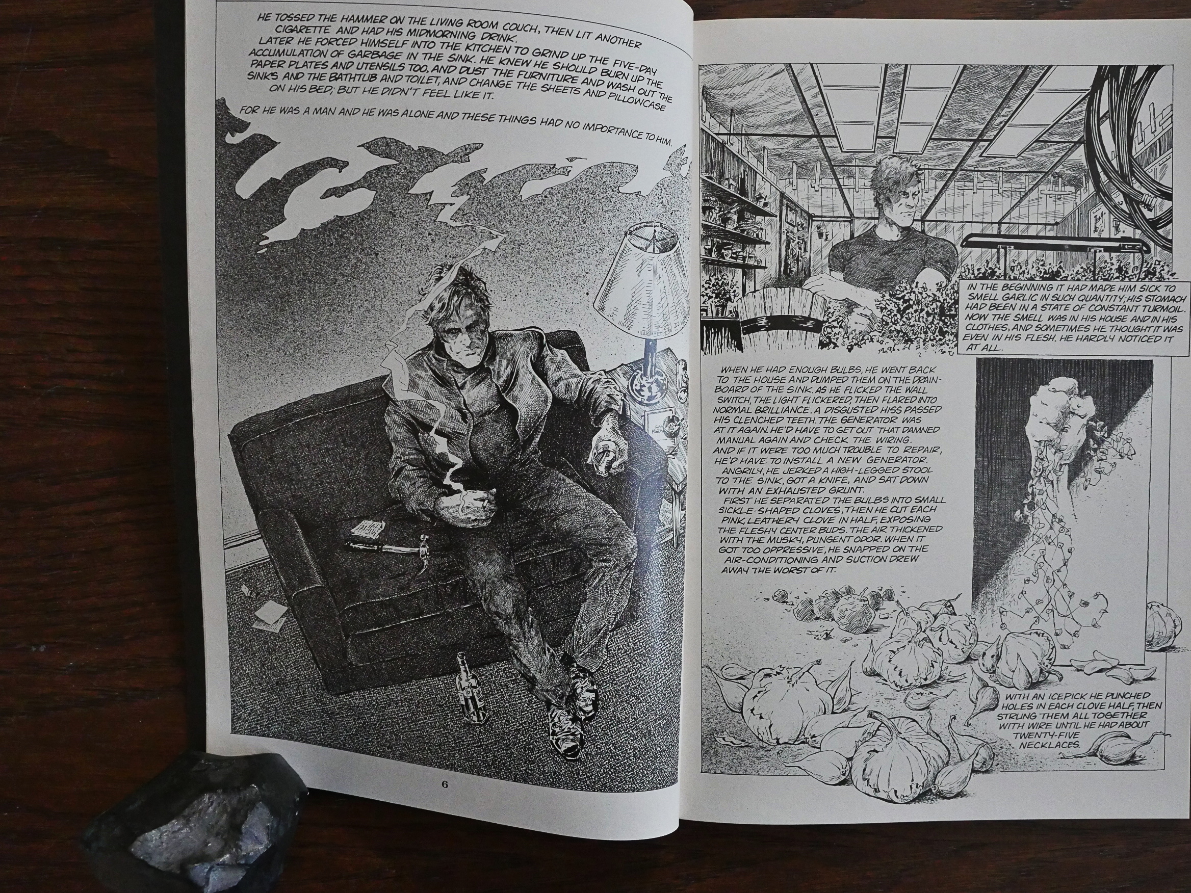
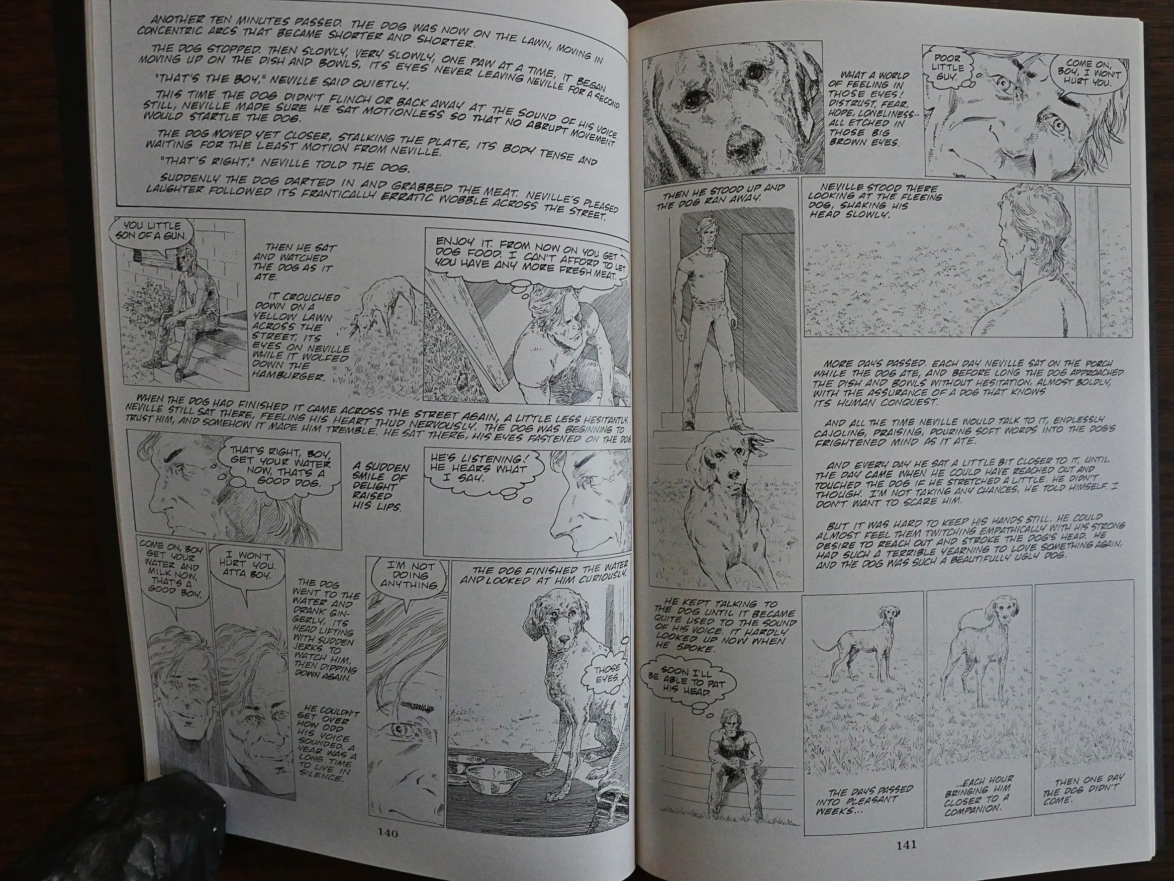
I know I’ve said “this is more like an illustrated version of the novel” before on some of these Eclipse adaptations, but… this is less a comic book than an illustrated version of the novel.

The reams and reams of text here is just mind-boggling. It’s a story about a guy who tries to figure out a post-apocalyptic vampire/zombie world, and he has nobody to talk with, so he thinks a lot. And he’s not smart and he’s not particularly sympathetic, and it’s just… tedious.

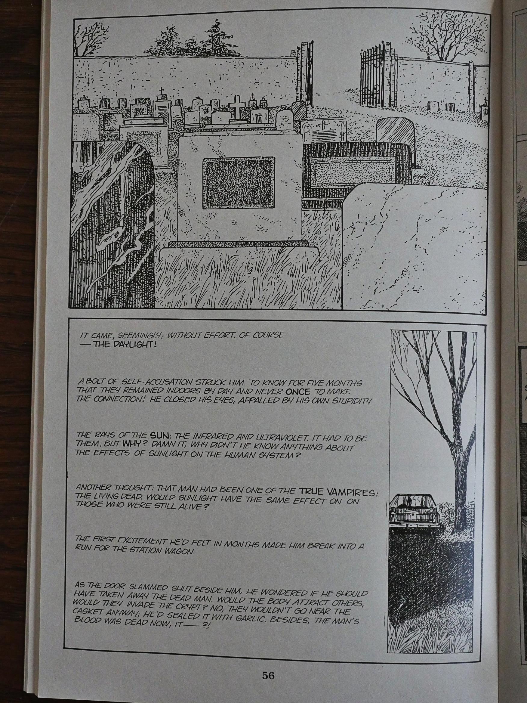
But now and again Niles lets Brown draw some nice pages.

But mostly the artwork is more utilitarian than anything else. Brown’s artwork isn’t pretty, but it’s effective.

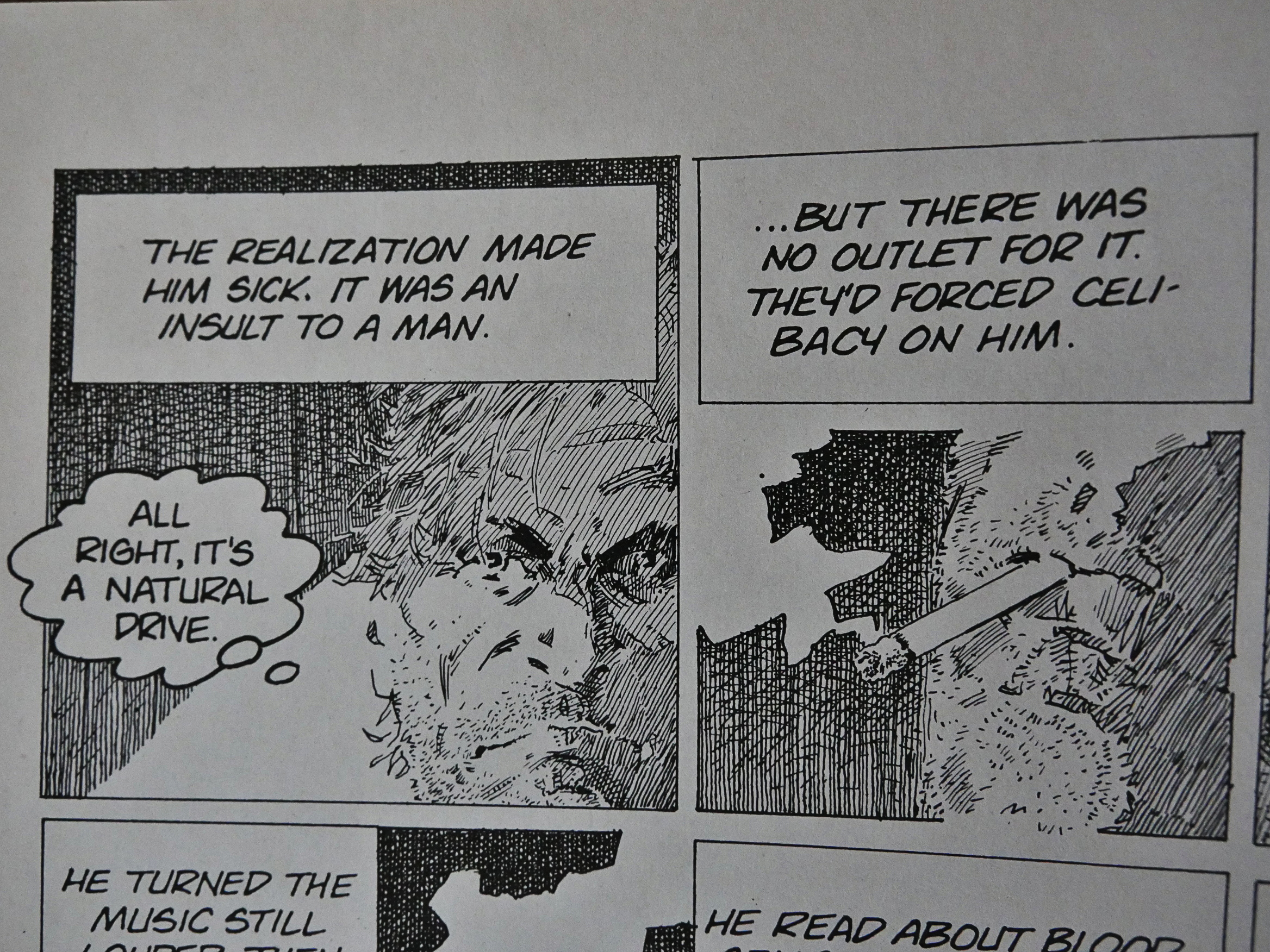
(And the most fantastic thing about Matheson’s alternative sci-fi world is that they haven’t invented masturbation there.)

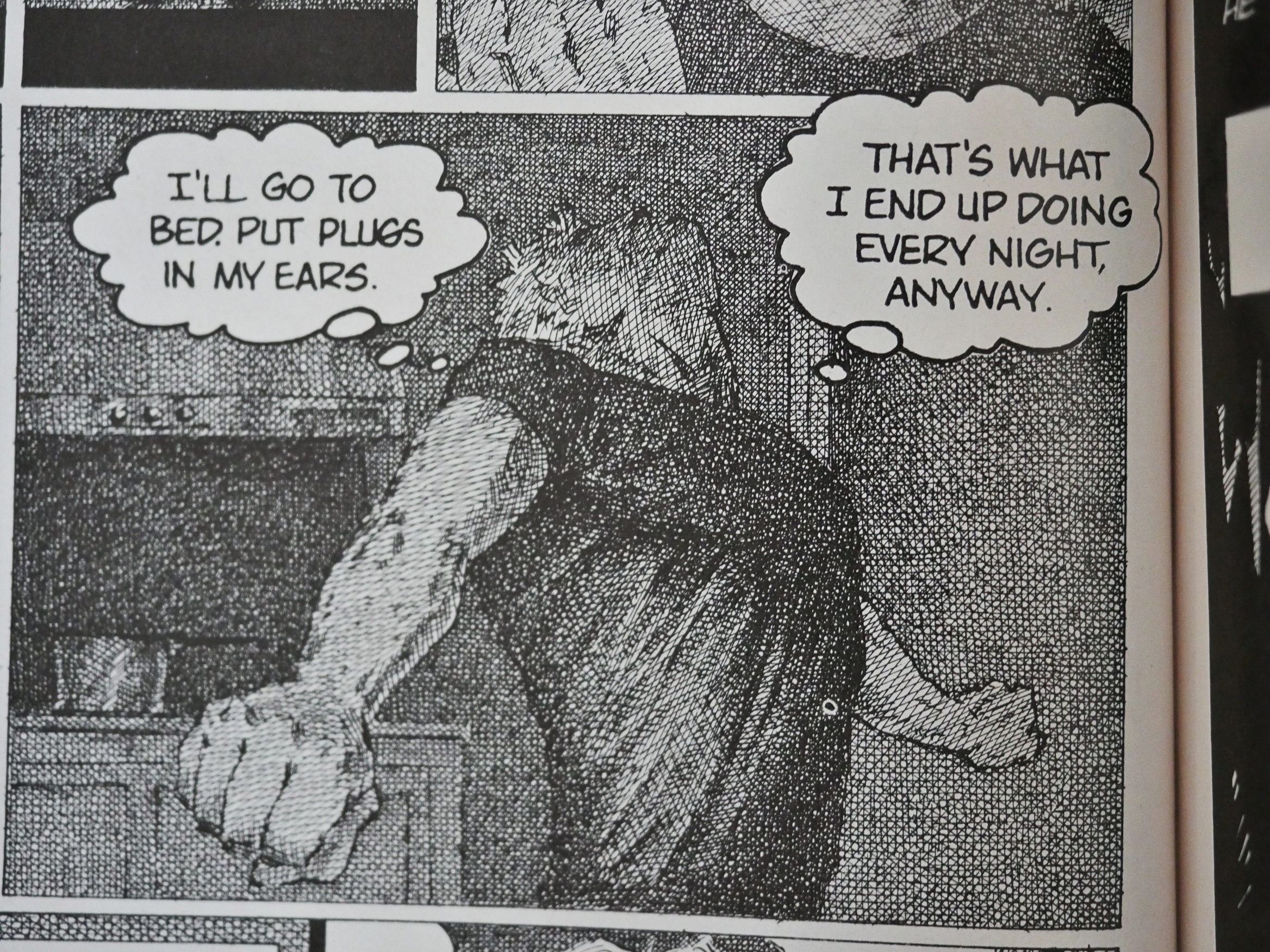
Brown really likes his hatching, cross or otherwise. It has a kinda deranged obsessiveness about it that I enjoy, but his figures are all kinds of wonky.

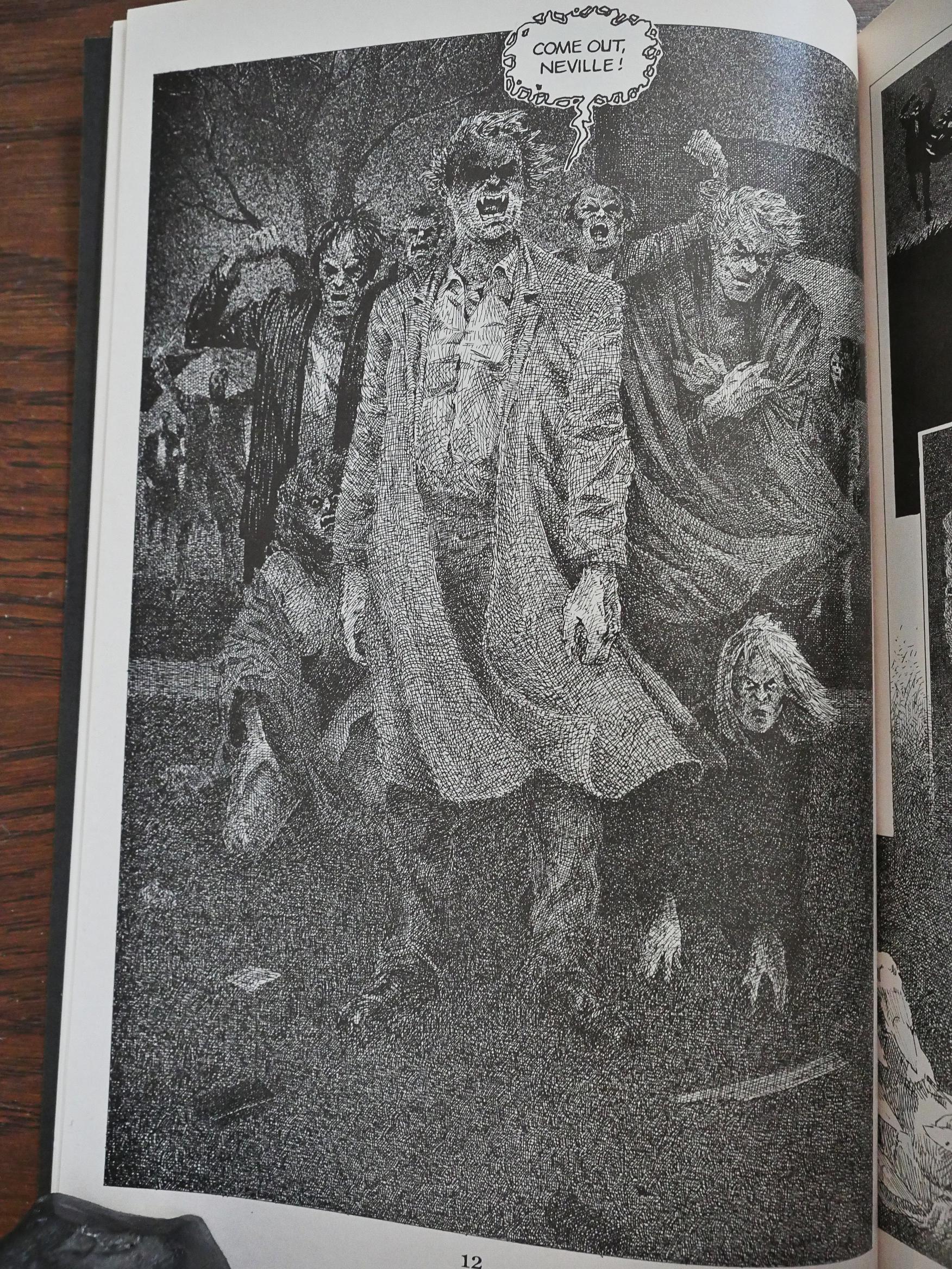
Oh, and the zombie vampires are so… pathetic. Our Hero spends a lot of time pondering then and trying to work out just the rules that explains how come they don’t take a crowbar to his makeshift barricades but just stand out there and shout at him. (That’s why he needs the ear plugs.) In the end, I don’t really think that Matheson comes up with a good explanation, or explains why Our Hero lives in that house, anyway, when there are so many that would be more easily defensible.

Other than Our Hero being a moron, which he is, and then suddenly isn’t.

He’s got pretty much the same thoughts about the plot.

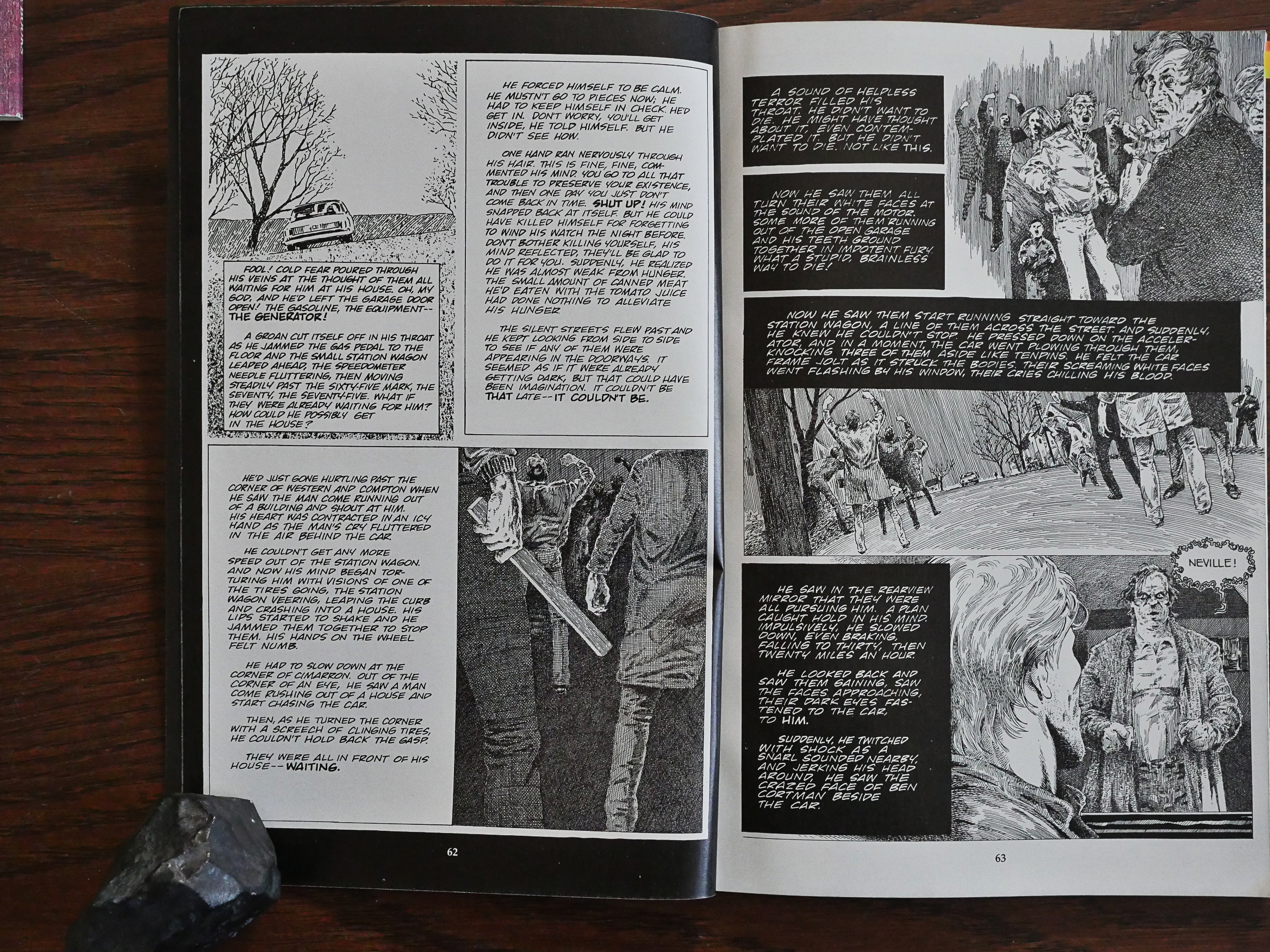
They’re so ineffectual that Our Hero can take strolls through gaggles of them without suffering any major discomfort.

I mean, he has to run a bit, but then he can just shove them away and lock his door. These are so much less scary than Romero’s zombies.

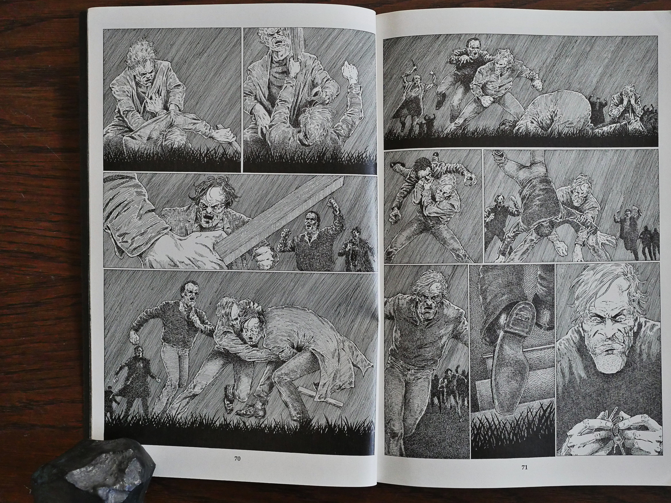
But at least Niles finds the room to add a couple of pages of honest-to-goodness comics in between swathes of verbiage.

And just when you things can’t get any more yawnworthy, he meets a dog.

*sigh*

But it does pick up slightly towards the end. The end makes no sense whatsoever beyond “that’s deep, man”.

So what do others think of it?

My opinion of this graphic novel is that it is completely unnecessary. It is very text heavy and so I think you might as well just read thr novel instead.

And I’m not a fan of the artwork, a few of the more detailed pages are really nice but the majority are quite basic and look a bit “scratchy’.

I’ve rated it 3 stars just because of the story itself.

Somebody on Amazon gives it five stars and says:

As others have mentioned, this is perhaps more of an illustrated novel than a comic book, as it frequently has very long blocks of text to go with only a few panels. Perhaps even more significant, all of the actual language, or at the very least almost all of it, is lifted directly from the novel. Stuff is cut out, of course, but nothing is added in, as far as I can tell.

And here’s and interview:

IAL Archive: The adaptation itself is extremely faithful to the novel – I’ve described it to people as a very heavily illustrated version of the novel. I think this speaks very highly of you and the job you did – how did you approach adapting a novel that had such a large following?

SN: Unlike other books/stories I’ve adapted I wanted to preserve as much of the text as possible. Like I said, I was so in awe of the material I wound up ADDING to the novel instead of condensing. I think, for I AM LEGEND, a novel known by so may, it was the way to go.

[…]

IAL Archive: Were you pleased with the finished project? Is there anything you’d do differently if you had the chance?

SN: Well, a lot of years have passed. I think if I did an adaptation today I would cut down on the text and allow the visual story to come through.

IDW published a collection of this in 2005 because Steve Niles is a big name these days.

1991: Dragonflight

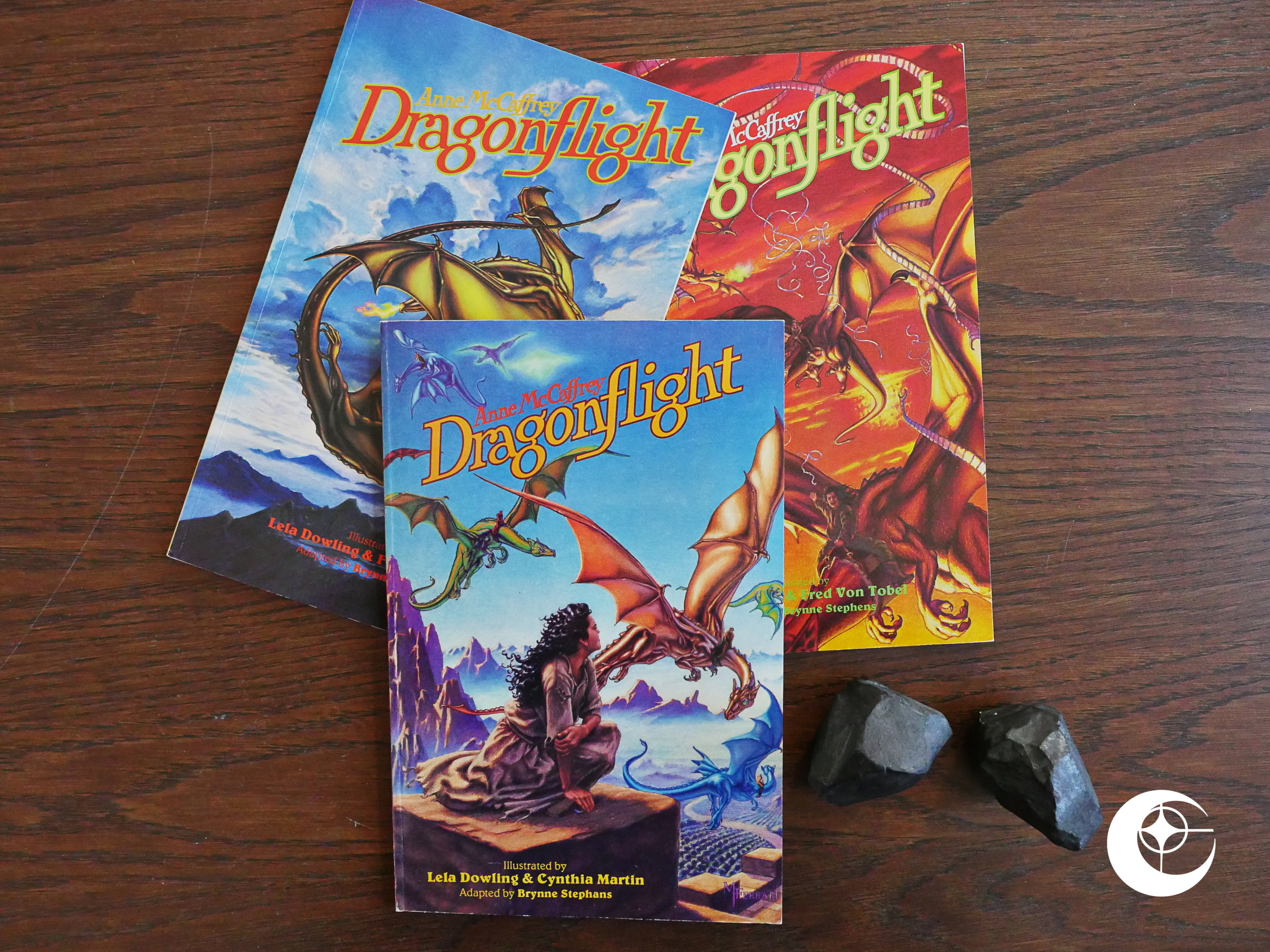
Dragonflight (1991) #1-3 adapted by Brynne Stephens, Lela Dowling, Cynthia Martin, Fred von Tobel from a novel by Anne McCaffrey.

Publishing adaptations in this format (three issue squarebound fully-painted 48 page yadda yadda) had been Eclipse’s signature for the last two years, and this is the last of these adaptations, I think. Eclipse would continue to publish adaptations of Clive Barker short stories, but would otherwise mostly stop doing this kind of thing as they spiralled towards bankruptcy.

But ending (sort of) on a Lela Dowling tip isn’t the worst thing you can do. I love Lela Dowling’s artwork, and Lex Nakashima (of Dreamery conceptual fame) is also somehow involved, so this should be easy sailing, right?

But but… That doesn’t really look a lot like Dowling’s artwork, does it? Granted, I’ve mostly seen her black and white pen and ink work (which is both hilarious and gorgeous), but I wouldn’t have guessed in a million years that she’s doing the artwork here.

Or perhaps she’s like only doing the layouts, and Cynthia Martin is doing the painted artwork? That would make sense.

Brynne Stephens, another name I’ve never heard of before, is responsible for the adaptation. (And it’s spelled Brynne Stephans on the cover of the first issue, so perhaps that goes for everybody?)

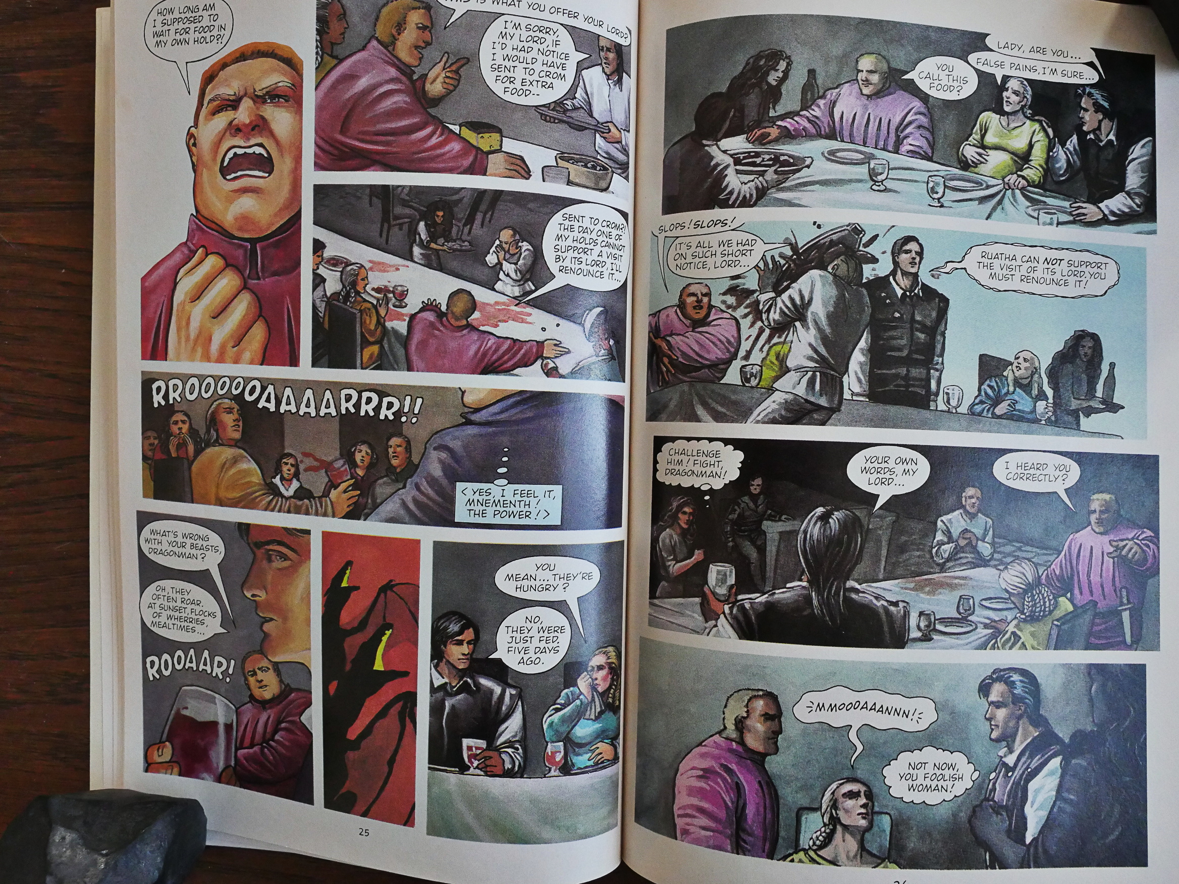
Many previous Eclipse adaptations have been plagued by being too respectful to the source material; preserving reams and reams of the text and giving the comic no room to be a comic. Stephans admirably avoids that, but…

… what we’re left with are the bare contours of the story.

I was an Anne McCaffrey fan until way into my twenties. McCaffrey writes irresistibly cute novels, with drama, passion and intrigue (and science fiction), but the books aren’t terribly complicated. I’ve probably read this book more than once, because I remembered the plot pretty well before starting to read this adaptation.

I think that if I hadn’t, I would have found the book pretty much incomprehensible. Things seem to happen so abruptly, with characters being introduced and killed off within pages. There’s virtually no characterisation (and McCaffrey is all about that).

As far as I can remember, this adaptation covers the entire novel. They have 150 pages to do it, and the original novel isn’t very long, but still it feels like I’m reading an illustrated plot synopsis.

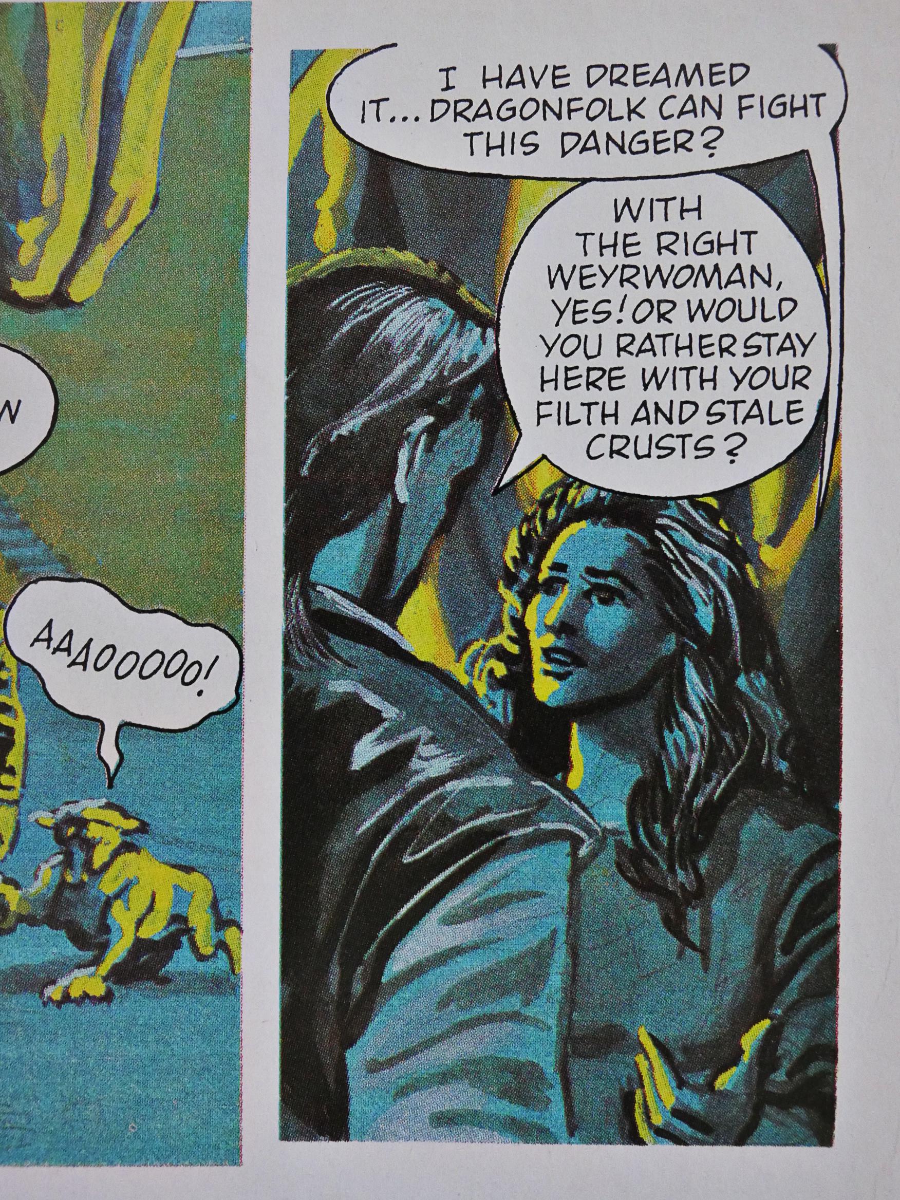
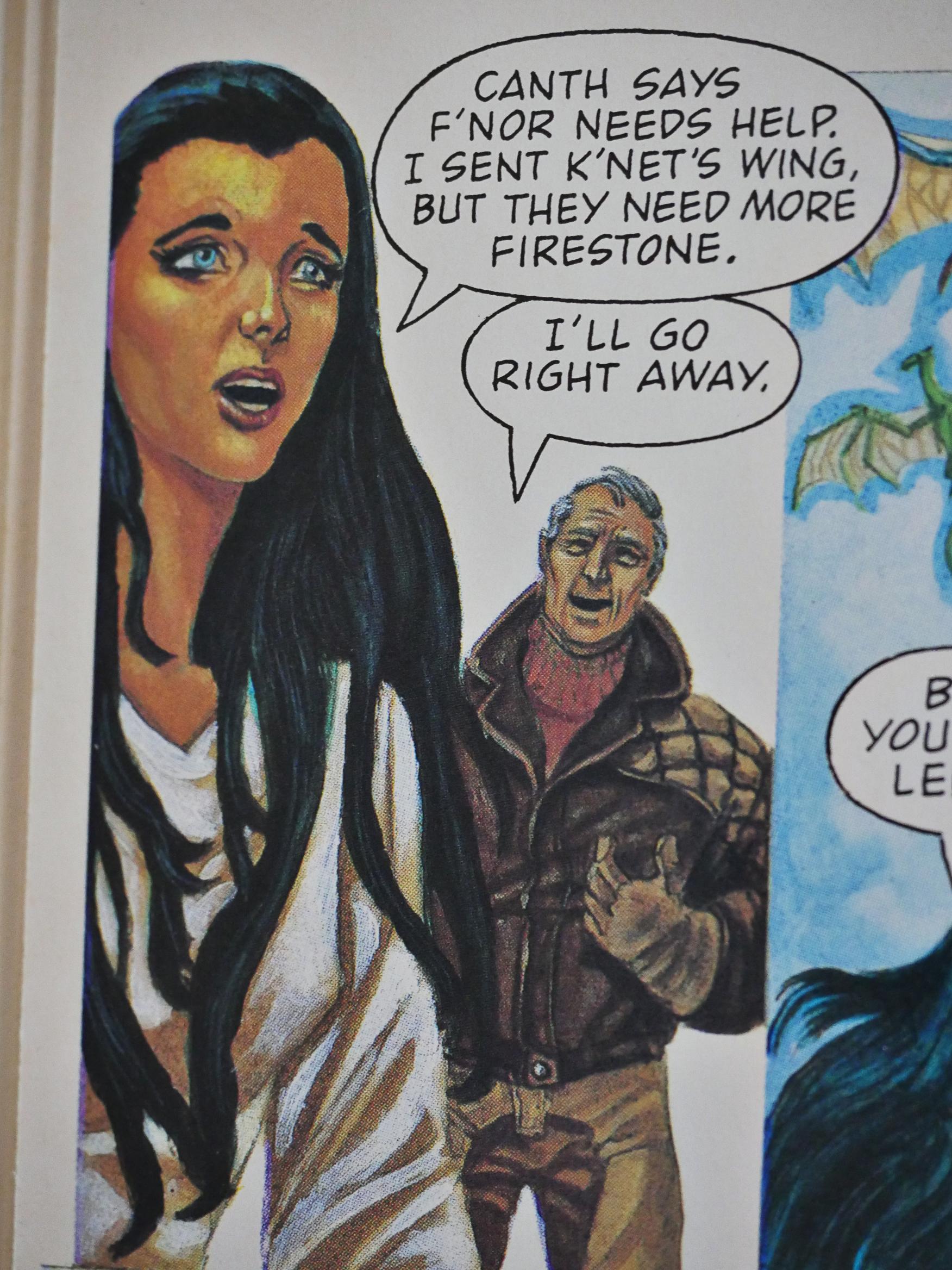
(I included the panel above because stuff like that was the major source of irritation while reading the novels: Our Heroine had to spend years as a scullery maid *gasp*, in “filth”. But then, of course, when she becomes queen of the weyrs (don’t ask), she still has all the same charwomen and servants — but they’re extremely happy being charwomen and servants (probably in filth), so that’s OK. Where’s the class struggle!1!)

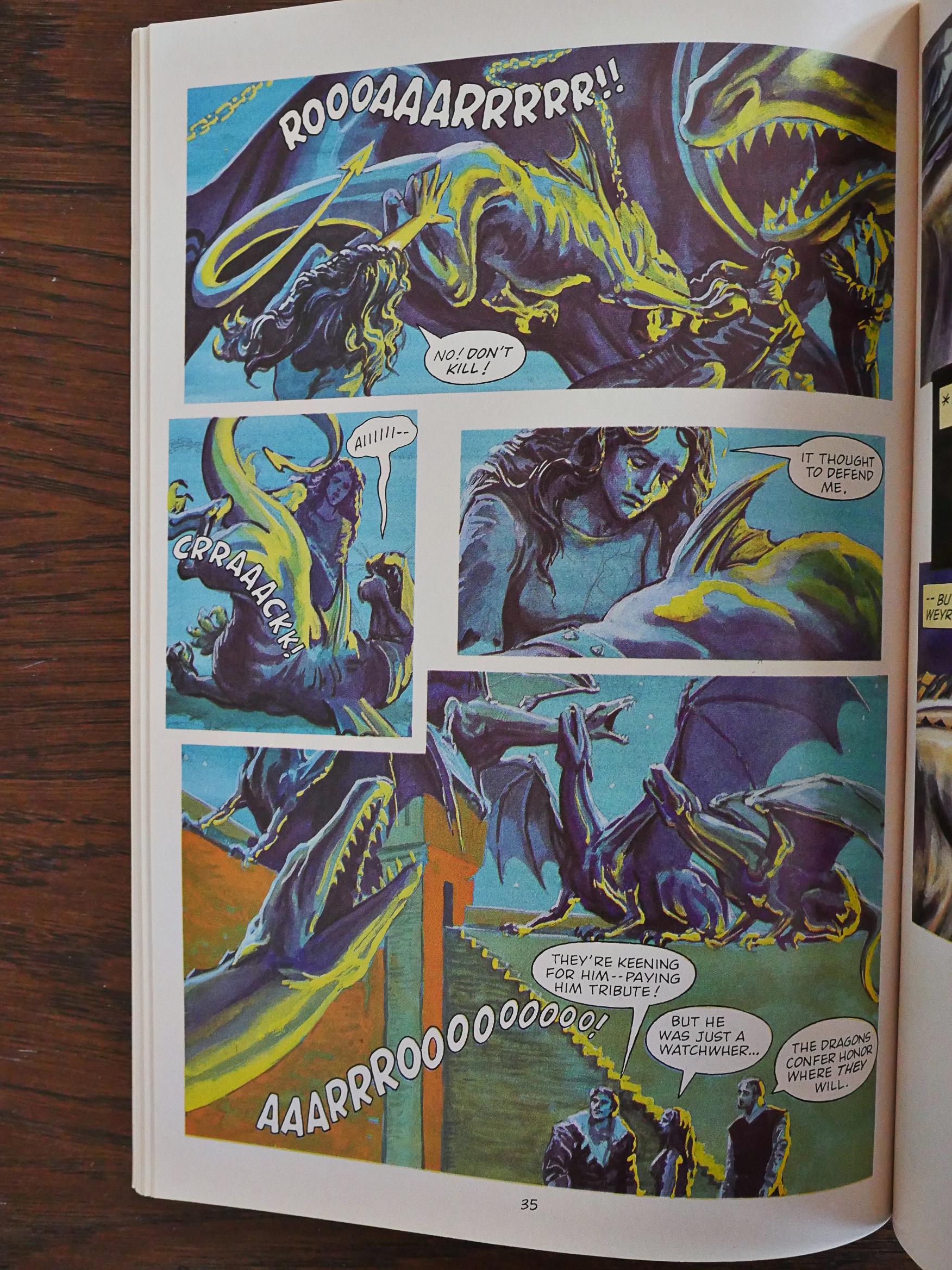
Aaaanyway. There are so many things that could have just been… left out… Above we see Our Heroine’s pet watch dragonette (don’t ask)… die… and that’s it. It’s an insane way to tell a story.

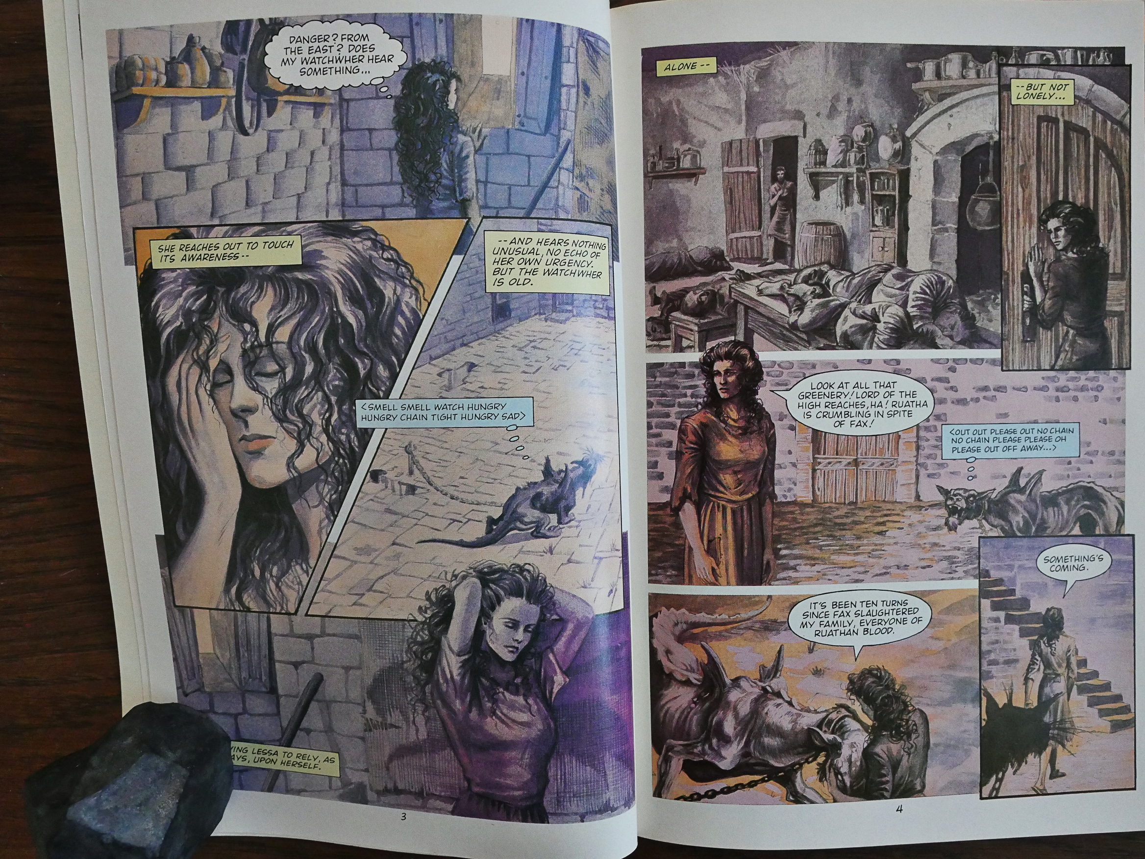
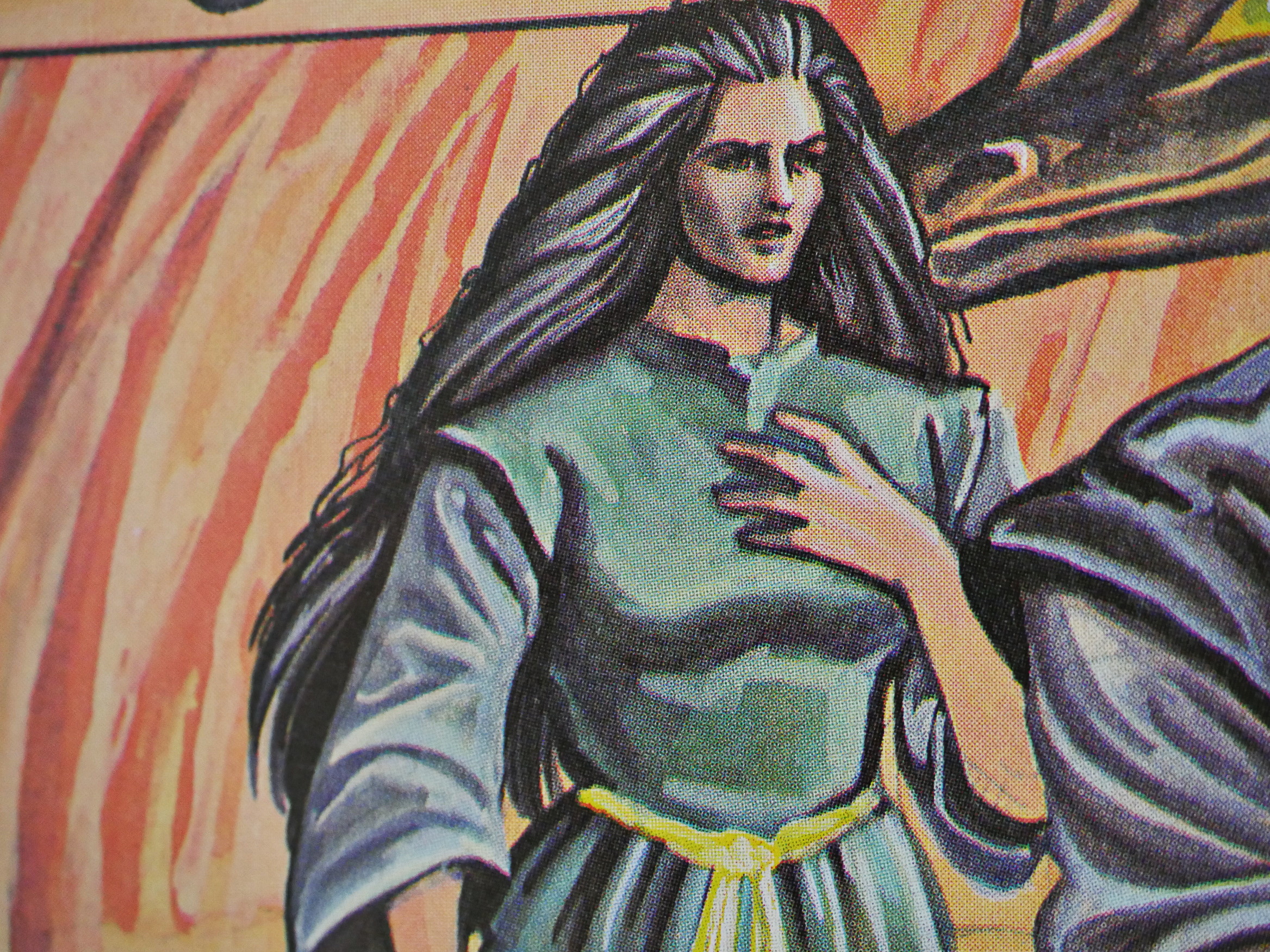
The artwork varies between OK and pretty crude, with the characters’ heads waning and waxing randomly.

But then! The final two issues are done by Dowling and Fred von Tobel, and they’re a lot better rendered. They still look nothing like Dowling pages, but they’re a lot prettier than the first issue.

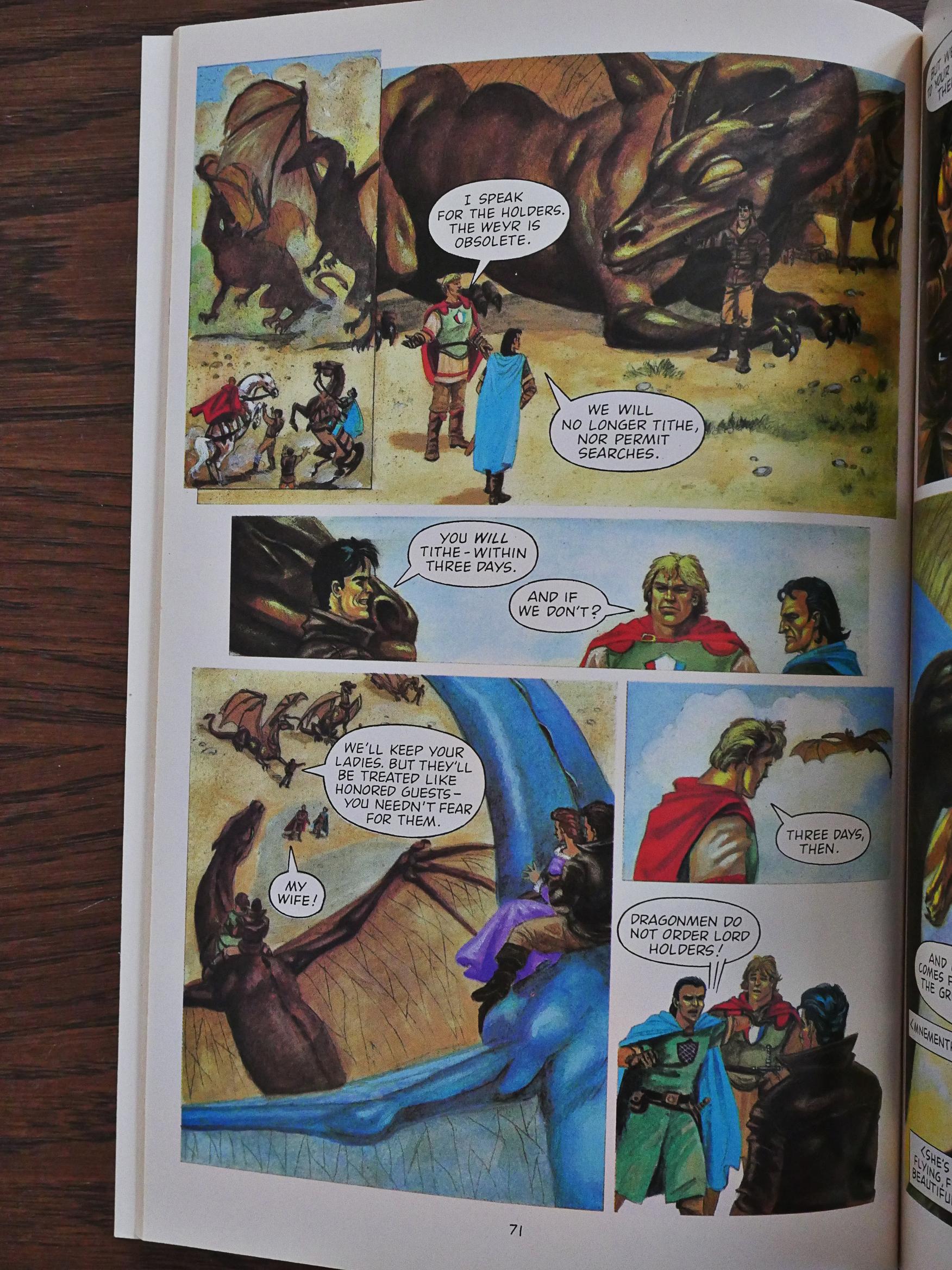
The storytelling is still so abrupt as to be absurd. In the page above, the weyr (don’t ask) leader meets with the holders (don’t ask) to negotiate with them. In the fourth panel it’s revealed that the weyr (don’t ask) leader has kidnapped the holders’ (don’t ask) wives. And that’s the last we hear about that sub plot.

And that’s the first time we hear about firestone.

*sigh*

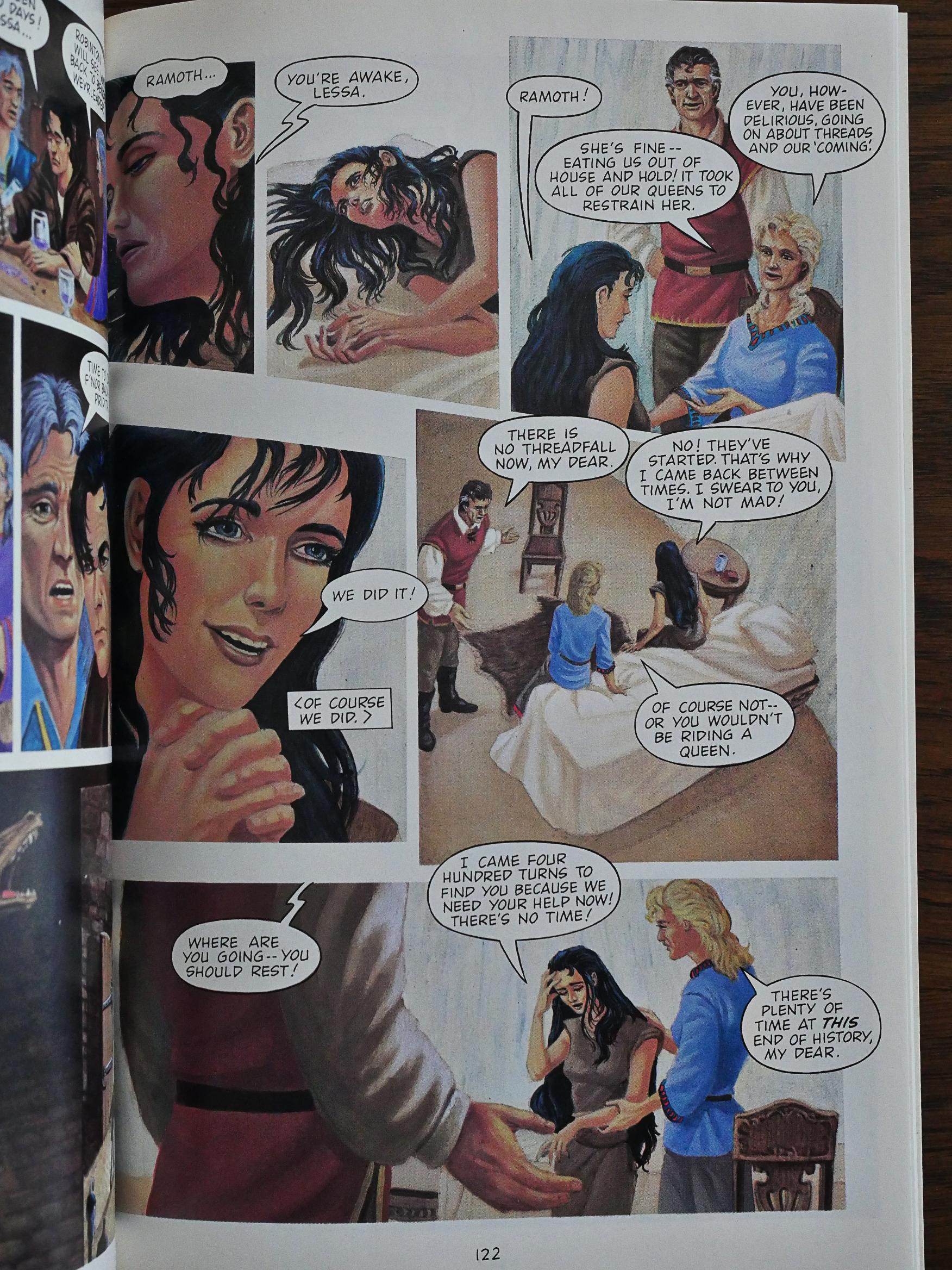
However, the last half of the final issue is pretty coherent. Even if I didn’t know what was going to happen, I probably would have found it pretty exciting. It’s like reading a real comic book with a plot and stuff.

If only they’d done the entire thing in this style.

It’s surprisingly difficult to find any reviews of this adaptation. The McCaffrey book series is stupendously popular, but apparently this adaptation isn’t?

I found this on Goodreads:

As with the first graphic novel, if you aren’t already familiar with the Dragonrider series, you may have some trouble keeping up. The coloring was brighter and the art a bit edgier than the previous graphic novel, but there was no transition from one scene to the next to indicate time passing or any other marker that would make the story flow smoother. It’s a nice homage to the series, but something that fans would probably be more interested in than just a person who had picked it up for the first time.

Eclipse published a collected edition, too, but it seems that the series hasn’t been reprinted since.

1986: Forgotten Horrors

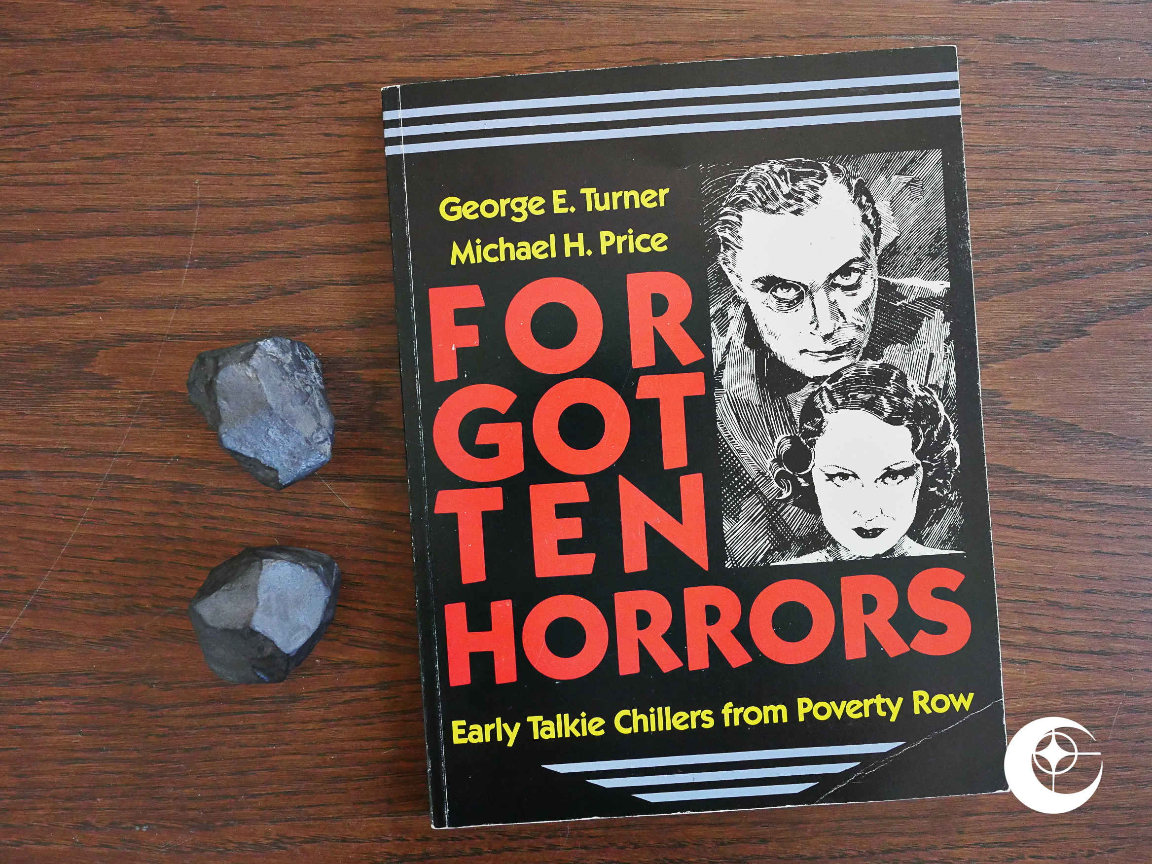
Forgotten Horrors (1986) #1 by George E. Turner and Michael H. Price.

1986!? Yes, 1986. For somebody with my level of CDO, it pains me to blog about these Eclipse artefact out of order. As I’m currently doing 1991, this is a detour to the past, but my initial methodology to identify all Eclipse publications was to use the comics.org web site. I didn’t realise that it only lists comics, and not the rest of the stuff Eclipse published or, indeed, that Eclipse had published much of anything else.

So as I’m discovering these books (by reading the On the Stands columns and the occasional back issue listing in the back of the Eclipse comics), I have to backfill.

I know, the pain and shame is all mine.

Anyway! This was originally published by A S Barnes and Co in 1979, but they went under soon afterwards and this book apparently never got a proper distribution at the time. So Eclipse reprinted it with revisions from the original authors.

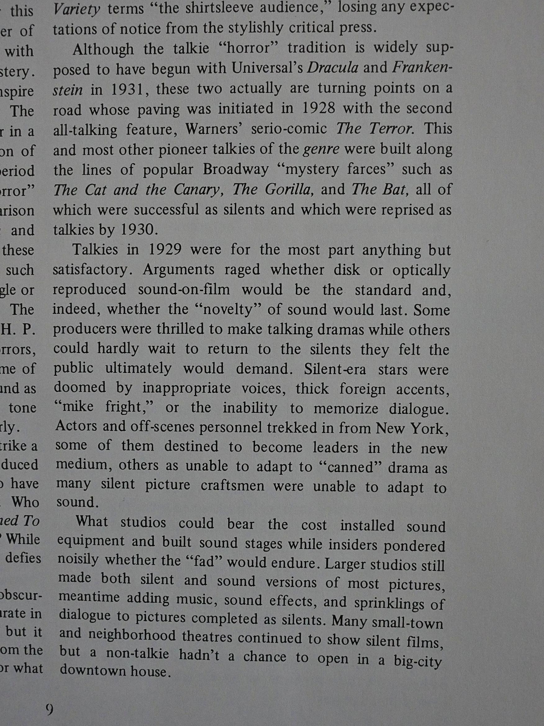
The authors lay out the perhaps somewhat arbitrary scope of the book: It lists and discusses all “Poverty Row” talkie horror films. So it doesn’t include silent horror, nor horror films made by major studios, nor horror movies made after 1936. But I understand the need to set some limits to a project to be able to delve deeply into a subject. I admire the nerdiness of these limits. How could I not?

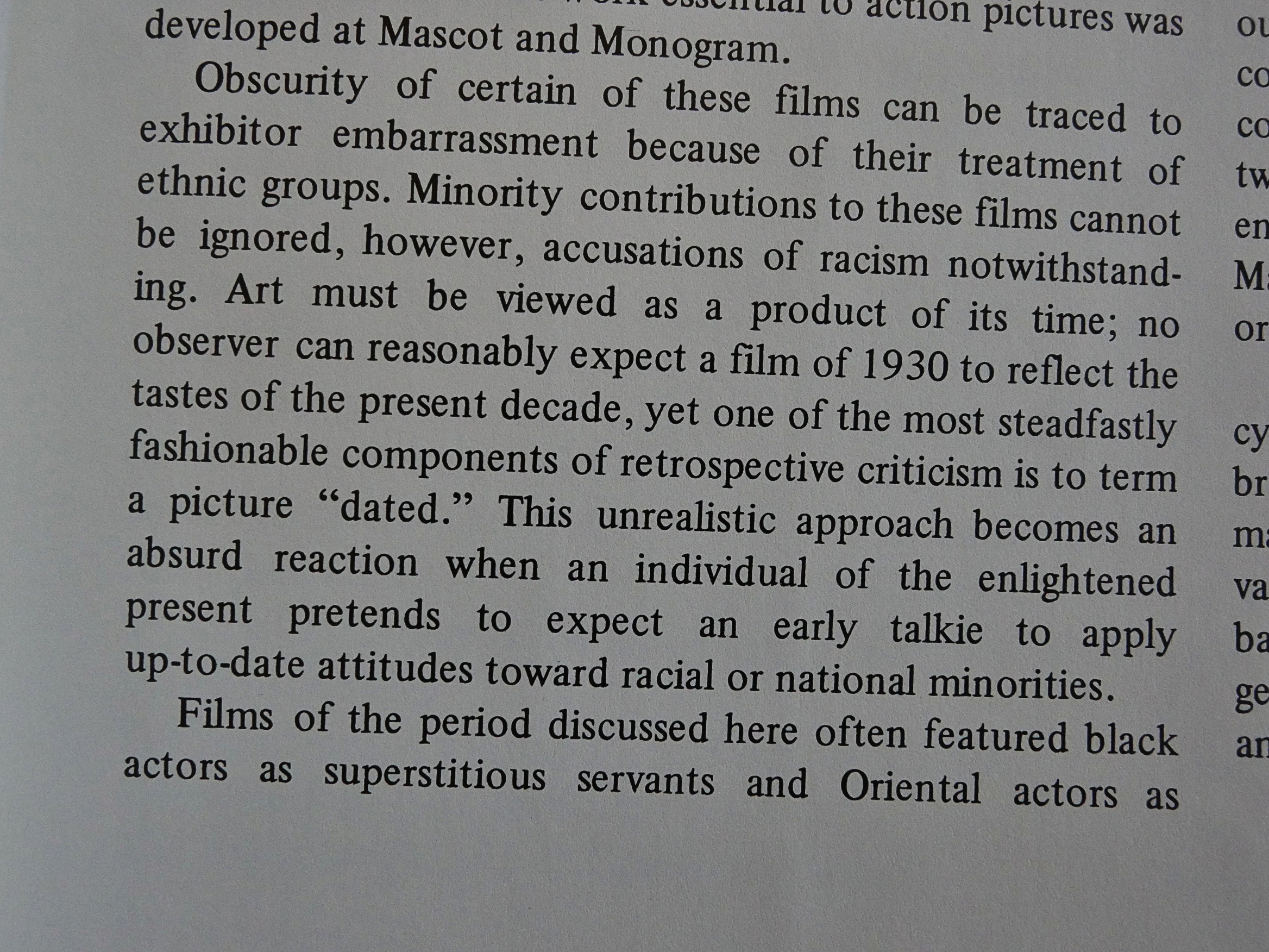
The introduction briefly touches upon racist character portrayals in these films, but claims that “[a]rt mys be viewed as a product of its time”, and presumably especially with “black actors” and “Oriental actors” (sic).

*sigh*

But perhaps we must view this book as a product of its time, right?

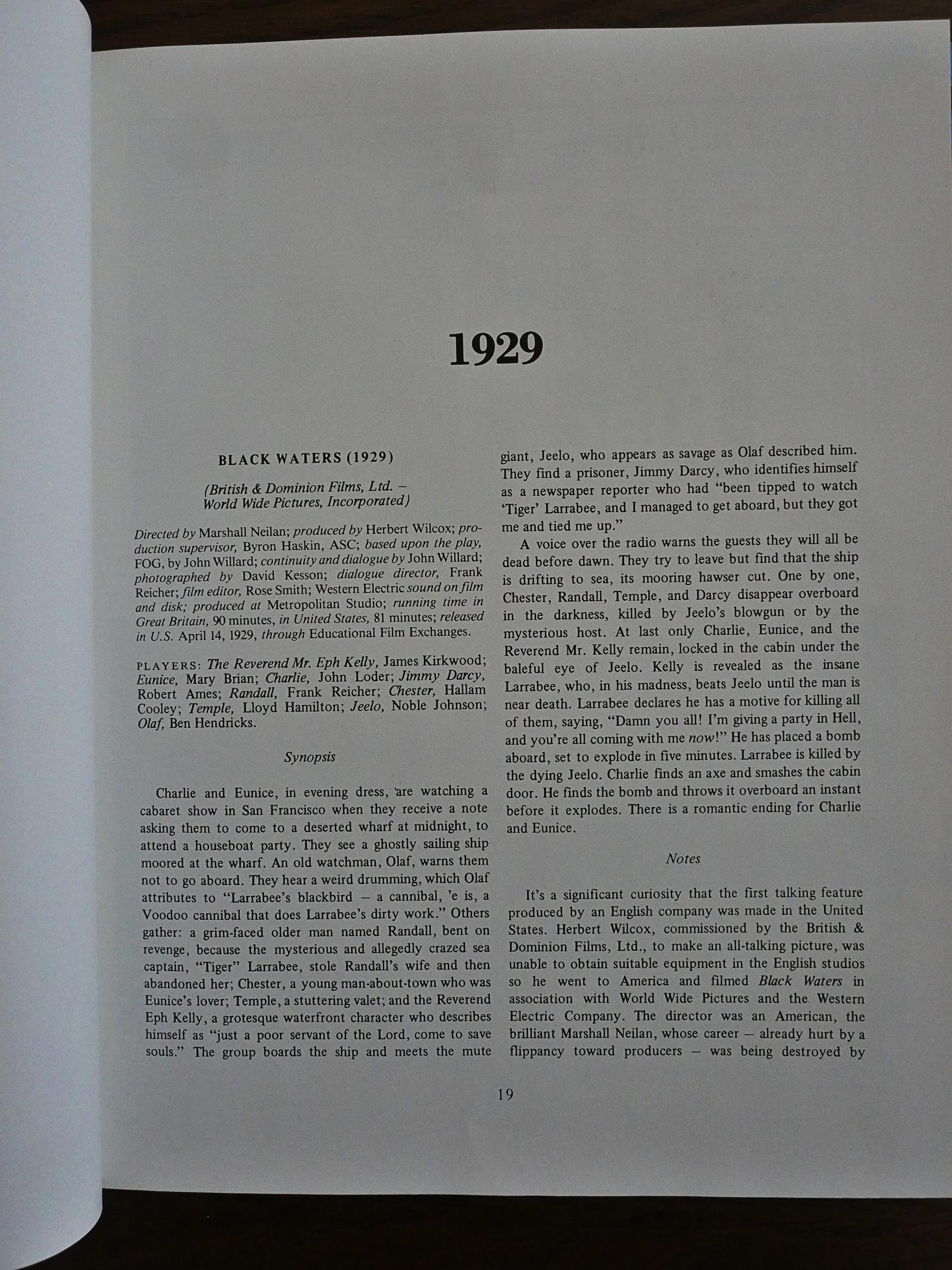
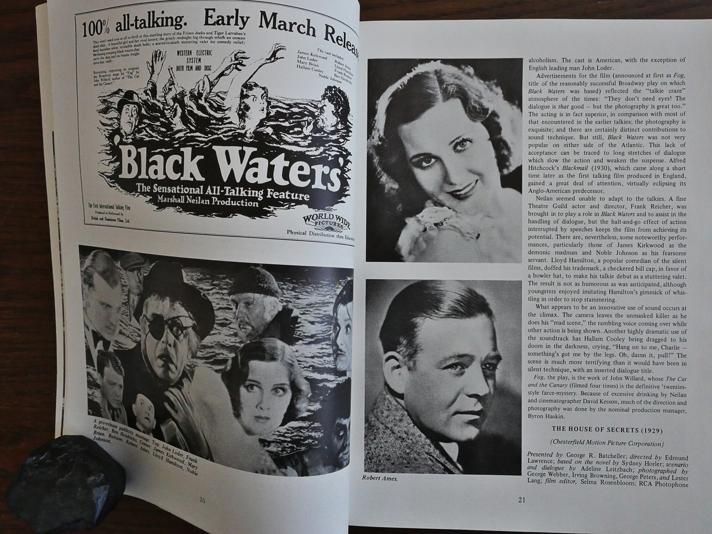
I’m not going to do a deep dive into this book in this blog post… mostly because I’ve only read a couple dozen pages, but here’s a typical entry for a film; Black Waters from 1929. First we get some production facts, and then a synopsis that may take up the better part of a page.

Then some production shots, snaps of the leading actors, the movie poster and some notes on the production. The synopsis can sometimes be very… detailed… and I have no interest in that really, so I concentrated on the notes, and they’re sometimes pretty interesting.

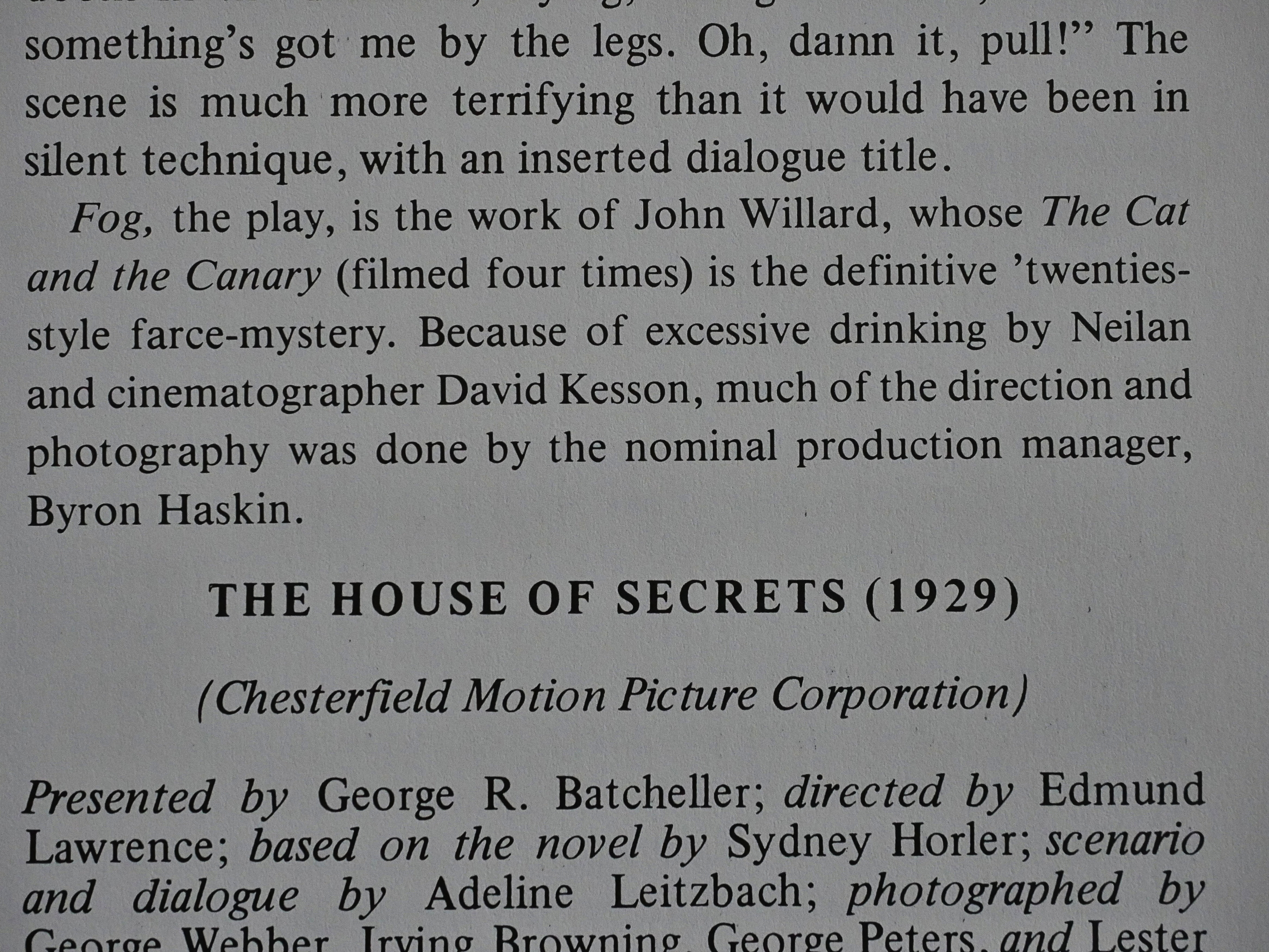
Like this one, where we learn that the production manager shot most of the film because the director and cinematographer were drinking excessively.

So it’s a kind of papery Wikipedia, but without all the [citation
missing] notes.

Does this kind of book exist any more, or does all this stuff just land on a blog somewhere? I guess there’s still coffee table books for people to rifle through, but this kind of repository of facts and anecdotes is mostly on the web these days, I think?

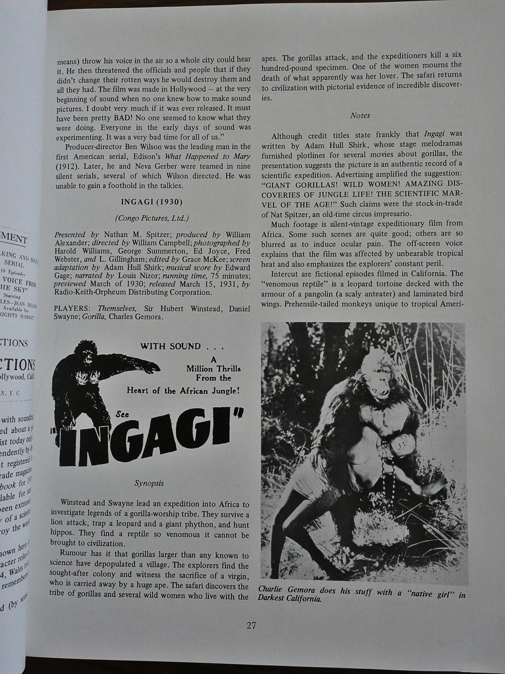
Well, that’s a picture to use as an illustration, I guess…

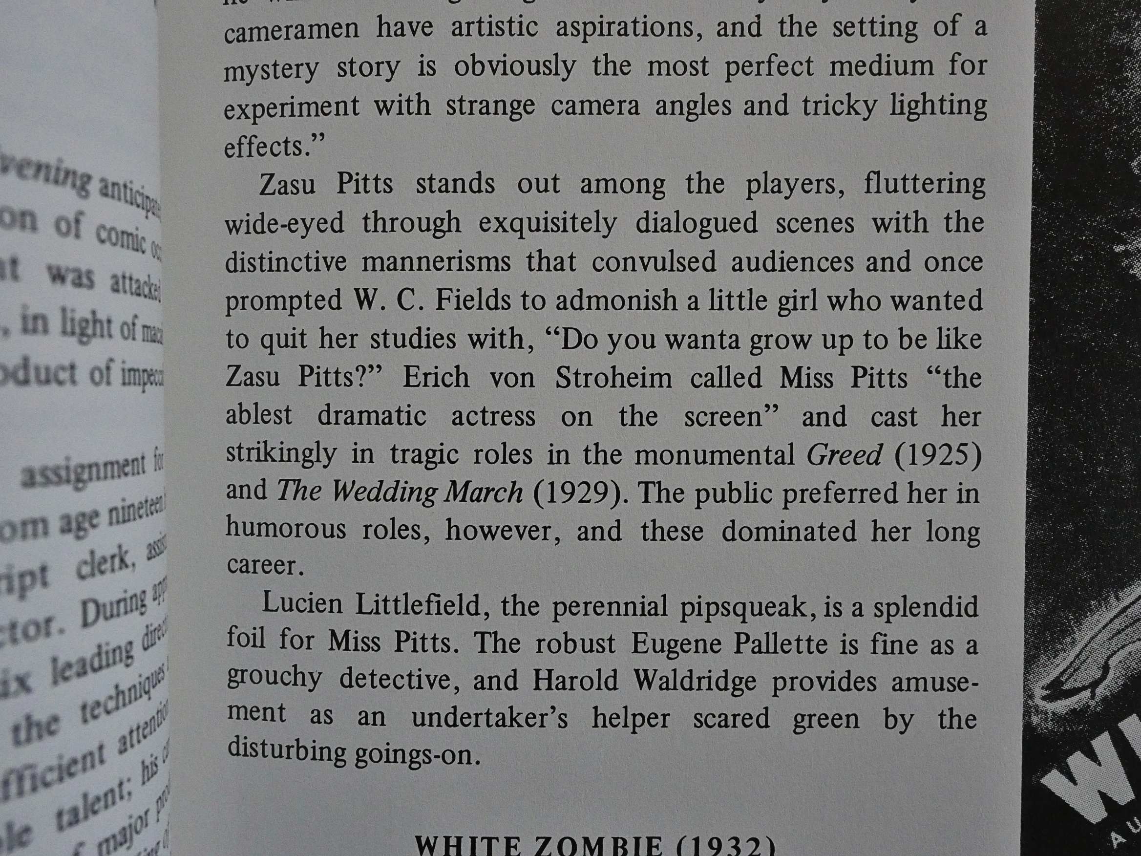
Hey, Zazu Pitts!

I think perhaps the main use case for a book like this, even back in those olden days of the nineteen-eighties, was to have something to read on the toilet, and it’s probably excellent for that. The writing is straightforward and uncomplicated and stuffed with titbits that you may or may not find fascinating.

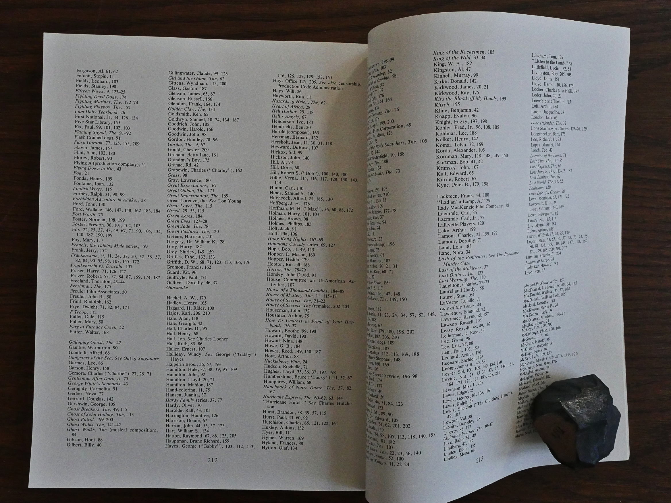
There’s even an index! Well done.

Hey, I must be totally wrong about there not being a market for this kind of thing any more. It’s apparently gotten several new, expanded editions over the year, and an Amazon reviewer says (of the 2012 edition):

I have every version of this title released to date. This one is much different from the rest in that it’s in a format that’s about half the size of the previous issues , and twice as thick. The content hasn’t changed all that much.

It’s spawned an entire industry, so that shows how much I know.

1991: Velocity

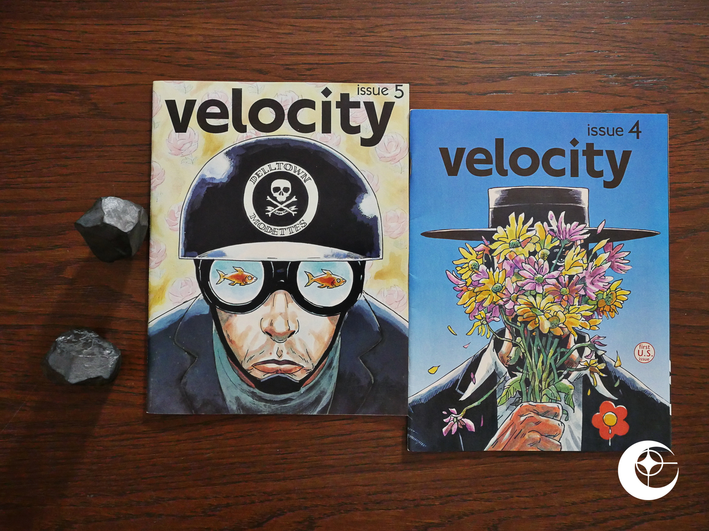
Velocity (1991) #4-5 by Gary and Warren Pleece.

Urr… “First US issue?” Oh, I see… comics.org says that the first three issues were self-published by the Pleece brothers in the UK, and then Acme/Eclipse published these two issues, and then the sixth and final issue was self-published by them again in the UK.

As commercial strategies go, this can’t possibly be the best one, I’d have thought. There are so many obsessive-compulsive comics readers that just can’t start with anything except issue #1…

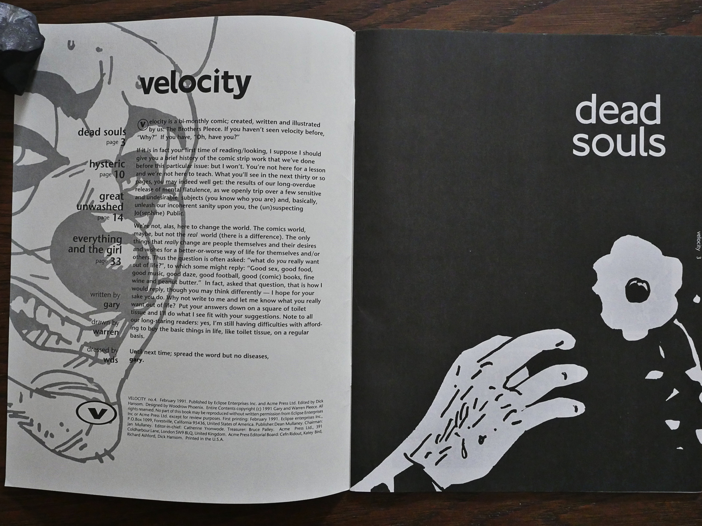
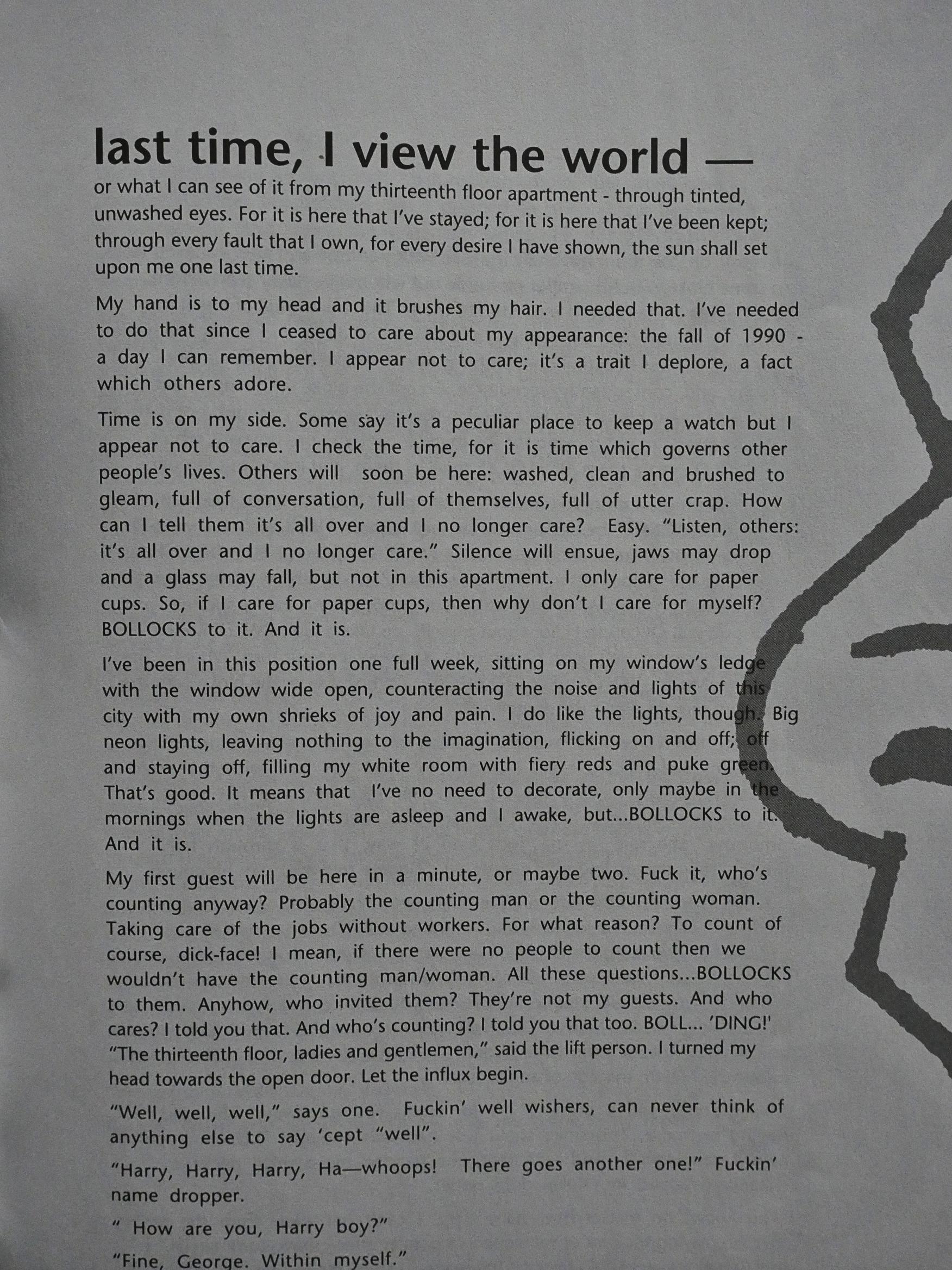
So what is this, then? An anthology? No individual credits are given for each story… Oh! All the stuff in here is by Gary and Warren Pleece. Perhaps… it would have made sense to write that somewhere instead of assuming that everybody’s in on details like that?

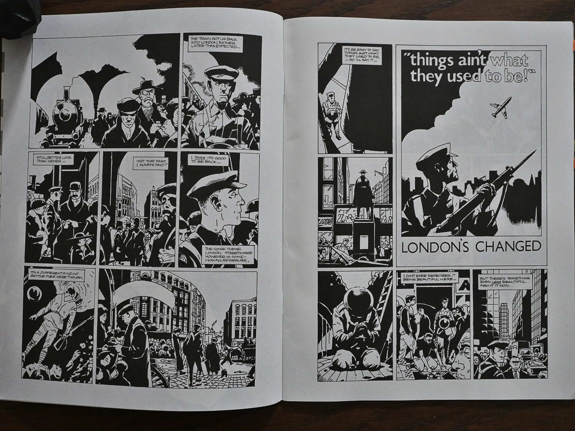
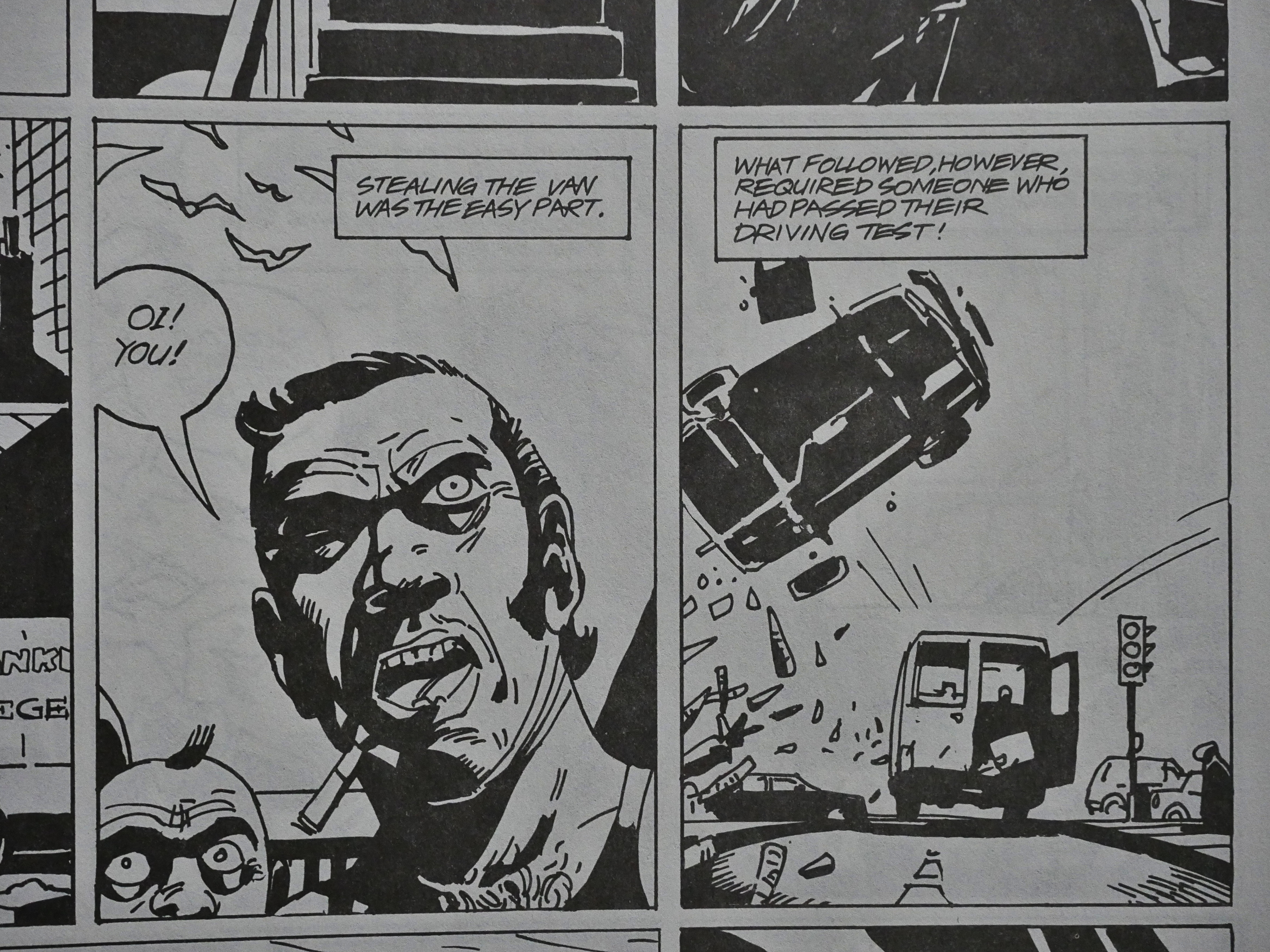
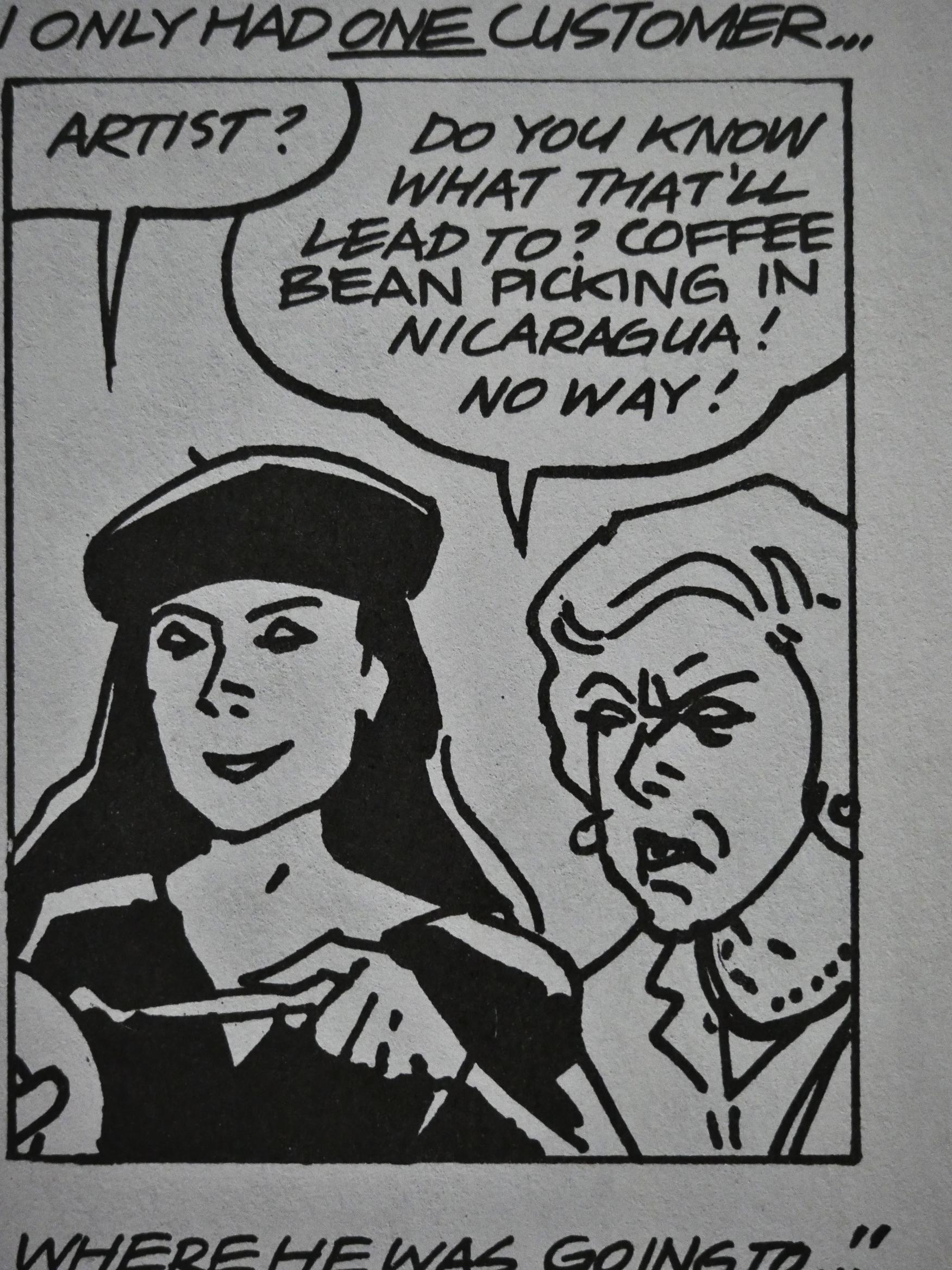
But but but THAT”S BEAUTIFUL! The artwork’s like nothing I was expecting! It’s like if somebody took Tardi’s costume drawing technique and crossed that with Pratt’s figures and Muñoz’s eye for spotting blacks! These are seriously gorgeous pages.

And the story’s pretty great too; a wistful anti-nostalgic thing with many juxtapositions and much flexing of different comics storytelling techniques. Very nice!

And then there’s a pretty far out text…

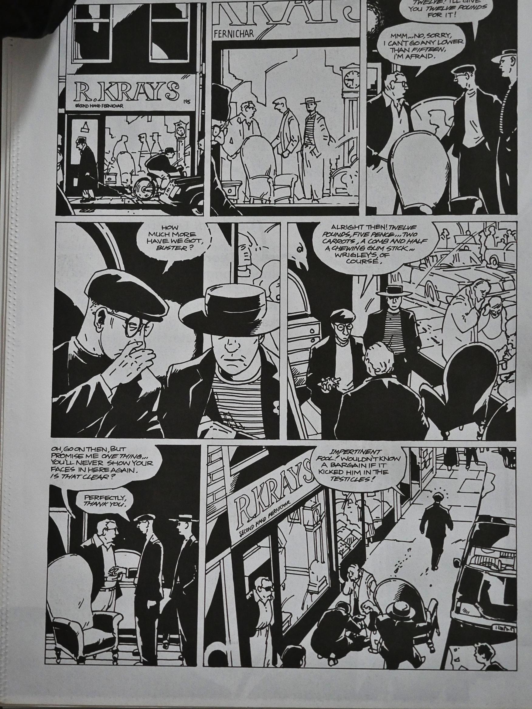
And a funnier, continued and complicated story about some guys wanting to buy carrots. Was this perhaps continued from previous issues? It seems to have a depth to its environs that’s very gripping.

And then a page of pure fun at the end.

What a wonderful comic book. It’s like perfect little distillation of everything that was good about 80s UK comics. Now I feel sad that I didn’t know about this book before.

The fifth issue is more of the same brilliant stuff. I just want to point to this page that’s filled to the brim with stuff and still perfectly paced. There’s an abundance of detail if you want that, and if not, it’s a pretty funny page. And with such wonderful artwork.

The main storyline doesn’t really reach any conclusion, but the other two shorter pieces are pretty spiffy. Especially the final one about the guys (or is it just one guy?) on the train. Excellent.

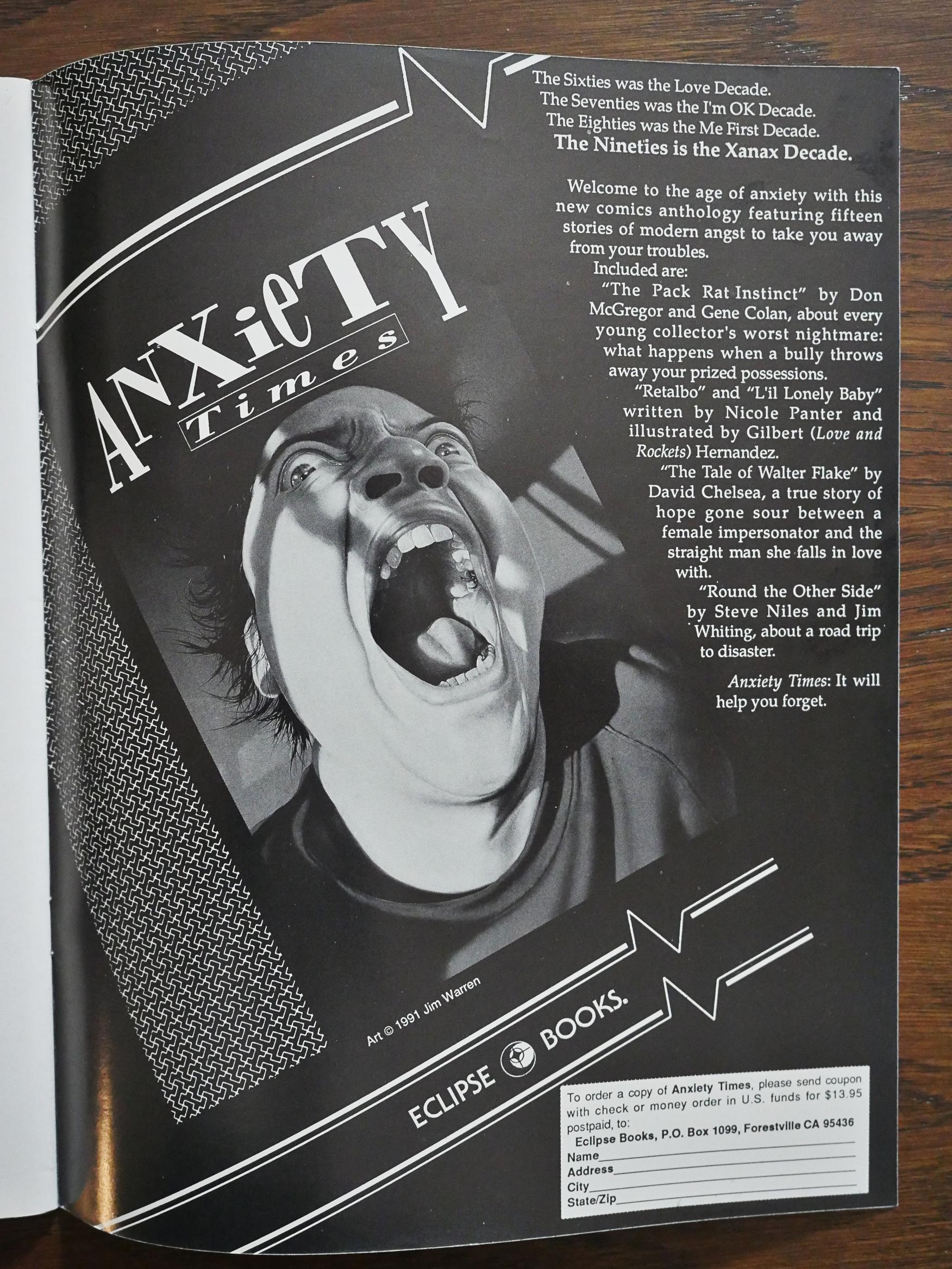
What’s this then? Another Eclipse book I’ve missed?! This page says that David Chelsea contributed to it… But I can find no other mention of Anxiety Times from Eclipse Comics/Books/Enterprises, so it never happened? Yup, Don McGregor confirms: “it was due to appear in a number of different Eclipse comics, but it never saw print”. And then they lost Gene Colan’s artwork… *sigh*

Well, these are the twilight years in Eclipse’s history, so weird things are happening… like them publishing these two issues. And note that Eclipse are advertising this not-yet-published book as being for sale (at $14)… but I guess doing mail-order action for non-existing things was just the Kickstarter of its age.

Ahem.

I’ve just had a peek on ebay, and getting the other issues of Velocity seems impossible. But Escape Books released a Los Bros Pleece collection in 2016, The Great Unwashed, which is supposed to collect most of this stuff, so I’ve just bought that:

Straightaway there was something about the brothers’ work that stood them apart from the bulk of the (sometimes slightly precious) small press stuff I was reading at the time.

On the surface, Warren’s bold, confident, noirish art caught the eye at once. But then, the way a fine beer leaves a pleasing finish on the palate, the sly wit and satirical edge of the stories made the brothers a creative team whose work I’d always seek out.